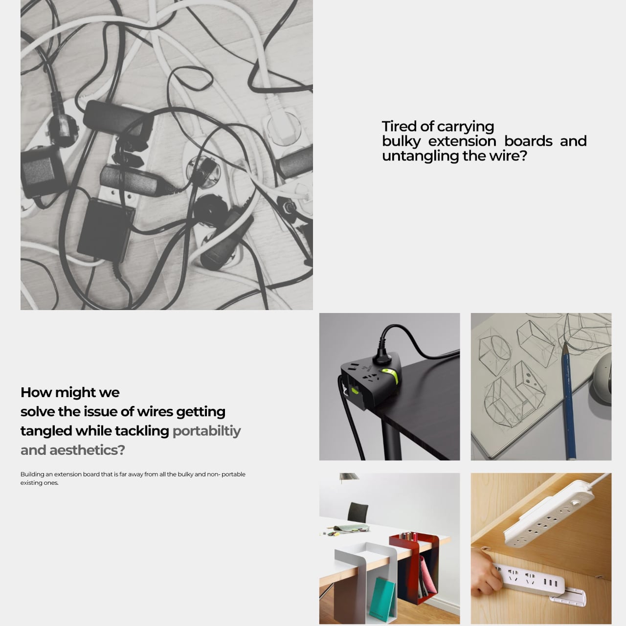
Working from wherever you can find a seat means accepting certain frustrations, and outlet hunting is near the top of the list. Extension boards solve that at home, but they’re designed for rooms rather than bags, and dragging one to a café or shared studio means arriving with a coil of cable that becomes someone else’s problem. Power infrastructure hasn’t caught up with how people actually work.
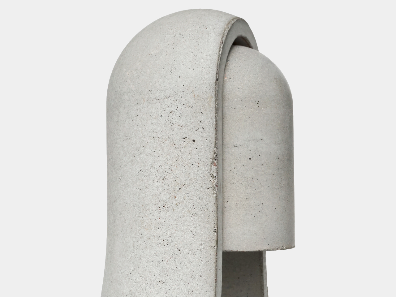
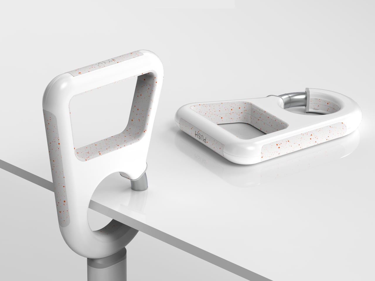
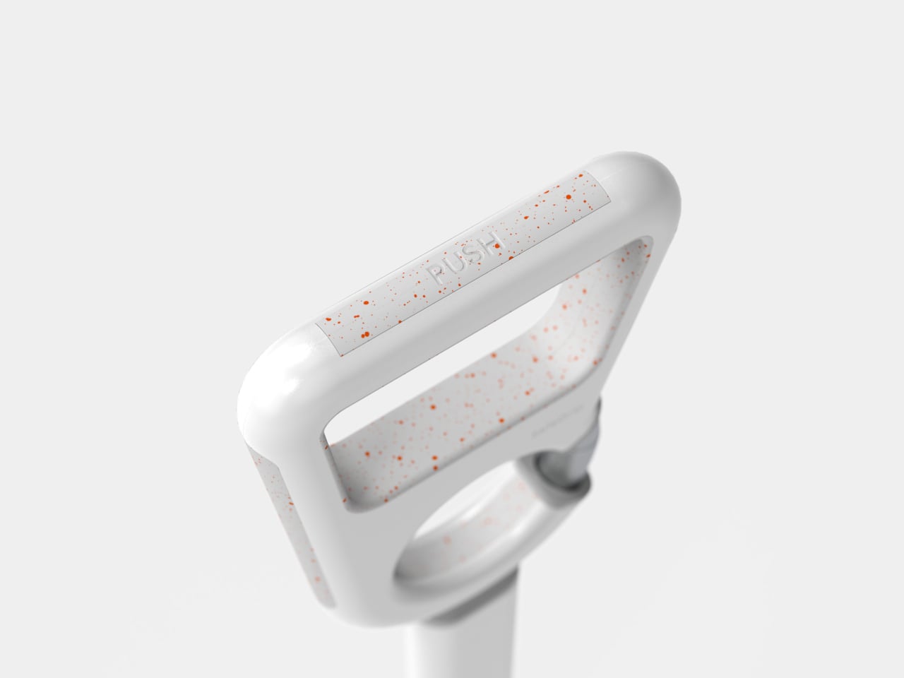
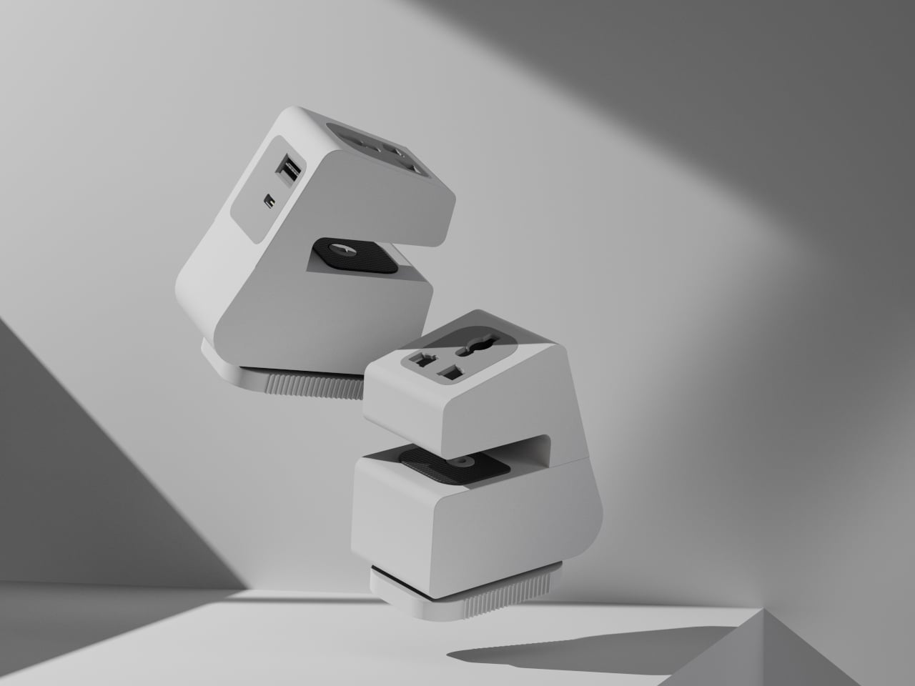
Xtend is a personal charging extension concept built around one challenge: making power access portable without making it awkward. The guiding claim is “Power access shouldn’t be bulky,” which is fair when most extension boards still feel designed for a fixed office and are never reconsidered. The concept answers with a compact, desk-edge device you carry rather than leave behind.
Designer: Parth Amlani
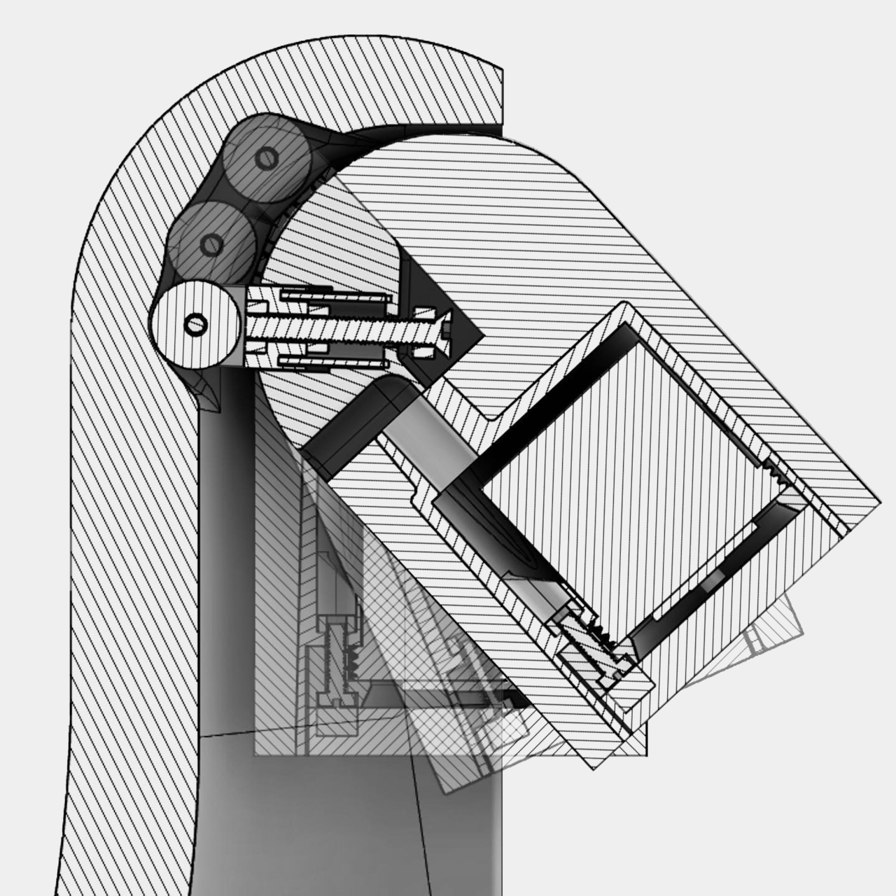
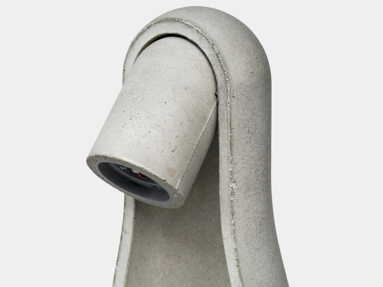
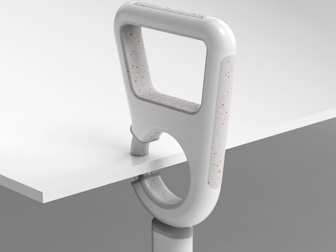
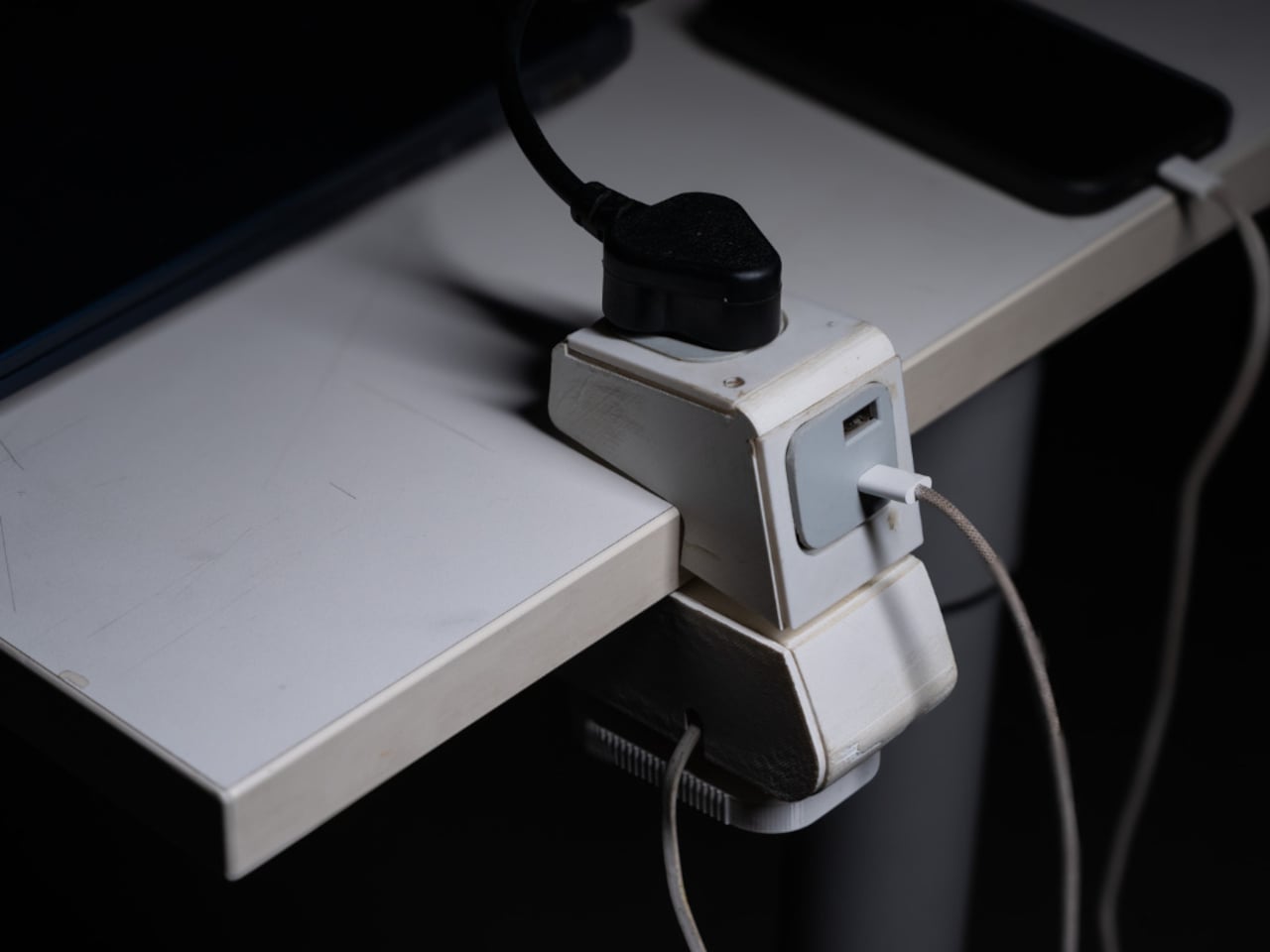
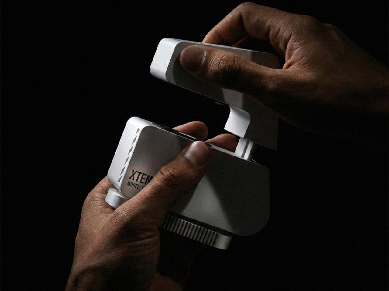
Rather than a strip on the floor where cables become trip hazards, Xtend clamps to the table edge and creates an elevated power zone right where you’re working. That’s the main behavioral shift, and it matters. It keeps cables off the ground, reduces accidental unplugging when someone shifts their chair, and gives the whole setup a predictable home, whether you’re there for twenty minutes or a few hours.
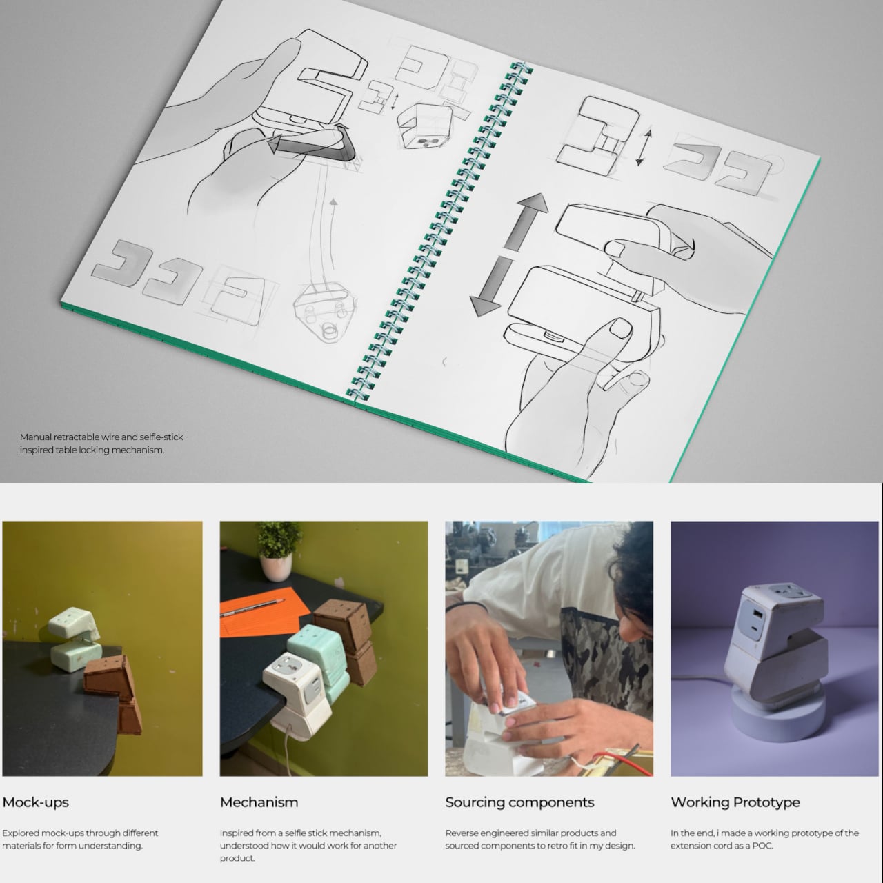
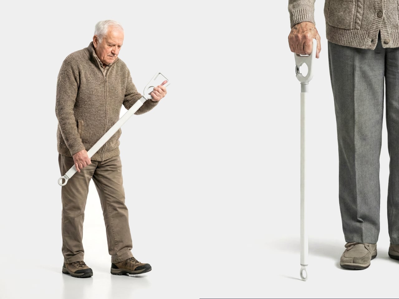
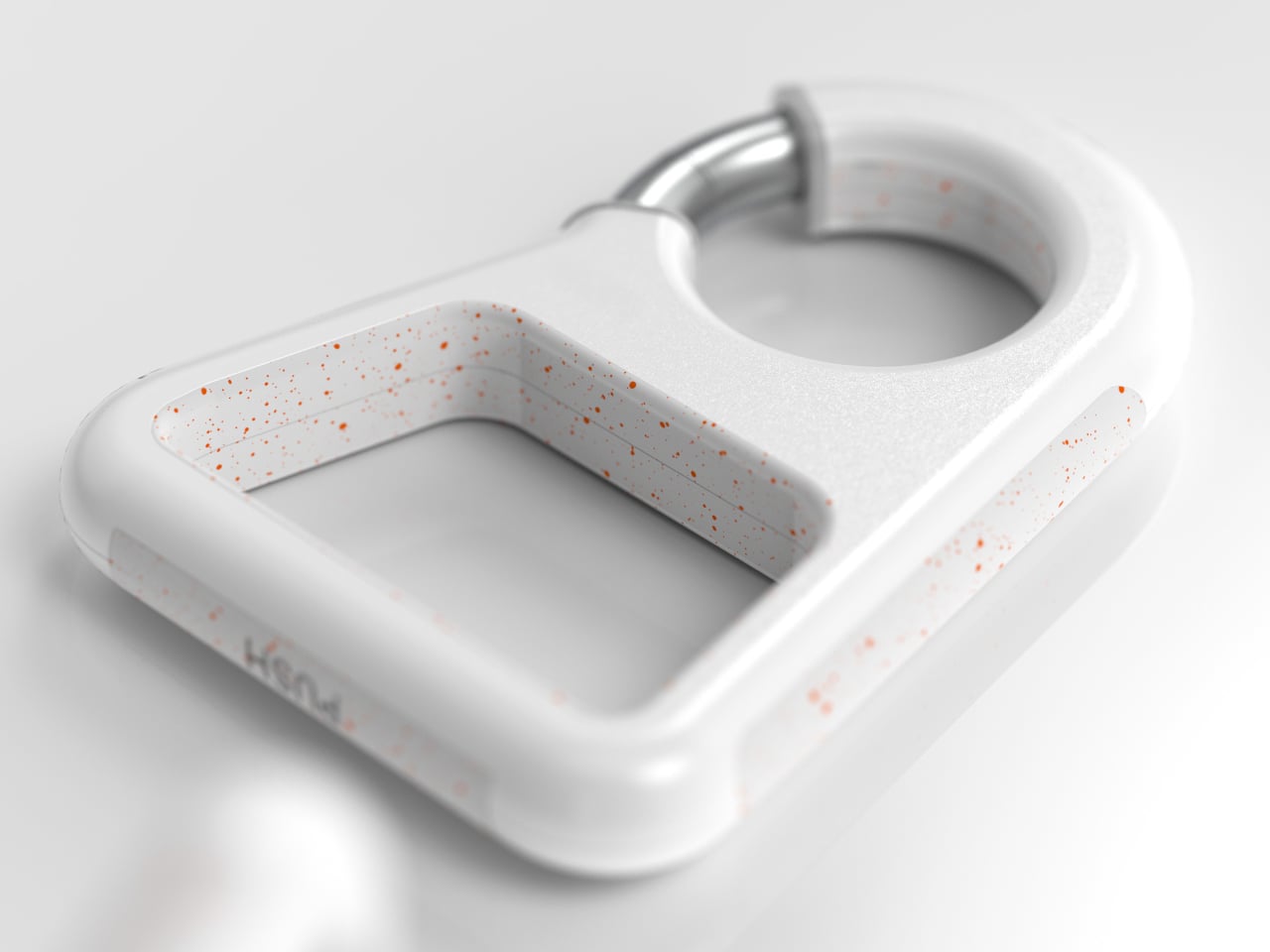
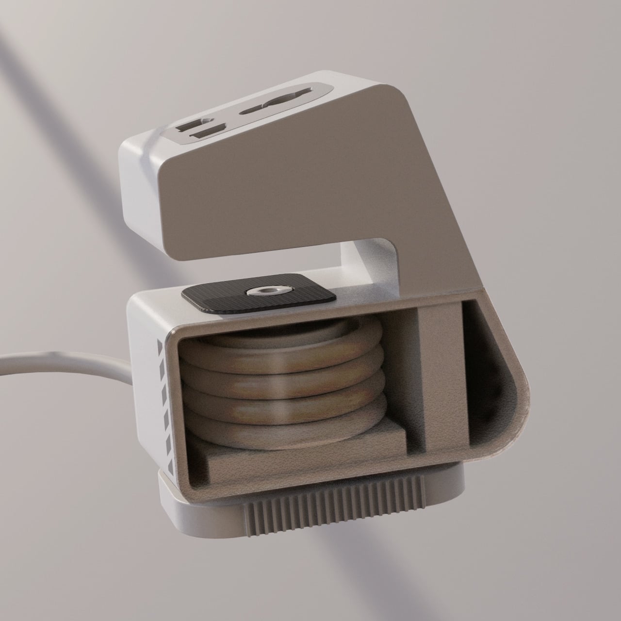
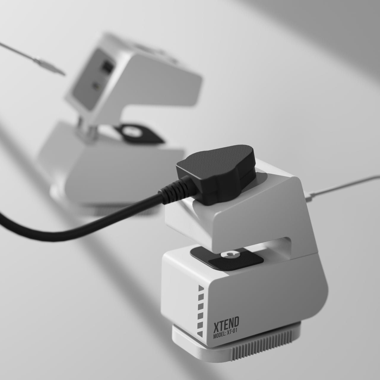
A manual retractable wire manages the cable when you pack up, addressing tangles at the source rather than relying on cable ties or zip pouches. The table attachment uses a selfie-stick-inspired locking mechanism for adjusting and securing the device to different desk edge profiles. That’s not a small detail, because portability only works if setup and stow are both quick.
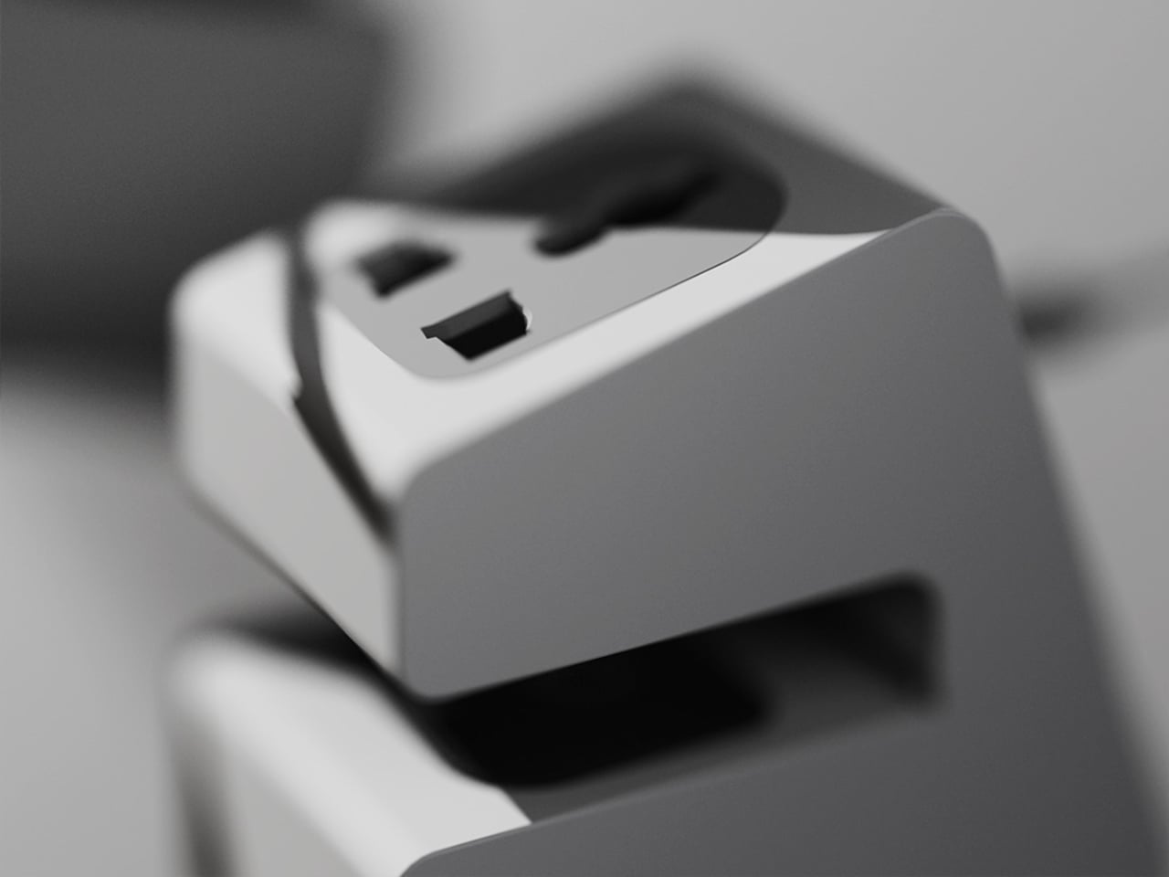
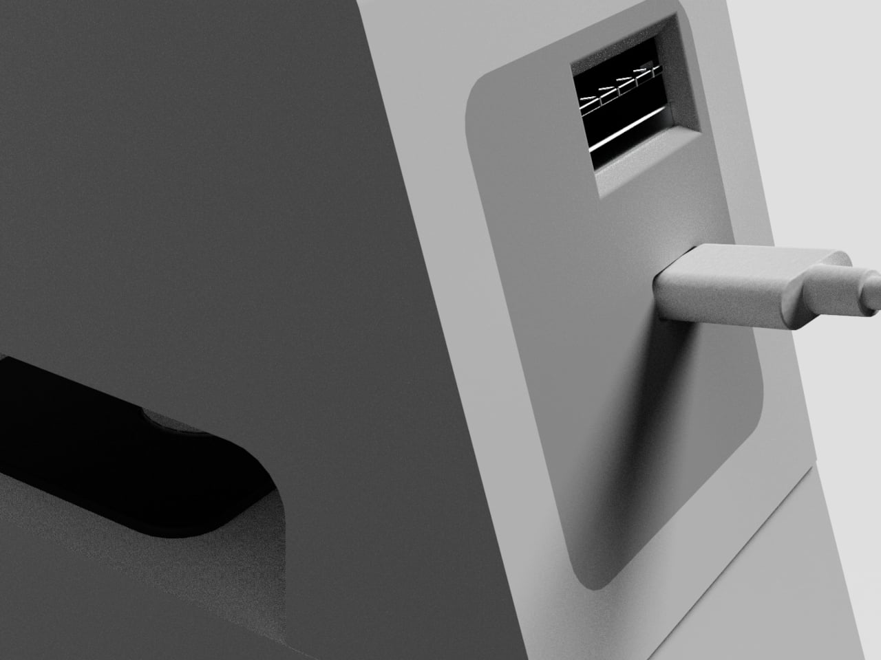
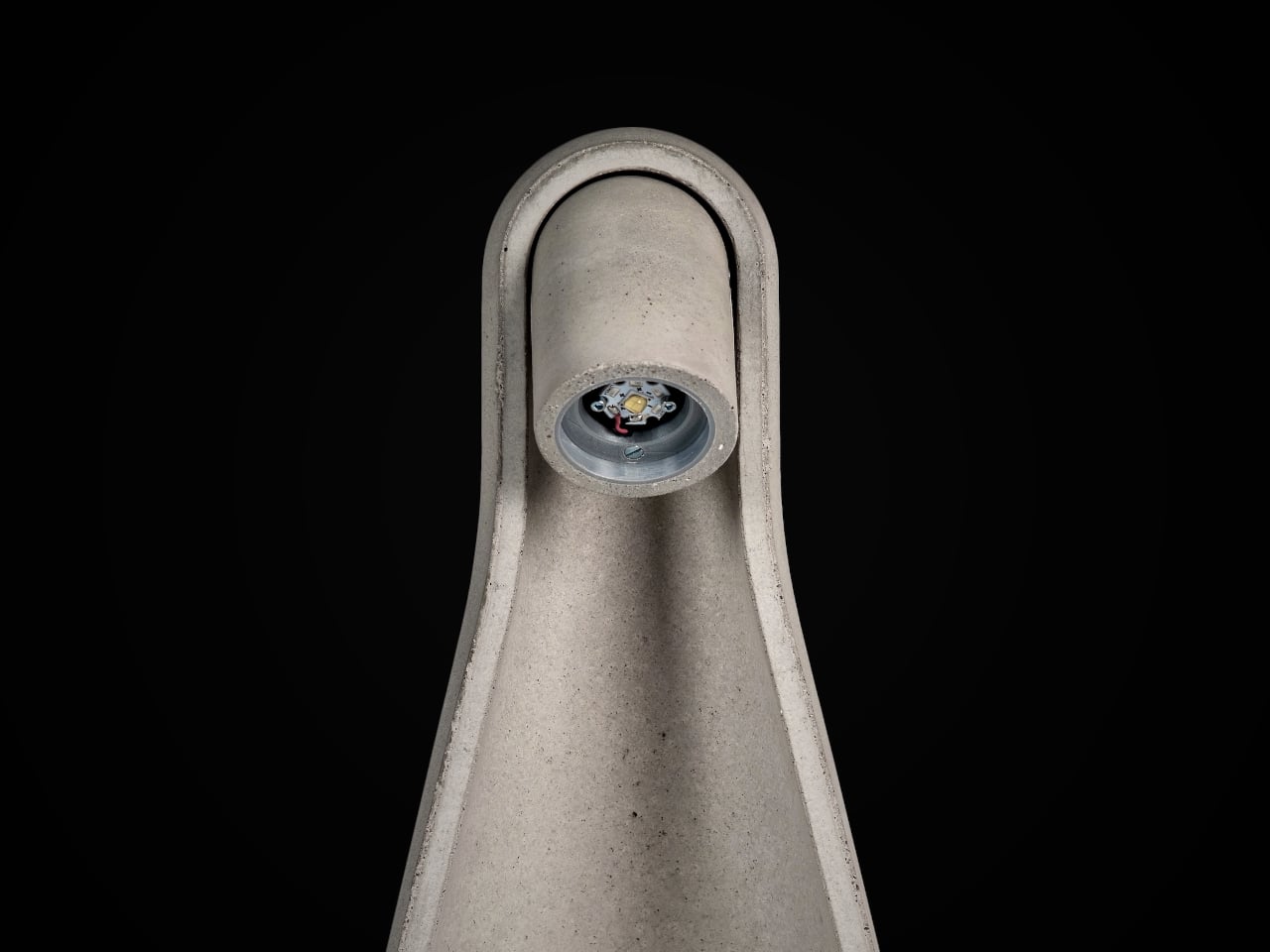
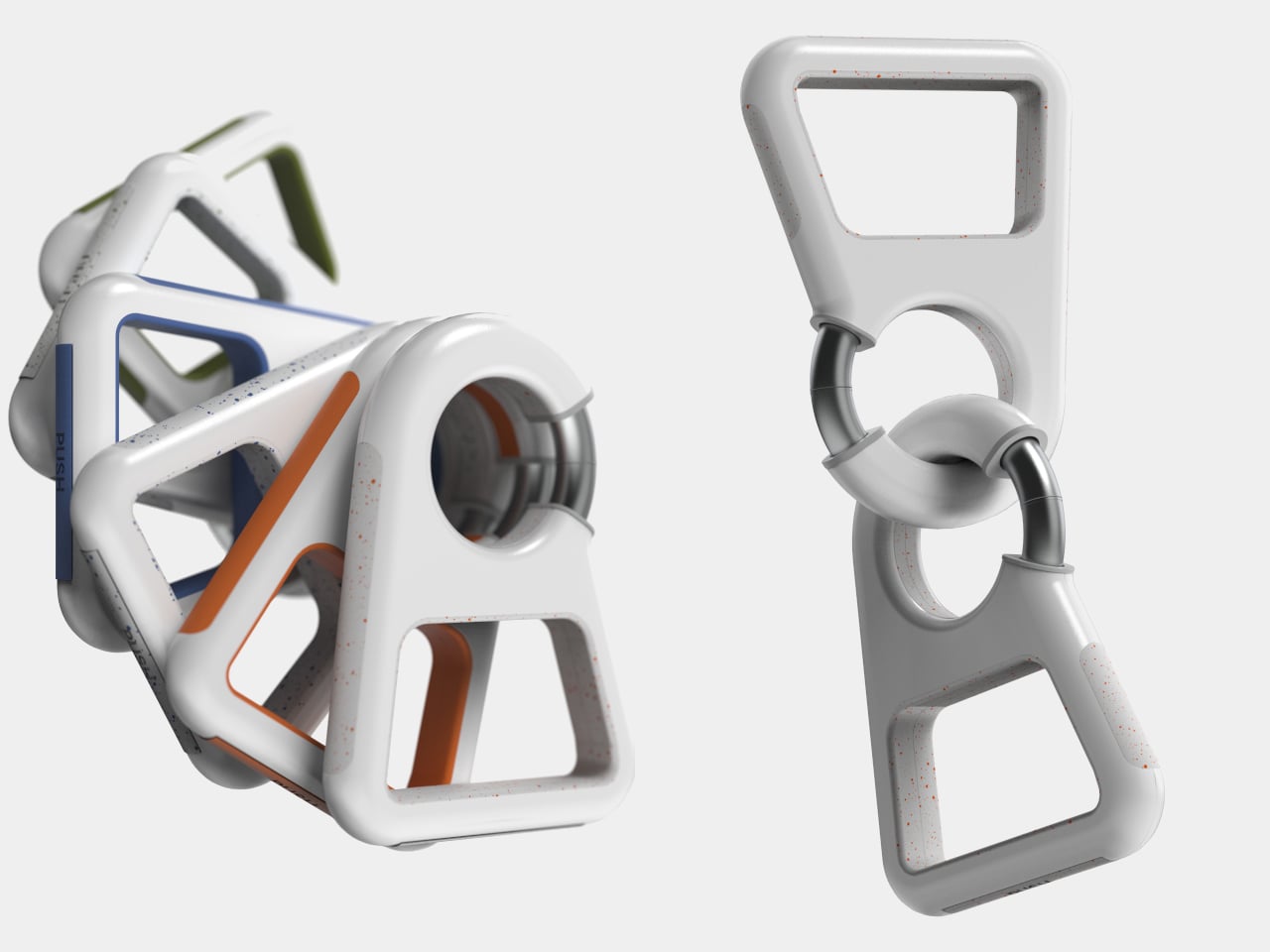
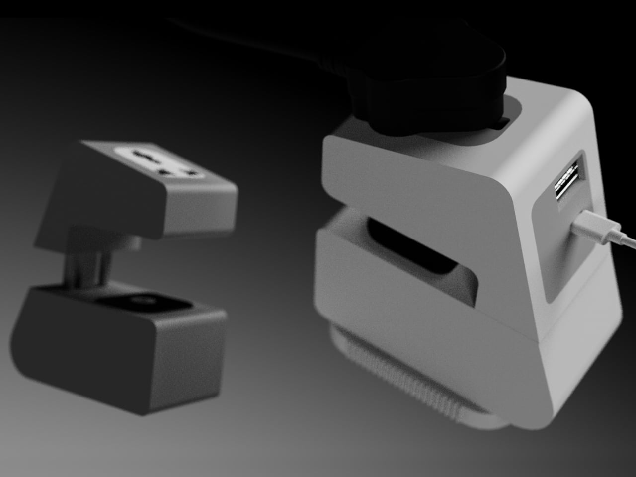
Of course, attaching to a desk edge only matters if it handles what you’re actually charging. Xtend is set up for three devices at once, a top-facing outlet for a laptop charger, and USB ports on the side for phones or smaller devices. That mix reflects how people actually charge at a shared desk, one large draw and a couple of smaller ones, rather than forcing everyone to compete for a single wall strip.
Xtend treats power the way people already treat other portable tools, as something that belongs in a bag and works anywhere. Extension boards have been a room infrastructure for decades, but how people work has changed. A small device that attaches to a desk edge, charges three things, and retracts its own cable before you leave suggests that the power strip category is ready for a rethink.
The post This Portable Power Strip Clamps to Table Edges and Charges 3 Devices first appeared on Yanko Design.