This $130 Mario Kart Racing Wheel for the Switch 2 Has Seven Sensitivity Levels for Throwing Banana Peels

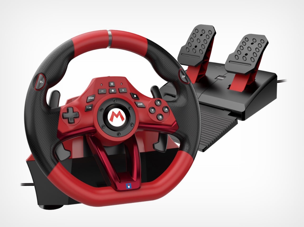
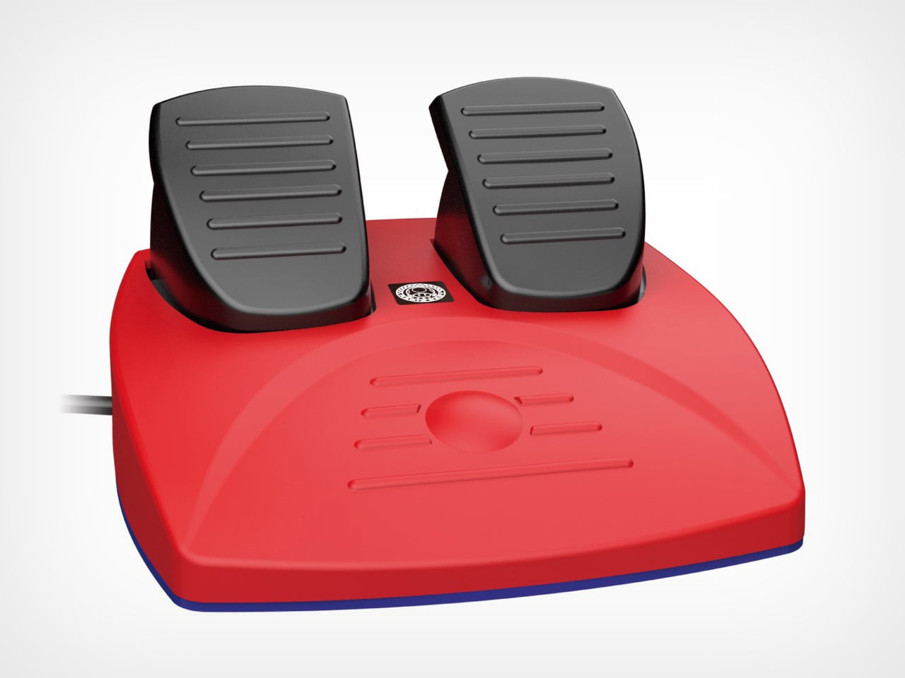
Nobody sits down to play Mario Kart and thinks “what this experience needs is a force feedback wheel, a pedal set, and a clamp-mounted desk rig.” And yet here we are, with Hori releasing two officially licensed racing wheels for the Switch 2, timed to launch alongside Mario Kart World on March 23. The Deluxe has an 11-inch wheel, a full pedal set, seven sensitivity levels, an adjustable dead zone, and a Quick Handling Mode that toggles steering output between 270 and 180 degrees. That last feature exists so you can more precisely navigate a rainbow-colored highway while a cartoon turtle throws a shell at you.

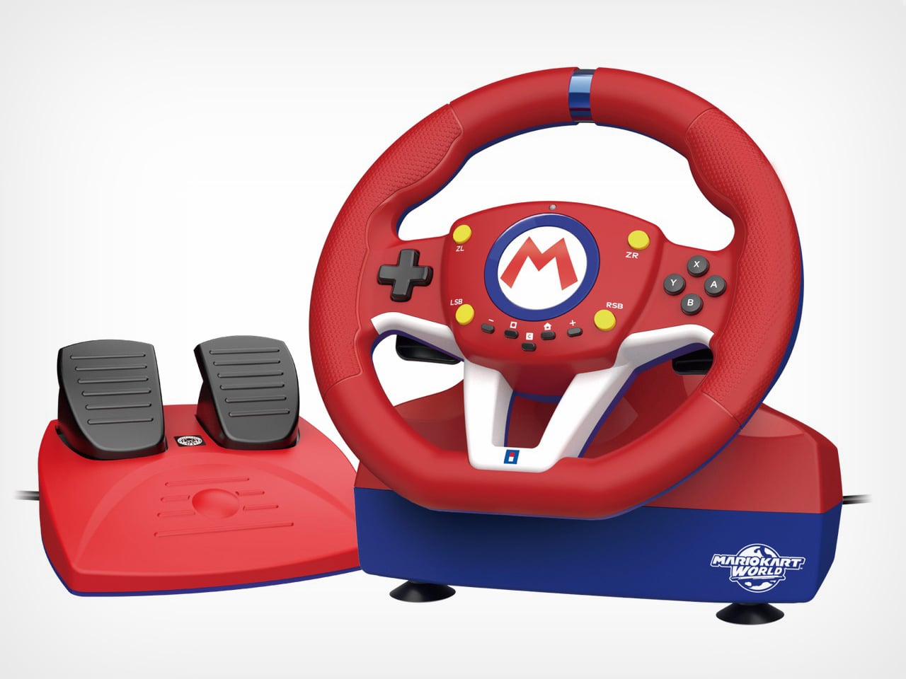
To be fair, the wheels look genuinely good. The Deluxe goes for a dark, almost aggressive red-and-black motorsport aesthetic, while the Mini leans fully into Mario’s red-blue-white color scheme with the Mario Kart World logo stamped on the base. Both add a C button for Switch 2’s GameChat, connect via a 9.8-foot USB-A cable, and work with the original Switch and OLED too. The Deluxe is $129.99, the Mini is $79.99, and both are available for pre-order now.

Designer: Hori
Click Here to Buy Now

The two wheels are closer in spec than the price gap suggests. Both have textured rubber grips, ZL and ZR buttons, racing paddles, programmable buttons, and the same ZL hold function that lets you drag items behind your kart in Mario Kart 8 Deluxe. That hold function is disabled in Mario Kart World, which handles item use differently, so if World is the primary reason you’re buying one of these, that particular feature is decorative. The Mini’s 8.6-inch wheel is smaller but not dramatically so, and for a game where precision steering matters about as much as knowing when to deploy a star, the size difference probably won’t register mid-race. Both also carry the Nintendo/PC toggle on the back, which is new to the Switch 2 versions and means you can run either wheel through a PC racing title if the Mario Kart novelty wears off.
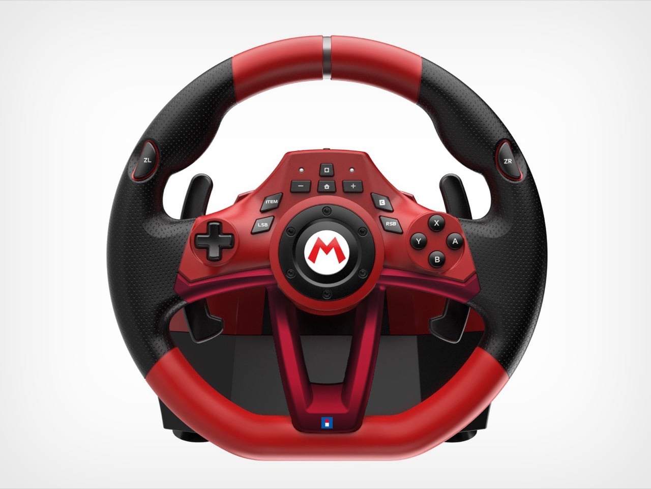
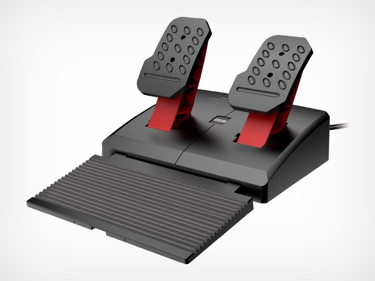
The Mini, with its Fischer-Price aesthetic, attaches via suction cups only, which works fine on a smooth desk but becomes a liability if you’re the type to slam the wheel hard into a corner. The Deluxe, on the other hand, adds a physical clamp mount, a meaningful upgrade for anyone who takes their banana peel delivery system seriously. The dead zone adjustment and the 180/270 degree toggle are also Deluxe-only, and those matter more than they sound: dialing in the dead zone tightens center response considerably, and 180-degree mode makes the wheel feel snappier in arcadey conditions where full-rotation sim behavior would actively work against you.
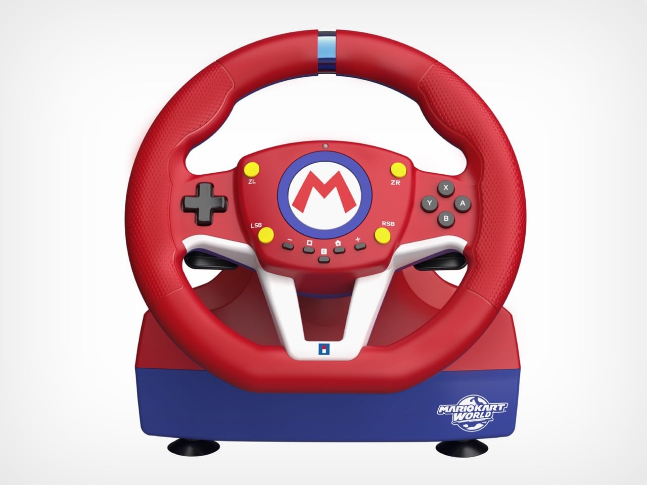
The Deluxe reads like a peripheral that wants to be taken seriously, with perforated black leather-look grip material, metallic red spokes, and a fairly restrained button cluster around the center M logo. The Mini abandons that restraint completely: solid red rim, blue and white spokes, yellow accent buttons, Mario Kart World branding on the base. They’re aimed at different buyers within the same audience, and the visual split is deliberate enough that you wouldn’t mistake one for the other in a product lineup.

Both wheels connect over USB-A, which is worth flagging because the Switch 2 uses USB-C natively. You will need an adapter or a hub, and Hori ships neither in the box. The 9.8-foot cable is generous in length, but the connector mismatch is a friction point on a product designed specifically for a new console, and it’s the kind of thing that should have been sorted at the design stage rather than left to the buyer.

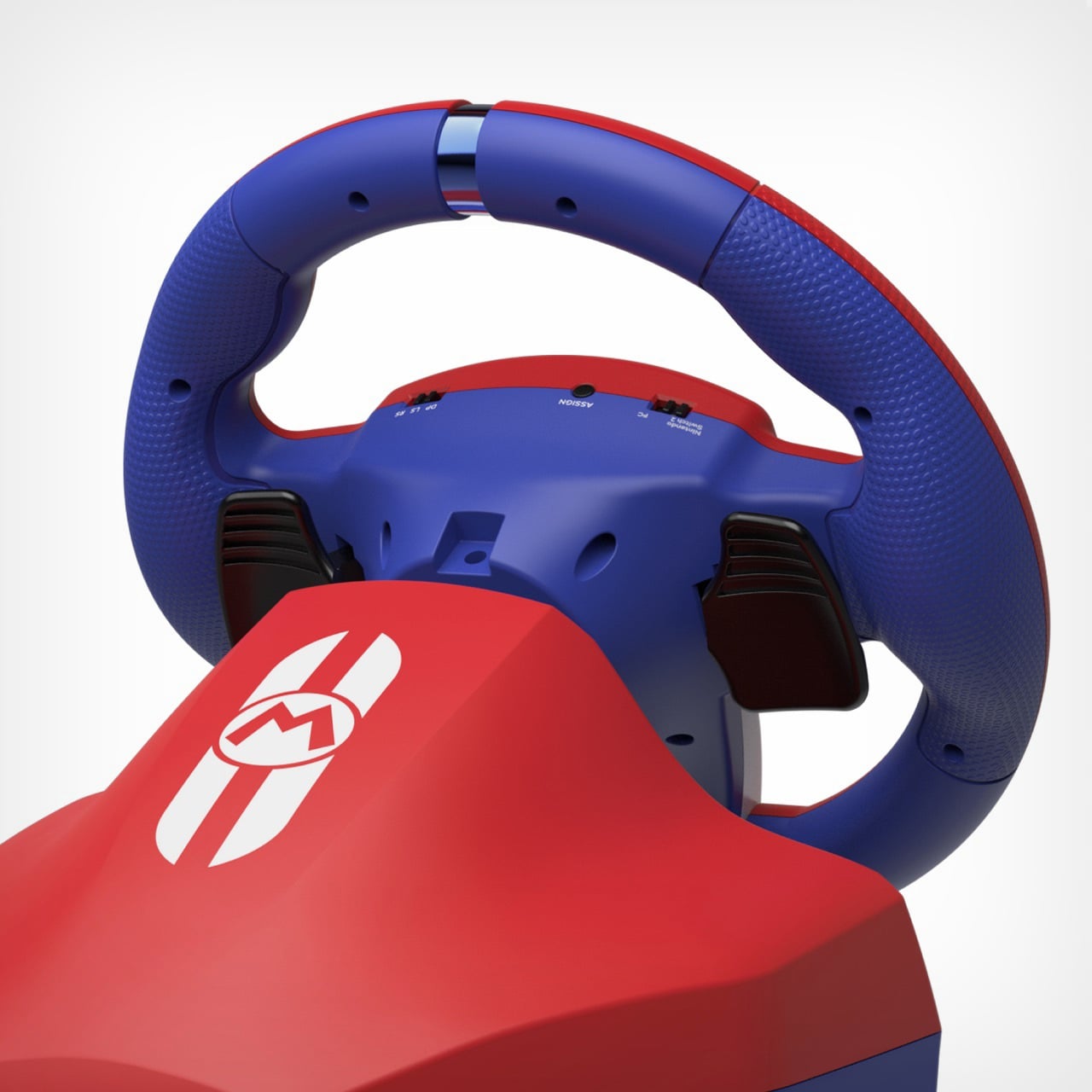
Hori has been the default answer for Switch racing wheels since the original console launched, and these Switch 2 versions do not reinvent that position. The older Switch wheels already work on the Switch 2, so this is really a product for new Switch 2 buyers rather than existing Hori customers looking to upgrade. For that audience, $79.99 for the Mini is a reasonable ask, $129.99 for the Deluxe is justified by the clamp mount and calibration options alone, and both are about as good as a wired USB wheel built around Mario Kart is ever going to get. Whether you need one is a separate question, but if you’re going to sit down with a dedicated racing rig to hurl banana peels at a go-kart driven by a plumber, at least Hori has given you two good ways to do it.

Click Here to Buy Now

The post This $130 Mario Kart Racing Wheel for the Switch 2 Has Seven Sensitivity Levels for Throwing Banana Peels first appeared on Yanko Design.
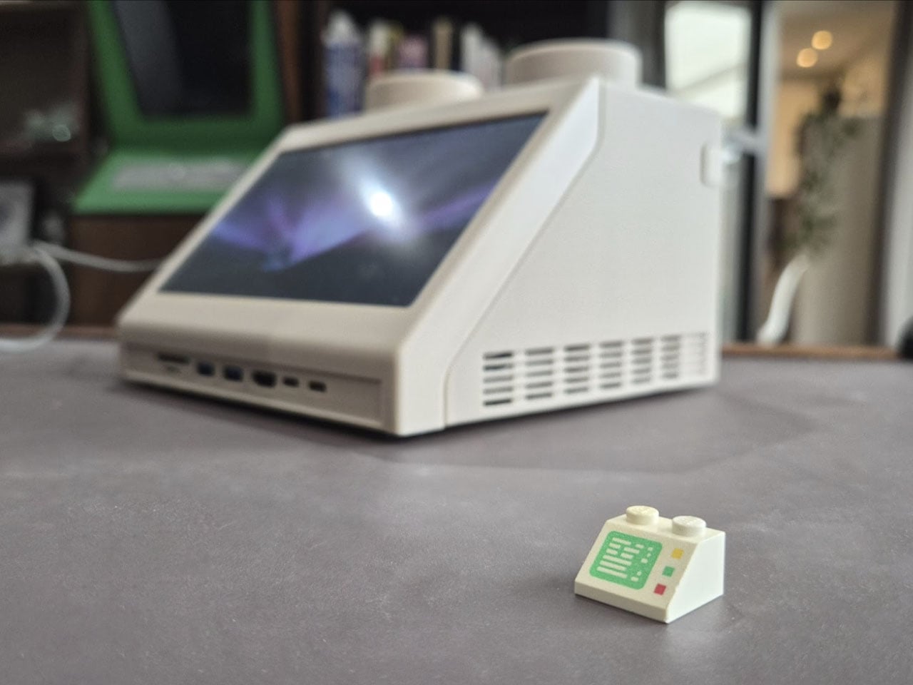
This classic 1979 LEGO computer brick hides a fully functional Mac mini workstation inside

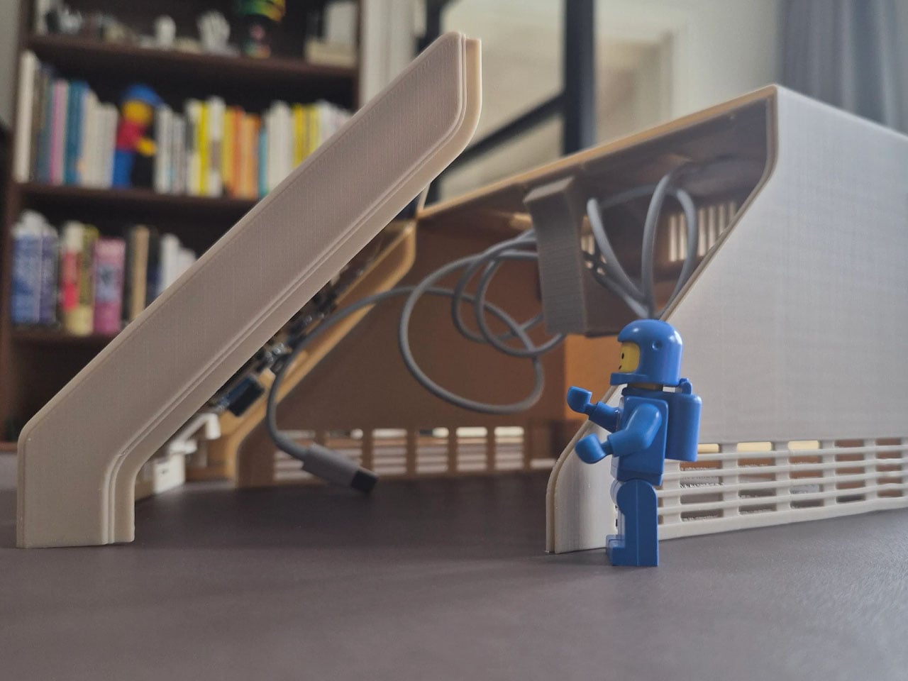
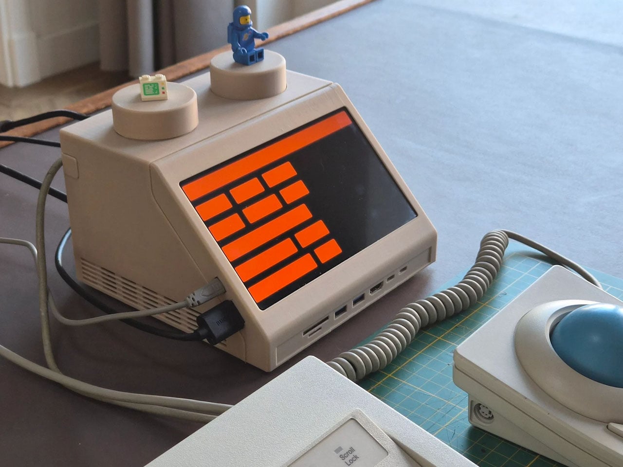
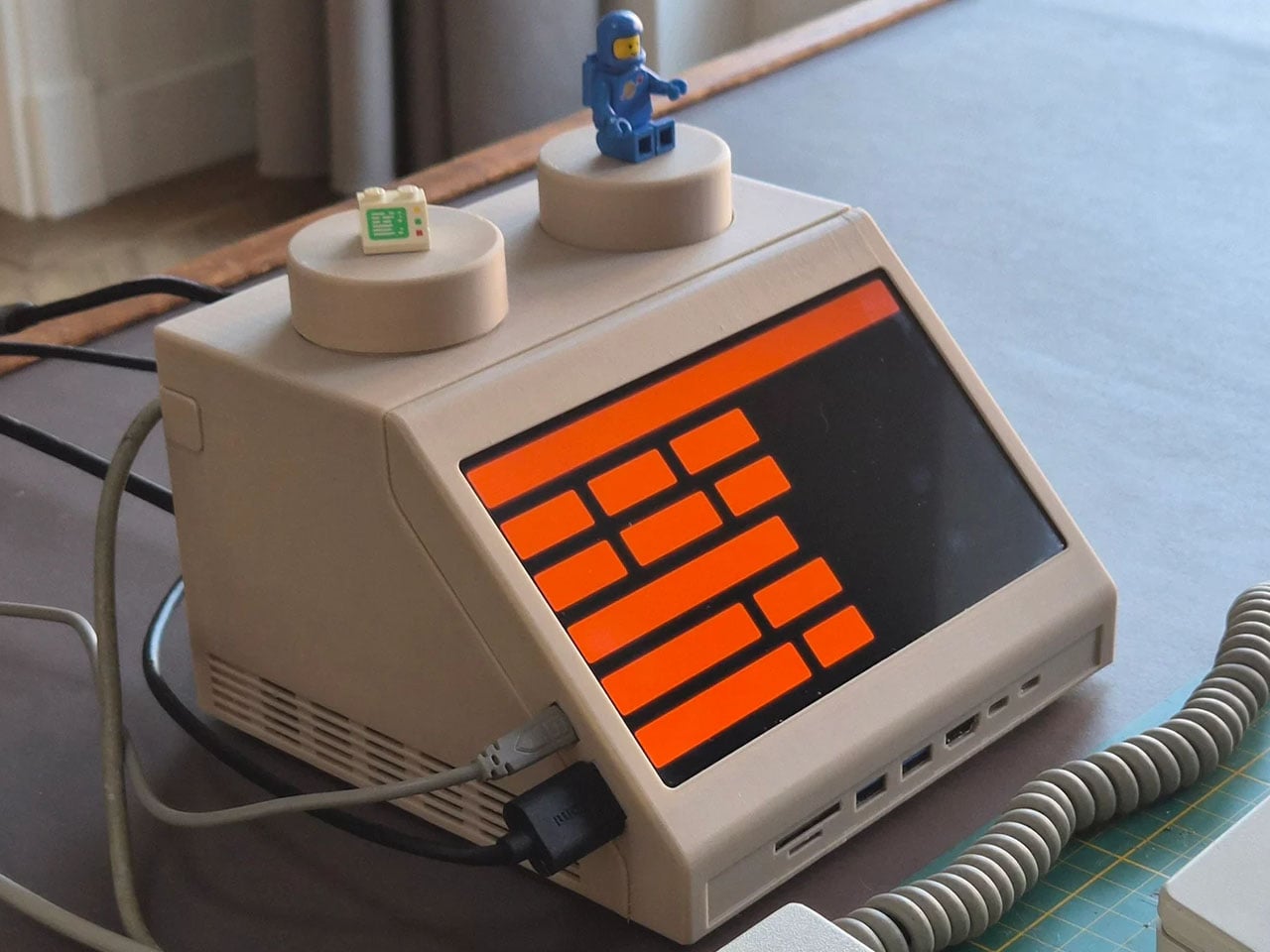
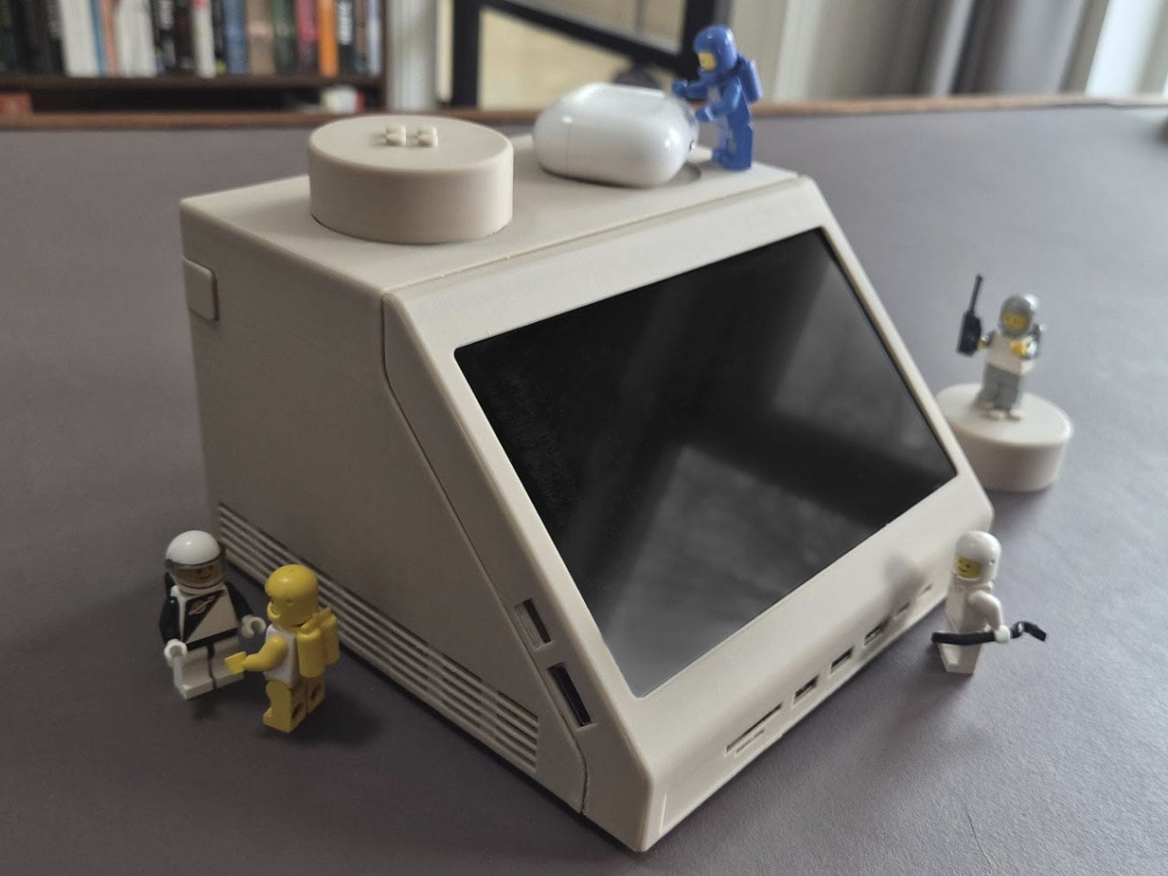
Retro designs often carry a sense of nostalgia, but occasionally they evolve into something more functional and imaginative. The M2x2 workstation by Watt IV is a good example with the inventive reinterpretation of a classic LEGO element transformed into a fully working desktop computer. Created by Dutch designer Paul Staal, the device takes inspiration from the iconic sloped LEGO computer brick introduced in 1979 and scales it up into a practical workstation powered by a modern Mac mini.

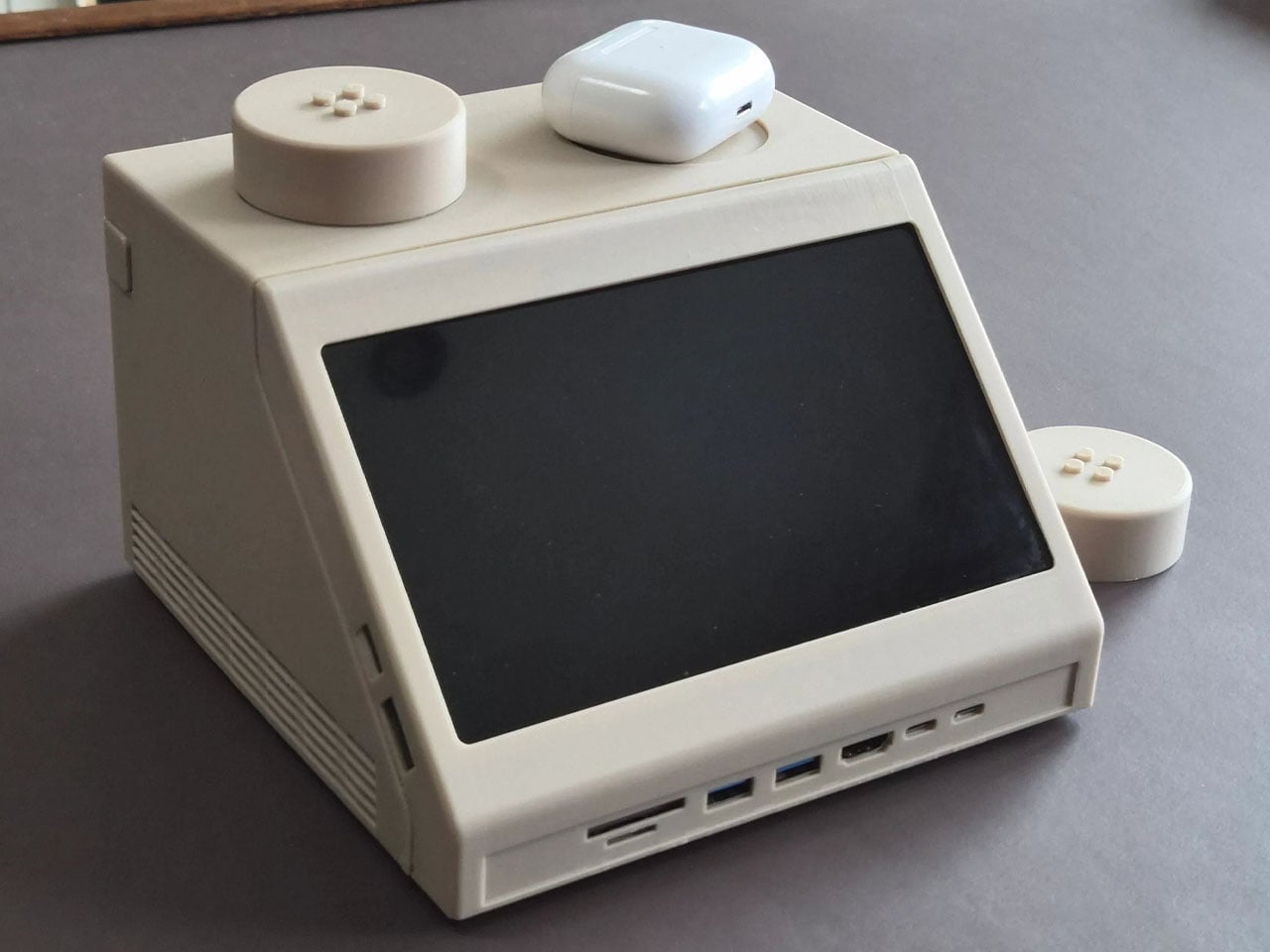
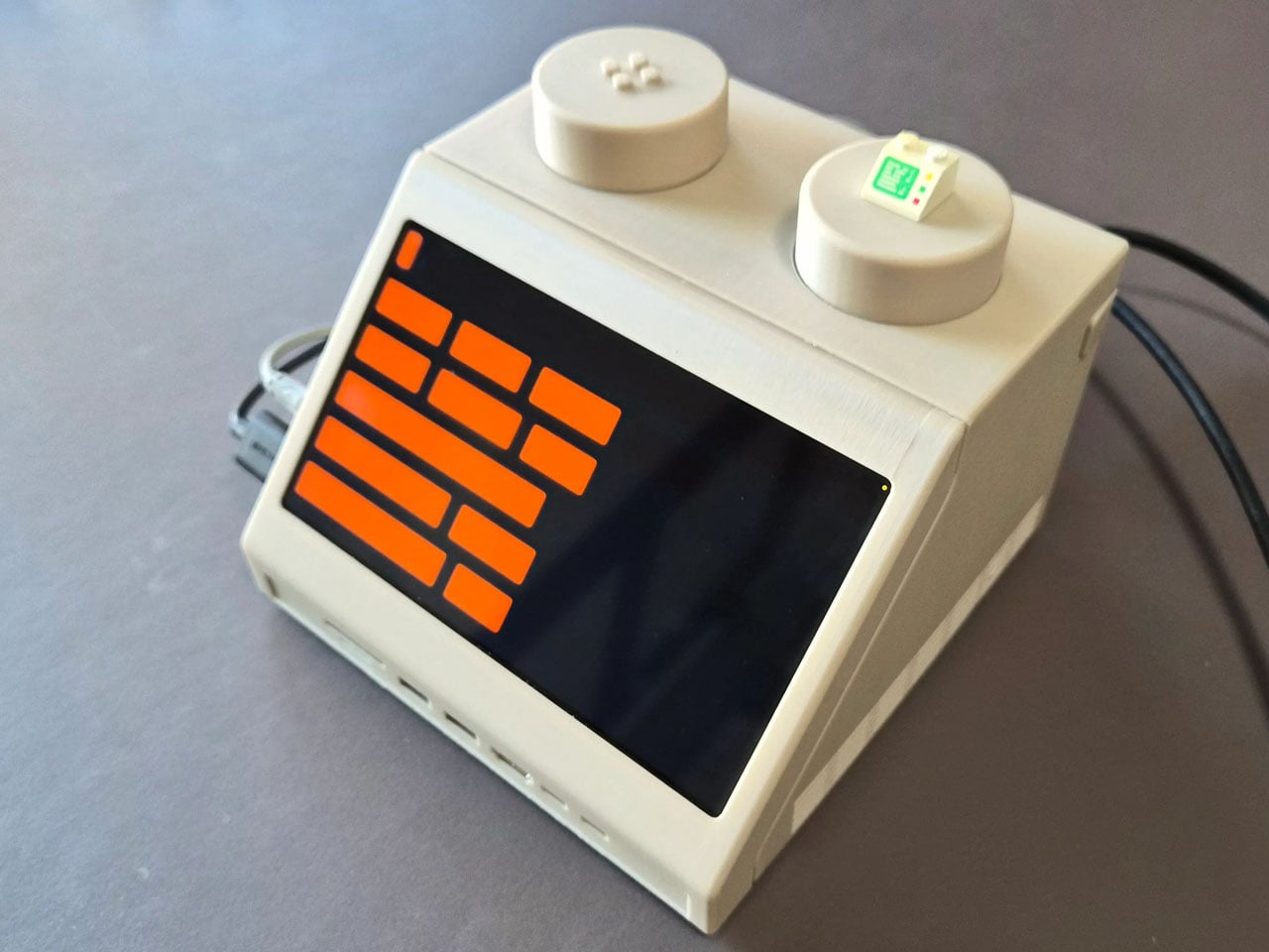
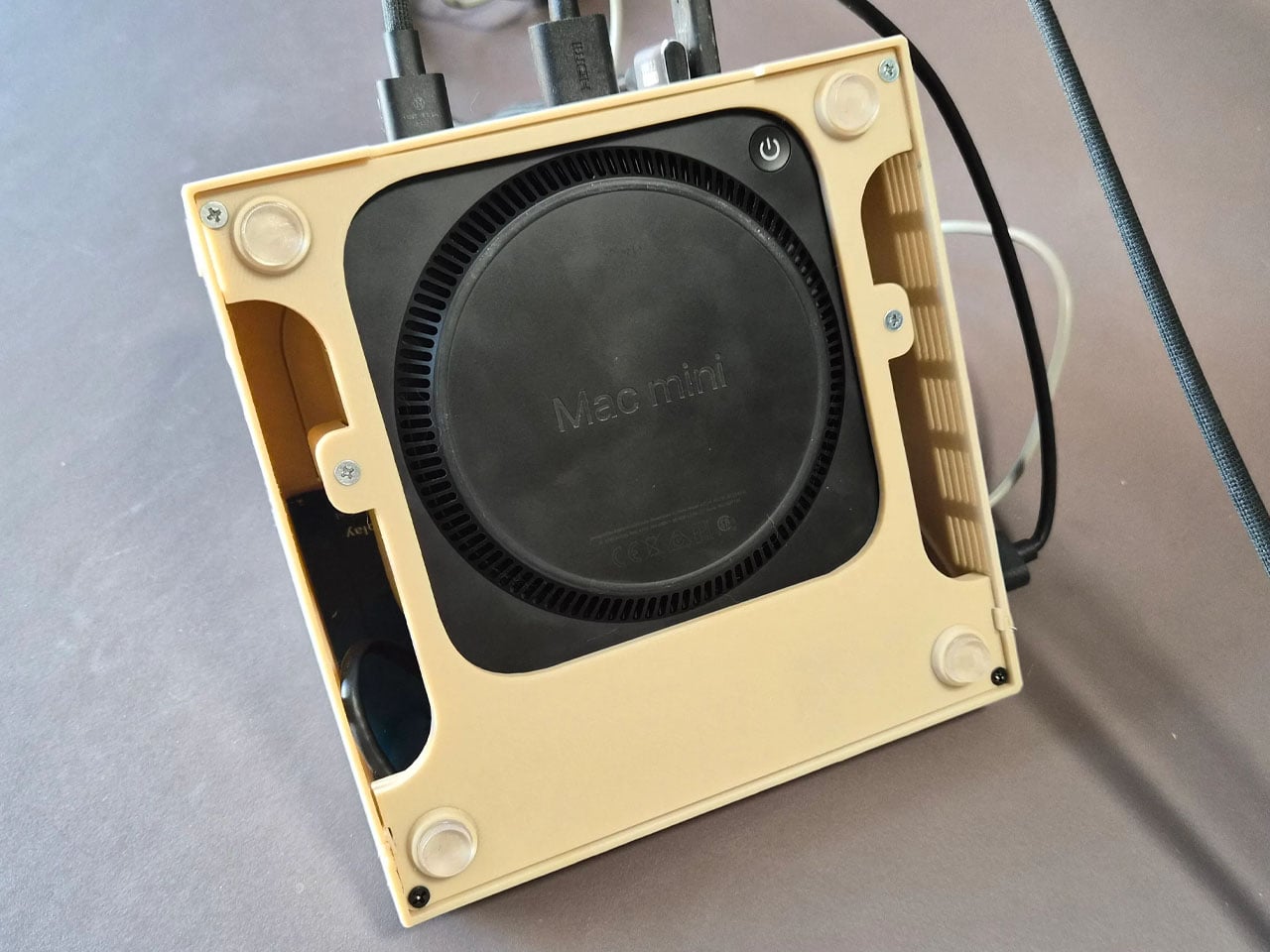
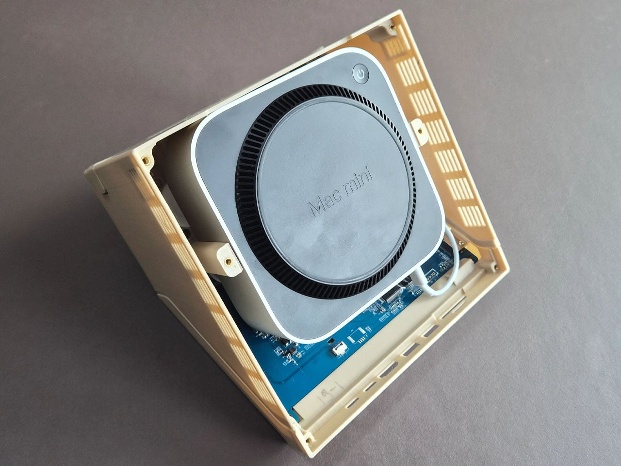
The DIY centers around the familiar wedge-shaped Slope 45 2×2 LEGO piece, a part historically used in LEGO space-themed sets as a representation of computer terminals inside spacecraft cockpits. Staal enlarged this element to roughly ten times its original size, turning it into a functional housing that blends retro toy aesthetics with contemporary computing power. Inside the oversized brick sits an Apple Mac mini equipped with Apple’s M4 chip, transforming the playful concept into a capable desktop system.

Designer: Paul Staal

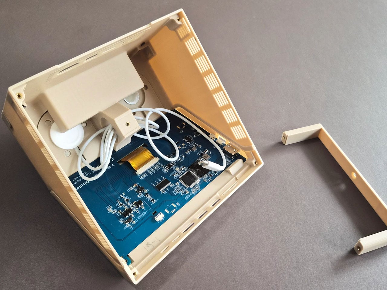
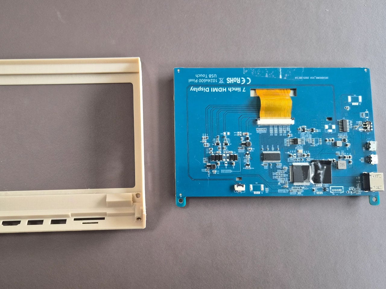
Rather than serving as a simple decorative shell, the M2x2 integrates several practical features that enhance its usability as a workstation. A slanted 7-inch IPS touchscreen is embedded in the front face of the structure, echoing the display graphic printed on the original LEGO piece while providing real functionality. The compact screen acts as a secondary interface, often used for quick system information or dashboards. Staal, for instance, uses it primarily to monitor and control his smart home through a Home Assistant interface while working on a larger external display.

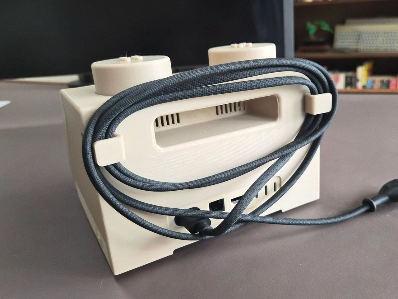
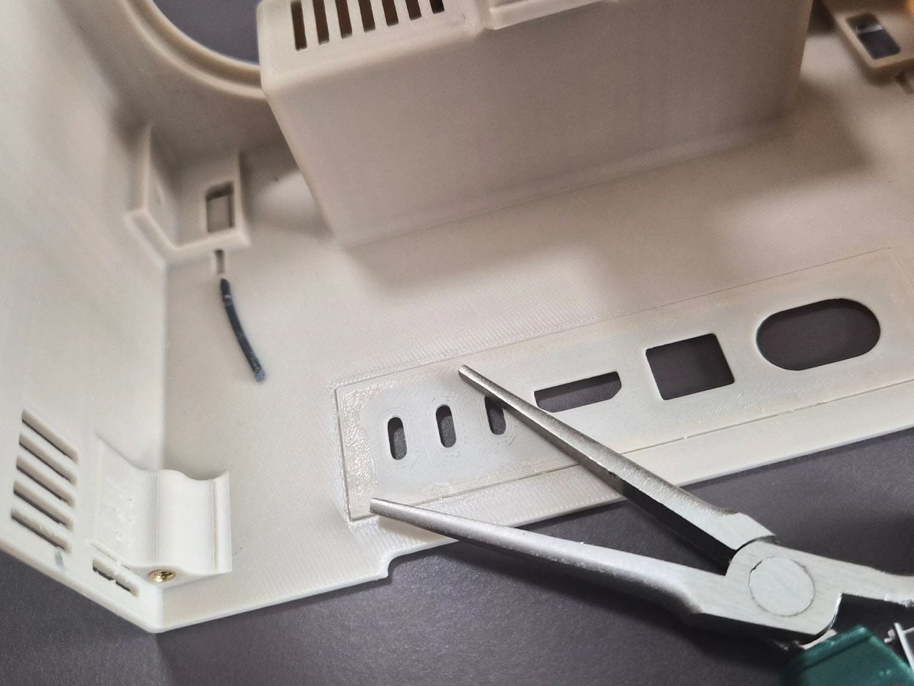
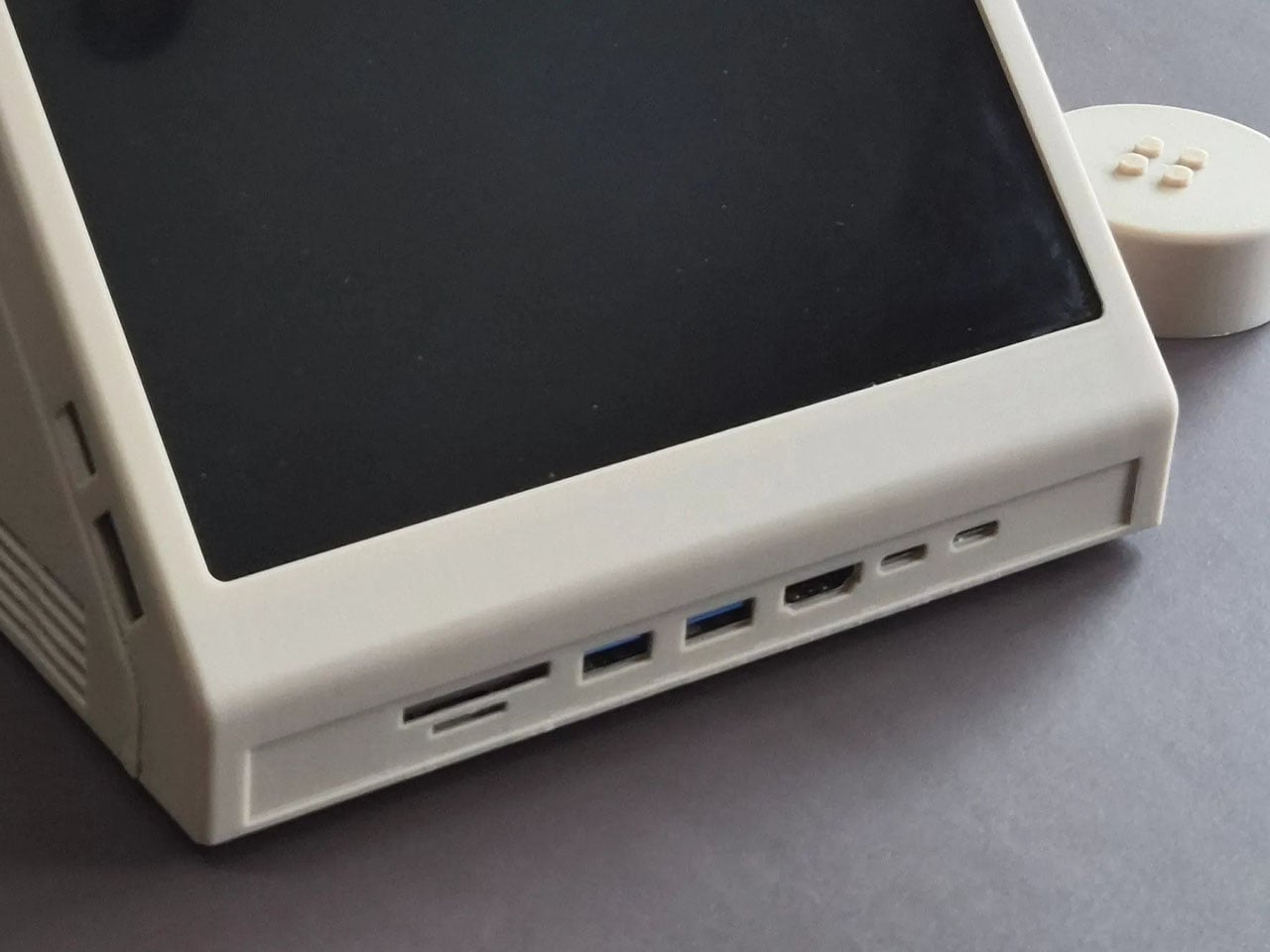
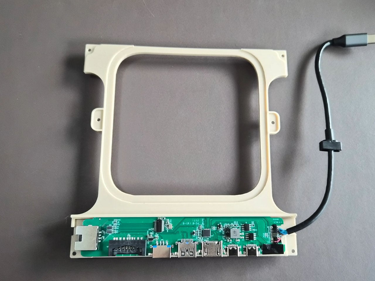
The case includes front-facing ports enabled through a USB-C hub, along with an SD card reader for easy access to external storage and accessories. This arrangement ensures the device remains practical for everyday use despite its playful form factor. The system also retains portability elements inspired by early Apple computers, including a built-in handle at the back that makes the unit easy to move around a desk or workspace. While the M2x2 works as a self-contained computer, it is typically paired with a larger external monitor for full productivity. In everyday use, the Mac mini handles the heavy computing tasks while the built-in display functions as a control panel or status screen.

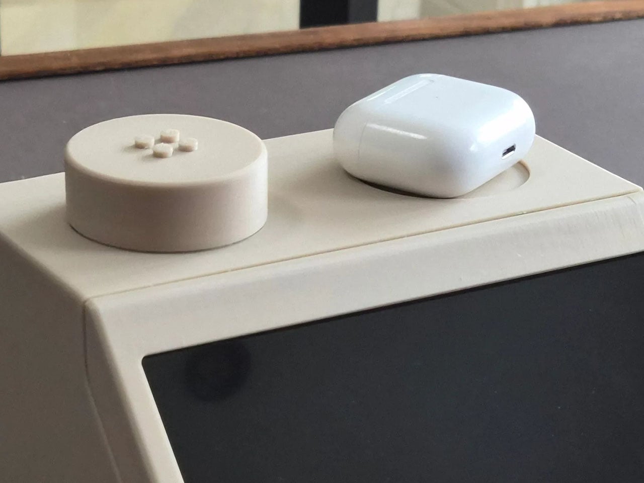
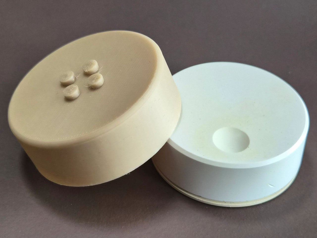
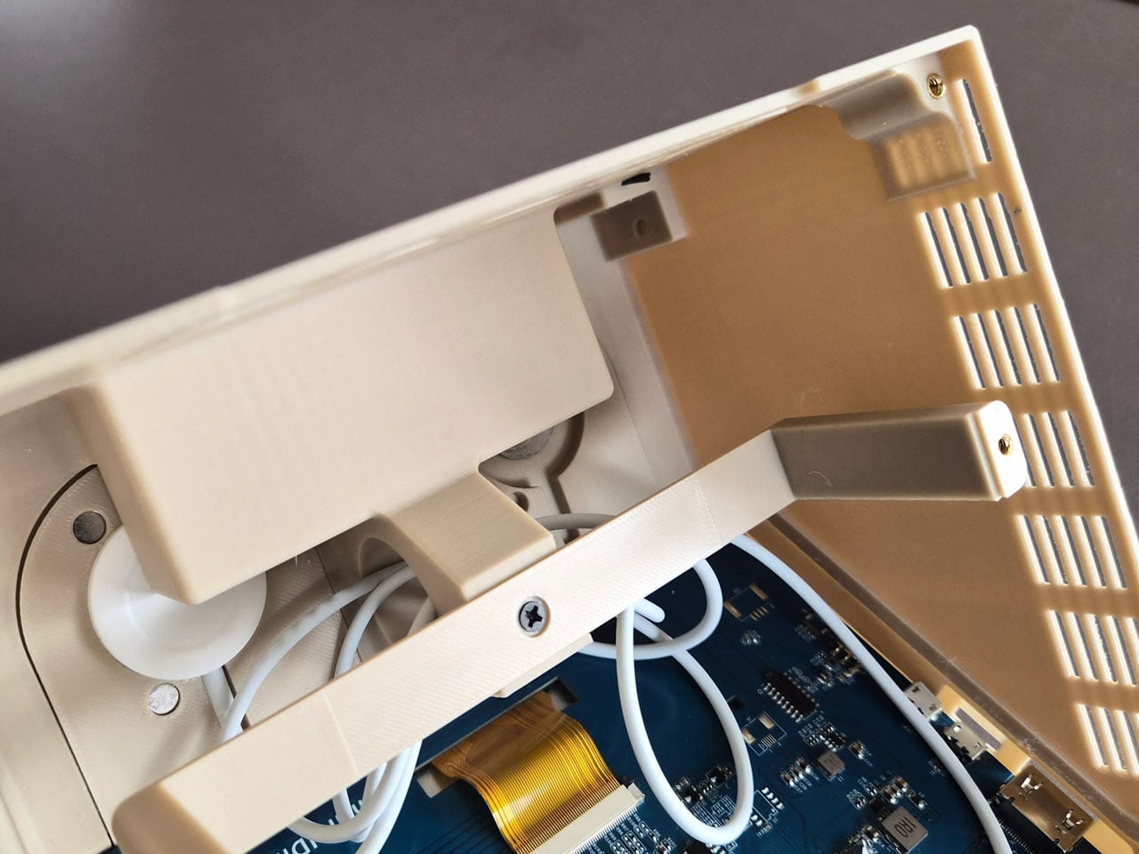
Perhaps the most creative detail lies in the oversized LEGO studs on top of the case. Instead of being purely decorative, these studs are designed to perform useful functions. One of them operates as a rotary control that can adjust volume or media playback, while the other conceals a wireless charging bay capable of powering devices such as AirPods or an Apple Watch. The studs themselves remain compatible with standard LEGO elements, allowing users to attach minifigures or bricks for a playful finishing touch.

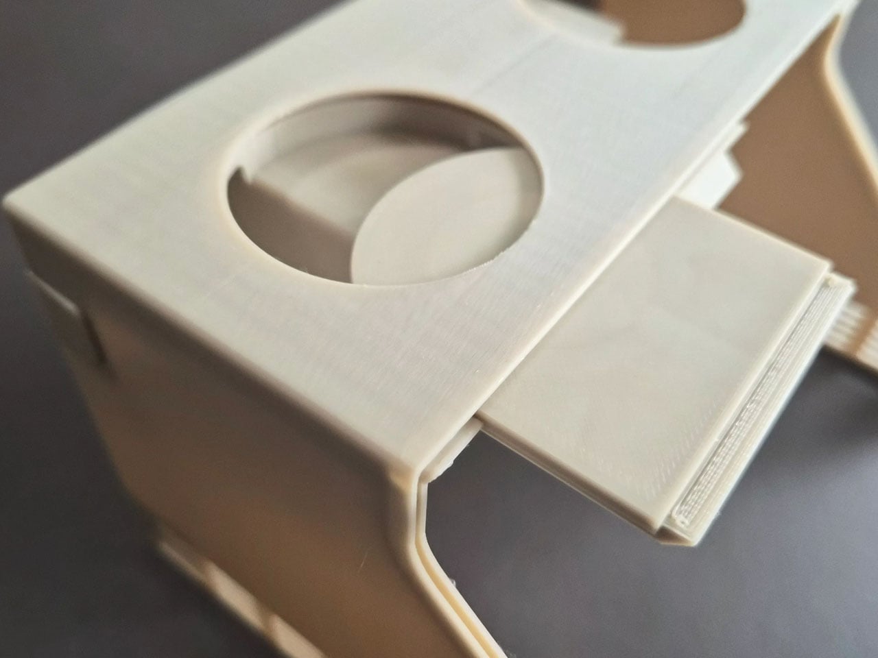
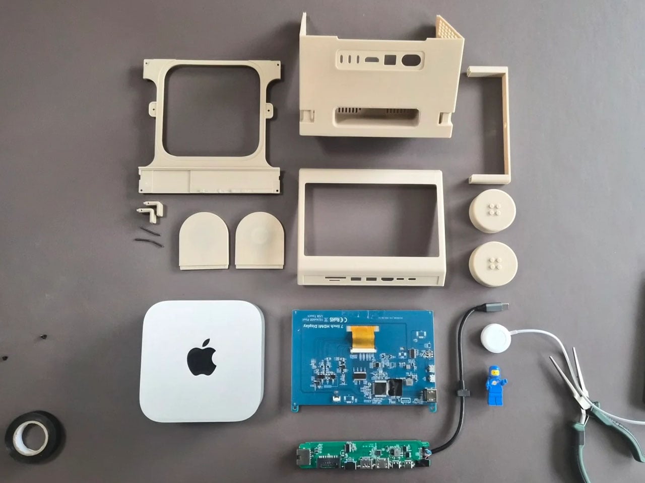
The M2x2 is largely built from 3D-printed components, making it accessible to enthusiasts who want to build their own version. Staal modeled the structure in CAD software and designed it as a modular system consisting of multiple printable parts. Aside from the Mac mini itself, the required materials are relatively simple, including PLA filament, a small touchscreen display, screws, and a USB-C hub. Assembly instructions and downloadable files are available, allowing makers to replicate or modify the design to suit their needs.

The post This classic 1979 LEGO computer brick hides a fully functional Mac mini workstation inside first appeared on Yanko Design.

This Baby Walker Grows With Your Child for 6 Years in 4 Different Ways

Most baby walkers have a shelf life measured in months. A 7-month-old wobbles through the living room gripping the handle, and by the time that same child turns two, the walker is already in a closet somewhere. The furniture cycle in a home with small children tends to follow that rhythm: buy, use briefly, replace with something else entirely.

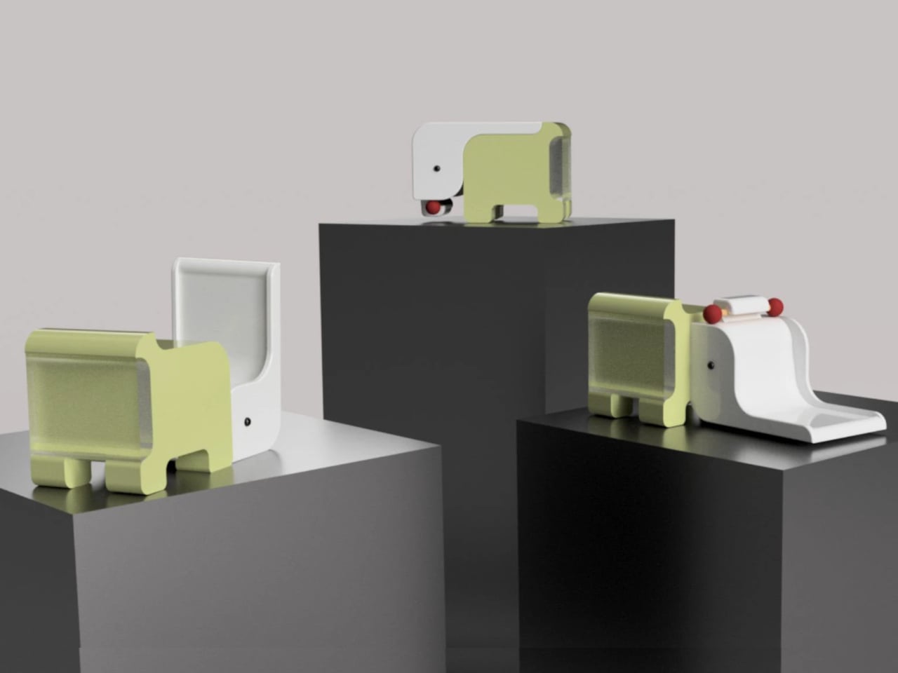
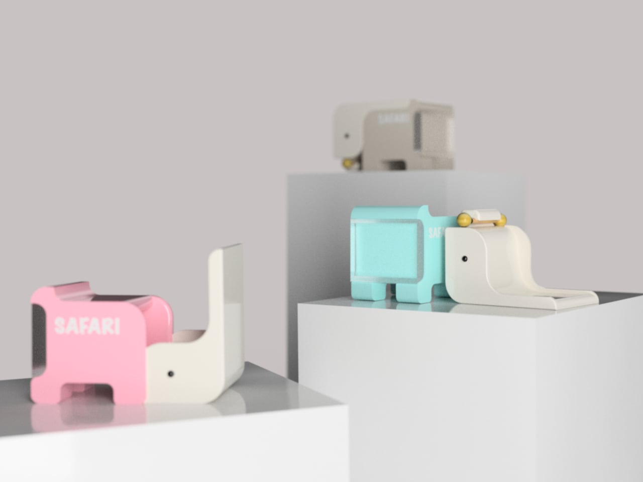
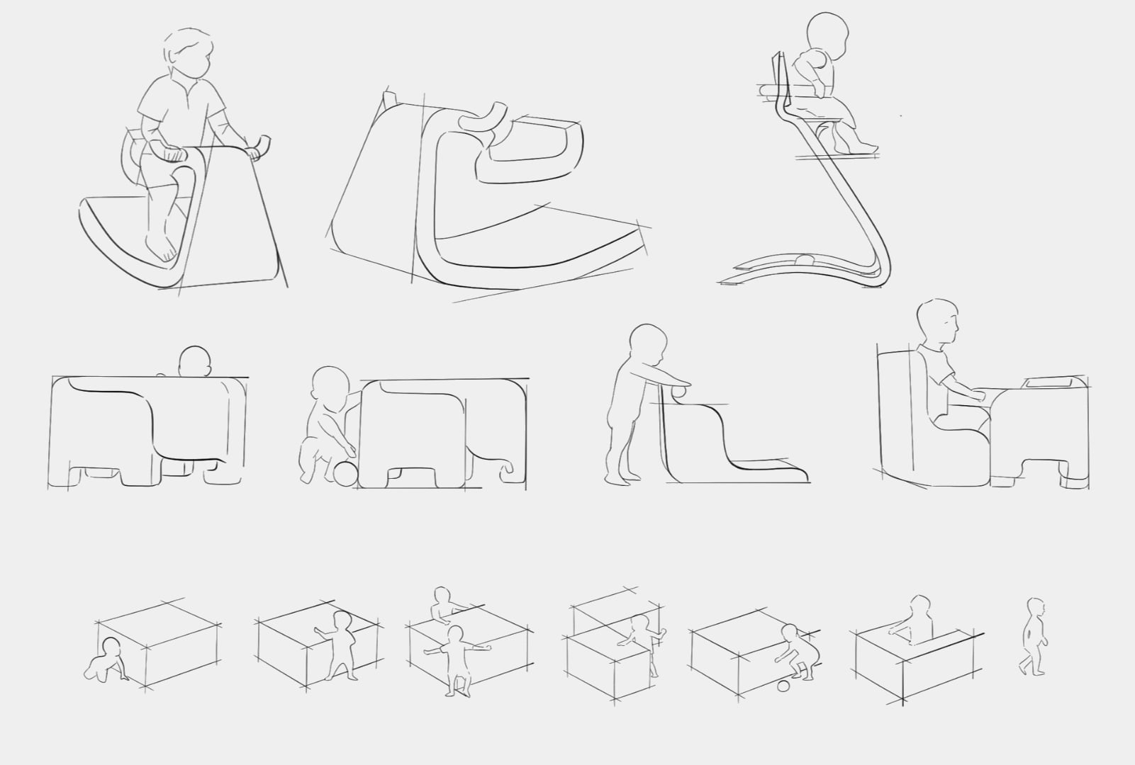
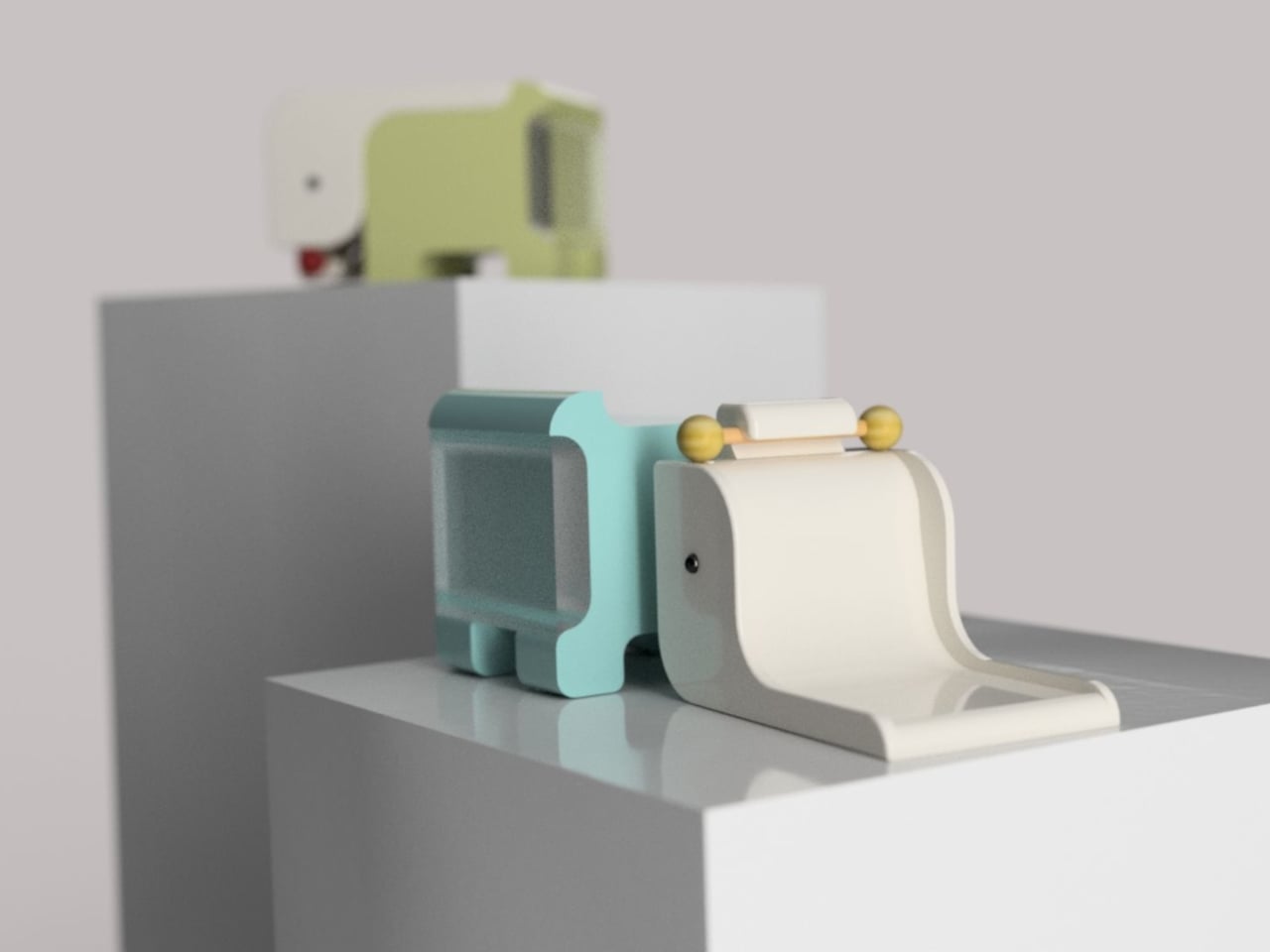
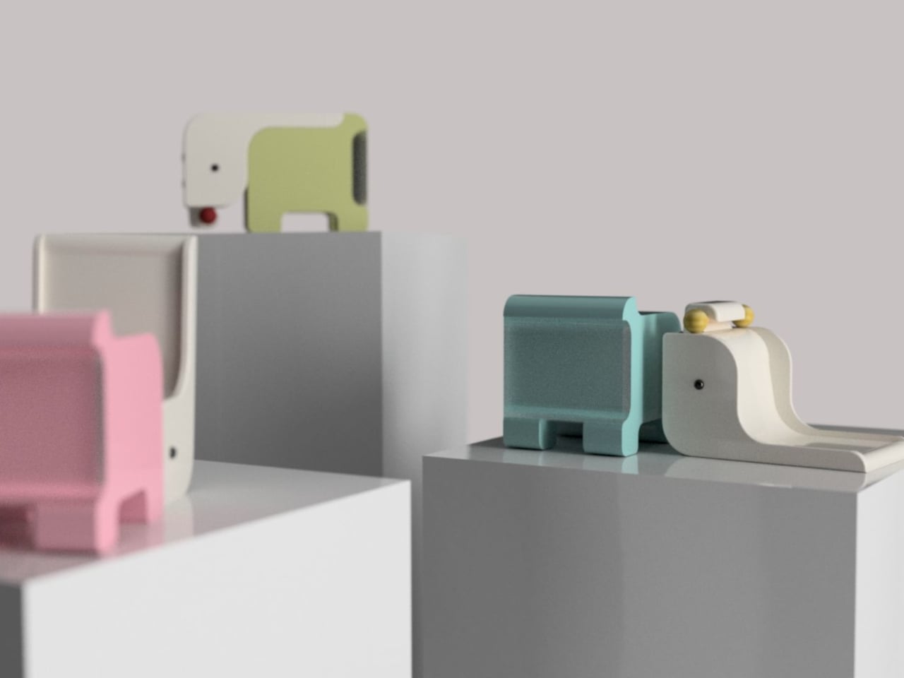
The Safari Multifunctional Kids Furniture concept tries to interrupt that pattern by designing one piece that stays useful across the first six years of a child’s life. The name “Step-N-Play” gives away two of its functions without mentioning the third or fourth. It is, depending on the child’s age and the day’s agenda, a walker, a climbing unit, a play table and chair, and a toy storage solution.

Designer: Bharti Upadhyay

At its earliest stage, the walker is built for children between 6 and 18 months, with a frame measuring approximately 600 x 400 x 500 mm. The structure combines wood, ABS plastic, and soft silicone grips, with a 95-degree backrest angle designed for infants who are not yet seated with full stability. An anti-tip base and anti-pinch safety gaps cover the more obvious hazards of putting a barely mobile child in contact with a moving object.

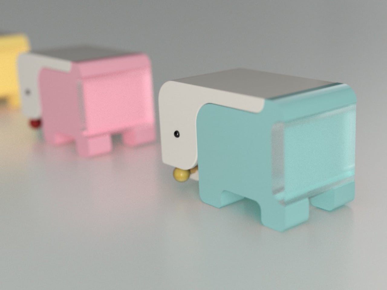
As the child grows into the 1-to-3 age window, the same structure becomes a climbable stair unit. From ages 2 to 6, it transitions again into a play table and chair. A built-in storage compartment for toys and books operates across all configurations. The manufacturing approach pairs CNC-cut wood with injection-molded ABS plastic, a combination suited to years of contact with small hands and the occasional harder object.

The safari animal inspiration shows up in organic silhouettes and surface language rather than in literal animal sculptures attached to the frame. Smooth curves, generous fillets, and chamfered grooves define the form. The pastel color palette, wooden handles, and textured sensory balls read as a considered aesthetic choice rather than an afterthought, which matters in a living space where parents also have to look at the thing.

Safari is a student concept at this stage, so the harder questions remain open. How the ergonomics hold across such a wide age range, how the mechanical transitions between configurations actually work in practice, and whether a single object can genuinely serve a 7-month-old and a 6-year-old with equal competence rather than adequacy are things a physical prototype would need to answer.

The post This Baby Walker Grows With Your Child for 6 Years in 4 Different Ways first appeared on Yanko Design.
A Student Built a Pocket Planet Tracker That Works Without Your Phone

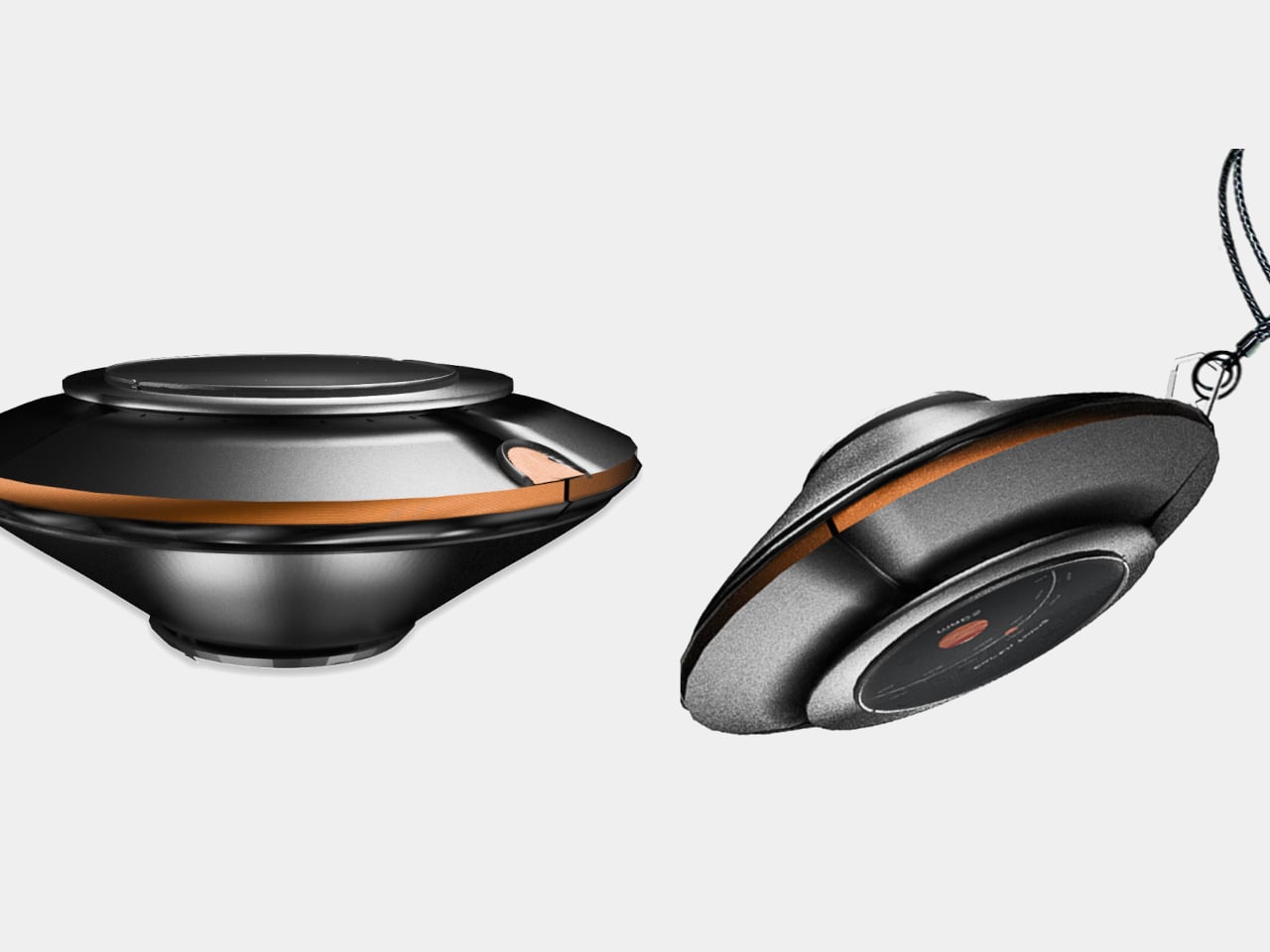
Most of us have looked up at the night sky at some point and felt that brief, humbling recognition that there is an enormous universe out there, and we have no idea what is happening in it. Then a notification comes in, and the moment passes. Lumen Orbit, a student concept from CEPT University, is a small handheld accessory designed to keep that awareness alive without requiring a telescope, a star chart, or a dedicated app.

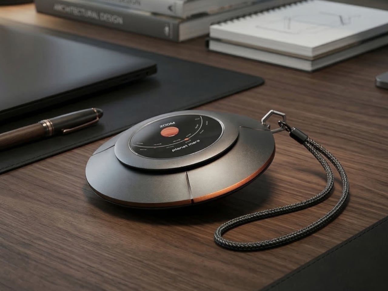
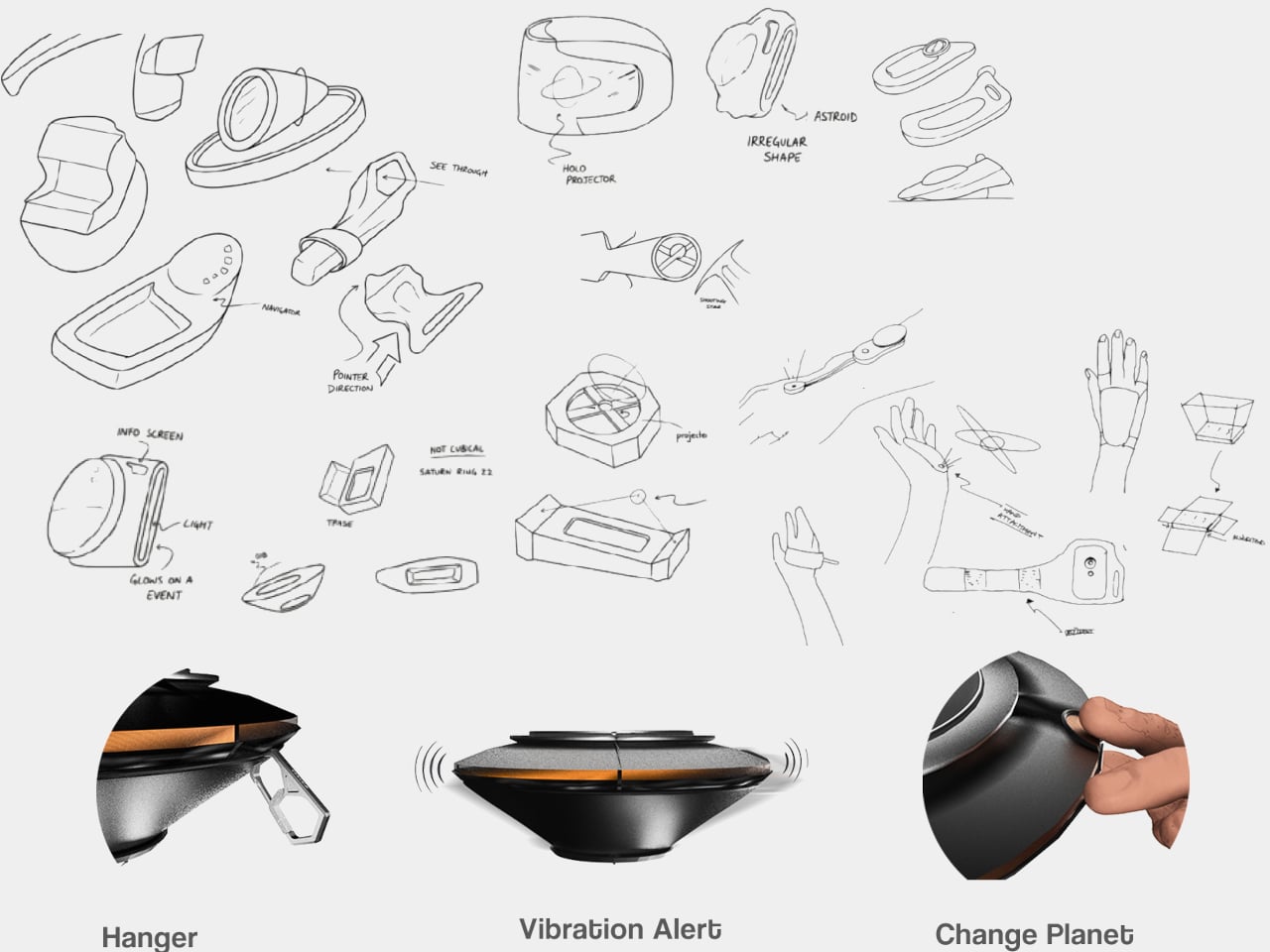
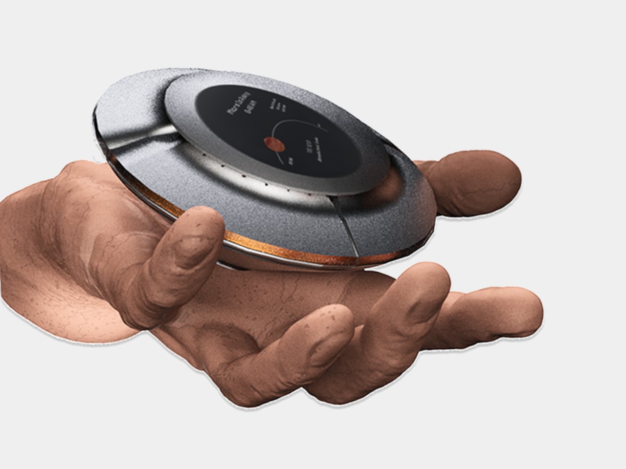
The device is disc-shaped and roughly palm-sized, with a two-part body split along its equator by a copper-toned accent band. The upper half is a polished silver-gray cap; the lower sits wider and shallower in a dark matte gunmetal finish. A woven braided lanyard with a hexagonal metal clasp attaches to the body, making it something you can loop around a wrist, hook to a bag, or hang using a built-in fold-out carabiner.

Designer: Kinshuk Agarwal

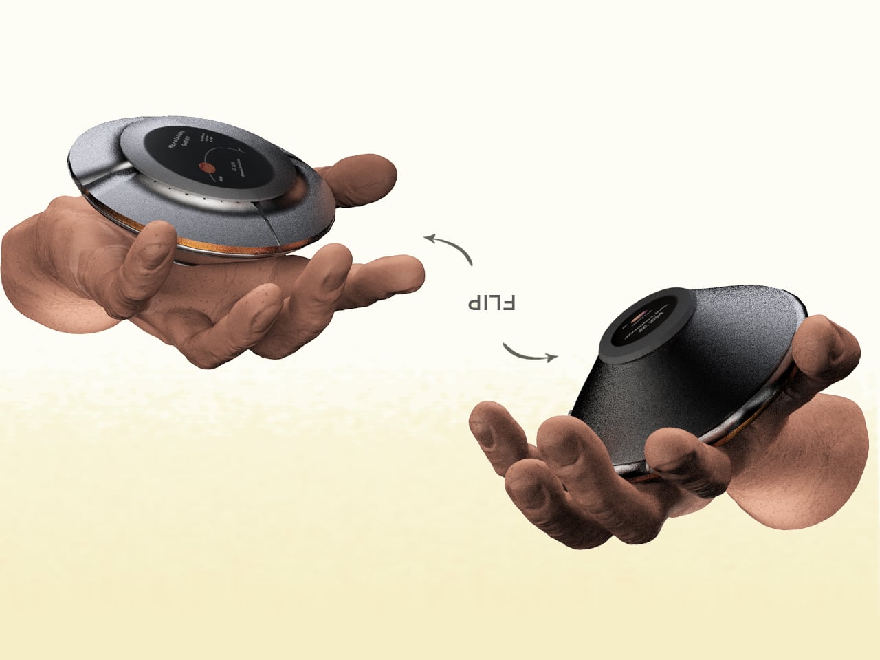
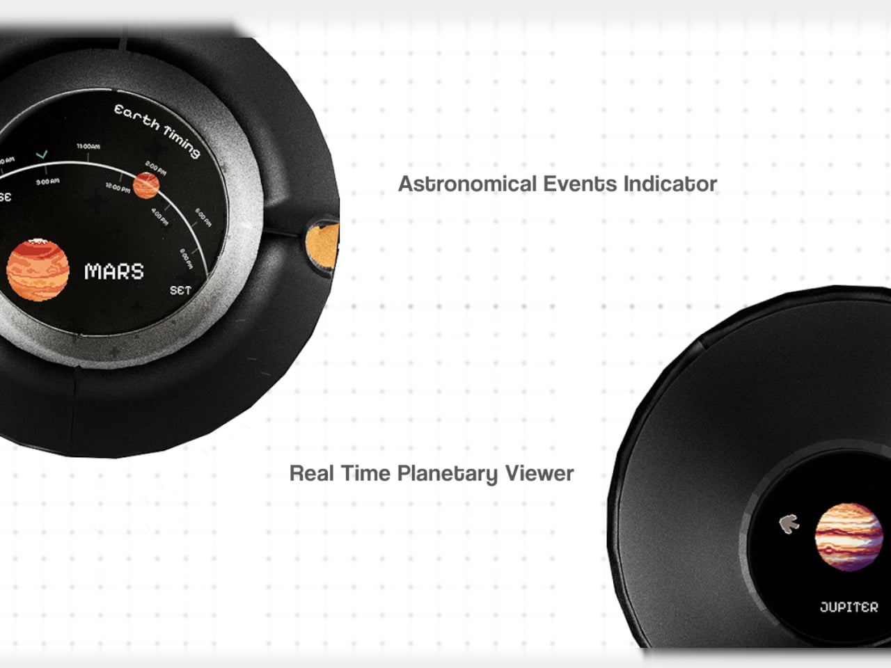
The primary face carries a circular display showing real-time planetary positions: which planet is currently visible, where it sits in the sky relative to your location, and when it rises and sets. Flip the device over, and a second, smaller screen on the reverse offers a close-up planetary render. The UI uses pixel-art-style graphics for its planet illustrations, landing somewhere between retro charm and deliberate restraint.

The interaction model is equally considered. A flip gesture switches between the two display modes, squeezing the body cycles through planets, and haptic vibration signals astronomical events such as meteor showers, eclipses, and alignments. The idea is that information about the cosmos arrives the same way a text message does, as a quiet nudge rather than something you have to actively seek out.

What the concept is really proposing is a dedicated single-purpose ambient device for astronomical awareness. Smartphones can technically do all of this through apps, but a specialized physical object changes the relationship to the information entirely. Carrying something whose only purpose is to connect you to the solar system is a genuinely different proposition than opening an app between emails.

The open questions are substantial. How the real-time tracking handles connectivity, how the device charges, and how positional accuracy works without confirmed GPS integration are things the concept leaves unspecified. The form is confident, and the interaction logic is coherent. The more interesting problem is whether a working version could fit into a jacket pocket for easy access.

The post A Student Built a Pocket Planet Tracker That Works Without Your Phone first appeared on Yanko Design.
Coleman’s $200 Cooler Chills for 2 Days, Folds Flat in 10 Seconds

Coolers are great until the trip ends. Then they become a large, oddly shaped object that takes up the entire trunk on the way home, sits on the garage floor for a month, and eventually gets shoved into whatever corner will take it. For apartment dwellers especially, owning a full-sized hard cooler is less a convenience and more a spatial negotiation that rarely ends well.

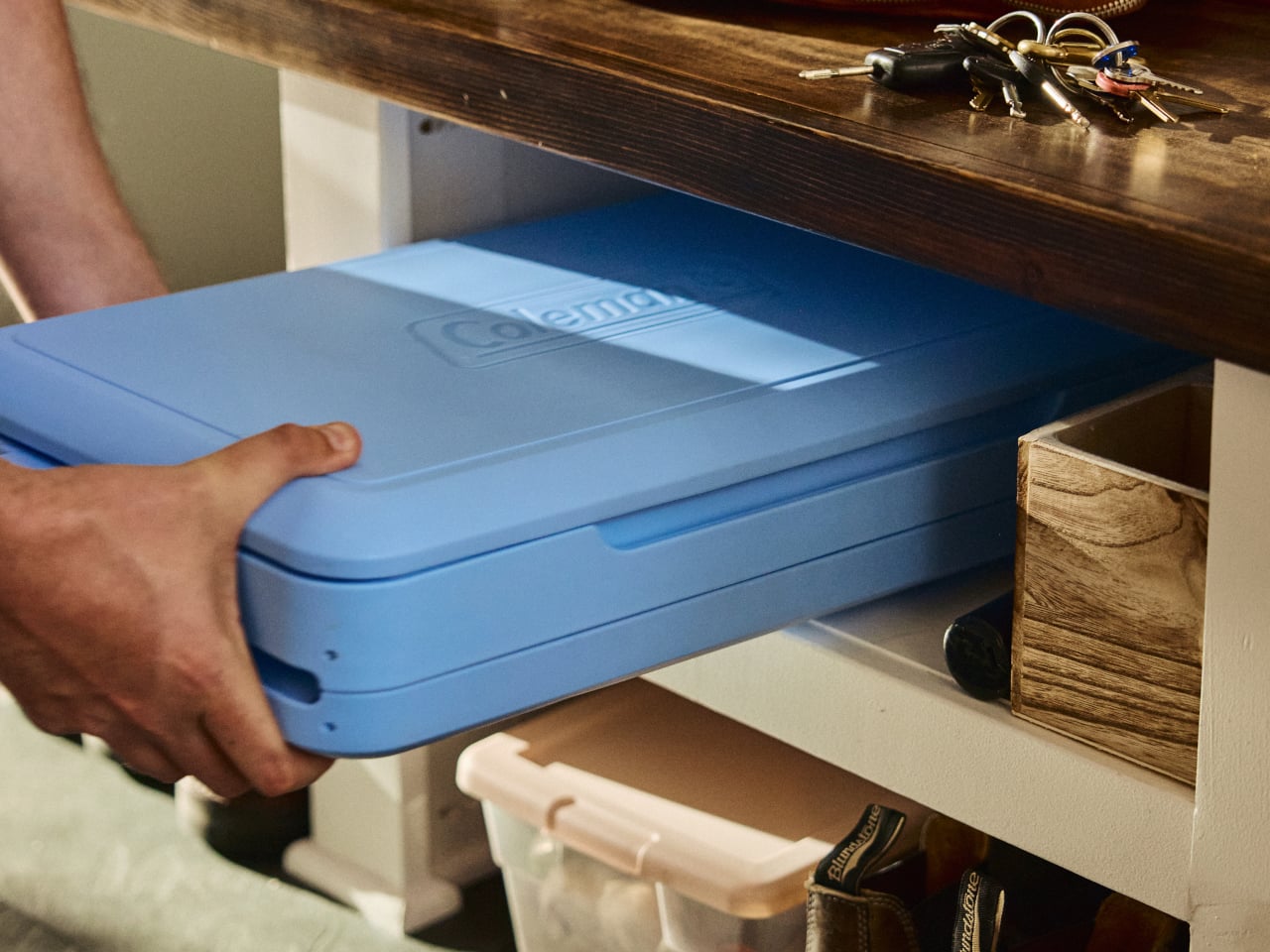
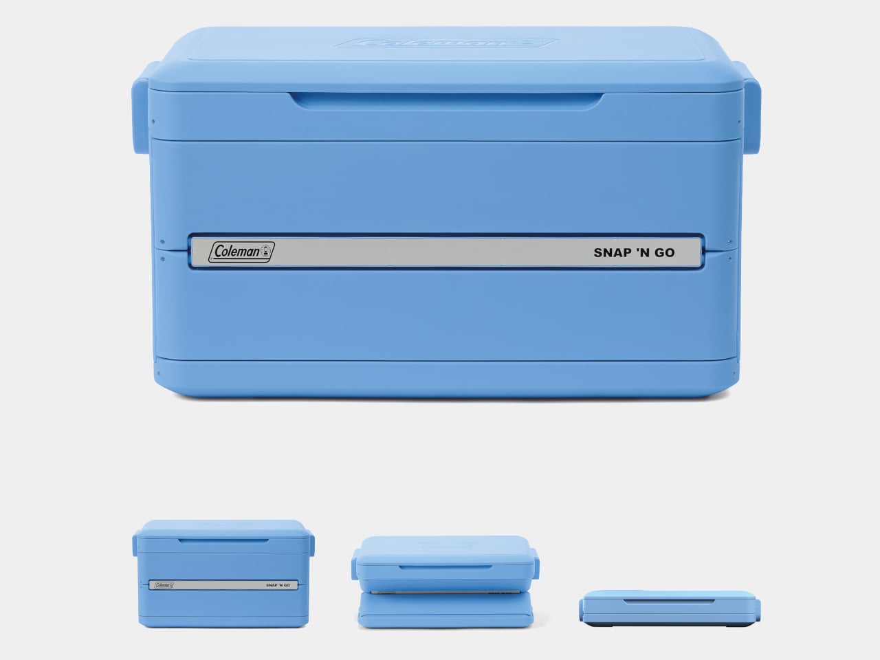
Coleman’s Snap ‘N Go is a hard-sided cooler with a patent-pending collapsible design that compresses to one-third of its open volume in under 10 seconds. The mechanism borrows logic from folding storage crates: the body panels snap down in sequence, and the removable interior liner folds flat and stows inside the lid. What was a full-sized cooler becomes a flat slab thin enough to slide under a bed or stand upright on a shelf between uses.

Designer: Coleman

The construction is hard polypropylene, which matters more than it sounds. Soft collapsible coolers already exist, but they sacrifice insulation to achieve that flexibility. The Snap ‘N Go maintains a fully insulated lid and body, rated to hold ice for up to 64 hours. That’s two full days of cold retention from something that, an hour later, disappears into a closet, which is a combination the soft-sided category has never managed.

1

Setup works in reverse, just as quickly. From flat storage to loaded and latched takes under 10 seconds, and the removable liner handles watertight containment once the body is expanded. The liner also makes post-trip cleanup more manageable, since it pulls out separately rather than requiring the whole cooler to be rinsed out and dried upright somewhere. It’s a small detail, but one that addresses one of the more tedious parts of cooler ownership.

Three sizes cover most group sizes: 35 qt at $200, 45 qt at $220, and 55 qt at $240. The 55-qt model holds up to 93 cans without ice and supports 200 lbs. when expanded, though Coleman is careful to note it isn’t intended as a seat. Handles are designed to accommodate both carry orientations, vertical when the cooler is collapsed flat and horizontal when it’s fully open and loaded.

The one question the design raises, and doesn’t fully answer yet, is how the collapsible mechanism ages. The hinges, panel connections, and liner attachment points are all doing repetitive work that a standard molded cooler body never has to perform. Coleman backs it with a three-year limited warranty, which covers the expected lifespan question in practical terms but doesn’t tell you much about what happens in year four after a few dozen collapse cycles on a tailgate.

The post Coleman’s $200 Cooler Chills for 2 Days, Folds Flat in 10 Seconds first appeared on Yanko Design.
The $199 VITA RING Wakes You Up Mid-Apnea Before You Ever Know It Happened Thanks To AI Health Tracking

The fact that you have to charge your Apple Watch every 48 hours means there’s a small sliver of time in the day where it isn’t capturing data. Your body uses sleep to run its most important maintenance cycles, and the biometric signals during those hours carry real diagnostic weight: heart rate variability, breathing quality, blood oxygen levels during deep rest. These are the readings that can flag early signs of atrial fibrillation, sleep apnea, or chronic stress load well before symptoms appear in your waking hours. A device sitting on your nightstand during this window captures none of it. The form factor that makes the most sense for genuine 24/7 health tracking turns out to be one that never needs to come off. Something like a ring.

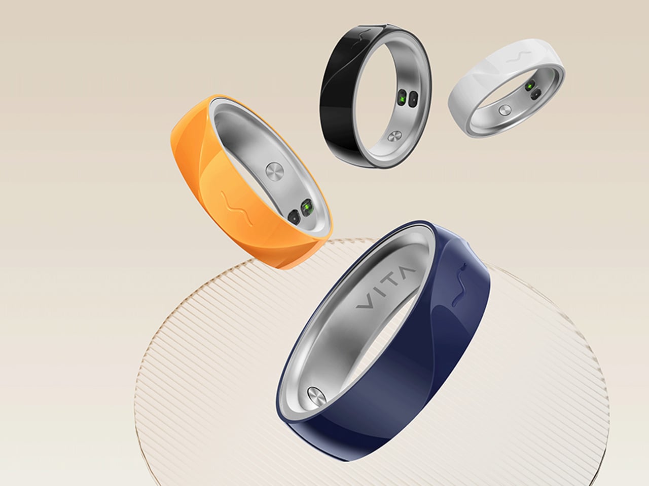
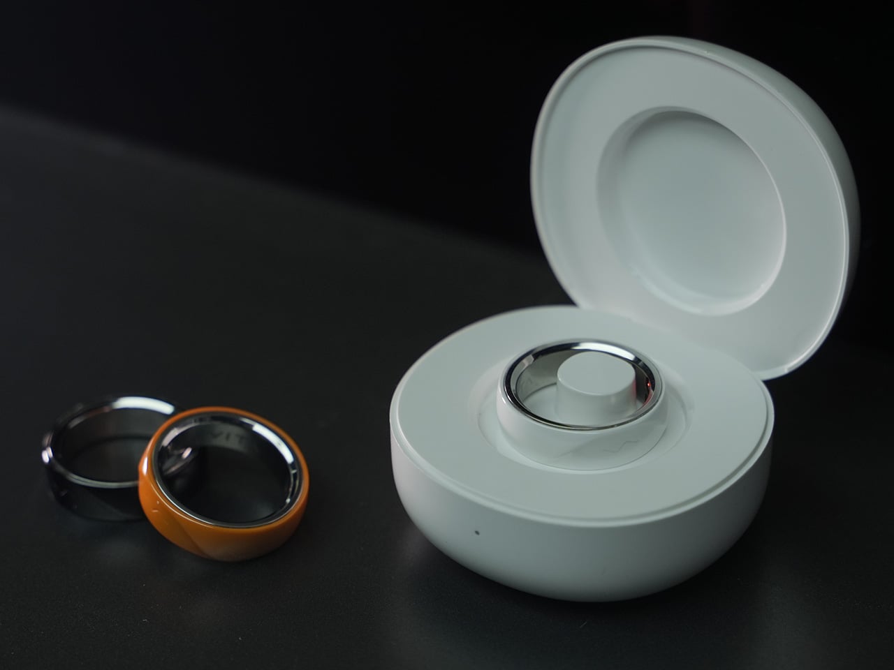
The VITA RING leans into this idea with a design that prioritizes both elegance and endurance. It uses a polished Aerospace Ceramic for its outer body, a material that feels more like a piece of refined jewelry than a piece of consumer electronics, and is 3x harder and scratch-resistant compared to titanium. This results in a device you are willing to live with twenty-four hours a day. With a battery that lasts up to a week on a single charge, it closes the data gap left by other wearables and operates silently in the background, using gentle haptic vibrations to deliver important alerts. It’s a design that ensures the ring remains forgotten until it has something important to share.

Designer: VITA TECHNOLOGY INC

Click Here to Buy Now: $199 $399 ($200 off).

VITA’s core proposition organizes around three verbs: Alert, Advise, Act. The ring’s Multi-Agent Health System tracks over 17 health metrics continuously, watching for deviations from your personal baseline rather than population-level averages. When something shifts meaningfully, a gentle haptic pulse is the only output, keeping the alert channel completely separate from the noise of your phone screen. The AI layer contextualizes what it finds, identifying patterns across sleep, stress, recovery, and activity to surface insights specific to your body. For a market that has treated data volume as a proxy for intelligence, that distinction matters.

Where VITA separates itself is in how it handles sleep. Most trackers deliver a score after the fact; VITA monitors sleep stages, breathing quality, and runs Apnea Intervention in real time. The ring detects disrupted breathing and responds with a gentle vibration prompting the user to shift position, often helping restore a more regular breathing pattern. Sleep apnea affects an estimated 936 million people globally, the majority of them undiagnosed, and real-time intervention at the consumer level addresses a clinical gap most wearables have stepped around entirely. The seven-day battery earns its keep here specifically, because consistent nightly data is how health patterns actually emerge.

“In Tune With You” is VITA’s attempt to build women’s health tracking around biology rather than calendar math, covering cycle awareness, fertility window detection, and pregnancy monitoring, all anchored in continuous biometric data. Most mainstream wearables approach this space with a period date counter and little else. Layering temperature shifts and HRV patterns onto reproductive health tracking delivers a different category of insight, capable of identifying a fertile window or flagging a physiological change earlier than any date-based system. Women’s health has been chronically under-engineered in consumer wearables, and making it a first-class feature is a deliberate product statement.

Circle of Care extends private health monitoring into a shared experience, letting users choose which wellness insights to share with trusted contacts alongside AI-guided care tips and relevant context. The Emergency SOS feature lets users send their live GPS location to those same contacts with a single tap when they cannot reach their phone. For adult children with aging parents, or anyone managing a chronic condition within a family dynamic, this broadens the ring’s utility considerably. Health monitored in isolation often goes unacknowledged, and VITA has built the architecture to change that.

Oura Ring charges $5.99 a month for premium features on top of the hardware cost. WHOOP’s entire model is subscription-based, with users paying around $30 a month to access their own data. VITA is different: core health tracking is completely free, but AI Health features require a subscription. Kickstarter backers get 1 year of AI Health features at no extra cost. The VIP pre-launch price sits at $179, representing 53% off eventual retail, and early backers who sign up before March 17 receive a free sizing kit. The real measure of whether it all holds up comes when hardware reaches users, but the pricing structure alone will earn serious attention in a market that has normalized subscription fatigue.

Click Here to Buy Now: $199 $399 ($200 off).

The post The $199 VITA RING Wakes You Up Mid-Apnea Before You Ever Know It Happened Thanks To AI Health Tracking first appeared on Yanko Design.

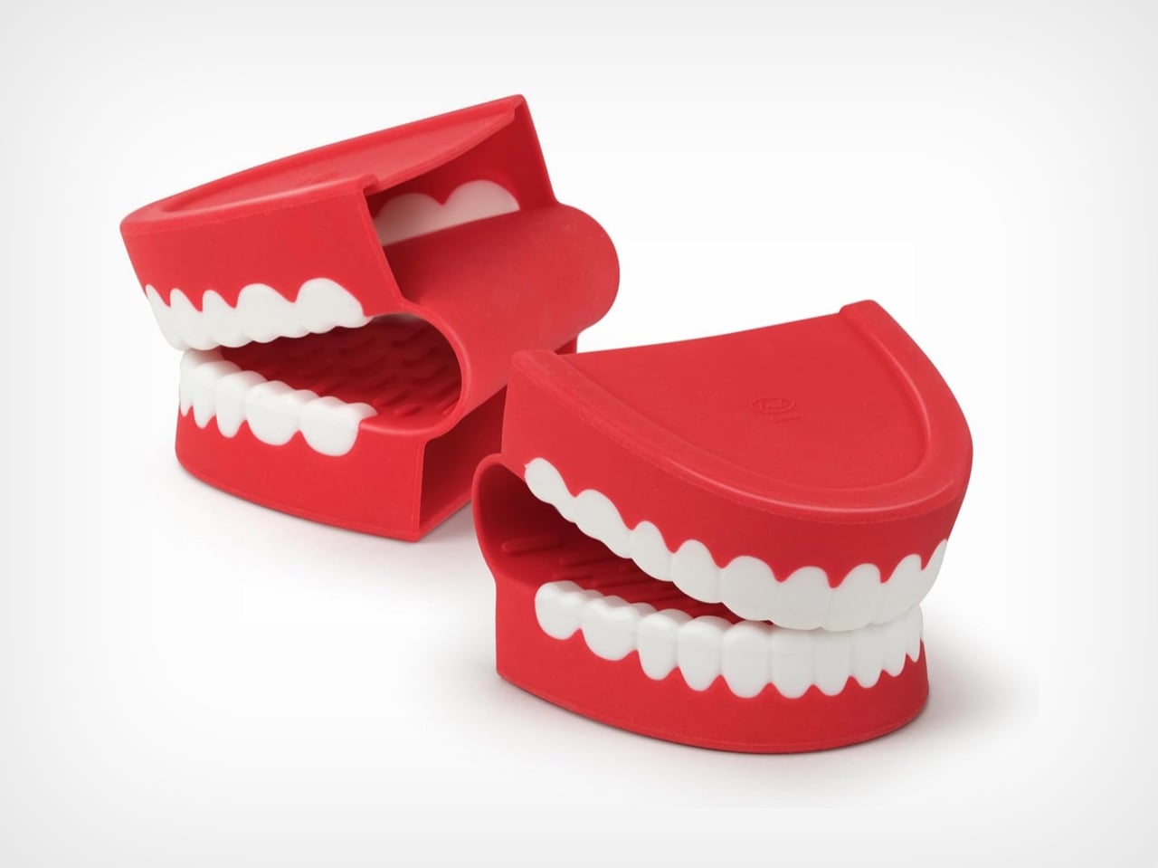
These $18 Chattering Teeth Pot Holders Are Stupidly Adorable and Oven-Safe, and I Need Them Immediately

Your kitchen drawer probably has a sad, stained oven mitt that you keep meaning to replace. Chomp is the universe telling you it’s time. Fred’s newest pot holders are shaped like classic wind-up chattering teeth, molded in heat-resistant silicone, and completely aware of how ridiculous they look gripping both sides of your Sunday pot roast. You will use them once, cackle, and then refuse to use anything else for the rest of your cooking life. This is not a warning. This is a promise.

The concept is almost insultingly simple: a set of two silicone pot holders shaped like classic wind-up chattering teeth, designed to grip hot pots and handles while looking like your cookware is being accosted by novelty dentures. You slip your fingers into the top jaw, curl them around a handle, and suddenly a completely ordinary Tuesday pasta situation becomes a bit. The pot is being chomped. The pot has opinions. The pot wants to talk. Nobody at the dinner table will be able to explain why this is so funny, but everyone will agree that it is.

Designer: Jennifer Norwood (Fred Studio)

Click Here to Buy Now

Functionally, the Chomp hasn’t cut corners to serve the joke. They’re made from BPA-free, heat-resistant silicone rated up to 450 degrees Fahrenheit (230 degrees Celsius), which covers everything from stovetop handles to oven roasting pans without breaking a sweat. The inside surface is grippy, the mitts lay flat for drawer storage, and the whole set is dishwasher safe, so post-roast chicken cleanup doesn’t require any special handling of your unhinged dentistry accessories. The compact form factor is a deliberate choice too. These work as mini mitts for grabbing handles, lifting lids, and pulling racks rather than full-coverage gloves, which is honestly the more useful format for everyday cooking anyway.

Fred (a kitchen accessory company, not a person named Fred), based out of Pawtucket, Rhode Island, has always been in the business of taking functional everyday products and twisting them into something unexpected and funny. They’ve done creature-mouth oven mitts before, but Chomp hits differently because the chattering teeth aren’t just a cute mouth shape lifted from nowhere. The wind-up chattering teeth toy has been a Halloween staple, a joke shop fixture, and a universal shorthand for low-budget absurdist comedy for decades. Applying that specific cultural weight to kitchen silicone is a genuinely sharp act of object quotation, the kind that makes you wonder why nobody did it sooner.

The set was designed by Jennifer Norwood at Fred Studio, and the sculpting earns its keep. The white molded teeth have the right rounded, cartoonish geometry that reads as instantly recognizable rather than vaguely tooth-shaped, the red gum color lands vivid without tipping into garish, and the two pieces together form a perfectly matched pair. Sitting on a counter, they look like a prop from a sketch show. Clamped onto a cast iron skillet, they look like the skillet has developed a strong personality and several unresolved grievances. Both are correct. Both are good.

At $18.60 for the pair, Chomp is an easy call. It’s a justifiable impulse buy for yourself and a completely effortless gift decision for anyone who spends time in a kitchen, which is most people. The bar for a great housewarming gift is “useful and memorable,” and a pot holder that makes someone laugh out loud the first time they use it clears that bar with room to spare.

Click Here to Buy Now

The post These $18 Chattering Teeth Pot Holders Are Stupidly Adorable and Oven-Safe, and I Need Them Immediately first appeared on Yanko Design.
A Chair Shaped by the Soft Curves of a Classic British Scally Cap

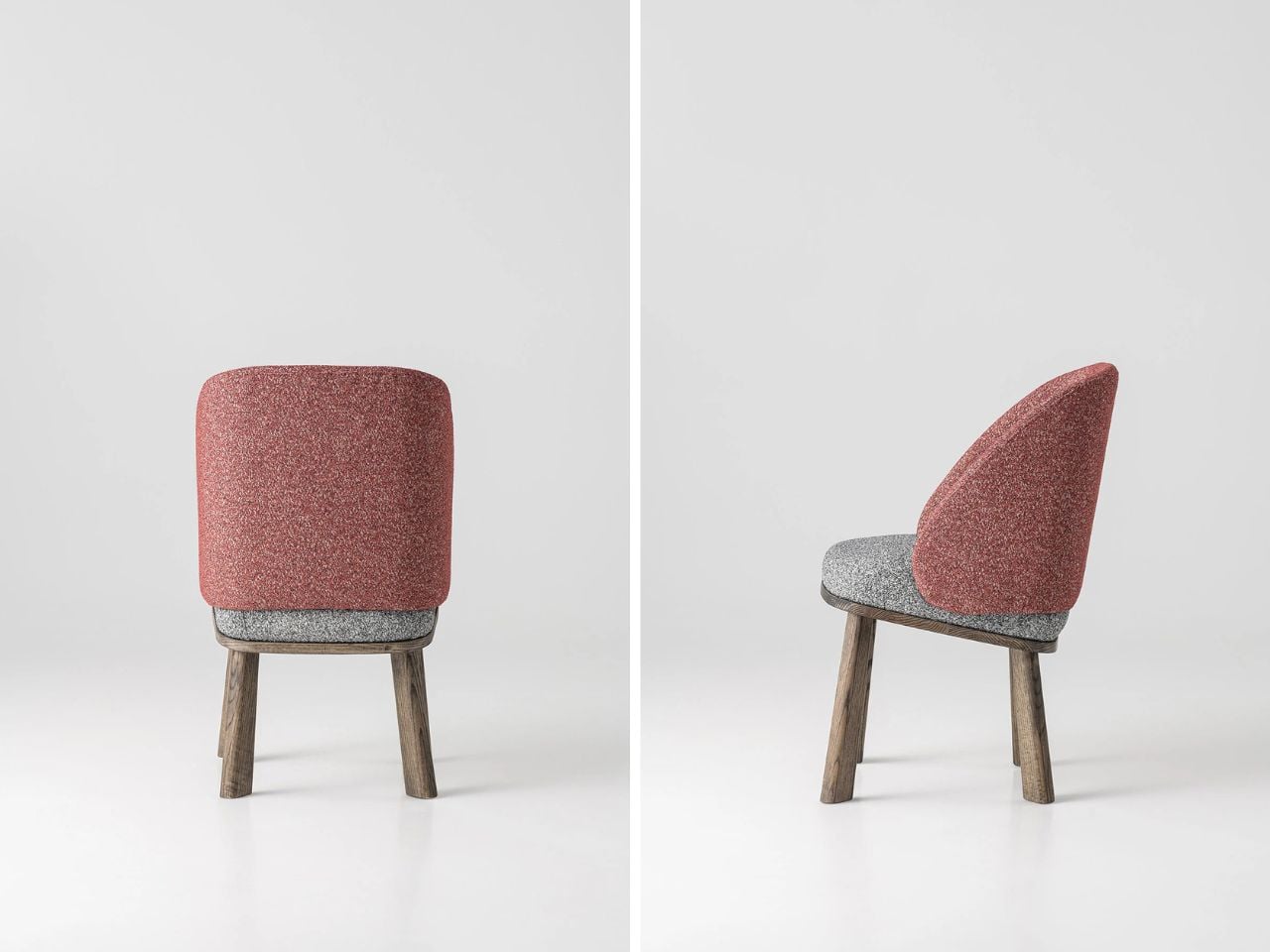
In a market full of furniture that competes loudly for attention, the pieces that often stay with us the longest are the ones that begin with a simple idea and a strong story. The Scally Chair is a beautiful example of this kind of design thinking. Its inspiration comes from something very familiar in British culture, the classic men’s scally cap. What is fascinating is how a small everyday object, such as a cap, can inspire the form of a chair and translate into a thoughtful piece of furniture.

The starting point of the design is an image. Instead of beginning with strict structural rules or purely functional decisions, the designer began with the recognizable shape of the scally cap. These caps are known for their soft, rounded crown and their distinct front visor. They have personality and a casual confidence that people instantly recognize. The Scally Chair translates these qualities into furniture in a subtle and elegant way.

Designer: Julia Kononenko

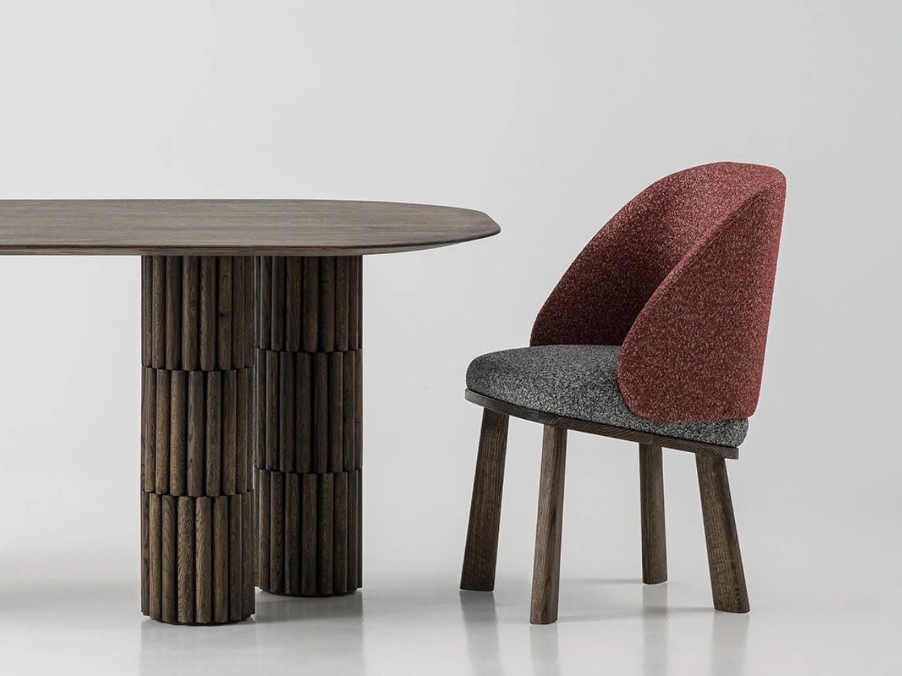
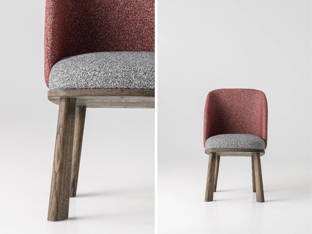
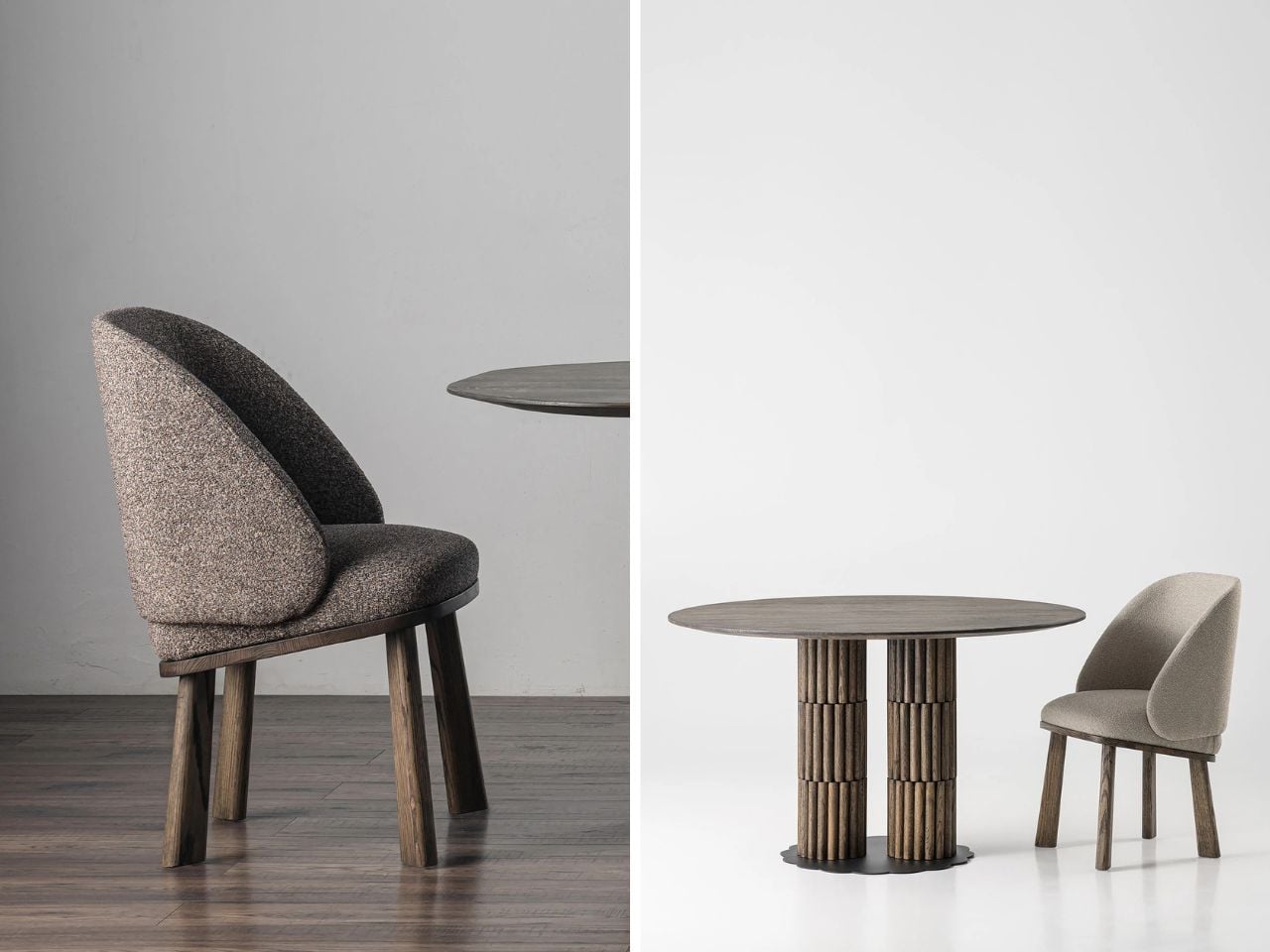
The rounded backrest is the most noticeable expression of this inspiration. It curves around the seat in a gentle way that recalls the soft crown of the cap. The form feels inviting and protective, almost as if the chair quietly embraces the person sitting in it. This small gesture adds a sense of intimacy and comfort while maintaining a clean and confident silhouette.

Another thoughtful detail appears at the front of the seat. The edge is slightly lifted in a gentle curve that echoes the visor of the cap. At first glance, the detail is subtle and easy to miss, but once you notice it the connection becomes clear. Instead of making the design too literal or predictable, this small reference adds character to the chair without overwhelming its form. It also introduces a sense of lightness and movement to the silhouette, making the chair feel more dynamic and visually balanced.

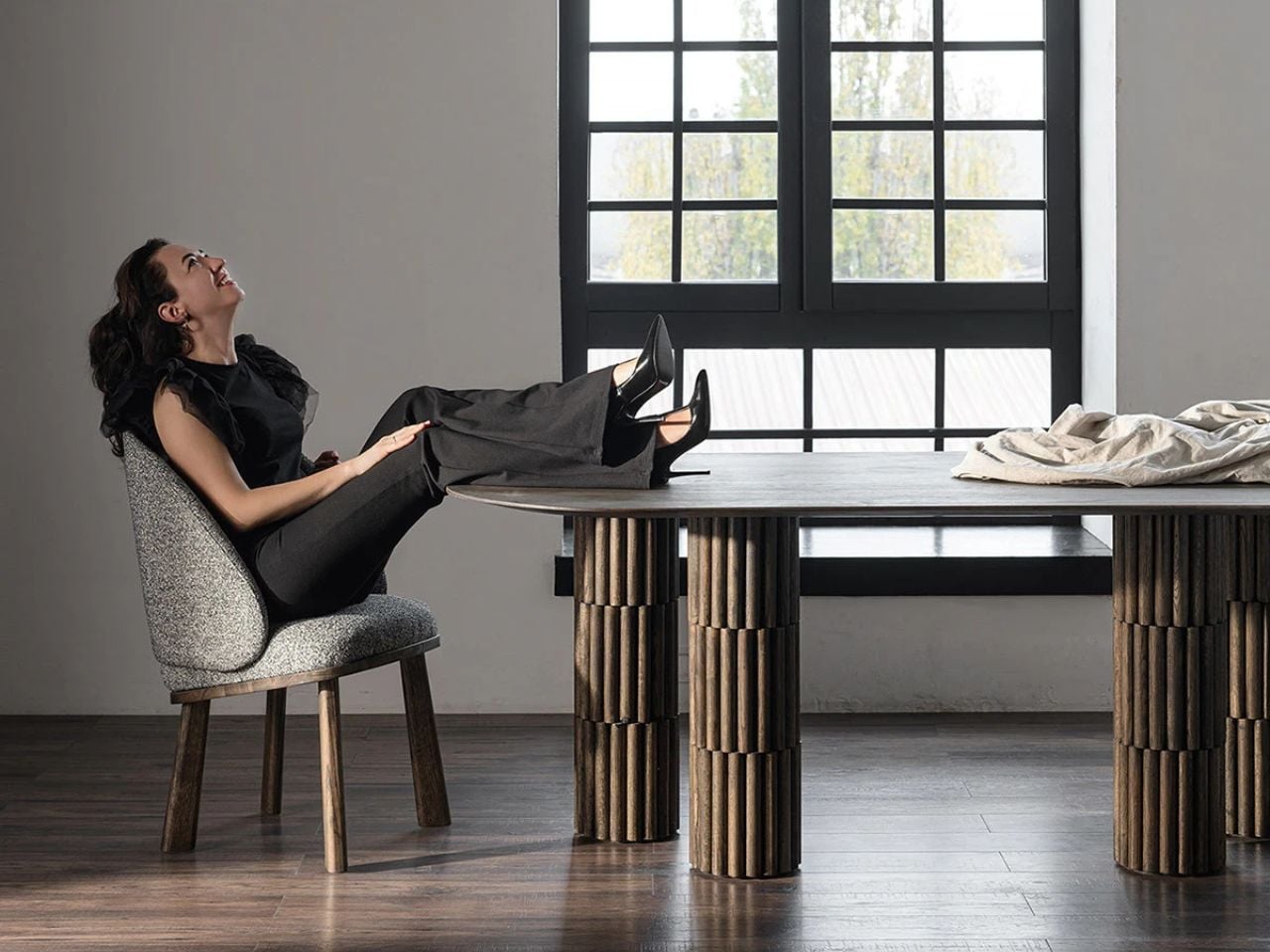
Material plays an important role in the experience of the Scally Chair. The use of wood brings warmth and authenticity to the design. Wood has a timeless quality that connects furniture to craftsmanship and longevity. It adds natural texture and depth to the chair while grounding the form in something familiar and tactile. The presence of wood also allows the chair to age gracefully over time, making it feel like a lasting object rather than a temporary trend.

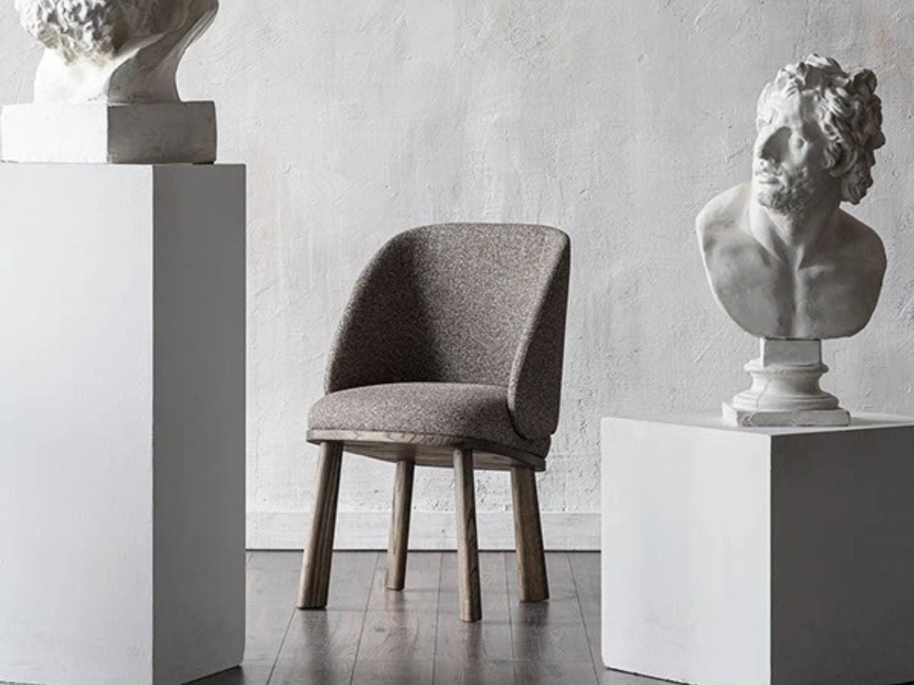
The muted tones used in the chair are equally important. Instead of relying on bold colors to stand out, the design embraces restraint. These softer tones allow the chair to blend naturally into different environments. In modern and contemporary interiors, this quality becomes incredibly valuable. The chair does not try to dominate the room. Instead, it quietly complements the space around it.

Because of this, the Scally Chair works beautifully in many settings. It can sit comfortably in a minimalist living room, a warm Scandinavian-inspired interior, or even a more contemporary dining space. Its presence feels calm and balanced rather than loud. It supports the atmosphere of the room while still offering a strong sense of design.

What makes the chair particularly interesting is how the story behind it changes the way we experience it. Once you know about the scally cap inspiration, you begin to notice the details more carefully. The curve of the backrest, the slight lift of the seat, and the careful proportions suddenly feel intentional and thoughtful. The experience of the chair becomes more layered.

This is what gives the Scally Chair its quiet strength. It shows how everyday objects can inspire other everyday objects in unexpected ways. A familiar cap becomes the starting point for a piece of furniture that feels both contemporary and timeless. Through subtle form, warm materials, and restrained color, the chair proves that thoughtful design does not need to demand attention. Sometimes the most meaningful designs are the ones that simply fit into our spaces and lives with effortless ease.

The post A Chair Shaped by the Soft Curves of a Classic British Scally Cap first appeared on Yanko Design.
This LEGO Tiramisu Might Be the Most Realistic LEGO Food Set Anyone Has Ever Built

Tiramisu has a strong claim to being the world’s most universally loved dessert. It crossed out of northeastern Italy sometime in the late 1960s, hit restaurant menus across Europe and America through the 80s and 90s, and somewhere along the way became the default “fancy dessert” of the home cook who wanted to impress without turning on the oven. The name translates roughly to “pick me up,” which is exactly what a shot of espresso-soaked ladyfingers and mascarpone cream does. LEGO Ideas creator Micdud has now built one out of 1,106 bricks, nearly at 1:1 scale, and the result is the kind of MOC that makes you do a double-take.

The build is a corner slice served on a decorative round plate, complete with chocolate drizzle, cream dollops, and a fork mid-bite suspended in the air on a transparent support. The cocoa topping alone is a masterclass in using disparate brown elements to simulate an organic, dusty texture. Micdud even hid a raspberry made from a red clown hairpiece and blueberries built from purple astronaut helmets under the garnish. Food MOCs live and die by their surface detail, and this one gets every layer right.

Designer: Micdud

The corner piece allows you to see the full lady-fingers without their cross-sections. There’s just so much detail that it’s easy to get lost focusing on just one part. Although that’s exactly what makes this ‘dish’ such a winner. It triggers a primordial response of hunger the minute you see it. The colors are perfect, the cross section is gorgeous, and the details even on the plate WILL make your mouth water. Cutting two faces open lets those layers read in amber and white bricks, while the outer two faces show the savoiardi as rounded bumps with cream spilling over them. The build is doing two different surface textures at once, and pulling both off cleanly at 27 by 27 centimeters is no small thing for a 1,106-piece model.

The MOC (My Own Creation) is presented on a round plate, adding to its flair. The chocolate scroll work and cream rosettes ringing the edge give the whole scene a plated, restaurant-ready quality that keeps it from reading as a lone brick sculpture sitting on a flat disc. The suspended fork is the finishing touch, a freshly cut bite floating mid-air on a transparent support brick, the kind of detail that commits fully to the storytelling and makes the whole thing feel like a frozen moment rather than a display piece.

Unlike most LEGO Ideas submissions, this one isn’t rendered. From the looks of it, and just the imprefections in the detail, Micdud already built the design out. That’s impressive on its own, because it shows exactly what the Tiramisu would look like. For the uninitiated, LEGO Ideas is the company’s portal for fan-made submissions, allowing enthusiasts to create their own LEGO builds and vote for their favorite ones. Any MOC that crosses the 10,000 vote mark gets reviewed by LEGO’s internal team and then potentially turned into a box set. Micdud’s Tiramisu is just mere days old on the platform and it’s already amassed 240 votes (including my own). If you want to have it hit that 10k mark, head down to the LEGO Ideas forum and cast your vote (it’s free!) Let’s get this MOC produced before October this year so we can enroll it in the Tiramisu World Cum in Italy this year!

The post This LEGO Tiramisu Might Be the Most Realistic LEGO Food Set Anyone Has Ever Built first appeared on Yanko Design.
This Oware-inspired gaming controller replaces joysticks with a precision half-ball control system

In an era where gaming peripherals are constantly evolving, designers are increasingly experimenting with new ways to rethink the relationship between the hand and the controller. Control PlusArc concept controller challenges the familiar joystick-and-button layout with a more tactile and deliberate approach to movement. Interestingly, this exploration arrives around the same time as other unconventional input devices, such as a mouse that doubles as a hidden game controller.

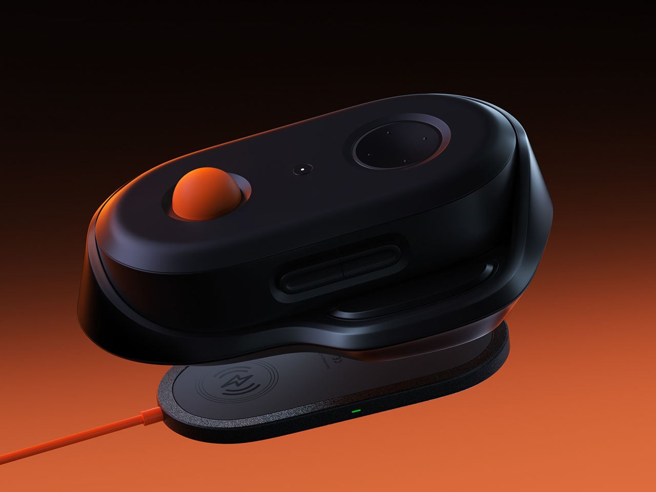
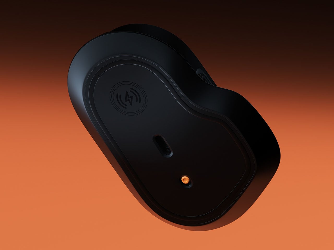
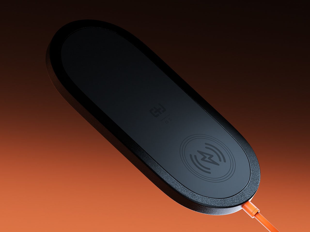
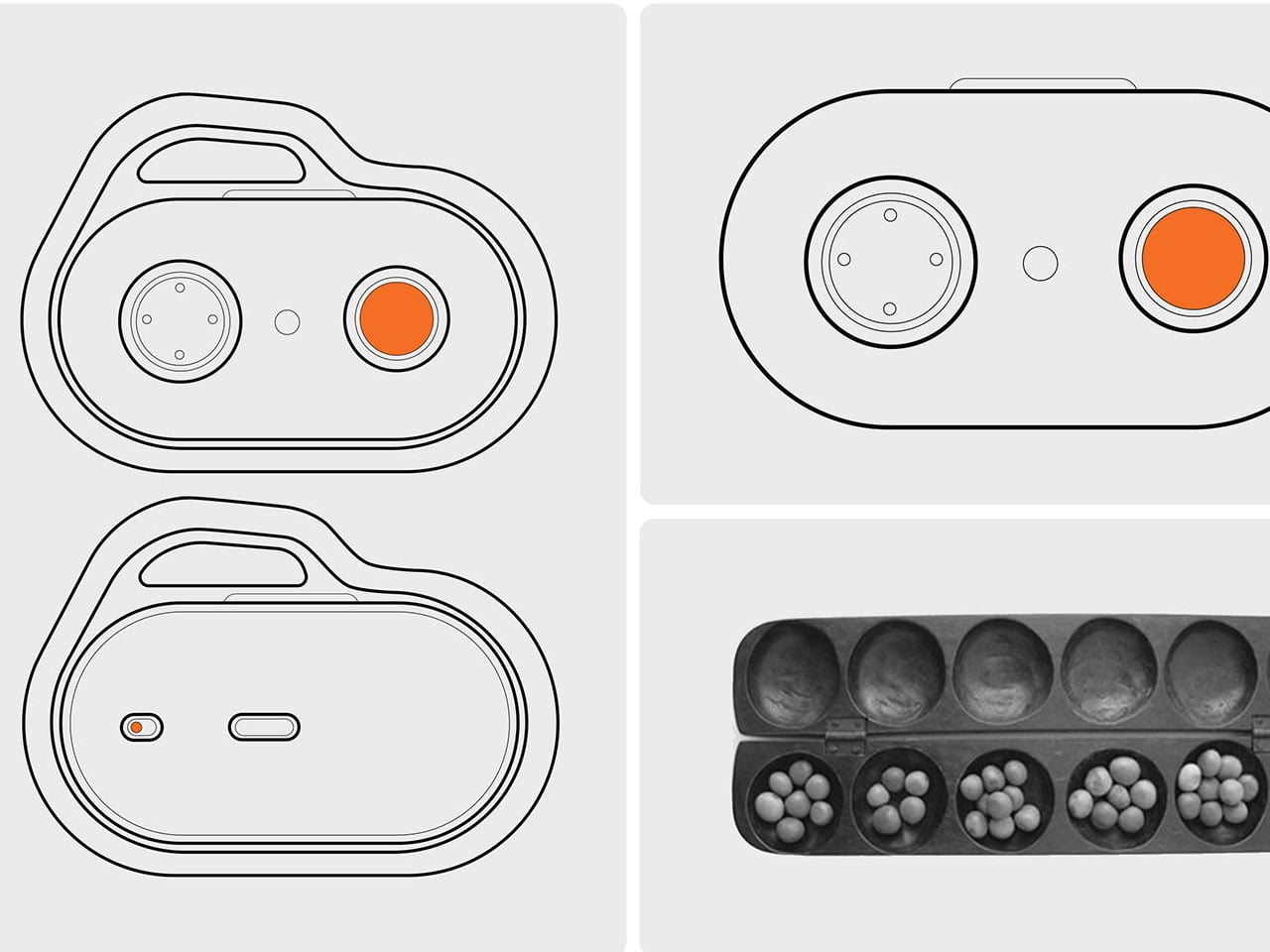
Control PlusArc is built around the idea that interaction should feel natural rather than mechanical. Instead of relying on standard analog sticks, the design introduces a semi-spherical control mechanism that encourages controlled, intentional movement. The controller’s overall oval form factor reflects this philosophy as well. Rather than forcing the user into rigid hand placements, the shape allows the device to sit comfortably within the palms, encouraging a continuous grip that feels fluid and stable during gameplay.

Designer: Kusi Boateng Arthur

The concept controller is inspired by Oware, known for its rhythmic and thoughtful movement of pieces across carved pits on a wooden board. Instead of mimicking the visual style of the game, the Control PlusArc borrows its philosophy of deliberate interaction. The controller’s oval shape emphasizes the organic contours of an Oware board, creating a tactile connection between hand movement and the act of play.

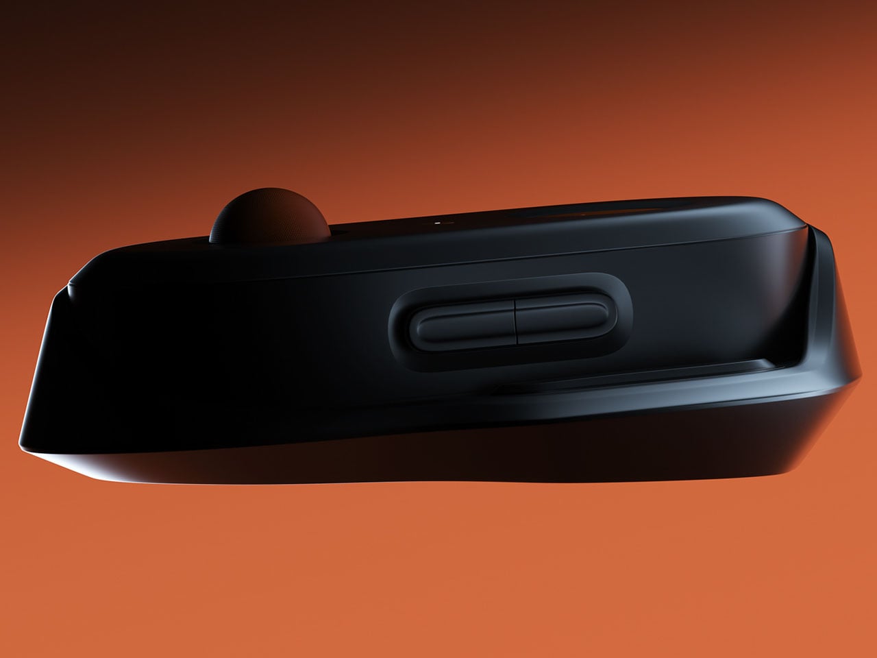
This influence becomes even more evident in the controller’s semi-ball control mechanism. Unlike a full trackball or freely spinning joystick, the half-ball structure introduces clear boundaries to movement. Players can roll the control surface in different directions, but the restricted geometry ensures that movement remains precise and predictable. This design choice prevents the kind of uncontrolled spinning that often accompanies traditional trackballs, instead reinforcing a sense of intentional navigation.

The half-ball interface effectively becomes the centerpiece of the interaction. Because the surface sits partially embedded in the controller body, it balances freedom and constraint. The user can perform quick directional adjustments while still maintaining tactile awareness of the controller’s limits. The result is a control system that feels less like manipulating a mechanical stick and more like guiding motion across a defined space.

Most modern gamepads still follow a layout popularized by early console designs: two sticks, directional inputs, and face buttons. By rethinking the primary control surface itself, this gaming controller questions whether future controllers might shift toward more tactile, sculptural interfaces that respond more intuitively to the way hands naturally move.

The post This Oware-inspired gaming controller replaces joysticks with a precision half-ball control system first appeared on Yanko Design.