The Hisense U7SG TV Was Built for Bright Rooms, Not Dark Showrooms

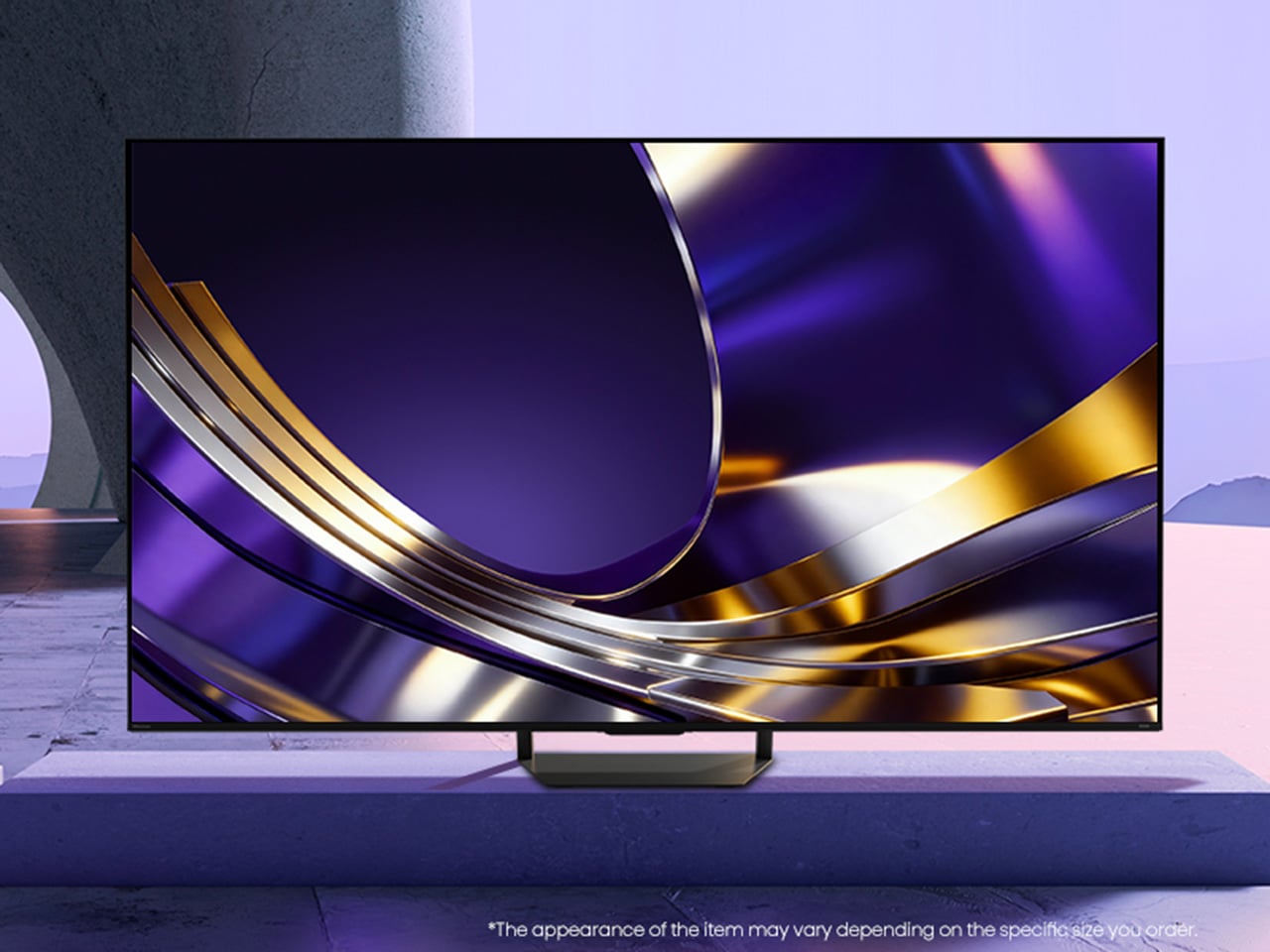
Despite what showroom demos suggest, nobody actually watches TV in a blacked-out room with the blinds drawn. Real living rooms have windows, afternoon sun, and someone walking in front of the screen mid-game. The Hisense U7SG seems to understand that, building its picture quality around the messy, bright rooms people actually watch in, not the dark theater fantasy TVs are usually sold on.

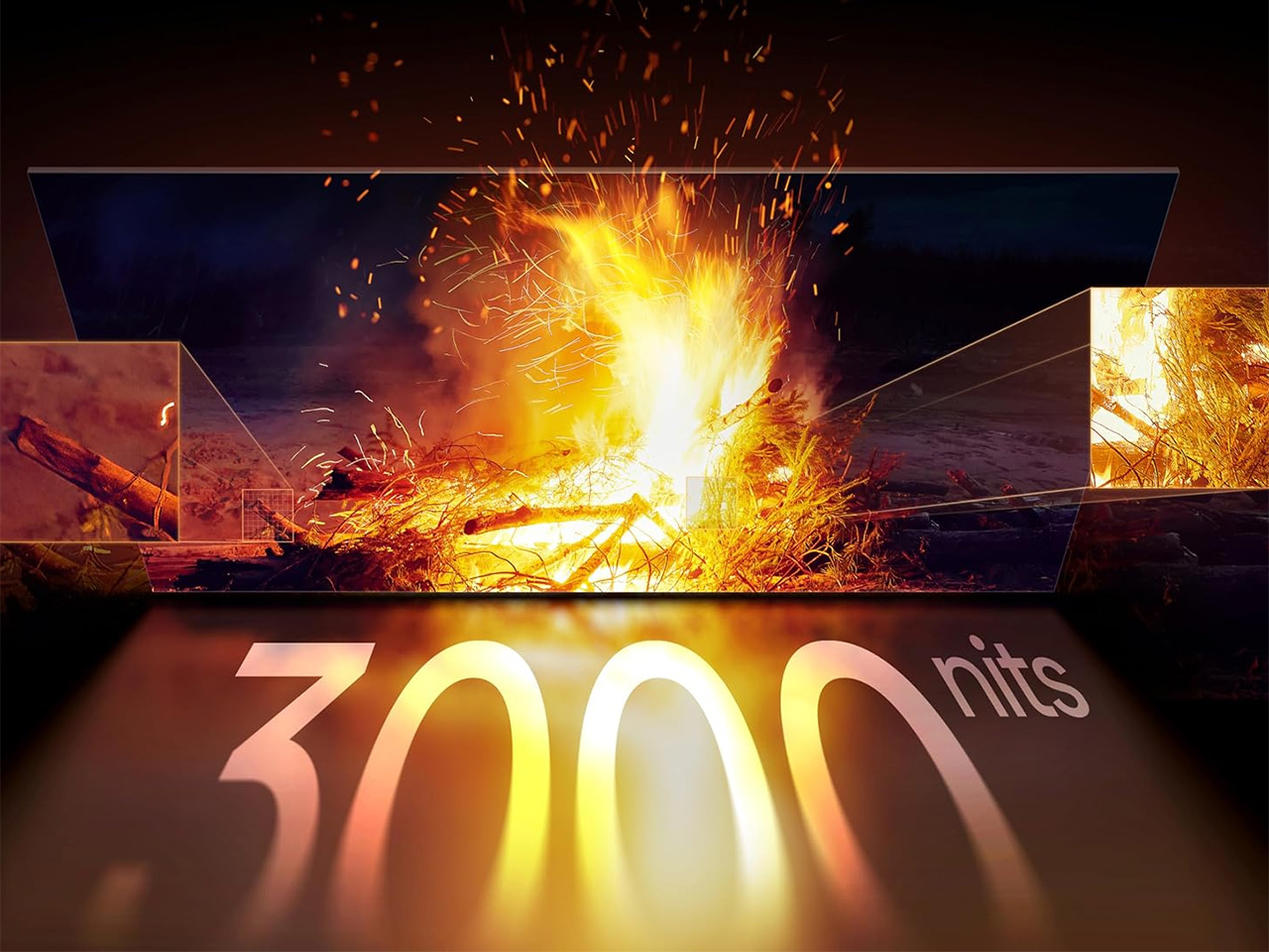
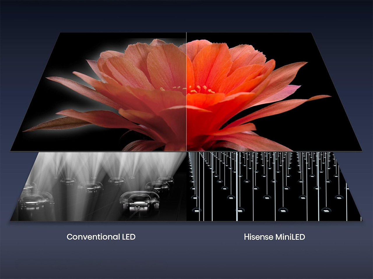
That starts with the panel itself. Thousands of MiniLEDs pack behind the screen, each one controlled with enough precision that bright highlights and deep blacks sit right next to each other without either blowing out. Hisense calls it MiniLED Pro with Full Array Local Dimming, but what it means is a sunset scene doesn’t wash out and a night scene doesn’t turn into a gray, murky mess.

Designer: Hisense

Click Here to Buy Now: $690 $1280 (47% off). Hurry, deal ends in 48-hours!

None of that matters much if the picture disappears under glare the moment the sun hits the window, which is where the anti-reflection layer earns its keep. Hisense uses a dual-layer screen treatment that goes further than the usual single-layer coating most TVs rely on, so afternoon light, overhead fixtures, and that one lamp nobody turns off stop being the enemy of a clear picture.

Motion is where a lot of TVs quietly fall apart once a game picks up speed. A native 165Hz refresh rate paired with Hisense’s own motion processing keeps fast breaks, corner kicks, and quick camera pans from turning into smeared pixels. It’s a small thing until you notice its absence, the kind of detail that only becomes obvious once a cheaper TV can’t keep up.

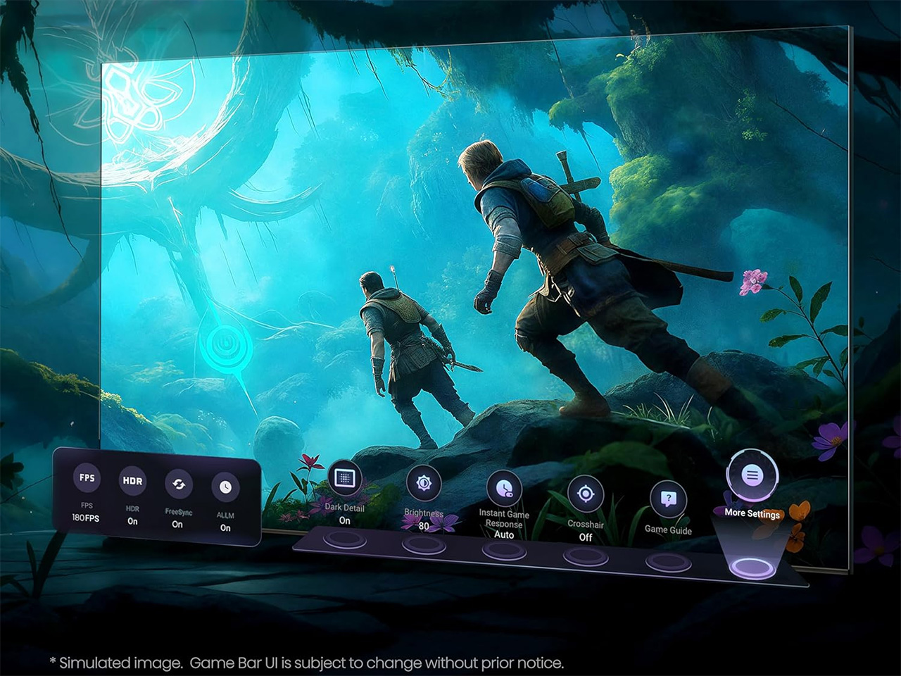
Gamers get their own reason to care. Game Booster 330 uses HSR technology to push refresh rates up to 330Hz VRR for smoother motion and less input lag, and the on-screen Game Bar lets you check FPS, VRR, and HDR settings without pausing whatever you’re playing. Four HDMI 2.1 ports also mean nobody argues over which console gets the good input, since all four handle 4K at 165Hz.

Color gets the same careful treatment. Hisense’s Hi-QLED panel is Pantone validated, which sounds like a checkbox until you notice how natural team uniforms, grass, and skin tones actually look instead of oversaturated. Add support for Dolby Vision, HDR10+, and IMAX Enhanced, and the U7SG stops caring what format your content showed up in. It just plays it, accurately, without asking you to think about it.

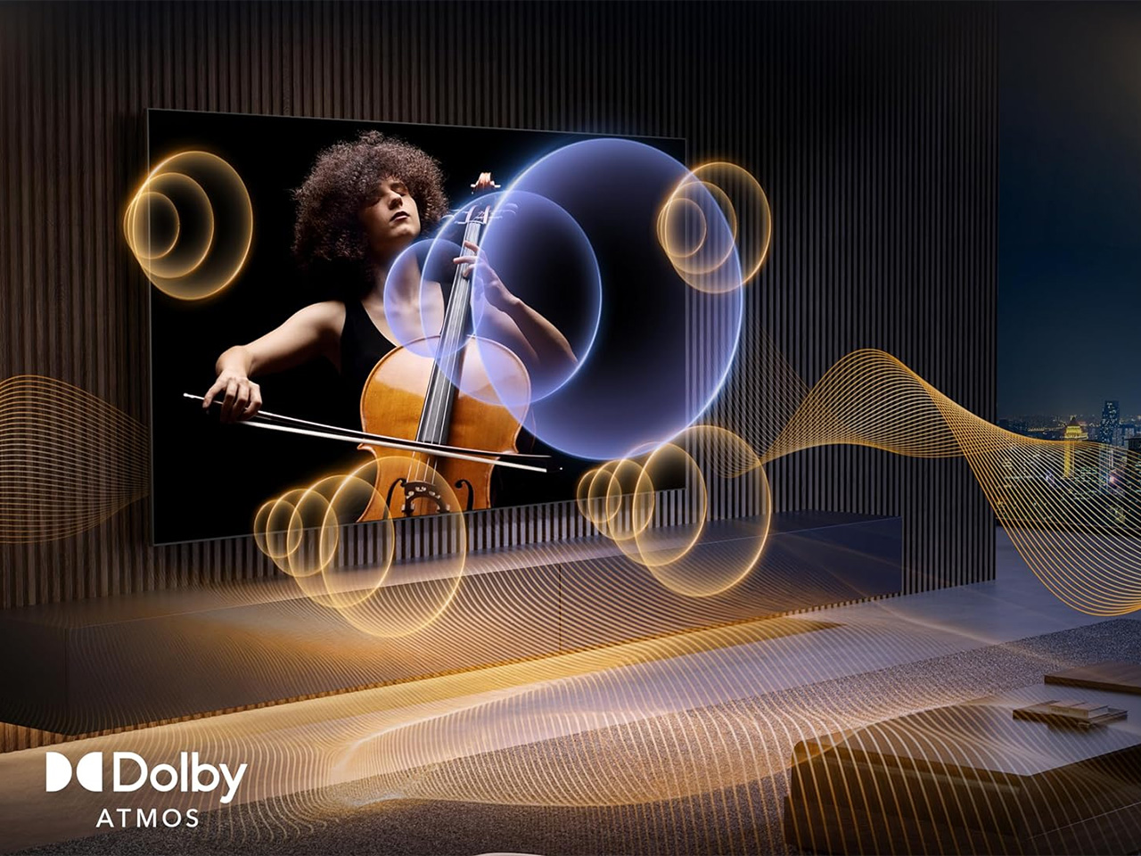
Sound tends to be an afterthought on most TVs, but not here. A 2.1.2 multi-channel setup tuned by Devialet pushes up to 60W across the room, with Dolby Atmos adding height overhead. Dialogue stays clear over crowd noise, commentary carries over stadium chatter, and reaching for a soundbar remote doesn’t feel as urgent as it usually would on a new television.

Google TV runs the show on the software side, now with Gemini built in for conversational searches instead of typing clumsy keyword strings. Ask it what to watch, and it pulls from more than 10,000 apps, or describe a vague mood and let it figure out the rest. It also answers questions on sports, cooking, or travel, a strange but welcome bonus for a television.

The U7SG also comes in sizes ranging from 55 inches up to 116 inches, which changes what the TV is for. A smaller set fits quietly into an apartment, but the larger ones turn into the obvious gathering point for a watch party or a family movie night, with a screen big enough that everyone feels like they got the good seat.

There was a time when getting all of this in one TV meant paying flagship prices for it. Hisense has spent the last few years chipping away at that assumption, one MiniLED generation at a time, and the U7SG is what that effort looks like now: a set that doesn’t force a choice between how bright your room gets and how good the picture looks in it.

Click Here to Buy Now: $690 $1280 (47% off). Hurry, deal ends in 48-hours!

The post The Hisense U7SG TV Was Built for Bright Rooms, Not Dark Showrooms first appeared on Yanko Design.

Whirlpool Spent 60 Years in an Italian Engineering Lab Just to Make Its Ovens Quieter

Here’s a fun rule of thumb: the less effort something takes to use, the more effort someone spent making sure it works. Good waiters make service invisible. Good editing makes a movie feel like it was never touched. Good design, generally, hides its own homework. Weirdly enough, that exact rule is now showing up in kitchen appliances, of all places. Whirlpool has spent the last few years chasing that kind of invisibility, building ovens and hobs that do more while asking you to do less. Its new premium lineup for Europe is basically one giant bet that simplicity is the hardest thing in the room to engineer.

That bet has a name and an address. The name is 6TH SENSE, the sensor-driven backbone tying together Whirlpool’s W Collection Kitchen Suite, a built-in range of ovens, hobs, dishwashers and fridges. The address is Cassinetta di Biandronno, a 60-year-old campus in northern Italy where design studios, food scientists and materials labs work out exactly how much invisible effort a “simple” appliance actually requires. The suite got its biggest showcase yet at EuroCucina 2026 in Milan, where Whirlpool shared a pavilion with sister brands Beko, Hotpoint and Bauknecht for the first time. It’s part of a wider premium push across a European built-in market worth around 6 billion dollars in 2024, expected to clear 9 billion by 2030. Turns out making an oven feel effortless takes a small army.

Designer: Whirlpool Global Industrial Design Centre, Cassinetta di Biandronno, led by Massimo Pedrazzini

The five-hour chocolate test that explains the whole strategy
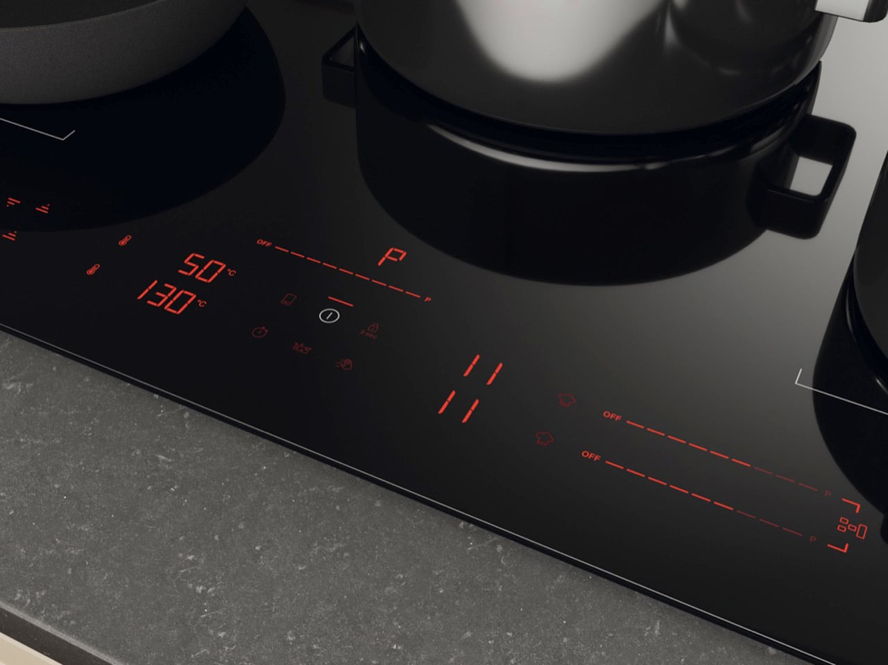
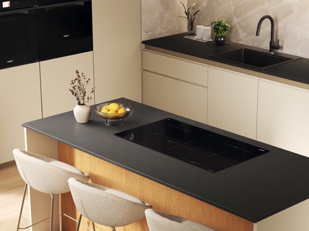
A pan of chocolate sat melting on a Whirlpool induction hob for five straight hours during the brand’s EuroCucina demonstrations, and came off glossy, smooth and completely unbroken. HeatControl is the reason, letting you set an actual target temperature between roughly 113°F and 392°F (45 to 200 degrees Celsius) in small increments instead of guessing at a power level between one and nine. Conventional induction asks you to translate “gentle simmer” into an abstract number, then keep wandering back to check whether you guessed right. HeatControl deletes the translation step. Its Hide & Touch interface goes one further and disappears entirely when the hob is switched off, leaving black glass and nothing else to look at.

The oven that switches itself off before you remember to check it

The self-supporting Food Sensing Probe tracks the internal temperature of whatever sits in the 73-liter cavity, and once your target is reached, the oven ends the cycle by itself. You pick a doneness, walk away, and the appliance handles the endgame. Cook4 runs the same logic sideways, cooking up to four dishes at once without flavors migrating between them, which Whirlpool says saves up to 72% of the time and 53% of the energy of doing them in sequence. The test behind that number involved cooking a full meal twice, a tart, roast potatoes, lasagna and chicken pasta, once simultaneously and once one after another. Pizza Party stretches it to four fresh 12-inch pizzas in roughly 15 minutes, preheat excluded.

Beko called it the invisible kitchen, and Whirlpool took it a layer deeper
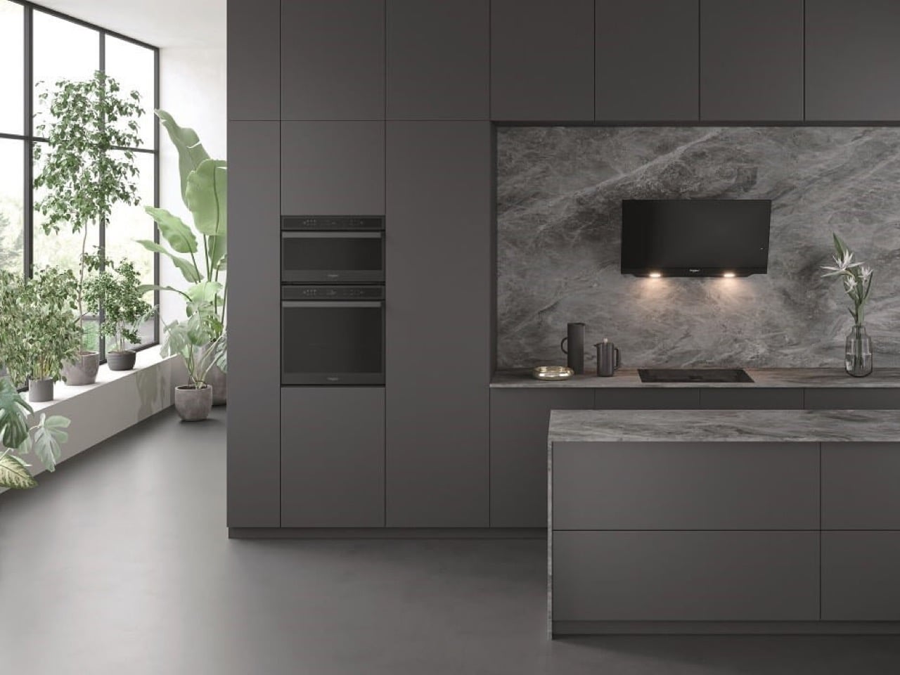
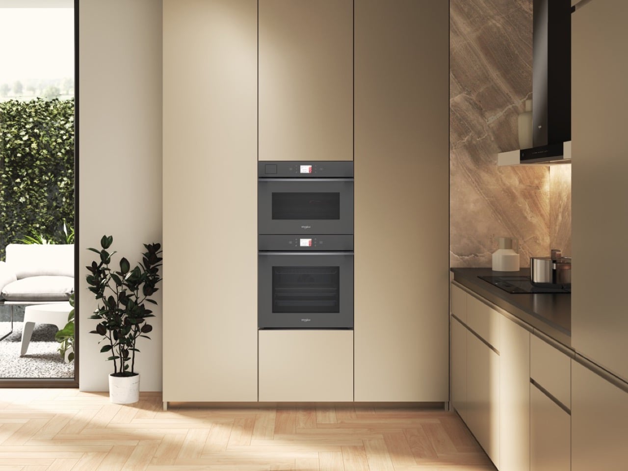
Beko named the theme of its EuroCucina pavilion the invisible kitchen, applying the phrase to hardware: flush surfaces, concealed hinges and handleless doors, all arranged under an undulating textile canopy designed by Mario Cucinella Architects. The staging was genuinely lovely, with each brand assigned its own palette, cream for Whirlpool against navy, terracotta and mineral for the others. Whirlpool then ran the same idea one layer deeper than the cabinet fronts. Visual invisibility is the easier half of the job, and plenty of the handleless minimalism sold as quiet luxury stops there while still asking for constant attention. Making the interaction disappear is the harder version of that idea, and it is the one the W Collection actually attempts.

Why removing a dial costs more engineering than adding one

Every decision an appliance makes on your behalf is a decision someone else had to get right in advance, permanently, for millions of households and every recipe they might attempt. A power dial hands that responsibility to you. A temperature target absorbs it. That absorption is why a story about simplification keeps leading back to a 1.25-million-square-meter campus founded in 1965, where Whirlpool runs three production plants alongside industrial design, cooking R&D, food science and materials research. Roughly 1,480 people work there, with an average tenure of 19 years, which is its own quiet argument about how long this kind of knowledge takes to accumulate.

The design studio that reached for light instead of another screen

Massimo Pedrazzini leads a 31-person team at Cassinetta spanning industrial design, CMF, UI, ergonomics and prototyping, working from hand sketches through CAD and rendered finishes to physical models. Their brief for the latest built-in cooking platforms included a new cavity, a redesigned door mechanism, an internal divider to improve energy efficiency, and light used as the element that guides a user through cooking. That last one is the tell. Handed an opportunity to add another display, the team reached for illumination instead, a guidance layer that communicates without requiring anyone to read. The UX group behind it pulls from psychology, ergonomics, interaction design and product design, and still builds multitouch screens when a product genuinely earns one.

The lab that measures browning so you don’t have to stand there watching

Food Technology landed at Cassinetta in 2003 as a discipline connecting appliance engineering to how food physically behaves, studied chemically, nutritionally and microbiologically. The team measures color, browning, crispness and texture through objective methods, which is the only honest way an oven can decide something is done. MaterialsLAB handles the parallel job on surfaces, and its output shows up as MatteProtect, a matte induction finish Whirlpool claims is around three times more scratch resistant than standard ceramic glass while hiding halos and fingerprints. CleanProtect, a nanotech hob treatment, targets cleaning without detergents at all. X-Lab closes the loop with robotics, machine vision and additive manufacturing, bridging research and the actual production line.

The industry is split, and Whirlpool picked the harder side
Hisense turned up at CES 2026 with a smart induction range carrying a seven-inch cooktop display and AI agents coordinating timing between oven and stovetop, an opposite bet placed with equal confidence. One camp is adding a screen to the hob while the other removes the one already sitting there. AEG reached Whirlpool’s conclusion independently, launching four products at IFA 2026 built around never babysitting an appliance again, which suggests a genuine movement rather than one brand’s marketing angle. Even within Beko Europe the instincts vary, since sister brand Beko’s HomeWhiz platform makes energy and water use more visible per cycle. Whirlpool committed to attention as the scarce resource, and committed across an entire suite.

Who this suits, and why the intelligence sits where it does

Sensor-led cooking fits anyone who treats dinner as something to get done well rather than a craft to practice, which honestly describes most weeknights in most houses. Cooks who enjoy the fiddling lose nothing, because HeatControl exposes exact temperatures and the 6TH SENSE menu can be ignored entirely. There is a second point in Whirlpool’s favor that became obvious this summer, when Weber switched off the June Oven’s AI camera and turned a $999 appliance back into a box that heats. Intelligence running on the device ages considerably better than intelligence running on somebody’s server. Whirlpool’s sensing lives in the hardware you paid for.

Appliance marketing has spent a decade answering what a machine can do, and that answer stopped being interesting somewhere around the fridge with a television bolted to the door. The more useful question now is how much of that capability you are never asked to supervise. Whirlpool’s answer required a 60-year-old Italian campus, four laboratories and a team of 31 designers to arrive at a hob you can comfortably walk away from. Measured in effort spent per decision removed, that ratio looks gloriously lopsided. Measured by what makes a kitchen pleasant to actually live in, it might be the only ratio worth counting.

The post Whirlpool Spent 60 Years in an Italian Engineering Lab Just to Make Its Ovens Quieter first appeared on Yanko Design.

The Fire Pit That Quietly Solved the Smoke Problem

Every fall, the same ritual plays out in backyards across the country. Someone drags out the fire pit, gets the flames going, and within twenty minutes the whole group has rearranged their chairs at least three times, all chasing the same goal: getting away from the smoke. It’s such a normal part of fire pit ownership that most people just accept it as the cost of doing business. You want warmth and ambiance, you pay for it with watery eyes and a jacket that smells like a campfire for the next two days.

That’s the actual problem the AirFlow 8-Panel Fire Pit is built to solve. Smoke isn’t some unavoidable side effect of burning wood outdoors. It’s mostly a sign that the wood isn’t burning completely, and Sanyo Works, the Japanese company behind this design, spent decades in metal processing before deciding to fix that at the source instead of asking people to just deal with it.

Click Here to Buy Now: $325

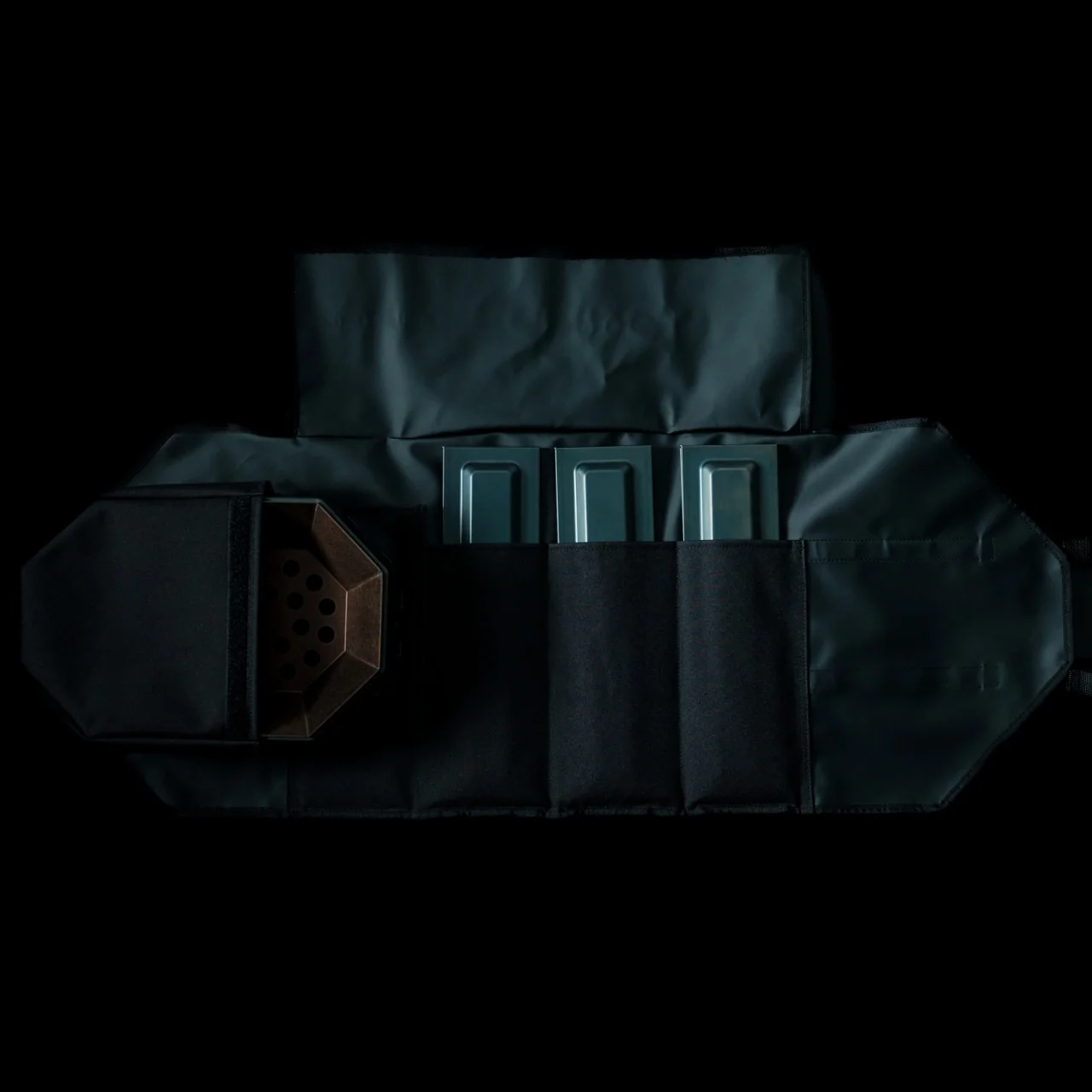
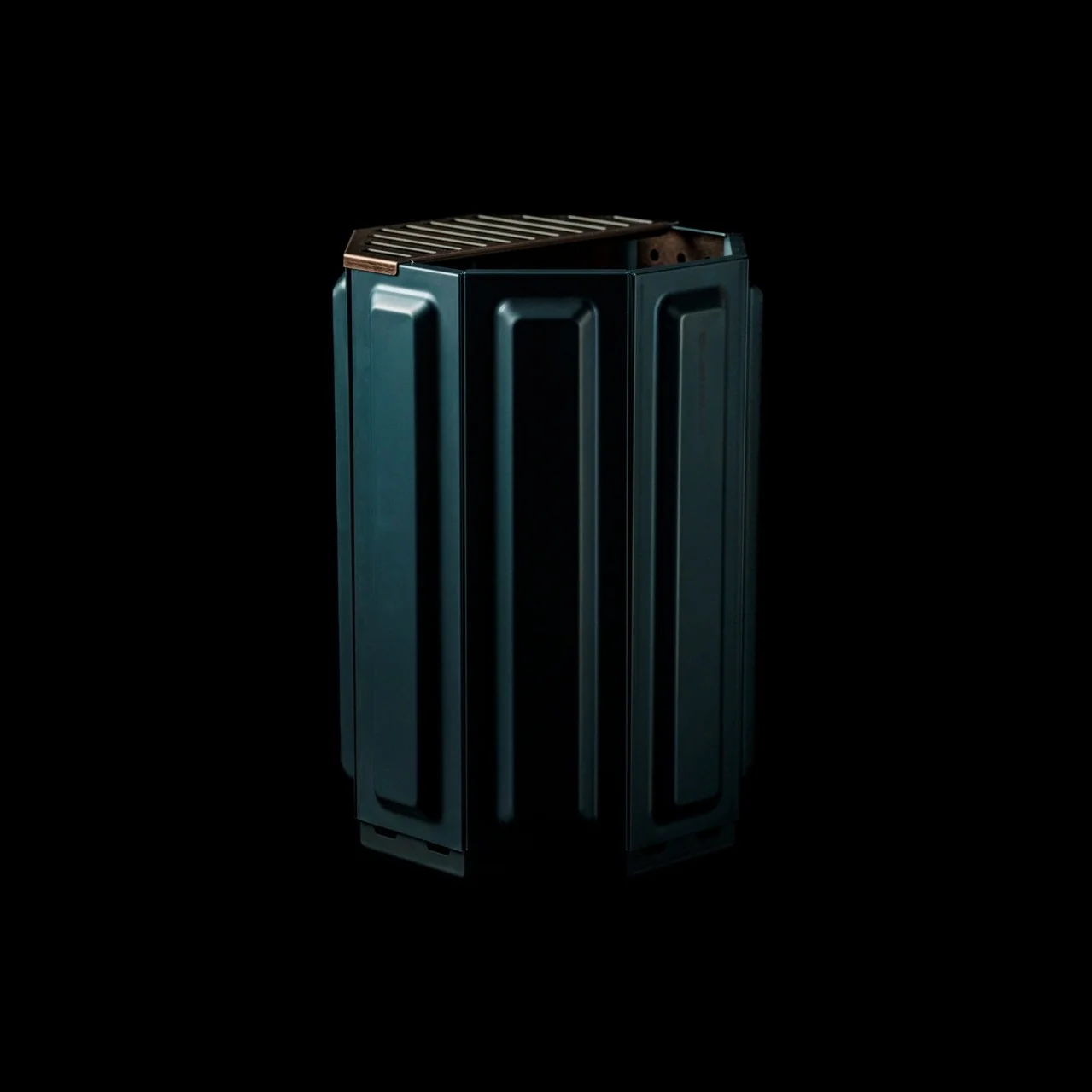
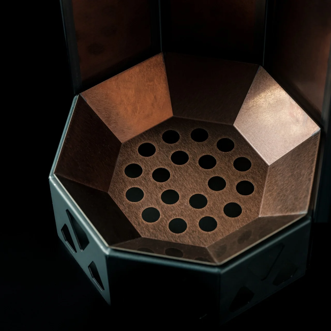
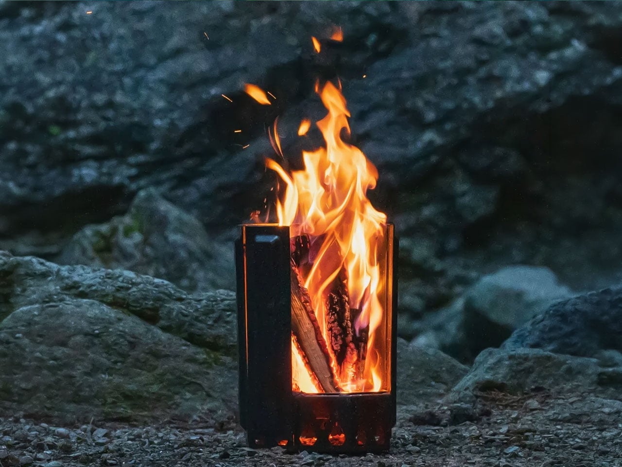
The engineering here is simple once you understand it, even if the payoff feels like magic in practice. Eight removable panels lock together into an octagonal cylinder, and each panel has holes at the base that feed fresh air straight to the wood for primary combustion. That’s step one, and it’s not particularly novel on its own. What makes this pit different is what happens next. The heated air doesn’t just disappear. It rises through a double walled cavity and exits through vents near the top, where it reignites gases that would normally just float away as smoke. That second burn is called secondary combustion, and it’s the reason a Yanko Design review of this exact pit called the smoke reduction “physics, not a marketing claim.” I appreciate that framing, because it’s easy for outdoor gear to lean on vague promises. This one has a mechanical reason for working the way it does.

I’ll admit the modular panel system is what actually sold me on this thing as a design object, separate from the smoke science. You can pull one or two panels off mid-evening and change how the fire breathes entirely. Want a roaring blaze while you’re cooking dinner? Leave it fully assembled. Want something calmer for the part of the night where everyone’s just talking and the temperature has dropped? Pull a panel and let it settle. Most fire pits give you one setting, and you either build a bigger fire or a smaller one and hope for the best. This one lets you adjust the actual airflow, which feels less like a workaround and more like the product was designed by people who understood fire before they started welding steel.

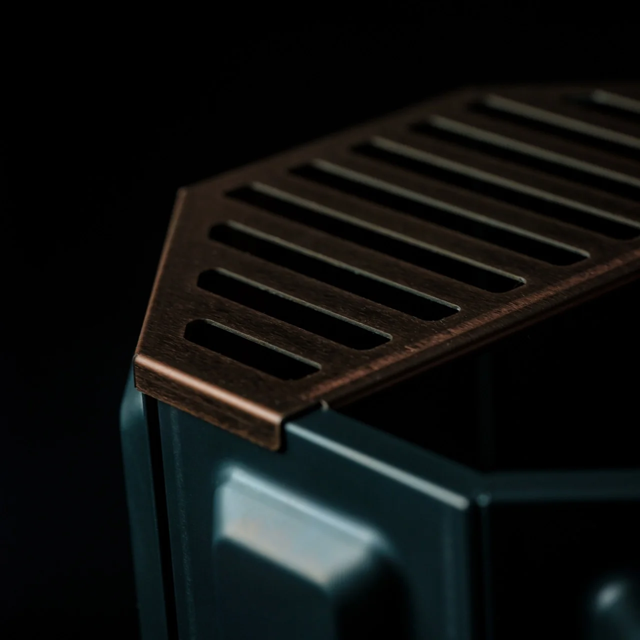
The materials back that up too. The interior uses corrosion resistant stainless steel that’s meant to age into a natural patina rather than just rust out and get replaced, while the exterior panels are built to take the abuse a real campsite delivers. There’s a grill grate attachment included as well, which turns the whole setup into a cooking platform without messing with the airflow logic that makes the pit work in the first place. Ash falls and collects at the bottom, so cleanup is mostly a matter of dumping it out rather than scraping char off a grate.

None of this matters much in July, but fall is exactly when a fire pit stops being a novelty and starts being the actual center of gravity for a backyard. Evenings get dark earlier, the air turns crisp enough that people actually want to stand near a flame, and suddenly the fire pit you own either makes those nights better or gives everyone a reason to go back inside. At $325, this one isn’t an impulse buy, but it’s priced like something meant to be a long term fixture rather than a seasonal throwaway.

What I keep landing on is that good outdoor design usually solves a problem people stopped noticing because they’d just gotten used to it. Nobody wakes up thinking their fire pit smokes too much, they just accept it as part of the deal. The AirFlow 8-Panel Fire Pit quietly argues that they shouldn’t have to.

The post The Fire Pit That Quietly Solved the Smoke Problem first appeared on Yanko Design.
This Charred-Wood Home in Japan Turns a Backyard Constraint Into Its Best Feature

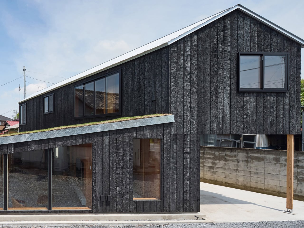
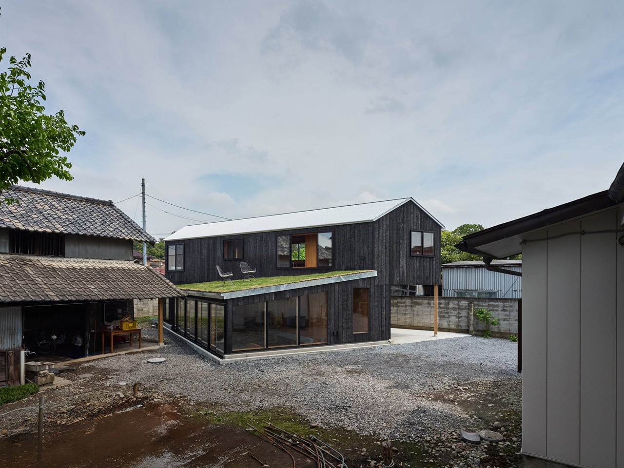
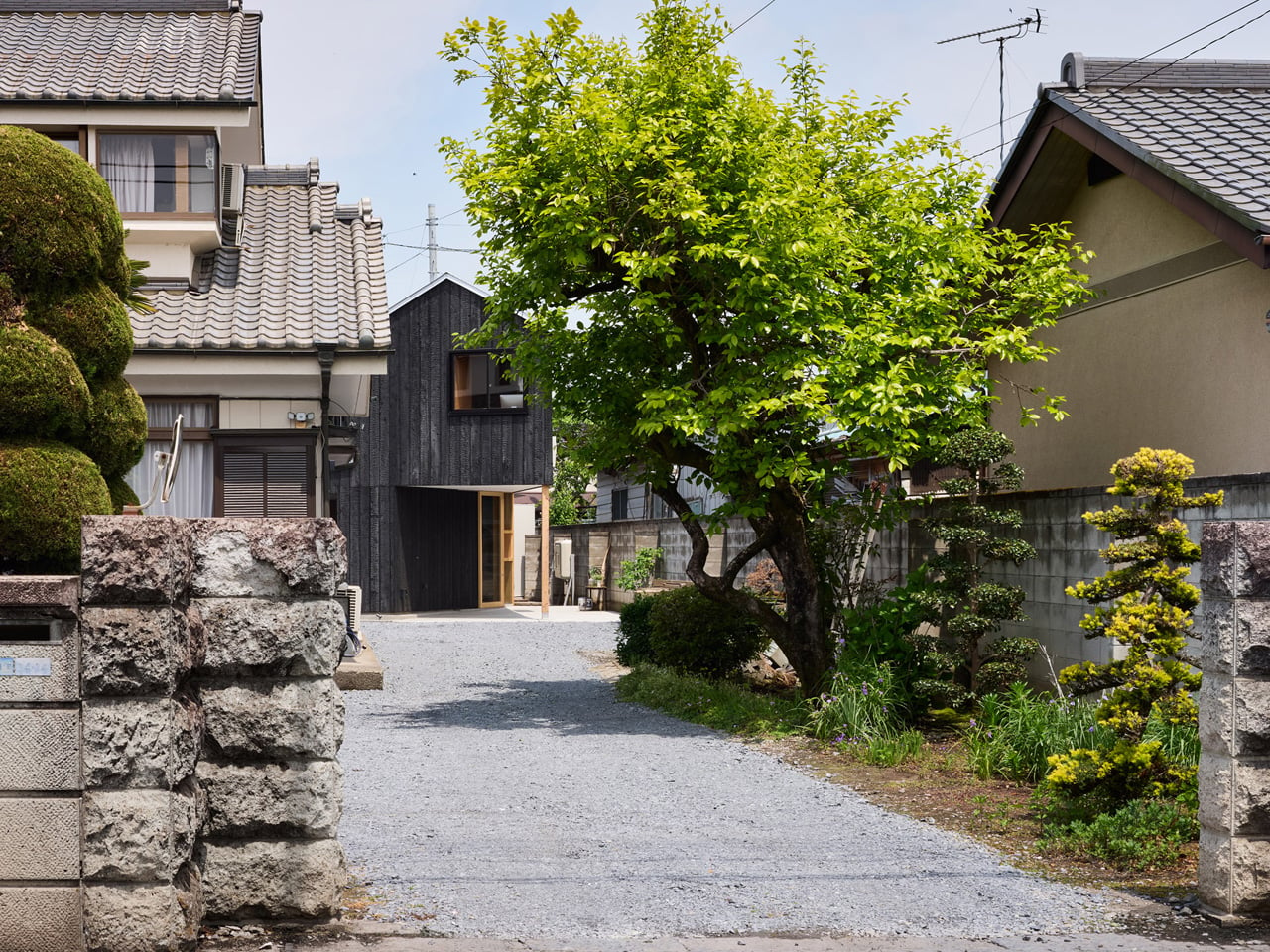
Kobe-based Tato Architects has never been a studio that plays it safe, and the House in Mibu — a 108-square-metre family home nestled inside the backyard of a client’s parental estate in Tochigi Prefecture, Japan — makes that clear from the outside in. The brief was layered with constraints: accommodate a couple and three children, preserve vehicle access to an existing garage and workshop on the property, and somehow make a house that doesn’t feel squeezed into a leftover corner of land. The answer wasn’t to fight these conditions but to let them write the architecture.

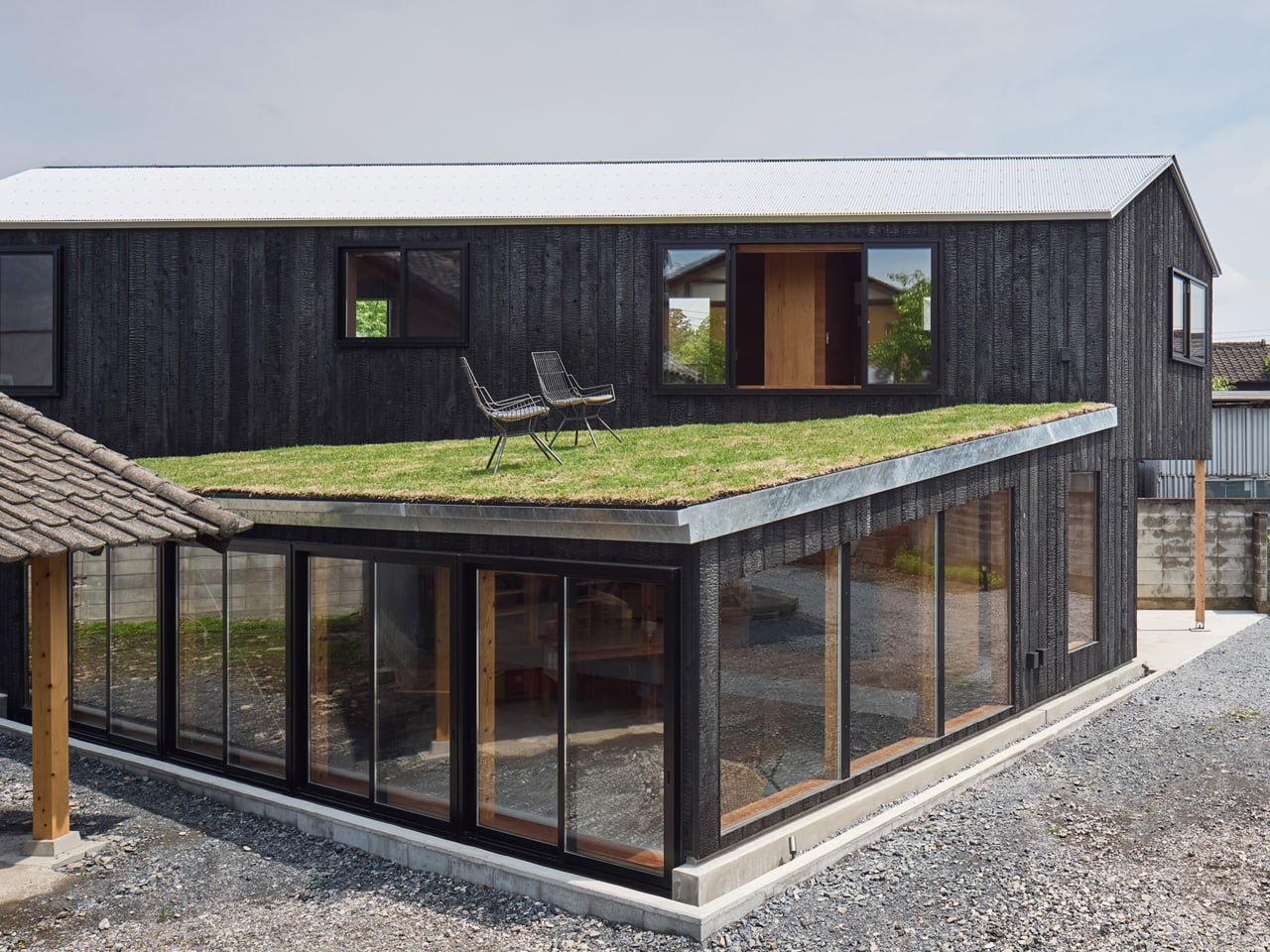
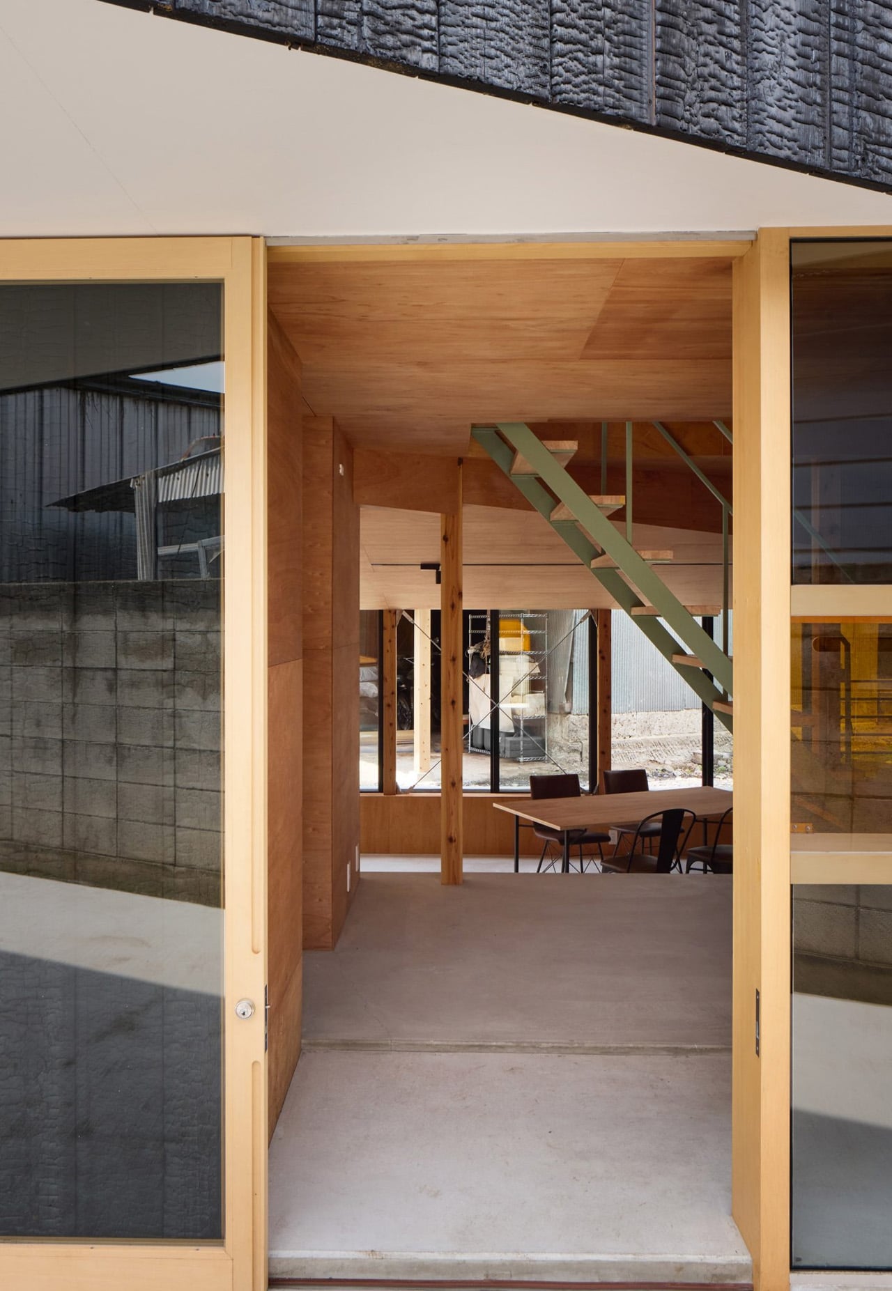
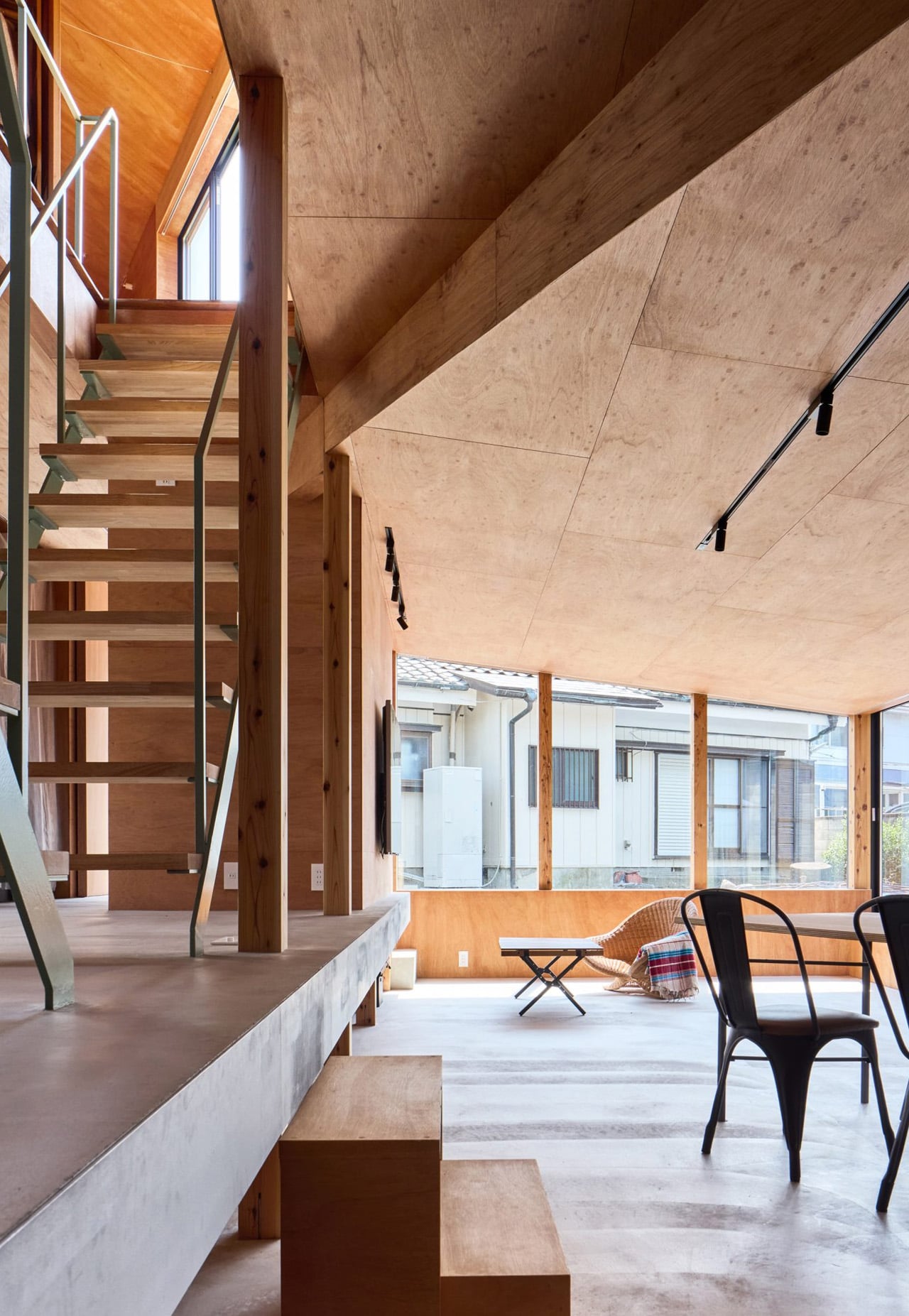
The studio’s guiding principle for the project was finding a balance between enclosure and openness. That tension is legible the moment you see the building. The ground floor is sunk 500 millimetres below grade and partially crowned with a sloped green roof, anchoring the home into the earth rather than sitting awkwardly atop it. The first floor cantilevers outward on one side, creating a sheltered threshold below and giving the structure a studied asymmetry that reads as intentional rather than improvised. Full-height windows wrap the sunken lower level to the west, pulling in light while framing views toward the neighbouring workshop — a deliberate dialogue between the new home and the older structures it lives beside.

Designer: Tato Architects

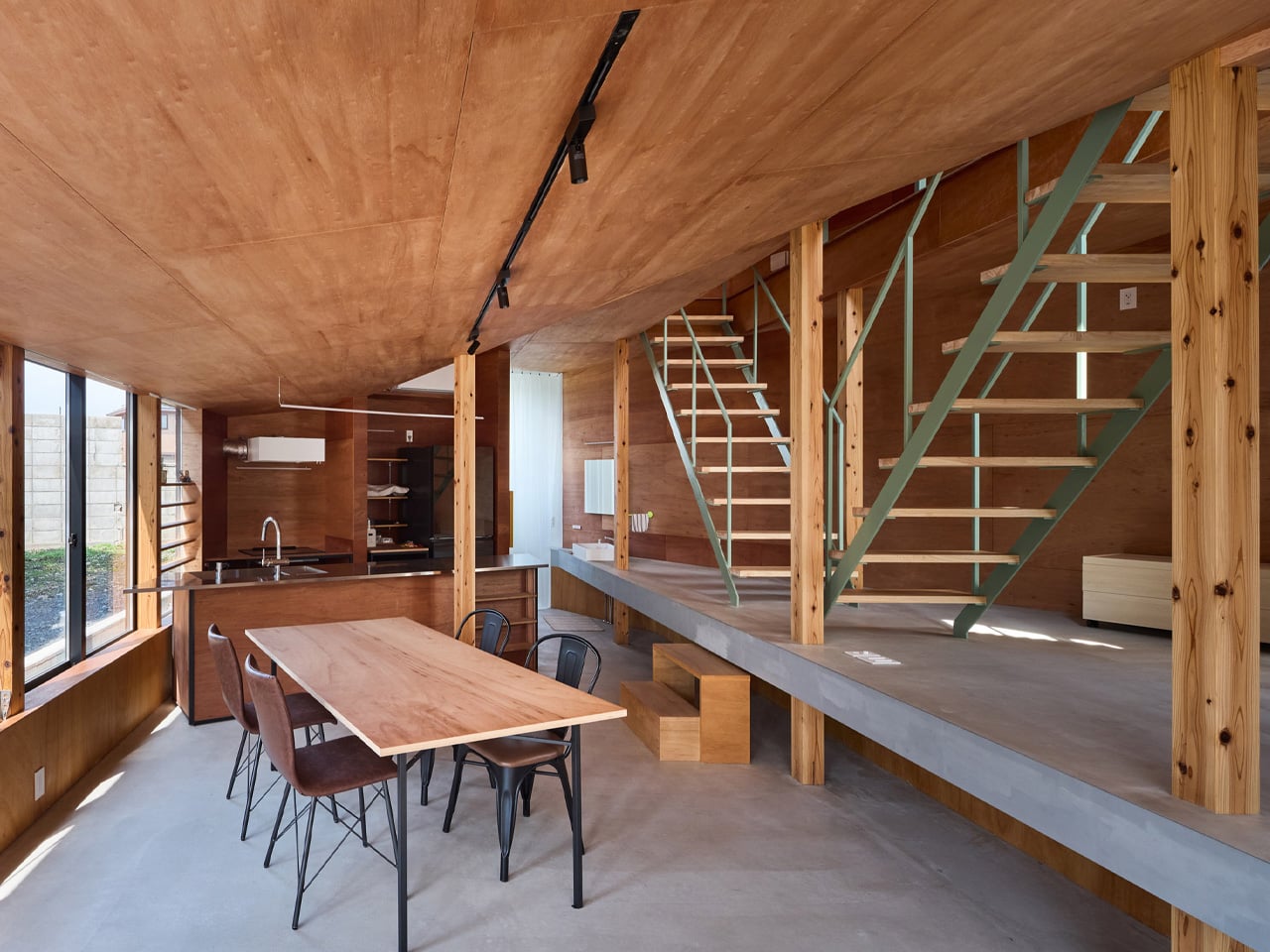
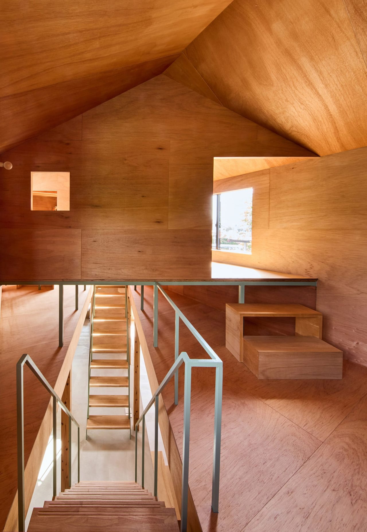
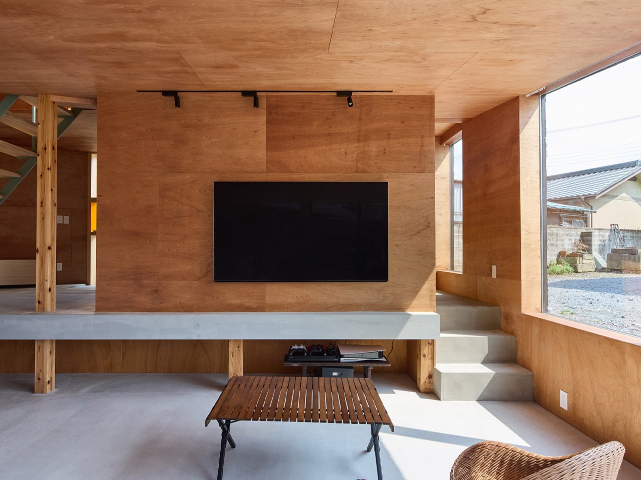
Externally, the house is clad in charred cedar planks — a material choice that references the yakisugi tradition while quietly echoing the workshop’s aesthetic — finished with a corrugated metal roof. The dark, textured exterior makes the building recede into its surroundings rather than announce itself. Step inside, and the mood shifts entirely. Warm plywood lines the walls and ceilings throughout, bringing an amber softness that offsets the char outside.

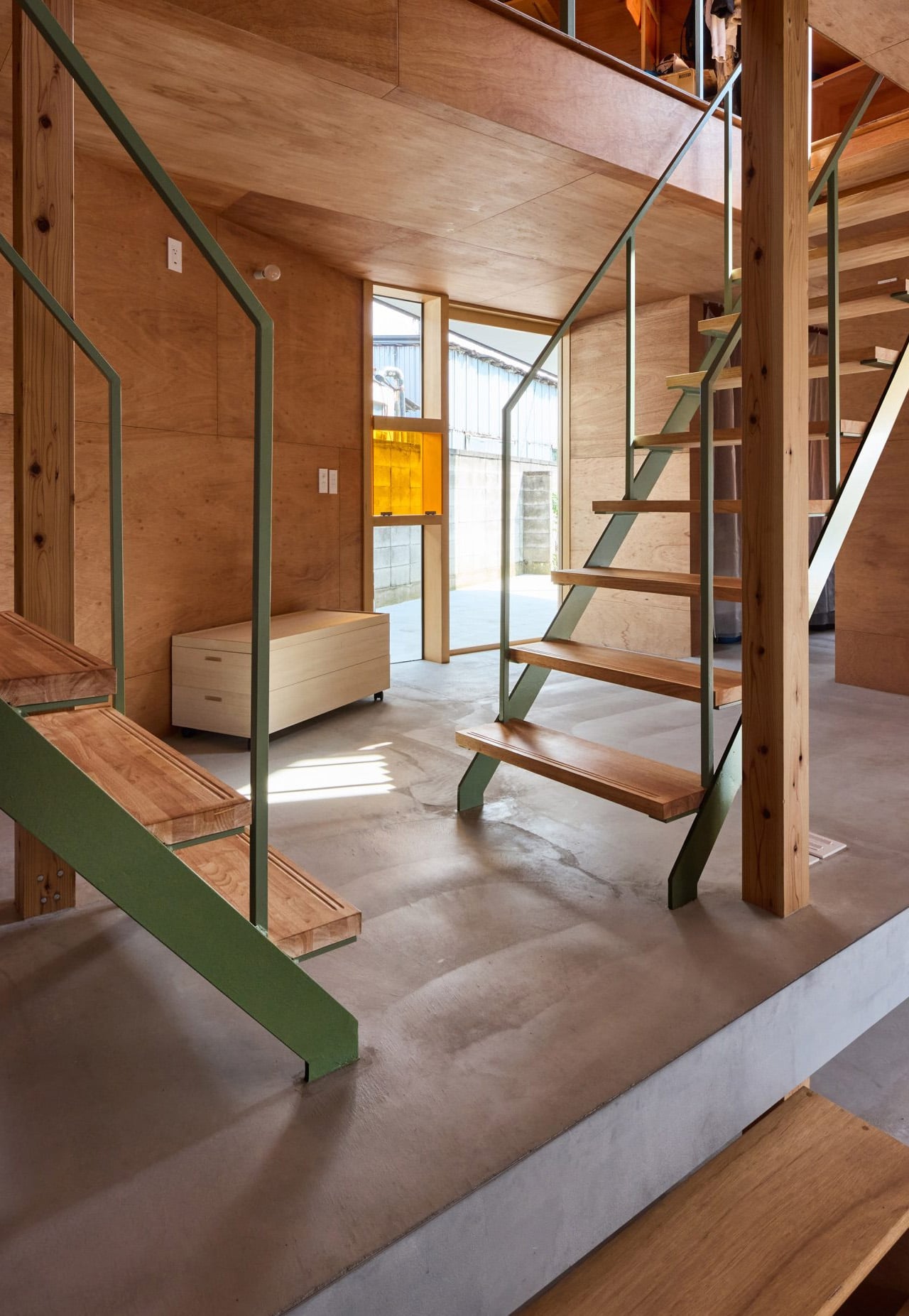
A pair of staircases — one timber, one in green-painted steel — rise through a rectilinear void, connecting the sunken ground floor to the upper level where the bedrooms sit on either side of a raised, loft-like space that can flex as a study or a guest room. The vertical sequencing of the home means sightlines stack on top of each other, and the experience of moving through it feels more spatial than square footage alone would suggest.

What Tato Architects achieves here is a kind of earned restraint. Nothing overreaches. The charred skin, the green roof, the careful sectional play — each decision earns its place by solving something real. For a studio that has spent years finding spatial inventiveness inside tight Japanese plots, the House in Mibu is another proof of concept: the best constraints are the ones that quietly become the design.

The post This Charred-Wood Home in Japan Turns a Backyard Constraint Into Its Best Feature first appeared on Yanko Design.
Teenage Engineering meets iPod Shuffle: This music player puts the screen where your eyes actually are

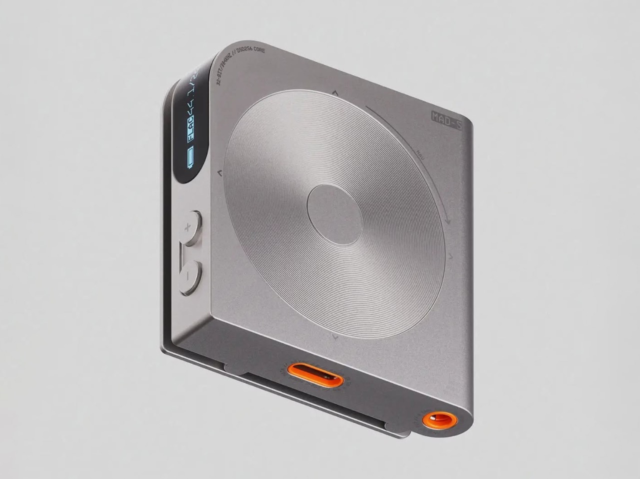
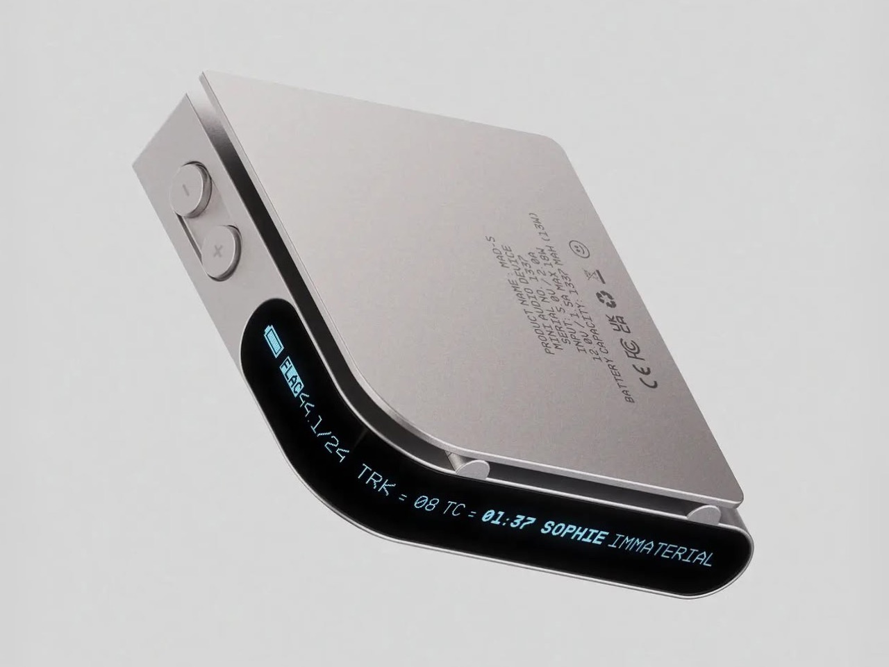
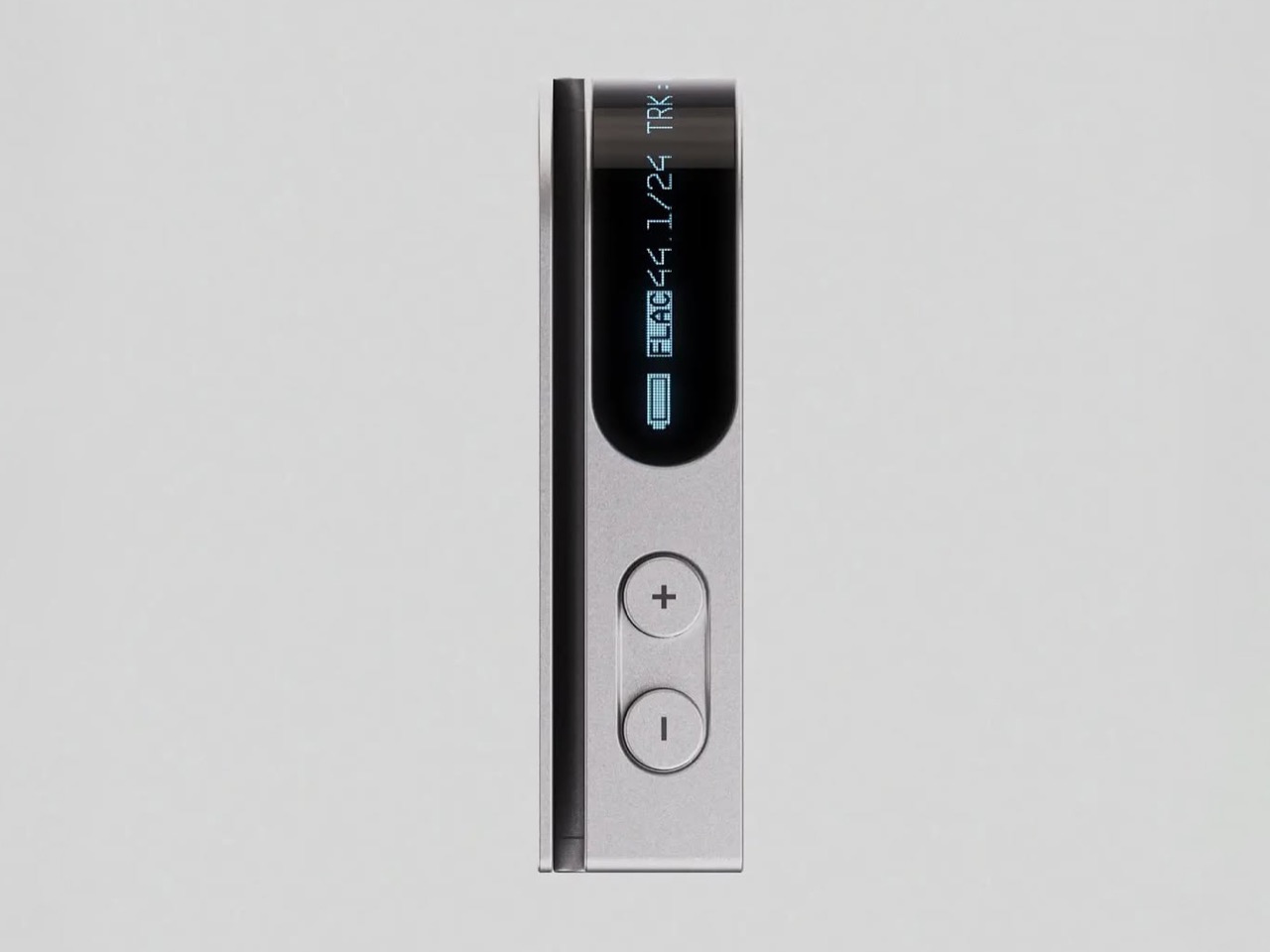
Sony killed the MiniDisc in 2006 with the MZ-RH1, a recorder so good that people still pay silly money for working ones on eBay. It did something unusual with its display, mounting the OLED on the front edge of the body rather than the top, so you could read it at an angle no other player offered. That edge-mounted screen is a small footnote in audio history, the kind of detail only a handful of collectors ever think about. Florent Porta has been staring at that screen for years, by his own admission, and the MAD-5 is what came out of the staring. It is a square aluminium player with a thin blue ticker running along its front lip, reading out format, sample rate, track number, timecode and song title.

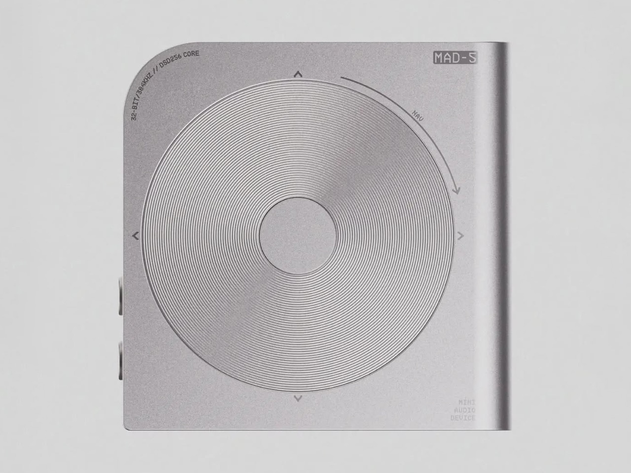
The MZ-RH1 measured 83.8 by 84.4mm, which is to say almost perfectly square, and the MAD-5 lands on the same proportion. That is either a deliberate quote or a very good accident. What Porta has added is a clip, borrowed from the later iPod Shuffles, and the combination solves a problem Apple never bothered with. A clipped-on player shows you its edge, not its face. So put the words there.

Designer: Florent Porta

The third generation Shuffle in 2009 stripped every physical control off the body, leaving a bare power switch, and pushed volume and track changes onto a three-button remote wired into proprietary earbuds. Reviewers hated it, and Apple reversed course within a year, bringing the button ring back on a fourth generation that shrank into something nearly square. Porta borrows the fourth gen’s clip and skips the third gen’s whole premise, which is the correct call. Wrap a screen around the exposed edge of a clipped device and you get the information without a button, an earbud remote, or Apple’s old workaround, a talking menu called VoiceOver that was software standing in for a hardware idea nobody had built yet.

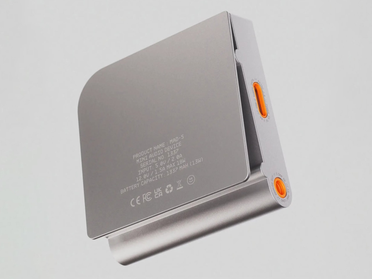
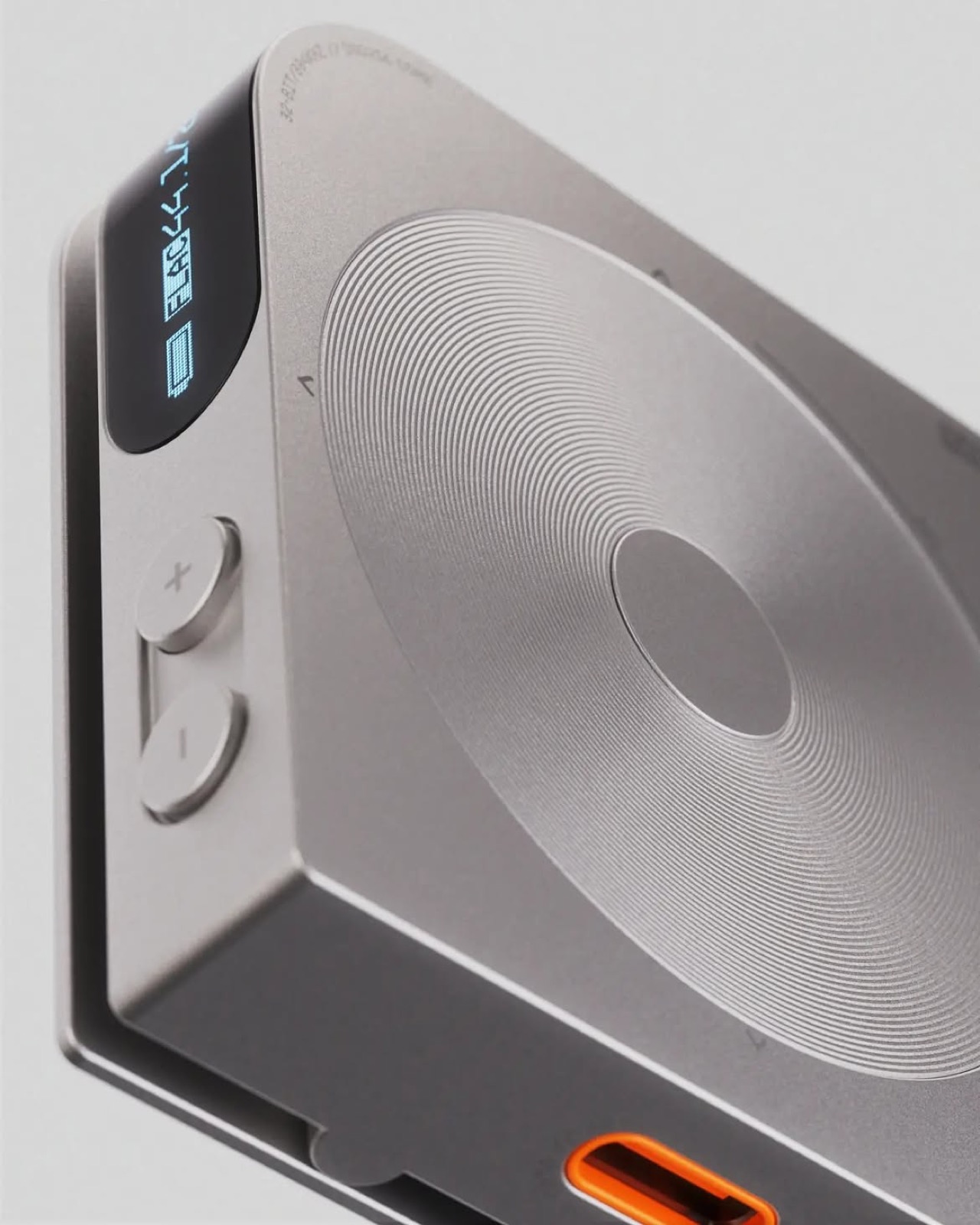
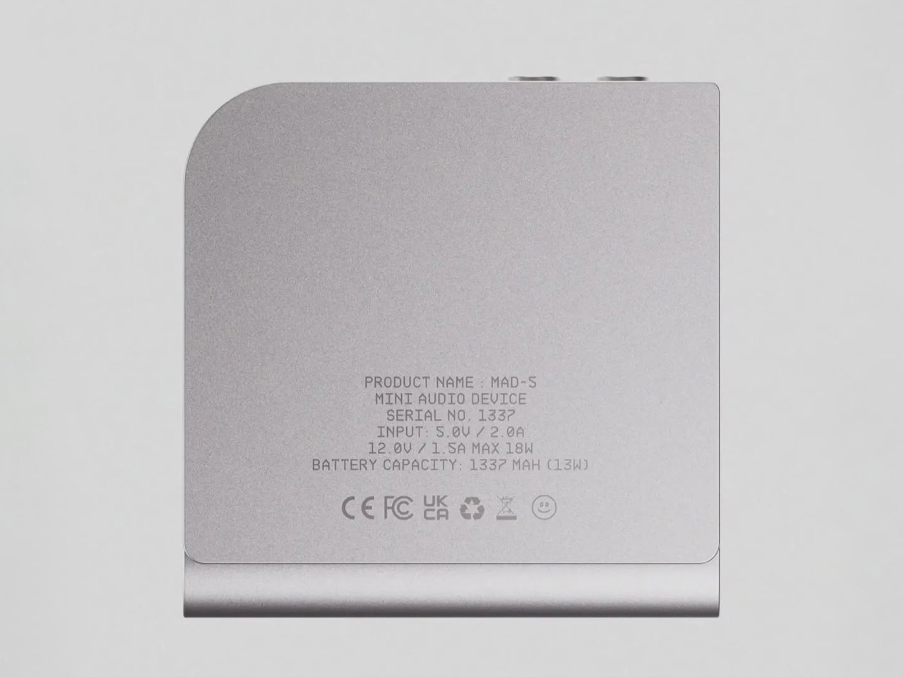
The jog disc on the face nods toward Teenage Engineering’s TP-7, the field recorder we covered when it landed in 2023, whose motorized tape reel actually spins under a brushed motor with ball bearings while you record or scrub through playback. Porta’s disc has no motor behind it, just concentric rings etched into aluminum with arrows for navigation, so the homage is visual rather than mechanical. That is a fair trade in a concept render, but it is worth naming, since a spinning reel earns its charm through motion and this one borrows the charm without it. The engraved spec plate leans aspirational too, and the 1337 mAh battery is the second time Porta has hidden that exact number in a product.

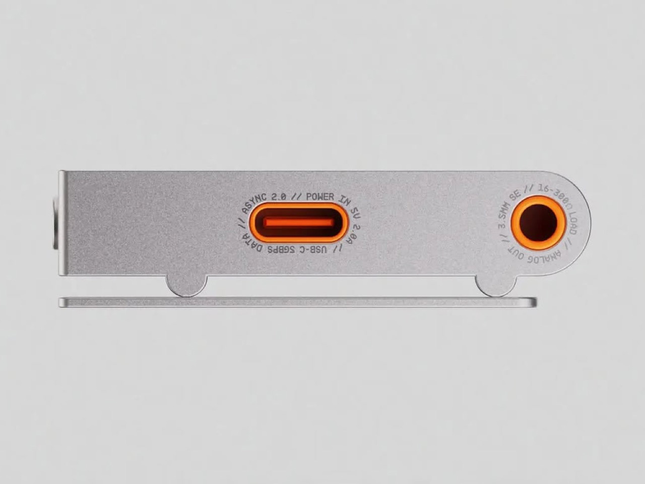
There is no Bluetooth listed anywhere on the body, no balanced output for the higher-end headphone crowd, and nothing marked for expandable storage, all of which current audiophile DAPs from Sony, FiiO and HiBy treat as standard at this level. The stronger idea might not be the ticker screen at all. It is the USB DAC mode, since anyone carrying a laptop already owns half the reason dongle DACs exist, and a player that folds into an audio interface the moment you plug it in solves a real annoyance rather than a cosmetic one. Porta says a desktop dock is next, meant to unlock more I/O once the MAD-5 is home, which quietly admits the ports on this version are thin. That is pretty self-aware for a concept render.

We covered Porta’s last swing at this category back in February, the DAP-1, a maximalist FLAC player built around an OLED touchscreen and a built-in speaker. The MAD-5 is the opposite instinct from the same person eight months later, stripped down to a disc, two buttons and a strip of text. Neither one exists as hardware yet, and a dock that is still just a thought puts no real timeline on anything. But the edge screen is worth remembering regardless of whether this specific object ever ships, because it solves something two decades of clip-on players walked straight past. Sony found the location by accident in 2006. Apple never looked. Porta just put both ideas in the same room.

The post Teenage Engineering meets iPod Shuffle: This music player puts the screen where your eyes actually are first appeared on Yanko Design.