Phones became both lifelines and germ magnets during the pandemic: the one thing you touched constantly but probably never cleaned properly. People started wiping screens with alcohol wipes or shirt sleeves, while juggling separate UV boxes and wireless chargers that never felt portable. The idea of a cleaner phone battling the reality of one more device to pack rarely worked out in daily practice.
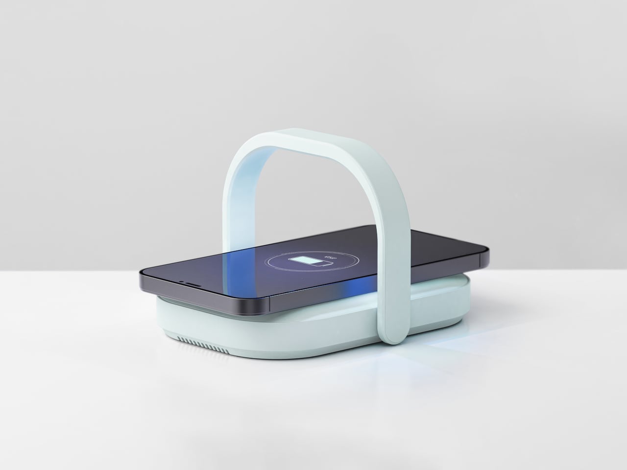
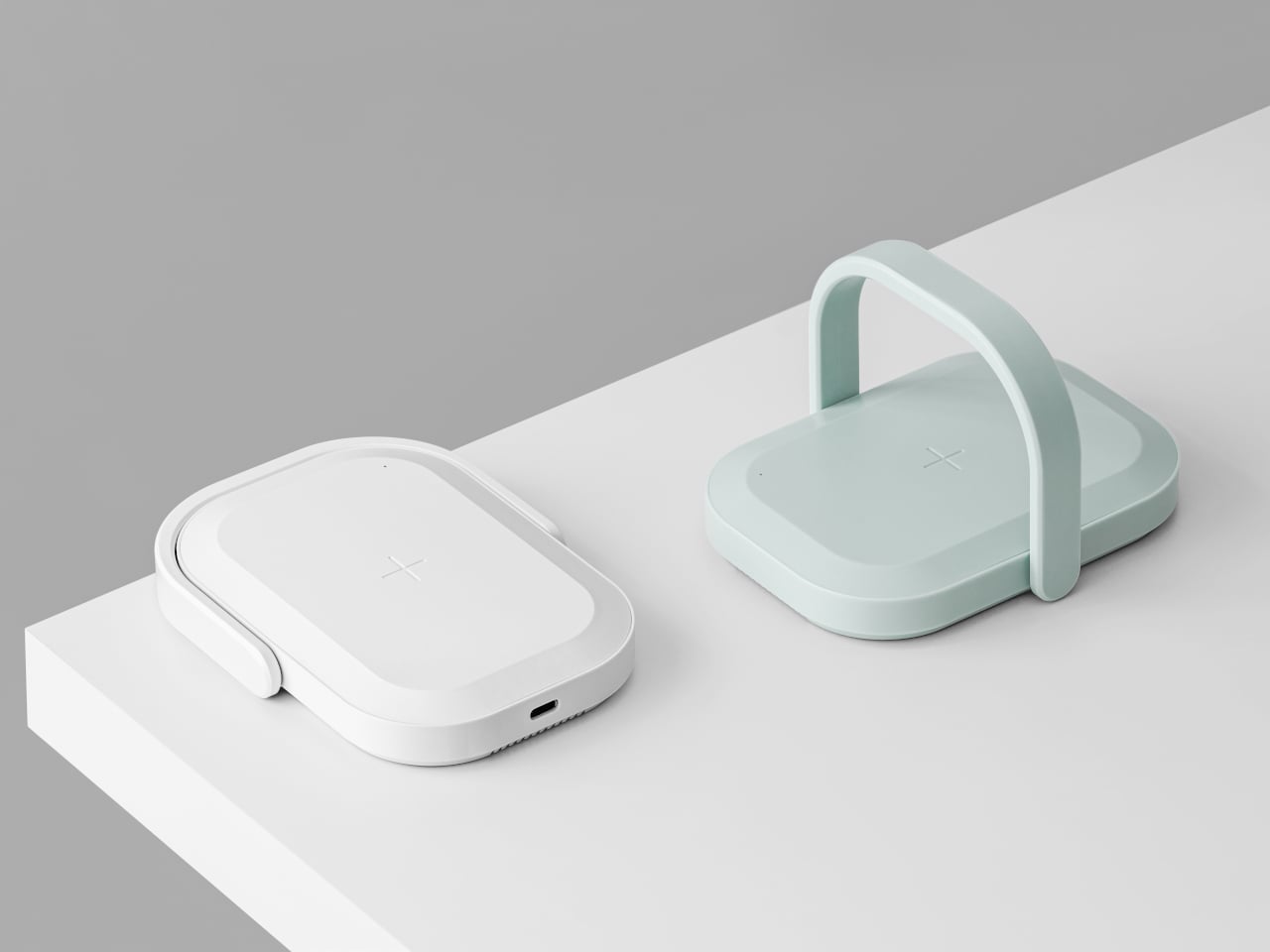
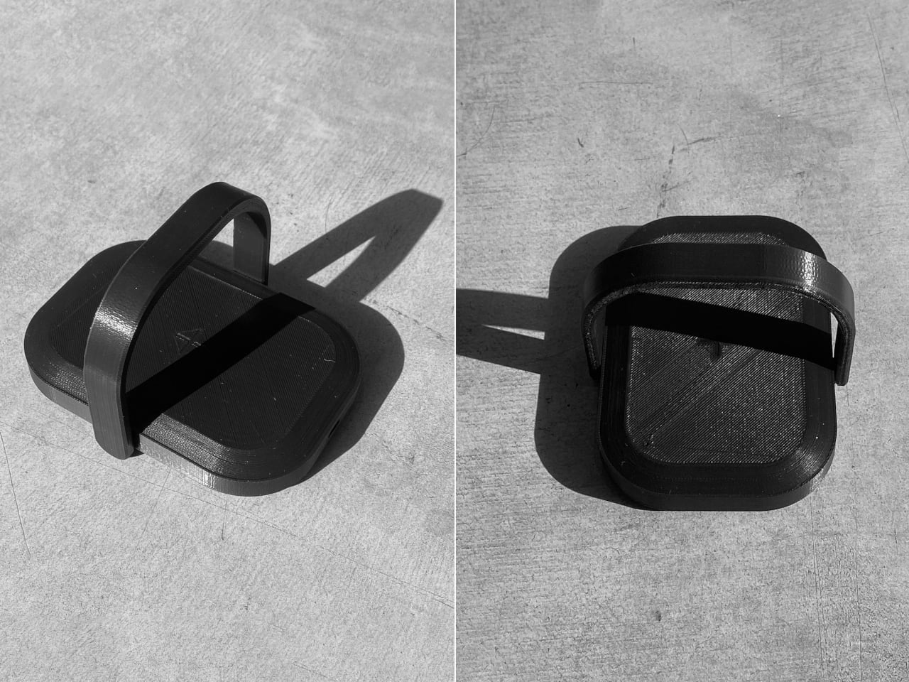
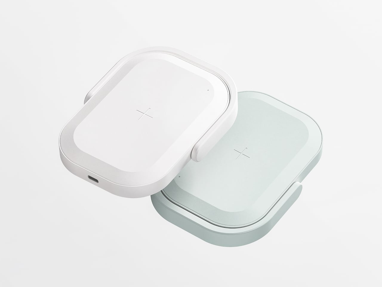
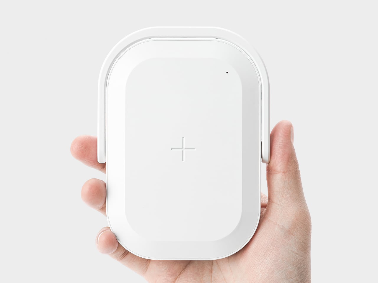
Picnic UV Charger merges those two needs, an extra battery and a cleaner phone, into one object. It is a wireless charger with a built-in UV sanitizer and a 10,000 mAh battery, shaped like a tiny picnic bag you can grab by the handle and drop into a tote or backpack. The compact body and soft colors keep it from looking like medical equipment parked on your desk.
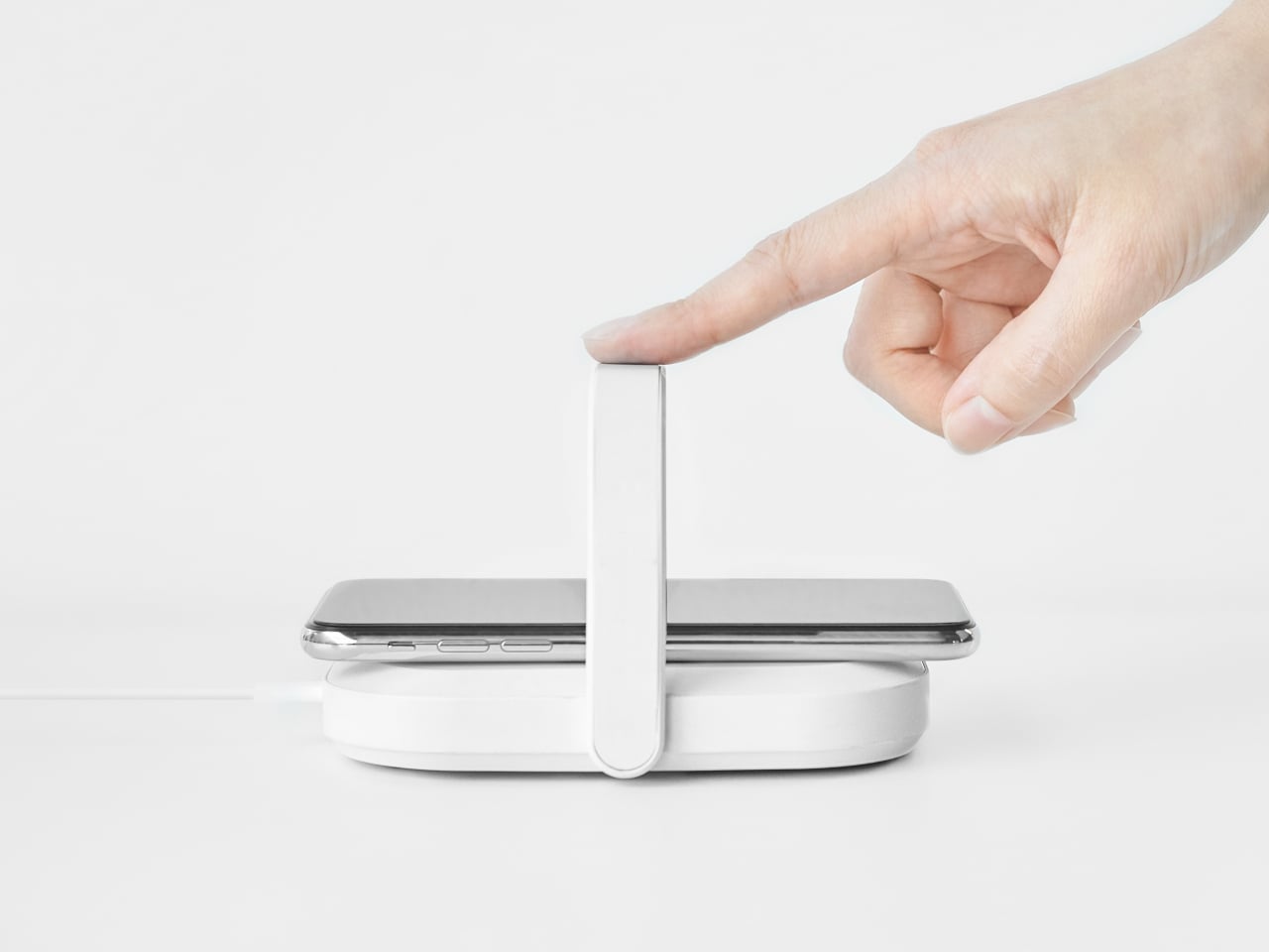
At a café with a questionably clean table, your battery is low, and you drop your phone onto the Picnic UV Charger instead of directly on the surface. You flip up the handle, which arches over the phone, and in about five minutes, the UV light has done its 99.9 percent sterilization pass while wireless charging quietly tops up the battery. Both tasks happen in a single gesture instead of requiring two separate gadgets.
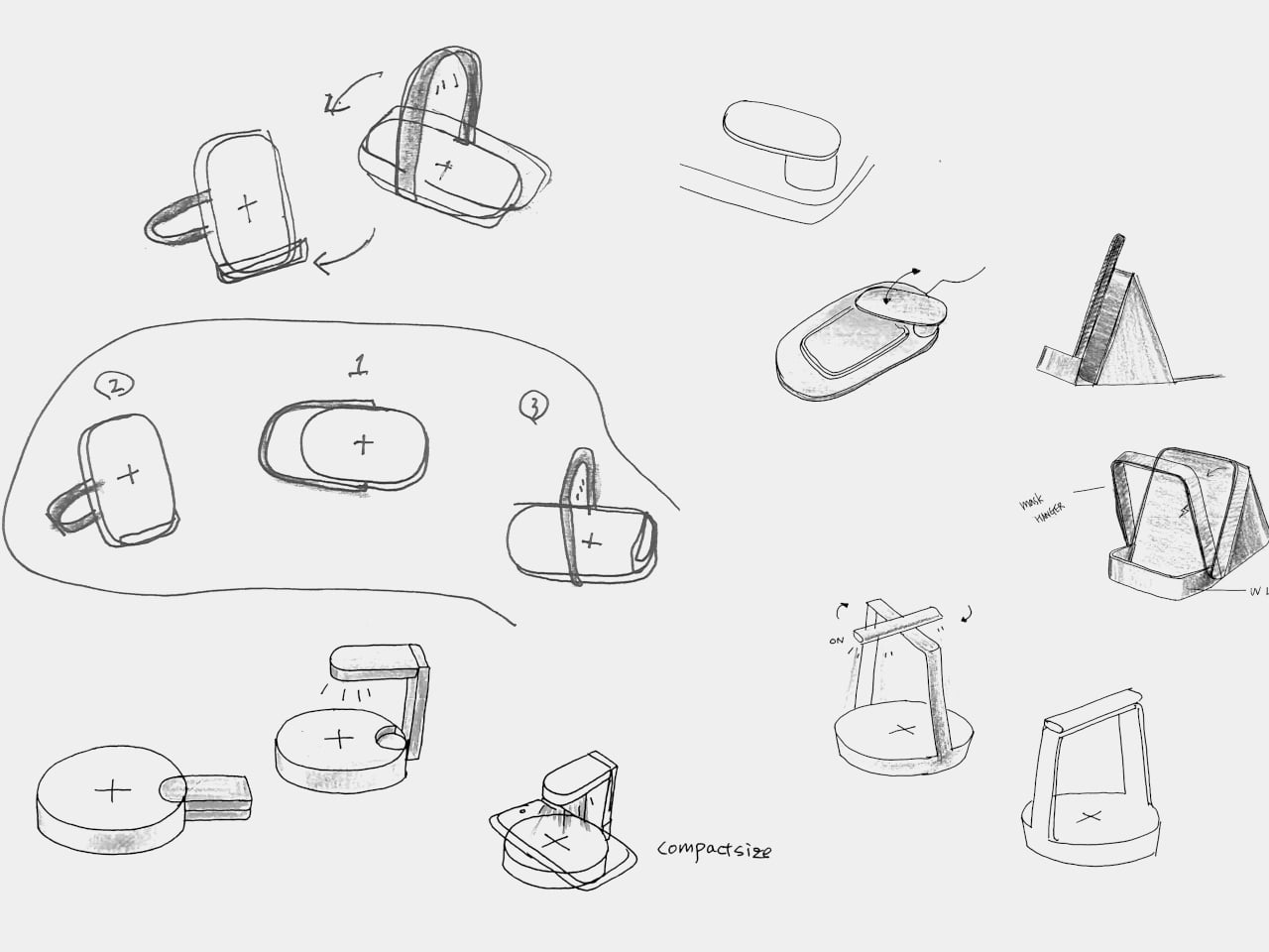
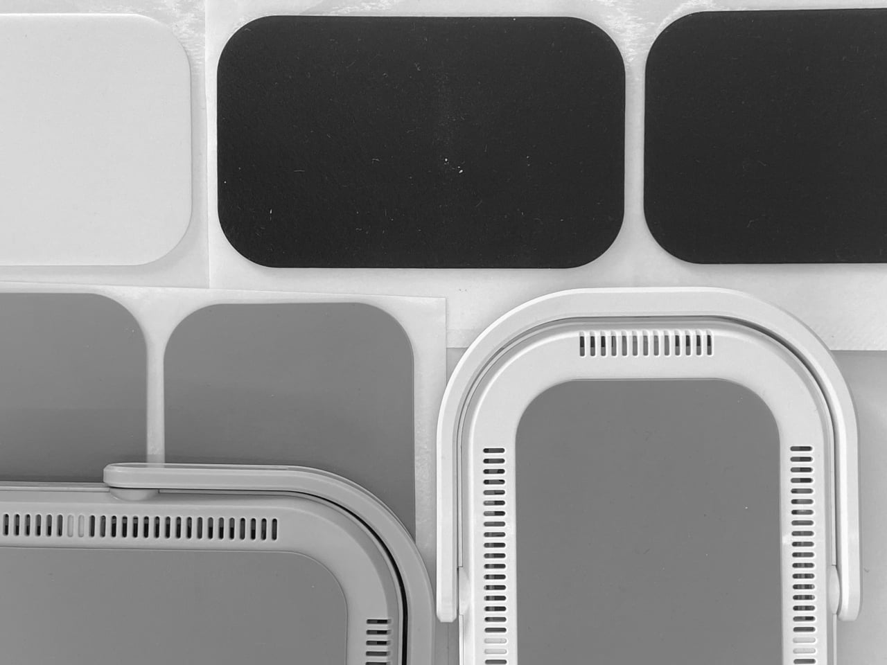
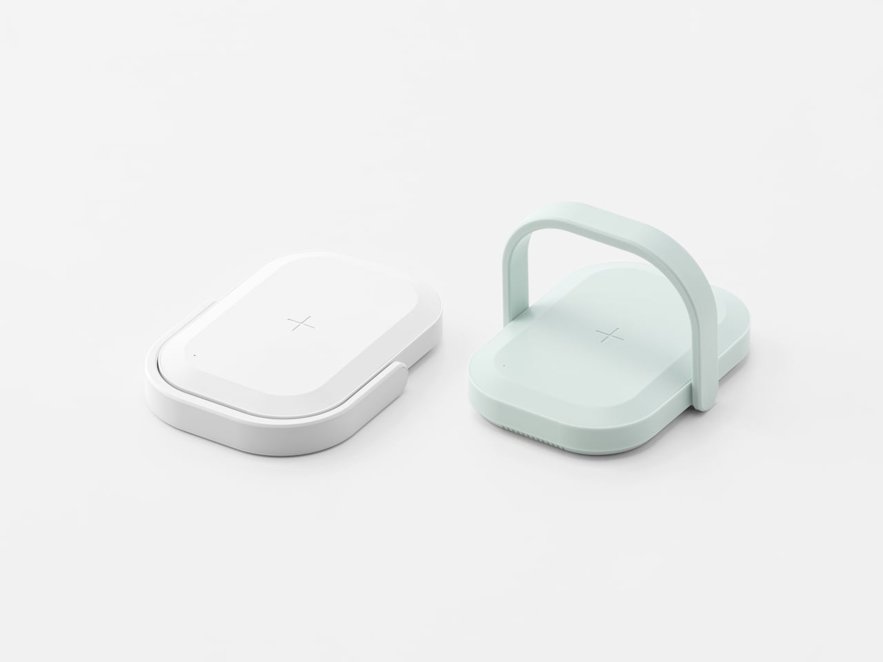
The handle does double duty: acting as a grip and carrying the UV LEDs. Its outline follows the shape of the body, so when folded down, it disappears into the silhouette, keeping everything compact and flat enough to slip into a bag. The form was prototyped with foam and paper to check scale, then refined with 3D printing to make sure the handle felt natural to raise and lower without snagging.
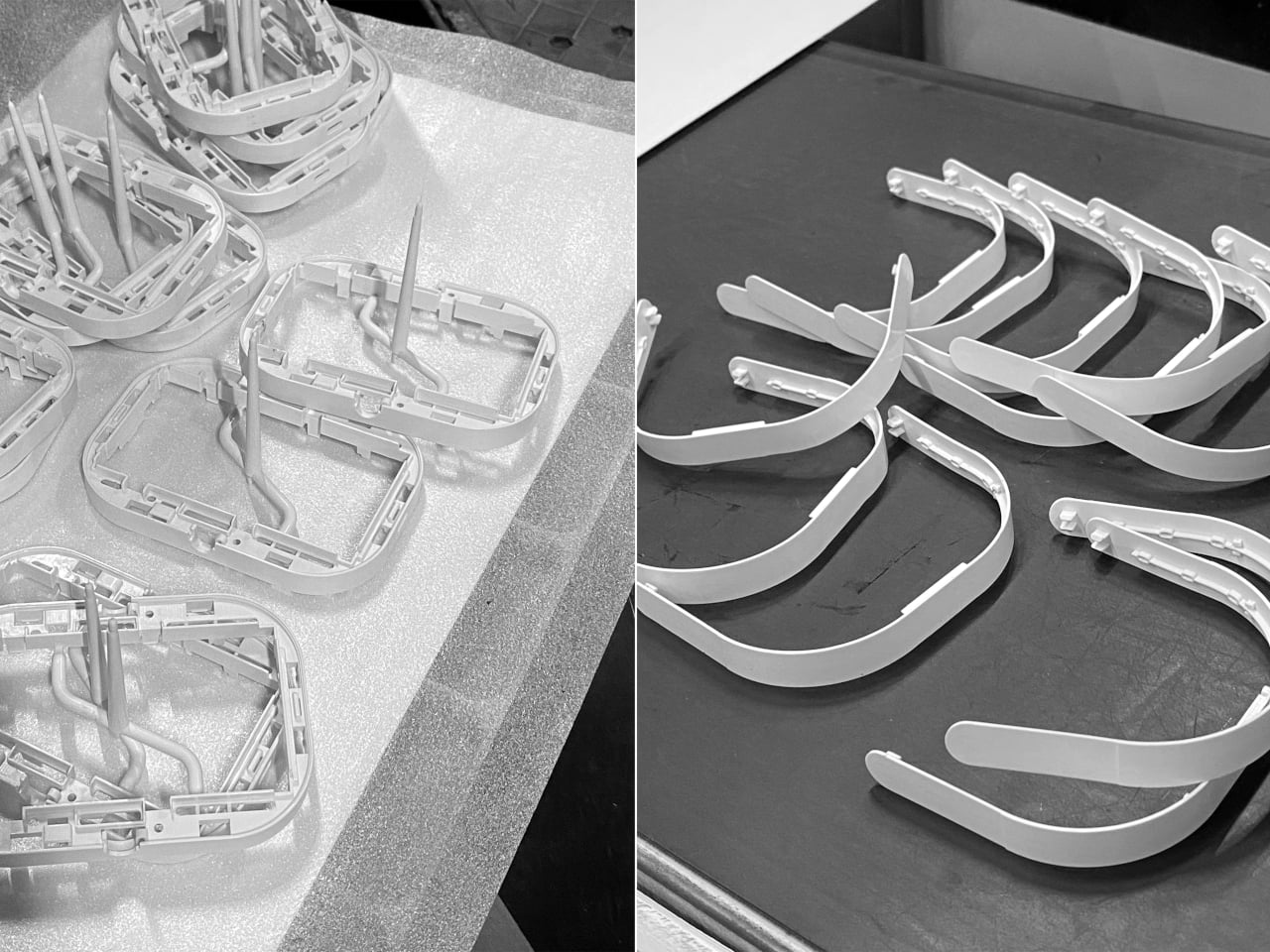
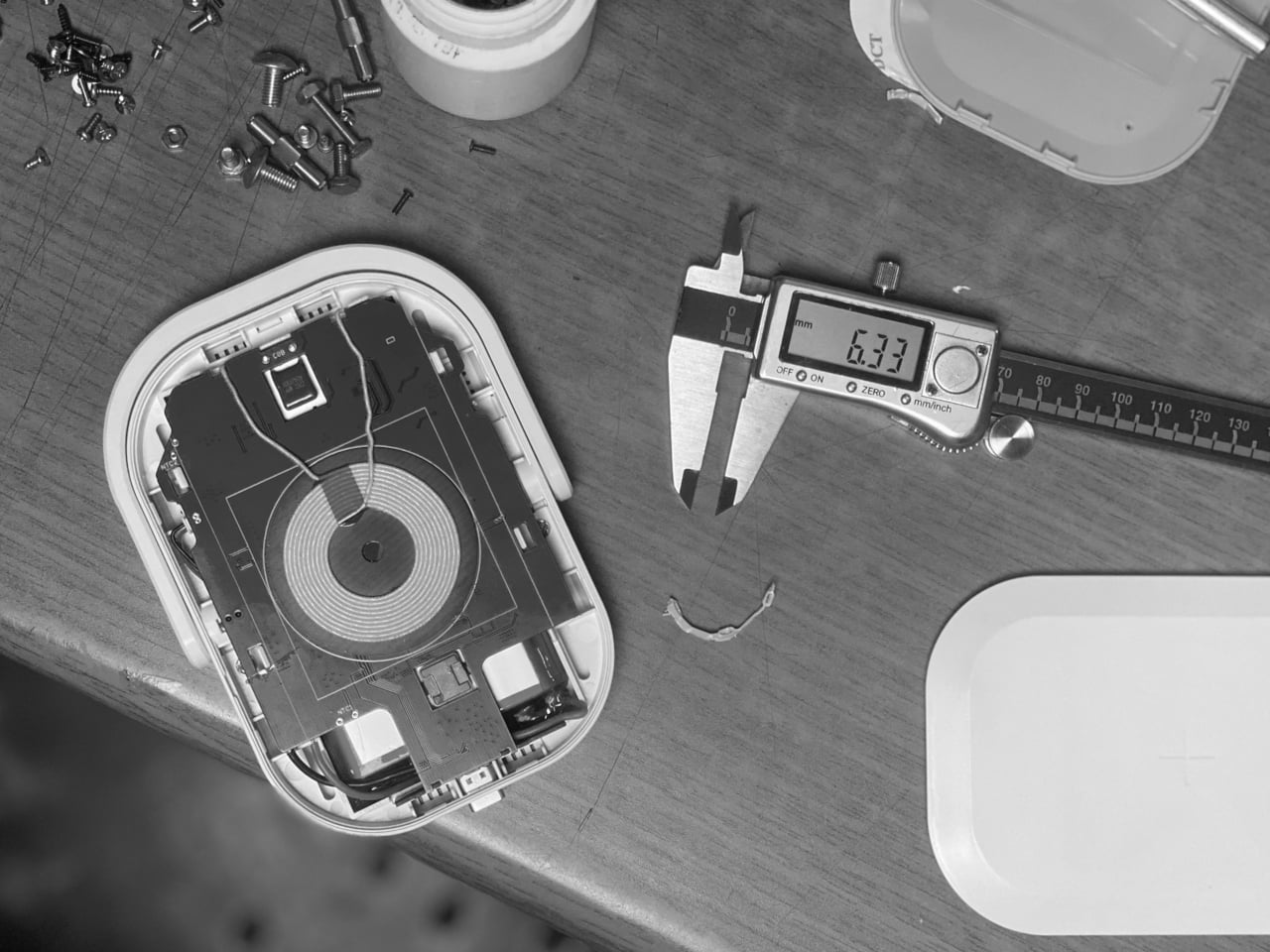
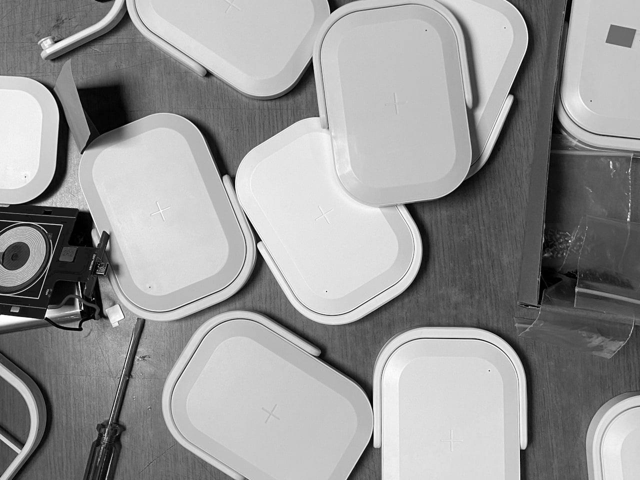
Working mock-ups were used to check battery heat and operation, which is important when combining a 10,000 mAh pack, wireless charging, and UV light in a small enclosure. The team iterated the molds several times to improve assembly and minimize breakage risk, suggesting attention to hinges, snaps, and internal ribs. It is the kind of work that makes a product feel trustworthy rather than fragile after a few uses.
The soft white and mint color options, rounded corners, and lunchbox-like proportions keep it from looking clinical. Even as Covid-era anxiety fades, a portable wireless charger that also sanitizes your phone still makes sense in crowded cities, shared offices, and travel. It turns a slightly uncomfortable task into something folded into a familiar ritual: place phone on charger, flip handle, walk away.
Picnic UV Charger treats hygiene as an add-on to something you already do, charging, instead of a separate chore. The handle, the compact body, and the dual function make it feel like a small, friendly object rather than a reminder of worst-case scenarios. A wireless power bank that also quietly cleans the screen you have been tapping all day turns out to be useful, especially when it fits into your bag without looking like you are carrying a sterilization station.
Decluttering your home doesn’t mean emptying it. The real transformation happens when you replace bulky, single-purpose objects with designs that work harder, look better, and take up less mental space. Minimalist home decor swaps prioritize intention over accumulation, choosing pieces that blend function with form so seamlessly they feel like they’ve always belonged there. Each item earns its place not through compromise but through clarity.
These seven swaps prove that less isn’t about deprivation. It’s about choosing objects that serve multiple roles, disappear when not in use, or turn everyday rituals into moments worth noticing. From shoehorns that vanish into the background to mirrors that double as vases, each design replaces clutter with calm. Your space becomes easier to navigate, simpler to maintain, and infinitely more intentional in how it supports your daily life.
1. Invisible Shoehorn
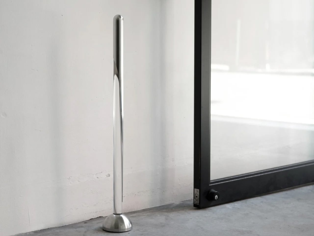
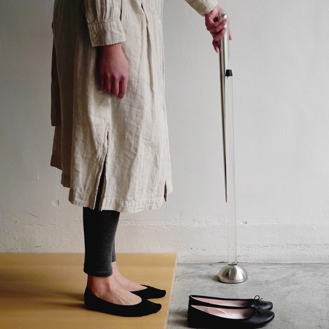
Most shoehorns live in that awkward space between useful and ugly. They lean against walls, slide under furniture, or get tossed into closets where you can never find them when your hands are full. This shoehorn takes a different approach entirely. Its long stainless steel body handles the practical work of protecting your footwear and your lower back, while its transparent stand makes the whole thing look like a sculptural accent rather than a utilitarian tool.
The magic happens when you step back and realize you’re not looking at a shoehorn at all. The clear stand holds the polished metal at just the right angle, creating visual interest without announcing its purpose to everyone who walks past your entryway. It replaces the need for a separate decorative object while solving the chronic problem of where to put the shoehorn when you’re done with it. You get function and form occupying the same footprint.
The transparent design hides the shoehorn in plain sight, eliminating visual clutter.
The extended length means you can put on shoes without bending or straining your back.
The polished surface slides smoothly without catching on delicate socks or stockings.
What We Dislike
The transparent stand may require occasional cleaning to maintain its clarity.
Some might prefer a shorter version for travel or smaller spaces.
2. Key Holder Wakka
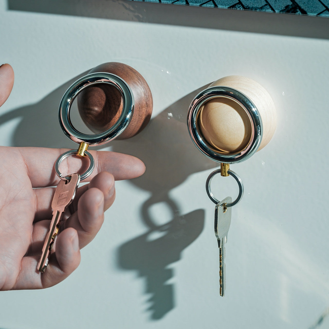
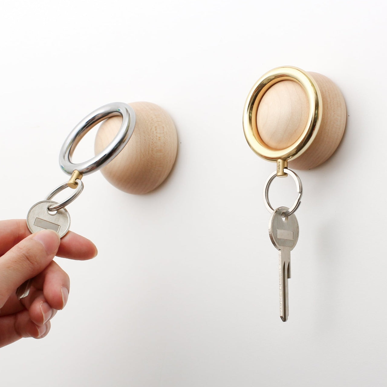
Keys create chaos in ways that seem disproportionate to their size. They end up on kitchen counters, buried in bags, or tossed onto random surfaces throughout your home. The Wakka Key Holder turns the simple act of putting your keys away into something you’ll actually want to do. The wooden base anchors the design with natural warmth, while the magnetic ring creates a satisfying connection that you can hear and feel.
That audible tap when metal meets magnet becomes a tiny ritual that marks your arrival home. The sound itself is calming, almost meditative, turning a forgettable action into a moment of intentional pause. The key ring works independently when you need it, and the wooden base stands alone as a sculptural element even when the keys are gone. This swap replaces messy key bowls or hooks that accumulate clutter with a singular object that does one thing exceptionally well.
The powerful neodymium magnet keeps keys secure without fumbling.
The brisk tapping sound creates a satisfying sensory experience.
Available in Silver/Maple and Silver/Walnut to match different interior styles.
What We Dislike
The magnetic system is only compatible with the included keyring design.
The wooden base requires a dedicated surface spot rather than wall mounting.
3. Penguin x MOEBE Book Stand
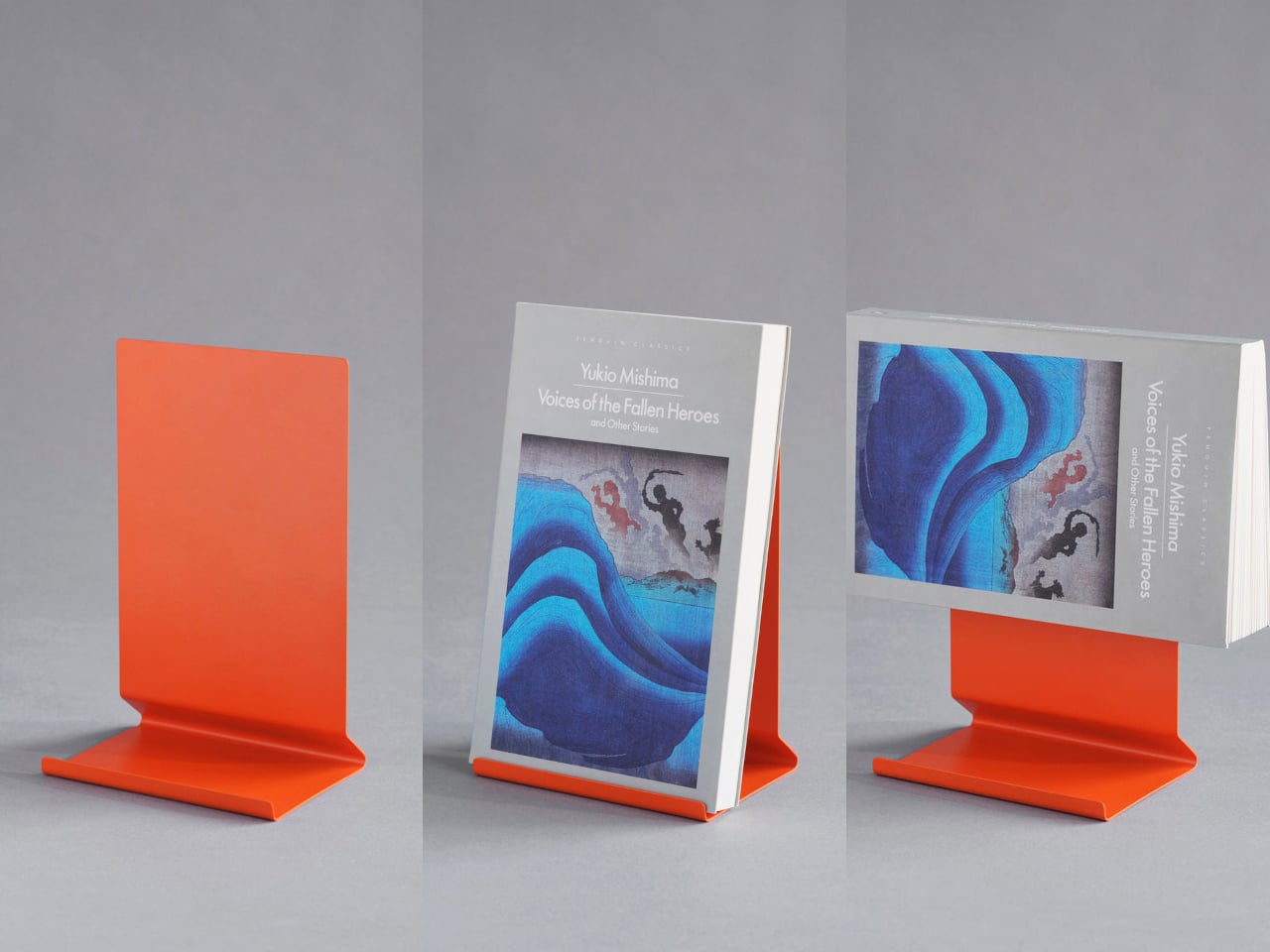
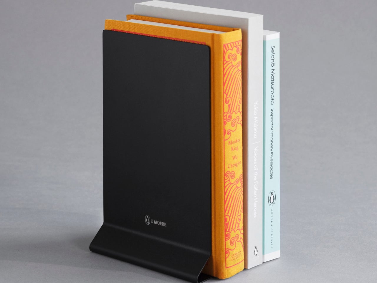
Books pile up in ways that make spaces feel chaotic even when everything else is tidy. Stacks lean precariously on nightstands, current reads disappear into shelves, and bookmarks slip out when you’re trying to remember your place. This bent steel stand treats books as objects worth displaying rather than just storing. It holds volumes open for reading, props single books upright for visibility, or works in pairs as bookends, depending on your needs.
The single-sheet construction means no visible fasteners or complicated assembly to wrestle with. The matte finish in stainless steel, cream, black, or Penguin orange stays visually quiet while the angled base supports different book thicknesses without wobbling or tipping. It replaces bulky bookends, flimsy wire stands, and the habit of leaving books face-down to hold your place. Your reading material gets a dedicated home that makes returning to the page feel natural.
What We Like
The versatile design works as a reading stand, display prop, or bookend.
The seamless bent steel construction creates clean lines without hardware.
Multiple color options coordinate with different interior aesthetics.
What We Dislike
The minimal footprint works best with standard book sizes.
Pairs are needed for full bookend functionality.
4. Miniature Bonfire Wood Diffuser Set
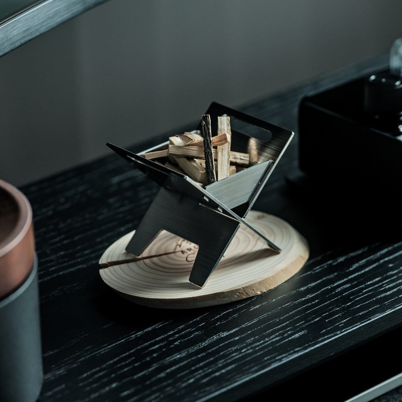
Traditional diffusers either look clinical or try too hard to blend in, taking up counter space without contributing much to the room’s atmosphere. This miniature bonfire flips that equation completely. The stainless steel construction creates a tiny sculptural fire pit that doubles as an essential oil diffuser, with miniature firewood pieces that spread fragrance as gently as an actual forest breeze. The camping aesthetic brings outdoor calm indoors without requiring commitment to literal nature decor.
The real versatility shows up when you realize the trivets transform the whole setup into a functional pocket stove. You can use it to warm small amounts of food or create an authentic camping experience right at your table. This single object replaces conventional diffusers, decorative candles, and even emergency heating elements. The rust-resistant material means it lasts, and the bundled firewood pieces with their tiny tying knots add handmade charm that mass-produced diffusers can’t match.
The rust-resistant stainless steel ensures lasting durability.
The included trivets convert the diffuser into a functional pocket stove.
The Mt. Hakusan essential oil captures authentic forest fragrance.
What We Dislike
The compact size limits oil capacity for larger rooms.
The campfire aesthetic may not suit all interior styles.
5. Lotus Clock
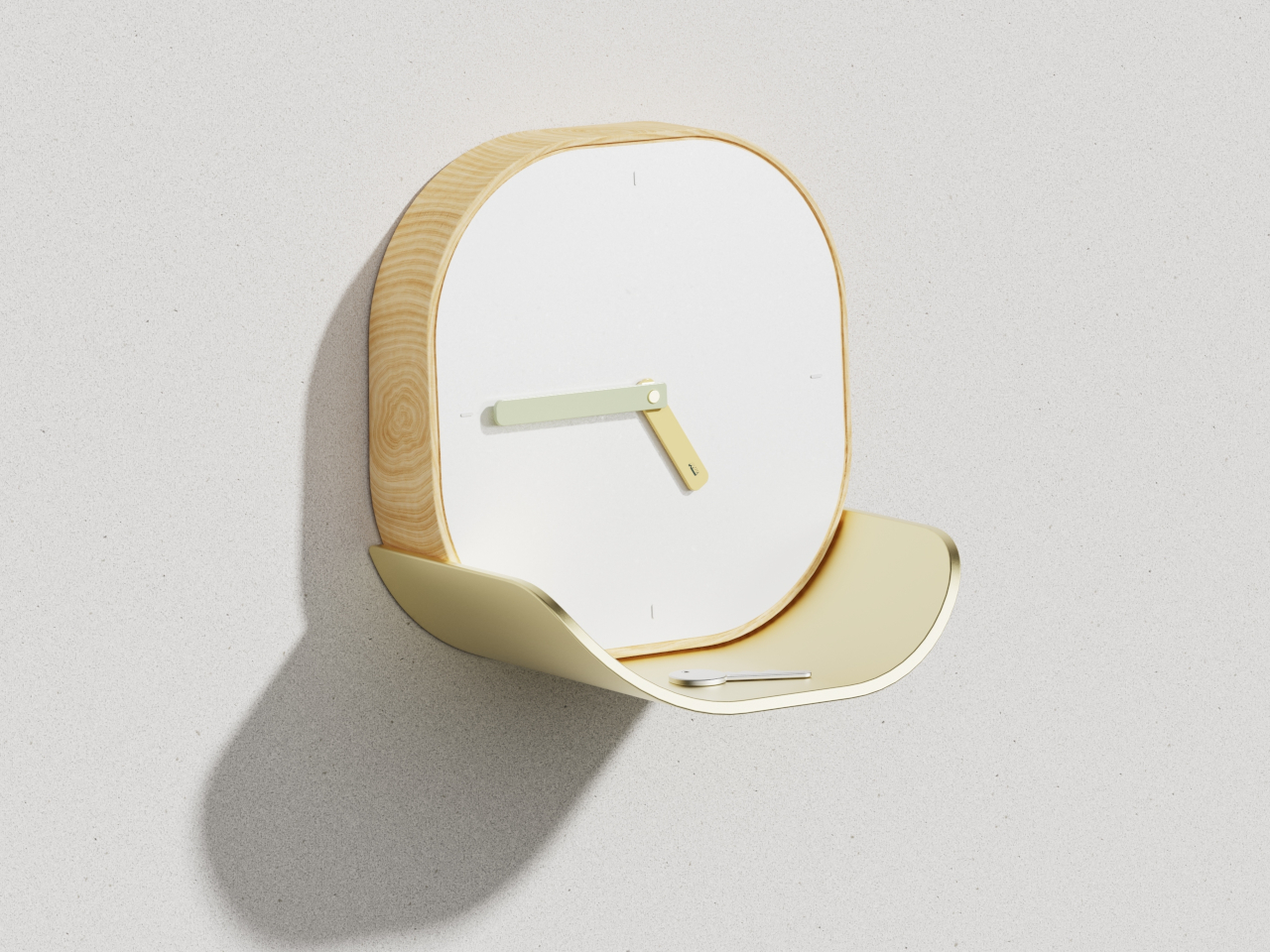
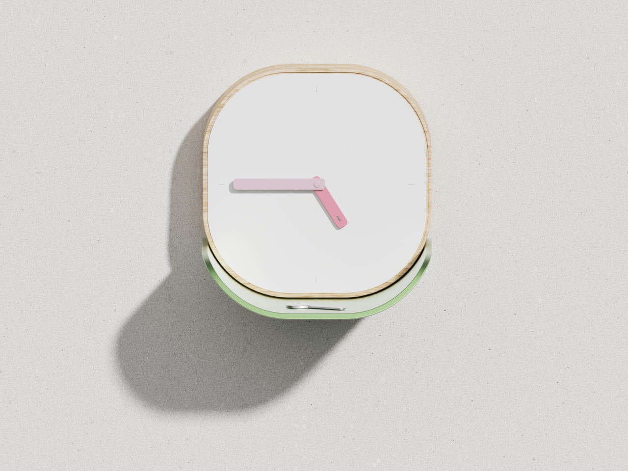
Wall clocks usually do one thing, and catchall dishes do another, which means you end up with both competing for wall and surface space. The Lotus Clock merges these functions into a single design that draws inspiration from nature’s problem-solving. The curved metal tray sits beneath the clock face like a lotus leaf collecting morning dew, creating a natural resting spot for keys, coins, and the small items that usually scatter across entryway tables.
The biomimetic approach makes the dual functionality feel intentional rather than forced. The wooden frame features soft rounded corners that read as approachable, while the clean white face keeps time-reading effortless even from across the room. The broad flat hands coordinate with the tray’s finish, whether you choose soft gold or gentle green, creating visual harmony between timekeeping and storage. This swap eliminates the need for separate wall clocks and entryway organizers, freeing up both vertical and horizontal real estate.
What We Like
The integrated tray provides dedicated storage for daily carry items.
The biomimetic design feels both poetic and practical.
Multiple colorway options allow personalization while maintaining minimalist aesthetics.
What We Dislike
The tray size limits what can be stored there comfortably.
Wall mounting is required, which may not work for renters.
6. ClearFrame CD Player
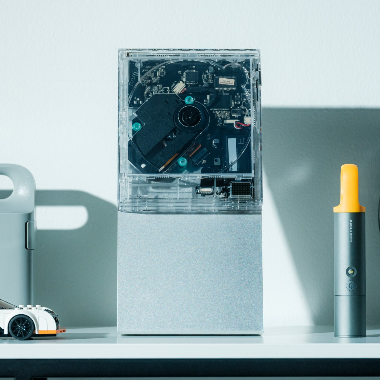
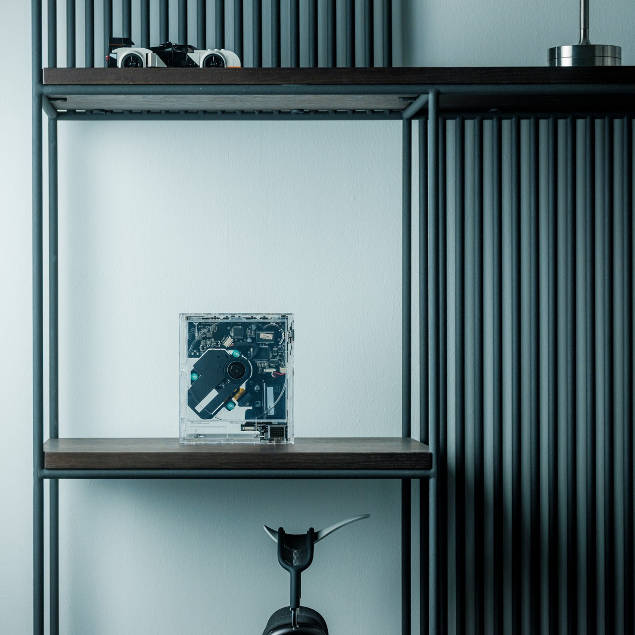
Physical media creates display challenges that streaming never will. CD collections sit in drawers or bulky towers that broadcast “clutter” even when organized. The ClearFrame CD Player reframes music as something worth exhibiting. The crystal-clear polycarbonate body turns the disc and album artwork into a miniature gallery, while the exposed black circuitry invites you to appreciate the engineering as part of the aesthetic rather than something to hide away.
The transparent design means the player becomes part of your decor, whether it’s playing or silent. Bluetooth connectivity, seven-hour battery life, and wall-mount capability give it flexibility that traditional players lack. It works on shelves, desks, or mounted as wall art, adapting to your space rather than demanding accommodation. This swap replaces both oversized stereo systems and hidden-away music players with something that celebrates physical media while taking up minimal space and maximum attention.
The transparent polycarbonate showcases both album art and internal engineering.
Bluetooth connectivity and a rechargeable battery offer placement flexibility.
Multiple mounting options adapt to different room configurations.
What We Dislike
The focus on CDs excludes vinyl collectors.
The transparent design shows dust and fingerprints more readily.
7. JewelVase Mirror Stand
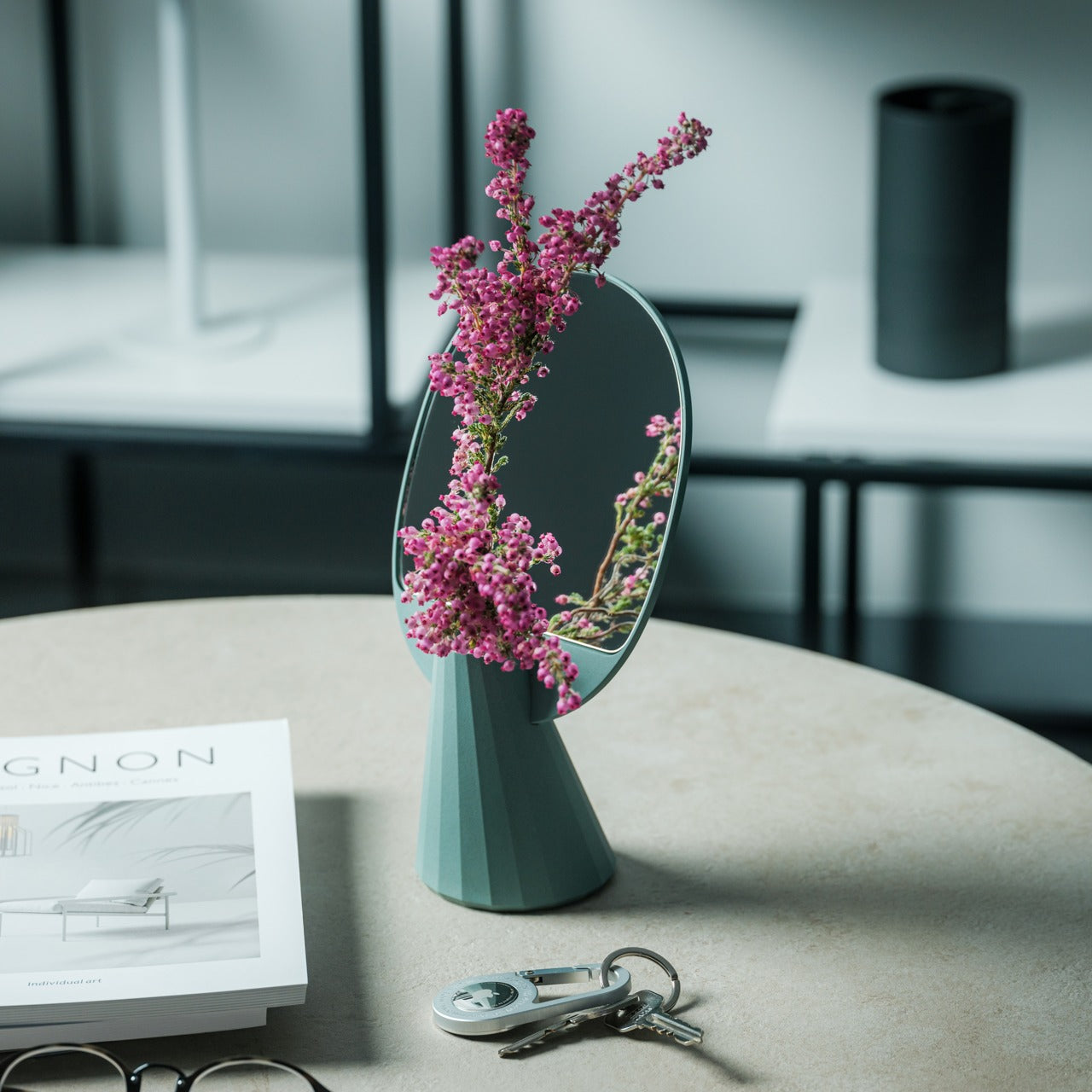
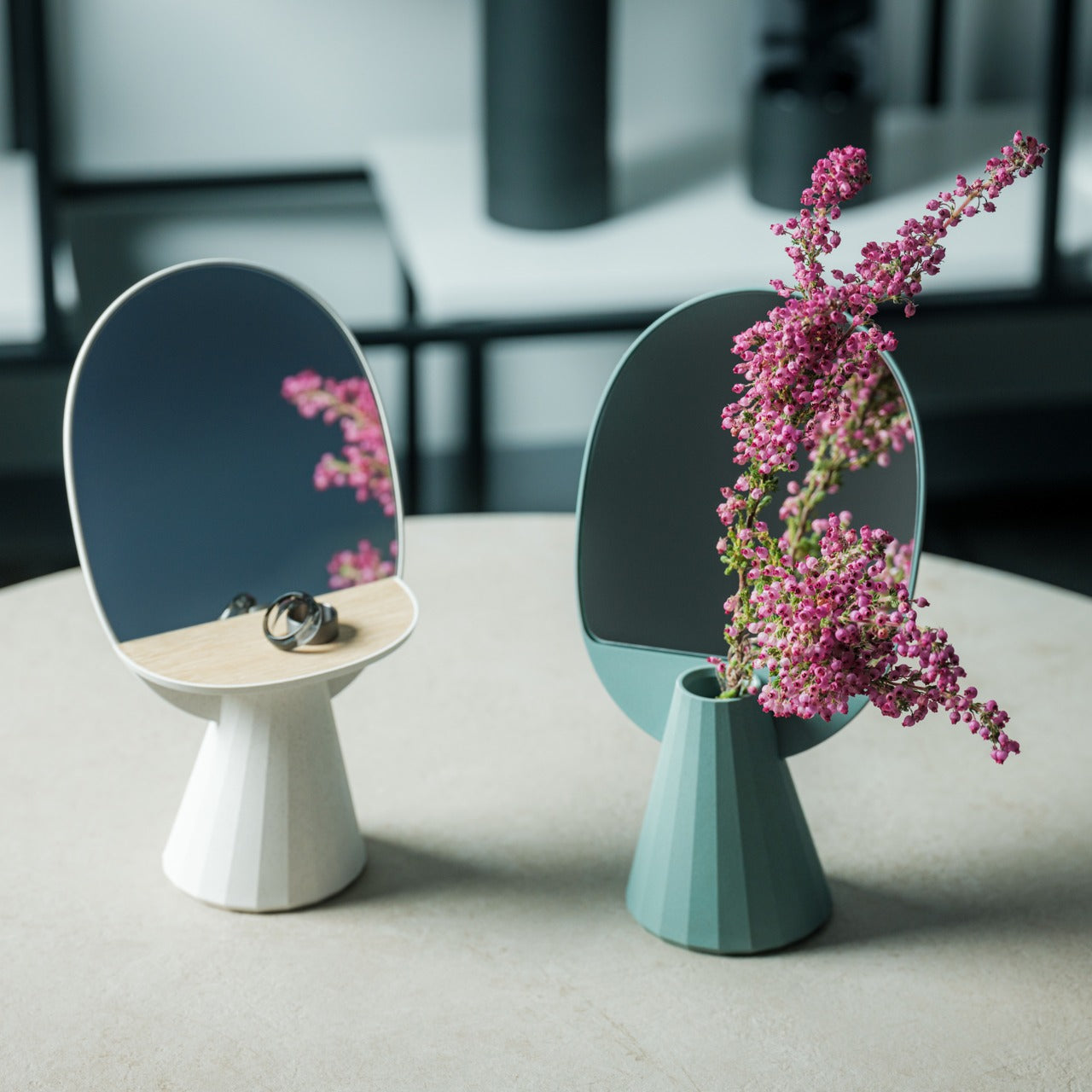
Mirrors, accessory storage, and vases typically occupy separate zones in your home, each claiming surface area and visual attention. The JewelVase collapses these categories into a single polyhedron form that functions as all three. The mirror reflects light and lets you check your appearance, the structure holds rings and bracelets, and the basin accepts water for fresh flowers. Each function enhances the others rather than competing for dominance.
The bioplastic construction contains rice husks, bringing material sustainability into the minimalist equation without sacrificing durability. The unique angled shape creates visual interest that earns its spot on any desk, table, or shelf, while the reflective surface doubles whatever beauty you place in front of it. Even pouring water becomes a small meditative ritual when the mirror shows you the flower from both sides simultaneously. This swap eliminates multiple accessories, consolidating them into one elegant object that does more with less.
The multipurpose design combines a mirror, an accessory stand, and a vase.
The bioplastic material incorporates sustainable rice husk content.
The polyhedron shape creates sculptural presence without bulk.
What We Dislike
The vase capacity suits single stems rather than large arrangements.
The angled mirror may not work for full-face viewing.
Making Space by Choosing Better
These seven swaps share a common philosophy. They refuse the false choice between function and beauty, instead insisting that thoughtful design delivers both simultaneously. Each piece earns its place by doing more than one thing well, by disappearing when appropriate, or by transforming mundane tasks into moments worth savoring. Your space becomes less about what you’ve removed and more about what you’ve chosen to keep.
Decluttering through minimalist swaps creates lasting change because you’re not fighting against your needs. You’re meeting them with objects designed to take up less room, require less maintenance, and contribute more to the atmosphere you’re trying to create. The result feels lighter, not because you’re doing without, but because everything present is pulling its weight. That’s where real minimalism lives, in the space between empty and intentional.
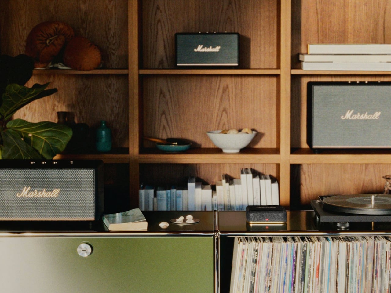
Owning a couple of Marshall Bluetooth speakers means great sound in different rooms, but getting music to follow you means reconnecting Bluetooth, nudging volume knobs, or carrying your phone with you. One speaker plays in the kitchen, another sits silent in the living room, and switching between them breaks whatever you were doing. The missing piece is not another speaker but a way to tie them together.
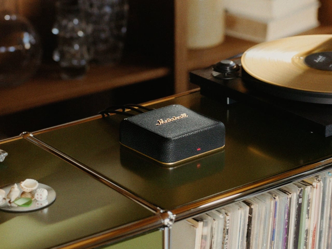
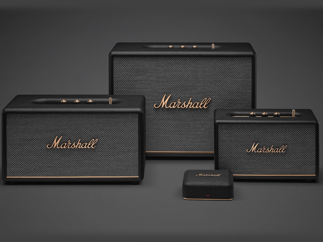
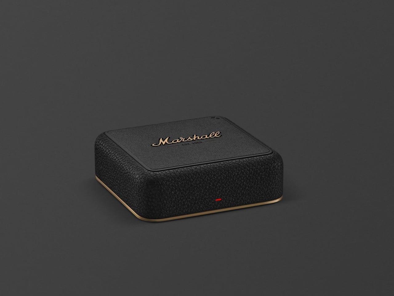
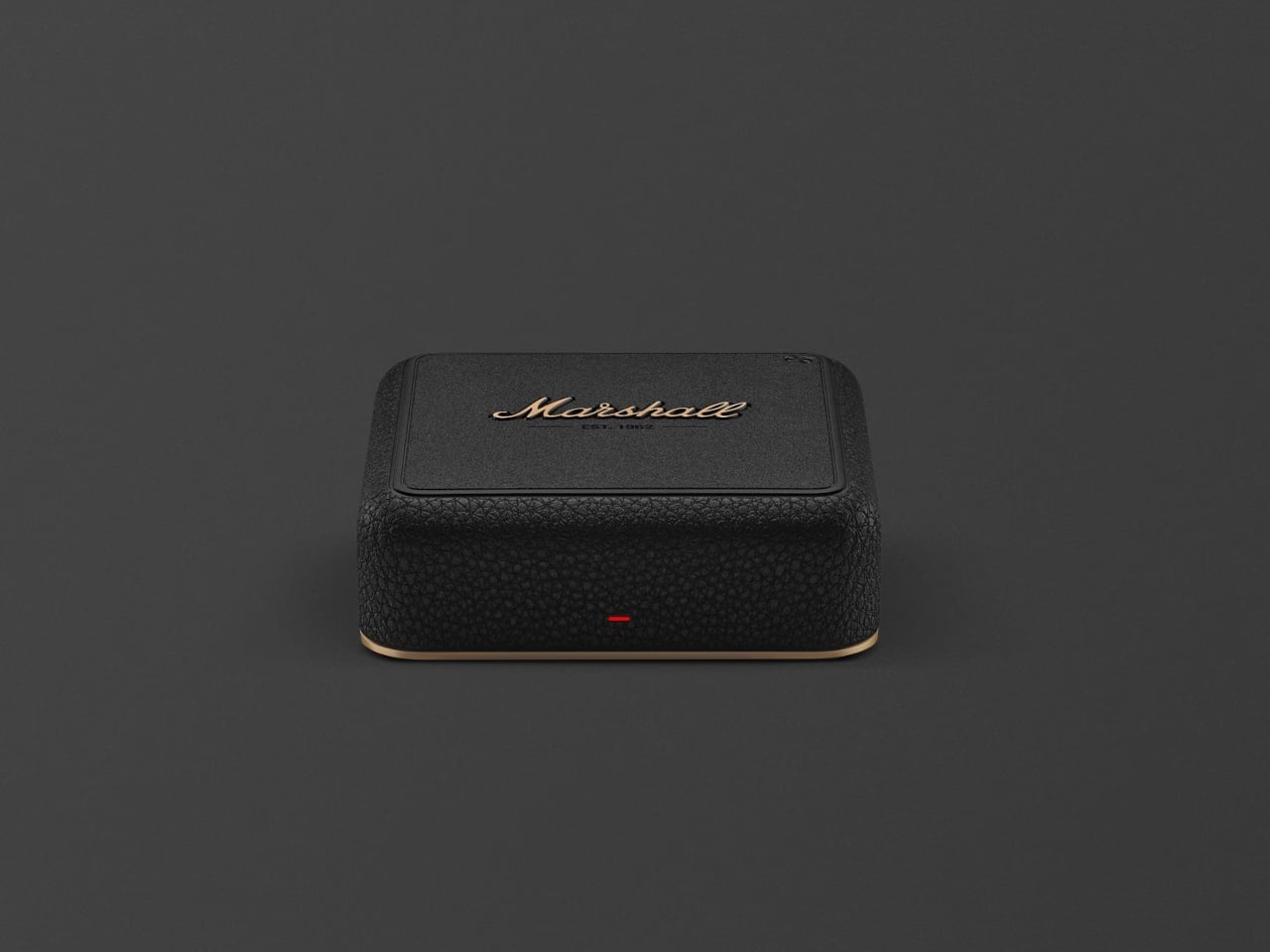
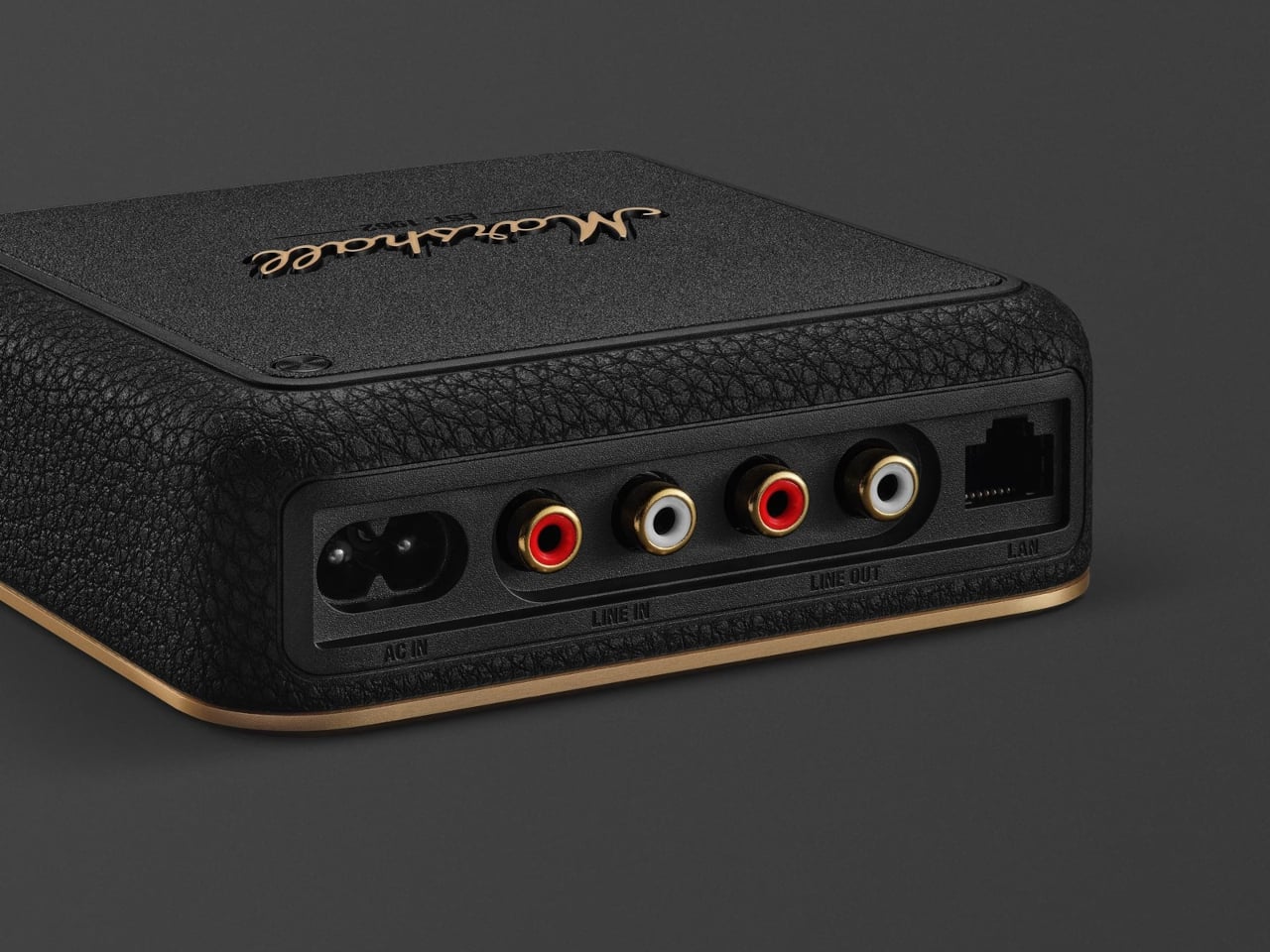
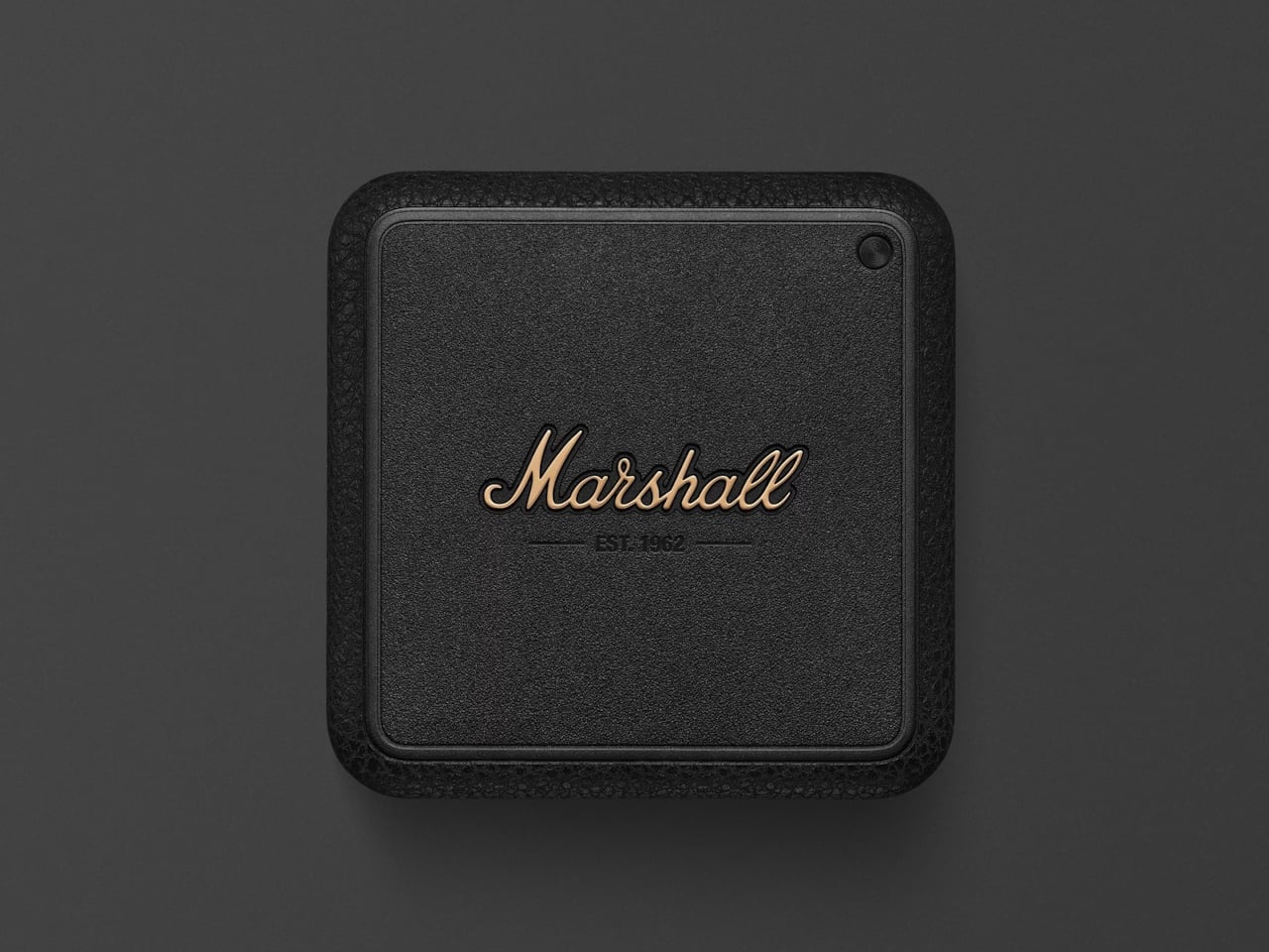
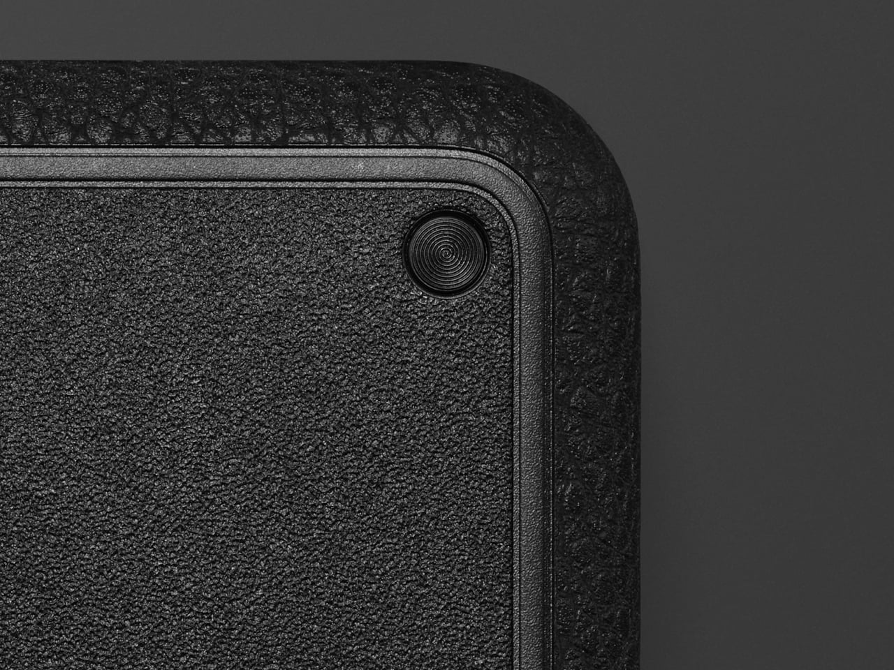
Marshall’s Heddon is a Wi-Fi music hub, a small square box that sits by your router and quietly becomes the brain for Acton III, Stanmore III, and Woburn III speakers. It connects to your network over Wi-Fi or Ethernet, pulls in music using Spotify Connect, AirPlay, Google Cast, or Tidal Connect, then rebroadcasts it to your speakers using Auracast so they all play in sync across rooms.
Starting a playlist on your phone, you send it to Heddon instead of a single speaker and let it handle the rest. You move from the kitchen to the living room, and the same track is coming out of different Marshalls without re-pairing. Friends can cast from their own apps, but the hub keeps the stream going even when phones leave or run out of battery, which is how whole-home audio is supposed to work.
Heddon has RCA line-in, so you can plug in a turntable or older CD player and stream that signal wirelessly to your Marshall speakers around the house. The only requirement is a phono preamp somewhere in the chain. A record spinning in one corner can be heard in the kitchen and bedroom without running cables or buying a new Wi-Fi-enabled turntable, turning analog playback into something that feels modern.
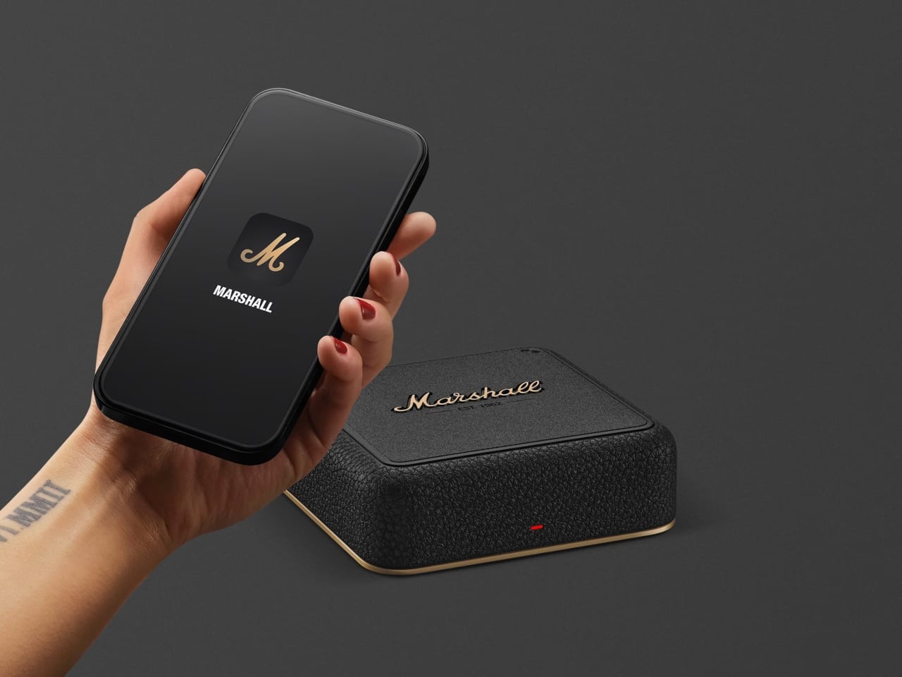
Most of the complexity lives in the Marshall app, which discovers Heddon, lets you assign speakers to rooms, create groups, and manage updates. The physical box stays simple on purpose. That makes it easier to update over time, but it also means the experience rises and falls with how well the app is maintained and how comfortable you are living inside one brand’s ecosystem.
Heddon only works with specific Marshall home speakers, not older models or portable units, which narrows the audience. At around $300, it is not a casual add-on, even if bundle discounts soften the cost. Compared to third-party streamers, you are paying for tight integration and the Marshall look, which makes sense if you are already committed to their gear.
Heddon is less about chasing another object and more about making the speakers you like feel current. By adding Wi-Fi, casting, and multi-room logic in one small hub, it nudges a Marshall-filled home closer to the convenience of dedicated multi-room systems without throwing anything out. For people who care as much about how speakers look as how they sound, that is a neat way to modernize without starting over.
Your laptop gets thinner every year and your tablet ditches another port with each refresh. Meanwhile, the actual work you do requires more connectivity than ever. Photographers need fast SD card access during client reviews. Presenters need a clicker and a thumb drive while streaming to the big screen. Educators move between rooms with different projectors and zero time to fumble with settings. The gap between sleek hardware and messy reality keeps widening.
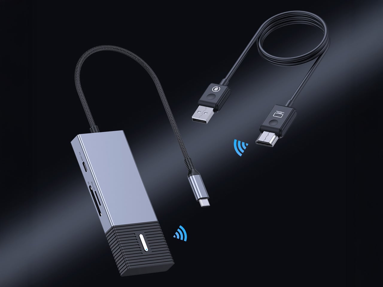
4URPC built the Gen 3 to close that gap entirely. The system pairs a plug-and-play wireless HDMI link with a genuinely useful hub, all in a single piece of kit. Plug the USB-C transmitter into your device and the HDMI receiver into any display. You get wireless 1080p 60Hz video in 0.02 seconds, plus immediate access to SD/TF cards, three high-speed USB ports, and 100W power delivery. No apps, no network dependency, no compromise. Just the screen and the tools you actually need, working together the way they should.
You can see the direct line from user feedback to this design. Their Gen 2 was a solid wireless 4K transmitter, but it was a single-purpose tool. People clearly pointed out that the moment they went wireless, their other ports were still occupied by hubs for storage, peripherals, and power. 4URPC took that to heart, building the new SP06 model around a complete workflow. They collapsed the entire dongle ecosystem into the transmitter itself, which is a far more practical solution for anyone working outside of a fixed desk setup.
The integrated hub is built with professional-grade specs. We are looking at two 10Gbps USB-A ports and a 10Gbps USB-C data port, which provides plenty of speed for fast external SSDs or multi-channel audio interfaces. The SD and TF card slots run at a respectable 5Gbps, fast enough for offloading photos and video without a huge bottleneck. Critically, the 100W USB-C power delivery input means you can run all of this connectivity and still keep a MacBook Pro or a powerful Windows laptop fully charged through a single connection.
All that local I/O becomes even more useful in a collaborative setting. A single HDMI receiver can pair with up to eight different transmitter hubs, completely changing the dynamic in a meeting room. Instead of passing a cable around or fighting with clunky software casting, each person can switch to become the active presenter with a button press. The 0.02-second switching time they claim makes the handoff nearly instant. This hardware-based approach sidesteps the need for everyone to be on the same Wi-Fi network or have specific apps installed, which is a constant headache in corporate or guest environments.
Packing a dual-band Wi-Fi module, a high-speed USB controller, and a PD circuit into one chassis generates serious heat, so the move to an aluminum alloy casing is a practical necessity. The metal body functions as a heat-sink, which should lead to more stable performance during long sessions where you are pushing 1080p video and transferring data simultaneously.
Super early backers can snag the complete system for $99, which includes the wireless transmitter/hub unit, the HDMI receiver, and the necessary cables. That is a 50% discount off the planned $198 retail price, limited to the first 500 backers. After that, early bird pricing sits at $109, and there are multi-pack options if you want to outfit an entire team or multiple rooms. The 4URPC G3 ships globally, starting April 2026.
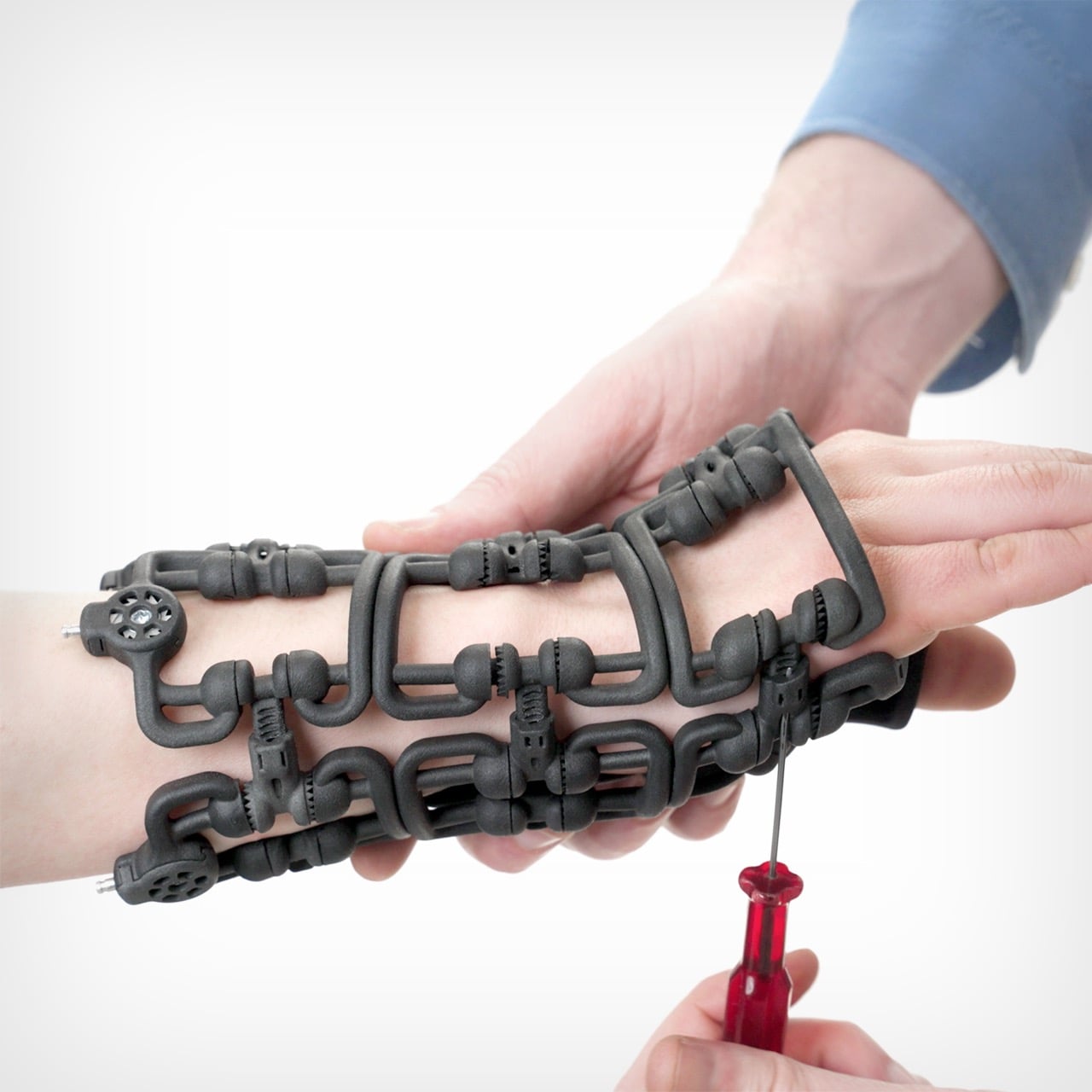
What do Swiss timepieces and sailing rigging systems have in common with orthopedic braces? More than you might think. The engineers at Osteoid drew inspiration from these precision mechanical systems to create Bracesys, a revolutionary approach to fracture immobilization that challenges everything we thought we knew about medical casts.
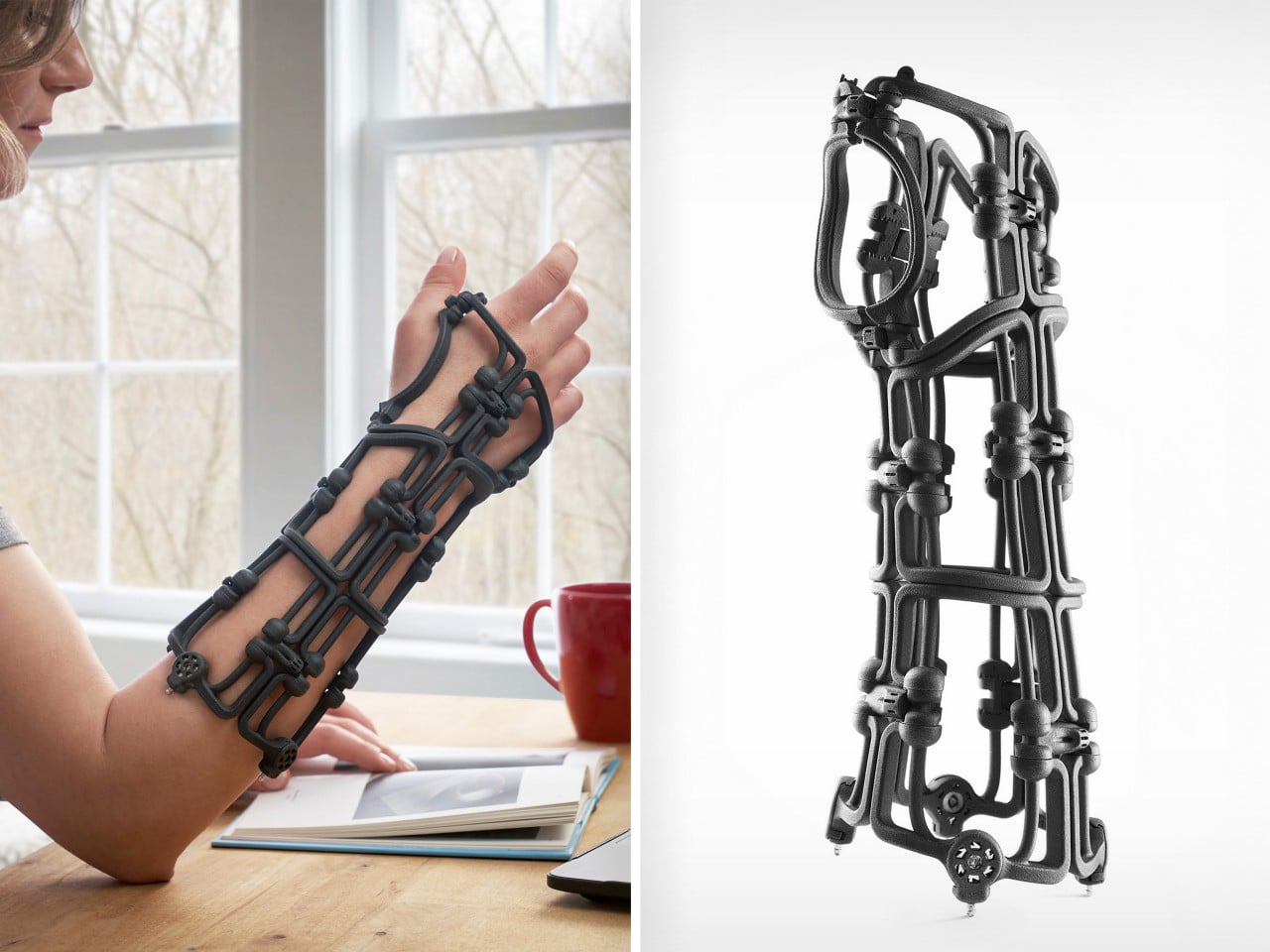
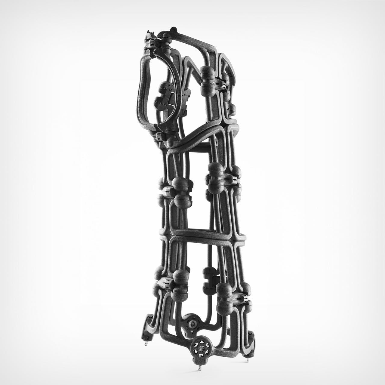
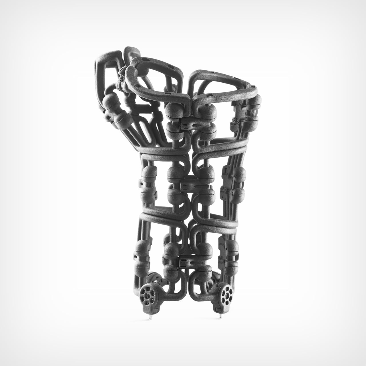
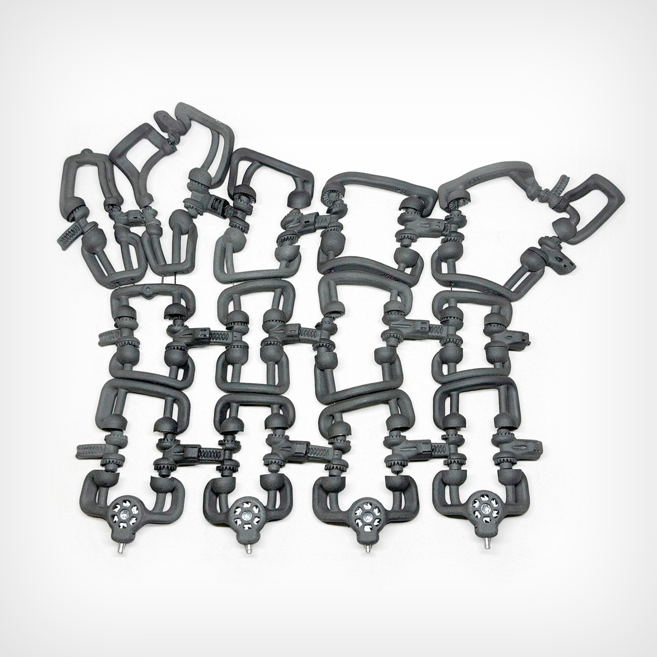
Traditional plaster casts have remained largely unchanged for over a century. Off-the-shelf braces offer convenience but rarely fit properly. Custom 3D-printed alternatives require expensive scanners, lengthy production times, and specialized expertise. Bracesys sidesteps all these limitations with an adjustable framework of segmented units, articulating connectors, and tension dials. The entire system weighs just 150 grams and folds flat into an envelope, yet provides rigid support comparable to traditional casts. More remarkably, clinicians can customize it to each patient’s anatomy in real time, adjusting the fit as swelling decreases and healing progresses.
Designer: Osteoid Design Team
Kevlar cables run through the framework and get tightened via integrated dials, borrowing directly from sailing rigging where distributed tension points create precise control. Yacht rigging achieves massive structural loads through this exact principle. Osteoid just applied it to wrist immobilization. The framework comes from SLS and MJF 3D printing with medical-grade Nylon 12, reinforced at stress points with CNC-machined aluminum and stainless steel. This hybrid manufacturing approach delivers geometric complexity for anatomical conformity while keeping structural integrity where loads concentrate. Pure injection molding couldn’t achieve these organic shapes. Pure 3D printing couldn’t handle the forces.
Over 600 anonymized CT scans went into the sizing methodology, processed through AI-driven segmentation and implicit skinning algorithms that map soft tissue deformation around bone structures. Principal Component Analysis crunched all that data into four standardized sizes covering the 5th to 95th percentile of hand and wrist anatomy. You’re getting semi-custom fit from off-the-shelf components, which anyone in medical device design will tell you is brutally difficult to pull off. Manufacturing needs standardization for scale. Patients need personalization for outcomes. Most companies pick one and live with the compromise.
A typical Colles fracture brace measures 190 x 90 x 115 mm assembled but breaks down completely flat into an A4 envelope. Clinicians wrap it around the limb loose, let the segmented units find their natural anatomical alignment, then use screwdriver-sized tools to adjust connector lengths and tighten the tension dials incrementally. Spring-loaded quick-release pins handle adjustments as swelling changes during recovery. The whole initial fitting takes minutes. I keep coming back to that speed because custom 3D-printed orthotics need weeks of turnaround, and drugstore braces fit approximately nobody correctly. This lands right in the middle with none of the usual tradeoffs.
Every plaster cast is single-use. Every prefab brace eventually becomes landfill. Traditional orthopedic devices generate waste at a scale that should embarrass the industry but somehow doesn’t. Bracesys uses recyclable materials throughout, sterilizes for reuse in clinical settings, and lets you replace individual components rather than trashing the whole assembly. I’m usually cynical about sustainability claims in medical devices because they often conflict with clinical needs or regulatory requirements. This actually works because better economics and better outcomes align with lower waste. Nobody has to sacrifice anything.
We shouldn’t still be using plaster casts in 2026. The technology to do better has existed for decades. The problem has always been the gap between custom fabrication costs and mass production constraints. Most attempts at solving this try to make manufacturing cheaper or faster. Bracesys flips that entirely by making adjustability the core feature and shipping that capability to the point of care. You’re not customizing during manufacturing. You’re customizing during application. That philosophical shift matters more than any individual mechanical innovation. If orthopedic practices actually start using this widely, we might finally kill off a medical technology that’s been coasting on pure inertia since the 1800s. It’s time we ‘brace’ for change…
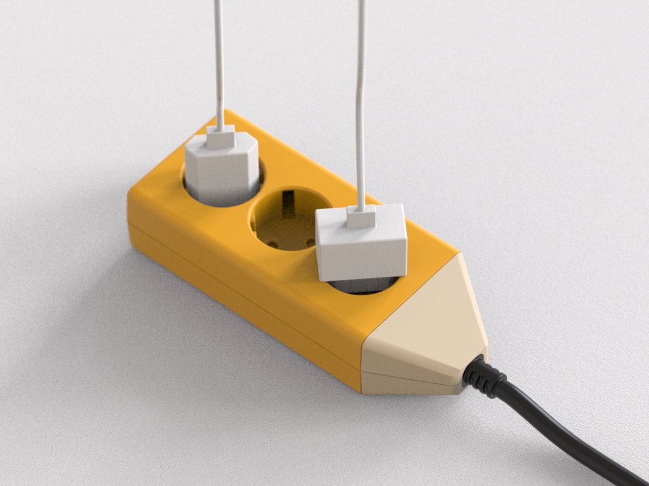
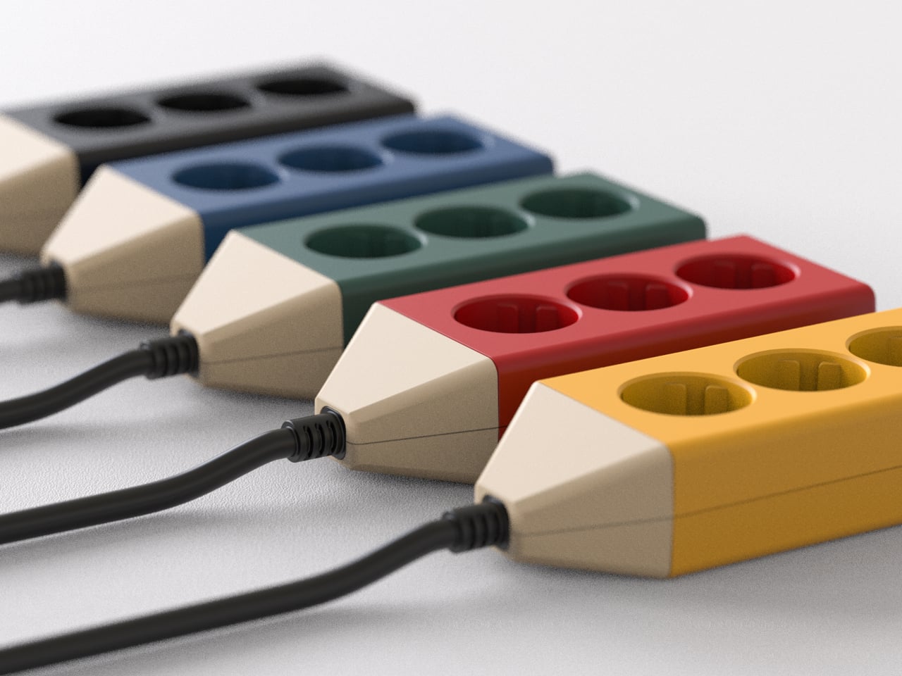
Setting up a desk usually means the laptop and lamp go on top while the power strip disappears underneath, tangled with dust and forgotten cables. Electricity gets treated as something to manage and conceal, even though it quietly runs everything you do all day. Most power strips look industrial or aggressively technical, which is why they end up banished behind furniture, making plugging things in feel like reaching into a dark cave.
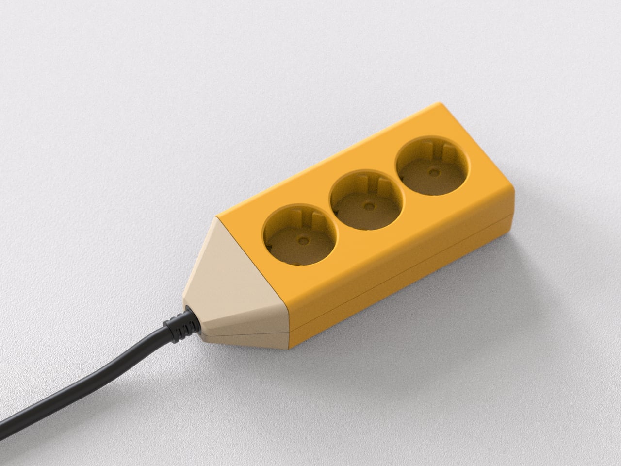
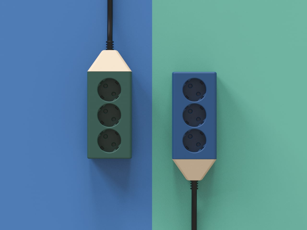
Composition Studio’s Pencil Multi-Tap follows a different line of thought. The studio designs objects that make you want to record simply by looking at them, asking what happens if the object itself initiates the act instead of waiting for discipline or habit. The Pencil Multi-Tap turns a power strip into something that feels closer to a pencil on a desk than a piece of hardware you are supposed to hide, treating electricity as part of the creative process.
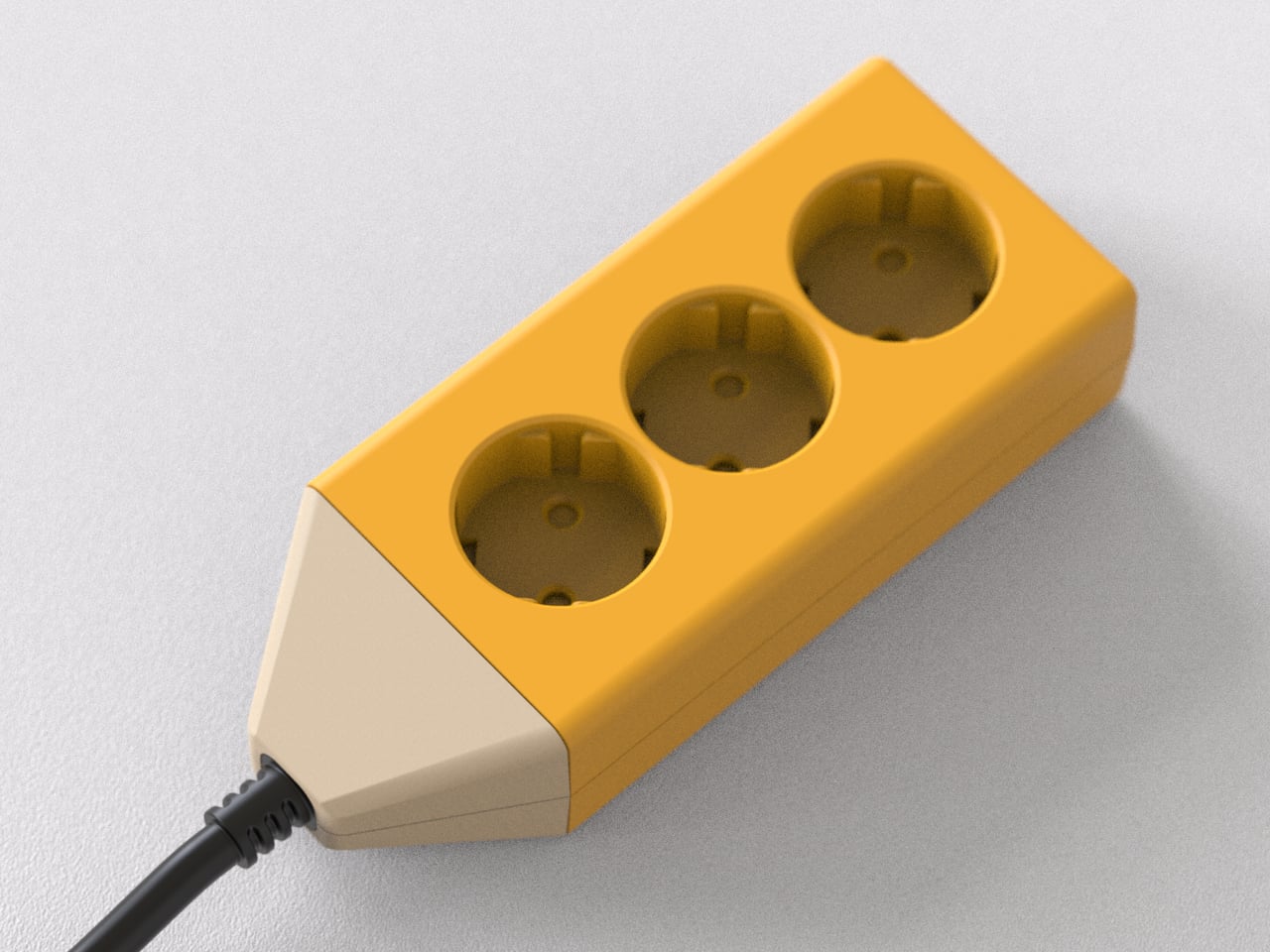
Sitting down at a clean desk in the morning, you drop your notebook, tablet, and laptop on the surface and plug them into a small block that reads as a fat, sharpened pencil. The black cable trails away like a drawn line toward the wall outlet. It feels less like plugging into infrastructure and more like drawing the first line on a blank page, a quiet signal that work is about to begin.
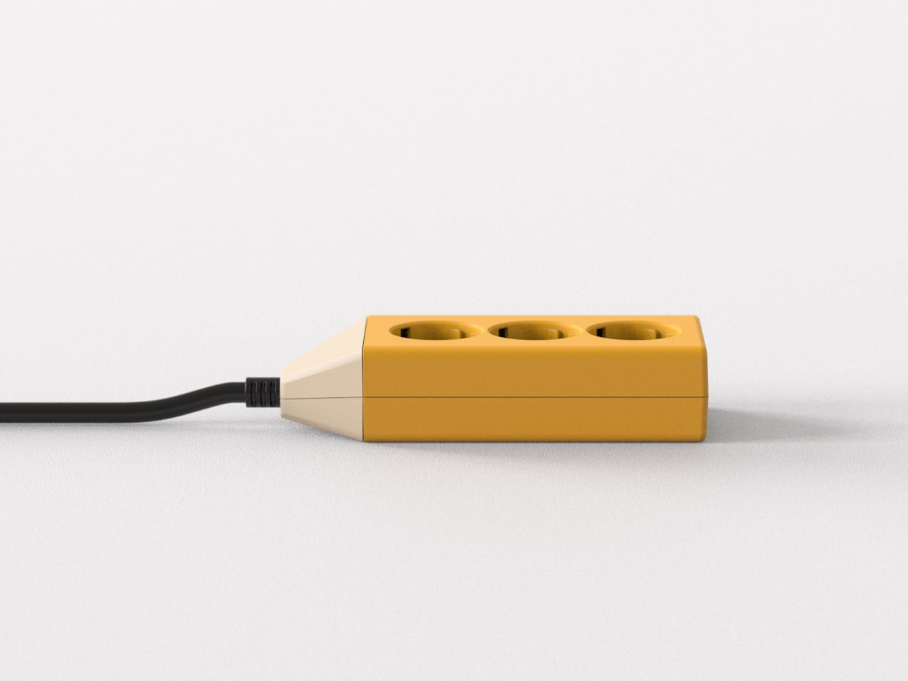
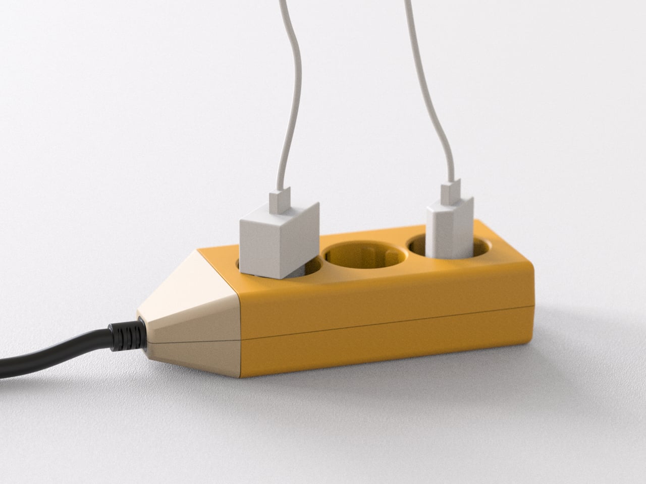
The practical side is straightforward. Three outlets give you enough capacity for a laptop, a charger, and a lamp without turning the surface into a cable farm. The compact, blocky body means it can sit anywhere on the desk or move with you to another room. Because it looks intentional, you do not mind leaving it visible, which makes plugging and unplugging devices easier and less of a contortion exercise under the table.
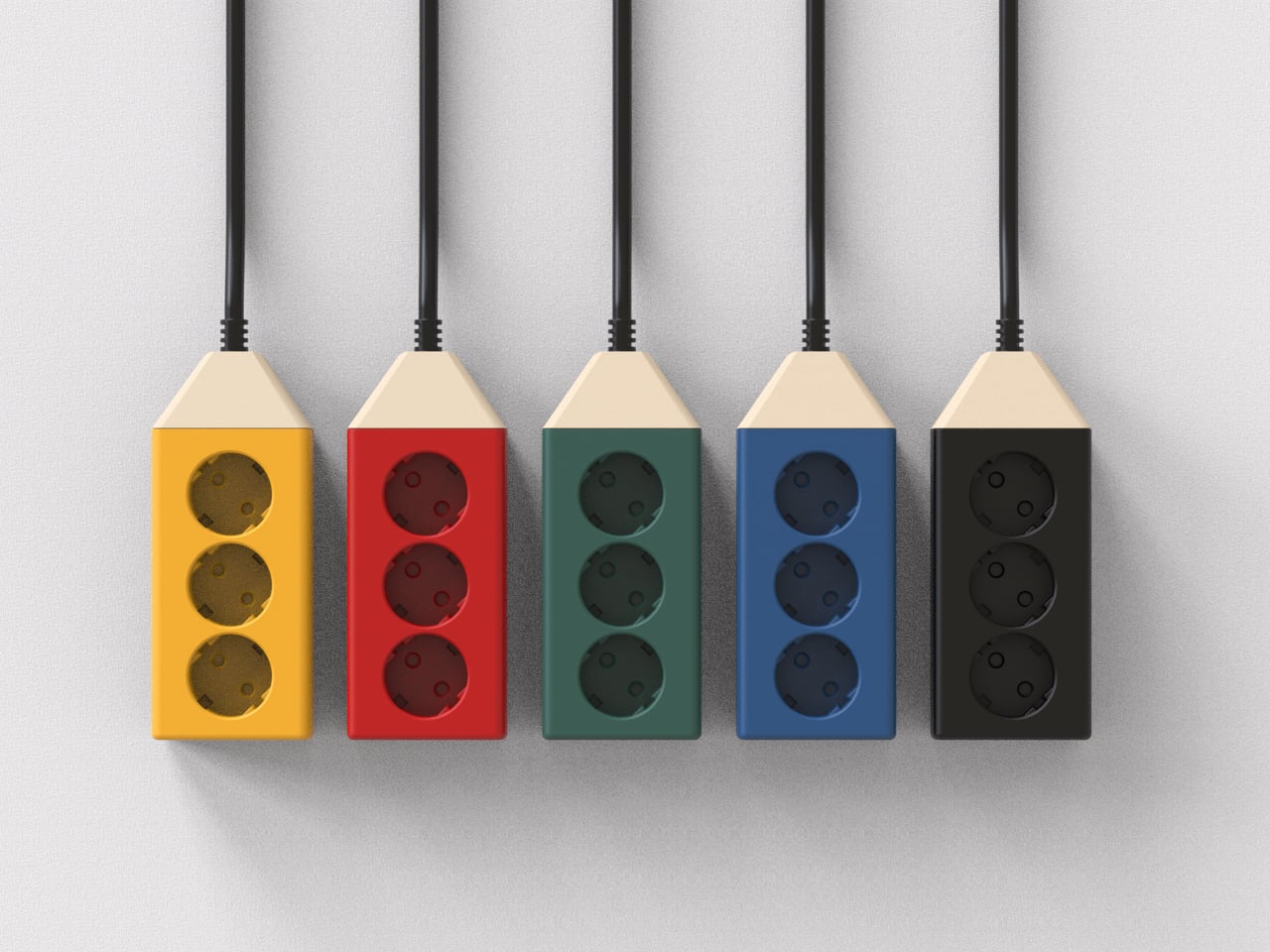
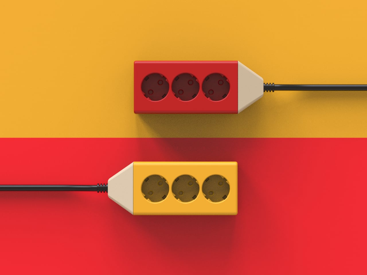
The pencil shape and color blocking make it feel familiar and non-technical, especially in a studio full of screens and metal. Instead of another black brick with a glowing switch, it reads as part of your creative kit, like a favorite pen or ruler. The single cable becomes a deliberate gesture instead of visual noise, which helps the workspace feel calmer even when multiple devices are connected and drawing power.
Three sockets mean this is not the strip you use to power an entire entertainment center or a full office rack. Big power bricks might still crowd each other if you stack too many adapters, and safety standards, surge protection, and regional plug types would all need careful engineering in a real product. But as a desk-level companion for a focused setup, the simplicity is part of the appeal.
The Pencil Multi-Tap treats electricity as part of the workspace experience instead of a background chore. Just as a pencil on the table invites you to write or draw, this little multi-tap invites you to plug in and begin. It is a reminder that even the most mundane tools can be designed to nudge you toward making something, rather than just managing the machines that do the making for you.
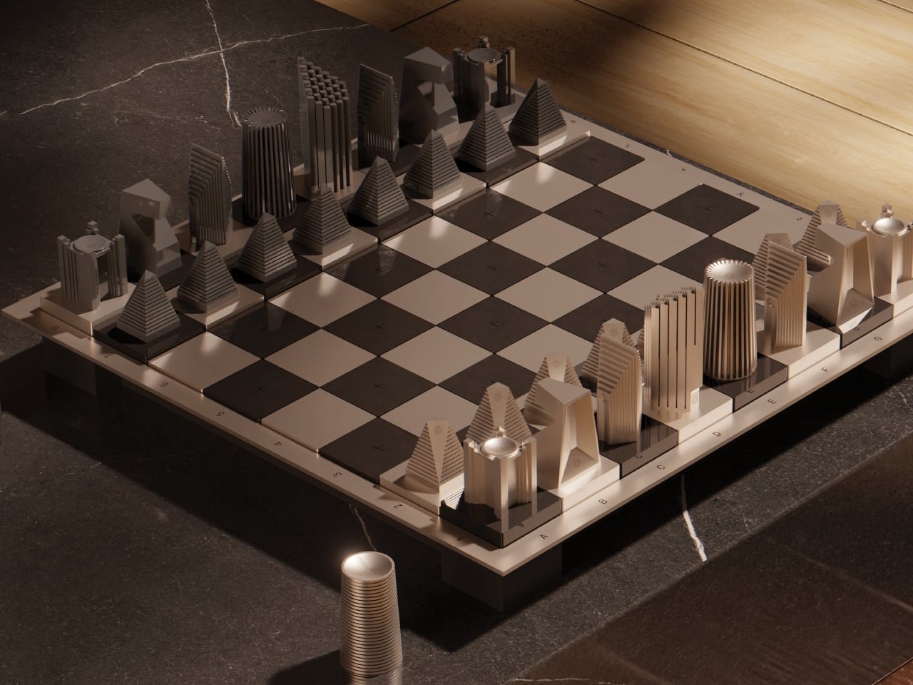
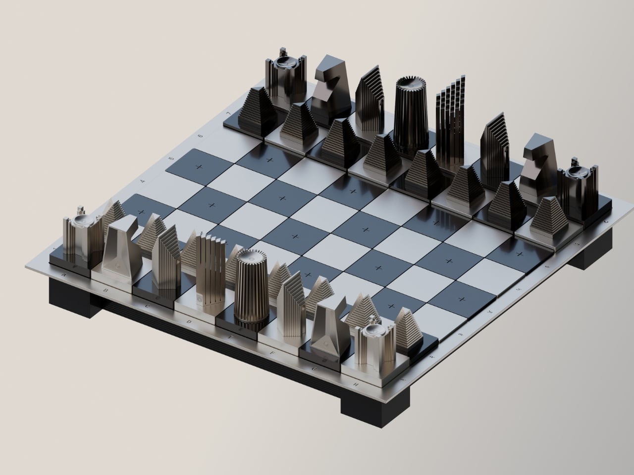
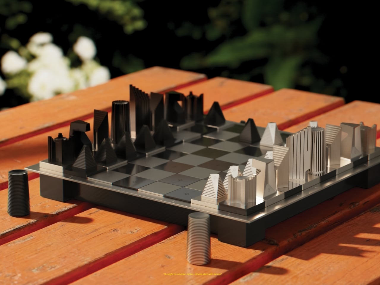
There’s something deeply satisfying about watching a familiar game get completely reimagined. The Mohmaya chess set does exactly that, turning the classic battlefield into a three-dimensional landscape where every move feels like navigating through a modernist city.
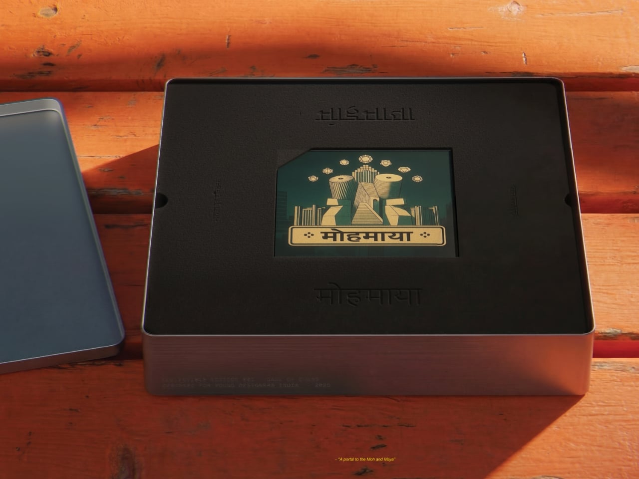
Designed by Tanay Vora, Vidushi Gupta, Hardik Sharma, and Yaman Gupta, this isn’t your grandmother’s chess set. Though actually, it kind of is, if your grandmother happened to appreciate mid-century Indian modernism and spiritual philosophy. The name “Mohmaya” translates to “illusion,” which feels perfect for a game that’s all about deception, strategy, and seeing through your opponent’s tricks.
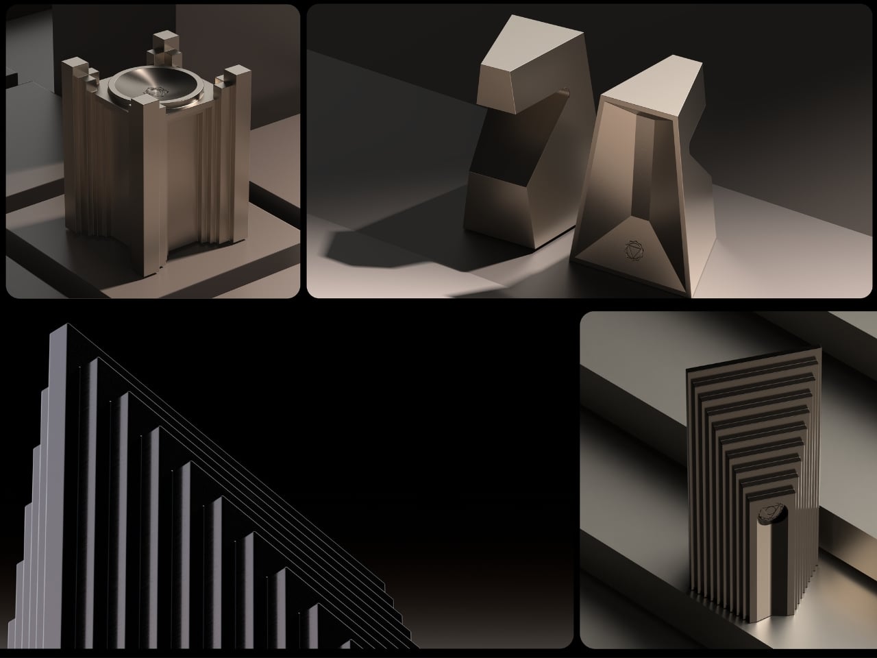
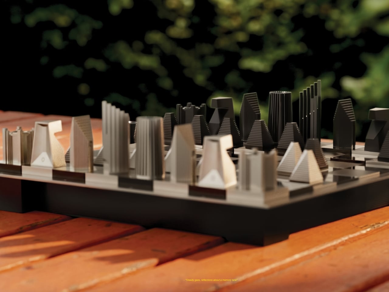
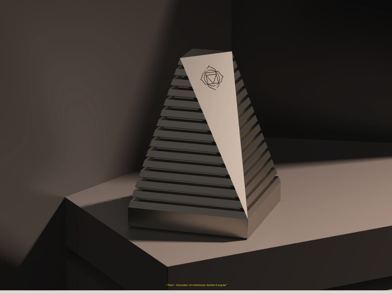
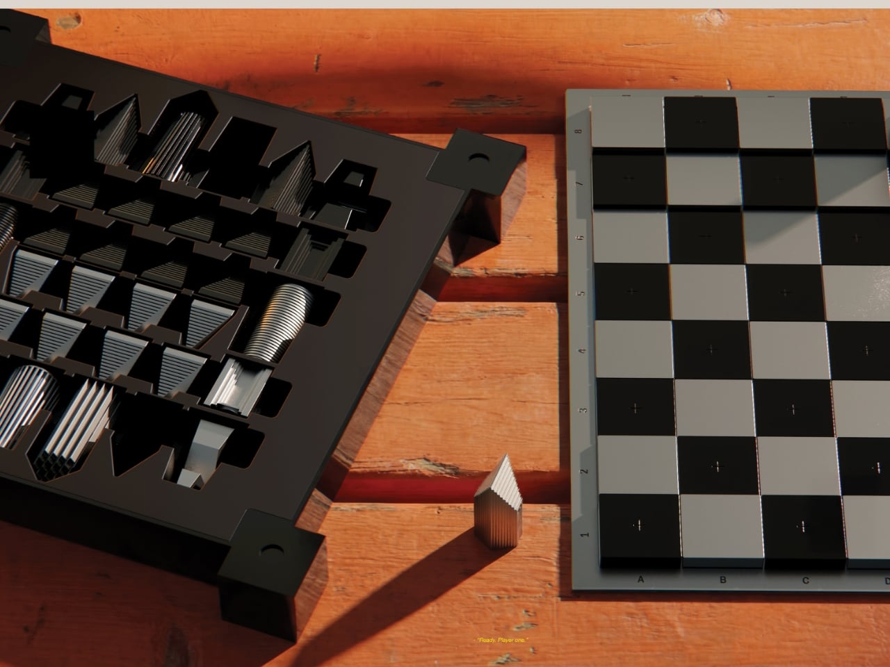
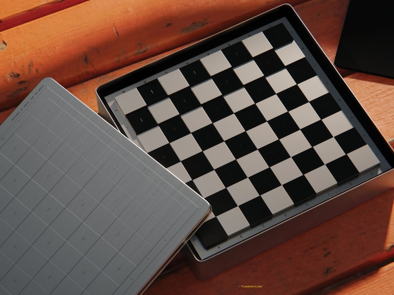
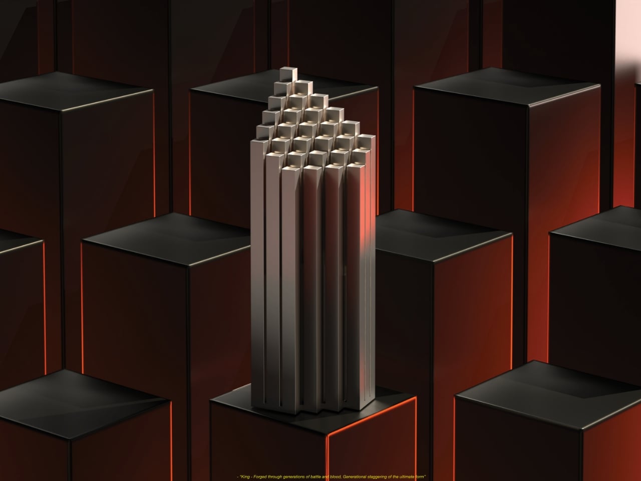
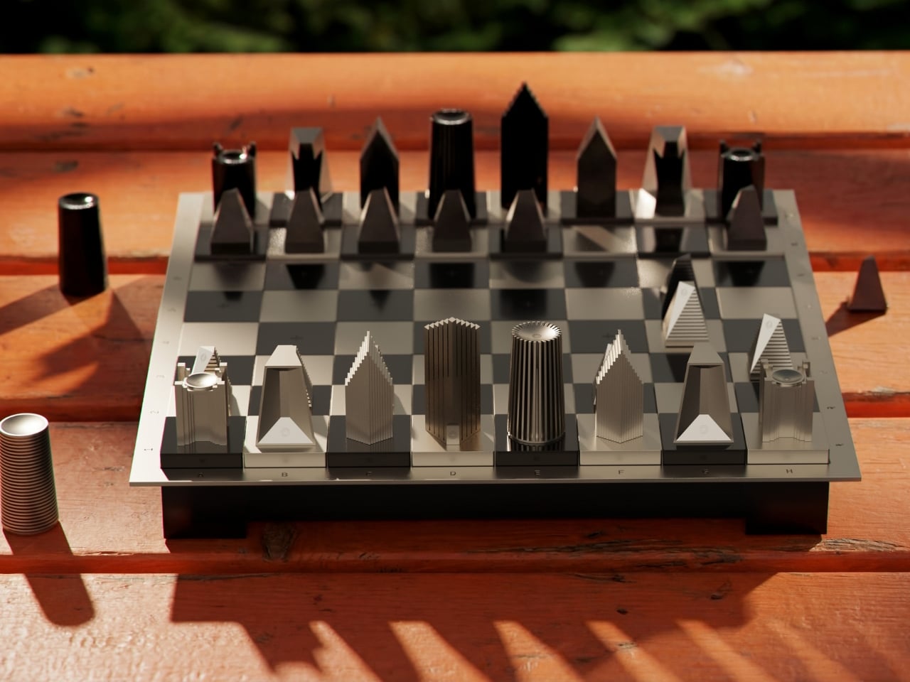
What makes this set visually striking is its refusal to stay flat. Unlike traditional chessboards that exist on a single plane, Mohmaya creates a topography. Pawns start on the lowest level, grounded and humble. The center of the board sits even lower, like a valley where the real drama unfolds. Then the back row rises highest, where kings and queens preside over everything like architectural monuments on a hilltop. Playing on this board means you’re not just moving pieces across squares but navigating elevation changes, climbing through terrain with every strategic advance.
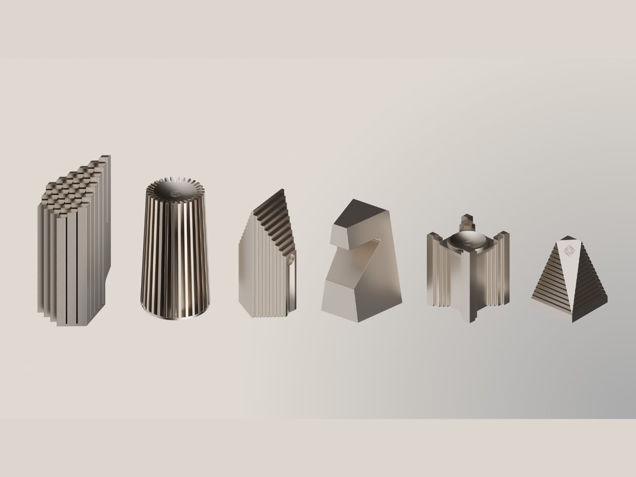
The pieces themselves are love letters to India’s architectural golden age. Each one draws from the concrete geometry, bold lines, and structural balance of mid-century modernist buildings. Think of the work of BV Doshi, Louis Kahn’s Indian Institute of Management in Ahmedabad, or Amit Raje’s brutalist visions. These weren’t architects who whispered. They made statements in poured concrete and dramatic forms, and Mohmaya channels that same confident energy.
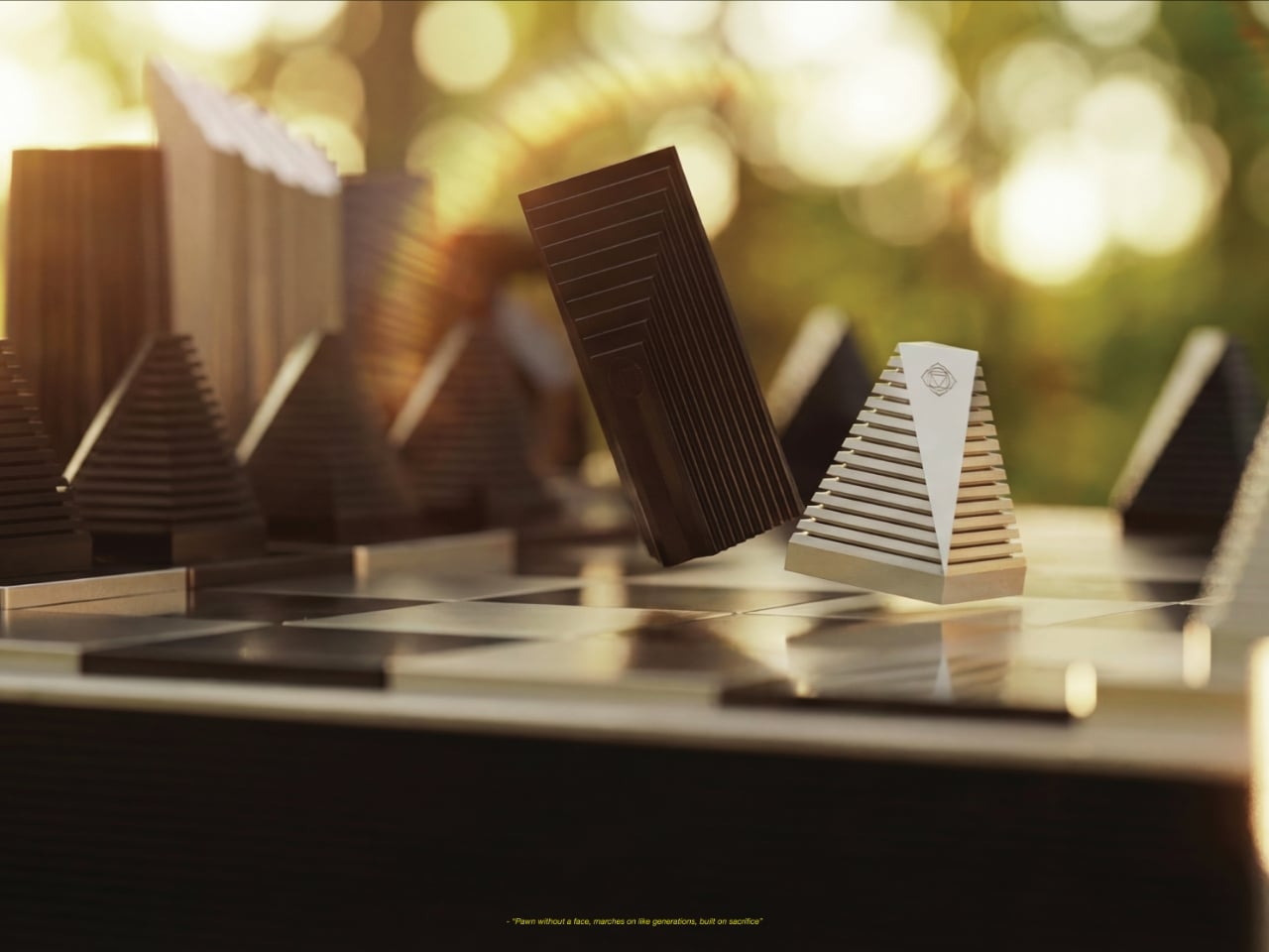
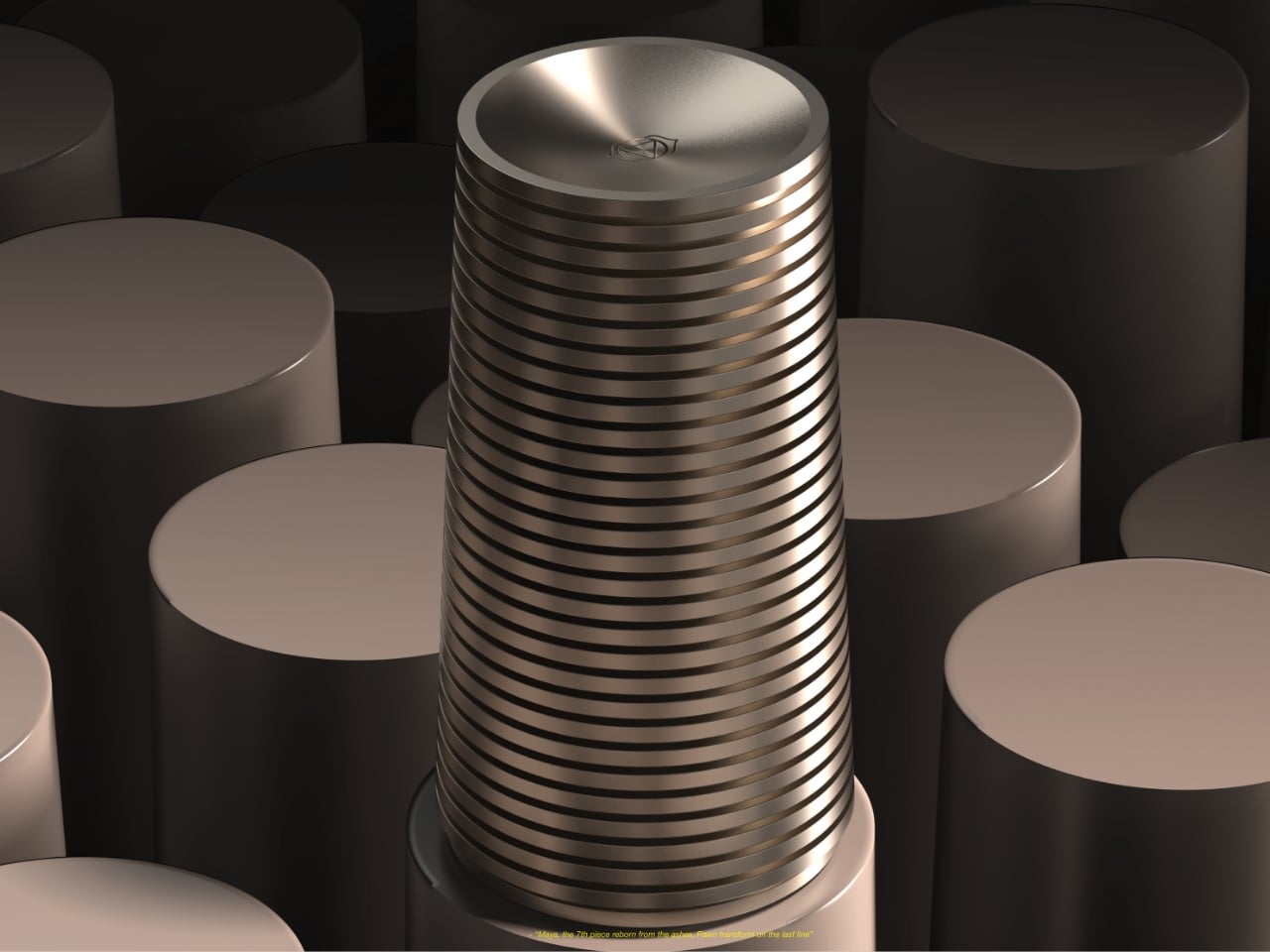
But there’s another layer here that elevates the design beyond pure aesthetics. Each chess piece aligns with chakra symbolism, giving every element a metaphysical dimension. Pawns connect to the Root Chakra, representing stability and patience. Knights embody the Sacral Chakra with their creative, playful energy, always in motion. Bishops hold the Solar Plexus, focused and powerful in their diagonal precision. Rooks align with the Heart Chakra, protective yet generous. Queens carry the Throat Chakra’s voice, expressing leadership across the board. And the king stands with the Crown Chakra, the quiet center of wisdom and balance.
This symbolic framework isn’t just decorative philosophy. It actually affects how you think about each piece’s role in the game. When your rook moves, you’re activating that protective heart energy. When your queen sweeps across the board, she’s literally voicing your strategy. It adds a narrative dimension to every match, making the board itself part of the story.
Speaking of story, Mohmaya introduces one fascinating rule variation. When a pawn reaches the opposite end of the board, it transforms into an additional queen, just like in traditional chess. But here, that transformation carries extra weight. It’s the awakened queen, a reminder that even the smallest, most grounded pieces can undergo radical change. It’s a beautiful metaphor for growth and potential, wrapped in gameplay mechanics.
What really resonates about this project is its underlying mission to reframe how people see Indian design. For too long, the global perception has been narrow, viewing Indian aesthetics through a lens of nostalgia, ornamental patterns, or folkloric charm. Mohmaya pushes back against that limiting view. This is Indian design that’s bold, globally conversant, forward-thinking, and philosophically deep. It draws from a culture that has always asked big questions about life, reality, and meaning, then translates those questions into something you can hold in your hands and play with.
The design team describes it as an homage to Indian utopian modernism, that brief moment when tradition and innovation mixed without hesitation. That period produced some of the most exciting architecture in the world, buildings that weren’t afraid to be both contemporary and rooted in local context. Mohmaya carries that same spirit into object design.
Whether you’re a chess enthusiast, a design collector, or someone who just appreciates objects with intention behind them, this set offers something rare. It’s functional art that doesn’t sacrifice playability for concept. It’s culturally specific without being exclusive. It takes an ancient game and makes it feel fresh by connecting it to a different kind of history, one that deserves more recognition in global design conversations.
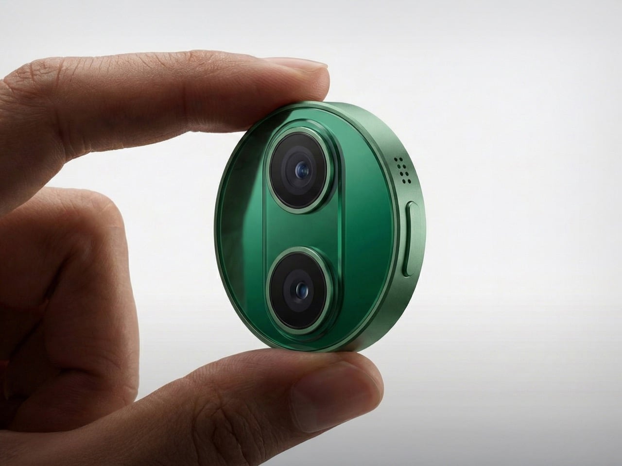
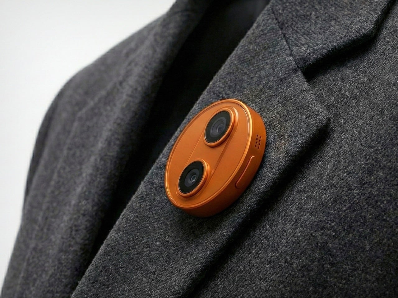
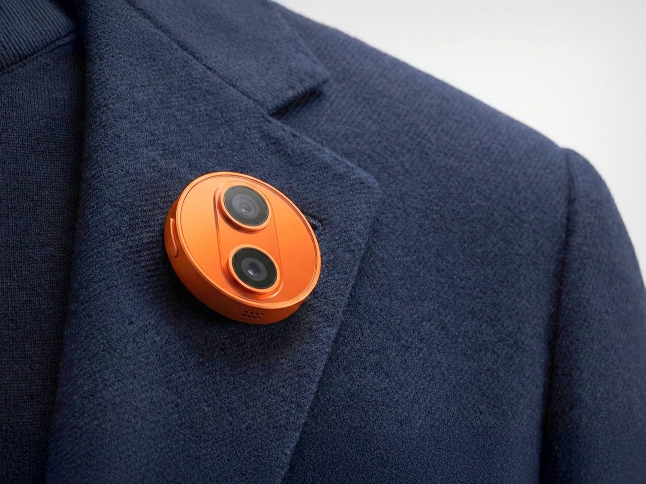
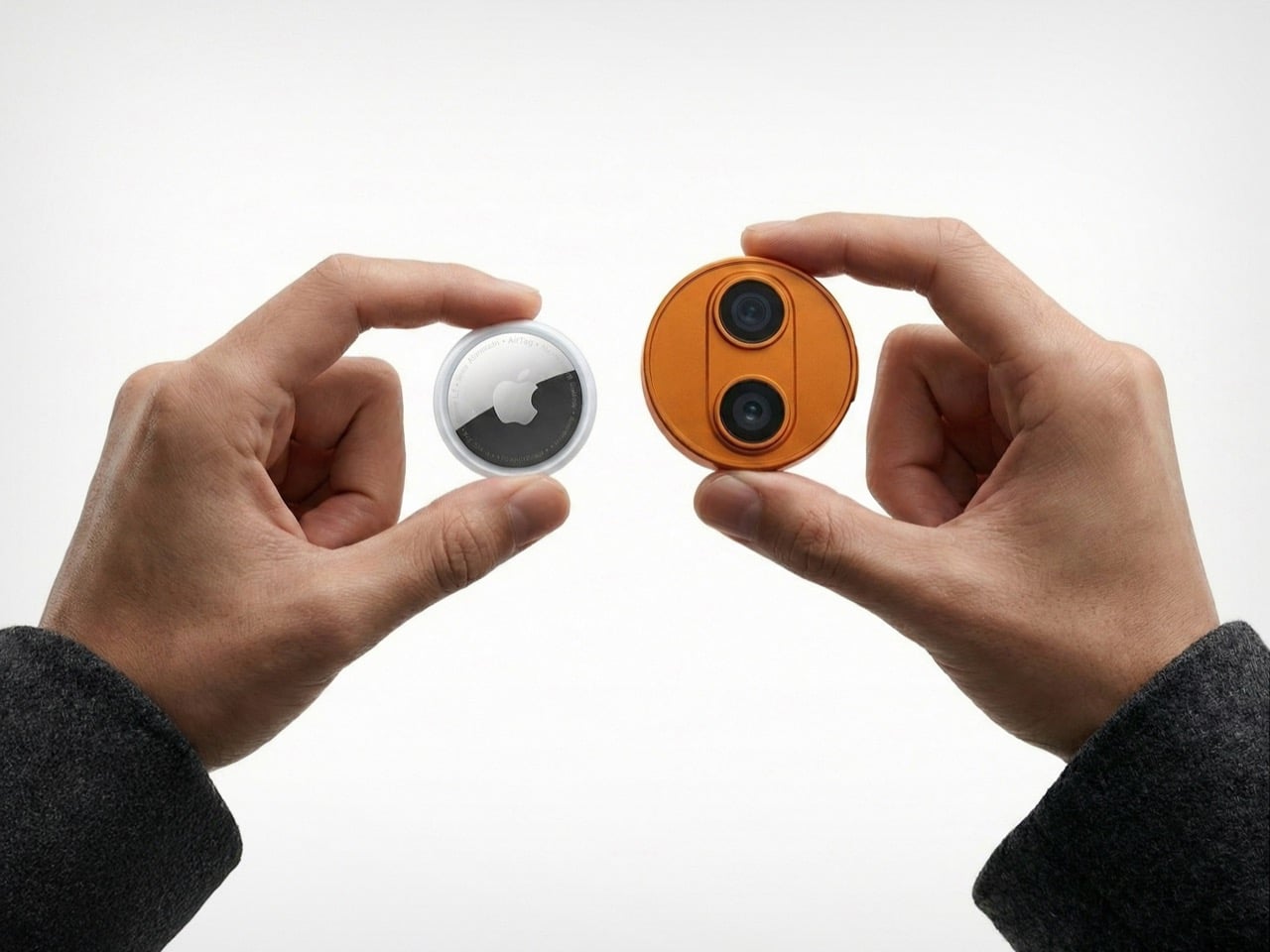
Apple’s wearable future might not be strapped to your wrist at all. According to new reports, the company is developing an AI-powered pin about the size of an AirTag, complete with dual cameras, microphones, and a speaker. The device would clip onto clothing or bags, marking a deliberate shift away from the smartwatch form factor that has dominated wearable tech for the past decade.
If the rumors prove accurate, this circular aluminum-and-glass device could launch as early as 2027, running Apple’s upcoming Siri chatbot and leveraging Google’s Gemini AI models. The company appears to be betting that consumers want ambient AI assistance without constantly pulling out their phones or glancing at their watches. Whether this gamble pays off remains to be seen, especially given the struggles of similar devices like Humane’s now-defunct AI Pin.
Designer: Apple
Representational Image
The hardware specs sound modest on paper but reveal something about Apple’s thinking. Two cameras sit on the front: one standard lens, one wide-angle. Three microphones line the edge for spatial audio pickup. A speaker handles output. Physical button for tactile control. Magnetic inductive charging on the back, identical to the Apple Watch system. The whole thing supposedly stays thinner than you’d expect from something packing this much capability. What strikes me most is the screenless design, which tells you Apple learned something from watching Humane crash and burn trying to replace phones with projectors and awkward gesture controls.
Representational Image
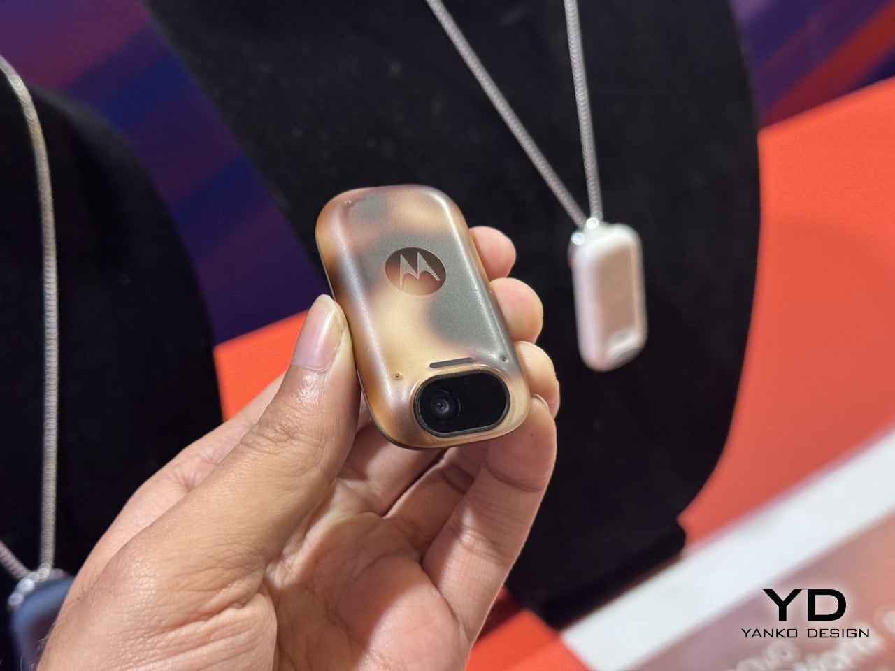
Because here’s the thing about AI wearables so far: they’ve all suffered from identity crisis. The Humane AI Pin wanted to be your phone replacement but couldn’t handle basic tasks without overheating or dying within hours. Motorola showed off something similar at CES 2026, and demonstrated a level of agentic control that was still in its beta stages but was impressive nevertheless. Apple seems to be taking notes from both the failure of the former as well as the potential success of the latter. A screenless pin that relies entirely on voice, environmental awareness, and audio feedback has clear limitations, which paradoxically might be its greatest strength.
Motorola’s AI Pendant at CES 2026
The timing lines up with Apple’s Siri overhaul coming in iOS 27. They’re rebuilding the assistant from scratch as a proper conversational AI, and they’ve partnered with Google to tap into Gemini models for the heavy lifting. Smart move, actually. Apple’s in-house AI efforts have been mediocre at best, and licensing Google’s tech lets them skip years of expensive catch-up work. This pin becomes the physical embodiment of that strategy: a purpose-built device for ambient AI that doesn’t pretend to be anything else. You clip it on, it listens and watches, you talk to it, it responds. Simple interaction model.
But I keep circling back to the same question: who actually wants this? Your iPhone already has cameras, microphones, and Siri access. Your Apple Watch gives you wrist-based notifications and quick voice commands. AirPods put computational audio directly in your ears. Apple’s ecosystem already covers every conceivable wearable surface area. Adding a clip-on camera pin feels like solving a problem nobody has, or worse, creating a new product category just because the technology allows it. The 38.5-gram weight of competing devices like Rokid’s AI glasses shows manufacturers obsess over comfort, but comfort alone doesn’t justify purchase.
Representational Image
The 2027 timeline is far enough out that Apple can quietly kill this project without anyone noticing, exactly like they did with the Apple Car. They’ve got a pattern of floating ambitious ideas internally, letting engineers explore possibilities, then axing things that don’t meet their standards or market conditions. Sometimes that discipline saves them from embarrassing product launches. Sometimes it means we never get to see genuinely interesting experiments. This AI pin could go either way, and frankly, Apple probably hasn’t decided yet either. They’re watching how the market responds to early AI wearables, gauging whether spatial computing takes off with Vision Pro, and waiting to see if their Siri rebuild with Google’s Gemini actually works before committing manufacturing resources.
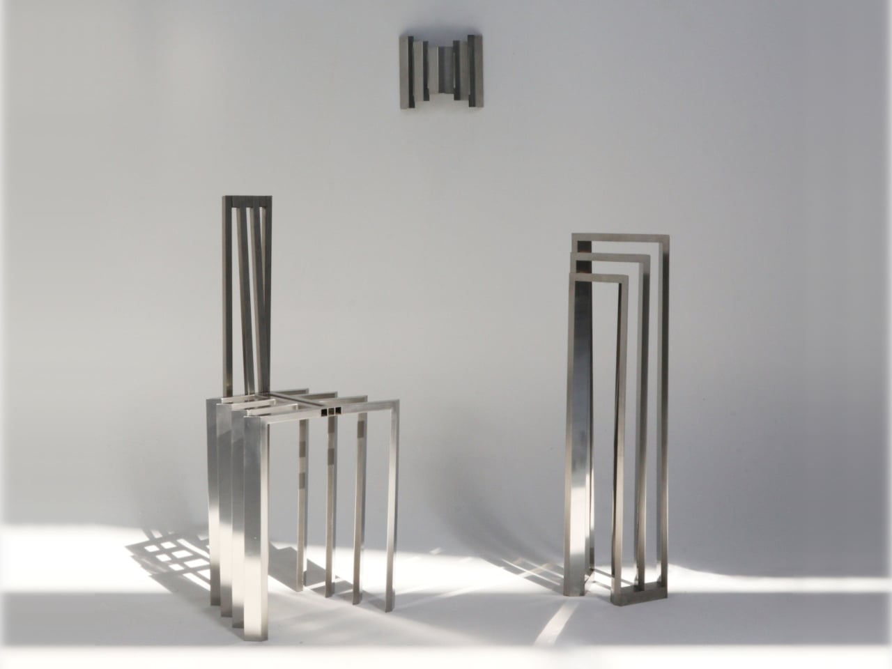
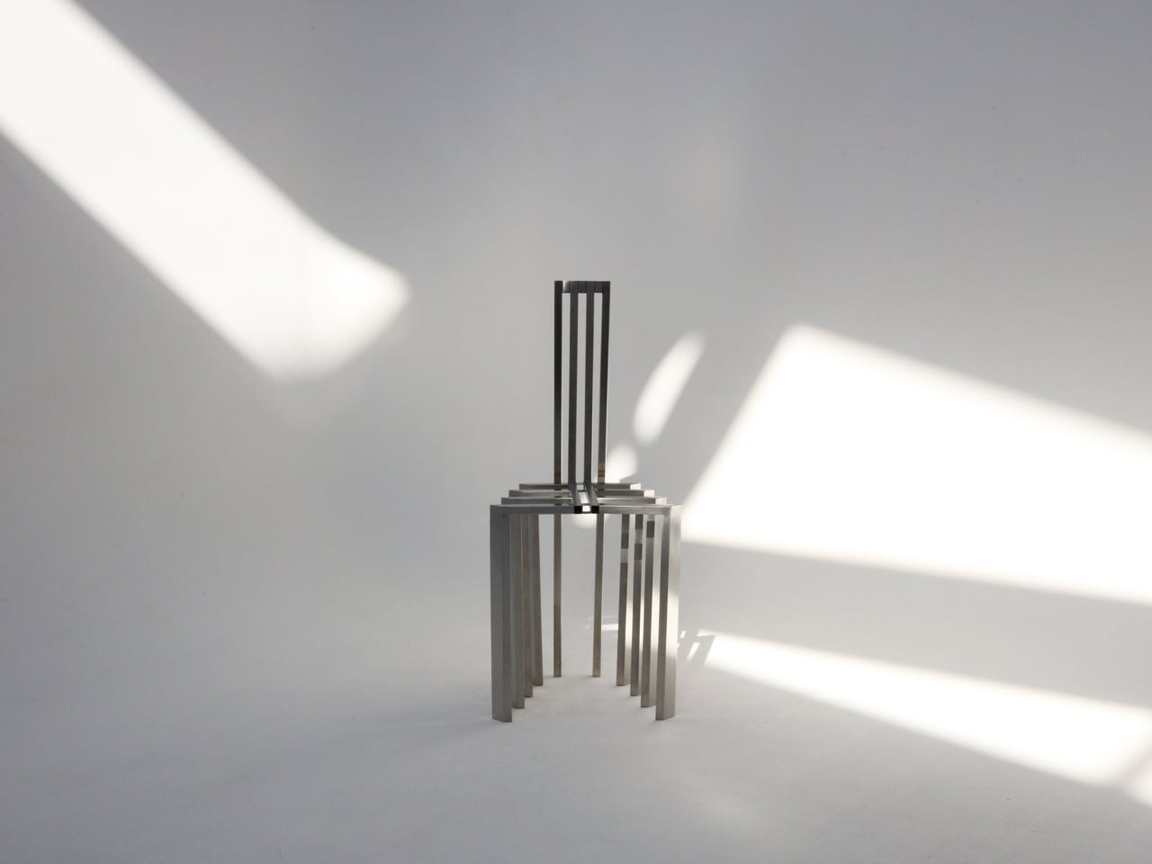
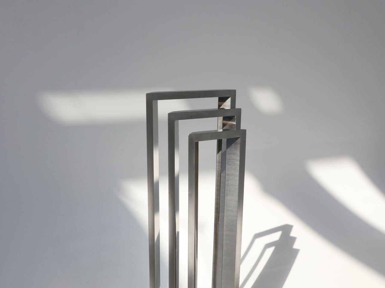
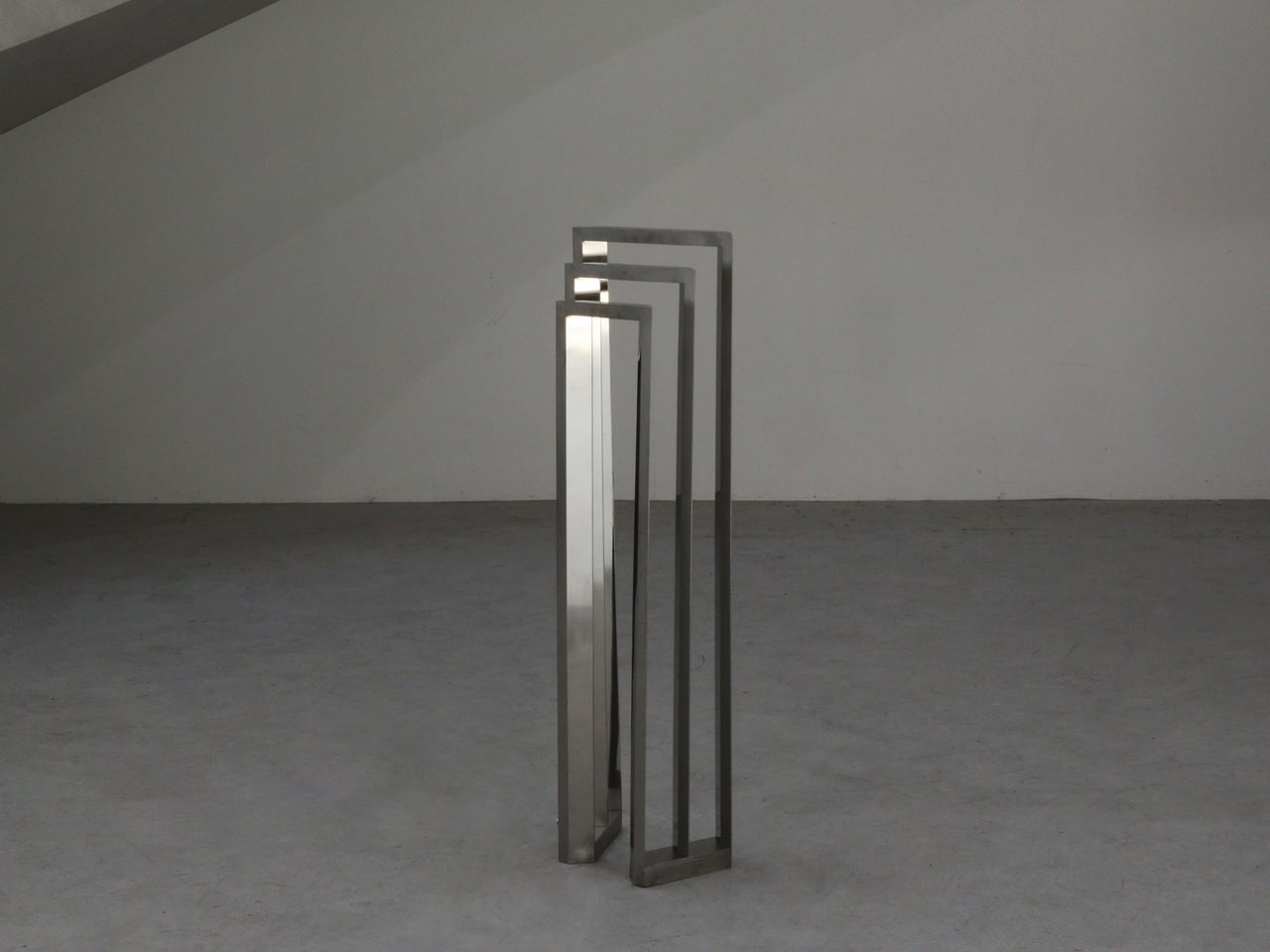
Walking under a pergola or slatted canopy, sunlight breaks into stripes, and the structure feels more like a drawing in space than a solid roof. That rhythm of beams and shadows is both architectural and strangely calming, turning overhead shelter into something closer to a pattern you move through. Foln takes that outdoor language and shrinks it down into objects you can live with indoors.
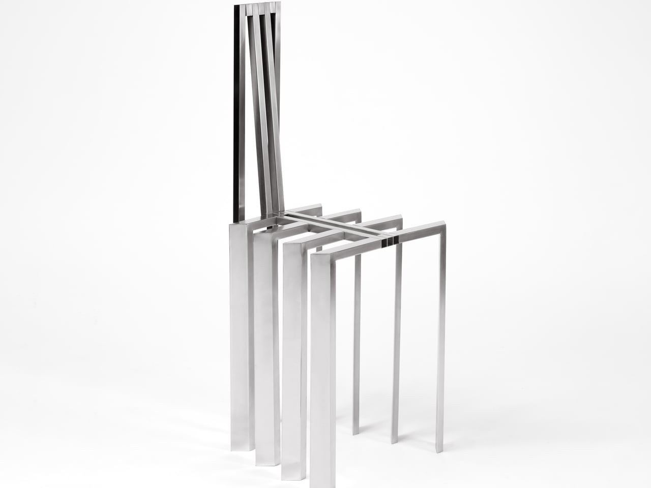
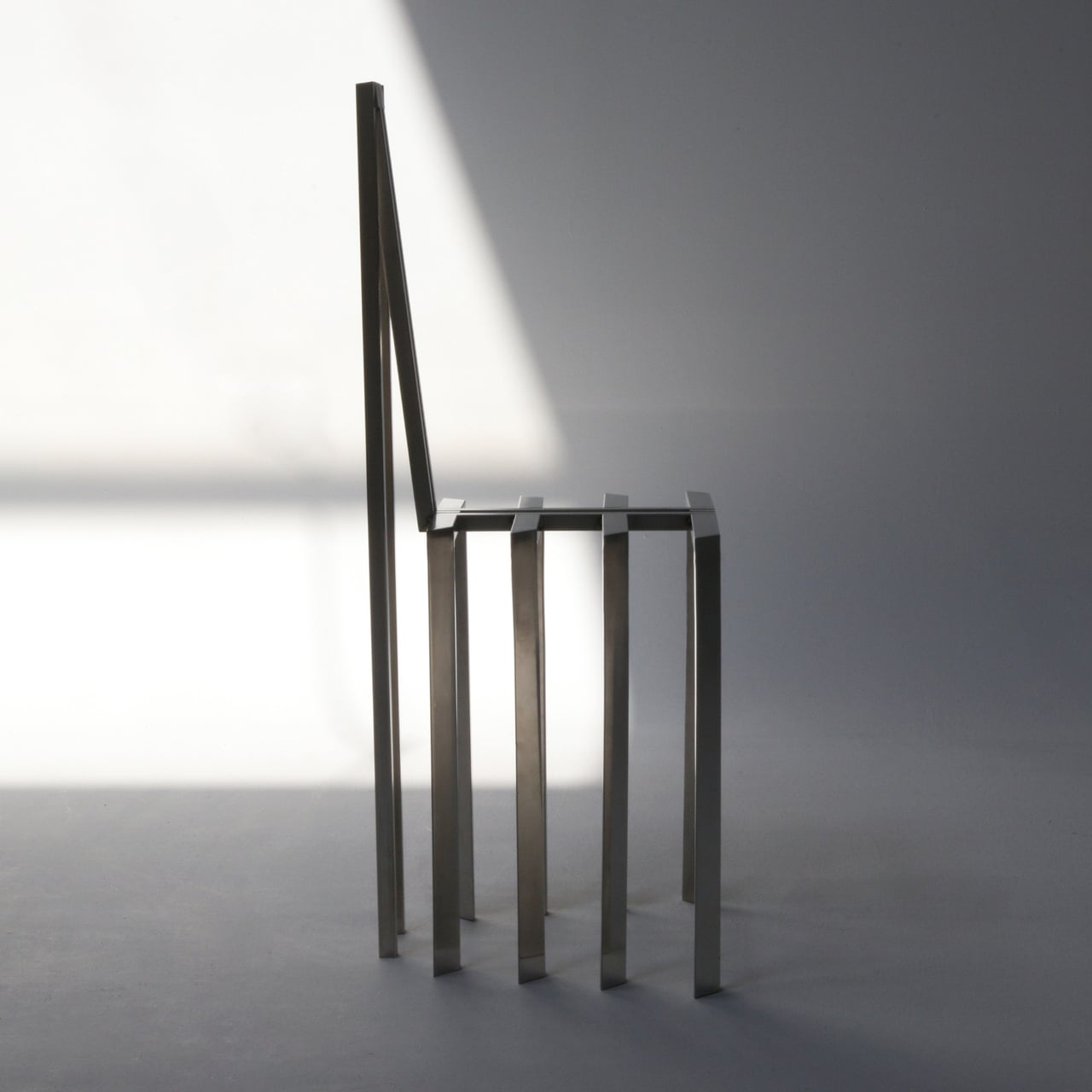
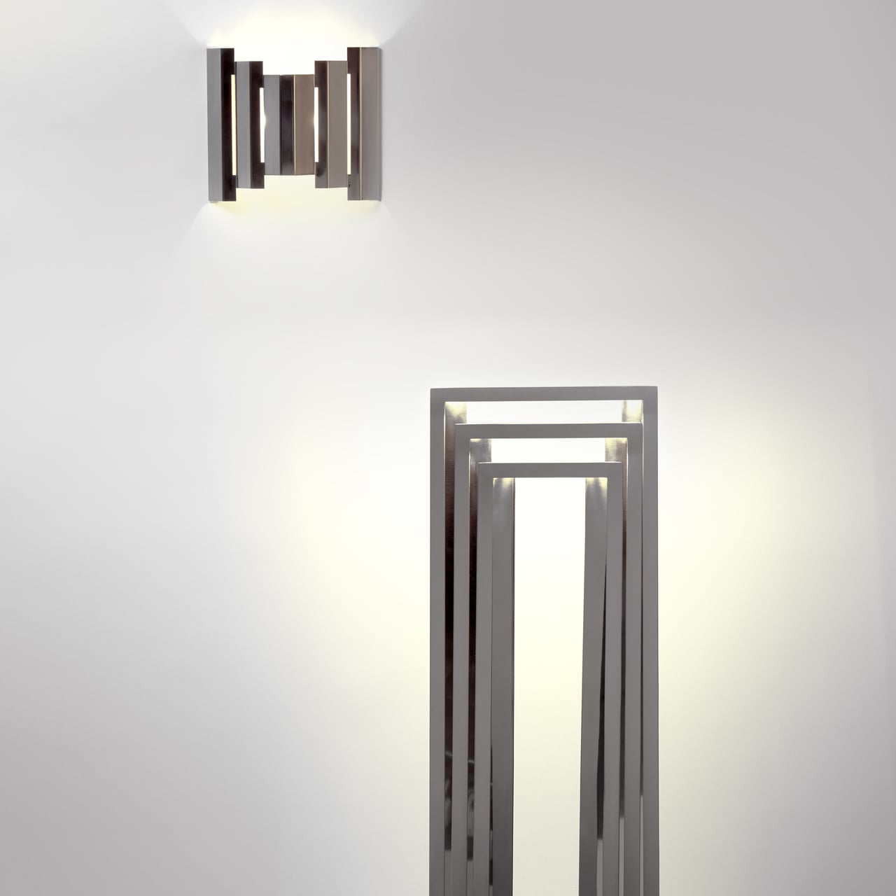
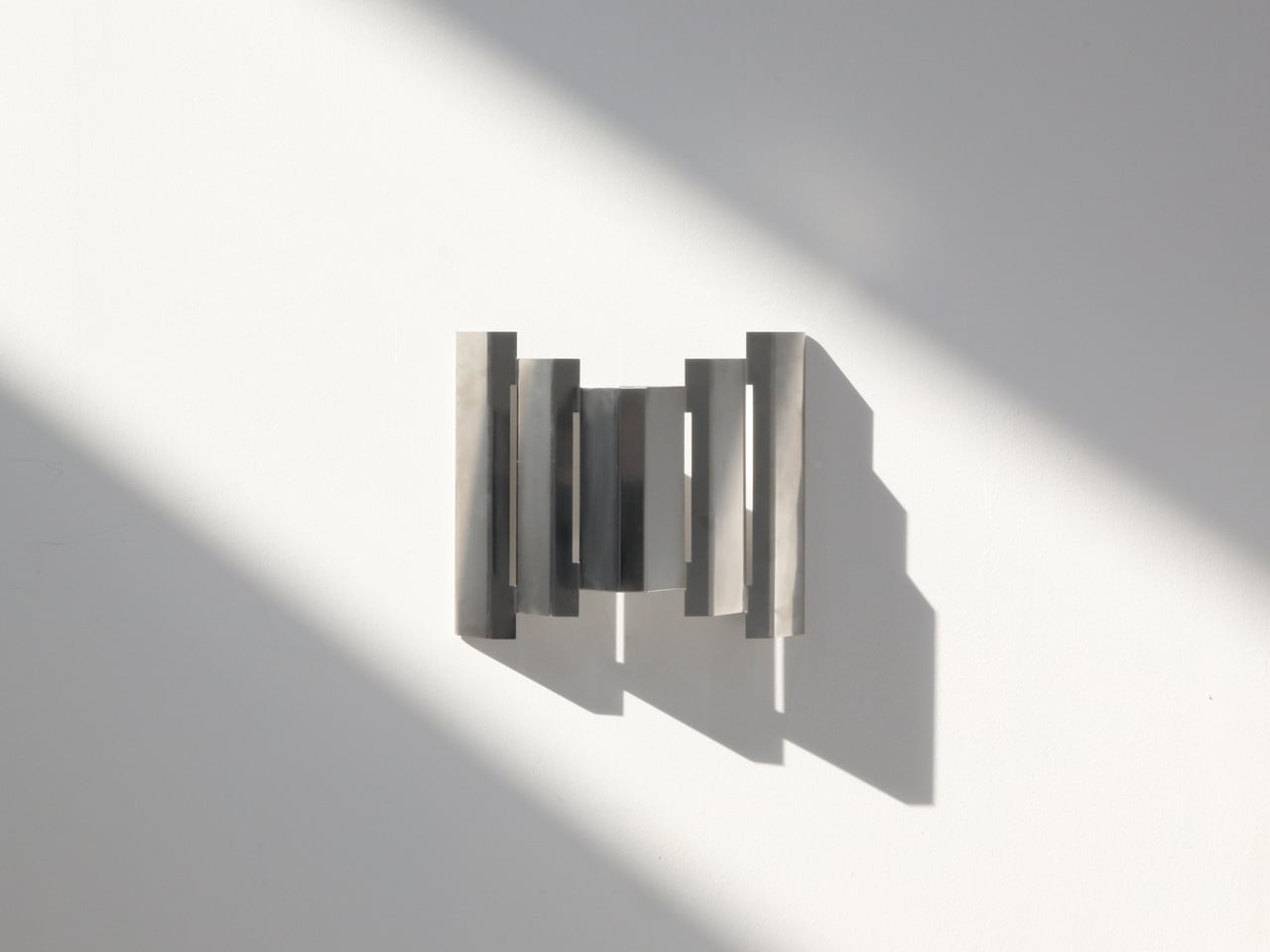
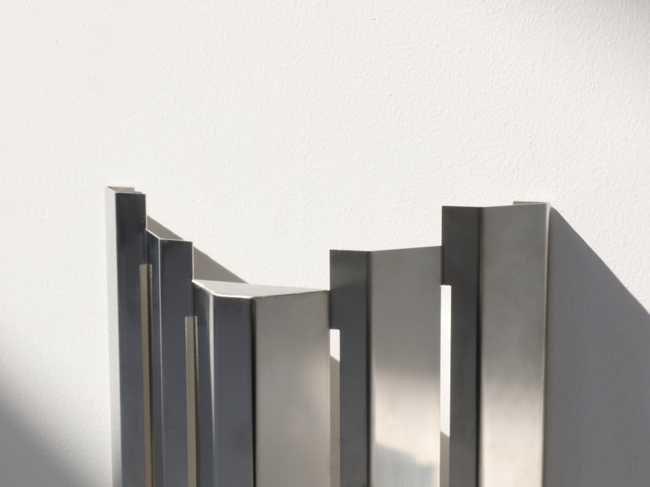
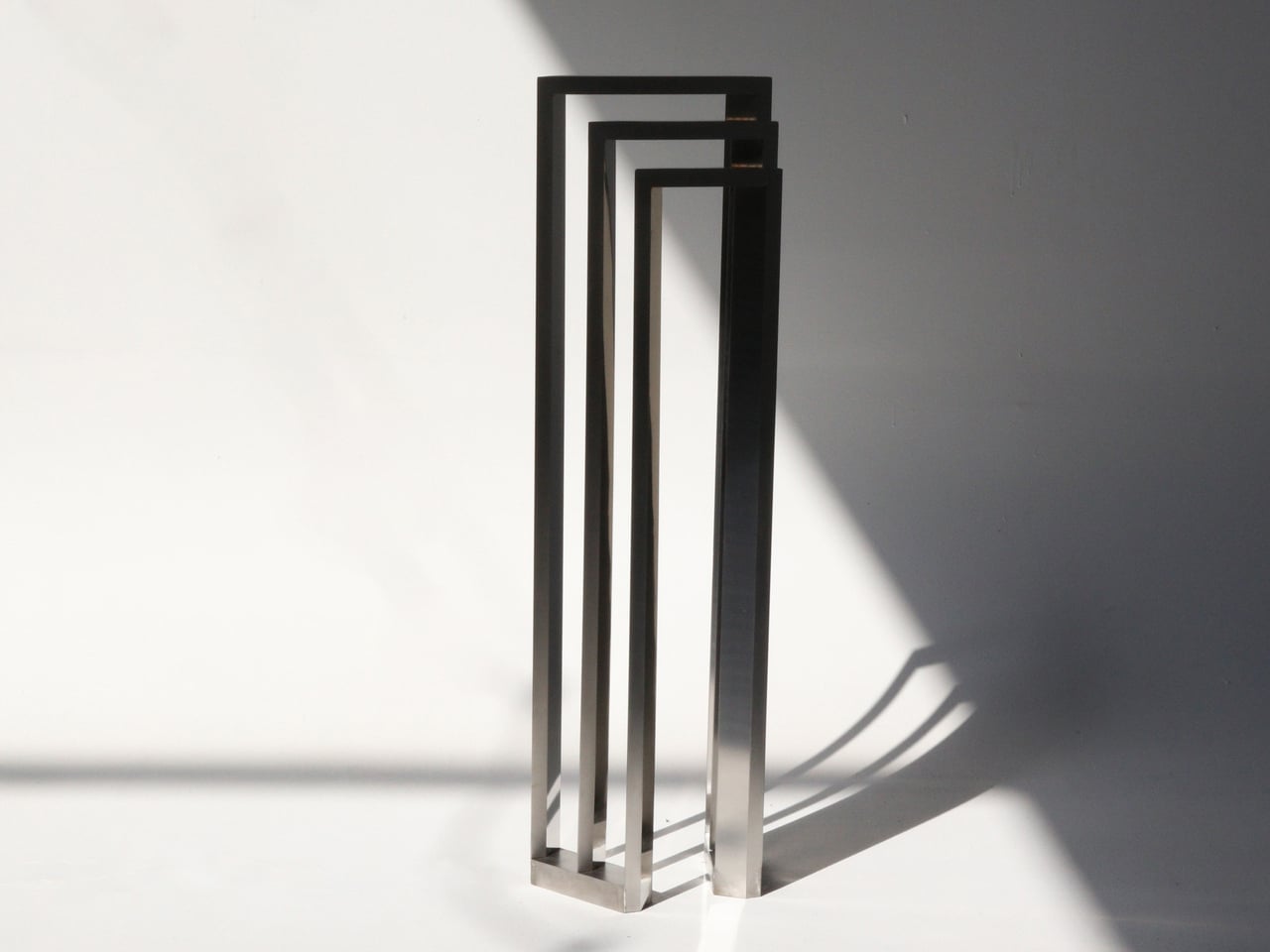
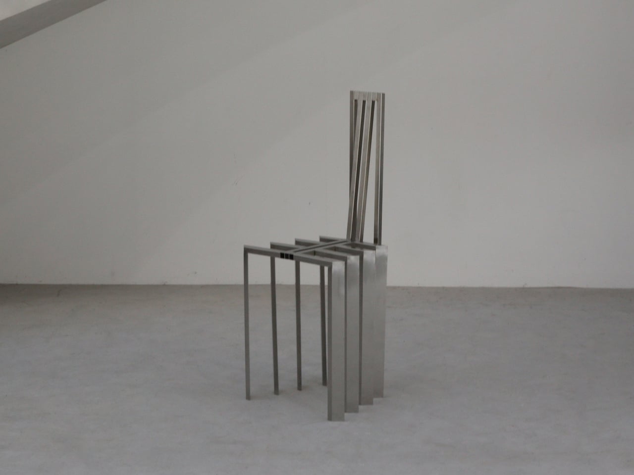
Jiyun Lee’s Foln series is a family of three stainless-steel pieces: the Linear Chair, a floor lamp, and a wall lamp, all built from folded metal lines. Each element is made entirely of stainless steel, with dimensions that keep it slender and vertical. The project is less about adding another chair or lamp to the world and more about importing a structural idea into a domestic scale, treating furniture and lighting as small frameworks you inhabit or move around.
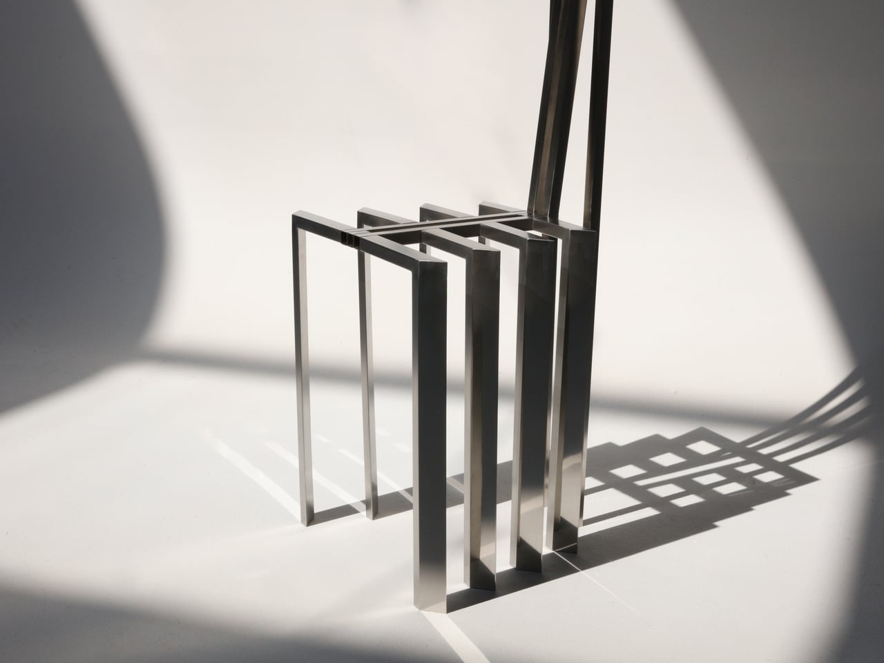
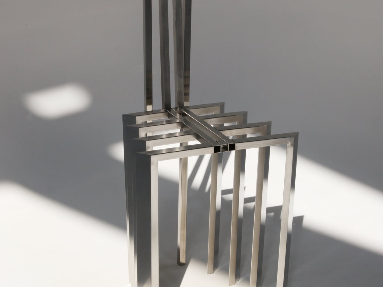
Encountering the Linear Chair, you see a small framework first, a set of repeated uprights and crossbars that read like a fragment of pergola. Only when you get closer does the seat reveal itself as a crossing of beams, with the back continuing the same rhythm upward. It is clearly functional, but it also feels like sitting inside a drawing, surrounded by lines and the shadows they cast on the floor and wall behind you.
The floor and wall lamps extend the same language into light. The floor lamp becomes a vertical corridor where illumination travels up and down between nested frames, while the wall lamp compresses that idea into a compact cluster that hovers off the surface. In both cases, lighting is less about a glowing bulb and more about how brightness slips between the metal and onto nearby surfaces, treating the surrounding wall as part of the composition.
Foln changes as you move around it. From one angle, the lines stack and the pieces look dense, almost solid; from another, they open up and nearly disappear. The designer’s statement that shadows become architectural elements in their own right comes through when you realize the real composition includes the dark stripes on the floor and wall as much as the polished steel itself, rewriting the room with every shift in daylight.
Stainless steel, sharp geometry, and unpadded surfaces mean Foln is not chasing ergonomic softness or maximum light output. The chair will feel firm, and the lamps will behave more like ambient or accent pieces than task lights. That trade-off is intentional, prioritizing a contemplative, spatial experience over conventional comfort and placing the series closer to collectible design than everyday contract furniture you buy in bulk.
Foln reframes interiors as places where structure, light, and emptiness can be as present as color or texture. By borrowing the pergola’s rhythm and translating it into folded metal, the series turns a familiar outdoor gesture into a quiet indoor ritual. Rhythm is not only seen in the lines of steel but felt in the way light and shadow keep rewriting the room around them, turning simple objects into small, inhabitable frameworks that change how you read the space they sit in.
LEGO has spent decades proving that plastic bricks can build anything from childhood memories to architectural masterpieces. January 2026 continues that tradition with designs that push beyond simple construction into genuine cultural commentary. These aren’t just toys gathering dust on shelves. They’re conversation pieces that bridge art history, gaming nostalgia, comedy legends, sports culture, and the maker movement into something you can actually hold.
What makes these five stand out is their refusal to play it safe. Each one takes risks with form, function, or concept. Some open to reveal hidden worlds. Others capture movement frozen in absurdity. The best designs this month understand that LEGO’s real magic lies in surprising people who thought they’d seen everything the medium could offer.
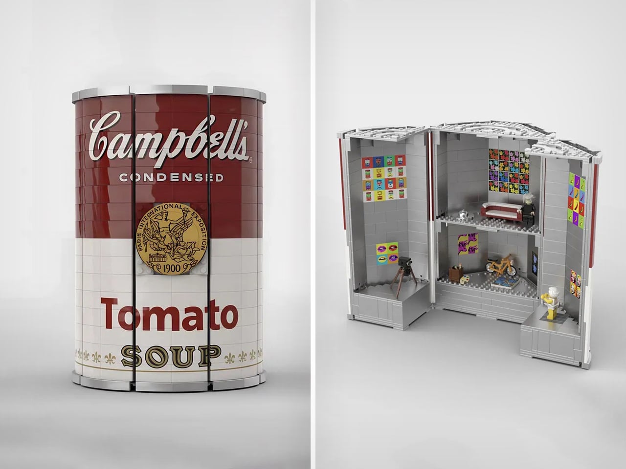
1. LEGO Campbell’s Soup Can Opens to Reveal Andy Warhol’s Factory Studio
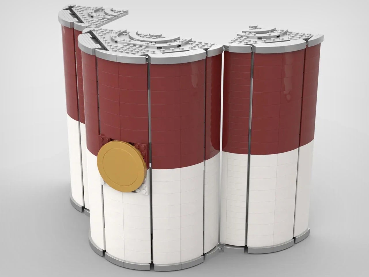
This LEGO Ideas submission transforms Warhol’s most famous subject into an architectural achievement that honors both pop art and the artist’s creative process. The 24-stud diameter curved exterior alone represents great technical skill, but that’s just the packaging for what’s inside. Months of research went into recreating The Factory’s actual layout, visual language, and cultural significance. The printed artworks covering interior walls reference Warhol’s practice of painting on the floor surrounded by finished pieces.
The metallic interior creates a jarring contrast against the familiar red and white label, mimicking that disorienting moment when commercial design becomes fine art. Props from the actual studio populate the space: the disco ball reflecting celebrity culture, the motorcycle representing Warhol’s fascination with danger and fame, the couch where artists and socialites blurred boundaries. The silver-wigged minifigure presides over it all like a tiny curator. This works as both a display piece and an educational tool, making 1960s avant-garde culture accessible through the universal language of LEGO.
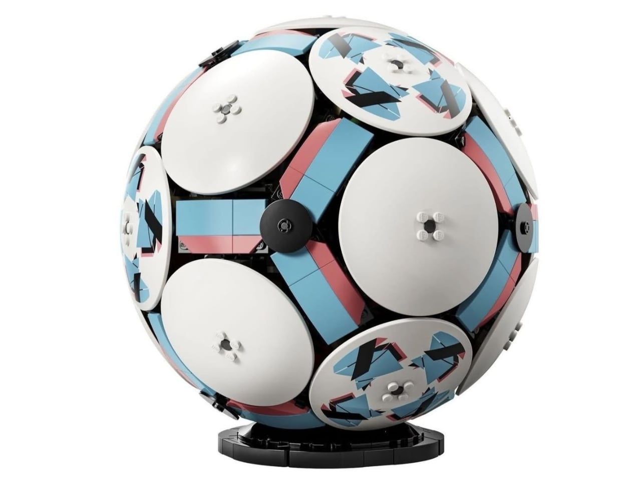
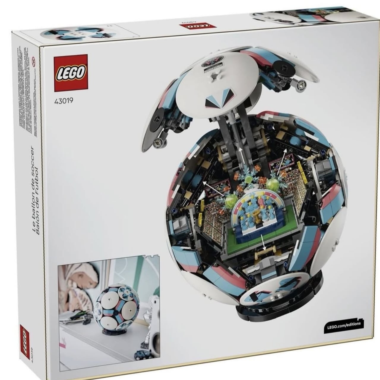
2. LEGO Editions 43019 Soccer Ball Opens to Stadium Interior
This 1,498-piece build measures 15 inches long, 10.3 inches wide, and 2.8 inches tall when fully assembled. The ball exterior alone would make a decent display piece, but cracking it open reveals the real achievement: a complete miniature stadium tucked inside curved walls. Stands, pitch, and match details occupy space most designers would leave hollow. Tiny fans populate the seating areas while players freeze mid-action on the field, capturing that electric moment before kickoff.
The engineering required to create both a recognizable ball exterior and a detailed stadium interior deserves recognition. This isn’t hollow packaging with loose pieces rattling around. Every element serves the dual design, allowing two completely different display configurations from one set. Show the closed ball for sports memorabilia aesthetic, or open it up to reveal the intricate stadium work. That versatility makes it perfect for shelves, desks, or dedicated LEGO display areas. The commitment to surprising builders at every construction stage elevates this beyond typical sports merchandise.
3. LEGO Monty Python Ministry of Silly Walks Build
John Cleese’s Mr. Teabag finally exists in brick form, complete with exaggerated proportions capturing every knee-flinging motion from the legendary sketch. The Technic joints provide genuine articulation rather than decorative suggestion, allowing precise recreation of those impossibly specific movements. This build solves a difficult problem: translating physical comedy into a static medium while preserving all the visual humor that made the original sketch memorable.
The facial expression captures Mr. Teabag’s deadpan bureaucratic seriousness with museum-quality attention to sculptural detail. That silhouette reads instantly from across any room, making it display-worthy alongside traditional LEGO architecture sets. The bowler hat and umbrella complete the aesthetic, transforming simple accessories into essential elements of British absurdist comedy. This works whether you’re a Python fanatic who can quote entire sketches or simply appreciate builds with genuine personality. The wit translates perfectly into plastic brick form.
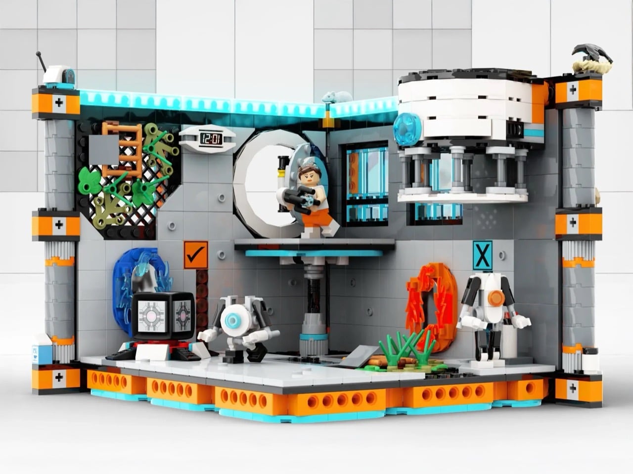
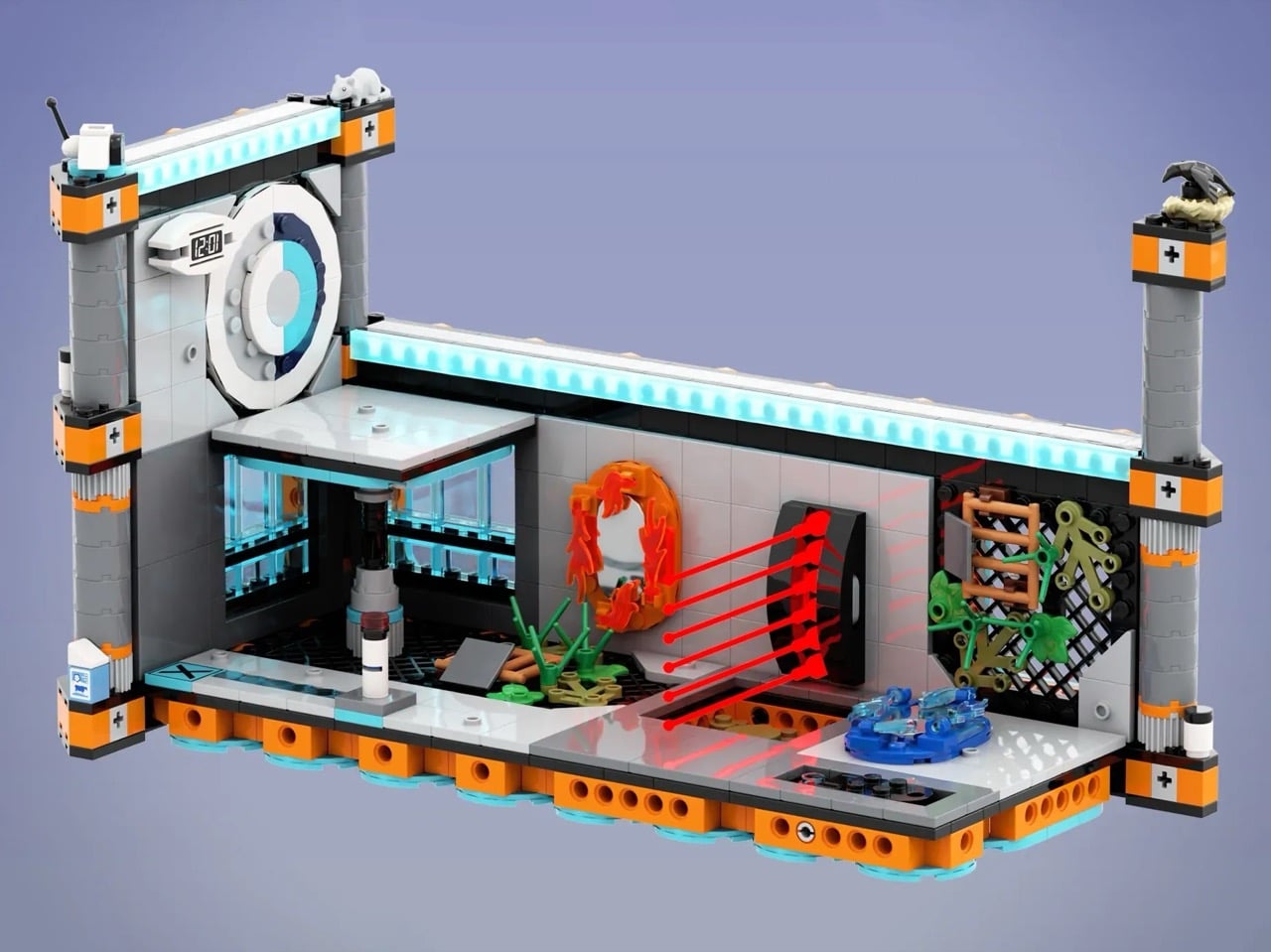
4. LEGO Portal 2 Test Chamber Creator with Modular Design
The Portal franchise earned its legendary status through ingenious puzzles, dark humor, and an aesthetic so distinctive that orange and blue instantly evoke Aperture Science. KaijuBuilds translated that sterile-yet-sinister world into brick form with this LEGO Ideas submission. The sophisticated modular tile system features 18 unique configurations across 29 total modules, letting builders reconstruct famous chambers or design entirely new challenges. Around 1,280 pieces include Chell, Wheatley, Atlas, P-body, turrets, portals, a Companion Cube, and that infamous cake.
Attention to detail extends to overgrown tiles referencing Portal 2’s decayed facility sections, complete with a white rat nodding to mysterious Rattman. The modular approach mirrors the in-game test chamber editor, transforming this from a frozen diorama into an actual spatial puzzle playground. You can play with configurations rather than building one static scene, which captures the core Portal experience of manipulating space to solve problems. That interactive design philosophy makes this more than fan service. It’s a genuine translation of game mechanics into a physical building system.
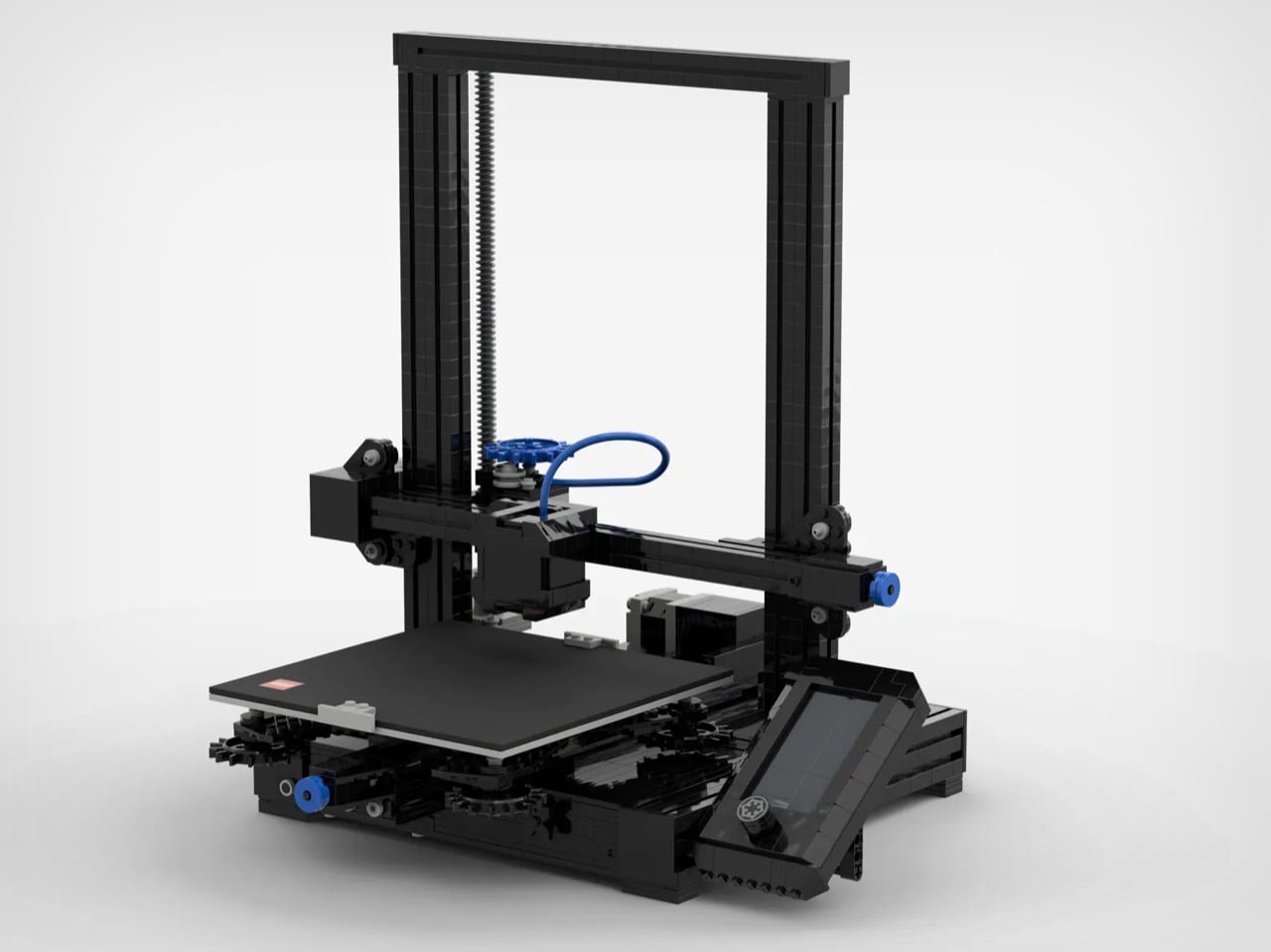
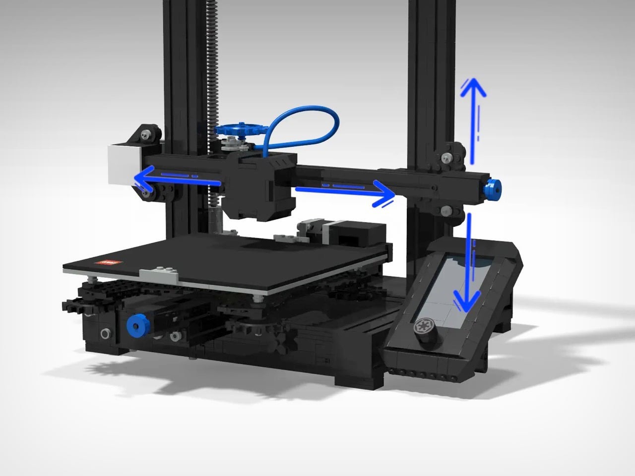
5. LEGO Ender-Inspired 3D Printer Model
LEGO and 3D printing occupy similar creative territory, both transforming ideas into physical objects through systematic processes. Despite this natural kinship, no official LEGO model has captured the specific machine democratizing small-scale manufacturing. This fan submission fixes that gap with a recognizably Ender-inspired design capturing both the utilitarian aesthetic and basic kinematic structure of Creality’s popular printer lineup. The build doesn’t actually function like some ambitious LEGO projects, but that misses the point entirely.
Someone unfamiliar with 3D printing could assemble this and understand how Cartesian motion systems work, how hotend assembly relates to the build plate, and why vertical lead screws matter for Z-axis stability. For people who already own an Ender or similar machine, it offers nostalgia and novelty in seeing familiar hardware translated into tabletop collectible form. This bridges two maker communities that share fundamental DNA: the systematic joy of creating physical objects layer by layer, whether through molded plastic bricks or extruded filament.
The New Direction of LEGO Design
These five builds represent where LEGO culture is heading: designs that celebrate specific communities, translate complex ideas into accessible forms, and trust builders to appreciate nuance. They’re not chasing mass appeal. They’re serving passionate audiences who want their interests reflected in brick form, whether that’s pop art history, gaming nostalgia, or maker culture.
The best part is how these designs use LEGO’s constraints as creative fuel rather than limitations. Curved soup cans, modular game chambers, articulated comedy, nested stadiums, and kinematic printer structures all push the medium into new territory. January 2026 proves that after decades of innovation, LEGO still has surprises left to build.