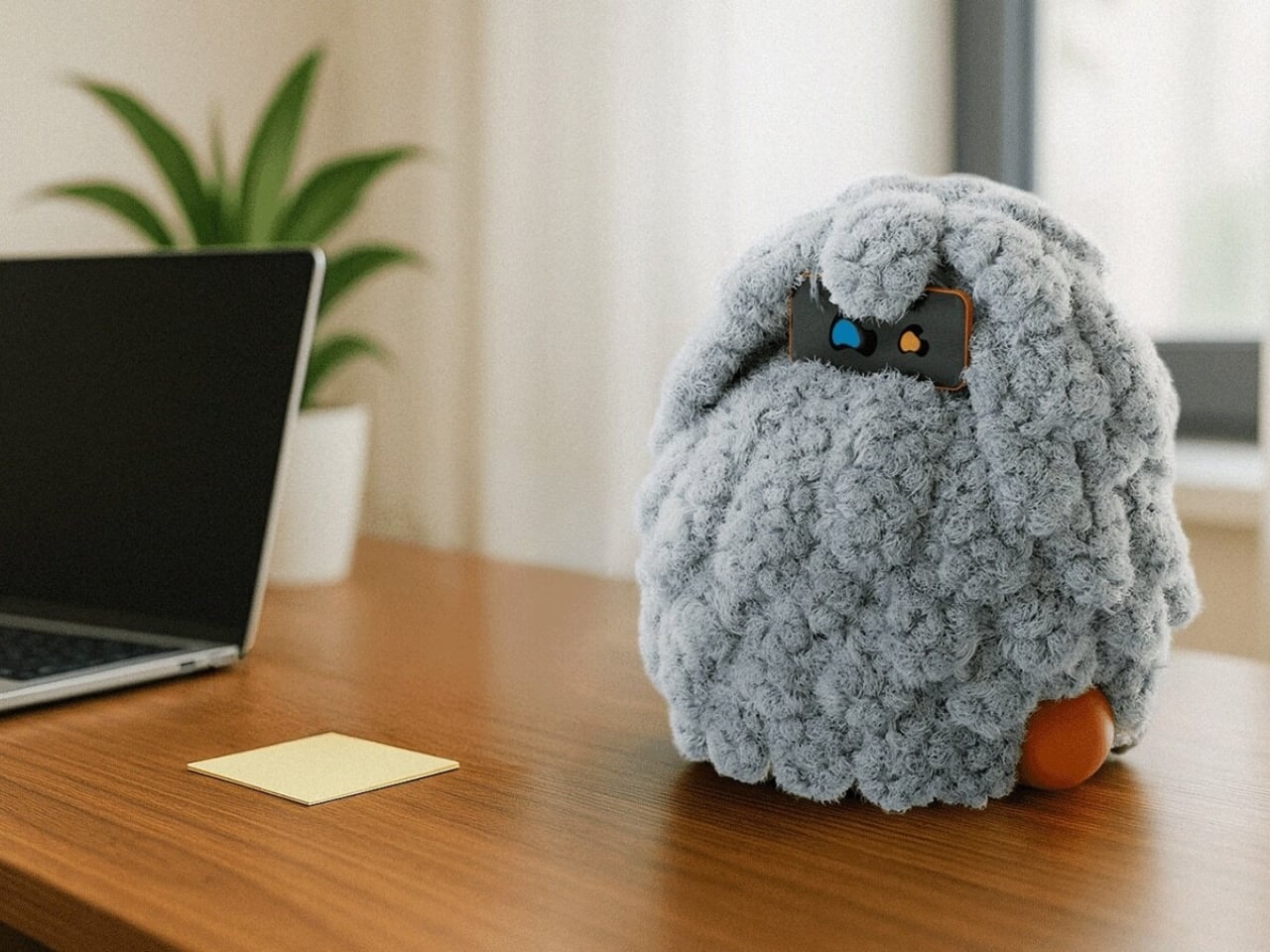
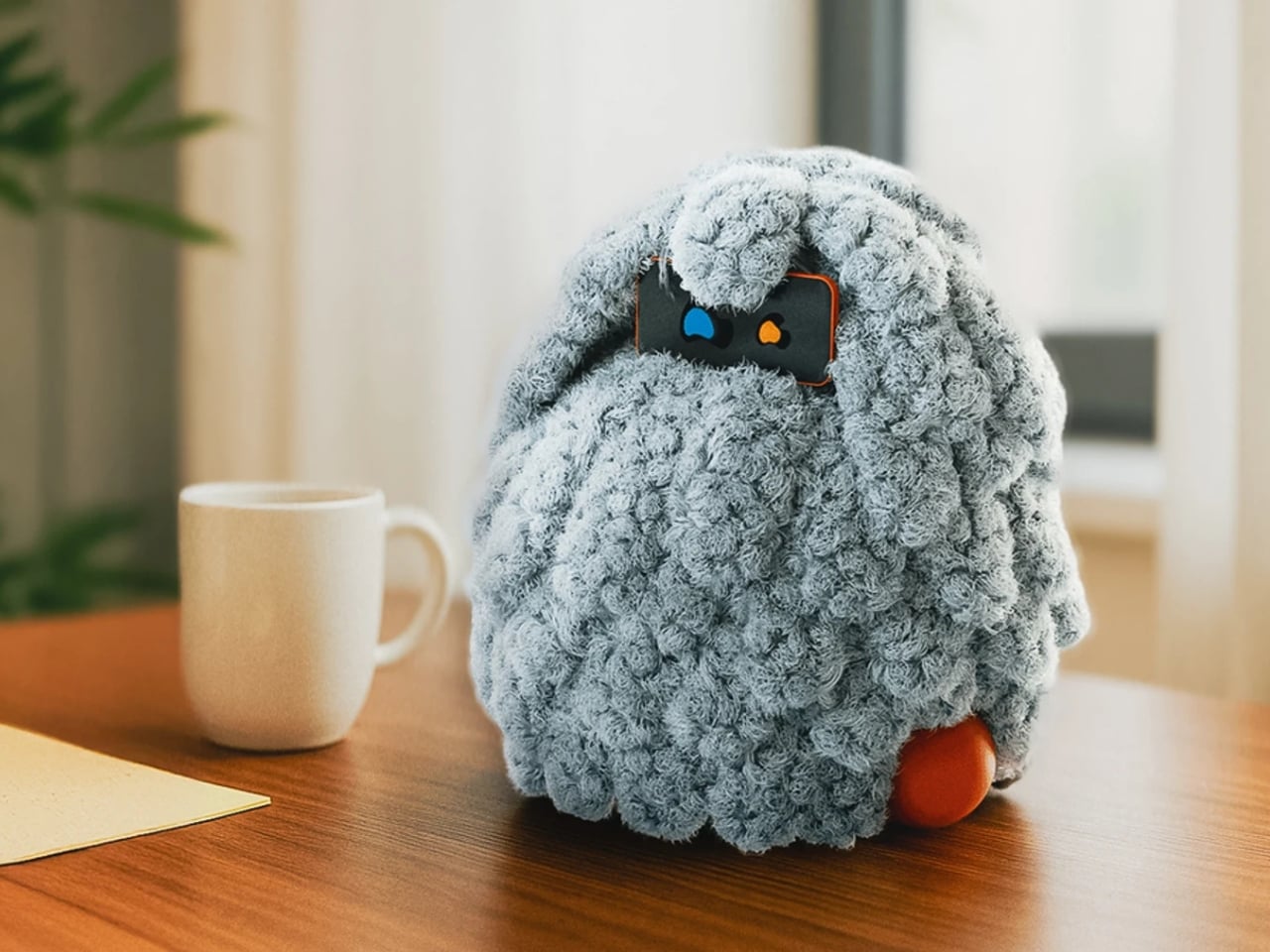
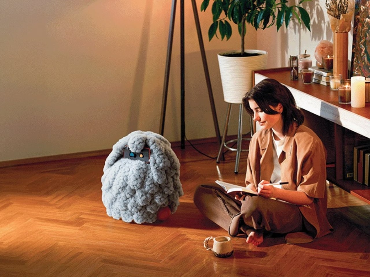
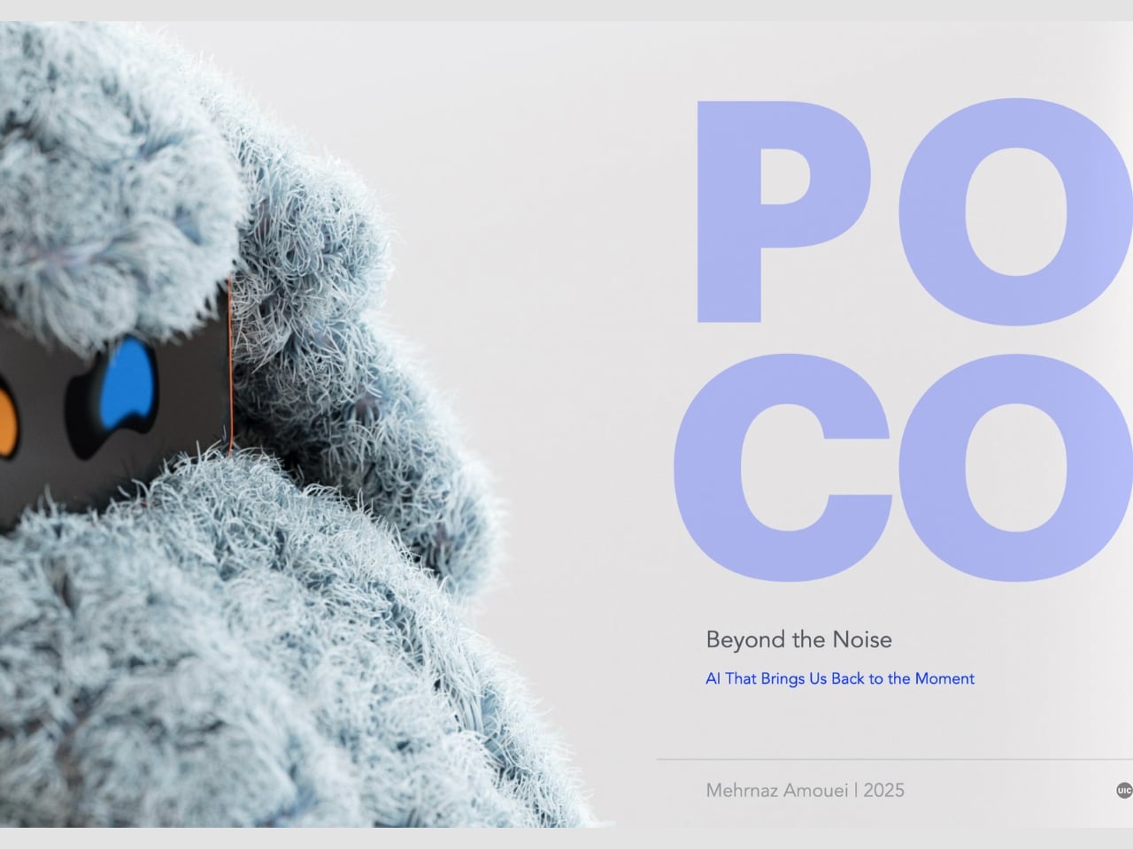
We keep building AI to do more. More answers, more speed, more certainty. Designer Mehrnaz Amouei looked at that trajectory and asked a fundamentally different question: what if we built AI to be more present instead? The result is POCO, a soft robotic companion that might be one of the most quietly radical design concepts to emerge in recent years. It doesn’t talk over you, doesn’t flood you with information, and it doesn’t pretend to know things it doesn’t know. POCO sits with you. Literally.
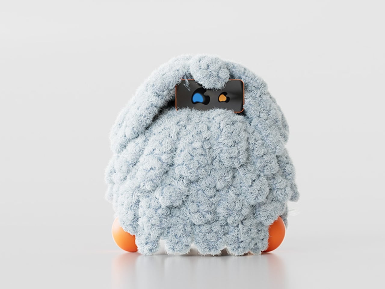
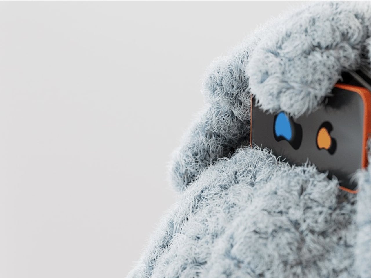
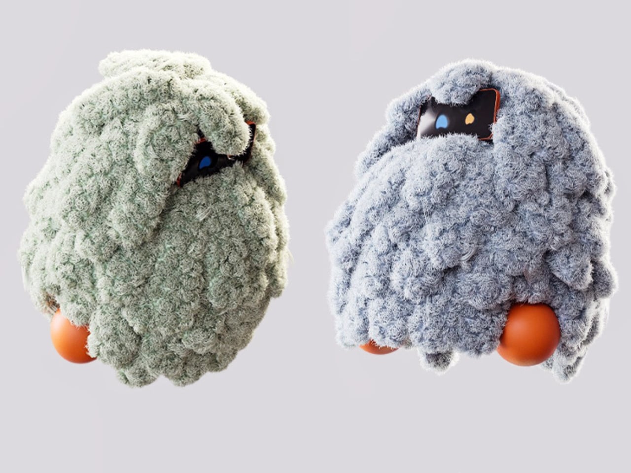
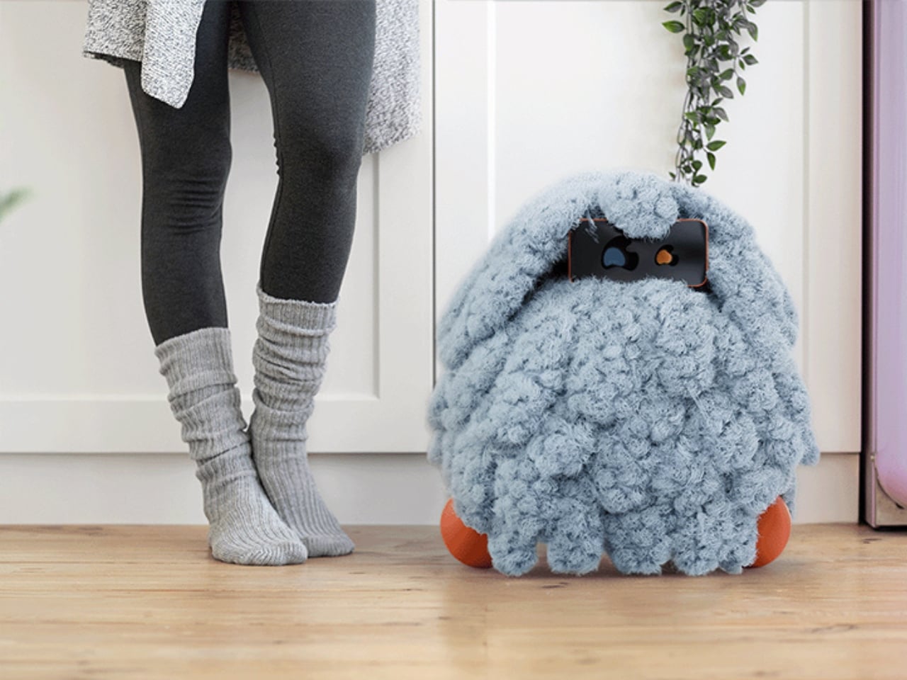
At its core, POCO is a soft, tactile object that pairs with a smartphone, which serves as its computational brain and face. A soft textile body wraps around the device, transforming rigid, glass-and-metal technology into something that moves, breathes, and gestures in response to your presence. Together, they create something that sits somewhere between object, creature, and companion, and that deliberate ambiguity is very much intentional. You’re not quite sure what to call it, and that’s entirely the point.
Amouei developed POCO through research at the University of Illinois at Chicago, grounding the project in studies on loneliness and trust. Her findings indicated that people don’t actually want AI that projects certainty or control. They want availability and responsiveness. They want something that shows up without taking over. From those findings came the concept of “constructive interdependence,” a design philosophy where POCO’s limitations aren’t bugs to be patched but features embedded directly into the interaction model itself. The robot communicates what it can and cannot do through its behavior and physical states, which is a level of honesty you don’t often get from technology that typically overpromises and underdelivers.
I think that matters more than it might initially seem. The dominant conversation around AI right now is almost entirely about expansion: more capability, more integration, more autonomy. POCO pushes back on that without being preachy about it. It reframes the question of what good AI design actually looks like, and the answer it offers isn’t “smarter,” it’s “more trustworthy.” That is a genuinely different value system, and it feels overdue.
The sustainability dimension is also worth paying attention to. Rather than introducing new hardware and generating more electronic waste, POCO repurposes a device most people already own. That decision isn’t just a nice bonus; it’s built into the concept from the start, aligning with the UN’s Sustainable Development Goals around mental well-being and responsible consumption. In product design terms, that means the project was developed with a broader cultural and environmental context in mind, not just a user persona sitting in a lab.
Physically, POCO responds to touch, movement, and environmental cues. It adapts to a user’s preferences while maintaining a consistent identity, which is a surprisingly nuanced balance to strike in any product, let alone one sitting at the intersection of soft robotics and emotional design. Because interaction happens through touch rather than voice commands or screen taps, there’s an intentional slowing down embedded in the experience. You can’t rush a tactile exchange the same way you can type faster or speak louder. That shift from speed to presence feels like a meaningful counter-proposal to how most tech is currently designed. We’ve grown so accustomed to interfaces that demand our attention that a device asking only for our company reads almost as radical.
POCO has already earned an Honorable Mention from the International Design Awards and drawn coverage from major design publications. Whether it ever moves into consumer production remains an open question. But as a design statement, it’s doing exactly what the best concept work should: prompting us to reconsider what we actually want from the technology we live with, and whether expanding capability was ever really the right goal. Maybe the most interesting AI isn’t the one that knows the most. Maybe it’s the one that knows when to just stay close.
Here’s what happens when you join a Zoom call right now: you click the link, wait for the app to launch, find the mute button, realize your camera is on when you’re still in pajamas, hunt for that toggle, then minimize the window to keep working. Six actions, multiple windows, all muscle memory you’ve built up because this is just how it works. We’ve accepted the friction.
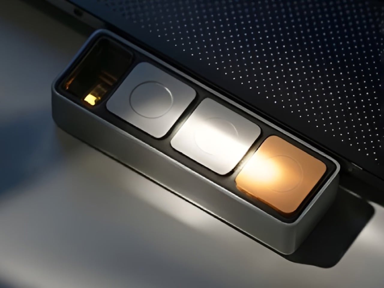
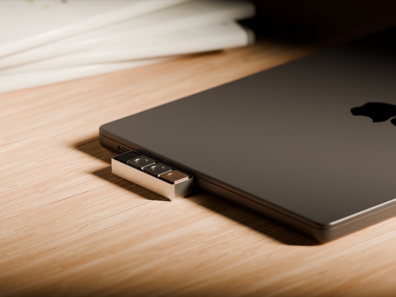
Project Mirage looked at that friction and built Dune. Three physical keys that sync with your calendar, know when your next meeting is, and give you one-button join, instant mic control, camera toggle that brings the window forward when you need it. Then you switch to your code editor and those same three buttons become the shortcuts you actually use in that tool. Open your browser, they adapt to the tab. The hardware reads context, talks to AI, morphs based on what you’re doing. It’s 50 grams of machined aluminum that finally acts like it knows what year it is.
The core idea is simple but meaningful. Dune monitors your Mac, detects which application is in the foreground, and automatically reconfigures what its three keys do. In GitHub, they handle pull requests and code reviews. In VS Code or Claude, they surface the commands you reach for constantly. The device integrates with Openclaw to trigger AI agents you’ve already built, so that email sorting routine you automated can fire with a physical button press instead of hunting through menus. In Photoshop, you can map them to copy/duplicate layers, increase or decrease brush sizes, or flatten/export images. The best part, however, is using the Dune on your browser, where the hardware detects which tab you’re on, changing controls/maps based on whether you’re on a Gmail tab, a Google Meet tab, an Instagram tab, or even scrolling through your inspiration on Pinterest. The on-screen display shows you what each key does at any moment, removing the need to memorize complex shortcuts or maintain mental maps of what Button 2 does in seventeen different apps.
What separates Dune from traditional macro pads is that layer of intelligence. Stream Decks and programmable keypads give you power, but they demand upfront investment. You configure profiles for every app, remember which layer you’re on, maintain the whole system yourself. Dune comes preconfigured with workflows for common tools and adapts automatically. You can still write custom scripts, assign URLs, build your own automations (I built mine using AI and they work like a charm). The difference is the device does the heavy lifting of context switching for you.
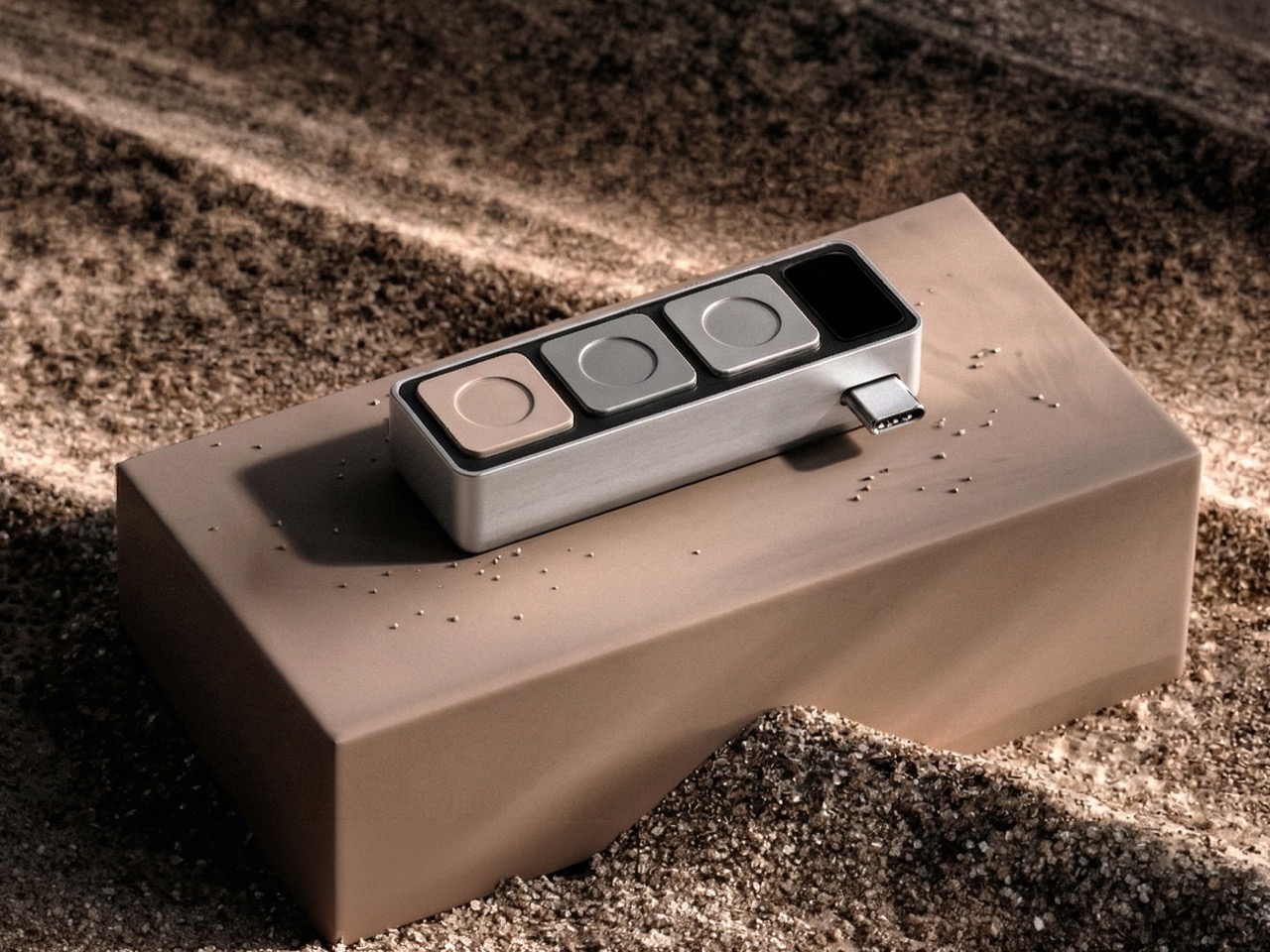
The hardware itself is straightforward. CNC-machined anodized aluminum body, USB-C connection that powers the device directly without needing a battery, 40mm × 10mm × 10mm dimensions that sit comfortably next to your keyboard without dominating desk space. It’s macOS only for now, which makes sense given the tight system integration required to read active applications and browser tabs in real time. The packaging ships each unit embedded in actual river sand, a physical callback to the name and the metaphor of something that shifts and adapts constantly.
Dune is available for pre-order now at $119, with the price moving to $149 after launch. Ships in May 2026 from the Project Mirage website, where you can also find setup guides and documentation on building custom automations.
The smart home speaker market has settled into a familiar aesthetic. Smooth cylinders, matte finishes, and understated designs meant to disappear into a room are the default for most voice assistants. It’s a reasonable approach, but it also means most of them look exactly the same, and the hardware driving them tends to get replaced every couple of years, whether it actually needs to be or not.
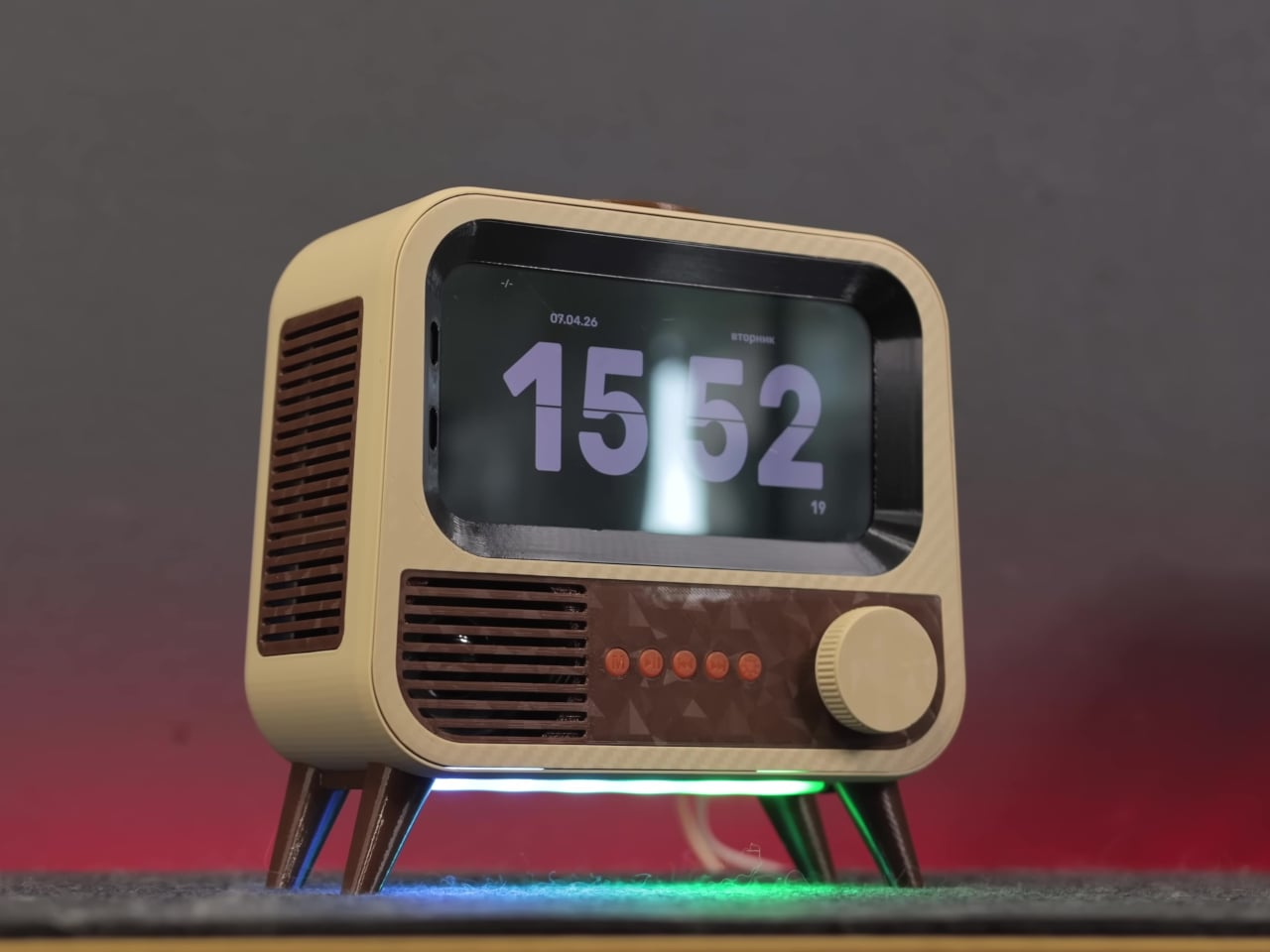
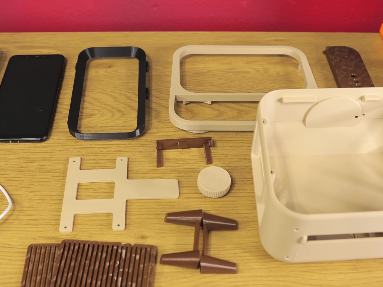
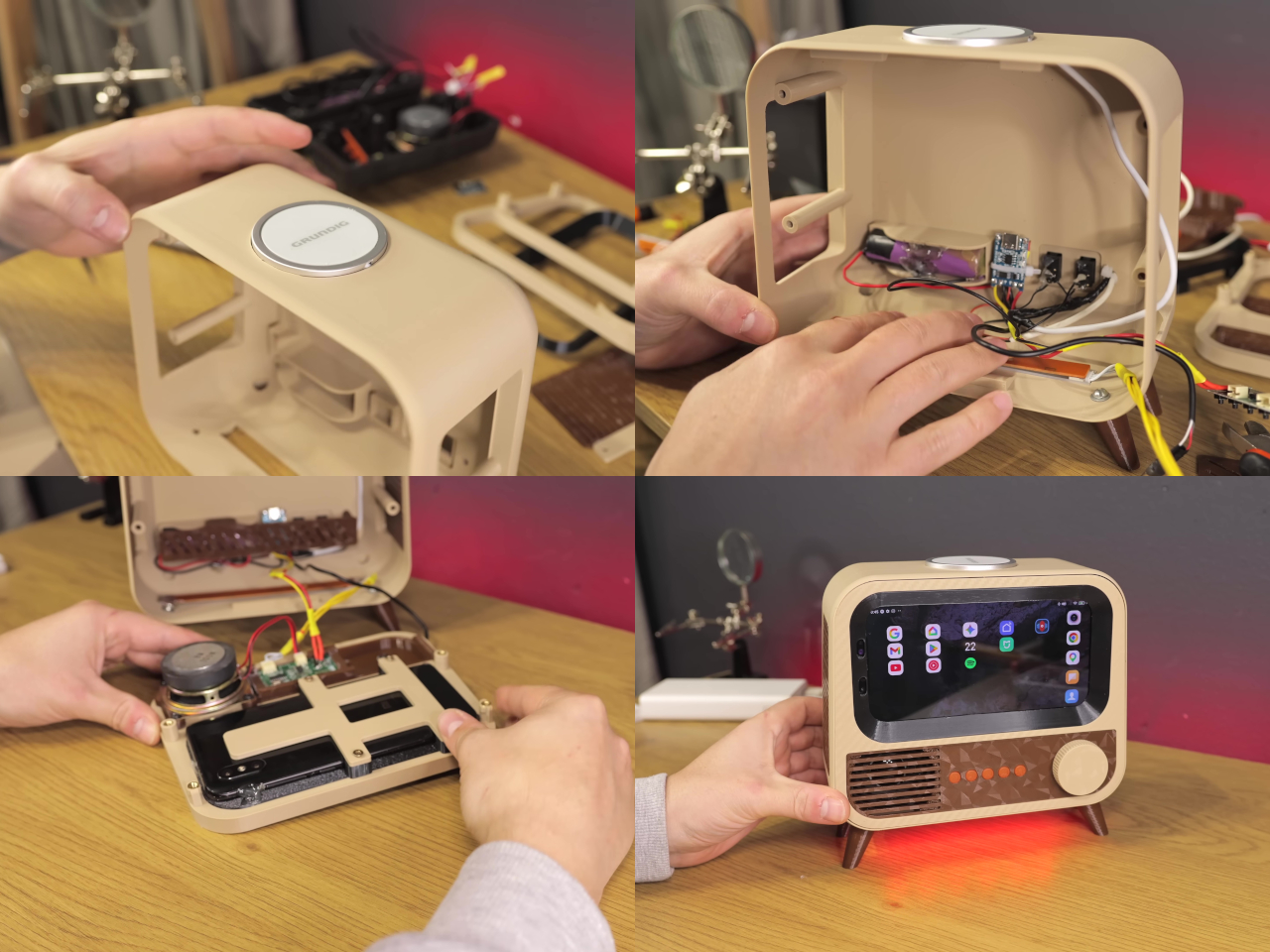
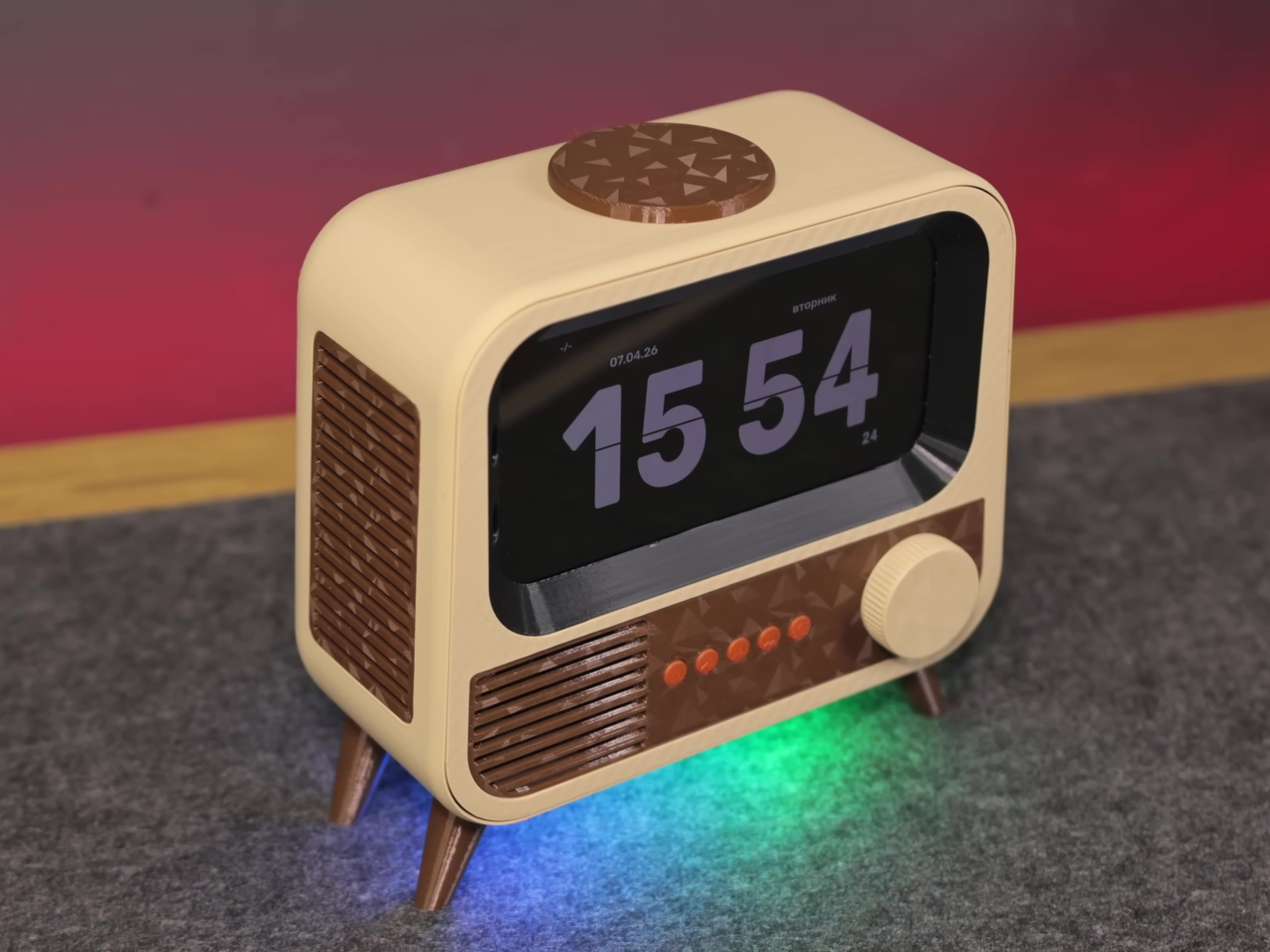
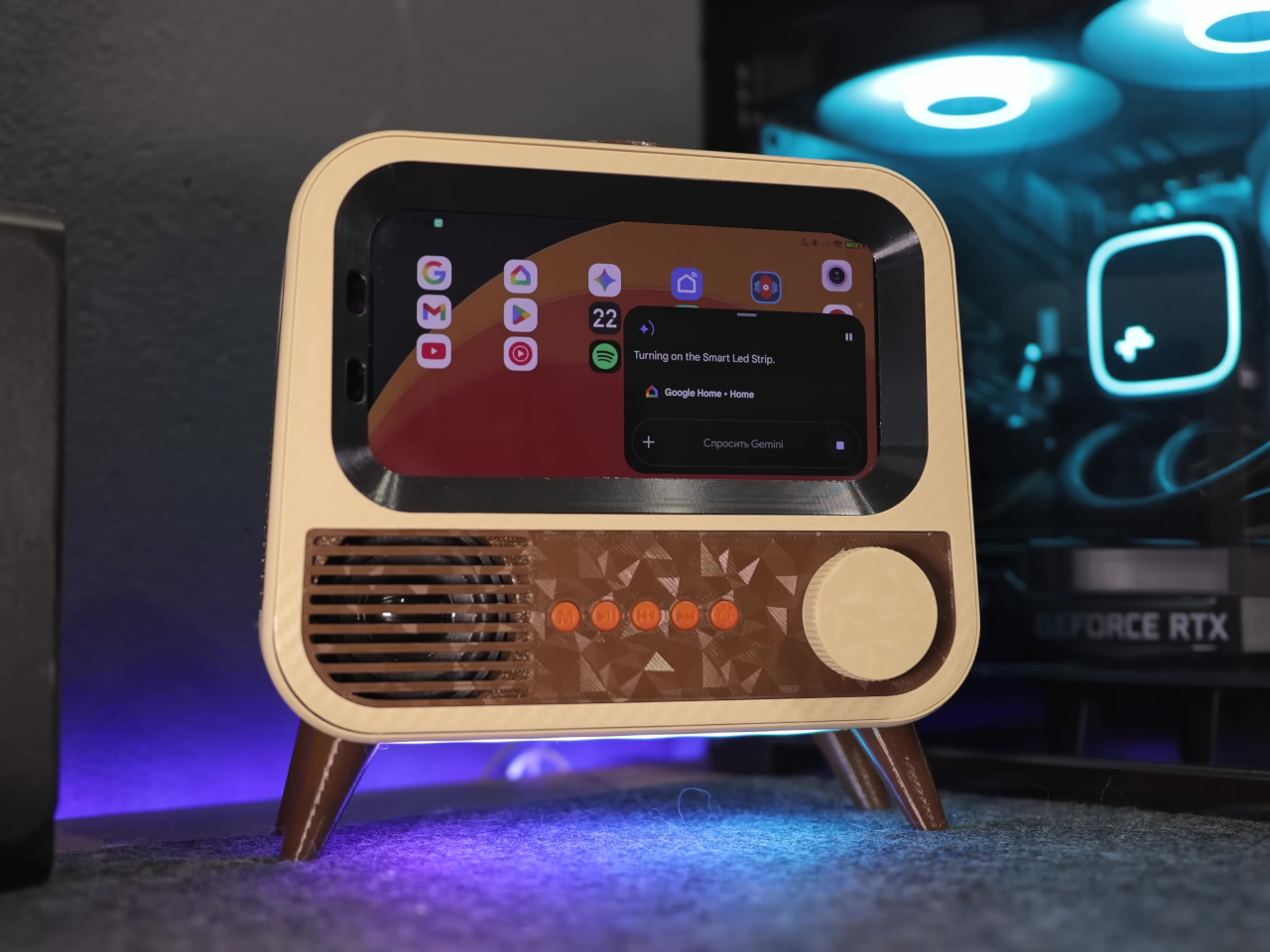
HANDMAX Workshop took a different approach entirely. Rather than buying new hardware, the build starts with a Xiaomi Mi 8 already well past its prime, complete with a burned-in display, degraded speakers, and a failing battery. The processor and software capabilities were still perfectly usable, though, and that turned out to be all this kind of project actually needs.
Designer: HANDMAX Workshop
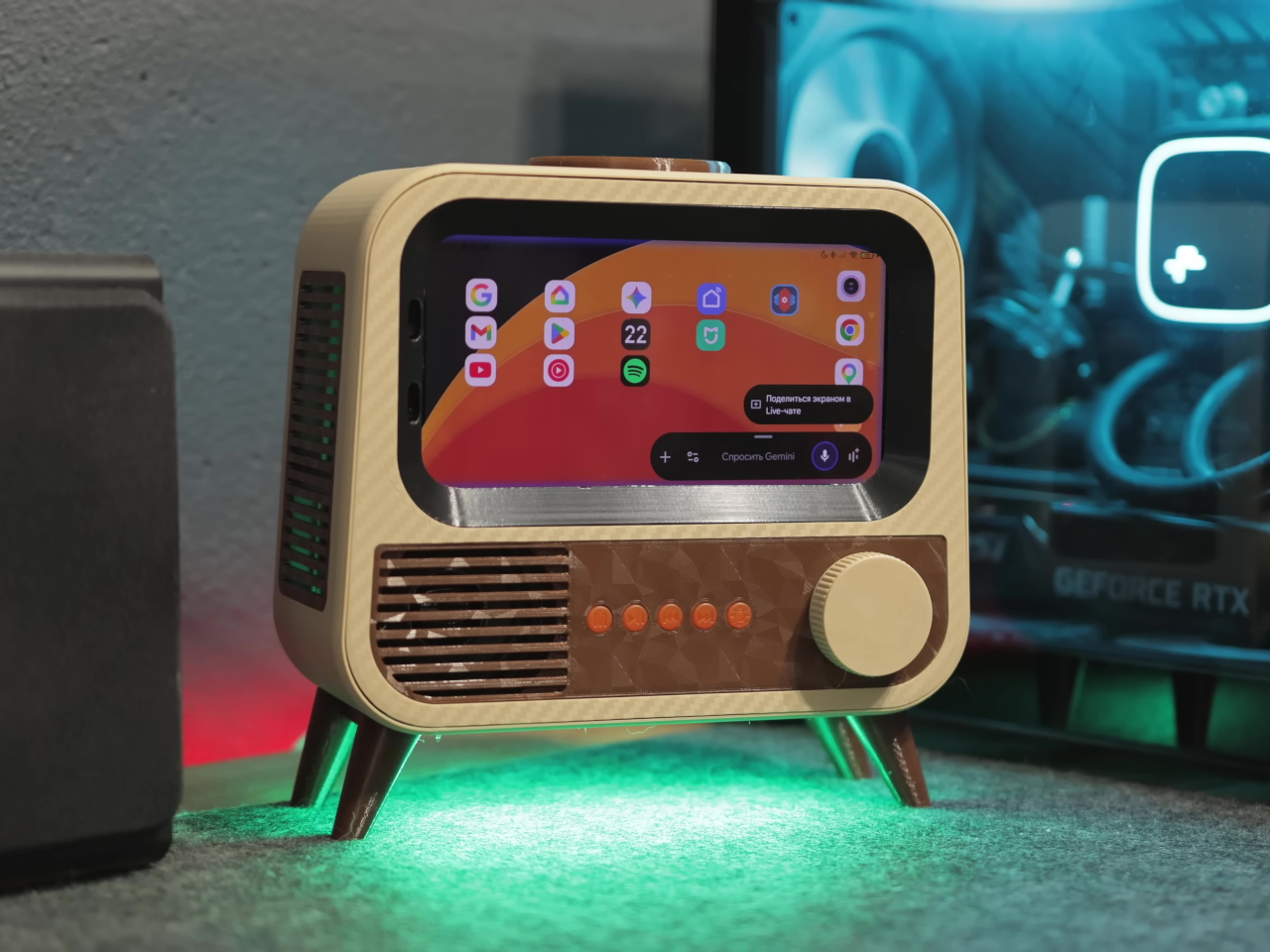
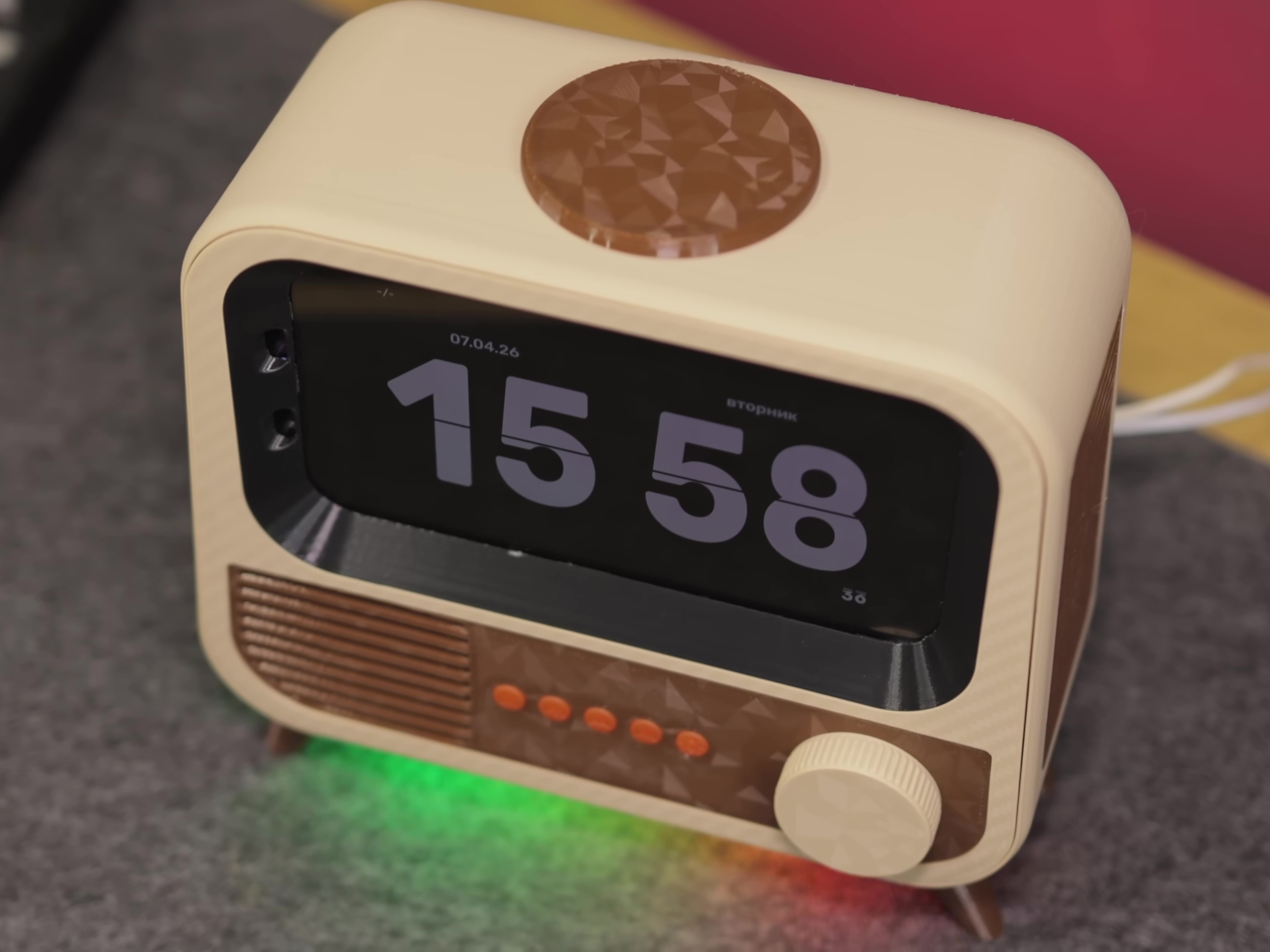
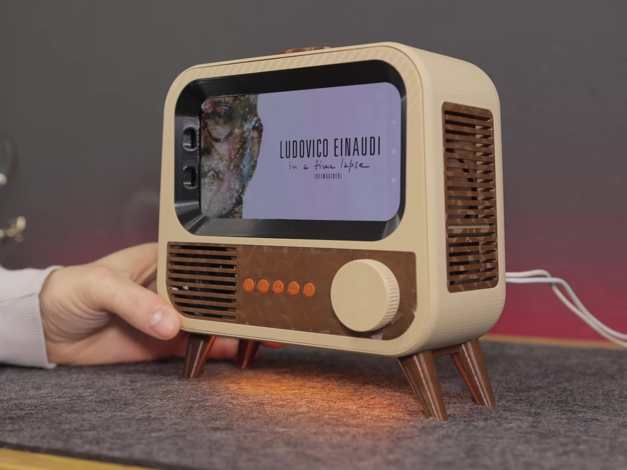
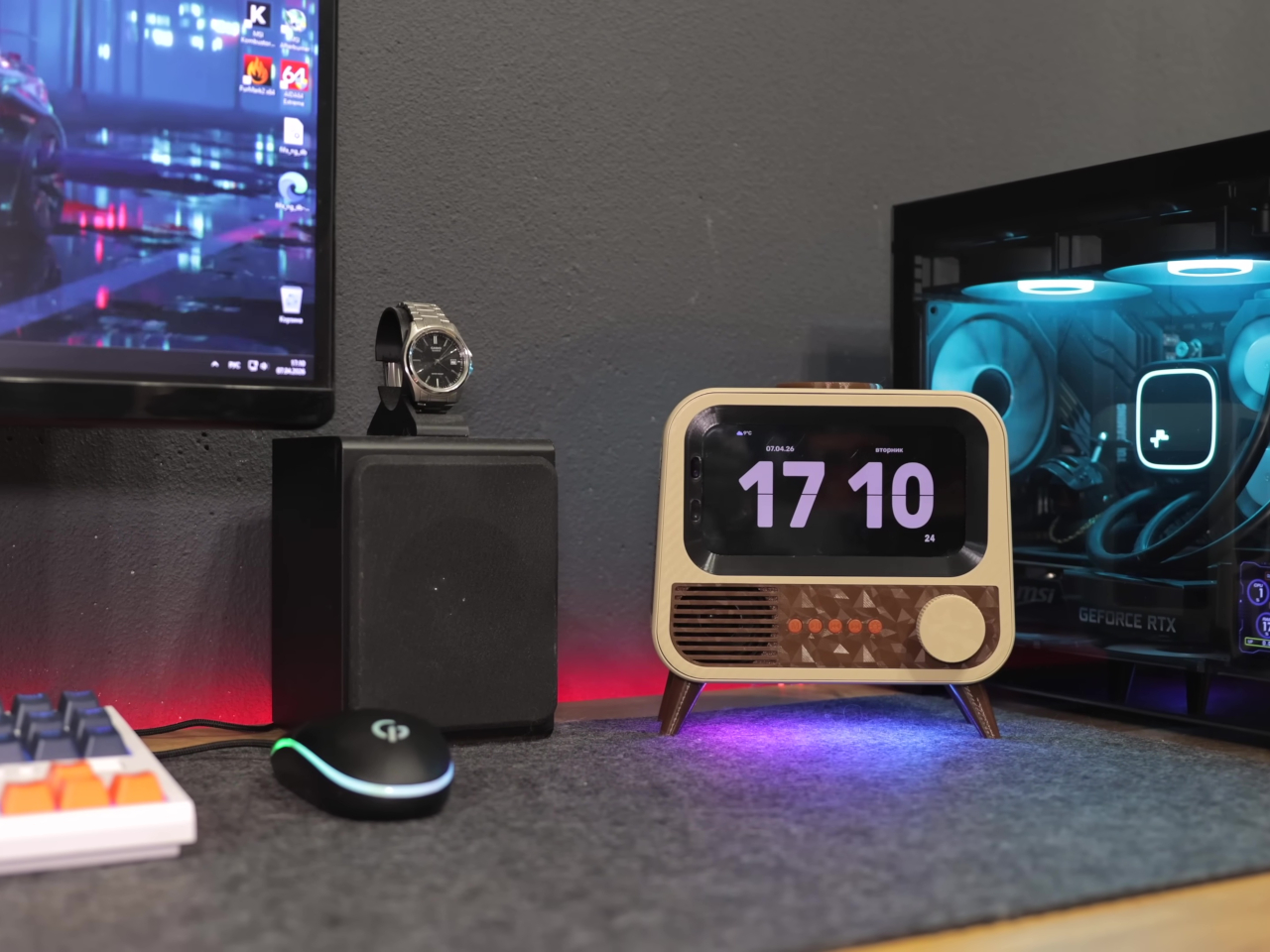
The case is where things get interesting. Instead of a sleek enclosure meant to blend in, the HANDMAX design goes full retro television, with a front grille, physical control buttons, and decorative legs completing the picture. Carefully modeled 3D-printed parts handle the practical side of things, accommodating the phone’s sensors and camera while keeping the vintage illusion intact from every angle you look at it.
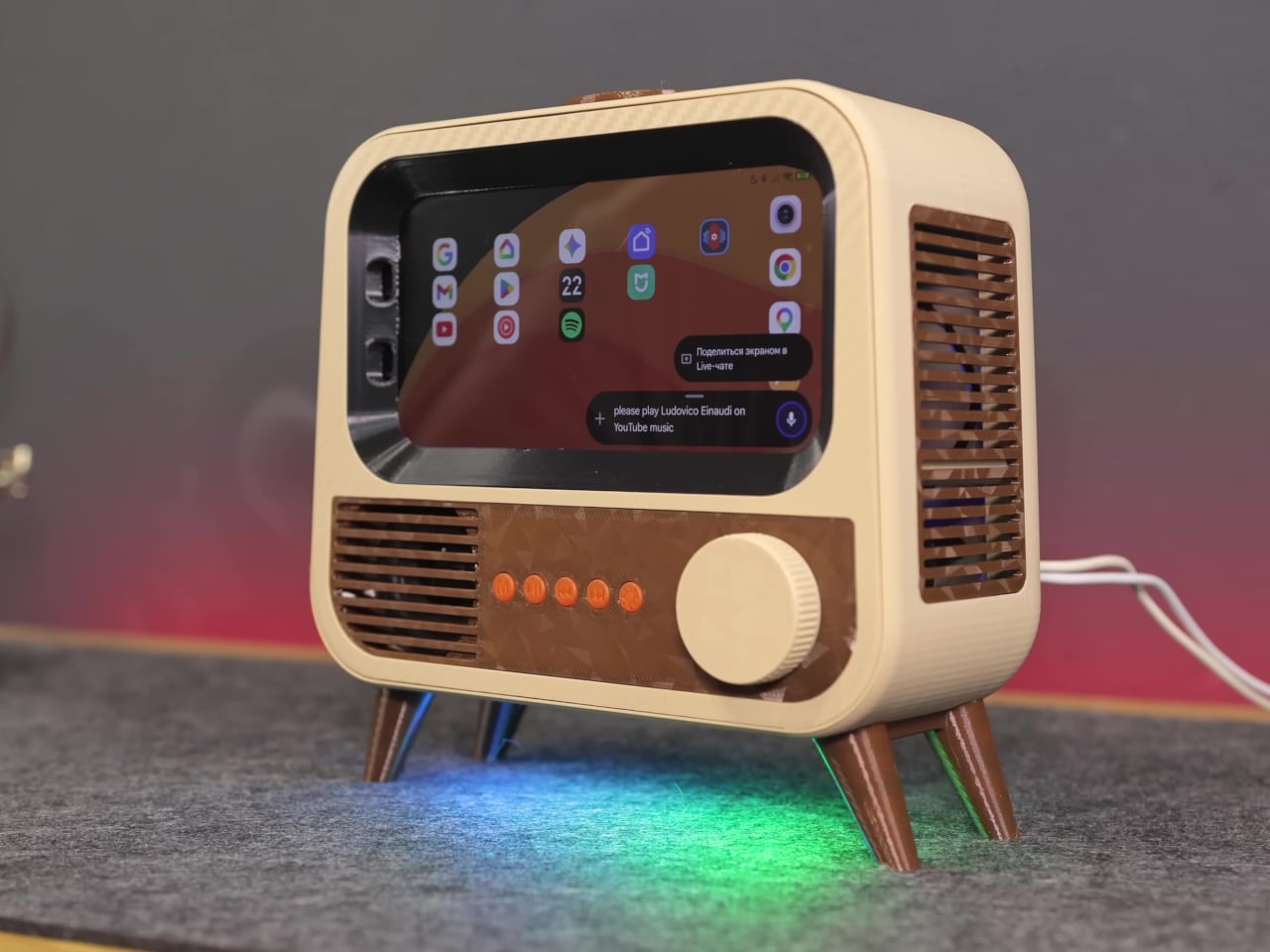
Put it on a desk, and you have a smart speaker that looks like something rescued from a garage sale, in the best possible way. Ask it a question, and Google Gemini handles the conversational side, pulling in responses without needing a dedicated microprocessor or a new development board. It’s the same AI model powering higher-end commercial devices, running on hardware that would otherwise be sitting in a drawer.
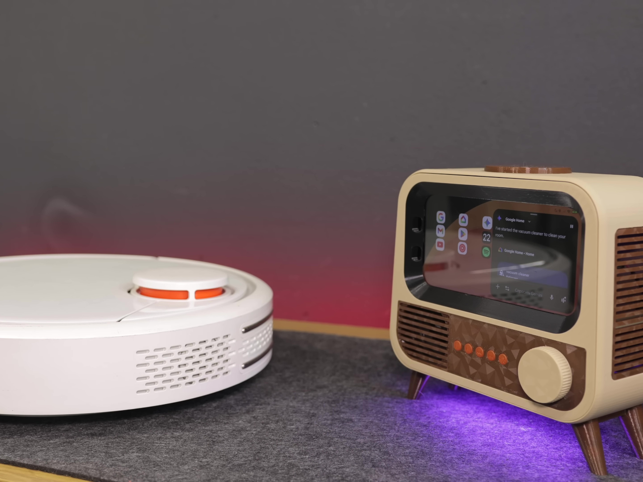
The smart home integration is what makes it genuinely useful beyond being a conversation piece. Through Google Home, the device can control smart home accessories directly, and custom routines let voice commands trigger specific actions around the house. Turning lights on, adjusting a thermostat, or running a sequence of automations becomes a spoken instruction directed at what looks like a miniature television set.
Getting there wasn’t entirely straightforward. The phone’s Bluetooth module had a habit of shutting itself down after 20 minutes of silence, which would quietly cripple the whole setup. The fix was characteristically clever, though; an inaudible 6 Hz tone runs constantly in the background, imperceptible to human ears but enough to convince the firmware that the system is still in use and shouldn’t shut down.
Beyond voice interaction, the finished device also functions as a wireless charger and a desktop display, which means it earns its counter space even when no one is talking to it. The final hardware list doesn’t include a single new component, just old parts that most people would have discarded without a second thought. That’s the more interesting design challenge of the two.
There’s an argument to be made that the best AI hardware isn’t always the most expensive, and this project makes it quietly. Commercial smart speakers are bought, used for a few years, and eventually replaced. A device built from broken hardware doesn’t follow that lifecycle, and the retro TV case that holds it together makes sure it doesn’t look like it’s trying to.
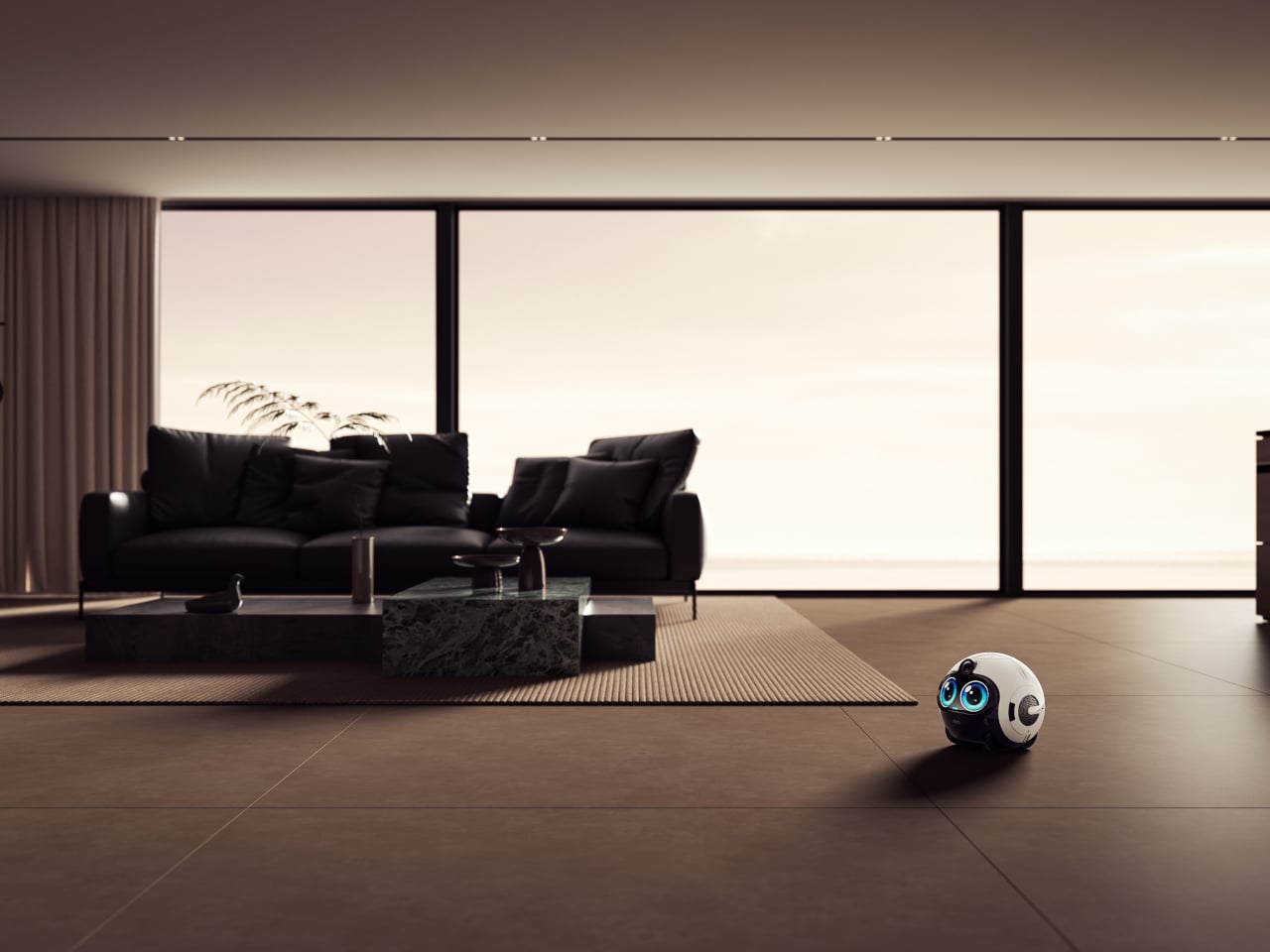
Smart home devices have gotten remarkably good at answering questions and playing music, but they’ve always had one big limitation: they stay put. A speaker on the kitchen counter can’t check on an elderly parent who hasn’t moved in hours, or trail a curious toddler around the house. For families trying to stay connected and keep everyone safe, that gap has always been difficult to bridge.
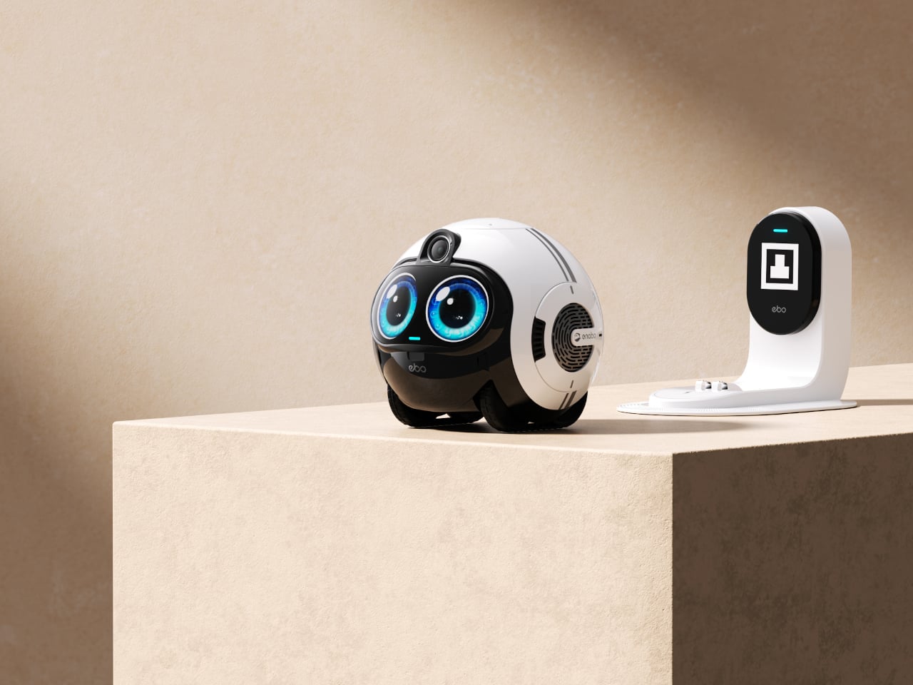
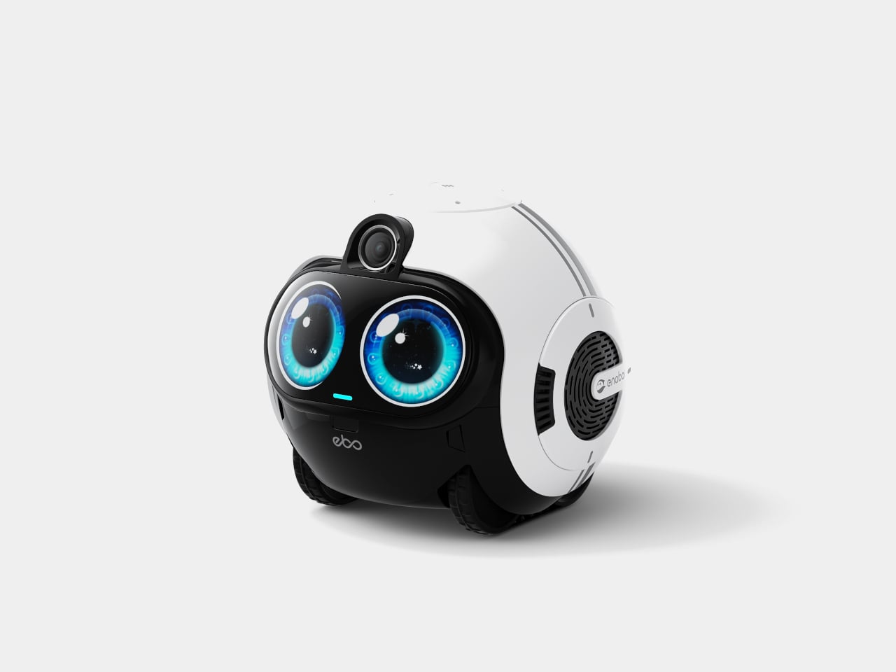
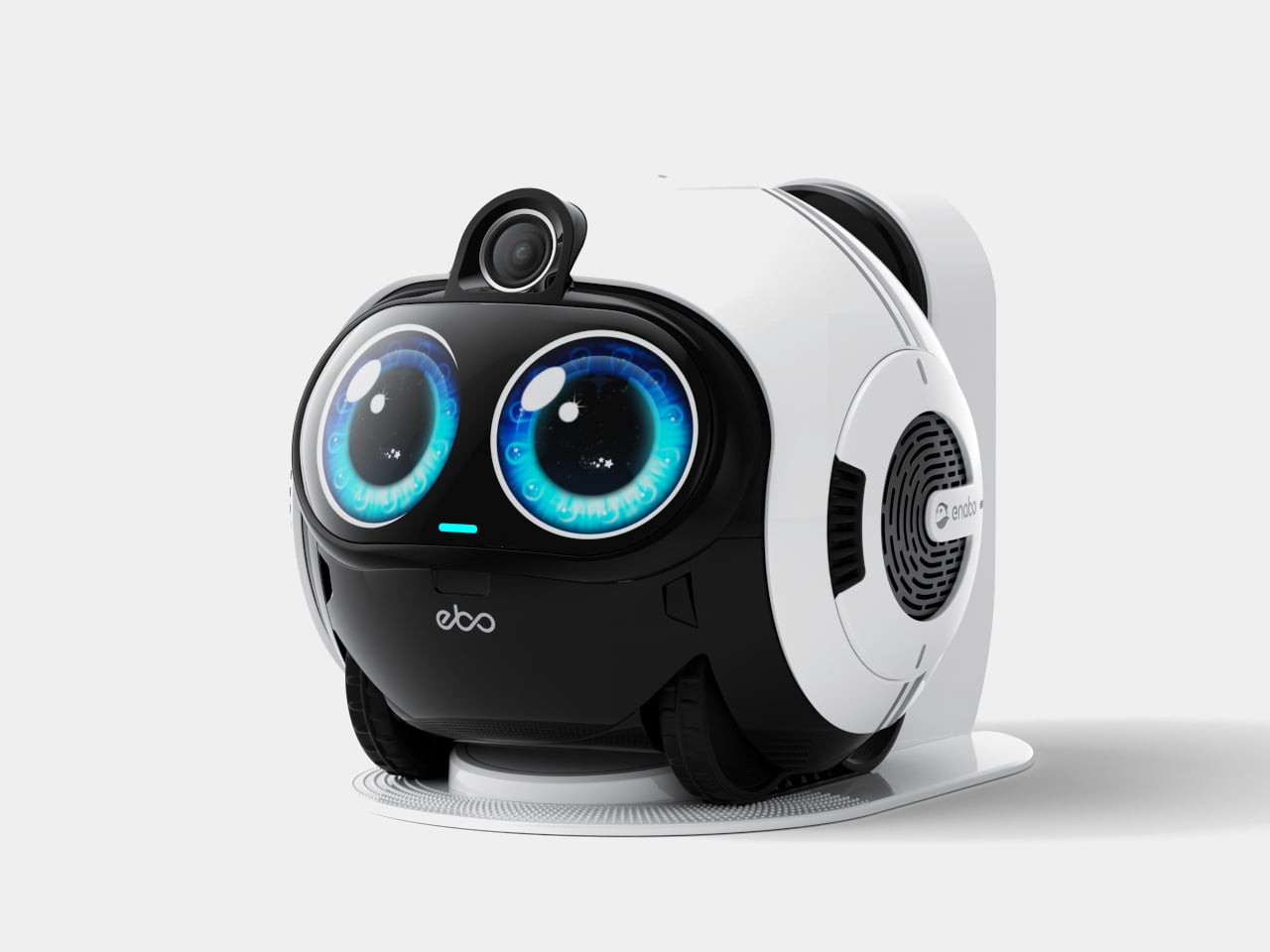
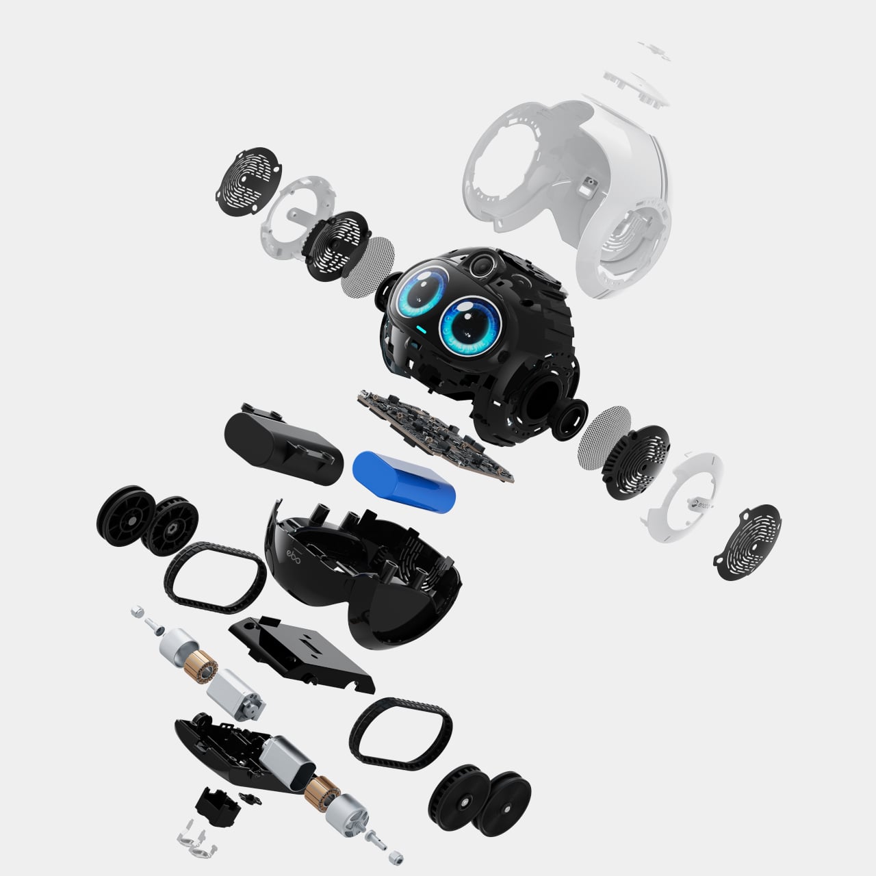
Enabot’s EBO Max FamilyBot takes a completely different approach. It’s a compact, round-bodied robot roughly the size of a football, with expressive oversized eyes and the ability to roll independently through every room of your home. Rather than sitting on a shelf waiting to be spoken to, the EBO Max goes looking for the people it’s come to know, without needing to be told.
What makes the EBO Max different is its multimodal AI. Unlike the reactive AI in earlier models that only responds to direct commands and retains no memory, it processes what it sees and hears with genuine context. It recognizes family members by their faces, voices, and how they carry themselves, remembering routines and preferences, and it’s built to grow more useful the longer it stays in your home.
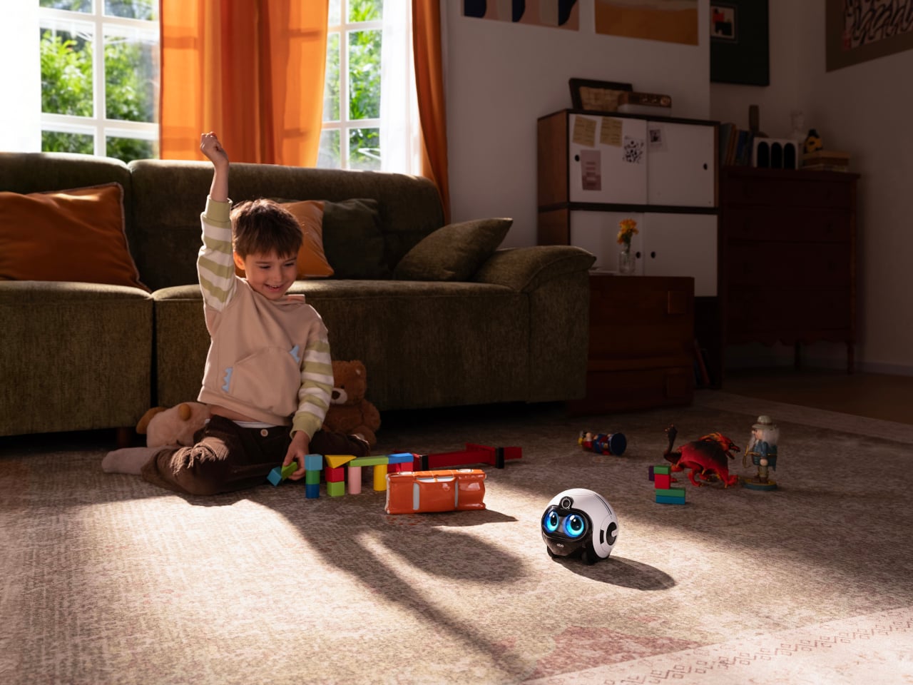
For kids, the EBO Max is something closer to a playmate than a gadget. It answers questions, joins in on simple games, and keeps children company with a curiosity that actually feels engaging. For the adults running the household, it quietly handles reminders, helps keep tabs on what’s happening at home, and keeps everyone looped in through the app without becoming another interruption in an already busy day.
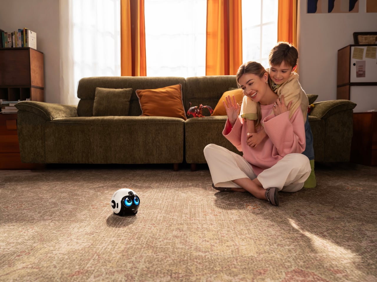
For elderly family members, it carries even more weight. The EBO Max can detect falls and instantly send alerts, which is the kind of safety net that gives everyone a little more peace of mind. It rolls over to check on them, stays close when needed, and keeps them company in a way that a fixed camera in the corner of a room simply can’t replicate.
When you’re away from home, the EBO Max keeps that connection from feeling distant. It streams 4K video through an 8MP wide-angle camera with a 131-degree field of view, so you can hop on a two-way call and actually see what’s going on. You can also direct it to specific spots around the house by voice or through the app, turning it into a mobile eye you control.
The EBO Max handles its own movement using V-SLAM navigation, a system that maps and remembers the layout of your home for more accurate positioning and smoother routes. It can patrol on a set schedule, cover the entire house on its own, or be pointed at marked spots for targeted check-ins. When the battery runs low, it finds its way back to the docking station without any prompting.
The EBO Max FamilyBot is available for pre-order at $549.99, which feels steep until you start accounting for what it replaces: separate cameras, smart speakers, and the quiet worry of not knowing what’s happening at home. It doesn’t do everything perfectly, but as an AI-powered companion that moves, learns, and actually keeps an eye out, it’s a more thoughtful answer to family care than a camera stuck to the wall.
Smart home devices have come a long way from the plain white boxes we once hid behind sofas. Voice assistants sit openly on shelves now, and small robotic helpers are slowly making their way into living spaces. For all their usefulness, though, most still feel more like appliances than companions. They respond when spoken to, perform tasks, then go quiet, making the whole relationship feel transactional rather than warm.
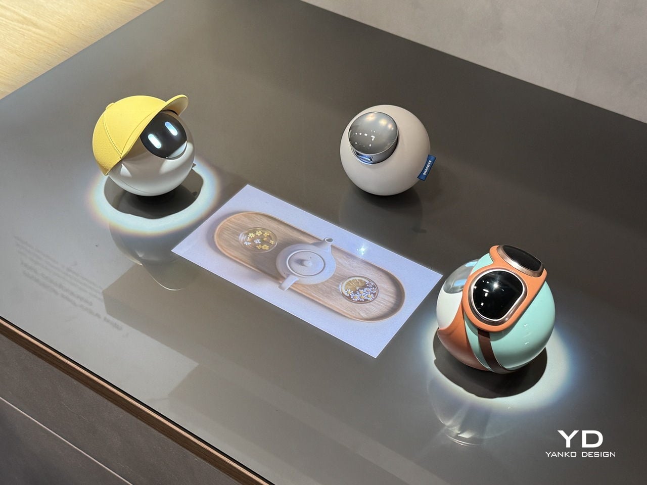
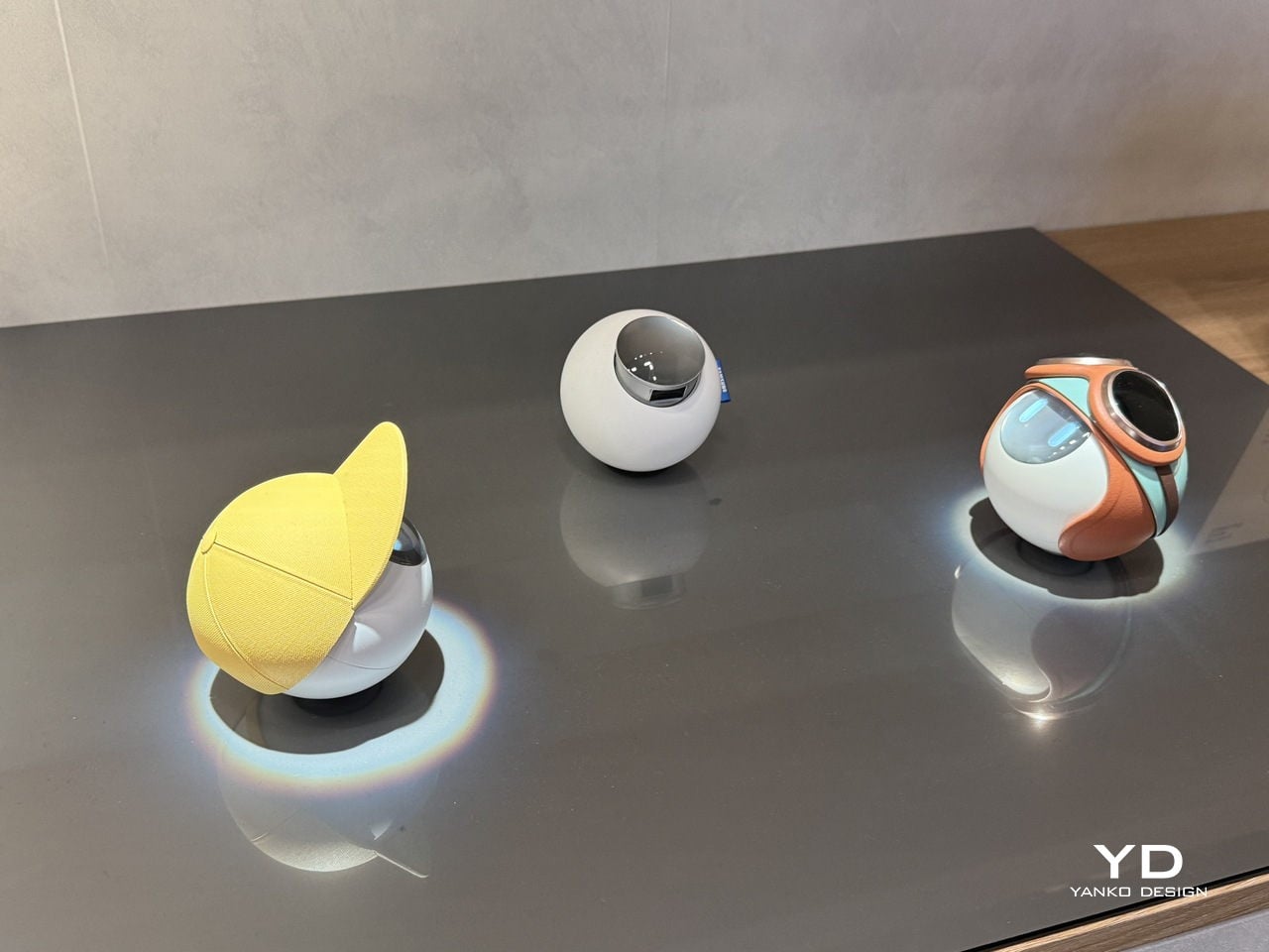
Samsung Design seems to think there’s a better way. At Milan Design Week 2026, its Open Lab unveiled the AI Companion, a small spherical robot designed to feel less like a gadget and more like a genuine presence. The concept frames these companions as friends that “understand you and grow with you,” bringing delight and warmth to daily life rather than simply waiting for the next voice prompt.
Designer: Samsung Design
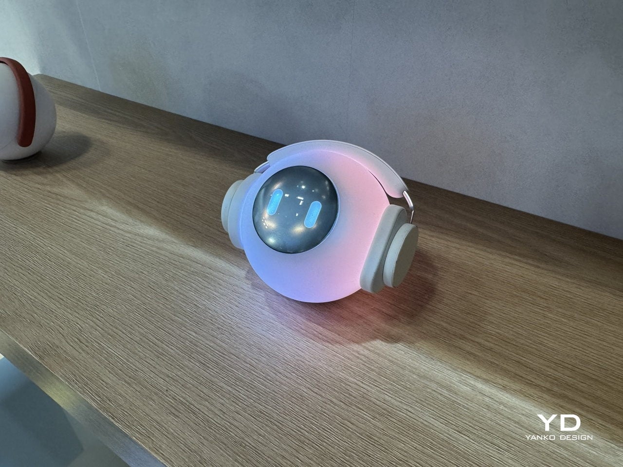
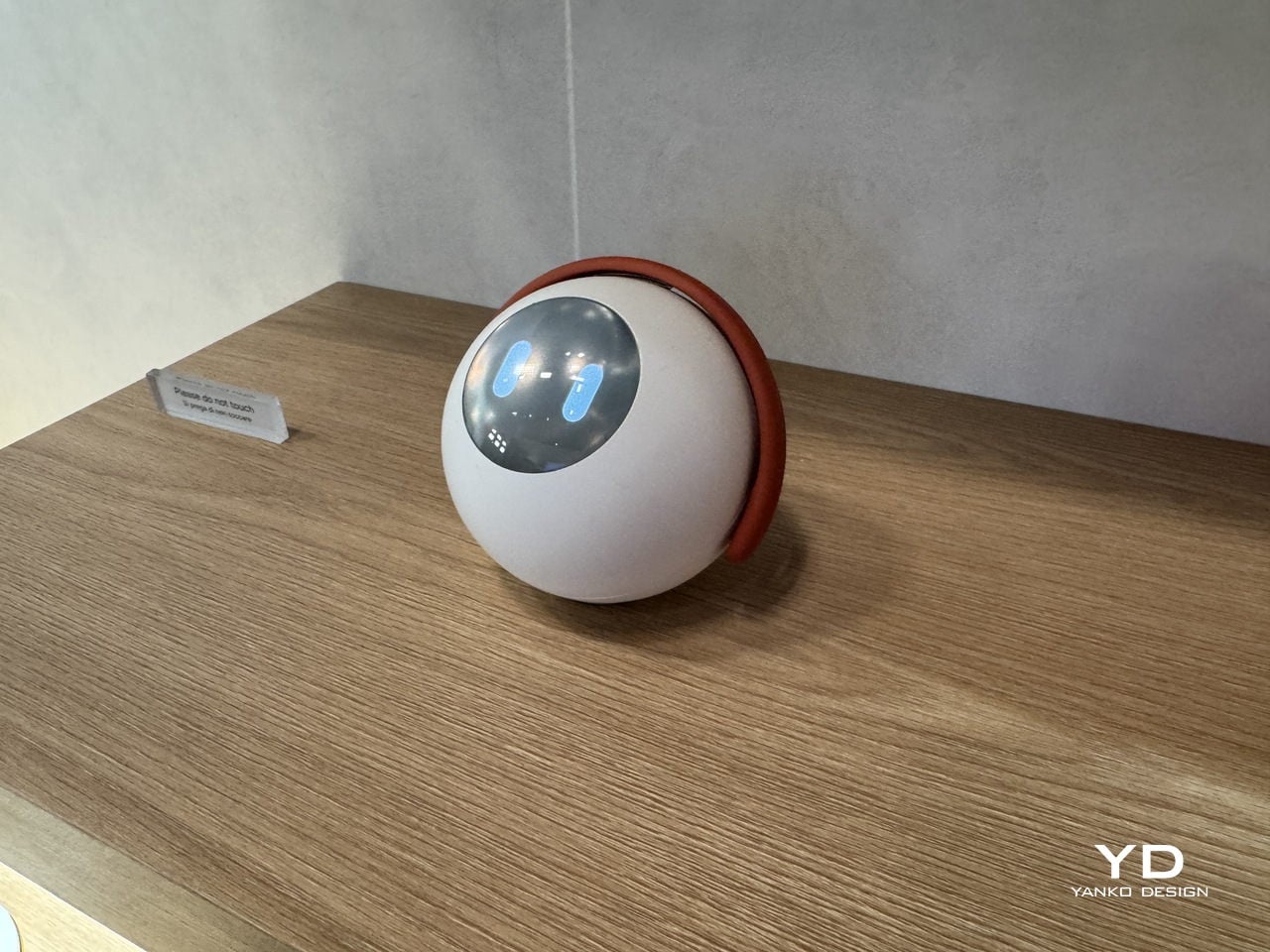
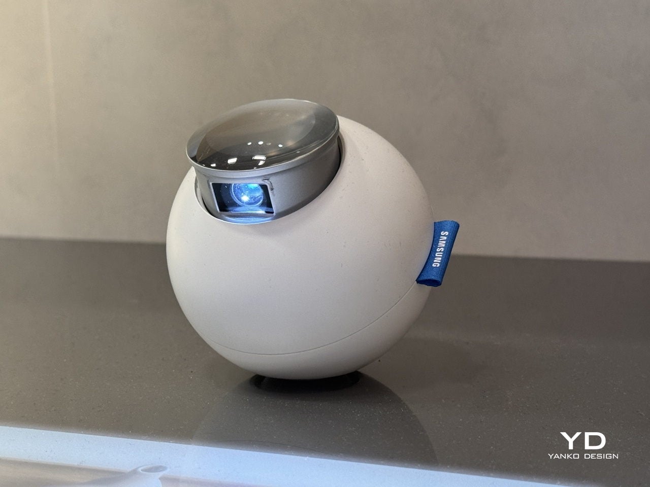
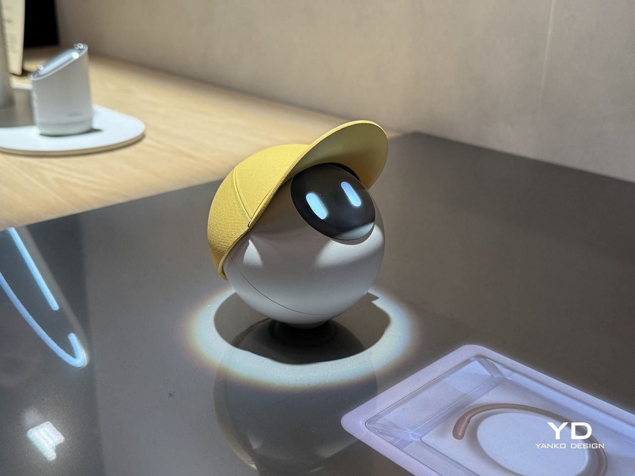
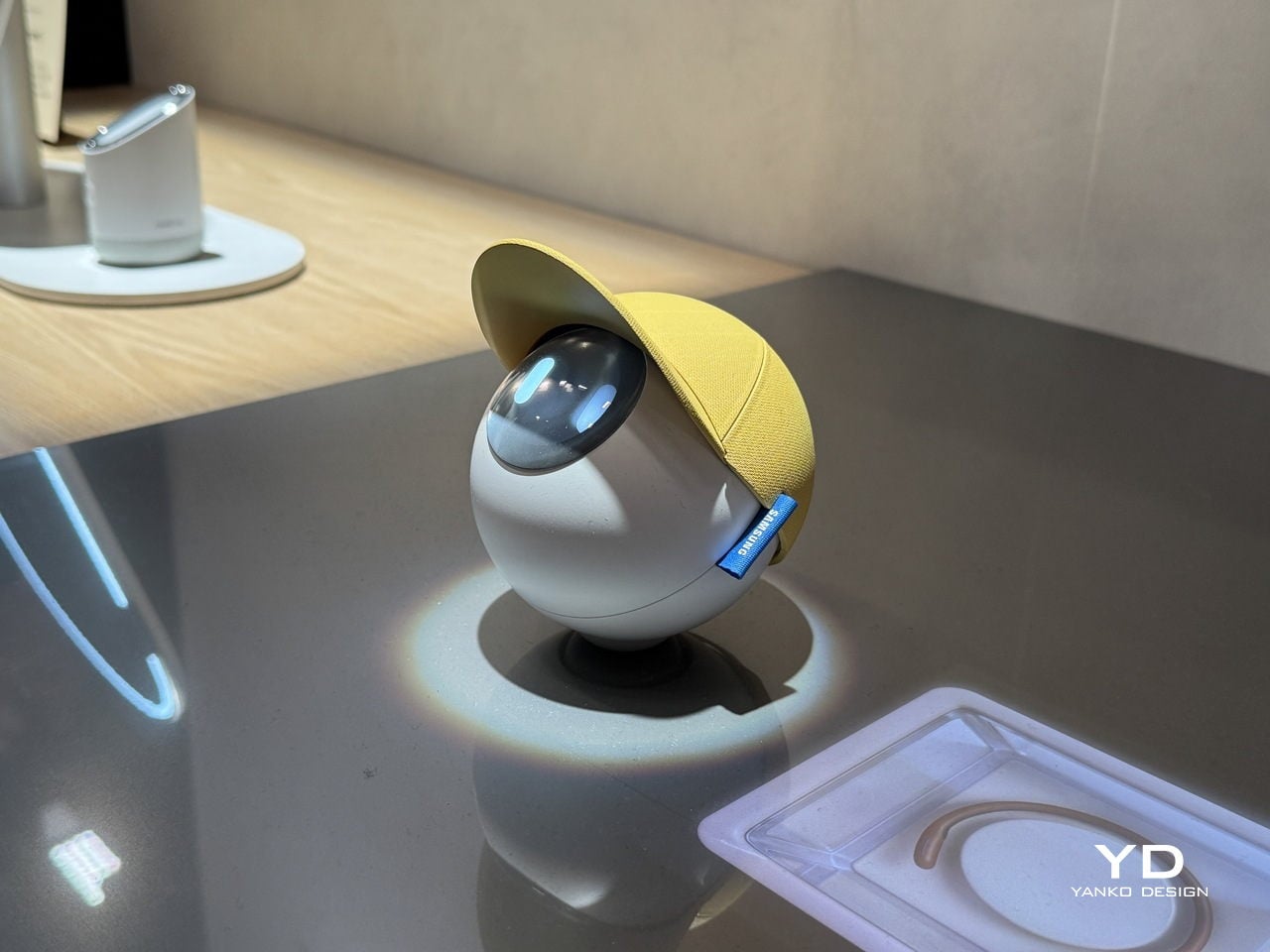
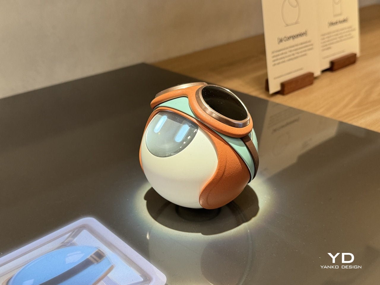
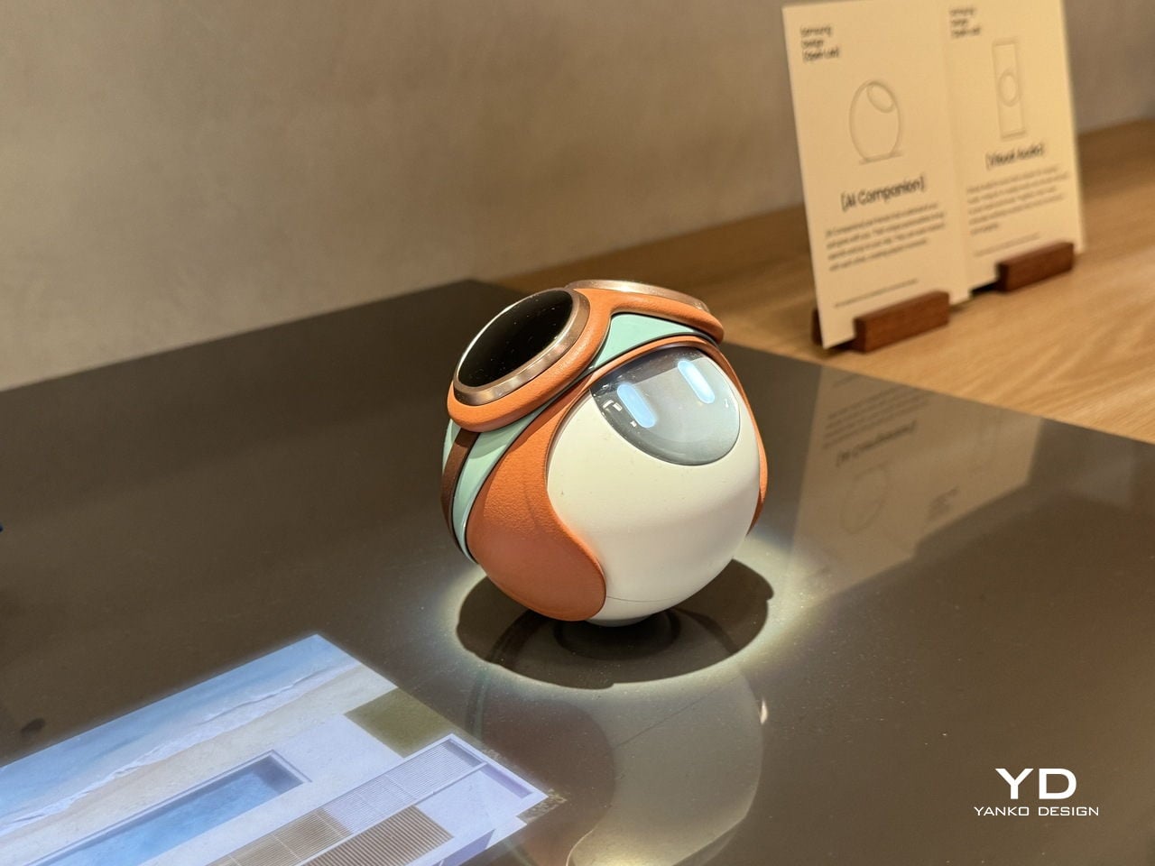
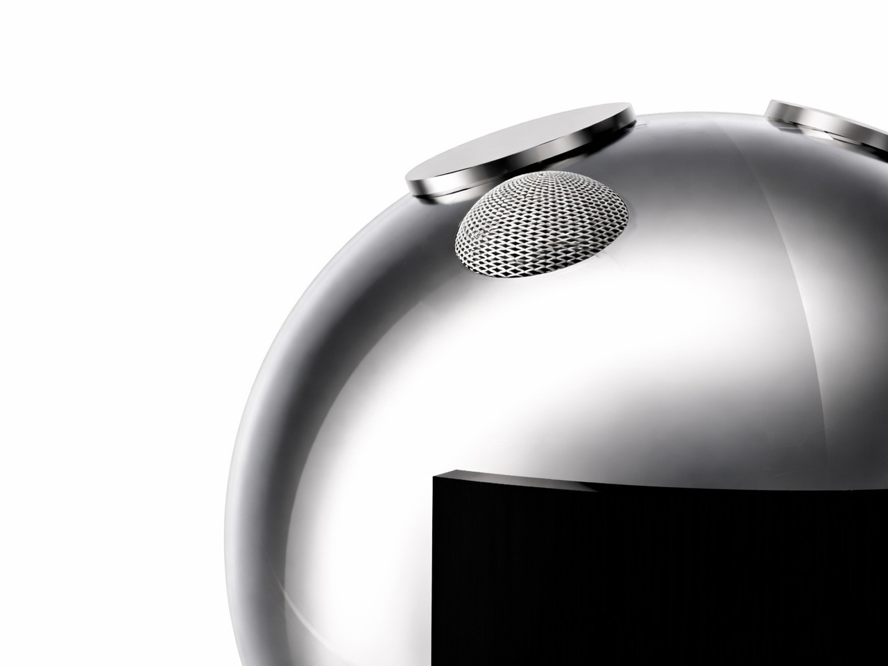
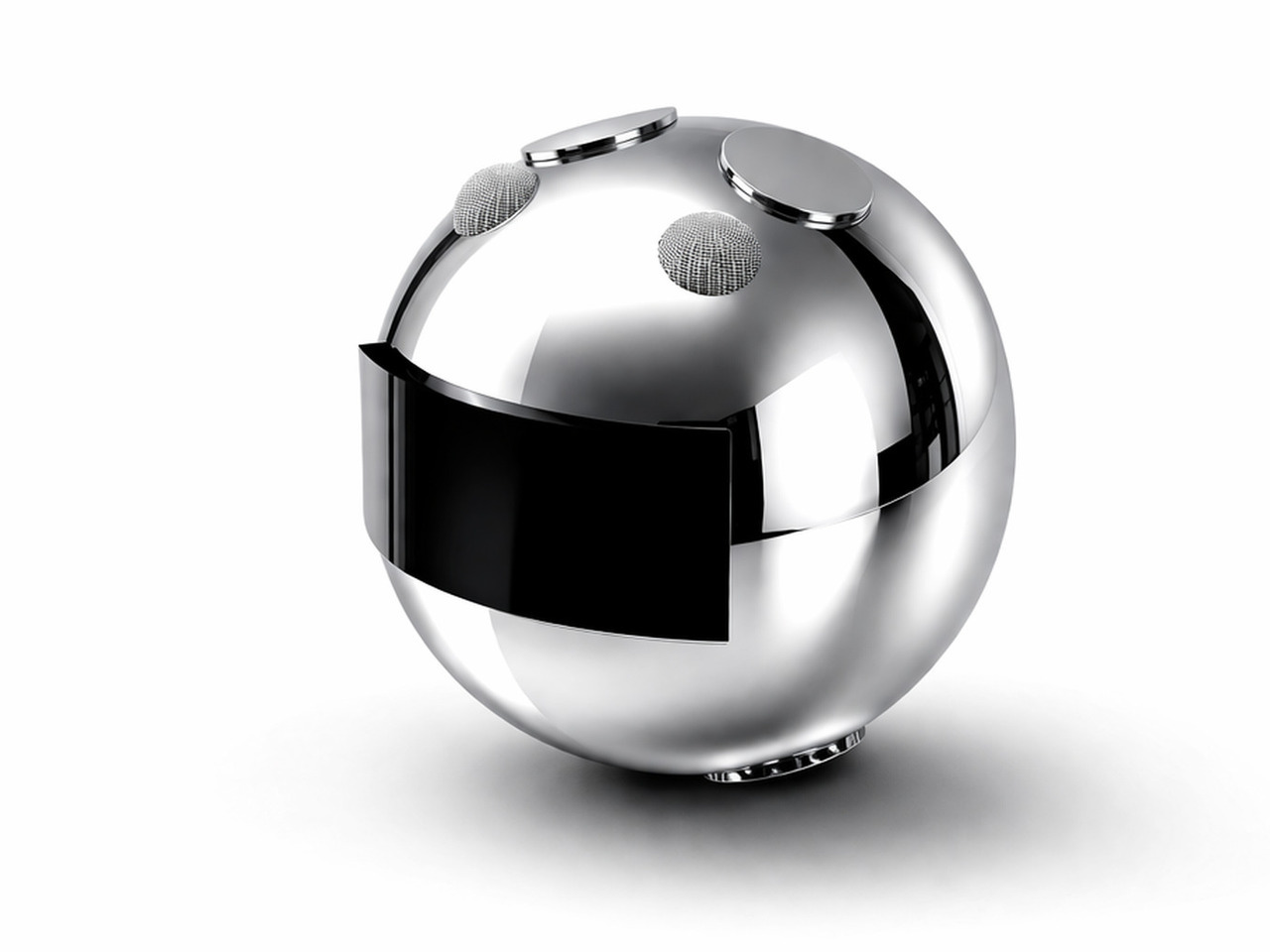
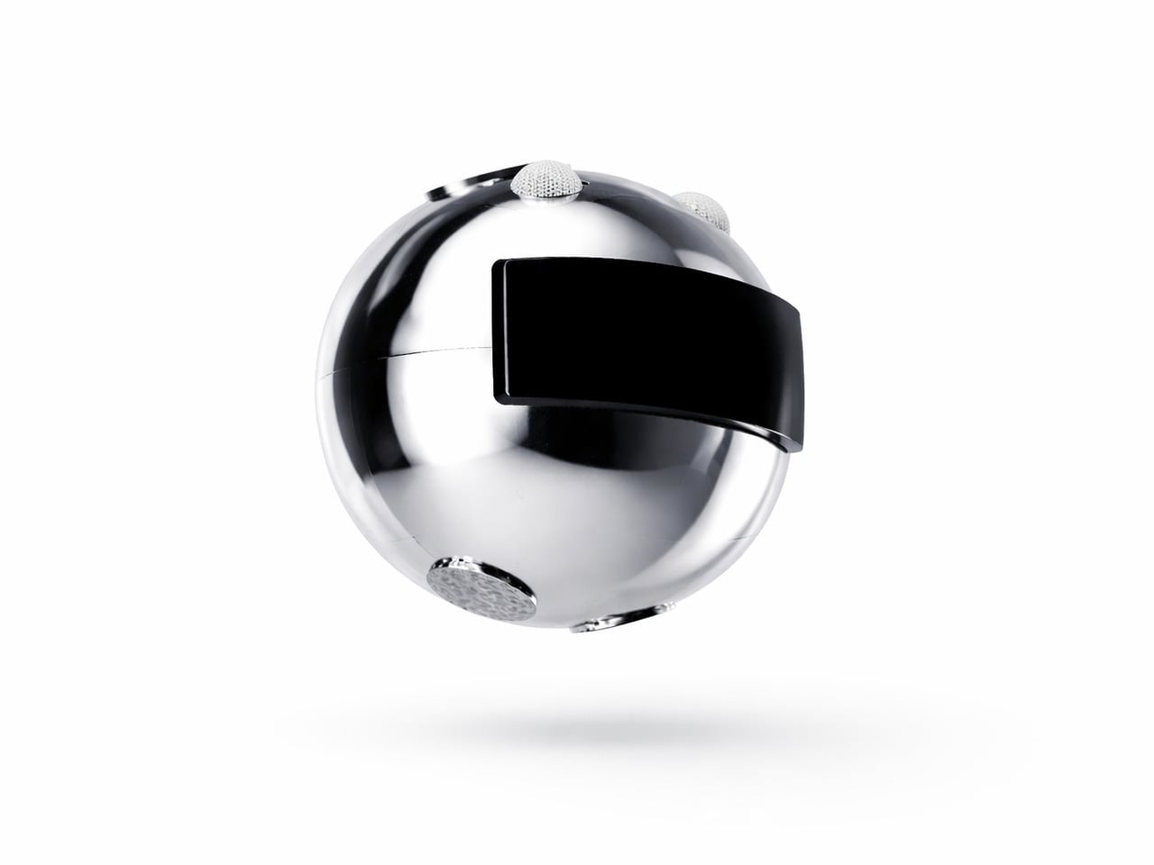
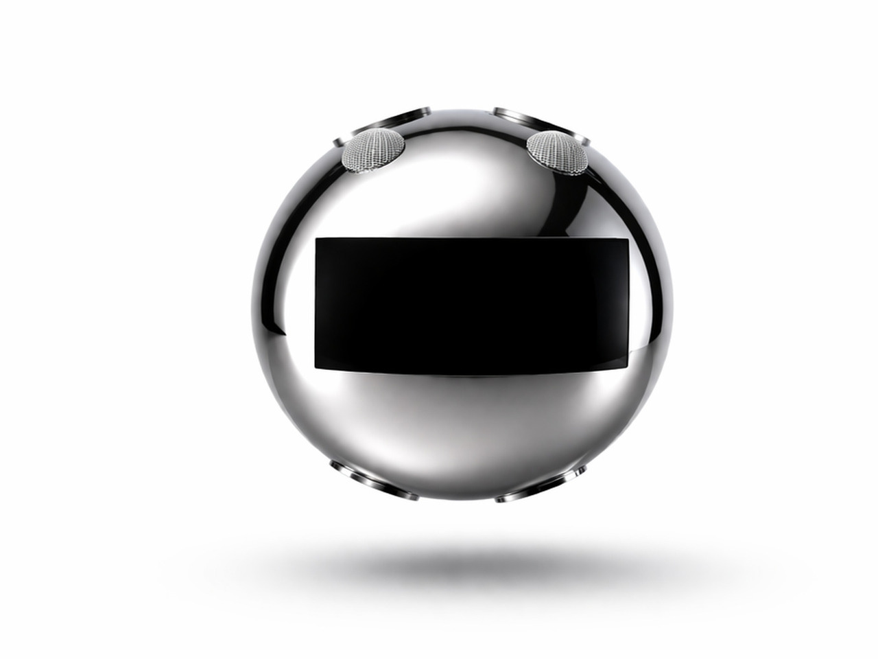
The AI Companion’s form is its first deliberate statement. It’s a near-perfect orb, compact and smooth, with a presence that feels more like a creature than a consumer device. There are no sharp edges, glowing rings, or intake vents, none of the usual signals of smart home hardware. What it has instead is a small circular screen that reads as expressive eyes, giving it a quiet, almost attentive quality.
That face is where the design becomes truly surprising. The upper section of the sphere lifts open, almost like a creature raising its head, to reveal a compact projector tucked inside. It’s a small mechanical gesture that carries outsized meaning. The transition from sealed orb to open, projecting device doesn’t feel like pressing a button; it feels like watching something wake up and decide to share a moment with you.
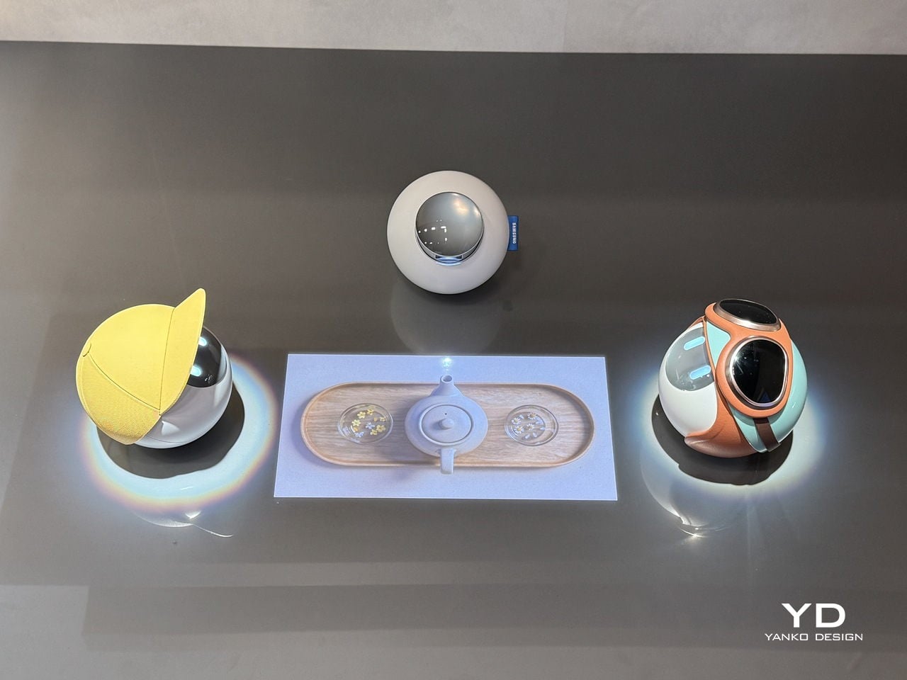
With that projector now exposed, the AI Companion can cast games, animations, and interactive content directly onto the surface in front of it. The experience shifts from a one-on-one interaction to something more communal, turning a tabletop into a small shared stage. It’s the kind of feature that makes the device feel genuinely social, designed for moments between people rather than a single user quietly issuing voice commands.
Part of what makes the AI Companion feel so considered is how personality has been worked into its physical design. It comes in distinct variants, each with its own visual character, from a minimal white orb to one with a yellow cap-like shell to another wrapped in teal and rust-orange. These aren’t cosmetic afterthoughts; they suggest that each companion is meant to reflect the personality of whoever it lives with.
Samsung Design also sees these companions as inherently social. They can interact with each other, creating the kinds of playful exchanges that make them feel more like characters sharing a space than devices sitting on a shelf. The AI Companion is explicitly a concept and isn’t headed for retail, but it lays out a compelling vision for home AI that’s designed to be felt, not just heard.
For most people, saying something as simple as “good morning” to a stranger or asking for directions takes no effort at all. For the tens of millions worldwide who live with speech impairments or are completely mute, those same moments can be frustrating or simply inaccessible. The tools that exist to help, from apps to letter boards, tend to make communication slower rather than simpler.
That’s what designer Ivana Nedeljkovska set out to change with Your Voice, an assistive communication concept built on a simple premise: the body already tries to speak, even when no sound comes out. Rather than adding yet another screen or typing interface to the equation, the system works with what the body naturally does, turning the attempt to communicate into communication itself.
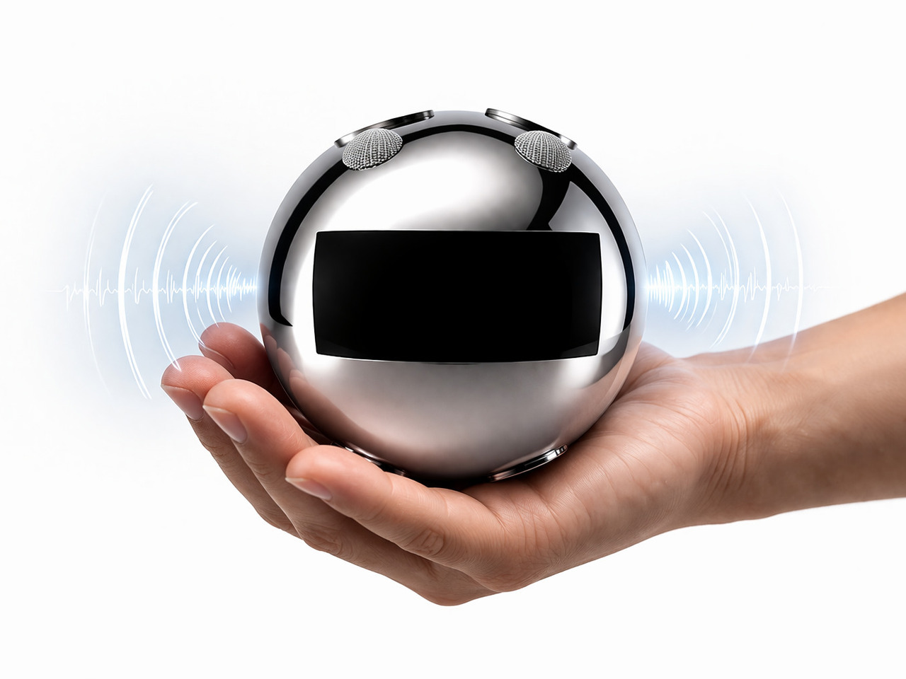
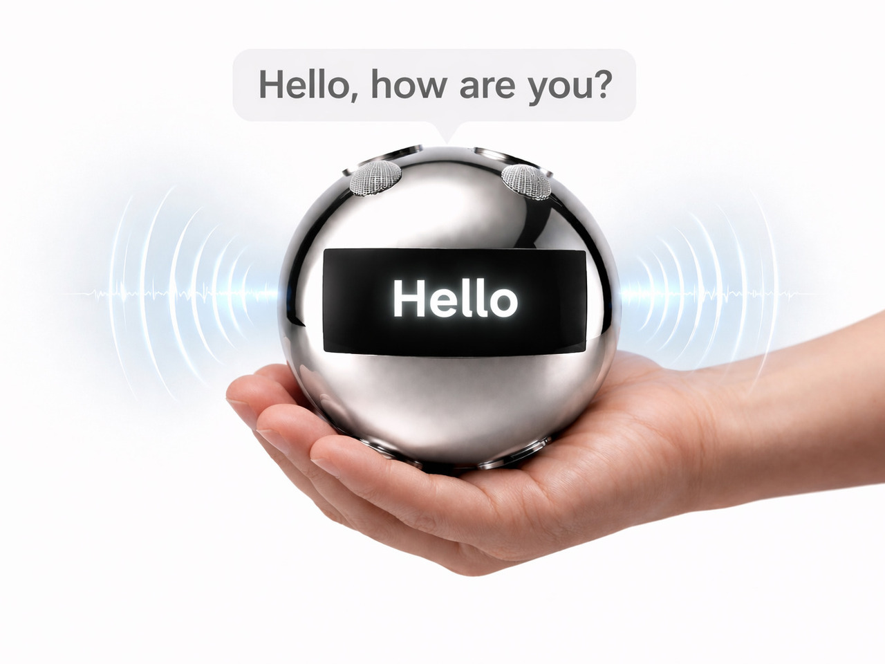
Your Voice consists of two components. A flexible patch worn on the neck detects the muscular movements the body makes during attempted speech, even when the vocal cords produce no sound at all. Those signals are transmitted in real time to a small, spherical robotic unit, which converts them into audible speech. The patch reads the intention; the robot gives it a voice.
What that means in practice is the removal of the pause that defines most assistive communication right now. Someone with a speech impairment attending a meeting doesn’t have to look away from the conversation to type out a response. A child who can’t speak can call for a parent without reaching for a device first. The thought and the response happen almost simultaneously.
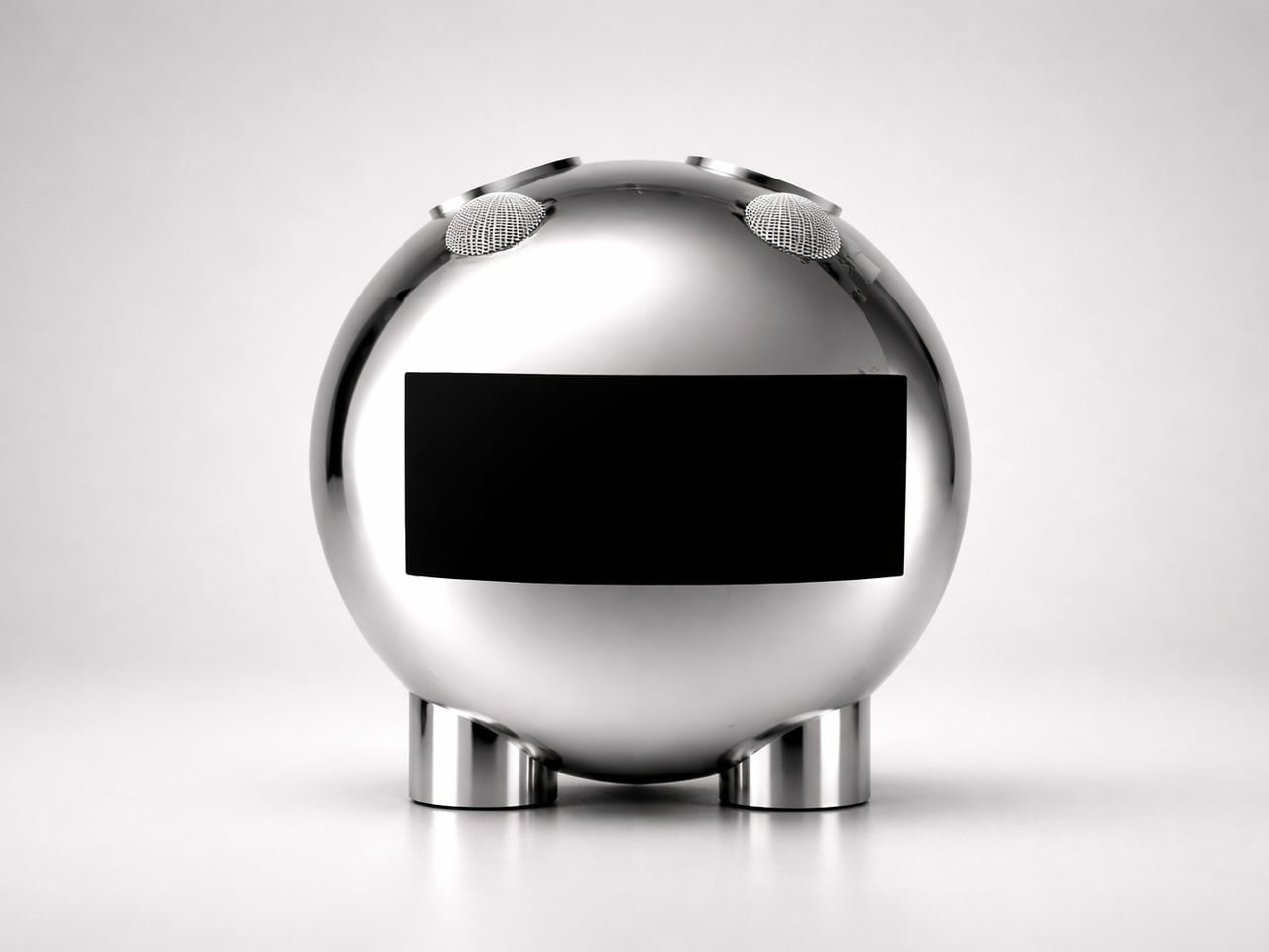
The robotic unit’s form was guided by Nedeljkovska’s early inspiration from an orange, its rounded shape steering the design away from anything clinical. The polished sphere, embedded display panel, and mesh speaker grilles give it a refined look that doesn’t betray its purpose at a glance. It’s something you’d carry without self-consciousness, which matters more in assistive technology than it’s often given credit for.
The display panel on the robot unit adds another layer to the audio output. It shows transcribed words in real time so conversations can continue even in noisy environments or when someone nearby can’t quite hear what was said. The neck patch is designed to sit against the skin comfortably for extended wear, and the robot is compact enough to be held in hand or placed nearby.
Most assistive communication tools are designed around output: a screen to tap, an app to navigate, a board to point at. Your Voice flips that logic by making the body the input. That shift in thinking is arguably the most significant thing the concept offers, more so than any single feature, because it treats a physical limitation as a starting point rather than a constraint.
It’s still a concept, and turning neck muscle signals into reliable speech at scale is a complex engineering challenge. But the direction Nedeljkovska points toward, communication that asks nothing extra of the person trying to be heard, is one that the assistive technology field sorely needs. The ambition isn’t simply to build a better device; it’s to stop making communication feel like work.
Design Mindset, Yanko Design’s weekly podcast powered by HiDock this week, it is 20 episodes in and showing no signs of slowing down. Hosted by Radhika Seth, the show premieres every week with conversations that dig into the minds behind the products shaping how we work, create, and communicate. This episode brings in a guest who fits that mission precisely.
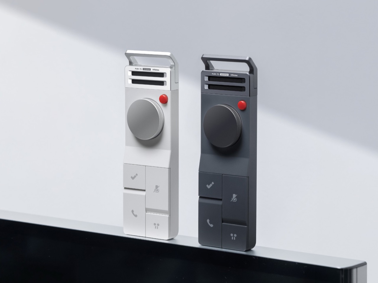
Sean Song is the founder and product lead of HiDock, a company with deep roots in audio DSP engineering whose technology has powered over 500,000 devices across smart homes, automotive, and enterprise communication systems. Their hardware, the HiDock P1, rethought how professionals capture conversations through their own earbuds, with no bots, no awkward announcements, no friction. With HiNotes 3.0, the team has made a far more ambitious move, tackling the part of the productivity problem the industry has largely left untouched. Sean thinks about productivity the way a designer thinks about systems, as a behavioral architecture challenge, and that’s exactly what this conversation gets into.
Sean opens the episode with a number that should stop anyone mid-scroll: research suggests that almost 44% of action items are missed after meetings. His argument is that the tools built to fix this have been solving the wrong problem entirely. “We have built some of the most sophisticated recording and transcription technology and products in history, and we are still leaving meetings with a list of things we never act on,” he says. “I come to believe that the real productivity crisis was never about capturing, never about transcription. It is all about what happens in the silence after the meeting.”
What makes this more than a product pitch is the neurological framing Sean brings to it. Meetings, in his view, are among the most computationally heavy tasks the human brain performs, comparable to driving, because vision, hearing, and real-time language generation are all running simultaneously. “It’s duplex, it’s fully duplex. I output, I input, I output, I input and my brain is calculating my next word. It’s just like the large language model predicting the next token.” After a long meeting, your brain is, as he puts it, “out of sugar.” Taking accurate notes under those conditions is genuinely hard, and executing on them afterward, when you’re already depleted, is harder still.
The Evolution of Productivity Tools and Product Philosophy
HiDock spent years building enterprise communication tools, and for a long time the assumption was simple: deliver clear audio, solid recording, and eventually a clean AI-generated summary, and the job is done. Sean’s reckoning with that assumption came from a place that was personal before it was professional. He describes being a devoted “GTD guy” since the late 1990s, carrying the Get Things Done philosophy across every platform from Palm to BlackBerry to iPhone. “After years of being a GTD guy, it helped nothing to my career. I didn’t perform better. I didn’t achieve more.” The tools were fine. The system was the problem.
That realization resurfaced when Sean was using HiNotes and recognized the same pattern playing out again in his own product. “A good transcription is not enough. A good summary is not enough. Taking notes is not enough. We need to extract the pearls inside the notes and help the user to manage after the meeting.” From there, the team’s design focus shifted from delivering beautiful text to understanding what users were actually trying to accomplish, which was getting work done across the full arc of a meeting’s life, including the silence that follows it.
Design Principles for Effective Productivity Tools
One of the most interesting distinctions Sean draws is between consumption apps and productivity apps, and why the design logic that works beautifully for one actively undermines the other. For consumption, he says, “laziness wins. Always, like social apps, Snapchat, picture apps. You just do one click, everything done.” For productivity, his position is the opposite. “Discipline wins. Because this is another belief that guides me to build everything, HiDock and HiNotes, which keeps human in the loop.” The principle runs through every hardware and software decision the team makes. Physical actions like a key push or a long hold are built in deliberately, because that tiny moment of effort is what creates cognitive ownership of the information being captured.
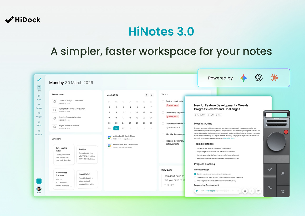
Context sits alongside discipline as a guiding force. The story behind HiNotes 3.0’s timestamp-linked action items came from a dinner at a traditional omakase restaurant in Japan. Months later, what Sean remembered from the experience was a conversation with the chef about his training and his master. The food itself had faded. “So this brought to me that we should not only give the user a to-do, we need to give the user the context.” The visual architecture of the software reflects the same thinking: a consistent three-pane interface, maintained even when only two panels are logically needed, because the stability reduces cognitive load and builds what Sean calls “solid reliability” over time.
HiNotes 3.0
Capturing Creativity and Fragmented Ideas
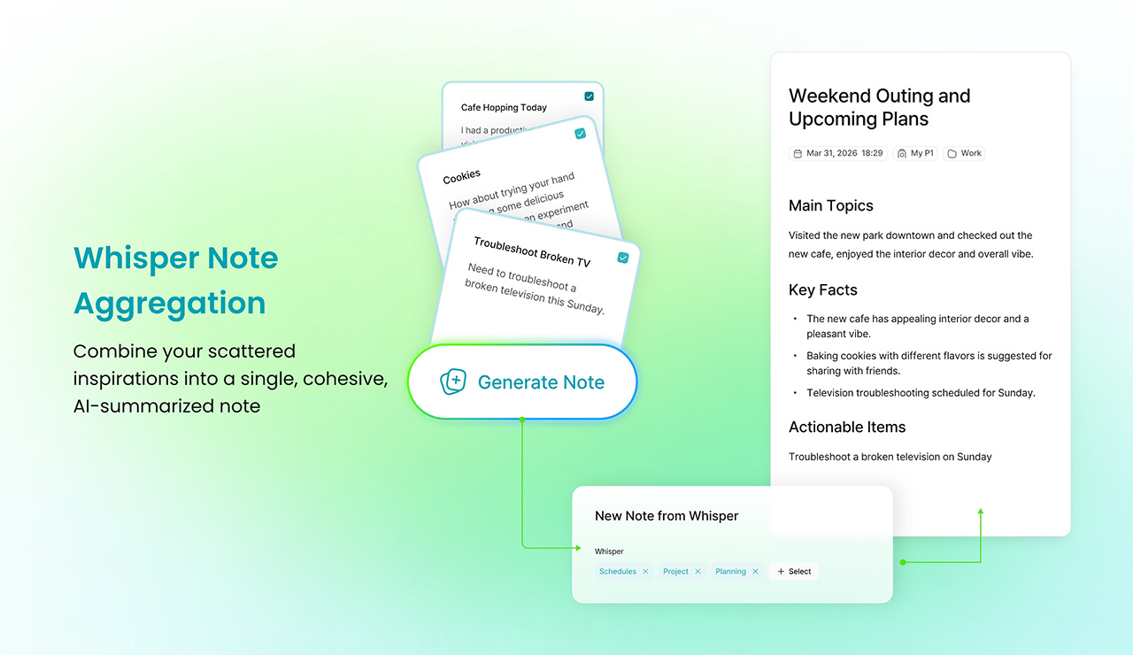
Scheduled brainstorming, Sean argues, is one of the less honest myths in modern work culture. “Many brainstorm meetings do not generate good ideas. Good ideas came from when you walk, when you drive. And when you swim or after you swim, when you’re taking a shower, those are creative moments.” The friction of capturing an idea in those moments, unlocking a large phone, finding the right app, waiting for it to load, is enough to kill the thought entirely. Whisper Notes was built around precisely that gap: an instant, low-friction way to record ideas wherever they arrive, with HiNotes 3.0 handling the synthesis, pulling scattered voice recordings from across the day into a single coherent summary.
The question of which AI model does that synthesizing led HiDock to a decision that runs counter to most of the industry. HiNotes 3.0 gives users access to seven frontier models including GPT, Claude Sonnet, and Gemini Pro, switchable on a per-meeting basis. Most tools make a single model choice and bury it. Sean’s reasoning comes back to the human-in-the-loop philosophy: “Different content may require different summarization, even may require different characteristic values of the large language models.” He describes Claude as “probably more philosophical and decent and pays attention to details,” Gemini as “probably more creative and probably more up to date,” and frames the act of selecting a model as a form of intentional engagement with the content. The effort, for Sean, is always the point.
Whisper Note Aggregation
Rapid Fire Round: Quick Takes
The rapid fire round is where Sean’s worldview comes through in its most concentrated form. His pick for the most overrated productivity tool is AI agent tools, marketed as capable of everything but, in his experience, delivering nothing meaningful for most people in practice. The habit he’d want every professional to adopt is “check alignment,” a ritual he runs after every meeting and town hall: “Do I make myself understood? Are we on the same goal?” His most honest moment in the segment comes when asked about his own biggest follow-through failure. Leading a 50-person startup, he has missed the personal onboarding of roughly 15 new employees despite having promised himself he would handle it himself.
On what hardware design understands that software consistently ignores, his answer is immediate: “Tactile and sensation matters. So you cannot just build a piece of plastic or a piece of metal. Even plastic or metal, there are textures, there are tactile sensation feelings that connect you and your consumers.” The one thing he would strip from modern meetings is social distance, the polite friction that slows down directness and alignment. Asked for the single greatest enemy of execution in one word, his answer lands as a kind of provocation: notes. As he puts it, “as long as you take notes, it helps you execute.” Coming from the founder of a meeting intelligence company, it is both a confession and a design brief rolled into one.
Design Mindset drops every week on Yanko Design. For anyone looking to go deeper into HiNotes 3.0 and the hardware that brings it to life, have a look here.
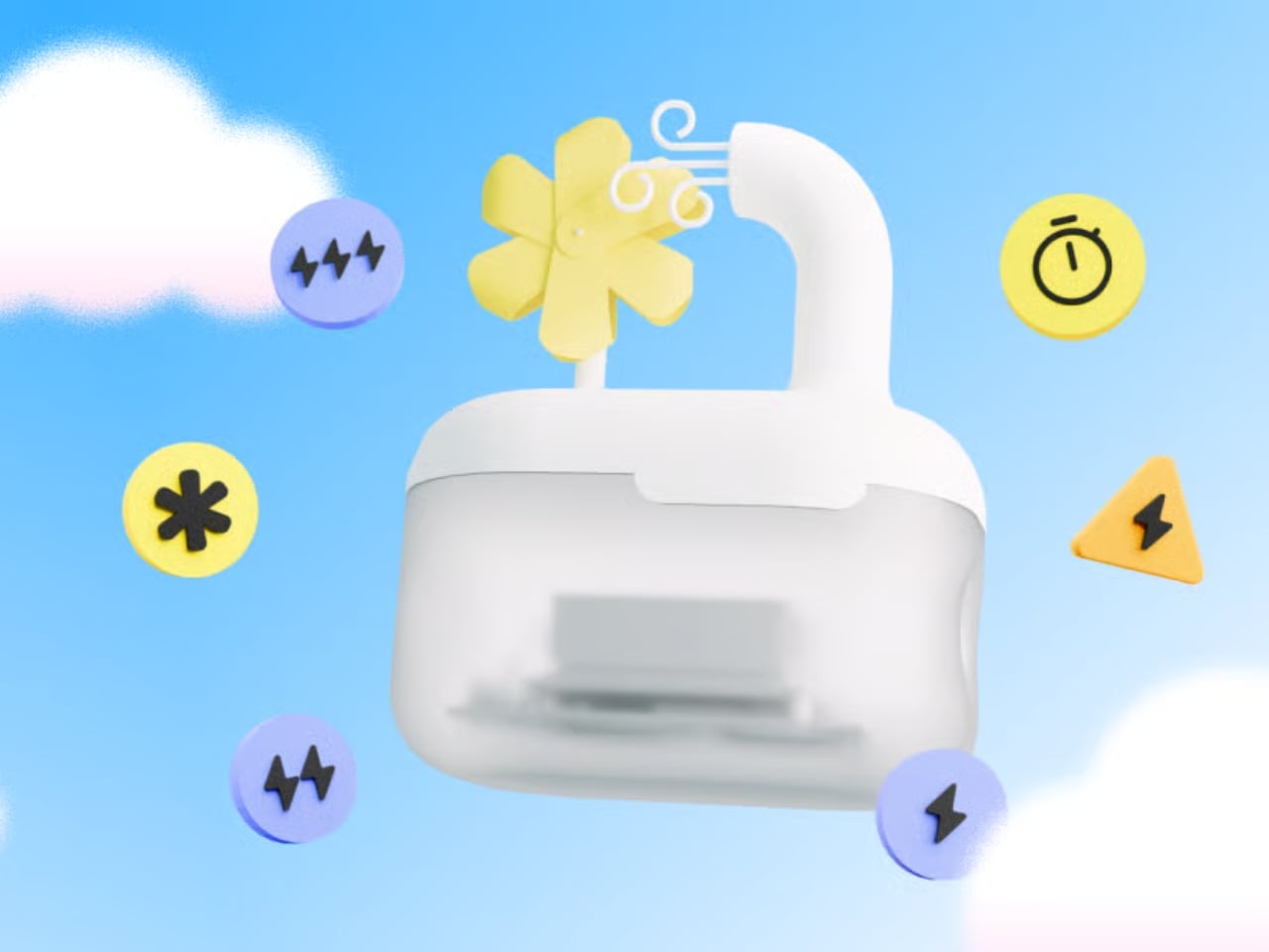
Every time you type a prompt into ChatGPT, something happens somewhere far away. Servers spin up. Electricity moves. Carbon gets generated. The whole transaction is so clean and invisible on your end that it might as well not be happening. That’s by design, and it’s worth thinking about. Although with the way we use technology these days, we seldom think about the consequences on our environment.
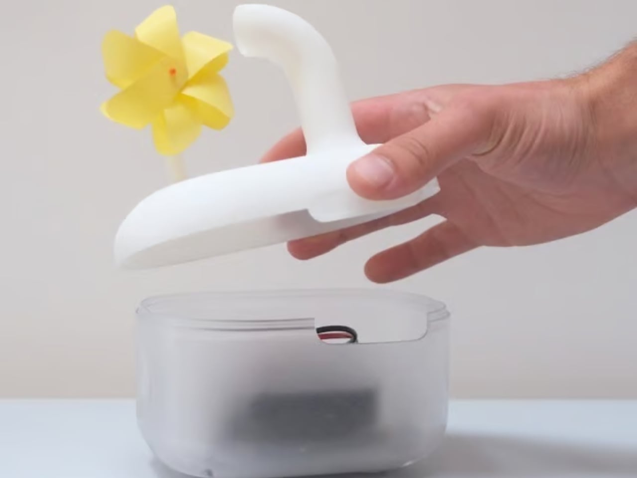
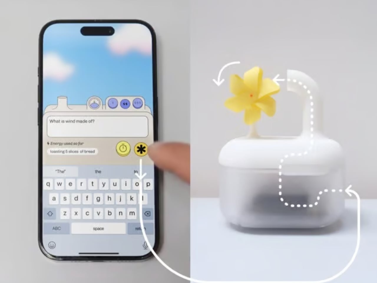
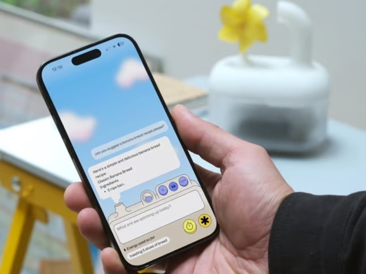
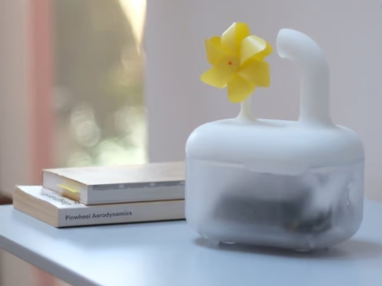
London-based creative studio Oio wants to change that, starting with a small 3D-printed box and a bright yellow pinwheel. Their project, the Hot Air Factory, is a domestic AI device that processes your questions and requests locally, without connecting to the cloud, and every time it thinks, it physically exhales. Hot air pushes out of the top of the device and spins that cheerful little pinwheel. The harder it thinks, the faster it spins. You’re watching computation happen in real time, which turns out to be a surprisingly powerful thing.
The concept is simple: make the invisible visible. We know AI uses energy. We’ve read the headlines. But knowing abstractly that data centers are energy-hungry is different from watching a pinwheel turn every time you ask your AI assistant to summarize something. One is a statistic. The other is a moment of honest accountability.
What makes the Hot Air Factory smart, beyond its obvious design appeal, is how it translates cost into human-readable terms. It doesn’t give you kilowatt-hours because most people have no idea what that means. Instead, it tells you something like “that prompt cost the equivalent of brewing a cup of tea” or “watching Netflix for five minutes.” Suddenly the math becomes personal. Suddenly you start wondering whether you really needed a 500-word AI response to a question you could have Googled.
Oio co-founder Matteo Loglio describes it as “a small, domestic AI that reveals the hidden energy cost behind every prompt.” The factory also lets you dial up or down the level of intelligence it uses. Want a quick answer? Use a lighter model, spend less energy. Need something more complex? Crank it up, and watch that pinwheel work for it. You can even schedule your heavier prompts for the night shift, when energy is cleaner and the grid is quieter. These are design decisions that carry real ethical weight, and they’re baked in with zero condescension.
The playfulness and the seriousness aren’t in conflict here. They’re exactly the point. The Hot Air Factory is built in a Frutiger Aero visual language, all soft curves and clean optimism, the kind of aesthetic that makes you want to put it on a shelf next to your plants. But underneath that approachable exterior is a genuinely complicated machine running open-source large language models on a local GPU. It looks like something a friendly robot would carry. It functions like a small act of protest.
AI companies have very little incentive to make their energy costs legible to users. Invisibility is convenient. It keeps things frictionless. It keeps you prompting without thinking about the bill. A report from the US Department of Energy projected that by 2028, data centers could account for 12% of total electricity consumed in the US. That’s not a small number, and it keeps growing every time we treat AI like it runs on good intentions and cloud magic.
The Hot Air Factory isn’t saying AI is bad. It isn’t demanding you stop using it. What it’s doing is quieter and more persuasive than that. It’s asking you to look. To see. To feel, just a little, what your digital habits cost in the physical world. That’s the argument made not through a lecture or a campaign, but through a yellow pinwheel spinning in your living room.
Design can do that. Sometimes a small, well-made object says more than a policy paper ever could. The Hot Air Factory is currently looking for collaborators to help bring it to a wider audience, still working its way from experiment to something anyone can own. If the goal is conscious computing, the first step might just be this: a tiny box, a spinning fan, and the quiet discomfort of watching a machine breathe.
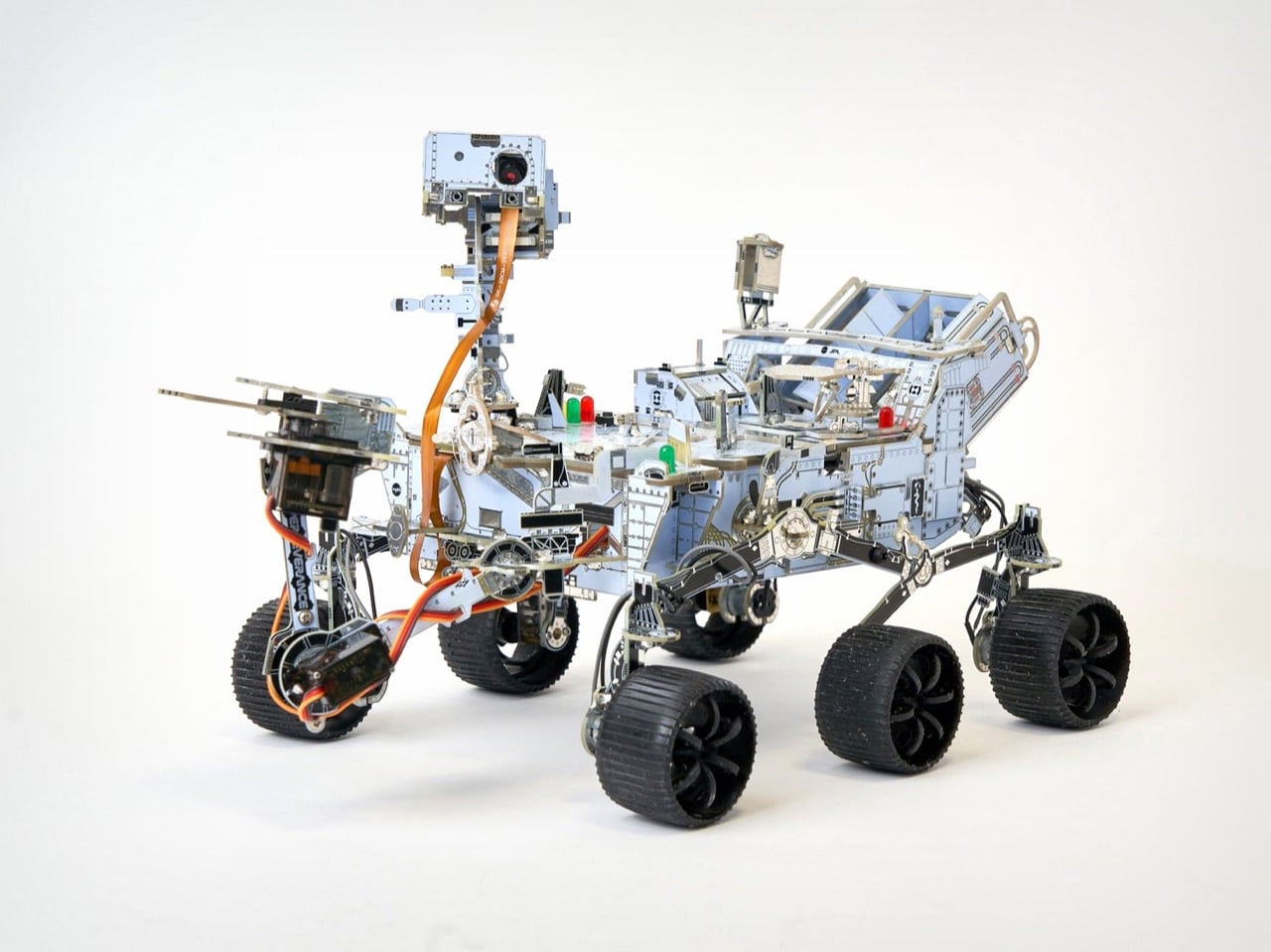
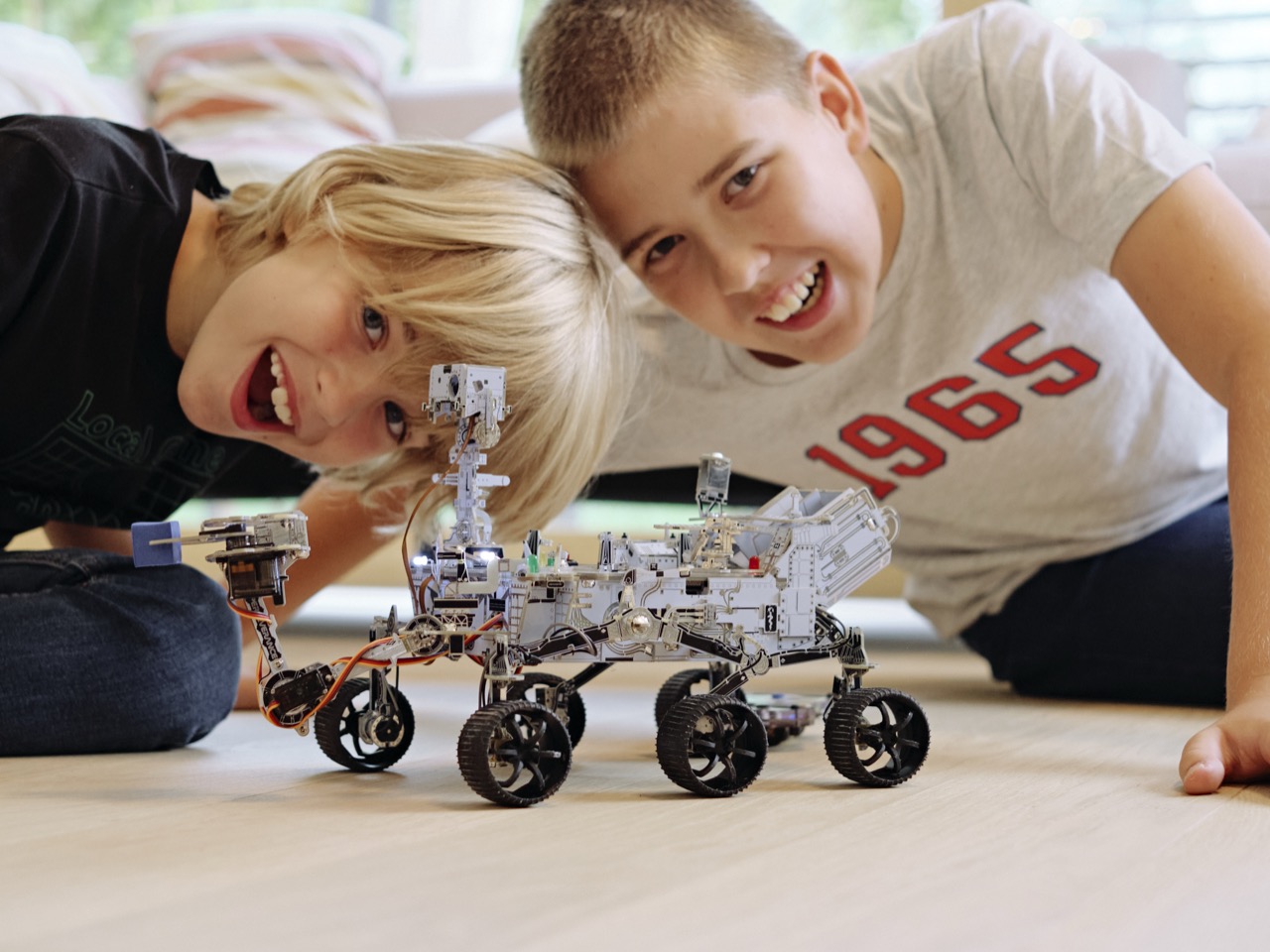
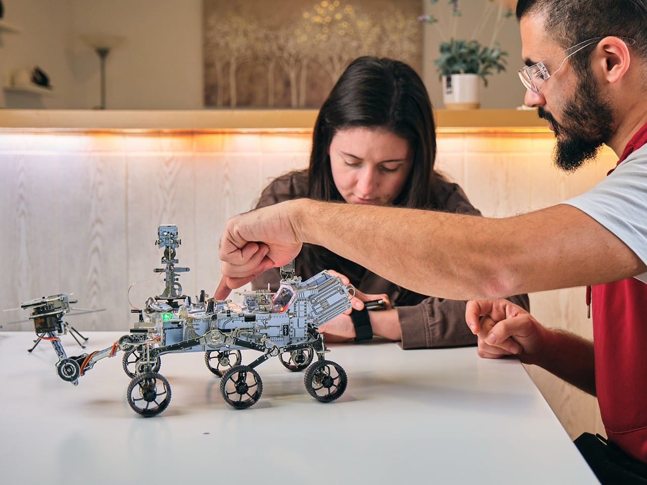
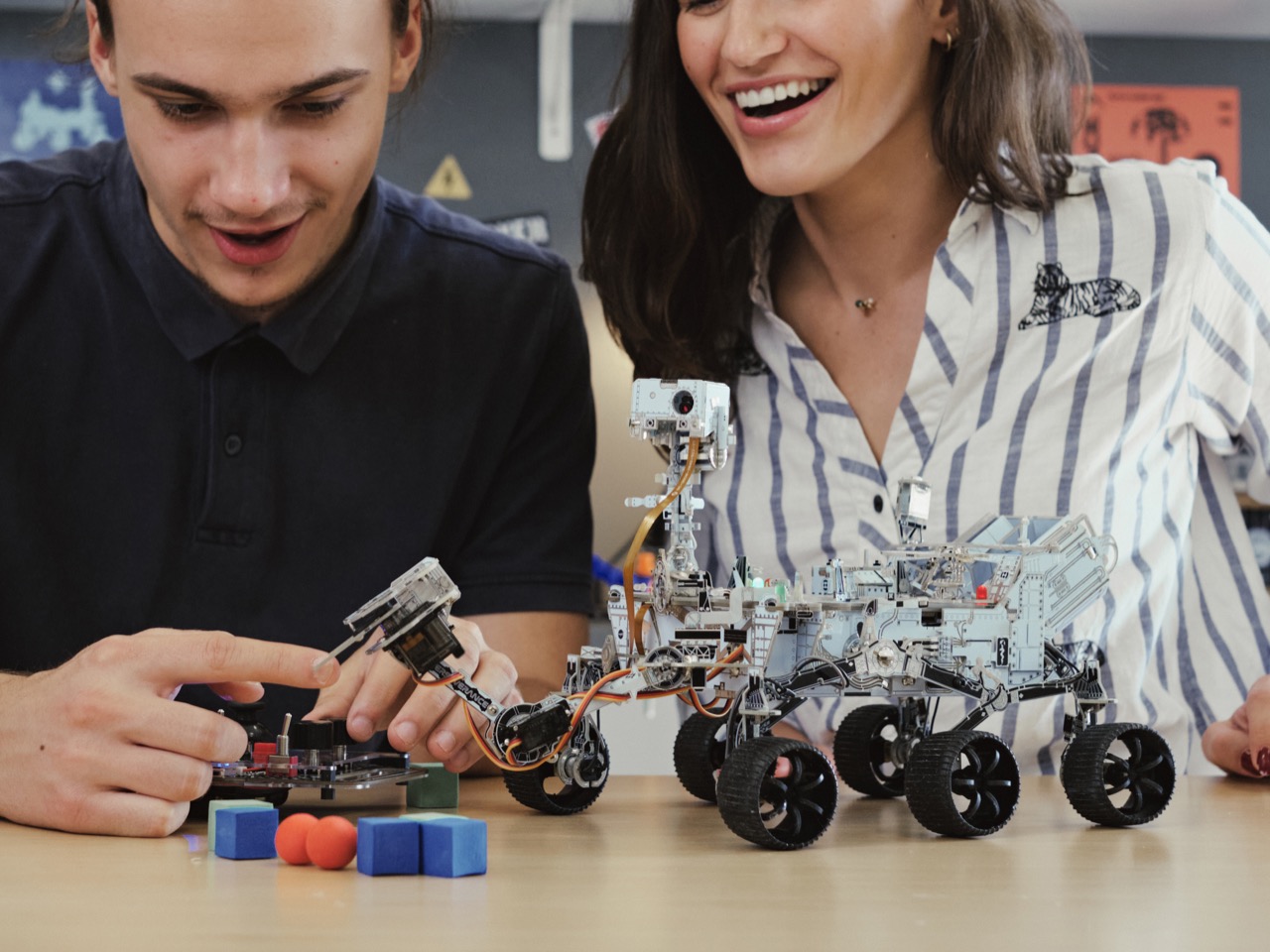
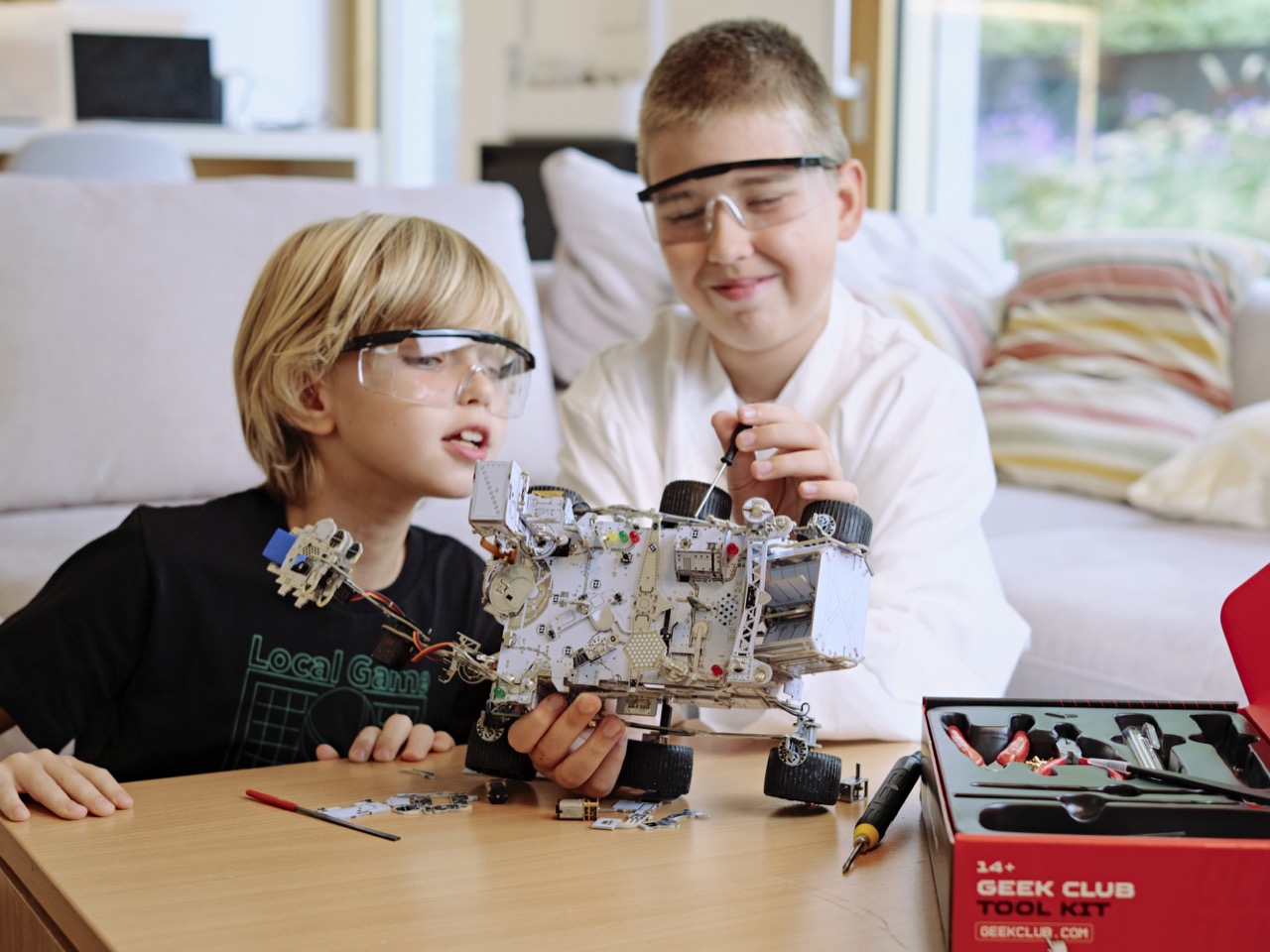
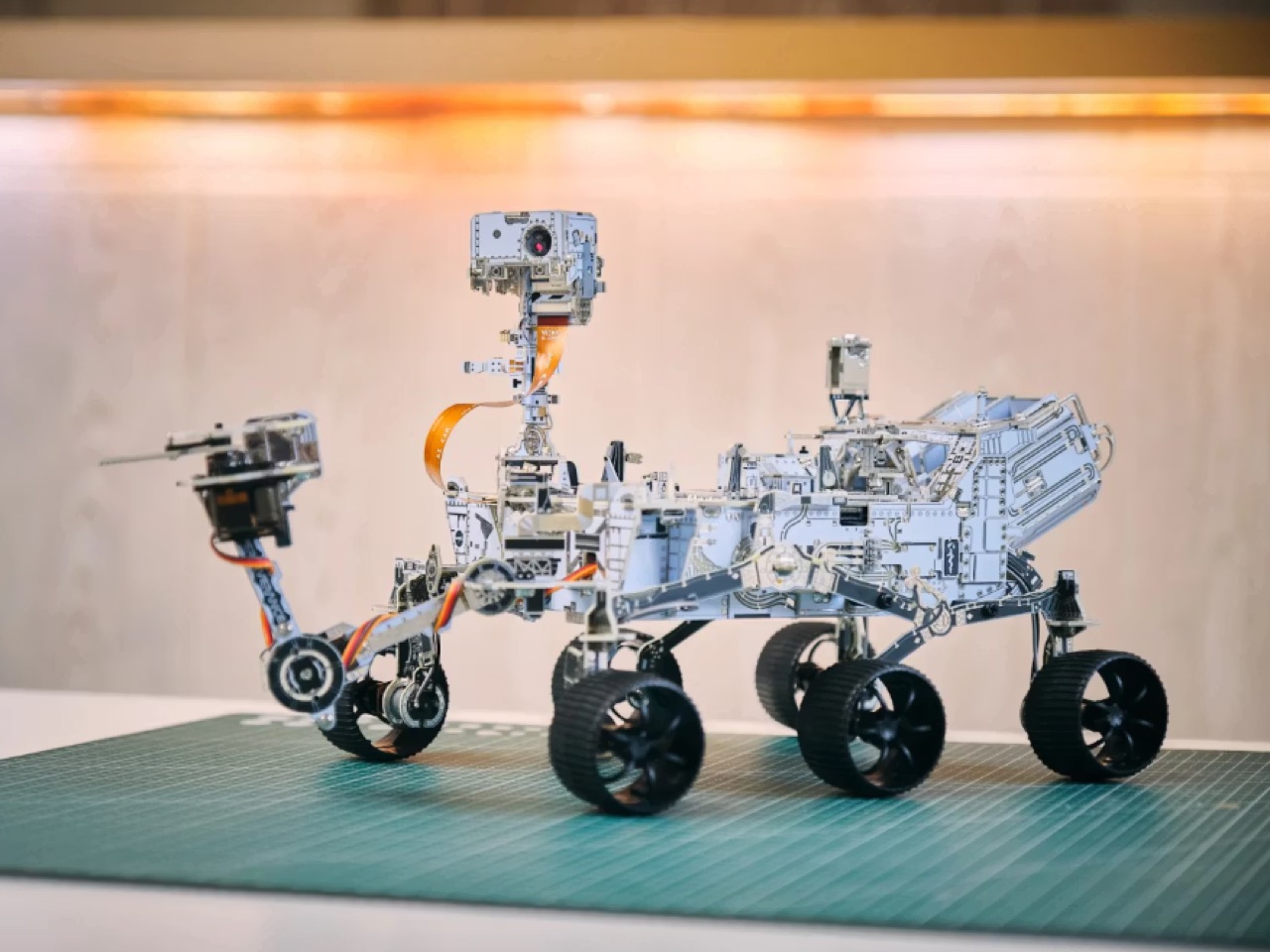
NASA spent $2.7 billion building Perseverance and getting it to Mars. CircuitMess will sell you a buildable, functional, AI-capable replica for $309, and you get to solder every joint yourself. The kit launched in early 2025 and has sold 4,000 units across five restocks, each batch clearing out in approximately two hours. The math on that kind of sell-through rate points to something working at a level most STEM products never reach. The engineering decisions behind the kit explain why people keep showing up for the restocks instead of waiting for broader availability.
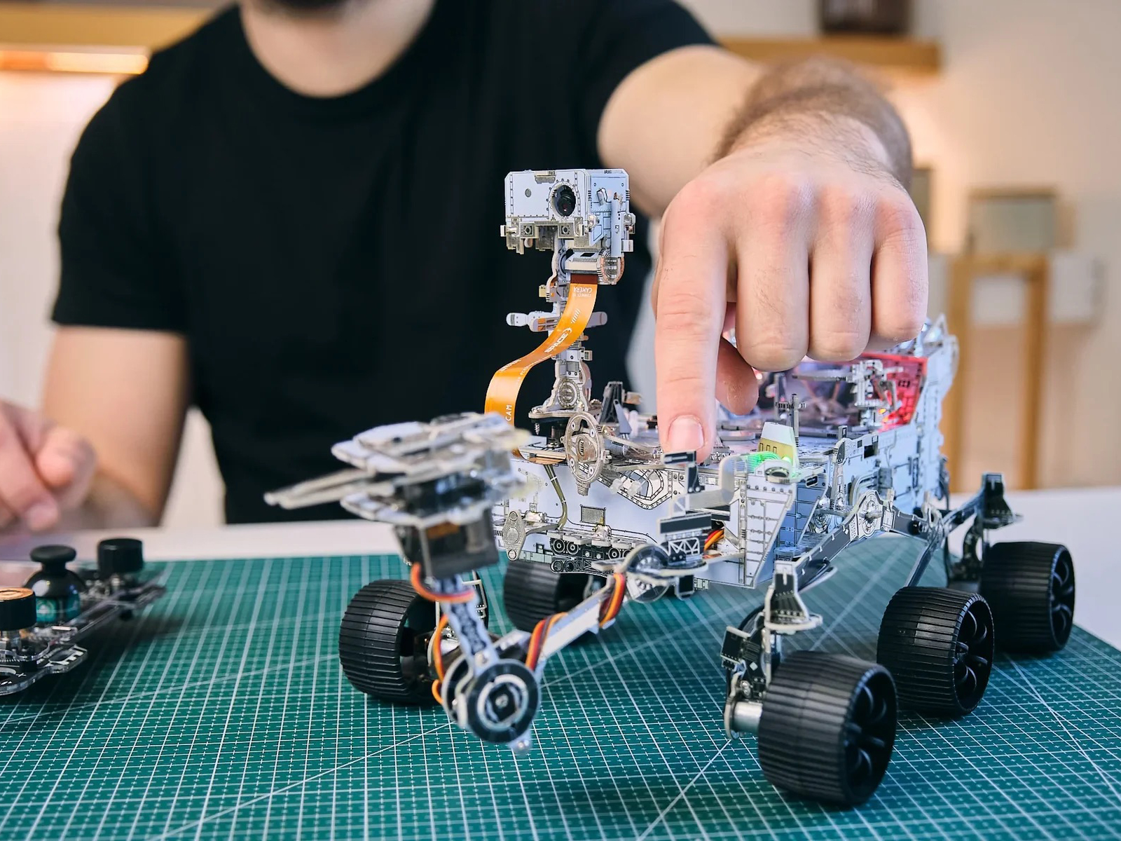
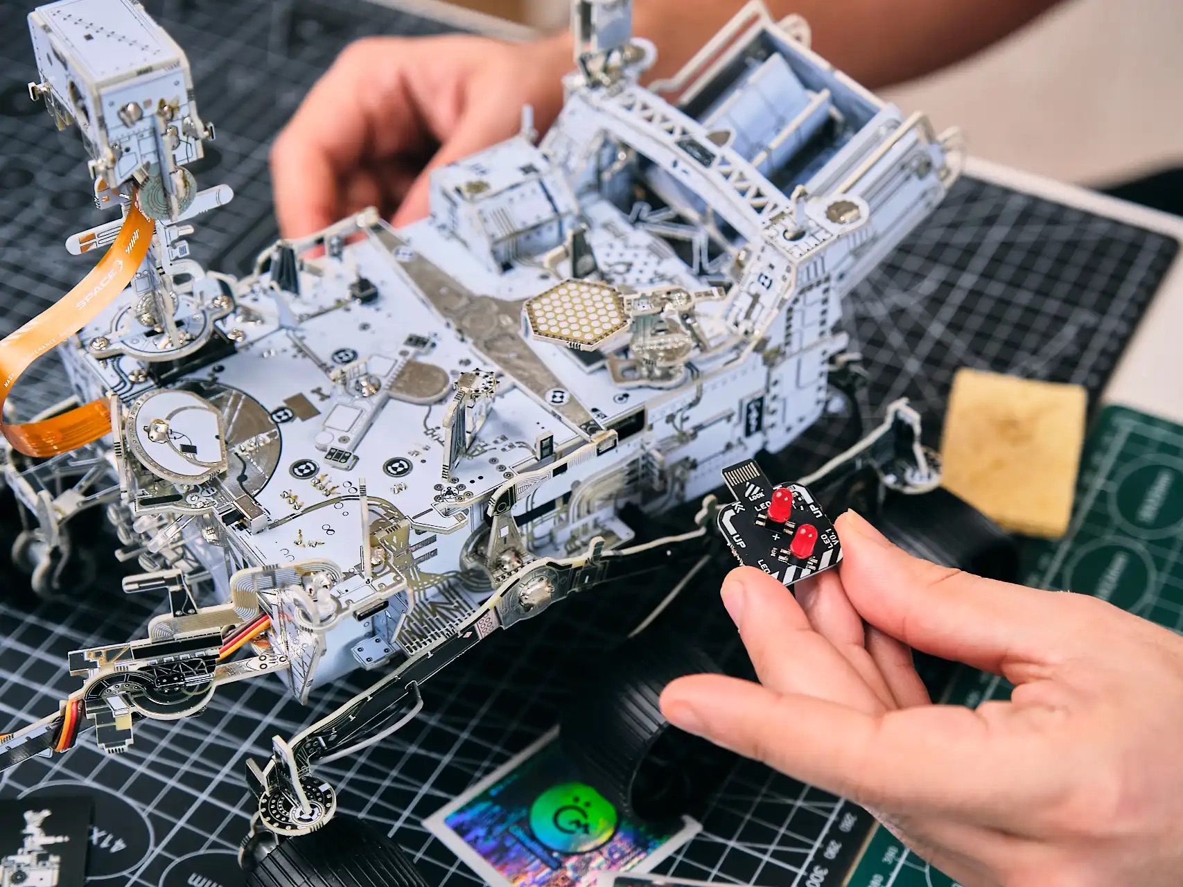
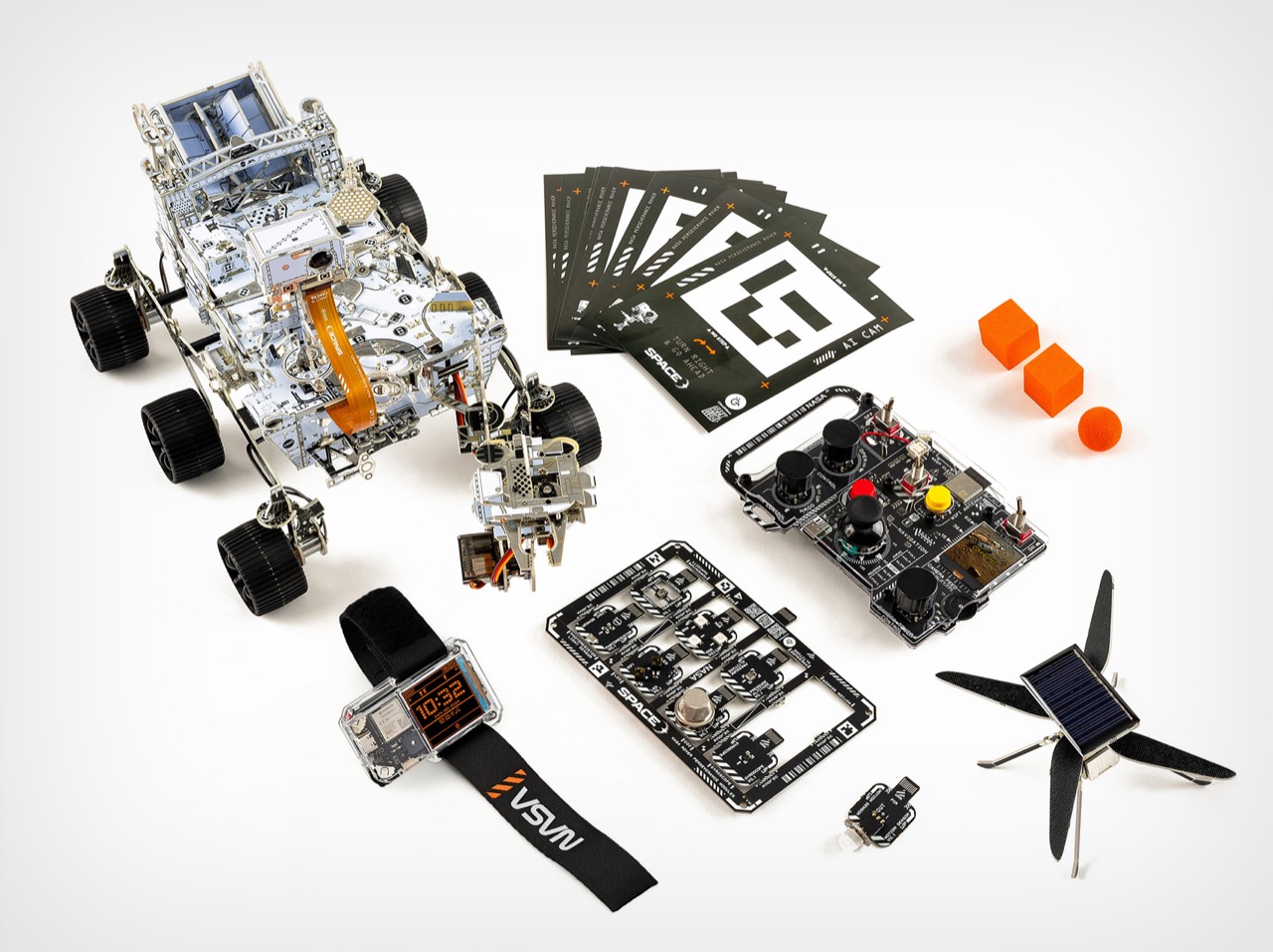
CircuitMess and GeeekClub secured NASA approval for the branding and matched the mechanical design to the real rover’s geometry, down to the rocker-bogie suspension that allows independent wheel movement across uneven terrain. The hardware includes six DC motors for propulsion, two servo motors for the arm and camera, a dual-core ESP32 microcontroller, and an AI-capable camera module with object recognition. Assembly involves soldering 300-plus components over roughly 20 hours, with all tools provided in the kit. Control options include a custom RF controller you build yourself, WiFi remote access, and autonomous navigation modes powered by the onboard AI. The firmware lives on GitHub as an open-source repository, and the rover accepts Python, C++, and Arduino IDE programming for anyone who wants to modify its behavior or add new capabilities through the modular expansion ports.
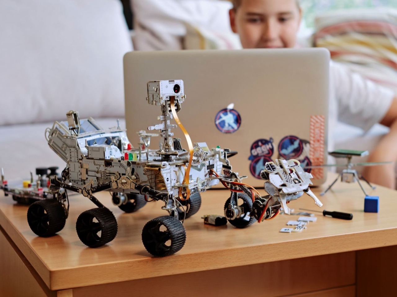
The process is guided but not restrictive, and after completing the base rover, users can reprogram it in Python or C++, experiment with CircuitBlocks, integrate additional modules, or alter its behavior entirely. That distinction matters because most STEM kits treat the build as a finish line. You follow the instructions, snap the final piece into place, drive it around for an afternoon, and then it becomes shelf decoration. The kit functions as a flexible platform rather than a one-time build. The modular architecture accepts additional sensor modules, letting builders upgrade and enhance their rover’s capabilities over time. The included fiducial marker cards give the AI camera immediate objects to recognize and track, so the computer vision feature has a real use case right out of the box. The orange foam cubes and balls visible in the kit photography serve as sample collection targets for the robotic arm, turning the rover into a functional system with tasks to perform, not a static display model.
While most STEM products bury their appeal in technical jargon and uninspired concepts, CircuitMess tapped into current trends to entice a broader audience, with strategic direction that aligned with Mars rover making real discoveries millions of miles away. Perseverance landed in Jezero Crater in February 2021, and for a sustained period afterward, space exploration felt culturally immediate in a way it hadn’t since the early shuttle era. People were watching a robot drive around Mars in near real-time, following sample collection updates, tracking the Ingenuity helicopter flights. CircuitMess launched this kit while that public interest was still live, and the timing was surgical. The kit didn’t sell because people wanted another electronics project. It sold because people wanted to understand how the thing they were watching on the news actually worked, and CircuitMess offered a credible path to that understanding.
The NASA Mars Perseverance Rover kit is available at circuitmess.com for $349. Since launching in early 2025, the kit has sold 4,000 units across five restocks, with each batch selling out in approximately 2 hours. If you’re the kind of person who followed the Perseverance mission beyond the landing headlines, who knows what a rocker-bogie suspension does or why a dual-core processor matters for onboard AI, this is one of the few educational kits that respects that level of interest.
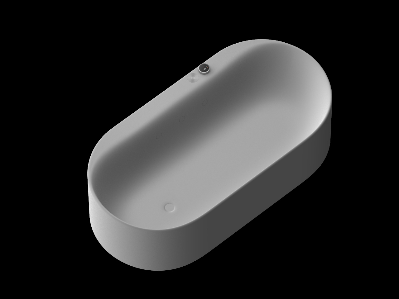
The bathroom is probably the last space in the home where smart technology has made any real dent. AI assistants have crept into living rooms, connected appliances have taken over kitchens, and yet the bathtub, one of the few places people genuinely go to decompress, has been left largely untouched. For anyone who’s had to get up and adjust the water temperature mid-soak, that feels like a missed opportunity.
That’s the gap that AquaIntelli is trying to close, a smart bathtub concept that doesn’t just run hot water and wait for you to climb in. Instead, it’s built around an AI-powered system that learns your bathing habits over time and then quietly handles everything on your behalf.
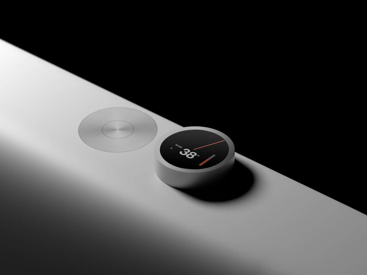
The core idea is personalization through repetition. Each time you use the AquaIntelli, its AI builds a more precise picture of your preferences, directing the jet massage toward the zones where you carry the most tension. If your lower back is always the problem, the system figures that out without you having to press anything. The more you use it, the better it gets at its job.
That same intelligence applies to the basics. The AquaIntelli can handle water temperature, depth, and massage strength entirely on its own, so by the time you actually step in, everything is already dialed in to your preferences. There’s no hovering over the tub as it fills, or dipping your hand in every few minutes to check whether it’s run too hot or too cool.
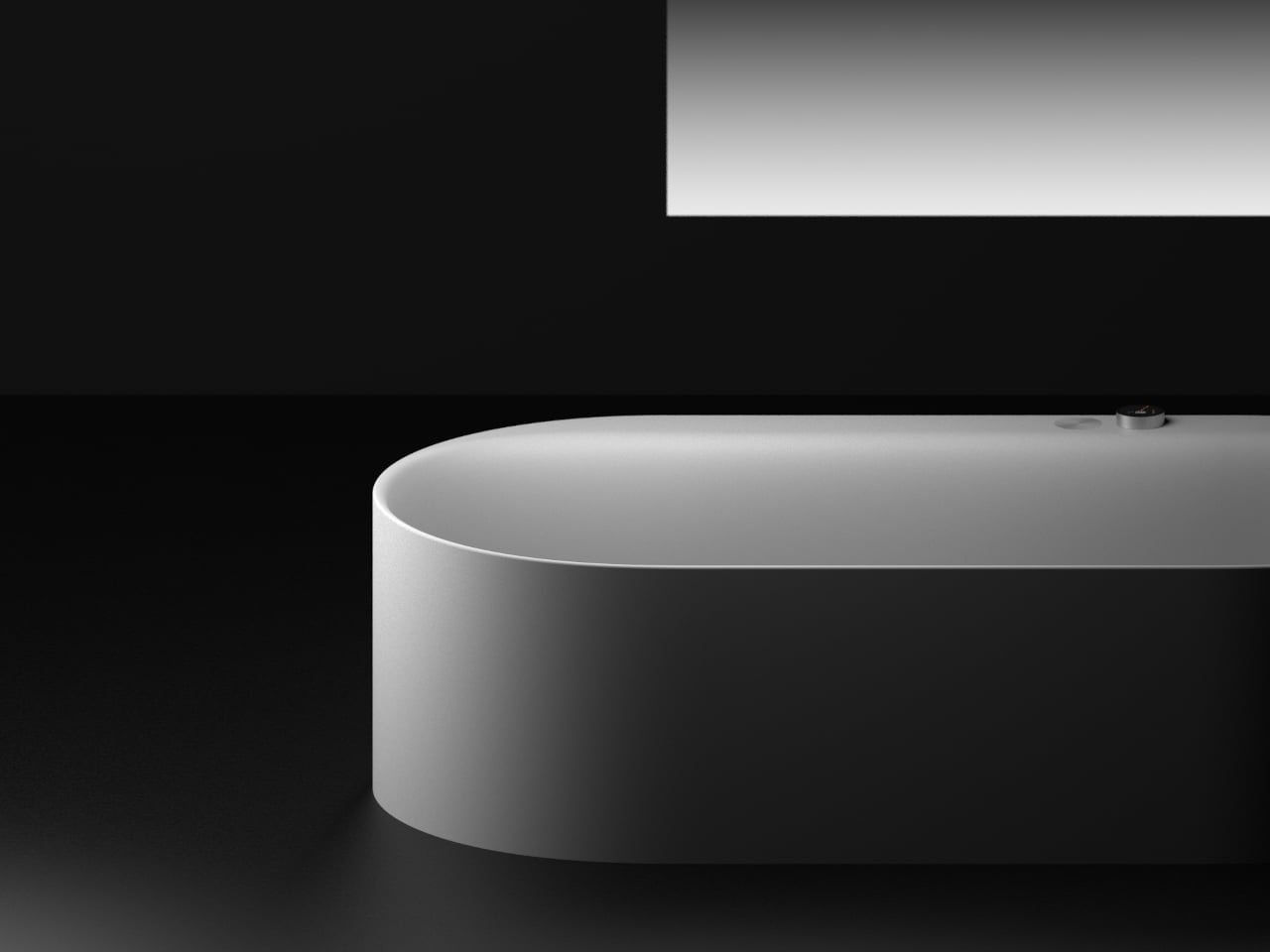
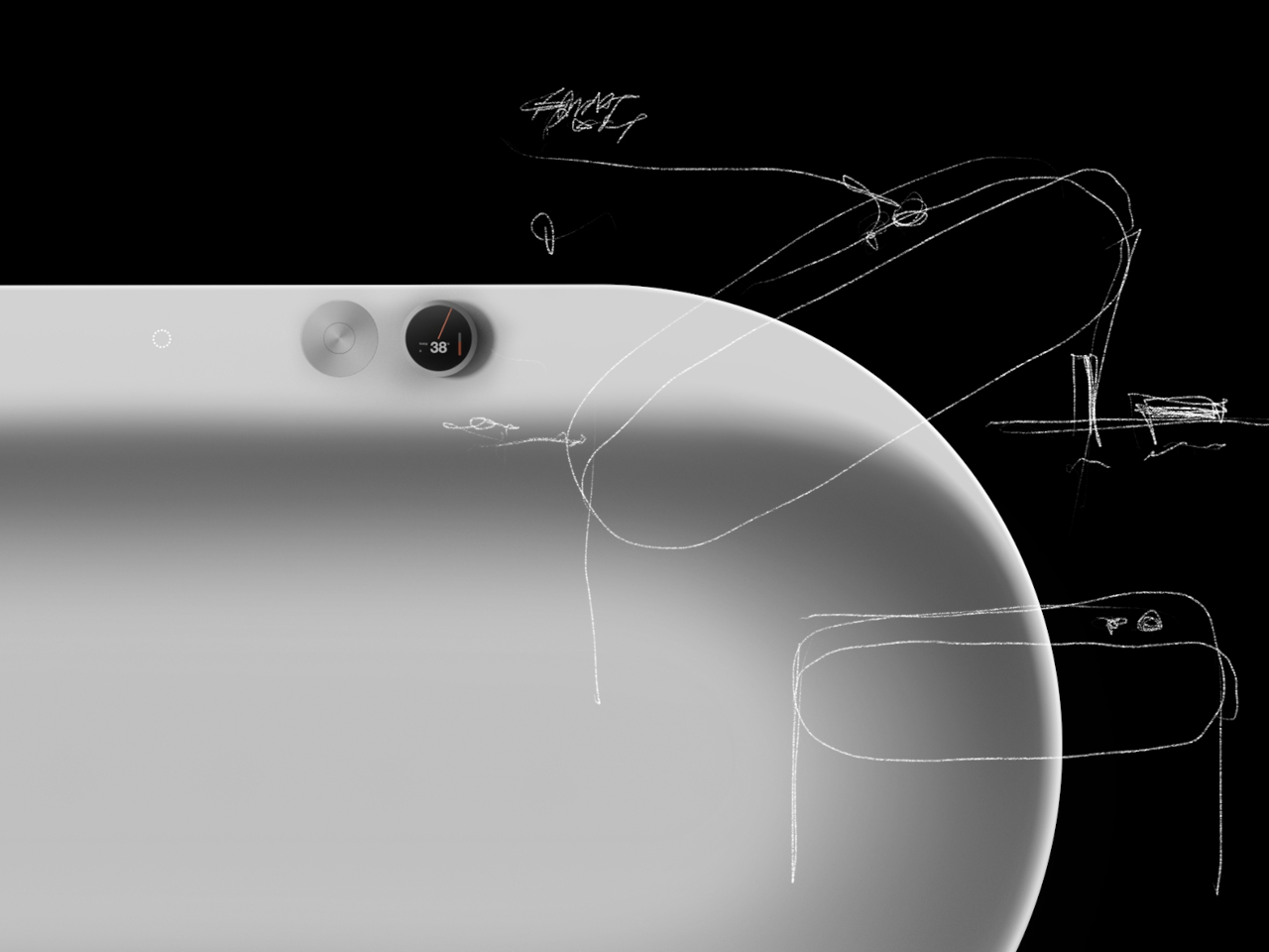
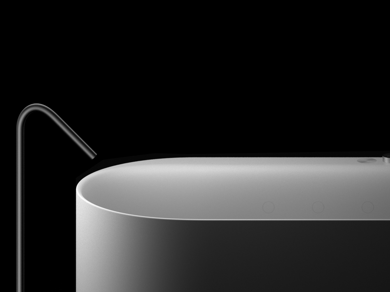
The designers clearly didn’t want the technology to clash with the form. The AquaIntelli takes the shape of a softly rounded, freestanding tub with no visible jets or hardware cluttering the surface. The air jets are hidden within the tub itself, keeping the interior clean and uninterrupted. It’s the kind of design where the functional details only reveal themselves once you’re already in the water.
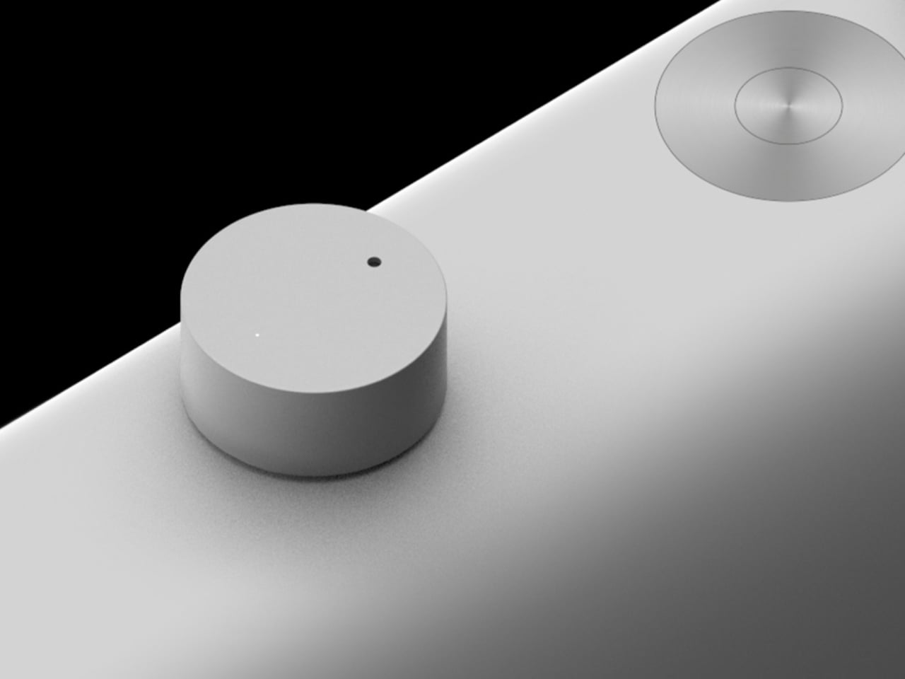
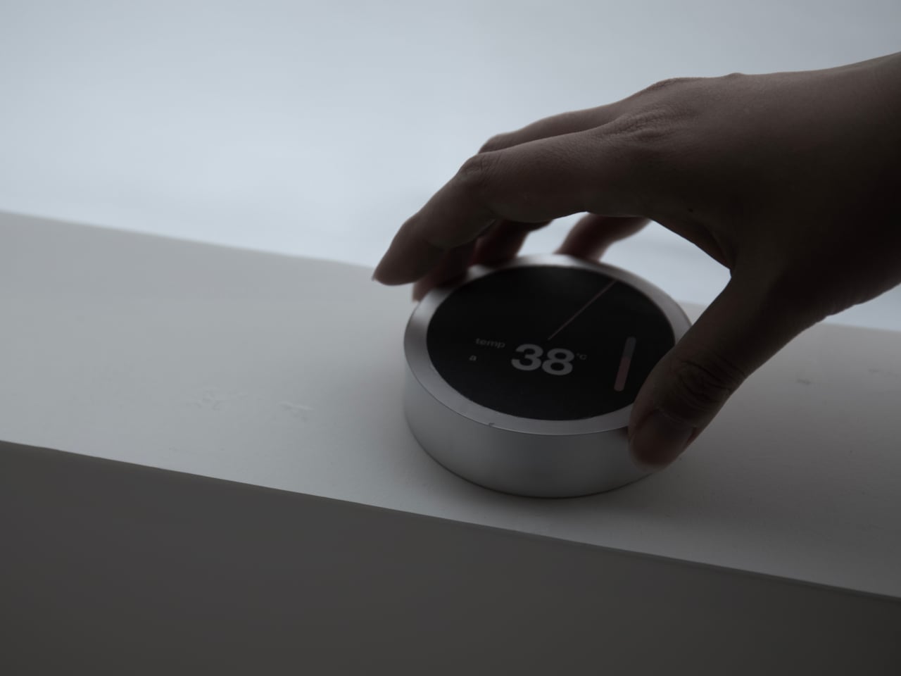
The controls follow the same logic. A touch dial sits on the tub’s rim, its face displaying the current water temperature in large, easy-to-read digits, with a flush-mounted push button beside it for toggling the spa functions on or off. For those who’d rather not wait until they’re in the bathroom, a companion app lets you set the temperature and run the tub remotely from your phone.
The AquaIntelli is still a concept, which means it could be a while before anything like it shows up in an actual bathroom. But the ideas behind it are genuinely compelling. A bathtub that takes care of the tedious setup, remembers what you need after a rough day, and gets more useful the longer you own it is a surprisingly straightforward pitch for something the category has never really had.