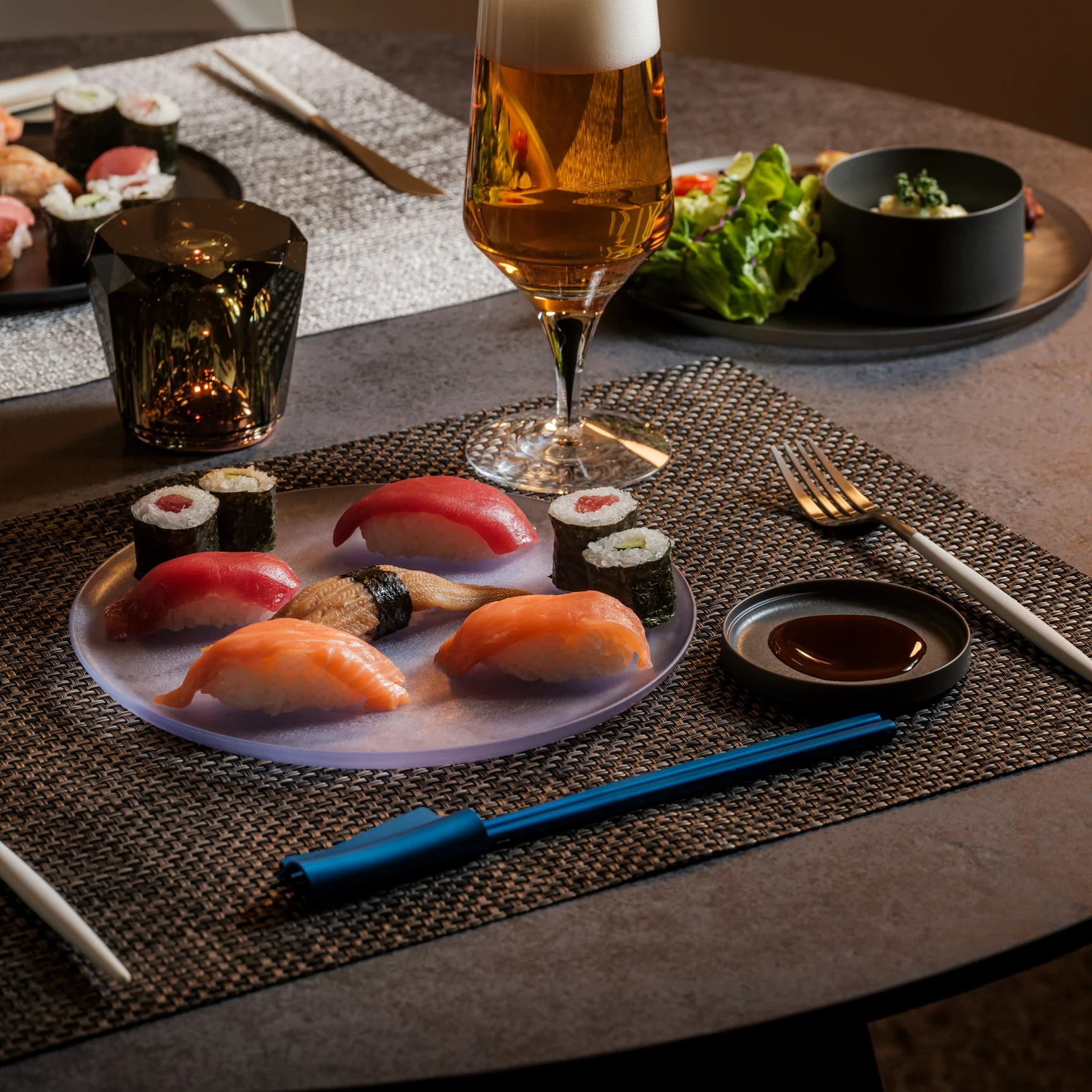
I didn’t grow up in a chopsticks household. Spoons and forks were de rigueur at our table, but once I learned how to use chopsticks, I picked up a pair whenever I could. The only problem? Using chopsticks can get surprisingly stressful. You don’t notice it at first, but the constant rotation against your fingers wears you out as the meal goes on, especially during a long dinner packed with side dishes and food that needs careful handling.
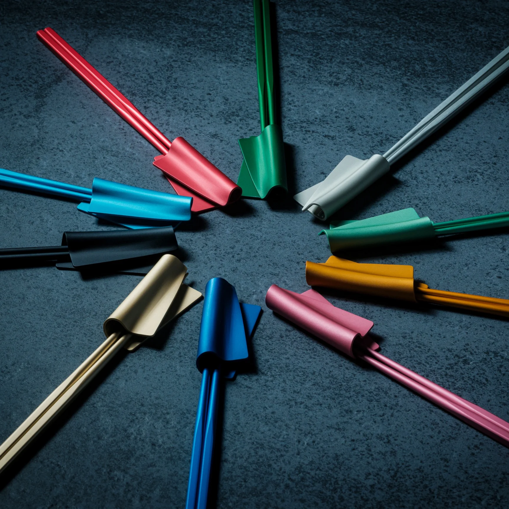
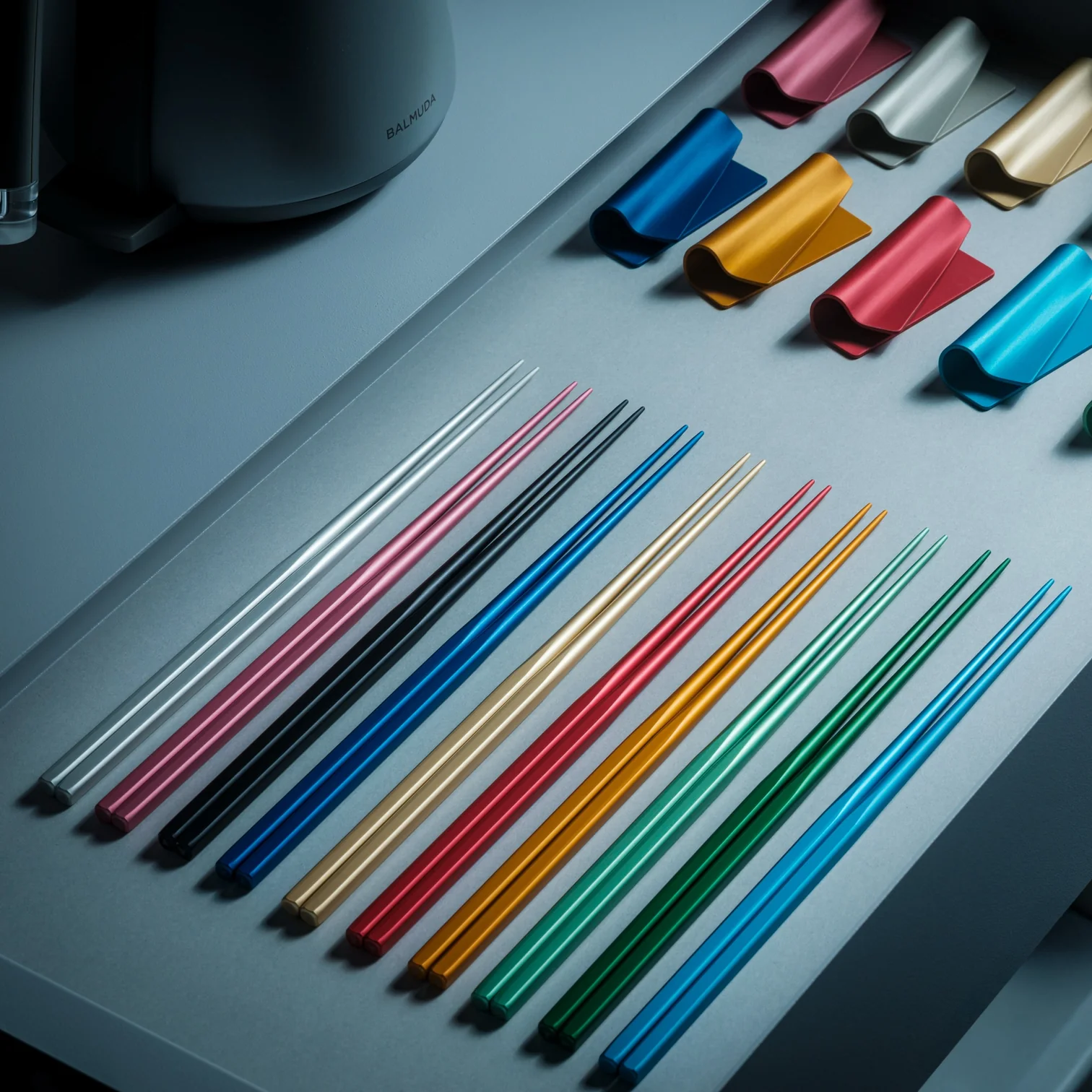
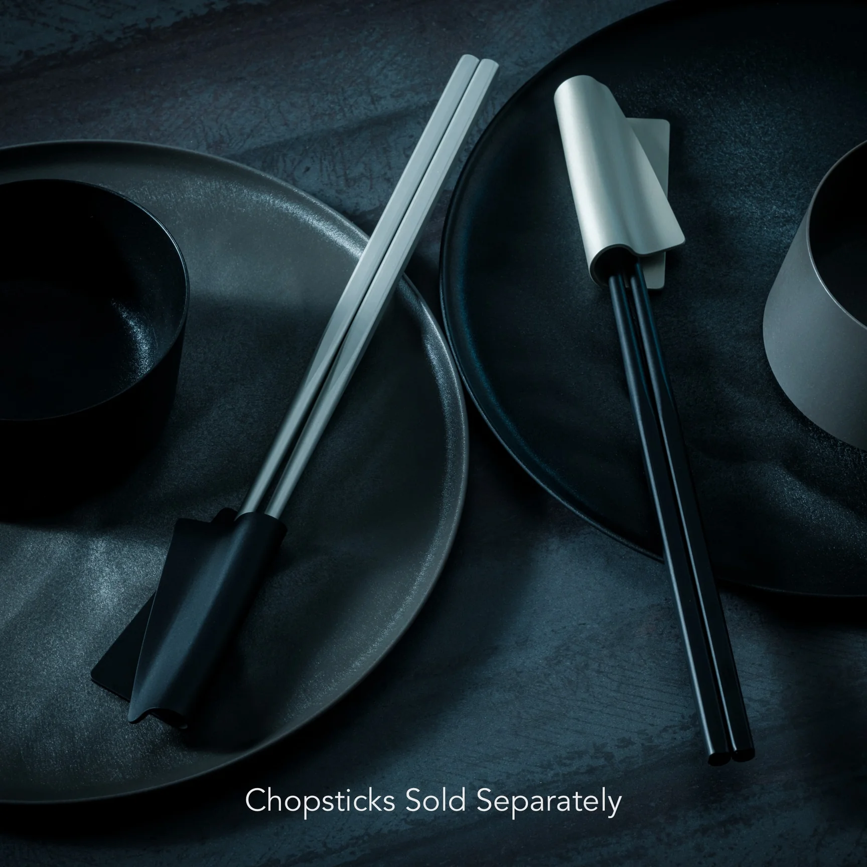
The design team behind the FineLine Aluminum Chopsticks and their matching Chopstick Rest thought long and hard about that exact problem. They put the pair through more than 40 rounds of refinement and trial and error, adjusting tip diameter, taper angle, grip texture, and balance to land on what might be the most comfortable pair of chopsticks you’ve ever held. And if you’re the kind of person who likes things to match, you can pick up a companion chopstick rest finished in the exact same colorway.
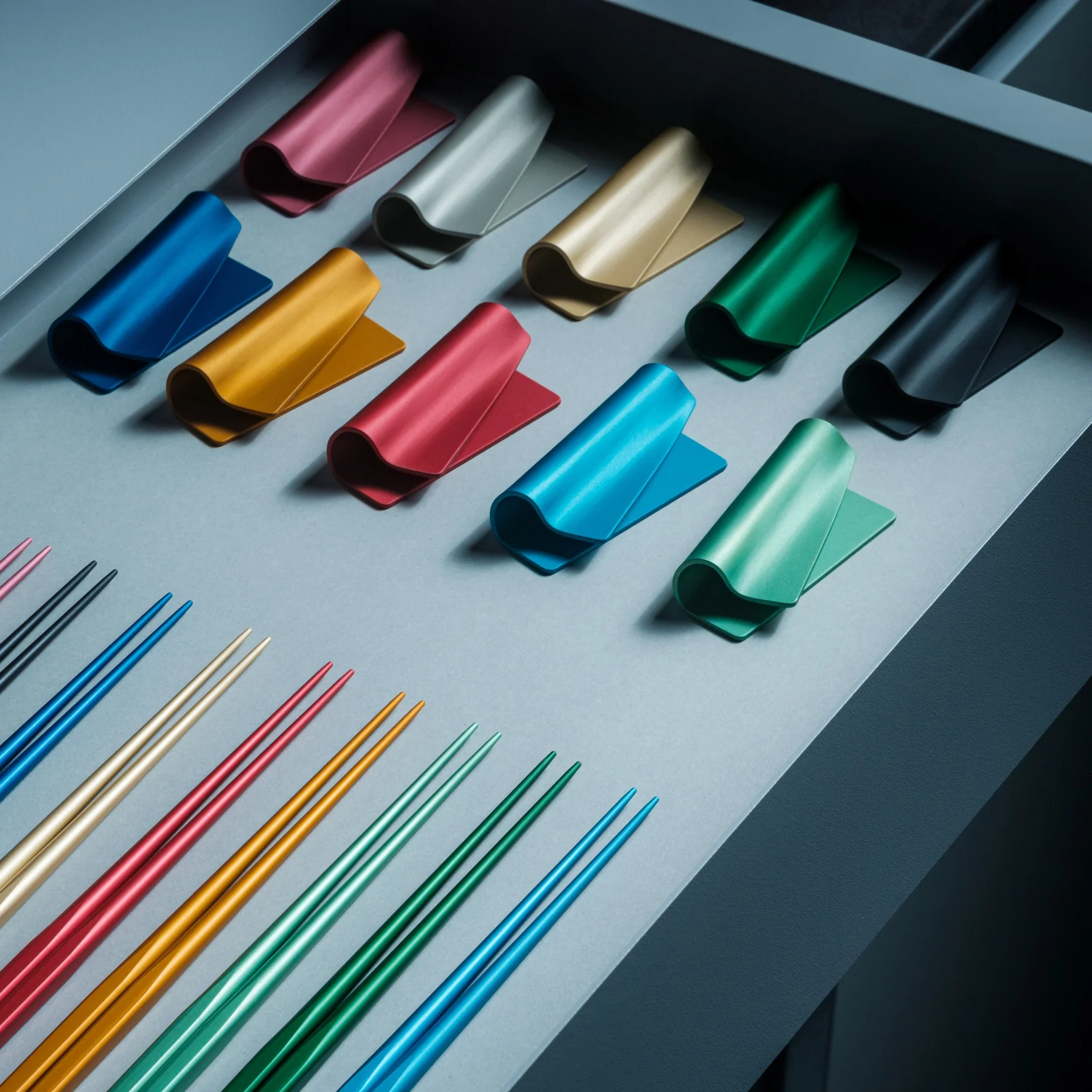
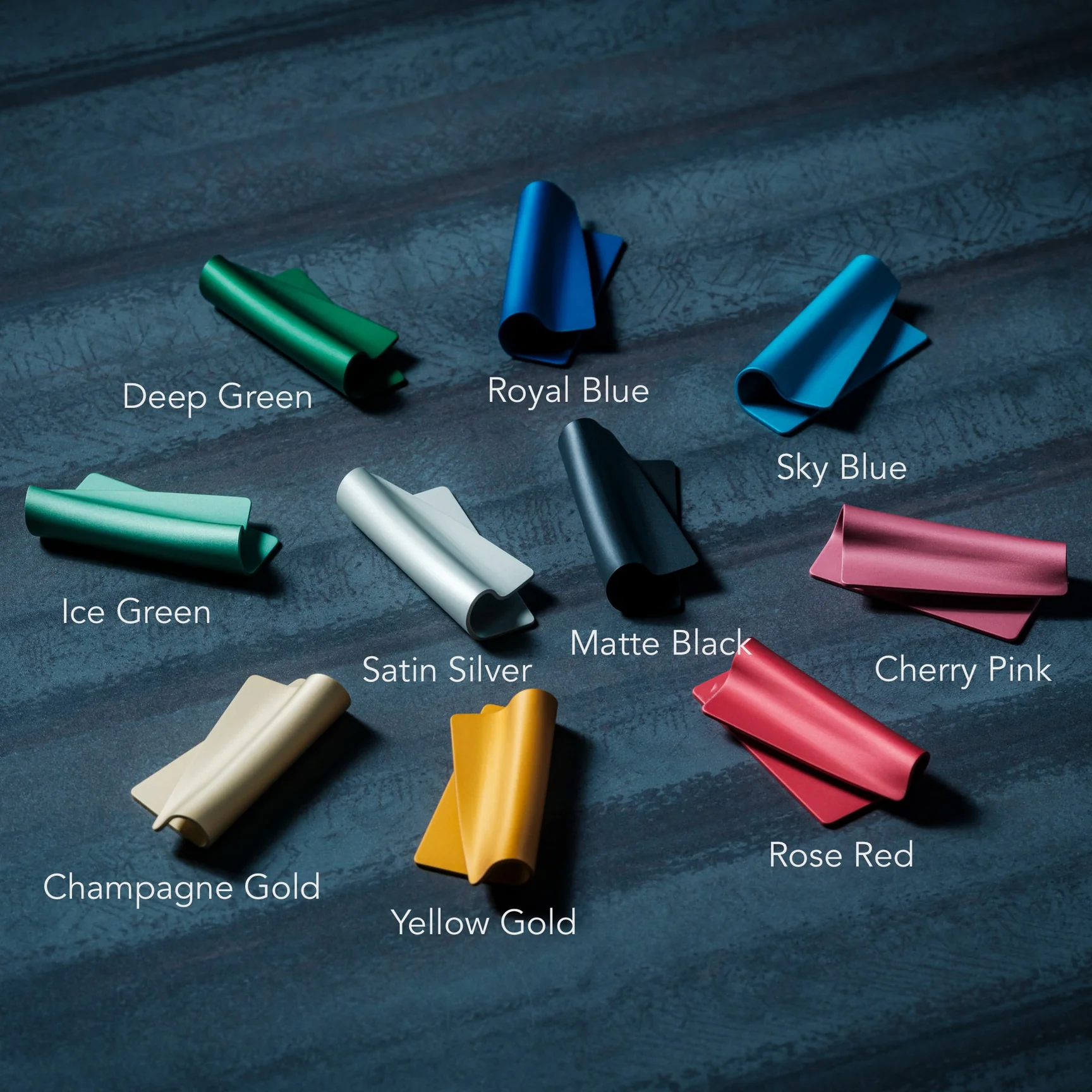
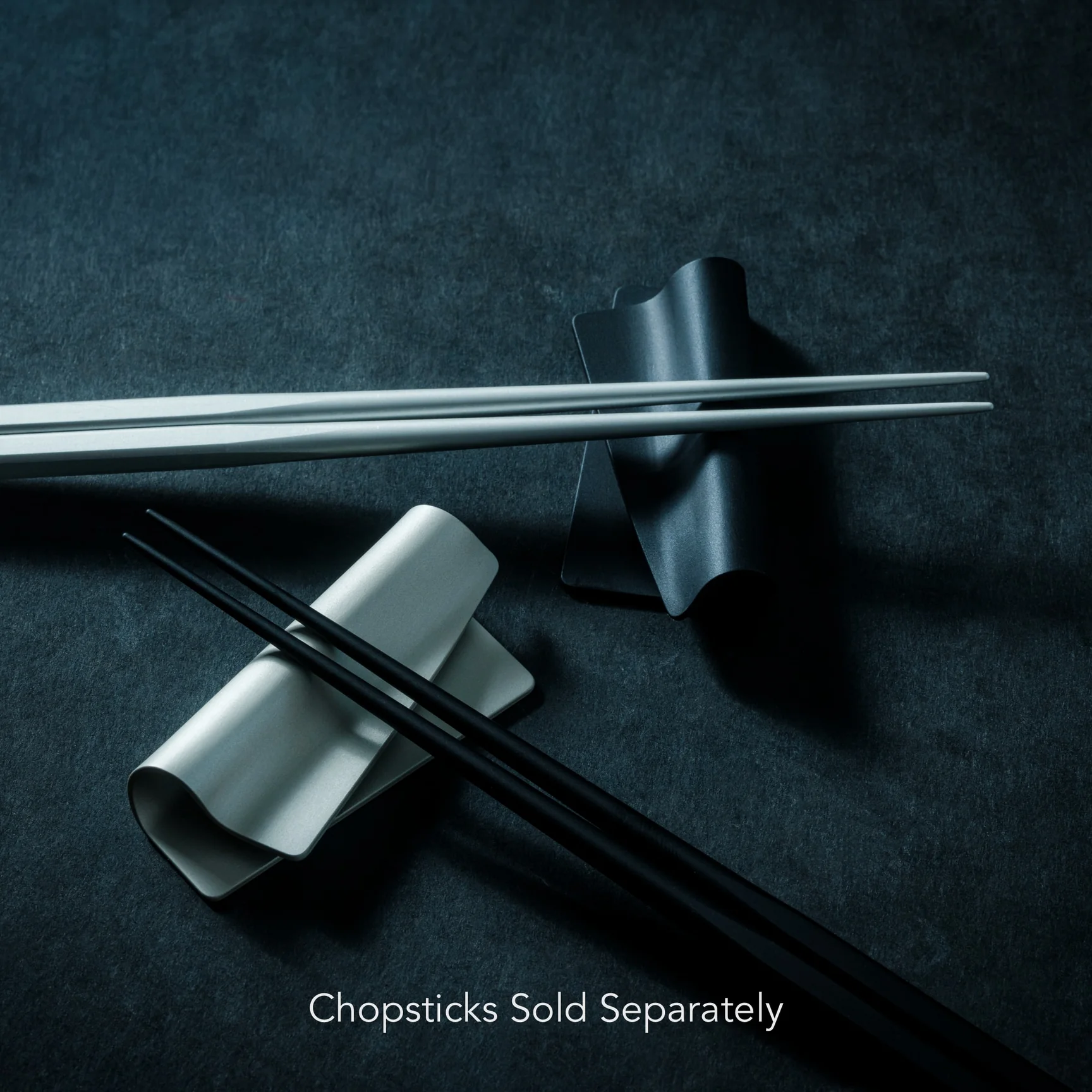
Both the chopsticks and the rest are manufactured in Tsubame-Sanjo, Japan, a region historically known for its precision metalworking, the same craft tradition responsible for some of Japan’s finest cutlery and hardware. The resulting chopsticks are thinner than what most people are used to, but the 1.5mm tip, roughly half the width of a standard chopstick, is engineered to be more stable and precise enough to pick up a single grain of rice cleanly. They’re made from anodized aluminum and are impressively light at just 14.5 grams per stick. You get 10 anodized color options, each with a soft, satin sheen, so whichever shade you pick, you end up with a pair that genuinely stands out on the table.
The separately sold Chopstick Rest is also machined from anodized aluminum and goes through the same production process as the chopsticks. It’s shaped specifically to cradle your chopsticks and keep the tips off the table, which is a small but meaningful upgrade if you care about a clean table setting or just like the reassurance of good hygiene. It’s designed to genuinely match your chopsticks rather than function as an afterthought accessory. The colorways line up exactly, so the two pieces read as one system instead of two separate purchases.
So how does this stack up against what’s already out there? Most of us are used to one of two extremes: free bamboo or plastic chopsticks from a takeout order, or a mass-produced set from a big household name like Muji, which sells reliable but fairly generic stainless steel or wood chopsticks in the $5 to $15 range. Those options get the job done, but they’re built for volume, not for the feel in your hand.
The FineLine set, at $30 for the chopsticks and $20 for the rest, sits in a different category entirely. You’re not just paying for aluminum instead of bamboo. You’re paying for 40-plus rounds of engineering aimed at solving a problem most brands never even identified: the constant, tiring rotation that round chopsticks force your fingers to correct for. Even other premium Japanese chopstick makers rarely address grip geometry this directly, which is what makes the FineLine’s faceted, anti-rotation design feel like a genuine innovation rather than a repackaged classic.
At the end of the day, good design isn’t always about reinventing something. Sometimes it’s about noticing the tiny frustration everyone else learned to ignore, and quietly making it disappear. That’s exactly what the FineLine Aluminum Chopsticks and their matching FineLine Chopstick Rest manage to do. They won’t change how you eat, but they might change how you feel by the end of the meal: less fatigue, more focus on the food and the company across the table. For $30 (plus $20 if you want the full matching set), that’s a small price for a tool that finally gets out of its own way. If you’ve ever finished a long dinner and realized your hand was more tired than your stomach was full, this might be the upgrade you didn’t know you needed.
The home office has been redesigned more times than anyone can count. Most of those attempts involve cable management trays and monitor arms that take an afternoon to install. The things that actually change how a day feels are quieter. A mouse that folds flat. A notebook with two E Ink screens side by side. A hub that replaces a desk full of adapters with a single cube. Five picks that earn their space without demanding much in return.
Each one on this list addresses a different part of the setup. Some resolve problems you have been quietly working around for years. Others make the workspace feel chosen rather than accumulated over time. None of them require a weekend to justify. What they share is a clarity of purpose that is rare enough in 2026 to be worth pointing out. These are the five gadgets that belong on a home office desk this September.
1. OrigamiSwift Mouse
Most portable mice compromise somewhere obvious. They are too small for real use or too light to feel properly controlled on a fast-moving screen. The OrigamiSwift, designed by Horace Lam, starts from a different premise entirely. It folds completely flat to 4.5mm when you are done and opens back into a full-size mouse without ceremony. At 40 grams, it disappears into any bag without taking up a thought or asking for a dedicated pouch.
Soft-click buttons keep video calls quiet, and the Bluetooth connection removes one more dongle from the port situation entirely. The USB-C rechargeable battery lasts up to three months on a single charge, which removes the low-battery anxiety that follows most wireless mice around. For anyone splitting time between a home desk and a coffee shop or hotel room, the OrigamiSwift collapses the gap between travel gear and desktop gear into one object that handles both without being a specialist at either.
Folds completely flat to 4.5mm, making it genuinely pocketable without needing a case
USB-C rechargeable with up to three months of battery life per charge
What We Dislike
Bluetooth-only connectivity means no wired fallback for latency-sensitive tasks
40-gram weight feels unfamiliar for the first few days coming off a heavier desktop mouse
2. Inkleaf Foldable Dual-Screen E-Ink Notebook
Every E Ink device on the market solves roughly the same problem and leaves the same one untouched. One screen means you are either reading or writing, never both at once, and that single limitation has defined the category for years. The Inkleaf, designed by Kameron Yu, treats that as the actual problem worth solving. It opens to two full 10.3-inch Carta E Ink panels side by side, letting you keep source material visible while your notes build on the other screen.
Priced at around $450, it ships with a pressure-sensitive stylus, a USB-C cable, and no subscription fees tied to reading your own files. For researchers and writers who have been running a tablet beside a separate notebook for years, this is the more honest version of that setup. The paper-like display reduces eye strain across long sessions, and keeping reference material on screen without switching tabs removes the small interruptions that erode focus before you notice they are happening.
What We Like
Two 10.3-inch Carta E Ink panels let you read and write simultaneously without switching screens
No subscription fees required to store or access your own content
What We Dislike
$450 price point is a genuine commitment for anyone uncertain about an E Ink-based workflow
Folds to hardcover size, which is practical but not compact enough to slip into a smaller bag
3. HubKey Gen2
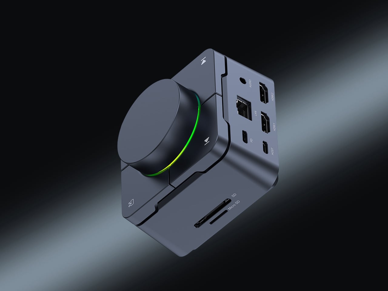
Modern laptops arrive with two USB-C ports and the expectation that you will figure out the rest. The HubKey Gen2 figures it out instead. It is an 11-in-1 USB-C hub and hardware control surface built into a single compact cube that sits beside your machine without demanding its own footprint. One cable handles display output, storage, network, charging, and peripherals at the same time. The design principle is one cable in and everything out, and it holds.
Four physical shortcut keys and a central knob sit on top of the cube. A built-in driver unlocks five preset systems with 170 fixed key combinations, plus a sixth mode where you assign shortcuts, macros, and sequences to suit your own workflow. When plugged in, a settings interface opens automatically. It includes dual 4K display output. For anyone tired of volume controls buried in software menus, this returns them to where they belong: within arm’s reach on the desk.
What We Like
11-in-1 connectivity with dual 4K display output through a single USB-C cable
Physical shortcut keys and central knob replace software-buried controls with something actually reachable
What We Dislike
Cube form factor is best suited to a stationary desk and less practical as a regular travel companion
Customization depth requires upfront setup time before the physical controls feel genuinely intuitive
4. Orico MiniMate SSD
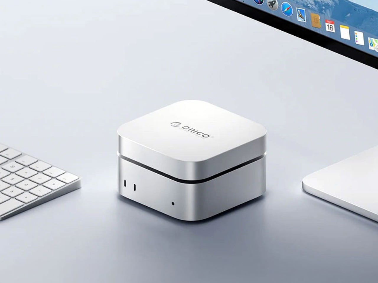
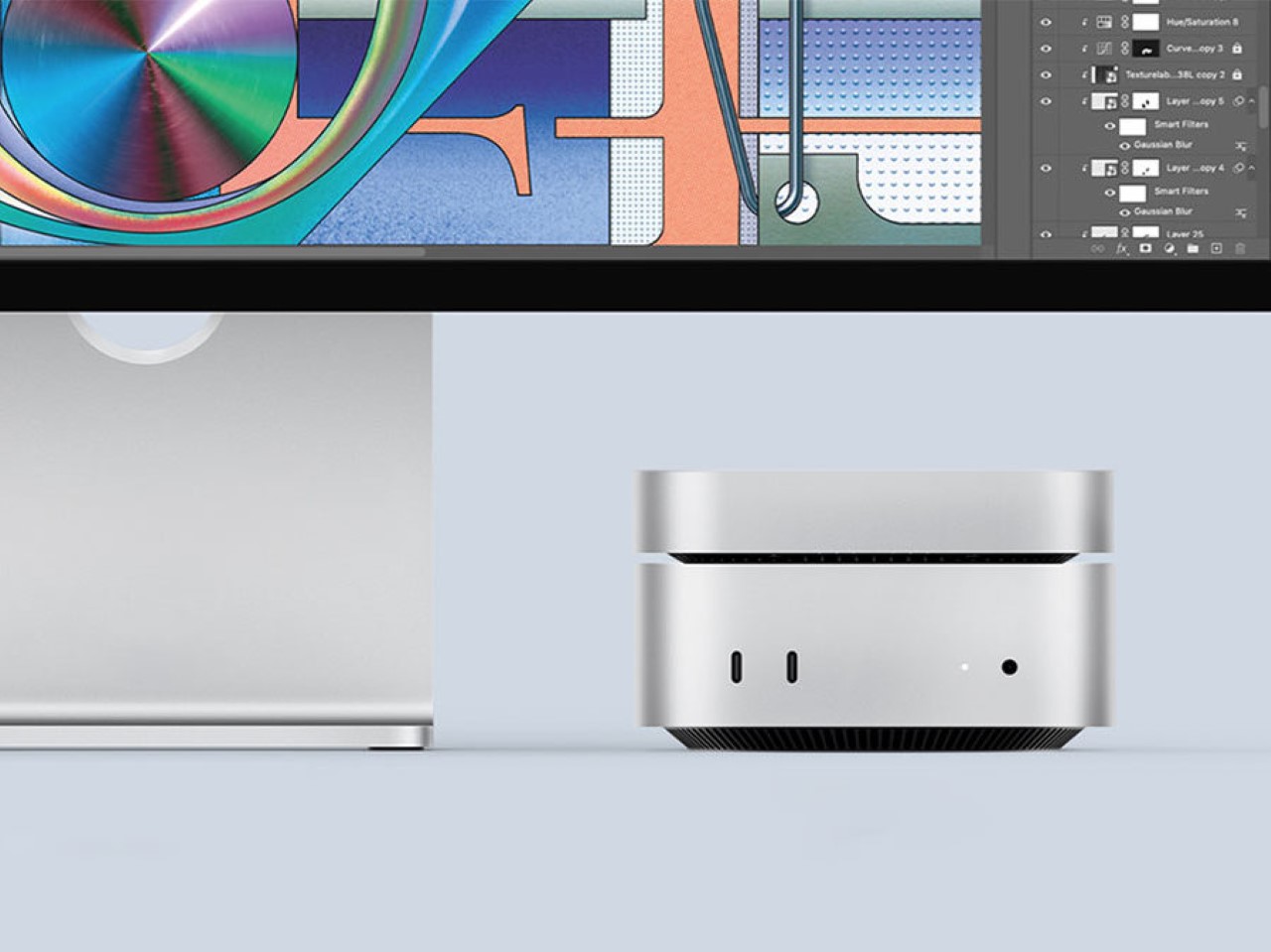
The base M4 Mac Mini ships with 256GB of storage, a number that starts feeling small the moment you put the machine to real work. The Orico MiniMate SSD is built to resolve that quietly. Its brushed aluminum casing mirrors the Mac Mini’s own footprint closely enough that the two sit together without the drive reading as an afterthought. The USB-C interface supports 40 Gbps transfer speeds, which keeps the external storage from becoming the slowest thing in the workflow.
Most external drives solve a storage problem while creating an aesthetic one. A cable snakes across the desk, the enclosure doesn’t match anything around it, and the setup that looked considered suddenly looks assembled. The MiniMate avoids that by treating the desk as the brief. For a Mac Mini setup built around clean lines and minimal clutter, it adds the storage the base model should have shipped with, at a price that makes the upgrade feel overdue rather than extravagant.
What We Like
Brushed aluminum casing sits flush with the M4 Mac Mini without reading as a bolted-on external drive
40 Gbps USB-C interface keeps transfer speeds fast enough that the drive never becomes a bottleneck
What We Dislike
Designed specifically around the Mac Mini footprint, so it reads less well considered alongside other desktop configurations
Budget positioning means users working with large video or audio libraries may find themselves outgrowing it sooner than expected
5. Side A Cassette Speaker
Most desk speakers are designed to disappear, which is a strange goal for something you look at every day. The Side A Cassette Speaker builds from the opposite direction. The visual language of a cassette tape is right there in the form, and it does not attempt to blend into the background. For a home office that appears on video calls, that kind of presence does quiet work that people in the meeting register before they notice the audio quality.
Slide it into its clear case, and the speaker becomes a stand as well as protection, turning the object into a display piece rather than something to tuck behind a monitor. The sub-$50 price makes it an easy desk addition without needing a budget argument. Whether you are winding down after a long day of calls or just need the afternoon to feel less like working inside a filing cabinet, the Side A earns its spot on both counts without much deliberation.
Cassette-inspired form reads immediately as an intentional design choice rather than a default tech purchase
Clear case doubles as a stand, keeping the setup clean without a separate accessory
What We Dislike
Design-forward identity means audio performance plays second to the aesthetic brief
Novelty framing can make it harder to justify for buyers whose main priority is sound quality over visual character
Final Thoughts
A home office should feel assembled with intention rather than accumulated over time. Each of these five objects earns its spot by doing something specific well. The OrigamiSwift handles the mouse without the usual compromises. The Inkleaf addresses the read-and-write gap that has defined the E Ink category for years. The HubKey consolidates connectivity into one object. The MiniMate closes the storage gap. The Side A makes the desk feel deliberately chosen.
None of these are purchases you forget about in two weeks. They are the kind that quietly shift the texture of a workday without announcing the change. A desk built around objects chosen deliberately tends to outperform one assembled from whatever was available at the time. These five are worth choosing carefully, and the shared quality across all of them is that they make their part of the setup feel settled rather than provisional.
Functions as a full-time everyday bulb even with the flame effects off
CONS:
Dual-color flame mode could offer a few more combinations
Group control caps at 16 bulbs per synced setup
RATINGS:
AESTHETICS
ERGONOMICS
PERFORMANCE
SUSTAINABILITY / REPAIRABILITY
VALUE FOR MONEY
EDITOR'S QUOTE:
The Linkind Smart Light Stick doesn't just light a room; it gives the room something to watch.
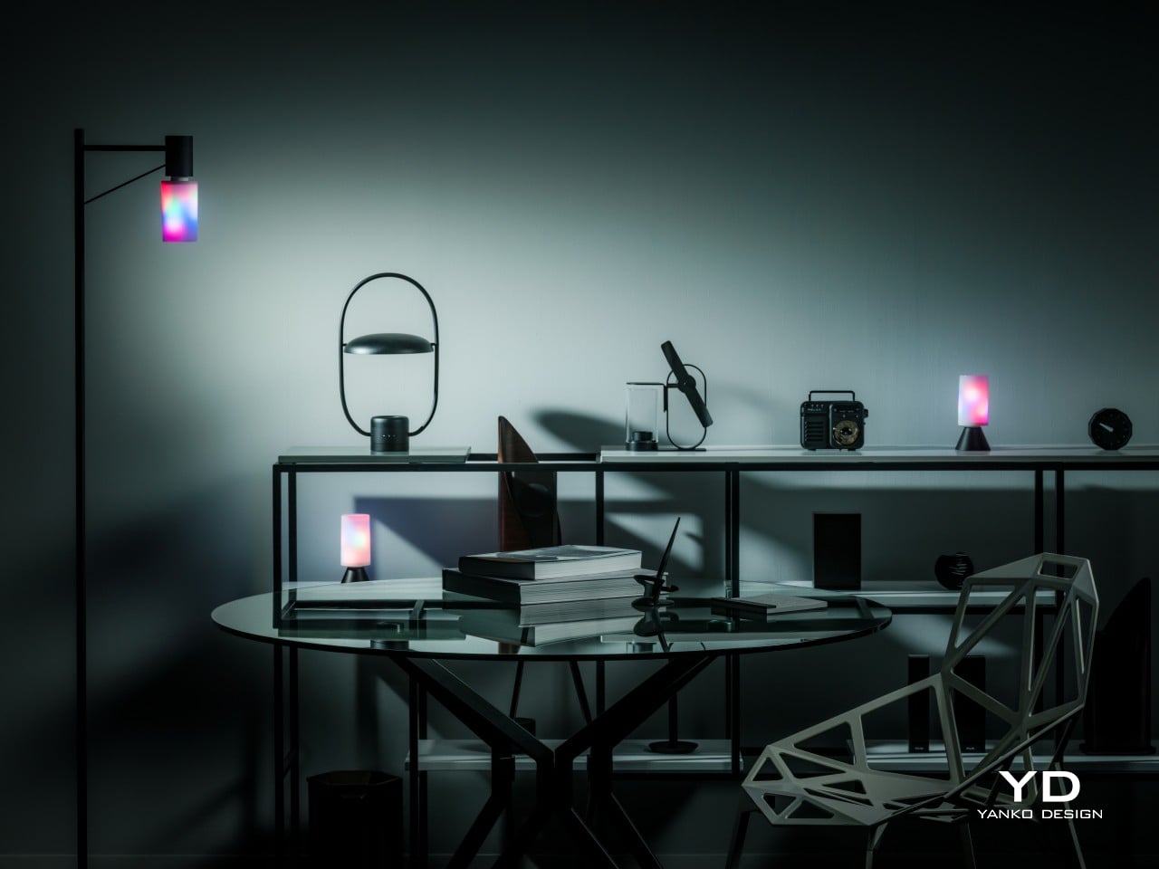
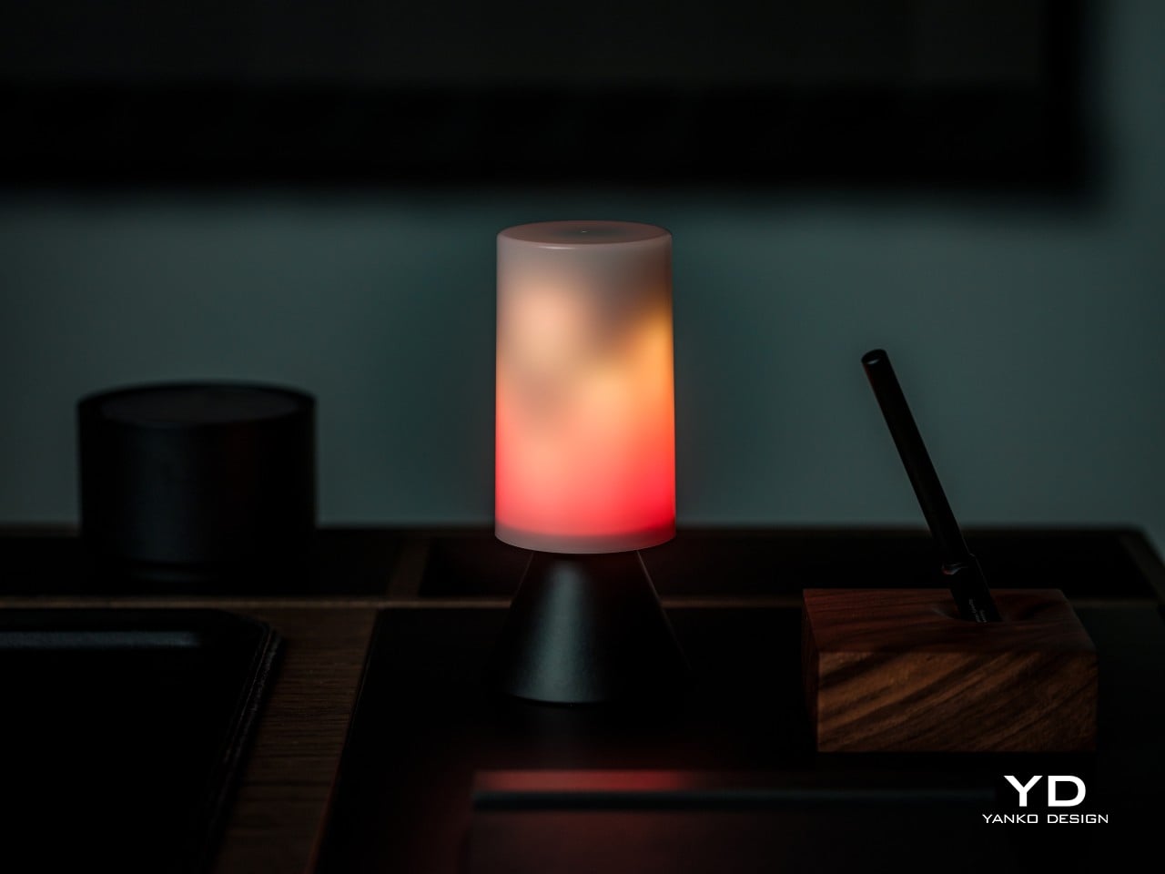
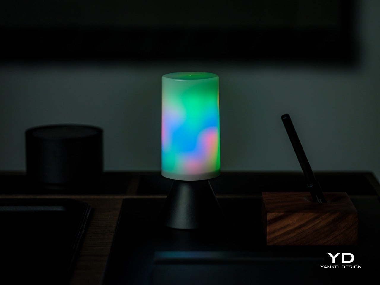
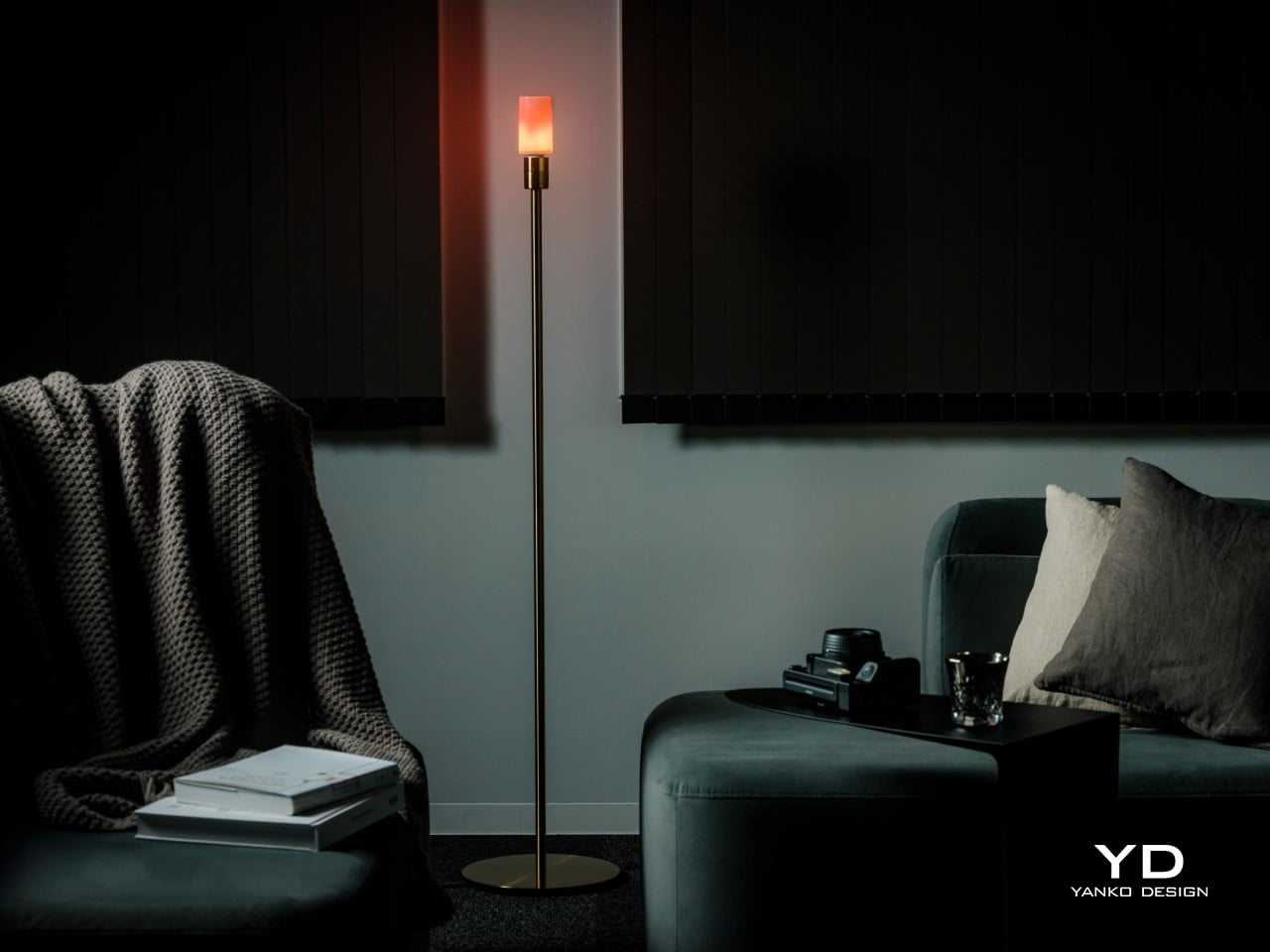
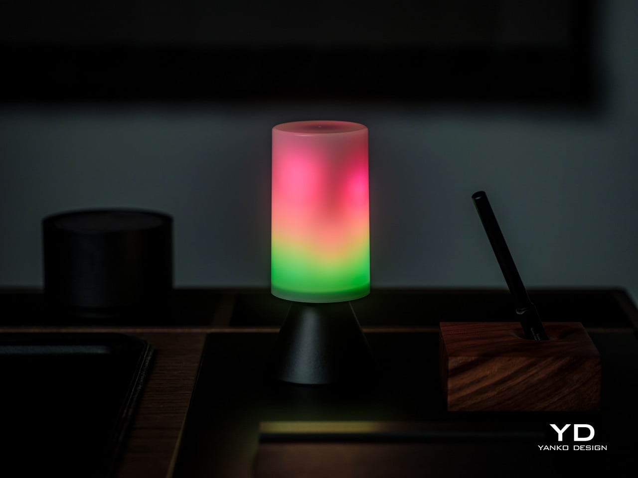
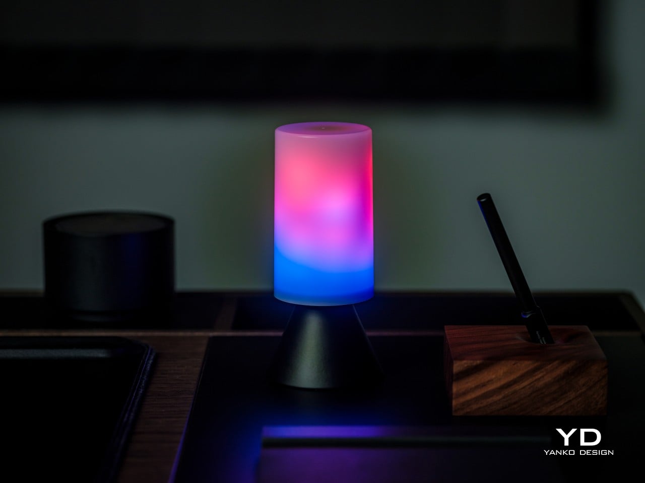
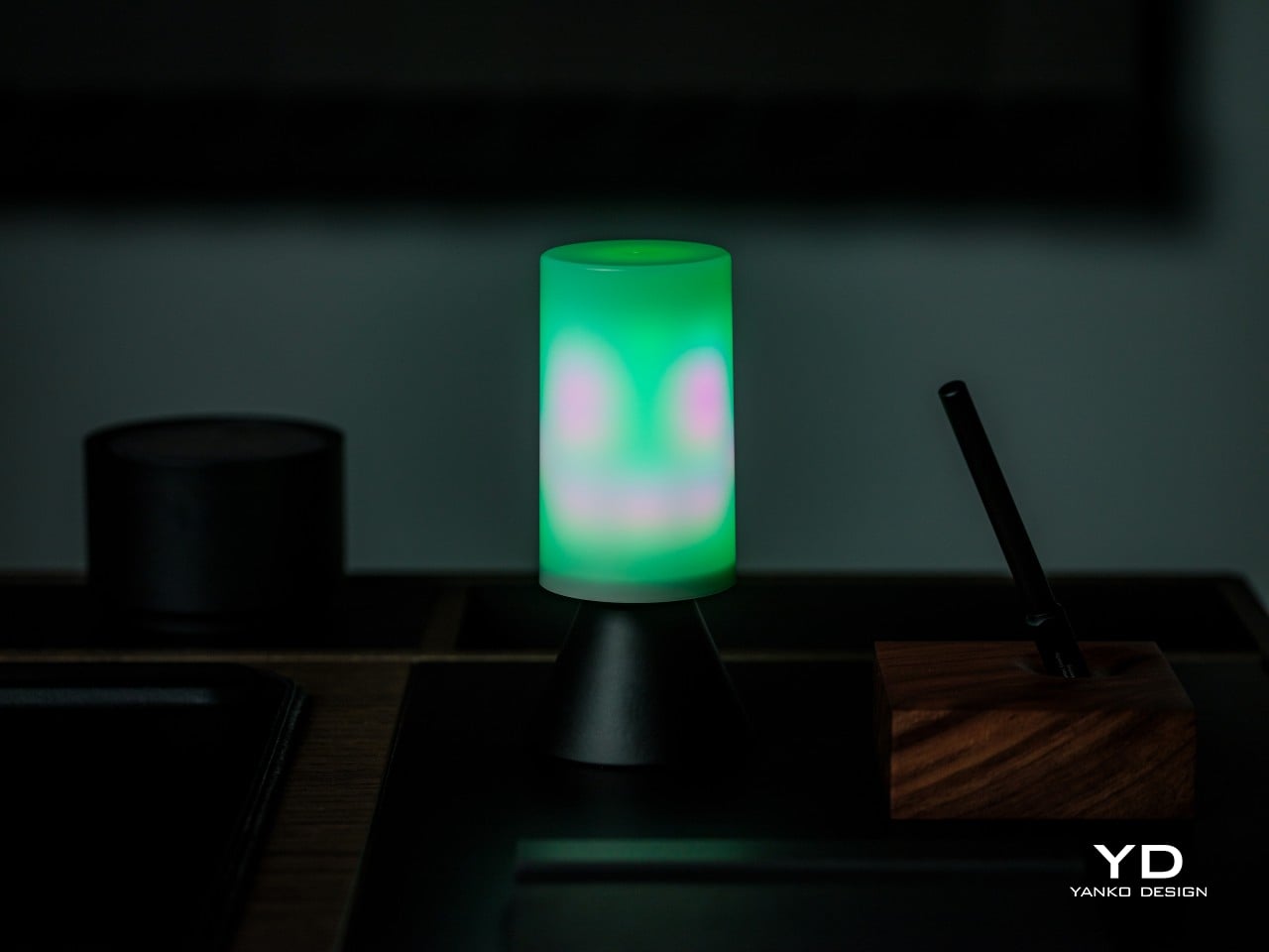
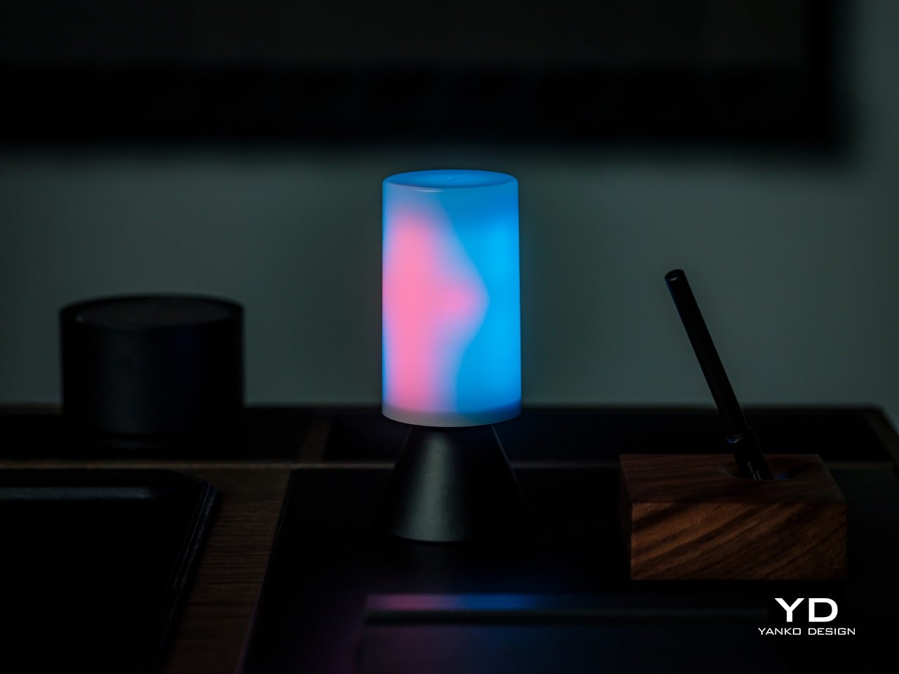
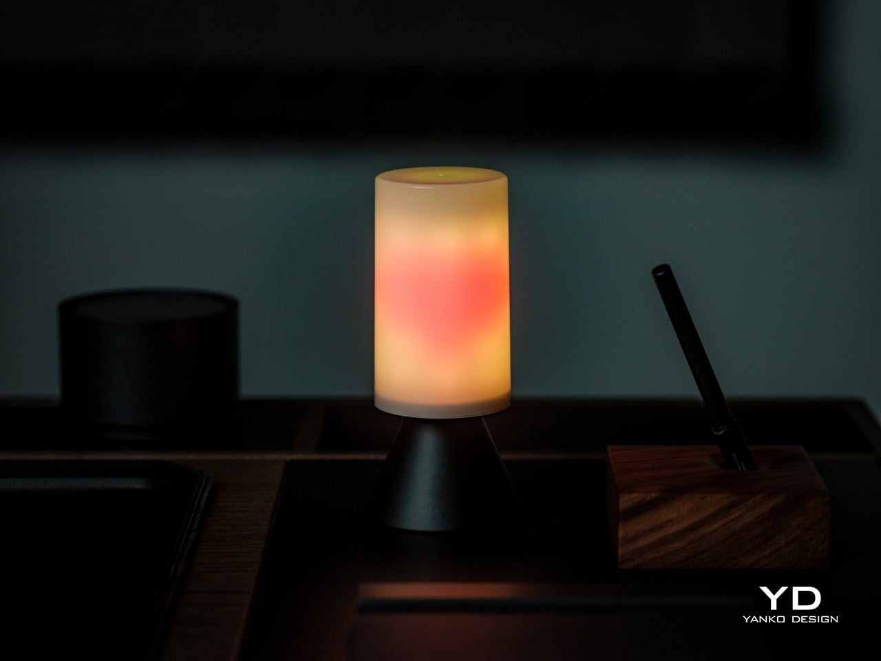
Most bulbs disappear once you screw them in. The Linkind Smart Light Stick refuses to. Instead of hiding inside a shade, it turns into the centerpiece, flickering through warm oranges and reds like a small fire caught inside glass. It still handles the job any bulb needs to do, pushing out up to 850 lumens from a standard E26 socket, so the drama doesn’t come at the cost of actual light.
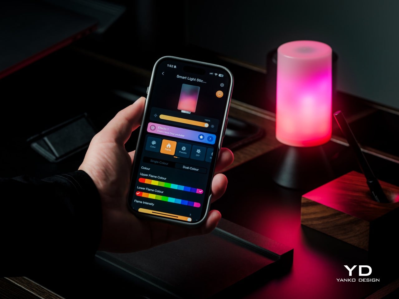
Linkind built its name on the idea that lighting should shape how a room feels, not just how bright it gets. The Smart Light Stick is where that philosophy gets its most theatrical outing yet, pairing animated color zones with Matter connectivity and app control through AiDot. It’s less a novelty bulb and more a small piece of moving light art that happens to also light your porch.
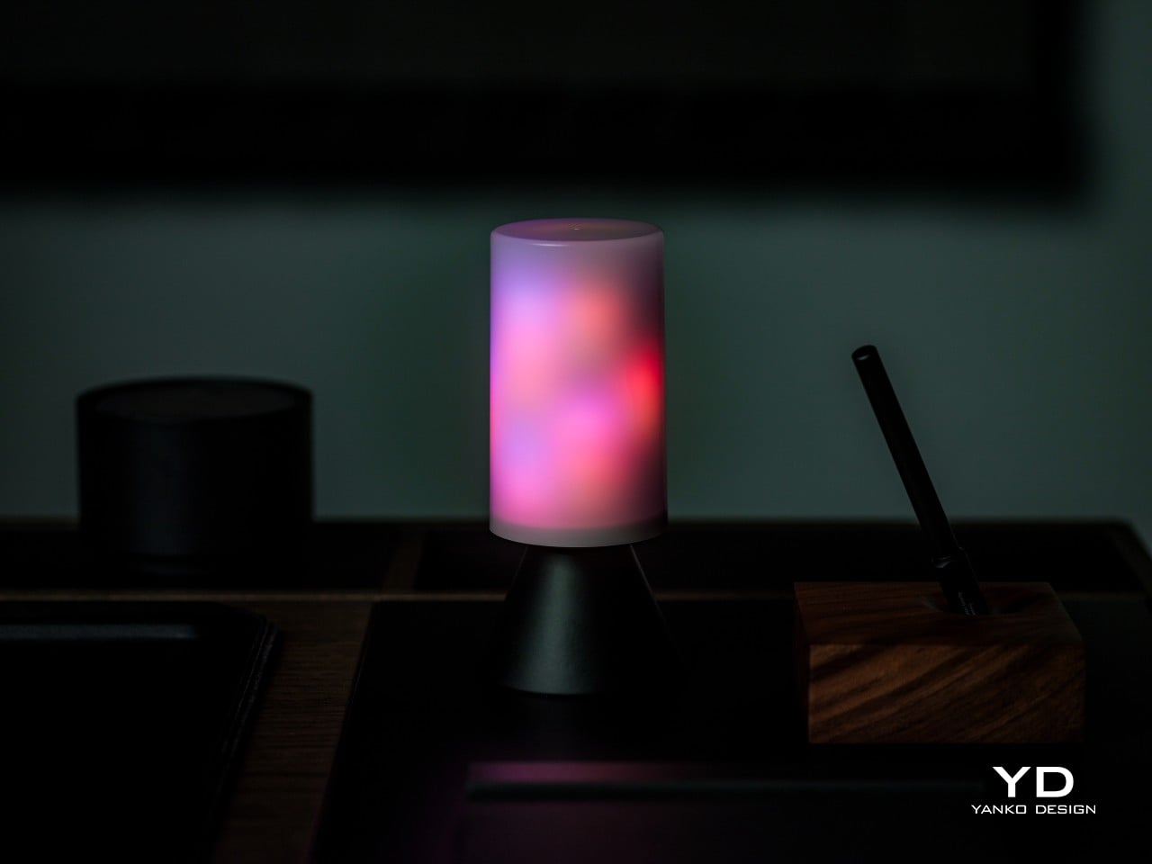
Flip the switch, and the flame mode takes over, cycling through 50 individually controlled zones that make the light climb and taper the way flickering light naturally moves. Three intensity settings, large, medium, and small, let you dial in how big that flicker looks inside whatever fixture it’s living in. It’s an animated, layered kind of glow, more theatrical suggestion of fire than anything trying to be mistaken for one.
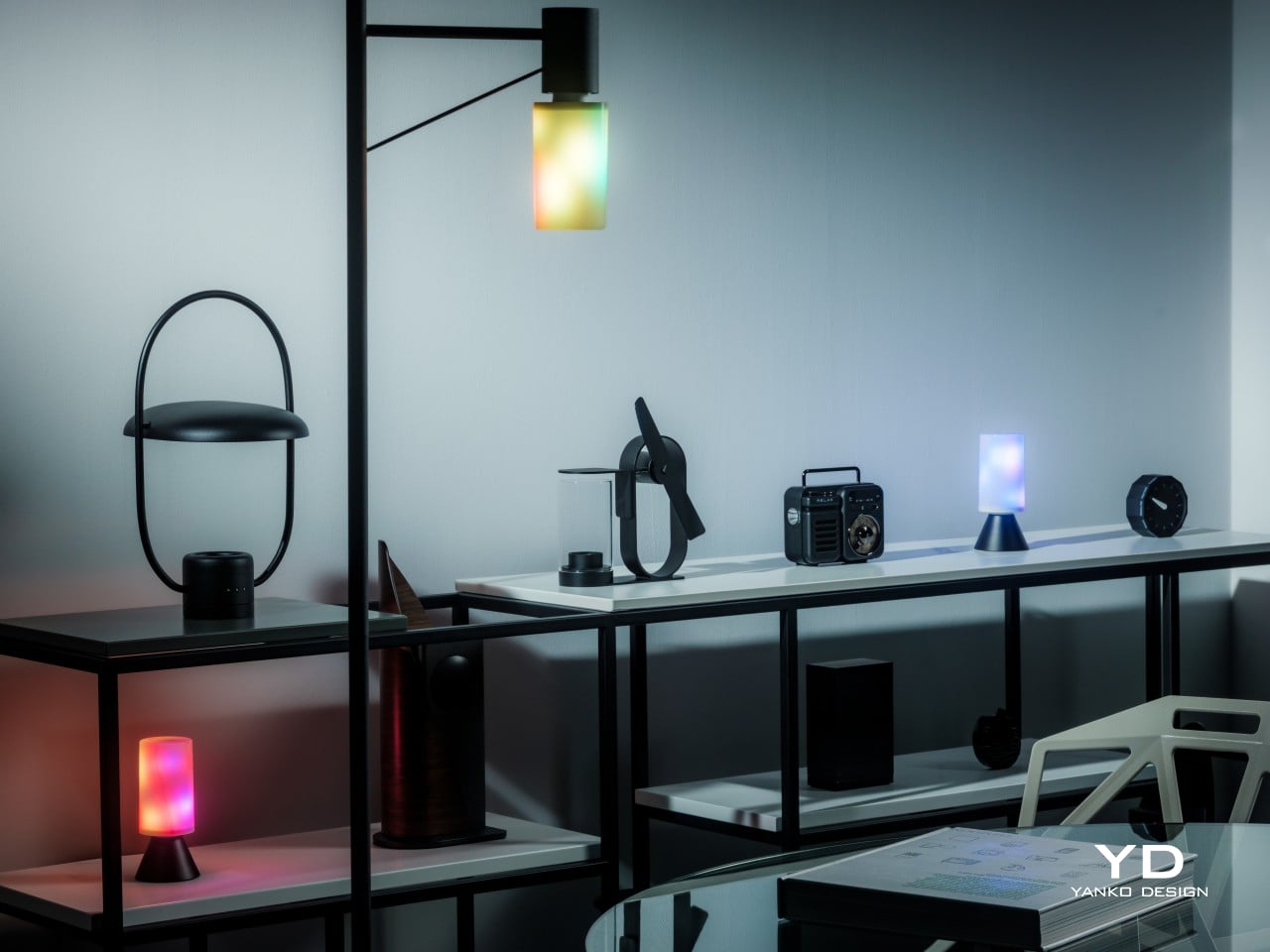
There’s also a dual-color option that layers two hues together for extra depth, plus a full palette of 16 million colors and more than 120 preset scenes for whenever you want something other than fire. Switch over to white light, and the range runs from an ember-warm 1000K up to a crisp 6500K, so the same bulb that plays campfire at night can light a workspace by day.
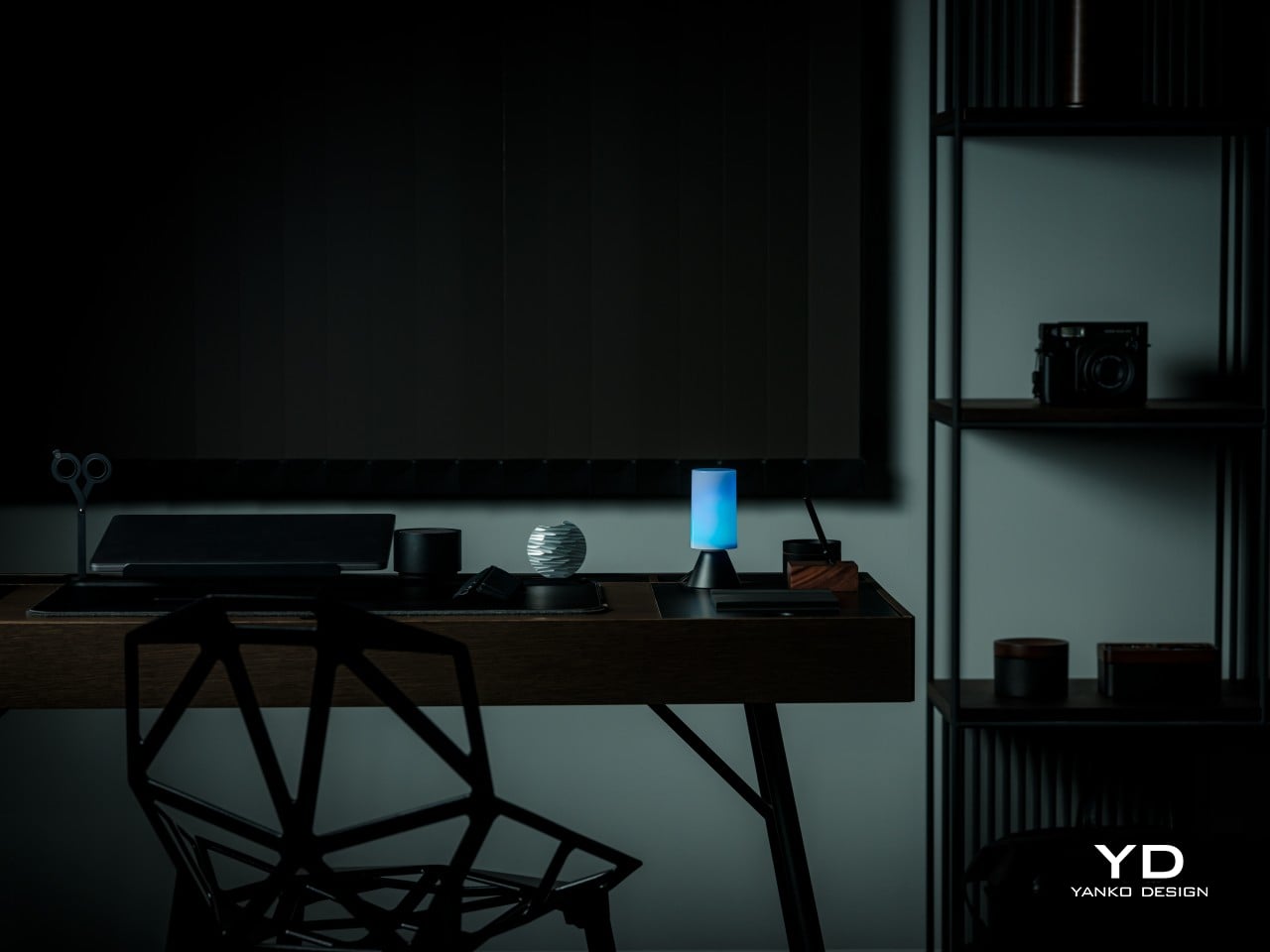
Off, the bulb itself stays quiet about all this. Its T19 shape is slim and cylindrical, finished in a neutral polycarbonate and aluminum body that slips into an open sconce, a lantern, or a clear-glass pendant without fighting the fixture’s own design. That restraint matters because the effect depends on the bulb being seen, and a busy-looking bulb would only compete with the light show it’s about to put on.
Ergonomics
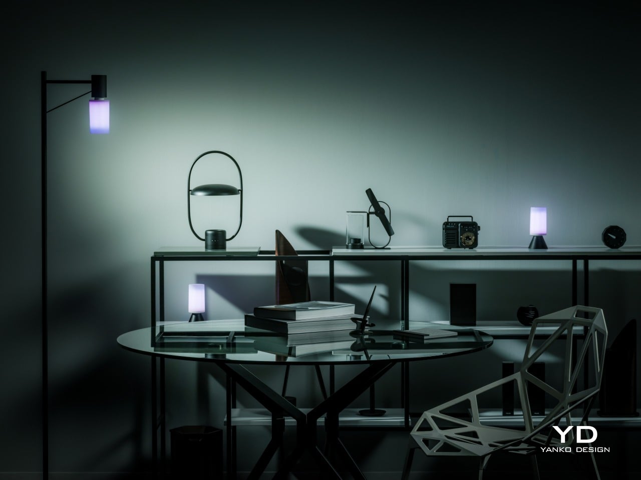
Getting one of these into a fixture takes about as long as changing a regular bulb, because that’s essentially what’s happening. The standard E26 base and compact T19 footprint mean it threads into ceiling fixtures, floor lamps, table lamps, overhead fixtures, and most decorative fixtures without extra hardware, adapters, or an electrician on speed dial. Twist it in, and the fixture is instantly running a completely different kind of light.
One detail solves a problem most flame bulbs never bother with: orientation. Because the flicker effect only reads correctly right side up, the bulb includes an automatic upright sensor that keeps the animation oriented no matter how the socket sits, whether that’s straight up in a table lamp or upside-down in a pendant lamp. It’s a small piece of engineering that removes the guesswork from installation entirely.
Performance
Strip away the theatrics, and this is still a genuinely bright bulb. At a maximum of 850 lumens, it puts out noticeably more usable light than typical flame-effect bulbs, which tend to trade brightness for atmosphere. Drawing only 8W to get there, it’s efficient enough to leave running in a main lamp for actual daily use, not just switched on for a few atmospheric minutes each evening.
The reason the flame animation looks fluid instead of choppy comes down to hardware most people never think about. Inside the bulb sit 160 individual LEDs arranged across 50 controllable zones, giving the light enough resolution to move in smooth gradients rather than snapping between colors. That density is really the engine behind every effect the bulb runs, flame or otherwise.
White light gets equal attention. The temperature range spans 1000K to 6500K, covering everything from a warm, almost candlelit glow to a cooler tone suited for reading or focused work. A Color Rendering Index of 80 keeps colors looking natural rather than washed out, and a built-in night light mode handles the moments when all a room needs is a soft, low-key glow.
Controlling all of it happens through the AiDot app, which pairs over Wi-Fi and Bluetooth and connects to Matter-based ecosystems including Apple Home, Alexa, Google Home, and SmartThings. Group control lets up to 16 bulbs sync together, scheduling handles timing automatically, and Music Sync ties the light show to whatever’s playing, perfect for setting the mood at parties.
Sustainability
Build quality shows up in the materials Linkind picked for the housing. Polycarbonate handles knocks and everyday wear better than the brittle plastics found in cheaper decorative bulbs, while the aluminum components help pull heat away from the LED array. That heat management matters more than it sounds, since LEDs that run cooler tend to hold onto their brightness and color accuracy much longer.
That durability carries outdoors too. The bulb is UV-resistant, meaning a porch lantern or garden fixture can keep it installed through full seasons of sun exposure without the diffuser yellowing or growing brittle the way lower-grade plastics eventually do. It’s built to become a permanent fixture upgrade rather than something that gets swapped out once the weather turns or a holiday ends.
There’s also the quieter advantage of running on LED technology in the first place. Older flame-effect novelty bulbs typically rely on incandescent or halogen sources that run hot and burn out fast. Pulling a maximum of just 8W keeps this bulb running cool by comparison, which extends the working life of both the LEDs and the polycarbonate shell surrounding them.
Value
Buying a decorative flame bulb and a functional smart bulb separately usually means two purchases for two different fixtures. At $39.99, this one collapses both into a single socket, and the 850-lumen output is strong enough to actually light a room rather than just accent it. That consolidation alone makes a solid case for the price before any of the effects or app features even factor in.
Most flame-style lighting gets bought for October and boxed up by November. This one earns its socket year-round instead. Halloween and fall evenings get the flame modes, the holidays get the wider color range, everyday nights get the warm white glow, and summer entertaining gets a bulb that’s just as comfortable strung up outside as it is glowing on a nightstand.
Add more than one and the value compounds further, since group control links up to 16 bulbs into a single synchronized display across a porch, hallway, or living room. That’s a level of coordinated lighting usually reserved for pricier installation-grade systems, delivered here through a bulb that screws into a socket you already own, with nothing extra to install or wire.
Factor in the smart home compatibility, the effects library, and the option to run the bulb as either an accent or a primary light source, and the overall package holds up well against similarly priced bulbs that typically ask you to pick one function or the other. Few competitors bundle brightness, animation, and full ecosystem support into a single screw-in bulb this convincingly.
Verdict
What makes the Linkind Smart Light Stick worth the attention is how little it asks you to compromise. It’s bright enough for everyday use, animated enough to change the mood of a room in seconds, tough enough to live outside, and simple enough to install in the time it takes to unscrew an old bulb. Those four things rarely show up together in one piece of lighting.
It earns its place most in fixtures where the bulb gets to be seen: open lanterns, glass pendants, and porch posts where that flicker becomes part of the room’s personality rather than something hidden behind a shade. Anyone hoping to give an old fixture new character without buying a new fixture entirely will find this bulb makes a genuinely persuasive case for itself.
Japanese kitchen tools have a way of reframing what you thought was a small decision. The bowl you use, the grater you reach for, the pot you carry to the table — each one changes the meal in ways disproportionate to the effort required. Instant ramen, for all its reputation as a shortcut, is genuinely good food. The gap between a cup of noodles and a restaurant bowl is mostly a matter of tools and intention.
The five tools collected here were all designed with a Japanese precision that prioritizes function as the foundation of form. A few come from independent studios, one is from Nendo — arguably Japan’s most internationally recognized design practice — and each earns its place by doing something specific better than the generic alternative. None of them require technique to use. They only ask that you put the right object in the right role.
1. Anaori Kakugama
The Kakugama is made from carbon graphite—the same material used in semiconductor and aerospace manufacturing—which puts it in a fundamentally different category from cast iron or stainless steel. Carbon graphite conducts heat with an evenness that metal cookware struggles to match: no hot spots, no scorching, just a consistent thermal surface from edge to edge. Anaori designed it to move from stovetop to table intact, meaning the pot that built your broth becomes the vessel you eat from.
For ramen specifically, heat control is the variable that separates a clear, layered broth from something muddied and flat. A pot that holds temperature steadily — warming gently rather than swinging between extremes — gives you more precision without demanding more attention. The Kakugama’s graphite body also doesn’t react with acidic or alkaline ingredients, so a miso base or vinegar-spiked tare arrives in the bowl tasting exactly as intended, not filtered through the pot itself.
What we like
Carbon graphite surface ensures even heat distribution without hot spots, giving you real control over broth temperature throughout the cook
Stovetop-to-table design removes the gap between cooking vessel and serving vessel entirely
What we dislike
Premium price positions it well outside most home kitchen budgets
Carbon graphite is more fragile than cast iron and won’t survive a drop onto a hard floor
2. Impact Spice Mill
Most spice mills look the same and work the same way. The Impact Spice Mill is neither. Where a standard grinder asks you to twist, this one operates through an impact mechanism — the physical act of milling becomes part of the experience rather than something you do mechanically without thinking. Built with material quality that earns a counter presence rather than a drawer, it makes the act of seasoning feel like a deliberate choice and not an afterthought.
For a ramen bowl, freshly ground spice is a finishing tool, not a background note. A pinch of togarashi ground tableside, or whole sesame cracked directly over the broth, lifts the bowl from assembled to considered. The Impact Spice Mill fits that moment naturally — small enough to set beside the bowl without competing with it, and tactile in a way that suits the ritual of building something worth eating slowly.
Impact mechanism offers a more engaging, tactile experience than a standard twist-grind mill
Compact enough to serve tableside without disrupting the bowl’s visual presentation
What we dislike
The percussion mechanism takes an adjustment period for those accustomed to traditional grinders
3. Tabletop Teppanyaki Kit
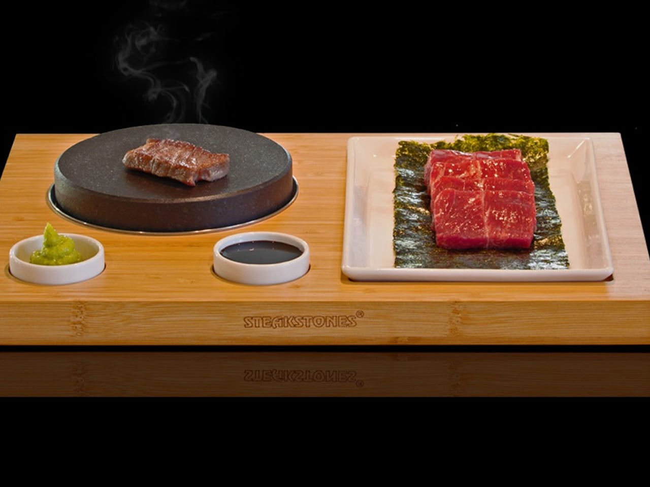
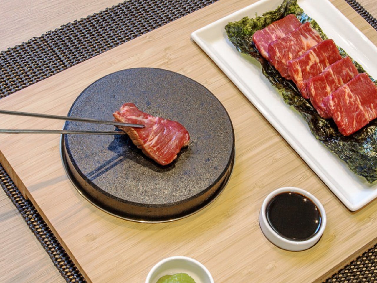
The tabletop teppanyaki kit does something that standalone appliances rarely manage — it turns the preparation of food into part of eating it. Designed for home use but built around the same principle as restaurant teppanyaki, it brings a cooking surface to the table. The food that goes into the bowl is finished in front of you rather than behind a closed kitchen door. The ritual matters as much as the result, and Japanese design has always understood that.
For a ramen setup, the kit earns its place as the tool for chashu. Pork belly seared at the right temperature — with visible caramelization on the fat cap — is one of the clearest signals that a bowl is worth eating slowly. A tabletop surface lets you sear slices to order, finishing them moments before they hit the broth, preserving both the texture of the crust and the temperature of the meat in a way that pre-plating never does.
What we like
Brings the cooking surface to the table, making preparation a visible and deliberate part of the meal
Ideal for finishing ramen toppings like chashu tableside, preserving texture and temperature simultaneously
What we dislike
Requires table space that a minimalist kitchen setup may not easily accommodate
Cleanup adds a step that a straightforward one-pot approach avoids entirely
4. Plate Grater
The Plate Grater solves a problem most kitchen tools don’t acknowledge: the transfer step. Grate something into a bowl, move it to a plate, and somewhere in that process you lose both texture and presentation. This tool removes the middle step entirely. The grater surface is the serving surface — grate your daikon, ginger, or garlic directly onto the plate, and the result arrives at the bowl without the texture-destroying detour of a second vessel.
In a ramen context, freshly grated daikon is the detail that signals care. The fine, airy texture of daikon grated at the moment of serving — before moisture has been pressed out by sitting in a bowl — is visually and texturally distinct from the pre-grated version. The Plate Grater makes that easy enough to do every time rather than only when you’re trying to impress someone, which is the point. The best tools remove the friction between intention and execution.
Eliminates the transfer step between grating and serving, preserving texture at the exact moment of plating
Dual function reduces the number of tools needed on the counter without sacrificing quality
What we dislike
A specific tool, not a versatile one — its value is limited to ingredients that benefit from fresh grating
Size constrains how much you can grate at once, making it less practical for larger servings
5. Nendo Intertwining Chopsticks
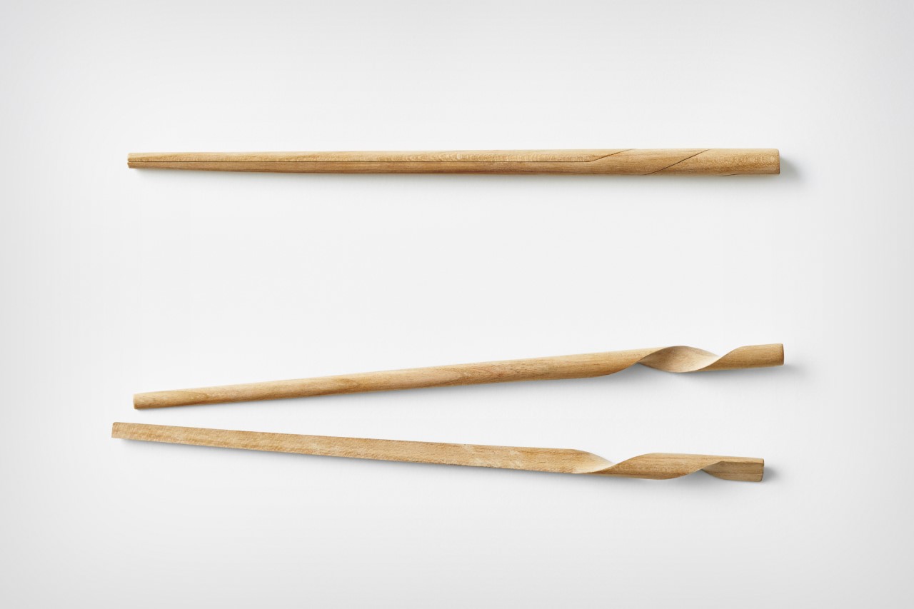
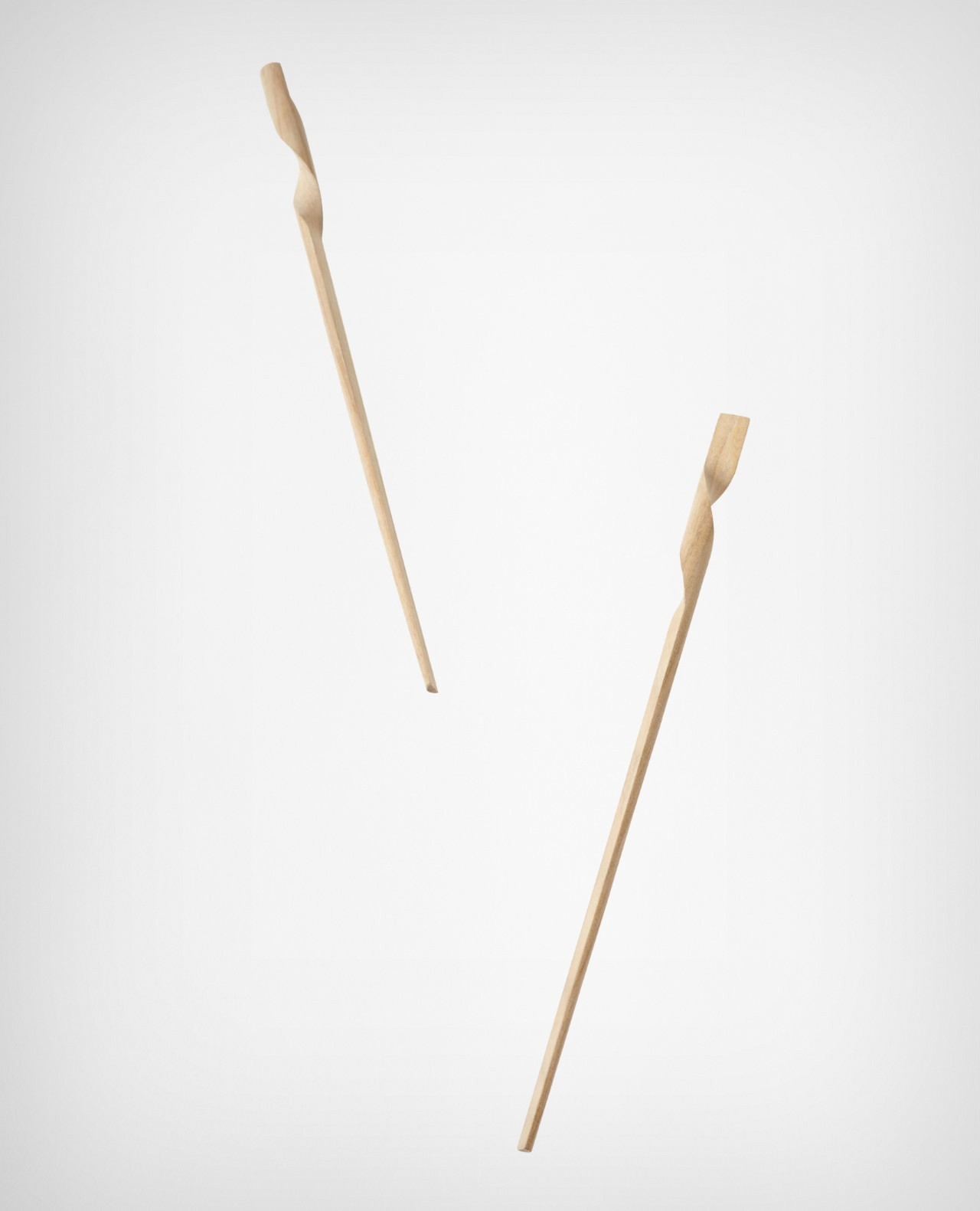
Nendo is the Tokyo design studio that has, over two decades, made a consistent argument that the most overlooked objects in daily life are worth redesigning most carefully. Their chopsticks apply that logic to one of the most common utensils in Japanese cooking. Rather than treating a pair of chopsticks as two identical sticks, Nendo redesigned them to intertwine into each other at rest — turning two separate objects into a singular, cohesive form the moment you set them down.
The change is purely formal — the function of the chopsticks themselves is unchanged. What shifts is how they behave as objects between uses, and that shift has a disproportionate effect on how the table looks while you eat. A ramen bowl is already visually composed — the placement of toppings, the rim, the broth catching light. Chopsticks that form a clean, considered shape when rested beside the bowl complete that composition rather than interrupting it.
What we like
The interlocking resting form turns a utilitarian object into a considered design detail with no added effort
No functional compromise — the redesign affects only how the chopsticks behave when not in use
What we dislike
Form-forward by design — those looking for material or grip improvements over standard chopsticks won’t find them here
The interlocking geometry may not translate equally well across all hand sizes or grip styles
The Meal Is the Design
What connects these five tools isn’t price or origin — it’s intention. Each one was designed by people who looked at a common kitchen problem and chose not to accept the existing answer. That thinking produces objects that change how cooking feels, not just how food looks. A bowl of ramen built with these tools tastes the same as one made without them. The difference is in how much you meant it.
Japanese design has always worked with the premise that everyday objects deserve the same rigor as landmark architecture — that the feel of a grater or the way chopsticks rest on a table are problems worth solving properly. These five tools carry that premise into the kitchen in ways that are concrete and usable. Start with one. The bowl you make next week will not look like the bowl you made last week.
Every idea deserves somewhere to go, and for a lot of 3D printing hobbyists, that place has been missing. ELEGOO wants to change that with ELEGOO DAY 2026, launching September 10, its annual celebration built around bringing creators together on Nexprint. This year folds in a creator fund, a design contest, new model generators, and a sale, all pointing toward one goal: getting more people to create, share, and be part of a growing community.
Most of that action happens on Nexprint, ELEGOO’s open-source 3D model platform, built on the belief that creation should be open to anyone with an idea. Think of it as the hub tying everything together: models get uploaded, tools get discovered, and creators get a real reason to keep contributing. That shift is slowly turning ELEGOO from a printer maker into a community built around making.
The centerpiece is the new $1,000,000 Creator Fund, ELEGOO’s way of recognizing and rewarding people for sharing 3D models on Nexprint, not just paying for output but investing in the community itself. Rewards start with your very first submission, no waiting for likes or rankings to climb first. Individual models can earn up to $100, and stacking incentives push that ceiling to $300 per model.
There’s more structure built in too. Extra rewards unlock at 3, 5, 10, 20, and 50 submissions, so consistency pays off as much as any single hit model. Monthly rankings hand exclusive prizes to the top five creators, including actual ELEGOO printers, while a new bonus-card mechanism can push individual payouts even higher. It feels less like a marketing gimmick and more like a system built to grow alongside its creators.
From September 10 to October 30, ELEGOO runs the MakeItReal contest on Nexprint, and the premise couldn’t be simpler: take a flat idea, in whatever form it takes, and give it dimension, no design background required. There’s no theme to chase, just that shift from flat to physical. Winning entries will be picked and announced on November 20, each earning up to $300 in ELEGOO coupons for the trouble.
The idea behind it is almost sentimental for a hardware company, echoing ELEGOO’s belief that 3D printing works best as a creative outlet, not a manufacturing shortcut. A photo on your phone or a doodle in a notebook can end up as something you actually hold, not just imagine. Creators don’t need advanced modeling skills to compete, either. Nexprint’s upcoming Text and Image to 3D Generator lets anyone shape a contest entry straight from a photo or a written description, no CAD needed.
That generator is one of three new tools ELEGOO just added to Nexprint, alongside a Vase Generator and a Nameplate Generator, each built to make creation easier for beginners and veterans alike. All three do the same basic job: they take a drawing, a photo, or a few typed words and turn it into a printable model within minutes. None of it replaces real design skill, but it removes the blank-page problem that stops many from starting.
Put it together, and the loop makes sense. Someone sketches an idea, runs it through a generator, shares the result on Nexprint, enters it into MakeItReal, and picks up Creator Fund rewards along the way. None of those steps demand deep technical skill. This is the connected ecosystem ELEGOO keeps referencing, not a slogan, but an actual sequence anyone can walk through starting today.
All this activity lines up with the ELEGOO DAY Sale, with discounts of up to 54% on selected products, running September 8 through 29 with regional pricing, ELEGOO’s way of putting that ecosystem into more hands. The Saturn 4 Ultra 16K brings high-resolution resin printing for detailed sculptures, jewelry prototypes, and miniatures. The Centauri Carbon 2 Combo handles multicolor prints for home décor and personalized gifts. The Mars 5 Ultra offers a smaller resin option with sharp detail for tight workspaces.
What stands out about ELEGOO DAY 2026 isn’t any single feature; it’s the shape of the whole thing. A hardware company built its business on printers, then quietly built systems for sharing, competing, and earning that turn a machine into a habit. For ELEGOO, that’s what building an ecosystem means: more chances for people to create, connect, and turn ideas into something real.
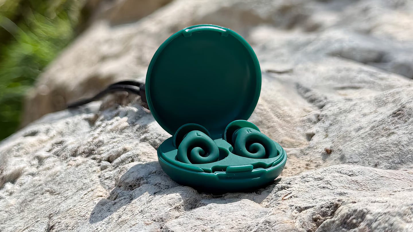
The humble foam earplug has been functionally unchanged since the 1970s: roll it down, jam it in, hope it expands to a seal, and find it somewhere in the sheets by 2 AM. It’s one of the few everyday objects that design culture has genuinely never come for, maybe because the attenuation numbers technically work, or maybe because nobody with enough resources was annoyed enough to fix it. The Ears 360 Silence, a CE-certified soft silicone earplug from Paris, is a structural redesign of that whole idea. Its retractable spiral wraps into the outer ear’s helix rather than anchoring in the canal, locking the plug flat and flush against the head with 24 dB SNR measured to EN 352-2:2020 and a peak of 29.9 dB at the frequency range where snoring and human voices live. The foam never had a chance.
Youcef Abdaoui runs a studio near Paris and started prototyping the Silence in 2024 with a bent wire and a bit of putty, just to test whether a helix-anchoring spiral could hold in an ear. It did, and the dozens of iterations that followed produced a product France voted Product of the Year 2026, consumer-elected rather than jury-awarded, which tells you something about how it performs in actual ears. Ears 360 has since shipped to more than 120,000 customers through their store, 500+ pharmacies, and B2B partners before going international. The Silence is not a prototype. It is certified to EN 352-2:2020, mass-produced, and more than 14,000 units are already in stock. I got to see a pair in person, and the silicone finish reads as serious product, not a health-aisle impulse buy.
The ear is already a spiral. The outer rim of the pinna is anatomically called the helix, a curved ridge that traces a partial revolution around the auricle, and deeper inside, the cochlea completes that geometry: a full spiral chamber, coiled like a snail shell, that converts sound pressure into neural signal. Nature returns to the spiral repeatedly because it distributes force without concentration points, the same structural logic behind a nautilus shell or the tight coil of a fern fiddlehead before it unfurls. The Ears 360 Silence works with that architecture: the spiral holds, not the tip. Instead of pressing into the canal and trusting friction, the retractable spiral wraps laterally into the helix and locks there through geometry, bearing almost no canal pressure, which is the whole reason the plug sits flush rather than protrude. If you know how spiral springs work, think of the way the spiral on the earplug expands to fill your ear canal. Along with friction, this physical detail helps the Silence adapt to pretty much any ear shape or size.
The flatness is perhaps the most impressive detail, setting it apart from every earplug you’ve seen in the past. The loop-style reusable earplugs that have become popular over the past few years make a design virtue of their visibility, with a circular protrusion sitting outside the ear canal as a deliberate aesthetic statement. That works at a concert, but it becomes a pressure point the moment you roll onto your side in bed, which is the situation most people are buying earplugs for in the first place. The Silence’s spiral body measures 18.44 mm by 15.49 mm, slim enough that there’s nothing significant pressing against a pillow. The profile looks almost deceitfully small for what it’s actually doing… and yes, Youcef did mention that the earplugs work perfectly well in concerts too.
One spiral body, two protection levels, switchable in seconds from 24 dB to 29 dB. The standard silicone tips, available in three sizes (9.9 mm, 11.9 mm, and 12.9 mm diameter), deliver 24 dB SNR, enough to take a busy street down to library territory without muffling conversation entirely. The Swim & Work Kit clips on triple-flange tips that push attenuation up to 29 dB, entering genuine worksite and industrial territory. User satisfaction data from Ears 360 puts concert approval at 91% and commute approval at 97%, and an IPX7 waterproof rating keeps the spiral itself pool-ready alongside the kit’s triple-flange seal.
One Silence replaces hundreds of disposable foam earplugs. The earplug’s body is made to last for years, the silicone tips are replaceable instead of throwing the product away, and the packaging is compact by design so every shipment travels as a slim letter, not a parcel. No separate carbon offset claim required. Pricing starts at €24 (roughly $28) for a single unit with carry case and all three tip sizes, with the Silence and Swim & Work Kit bundle at €27, and a Duo Pack at €39 for two. Current colorways are Black and Pink, with Green planned as a future addition. Delivery is November 2026, and no specific warranty period is stated on the product page, though the replaceable-tip architecture makes longevity something you can actually act on rather than just take someone’s word for.
The Apple ecosystem runs deep, but the devices themselves only go so far. The iPhone, Apple Watch, and iPad are remarkable pieces of hardware on their own, and yet a small category of accessories has figured out exactly what each one is missing. Not cases that just protect or cables that just charge, but objects that change the way a device feels, sounds, looks, or works from the moment you pick it up.
These five accessories do exactly that. They come from different corners of the Apple world, covering the watch, the phone, the iPad, and the kind of audio experience Apple never built its own hardware around. Each one earns its place not because it carries a name worth recognizing, but because it solves a specific frustration that was always there waiting to be noticed. Here are the ones worth knowing about right now.
1. NightWatch
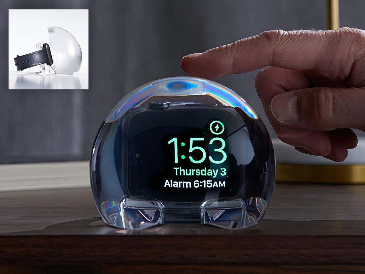
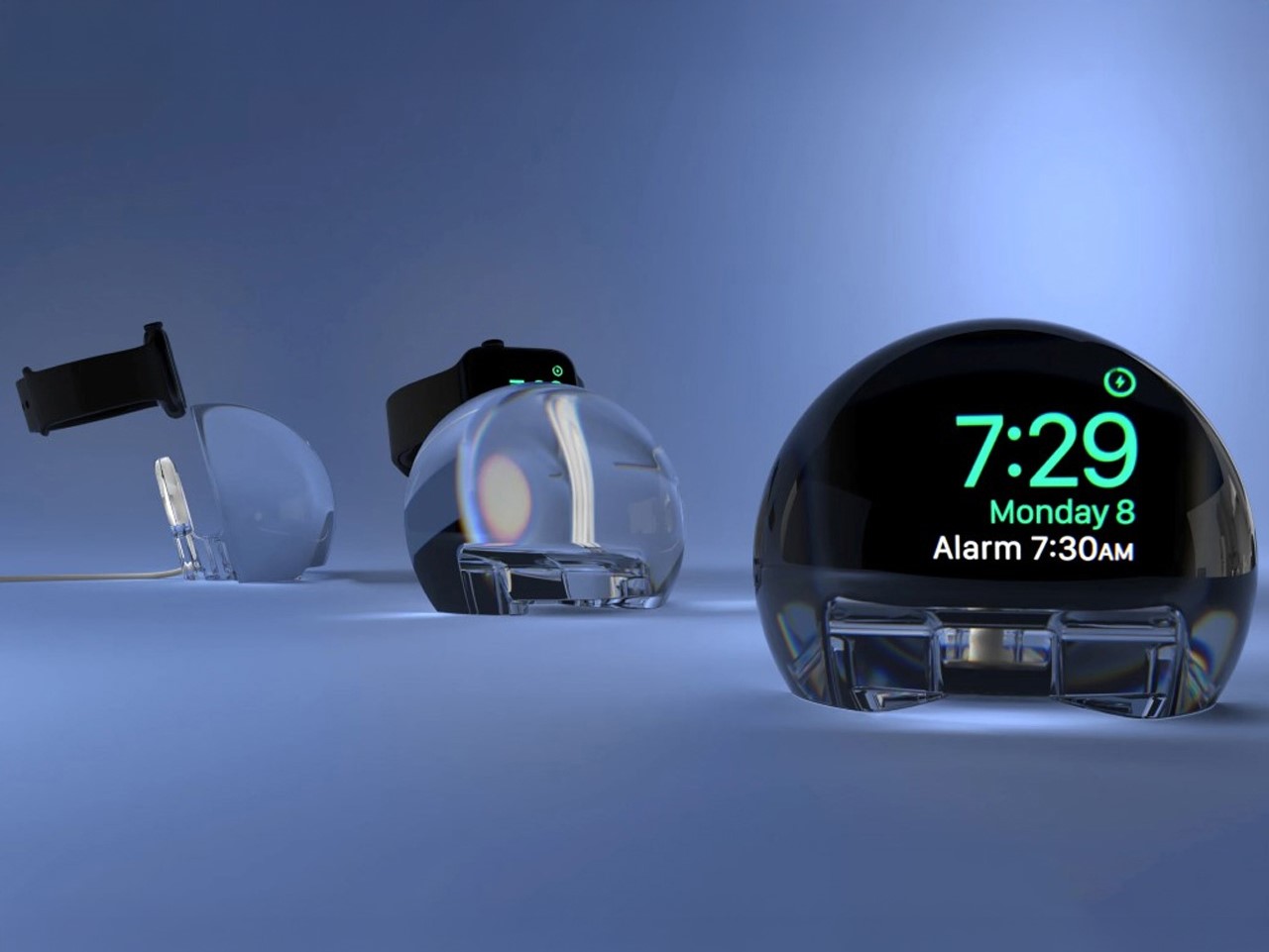
Most Apple Watch docks are functional and forgettable, a plastic puck with a magnetic charger and no ambition beyond getting your watch off your wrist for the night. The NightWatch is not that. It is a clear glass orb, roughly the size of a generous paperweight, that you set your Apple Watch inside at night. The result transforms the watch’s nightstand charging face into a magnified, glowing clock that is genuinely easier to read from across a dark room than the device alone would ever allow.
The dock works by treating the Apple Watch display as a light source and the glass sphere as a lens, drawing the time out of a small wrist-bound rectangle and spreading it into a real visual presence on the nightstand. It also includes a built-in audio amplifier that boosts the sound of your alarm, so quiet mornings stay that way until you actually need them not to be. At $69.99, it is priced more like a considered object than a cable management solution, which is exactly the spirit it deserves to be received in.
What we like
The magnification effect turns the Apple Watch display into a legitimate bedside clock without additional screens, apps, or setup
The built-in audio amplifier addresses the one genuine weakness of relying on Apple Watch nightstand mode as a morning alarm
What we dislike
The orb form factor is visually dominant enough that it will not suit minimalist nightstands where a small footprint matters
At $69.99, it costs more than several competing dock designs that handle charging equally well without the visual statement
2. Rock Paper Pencil 4.0
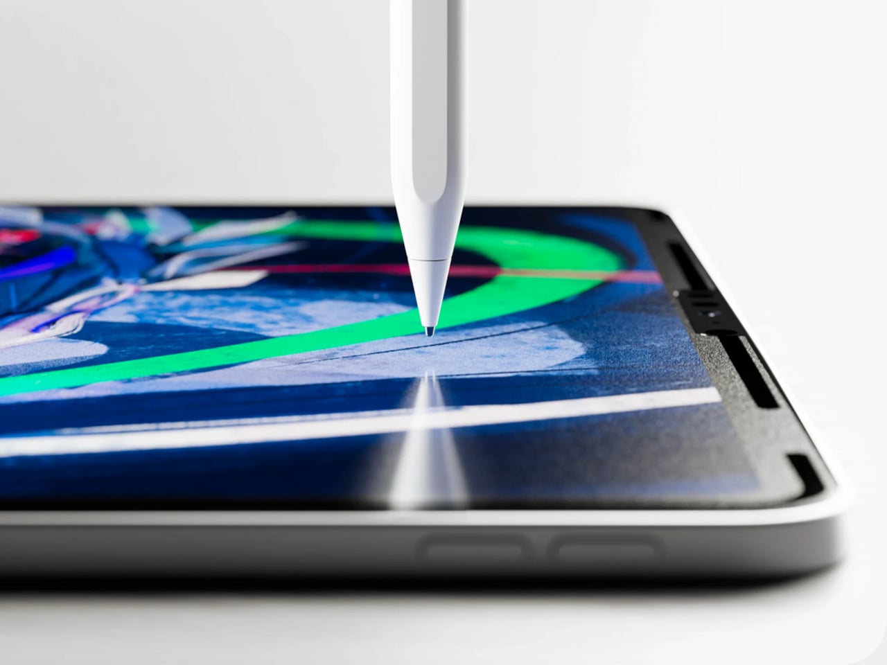
The Apple Pencil is a precision instrument that has never quite figured out how to feel like one. The glass surface beneath it is smooth and frictionless, and while that works fine for certain tasks, illustrators and note-takers spending hours drawing have always wanted something closer to real paper. Astropad’s Rock Paper Pencil addresses that gap directly: a removable, reusable nano-texture screen protector paired with custom Apple Pencil tips, and version 4.0 makes the system meaningfully better than it has ever been.
The upgrade introduces a new graphite POM tip alongside the existing steel ballpoint option, and the difference is immediately legible. The graphite tip mimics the toothy drag of a 2B pencil, a sensation that makes expressive sketching and shading feel deliberate and controlled rather than slippery and approximate. Each kit now ships with four tips in total, two graphite and two ballpoint, alongside a screen cleaning kit that should have been included from the beginning. The protector attaches via NanoCling static cling rather than adhesive, meaning it lifts off without residue and goes back on without a bubble.
What we like
The NanoCling system is genuinely removable and reusable, giving iPad owners a paper-feel surface on demand without permanently altering the display
Having both graphite and ballpoint tips in a single kit covers two distinct working styles without requiring a separate accessory purchase
What we dislike
The graphite tip wears down noticeably faster than the ballpoint option, which will matter to anyone putting in long, intensive drawing sessions regularly
The friction that makes sketching feel natural also makes smooth, fast swiping across the screen feel slightly resistant during ordinary everyday use
3. Battery-Free Amplifying iSpeakers
Every speaker you own asks something of you before it makes a sound. The Bluetooth speaker needs charging, and the charging case needs its own cable. The smart speaker needs a wall outlet, a WiFi password, and a company’s servers to stay online on a random Tuesday. The Battery-Free Amplifying iSpeakers, designed by Ooi Masato of Pit-A-Pat for Shimawa and made in Japan, need none of it. They need your iPhone and the physics of a sound wave moving through precision-machined metal, and that is the complete brief.
The design is straightforward: a Duralumin metal body with a slot for the phone and golden-ratio speaker apertures that channel and amplify sound through acoustic resonance, the same principle that powered phonographs before electricity reached most homes. There is no pairing, no app, no battery level to check. You set your phone in the slot, and your music gets louder and fuller, immediately.
Zero setup and zero charging requirements make it the simplest speaker in any room, with no ritual standing between you and better sound
The precision-machined Duralumin construction means there is nothing to break, replace, update, or charge, ever
What we dislike
At $179, it competes on price with capable Bluetooth speakers that offer far more volume, range, and flexibility for larger spaces or outdoor use
The phone slot is sized for specific handsets, so case thickness and phone dimensions will determine how well it actually cradles your device
4. Nomad Leather Folio
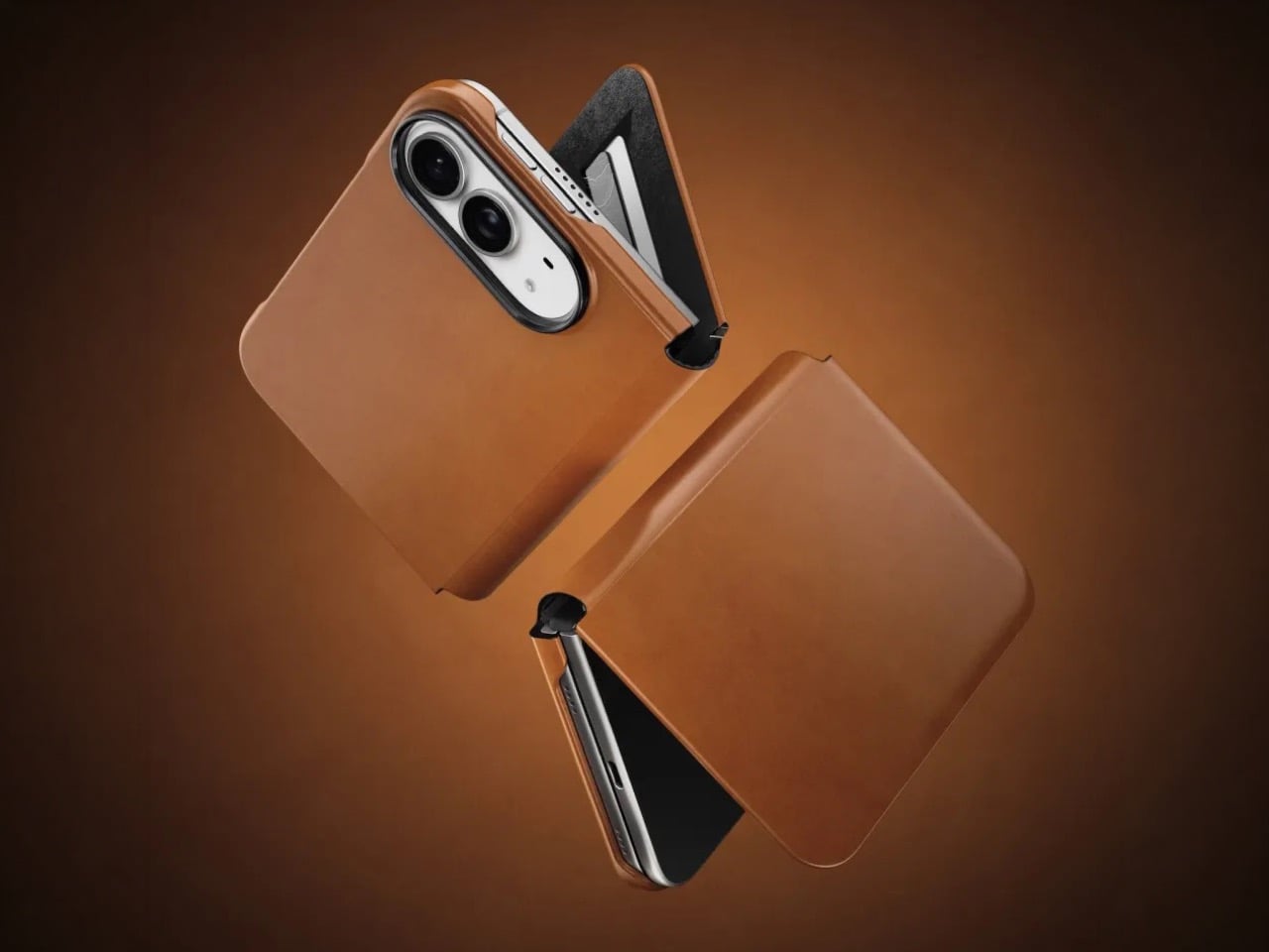
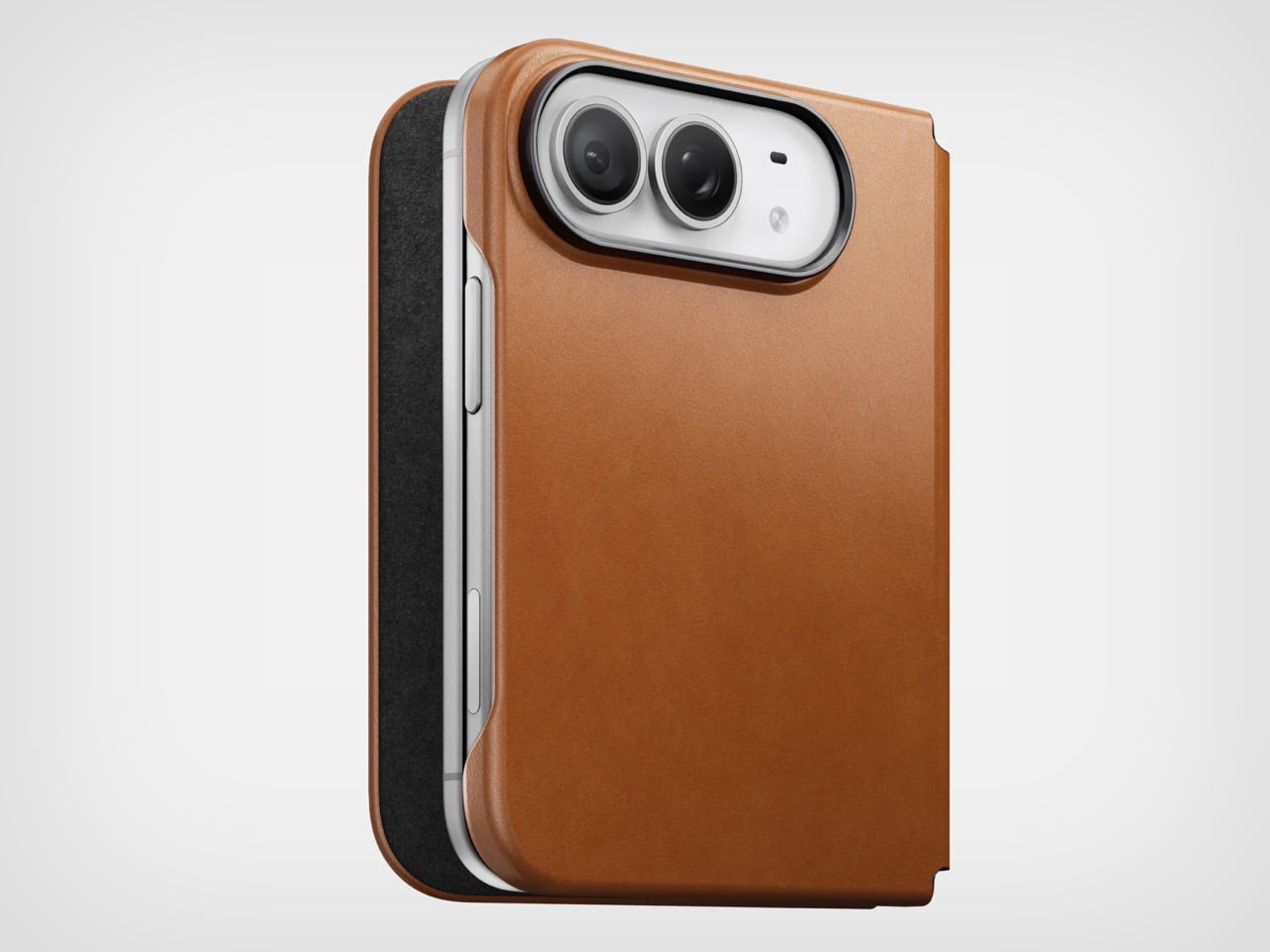
Phone cases tend to fall into two camps: those that protect the device and those that try to say something. Nomad’s Leather Folio attempts something harder: a single object that does both without looking like it is trying to do either. Crafted from Horween leather inside and out, with MagSafe compatibility and RFID blocking built in, it folds over the front of the iPhone Duo and turns what is already an expensive device into a combination that reads less like a phone and more like something a person who still carries a leather notebook would reach for without thinking twice.
Priced at $129, it is not a cheap case, but it is not pretending to be. The leather cover closes over the screen, which is either a feature or a nuisance depending entirely on how you use your phone, though for anyone who already drops it face-down out of habit, the protection is real and the payoff is legitimate. MagSafe integration means the phone charges normally through the case, and the RFID blocking handles the handful of situations where that actually matters. The overall effect is a device that feels deliberately considered in a way most cases never manage to pull off.
What we like
Horween leather develops a patina with use rather than aging badly, which gives the case a genuinely long useful life most materials cannot match
MagSafe compatibility and RFID blocking are both included without any visible hardware bulk or added thickness to the profile
What we dislike
The full front flap adds a step to every screen interaction that will feel like friction until the habit settles, and that adjustment can take longer than expected
At $129, it sits in an awkward price band between affordable everyday cases and truly premium leather goods, which makes the value case harder to land cleanly
5. RePod C1
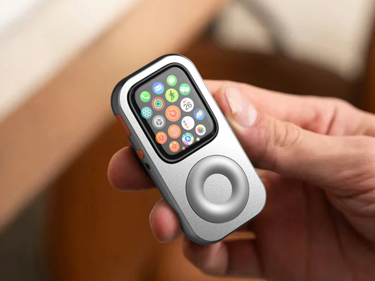
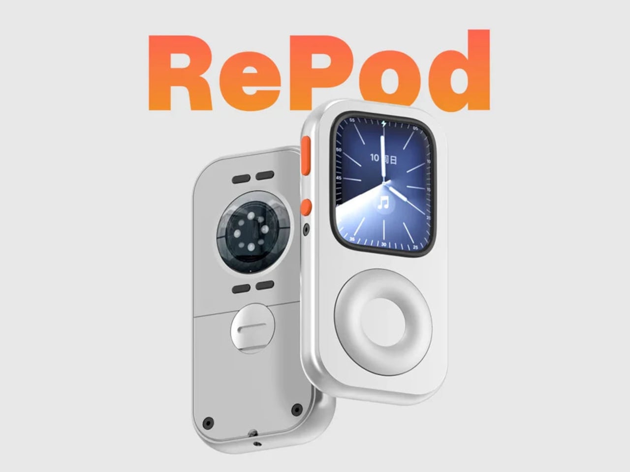
The click wheel was never just an interface. It was a tactile experience that gave early iPods a sense of ceremony that touchscreens have never quite replaced, a physical scroll mechanism that made navigating a playlist feel like it was worth doing slowly. Techpod’s RePod C1 is a $60 Apple Watch case that wraps the watch in an iPod-style shell and brings that wheel back, and what keeps it from being a novelty is one mechanical detail: the click wheel connects directly to the Apple Watch’s Digital Crown, so turning it actually does something real.
The case uses an open-back design that leaves all of the watch’s sensors fully accessible, meaning heart rate monitoring, ECG, and Apple Pay all continue to work normally. Antenna cutouts preserve Wi-Fi, Bluetooth, and cellular connectivity without compromise. The more interesting side effect is what it does to the device’s identity: sliding the watch into a pocket during a run or a commute and navigating with the Crown from inside the shell turns the Apple Watch into something that feels far more like a small, deliberate music player than a wrist-worn notification machine.
What we like
The mechanical connection between the click wheel and the Digital Crown makes the nostalgia functional rather than cosmetic, which is a meaningful distinction
The open-back design keeps every sensor and connectivity feature fully intact, so nothing about the watch’s capabilities changes when the case goes on
What we dislike
Adding any case to the Apple Watch introduces bulk to a device whose appeal partly depends on being thin and unobtrusive on the wrist
The iPod aesthetic lands clearly for one generation and reads as entirely opaque to anyone who came to Apple after the click wheel era ended
The Best Accessories Are the Ones Apple Didn’t Think to Make
Apple’s hardware is precise enough that the accessories worth paying attention to are the ones that noticed a gap the company chose not to fill. The NightWatch saw a dim nightstand clock. Astropad saw a frictionless drawing surface. Ooi Masato saw a speaker that required too much setup before it made a sound. Nomad saw a phone that could carry itself differently. Techpod saw a scroll mechanism nobody had brought back with anything real underneath it.
None of these are essential in the way a charging cable is essential. They are optional in the best sense, the kind of thing that makes a device feel more considered in the hands of whoever chose it. Whether your Apple device is a watch, a phone, or an iPad, something on this list has already figured out what was missing before you had the words for it.
There’s something wonderfully strange about walking up to a framed picture on your wall and telling it what to paint next. Say “paint my dog as a Japanese ink painting,” and the frame generates and displays a new piece. No file transfers, no app navigation, no creative software required. Jitrainno’s Smart Canvas runs on this premise: a voice and text-prompted AI art frame built around an E-Ink Spectra 6 color display, the matte, paper-like panel technology that draws zero power in static mode and reads under ambient light the way a canvas does. It comes in three solid-wood sizes, 7.5, 13.3, and 31.5 inches (named the Echo-7, Echo-13, and Echo-31 respectively), all with built-in batteries and Wi-Fi.
Jitrainno is a Hong Kong-based multidisciplinary team with in-house expertise spanning hardware R&D, E-Ink engineering, AI integration, firmware, and cloud services. They developed a proprietary color rendering layer on top of the Spectra 6 panel, tuned specifically for skin tone accuracy, landscape depth, and smooth gradient transitions. That kind of layered engineering, building custom display algorithms rather than shipping a panel with factory defaults, is what separates a team that genuinely understands display science from one that simply sourced a good component. The project moved from inception and industrial design in June 2025 to a production validation run by May 2026, a fast but not reckless pace for hardware at this scale. Global fulfillment is estimated for November 2026.
E-Ink Spectra 6 is the most capable color e-paper panel currently available to consumer product makers, using six primary pigments: black, white, red, yellow, blue, and green. It achieves up to 200 pixels per inch and draws zero power in static display mode, meaning the canvas can stay on your wall for days between charges. The paper-like surface reflects ambient light rather than projecting it, eliminating the glowing-rectangle problem that has defined every LCD-based digital art frame since the Kodak EasyShare era. Jitrainno’s self-developed rendering and color optimization layer is designed to preserve the subtle details that make an image feel closer to paper art. Based on early reviews, it reads more like a framed print than a screen, which is the bar the whole product needs to clear.
Speaking a prompt aloud and watching a new image materialize on the wall is a genuinely new behavioral ritual, and I think it’s the feature that will hook most people. Users can create images from text or voice prompts, explore different visual styles, and generate variations of their ideas, with AI used as a creative tool within the artwork creation experience. The product page demos a prompt like “a cute green dinosaur in a sunny prehistoric scene, soft watercolor and colored-pencil storybook style,” which apparently renders accurately enough to land on a kid’s wall. The AI side routes through third-party commercial image generation services via official APIs, supporting text-to-image and image-based creative generation within the experience. They also confirm they do not use user content to train their own foundation models, a meaningful distinction in a market where that commitment is far from universal.
AI generation is only one of several ways to populate the canvas. The app supports content from AI-generated art, a free art gallery called Daily Drops, the phone camera, the user’s photo library, and personal collections. Daily Drops streams a rotating selection of curated artwork that users can filter by mood or scene type and push directly to the display. The phone camera connection opens the obvious use case of photographing a physical painting, a landscape, or a face and sending it to the frame instantly. That breadth of sourcing makes the Smart Canvas a capable display platform in its own right, with AI generation sitting as a feature rather than a crutch.
Gallery proportions, tactile materials, and Auto-Rotation are deliberate choices to help the Jitrainno Echo series belong in the room like framed art. From the product photography, the proportions are gallery-standard, the profile slim enough to recede into a wall, and the matte panel surface does the visual work of making it belong. A built-in sensor detects whether the frame is in portrait or landscape and automatically switches the artwork’s aspect ratio, with no manual setting required. Connectivity runs in two modes: full cloud-connected (remote upload, AI creation, gallery sync, multi-user sharing) or completely offline (no account, no internet, direct phone-to-frame transfer). The offline option is a genuine design stance in a category where “smart” has almost universally meant always routing through someone else’s server.
The Jitrainno Echo-7 at 7.5 inches (1024×600, 170x236mm) is the tabletop model. The Jitrainno Echo-13 at 13.3 inches (1200×1600, 316.3×416.3mm) works both on a desktop stand and wall-mounted, making it the most flexible of the three. The Jitrainno Echo-31 at 31.5 inches (2560×1440, 603x903mm) is wall-only, the model that reads as a proper statement artwork rather than a gadget trying to pass itself off as one. All three run on E-Ink Spectra 6 full-color panels in solid wood frames, with built-in batteries and USB-C charging. The Jitrainno Echo-13 retails at $469 and the Jitrainno Echo-31 at $1,499, both covered by a one-year manufacturer’s warranty, with global fulfillment estimated to begin November 2026.
Small apartments don’t fail because of square footage. They fail because the things you need to live in them- a speaker, a vacuum, somewhere to work out- were designed for rooms twice the size. You end up with a robot dock that reads like a utility object in the middle of your living space, a rowing machine eating an entire corner, and three devices on a nightstand doing three things that one should be doing.
The five products here take the opposite approach. Each one earns its footprint or removes it entirely, doing more with less floor space without requiring you to reorganize your life around the purchase. The measure of anything in a small apartment is simple: does it disappear into the room, or does the room start disappearing around it? These five clear that bar in noticeably different ways.
1. Portable CD Cover Player
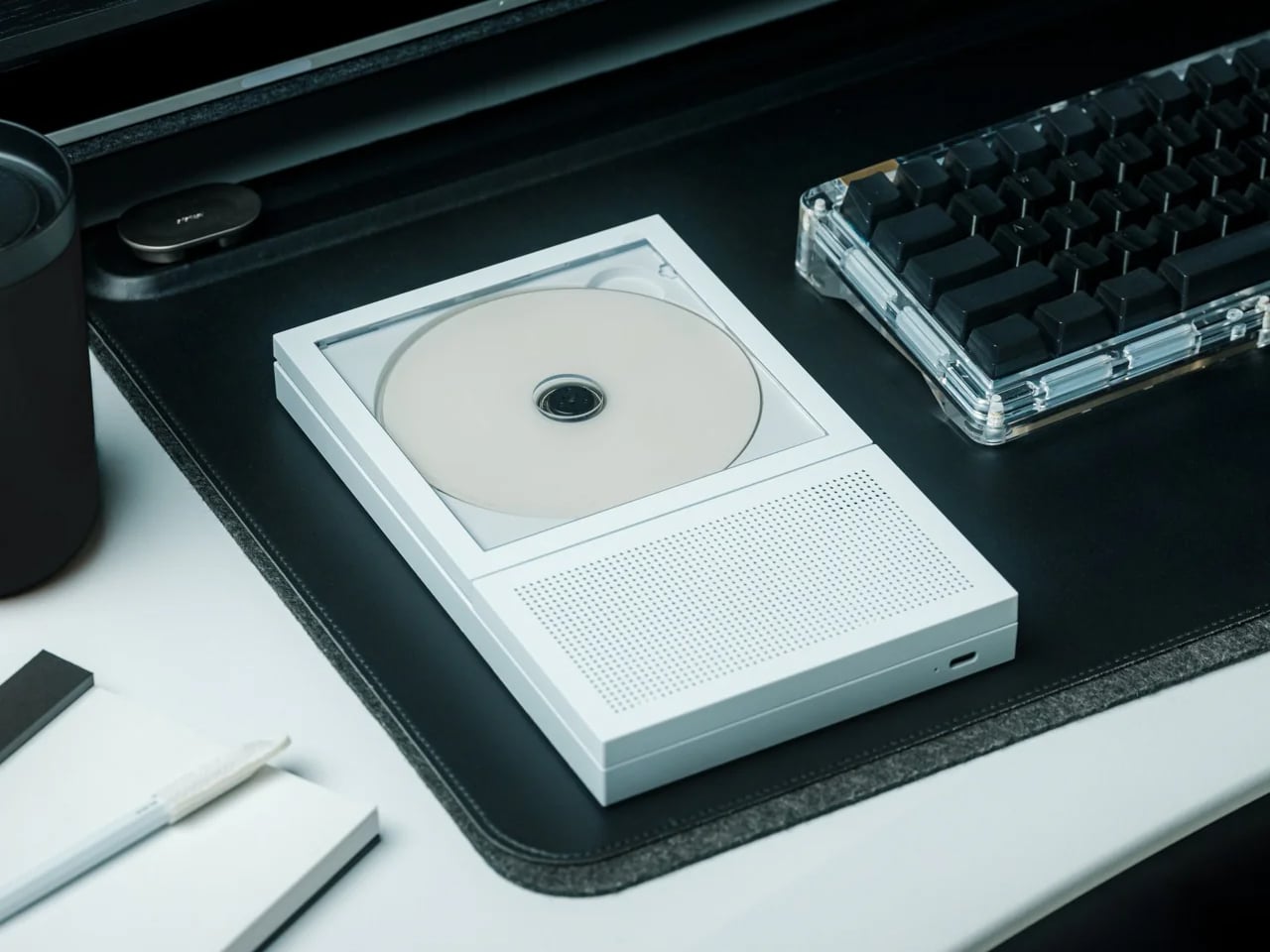
The Portable CD Cover Player costs $199 and takes up no horizontal surface at all. It mounts directly to the wall, leaving every shelf, table, and counter below it available for something else. In a small apartment, that trade earns itself back in freed real estate almost immediately. Physical media also takes you away from algorithm-driven listening, and in a room where every surface and every sound competes for attention, that turns out to feel like a feature rather than a compromise.
What changes in practice is the relationship between music and the room. The Cover Player doesn’t sit on anything. It doesn’t need a corner or a dedicated shelf. It mounts, plays, and disappears into the wall in a way that most audio objects never quite manage. The wall mount bracket is sold separately from the base price, which is worth factoring in, but the outcome is a speaker setup that reads as an intentional design choice rather than something you found space for.
Mounts to the wall entirely, removing itself from every horizontal surface in the room
Encourages deliberate, album-led listening rather than passive background playback
What we dislike
The wall mount bracket is sold separately, adding to the $199 base price
CD-only playback works best for those already invested in physical media
2. Narwal Freo 20
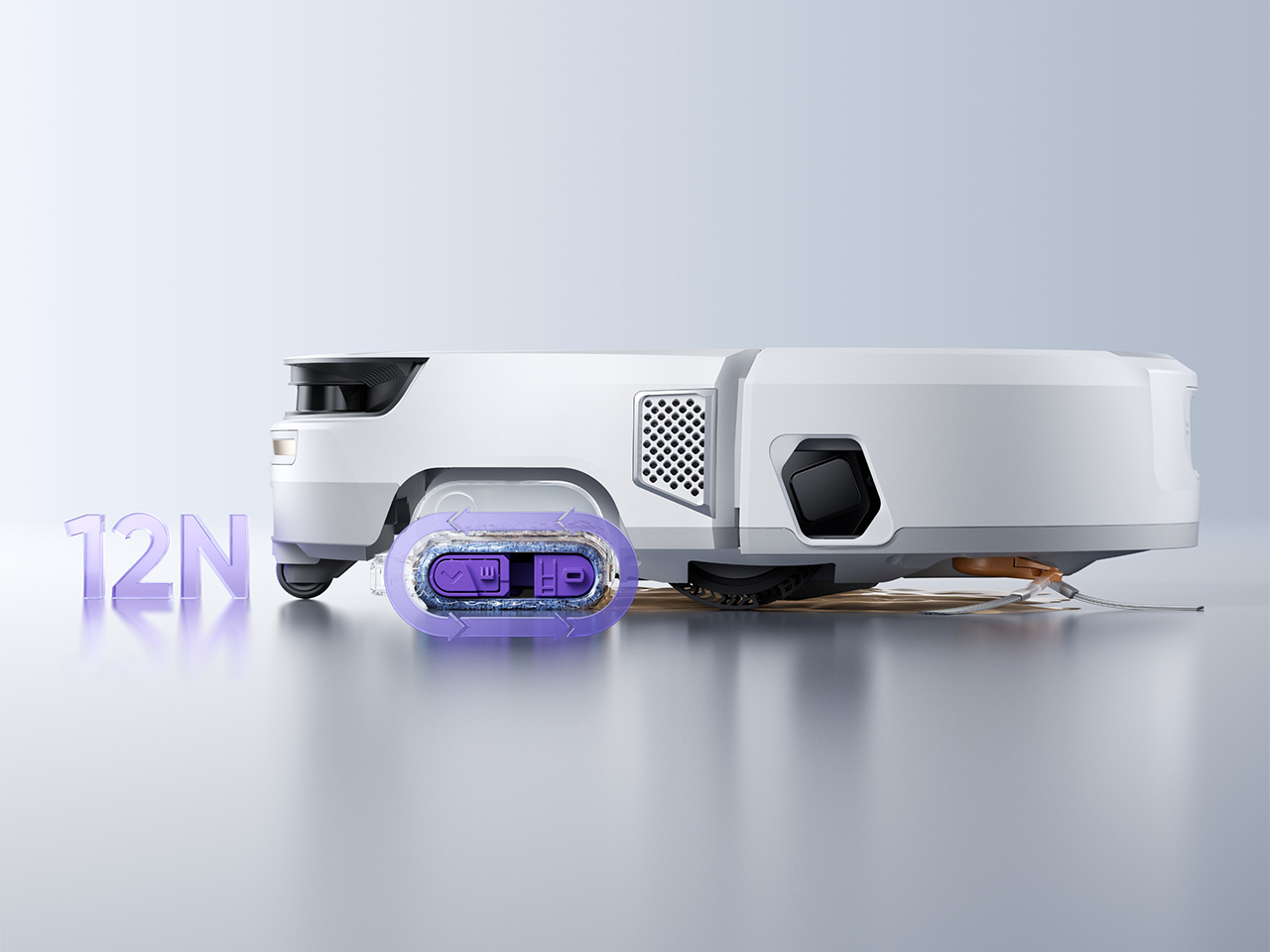
The Freo 20 addresses the two problems robot vacuums have quietly carried since the beginning. The first is the mop, which on most machines drags the first room’s dirt through every room that follows. Narwal’s Track Mop cleans itself mid-run using 16 precision nozzles, 140°F water, and a built-in scraper that routes dirty water into a separate tank, so the floor it finishes on is genuinely cleaner than the one it started. The second problem is the dock, and the woven fabric texture Narwal wraps it in is the first of its kind in the category.
In a small apartment, both issues land harder. A dirty mop re-running on three hundred square feet means the whole floor carries whatever it picked up in the first pass. A dock that reads as a utility object means hunting for a corner to store it in, which in a studio is usually a corner you’d rather use. The Freo 20’s 120-day maintenance interval and 31,000Pa suction make the performance case directly. The dock being genuinely livable alongside rather than tolerated is the detail that separates it from the rest of the category at any price.
The Track Mop self-cleans in real time with 140°F hot water and a separate dirty water extraction tank
The woven-texture dock is designed to sit beside furniture rather than be hidden behind it
What we dislike
At $1,099.99 MSRP, it represents a significant investment relative to the wider robot vacuum market
Thirty Amazon ratings is a thin review count for a product at this price point
3. Compact Folding Rowing Machine
A rowing machine is one of those fitness purchases that tends to exist in a small apartment as a statement of intent rather than a piece of equipment. It claims a corner, it demands clearance on both sides, and the commitment it asks for from the room is usually larger than the commitment it gets from the person who bought it. The Home Gym Cube Rower changes that equation by folding down to the size of a side table, making it something you can actually live alongside rather than continuously negotiate with.
Folded, it stores flat against a wall or inside a closet without permanently claiming the room. Unfolded, it offers a complete rowing workout without a gym membership, a separate fitness space, or the friction that usually makes skipping a session too easy. For anyone working out of a studio or one-bedroom, the calculation shifts from whether you can fit a rowing machine at all to whether you actually want to use one, which is a significantly more useful question to be spending your energy on.
What we like
Folds to side-table size, removing the spatial penalty that normally keeps rowing machines out of small apartments
Functions as a standalone full-body workout without requiring any additional equipment alongside it
What we dislike
Compact rowing machines typically offer a narrower resistance range than full-size models
Requires cleared floor space when in use, which in a studio may mean rearranging other furniture first
4. Practiko Otis Hanger 3.0
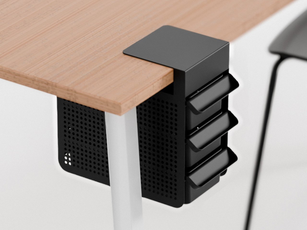
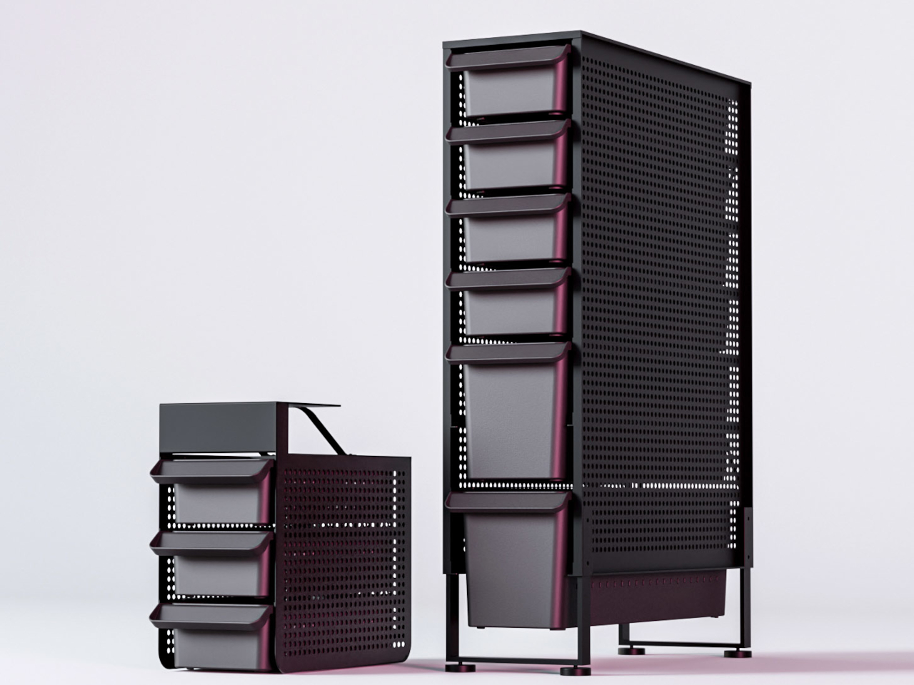
Most desk organizers solve the clutter problem by making clutter more vertical. The Otis Hanger 3.0 takes a different position: it hangs a full drawer beneath the desk surface without a screw, adhesive, or any permanent alteration to the furniture. For renters, which describes most people living in small apartments, that matters. You are not committing to a hardware modification for furniture you don’t own in an apartment you are not permitted to drill into. It clips on, holds things, and comes off clean when you leave.
In practice, it means the desk surface stays clear. Cables, chargers, notebooks, and the collection of small items that colonize any workspace have somewhere to go that stays entirely out of sightlines and video call frames. In a small apartment where the desk often doubles as the dining table, the morning coffee surface, and the only flat working area in the room, keeping the top uncluttered is one of the more useful upgrades you can make without touching a single wall or piece of furniture permanently.
What we like
Attaches to any desk without screws, drills, or permanent changes, making it fully renter-friendly
Under-desk placement keeps stored items out of sightlines and video call backgrounds entirely
What we dislike
Compatibility depends on desk edge overhang depth, which can exclude some desk designs
5. Divoom FlowToo
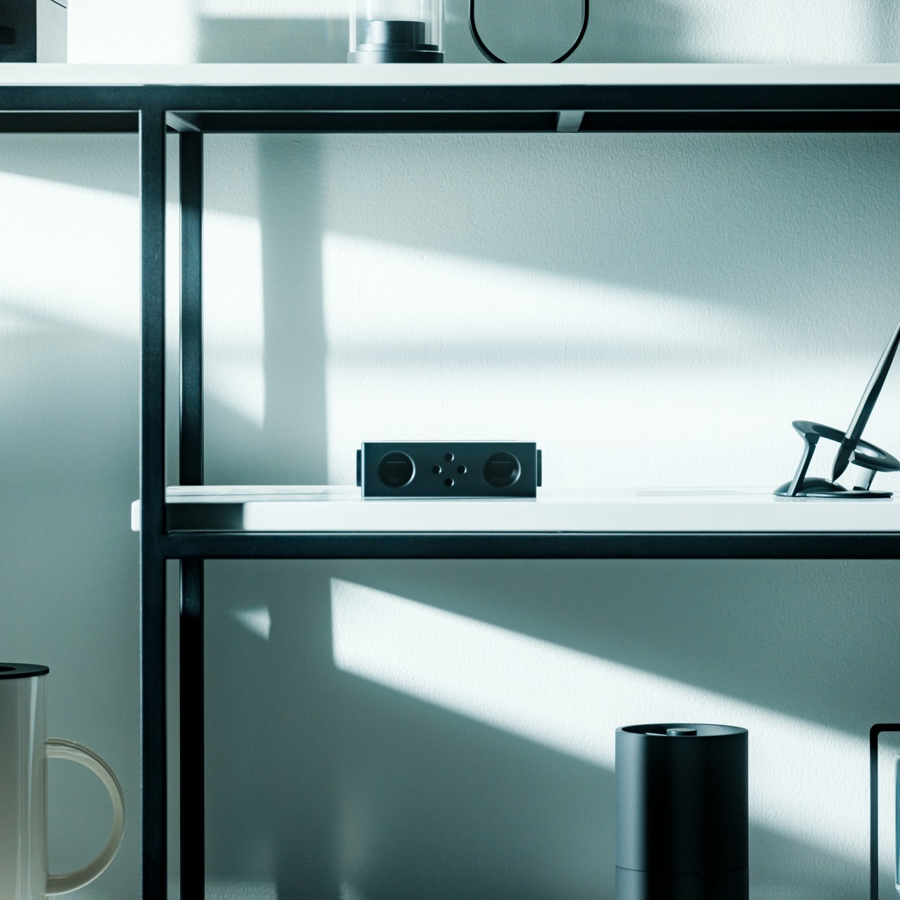
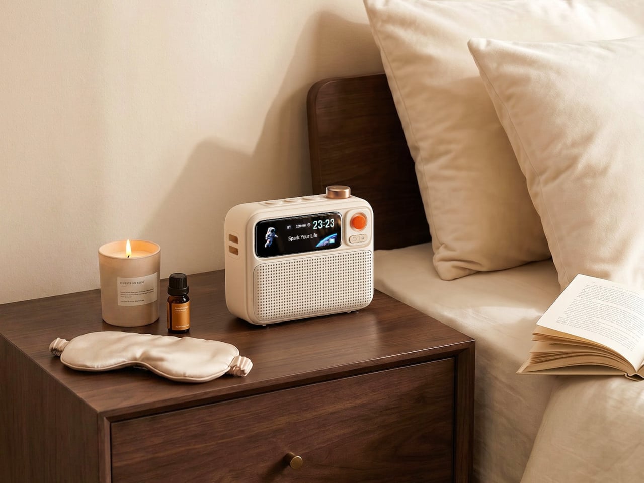
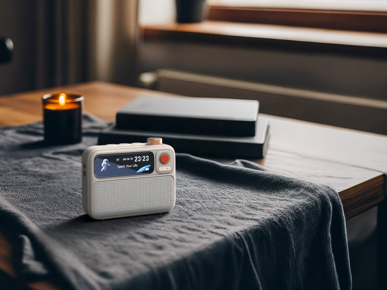
A nightstand in a small apartment runs out of surface faster than almost anywhere else in the room. The usual setup- white noise machine, alarm clock, Bluetooth speaker, phone charger- is four separate objects doing four separate things on a surface that doesn’t comfortably hold two. The Divoom FlowToo consolidates three of those into a single compact body: a 10W Bluetooth speaker with a 45mm full-range driver, 90-plus soothing and white noise sounds, a smart alarm, and a Pomodoro timer, all in one object that draws $99.99 from your wallet and returns significant nightstand real estate in exchange.
The design reads like a retro desk object rather than a tech gadget, which matters in a room where everything left out is also part of how the space looks at eight in the morning. At $99.99, it costs less than most standalone Bluetooth speakers of comparable output while replacing the white noise machine and alarm clock entirely. The Pomodoro timer makes it genuinely useful during working hours too, which gives it a reason to stay out on the desk rather than get stashed in a drawer the moment the alarm goes off.
What we like
Replaces a Bluetooth speaker, white noise machine, and alarm clock with a single object that earns its nightstand space
The retro-inflected design reads as a considered object rather than an appliance in a small room
What we dislike
10W output fills a bedroom well but will not scale to larger open-plan living spaces
Customization of display and routines requires the Divoom app, creating ongoing phone dependency
Small Living Made Big
Outfitting a small apartment well is less about finding products that fit and more about finding products that don’t ask too much. The best ones earn their square footage by solving something real: a dock that belongs in the open, a speaker that stands in for three devices, a rowing machine that stops being an obstacle the moment you fold it up. None of these require you to rearrange your life to accommodate them.
That is what separates the five here from most of what fills a small-space shopping list. They work with the room rather than demanding the room work around them. Whether it’s the wall-mounted CD player freeing every surface below it, or the Narwal dock sitting beside the couch without apology, the common thread is the same: good design in a tight space isn’t about fitting more in. It’s about needing less room to begin with.
Small apartments don’t fail because of square footage. They fail because the things you need to live in them- a speaker, a vacuum, somewhere to work out- were designed for rooms twice the size. You end up with a robot dock that reads like a utility object in the middle of your living space, a rowing machine eating an entire corner, and three devices on a nightstand doing three things that one should be doing.
The five products here take the opposite approach. Each one earns its footprint or removes it entirely, doing more with less floor space without requiring you to reorganize your life around the purchase. The measure of anything in a small apartment is simple: does it disappear into the room, or does the room start disappearing around it? These five clear that bar in noticeably different ways.
1. Portable CD Cover Player
The Portable CD Cover Player costs $199 and takes up no horizontal surface at all. It mounts directly to the wall, leaving every shelf, table, and counter below it available for something else. In a small apartment, that trade earns itself back in freed real estate almost immediately. Physical media also takes you away from algorithm-driven listening, and in a room where every surface and every sound competes for attention, that turns out to feel like a feature rather than a compromise.
What changes in practice is the relationship between music and the room. The Cover Player doesn’t sit on anything. It doesn’t need a corner or a dedicated shelf. It mounts, plays, and disappears into the wall in a way that most audio objects never quite manage. The wall mount bracket is sold separately from the base price, which is worth factoring in, but the outcome is a speaker setup that reads as an intentional design choice rather than something you found space for.
Mounts to the wall entirely, removing itself from every horizontal surface in the room
Encourages deliberate, album-led listening rather than passive background playback
What we dislike
The wall mount bracket is sold separately, adding to the $199 base price
CD-only playback works best for those already invested in physical media
2. Narwal Freo 20
The Freo 20 addresses the two problems robot vacuums have quietly carried since the beginning. The first is the mop, which on most machines drags the first room’s dirt through every room that follows. Narwal’s Track Mop cleans itself mid-run using 16 precision nozzles, 140°F water, and a built-in scraper that routes dirty water into a separate tank, so the floor it finishes on is genuinely cleaner than the one it started. The second problem is the dock, and the woven fabric texture Narwal wraps it in is the first of its kind in the category.
In a small apartment, both issues land harder. A dirty mop re-running on three hundred square feet means the whole floor carries whatever it picked up in the first pass. A dock that reads as a utility object means hunting for a corner to store it in, which in a studio is usually a corner you’d rather use. The Freo 20’s 120-day maintenance interval and 31,000Pa suction make the performance case directly. The dock being genuinely livable alongside rather than tolerated is the detail that separates it from the rest of the category at any price.
The Track Mop self-cleans in real time with 140°F hot water and a separate dirty water extraction tank
The woven-texture dock is designed to sit beside furniture rather than be hidden behind it
What we dislike
At $1,099.99 MSRP, it represents a significant investment relative to the wider robot vacuum market
Thirty Amazon ratings is a thin review count for a product at this price point
3. Compact Folding Rowing Machine
A rowing machine is one of those fitness purchases that tends to exist in a small apartment as a statement of intent rather than a piece of equipment. It claims a corner, it demands clearance on both sides, and the commitment it asks for from the room is usually larger than the commitment it gets from the person who bought it. The Home Gym Cube Rower changes that equation by folding down to the size of a side table, making it something you can actually live alongside rather than continuously negotiate with.
Folded, it stores flat against a wall or inside a closet without permanently claiming the room. Unfolded, it offers a complete rowing workout without a gym membership, a separate fitness space, or the friction that usually makes skipping a session too easy. For anyone working out of a studio or one-bedroom, the calculation shifts from whether you can fit a rowing machine at all to whether you actually want to use one, which is a significantly more useful question to be spending your energy on.
What we like
Folds to side-table size, removing the spatial penalty that normally keeps rowing machines out of small apartments
Functions as a standalone full-body workout without requiring any additional equipment alongside it
What we dislike
Compact rowing machines typically offer a narrower resistance range than full-size models
Requires cleared floor space when in use, which in a studio may mean rearranging other furniture first
4. Practiko Otis Hanger 3.0
Most desk organizers solve the clutter problem by making clutter more vertical. The Otis Hanger 3.0 takes a different position: it hangs a full drawer beneath the desk surface without a screw, adhesive, or any permanent alteration to the furniture. For renters, which describes most people living in small apartments, that matters. You are not committing to a hardware modification for furniture you don’t own in an apartment you are not permitted to drill into. It clips on, holds things, and comes off clean when you leave.
In practice, it means the desk surface stays clear. Cables, chargers, notebooks, and the collection of small items that colonize any workspace have somewhere to go that stays entirely out of sightlines and video call frames. In a small apartment where the desk often doubles as the dining table, the morning coffee surface, and the only flat working area in the room, keeping the top uncluttered is one of the more useful upgrades you can make without touching a single wall or piece of furniture permanently.
What we like
Attaches to any desk without screws, drills, or permanent changes, making it fully renter-friendly
Under-desk placement keeps stored items out of sightlines and video call backgrounds entirely
What we dislike
Compatibility depends on desk edge overhang depth, which can exclude some desk designs
5. Divoom FlowToo
A nightstand in a small apartment runs out of surface faster than almost anywhere else in the room. The usual setup- white noise machine, alarm clock, Bluetooth speaker, phone charger- is four separate objects doing four separate things on a surface that doesn’t comfortably hold two. The Divoom FlowToo consolidates three of those into a single compact body: a 10W Bluetooth speaker with a 45mm full-range driver, 90-plus soothing and white noise sounds, a smart alarm, and a Pomodoro timer, all in one object that draws $99.99 from your wallet and returns significant nightstand real estate in exchange.
The design reads like a retro desk object rather than a tech gadget, which matters in a room where everything left out is also part of how the space looks at eight in the morning. At $99.99, it costs less than most standalone Bluetooth speakers of comparable output while replacing the white noise machine and alarm clock entirely. The Pomodoro timer makes it genuinely useful during working hours too, which gives it a reason to stay out on the desk rather than get stashed in a drawer the moment the alarm goes off.
What we like
Replaces a Bluetooth speaker, white noise machine, and alarm clock with a single object that earns its nightstand space
The retro-inflected design reads as a considered object rather than an appliance in a small room
What we dislike
10W output fills a bedroom well but will not scale to larger open-plan living spaces
Customization of display and routines requires the Divoom app, creating ongoing phone dependency
Small Living Made Big
Outfitting a small apartment well is less about finding products that fit and more about finding products that don’t ask too much. The best ones earn their square footage by solving something real: a dock that belongs in the open, a speaker that stands in for three devices, a rowing machine that stops being an obstacle the moment you fold it up. None of these require you to rearrange your life to accommodate them.
That is what separates the five here from most of what fills a small-space shopping list. They work with the room rather than demanding the room work around them. Whether it’s the wall-mounted CD player freeing every surface below it, or the Narwal dock sitting beside the couch without apology, the common thread is the same: good design in a tight space isn’t about fitting more in. It’s about needing less room to begin with.