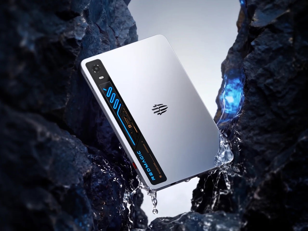
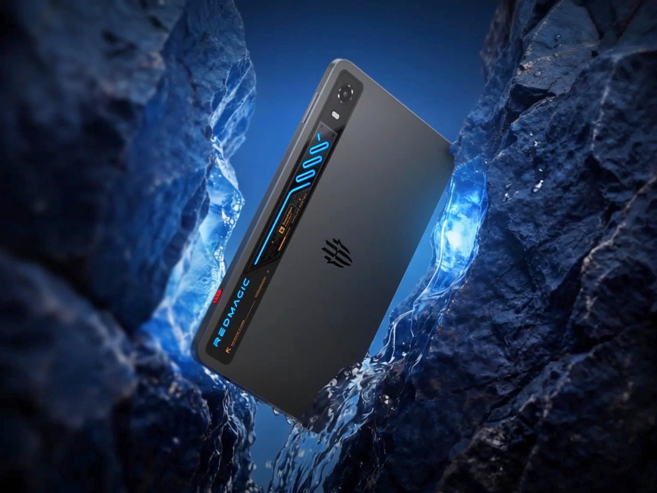
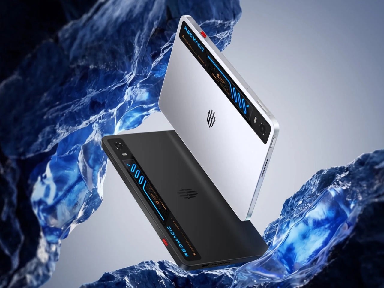
RedMagic built its reputation by shoving desktop grade cooling into devices that had no business needing it, starting with fans strapped onto gaming phones back when that idea still seemed ridiculous. The company’s 11 Pro phone proved a miniaturized liquid cooling loop could fit inside something you carry in a pocket. Now that same engineering obsession has scaled up into the Astra 2, a tablet that treats visible liquid cooling as its main selling point rather than a novelty. Most tablet makers spend their engineering budget on thinner bezels and lighter frames. RedMagic spent its on keeping the thing from overheating under real, sustained gaming load. That choice alone says a lot about who this tablet is actually built for.
The Astra 2 measures 9.06 inches, close enough to an iPad mini that the comparison writes itself, yet it runs hot enough inside to need actual liquid moving through it. RedMagic says the screen refreshes at up to 185Hz and gets bright enough to use comfortably outdoors, numbers most tablets never bother chasing. Battery life gets a boost too, backed by fast charging that promises short waits between long sessions. Pricing in the US starts at $750, climbing higher for more storage and memory. RedMagic already sells this tablet in China under a different name, and a global release is set for August 26.
Designer: RedMagic
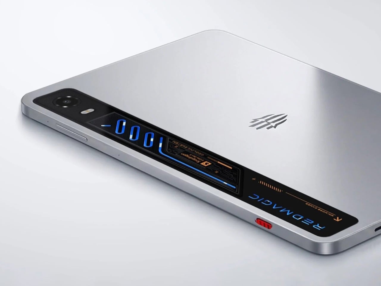
RedMagic runs an actual liquid loop through the chassis, moving heat away from the processor the same way a gaming desktop does, just shrunk down to fit a slab you hold with two hands. A large vapor chamber spreads that heat across a wider surface before it ever gets a chance to build up in one spot. Layered on top is something RedMagic calls Liquid Metal 3.0, a thermal compound that conducts heat far better than the paste most devices settle for. None of this needs to work perfectly to feel like a genuine design statement. Just seeing the concept committed to at this scale is the interesting part.
Powering all that heat generation is Qualcomm’s Snapdragon 8 Elite Gen 5, paired with RedMagic’s own RedCore R4 chip built specifically to keep frame rates steady during long sessions. That combination explains why the cooling system needed to grow up in the first place. A 9.06 inch OLED panel adds its own heat on top, running at up to 185Hz with brightness RedMagic rates at 1,600 nits, figures that would turn heads on a laptop, let alone a tablet. An 8,300mAh battery and 75W fast charging round things out, aimed squarely at people who game for hours rather than minutes.
Apple and Samsung have spent years convincing buyers that tablets should stay quiet, sealed, and forgettable on the inside. RedMagic is betting there’s an audience that wants the opposite, a device that shows its work and treats visible engineering as a feature rather than a flaw. Whether that logic holds up once the Astra 2 ships in August remains the real test, but the idea itself is hard to ignore.
There’s something about the start of a new semester that makes you want to be more organized than you actually are. The folders, the planners, the fresh notebooks- most of it is forgotten by October. The stationery that survives a school year isn’t the cheapest or the most colorful. It’s the piece you reach for every morning without thinking, the one that fits your hand and your routine like it was built for both.
This list leans Japanese, not because it’s a trend, but because Japanese stationery culture takes the design of everyday objects more seriously than anywhere else. Every piece here comes from Japan or was designed in conversation with that same philosophy: that a notebook is not just paper, that a pen is not just ink, and that the objects you carry to class every day deserve more thought than they usually get.
1. Inseparable Notebook Pen
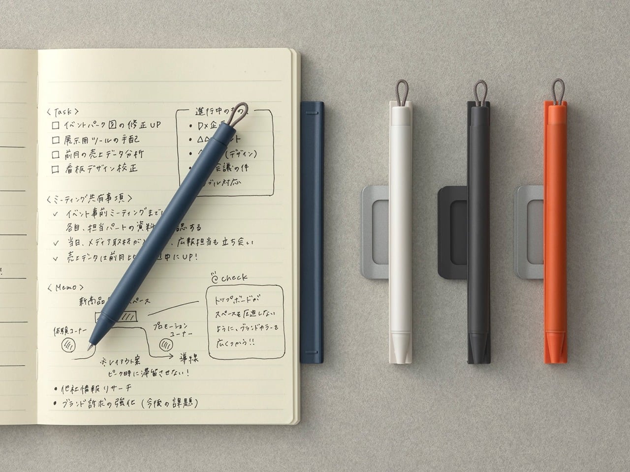
The most common desk frustration is not the work itself. It’s the pen that isn’t where it should be. The Inseparable Notebook and Pen solves this with the kind of restraint that good design always defaults to. The pen lives with the notebook, held in place by a mechanism that doesn’t feel like an afterthought. It’s a single object now, not two things that keep losing each other. Pick it up, and both are already in hand.
What makes this relevant for back to school isn’t novelty. It’s the reduction of one small daily friction, the kind that compounds quietly across an entire semester until you realize you’ve wasted ten minutes a week chasing a pen that should have been right there. The notebook is designed with the same intention: clean pages, a form factor that sits flat on a desk without fighting you, and a cover that holds its shape through a bag that sees daily use.
The pen-and-notebook pairing solves a real problem without adding hardware or bulk
Genuinely useful as a bag or desk companion that earns its place through the whole year
What we dislike
Commits you to one pen choice, which won’t suit writers with strong preferences about their writing instrument
Better suited as a secondary notebook than a primary daily journal
2. Classiky Chestnut Postcard Case
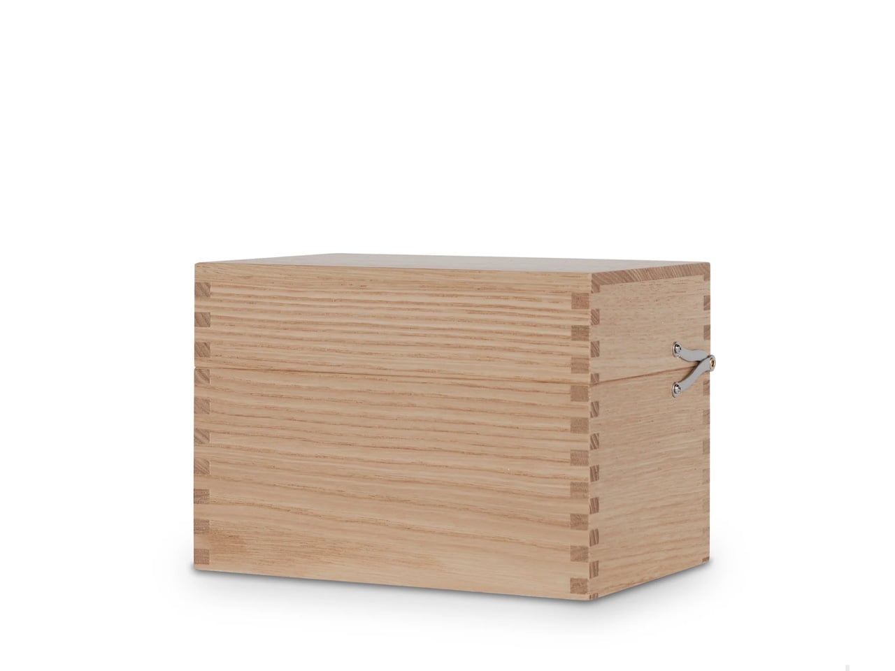
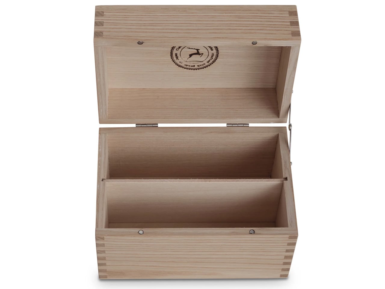
Classiky is a Japanese paper goods brand that works best when it’s working small. The Chestnut Postcard Case is exactly the kind of object the brand does well: a holder designed for postcards, loose notes, and small cards, with a quiet authority the category doesn’t usually earn. The chestnut colorway isn’t brown in the way most things are brown. It’s the specific warmth of something that ages into itself, a piece you’ll handle daily and find better for it six months from now.
For back to school, the use case is broader than it sounds. Business cards from professors, research source cards, index cards you’ve actually written something useful on, transit cards, anything that matters enough to keep but gets lost in a wallet. The postcard case keeps these things accessible and flat, in a form that sits comfortably in a bag’s outer pocket. It’s a solution to a problem most people don’t realize they have until they stop losing things.
What we like
The chestnut colorway ages gracefully and won’t feel wrong on a desk six months into the year
Compact and structured enough to keep cards flat and accessible without adding bulk to a bag
What we dislike
Specialized enough that it only earns its place if you actually carry cards regularly
Sized for postcards, so it won’t accommodate folded A5 paper or larger loose sheets
3. Clearslide Box Opener
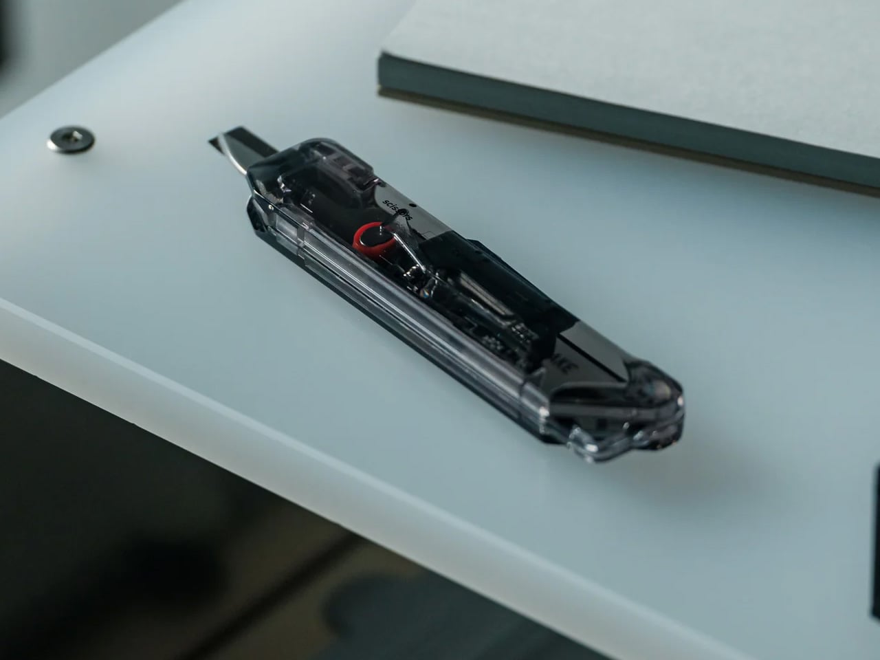
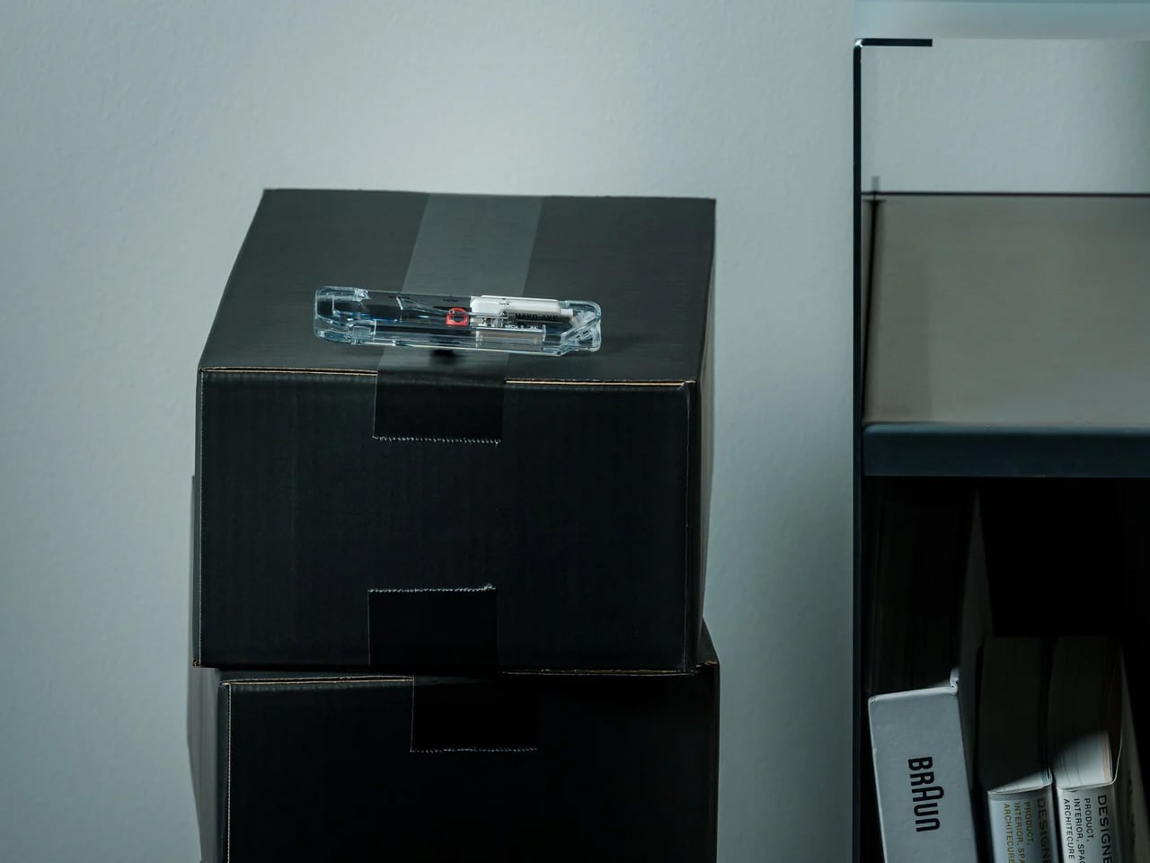
The box opener is one of those objects that lives in a junk drawer until someone designs it properly. The Clearslide is that version: a compact, refined take on something that’s usually made from whatever’s cheapest and shoved somewhere to live out its days next to a rubber band and a dead battery. The form factor is clean, the mechanism works without drama, and it sits on a desk without looking like a mistake.
Back to school means packages. Textbooks from online retailers, desk organization orders, care packages from home- opening them all becomes a daily task by October. The Clearslide turns that into a cleaner experience. It’s the kind of thing that earns its desk space not by doing something unusual, but by doing one thing better than anything else in the room. The sliding mechanism keeps the cutting edge protected when the tool is not in use, which is most of the time.
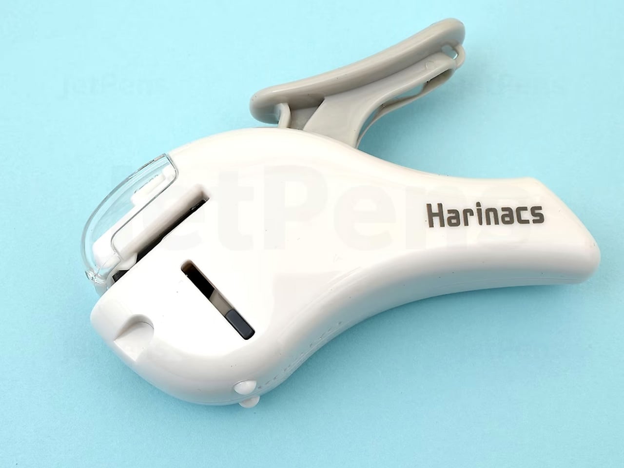
Kokuyo is one of Japan’s largest office supplies companies, and the Harinacs is the product that best captures what happens when engineering turns its attention to something everyone else stopped thinking about. Instead of a metal staple, the Compact Alpha cuts a small tab from the paper itself, folds it back through a slit, and binds up to five sheets cleanly. The result is permanent, metal-free, and fully recyclable without any extra steps.
For a student environment, this is more useful than it sounds. Lecture notes, assignment printouts, research papers that need to stay together- the Harinacs handles all of it without a supply chain. You never run out of staples because there are no staples. The white compact body is quiet on a desk, light enough to carry in a pencil case, and precise enough that the binding holds through a semester’s worth of daily bag use. Under ten dollars.
What we like
The staple-free mechanism is genuinely clever and holds as well as a metal staple for everyday tasks
Fully recyclable binding means no extra sorting: the bound packet goes into paper recycling as is
What we dislike
Five-sheet limit is the real constraint; for thicker documents it simply won’t work
The tab binding is functional but not as formally neat as a metal staple when presentation matters
5. Hobonichi Techo Original A6
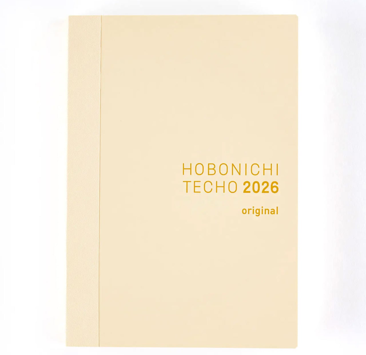
The Hobonichi Techo has been running in Japan since 2002, and the Original A6 English edition looks almost identical to the one made in the first year. That’s either a sign of a design that was never quite finished or one that was finished immediately. The Tomoe River paper is the main event: impossibly thin, fountain pen friendly, and resistant to bleed-through in a way that heavier papers often aren’t. One page per day, a 4mm graph grid, no motivational quotes.
The A6 size, roughly 4 by 6 inches, is the decision that makes this work for a student. It’s small enough to carry everywhere but generous enough to actually write in. The book opens completely flat, which sounds minor until you’re writing on a desk that’s too small and need both hands free. The English edition is printed in full on Hobonichi’s own Tomoe River stock, sourced and manufactured in Japan, and sold direct from the brand’s English store.
What we like
Tomoe River paper handles fountain pens, fine liners, and brush pens without ghosting
The flat-open binding makes it the most consistently usable daily planner in this category
What we dislike
The book is sold without a cover, and a cover adds high cost to the full setup
Certain editions sell out early; ordering in summer for the January start date is the safer move
6. Magboard Clipboard
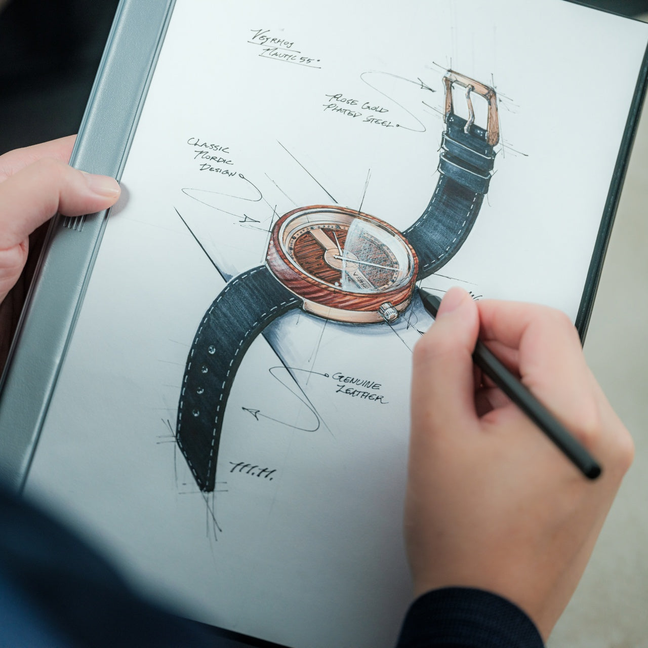
The clipboard is a category that design forgot. Most of them are pressed hardboard with a spring clip that loosens within a month and leaves rust marks on paper by the third. The Magboard replaces all of that with a magnetic closure that holds paper firmly, quietly, and without a mechanism that wears out. It’s flat, it’s clean, and it works the same on the last day of the semester as it does on the first.
For anyone who works between a desk and a lecture hall, the Magboard earns its place in that transition. Notes stay where you put them, the surface is rigid enough to write on without a hard surface underneath, and the form factor is slim enough to slide into a bag alongside a notebook without adding the thickness of a traditional clipboard. It also functions as a desk organizer when it’s not in transit, holding loose sheets vertically or flat depending on what the week requires. The magnetic closure is the detail that separates it from every alternative, a single design decision that removes the only part of a clipboard that ever fails.
The magnetic closure holds consistently without the loosening or rusting that comes with spring-clip alternatives
Slim enough to function as both a portable writing surface and a desk-side sheet organizer
What we dislike
Not suited for very thick stacks of paper; the magnetic hold is firm for daily notes, not a semester’s worth of documents at once
The flat minimal aesthetic shows wear from a full bag faster than a traditional hardboard clipboard would
7. Stalogy 365 Days Notebook A5
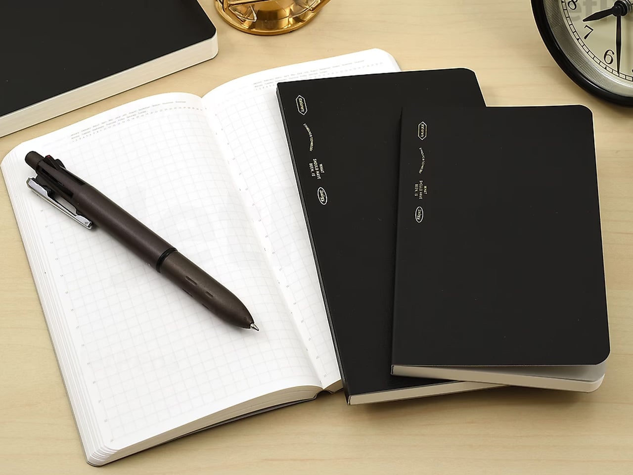
Stalogy is made by Nitoms, a Japanese industrial company that makes adhesives and functional materials for a living. The 365 Days Notebook is what happens when a company with no background in lifestyle products decides to make a notebook strictly on engineering terms. The paper is 52 gsm and fountain pen-friendly without being precious about it. The binding is Smyth-sewn, meaning the book opens completely flat at any page without cracking. The cover is matte black with near-zero branding. A small year-at-a-glance calendar sits at the front. After that, it’s 368 pages of 4mm grid, each one numbered and dated so you know exactly where you are.
For a school year, the dated structure is the feature that justifies the format. Every page already knows what day it belongs to, which removes the planning step that most blank notebooks push onto the writer. You open to today’s date and start. The A5 size is generous enough for long-form notes and detailed diagrams but compact enough to carry daily without making the decision feel burdensome. This is the notebook that tends to outlast every other system a student tries in September, not because it’s the most exciting object in the bag but because it has already solved every problem before you thought to have it.
What we like
Dated pages remove the friction of setting up a daily note system, making it immediately useful without a learning curve
Smyth-sewn binding opens flat at every page, including the first and last, which most notebooks can’t claim
What we dislike
The black cover and minimal branding read as intentionally anonymous, which suits some desks and feels cold on others
Dated format means unused pages feel like wasted money if your semester doesn’t follow a consistent daily rhythm
The Best School Supplies Are the Ones You’re Still Using in December
Every piece on this list does one thing well and stays out of the way the rest of the time. That’s the standard Japanese stationery holds itself to, and it’s the reason the best of it survives a year of daily use while the rest of what you bought in September ends up at the bottom of a drawer by November. None of these objects ask you to change your habits. They work inside the ones you already have, just more quietly and more precisely than whatever they replace.
The back-to-school moment is usually about buying things that signal a version of yourself you haven’t become yet. These are the things that help you actually get there.
Clous de Paris-inspired button makes AI more tactile and personal
Decent performance and strong value for its price
CONS:
No dedicated telephoto or ultra-wide cameras
Infinix HOT 70 (non-Pro) is limited to 4G networks only
RATINGS:
AESTHETICS
ERGONOMICS
PERFORMANCE
SUSTAINABILITY / REPAIRABILITY
VALUE FOR MONEY
EDITOR'S QUOTE:
The Infinix HOT 70 is proof that expressive, design-forward smartphones don't have to cost a fortune.
The affordable smartphone market has long operated on an unspoken rule: you get your camera, your processor, and a solid battery, but genuine design ambition is a luxury reserved for pricier tiers. Walk into any mid-range phone aisle, and you’re likely to face the same predictable cycle, gradient blues and purples on glass-and-plastic slabs that look almost indistinguishable from one another, functional but rarely intentional.
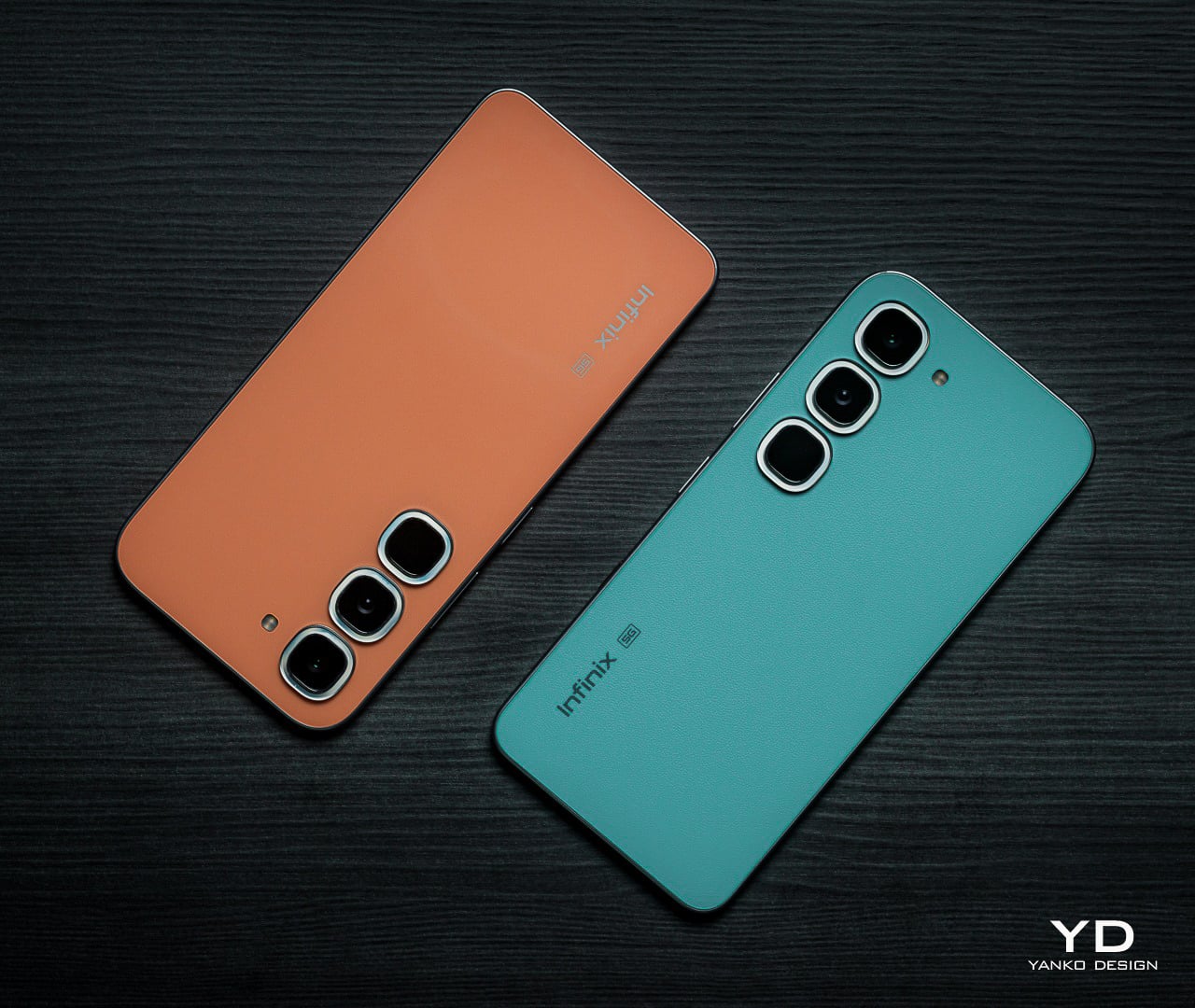
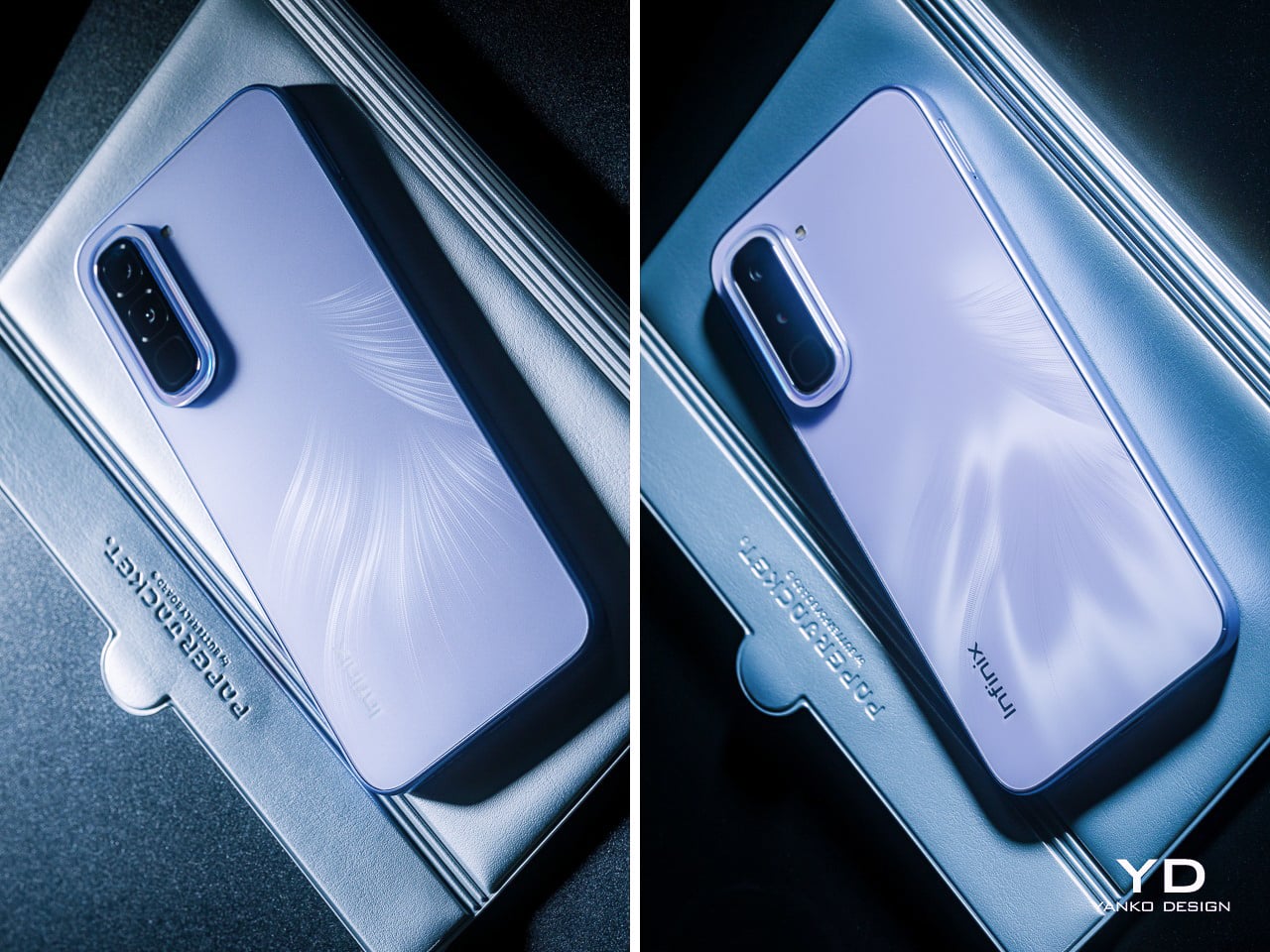
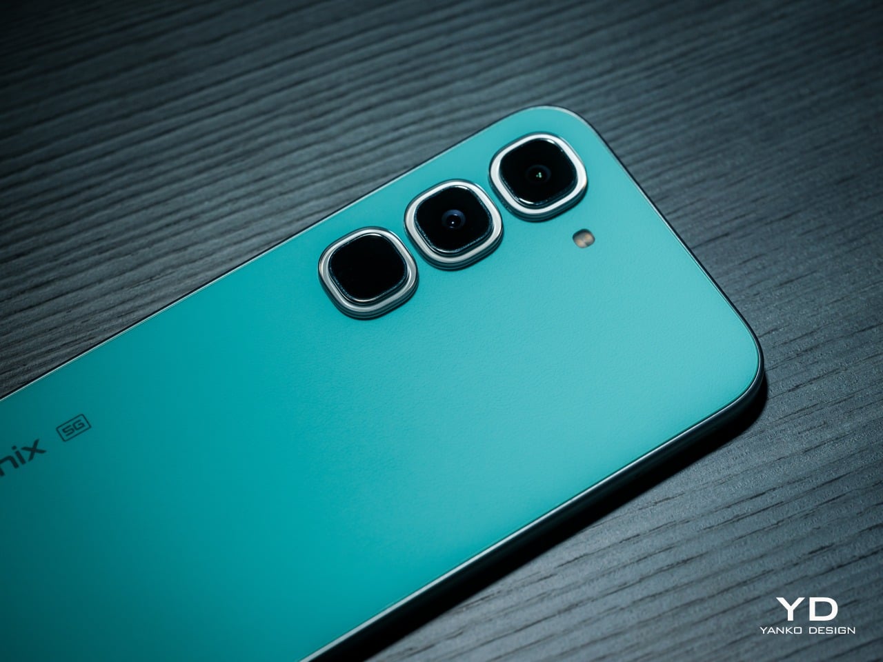
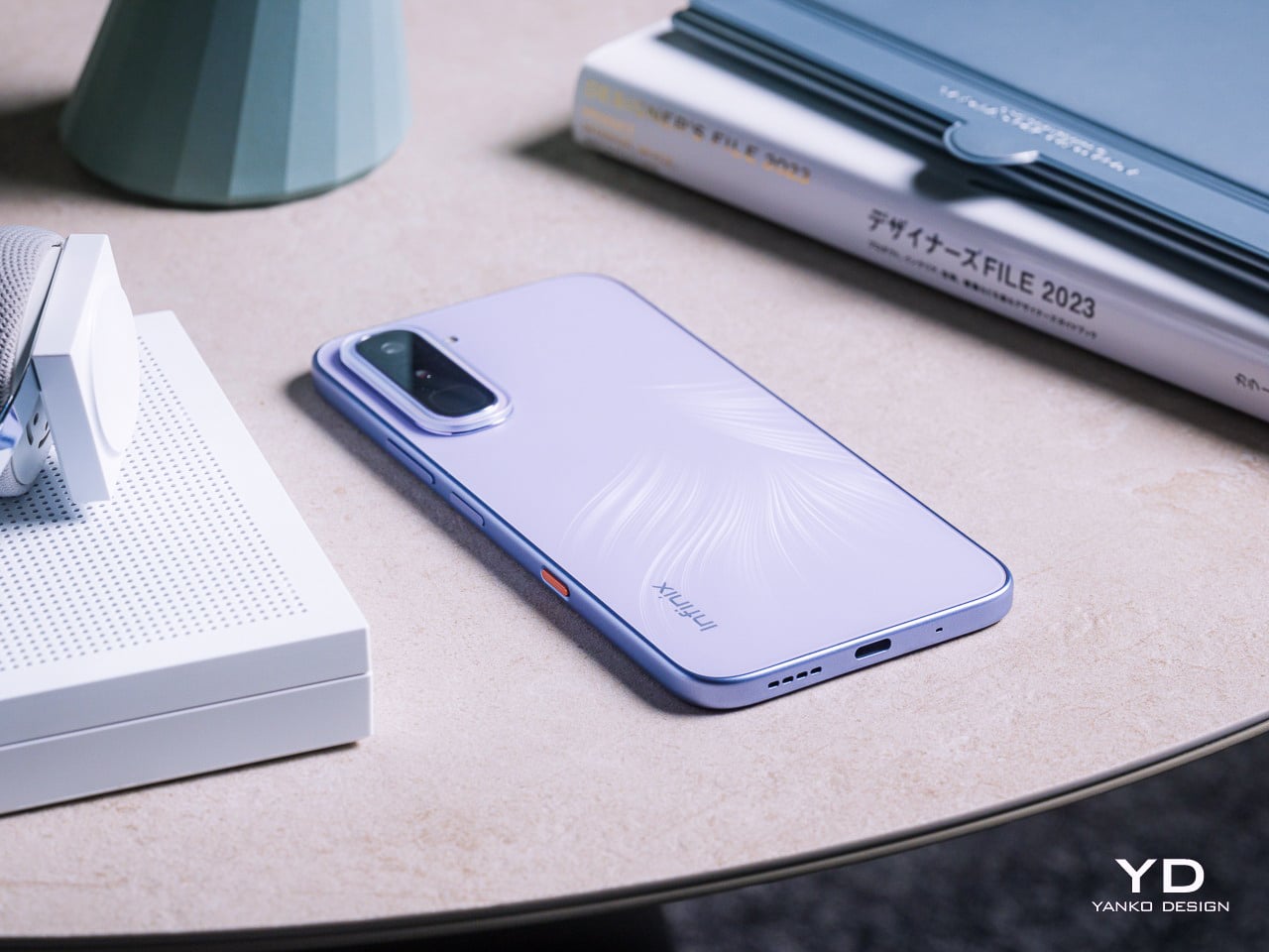
Infinix is trying to challenge that assumption with the HOT 70 series with its Industry-First 12-Colorway Dynamic Shine Design. It comes in two distinct flavors: the HOT 70 and the HOT 70 Pro 5G. Both arrived for this review, the HOT 70 in Quiet Violet and the HOT 70 Pro 5G in Thermo Orange and Mirage Green, and all announced themselves as something genuinely
Infinix has long understood something that a lot of phone brands still haven’t fully caught on to: young users aren’t shopping for specs alone, they’re buying something that reflects who they are and what they’re about. The HOT 70 series is the brand’s clearest statement on that front, organized around a “Colorful, Versatile, Fun” philosophy that treats aesthetic identity and personal expression as core design priorities, not afterthoughts.
Both phones share a design language Infinix calls the Dynamic Shine Aesthetic Design, and the common thread across both models is a Baby-Smooth Finish, a surface with an advanced anti-fingerprint coating. That silky, finely soft in-hand texture genuinely holds up in practice. After time with both phones, fingerprints and grease smudges are noticeably less of a nuisance than on most others in this price category, which counts for a lot.
Infinix HOT 70
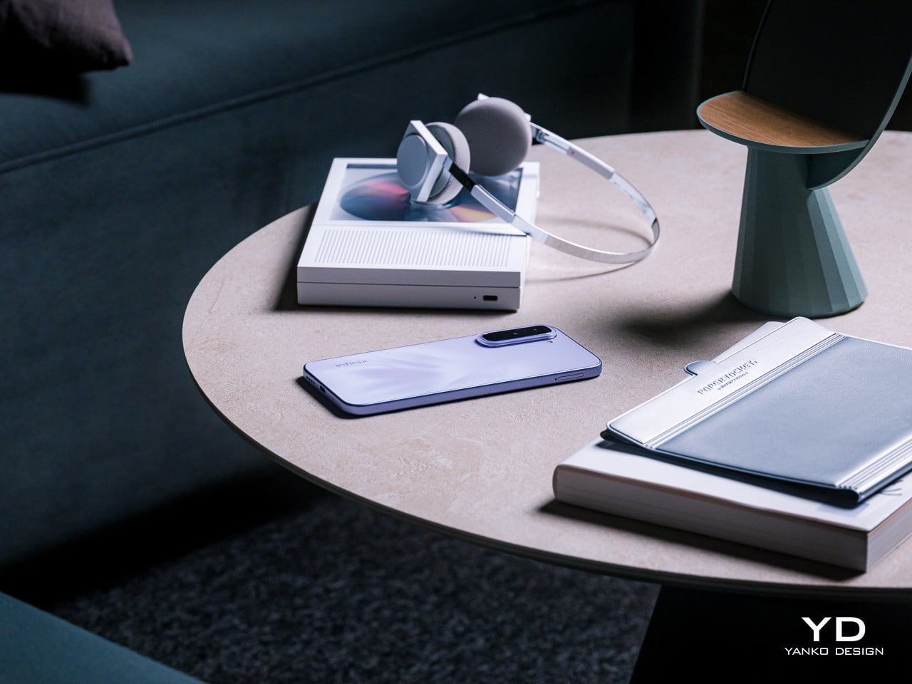
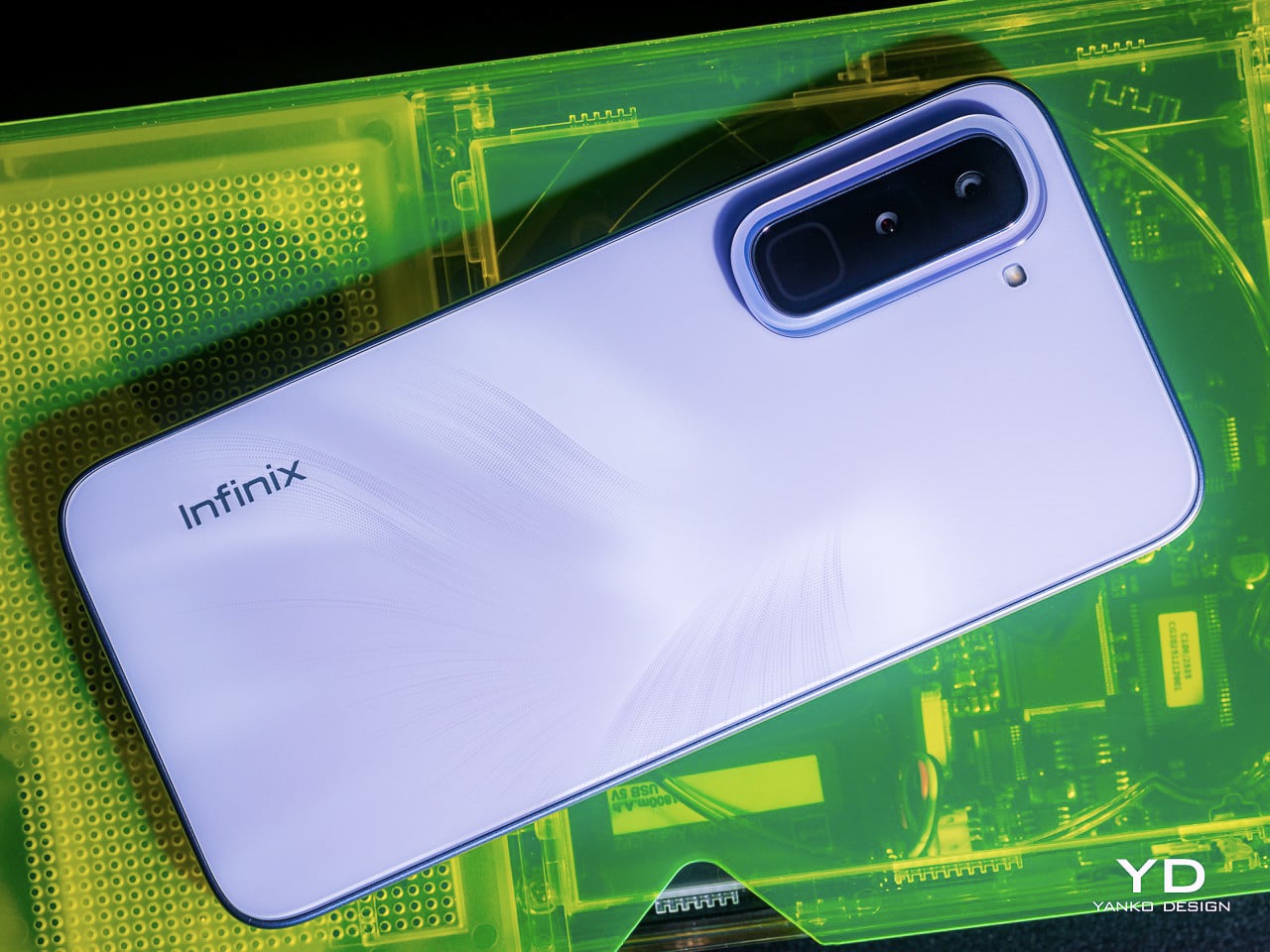
The HOT 70 arrives in six colorways: Thermo Orange, Night Pulse, Silver Dancer, Dive Blue, Green Texture, and the Quiet Violet reviewed here. Where most phones at this price simply pick a color and commit to it, the Quiet Violet does something more considered. The Lumina Flare Dynamic Flame Texture layers micro-textures beneath the surface, creating a shifting light-and-shadow effect that reads differently depending on where you are.
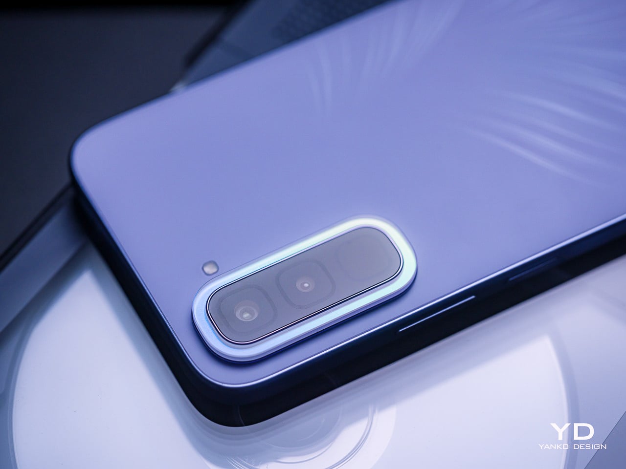
The Crystal Mood Island camera ring is where the craftsmanship gets more deliberate. It sits around the camera bump as a decorative ring that catches light and bends it into iridescent gloss, shifting tone with every viewing angle. On paper, that sounds like a marketing detail, but in practice, it adds genuine visual contrast between the ring and the rest of the panel behind it.
Then there’s the Active Halo, the light ring surrounding the camera area that pulses softly for calls, messages, charging status, and game launches. It’s tempting to dismiss this as a gimmick, but there’s a genuinely useful case for it: the phone is face down, silent, and the Halo quietly signals an incoming call without making you reach for it every few minutes.
Infinix HOT 70 Pro 5G
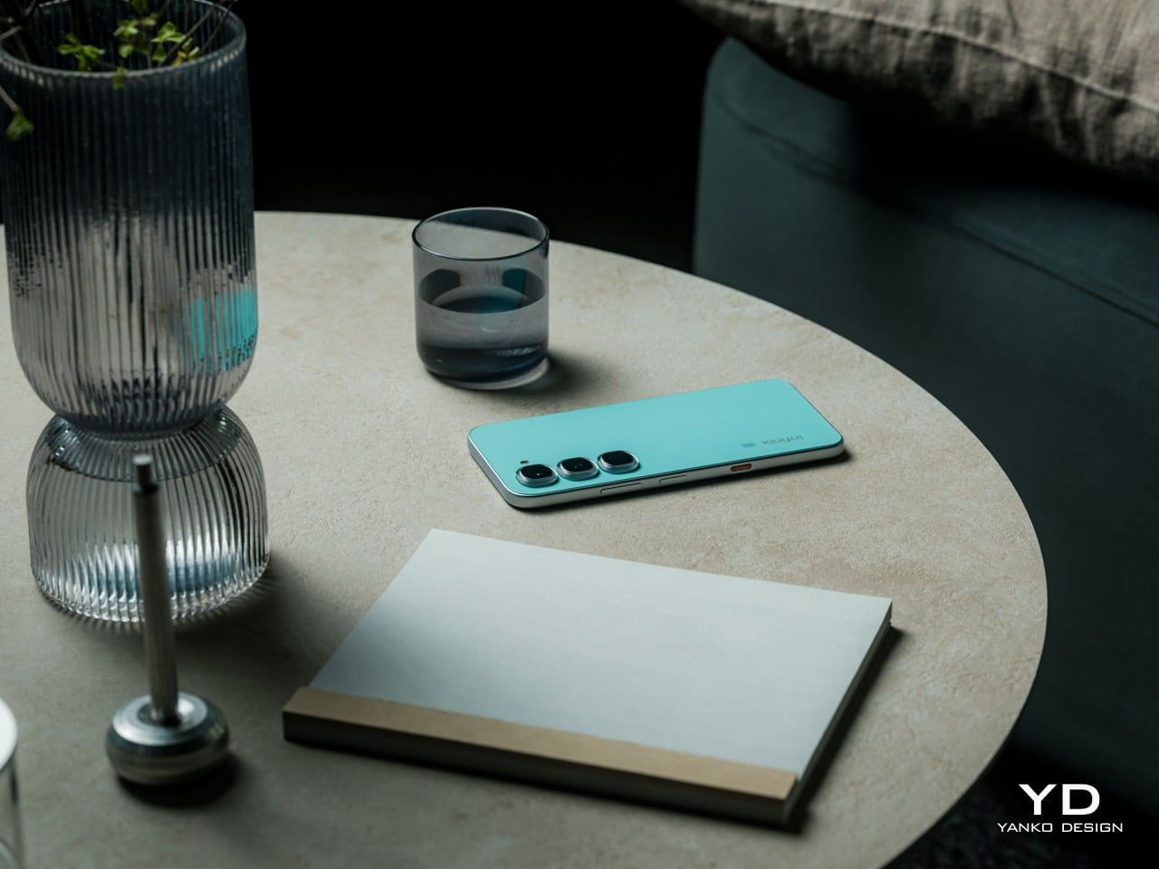
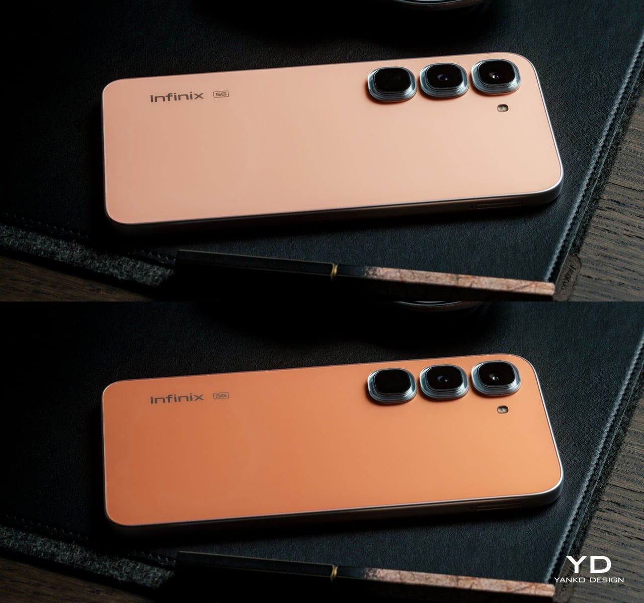
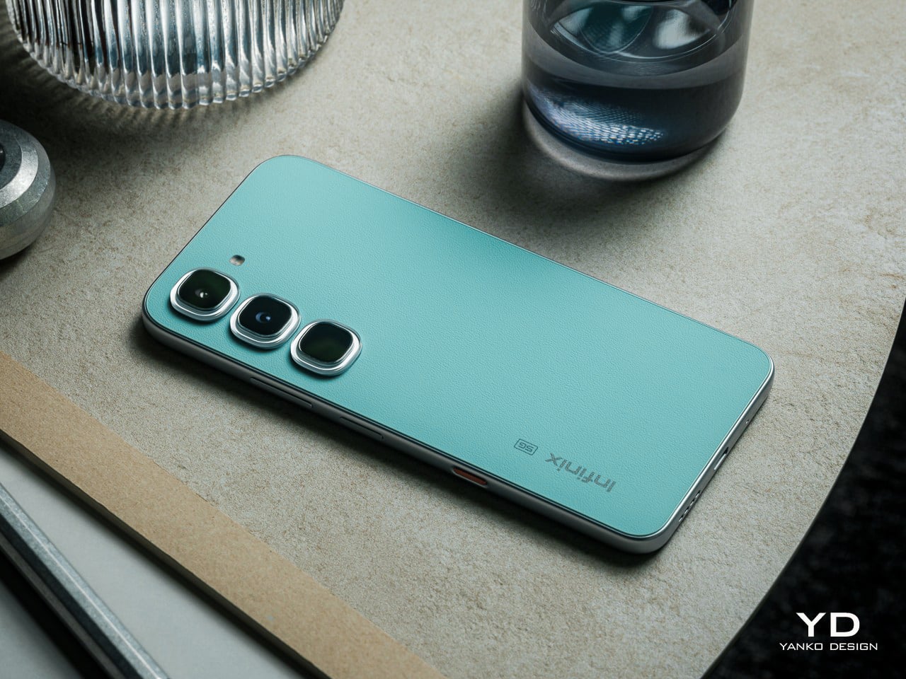
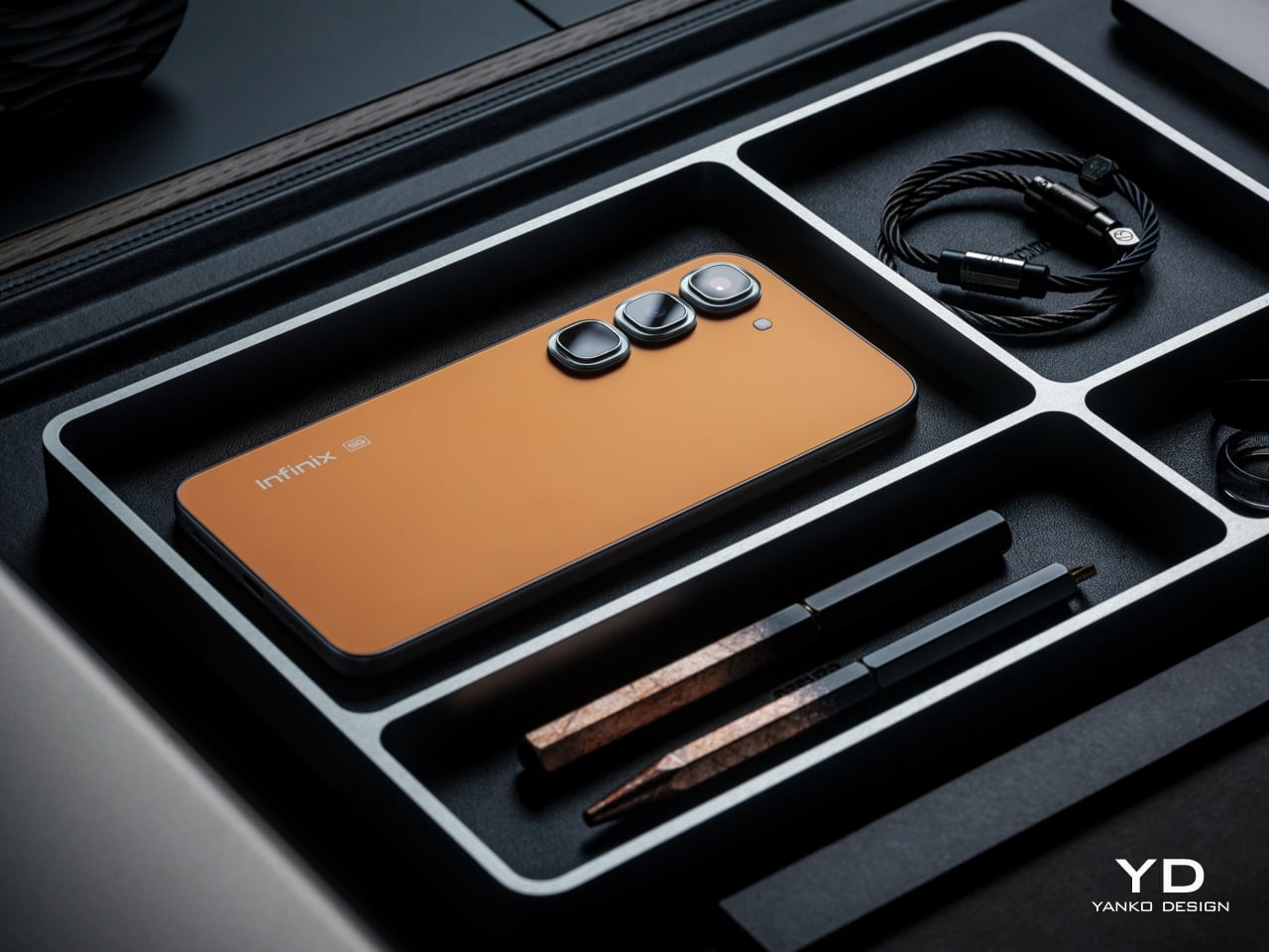
The HOT 70 Pro 5G is available in six colorways: Thermo Orange, Mirage Green, Silk Glow Purple, Night Pulse, Dive Blue, and the limited edition Depth Ring White. The Thermo Orange commands the most attention, and rightly so. Its Dual-way Thermo Sensing Skin technology physically shifts between a deeper orange below 0°C and a lighter tone above 65°C, and crucially, holds that state until the temperature resets it.
What the Thermo Orange also enables is DIY customization: cool the phone to its deep state, then press a heated stamp or trace with a hot glue pen at around 65°C to create patterns directly onto the back. The concept is genuinely novel for this price tier, and it’s quite fascinating to see the phone come out of the freezer with a different shade of orange. It also opens up possibilities for DIY designs with the stencils and the careful use of a glue gun to heat up only certain areas, creating eye-catching contrasts of light and dark areas you’d think the phone was designed with originally. Given that you are exposing the phone to extreme cold and hot temperatures, however, proper care should still be taken.
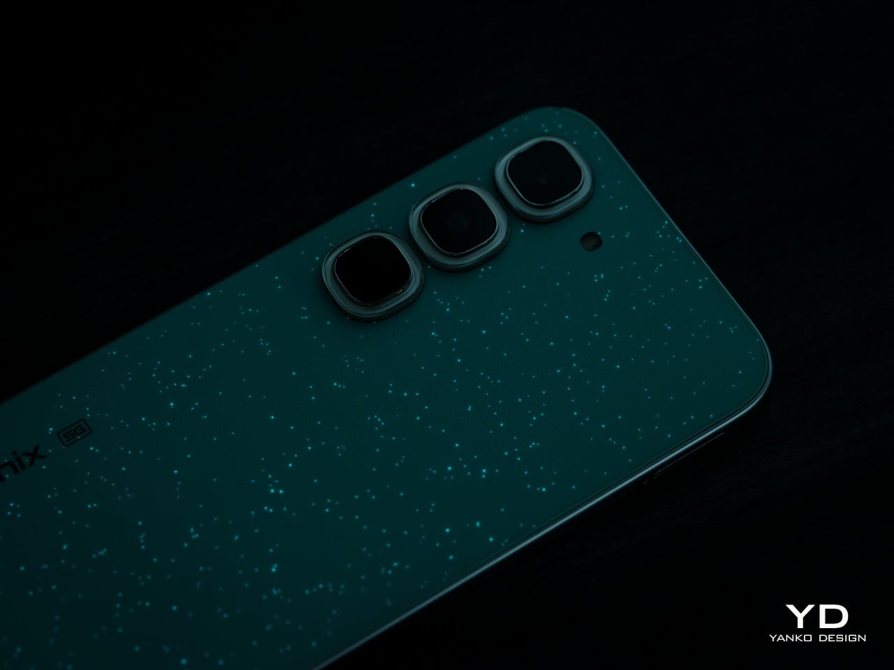
Mirage Green, exclusive to the Pro model, offers a more subtle yet equally stunning color-changing effect. Nearly-invisible luminous particles embedded in the leather-like finish on the back of the phone absorb light during the day. Once the sun sets, these dots glow like stars dots scattered against a dark green night sky. It’s a visual that is both premium and calming, perfectly reflecting its design.
The remaining hero finishes deserve more than a footnote. Silk Glow Purple builds its color from nano-scale structural layers rather than pigment, which means the purple actually shifts and travels across the surface as the angle changes. The Limited Edition Depth Ring White goes further, using a micro-lens array to create what reads as a floating 3D ring against an otherwise flat back panel.
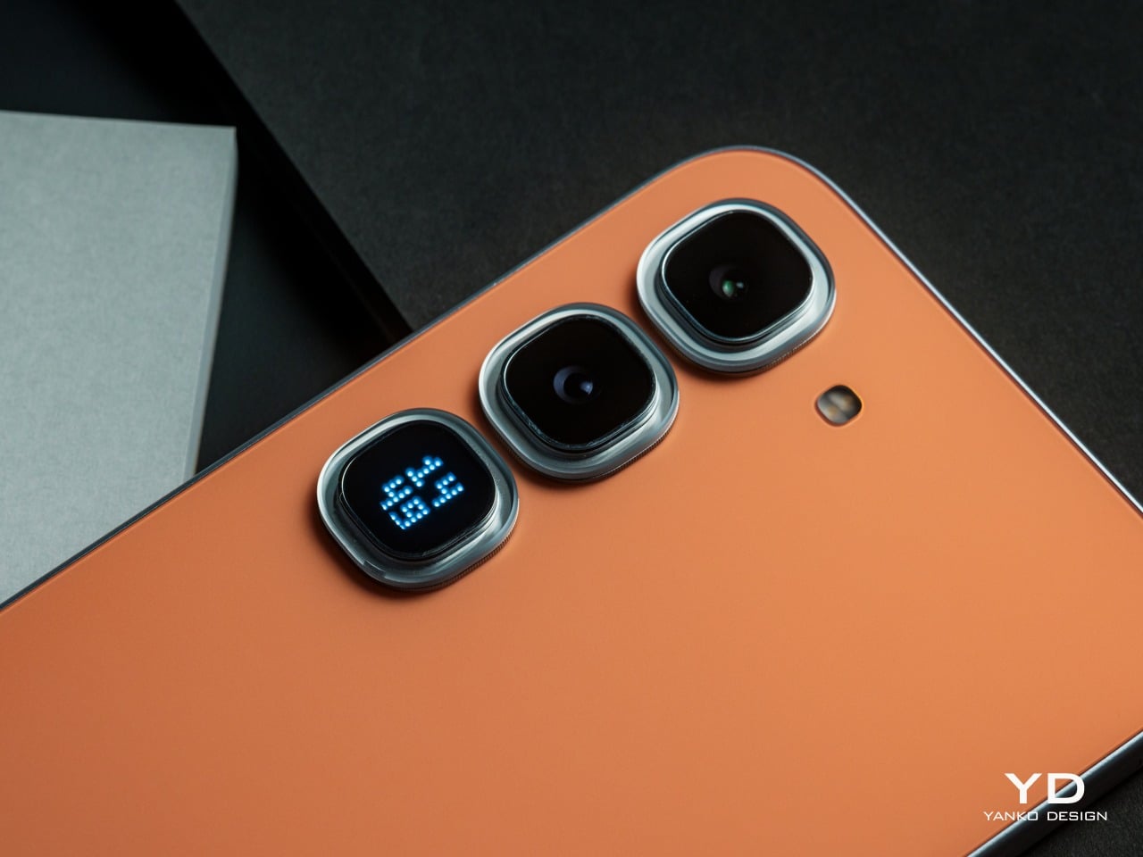
The Active Matrix Cube is the Pro’s most distinctive rear-surface detail, a programmable light matrix that’s a flagship-level feature from Infinix’s premium product lineup. It handles status alerts, ambient lighting, mini-games, and custom pattern displays, and can even share those creations via NFC with a single tap. It turns the back of the phone into a secondary surface that communicates something, even when the screen is dark.
Ergonomics
At just 7.49mm thin and 195g light, the HOT 70’s pocket-favourite design offers effortless portability, slipping easily into pockets or small bags and ensuring smooth one-handed handling for commuting, travel, and everyday use. The HOT 70 Pro 5G is marginally heavier at 204g and slightly thicker at 7.85mm to 7.95mm, depending on the colorway, differences that don’t read as particularly significant in everyday handling.
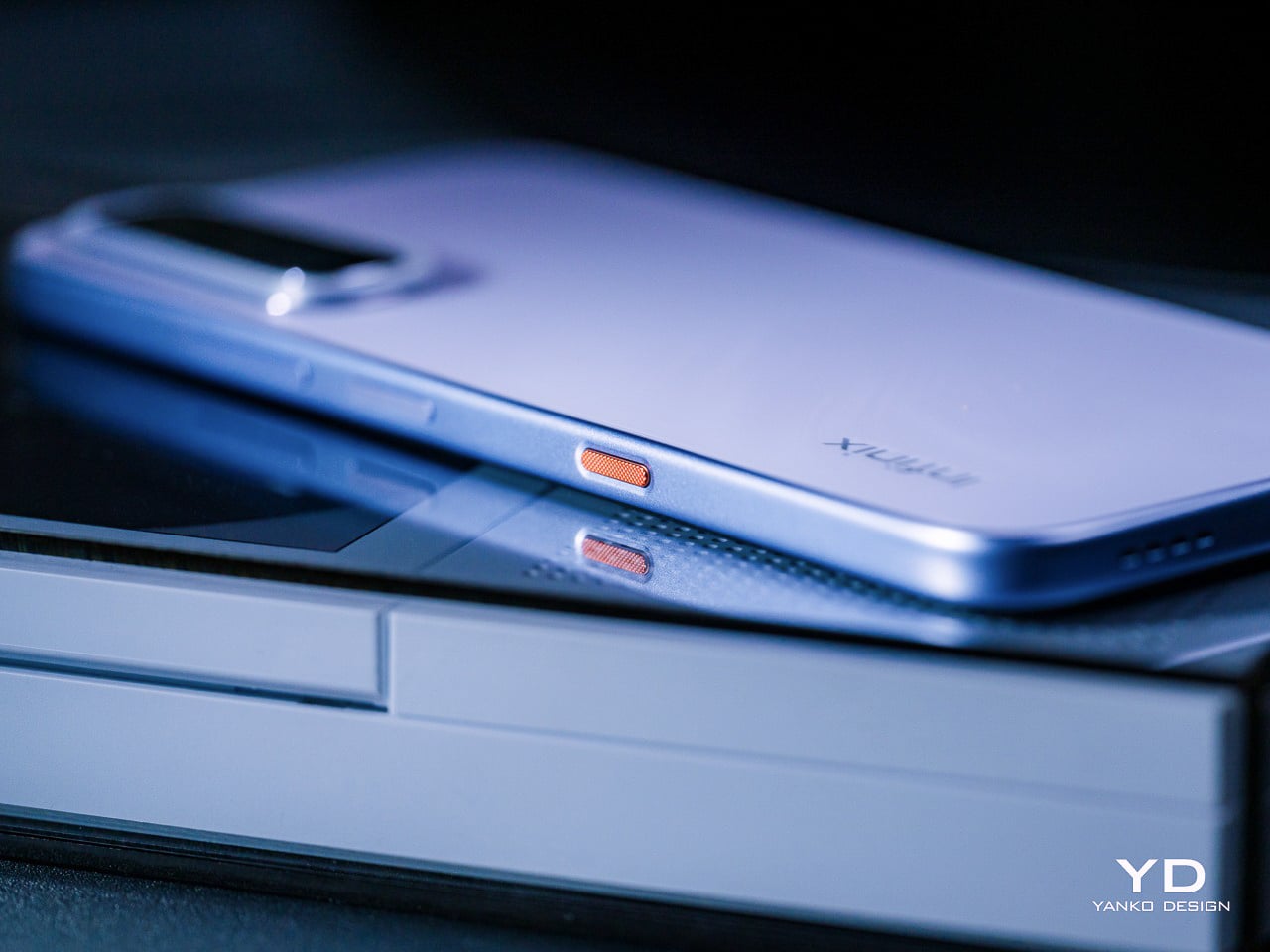
The One-Tap AI Button on both phones is inspired by the Clous de Paris design, with a three-dimensional textured surface that delivers a refined, premium tactile feel. Its customizable shortcut logic enables One-Tap AI FlashMemo with a short press and activates Folax AI assistant with a long press, allowing intuitive control and more efficient smart interaction by streamlining everyday tasks. That physical anchor makes AI feel genuinely accessible rather than buried in software menus.
Both phones use punch-hole displays with narrow bezels, giving a clean, open canvas for everyday use. The HOT 70 and HOT 70 Pro 5G have very similar screen sizes at 6.78 and 6.76 inches, respectively, so the real ergonomic difference lies in the refresh rate. The HOT 70 Pro 5G’s 144Hz high refresh rate and 240Hz touch sampling rate deliver ultra-smooth scrolling without ghosting while browsing and streaming, while the HOT 70’s 120Hz panel handles daily navigation comfortably. The smooth visuals help ease eye strain while also improving the overall user experience.
Performance
AI is quite the trend these days, and Infinix isn’t one to be left behind. The HOT 70 Series delivers a full AI experience upgrade featuring a physical One-Tap AI Button, with a dedicated AI Button that supports intelligent intent recognition, enabling one-tap capture of ideas, meetings, emails, and more, with auto archiving and smart schedule creation based on content type. Long-pressing the button activates Folax, Infinix’s custom AI assistant, which answers questions based on whatever is on screen, from displayed text to a live camera view, with access to five or more AI models simultaneously. Between FlashMemo’s capture-and-organize logic and Folax’s any-screen contextual awareness, the two together cover most of what people actually reach for their phones to do throughout the day.
Battery anxiety is real, especially among the younger generation, so Infinix naturally has a solution. Both models offer a 15% larger battery capacity than the previous generation, featuring a 6,000 mAh single-cell design or 5,600 mAh in certain regional markets, a capacity difference driven by local regulatory requirements rather than any hardware compromise. Fortunately, both capacities support 45W Lightning FastCharge, and in Super Fast Charging mode, which allowed us to hit 50% in half an hour and fully charge in an hour. Bypass charging routes power directly from the charger to keep the phone cooler during heavy use, a critical safety measure when gaming or using the phone for navigation.
The Infinix HOT 70 runs on a MediaTek Helio G100 Ultimate, a powerful octa-core gaming processor designed for smoother daily use, multitasking, and light gaming. That said, the Helio G100 is a 4G-only chip, which means the HOT 70 can’t connect to 5G networks. The HOT 70 Pro 5G steps up to a MediaTek Dimensity 7100 with 5G support, a meaningfully stronger chip that pushes AnTuTu V11 scores above 780,000, delivers up to 90 fps in supported games, and brings faster 5G connectivity tuned for crowded real-world conditions.
The display difference between the two models is more significant than the size gap suggests. The HOT 70’s 6.78-inch 120Hz Eye-Care Display reaches 700 nits of HBM brightness for sunlight readability. The HOT 70 Pro 5G’s 6.76-inch FHD+ panel pushes that to 950 nits of HBM brightness, a genuine sunlight-legibility advantage, and the jump to Full HD+ resolution adds sharpness that becomes particularly noticeable when reading text or watching video.
Camera setups share a foundation but diverge meaningfully at the Pro tier. Both phones use a 50MP main sensor, with AI Live Photo on both automatically filtering out shaky frames from a burst. The HOT 70 Pro 5G’s imaging toolkit, however, rests on a 50MP Sony IMX882 with a large 1/1.95-inch sensor, f/1.8 aperture, and full-pixel autofocus, plus a 2x lossless zoom shortcut, giving it stronger low-light performance.
In both cases, both images and videos come out clear, detailed, and vibrant, punching above their price tier. Sadly, the lack of a dedicated telephoto or ultra-wide cameras will make you miss out on decent close-ups and breath-taking panoramas. It isn’t the series’s strongest suit, but it at least won’t let you down when you need to preserve important moments and scenes.
Sustainability
The HOT 70 carries an IP65 rating, featuring six-level full dustproofing and IP65 splash resistance, blocking dust, rain, and sweat effectively for safer daily commutes and outdoor use. It also boasts military-grade durability with an SGS-certified 5-star drop protection. The HOT 70 Pro 5G steps up to IP68, Infinix’s highest rating to date, rated for up to 2 meters of fresh water for 30 minutes, with screen and camera protected throughout, and further adds MIL-STD-810 military-grade certification for durability across more demanding conditions.
Both phones deliver long-term OS support, keeping the device smooth, secure, and reliable for years, with guaranteed three years of major XOS version upgrades (only for models with 6GB RAM or more) starting with factory-installed XOS 16, continuously updating to XOS 17, XOS 18, and XOS 19. Three OS upgrades aren’t quite on par with what some flagship brands now offer, but it’s a genuinely generous commitment for this price tier, where software longevity is rarely treated as a selling point at all. One caveat is that certain XOS features only apply if your configuration has 6GB of RAM or more.
Value
The Infinix HOT 70 starts at around $120, depending on configuration and market, and the package it delivers at that price is hard to dismiss. Tactile finishes, a physical AI shortcut, a generous battery, and a sunlight-readable display aren’t common at this tier. The Lumina Flare texture and Crystal Mood Island add visual differentiation that most competitors simply don’t bother attempting.
The Infinix HOT 70 Pro 5G starts at around $200, and the step up from the base HOT 70 is justified on multiple fronts. A faster 5G chip, a sharper and faster display, a more capable Sony camera sensor, full IP68 waterproofing alongside military certification, and the Active Matrix Cube add up to a meaningfully more capable and expressive package.
Neither phone asks for a premium price to deliver a premium-feeling design, and that’s genuinely rare. At comparable price points, the alternatives in this category tend to compete primarily on camera megapixels or battery size, without investing much thought into what the phone feels like to hold, look at, or interact with. The HOT 70 series treats those questions as worth answering, which puts it in a different conversation entirely.
Verdict
The HOT 70 makes a case for what affordable phone design can look like when treated as an actual discipline. The Lumina Flare texture, the Crystal Mood Island camera ring, the Active Halo, and the Baby-Smooth Finish come together in a device that rewards closer attention. It gets noticed on a table or out of a pocket, not because it’s loud, but because it clearly has a point of view. The HOT 70 Pro 5G takes that design ambition further into something genuinely experimental, with four optical behaviors across its colorways, a 5G chip with real gaming headroom, a Sony camera sensor that performs above expectations, and IP68 waterproofing for more demanding conditions.
Together, both phones say something interesting about where considered, expressive design is heading at the more accessible end of the smartphone market. At a price tier where “design” usually means picking between black, blue, or midnight black, the Infinix HOT 70 series is quietly raising the bar for what a phone at this price is allowed to look and feel like.
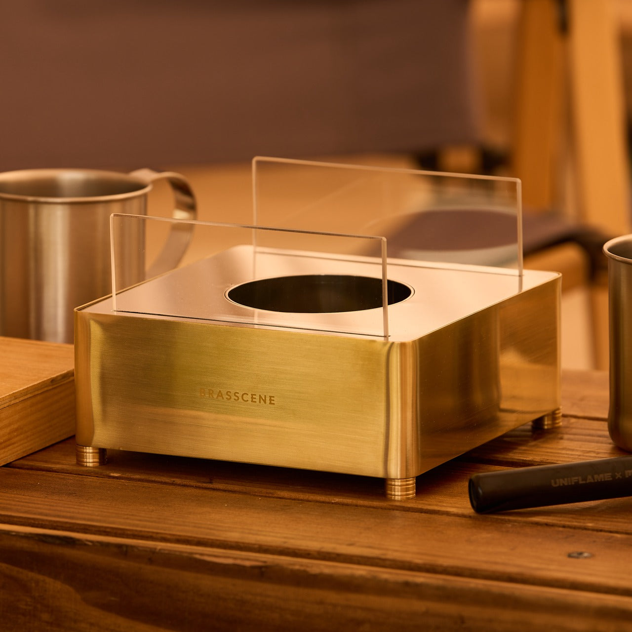
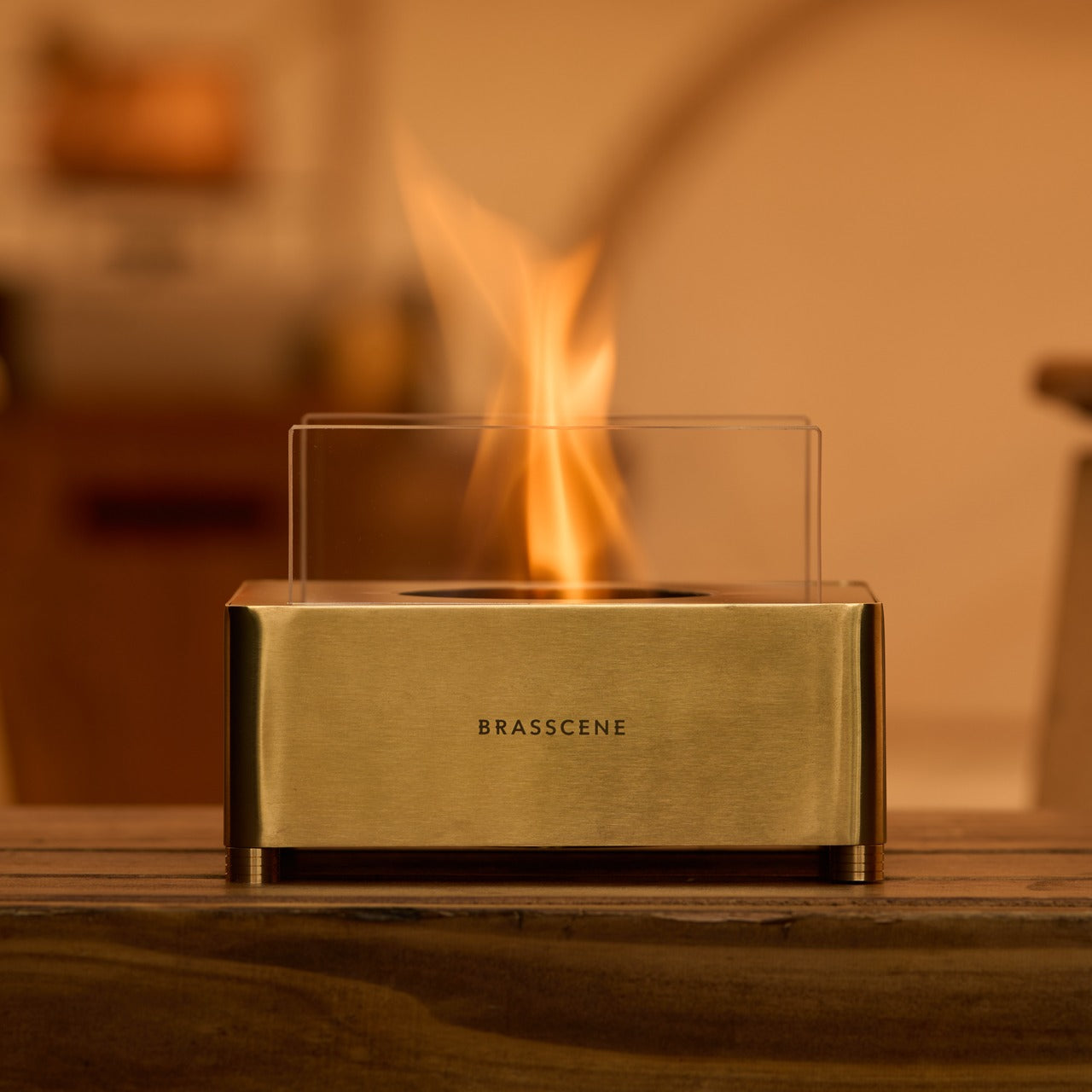
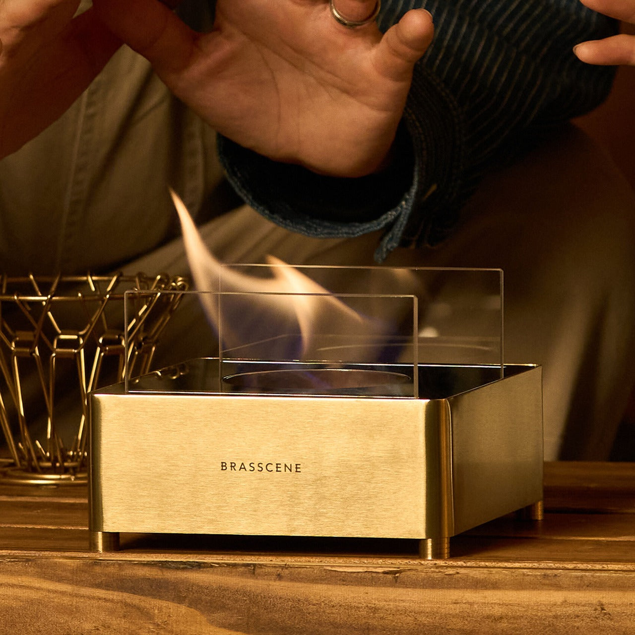
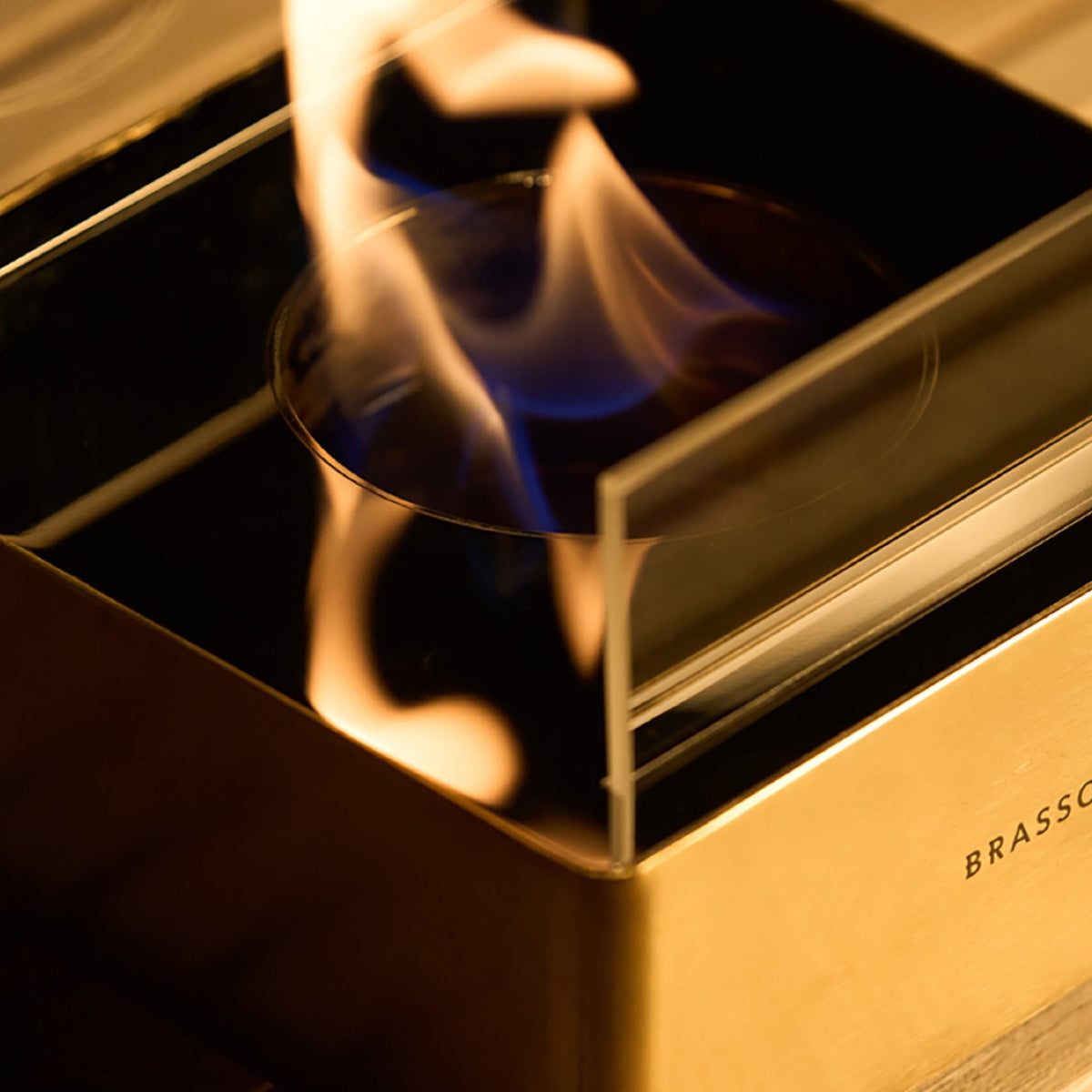
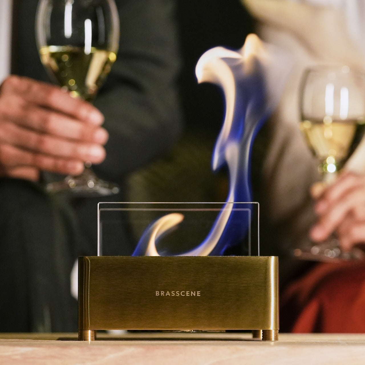
Most fireplaces require a great deal in exchange for a little warmth. A gas line. A flue. A weekend cleared for installation that ends up becoming two. The Harmony Flame asks for none of it. A brass fireplace that runs on bioethanol and sits on any surface you choose, it brings real fire to a dining table or a patio without smoke, without odor, and without anything that needs to be built into a wall.
What makes it worth owning is the craft behind it. The Harmony Flame is made by hand by craftsmen who build brass musical instruments, and that background changes everything about the object. The finishing, the fit, and the way brass behaves in firelight are not accidents of manufacturing. They are the result of people who understand the material at a level that most decorative product makers simply do not.
The decision to build this fireplace in brass is not purely aesthetic, though the aesthetics are difficult to argue with. Brass holds heat well, develops a patina over time that makes each piece distinct, and responds to flame the way few other materials can. The craftsmen behind the Harmony Flame come from instrument-making, where precision and finish are non-negotiable because the material reveals everything. That same discipline carries into this fireplace, across every seam and surface, and the result is an object that gets better the longer it is used.
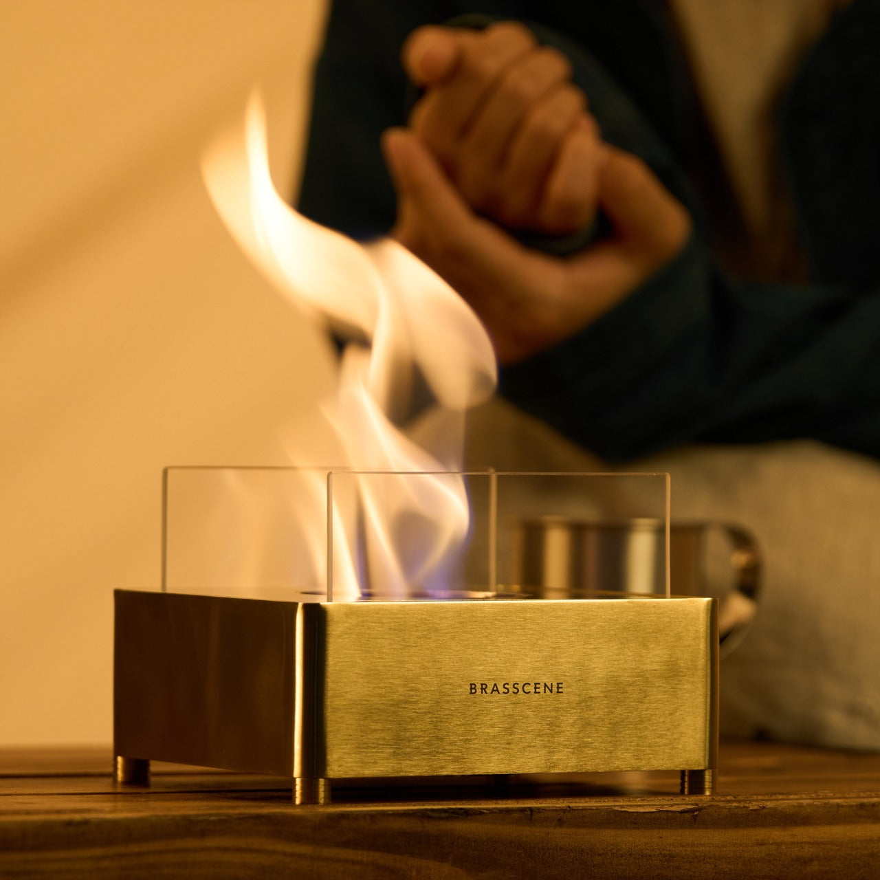
The reflective interior is where the design genuinely separates itself. Fire inside a brass box does not simply burn. It bounces. Light moves across the surface differently with every shift of air in the room, casting shadows that a candle cannot produce and a printed flame never will. The Harmony Flame is not trying to replicate a built-in fireplace. It creates its own atmosphere, and the quality of light it generates is specific enough to change the character of whatever room or table it sits on.
Bioethanol, Any Surface, Anywhere
Bioethanol burns clean. No smoke rises from it, no odor lingers after an evening of use, and nothing accumulates on the ceiling or the curtains over time. The Harmony Flame runs on it directly, which means it qualifies as indoor-safe without ventilation requirements and outdoor-ready without any modification. Move it from the dining table to the patio as the evening shifts, or keep it fixed in one place and let the fire do what fire does naturally to any room it occupies.
There is no installation because none is required. No plumber, no electrician, no mounting hardware, no manual written in four languages. Fill the reservoir with bioethanol, light it, and the fire starts. When the fuel runs out, refill and repeat. For a product designed to bring warmth to a space, the lack of friction in getting it started is one of the more considered details here. Complicated setup and a beautiful object rarely coexist well, and the Harmony Flame seems aware of that.
What We Like
Brass construction by instrument craftsmen: the level of finishing and attention to material that comes from instrument-making carries into every surface and joint of this fireplace, and it is immediately apparent in the way the object sits and holds itself
Bioethanol fuel system: burns without smoke, odor, or residue, making it genuinely safe for indoor use and equally capable outdoors without any modification or secondary equipment
Zero installation required: fill it, light it, use it — the absence of any setup barrier is a design decision as much as it is a convenience, and it removes every reason to leave the fireplace in a cabinet
Ambiance that earns its place: the reflective brass interior creates a play of light and shadow that neither a candle nor an electric flame can produce, which is the actual reason to own it
What We Dislike
Fuel not included: bioethanol is widely available, but first-time buyers will need to source it separately before the first use, which adds a step to an otherwise immediate experience
No cover or case specified: there is no mention of a protective lid or carry solution for storage or transport, which matters when moving the fireplace between indoor and outdoor settings regularly
Fire Without the Complications
The Harmony Flame was built for spaces that want real warmth and cannot accommodate a traditional fireplace. A dining table where the evening deserves something more than candlelight. A covered patio where the temperature drops late and the conversation keeps going. It works in both settings without modification, without smoke, and without the installation that a fixed fireplace requires. The craftsmanship behind it ensures it earns its place wherever it ends up sitting.
If the rooms and evenings you share feel like they are missing one quiet element and you have not been able to name it, this is likely it. The Harmony Flame does what a good fire has always done. It changes the quality of a space. Pick one up and find out what an open brass flame does to the feeling of a dinner that was already good.
At this point, a Google hardware leak ahead of launch feels almost ceremonial. Long before the keynote lights come up, the phones usually arrive in fragments through retailer pages, spec sheets, teaser campaigns, and the wider rumor mill. The Pixel 11 now seems to be following that familiar script, with Amazon reportedly revealing major details early and introducing an unexpected side character in the form of a Pixel Tag tracker ahead of Google’s August 12 event.
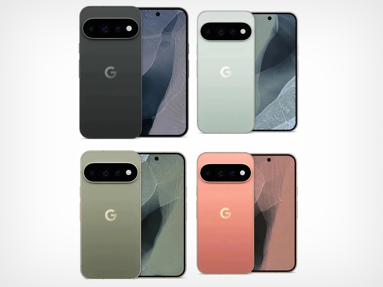
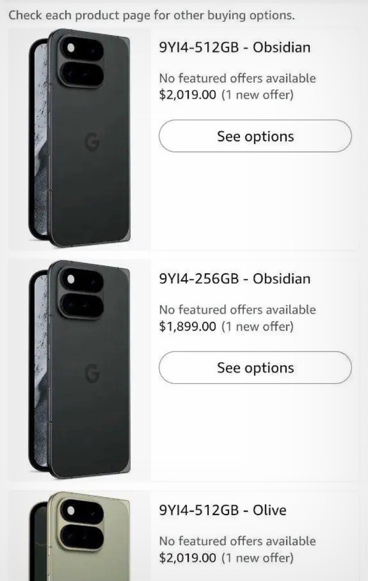
The leaked lineup already sketches out Google’s fall hardware palette in surprising detail. The base Pixel 11 appears in Obsidian, Frost, Hibiscus, and Pistachio, with 256GB storage priced at $899. The Pro shifts to Canyon and Obsidian, the Pro XL climbs from $1,299, and the Pixel 11 Pro Fold stretches the range to $1,899 in Obsidian with an Olive variant that may also be tied to the name Pine. Taken together, the colors feel as intentional as the pricing, and the Pixel Tag mention adds one more clue that Google may be building a broader visual ecosystem around the phones rather than treating accessories as an afterthought.
Google appears to be making 256GB the new base storage tier across the Pixel 11 family, which is probably overdue given how aggressively on-device AI has been eating into storage headroom. Droid Life also spotted a 512GB variant priced at $1,019, all but confirming that Google is dropping the longstanding 128GB entry-level option entirely. That’s a sensible call on paper, but it also means buyers have fewer options to quietly trade down on storage to save money at the baseline.
Then the pricing hits, and it hits hard. The Pixel 11 Pro reportedly starts at $1,099 for 256GB in Canyon, with the 1TB configuration reaching $1,449. The Pro XL tops out at $1,649 for 1TB. The Pixel 11 Pro Fold reportedly opens at $1,899 and climbs to $2,249 for a 1TB model. These are numbers that would have seemed audacious five years ago, and in 2026, with the broader economy and RAM shortage doing what it’s doing, I don’t blame you for still wondering what nightmarish timeline we live in. Google is clearly betting that its AI-forward software story justifies the ask, but at nearly $1,900 just to get into Fold territory, it really does feel like Google isn’t betting on this one selling like hot-cakes.
Image Credits: Android Authority
The Pro models also carry an unusual RAM decision I couldn’t help but notice. The 256GB Pixel 11 Pro will reportedly ship with 12GB of RAM, while the 512GB and 1TB variants retain 16GB, a departure from the Pixel 10 Pro lineup where every storage configuration included 16GB. It creates a situation where the least expensive Pro is also the most memory-limited, which sends a strange signal in a product cycle so heavily defined by AI features that depend on RAM headroom to run locally.
One detail on the Fold worth watching is the listed 4,750mAh battery, which would actually be smaller than the Pixel 10 Pro Fold’s 5,015mAh pack. Given that several other listing details appear unfinished, it’s possible this battery figure is also placeholder information. Still, the kind of number that makes you squint twice before scrolling on.
Image Credits: Android Authority
Through all of this, Pixel Tag stays the most intriguing footnote. A first-party tracker from Google would put the company directly in AirTag territory, and while tracker specs are almost beside the point, design language very much is not. Whatever Pixel Tag looks like, it will need to feel at home on a keyring and inside a product lineup simultaneously. If August 12 brings a formal reveal, the smallest object on stage may end up carrying the largest story.
The nightstand is one of the most underestimated surfaces in any home. It accumulates cables, three chargers doing the job of one, a lamp chosen in five minutes, and a rotating cast of objects that never formally earned their place. Most people accept this as normal. The result is a space that begins every evening and ends every morning with the kind of visual noise that makes a room feel smaller and less intentional than it actually is.
The five products below were chosen because each one solves a specific nightstand problem without introducing three new ones. None of them overlap in function. Start with the one that addresses your most pressing problem first, and the case for the next one tends to become clear in about a week.
1. Anywhere-Use Lamp
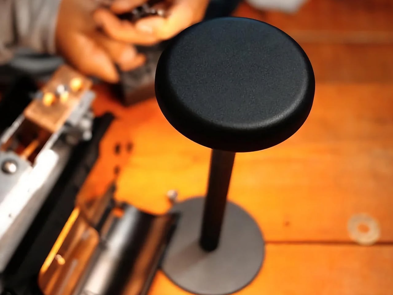
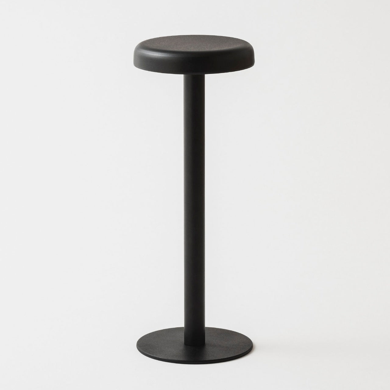
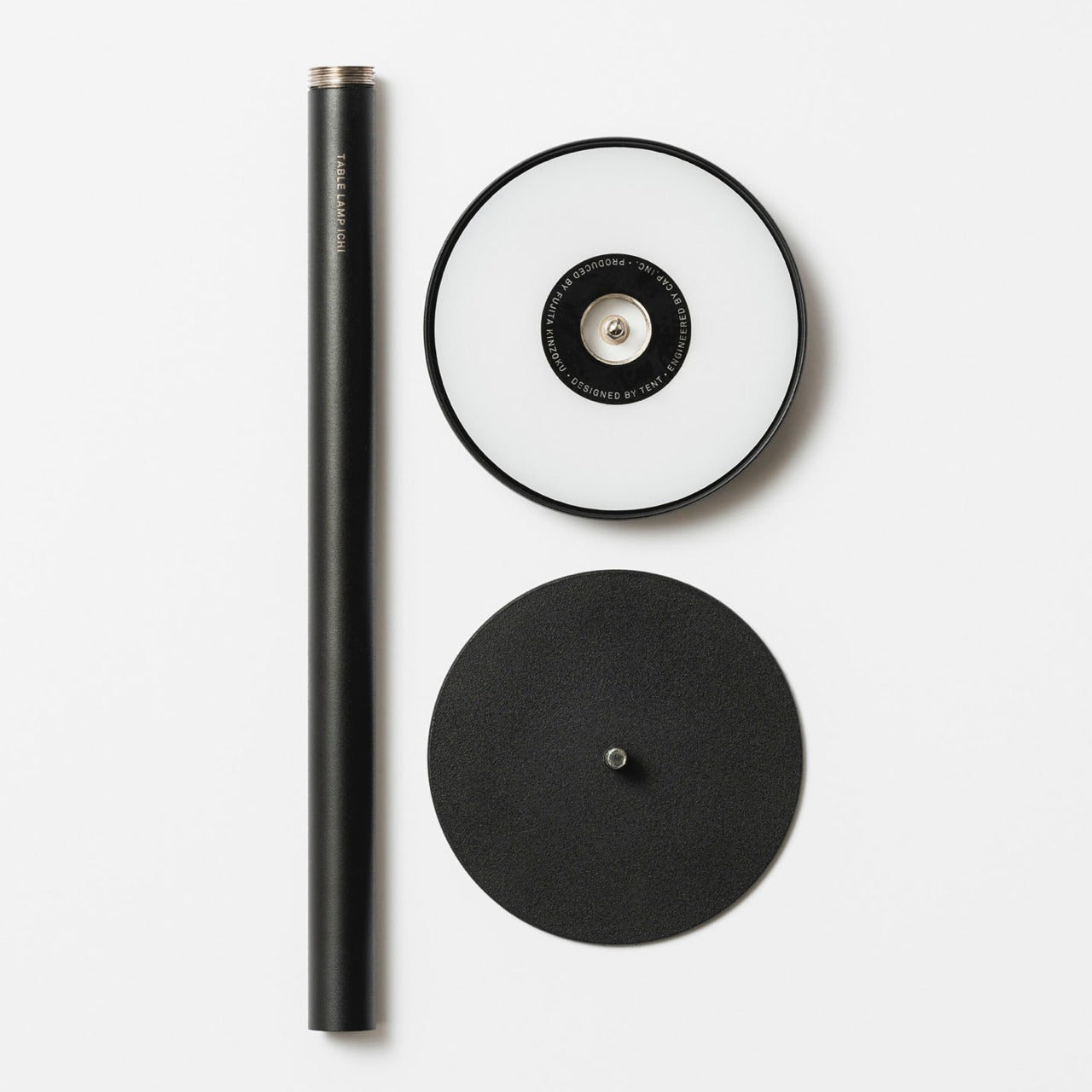
Most nightstand lamps are compromises. The color temperature drifts toward clinical white at exactly the wrong hour, the base requires an outlet placement that dictates where everything else goes, or the design was selected in poor lighting at a furniture store and has been quietly resented ever since. The Anywhere-Use Lamp removes most of those friction points from the equation. Available in black, white, and a new Industrial edition, it is a portable, cord-free table lamp with a clean minimalist silhouette and a warm, contained glow that changes the character of a bedroom after the main lights go off.
Ambient light quality at bedtime is one of the most underrated variables in how quickly a bedroom shifts from a room you happen to be in to a place that actually invites rest. Warm, directionless light at eye level, rather than overhead, does a significant portion of that work without requiring any configuration. There is no companion app, no color temperature slider, and no smart home integration to set up. The Anywhere-Use Lamp delivers exactly the quality of light a nightstand surface deserves.
Portable and cord-free — works on a nightstand, in a travel bag, and on a hotel desk without adapters or outlets
Industrial edition offers a raw material finish that integrates well into modern and minimal bedroom aesthetics
What We Dislike
At $149, it occupies the premium end of portable lamp pricing, a harder case to make without seeing the build quality in person
2. ADAM elements Mag 3 Ultra
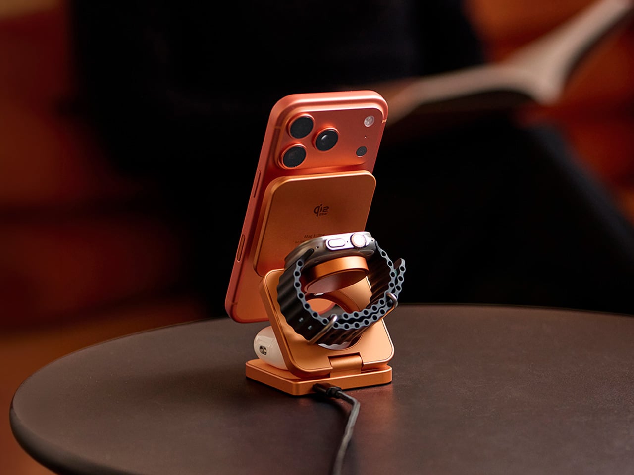
The Mag 3 Ultra addresses the charging problem Apple created and never solved. When Apple canceled AirPower in 2019, it left iPhone users managing three separate charging solutions on one surface: a MagSafe puck for the phone, a dongle for the Watch, and a Qi pad for the AirPods. This aluminum alloy dock collapses all three into a single folding station that snaps into position magnetically and arrives in a copper-orange colorway that reads more like a considered desk object than a utility accessory hiding under a lamp.
The engineering detail that separates it from most competitors is the elevated phone pad, which keeps the iPhone camera module completely clear of the stand body so the phone sits flush and upright without an awkward tilt. With Qi2 support and up to 25W magnetic fast charging, the Mag 3 Ultra handles all three devices simultaneously without any of them competing for priority. StandBy mode works properly through the night. Foreign Object Detection protects both the dock and whatever else lands on the surface. A three-year warranty backs a product designed to stay in one place permanently.
What We Like
Folds completely flat for travel, collapsing all three charging positions into a square barely thicker than a deck of cards
Elevated phone pad prevents camera module contact, solving a real alignment problem most flat docks quietly introduce
What We Dislike
Peak 25W performance requires a 45W or higher single-port USB-C adapter, sold separately and adding to the total cost
Ships with one cable, so integrating it cleanly into an existing setup may require an additional purchase
3. Divoom FlowToo
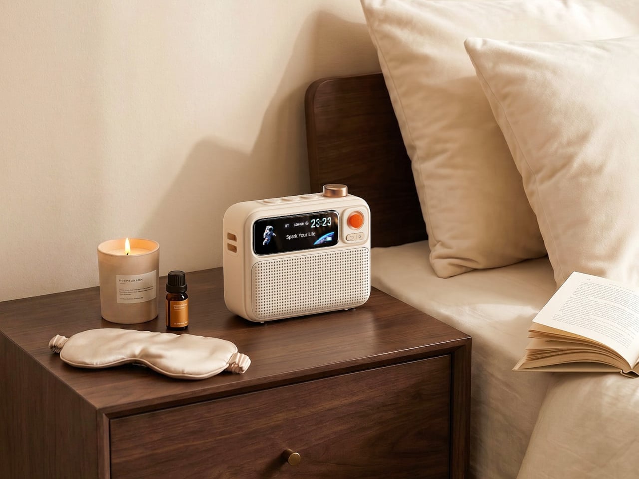
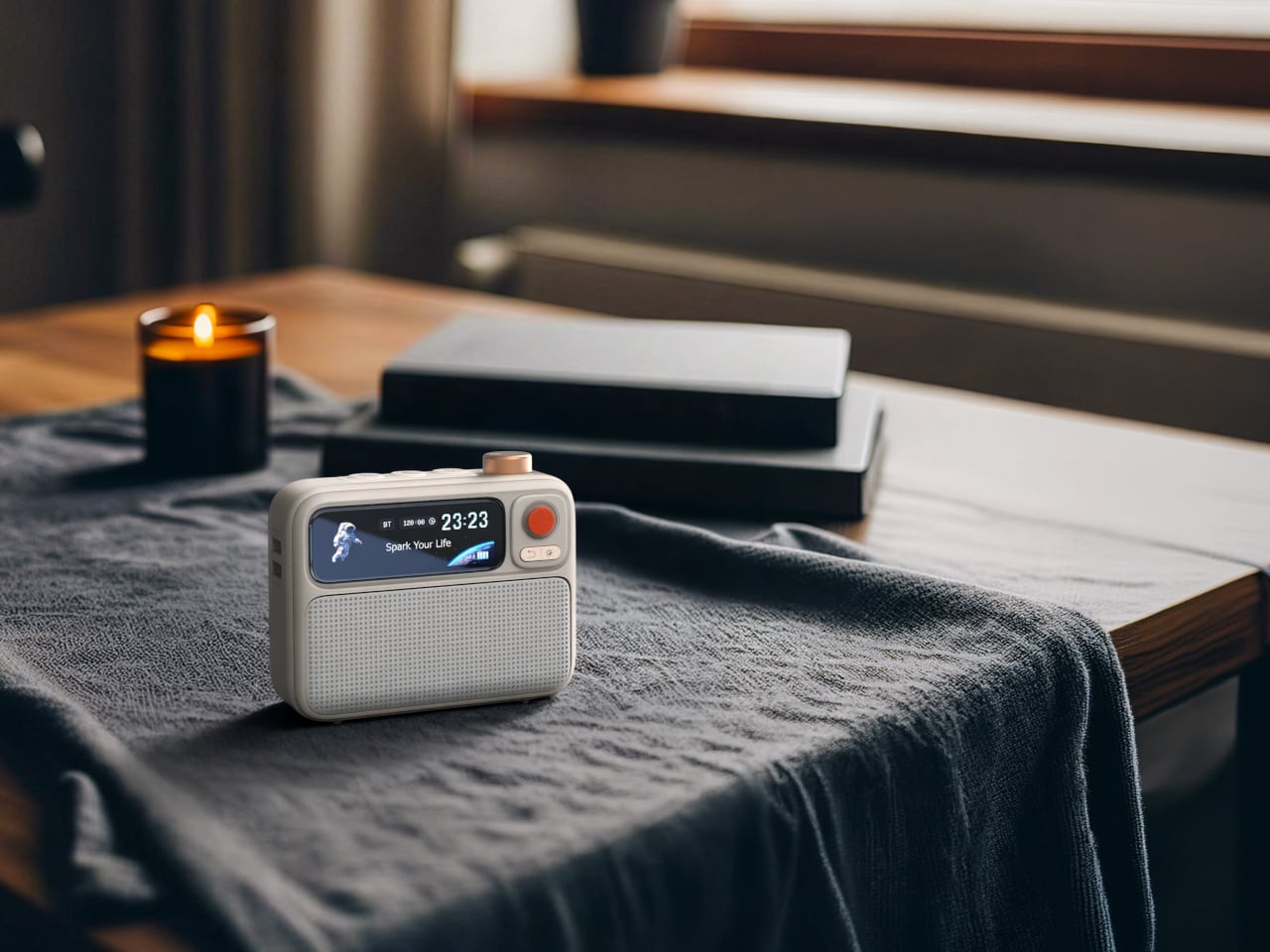
Three devices disappear from the nightstand for under a hundred dollars. The Divoom FlowToo combines a Bluetooth speaker, white noise machine, and alarm clock in a single compact unit, and handles each of those functions with more care than most products that attempt the combination. Its 10W amplifier and 45mm full-range driver are genuine audio hardware, not the obligatory speaker feature most alarm clocks bolt on as an afterthought. More than 90 built-in sounds cover the most-used sleep and focus categories, and the Divoom app keeps alarm scheduling and sound selection manageable from your phone without requiring physical interaction in the dark.
The 2.26-inch smart display does more than show the time. It runs multiple clock face designs, music visualizers that respond to whatever is playing, sleep scene animations, and a mood lighting mode that shifts the character of the room across the evening. The wake system layers natural sounds and soft light simultaneously, so the morning alarm builds gradually rather than firing at full volume from silence. It comes in black and white, both clean enough to sit beside almost any existing bedroom setup without visual conflict. For a first nightstand upgrade, this is the most efficient starting point.
What We Like
Gradual wake system combines natural sound and light simultaneously, removing the cortisol spike of a standard alarm entirely
Smart display handles mood lighting and timekeeping in one surface, so no additional ambient screen is needed
What We Dislike
Alarm management requires the Divoom app, which means keeping the phone nearby and partly contradicts a phone-free sleep routine
10W speaker output suits a nightstand well but will not satisfy listeners who prioritize audio quality as the primary function
4. Dreamie by Ambient
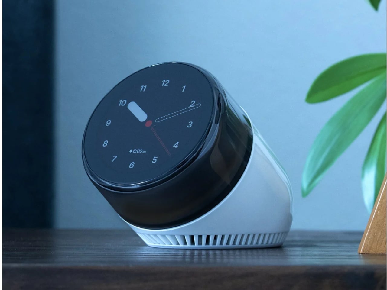
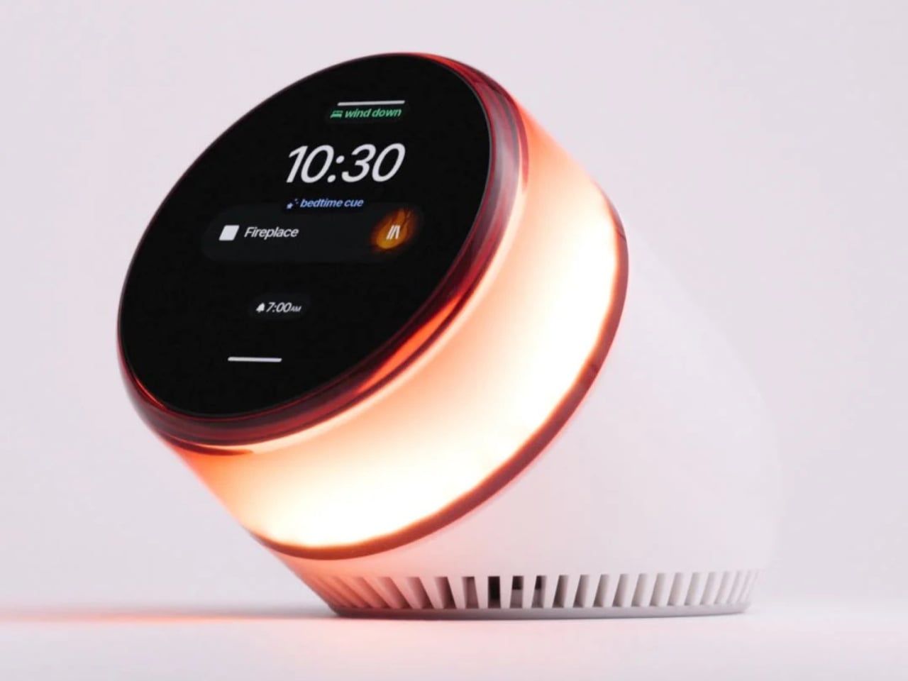
Dreamie is built around one design argument: the phone does not belong beside the bed. Ambient’s founder Adrian Canoso, who brings an industrial design and audio engineering background to the company, built Dreamie to consolidate every legitimate reason a phone lives on a nightstand — alarm, ambient sound, light, podcasts, simulated sunrise — into a single device that offers none of the reasons phones keep people awake. There are no notifications, no feeds, no accounts, and no subscription fee. The Calm Tech Institute awarded it their highest certification, a signal that carries real weight in a category full of vague wellness claims.
The 50mm speaker with a 360-degree grille diffuses sound into the room rather than projecting it forward, creating an ambient quality that wraps the space during wind-down. A hidden volume dial and a touch strip for lamp brightness handle all physical interaction without requiring a menu or a screen tap. All sensor data stays on-device. Contactless sleep tracking arrives as a free over-the-air update later this year. At $249.99, the value case is most honest when compared to a wearable you already charge every night: Dreamie costs about the same, stays on the nightstand, and keeps the phone across the room where it belongs.
What We Like
No subscription, no account, no data collection — everything runs on-device and stays there indefinitely
Tactile controls function reliably in complete darkness without triggering a screen or making any sound
What We Dislike
At $249.99, the value argument requires genuinely committing to leaving the phone elsewhere, not supplementing existing nightstand devices
Audio output is Bluetooth only, so wired headphone use for partner-friendly late-night listening is not an option
5. 3-in-1 Luminous Mirror Diffuser
The 3-in-1 Luminous Mirror Diffuser follows this design philosophy — an object that earns permanent placement by doing several things with uncommon care, rather than one thing with a list of compromises attached. The oval anodized aluminum body houses three genuinely distinct functions: a customizable lamp, a 360-degree rotatable mirror, and a patented aroma plate that uses aluminum matrix technology to gently diffuse fragrance from a few drops of essential oil. None of the three feels like an afterthought added to justify a price point.
The lighting system moves between three color temperatures — 2400K warm amber for wind-down, 3800–3250K neutral for calm focus, and 6000K daylight clarity for precision — across four brightness levels, which makes it the one lamp on this list that adapts to both ends of the evening. A wireless charging pad integrated into the base handles device power without adding a cable to the surface. The mirror eliminates the separate grooming mirror that occupies nightstand real estate in most bedrooms. And the aroma diffuser, with its washable aroma plate and temperature-controlled heating, replaces a plug-in ultrasonic unit with something that requires no water tank, no misting, and no countertop clutter.
Three color temperatures and four brightness levels make it genuinely useful at every stage of the evening, from bright grooming light to dim amber wind-down
Wireless charging pad built into the base means the charging dock and lamp footprint collapse into a single object on the surface
What We Dislike
At $800, it sits in a different spending bracket from the rest of this list and requires treating it as a long-term investment rather than an upgrade purchase
The mirror function adds real utility for grooming but may feel surplus to requirements in bedrooms where a bathroom mirror is steps away
The Nightstand You Actually Want Starts With One Good Decision
The nightstand is the last surface you interact with before sleep and the first thing you look at when you wake up. What lives there shapes both experiences more than most people give credit for. Each product here earns its place by solving something specific: warm light that belongs in the space, three devices charging cleanly, a room filled with gradual sound, a phone that stays across the room where it always should have been, and a single object that handles light, scent, and reflection with equal care.
The best nightstand setups are not minimal out of discipline. They are minimal because every object on the surface was actually chosen. None of these five products overlap in function, and none requires the others to justify its place. Start with the one that solves the most visible problem on your nightstand today, and the argument for the next one tends to present itself without much effort.
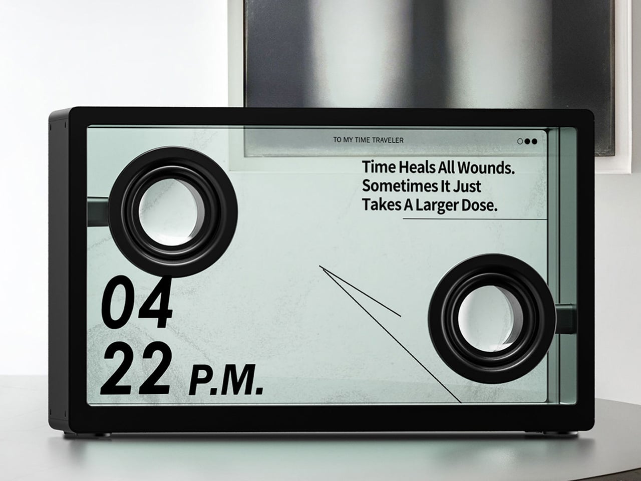
Bang & Olufsen perfected the idea of audio equipment as art, creating speakers so sculptural and beautiful they demand to be looked at long before they are ever heard. This approach turned hi-fi systems into statement pieces, architectural elements that shape a room’s aesthetic just as much as they fill it with sound. The price for such artistry, however, often places it in the realm of museum-worthy gallery objects. A new design is taking a similar run at that “look at me” audio philosophy, finding its visual hook through an entirely different and arguably more dynamic method, without the five-figure price tag.
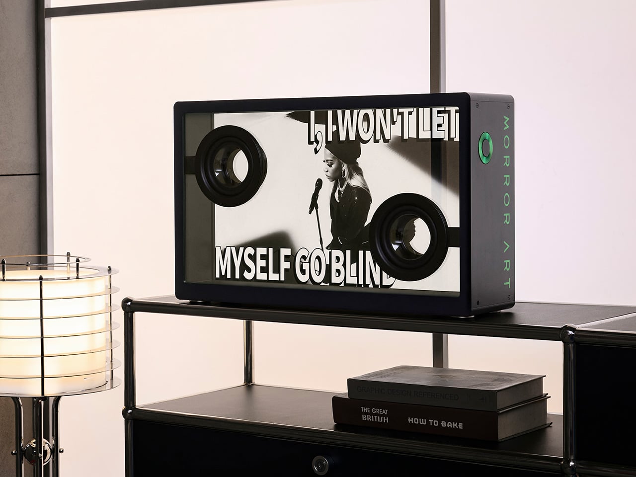
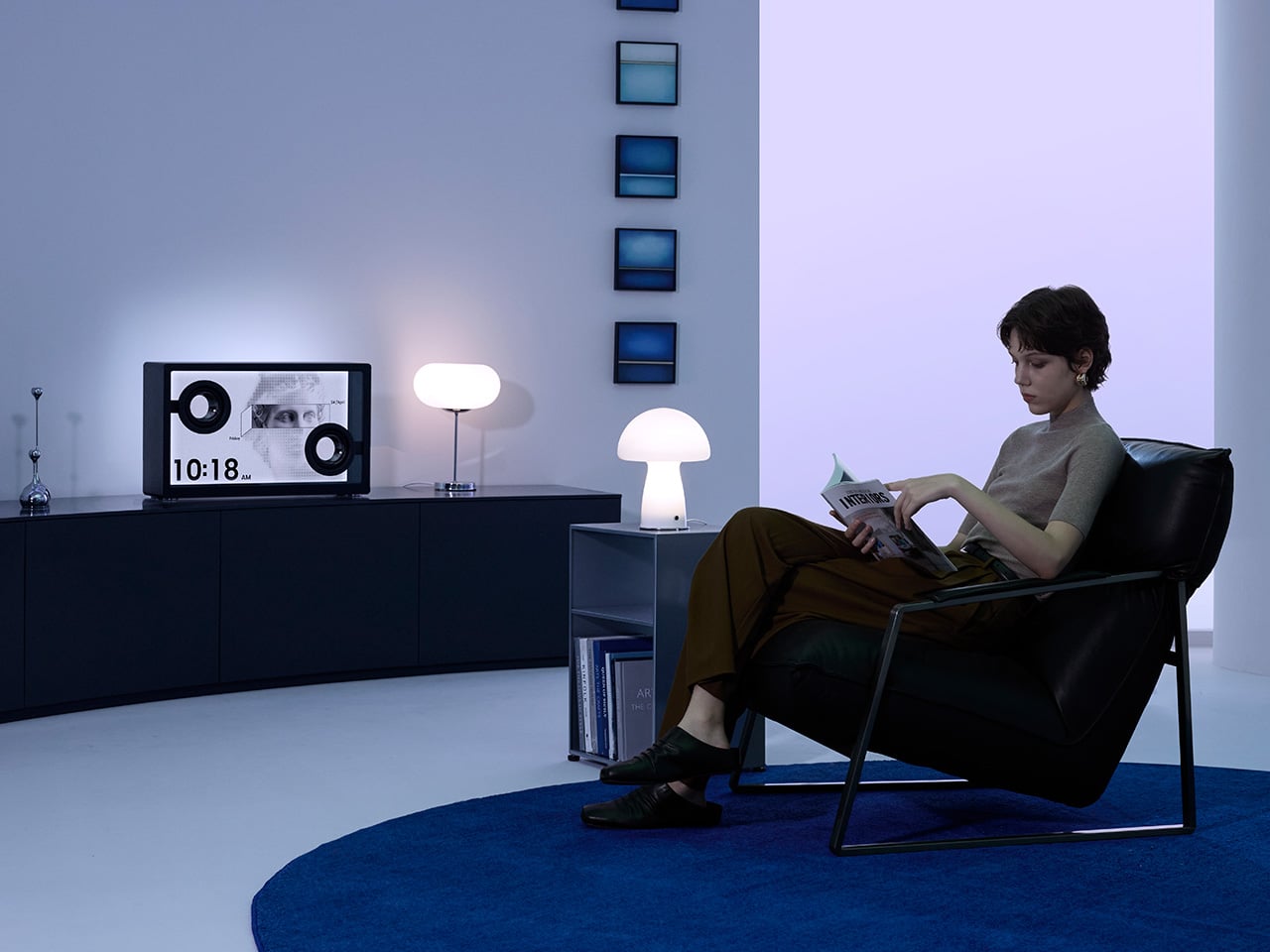
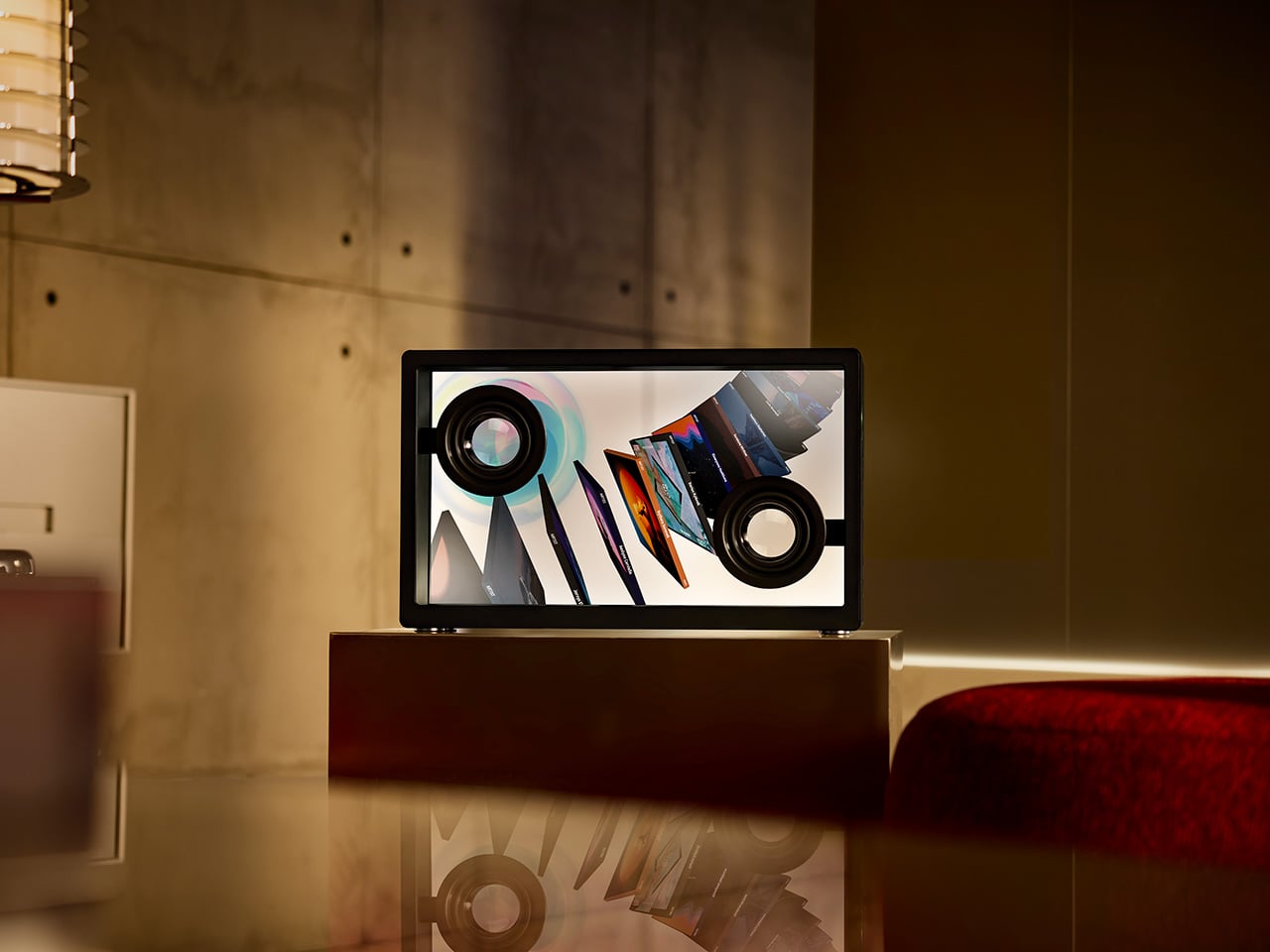
The MorningBlues SonicGlass A1 achieves its visual identity through engineered transparency. Instead of relying on exotic woods or polished aluminum, its beauty comes from revealing the inner workings of sound itself. The speaker’s main diaphragm is a sheet of clear glass, letting you watch the physical driver move and vibrate with the music. This turns the hardware into a performance, a living object that makes sound tangible. MorningBlues calls this “Visualized Music” – a vision where sound, lyrics, motion, and visuals become part of one unified experience rather than separate elements. It’s a clever way to create a decorative speaker that feels both technical and artistic, designed for people who appreciate seeing how their favorite things work.
This focus on a meaningful visual is a refreshing change of pace. We are, after all, intensely visual creatures. For decades, speaker companies have tried to give our eyes something to do while we listen, but the solutions have been uniformly uninspired. We’ve been served an endless buffet of dancing digital equalizers and pulsing RGB lights that flash along to the beat. These features feel disconnected from the soul of the music, reducing a complex song to a simple, repetitive light show. The SonicGlass A1 offers something far more compelling because it taps into the most human element of any track: the story.
It’s basically captions for your music, an idea so immediately brilliant it’s a wonder it took this long to happen. Let’s be honest, almost nobody watches movies anymore without subtitles. Between mumbled dialogue and our own fractured attention spans, seeing the words has become essential. The SonicGlass A1 applies that same logic to listening. It uses its 21.5-inch transparent display to make lyrics appear to float in mid-air, animating and shifting with the rhythm and mood of the song. You can finally catch that one line you’ve been mishearing for years or appreciate the poetry of a verse without breaking the spell to look at your phone.
The real magic here is that the display isn’t just a screen sitting behind glass; the glass is the speaker. The entire front panel is an ultra-thin German Schott glass diaphragm, which vibrates to create sound. This panel is moved by a powerful neodymium magnetic system, turning the whole assembly into a transparent driver. It’s a remarkable piece of acoustic engineering that makes the visual effect feel earned, not tacked on. The transparency goes beyond just the surface, revealing the acoustic movement behind every note and creating a direct, physical link between what you hear and what you see.
This commitment to engineering extends to the audio quality. Inside the sealed enclosure are dual 4-inch full-range drivers powered by a pair of 80W Class-D amplifiers, delivering clean, room-filling stereo sound. The design prioritizes clarity and a balanced, natural reproduction, ensuring vocals are crisp and instruments feel distinct. It also features three different tuning modes, allowing you to tailor the sound profile to your room or your mood. It’s a system designed to prove that a speaker built around a visual novelty can also be a genuinely capable piece of hi-fi equipment.
While the speaker is a stunning object on its own, its personality is shaped through the MorningBlues smartphone app. This is the creative command center where you control the entire visual experience. The app’s “Lyric Lab” lets you customize the fonts, effects, and animations of the floating lyrics, tailoring them to your exact taste. It’s also where you can access the more futuristic AI features, like generating a music video for a favorite song or using a Face Swap tool to put yourself in the performance. For quieter moments, the app lets you display personal photos and videos or choose from a library of mindful meditation scenes, turning the speaker into a dynamic digital canvas.
If the app is the creative hub, the optional Music Hub is the tactile command deck for your entire audio ecosystem. This physical controller is a serious piece of kit, designed to manage your listening experience with dedicated controls. It features a prominent vocal removal button that instantly preps any song for karaoke. More impressively, it acts as a bridge to your existing audio gear, allowing you to pair the SonicGlass A1 with up to three other Bluetooth speakers from any brand. With its own enhanced audio decoding, the Hub ensures all connected speakers sound their best while giving you a single, elegant interface to control your multi-room setup.
This transforms the speaker from a standalone device into a social centerpiece. The combination of easy vocal removal and synchronized lyrics makes it an incredibly fun and intuitive karaoke machine. It’s an artful object for your daily listening, a conversation-starting decor piece when it’s quiet, and an interactive entertainment system when you have friends over. It’s one of the few devices that feels equally at home providing background music for a quiet evening or being the main event at a party.
The standard retail price for the SonicGlass A1 Lyric Speaker is $999. For its launch, MorningBlues is offering a super early bird price of $649. Several bundles are also available to build out a more complete system. A Stereo Pair of two speakers is offered at $1,299, down from a retail of $1,998. The Smart Audio Bundle, which includes one speaker and the Music Hub controller, is available for $849. For those looking to go all-in on the social features, a Karaoke Special bundle includes the speaker, the Music Hub, and a microphone for $879.
Four-player chess is not some internet-era gimmick dreamed up for group game nights. Variants of it have existed for centuries, from Indian Chaturaji played with dice, to Victorian England’s fascination with elaborate cross-shaped boards designed specifically to seat four rivals at once. The format never quite dethroned standard chess in popularity, mostly because building a proper four-sided board was always a pain, and because the rules needed serious rethinking to keep games from spiraling into total mayhem. It is a format that rewards ambition and punishes anyone who tries to wing it.
That is precisely the gap LEGO Ideas creator CozyBuildingBlocks7126 decided to fill, with a physical, brick-built four-player chessboard that revives the format for a new generation of players, dice optional. The design leans into a cross-shaped layout, four full armies in distinct colors, and, most interestingly, a scoring system engineered specifically to make four-way chess feel less like chaos and more like calculated risk. It is a smart, tactile answer to a format that has always deserved better hardware.
Designer: CozyBuildingBlocks7126
The board itself is the first thing that grabs you, a cross-shaped slab built from 852 pieces and measuring a generous 51.2 by 51.2 centimeters, large enough to comfortably seat four full armies without anyone’s rooks bumping elbows. Blue, yellow, green, and red pieces line up along their respective arms of the cross, and the notched corners where each arm meets the central board are a genuinely clever piece of structural design, letting four ranks sit flush against each other without any awkward diagonal overlap. It reads almost like a plus sign built out of chessboard, which is exactly the kind of geometric problem-solving that separates a thoughtful MOC (my own creation) from a simple recolor job.
My favorite detail, though, is the scoring system, because this is where the design stops being a novelty and starts being a genuine strategic rethink. Pawns promote at the eighth rank instead of the fourteenth, landing them mid-board rather than at the enemy’s doorstep. Bishops are worth five points instead of three, queens born from promoted pawns are quietly capped at just one point, and a checkmate alone is worth a hefty twenty points. Captured kings leave their armies “dead” on the board, meaning their pieces can still be captured but no longer award points to whoever takes them. The result is a game where getting checkmated does not necessarily mean losing, since a well-timed capture can vault you into first or second place even after your king falls. That is a wonderfully devious wrinkle for a build that could have coasted on novelty alone.
The set is still early in its LEGO Ideas run, sitting at 105 supporters with 424 days left on the clock to reach the first milestone of 1,000. It has a long runway ahead before the official 10,000-vote threshold that triggers a LEGO review, but for anyone who has ever wanted to drag chess off the screen and back onto a real table, four opponents included, this is a build worth rallying behind. You can head to the LEGO Ideas page and cast your vote here.
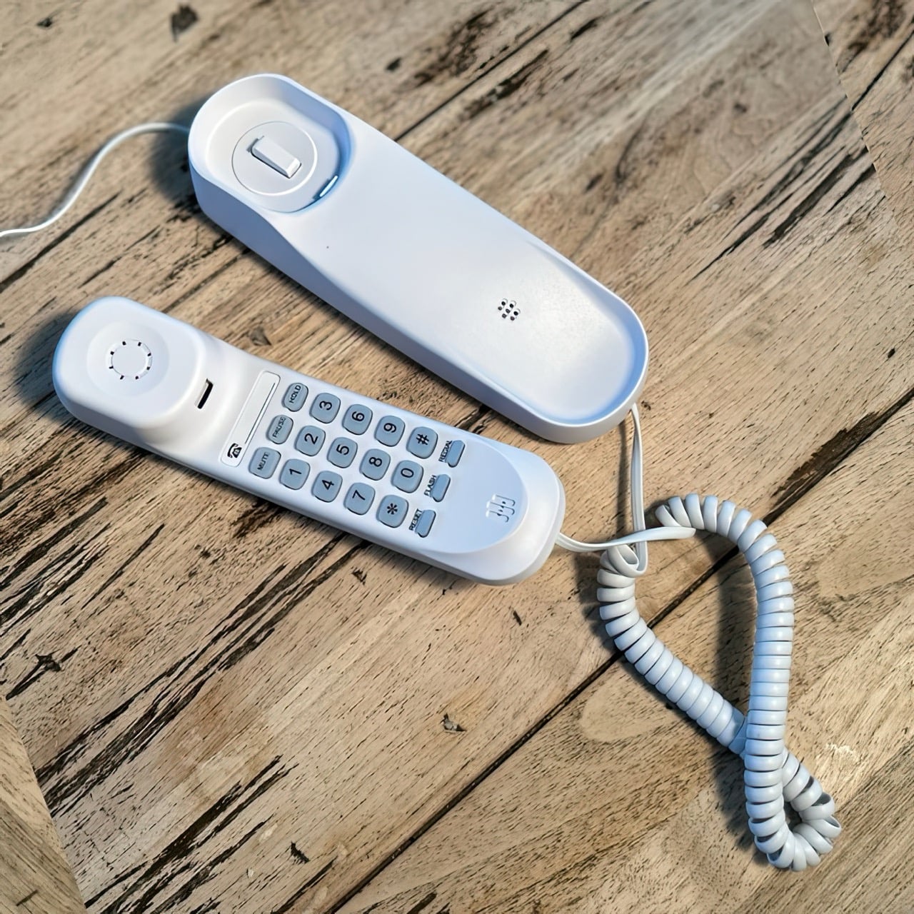
The landline died because of the wire, not because of the idea. A physical phone tethered to a wall socket made sense in 1985 and made increasingly less sense every year after, until entire households simply stopped bothering to replace them. Pinwheel’s new release makes the case that the object itself, the tactile handset, the dedicated cradle, the single purpose design, was worth keeping around long after the copper wiring became a liability. Strip out the jack and run the whole thing over Wi-Fi instead, and suddenly a nostalgia object becomes a genuinely practical piece of furniture again. That is the quiet design insight buried inside what looks, at first glance, like a novelty throwback.
Called Pinwheel Home, the device targets kids aged 5 to 10 who need a way to reach approved contacts without inheriting a full smartphone. It plugs into any outlet and pairs with Wi-Fi, meaning it can sit on a kitchen counter or a bedroom shelf without a technician ever showing up. Two versions exist, the smaller Home Spark at 68 dollars and the larger, more decorated Home Classic at 79 dollars, both sold directly through Pinwheel ahead of an Amazon release this fall. Parents control the whole experience through Pinwheel’s Caregiver Portal, approving every contact and setting the hours calls are allowed. The company already makes kid smartwatches, so this slots into a lineup built specifically around delaying smartphone ownership.
Designer: Pinwheel
That oversized handset is not just a styling choice, it is the entire emotional payload of the product. Somewhere in the last two decades, ending a phone call turned into touching a red icon on glass, a gesture with all the drama of dismissing a notification. Home Classic hands a kid an actual weighted receiver and an actual spring loaded cradle, and the moment a call ends, physics takes over. Slam it down hard enough after telling a sibling they are wrong about something, and the whole base rattles. Rest it gently after a call with grandma, and it clicks shut soft as a whisper. That range, from petty dramatic slam to quiet contented click, is a form of emotional expression a swipe gesture has never once offered a five year old, and Pinwheel built the entire handset geometry around making that range possible.
Calling another Pinwheel Home device is free, routed through the company’s own Circle network using a short internal code instead of a standard phone number. Reaching an actual mobile number, like a grandparent’s cell phone, requires a subscription, either 6.99 dollars monthly for a real 10-digit number and five approved contacts, or 9.99 dollars monthly to remove that contact ceiling. Emergency calling stays free no matter what plan a family is on, which is the one place Pinwheel clearly refused to charge across. Home Classic’s stickers might be the hook that gets a kid excited, but the free-versus-paid split is the part parents will actually feel every month.
Pinwheel has already teased three-way calling and tighter integration with its kids’ smartwatches, hinting that a child’s number and approved contacts could eventually follow them from the countertop straight onto their wrist as they get older. That continuity is the real long game here, not the retro shell. A phone that lets a kid slam down a receiver like they mean it sounds like a gimmick, until you realize it might be the only piece of hardware left teaching an entire generation how satisfying hanging up used to feel.
Back to school has a version where you scramble for a notebook and a pen that works, and a version where everything you reach for during the day does its job cleanly, looks like someone cared about it, and disappears into your pocket without complaint. The gap between those two versions is smaller than a full semester’s worth of regret. It mostly comes down to the eight things you carry every single day.
EDC — everyday carry — was never designed specifically for students, but it should have been. Campus life is its own particular design problem: long days across multiple environments, limited pocket space, and the constant friction of tools that underperform at the exact moment you need them most. These eight picks solve that friction. Each one earns its space on a keychain or in a bag pocket on its own terms, without needing to be explained.
1. Pininfarina Aero Ethergraf
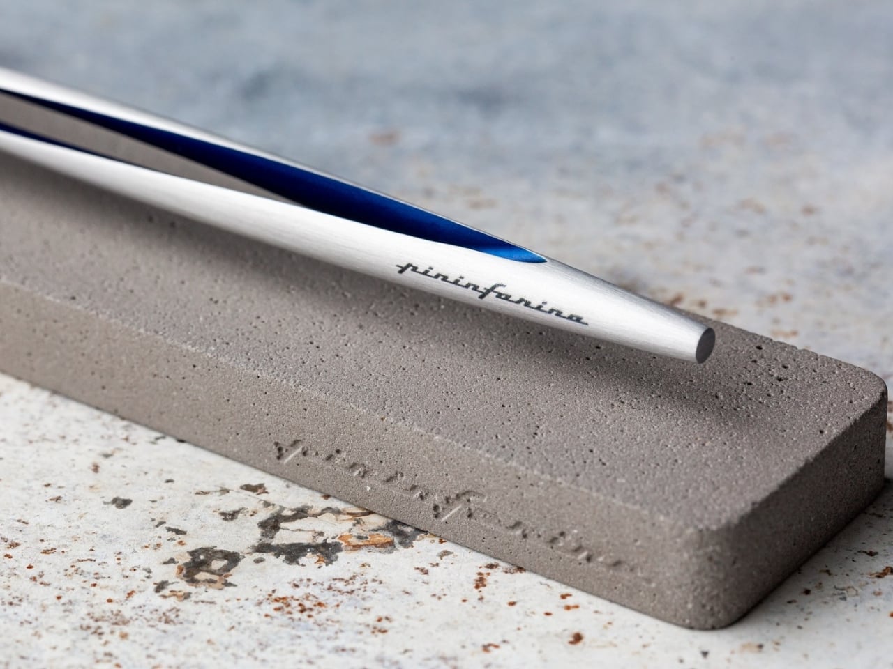
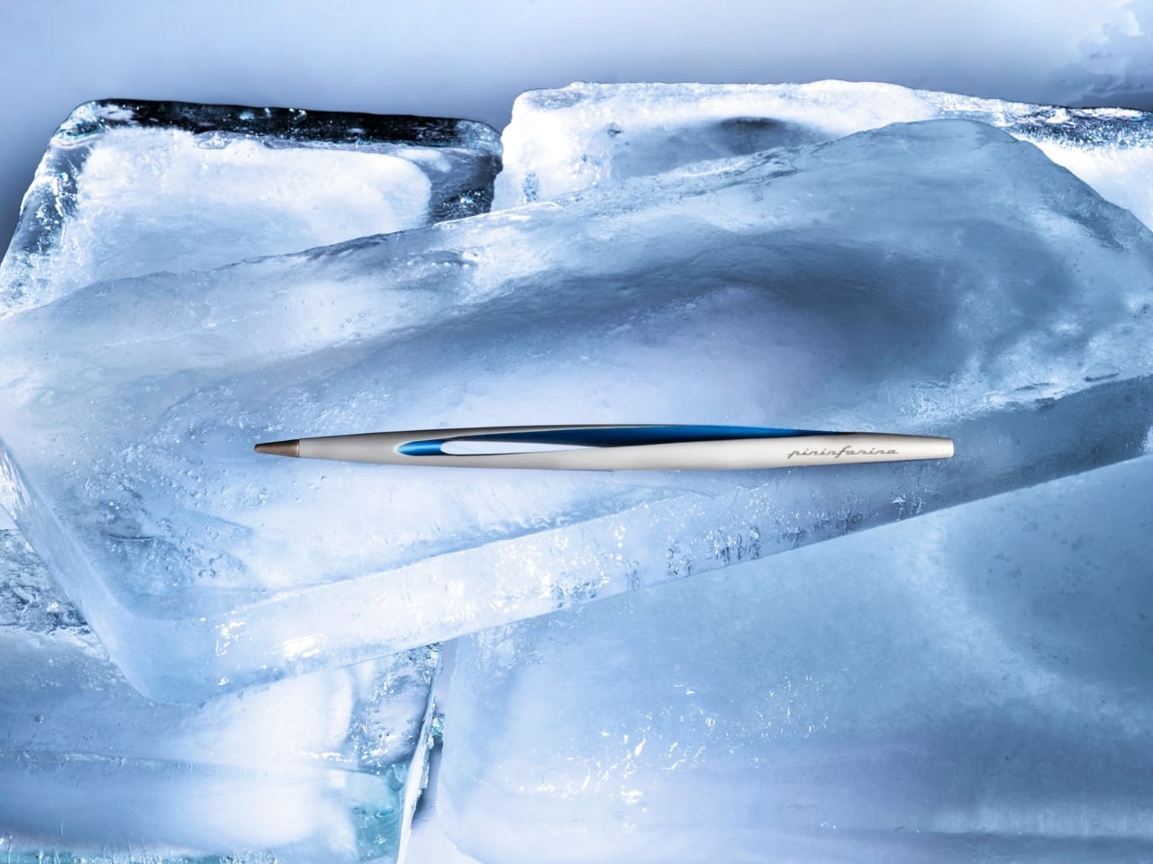
Most pens run out at the worst possible moment: mid-exam, mid-note on a page that actually mattered. The Pininfarina Aero Ethergraf solves that by removing ink entirely. The writing tip is an Ethergraf metal alloy engineered to leave a permanent graphite-like mark on paper through oxidation, a technique older than the ballpoint by centuries. The result is a line that is precise and smudge-proof, will not bleed through paper, will not dry out when left uncapped, and will never need a refill.
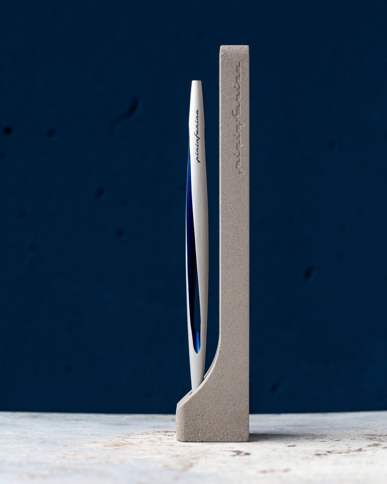
Pininfarina built the Aero from aerospace-grade aluminum at 17 grams and 160mm long. The same studio responsible for decades of Ferrari and Maserati bodies brought that same design language to the pen form: a single confident shape, a blue accent that catches light at the right angle, and nothing that does not need to be there. The pen ships with a raw concrete cradle that sits on a desk without pretending to be anything other than what it is: a writing instrument built to stay rather than be replaced.
What we like
No ink or refills means this pen performs identically on the first day of term and the last, which is the most honest promise a writing tool can make.
The aerospace aluminum body and Italian construction give it the kind of material presence that makes it worth keeping across a career, not just a semester.
What we dislike
The Ethergraf line is lighter than ballpoint or gel output, which requires more deliberate pressure on thinner paper stocks to achieve confident, consistent marks.
The metal tip performs best on standard paper; coated or glossy surfaces produce inconsistent results.
2. Fantom X Wallet
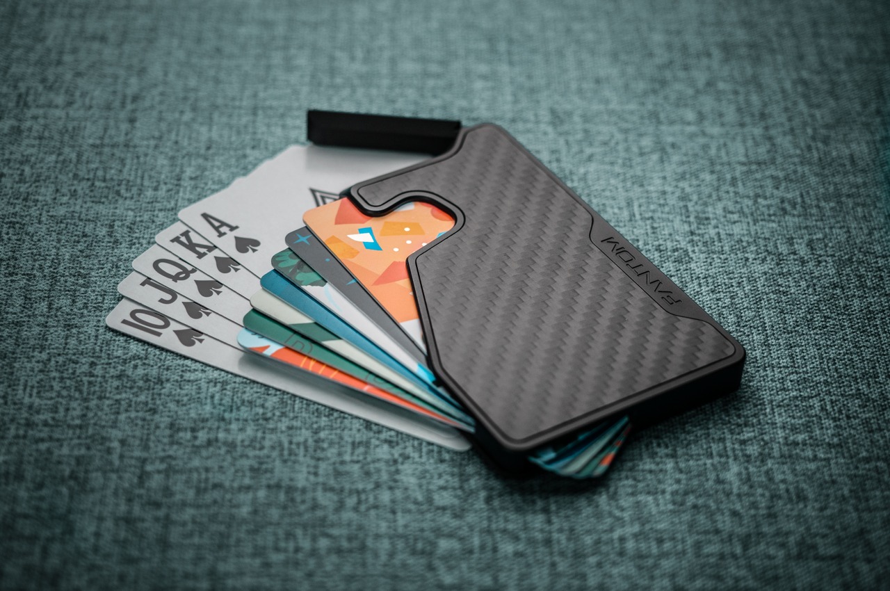
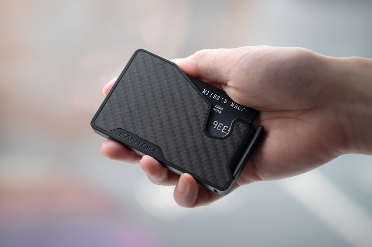
A wallet is the one carry item almost nobody replaces until it fails, which is why most students spend three years sitting on something thick enough to tilt their posture. The Fantom X makes the case for replacing it before that happens. Built on a slim aluminum or carbon fiber chassis, it carries your most-used cards in a front-pocket profile that does not print through fabric, does not soften and stretch over time, and does not demand you excavate it to find what you are looking for.
The design philosophy here is subtractive: strip the wallet back to what it actually needs to do, then build those functions with enough precision that none of them fail quietly. For students moving between campus buildings, transit cards, and a student ID that needs to appear in under three seconds, that clarity matters. Drop it in a front pocket on the first day, and it becomes the kind of object you stop noticing, which is the highest compliment a wallet can earn.
What we like
The aluminum frame holds its shape across an entire degree program without softening, stretching, or accumulating the debris that leather wallets quietly collect over time.
The front-pocket profile is genuinely slim enough to change how you move through a crowded lecture hall or a packed transit car.
What we dislike
Fixed capacity suits a minimalist carry well but creates friction for anyone who still relies on cash for campus cafeterias or weekend markets.
The rigid form does not adapt as card count grows, which becomes a real limitation by the time senior year adds a work badge to the rotation.
3. Personal Whiteboard
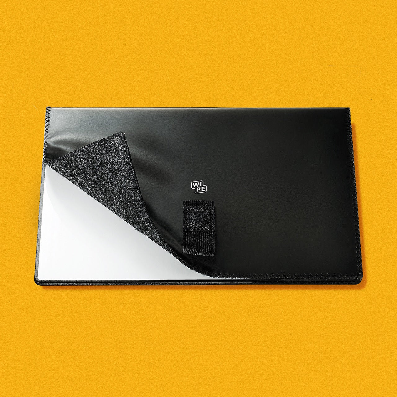
The notebook has one flaw that nobody talks about: every page you write on is gone from active use the moment you turn it. Campus life generates a specific kind of thinking that does not need to be permanent — a rough sketch before a presentation, a formula to hold in working memory for twenty minutes, a quick to-do list that expires by lunch. The Personal Whiteboard is built for exactly that. Compact enough to carry anywhere, it opens to a clean dry-erase surface that works with any standard marker, requires no app, no sync, and no battery.
What separates it from a whiteboard bolted to a wall is the complete carry system built into the form: an eraser, pen holder, stand, and storage pocket all housed in one portable unit. Jot an idea down, snap a photo with your phone to send it wherever it needs to go, and wipe the surface clean before the next lecture. For students who think visually — sketching diagrams, mapping out arguments, working through problems spatially — this is the analog scratchpad that a phone notes app can never fully replace.
The all-in-one build — eraser, pen holder, stand, and storage pocket — means nothing is left behind and nothing rattles loose in a bag.
No battery, no app, no sync: it works the moment you open it, every single time.
What we dislike
Dry-erase surfaces require a marker that lives with the board; losing the pen turns it into a decorative object until a replacement is found.
The reusable format is not suited for notes that need to be kept; the photo-to-cloud workflow adds a step that some students will skip and regret.
4. 8-in-1 EDC Scissors
Scissors are the carry tool almost nobody thinks to include until the moment they cannot find them and spend fifteen minutes looking for something that does the job less cleanly. The 8-in-1 version addresses that by folding eight functions into a flat-pack form that opens in a single motion and weighs almost nothing in a bag. For students working across studio space, labs, and a dorm room across a single week, the cutting tasks stack up faster than any back-to-school supply list would suggest.
The real case for scissors in your EDC is that a knife cannot handle every task with the same grace: opening a sealed envelope cleanly, trimming a loose thread from a collar before a presentation, cutting a document to size, working through the tape on a textbook that arrived shrink-wrapped. The 8-in-1 handles all of those and brings enough additional functions that it earns its flat-pack space even on days when you reach for it exactly zero times. It is there on the days you do.
Eight functions in a flat-pack form that most people will actually carry consistently, rather than a dedicated pair that stays in a desk drawer.
The profile means it does not compete with other tools for space in a pencil case or bag.
What we dislike
Scissors remain the one tool people most reliably leave behind on the assumption they will not need them that particular day.
The multi-function format means none of the eight tools reaches the specialist performance of a dedicated single-purpose version.
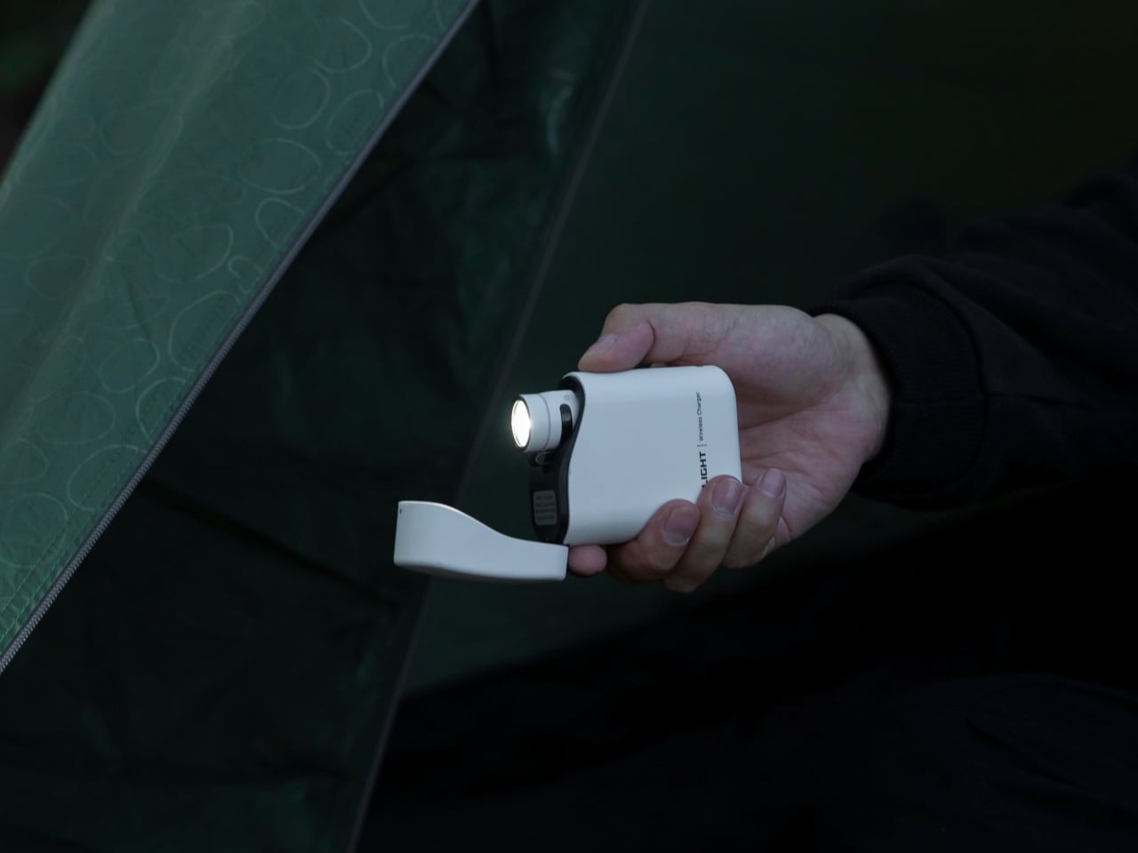
5. Olight Baton 4 Premium Edition
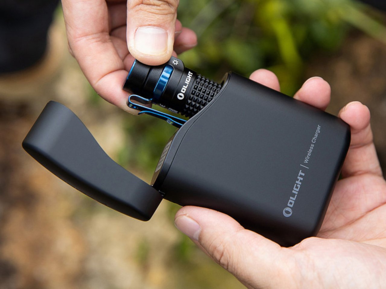
Flashlights are the EDC carry people dismiss until a power outage turns a campus building into a dark maze, or a late walk back from the library asks more of a phone screen than it should reasonably deliver. The Olight Baton 4 Premium Edition is the version of this argument that earns a permanent pocket position. The Premium finish options, stainless and copper variants in particular, read as desk objects as readily as tools, which changes what you are willing to carry every day without a second thought.
For students, the Baton 4 brings dependable illumination to the scenarios campus life generates more regularly than anyone plans for: power infrastructure that goes out during finals week, a trail run where daylight ends mid-route, a parking structure at midnight after a late seminar. The build quality means it lives in a pocket through an entire semester without corroding, scratching, or developing the rattle that cheaper lights accumulate over months. It stops being noticed after the second week, which is precisely where well-designed EDC should land.
What we like
The Premium Edition finish reads as a considered object in a professional or social setting, without the visual aggression most tactical flashlights lead with.
Build quality holds through a full semester’s worth of varied conditions without requiring any deliberate maintenance.
What we dislike
Premium Edition pricing sits at the higher end of what most students budget for pocket carry in the opening weeks of a new year.
The charging method may feel dated alongside newer competitors offering wireless or more streamlined options.
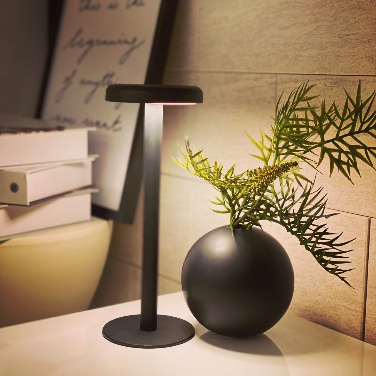
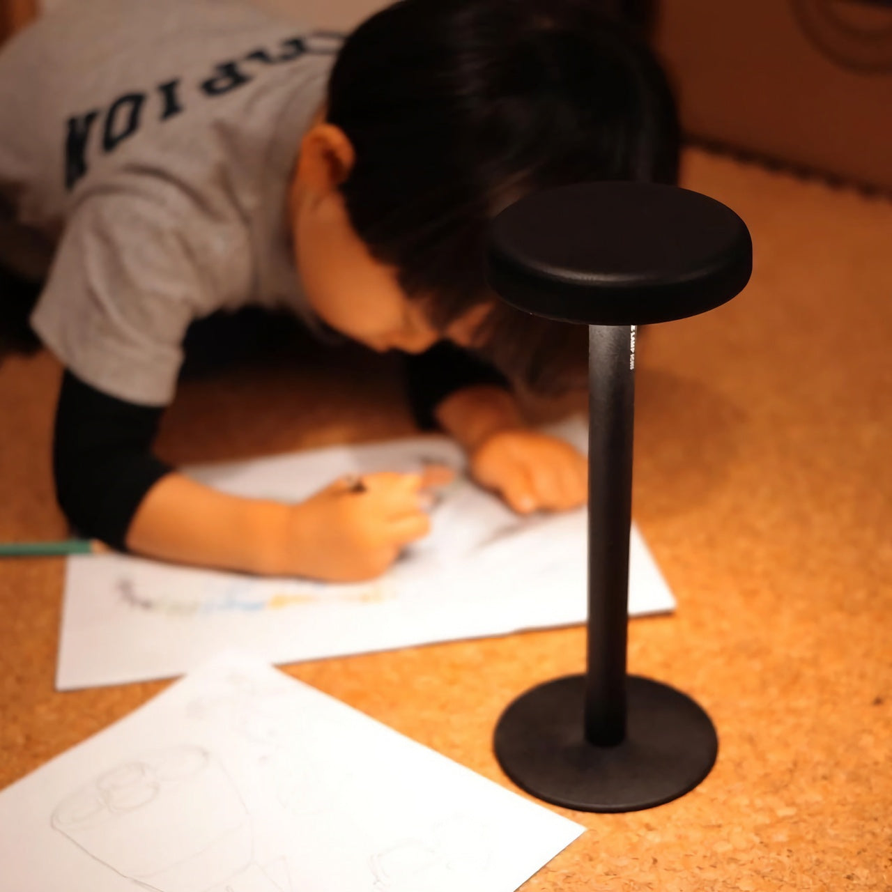
6. Anywhere Use Lamp
Dorm lighting is one of the specific miseries of freshman year that nobody adequately warns you about. The overhead fixture is fluorescent and institutional. The desk lamp that came with the room is the cheapest unit the university could justify sourcing. Studying under either of them for three hours produces a particular kind of low-grade fatigue that gets blamed on the subject matter rather than the light quality. The Anywhere Use Lamp moves between a bedside table, a study desk, and an outdoor session without requiring any adjustment whatsoever.
What makes portable lighting genuinely matter for students is the range of settings a single week creates. Late reading in a room where a roommate is already asleep. A library corner where the overhead has been out for three weeks and the work order remains unfiled. A study session outside that started in afternoon light and ran well into the evening. The Anywhere Use Lamp handles all of those and reads as a design object rather than a utility purchase, which is the difference between something that stays out on a desk and something that lives in a closet.
The portable form factor transitions from dorm desk to outdoor table to bedside table without any adjustment or setup.
The aesthetic reads as a designed object worth displaying, rather than a lamp that gets hidden when guests arrive.
What we dislike
Output works best as supplementary or mood lighting rather than a primary source for demanding, extended work sessions.
At $149, it sits at the premium end of the student carry budget for what might initially read as a secondary light.
7. MetMo Pocket Grip
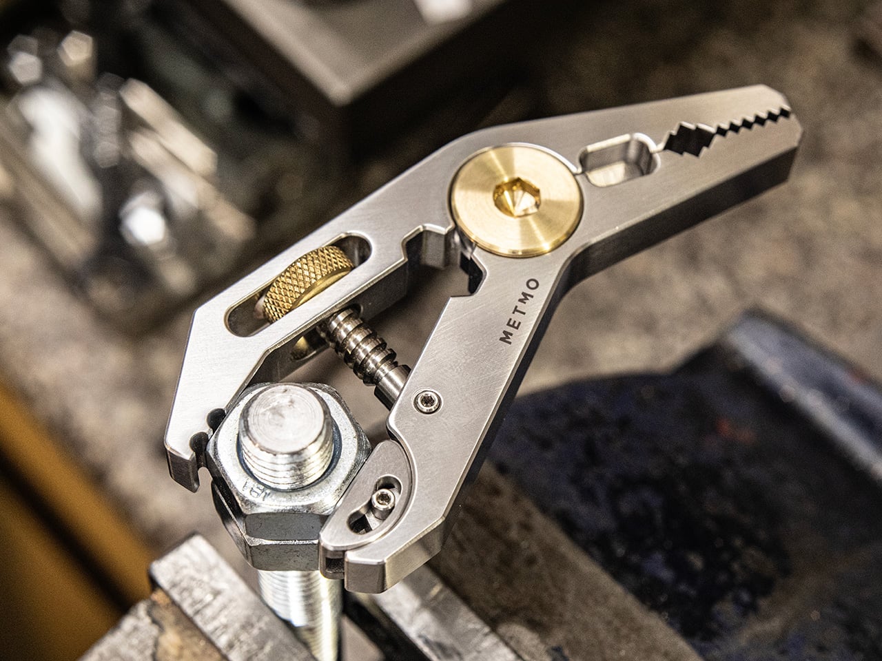
The MetMo Pocket Grip started as a 113-year-old patent that nobody had properly built until MetMo did. The result is a precision grip multi-tool measuring 95.5 by 45.5mm that disappears into a front pocket alongside a phone. The mechanism is what makes it worth paying attention to: Victorian-era engineering applied to a current material palette, which gives it a tactile character that most modern multitools — machined to tight tolerances with no analog history behind them — tend to completely lack. Old thinking, re-executed for actual daily use.
Carrying the Pocket Grip changes what you notice. Bolts that need tightening. Mechanisms that need adjusting. The tool gives you confidence to engage with the physical world in a way that most EDC does not, because most EDC prepares for emergencies rather than enabling daily interaction. For a student who spends time in studio environments or maker spaces where small physical interventions happen throughout the week, that quiet engagement matters. The fact that it looks like something a craftsman from 1913 would recognize is not nostalgia. It is just durable design.
What we like
The design origin story gives it depth of character that purely modern multitools, designed entirely from scratch, cannot replicate.
The 95.5 by 45.5mm footprint fits a front pocket without competing with a phone for space.
What we dislike
The patented mechanism takes a few uses to feel fully intuitive in the hand before it becomes second nature.
The precision grip application makes it more specialized than a general-purpose multitool for anyone looking for broader day-to-day utility.
8. CraftMaster EDC Utility Knife
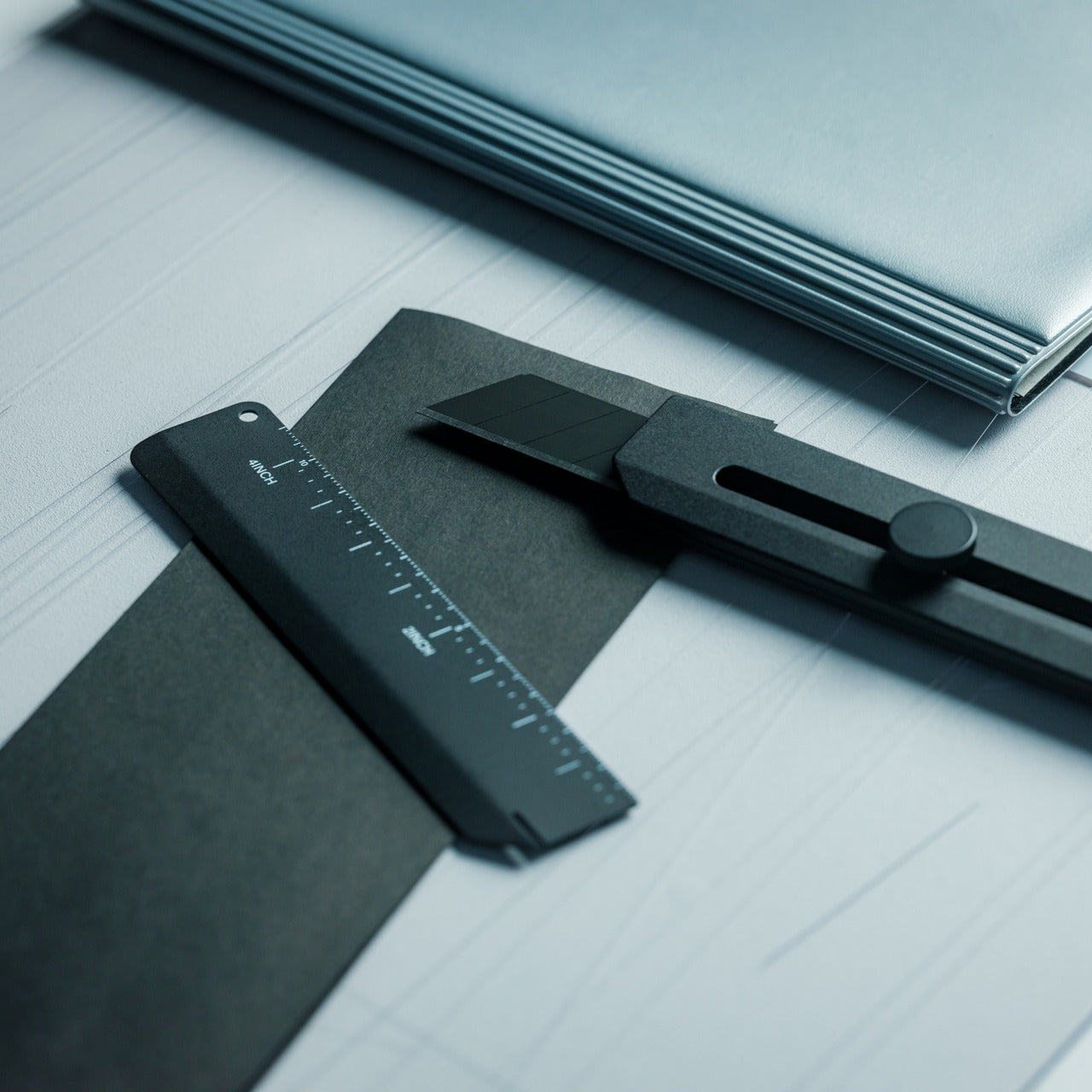
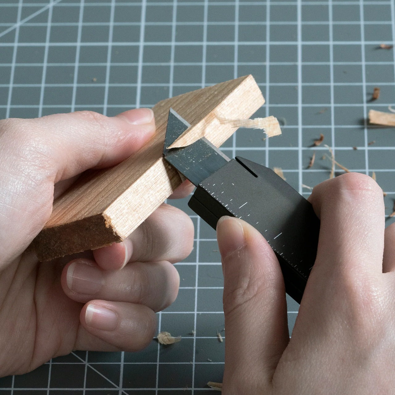
The utility knife is the most underestimated tool in everyday carry, which is why most people settle for a disposable box cutter until they need to make a clean cut and immediately remember why that choice was wrong. The CraftMaster comes in at 8mm thick and 12cm long, with a tactile rotating-knob blade deployment and an OLFA blade angled at 45 degrees: the specific geometry that makes box opening clean rather than torn. A companion metal ruler scale docks magnetically to the back of the knife body.
At 0.3 inches thick, this slides into a pocket alongside a phone without announcing itself. The ruler scale adds imperial and metric markings alongside a blade-breaker for snapping off dull OLFA segments, with a 15-degree curvature along the ruler edge that keeps fingers clear during cuts. OLFA blades are available at any hardware store on earth, which means this knife avoids the proprietary-consumable trap that quietly ruins otherwise good knives when the included blades run out halfway through a semester with no obvious replacement.
The magnetic ruler scale transforms the knife into a measuring tool without adding any bulk or requiring anything else in the bag.
OLFA blade compatibility keeps replacements cheap, universal, and available anywhere.
What we dislike
The rotating knob deployment is slower than a thumb-stud or flipper mechanism for one-handed operation under any kind of time pressure.
At 12cm, cutting depth stays appropriate for light and medium work; heavy-material tasks will need something else.
The Only EDC Rule That Actually Matters: Carry What You’ll Use
None of these eight things require a lifestyle change to carry. They sit in a pocket, clip to a bag strap, or live on a desk without demanding attention. What they do require is a single decision: that the things you reach for every day are worth choosing deliberately. One or two of these will solve a specific friction point you encounter this week. Start there and let the rest of the list find its moment when the semester makes it obvious.
The best EDC stops being noticed after the first month, which is the whole point. These eight cover the functional range of a full year at campus: writing, carrying, cutting, lighting, measuring, organizing. Together they represent the version of back to school where everything you touch works exactly as expected, and nothing in your bag exists simply because it was on a generic supply list at the campus bookstore.