Yamaha is a name that can mean two different things to different people. On the one hand, you have the famed maker of musical instruments. On the other hand, you also have Yamaha Motors which imprints the brand on motorcycles. Their products might be unrelated, but the two Yamahas share a similar spirit and passion for good design. Not a few concepts have come out from trying to bring these two different worlds together, resulting in novelties that delight and, in some cases, even become useful products. This collection of outdoor tools could have the same effect, highlighting the spirit of outdoor adventure and commitment to craftsmanship that both Yamaha companies embody.
Designer: Kazuya Washio
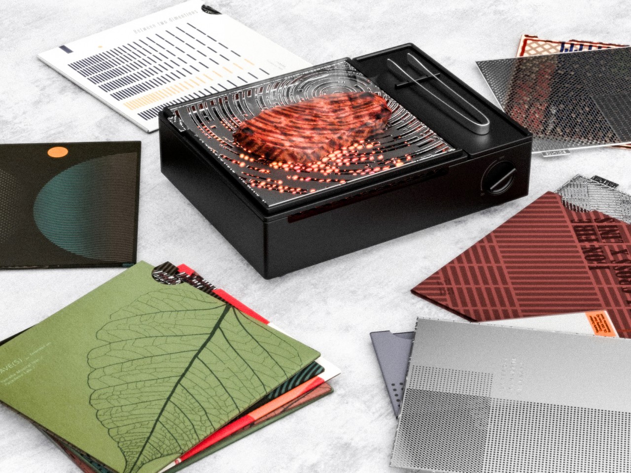
When camping outdoors, one of the most important tools you need is fire, whether it’s for keeping warm or, more importantly, cooking food. There’s no shortage of bonfire and grill products available in the market today, but the majority of them seem to be content focusing on utility alone. The Yamaha Outdoor Tools concept, however, doesn’t forget that aesthetics and fun are just as important, adding flavor to the experience and making it even more memorable.
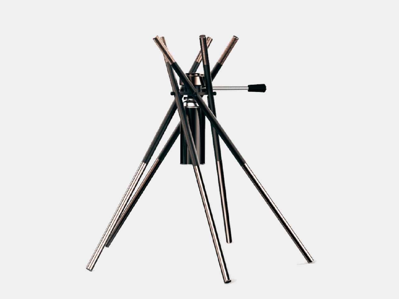
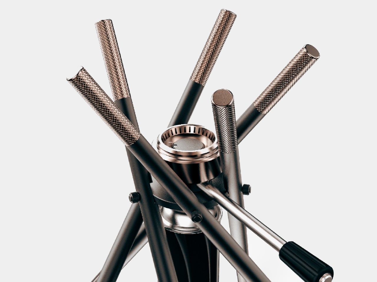
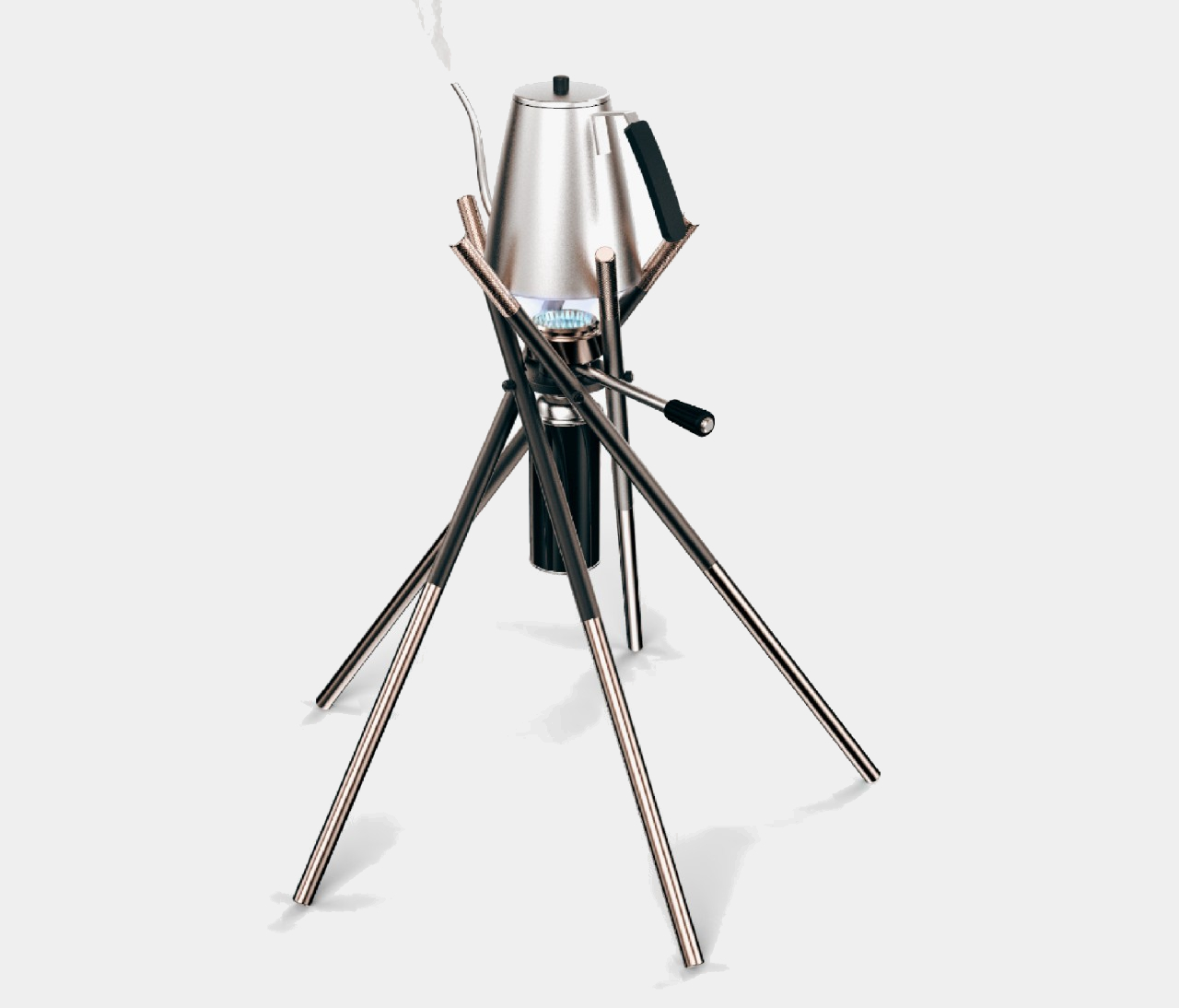
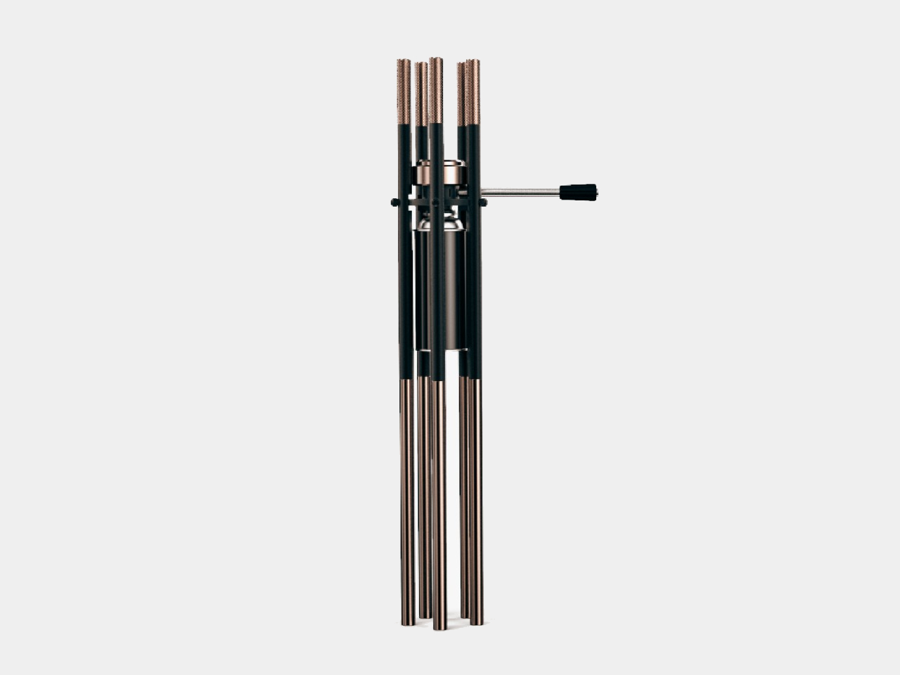
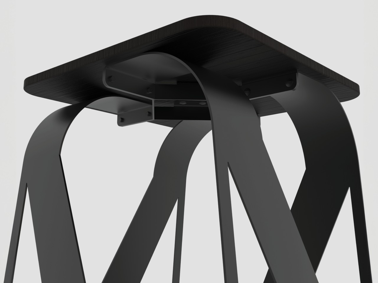
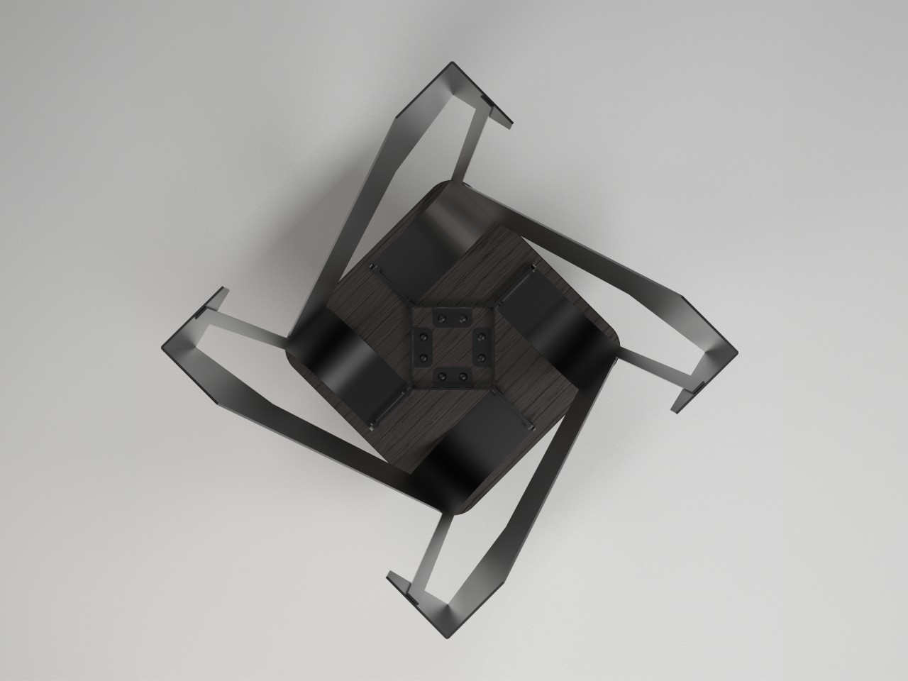
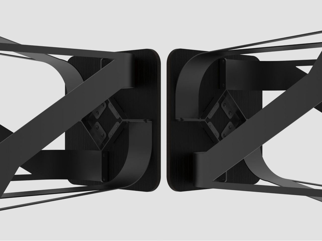
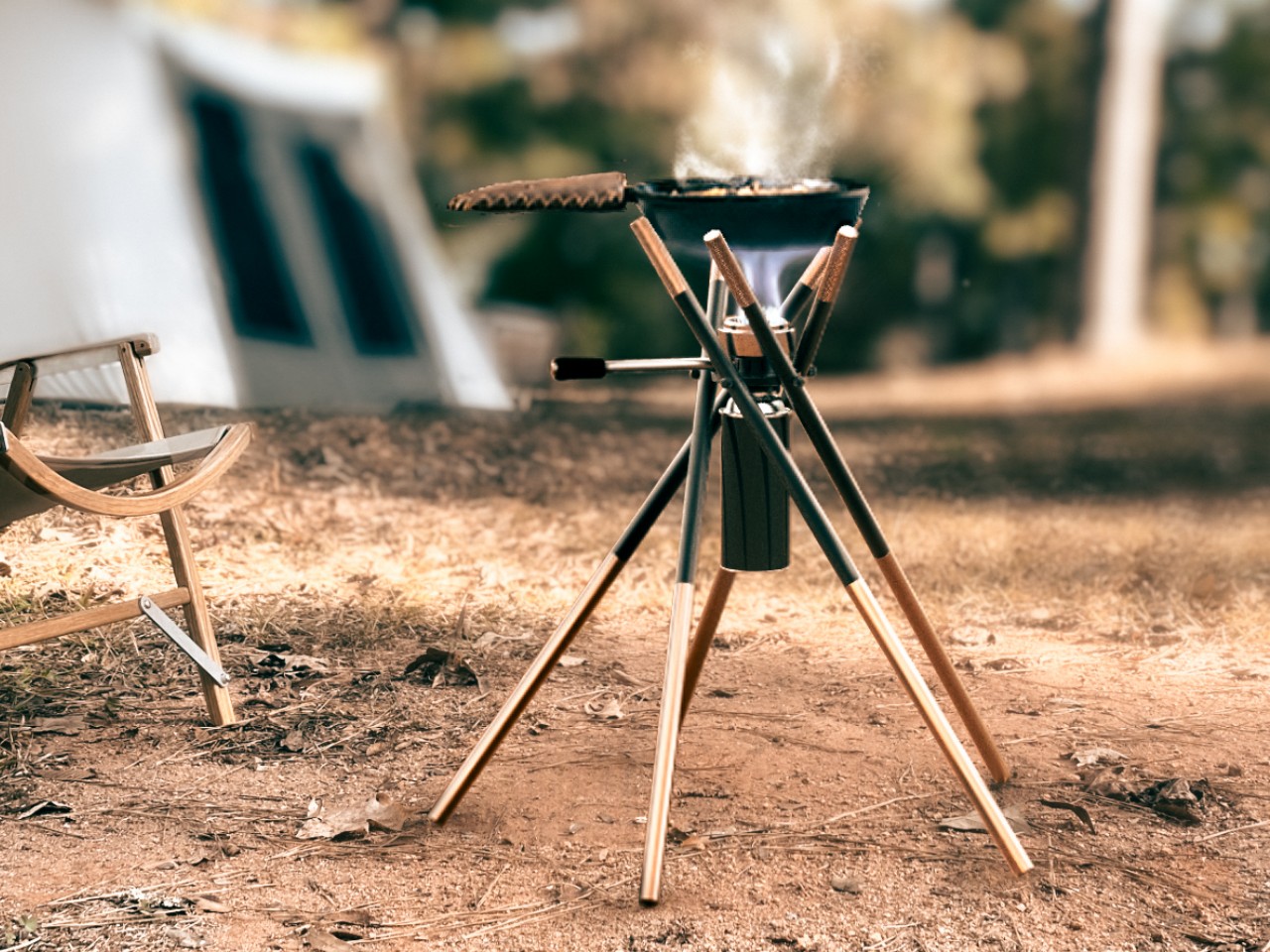
The Bon-Burner, for example, is nothing more than five metal sticks joined at different angles to create the semblance of sticks of firewood lying against each other. This form isn’t just for looks, though, as the top formation functions as a trivet for holding pots and kettles. The metal bars can be easily folded or detached, making transport a walk in the park, or in this case, the campsite.
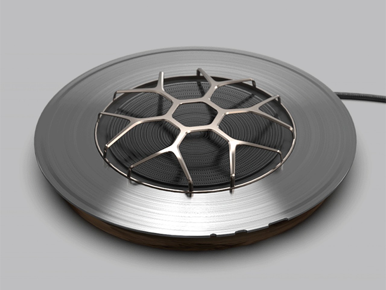
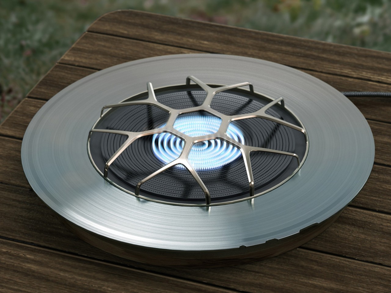
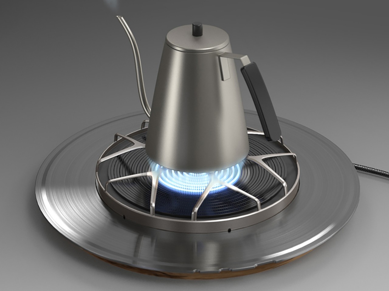
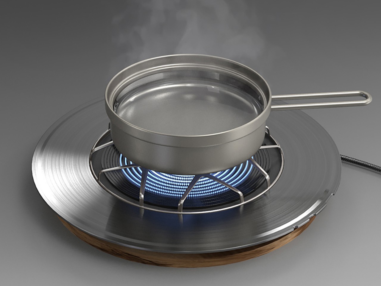
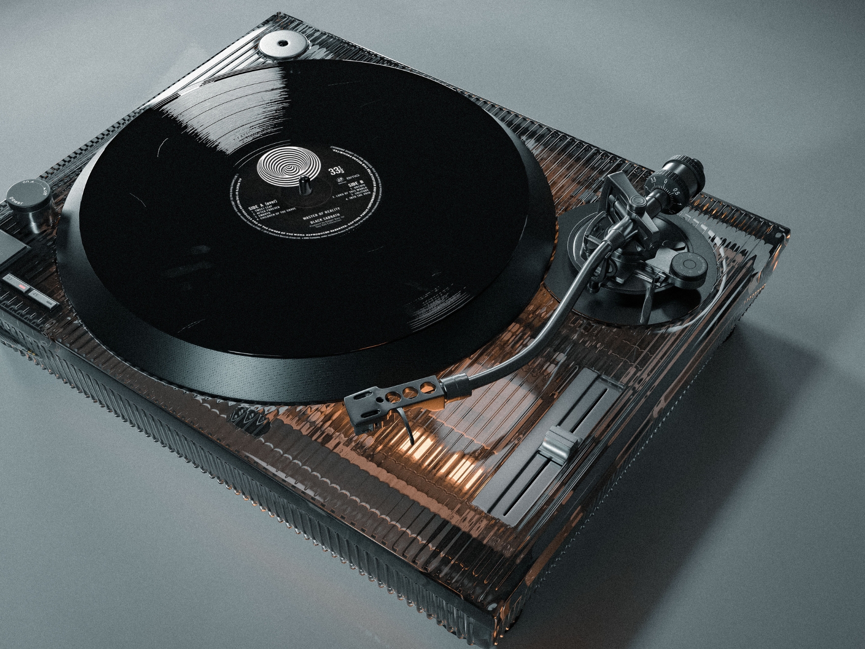
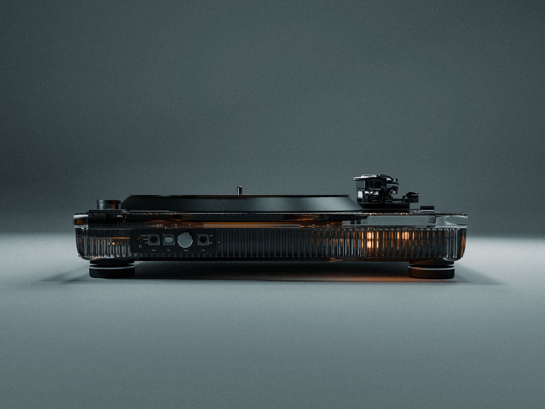
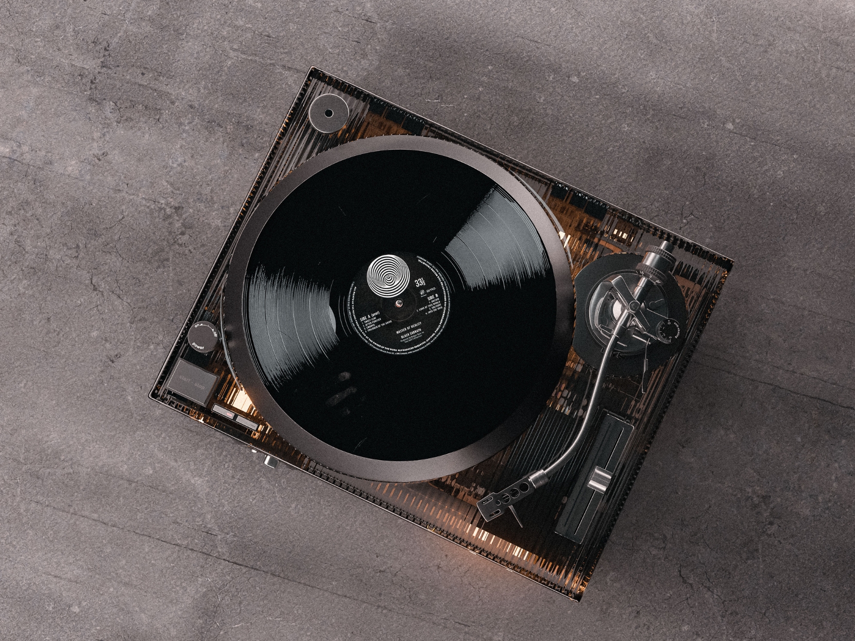
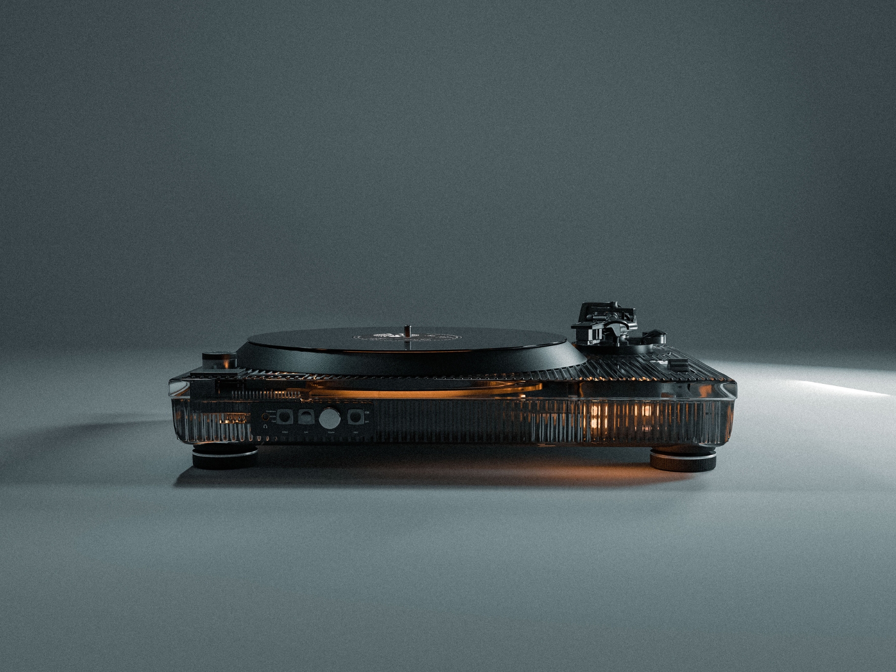
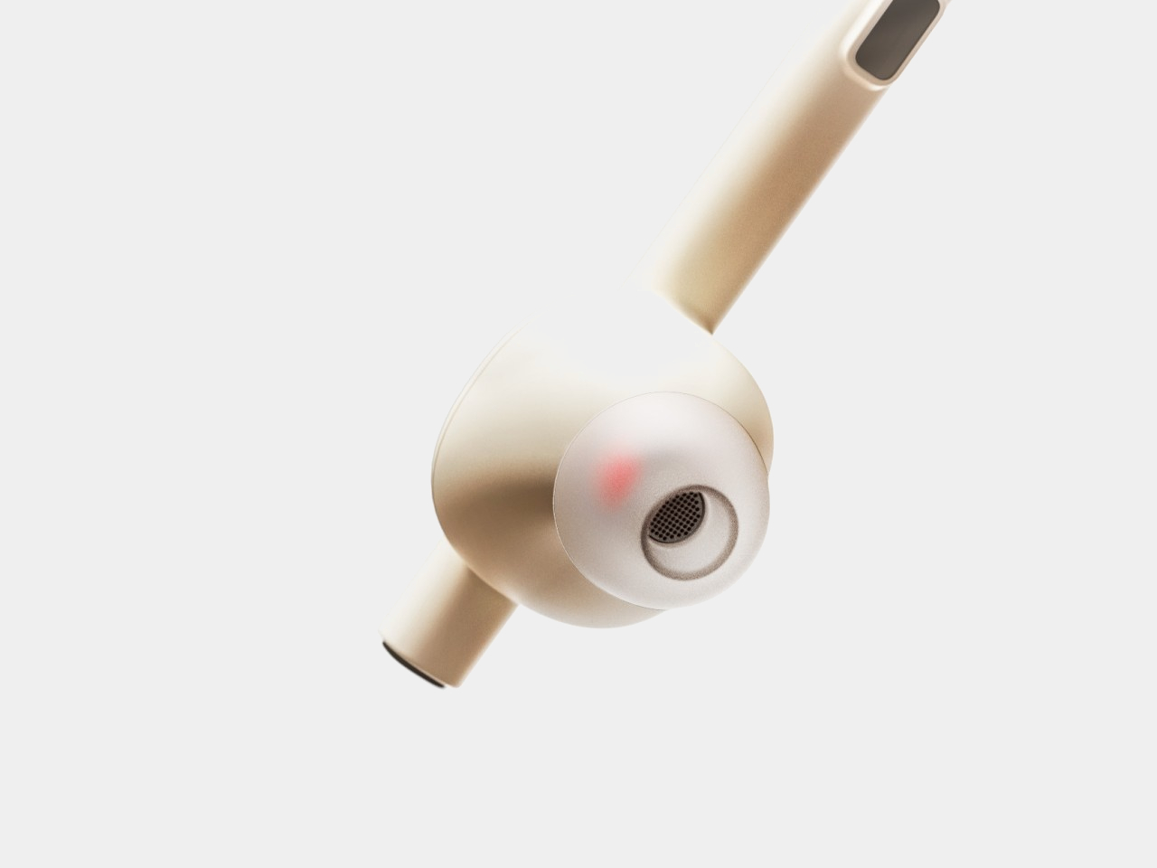
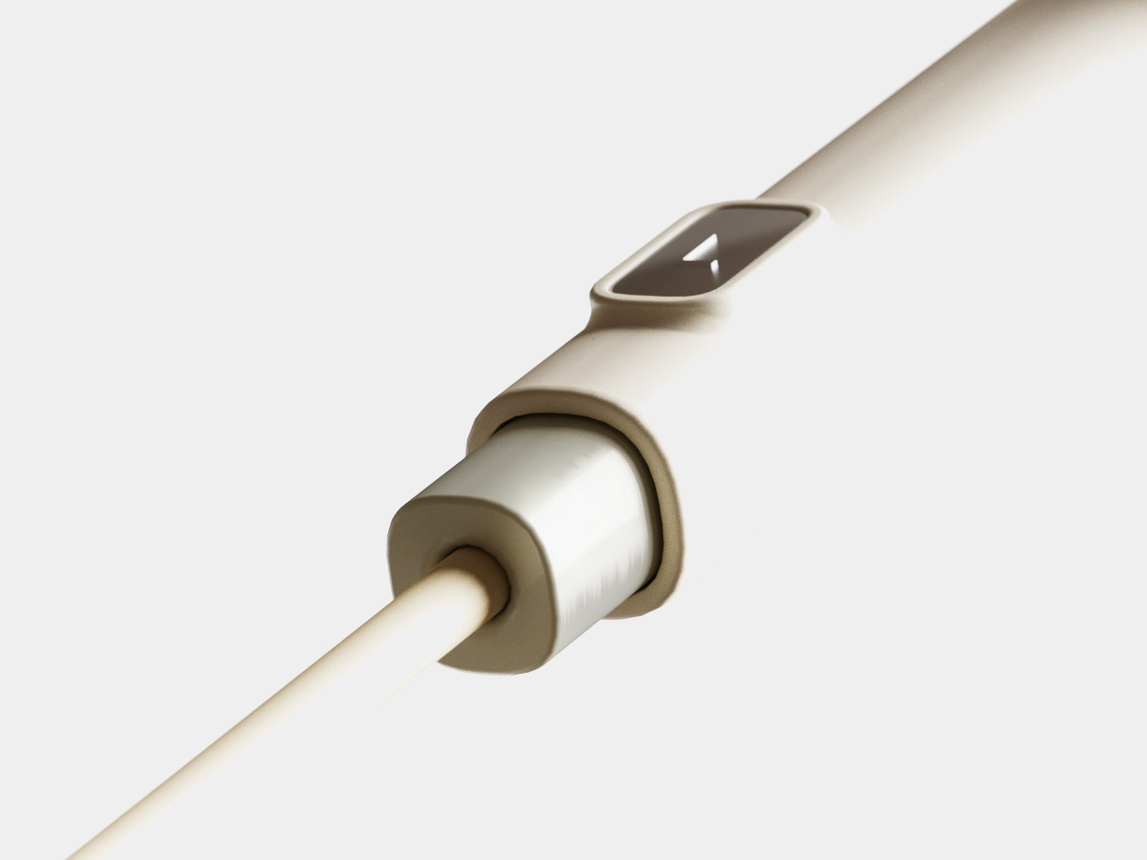
The Bon-Player is a twist on the typical gas stove that is like an amalgamation of a metallic vinyl record and the experience of throttling the engine of a motorbike. You turn the metal disc to control the radius of the fire, represented by concentric rings radiating from the center, and you push it down to increase the intensity of the flame. It is a more involved and more interactive way to control the fire, better than simply turning a boring old knob.
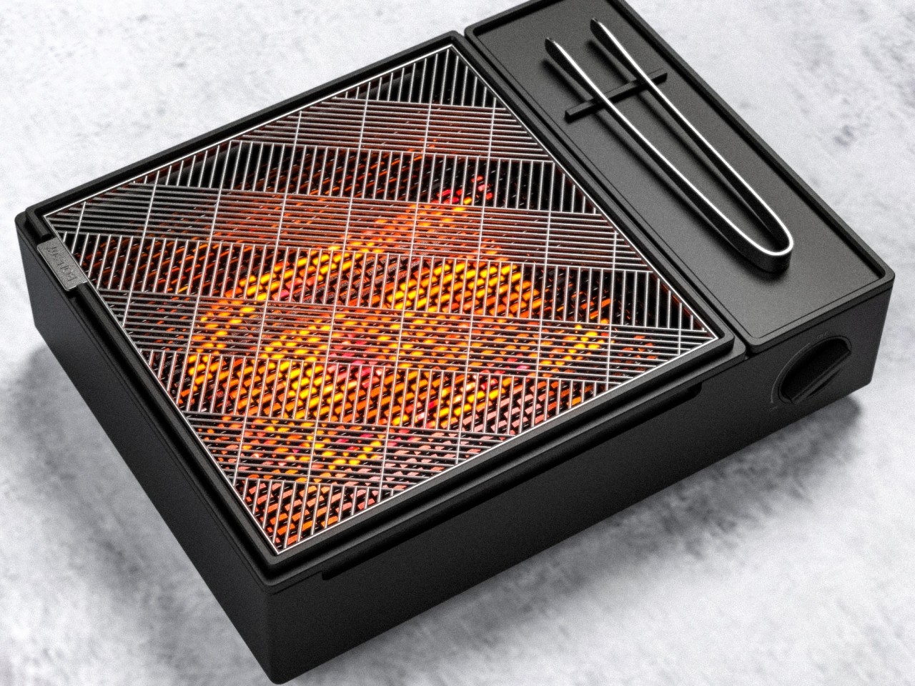
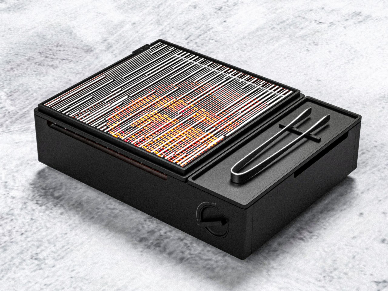
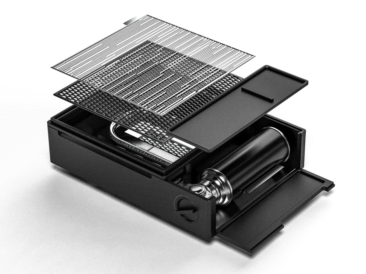
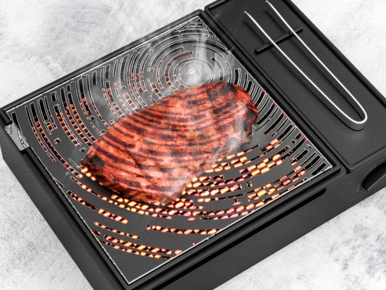
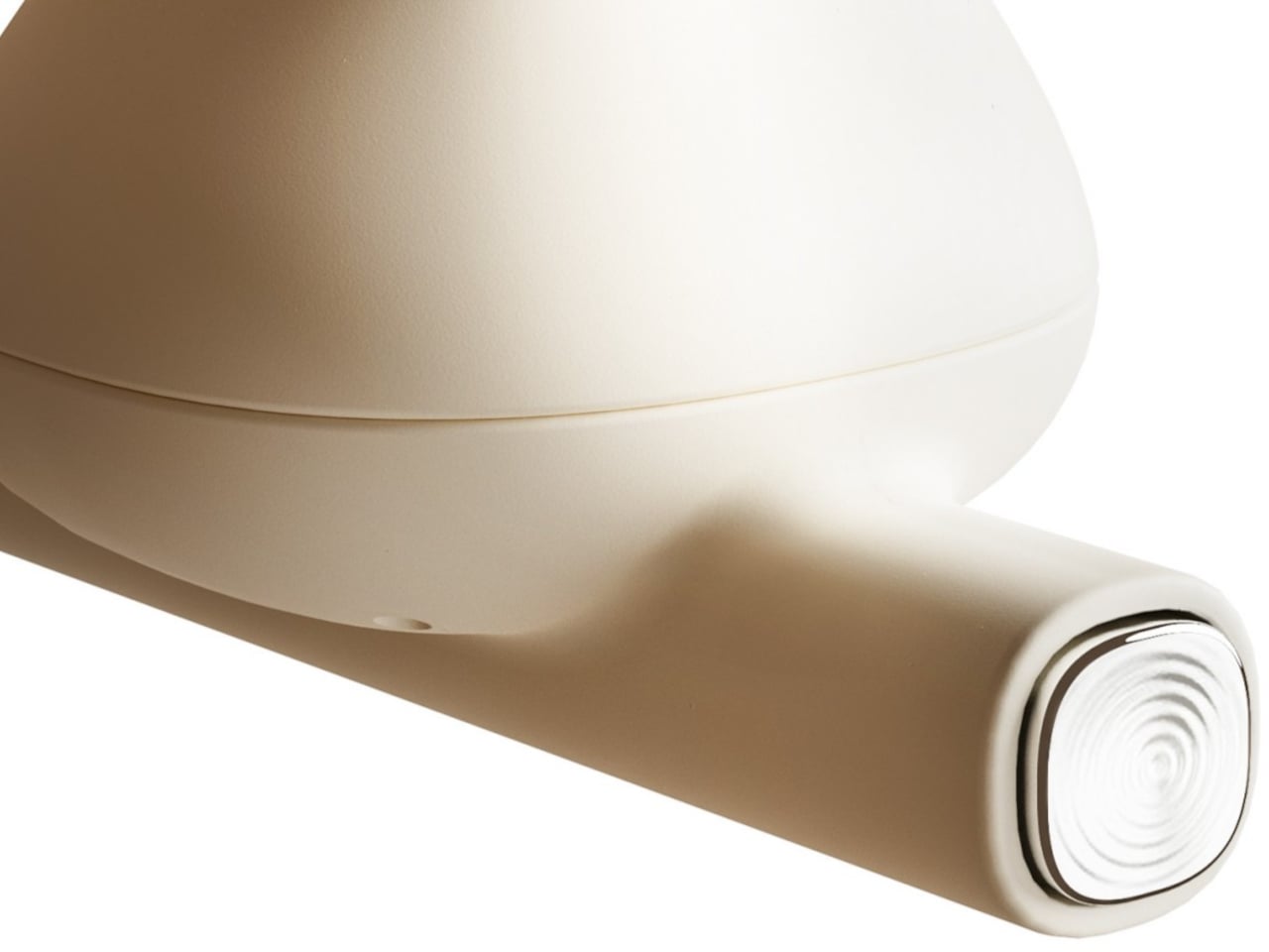
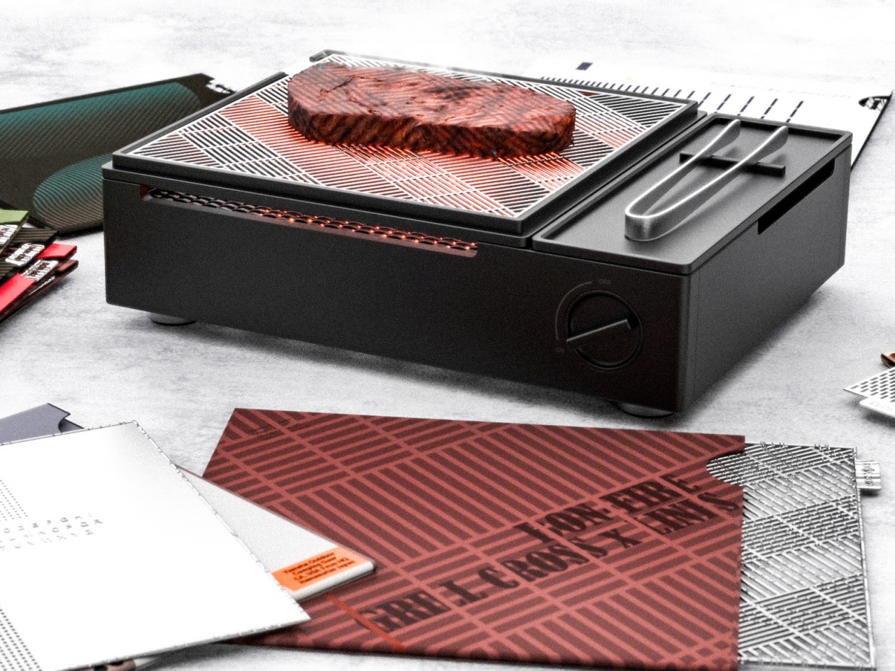
Bon-Grill takes that turntable metaphor even further with a rectangular box that lets you choose the appearance of your grill marks. You simply switch between different mesh jackets, just like you switch record sleeves, to select the best grill marks that will bring out the best taste from your food. Plus, it makes the steaks and veggies look fun as well!
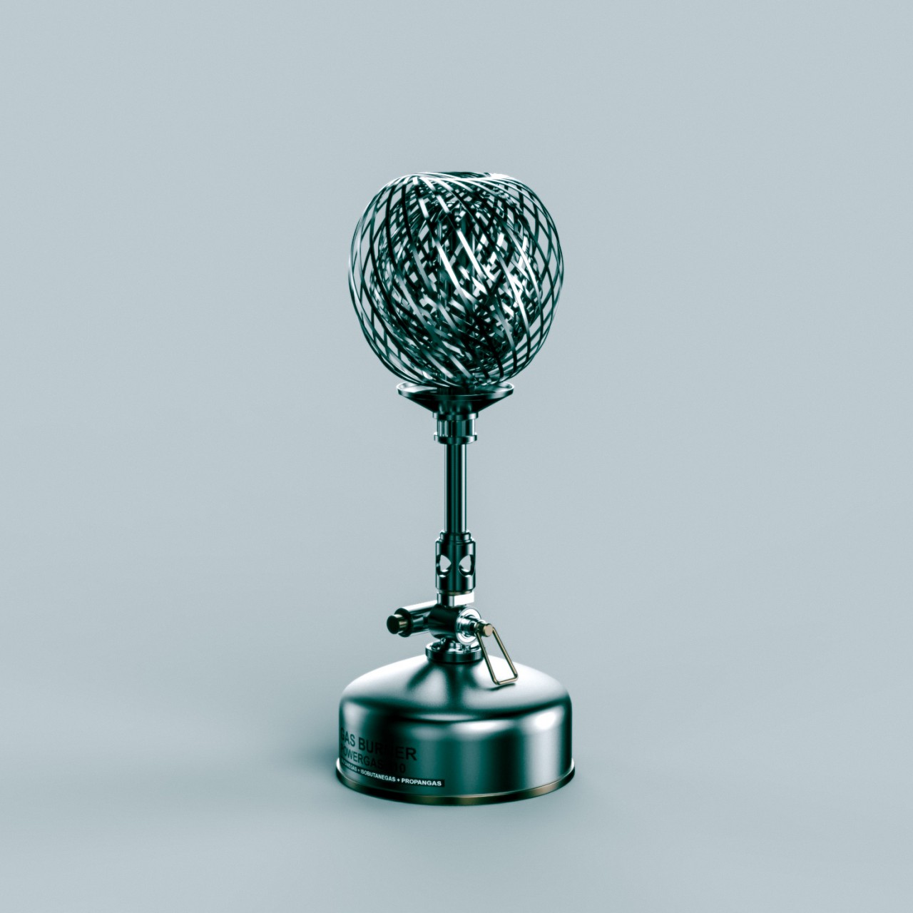
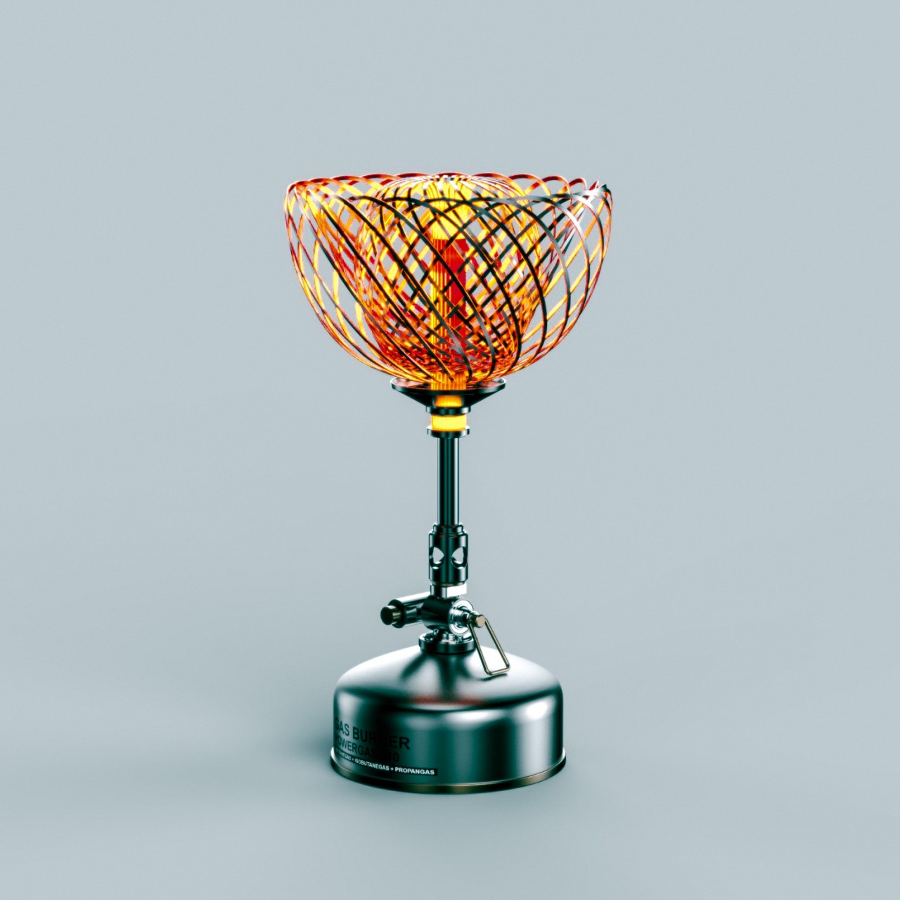
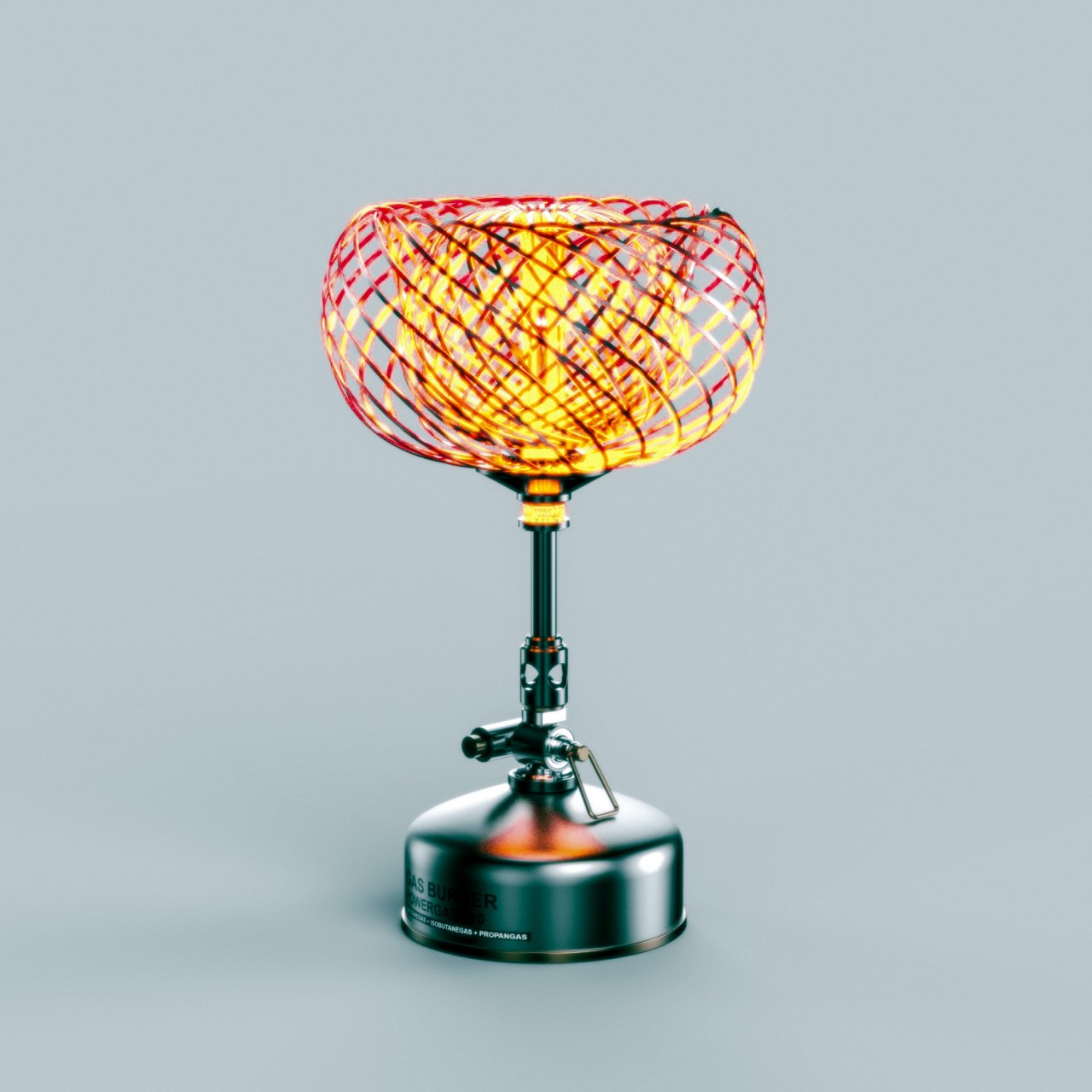
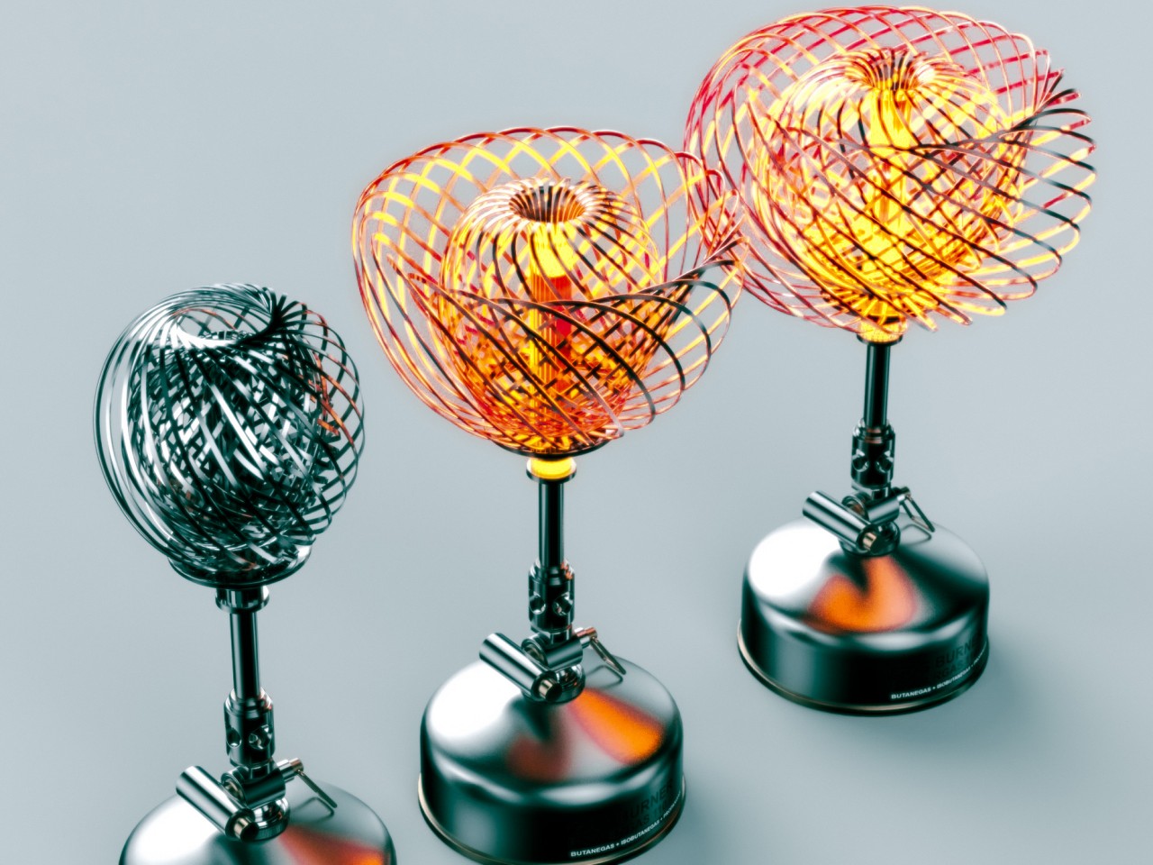
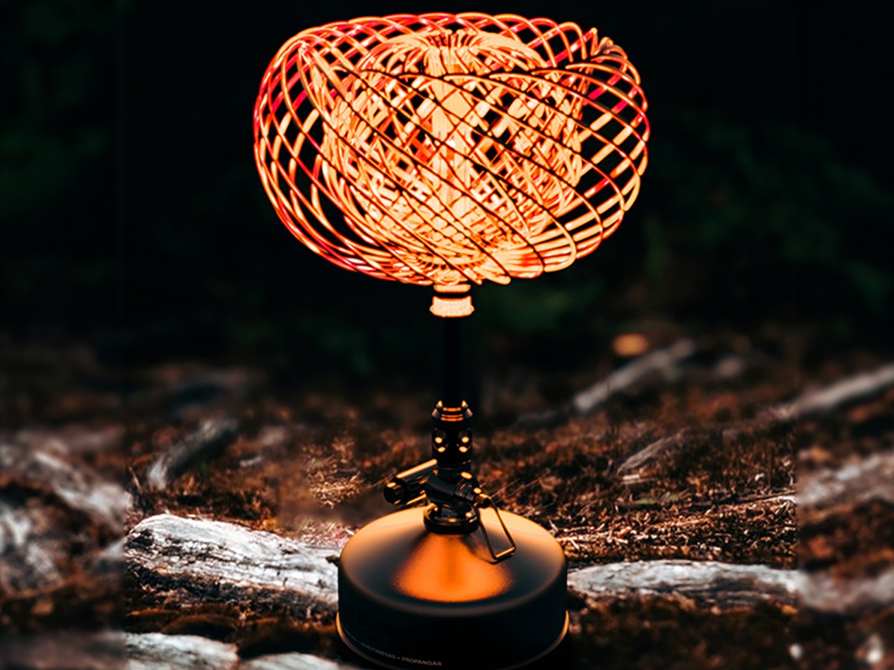
The Bon-Flame outdoor heater is probably the most beautiful and most poetic of the set. A bimetallic sheet changes shape with the heat, opening up like a flower and providing both heat and an enchanting visual representation of that warmth. Unfortunately, all these are just concepts at this point, but hopefully, Yamaha will pick them up and turn them into actual products that we can bring to our outdoor adventures someday.
The post Yamaha Outdoor Tools concept brings a fusion of music, metal, and fire to your adventures first appeared on Yanko Design.