What Makes a Watch Design Timeless Over 70 Years

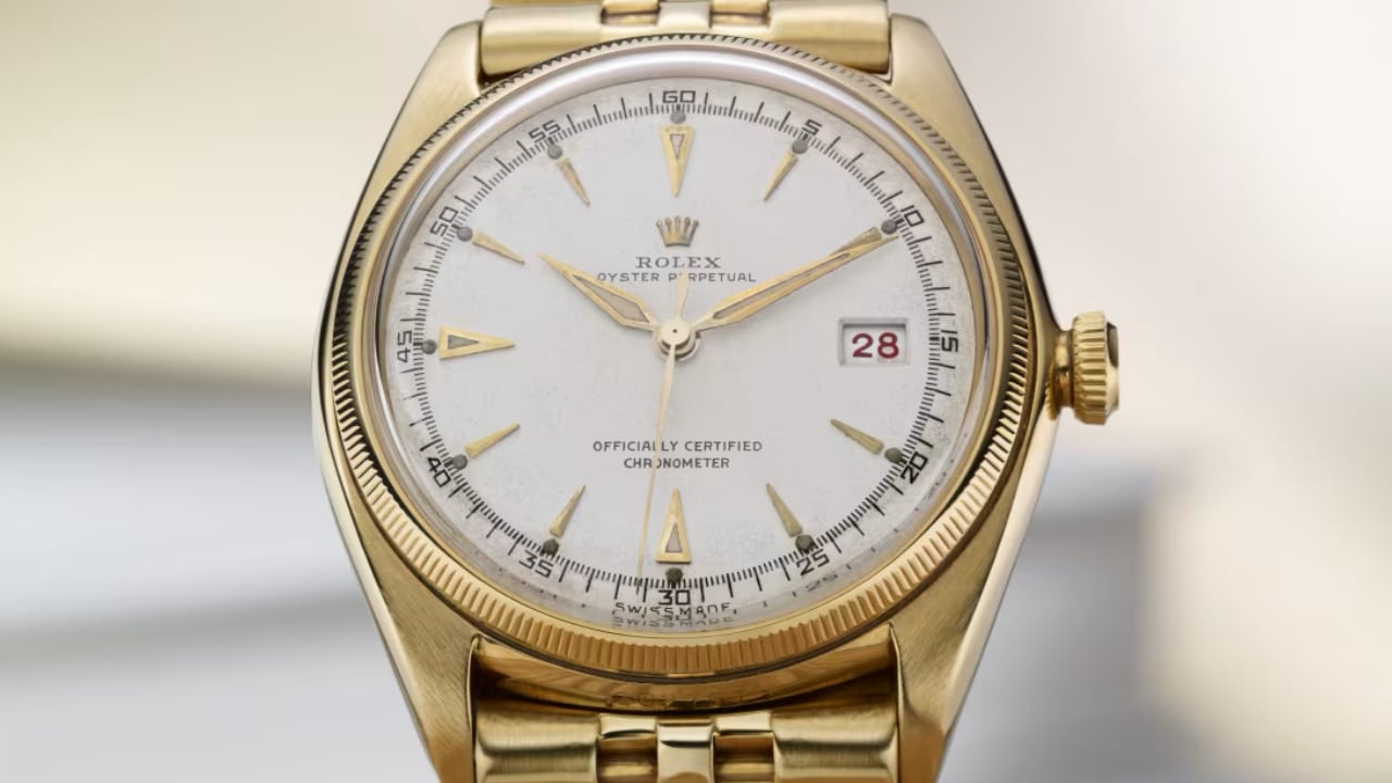
Rolex: first Datejust 1945

Wristwatches have gone through many changes over the past 70 years, but some designs have stayed popular through it all. What’s the secret to a watch that never goes out of style? It’s a blend of simplicity, versatility, quality craftsmanship, innovation, and a nod to history. Let’s dive into how brands like Rolex, Omega, Audemars Piguet, Casio, and Swatch have kept their designs timeless.

1950s: The Golden Age of Elegance

The 1950s were all about elegance. After the war, people craved refined accessories. Watches from this era were clean and simple. The Rolex Datejust, introduced in 1945, became notable in the 1950s with its straightforward dial and comfortable Jubilee bracelet. Its 36mm case size was just right—not too big, not too small.
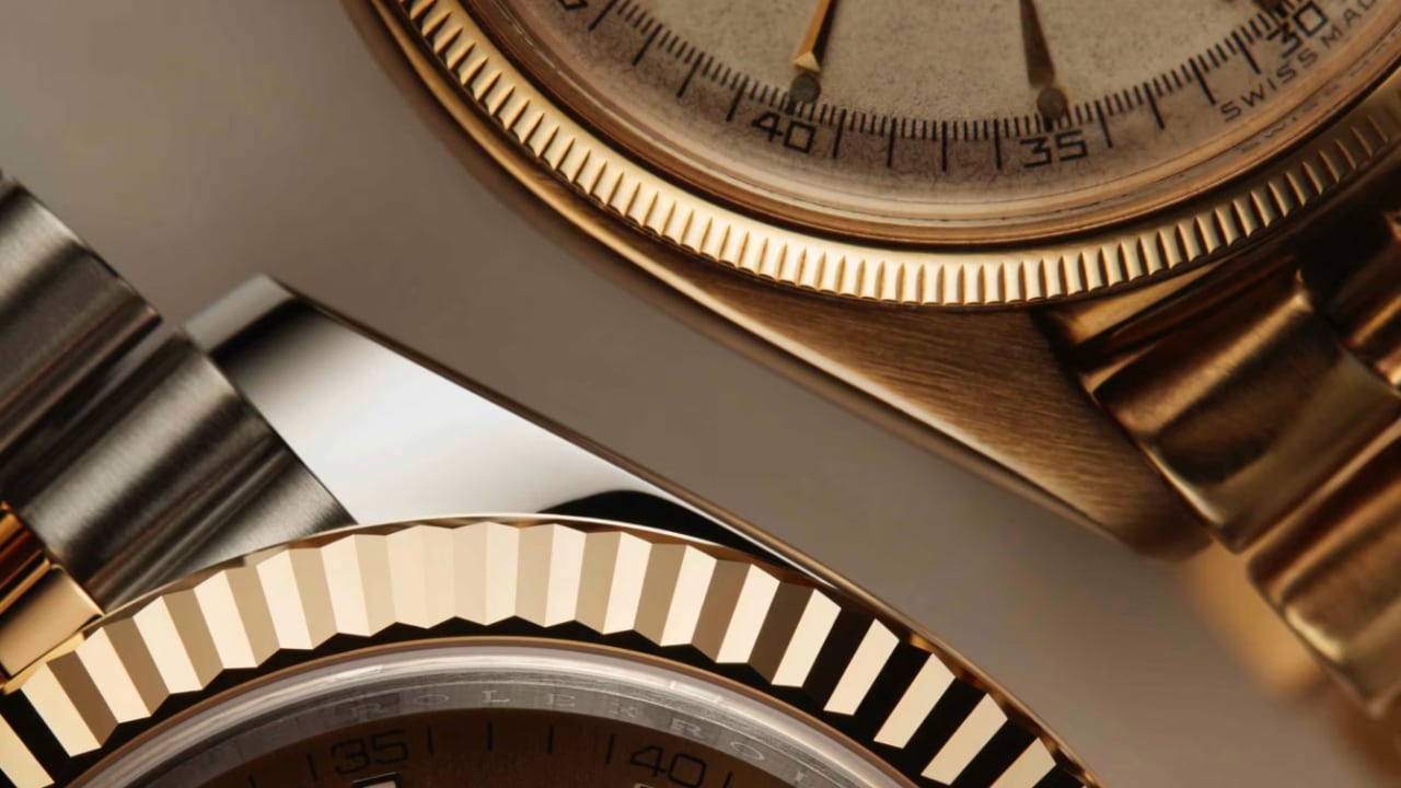
Rolex: Datejust

Introduced in 1948, the Omega Seamaster quickly rose to prominence and became a favorite among watch enthusiasts and casual wearers alike. Its design, balancing robustness and elegance, ensured its suitability for various occasions. Whether for a casual outing or a formal event, the Seamaster proved to be a versatile accessory. Its case was crafted from durable stainless steel, enhancing the watch’s practicality for everyday wear. Additionally, the watch was equipped with waterproof features, emphasizing Omega’s commitment to functionality without compromising design. Its sleek and refined look made it both practical and stylish.

Another impressive timepiece from this era is the Patek Philippe Calatrava. This watch stands out because of its minimalist design, characterized by a clean and uncluttered dial with simple hour markers. Its slim case enhances its refined and subtle aesthetic. The craftsmanship that goes into this piece is top-notch, with every detail meticulously executed. The Calatrava, with its understated elegance, has set a high bar for future designs in the watchmaking industry.

1960s: The Rise of Versatility

The 1960s marked an era of change and acceleration in lifestyle, necessitating timepieces that could keep up with the pace. The Rolex Submariner emerged as a symbol of both adventure and style. Its easy-to-read dial, rotating bezel, and superior water resistance make it an attractive timepiece for adventurers. It was designed to perform optimally underwater and also held its own in formal settings, making it a versatile accessory.

This era also saw the rise of the Omega Speedmaster, famously known as the “Moonwatch,” after it was worn during the Apollo moon landings. The Omega Speedmaster was chosen for its functionality and precision. Its tachymeter bezel allowed for the accurate measurement of speed, a feature integral for both astronauts and car enthusiasts. Its chronograph functions made it a perfect blend of style and functionality.
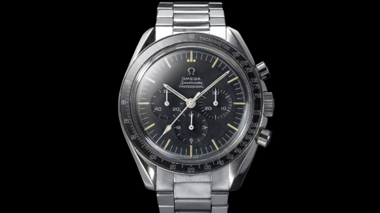
OMEGA Speedmaster Moonwatch, 1965

The Rolex Daytona, first introduced in 1963, became synonymous with auto racing. Named after the famous Daytona International Speedway, the watch was designed to meet the needs of professional race car drivers. The Daytona’s chronograph function, coupled with a tachymeter bezel, allowed drivers to measure average speeds up to 400 kilometers or miles per hour. The watch featured a distinctive dial layout with three sub-dials and was initially available in both stainless steel and gold. Its robust design and high-performance movement made it a favorite among motorsport enthusiasts and collectors alike.
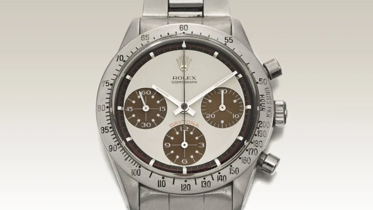
Paul Newman Daytona Ref. 6239
Photo: Courtesy Sotheby’s

Introduced in 1963, the Heuer Carrera appealed to race car drivers and professionals alike. The watch stood out for its chronograph function and bold, easy-to-read dial. These attributes allowed users to keep accurate time while adding a fashionable touch to their ensemble. The success of the Heuer Carrera underscored the idea that form and function can coexist in a well-designed timepiece.

1970s: Breaking the Mold
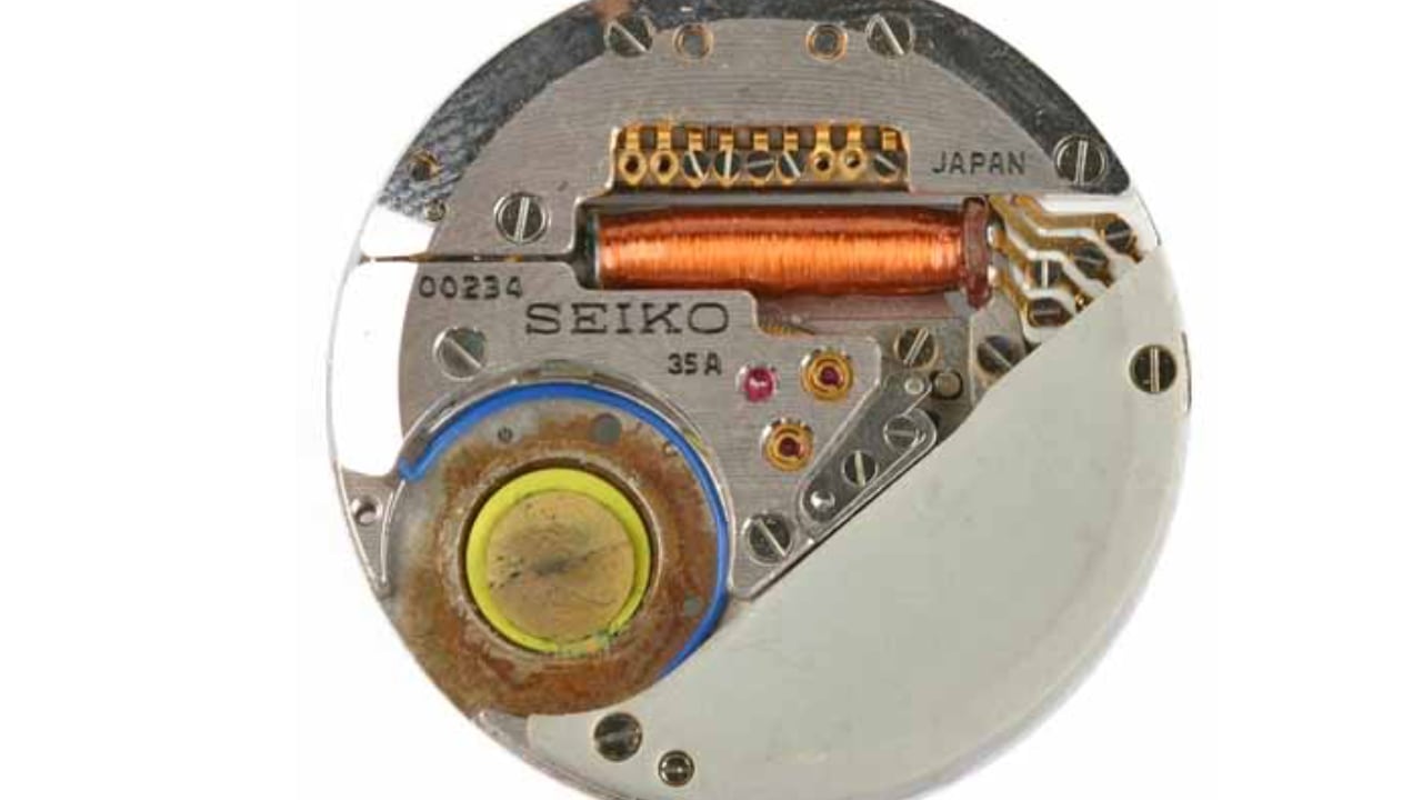
The 1970s was a transformative decade that shattered pre-existing norms. The quartz revolution introduced cutting-edge technology into watchmaking, leading to more audacious designs. The Seiko Astron, the world’s first quartz watch, offered remarkable accuracy and affordability, setting a new industry standard for precision.
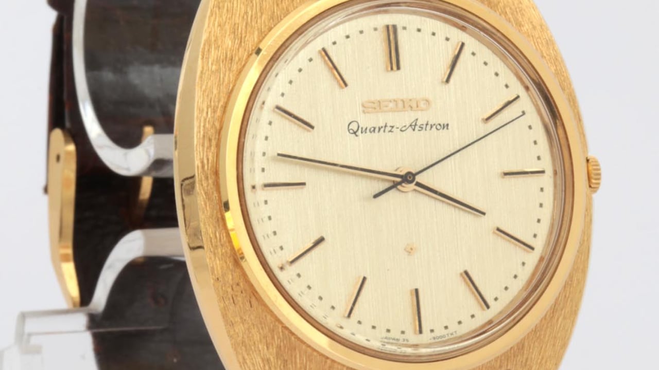
Seiko Quartz-Astron 35SQ

During the same period, the Audemars Piguet Royal Oak emerged in 1972, shaking up conventional luxury watch design with its distinct octagonal bezel and integrated bracelet. Designed by Gérald Genta, the Royal Oak’s stainless steel case and bold design were revolutionary at a time when luxury watches were typically crafted from precious metals. The Royal Oak’s bold design and unconventional material choice set a new standard in watchmaking.
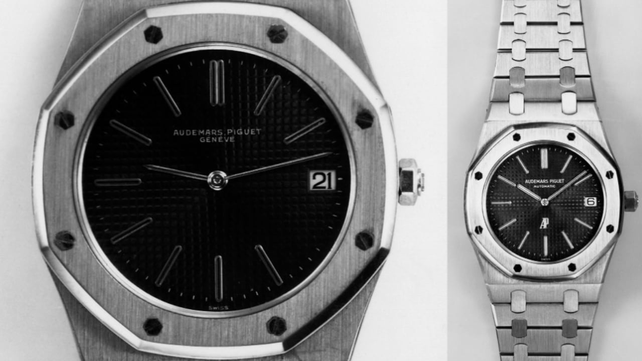
Audemars Piguet 1972 Royal Oak 5402ST

Rolex introduced the Explorer II in 1971. With its 24-hour bezel and robust construction, it was also specifically crafted for adventurers. The Explorer II catered to the growing trend of sports and adventure watches, blending functionality with rugged good looks.

1980s: Digital and Classic Converge

The 1980s saw a blend of digital sophistication and traditional aesthetics in watch design. Casio introduced the G-Shock line, bringing tough, functional watches that appealed to active people. The G-Shock’s shock resistance and multifunctional digital displays set a new standard in watch design. These watches were designed to withstand extreme conditions, making them a favorite among athletes and outdoor enthusiasts.

At the same time, classic designs like the Patek Philippe Calatrava remained popular for their simple, elegant looks. The Calatrava’s timeless design continued to attract those who appreciated traditional watchmaking.

TAG Heuer made a splash with the Formula 1, introduced in 1986. This watch combined sporty looks with quartz technology, appealing to a younger audience and cementing TAG Heuer’s reputation in motorsports.

1990s: Return to Heritage

The 1990s marked a return to heritage within horology. Watchmakers began reissuing classic models with contemporary updates, blending the old with the new. One such model was the Omega Speedmaster Professional, linked to the Apollo moon landings. Its practical and functional design ensured its continued relevance.
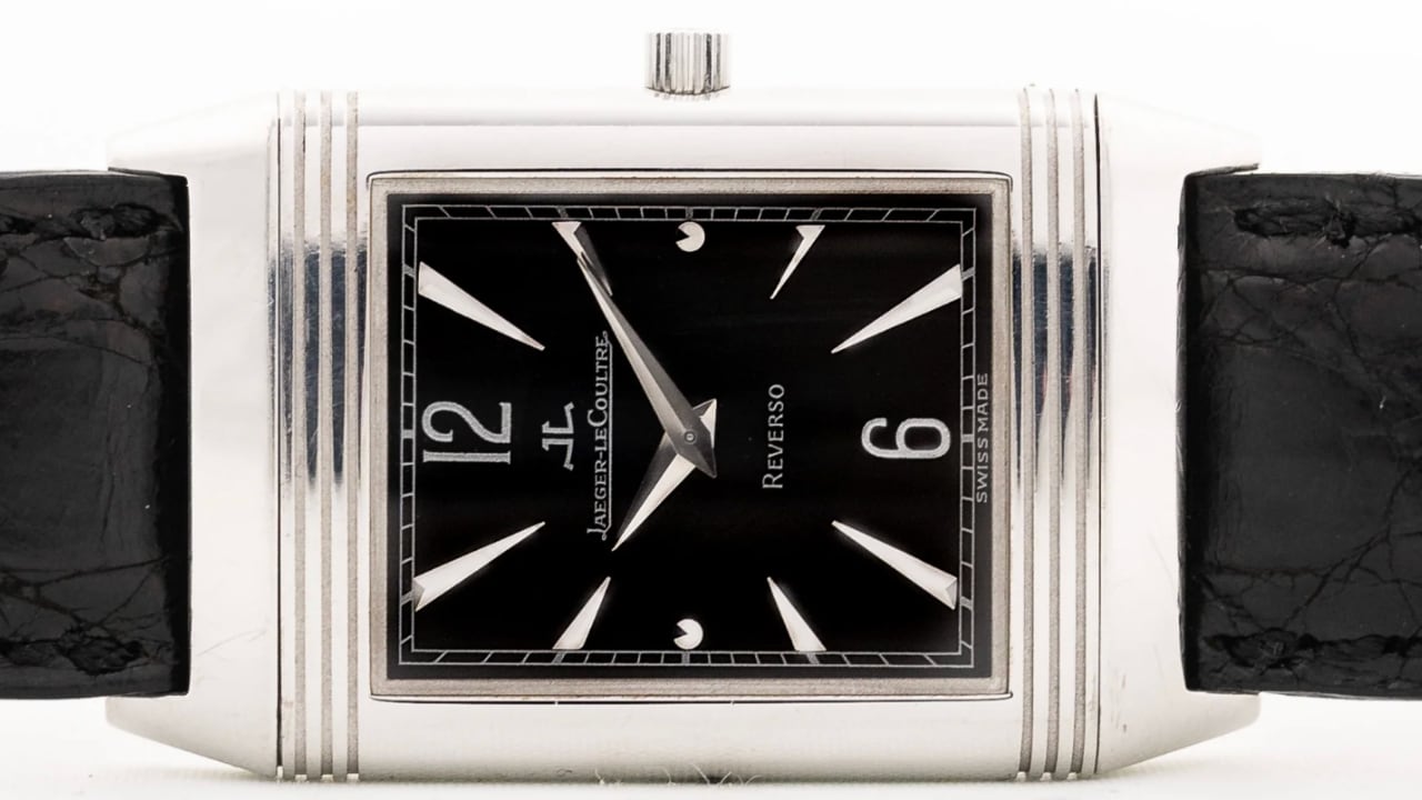
Jaeger LeCoultre Reverso 18k 1990s

The 1990s also saw the resurgence of the Jaeger-LeCoultre Reverso, a model originally designed in the 1930s. Known for its unique reversible case, the Reverso became a symbol of timeless elegance and innovative design. The reissued models combined vintage charm with modern precision.

Another model that gained iconic status during this period was the Rolex GMT-Master II. Introduced in 1983, it came into its own in the ’90s. Its dual-time-zone function was a boon for frequent travelers. Moreover, its robust design meant it could withstand the rigors of international travel, making it a trusted travel companion.

The Rolex Daytona, first introduced in 1963, also saw renewed popularity in the 1990s. Its association with auto racing and robust chronograph function made it a standout model. Its design, featuring a tachymeter bezel and high-performance movement, appealed to both collectors and motorsport enthusiasts.

2000s: Embracing Boldness

In the early 21st century, the trend in watches shifted towards larger models. Brands like Panerai and Hublot embraced large cases for individuals who wanted their timepieces to stand out. Panerai’s designs, rooted in military diving, featured oversized dials and bold numerals, making them highly legible and stylish.

In 2005, Hublot launched its Big Bang series, marked by its large cases and innovative use of materials like rubber and ceramic. The Big Bang series offered a refreshing change from traditional watch designs, appealing to watch enthusiasts seeking something different.

The Audemars Piguet Royal Oak Offshore first launched in 1993 but gained prominence in the 2000s. It expanded the original Royal Oak design with larger cases and more rugged features. This bold approach to watch design appealed to a new generation of watch lovers seeking a statement piece.

2010s: Balance and Innovation

The 2010s marked a shift towards balanced designs. Watch sizes typically ranged from 38mm to 42mm, catering to a broader audience. The Swatch Sistem51 won over watch enthusiasts with its unique approach to automatic watch production, featuring a construction of just 51 parts and a fully automated manufacturing process.

In 2012, the Tudor Black Bay reappeared, drawing on elements from Tudor’s iconic dive watches of the 1950s and 1960s. The Black Bay blended vintage design cues with modern materials and technology, resulting in a timepiece recognized as a classic.

In 2018, the Omega Seamaster Diver 300M was reintroduced with updates like ceramic materials and a modernized movement while preserving the iconic design elements.

2020s: Comfort, Versatility, and Sustainability

Today, the focus is on comfort, versatility, and sustainability. Watchmakers are incorporating recycled materials and adopting eco-friendly processes without compromising design. The Swatch x Omega MoonSwatch collaboration blends the iconic look of the Omega Speedmaster with Swatch’s innovative materials.

The Oris Aquis Date Upcycle features a dial made from recycled ocean plastic, emphasizing sustainability and giving each watch a unique look.

The Rolex Oyster Perpetual, refreshed in 2020 with vibrant dial colors, combines classic design with modern aesthetics. Its simplicity and robustness, enhanced with new color options, make it versatile and stylish.
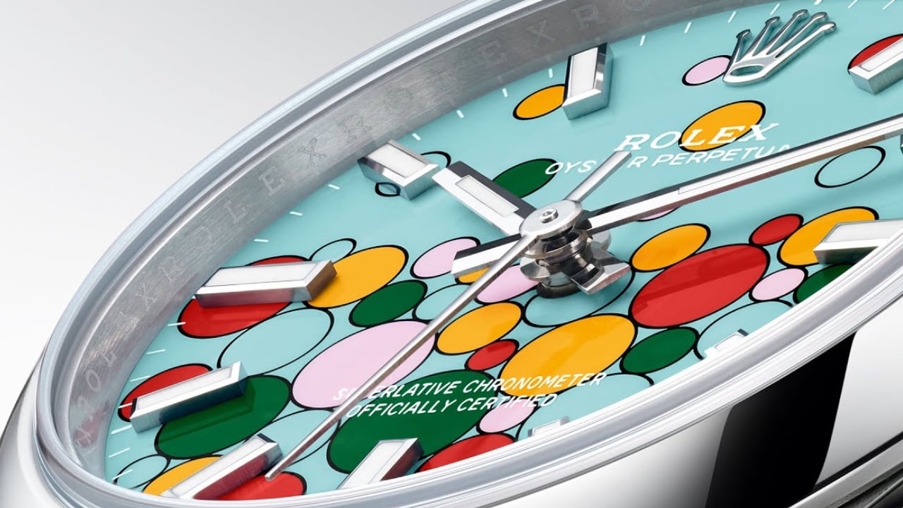
ROLEX: TURQUOISE BLUE DIAL – Named ‘Celebration’

Conclusion

What makes a watch timeless? It’s a blend of simplicity, versatility, quality craftsmanship, innovation, and a touch of history. Watches like the Rolex Datejust, Omega Speedmaster, and Swatch Sistem51 show how these elements combine to withstand time. Versatility is vital, as a timeless watch should look good in both a boardroom and on a beach. The Rolex Submariner exemplifies this with its dual role as both a tool watch and a dress watch.

Quality craftsmanship is fundamental, with the use of premium materials and meticulous attention to detail elevating a watch. The Patek Philippe Calatrava and Audemars Piguet Royal Oak demonstrate that quality renders a watch truly timeless. Innovation also keeps the watch industry lively, from the quartz revolution to the integration of new materials and digital features. Staying ahead in technology without compromising the core design is crucial.

A connection to heritage endows a watch with historical significance, with vintage reissues and designs influenced by a brand’s archives reminding us of the traditions that have shaped watchmaking. These elements have characterized the most iconic watches for the past 70 years. While trends may change, these principles ensure a watch’s appeal to generations. Whether it’s a vintage reissue, a modern classic, or a bold new design, a timeless watch stands the test of time and trends.
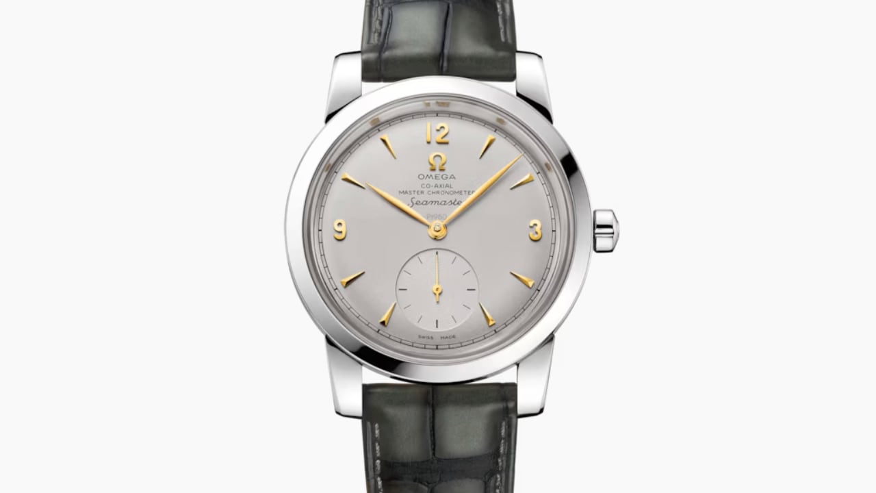
OMEGA: Seamaster models of 1948

Thank you for joining me on this journey through the history of timeless watch designs. I truly appreciate your continued support and enthusiasm for Wristwatch Wednesday. If you’re new to this column, welcome!

The post What Makes a Watch Design Timeless Over 70 Years first appeared on Yanko Design.
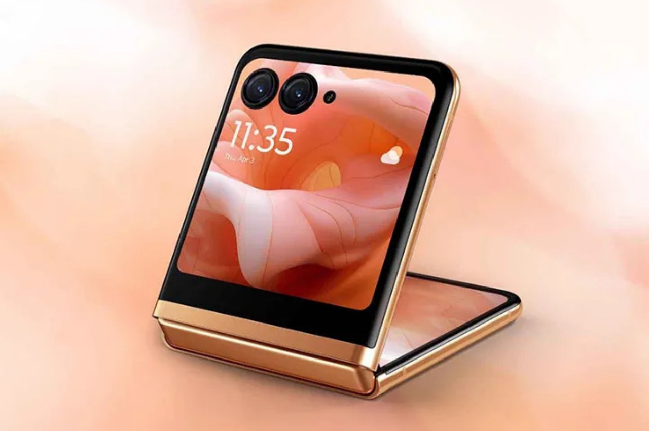
Motorola Razr+ 2024 foldable phone: News, Rumors, Price, and Release Date

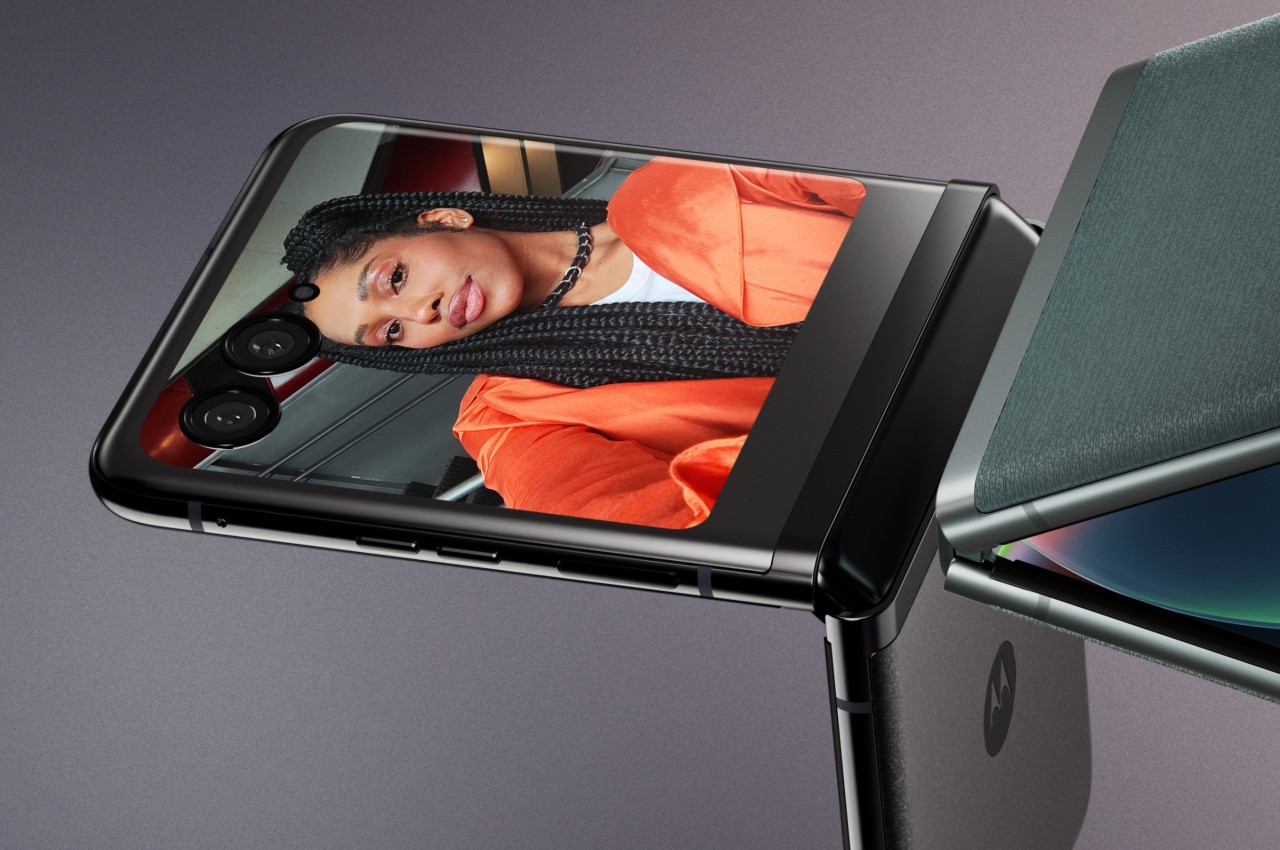
Google I/O 2024 has come and gone, and despite rumors and expectations, a new foldable phone was nowhere in sight. Of course, the Google Pixel Fold is hardly the only game in town, nor is it the only one that’s expected to debut really soon. Perhaps beating both Google and Samsung to the punch, Motorola’s next-gen foldable could be hitting shelves as early as June, though it will still be competing with the likes of the Samsung Galaxy Z Flip rather than the OnePlus Open and other larger foldables. Unofficial information about the device is quite thin, but the ones we’ve already heard are quite substantial and paint an interesting picture, one that could make the Motorola Razr+ 2024 or Motorola Razr 50 Ultra the clamshell foldable to beat this year.

Designer: Motorola

Motorola Razr+ 2024: Design

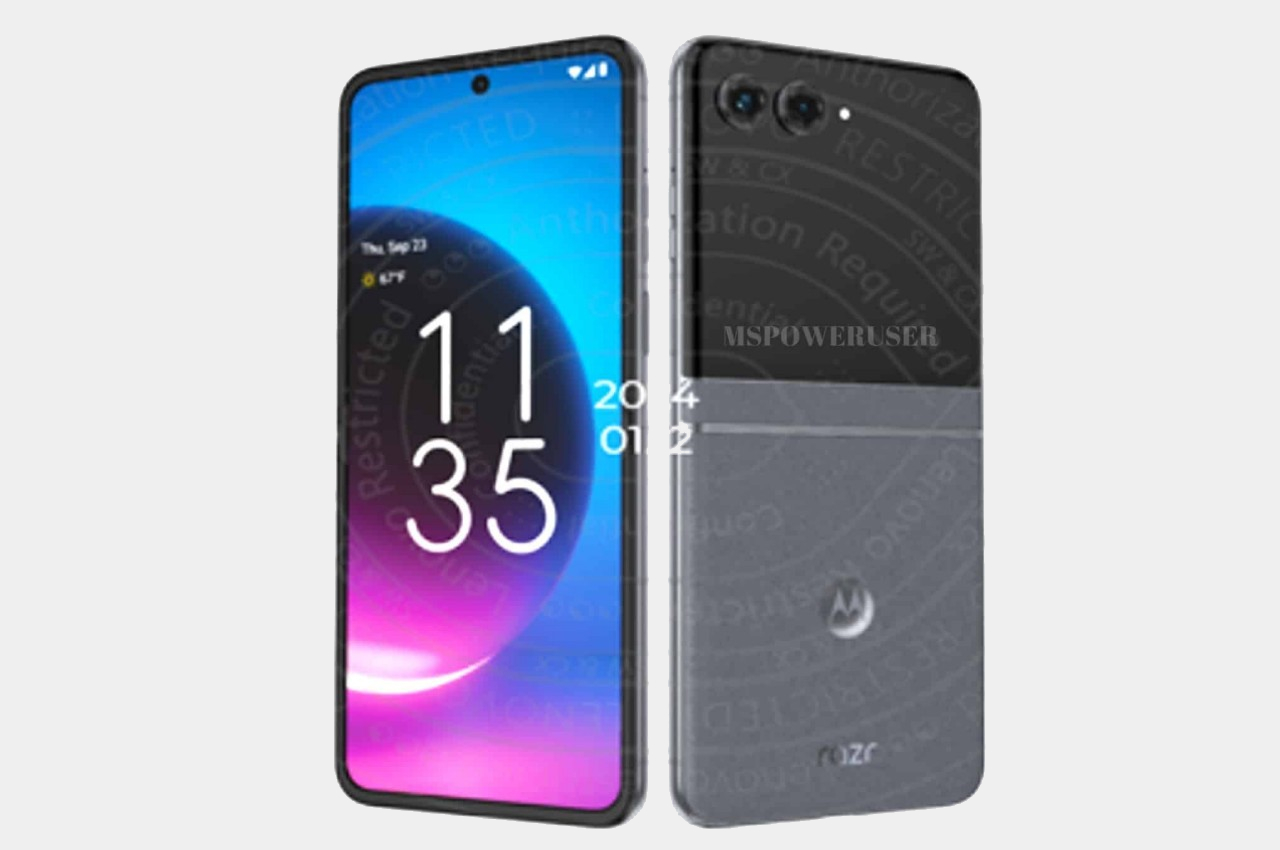
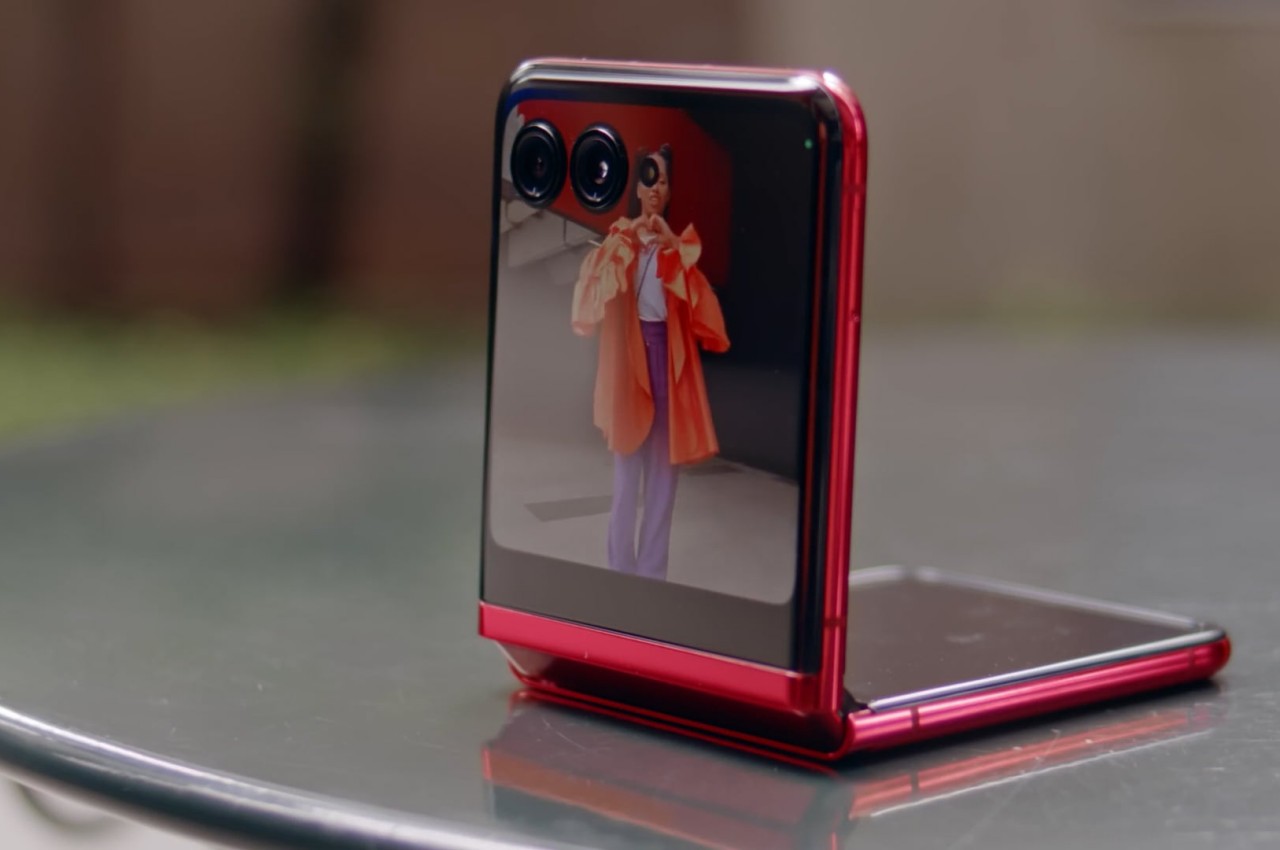
According to sources, this year’s Motorola foldable would look exactly like last year’s Motorola foldable, save for some changes in screen size. That means the Motorola Razr+ 2024’s external screen will still cover the entire surface of the upper half of the phone’s back, leaving only room for the camera lenses themselves. It might sound like a letdown and a sign of lack of innovation over at Motorola, but sticking to a design that works is also a sign of maturity, especially since the design is only a year old.

Image courtesy of: MSPoweruser

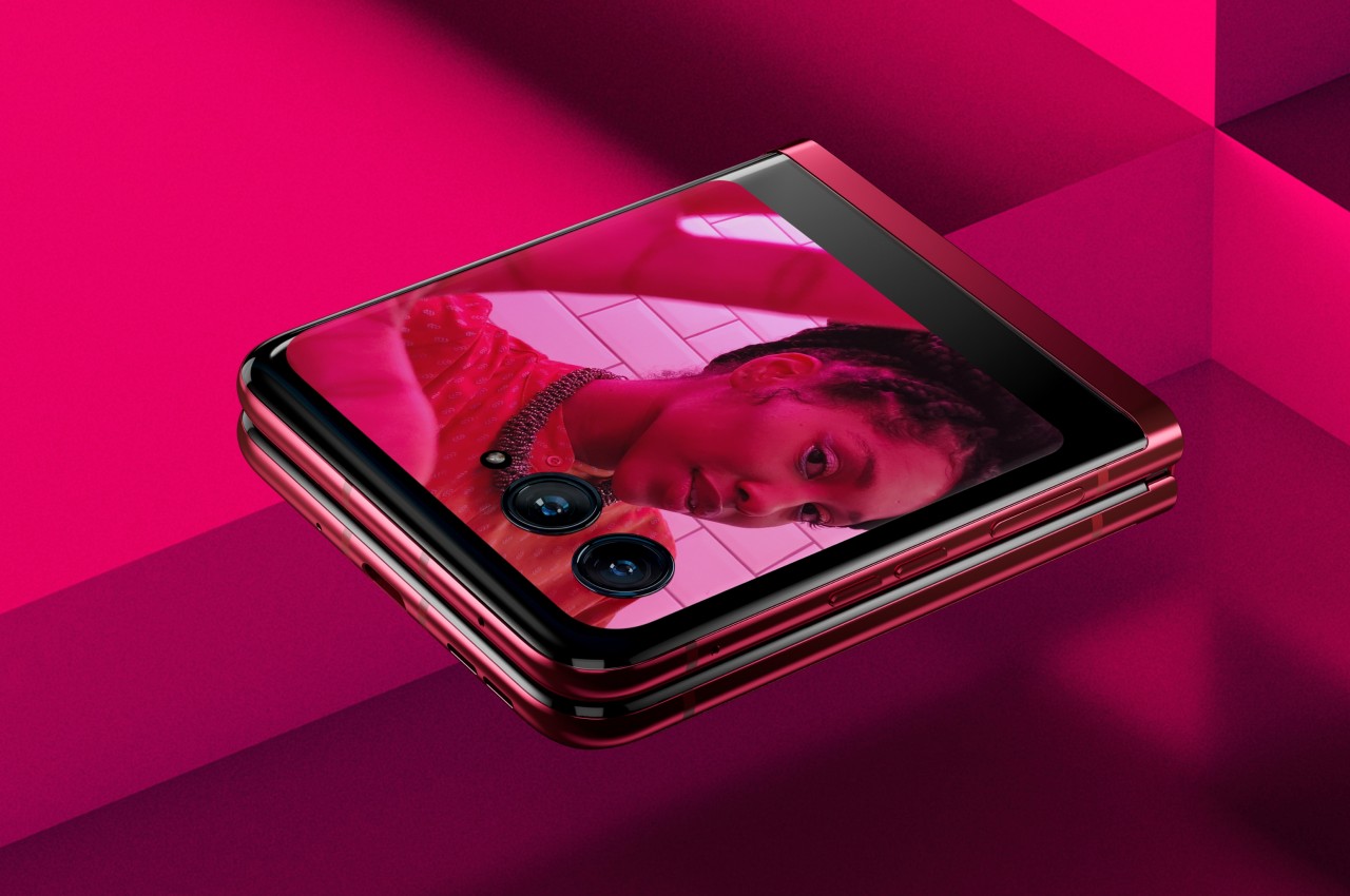
Motorola’s design for its Cover Screen is admittedly divisive. On the one hand, it’s the only foldable of its kind that utilizes the whole area, while others make do with tiny rectangles, even tinier circles, or a square with an uneven cutout to make way for cameras. On the other hand, this also makes for a weird arrangement that actually cuts out part of the display anyway, making the image or text in that area inaccessible.

Motorola is also the only brand that allows normal apps to run on that external screen, which is both an advantage and a disadvantage. Regardless, it seems to be sticking to its guns for one more year, offering an experience that, while faithful to the design spirit of the original RAZR, isn’t afraid to go beyond to offer something new and useful.

Motorola Razr+ 2024: Specs and Software

While the Moto Razr+ 2024, or Moto Razr 50 Ultra, won’t look any different on the outside, it will be a very different beast on the inside. Of course, there’s the new Qualcomm Snapdragon 8s Gen 3 leading the changes, and there will supposedly be a larger external screen at 3.9 inches up from last year’s 3.6-inch Cover Screen. There will also be 12GB of RAM paired with 256GB of storage, while the battery has been expanded from 3,800mAh to 4,000mAh.

Given the expected launch windows, the 2024 Razr will be running Android 14 out of the box, and while it might sound like Motorola would upgrade it once Android 15 comes out, there’s not really any certainty. After all, the Motorola Razr+ 2023, which launched with Android 13, still received Android 14 half a year later. Despite being once owned by Google (now under Lenovo’s stewardship), Motorola’s track record for Android updates sadly isn’t that impressive.

Motorola Razr+ 2024: Cameras

Part of the big upgrades coming to the Motorola Razr+ 2024 according to those rumors is an upgrade to the camera system. It will now have not one but two 50MP cameras, one of which has a wide lens while the other is capable of 2x telephoto zoom. Given how Motorola advertises its foldable phone as a sort of mini camcorder, more capable cameras are definitely in order. The 32MP selfie camera, on the other, might remain the same as last year.

Motorola Razr+ 2024: Price and Release Date

There has been no word on the exact date when the Motorola Razr+ 2024 will be launched, which might go by the name of Motorola Razr 50 Ultra in other markets, but all signs point to yet another June release. In fact, the device was spotted making its way through a certification process, suggesting that its debut is close at hand. The leak also confirms what we’ve heard about the design, that it would be a dead knocker for last year’s model.

Image courtesy of: 91mobiles

That leak also “revealed” the color options for the Razr+ 2024, which include Blue, Orange, and Green instead of last year’s Black, Magenta, and Peach. But the more interesting detail about the phone is its starting price of $999 for the base model with 12GB of RAM and 256GB of storage. That’s the same price for half the capacity last year, so it will definitely make the Motorola Razr+ 2024 the cheapest flagship foldable in the market.

Motorola Razr+ 2024: Final Thoughts

Although they are younger than the larger foldables like the Galaxy Z Fold, clamshell-style foldables have become better accepted and sought after. They’re usually more affordable and look more stylish, bringing to mind the flip phones of old. They’re pocketability makes a bit more sense to most people who don’t need a phone that turns into a tablet, and their accessible price tag makes them feel more like regular flagships rather than overpriced novelties.

Of the many foldable flip phones in the market right now, the Motorola Razr+ 2024 seems to offer a more reasonable balance of features and price, especially one from a reputable brand. It looks like this year will show a significant upgrade, at least internally, while still keeping the design that has won fans. That said, Motorola’s Android updates don’t inspire confidence, and we’ve yet to see it make any improvements in that regard.

The post Motorola Razr+ 2024 foldable phone: News, Rumors, Price, and Release Date first appeared on Yanko Design.

10 Best Office Furniture Designed To Create The Ultimate Working Space

Never underestimate how crucial great office furniture can be to a workspace! We spend the majority of our day sitting on our office chairs or typing away on our desks whether we’re working in our home office or a corporate one. Hence, these pieces of furniture need to be not only comfortable but ergonomic, and aesthetic as well. And we’ve curated a collection of furniture designs that meet all these criteria. From the ultimate task chair for you to a minimal cubicle-like furniture system – these innovative furniture designs are not only great for maintaining a healthy posture, but are also super comfy to work on, and will perfectly match the interiors of your modern office. Enjoy!

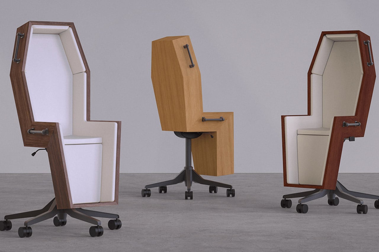
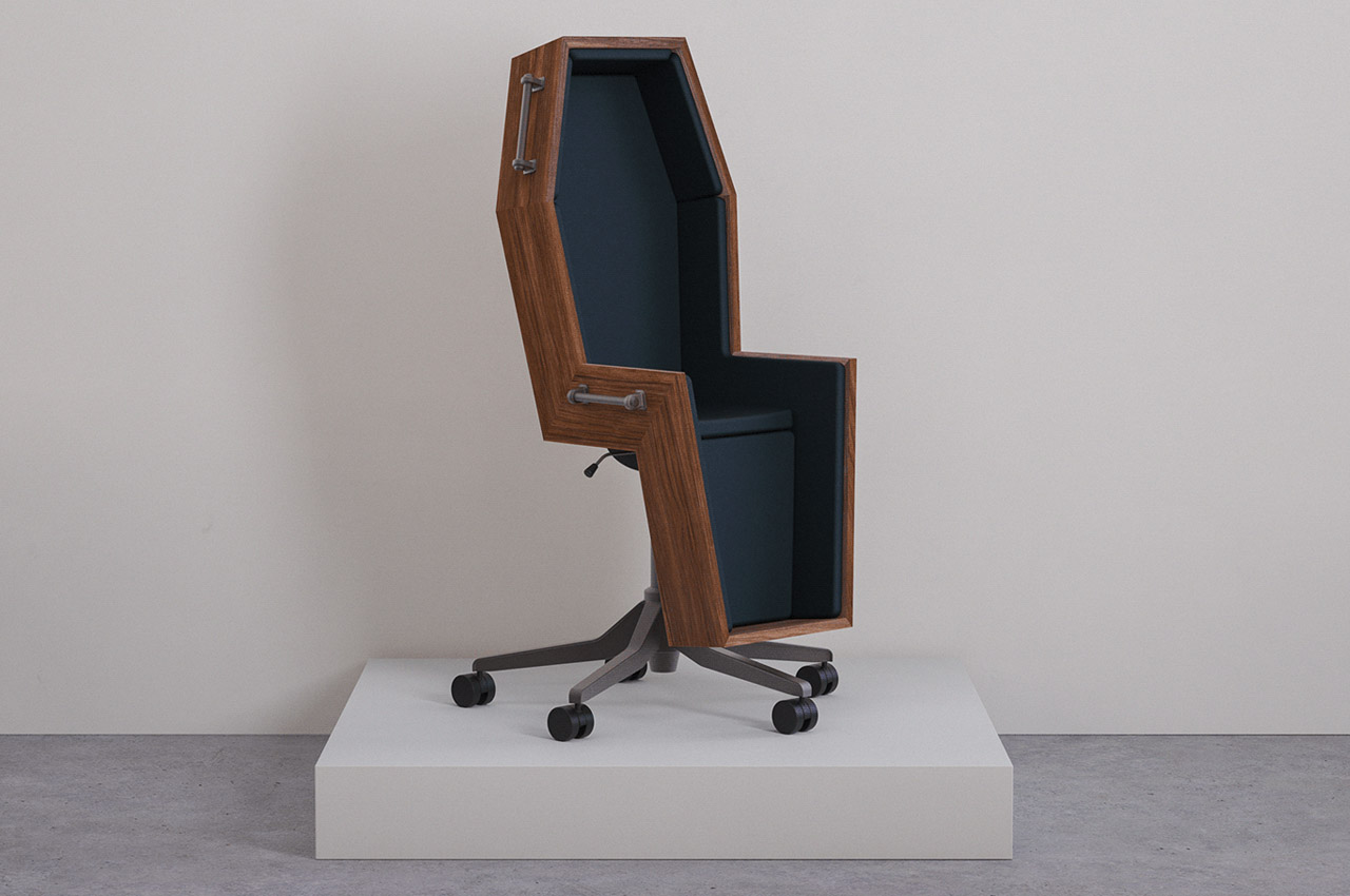
1. Coffin Chair

Shaped like a coffin, this interesting-looking office chair captures the emotions you feel regarding your dead-end corporate job. It is a unique and innovative chair for those who are quite stressed with their jobs but cannot leave. This allows them to process their emotions in a healthy manner.

Why is it noteworthy?

The chair completely captures the feelings you may experience as you go through another tedious workday. It encapsulates the sense of mundaneness and exhaustion you feel as you sit through another dreary meeting that could have quite easily been an email!

What we like

  • Inspired by a painting, giving it an artistic context
  • Captures the emotions of a dead-end job perfectly

What we dislike

  • Lacks cozy cushioning, so not a good option for sitting for long periods of time

2. Plenum Cabin

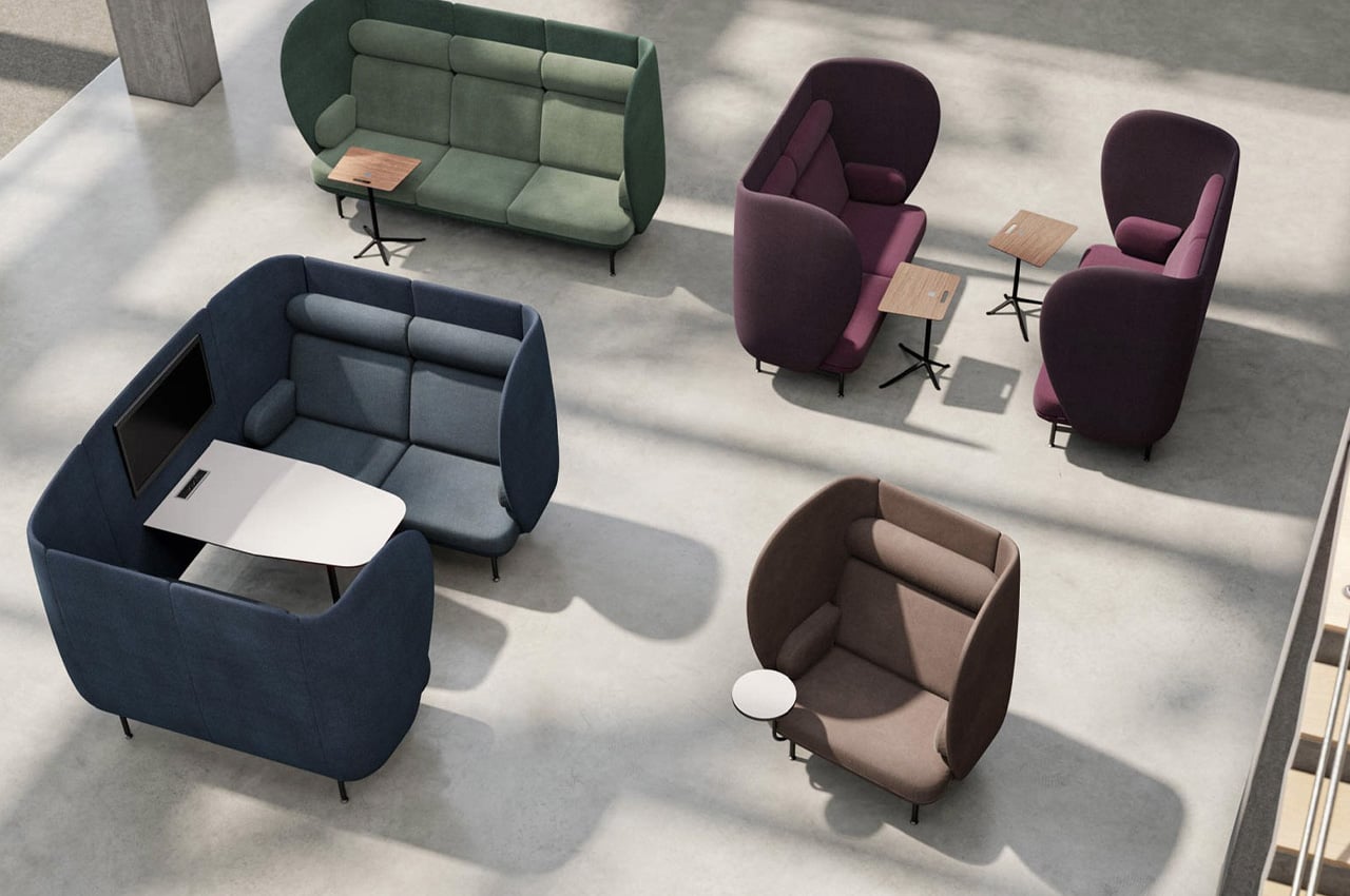
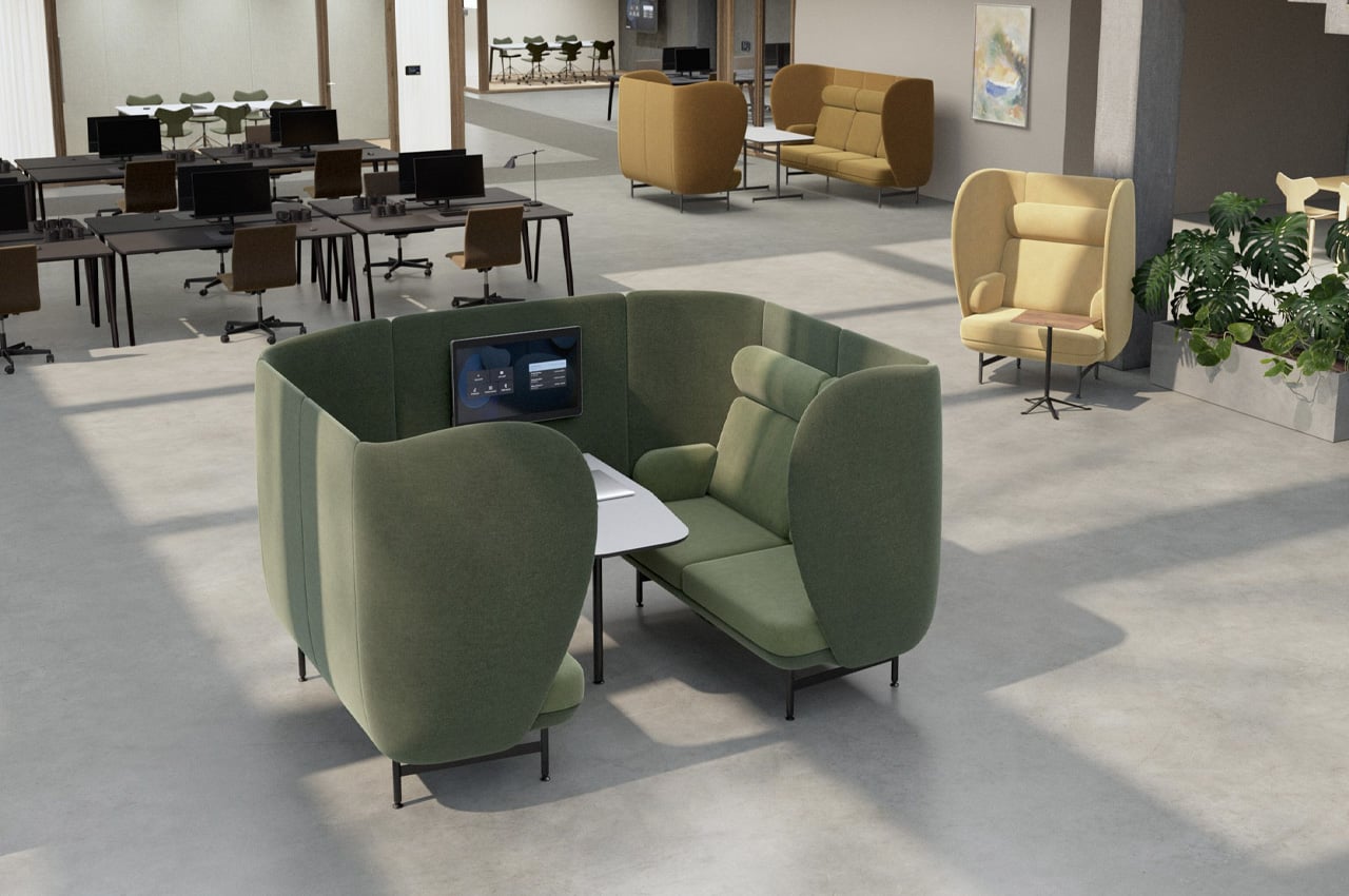
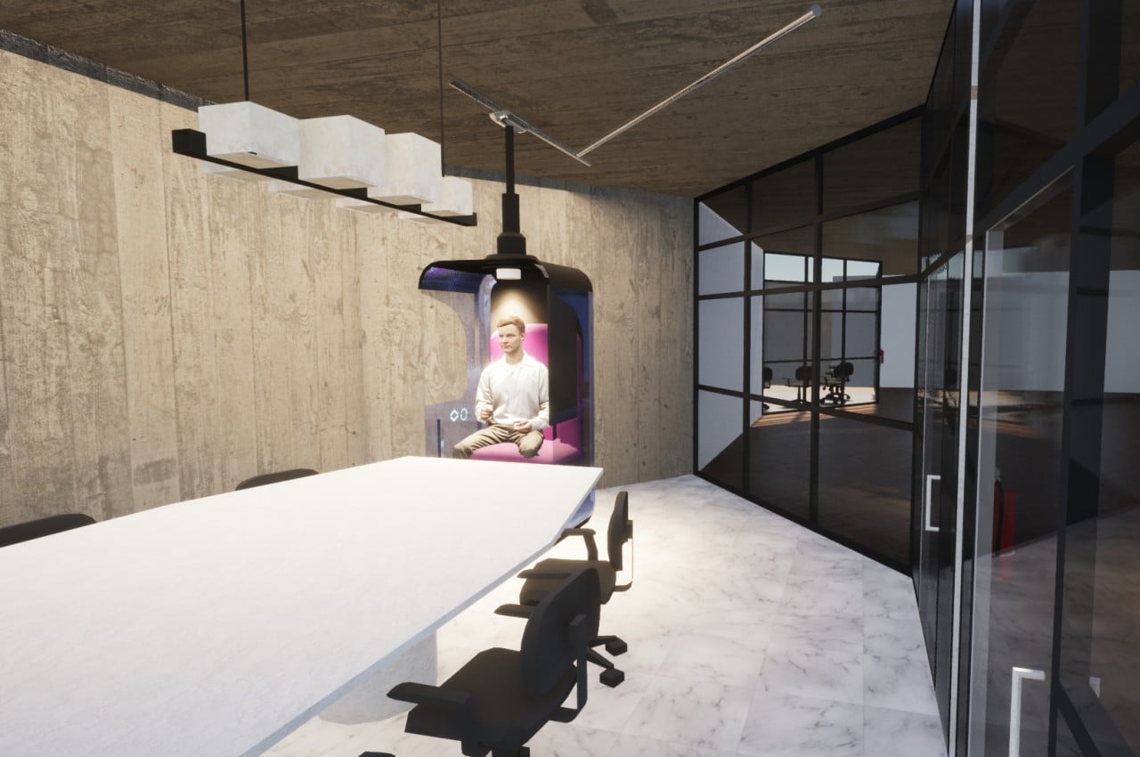
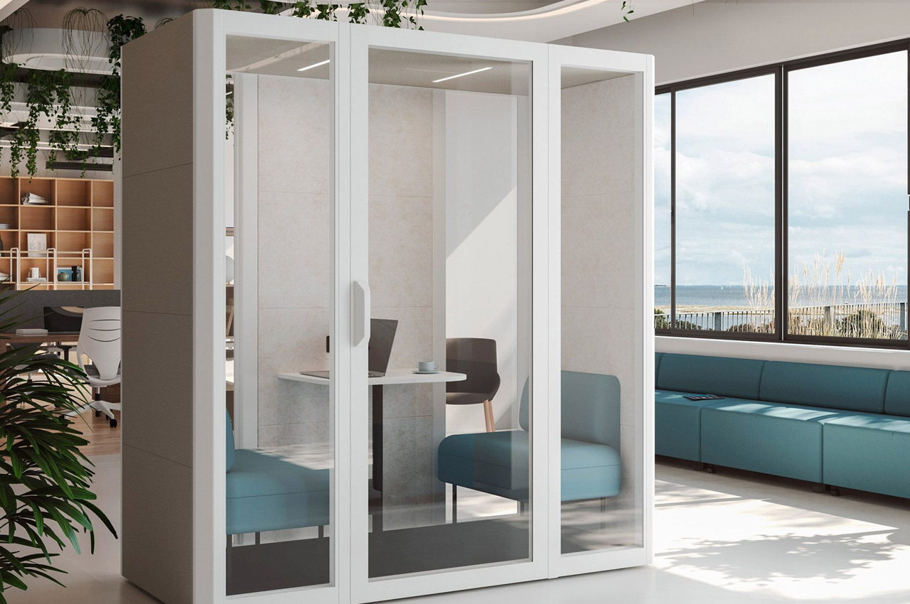
Created by Jaime Hayon for the Danish brand Fritz Hansen, the Plenum Cabin provides comfy spaces to work in corporate offices. The cabins have been designed to function as meeting spots for informal meetings, and they serve as integral focal points in office spaces.

Why is it noteworthy?

“With Plenum Cabin, my aim was to craft a space within a space – a haven for intimate conversations and informal gatherings,” said Hayon. “It’s not just a cabin – it’s an invitation to connect, to share, and to experience the best of human interaction in the workplace.” And the cabin really does function as a comfy and private oasis to work in.

What we like

  • Features a table, an internal cable management system, and an integrated screen

What we dislike

  • Space-consuming design, not intended for offices with space constraints

3. Flow Wall Desk

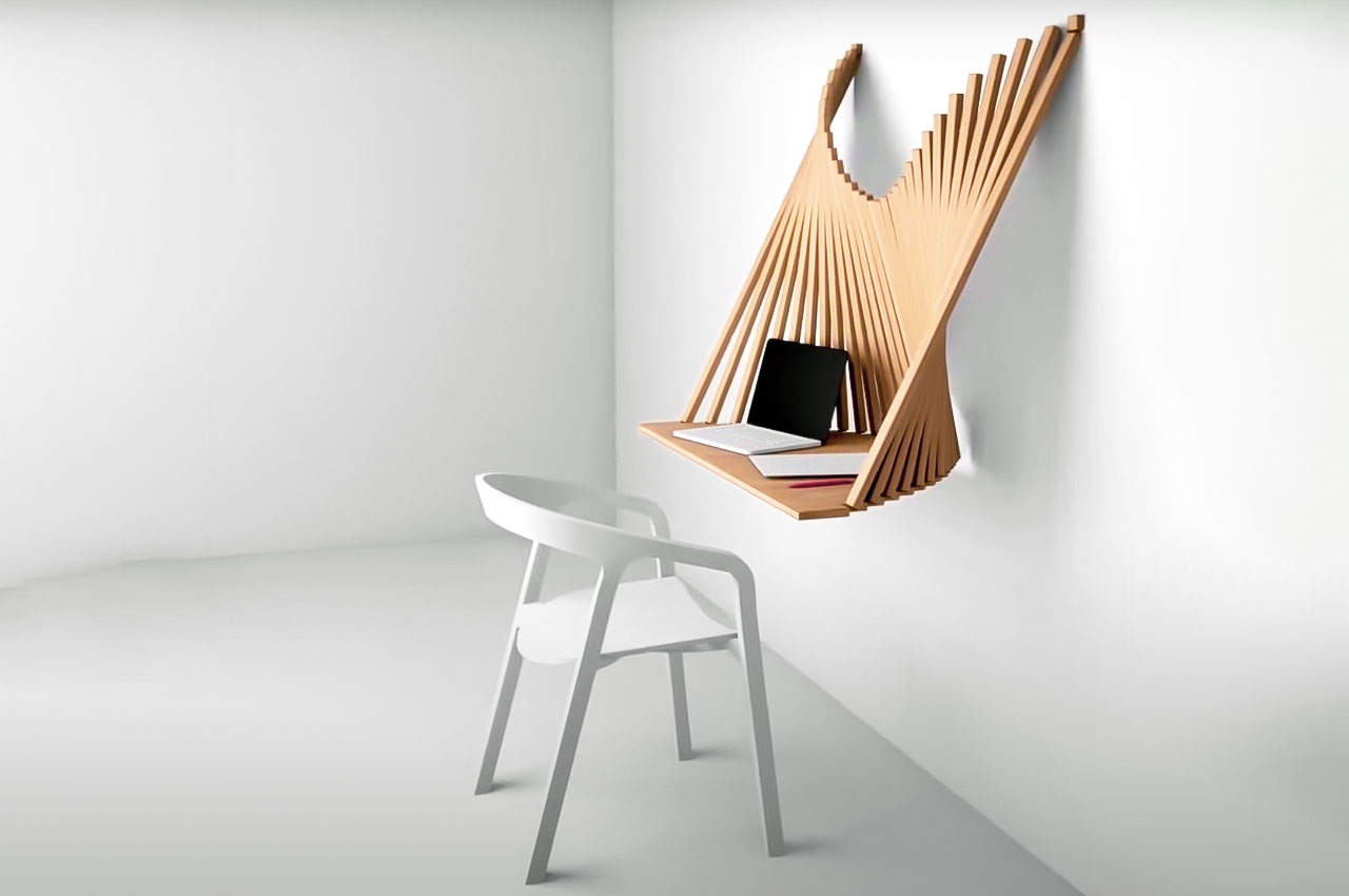
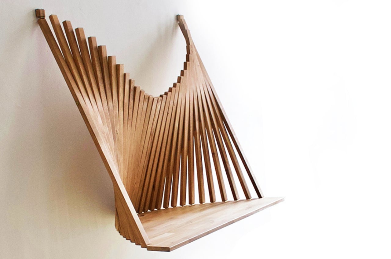
Called the Flow Wall Desk, this intriguing furniture design is intended to be an excellent piece of office furniture for spaces that don’t have too much space. It features a sustainable and simple design philosophy, and it is quite decorative as well, besides having great functionality.

Why is it noteworthy?

You can store and fold up the Flow Wall Desk, allowing it to look like a piece of art on your wall, when you’re not working on it. It looks like a ‘spiraling caterpillar’ when you unfold it!

What we like

  • Has a flatpack form
  • It can be easily stored away

What we dislike

  • Folding and unfolding the desk whenever you need to use it means we can’t have a constant setup

4. Accessible Office Furniture Concept

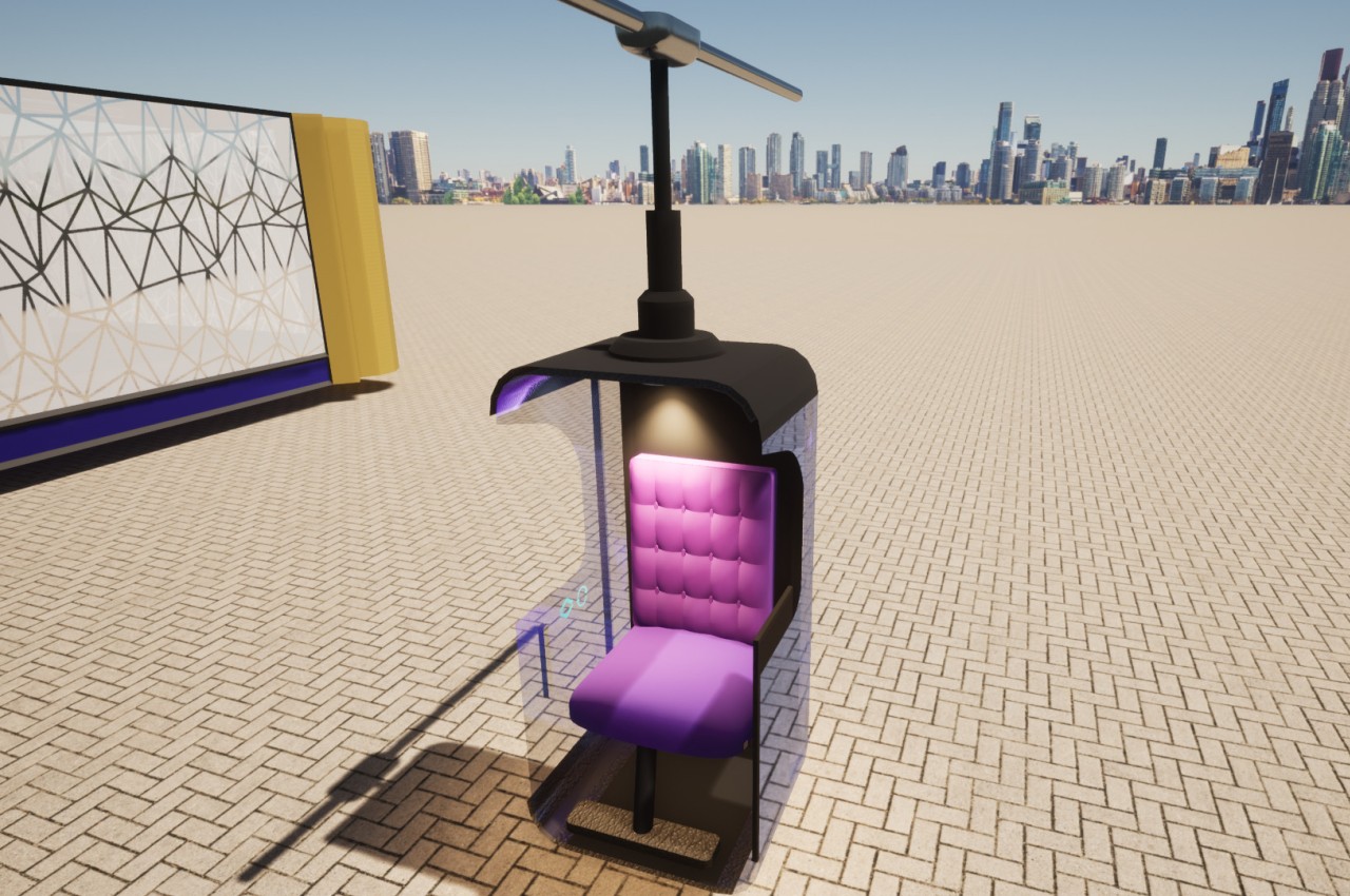
This office furniture concept merges mechanisms that will be needed by people from all walks of life. This innovative chair shifts forward to facilitate moving from the chair to a wheelchair, a feature that is used in cars made for accessibility.

Why is it noteworthy?

This unique concept involves a motorized track running across the ceiling, like trains on a rail. This ensures that the person doesn’t have to move around, the furniture will help move them around. A desk was also created, and it pivots and slides in and out as needed, like the chairs.

What we like

  • Features a smart glass that goes opaque if the person needs privacy

What we dislike

  • It is currently a concept, so we don’t know how well it will translate into a tangible product

5. Typo Chair

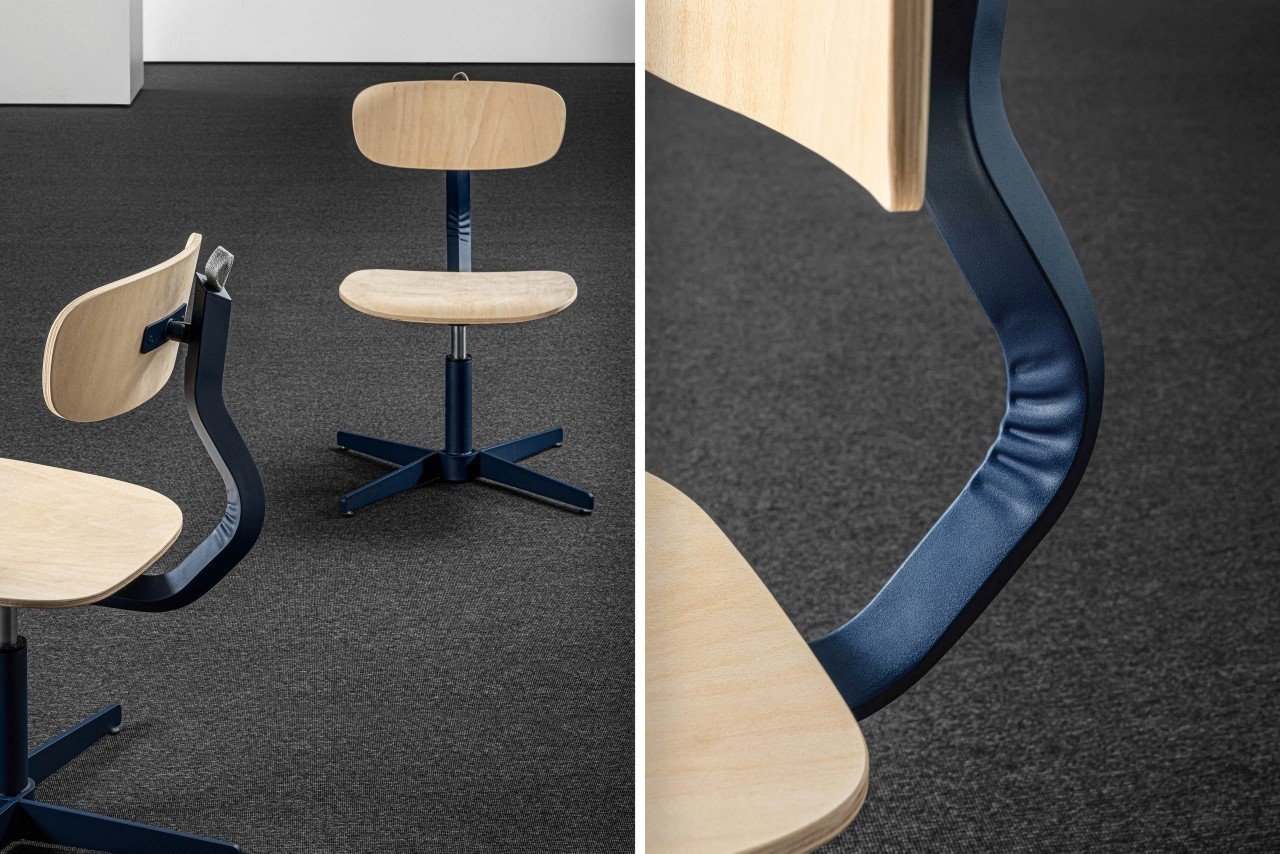
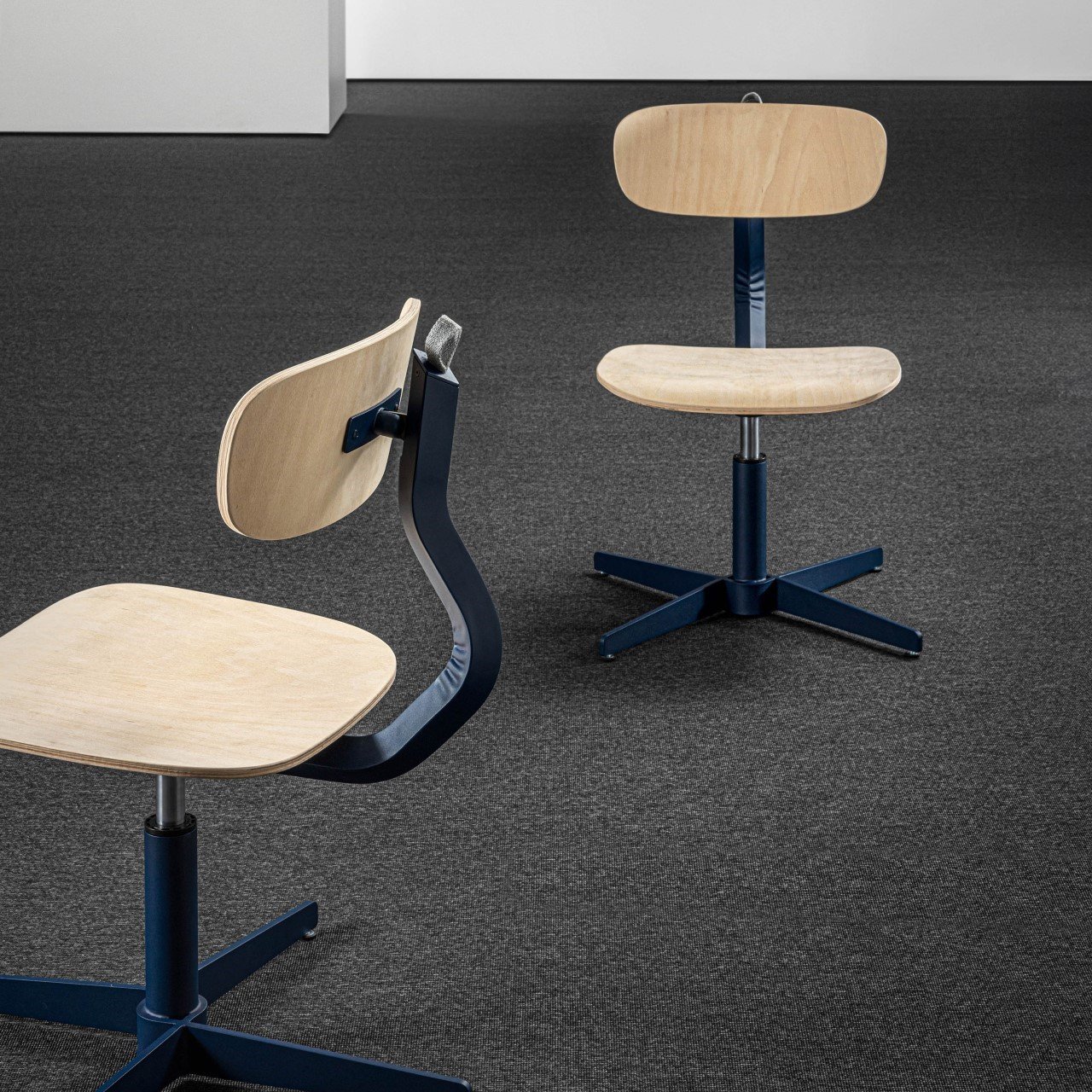
Dubbed the Typo Chair, this unique chair is minimal yet quite powerful. It is designed by AMDL Circle for the furniture brand Mara, and what makes it stand out is its playful bent form, which functions as a one-of-a kind and quite an uncommon element in furniture design.

Why is it noteworthy?

The Typo Chair is an ergonomic furniture design equipped with a light timber base. It features a gentle curve, which allows the chair to stand apart from other conventional chair designs. The cure is the star feature of the entire furniture piece.

What we like

  • The wooden and colored metal elements contrast to form a dynamic silhouette
  • The gentle curve adds some depth and character to an otherwise simple chair

What we dislike

  • There seems to be no option for customization, which can be inconvenient for some users

6. Qyos

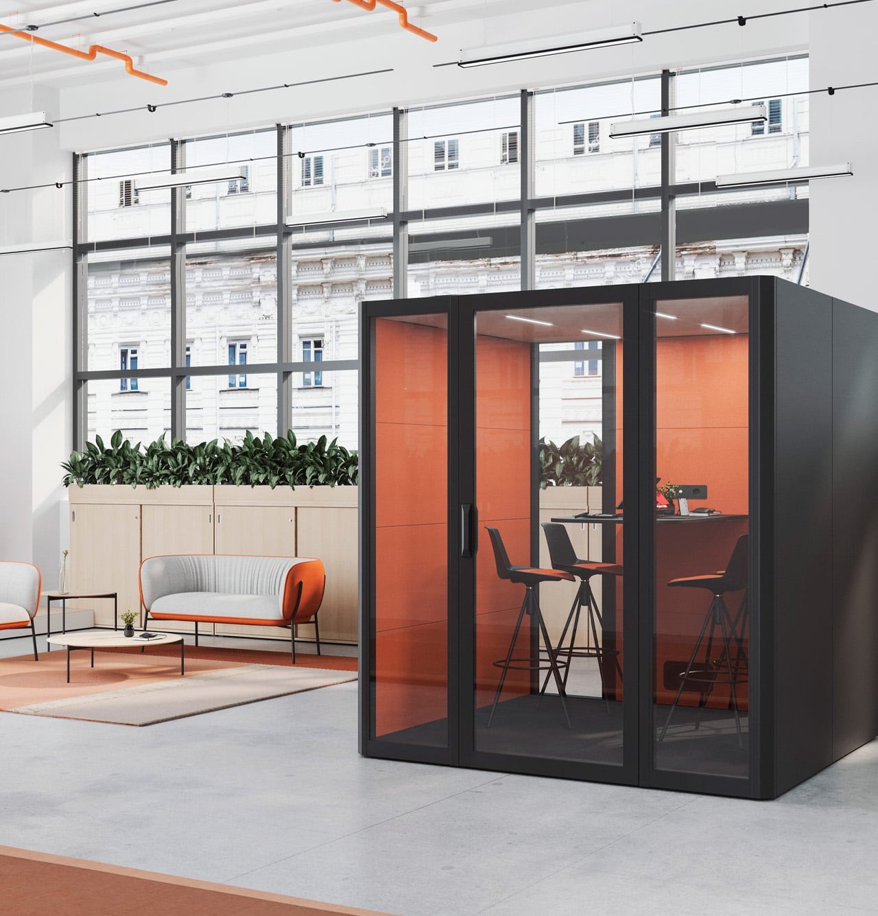
Designed by the Spanish furniture brand Acitu, the Qyos is their first acoustic meeting pod. Qyos was designed to function as “islands of privacy”, allowing employees to work in peace without being disrupted by the rest of the office environment. The pods function as meeting spaces to boost productivity and focus better.

Why is it noteworthy?

The cabins are modular and sound-insulated cabins that were designed by Actiu’s research and development team. They’re excellent for making calls or completing tasks that require all your focus and attention.

What we like

  • Offers an escape from noisy office spaces
  • Can be easily put together and assembled

What we dislike

  • There are similar designs on the market, it has nothing too exciting to set it apart

7. Anthros Task Chair

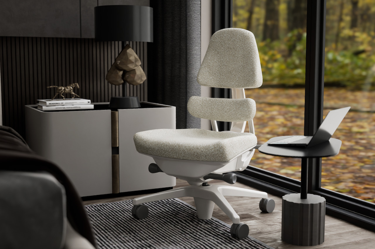
Dubbed the Anthros Task Chair, this one-of-a-kind task chair is designed with a wholly fresh approach. The chair was made using scientific evidence and research, creating a furniture design that improves your posture, minimizes pain points, helps you focus better, and boosts productivity.

Why is it noteworthy?

The Anthros team observed wheelchair users and worked with them, to understand the importance of right seating. They used this invaluable experience to form a novel way to modern task chair.

What we like

  • The chair features 4D armrests, so you can adjust the height, pivot angle, and depth

What we dislike

  • Learning how to operate the chair can be a bit complicated

8. Catifa Carta

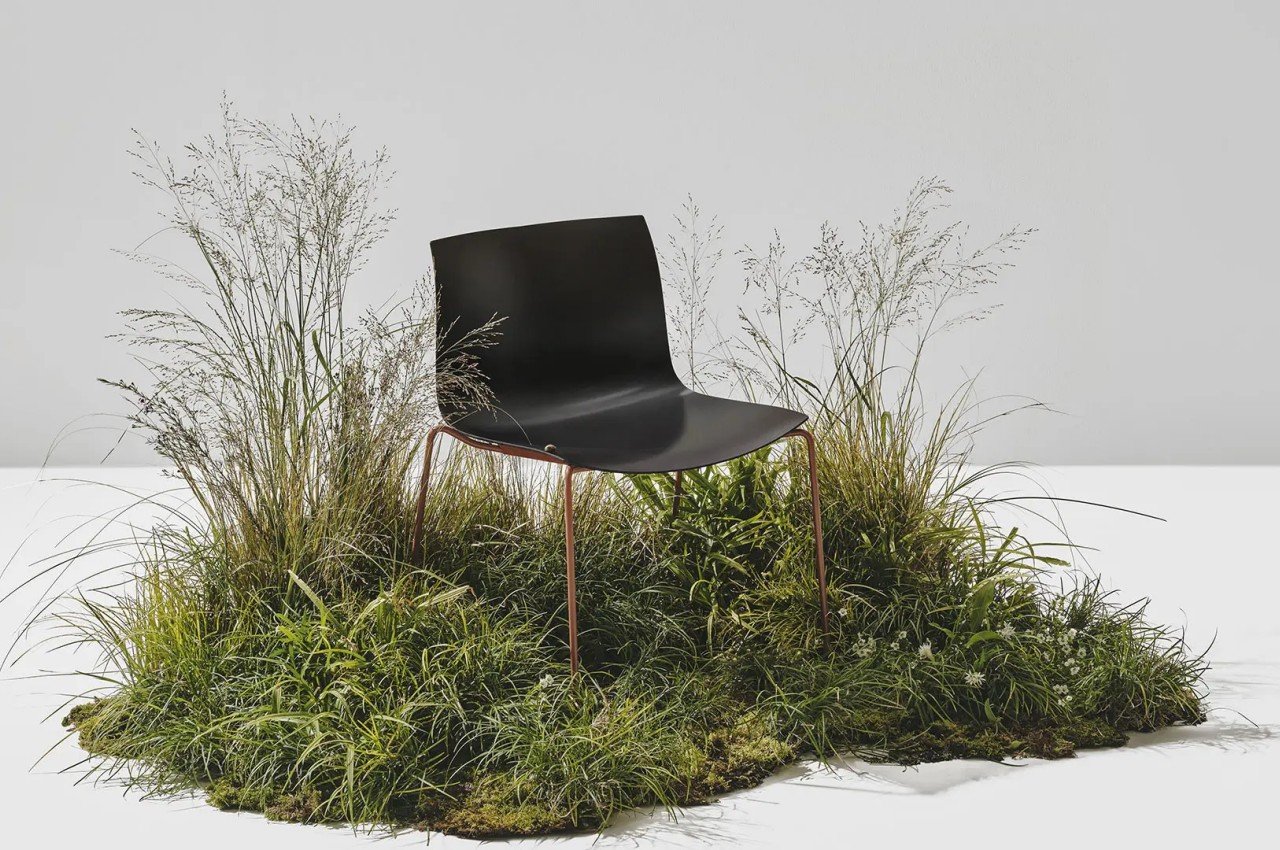
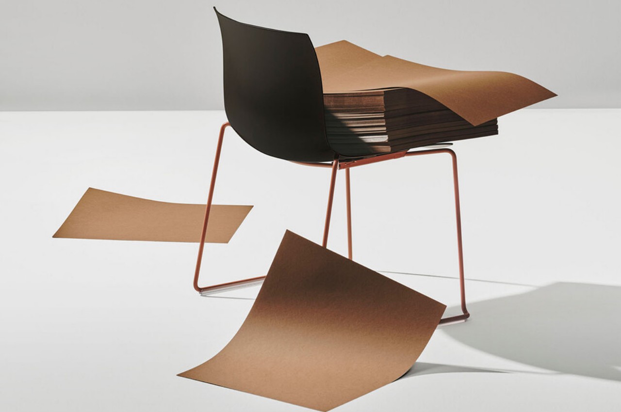
Say hello to the Catifa Carta – a lovely sustainable chair with a minimal ethos. The chair is built from dozens of sheets of paper, or specifically PaperShell – an innovation material created by transforming paper into a wood-like material. The end result is a functional and sleek office chair!

Why is it noteworthy?

The wood-like material has a lot of benefits to it. It is rigid, stable, and also quite charming to look at. The material is created by using wood-by products such as sawdust, chips, and waste wood such as the fallen branches from forests. This novel paper-like material is a sustainable alternative to plastic, wood, or fiber composites.

What we like

  • PaperShell has certain natural imperfections which imparts eah chair with a unique characteristic

What we dislike

  • Not sure how effective the ergonomics of the chair are for sitting for longer durations of time

9. Eto Desk

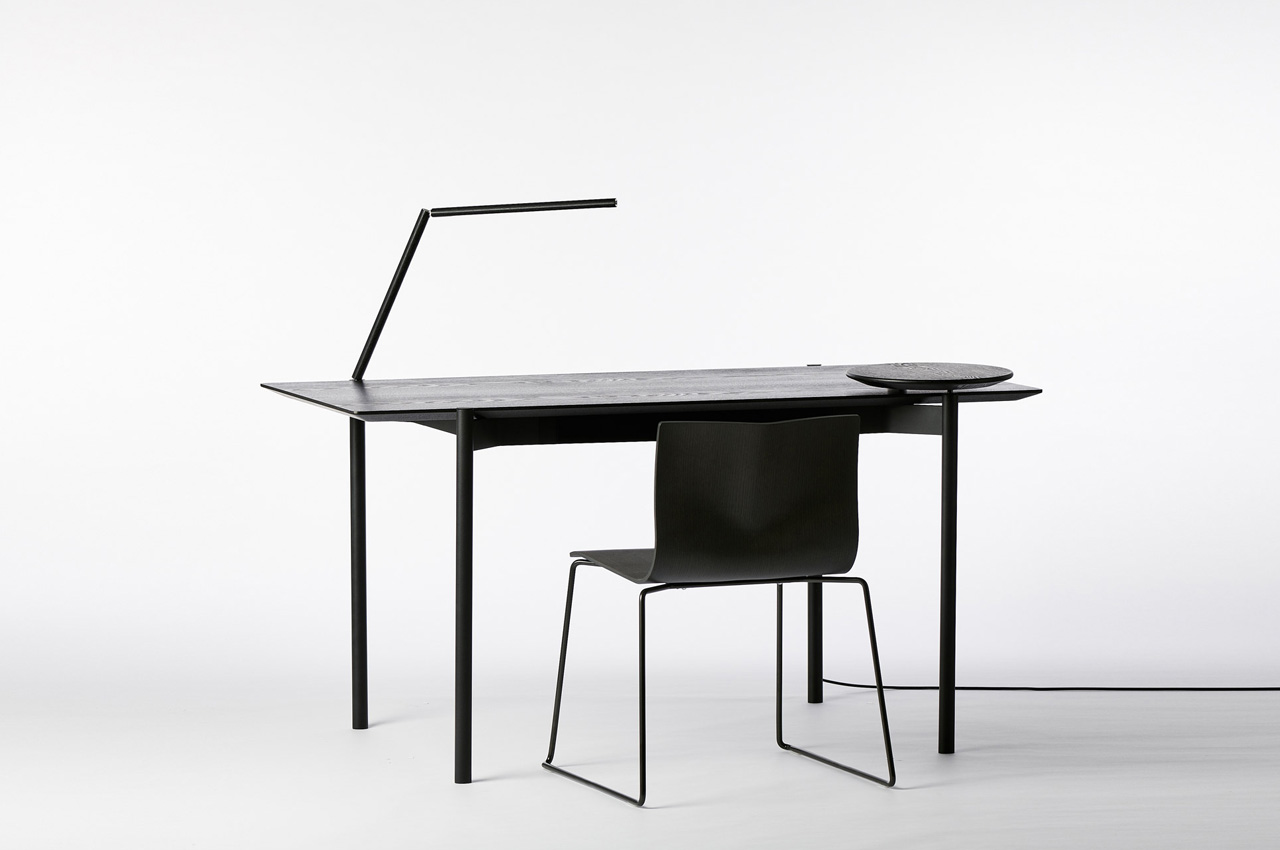
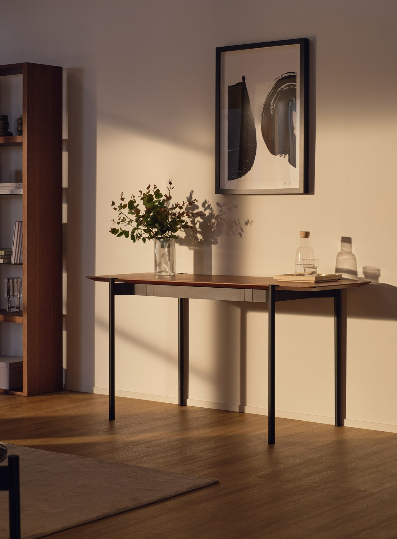
Designed by Australian designer Tom Fereday for the furniture brand King, the Eto Desk includes minimal angles and smart integrated accessories. The desk is an excellent option for your home office or even a corporate home, although its minimal and subtle looks make it a great contender for your home office.

Why is it noteworthy?

The desk is quite sleek and minimal and includes an aluminum frame and a timber veneer top that is available in three finishes – Smoked Oak, American Walnut, and Congo.

What we like

  • The desk is slim and equipped with accessible storage for your stationery

What we dislike

  • Aesthetics are a bit simple and unassuming, which may not be preferred by some. They could have worked on the aesthetics a little more

10. Lives Post + Beam workspace

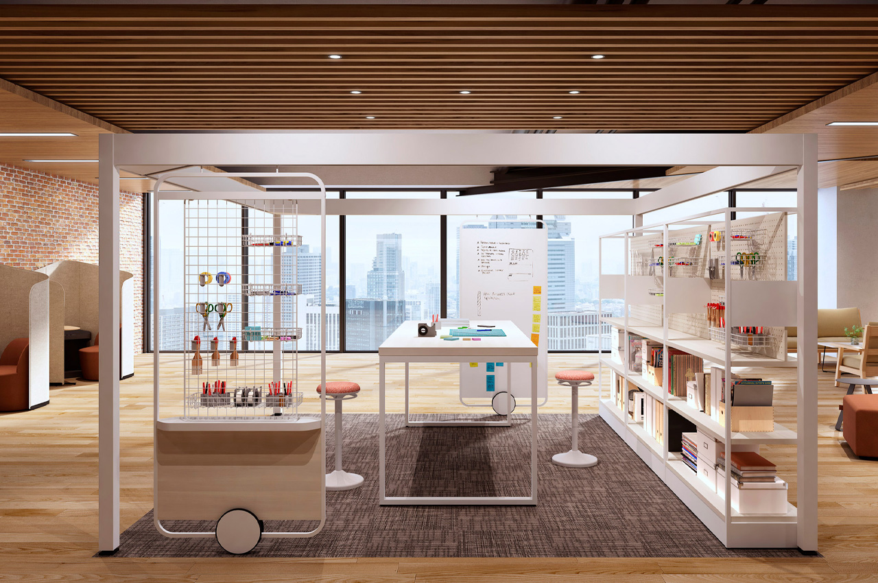
Created by the Japanese furniture brand Okamura, the Lives Post + Beam workspace is created to be a flexible + versatile workspace for modern-day offices. The offices are designed to be comfortable and interactive spaces where co-workers can work and engage with one another, creating new ideas and fostering growth.

Why is it noteworthy?

The workspace is designed with a frame and sliding wall panels, and these panels are customizable, allowing users to customize square frames with fixed or moveable panels that can be attached to the top rail.

What we like

  • Allows companies to create personalized workspaces catering to the needs of their employees

What we dislike

  • It’s not available yet, so we don’t know how the final design will turn out to be

The post 10 Best Office Furniture Designed To Create The Ultimate Working Space first appeared on Yanko Design.

Want Perfect Sourdough Bread every single time? This Kitchen Tool gives you foolproof results

The beauty of baking your own bread lies in its simplicity, and the fact that the yeast and bacteria does most of the job for you. You don’t need fancy equipment or ingredients, just a big container to proof your bread, and an oven to bake a perfectly rustic loaf of sourdough that you can then top up with avocado or ricotta and honey. However, what most bakers don’t tell you is that your loaf of bread is actually a living being. The yeast, whether natural or the instant kind you buy at the market, is a living creature that transforms your ball of dough into a fluffy, airy, mildly tart slice of bread that tastes so good with anything you put on top. This yeast needs just 3 things to perform this transformation – flour, water (hydration), and the right temperature. Most home bakers ignore that last metric, and if you’ve made a loaf of bread that just lacked that oomph or the right texture, chances are you followed your recipe correctly, but missed out on ensuring the yeast could grow under the right temperature. The DoughBed, however, takes care of that part of the breadmaking journey for you. Designed to be a perfectly optimal proofing tray for your dough, the Doughbed is a wide glass tray with a cork lid and a heating bed that creates exactly the right temperature for your loaf. Keep your dough to proof in the DoughBed and you’ll be consistently rewarded with the perfect proofing every time, whether it’s for sourdough loaves, pizzas, baguettes, focaccias, brioche buns, or any other kind of leavened bread you desire to bake!

Designers: Sourhouse (Erik Fabian & Jennifer Yoko Olson)

Click Here to Buy Now: $175 $225 ($50 off). Hurry, deal ends in 72-hours! Raised over $220,000.

Designed by home-baker Erik Fabian and industrial designer Jennifer Yoko Olson, the DoughBed is basically an incubation chamber for bread microbes that creates the perfect thermal conditions for yeast (and sourdough bacteria) to feed and grow. “The problem is not your dough, it’s your kitchen. Kitchen temperatures are often too cold for bread dough, and more importantly, always changing,” say the duo behind the DoughBed. The yeast in your dough thrives at temperatures of 75-82°F (24-28°C), but that might just be a tad too warm for humans, who set their thermostats or air conditioners to slightly lower temperatures. This mild temperature difference (of a mere 4-5°F) can be the difference between a perfect loaf, and a loaf that just doesn’t have the right open crumb. The solution? A mini habitat for your doughball, allowing it to do its job flawlessly well, every single time.

Mat + Bowl + Lid = The Perfect Proofing Solution

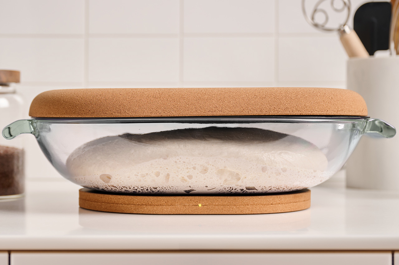
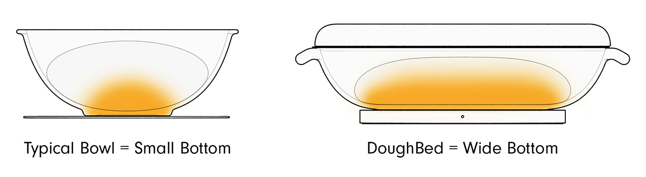
DoughBed combines a warming mat, a glass dough bowl, and a cork lid to create an efficient warming solution. The dough bowl has a wide bottom so your dough is gently and evenly warmed to 75-82°F (24-28°C) by the mat below.

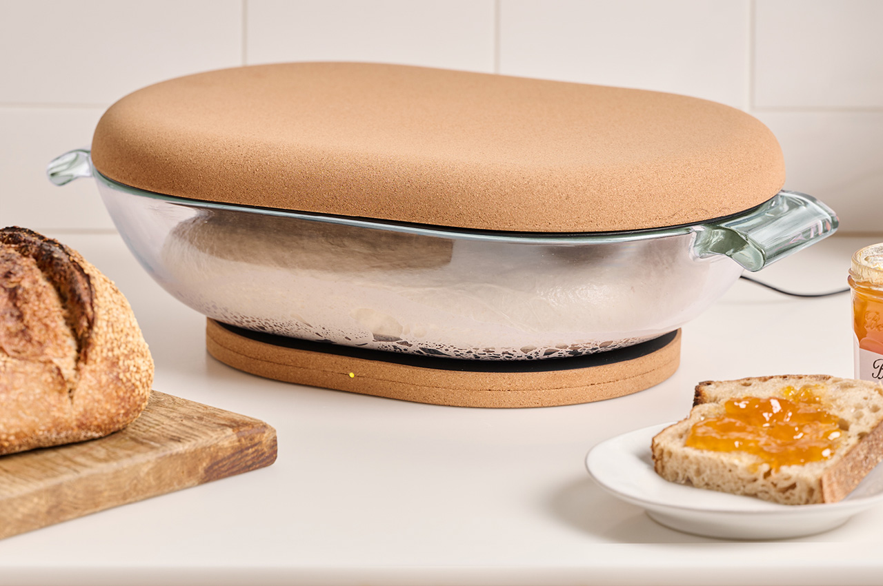
Each DoughBed is made of 3 parts – an oval-shaped glass bowl, a cork lid, and a warming base that gives your bread microbes the ideal temperature to do its job. The wide oval tray is big enough to hold 3 loaves worth of dough at one time, and is perfectly shaped and sized for mixing your dough in, resting and proofing, and pouring your dough out for shaping before baking. As a bonus, it’s even designed to be oven safe, although baking a loaf that big would be overkill!

The warming mat is made with cork to prevent heat loss into your cold counter.

Once your dough’s ready for proofing, simply cover the glass tray with the DoughBed’s cork lid and place the tray and lid on the DoughBed’s electric base, which heats up to just the right temperature for your bread microbes to thrive. The bowl’s wide base helps the bread dough heat evenly and quickly, and the DoughBed’s single temperature target works with remarkable consistency all throughout the year, giving you perfect loaves even in autumn or winter months.

Oval = the Best Shape for Dough Handling

The DoughBed is perfect for home bakers looking to upgrade their bread game. The oblong oval shape of the glass bowl is ideal for mixing, kneading, and folding with both your hands, and the cork lid and base don’t just give the DoughBed its rustic aesthetic, they’re key to helping your dough maintain its temperature efficiently, and the cork base prevents heat-loss into your kitchen counter.

The DoughBed’s base operates with just 10W of power (that’s 75% less than an oven light), relying on a USB cable that can be wound up and tucked into the underside of the base when not in use. The cork lid comes with a removable, food-safe polypropylene liner, and both the glass bowl and polypropylene liner are dishwasher safe. We’d recommend not washing the cork to ensure it lasts longer. The DoughBed starts at a discounted $175 for backers – that’s a lot cheaper than the Le Creuset you’d mix and proof your sourdough loaf in.

Click Here to Buy Now: $175 $225 ($50 off). Hurry, deal ends in 72-hours! Raised over $220,000.

The post Want Perfect Sourdough Bread every single time? This Kitchen Tool gives you foolproof results first appeared on Yanko Design.

An Interactive Lamp Series That Brings The Cosmic Moments Into Interiors

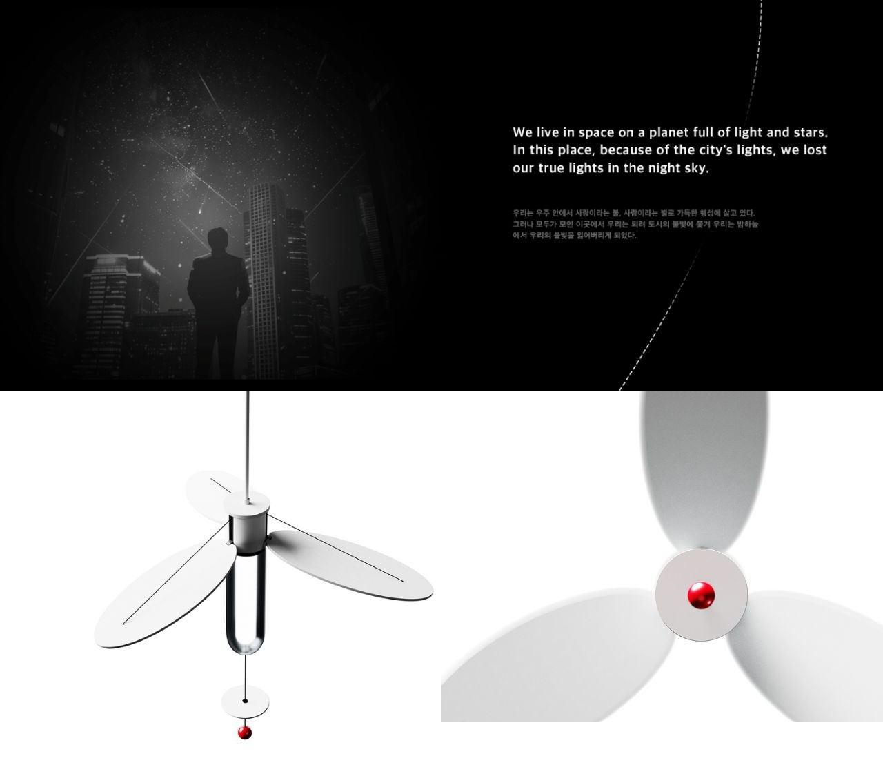
Space, with its vastness and complexity, has always captivated the human imagination. Our solar system, a celestial ballet of planets and stars, has inspired various aspects of human life and design, from ancient sundials to modern-day innovations. The COSMOOVAL lamp series is a testament to this inspiration, drawing on the phenomenal interconnectivity of our solar system to create a collection of lamps that not only illuminate spaces but also tell a cosmic story.

Designer: LFD Official – Seohyun Nam, Nam Woo Kim, Doyoon Kim

The designers of Cosmooval drew inspiration from the celestial bodies in our solar system, considering the way they influence our planet and the intricate dance of light and shadow they create. The lamp series incorporates key elements such as expandability, limitation, transparency, and immateriality to bring the essence of space into our living environments.

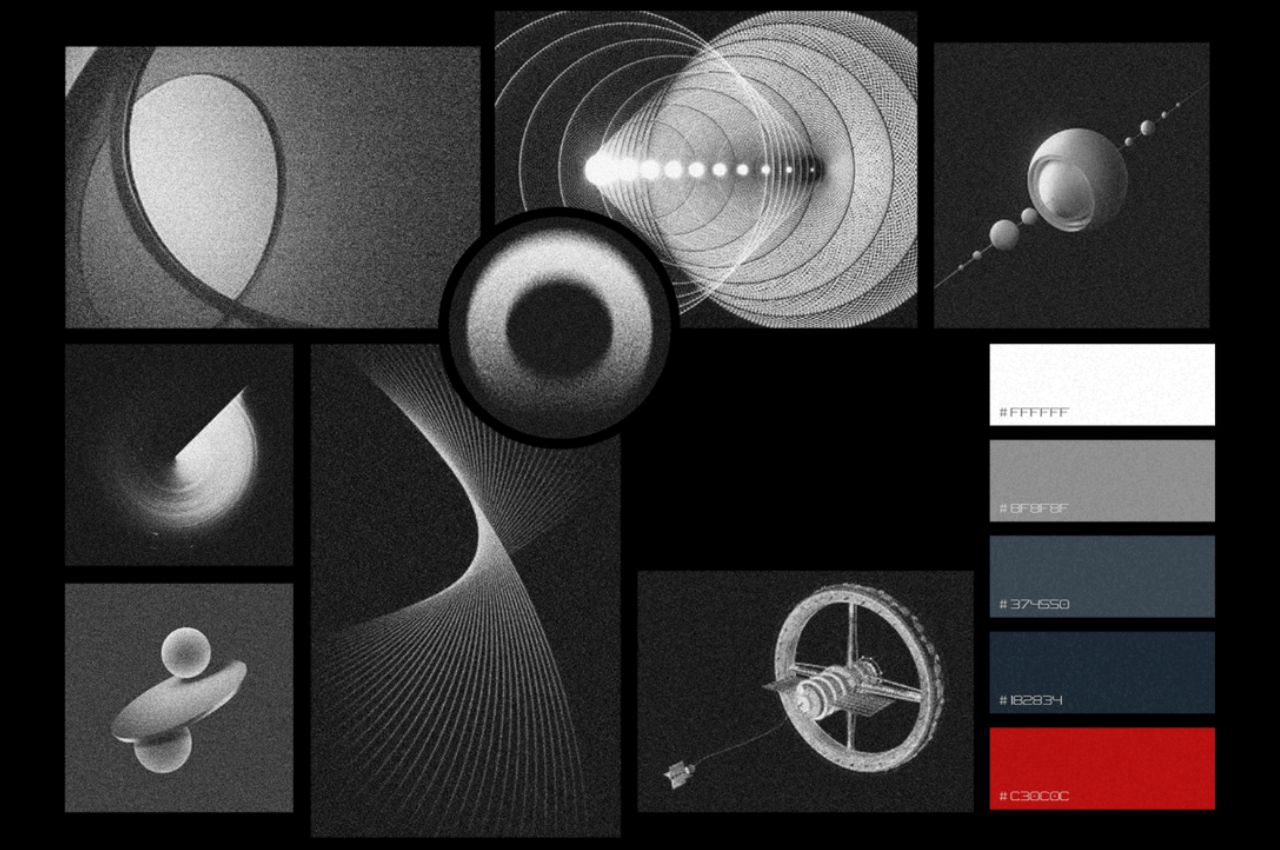
The design process began with the creation of a mood board, reflecting the tension and spatial dynamics of the universe. Simple basic figures, inspired by solar and lunar eclipses, shooting stars, and planetary movements, were arranged to evoke the mood of the cosmos. A clay mockup emphasized stability through the use of circles and triangles, laying the foundation for the lamp series’ structural elements.

Several idea sketches were explored, with the initial focus on a triangular structure within three circles. As the design evolved, proportions, details, and interactions were refined in subsequent sketches. The final design selected a form that considered materials, structure, and user interaction, resulting in three distinct types of lamps within the Cosmooval series.

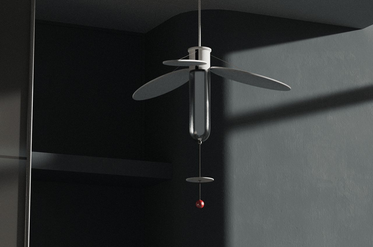
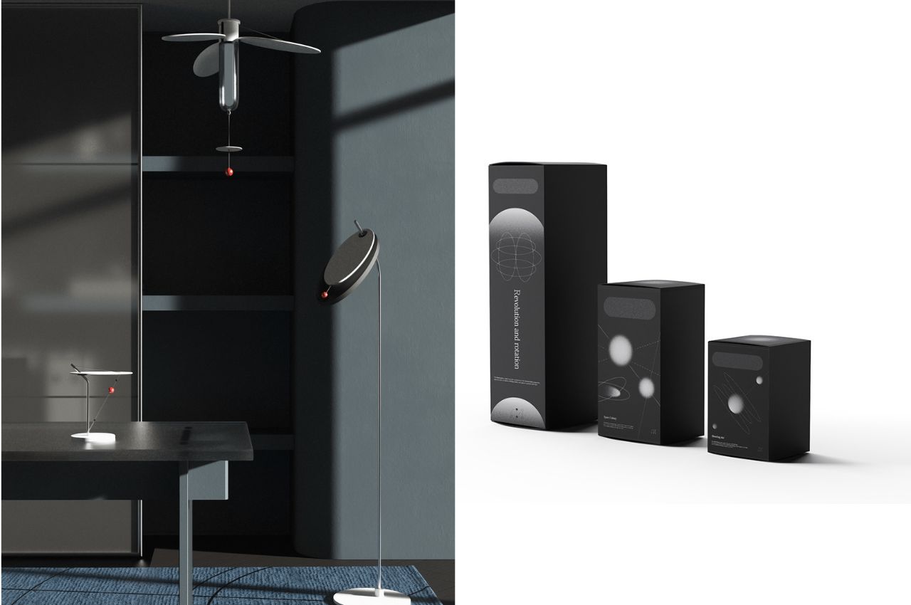
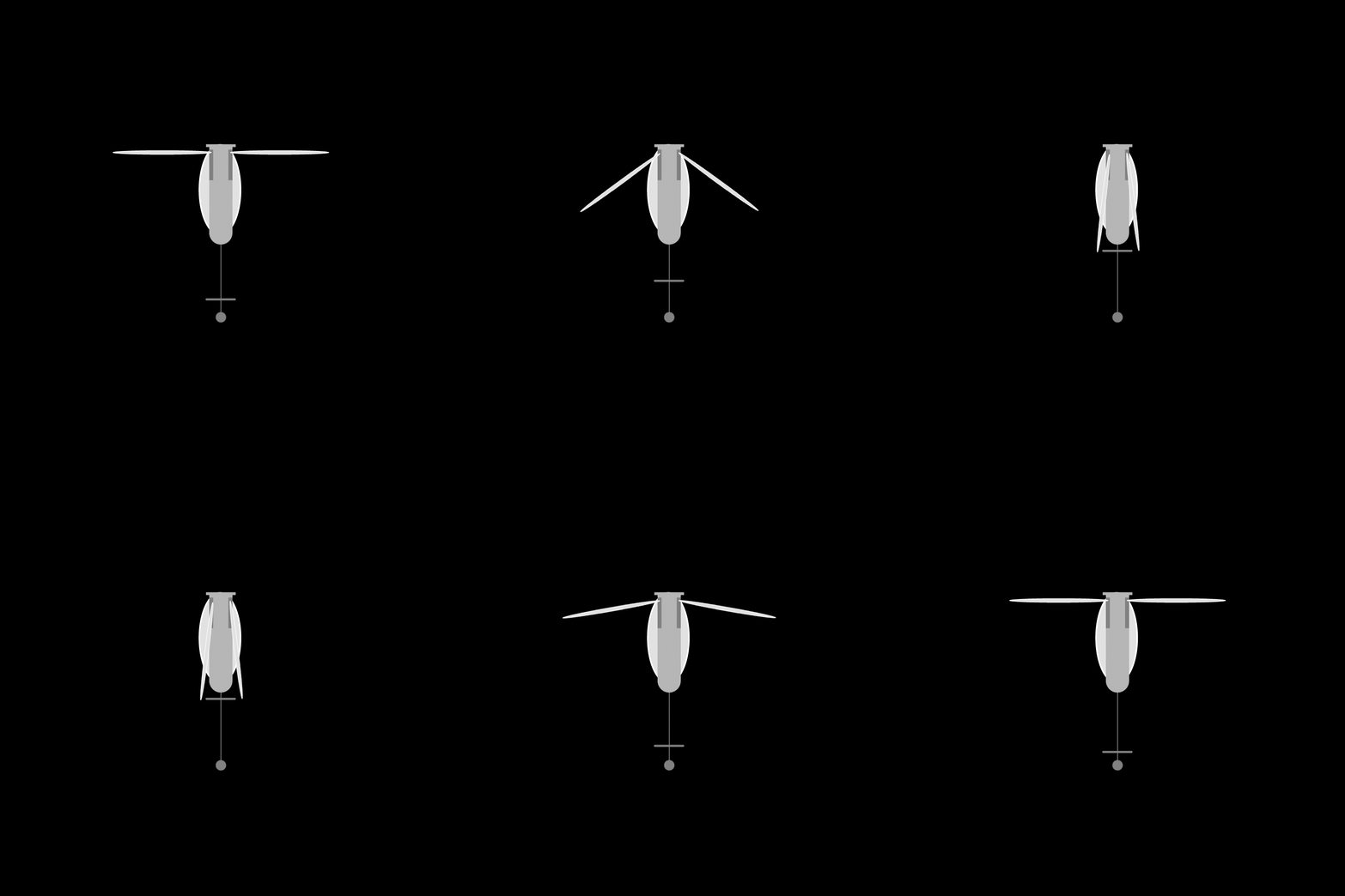
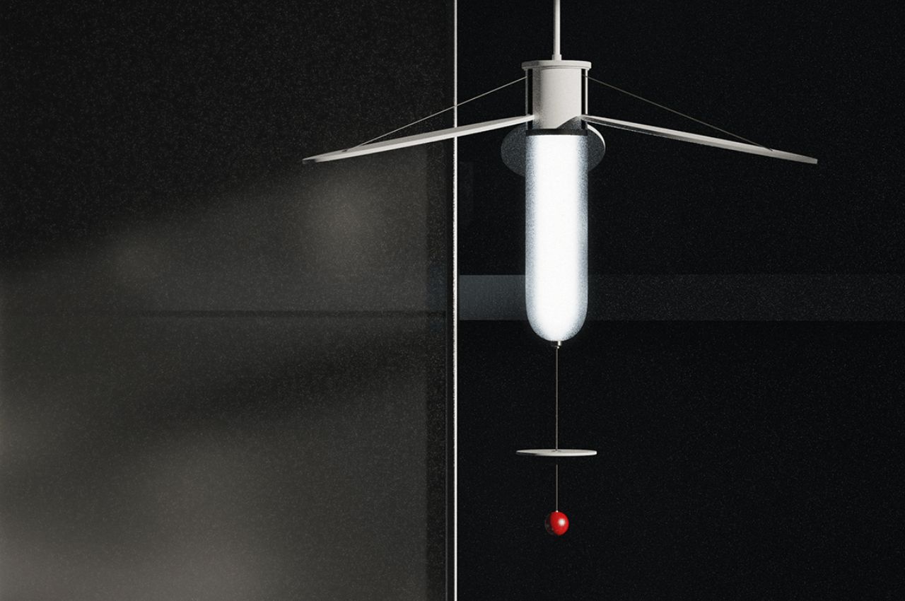
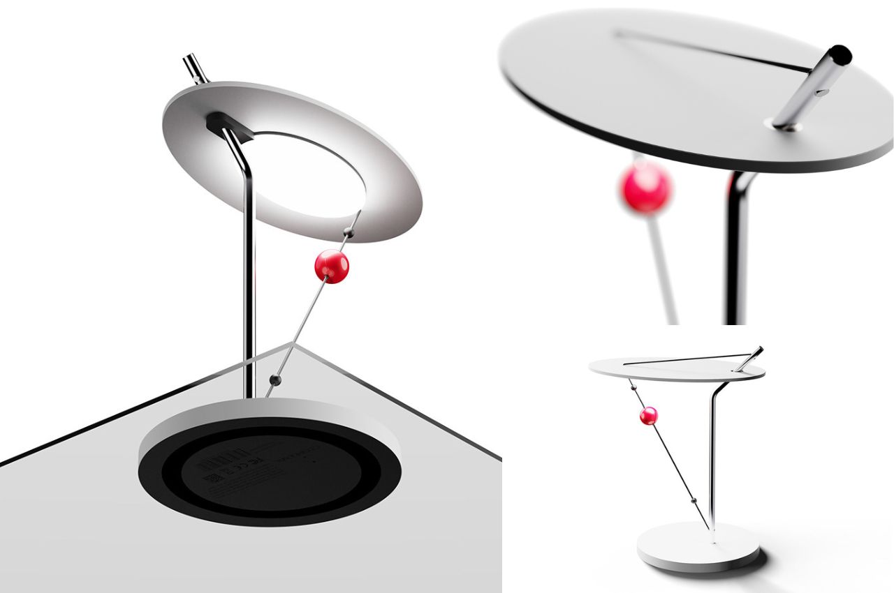
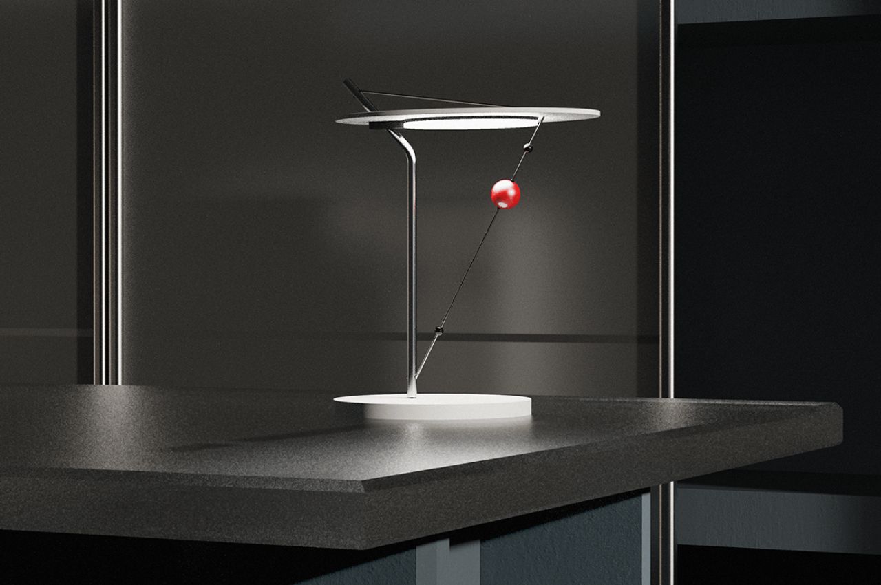
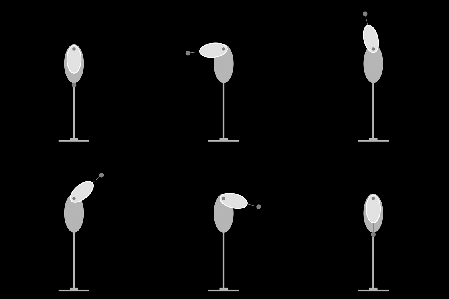
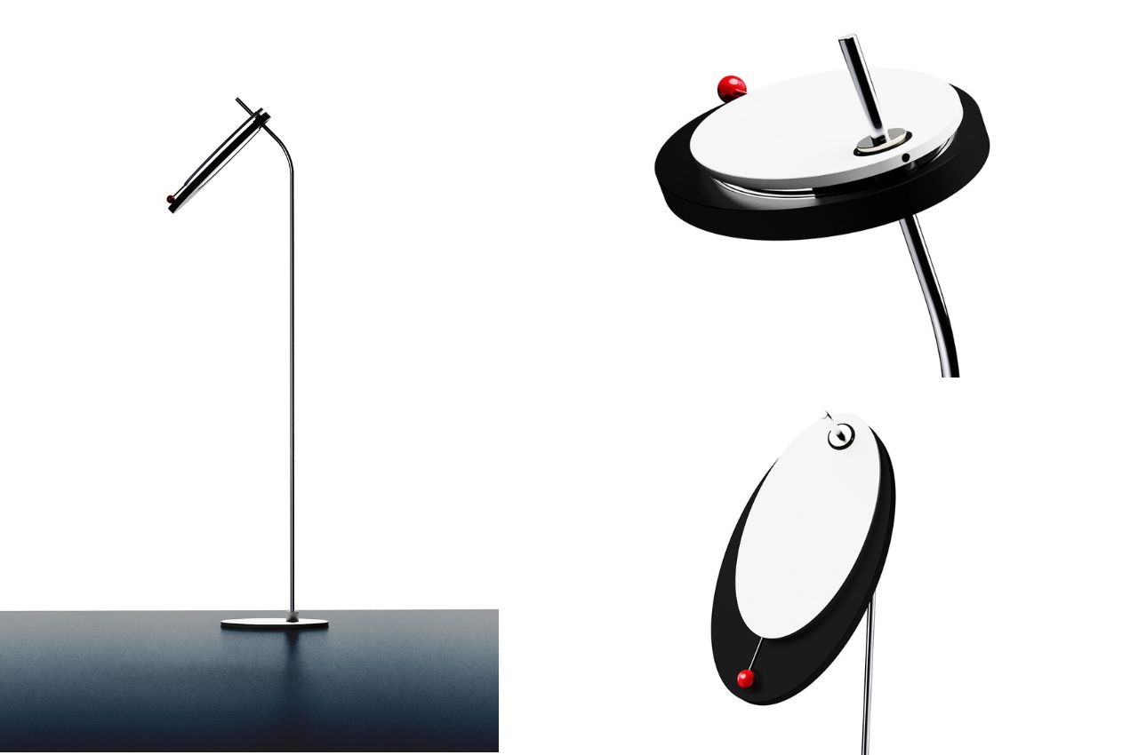
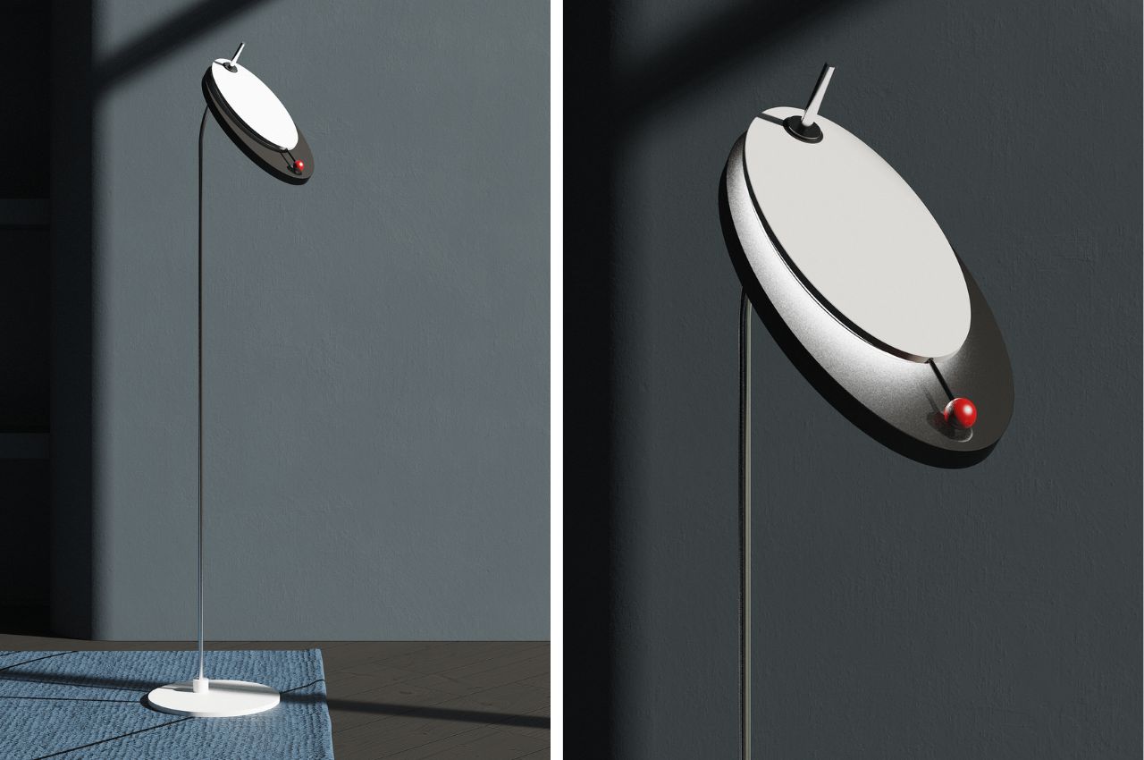
Each lamp in the series offers a unique interaction with light, adding to the overall cosmic experience. The ceiling lamp, representing expandability, spreads light by adjusting the angle of an oval disk. The table lamp, embodying limitation, controls light brightness through the movement of a red sphere, mimicking the motion of a shooting star. The floor lamp, combining transparency and immateriality, simulates orbiting planets and solar eclipses, changing light intensity as the red sphere is manipulated.

Cosmooval, derived from the fusion of “Cosmo” (space) and “Oval” (ellipse), is more than just a lighting solution; it is an artistic representation of the cosmos. The series serves as a visual metaphor for planets, satellites, and shooting stars, moving in harmony with their orbits.

The ceiling lamp symbolizes the expansiveness of space, spreading light with three ovals arranged in a stable manner. By pulling the red sphere attached to a string, users can open and close the ovals, controlling the brightness and essential light in their space.

1

In the table lamp, a triangular structure controls the concentrated light source. Moving the red sphere along a diagonal line mimics the motion of a shooting star, allowing users to experience the fleeting brightness associated with celestial phenomena.

1

The floor lamp embodies transparency and immateriality, recreating the orbits of planets and solar eclipses. Pushing the red sphere sideways changes the shape and intensity of light, providing a dynamic representation of the passage of time and celestial revolutions.

1

The Cosmooval lamp series transcends conventional lighting, offering users an immersive experience that connects them to the wonders of our solar system. Through innovative design and thoughtful interaction, these lamps bring the cosmos into our living spaces, reminding us of the beauty and complexity of the universe that surrounds us.

The post An Interactive Lamp Series That Brings The Cosmic Moments Into Interiors first appeared on Yanko Design.
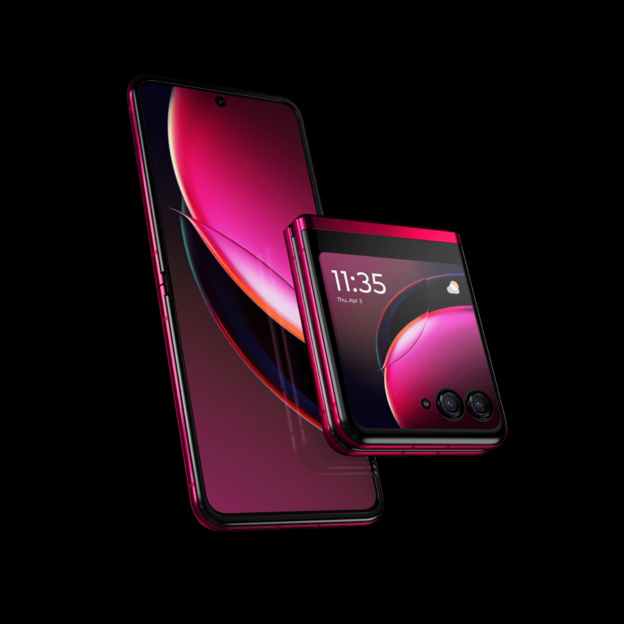
Top 5 Quirky Phone Designs That Actually Make Sense

Smartphones today seem to look very similar, varying only in the shape of the camera bump and the color of their backs. Sometimes, the materials might be different, too, but the same large-sized “candy bar” form factor has become the standard for all the smartphones currently in the market. There was a time, however, when companies were a bit more daring, experimenting with phone designs and features in an attempt to stand out from the crowd. That did lead to some rather eccentric and sometimes even ridiculous designs that make us question the sanity of the minds behind them. But there are times when those odd designs of the past actually have important relevance today. Here are five such phone design oddities that we wished existed or still exist, and some alternatives in case you may have been smitten by their quirky appearance.

Designer: Google, Motorola

Undying Handset: Project Ara

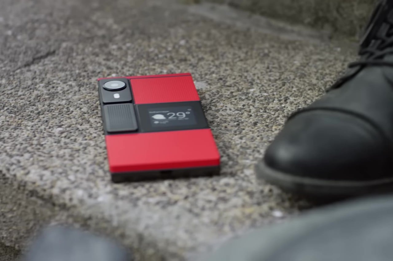
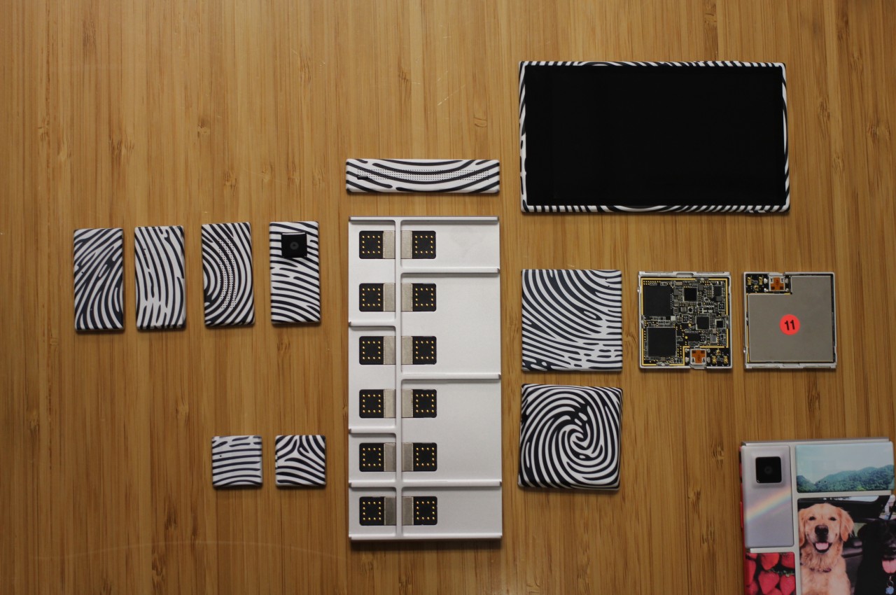
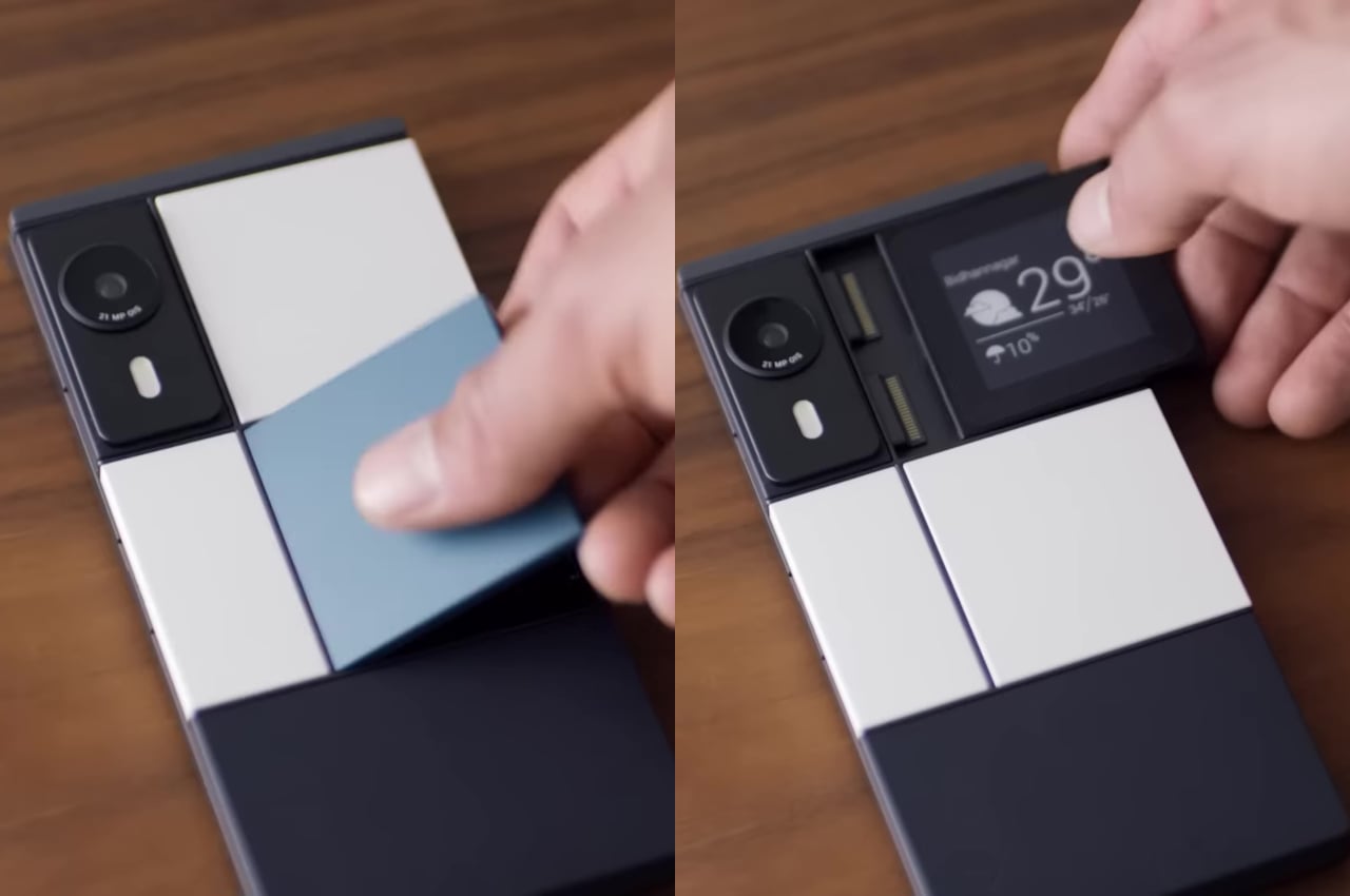
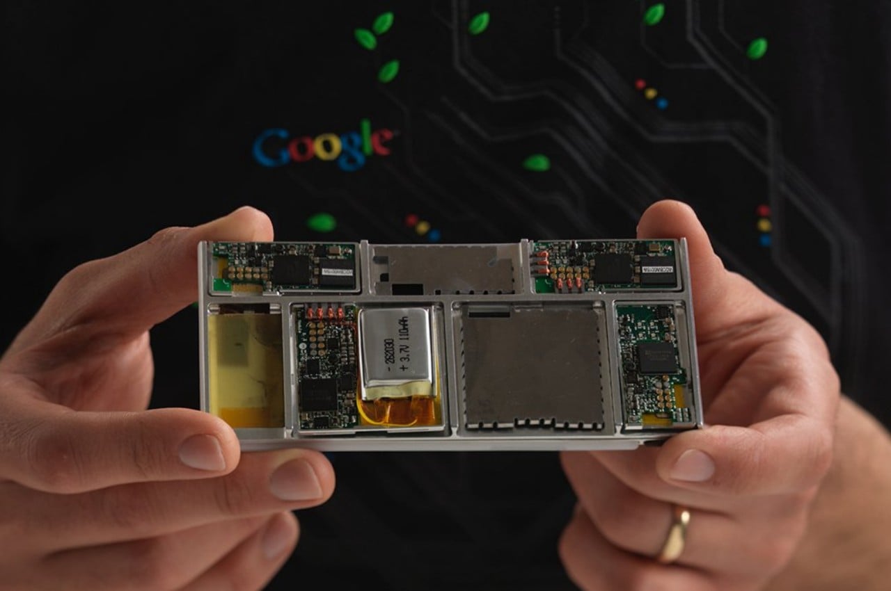
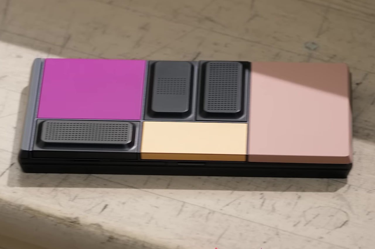
Google’s Project Ara inspired the idea of a modular smartphone whose components you can easily swap to upgrade or repair parts. In theory, this would make the phone last forever, or at least as long as the base is intact and parts continue to be manufactured for it. In practice, it was a very ambitious endeavor that could neither meet expectations nor present a viable business model that wouldn’t bankrupt manufacturers. In the end, that sustainable and immortal smartphone remained just a dream, at least in that idealistic and perfect form.

Alternative: Fairphone 5

Designer: Fairphone

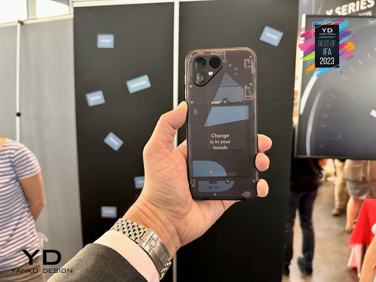
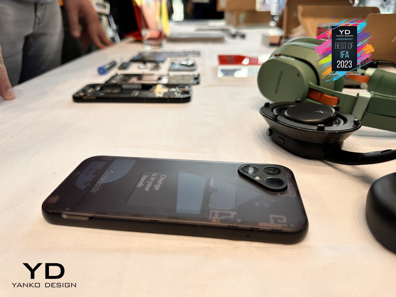
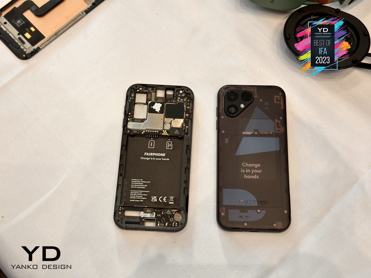
Fortunately, a part of that dream is actually possible and even sustainable in more ways than one. Although you can’t hot swap components on the fly, the Fairphone 5 at least offers a way for owners to change important parts of the phone, like batteries or even cameras, to keep them running almost forever. There are some limitations, of course, but if all you want is a phone that will last you for almost a decade instead of just two years, this self-repairable design pretty much has that in the bag.

Mobile Shutterbug: Nokia N90

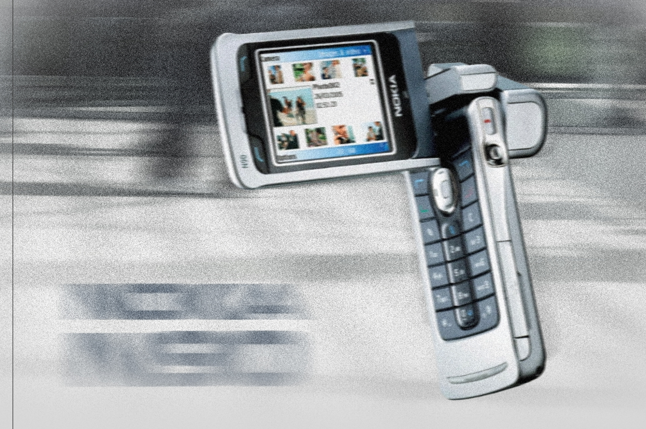
One of the biggest uses for smartphones today next to social media is taking photos and videos. In the days even before the term “smartphone” was coined, even the most advanced handsets from the likes of Nokia could barely hold a candle to point-and-click cameras. That’s why the quirky Nokia N90 was prophetic and way ahead of its time, envisioning a day when smartphones would be used like camcorders, though with a bit more awkwardness due to their inflexible designs.

Alternative: Nokia x Nothing Concept

Designer: Viet Doan Duc

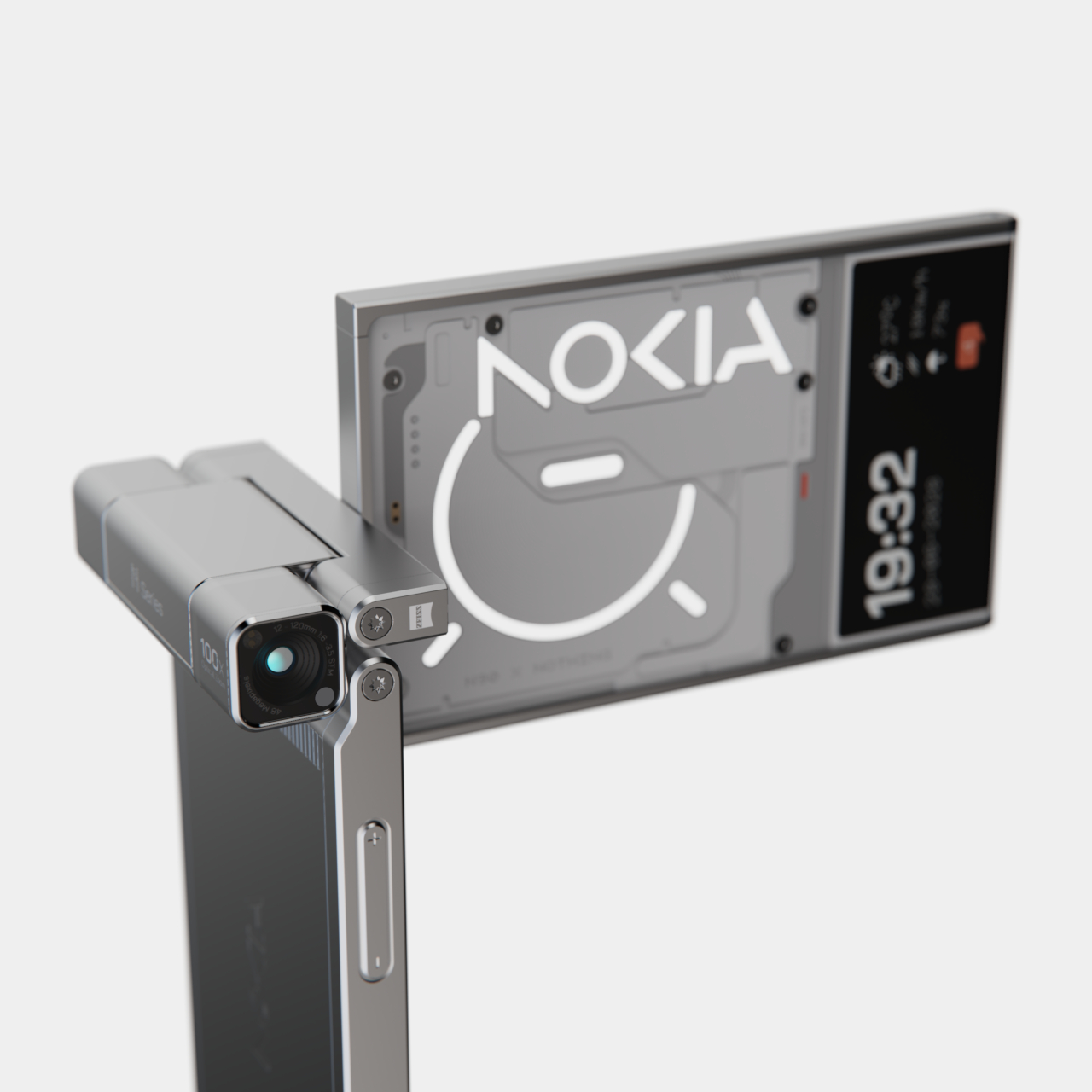
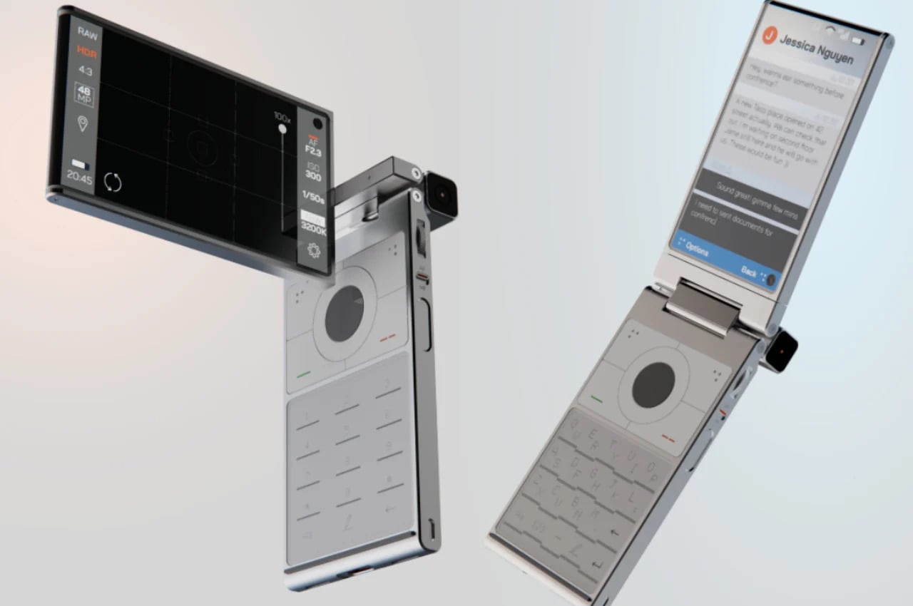
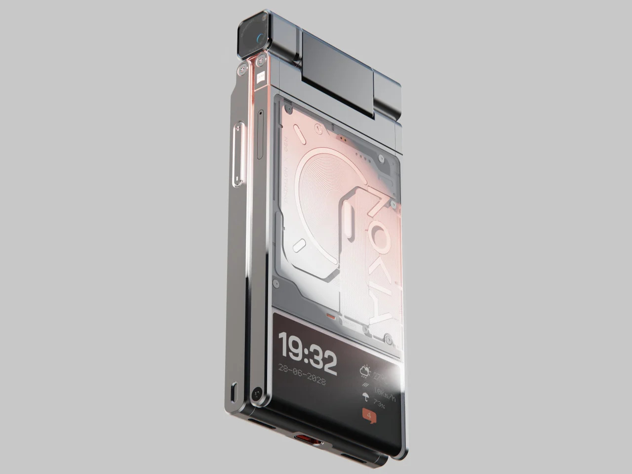
While clamshell phones are back in season thanks to foldable screens, the folding and twisting design of the original Nokia N90 remains a distant memory. This concept tries to answer the question of “what if?” and mixes two famed brands’ design languages to craft what could be the perfect camera phone. It makes you feel like a pro photographer or cinematographer, holding up your phone not with shame but with pride, capturing not only the moment but also people’s attention in a good way.

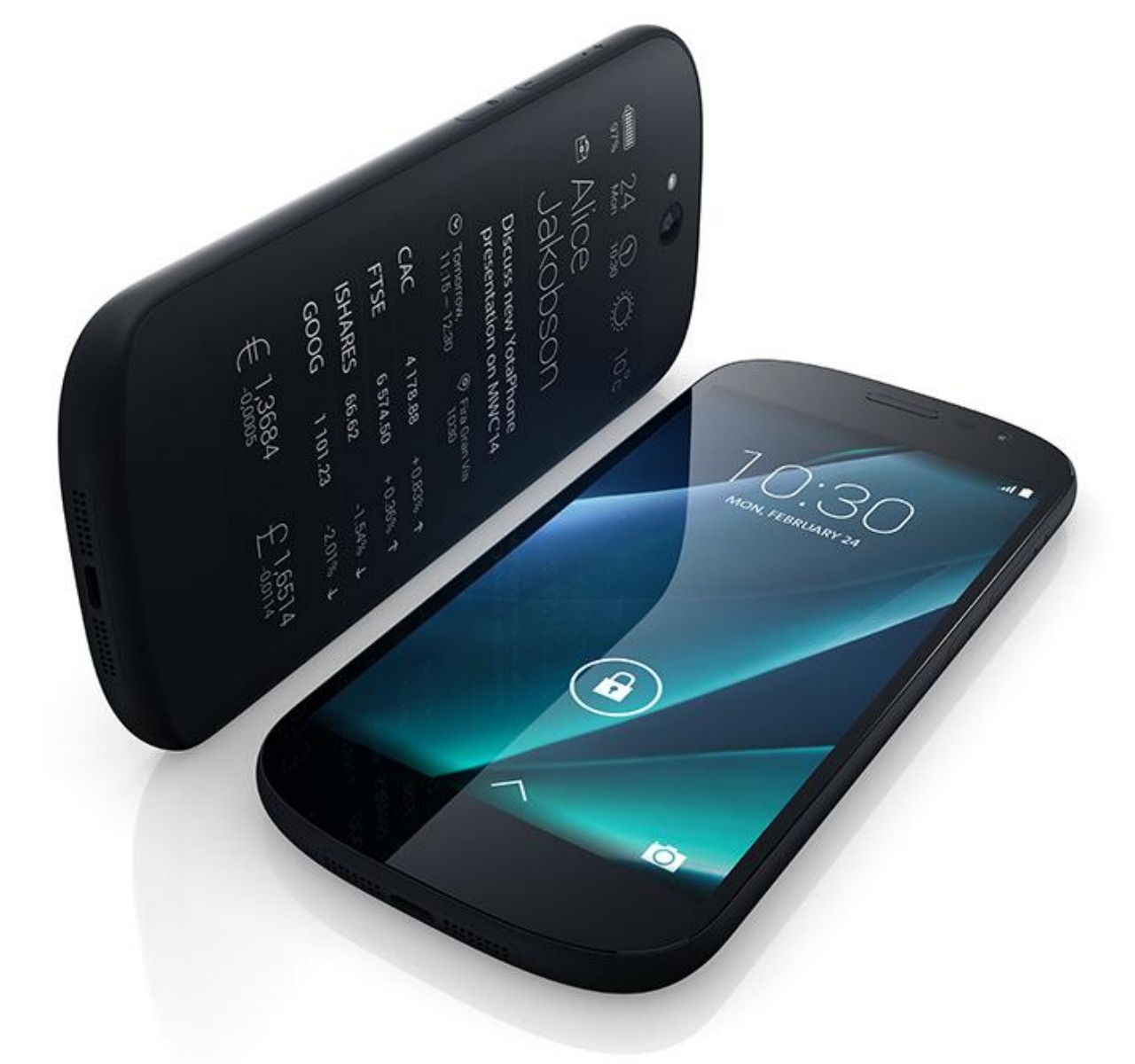
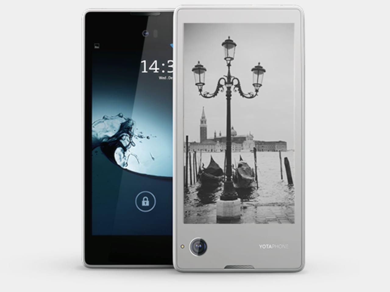
Pocket Book: YotaPhone Dual-Screen Phone

Designer: YotaDevices

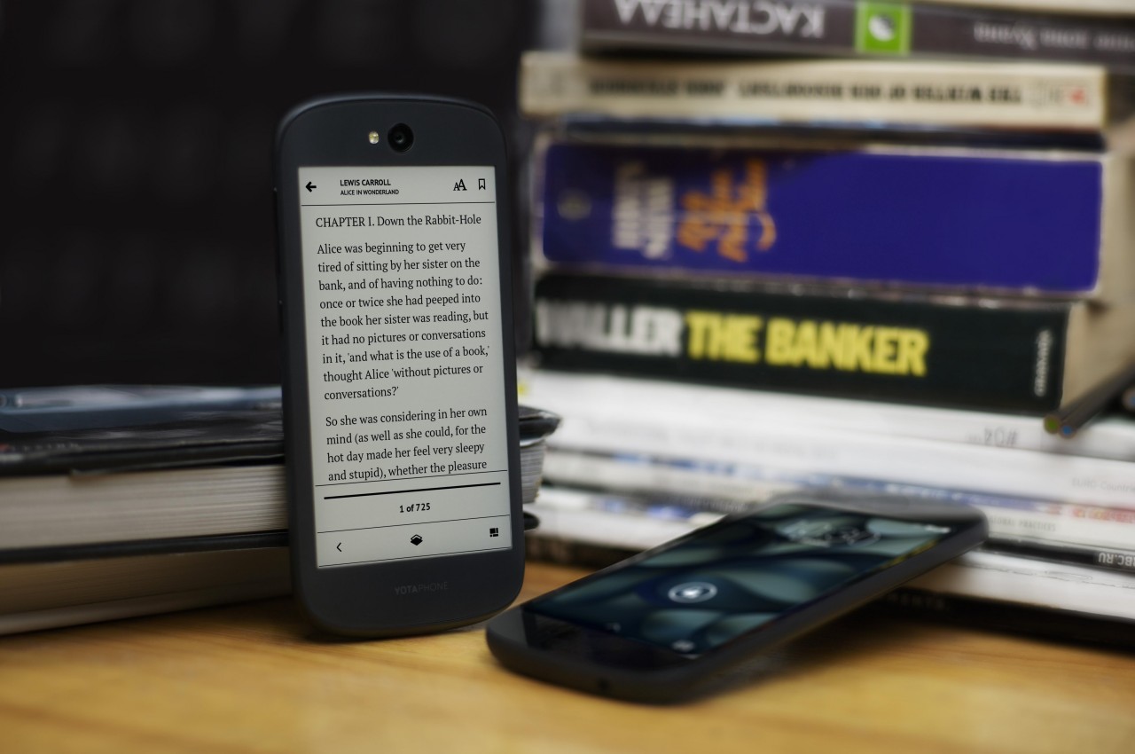
E Ink devices are becoming more popular these days, especially after the addition of features like stylus support and color. These displays are easy on the eyes and the battery, allowing the screen to show the same thing for days without requiring a recharge. A few years back, a small company tried to bring those benefits to the smartphone in the oddest way, by putting an E Ink screen on its back. Although it can be used for reading e-books on the go, its main purpose was to have a battery-saving always-on display that is a bit more dynamic and useful than typical AOD implementations.

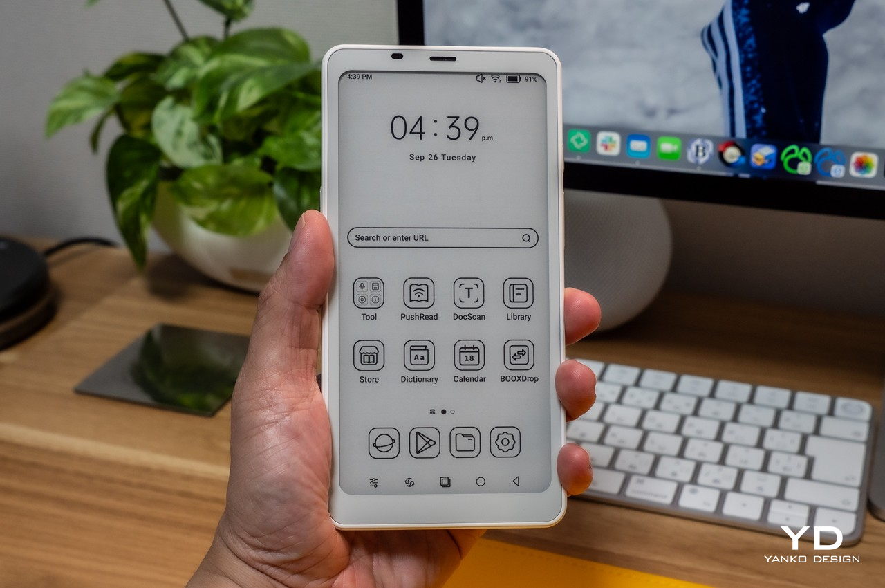
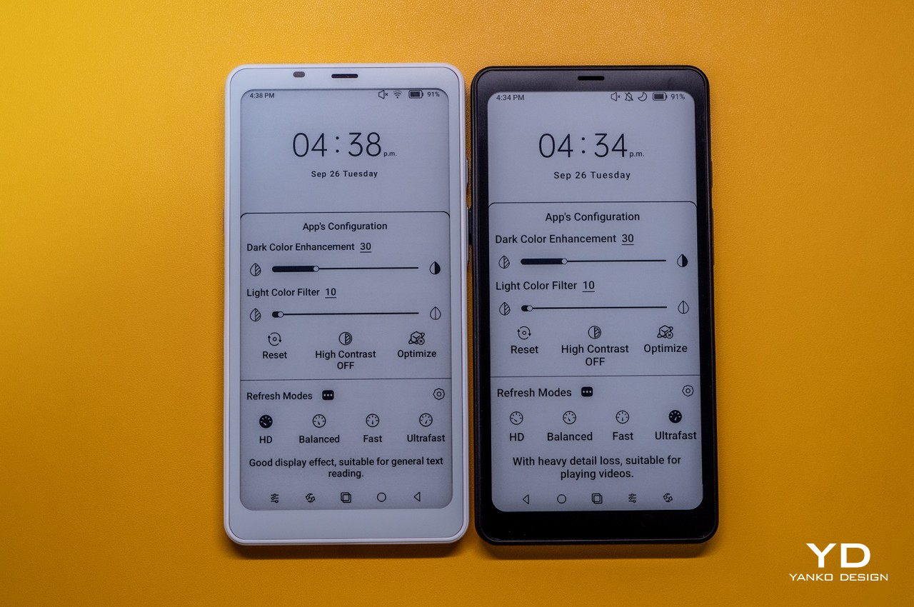
Alternative: Onyx BOOX Palma

Designer: BOOX

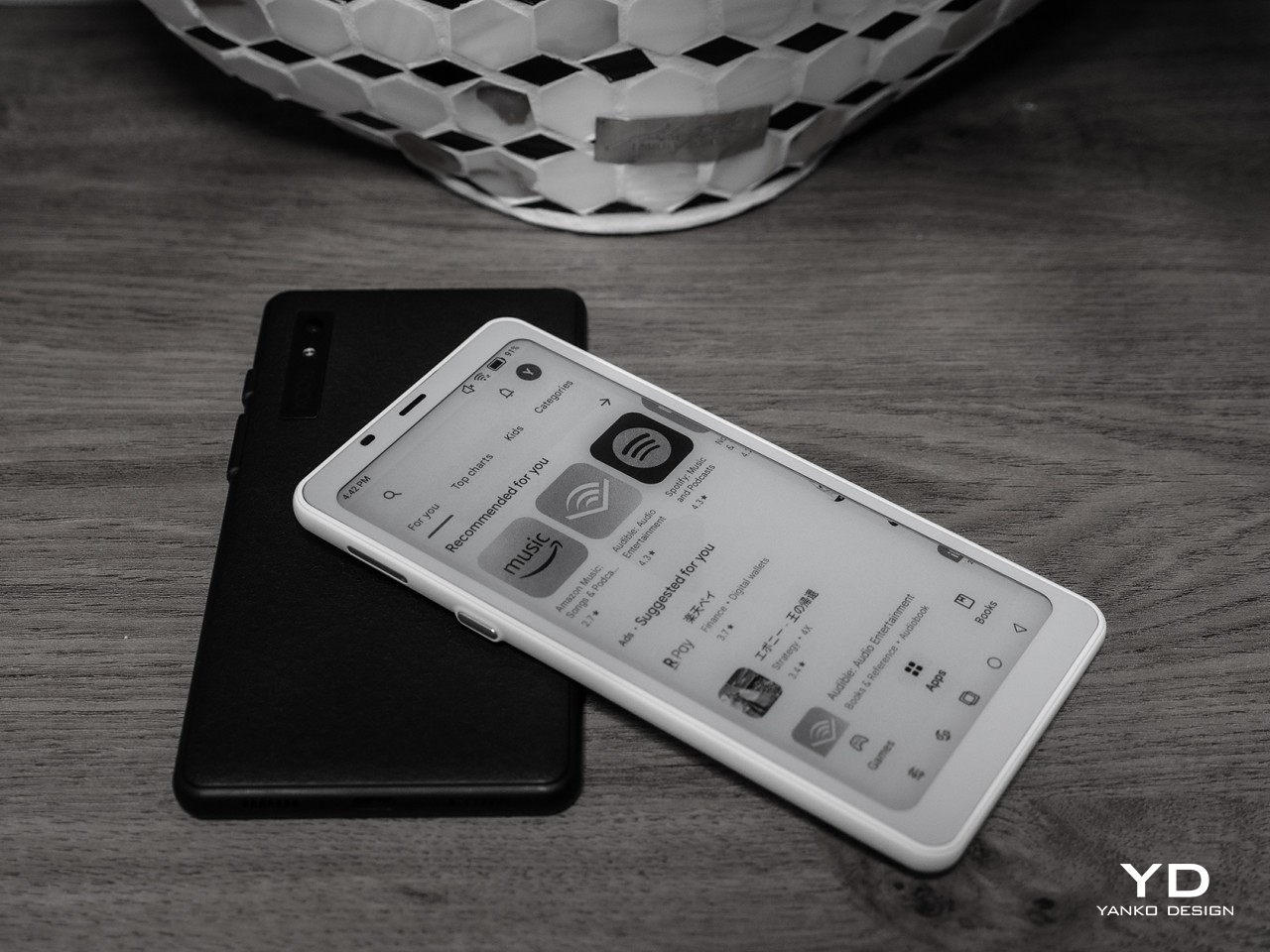
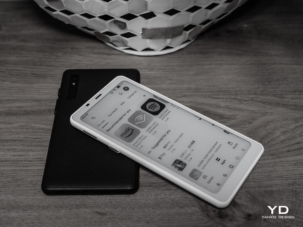
That said, a phone-sized Android device with an E Ink display might be an even more efficient design, which is what the Onyx BOOX Palma is offering. Technically, it’s an e-book reader that’s the size of a regular phone and actually runs Android, which is the standard for BOOX’s devices. This means it has access to the same apps you have on your regular phone, but without color. You also don’t have cellular connectivity via a SIM card, which might be a deal-breaker for a phone but a great deal for distraction-free reading and mobility.

Productive Minimalism: Minimal Phone

Designer: The Minimal Company

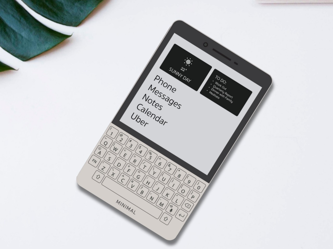
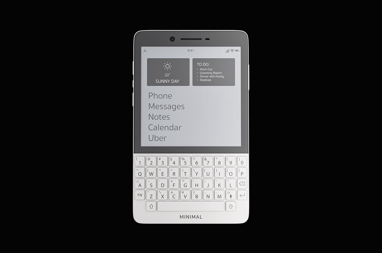
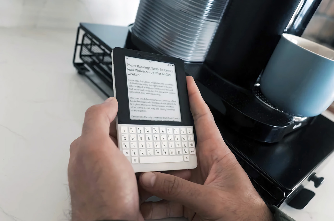
BlackBerry might have joined the likes of Nokia and LG as just parts of the annals of mobile history, but its squarish shape and QWERTY keyboard are forever etched in the consciousness of even the least tech-savvy person on the planet. Many have tried to recreate that magic, but this rather elegant yet odd phone puts a twist to it. It combines the iconic BlackBerry design with an E Ink screen and a minimalist aesthetic, promising distraction-free productivity by actually limiting what you can do on the device. It can even make it easier to actually reply to or post on social media, though the drab grayscale screen is probably going to make that a little less enjoyable anyway.

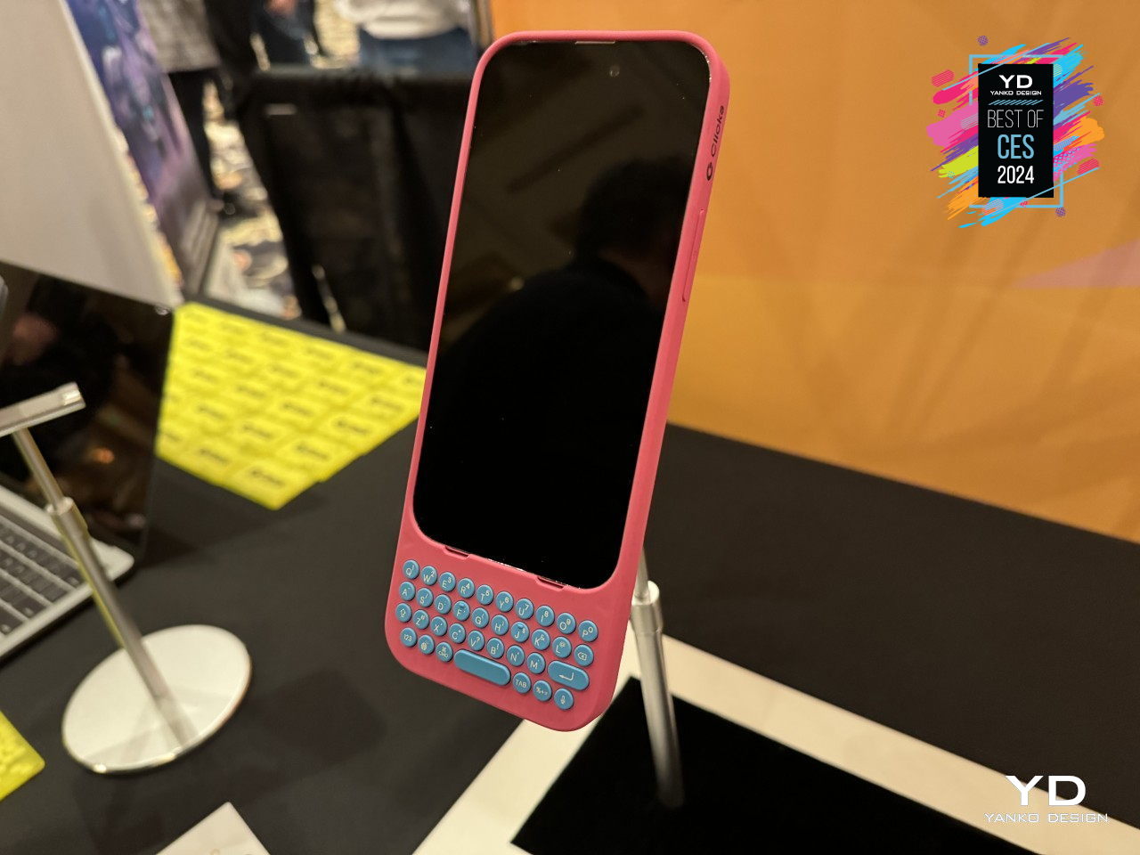
Alternative: Clicks QWERTY Case

Designer: Clicks

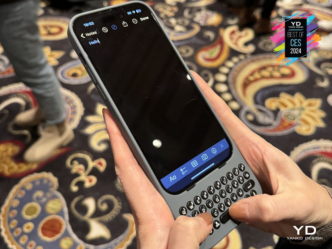
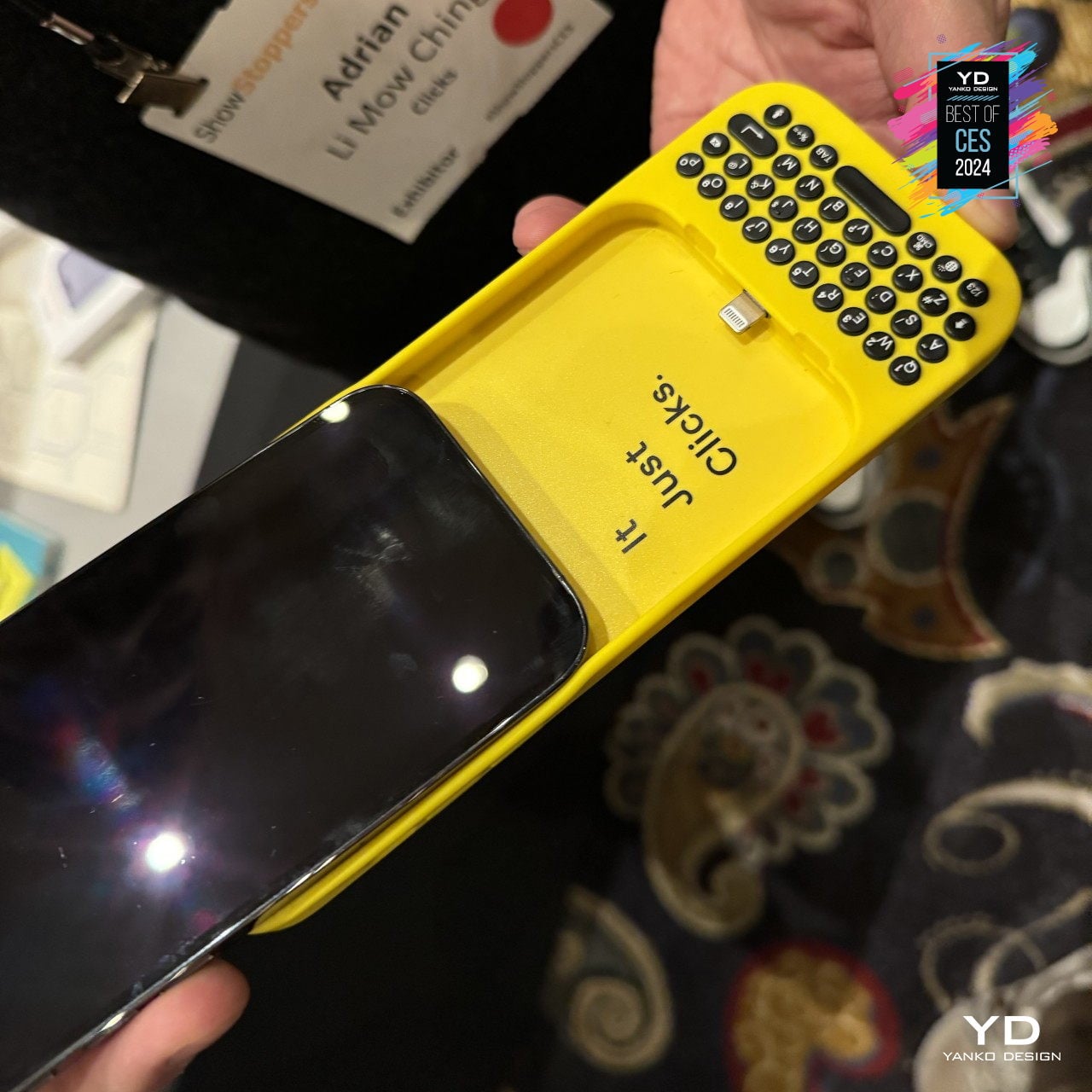
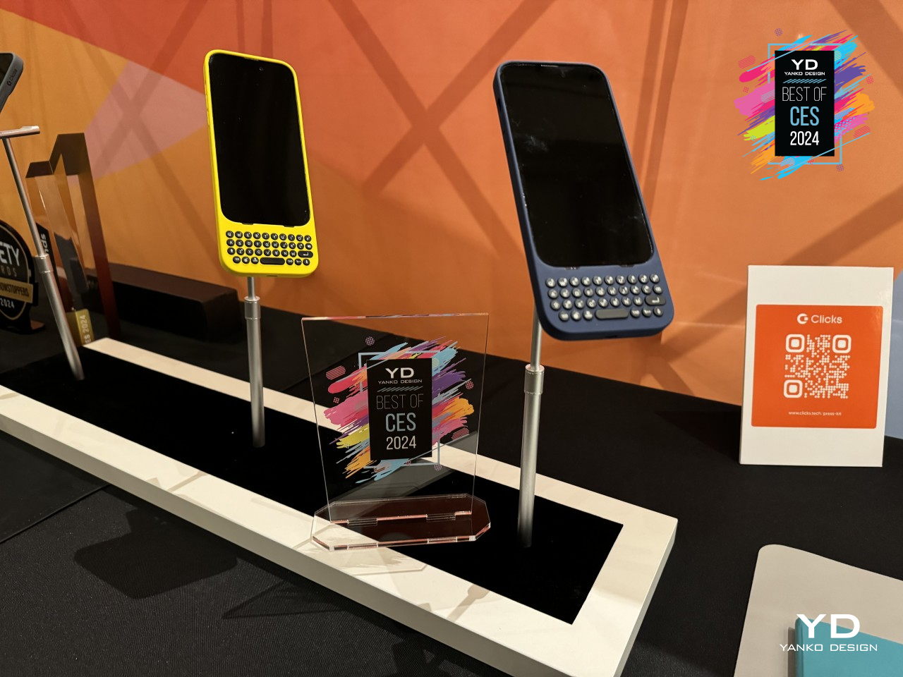
The idea of a BlackBerry-like experience might tickle the fancy of smartphone users, but none of them will be willing to ditch their powerful, colorful, and highly functional smartphones. Clicks is a case that tries to bring the best of both worlds, and it’s practically just a case that slides onto an iPhone to provide that tactile typing experience. You won’t have to give up your favorite apps, especially the ones you need to actually be productive, but the burden of being disciplined and ignoring distractions is now on you instead.

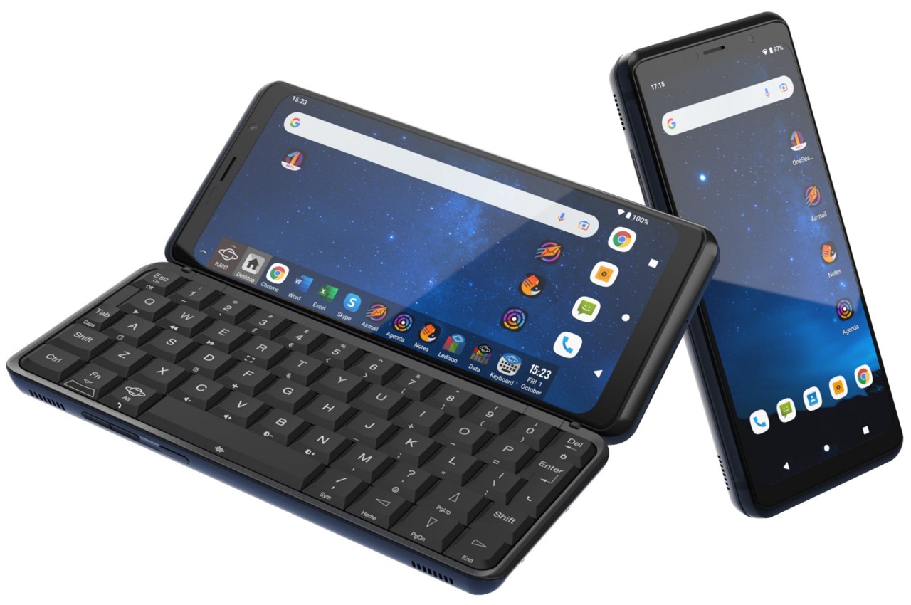
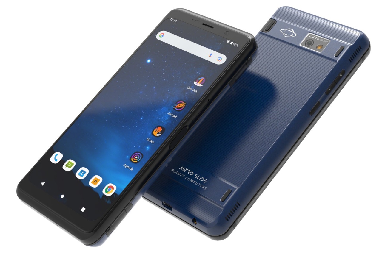
Shapeshifting Multitasker: Astro Slide 5G

Designer: Planet Computers

A phone that opens like a mini typewriter has actually been around since the days of the Nokia Communicator and its kin, but that design proved to be more complicated than they’re worth. After playing with that same design, PlanetComputing shifted to a slider that still provides that typing experience while retaining the exact same functions as a phone. Unfortunately, such a mechanism proved to be just as clunky and unreliable, and the software platform didn’t exactly lend itself well to a landscape screen.

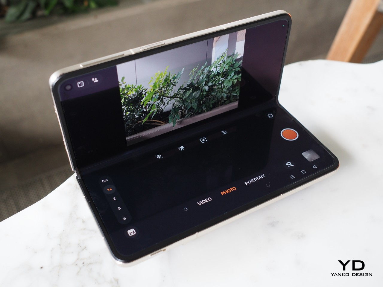
Alternative: Any Foldable Phone

Designer: OPPO

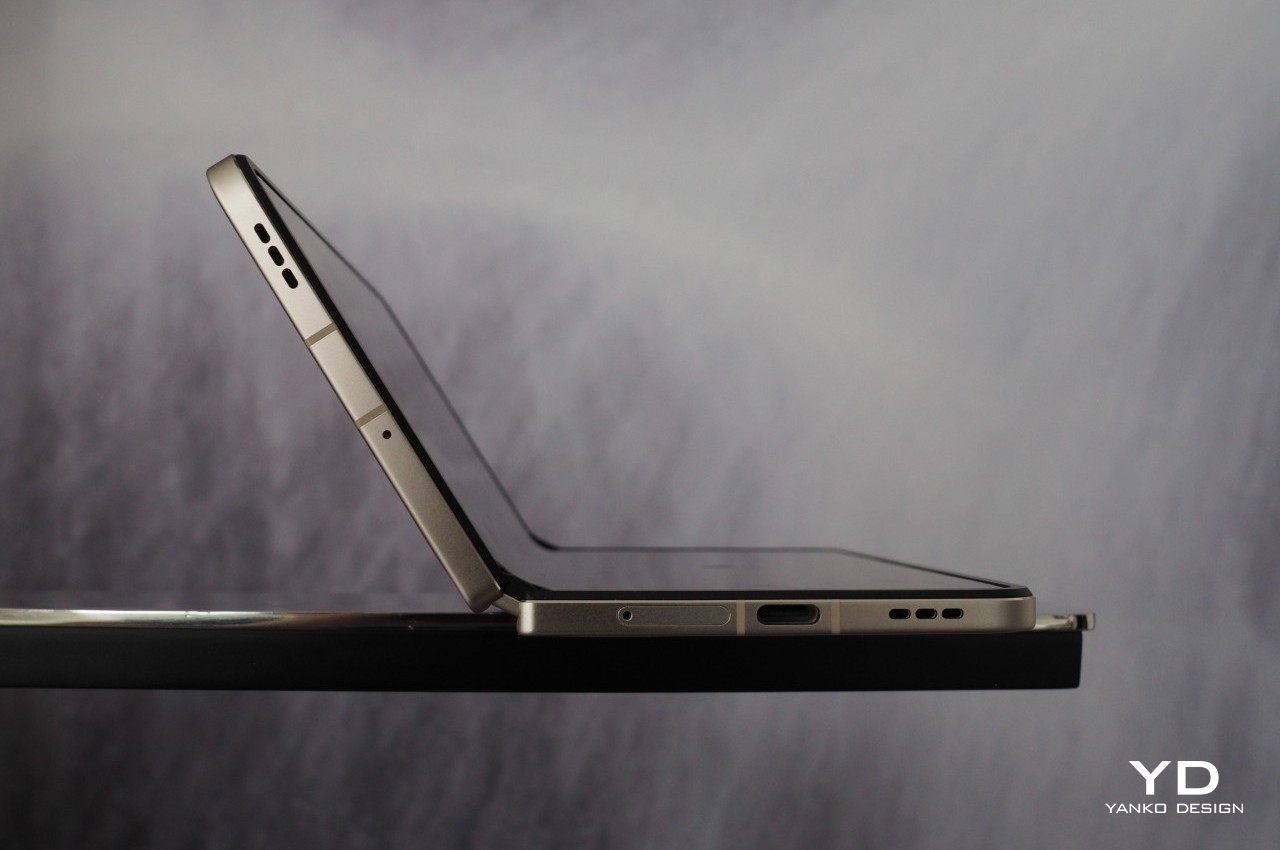
These days, you don’t have to rely on a physical qwerty keyboard to have that same mini laptop experience. With foldable phones now more common, you can tap away on a more flexible on-screen keyboard when the device is only half-folded. At the same time, however, you have both phone and tablet functionality in your hands. Admittedly, the design is far from perfect, and we’re still waiting for more affordable foldables coming in the very near future.

The post Top 5 Quirky Phone Designs That Actually Make Sense first appeared on Yanko Design.

10 Best Wooden Furniture Designed To Add The Warmth & Simplicity Of The Material To Your Home

Wood has been the material of choice for furniture designers for ages galore. And no wonder! There’s something about wood that instantly adds a sense of zen and calm to any living space it is placed into. It puts your mind at ease while managing to radiate a feeling of warmth and tranquility. It’s a minimal material that holds a strong personality without any additional frills and tassels. I truly believe a well-crafted piece of wooden furniture can add a magical touch to even the simplest of living spaces. Minimal, clean, and almost always soothing, beautifully designed wooden furniture helps add the ultimate finishing touch to a room. We’ve curated a collection of wholesome wooden furniture designs for you – from a dice-inspired wooden furniture design to a desk that transforms from a work of art into a functional table.

1. Flow Wall Desk

Named the Flow Wall Desk, this innovative and one-of-a-kind furniture design is designed to be functional and decorative. It has an impressive yet basic design philosophy which makes it an excellent option for corporate and home offices with space constraints. Since it is made of wood, it is a sustainable design.

Why is it noteworthy?

The Flow Wall Desk has a flexible and unique form which allows it to be stored and folded away. When not in use, the desk looks like an interesting piece of wall art. Once unfolded, it mimics a spring caterpillar which can serve as a desk for you to work, read, and write on.

What we like

  • The Flow Wall Desk is a multifunctional and sustainable furniture design
  • Effective and convenient flatpack form

What we dislike

  • Folding and unfolding the desk whenever you need to use it means we can’t have a constant setup, which may be a hassle for some people

2. Tokyo

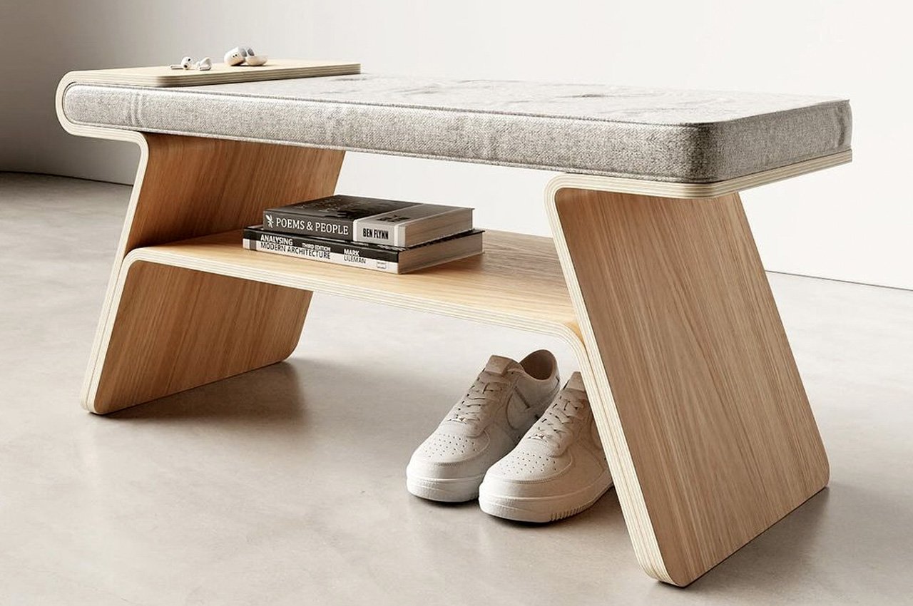
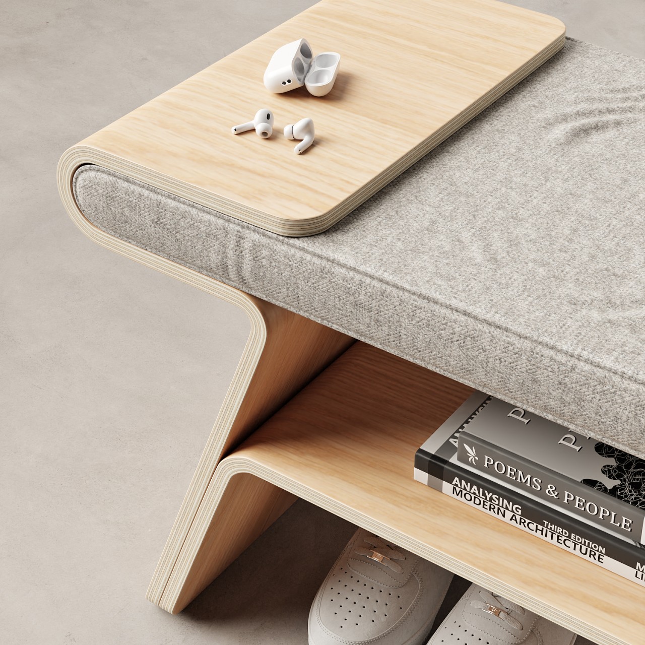
Called Tokyo, this minimal wooden furniture design is a multifunctional piece that functions as a shoe rack and a bench. It merges two functional furniture pieces into one ingenious individual furniture design. It has a simple Japandi-like aesthetic which adds some subtlety and class to any living space.

Why is it noteworthy?

Tokyo’s side leg is really quite unique. It seamlessly and gently curves, allowing the cushion to form a top tray to hold your everyday essentials. It serves as a neat spot to store your souvenirs and other belongings.

What we like

  • Has a bottom shelf that can be used as a storage space
  • A furniture design with multiple functionality

What we dislike

  • It’s a conceptual design, so we’re not sure how functional it will be in reality

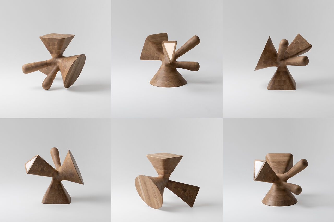
3. Dice

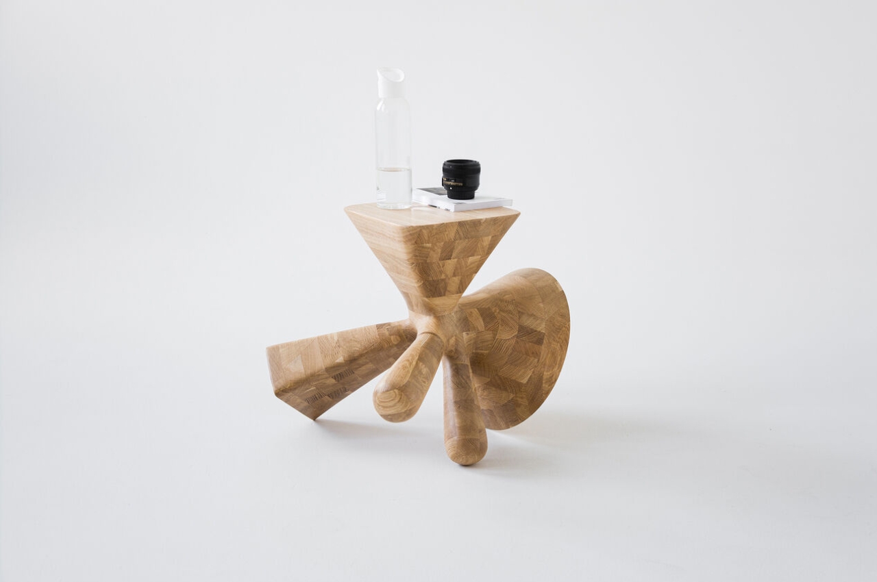
Called the Dice, this unique furniture design by Zurich-based Kosmos Architects functions as a stool, coffee table, leg bench, and lamp – all in one. Based on how you turn the furniture design, it can work as any of the four furniture typologies. And this is where the dice reference comes in since the furniture piece is inspired by a dice.

Why is it noteworthy?

The furniture design is inspired by the different numbers and dots on the dice, and this is one of the key factors of the piece. Although it looks nothing like a square dice, its four-in-one piece makes it quite similar to a dice. It is a portable furniture design that can be easily moved from one place to another.

What we like

  • 3D-printed through KUKA robotics technology
  • Looks like a wooden sculpture when not being used

What we dislike

  • The eccentric aesthetics may not be preferred by everyone

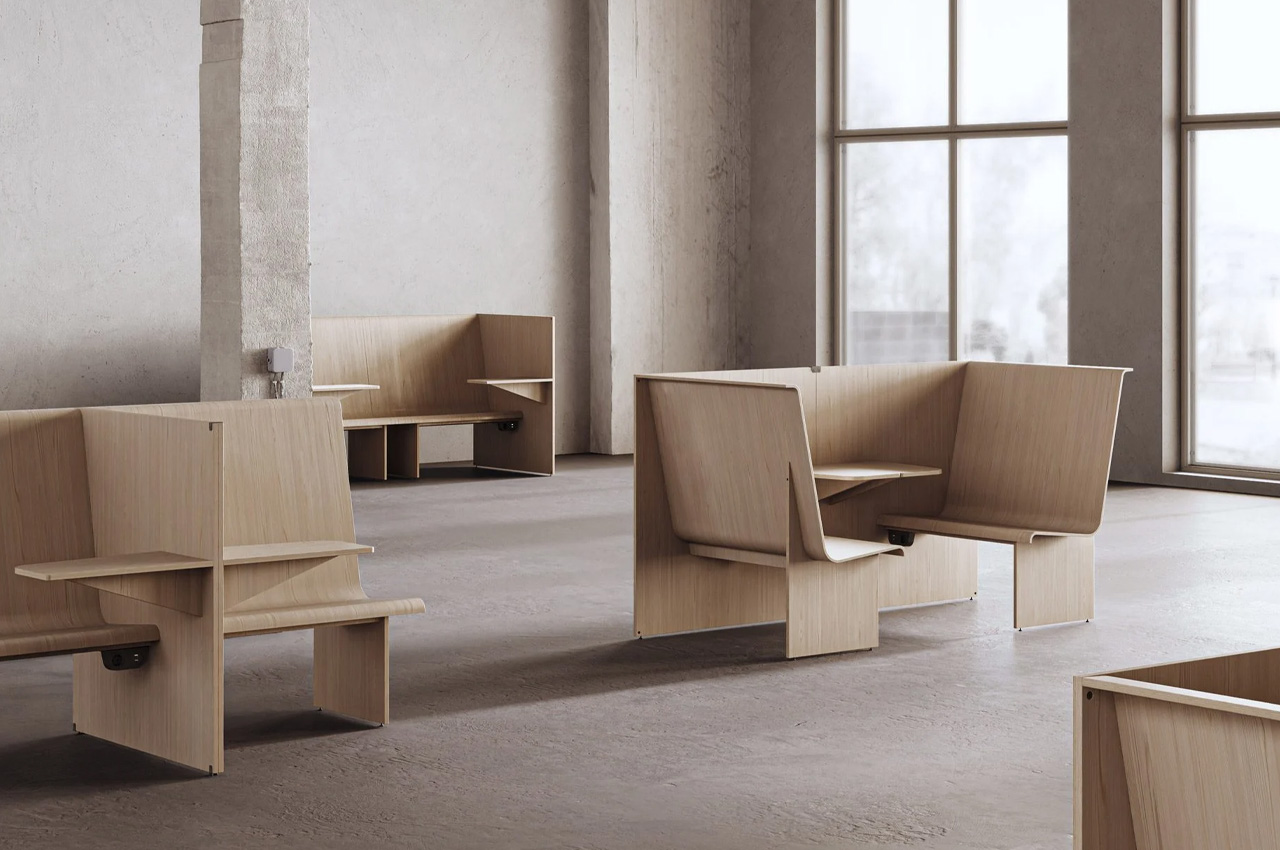
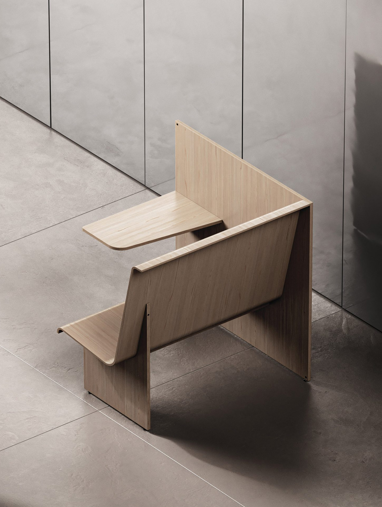
4. The Cubicle

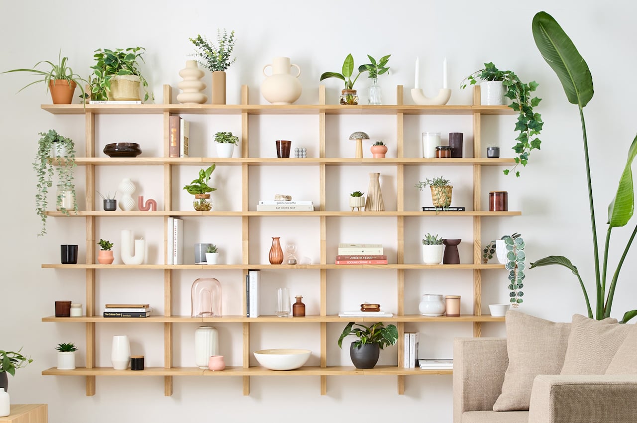
Named the Cubicle, this fascinating “bench and wall system” is created to stimulate the experience and sensation of working with your back to the wall in open-plan workspaces. It creates a against-the-wall working experience without the actual presence of a wall. How cool, is that?

Why is it noteworthy?

The Cubicle is designed to replicate and imitate the experience people seek when they sit in seats in an open indoor workspace like a library or a co-working space. They’re designed to simulate and recreate a very particular experience.

What we like

  • It is available in different variations
  • Made using as few materials as possible

What we dislike

  • Space-consuming bulky design, suitable for larger and open spaces only, hence making it a limited design

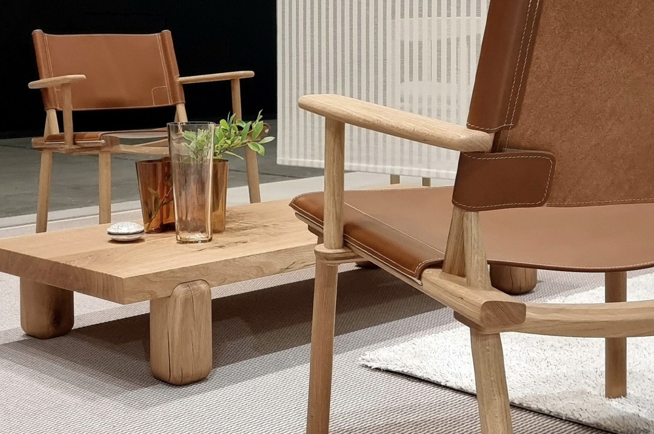
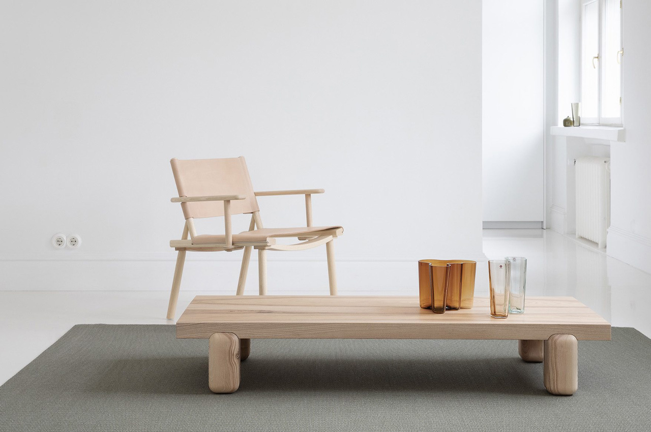
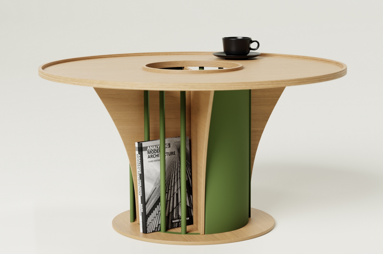
5. Centenniale Coffee Table

Created by the architect and designer Joanna Laajisto for the Finnish brand Nikari, the Centenniale coffee table is a sturdy and minimal coffee table built using 100-year-old wood. The simple yet stunning coffee table is designed to showcase the rawness and ruggedness of old timber. It is a no-frills and humble design that heavily focuses on the material used to craft it.

Why is it noteworthy?

The coffee table was designed by embracing the cracks and imperfections of the old timber. The entire coffee table was constructed from a single piece of wood, and it features a sharp-edged and elongated tabletop that is supported by blocky and chonky legs with rounded edges.

What we like

  • The table beautifully showcases the versatile textures and variations in the old timber

What we dislike

  • Aesthetics are a tad bit simple and unassuming and could have been exaggerated a bit more

6. Marumarushikaku

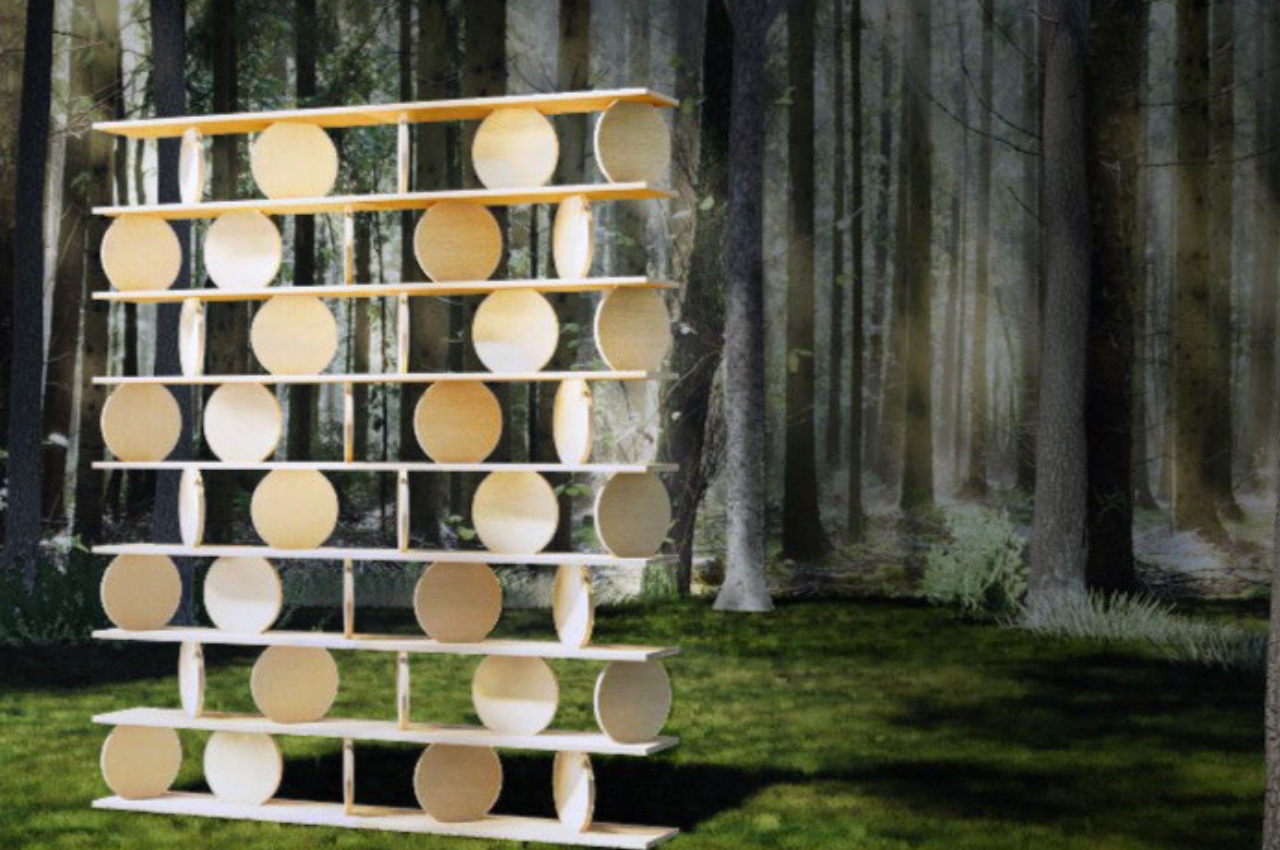
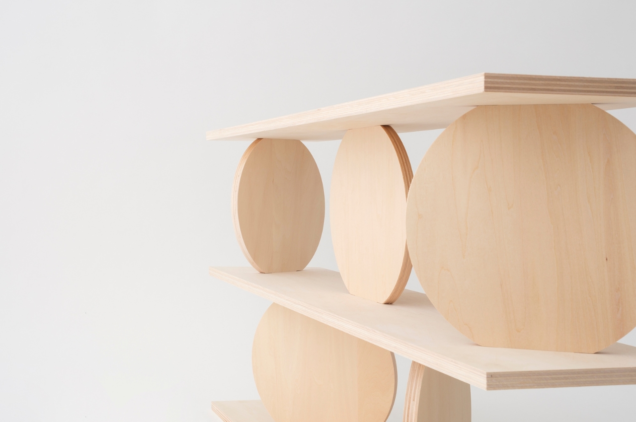
Kego Kuma took over Ryuichi Sakamoto’s company More Trees, and he unveiled a modular wooden shelf made up of various shapes tacked together. Called the Marumarushikaku, the furniture design looks like an art piece, owing to its unique look. It functions as a decorative shelf as well!

Why is it noteworthy?

The furniture piece is made of rectangular shelf boards and round pillar boards which have been stacked on top of each other. You can place the different parts between the shelves creating your own unique design and look. You can place books, bottles, plants, pots, and other knick-knacks on it.

What we like

  • Modular form that can be stacked up to eight levels

What we dislike

  • Massive bulky form that will occupy substantial space in your home

7. Designated Table

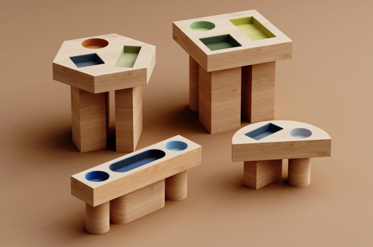
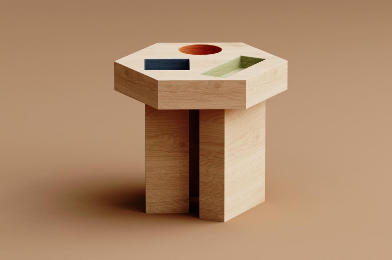
These intriguing wooden tables don’t look too practical or functional when you first look at them, but then you realize that using them is like playing that educational game of fitting shapes into the right holes! It reminds you of the toys that have geometric holes in them, and you need to drop geometric blocks inside them!

Why is it noteworthy?

The geometric holes aren’t just whimsical little features, but they can be used as helpful organizational tools which are also quite interesting to look at. Organizing your stuff has never been this fun and efficient. The table also has a unique aesthetic which makes it an eye-catching piece.

What we like

  • Playful yet functional furniture pieces

What we dislike

  • The tables come in different shapes, and hence may not be able to cater to all functionalities

8. Circus Coffee Table

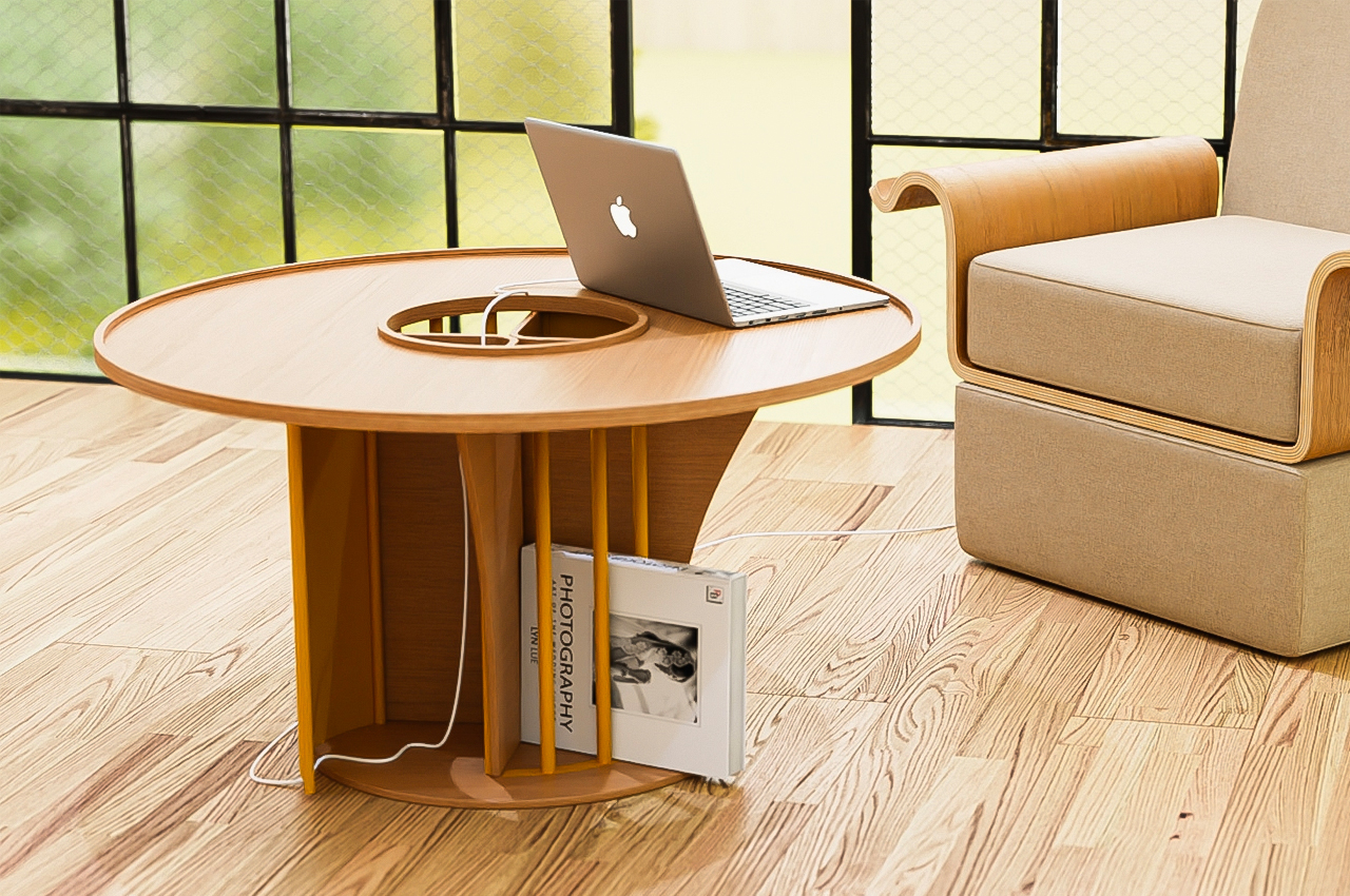
Called the Circus coffee table, this unique table design intends to bring people together in a fun and interactive manner. The table is quite small, and it can be utilized as a regular desk if the need arises. It is pretty tall, unlike typical coffee tables.

Why is it noteworthy?

The shapes and materials of the table create a design philosophy that is chaotic like a circus. It is made from wood, and amped with metallic components which add some functionality to the table.

What we like

  • Created to be the center of attention
  • You can use it as a regular desk too

What we dislike

  • Some people may not like the unconventionality of the design, and it may not complement all interior styles

9. Kainchee

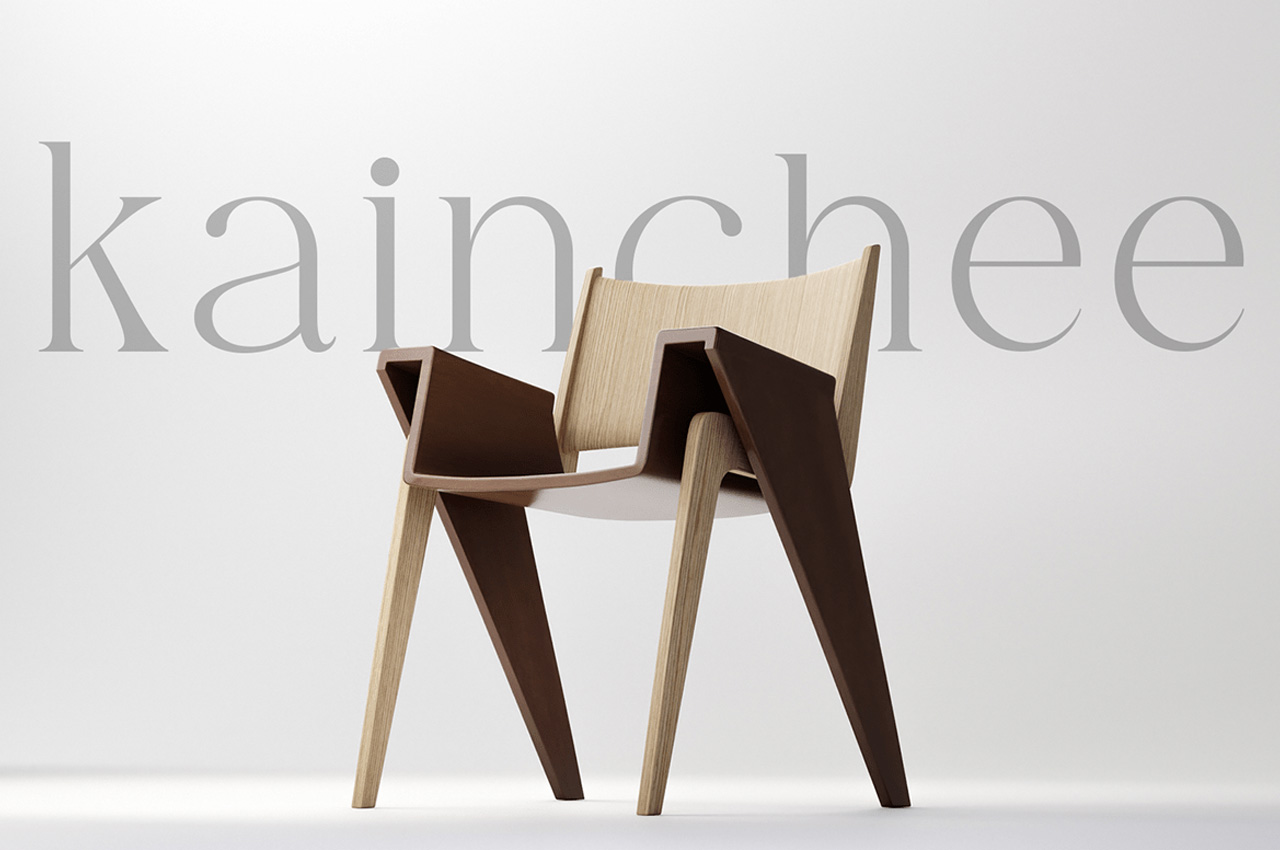
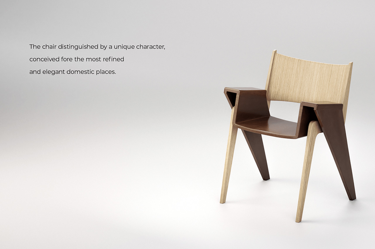
Called Kainchee, this innovative chair design translates to scissors in the Hindi language, and quite rightfully so, since it looks like a pair of scissors, which does full justice to its interesting name. And truly the chair looks like a pair of scissors from the bottom at least.

Why is it noteworthy?

What makes the Kainchee chair truly stand out is its innovative and intertwining form. The seat of the chair is essentially a band of walnut wood, which interlocks with the ash wood to build the leg of the chair, in turn forming a seating solution that is geometrically quite fascinating.

What we like

  • Has a unique form and design philosophy make it stand apart from other furniture designs

What we dislike

  • It’s still a concept, so we don’t know how ergonomic or practical the final product will be

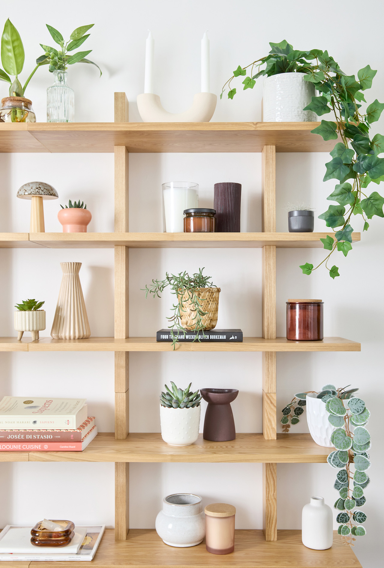
10. Altitude Shelf

Called the Altitude Shelf, this shelving design by Evan Clabots draws inspiration from clean lines and the minimal form of traditional Japanese woodworking. The end result is a storage solution that is peak Japandi aesthetics while being extremely functional. It has loads of storage space amped by a clean and minimal vibe.

Why is it noteworthy?

The Altitude Shelf is inspired by Japanese furniture, but you can see hints of traditional Danish furniture in it as well. The design is highlighted by minimal lines and no back panels, forming a design which is open, airy, and free-flowing.

What we like

  • It is a modular design inspired by Japanese and Danish furniture

What we dislike

  • Bulky space-consuming design

The post 10 Best Wooden Furniture Designed To Add The Warmth & Simplicity Of The Material To Your Home first appeared on Yanko Design.

Cutting-edge Pet Water Fountain has a 10-liter reservoir and a multi-stage filtration system

Would you drink water out of a glass that’s been sitting on the table for 5-6 hours? No, right? So why is it that your pet has to drink water from a bowl that’s been left standing for hours at an end? Quite like a drinking glass with stagnant water, traditional water bowls can become stagnant and harbor bacteria, requiring frequent cleaning and refills. The LALAHOME DailyFresh™ Eco-System pet fountain aims to revolutionize pet hydration by not only ensuring that your pets drink fresh water, but also ensuring they drink water that’s been appropriately filtered.

Designer: LALAHOME SMARTECH CO.,LTD

Click Here to Buy Now: $169 $299 (43% off). Hurry, only 18 left! Raised over $90,000.

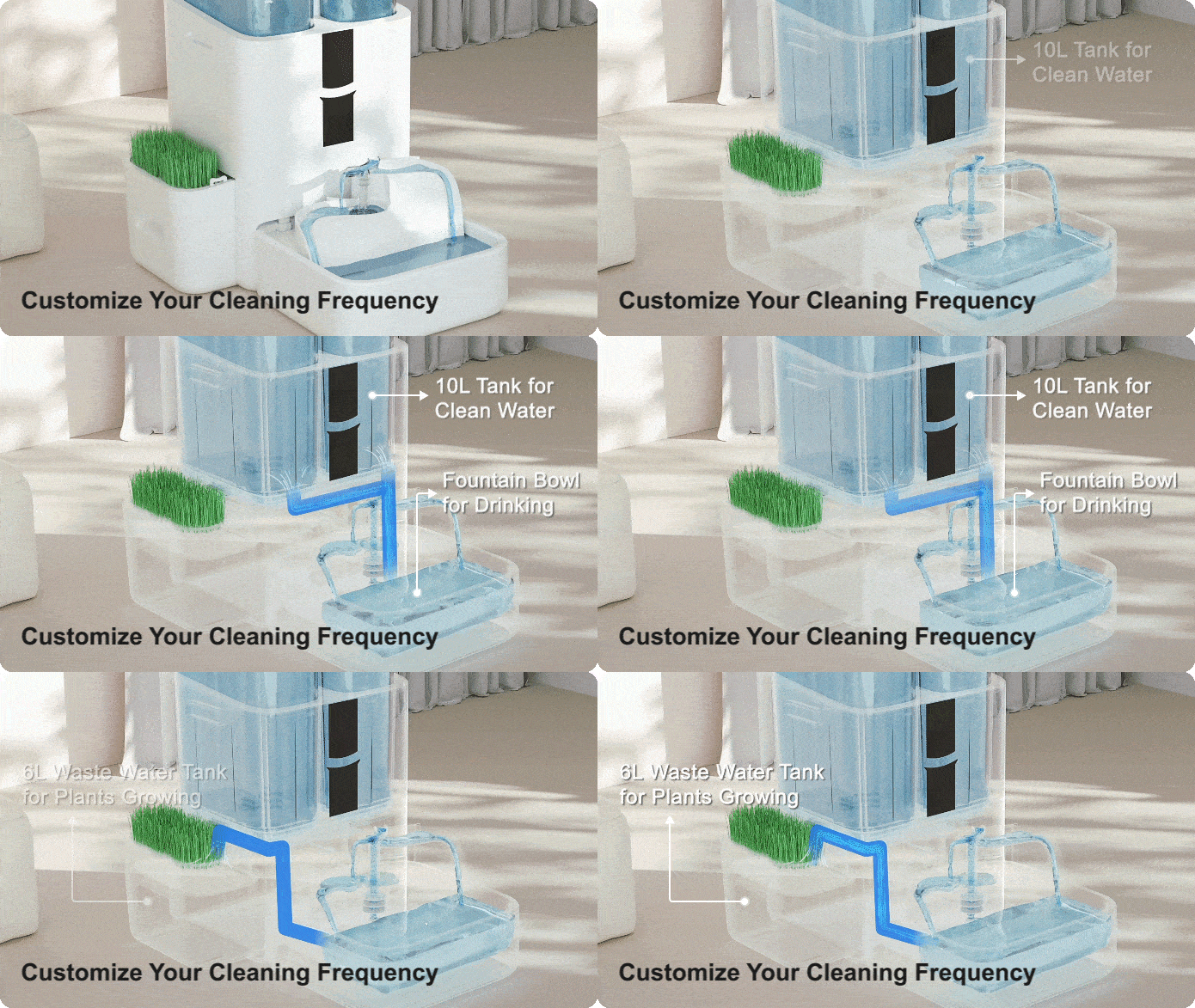
DailyFresh™ and RealPura™ 5X Filtration Technology help deliver fresh and crystal-clear water, while the extra-large 10L tank and 6L waster water tank ensure fewer refills and disposals.

Sure, it’s easy to think of the LALAHOME DailyFresh as yet another pet water fountain, and there are many pet water fountains available out there… but on the inside, you’ve got a purification system so cutting-edge it could rival most regular purifiers found in homes for human consumption. Water is purified, oxygenated, sterilized, and waste/contaminated water is even discarded in a separate container that you can then use for watering/growing plants. The system is ruthlessly efficient, giving your pet the best water it can drink, and ensuring that every sip they have is as fresh as possible. Why? Because pet parents only want what’s best for their fur-babies, right?!

The overall design takes cues from Brutalist architecture of the 60s, combining those cues with the the minimal functionalism of contemporary design styles. Almost reminiscent of a self-sustaining society, the LALAHOME DailyFresh recycles, treats, and dispenses water efficiently. The twin cylinders look almost like skyscrapers, dual spouts look like meandering rivers, and waste water is diverted to grow cat grass (wheatgrass and other sprouted cereals) that help aid your pet’s gut biome and digestive system.

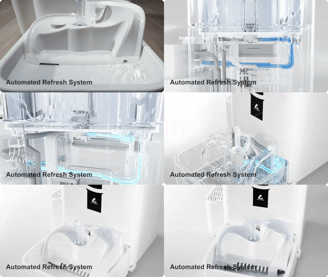
The pet fountain boasts a large 10-liter water reservoir, eliminating the need for daily refills. That’s up to two weeks of fresh water for your pet, providing peace of mind for busy pet owners with multiple jobs or those who travel frequently. The DailyFresh system goes a step further by incorporating automatic water renewal. This innovative technology automatically flushes, drains wastewater, and refills the fountain with fresh water, ensuring a consistent supply of clean water for your pet.

But fresh water is only half the story. The DailyFresh Eco-System Pet Fountain incorporates a rigorous 5-layer RealPura filtration system to remove impurities. This multi-stage filtration process tackles everything from pet hair to heavy metals, keeping the water fresh and healthy for your pet. An integrated UVC light provides an extra layer of protection by eliminating bacteria and other pathogens that can lurk in stagnant water. LALAHOME’s OxygenZ technology increases water flow, resulting in oxygen-rich water that tastes fresher and is more enticing to pets. This can be particularly beneficial for cats who may be more inclined to drink from a moving water source than a stagnant bowl.

All that tech delivers results that you can actually measure. The DailyFresh comes with a smartphone app to control the dispenser, check water levels, and even toggle different modes. Now, you’re probably wondering why your pet fountain needs its own dedicated app, but for the overly caring pet parent, the app gives control over the dispenser as well as allows you to track how much your pet drinks in the day. The app lets you know when the DailyFresh’s water levels are low, so you can replenish the removable water tanks, and the DailyFresh’s neat design and tight footprint let you easily place the pet fountain anywhere in you house, ensuring your furry friends get the best drinking water to stay hydrated and healthy, without depending on you to constantly replenish their water bowl!

Click Here to Buy Now: $169 $299 (43% off). Hurry, only 18 left! Raised over $90,000.

The post Cutting-edge Pet Water Fountain has a 10-liter reservoir and a multi-stage filtration system first appeared on Yanko Design.

This handheld console for disabled gamers has modular control pods for better ergonomics

Gaming controllers are primarily designed keeping in mind the needs of seasoned gamers who have razor-sharp reflexes and blazing reaction times. Most of the mainstream controllers don’t factor in the needs of disabled gamers who have accessibility issues. Major manufacturers like Sony and 8BitDo, however, have ventured down this road with the PlayStation 5 Access Controller and Lite SE controller respectively.

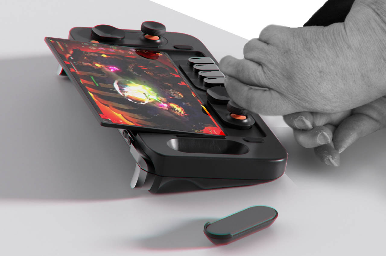
Along the same lines, this Windows-based gaming controller concept dubbed Free Play wants to give disabled gamers a level playing field when it comes to playing chart-topping games. The gadget achieves this without compromising on the form factor a normal gamepad relies on. Therefore, normal gamers can also use it without any problem.

Designer: Aiden Schutte

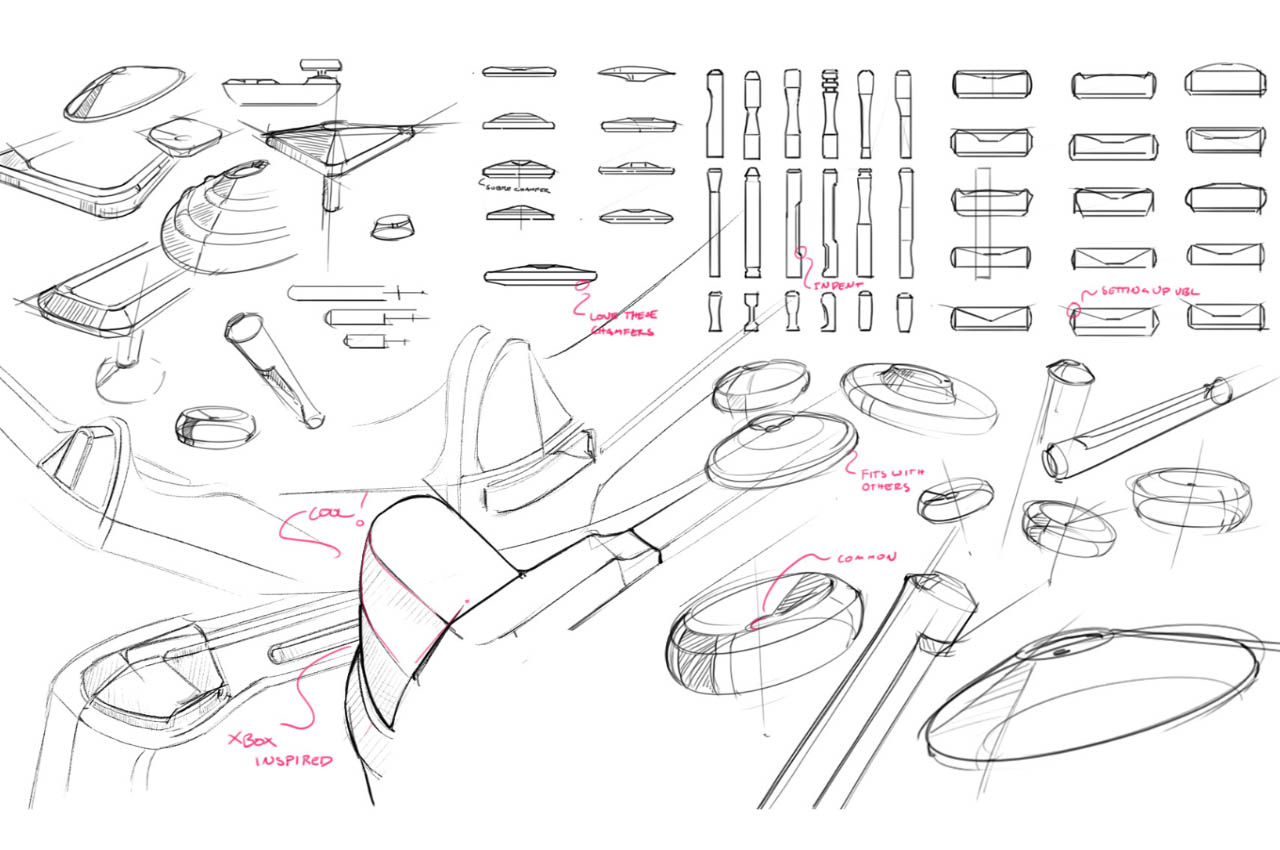
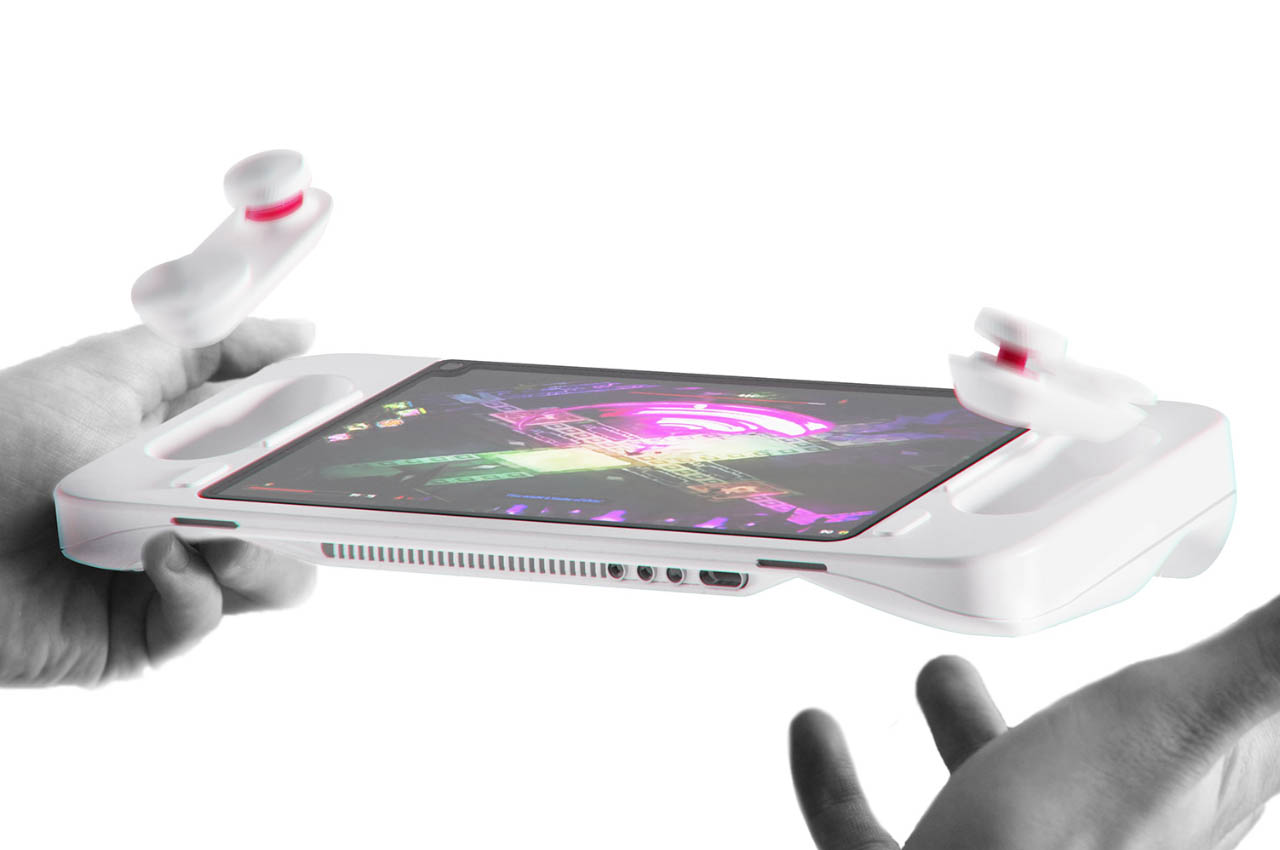
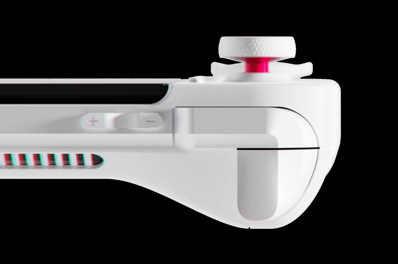
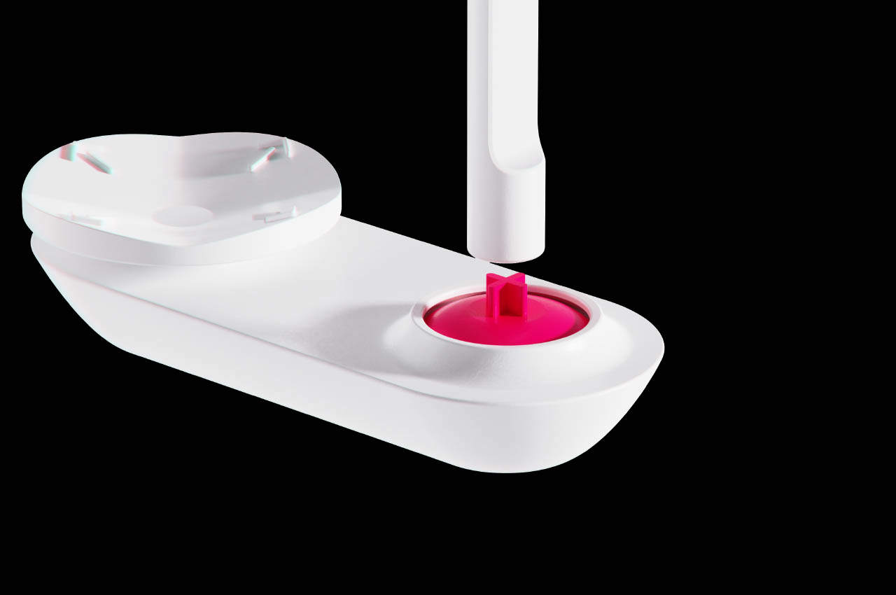
The intended dual functionality of the gaming controller is achieved with modular control pods that can be placed around the console. With the rise in popularity of handheld gaming consoles, attention towards accessible controllers for the disabled is imminent. The design proposed here employs the modular buttons that settle inside the metal body and the ergonomic grips having flat surfaces as the viable solution. So, one can easily swap the D-Pad buttons to reside on the front rather than the sides. Customized sticks can be attached to the controller if the disabled gamer has problems holding on to the joystick with the thumb.

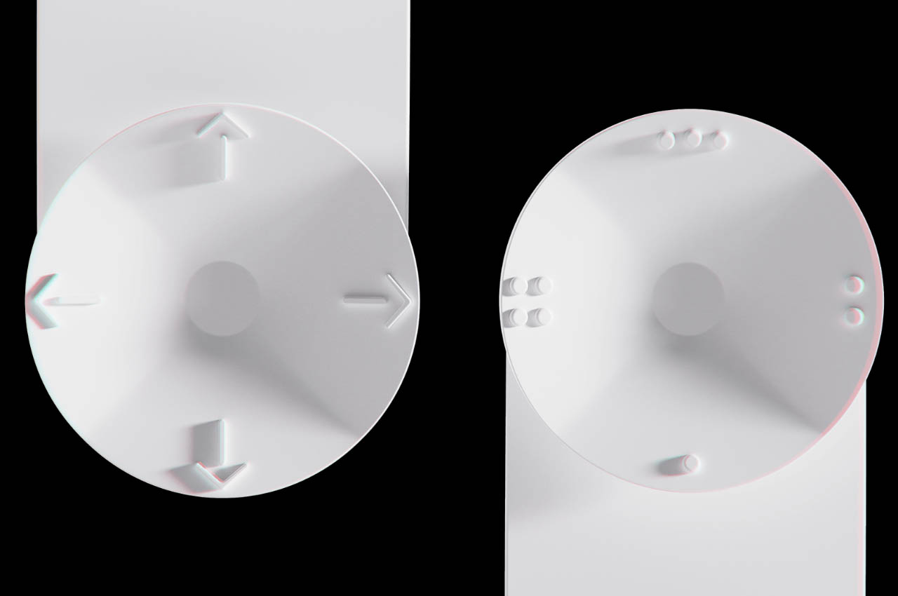
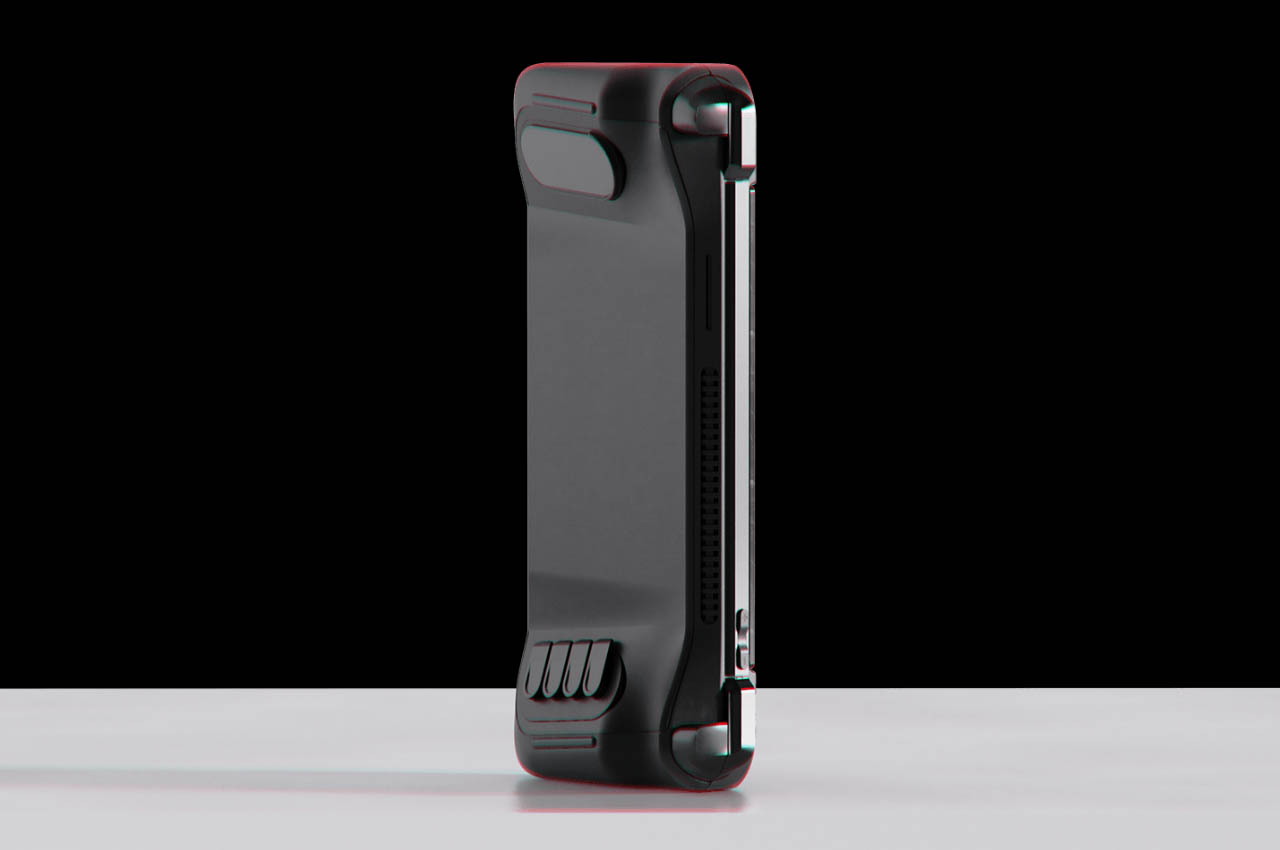
To keep it simple, the modular gaming controller has multiple configurations to play depending on the comfort level of the disabled person. Whether it’s using the controller with just one hand or situations where dexterity is not an option. Aiden has designed the bottom to be flat so that people with dexterity issues can easily lift the gadget from the surface. In addition to the buttons you would find on any normal controller, this one has tactile touchpoints to navigate controls. These tactile touchpoints can be placed at the back of the console or on the front. The size of all the buttons and triggers has been intentionally kept large for easier presses and navigation.

The post This handheld console for disabled gamers has modular control pods for better ergonomics first appeared on Yanko Design.
This 10th Anniversary Apple Watch Concept comes with a camera, edge-to-edge screen, and TouchID

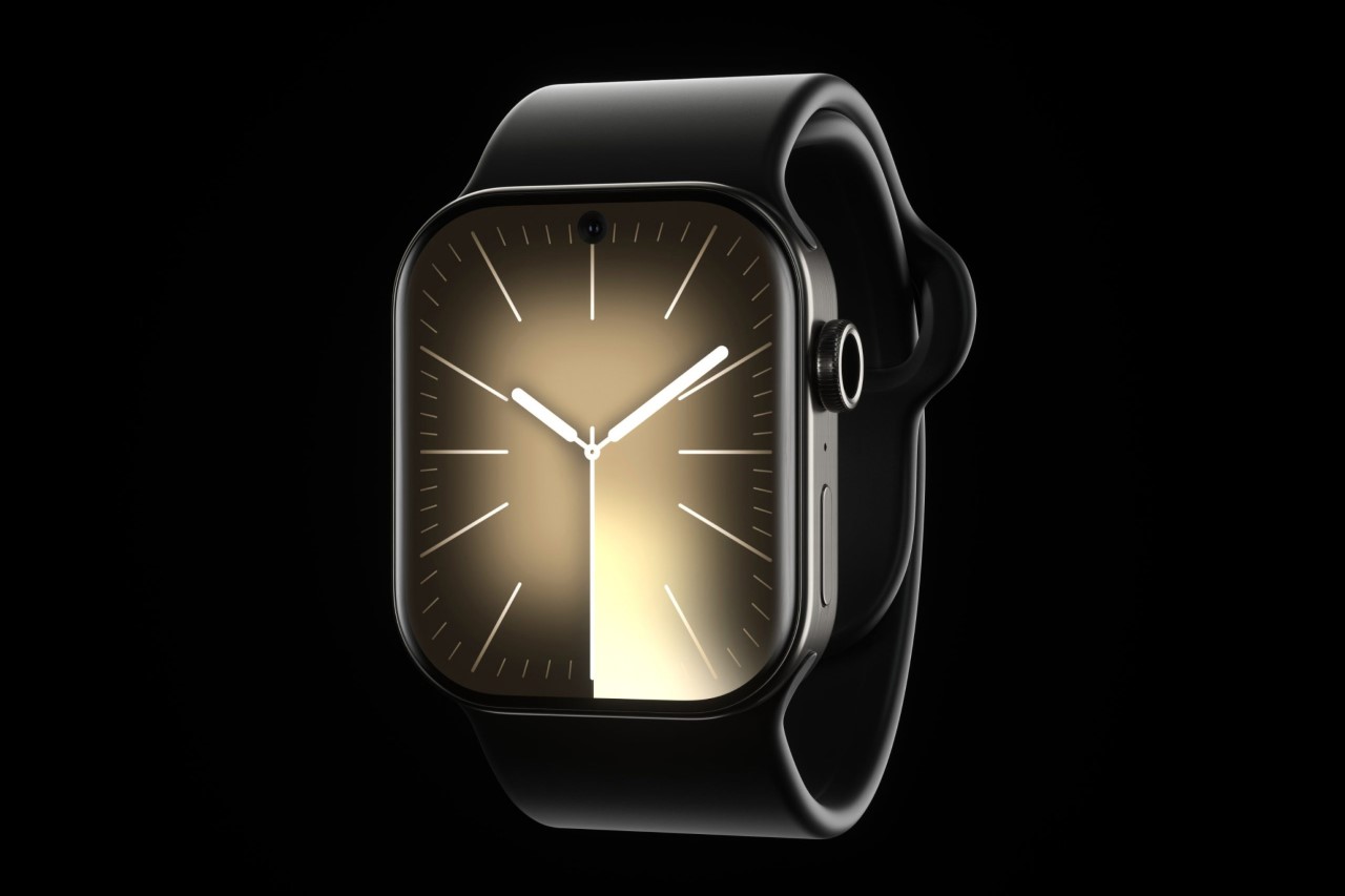
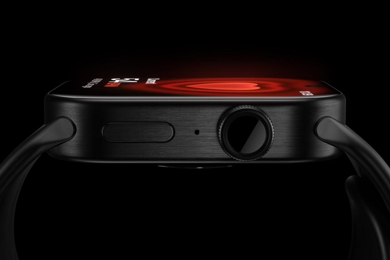
Apple is rumored to be planning something special for the 10-year anniversary of the Watch this September (quite like the iPhone got the iPhone X), although nobody really knows whether it’ll be a seismic leap like the iPhone X introducing the notch. Designer Luka Gehrer, however, designed what he believes to be the ideal evolutionary stage for the Watch’s 10-year anniversary. The Watch X comes with a few upgrades that make it even more unique than the Watch Ultra – Gehrer outfits it with an edge-to-edge screen, a hole-punch camera (which could easily function as a dynamic island), a blood pressure monitor built into the watch strap, and TouchID integrated into the crown. In doing so, Gehrer doesn’t just make the Watch better, he practically makes it a miniature iPhone… which is totally something Apple’s done before, turning the iPad into a miniature MacBook!

Designer: Lukas Gehrer (Wordsmatter.io)

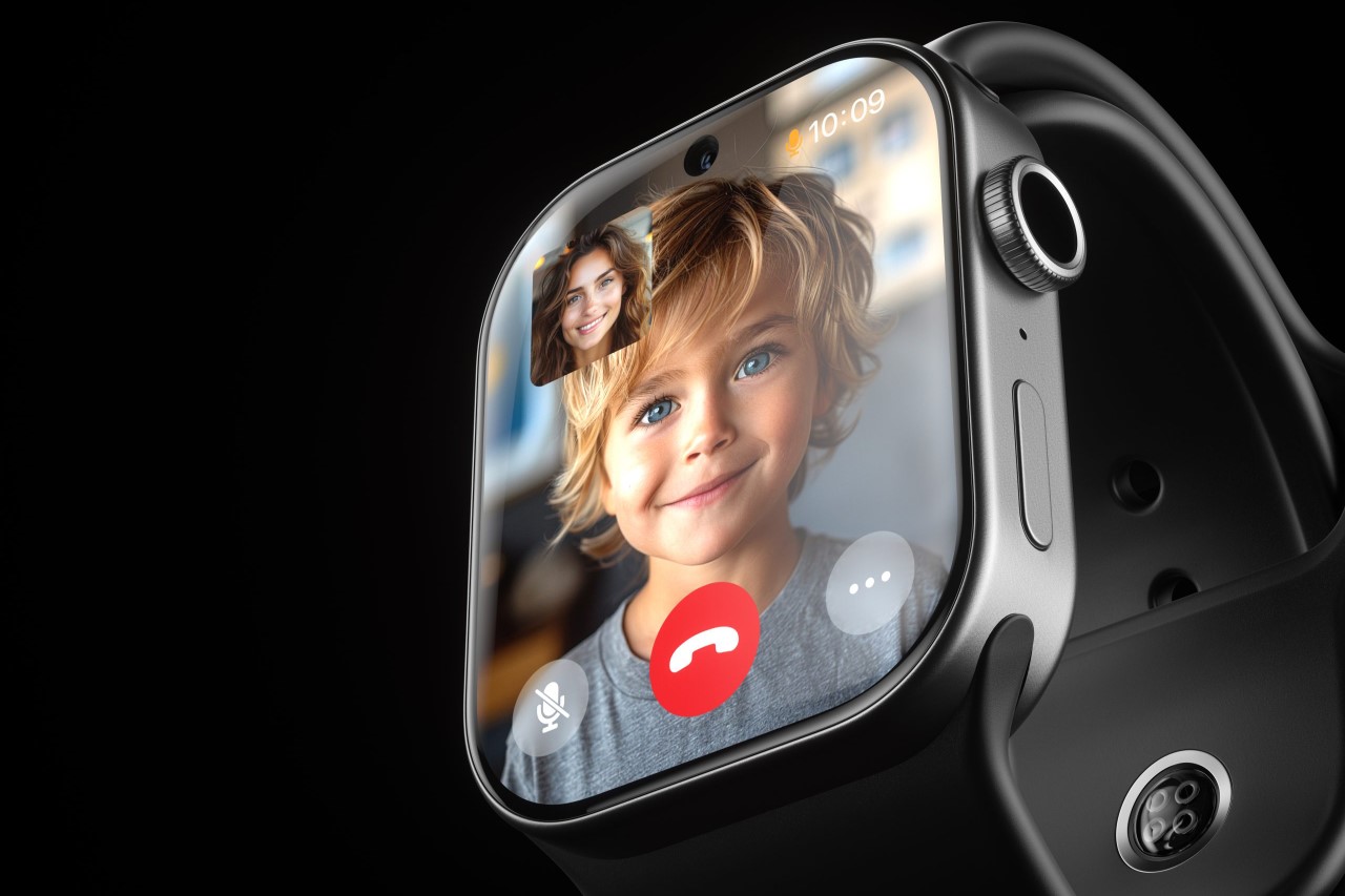
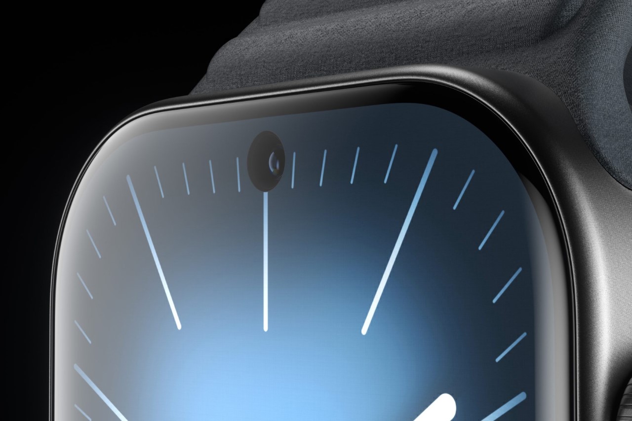
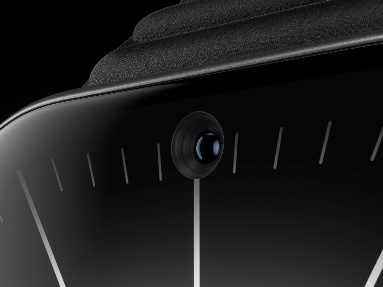
For Gehrer, the watch is basically an extension of his phone, with added health benefits. You can answer audio calls on your watch, read messages on it, so why not accept FaceTime calls too? The Watch X sports an 8MP shooter on the front, thanks to a screen cutout (Apple would probably never do this), but as a compromise, Gehrer also pushes the screen to its limits, practically making a bezel-less display with edge-to-edge pixels. The result feels familiar but different, with a rather visible hole in the display that conveniently gets hidden by gradient watch interfaces that go dark as they approach the edges.

The camera serves as a crucial element for enabling FaceTime on the Watch X, but also allows you to occasionally click selfies or record videos or vlogs. I’d imagine the hole punch could easily serve as a dynamic island too, but dynamic islands on smartwatches may be a little too much too soon.
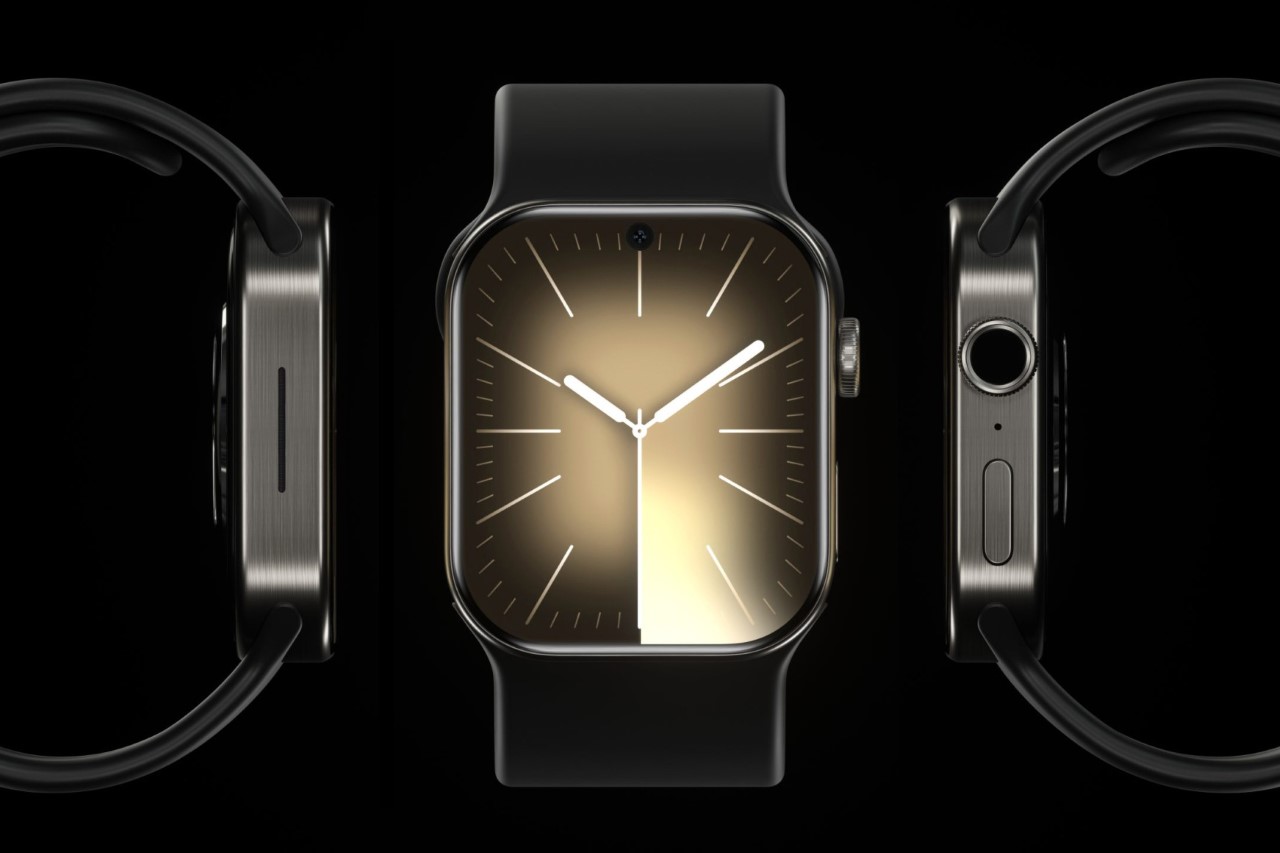
The Watch X (10th Gen) also gets a casing upgrade, with Gehrer opting for a squarish case design instead of the obvious curved case. Designed as a hat-tip to the iPhone 15, the case has flat edges, and a brushed metal finish reminiscent of the iPhone 15’s Titanium outer casing.
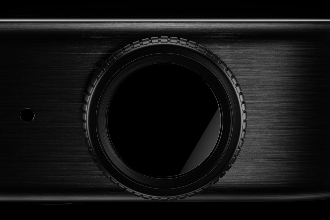
The presence of a camera also creates safety concerns, which is why the Watch X is the first to be outfitted with TouchID built right into its crown. Mimicking the TouchID found in the iPad Air’s power button, this adds a layer of security to the Watch X, ensuring that not everyone can access all of the watch’s core features.

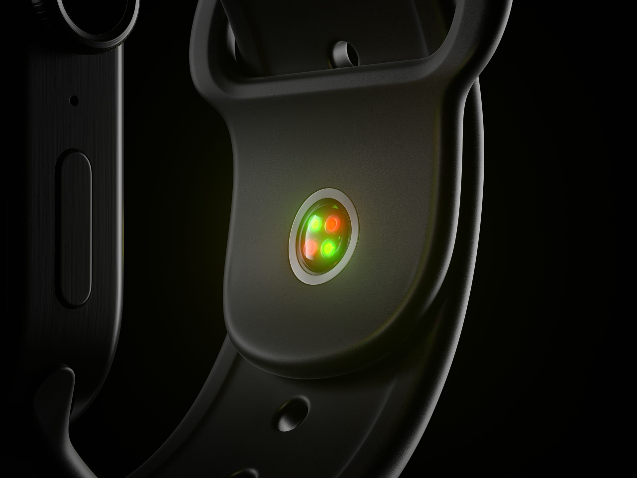
In an unusual twist, the Watch X’s strap also gets is first sensor. The new Blood Pressure sensor on the strap sits on the front of your wrist under the palm, and comes based on a rumor from famed Apple leaker and analyst Mark Gurman of Bloomberg.

Apple’s iPad event ended with quite a flair last week, and Apple is gearing for WWDC soon. However, there’s a lot that’s planned for the September event. Quite a few Apple products need a refresh this year, although it’s pretty much set in stone that the September event will see newer versions of the iPhone, the Watch, and probably even the Watch Ultra. One can only speculate what the Watch 10th Gen will look like, but until then we’ve got this concept giving us dreams of being able to FaceTime on an Apple Watch without relying on the Wristcam strap from years ago!

The post This 10th Anniversary Apple Watch Concept comes with a camera, edge-to-edge screen, and TouchID first appeared on Yanko Design.