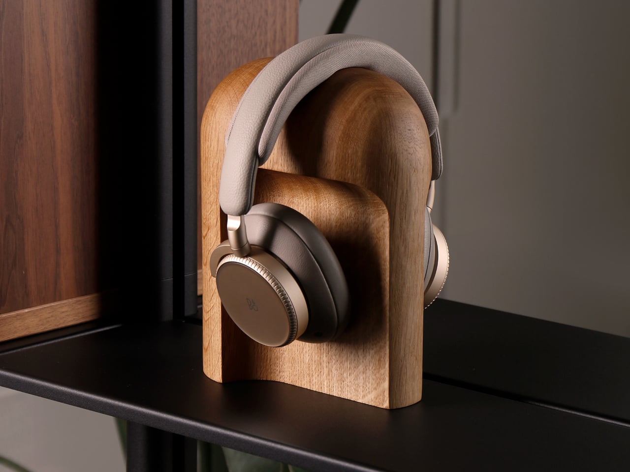
Headphones usually end up draped over monitors, balanced on stacks of books, or left in a tangle on the desk. They are often the nicest piece of audio gear in the room, but rarely have a home that matches their presence. Most stands are plastic hooks or generic metal frames that disappear under the headband, doing their job but adding nothing to the space. Arco is a response to that gap, a stand that treats headphones like something worth giving a proper place.
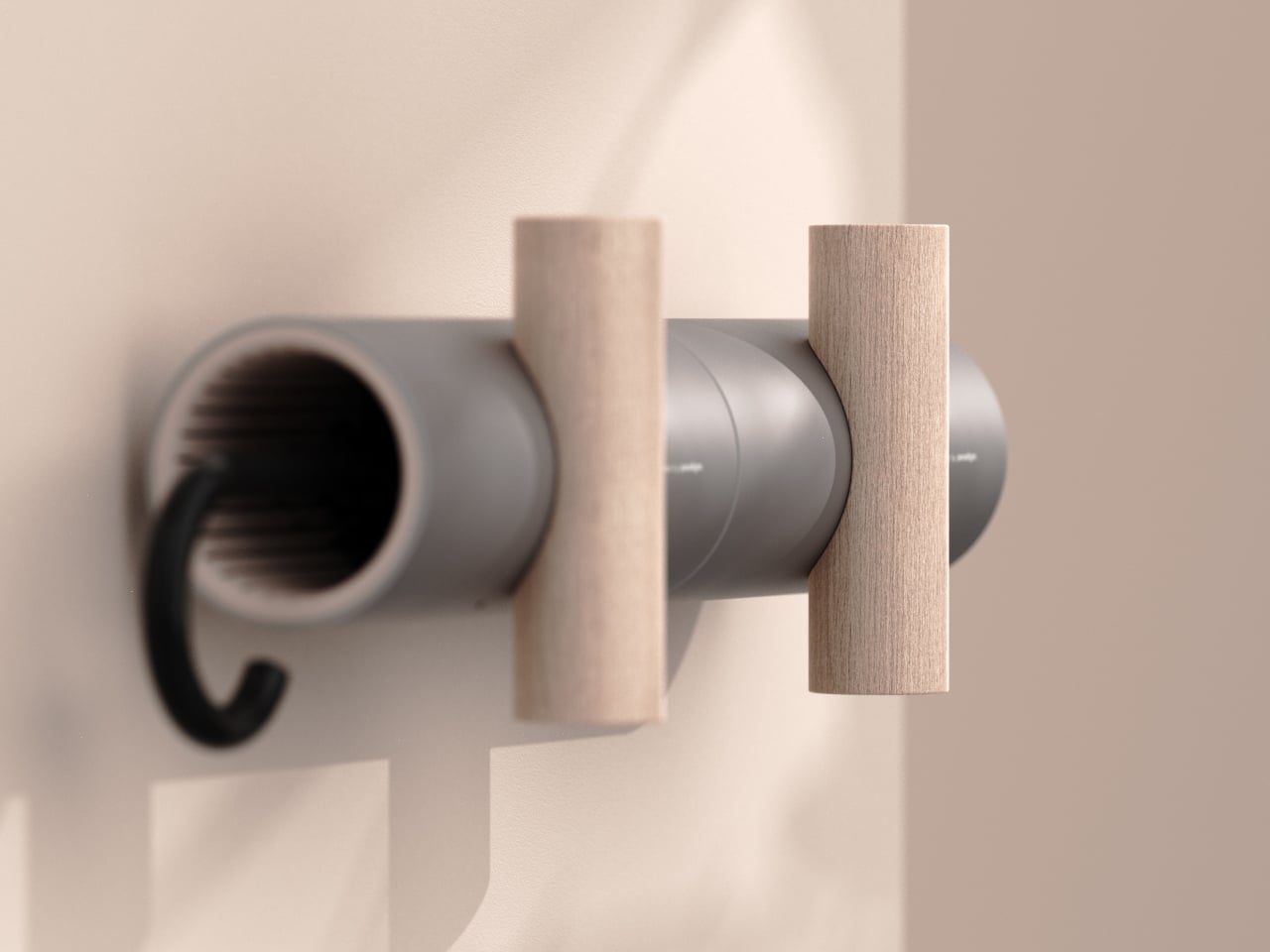
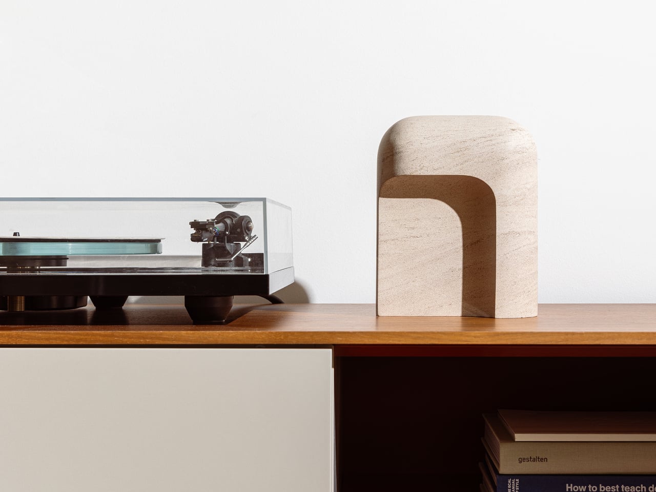
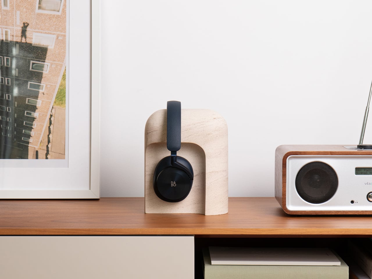
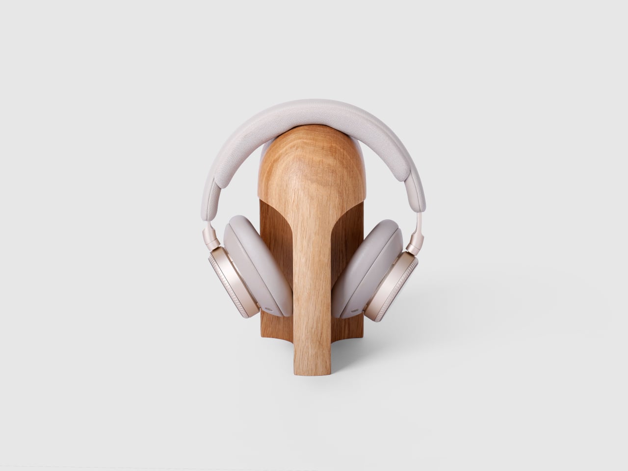
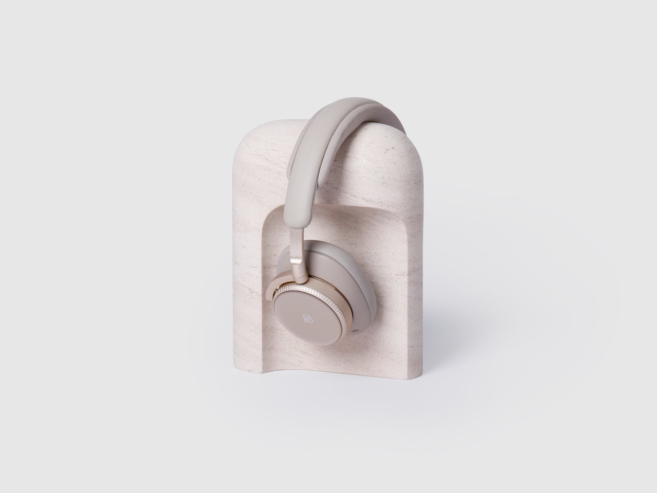
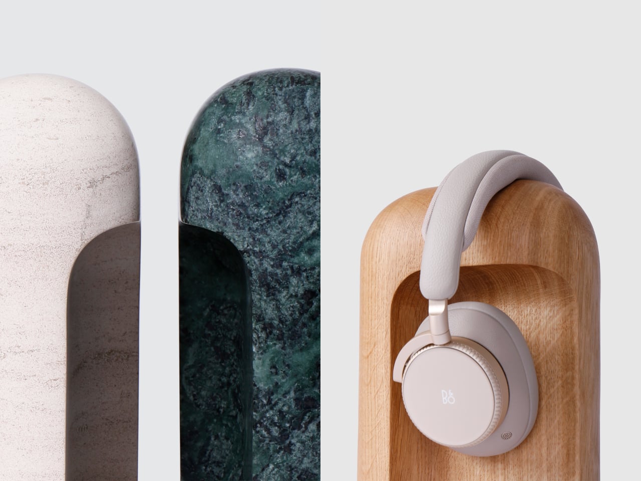
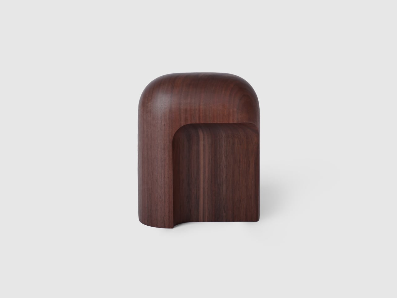
Arco is a headphone stand designed to feel like a finished object, whether or not there is a pair of headphones resting on it. Carved from a single block of wood or stone, it has a smooth arc that gives the headband a gentle resting point and a solid base that reads more like a small piece of furniture than an accessory. When empty, it still looks complete, adding subtle presence to a shelf or desk.
Designer: latr.
Reaching for headphones becomes a small, deliberate gesture instead of fishing them out from under papers. When you are done listening, they go back to the same place, the arc catching the headband and lifting the earcups off the surface. Over time, that simple habit keeps the desk clearer and the headphones in better shape, protected from pressure points or deforming pads that come from stacking other things on top.
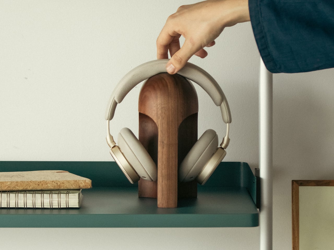
The wood versions, oak and walnut, bring warmth and visible grain to a shelf or sideboard. The stone versions, Portuguese limestone for subtlety and Guatemala marble for a stronger character, feel more like small monoliths anchoring a corner of the room. In each case, the material is chosen to sit comfortably among books, speakers, and other objects without shouting for attention or feeling like obvious “tech gear.”
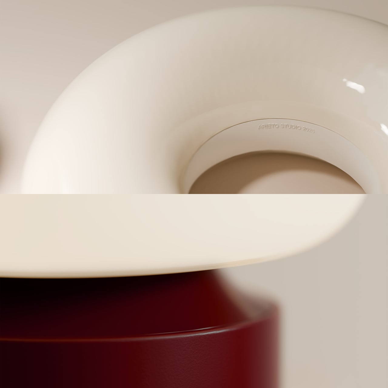
Both wood and stone Arcos are CNC-machined from a single solid block, then finished entirely by hand to refine surfaces and edges while letting the natural character of the material remain visible. The arc and outer volume went through many sketches and prototypes until the proportions felt natural and there was nothing left that looked unresolved, which is why the form feels calm rather than generic or rushed.

Latr is a young design brand focused on lifestyle pieces with character for a more relaxed way of living. Arco fits that ethos by turning a purely functional object into something that quietly adds presence to a room, giving headphones a place in the open instead of hiding them away. It is easygoing and optimistic in its own way, inviting you to enjoy the small pleasure of a tidy, intentional audio corner.
Arco is not trying to reinvent storage; it is simply making one everyday object feel more considered. By giving headphones a stand that looks complete on its own, it turns a bit of visual noise into a small architectural moment. In rooms where so many accessories feel disposable or provisional, a single block of wood or stone that earns its place on the desk every day is a quiet kind of luxury.

The post This Headphone Stand Looks Like a Sculpture Even Without Headphones first appeared on Yanko Design.