Your Kindle Can’t Do This: BOOX’s Pocket E-Reader Now Takes a Stylus

Most dedicated e-readers exist at the opposite ends of a familiar spectrum. Closed-ecosystem devices like the Kindle keep things deliberately simple and locked in, while Android-based tablets offer full flexibility but grow too large to carry comfortably in a pocket. The gap between those two has always been somewhat underserved, especially for anyone who wants true portability alongside a genuinely open operating system.

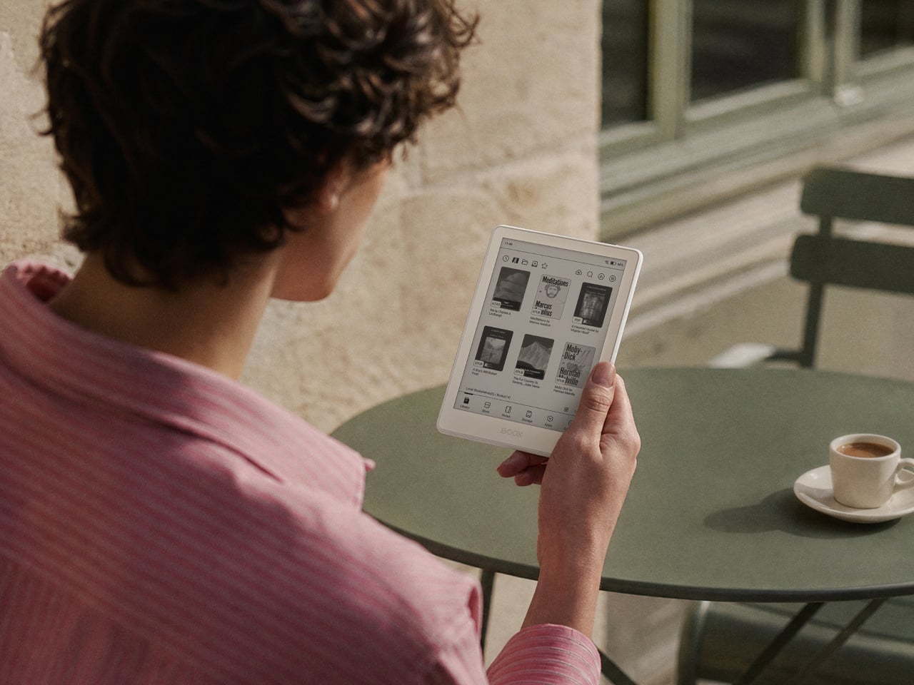
BOOX’s Go 6 (Gen II) is the second generation of its most pocketable e-reader, arriving with upgrades that make that middle ground considerably more appealing. Built around a 6-inch, 300 ppi E Ink display and running Android 11 with full Google Play access, it’s aimed at readers who want their device to be both portable and versatile, without having to choose one over the other.

Designer: BOOX

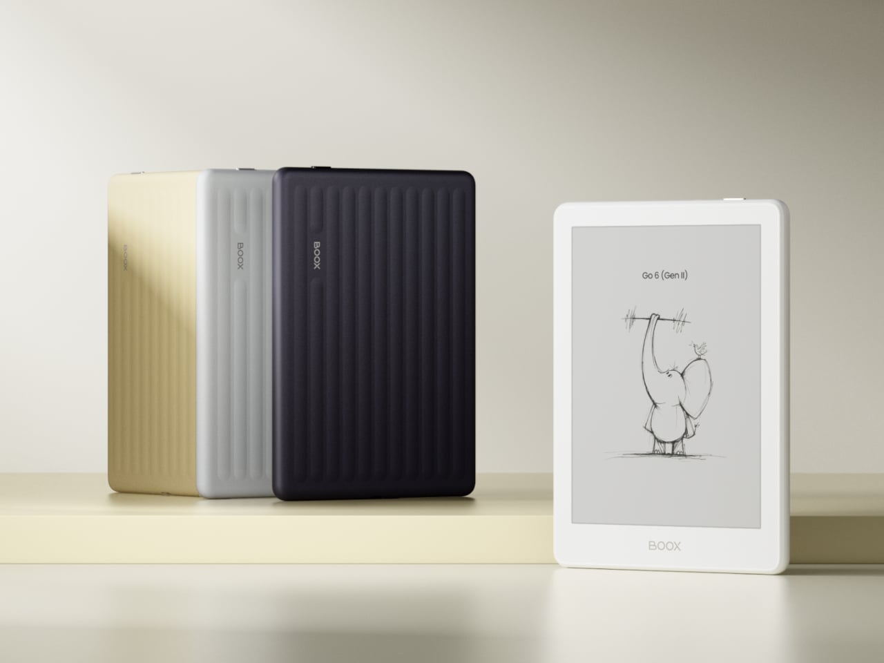
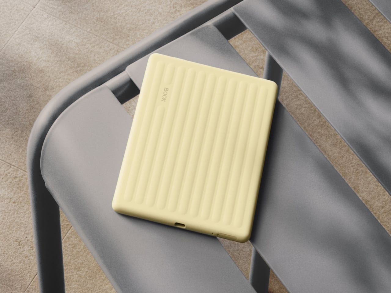
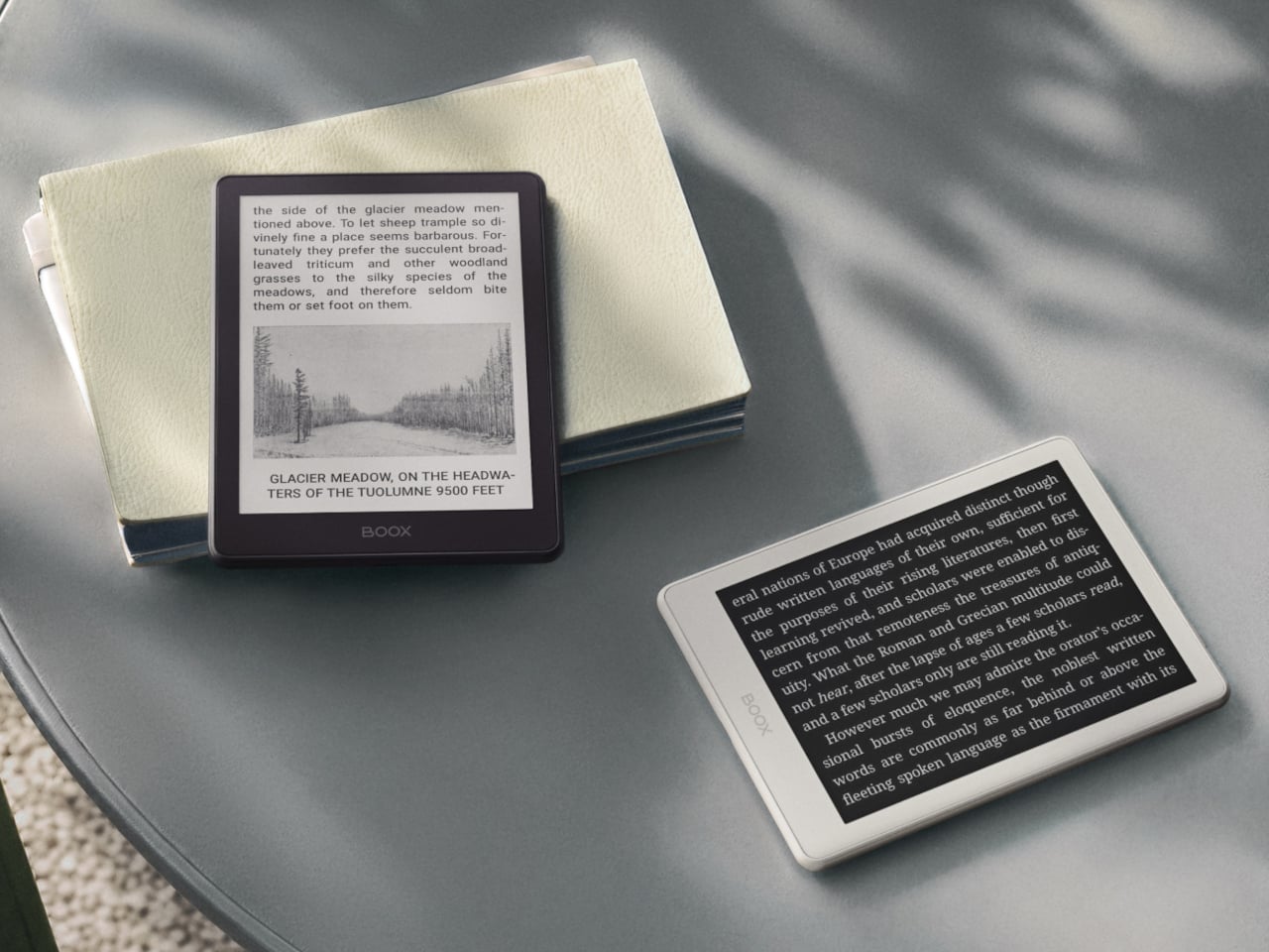
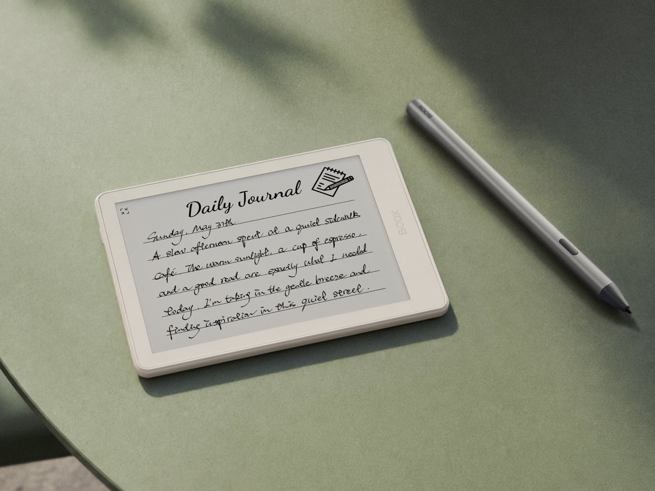
The first thing you’ll notice about the Gen II is that it doesn’t look like a standard e-reader. The redesigned textured rear shell has a suitcase-inspired aesthetic that feels more deliberate than the plain black slab of the first generation. It comes in four muted color options: Plum, Stone, Shell, and Custard, all suggesting a device meant to slip into a bag and come with you wherever you go.

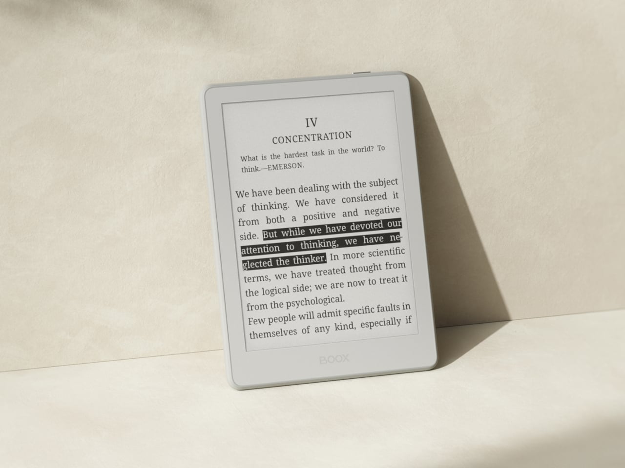
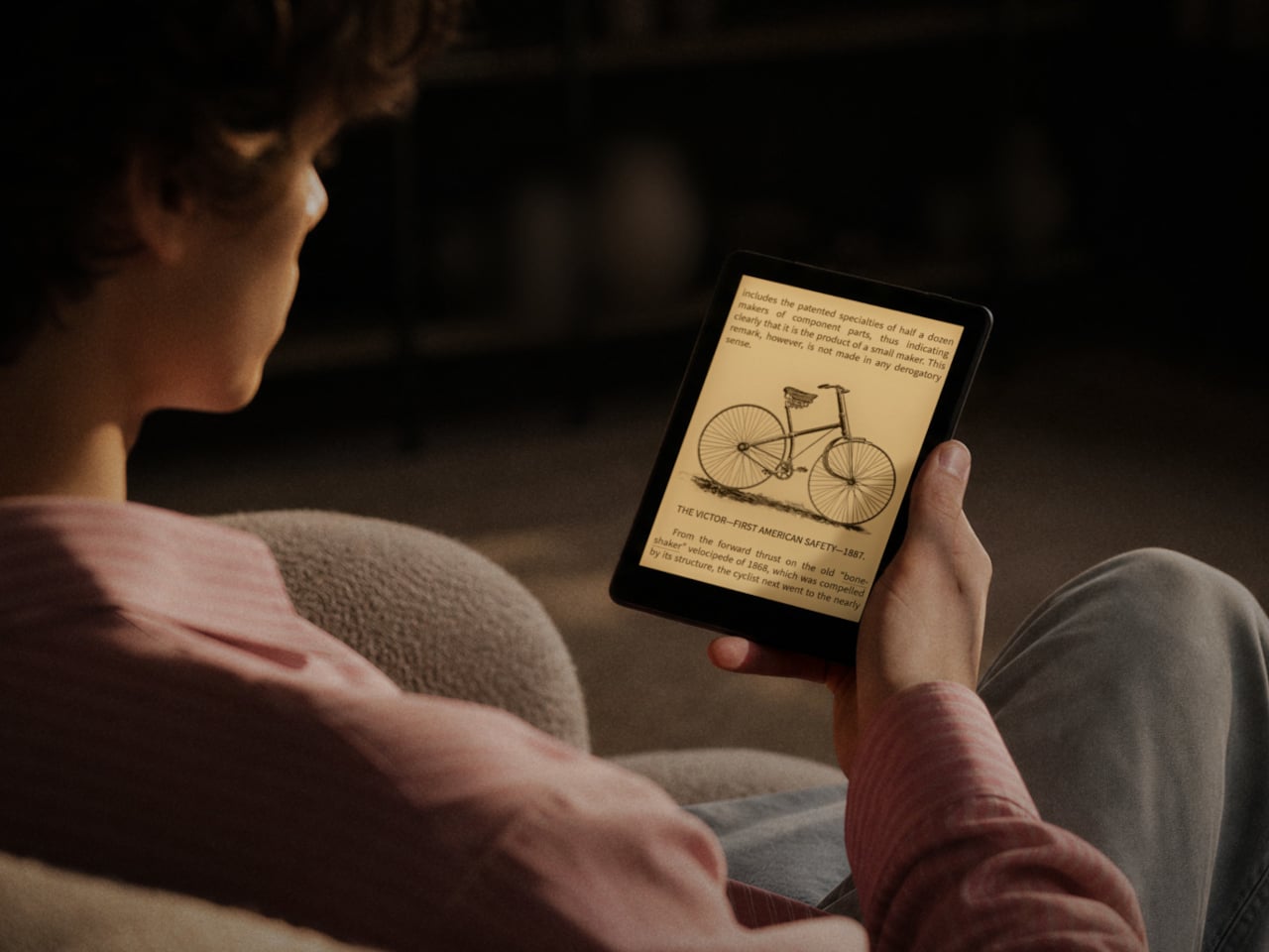
The screen gets a meaningful upgrade with this generation. The Gen II adds anti-glare (AG) glass to its 300 ppi E Ink panel, reducing reflections when you’re reading in direct sunlight on a patio or near a bright window. The adjustable front light handles both warm and cold color temperatures, letting you read comfortably at night without straining your eyes against harsh lighting.

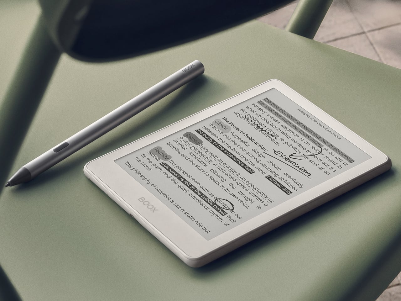
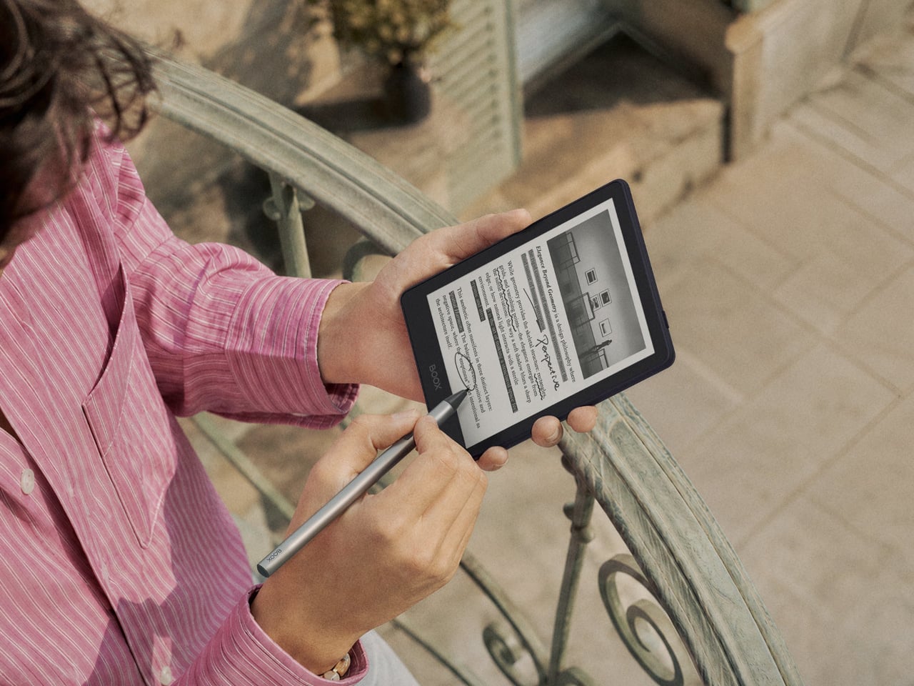
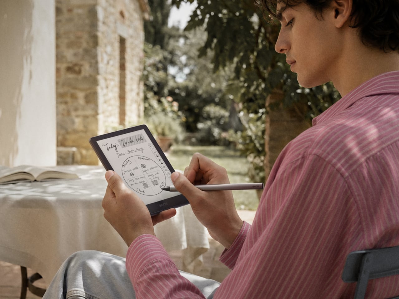
The more surprising addition is stylus support, which is uncommon at this screen size. The Go 6 (Gen II) is compatible with BOOX’s InkSense Plus stylus, an active pen with 4,096 levels of pressure sensitivity that lets you annotate directly in books, mark up PDFs, or take handwritten notes on a screen small enough to fit in a jacket pocket. It connects directly to the device and charges via USB-C.

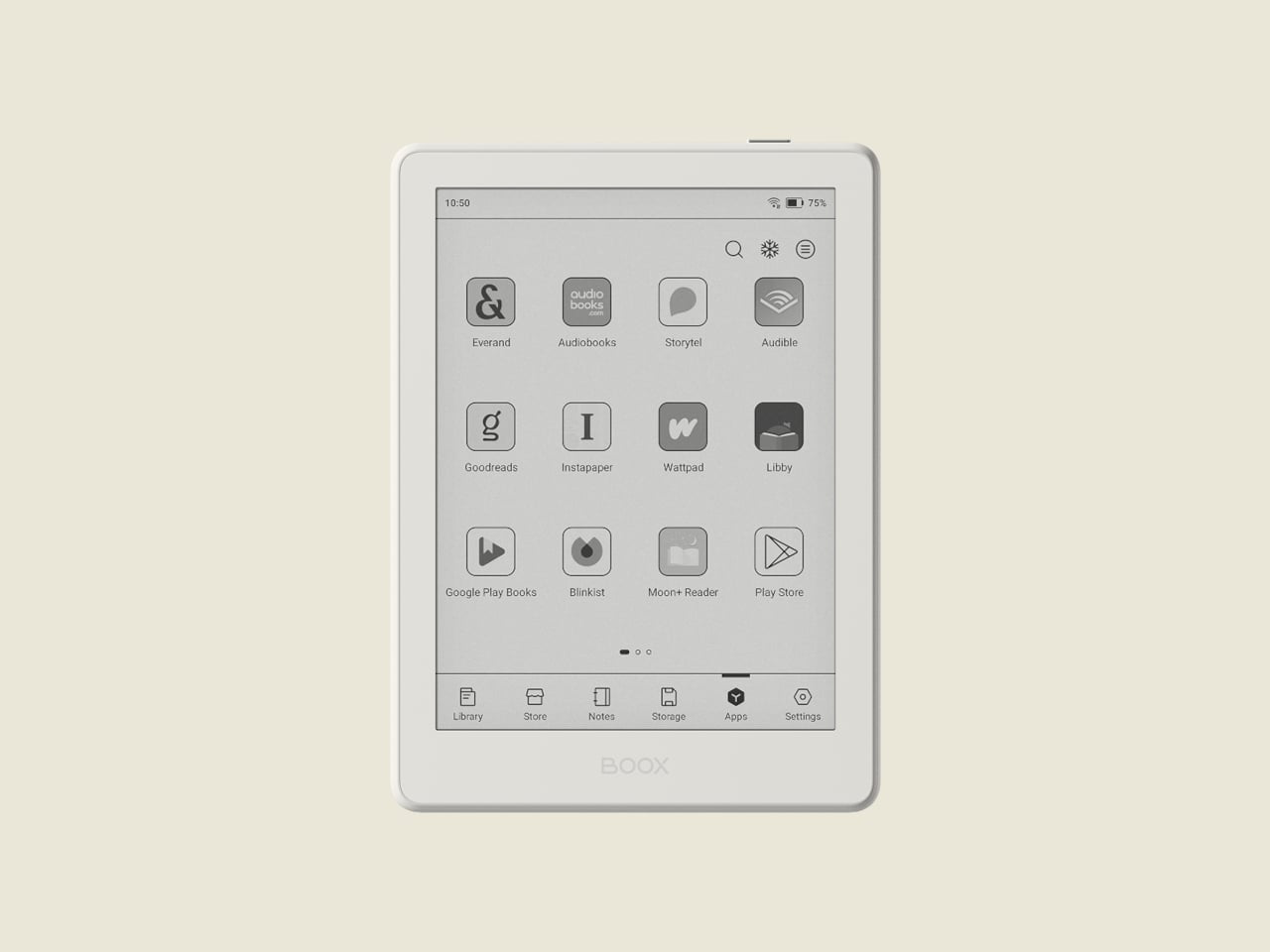
Running open Android 11 with a built-in Google Play Store means you aren’t locked into any one reading platform. BOOX’s NeoReader app handles 20 document formats natively, including PDF, EPUB, MOBI, and DJVU, and supports dark mode for lower-light reading. Install the Kindle app, Kobo, Libby, or anything else you’ve been using, and your existing library follows you without having to start over from scratch.

At 160 grams and 6.8mm thin, the BOOX Go 6 (Gen II) fits in a jacket pocket without making its presence felt. A microSD card slot supplements the 32 GB of built-in storage, and the USB-C port doubles as an audio jack for wired listening. The 1,500 mAh battery holds up well through long reading sessions, largely because E Ink uses so little power compared to a conventional backlit screen.

The BOOX Go 6 (Gen II) is still primarily a reader’s device, but the combination of Android OS, stylus compatibility, and anti-glare glass packed into a pocket-friendly body gives it a range that most devices at this size simply don’t attempt. It’s currently available for pre-order through the official BOOX store, arriving at a moment when the 6-inch e-reader category could use a reminder of what it can still do.

The post Your Kindle Can’t Do This: BOOX’s Pocket E-Reader Now Takes a Stylus first appeared on Yanko Design.

SharkNinja’s $499 Vacuum Now Comes in Colors Your Designer Would Pick

Most home appliances are designed to be forgiven, not admired. You buy them, you use them, and when company comes over, you hope nobody notices the boxy gray robot charging in the corner or the utilitarian stick vacuum propped against the wall. That’s just been the unspoken contract between cleaning products and the people who own them: function first, aesthetics never. SharkNinja just tore up that contract.

The Shark Home Luxe Collection is SharkNinja’s first coordinated cross-category color initiative, and it’s a surprisingly considered move from a brand better known for suction power than style. The collection spans two of Shark’s most capable products: the PowerDetect UV Reveal robot vacuum and mop, and the PowerDetect Speed cordless vacuum. Both get a total of eight new colorways, split across the two products, and they are genuinely beautiful in a way that feels deliberate rather than decorative.

Designer: SharkNinja

For the robot vacuum, the shades are Espresso, Evergreen, Deep Harbor, and Ivory. The cordless gets Walnut, Oatstone, Sagewood, and Harbor Slate. Read those names and you’ll notice a pattern immediately: these are the exact same tones showing up in Japandi interiors, minimalist furniture lines, and the kind of design-forward spaces that get 400,000 likes on Pinterest. SharkNinja clearly did its homework. The names alone do half the marketing work.

Interior designer Jeremiah Brent was brought in to mark the launch, and his take on it cuts right to the point. “For so long, products in this category were designed to be hidden, when the reality is they live alongside us every day,” he said. He’s right. Robot vacuums don’t get tucked into closets; they sit in plain view on their charging docks. Cordless vacuums lean against walls in the hallway or the bedroom. They occupy space in the same rooms as carefully chosen furniture and lighting, and for years, the design language of those products has been completely at odds with everything else around them.

The Shark Home Luxe Collection doesn’t just slap a new coat of paint on existing hardware either. The finishes feel considered, the proportions haven’t changed, and the products underneath are legitimately strong. The PowerDetect UV Reveal is the first robot vacuum and mop to use UV light detection to identify hidden messes, including dried spills, pet accidents, and residue that standard sensors would otherwise miss. It vacuums and mops simultaneously, adapts in real time to different floor types, and the self-empty base holds debris for up to 45 days. Prices for the UV Reveal Luxe start at $1,299.

The PowerDetect Speed, meanwhile, is a 7-pound cordless vacuum offering up to 60 minutes of runtime, with PowerDetect Intelligence that automatically adjusts to different surfaces and cleaning directions. Its auto-empty base can go up to 45 days between empties. The Luxe version starts at $499.99.

Now, is a color refresh a radical redesign? No, and nobody is pretending otherwise. But that’s not really the point. The point is that SharkNinja is acknowledging something the design community has quietly understood for years: objects we live with daily should be held to the same aesthetic standard as everything else in our homes. A vacuum isn’t a utility hiding in a utility closet anymore. It’s furniture, essentially.

The broader trend here is one worth watching. Brands across categories, from air purifiers to kitchen appliances to Wi-Fi routers, are starting to understand that people want technology that integrates into a home visually, not just functionally. Dyson figured this out early. Now SharkNinja is making the same argument, at a wider price range and with a much clearer design vocabulary.

Whether the Shark Home Luxe Collection becomes a defining shift in how cleaning appliances are marketed, or whether it remains a smart but limited edition palette refresh, depends entirely on how consumers respond. My instinct says the response will be warm. Because given the choice between a vacuum that blends into your home and one that doesn’t, most people will choose the one that doesn’t make the room look worse.

The post SharkNinja’s $499 Vacuum Now Comes in Colors Your Designer Would Pick first appeared on Yanko Design.

Fingerprints Are Dead: This $189 Lock Reads the Veins in Your Palm

Smart locks are supposed to simplify entry into your home, but many of them just introduce a different set of frustrations in the process. Fingerprint sensors don’t always cooperate when your fingers are tired or wet. PINs get forgotten or spotted by someone standing too close. Key cards are easy to misplace. Despite years of innovation in home security, reliably verifying identity at the front door hasn’t been answered cleanly.

TCL’s D2 Pro approaches that question from a completely different direction. Instead of asking you to touch a sensor or remember a combination, it reads the unique vein patterns beneath the surface of your palm using infrared light. Those patterns are hidden under the skin, making them practically impossible to copy, replicate, or steal, which gives this particular solution a considerably stronger security foundation than most locks on the market.

Designer: TCL

Think about getting home late at night with both arms full of takeout and a bag swinging off your wrist. There’s no patting pockets for a key or squinting at a keypad in the dark. You raise your palm toward the reader, and the door opens in 0.3 seconds. It’s the kind of effortless entry that sounds like a small thing until you stop having to think about it altogether.

The D2 Pro also learns as it goes. Each time you unlock the door, the on-device AI quietly adjusts your palm vein profile, making recognition faster and more accurate over time. All that data stays stored on the device, so there’s no cloud dependency and no monthly subscription to worry about. A liveness detection system also comes built in, ensuring the scanner won’t respond to anything but a living hand.

Sharing a home means sharing access, and the D2 Pro makes that manageable through the TCL Home app. You can register palm vein profiles for multiple household members, assign or revoke permissions from wherever you are, and receive real-time notifications whenever the door opens. For guests or anyone who doesn’t have a registered profile, the lock still accepts key cards, a physical key, and a backup keypad.

The hardware is built to stay outdoors in all conditions. The D2 Pro’s aerospace-grade aluminum alloy body carries an IP55 weather resistance rating, holding up against dust and water splashes day in and day out. Its operating temperature ranges from -25°C to 70°C, so climate extremes aren’t a concern. A built-in 10,000 mAh rechargeable battery connects via USB-C and is rated for up to eight months on a charge.

A Matter-compatible version of the D2 Pro connects to Apple Home alongside Alexa and Google Assistant, covering most major smart home platforms without needing a separate hub. An auto-lock feature re-engages the deadbolt automatically whenever the door closes, taking care of one more thing you’d otherwise have to remember. BHMA Grade 3 certification covers the structural side, and at $189, it costs significantly less than comparable palm-scanning alternatives.

The post Fingerprints Are Dead: This $189 Lock Reads the Veins in Your Palm first appeared on Yanko Design.

Your Charger Is On Display for 23 Hours a Day, ORNA Designed for That

The wall charger is one of the most present objects in any home and one of the least considered. It sits on bedside tables, desk corners, and coffee tables for most of the day, then gets used for a few minutes and goes right back to being an uninvited presence. Nobody picks a charger because it belongs in their space. They pick it because it was cheap, available, and functional.

ORNA’s Objet Charger proposes a different starting point. It’s a 35W USB-C wall charger that treats the design of the object as seriously as the technology inside it. The key is a modular floral cover with a high-gloss, pop-art silhouette that attaches magnetically to the charger body and turns an overlooked utility item into a sculptural presence on any wall.

Designers: Kangnim Park, Jaehwa Lee, Jinsu & Jiwoong Studio for ORNA

The cover is the part that gets swapped out to suit personal taste. Four versions are available: Daisy White, Sunflower Yellow, Marigold Orange, and Chrome Silver, each finished in a high-gloss surface that reads differently by room. The magnetic connection makes switching instant, which is part of what makes the concept work. Changing the personality of the object doesn’t require a new charger, just a different flower.

Underneath the sculptural exterior is a charger built for serious daily use. A one-meter USB-C cable is integrated into the body and retracts cleanly, so there’s no loose cord when the charger isn’t in use. A secondary USB-C port on the base handles a second device simultaneously, with the total output shared at 15W when both are active. Single-device charging peaks at 35W with full fast-charge protocol support.

The base of the charger was designed with the proportions of a traditional Korean Moon Jar in mind, a ceramic form known for the quiet completeness of its rounded body and the restraint of its surface. That design context matters more than it might sound. The charger is meant to occupy the wall the same way a carefully selected object occupies a shelf, present, purposeful, and unhurried.

Flower Objet covers are sold separately from the charger base, starting at $49 for the Daisy White and Sunflower Yellow finishes and $99 for the Chrome Silver variant. The modular logic means the same base stays in place for years while the floral cover changes with the seasons, the room, or simply a shift in taste. The foldable plug keeps the package compact enough to carry between rooms or pack into a bag without a trailing cable. It’s a long-term object, not a disposable tool.

ORNA frames the proportion of the charger’s daily existence as roughly 23 hours of visual presence for every one hour of active use. That framing captures why most chargers feel like failures: they’re designed entirely for the one hour and ignored for the 23. The Objet Charger is built for both, which is the kind of quiet attention most objects in our homes never receive.

The post Your Charger Is On Display for 23 Hours a Day, ORNA Designed for That first appeared on Yanko Design.

Why a $70 Screenless Camera Is the Most Interesting Gadget Right Now

A camera with no screen sounds like a step backward. It is, by design. And that’s exactly the point. We live in an era where every piece of technology is racing to give you more. More features, more connectivity, more reasons to stay glued to a display. And here comes a small, cheerful little camera doing the opposite on purpose. It’s almost rebellious, except it fits in your pocket and comes in Strawberry Splash.

Camp Snap just released its second-generation screenless digital camera, the Camp Snap 2, and it’s already making the rounds on social media with the kind of low-key enthusiasm that feels genuine rather than manufactured. If you missed the original, here’s the short version: it’s a point-and-shoot with no rear LCD, no Wi-Fi, no app ecosystem, and no ability to review your shots before downloading them later. The whole pitch rests on the idea that not knowing what you captured is actually better for you.

Designer: Camp Snap

I’ve thought about this a lot, and I don’t think it’s a gimmick. We’ve spent years optimizing the act of photographing something into oblivion. We shoot, we review, we retake, we add a filter, we post, we check the likes. The photo becomes less about the moment and more about the performance of documenting it. The Camp Snap strips all of that away, and when you hold a camera you literally cannot scroll through, you start paying attention to the moment in a way that feels a little foreign at first, then oddly refreshing.

The Camp Snap 2 keeps everything that worked about the original and quietly fixes what didn’t. It’s 15% slimmer than the V1, which sounds minor until you actually slide it into a pocket and forget it’s there. The 8-megapixel sensor is unchanged, which will either bother you or not depending on what you’re looking for. The photos are not going to replace your iPhone shots. They’re warmer, a little imperfect, and have that slightly analog quality that makes you feel like you developed something rather than downloaded it.

The biggest upgrade is the filter button. On the original Camp Snap, switching filters required plugging the camera into a computer, which was a meaningful enough friction point that most people probably just left it on the default setting and moved on. The Camp Snap 2 now has a dedicated button on the back that cycles through six built-in looks: Standard, Vintage 1, Vintage 2, Vintage 3, Analog, and Black & White. No apps, no computer, just click until you land on the vibe you want. For anyone who bought the first version and felt mildly cheated by the filter situation, this is the update they were owed.

For families, Camp Snap also added a CampLock feature, which disables the filter button so younger users can’t cycle through settings accidentally (or intentionally). You unlock it by holding the button for ten seconds, which is the kind of low-tech solution that’s either charming or mildly annoying depending on the day.

The new model also supports 30.5mm screw-in filters, which opens up creative territory that feels almost comically ambitious for a camera of this nature. Wide-angle adapters, diffusion filters, star effects, macro attachments. It’s a camera designed to make you feel less precious about photography, and now it technically supports a whole accessory ecosystem. The tension between those two ideas is interesting, and I’m curious to see how people actually use it.

The Camp Snap 2 comes in nine colorways, including some jelly-style translucent options that hit the Y2K nostalgia button hard. Sunbeam Yellow, Tangerine Drift, Twisted Lime, and Strawberry Splash are doing a lot of visual heavy lifting here, and they look exactly like the kind of tech that lived in every locker in 2003. That’s not accidental. Camp Snap knows its audience includes adults who are as nostalgic for simpler devices as they are tired of their smartphones.

At $69.95, the Camp Snap 2 costs about the same as a dinner out, and it will probably be more memorable. It’s not asking you to quit your phone or adopt a new philosophy. It’s just a small, uncomplicated camera that asks you to look up more than you look down. For a lot of people, that might be worth exactly seventy dollars.

The post Why a $70 Screenless Camera Is the Most Interesting Gadget Right Now first appeared on Yanko Design.

FutureWave’s Furny home robot talks to you by moving, not by talking

Most home robots ask a lot from the room they inhabit. They arrive with screens, speakers, wake words, and personalities, all requiring acknowledgment from whoever happens to be nearby. The interaction model is fundamentally borrowed from smartphones: alerts, prompts, and responses delivered through layers of interface. The result is a machine that demands attention in a space that already has more than enough competition for it.

Brussels-based studio Futurewave took a different position with Furny, a domestic robot concept presented at the last Milan Design Week 2026. Rather than building something with a face, a voice, and a screen, the team asked whether a robot in the home could communicate through posture and movement alone, the way furniture communicates presence and purpose without saying anything at all.

Designer: Futurewave

The answer is a furniture-sized object with a movable head that expresses itself entirely through physical behavior. When something happens nearby, the head tilts. When the robot is ready to act, it orients toward the task. When it’s waiting, it recedes into a posture that reads as neutral, almost still. The timing, direction, and intensity of each shift are calibrated to communicate specific states: focus, readiness, attention, and reaction. There are no pixels involved in any of it.

Deliberately avoiding humanoid proportions was a foundational decision. Furny doesn’t mimic the way a person or animal moves. The gestures it uses are abstract enough to feel designed rather than imitated, which makes them easier to read in context without triggering the uncanny valley that tends to follow robots built on biological templates. The visual restraint also helps it belong in a room. It reads as an object with behavior, rather than a character out of place.

The research behind the project draws on work in expressive movement design for non-anthropomorphic robots, a field that looks at how physical states and intentions can be conveyed through spatial behavior without resorting to screens or voice. Furny’s head doesn’t speak for it. The way the body holds itself does. The robot signals what it’s about to do before it does it, which is a meaningful distinction from machines that simply act and leave the explanation for an app notification afterward.

Futurewave also built Furny within a manufacturable framework, which separates it from most conceptual robot work. The project integrates industrial design, embedded electronics, and software-controlled motion systems in a way that points toward practical production rather than exhibition only. That framing is important because the most interesting thing about Furny isn’t the movement vocabulary itself but the argument it makes about what a domestic robot is supposed to be.

The prevailing assumption has been that robots become more useful as they become more capable of mimicking human interaction. Furny pushes back on that. A robot that remains quiet when nothing’s needed, reads the room through its posture, and signals intention before acting doesn’t interrupt the household. It becomes part of it, the way a good piece of furniture does, present and purposeful without drawing attention to itself until the moment calls for it.

The post FutureWave’s Furny home robot talks to you by moving, not by talking first appeared on Yanko Design.

Argus Just Showed Up With 20 Eyes, 20 Legs, and No Rules

The moment you see Argus rolling across a college lawn, you feel a kind of awe that’s equal parts scientific admiration and mild existential discomfort. It doesn’t look like a robot. It doesn’t look like anything you’ve seen before, actually. It looks like a sea urchin crossed with a fever dream, or if you’ve spent any time on the internet in the last few years, it looks exactly like what happens when someone renders a biblically accurate angel and sends it out to navigate uneven terrain.

That’s not an exaggeration. The internet made the comparison almost immediately after Duke University’s General Robotics Lab unveiled Argus, and the parallel holds up. In the Book of Ezekiel, the ophanim, a type of divine being, are described as wheels covered in eyes, seeing in all directions simultaneously. Argus, named after the Greek mythological giant with a hundred eyes, does essentially the same thing, minus the divine mandate. It has 20 legs, each one telescoping and tipped with a camera, arranged at the vertices of a regular dodecahedron. No blind spots. No preferred orientation. No front or back.

Designer: Duke University General Robotics Lab

That last part is what keeps pulling me in, design-wise. We’ve spent decades building robots that mirror the logic of our own bodies: two legs, bilateral symmetry, a definitive forward direction. It made intuitive sense. We move front-to-back, so we assumed machines should too. Argus rejects that assumption entirely. The team at Duke built it around a principle they’re calling dynamic symmetry, which refers to how uniformly a robot can accelerate in any direction. Most robots are strongest and most efficient when moving the way they were designed to move. Argus has no such preference. It moves sideways, backward, forward, and diagonally with the same ease, which sounds like a minor technical distinction until you watch it roll through rough terrain, navigate around trees, and absorb collisions without losing its course. That’s when you realize how significant the gap is.

The design precedent here matters more than it might seem. Robotics has long borrowed from nature by mimicking the shapes that evolution produced: bipedal forms for humanoids, quadruped frames for terrain bots, insect geometries for swarm machines. But Argus is borrowing something different from nature. It’s borrowing from the radial logic of starfish and sea urchins, creatures that don’t have a front because every direction is equally valid. The Duke researchers describe Argus as an “existence proof,” a demonstration that a robot built for dynamic symmetry isn’t just theoretically interesting but practically deployable. Postdoctoral researcher Boxi Xia put it directly: “It produces a robot you can deploy in the wild, on uneven ground and in clutter, even in low-gravity settings.”

Low-gravity settings. That detail is doing a lot of quiet work in this conversation. The practical applications being discussed range from disaster response and search-and-rescue operations to planetary exploration, environments where the rules of conventional locomotion break down fast and all-directional agility becomes the difference between success and failure. A humanoid robot in a collapsed building still has to worry about which way it’s facing. Argus doesn’t.

I’ll admit the design is deeply strange to look at. It is not sleek. It is not elegant in any conventional sense. It doesn’t have the clean industrial confidence of Boston Dynamics’ machines or the deliberate anthropomorphism of recent humanoid models. It looks a little chaotic, frankly, like it was assembled by someone working from a very different set of aesthetic values, someone less interested in how the thing looks than in what the thing can do. And maybe that’s the point. Beauty in engineering doesn’t always wear the shape we expect. Sometimes it rolls across a lawn on 20 legs, sees absolutely everything, and changes the conversation entirely.

Argus is the kind of design that reminds you why robotics is still worth watching. Not because of what it looks like, but because of what it means for how we think about movement, perception, and the assumptions we’ve been quietly building into machines all along.

The post Argus Just Showed Up With 20 Eyes, 20 Legs, and No Rules first appeared on Yanko Design.

Motorola Just Made the Baby Soother That’s Actually Worth Displaying

Nursery products have generally been designed around the assumption that function is the only thing that matters. A baby monitor that broadcasts clearly, a sound machine that blocks noise, a nightlight that stays on through the small hours without overheating. These things work, and most of them look exactly like what they are: appliances with a secondary mission, built from a brief that never included the word “beautiful.” The emotional dimension of the room they live in is almost never part of the specification.

Industrial designer Tej Chauhan rethought that assumption through Motorola Nursery’s PIP collection, and the S1 Soother is the latest product from it. It begins with a sketch of a little seal, a soft, neotenic form drawing on the same mechanism that makes baby animals universally disarming. The rounded shape isn’t decorative padding over a functional core. It’s part of the reason the device works as well as it does.

Designer: Tej Chauhan for Motorola Nursery

The form achieves something most nursery devices don’t: it looks considered even when it’s not on. Switched off, the S1 reads as a small sculptural object that a parent with a carefully arranged room wouldn’t feel compelled to hide. Switched on, the round tip glows in one of seven colors: yellow, orange, red, pink, blue, cyan, and green, adjustable across five brightness levels. The light is calm and diffuse by design.

The sound side offers ten options: three lullabies, three nature sounds, white noise, brown noise, a fan loop, and a womb sound, covering the range that different babies respond to. Parents who’ve cycled through multiple sound machines will appreciate that breadth in a single device. Volume adjusts across five levels, and USB-C charging sustains up to 50 hours of use per charge, covering weeks of nap times before the next top-up.

Portability isn’t incidental. The S1 travels in a bag without cables, without a base that won’t fit a hotel nightstand, and without the visual clash of a device that clearly belongs somewhere it isn’t. Non-toxic materials and rounded edges address the physical dimension of baby safety that gets less marketing attention than certification ratings but matters considerably more at close quarters with a curious infant.

Chauhan has described the goal as inviting warmth into an everyday routine while making something beautiful enough to live anywhere in the home, goals that usually don’t apply to baby gear. The neotenic seal shape suggests calm before it does anything else, which is the point. A device that parents genuinely want in the room works harder than one they merely tolerate because it does the job.

The objects that occupy a nursery carry more emotional weight than the ones in any other room. Chauhan’s goal, inviting warmth into an everyday routine while making something beautiful enough to keep, sounds loftier than a $29.99 nightlight deserves. But the design argument is sincere, and so is the result. Parents who’ve spent months chasing the right combination of light and sound will recognize what they’re getting.

The post Motorola Just Made the Baby Soother That’s Actually Worth Displaying first appeared on Yanko Design.

PixVerse Just Made Product Videos as Easy as Writing a Brief

Product design has always been part craft, part communication. Getting a concept from sketch to client approval demands a level of visual storytelling that most designers simply haven’t had the budget or tools to manage on their own. Video production, in particular, has long been the step that gets quietly skipped, not because the ideas aren’t there, but because the process is expensive, slow, and complicated.

That’s a gap PixVerse has been working to close. Founded in 2023, the platform has grown to over 100 million users across 177 countries, powered entirely by proprietary models it builds in-house. At the iMpact Global Connect Show 2026, the company’s team walked through three distinct products that together make a compelling case for AI-generated video as a practical part of the design process.

Designer: PixVerse

The most immediately useful of the three, at least for most designers, is V6. It’s the platform’s flagship model, and the latest update improves camera movement, character performance across scenes, and physical object interaction in noticeable ways. More significantly, V6 can now generate a complete multi-shot short film with native audio from a single prompt, without any separate editing or sound production steps involved.

Think about what that actually means for a product designer. A 30-second product video typically means writing a brief, hiring a videographer, sourcing music, shooting, and editing over several days or weeks. With V6, a designer who can clearly articulate how a product should look, move, and feel in context can produce that same result from a prompt and a reference image in considerably less time.

That kind of speed has obvious advantages for solo designers and small studios. A freelancer can arrive at a pitch with three distinct video directions instead of three mood boards. A startup preparing a crowdfunding campaign doesn’t need a separate production budget for a launch video. An in-house team can test how a product reads in a real context before committing to a full-scale shoot.

The second product, C1, goes further by targeting actual film production pipelines. It combines a cinematic visual effects system, an industrial-grade action engine, and a storyboard-to-video feature in a single workflow, letting production teams convert static panel layouts directly into continuous video sequences. Reference-guided generation also keeps characters and scenes consistent across shots, which has historically been one of the harder problems for AI video to solve.

For designers, that matters most when a concept already lives as a sequence of moments rather than a single frame. A transportation designer communicating a user journey, a consumer electronics team mapping how a device gets picked up, handled, and put down, or a lifestyle brand building a product narrative around daily routines, all of them are telling stories that C1 is built to handle.

Then there’s R1, which doesn’t behave quite like any other AI video tool currently available. Rather than producing a fixed clip with a clear beginning and end, R1 generates a continuous, interactive visual environment that responds to user input as it runs. It’s less like watching a video and more like navigating a space that exists, evolves, and reacts, one that you can steer and share.

Users can build a personalized digital avatar from photos and enter these generated worlds alongside others in real time. During the demo, a shared environment called “Cat Takes Charge” had 118 users inside it at the same time, running continuously for over nine hours. Each participant could submit prompts into a live feed, with the AI realizing them as video within the shared space as they appeared.

For product designers, R1 opens up possibilities that a rendered video simply can’t replicate. Imagine walking a client through a simulated retail environment built around a new appliance, or letting a stakeholder explore a furniture concept in a living, reactive interior before a prototype even exists. It’s the kind of tool that starts to make spatial storytelling feel accessible at the concept stage, not just post-production.

What all three tools share is that they reward the same skill designers already rely on: clarity of intent. A well-constructed prompt isn’t a technical exercise; it’s a creative direction, not unlike a solid design brief. Companies integrating PixVerse into their workflows reportedly cut costs by 68% and finish work 57% faster than conventional production methods, a significant gain for teams of any size.

None of that requires a production background, and it doesn’t even require familiarity with video editing software. What it does require is the ability to describe a vision precisely, which is something designers do every single day across briefs, sketches, and presentations. PixVerse just moved video closer to the beginning of that process, somewhere between the first concept and the final approval, rather than as an afterthought at the very end.

The post PixVerse Just Made Product Videos as Easy as Writing a Brief first appeared on Yanko Design.

This 3D-Printed Macintosh Replica Is Actually a Voice AI Assistant

Smart speakers have become some of the most visually forgettable objects in modern homes. A cylinder, a puck, a fabric-wrapped drum, placed wherever the Wi-Fi is strong and largely invisible once the novelty wears off. They do their jobs well enough, but none of them look like they belong in a collection or on a desk that someone cares about. The hardware has always been purely functional, and the design has always shown it.

Alisher Ashimov approached the idea of a desk-based AI assistant from a completely different direction. Kira, his open-source project, takes its visual cues directly from the original 1984 Macintosh, a machine whose beige monolith silhouette is arguably the most iconic in personal computing history. The result is a voice-activated AI companion that looks more like a cherished collectible than a utility device.

Designer: Alisher Ashimov

The enclosure is 3D printed in a single recommended filament color: Light Khaki matte PLA, the closest approximation of that distinctive Apple beige. Rounded top corners, a recessed front panel, horizontal side vents, and a decorative floppy-drive-style slot below the display all reproduce the original’s proportions at pocket scale, somewhere around 80mm wide. A small four-color badge on the lower front panel adds the final recognizable touch.

Where the original Macintosh showed a desktop environment, Kira shows a face. The 1.5-inch OLED display renders two rectangular eyes and a small dash mouth, animating expressively in response to interaction. The wake word is “Hey, Kira,” and from there, a built-in microphone picks up questions while a 4Ω, 3W speaker delivers spoken answers through the sculpted housing. It handles everyday voice queries the same way any smart assistant does, just with considerably more personality sitting on the shelf.

The electronics are deliberately approachable. The core is a Seeed Studio XIAO ESP32-S3 Sense, a capable and compact microcontroller with built-in Wi-Fi, Bluetooth, and a microphone. The rest of the bill of materials, a speaker, amplifier, SH1107 OLED module, mini breadboard, and jumper wires, are available on Amazon for modest amounts. The 3D-printed enclosure is optimized to print in about three hours across two plates with minimal support material, and an assembly guide walks builders through wiring, assembly, and firmware flashing.

The software carries the same open-ended spirit as the hardware. Voice, language, the assistant’s character, and memory settings are all user-definable, which means Kira isn’t locked into a single personality or a single cloud service. Tinkerers can tune the firmware directly. Ashimov has published the files freely, with no commercial barriers between the design and anyone with a printer and an afternoon to spare.

The objects people choose to keep on their desks tend to say something about them. A tiny Macintosh-shaped AI assistant that you built yourself and tuned to your own preferences says rather a lot. It combines a piece of design history, a genuinely capable voice interface, and an honest invitation to understand exactly how the thing works, all in a form that most people will stop and ask about the moment they see it.

The post This 3D-Printed Macintosh Replica Is Actually a Voice AI Assistant first appeared on Yanko Design.