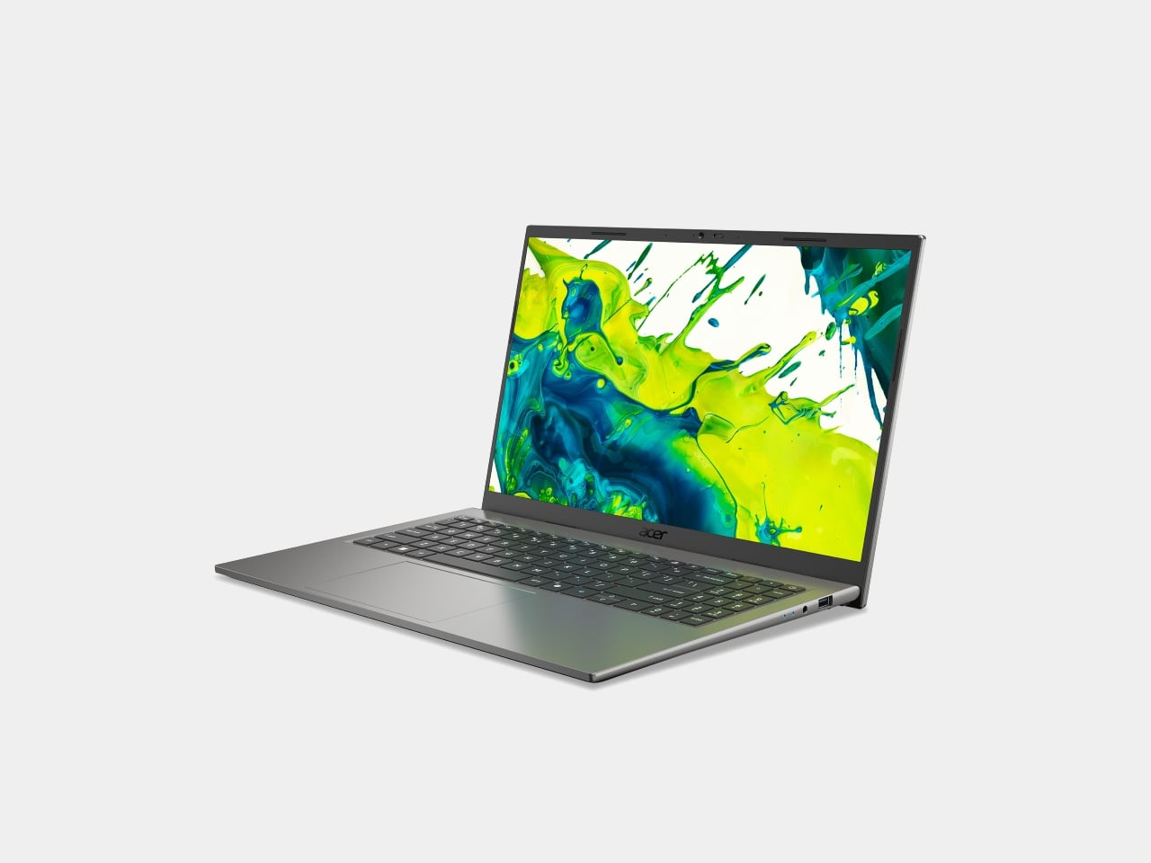
Acer’s Predator Atlas 8 Is the First Gaming Handheld With a Metal Fan

Handheld gaming PCs have come a long way in a short time, but two problems follow every device in the category. Performance peaks early in a session and then quietly retreats as thermals climb, and battery life forces a trade-off that no amount of power management has fully resolved. The Steam Deck addressed portability. The ROG Ally pushed performance. Both still leave room for something that takes thermal management seriously at the hardware level.

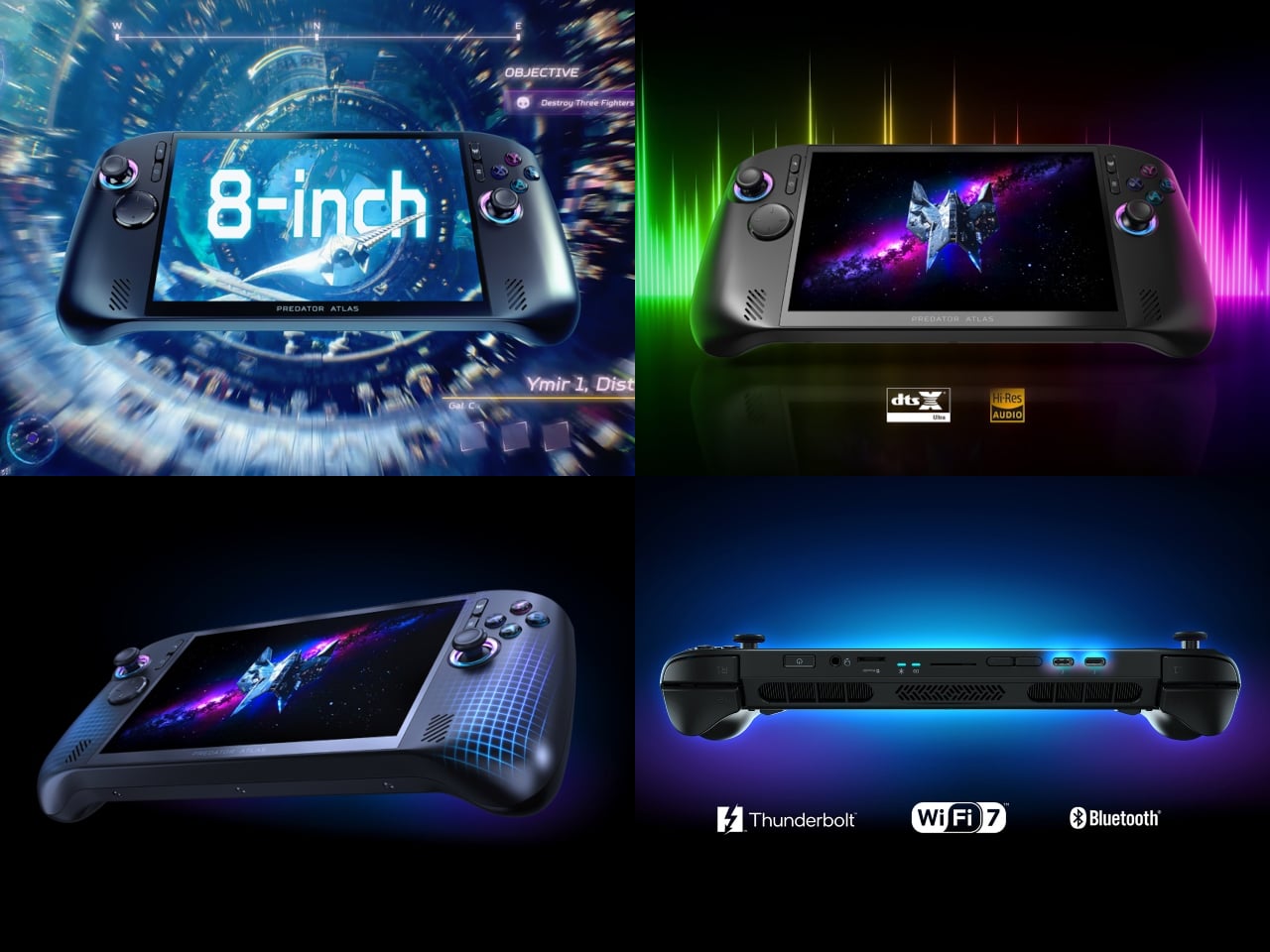
Acer’s answer is the Predator Atlas 8, a Windows 11 handheld announced at Computex 2026 and built directly from the same engineering philosophy behind the Predator laptop line. Rather than adapting a tablet platform, Acer treated the Atlas 8 as a PC that happens to be handheld, pulling familiar solutions into a smaller chassis. It arrives in North America, EMEA, and Australia in October 2026.

Designer: Acer

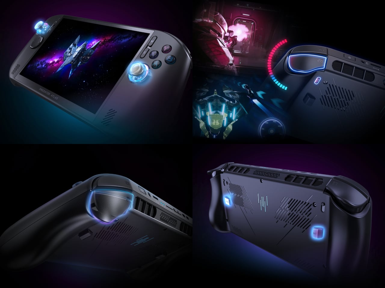
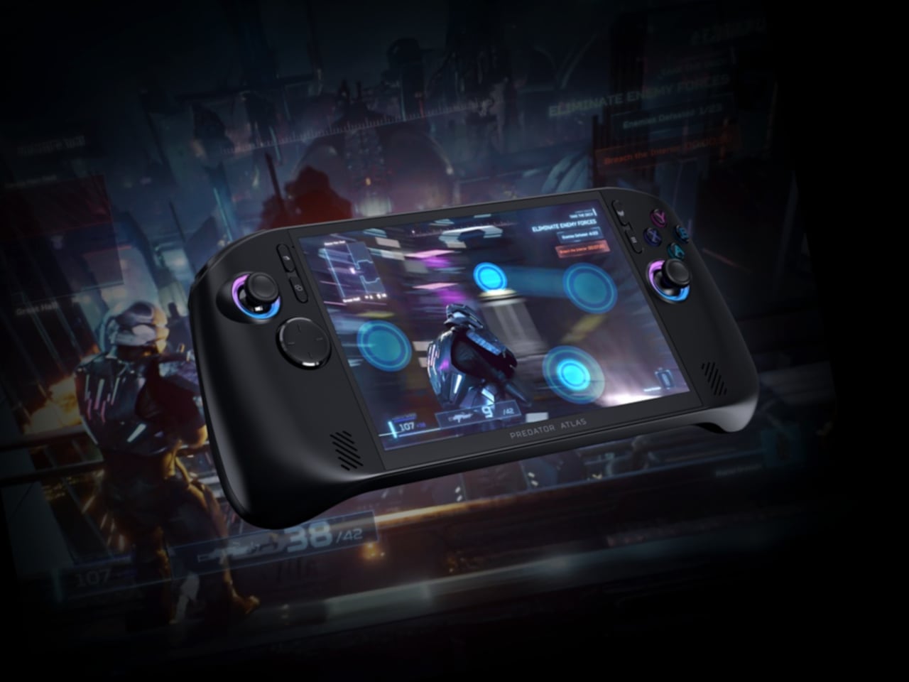
The cooling system is the headline. The Predator AeroBlade fan, a fixture in Predator laptops, makes its handheld debut here and brings a genuine first with it: the first metal fan in any gaming handheld. At 89 blades and just 0.1mm of thickness, it delivers up to a 10% increase in airflow compared to a plastic equivalent. A second plastic fan works alongside it, with Vortex Flow tuning directing air through angled internal channels so heat exits faster.

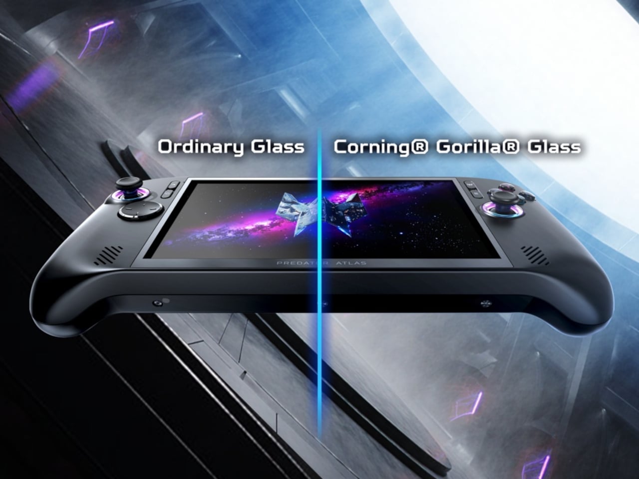
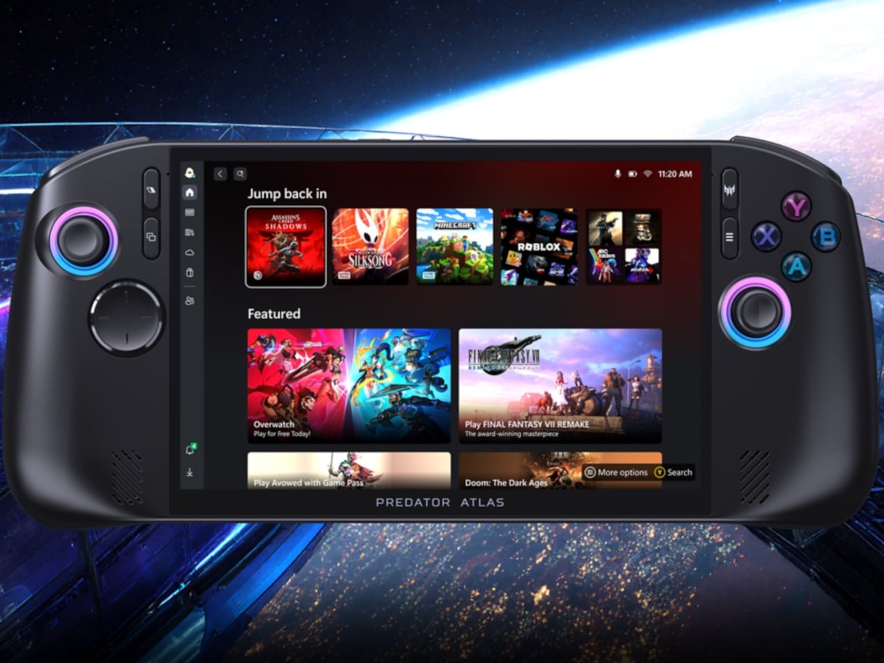
The display is a 16:10, 8-inch WUXGA panel running at 120Hz with Variable Refresh Rate (VRR) support and 500 nits of peak brightness. Corning Gorilla Glass Victus with DXC covers glare and scratch resistance for outdoor play. Audio runs through dual 2 W speakers with DTS:X Ultra, and dual microphones backed by Acer PurifiedVoice AI noise reduction keep voice chat clean even when the game gets loud.

The top configuration pairs the Intel Arc G3 Extreme processor with Intel Arc B390 graphics, adding ray tracing support and Intel XeSS 3 AI-powered upscaling to sustain high frame rates during heavy GPU workloads. Paired with an 80Wh battery and Intel Endurance Gaming, which balances frame rate against power draw dynamically, the Atlas 8 makes a credible case for longer sessions away from a wall without sacrificing visual quality.

The trigger system earns its own mention. A physical switch on each trigger toggles between two distinct response modes on the fly. Micro-switch mode provides an instant click suited to first-person shooters, while Hall-effect analog mode gives racing games and flight simulators the full pressure range they need. Switching between the two mid-session takes a moment, not a menu.

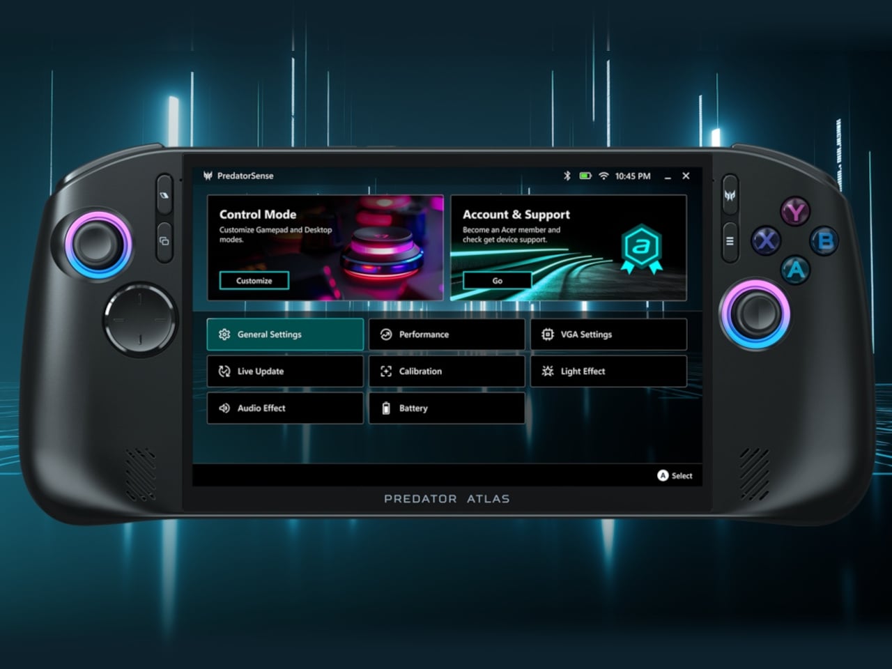
PredatorSense makes its handheld debut here, too. The app, which has been a cornerstone of Predator laptops for years, now sits behind a dedicated button on the device, bringing live system monitoring, performance modes, RGB lighting, and gameplay settings into one fast-access dashboard. XBOX Mode and an included XBOX Game Pass subscription reduce the friction of getting into a library of hundreds of titles from the first boot.

Memory reaches up to 24 GB of LPDDR5x, storage goes up to 1 TB via PCIe Gen 4, and the Atlas 8 weighs under 810 g with the larger battery. Dual Thunderbolt 4 ports, Intel Killer Wi-Fi 7, and Bluetooth 5.4 round out the connectivity. Pricing hasn’t been confirmed, but for a handheld that’s drawing from a decade of Predator laptop engineering, October 2026 can’t come fast enough.

The post Acer’s Predator Atlas 8 Is the First Gaming Handheld With a Metal Fan first appeared on Yanko Design.

Acer’s Aspire Go 15 Is the First Budget Laptop Built on Snapdragon C

Qualcomm’s Snapdragon processors have spent the past couple of years proving themselves in premium laptops, winning over skeptics with extended battery life and capable on-device AI. The architecture has benefited from that validation, but it has largely stayed in the upper tiers of the market, leaving mainstream buyers without access to the same platform. That split is exactly what Acer is addressing at Computex 2026.

The company announced two laptops at opposite ends of the price range: the Swift Spin 14 AI, a premium convertible running on Snapdragon X2 Series processors, and the Aspire Go 15, which holds a distinction of its own as the first laptop ever announced with Qualcomm’s new Snapdragon C processor. Together, they cover more of the market with ARM-based computing than any single product could manage alone.

Designer: Acer

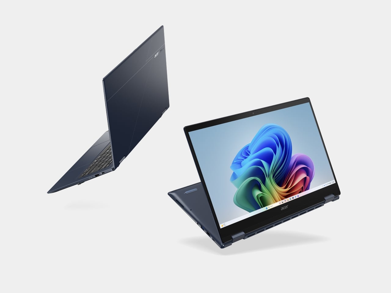
The Swift Spin 14 AI carries up to a Snapdragon X2 Elite processor paired with an 80 TOPS NPU, qualifying it as a Copilot+ PC with full on-device AI support. The 14-inch WUXGA IPS display runs at 120Hz and handles touch input alongside the included Acer Active Stylus 420, which uses Wacom AES 2.0 technology with 4,096 pressure levels and tilt detection for natural pen-on-screen writing and annotation.

The 360-degree hinge lets it shift between laptop, presentation stand, and flat tablet without swapping accessories. Weighing just 1.34 kg and measuring 15.9–16.5 mm thin, it fits in a small bag without much thought. The cobalt blue aluminum chassis is MIL-STD-810H certified, and the 65Wh battery is advertised to last up to 23 hours under video playback, with a 100W USB4 Type-C fast-charging option for quick power-ups between sessions.

The stylus parks in an onboard garage and charges for 100 minutes of use in just 30 seconds. The laptop connects via Wi-Fi 7 and Bluetooth 6.0, and the port lineup covers dual USB4 Type-C, dual USB 3.2 Type-A, and HDMI 2.1. Three microphones with Acer PurifiedVoice AI noise cancellation keep calls clear, while the 5 MP IR camera handles Windows Hello and automatic screen-lock for privacy.

The Aspire Go 15 carries a different kind of significance. Acer is the first PC maker to announce a laptop powered by Qualcomm’s Snapdragon C processor, a platform aimed squarely at the entry-level market. The 15.6-inch Full HD display and straightforward clamshell design target users who want reliable daily performance for browsing, documents, and streaming without the overhead or cost of a premium machine.

Acer also built post-consumer recycled plastic into the back cover and power adapter, packaged the whole thing in 100% recyclable materials, and earned both Energy Star certification and EPEAT registration. Wi-Fi 6E, dual full-function USB Type-C, and a 53Wh battery are positioned for all-day unplugged use. AcerSense manages battery and app settings, and the programmable Acer My Key provides one-press access to frequently used tools.

The Swift Spin 14 AI reaches EMEA in July 2026, North America in August, and Australia in Q3. The Aspire Go 15’s availability window hasn’t been confirmed yet, and neither laptop carries an announced price. Taken together, they mark a significant expansion in how broadly Qualcomm Snapdragon-based Windows computing now reaches, from someone signing contracts on a cobalt blue convertible to a student getting through the day on a tight budget.

The post Acer’s Aspire Go 15 Is the First Budget Laptop Built on Snapdragon C first appeared on Yanko Design.

Xiaomi 17 Pro Review: Refined in All the Right Places

PROS:


  • Capable camera setup with excellent 5x telephoto camera

  • Great battery life from the big 7,000mAh battery

  • Refined, premium design with rich color options

  • Bright, smooth display with strong eye-care features

CONS:


  • Telemacro mode is not especially sharp

  • Fingerprint sensor sits too close to the bottom edge of the display

RATINGS:

AESTHETICS
ERGONOMICS
PERFORMANCE
SUSTAINABILITY / REPAIRABILITY
VALUE FOR MONEY

EDITOR'S QUOTE:

The Xiaomi 17T Pro is a confident refinement of an already strong formula, pairing elegant design with excellent battery life and one of the best telephoto cameras in its class.

Xiaomi is bringing back its T series with the Xiaomi 17T and Xiaomi 17T Pro, but this time the schedule feels unusually aggressive. Instead of the typical September-style annual launch, the new models arrive only about six months after the 15T series. That shorter gap also brings the T series closer to the Xiaomi 17 and 17 Ultra launch window, which usually falls between late February and early March, making the company’s flagship lineup feel more cohesive across the year.

The Xiaomi 15T Pro was one of my favorite affordable flagships of the past year, particularly for its design and camera performance. So I was pleased to see that Xiaomi has not abandoned that formula. The design language remains largely the same, and so does the familiar triple camera setup.

Designer: Xiaomi

On paper, the Xiaomi 17T Pro still makes a strong case for itself. It features a 6.83-inch 144Hz display with peak brightness of up to 3,500 nits, a triple camera system with a 5x periscope telephoto camera, and a larger 7,000mAh battery with 100W wired charging. Continuing a partnership with Leica that is now in its fifth year, Xiaomi also introduces Leica Live Moment with the 17T series, adding a new layer of visual storytelling shaped by Leica’s photographic look.

I have been testing the Xiaomi 17T Pro for about a week to get an early sense of how this year’s T series performs. Even at this stage, it already feels like a phone that knows exactly what made its predecessor appealing. The question is not whether Xiaomi changed everything, but whether it refined the right things.

Aesthetics
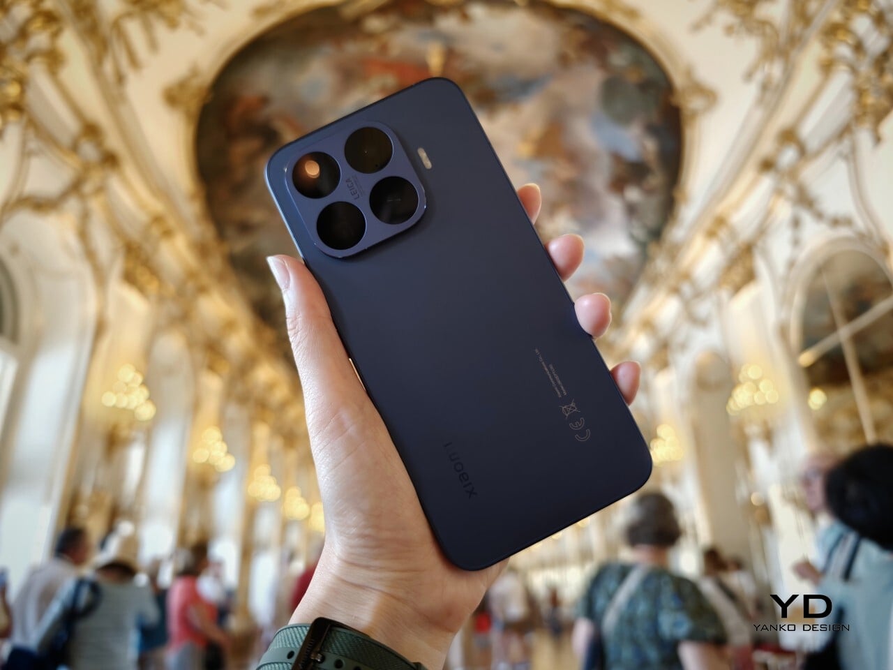
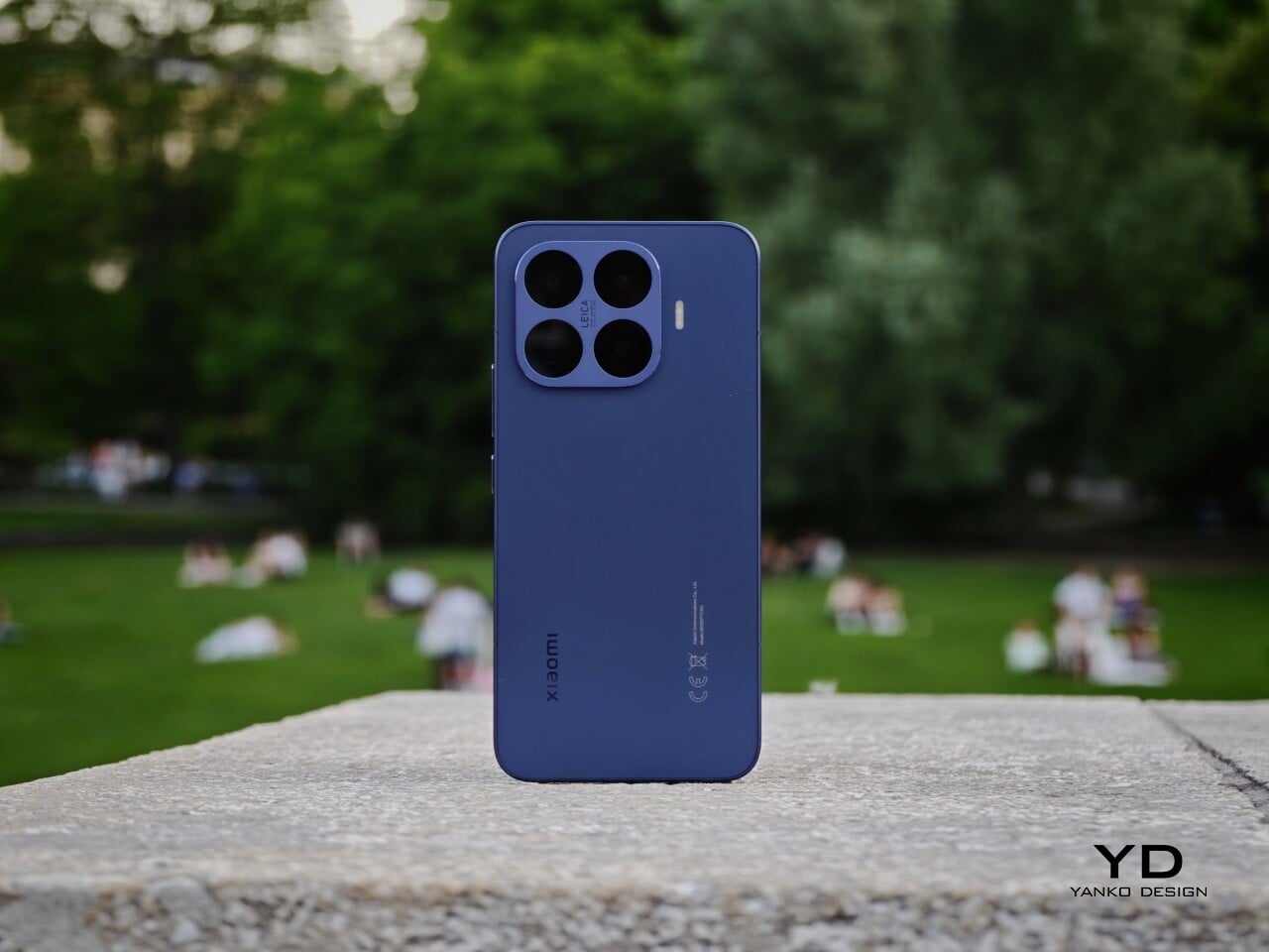
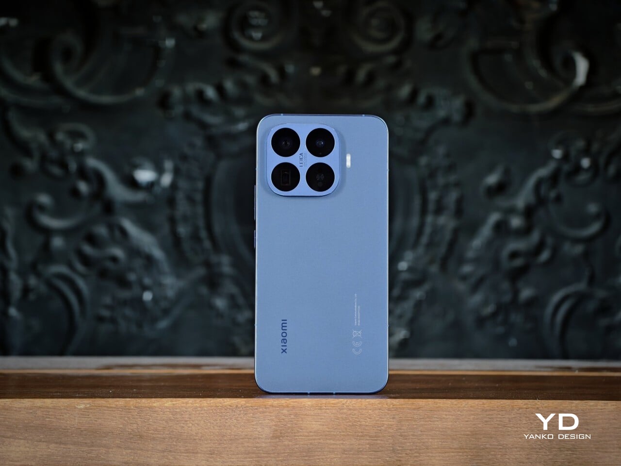
At first glance, the Xiaomi 17T Pro looks almost identical to its predecessor, and that is not a bad thing at all. When a design language already works, refinement can be more valuable than reinvention. Rather than chasing a dramatic visual reset, Xiaomi builds on a form that already felt resolved, keeping the same restrained character while sharpening the details that made the earlier model appealing.

What continues to make this T series design stand out is the way restraint is paired with color. The silhouette remains minimalistic, but it is lifted by finishes that feel subtle yet premium. Instead of relying on loud textures or flashy accents, the phone creates presence through tone, depth, and gentle shifts in light, giving it a more personal quality.

Compared to the 15T Pro, there is also a clear shift in the finish itself. The older model had more of a shimmer, while the 17T Pro moves toward a sheen finish instead. Both have their appeal. The shimmer of the 15T Pro feels lively and expressive, while the sheen of the 17T Pro feels smoother and more understated.
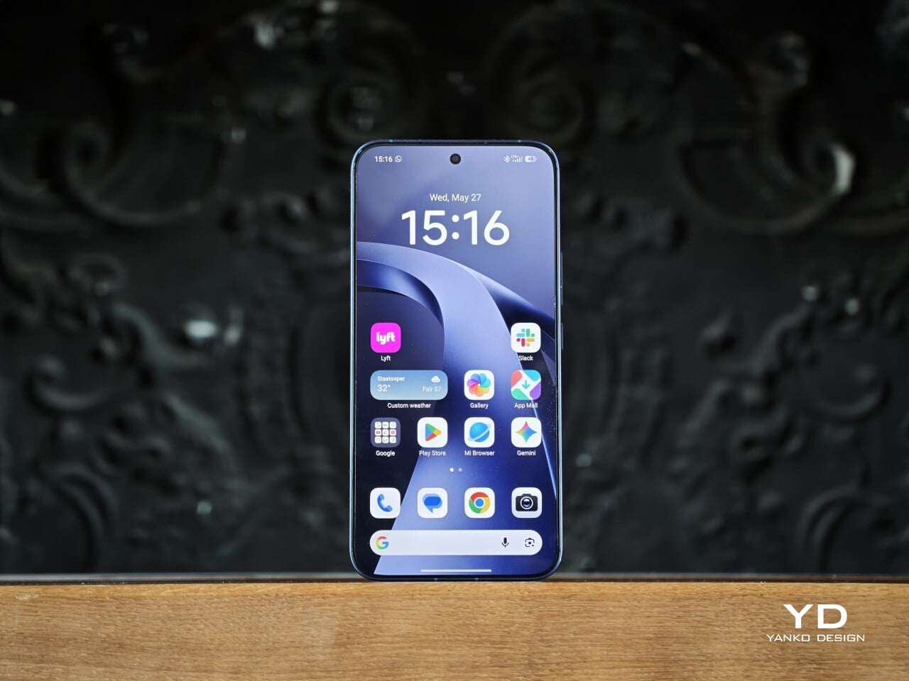
The Xiaomi 17T Pro comes in Deep Blue, Deep Purple, and Black. I received the Deep Blue variant, and it made the strongest first impression with its deep purple undertone, which adds richness and subtle variation depending on the light. Deep Purple feels a little warmer and more expressive, while Black is the most understated of the three, though it still has a deep navy undertone that keeps it from looking flat.

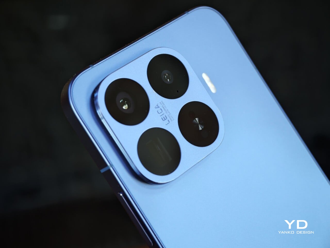
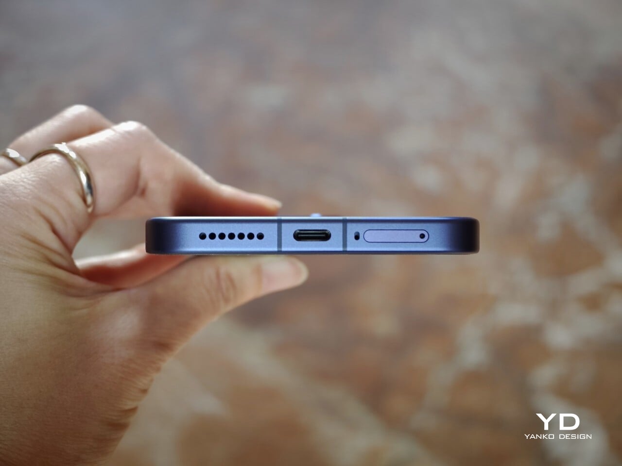
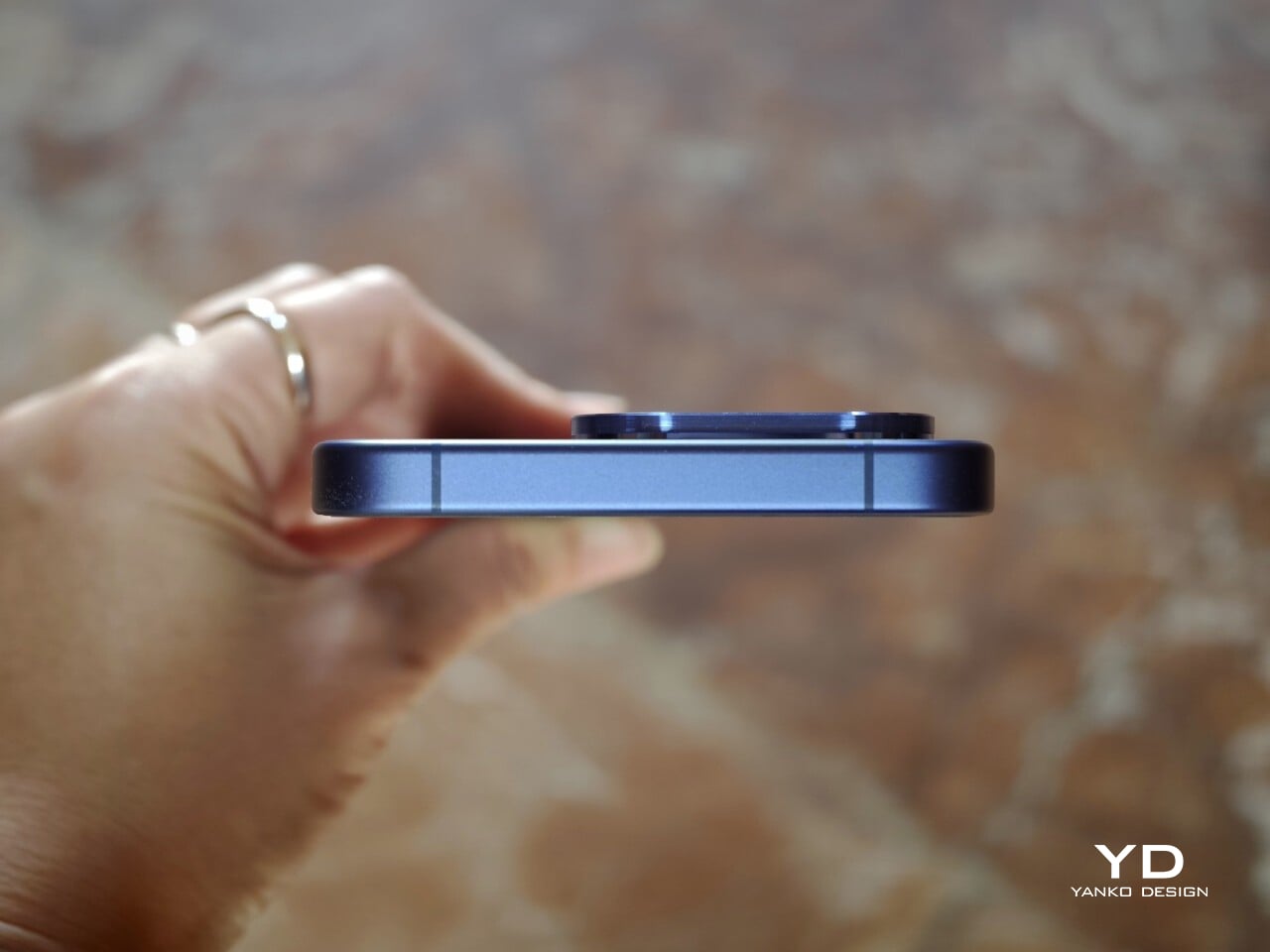
Another key part of the visual identity is the square camera housing, which is color-matched to the rest of the body. The continuous side frame and matching buttons also help the device feel more unified and architectural. The only minor distraction is the regulatory markings on the lower right of the back panel, which are a bit more noticeable than I would like on an otherwise very clean design.

Ergonomics

The Xiaomi 17T Pro remains close to its predecessor in both size and weight, measuring 162.2 x 77.5 x 8.25mm and weighing 219g. Those numbers are substantial, but they make sense for a phone with a 6.82-inch display, 7,000mAh battery, and a capable camera system. Given the hardware it packs in, Xiaomi has done a good job balancing flagship ambition with everyday usability.
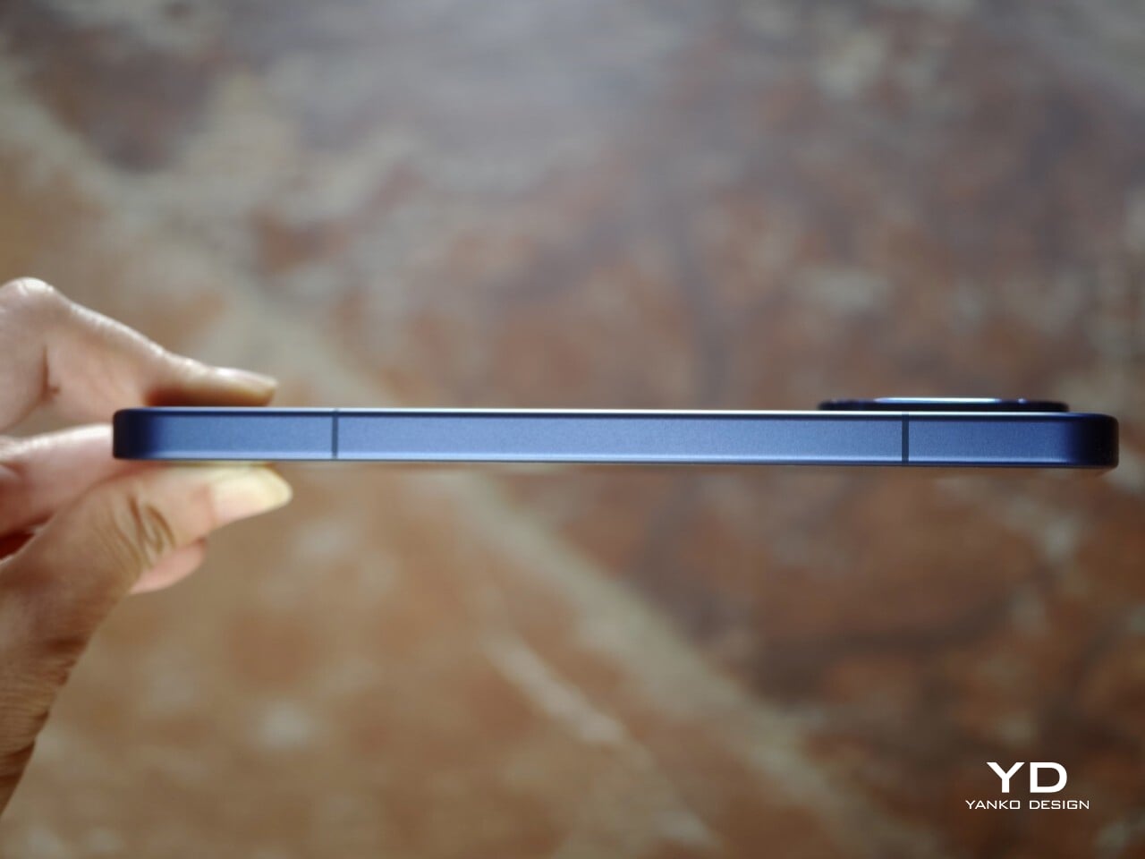
This is not really a one-handed phone unless you have large hands, but it avoids feeling awkward. The smooth pebble-like texture of the back panel helps here, making the phone feel softer and more natural in the hand. Combined with the frame and the gentle transitions from the back panel, the edges do not dig into the palm even when you are using it a little awkwardly with one hand. The weight is also well balanced, which makes the phone feel more controlled than its size might suggest.

One detail that could be improved is the fingerprint sensor placement. It sits quite close to the bottom edge of the display, which makes unlocking the phone feel a bit awkward at times. It is something you can get used to, but a slightly higher position would have felt more natural.

Performance

The Xiaomi 17T Pro feels fast and responsive in everyday use, which is exactly what you would hope for from a flagship built around the MediaTek Dimensity 9500. Paired with LPDDR5X RAM and UFS 4.1 storage, the phone has more than enough headroom for smooth navigation, quick app launches, and fluid multitasking. The phone runs Xiaomi HyperOS 3 based on Android 16 out of the box, and so far, the overall experience feels snappy and polished rather than overly busy.
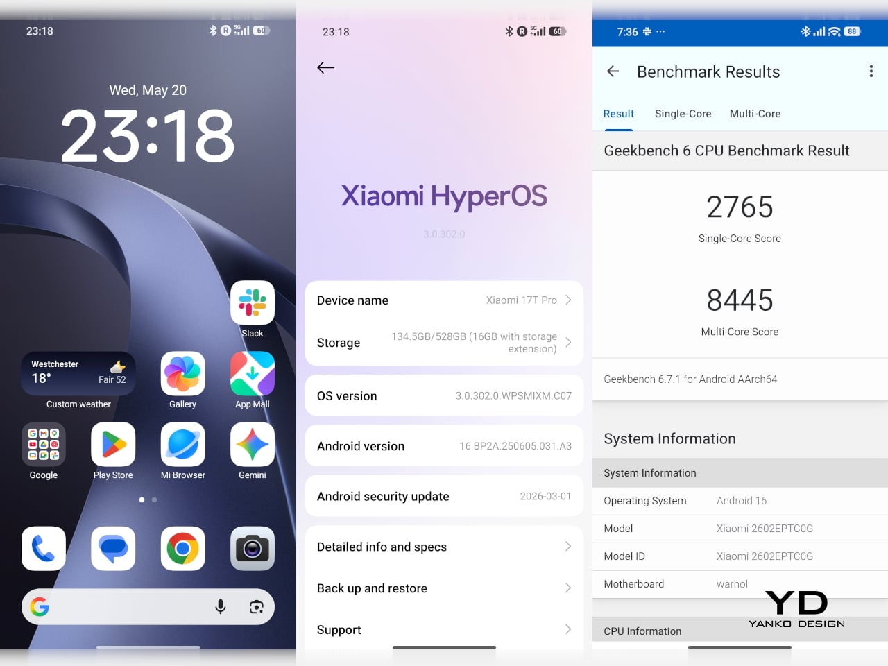
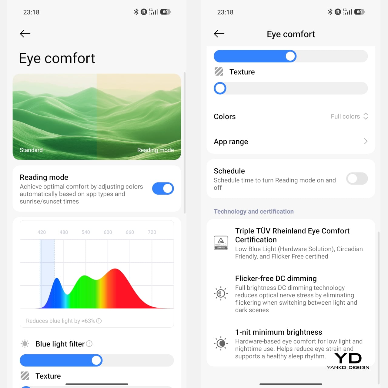
A big part of that impression comes from the display. The 6.83-inch AMOLED panel has a 1.5K resolution of 2772 x 1280, a refresh rate of up to 144Hz, and peak brightness of up to 3,500 nits. It also supports HDR10+ and Dolby Vision, which helps content look vivid and high contrast when the source material allows. Xiaomi includes both DC dimming and PWM dimming and introduces Xiaomi Vision Care with the 17T Pro. The 17T series is also the first in the industry to receive TÜV Rheinland quadruple eye care certification, including Low Blue Light, Circadian Friendly, Flicker Free, and Intelligent Eye Care, with the display designed to deliver a more comfortable viewing experience over longer sessions.
The camera system builds on what already worked well on the 15T Pro rather than trying to reinvent the formula. On the back, you get a 50MP main camera, a 50MP telephoto camera, and a 12MP ultra-wide camera, while the front houses a 32MP selfie camera. All three rear cameras carry Leica branding, and as usual, Xiaomi lets you choose between Leica Vibrant and Leica Authentic color profiles. I usually prefer Leica Authentic because it delivers that signature Leica look, though Leica Vibrant tends to work better for food photography, where a little extra punch can be welcome.

1x Main, Leica Authentic

1x Main, Leica Authentic
5x Telephoto, Leica Vibrant

The 23mm-equivalent main camera with its f/1.67 aperture takes great photos with a pleasing level of detail, good exposure, and a wide dynamic range in good lighting. Colors look realistic rather than overly processed, which gives the images a more natural feel. Low-light performance is also strong overall, with good detail retention and very little visible noise. It feels like a dependable main camera that can handle a wide range of situations without much fuss.

5x Telephoto

10x Telephoto

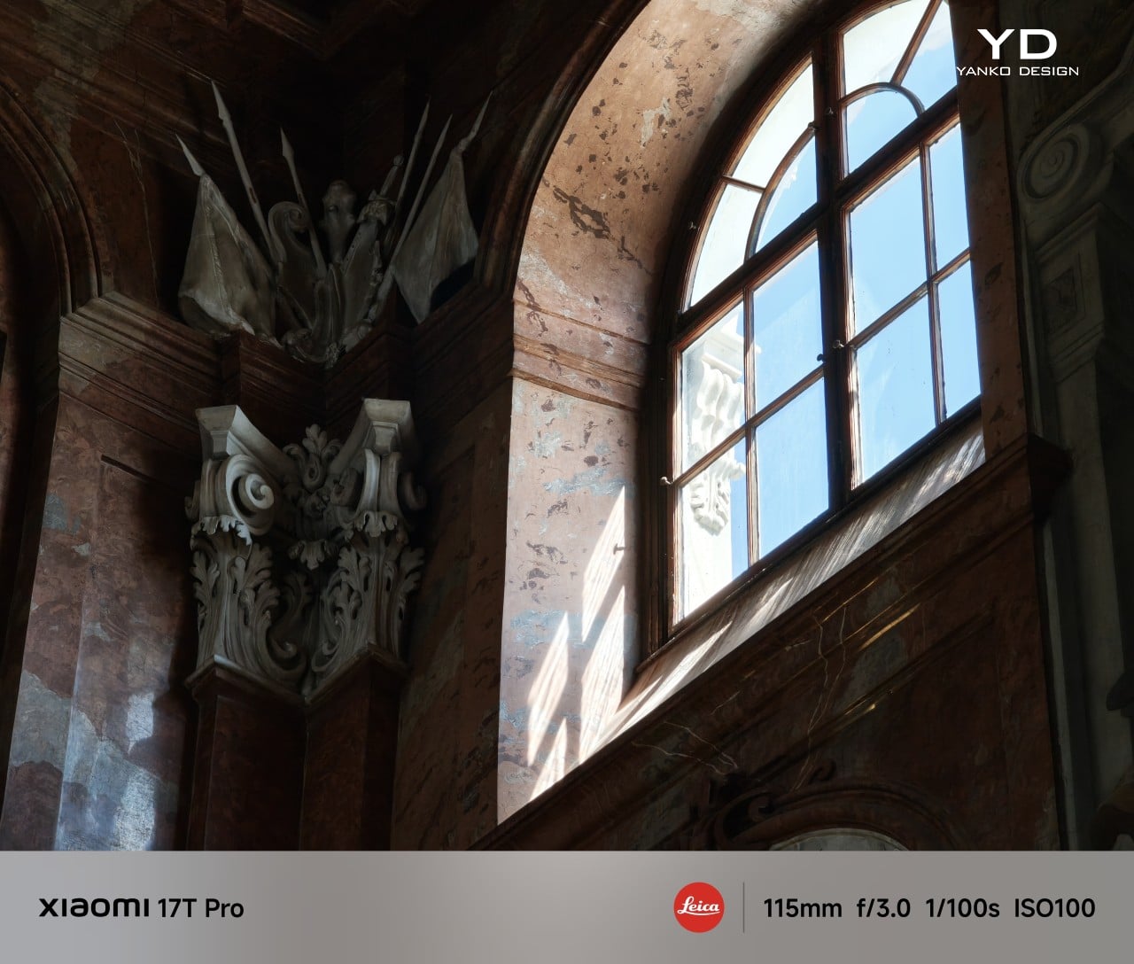
The 115mm-equivalent telephoto camera with its f/3.0 aperture is really the star of the show. It delivers shots with strong detail, good exposure, and a wide dynamic range, while color stays fairly consistent with the main camera. Even in low light or more difficult lighting conditions, it manages to hold onto detail impressively well. The telemacro mode is less convincing, though. It is not especially sharp, and with a minimum focus distance of 30cm, it does not let you get quite as close to the subject as I would have liked.

0.6x Ultra-wide, Leica Vibrant with Film Positive filter
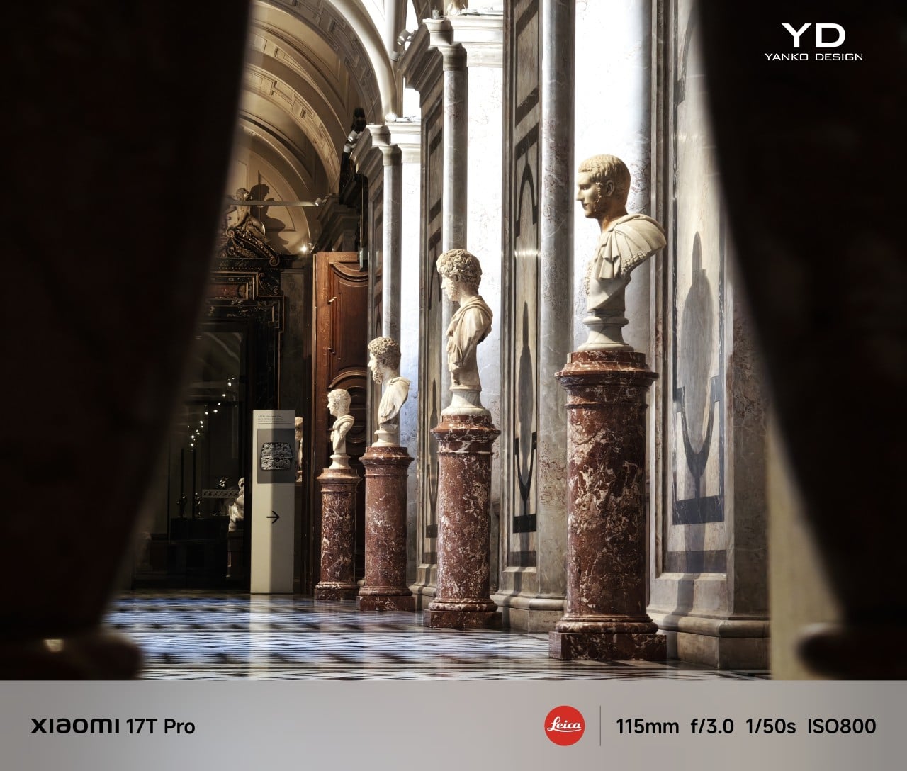
5x Telephoto, Leica Authentic

5x Telephoto, Leica Authentic

The 15mm-equivalent ultra-wide camera with its f/2.2 aperture and 120-degree field of view is the weakest of the three rear cameras, but it still delivers solid results. Detail can look a bit softer compared to the main and telephoto cameras, though dynamic range remains good, and the overall output is still perfectly usable. It may not be the standout lens in the system, but it does its job well enough for most casual wide shots.

Portrait mode is another strong point. You can choose between Master Portrait and Leica Portrait, and both styles deliver attractive results with natural-looking background blur. Subject isolation is consistently well judged, which helps portraits look polished without feeling overly artificial.

2x Main, Master Portrait
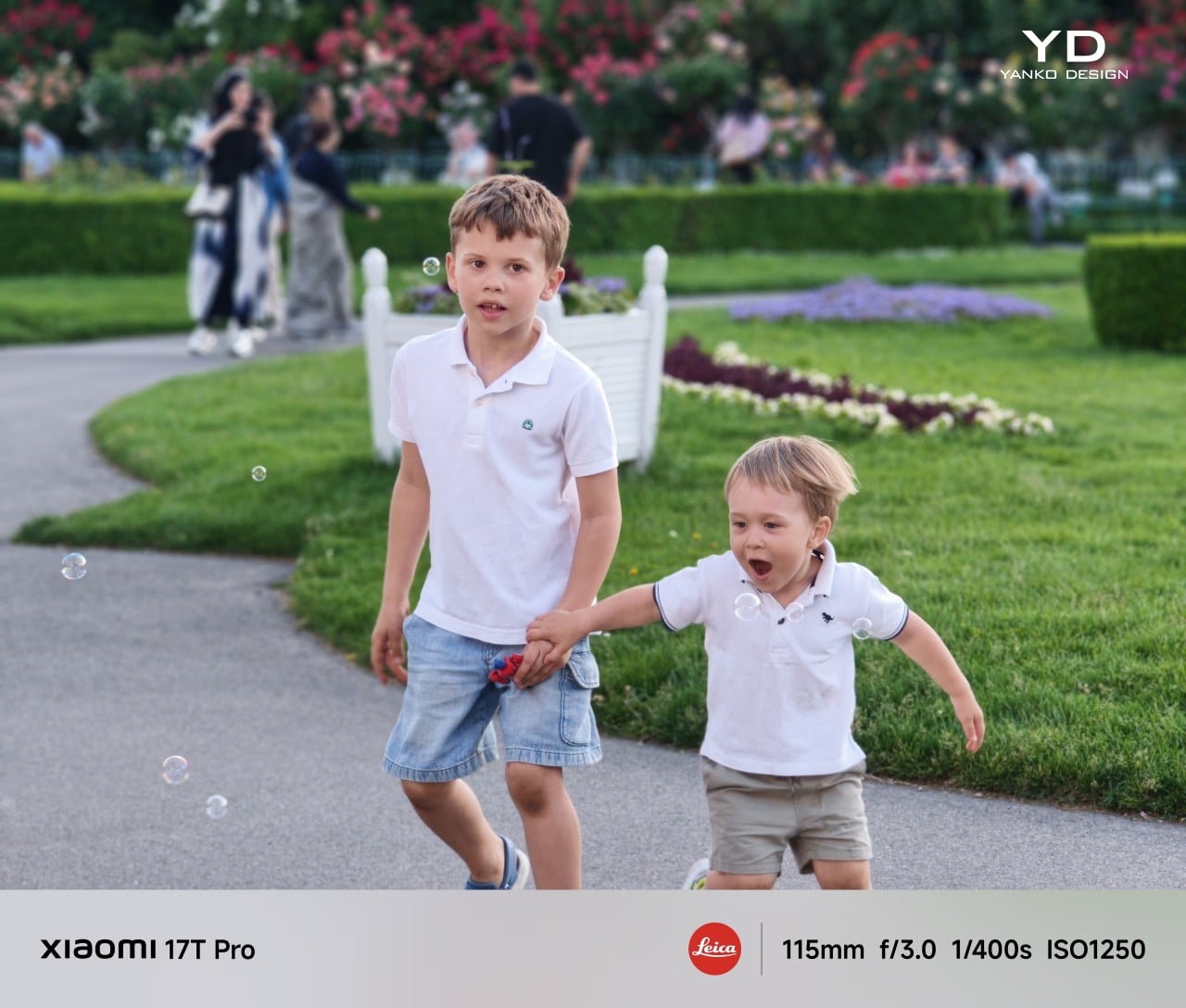
5x Telephoto, Master Portrait

5x Telephoto, Master Portrait

One of the more playful additions is Leica Live Moment, which lets you capture live motion photos with Leica color tone. I usually turn off live motion photos on most phones because the still image quality often takes a hit, and the moving portion can end up looking blurry. With the 17T Pro, though, I could clearly see the appeal.

It adds a little more story and spontaneity to the image, and the fact that it is available even in Portrait mode makes it more versatile than I expected. I tried it with kids, pets, a couple dancing, and an approaching train, all of which felt like good examples of where the feature makes sense. In those moments, it preserved a bit of movement and atmosphere that a still image alone would not fully capture. You do need to keep the phone fairly still; the motion portion can end up showing too much camera movement. Even so, when it works, it is a genuinely fun feature.

2x Main, Leica Vibrant with B&W Filter

Video is another area where the 17T Pro feels well-equipped. The main camera can record up to 8K at 30fps or 4K at 120fps. The telephoto and ultra-wide cameras are capped at 4K at 60fps, while the front camera tops out at 4K at 30fps. Xiaomi also lets you shoot in Log with all rear cameras, and there is a Movie mode that adds cinematic background blur for a more stylized look. Video quality has been very good across different lighting conditions on both the main and telephoto cameras, with wide dynamic range, solid exposure, and a generally polished result.

Battery size is one of the biggest improvements over the previous model. With its 7,000mAh silicon-carbon battery, the 17T Pro gives a reassuring sense of stamina that matches its large size, and it has felt great in day-to-day use. Even with a full day of heavy camera use, the phone was able to last the entire day, and with lighter use, it can easily stretch beyond that. It supports 100W wired charge, 55W wireless HyperCharge, and 22.5W wired reverse charge.
Sustainability

The Xiaomi 17T Pro makes a reasonable case for longevity through both durability and software support. It comes with an IP68 rating, Corning Gorilla Glass 7i on both the display and back panel, and a high-strength aluminum frame. Those details may not define sustainability on their own, but they do suggest a phone built to hold up well over time.

Xiaomi is also promising 5 generations of Android upgrades and 6 years of security patches, which gives the 17T Pro a longer life beyond the hardware itself. That matters because one of the most practical forms of sustainability is simply keeping a phone useful for longer. The 17T Pro may not radically change the sustainability conversation, but it does feel like a device designed with longevity in mind.

Value

The Xiaomi 17T Pro comes in three configurations: 12GB + 256GB, 12GB + 512GB, and 12GB + 1TB, with prices starting at 899 euros. That is 100 euros more than the 15T Pro, which is a noticeable jump for the series. It does make the 17T Pro feel a little less aggressively priced than its predecessor.
Still, the increase does not feel entirely surprising given the recent rise in memory prices. Xiaomi is also unlikely to be the only brand adjusting prices in 2026. With its larger 7,000mAh battery, refined design, strong telephoto camera, and solid software support, the 17T Pro still feels like a well-rounded flagship that offers good value overall.

Verdict

The Xiaomi 17T Pro does not try to reinvent what made the T series appealing, and that is exactly why it works. Instead, it takes the core strengths of the 15T Pro, including the restrained design, strong camera system, and flagship-like everyday performance, and refines them in ways that feel practical rather than flashy. The result is a phone that feels more mature than dramatic, but also more complete.

What stands out most is how balanced the overall package feels. The telephoto camera is genuinely excellent, the battery life is a major step up, and the design still has a quiet confidence that helps the phone stand out without trying too hard. There are a few compromises, of course. The ultra-wide camera is merely good rather than great, the fingerprint sensor sits lower than it should, and the higher starting price means the 17T Pro no longer feels quite as aggressively positioned as earlier T Pro devices.
Even so, Xiaomi has refined the right things. The 17T Pro feels like a phone that understands its own appeal and leans into it with confidence. It is not chasing attention with gimmicks or trying to prove itself through excess. Instead, it delivers the kind of thoughtful, well-rounded flagship experience that becomes more convincing the longer you use it, and that is what makes it easy to recommend.

The post Xiaomi 17 Pro Review: Refined in All the Right Places first appeared on Yanko Design.
XREAL’s $299 a01 Is Lighter and Brighter Than Its $450 Sibling

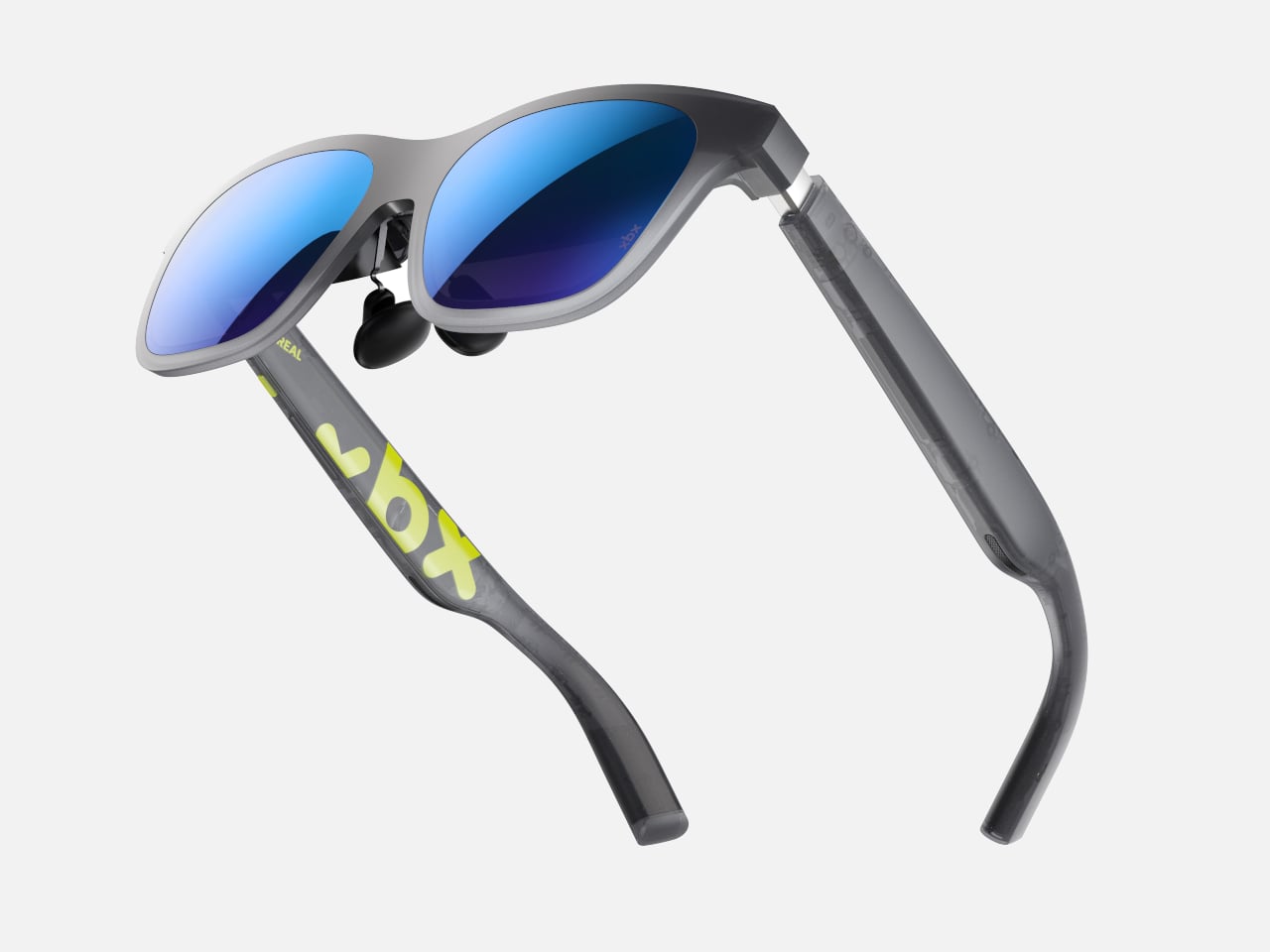
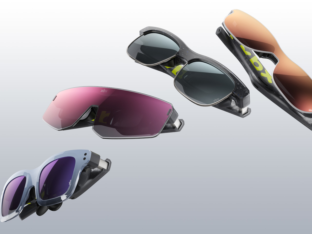
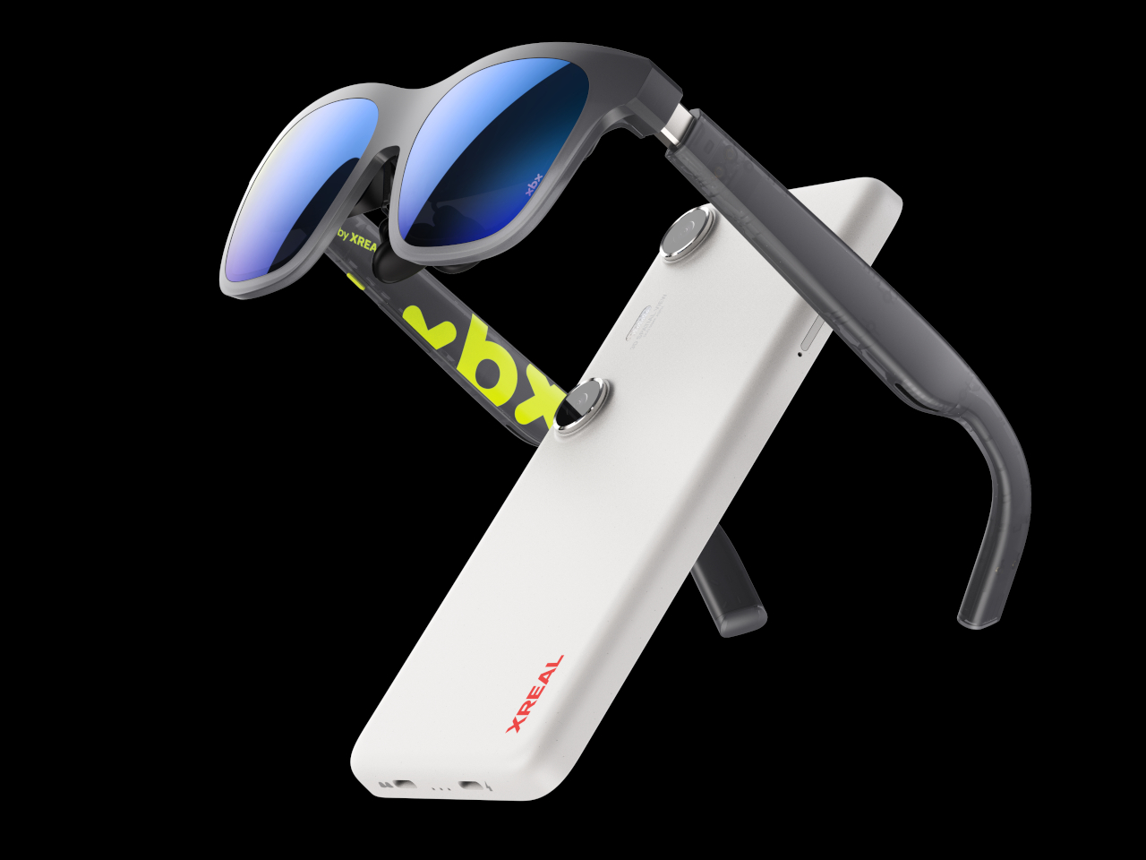
Xbox-branded gray sport sunglasses with blue mirrored lenses and curved arms, angled for a sleek athletic look

AR display glasses have spent years trying to convince a narrow audience that the experience is worth the money. The XREAL One starts at $450. The ROG XREAL R1 pushes past $800. For a category that promises a personal big screen you can carry anywhere, the entry cost has stayed high enough that most curious buyers talk themselves out of a first pair before they’ve had a reason to try one.

XREAL’s answer to that is xbx, a new sub-brand aimed at the hesitant first buyer, and its opening product, the a01, comes to the US in July at $299. The company is quick to note that the lower price didn’t come from cutting specs. The a01 holds two category records simultaneously: the lightest AR display glasses on the market at 62g, and the brightest at 1,600 nits, both beating the XREAL One it slots below.

Designer: XREAL

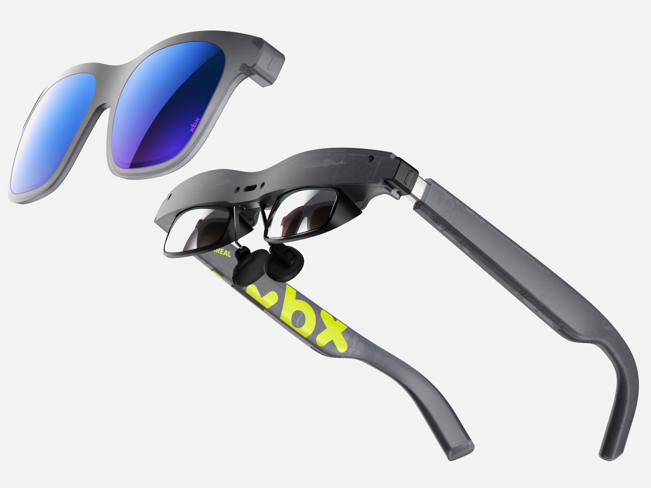
The 20g difference between the a01 and the XREAL One might sound minor, but it adds up over a long flight or a late-night watch session. XREAL reached that figure through a custom ultra-light nylon body, reduced lens thickness, and a redesigned hinge and temple-tip structure. Three nose pad sizes, adaptive elastic hinges, and flexible temples distribute pressure evenly across different face shapes.

Display performance is where the a01 goes further than a $299 product typically would. Dual-layer MicroOLED panels deliver 1,600 nits of perceived brightness across 1.07 billion colors with full HDR10 support, backed by a dedicated image enhancement chip that pushes every frame through real-time AI SDR-to-HDR conversion. The 50° field of view gives you the equivalent of a 147-inch screen from four meters away, which covers most rooms.

The most technically interesting addition is the spatial anti-shake algorithm, which XREAL claims is a category first. Earlier stabilization approaches reduced blur at the cost of image sharpness and washed-out colors, an acceptable trade-off in some contexts but not when you’re midway through a film. The a01’s algorithm preserves clarity and color fidelity while keeping the image steady, so a rattling subway car or a turbulent flight doesn’t turn a crisp picture into a smear.

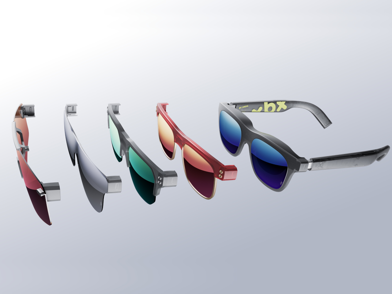
The interchangeable front frames add a layer of personalization that most display glasses skip. The semi-transparent body uses chromatic dimming to shift between transparent and immersive viewing depending on whether you want to stay aware of your surroundings or shut them out. Swap the front frame to match an outfit or a mood, and if you’re the tinkering type, XREAL has opened the design up for 3D printing your own.

Someone catching up on a show during a forty-five-minute commute, a gamer who wants a massive screen from their handheld without dragging a TV along, or someone watching a film alone in a shared hotel room all find a more credible device here than anything currently available at this weight and brightness level. The a01 doesn’t need a dedicated ecosystem either; connect it to a phone, a tablet, or a laptop, and it works.

The a01 is already on sale in China and hits the US in July at $299, sitting $151 below the XREAL One at comparable or better specs by the numbers that matter most: weight and brightness. For a category that’s been waiting for its mass-market moment, a product that leads on both counts at a genuinely accessible price makes a fairly hard case to ignore.

The post XREAL’s $299 a01 Is Lighter and Brighter Than Its $450 Sibling first appeared on Yanko Design.
Yamaha Just Bought a Fish and Made It Into an Amplifier

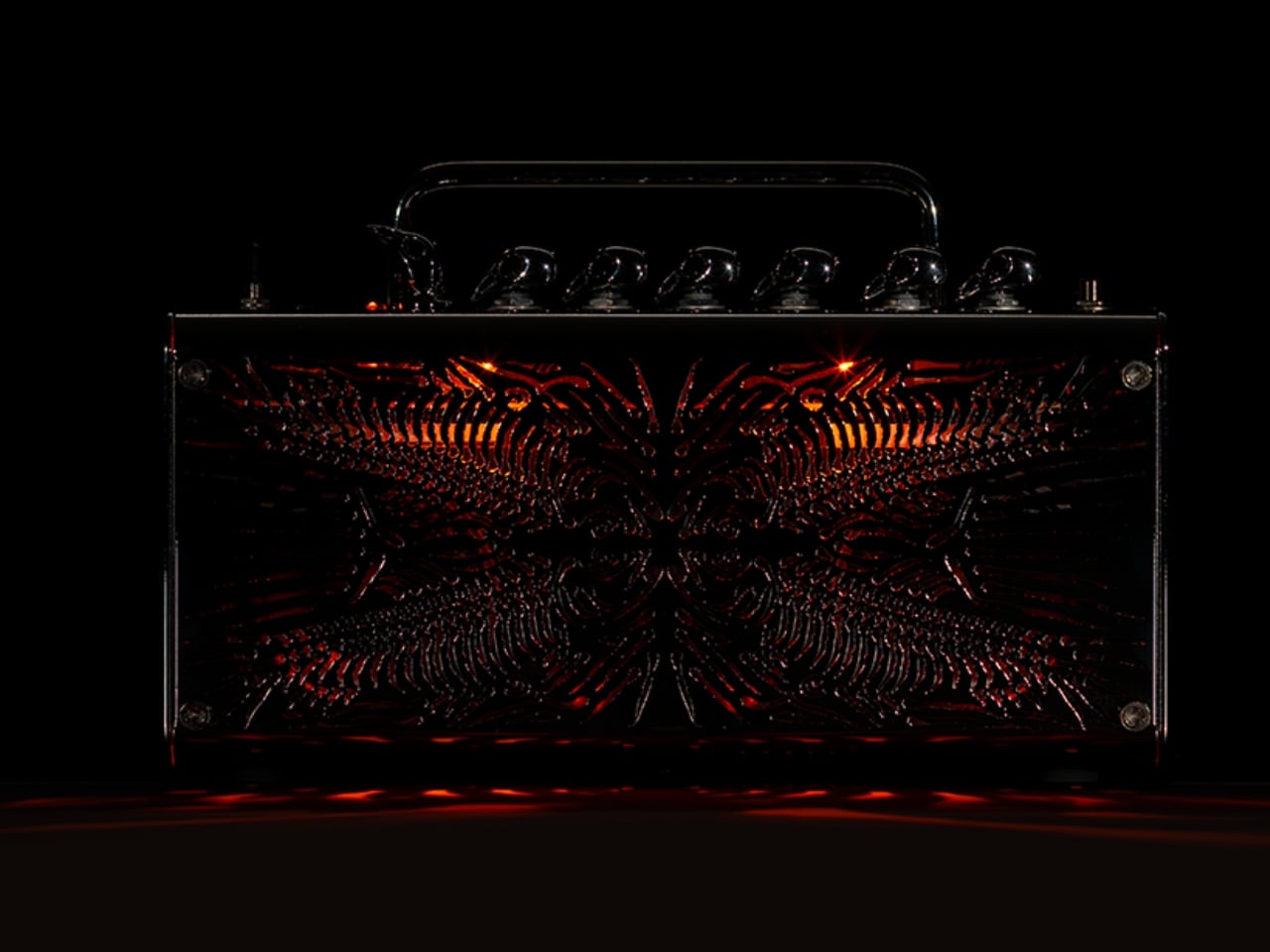
Somewhere between a fish market and Milan Design Week, a guitar amplifier became an animal. Yamaha’s HERRING, a concept piece by designer Koji Notomi, is based on the brand’s THR5 guitar amplifier, and it is one of those rare design projects where the idea is so clean, so quietly witty, that you almost feel like you missed something obvious the first time you looked at it. The joke, once you see it, is impossible to unsee.

The starting point was a question that most people never think to ask: where do design terms actually come from? The herringbone pattern is everywhere. You have seen it on jackets, hardwood floors, speaker grilles, and kitchen tiles. It is one of those visual shorthand patterns that has been repeated so many times it has practically lost its name. Notomi looked at it and wondered what would happen if you took that name literally. If a herringbone pattern is supposed to look like a fish’s skeleton, then why not make it actually look like one?

Designer: Koji Notomi

The answer became the front face of this amplifier. Notomi reportedly went to a fish market, bought a herring, dissected it, and drew its skeletal structure by hand before translating it into the final design. That part matters more than it might seem. It would have been easy to scan a reference image and apply it digitally, but the act of going to a market, handling the actual thing, and sketching it out by hand gives HERRING a different quality. You can feel the specificity in the final piece. The skeleton on the grille is not a decorative motif borrowed loosely from nature. It is anatomically observed, then mirrored and composed into something that functions simultaneously as a speaker cover, a relief sculpture, and a quiet act of homage to the fish it literally came from.

The knobs take the concept even further. In guitar culture, amplifier knobs with a pointed tip are commonly called “chicken-head” knobs. Notomi ran with that too. On HERRING, those knobs are exaggerated into sculptural bird-head forms that perch along the top of the amp like a row of tiny, knowing sentinels. Seen individually, they read as quirky hardware. Seen as a group, they complete the comedy of the whole piece without overpowering it.

That restraint is what makes HERRING work. It is a concept built on wordplay and zoological etymology, and it could have very easily tipped into novelty. It did not. The piece holds together because Notomi treated the humour as the entry point, not the destination. Visitors at Milan reportedly laughed when they noticed it, but quietly, the way you do when you feel like you have been let in on something rather than shown something.

There is also a broader observation baked into this project that I find genuinely interesting. Design language is full of terms borrowed from the natural world. Herringbone, chicken-head, dovetail, honeycomb, butterfly joint. We use these words constantly, and most of us stopped noticing the images inside them a long time ago. These names stuck because they once captured a visual truth, but over time the metaphor fades and the term becomes pure vocabulary. HERRING reverses that process, pulling the name back through its own etymology until the thing named and the thing itself become the same object. It is a rare kind of conceptual clarity, and it takes genuine intellectual curiosity to arrive there.

Whether HERRING ever becomes a production piece is a separate conversation. As a concept model, it functions perfectly well as a provocation: a reminder that the objects around us carry linguistic history that almost nobody stops to read. Koji Notomi stopped, dissected it quite literally, and built something that rewards the kind of slow attention that most designed objects never invite. It is playful, yes. But it is also a genuinely thoughtful piece of design thinking, and those two things are not in conflict here. If anything, the playfulness is exactly what makes the thinking land.

The post Yamaha Just Bought a Fish and Made It Into an Amplifier first appeared on Yanko Design.

REDMAGIC 11S Pro Review: Gaming Phone That Shows Its Worth, Literally

PROS:


  • Distinctive flat and boxy design with visible liquid cooling

  • Top-tier performance

  • Has rare 3.5mm headphone jack

  • Large battery with 80W wired and wireless charging

CONS:


  • No telephoto camera

  • No formal IP dust resistance rating

RATINGS:

AESTHETICS
ERGONOMICS
PERFORMANCE
SUSTAINABILITY / REPAIRABILITY
VALUE FOR MONEY

EDITOR'S QUOTE:

The REDMAGIC 11S Pro proves that a gaming phone doesn't have to apologize for what it is.

Most premium smartphones are converging toward the same design language: a glass sandwich, a growing camera island, and a polished finish that looks good in press photos but feels indistinguishable from everything else on the shelf. The harder question has always been whether a phone can look genuinely different without feeling like a novelty, which gaming phones have always struggled to answer.

REDMAGIC has been building gaming-first phones since 2018, and the 11S Pro is the brand’s most coherent statement yet. It doesn’t try to disguise its identity with a mainstream-friendly exterior. Instead, it leans into its engineering, turning the cooling system and gaming hardware into the visual story. But does that actually work in its favor? We spend time with it if it’s truly a deliberate choice or just an accident.

Designer: REDMAGIC

Aesthetics

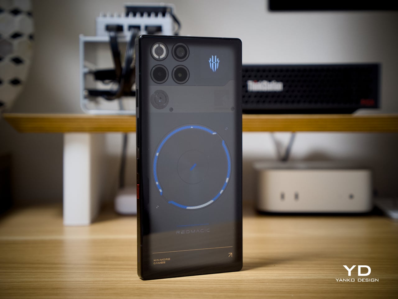
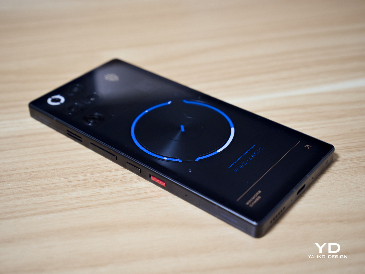
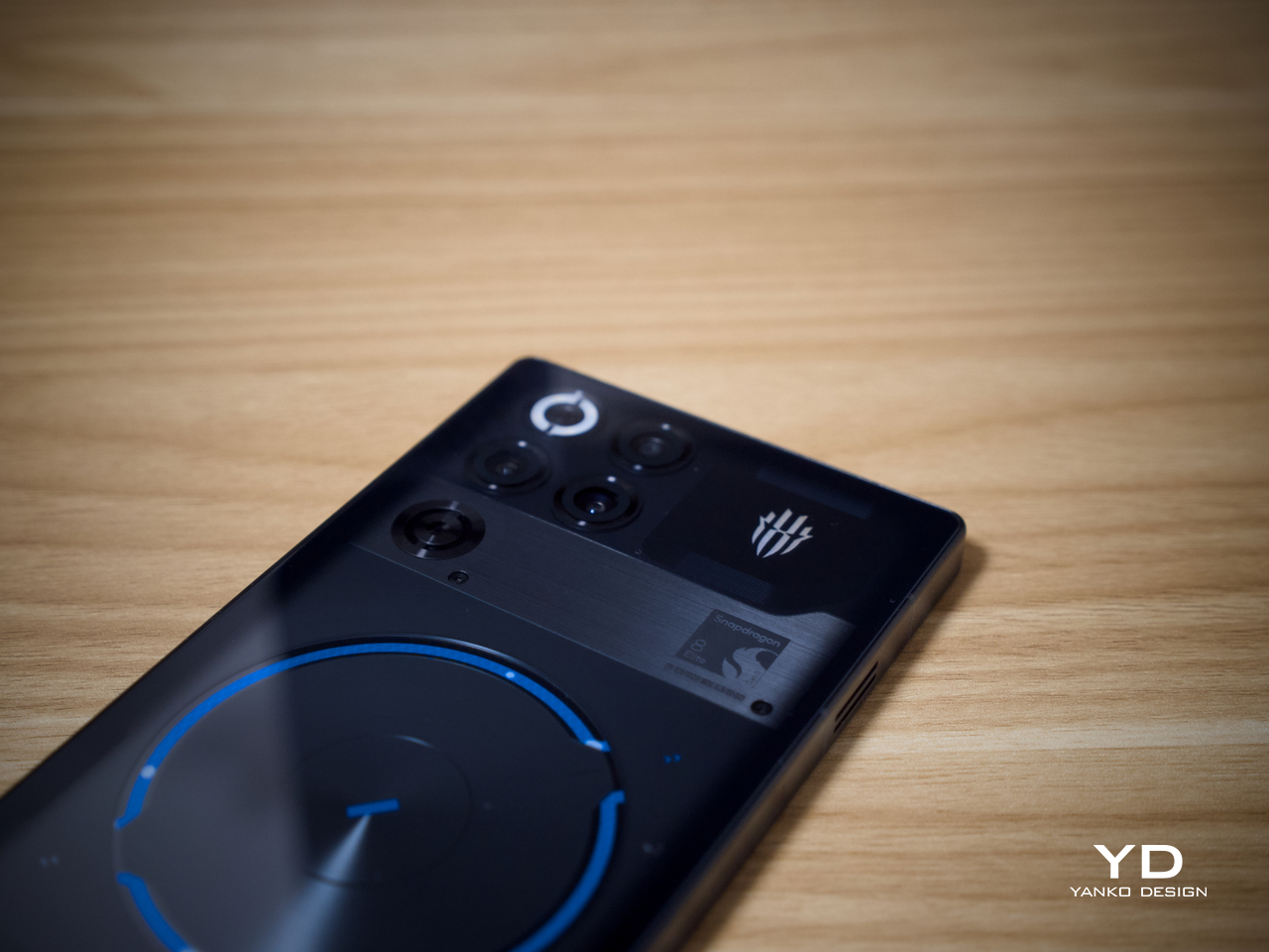
The first thing that stands out about the REDMAGIC 11S Pro is that it doesn’t look like anything else. The transparent rear in the Nightfreeze colorway exposes the internal structure, giving the phone a graphic, almost industrial quality. A large circular motif sits centered on the back, and blue accents run through the design with enough restraint to feel technical rather than theatrical.

The flat back makes an immediate impression. Without a protruding camera module, the rear reads as a unified composition. The camera cluster sits quietly in the upper corner, which keeps the visual hierarchy centered on the cooling hardware and transparent body rather than the lens arrangement. It’s a deliberate order of priority that gaming phones rarely manage to get right.

Of course, the real standout is that the visible liquid cooling system isn’t decorative at all. The AquaCore’s structure shows through the transparent body, meaning the design and engineering are the same thing. Most phones hide their thermal management entirely, but the 11S Pro treats it as something worth showing, giving the phone an architectural confidence that’s hard to ignore.

The Nightfreeze black colorway reads quietly, which is a little surprising for a gaming phone. The RGB lighting strip adds presence without being overbearing, and the blue accents feel more mature than typical gamer aesthetics. It’s a design that rewards a closer look rather than demanding attention from across the room, setting it apart from most flagships chasing the same polished minimalism.

Ergonomics

Holding the 11S Pro makes clear it’s a substantial phone, though not in a way that feels unintentional. The weight reflects the 7,500mAh battery and the active cooling system tucked inside, and the flat sides with squared-off edges create a secure, confident grip. It doesn’t try to disappear in the hand the way ultra-thin phones do, which feels appropriate given what’s inside.

In landscape orientation, which is where the 11S Pro truly comes into its own, the balance improves noticeably. The flat rear makes it easy to steady the device during long sessions, and the 520Hz capacitive shoulder triggers sit exactly where the fingers fall. If you’ve played competitive titles without a controller nearby, those triggers aren’t a nice addition. They’re a genuine advantage.

Performance

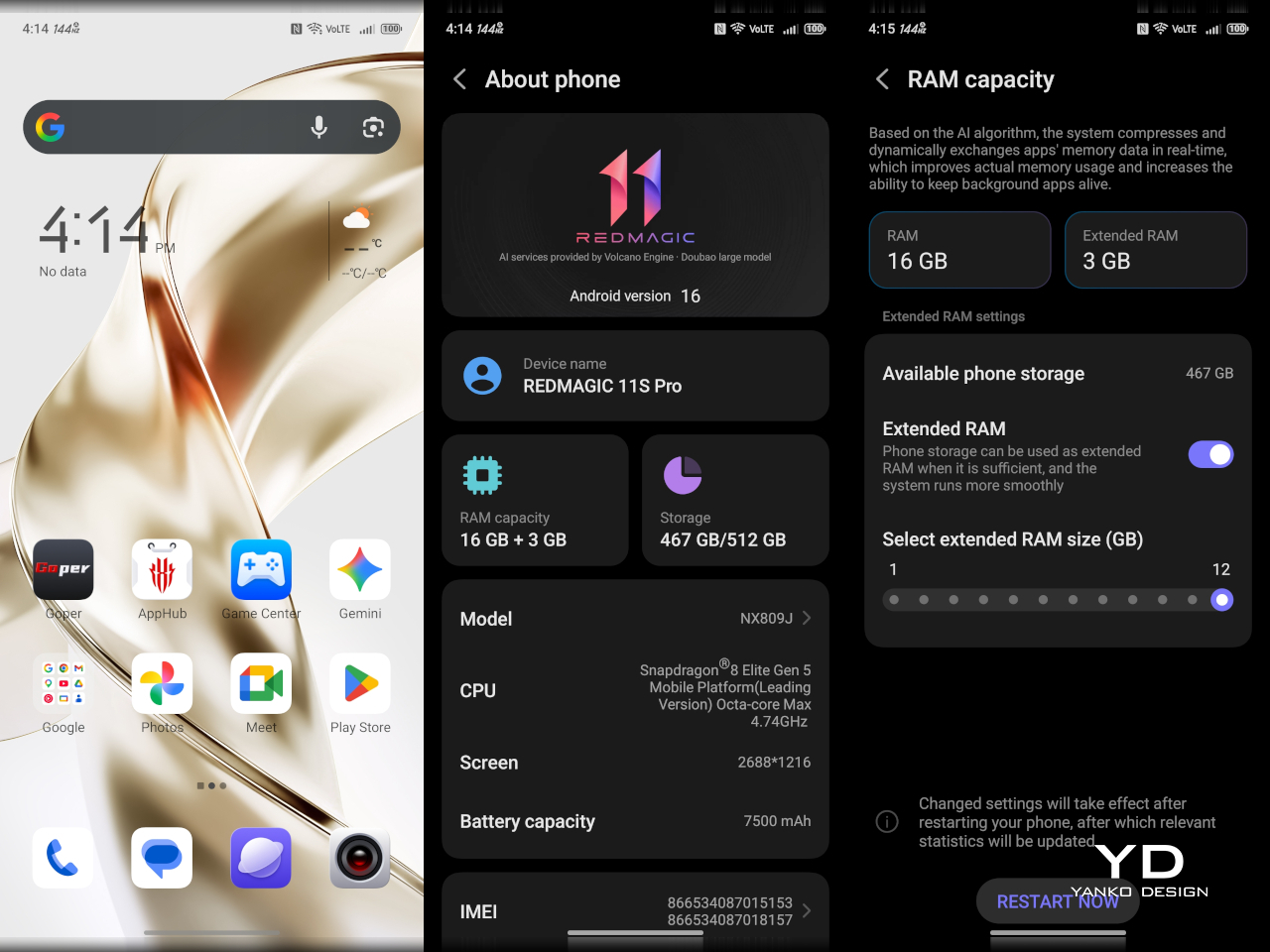
Under the hood, the REDMAGIC 11S Pro runs on the Snapdragon 8 Elite Gen 5 Leading Version, Qualcomm’s highest-binned variant of the chip, paired with the brand’s own RedCore R4 co-processor. Storage configurations go up to 16 GB of RAM, and the full package includes a 144 Hz AMOLED display and the AquaCore active cooling system, keeping performance from overreaching its own thermal limits.

The performance story here isn’t really about peak benchmark numbers. It’s about whether the phone can maintain that output through a two-hour ranked session or a streaming marathon without throttling back to catch its breath. In testing, the 11S Pro handles sustained workloads with a composure that most phones struggle to match, frame rates staying consistent, and the device never getting uncomfortably warm.

That’s largely down to the AquaCore cooling system, which combines a 13,116mm² vapor chamber, a built-in fan spinning at up to 24,000 RPM, and a liquid metal thermal layer. The fan operates below 30dB, so it’s audible but not distracting. What matters most is that the thermal management works as claimed, keeping temperatures controlled even through extended, back-to-back gaming sessions.

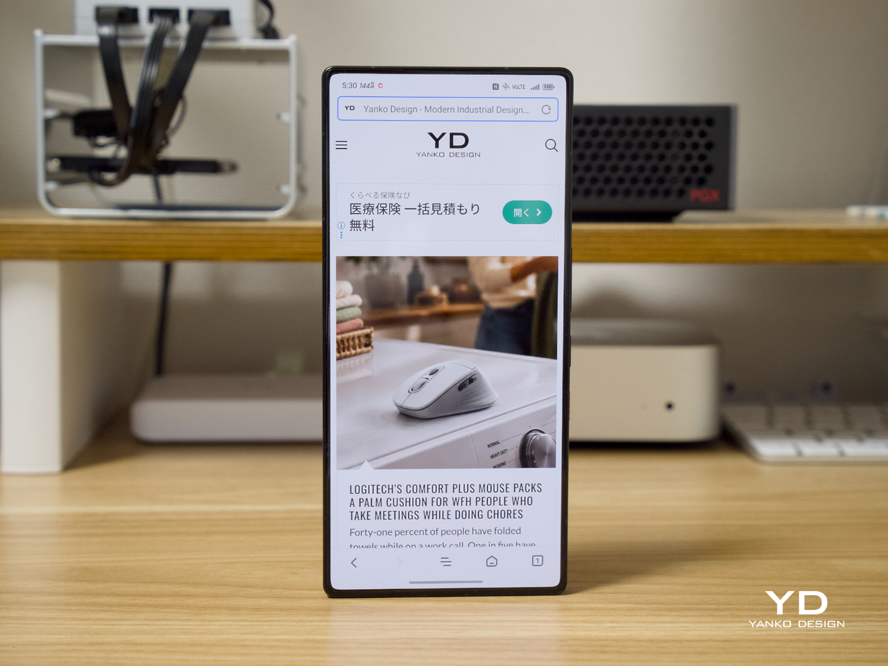
The 6.85-inch BOE X10 AMOLED panel is easy to understate. At a 2,688×1,216 resolution with a 95.3% screen-to-body ratio and a peak brightness of 1,800 nits, the display holds up in virtually any lighting condition. Paired with shoulder triggers and a retained 3.5mm headphone jack, the complete control package covers every input a serious mobile gamer could reasonably ask for.

Battery life is where the REDMAGIC 11S Pro makes a strong case beyond gaming. The 7,500mAh cell supports both 80W wired and 80W wireless fast charging, and endurance in mixed usage stretches comfortably into the following day. In FPS gaming at full frame rates, testing ran for several hours before significant drain, making the phone practical well outside a dedicated desk setup.

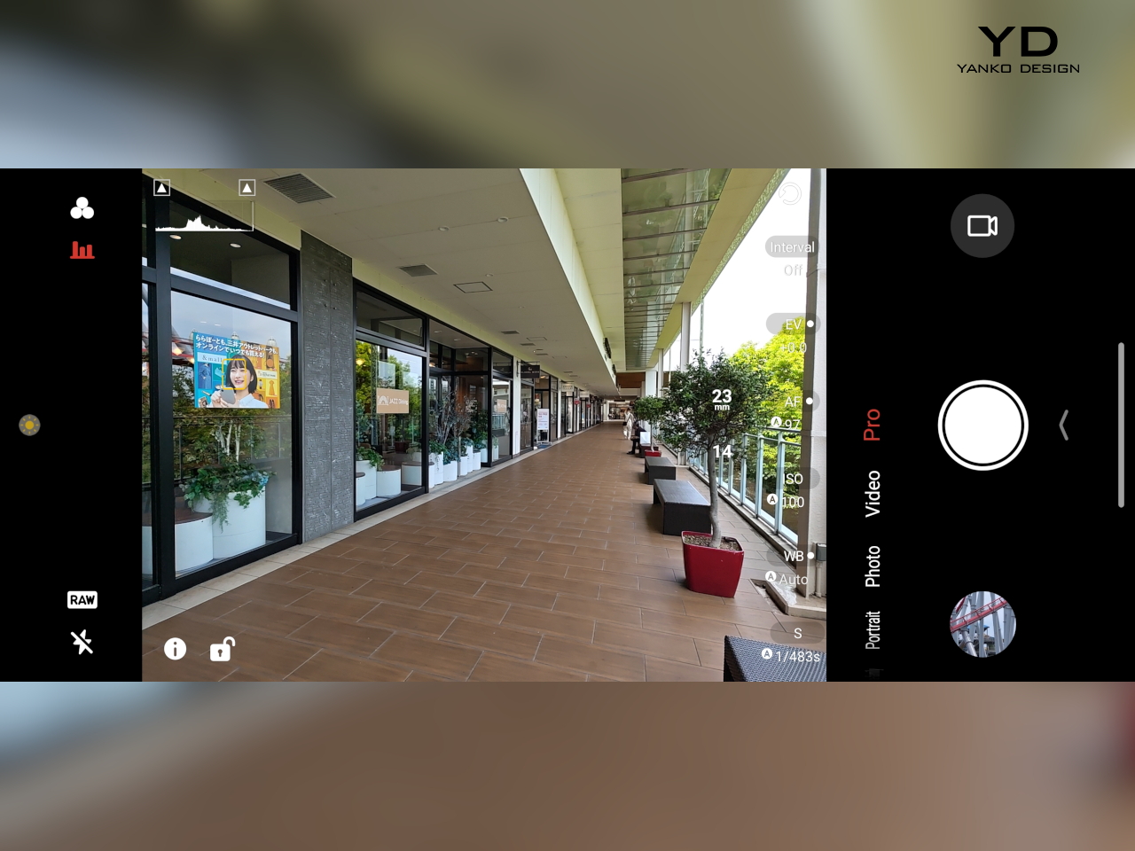
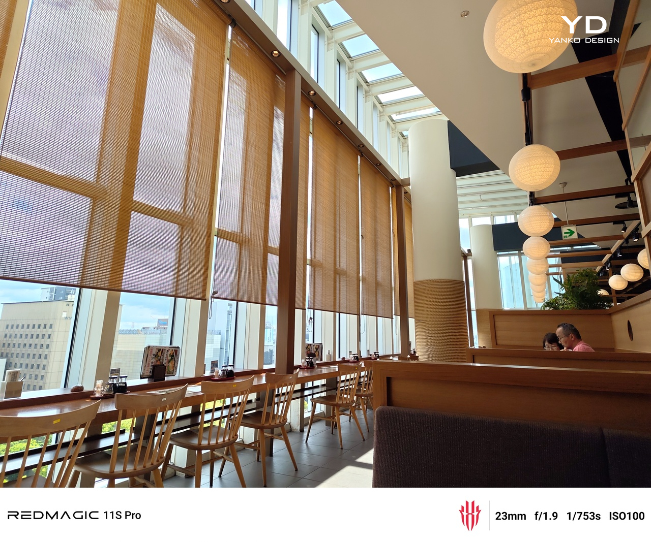
The cameras are capable, without being the main attraction here. The 50MP primary sensor with optical image stabilization delivers dependable photos in most conditions, and the 50MP wide-angle lens handles everyday shooting well enough. Low-light results are solid rather than exceptional, which is perfectly respectable for a phone that’s investing this heavily in sustained performance, active cooling, and battery endurance.

Sustainability

The REDMAGIC 11S Pro isn’t marketed as a sustainability story, and it doesn’t need to be. The aluminum alloy frame, Corning Gorilla Glass protection, and IPX8 water resistance contribute to a phone built to survive more than just a few drops. A dust-resistant design alongside full water resistance means the device holds up under conditions where most flagships would start showing wear considerably sooner.

There’s a longer-term argument here, too. Better thermal management means the internals aren’t running at temperatures that accelerate degradation. A 7,500mAh battery means fewer charge cycles per year compared to smaller cells. Combined with robust construction, the 11S Pro has a credible case for lasting beyond the typical two-year upgrade cycle, which is its own kind of sustainability without the marketing language.

Value

It’s worth considering what comes with the REDMAGIC 11S Pro as a complete package. The Snapdragon 8 Elite Gen 5 Leading Version sits at the top of the current chip hierarchy. The 7,500mAh battery with dual-mode 80W fast charging is a meaningful inclusion. Add a 144 Hz display, active cooling, shoulder triggers, a 3.5mm jack, and NFC, and the list leaves very little out.

Most premium phones ask buyers to make trade-offs: a thinner profile at the cost of battery life, a camera upgrade at the cost of gaming performance, or a mainstream look at the cost of personality. The 11S Pro doesn’t follow that logic. The transparent design and visible cooling system aren’t decorative flourishes. They’re central to what makes the phone feel worth its position.

Buyers looking for a camera-centric flagship would feel better served elsewhere. But for anyone drawn to gaming performance, long battery life, tactile controls, and a design grounded in its own hardware, the REDMAGIC 11S Pro makes a concentrated argument. The trade-offs are real but narrow, and the things it does well, it does with enough clarity that the package feels specialized without feeling limited.

Verdict

The REDMAGIC 11S Pro is a refinement of an idea that’s been building for years: that a gaming phone doesn’t have to apologize for what it is. The AquaCore cooling, the transparent body, the shoulder triggers, and the sustained performance all point in the same direction. It’s a phone that knows its priorities and has the engineering to back them up coherently.

It won’t be for everyone, and it doesn’t try to be. That clarity is actually what makes it interesting as a design object. Gaming flagships often struggle to find an identity that doesn’t feel borrowed from PC hardware aesthetics or overstyled past the point of reason. The 11S Pro avoids both traps, and that’s harder to pull off than it looks.

The post REDMAGIC 11S Pro Review: Gaming Phone That Shows Its Worth, Literally first appeared on Yanko Design.

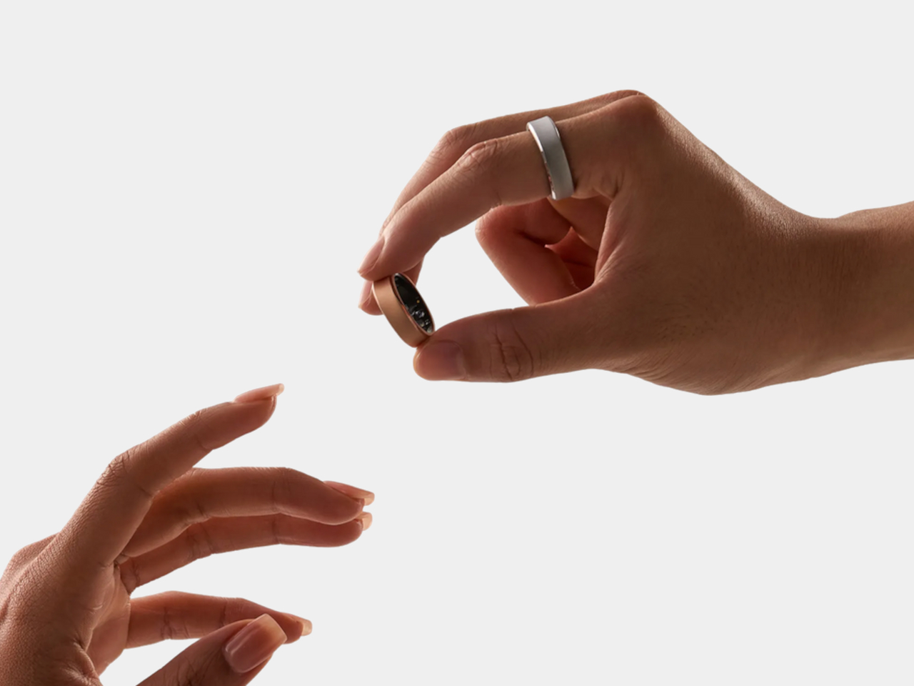
Smart rings just had their breakout week

Smartwatches have had an impressive run, but the category is starting to feel a bit crowded and tired. Most recent releases have been iterative, adding a sensor here or a display tweak there, while the core form stays essentially the same: a small screen on your wrist buzzing at you constantly. Consumers are starting to wonder what the next genuinely interesting chapter of wearables looks like.

It turns out the answer might be right on your finger. In one week during May 2026, the smart ring went from niche wellness accessory to the category everyone in wearables should be watching. Oura confidentially filed an S-1 with the SEC, RingConn opened pre-orders for its Gen 3, and fresh leaks in iOS 26 code reignited the idea that Apple might be circling the space.

Designer: Oura Ring, RingConn, Apple, Samsung

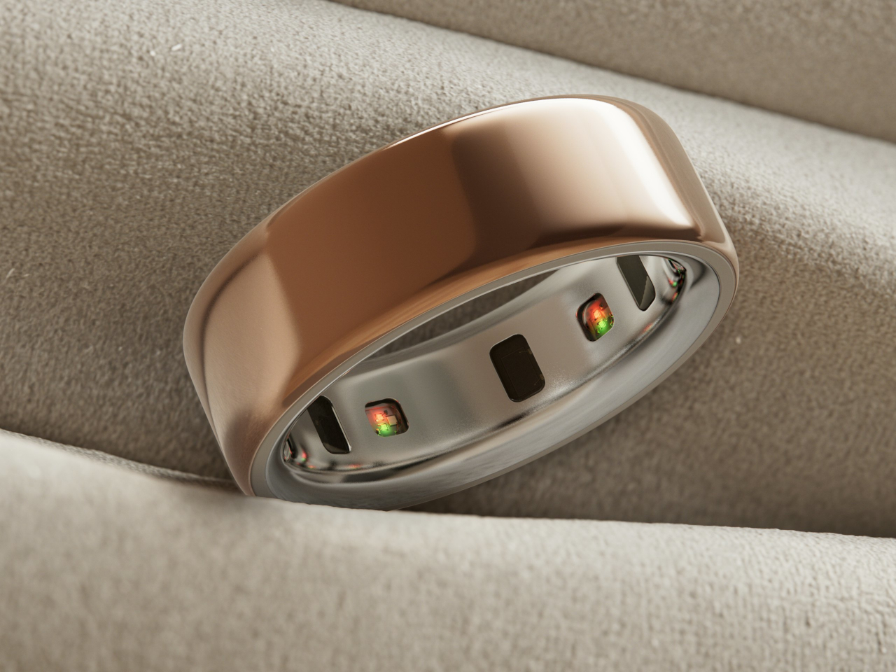
Part of what makes this moment feel significant is that it isn’t purely a business story. The smart ring’s appeal is rooted in something the smartwatch was never designed for: disappearing. A ring doesn’t have a screen demanding your attention, doesn’t buzz through dinner, and doesn’t get taken off at bedtime. For passive health tracking, especially overnight, the finger turns out to be a surprisingly elegant surface.

RingConn Gen 3

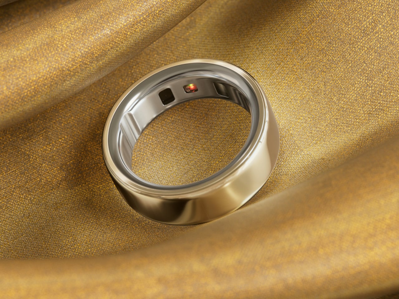
RingConn’s Gen 3 is the clearest hardware proof that the category is maturing. At $349, the titanium ring ships with a 14-day battery, vascular health tracking, and haptic alerts, all without a subscription fee. That battery figure alone is worth pausing on. A ring that only needs charging once a fortnight fits into daily life in a way that a device needing nightly top-ups simply doesn’t.

RingConn Gen 3

RingConn Gen 3

What RingConn’s launch really signals is a shift in the category brief. Buyers aren’t just asking whether a ring can track their sleep anymore. They want richer health data, meaningful feedback, and hardware that feels finished rather than experimental. Titanium construction, cardiovascular insights, and a no-subscription model together suggest that the smart ring has stopped apologizing for what it can’t do and started showing off what it can.

Oura’s confidential S-1 filing adds a different kind of weight to the week. Filing with the SEC isn’t something companies do casually. It means Oura believes the smart ring market is stable enough, scalable enough, and financially convincing enough to withstand public-market scrutiny. It’s also a signal that the subscription model, which charges users a monthly fee to access their own health data, has real staying power.

Oura Ring 4

That subscription debate cuts to something interesting about how these companies see what a smart ring is. Oura is essentially selling a sensor paired with an ongoing interpretation service. RingConn is selling a finished object you own outright. Neither is wrong, but the two approaches create very different relationships between wearer and device, and that relationship shapes every other decision the product team ends up making.

Then there’s Apple, which hasn’t confirmed anything but whose shadow is already affecting the conversation. References buried in iOS 26 code have fueled speculation that Cupertino is at least exploring a ring-shaped device, possibly one that ties into the broader Vision Pro ecosystem. Apple hasn’t shipped a ring yet, but its apparent interest alone changes how developers, investors, and competing hardware teams think about the category’s long-term potential.

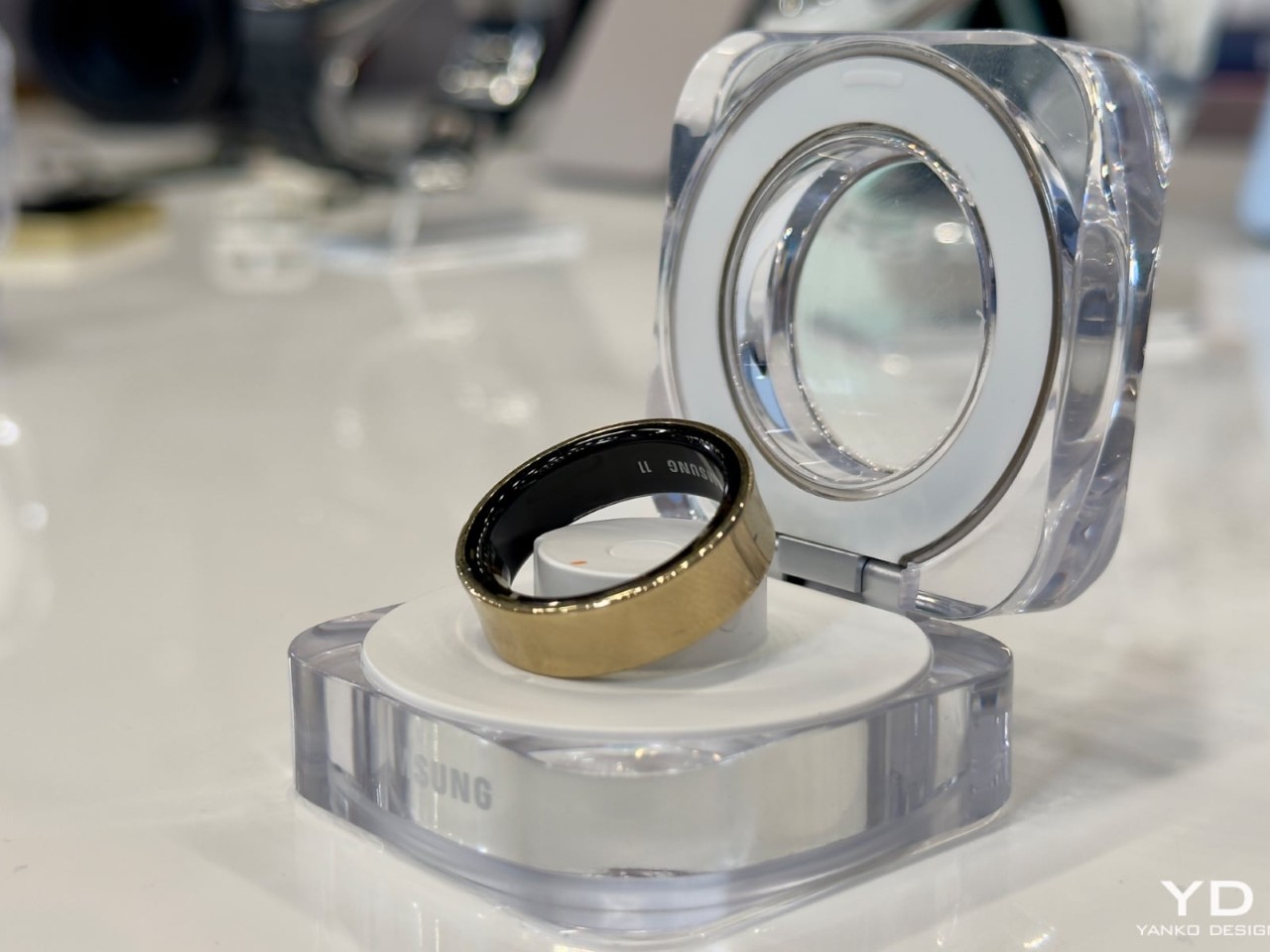
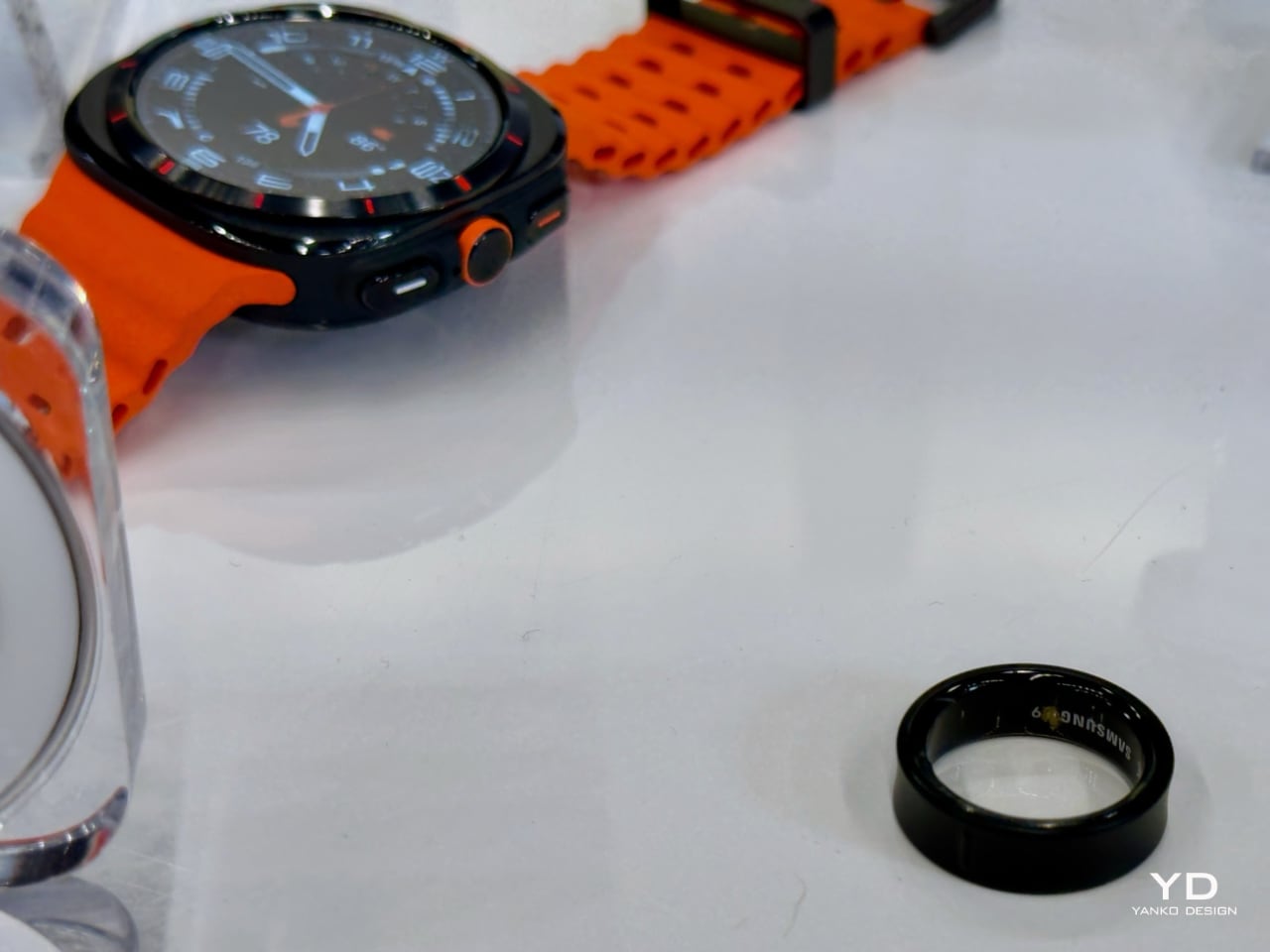
Samsung Galaxy Ring

The harder question, of course, is what comes next for a category that’s barely five grams and still trying to grow up. Blood pressure monitoring, non-invasive glucose tracking, and finer cardiovascular sensing are all on the roadmap, but they’ll demand even more from a form factor that’s already pushing the limits of miniaturization. Getting there without sacrificing comfort or wearability is the real design challenge ahead.

The post Smart rings just had their breakout week first appeared on Yanko Design.

Hermès Just Built a DJ Table in Mahogany and Cowhide

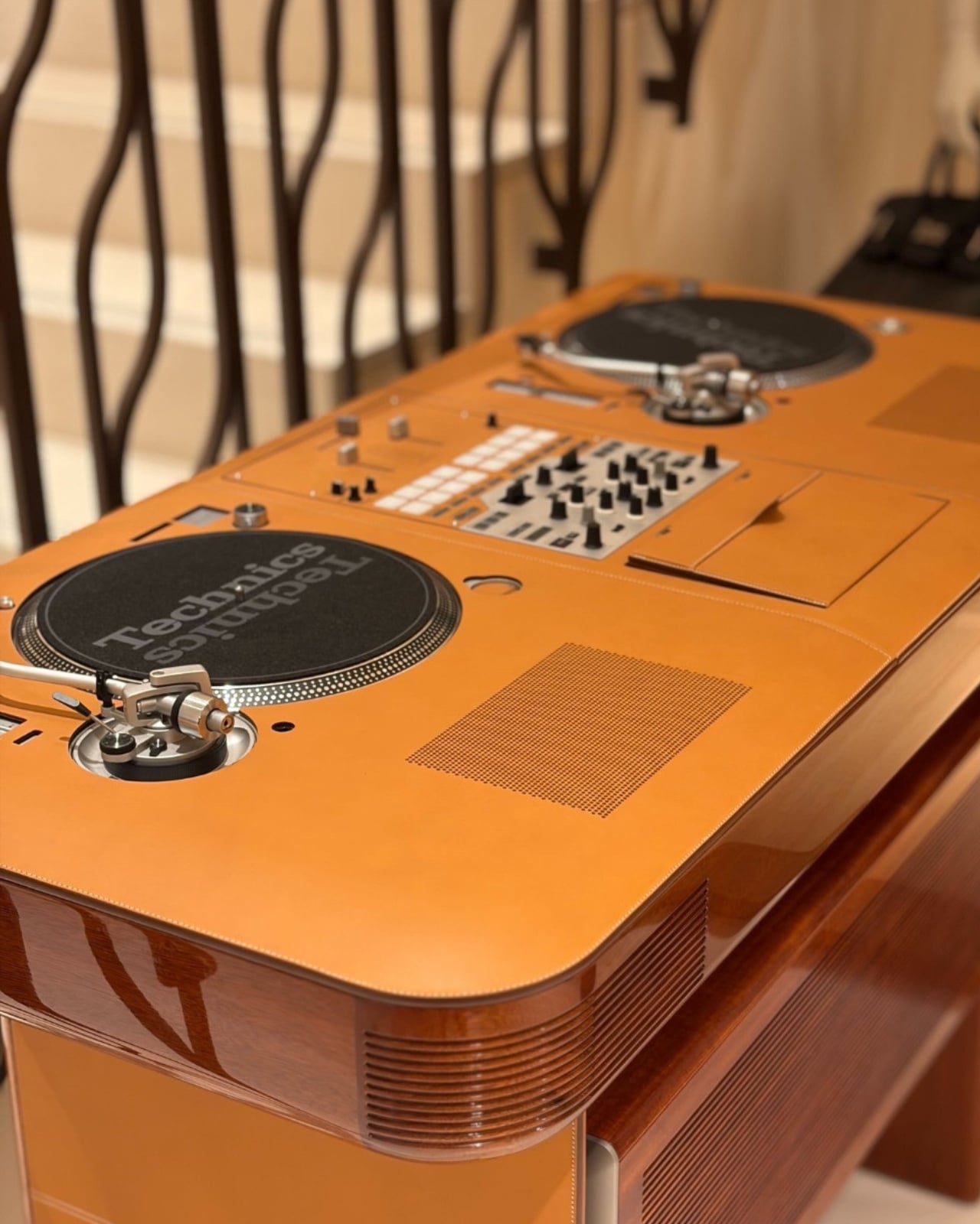
If you told me five years ago that Hermès would release a DJ table, I’d have assumed it was a joke told at a fashion party where nobody laughed. And yet here we are, looking at the Atelier Horizons Disque Jockey Club: a fully functioning DJ setup built in mahogany and wrapped in Pippa cowhide, with Japanese turntables fitted right in. It is, objectively, one of the most absurd and wonderful things I’ve seen come out of a luxury house in recent memory.

Let me back up a little. Atelier Horizons is Hermès’ bespoke workshop, run by creative director Axel de Beaufort. It exists in that rare space where the impossible meets the impeccably crafted. We’re talking leather-covered jukeboxes with Murano glass stands. Bespoke boomboxes. A birdcage bag that reportedly took three years to complete. The whole operation runs on one guiding principle: if you can imagine it and it can be made with extraordinary craft, Horizons will figure it out. What it is not, de Beaufort has made very clear, is a branding exercise. “We are not a branded company, we are craftsmen,” he’s said. And when you look at the DJ table, you believe him.

Designer: Hermès (photos from High Snobiety Design)

The Disque Jockey Club was developed in collaboration with British DJ Prince Charles (yes, that’s his actual name, and no, he is not a monarch). It’s fully functional, not decorative. The turntables are real, the mixer is real, and the whole setup performs exactly as a working DJ rig should. The French furniture craftsmen who built the wooden structure made sure of that. But it’s the material choices that make it so specifically Hermès: mahogany, warm and rich, paired with cowskin that has that unmistakable texture of something made to last several lifetimes. It doesn’t shout luxury. It doesn’t need to.

I’ll be the first to admit that a designer DJ table sits comfortably in the category of things very few people actually need. But I think that framing misses the point entirely. Atelier Horizons isn’t about need. It never was. It’s about the intersection of craft and desire, about what happens when a house with nearly two centuries of leather expertise decides to turn its attention toward a turntable. The result is less a product and more a provocation: what if the things we use to make music were treated with the same care and intention as the things we wear?

That question lands differently right now. We live in an era of disposable aesthetics, where everything from furniture to consumer electronics is designed to be replaced within a few years. The Hermès DJ table is the philosophical opposite of that. It’s an object that asks to be kept, passed down, maybe even argued over in an estate somewhere decades from now. There is something genuinely radical about that, even if the price tag ensures it lives in a very particular tax bracket.

All of this fits into a broader shift happening across luxury right now. The most interesting moves aren’t on the runway; they’re in spaces like this, where fashion houses start thinking like furniture designers, architects, and now apparently audio engineers. Hermès isn’t the only brand doing it, but they might be doing it with the most conviction. The Atelier Horizons pieces never feel like branded merchandise dressed up in leather. They feel like objects that had to exist, born from a genuine creative compulsion rather than a marketing calendar.

The DJ table is also, let’s be honest, wildly compelling on a purely visual level. The combination of dark mahogany and pale cowhide is exactly the kind of thing that photographs beautifully and looks even better in person. It occupies a room with quiet confidence and zero need for explanation. It’s not decorative in the way most luxury objects lean decorative. It’s still a working tool, one that just happens to look extraordinary while doing its job. You don’t have to be a DJ to want it. You don’t even have to own a record. You just have to appreciate the idea that craft, when taken seriously, can turn almost anything into art.

The post Hermès Just Built a DJ Table in Mahogany and Cowhide first appeared on Yanko Design.
ASUS V400 All-in-One Ditched Intel for Snapdragon to Stay Slim and Silent

All-in-one computers have always promised clean desks, but they rarely deliver a truly minimal presence. Traditional AiOs hide their processors inside their displays, and those chips generate enough heat to demand substantial cooling, adding bulk to what should be a space-saving device. The result is often a thick, monitor-shaped box that makes you wish the cables were the only problem.

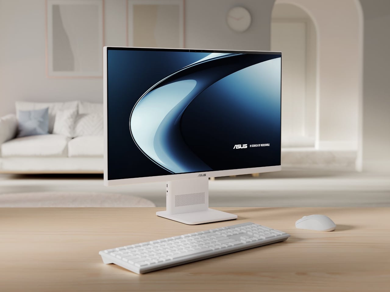
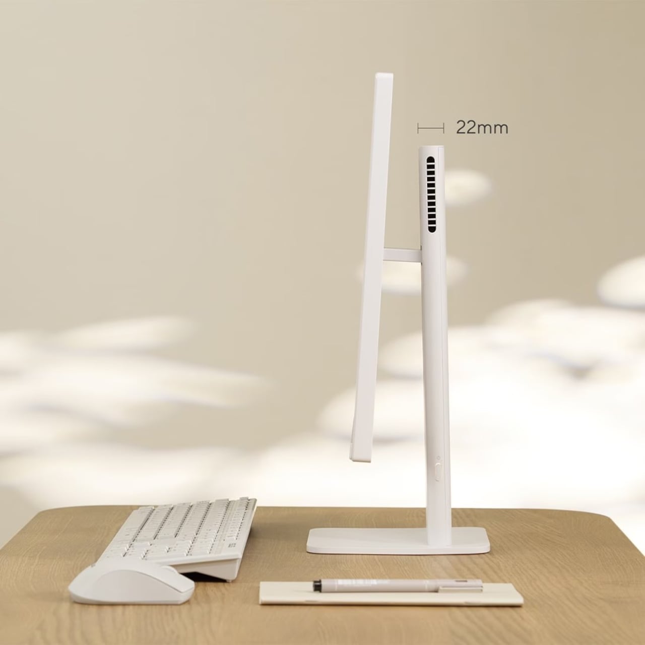
ASUS’s answer to that problem isn’t a slimmer chassis on paper, but a different processor choice entirely. The V400 AiO is the first all-in-one PC built on Qualcomm’s Snapdragon X platform, an ARM-based chip with mobile roots. Because it runs more efficiently than conventional desktop processors, it generates less heat, which means the cooling system can shrink significantly, and so can everything around it.

Designer: ASUS

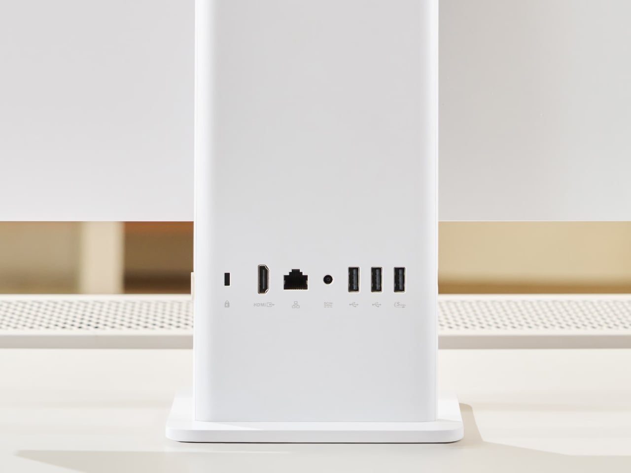
The lean stand and uncluttered rear panel make the V400 AiO look more like a monitor than a desktop. In a living room or study doubling as a homework station, it doesn’t demand attention the way a traditional AiO does. The quieter cooling helps too; no loud fans cycling up during video calls or while someone streams in the next room.

The 23.8-inch Full HD IPS display supports touch input and covers the full sRGB color gamut, making it comfortable for both casual browsing and creative work. With up to 32 GB of LPDDR5X memory and up to 1 TB of PCIe 4.0 SSD storage, it handles simultaneous tasks without hesitation. The 5-megapixel IR camera gives video calls a cleaner look than most built-in webcams manage.

The Snapdragon X’s 45 TOPS NPU qualifies the V400 AiO as a Copilot+ PC, meaning it runs Microsoft’s on-device AI features without routing anything through the cloud. Smart photo management, real-time voice processing, and intelligent assistance all happen locally, keeping personal data off third-party servers. For a machine that’ll likely sit in a shared family space, that kind of privacy has practical appeal.

Dolby Atmos handles the audio, which makes a difference when the V400 AiO doubles as an entertainment hub for the family. Connectivity includes HDMI output, USB 3.2 Gen 1 Type-A, and USB-C ports, covering most peripherals without adapters. A wireless keyboard and mouse ship in the box, so the whole setup can be up and running without hunting for extra accessories.

ASUS priced the entry-level V400 AiO at $649.99 in the US, with 16 GB of RAM and a 512 GB SSD. The Indian market gets a 512 GB model at ₹1,01,990 and a 1 TB version at ₹1,11,990. For an all-in-one that doubles credibly as a piece of furniture in a modern room, that starting point asks less than many Intel-powered competitors.

What the V400 AiO makes clear is that the Snapdragon X choice isn’t incidental. The chip’s lower heat output is why the chassis stays slim. Its efficient architecture is why the AI runs locally rather than through a server. Its quiet thermal profile is why it belongs in a living room as much as a home office. The processor determines the design, not the other way around.

The post ASUS V400 All-in-One Ditched Intel for Snapdragon to Stay Slim and Silent first appeared on Yanko Design.

This Dual-Sided Philips Monitor Lets You Share One Screen With Clients Without Sacrificing Desk Space

The business monitor market rarely sees truly original ideas, but Philips may have found one with the new Philips 24B2D5300. Instead of chasing higher resolutions or curved ultrawide panels, the company has introduced what it calls the world’s first standalone dual-sided monitor, placing two full HD displays back-to-back inside a single chassis. The idea sounds unconventional at first, but its practical applications quickly become obvious in customer-facing environments, collaborative offices, reception counters, healthcare desks, banks, retail spaces, and coworking setups where information needs to be shared across a desk without awkwardly rotating a screen.

The monitor uses two 23.8-inch IPS LCD panels, each with a 1920 x 1080 resolution and a 120Hz refresh rate. Both displays support wide 178-degree viewing angles, ensuring the image remains visible and color accurate from nearly any position. Philips also includes its SoftBlue low-blue-light technology and TÜV Rheinland certification to reduce eye strain during long work sessions. Unlike standard dual-monitor setups that consume more desk space and require additional cabling, the 24B2D5300 integrates everything into one footprint while still offering two independently usable screens.

Designer: Philips

The real innovation lies in how the screens can operate. Philips’ DualView and SmartView software features allow the monitor to either mirror content across both displays or extend the desktop independently. In practice, this means an employee can keep confidential information visible only on their side while showing approved content such as invoices, forms, instructions, transaction details, or queue information to customers on the opposite display. It can also function as a collaborative workstation where two users interact with the same computer from opposite sides of a desk. Philips even claims the monitor can handle up to three simultaneous application windows through its split-screen functionality.

Connectivity is equally business-focused as each side includes its own HDMI and USB-C ports, with the USB-C connections supporting up to 65W power delivery for laptops and notebooks. The monitor can connect to one or multiple devices simultaneously, allowing the screens to function independently if needed. Built-in stereo speakers, USB hub functionality, and synchronized on-screen display controls further simplify workspace management. A 180-degree swivel stand also helps users quickly rotate the display to check the opposite screen without repositioning the entire setup.

While the hardware specifications themselves are relatively modest by gaming or creative-professional standards, the product is clearly aimed at improving workflow efficiency rather than visual performance. The monitor’s compact design could be particularly useful in environments where counter space is limited, but customer interaction is constant. Tech observers have already pointed out that the concept feels surprisingly practical despite its unusual appearance, especially for front-desk staff, service counters, and collaborative workplaces.

The Philips 24B2D5300 is expected to launch in parts of Europe beginning in June 2026, with reported pricing starting around £359.99 (roughly $480). Availability in other markets has not yet been confirmed, though the monitor’s distinctive functionality could easily attract broader global interest if businesses see value in its space-saving and customer-friendly design.
The post This Dual-Sided Philips Monitor Lets You Share One Screen With Clients Without Sacrificing Desk Space first appeared on Yanko Design.