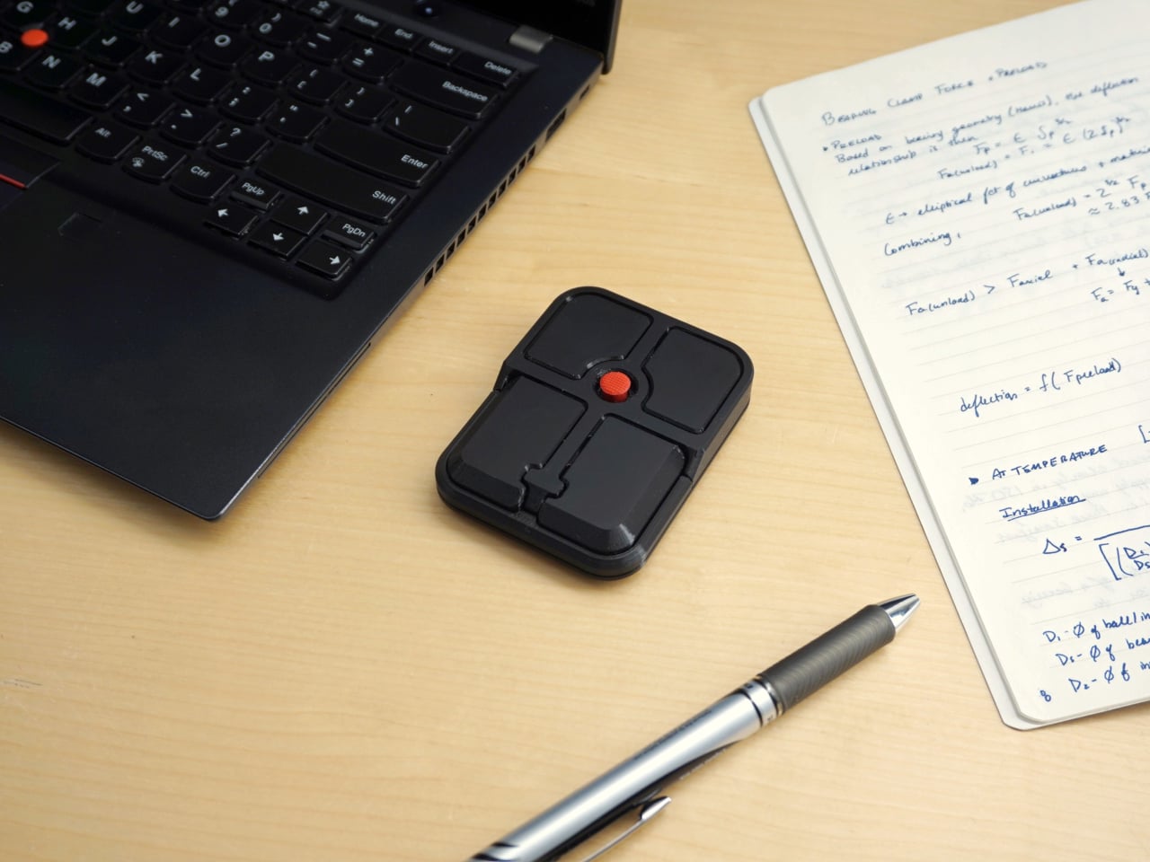
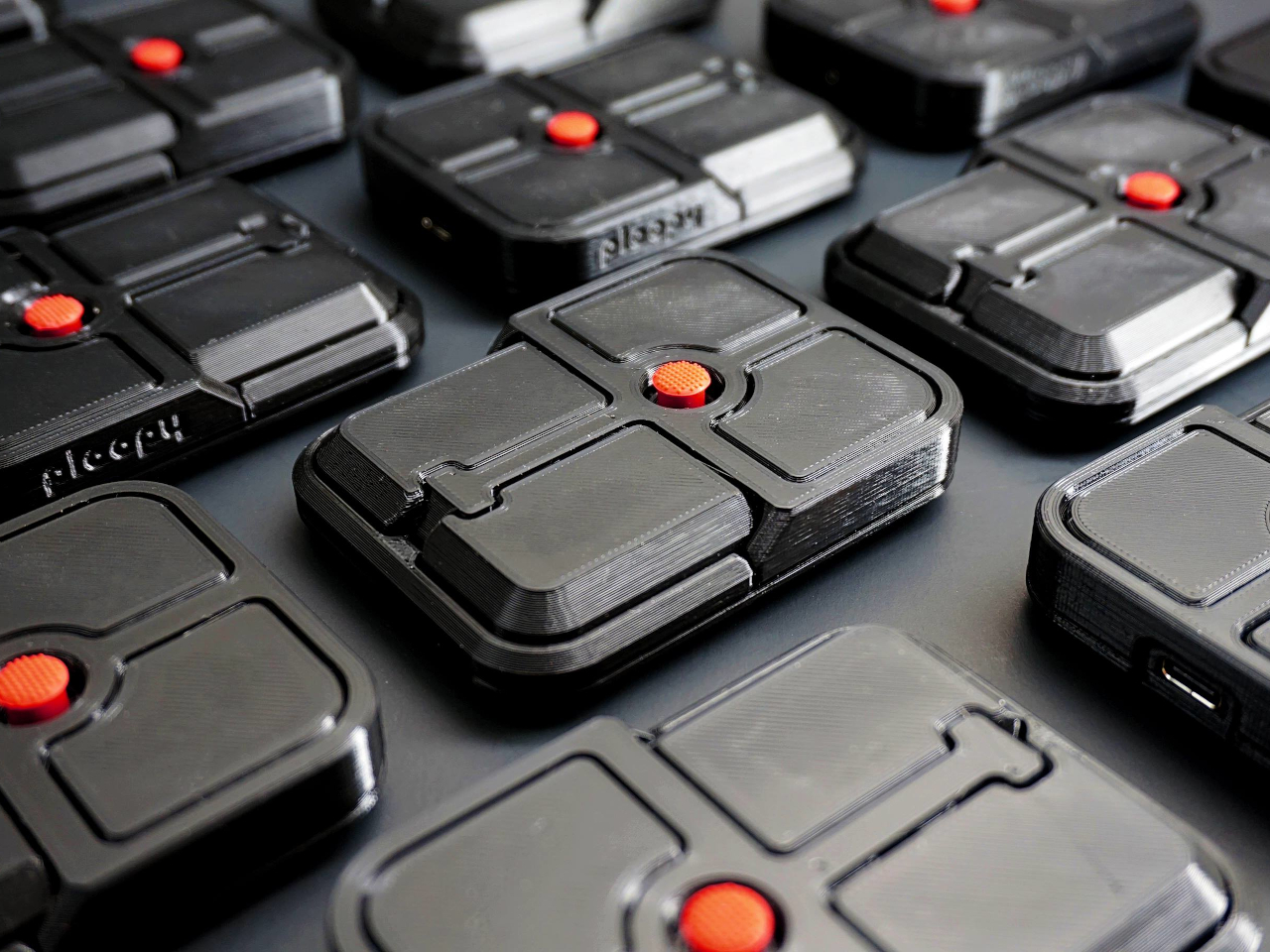
The pointing stick is one of the more divisive input devices in computing history. Lenovo’s TrackPoint has a devoted following, built around people who never want to lift their hands off the keyboard home row just to move a cursor. Everyone else finds the red nub somewhere between baffling and genuinely annoying. Either way, it has stayed locked to laptop keyboards for decades, with essentially no standalone options available.
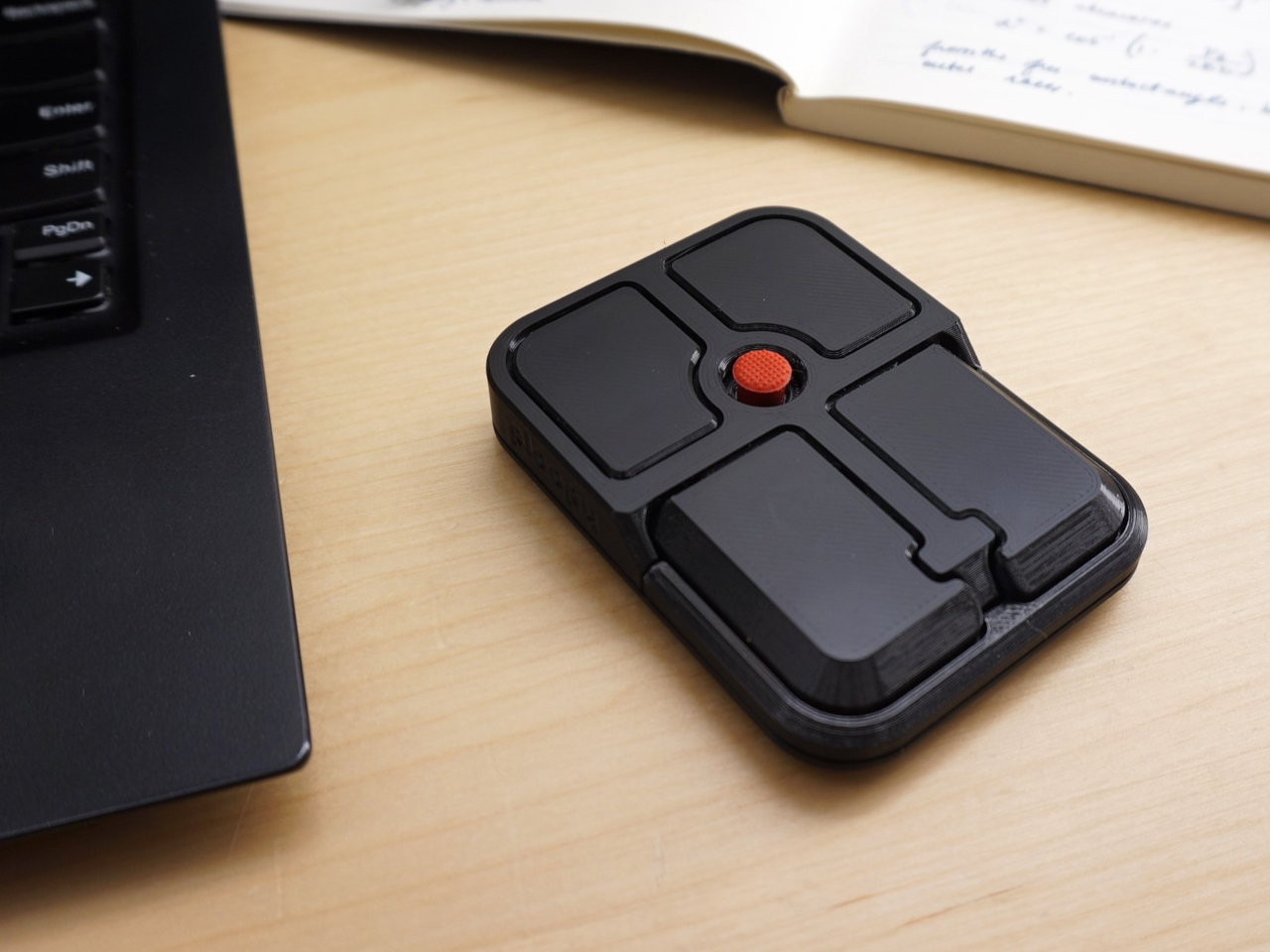
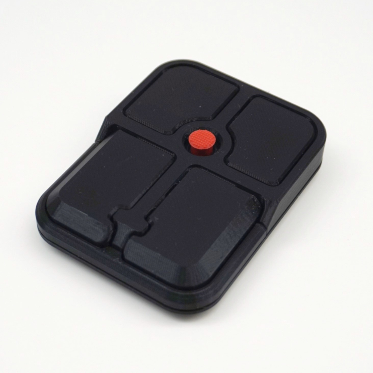
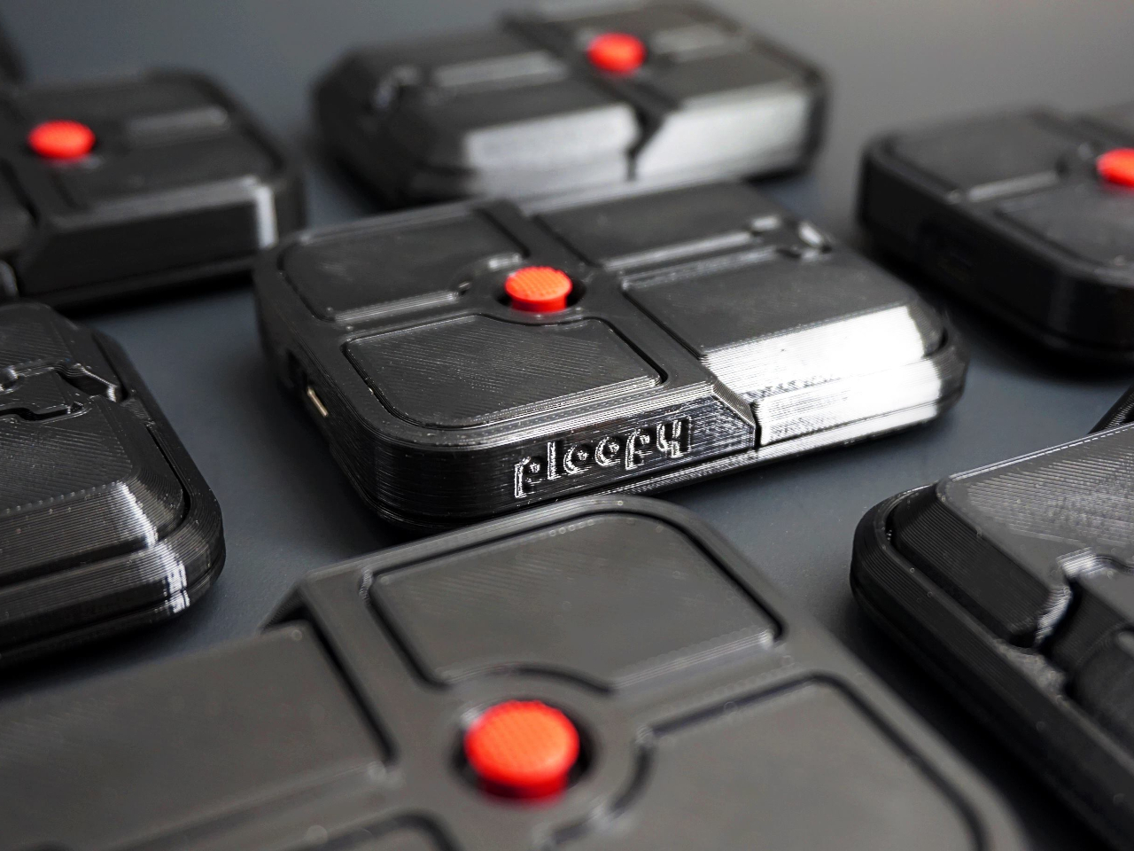
Ploopy, the Canadian open-source hardware company known for its lineup of trackballs and trackpads, has changed that with the Bean. It’s a standalone external pointing stick that connects over USB-C and sits flat on a desk. Think of it as a TrackPoint you don’t have to buy a ThinkPad to access, with a few deliberate improvements added to address the weaknesses that nub has always had.
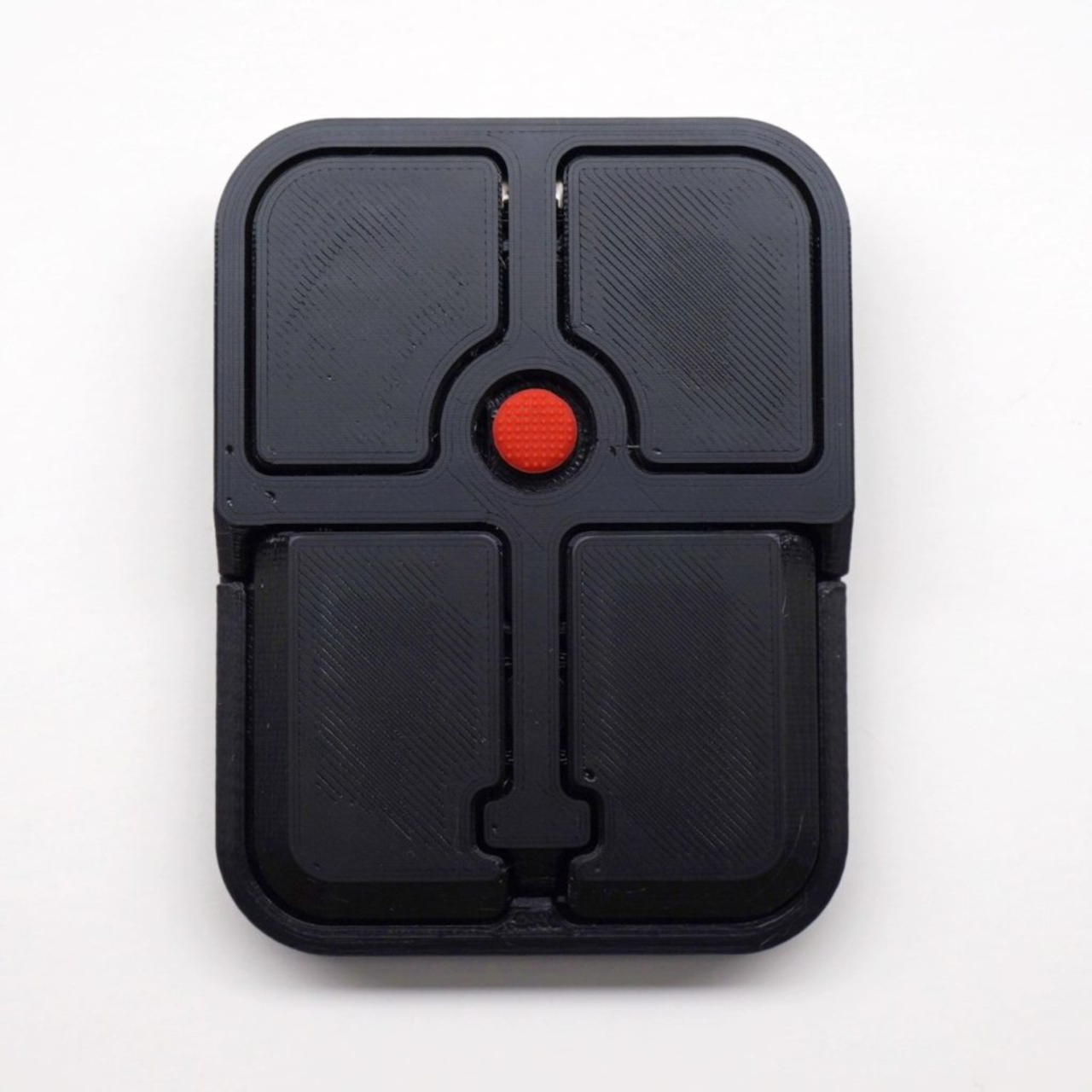
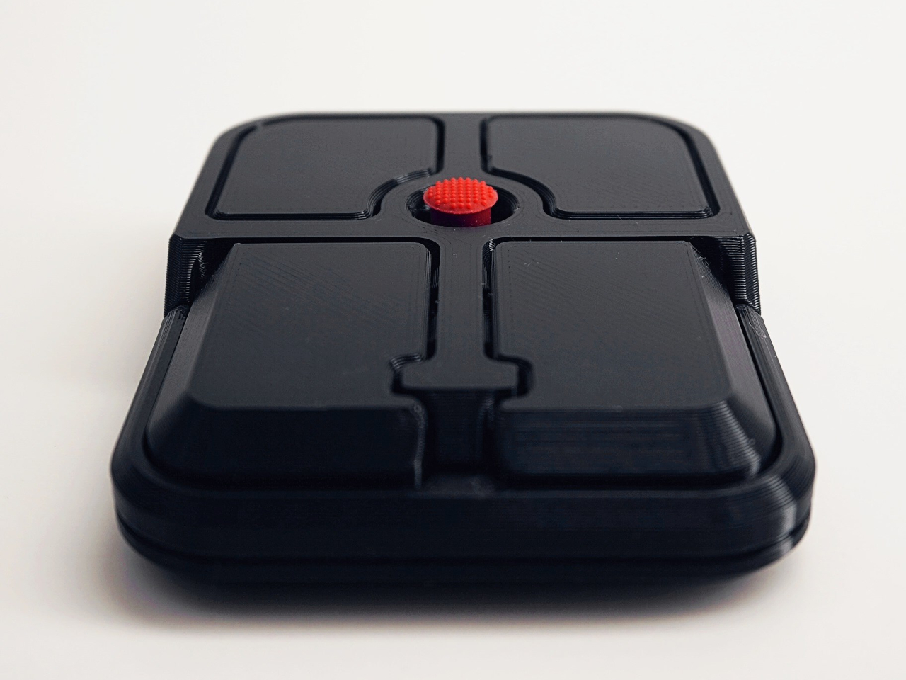
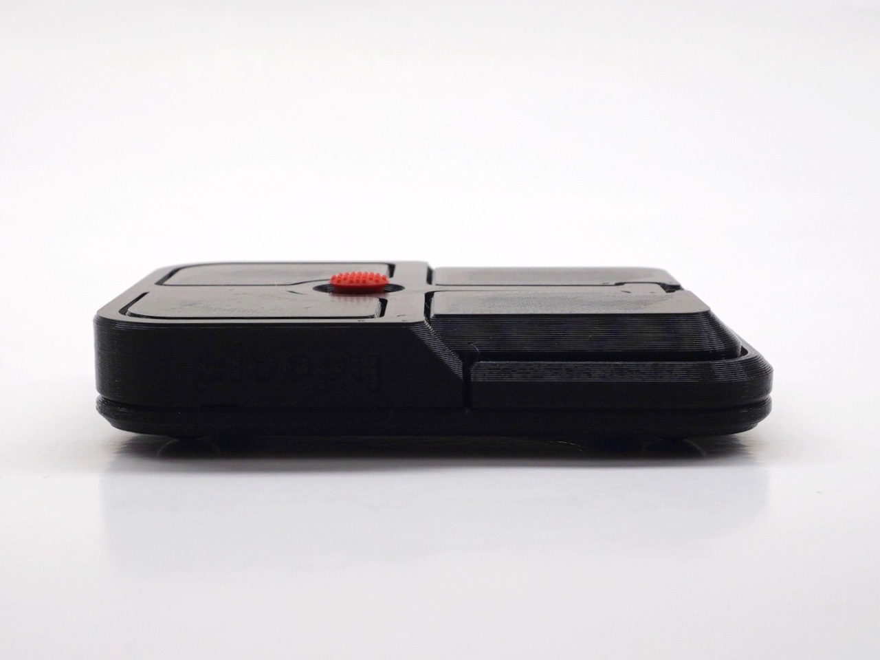
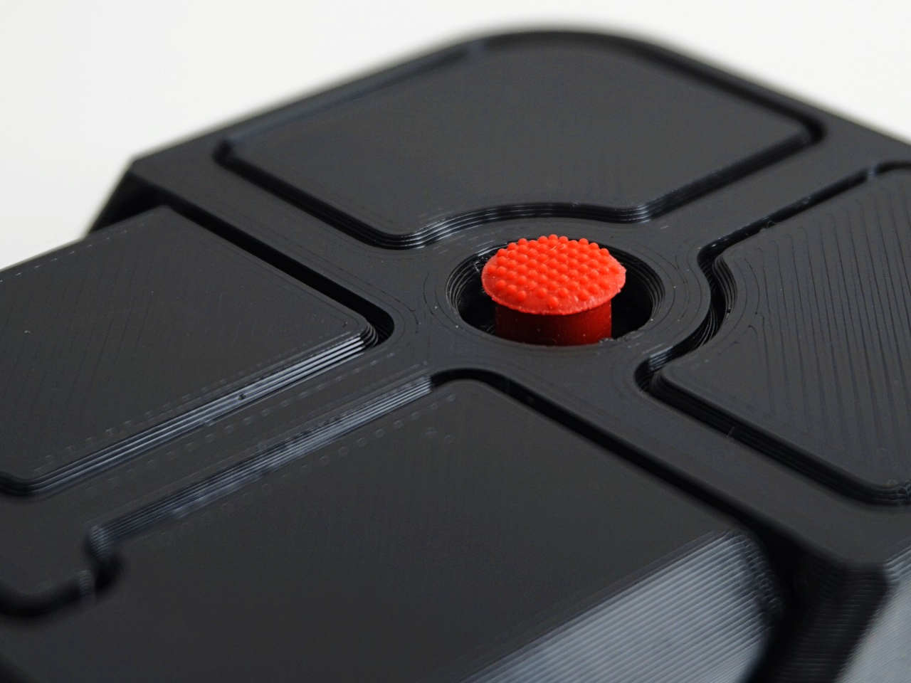
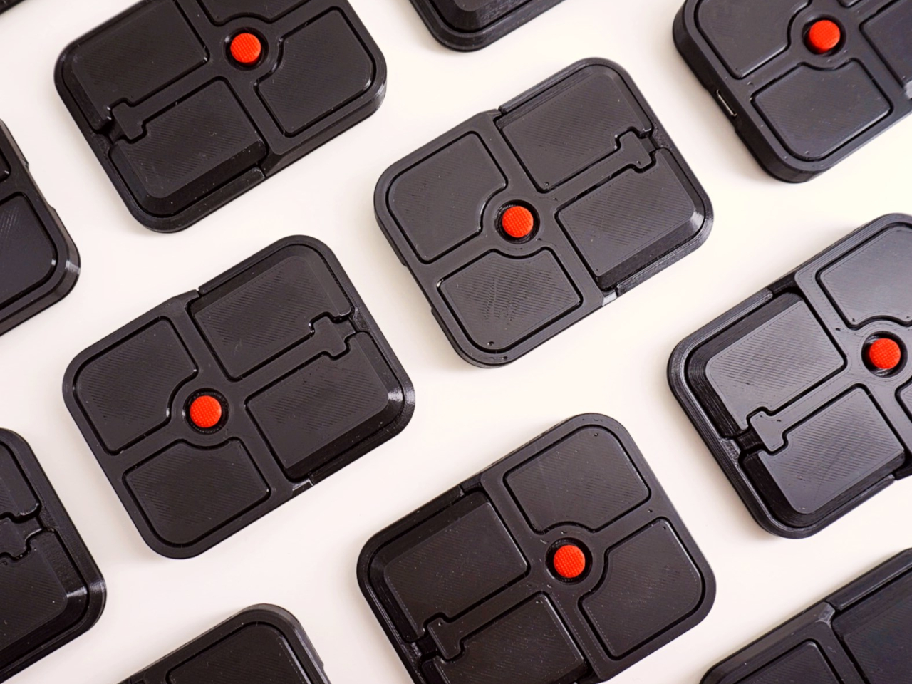
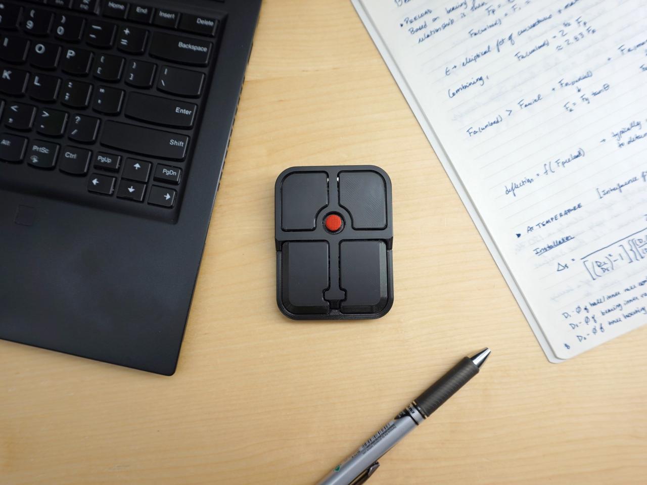
The Bean measures 84mm x 64mm x 16mm and houses a red pointing nub near the center of its flat, 3D printed case. Unlike the fixed nubs built into laptop keyboards, this one has additional travel in its movement, which Ploopy says helps reduce fatigue from pushing a stiffer stick over long sessions. Four buttons flank the nub, covering the standard left, right, middle click, and scroll by default.
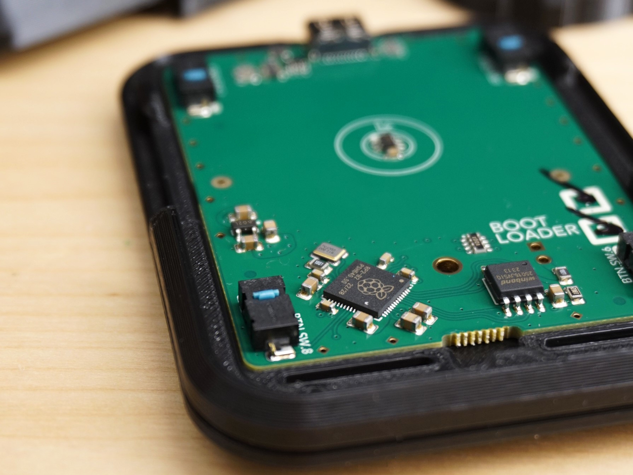
None of those defaults is locked in. The Bean runs QMK open-source firmware on a Raspberry Pi RP2040 microcontroller, and remapping any of the four Omron D2LS-21 buttons takes just a few minutes using the free VIA web app. There are no drivers to install and no proprietary software to deal with, just a browser-based tool that reads the device and lets you assign functions however you like.
For anyone who finds the conventional mouse hard on their wrist, or simply prefers keeping their hands positioned in front of them rather than reaching out to one side constantly, a pointing stick can make a noticeable difference over long sessions. You nudge the nub, and the cursor moves without your palm going anywhere. It’s a small thing until it isn’t, especially for people managing repetitive strain concerns.
Like everything else Ploopy makes, the Bean is completely open source. Hardware design files and firmware are both on GitHub, so anyone who wants to print their own case, modify the button layout, or write custom firmware from scratch has everything they need to do it. That kind of transparency is unusual for any consumer input device and puts Ploopy in a different category from virtually every competitor.
The Bean is available now for $70 CAD (around $52 USD), which is reasonable for a device with this much flexibility built in. It isn’t going to pull in anyone who has never thought about pointing sticks before, but for the enthusiast crowd that has been waiting for a standalone option this customizable and this open, it’s about as close to a purpose-built answer as anyone has delivered.
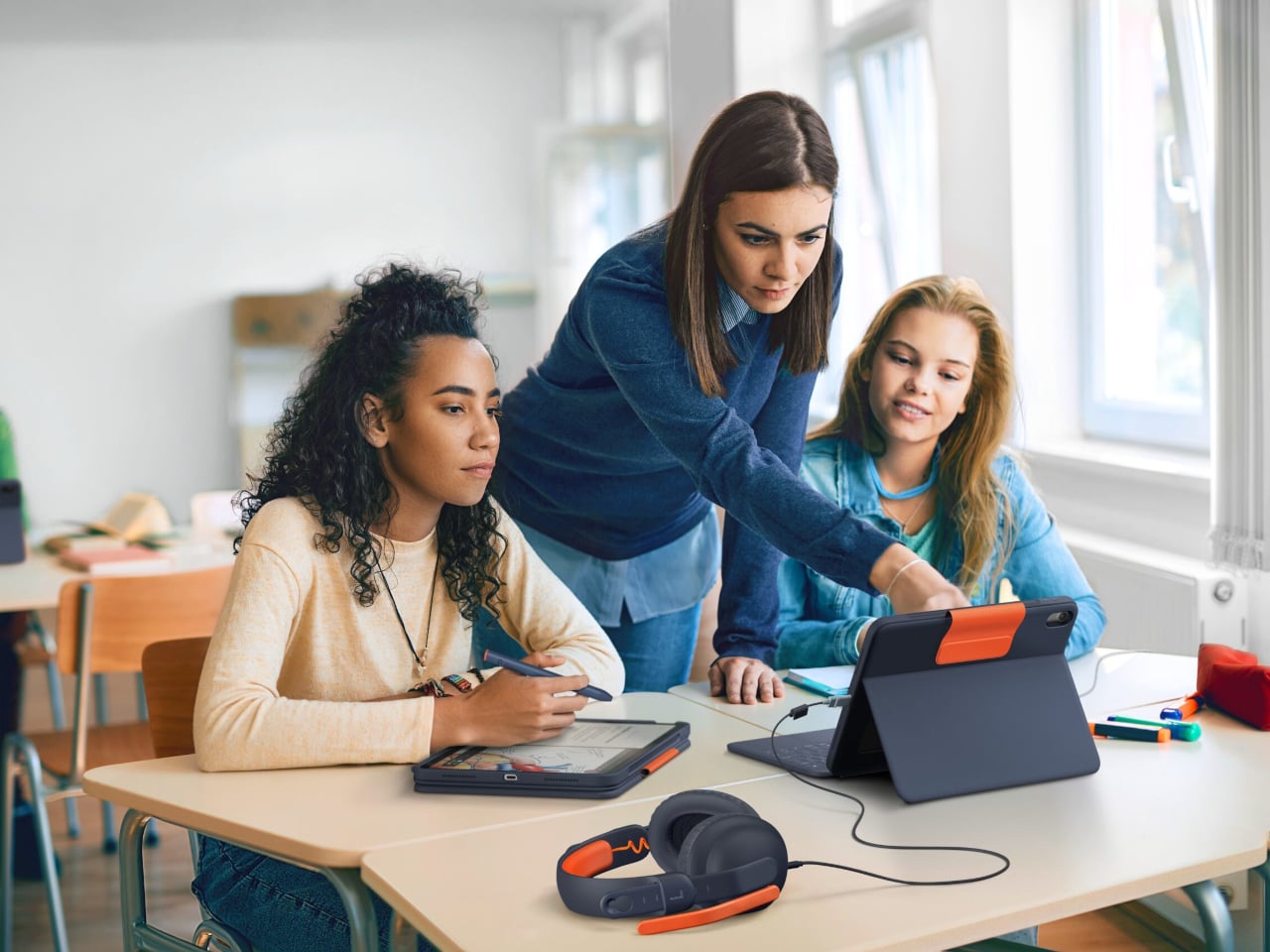
School tech accessories live and die by one rule that has nothing to do with specs: can they survive a school day? That’s not a small ask. It means tolerating backpack tosses, spilled drinks, a constant rotation of different hands, and the kind of daily disregard that would disqualify most consumer products after a semester. Keyboard cases designed for classrooms have to think about all of that before they think about typing feel.
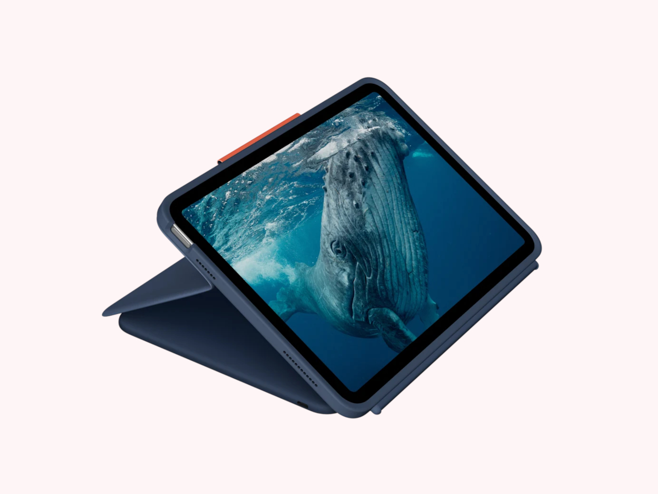
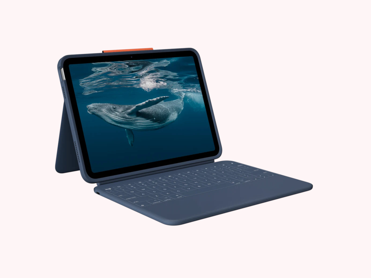
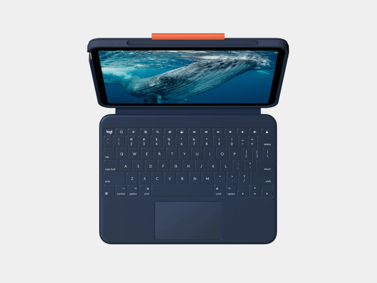
Logitech’s new Rugged Combo 4c and Rugged Combo 4c Touch are the latest additions to the company’s Rugged Combo lineup, designed for the iPad (A16) and iPad (10th generation). Both cases are built explicitly around the realities of student life, and a few of their design choices reflect how thoroughly the company thought about where and how these devices actually get used.
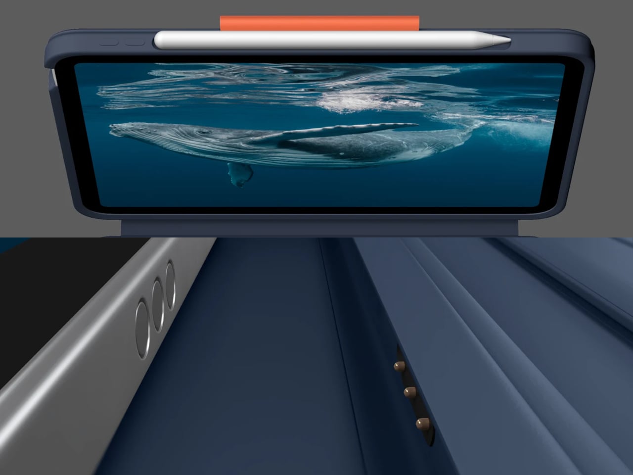
The most immediately useful upgrade in both models is the dedicated USB-C port. Audio has become central to how students learn, with literacy programs, digital assessments, and language learning all increasingly depending on wired headphones. Previously, plugging in headphones often meant going without charging, or the other way around. The USB-C port eliminates that choice by handling both simultaneously without any adapters.
The keyboard itself is fully sealed and spill-resistant, which handles the inevitable water bottle incident, and the case is made from material tested to survive more than three years of daily cleaning at school facilities. Drop protection reaches up to 6.6 ft, and the case has also been backpack drop-tested 10,000 times, addressing the specific scenario where a bag hits the floor from a hook or desk. That’s a meaningfully different durability benchmark than a standard drop test.
Both cases connect via Smart Connector, which means instant pairing without any Bluetooth setup and no separate charging required since the case draws power directly from the iPad. Four use modes, Type, View, Read, and Sketch, support a variety of classroom activities, including compatibility with Apple Pencil and Crayon for note-taking and drawing. There’s also a window for iPad asset tags and a built-in QR code to simplify IT tracking and deployment across a school fleet.
The main distinction between the two models is the Rugged Combo 4c Touch’s large, high-precision multi-touch trackpad. For students who’ve grown up navigating touchscreens, a trackpad offers a more familiar cursor-based experience that fits naturally into typing sessions. It’s one of those additions that sounds modest but actually changes how students interact with the device during longer tasks like writing assignments or research.
Logitech designed both products with school-wide deployment in mind rather than individual purchase, which explains features like the asset tag window and the clean construction that holds up to institutional cleaning protocols. Both cases are available through Logitech’s authorized education distributors. For any IT administrator who has ever had to account for hundreds of devices scattered across dozens of classrooms, that kind of practical thinking ends up mattering more than any single feature on the spec sheet.
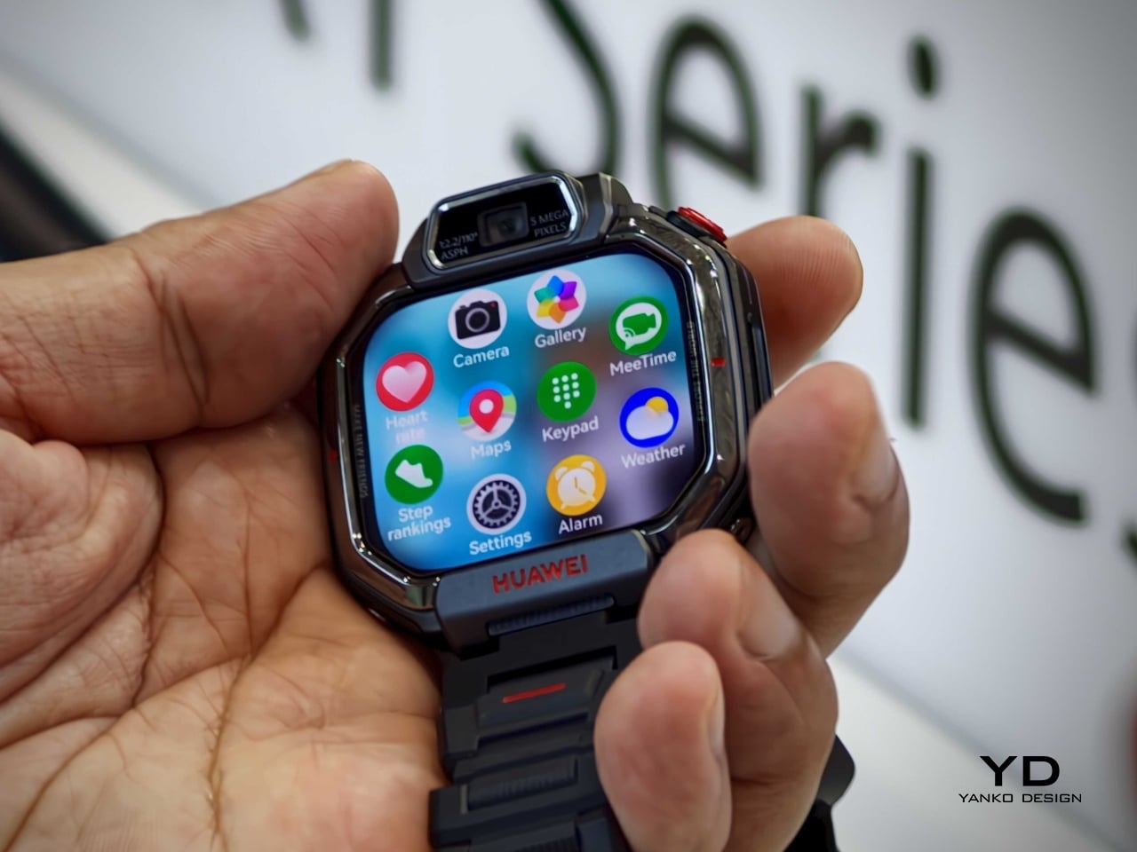
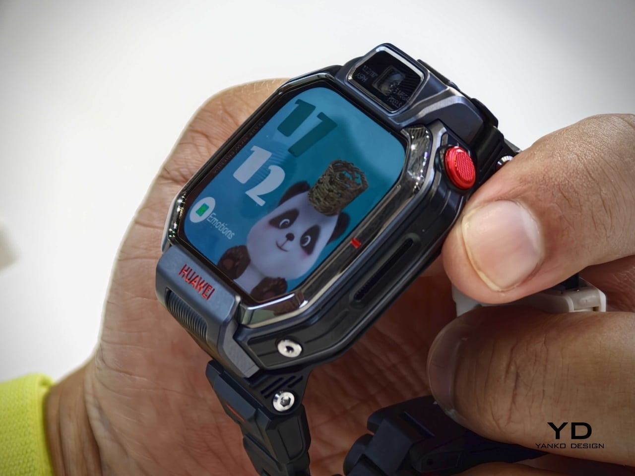
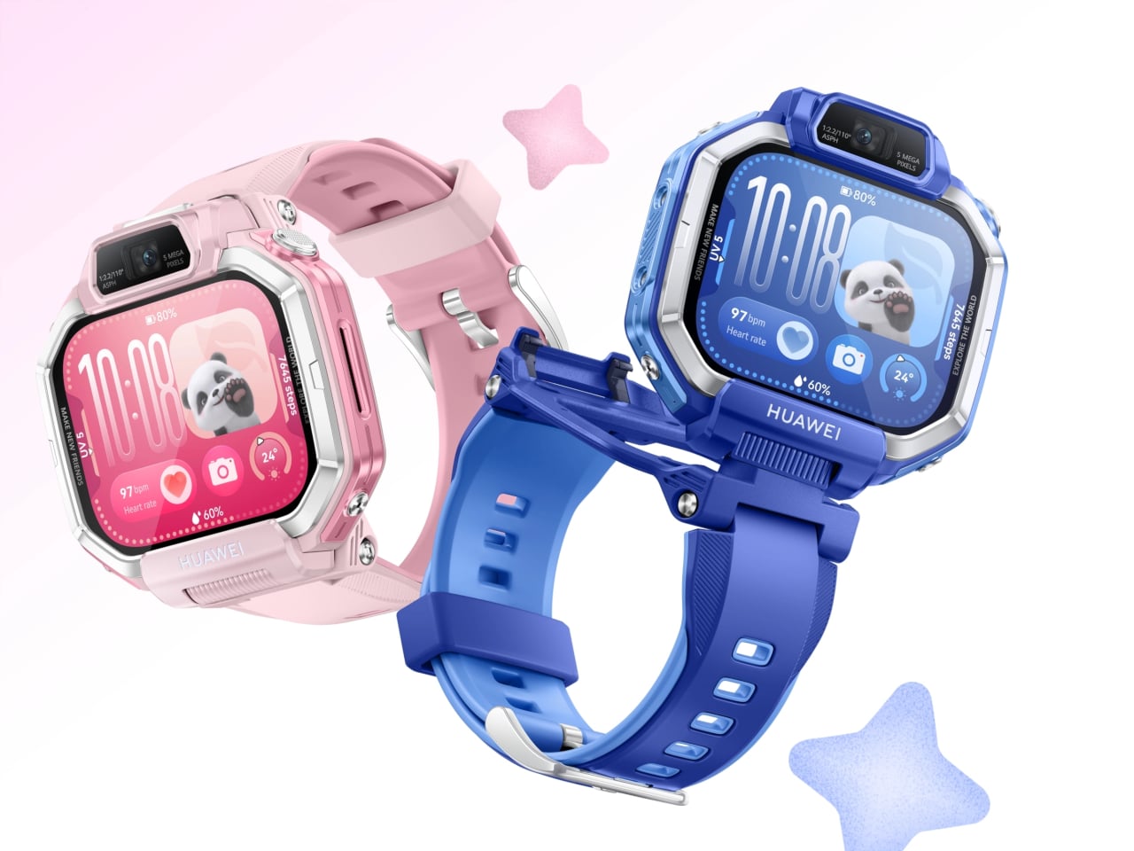
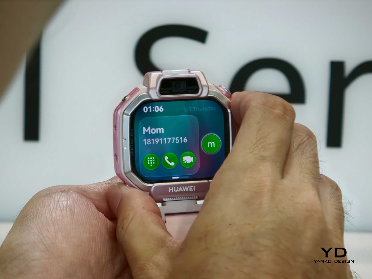
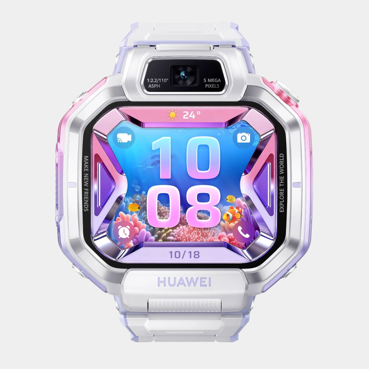
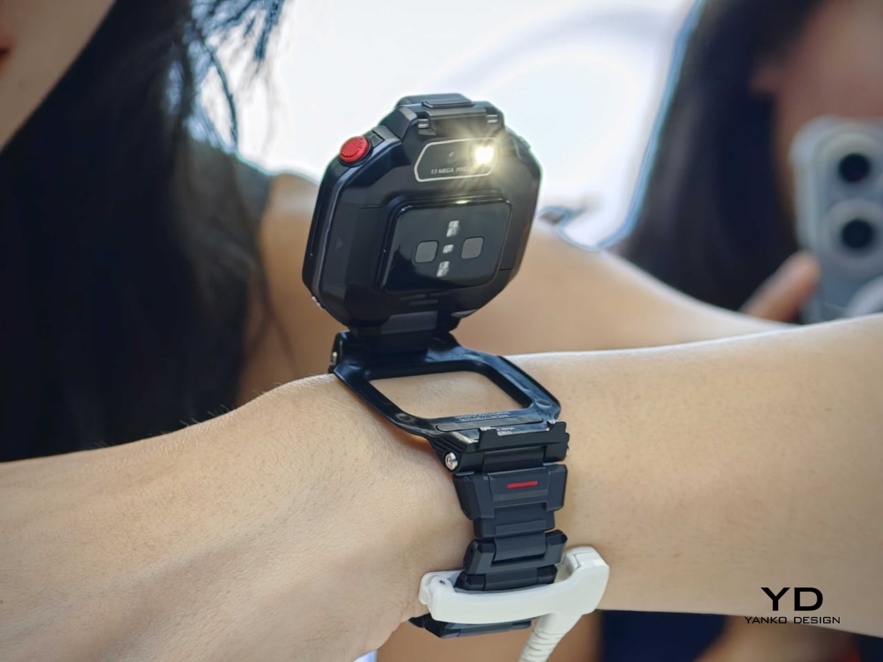
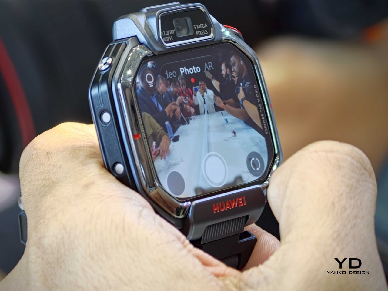
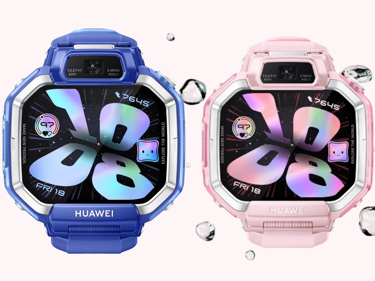
Huawei is returning to the children’s wearable category with the Watch Kids X1 series, a new lineup that feels noticeably more design-driven than the average kid-safe smartwatch. Announced during the company’s global launch event in Thailand, the series generated visible excitement from the audience, signaling strong interest in a product that brings a more playful and expressive take to kids’ tech. Instead of reducing the device to a wrist-bound tracker with calling features, Huawei gives it a more dynamic physical identity. The result is a wearable that balances parental reassurance with the kind of tactile, camera-friendly interaction that actually appeals to kids.
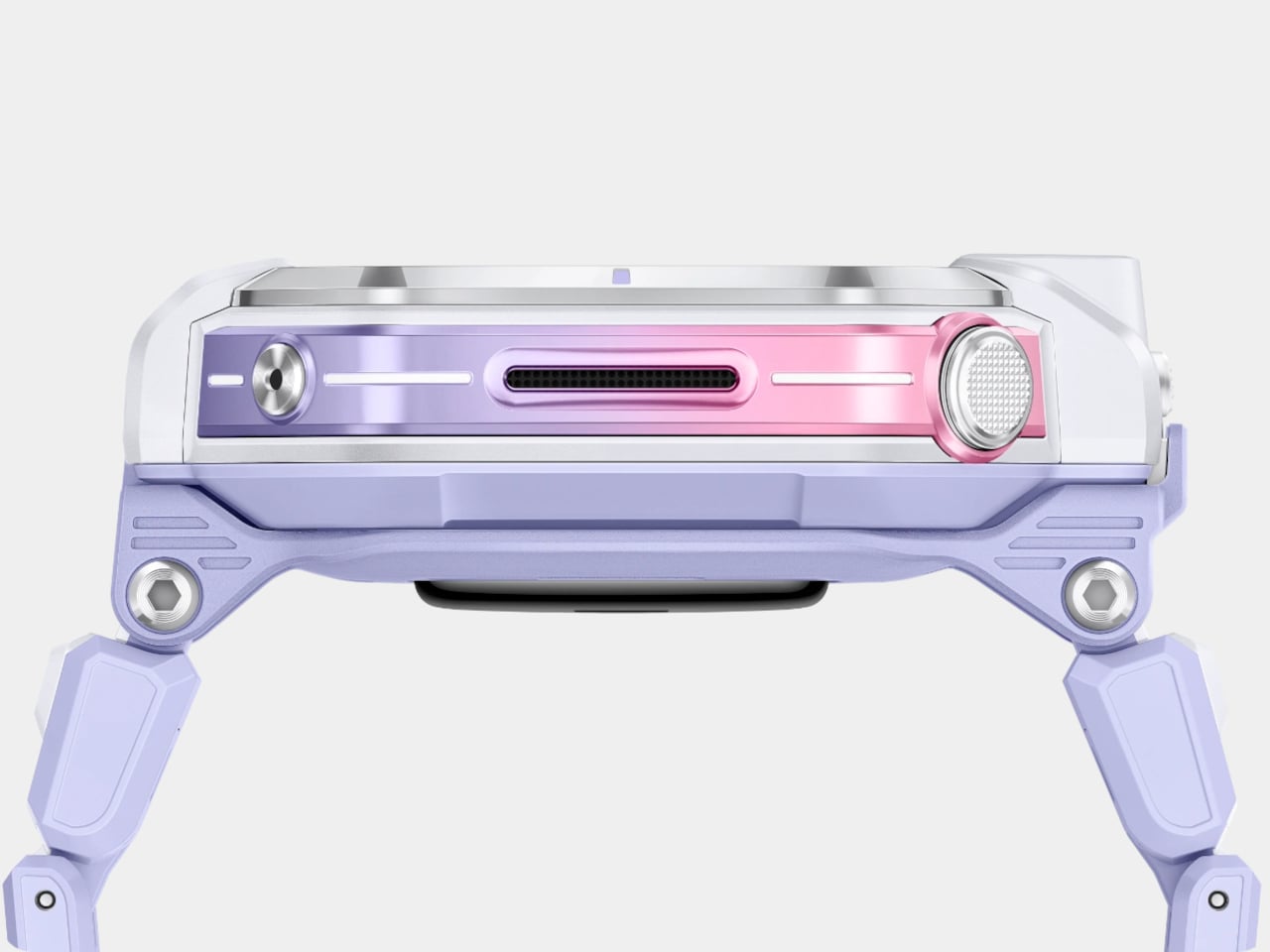
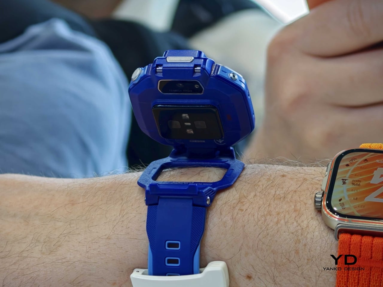
The series includes the Watch Kids X1 and Watch Kids X1 Pro, and both models lean heavily into transformable hardware. The standard version uses a flippable, 360-degree rotatable design, while the Pro adds a detachable module that can be removed from the strap and used more like a tiny handheld camera with its housing case. That shift in form makes the X1 series feel less like a miniature adult smartwatch and more like a hybrid object designed around play, communication, and movement.
Designer: Huawei
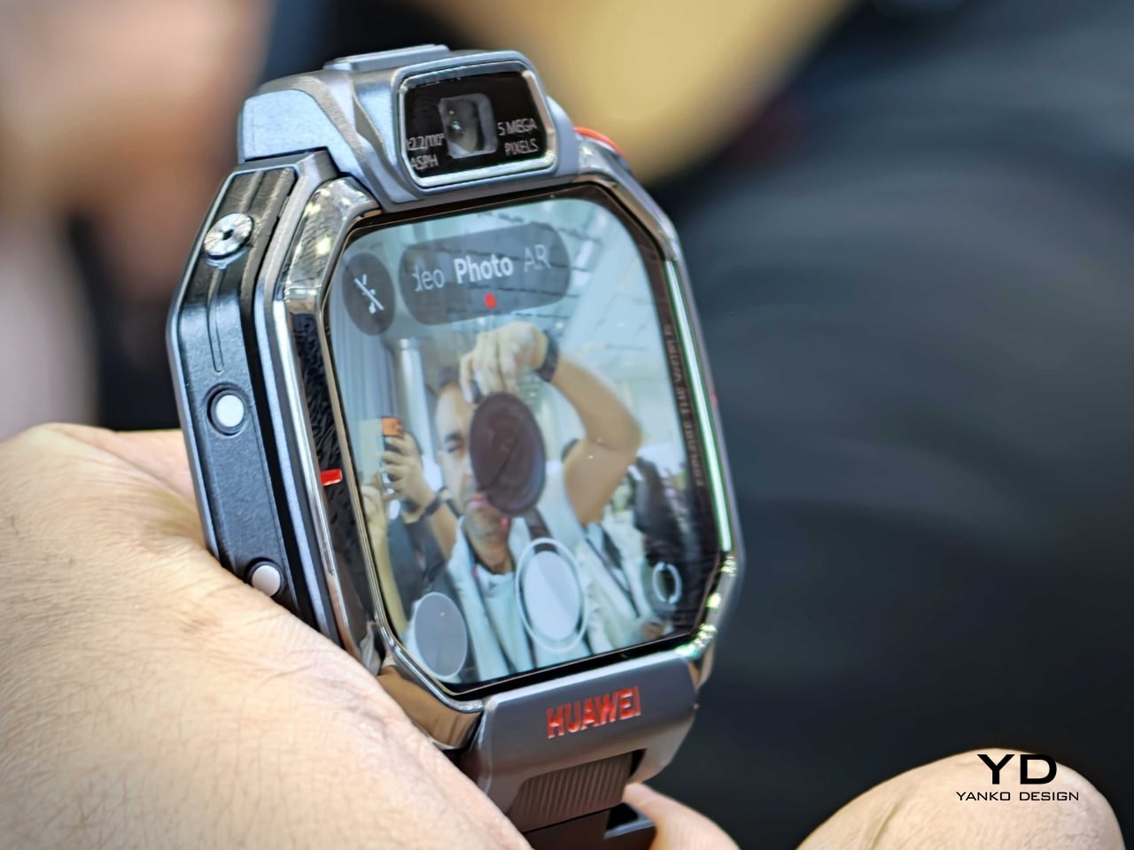
Both devices feature a 1.82-inch AMOLED touchscreen with a 480 x 408 resolution, giving the watches a bright, modern face that feels more premium than the category usually suggests. Huawei also equips the lineup with a 5MP front camera and a 13MP rear camera for HD video calls and photos, reinforcing the idea that these are communication-first wearables rather than simple step counters with GPS.
Safety remains a core part of the pitch. The Watch Kids X1 series supports multiple positioning methods, including dual-band satellite and GNSS-based tracking, along with additional location assistance modes designed to improve accuracy indoors and outdoors. Huawei also includes parental controls and health-oriented features, framing the watch as both a child-friendly gadget and a practical family tool.
There is also a more expressive side to the design. The watches support filters, stickers, timer shooting modes, and friend-adding gestures such as touching devices together or shaking hands. These details may sound small, but they turn the product from a passive utility into something performative and social, which is exactly where children’s tech often succeeds or fails.
Battery life appears to be centered around an 850mAh cell, with reports claiming charging can reach 50 percent in about 20 minutes. Connectivity includes cellular support with 2G, 3G, and 4G compatibility, alongside WLAN, Bluetooth, and GNSS. That combination positions the X1 series as a compact communication hub for calls, messages, photos, and location sharing.
The Watch Kids X1 series shows that Huawei does not treat safety features and delight as opposing ideas. The flip, rotate, and detach mechanics give the product a sense of personality, while the cameras and bright display make it feel more like a creative object than a compliance device. For a category that often defaults to chunky plastic and strictly functional design, that is a meaningful shift.
The Watch Kids X1 is priced at €249, while the Watch Kids X1 Pro comes in at €349. If those figures hold across broader availability, Huawei is clearly positioning the pair above the most basic children’s wearables and closer to a premium family tech accessory with stronger industrial design ambitions.
Most fitness trackers have followed the same design logic for years: a screen on the wrist that flashes step counts, shows incoming messages, and turns the whole device into a smaller, sweatproof version of your phone. That approach has its fans, but it also has a ceiling. Screens add bulk, drain batteries, and tempt you to keep checking things you probably didn’t need to check while trying to fall asleep.
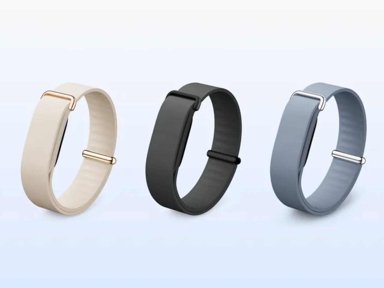
Fitbit Air is Google’s answer to what a fitness tracker looks like when the screen comes off entirely. It’s the smallest Fitbit ever made, weighing roughly five grams on its own and about 12g with a band, and it has nothing on its face except a slim oval housing made from recycled polycarbonate. No display, no haptic button, no notification feed; just sensors doing their job quietly and continuously.
That doesn’t mean there’s less happening inside. The Air carries an optical heart rate monitor, a three-axis accelerometer and gyroscope, red and infrared sensors for blood oxygen monitoring, and a device temperature sensor. Together, these maintain a continuous record of heart rate, heart rate variability, resting heart rate, oxygen saturation, and sleep stages, while also flagging irregular heart rhythms along the way without any input from the wearer.
Wear it to bed, and it tracks sleep stages through the night without lighting up or buzzing. Take it through a workout, and it recognizes the activity automatically. The battery lasts up to seven days under normal use, and a five-minute top-up adds another full day when the charge runs low. Water resistance reaches 50 meters, so showers, swimming, and sweaty training sessions don’t require a second thought.
The data flows into the Google Health app, which is where the Air actually earns its keep. Built on Gemini, Google Health Coach reads everything the tracker has collected and turns it into something genuinely useful: personalized recommendations, recovery guidance, trend analysis, and answers to specific questions about why you might be feeling tired after travel or how to adjust training around an injury, all based on your actual biometrics.
The app works the same way with Pixel Watch, meaning the Air can slot into an existing Google wearables setup or work entirely on its own. Wearing both simultaneously is supported, health data syncs automatically, and the app lets you sort metrics by device. For someone who already carries a Pixel Watch but wants continuous overnight tracking without the bulk of a full smartwatch, the Air fills that gap neatly.
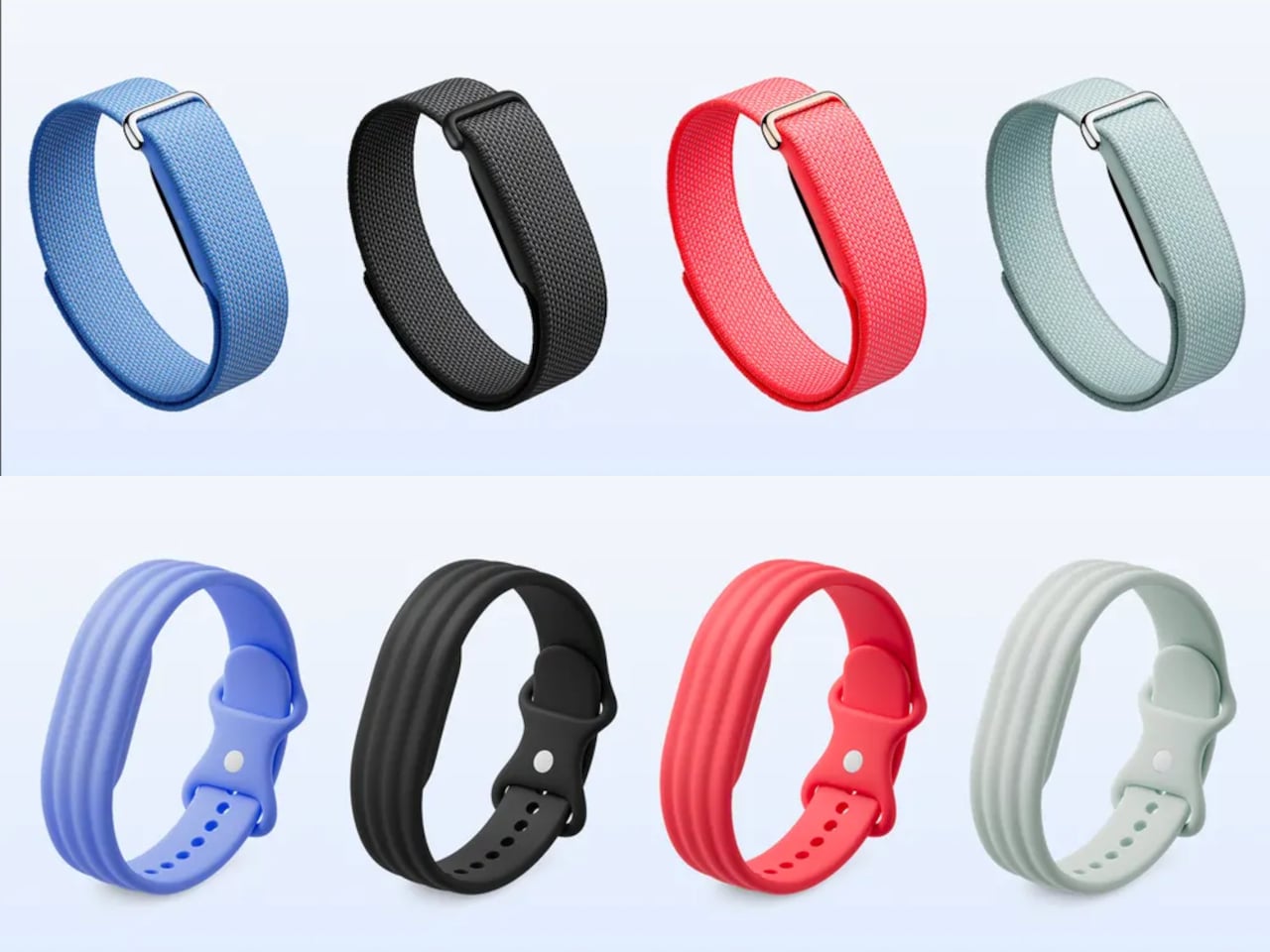
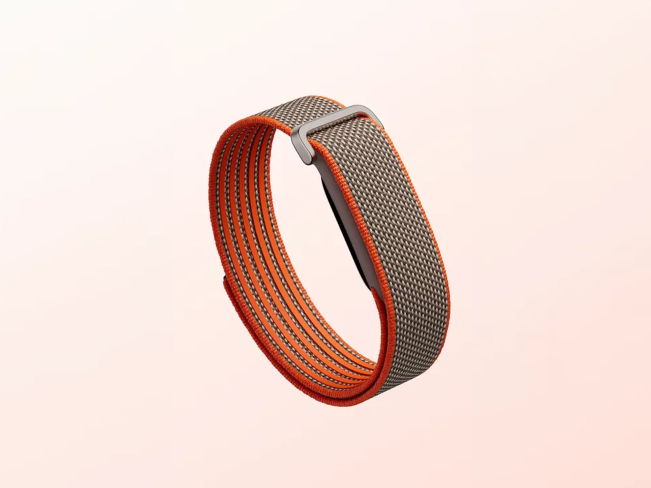
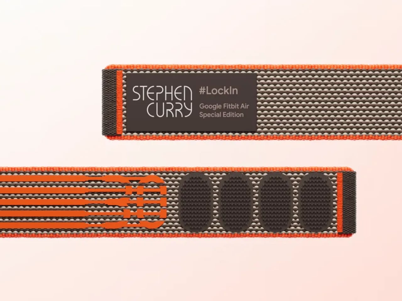
Fitbit Air is available for preorder at $99.99, with first shipments scheduled for May 26. That price includes three months of Google Health Premium, which unlocks full access to Health Coach. After the trial, continuing the service runs $9.99 per month or $99.99 per year. A Stephen Curry Special Edition runs $129.99, and interchangeable accessory bands start at $34.99, compatible with Android and iOS.
Compared to other services that charge nothing upfront but require a subscription from the start, the Air’s $99.99 entry price is a more accessible way in. As a device you’re genuinely not meant to look at, its value lives almost entirely in the software behind it; the band gathers, and Google Health interprets. For a tracker specifically designed to be forgotten on the wrist, that’s a quietly compelling arrangement.
Most GaN chargers on the market right now treat 140W like a finish line. Satechi hit it with their ChargeView hub and added a wattage display, which was genuinely useful. Voltix pushed to 180W with 7 ports and called it a day. Belkin went sideways into docking territory with their 146W 11-in-1 hub, bundling in connectivity features that most people opening a laptop at a coffee shop will never touch. The entire category seems to have collectively decided that anything past 150W requires compromises elsewhere, whether in size, port count, or heat management.
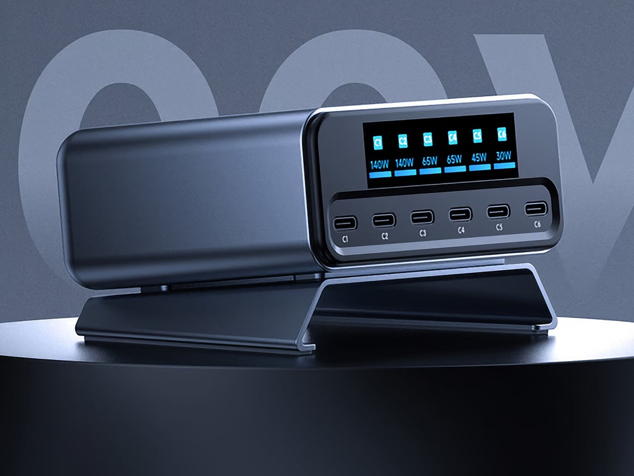
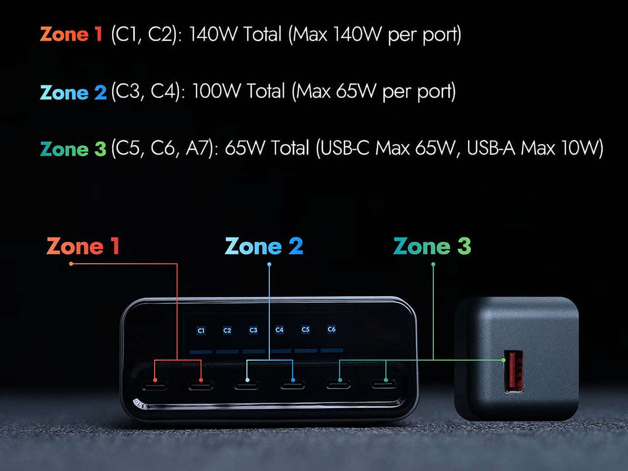
MUITAVY Gen2 delivers 300W across 7 ports without requiring a docking station footprint or a cooling fan that sounds like a jet engine spooling up. The 3-zone distribution system splits power intelligently: Zone 1 covers two USB-C ports at 140W total with 140W max per port, Zone 2 handles two more at 100W total with 65W max per port, and Zone 3 manages the remaining three ports (two USB-C, one USB-A) at 65W total. A switchable LCD display cycles through individual port output, temperature monitoring, and total wattage draw. At 492g and roughly the footprint of two stacked iPhones, it’s heavier than a travel charger but lighter than most docking hubs attempting similar output.
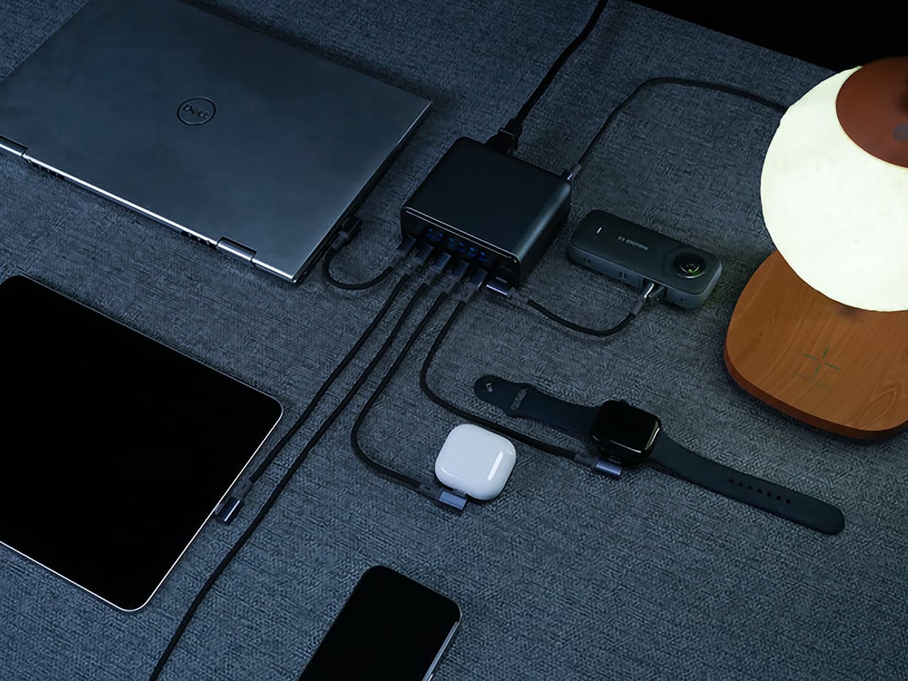
The MUITAVY Gen2 splits its power across three distinct zones. Zone 1’s 140W max per port means you can run a MacBook Pro M5 Max at full tilt on C1 while simultaneously fast-charging an iPad Pro through C2 without either device entering slow-charge purgatory. Zone 2’s dual 65W ports handle the middle tier, perfect for a MacBook Air, a Windows ultrabook, or a Steam Deck that needs a proper feed. Zone 3 covers the accessories: AirPods, a Kindle, a smartwatch, a Bluetooth speaker, whatever low-draw gear is cluttering your desk. The zones don’t borrow from each other, so plugging your phone into Zone 3 won’t suddenly throttle the laptop in Zone 1. That allocation is a lot like having a compartmentalized travel case or backpack with dedicated slots for organizing all your stuff, rather than just one big empty space that you chuck things into and pray for the best.
PD 3.1 handles the protocol layer, which is the same standard powering Satechi’s ChargeView and the top-tier Anker and Belkin hubs. The smart management chip inside the Gen2 reallocates power in milliseconds as devices connect or disconnect, so you’re not waiting for a handshake cycle every time you unplug your phone. The chip also handles trickle charge detection, which matters when you’re topping off a device that’s already at 95% and doesn’t need the full 65W anymore. That freed-up wattage gets redistributed across the other active ports without you lifting a finger. It’s the kind of behind-the-scenes efficiency that GaN was supposed to deliver all along but rarely does outside the premium tier.
The LCD display is where MUITAVY takes a page directly from Satechi’s playbook and expands on it. A side-mounted touch button cycles through three display modes: individual port wattage, temperature and performance stats, and total output. The Satechi ChargeView only shows wattage per port, which is helpful but incomplete. Adding temperature monitoring makes sense at 300W, where heat becomes a genuine concern rather than a footnote in the manual. If the hub is running hot because you’ve got seven devices pulling maximum draw simultaneously, you’ll know about it before anything thermal throttles or shuts down. The display itself is clear, bright enough to read in daylight, and updates in real time rather than refreshing every few seconds like cheaper implementations.
Size and weight sit in a reasonable middle ground. At 102.4 x 92.0 x 43.9mm, the Gen2 is larger than a typical travel charger but smaller than most desktop hubs attempting this kind of output. The 492g weight keeps it stable on a desk without needing a separate stand or adhesive pad to stop it from sliding around when you’re plugging cables in and out. For comparison, the Satechi ChargeView weighs 465g and still ships with a dedicated stand to keep it upright. MUITAVY’s footprint is wide enough that it sits flat without tipping, and the cable ports are positioned on opposite ends so you’re not dealing with a tangled mess of USB-C cables all emerging from the same side.
Universal compatibility extends beyond just USB-C and USB-A port selection. MUITAVY offers four input cable options to match regional plug standards: Type B for the US, Canada, Japan, and Mexico; Type I for China, Australia, and New Zealand; Type E for Germany, France, Spain, and Italy; Type G for Brazil, Hong Kong, Singapore, and Malaysia. That’s a detail most charger manufacturers ignore, assuming you’ll just buy a separate adapter if you’re traveling internationally. At 300W, though, plug compatibility becomes critical. You’re pulling serious current from the wall, and using a flimsy third-party adapter with a high-draw hub is how you blow a fuse or start a small fire in a hotel room. MUITAVY handles it at the hardware level, which is the correct approach.
The Gen2 comparison chart against the original MUITAVY is almost comical. Gen1 topped out at 200W total, 100W single-port max, 6 output ports, and a single power distribution zone with no display at all. It weighed 200g and measured 145 x 72 x 72mm, so it was lighter and taller but delivered significantly less power. Gen2 is a complete rebuild rather than an iterative spec bump, which is rare in a category where most “Gen 2” products just swap the exterior color and call it progress. The jump from 200W to 300W, from 1 zone to 3, and from no display to a multi-mode LCD suggests MUITAVY actually listened to feedback and designed around real-world use cases rather than just chasing a higher number for the product page.
The Early Bird pricing sits at $119 against a $200 MSRP, which positions it directly against the Voltix 180W at full retail and well below the Satechi ChargeView when you account for the wattage and port count difference. At $200 MSRP, it’s competing with premium desktop hubs from Belkin and Anker, but those products typically bundle data passthrough, HDMI outputs, and Ethernet jacks that add cost without adding charging capacity. MUITAVY Gen2 is a pure charging hub with no data connectivity, so the entire 300W budget goes toward power delivery rather than being split across multiple functions. Shipping costs are reasonable for hardware of this class: $19 for a single unit to the US, Canada, EU, UK, or Australia; $15 for Asia. The hub ships with the Gen2 unit, an AC input cable matched to your region, and a user manual. Expected delivery is mid-July 2026, with production ramping up in June.
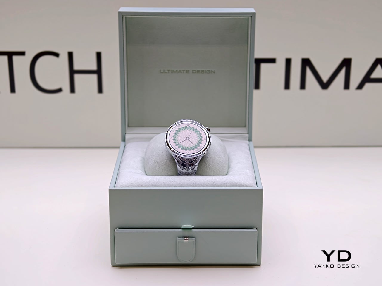
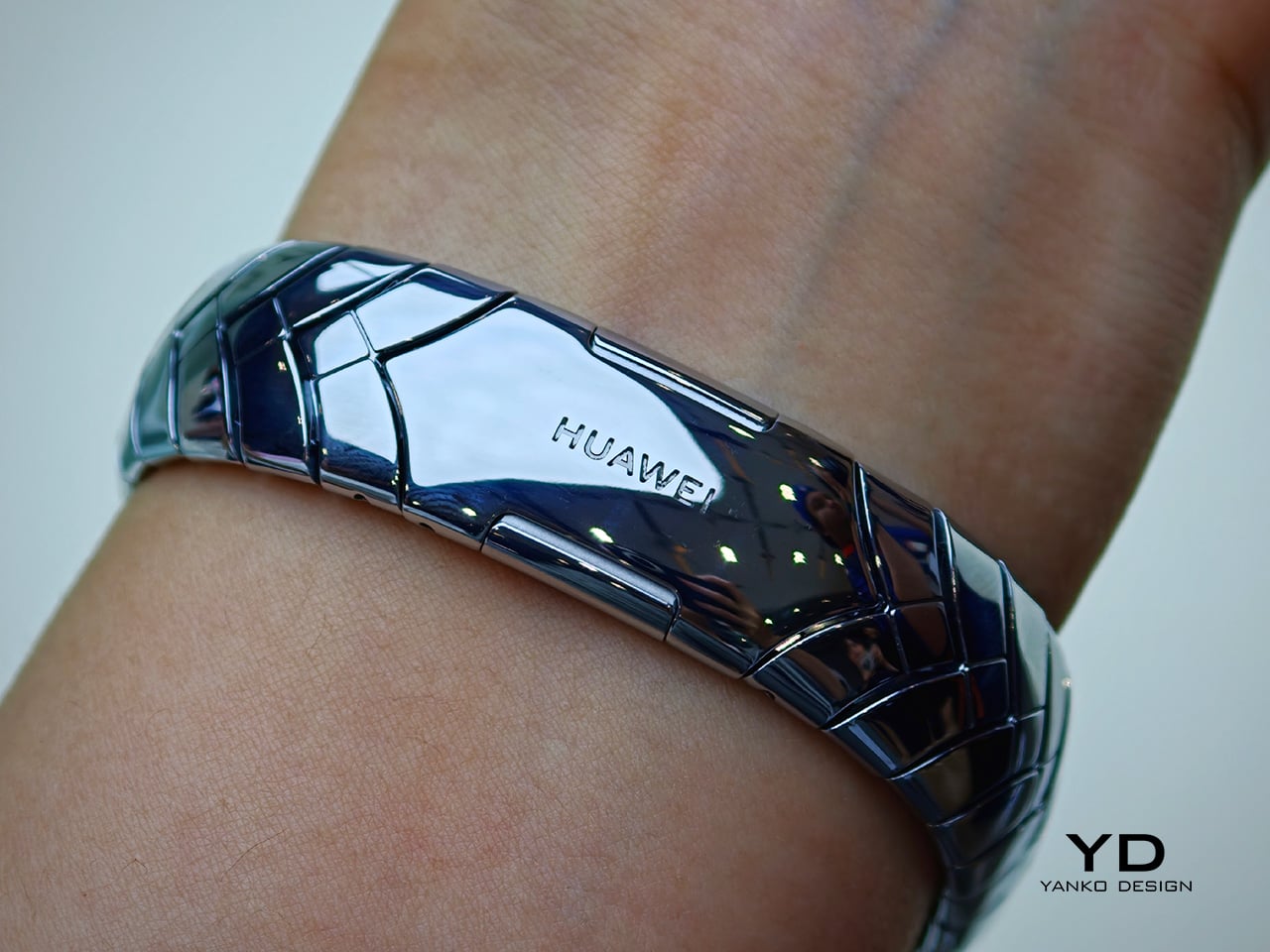
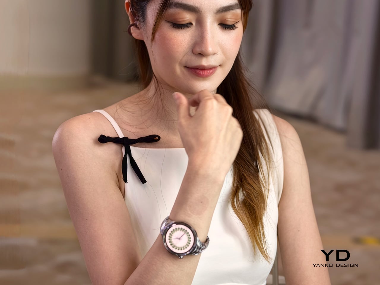
Huawei’s latest luxury wearable explores a space the smartwatch industry still hasn’t fully resolved. Instead of presenting technology as something discreet, technical, or performance-first, the Huawei Watch Ultimate Design – Spring Edition approaches the category from a more ornamental direction, treating the smartwatch as a fashion object as much as a connected device. In a market still dominated by sporty silhouettes and restrained finishes, that alone makes it a distinct proposition.
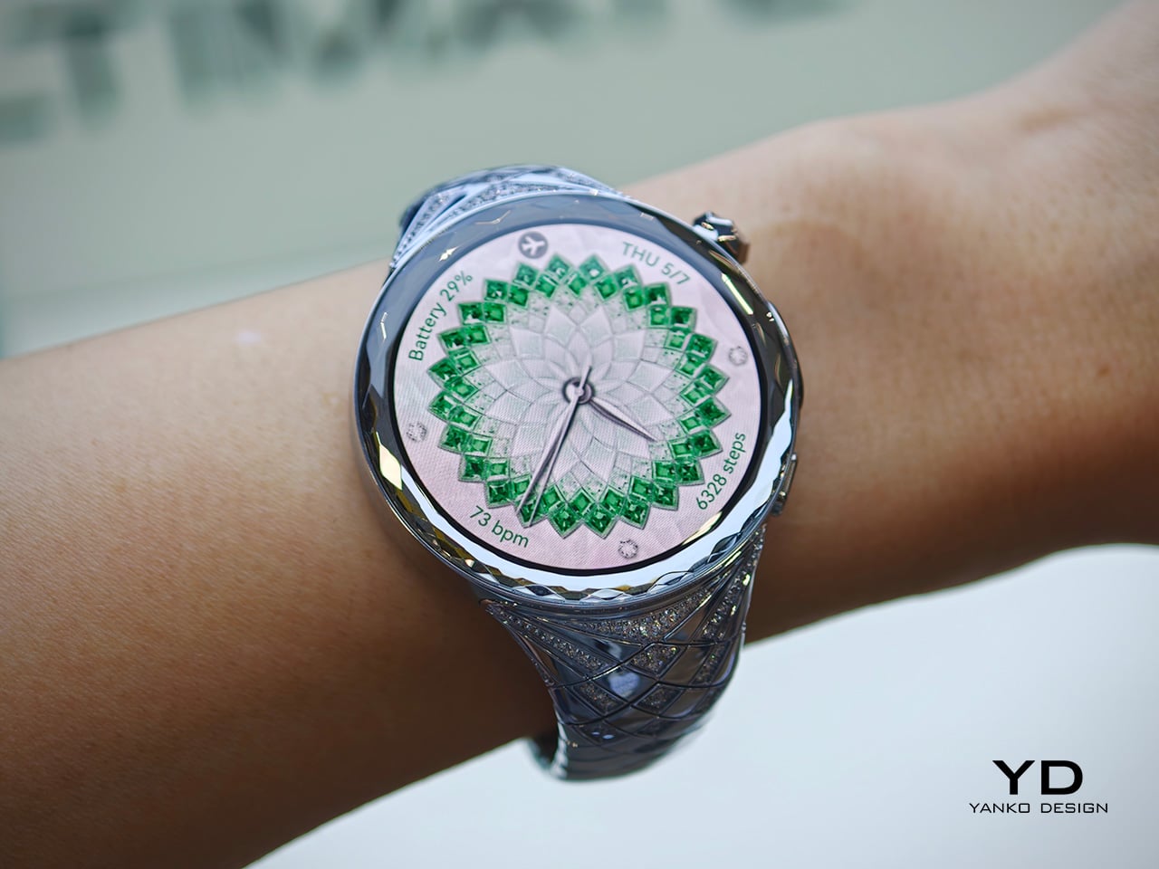
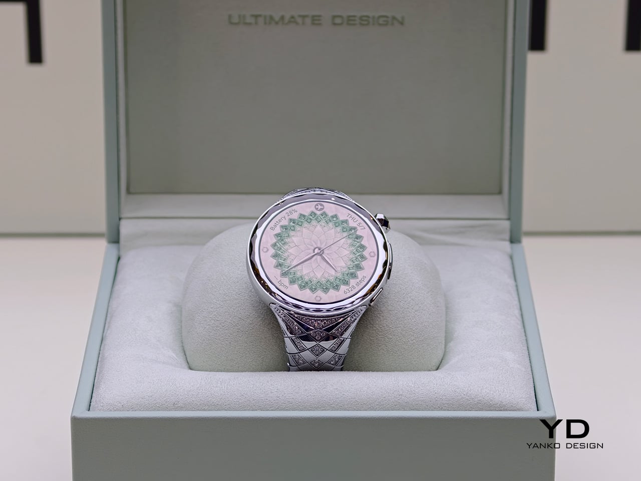
Announced as part of Huawei’s latest global product launch, the Huawei Watch Ultimate Design – Spring Edition was created in collaboration with world-renowned jewelry designer Francesca Amfitheatrof. The watch draws on the imagery of spring and incorporates 99 natural diamonds, positioning itself less as a conventional wearable and more as a luxury interpretation of one. Rather than relying on a simple premium finish or a new strap option, Huawei appears to have built the product’s identity around adornment from the outset.
Designer: Huawei x Francesca Amfitheatrof
Most smartwatches still follow a familiar visual formula. They tend to emphasize utility through subdued finishes, sporty proportions, and a design language shaped by fitness tracking and digital convenience. The Huawei Watch Ultimate Design – Spring Edition moves in another direction, using precious materials and decorative detailing to shift attention toward styling, symbolism, and visual presence. It does not try to disappear into an everyday tech wardrobe. Instead, it is designed to be noticed, and to function as part of a broader personal aesthetic.
That is what makes the watch interesting from a design perspective. Rather than simply applying luxury cues to an otherwise standard smartwatch body, Huawei seems to frame the product around a more expressive visual narrative. The result is a wearable that sits closer to jewelry than to the stripped-back minimalism that still defines much of the category. It also reflects a broader shift in premium wearables, where differentiation increasingly comes from form, finish, and material storytelling rather than purely from software or sensors.
The watch is inspired by the blossoming of spring and is intended to reflect women’s strength and vitality. In practice, that gives the product a softer narrative framework than most wearable launches, which usually center on health metrics, performance upgrades, or endurance claims. Here, the emphasis is clearly on material expression and thematic storytelling. Whether that spring concept feels nuanced or simply decorative will depend on the viewer, but it does give the watch a more distinct point of view than the usual language of optimization and performance.
At the same time, Huawei has not stripped away the technical identity of the WATCH ULTIMATE range. It includes advanced outdoor modes, health tracking, ECG support, expedition mode, diving capability up to 100 meters, and battery life of up to 14 days under typical use. That combination makes the Spring Edition more than a simple luxury variant. It still carries the expectations of a tool watch, even as its materials and detailing push it toward a more ornamental category.
Huawei’s answer here is to push further into the language of jewelry, suggesting that for some users, a smartwatch is no longer just a tool to wear but an accessory to build a look around. Priced at £3,499.99 or €3,799, the Huawei Watch Ultimate Design – Spring Edition sits firmly in the territory of statement objects rather than everyday wearables. More than anything, it reflects how wearable tech is evolving, not just as a category of devices, but as a category of personal objects.
There has been a lot of discussion lately about how Artificial Intelligence can affect all kinds of religion. From using ChatGPT to create sermons to having an AI give spiritual guidance (with one even pretending to be Jesus), there are a lot of gray areas that are open to debate and discussion by different sectors. But how would you feel if an AI robot actually joined your congregation?
South Korean monks at Jogyesa Temple in Seoul are facing that situation now as they ordained Gabi, the country’s first robot monk. Dressed in traditional grey-and-brown Buddhist robes, it joined the Jogye Order of Korean Buddhism as part of the celebrations ahead of Buddha’s birthday later this May. South Korea joins its neighbor Japan, which previously had its own AI monk, Buddharoid, join a Kyoto temple, a sign that the intersection of faith and technology is becoming a growing trend across Asia, and that the question of AI’s role in religion is no longer purely theoretical.
Designer: Unitree Robotics
Gabi, whose name comes from a Korean term associated with compassion and mercy and is inspired by Siddhartha, stands 130 cm tall and is based on the Unitree G1 model developed by Chinese civilian robotics company Unitree Robotics. The G1 is a compact humanoid platform engineered with over 23 degrees of freedom, giving it a remarkably fluid range of motion. Built to replicate natural human movement, the robot can walk steadily, maintain balance, and perform deliberate, precise gestures with its articulated hands. It is also AI-powered, capable of processing and responding to verbal questions, which is exactly how it was able to respond to the senior monk during the ordination. It’s this combination of physical dexterity and responsive AI that made Gabi such a fitting presence at a Buddhist ceremony: its hands are capable of folding gracefully into the traditional prayer position, and its frame is nimble enough to perform a respectful bow, movements that carry deep spiritual meaning in Buddhist practice.
During the ceremony on May 6, Gabi did exactly that, folding its metallic hands and bowing respectfully alongside the other monks. When a senior monk asked if it would devote itself to Buddhism, it answered, “Yes, I will devote myself.” The monks then placed a traditional 108-bead rosary around its neck. In a small but telling concession to its mechanical nature, Gabi received a symbolic sticker instead of undergoing the customary incense burn, a reminder that, despite its robes and vows, it is still very much a machine.
Not everyone, however, is moved by the spectacle. The ordination has sparked debate among religious scholars and the public alike, with many questioning whether a machine can genuinely hold spiritual vows or embody the core Buddhist ideals of mindfulness, compassion, and the pursuit of enlightenment. Can a robot truly understand suffering, the very foundation of Buddhist teaching, when it cannot feel it? Critics also raise concerns about the trivialization of sacred rituals, arguing that ordination should remain a deeply human and intentional act. On the other side of the debate, however, supporters see Gabi as a creative and modern bridge, one that could engage younger generations with ancient teachings and make spirituality more accessible in an increasingly technology-driven world.
Whether you see Gabi as a bold leap into the future or a step too far, one thing is certain: this is just the beginning. Three more “spiritual cyborgs” are already set to join it at the temple for Buddha’s birthday celebrations on May 24. As AI continues to weave itself into every corner of human life, including our most sacred spaces, the line between the spiritual and the synthetic grows thinner by the day. What does it mean for a machine to seek enlightenment, or to offer compassion, when it was never capable of suffering to begin with? Perhaps the real question isn’t whether a robot can be a monk, but what it reveals about us that we’re the ones doing the ordaining.
There has been a lot of discussion lately about how Artificial Intelligence can affect all kinds of religion. From using ChatGPT to create sermons to having an AI give spiritual guidance (with one even pretending to be Jesus), there are a lot of gray areas that are open to debate and discussion by different sectors. But how would you feel if an AI robot actually joined your congregation?
South Korean monks at Jogyesa Temple in Seoul are facing that situation now as they ordained Gabi, the country’s first robot monk. Dressed in traditional grey-and-brown Buddhist robes, it joined the Jogye Order of Korean Buddhism as part of the celebrations ahead of Buddha’s birthday later this May. South Korea joins its neighbor Japan, which previously had its own AI monk, Buddharoid, join a Kyoto temple, a sign that the intersection of faith and technology is becoming a growing trend across Asia, and that the question of AI’s role in religion is no longer purely theoretical.
Designer: Unitree Robotics
Gabi, whose name comes from a Korean term associated with compassion and mercy and is inspired by Siddhartha, stands 130 cm tall and is based on the Unitree G1 model developed by Chinese civilian robotics company Unitree Robotics. The G1 is a compact humanoid platform engineered with over 23 degrees of freedom, giving it a remarkably fluid range of motion. Built to replicate natural human movement, the robot can walk steadily, maintain balance, and perform deliberate, precise gestures with its articulated hands. It is also AI-powered, capable of processing and responding to verbal questions, which is exactly how it was able to respond to the senior monk during the ordination. It’s this combination of physical dexterity and responsive AI that made Gabi such a fitting presence at a Buddhist ceremony: its hands are capable of folding gracefully into the traditional prayer position, and its frame is nimble enough to perform a respectful bow, movements that carry deep spiritual meaning in Buddhist practice.
During the ceremony on May 6, Gabi did exactly that, folding its metallic hands and bowing respectfully alongside the other monks. When a senior monk asked if it would devote itself to Buddhism, it answered, “Yes, I will devote myself.” The monks then placed a traditional 108-bead rosary around its neck. In a small but telling concession to its mechanical nature, Gabi received a symbolic sticker instead of undergoing the customary incense burn, a reminder that, despite its robes and vows, it is still very much a machine.
Not everyone, however, is moved by the spectacle. The ordination has sparked debate among religious scholars and the public alike, with many questioning whether a machine can genuinely hold spiritual vows or embody the core Buddhist ideals of mindfulness, compassion, and the pursuit of enlightenment. Can a robot truly understand suffering, the very foundation of Buddhist teaching, when it cannot feel it? Critics also raise concerns about the trivialization of sacred rituals, arguing that ordination should remain a deeply human and intentional act. On the other side of the debate, however, supporters see Gabi as a creative and modern bridge, one that could engage younger generations with ancient teachings and make spirituality more accessible in an increasingly technology-driven world.
Whether you see Gabi as a bold leap into the future or a step too far, one thing is certain: this is just the beginning. Three more “spiritual cyborgs” are already set to join it at the temple for Buddha’s birthday celebrations on May 24. As AI continues to weave itself into every corner of human life, including our most sacred spaces, the line between the spiritual and the synthetic grows thinner by the day. What does it mean for a machine to seek enlightenment, or to offer compassion, when it was never capable of suffering to begin with? Perhaps the real question isn’t whether a robot can be a monk, but what it reveals about us that we’re the ones doing the ordaining.
The smart speaker category has been quietly stagnating. Go ahead and look around your house. Chances are there’s a Nest Audio or an Amazon Echo gathering dust on a shelf, doing exactly what speakers did in 2018 but with a fresh coat of AI marketing layered on top. It still feels like a tech product, which is to say, it still looks like one. Google seems to have noticed.
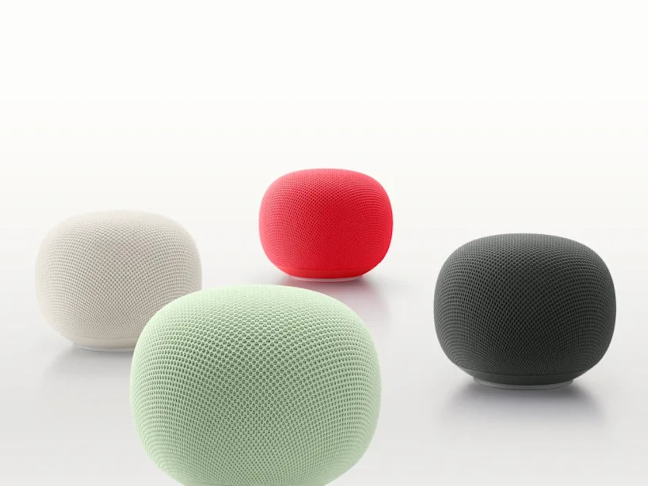
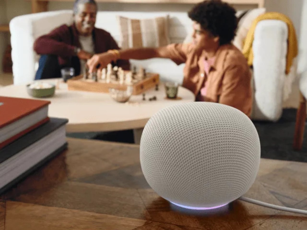
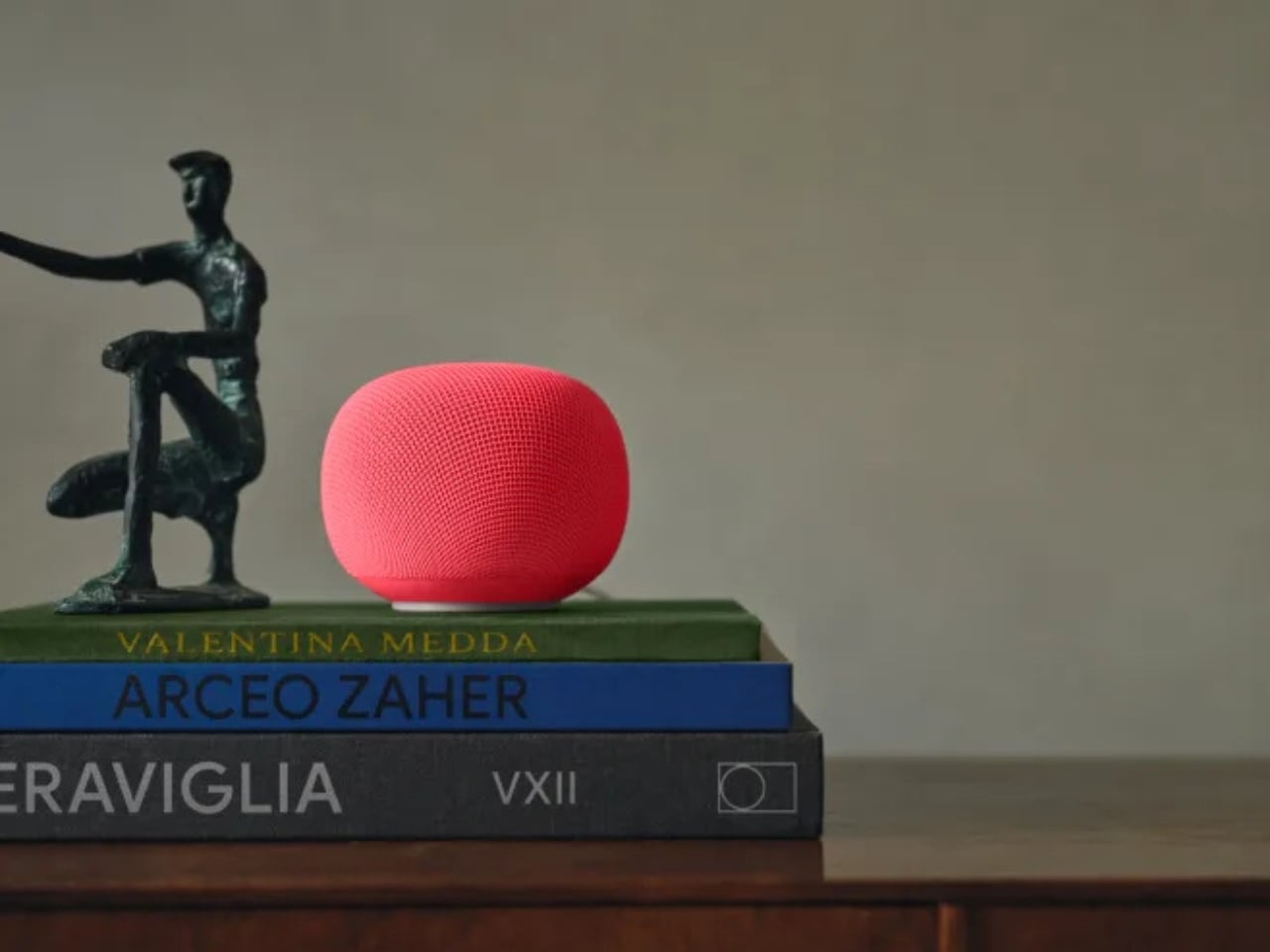
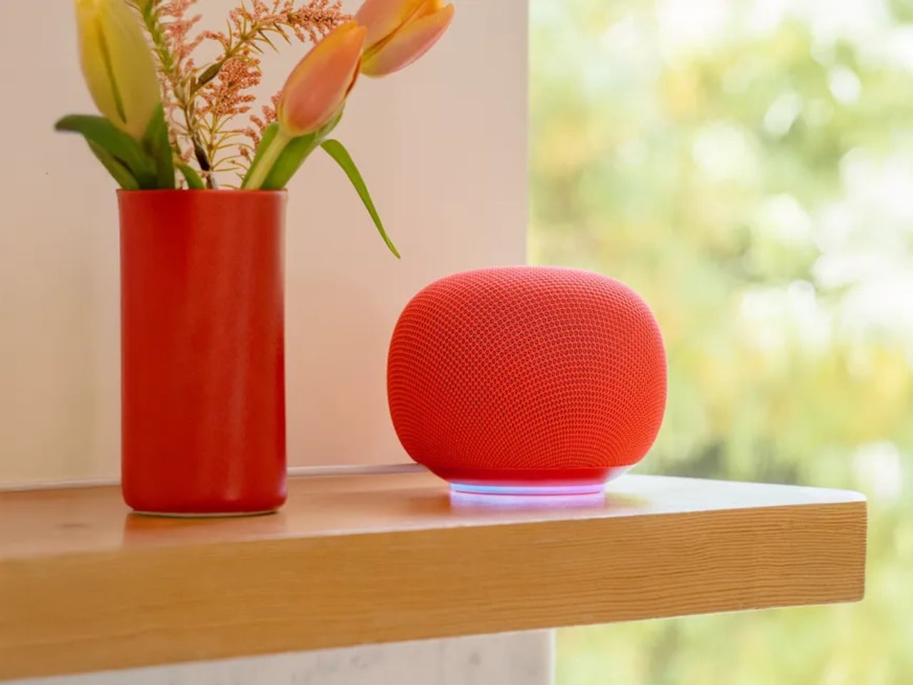
The new Google Home Speaker, officially arriving spring 2026 at $99.99 and heading to 19 countries, is not a Nest. That’s the first thing worth saying. Google dropped the Nest name entirely, and the shape that went with it. The speaker is round, compact, and wrapped in a 3D-knitted eco-friendly fabric that reads less like a gadget and more like something you’d find alongside handmade ceramics and artisan candles on a design blog. Google is calling the colorways Berry, Hazel, Jade, and Porcelain. Those aren’t accident names. That’s homeware language, not consumer electronics language.
Designer: Google
That shift matters more than it might seem. The naming tells you exactly who Google is designing for now, and it isn’t the person who organizes their cable management. Porcelain and Hazel are colors a person picks when they’re thinking about how something looks on a bookshelf, not which one has the best specs. Whether the average buyer consciously registers this or not, the vocabulary of the product positions it closer to a Muji lamp than a mesh Wi-Fi node. For a category that has long been aesthetically stranded, that’s a meaningful move.
Underneath the fabric, the hardware story is genuinely interesting. The Google Home Speaker is built around Gemini for Home, which means it isn’t running a legacy assistant clumsily retrofitted with new AI layers. It has custom processing designed specifically for Gemini’s computational demands, meant to make conversations feel faster and more natural. A new light ring gives visual feedback as Gemini listens, thinks, and responds. The speaker also delivers 360-degree sound and supports stereo pairing. At $99, that’s a competitive package, especially compared to what Amazon and Apple are currently offering in the same price range, which hasn’t changed much in years.
Here’s the angle that gets underplayed in most coverage: Google built this speaker to coexist in an ecosystem that’s already expanding before the device even ships. Walmart’s Onn smart speaker appeared in CSA Matter filings in early May 2026, suggesting a budget tier of Gemini-compatible hardware is on its way. Google confirmed last October that Walmart’s Onn devices would work within Google Home. A $99 Google speaker alongside a cheaper third-party Gemini option creates a layered ecosystem where entry-level users get into the platform and those who want a more refined experience buy the Google-branded version. That’s a smarter market play than Google has made in this category in years.
What makes me take this launch seriously isn’t the hardware alone. Amazon has Alexa, which has gone through its own AI reinvention but still carries the aesthetic baggage of the cylinder era. Apple’s HomePod is excellent and priced accordingly. Sonos is navigating its own turbulent chapter. None of them are shipping something that looks like a river stone, costs $99, and runs a genuinely current large language model. Google, for once, doesn’t have obvious company in that specific lane.
The question I keep sitting with is whether the design conviction will hold once the product is actually in people’s homes. It’s easy to look good in product shots, and the Nest Audio looked great too. But if Google has genuinely committed to positioning this as a home object first and a gadget second, and if the Gemini experience inside it is as conversational as promised, then spring 2026 could mark something worth paying attention to.
The smart speaker had a moment, then it plateaued. A pebble-shaped $99 AI speaker with pastel names and a language model built for conversation might not sound revolutionary. Compared to what’s been sitting on kitchen counters for the last five years, though, it kind of is.
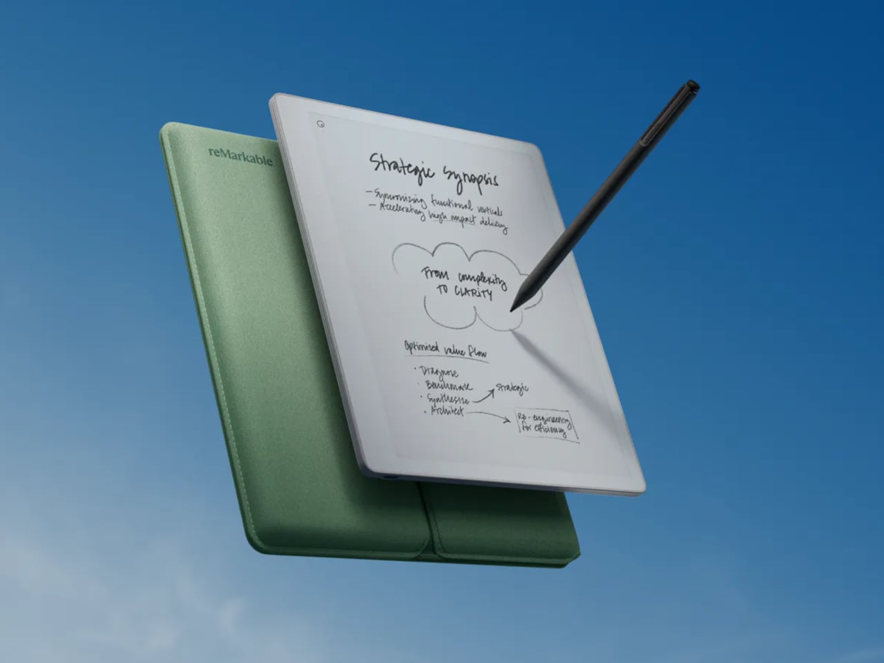
There’s a particular kind of frustration that comes with trying to take notes on a device that also wants to tell you about emails, calendar reminders, and a dozen app updates. A general-purpose tablet is extraordinary for many things, but for someone who simply wants to write, it’s often too much. That gap is exactly where reMarkable has built its reputation, and the Paper Pure is its clearest statement yet.
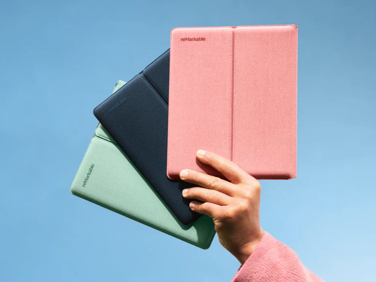
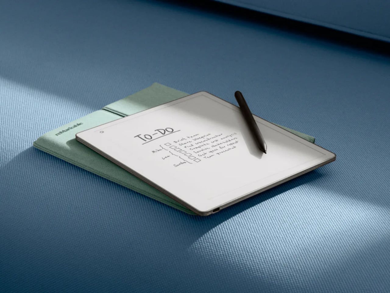
The Paper Pure launched as the direct successor to the reMarkable 2, priced at $399 with a Marker stylus and six replacement tips included. A $449 bundle adds the Marker Plus, which features a built-in eraser, along with a Sleeve Folio for protection. It’s a focused proposition for a focused device: write, read, annotate, and essentially nothing more.
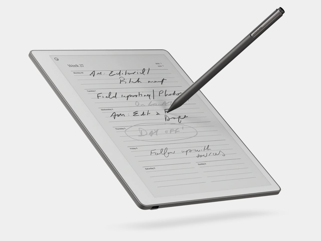
The display is the centerpiece of what’s improved, which reMarkable calls a third-generation Canvas screen, built on E Ink’s Carta 1300 panel and delivering 20% more contrast than the reMarkable 2’s display. Ink promises to appear darker and crisper on a background that reads as noticeably whiter and more paper-like. An adjustable reading light is new to this form factor in the lineup, finally making the device usable in dim rooms.
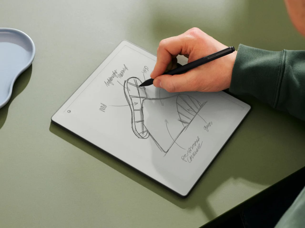
Writing responsiveness matters as much as display quality on a device like this, and the Paper Pure advertises 21ms of latency. That’s fast enough to feel genuinely natural, especially combined with the textured surface that gives the Marker tip just enough drag to mimic paper. The Marker now recharges magnetically when attached to the side of the tablet, so there’s no separate cable to manage.
A three-week battery rating changes how you think about the device entirely. You stop treating it like a phone that needs a nightly top-up and start treating it more like a paper notebook you just pick up and toss in a bag. The internal storage also grew from 8GB to 32GB, and RAM doubled from 1GB to 2GB, both contributing to a noticeably snappier experience.
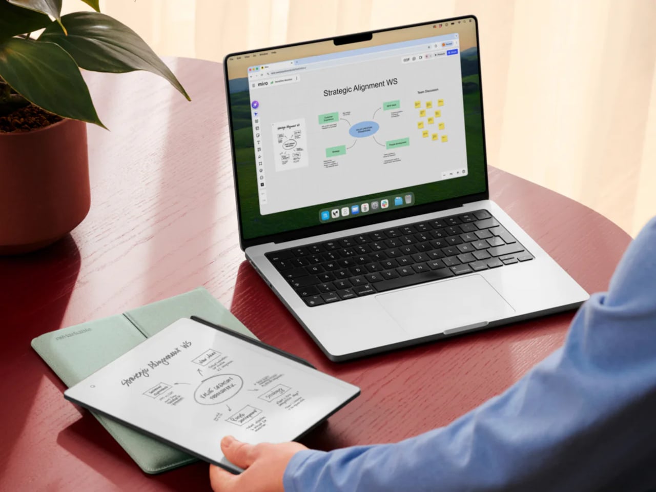
Notebooks sync to your phone or desktop through the reMarkable apps, and a Connect subscription unlocks cloud storage and handwriting-to-text conversion. The operating system stays deliberately out of the way, offering no browser, no email, and no app store. Whatever you write on the Paper Pure stays on the Paper Pure unless you choose to share it, which turns out to be a surprisingly refreshing constraint.
The back panel is now fully plastic, which sounds like a downgrade but actually makes the device more durable in everyday use. It’s also 44g lighter than the reMarkable 2, landing at around 360g total. What’s intentionally gone is support for keyboard accessories and the pogo pins that enabled them; those features belong to the Pro lineup, and the Paper Pure isn’t trying to compete.
It comes in Ocean Blue, Mist Green, and Desert Pink, three colors with more personality than the reMarkable line has typically offered. Orders opened on May 6, with first shipments expected in early June. At $399, it’s the most accessible entry into reMarkable’s current lineup, and for anyone whose main reason for wanting a tablet was always just to write, it makes a compelling argument for simplicity.