Instagram vs Impact: How Design Awards Separate Digital Noise from Real Value

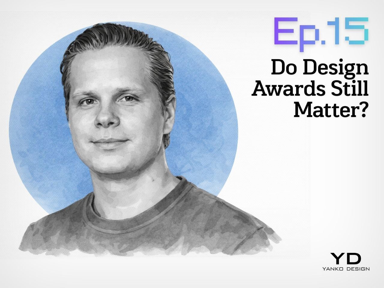
Yanko Design’s new podcast, Design Mindset, continues to bring fresh perspectives from design leaders around the world. Every week, this series (Powered by KeyShot) explores critical questions shaping the future of design, from recognition and validation to the evolving role of awards in our digital age. Episode 15 tackles a particularly timely subject: whether design awards still hold relevance when every designer has Instagram, Behance, and LinkedIn at their fingertips.

Jova Zec, Vice President of Red Dot Awards, joins host Radhika Seth for a candid discussion about the changing landscape of design recognition. As the second generation leading one of the world’s most prestigious design competitions (founded by his father, Professor Dr. Peter Zec), Jova brings a unique vantage point on how awards have transformed over three decades, from insider validation to global influence. He’s actively reshaping what recognition means in 2025 and beyond, viewing it as a responsibility rather than simply a reward.

Download your Free Trial of KeyShot Here

From Visibility to Validation: What Awards Mean Now

Jova recalls a time when getting recognized meant appearing on TV or in newspapers. For designers especially, having their own platform was nearly impossible. But now, with Instagram profiles and countless social media options, the landscape has completely changed. This shift has fundamentally altered what design awards need to offer the creative community.

The focus has pivoted from providing visibility to providing qualification. Awards have evolved from megaphones to validators, from amplifiers to authenticators. Jova explains that nowadays, the emphasis lies on being qualified by Red Dot as somebody who produces something that carries genuine value, helping designers prove that their work matters beyond popularity metrics. In a world drowning in content, expert validation proves that a designer’s work holds timeless value beyond digital noise.

The Four Qualities That Separate Impact from Noise

Red Dot evaluates submissions based on four core qualities: functionality, use, responsibility, and seduction. Interestingly, Jova highlights seduction as perhaps the most important. This quality creates the emotional connection that makes consumers genuinely want a product. While functionality and responsibility might seem self-explanatory, seduction is what really drives desire and adoption in the marketplace.

This evaluation approach allows Red Dot to look past short-term viral gimmicks that might rack up likes online. The judges evaluate products on timeless criteria that have remained consistent across the award’s history. Washing machines, for instance, might all look similar to casual observers, but there’s often extraordinary design work happening in the details. Quality never changes; it’s about the experience. If you experience a quality moment with a product, that experience stays the same whether it happened 50 years ago or will happen 100 years from now.

Meta-Categories: Recognizing Invisible Excellence

One of Red Dot’s most significant evolutions has been the introduction of meta-categories. While core principles remain constant, these categories allow Red Dot to highlight specific aspects of design that deserve elevation. The innovative category, for example, recognizes technologically advanced ideas that may lack polish but carry revolutionary potential. Red Dot has also introduced a sustainability meta-category to encourage environmental responsibility.

When Radhika presents Jova with a hypothetical scenario (a sustainable packaging startup with genuinely innovative biodegradable materials that’s technically brilliant but doesn’t photograph beautifully), his response perfectly illustrates this approach. Such a product would win both the innovative award for finding a solution that could revolutionize the industry and the sustainability award for its environmental impact. Winners of these meta-category awards then gain access to a network that includes experts in visual and seductive design, fostering collaboration that can yield products blending sustainable innovation with high aesthetic quality. Leaving such innovation unrecognized is never an option.

Validation Matters at Every Career Stage

The conversation turns personal when discussing how recognition affects designers differently throughout their careers. Jova’s observation is insightful: the importance to the person themselves always stays the same. Whether you’re a design legend or an emerging talent, validation matters deeply.

For established professionals and design legends, winning a Red Dot confirms they’re still performing at the level they believe they are, that they remain in the mindset of the current generation. For young designers trying to establish themselves, awards serve as career kickstarters. Jova shares stories of students who took part in Red Dot, won something, and immediately got employed by major companies wanting their design talent. Beyond career advancement, recognition provides crucial feedback from professionals who aren’t involved in your project and may have never met you before. This validation boosts self-esteem and helps designers affirm they’re on the right path, especially when they’ve just created something great and need confirmation to continue in that direction.

Recognition as Responsibility: Creating a Better World

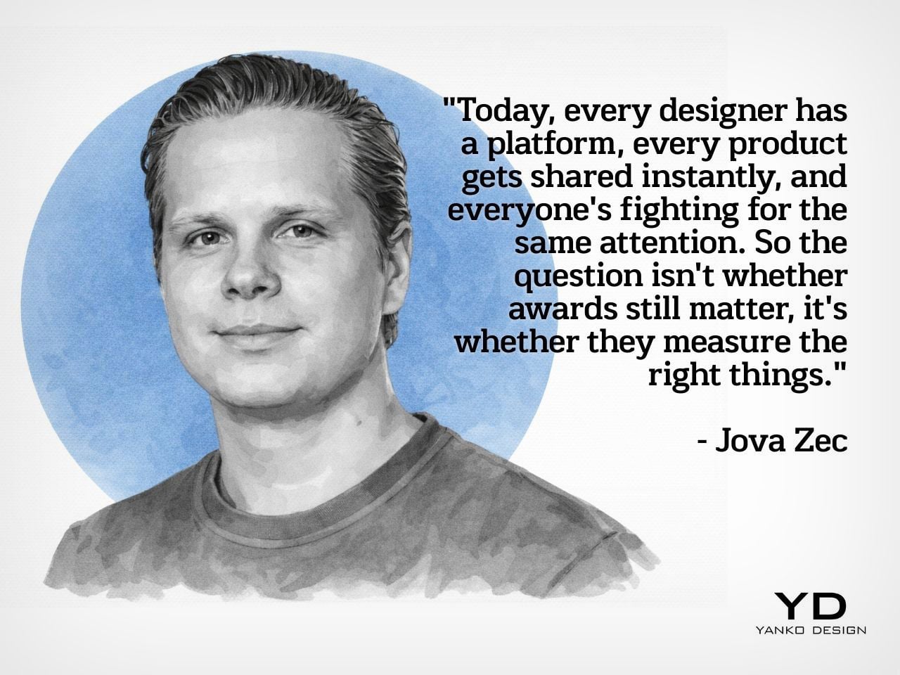
The overarching theme throughout the conversation is that recognition has evolved significantly in its purpose and meaning. As Jova reflects, he’s watched recognition transform from something designers hoped for to something they expect, from validation to influence, from celebration to obligation. Today, every designer has a platform, every product gets shared instantly, and everyone’s fighting for the same attention. The question isn’t whether awards still matter; it’s whether they’re measuring the right things.

When asked during the rapid fire round what recognition should ultimately create, Jova offers two words: a better world. The biggest misconception designers have about awards? That it’s all a scam. The most overrated aspect of design recognition today? Just designing something that is very popular but lacks usefulness. This episode of Design Mindset crystallizes something important: in an age when anyone can go viral and content floods every feed, expert validation becomes more critical than ever. Awards that maintain rigorous standards and evaluate based on timeless principles fulfill a vital function, steering the design community toward values that matter: quality, responsibility, innovation, and seduction. The future belongs to awards that actively create conditions for great design to flourish.

Design Mindset, Powered by KeyShot, premieres every week with new conversations exploring the minds shaping the future of design. Listen to the full episode with Jova Zec to hear more insights on recognition, Red Dot’s evolution, and what makes design truly timeless.

Download your Free Trial of KeyShot Here

The post Instagram vs Impact: How Design Awards Separate Digital Noise from Real Value first appeared on Yanko Design.

The Only 10 Designs You Need to Start 2026 Right

A new year offers permission to refresh, recalibrate, and reimagine the things that surround you. Not through drastic overhauls, but through intentional upgrades that make daily life smoother, smarter, and more satisfying. These ten designs aren’t about chasing trends or filling space. They’re about solving problems you didn’t know had such elegant answers.

Each piece here earns its spot through thoughtful engineering, aesthetic restraint, or sheer utility. Some will help you work better, others will keep you grounded when things go sideways, and a few exist simply to make the ordinary feel remarkable. Starting 2026 right means surrounding yourself with objects that respect your time, elevate your routines, and age gracefully alongside your ambitions.

1. ChatGPT-Enabled TWS Earbuds with Built-In Cameras

The idea of wearing cameras near your ears might sound dystopian at first, but this concept from designers reimagining AI hardware makes a surprisingly strong case. Each earbud features a small camera positioned at the end of an extended stem, roughly aligned with your natural line of sight. Paired with ChatGPT, the setup turns your audio gear into a live visual assistant that can translate signs, describe surroundings, read menus, and guide you through unfamiliar cities without forcing you to stare at a screen. The form stays recognizable as earbuds, but the function feels genuinely new.

What sets this design apart is how it sidesteps the awkwardness of face-mounted cameras while keeping the tech close enough to be useful. The industrial design leans into a retro sci-fi aesthetic, with the lens sitting like a tiny action cam, surrounded by a colored ring that serves as both an accent and a functional cue. Translucent tips and playful shell colors keep it from looking overly serious. It reads as audio first, AI second, which matters when you’re asking people to trust optics hanging off their heads.

What we like

  • The camera placement avoids the social friction of smart glasses while staying in your natural line of sight.
  • Pairing visual input directly with conversational AI turns assistance into something ambient rather than intrusive.

What we dislike

  • Battery life will likely take a hit with dual cameras running alongside audio and AI processing.
  • The inevitable privacy conversation around always-available lenses in public spaces.

2. RetroWave 7-in-1 Radio

Some mornings call for jazz and coffee. Other days demand emergency power and a working flashlight. The RetroWave handles both without flinching. This compact device packs seven functions into one retro-styled body: Bluetooth speaker, MP3 player, FM/AM/SW radio, flashlight, clock, power bank, and SOS siren. It streams from your phone or plays music directly from USB and microSD cards, making it useful whether you’re online or completely off-grid. The hand-crank and solar panel charging options mean you’re never fully powerless.

Beyond survival scenarios, the RetroWave fits surprisingly well into everyday routines. It sits comfortably on a nightstand as a clock radio, doubles as a desktop speaker during work hours, and transitions into a camping essential on weekends. The 2000mAh battery delivers up to 20 hours of radio time or six hours of emergency lighting. Its lightweight build and thoughtful design make it easy to pack and easier to justify keeping around. It’s the kind of object that earns its spot by being genuinely useful, then stays because it looks good doing it.

Click Here to Buy Now: $89.00

What we like

  • True multi-functionality that works in daily life and crises alike.
  • Hand-crank and solar charging remove dependency on outlets entirely.

What we dislike

  • The 2000mAh battery feels modest for powering multiple devices in extended off-grid situations.
  • Retro styling won’t appeal to everyone seeking modern minimalism.

3. Auger PrecisionLever Nail Clipper

Grooming tools often get overlooked in design conversations, but a well-made clipper can turn a mundane task into something oddly satisfying. The Auger PrecisionLever uses a patented rotating lever mechanism that shifts the pivot point closer to the blade, maximizing cutting power with minimal hand effort. Made from stainless cutlery steel by Japan’s Kai Corporation, a blade-making authority since 1908, the clipper delivers clean cuts through thick nails without tearing or splitting. At 67 grams, it carries enough weight to feel substantial without being cumbersome.

The design balances mechanical efficiency with understated aesthetics. The zinc die-cast lever features a sleek plated finish, while thermoplastic stoppers and a stainless steel filing surface add functional durability. At 86mm in length, it slips easily into a Dopp kit or drawer. The press-and-release action is smooth and quiet, delivering crisp results without the jarring click of cheaper clippers. It’s grooming stripped to essentials: precise, deliberate, built to last, and refined enough to make you appreciate the engineering behind something you use weekly.

Click Here to Buy Now: $49.00

What We Like

  • The patented rotating lever reduces effort while increasing control, especially on thicker nails.
  • Kai’s century of blade-making expertise translates to noticeably cleaner cuts.

What We Dislike

  • The 67-gram weight, while satisfying in hand, makes it heavier than most travel clippers.
  • Premium pricing may feel steep for a category that people usually buy cheaply.

4. Fire Capsule Oil Lamp

Candlelight without the mess, wax, or weak flame. The Fire Capsule reimagines the oil lamp as a modern minimalist object, wrapped in sleek cylindrical glass with a precision-engineered lid that keeps dust out and clarity intact. The 80ml capacity provides up to 16 hours of continuous light, enough for a full evening gathering or an extended power outage. Burn paraffin oil with insect-repelling properties, and it becomes an outdoor companion that sets ambiance while keeping bugs at bay. An included aroma plate lets you infuse spaces with scent, turning functional lighting into a sensory experience.

What makes the Fire Capsule work is its refusal to compromise portability for aesthetics. At just 180 grams, it’s light enough to pack for camping trips or move between rooms without thought. The flat-topped design allows stacking for storage, and it comes with a protective drawstring pouch. Paraffin oil burns clean and odorless, making it approachable for beginners while offering reliability for experienced users. It’s the kind of object that transitions seamlessly from dinner party centerpiece to emergency kit essential, looking intentional in both contexts.

Click Here to Buy Now: $89.00

What we like

  • Sixteen hours of burn time from a compact, stackable form that travels easily.
  • Clean-burning paraffin oil eliminates the smoke and scent issues of traditional candles.

What we dislike

  • Paraffin oil requires a separate purchase and proper storage, adding a layer of maintenance.
  • Open flame always carries risk, requiring more supervision than battery-powered alternatives.

5. BØYD Minimalist Espresso Machine

The BØYD espresso machine concept strips coffee-making down to pure geometric form. NYZE Studio designed it as a sculptural statement first, functional appliance second, though the two aren’t mutually exclusive. Smooth curves and clean lines replace the usual visual clutter of traditional machines. The handle arches naturally for ergonomic grip, and the interface stays minimal, eliminating the multi-button confusion that often accompanies morning caffeine rituals. It’s the kind of design that makes you reconsider what kitchen appliances could look like if form and function started on equal footing.

Though still conceptual, the BØYD demonstrates how thoughtful industrial design can transform utilitarian objects into conversation pieces. The silhouette feels more like modern sculpture than a small appliance, yet the user experience remains intuitive. Imagining it on a countertop, it commands attention without demanding maintenance or complexity. For coffee lovers who care as much about their space as their brew, it’s a vision of what’s possible when designers prioritize restraint over feature bloat. It’s also a reminder that sometimes the best designs exist first as provocations, pushing categories forward even before production begins.

What we like

  • Bold minimalist form turns a functional appliance into a sculptural statement piece.
  • Simplified interface suggests a more intuitive, less overwhelming user experience.

What we dislike

  • As a concept, it’s not available for purchase or real-world testing.
  • Extreme minimalism may sacrifice the practical features that experienced espresso users expect.

6. Bookish Bookmark

Reading shouldn’t require improvised solutions like mugs, random objects, or cracked spines. The Bookish bookmark solves a persistent problem with elegant simplicity: it’s a book-shaped transparent paperweight with curves designed to hold pages open naturally. Made from clear acrylic resin, it sits across your book without blocking text, letting you read hands-free while protecting pages from smudges or accidental creases. The curved form respects the book’s natural arc rather than forcing it flat, preserving spine integrity while keeping your place.

The genius here is restraint. Instead of adding complexity, the design removes friction from an activity that should be relaxing. It works equally well for cookbooks in the kitchen, textbooks on a desk, or novels on a nightstand. The transparency ensures it doesn’t interfere with your reading experience visually, while the weight keeps pages secure without damage. For anyone who’s ever balanced a book awkwardly while eating, taking notes, or trying to follow a recipe, this is the kind of micro-solution that feels obvious in hindsight but surprisingly rare in practice.

Click Here to Buy Now: $65.00

What we like

  • Transparent design allows uninterrupted reading while keeping pages open securely.
  • Curved shape holds books naturally without damaging spines.

What we dislike

  • Acrylic scratches over time with regular handling and storage.
  • Size may not accommodate very large or very small books equally well.

7. Memento Business Card Log

In a digital age, handwritten notes carry unexpected weight. The Memento Business Card Log preserves the memory of every important meeting by pairing physical cards with space for personal observations. It holds up to 120 business cards using a two-point slit system, with a dedicated room beside each card for jotting down conversation details, characteristics, dates, or context. Those handwritten notes become memory triggers, helping you reconnect with both the person and the moment long after the meeting ends.

Japanese brand Re+g brings expert craftsmanship to organizational tools, using a proprietary binding system that allows seamless page reordering and easy reorganization as your network grows. The minimal paper design offers a warm, tactile experience that elevates this beyond simple storage into something closer to a professional journal. For people who value relationships built slowly through attention and follow-through, it’s a tool that respects the analog ritual of connection. It acknowledges that sometimes the best way to remember someone isn’t through CRM software, but through your own words written in the moment.

Click Here to Buy Now: $35.00

What we like

  • Combines card storage with note-taking space, creating a richer context for each contact.
  • The proprietary binding system allows flexible reorganization as your network evolves.

What we dislike

  • Physical storage requires dedicated space compared to digital contact management.
  • Capacity maxes out at 120 cards, requiring eventual archiving or purging.

8. AirTag Carabiner

Forgetting where you left your bag, bike, or umbrella becomes significantly less stressful when Apple’s Find My network can pinpoint it. This handcrafted metal carabiner holds an AirTag securely while attaching to nearly anything you’d rather not lose. Made from Duralumin composite alloy, the same material used in aircraft and spacecraft, it’s lightweight yet remarkably strong. Each piece is individually crafted by hand, also available in untreated brass and stainless steel for different aesthetic preferences.

The engineering behind Duralumin makes it suitable for extreme environments, from high altitudes to marine use, meaning your everyday carry won’t wear out from rain, bumps, or daily abuse. The carabiner clips easily onto bag straps, bike frames, or jacket loops, turning Apple’s tracking ecosystem into a passive insurance policy for your belongings. For busy people who’d rather spend mental energy on meaningful decisions than retracing steps, it’s a small investment in peace of mind. The tactile quality of metal also makes it feel like a deliberate accessory rather than a cheap plastic add-on.

Click Here to Buy Now: $149.00

What we like

  • Duralumin alloy provides aircraft-grade strength at minimal weight, ensuring durability in varied conditions.
  • Handcrafted quality and material options give it accessory-level appeal beyond pure function.

What we dislike

  • Requires separate purchase of Apple AirTag, adding cost and platform dependency.
  • Carabiner attachment may not suit all bags or accessory types equally well.

9. Smart Tea Pot

Tea brewing becomes genuinely personalized with this smart teapot that tailors every cup to your biometric data and environment. Six built-in sensors analyze heart rate, finger temperature, and ambient conditions, then adjust brewing parameters to match your physical state and mood. An app-connected system lets you select tea types from a comprehensive database containing optimal conditions for varieties from green to herbal. A patented rotary brewing system replicates traditional Japanese tea master techniques, mimicking the nuanced wrist movements that bring out full-bodied flavor and aroma.

What elevates this beyond gadget territory is how it removes guesswork while honoring tea culture’s precision. Each brew adapts to whether you need relaxation or focus, automatically adjusting temperature, steeping time, and agitation intensity. The interface stays intuitive despite advanced tech underneath, and the sleek design fits naturally into modern kitchens. For tea enthusiasts tired of inconsistent results or intimidated by traditional preparation complexity, it offers a middle path: professional-grade quality through automation that respects the ritual. It’s technology serving tradition rather than replacing it.

Click Here to Buy Now: $349.00

What we like

  • Biometric sensors personalize each brew to your current physical and emotional state.
  • Comprehensive tea database ensures optimal brewing conditions across a wide variety of tea types.

What we dislike

  • App dependency means the teapot’s advanced features require smartphone connectivity to function fully.
  • Price point likely positions it well above standard electric kettles and traditional teapots.

10. ScytheBlade

The ScytheBlade takes visual inspiration from the Grim Reaper’s signature tool, scaling the curved blade profile down into a tiny EDC knife that punches well above its weight class. At just 46mm in length when deployed and weighing only 8 grams, it’s one of the smallest folding knives available without sacrificing capability. The body is crafted from lightweight titanium, offering exceptional strength and corrosion resistance without demanding constant maintenance. The curved blade design, reminiscent of both scythes and tiger claws, concentrates cutting power efficiently despite compact dimensions.

Titanium construction ensures durability that outlasts cheaper materials while remaining virtually unnoticeable in a pocket until needed. The tiger claw blade profile isn’t just aesthetic; it provides leverage and cutting efficiency that straight blades struggle to match at this scale. For anyone seeking a backup blade that won’t weigh down a keychain or require special care, the ScytheBlade delivers. It’s proof that smart material choices and thoughtful blade geometry can create something genuinely capable without requiring a belt sheath or bulk. The design respects both form and function, looking deliberate while performing reliably.

What we like

  • Titanium construction provides an exceptional strength-to-weight ratio at only 8 grams.
  • Curved blade profile maximizes cutting efficiency despite an extremely compact 46mm deployed length.

What we dislike

  • Small size, while portable, limits cutting capacity for larger tasks or extended use.
  • Unique blade shape may require adjustment for users accustomed to traditional knife designs.

Why These Ten Designs Matter

Starting a year right isn’t about acquiring more things. It’s about choosing objects that align with how you actually live, work, and move through the world. These ten designs share common DNA: they solve real problems with restraint, respect your intelligence, and refuse to sacrifice aesthetics for function or function for aesthetics. They’re the kinds of purchases you make once and keep using.

Whether it’s a clipper that makes grooming feel intentional, a radio that keeps you connected when infrastructure fails, or a teapot that finally understands tea as both science and art, these designs earn their space. They represent the best of what thoughtful design offers: objects that improve daily life quietly, age gracefully, and remind you that quality still matters when everything else feels disposable and temporary.

The post The Only 10 Designs You Need to Start 2026 Right first appeared on Yanko Design.

Ovme Smart Mirror System Lets You See, Feel, and Fit Virtual Outfits

The everyday “what should I wear today?” moment has gotten more complicated by online shopping. You can scroll endless outfits, but a screen cannot show how something fits, feels, or plays with what you already own. Ovme is a concept that treats the mirror as a missing link between your closet, your feed, and your actual body, closing the gap between seeing and knowing.

Ovme is an AR smart mirror ecosystem built around three objects: a full-height mirror, a sensor-laden fitting belt, and a haptic tactile table, plus a companion app. The name stands for “Own version of me,” and the system is designed to help you find new styles, feel how they fit, and touch virtual fabrics before you ever click buy or open your wallet.

Designers: Daun Park, Seyeon Park, Chawon So, Yewon Shim, Yejin Hong

The mirror acts like a personal stylist, overlaying outfits on your reflection and pulling from three sources: new looks, your existing wardrobe, and reference images you feed it. You can swipe through categories like formal, sporty, or feminine, and see complete outfits assembled around your silhouette, then save the ones that feel right into a virtual closet for later when you need inspiration or want to revisit.

The fitting belt is a flexible band with sensors that can wrap around your head, waist, or thigh. It measures circumference and applies gentle pressure, tightening or loosening to simulate how a garment would hug or hang on that part of your body. On the mirror, the virtual outfit responds in real time, turning fit from a guess based on size charts into something your body can actually sense.

The tactile table is a slim pedestal with a haptic surface that uses electro-tactile feedback to mimic fabric textures. When you place your hand on it, the system can suggest sensations like smooth silk, textured knit, or structured leather in sync with what you see in the mirror. It attempts to close the gap between seeing a material and knowing how it might feel against your skin or draped over your shoulders.

Ovme also acts as a style diary. It can scan what you are wearing today, score the outfit, and save it to a timeline called My Closet, so you can revisit past looks and see patterns in what you actually wear. A social layer called OvUS lets you browse other people’s saved styles and mood boards, turning the mirror into a place to share and borrow ideas rather than stare at yourself alone.

Ovme treats getting dressed as an ongoing design process, not a daily panic, and uses AR, haptics, and sensing to give online fashion some of the feedback loops of a real fitting room. Whether or not this exact hardware ever ships, the idea of a home mirror that helps you experiment, feel, and remember your style captures a direction that deserves attention, especially as wardrobes become more scattered across platforms and shopping becomes more remote.

The post Ovme Smart Mirror System Lets You See, Feel, and Fit Virtual Outfits first appeared on Yanko Design.

This 3D-Printed Clock Uses Orbital Rings to Tell Time

You know that moment when you see something so clever you wonder why it hasn’t been done before? That’s exactly what happened when I came across Denis Turitsyn’s Radius Clock. This isn’t just another minimalist timepiece fighting for wall space in your Pinterest feed. It’s a genuinely fresh take on something we look at dozens of times a day without really seeing anymore.

The concept is simple but brilliant. Turitsyn looked up at the solar system and thought, what if a clock worked like that? Planets orbit at different speeds and distances from the sun, each following their own path. The Radius Clock captures that same energy, turning timekeeping into something that feels alive and kinetic rather than just functional.

Designer: Denis Turitsyn

Here’s where it gets interesting from a design perspective. Instead of the traditional center-mounted mechanism we’ve all grown up with, the hour and minute hands on this clock are driven by external rings hidden behind the case. Picture it like invisible tracks guiding each hand at its own pace. The second hand, meanwhile, runs on a completely separate motor that’s mounted right at the base of the hour hand. It’s this layered independence that gives the clock its orbital quality.

What really caught my attention is how Turitsyn balanced artistic vision with practical engineering. The dial is 3D printed using FDM technology on a standard desktop printer. That’s the kind you could theoretically have in your home or studio, not some industrial-grade machine. This accessibility makes the design feel less like an untouchable art piece and more like something that could actually exist in the real world of production and commerce.

The hands themselves are made from a lightweight metal alloy, which might sound like a small detail but it’s actually crucial to the whole operation. Lighter hands mean less mechanical stress on the system, which translates to smoother movement and longer lifespan. It’s the kind of thoughtful problem-solving that separates concept designs from functional products. Behind that sculptural white body, two synchronized motors work in tandem to drive the hour and minute hands. This paired configuration isn’t just redundancy for the sake of it. It keeps the system balanced and prevents uneven load on those hidden rings, which means the clock can maintain precise timekeeping over months and years rather than gradually falling out of sync.

The second hand solution is particularly clever. Its miniature motor comes with an integrated battery and sits directly at the base of the hour hand. This setup lets the seconds tick away independently without adding strain to the main mechanism. It’s a bit like having a parasite motor hitching a ride, but in the best possible way.

Visually, the Radius Clock has this organic, almost fluid quality. The concentric rings create depth and movement even when you’re looking at a still image. That bright orange second hand provides the perfect pop of color against the white body and black hands, making it feel contemporary without trying too hard to be trendy. You could see this fitting into a modern apartment just as easily as a creative studio or tech startup office.

What strikes me most about this design is how it makes you reconsider something as fundamental as reading time. We’re so conditioned to the standard clock face that we don’t question it anymore. Turitsyn’s orbital approach doesn’t make the clock harder to read, it just makes the experience more engaging. Time becomes something you observe rather than something you just glance at. The modularity shown in the photos, with multiple clocks arranged together on a wall, opens up even more possibilities. Imagine using these to display different time zones, or creating a sculptural installation that turns practical timekeeping into a genuine design statement.

Denis Turitsyn’s Radius Clock proves that even the most familiar objects still have room for innovation. By borrowing from the cosmos and combining it with accessible manufacturing technology, he’s created something that feels both futuristic and strangely timeless. It’s the kind of design that makes you pause and appreciate the everyday objects we usually take for granted.

The post This 3D-Printed Clock Uses Orbital Rings to Tell Time first appeared on Yanko Design.

LEGO And Creality Come Together in This Incredibly Detailed Ender-Inspired 3D Printer Model

LEGO and 3D printing occupy similar creative territory, both letting you turn ideas into physical objects through systematic processes. Yet despite this natural kinship, there’s never been an official LEGO model of the specific machine that’s currently democratizing small-scale manufacturing. This fan submission fixes that gap with a recognizably Ender-inspired design that captures both the utilitarian aesthetic and basic kinematic structure of Creality’s popular printer lineup.

The build doesn’t actually function like some ambitious LEGO projects (there’s a working LEGO Turing machine out there made from 2,900 bricks), but that’s not really the point. Someone unfamiliar with 3D printing could assemble this and understand how Cartesian motion systems work, how the hotend assembly relates to the build plate, and why those vertical lead screws matter for Z-axis stability. For people who already own an Ender or similar machine, it’s more about the novelty and nostalgia of seeing familiar hardware translated into a tabletop collectible to admire and cherish.

Designer: Guris14

Paying homage to the Ender 3 is fitting, since it was literally the first 3D printer for so many people, quite like an entire generation having a Nokia first phone. Creality sold hundreds of thousands of these things, maybe millions at this point, and the design became the default mental image of what a 3D printer looks like for an entire generation of makers. That boxy aluminum frame, the single Z-axis lead screw on earlier models (this LEGO version appears to reference the dual-screw V2), the bowden extruder setup with that blue PTFE tube snaking from the frame-mounted motor to the hotend. That characteristic black and silver color scheme with blue accent components has become as visually shorthand for “budget 3D printer” as the beige tower was for 90s PCs. Designer Guris14 scaled the model down from the Ender 3 V2’s actual 220x220x250mm build volume to something desk-friendly, but kept the proportions honest enough that you immediately recognize what you’re looking at.

What’s impressive is how the mechanical systems translate into LEGO’s vocabulary without completely abandoning accuracy. The Z-axis uses what appears to be LEGO’s ribbed hose pieces to represent lead screws, with the gantry able to move up and down the vertical supports. The X-axis gantry rides on a black beam that mimics the 2040 aluminum extrusion found on real Enders, while the hotend assembly hangs from a carriage with that signature blue bowden tube curling back toward the extruder. The build plate sits on a Y-axis assembly with its own lead screw mechanism, and there’s even a LEGO logo on the build-plate, like perfectly placed branding!

Flip the model and you’ll find representations of the motherboard and power supply tucked beneath the build plate, exactly where Creality positions them on the actual hardware. There’s that angled LCD screen mount on the front right corner, positioned just like the stock Ender setup. Even the spool holder perched on the top frame gets included, which is the kind of completeness that separates a thoughtful recreation from a surface-level approximation. You could hand this to someone who’s never seen a 3D printer and they’d walk away with a surprisingly accurate mental model of how these machines are structured.

The project currently sits on the LEGO Ideas website, where fans share their own creations and vote for their favorites. Lucky builds that hit the 10,000 vote mark move to the review stage where LEGO actually considers it for production. That’s always been the tricky part with Ideas submissions. You need a concept that’s simultaneously niche enough to excite enthusiasts but broad enough that LEGO thinks they can sell tens of thousands of units through their retail channels. A 3D printer model lives in an interesting space there. The maker community overlap is real and passionate, but you’re also asking LEGO to produce a set celebrating a technology that competes with their own manufacturing process in certain contexts.

Still, LEGO has greenlit plenty of sets that celebrate tools and technology. The Typewriter, the Polaroid camera, the various Technic construction vehicles, all of these acknowledge that people enjoy building detailed models of machines they find interesting or useful. A 3D printer fits that pattern perfectly, especially as these devices become more common in homes and schools. The educational angle writes itself: here’s a hands-on way to understand additive manufacturing without dealing with bed leveling or filament moisture. Whether that’s enough to get LEGO’s product team on board is another question entirely, but stranger things have made it through the Ideas gauntlet. The NASA Apollo Saturn V started as a fan submission. So did the ship in a bottle.

The post LEGO And Creality Come Together in This Incredibly Detailed Ender-Inspired 3D Printer Model first appeared on Yanko Design.

This Weird $12 Clip-On Gamepad Turns Your Smartphone Into a Game Boy Color

Playtiles looks like something that shouldn’t work. A thin piece of plastic with buttons, no electronics inside, sticking to your smartphone screen like a temporary tattoo. Yet this $12 accessory has managed to capture what expensive gaming phones and elaborate clip-on controllers often miss: the pure, uncomplicated joy of pressing actual buttons while playing retro-style games. The device ships with access to a curated library of indie titles that feel lifted straight from the Game Boy Color era.

The design strips away everything modern mobile gaming has become. No account setup, no firmware updates, no charging cables. You place it on your screen where the virtual controls appear, press the buttons, and play. Thousands of micro suction cups hold it in place during gameplay, and when you’re done, it slides back into your wallet next to your credit cards. After months of anticipation since July’s pre-order launch, units are now reaching backers who wanted to rediscover what handheld gaming felt like before touchscreens took over.

Designer: Playtile

The buttons work through capacitive conduction, using your own body’s electrical properties to register a press on the screen beneath. It’s a completely powerless system, which in a world of constant charging is a breath of fresh air. The entire polycarbonate unit weighs just 0.2 ounces and measures 2.68 by 1.57 inches, making it smaller than a credit card. This isn’t trying to compete with a Backbone or Razer Kishi; those are full-fledged peripherals that turn your phone into a console hybrid. Playtiles is a fundamentally different idea, an accessory so unobtrusive it feels more like a guitar pick than a piece of hardware.

Of course, the hardware is only half the story. The back of every Playtiles has a QR code that launches a browser-based OS, completely sidestepping the app stores. This is an incredibly shrewd move, giving the creators a direct channel to their audience without platform fees or gatekeepers. Early adopters who bought the Season 1 bundle get a new, bite-sized retro game delivered every week for twelve weeks, all built in GB Studio. This transforms a simple controller into a curated content platform. It solves the biggest problem with mobile gaming, which is finding good games amidst a sea of ad-riddled clones. You get a handpicked library that you know is designed perfectly for the D-pad and two-button layout.

You are obviously not going to be playing Genshin Impact on this thing. The two-button constraint is a feature, a deliberate design choice that forces a return to the focused game mechanics of the 8-bit and 16-bit eras. It works on any phone with a screen wider than 68mm, so long as the game lets you reposition the on-screen controls to align with the controller. That’s the key requirement. For $12, it’s an impulse buy that feels like a low-risk experiment in nostalgia. In a market where dedicated handhelds from companies like Anbernic command prices north of $100, the Playtiles carves out its own space by being almost disposable in price yet surprisingly robust in its concept.

The post This Weird $12 Clip-On Gamepad Turns Your Smartphone Into a Game Boy Color first appeared on Yanko Design.

Lexus LX 700h Overtrail Review: Overbuilt for the Road and That’s the Point

PROS:


  • Highway composure rivals luxury sedans despite off-road tires

  • Seats built for hours, not just showroom impressions

  • Hybrid torque smooths every merge and grade effortlessly

  • Genuine off-road hardware never compromises daily driving

  • Restrained design reduces visual bulk without losing presence

CONS:


  • Dual-screen infotainment takes time to internalize

  • Third row remains tight for adult passengers

RATINGS:

AESTHETICS
ERGONOMICS
PERFORMANCE
SUSTAINABILITY / REPAIRABILITY

EDITOR'S QUOTE:

The capability you'll never use shapes every mile you actually drive.

I spent a week with the 2025 Lexus LX 700h Overtrail on a family road trip. Not crawling over rocks. Not testing approach angles. Just driving, for hours, across highways and through small towns with my family loaded in.

Designer: Lexus

The Overtrail package is engineered for terrain I never touched. Electronically locking front and rear differentials. A torsen center diff. 33-inch all-terrain tires mounted on 18-inch wheels. Multi-Terrain Select with crawl control and downhill assist. Lexus built this thing to climb, descend, and articulate through conditions that would strand most luxury SUVs.

I used it to pick up coffee and cover 400 miles of interstate.

That disconnect sounds like a waste. It isn’t. The Overtrail’s capability translates into something unexpected on pavement: confidence that borders on calm.

Design Intent: Restraint Over Spectacle

Most off-road trims exaggerate aggression. Overtrail does the opposite. It reads like industrial equipment that happens to be finished well.

My tester arrived in Desert Moon Beige, a color that does real design work. In overcast light, it leans neutral and slightly cool. In direct sun, it warms without becoming flashy. There’s no metallic sparkle, no high-contrast drama. The finish behaves like a muted architectural surface, and that restraint helps the LX feel calmer and less imposing despite its size. For a vehicle this large, color choice matters more than most buyers realize. Desert Moon Beige actively reduces perceived bulk.

The Overtrail-specific dark spindle grille anchors the front fascia with no chrome and no bright interruptions. Horizontal slat density visually lowers the nose and widens the stance. The black surround ties directly into lower cladding and wheel arch trim, creating a continuous dark band that grounds the vehicle from every angle. Headlights sit high and slim, emphasizing width rather than height. The LED signature reads clean and controlled, not aggressive.

Wheel choice plays a bigger role than it first appears. The 18-inch black wheels with tall all-terrain sidewalls visually compress the body and soften the stance. That extra tire volume signals off-road intent, but it also calms the design. Larger wheels would have sharpened the edges and made the LX feel top-heavy. Instead, Overtrail looks grounded and planted, even parked. Tire tread is visible but not visually loud. Capable at rest, quiet in motion.

My vehicle included two options worth noting. Black side steps visually lower the body line and materially improve daily usability, making entry and exit easier on a family road trip without making the vehicle look less capable. A roof rack subtly changes the silhouette and adds a hint of expedition intent, but it remains proportionally integrated and introduces no visual clutter or noticeable wind noise. Both are optional, not standard, and both reinforce the configured nature of this specific vehicle.

Nothing about Overtrail pretends to be lightweight or sporty. The surfaces are thick. Panel gaps look engineered for durability, not minimized for show. It feels designed to survive abrasion, dust, and neglect without losing its identity. In this exact configuration, the LX 700h Overtrail looks intentional, grounded, and restrained. It doesn’t read as an off-road costume. It reads as a long-distance vehicle that happens to be engineered far beyond what most daily driving demands. That material honesty carries into the cabin.

Cabin Design: Luxury Filtered Through Utility

Inside, Overtrail prioritizes clarity, durability, and spatial calm. These qualities become obvious after hours behind the wheel.

The seats deserve specific credit. Cushions are broad and upright, with a firmness that supports posture rather than sinking you in. On a road trip, this matters more than initial plushness. Hours in, fatigue stays low. Lexus tuned these seats for sustained comfort, not showroom softness.

Material choices reinforce that goal. Leather surfaces feel resilient rather than delicate. Trim finishes avoid gloss in favor of textures that diffuse light. In changing daylight conditions, the cabin stays visually quiet. No glare. No sparkle. That reduces cognitive load on long highway stretches.

The dual-screen layout finally makes sense in this context. The upper 12.3-inch display handles navigation and media without feeling crowded. The lower 7-inch screen anchors climate and vehicle functions in a fixed visual zone. This separation reduces hunting for controls. Muscle memory builds quickly when you’re driving for hours rather than minutes.

Physical controls deserve credit. Knobs and buttons for key functions feel deliberate and weighted. Lexus resisted the urge to bury everything in menus, and that restraint pays off when you’re adjusting climate or audio repeatedly during a 6-hour drive.

Powertrain: Hybrid Torque Without Drama

The 3.4-liter twin-turbo V6 hybrid pairs with a high-torque electric motor and 10-speed automatic. Output reaches 457 horsepower and 583 pound-feet of torque, significantly more twist than the non-hybrid LX600.

On paper, those numbers suggest performance ambitions. In practice, the hybrid system plays a subtler role. It smooths transitions and fills gaps rather than announcing itself.

Throttle response feels immediate without being jumpy. Low-speed acceleration is effortless, especially when merging or climbing grades. The electric assist masks turbo lag and prevents the drivetrain from feeling strained under load. At highway speeds, the LX settles into a relaxed cruising rhythm. Engine noise stays muted. Gear changes are unobtrusive.

The vehicle never feels confused about its identity. Power delivery remains linear and confident, reinforcing the sense that this is a long-distance machine. EPA ratings land at 19 city, 22 highway, and 20 combined. Real-world highway testing shows around 20 mpg on premium fuel. The roughly 22-gallon fuel tank helps offset the hybrid system’s modest efficiency gains, though range still trails some non-hybrid rivals due to weight and tire choice. Off-road tire fitment can drop economy nearer to 13 mpg in demanding conditions. For my highway-heavy week, fuel stops came more often than expected but never felt punishing.

Ride Quality: The Overtrail Surprise

This is where the experience becomes genuinely interesting.

Despite the aggressive tire and suspension setup, the LX 700h Overtrail rides with unexpected composure on the highway. No constant jiggle. No nervous vertical motion. Expansion joints and uneven pavement are absorbed with a controlled, damped response rather than sharp impacts.

The tall sidewalls do significant work here, but suspension tuning deserves equal credit. Lexus prioritized body control over stiffness. The vehicle settles quickly after bumps, maintaining a sense of mass without sluggishness. It doesn’t float, but it doesn’t punish either.

At highway speeds, the cabin remains impressively insulated. Tire noise is present but subdued, more of a distant texture than a distraction. Wind noise stays low, even around the mirrors and A-pillars. That achievement isn’t trivial given the LX’s frontal area.

Long stretches reveal another strength. The ride stays consistent over time. Some off-road oriented vehicles feel fine initially, then wear you down. Overtrail maintains its composure. After hours, it still feels predictable and settled.

Steering and Control: Calm Over Sharpness

Steering feel aligns with the rest of the design philosophy. It isn’t sporty, but it’s precise enough to inspire confidence.

On-center stability is strong, which reduces constant micro-corrections on the highway. The wheel weights up naturally at speed, reinforcing a sense of control rather than urgency.

In corners, the LX reminds you of its 6,000-plus pounds. But it manages weight transfer gracefully. No sudden lean. No delayed response. Everything happens predictably. That predictability becomes a form of comfort on long drives.

Driver assistance systems stay mostly out of the way. Lane keeping and adaptive cruise work quietly in the background without aggressive corrections. That restraint fits the Overtrail personality. The vehicle supports the driver rather than competing for attention.

The Off-Road Hardware You May Never Use

The Overtrail package isn’t cosmetic. The hardware is real.

Front and rear electronically locking differentials provide genuine capability. The torsen center diff, front skid plate, and 33-inch all-terrain tires on 18-inch wheels add articulation and low-speed control that matter on dirt and rock. Multi-Terrain Select, crawl control, and downhill assist mean Lexus built systems for conditions most owners will never encounter.

Physical buttons for drive modes make it both automatic point-and-shoot capable and manually configurable for serious terrain. Reviewers who have tested Overtrail in off-road conditions confirm it performs. I simply chose not to.

That choice reveals the real achievement. Lexus engineered an off-road package that doesn’t dominate the on-road experience. The hardware adds capability without injecting harshness, noise, or visual chaos into daily use.

What Lexus Got Right and What They Didn’t

The interior craftsmanship is excellent. High-end materials and supportive seats make long drives comfortable. Physical controls for essential functions feel deliberate and earned. Safety technology is plentiful.

The digital user experience is less cohesive. The dual-screen infotainment can feel disjointed and layered in ways that take time to internalize. Some competitors offer more advanced hands-free driver assistance. Cargo space is modest with the third row up, though it grows significantly when folded. The third row itself is tight for adults.

At six-figure pricing, starting around $114,500 to $119,000 before options, some buyers may expect interior richness that matches or exceeds European benchmarks. Lexus delivers refinement and durability, but the cabin doesn’t scream opulence. It whispers capability.

The Design Takeaway

The LX 700h Overtrail is not an off-road cosplay vehicle that sacrifices road comfort. It’s a long-distance luxury SUV that happens to be overbuilt for terrain you may never touch.

From a design perspective, that’s the real achievement. Ruggedness doesn’t need to announce itself loudly. Sometimes the most confident design choice is letting capability exist quietly beneath the surface.

I drove it across states with my family. The off-road hardware sat unused, but its presence shaped everything about how the vehicle behaved. The mass felt intentional. The composure felt earned. The confidence felt deserved.

For buyers who want genuine capability without the aesthetic compromise, Overtrail makes a compelling argument. You’re paying for engineering that may never be tested, but you feel it every mile anyway.

Price: Starting at $114,500 (Overtrail trim)

Powertrain: 3.4L twin-turbo V6 hybrid, 457 hp, 583 lb-ft

Fuel Economy: 19 city / 22 highway / 20 combined (EPA)

Key Features: Electronically locking front/rear differentials, 33-inch all-terrain tires, Multi-Terrain Select, adaptive suspension, dual-screen infotainment with physical controls

The post Lexus LX 700h Overtrail Review: Overbuilt for the Road and That’s the Point first appeared on Yanko Design.

Jetbeam E28 Review: The Swiss Army Knife of EDC Flashlights Finally Exists

Most flashlights ask you to choose. Throw or flood. Pocket size or runtime. A simple beam or specialty features. Jetbeam’s E28 walks into the room and suggests you stop choosing altogether. This flat, brick-shaped EDC light packs dual independently controlled white beams (one flood, one throw), a 365 nm UV emitter, a 520 nm green laser, an RGB side strip with nine modes, and a 7,000 mAh power bank into a single 251-gram body. It is the sort of design that makes you wonder whether the engineers were trying to solve real problems or just win a feature-count contest.

Here’s the thing: the spec sheet sounds like overkill until you actually think about the situations where you need more than a basic beam. Checking a hotel room for cleanliness with UV. Using the laser as a presentation pointer by day and a pet toy by night. Mounting the light magnetically under a car hood while the flood beam lights your work and the throw beam spotlights a distant part number. The E28 is betting that enough people want a true multi-tool in flashlight form, and the early reviews suggest Jetbeam might be onto something.

Designer: Jetbeam

Click Here to Buy Now: $87.45 $159.95 (45% off). Hurry, only a few left!

Two 18650 cells sit inside a flat aluminum body measuring 107.6 × 48 × 26.6 mm, delivering 7,000 mAh of total capacity. That translates to 8.3 hours at 500 lumens in flood mode or 13.2 hours at 300 lumens in throw mode, which are the runtimes that actually matter when you cannot swap batteries mid-hike. Moonlight mode allegedly hits 350 hours, though nobody is realistically running a light that dim for two weeks straight. The dual-cell setup adds weight, pushing the E28 to 251 grams with batteries installed, but that heft comes with the benefit of never worrying about your light dying during an evening walk or a weekend camping trip.

Jetbeam gave each beam its own proper optics instead of cramming compromised emitters into a too-small head. The flood side uses a 7070 LED with a wide, shallow reflector, maxing out at 3,300 lumens (briefly, before stepping down to 1,500 then 1,000 as heat builds). It is a wall of light that illuminates everything within 10 meters with zero shadows, exactly what you want for close work or navigating a dark campsite. The throw channel uses a Luminus SFT-42R with a smooth, focused reflector, hitting 2,480 lumens and reaching 365 meters with a 33,375-candela hotspot. That is search-and-rescue level throw from a light you can slip into a jacket pocket. Running both channels simultaneously gives you a beam profile with bright center punch and complete peripheral coverage, which is how dual-beam lights should work but rarely do because most manufacturers cheap out on one emitter or the other.

A rotary dial handles mode switching, which immediately sets this apart from the “click seventeen times to find strobe” nonsense that plagues most multi-mode lights. Rotate to flood, throw, dual-beam, UV, laser, or RGB, then tap the side button to turn on or cycle brightness. It takes maybe ten minutes to learn and then becomes completely intuitive. You can operate it one-handed even with gloves because the dial has positive detents and the button is chunky and easy to find by feel. Jetbeam clearly spent time thinking about how people actually use lights in the field instead of just designing a UI that looks good on paper.

The UV emitter sits on one side at 365 nm, which is proper ultraviolet (not the 395 nm purple wash that cheap lights use). This wavelength makes currency security features glow, reveals pet stains on carpets, highlights HVAC leak-detection dye, and generally makes invisible contaminants visible. If you work in automotive, HVAC, or forensics, this is a tool you already carry separately. If you travel frequently and care about hotel cleanliness, same deal. For everyone else, it is a fun party trick that might come in handy twice a year. The 520 nm green laser sits opposite, useful for presentations, pointing out distant landmarks, or entertaining pets. It is low-powered enough to be safe but bright enough to be visible across a parking lot at night. The RGB strip runs along the side with nine different modes: solid colors, breathing patterns, meteor effects, rainbow flow. Red light preserves night vision when you are reading maps. Multicolor modes create ambient lighting at camp or act as fill light for photos. Solid white functions as a secondary task light. Some people will use this constantly; others will turn it on once, say “neat,” and forget it exists.

Aerospace-grade aluminum with HA III hard anodizing means the body can take scratches, drops, and general abuse without looking like it fell off a truck. The machining cuts along the flat sides double as heat fins and grip texture, which is functional design instead of just aesthetics. IPX8 waterproofing handles 2 meters of submersion, and the USB-C port hides behind a sealed rubber cover. The magnetic tail holds firm on steel surfaces even when the light is pumping out heat on high mode, making hands-free work actually practical. A removable clip mounts in either direction for cap-brim carry, backpack straps, or belt attachment, and the base plate is compatible with GoPro-style action camera mounts, so you can stick this on bike handlebars, helmets, or quick-release brackets.

The power bank function turns 7,000 mAh of onboard capacity into emergency phone charging via USB-C. You can fully charge most phones at least once, which makes the E28 useful during power outages or long days away from outlets. It is not replacing a dedicated battery bank, but as something that lives in your car or go-bag anyway, having that backup option adds real value. The RGB strip shows battery status for five seconds on power-up, cycling through colors to indicate remaining charge, which is smarter than trying to guess voltage by how bright the beam looks.

Jetbeam ships the E28 with two 3,500 mAh 18650 cells, a USB-C cable, lanyard, mounting clip, hardware, and a hex wrench, so you can use it immediately without buying accessories. Pricing lands at $87.45 with 2 color options to choose from – a tactical green, and a classic grey, which feels reasonable for a light that consolidates a flood beam, throw beam, UV source, laser pointer, and power bank into one 251-gram package. If you already carry multiple single-purpose tools, the E28 is the Swiss Army knife consolidation you did not know you needed. If your lighting needs are simple, a $25 single-beam EDC  or even your phone’s flashlight will serve you fine. But for anyone who regularly finds themselves thinking “I wish I had X tool right now,” Jetbeam built exactly that.

Click Here to Buy Now: $87.45 $159.95 (45% off). Hurry, only a few left!

The post Jetbeam E28 Review: The Swiss Army Knife of EDC Flashlights Finally Exists first appeared on Yanko Design.

This LEGO Retro TV Build Shows You How Cathode Ray Tubes Actually Worked

Before flat screens and streaming services, television sets were hulking pieces of furniture that commanded respect and curiosity in equal measure. FMDavid’s LEGO Ideas submission celebrates these beloved artifacts with a build that goes far beyond surface level nostalgia, diving deep into the mechanical heart of what made these cathode ray tube televisions actually work.

The exterior immediately transports viewers back several decades with its mint green housing, classic rabbit ear antenna, and the unmistakable SMPTE color bars displayed on its gently curved screen. Remove the back panel, however, and the true engineering achievement reveals itself. Every major component of a vintage television has been faithfully recreated in brick form, from the deflection coils wrapped around the CRT neck to the colorful wiring snaking between vacuum tubes and capacitors along the chassis floor.

Designer: FMDavid

And that’s what’s so fascinating about this build – the inner guts. Most retro TV builds in LEGO form stop at the cabinet and screen. Slap on some rabbit ears, throw in a color bar pattern, call it a day. FMDavid apparently decided that approach was for amateurs. The real story here happens when you pop off that back panel and discover what amounts to a miniature engineering degree compressed into approximately 200 square studs of space. The cathode ray tube dominates the interior volume exactly as it would in an actual 1960s Zenith or RCA, which tells me this builder actually studied reference material instead of just vibing on childhood memories. Those deflection coils wrapping around the tube neck aren’t decorative. They’re positioned where they’d actually sit in a functioning set, using what appears to be copper-colored flexible elements or possibly custom printed tiles to simulate the electromagnetic coils that would bend electron beams across phosphor screens at 15,734 times per second.

This build works as both display piece and educational tool. The SMPTE color bars on screen are a nice touch that any broadcast engineer would immediately recognize. Those bars weren’t just pretty patterns. They were precision test signals containing specific luminance and chrominance values that let technicians calibrate everything from color temperature to sync pulse timing. The curved screen profile captures that subtle convex bulge of real CRT glass, which existed because a flat surface would implode under atmospheric pressure once you evacuated the tube interior to near-vacuum conditions. Physics demanded that curve, and FMDavid respected it.

The exterior styling nails the mid-century aesthetic with that sage green cabinet color and brown wooden legs angled outward in classic Danish modern furniture tradition. Those aren’t just legs, they’re cultural signifiers of an era when televisions were statement furniture pieces that families planned their living rooms around. The two control knobs on the right panel would’ve been your channel selector and volume control, back when changing channels meant physically walking across the room and turning a mechanical detent switch through twelve discrete positions. No endless scrolling through 500 cable channels, just ABC, NBC, CBS, and maybe PBS if you were lucky.

The component density here feels right for a television set from the tube era without overwhelming the interior space. Real TV sets from the 1960s packed dozens of components into their cabinets, handling everything from IF amplification to horizontal output to audio processing. FMDavid’s arranged the internal elements so you can actually see the relationship between the major systems. The vacuum tubes reminiscent of the old-timey technology, the transformers with their ribbed heat sinks sit where you’d expect them, probably using modified tile or plate stacks to create those distinctive cooling fins that prevented components from cooking themselves to death during long viewing sessions. Those cylinders at the bottom represent capacitors, which in real sets would filter high voltage DC and store energy for the horizontal deflection circuit. Get a capacitor failure in a vintage TV and you’d lose either your picture width or your vertical hold, sending the image rolling endlessly up the screen. Heck, there’s even the RCA output on the back, with the yellow and red for left and right audio channels, and a white for presumably the video.

The build currently sits at 1,136 supporters on LEGO Ideas, which means it needs another 8,864 votes to hit the 10,000 threshold for official review. That’s how the Ideas platform works. You need 10,000 people to vote for your concept within a limited timeframe, then LEGO’s internal review board evaluates it for commercial viability, piece count economics, licensing considerations, and market fit. FMDavid’s got 418 days remaining to gather those supporters. If you want to see this hit production shelves, head over to the LEGO Ideas website, create a free account if you haven’t already, and cast your vote. No money required, just a few clicks to tell LEGO this deserves manufacturing consideration alongside other fan-designed sets.

The post This LEGO Retro TV Build Shows You How Cathode Ray Tubes Actually Worked first appeared on Yanko Design.

GameSir’s $79 MFi-compatible Controller Lets You Play PC & Xbox titles on an iPhone or iPad Mini

Backbone has enjoyed relatively comfortable dominance in the iPhone controller market, but GameSir just made things considerably less comfortable. The GameSir G8 Plus MFi arrives as the company’s first MFi-certified product, bringing proven gaming hardware expertise to Apple’s ecosystem at an aggressive $79.99 price point. This puts GameSir $20 below the established market leader while matching many of its core features. The competitive landscape matters here because Backbone now faces much stronger competition from companies like GameSir, Gamevice, and Razer, making its premium positioning harder to justify. GameSir counters Backbone’s sleek design and app integration with Hall Effect technology, customizable faceplates, and dual back buttons. The G8 Plus MFi also supports both iOS and compact Android devices, offering flexibility that pure iPhone-focused controllers cannot match.

GameSir finally secured MFi certification, which means reliable performance and stable connectivity across iOS devices without the usual third-party controller jank. The company built its reputation on solid hardware, particularly with controllers like the standard G8 Plus that launched earlier this year with Bluetooth and battery support. This MFi version strips out both the battery and wireless connectivity to meet Apple’s specifications and hit that $79.99 price point. You’re getting a wired-only experience through a movable USB-C port, but the tradeoff includes pass-through charging so your phone doesn’t die mid-session. The telescopic design stretches to accommodate devices up to 215mm, which covers everything from standard iPhones to the iPad Mini, giving you way more versatility than you’d expect from a phone controller.

Designer: GameSir

Click Here to Buy Now

Hall Effect sensors in both the thumbsticks and analog triggers eliminate stick drift, which remains a persistent problem even in premium controllers. The mechanical D-pad provides tactile feedback that membrane alternatives can’t match, though the ABXY buttons use membrane technology to keep costs reasonable. Two programmable back buttons sit on laser-engraved grips, and the entire controller works with the GameSir app for customization. The detachable magnetic faceplate lets you swap thumbstick positions and rearrange the ABXY layout, something Backbone doesn’t offer at any price point. There’s also a 3.5mm audio jack for wired headphones, which matters more than you’d think when Bluetooth audio introduces latency in competitive games. GameSir clearly spent their engineering budget on components that affect gameplay rather than feature bloat.

No gyroscope means games that rely on motion controls won’t work properly, which eliminates a chunk of the iOS gaming library. The wired-only design lacks the flexibility of Backbone’s newer Pro model with its 40-hour battery and Bluetooth connectivity. GameSir’s app exists but doesn’t approach the polish or social features of Backbone’s ecosystem, which has become a genuine differentiator for the brand. Backbone built a game launcher, social platform, and recording hub that transforms the controller from a peripheral into a gaming experience. GameSir offers button remapping and firmware updates, which covers the basics but won’t replace your need for separate apps. You can tell where each company decided to compete and where they chose to concede ground.

The calculation for buyers comes down to whether Backbone’s ecosystem and brand cachet justify a 25% premium over GameSir’s hardware-focused approach. If you care about launching games from a unified interface, sharing clips with friends, or using your controller as a social hub, Backbone remains the obvious choice despite the higher cost. But if you want Hall Effect reliability, physical customization options, and the ability to use the same controller with both your iPhone and a compact Android tablet without switching devices, GameSir built exactly that product. The G8 Plus MFi proves you can compete with an established market leader by focusing on what actually matters to a specific segment of buyers. Backbone set the standard for mobile controllers on iOS, and now someone finally showed up with enough credibility to make the comparison worthwhile rather than embarrassing.

Click Here to Buy Now

The post GameSir’s $79 MFi-compatible Controller Lets You Play PC & Xbox titles on an iPhone or iPad Mini first appeared on Yanko Design.