Death is the only permanent truth. We all have to go on, but how we depart depends on our choices in life. Some leave behind a legacy, others their organs, but when it comes to the last rites, we all leave only carbon emissions and pollution. Dutch firm Loop Biotech wants to change that with the Living Cocoon, the world’s first mushroom-based coffin built completely emissions-free and safe for the environment after life.
A casket made from mushroom mycelium decomposes and enriches the surrounding soil in the process. The invention of a decomposable coffin is beneficial for the environment since the traditionally used velvet-lined wooden coffins are not very kind.
The wooden ones generally take decades to decompose and release toxins into the soil. The Loop Living Cocoon is believed to take roughly 45 to completely decompose and become nutrients for the soil. With the use of mycelium and hemp fibers for its construction, Loop has been able to fully eliminate the use of chemicals, glues, and metals in making the Living Cocoon. Yet, the coffin is durable and usable in all types of weather conditions.
Loop Living Cocoon is offered in a calm or wild color option and is certified for ‘natural burials, traditional burials, and cremations.’ According to Loop, it has also created an EarthRise urn from similar mycelium material, offering a biodegradable way to part with the ashes.
Loop informs that a 100 percent decomposable coffin can be sustainably grown in a week’s time. It is made in one size, measuring 85 × 30 × 18 inches, which the company says should fit 98 percent of adults weighing up to 200 kg. Storing the casket can seem tricky, but according to the FAQs on the company’s website, the Living Cocoon can remain safe “as long as it’s kept dry” and stored in a “ventilated space above the ground.” The coffin only starts decomposing when it comes in contact with the soil.
Unlike the velvet-lined wooden caskets, the Cocoon is lined with moss. Moss is the standard material, but family members have the choice to order it lined with any other natural material. The biodegradable construction also makes a considerable difference to the dry weight of the Cocoon. It weighs only 30 kg, which is almost three times less than a traditional wooden coffin.
The lightweight construction, paired with six jute handles, makes it safe and secure to lift or shoulder the Living Cocoon, which is compatible with mechanical lifts and ropes, used for lowering the coffin. Basically, using the Cocoon doesn’t require any special accommodations; it’s usable just like any traditional casket, but unlike them, it leaves nothing more than a cleaner future behind. Sustainability doesn’t come cheap. The Loop Living Cocoon is priced just under $4000.
Movie nights used to mean cramming into theater seats with strangers and overpriced snacks. Now the best screenings happen at home, where you control everything from the lighting to the soundtrack of ice clinking in your glass. The shift to home viewing opened space for something better than convenience. It created room for ritual, for intentionality, for designing an experience that feels like an event rather than background noise while scrolling your phone.
These five designs treat movie night like the ceremony it deserves. Each one solves a specific problem you didn’t realize was breaking your immersion. Spilled drinks. Harsh lighting. Forgettable beverages. Stale air. They’re small disruptions that pull you out of the moment. Together, these gifts form a complete system that transforms any room into a space where you can actually settle in and stay present for two uninterrupted hours.
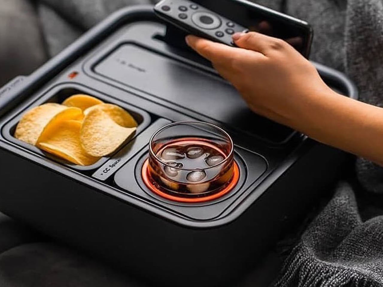
1. Couch Console: The Self-Balancing Command Center
The Couch Console solves the oldest problem in home entertainment: where to put your stuff without creating a disaster zone. This modular organizer holds your drink, snacks, remote, phone, glasses, and everything else you need within arm’s reach. The standout feature is the mechanical gyroscope cupholder with a built-in counterweight that keeps your drink perfectly vertical, even on uneven cushions or slouchy surfaces. You can finally sink into your couch without worrying about physics.
The design prioritizes clear functionality through simple geometry. Each component has a dedicated space—a hidden compartment for glasses, a dedicated remote tray, a phone stand with charging dock, and a snack holder that keeps crumbs contained. The cupholder fits most standard glasses and includes a locking mechanism for added security. It’s the kind of thoughtful design that anticipates needs you didn’t know you had until someone pointed them out. Your couch becomes a self-contained entertainment hub rather than a collection of precariously balanced objects waiting to topple.
What we like
The gyroscope cupholder genuinely works and prevents spills on soft surfaces.
Everything has a designated spot, so you stop losing your glasses between cushions.
The modular design adapts to different couch styles and personal preferences.
It keeps your viewing area organized without requiring you to sit upright like a Victorian.
What we dislike
The size might not fit every couch arm configuration perfectly.
You’ll need to break the habit of just throwing things on the couch randomly.
2. Japanese Lantern Candle: Soft Light Without the Glare
Overhead lights kill movie night ambiance faster than anything else. The Japanese Lantern Candle offers a solution rooted in centuries of traditional design. Inspired by “chouchin” lanterns that lit up Japanese festivals and izakaya bars, this modern interpretation brings a gentle, flickering glow that sets the right mood without washing out your screen. The handmade candle sits inside a holder designed to create an undulating light pattern as the wax melts.
Craftsmen in Kurashiki, Japan, make each candle by hand using patented technology that prevents the outer wax layer from melting. This means the decorative exterior stays intact while the interior wax burns down, creating an increasingly dramatic light show as the flame dances inside the carved structure. The minimalist design fits into any interior style while adding a distinctly Japanese sensibility. It’s lighting that asks you to slow down and notice the quality of the glow rather than just flooding a room with brightness.
The handcrafted quality shows in the details and burn pattern.
Creates the perfect ambient lighting level for movie watching.
The patented outer wax technology makes it both functional and sculptural.
Adds a ritual element to starting your movie night by lighting the candle.
What we dislike
You need to remember to blow it out when the movie ends.
Candles require more attention than just flipping a switch.
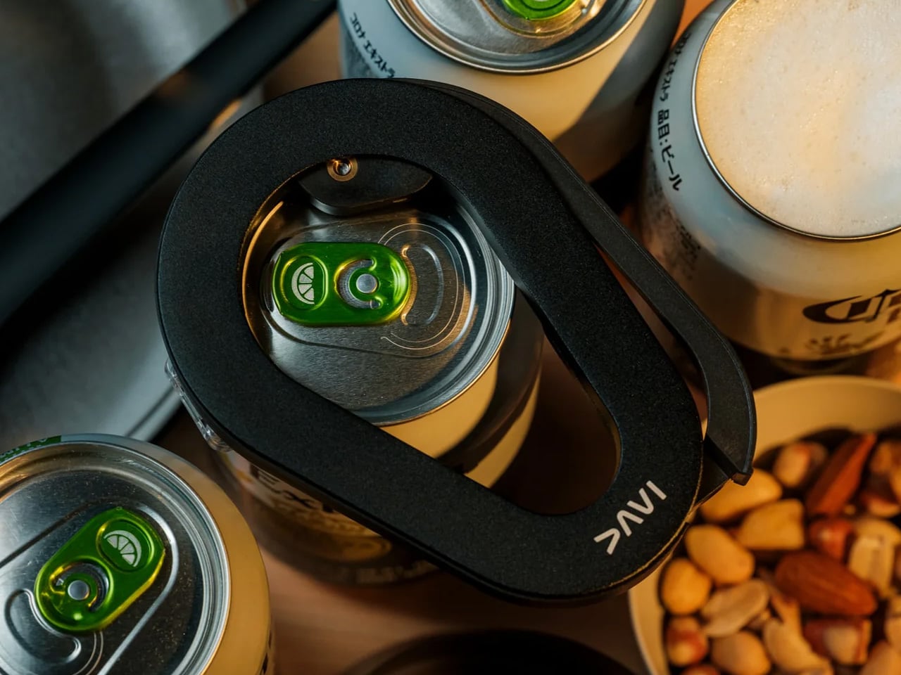
3. DraftPro Can Opener: Turn Every Can Into a Glass
Award-winning Japanese designer Shu Kanno created the DraftPro to solve a problem most people accept without question: cans have a small opening that limits how you experience what’s inside. This tool removes the entire top of any can, transforming it into an open vessel that functions like a glass. The difference is immediately noticeable. Aromas reach your nose before the first sip. You taste the full flavor profile instead of just whatever makes it through that narrow opening. It turns functional hydration into an actual drinking experience.
The universal design works with both domestic and international can sizes, making it useful whether you’re drinking beer, sparkling water, or using cans as cocktail mixing vessels. The smooth-edge removal process creates a safe rim that won’t cut you. You can drop ice cubes directly into the can to chill drinks faster, or mix cocktails without dirtying a shaker or glassware. The lightweight, portable form factor means you can bring it anywhere—backyard screenings, camping trips, friends’ apartments. It’s the kind of simple tool that becomes indispensable once you realize how much better canned drinks taste when you treat them like draft pours.
Dramatically improves the drinking experience from any can.
Creates zero waste beyond what the can itself produces.
Portable design works anywhere you bring canned beverages.
The smooth-edge removal makes it safe to drink directly from.
What we dislike
Requires manual effort each time you want to open a can.
You can’t reseal the can once it’s open, so commit to finishing it.
4. Prism Titanium Beer Glass: Engineered for Savoring
The Prism Titanium Beer Glass treats beer like it deserves the same attention as wine or whiskey. This isn’t about pretension. It’s about recognizing that good beer has nuanced flavors that cheap glassware can actually diminish. The interior is lined with 99.9 percent pure, aerospace-grade titanium that neutralizes metallic aftertastes and breaks down off-notes. What remains is just the beer itself, presented in its purest, most refined form. The clear glass exterior contrasts with the softly reflective titanium interior, creating a visual interplay that reveals your beer’s true color with an elegant glow.
The gently flared rim isn’t just aesthetic—it improves mouthfeel by guiding beer smoothly across your palate, softening texture and lifting aroma toward your nose. Delicate etched patterns carry centuries-old Japanese symbols for prosperity and longevity, adding emotional depth to an object that could have just been functional. You can choose between the Silver finish with its quiet luster or the Infinite version that shifts with an aurora of color depending on the angle and light. It’s designed to make you pause between sips, to notice what you’re drinking rather than just consuming it. At ninety-nine dollars, it positions itself as an investment in slowing down.
The titanium lining genuinely improves flavor by eliminating metallic interference.
The flared rim design enhances both taste and aroma.
Beautiful enough to display between uses. Symbolic etching adds meaning beyond pure function.
What we dislike
The price point means you’ll think twice before casual use.
Hand washing is required to maintain the finish.
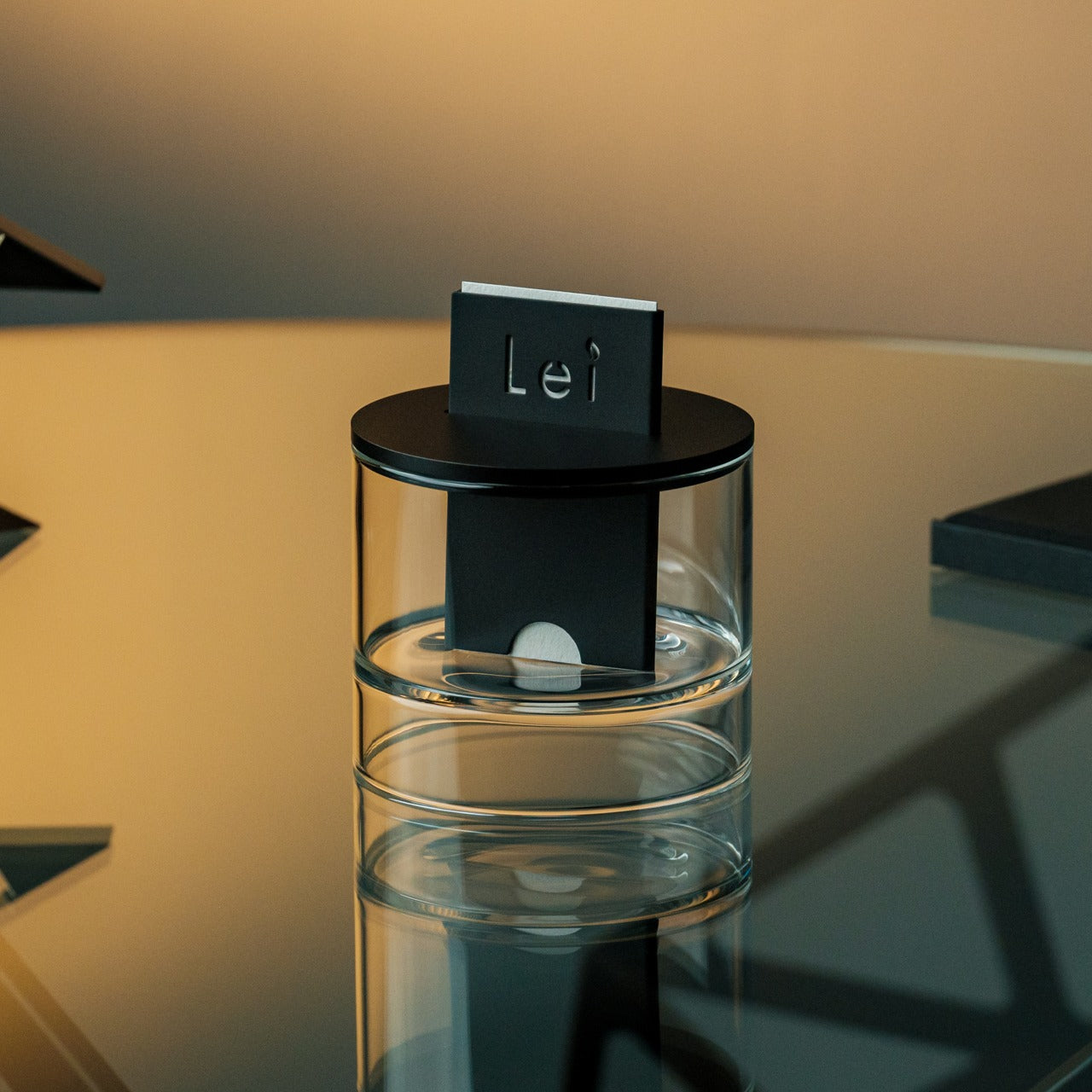
5. Ritual Card Diffuser: Scent as an Invisible Layer
The Ritual Card Diffuser approaches ambiance from an angle most people overlook during movie night: scent. Not an aggressive fragrance that competes with your popcorn, but a subtle atmospheric layer that shapes the air without demanding attention. The design turns scent diffusion into a tactile ritual. You slide a handmade washi paper card—soaked in fragrance oil—into an anodized aluminum body. The motion feels deliberate, like inserting a train ticket at a station gate. It marks the beginning of something, signaling that regular time is ending and movie time is starting.
The patented mechanism draws alcohol-based fragrance upward without heat, electricity, vapor, or traditional reeds. The washi card absorbs oil from the hand-poured base and releases it gradually into your space through natural diffusion. There’s no mist, no sound, no visible mechanism. Just paper and oil working in stillness. When the card eventually dries, it becomes a scented keepsake you can tuck into drawers or bags. The layered glass base creates a visual float effect while the aluminum body grounds it with quiet weight. It’s sized to sit on side tables or desks without dominating the space, and the minimalist form means it disappears into any setting while doing its job.
The card-sliding gesture adds intentional ritual to starting your movie night.
Completely silent and power-free operation.
The dried washi cards become reusable scent keepsakes. Recyclable materials with no single-use plastic components.
What we dislike
You need to remember to refill the oil when it runs low.
Scent preferences are personal, and some people prefer fragrance-free spaces.
Creating Moments Worth Remembering
These five designs work together because they address movie night holistically rather than just solving individual problems. The Couch Console creates the physical foundation for comfort. The Japanese Lantern Candle sets a visual ambiance without screen glare. The DraftPro and Prism Glass elevate your drinks from afterthought to experience. The Ritual Card Diffuser adds an invisible atmospheric layer that signals this time is different from the rest of your evening. Each one removes a small friction point that was quietly degrading your ability to stay present and engaged with what you’re watching.
The real gift isn’t just five well-designed objects. It’s permission to treat movie night like something worth preparing for, worth designing around, worth making special. These pieces come from Japanese designers who understand that everyday rituals deserve the same attention as special occasions. They’re built to last, crafted with intention, and designed to improve with repeated use as you develop your own patterns and preferences. Whether you’re buying them for someone else or building your own setup, they transform movie night from passive consumption into an experience you’ll actually remember.
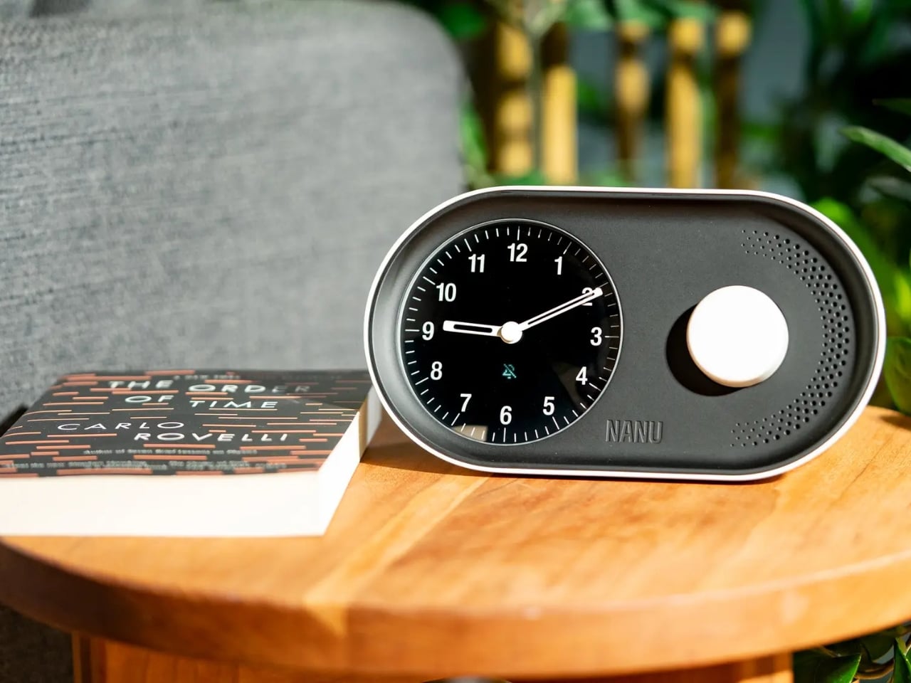
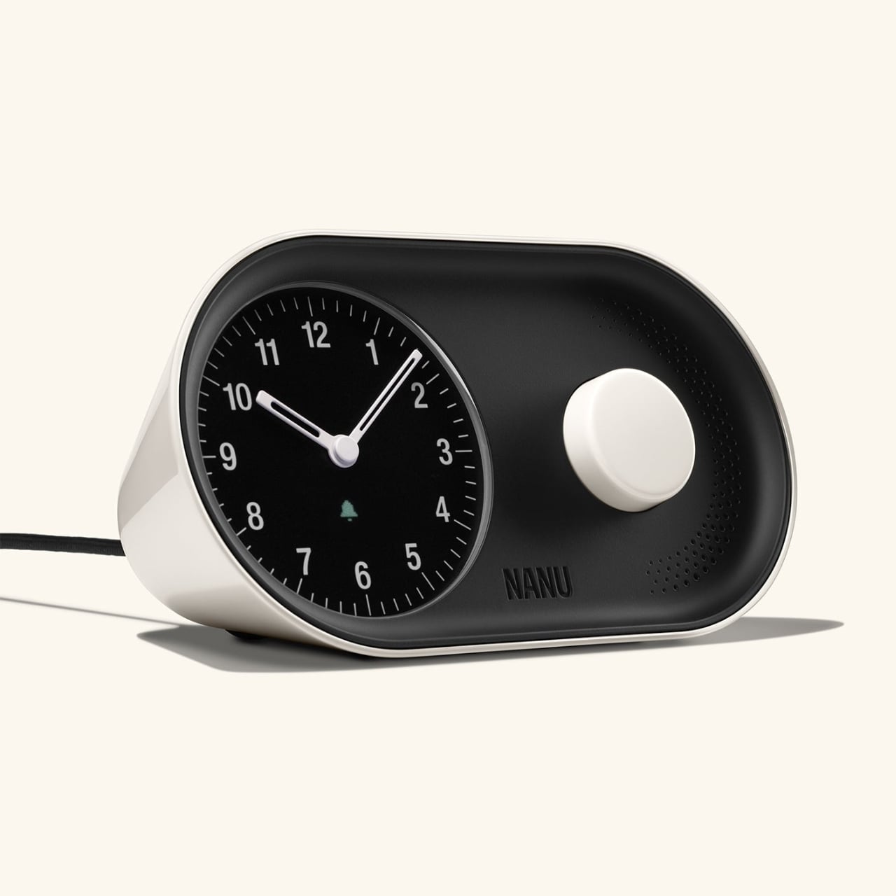
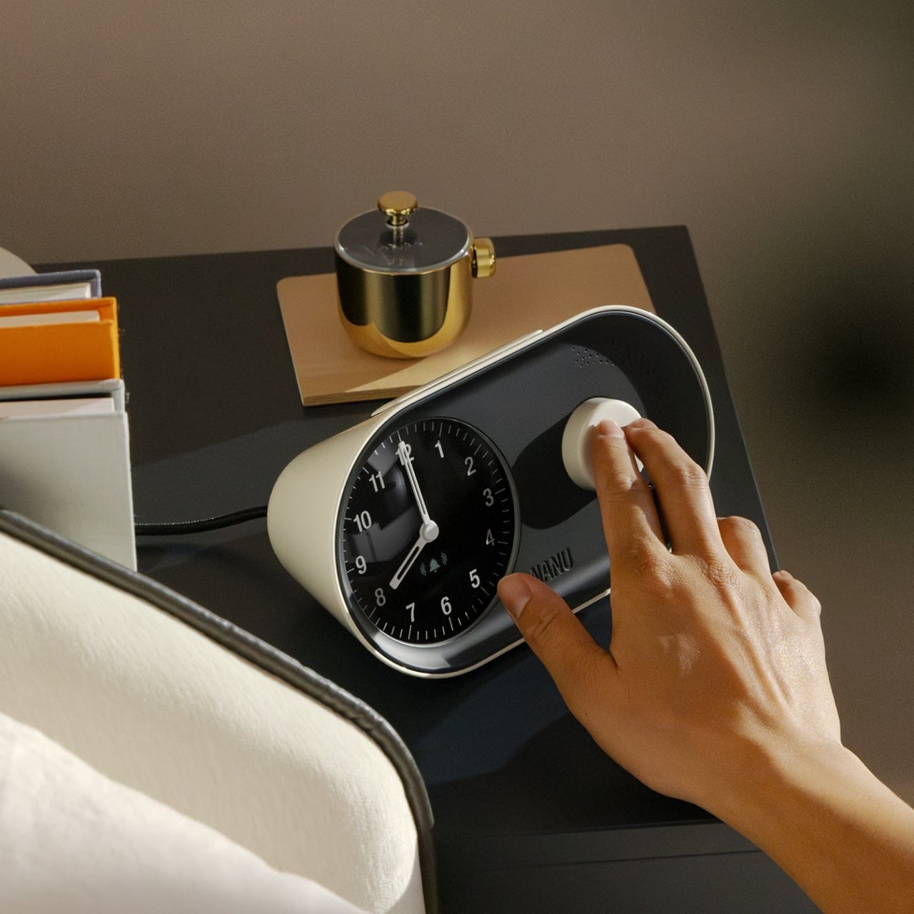
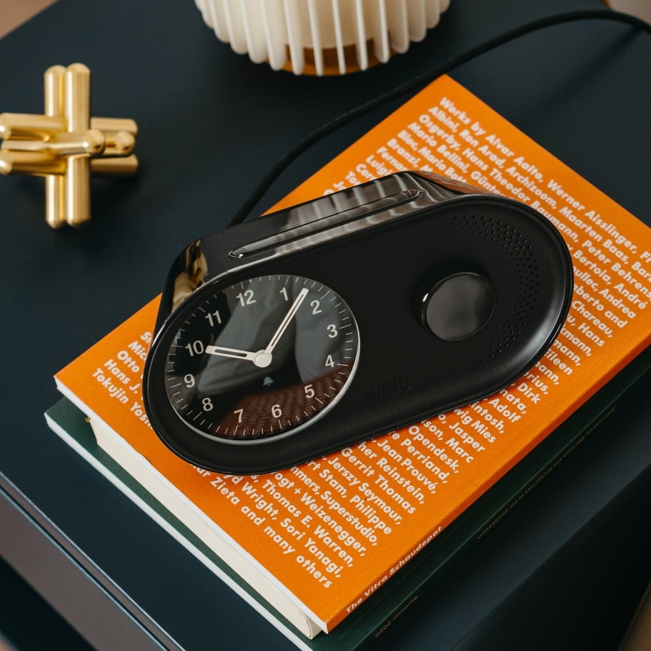
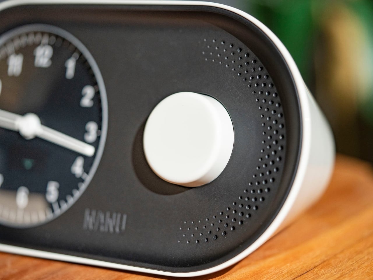
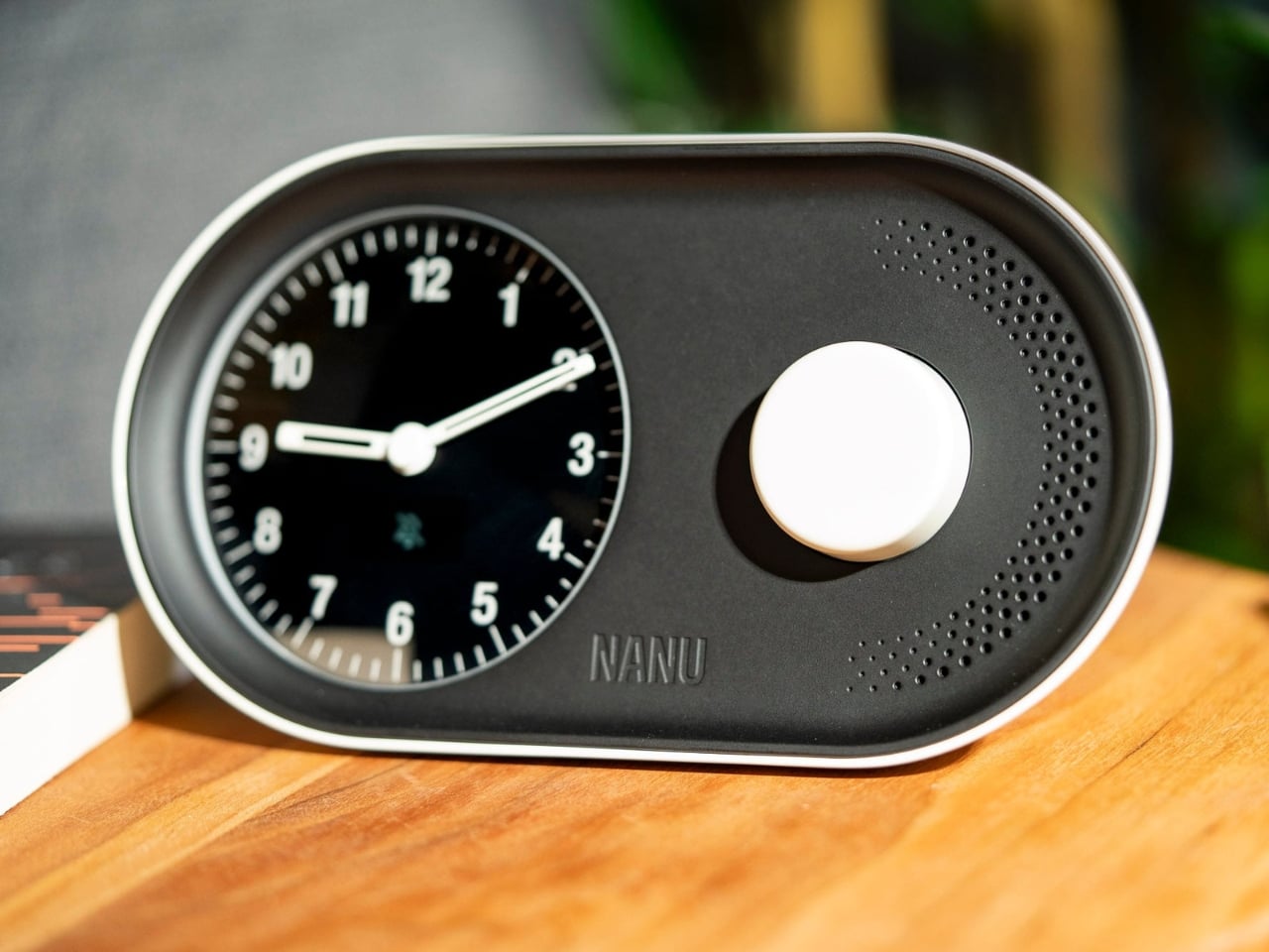
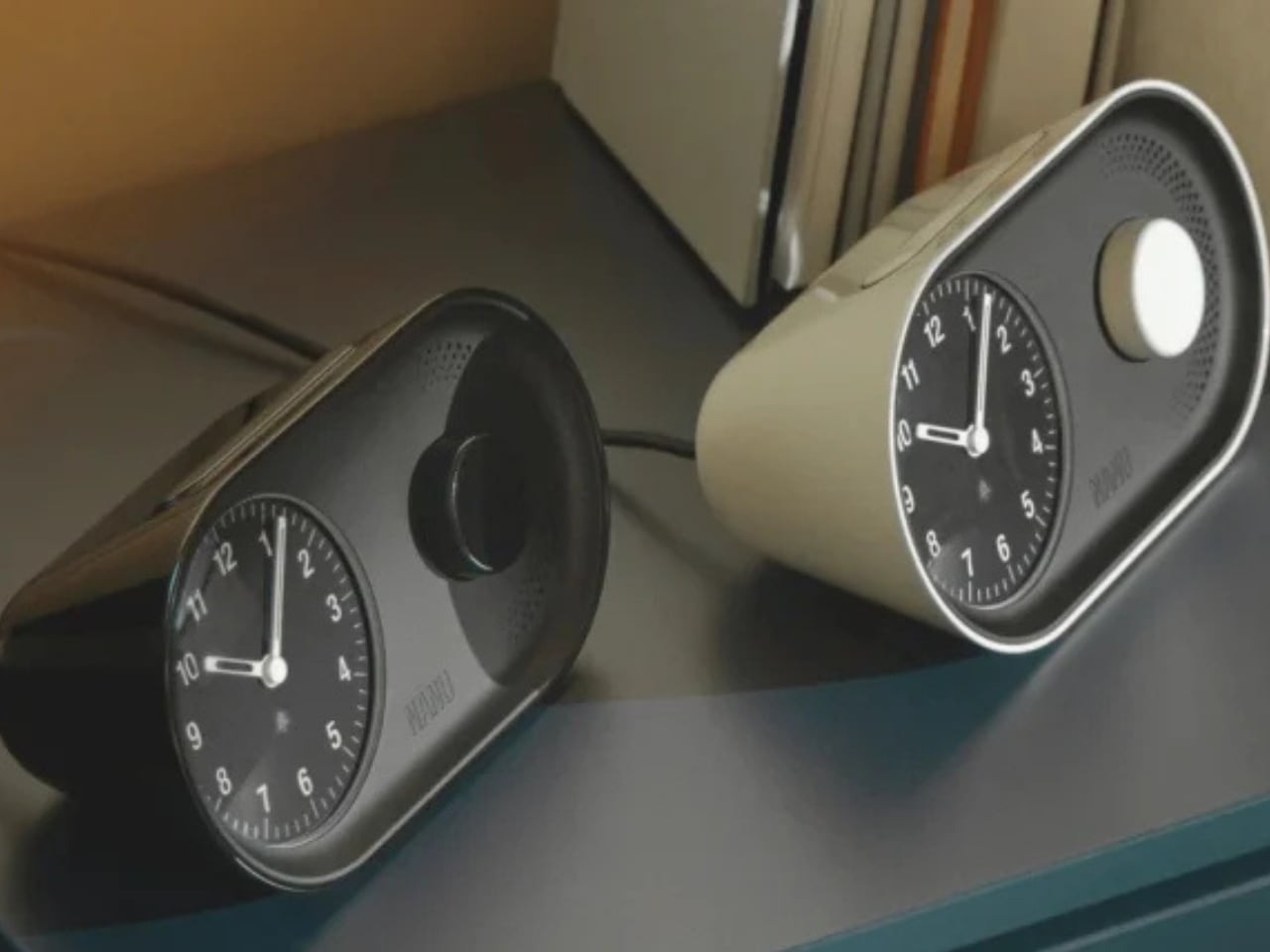
There’s something oddly satisfying about a product that does exactly what it’s supposed to do, but does it with style. That’s the vibe I get from the Arc Alarm Clock by Nanu Electronics, a piece that manages to feel both futuristic and oddly nostalgic at the same time.
At first glance, the Arc looks like it belongs in a sci-fi movie set in a very tasteful future. The curved design is its defining feature, and honestly, it’s a bold move in a world where most alarm clocks are either aggressively minimalist rectangles or trying way too hard to be cute. This one splits the difference beautifully. The gentle arc creates a natural viewing angle that actually makes sense when you’re blearily checking the time at 3 a.m., which is more thoughtful than you’d expect from something you probably curse at daily.
What really sets the Arc apart is how it approaches the whole “waking up” problem. We’ve all been there: you set an alarm, it goes off, you hit snooze approximately seven times, and suddenly you’re late for that meeting you swore you’d be early for. The Arc uses a sunrise simulation feature that gradually increases light intensity before your alarm actually sounds. It’s basically tricking your brain into thinking it’s morning, which sounds manipulative but in the best possible way. Your body responds to light more naturally than it does to a jarring alarm sound, so you’re more likely to actually wake up instead of entering that weird snooze-induced time warp.
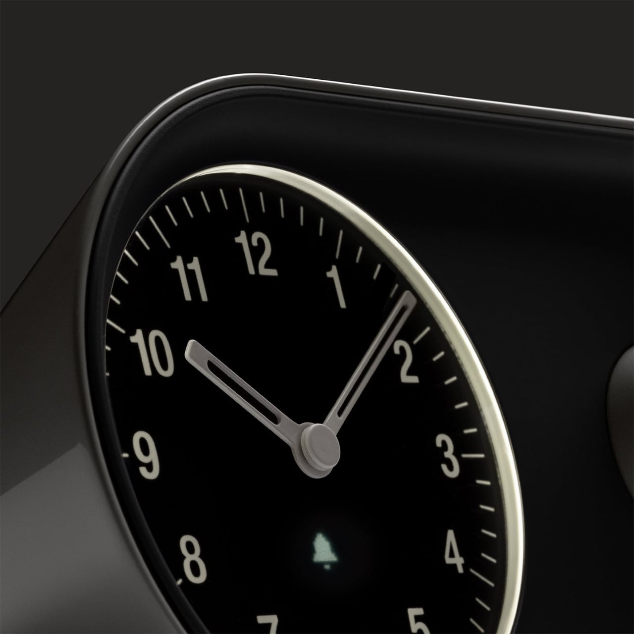
But here’s the thing: it doesn’t sacrifice functionality for aesthetics. The LED display is crisp and easy to read without being obnoxiously bright at night. There’s something to be said for a clock that doesn’t light up your entire bedroom like a miniature sun. The controls are intuitive enough that you won’t need to keep the manual on your nightstand, which is a low bar but one that surprisingly few products clear.
The Arc also works as a bedside lamp, which makes it genuinely useful beyond its alarm clock duties. It’s one of those features that seems obvious in retrospect but that most alarm clocks skip entirely. You can adjust the brightness to whatever suits your needs, whether you’re reading before bed or just need a gentle glow to navigate your way to the bathroom at night without fully waking yourself up. Sound quality matters more than you might think for an alarm clock. The Arc’s speaker is decent enough for casual music listening or podcasts, though audiophiles will probably still prefer their dedicated speakers. But for morning news, white noise, or just having some background sound while you get ready, it does the job without sounding tinny or cheap.
From a design perspective, the Arc fits into that sweet spot where it’s distinctive enough to be interesting but neutral enough to work with most decor styles. It comes in a few color options, so you can match it to your aesthetic whether you’re going for modern minimalist, cozy maximalist, or something in between. The curved form factor also means it takes up less visual space than a traditional rectangular clock, even though its footprint is similar.
Is it going to revolutionize your life? Probably not. But it might make your mornings slightly less awful, and in this economy, we’ll take small victories where we can get them. The Arc Alarm Clock proves that everyday objects don’t have to be boring or purely utilitarian. Sometimes the things we interact with most frequently deserve a little extra thought and care in their design. If you’re in the market for an alarm clock that looks good on your nightstand and might actually help you wake up like a functional human being, the Arc is worth considering. It’s the kind of purchase that feels slightly indulgent but practical enough to justify.
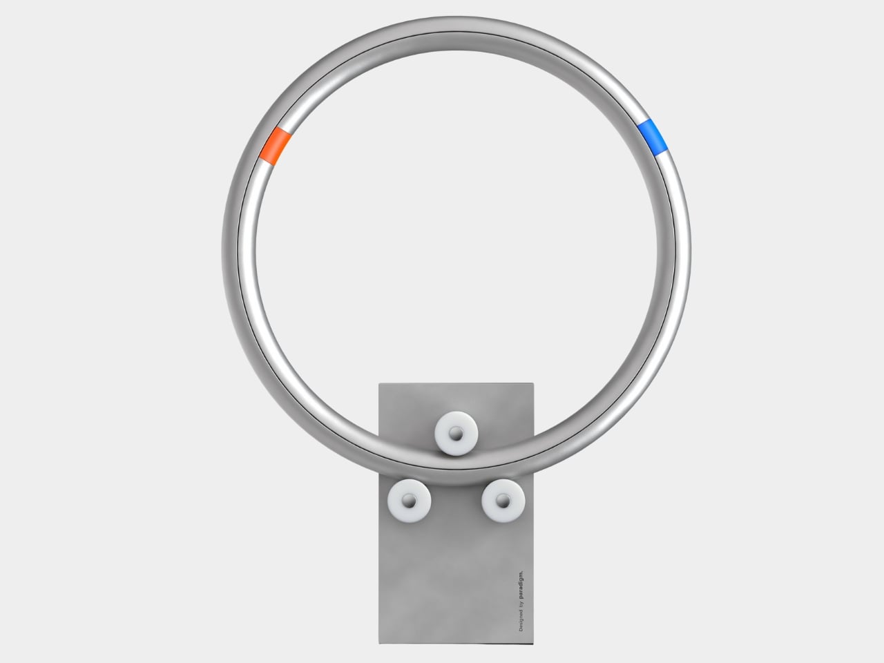
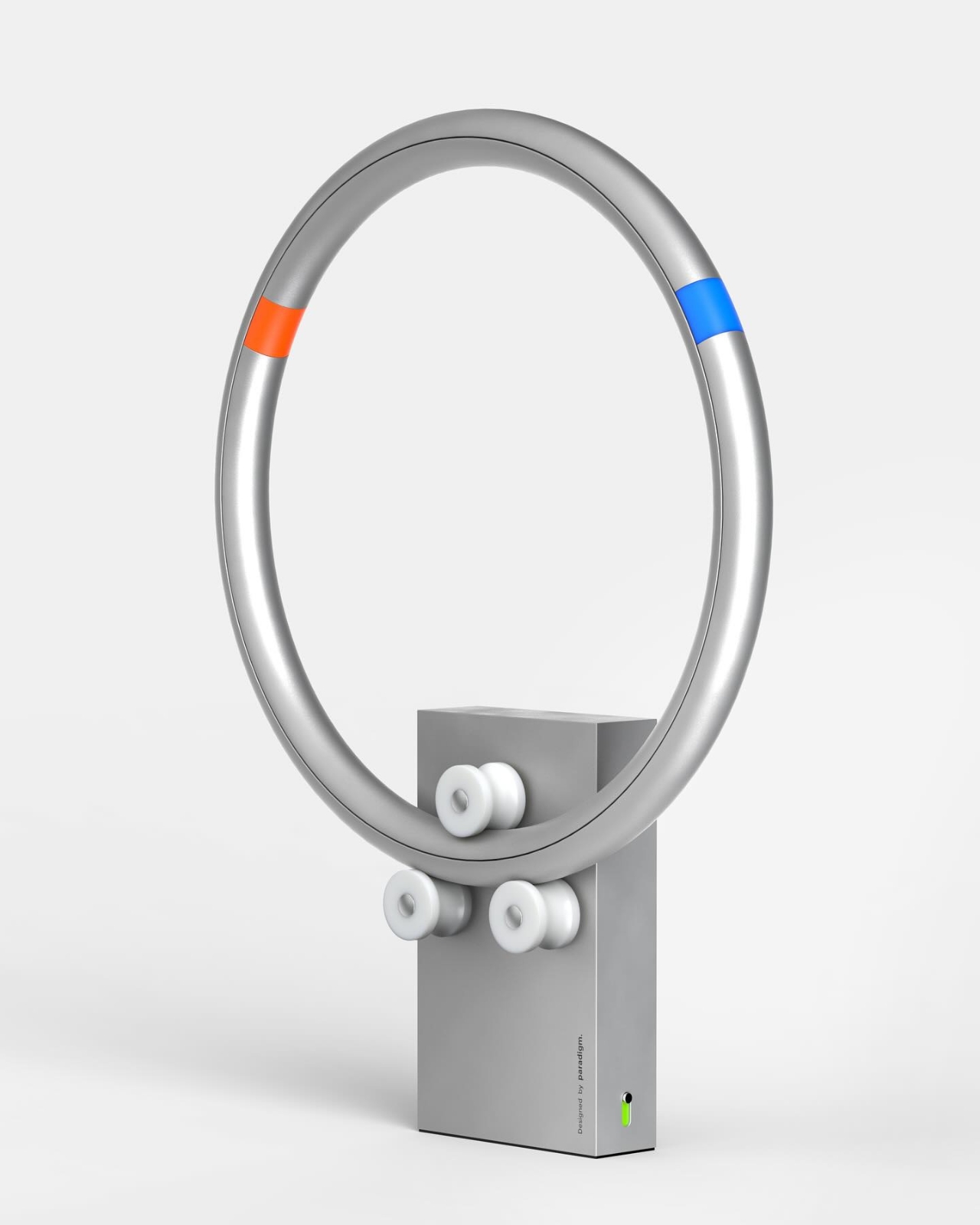
There’s something oddly satisfying about watching things spin. Maybe it’s the smooth rotation, the predictable yet mesmerizing motion, or just our collective fascination with anything kinetic. Whatever it is, designer Germain Verbrackel has tapped into that feeling with Clock&Roll, a timepiece that turns the simple act of checking the time into a visual experience you can’t look away from.
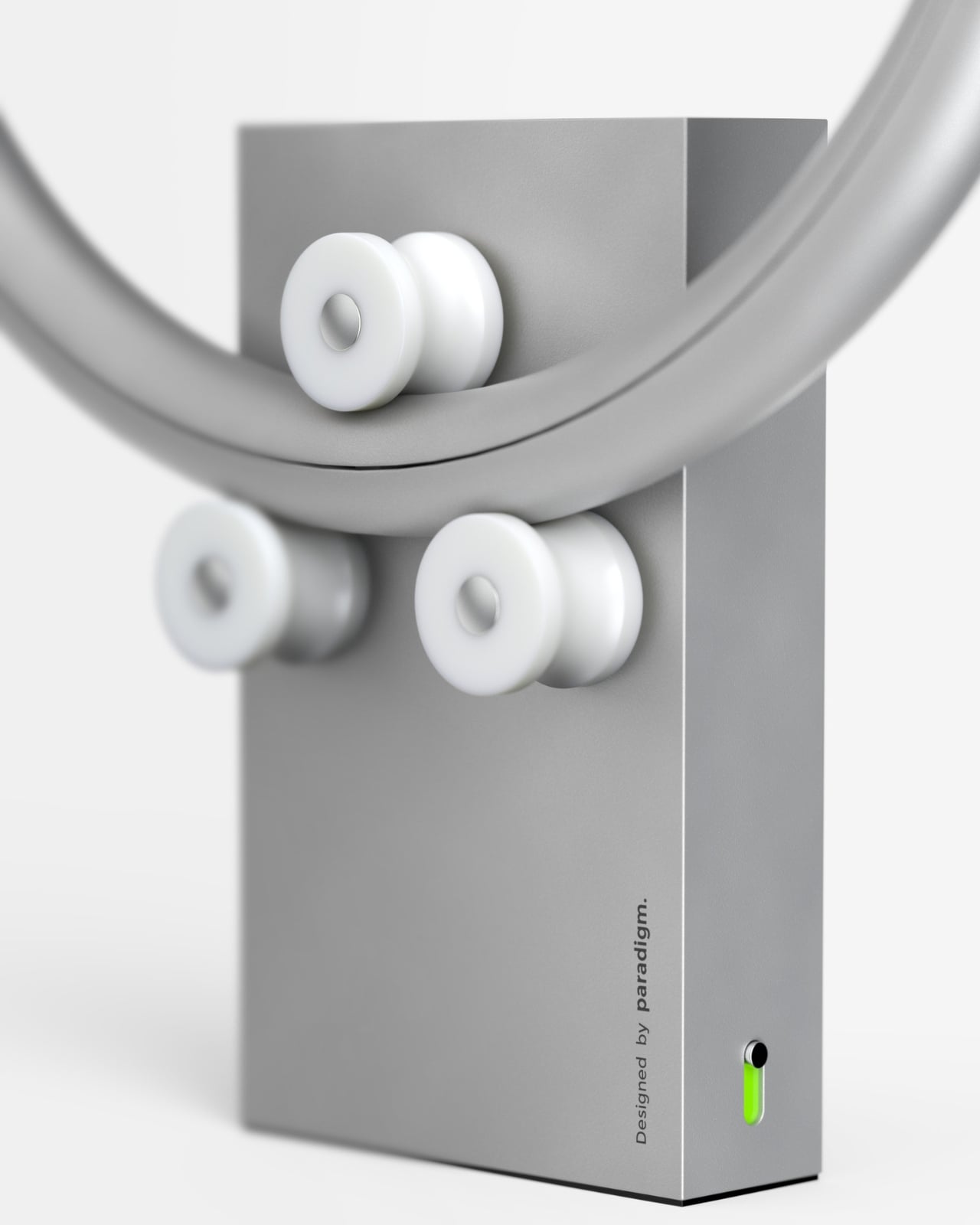
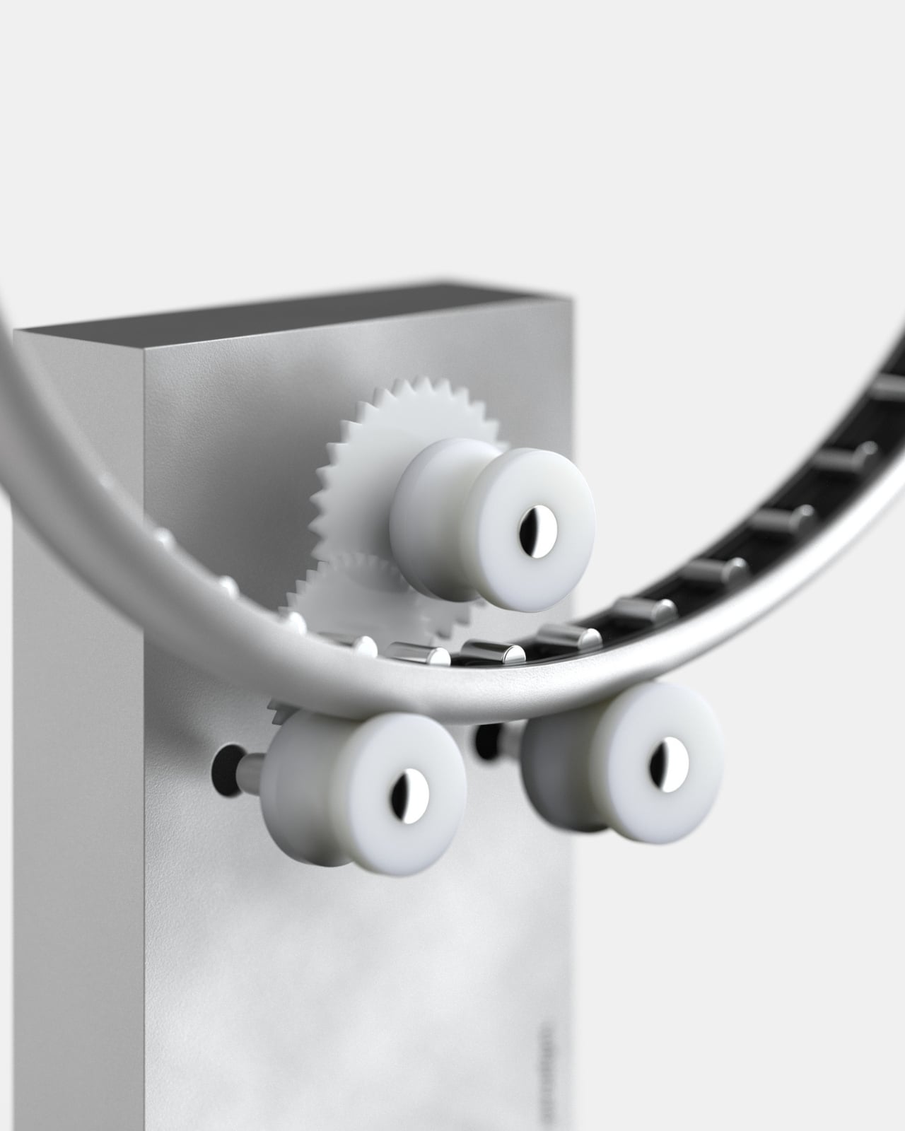
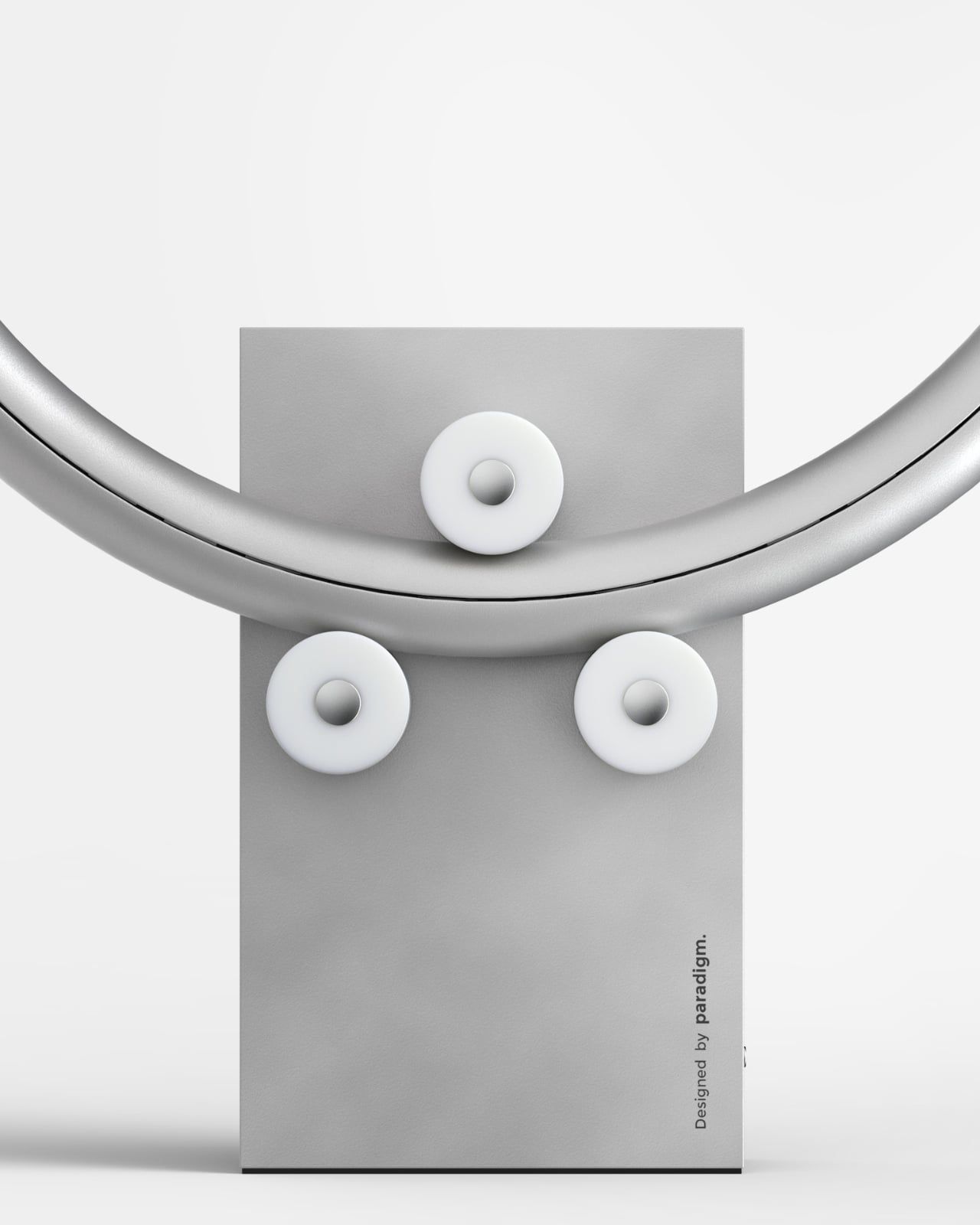
At first glance, Clock&Roll looks like a minimalist sculpture that belongs in a modern art museum. Two aluminum rings form a sleek torus shape, suspended vertically on a clean rectangular base. But this isn’t just eye candy for your desk or shelf. Those rings? They’re actually moving, gliding independently on precision bearings, each one tracking time in its own hypnotic rotation.
The genius here is in how the clock communicates time without numbers, hands, or a traditional face. Instead, small colored bands mark the hours and minutes on each ring. An orange segment on one ring, a blue one on the other. As external rollers built into the base push the rings into motion, these colored markers shift positions, creating an ever-changing display that’s equal parts functional and meditative to watch. It’s like someone took the mechanical beauty of old clockwork and gave it a sleek, contemporary makeover.
What makes Clock&Roll particularly interesting is how it challenges our relationship with timekeeping. We’re so used to glancing at digital displays or traditional clock faces that instantly tell us exactly what time it is. But this design makes you pause for a second, observe the position of those colored bands, and actually engage with the object. It’s a small moment of mindfulness in a world where we’re constantly checking our phones for the millionth notification of the day.
The materials play a huge role in the overall vibe. Aluminum gives the rings that perfect industrial-sleek look, somewhere between high-tech gadget and designer object. The finish has that subtle matte quality that catches light just right, while the white rollers and base provide a clean contrast that keeps everything balanced. And those pops of orange and blue? They’re not just practical markers but also inject personality into what could have been an entirely monochrome piece.
Verbrackel clearly had fun with the mechanics too. If you look closely at the base, you can spot the gears and motor system that drive the whole operation. Instead of hiding the machinery away, the design embraces it, showing you exactly how this kinetic magic happens. It’s honest engineering meets aesthetic appeal, which is pretty much the sweet spot for anyone who appreciates good industrial design.
Clock&Roll also plays with scale in an interesting way. It’s substantial enough to be a statement piece, something that commands attention in a room, but not so large that it overwhelms your space. You could see it living happily on a modern office desk, a minimalist living room shelf, or even in a creative studio where it would fit right in with other design-forward objects. There’s also something inherently playful about the name and concept. “Clock&Roll” obviously riffs on rock and roll, complete with the little hand gesture emoji, and that rebellious spirit comes through in the design itself. This isn’t your grandmother’s mantel clock or even your standard smartwatch. It’s time reimagined for people who appreciate when everyday objects get a creative twist.
Since most of us check the time on our phones or smartwatches, a dedicated clock needs to justify its existence. Clock&Roll does exactly that by offering something those digital displays can’t: a tactile, visual, almost sculptural experience of time passing. It’s functional art that happens to tell you when you’re running late for your next meeting. Whether you’re a design enthusiast, a lover of kinetic art, or just someone who appreciates when familiar objects get reinvented in unexpected ways, Clock&Roll is the kind of piece that makes you rethink what a clock can be. Sometimes the best designs are the ones that take something we see every day and spin it in a completely new direction.
Last year, a consumer-focused UV printer made a remarkable splash on Kickstarter, marking the first time consumer UV printing made it to the big leagues. Now, LONGER ePrint enters the market, bringing unique innovation, a user-friendly experience, and highly competitive pricing to DIY enthusiasts, startups, and designers alike. Built for creative expression and customizable solutions. The campaign has already achieved an impressive $3.6 million in sales within its first week.
LONGER brings a decade of experience (and four successful crowdfunding campaigns) making 3D printers and laser engravers to this project, plus patents and research credentials from its MIT and Georgia Tech founding team. The ePrint’s headline feature is its dual-printhead design with 12 ink channels, which the company says delivers print speeds up to six times faster than single-head printers when laying down textured white ink layers. Add automated cleaning systems, white ink circulation to prevent clogging, and compatibility with third-party inks, and LONGER has assembled a feature set aimed squarely at cost-conscious small businesses.
LONGER runs 12 ink channels across two printheads in the full ePrint model: CMYK color plus six white channels and two varnish channels. Building up textured prints to the maximum 60mm height means laying down multiple passes of white ink. Six white channels working simultaneously stack ink six times faster than a single channel could manage. For flat printing without the texture work, the dual-head configuration cuts print time by 50 to 70 percent. At 1440 DPI resolution, print quality stays consistent while speeds improve.
Running a small custom merch operation means speed directly translates to how many orders you can fulfill in a day. Print a full-color design on a phone case and you’re looking at roughly 2 to 3 minutes at high quality settings, faster if you drop to balanced or draft modes. A dozen custom phone cases in under half an hour. Coasters, small signs, and similar flat items clock in at similar speeds. Want to add that 3D textured effect with raised logos or embossed details? That takes longer since you’re building up layers of white ink, but the dual printheads working together mean you’re still finishing pieces in reasonable timeframes rather than waiting hours per item. The 310mm by 420mm print bed accommodates most personal accessories and small merchandise. You’re not printing posters, but phone cases, drinkware graphics, small wooden signs, custom keycaps, personalized gifts, all the items that make up craft fair tables and Etsy shops fit comfortably.
That 60mm embossing capability opens up applications beyond flat graphics. You can produce tactile braille signage with actual raised dots instead of stickers. Relief sculptures and dimensional art pieces become feasible without molding or casting. Product prototypes gain realistic texture that photographs can’t convey. Custom keycaps for mechanical keyboards, raised logos on promotional items, textured business cards that stand out in a stack. Small batch production of items that would normally require expensive tooling or outsourcing to specialty shops. Running a custom merchandise side business or handling client work for local businesses becomes viable when you’re not paying per-piece service bureau rates or minimum order quantities.
White ink creates problems for every UV printer manufacturer. Leave it sitting idle and it separates, leading to inconsistent prints and clogged nozzles that can brick expensive printheads. LONGER built a continuous circulation system that keeps white ink flowing even when you’re not printing. Automated cleaning cycles purge the printheads periodically to prevent clogs before they start. Most desktop UV printers demand manual maintenance rituals before each job. LONGER designed this to stay ready rather than requiring constant babysitting.
The best part is that this printer isn’t unscrupulously bound to specific ink cartridges – the system is designed to be open, and LONGER accepts third-party ink cartridges, including low-migration ink varieties for printing on plates and packaging. You get twelve 200ml cartridges in the dual-head model, totaling 2.4 liters of capacity. Proprietary cartridge systems lock you into whatever the manufacturer charges. Over months of production, open ink compatibility saves real money.
Flatbed mode handles your standard work on flat materials up to 310mm by 420mm. Wood plaques, acrylic sheets, metal panels, glass coasters, leather patches. The 10mm high-gap printing capability means the printhead stays elevated above the material, so you can print on textured wood, embossed surfaces, or slightly warped materials without the head scraping or smudging wet ink. Phone cases with camera bumps, rough stone tiles, wrinkled leather, all printable without fighting the machine.
Rotary printing opens up cylindrical objects. Water bottles, wine bottles, tumblers, pens, flashlights, anything roughly cylindrical that fits the attachment. The printer rotates the object while printing, wrapping your design around the curve. Transfer film mode takes a different approach by printing onto a special film substrate first. Print your design with the UV printer, then use the included laminator to apply heat and pressure, transferring the design onto fabric. You’re making custom heat-transfer stickers for t-shirts, jackets, bags, hats. Not direct-to-garment printing, but useful when DTG doesn’t work well or when you want that raised, glossy finish that UV ink provides. The laminator handles the heat-press work, so you’re not buying separate equipment.
Roll-to-roll attachment extends the workflow for producing multiple transfers in sequence. Instead of printing individual pieces, you load a roll of transfer film, print continuously, and wind up the finished prints on the output roll. Makes sense if you’re producing batches of vinyl stickers or multiple heat-transfer designs for a clothing run. The conveyor belt attachment serves a similar batching purpose but for rigid objects. Load up phone cases, coasters, or other small items, and the conveyor moves them through the print area automatically. No manual repositioning between pieces. Between these four modes and the accessories that enable them, LONGER built a system that adapts to different production workflows rather than locking you into one application.
Dual lasers and a 16MP camera handle object detection and positioning automatically. In batch mode, the system scans multiple objects, identifies positions, and fills patterns without manual placement for each piece. Software includes AI-powered background removal and pattern generation too.
UV printing generates fumes that need proper ventilation regardless of what the manufacturer says about filtration. LONGER includes air purification and claims operation stays under 60dB, quieter than conversation. At 650mm by 445mm by 330mm and 30kg for the dual-head version, it genuinely fits on a desk rather than demanding dedicated floor space like industrial models. You still want good airflow in your workspace, but the footprint works for small studios or home offices with proper setup.
Early bird pricing breaks down to $1,499 for the single-head ePrint SE with six ink channels, $1,899 for the dual-head ePrint with 12 channels, and $2,949 for the all-in-one combo bundling rotary, laminator, conveyor, and roll-to-roll attachments. US and EU backers get free shipping.
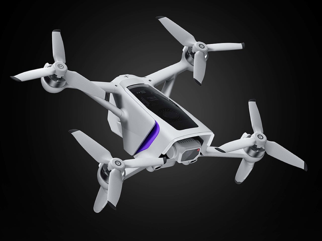
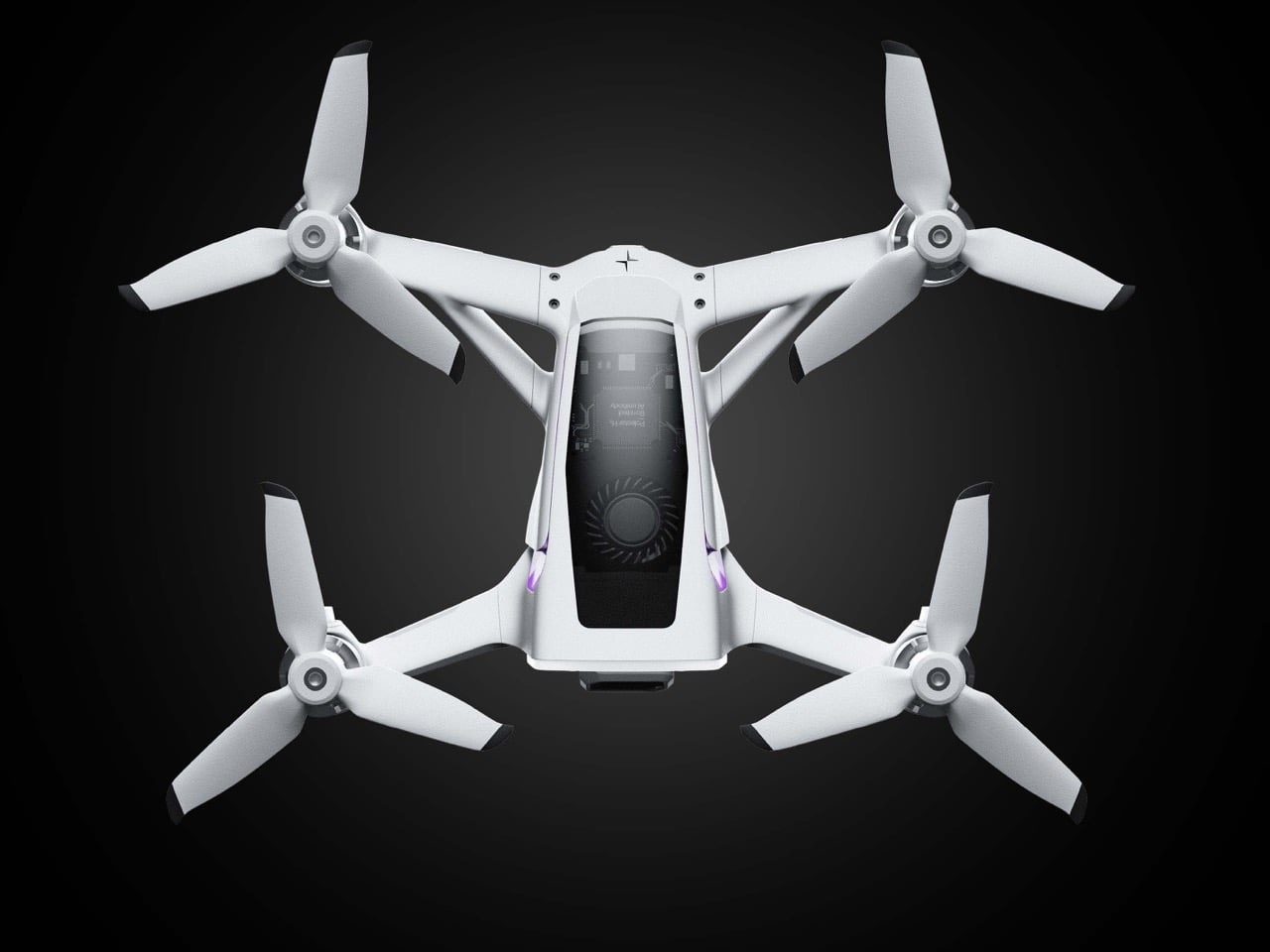
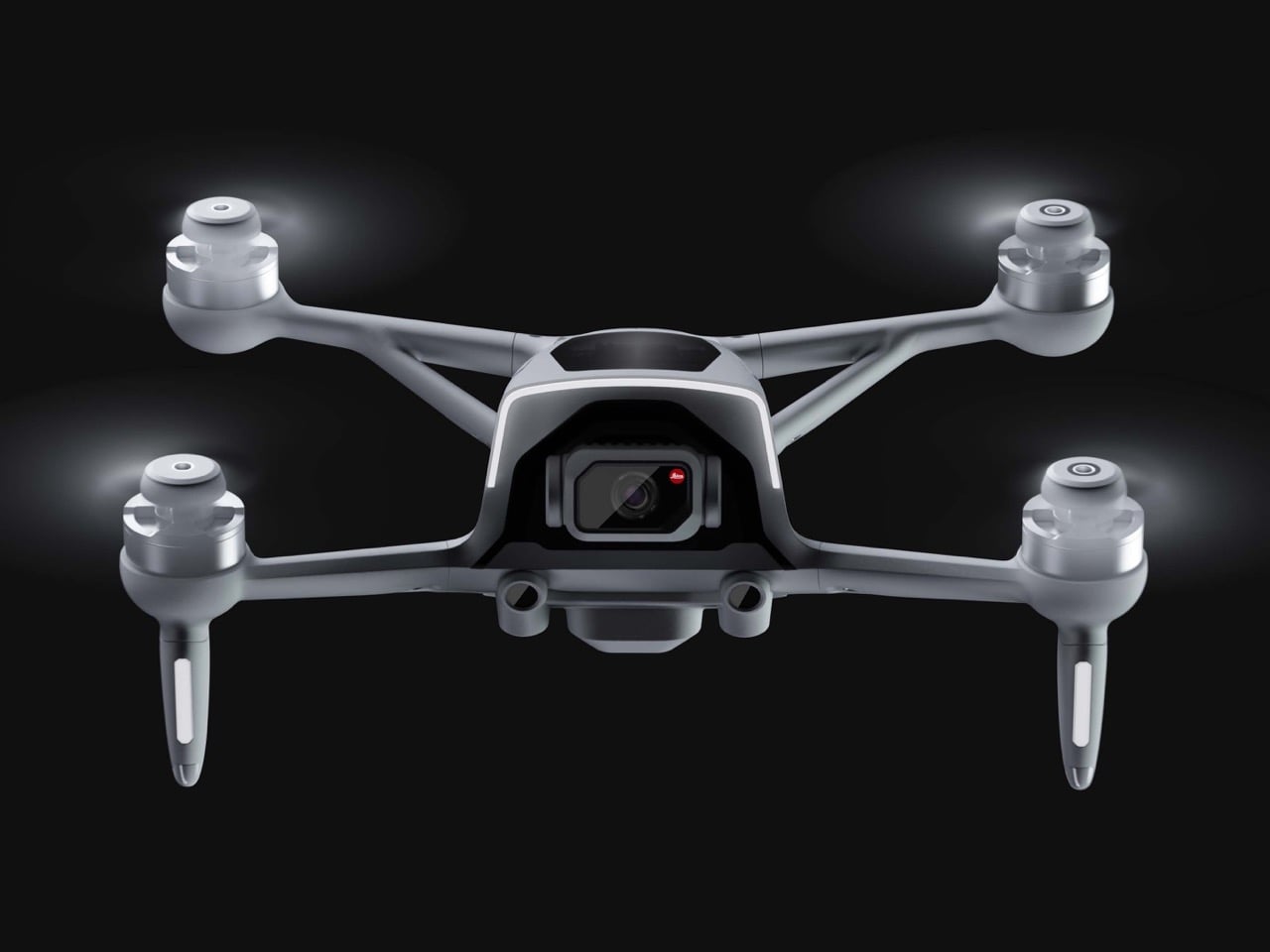
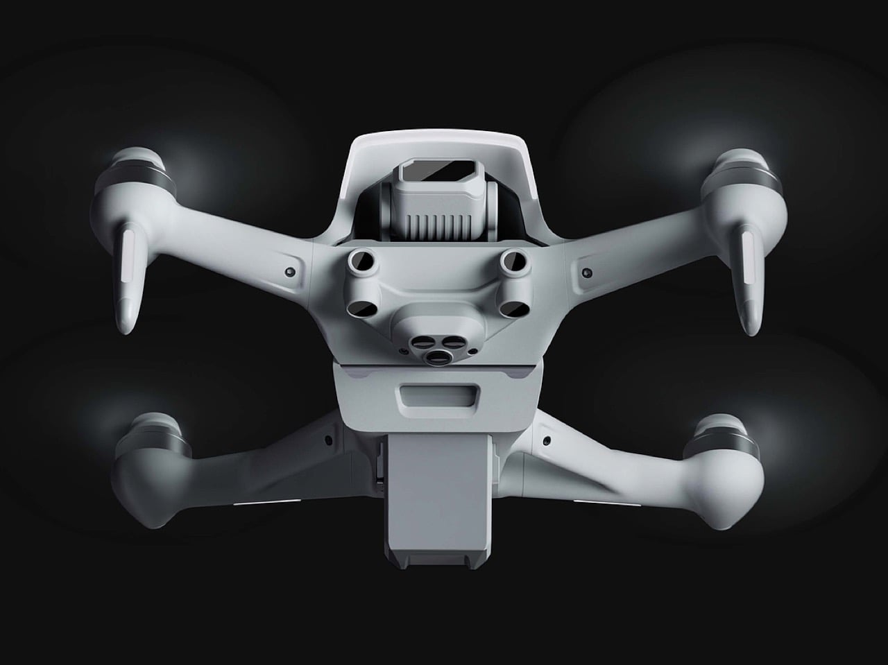
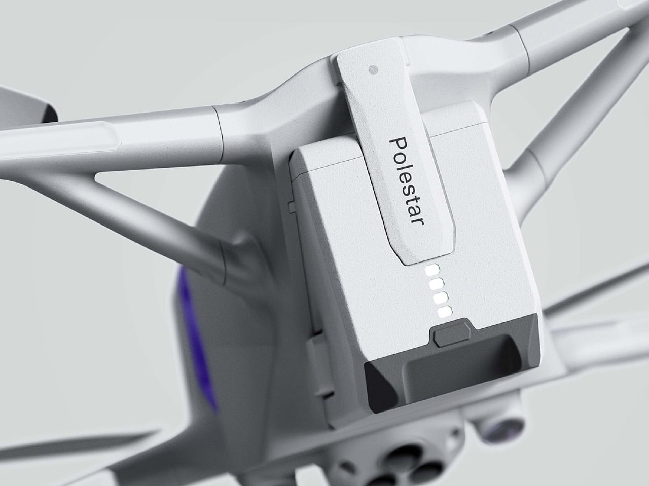
Polestar’s cool Nordic minimalism is not the first thing you expect to see in an FPV rig, yet this concept leans into that contrast and makes it feel inevitable. The drone lifts DJI’s “stacked” architecture of camera, flight controller, cooling, and battery, then wraps it in a crisp, automotive shell that would look just as natural parked beside an electric coupe as it would screaming through a canyon. Instead of the usual exposed carbon and repair-bench aesthetic, the body reads like a single sculpted volume, with the arms flowing out of a central spine and a long, glassy tech strip revealing the hardware beneath. Subtle light signatures, a clean white finish, and a battery module that wears the Polestar wordmark turn what is usually a niche racing tool into something that feels like a premium consumer product, without sanding off its performance edge.
The design’s intelligence lies in how it translates DJI’s engineering logic into a clean visual language. The concept of “structural stacking” is central here, treating each primary component as a self-contained module arranged in a neat, vertical order. The camera and gimbal sit in a dedicated nose pod, followed by the flight control unit and heat dissipation systems under the long, dark canopy, with the battery locking in as a solid block at the rear. This layered approach brings an architectural order to the drone’s anatomy, making the technology feel organized and accessible. It moves away from the traditional FPV layout, where components are often fastened to an open frame, and instead presents a unified, product-like object that feels intentional from every angle.
Designer: Ocean
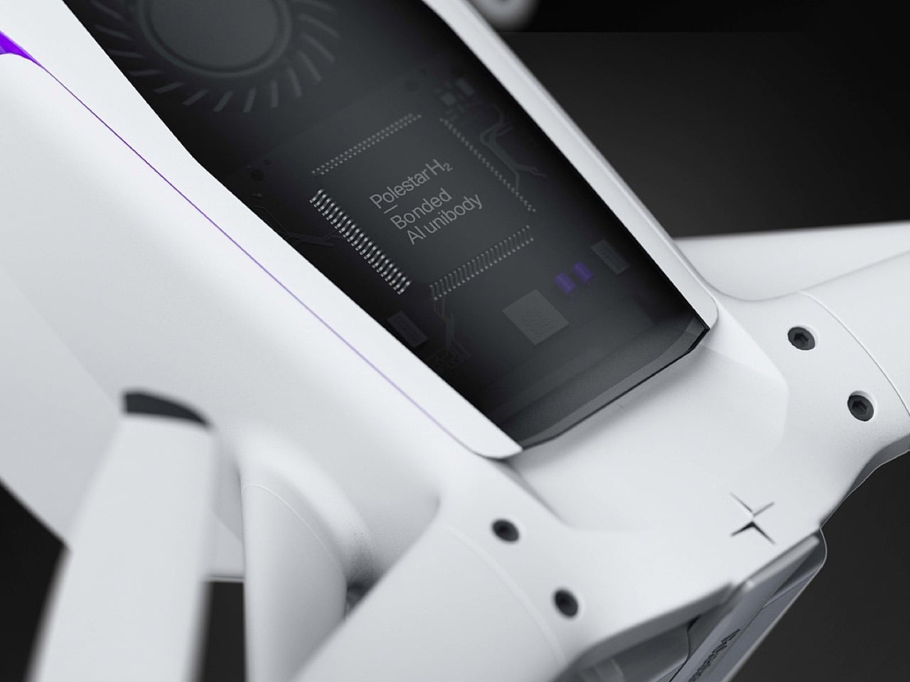
The drone’s body is finished in a matte, almost ceramic white, with surfaces that are both soft and incredibly precise, a hallmark of the EV brand’s surfacing strategy. The long, dark insert on top is more than just a cover; it’s a “tech window” that frames the internal hardware as a point of interest, much like Polestar does with its glass roofs and integrated sensor bars. Even the lighting is handled with automotive discipline. The thin purple accents feel like signature light blades, providing a controlled glow that suggests advanced technology rather than the often chaotic RGB strips found on custom FPV builds. The result is a machine that feels both high-tech and incredibly calm.
Still, this polished exterior does not compromise the drone’s aggressive spirit. The wide, planted stance and large, efficient-looking propellers signal that it is built for serious performance. A look at the underside reveals a dense cluster of sensors, cooling vents, and structural ribbing, confirming that this is a tool for demanding pilots, not a toy. The designer skillfully balances these hard-core elements with a consumer-friendly sensibility. The battery, for instance, is a perfect example. Branded with the Polestar logo and featuring clear, intuitive LED charge indicators, it feels like a piece of premium electronics, making a critical component feel safe and simple to handle for users who may not be seasoned hobbyists.
Ultimately, this concept imagines an FPV experience for the tech enthusiast who appreciates sophisticated design as much as raw performance. It is a drone for the person who owns a Polestar, not just because it is electric, but because of its commitment to a clean, forward-looking aesthetic. By merging the robust, modular architecture of a DJI product with the refined, human-centric design of a modern EV, this concept suggests that the future of high-performance drones might be less about exposed wires and carbon fiber, and more about the seamless integration of power and polish.
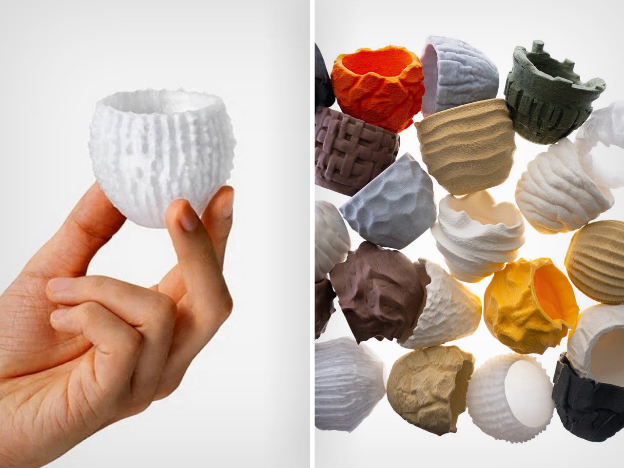
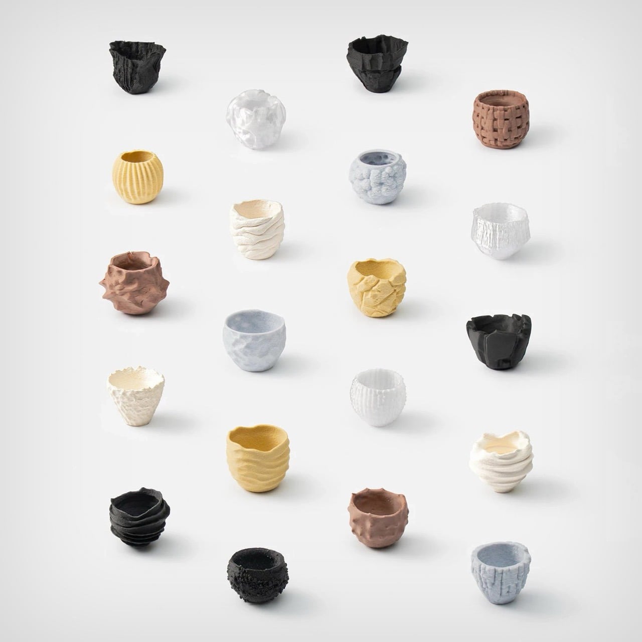
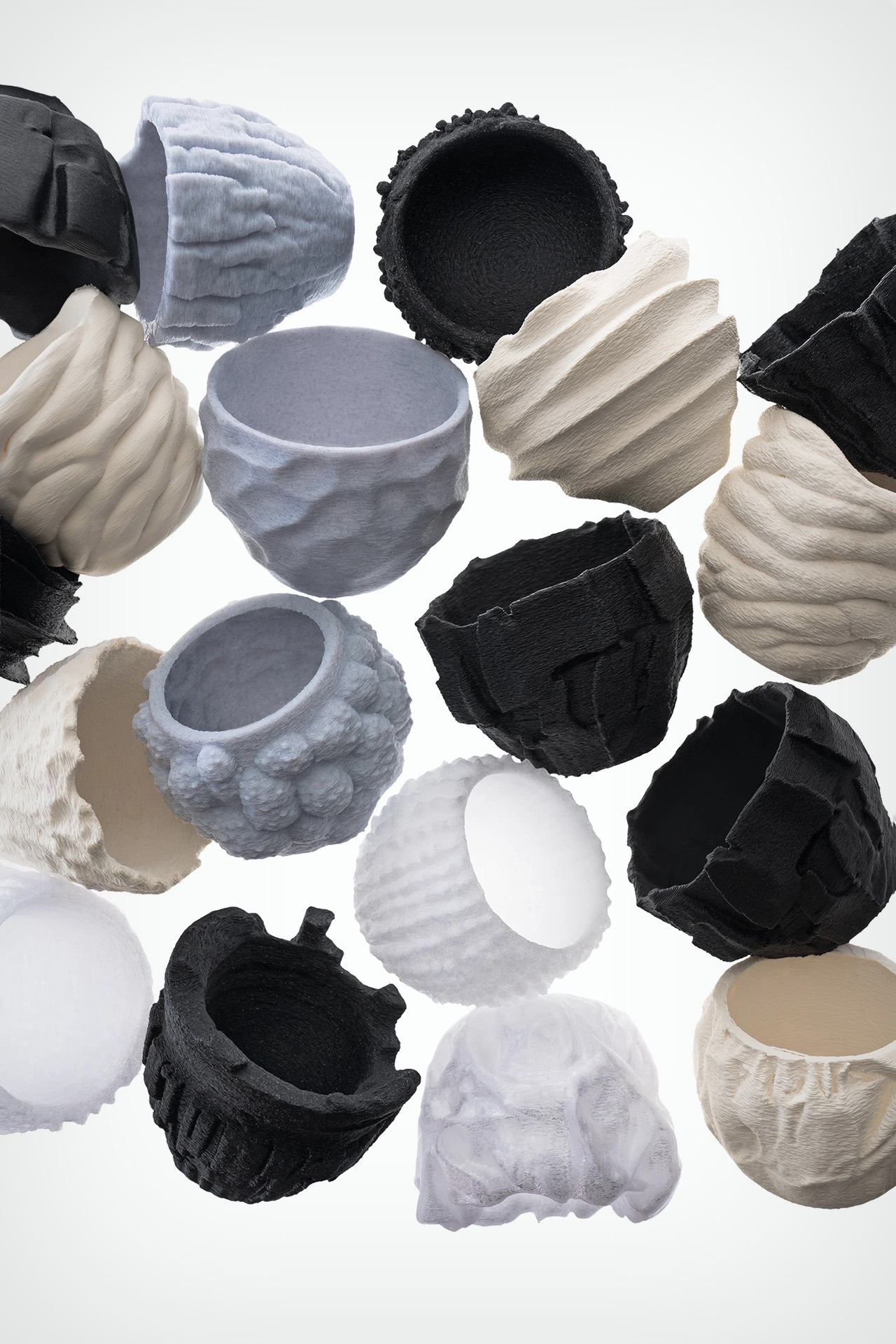
Sure, we could sit and fearmonger about how AI will one day replace designers, but here’s an alternative reality – what if AI didn’t replace us, it just created a parallel reality? Like you’ve got Japanese ceramics, Italian ceramics, and Turkish ceramics, what if you could have AI ceramics? Not a replacement, not a substitute, just another channel. That’s what BKID envisioned with ‘Texture Ware’, a series of cups designed entirely by AI and manufactured using 3D printing. Minimal human intervention, and minimal human cultural input.
The AI feeds itself a vast repository of data and uses its own database to make textural products that humans then use. BKID’s results look nothing like anything we’ve seen before, each cup of the Texture Ware series looks almost alien, an exaggeration of textures found in nature taken to an extreme. You wouldn’t find such cups in a handicrafts bazaar or your local IKEA. They’re so different that they exist as a separate entity within the industry, not a replacement of the industry itself.
Designer: BKID co
The workflow uses different AI services to go from prompt to cup. The only real input is a text prompt from a human specifying what sort of texture they want. The AI generates the texture image using ChatGPT’s Dall-E, creates a cup out of it in Midjourney, and then translates the 2D image of a cup to 3D using Vizcom. The 3D file then gets 3D printed, eliminating pretty much any actual human intervention as the machine models and manufactures the design from start to end.
“What would normally require a considerable amount of time if crafted entirely by hand was instead realized through two to three generative tools and a process of repeated trial and error,” says BKID. “The exaggerated expressions and omitted forms that emerge in each stage invite the audience to experience the subtle differences in sensibility between traditional handcraft and craft shaped by generative software.”
Users can make cups inspired by brutalist textures of concrete, fuzzy textures of moss, rustic textures of wood-bark, wrinkled textures of crumpled paper, raw textures of coal, columnar textures of basalt rock, porous-like textures of coral, or even alien-like textures of fungi. Each cup looks unique and the AI never repeats itself, which means even cups within the same texture category could be wildly different.
The result truly feels alien, because the AI approaches design using an entirely different set of parameters. Their imperfections become design details, their lack of ergonomics or awareness become a unique design DNA. The result isn’t like any cup you’ve ever seen before, and that’s the point – it’s created by an AI that hasn’t ‘seen’ cups, hasn’t used cups, and doesn’t test its output. That being said, the cups are still usable because of the parameters set by the human. The cups don’t have holes, and contain enough volume to hold liquid efficiently. They’re perfect for espresso, saké, or green tea, something that’s savored in tiny quantities in vessels that feel less utilitarian and more ritualistic.
What BKID’s experiment proves is that AI (at least in this case) won’t replace designers, it’ll exist independent of them. Can an AI make a cup exactly like a regular designer would? Absolutely… but there’s a better case to be made to have AI make things beyond human creativity and culture. These cups contort nature and textures into something that feel extremely new, in a way that allows AI-made cups and human-made cups to coexist peacefully.
As Mariah Carey says religiously every single December – “It’s tiiiime!” As we kick off the last month of the year and the holiday season, this LEGO build adds exactly the right spice to everyone’s lives. Why buy a generic snow globe from Hallmark when you could make your own, asks The Brick Artist – the designer behind the Christmas Snow Globe currently gathering momentum on the LEGO Ideas website.
We’ve covered LEGO snow globes before on this website, but none of them designed to be as dynamic as this MOC (My Own Creation). The Brick Artist’s build actually features a rotating element, allowing the globe to spin on its own axis like a tiny fidget toy. Inside, the globe features a decked out Christmas tree complete with baubles, stars, and a shimmering snowflake tree topper. Underneath the tree are the usual suspects, gifts like a wooden train, the nutcracker, a toy rocket, and a remote-controlled airplane.
Designer: The Brick Artist
The build looks fairly simple, with a base decorated with snowflakes and wreaths, capped off with a rotating platform which houses the Christmas tree encased in the clear orb. The Brick Artist hasn’t detailed the part-count, but it’s probably in the 200-400 brick-ballpark, making it easy to assemble and perfect for kids, adults, or even Santa and his elves.
The way the tree rotates is using a rotary crank on the back that probably activates a pair of bevel gears that cause the upper half to spin on a central axis. There’s no music element here, although that would probably seal the deal as a pretty fun Christmas toy. However, the joy of this MOC isn’t in the experience as much as the journey of building your own snow globe from scratch.
The drill with this MOC is like every other one we’ve written about. It’s a fan-made creation that currently exists only on LEGO’s Ideas website – an online forum where people build and share their own LEGO creations and have the broader community vote for them. The only way this build becomes an official LEGO box set is if it crosses the 10,000 vote mark, and then gets approved by LEGO’s internal team after a review period. If you want to see that happen, head down to the LEGO Ideas website and cast your vote for this brickset!
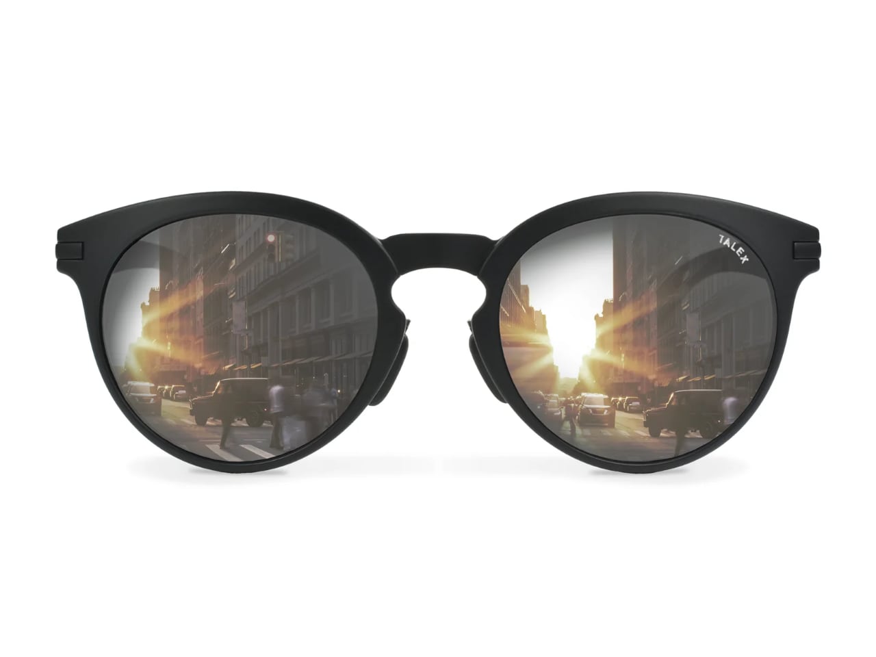
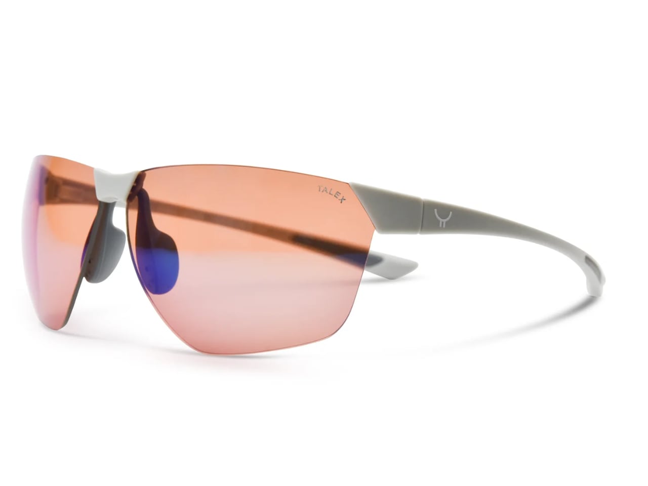
When the Lens Comes First: Most sunglasses begin as sketches. Designers draw frames that photograph well, then select lenses that match the aesthetic. Shinzo Tamura flips that sequence entirely. This Osaka-based brand starts with TALEX polarized lenses, then engineers frames specifically to house them. The result challenges how we think about eyewear design.
Designer: Shinzo Tamura
The approach stems from an uncomfortable truth about the sunglasses industry: dark lenses can actually damage your eyes. When non-polarized dark lenses block visible light without filtering UV rays, your pupils dilate to compensate for the darkness. More UV radiation reaches your retina than if you wore nothing at all. Shinzo Tamura positions itself against this paradox, treating eye protection as the foundation of design rather than an afterthought. That commitment traces back nearly a century, to a family workshop where lens-making became a generational obsession.
Three Generations in Tajima
The brand carries the name of its founder, a third-generation lens maker whose family began crafting eyeglass lenses in 1938. Tajima, the region near Osaka where the family workshop sits, has functioned as Japan’s optical manufacturing heartland for decades. This geographic heritage matters because it embedded generations of lens expertise into the company’s DNA before a single frame was ever designed.
The critical moment came in 1966 when Shinzo Tamura’s grandfather created what the company describes as the first fully balanced polarized lens. That balance refers to three properties TALEX has spent eight decades refining: natural color reproduction, contrast enhancement, and brightness optimization. Standard polarized lenses sacrifice one or more of these qualities. TALEX treats all three as non-negotiable.
Understanding this history reframes the brand’s design philosophy. When your family has spent 80 years perfecting lens technology, starting frame design with the lens feels obvious rather than contrarian. The lens expertise preceded the eyewear brand by multiple generations. What that expertise produced deserves examination.
Inside the TALEX Filter
The technical core of every Shinzo Tamura lens is a proprietary iodine compound filter that TALEX developed in Japan. Unlike standard polarization that simply blocks horizontal light waves, the iodine compound targets specific wavelengths that cause eye strain and fatigue. The company claims this approach eliminates glare without the characteristic darkening that makes cheap polarized sunglasses feel like wearing tinted windows.
Three distinct lens properties emerge from this filtration system. Natural color lenses render the world without the yellow or blue tint common to polarized eyewear. Contrast lenses sharpen edges and add depth, useful for activities requiring precise visual judgment. Brightness lenses intensify light transmission while still blocking harmful rays. TALEX tunes these three qualities for specific use cases, from driving to fishing to golf.
The technical claims carry weight because of how TALEX has positioned its lenses commercially. The Porsche Experience Center Japan equips its driving instructors with TALEX sunglasses. Professional fishing guides in mountain streams use them. Japanese women’s surfing champion Narumi Kitagawa competes in them. These partnerships suggest performance validation beyond marketing copy.
UV protection reaches 99% according to TALEX specifications. But the brand emphasizes something beyond UV numbers: the reduction of eye fatigue over extended wear. This positions the lenses as tools for sustained activity rather than accessories for brief outdoor moments. The newest lens technology pushes these principles further.
The HD Lens Series
TALEX’s latest lens advancement arrives in two specialized variants, both built from the company’s patented CACCHU® material. This proprietary compound achieves something that seemed mutually exclusive: the optical clarity of glass combined with the impact resistance and weight savings of polyurethane. Nine distinct layers work together in each lens, with a super-thin polarizing film infused with iodine compounds at the core. The construction passed ANSI Z87.1 certification, which TALEX describes as the world’s most demanding optical inspection standard.
Onyx HD targets everyday wear and driving applications. At 13% visible light transmission, the lens handles strong light intensity while preserving natural color reproduction with a slightly warmer character than conventional grey polarized lenses. The design prioritizes defined contours and enhanced contrast, making road markings, traffic signals, and distant objects appear with unusual clarity. Standard Onyx HD lenses price between $275 and $325, with an HD-M mirror finish option available at $360.
Zircon HD addresses outdoor sports and high-speed activities where visual precision determines performance. The lens shares the same 13% VLT as its Onyx sibling but optimizes for directional visibility at velocity. TALEX engineered this variant to recognize the smallest terrain changes and render object outlines with three-dimensional depth. Cyclists, skiers, and motorsport enthusiasts represent the target audience. Pricing mirrors the Onyx HD structure: $275 to $325 for standard versions, $360 for HD-M mirror coating.
Both HD lenses eliminate the discoloration and distortion that plague conventional polarized eyewear. The nine-layer CACCHU® construction maintains optical consistency across the entire lens surface, even at the edges where cheaper lenses typically degrade. With the lens technology established, the question becomes what holds it.
Premium Nylon Innovation
Frame design at Shinzo Tamura uses double-shot injection molding with premium nylon compounds. The material choice addresses specific failures in traditional eyewear materials. Acetate frames warp over time and develop surface whitening from sweat and plasticizers. Standard plastic loses structural integrity. Premium nylon resists all of these degradation patterns while achieving significantly lower weight than comparable materials.
The manufacturing collaboration with local Tajima factories applies Japanese precision standards to each frame. The Ultralight Collection pushes material efficiency to its limits, producing frames substantially thinner than industry standard constructions. The Classic Collection references 1960s and 1970s American and Japanese eyewear aesthetics, acknowledging the shared sunglass culture that developed between both countries during those decades. Material choice means nothing, though, if the wearer notices the frame at all.
The Disappearing Frame
Shinzo Tamura articulates its ultimate design goal through an unexpected metric: how quickly you forget you are wearing sunglasses. The brand wants frames so light, so precisely fitted, that by day’s end the wearer has no awareness of them. This invisible design philosophy runs counter to fashion eyewear that demands attention and signals status.
The goal requires solving weight distribution problems that most eyewear designers ignore. Nose pads must transfer minimal pressure. Temple arms must grip without squeezing. The combined weight of lens and frame must balance across contact points rather than concentrating at any single location. Low bridge fit options address additional anatomical variations, ensuring the disappearing frame experience extends to wearers with pronounced cheekbones and lower nose bridges.
This comfort obsession connects directly to the lens-first philosophy. If you are building eyewear around lenses designed for all-day outdoor activity, the frame must support that duration. Beautiful frames that cause headaches after two hours betray the lens technology they carry.
What Lens-First Design Means for Eyewear
The fashion industry spent decades training consumers to evaluate sunglasses by their frames. Designer names, trending shapes, and celebrity endorsements became the vocabulary of premium eyewear. Shinzo Tamura speaks a different language entirely, one where the invisible component determines value.
For designers watching this space, the lens-first approach suggests a broader principle: that the functional core of any product deserves design priority over its visible shell. The most elegant solution might be the one users forget they are wearing. Shinzo Tamura built an entire brand around that disappearance.
I’ve accepted the fact that in my lifetime, my home country will probably never win the World Cup, seeing as we’ve never come close to qualifying for one. So the next best thing would be to see the World Cup trophy in person, although that is also still a long shot given that the trophy tour will never pass by this side of the world. So the next best thing would be to see a replica of some sort and as I’m a LEGO fan as well, this newest build would be the perfect thing to own. It’s one of those rare occasions where my love for collecting LEGO sets and my passion for football intersect in the most beautiful way possible.
The LEGO® Editions FIFA World Cup Official Trophy (43020) is for the soccer (or football, as the rest of the world calls it) fan in you that would love to display the trophy on your shelf. It’s meant to hype up the 2026 World Cup tournament happening in the US, Canada, and Mexico in June-July 2026, which is one of, if not the world’s most popular sporting tournament. It’s a LEGO-fied replica of the trophy, featuring authentic details that capture the essence of the real thing. In case, like me, this is the closest you’ll ever come to actually touching this prestigious trophy, at least you can say you built it brick by brick with your own hands.
Even though the World Cup is one of the most-watched sporting events every four years, drawing billions of viewers from around the globe, this is actually the first time that football fans will be able to build an official replica 1:1 scale model of the trophy. The iconic design features two human figures holding up the earth, symbolizing the global unity that football brings. The build is made up of 2,842 LEGO elements, making it a substantial and satisfying project that will keep you engaged for hours. What’s particularly impressive is that it has the highest number of gold-colored bricks used in a single LEGO set, giving it that authentic metallic sheen that makes the real trophy so mesmerizing under stadium lights.
The attention to detail is remarkable. The build also includes a printed plaque under the base which lists all the countries that have lifted the current trophy design since it was introduced in 1974. This includes legendary winners like Brazil, Germany, Argentina, France, and Italy. It’s a nice touch that adds historical context and makes the replica feel more authentic and commemorative. For collectors and football historians, this detail alone makes the set worth having.
You even get a special easter egg when you pull out the slip in a hidden compartment in the upper globe section. You’ll see the actual FIFA World Cup 2026 logo and a cute branded minifig holding up a mini trophy toy. Basically you get a small trophy within the trophy replica, kind of like an inception-style setup. You can pull out this mini scene and display it next to the trophy replica so you sort of get two kinds of decorations. It’s these thoughtful little surprises that LEGO is known for, and they really enhance the overall building experience and display value.
The building process itself is designed to be both challenging and rewarding. With nearly 3,000 pieces, you’ll need to set aside several hours to complete it, but the step-by-step instructions make it accessible even if you’re not a LEGO expert. The modular construction means you build from the base up, just like the journey teams take to reach the final. There’s something meditative about clicking those golden bricks into place, watching the trophy take shape before your eyes.
The main trophy itself measures around 14.5 inches high once finished, making it a substantial display piece that commands attention without overwhelming your space. It’s a perfect gift for kids aged 12 and above or adults like me who are fans of both the sport and LEGO builds. Whether you display it in your living room, office, or dedicated collection space, it’s sure to be a conversation starter, especially during World Cup season.
It will be available for purchase starting March 2026 in the lead up to the tournament, giving fans plenty of time to build and display it before the first match kicks off. LEGO also said they will be rolling out new products and experiences to celebrate this momentous tournament that will feature 48 teams, the most of any edition. This expansion makes the 2026 World Cup historic in its own right, and having this replica feels like owning a piece of that history.


 Official Trophy (43020) is for the soccer (or football, as the rest of the world calls it) fan in you that would love to display the trophy on your shelf. It’s meant to hype up the 2026 World Cup tournament happening in the US, Canada, and Mexico in June-July 2026, which is one of, if not the world’s most popular sporting tournament. It’s a LEGO-fied replica of the trophy, featuring authentic details that capture the essence of the real thing. In case, like me, this is the closest you’ll ever come to actually touching this prestigious trophy, at least you can say you built it brick by brick with your own hands.