Cherry blossom season in Japan is one of the shortest windows in the travel calendar. Full bloom in Tokyo peaks around March 26 to April 3. Kyoto follows a few days later. Each city holds its peak for roughly a week before the petals fall. The parks fill before sunrise. The trains are packed. The days move fast, and the light does not repeat. What you brought matters more than it usually does, because there is no second shot at the season and no nearby store stocking the specific things that make the difference between a fluid trip and a frustrating one. These nine designs were not built for airport shelves or generic packing lists. They were made to be used — on the flight over, under the trees, and everywhere in between.
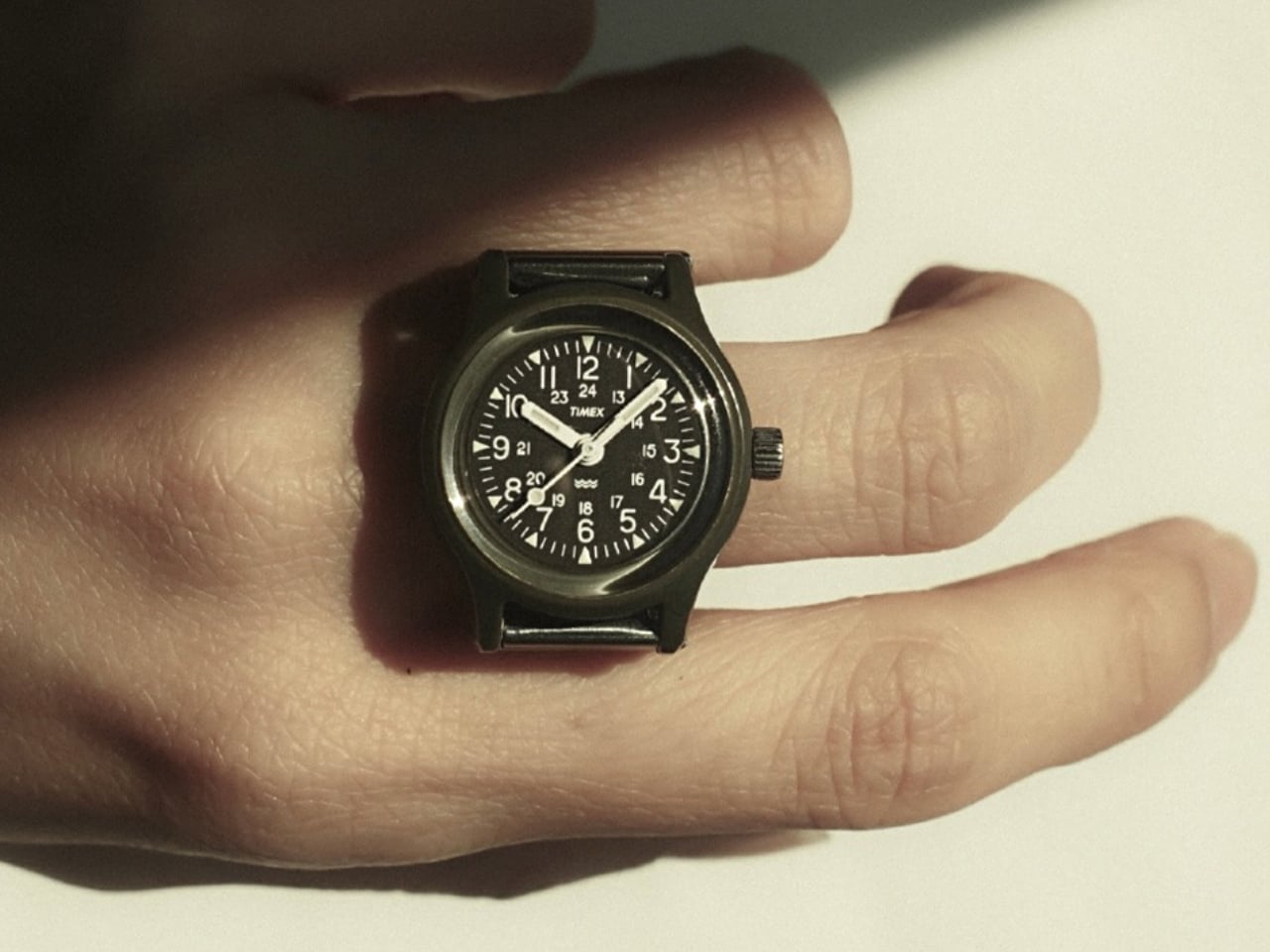
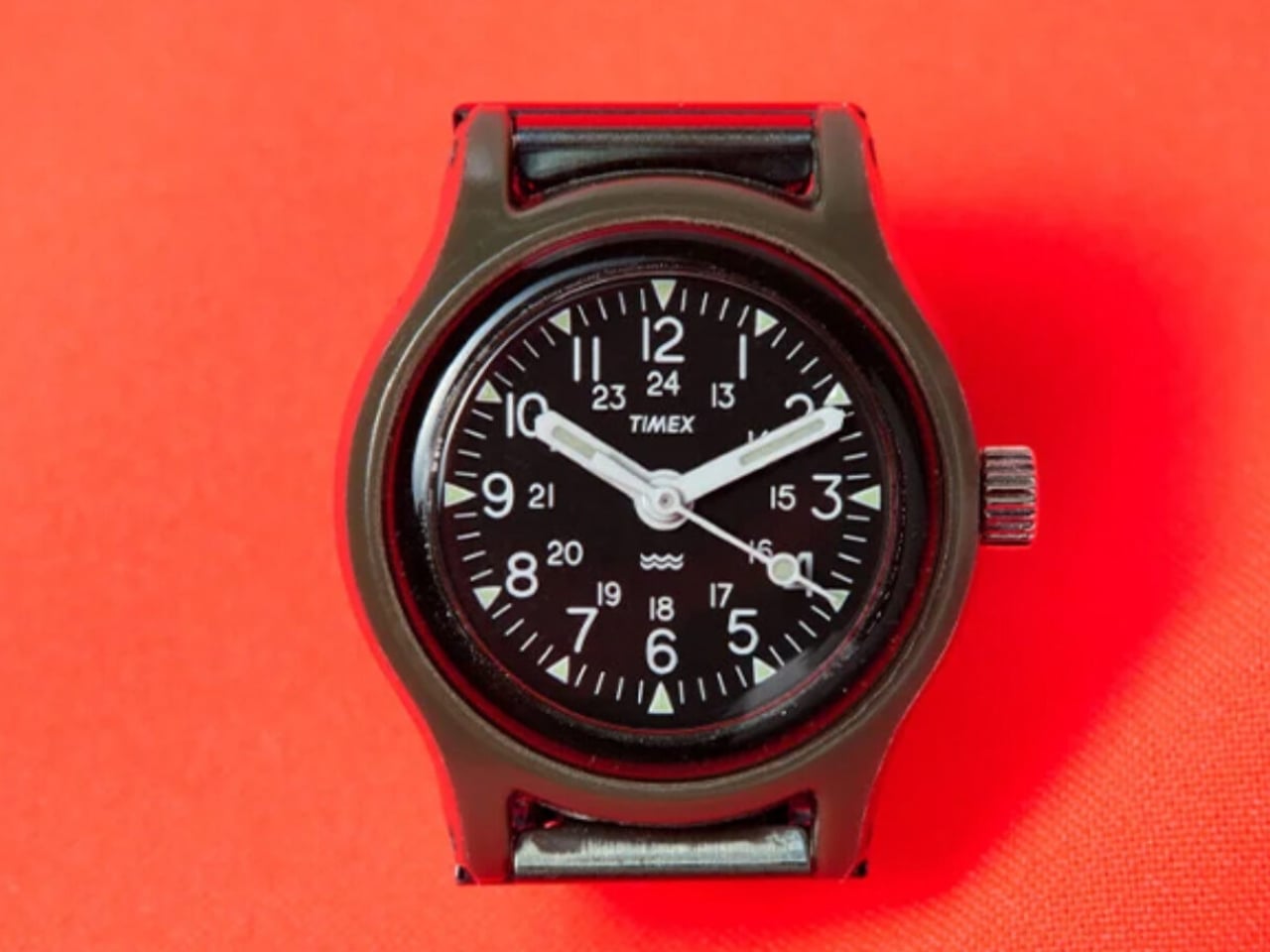
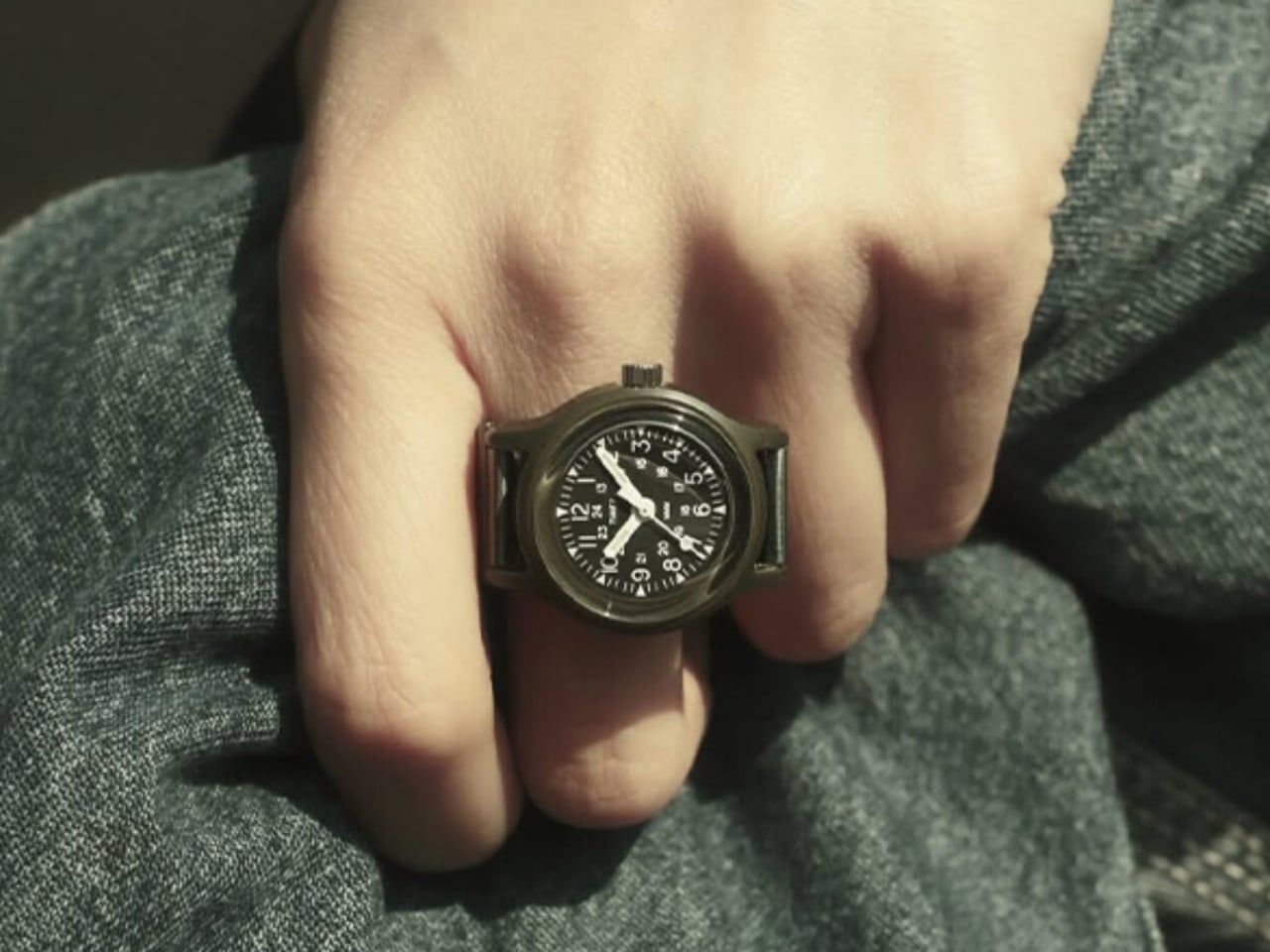
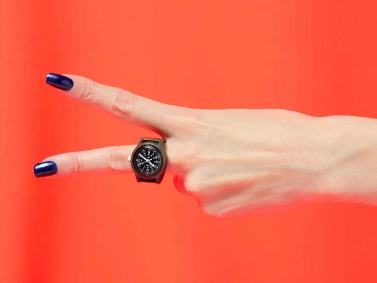
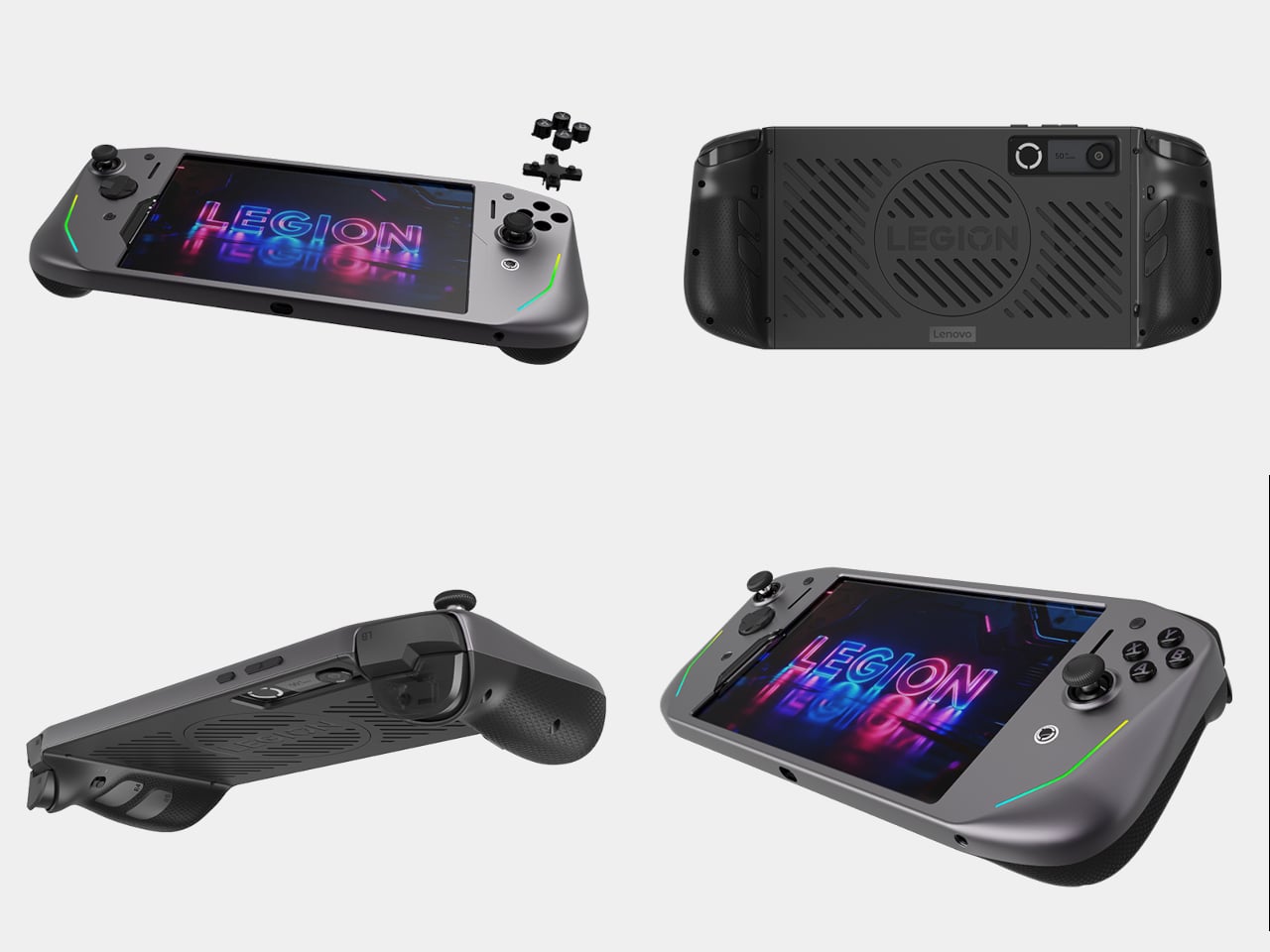
1. Camera (1) — A Tactile Digicam for a Screen-Tired Generation
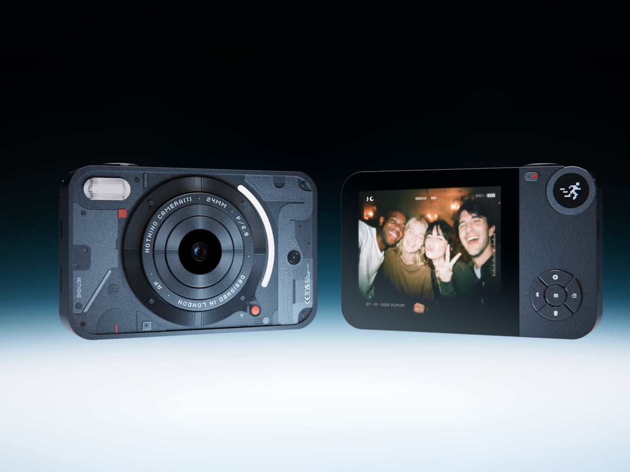
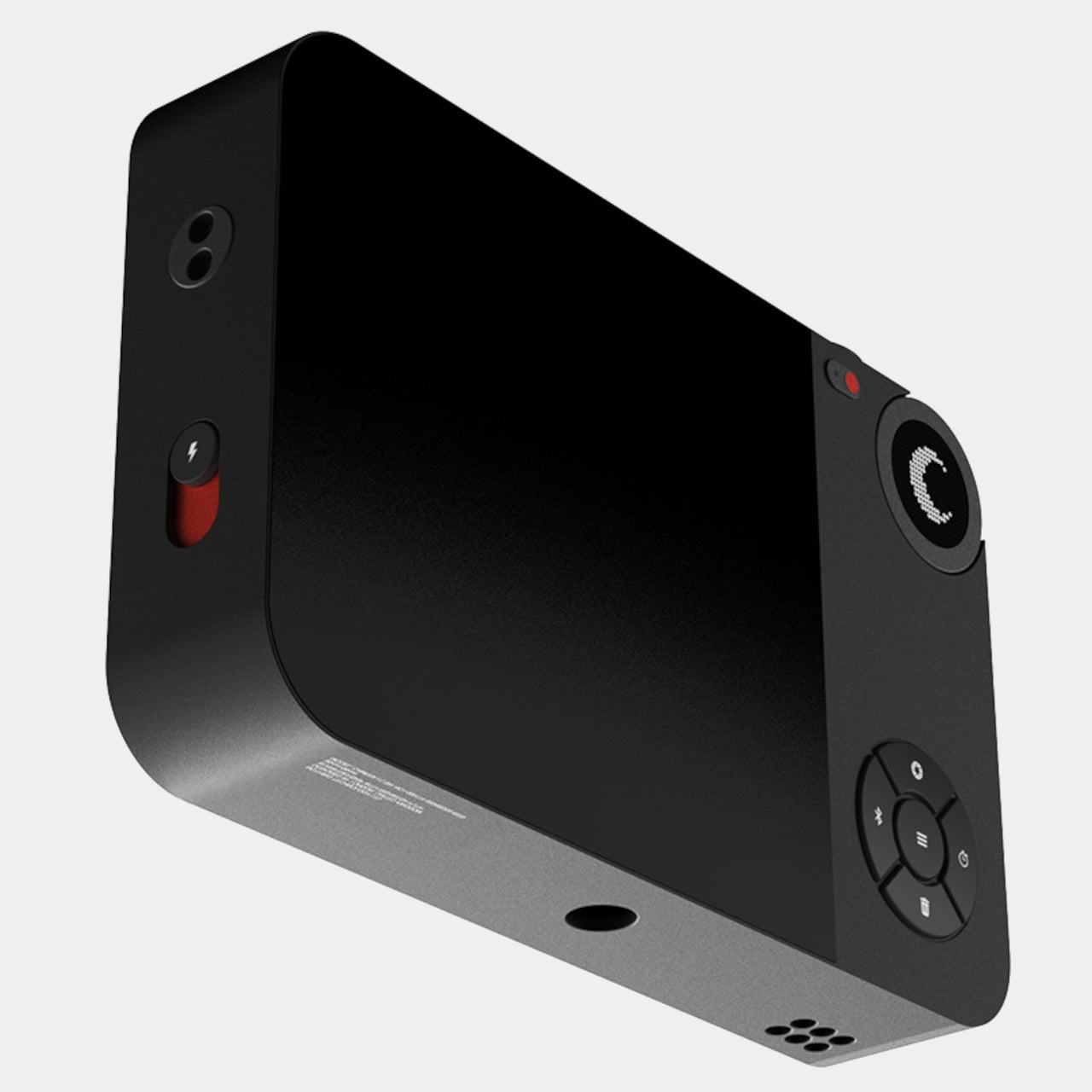
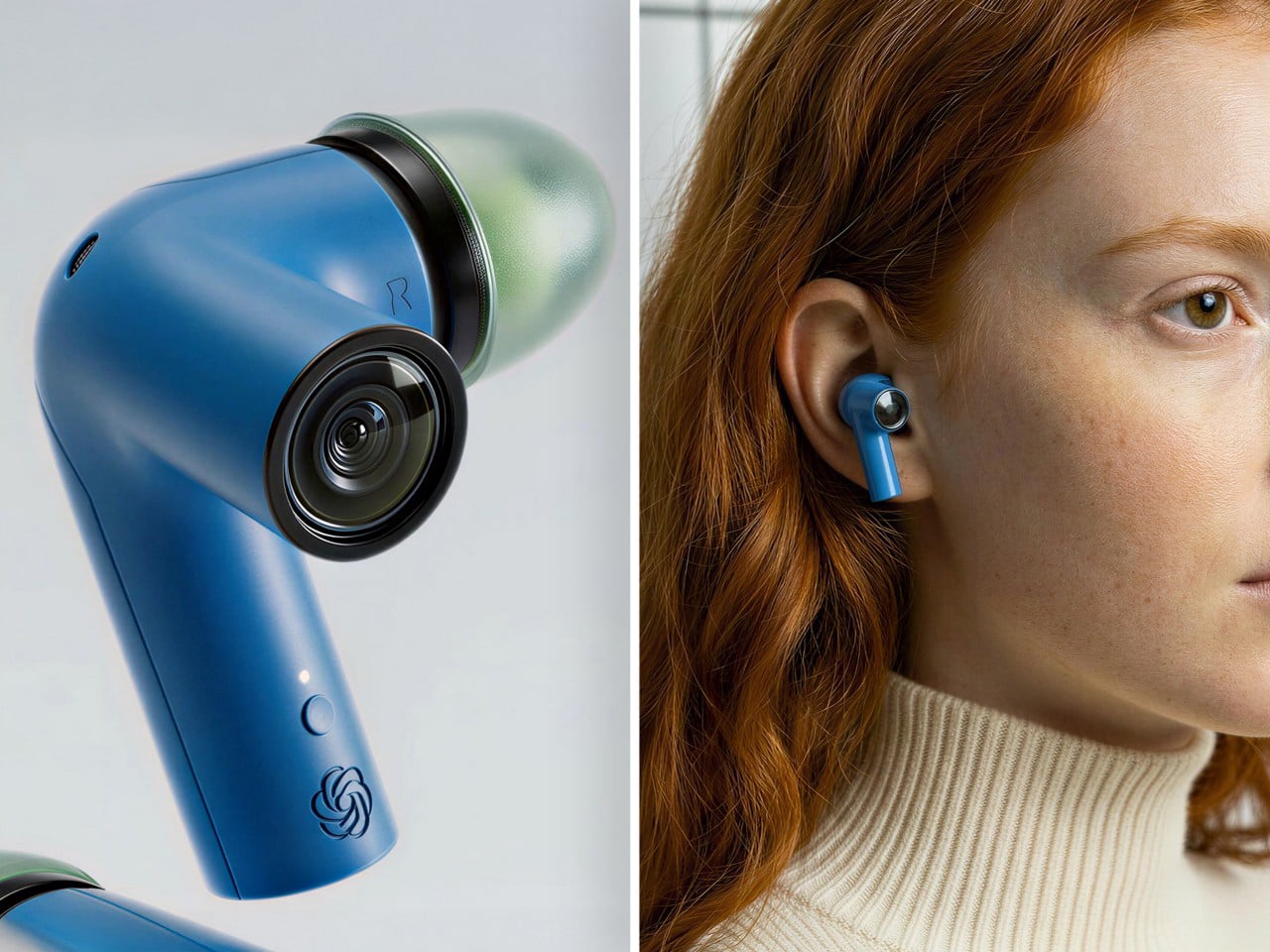
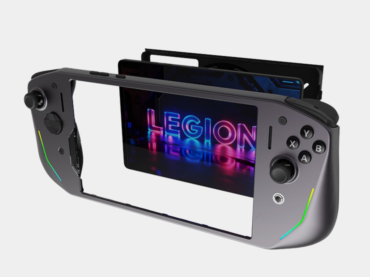
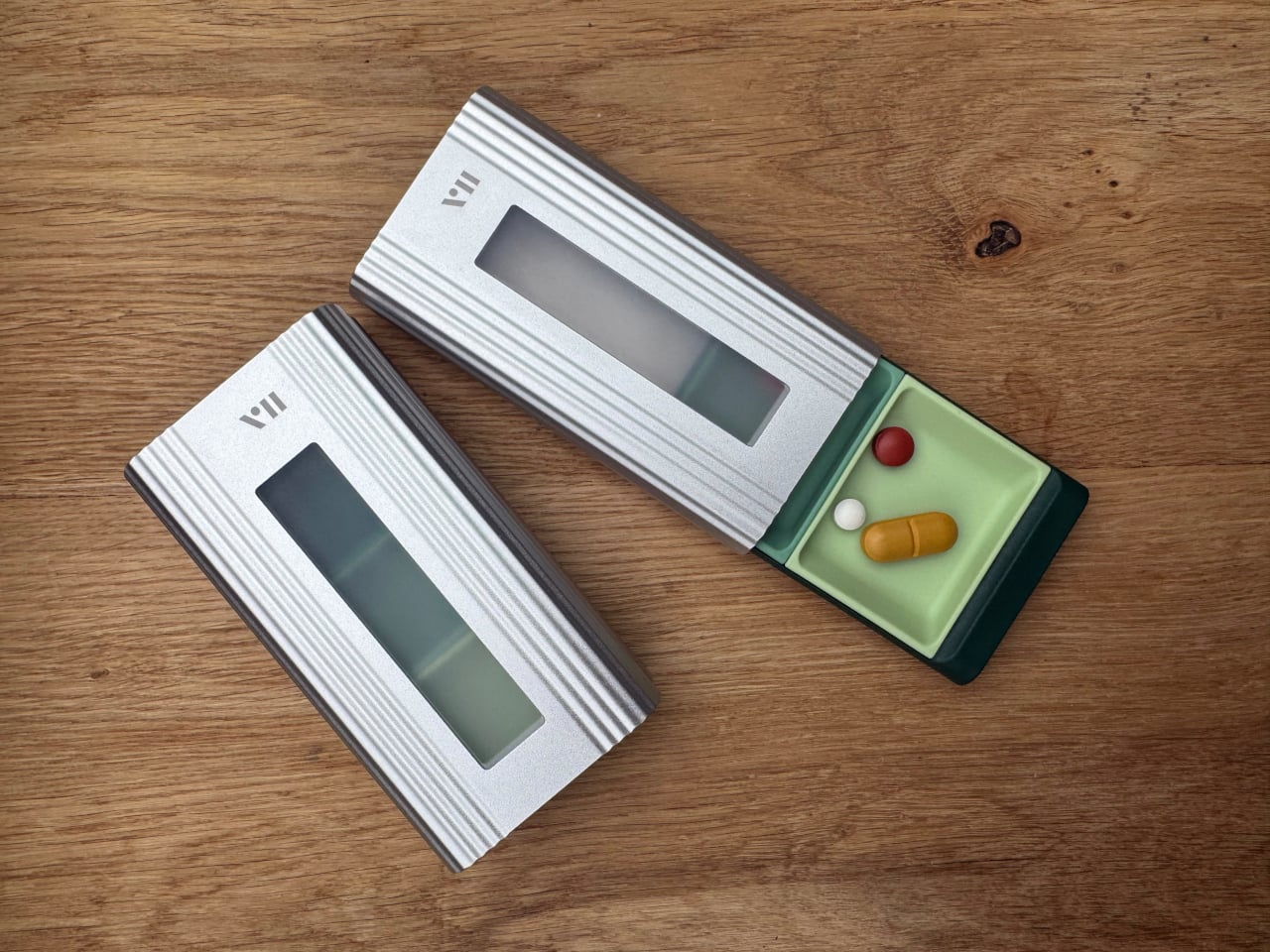
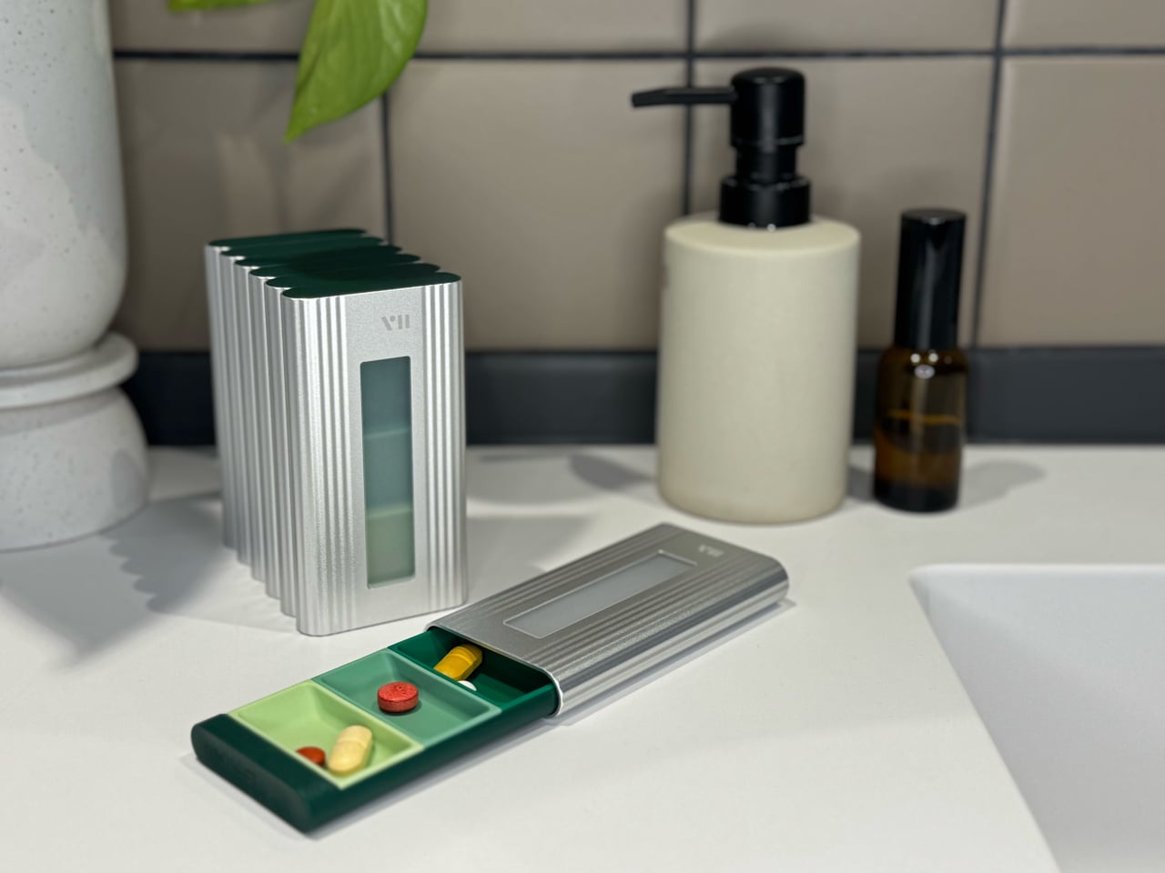
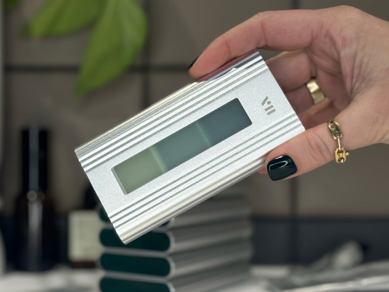
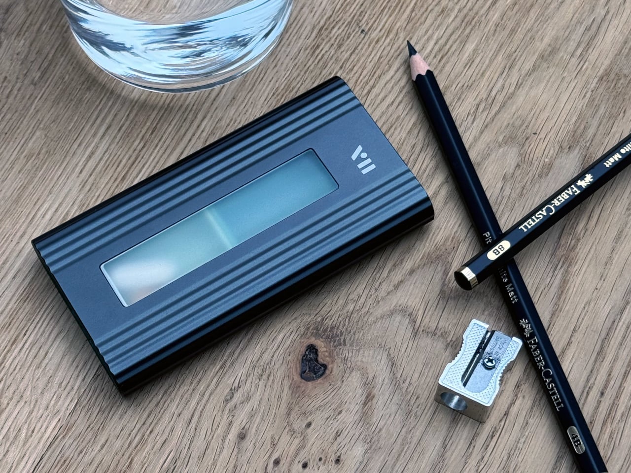
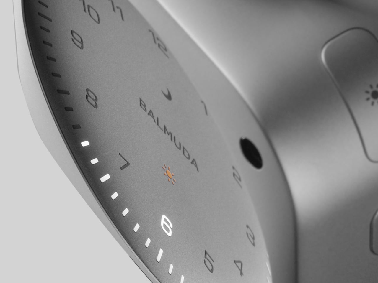
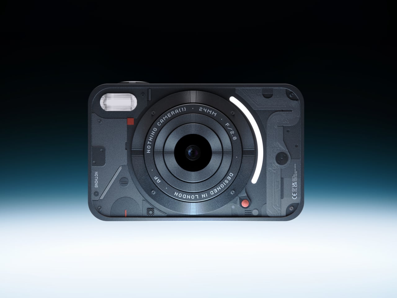
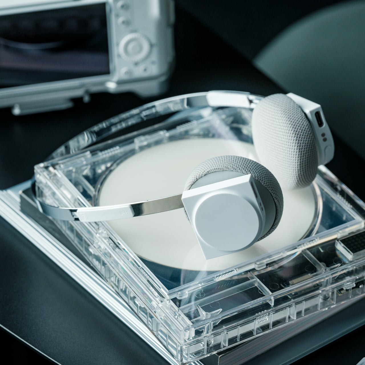
Camera (1) is a compact, metal-bodied camera with softly rounded corners, sized to slip into a pocket but solid enough to fill the hand with the right kind of weight. All the main controls live on one edge — shutter, a circular mode dial with a tiny glyph display, and a simple D-pad — reachable without shifting grip or navigating a touchscreen. Inspired by Nothing’s transparent, hardware-forward design language, it carries the confidence of a device that has thought carefully about how a person actually holds something. The rear display stays out of the way because it is designed to.
In Japan, during cherry blossom season, the light changes fast, and the best moments do not hold for a menu scroll. Petals falling across a stone lantern at Ueno. A crowded riverbank at golden hour along the Meguro. Camera (1) puts the full interaction in your fingers — twist the lens ring to frame, feel the shutter click, glance at the dial glyph to confirm mode. It encourages you to look at the scene rather than at the screen, which is the right priority when the thing in front of you is a path of blooming trees reflected in a temple pond.
What We Like
- Single-edge control layout gives full shutter, mode, and navigation access in one hand without lifting your eyes from the scene
- Pocketable metal body is carry-on ready and solid enough for full walking days across multiple cities
What We Dislike
- Currently a concept design, meaning production availability and final specifications are not yet confirmed
- No touchscreen requires an adjustment period for those accustomed to modern smartphone-style interfaces
2. StillFrame Headphones — Listening as a Physical Ritual
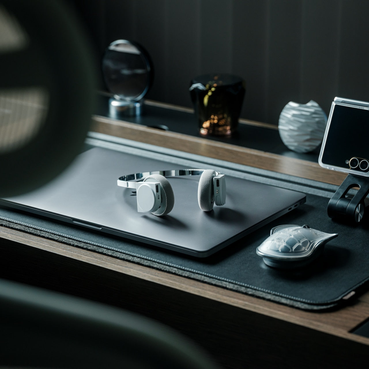
StillFrame wireless headphones are built around a specific idea: that listening should feel like something. The form echoes the quiet geometry of 80s and 90s CD hardware — measured proportions, nothing aggressive. The 40mm drivers deliver a wide, open soundstage that shapes quiet tracks into something more spatial, turning melodic textures into landscapes rather than noise. Noise-cancelling engages when the environment demands it. Transparency Mode opens the sound field when the world is worth hearing. Featherlight but full in the hand, it sits in quiet dialogue with a ClearFrame CD Player from a time when music had weight.
The flight to Tokyo runs roughly 14 hours from the US West Coast. Noise-cancelling carries you through the worst of the cabin without asking you to fight it. On the other side of that flight — on the Shinkansen between cities, in a ryokan at night with rain on a wooden roof, walking through a park where petals are already on the ground — Transparency Mode brings Japan back in without pulling the music out. Cherry blossom season moves at the pace of the trees, not the internet. StillFrame is designed for exactly that tempo.
Click Here to Buy Now: $245.00
What We Like
- Noise cancelling and Transparency Mode cover the full range of environments a Japan trip demands, from the cabin to the temple garden
- On-ear form is lighter and less fatiguing than over-ear alternatives across long travel days
What We Dislike
- On-ear design provides less passive isolation than over-ear headphones in the noisiest cabin environments
- Premium audio hardware adds a carefully packable item to a carry-on already optimized for volume
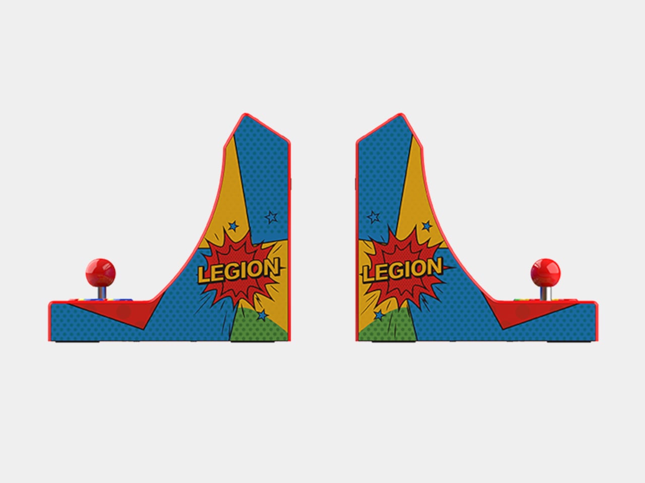
3, Benro Theta — The Tripod That Refuses to Compromise
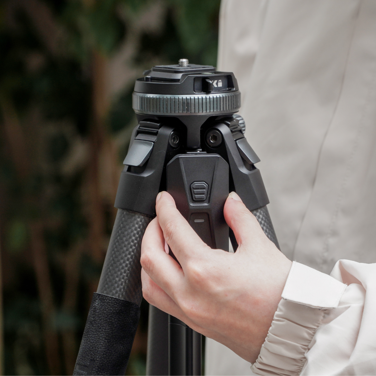
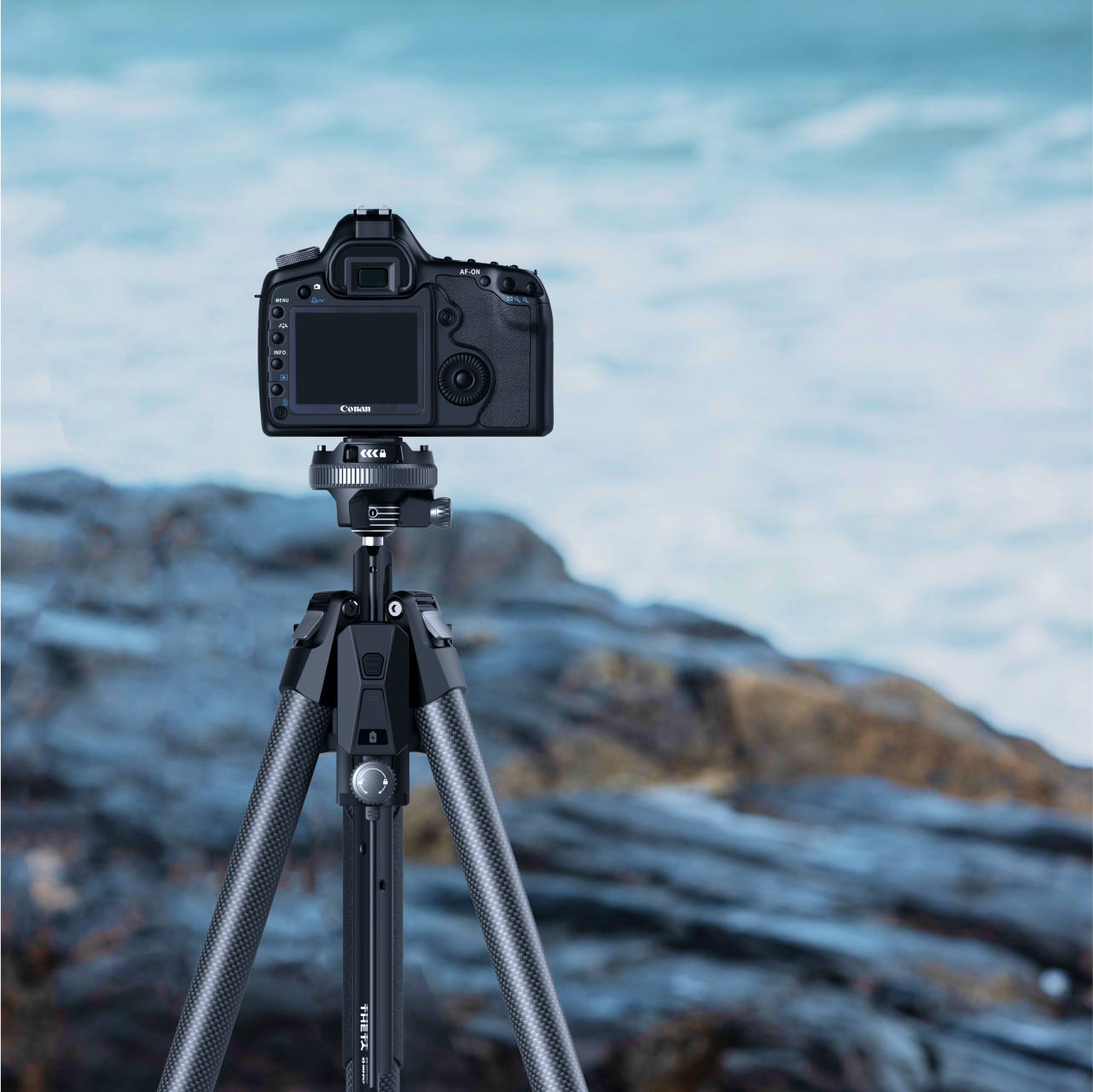
The Benro Theta is a tripod that refuses to accept the standard trade-off between portability and capability. Rapid leg deployment, automatic leveling, remote camera control, automatic exposure adjustment, and livestreaming support — all in a package compact enough to carry into a city without rethinking your bag. It does not present itself as a scaled-down version of a better product. The engineering is serious, the footprint is small, and that combination requires actual design effort to achieve, rather than simply removing features until something fits in a daypack.
Sakura season in Japan is a photographer’s season, and the locations that make the best photographs require patience, positioning, and speed. Setting up at Maruyama Park in Kyoto before the light peaks, or along the Philosopher’s Path before the morning crowds arrive, leaves no room for a slow tripod. The Theta’s rapid leg deployment means seconds between pulling it out and having a steady frame. Remote camera control means a solo traveler can step into the shot. Carry-on compatible without the overhead bin negotiation that full-size tripods demand, it earns its space before you even land.
What We Like
- Rapid leg deployment and automatic leveling cut setup time dramatically in crowded, fast-changing outdoor locations
- Remote camera control gives a solo photographer full control over framing without being physically behind the viewfinder
What We Dislike
- Smart Modules that extend the Theta’s full capability are excluded from the standard pack and sold separately, increasing the total cost
- The depth of technical features may exceed what casual photographers need on a trip built around handheld shooting
4. TMB Modular Bottle — A Bottle That Adapts to the Day
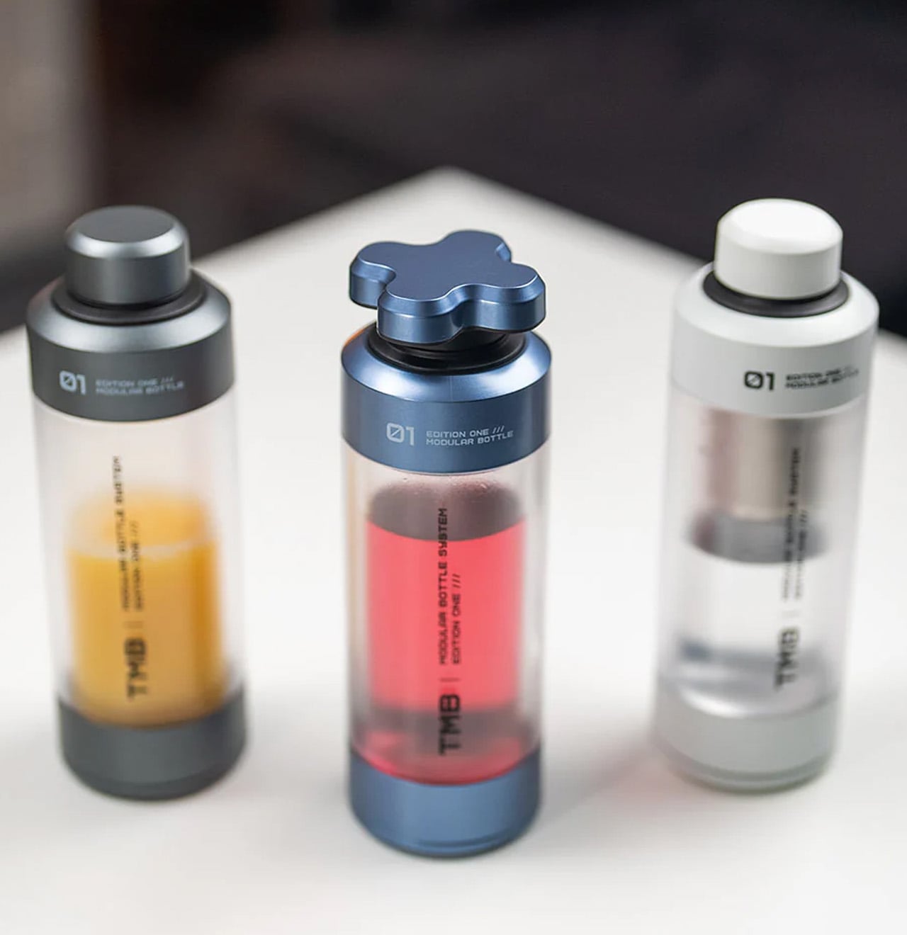
The TMB Modular Bottle starts from a premise most hydration products avoid: no single bottle works equally well for a long-haul flight, a full city day, and a trail hike. The borosilicate glass interior preserves drink flavor without absorbing taste or odor — a genuine material distinction from the steel and plastic alternatives that dominate this category. A translucent mid-section gives a constant read on remaining liquid. Every component is designed to be replaced individually, so a worn exterior case or cracked cap becomes a five-minute fix rather than a full replacement.
Japan’s tap water is among the cleanest in the world, and refilling throughout cherry blossom season is both practical and culturally appropriate in a country with almost no public trash cans. The TMB Modular Bottle handles morning tea, a full afternoon of water, and whatever comes between, without carrying the previous drink into the next. Cherry blossom season means long days on foot across multiple neighborhoods — Yanaka to Ueno, Arashiyama to Gion — and a bottle designed to adapt to those hours without failing them earns its volume in the carry-on.
What We Like
- Borosilicate glass interior preserves drink flavor completely, with none of the taste transfer found in steel or plastic alternatives
- Modular construction means worn components can be individually swapped, extending the product’s useful life significantly
What We Dislike
- Glass interior is heavier and requires more careful packing than steel alternatives on a long-haul flight
- Multiple modular components mean more individual parts to track across a multi-city itinerary
5. AirTag Carabiner — The Lightest Peace of Mind in the Bag
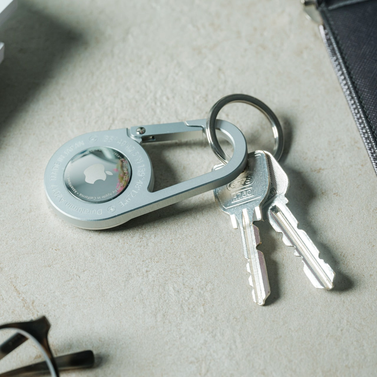
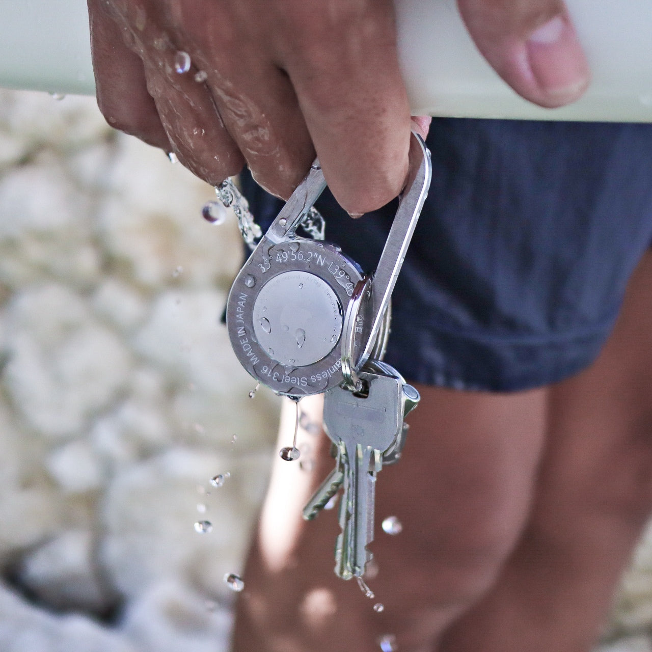
The AirTag Carabiner is made from Duralumin composite alloy — the same material used in aircraft, spaceships, and boats — which makes its lightness feel like a technical achievement rather than a shortcut. It clips directly onto bag straps, handles, or umbrella loops and turns an Apple AirTag into a permanent part of the bag rather than a separate object to remember. Individually hand-crafted and available in treated alloy, untreated Brass, and Stainless Steel. The AirTag itself is not included, but the carabiner makes a strong case for buying one before the trip.
The cherry blossom season is the peak of tourism in Japan. Parks like Ueno and Shinjuku Gyoen draw enormous crowds through late March and early April, trains between cities run at capacity, and moving a bag through a country where getting lost requires a language you may not speak adds a layer of cognitive friction the trip does not need. One carabiner on the main bag strap. One on the umbrellas you will inevitably set down somewhere and nearly walk away from. The GPS network handles the rest. For a carry-on trip built around doing things rather than managing them, this is a small object with an outsized return.
Click Here to Buy Now: $129.00
What We Like
- Aircraft-grade Duralumin composite alloy delivers structural reliability at a weight that adds nothing meaningful to the overall load
- Clips onto existing bag hardware with no case, pouch, or added setup required
What We Dislike
- Apple AirTag must be purchased separately, adding to the total cost of a complete tracking setup
- Designed exclusively for AirTag, making it incompatible with other location tracker formats
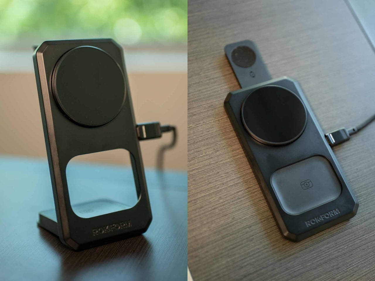
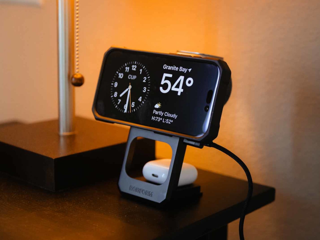
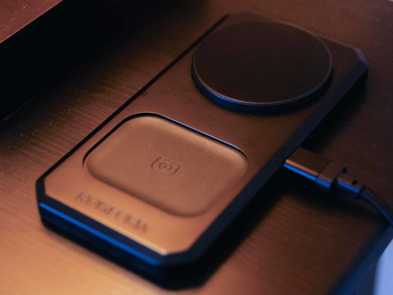
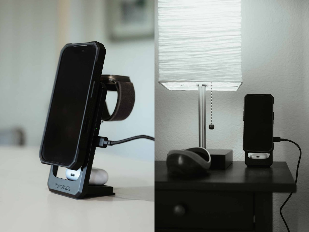
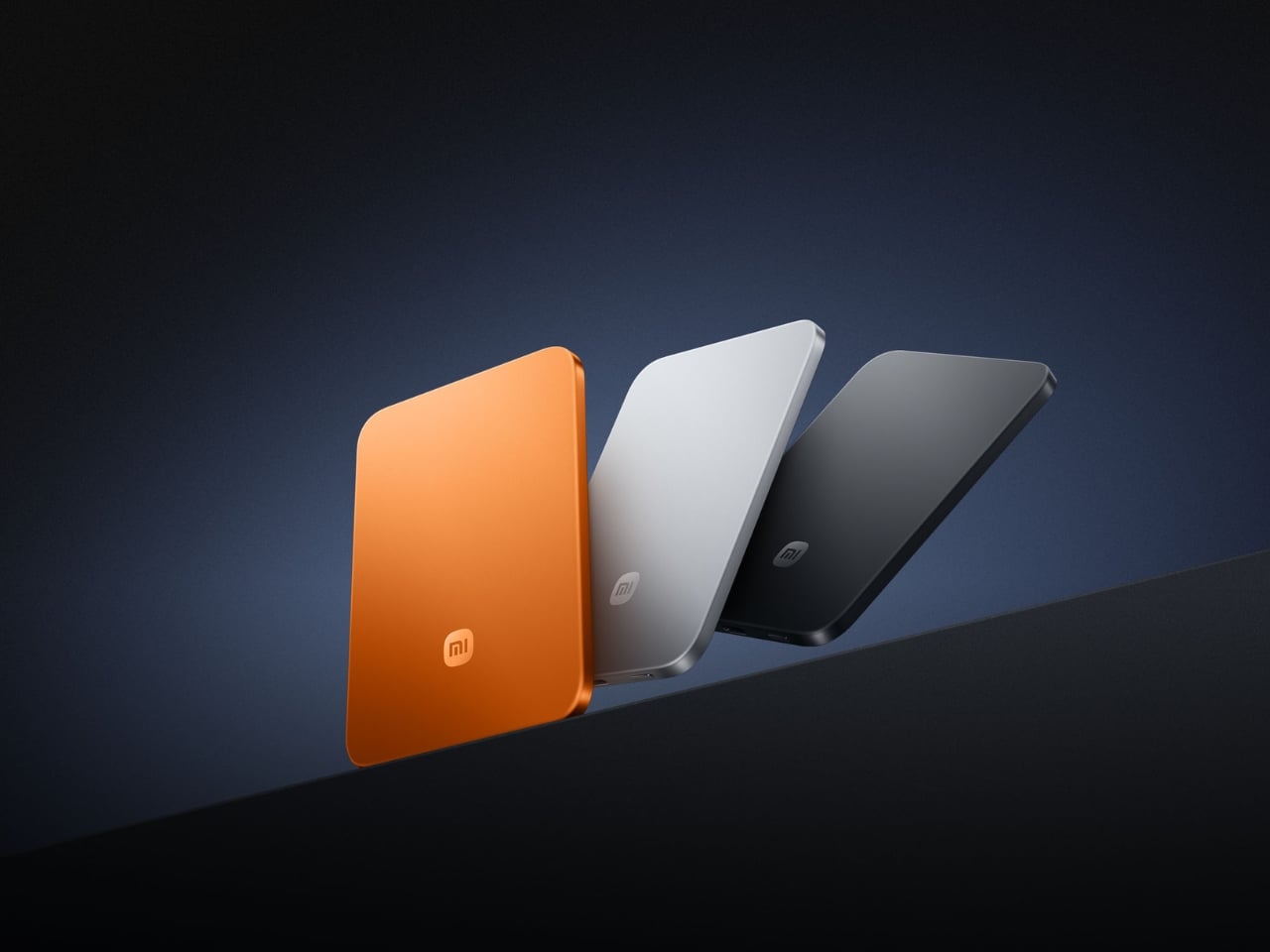
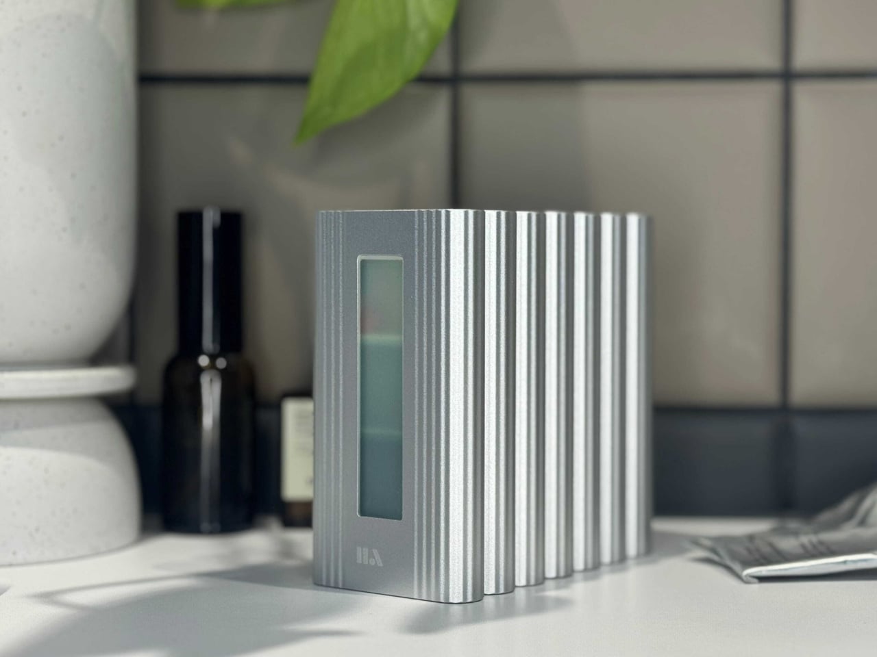
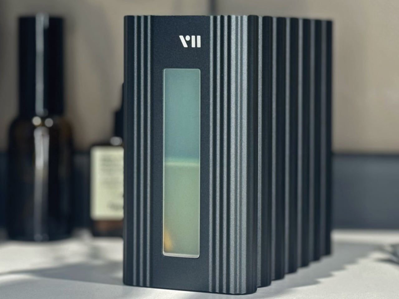
6. PWR 27 — The Power Bank That Actually Keeps Up

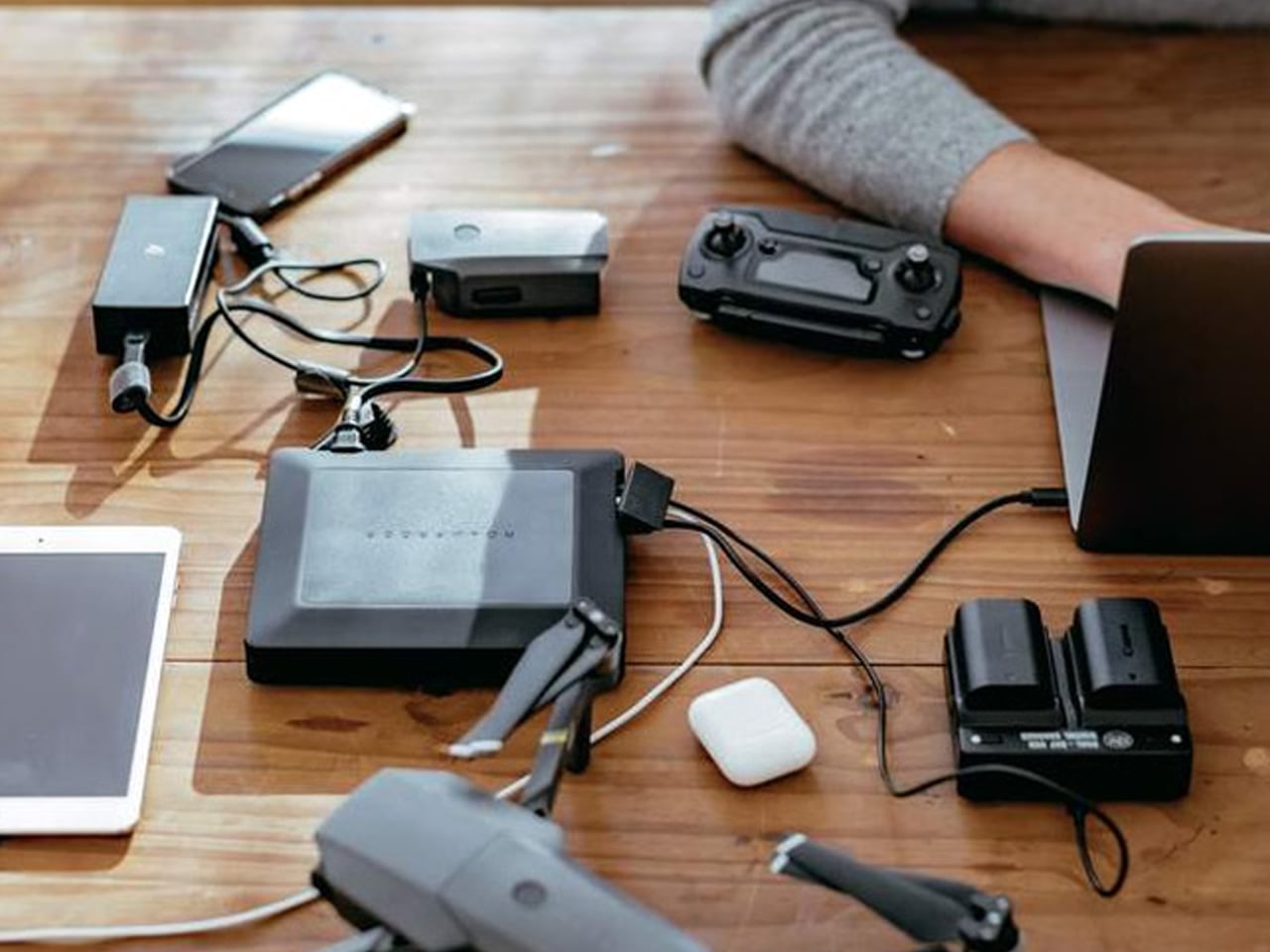
The PWR 27 is a 27,000 mAh power bank with an AC outlet, rated at 99 wH — the maximum battery capacity permitted in carry-on luggage by the TSA and all international air regulations. It charges four devices simultaneously, carries an IP67 dust and waterproof rating, is drop-proof and crushproof to significant tolerances, and features integrated solar battery life extension, an industry first for an AC power bank. It does not ask you to choose between the capacity a long trip demands and the ability to board the plane with it.
Japan runs on apps: navigation, IC transit cards, real-time translation, camera apps, and the constant map-checking that moving between Tokyo, Kyoto, and Osaka requires. A full day of cherry blossom season in any major city will drain a phone twice before dinner. The PWR 27 handles all four devices at once and keeps working in the rain, which matters in a spring season known for sudden, wind-driven showers. Power banks that are smaller and lighter are easy to find. Power banks at this capacity that fly legally, survive getting soaked, and charge a laptop mid-Shinkansen are not.
What We Like
- Maximum TSA-permitted capacity of 99 wH guarantees full legal compliance without any sacrifice in power availability
- IP67 waterproofing and crushproof construction make it genuinely dependable in Japan’s unpredictable spring weather
What We Dislike
- At 27,000 mAh, the physical weight is heavier than compact power banks, which registers across full walking days
7. Ori Frameless Umbrella — The World’s First Umbrella Without Ribs


The Ori umbrella was founded by MIT engineers and origami specialists. Its canopy structure uses the Miura fold — the same origami-derived engineering NASA deploys for spacecraft structures — which means there are no metal ribs, no fabric stretched over a frame, and no traditional failure point waiting for a windy Tuesday. The canopy itself becomes the structure. The result is a compact cylinder that stores like a pen and opens into a full umbrella. Billed as the world’s first frameless umbrella, the engineering behind that claim is real, and it shows in the form.
Spring in Japan brings unpredictable rain, and sakura season specifically delivers the kind of sudden gusts that destroy conventional folding umbrellas in minutes at the worst possible moment. The Ori’s frameless construction removes the single failure mode that makes cheap travel umbrellas frustrating and expensive ones still unreliable. The cylindrical form fits a jacket inner pocket or a bag side pocket that a standard folding umbrella profile cannot reach. Walking Philosopher’s Path in Kyoto in the rain while the petals come down around you is one of the better versions of that walk. Being dry enough to stay in it makes all the difference.
What We Like
- Frameless, rib-free construction eliminates the primary failure point of conventional compact umbrellas in wind and heavy rain
- Cylindrical form fits pockets and bag slots that standard folding umbrella profiles cannot reach
What We Dislike
- As a newer product, long-term durability data for the origami-based canopy in sustained heavy rain remains limited
- Premium engineering is reflected in a price point above standard compact travel umbrellas
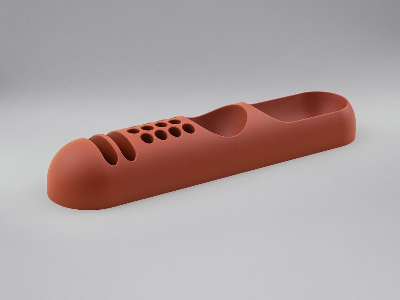
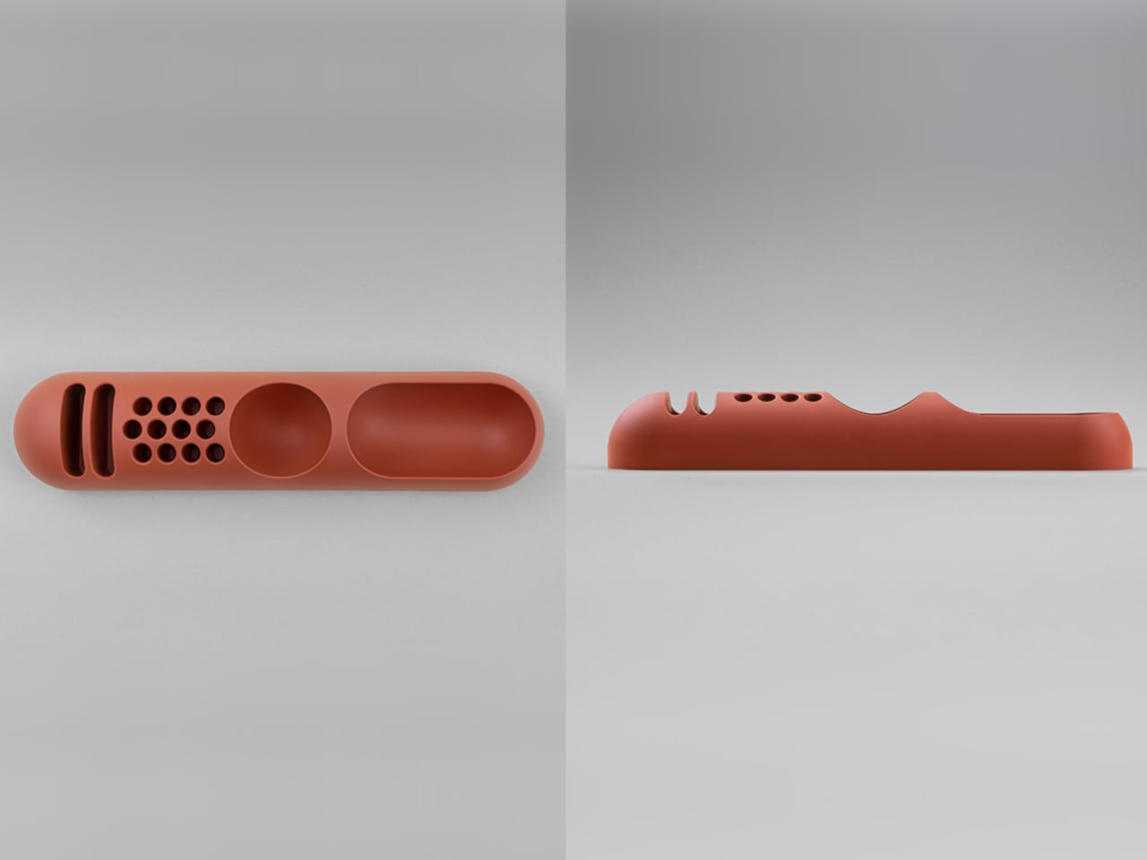
8. Inseparable Notebook Pen — The Pen That Never Leaves the Book


The Inseparable pen is designed to live permanently attached to a notebook. A magnetic clip holds it flush against the cover. A built-in silencer makes the detachment and reattachment quiet rather than abrupt. The form is minimal, the grip is comfortable, and the ink flow is smooth — all by deliberate design choice. It does not compete with the notebook for attention. The goal from the start was a writing instrument that becomes an extension of the book itself, always within reach, never a separate thing to locate when the thought arrives and the moment is already passing.
Japan, during cherry blossom season, produces the kind of experiences worth writing rather than photographing. The name of the temple you want to return to. The smell of a specific lane in Yanaka at dusk. The precise quality of afternoon light through sakura petals at Shinjuku Gyoen. A notebook and a pen that are never separated mean nothing interrupts the move from thought to page. Packing a journal without a reliable pen attached to it is a half measure. The Inseparable pen completes it, quietly and without asking for any attention of its own.
What We Like
- Magnetic clip keeps the pen permanently attached to the notebook, removing the friction of searching when the moment arrives
- Minimalist form and smooth ink flow make it a genuine pleasure to use rather than simply a functional object
What We Dislike
- Designed specifically as a notebook companion rather than a standalone pen, limiting its versatility as a general writing tool
- Magnetic attachment performance may vary depending on the notebook cover material and thickness
9. CleanseBot — The Travel Robot That Sanitizes the Room You Sleep In


CleanseBot is a travel robot with 18 sensors and four UV-C lamps, designed to sanitize hotel surfaces autonomously. Independently tested to kill 99.99% of E. coli, it navigates across beds, desks, and surfaces without manual direction. The UV-C light extends its sanitation capability beyond contact surfaces to airborne pathogens. It is compact enough to carry in a standard travel bag and smart enough to complete a full sanitation cycle while you unpack, check tomorrow’s weather, and figure out which train to take to the morning blossom spots.
Cherry blossom season is the busiest tourism window in Japan. Hotels and guesthouses turn over quickly during peak weeks, with rooms running at capacity from late March through early April. The CleanseBot is not a paranoid product — it is a calibrated one. Running it across the bed and key surfaces takes two minutes of setup and leaves a room measurably cleaner than the one you walked into. For a trip across multiple accommodations in Tokyo, Kyoto, and Osaka, the reassurance compounds over time. Small, autonomous, and easy to forget once it has run its cycle, which is exactly the standard a good travel object should meet.
What We Like
- UV-C sanitation, independently verified to eliminate 99.99% of E. coli, provides measurable assurance rather than theoretical comfort
- Autonomous operation via 18 sensors requires no manual guidance, freeing you to settle in rather than direct the process
What We Dislike
- Adds volume and weight to a carry-on already carefully balanced for a long-haul trip
- Maximum sanitation effectiveness requires clear, unobstructed surface access, which limits performance on heavily layered or textured bedding
Pack Smart, Stay Present — The Only Packing Philosophy That Survives Sakura Season
Cherry blossom season does not wait. The bloom window is roughly a week in each city, and the days inside it move faster than any itinerary accounts for. The nine objects on this list were chosen because each one does a specific job well — and because none of them requires your attention to do it. The camera keeps your eyes on the scene. The headphones adapt to the environment without asking. The carabiner tracks your bag silently. The CleanseBot runs while you sleep. The Ori opens in a second and closes in another. Good carry-on packing for a trip like this is not about having everything — it is about bringing only what earns its space and then forgetting it is there. These nine do exactly that.
The post Your Carry-On Isn’t Ready for Cherry Blossom Season in Japan — These 9 Designs Are first appeared on Yanko Design.