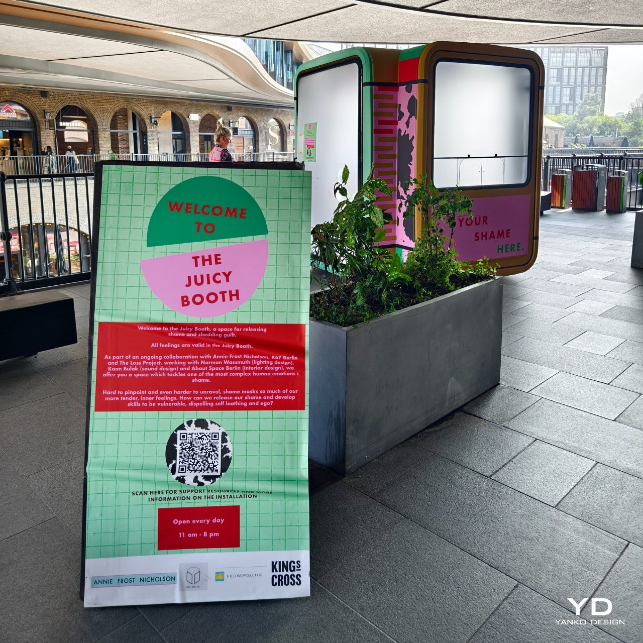
One of the hardest emotions for people to deal with is shame. We are afraid to admit it, confront it, and figure out a way to live with it. The healthiest way would be to talk to someone especially professionals. But if you’re not yet ready to take that step and you’re in London until December, there’s a pretty interesting art installation that may help you have a cathartic experience with your secret shame.
Designer: Annie Frost Nicholson
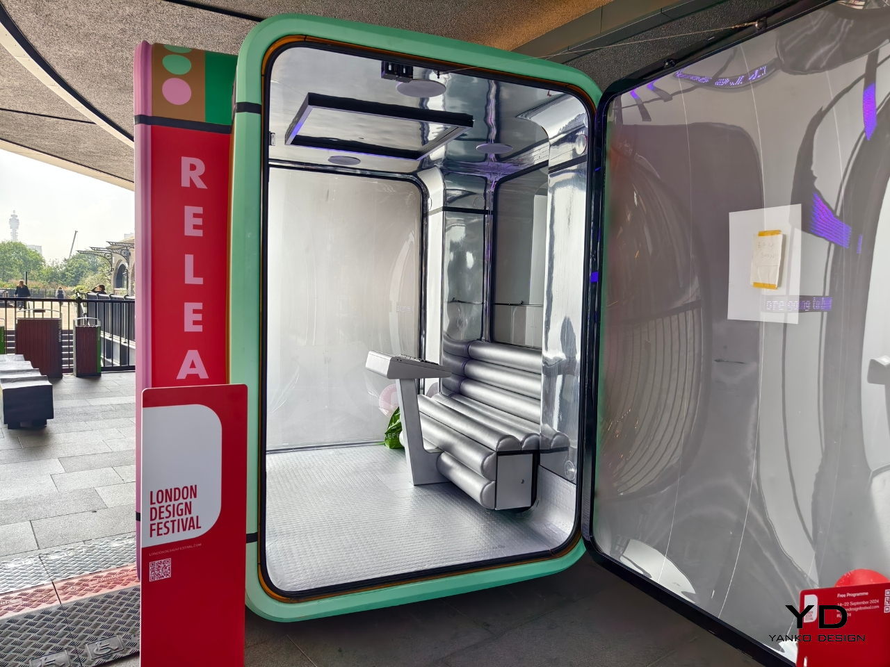
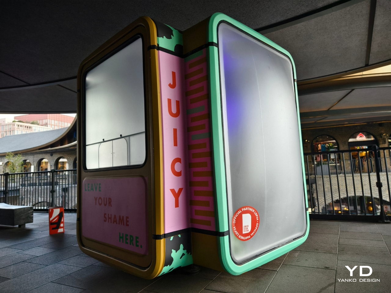
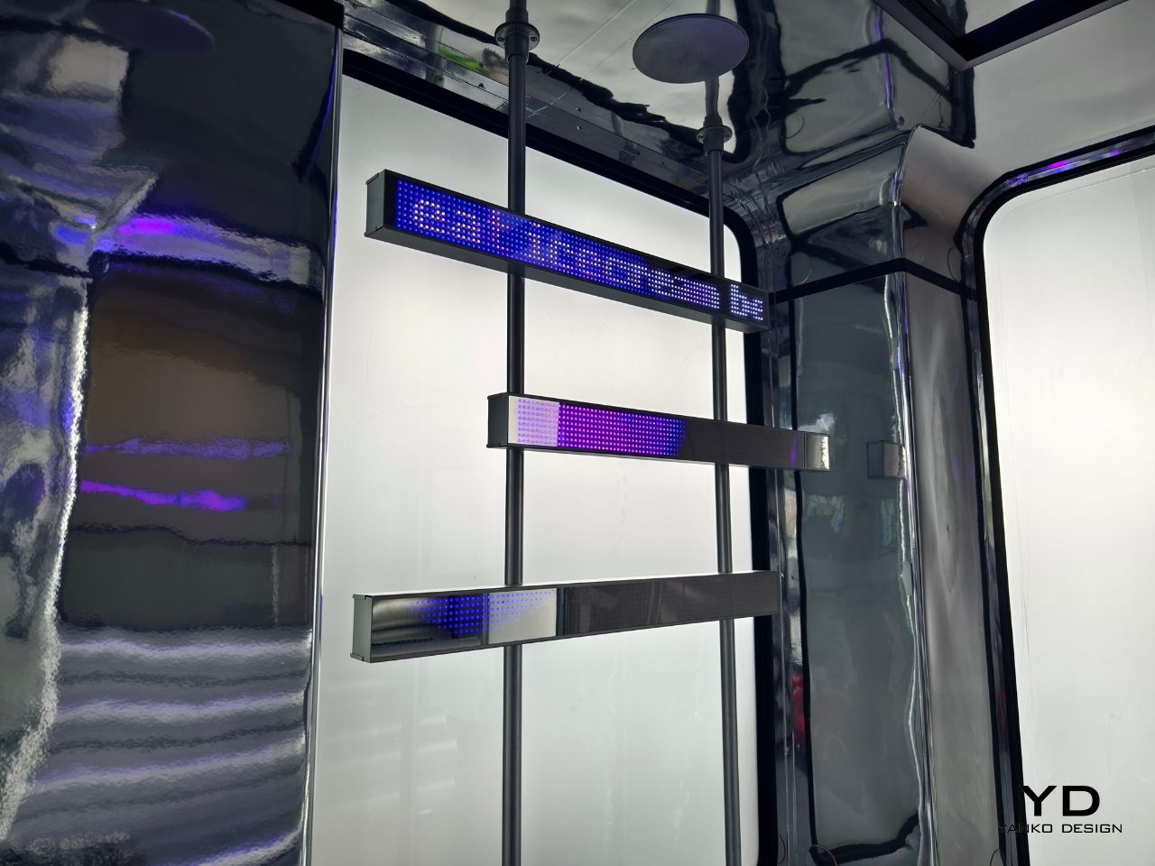
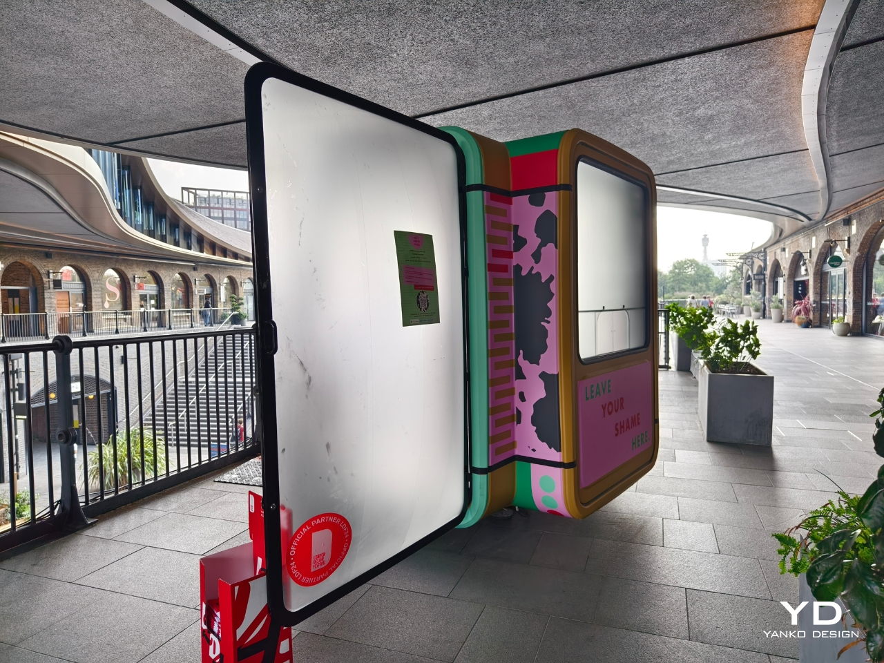
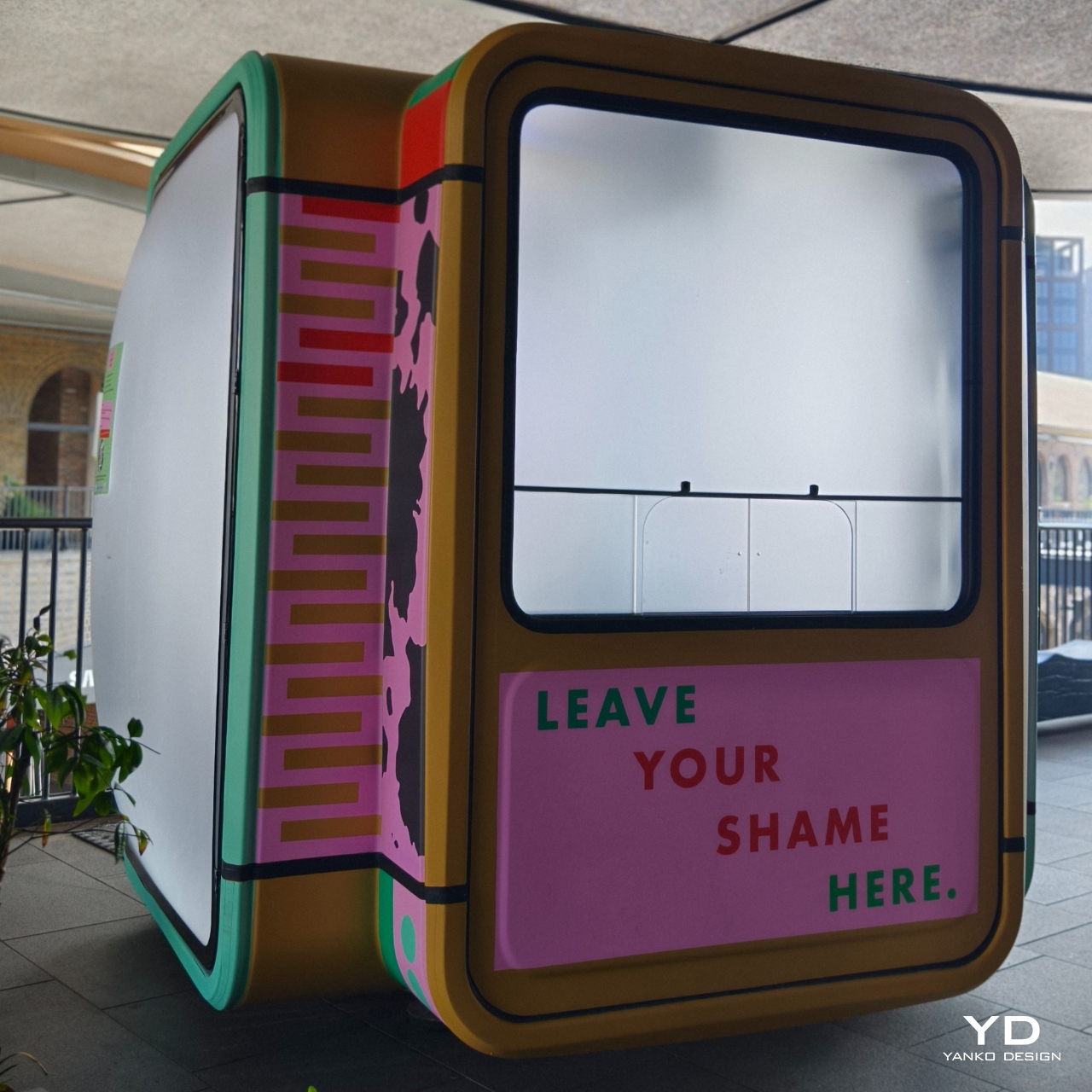
The Juicy Booth is an installation at the Coal Drops Yard as part of London Design Week which lets people have a 10-minute multi-media confessional session. Created in collaboration with K67 Berlin (a company that restores historical K67 booths) and The Loss Project (a social enterprise that creates spaces for communities to deal with grief and loss), artist Annie Frost Nicholson wanted to have a space for people to release their shame and have a quick healing session through colour, light, and music.
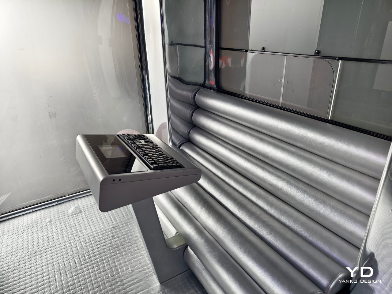
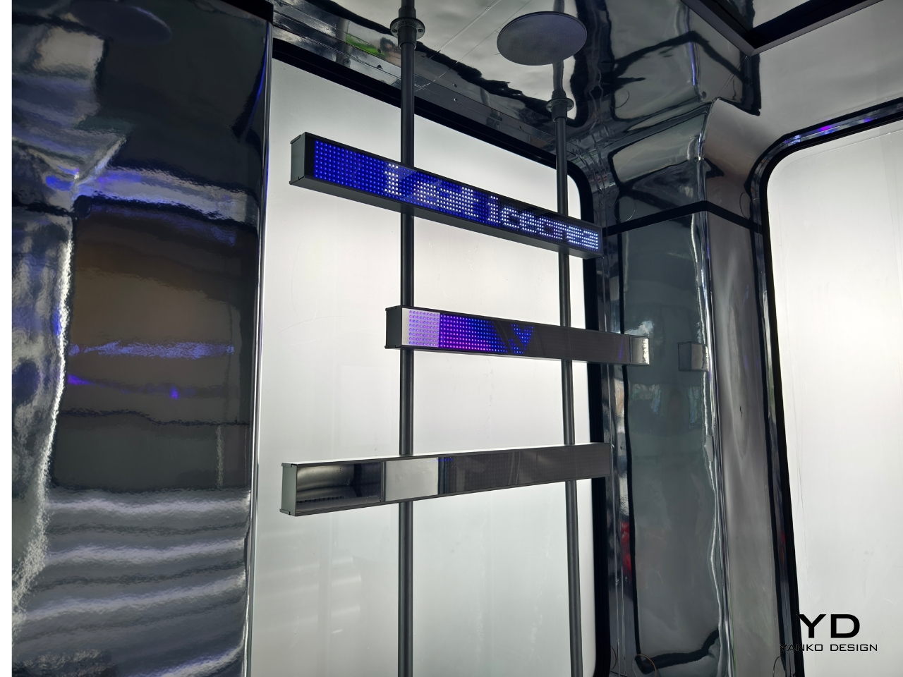
When you enter the booth, a refurbished K67 booth, you’ll see a retro 80’s keyboard where you can type out the thing that you’re currently ashamed of. Your confession will be spelled out on an LED monitor for your eyes only of course (unless you brought someone in with you there). Based on what particular emotion you’re dealing with, the system maps it out with their “carefully conceived colour spectrum”. You then get a light and sound show that will hopefully take you on a cathartic journey.
The whole experience will take you just 10 minutes but hopefully that is enough to start you on a journey to healing. You will also get to scan and access additional resources that can support you after your Juicy Booth session. The installation will be there until December 9 so if you have the chance to visit it and have a mini-confessional session, go ahead and do it.
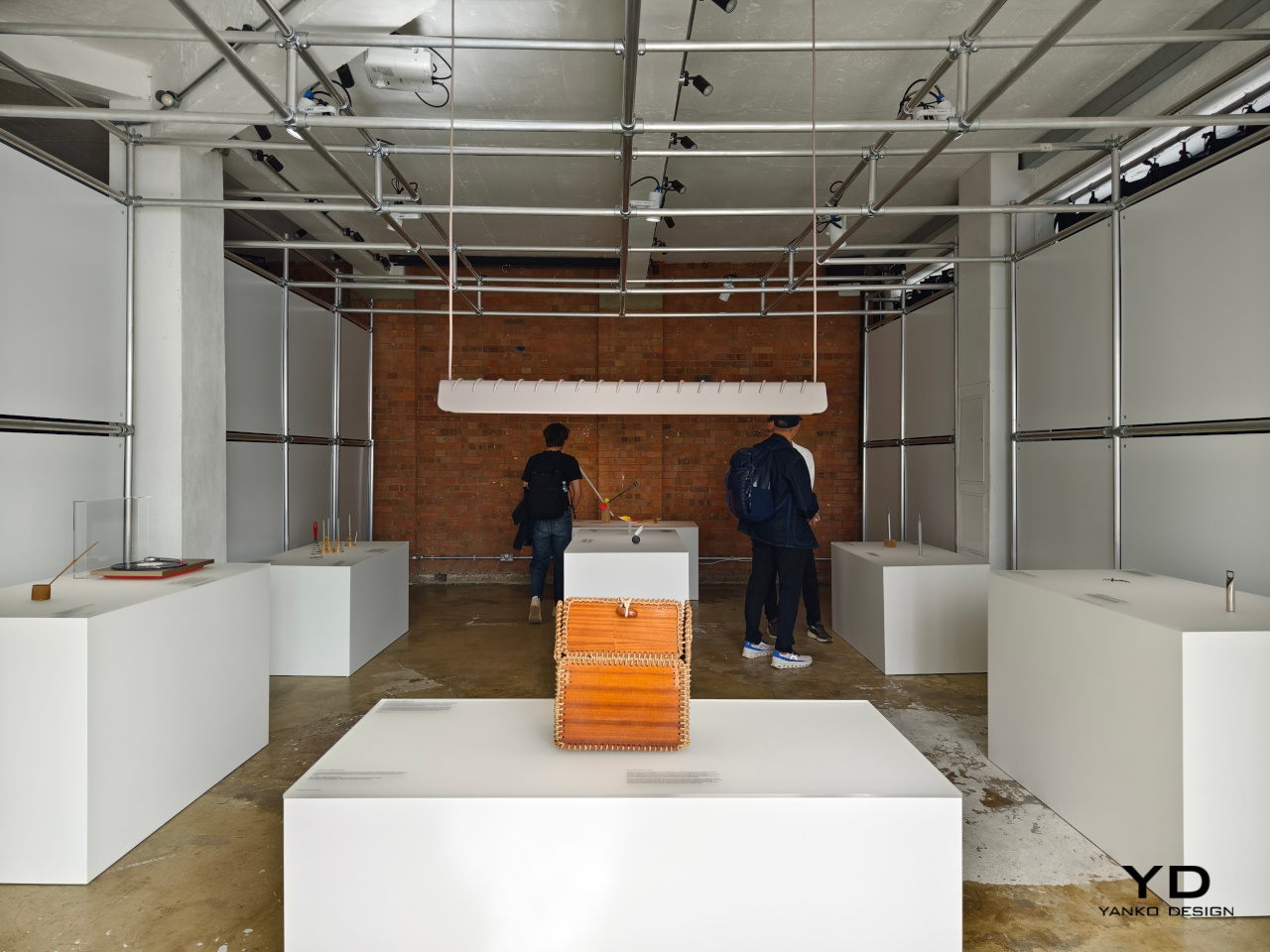
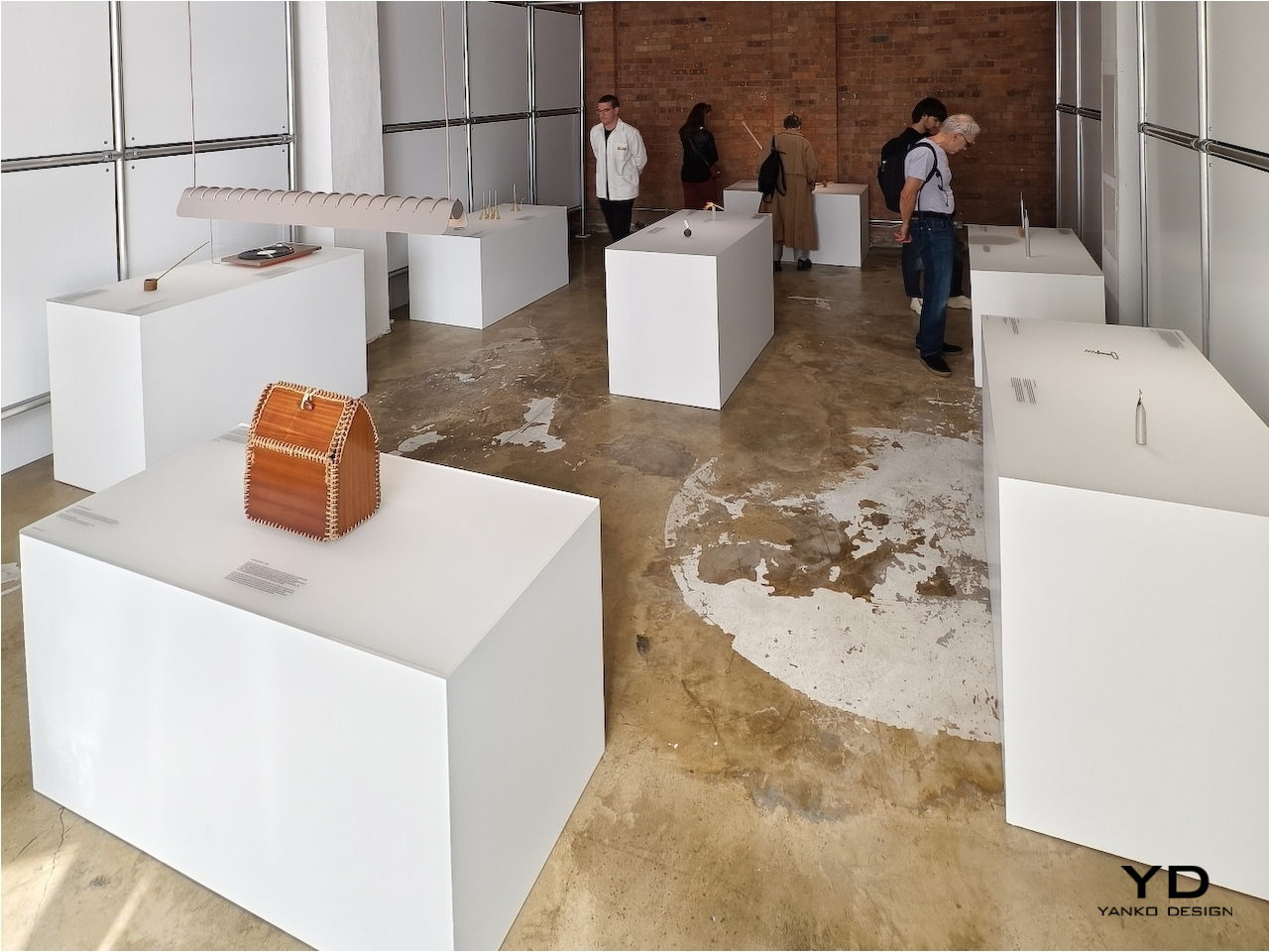
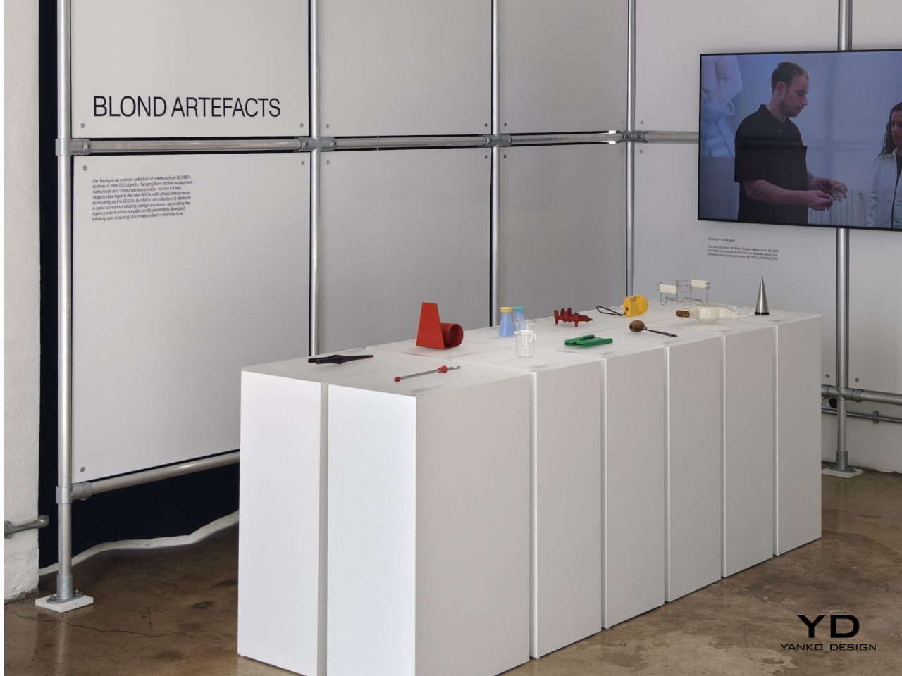
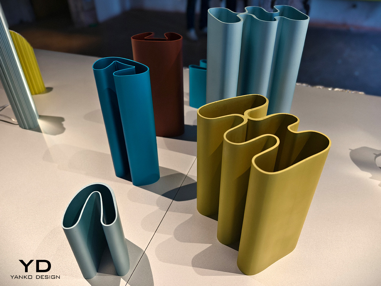
There are plenty of wise sayings about how the past guides our future, and nowhere is that perhaps more evident than in the design and fashion industries. “Retro” might seem like a passing fad, but this isn’t the first time that the design pendulum has swung back to the past for inspiration. This homage to the designs of our predecessors may be the guiding spirit behind famed London-based design studio BLOND’s ARTEFACT initiative, taking objects that are no longer in production or even in use and reimagining them in a completely different light. At the London Design Festival this week, the BLOND LABORATORY challenged a stellar roster of international designers and studios with this quest, and here are the responses that give these “offline” products a new kind of life in this modern world.
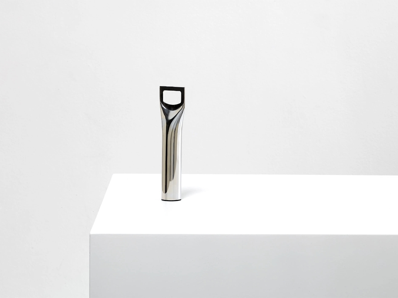
Opening wine bottles today is as easy as turning a cap, but true connoisseurs still prefer the classic cork that is just as difficult to remove as in the old days. Of course, we have it easy today as well with more modern tools, but the traditional corkscrew and its menacing metal spiral has always been the weapon of choice for that task. Even older designs used a single bent rod of metal, which is probably not as comfortable to use as those with wooden or even plastic handles.
Turning something crude into an art object is the feat that From Us With Love accomplished. Taking a single rod of metal, flattening its top, and cutting out a hole in the middle resulted in a simple yet functional bottle opener. It embraces the functional minimalism of the old-school corkscrew and imbibed with the elegance of modern tools, a true retro design if there ever was one.
Hirotaka Tako: Marking Gauge Ikebana Lamp
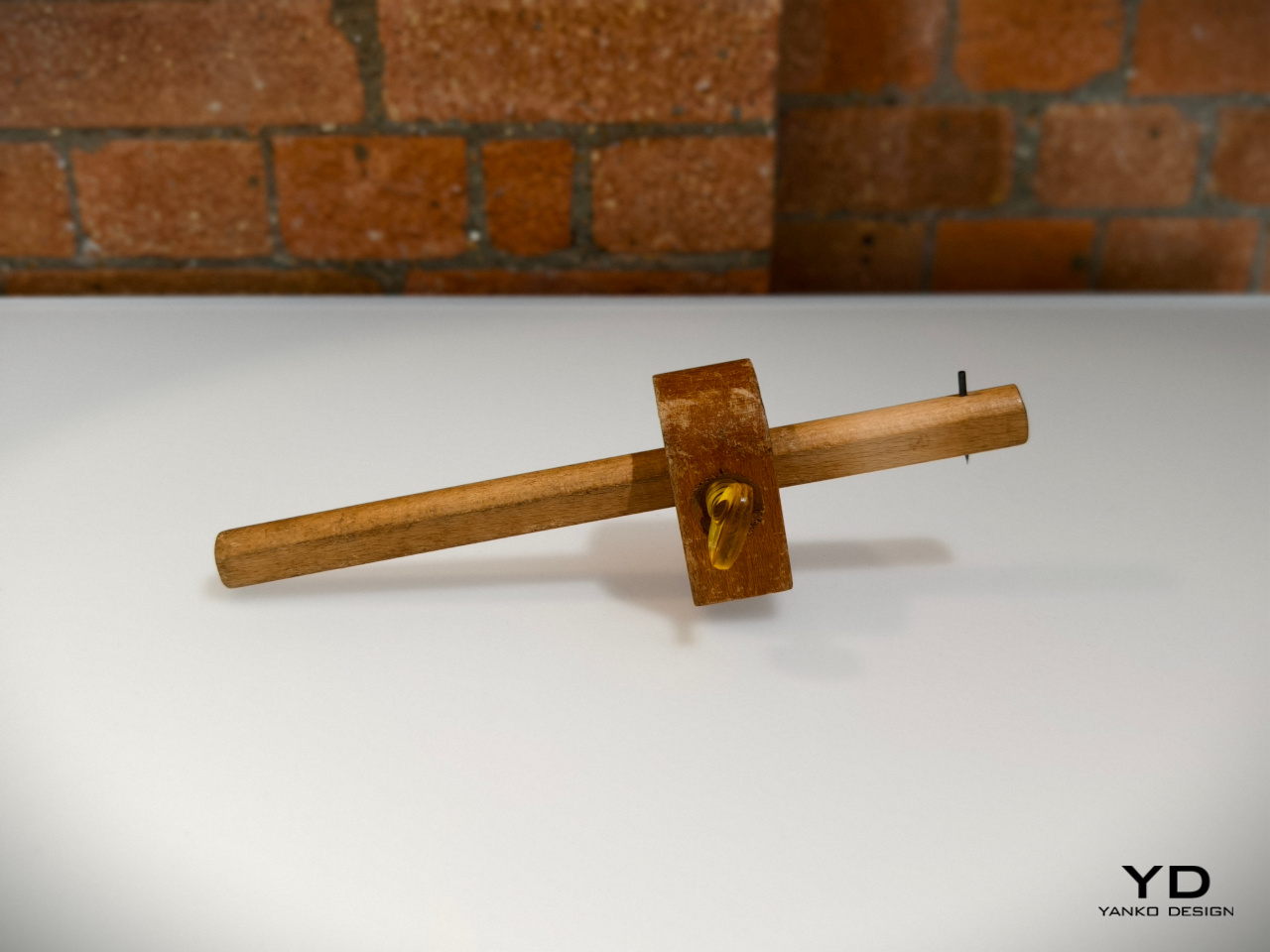
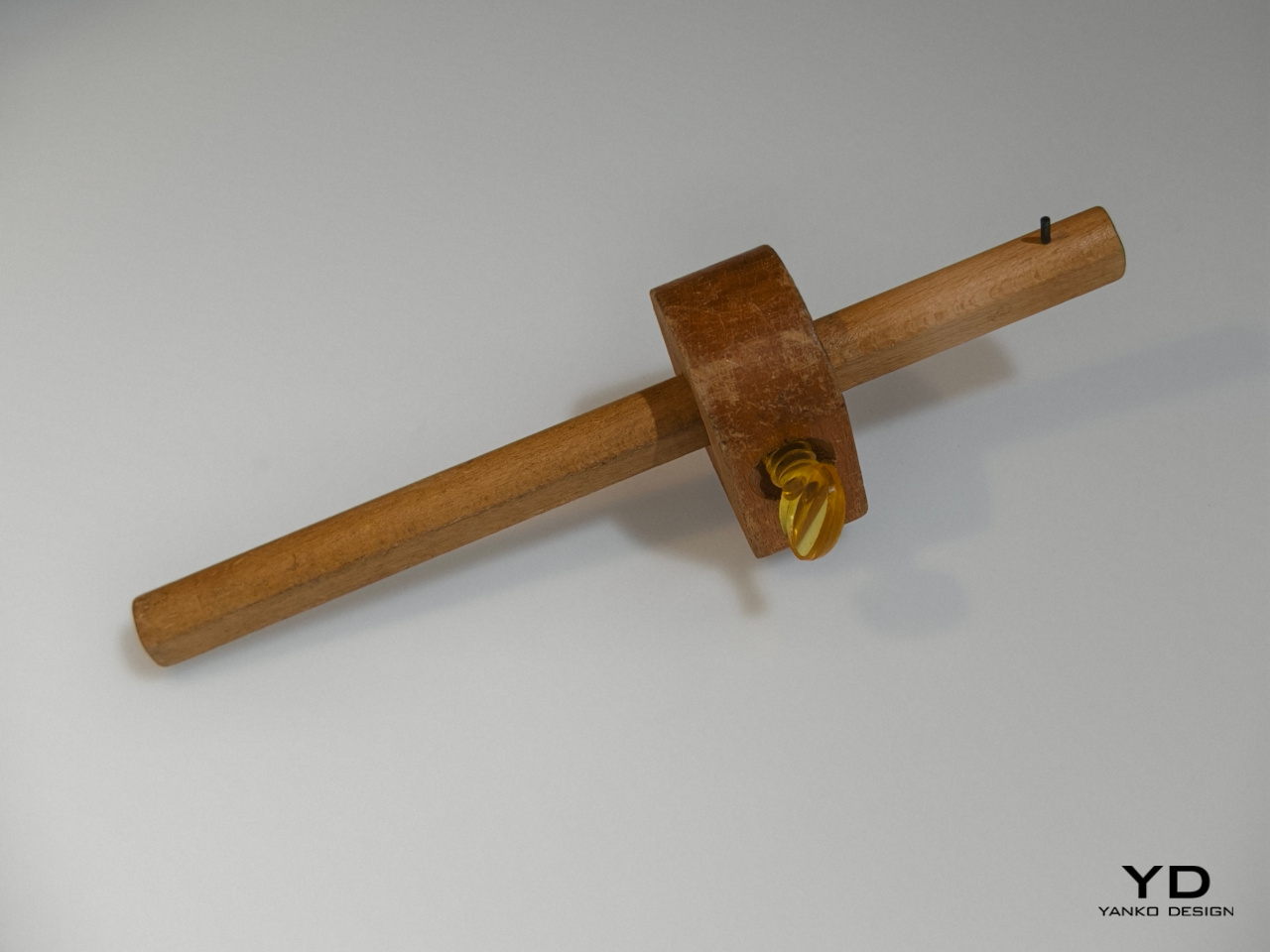
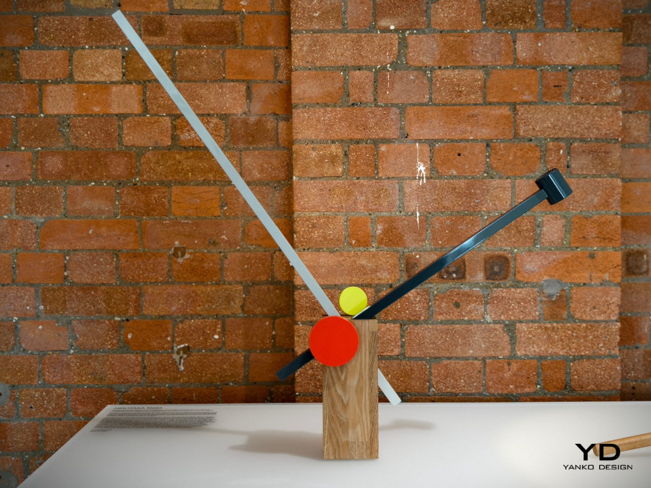
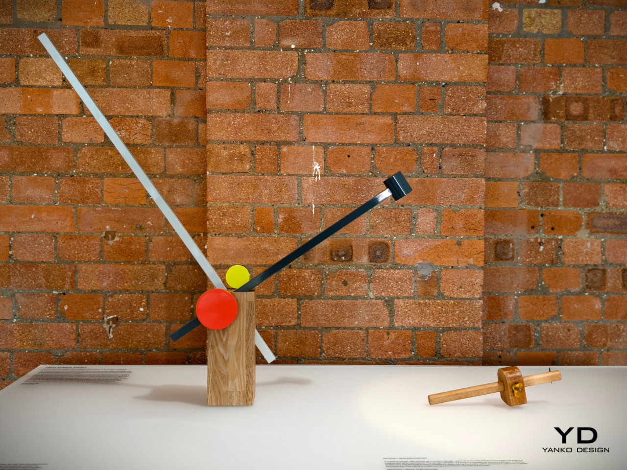
We enjoy a lot of convenient tools today that make it trivial to do things like measuring pieces of wood. In the old days before measuring tapes and meters, however, people had to make use of rather complicated tools that involved a wooden rod sliding inside a a block. This measuring gauge, though crude, created a rather interesting form that was not that different from a piece of art, which is exactly what inspired this rather geometric lamp design.
Taking inspiration from both this outdated tool as well as a Japanese art of floral arrangement, Hirotaka Tako designed a table lamp that similarly used the concept of inserting a long thin stick into something bigger. He likened the wooden rods to a flower stem inside a vase, exactly like an Ikebana arrangement. The result is a table lamp that is both functional and artistic, inspired by a tool that was anything but.
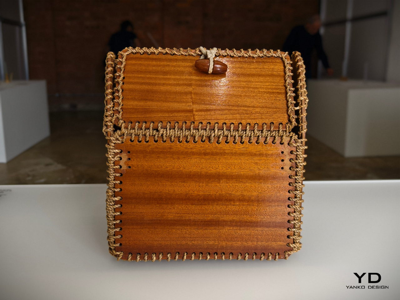
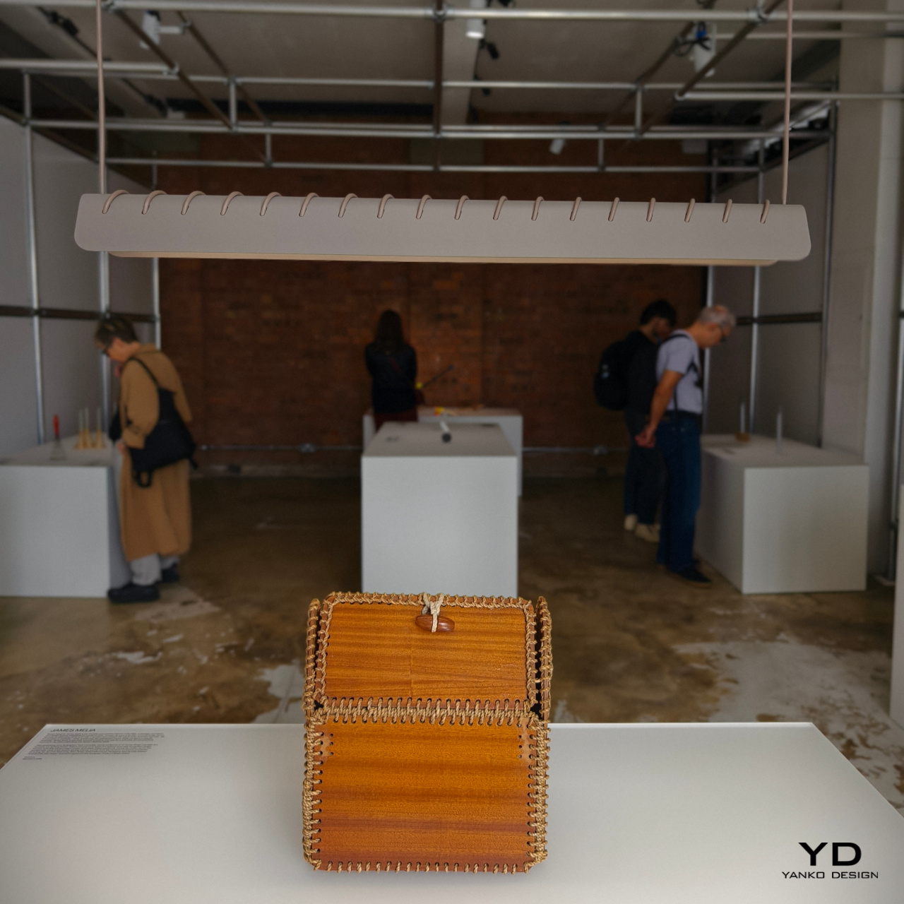
James Melia: Timber Basket Pendant Lamp
We take for granted the materials used to create modern products these days, not to mention the methods for making them. Today, we have machines that can print almost any shape imaginable, but past generations had to do things by hand, using stubborn and difficult materials. The rope patterns used to keep a timber basket together, for example, offered not only structural stability but also an interesting visual, one that can add a bit of a flair to an otherwise normal object.
James Melia takes a hanging lamp’s power cord and stitches it along the length of its shade, creating a row of diagonal stripes that turns a plain lamp into an art object. That same cord is used to actually hang the lamp from a ceiling, reducing the number of parts involved in designing the lamp and creating a simpler and more sustainable design.
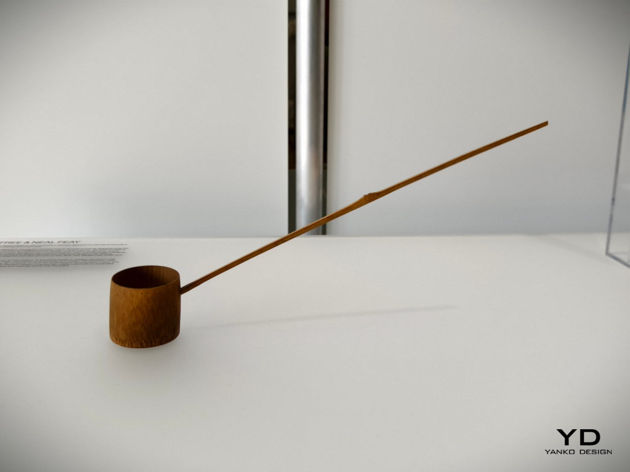
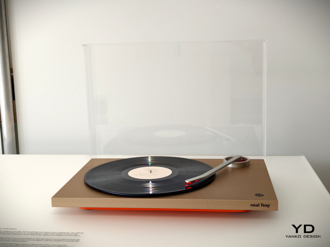
John Tree and Neal Feay: Tea Ladle Turntable
The Japanese are famed for their minimalist tools which are an art form in their own right. A simple scoop for tea powder, for example, takes the form of a bamboo ladle with a distinct charm. Though today’s tea lovers will probably use different tools, this traditional object still remains a staple in Japanese culture today as well as practices that recreate it. To some extent, it’s almost like the venerable turntable that has seen a renaissance and is getting some use even today.
This optical turntable takes that delicate-looking bamboo tea ladle and transforms it into a turntable arm that preserves that spirit of gentleness. Rather than using a sharp pin to read the grooves of the platter, it uses light to avoid any physical contact and help preserve the vinyl material. It’s a gentle and delicate spin on a classic retro design, no pun intended.
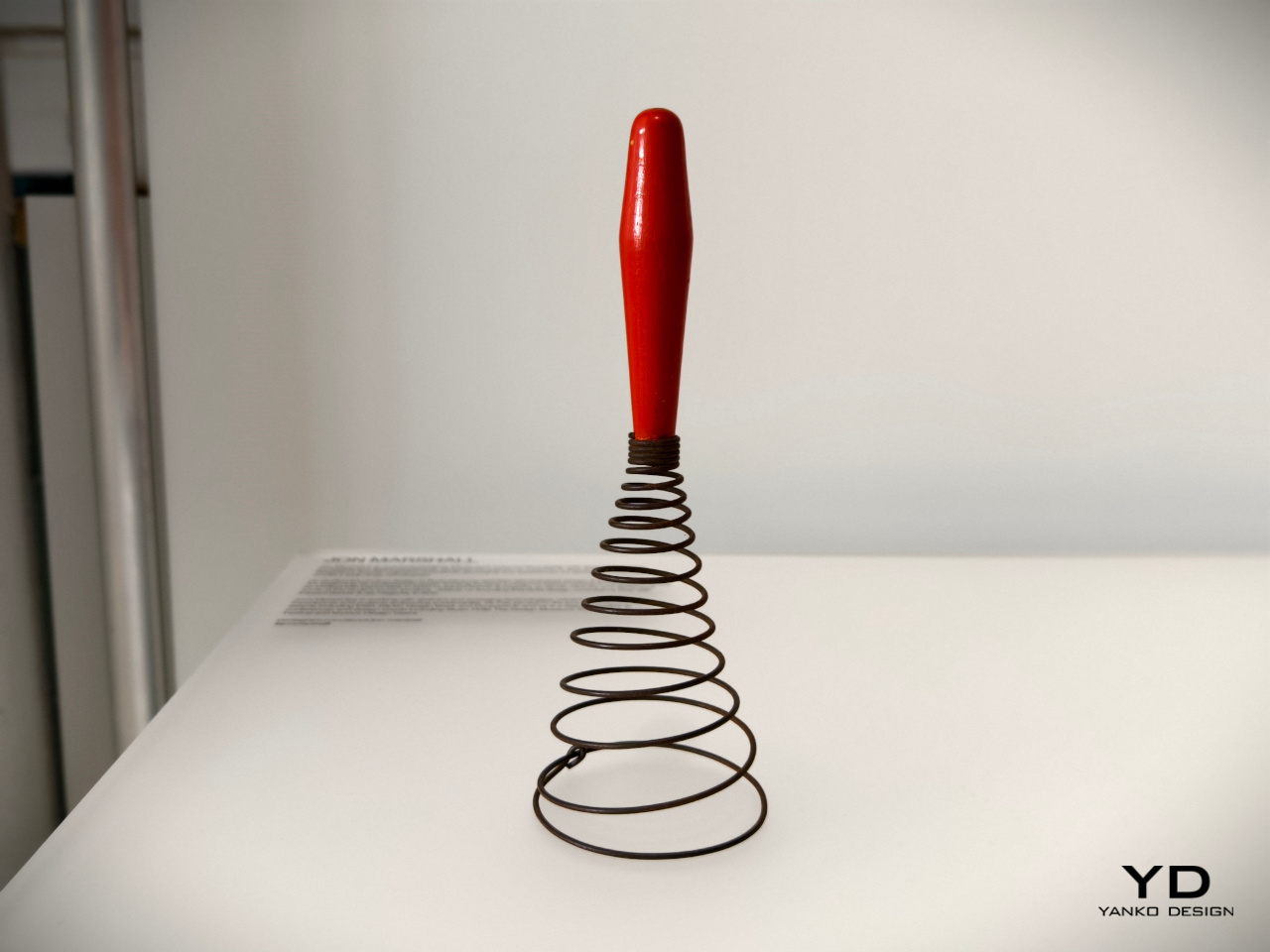
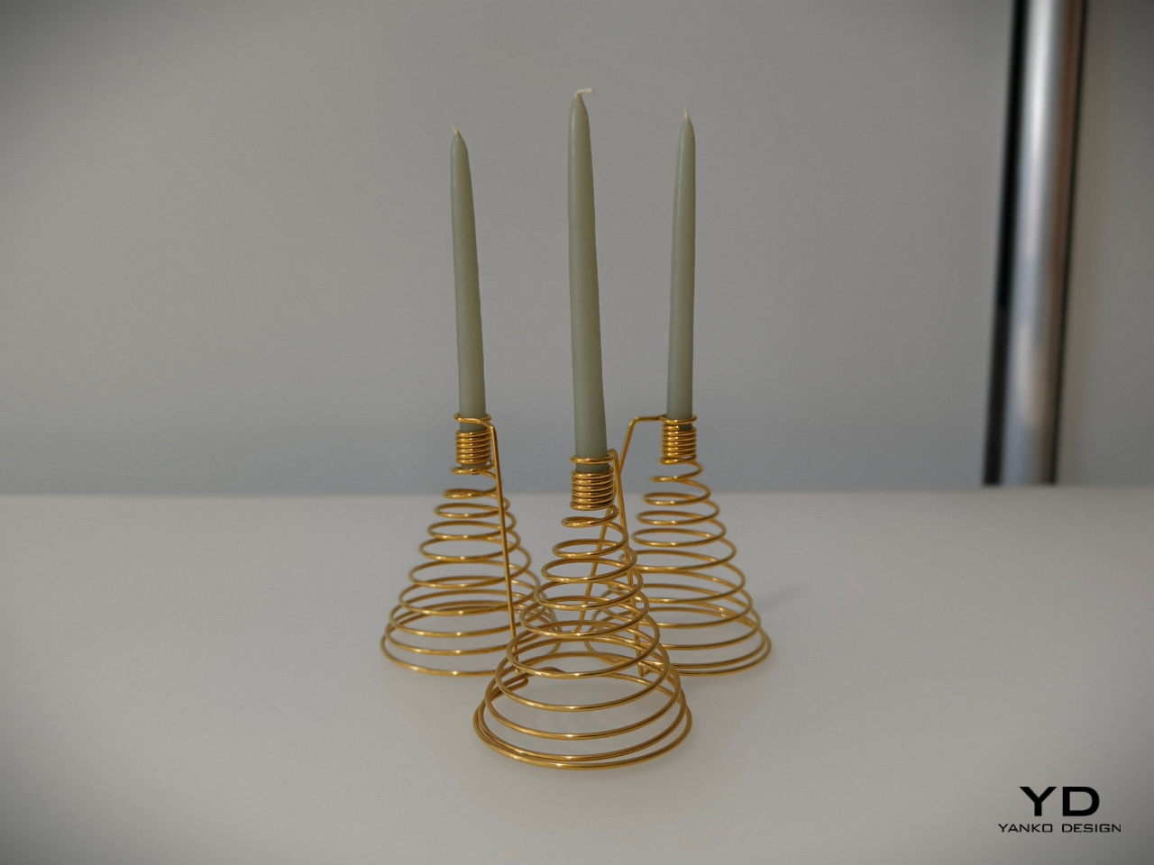
Jon Marshall: Whisk Candelabra
Today’s whisks are light, compact, and handy tools that use a few loops of bendable wire or plastic, a design that’s so far removed from the coiling iron wires of much older versions of the kitchen tool. Looking more like springs or even weapons, this antique whisk form isn’t very efficient at what it’s meant to do, but it admittedly looks novel and interesting to our modern eyes.
It might not make scrambled eggs, but this candelabra will definitely bring a bit of delight to your dinner table. The spiraling form of the base and the tight coils of the candle holder make for an interesting visual, but it’s when the candles are lit and the shadows dance that this rather luxurious-looking light fixture truly comes alive.
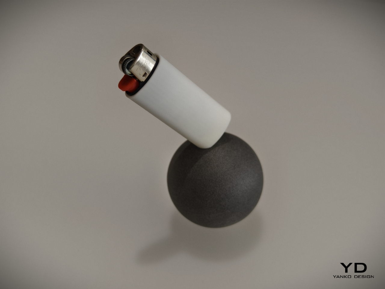
Julie Richoz: Balance Bird Balancing Lighter
Kids tend to find science and math lessons boring until they encounter puzzles and feats that really blow their minds. Something as simple as a perfectly balanced eagle held up only by its beak is sure to pique curiosity, even those of adults. This ingeniously disguised pendulum is not an uncommon toy or desk ornament, but the same principles can be used to the same effect for other objects, including more utilitarian ones.
A lighter standing only one of its corners is definitely going to make you the talk of the party, and it provides not only an entertaining piece of decoration but also practical use. It will be easy to see if the lighter is missing from its base, and people who use it will be more likely to put it back on its perch just to marvel at its balancing act. It’s a very simple twist to a simple object but one that has a nontrivial effect on those who see it, all thanks to some inspiration from old objects we have taken for granted.
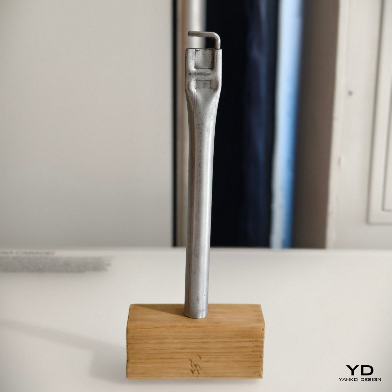
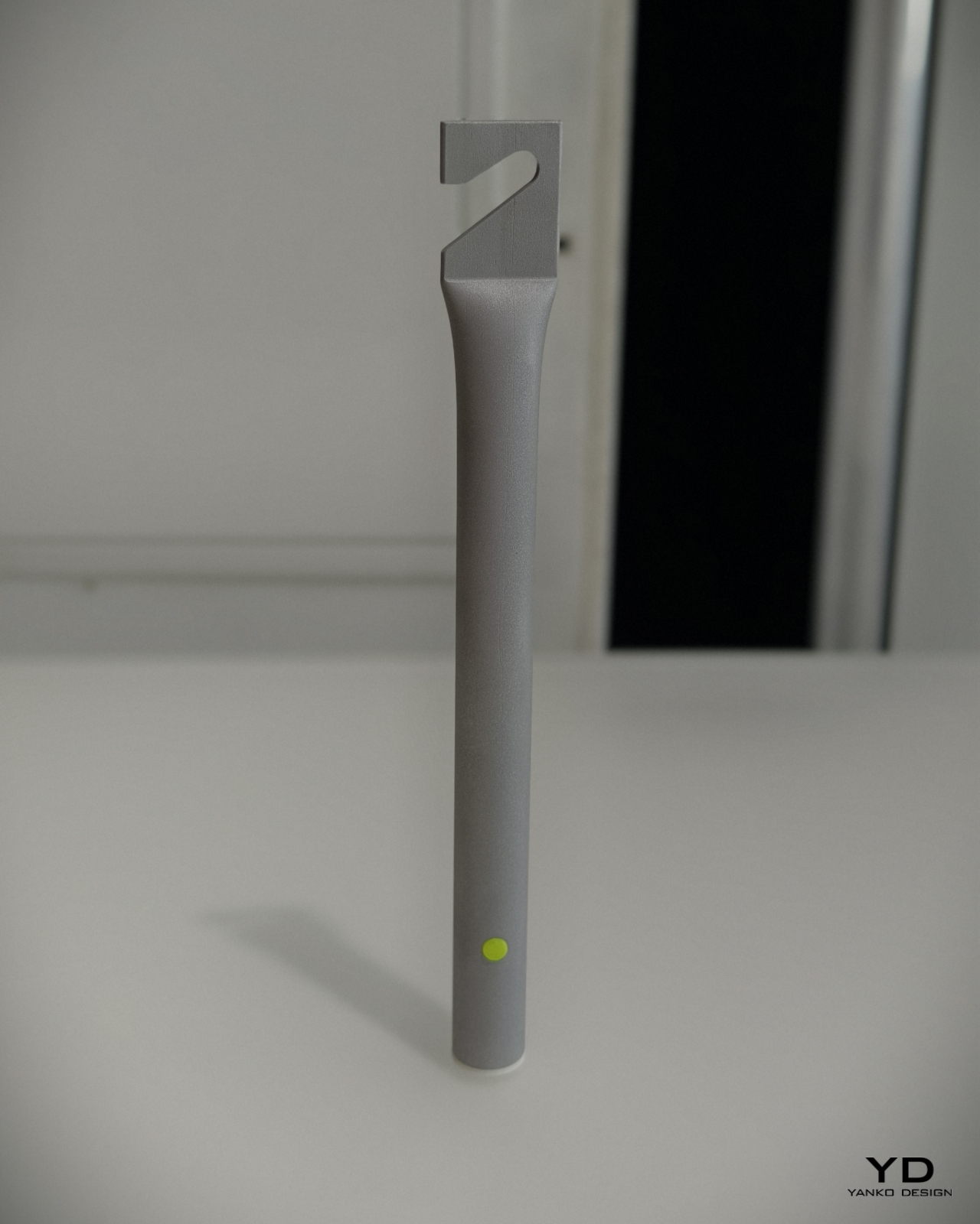
Maddalena Casadei: Mallet Flashlight
Most of us who have done any sort of handiwork may have used a hammer at one point in time or another. There are different kinds of hammers, of course, and one such type is the mallet. Often made with a heavy head to pound things flat, some old-school mallets would reverse the typical hammer design and use a steel rod handle with a wooden block for the head.
Maddalena Casadei took that raw-looking industrial metal handle to turn it into a cylindrical flashlight with similarly brutalist aesthetics. Instead of the wooden head, it has a small removable cone that serves as a diffuser for the light. On the opposite end is a flattened section with a hook that serves the same purpose as the hammer from decades ago: hanging the tool from walls or rods. It’s a rather interesting depiction of a flashlight that sheds off all the sleek and luxurious designs of its modern equivalents, embracing the utilitarian character of its inspiration.
This year we got a chance to experience the London Design Festival! Currently, in its 22nd edition, the festival takes place on 14-22 September in London. It celebrates London as a design capital of the world while presenting a series of exhibitions and installations that explore design through different mediums such as light, materials, sounds, and more. Designers and creators from around the world showcased dynamic and fluid installations such as ‘Light in Motion’, where light was explored, or the Materials Matter fair where the importance of materials, and how they impact us was focused upon. We’ve picked out the Top 5 installations and designs from the London Design Festival that we loved experiencing. We hope you love them too!
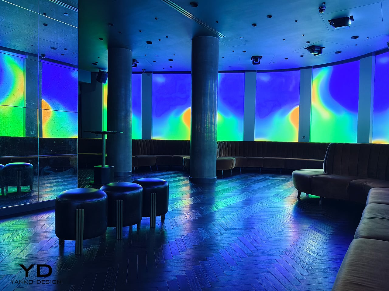
1. Light In Motion by Acrylicize
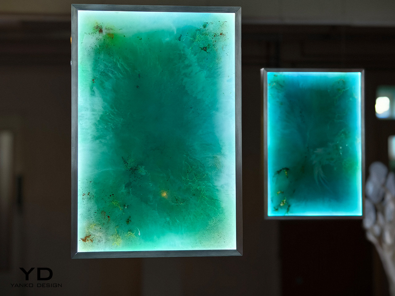
This stunning inaugural exhibition by Acrylicize is called ‘Light in Motion’ and it is running at the London Design Festival this year. It celebrates the fluid and dynamic interplay of light and form, diving deep into its bond with space, time, and movement. Twelve artists, designers, and engineers showcased their work, manipulating light to adopt a sculptural form, allowing it to move across walls and rejuvenate spaces. The displayed works are an effort to bring focus on the quality of light, and how it can be moved and perceived. “Each practitioner has approached light and motion from a unique perspective and with a different relationship to time. Yet there is a sense of continuity between the works,” said the curators.
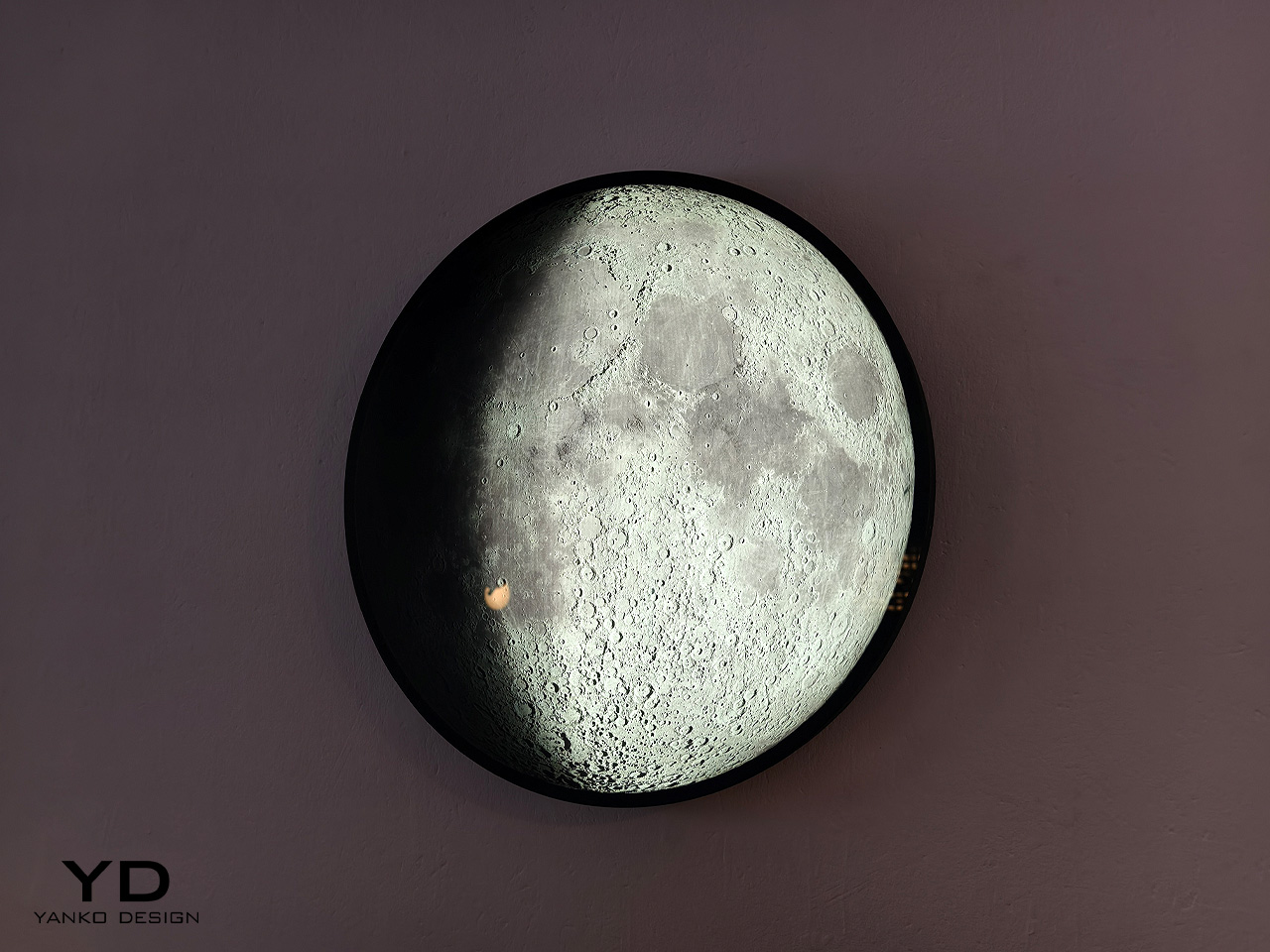
The installation ‘10,000 Tiny Suns’ by Generative Optics experiments with light as a medium and subject. It includes an intricate and impressive assembly of compound lenses, interconnected through a fibrous framework, which ushers and manipulates the path of light. It is made using advanced 3D-printed lenses, caustics, and algorithms. Designed by Relative Distance, a London-based studio, Phase is a long-form timepiece that showcases the details of the moon’s surface, via an artful use of light and glass. The surreal installation replicates natural moonlight, forming a unique and immersive experience.
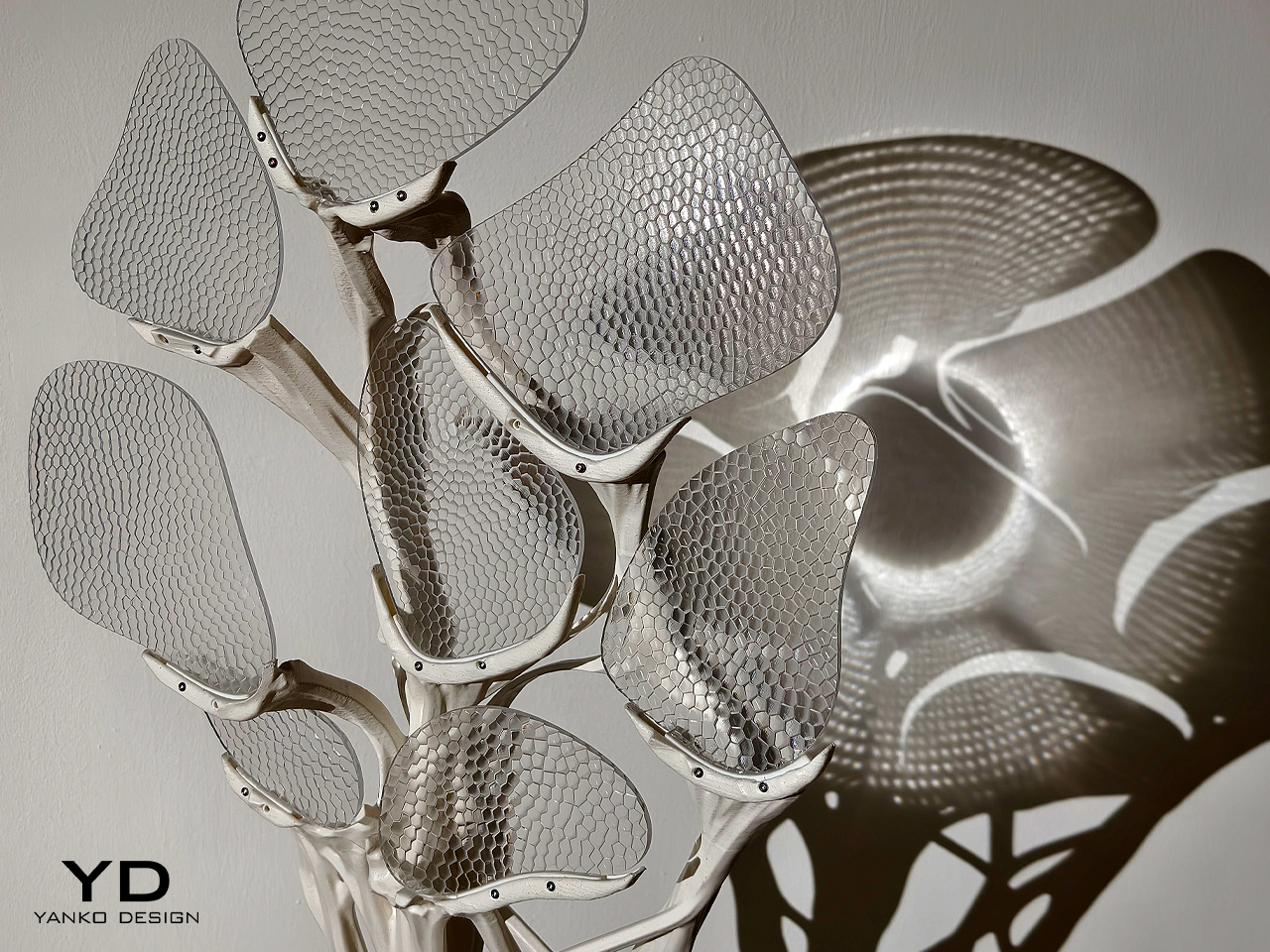
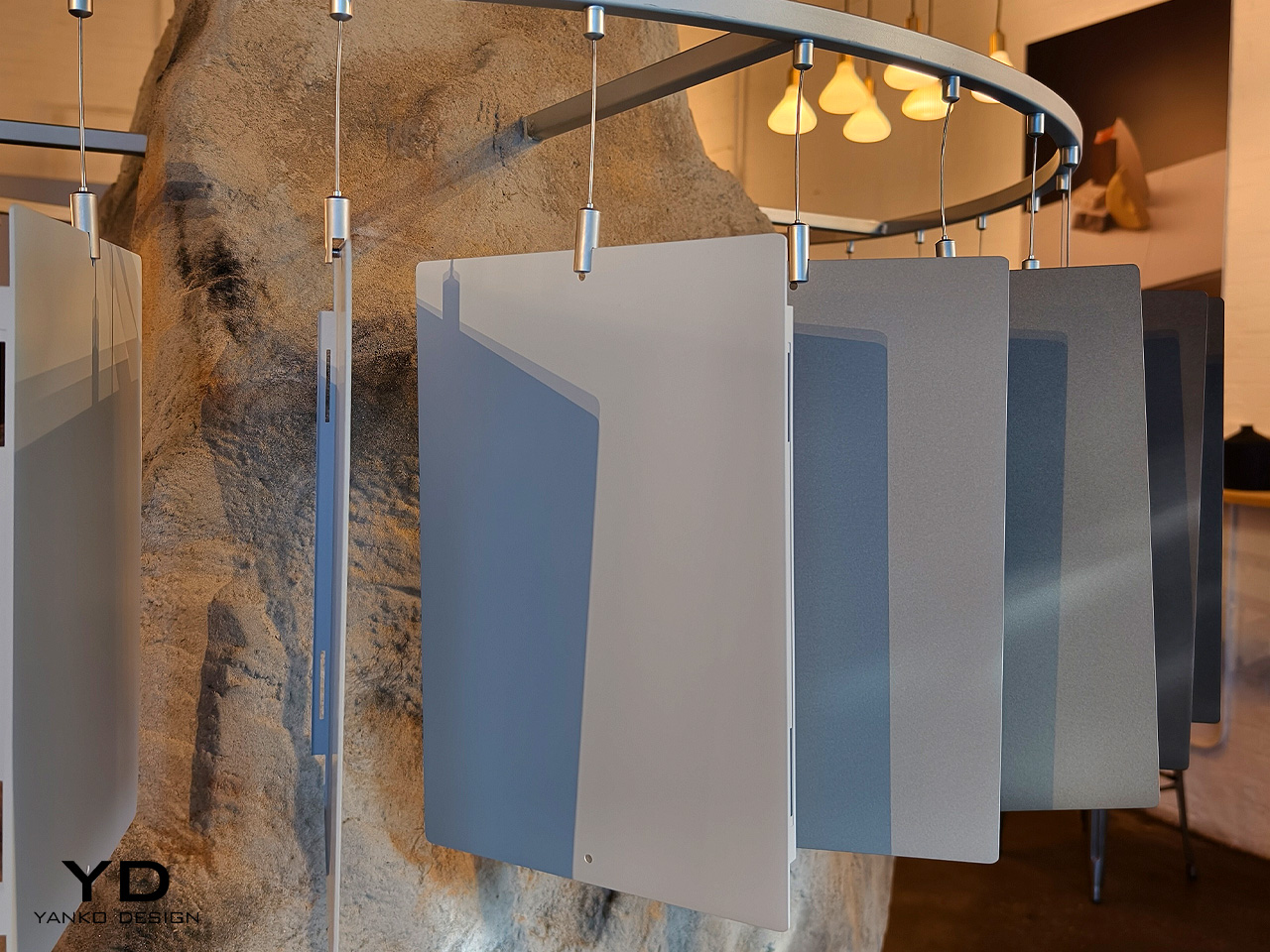
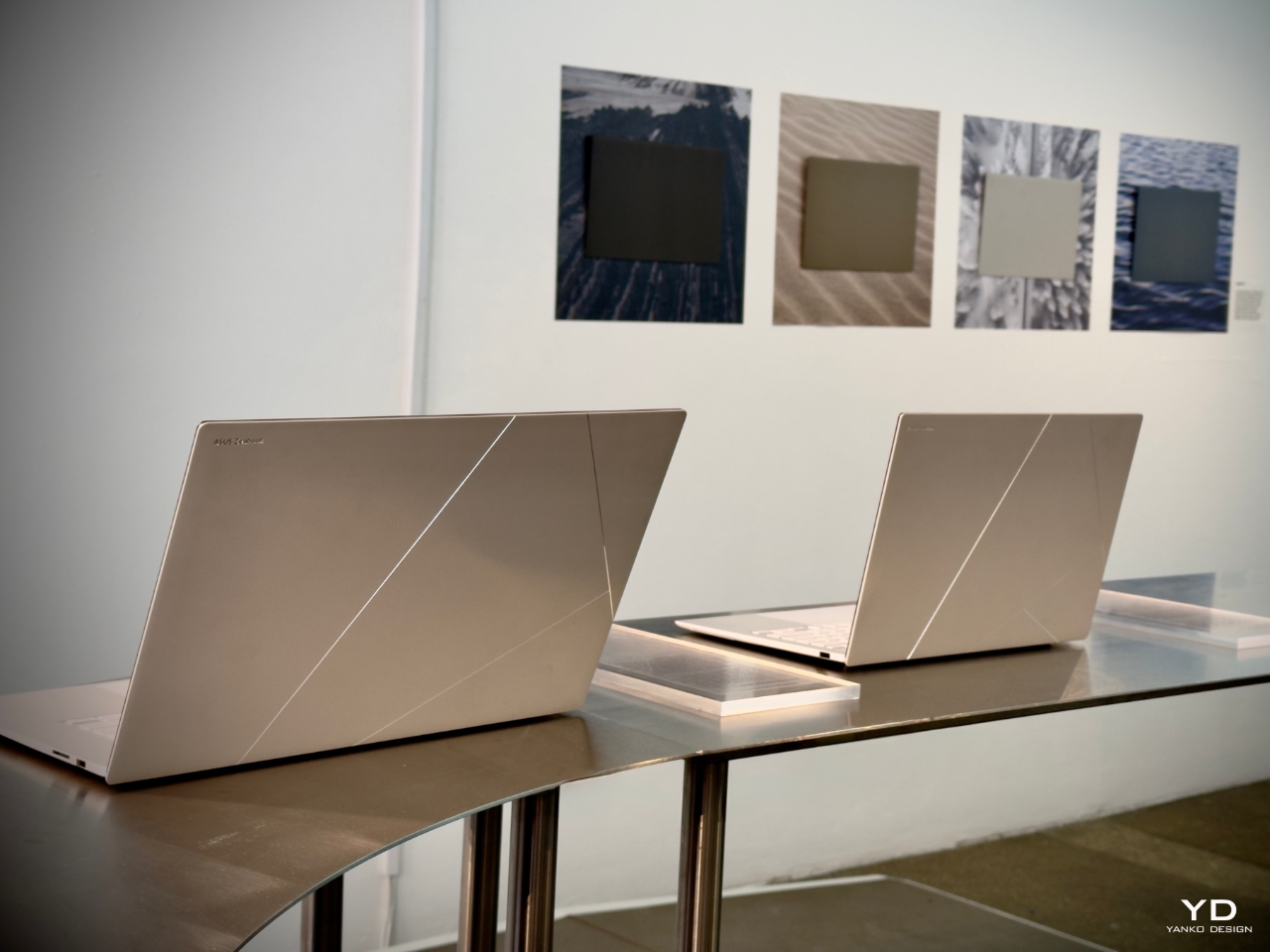
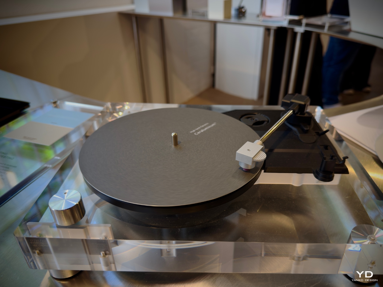
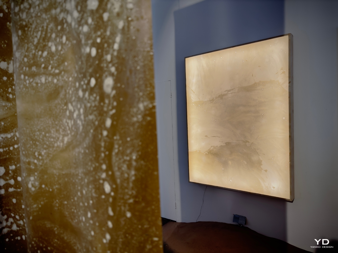
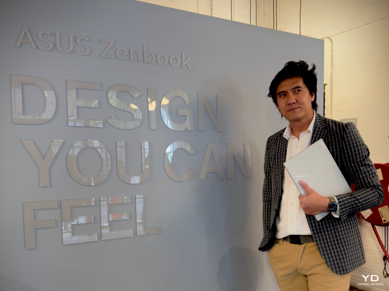
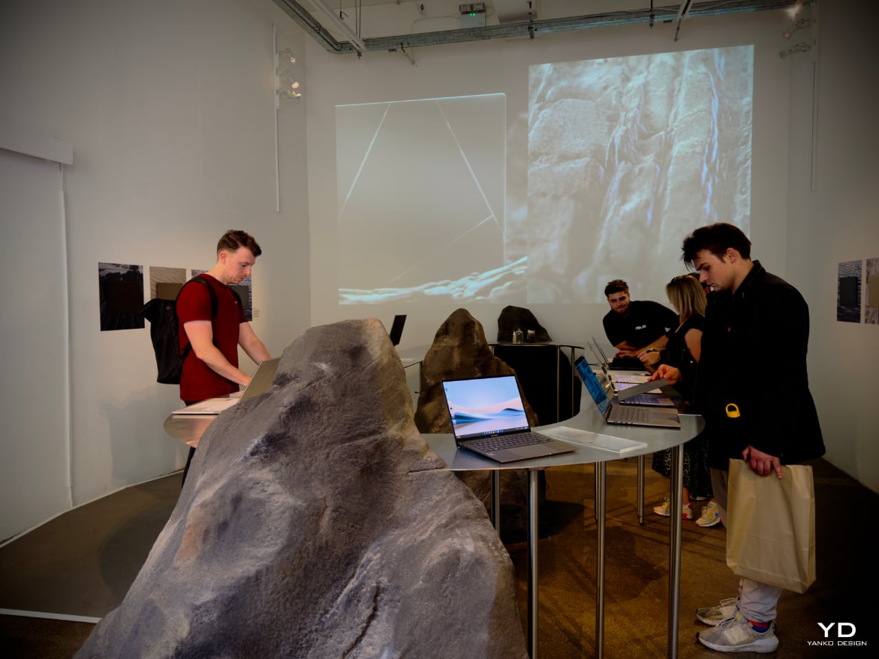
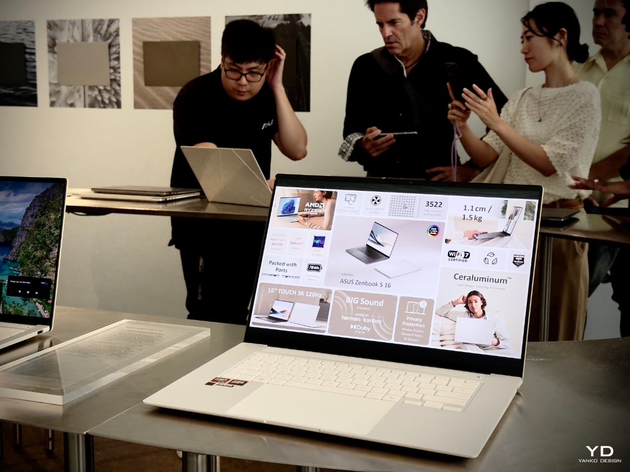
2. Design You Can Feel by ASUS
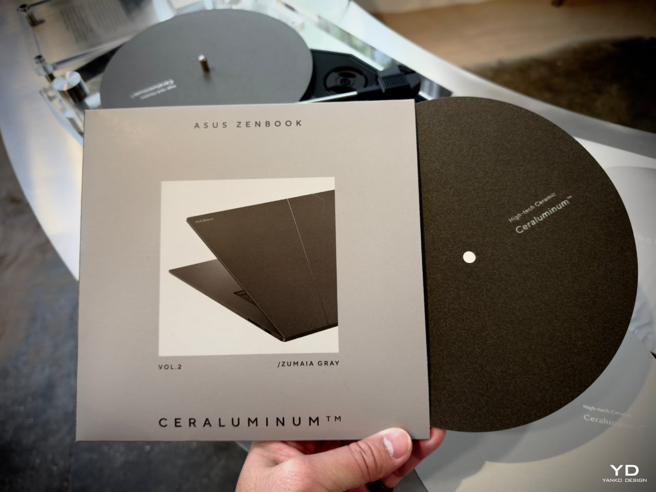
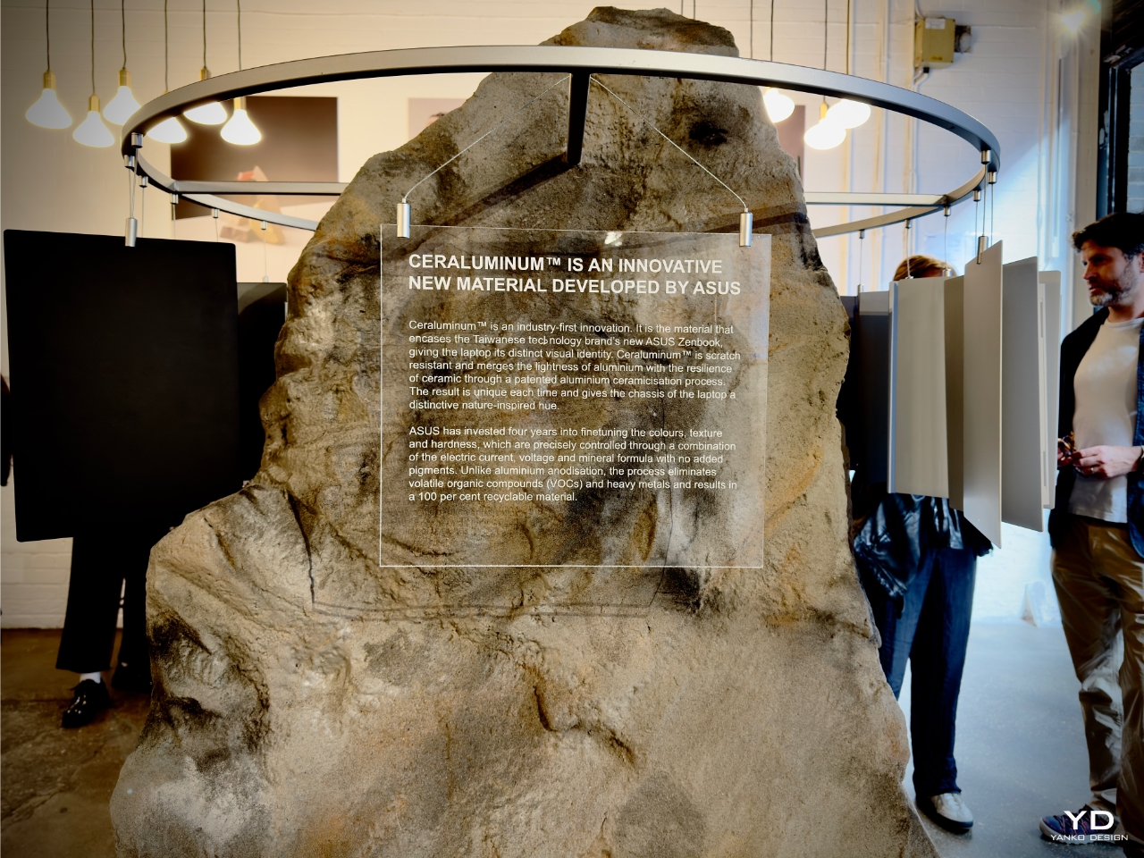
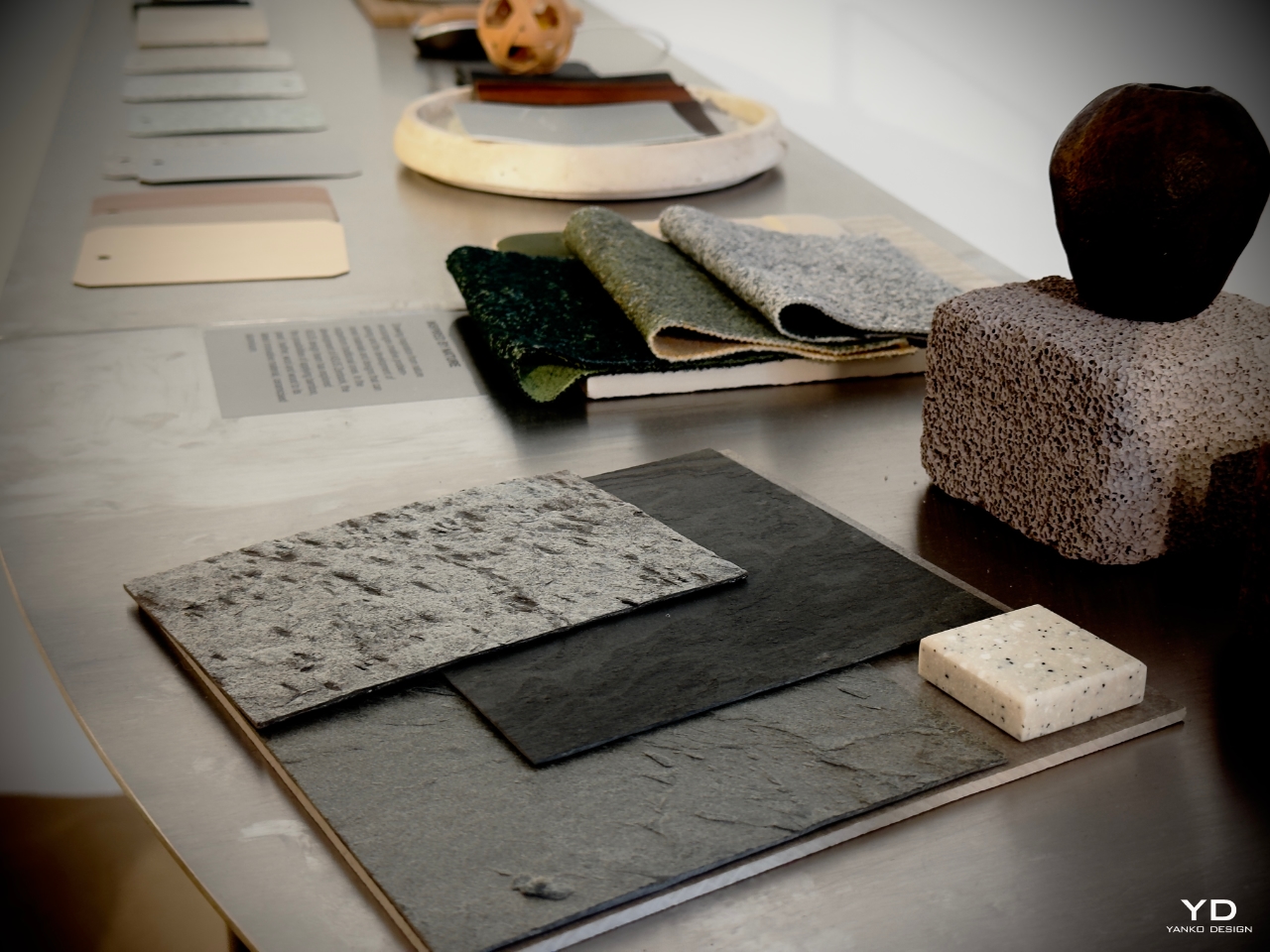
ASUS’s Design You Can Feel Exhibition is open to the public till 22nd September, and it is one to check out. Centered around the material ‘Ceraluminim’, which was used by ASUS to develop its Zenbook laptops, the exhibit explores not only this material but also intricate topics such as craftsmanship and artificial intelligence. Ceralumin boasts a light and durable tactility, merging the qualities of both aluminum and ceramics, making it a one-of-a-kind material with a surreal nature-inspired aesthetic. Six product and industrial design studios were selected to express the various qualities of Ceralumin through furniture, lighting, and installation design.
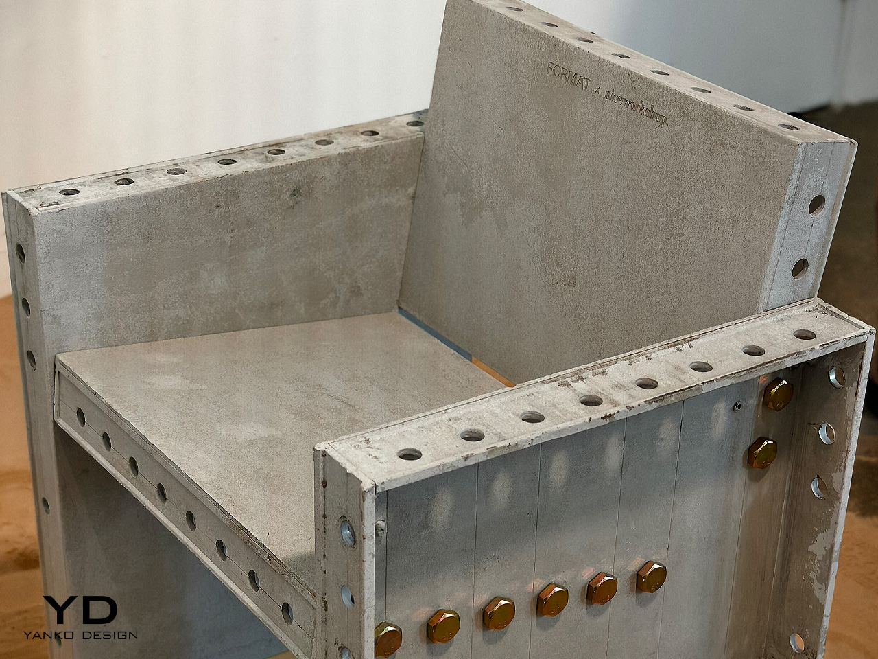
British designer Giles Miller built a stunning floor-to-ceiling sensory installation comprising 1800 pieces. Thick timber petals were positioned astonishingly and artfully, allowing them to rotate, and resulting in seamless rhythmic patterns. South Korean design studio Niceworkshop created the Aluminum Formwork (AL-FORM) series – a collection of solid seating and tables built from old skyscraper formwork. The collection’s lounge chair was ceramized by ASUS, making it one of the first products to feature Ceralumin, besides the Zenbook laptops.
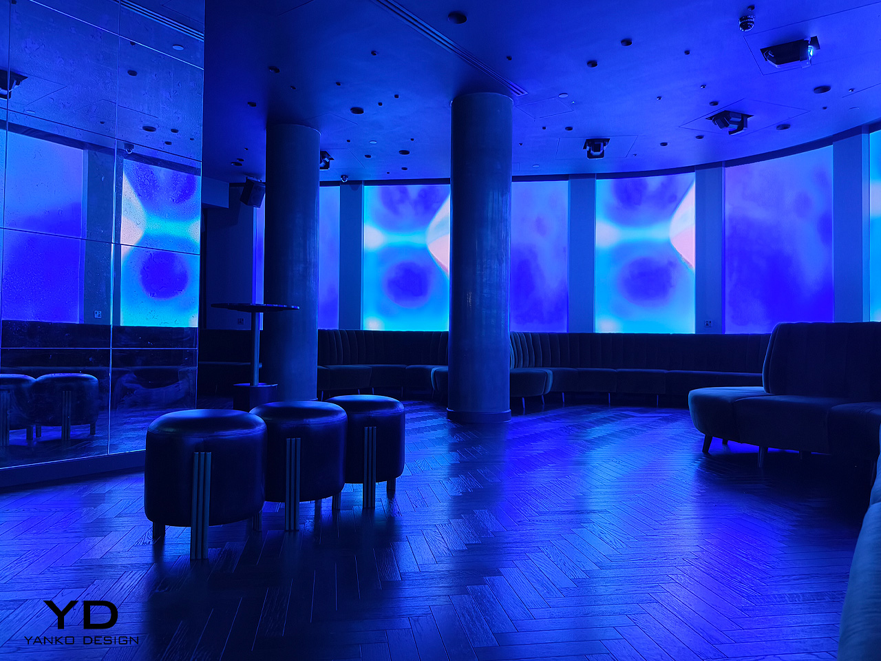
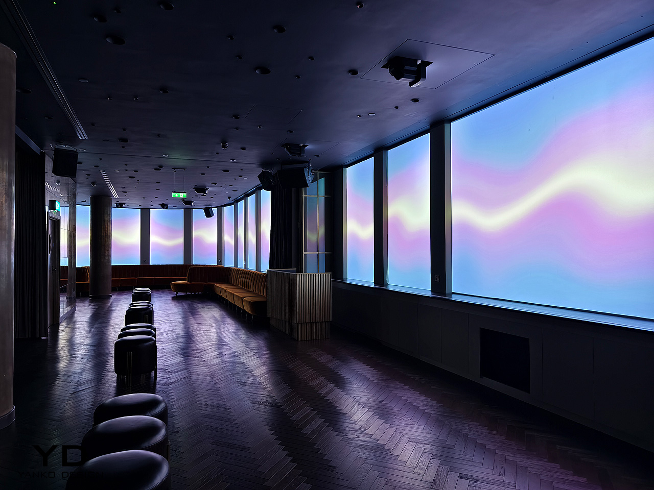
3. SPECTRUM by 2LG Studio
Jordan Cluroe and Russell Whitehead teamed up to form the 2LG studio, and this year they’re completing 10 years of collaboration. To celebrate their years of creation and innovation together, they partnered up with the London-based hotel Hart Shoreditch to present the immersive exhibition ‘SPECTRUM’. Through Spectrum they are creating a sensory journey within the hotel, setting up a series of vibrant and colorful interventions. They are “exploring human and personal connections to color, evoking memories and inviting conversations.”
The hotel is based on a theme of ‘joyful minimalism’, and various products have been reimagined intriguingly and colorfully. The creations include a reincarnation of a rug by Floor Story in the form of a large-scale moiré using AI filters in a rainbow spectrum. Other pieces involve an eight-minute soundscape written with the composer Quentin LaChapele and a wraparound video piece by digital artist Lucy Hardcastle.
4. Material Matters
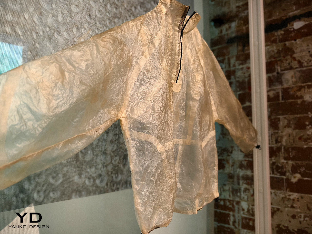
50 acclaimed brands, designers, makers, and organizations have contributed to creating the Material Matters fair on the iconic Bargehouse, Oxo Tower Wharf on London’s Southbank. The fair attempts to celebrate the significance of materials, and the myriad ways in which they shape and affect our lives. It includes five floors flooded with products, installations, curated exhibitor spaces, and an extensive talks program too. It dwells deeply into how the design world can address problems regarding the circular economy, and how material intelligence makes a difference to our lives.
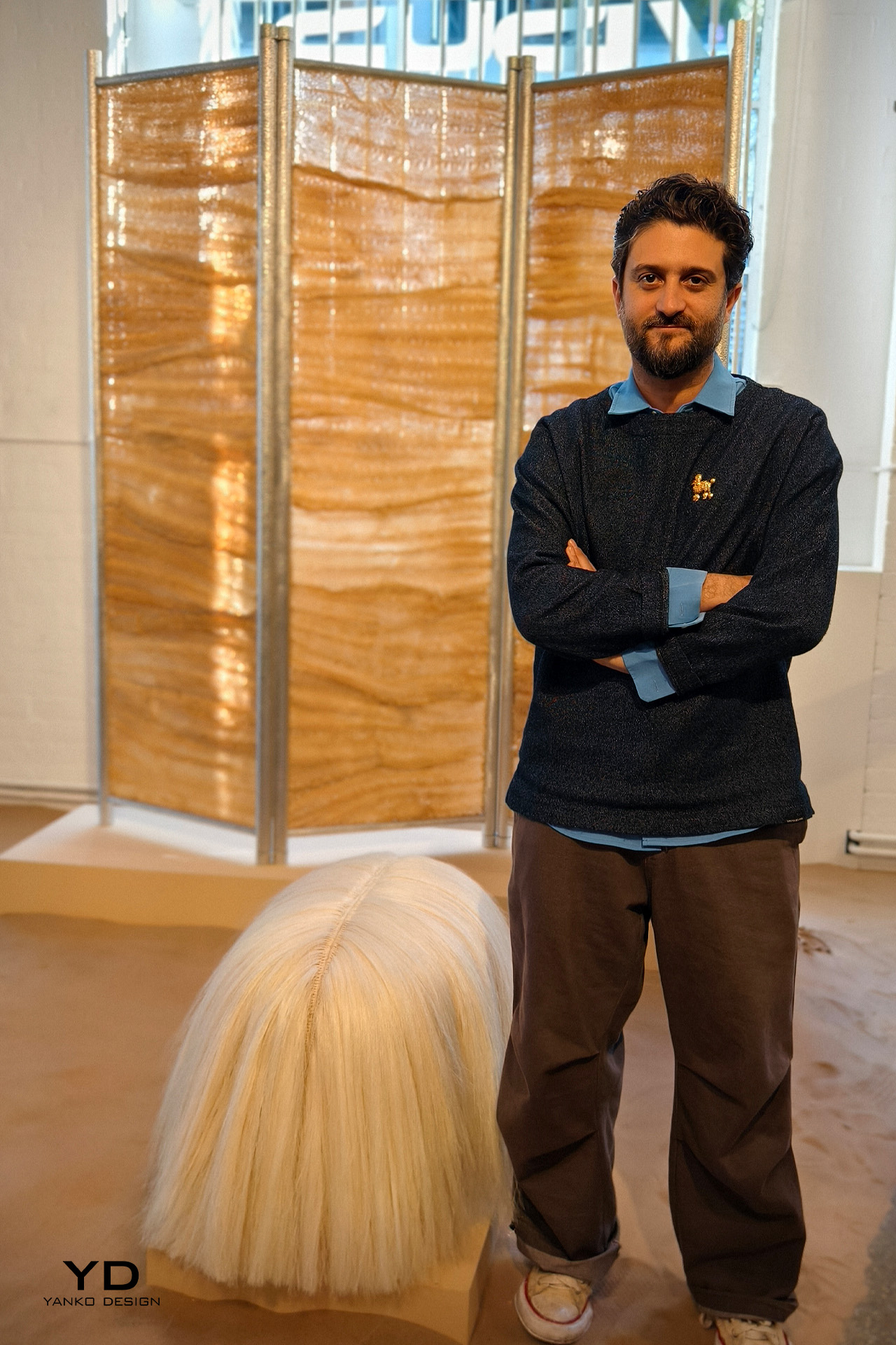
The FIBER FUTURES exhibition showcases eight different approaches to alternative resource streams, innovative spinning techniques, and bio-manufacturing, as well as opening up new pathways for real change. It is led by Adidas AG and RWTH Aachen University. The Locally Grown installation is an interactive one, and it explores hair as a new material, highlighting its great potential. Led by Studio Sanne Visser, this project focuses on the development of human hair as a super-scale regenerative material.
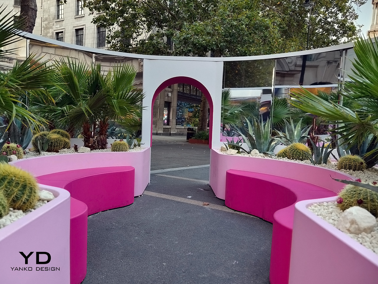
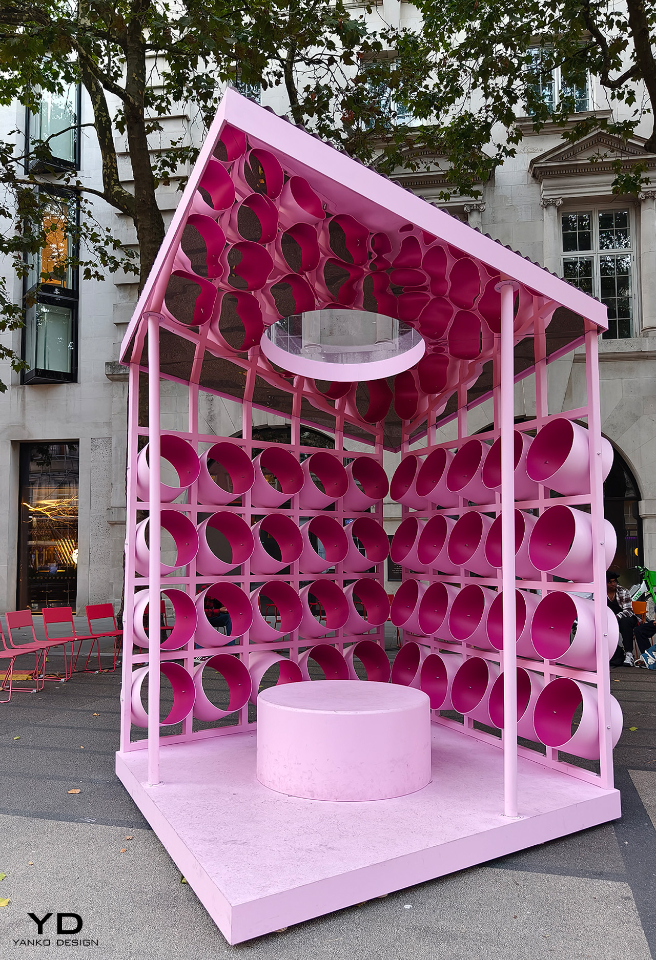
5. Pavilions of Wonder by Nina Tolstrup
Nina Tolstrup designed and set up three immersive pavilions on the Strand as a part of the London Design Festival. The impressive structures are inspired by Barbie Dreamhouses and Palm Springs’ mid-century modern architecture. She teamed up with Barbie creators Mattel and the tourism agency Visit Greater Palm Springs to bring the installation to life. Named the Pavilions of Wonder, the pavilions are a tribute to the whimsical and vibrant design of Barbie’s Dreamhouse, while nudging at the desert modernism of Palm Spring’s architectural style.
The Playful Pauses Pavilion is inspired by the Palm Springs City Hall and Tramway Gas Station. The gas station was taken as a source of inspiration for previous Barbie Dreamhouses as well. It features a simple metal grid, and a pointed roof, accentuated by kaleidoscopic circles which have been crafted from painted drainage tubes. The Design Stories Pavilion is made from CNC-cut plywood connected by a metal scaffold grid system that can be disassembled when needed. The structure merges the design philosophy of straight swimming pools with the geometric signage typically seen in Palm Springs.
ASUS has long been recognized for its forward-thinking approach to technological innovation. With Ceraluminum, the company shifts focus, moving beyond performance metrics and engaging users on a sensory and emotional level. At the “Design You Can Feel” exhibition during the London Design Festival, ASUS presented this unique material in an artistic context, blending technology, material science, and human-centered design. This exhibition explored how technology doesn’t need to feel cold or distant but can foster emotional engagement and tactile experiences that draw users in.
Designer: ASUS
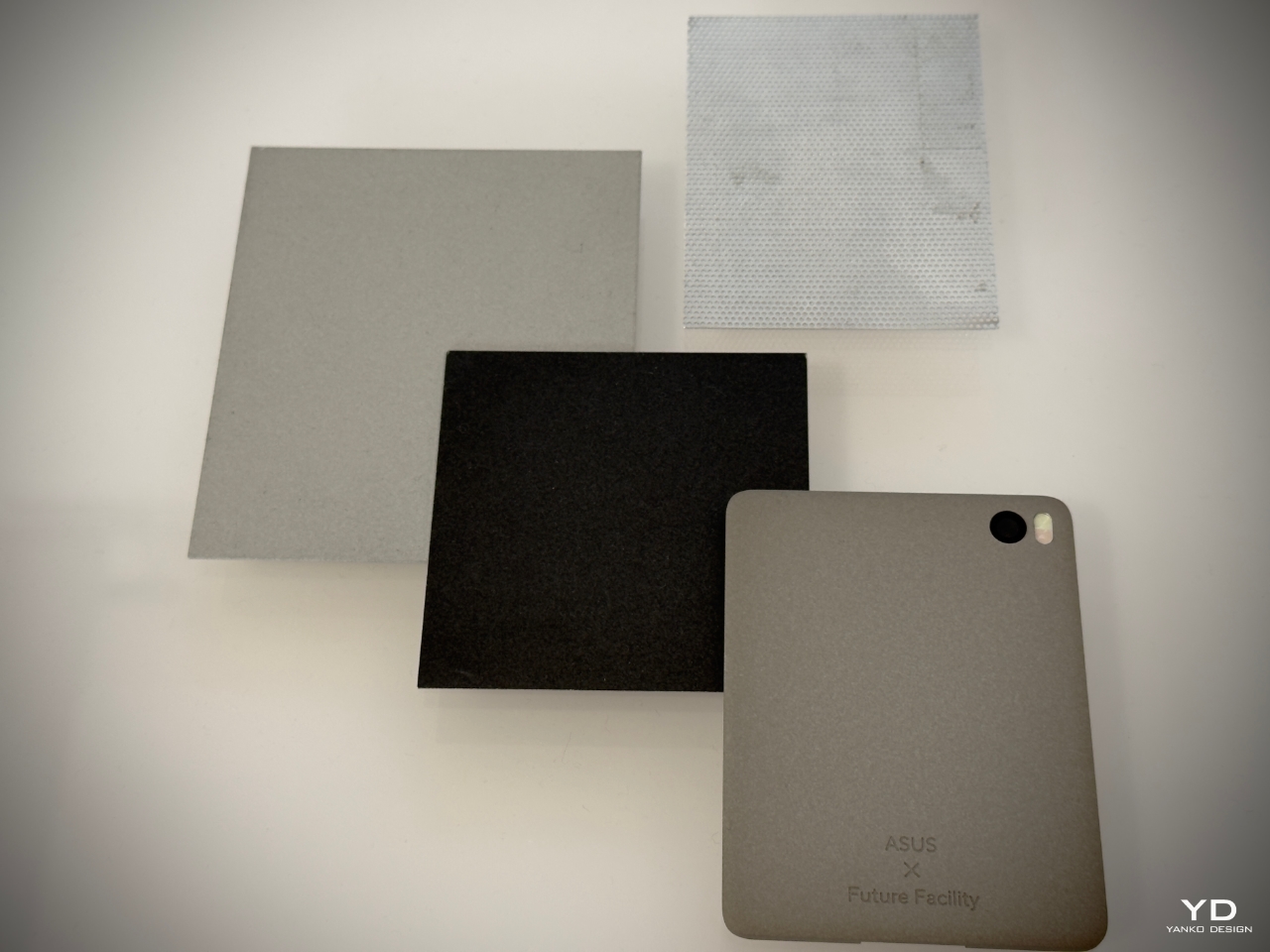
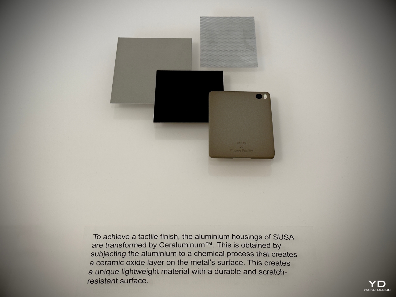
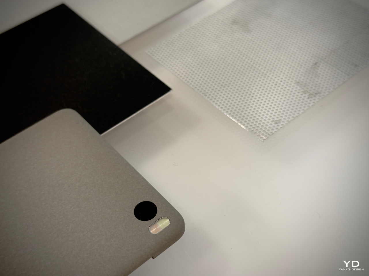
At the core of this shift is Ceraluminum, a revolutionary material that merges aluminum’s structural benefits with the tactile qualities of ceramic. With its four-year development, this material represents a significant leap forward in the functionality and aesthetics of ASUS’s products. Ceraluminum invites users to touch, explore, and experience their devices in a more intimate, human-centered way. It’s a breakthrough that combines art and technology, reshaping how we engage with our tech.
Ceraluminum: A Material with Presence
Ceraluminum reflects ASUS’s focus on creating materials that enhance functionality while fostering a more personal and tactile user experience. From my interpretation of their design philosophy, ASUS aims to develop materials that resonate emotionally with users, evoking a sense of warmth and connection—without suggesting metaphysical attributes like having a soul. Unlike traditional metals that feel cold and impersonal, Ceraluminum exudes warmth and tactility. It absorbs light and reduces glare while offering a textured, matte finish that invites interaction. Chief Design Officer Mitch Yang elaborated on the significance of this during the panel discussions, emphasizing that the texture and feel of Ceraluminum are key to fostering a deeper connection between users and their devices.
Developed through a unique micro-arc oxidation (MAO) process, Ceraluminum begins as lightweight aluminum and is transformed into a hybrid material through a high-voltage plasma discharge. This creates a ceramic oxide layer that maintains aluminum’s strength and lightness but offers ceramic’s hardness, scratch resistance, and tactile warmth. This unique combination gives ASUS’s devices a distinctive feel and presence, setting them apart from the sea of cold, reflective metal gadgets on the market.
Yang explained further, “Ceraluminum allows us to create devices that don’t just look good but feel meaningful to the touch. It changes how users interact with their technology, inviting them to explore the material with their hands, not just their eyes.”
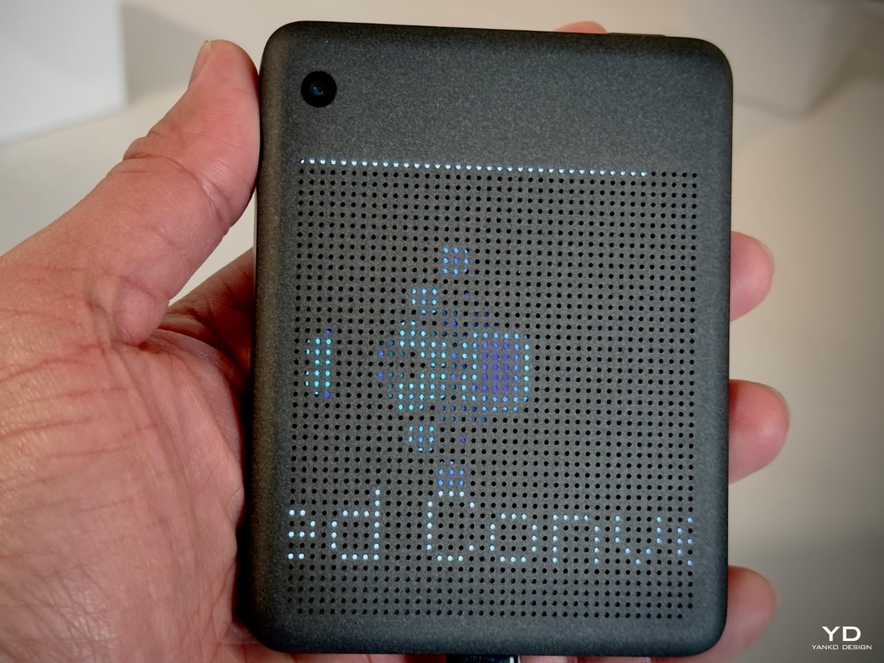
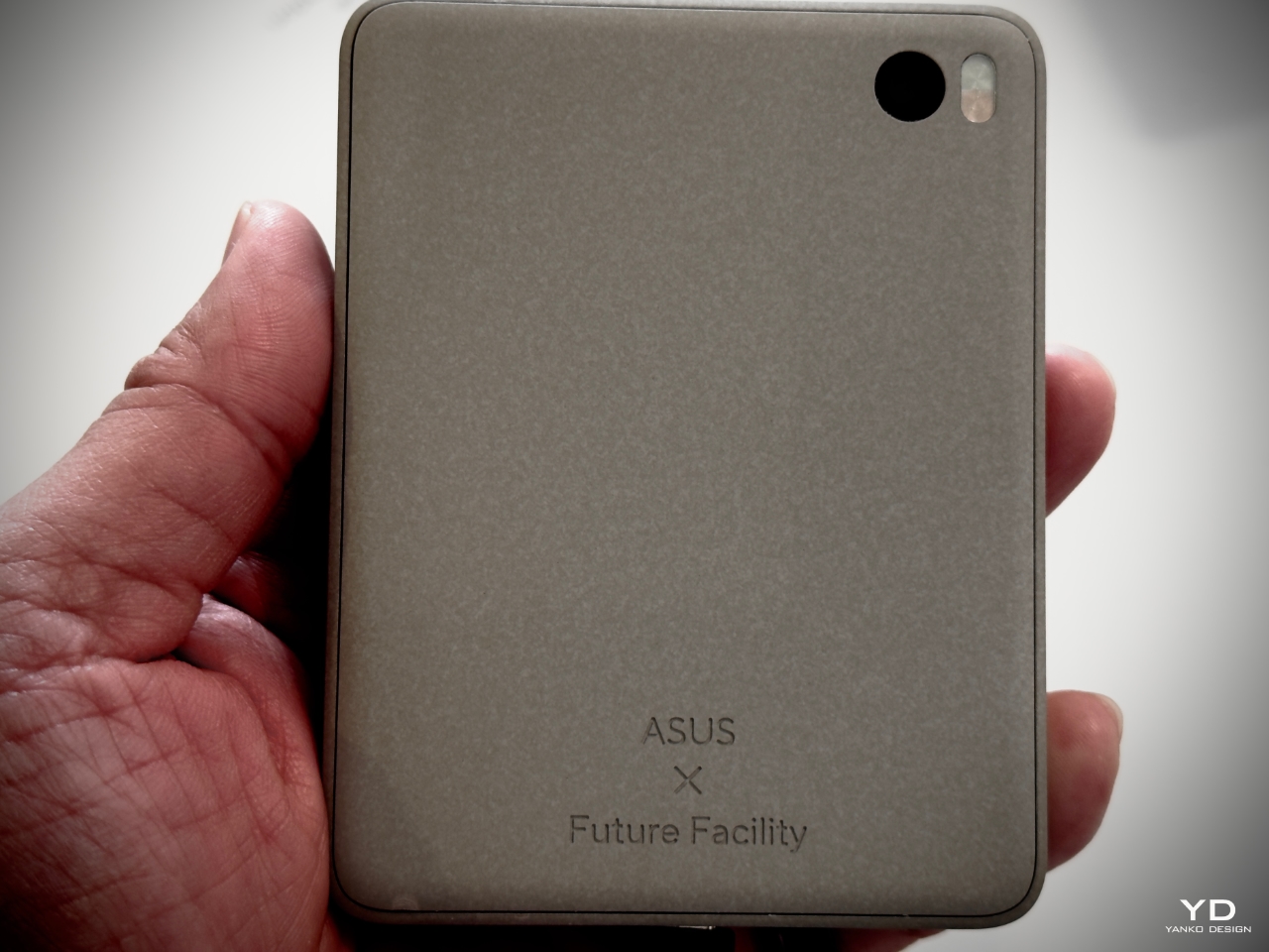
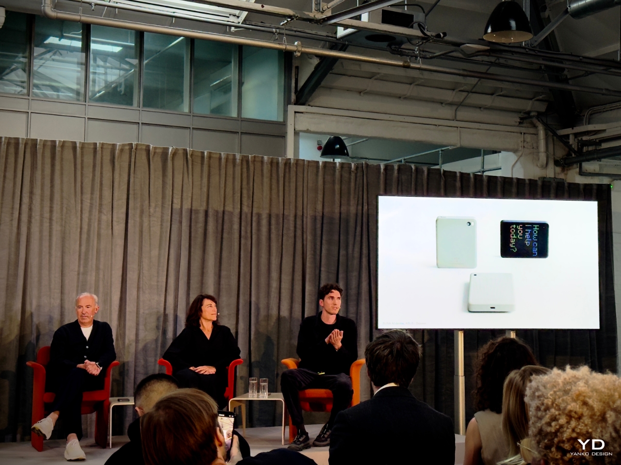
SUSA: Embodying Calm Technology
At the center of the “Design You Can Feel” exhibition was SUSA, a conceptual AI-powered device designed by London-based Future Facility. This device embodies ASUS’s philosophy of calm technology, where tech is designed to be intuitive, unobtrusive, and calming rather than overstimulating. Encased entirely in Ceraluminum, SUSA represents the potential of this material to facilitate more mindful, tactile interactions with technology.
SUSA’s design is deliberately minimalist. It features a perforated screen that subtly filters its digital display, minimizing distractions while maintaining core functionalities such as photography, navigation, and calls. By encouraging users to engage with the physical object rather than becoming consumed by the screen, SUSA promotes a more intentional relationship with technology.
Leo Leitner, a designer at Future Facility, explained this during the panel discussion, stating, “SUSA is a reflection of how we can rethink the role of digital devices in our lives. By using Ceraluminum, we create a product that feels more natural and calming. It’s about slowing down, encouraging the user to focus on what’s important rather than being overwhelmed by constant notifications.”
Kim Colin, also from Future Facility, expanded on this by adding, “The tactile nature of Ceraluminum allowed us to create a product that feels inviting and grounded. It shifts the focus from what the device can do to how it feels when used. That tactile warmth is crucial to fostering a more mindful, human-centric interaction.”
SUSA is more than a concept. It represents a future where technology is integrated into our lives in ways that promote mental well-being, offering a calming influence rather than a constant source of overstimulation.
Collaborations with Global Designers: Ceraluminum Through the Eyes of Art
The “Design You Can Feel” exhibition also served as a platform for international designers to reinterpret and manipulate Ceraluminum in their own creative ways, showcasing its versatility beyond traditional tech applications. By inviting leading artists and designers to explore the material, ASUS highlighted how Ceraluminum can inspire new forms of user interaction. Each designer’s work emphasized tactile engagement and explored how material science can evoke emotional responses while remaining functional.
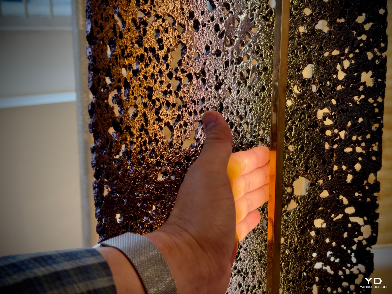
Giles Miller Studio (UK) approached Ceraluminum from a design perspective that blurred the lines between industrial application and artistic expression. Miller’s work focused on transforming the surface texture of Ceraluminum, turning it into a canvas for intricate patterns and reliefs. By manipulating its reflective qualities, Miller demonstrated how Ceraluminum could become a material that protects and decorates, elevating everyday technology into something more visually dynamic.
Designer: Giles Miller Studio
The studio used light to reveal hidden details in the material, inviting users to interact with their devices in new ways. Miller explained during the panel that they wanted to capture the subtle shifts in light as users moved their devices, turning a practical surface into an artistic experience. “Ceraluminum gave us the ability to create a surface that changes with the viewer’s movement, transforming the device from an object of utility into something more engaging,” Miller noted. This emphasis on the material’s light-reflecting properties invited deeper emotional engagement, making the device feel more personal.
Natural Material Studio (Denmark) took an organic approach to Ceraluminum, focusing on its ability to mimic natural textures. Their contribution aimed to highlight the material’s matte finish and tactile softness, drawing inspiration from natural elements like stone and sand. By working with Ceraluminum’s porosity, they created objects that felt grounded and familiar, offering a contrast to the typically sleek, hard surfaces of most technology.
Designer: Natural Material Studio
The goal was to craft a sensory experience that reminded users of nature. Their work emphasized the tactile qualities of Ceraluminum, offering an experience that felt like the material had been shaped by natural forces rather than human technology. “We wanted the object to feel as if it had always existed—like a pebble-shaped by the sea,” the studio shared during the exhibit. Their designs provided a sense of calm, reinforcing ASUS’s broader mission to create technology that connects users to the natural world while still harnessing advanced materials.
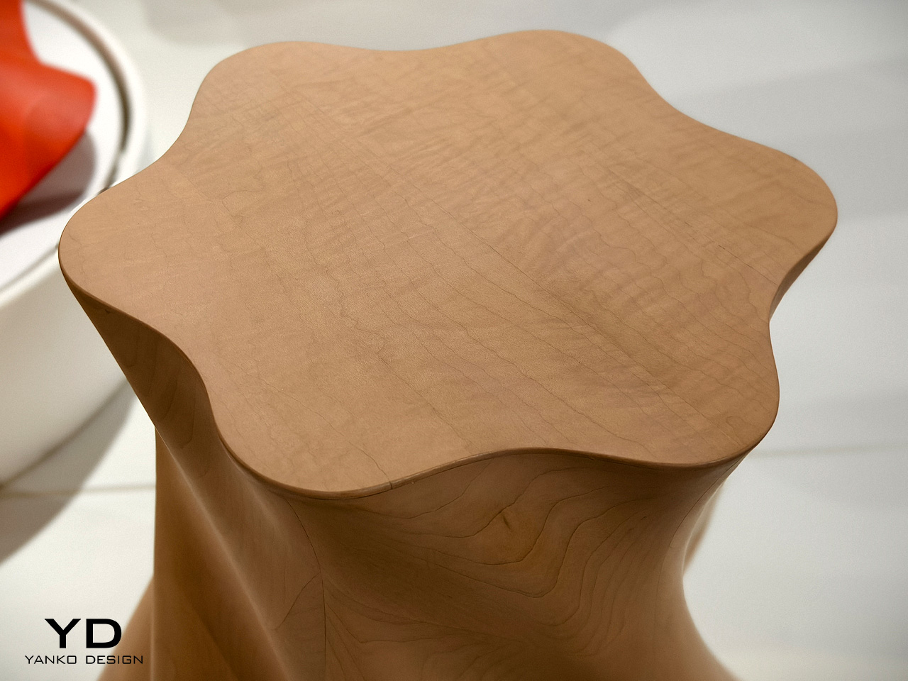
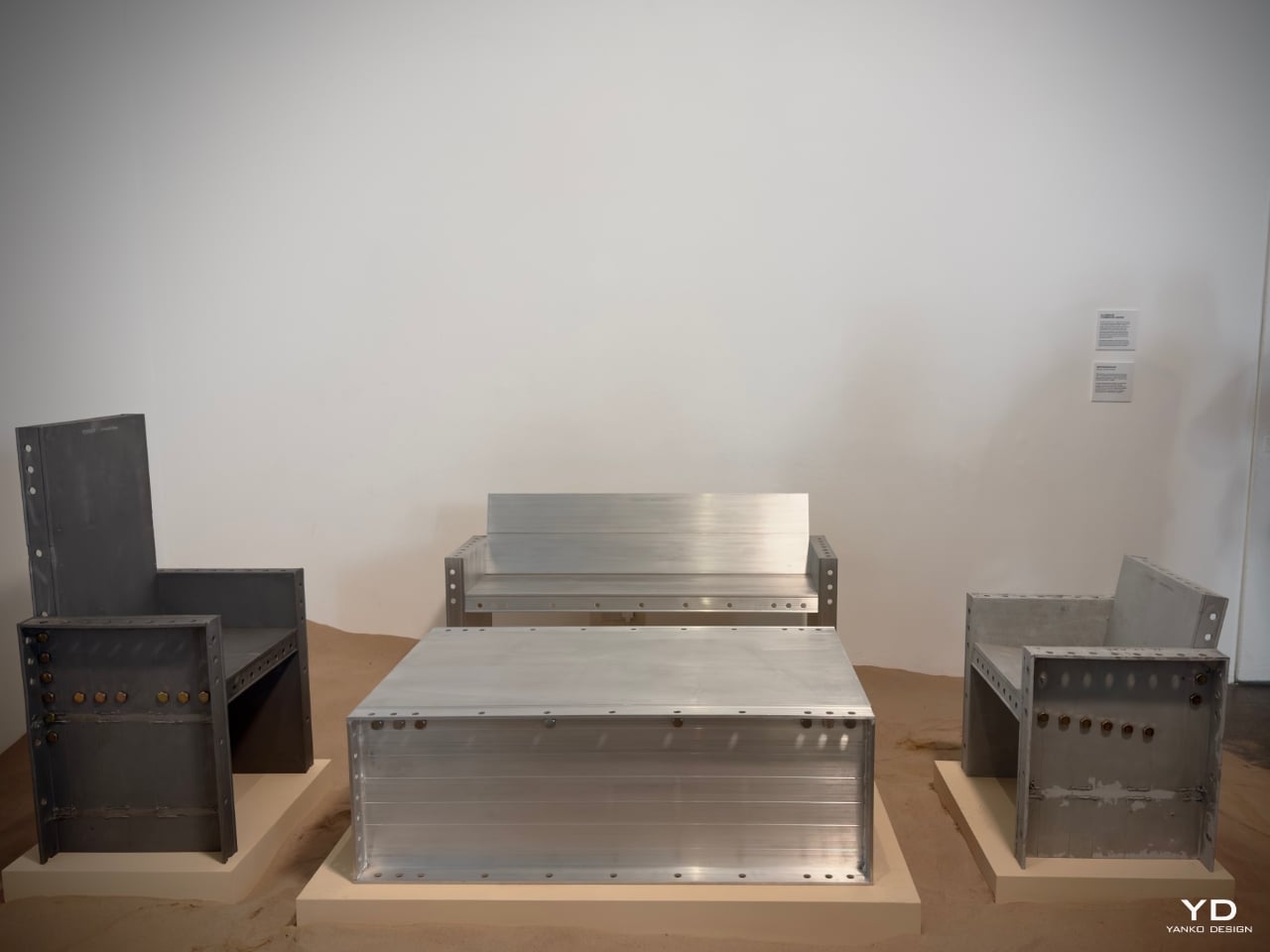
Nice Workshop (South Korea) explored the application of Ceraluminum in larger-scale objects with their “Aluminium Formwork Series”. Moving away from electronics, they demonstrated how Ceraluminum could be used in furniture design by applying ASUS’s ceramicization process to aluminum forms. This process resulted in furniture pieces with a textured, stone-like finish that invited touch and interaction. Founder Hyunseog Oh said their goal was to make aluminum—a traditionally cold, hard material—feel softer and more approachable.
Designer: Nice Workshop
Their work showed how Ceraluminum’s unique texture could be adapted to everyday objects, making them more inviting and user-friendly. “We wanted people to feel comfortable interacting with furniture in the same way they interact with their devices,” said Oh. This exploration of Ceraluminum’s versatility in non-tech applications expanded the material’s potential, proving it could enhance electronics and the physical spaces we inhabit.
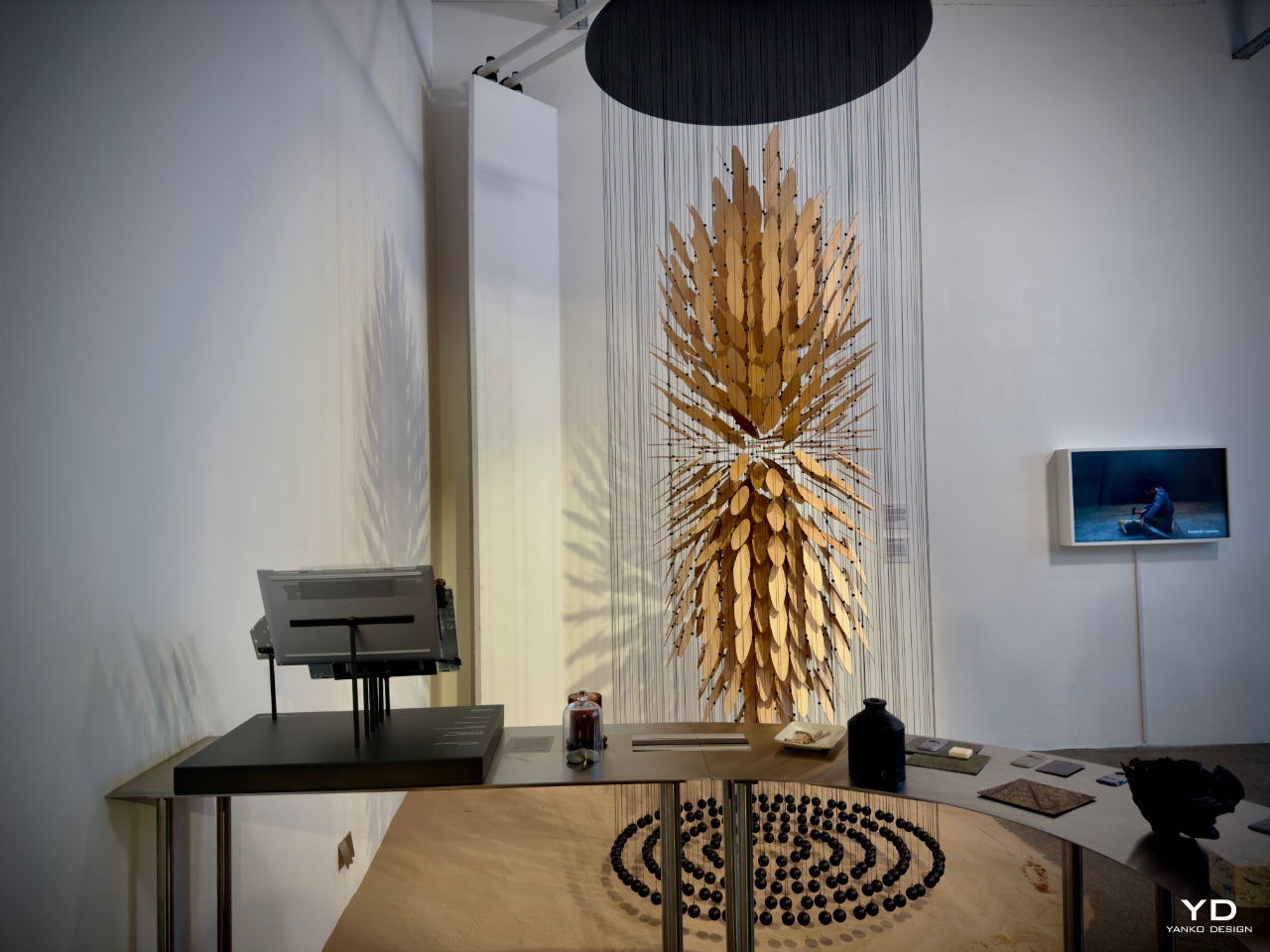
Fernando Laposse (Mexico) brought a sustainability-focused lens to the exhibition, concentrating on how Ceraluminum could be repurposed and recycled to reduce environmental impact. Known for his work with natural fibers, Laposse saw potential in Ceraluminum’s longevity and durability. He explored how the material could be integrated into sustainable design practices, offering a responsible alternative to more wasteful production methods.
Designer: Fernando Laposse
Laposse’s work aligned with ASUS’s vision for creating long-lasting products that reduce waste and contribute to a circular economy. By focusing on Ceraluminum’s recyclability, he highlighted its potential to contribute to sustainable design efforts. “Ceraluminum’s strength and durability mean it can be repurposed, not discarded, ensuring that our devices leave a smaller environmental footprint,” Laposse explained. His approach resonated with ASUS’s commitment to sustainability, demonstrating that high-tech materials and responsible design can coexist.
Studio Furthermore (UK) embraced a more experimental approach, pushing Ceraluminum’s potential beyond the traditional limits of material design. Their contribution focused on the material’s transformation through ceramicization, exploring how different textures and surface treatments could evoke new tactile experiences. By experimenting with forms and patterns, Studio Furthermore demonstrated how Ceraluminum could serve as a medium for creative exploration, where users could discover new ways to interact with their devices.
Designer: Studio Furthermore
The studio’s work underscored how Ceraluminum is durable and capable of provoking emotional and tactile connections. By emphasizing the material’s sensory qualities, they invited users to engage more profoundly and rigorously with their devices. “We wanted to encourage users to touch and feel their devices, not just see them as tools,” the studio remarked. Through their experimental processes, Studio Furthermore showcased how Ceraluminum could foster more profound, more meaningful interactions between users and the objects they use every day.
Final Thoughts: A Sensory Future for Technology and Design
ASUS’s “Design You Can Feel” exhibition and the development of Ceraluminum represent a forward-thinking approach to how technology integrates into our lives. With this material, ASUS bridges the gap between the tactile and the technological, offering users an experience that goes beyond performance to touch the soul of design.
Ceraluminum’s durability, tactile warmth, and matte finish go beyond aesthetic choices; they reshape how we interact with devices moving forward. This material reflects ASUS’s commitment to creating devices that resonate emotionally, offering comfort, engagement, and fostering a deeper connection.
Through collaborations with global designers, ASUS has highlighted the potential of Ceraluminum to transform not just technology but how we live, interact, and engage with the objects around us. As we move forward, Ceraluminum is poised to lead a new design wave that prioritizes emotional resonance, environmental responsibility, and the fusion of art with cutting-edge material science.
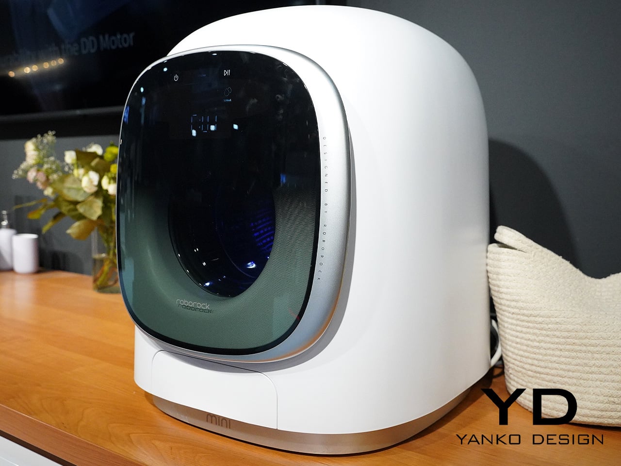
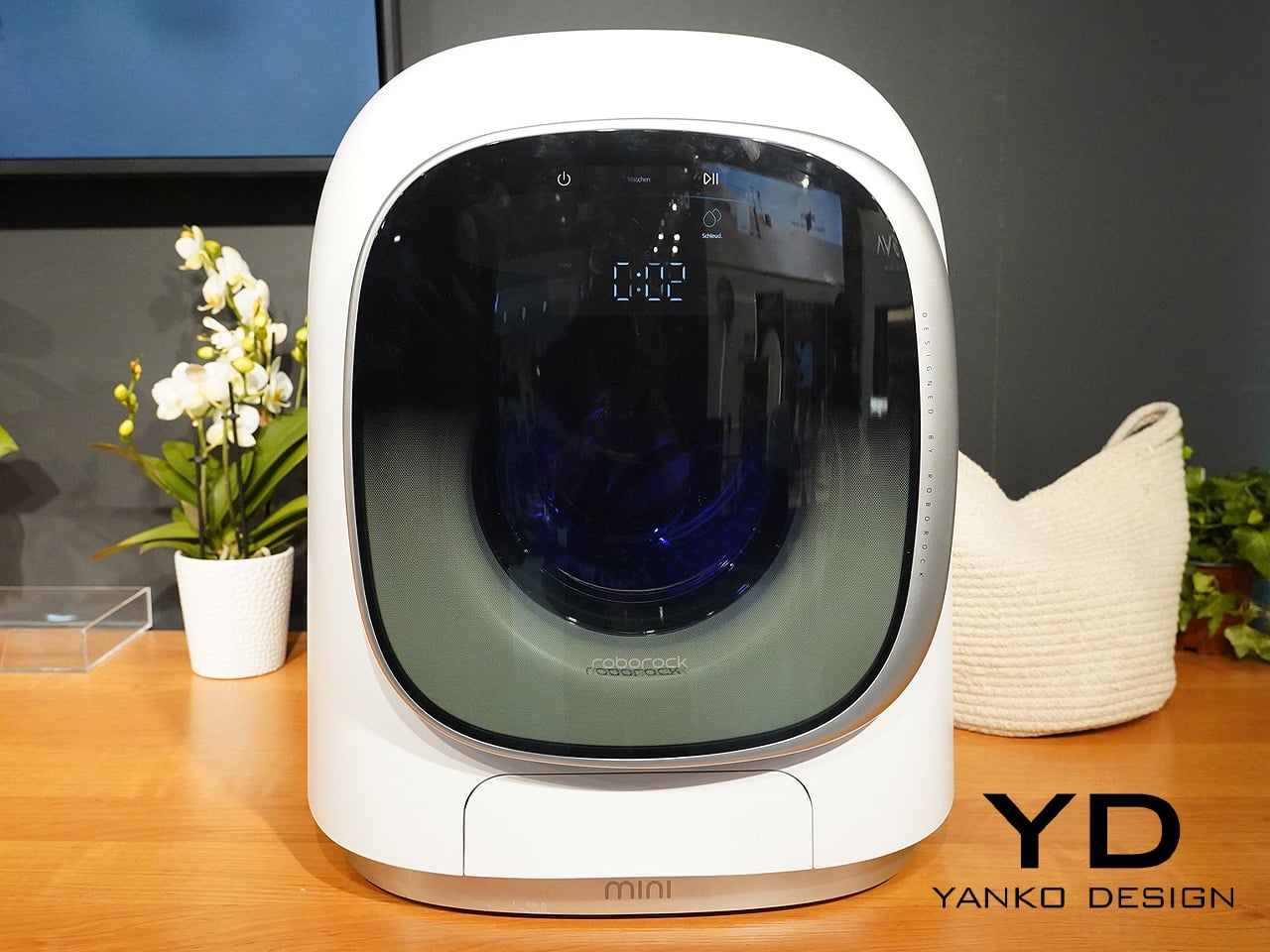
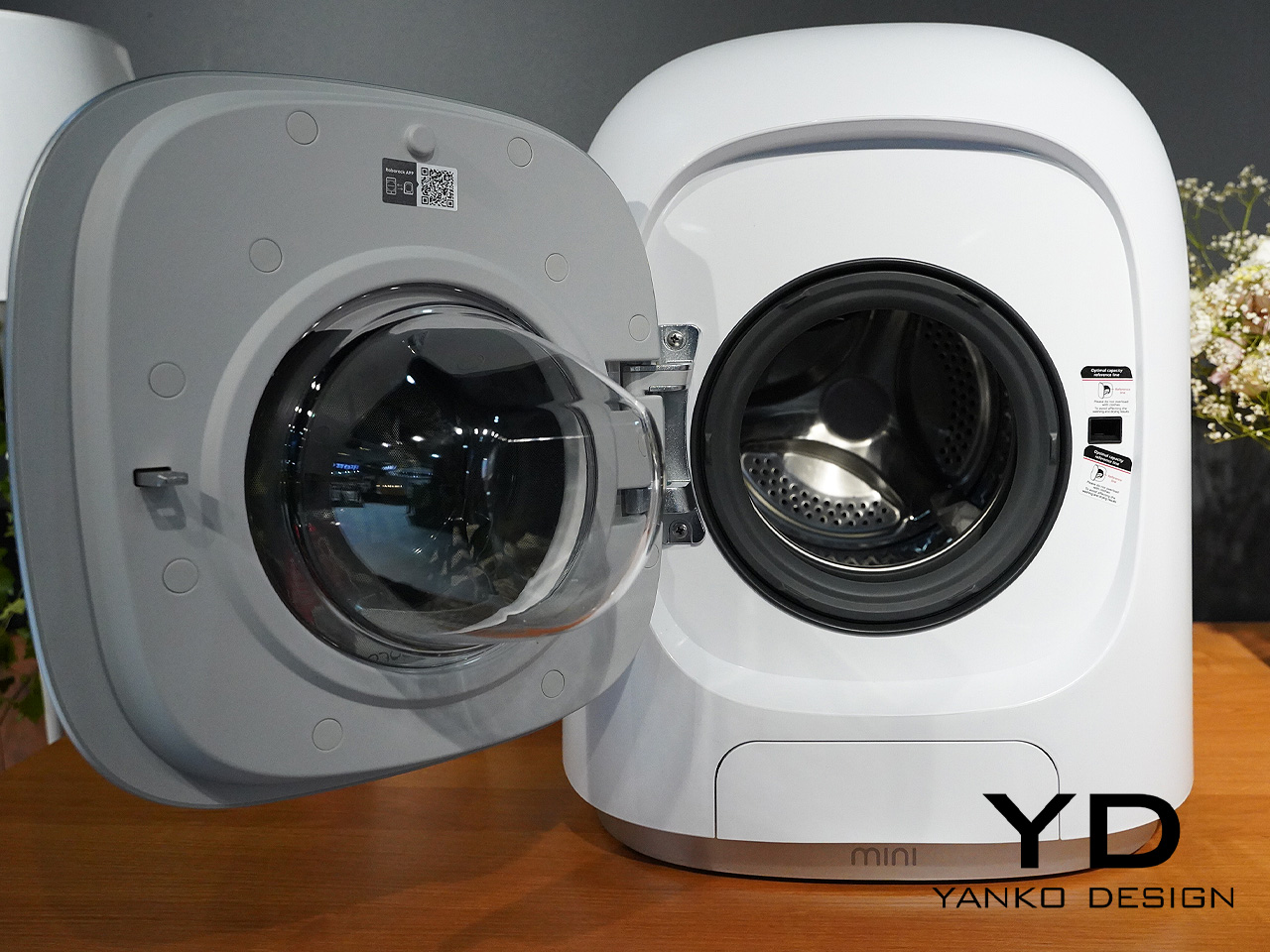
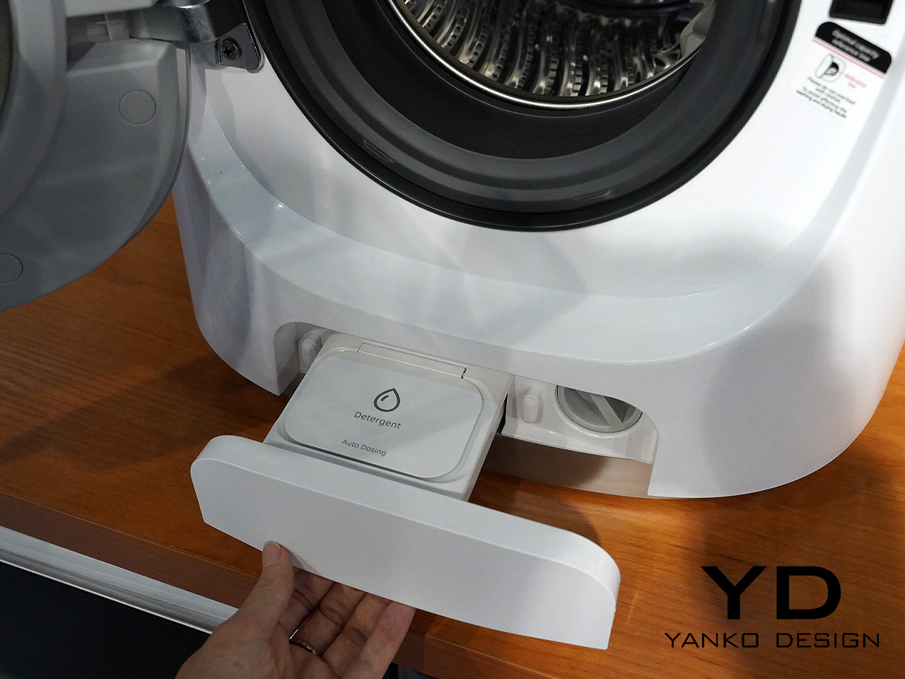
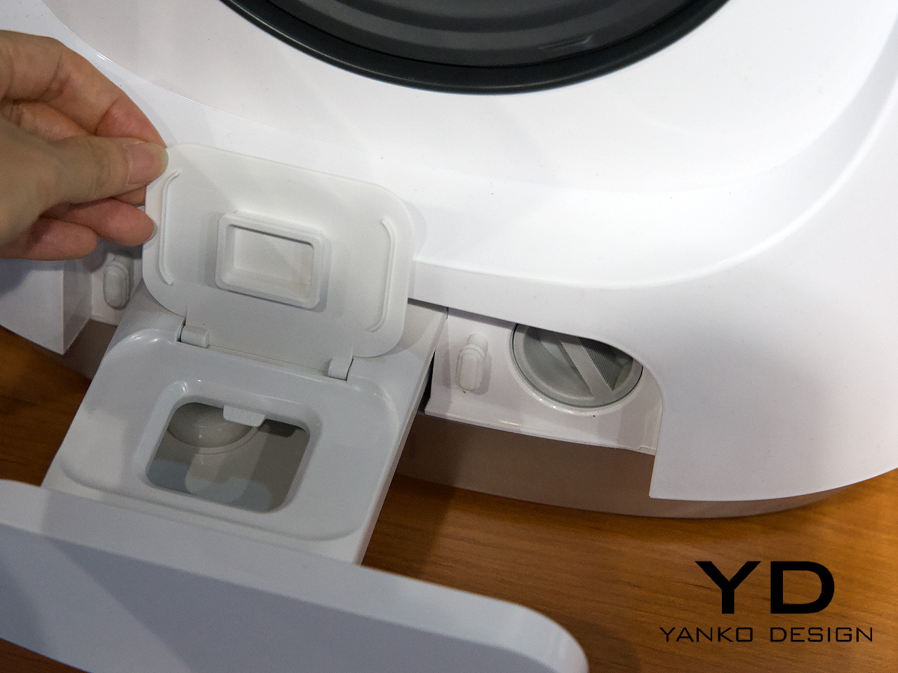
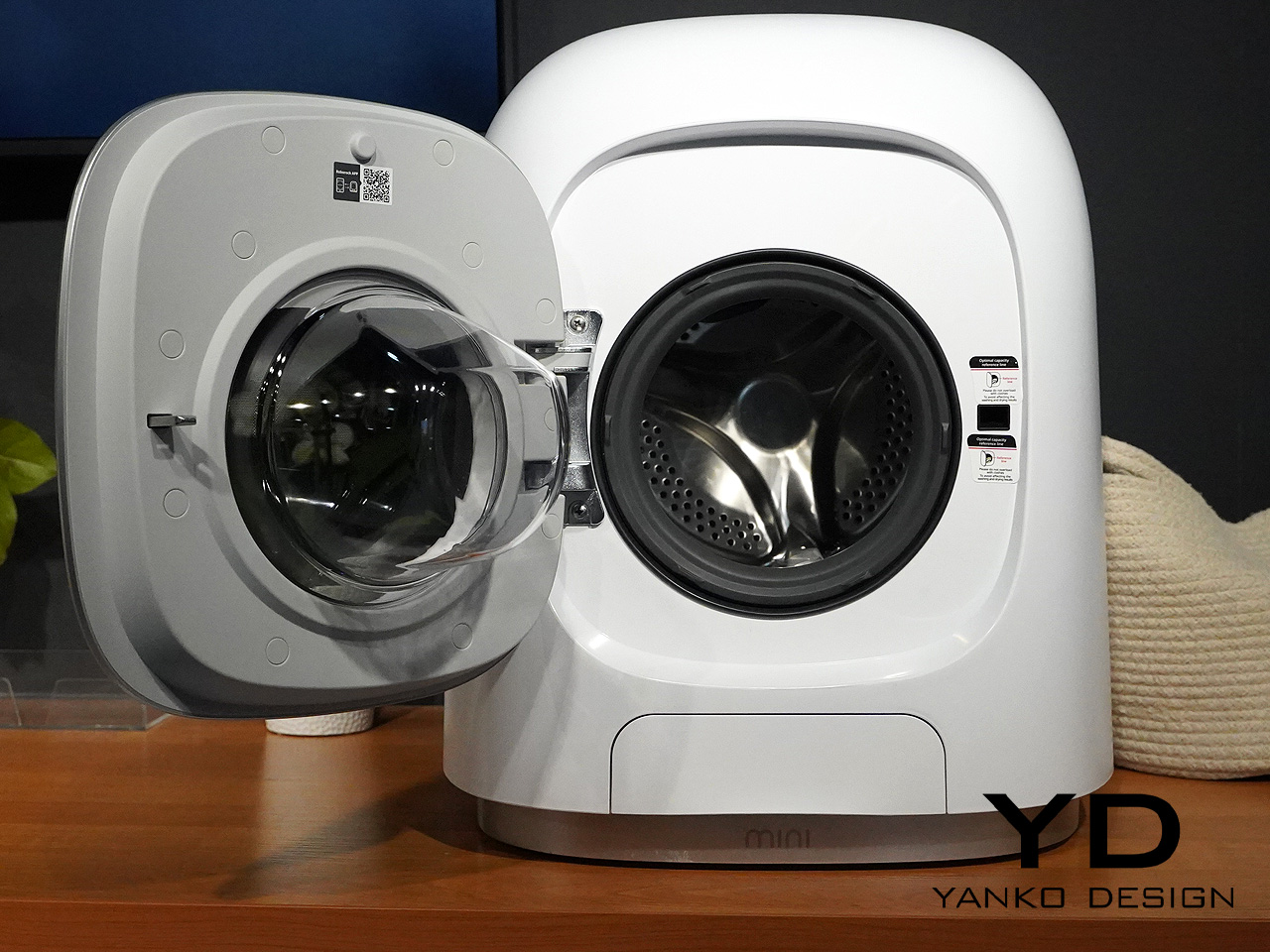
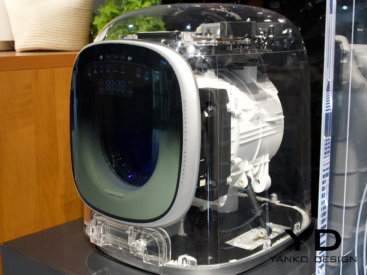
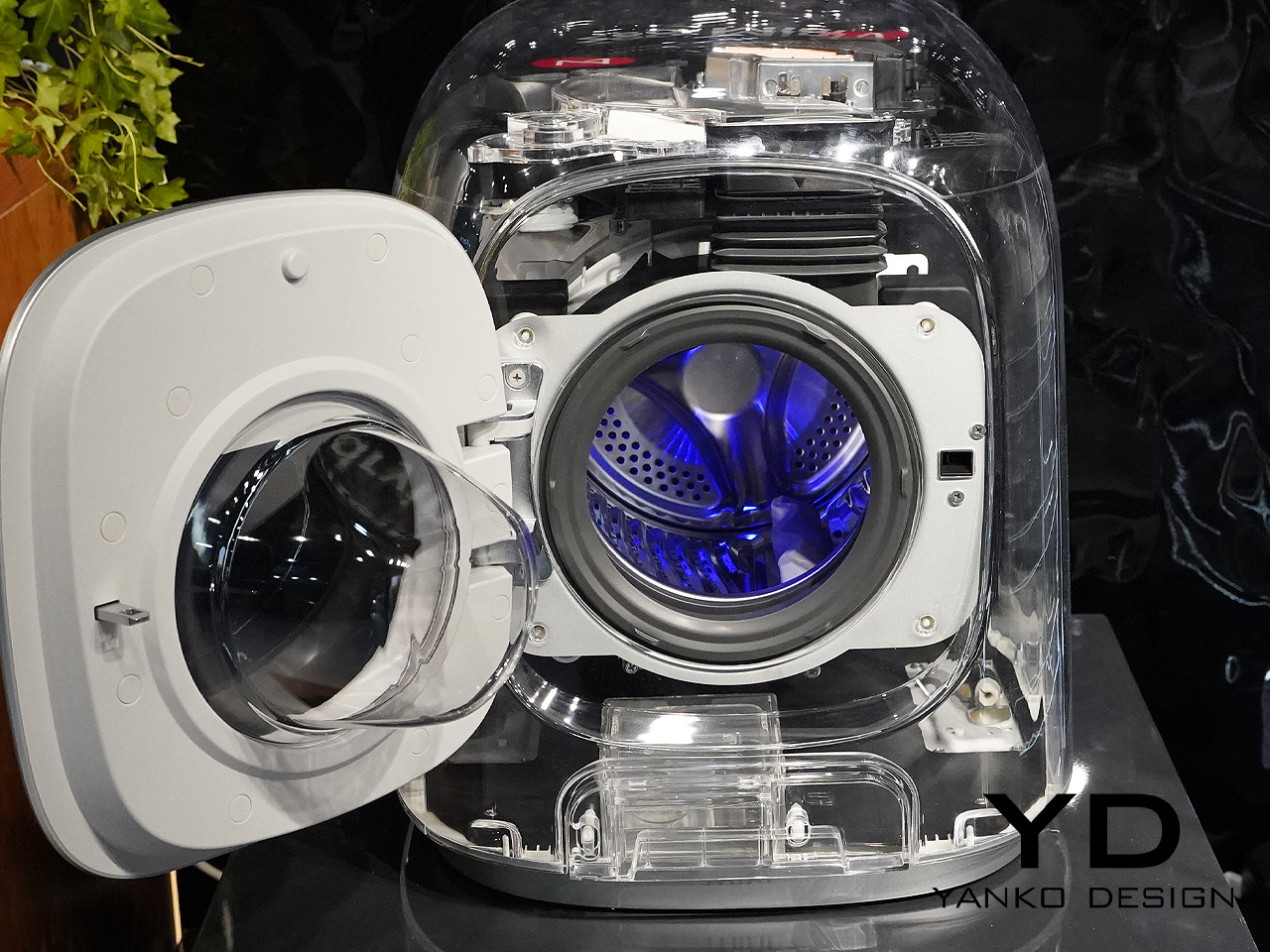
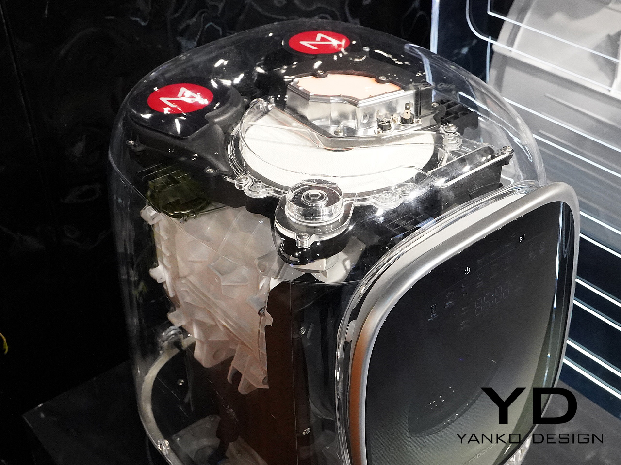
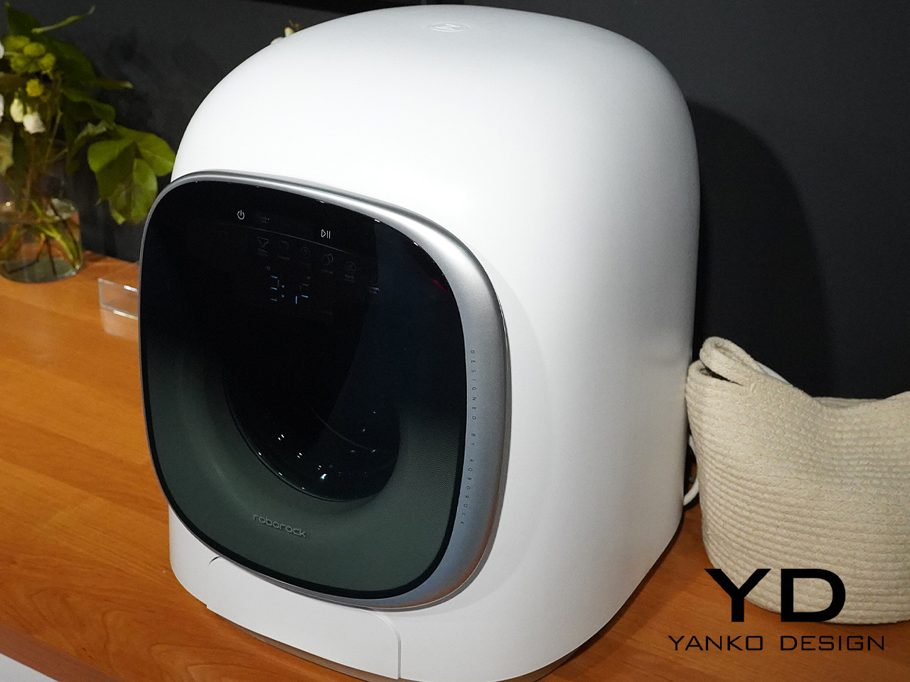
At IFA 2024, we spotted a trend that may or may not be here to stay, but it did win our hearts. We came across a bunch of super adorable mini-washing machines. Roborock’s Zeo Mini M1 features a compact little body, soft curves, and downright cute plumpness. Of course, the model cannot be compared to traditional washer-dryers and their capacity, but it can handle one kilogram of laundry for washing, and only 500 grams for drying. It has a pretty small drum, which must be noted.
Even though the machine has a small load, it has some intelligent features such as automatic drying, if you forget to unload the machine after washing, and detergent dispensing. It is an all-in-one solution that merges the convenience and size of a small washing machine, with the efficiency of a dryer. The cutesy washing machine can accommodate 25 pairs of lightweight underwear, 15 pieces of bras, and 80 pairs of socks simultaneously, so it could serve well for the everyday requirements of a contemporary family.
The M1’s engine is a DD variable frequency direct drive motor and it can rotate up to 4000 times per minute, with the air flowing up to 18kph. The motor runs pretty quietly, creating only 45dB of noise, and it can run overnight. It also includes a 90°C self-cleaning mode. The washing machine is essentially an auxiliary device, with the ability to handle fragile items of laundry that you don’t want to pop into your bigger washing machine. It functions as a companion to your primary washing machine, allowing you to fit in pieces of clothing that are too soft and gentle for a big load.
The Roborock Zeo Mini M1 isn’t currently available for sale, but it should arrive in the country soon for a price of around $660. Would you consider purchasing the M1? Is such a compact solution viable in today’s homes, or is it yet another unnecessary luxury that we could probably do without? We’ll probably know once it is out on the market.
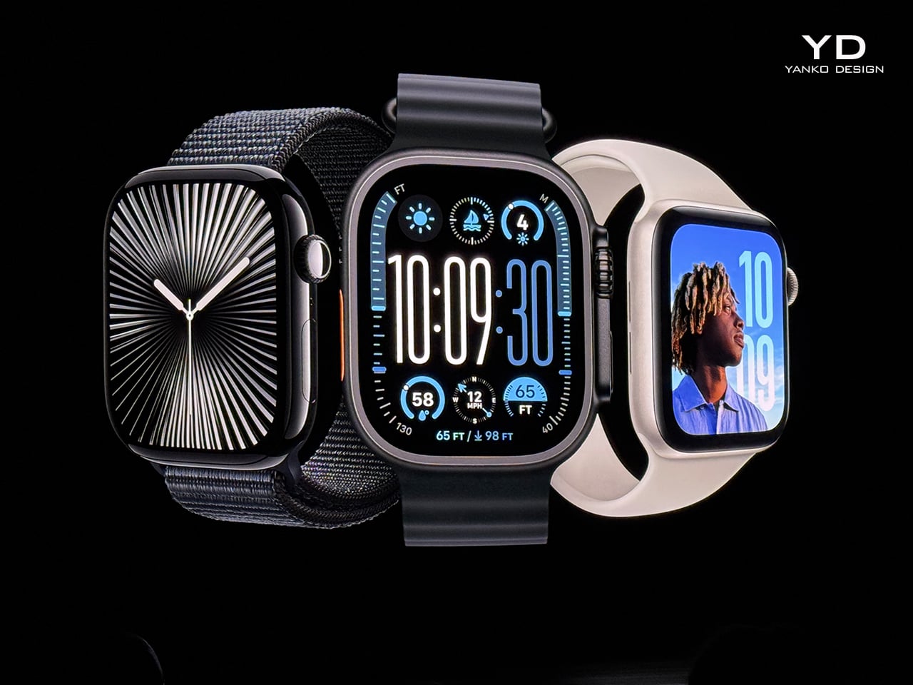
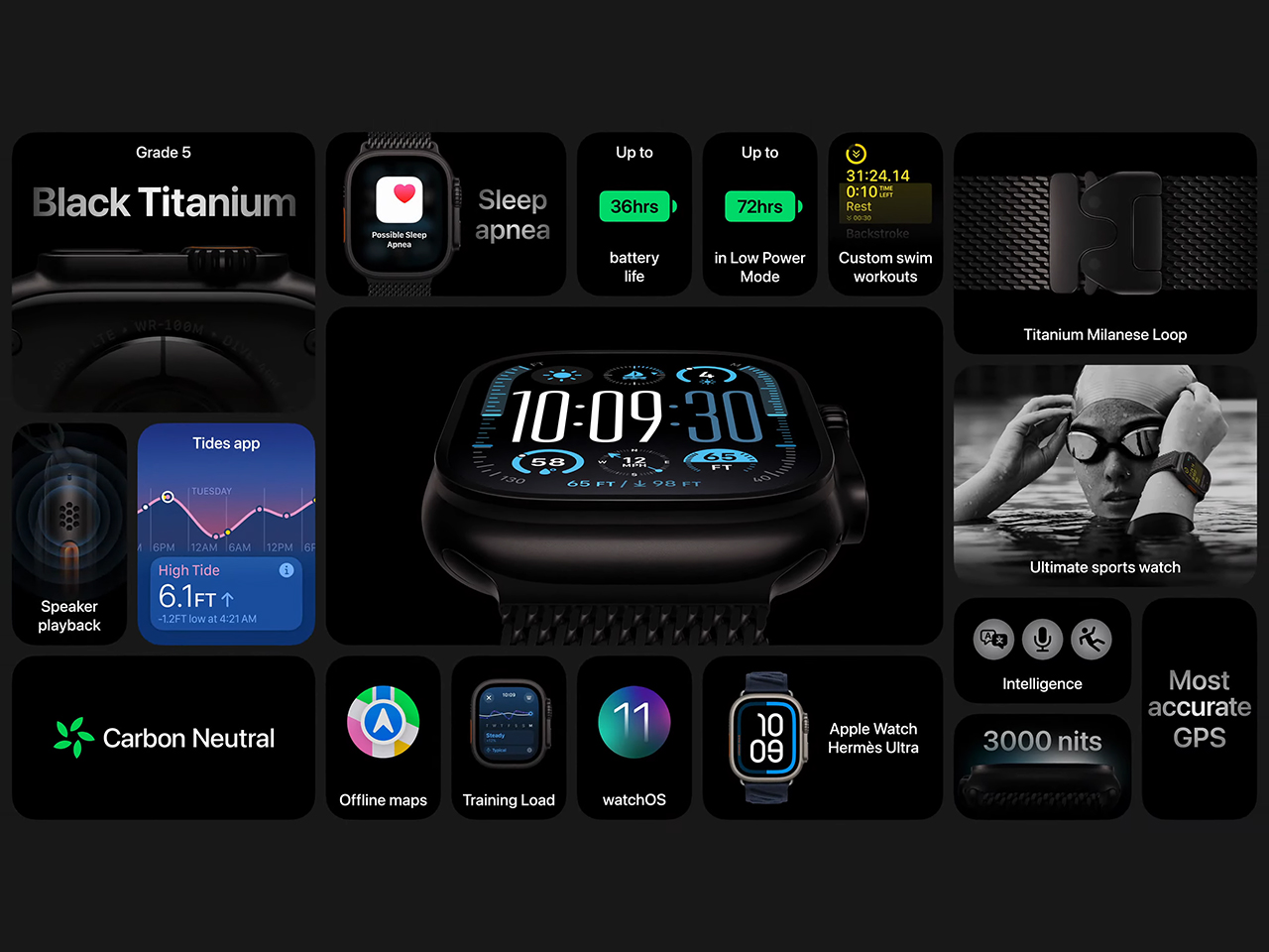
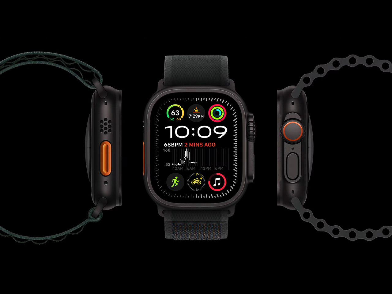
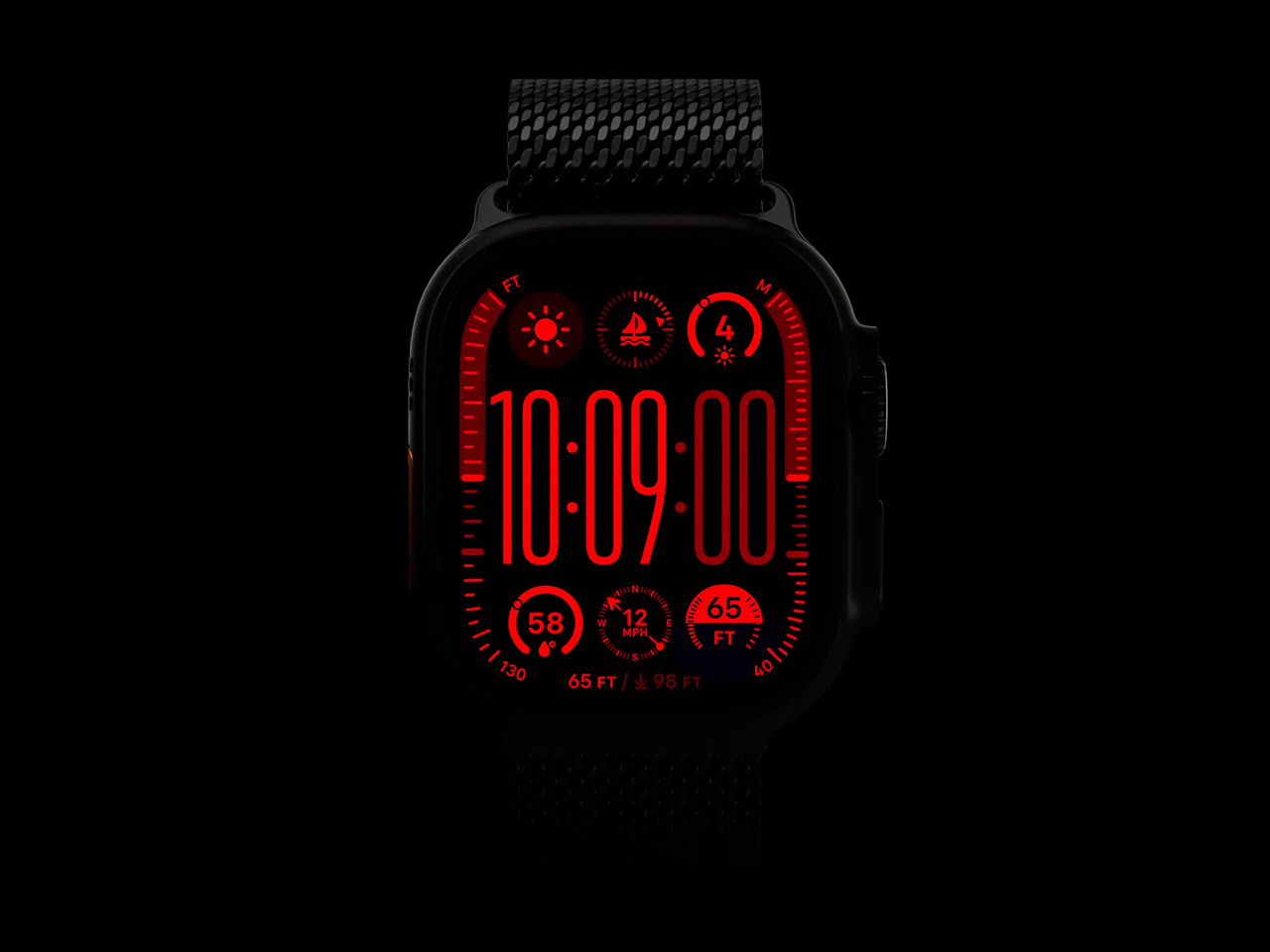
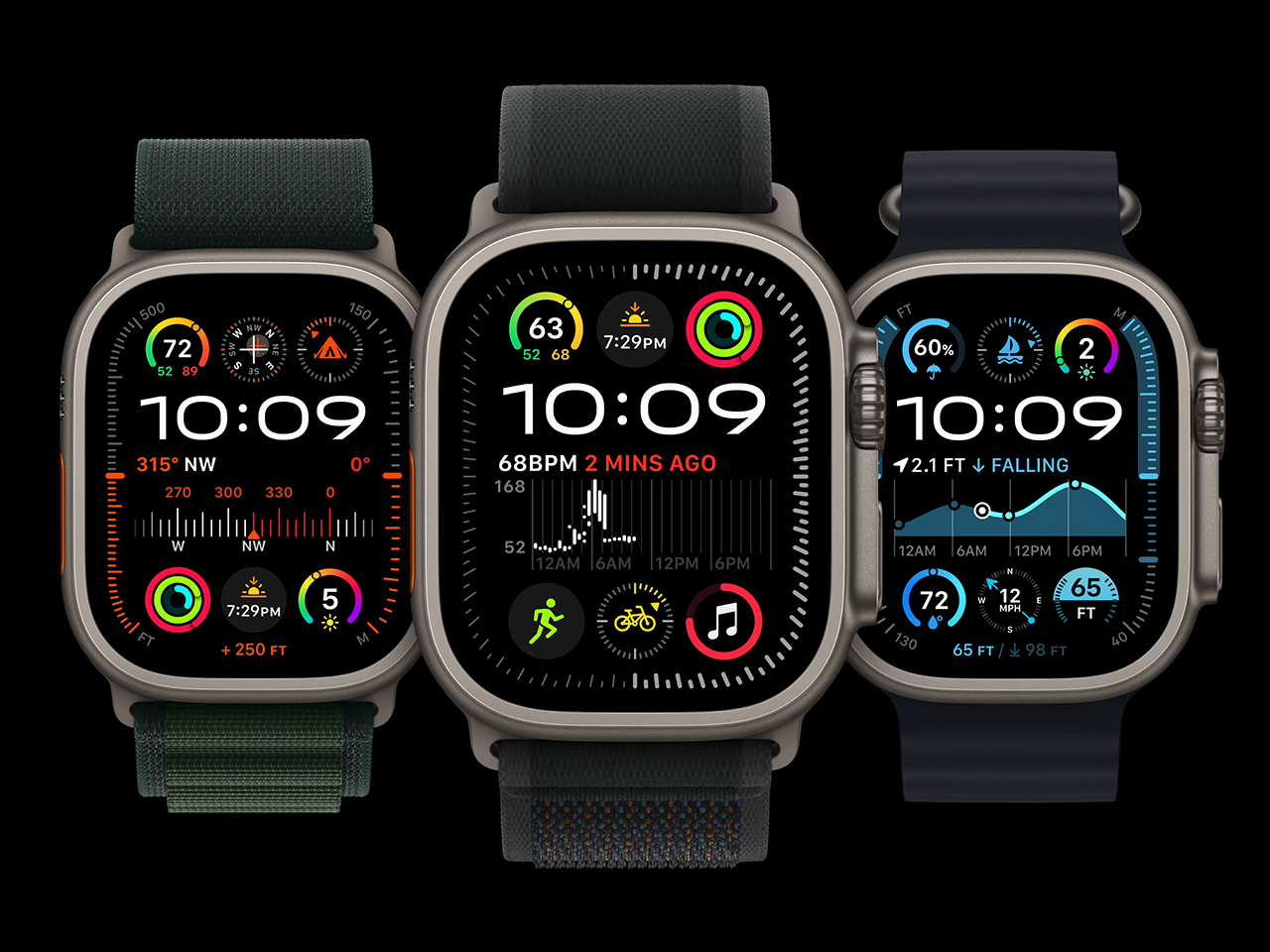
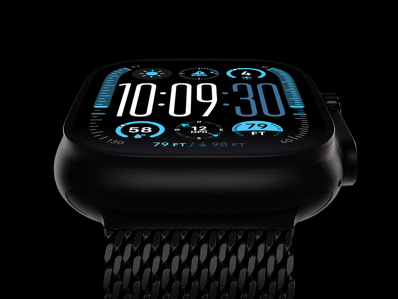
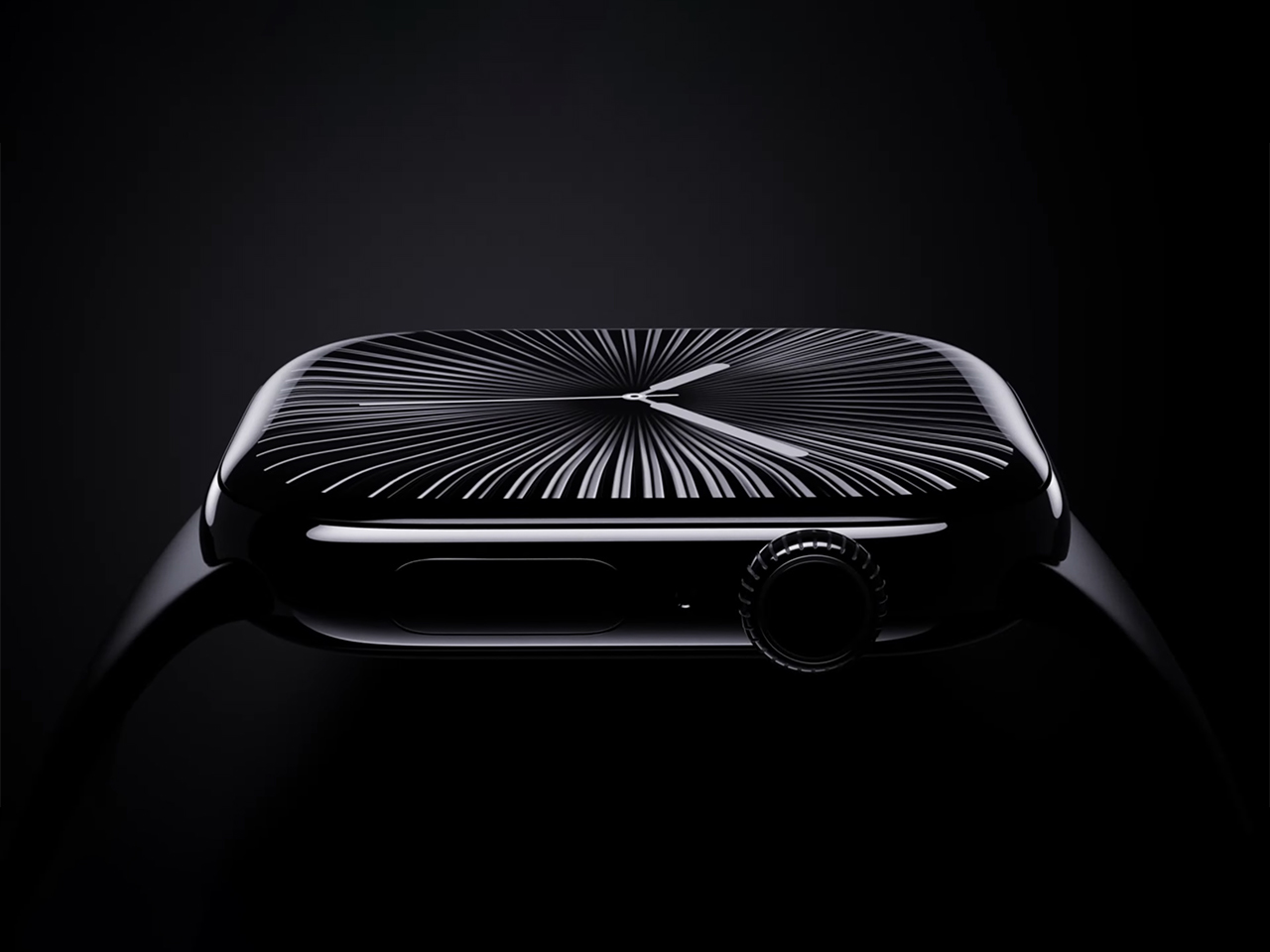
Apple has unveiled the Apple Watch Ultra 2, now available in a striking satin black finish and packed with new health features like sleep apnea detection. Announced at Apple’s September event, this refresh marks the first time the Ultra has been offered in more than one color since its launch two years ago.
The Ultra 2 uses its accelerometer and long-term motion tracking to detect signs of sleep apnea, enhancing the watch’s reputation as a health-focused device. Additionally, the new Vitals app monitors respiratory rate and sleep duration and flags any outliers in these key health metrics. Apple has also introduced the new Training Load feature, designed to help athletes balance exertion and recovery based on their activity levels.
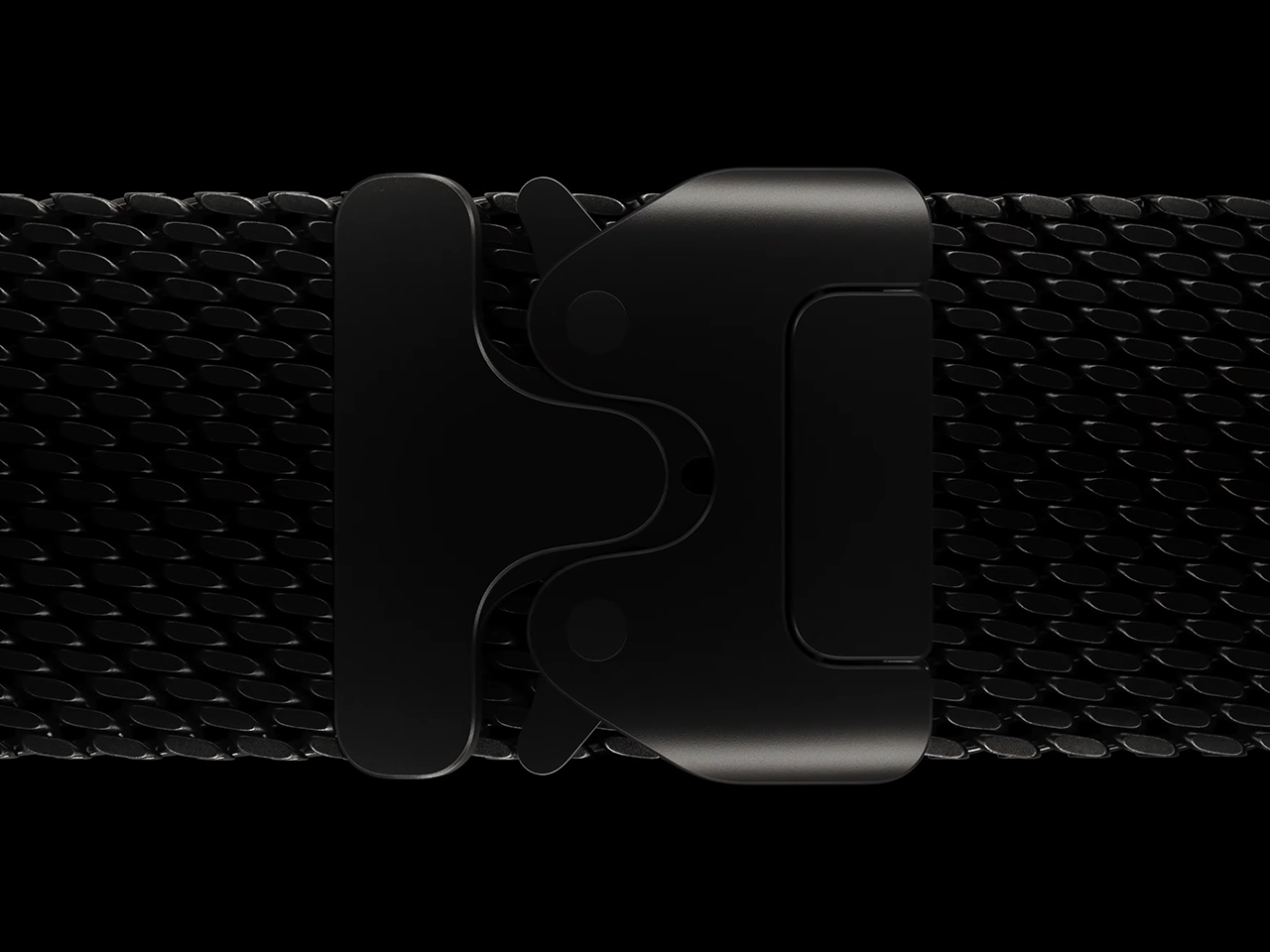
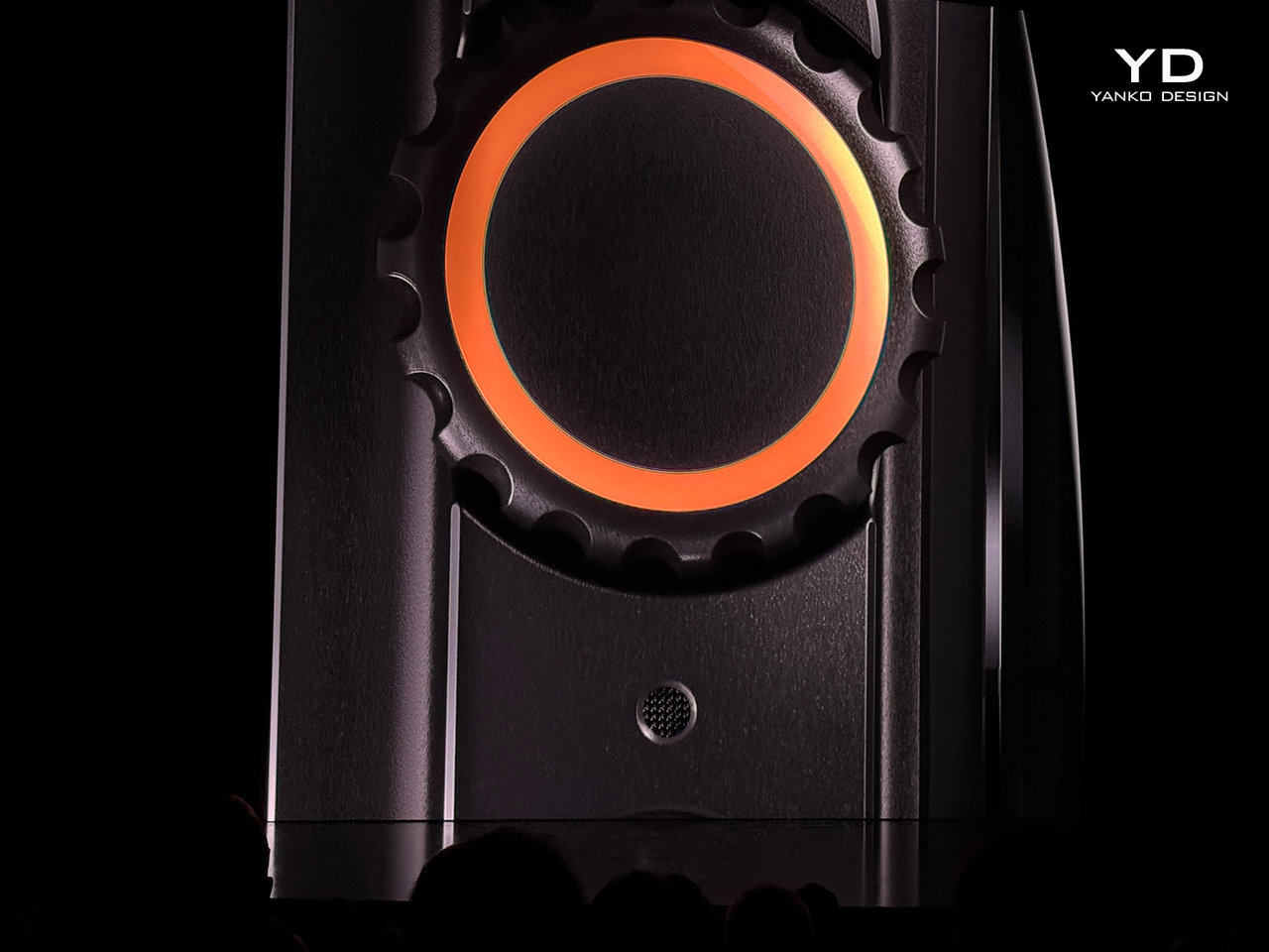
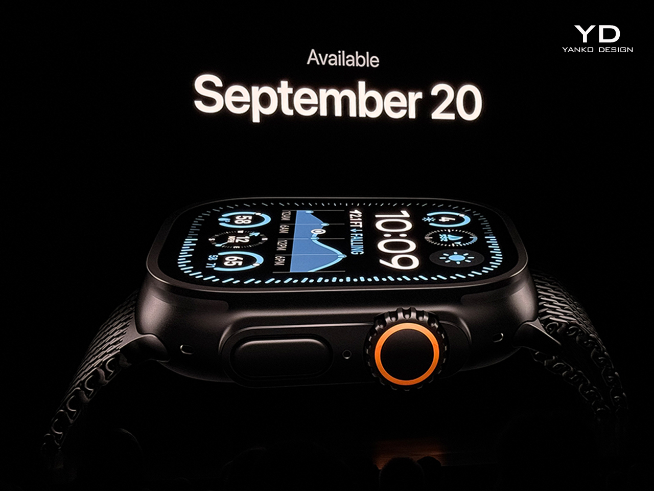
Priced at $799, the Apple Watch Ultra 2 is available for preorder now, with deliveries beginning September 20th. It retains the rugged titanium case but now features a custom diamond-like carbon PVD coating, making it more scratch-resistant. The new titanium Milanese Loop, inspired by mesh used in scuba gear, provides a lightweight, corrosion-resistant band option.
The Ultra 2 is equipped with Apple’s S9 chip, which offers faster performance and enables on-device Siri processing for greater efficiency. It also sports a brighter display, ideal for outdoor activities, and remains Apple’s battery life leader, built to last through extended workouts and adventures.
WatchOS 11, which powers the Ultra 2, updates the Smart Stack, now showing Live Activities similar to the iPhone. Offline maps, enhanced GPS accuracy, and detailed workout metrics make the watch a powerful tool for athletes, hikers, and divers alike. With automatic stroke detection for swimmers, track detection for runners, and cycling metrics like cadence and power, the Ultra 2 is designed to meet the needs of serious fitness enthusiasts.
This year’s addition of sleep apnea detection and a sleek black finish keeps the Ultra 2 as Apple’s premier wearable for those who demand advanced health tracking, durability, and performance in their smartwatch.
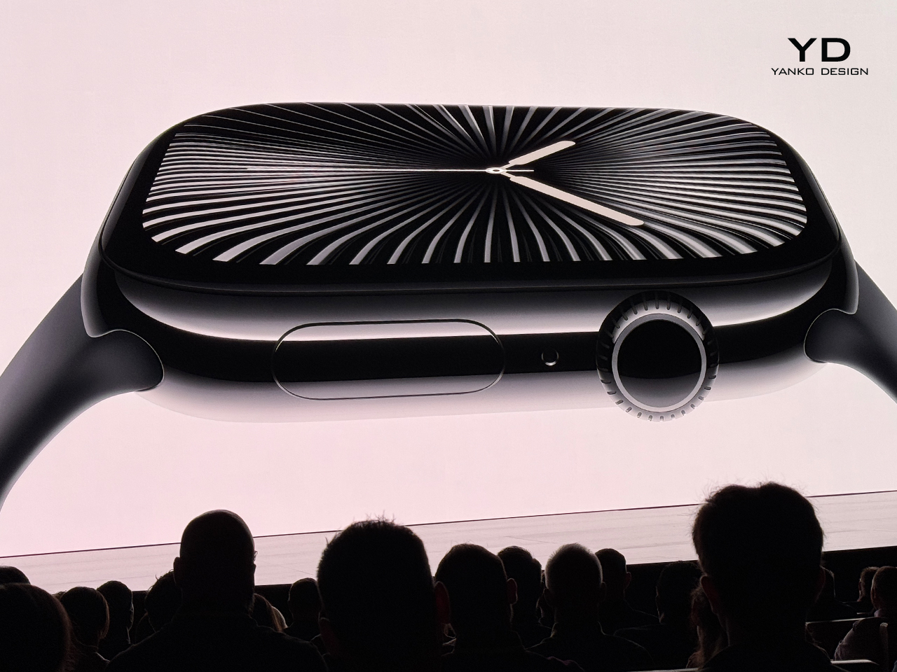
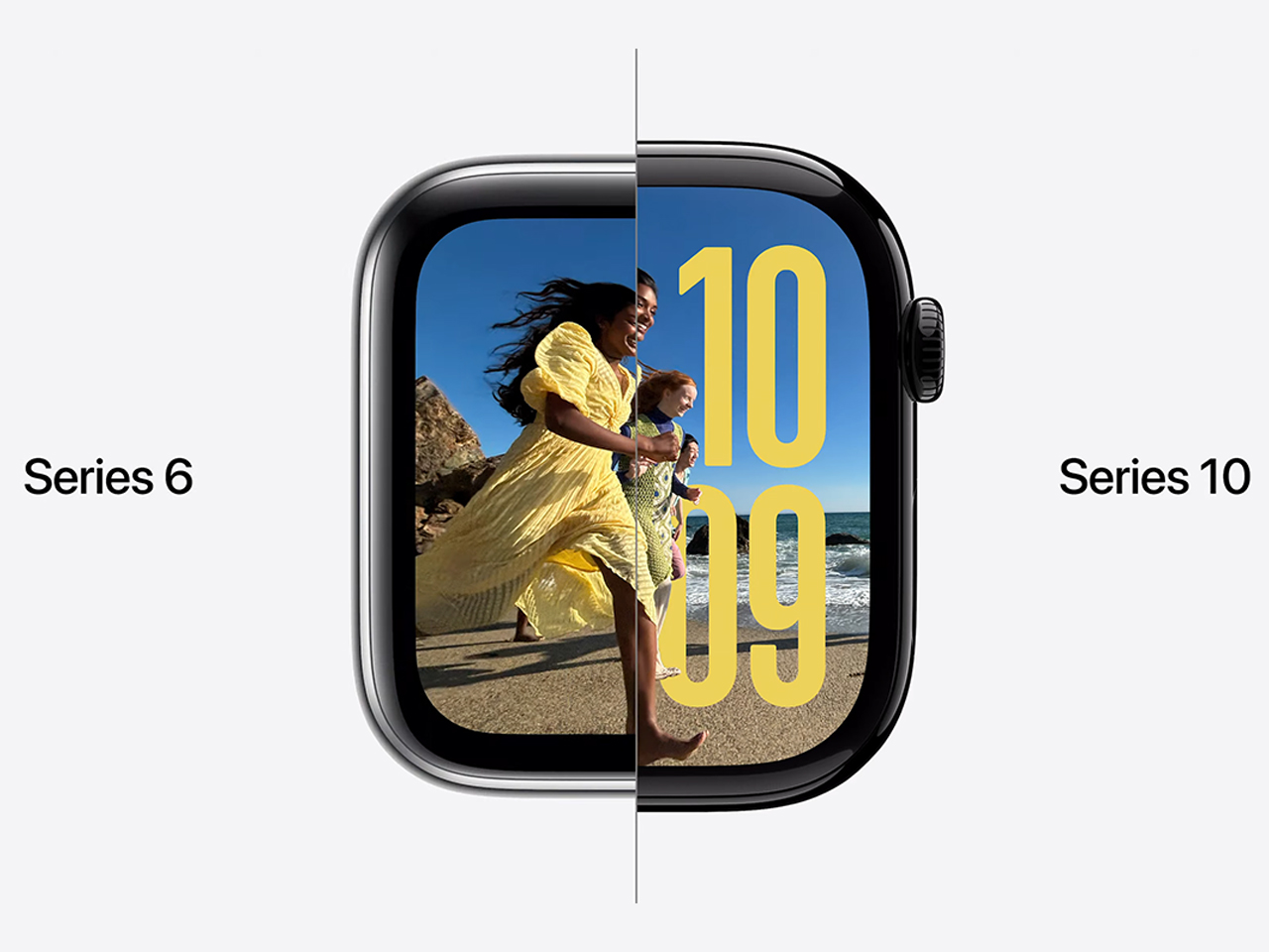
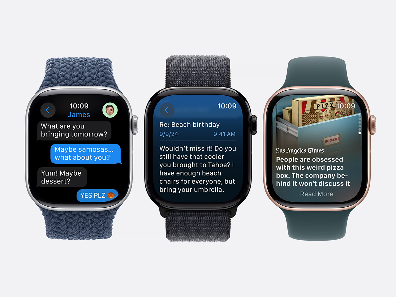
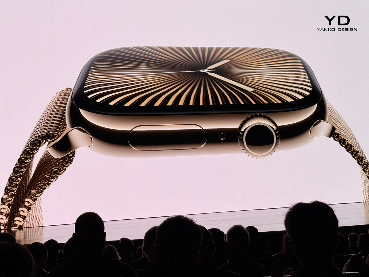
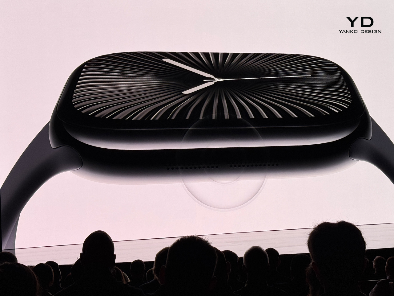
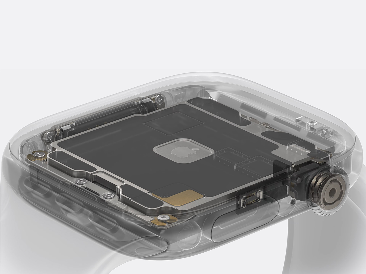
Apple’s latest wearable, the Series 10 Watch, pushes usability and design to new heights. Featuring its largest and most advanced display yet, the Series 10 now boasts the biggest screen ever built into the brand’s smartwatch lineup. Slightly larger than the Apple Watch Ultra, this screen provides up to 30% more area than earlier versions, allowing users to increase font size without losing content and offering extra lines of text for apps like Messages and Mail.
In focusing on user experience, the company has made Series 10 easier to interact with. Rounded corners and a wider aspect ratio give the watch a sleek and softer appearance. One of the most significant upgrades is the first-ever wide-angle OLED display, designed to emit more light at wider viewing angles. This proves particularly useful when checking the watch from the side, such as while typing or walking. The display is also up to 40% brighter when viewed at an angle, making information easier to read in passing.
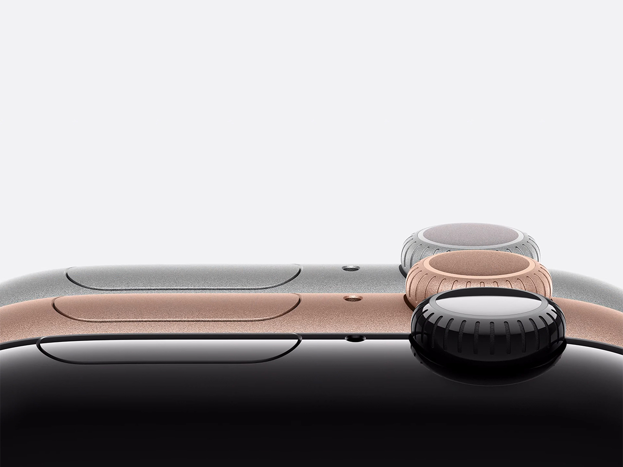
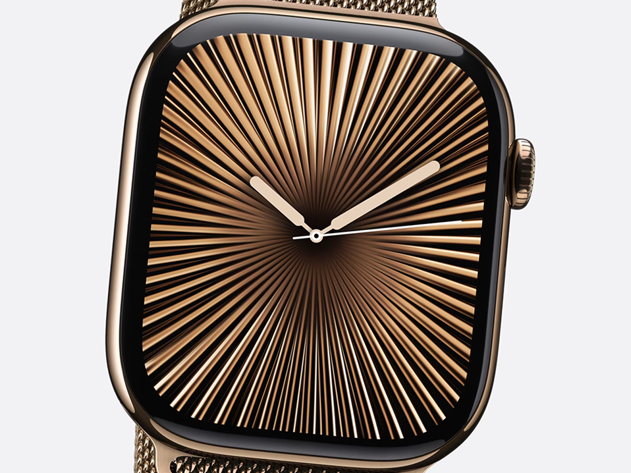
Battery efficiency remains a priority, and Series 10 features Always On mode, which updates once per second and displays a ticking second hand even when the wrist is down. A new watch face, Flux, takes full advantage of the large display, filling it with dynamic color. The case, made from a polished aluminum alloy, marks a first for Apple with its reflective Jet Black and warm Rose Gold finishes.
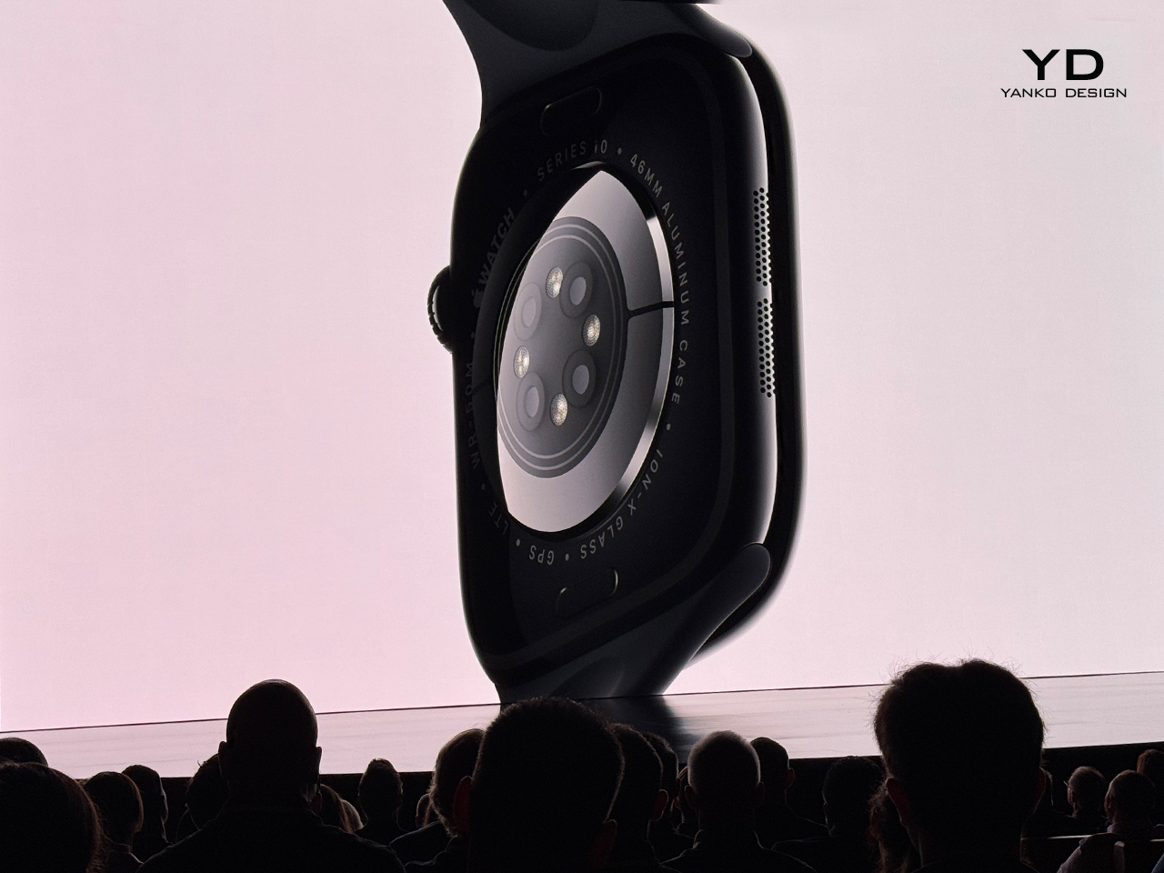
Comfort has been central to the design of the Series 10. The latest iteration is Apple’s thinnest watch, measuring 9.7 millimeters thick, almost 10% thinner than its predecessor. Achieving this thin profile required miniaturizing essential components, including the digital crown, SIP, and speaker system, which has been re-engineered to be 30% smaller without compromising sound quality. Users can now play music or podcasts directly through the watch’s speaker, eliminating the need for AirPods in certain situations.
Series 10 offers the fastest charging experience, thanks to a new metal back that integrates the antenna and enhances cellular performance. The design retains its 50-meter water resistance, making it ideal for swimming and surfing. Charging now reaches 80% in just 30 minutes, adding convenience to the user’s day.
Alongside the aluminum options, the tech giant has introduced polished titanium cases in three colors: natural, gold, and dark slate gray. These lightweight cases are nearly 20% lighter than the stainless steel Series 9, offering durability without extra bulk. The Milanese Loop and Classic Link bracelets have been updated to match these titanium finishes, creating a seamless metallic aesthetic.
Beyond functionality and design, the Series 10 reflects Apple’s commitment to sustainability. The titanium model is made with 95% recycled materials and produced using renewable electricity. The new S10 SIP, featuring a neural engine, powers key features like Siri dictation and crash detection, enhancing everyday usability and safety.
The Apple Watch Series 10 represents the company’s ongoing effort to combine thoughtful design with cutting-edge technology, delivering a seamless user experience worldwide.
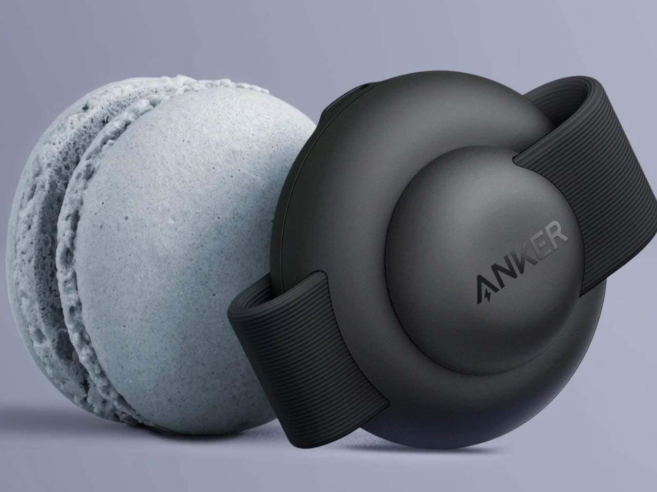
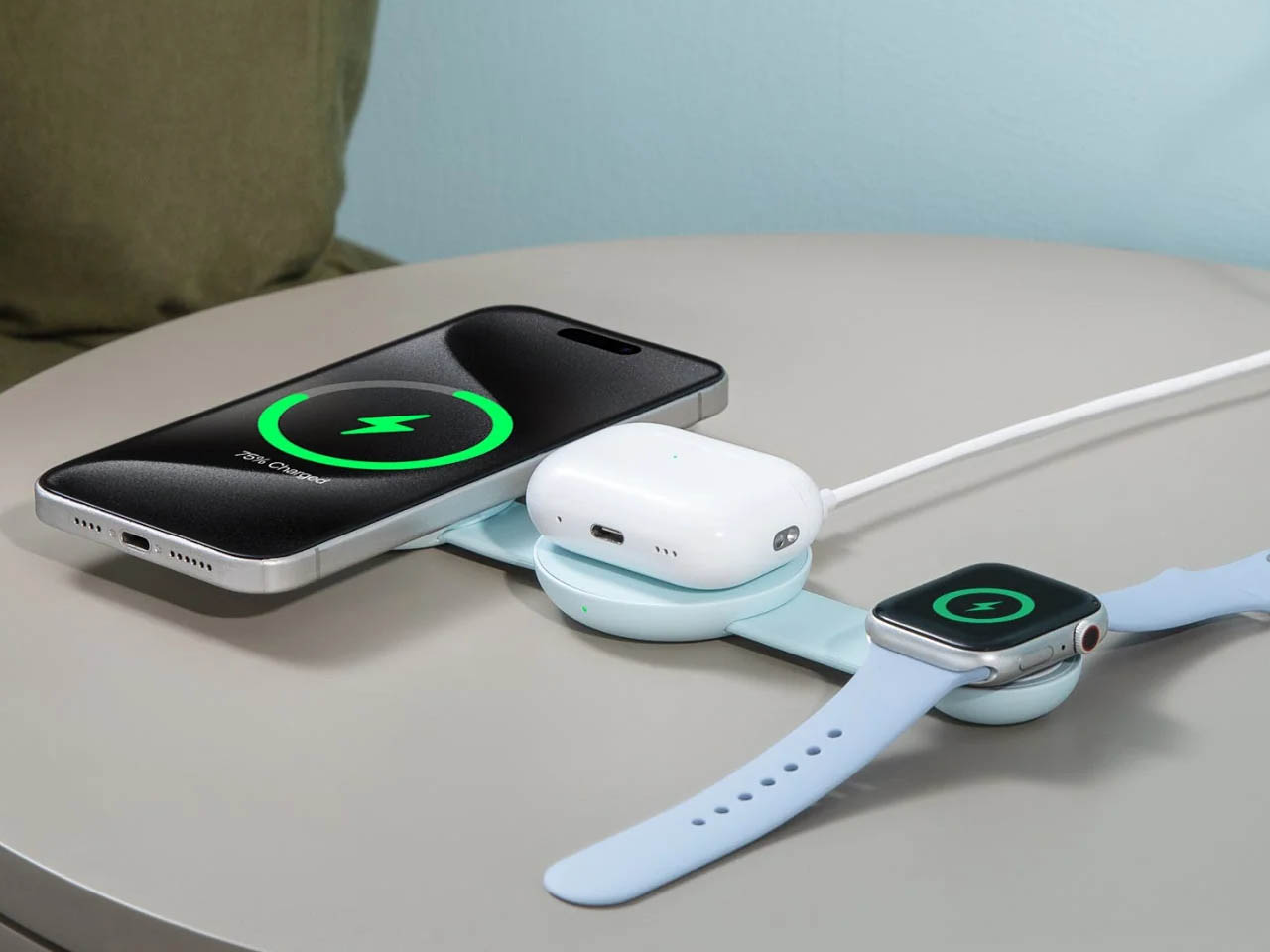
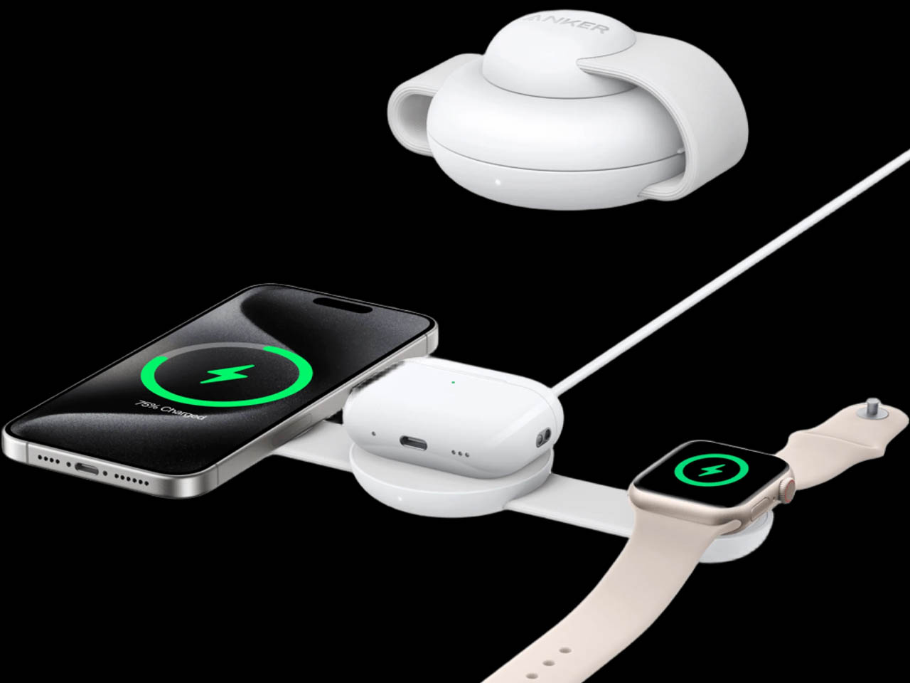
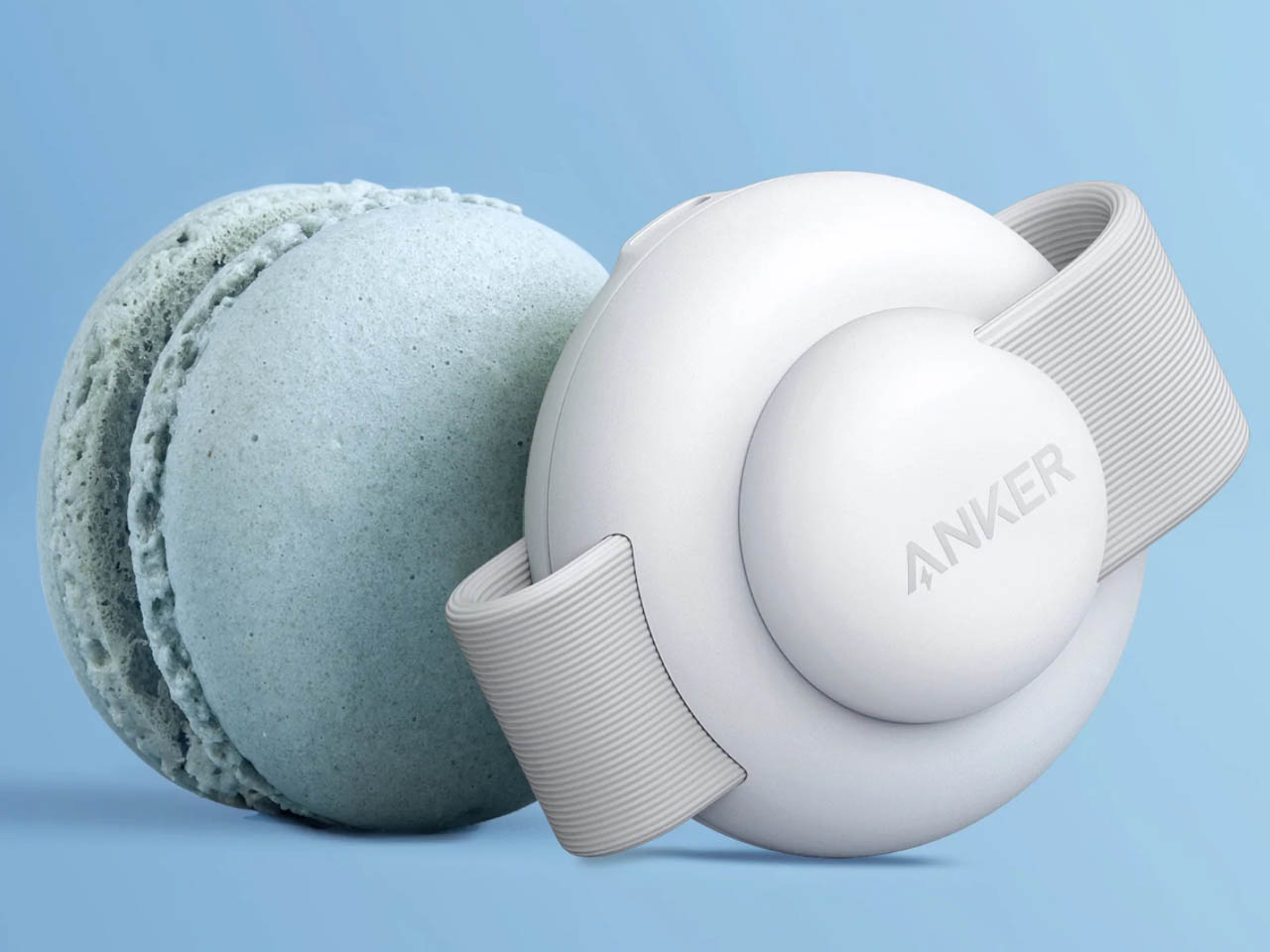
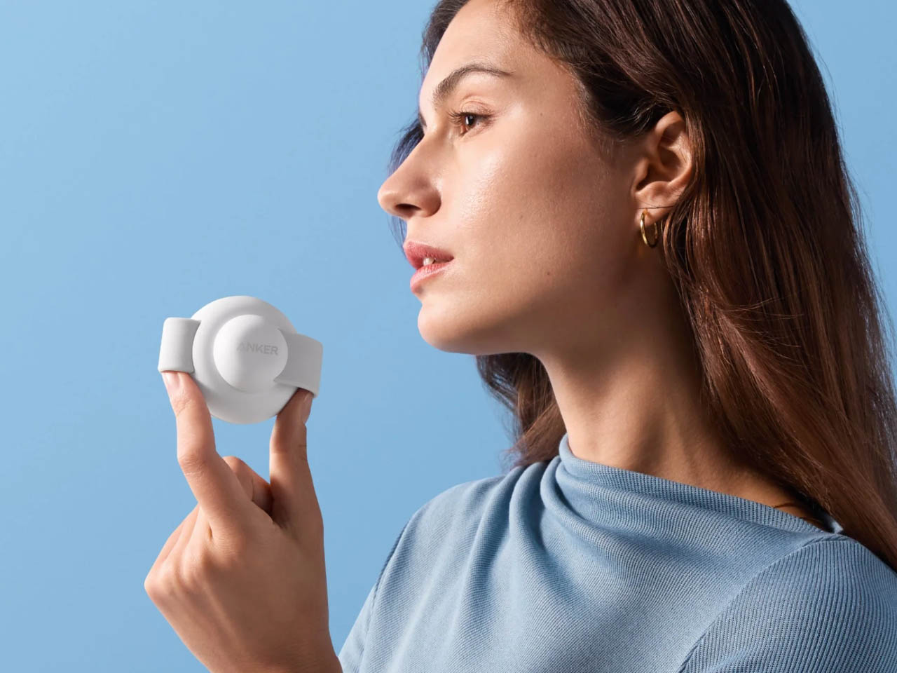
Anker has brought its new line of chargers to IFA 2024 that enhance your wireless charging experience and hone portability. The one making headlines is the MagSafe-compatible 3-in-1 travel charger that folds like a puck, something similar to the Twelve South Butterfly.
The fold-out charger does draw inspiration from the Butterfly but improves on the design and functionality with an added third charging pad. The trifecta charging pads should be more than enough for travelers who love to carry their share of Apple gadgets!
The Qi2-certified 15W MagGo Wireless Charging Station folds into an easily carriable form which lends it ultra-portable aesthetics. The three equidistant charging ports include a Qi2-certified 15W charger, a 5W Apple-certified Apple Watch charger, and a 5W Qi puck in the middle. The latter houses the USB-C power input port to charge up the battery. Targeted for the Apple ecosystem of devices it can simultaneously charge your Apple iPhone 15, Apple Watch, and Airpods Pro while traveling.
The pocket-friendly accessory comes with Apple’s Magnetic Power Profile technology for stable and efficient charging on the go. It has a dedicated StandBy and landscape mode for optimal viewing while binge-watching on the iPhone. There’s a quick snap mode that turns this usable accessory into a puck-sized dimensions of 2.36 x 2.36 x 1.4 inches that can be put inside a pocket – it’s that compact. Anker specifically mentions the charger can also charge Apple Watches with undetachable metal straps which is a bonus.
Anker’s 3-in-1 MagGo Wireless Charging Station comes with a 40W adapter and a 5-foot USB-C to USB-C cable for quick charging of the 3-in-1 pad. It is currently up for grabs on Anker’s website and Amazon for $90. You can choose the accessory from a cool selection of color options including black, white, pink and green. The colorful variants (pink and green) are slated to arrive later this year.
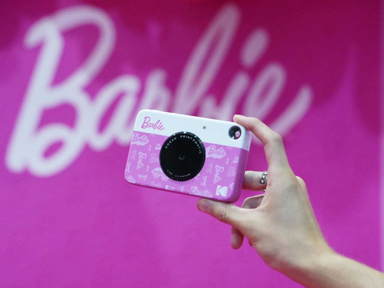
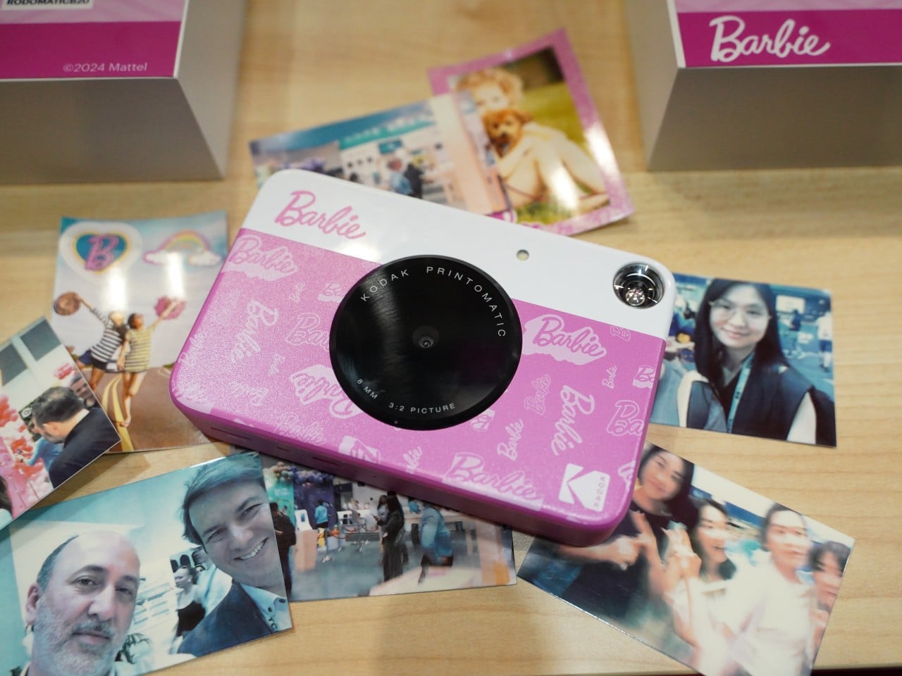
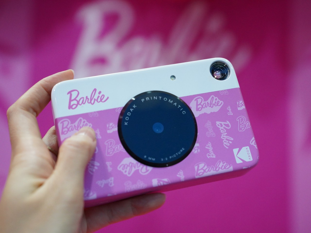
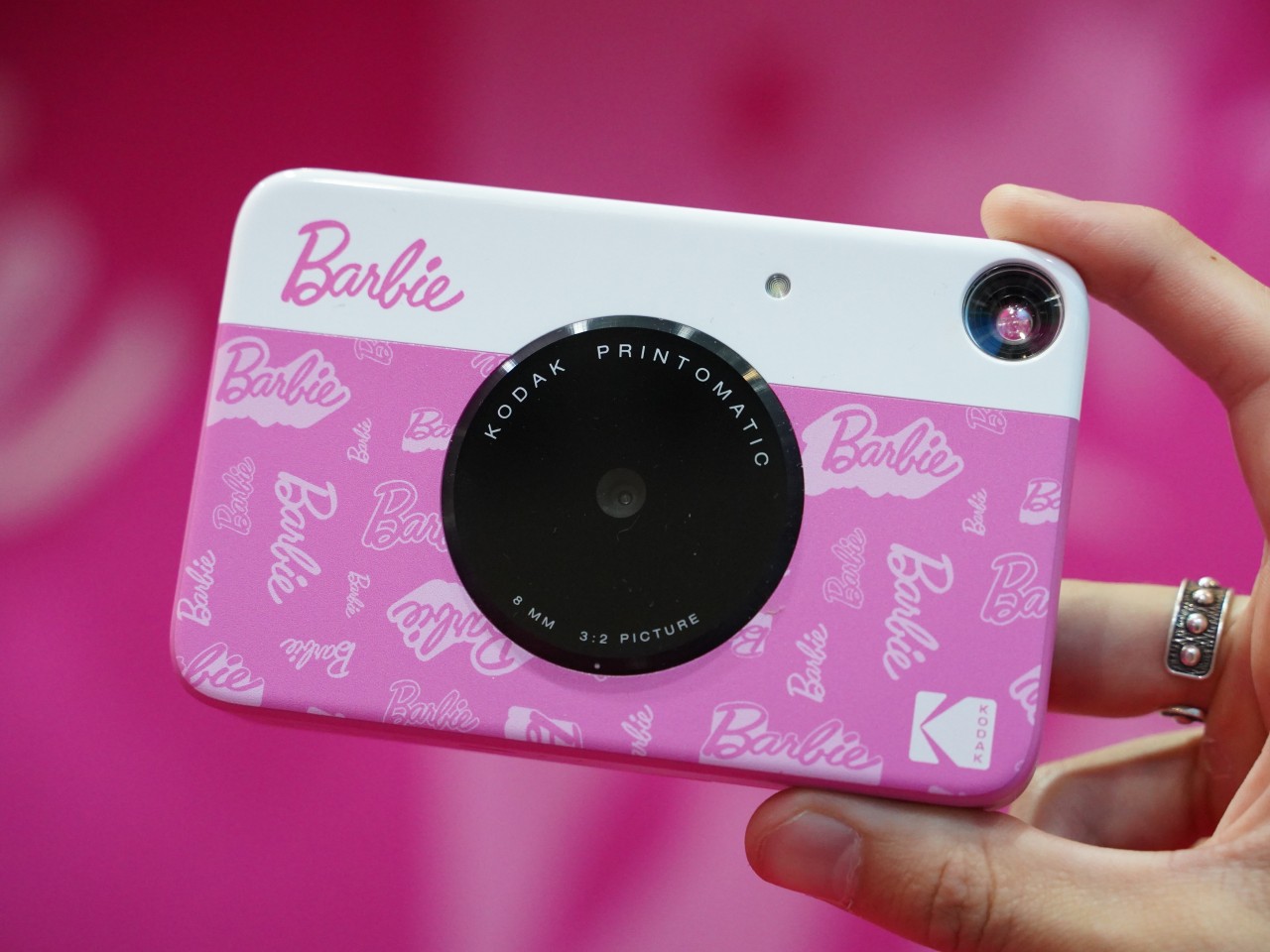
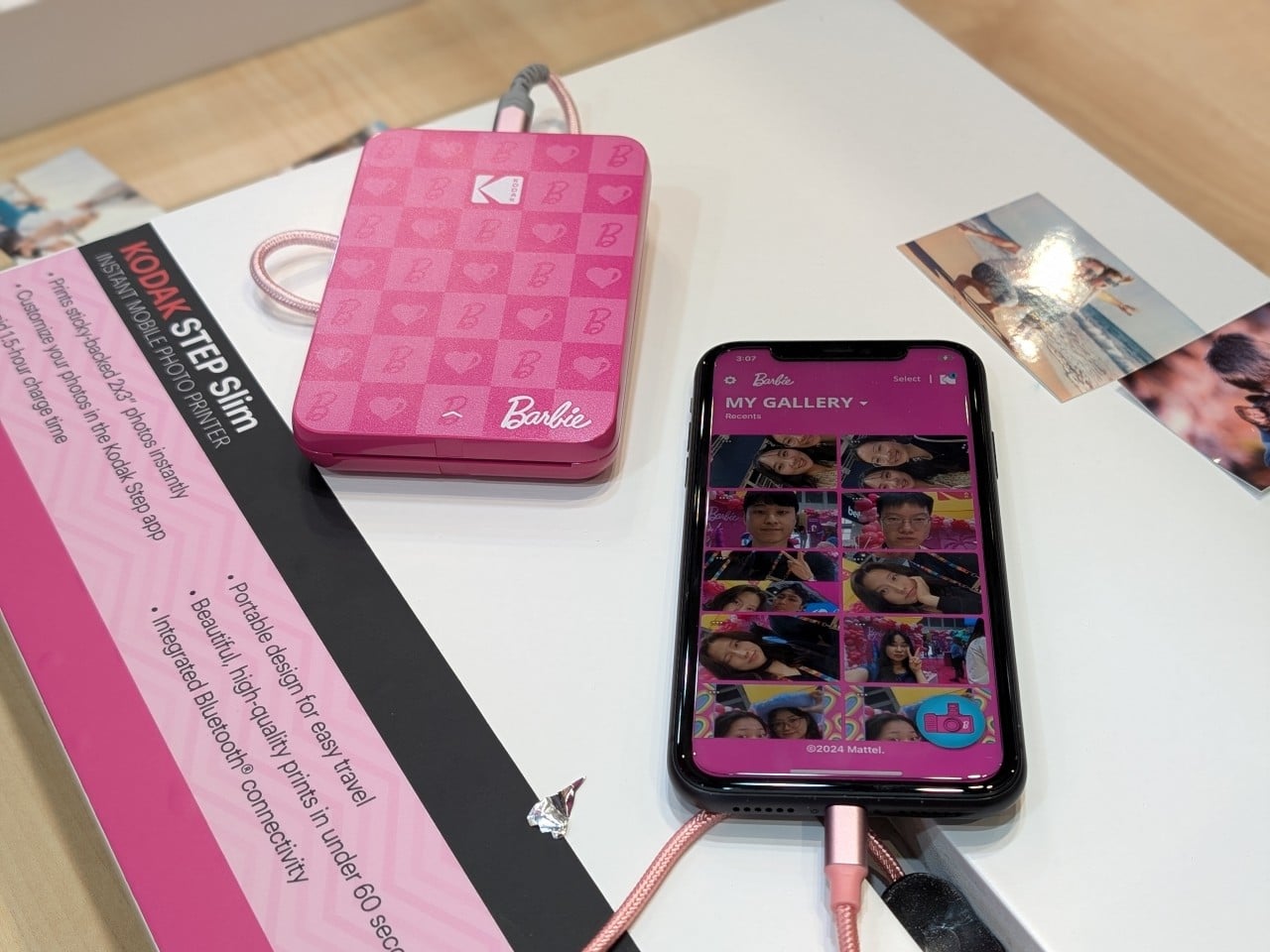
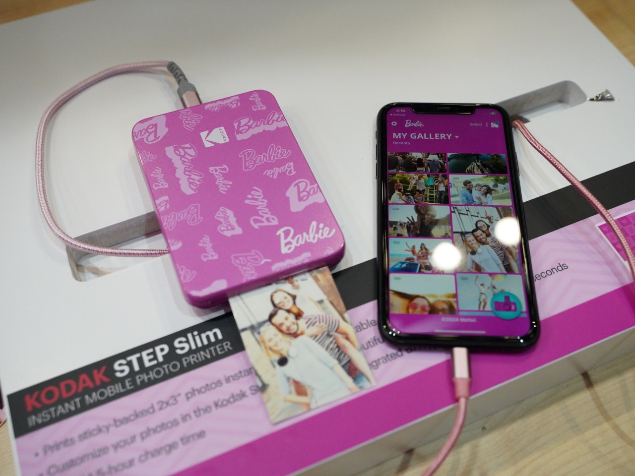
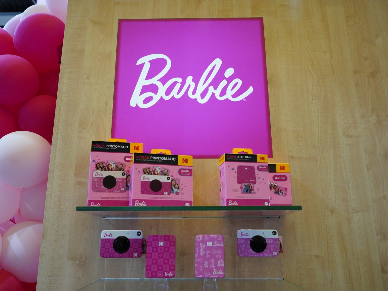
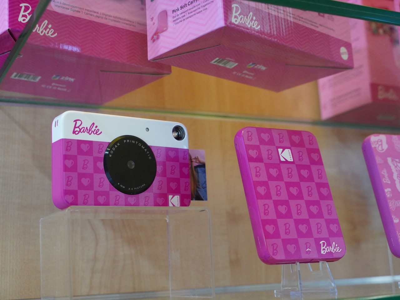
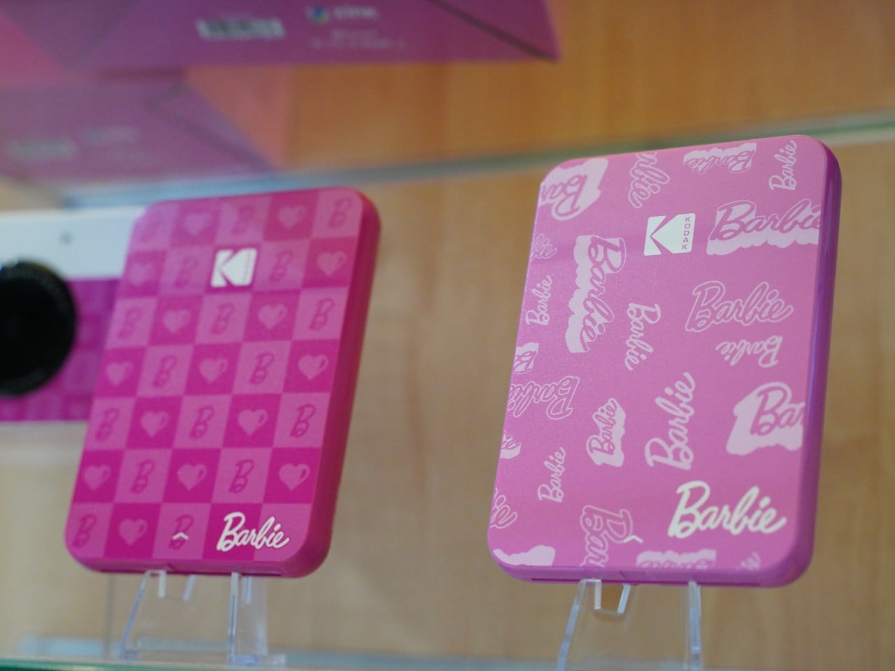
Although it was never really gone, the Barbie franchise recently got a resurgence of popularity thanks to a fun yet odd live-action film. The toy has changed dramatically over the decades, but what has always stayed the same is its spirit of fun, whimsy, and connecting with loved ones. Oh, and the overabundance of the hot pink color. Just in time for the Barbielicious renaissance, Kodak and Mattel have joined hands to create a special limited edition instant camera and photo printer that embody those qualities, encouraging people of all ages and genders to shoot and share those special moments with big smiles and very pink accessories.
Instant cameras in the vein of the iconic Polaroid have very limited uses and printouts, but it’s that scarcity and rarity that have actually endeared these products to people, including the younger generation who may be hearing about the idea for the first time. There’s just something exciting about the thought of pressing a shutter button and instantly printing out a photo that you can share or treasure, knowing that that exact moment and that exact photo will never happen again. There’s a huge market for this retro camera design, and what can be more retro and more fun at the same time than Barbie?
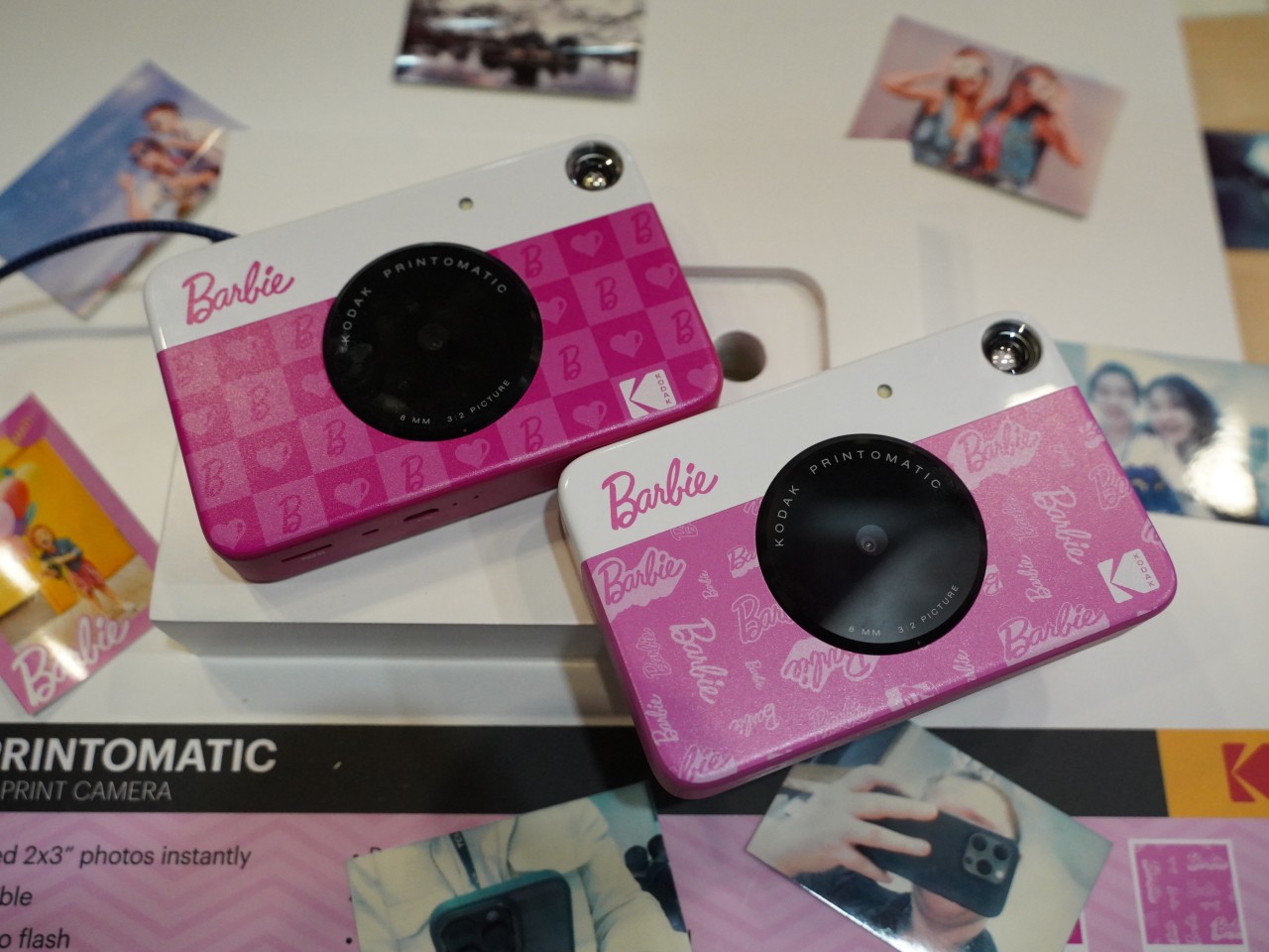
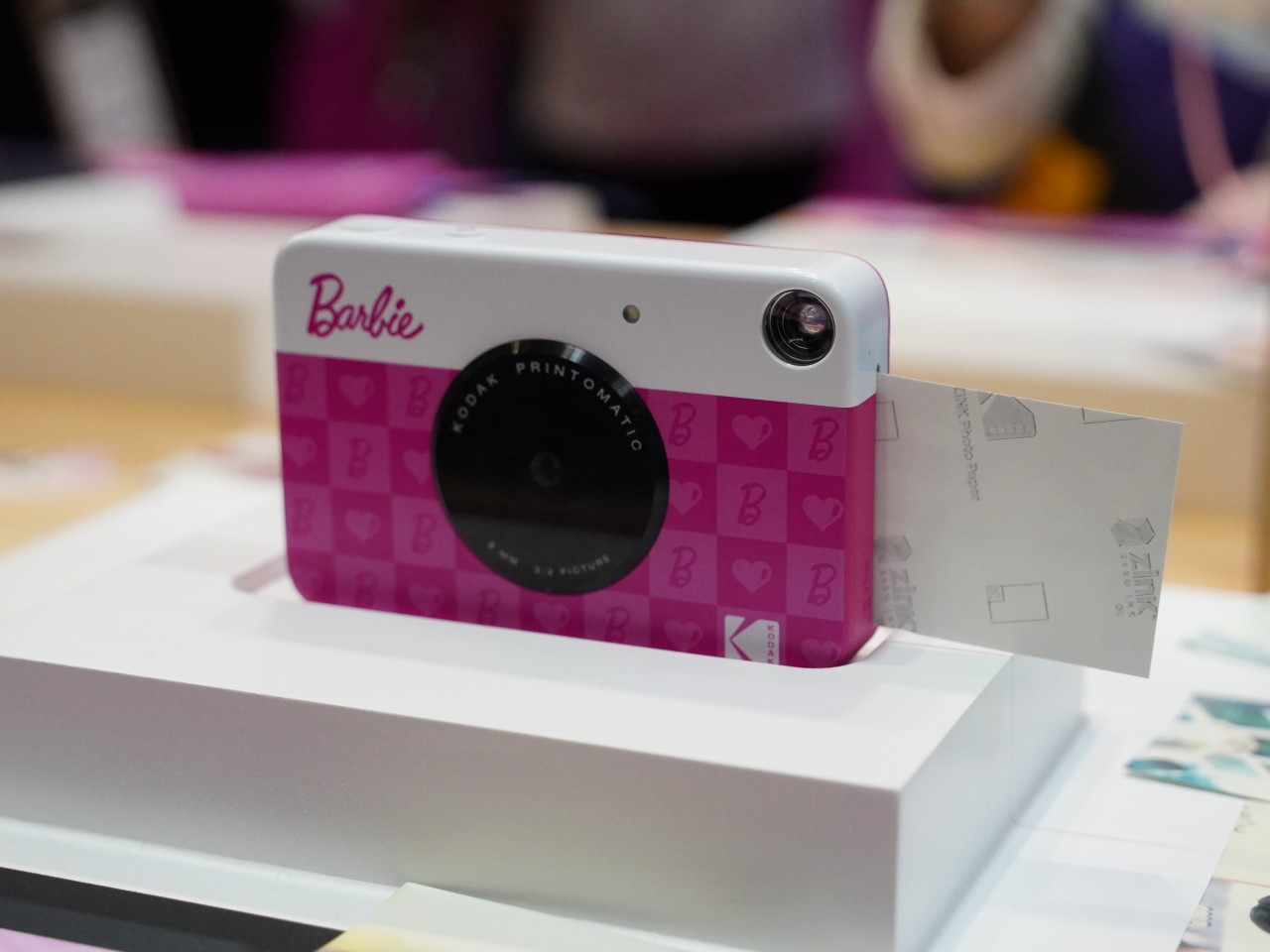
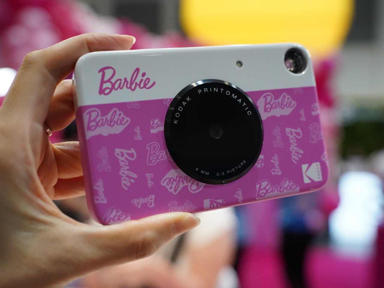
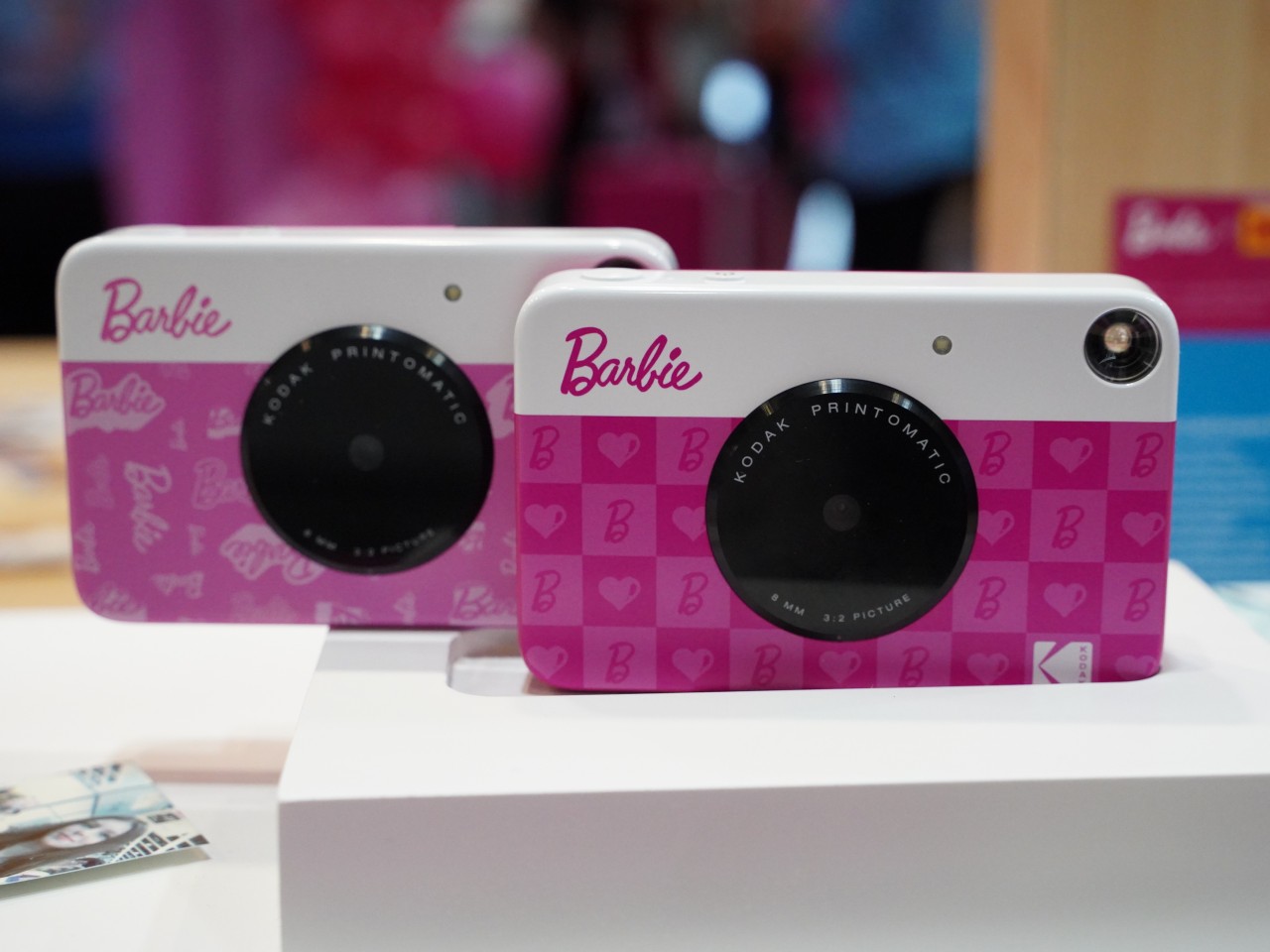
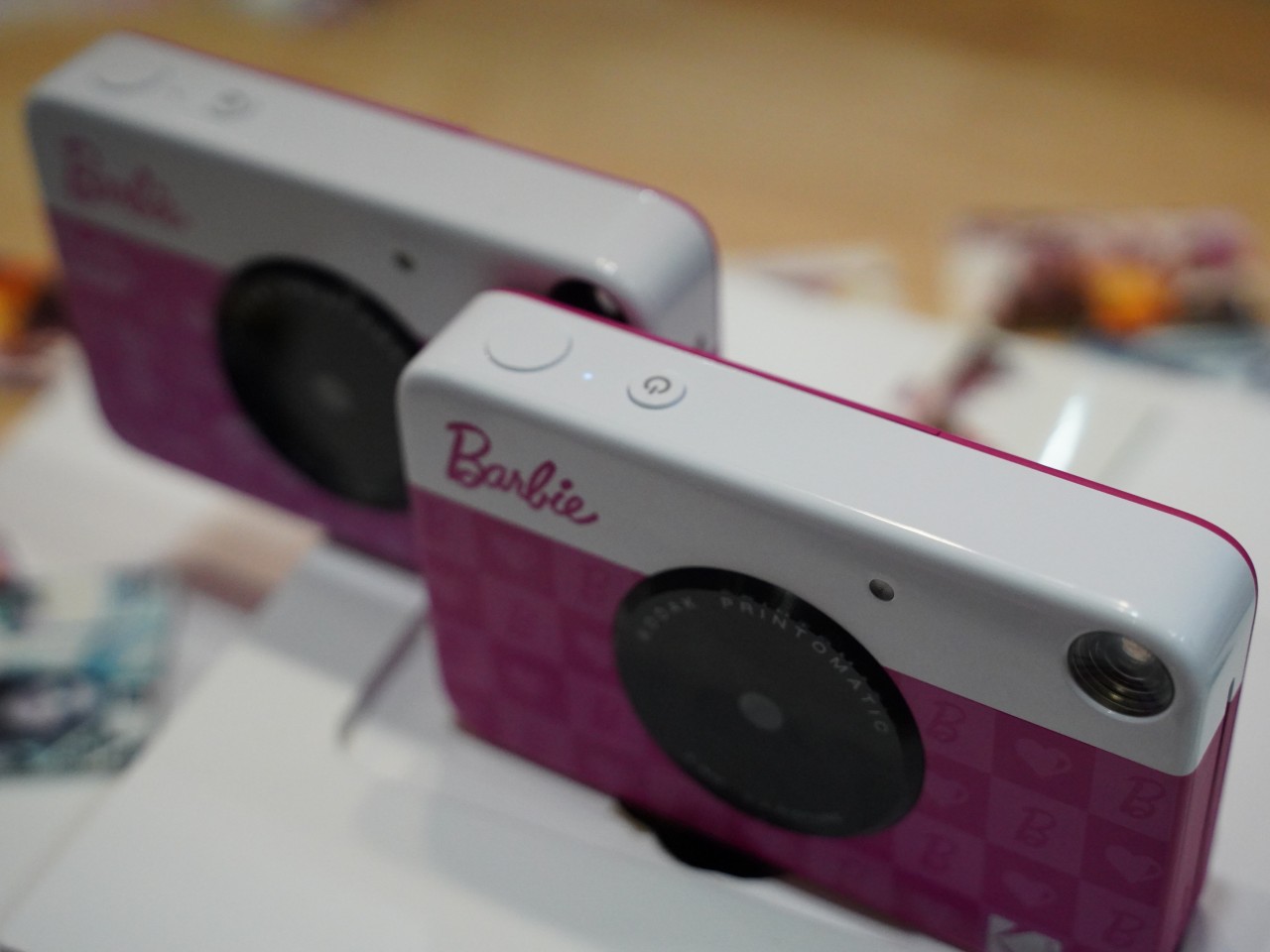
The KODAK Printomatic Barbie Edition pours a splash of pink on the instant camera and scribbles the iconic toy line’s name all over the surface. The instant camera uses ZINK technology to print out those lively colors without the dangers of spilling ink in your bag or even your pocket. The 5MP sensor, while sounding like a bummer, lets you also have a retro-quality photo that you can save on a microSD card for future viewing or, better yet, reprinting.
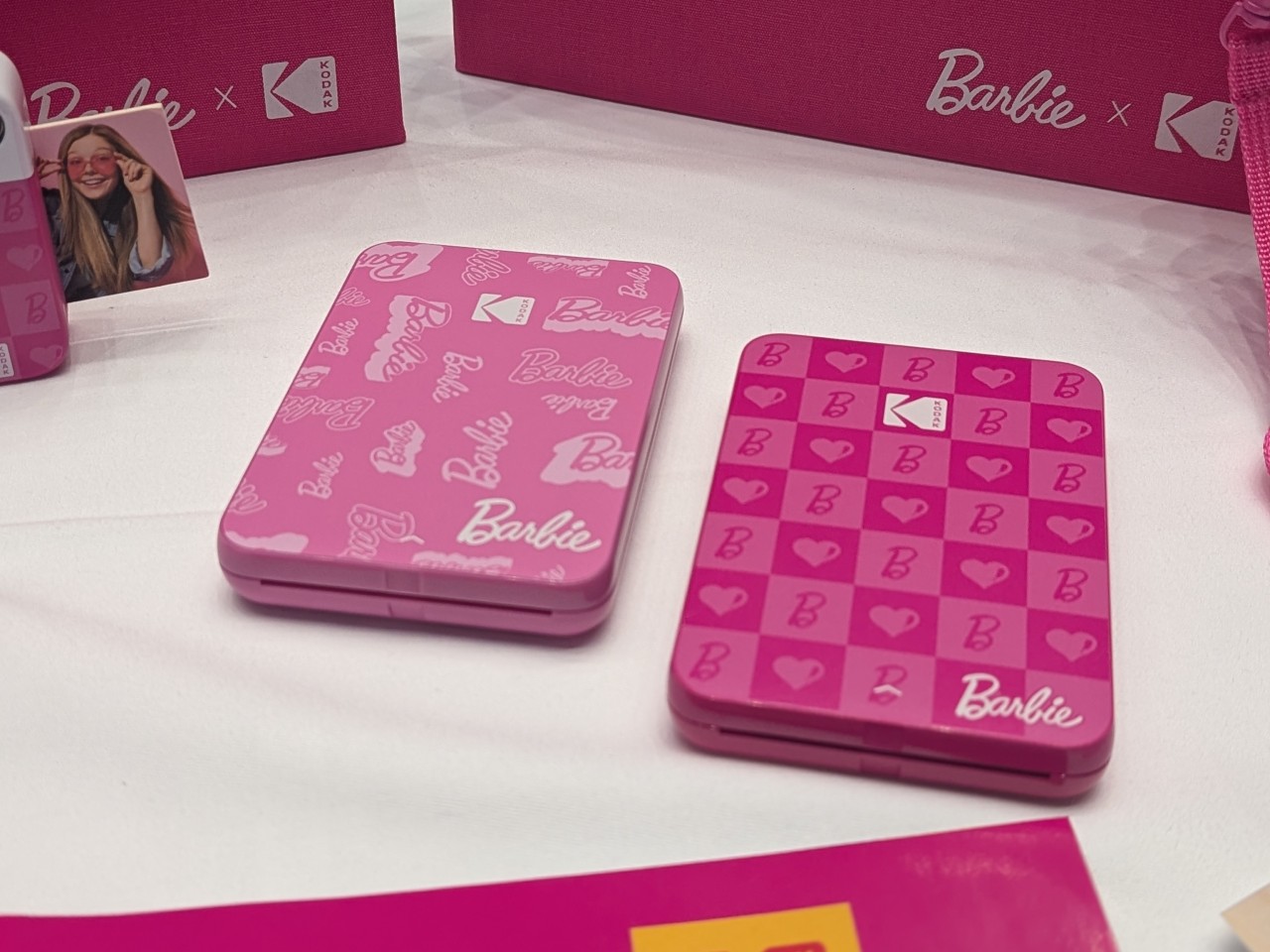
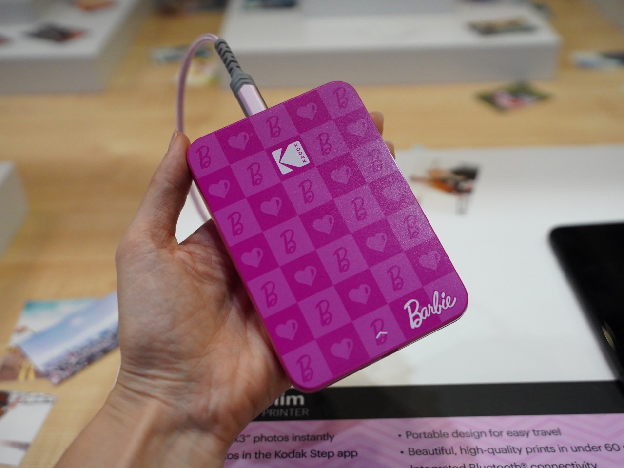
Yes, it might feel like a bit of a cop-out, but you don’t have to sacrifice versatility just to get that nostalgic photography experience, at least not if you also grab the Barbie-themed KODAK STEP Slim Instant Photo Printer. Connected to a smartphone, you can easily print images on that same 2×3 inch instant photo paper format, from the photos you took using your smartphone, to photos you save from the Kodak Printomatic Barbie Edition camera as well. It’s the best of all worlds, allowing you to experience the instant joy of printing photos while still leaving the option to share that over and over again.
The Kodak x Mattel collab is a fun nod to the iconic Barbie brand and could give fans and collectors alike something to vie for when the products do launch. Unfortunately, availability details have yet to be disclosed, but the windows of opportunity to launch Barbie-themed products, like the HMD Barbie phone, are getting smaller.
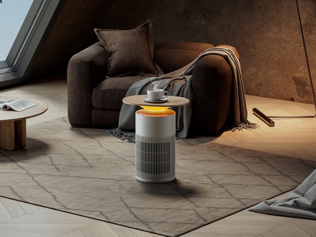
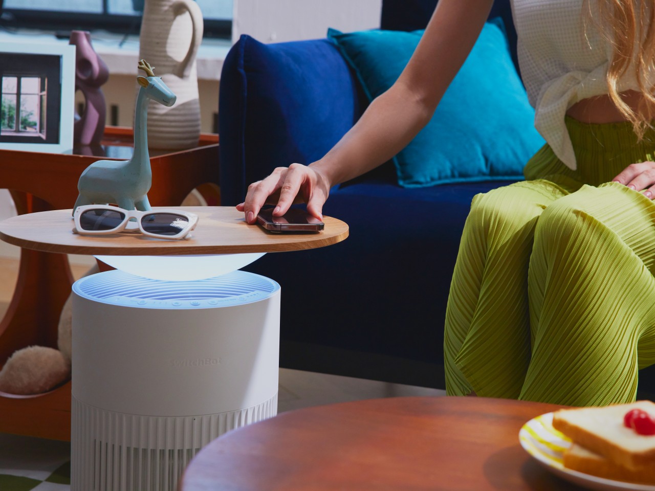
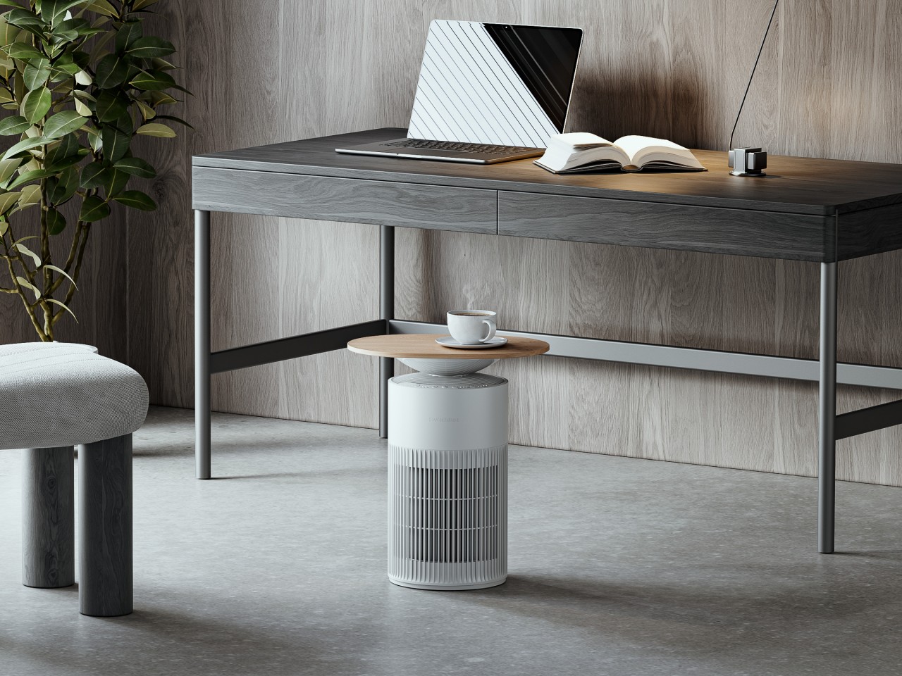
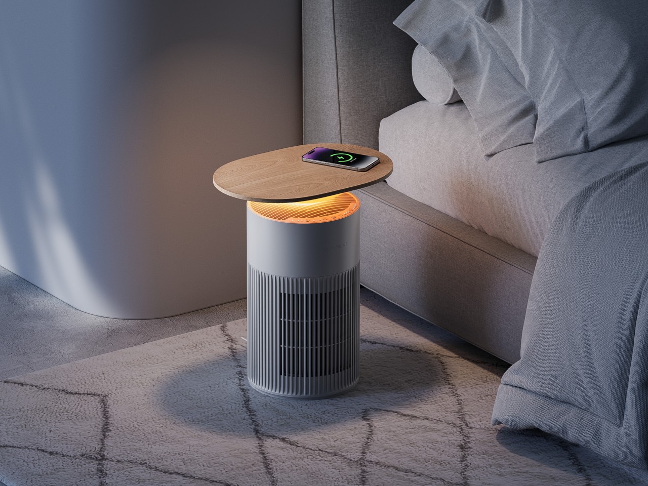
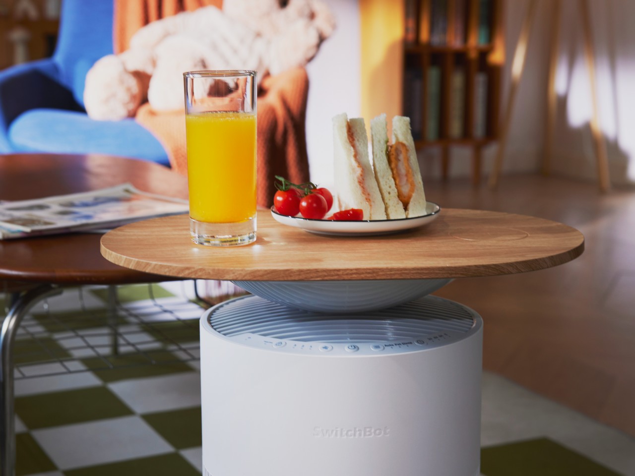
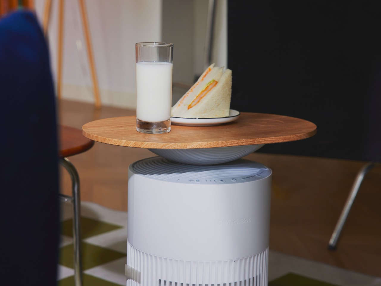
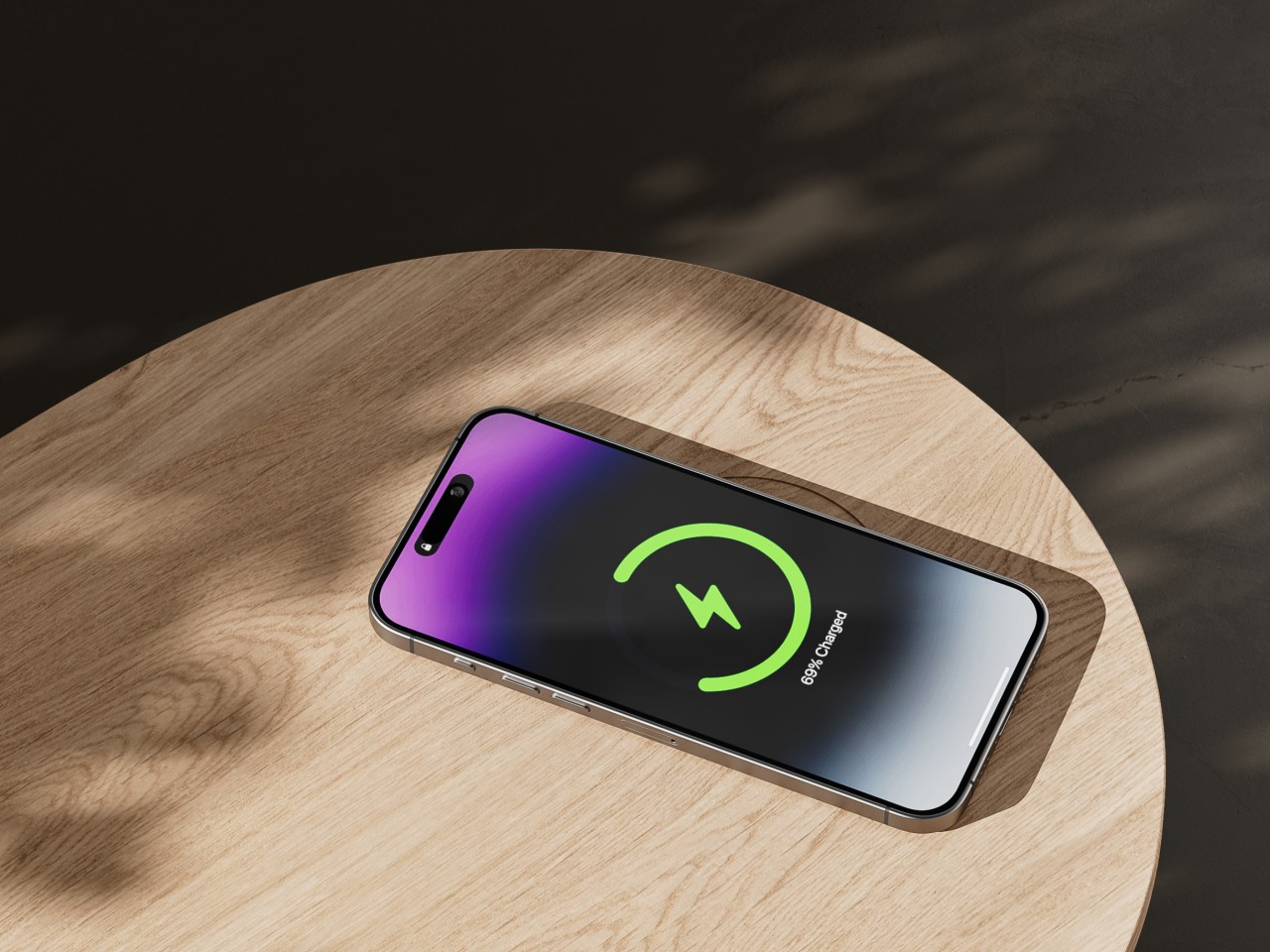
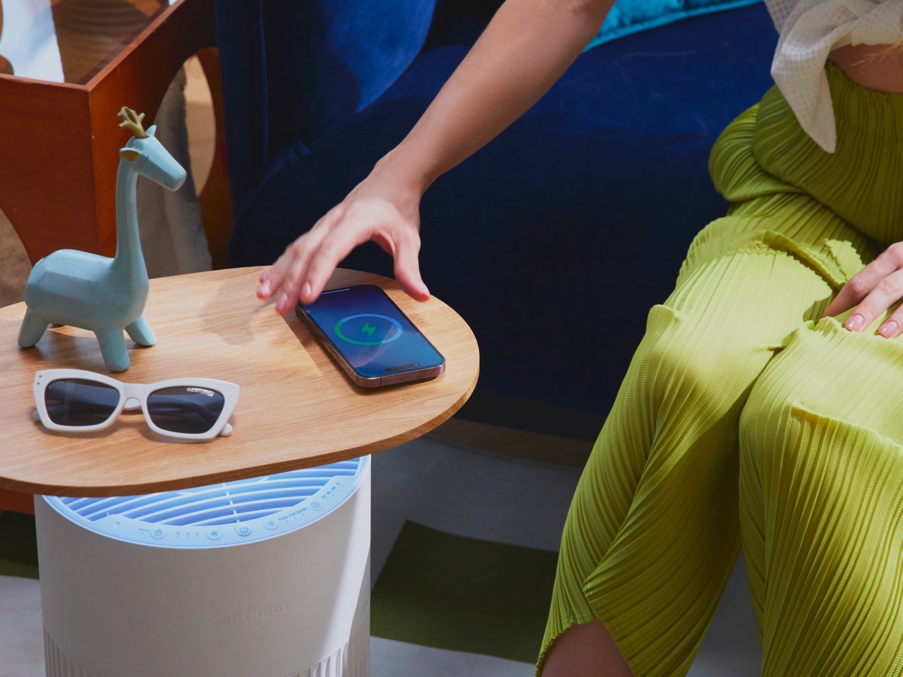
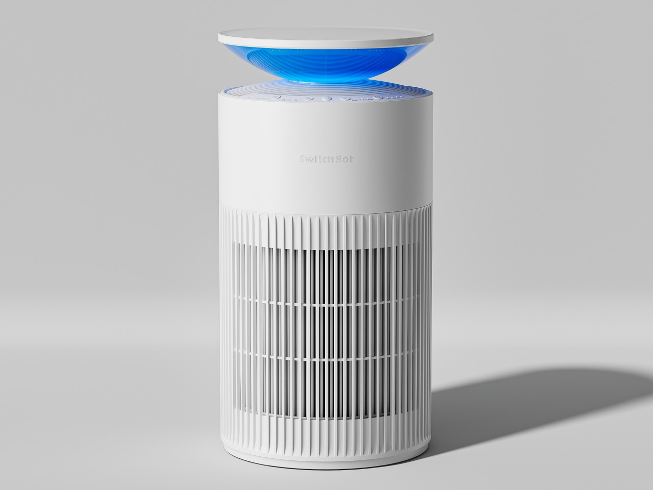
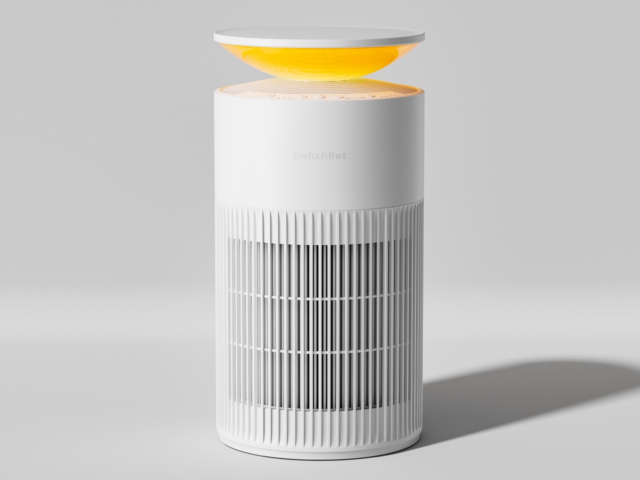
Air quality at home has become a key concern among homeowners in the past few years, finally raising awareness that the air we breathe indoors might be just as bad as the pollution-filed air outdoors. Pet owners have it especially bad, with fur and pet hair adding to their list of worries. While air purifiers are becoming more popular because of that situation, very few of them can be considered to have the same aesthetic maturity as more common appliances that have been around for decades. Many are not only uninspiring but also take up space that could have been otherwise given to more functional and appealing furniture. Venturing into the home appliances market, SwitchBot is launching an air purifier that looks a tad more interesting and definitely more useful thanks to its multi-functional design, doubling as a table you can also use as a phone charger.
Many air purifier take on a cylindrical shape that maximizes air intake and output, but that means putting their less than attractive bodies in the middle of spaces where they stick out like a sore thumb. The new SwitchBot Air Purifier Table admittedly does have that cannister design, but it takes steps to set itself apart from the crowd and elevate your living space as well.
In addition to its minimalist style, this air purifier puts a flat oval on top that can be used as a table to hold your things while you sit back and relax for a bit. The wood-like finish gives it a bit of visual flair and helps make it match the other furniture in your living area or bedroom. It also encourages you to put the air purifier in places that get a lot of human presence, usually beside couches or beds or maybe even in the middle of the room, allowing it to have a better impact on the quality of the air people breathe.
Its “extra” functionality doesn’t stop there, however. That tabletop is also a wireless charger, supporting 15W charging for Android devices and 7.5W for iPhones. Simply place your phone there and let it charge while you read, watch, or just chill with friends. The Air Purifier Table has configurable lighting between the air purifier itself and the tabletop, allowing you to set the mood you want or be informed when the air quality in its immediate vicinity worsens.
Of course, the SwitchBot Air Purifier Table is an air purifier, first and foremost, and it boasts plenty of street cred for that. It’s also pretty proud of its ability to remove pet hair and prevent it from contaminating the air that humans breathe, all without stressing out the pet in the process. The SwitchBot Air Purifier Table, available now for pre-order, will set you back $269.99, but there’s also a simpler $219.99 version that trades the wireless charging table top for a smaller bowl-like structure that cats might love to sit on.