The images from the pandemic were hard to forget. Surgical masks tangled in mangroves, disposable gloves floating past fishing boats, lateral flow tests piling into landfills at a scale nobody had anticipated or planned for. At its peak, an estimated 129 billion face masks and 65 billion gloves were being consumed every single month worldwide, and more than 140 million COVID-19 test kits generated around 731,000 litres of chemical waste alone. The pandemic did not create the disposable medical plastic problem; it simply made it large enough, and visible enough, that ignoring it became harder to justify. Healthcare products had always been designed around urgency, accuracy, and immediate disposal. What the pandemic exposed was the full weight of that logic applied at planetary scale.
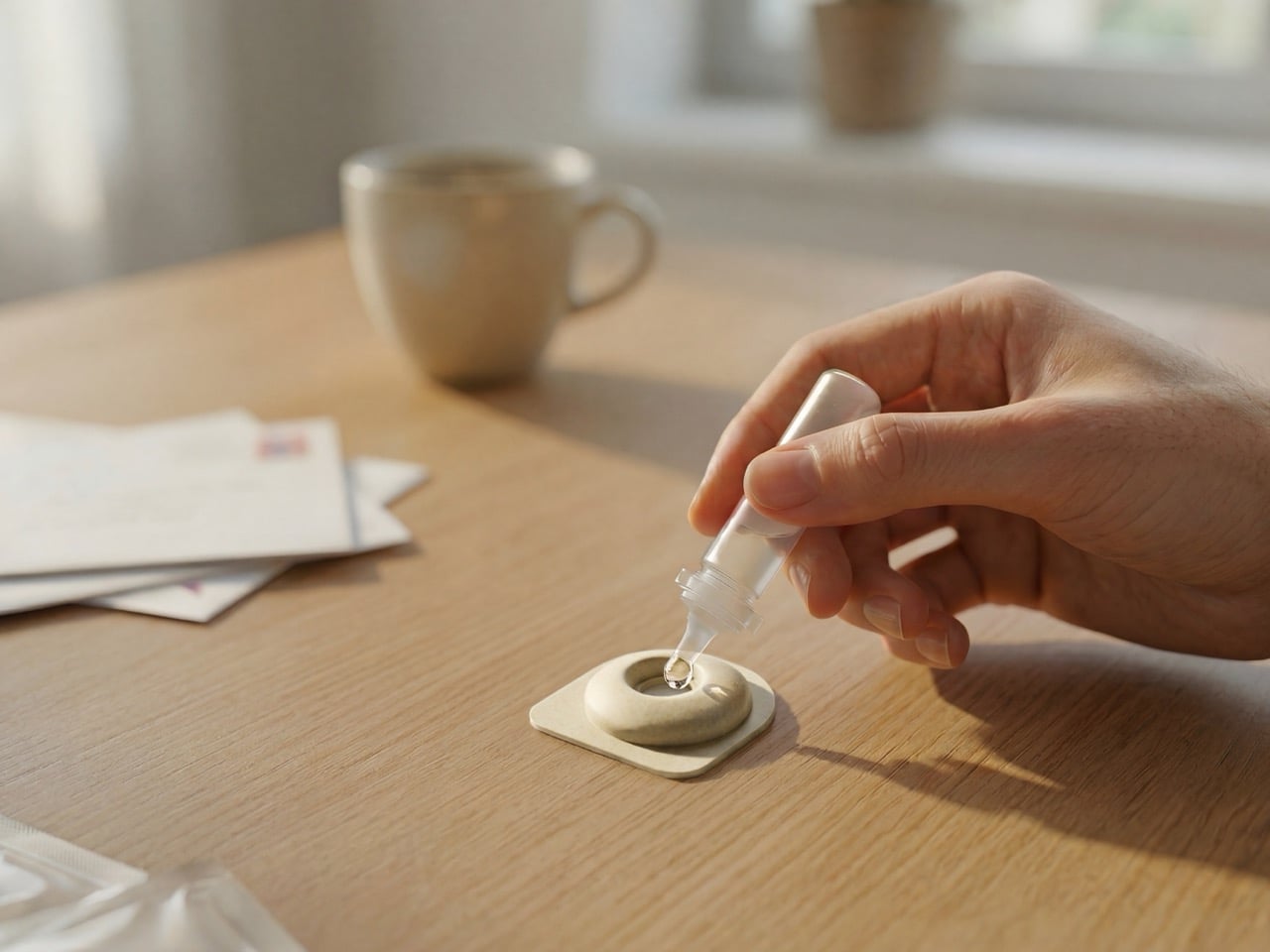
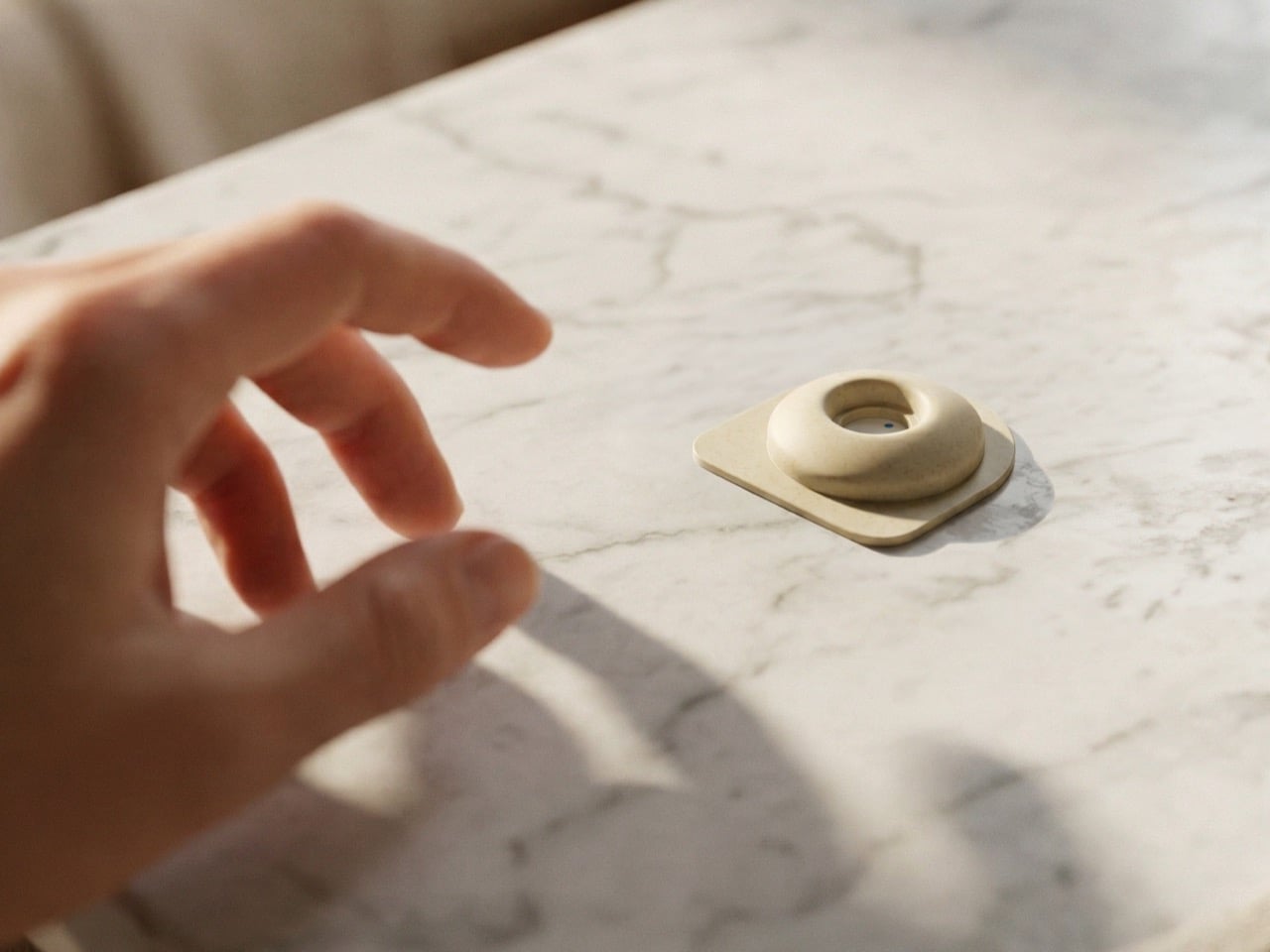
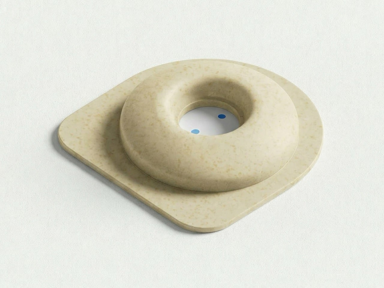
Created by Okos Diagnostics with industrial design by Luis Fernando Barrios, ‘Measuring the Invisible’ arrives at that problem from a direction with an unusual internal coherence. The project proposes a biodegradable rapid test concept for detecting microplastics in the human body – a zero-waste testing kit designed to detect the plastic waste in your body. Rather than treating sustainability as a coating applied after the product logic was already fixed, the material strategy and the diagnostic function are developed as a single integrated argument. Because everyone has microplastics in their body – but the Earth can’t take the load of everyone testing for microplastics only to dispose of used kits in the millions or billions.
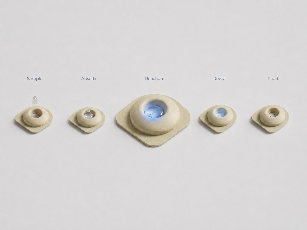
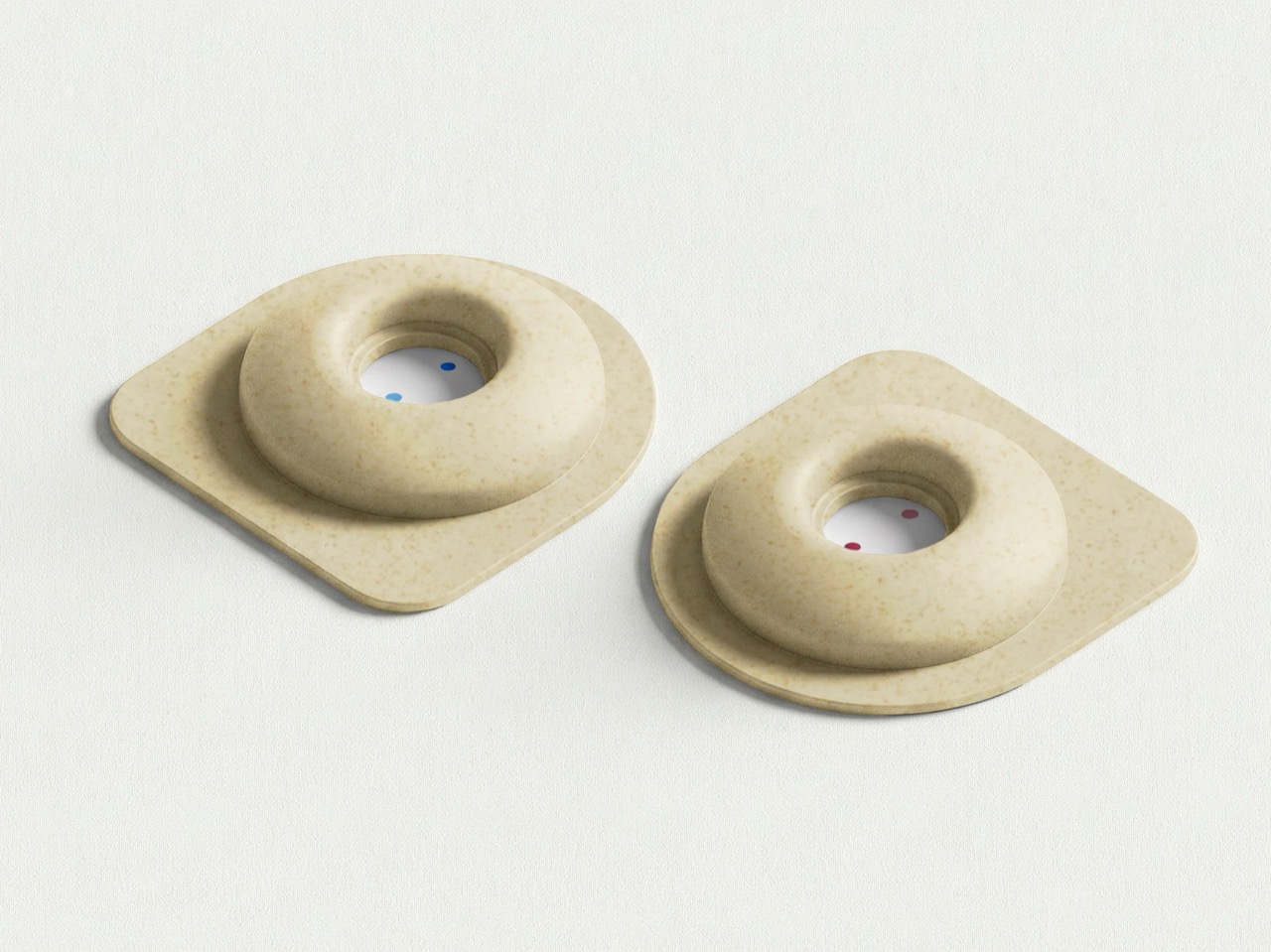
Measuring the Invisible uses a vertical-flow system where a biological sample interacts with a reactive surface, generating a chromatic response tied to the presence and concentration of specific microplastic particles. Rather than reading two lines, the user interprets a dot-based visual field where tone, saturation, and density do the interpretive work. Color intensity communicates contamination levels as gradients rather than binary outcomes, a visual language closer to environmental data than a clinical checklist. The 2020 James Dyson Award international winner, The Blue Box, enabled breast cancer home-testing through a urine sample; the 2025 shortlist featured Urify, a toilet-cleaning tablet that also screens for kidney disease. Measuring the Invisible occupies that same design space, applying the point-of-care impulse to a contamination problem nobody has yet brought home.
The housing uses Okos’ own biodegradable material formulations, with compatibility with existing molding infrastructure treated as a core constraint. That practicality separates the project from speculative material concepts that collapse at the production stage, unable to be processed without complete retooling. Visually, the design resists the earthy textures and performative naturalism common to sustainability-led objects, maintaining the clinical restraint of standard medical hardware. The biodegradable material sits beneath the surface, invisible in the same way microplastics are invisible, doing its work without announcing it. Whether Okos Diagnostics takes this from concept to validated clinical product depends on scientific and regulatory groundwork that renders cannot shortcut, but the design argument it makes is already worth the attention.
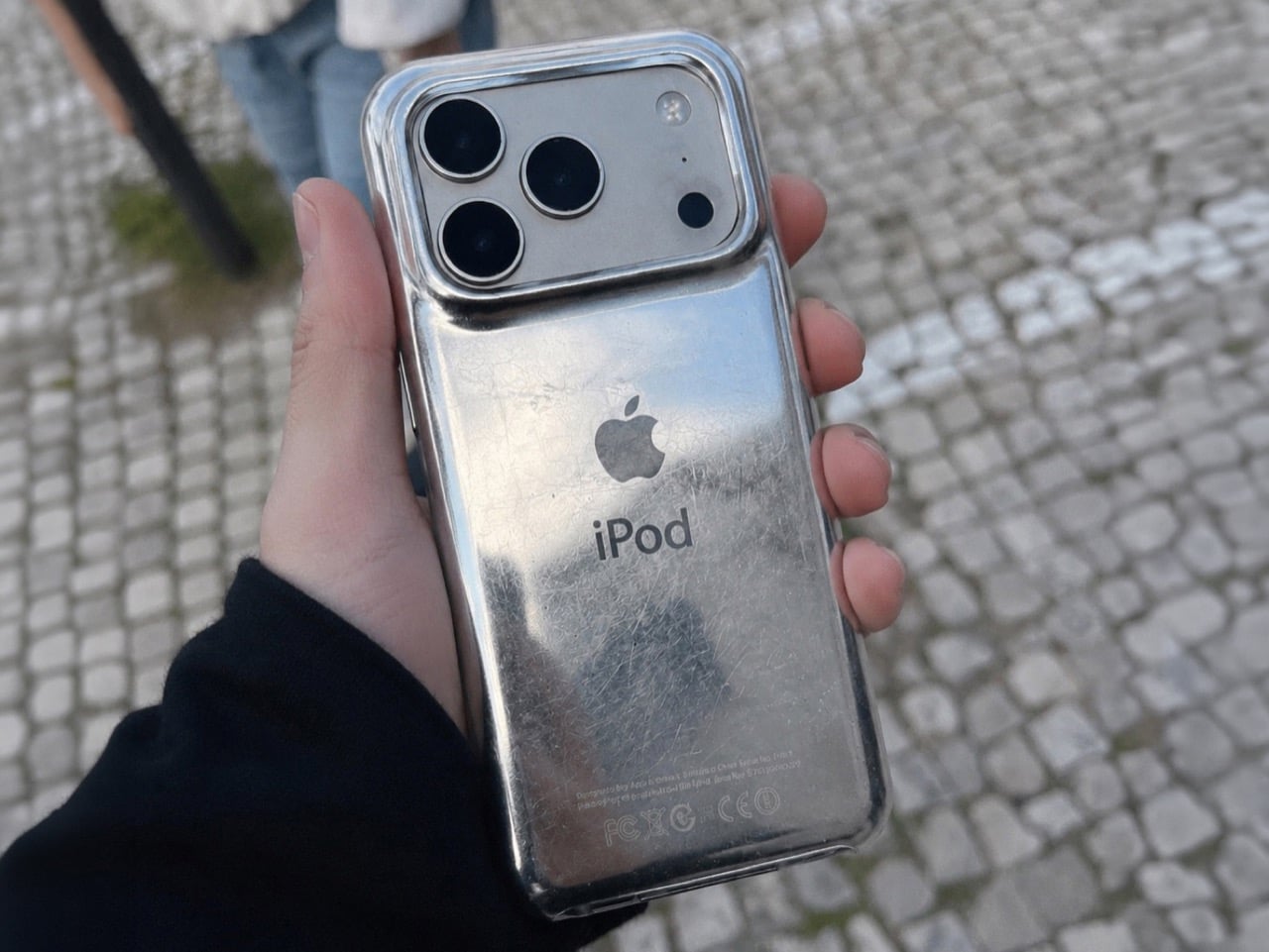
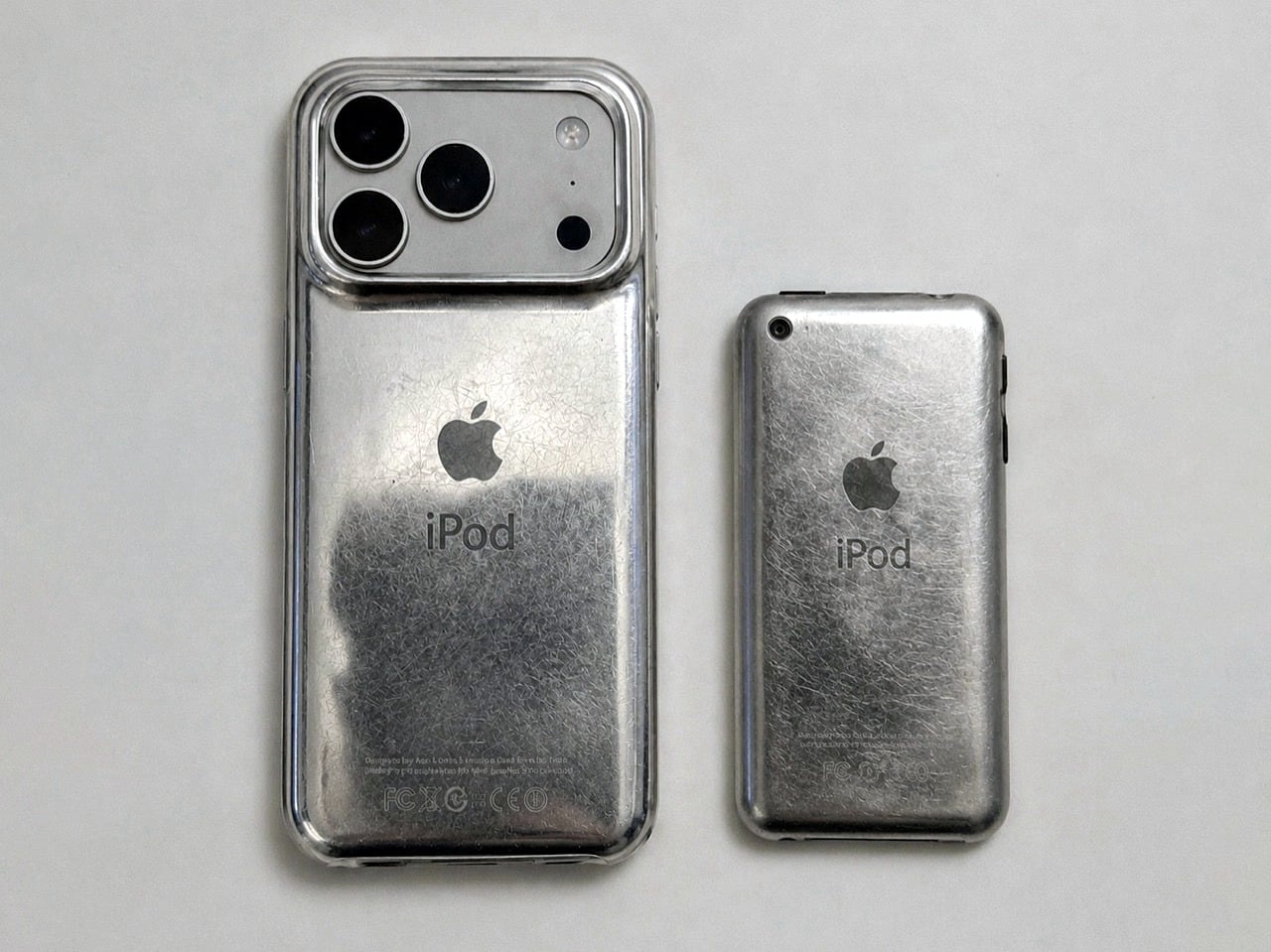
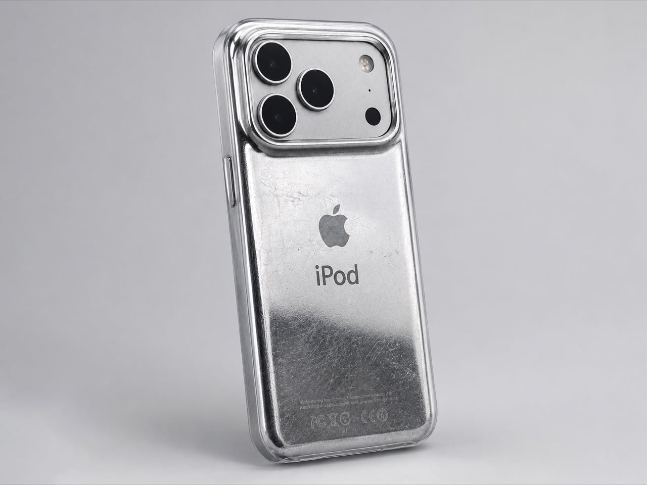
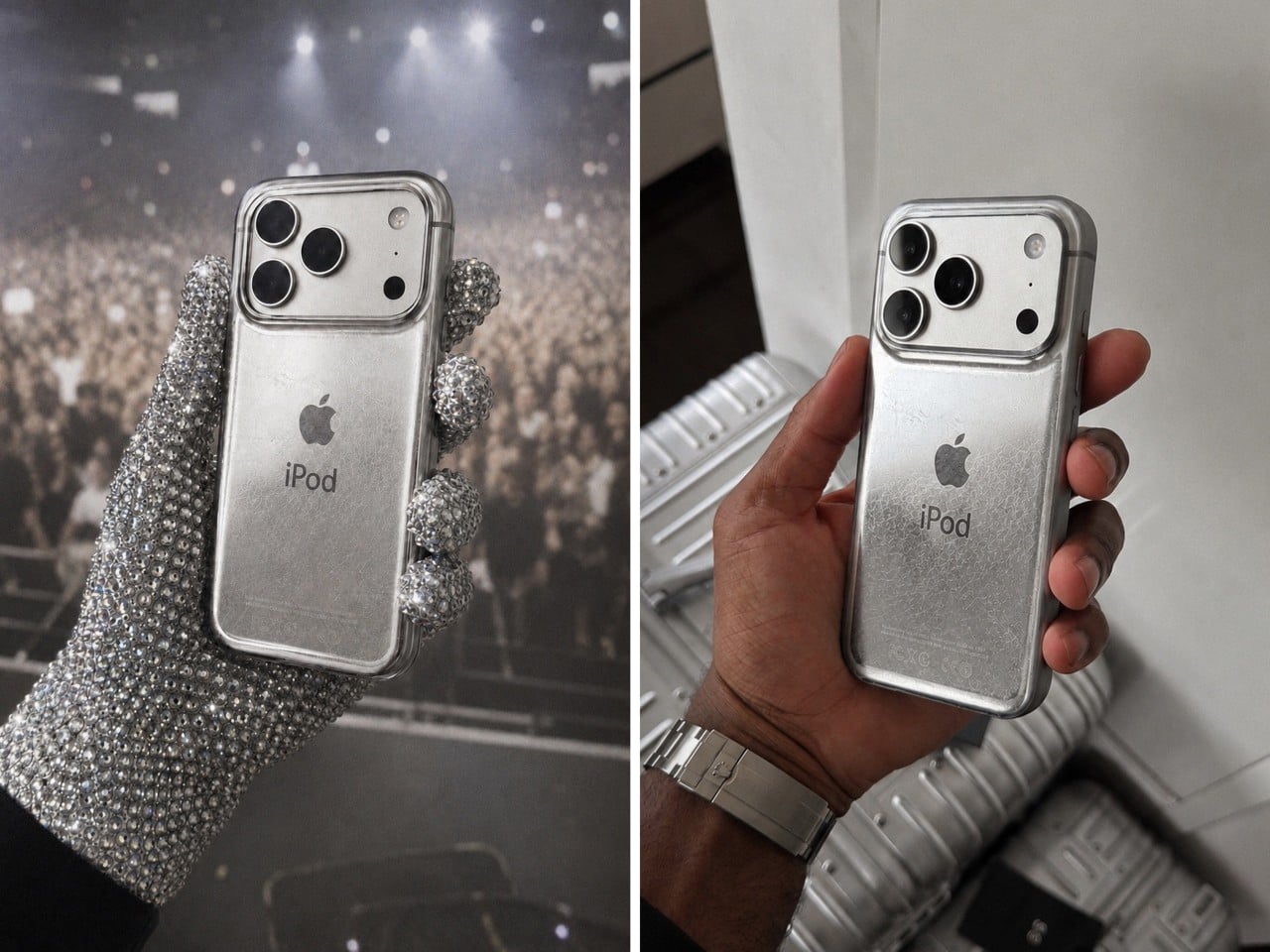
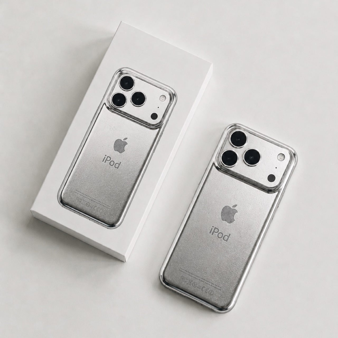
The original iPod (even the iPhone) was designed to scratch. Contrary to the idea of Steve Jobs and Jony Ive chasing perfection, the idea behind having an iPod that wears and tears with use was that A. it would be less of a hurdle to get you to upgrade, but also B. it would make each iPod uniquely different.
The term designers and craftspeople use to describe this phenomenon is ‘Patina’, it’s when iron rusts a certain way, when bronze oxidizes in a unique style, or when leather wears down in a distinct manner that’s unique to each individual product and how it’s used. The back of the iPod would scratch based on whether you’d keep it on tables or in pockets, whether your pocket had keys, whether you accidentally scuffed it against your belt buckle or the railing of a flight of stairs. That patina was ‘by design’, and even though the new iPhones don’t have that feature, David Delahunty designed a case that lets you relive exactly that.
Rather simply put the iPod Classic iPhone 17 Case, this distressed metal case was designed to fit around any iPhone 17 Pro or Pro Max, giving your phone the same grunge-ish vibe. It has the exact same curved body that the iPod Classic had, making the product feel almost identical to the original when held in your hand (bye bye sharp edges on the iPhone, you won’t be missed). The case sports the same artwork on the back too, with an iPod symbol and the Apple logo, along with even the certification text at the bottom… but what steals the show are the scratches.
Now it’s difficult to say if Delahunty designed each case to be unique, but that’s because these are just conceptual… for now. The designer, who goes by ‘delahuntagram’ on social media, churns out unique ideas of quirky products (like this MS paint makeup kit or this Apple Spinning Wheel Tennis Ball). Some products end up making it to reality, like the MacOS Folder SSD that is now available for sale. With enough interest, I don’t see how such a product couldn’t hit the mainstream. Delahunty even rendered an image of Drake (although I choose to see MJ) holding the phone in his hand while wearing those bejewelled gloves.
It isn’t the first time the iPhone’s been used as a canvas for Apple-of-the-past. Spigen routinely releases cases that transform the iPhone into Apple icons like the Lisa/Macintosh, or the iMac G3, or even the original iPhone 3G. The ‘scratched’ iPod is a fairly new design take, and something you could totally expect from the mind of Delahunty. I wonder if the case has a faux 3.5mm jack just for kicks…
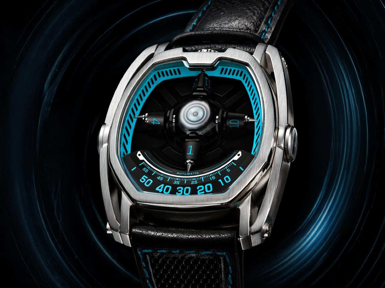
URWERK builds watches that cost as much as a compact car. The Geneva-based studio has spent decades engineering satellite hour complications, where orbiting arms carry hour numerals into position around a central axis, revealing the current hour as they complete their circuit. It is horological theater at its most sophisticated, with collectors typically paying between $30,000 and $100,000 depending on the configuration. The wandering hour concept itself dates to 17th-century pocket watches, but URWERK transformed it into an entire brand identity that has spent the better part of three decades sitting behind a velvet rope. The visual language of satellite hours has remained firmly in luxury territory for nearly all of that time.
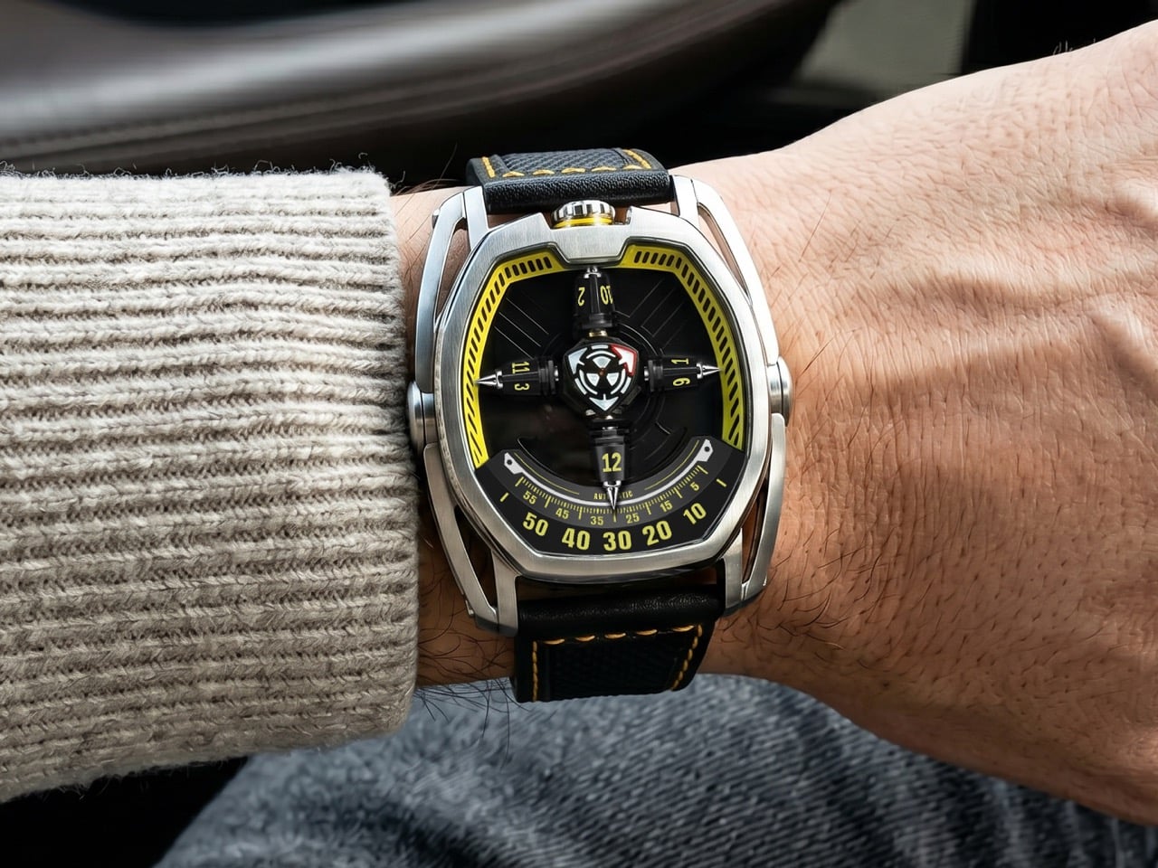
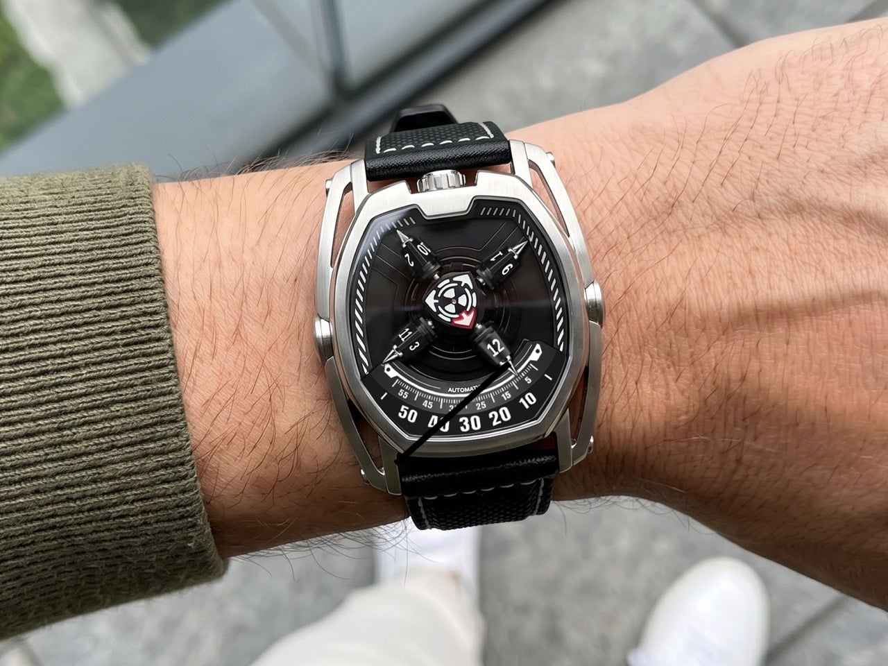
Mitico, a Hong Kong-based brand, just launched the PhantomX on Kickstarter at $399. It runs a four-arm satellite wandering hour system over a Miyota 9039 automatic, wrapped in a stainless tonneau case with a 3D star wheel mechanism that reveals only the current hour at any given moment. The campaign cleared 1,400% of its funding goal within days of going live. Something is clearly happening in independent horology right now, and the PhantomX is one of the most direct examples yet of the satellite hour complication finally escaping the velvet ropes. The gap between ambition and accessibility, in this category, is narrowing fast.
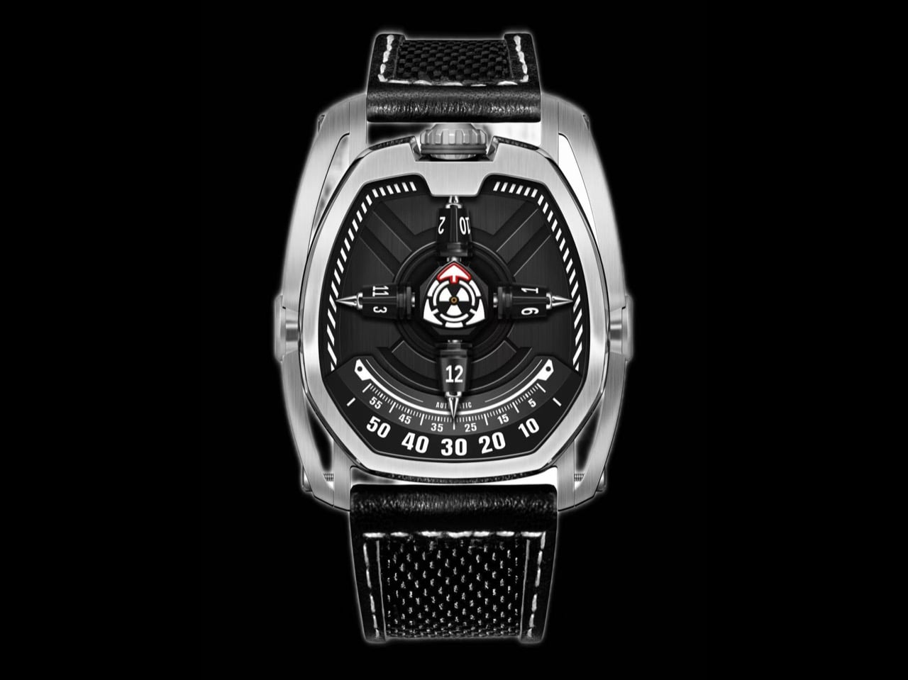
The wandering hour format has existed in some form since the 17th century, and Mitico’s interpretation adds a structural layer that separates the PhantomX from the current wave of indie satellite designs. Four arms orbit continuously around a central axis, each carrying three hour numerals on a sculpted 3D star wheel, with only the current hour numeral vertically aligned and fully visible at the dial center. Mitico calls this the “Only the Present Hour Revealed” concept, meaning the adjacent numerals stay tucked along the curved sides of the wheel, keeping the face uncluttered despite the mechanical complexity underneath. Time is read by finding the arm that has rotated into the central display position, then cross-referencing it against the clockwise 0-to-60 minute track. The result is a reading experience that demands a moment of engagement rather than a reflex glance.
A red triangular seconds hand sweeps steadily across the dial, acting as both a navigational beacon and a metronome for the entire orbital system. It gives the eye something to follow inside a display that is otherwise in constant, multidirectional motion, and the contrast between its singular sweep and the orbiting arms creates a layering effect that rewards watching rather than just checking. The dial center is sculpted with layered textures rather than left flat, adding mechanical depth that reveals itself at close range. Mitico applies high-intensity Swiss Super-LumiNova to the central time display, covering the rotating seconds, minute track, and hour indicators, for clear legibility in the dark. The upper inner dial ring gets standard-grade lume, providing a faint structural outline at night without competing with the primary display.
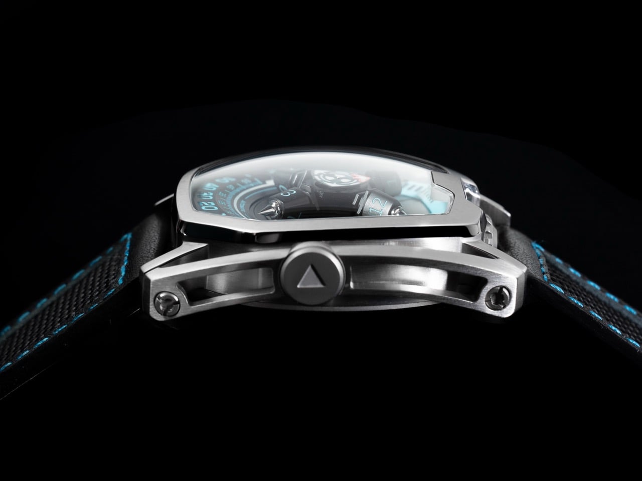
The tonneau-shaped stainless steel case measures 50.64mm wide by 43.32mm tall, with a case thickness of 15mm, dimensions that put this squarely in bold-statement territory. The skeletonized side architecture is machined to reduce visual bulk and overall weight while preserving structural rigidity, with every cutout doing double duty as both aesthetic element and structural support. Crown placement at 12 o’clock reduces wrist pressure during wear and allows more natural operation, one of those ergonomic decisions that sounds minor until you actually live with a conventionally crowned watch all day. A double anti-reflective sapphire crystal with a Mohs hardness of 9 sits over the dial, ensuring clarity from any angle. Water resistance is rated at 5 ATM.
The Miyota 9039 is a self-winding caliber running at 28,800 vibrations per hour with a 36-hour power reserve, and it is the right movement for a project at this price point. Miyota calibers in this family carry an established track record across the microbrand world, offering day-to-day reliability that lets a complex display module run on top without stress-testing the foundation. The 9039 carries no date complication, which is the correct call, because a date window would introduce visual noise into a dial already managing considerable simultaneous motion. Choosing a proven base over an untested proprietary caliber is the pragmatic engineering decision that separates a deliverable product from a concept. That the four-arm satellite module delivers stable, legible display on top of this foundation is the understated technical achievement at the center of the PhantomX.
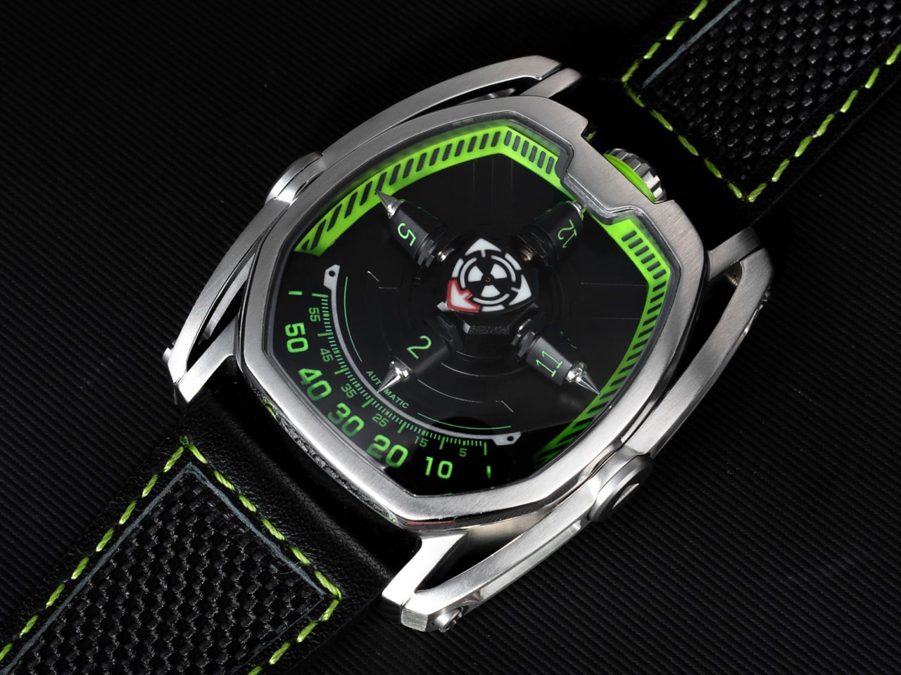
The PhantomX arrives in ten colorways: Phantom Black, Arctic White, Solar Yellow, Stellar Blue, Nebula Green, Mars Orange, Flare Red, Abyss Blue, Orbital Brown, and Nova Purple, each carrying matching strap stitching and crown accent treatment across the same stainless case and movement platform. The strap is a nylon and genuine leather hybrid fitted with quick-release spring bars, so swapping requires no tools. Mitico estimates shipping to backers in August 2026, with the campaign running through June 13. At $399, the PhantomX is making the satellite hour complication accessible at a price point that no established watchmaker has approached at this level of mechanical ambition.
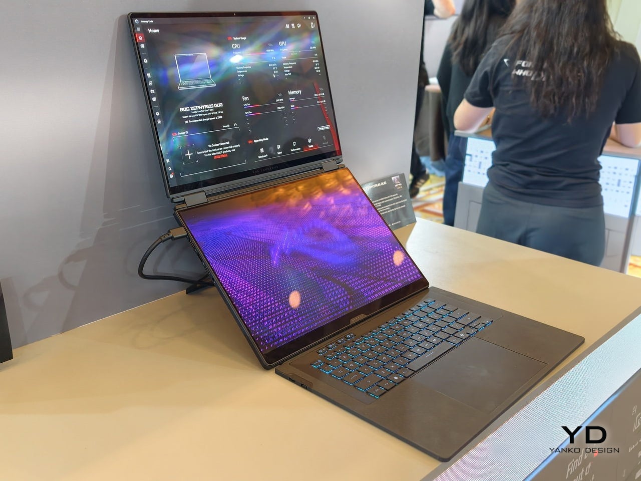
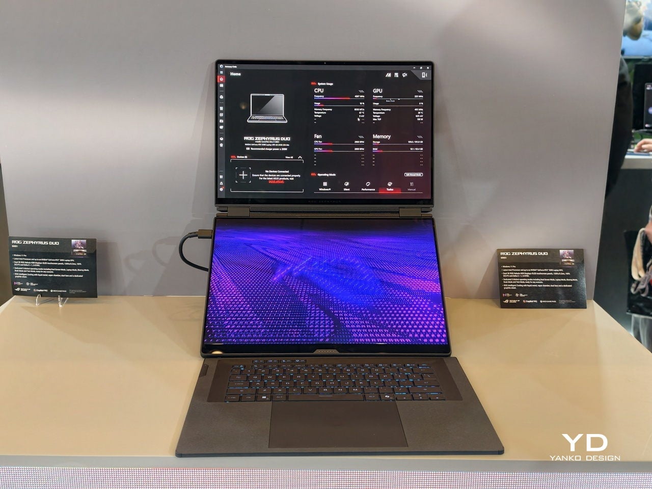
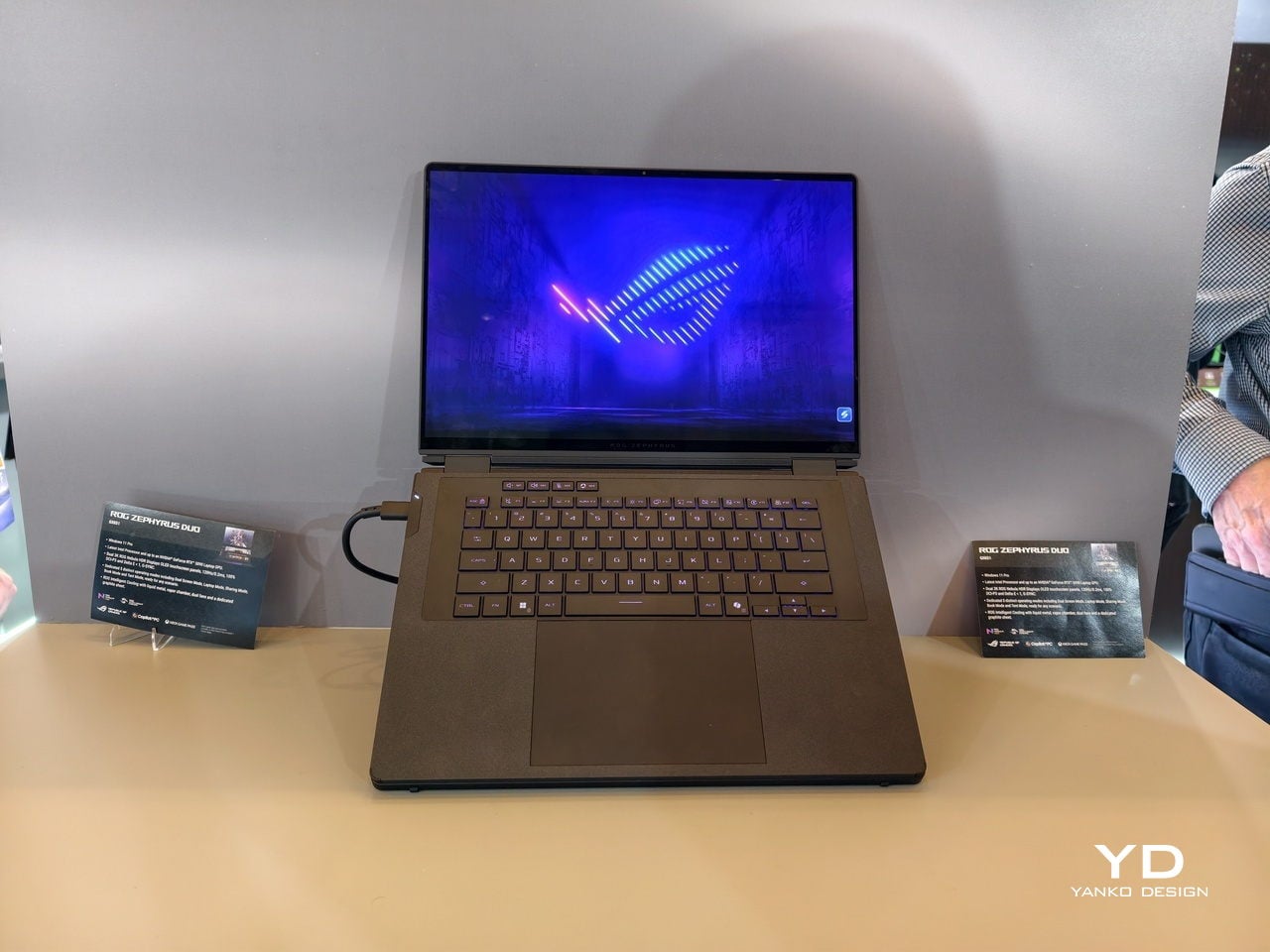
Dual-screen laptops have been ASUS’s long game. The Zenbook Duo spent several years proving that two displays could coexist for productivity users before the form factor felt genuinely mature. The ROG Zephyrus Duo carried that logic into gaming territory, though the 2022 original hedged its bets with a half-sized secondary panel perched above the keyboard. The 2026 GX651, which first appeared at CES earlier this year and got its US pricing confirmed at Computex this week, drops the hedge completely. Two full 16-inch OLED panels, same resolution, same refresh rate, same brightness ceiling.
The base configuration opens at $4,499, and the Computex backdrop gives that number useful framing. Nvidia and Microsoft were teasing ARM-based laptop chips a few booths over, and the rest of the gaming hall was running its annual RTX refresh cycle. None of that noise touched the Duo’s story, because its headline was a chassis decision rather than a silicon one. After six years and three generations, ASUS finally has a dual-screen gaming laptop that leads with the screens and lets everything else follow.
Brand: ASUS ROG
Matching the displays across both panels is the design decision that signals intent. Both screens deliver 3K resolution at 2880 x 1800 pixels, both run at 120Hz with variable refresh rate support, and both hit 1,100 nits peak brightness in HDR with full DCI-P3 color coverage. The top panel gets G-Sync compatibility because it handles gaming duties, but the bottom screen doesn’t get downgraded to compensate. Previous Zephyrus Duo models gave you a flagship display up top and a secondary utility screen below, a hierarchy that made sense when the bottom panel was physically smaller. The GX651 treats parity as the baseline, which changes the relationship between the two surfaces entirely. One screen runs your game, the other runs Discord, Spotify, streaming software, browser tabs, whatever parallel workflow gaming actually requires in 2026.
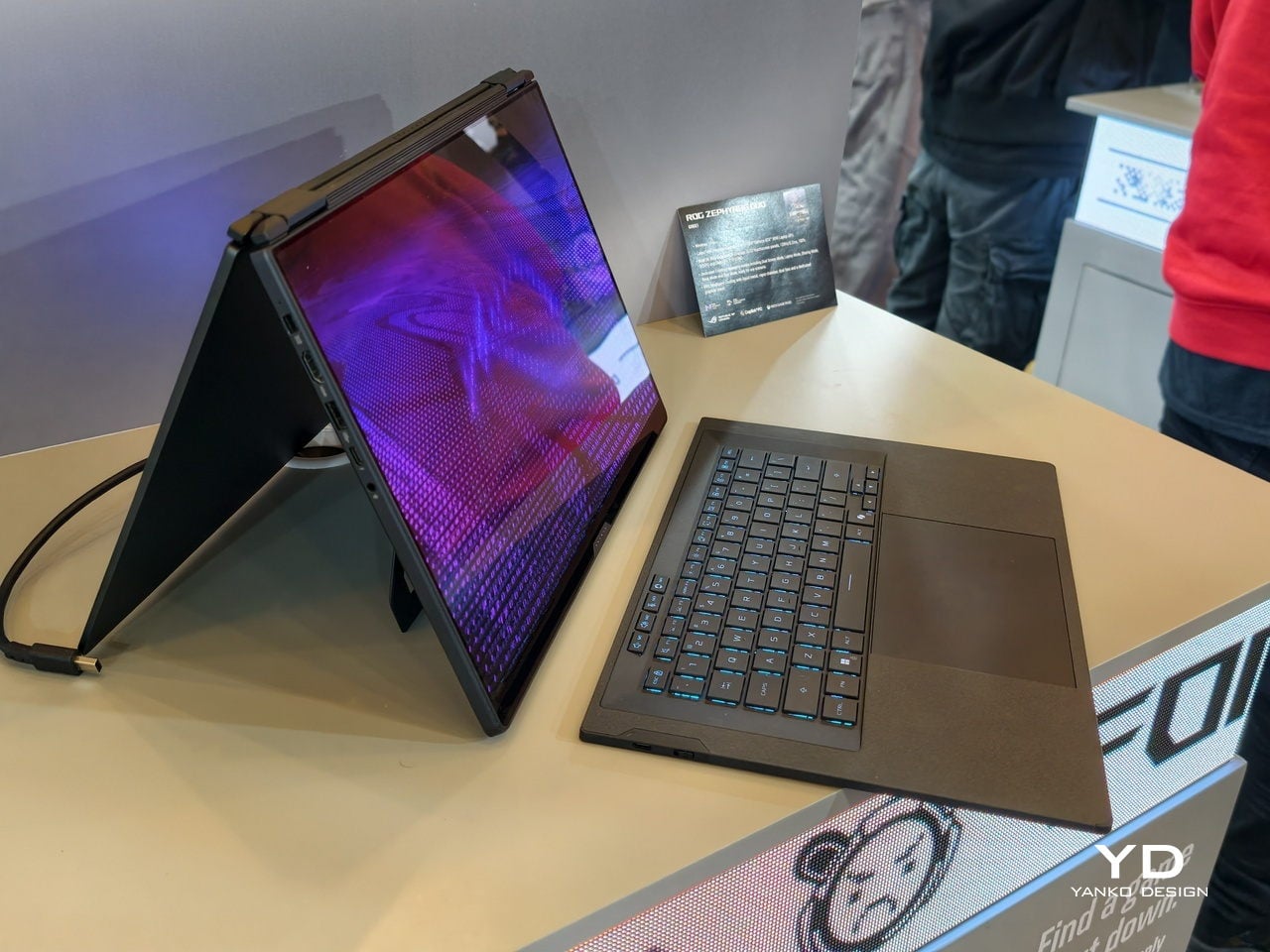
The keyboard detaches completely and connects over Bluetooth when separated from the chassis, continuing the design language ASUS refined with the Zenbook Duo line over the past few years. Magnets hold it in place when docked, covering the lower display for traditional laptop mode, but the machine was engineered to run with both screens exposed. Pull the keyboard free and set it wherever makes ergonomic sense, angled on a stand or flat on the desk beside the laptop itself. The trackpad lives on the keyboard folio, so input travel is part of the design assumption. ASUS isn’t treating detachment as a party trick or an edge case. The entire thermal layout, the hinge mechanism, and the port placement assume you will use this machine with the keyboard removed.
The silicon inside follows the screen-first brief rather than leading it. The base $4,499 configuration ships with an RTX 5070 Ti, while the top-end model pushes into RTX 5090 territory at a price ASUS hasn’t officially published yet but Gizmodo clocks at $5,500. Intel’s Panther Lake CPUs handle the processor side, with options ranging across the Core Ultra X series depending on configuration. All of that is competitive hardware in mid-2026 terms, but the specs themselves are table stakes. What matters is how ASUS packaged them. The cooling system has to manage thermals across a chassis that expects both displays to be running simultaneously under load, and the hinge assembly has to support the weight and structural integrity of two full glass OLED panels without compromising rigidity. Those are the engineering problems that define this product, and the GPU choice is downstream of solving them.
ASUS confirmed US availability at Computex after showing the hardware at CES in January, which means the company spent the better part of six months watching feedback, finalizing logistics, and preparing the supply chain for a machine that doesn’t fit neatly into any existing SKU category. At $4,499 the Zephyrus Duo GX651 costs meaningfully more than a conventional gaming laptop with identical silicon, and the delta is purely the dual-screen chassis. That premium is either justified or deal-breaking depending on whether you’ve spent the last several years wishing your gaming laptop had room for a second panel. ASUS is betting that enough buyers have been waiting for exactly this. Computex 2026 will be remembered for Nvidia’s ARM tease and the RTX 5090 mobile flood, but the Zephyrus Duo is the machine that asked a different question entirely and shipped with an answer.
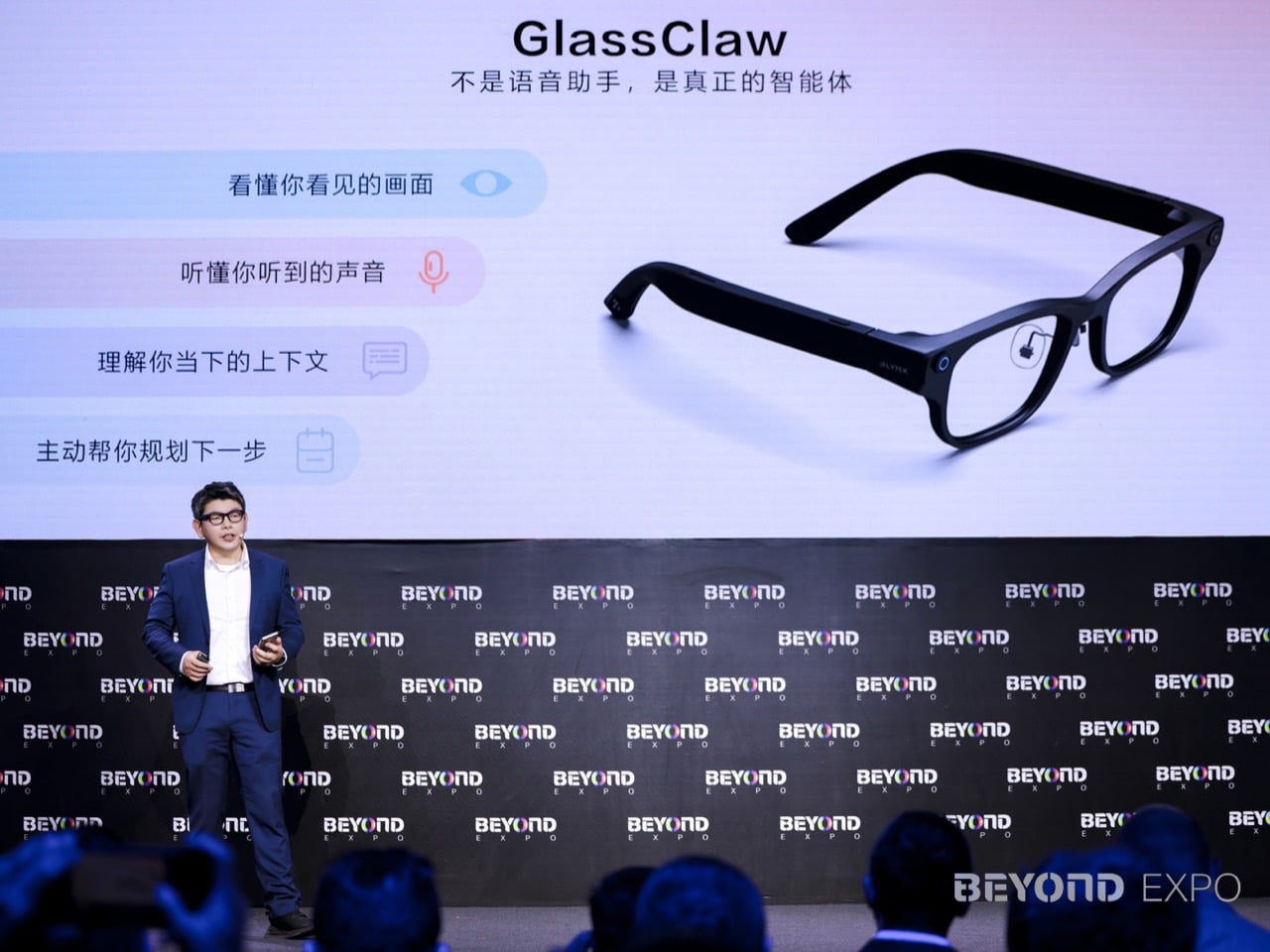
Beyond Expo 2026 arrived with a clear message for the tech world, AI has moved past the screen and into the objects people wear, hold, and live with every day. Our own preview of the show framed this year’s edition as a turning point, arguing that AI software was only the warm-up for what the industry was really building toward. The event ran from May 28 to 30 at The Venetian Cotai Expo in Macau, centered on the theme of AI moving from digital to physical. That theme played out across robotics, smart machines, wearable intelligence, and real-world utility products on the show floor. It set up exactly the kind of environment where a product built around ambient AI communication could land with real meaning.
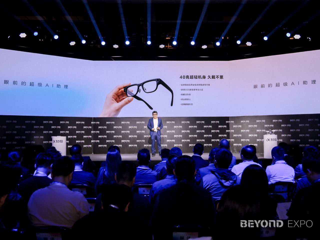
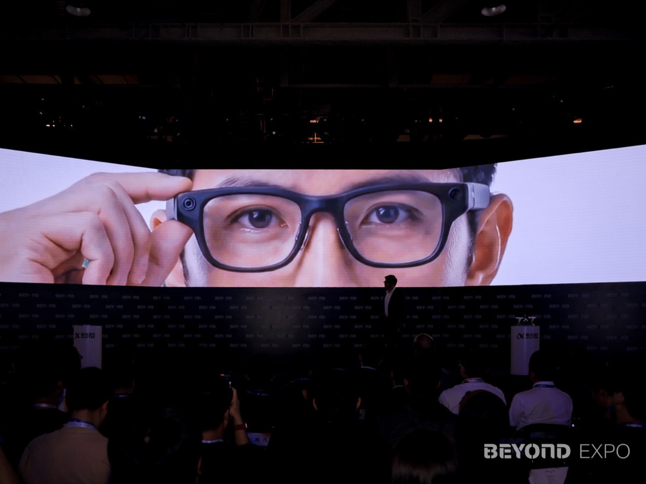
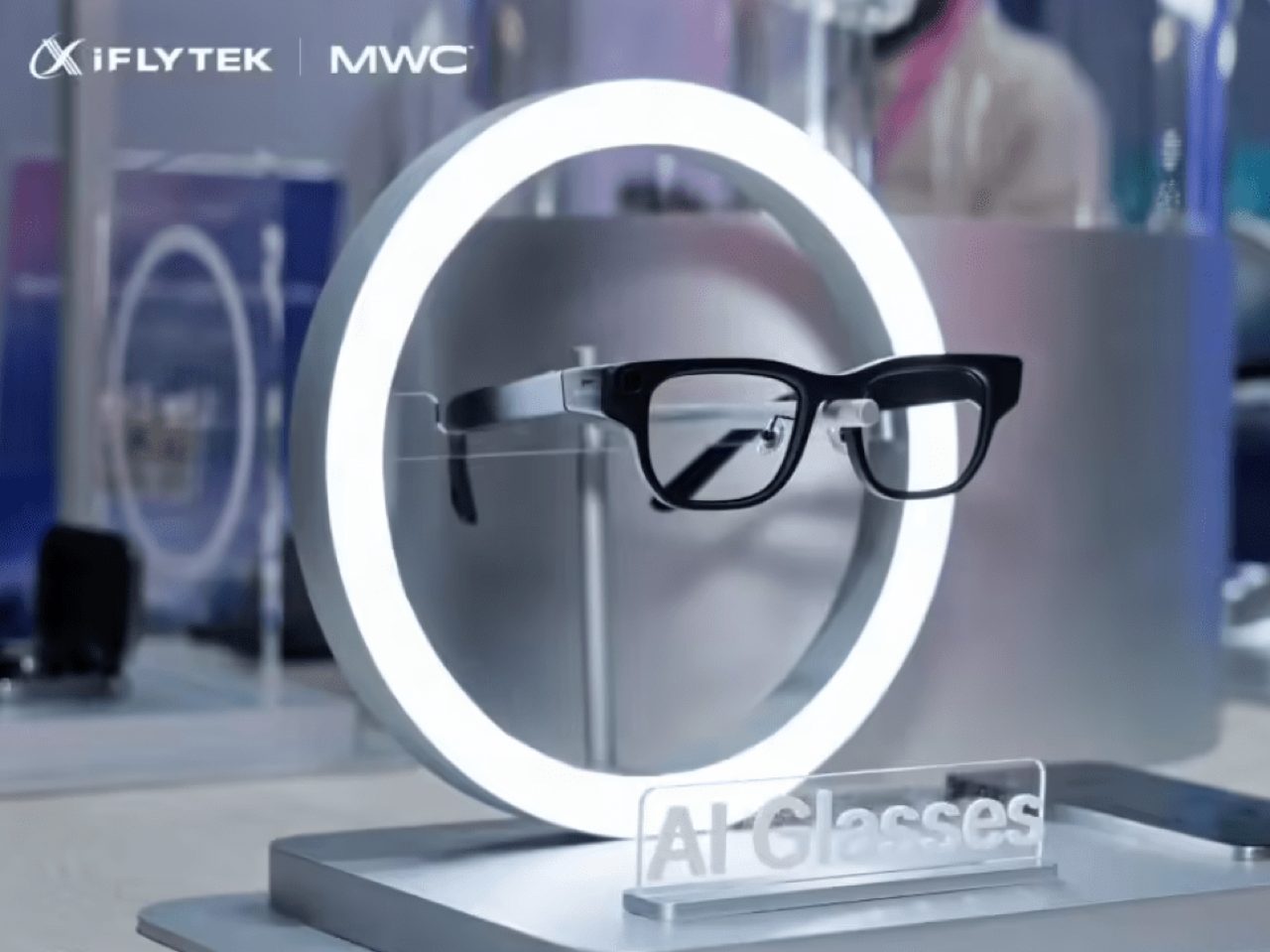
That made Macau the perfect stage for iFLYTEK’s AI Glasses, a 40 gram wearable built around communication, translation, and ambient intelligence. Announced at BEYOND Expo 2026, the glasses pair a lightweight magnesium-aluminum frame with a resin waveguide display, real-time translation, teleprompting, advanced noise recognition, and the GlassClaw AI agent, all wrapped into a device designed to keep information in sight and conversation in flow. iFLYTEK, the Shenzhen-listed AI company founded in 1999 and best known for its speech and language technology, framed the launch under the theme “Communication Without Boundaries, the World Before Your Eyes.” For a company whose core competency has always been understanding and generating human language, a glasses product aimed at communication is a logical next step. The pitch is a strong one: AI belongs in the line of sight, ready when you need it, invisible when you do not.
Designer: iFLYTEK
Getting a display, waveguide, processing stack, and speaker array under 40 grams in a glasses form factor is not a given, and the material choices iFLYTEK made to hit that number tell most of the hardware story. The frame uses an aerospace-grade magnesium-aluminum alloy, keeping the structure rigid without the front-loaded weight that makes smart glasses genuinely uncomfortable after twenty minutes. The display runs on a resin waveguide paired with a customized micro-optical module, a combination chosen to balance visual quality against physical footprint. Ergonomic adjustments calibrated specifically to Asian facial structures add another layer of intent, signaling that the wearability goal goes beyond a marketing claim. That kind of constraint-driven design work is what separates a considered wearable from a concept render that happens to ship.
GlassClaw, the AI agent built into the glasses, handles the intelligence layer across multiple modes (not related to OpenClaw). It captures conversations, generates AI meeting summaries, enables full-scenario real-time translation, and pulls in life services, functioning as a persistent contextual companion rather than a novelty voice assistant. The teleprompter feature stands out from a practical design standpoint, giving the glasses a repeatable use case in presentations, live video, and multilingual business settings. Advanced noise recognition ties the system together by giving the speech-processing layer a cleaner audio signal in conference halls, trade floors, and the ambient chaos of travel. iFLYTEK’s deep history in speech AI means the noise handling and translation accuracy are the features most likely to determine whether these glasses earn daily wear.
The iFLYTEK AI Glasses are priced at 4,299 yuan, roughly $635, with presales beginning June 15. iFLYTEK also staged an ecosystem partner forum at the expo alongside Sunny Optical, Wanxin Optical, and Conant Optics, treating the launch as the beginning of a product line rather than a one-time debut. For a product category that has struggled to articulate a daily reason to exist, iFLYTEK’s communication-first positioning is a credible answer. The Ray-Ban Meta glasses proved that lightweight wearable audio could build a real user base when the form factor stopped fighting the face, and iFLYTEK is making a similar bet with a display and translation stack on top. At 40 grams, with a clear professional use case and a company whose entire identity is built around understanding human language, these glasses have the ingredients to matter.
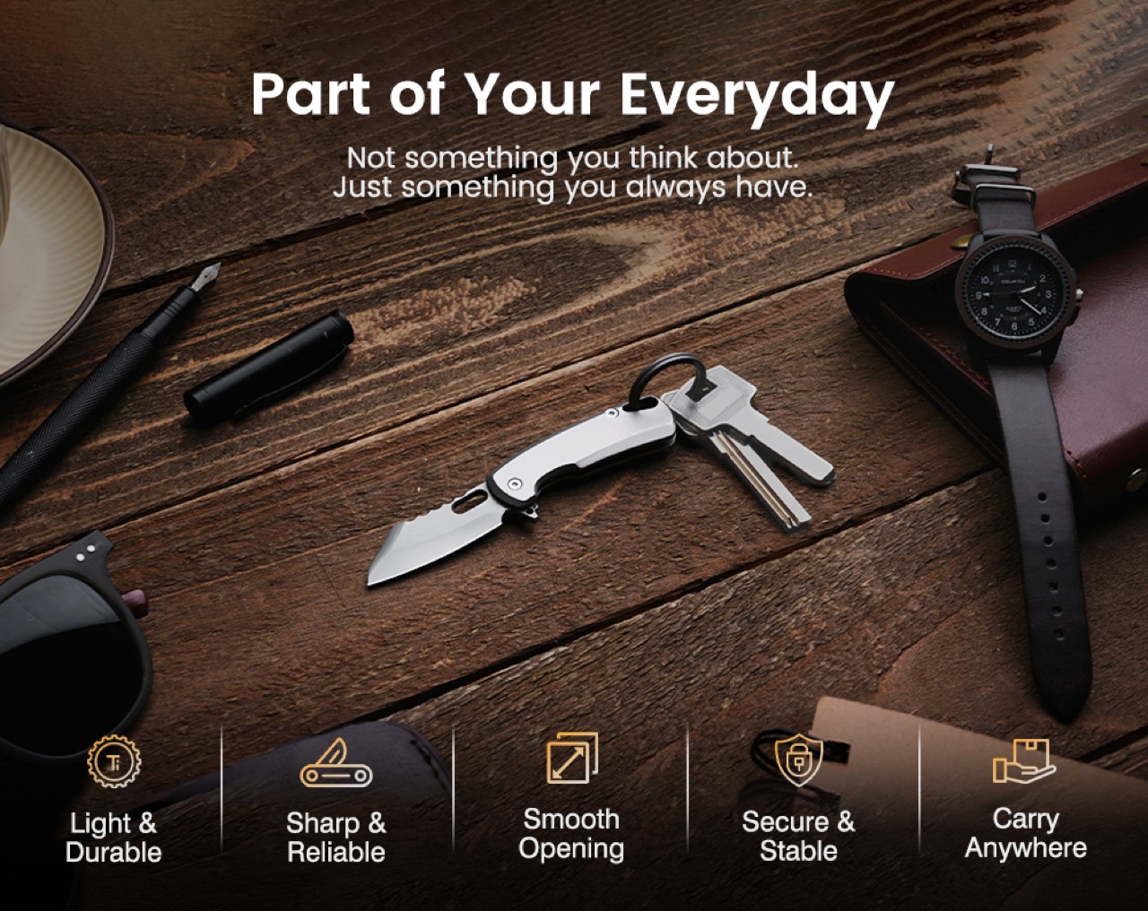
A phone does a bunch of things – it clicks photos, it sends/receives emails, it tells you the weather, it also plays music. There’s a case to be made that a phone is worth owning for how multifaceted it is. Similarly, there’s also a case to be made for owning a vinyl player. A vinyl player doesn’t give you weather updates, doesn’t let you access ChatGPT, all it does is plays music, and does it well to the point of being a ritual. These two spectrums exist in almost every industry, but more so in the EDC world. You’ve got multitools thumping their chest for how multi and how tool they are. And you’ve got specialized EDC that’s made to do one job but do it with pleasure. The TiArc falls into the latter camp.
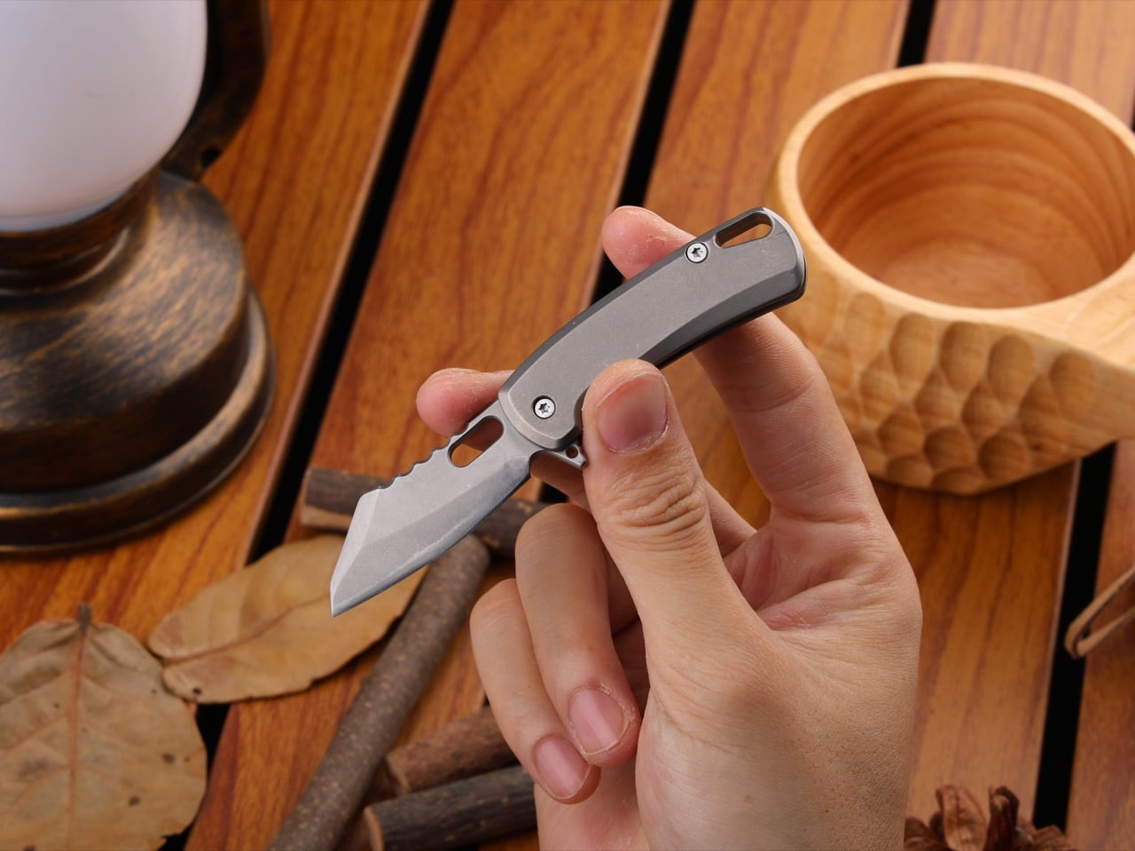
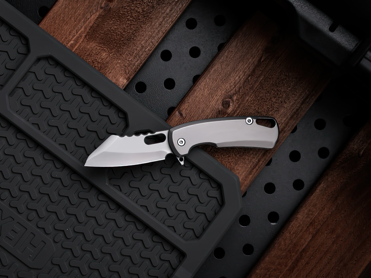
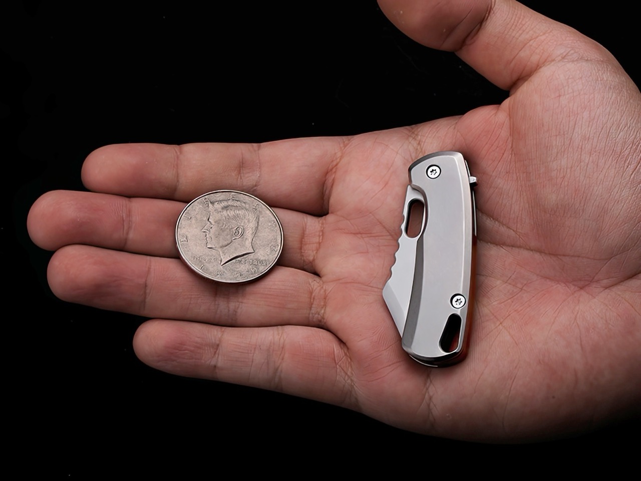
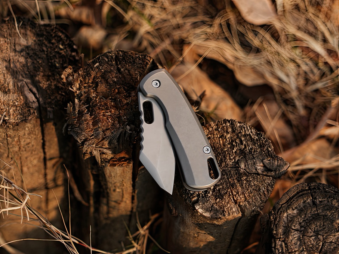
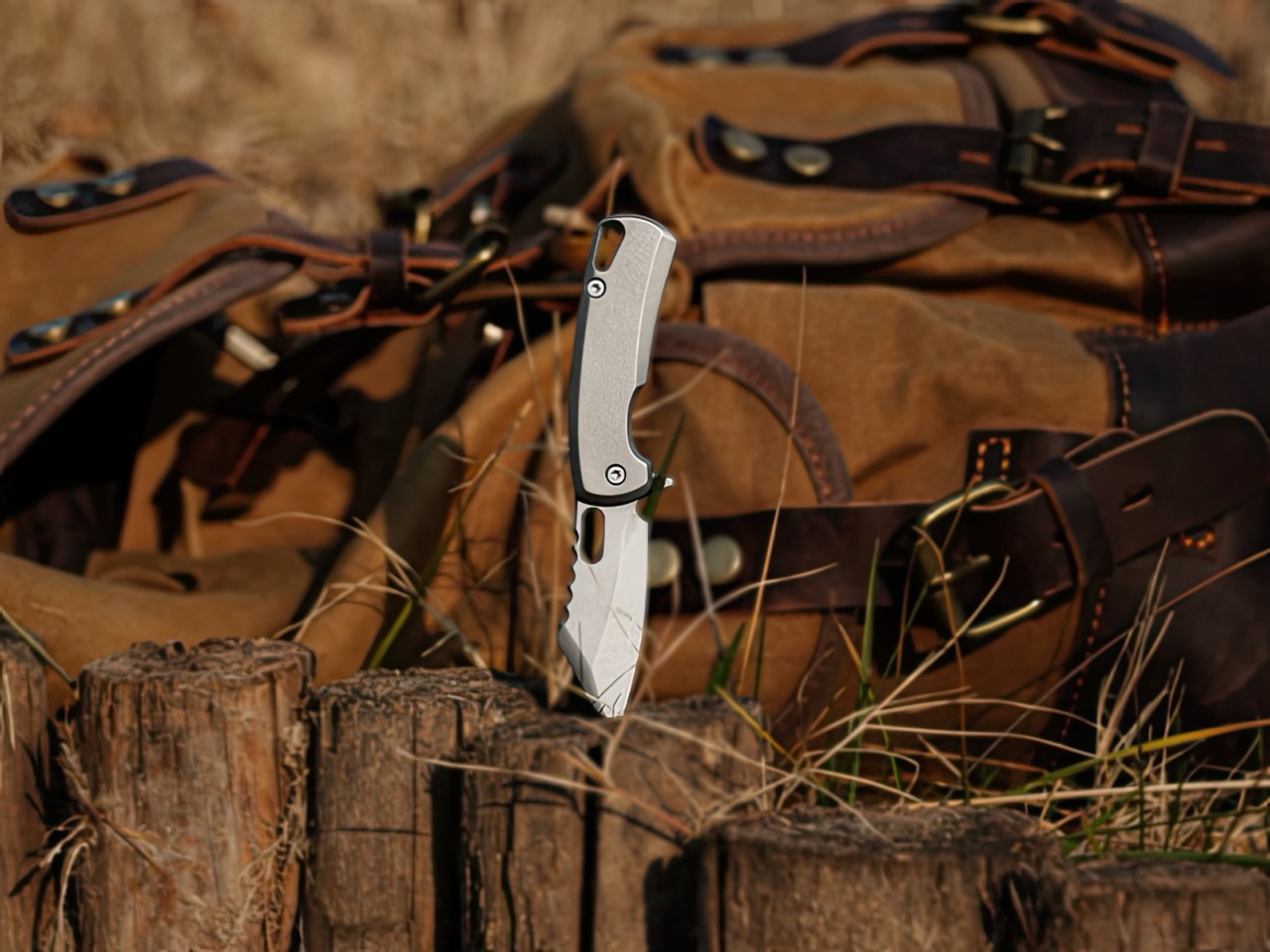
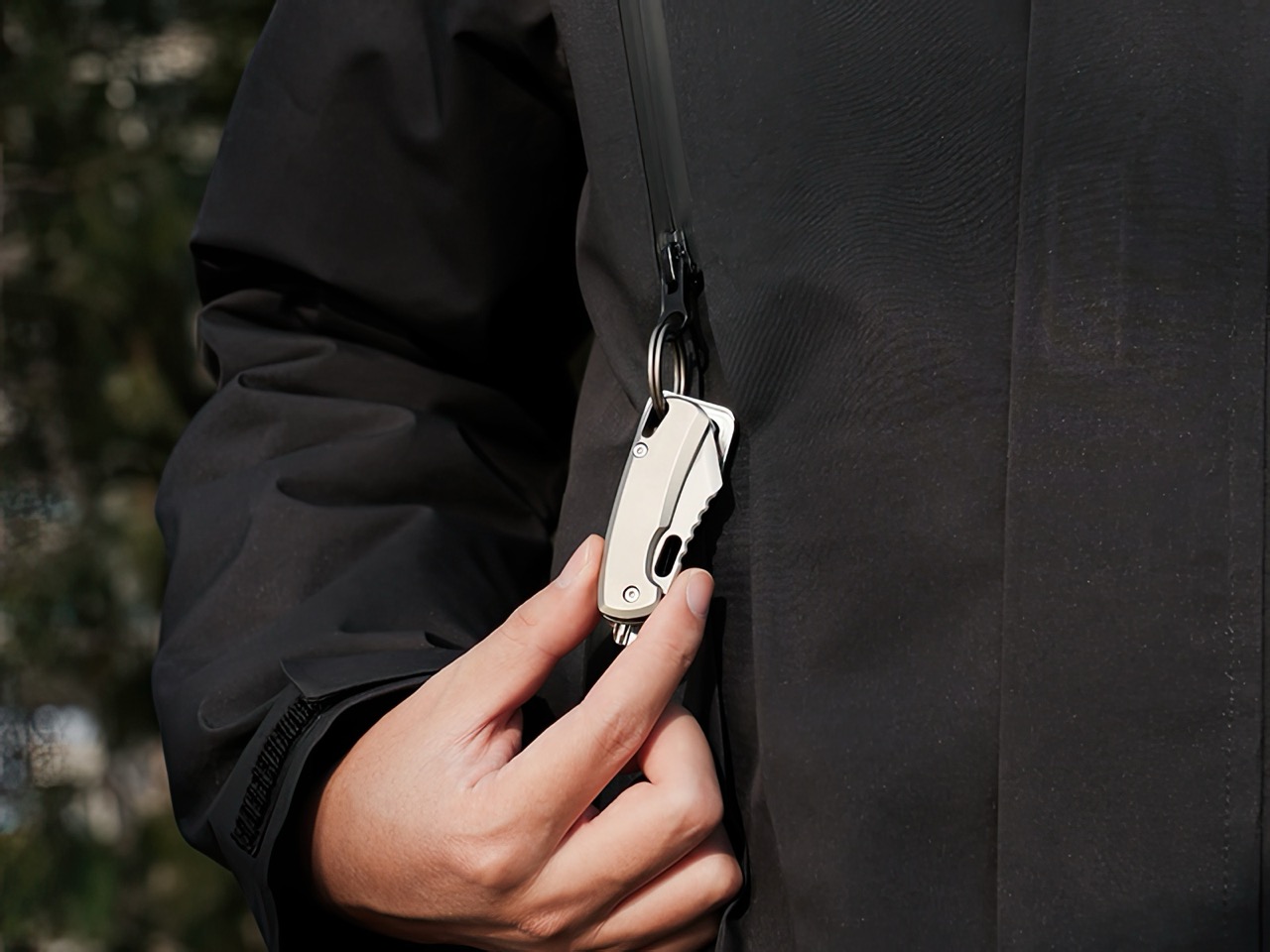
No bottle-opener, no pry-bar, no complications. The TiArc is built like a tank, and it’s built to be three things – reliable, robust, and for the most part, repairable. The thing’s tiny enough to fit on a keychain, in your palm, or your pocket. It measures 4.16″ when open, and 2.34″ when closed, weighing in at 30 grams or just above an ounce (that’s as much as an AirPods case). As unassuming those specs sound, the TiArc packs a Grade 5 titanium body and a D2 steel shell, making it the EDC equivalent of a ninja, invisible most of the time, but lethal when wielded.
The tiny knife category is more vast than I originally imagined. While anyone will agree that bigger is (for the most part) better, sometimes you don’t need a 4-inch fixed blade. Sometimes even a cutter under 2 inches actually gets the job done, whether it’s opening boxes, slicing through paracord, whittling wood, starting fires, or even working on craft projects. The TiArc’s 1.82 blade gets the job done, whatever the task may be. The D2 steel has a HRC rating of 60, which means it won’t dull easy, even with rough usage.
That sheepsfoot blade profile is a classic in the EDC world. Also known as the ‘wharncliffe’ design, it features a curved belly blade that you can slice with running motions or even rock the way a chef rocks their knife while finely cutting something. The blade’s tip is pointy enough for piercing actions, making it fairly versatile no matter the task. You could be opening rations in the outdoors, defending yourself from danger, or doing something as benign as cutting open a lime to make yourself a margarita. The TiArc’s compact design means it’s on your person all the time, and the reliable build lends itself to almost every activity that would require a cutting edge.
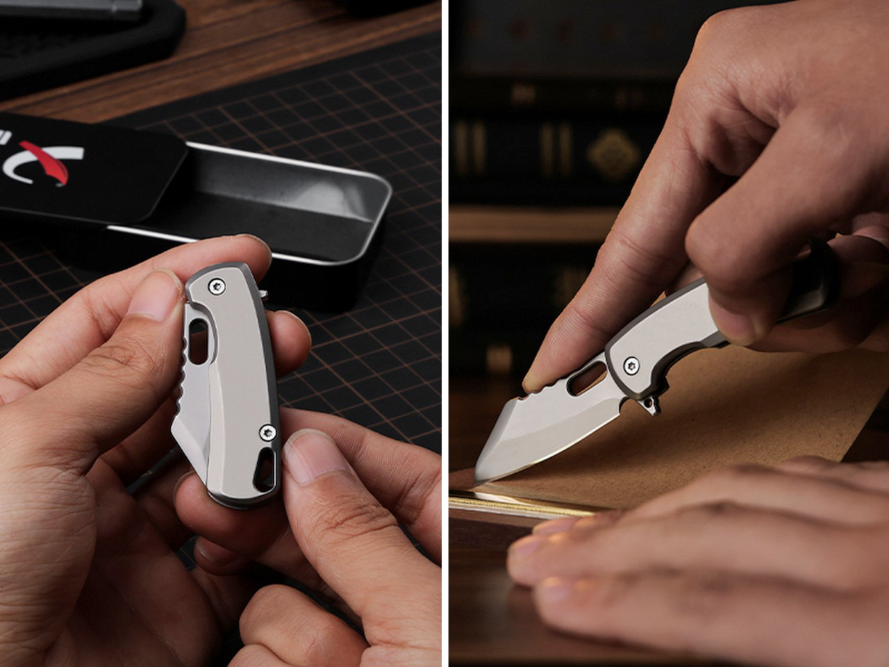
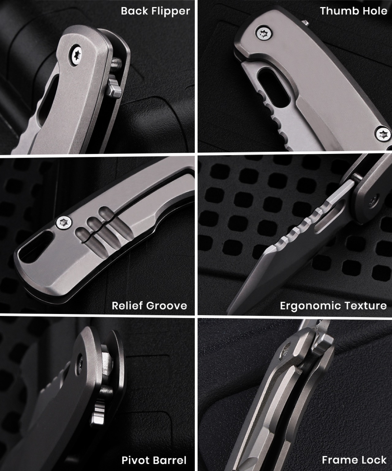
TiArc’s makers iterate that the knife’s made with simplicity – but that doesn’t mean ‘basic’. It’s fairly capable the same way a Kalashnikov from the 40s still happens to be the gold standard for rifles, even after nearly 8 decades. The tiny knife packs an all-metal design that can be disassembled in a jiffy using two screws integrated into the body. A cutout in the blade lets you open meticulously, or just use the flipper on the back to flip open with panache. Once open, it holds its positions with stern resolve, and you can literally chuck the blade tip-first into hardwood and the knife won’t buckle. A frame-lock holds the blade in place, and to close your TiArc, simply coax the frame lock open to have the blade glide right back smoothly into its sheathe.
The Grade-5 titanium body is cool to the touch, practically destruction-proof, hypoallergenic, and comes with a stone-wash finish that genuinely feels great when you hold it, providing just enough friction while in use. Titanium has become a bit of a mainstay in the EDC world, but it’s always a mark of a premium tool given that you won’t find cheap knives made from titanium. You’re paying for the craftsmanship, the material, and the fact that this thing is built forever. I’ve long said that if you’ve got yourself a titanium EDC, chances are it doesn’t even need to come with a warranty because it’ll last long enough to pass down to your great grandkids. The TiArc, to that end, comes with a lifetime warranty.
At just 1.06 ounces, the TiArc is really made for everyday carry. Clip it to a carabiner, string it on your keyring, secure it on your outdoor backpack, or even stash it on your pocket. It goes where you go, doesn’t announce itself, but steals the show once you need to use it. No extra features adding any complexity, not even as much as a pocket clip – the thing is designed with the same minimalist mentality of a MacBook Air, which famously cut down on ports to keep things focused and still managed to become one of the most popular laptops out there. I’m writing this article on one as we speak.
The TiArc starts at $39 USD, discounted from its original $50 price tag. For that, you get the TiArc itself, a titanium split keyring to match, free global delivery, and a lifetime warranty. For an extra $14.6 USD, you can grab either one of the following – a custom engraving on the blade, a PVD black coating to give your knife a stealthy look, or a special quick-release keyring with a single-piece carabiner machined from titanium. The TiArc begins shipping as early as September 2026.
Meta’s Ray-Ban smart glasses sold over 7 million units in 2025, a number that would have seemed improbable two years earlier when the category barely existed outside enterprise pilots and conference demos. Google confirmed its own entry at I/O 2026, with Gemini-powered frames and eyewear partnerships with Warby Parker and Gentle Monster already in place. The market Apple is entering has already been legitimized by its competitors, which is an unusual position for a company that typically defines the categories it enters. All of that makes the N50, Apple’s first smart glasses, feel like a response to a race that started without it. The honest version of that story includes the fact that Apple’s engineers were busy building something else entirely.
The N50 is the product that absorbed the engineering resources originally aimed at a Vision Pro sequel. Bloomberg’s Mark Gurman confirmed in May that no headset successor is in active development, and that the Vision Air, a cheaper model codenamed N100, was canceled last year to redirect talent toward smart glasses. Apple restructured the Vision Products Group, splitting engineers across hardware and software divisions, with many redeployed to the glasses program, to Siri, and to camera-equipped AirPods. The glasses carry cameras, microphones, speakers, and Apple Intelligence inside a conventional eyeglass frame with no display, no pass-through video, and no external battery, functioning as an iPhone accessory in the same way AirPods or Apple Watch do. A late 2026 reveal and 2027 commercial launch is the expected window, with analyst Ming-Chi Kuo projecting 3 to 5 million units shipped in the first year.
Designer: Oleh Koval
Four frame styles are in testing, two rectangular and two oval, built in premium acetate with colorways including black, ocean blue, and light brown (the images shown here are just a concept mocked up by designer Oleh Koval back in 2018). Apple initially experimented with embedding electronics into established eyewear brand frames, similar to Meta’s EssilorLuxottica arrangement for the Ray-Ban lineup, before moving toward designing its own frames in multiple sizes. Meta’s partnership gave the smart glasses category immediate cultural legitimacy because Wayfarers were already objects people wanted on their faces before any chip was inside them. Apple is betting its own design language in premium acetate can carry the same weight without borrowed heritage. Whether that holds against consumers who have already spent two years wearing Ray-Ban Metas is the sharpest design question the N50 faces at launch.
Two cameras are planned inside the frame: a high-resolution sensor for photos and video, and a second dedicated to computer vision tasks, helping the device read its environment and measure spatial relationships between objects. The N401, a custom chip derived from Apple Watch silicon, handles the compute with a design emphasis on ultra-low power draw, targeting a total frame weight below 50 grams. That weight target is the industrial design achievement the whole product depends on. A sub-50 gram device sits within the weight range of premium optical frames, which means the person wearing it makes a fashion decision first and a technology decision second. That ordering is exactly what the smart glasses category has needed to move beyond enthusiast territory into genuine everyday carry.
The M5 Vision Pro that arrived in October 2025 reads now as a holding action rather than a product commitment. The chip swap kept the SKU alive but left the device’s foundational problems untouched: 650 grams of front-heavy glass and aluminum, a mandatory external battery, and a $3,499 entry point that stranded it between developer hardware and enterprise curiosity. The Vision Air was supposed to address the weight and price simultaneously, and its cancellation signals that those two problems couldn’t be reconciled inside an enclosed headset on any timeline Apple found workable. A Vision Pro sequel won’t arrive before 2028, meaning it enters a market the N50 will have already spent a year conditioning. That sequencing is either very deliberate or very revealing, and I’d argue it’s both.
Pricing estimates cluster between $299 and $499, placing the N50 directly against the Meta Ray-Ban Gen 2. Privacy is a genuine competitive lever here: nearly 47% of potential smart glasses buyers cite data concerns, and neither Meta nor Google carries credible on-device processing as a core value proposition. Apple’s Apple Intelligence architecture, built around local compute rather than cloud offload, gives the company a story neither competitor can cleanly replicate. A second-generation model with an in-lens display is reportedly expected as early as 2028, which is also the window when enclosed headset technology might finally be miniaturized enough to make a Vision Pro sequel viable. The N50, by that reading, is the product Apple had to build before it could build the one it always imagined.
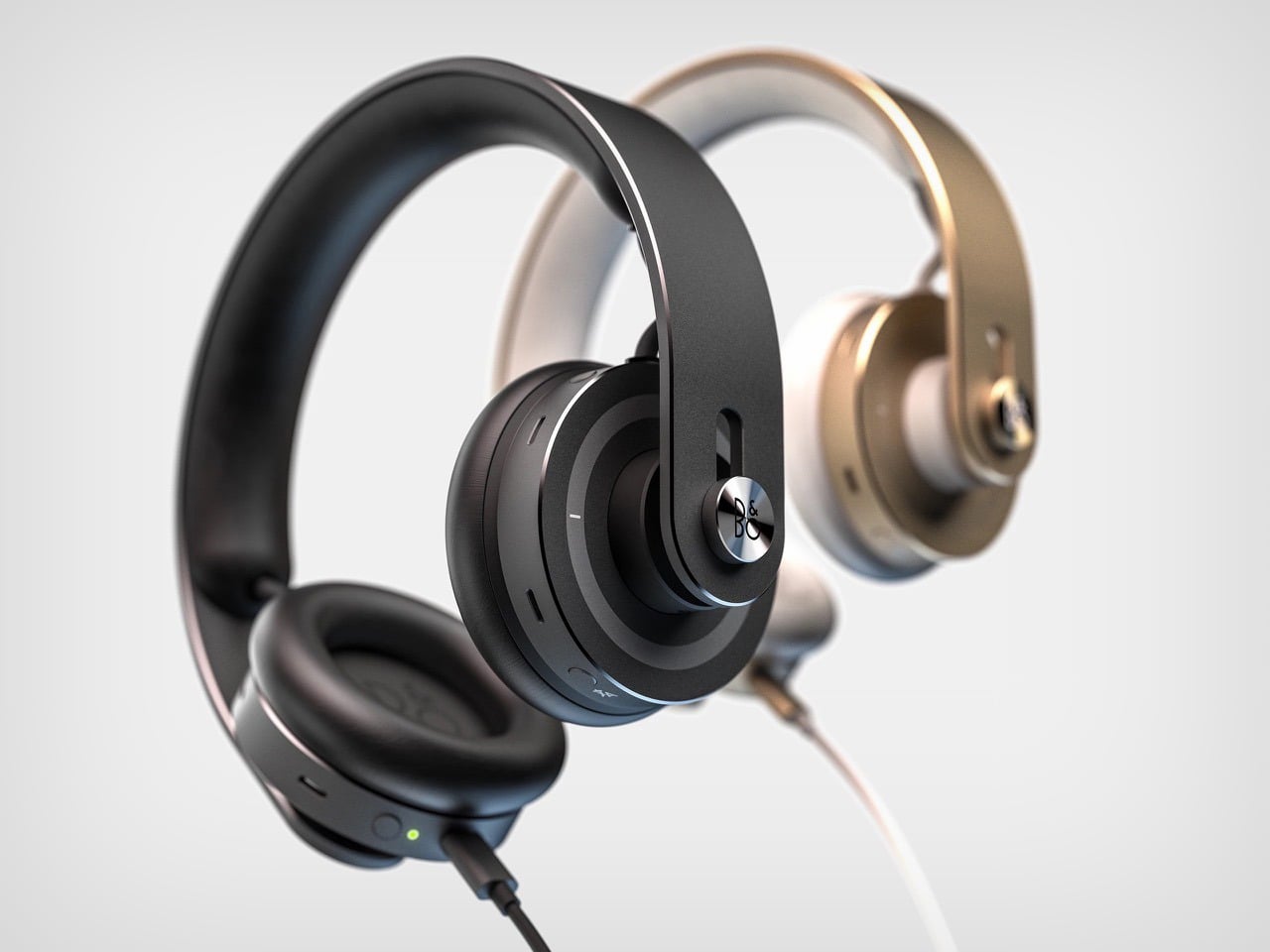
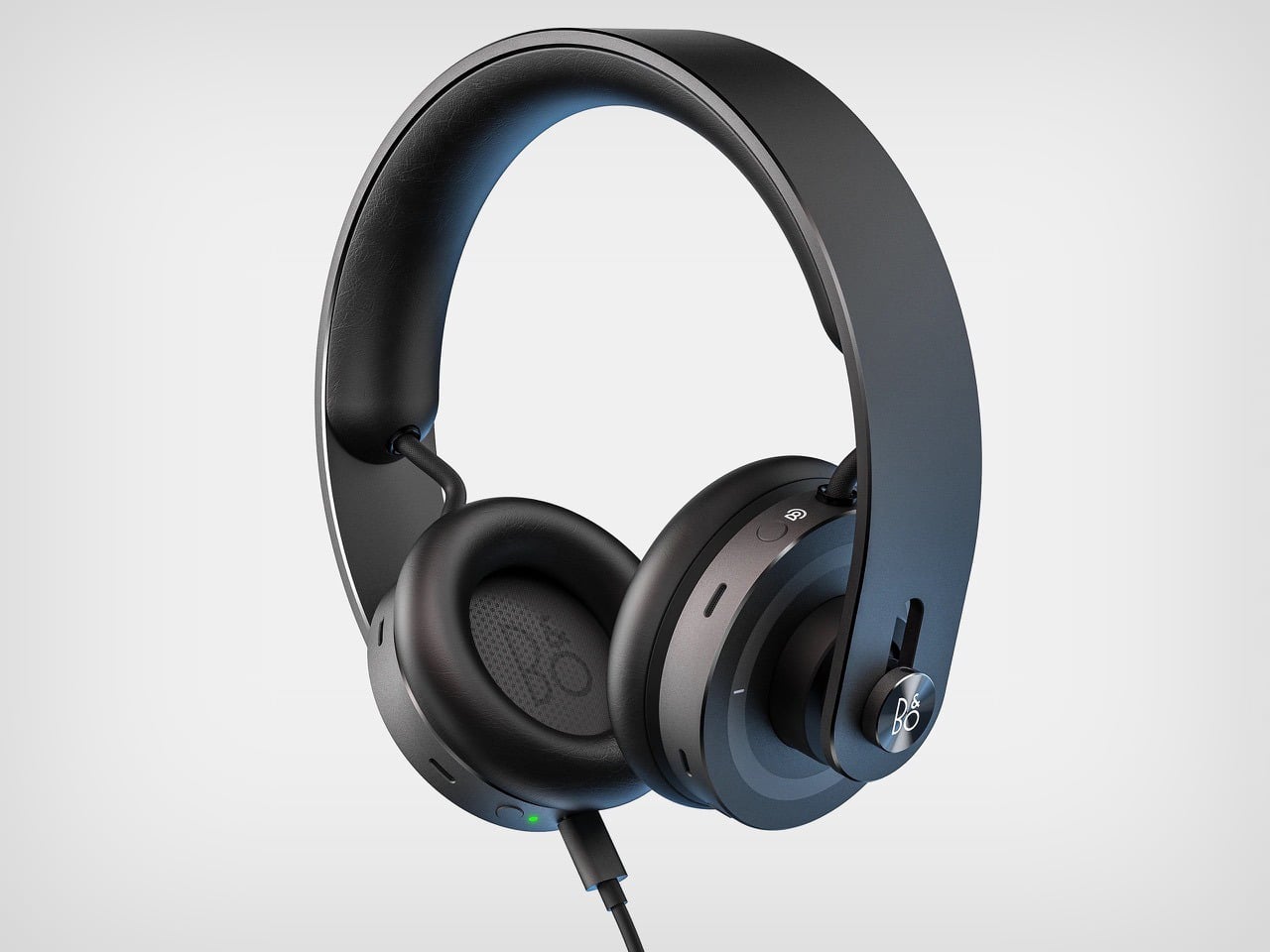
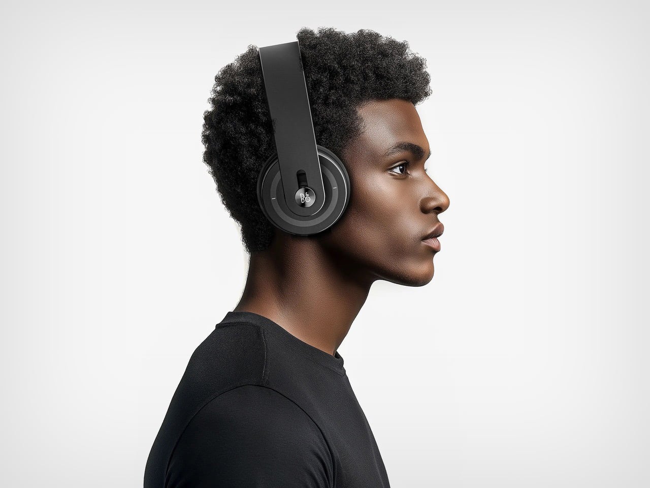
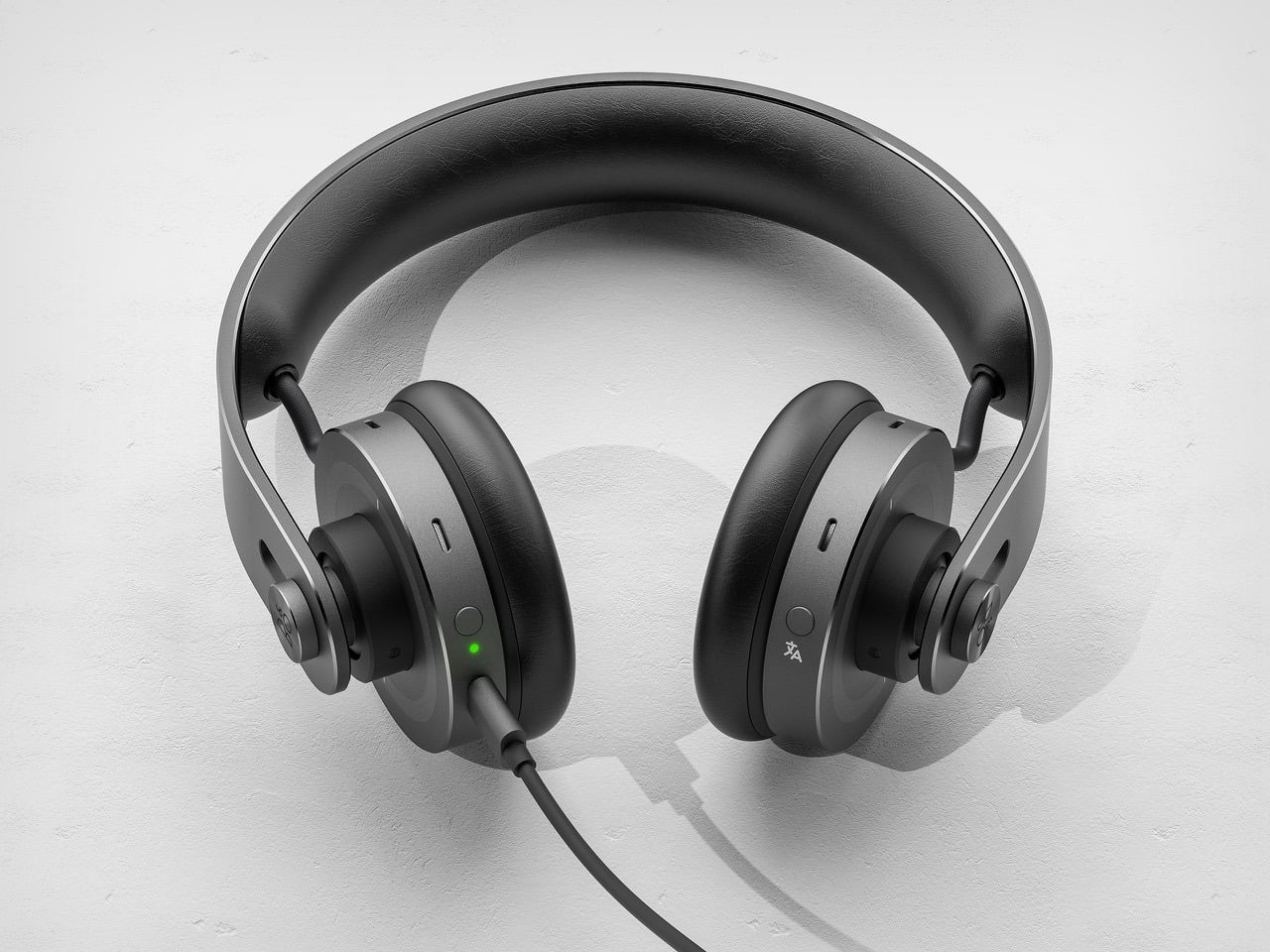
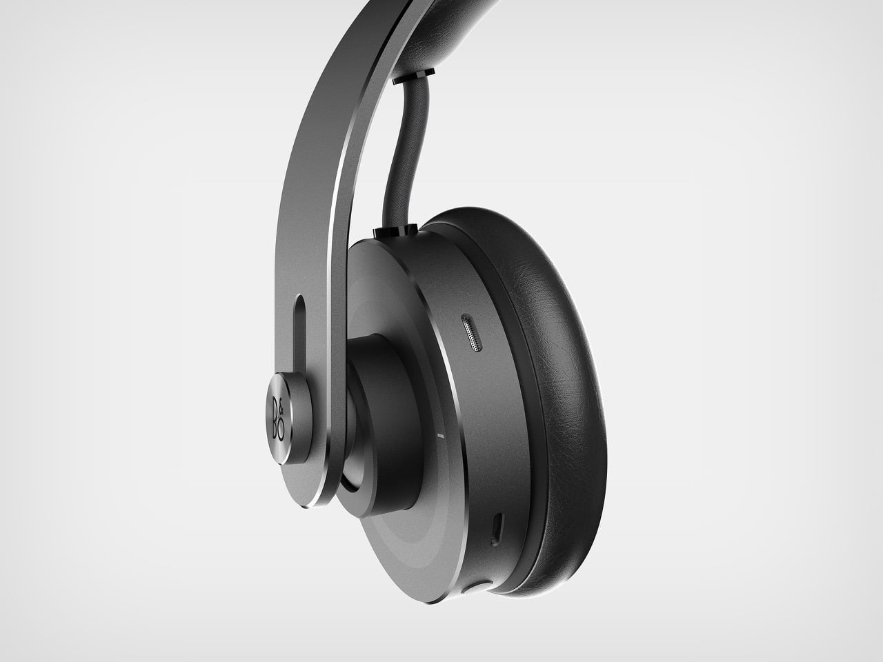
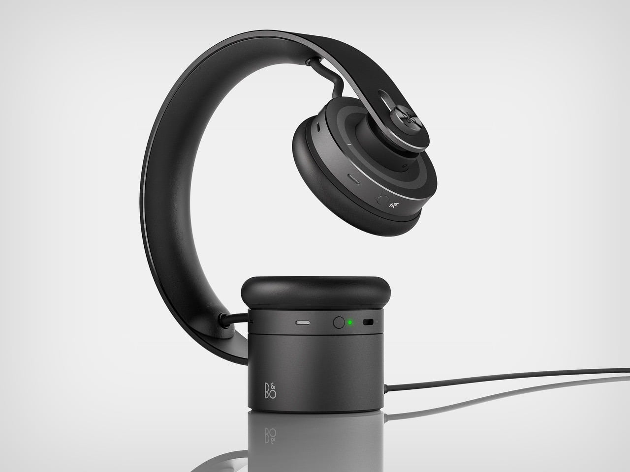
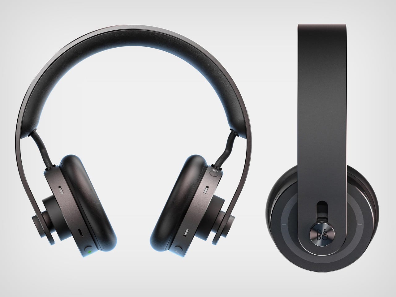
Bang & Olufsen built its reputation on the idea that audio equipment should be worthy of the spaces it inhabits. Bas Kamp’s ONCE concept takes that idea and sharpens it into something more intimate. A headphone fitted once, precisely, to a single person. A form that carries the geometry of classic over-ear design, two cylindrical drivers, a continuous band, an honest material palette, and updates it with one quietly radical proposition: permanence.
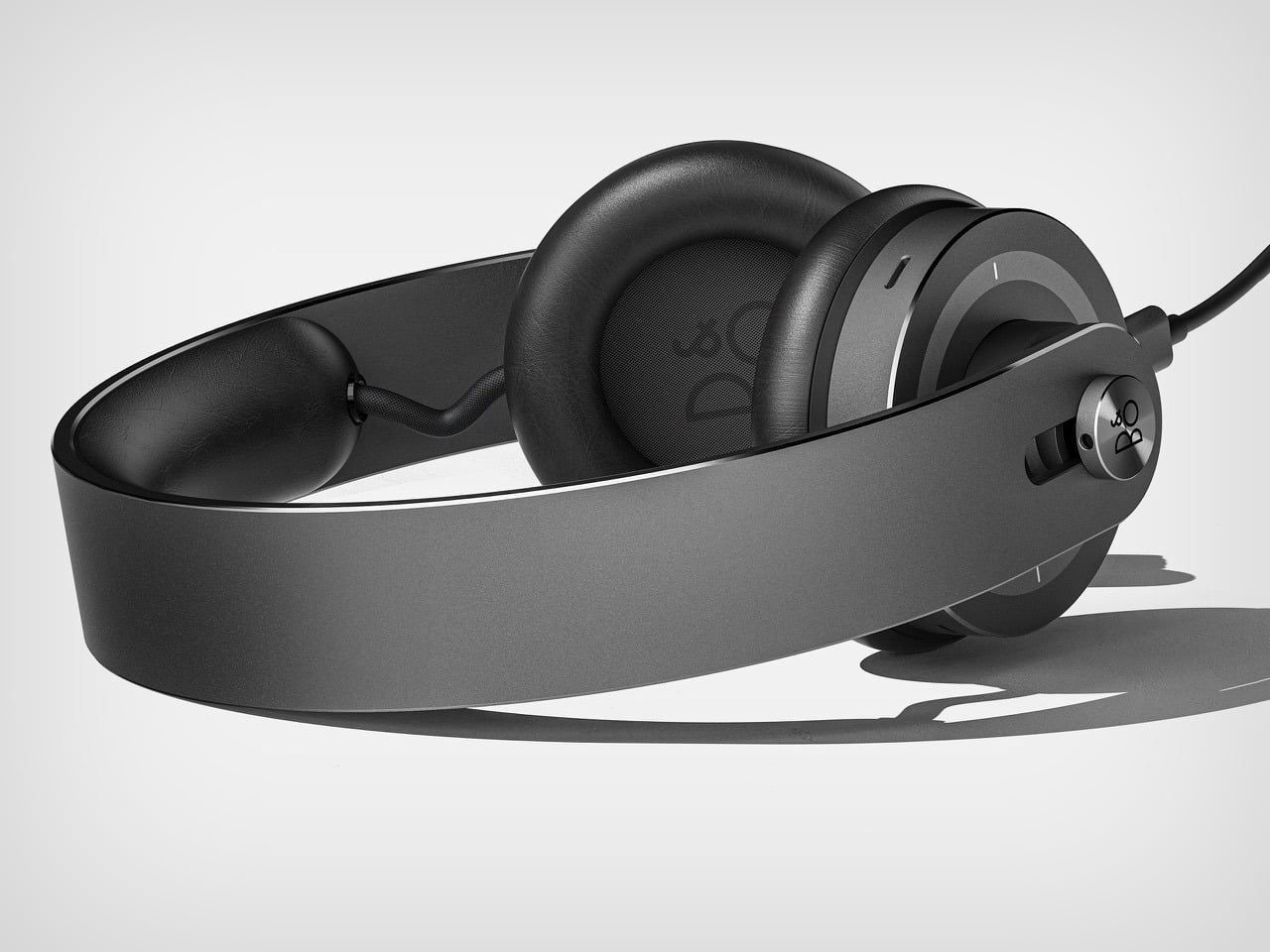
The charging base makes the argument visible. The headphone drapes over a cylindrical puck in a clean arc, sitting on any surface like a considered object rather than a piece of gear waiting to be packed away. Kamp’s concept suggests that the best version of a B&O headphone is one that earns a permanent place in your life, and looks the part doing it.
Designer: Bas Kamp
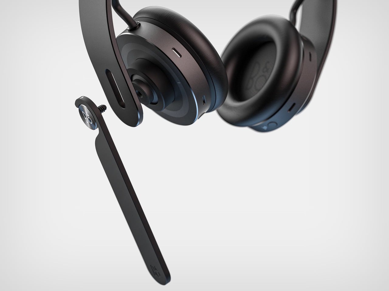
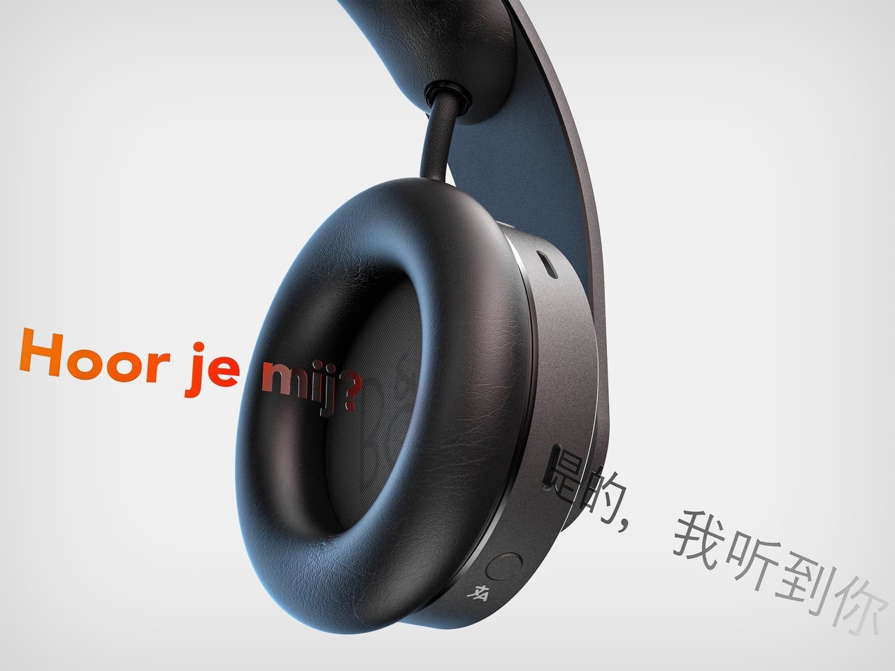
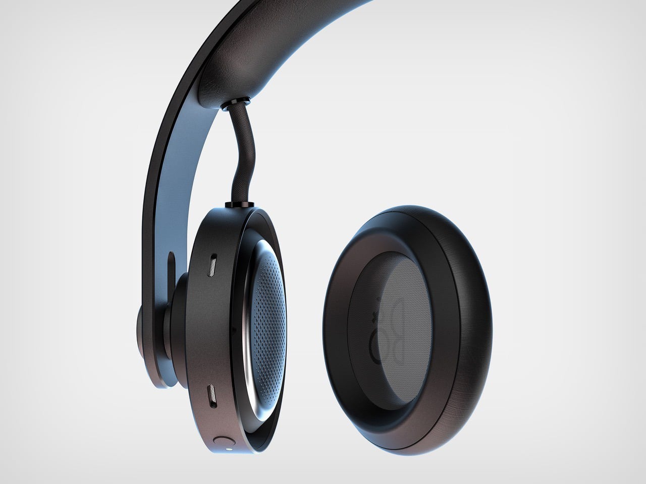
Most headphones are engineered to fit everyone, which in practice means they fit no one particularly well. Telescoping arms, spring-loaded sliders, and adjustable pivots are all workarounds for a problem the industry has accepted as permanent. Kamp rejects the premise entirely. The wide, uninterrupted band is machined as a single continuous form, and when you first receive the headphone, you set it once using the included precision tool, tightening the iconic B&O signature dot that connects band to aluminium cylinder through a refined screw thread. From that calibration forward, the fit is yours alone.
The visual language pulls directly from B&O’s deepest design DNA. The arc, the band, the cylinder, these are the honest architectural elements that defined the great headphones of the twentieth century, and Kamp makes no attempt to disguise or reinvent them. Two cylindrical drivers sit at either end of the continuous band, their outer faces rendered in concentric circles that give the ear cups an almost mechanical, watchlike presence. Where the headphone meets skin, genuine leather handles the contact, soft and warm against the geometry of the machined aluminium. The restraint is total and deliberate.
A cylindrical puck holds the headphone in a sculptural arc that reads, from certain angles, uncannily like a hunching table lamp, the band curving down toward the base with the ear cup hanging at the end of the arc. It is an accidental elegance that makes the resting state of the object as compelling as the wearing state, which is exactly the kind of considered design thinking B&O has always demanded of the objects bearing its name.
ONCE also integrates a real-time AI translation feature, activated by a single press of the dot, delivering conversational translation directly through the drivers. For a concept built around permanence and personal calibration, it is a quietly forward-looking addition, proof that Kamp’s vision for B&O reaches comfortably into the next decade of what a headphone can do.
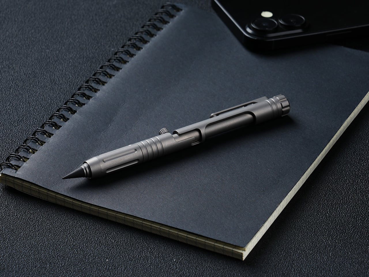
Bolt-action pens command a fanbase that splits neatly into two camps. There are the fidget enthusiasts, the ones who cycle the bolt compulsively mid-conversation and genuinely cannot put the thing down, drawn entirely by the sensory reward of a well-tuned spring mechanism. The satisfying click and return of a well-machined bolt has an almost compulsive quality that most people who have owned one will recognize immediately. Then there are the EDC traditionalists, who carry bolt-action pens with something closer to reverence, appreciating how a mechanism borrowed from military rifles found its way into writing instruments and became a small, tactile piece of mechanical history worth keeping in a pocket. For that second group especially, the bolt-action pen occupies the same mental space as a quality pocket knife or a classic field watch: a precision object that earns its keep through both performance and heritage.
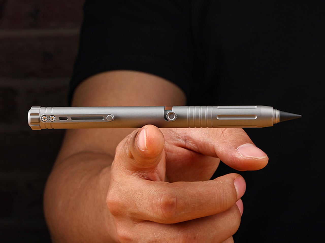
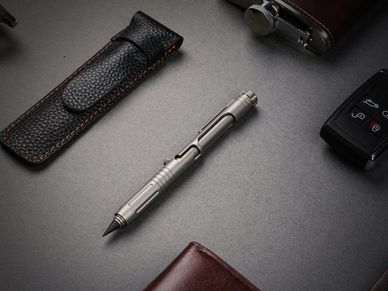
The Bullet Ant 4.0 by MeTool builds on that foundation and loads it with function. The bolt-action mechanism deploys a top-mounted 4mm bit driver the moment the bolt flicks forward. Nested inside the barrel is a magnetic bit garage holding a spare, and a hidden blade sits flush in the lower section, locked by two magnets that hold it against shaking, jostling, or being tossed in a bag. The rear tip swaps between a graphite and metal writing point, with a tungsten glass breaker completing the set. All of that in 32 grams of Grade 5 titanium.
A single forward flick of the bolt deploys the 4mm magnetic bit driver into working position, with no caps to remove and no secondary steps to take. The magnetic mount keeps the bit seated precisely, and the same magnetic logic governs the bit garage inside the barrel, which stores a second 4mm bit as a permanent spare. Losing a bit mid-job is a real-world frustration that MeTool clearly heard from earlier-generation users, and the solution is architectural rather than behavioral: one extra 4mm bit, always with you, no loose parts, no hunting through a bag for the Phillips you dropped. Both the working bit and the stored backup are standard 4mm, keeping compatibility with common interchange systems rather than locking the user into proprietary accessories. The bolt mechanism also carries the distinction that made this whole category worth caring about: positive tactile feedback on both extension and retraction, the kind of mechanical click that turns a tool into something you actually look forward to using.
The blade lives flush inside the lower barrel, producing zero poke, zero rattle, and zero external profile, and when you don’t need it, it simply disappears, leaving a clean, cylindrical pen that looks like nothing but a pen. Two small but powerful magnets keep the bit blade perfectly seated, with no wobble and no creep, meaning you can throw the pen in a bag, run down stairs, or shake it aggressively without the blade budging until a deliberate thumb pull releases it. In practical daily use, it handles the mundane cutting jobs that otherwise require hunting for scissors: tape, packaging, zip ties, rope, plastic clamshells. Slip the blade out in two seconds, make the cut, click it back, and the pocket knife can stay home. The design intent leans firmly toward daily micro-cutter territory rather than survival blade ambition, which keeps the tool honest about its actual scope.
The everlasting pen tip carries no ink and no limits, writing on paper, metal, wood, plastic, or underwater. Two tip configurations are available: the graphite tip delivers smooth, paper-friendly contact suited for notebooks and daily writing, while the metal tip offers rigid marking performance on hard surfaces in outdoor conditions. The new alloy tip survives waist-high drops onto concrete without cracks or flakes, in either metal or graphite form, and swaps between configurations in seconds. The tungsten glass breaker occupies the same interchangeable slot at the rear of the barrel as a third configuration, converting that end into a hardened emergency strike point capable of breaking automotive glass. Concentrating the writing, glass-breaking, and emergency functions at the rear of the barrel is a coherent spatial decision that keeps the bolt-action end clean and dedicated entirely to the driver.
136mm of titanium at just 32 grams, with six precision grooves machined into the grip section that give ultimate hold in any condition, wet, cold, or gloved. Grade 5 titanium, the Ti-6Al-4V aerospace alloy, is the material for the entire body, chosen for its strength-to-weight ratio rather than its premium associations. The all-new ball-detent contact point lets the Bullet Ant 4.0 glide over any fabric, whether pocket, bag, or strap, without snags or scratches. Earlier generations of the pen were known to catch and drag on pocket linings, a small but genuinely irritating daily friction that the redesigned clip eliminates cleanly. Finish options include sandblasted titanium, raw and untouched in the way titanium comes out of the earth, and black, stealth and matte, a finish that disappears in low light.
Anodized blue and purple finishes are available as add-ons, and the distinction MeTool draws is worth noting: anodizing is an electrochemical bond that becomes part of the metal itself, and won’t chip or peel. Regardless of chosen finish, the underlying material is the same Gr5 titanium with identical performance throughout. The Bullet Ant 4.0 is built for a specific kind of person: someone whose environment demands improvised repairs, a cutting edge within reach, and legible notes all within the same hour, whether that person is a hiker tightening gear on a trail, a field technician working a job site, or an outdoors-oriented carry enthusiast who wants glass-breaking capability without a dedicated tool eating up pocket space. The pen cycles between five roles through mechanical reconfiguration rather than physical disassembly, shapeshifting from writing instrument to bit driver to blade to emergency tool without ever requiring a bag dig or a secondary carry item. It manages all of this without looking overtly tactical, which, for a category that sometimes leans too hard into military aesthetics, is a meaningful restraint.
Gen 1 proved the concept, Gen 2 made it tactical, Gen 3 packed in more tools, and MeTool has been running this annual design cycle since 2023. The two complaints every Bullet Ant 3.0 user raised were the same: why unscrew a cap every time a screwdriver is needed, and why does the metal tip crack on a drop. MeTool listened, and rebuilt. Gen 3 hid the blade under a cap that required unscrewing before driving a screw. Gen 4 hides the blade inside the bit itself. Gen 3’s tip could crack on a hard drop. Gen 4’s alloy tip survives waist-high falls onto concrete. That pattern of user-feedback-to-design-decision shows in how purposeful the Gen 4 upgrades feel when set against the earlier versions, each fix traceable directly to a complaint someone actually filed.
Each Bullet Ant 4.0 ships with the pen body in Gr5 titanium, an alloy tip for the everlasting pen system, one magnetic hidden blade, and two 4mm magnetic bits, with worldwide shipping included at no extra cost. That represents a complete functional loadout without any additional purchases required for core use. Anodized blue and anodized purple finishes are available as paid add-ons, with the electrochemical finish applied to the same Gr5 substrate across all color options. The campaign runs through June 17, 2026. Pricing and full reward tier details are live on the Bullet Ant 4.0 Kickstarter page.
Damien Chazelle made La La Land as a love letter to a Los Angeles that barely exists anymore, and to a style of filmmaking that Hollywood had largely abandoned. The big-studio musical, with its choreographed sidewalks and color-saturated dreamscapes, had been gathering dust since the golden age of MGM. Chazelle dusted it off, handed it to two impossibly charming leads, and aimed it squarely at the part of your chest that still believes in chasing something impossible. The result was fourteen Oscar nominations, six wins, and one of the most recognizable movie posters of the decade.
The scene that lives on that poster, Mia and Sebastian dancing above the lights of Los Angeles on a clear, impossible evening, is the film distilled to its purest emotional frame. TesrYer, a LEGO Ideas builder, had the good sense to freeze it in plastic. The resulting diorama layers a deep gradient night sky in dark navy and purple, studded with circular brick elements that somehow read as stars and rolling hills simultaneously, with two minifigures caught mid-step below a glowing streetlamp. The city of stars shimmers behind them in stacked dark tiles, each lit window implied rather than stated.
Designer: TesrYer
The building technique behind that night sky is a bit of LEGO ingenuity. TesrYer has used round plates and dish elements of varying diameters, packed together in overlapping clusters across multiple shades of dark blue, dark purple, and near-black, to create a backdrop that feels organic and volumetric rather than flat. It reads as clouds, as hills, as a stylized abstract sky all at once, which is exactly the kind of visual ambiguity that Chazelle’s cinematographer Linus Sandgren was doing with light and color on the actual film. My favorite detail, though, is the streetlamp. A single white gas-lamp post rising at the right edge of the composition, its globe rendered in translucent white bricks, warm and slightly luminous. It anchors the whole scene the way a key light anchors a stage, and without it the diorama would lose half its atmosphere.
The minifigures are pitch-perfect. Mia arrives in her yellow dress, printed with the small floral detail visible in the film, while Sebastian stands opposite in his white shirt and black tie, one arm raised mid-movement. Whether his hand is positioned correctly is a matter I will leave between TesrYer and Ryan Gosling.
LEGO Ideas is the fan-design platform where community-built MOCs (My Own Creations) gather votes toward the 10,000-supporter threshold required for official LEGO review. TesrYer’s diorama is currently in the early stages of its run, with nearly a 1,000 supporters and 334 days left on the clock. If you want to see this lovely little slice of cinematic nostalgia make it to a box, head to the LEGO Ideas page and cast your vote here.