Modular seating tends to be either complicated or a compromise. The sectional sofa has never really solved the fundamental problem that living situations change, people move, and the enormous L-shaped configuration that worked in your last apartment probably doesn’t fit your new one. Furniture that adapts to circumstance sounds like an obvious idea, but the designs that actually pull it off cleanly remain surprisingly rare.
Liam de la Bedoyere, the designer behind Bored Eye Design, takes a direct approach to the problem with Bunch, a modular seating concept that begins from a deceptively simple premise. Each unit is a fully functional lounge chair on its own. The idea, however, is that it was designed from the beginning to combine with others, and the way it does that is where the concept gets genuinely interesting.
Designer: Liam de la Bedoyere
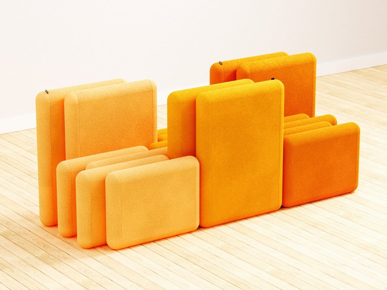
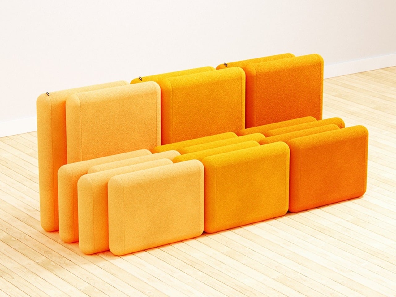
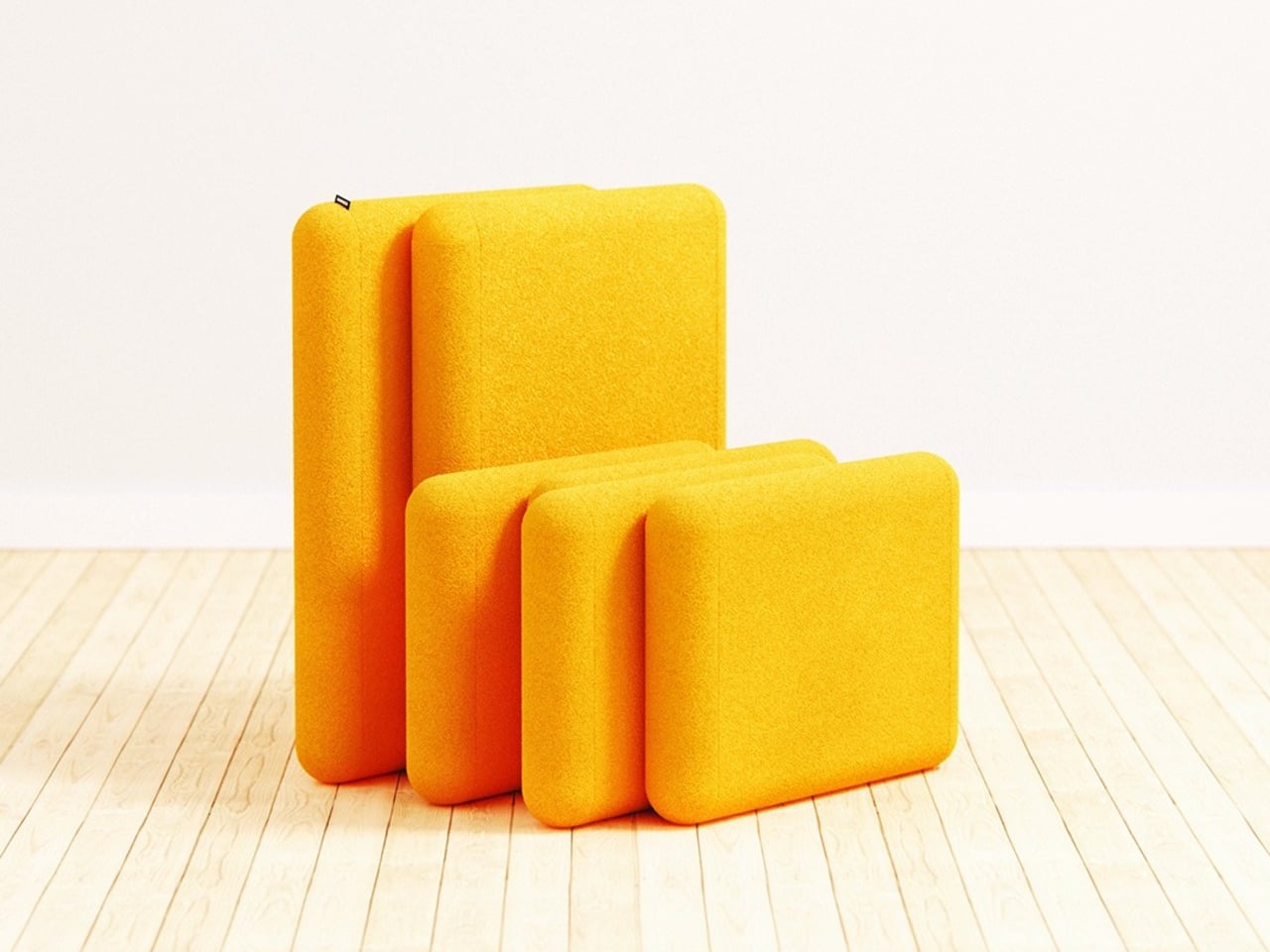
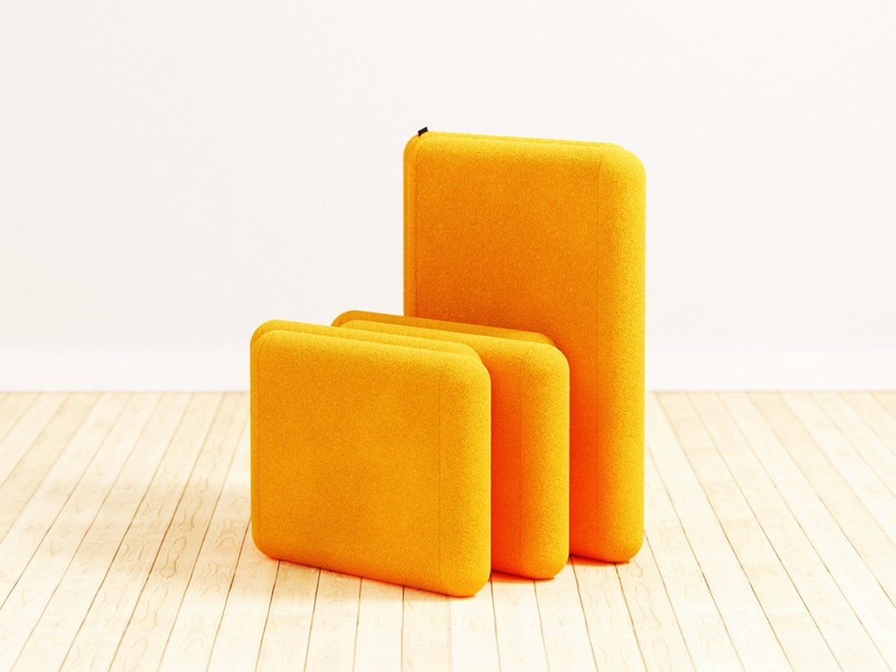
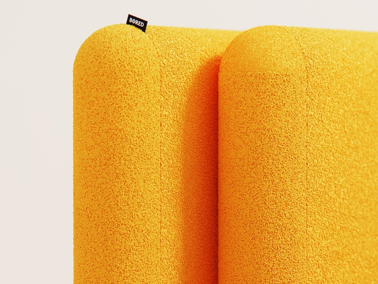
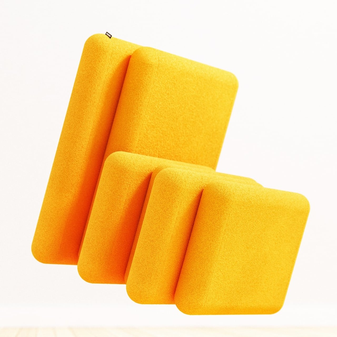
The mechanism is in the staggered relationship between the two parts of each chair. The backrest sits elevated and set back, while the seat extends forward, creating a stepped profile from the side. That offset is precise enough that when a second chair is placed alongside it, the seat of one slides naturally into the space left open by the recessed back of the other. No connectors, no assembly, just geometry.

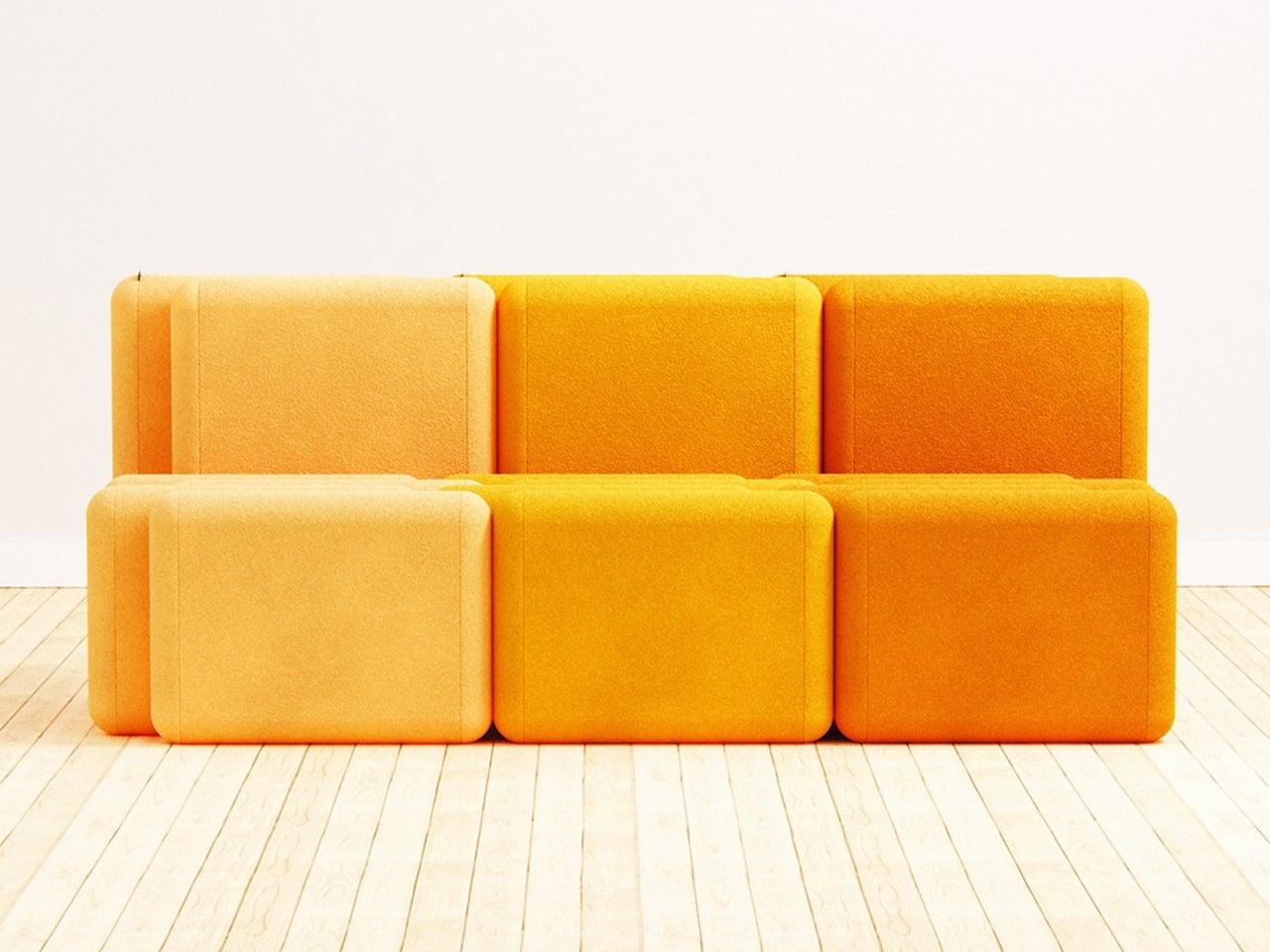
The result, when two or more units are pushed together, is a sofa that reads as a continuous and intentional piece rather than a row of chairs touching each other. The staggered rhythm carries across the joined units, producing a silhouette that looks considered rather than accidental. It’s the kind of configuration that takes a moment to understand, but once you do, it feels like it couldn’t have worked any other way.
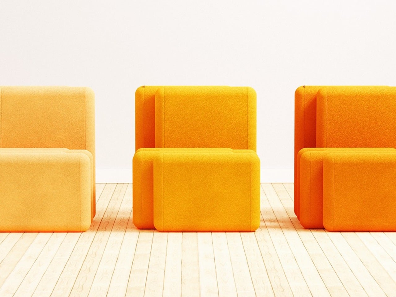
The standalone chair holds up on its own terms, too, and isn’t just a sofa segment that happens to function independently. It sits directly on the floor with no visible legs, giving it a relaxed lounge quality. The proportions keep the form compact enough to live in smaller spaces, which matters when the concept is something you might realistically buy gradually, one unit at a time.
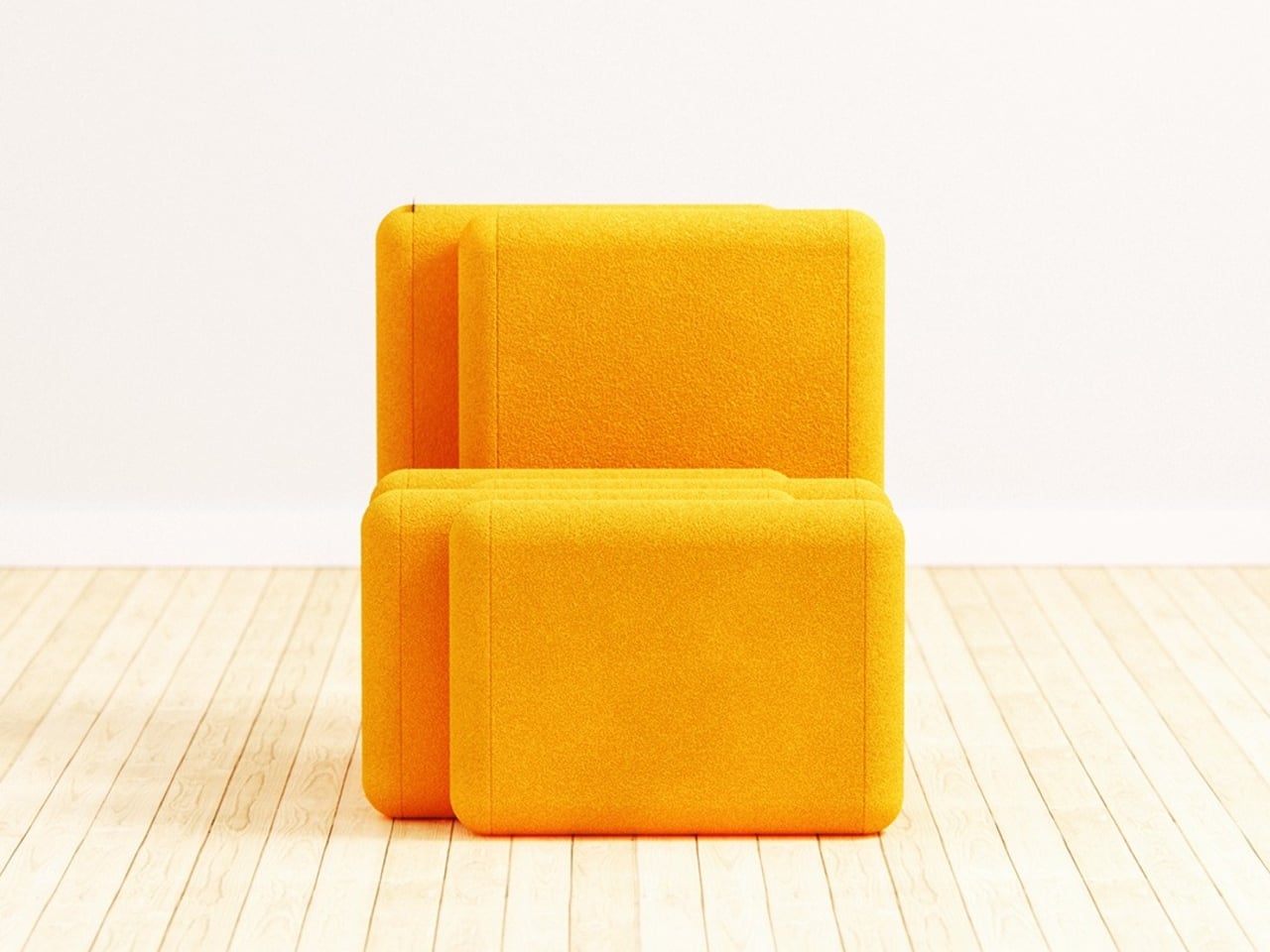
Both the backrest and the seat share the same rounded-rectangle silhouette, upholstered in a thick, textured fabric with the warmth of bouclé. That material, combined with the legless, floor-hugging profile, gives the chair a deliberately unhurried quality, the kind of object that makes a room feel slightly slower and more settled than it did before.
The scalability is part of the appeal. Two units make a small sofa, three make a longer one, and the concept seems to extend indefinitely. When units in different tones are combined side by side, the color contrast adds a visual layer that a single chair doesn’t have. There’s also something honest about a design whose best version requires more than one, an admission that’s built directly into the name.
The post This Lounge Chair’s Shape Is Precisely Why Two of Them Make a Sofa first appeared on Yanko Design.