The fashion industry has a water problem that most people never see. Dyeing fabric is one of the most chemically intensive steps in garment production, and the wastewater that comes out of that process carries synthetic dyes, heavy metals, and other pollutants that routinely end up in rivers and soil. By the time a sequined dress reaches a store, the environmental cost of making it sparkle is already long gone and mostly forgotten.
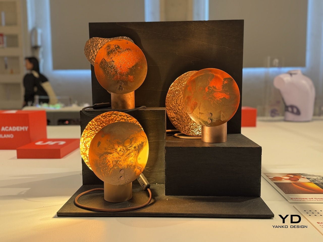
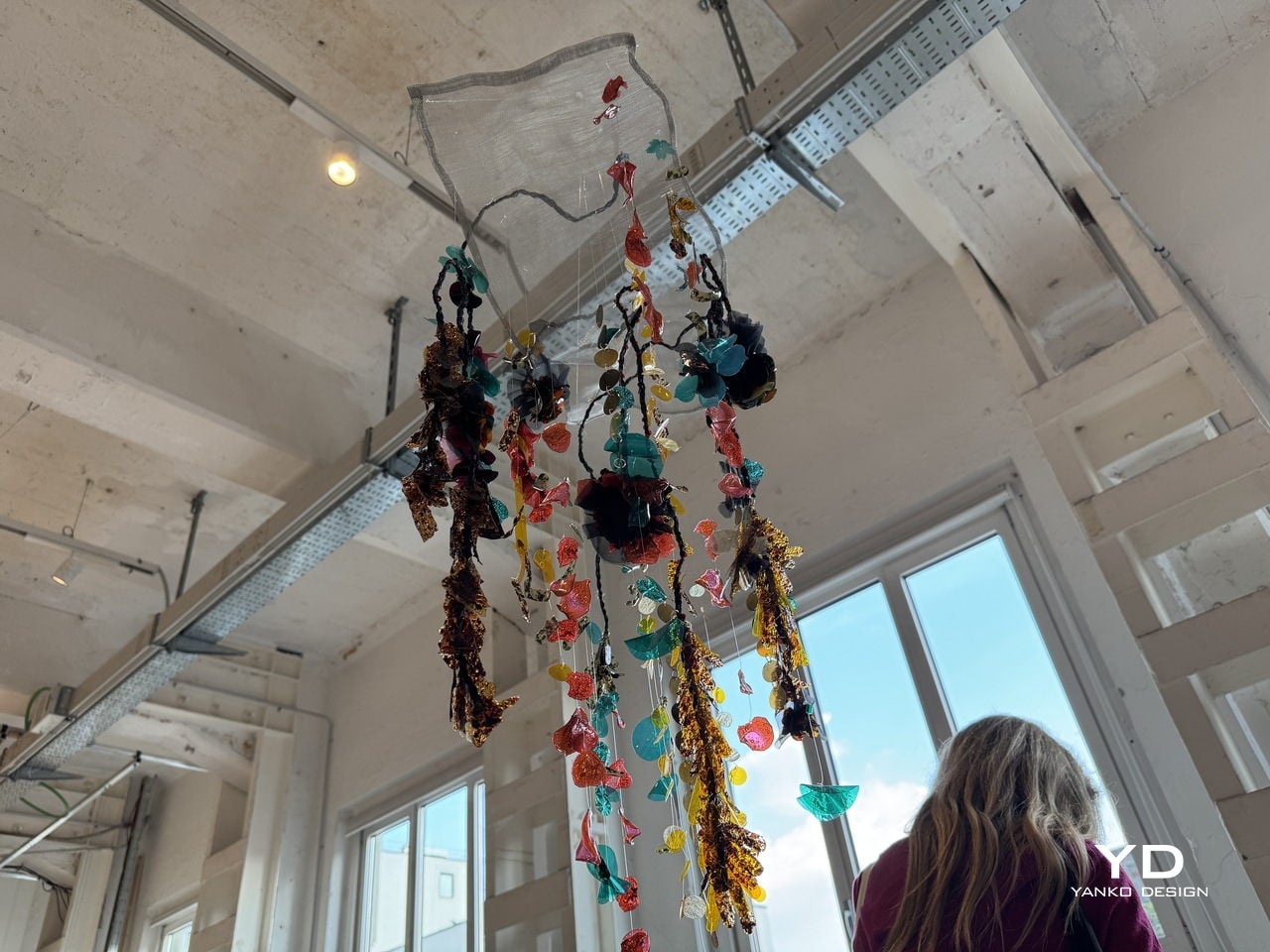
CQ Studio, a London-based regenerative textiles lab, tackled that problem head-on with a material experiment that turns the very wastewater from textile dyeing into the sequins themselves. The result, called Detox Bio-Embellishments, was on show at BASE Milan during Milan Design Week 2026 as part of the studio’s debut exhibition, Transient Gradients.
Designer: Cassie Quinn (CQ Studio)
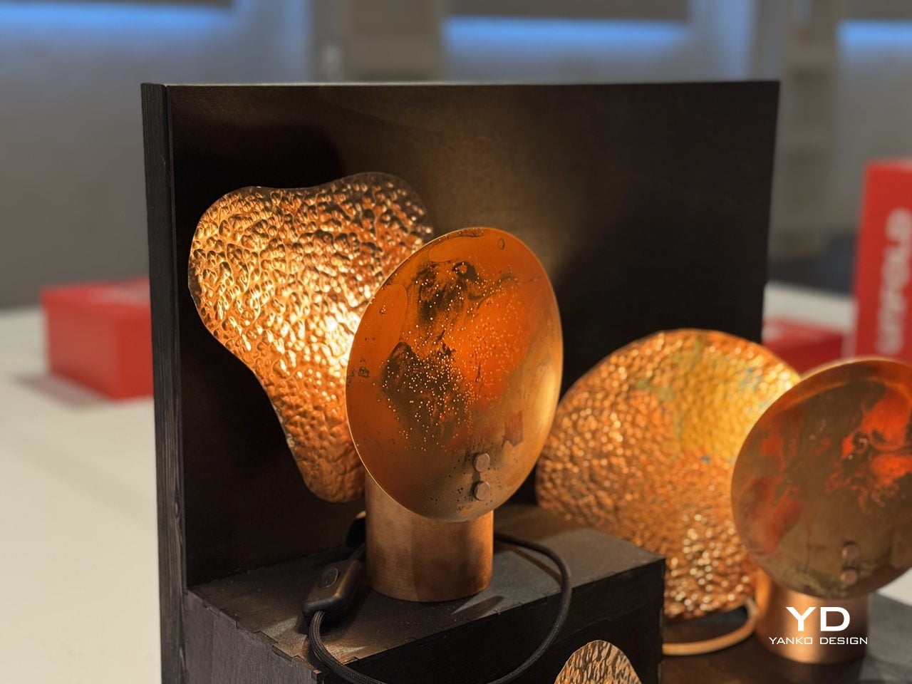
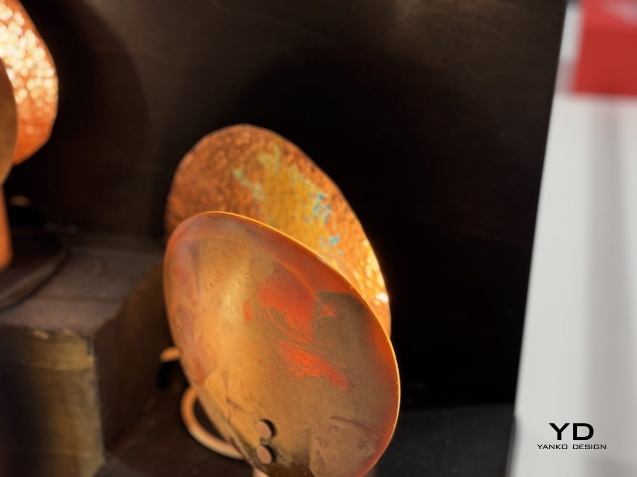
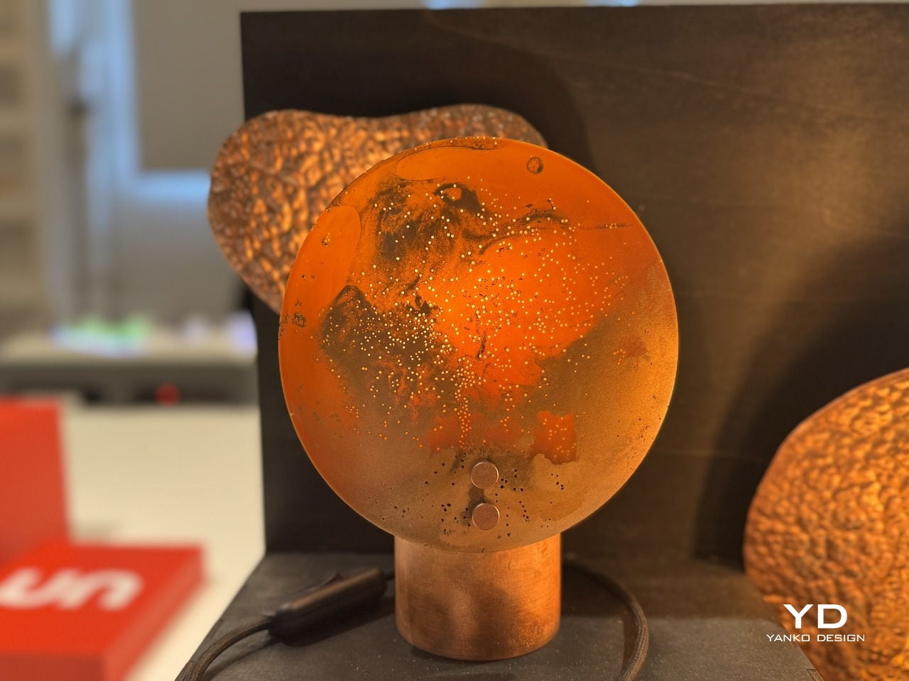
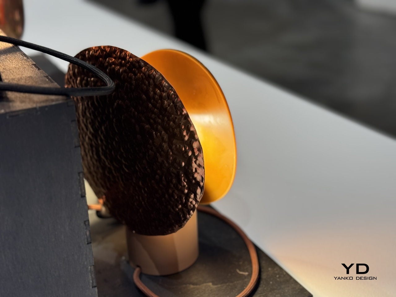
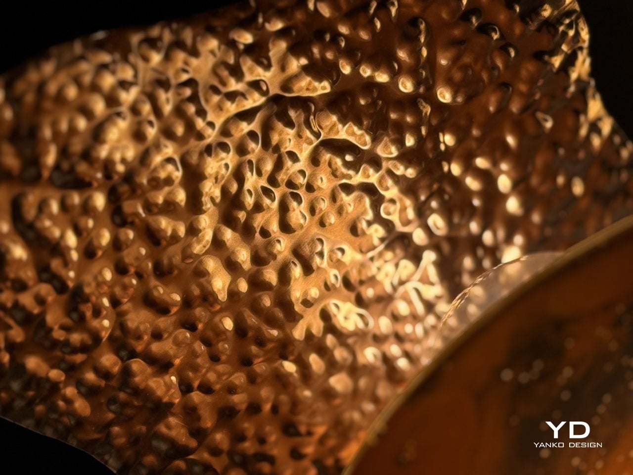
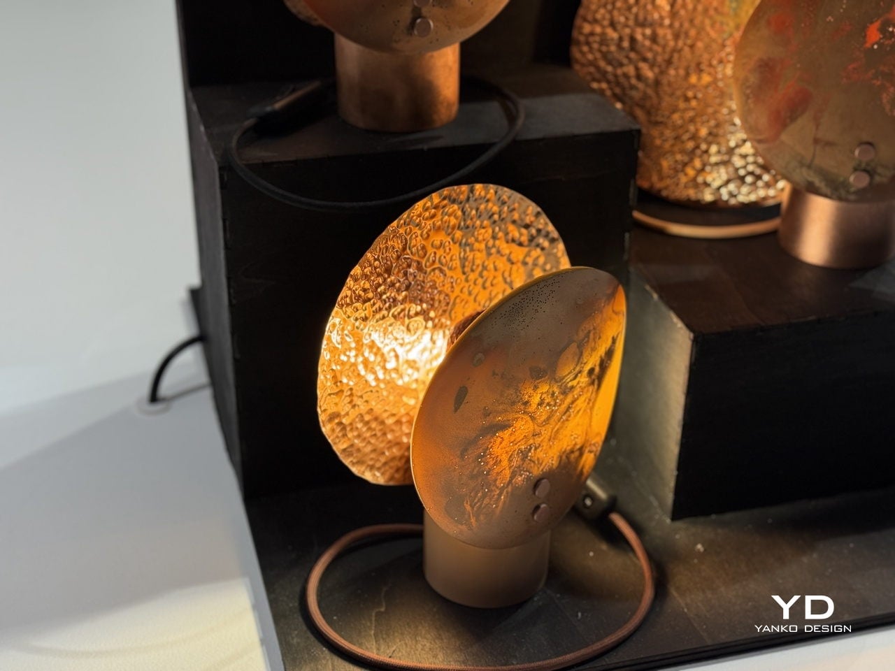
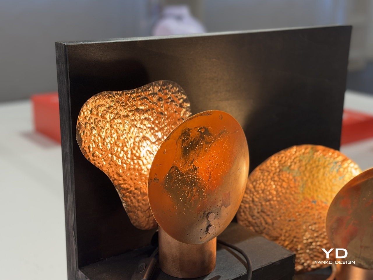
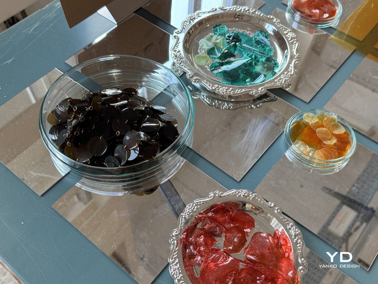
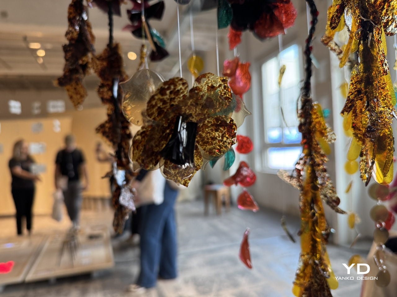
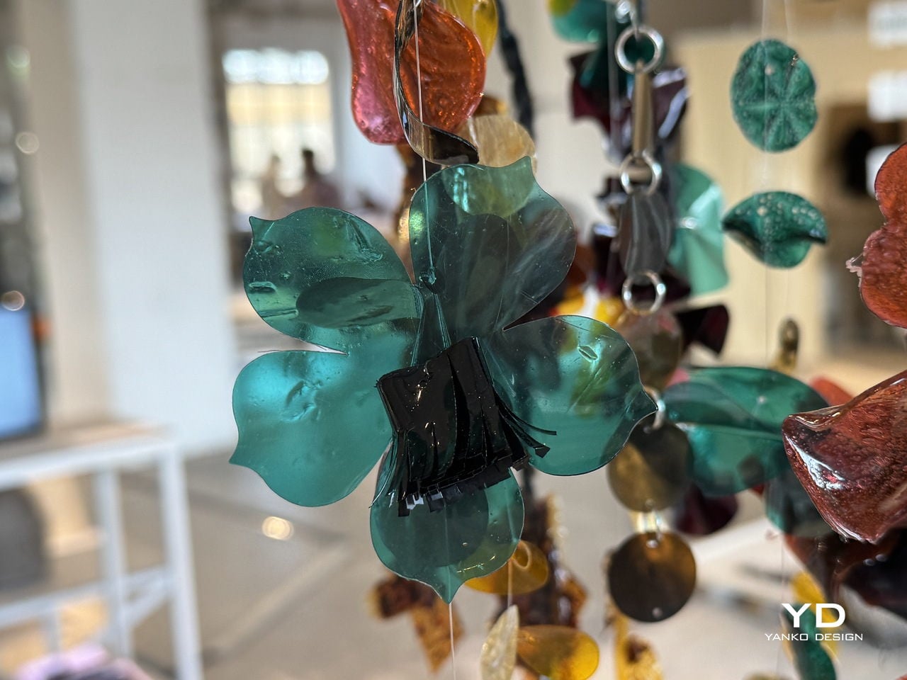
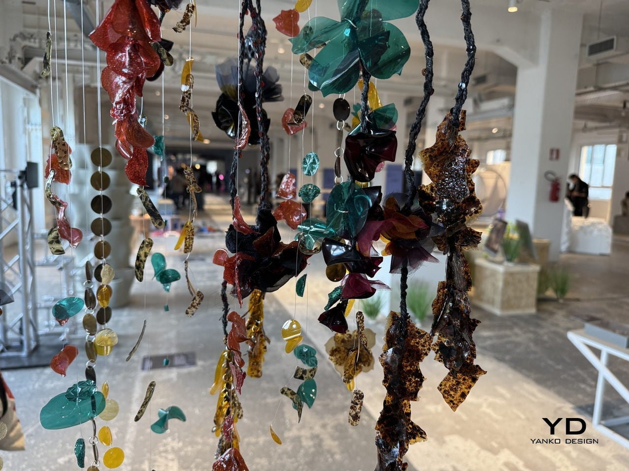
The process starts by running textile-dye wastewater through a detox capture system that uses food waste to pull out the contaminants. Once the water is cleaned and separated, the leftover sludge doesn’t get thrown away. Instead, it’s processed into thin, flexible sheets that look and feel like plastic, but are bio-based, biodegradable, and recyclable. Sequins are then die-cut from those sheets, and whatever scraps remain from the cutting are folded back into the process.
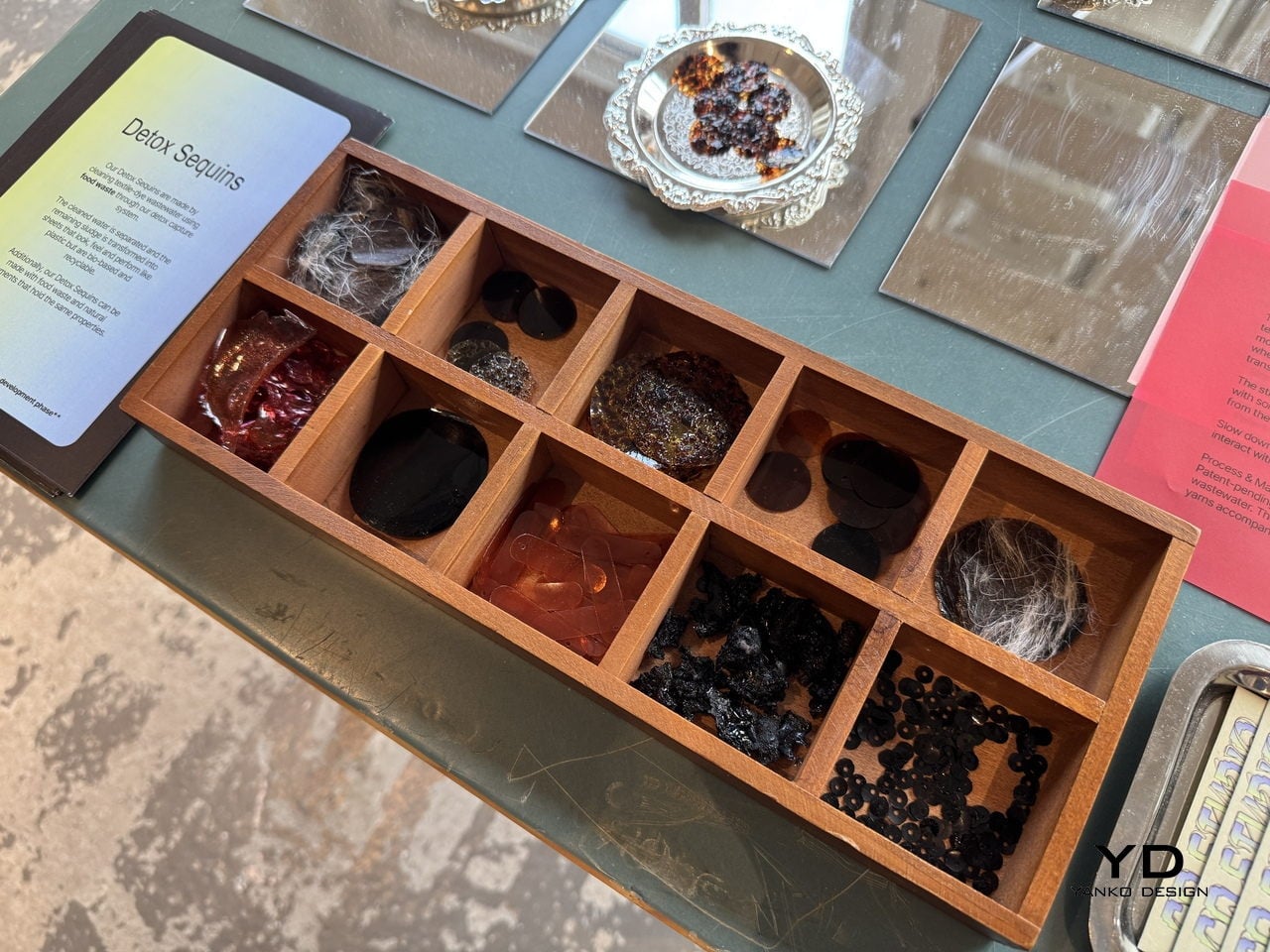
What makes the material particularly clever is how far it extends the concept of nothing wasted. It handles both synthetic-dye and natural-dye wastewater, keeping the synthetic version from ever reaching waterways, while the natural-dye version becomes safe enough to compost into soil. The sheets can also be made using food waste and natural pigments, giving designers a way to produce embellishments in a wide range of colors without any virgin plastic.
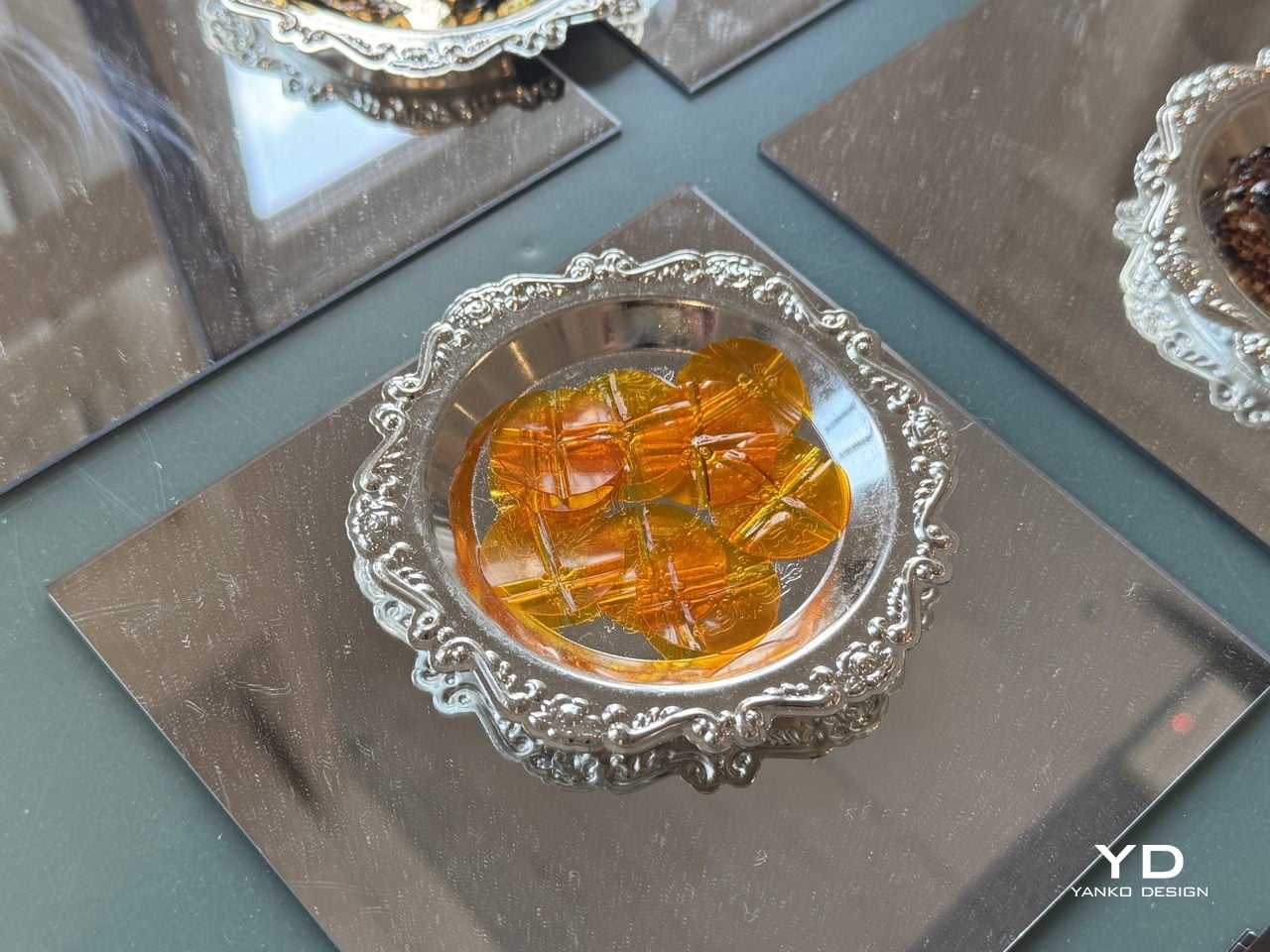
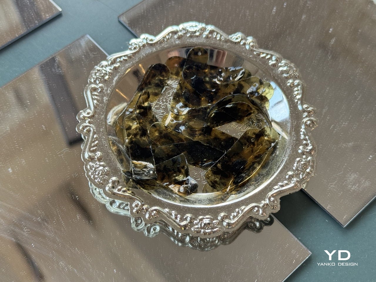
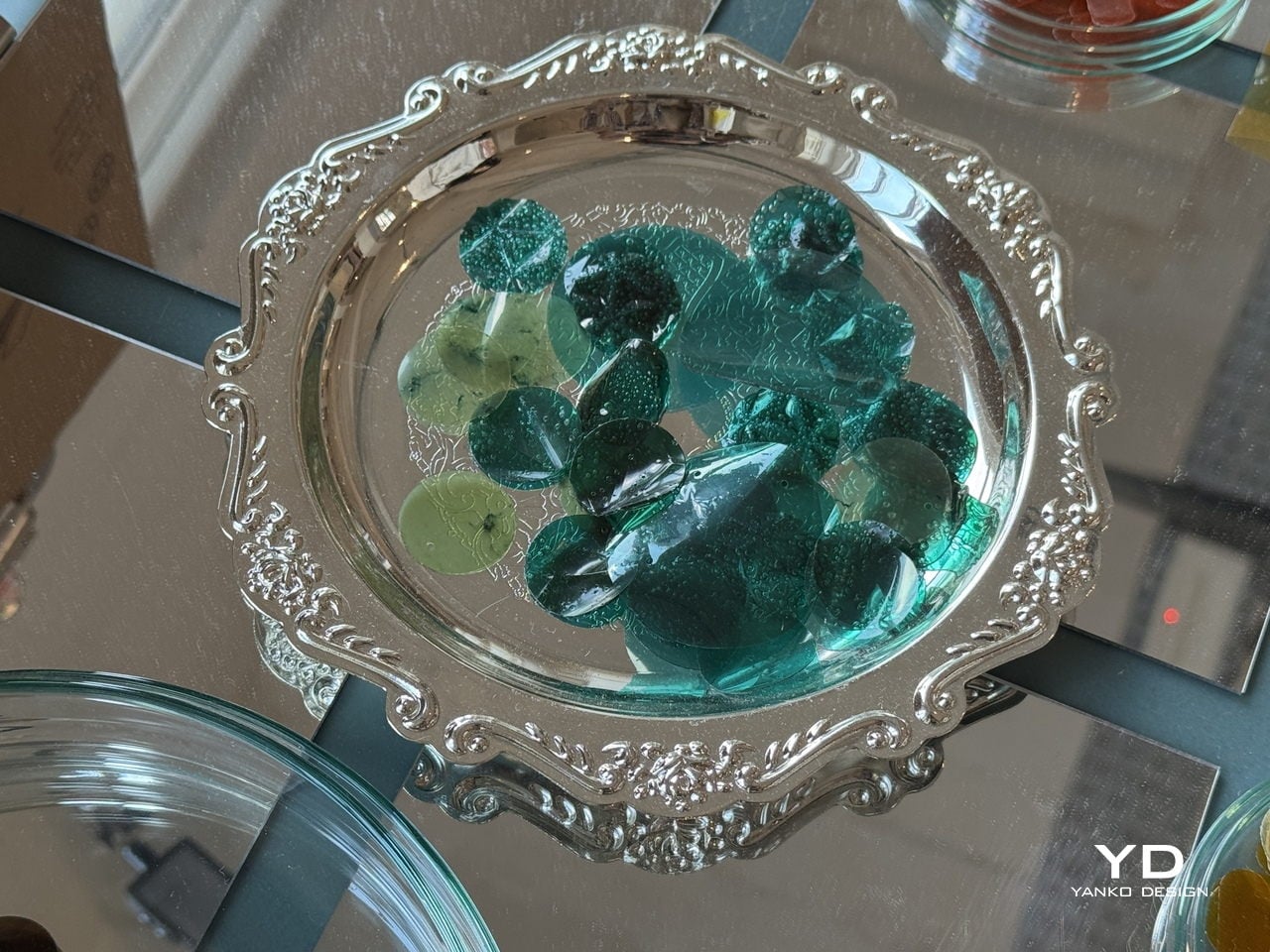
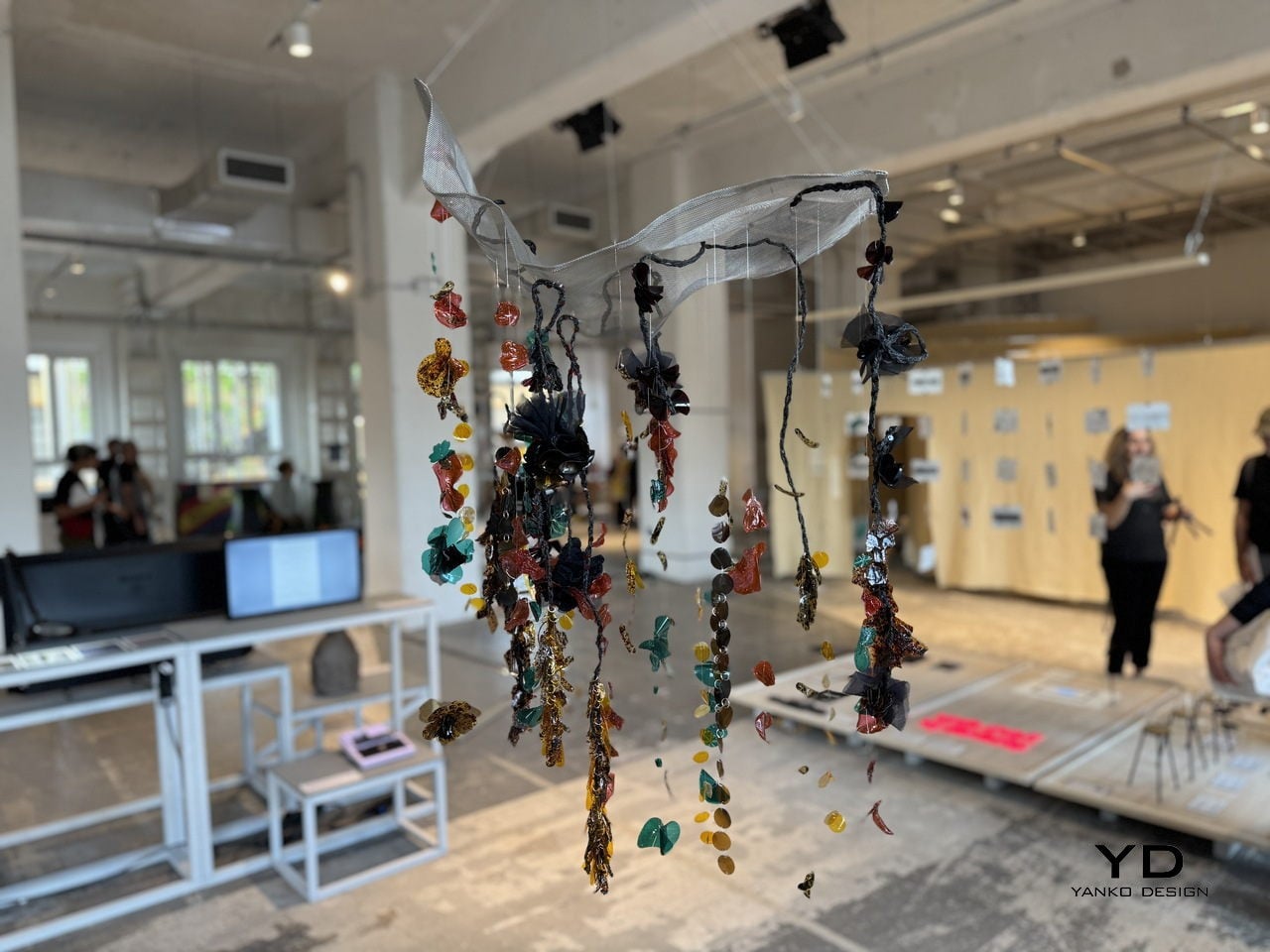
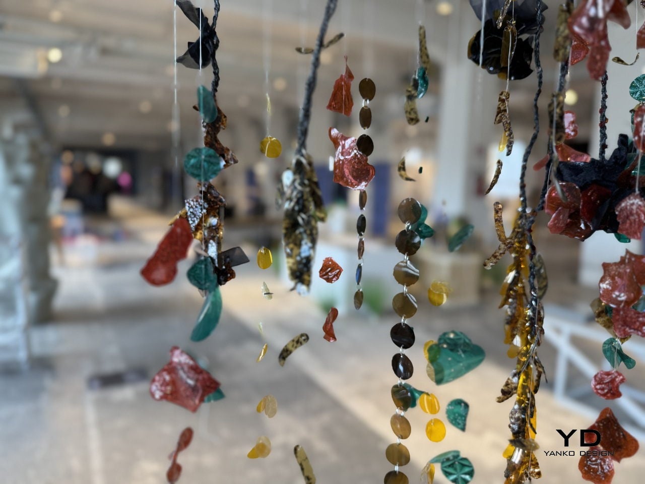
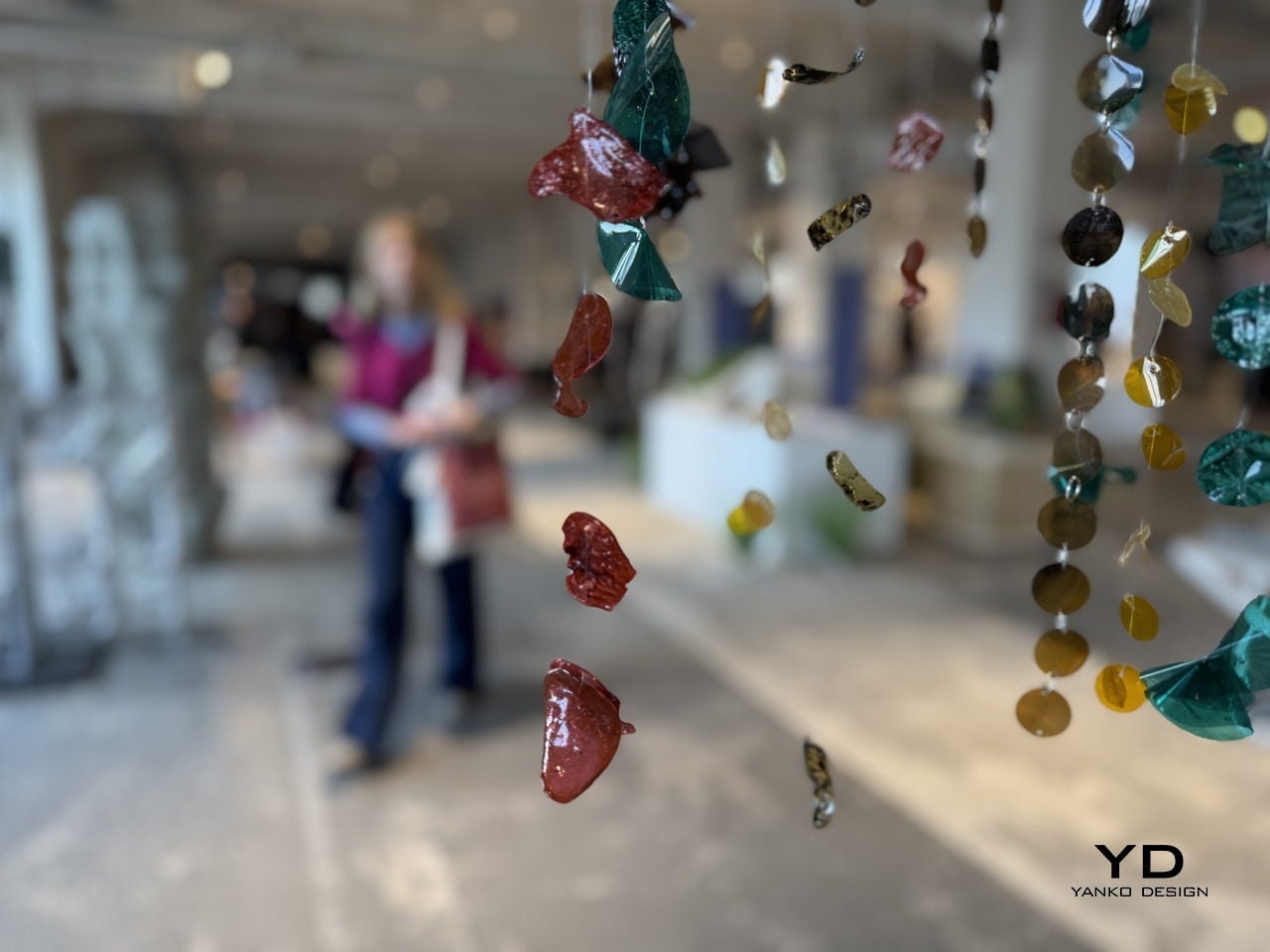
The visual result doesn’t look like a sustainability project at all. The sequins and embellishment pieces come out in deep blacks, jewel-like teals, warm ambers, rich reds, and tortoiseshell-patterned fragments that carry a high-shine finish. Strung onto braided cords and translucent threads for the Milan installation, they hung in dense cascading curtains that looked more like haute couture jewelry than anything born from industrial sludge.
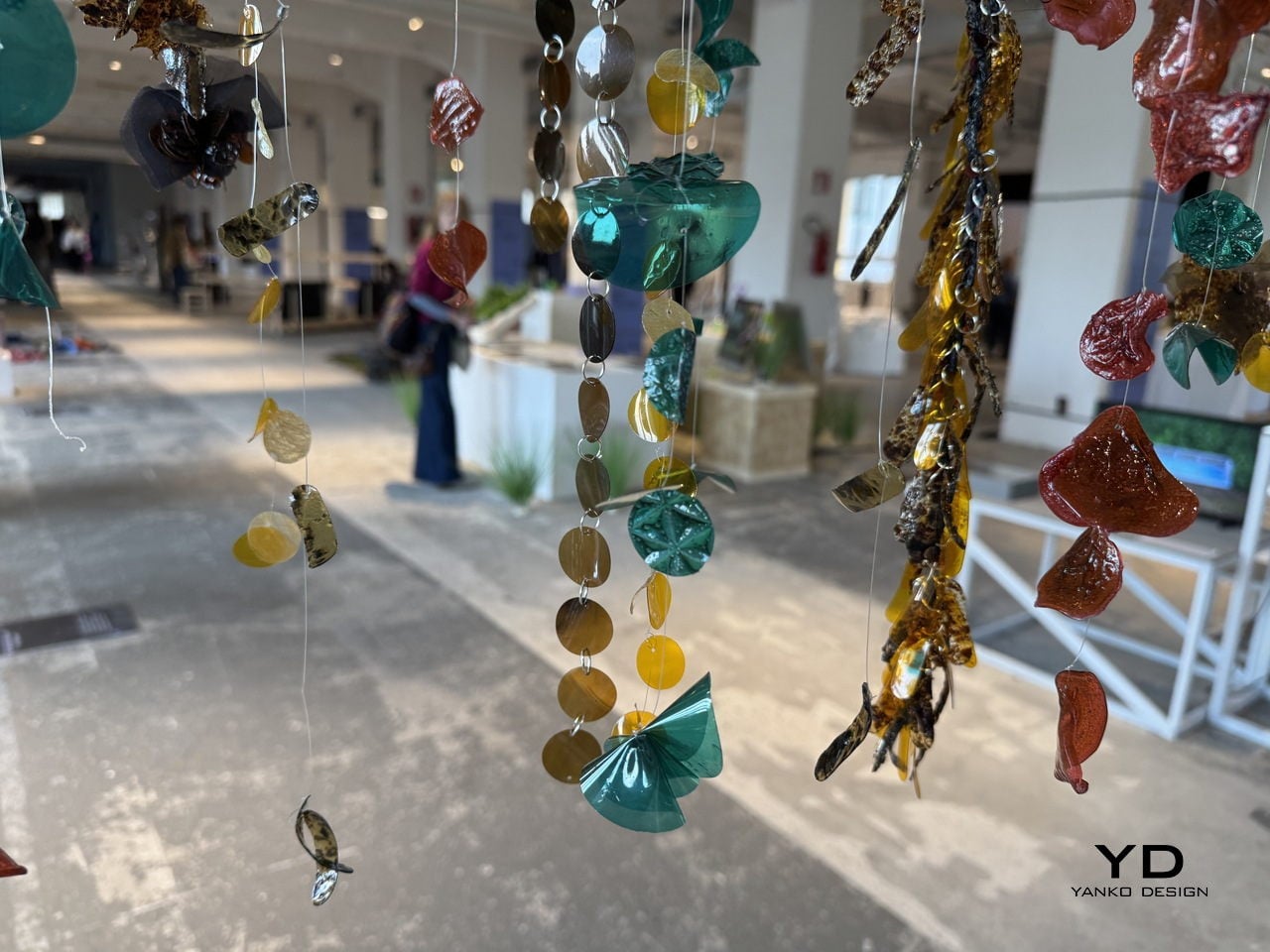
For the fashion industry, where sequins are almost universally made from petroleum-based PET plastic and are notoriously difficult to recycle, having a material that can match the visual appeal of conventional embellishments while being fully bio-based is a genuinely significant step. A garment made with Detox Sequins wouldn’t just sparkle; it would also carry a story worth telling, one that runs from a dyeing vat through a detox system and out the other side as something a designer can actually use.
The post These Sequins Are Made From Industrial Dye Sludge and Still Sparkle first appeared on Yanko Design.