The former mobile giant Nokia was both famed and notorious for its innumerable phones, some of which have gone down in history for their iconic designs. There are some, however, that have also gone down in infamy for their odd designs that, while eye-catching, end up being unusable. Although not the biggest culprit, the Nokia 7610 belongs to the latter group with its curved and off-center keypad.
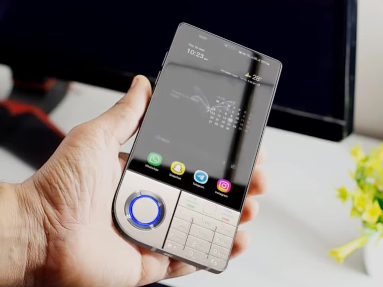
With HMD reviving some of Nokia’s classic designs, there has been some interest in modern interpretations of these peculiar phones. This concept design for a 5G variant of this “stylish” phone, for example, retains the basic contours of the original but thankfully prioritizes usability over glamour, though not without a gimmick of its own.
Designer: AndroidLeo
Although it stuck to the conventional vertical candy bar format, the Nokia 7610 is characterized by an odd combination of sharp and curved corners on opposite sides, giving it a leaf-like shape. What made it even more unusual, however, was the shape of its keys. While it also conformed to the T9 layout, the keys curved a bit and had non-uniform sizes, making them harder to hit accurately by muscle memory alone.
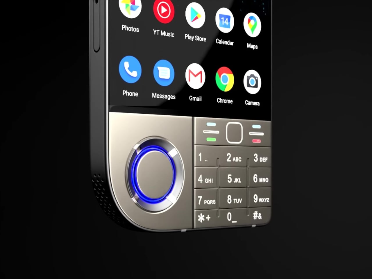
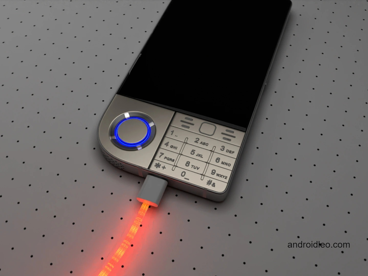
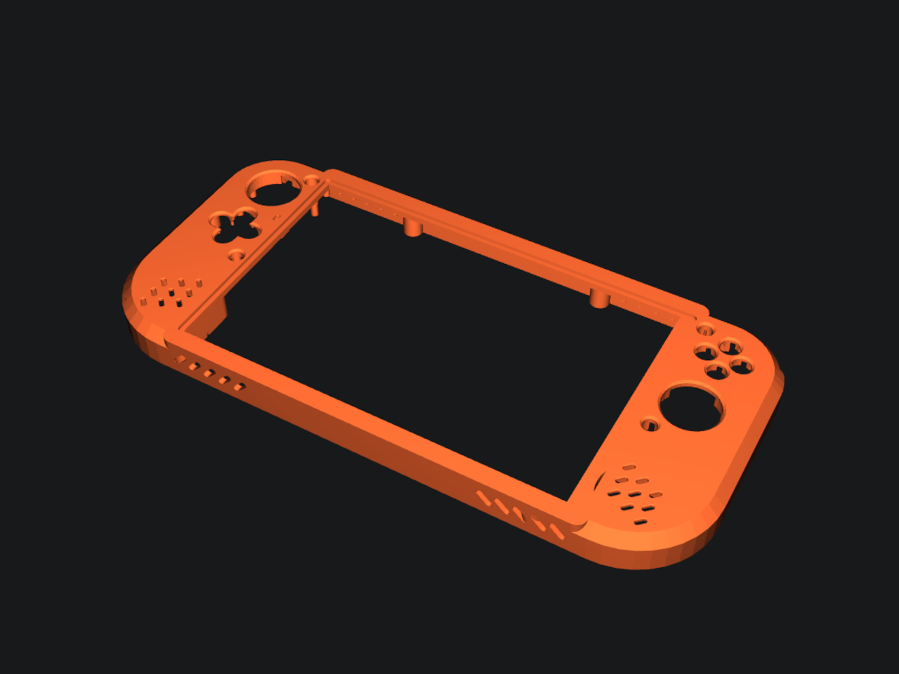
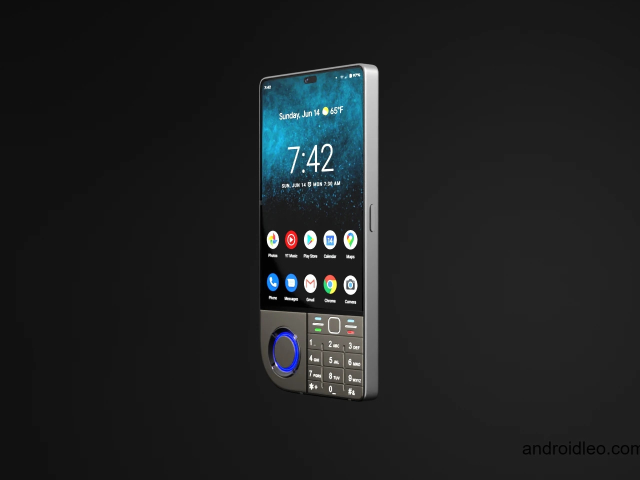
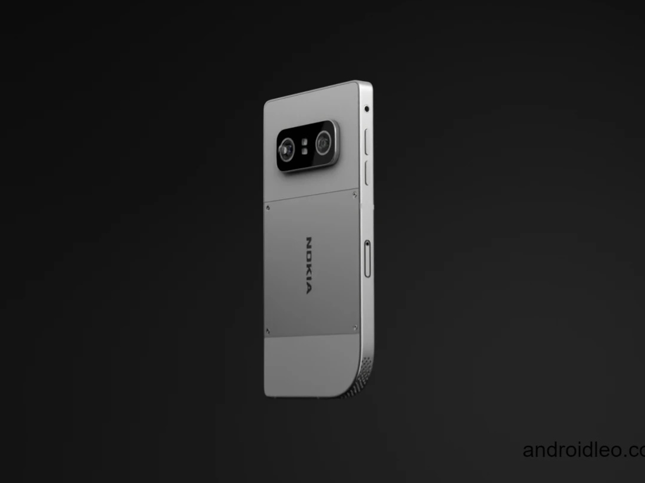
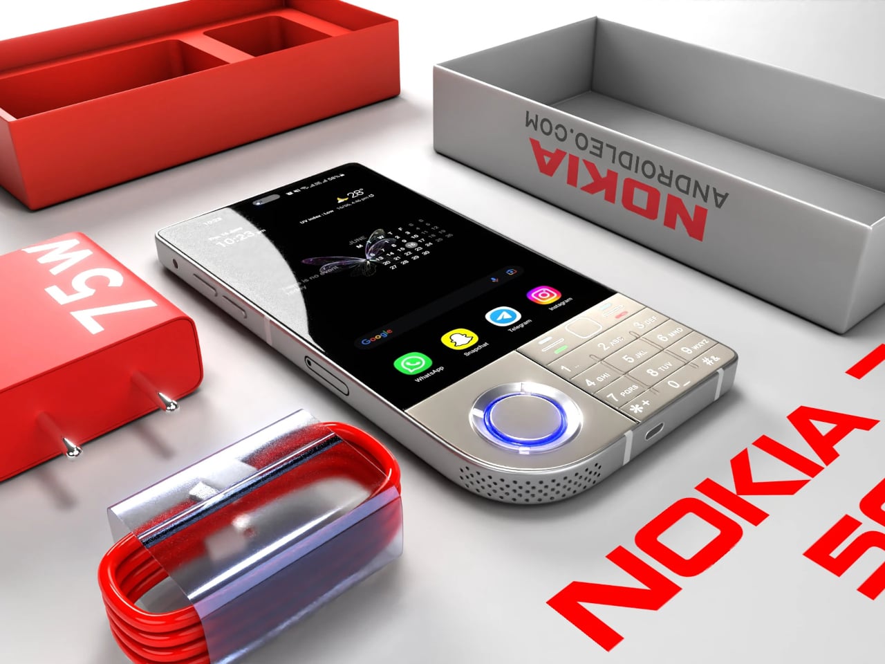
The Nokia 7610 5G concept ditches that novelty for a more standard keypad layout, one that would be instantly familiar to users of those old phones. The keypad is, however, still off to the right side, and the empty spot on the left is taken up by a large flat circular that functions as a sort of joystick controller. Whether that has any actual useful function is debatable, but it does make the phone look unique and a little more balanced.
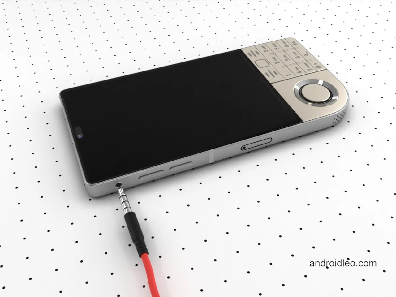
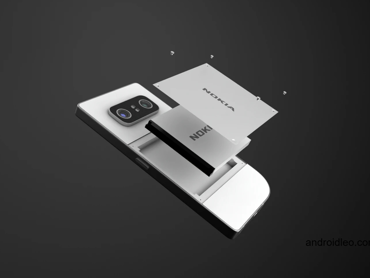
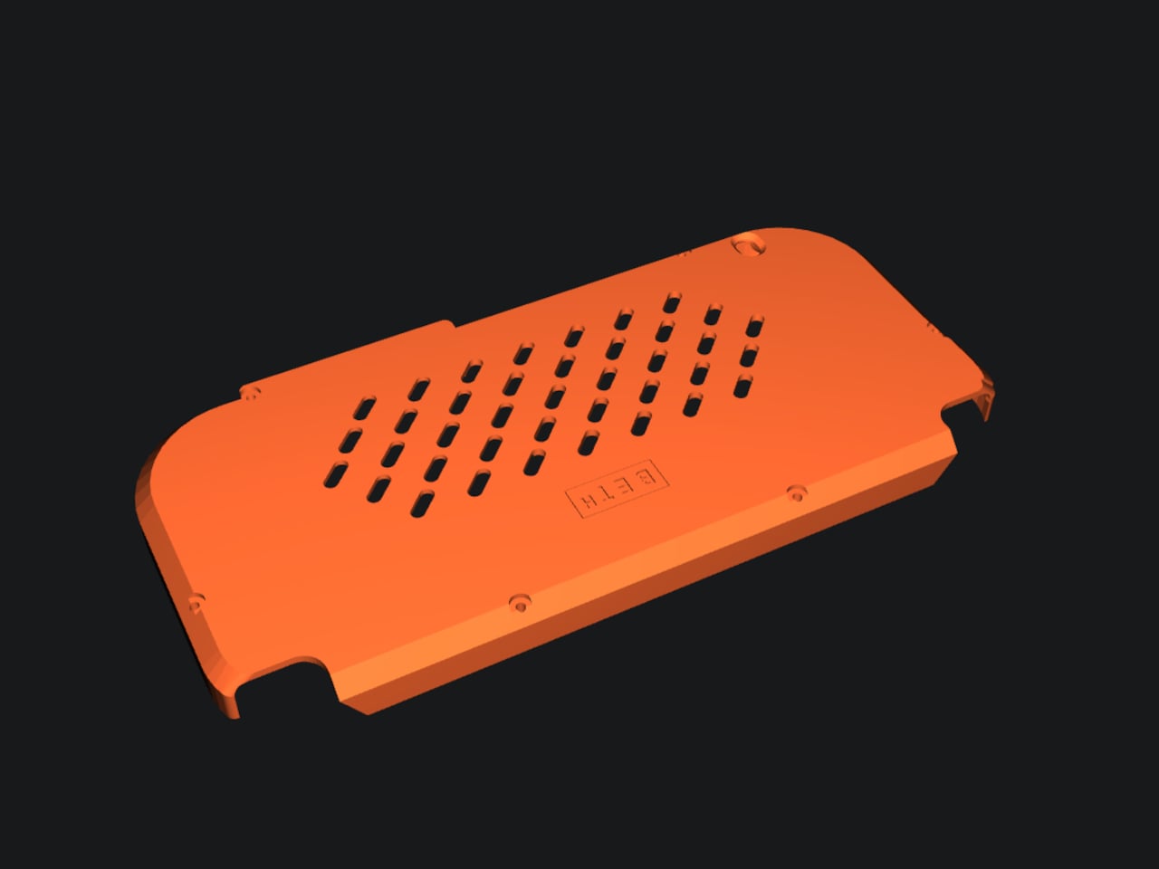
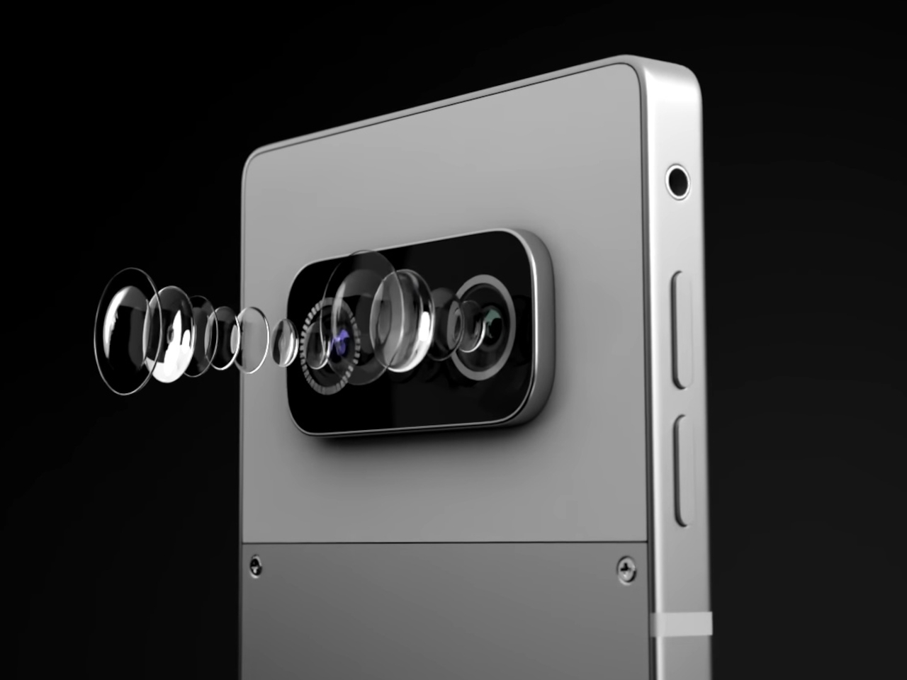
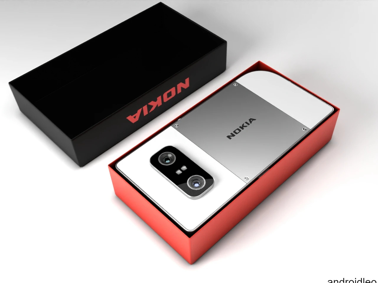
In almost all other aspects, this concept would look like any Android-like phone, but there are some details you’d be hard-pressed to find in modern smartphones. There’s a headphone jack, for one, which is a rare sight these days. The battery is also replaceable, hidden behind a removable panel on the back.
These details are a homage to some of the things that made Nokia phones great, despite their odd and sometimes unusable designs. There is a strong focus on functionality, paired with the courage to risk novel and untested designs. We’re unlikely to see the Nokia 7610 revived the way other Nokia classics have been, but this concept is still an interesting experiment in reinterpreting that design language for modern needs and tastes.
The post Nokia 7610 5G concept is a dreamy fusion of past and future first appeared on Yanko Design.