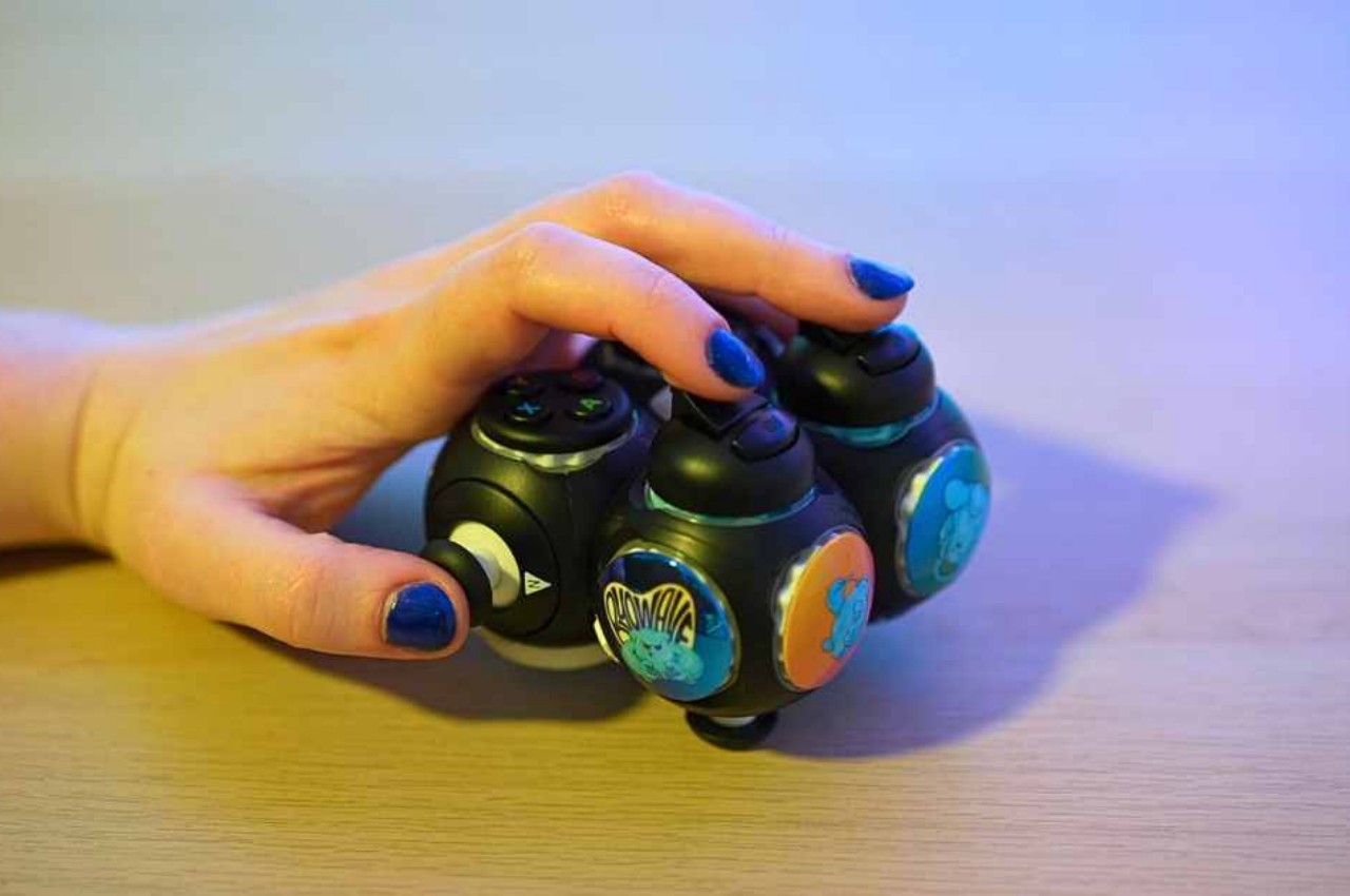
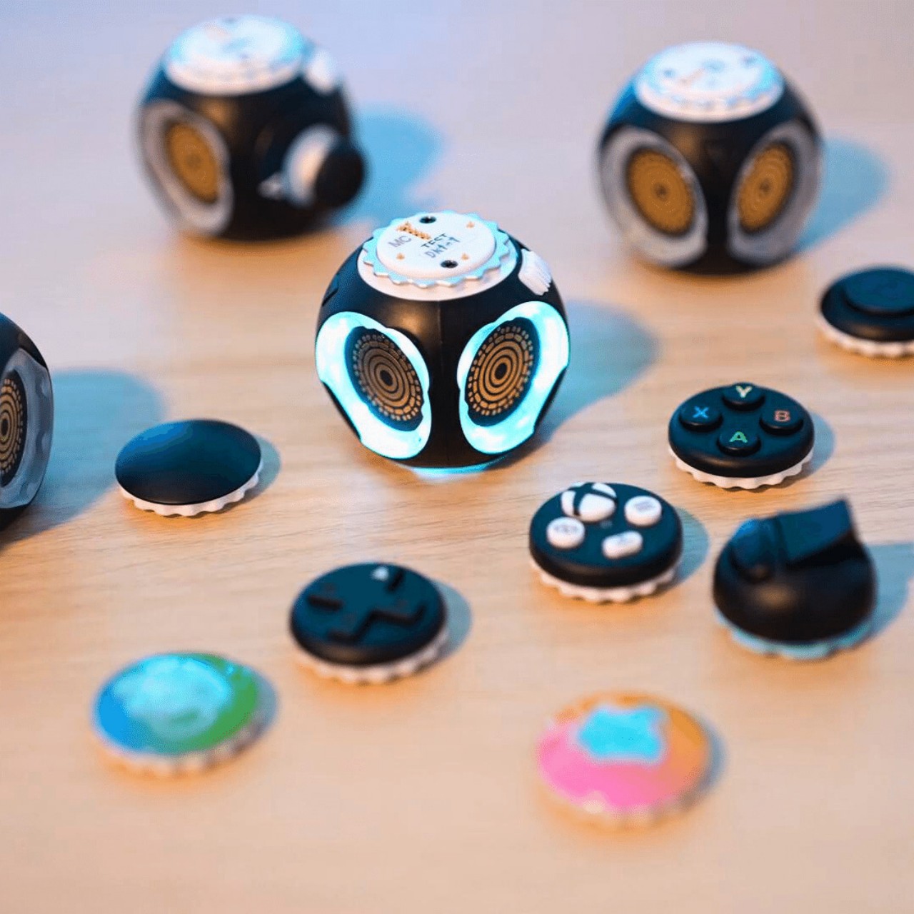
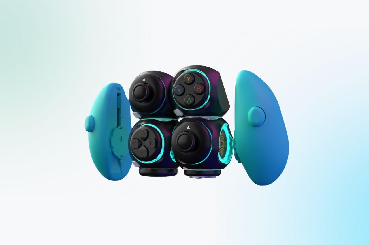
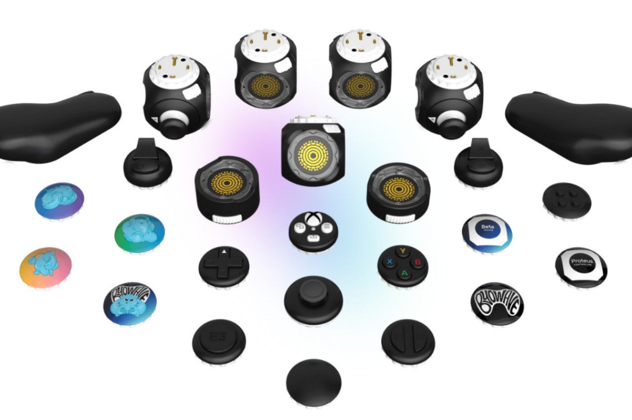
Wireless speakers have become all too common now thanks to multiple factors, from the rise of voice-activated smart home assistants to the popularity of streaming services to the demise of the headphone jack from smartphones. These audio devices have also outgrown their initial designs which seemed to be limited to blocks or cylinders, adopting more fluid forms that are almost artful than technical. Of course, there is no need to go to opposite extremes to have a good speaker design, as this concept proves with a simple and clean shape that immediately strikes one as something that isn’t your regular wireless speaker while, at the same time, clearly tries to deliver the basics of an omnidirectional audio source.
Designer: Fran Rossi, Javier Bianchi

Many wireless speakers today try to deliver sound in 360 degrees to cover the entire room, which is especially needed if it’s meant to respond to voice commands coming from anywhere in the area. Thanks to the likes of the Amazon Echo, Google Home, and Apple HomePod, cylindrical shapes seem to have become the most common design for wireless speakers. Of course, there are conical or even spherical speakers, but these aren’t the only round objects that can be used to the same effect.
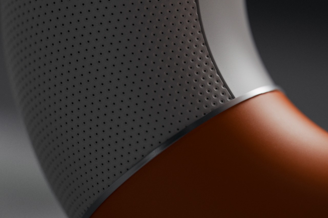
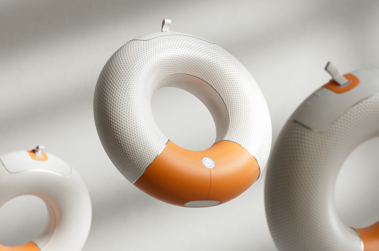
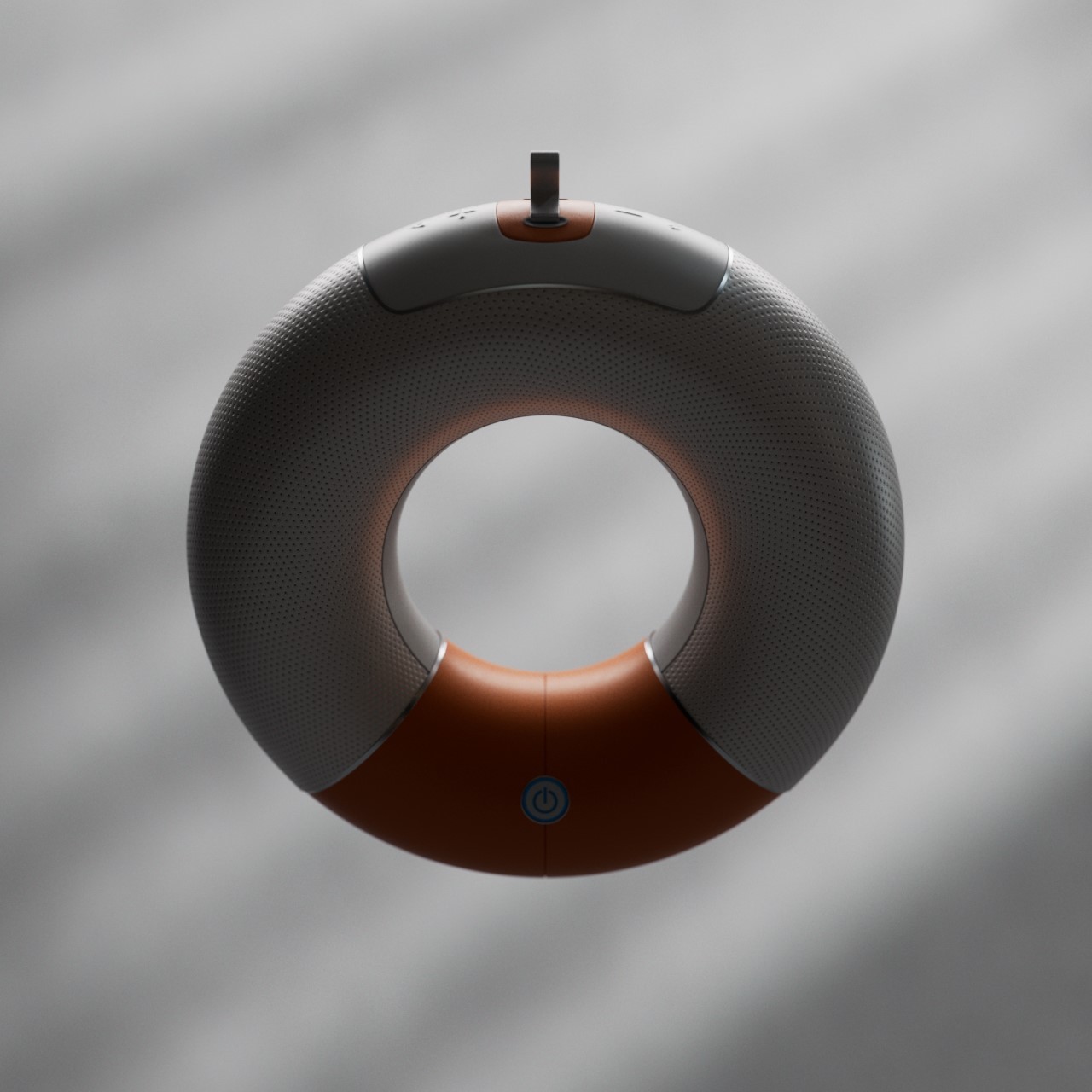
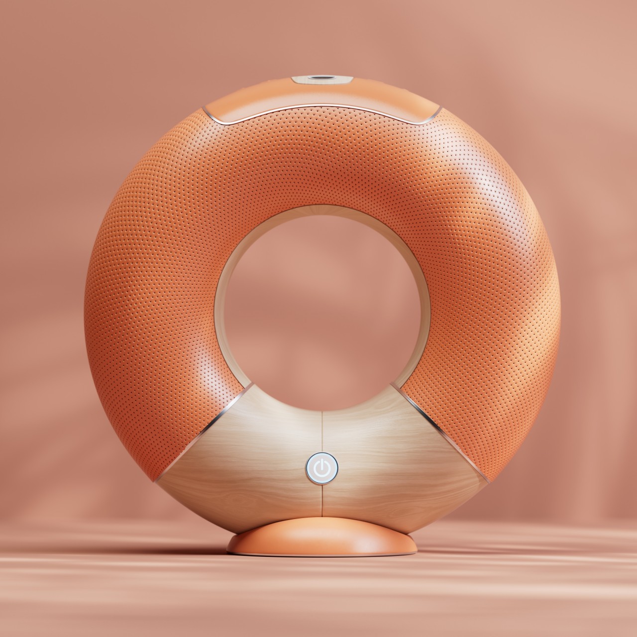
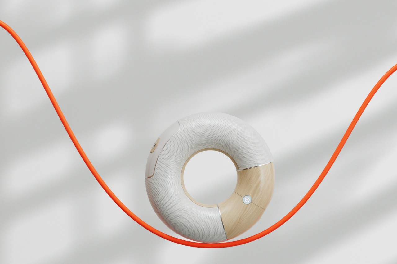
Orbit adopts a lesser-used shape that, along with a sphere or ball, is immediately associated with fun things. A torus can be a donut, a wheel, a piece of candy, or even a floatation device, and the way it can roll on a floor and wiggle and spin before falling down flat is often a game played by children. That playful charm is further emphasized the by concept’s choice of colors and materials, with a bright orange accent against a cool white body, and reflective plastic instead of fabric. It looks almost like a toy, though its functionality is far from being child’s play.


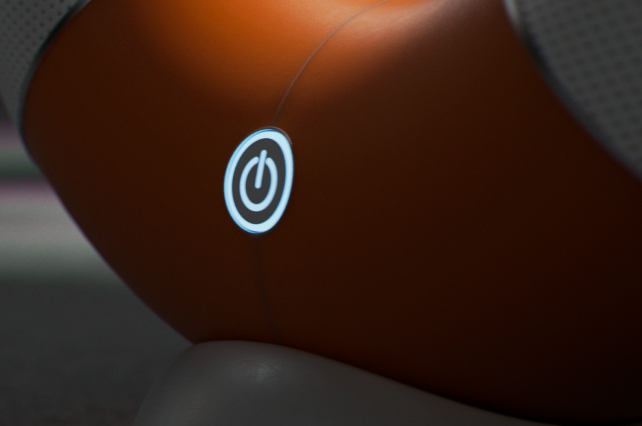
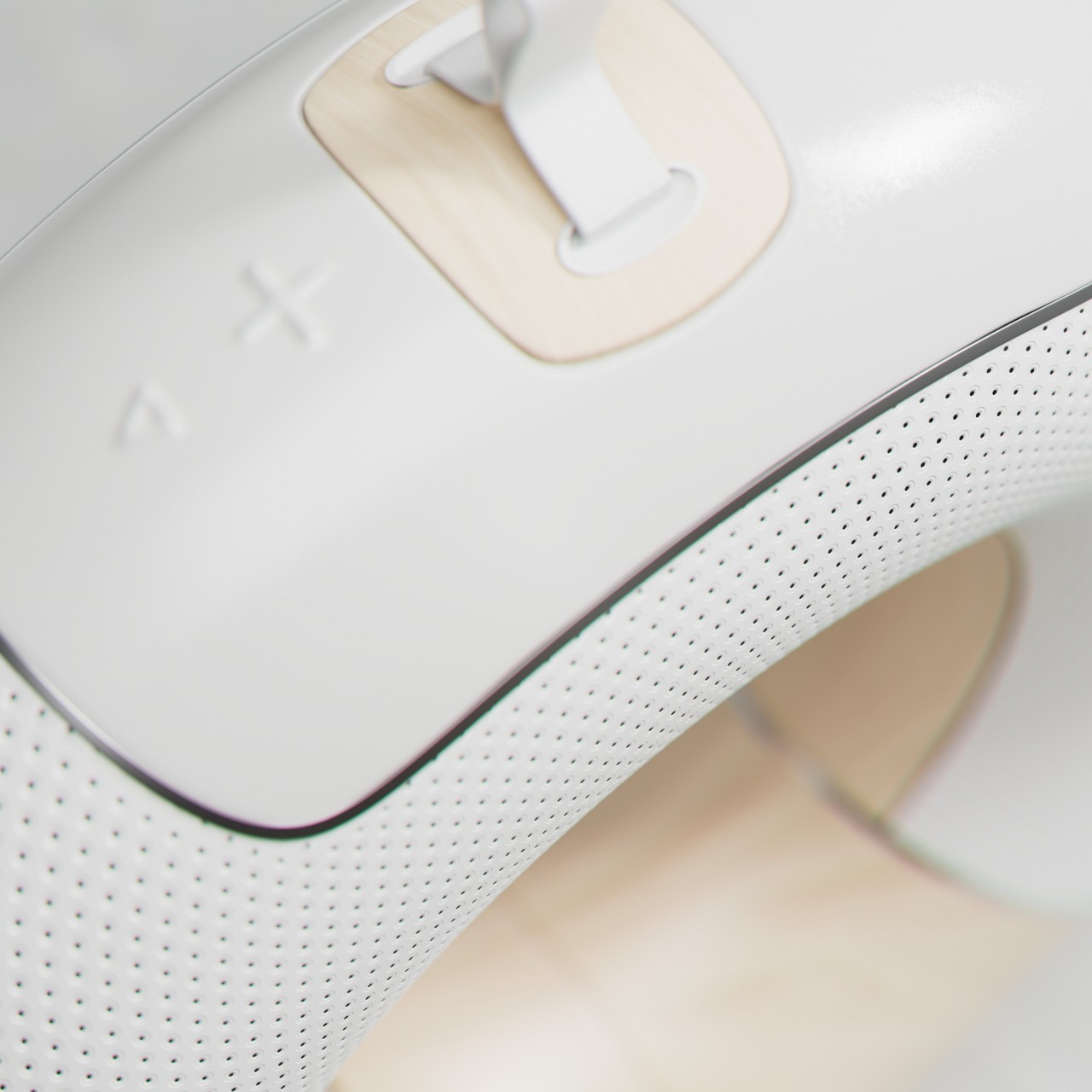
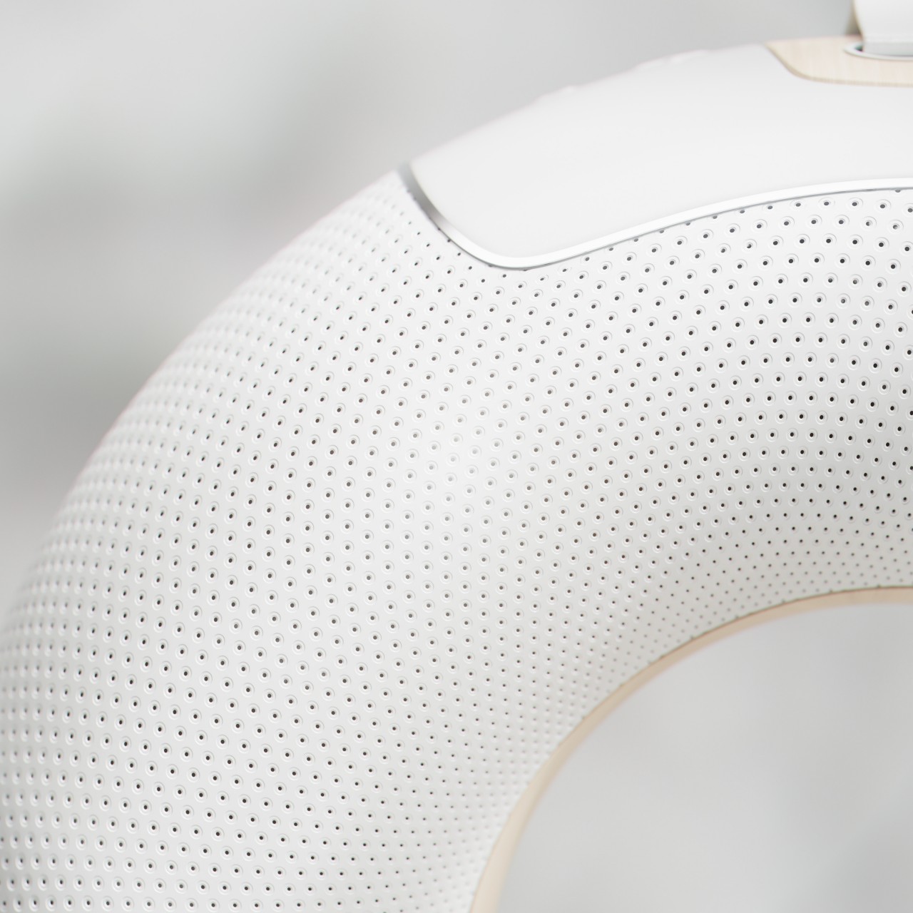
Thanks to its ring shape, it can also transmit audio 360 degrees, though it also has more freedom on where the sound is sent. When standing, it can bounce the sound off the ceiling, though it can also be placed down on its back for a more conventional horizontal output. The Orbit is almost a perfect torus, so it requires a stand to, well stand up. Its other functions, however, are all built into the device itself, like the large backlit power button in front and the embossed playback controls on top.


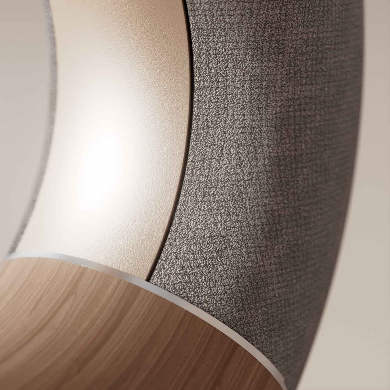
Despite the playful nature of its shape, small variations to the design can result in a totally different character. Covering the entire ring with dark gray fabric and switching the accents to wood or gold gives it a more luxurious appeal that could proudly stand as an art object in your living room. Switching up the colors and materials also generates different imagery, turning what looks like a simple design into a highly flexible and customizable one.


The post Donut-shaped Bluetooth speaker concept inspires a more playful way to enjoy music first appeared on Yanko Design.