There’s a specific kind of loneliness that comes with working alone all day. Not the dramatic kind, just the low-grade awareness that every question you have goes into a chat window, every instruction gets typed into a box, and the thing supposedly helping you has no idea where you’re sitting or what’s on your desk.
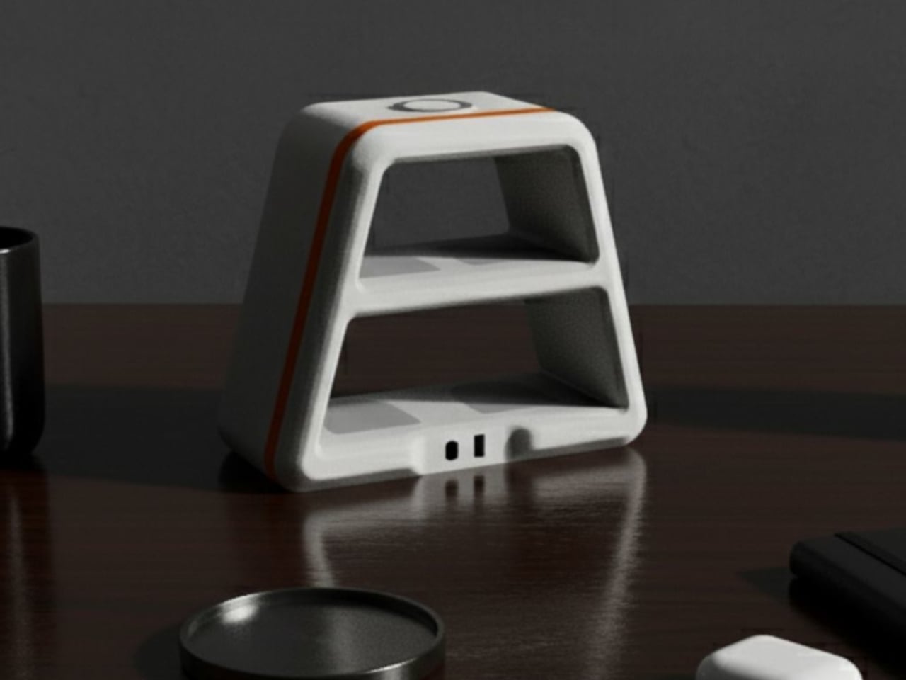
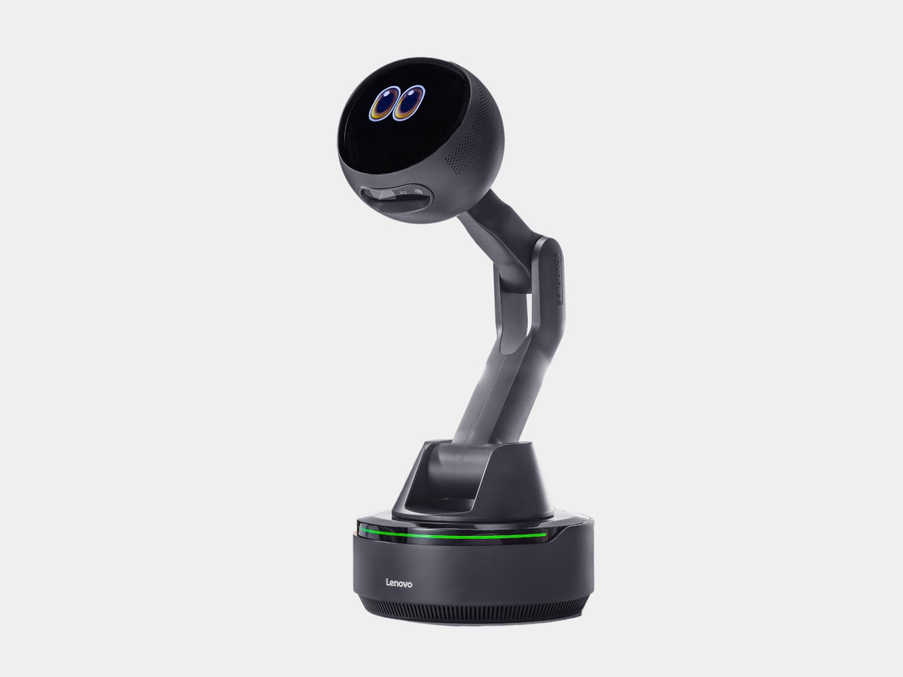
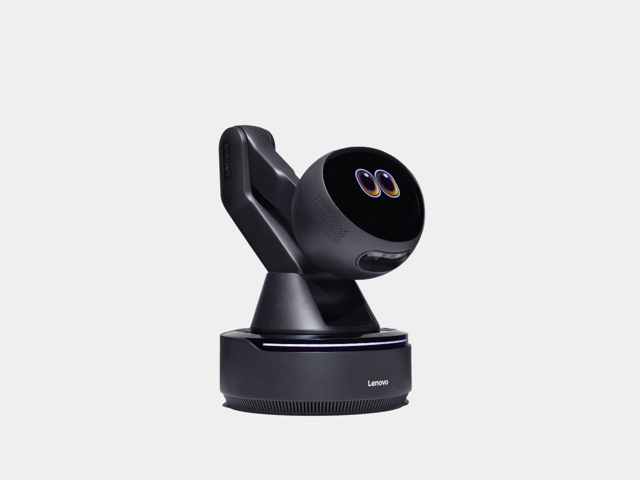
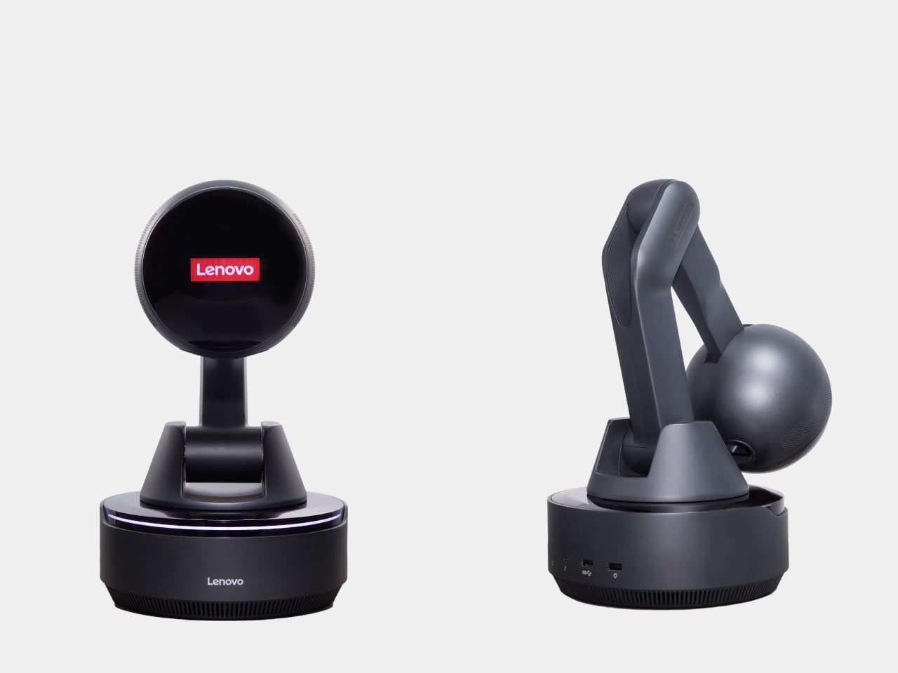
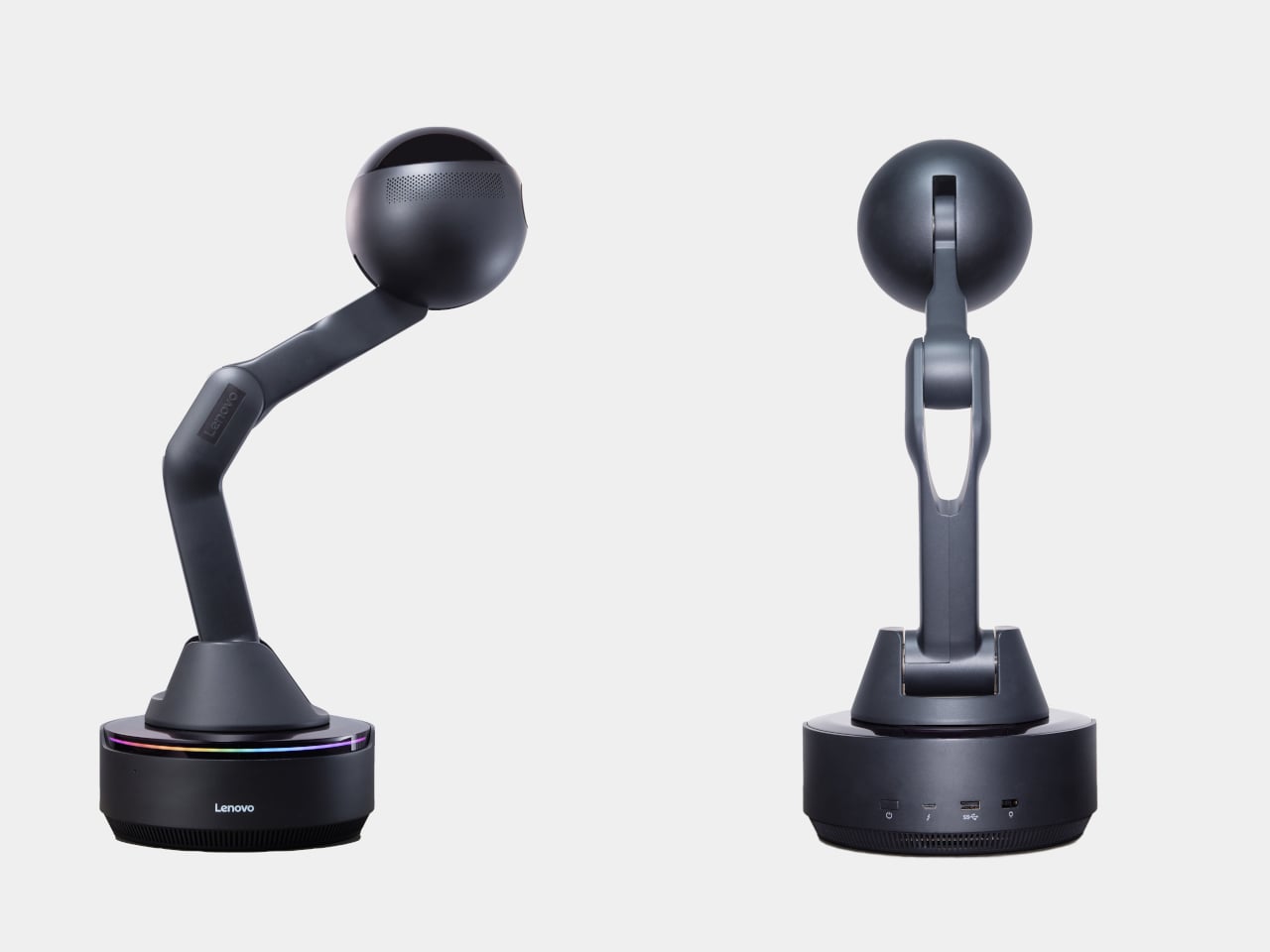
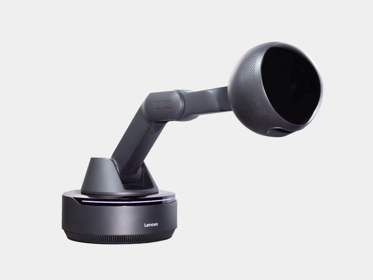
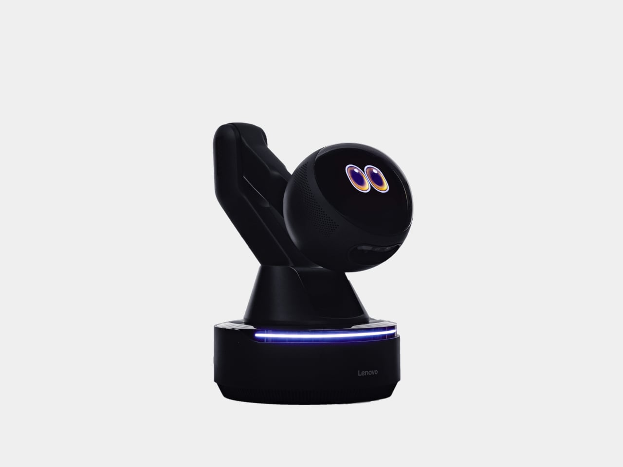
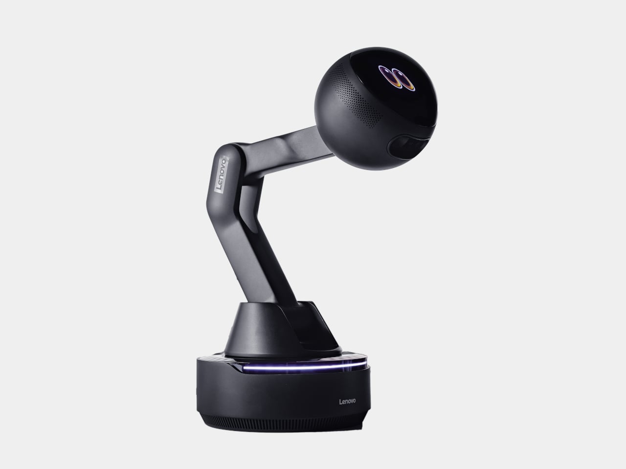
Lenovo’s AI Workmate Concept, shown at MWC 2026, takes that gap seriously enough to build a physical object around it. The device is a desk companion in the most literal sense, a spherical head on an articulated arm, rising from a circular base, with animated eyes on its front display that shift and orient as it responds.
Designer: Lenovo
The arm is the most telling design decision, though it isn’t just decorative. Because it moves, the Workmate can orient itself toward whatever is in front of it, a document laid flat, a person leaning back, a wall nearby. That range of motion is what separates it from a smart speaker with a face. It has spatial awareness built into its posture, not just its software.
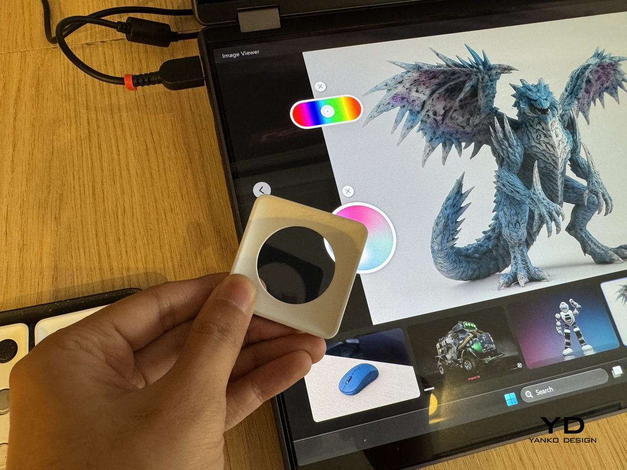
On the practical side, it handles the kind of work that accumulates quietly throughout a day. Place a document in front of it, and it can scan and summarize the contents. Talk through a rough set of notes, and it can help organize them into something usable. Working on a presentation means the Workmate can assist in structuring the content, pulling from what it already knows about the task at hand through on-device AI processing rather than a cloud connection.
The projection feature is the most speculative part of the concept. Rather than keeping information on a screen, the Workmate can cast content onto a desk surface or wall, which, on paper, turns any flat surface nearby into a secondary display. Whether that’s genuinely more useful than glancing at a monitor, or just a more theatrical way to display the same information, is a fair question that a proof of concept can’t fully answer.
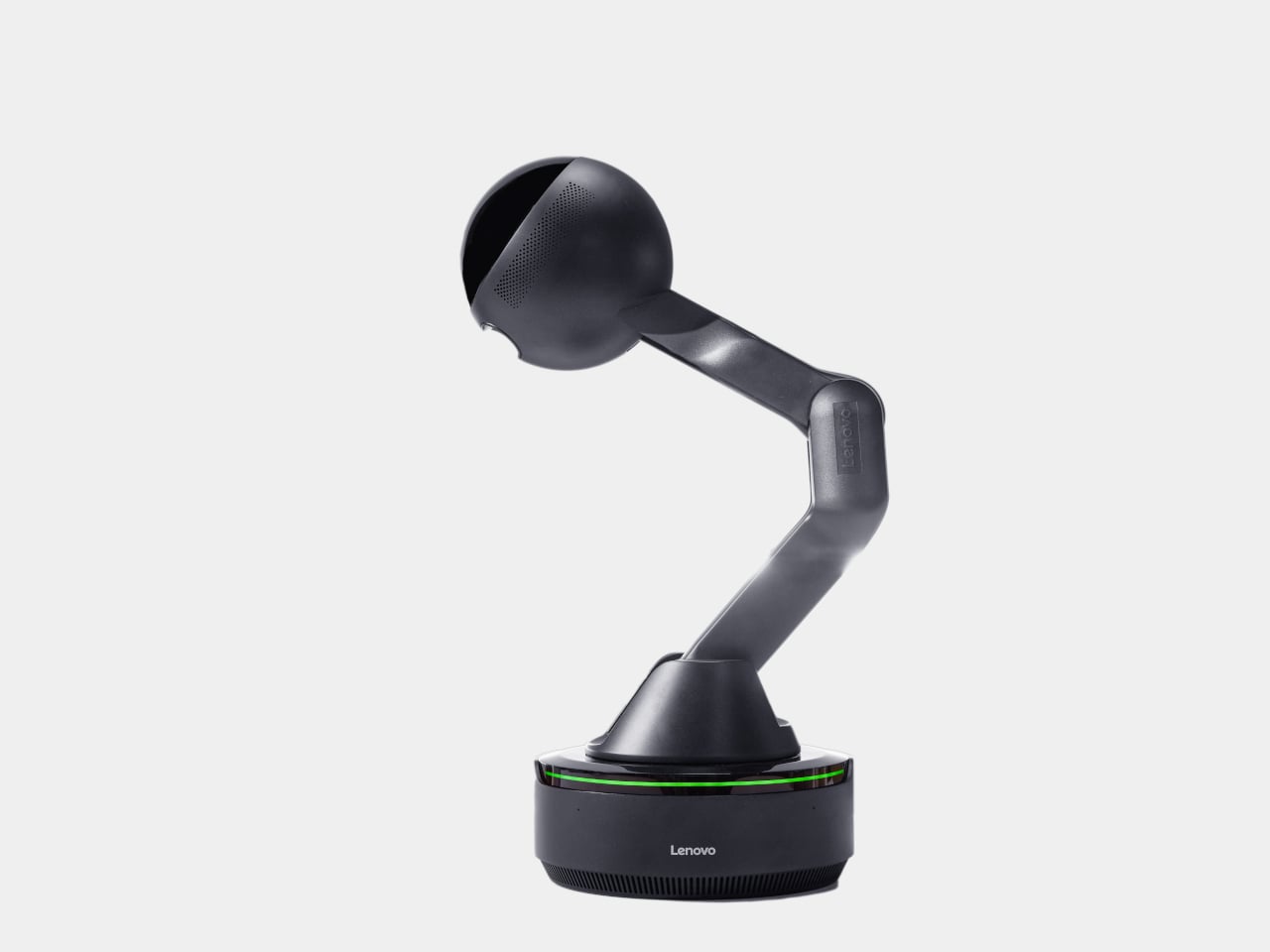
What’s harder to dismiss is the physical language the design uses. The animated eyes aren’t a gimmick in the way that most product “personalities” are. They borrow from the same visual shorthand that makes robots in film immediately readable as attentive or distracted, curious or idle. A status light ring on the base shifts color depending on what the device is doing, adding a peripheral layer of feedback that doesn’t require looking directly at the display. Together, those two elements mean the Workmate communicates state without demanding attention, which is actually a more considered interaction model than most desktop AI tools currently offer.
The deeper question isn’t whether the Workmate works. It’s whether having a robot with eyes watching from the corner of the desk makes the day feel more manageable, or just more observed. That’s not a problem Lenovo can solve with a better arm joint. It’s the kind of thing that only becomes clear once the novelty of the eyes wears off.
The post Lenovo’s AI Desk Robot Has Eyes, Moves, and Watches You Work first appeared on Yanko Design.