The iPad got its own native calculator app in 2024, just 40 years after Apple rolled out its first-ever GUI (graphical user interface) calculator for the Macintosh in 1984. The original was designed by Chris Espinosa, and was a favorite of Steve Jobs’ up until it was refreshed with the MacOS X in 2001. However, most of us are familiar with the original black and orange calculator UI that debuted as early as 2007.
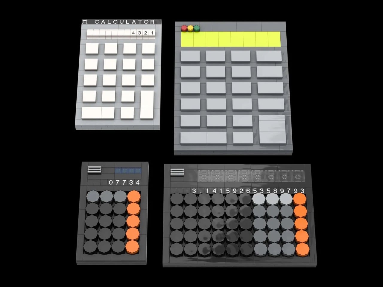
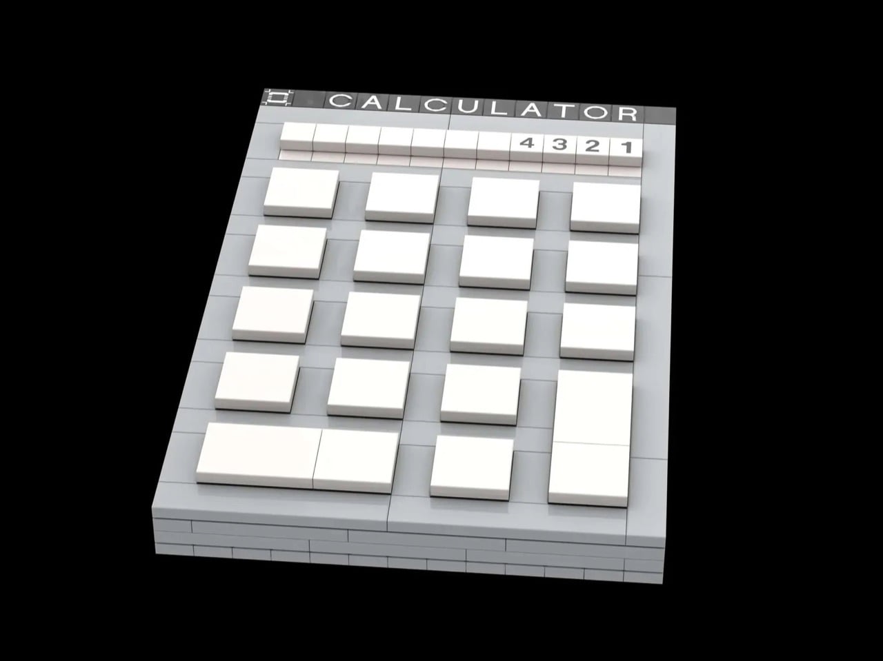
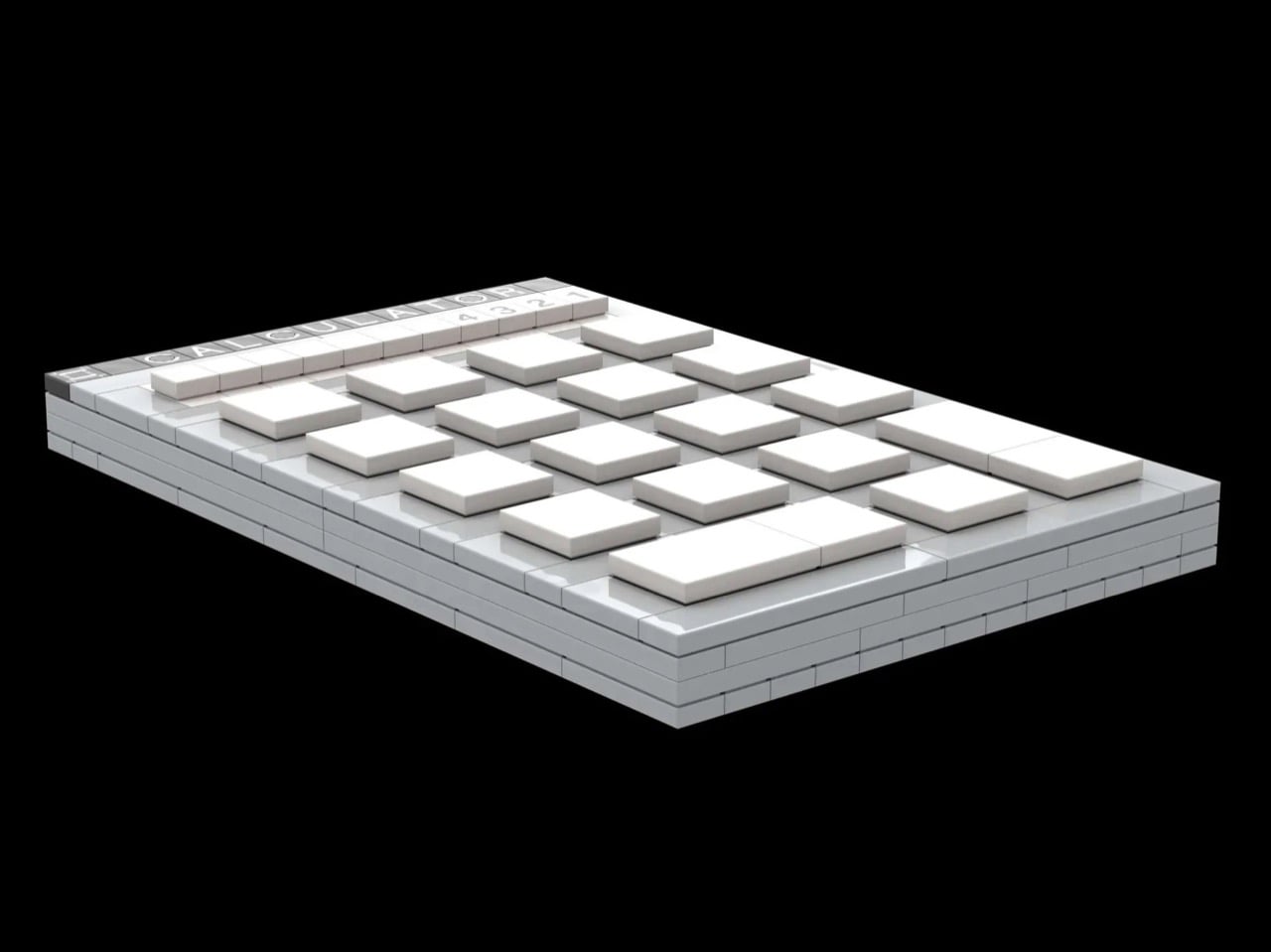
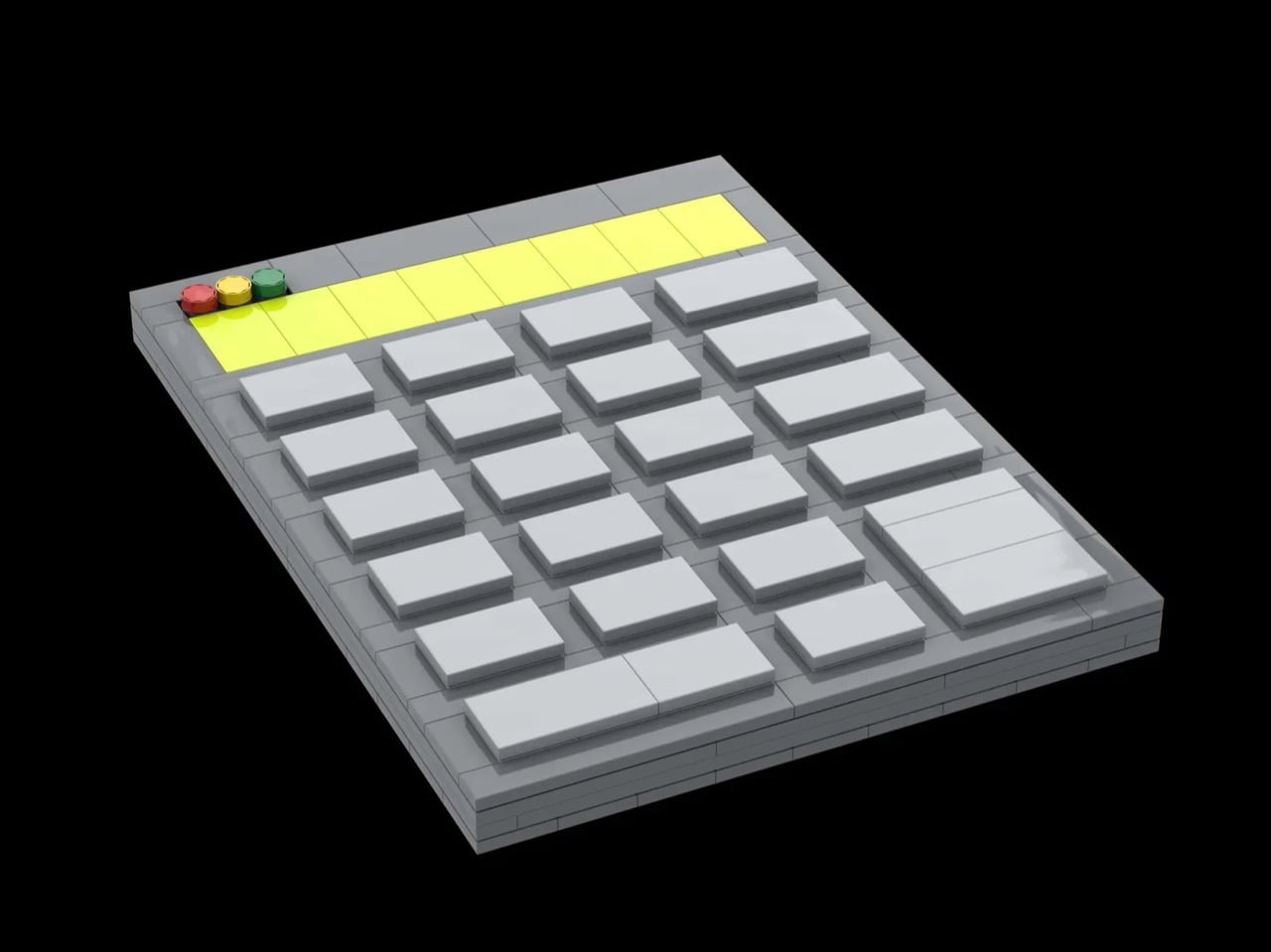
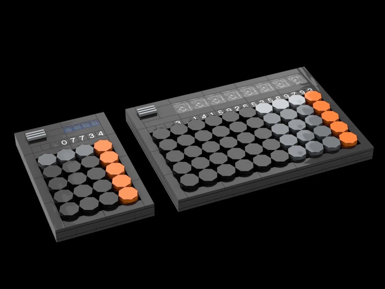
The thing is, Apple’s calculator designs are a pretty great way to see the company’s design journey. Things went from strictly functional to visually contemporary to goddamn gorgeous (without ever compromising usability of course), and this LEGO set captures that journey perfectly. Put together with just 821 pieces, this fan-made build shows Apple’s transition through 4 stages – going all the way from the b/w 1984 calculator to the modern scientific calculator.
The first calculator design was put together by Espinosa at the young age of 22 while under the leadership of Jobs. Famously a pedantic, Jobs ripped apart almost every design that Espinosa shared with him. After multiple iterations, Espinosa went to him with what we now look at as the final design. It was accepted, but not without a strong dose of criticism from Jobs, who said “Well, it’s a start but basically, it stinks. The background color is too dark, some lines are the wrong thickness, and the buttons are too big.”
The calculator was finally tweaked on the UI and semantics front by Andy Hertzfeld and Donn Derman, who retained this Jobs-approved graphical version. This remained a standard on Macs all the way up until the end of OS 9. The following OS X, again led by Jobs’ vision to break past old and usher in the new, saw a more skeuomorphic approach.
In 2001, Apple transitioned away from its classic Mac OS 9 calculator, known for its simple, functional design (influenced by Steve Jobs and Dieter Rams’ Braun aesthetic), to the new Mac OS X, featuring a refreshed look that emphasized minimalism, better integration, and user-friendly details like larger zero buttons, reflecting Jobs’ philosophy of simplicity and intuitive interaction.
The final calculator design we see today wasn’t always like this. Apple loyalists will remember a phase in 2007 when the iPhone did have a calculator app with the familiar black and orange colorway, but with rectangular buttons instead of orange ones. The circles only made their way into the UI as late as 2024, although design-nerds will remember the Braun ET55 calculator which heavily inspired Apple’s design efforts. Braun’s entire design philosophy, crafted by legend Dieter Rams himself, helped craft Apple’s approach to industrial (and even interface) design. Shown below are two versions of the same iOS18 calculator design – in basic as well as scientific formats.
“This model utilizes interlocking plates, tiles, and inverted tiles for a smooth, tactile finish. It is designed as a modular desk display, perfect for students, engineers, and tech historians alike. With roughly 821 pieces, it offers a rewarding build experience that fits perfectly alongside other LEGO office or technology sets. Attention is paid to the scale of the model to match as closely as possible to the apps,” says designer The Art Of Knowledge, who put this MOC together for LEGO lovers on the LEGO Ideas forum. It currently exists as just a fan-made concept, although you can vote the build into reality by heading down to the LEGO Ideas website and casting your vote for the design. It’s free!
Music is the ultimate nirvana to numb the stresses of life or derive inspiration while taking up focus-intensive tasks. The hobby of listening to music has come a long way from the dated radios to the current generation of high-resolution Bluetooth music listening gear. But then, things always come back in circles, that’s why we’re seeing a revival of old school analog media like record players, CDs, and even cassette players.
Countless companies are experimenting with the idea of infusing old-school charm into current-generation music players without losing out on the tactile feel. Teenage Engineering has been a pioneer in modern times when it comes to creating electronic music instruments with design that’s second to none. The signature TE aesthetics and color theme can be clearly seen to be inspiring designs in unrelated domains.
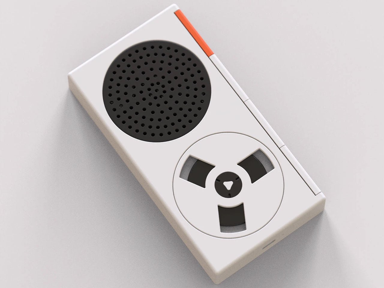
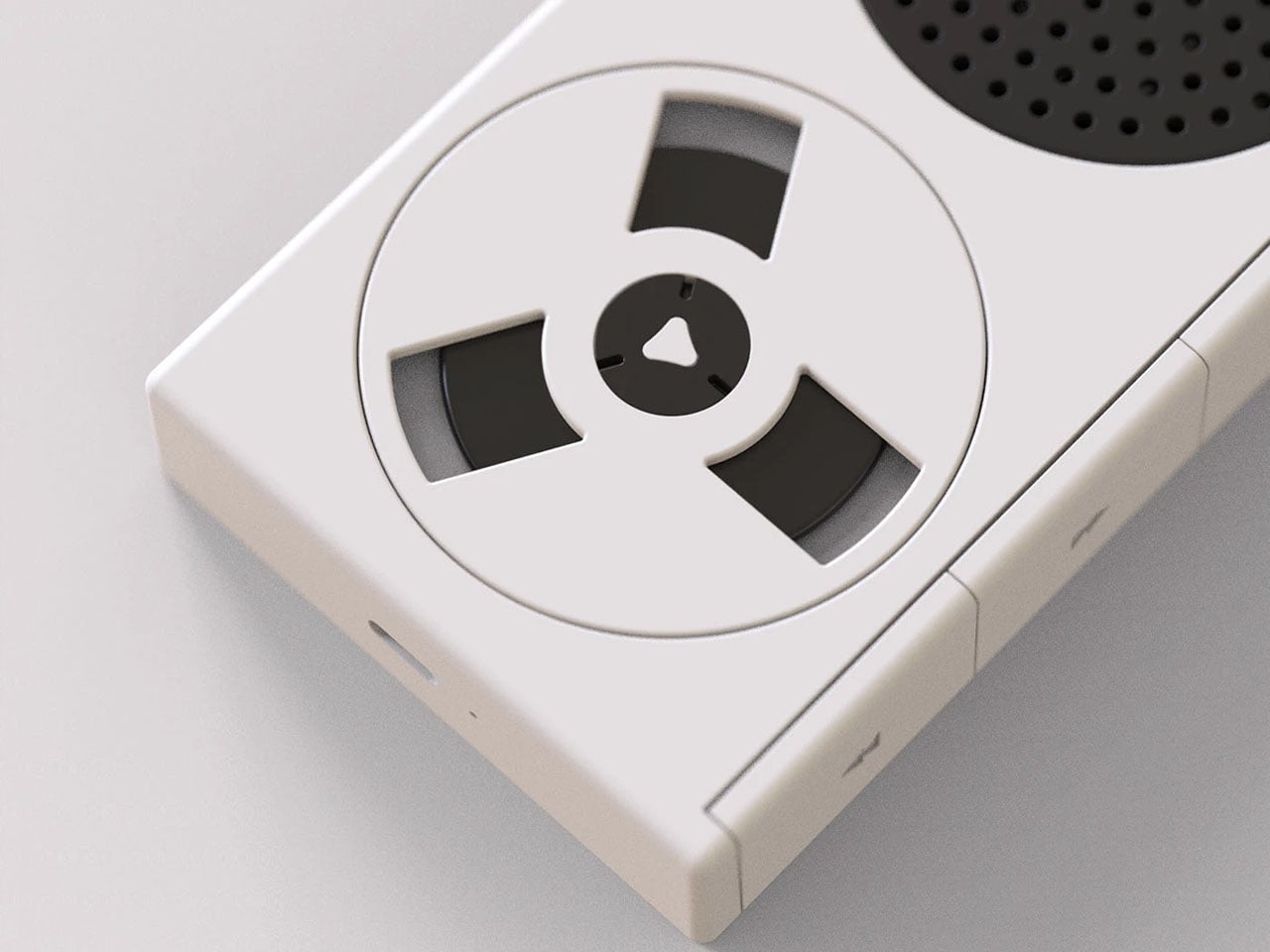
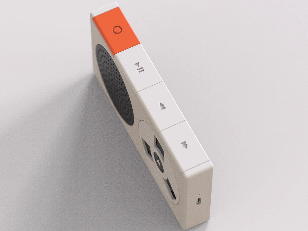
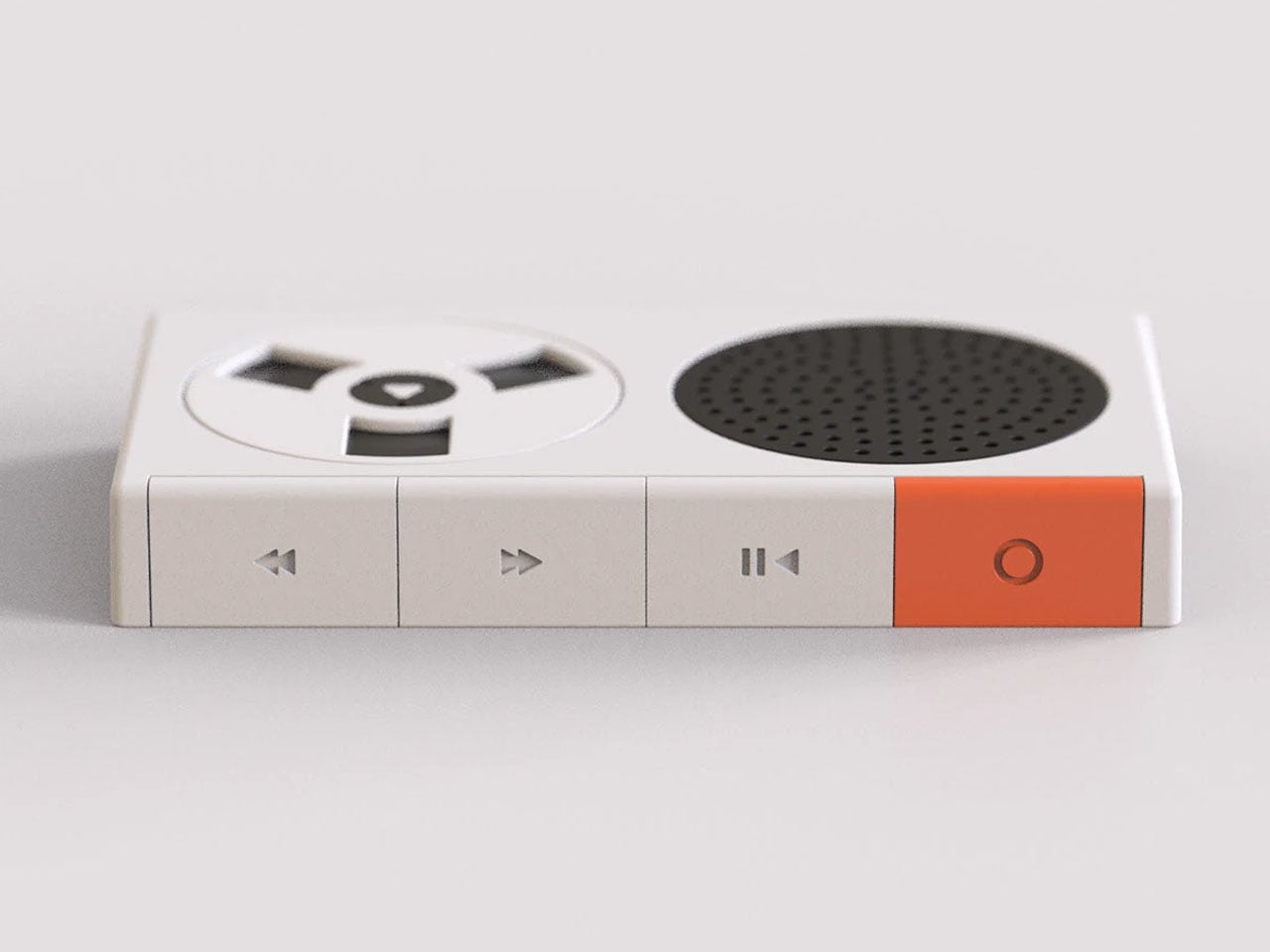
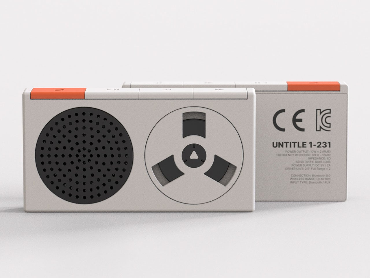
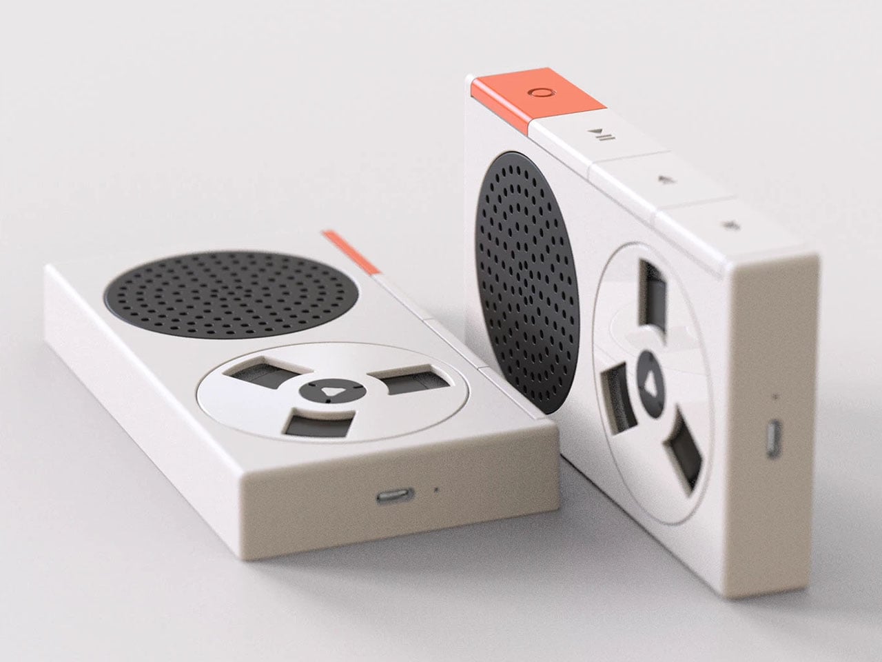
For this time around, however, the concept player here stays within the audio listening gear domain; nonetheless, has clear signs of a TE-inspired design. The retro Bluetooth player is a music accessory that’s reminiscent of the classic cassette tape player design, but on the inside, it’s a modern music player that plays music wired or wireless. The aesthetics are purely for arousing the nostalgic feel of listening to music on a cassette player, while the audio is digitally played via a DAC for high-resolution output.
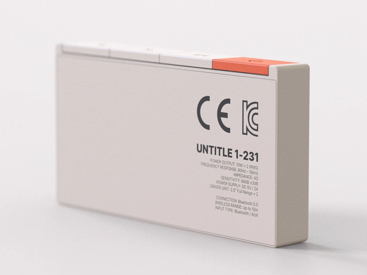
The mono speaker can output 10W sound with a frequency range of 80Hz – 18kHz. Clearly, in the mono speaker mode, the audio accessory is suited for casual listening. For more analytical listeners, the wired or Bluetooth mode is suited to enjoy the nuances of music. Either way, the spinning cassette player takes you back to a happy place, making the music sound more soulful than ever.
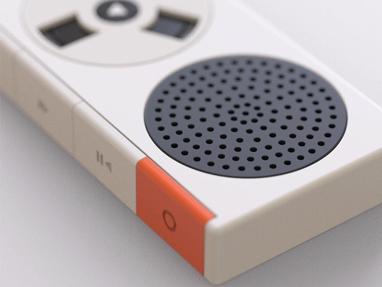
The front displays the spinning cassette player with the perforated speaker grill section. At the top, there are the big player controls to keep things minimal. Other than that, the music player follows a clean design language, which is much appreciated. The designer has not mentioned the exact dimensions of the player, but we presume it’ll be palm-sized given the reference size of the buttons.
Clearly, such a retro-modern music player is recommended for people who appreciate design and love their tunes. Revival of the analog music era is another influence that should resonate well with people who want the tactile feel of the visual elements while enjoying their favorite playlists on music services like Apple Music, Spotify, Dezeer or Tidal in high resolution.
Cheap office keyboards sound like plastic rain, which becomes unbearable in open-plan offices or when working late while someone else is trying to sleep. Custom mechanical keyboards feel better, but they tend to be loud, visually aggressive, and often shrink to compact layouts that sacrifice the numpad. Most people end up compromising on sound, feel, or functionality, rarely getting all three at once.
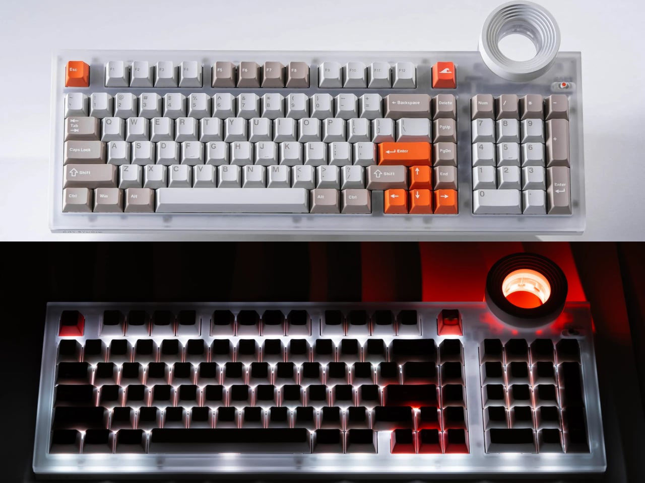
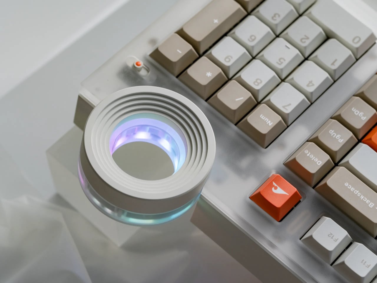
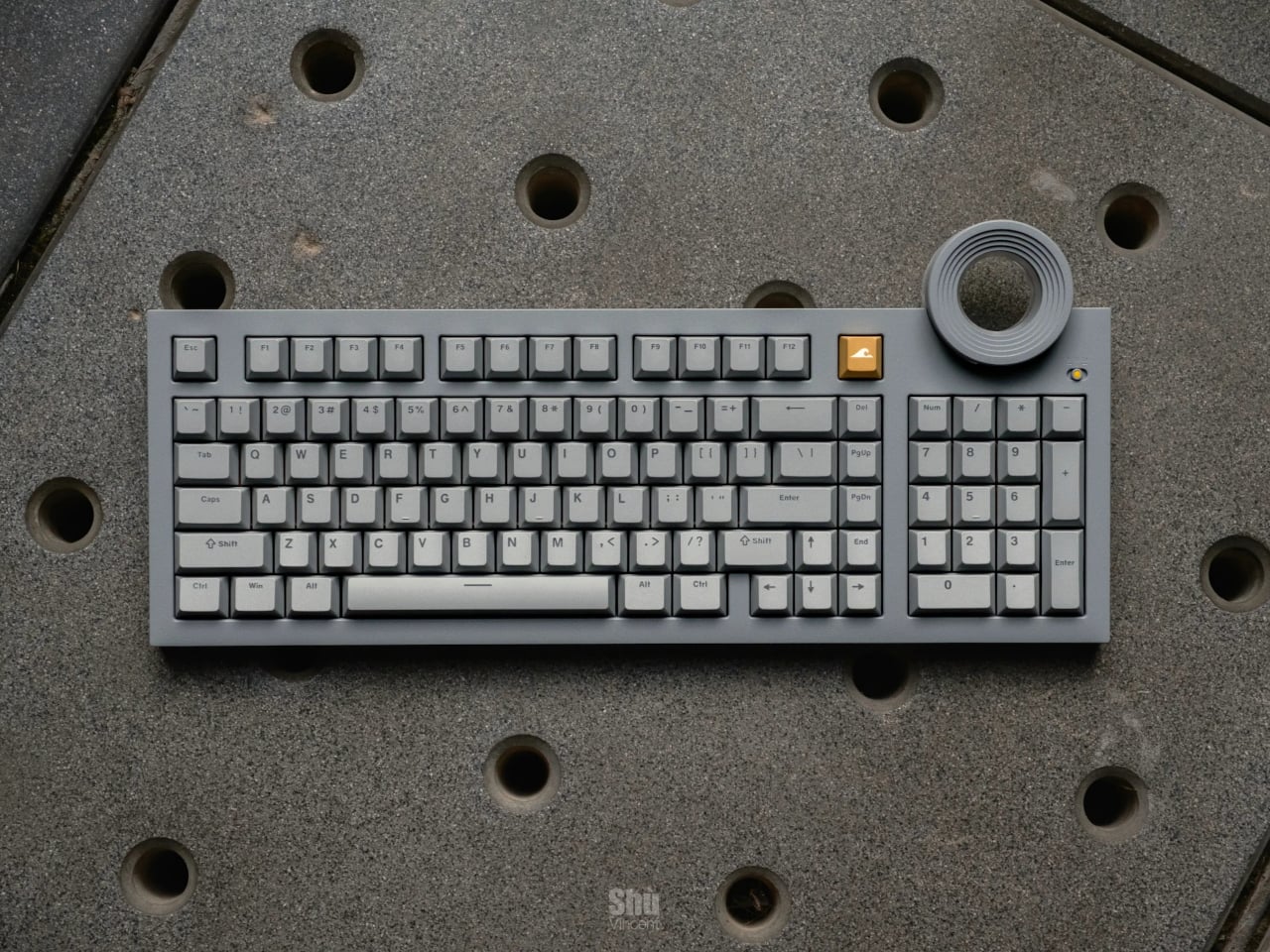
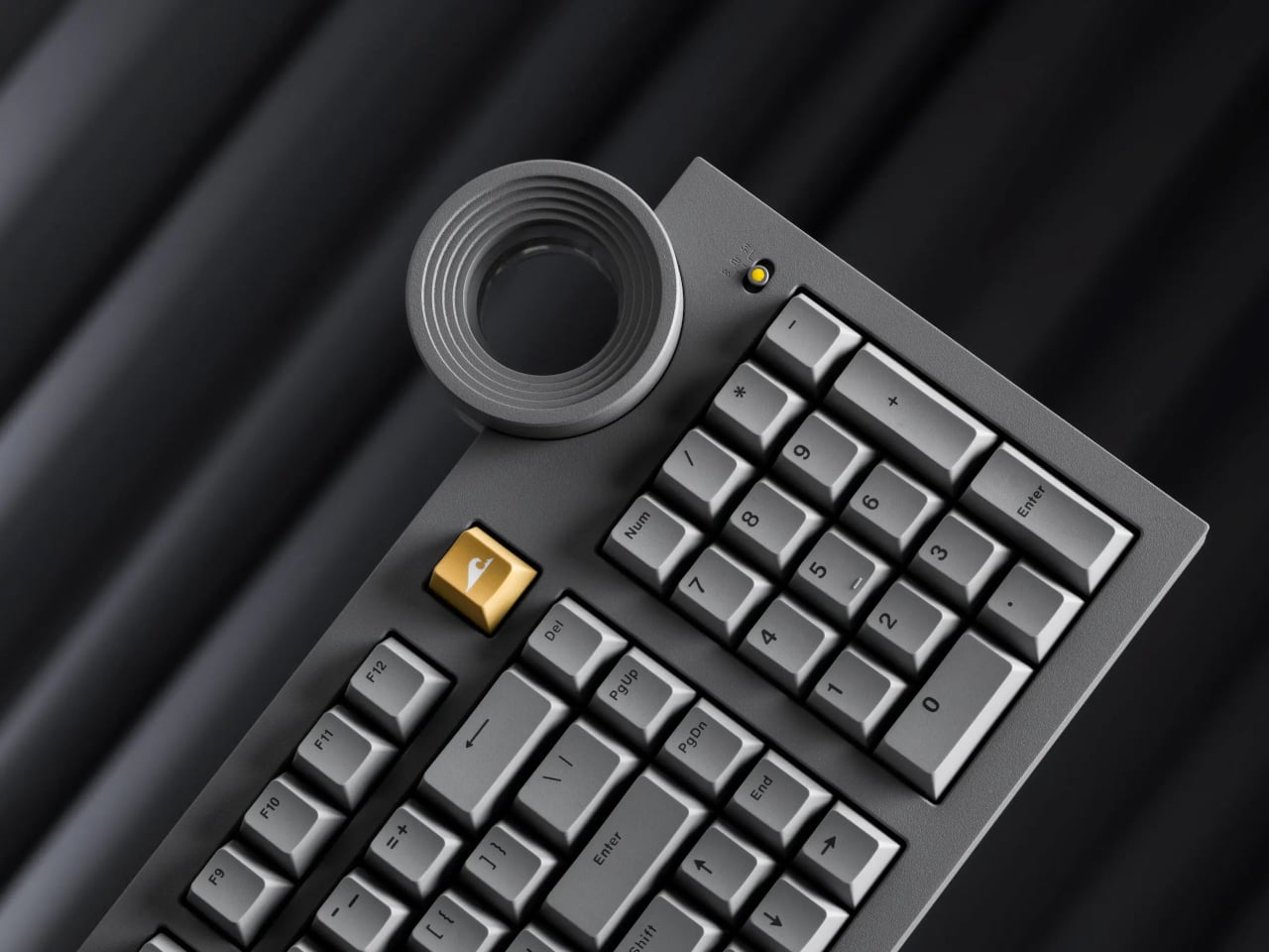
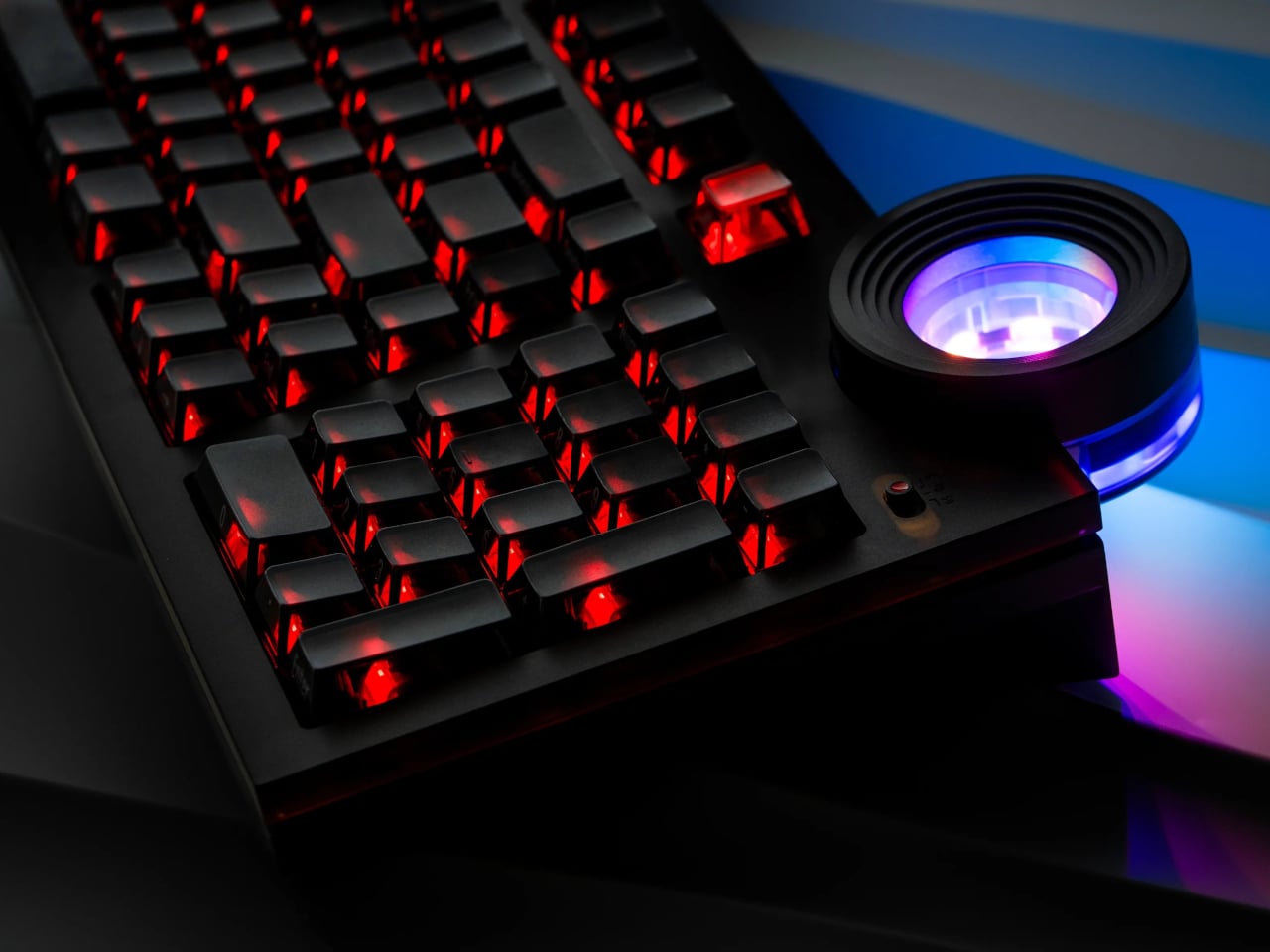
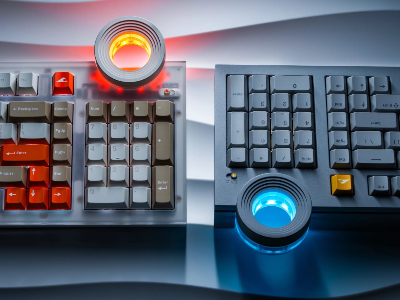
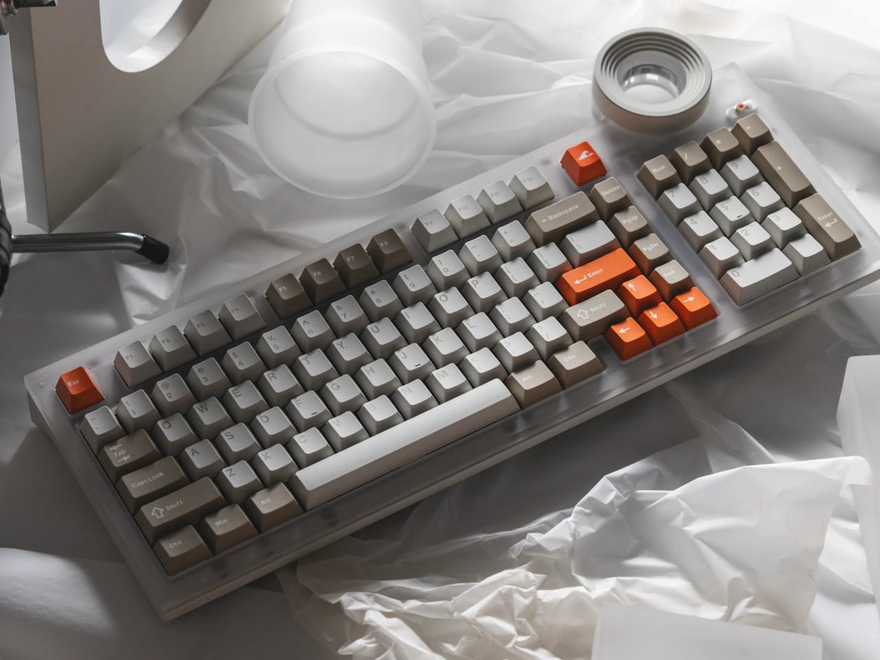
Angry Miao’s ATM 98 tries to bridge that gap with a silent-first philosophy. It keeps a full 98-key layout with a numpad and function row, wraps it in an aluminum shell that weighs around 2.6 kg, and centers a large Star Ring knob on the top right. The whole thing reads more like a desk sculpture than office equipment, built for people who type all day and want something that feels deliberate without announcing itself.
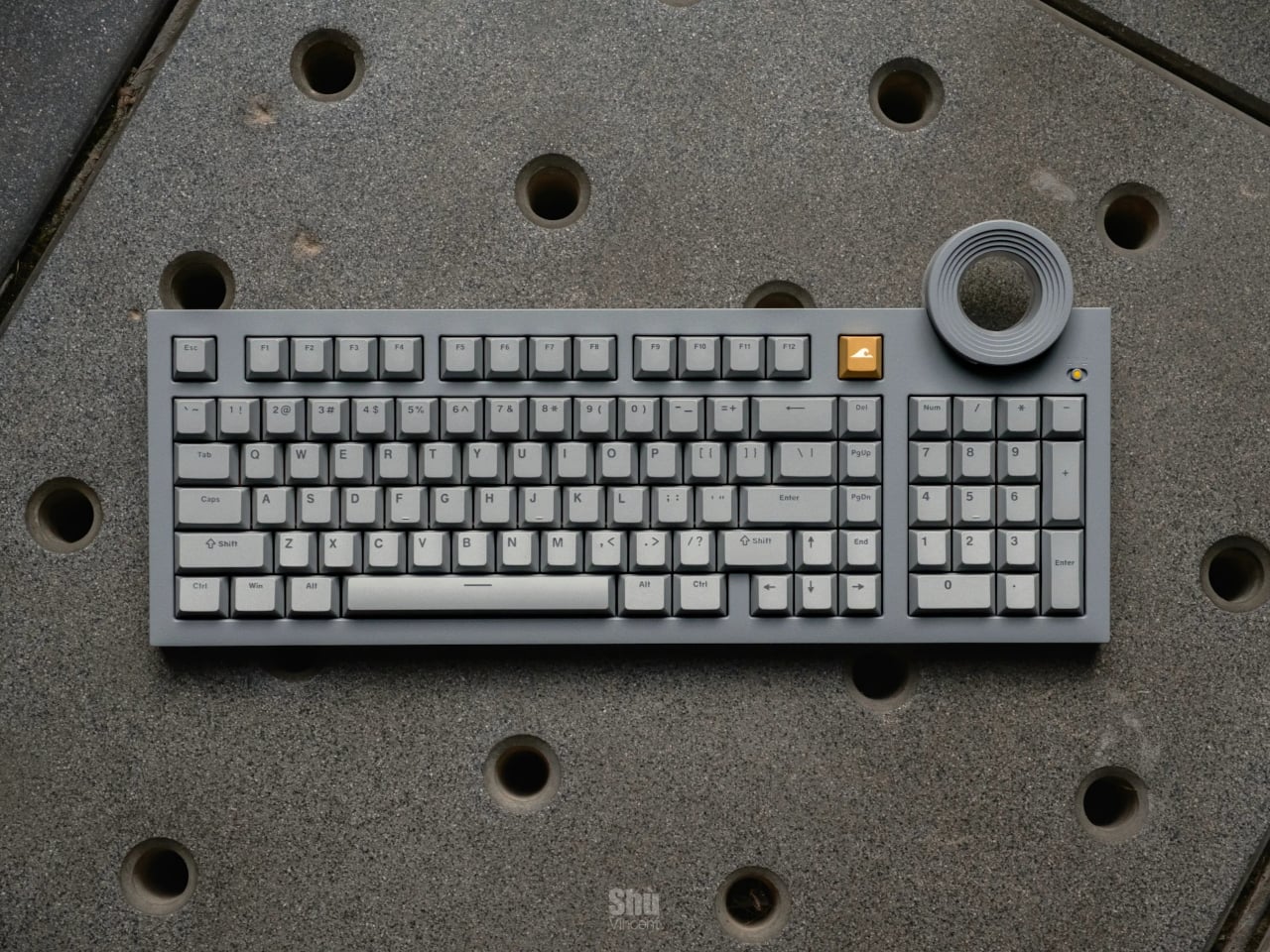
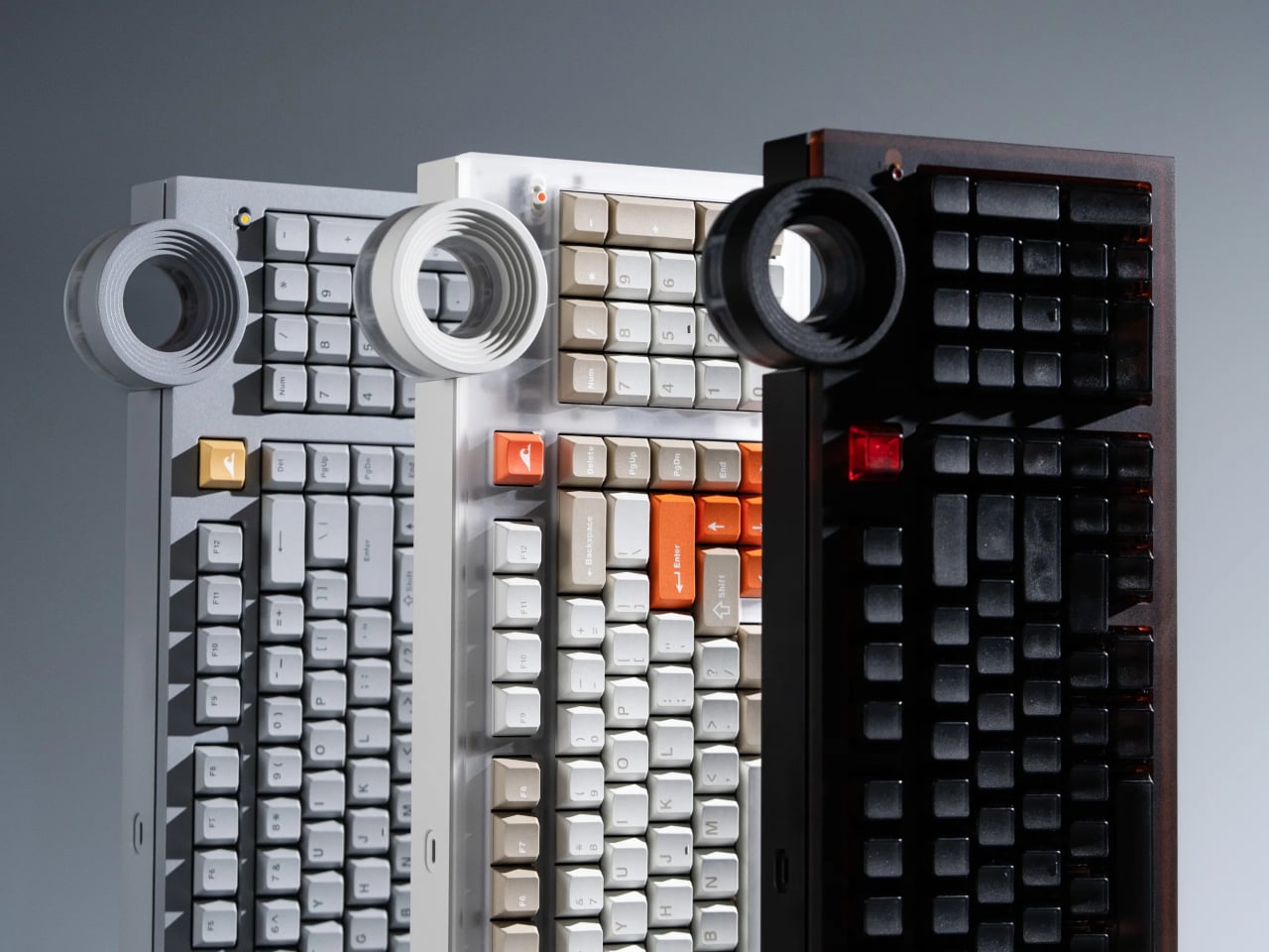
The design references are specific. One version channels Tadao Ando’s Church of the Light with a matte concrete-gray shell and controlled RGB lighting, treating the keyboard like a minimalist architectural object. The translucent Frost Whisper and Night Ink editions take inspiration from Off-White x Rimowa’s see-through luggage, revealing the gold-plated PCB and mounts underneath. The structure and lighting become part of the composition, not just decoration.
What matters more on a Tuesday morning is how it feels to type all day. Angry Miao worked with Bsun to develop custom Light Sakura silent linear switches with an S-shaped damping stem and low-friction LY material that delivers smooth, crisp bottom-out without the mushy rebound typical of silent switches. Paired with an eight-layer gasket stack, the board kills hollowness, letting you type emails without sounding like you are auditioning for a contest.
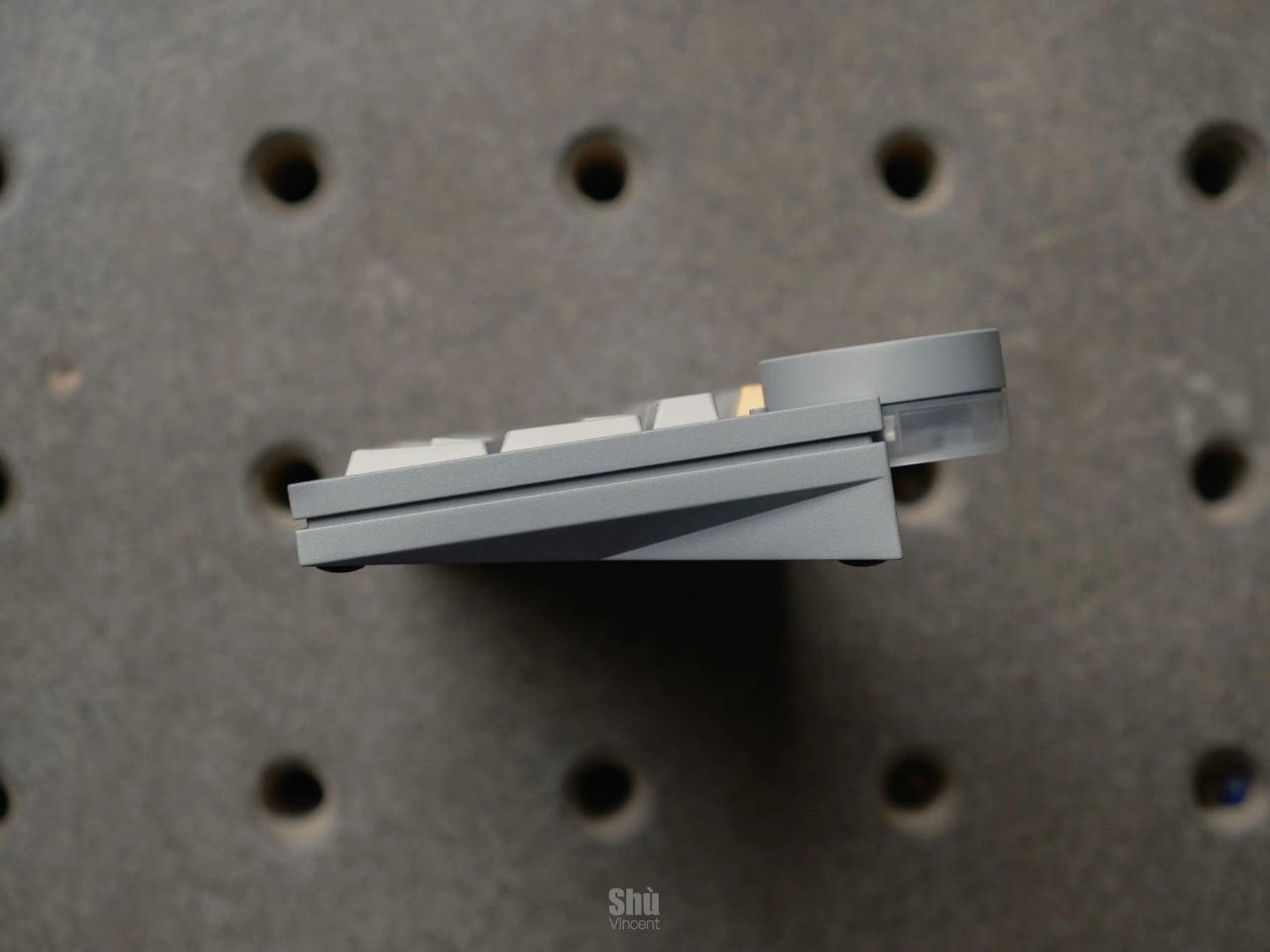
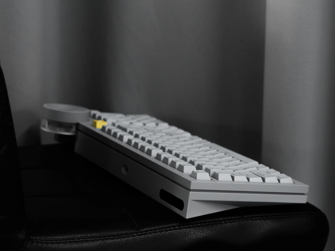
The 18.8mm front height and 8-degree typing angle let you skip a wrist rest without cramping by lunchtime. The 98% layout keeps the numpad for spreadsheets and shortcuts while fitting on a normal desk, and the Star Ring knob becomes a habit for volume, timelines, or switching layers. It is the kind of control you miss when you go back to a plain keyboard.
Tri-mode wireless with tuned 2.4GHz lets you jump from Bluetooth on a laptop to low-latency gaming on a PC without swapping dongles. The board runs QMK firmware for deep remapping, but Angry Miao also built a web-based configurator for people who just want to drag and drop keys and RGB effects without learning command-line tools, making it approachable even if this is your first custom board.
The Angry Miao ATM 98 treats quiet as a design material alongside aluminum and light. It is built for people who live at their keyboards and want something that feels deliberate under their fingers without turning every keystroke into a sound effect that echoes across the room. When loud gaming slabs and forgettable boards dominate the office space, that kind of architectural silence feels oddly refreshing, like finally getting a desk object that understands the difference between personality and noise.
Some plastics never get recycled, no matter how much you sort them. Fishing nets, buoys, agricultural films, and multilayer snack packaging are too dirty or too mixed for normal recycling systems, so they end up burned or buried. Meanwhile, we keep pouring concrete into retaining walls and bases, even though concrete production is heavy on CO₂ and performs poorly under tension when soil shifts or water builds up behind a wall.
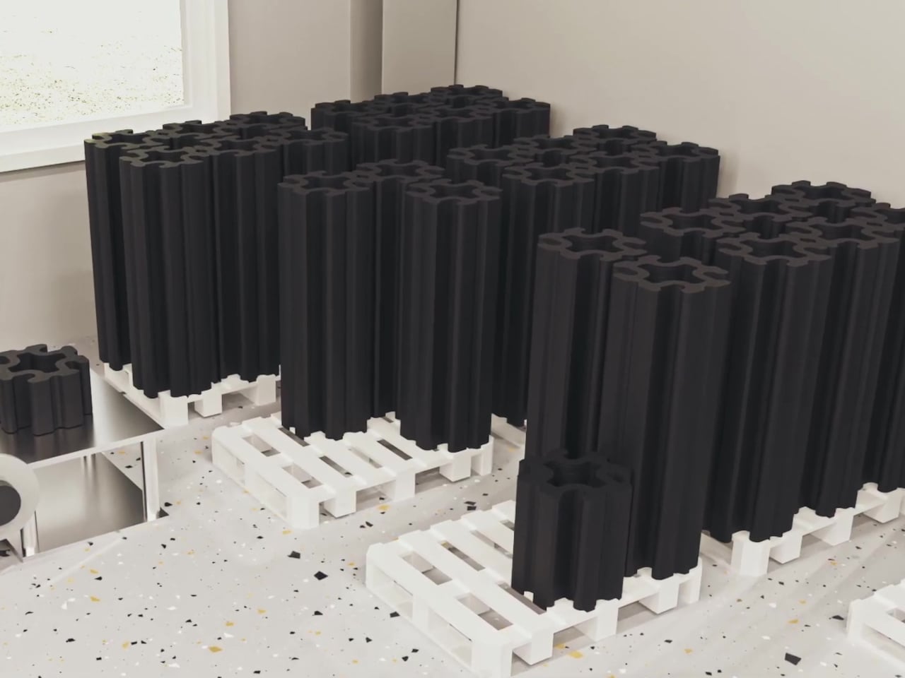
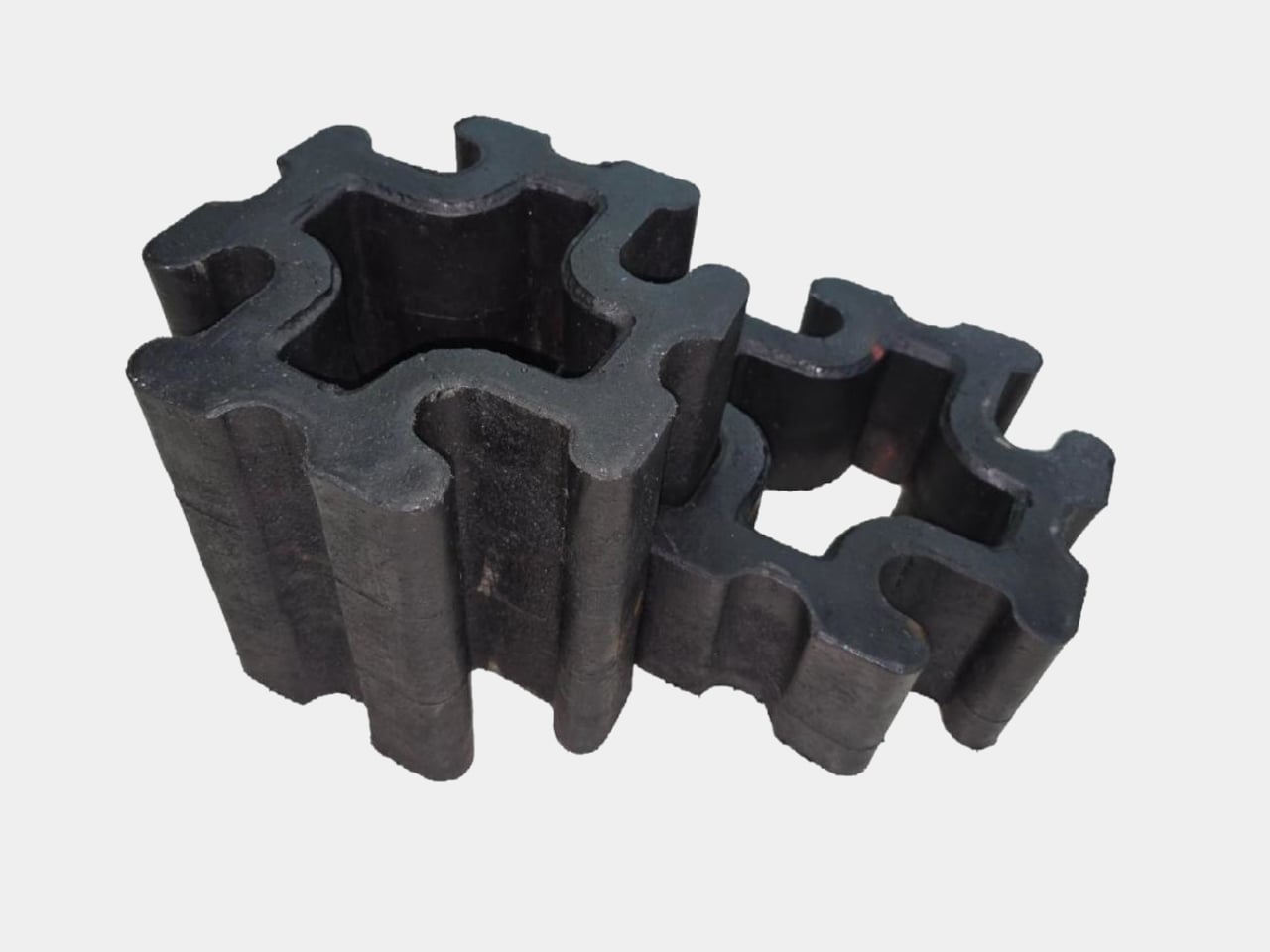
Eco-C CUBE treats those two problems as one solution. Developed by WES-Tec Global and the Korea Low Impact Development Association, it turns hard-to-recycle mixed plastic waste into a structural block for civil infrastructure. The New-Cycling process melts fishing nets, buoys, and film waste at low temperature without sorting or washing, then extrudes the material directly into three-dimensional interlocking blocks designed to hold back hillsides, stabilize slopes, and form solar panel bases.
Picture a discarded fishing net or multilayer wrapper that normally has no second life. Instead of being shredded, washed, and downgraded into pellets, it goes straight into a controlled low-temperature extruder that preserves the polymer structure. What comes out is a dense, high-strength block with better tensile and compressive performance than concrete, which is what you want in a retaining wall trying to hold back a hillside after heavy rain or freeze-thaw cycles.
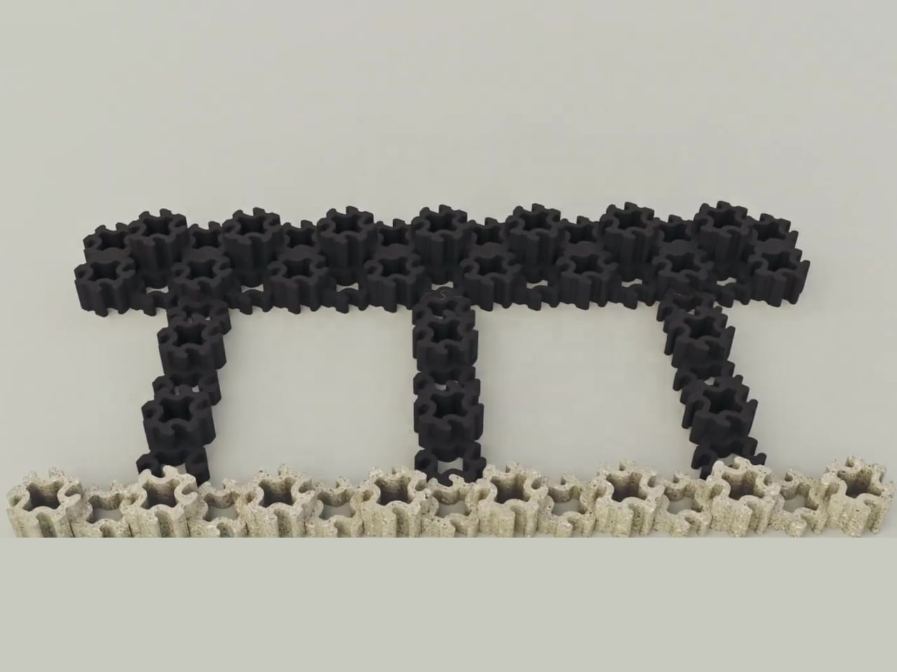
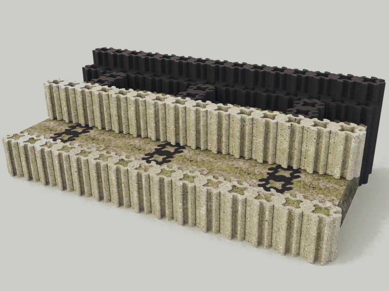
The three-dimensional interlocking design lets crews stack the blocks into buttress-style or box-style retaining walls without cement or adhesives. Gravity and geometry keep everything stable, which means faster installation, easier disassembly if something needs repair, and built-in drainage through hollow channels so water does not accumulate pressure behind the wall. That drainage feature also makes the blocks compatible with low-impact development strategies that manage stormwater on site.
Each kilogram of Eco-C CUBE reduces about 2.99 g of CO₂ compared to business as usual, verified by Life Cycle Assessment through the SDX Foundation. That reduction comes from avoiding incineration, skipping energy-intensive washing and sorting, and replacing concrete. Because the blocks use waste collected through extended producer responsibility systems, they plug directly into existing collection networks instead of requiring new infrastructure to gather and transport material.
A coastal town shoring up eroding slopes could use these blocks instead of pouring concrete, cutting carbon while handling weight and drainage. Solar farms needing stable panel bases that do not leach heavy metals can be built with Eco-C CUBE instead of traditional footings. To most people, these installations will just look like dark modular blocks, but underneath, they are turning plastic that would otherwise drift in oceans or burn in incinerators into long-term structural work.
Eco-C CUBE does not chase perfect purity or pretend mixed plastics can return to virgin resin. It accepts the messiness and turns it into something structurally useful. For designers and engineers, that shift from trying to eliminate waste to actually building with it might be the more interesting part, treating the worst materials we generate as a feedstock instead of an endpoint.
Eating pistachios or olives usually means improvising a discard situation. Shells end up on napkins, side plates, or scattered across the coffee table, and by the time the bowl is empty, there’s a mess to clean up. Shared snack bowls at parties have the same problem: fresh food mixed with scraps, and everyone reaches in with uncertain hands trying to avoid the pile of pits someone left on the edge.
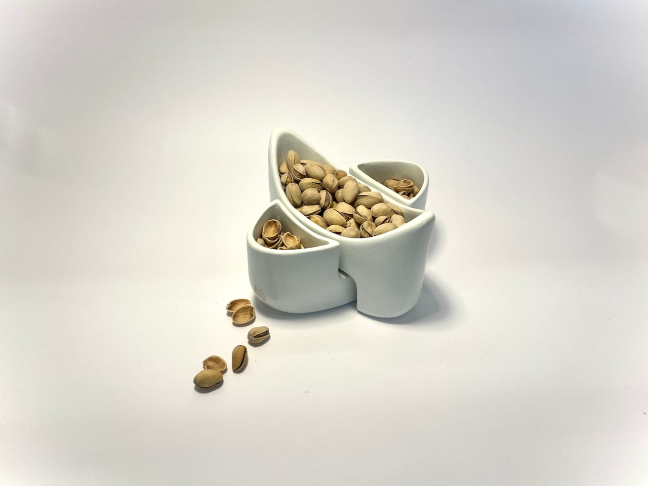
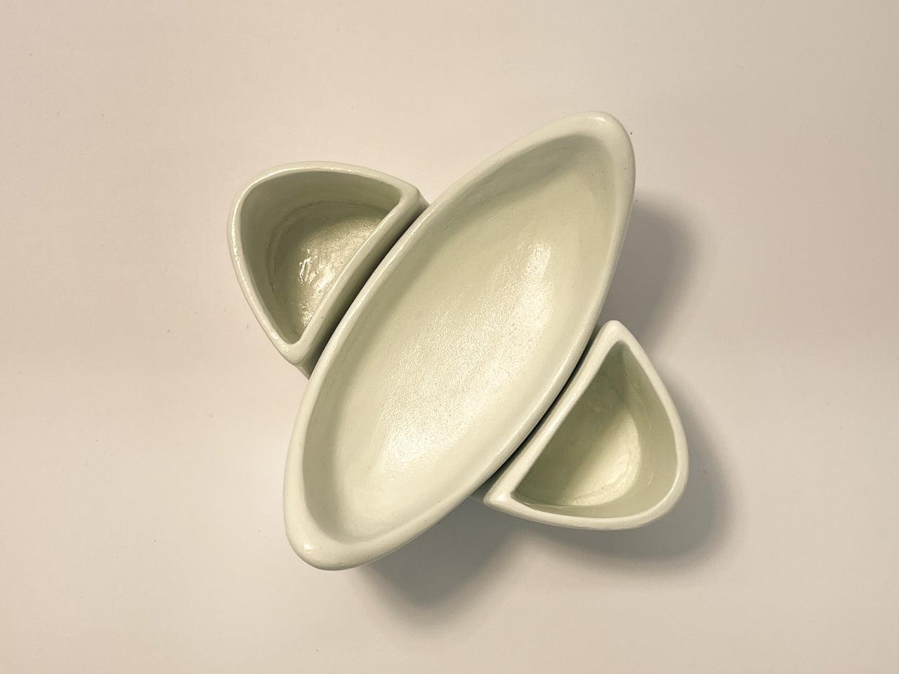
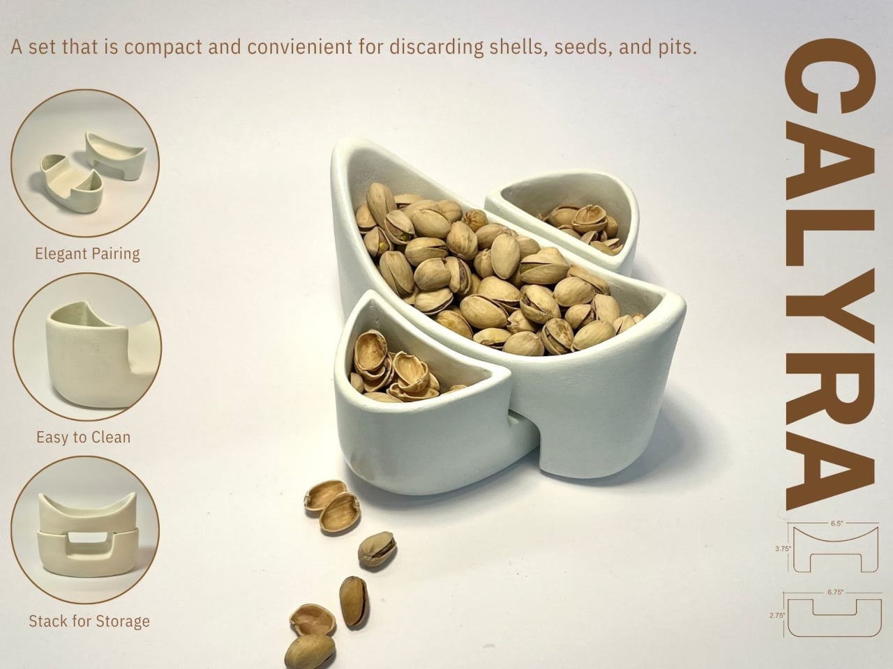
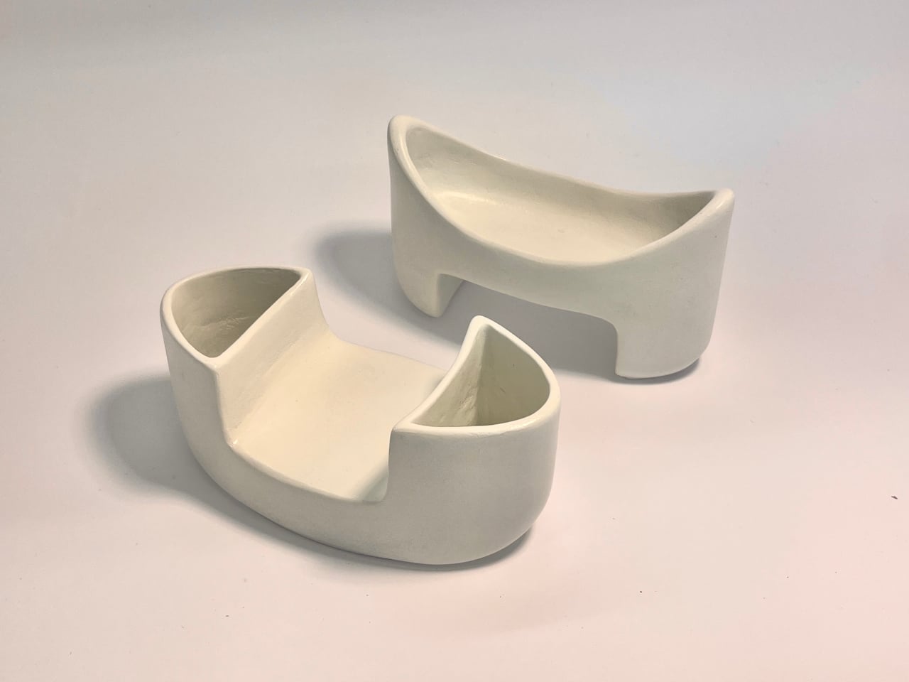
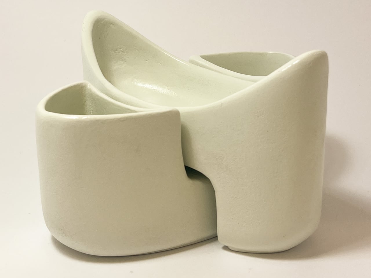
CALYRA treats that mess as part of the design brief rather than an afterthought. It’s a ceramic food and waste server that combines a main serving space with dedicated discard areas in a single form. The two pieces nest together symmetrically, both during use and when tucked away in a cupboard, so pits and shells have an obvious home from the start instead of wandering around the table.
Designer: Christina Tran
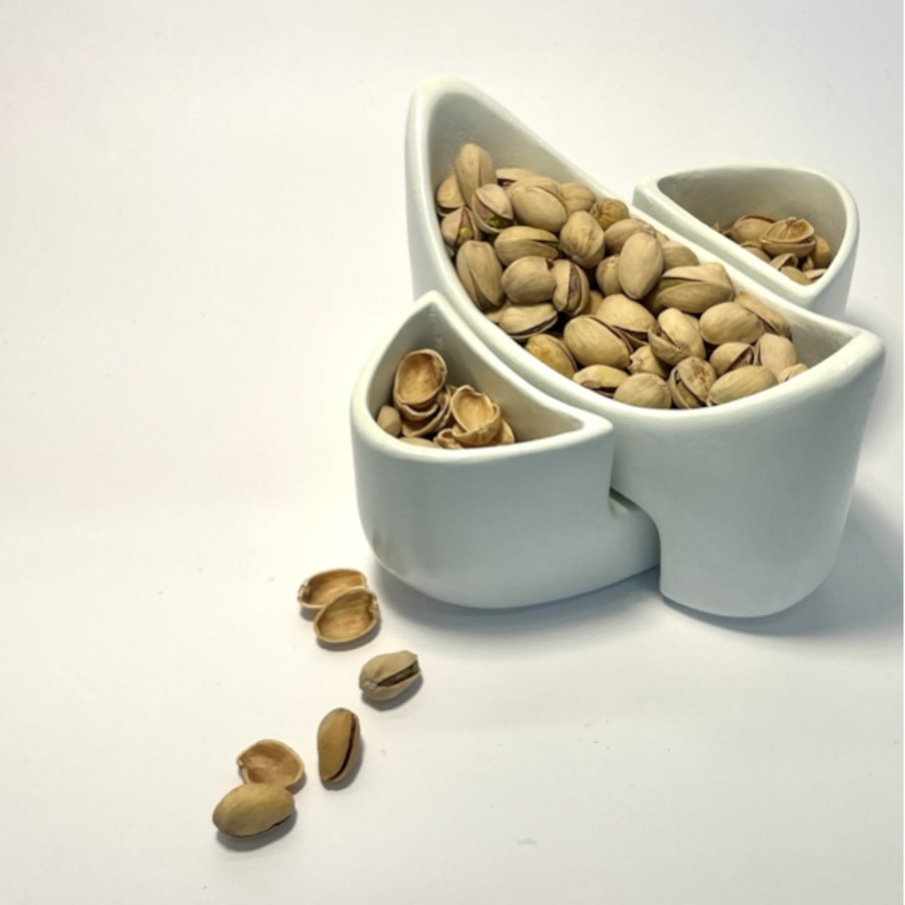
Picture a casual evening with pistachios on the coffee table. CALYRA’s larger basin holds the fresh snacks, while two smaller cavities collect empty shells and pits as you work through the bowl. Instead of juggling an extra plate or folding a napkin into an improvised waste pouch, everything stays within one footprint. When you’re done, you can carry the whole situation to the sink in one trip.
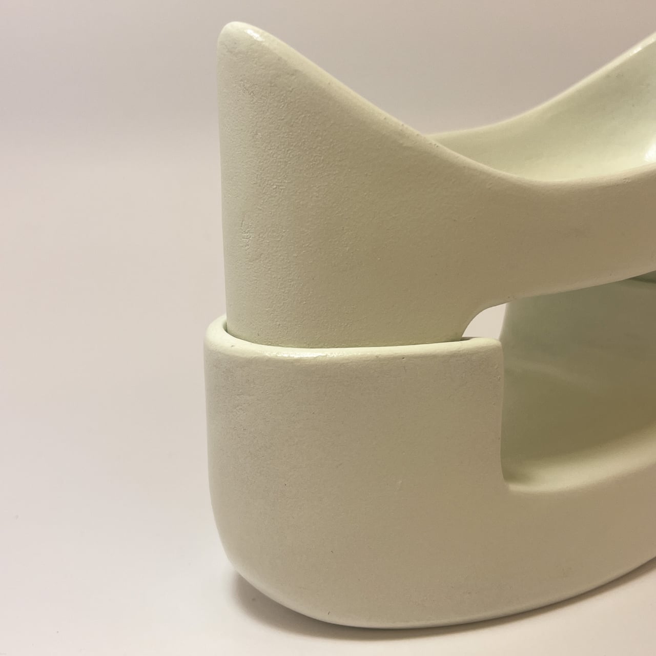
Once the food is gone, the two pieces nest into a compact stack. The cut-out legs and curved profiles lock into a stable shape that’s easy to store in a small cabinet. That symmetry means you can carry it as a single object from the cupboard to the table and back again, even when your hands are already full with wine glasses or a tray of something else that needs attention.
CALYRA’s smooth ceramic surfaces and rounded interiors make it simple to rinse or wipe clean, with no tight corners for residue to hide in. The neutral form and color let it move between different foods and settings, from solo snacks at a desk to shared tapas at dinner. It behaves like regular tableware, just with the added intelligence of a built-in waste plan that most bowls quietly ignore.
The concept focuses on the unglamorous part of eating, the shells, seeds, and pits that usually get handled as an afterthought. By folding that step into the serving piece itself, CALYRA turns a small annoyance into a smoother gesture. It’s the kind of quiet improvement that makes you wonder why most snack bowls still pretend the messy part doesn’t exist, as if ignoring it makes it less of a problem when you’re trying to enjoy pistachios without turning your table into a shell graveyard.
Back in early 2024, John Tse designed a flying umbrella controlled by a remote, which seemed a completely out-of-the-box idea. However, some users pointed out that the umbrella should follow the person using it, to make it more practical, come rain or shine. The hands-free option of using a flying umbrella is far more exciting than maneuvering it while walking.
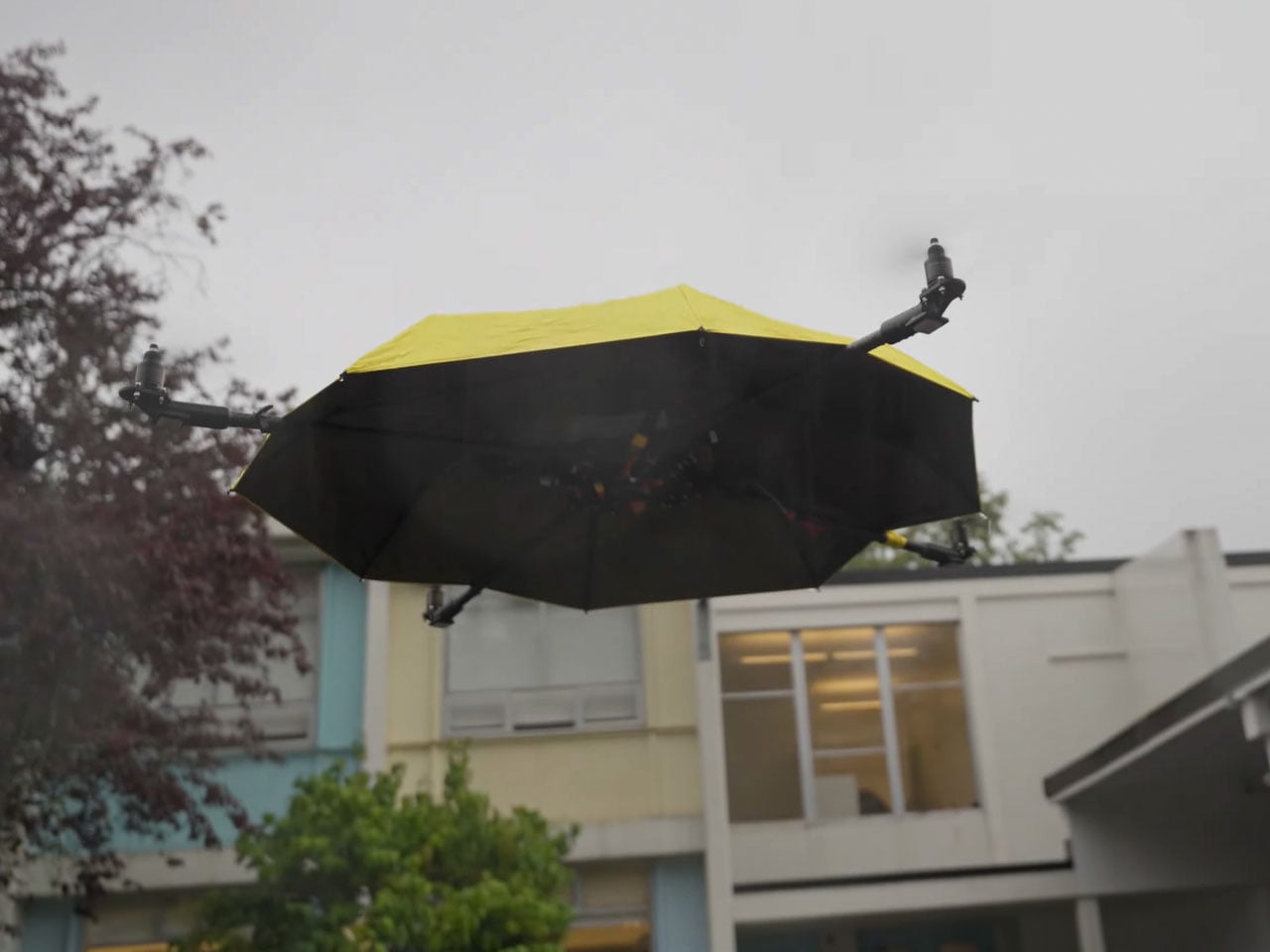
Months later, John set out to design an upgraded version of the project. The thing is essentially an autonomous drone shading you from wet or dry weather on demand. The vital addition to the rig is a tracking system loaded with a camera that comes from drone parts. That said, the build was not a cakewalk, and it took him a couple of years to achieve the intended version.
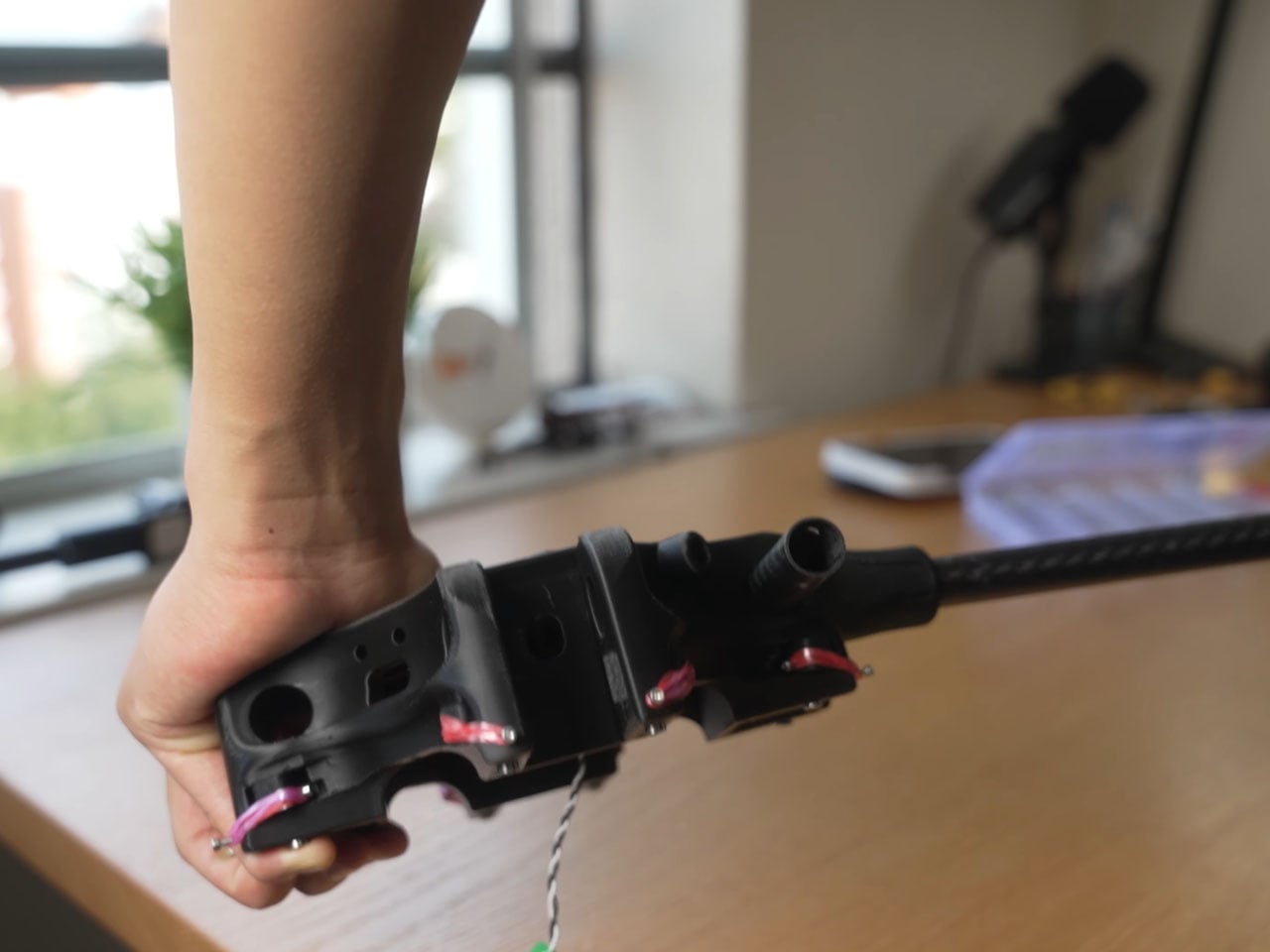
Things started off by creating a custom frame with a central hub for the umbrella, the locking mechanism, and the hinges to have a solid structure for the camera and sensors to mount on. Most of the components are 3D printed, either made out of carbon fiber or nylon. Once the design materialized, an ordinary umbrella was mounted onto the frame, and the arms attached to the mechanism, just like a tripod. After figuring out the GPS, flight controller, Raspberry Pi function, and other electronics, it was time for the first test flight. After a few glitches with the rotational direction and the flight anomalies, the troubleshooting mode kicked on. The rig finally held stable in flight, and John attached the umbrella housing to the thing.
The next step was to align the camera, sensors, and GPS function to make the autonomous flight possible, so that the umbrella doesn’t bump into the person it’s hovering over, or other people on the street. With help from his buddy Hinsen, the idea of creating a 3D map of the people nearby, even in low light, using complex light reflection tech, came to life. Somehow, the thing didn’t work after replacing all the old components with the new ones. Eventually, after a lot of tinkering and tuning, the flying umbrella finally moved from the initial stage to the concrete prototype stage. A project that was meant to be just a few weeks finally took more than a couple of years.
Finally, the day arrived when the project materialized, and the floating umbrella hovered over John. Even when the sun went down, the thing managed to hover over him. Thereafter, it was time for the rain to come down and test the flying umbrella in wet weather. In heavy rain, the umbrella had zero glitches, and the painstaking ritual of going through numerous roadblocks felt sweet for him. The design of the umbrella doesn’t feel like there’s something off; it just feels like an everyday object. Sure, the high-tech accessory is heavy due to all the components, still it manages to do what it was intended for. In the end, a shout out to John for his patience and persistence that ultimately materialized this project.
Walking to the grocery store with a wire granny cart has always been practical but never particularly pleasant. The wheels rattle over every sidewalk crack, the wire basket looks like it escaped from a hardware aisle, and your tomatoes inevitably get crushed under a bag of potatoes. As more people ditch cars for walkable neighborhoods, the tools for hauling groceries haven’t really kept up with how design-conscious those people actually are.
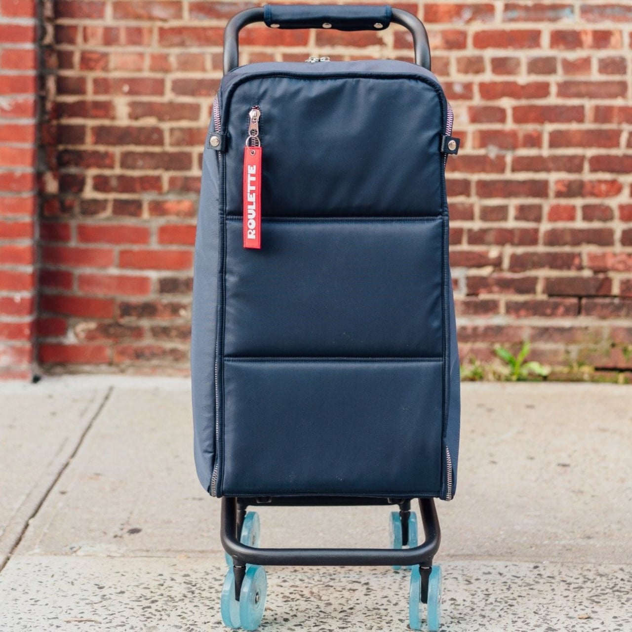
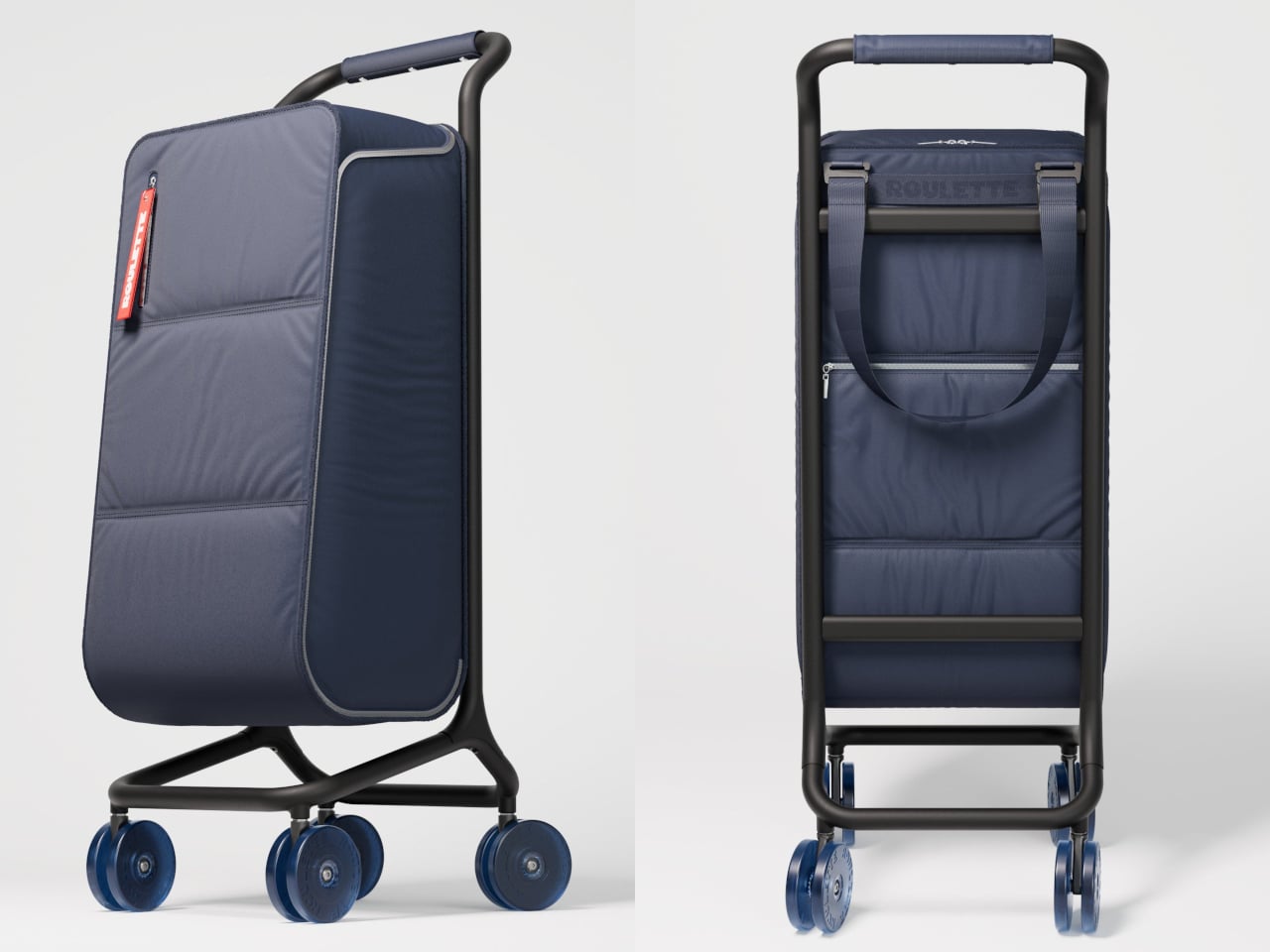
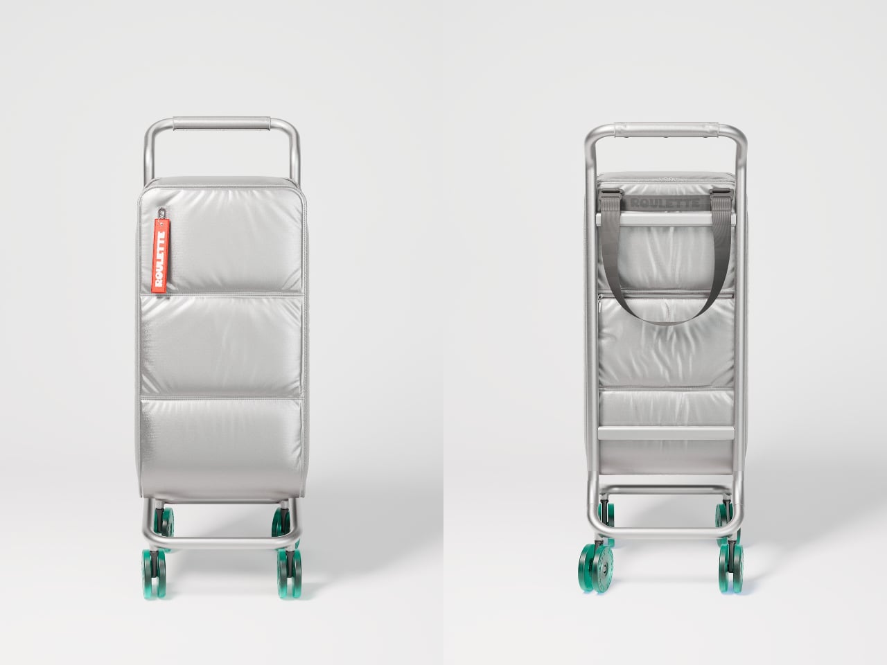
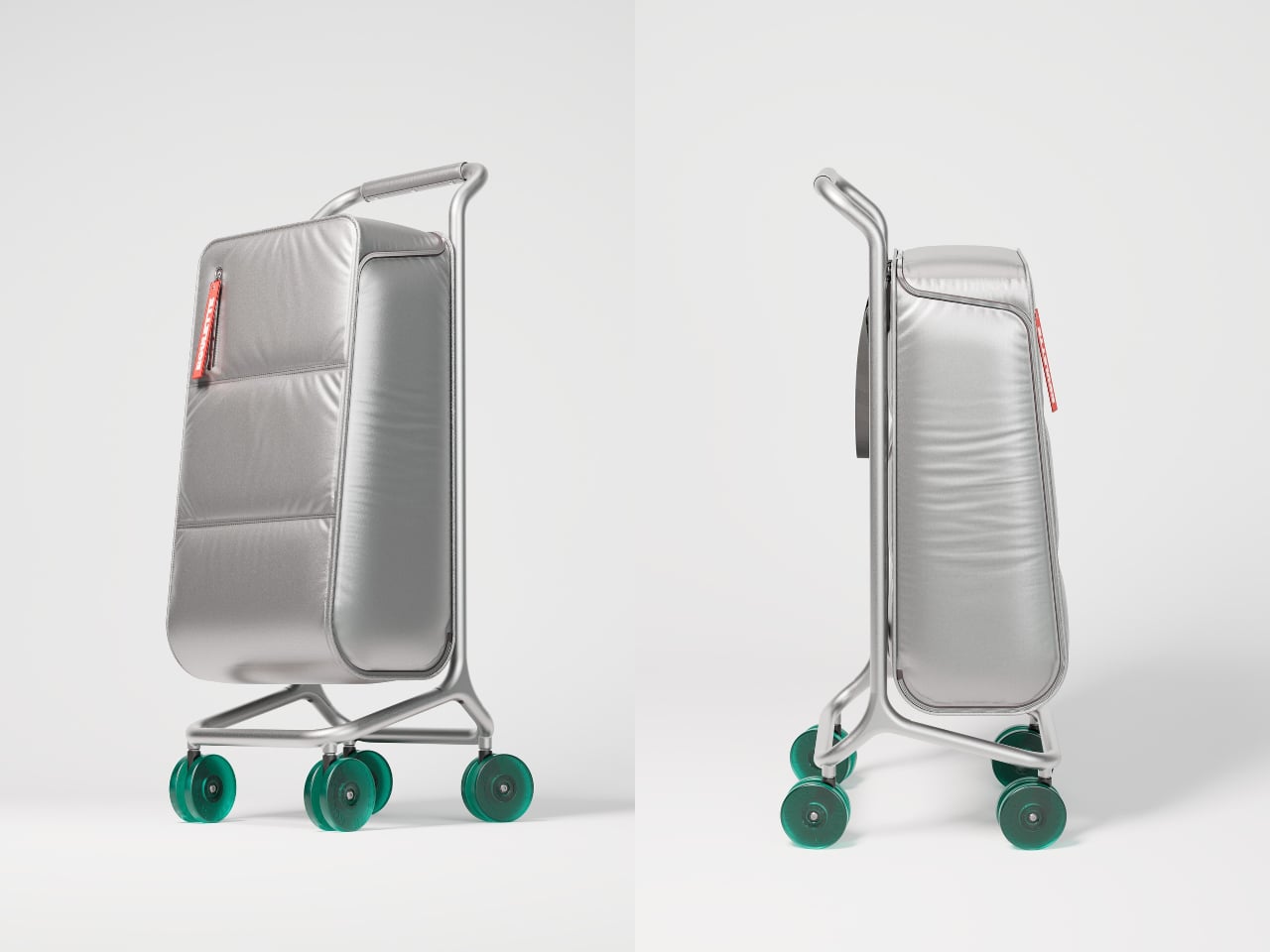
That’s where Roulette Cart comes in. The Manhattan Blue version looks less like something you hide in a closet and more like a piece of luggage you wouldn’t mind leaving in your entryway. A padded navy bag sits on a slim aluminum frame with four small translucent wheels, the whole thing reading as upright and intentional. It’s built for people who walk to the store regularly and want something that feels considered, not just functional.
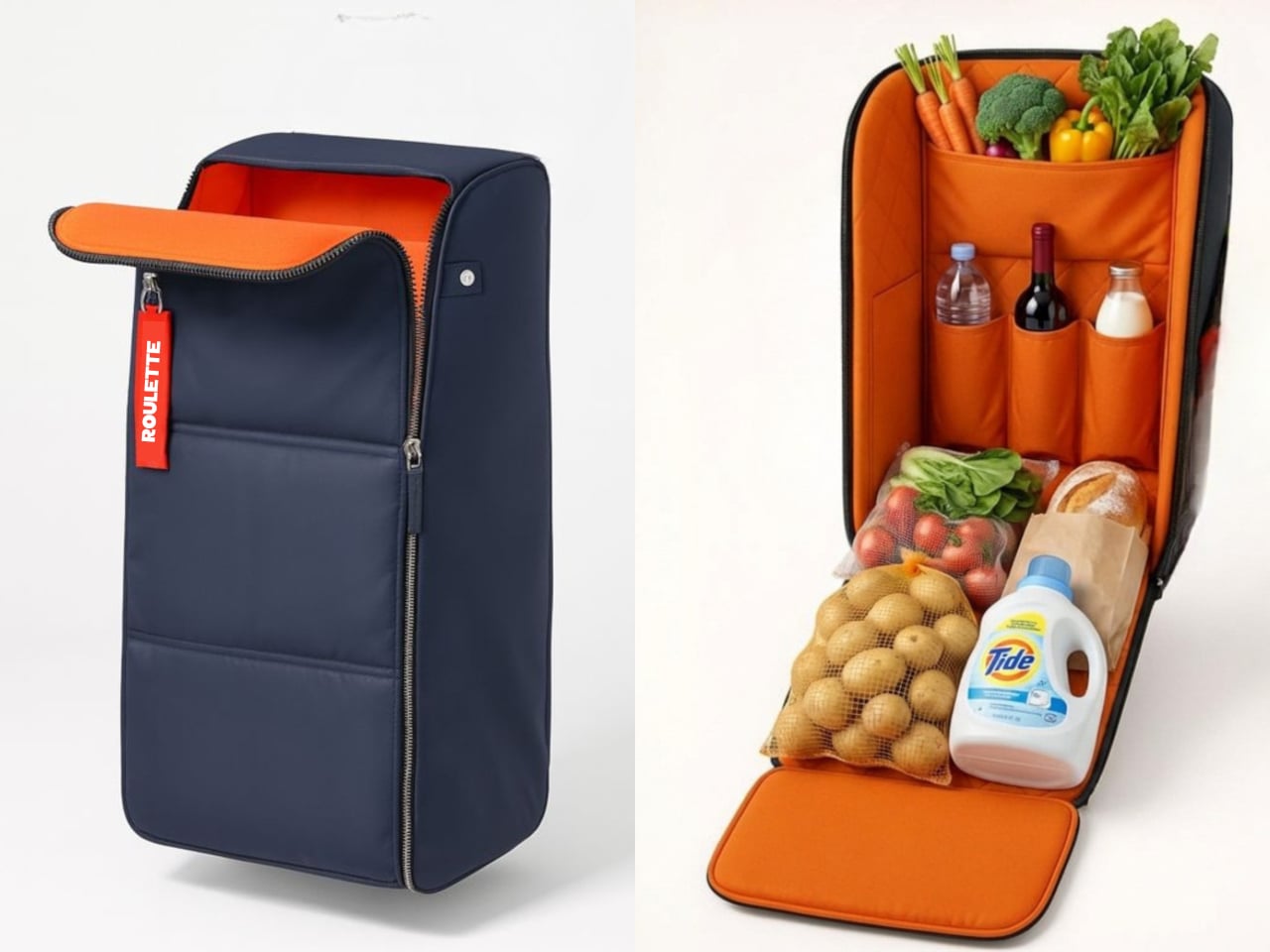
The interior actually makes a bigger difference than you’d think. Unzip the front, and the bag opens into a bright orange compartment with vertical bottle sleeves, small pockets for eggs or berries, and a wide cavity for everything else. You can slide wine upright without worrying it’ll tip, tuck leafy greens into their own space, and stack cans without turning your bread into a pancake. The 40-liter capacity feels more like organizing a rolling pantry than just dumping bags into a void.
Of course, none of that matters if the cart falls apart on cracked sidewalks. The lightweight powder-coated aluminum frame stays rigid when loaded, while the skateboard-style TPU wheels roll more quietly than cheap plastic ones that sound like you’re dragging a shopping cart through a parking garage. The four-wheel stance lets you push it like a stroller instead of tilting and dragging behind you, which helps when you’re navigating crowded aisles with 15kg of groceries.
Living with it in a small apartment feels surprisingly well thought out. The slim footprint and upright posture make it easy to park in a hallway without it sprawling into your living space, the way folding chairs tend to. The padded handle sits at a comfortable height so you’re not hunching on the walk back, and the detachable bag means you can lift just the soft part up a few stairs without wrestling the entire frame into a narrow elevator.
The materials are chosen for durability without shouting about it. The bag uses tough nylon, the frame is aluminum, and the wheels are high-quality TPU, the same stuff in skateboard wheels. These feel less like features to brag about and more like insurance against wet sidewalks, weekly grocery runs, and those trips where you bought way more than you planned and need everything to survive another six blocks home without collapsing.
Roulette Cart doesn’t reinvent walking or shopping, but it does make the annoying parts less annoying. The hauling, the packing, and the storing all get a little easier, and the whole thing looks deliberate enough that you’re not embarrassed rolling it through your neighborhood. It treats a routine errand with a bit more respect than a wire basket ever could, which turns out to matter more than you’d expect.
Book clubs thrive on intention, and 2026 is calling for a refresh. The ritual of reading together deserves more than cramped corners and harsh overhead lighting. Creating a dedicated reading nook transforms your literary habits from scattered moments into meaningful experiences. These five essentials blend form with function, turning any space into an inviting sanctuary where pages turn naturally, and conversations flow.
The best reading nooks aren’t about excess. They’re about selecting pieces that enhance comfort while celebrating the act of reading itself. From ambient lighting that sets the perfect mood to clever tools that keep your place without damaging precious spines, each element serves a purpose. These designs honor the tactile joy of physical books while adding visual interest that makes your reading corner a destination worth visiting daily.
1. Bookish Bookmark
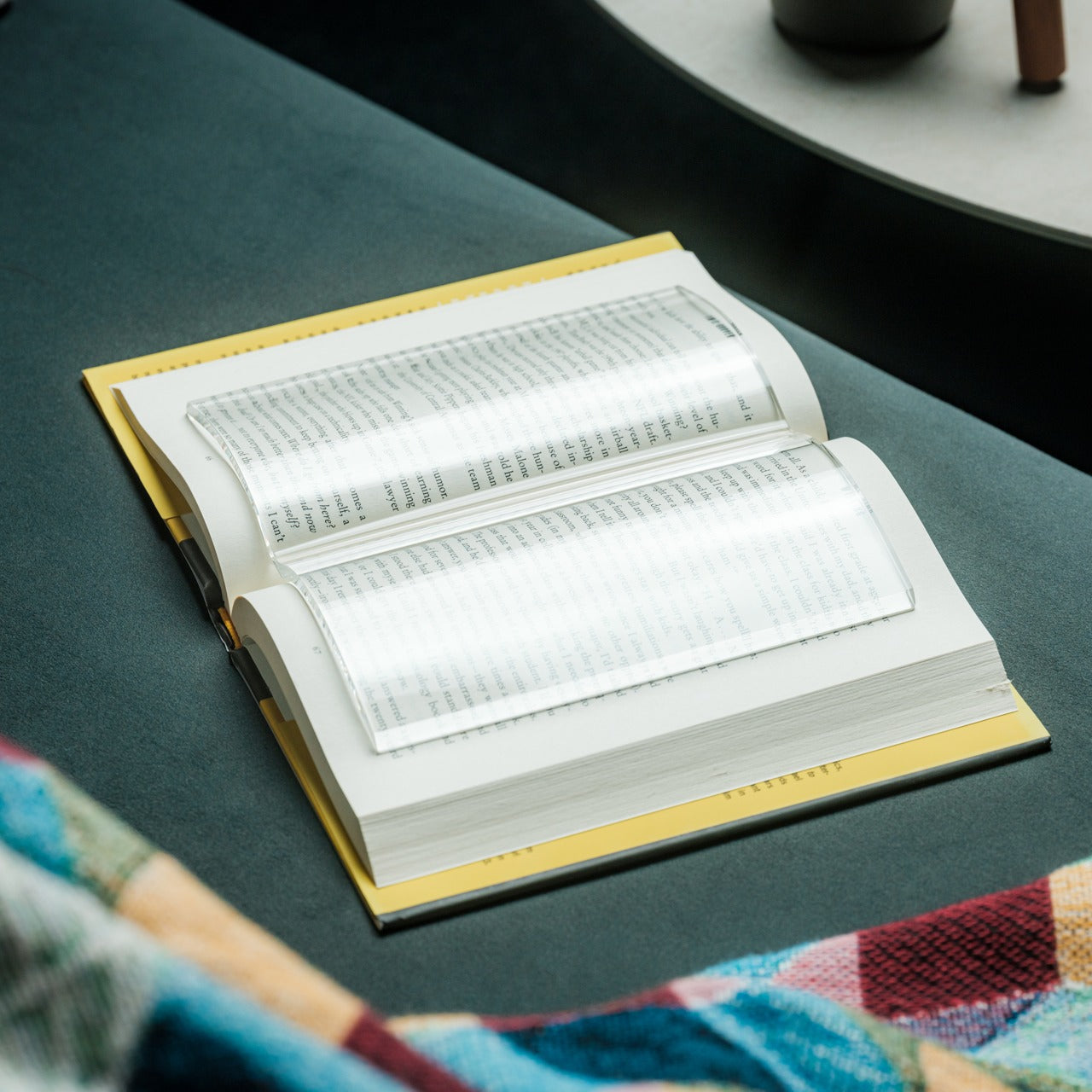
Every dedicated reader knows the frustration of trying to keep a book open while juggling a cup of tea or taking notes. The Bookish Bookmark solves this age-old problem with elegant simplicity. This transparent acrylic paperweight curves naturally to hold pages open without forcing the spine into unnatural positions, respecting the integrity of your favorite volumes while keeping them accessible.
The genius lies in its transparency. Unlike traditional paperweights that obstruct text, this bookmark disappears visually while doing its job. You can read straight through it without interruption, making it perfect for those moments when you need both hands free to sketch ideas or reach for snacks during intense book club discussions. The book-shaped design adds a meta touch that book lovers will appreciate.
The curved design respects the natural form of books, preventing spine damage that can devalue collectible editions.
The transparent material means no more awkward repositioning to read past an opaque weight.
It eliminates the need for makeshift solutions like coffee mugs or phones that can leave marks or cause spills.
The dedicated design shows thoughtfulness toward the reading experience itself.
What We Dislike
Acrylic resin can scratch over time with rough handling, potentially affecting its clarity.
The transparency that makes it functional also makes it easy to misplace on cluttered surfaces.
It works best with standard-sized books, leaving oversized art books or tiny pocket editions without ideal support.
The minimalist design lacks personalization options for readers who enjoy expressive accessories.
2. Anywhere Use Lamp
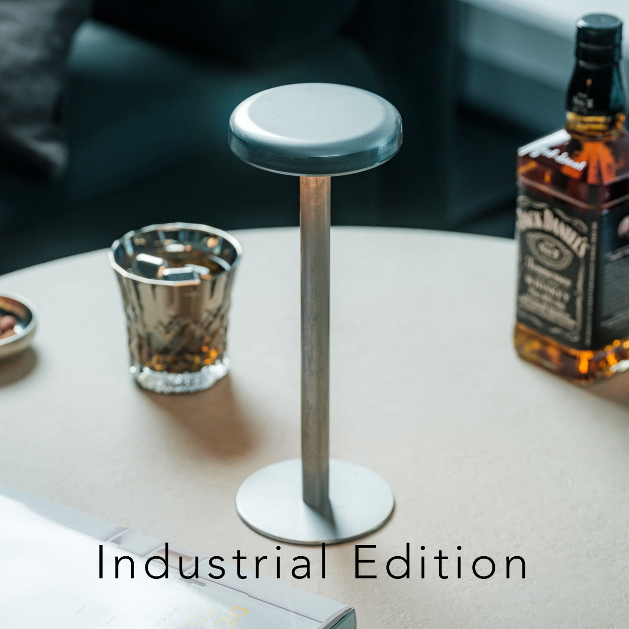
Lighting makes or breaks a reading environment. The Anywhere Use Lamp brings warmth and flexibility to your reading nook with its mushroom-inspired portability. Six high color rendering LEDs cast a soft glow that’s bright enough for comfortable reading without the harshness of overhead lights. The modular design means you can reposition it instantly, following natural light throughout the day or moving between rooms.
Battery power changes everything for the reading nook design. Four AA batteries free you from outlet proximity, letting you claim any corner as your literary retreat. The tactile satisfaction of pressing anywhere on the lamp’s cap to cycle through four brightness levels adds a sensory element to your reading ritual. Choose between black, white, or the new Industrial edition with its deliberately imperfect metal base that celebrates authentic character.
The portable design using AA batteries liberates your reading nook from electrical constraints.
Warm LED lighting reduces eye strain during extended reading sessions while creating an inviting ambiance.
The haptic feedback from adjusting brightness adds satisfying physicality to the experience.
Modular construction allows easy disassembly for transport to outdoor book club meetings or weekend retreats.
What We Dislike
Battery replacement creates ongoing costs and environmental considerations compared to rechargeable options.
The compact size limits coverage area for larger reading spaces or group gatherings.
AA batteries add weight that slightly contradicts the portable promise.
The minimalist aesthetic, while elegant, offers limited decorative personality for eclectic spaces.
3. Pop-Up Book Vase
Reading nooks benefit immensely from living elements. The Pop-Up Book Vase brings nature into your literary space with whimsical charm. This clever design opens like a storybook to reveal three-dimensional vase cutouts that hold fresh flowers. Three different vase designs within one book format mean you can refresh your display without purchasing new pieces, simply by turning pages to reveal new arrangements.
Natural pulp construction with water-resistant coating protects against spills while maintaining an organic aesthetic. The vase can be positioned normally or flipped upside down for dramatically different perspectives, encouraging the kind of creative thinking that enriches book discussions. Flowers add color, fragrance, and vitality to reading spaces, creating sensory layers that make settling in with a book feel truly special.
Three distinct vase designs provide variety without clutter, perfect for small spaces.
The pop-up mechanism delights visitors and adds conversation-starting visual interest.
Natural materials align with sustainable living values while complementing book aesthetics.
Fresh flowers improve air quality and mood, both beneficial for focused reading and lively discussions.
What We Dislike
The water-resistant coating requires careful maintenance to prevent degradation over time.
Structural integrity depends on proper setup, making it less intuitive than traditional vases.
Page-turning mechanisms can weaken with frequent repositioning, limiting design changes.
The creative format takes up more surface area than conventional cylindrical vases.
4. Fire Capsule Oil Lamp
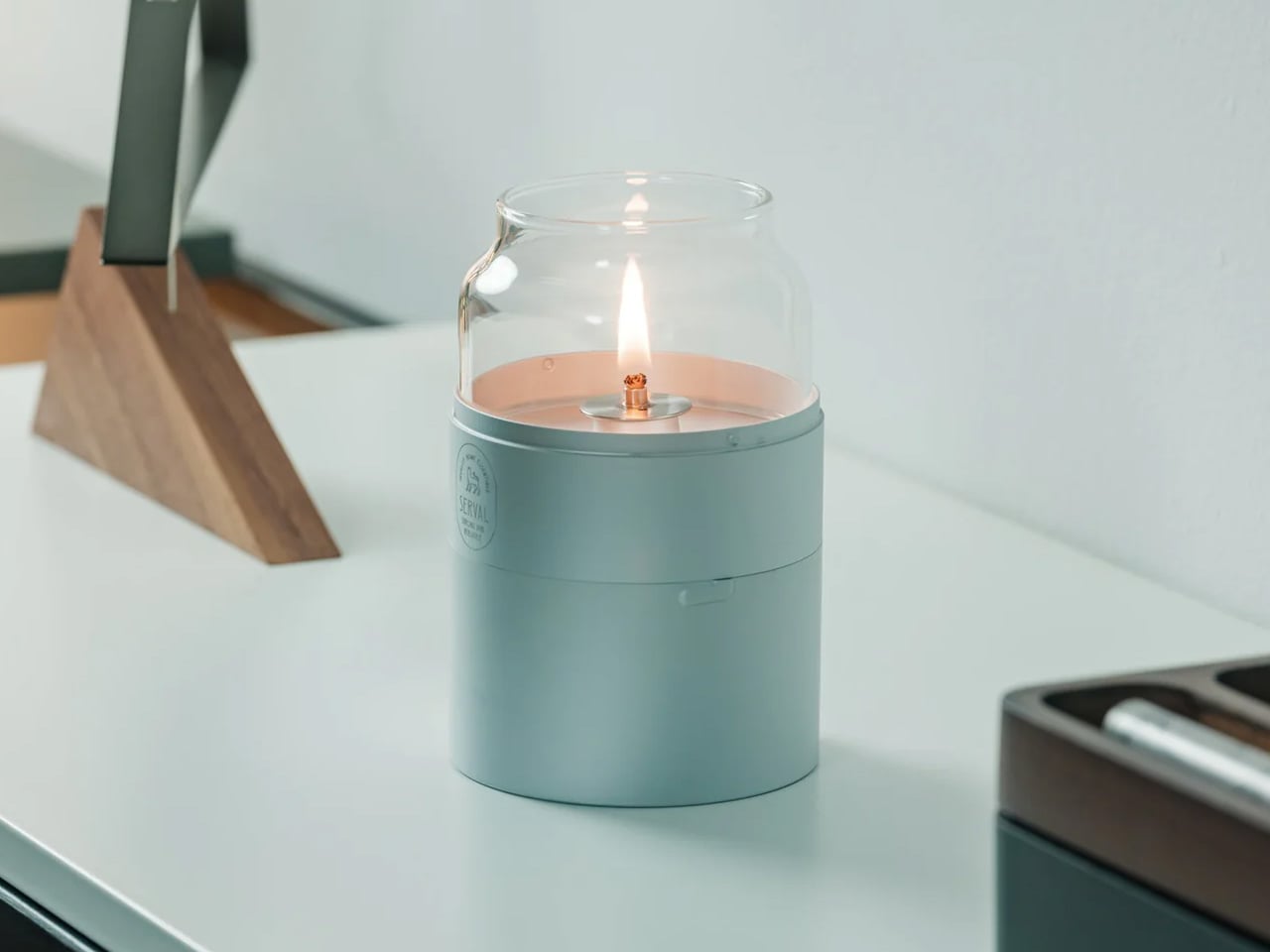
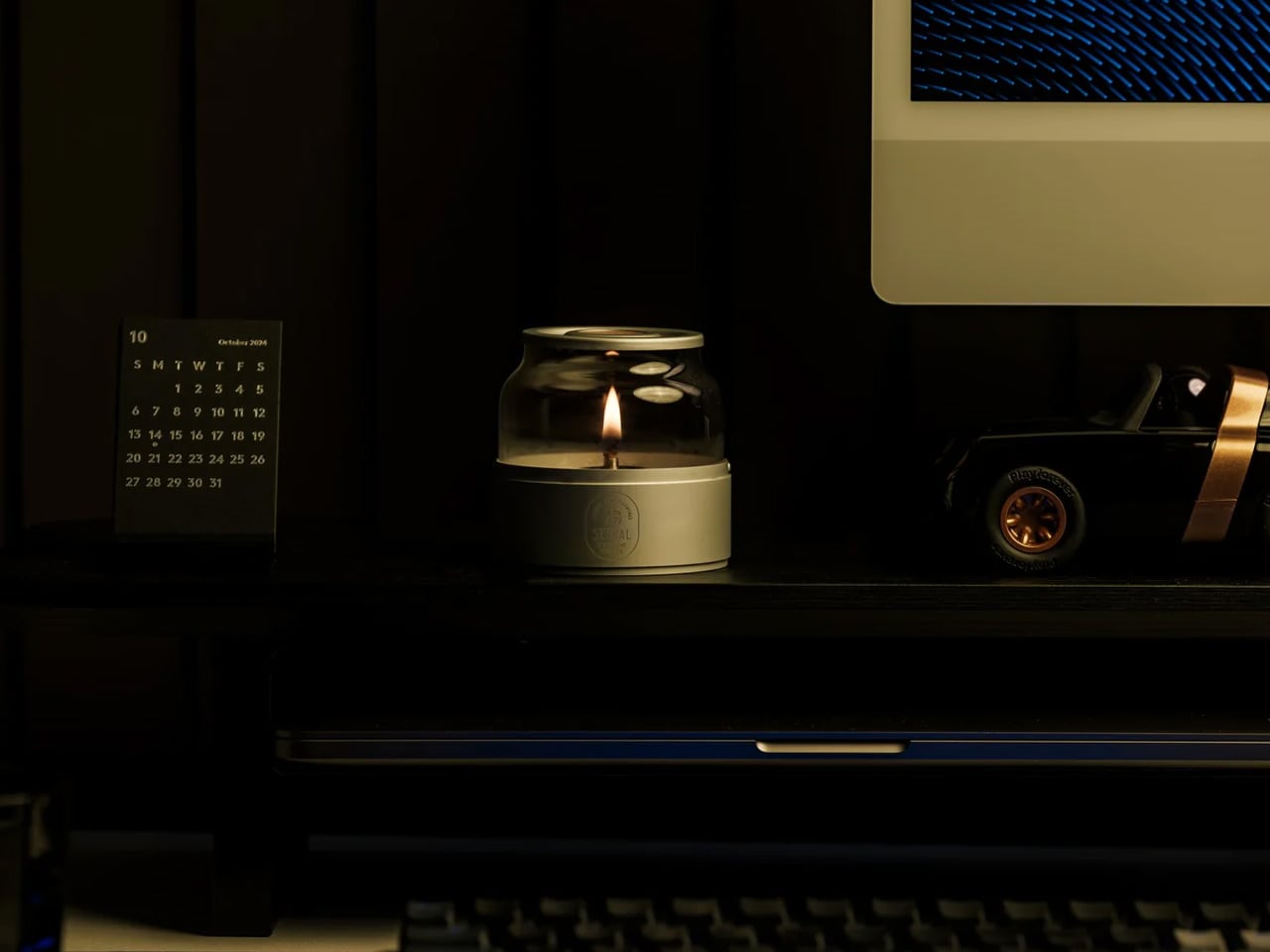
Ambient lighting elevates reading from routine to ritual. The Fire Capsule Oil Lamp provides up to 16 hours of continuous illumination from its 80ml capacity, creating a serene atmosphere that invites longer reading sessions. The precision-engineered lid keeps the glass chimney dust-free, maintaining crystal clarity that showcases the living flame. This isn’t just functional lighting—it’s a centerpiece that transforms your reading nook into a sanctuary.
The included aroma plate expands functionality beyond illumination. Add essential oils to infuse your space with scents that enhance focus or relaxation during reading sessions. Paraffin oil burns clean and odorless, creating a safe ambiance for both novice and experienced users. The cylindrical form stacks beautifully for storage, while the protective drawstring pouch makes it portable for outdoor book club gatherings, where you can use insect-repelling oils.
The generous 16-hour burn time supports marathon reading sessions and extended book club meetings.
Clean-burning paraffin oil eliminates the smoke and odor concerns that candles present near books.
The aroma plate feature creates multi-sensory reading experiences that deepen immersion.
Stackable design solves storage challenges while the included pouch enables outdoor literary adventures.
What We Dislike
Open flame requires vigilant supervision, especially in homes with children or pets.
Paraffin oil represents an ongoing expense and requires dedicated storage space.
The glass chimney, while beautiful, introduces fragility that demands careful handling.
Flame lighting lacks the instant convenience of electric options for quick reading sessions.
5. StillFrame Headphones
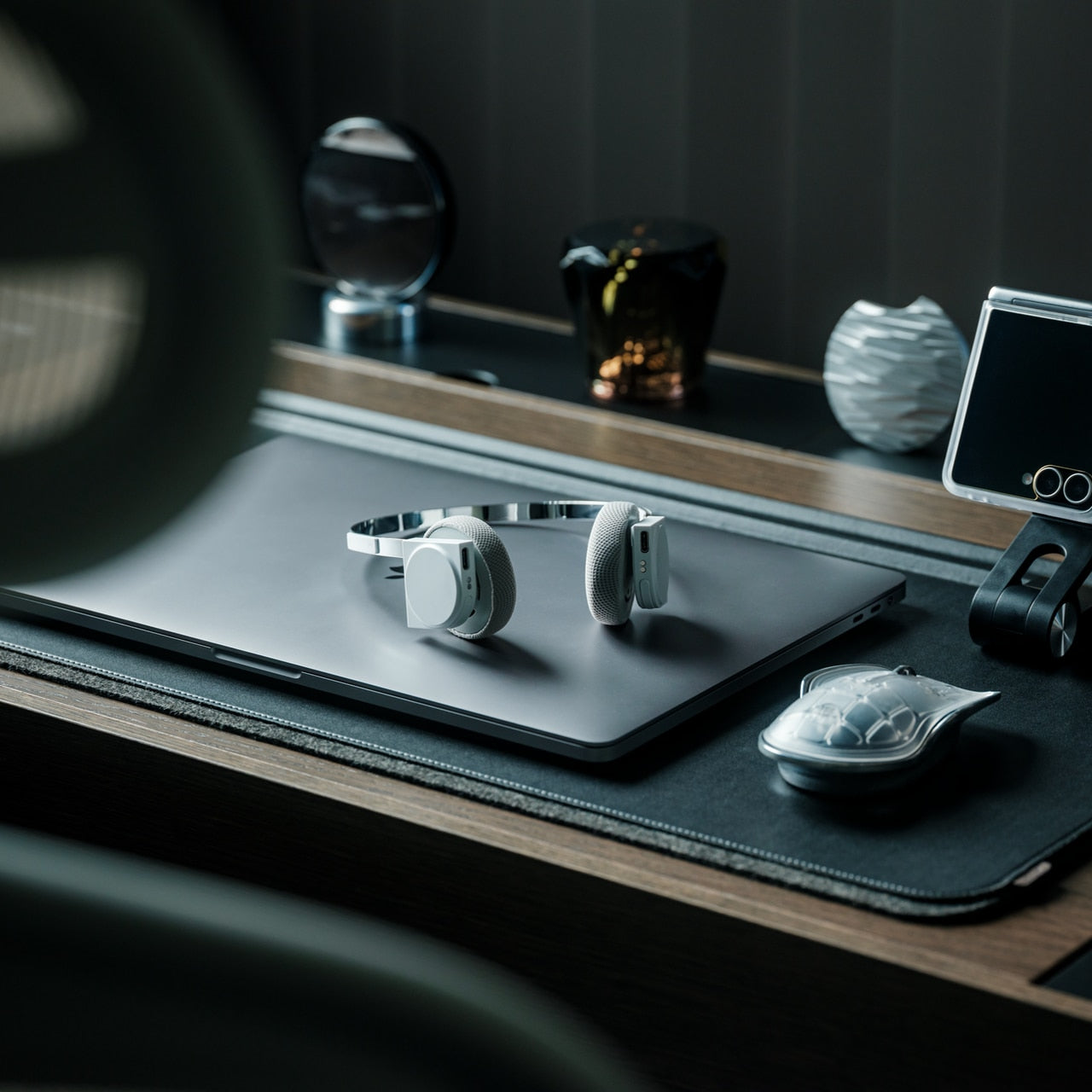
Modern reading encompasses multiple formats. The StillFrame Headphones honor audiobook listeners and those who prefer ambient soundscapes while reading physical books. At just 103 grams, they vanish physically while delivering substantial audio through 40mm drivers that create an expansive soundstage. The design splits the difference between in-ears and over-ears, offering comfort for the 24-hour battery life that powers all-day listening.
The retro-inspired geometry references the CD era when albums demanded dedicated attention, making these headphones philosophically aligned with focused reading. Active noise cancelling creates isolation for deep concentration, while transparency mode maintains environmental awareness for shared spaces. This adaptability serves book club members who alternate between private reading and group discussions, supporting both modes with a simple tap.
The 24-hour battery life eliminates charging anxiety during long reading days or travel.
Featherlight construction at 103 grams prevents the fatigue associated with heavier headphones.
Dual-mode functionality adapts to changing environments without requiring different devices.
The wide soundstage enhances audiobook narration and creates immersive atmospheres for background music during reading.
What We Dislike
The premium design comes with corresponding pricing that may stretch book club budgets.
On-ear style can cause discomfort during extremely extended wear despite light lightweight.
The aesthetic, while striking, demands commitment to a specific design language.
Bluetooth connectivity introduces another device to charge and maintain in your reading ecosystem.
Building Your 2026 Reading Ritual
These five essentials work together to create reading environments that honor literature. The combination addresses lighting from multiple angles, supports the care of physical books, introduces natural elements, and acknowledges evolving consumption formats. Investing in a dedicated reading space signals a commitment to your book club goals, transforming intentions into daily practices that last throughout the year.
Quality tools enhance experiences worth repeating. When your reading nook becomes genuinely inviting rather than merely functional, returning to it feels effortless. These designs demonstrate that thoughtful curation matters, that small details compound into significant improvements. Your 2026 book club goals deserve this foundation, where every element serves both purpose and pleasure in equal measure.
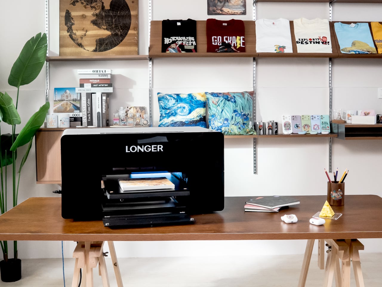
A typical small studio or serious hobbyist handles printing across multiple devices and vendors. One machine for paper, maybe another for vinyl, a separate UV printer if you are lucky, and outsourcing for anything textured, cylindrical, or fabric-based. The friction adds up quickly, juggling vendors, minimum orders, and formats that do not quite align. Longer ePrint tries to pull those scattered workflows back into a single, desk-sized footprint, treating printing as something you do in-house across materials and processes instead of planning around what your gear can handle.
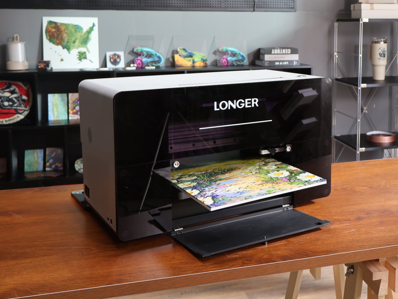
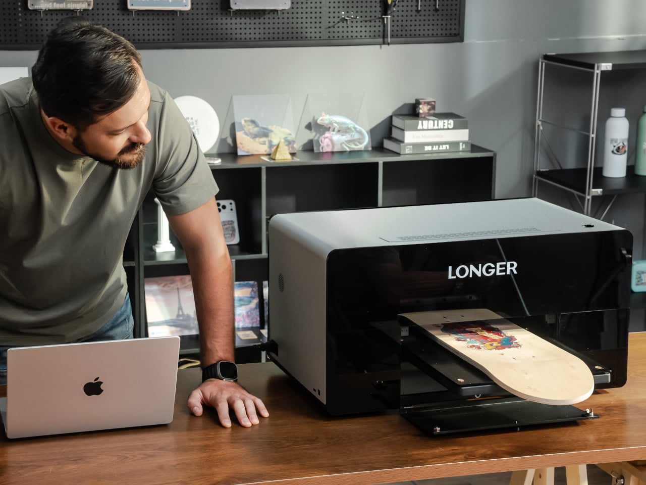
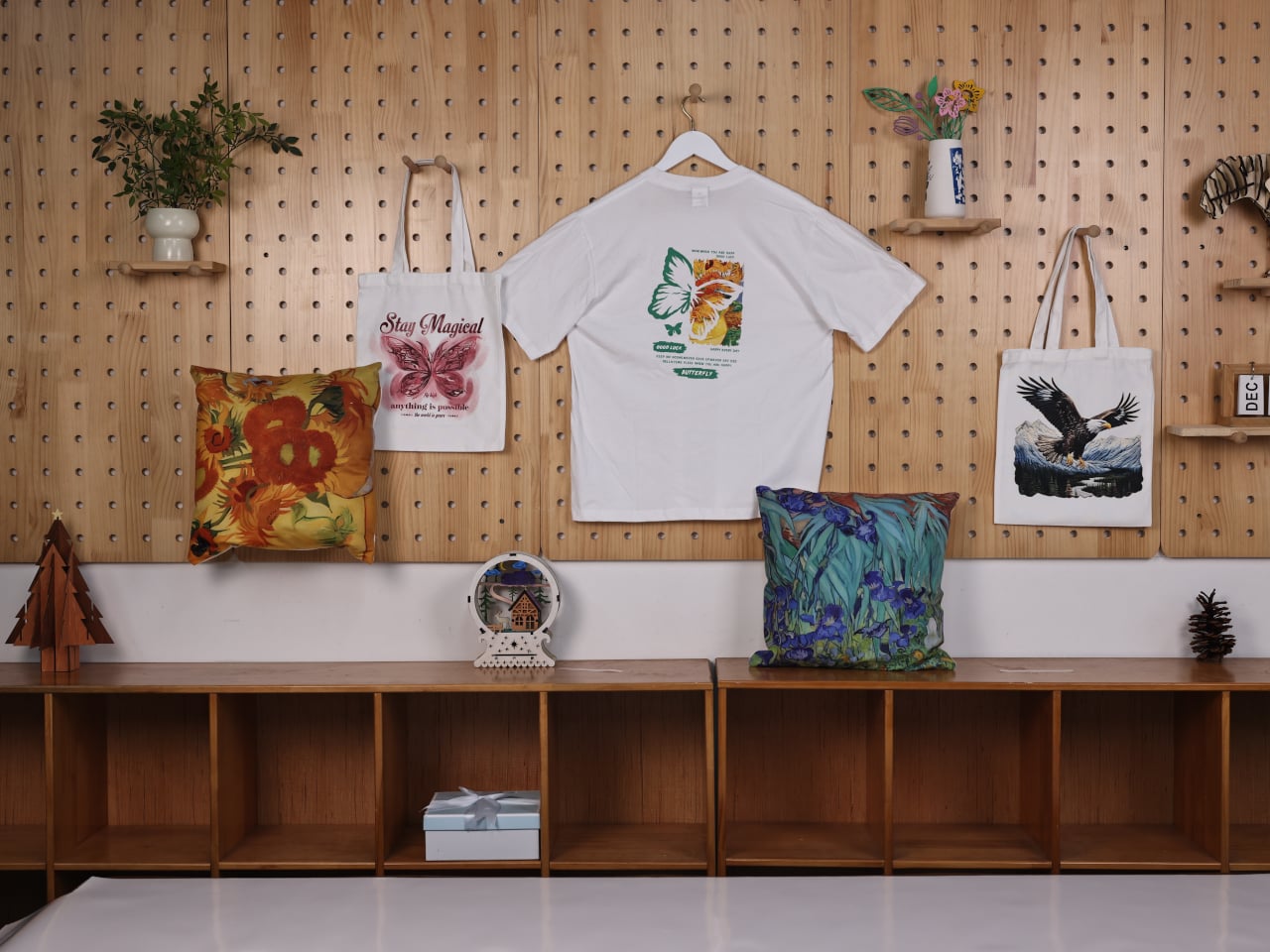
Longer ePrint is a dual-head, 3D-texture personal UV printer that behaves more like a tiny print lab than a single-purpose machine. One printhead is dedicated to UV inks for direct printing onto hard goods, while the other can be configured with a dedicated printhead for DTF inks to handle fabric transfers. The same box can print phone cases, embossed wood panels, and heat-press designs for tote bags without swapping hardware, which changes the kinds of projects you can start and finish in an afternoon.
ePrint runs 12 ink channels across two printheads, CMYK color plus six white channels and two varnish channels in the full model. For textured work, all six white channels stack ink simultaneously, building height up to six times faster than a single channel. For flat prints, the dual-head setup can cut time roughly in half while still holding 1,440 DPI resolution. The point is being able to run more experiments and finish more pieces in the same time block without waiting hours between iterations.
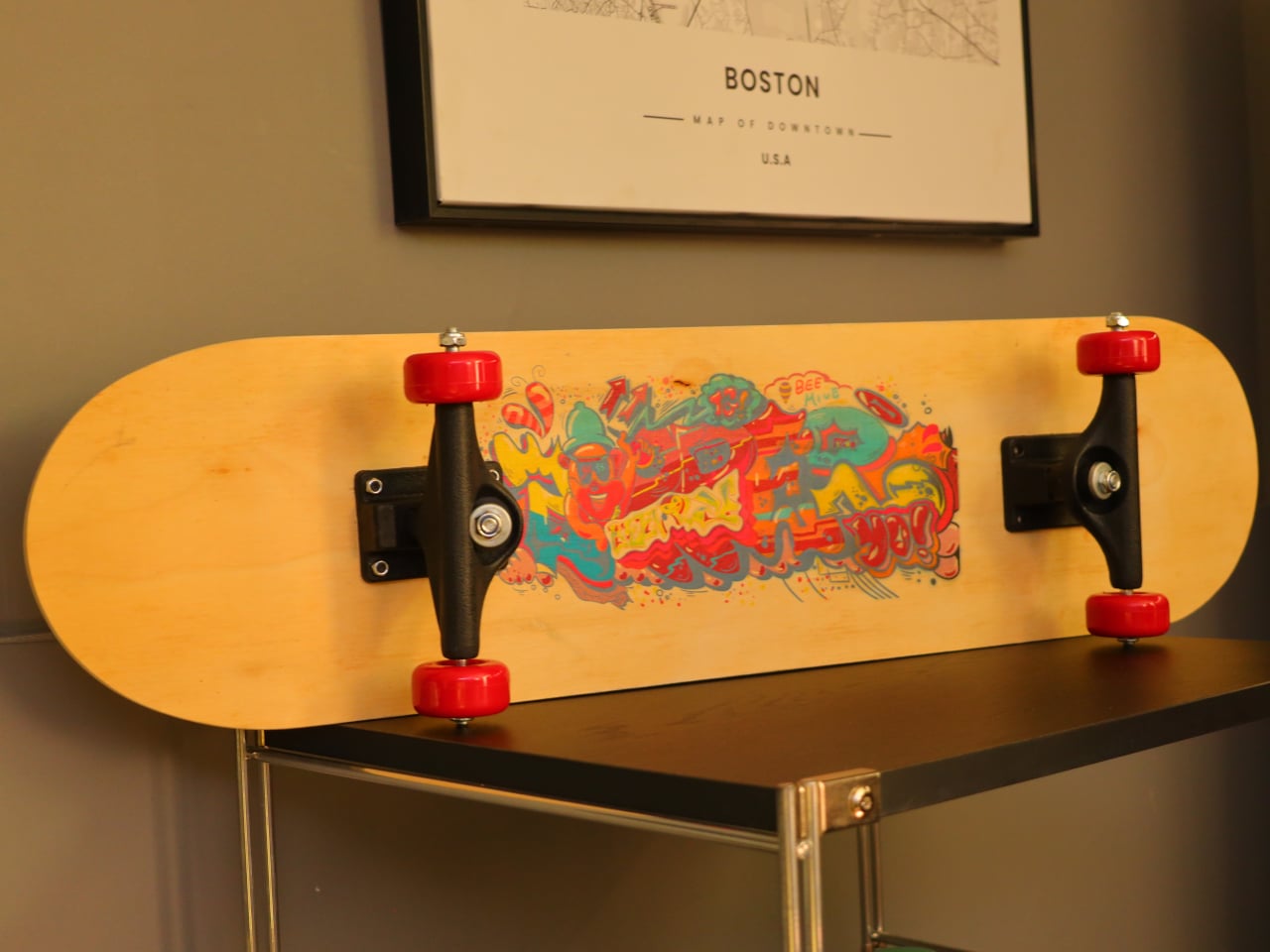
The 60mm embossing height pushes ePrint beyond flat graphics into tactile territory. That build-up lets you create braille signage with real raised dots, relief art that catches light and shadow, dimensional logos on cases and plaques, and prototypes that feel like finished products instead of flat mockups. It turns a UV printer into a way to explore form and tactility, not just color and layout, which is a shift for designers used to thinking flat and outsourcing anything that needs actual depth.
ePrint holds twelve 200ml cartridges and runs an open-ink system, so you can use Longer’s inks or third-party options, including DTF inks, low-migration ink formulations, and fluorescent colors. Combined with support for more than 300 materials and a 10mm high-gap printing capability, it can handle wood, acrylic, glass, metal, leather, stone, curved objects, and textured surfaces without the printhead scraping. That flexibility matters when you are testing new products or saying yes to unusual requests beyond the usual phone case rotation.
The machine supports four mechanical modes that each unlock different outputs. Flatbed mode handles panels, cases, and signs up to 310mm x 420mm. Rotary mode spins bottles, tumblers, and cylindrical objects while the heads print, wrapping designs around curves. Transfer film mode prints onto a special substrate first, then lets you laminate or heat-press onto fabric. Conveyor belt printing automates small-batch runs of rigid items like phone cases without repositioning each piece by hand.
The AI-powered studio offers tools like pattern generation, text-to-image, background removal, and product series generation, helping you respond to ideas or client briefs quickly without outsourcing design work. White-ink circulation and auto-cleaning routines keep the heads from clogging, which is usually a pain point with UV printers, while built-in air purification and sub-60dB operation make it more comfortable to run in a small studio as long as you still keep proper ventilation going.
A machine like this changes how you approach printing. Instead of sending work out for anything unusual or saying no to projects that need specific inks, materials, or texture, you can test ideas in-house, move from a sketch to a raised, textured object in a day, and run small batches without committing to huge minimums or buying another specialized tool. For designers, DIY enthusiasts, and small businesses, Longer ePrint feels less like a printer and more like a compact production partner that happens to live on a desk, letting you expand what you make without expanding the square footage or vendor list you need to manage.
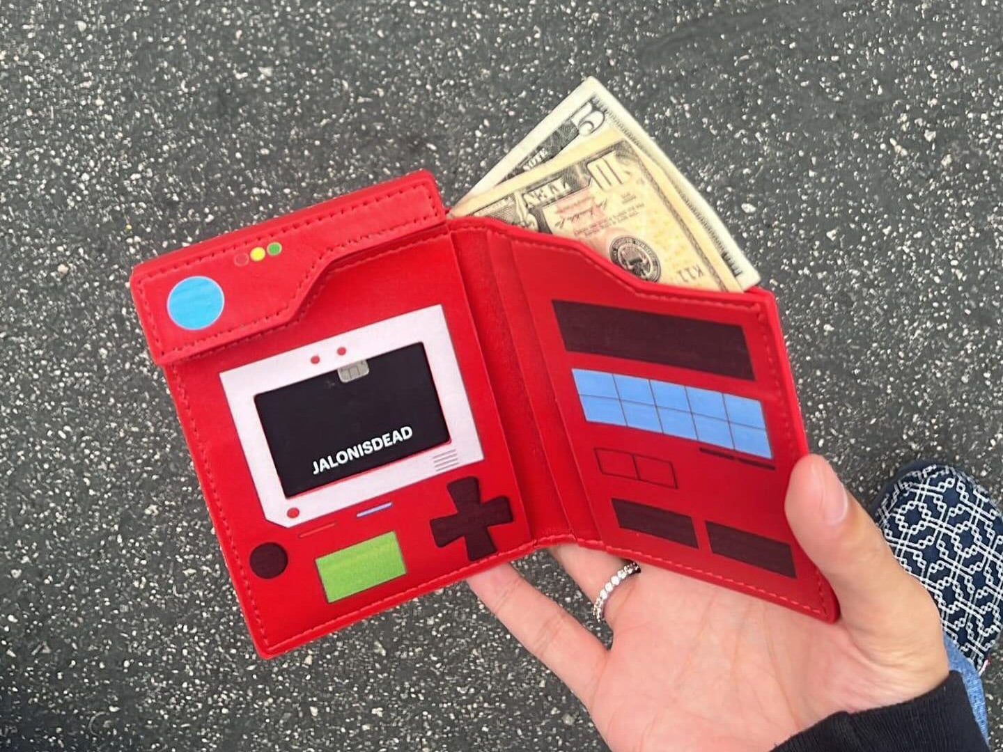
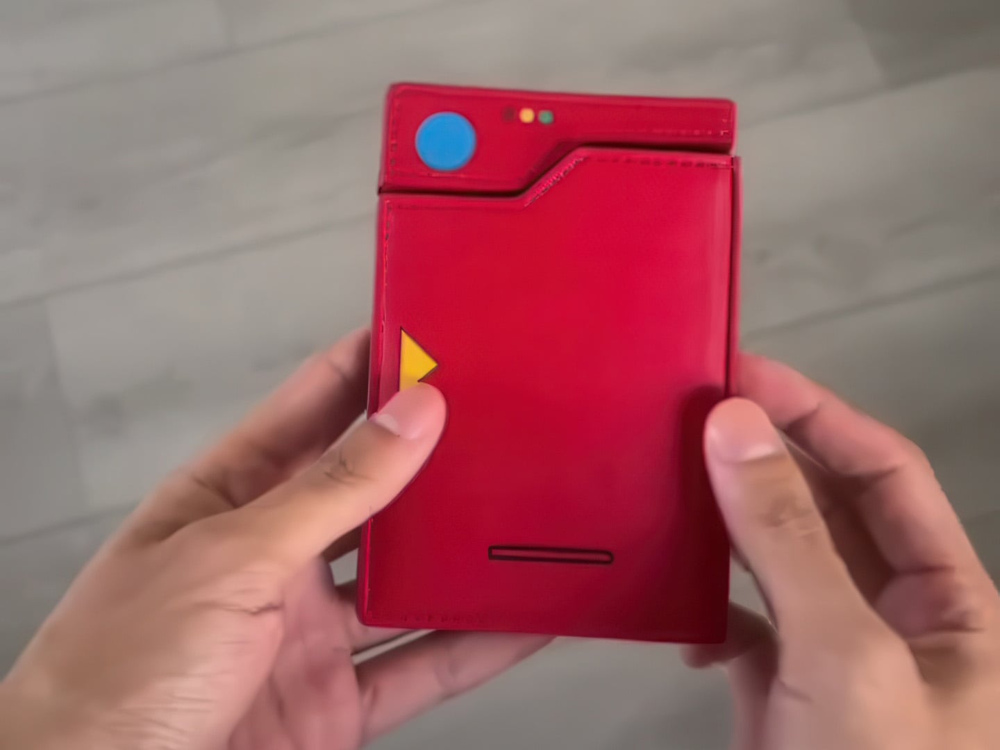
More like Gotta Cash ‘Em All, am I right?! Say hello to by far the nerdiest wallet I’ve ever had the pleasure to set my eyes on. Made for clearly Pokémon lovers, this wallet takes inspiration from one of the most crucial gadgets in the Pokémon universe – the PokéDex. Designed to look almost identical to the flip-based device used to identify the Pokémon you see around you, this wallet comes from the mind of Jalonisdead, with slots to hold (and display) your Pokémon cards along with your banknotes.
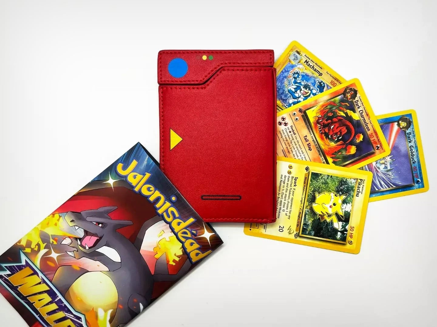
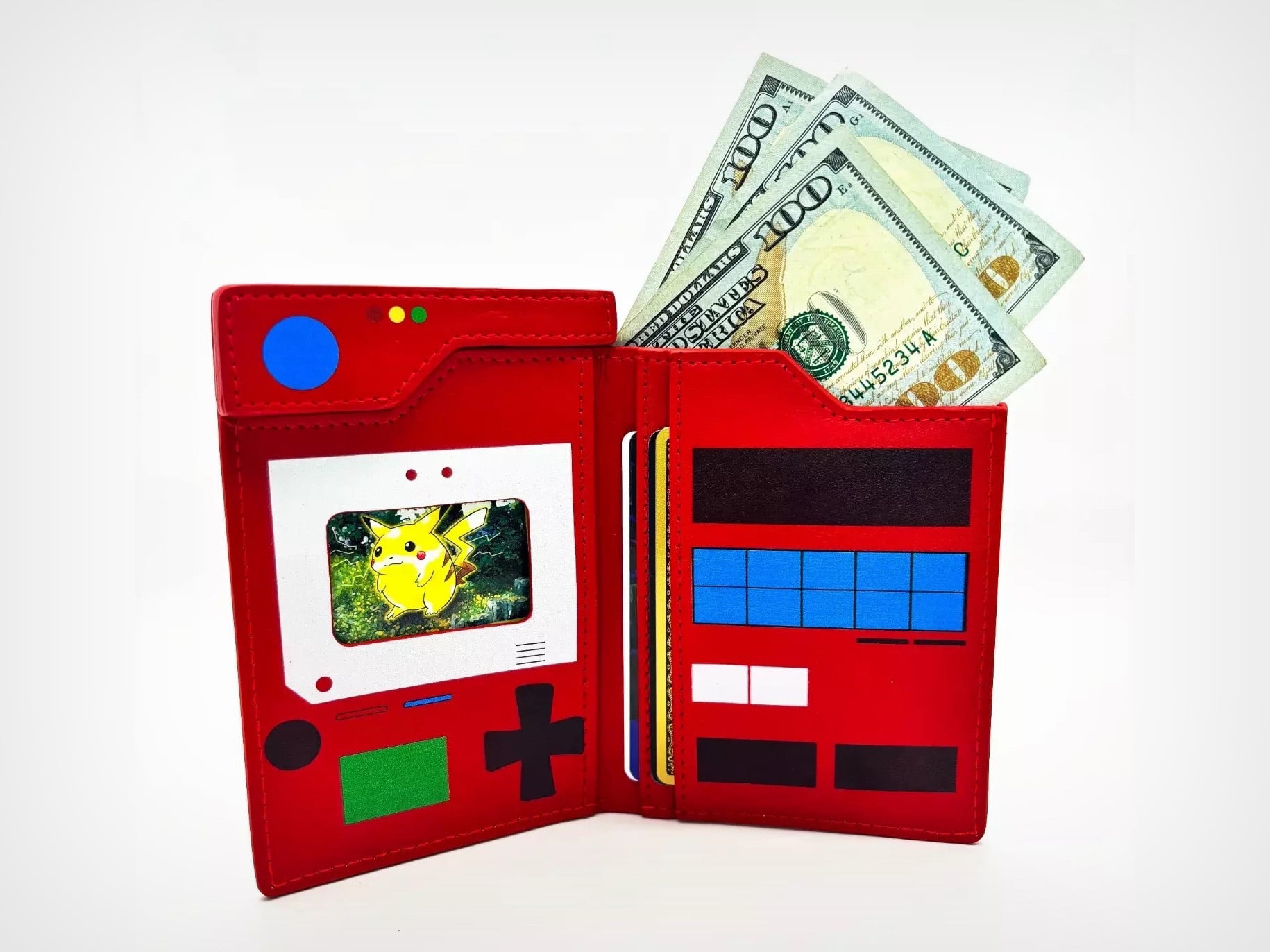
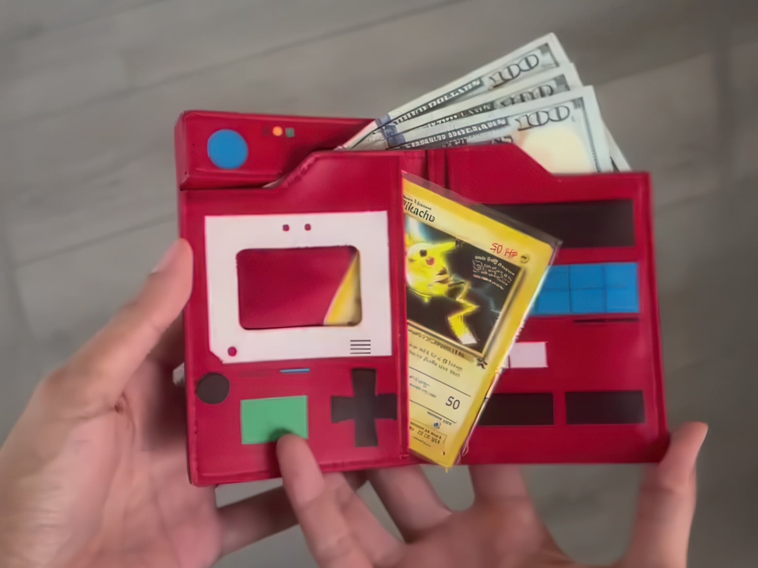
The wallet comes in a bifold format in that unmistakeable red finish, with a design to match the PokéDex perfectly. When shut, it looks like a red PokéDex waiting to be opened. Flip the lid open and you’re greeted with a card window on the left that you can use to store the card of your choice. The window lines up perfectly with the card’s graphic, making it look like you’ve ‘spotted’ that Pokémon. Meanwhile, faux graphics on the wallet look almost identical to the gadget from the game/series.
There’s space for multiple cards, although the one front-and-center is clearly for a Pokémon card. Two other slots on the right side can be used for payment and I’d cards too – this is a wallet after all. A slot on the top holds banknotes, although I wish there were place for coins too. The unusual shape lends itself perfectly to wallet use, and I’m surprised nobody at Nintendo thought of cashing in on this idea.
Each wallet costs in the ballpark of $56 USD, and ships in authentic Pokémon card-style packaging, along with 4 Pokémon cards in mint condition. Jalonisdead (the maker) isn’t a massive company, so each wallet is made-to-order and probably by hand too. This means the turnaround time for delivery is anywhere up to 2 months, but for a Pokémon aficionado, I’m sure it’s a small price to pay for perhaps what might be the coolest wallet I’ve seen in years!