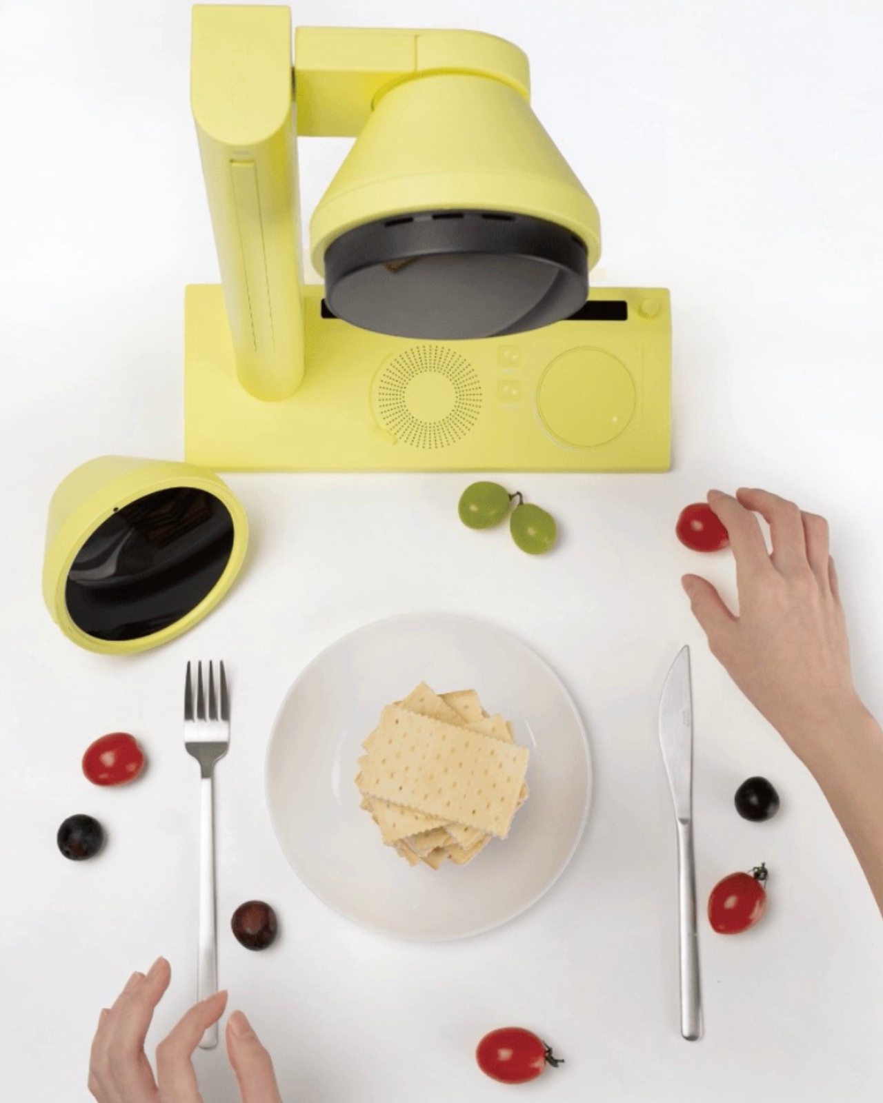
We’ve seen AI make itself comfortable in our music, our fashion, and our skincare routines. It was only a matter of time before it pulled up a chair at the dinner table. Kitune, a design concept by Seoul-based designer Jiyeon Choi, is exactly that moment, arriving in the form of a compact, butter-yellow device that looks more like a studio prop than a kitchen appliance. As a concept, it’s already asking a question that most kitchen technology doesn’t bother with: what if the way your food looks was just as personal as the way you dress?
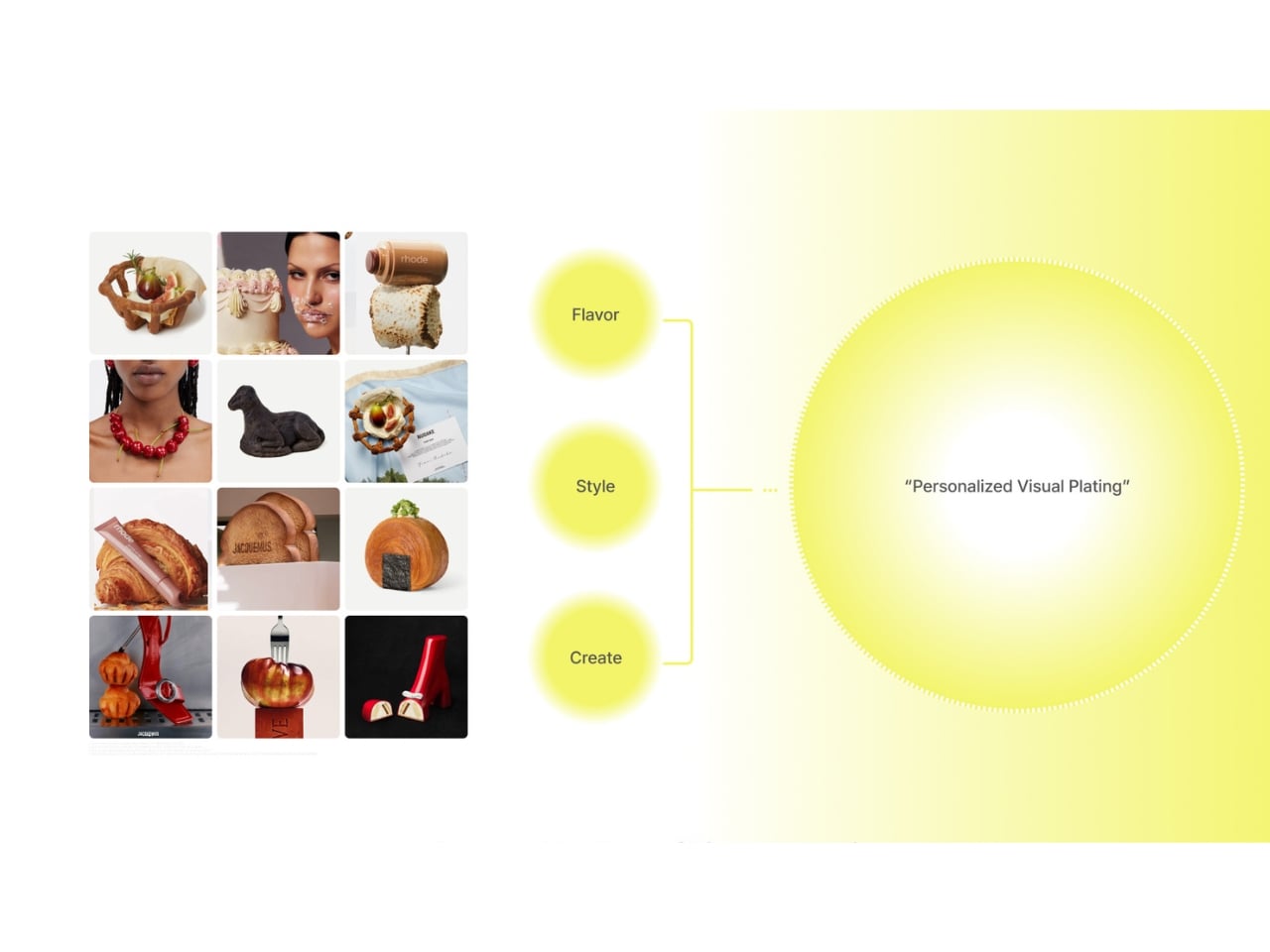
The premise is deceptively simple. Food, Choi argues, has crossed well beyond the realm of taste and into the realm of visual expression. That’s a hard argument to push back on. You only need to spend thirty seconds on any social feed to see that the way a dish looks now carries as much cultural weight as what it actually tastes like. Plating is styling. Styling is identity. Food shows up in fashion editorials, in art installations, in luxury brand campaigns. It has become its own visual language, and Kitune is a concept built entirely around that reality.
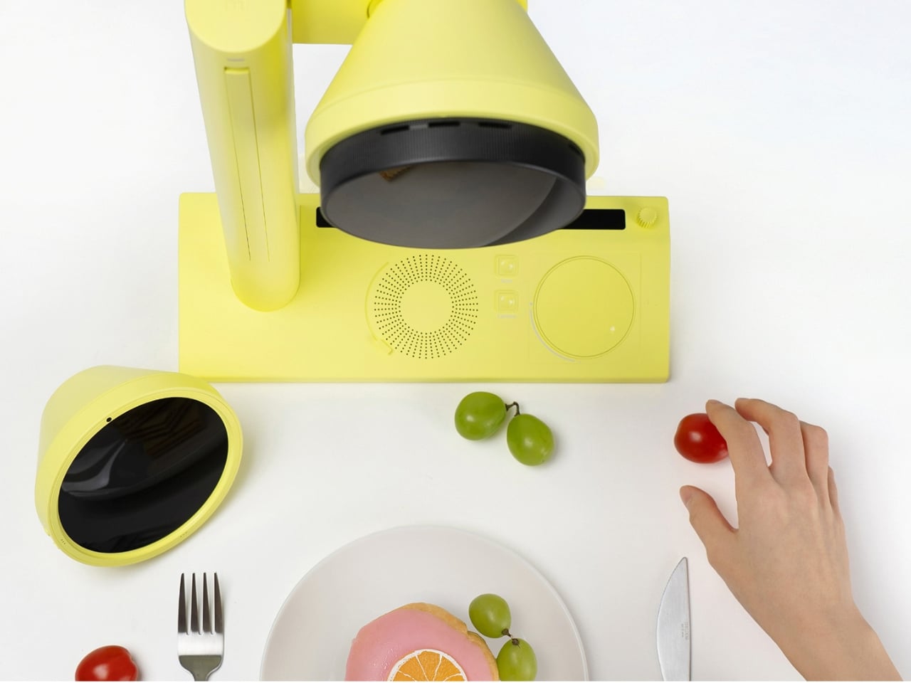
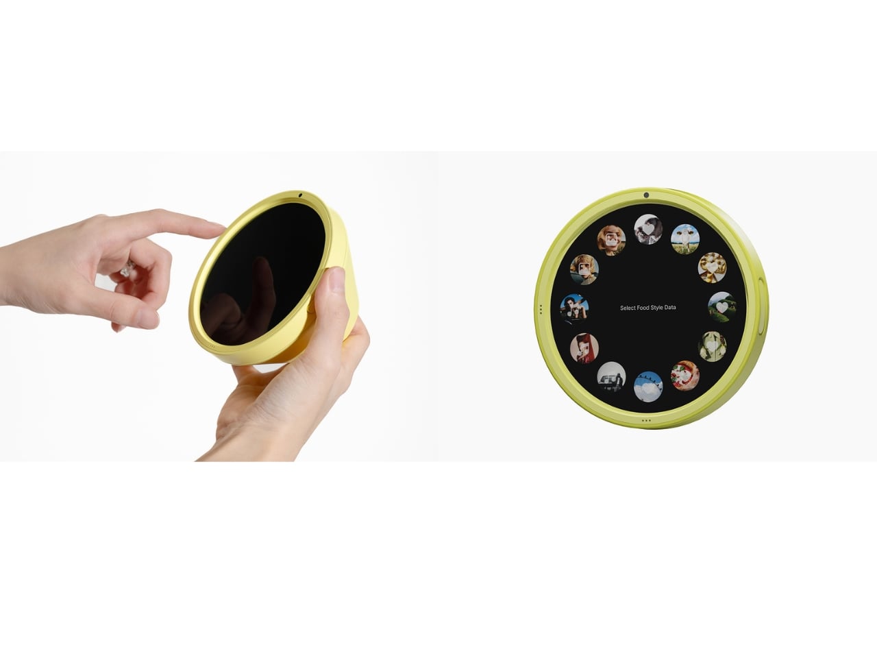
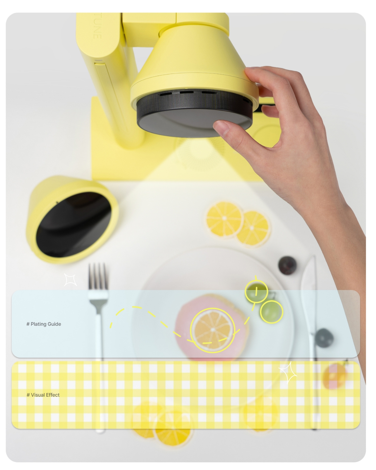
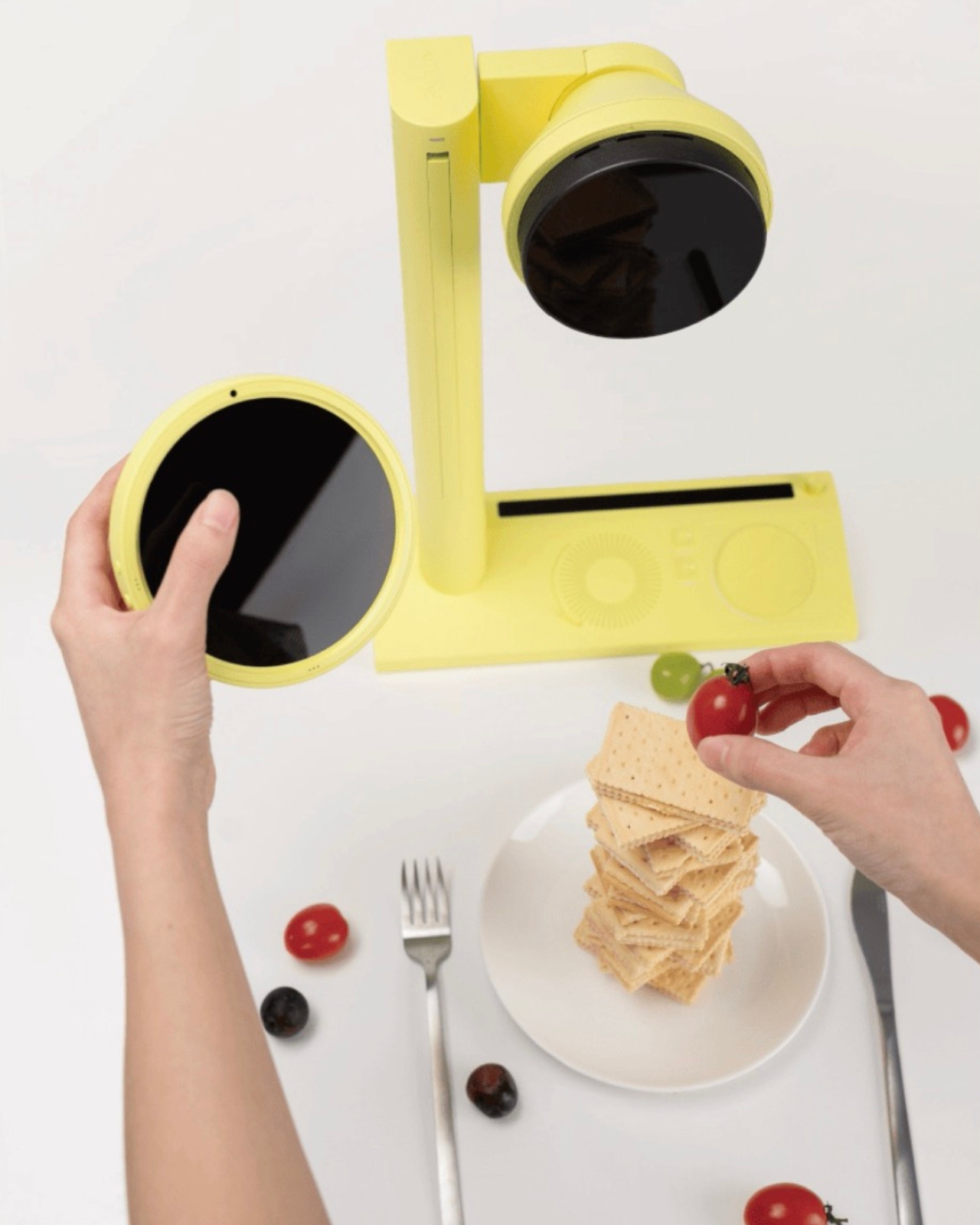
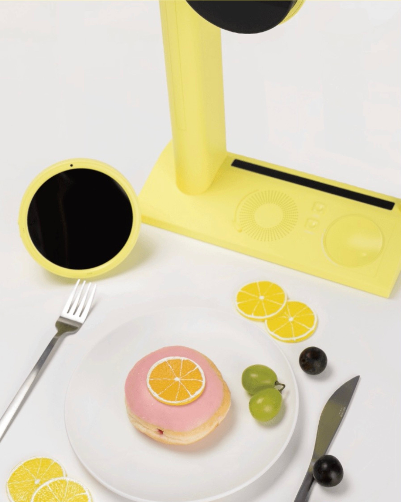
Here’s how the concept works. The device takes in personal data you’ve selected and tuned, your aesthetic preferences, your current mood, your lifestyle references, and uses it to generate a visual concept for how your dish should look. Not a vague suggestion, but a specific, styled direction. From there, a built-in projector casts a real-time plating guide directly onto your surface, showing you where each element should land. There are also mood-matched visual overlays that let you feel the overall atmosphere of the dish before you commit to placing a single garnish. It’s a feedback loop between your data and your plate.
That last part sounds theatrical, but I think that’s deliberately the point. Kitune isn’t trying to make you a more efficient cook. It’s trying to make cooking feel more like creative expression, and that’s a meaningful shift in what kitchen technology usually promises. Whether as a concept or an eventual product, that distinction matters.
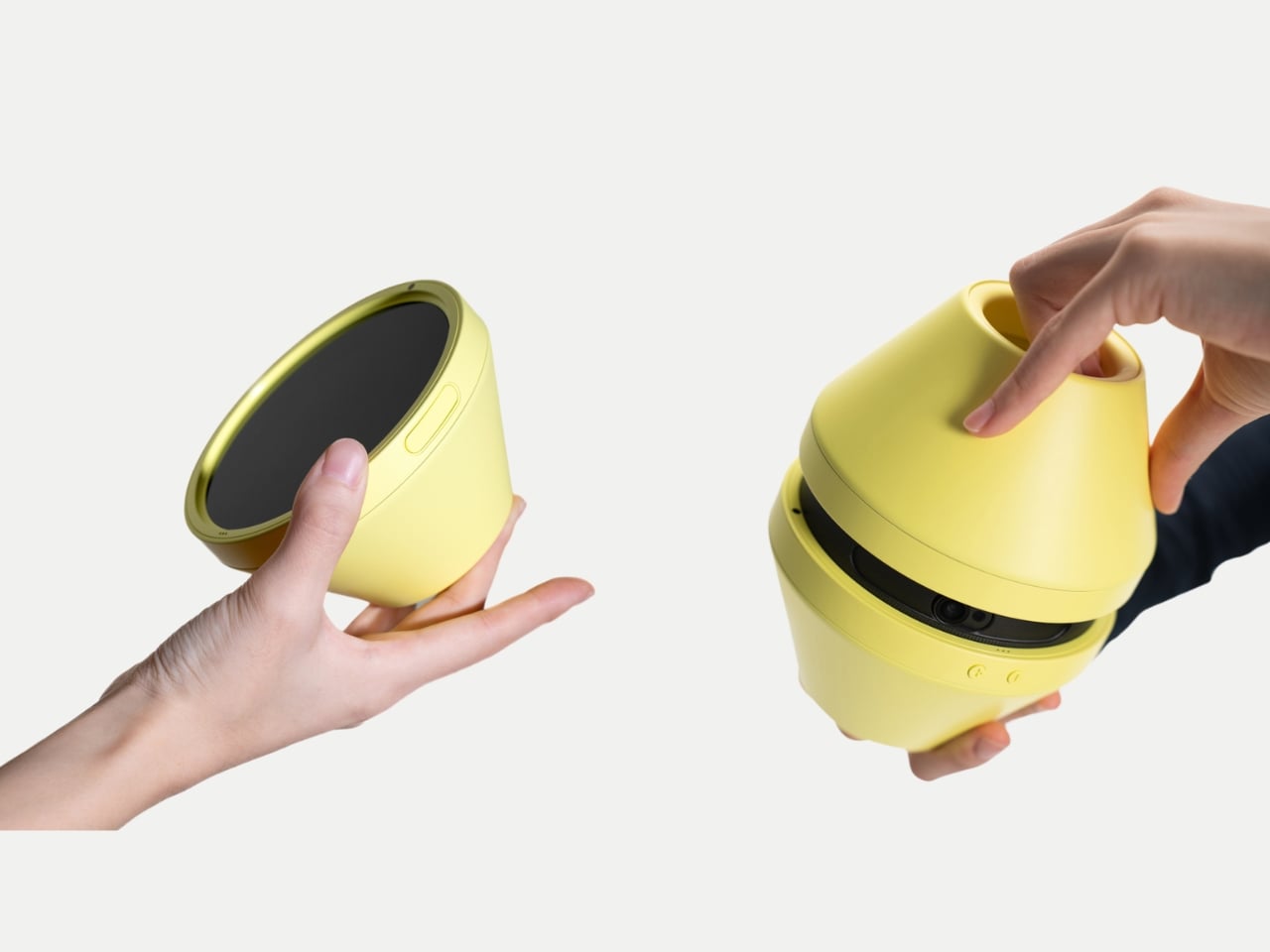
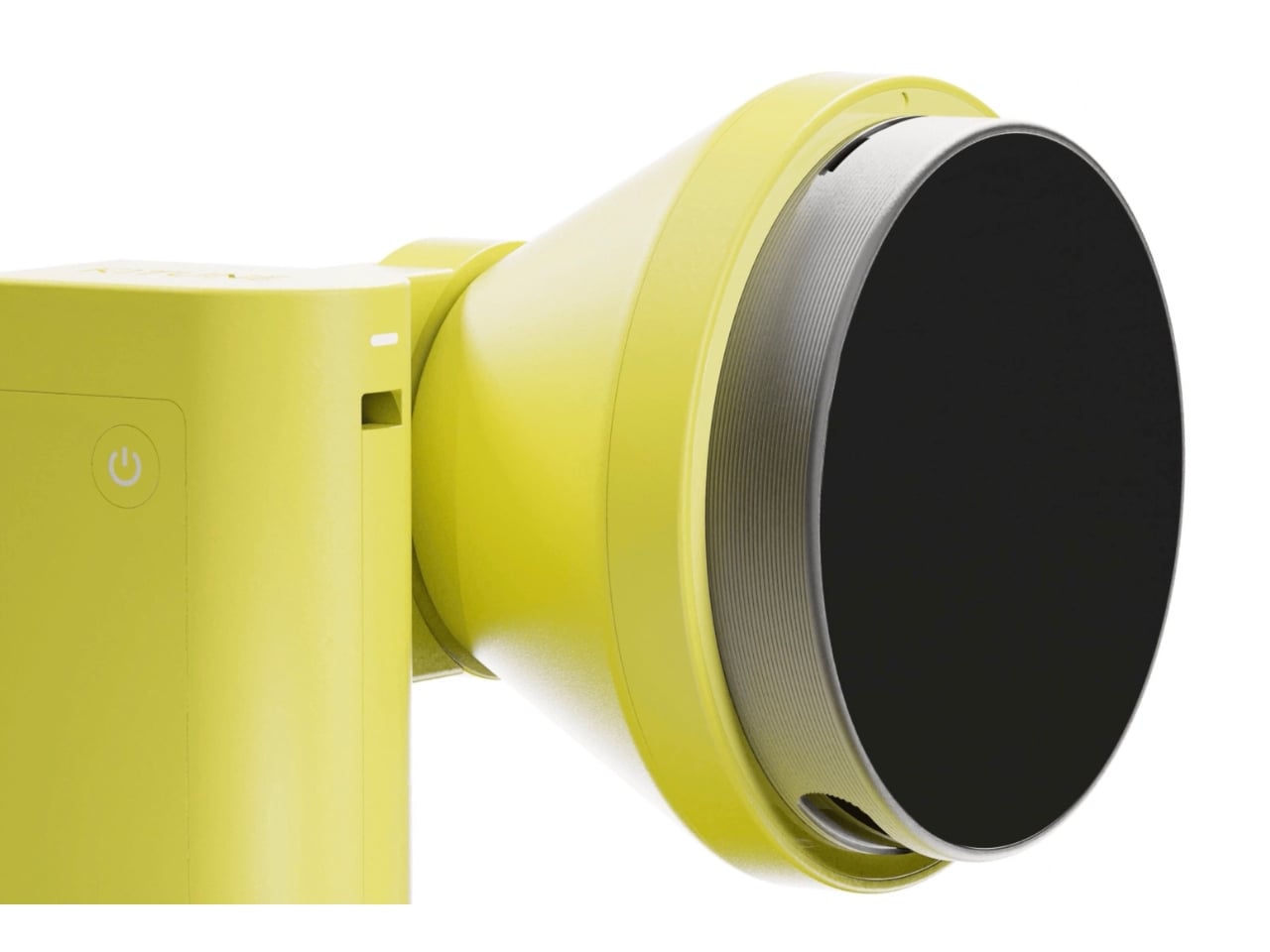
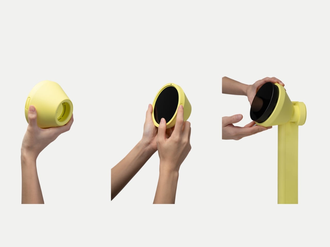
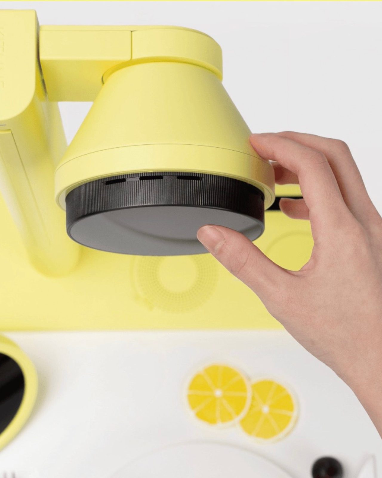
The hardware design is genuinely considered. Kitune is conceived as a portable device that works in two configurations: a handheld form for close, controlled work and a standing version where an arm suspends the projector above your plate. Both modes carry the same cheerful yellow finish, which matters more than it might seem. That color choice softens what could easily feel like cold, clinical AI tech in a space that’s historically been warm and human. It signals that this device belongs to the experience of cooking, not just the logistics of it.
The interface is also worth attention. Instead of typing prompts or navigating flat touchscreen menus, the concept proposes interacting with a circular dial loaded with mood and lifestyle imagery that you physically rotate and select. It’s tactile, and that decision feels very deliberate. Choi seems to understand that the kitchen is not a place where people want to feel like they’re operating software. The interaction needs to feel as intuitive and sensory as the act it’s guiding.
Where Kitune really makes its case as a concept is in how it reframes what personalization means. Most AI products personalize around efficiency, faster, smarter, more optimized. Kitune personalizes around feeling. The output isn’t a quicker route or a better recommendation. It’s a visual mood built from your data that’s meant to feel like you, on a particular day, in a particular state of mind. That’s a genuinely different kind of design ambition, and one that feels more honest about the role food actually plays in people’s lives.
There are real questions the concept raises. How much data does it need to work well? Does it develop a sharper sense of you over time, or does each session reset? These are the practical gaps between a compelling concept and a working product. But Kitune doesn’t need to answer all of them right now to be worth paying attention to. As a design statement, it’s already saying something clear: that the future of kitchen technology might have less to do with what you’re cooking, and a lot more to do with how it makes you feel.
Spring changes the way students think about their tools. The semester finds its stride, the days stretch longer, and the quiet audit of what is actually working versus what has simply been tolerated becomes impossible to defer. For tech-savvy students, this impulse is never casual. It turns into a deliberate reckoning with every device in the bag, every cable on the desk, and every piece of hardware that earns or fails to earn its place in a schedule already running at capacity.
Most gadget guides aim too low. They recycle the same categories, suggest the predictable safe picks, and miss the specific texture of what a tech-savvy student’s day actually looks like in spring. Tools that genuinely serve that day are portable without sacrifice, precisely designed, and specific enough in their purpose to feel built for the exact problem they solve. The wishlists circulating among students who think carefully about design land on exactly that — and every product here was chosen to reflect it.
1. OrigamiSwift Folding Mouse
The mouse is the peripheral that students consistently overlook until a trackpad fails them mid-session. The OrigamiSwift changes that calculation. Drawing on origami’s structural logic, this Bluetooth 5.2 mouse collapses flat and springs into a full-sized ergonomic device in under 0.5 seconds. At 40 grams and 0.18 inches thin when folded, it disappears into a jacket pocket without adding noticeable weight. Soft-click buttons suit shared study spaces, and a USB-C battery sustains three months on a single charge.
For students moving between a library desk, a café table, and a campus bench in one afternoon, this is the mouse that travels without being noticed until needed. Compatible across Mac, Windows, Android, and iPadOS, it works equally on a personal laptop and a shared lab machine with no additional setup. The ergonomic form handles extended sessions without fatiguing the wrist, turning a recurring compromise into a peripheral that finally earns its place.
Folds to 0.18 inches and 40 grams, fitting into a jacket pocket without adding meaningful bulk to the daily carry
Three-month USB-C battery life removes it entirely from the weekly charging routine, so one less thing to think about
What We Dislike:
Bluetooth-only connectivity limits use on older shared desktops or lab machines that lack wireless support
The folding mechanism takes a brief adjustment period for students accustomed to the immediate grip of a conventional fixed-body mouse
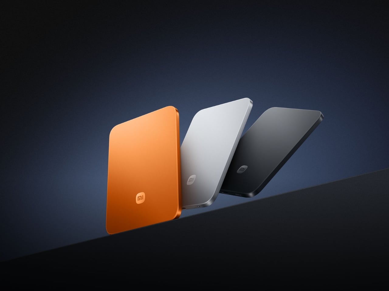
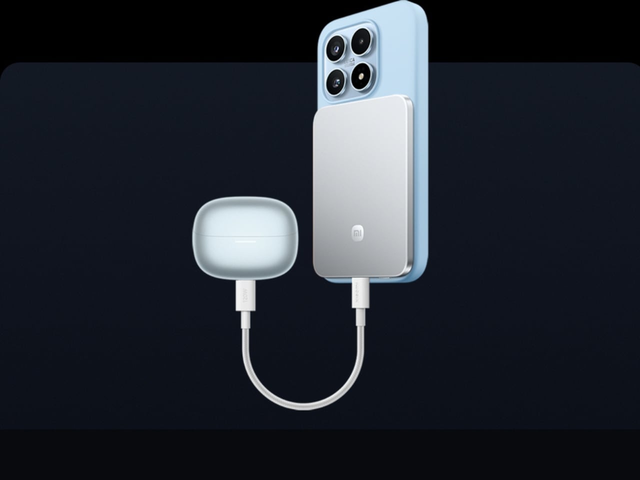
2. Xiaomi UltraThin Magnetic Power Bank 5000 15W
Power banks occupy a strange design dead zone. Most work as promised and are forgotten the moment they enter a bag. The Xiaomi UltraThin Magnetic Power Bank 5000 15W reframes the category. At 6mm thin — slimmer than any current smartphone — it holds 5,000mAh inside an aluminum alloy shell. Silicon-carbon battery chemistry with 16% silicon content enables higher energy density without expanding the footprint, and a fire-resistant fiberglass rear surface manages heat during wireless charging.
This solves the persistent problem of the charging backup that stays home because it feels too heavy to justify. At 6mm, it sits magnetically against a compatible phone and delivers 15W wirelessly while moving between buildings, sitting through a lecture, or waiting at a transit platform. No cable between bank and phone, no rummaging for the right end. It sits in a pocket as an extension of the device rather than a separate burden to manage throughout the day.
What We Like:
Silicon-carbon chemistry achieves 5,000mAh within a 6mm profile, making it the thinnest power bank available at this capacity tier
Magnetic cable-free attachment delivers 15W wirelessly while the phone stays pocketed between classes, with zero management required
What We Dislike:
5,000mAh covers roughly one full smartphone charge, which falls short on heavy-use days involving continuous navigation, recording, and streaming
Magnetic wireless charging is limited to compatible phone models, restricting the cable-free feature for students outside that ecosystem
3. HubKey Gen2
The average student laptop setup involves a quiet accumulation of compromises: a dongle for the display, a separate hub for ports, a cable for audio, and none of it cohering. The HubKey Gen2 addresses this from a single USB-C connection. An 11-in-1 hub in a compact cube, it adds two HDMI ports, each capable of driving a 4K display at 60Hz, four fully customizable physical shortcut keys, and a central control knob that handles everyday actions without navigating software menus.
Spreading a research document across two 4K panels changes the quality of a work session in ways only understood from the inside. Reference material stays open while the draft stays active. Code and documentation share the same eyeline. The shortcut keys reduce the cognitive overhead of memorizing keyboard combinations, and the central knob delivers volume control with tactile immediacy that no software slider replicates. For students working across design, development, or video, this cube earns its place on day one.
What We Like:
Dual 4K HDMI outputs at 60Hz each simultaneously expand a laptop into a proper two-monitor workstation from a single connection
Physical shortcut keys and a central control knob bring immediate, tactile control to routine tasks that software menus handle more slowly
What We Dislike:
Cube form factor suits a stationary desk, but does not pack into a travel bag as cleanly as a flat or cable-style hub alternative
Full 11-in-1 performance depends on the connected laptop’s USB-C port supporting the required power delivery and data bandwidth specifications
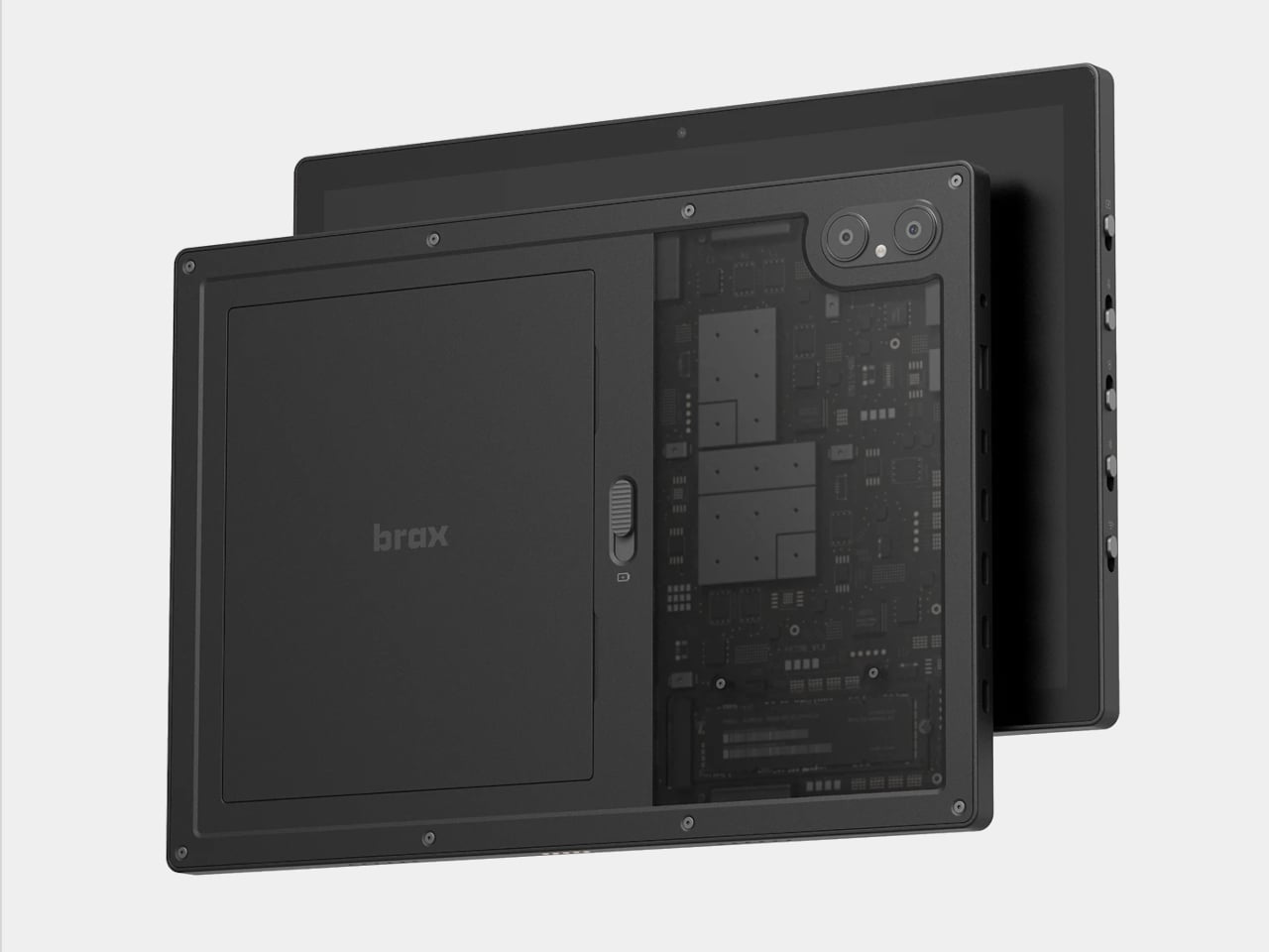
4. BraX open_slate
Almost every tablet arrives sealed, with decisions already made inside the chassis: fixed storage, an inaccessible battery, a software support window that closes on the manufacturer’s schedule. The BraX open_slate rejects that model. This 12-inch 2-in-1 includes an M.2 2280 slot for user-swappable storage, a replaceable 8,000mAh battery rated at 20 hours of runtime, and a 120Hz display driven by a MediaTek Genio 720 chip paired with either 8GB or 16GB of RAM.
The open_slate removes the most predictable frustration of the tablet ownership cycle: the moment a device slows enough to become an obstacle, and the only available response is full replacement. Swappable storage means a capacity upgrade takes an afternoon. A user-replaceable battery means two years of student use does not write off the entire device. For students making a deliberate, multi-year investment in one tablet, this is currently the only option making that argument with hardware to back it.
What We Like:
User-replaceable M.2 storage and battery extend the device’s usable lifespan well beyond the typical two-to-three year sealed-tablet replacement cycle
A 20-hour claimed battery runtime on a 120Hz display covers a full academic day without requiring a charge mid-session
What We Dislike:
MediaTek Genio 720 is a capable mid-range chip, but it is not suited for students with intensive video rendering or compute-heavy creative workloads
The open modular hardware requires a degree of technical confidence that students coming from fully managed, sealed device ecosystems may need time to build
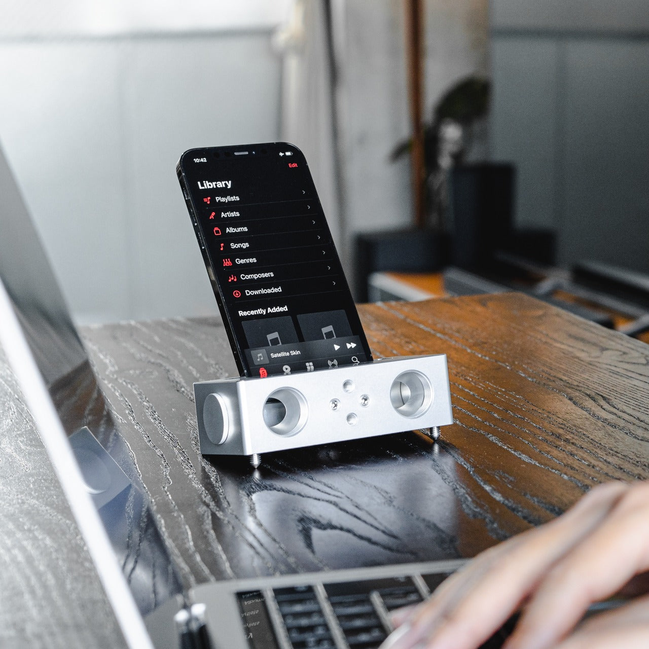
5. Battery-Free Amplifying iSpeakers
The Battery-Free Amplifying iSpeakers operate on a principle that is easy to underestimate until the sound fills the room. A smartphone sits in the machined Duralumin cradle, and sound waves are directed and amplified through the chamber without any electrical input. The body is the same aluminum alloy used in aircraft construction, chosen for its vibration resistance and acoustic properties. Chamber proportions were developed using the golden ratio, a structural decision that shapes the internal acoustic geometry deliberately.
No charging reminder, no Bluetooth pairing, no firmware update mid-session. A phone in the cradle and the room shifts immediately, audio gaining presence and warmth that a phone speaker lying flat on a desk cannot approach. For study sessions running on focus music, ambient sound, or a lecture replay, the difference registers in seconds. Duralumin handles daily movement without showing wear, and because it operates entirely outside the electrical ecosystem, it performs identically in ten years as it does today.
Zero power requirement means no charging, no battery degradation, and no dependency on any cable or power source at any point
Aircraft-grade Duralumin construction delivers acoustic quality and physical durability that holds across years of regular daily use without deterioration
What We Dislike:
Passive acoustic amplification improves meaningfully on bare phone speaker output, but cannot match the volume or bass depth of even entry-level powered speakers
Cradle sizing is optimized for specific smartphone dimensions, and compatibility may vary with larger phones or thick protective cases
The Setup That Actually Works for You
The five products here do not share a category, price point, or use case. What they share is design precision that addresses real daily friction rather than just performing a feature list. A wishlist built on that standard holds up across the full stretch of any semester. These are tools chosen because someone thought carefully about the problem first, and that clarity comes through every time you reach for one.
Spring is short. It moves quickly from the first warm afternoon to the last exam, and the tools you work with shape how much of that time goes toward actual output. The difference between owning something well-considered and tolerating what came with freshman year becomes obvious around week ten. Choosing now means spending the rest of the semester working with something that performs exactly the way a well-chosen tool should.
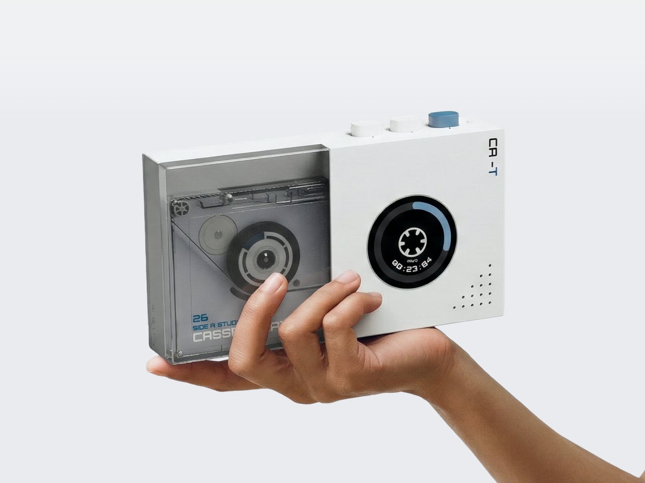
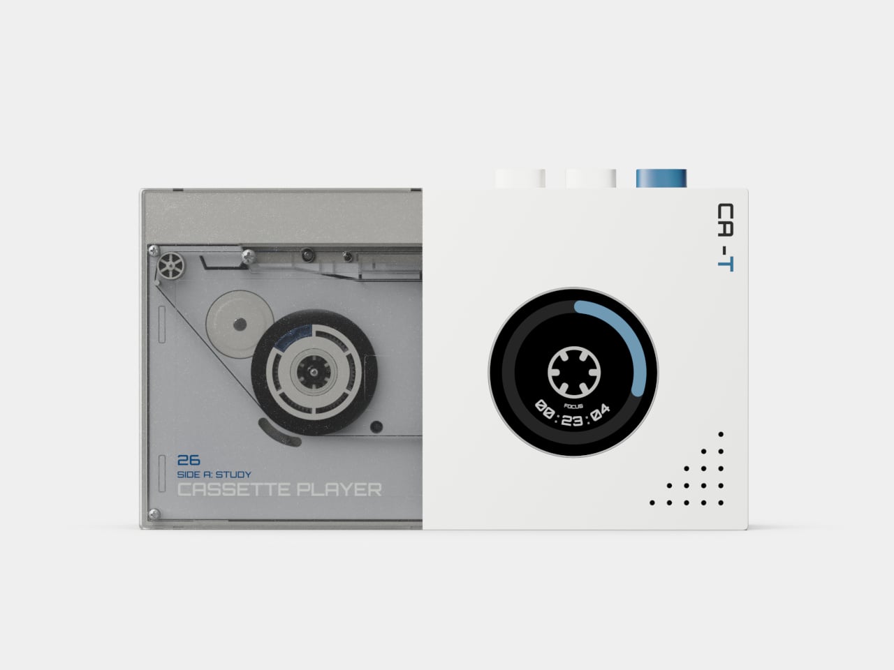
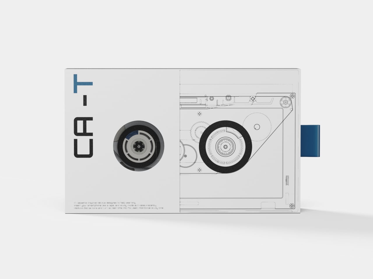
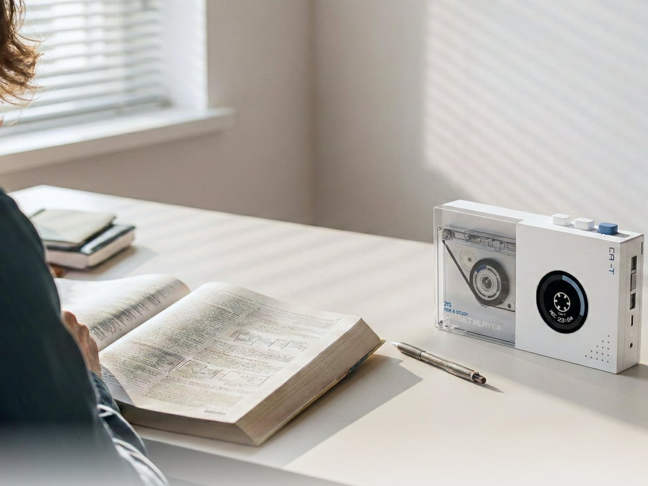
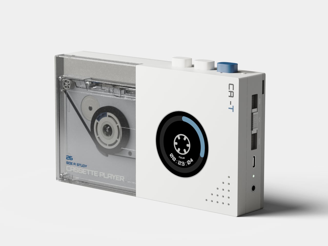
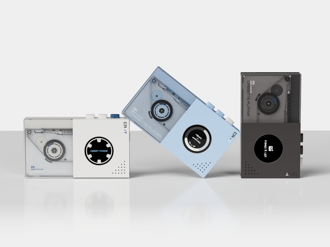
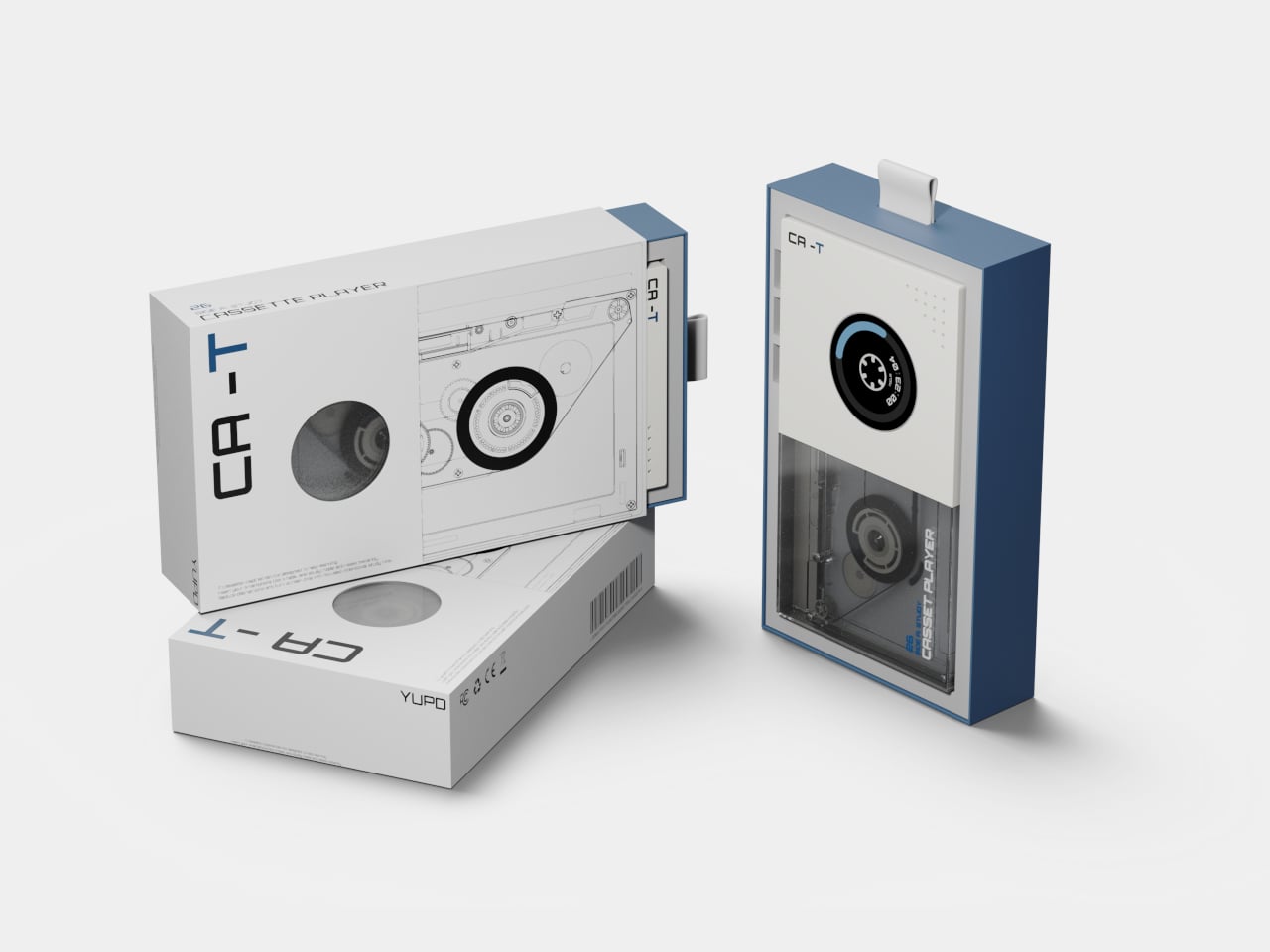
The problem with focus apps isn’t that they don’t work. It’s that the thing running them is also running Instagram, YouTube, and every group chat you’ve ever been in. The phone stays in your hand, the timer ticks, and the notifications stack up at the edge of your vision. CA-T is a concept that treats this as a hardware problem rather than a willpower problem, and the solution it proposes is surprisingly literal.
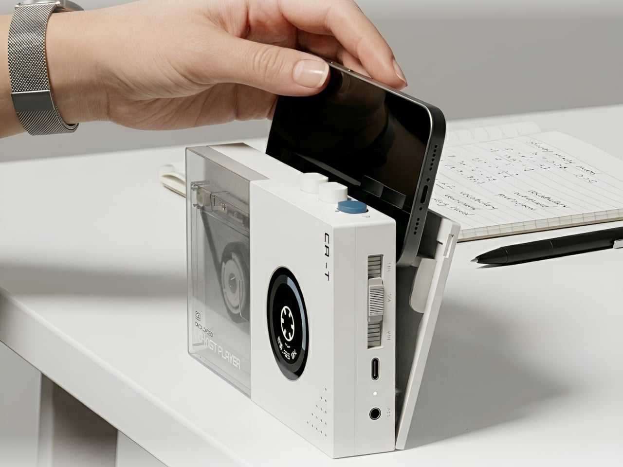
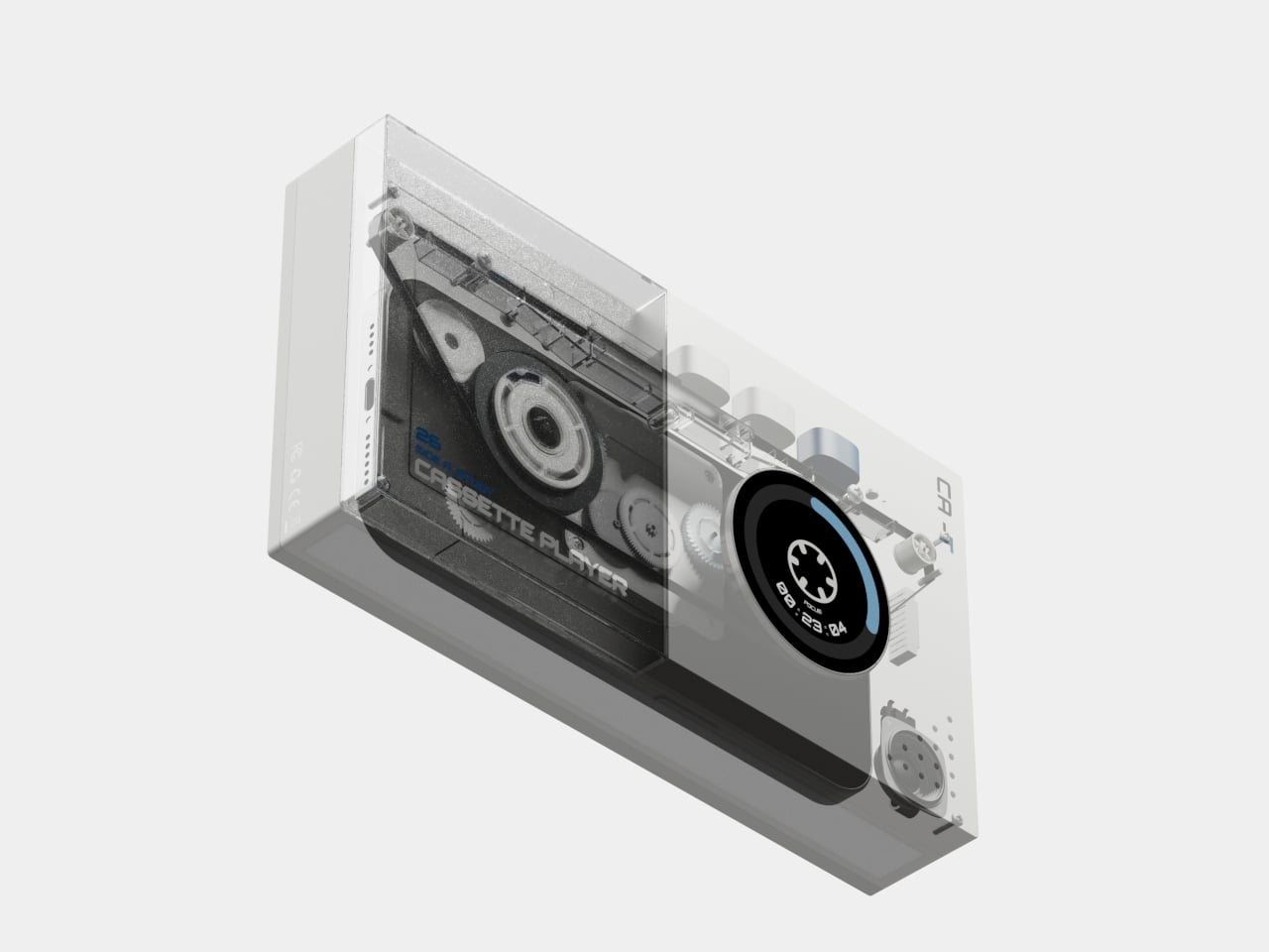
Taking inspiration from an age before smartphones, the CA-T is a compact desktop device shaped like a cassette player. Your smartphone is the tape. Slot it into the bay on top of the device, and the study session starts. The concept’s own framing is direct about this: the mobile phone, once a source of distraction, becomes the condition for activation. The device doesn’t operate at all until the phone is inserted.
Once docked, the phone charges wirelessly while the session runs. The circular display on the front face of the device shows a timer, but with a specific and deliberate framing: it visualizes the accumulation of focus rather than the countdown of remaining time. The reel graphic rotates as the session progresses, showing how much you’ve built up rather than how much you have left. That’s a small but meaningful reframe of what a study timer is supposed to communicate.
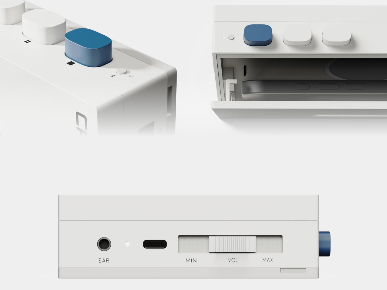
The session moves through four states. Ready prompts the user to insert their phone. Focus runs the timer as the reel turns. Comment delivers brief encouragement during the session, minimal by design, intended not to interrupt but to sustain. Complete shows the accumulated result, offering a record of consistency rather than just a signal that time is up. The physical controls are kept sparse: a prominent blue button on top, two secondary white ones, a volume slider, and a headphone jack along the bottom edge.
The cassette reference earns its place here beyond the obvious nostalgia. A tape only plays when it’s loaded, and loading it is an unambiguous act; there’s no passive way to start. The design applies the same logic to starting a study session, using physical insertion as a commitment mechanism. The design also addresses what it calls “the pressure of having to start,” framing the gesture of inserting the phone as lower-friction than opening an app and navigating past whatever else is waiting on the screen.
CA-T is a concept, with no announced production timeline or pricing. What it puts on the table is a specific question: does the ritual of physically committing your phone to a device change your relationship to the session that follows? The wireless charging detail suggests the designers thought carefully about removing objections. You won’t need your phone back because it’s running out of battery. You’ll need it back because you chose to reach for it.
Easter arrives on April 5, giving you ten days to find something that doesn’t feel purchased in panic. The candy basket is covered. What makes the morning memorable is the object that makes him pause because the thing in his hands is worth looking at. These seven picks aren’t pulled from a generic roundup — they’re designed objects built with enough conviction that engineering and aesthetics arrive at the same answer
None of these need an explanation on the card. Some ship immediately; others are in production with lead times worth checking before checkout. Shop products move quickly during gift windows, and objects like this rarely wait for last-minute decisions. Order now, check shipping windows, and show up April 5 with something he didn’t know to ask for — which is the only kind of gift worth giving.
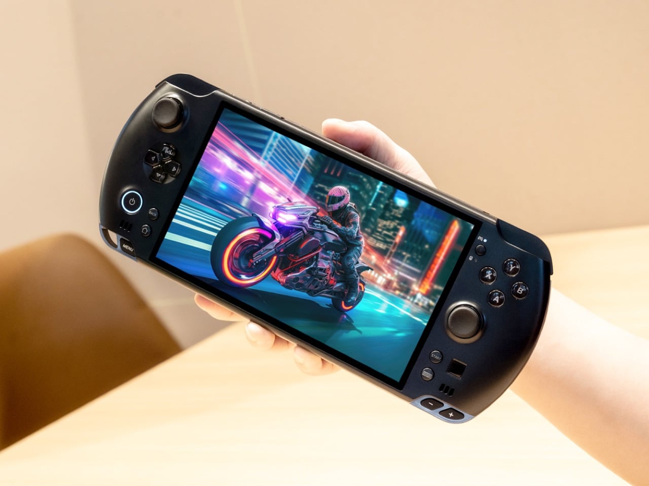
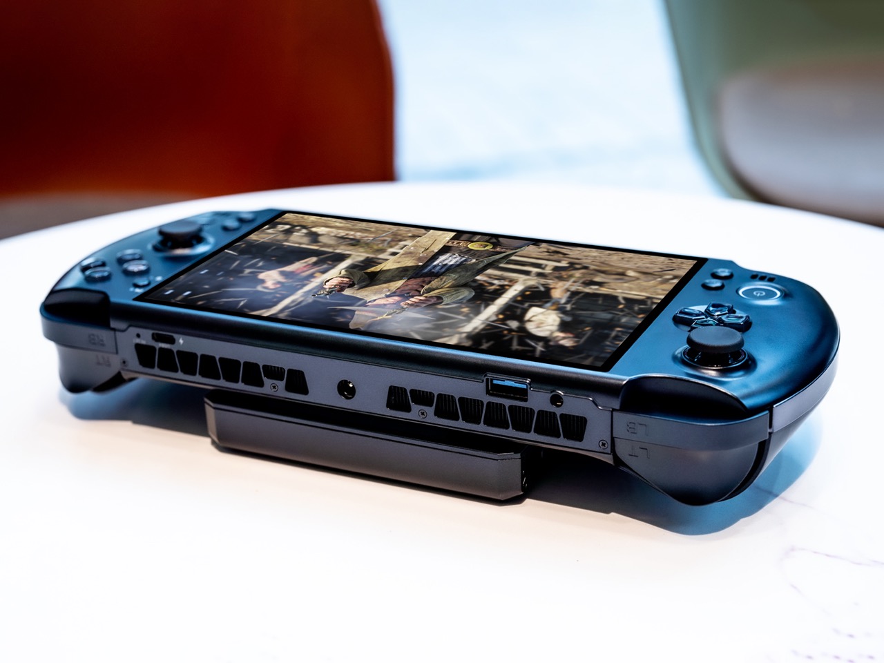
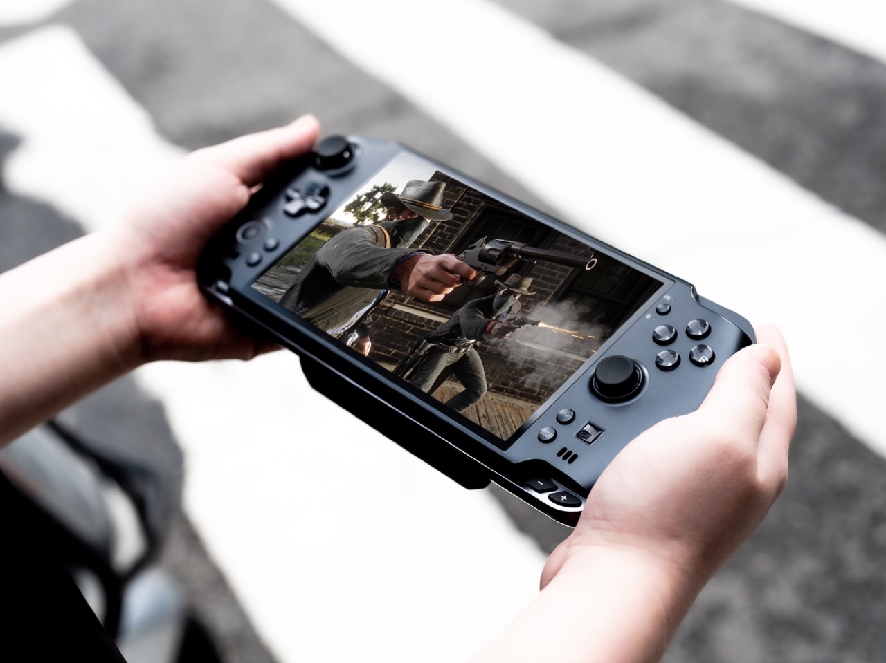
1. GPD Win 5 Gaming Handheld
The PSP’s silhouette never really died — it just kept getting more ambitious inside. The GPD Win 5 takes the wide landscape layout we’ve known for twenty years and fills it with an AMD Ryzen AI Max 395 processor and a full terabyte of storage — a desktop-level decision wrapped inside a handheld form. The result is a device that plays any PC game at settings no portable console would dare suggest.
The engineering required to keep it running is written directly onto the chassis. Quad heat pipe cooling, a proprietary Mini SSD slot, hall effect triggers, and a detachable 80Wh battery extend sessions well beyond what the internal cell could manage. The 7-inch 16:9 display sits centered between capacitive joysticks with zero deadzone in a layout that feels immediately familiar. This is not a gaming device that compromises on performance — it refuses to.
What We Like
The AMD Ryzen AI Max 395 delivers genuine desktop-class performance from a body that still fits in a bag
Hall effect triggers and capacitive joysticks with zero deadzone give it a precision edge over every portable console alternative
What We Dislike
The thickness and thermal venting make it visually dense — this is not a subtle object
The price positions it well above impulse territory, narrowing its natural audience considerably
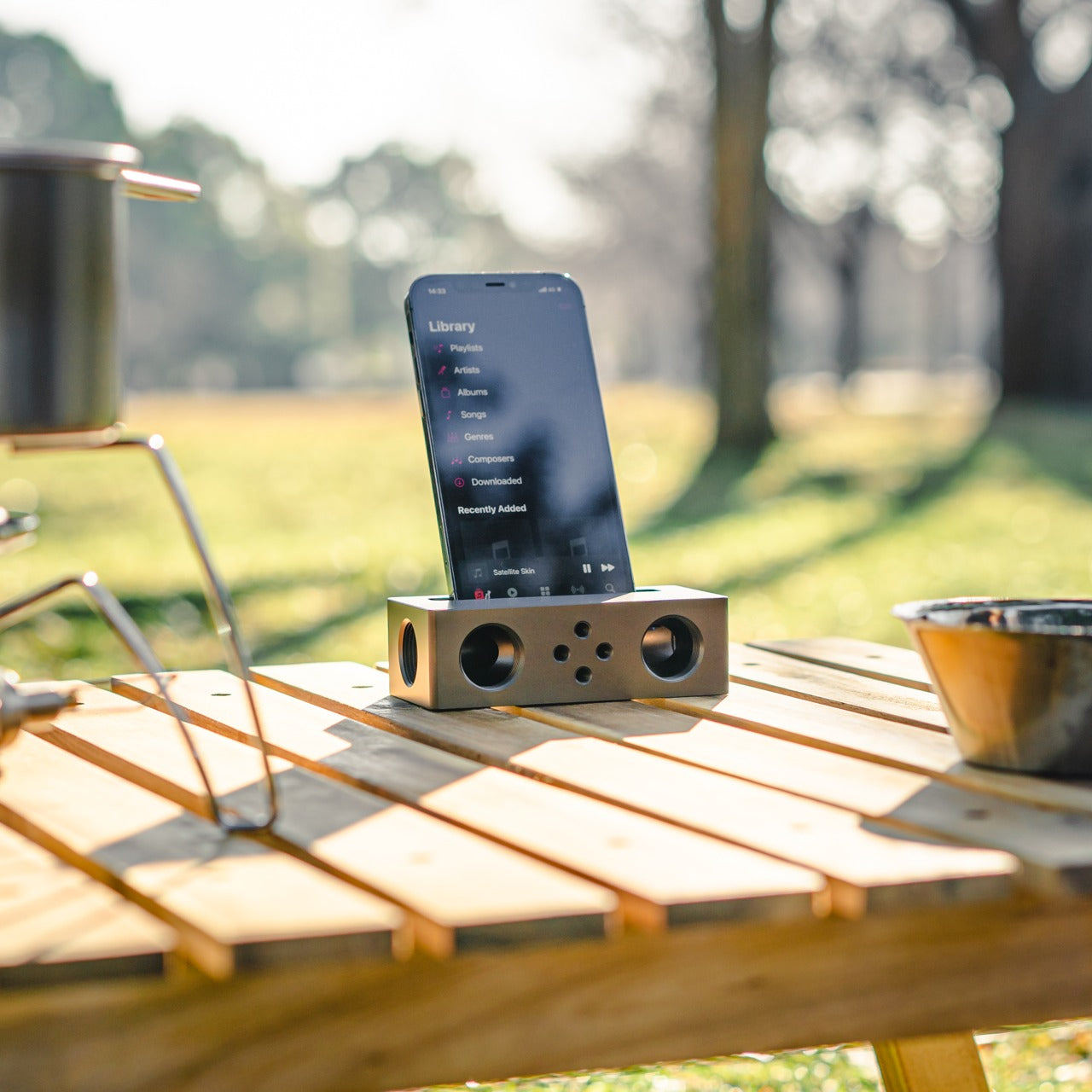
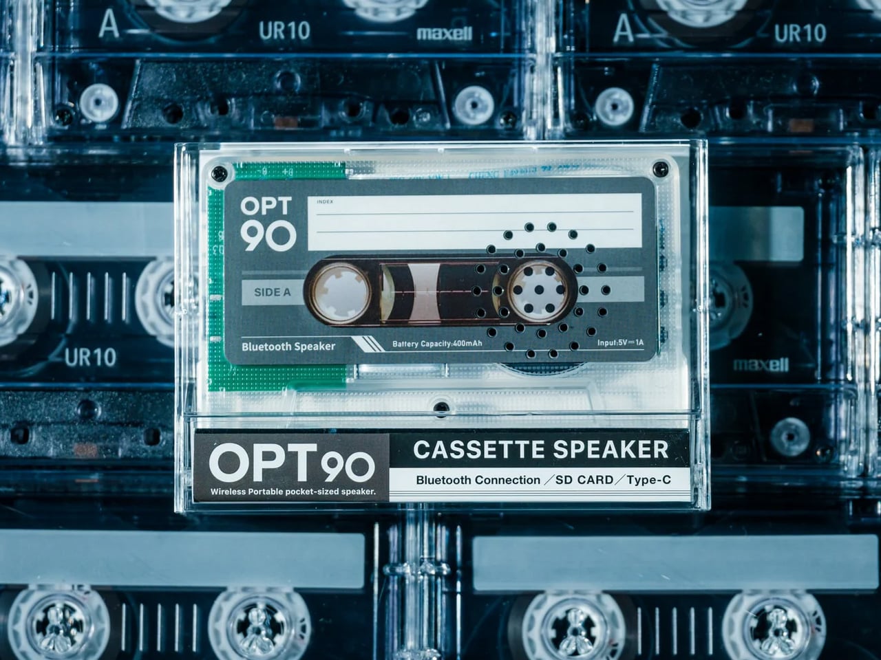
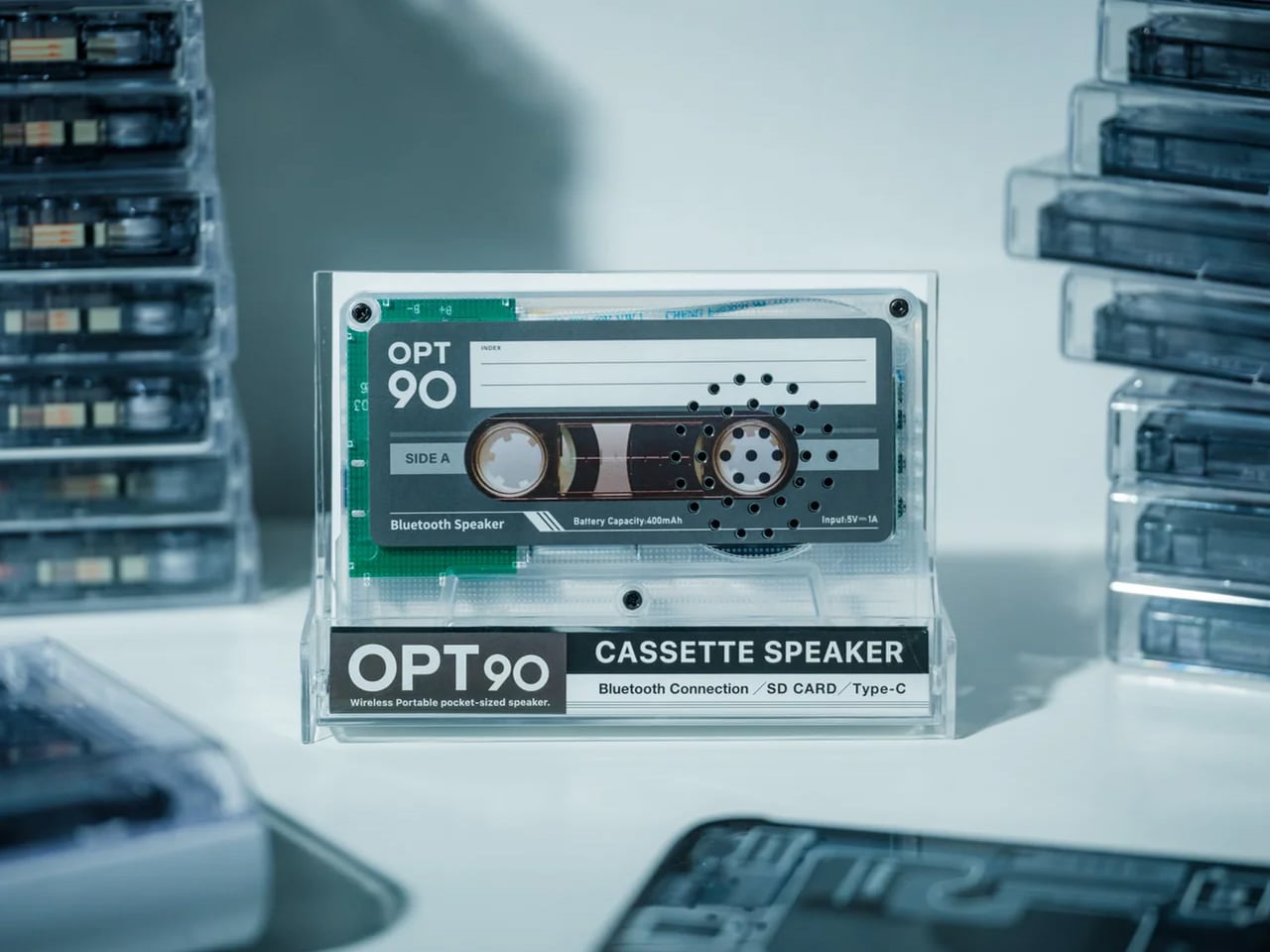
2. Side A Cassette Speaker
Everything about the Side A Cassette Speaker is designed to make you pick it up. The transparent shell exposes its mechanics the way a skeleton watch exposes its movement — not to perform engineering, but to invite curiosity. The cassette form is faithful enough to earn a double-take and modern enough to pair via Bluetooth 5.3 without cognitive dissonance. It looks like a mixtape from 1997 and sounds like something bought this year.
For under fifty dollars, it streams wirelessly, supports microSD offline playback, and delivers warm-tuned sound that rewards the retro framing rather than undermining it. The clear case doubles as a stand, which means it sits upright on a desk looking intentional rather than abandoned. This is the gift that earns visible placement — the kind of object someone keeps out not because they have to, but because it says something about the shelf it lives on.
The transparent cassette shell creates instant visual storytelling before it’s even switched on
At under $50, it’s the most accessible pick on the list — approachable price, zero sense of compromise
What We Dislike
The smaller cabinet limits low-end response — bass is present, but won’t satisfy anyone comparing it to a full-size speaker
Best suited for near-field listening; it won’t carry sound convincingly across a large room
3. RingConn Gen 2 Smart Ring
The RingConn Gen 2 makes the case that wearable health tracking never needed to live on your wrist. It’s a ring — thinner and lighter than its predecessor — that runs 10 to 12 days on a single charge and tracks sleep, heart rate, and respiratory variations through AI analysis, claiming 90.7% accuracy in identifying sleep risk events. No subscription. No display competing for attention. Just a slim band doing quiet overnight work.
The appeal for someone who refuses a smartwatch is genuine. There’s no screen to check, no notification buzzing against the wrist, no social permission for the device to interrupt your day. The AI sleep tracking surfaces insights about breathing patterns and nighttime respiratory variations that standard fitness bands don’t reach with the same depth. It tracks without performing the act of tracking, which is its entire design philosophy. Wear it and forget it is the point.
What We Like
A 10 to 12-day battery life removes the nightly charging ritual that makes most wearables feel like obligations
AI-powered sleep insights with no subscription fees eliminate both the friction and the ongoing cost
What We Dislike
Sizing matters significantly for a ring — gifting one requires knowing the recipient’s ring size in advance
The value of the health data depends entirely on the wearer engaging with the insights it surfaces
4. Soundcore Sleep Earbuds
Sleep earbuds have always been a comfort problem disguised as an audio problem. Soundcore’s answer involves 3D ergonomic shaping built around the concha cavity’s actual geometry, an Air Wing hollow structure that distributes contact pressure across a wider surface area, and a stacked charging pin architecture that repositions hardware away from the ear entirely. The result is an earbud designed to be forgotten during use — not because it lacks presence, but because its presence feels like nothing.
Noise blocking keeps external sound out while a soft audio profile handles whatever you use to fall asleep. The Air Wing’s flexibility adapts across different ear shapes rather than demanding the ear adapt to it — the distinction that separates earbuds built for sleeping from earbuds people merely attempt to sleep in. For anyone whose sleep is light or interrupted, this is the category of gift that earns its place by how someone feels the next morning.
What We Like
The 3D ergonomic shaping and hollow Air Wing design solve the pressure and slippage problems that have historically made sleep earbuds impractical
Stacked charging pin architecture removes the most common comfort complaint in the category without sacrificing charging functionality
What We Dislike
Fit is deeply individual — what disappears for one person may still feel present for another, depending on ear geometry
Noise blocking effectiveness varies with ear canal shape and the sleep position someone naturally defaults to
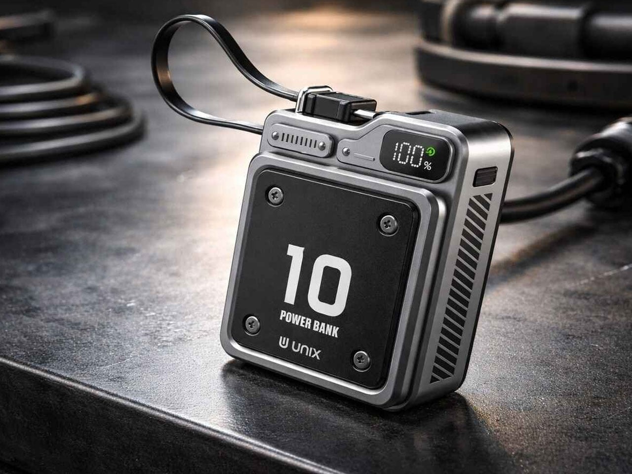
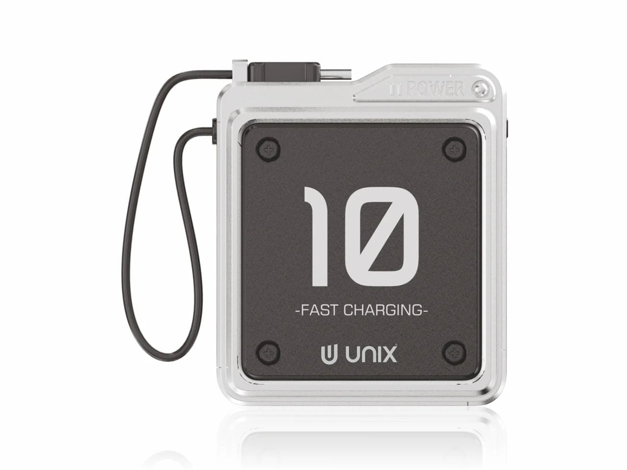
5. Unix UX-1519 NEOM Power Bank
Power banks exist in a visual category that design has largely abandoned — they are rectangles. The Unix UX-1519 NEOM is still a rectangle, but it looks like it was designed at the same meeting as the rest of your gear rather than found in an airport convenience store. The industrial finish, considered proportions, and built-in Type-C carry loop cable elevate it into an object worth keeping visible rather than buried at the bottom of a bag.
Under that exterior sits a 10,000mAh cell delivering 22.5W fast charging, dual output ports for simultaneous device charging, and the S-Power smart chipset managing stable discharge throughout each session. The cable that serves as a carry loop supports 12V output, pulling fast charging performance through the same thing you grip to retrieve it. That level of integration — where every detail earns its presence — is what separates this from the generic category it technically belongs to.
What We Like
The built-in Type-C carry loop cable is the kind of small detail that makes the whole object feel more considered than anything at this price point
22.5W fast charging with dual output and smart chipset management handles the functionality without any concessions
What We Dislike
At 10,000mAh, larger capacity banks will outlast it across multi-day travel without wall access
The industrial aesthetic is confident and specific — some will read it as premium, others as heavy-handed
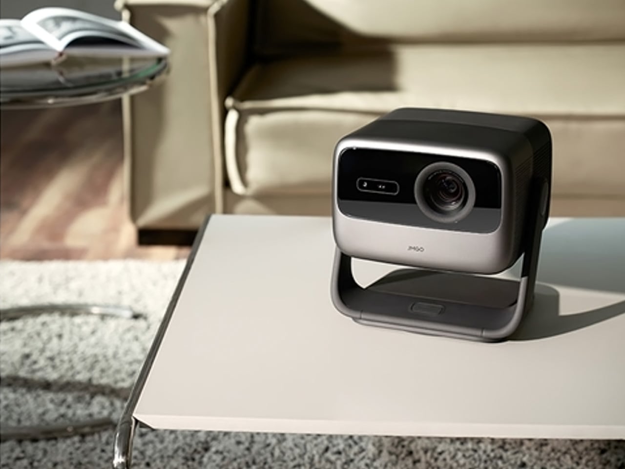
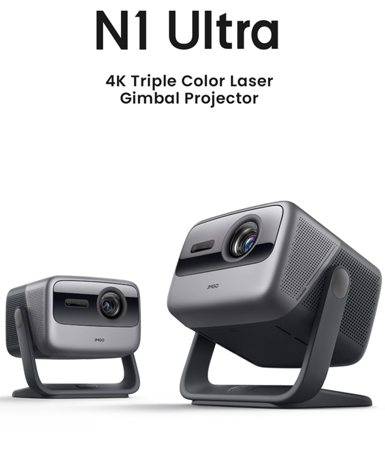
6. JMGO N1 Ultra 4K Laser Projector
The JMGO N1 Ultra solves the problem that has historically made projectors aspirational rather than practical: setup. The gimbal tilts automatically, focus locks without a hand on the lens, keystoning corrects itself, and obstacle detection keeps the image where it belongs. At 2800 ISO lumens from RGB triple-color laser optics, it works in a lit room, which means it lives in a living room without requiring the space to be reorganized before every use.
The color accuracy from tricolor laser projection has a saturation and richness that lamp projectors simply cannot reach. HDMI 2.1 with eARC handles connectivity, and 20W dual speakers with Dolby Digital Plus and 45Hz bass extension fill a room without requiring a separate soundbar. This is a projector for people who want cinema at home without the ceremony of installing one. Point it at a wall, let it calibrate in seconds, and the room becomes something else entirely.
What We Like
The smart adaptive system handles focus, keystone correction, and brightness automatically — setup takes seconds, not an evening of calibration
RGB triple-color laser at 2800 ISO lumens performs in ambient light, removing any requirement to design a room around it
What We Dislike
The price positions it as a considered purchase rather than a spontaneous gift — it requires a genuinely enthusiastic recipient
The gimbal and automated systems add complexity that may feel like more setup than expected for buyers anticipating a simple plug-in experience
7. Rolling World Clock
Not every great tech gift has a circuit board inside it. The Rolling World Clock is a 12-sided dodecahedron that tells global time through the simplest possible mechanism: roll it to a city face, read the single hand. London, Tokyo, New York, Shanghai, Sydney, and seven more time zones are built into its geometry. For anyone navigating remote work across multiple cities, this solves a daily frustration through pure physical design.
What earns it a place on a tech gift list is exactly that clarity of purpose. Most remote workers live inside four different time zone tabs, a world clock widget, and a mental arithmetic habit they never asked for. The Rolling World Clock replaces all of that with an object you can hold. Roll it to a city face and a single hand tells the time there — no toggling between apps, no unlocking a screen. It sits on the desk between the monitor and the coffee, available in black and white, and asks nothing from you except the decision to pick it up. Sometimes the most considered technology is the kind that gets out of your way entirely.
The 12-sided dodecahedron form solves a genuinely common remote work problem — global time tracking — through tactile physical interaction rather than another screen
The fully analog mechanism means no charging, no setup, and no interface to learn — it works the moment it lands on a desk
What We Dislike
Coverage is limited to 12 major cities — travelers or remote workers operating in less-represented time zones will find gaps
The single-hand display reads cleanly, but requires a moment of orientation for anyone unfamiliar with the face layout
The Gift That Earns Its Place Before He Opens It
Seven products, seven completely different problems solved. A gaming handheld that refuses to compromise on desktop performance. A cassette speaker that makes Bluetooth feel like something worth displaying. A smart ring tracking sleep from a finger. Earbuds engineered around the geometry of the ear rather than against it. A power bank that looks like it belongs with the rest of your gear. A projector that sets itself up. A dodecahedron that tells time in twelve cities without asking anything of you.
The best gifts don’t need wrapping to communicate their value — they do it the moment someone picks them up. Each of these objects was built with a specific person in mind, which means the person who receives one will feel that immediately. Check shipping windows before checkout, move quickly on anything with limited stock, and resist the instinct to wait. April 5 has a way of arriving before the decision gets made.
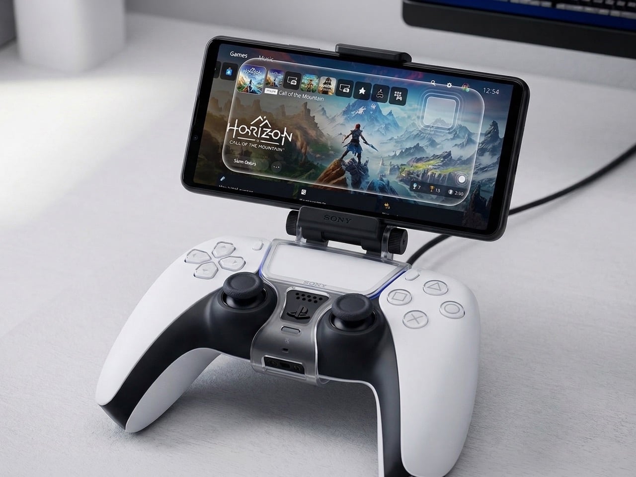
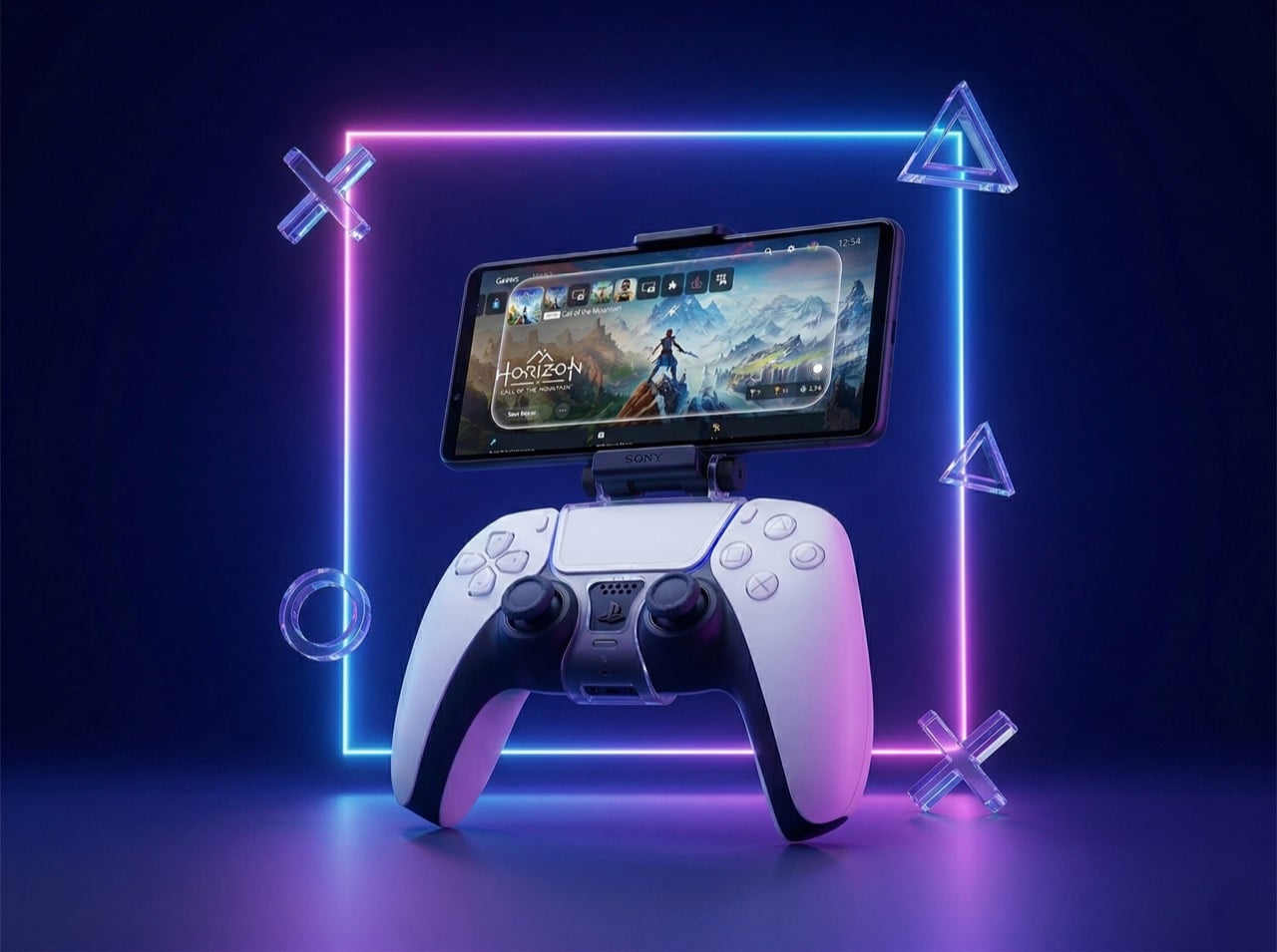
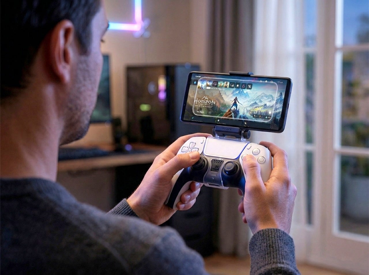
Back in 2014, Sony shipped a small piece of plastic that clipped a phone onto a PS4 controller. It was limited to certain Xperia handsets, relied on Remote Play at a point when Remote Play was barely holding itself together over most home Wi-Fi networks, and it quietly disappeared without much fanfare. The idea of physically fusing your smartphone with your PlayStation controller got filed away as one of those concepts that sounded reasonable on paper and fell apart in practice. Sony moved on, and for a decade, so did everyone else.
A patent circulating this week suggests the concept never fully left. Sony’s new filing describes a smartphone mounted directly onto a DualSense controller, with the phone functioning as a live secondary input device. Its touchscreen, motion sensors, and hardware would all be available to developers as genuine control surfaces, feeding into the game in real time rather than simply mirroring it. That positions this as a meaningfully different idea from Remote Play, from the PS Portal, and from anything Sony has formally put in front of PlayStation players before.
Designer: Sony
The PS Portal, Sony’s dedicated remote play device launched in late 2023, is essentially a DualSense controller sliced in half with an 8-inch 1080p LCD placed in the middle. It streams games from your PS5 over Wi-Fi and does nothing else. You don’t own a PS5 running at home, the Portal becomes a paperweight. The patented phone mount concept flips that logic. Your smartphone becomes an extension of the controller’s input vocabulary, giving developers access to touch zones, gyroscope data, and potentially camera input without Sony needing to manufacture, stock, and sell another dedicated piece of hardware. Third-party phone mounts already exist for the DualSense and sell for as little as the equivalent of $10, so the mechanical attachment problem is solved. What Sony would be adding is first-party integration at the software and developer level, where the phone is recognized as part of the control scheme and games are built around it.
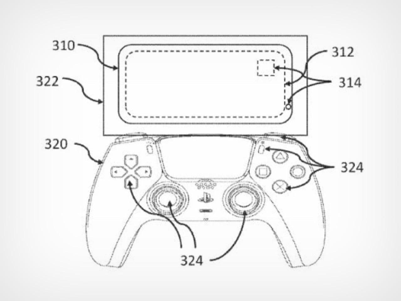
Patent Drawing from Sony’s filing
The market conditions in 2026 are dramatically different from the failed 2014 attempt. Fibre internet is widespread, Remote Play latency has improved significantly, and players already treat their phones as natural extensions of their gaming sessions. Controllers with phone clips are common enough in mobile gaming circles that the form factor no longer reads as awkward or experimental. Sony’s job would be convincing developers to design around a hybrid input model, which is a softer sell than asking players to spend $200 on dedicated streaming hardware with a narrow use case.
Sony patents ideas constantly, and most of them never see retail shelves. This particular concept feels more grounded than some of the company’s weirder filings because the infrastructure already exists, consumer behavior supports it, and the barrier to entry is lower than building new hardware from scratch. Whether it ships is still a gamble, but the logic behind it holds together better than it did a decade ago.
Back in 2014, Sony shipped a small piece of plastic that clipped a phone onto a PS4 controller. It was limited to certain Xperia handsets, relied on Remote Play at a point when Remote Play was barely holding itself together over most home Wi-Fi networks, and it quietly disappeared without much fanfare. The idea of physically fusing your smartphone with your PlayStation controller got filed away as one of those concepts that sounded reasonable on paper and fell apart in practice. Sony moved on, and for a decade, so did everyone else.
A patent circulating this week suggests the concept never fully left. Sony’s new filing describes a smartphone mounted directly onto a DualSense controller, with the phone functioning as a live secondary input device. Its touchscreen, motion sensors, and hardware would all be available to developers as genuine control surfaces, feeding into the game in real time rather than simply mirroring it. That positions this as a meaningfully different idea from Remote Play, from the PS Portal, and from anything Sony has formally put in front of PlayStation players before.
Designer: Sony
The PS Portal, Sony’s dedicated remote play device launched in late 2023, is essentially a DualSense controller sliced in half with an 8-inch 1080p LCD placed in the middle. It streams games from your PS5 over Wi-Fi and does nothing else. You don’t own a PS5 running at home, the Portal becomes a paperweight. The patented phone mount concept flips that logic. Your smartphone becomes an extension of the controller’s input vocabulary, giving developers access to touch zones, gyroscope data, and potentially camera input without Sony needing to manufacture, stock, and sell another dedicated piece of hardware. Third-party phone mounts already exist for the DualSense and sell for as little as the equivalent of $10, so the mechanical attachment problem is solved. What Sony would be adding is first-party integration at the software and developer level, where the phone is recognized as part of the control scheme and games are built around it.
Patent Drawing from Sony’s filing
The market conditions in 2026 are dramatically different from the failed 2014 attempt. Fibre internet is widespread, Remote Play latency has improved significantly, and players already treat their phones as natural extensions of their gaming sessions. Controllers with phone clips are common enough in mobile gaming circles that the form factor no longer reads as awkward or experimental. Sony’s job would be convincing developers to design around a hybrid input model, which is a softer sell than asking players to spend $200 on dedicated streaming hardware with a narrow use case.
Sony patents ideas constantly, and most of them never see retail shelves. This particular concept feels more grounded than some of the company’s weirder filings because the infrastructure already exists, consumer behavior supports it, and the barrier to entry is lower than building new hardware from scratch. Whether it ships is still a gamble, but the logic behind it holds together better than it did a decade ago.
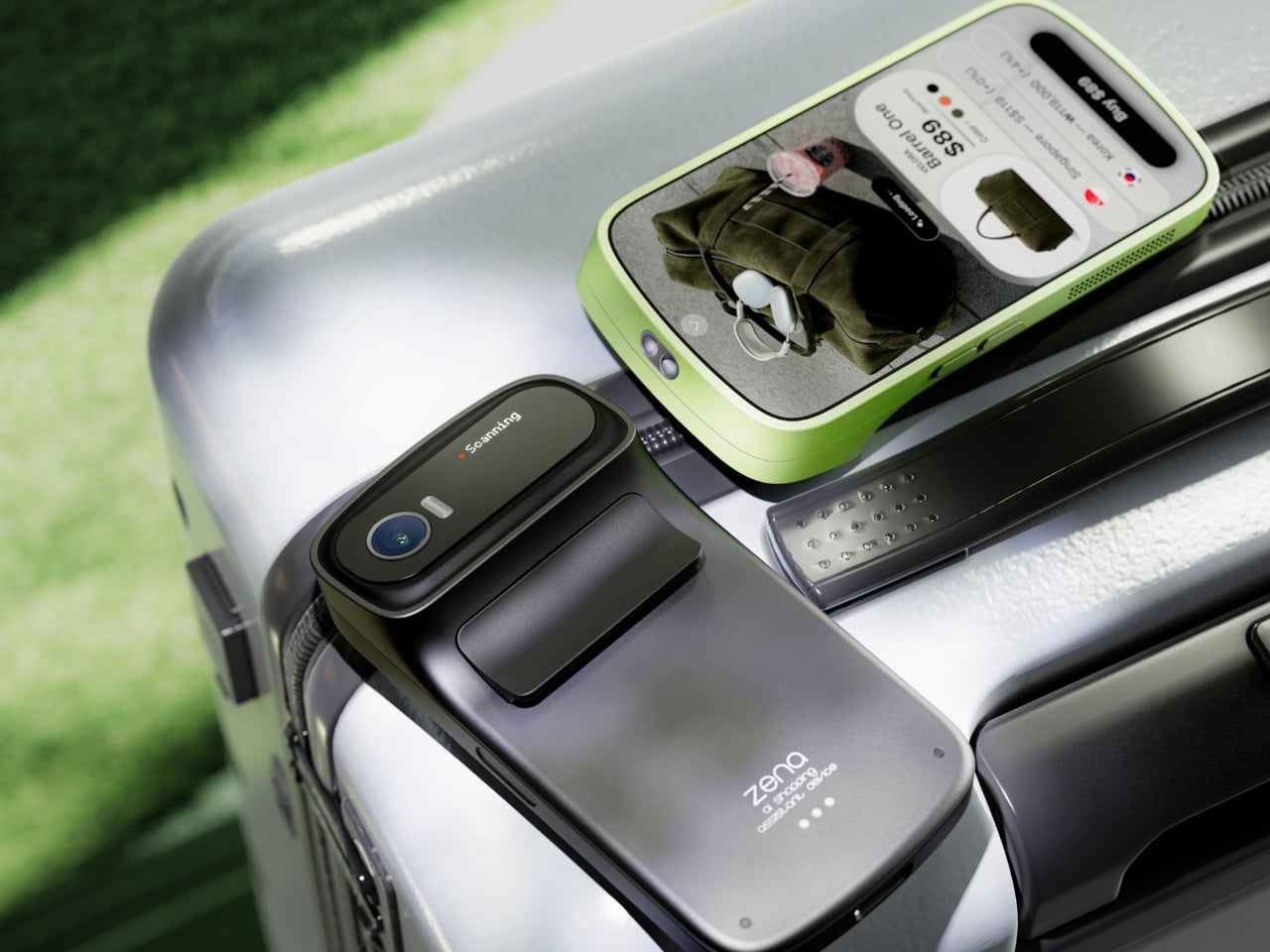
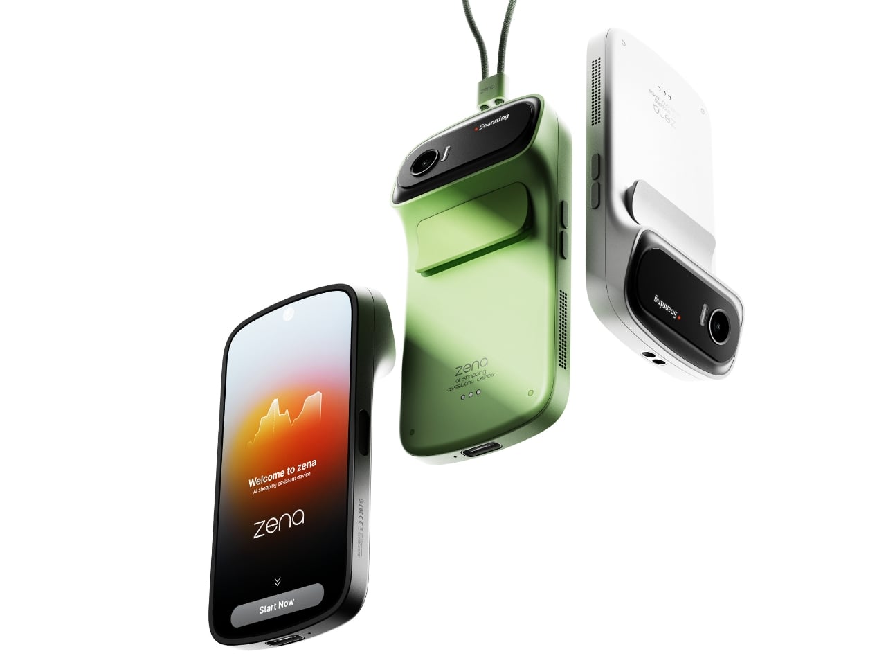
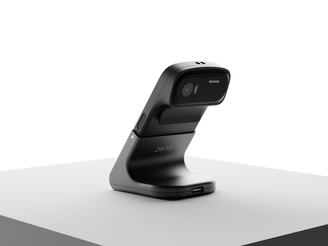
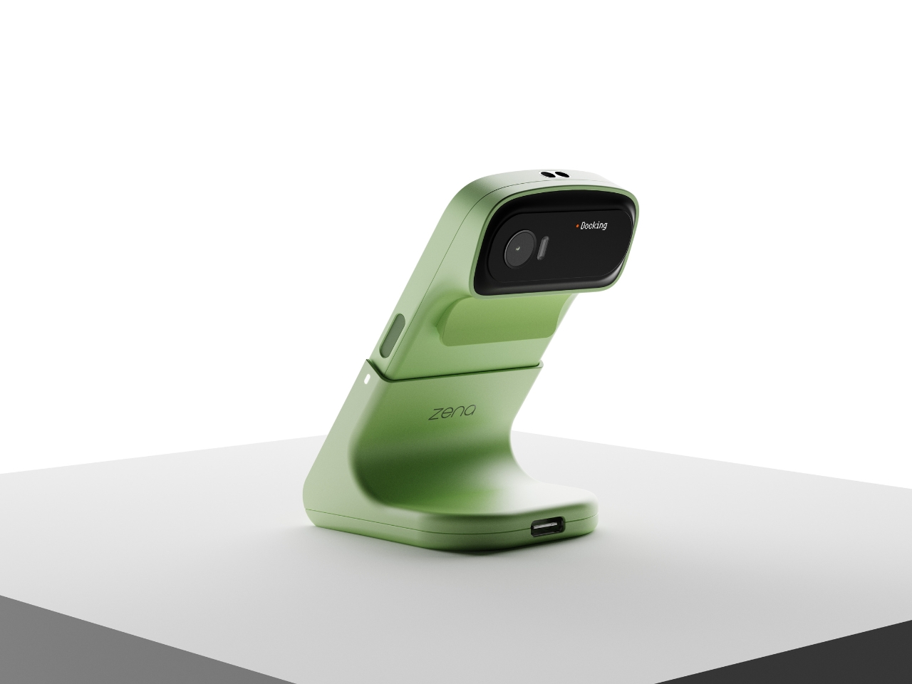
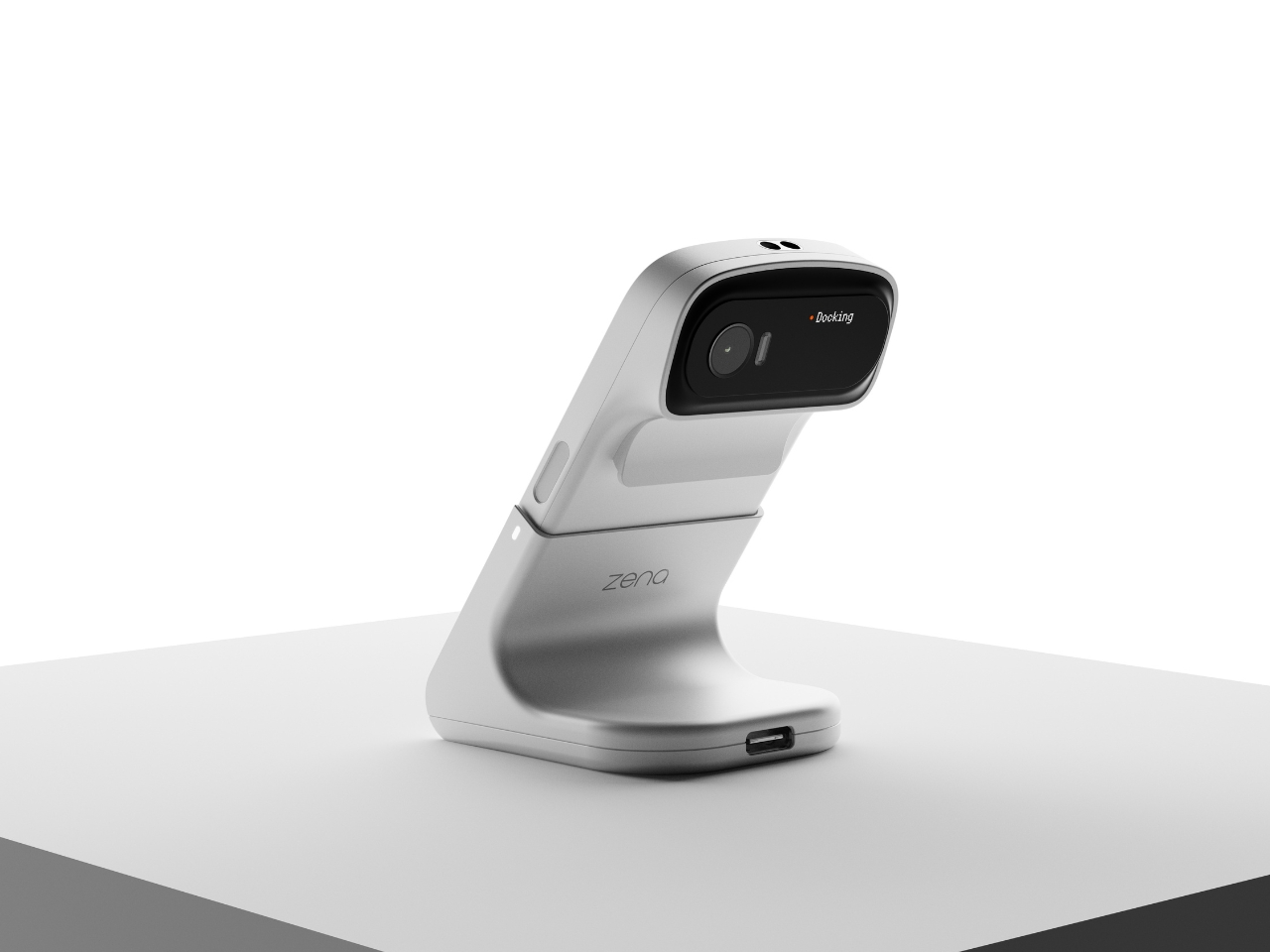
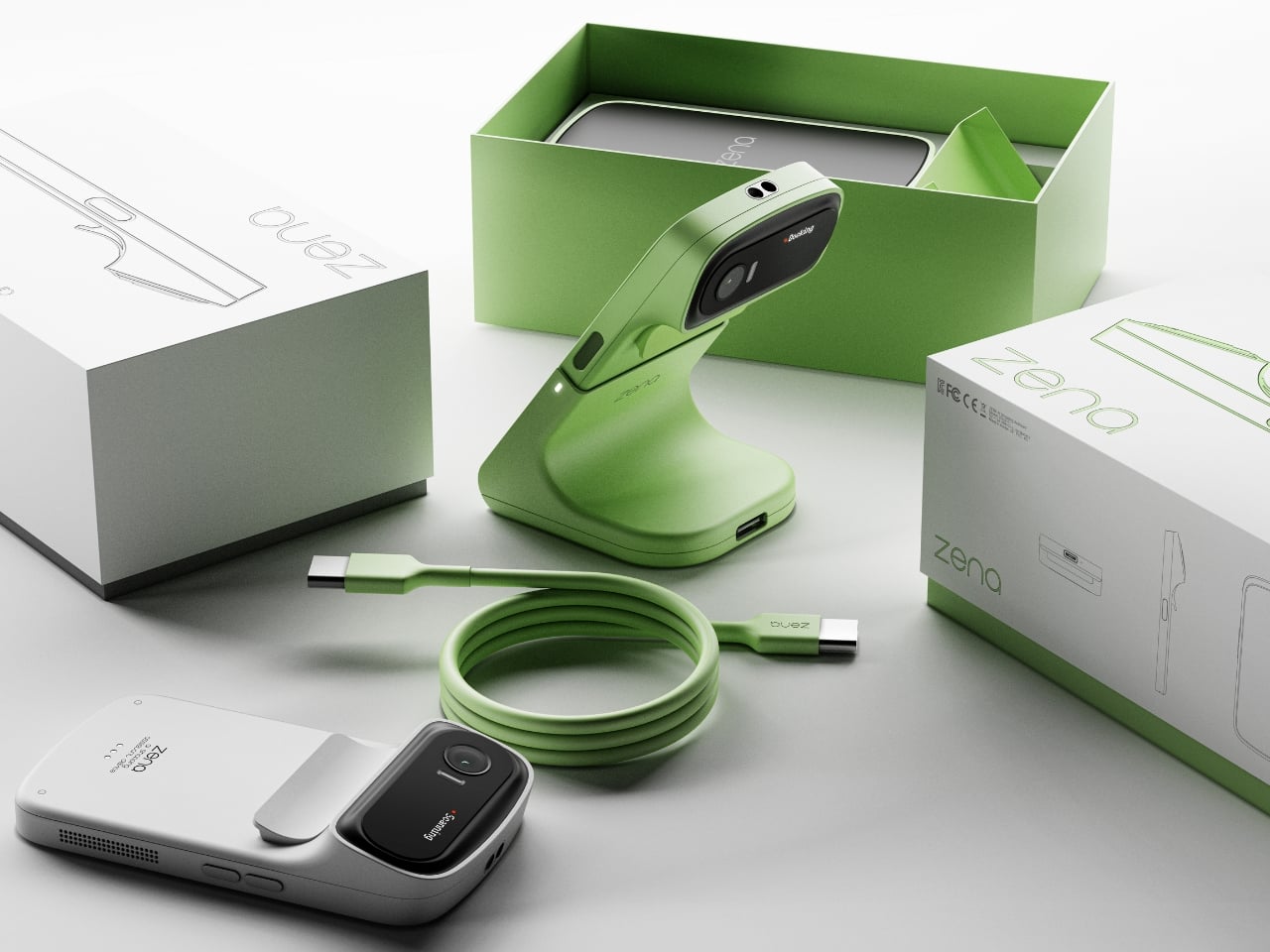
If you’ve ever ordered something from an international retailer only to be blindsided by a customs bill at your door, you already know the frustration that designers Taehyeong Kim and Yu Jeong Choi were sitting with when they created zena. It’s a concept device that reads like the future of shopping, but it addresses a problem that is very much happening right now.
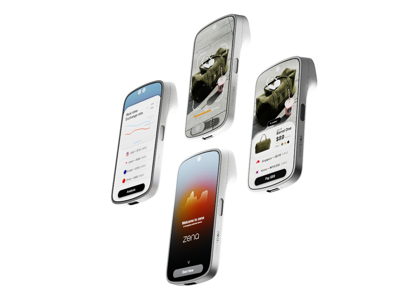
The premise is deceptively simple. You point zena at a product, it scans it, and within seconds you have a full breakdown: the item’s price, real-time exchange rates across multiple currencies, applicable duties, and the best purchasing options available. Not the price the retailer wants you to see. The actual, landed cost. The number that follows you home.
The design team’s background research puts the stakes into perspective. Citing Avalara’s 2024 global consumer survey, their project notes that 68% of shoppers reported a negative experience tied to unexpected cross-border costs. 75% said they wouldn’t repurchase from a retailer after a customs surprise. And 49% refused delivery altogether. That last number is staggering when you sit with it. Nearly half of the people who encountered surprise fees just sent the package back. That’s not only a UX failure. That’s an industry-wide trust problem that e-commerce at large seems unmotivated to solve. So two industrial designers from Daegu, Korea, decided to take a direct swing at it.
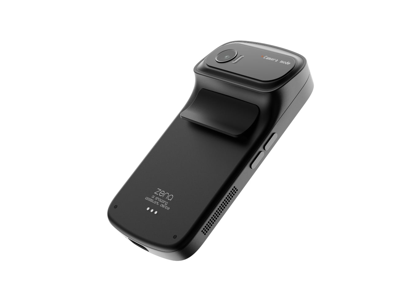
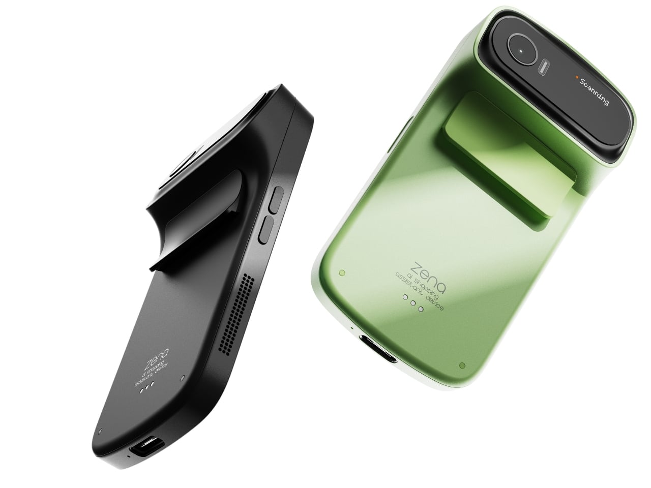
The way they’ve approached the physical design is just as compelling as the concept itself. Zena is small, handheld, and wears its function confidently. The camera module sits on a rotating head at the top, giving it a form that feels like a high-end digital camera crossed with a barcode scanner from a much more considered future. It comes in matte black, soft silver, and a sage green that is genuinely lovely, with a woven lanyard strap running through a flush metal eyelet on the side. That strap detail alone signals that these designers cared about the object beyond its utility. It’s the kind of quiet decision that separates a good concept from a great one.
The docking station is worth mentioning too. Docked, zena tilts its camera head upward like it’s curious about something, giving it a personality that feels almost alive. It sits on a desk in a way that makes you want to look at it, which is more than you can say for most gadgets. The dock functions as a charging station as well, which means the device is always ready to go when you reach for it.
On the software side, the UI is clean and intentional. Once zena scans a product, it surfaces the item’s name, price, color options, and a list of purchase prices sorted by country and currency, with duty percentages clearly noted beside each one. A real-time exchange rate graph runs alongside. You pick your preferred price, preferred purchase location, and complete the transaction immediately. The workflow is scan, search, analyze, buy. No extra apps, no tab-switching, no mental math in a foreign currency.
The part that sticks with me is how practical this feels specifically as a travel companion. Imagine walking through a boutique in Tokyo or a market in Paris and actually knowing, before you commit, whether you’re getting a fair price or paying for the privilege of proximity. Right now that calculation happens mostly in your head, half-guessed and usually wrong.
Zena isn’t something you can buy yet. It’s a concept living on Behance for now. But it speaks to a real gap in how we shop globally, and it does so in a package that respects both form and function equally. In a design space full of concepts that look polished but feel purposeless, this one carries a clear point of view. Kim and Choi aren’t just designing a gadget. They’re designing against a system that has been profiting from consumer confusion for years. That’s the kind of ambition that deserves more than just a scroll-past.
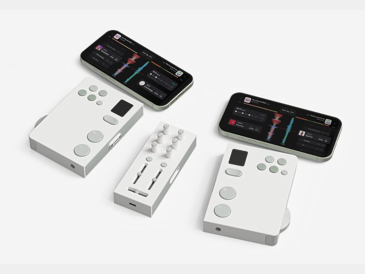
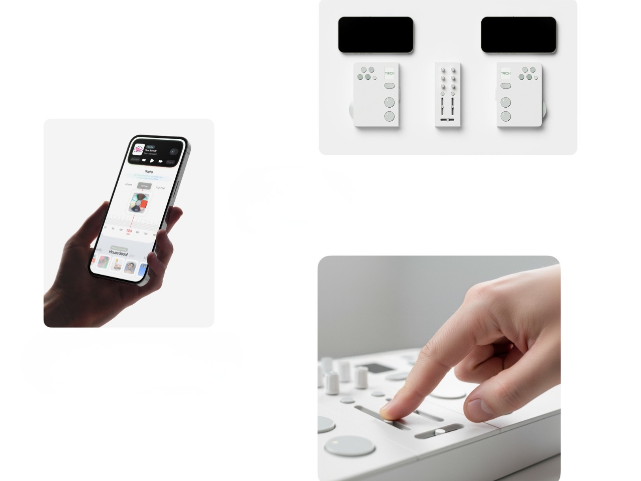
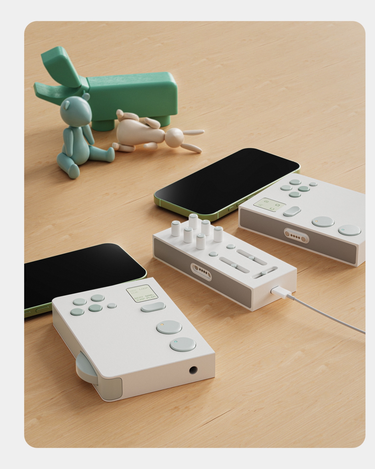
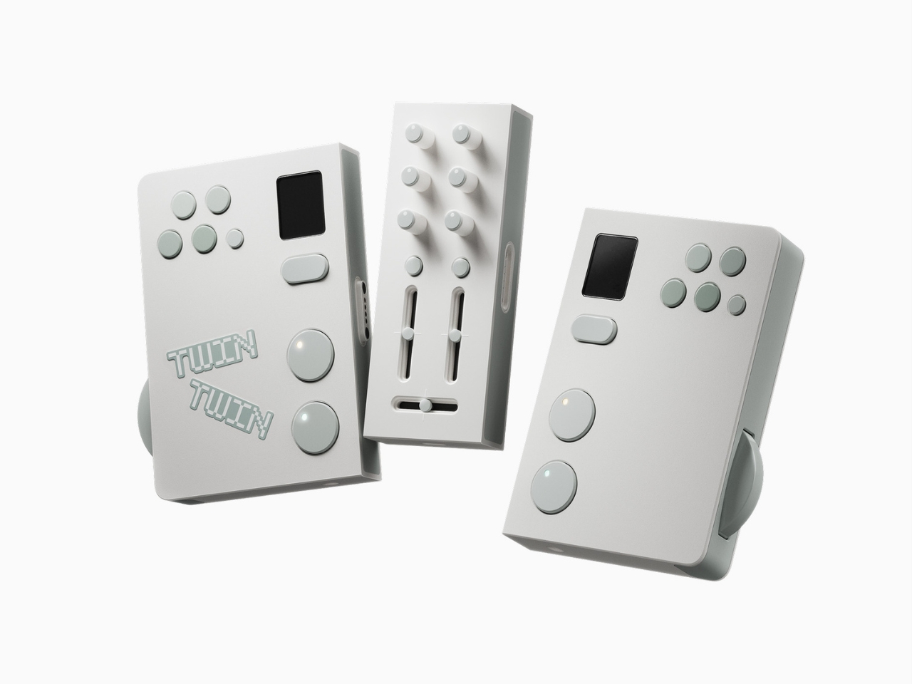
Most DJ setups are built for one person. One set of decks, one headphone jack, one vision for how the night should sound. That has always made DJing feel like a solo art form, even when it happens in a room full of people. Twin, a concept design by Eunjung Jang, myyung kyun seo, workplace 42, and kmuid graduate, challenges that assumption from the ground up, and it does so with one of the more elegant design ideas I’ve come across in this space.
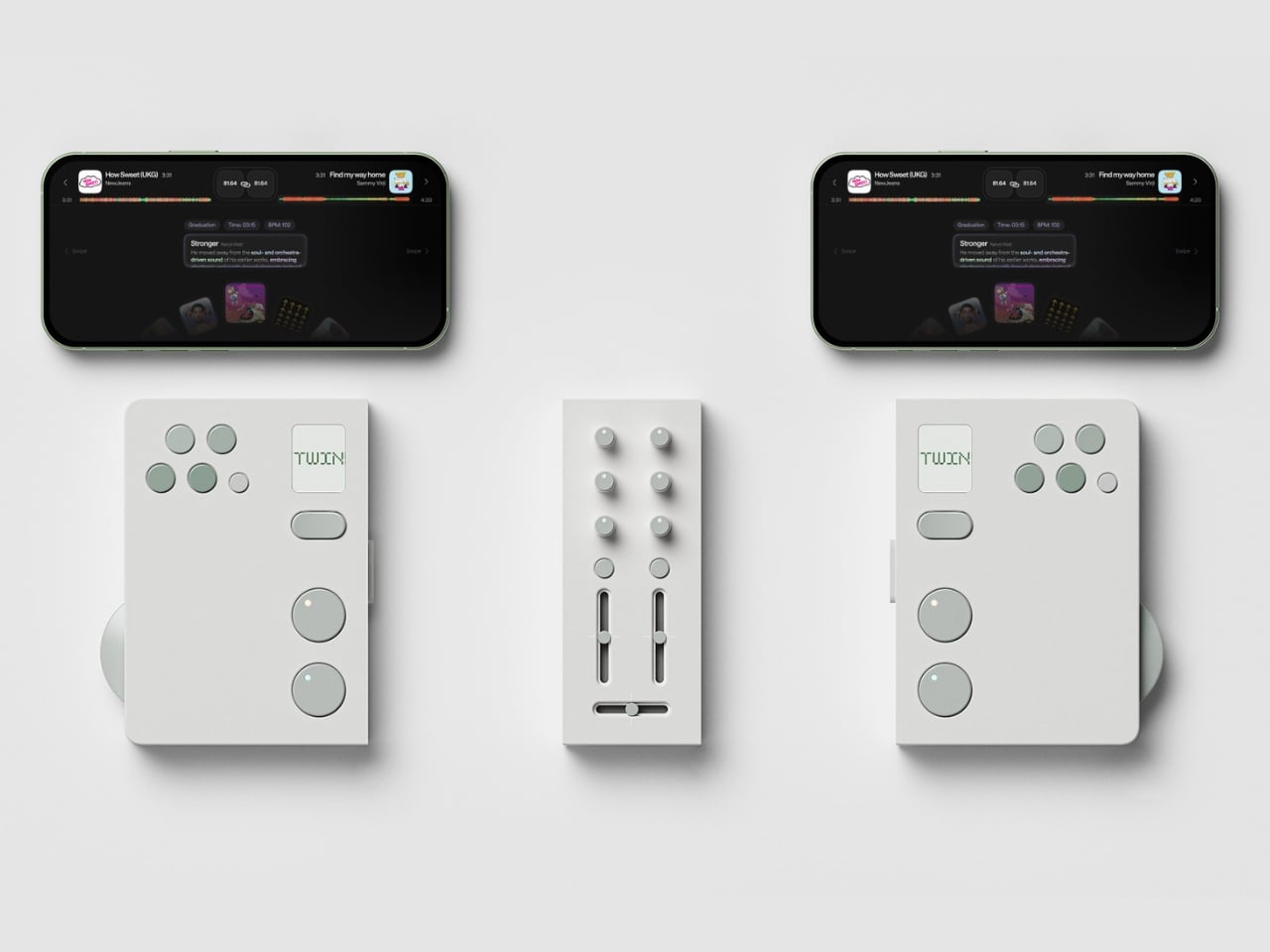
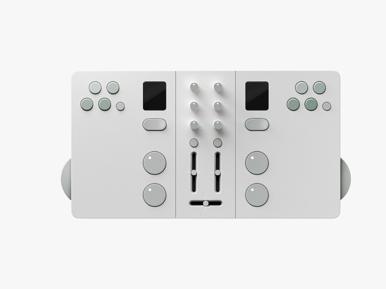
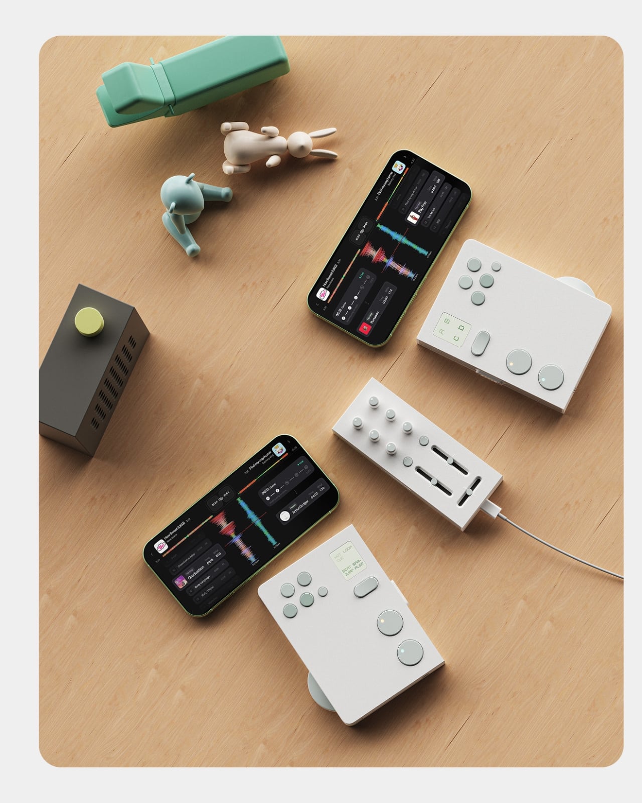
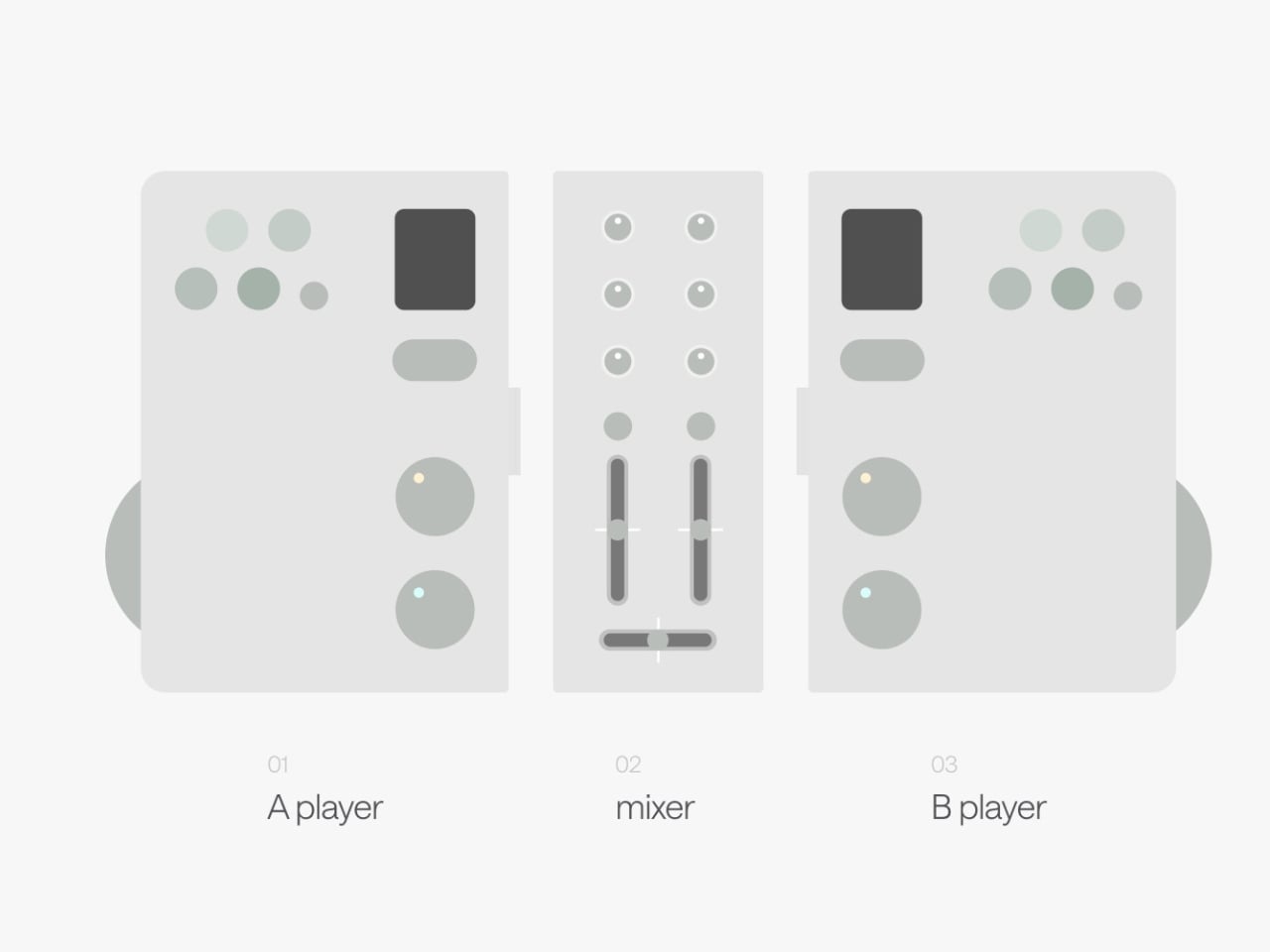
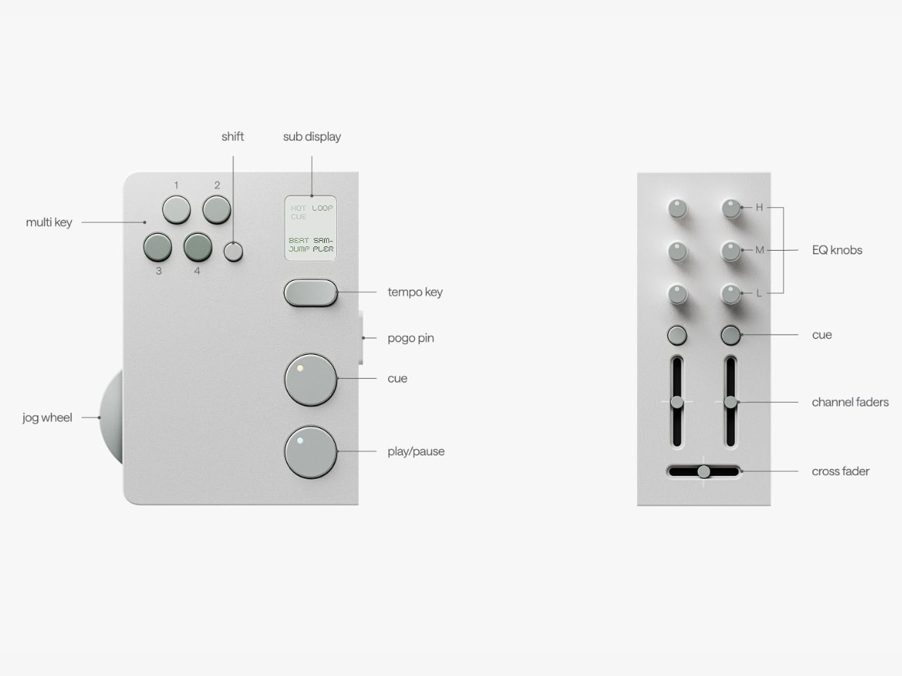
The premise is simple but kind of radical: two DJs, one device. Twin is a modular controller system made up of two mirrored player decks and a shared mixer at the center. Each player gets their own jog wheel, multi keys, sub display, tempo control, cue, play/pause, and hot cue functions. The mixer module in the middle gives both players access to EQ knobs, channel faders, and a crossfader. When connected, the whole system clicks together into one clean unit. When you want to go your separate ways, the modular sections split apart. The physical design of the hardware itself communicates the whole concept: together or apart, the choice is always yours.
Designers: Eunjung Jang, myyung kyun seo, workplace 42, kmuid graduate
Design-wise, Twin is stunning in the way that restrained things often are. The palette is muted and deliberate, soft white surfaces with sage green accents on every button and control. It reads less like audio equipment and more like something you’d find at a thoughtful design boutique. That’s not a small thing. DJ gear has historically leaned toward the dark, chunky, and maximalist, which works for club installs but can feel genuinely intimidating on a bedroom shelf. Twin looks like it belongs in your living room, which I suspect is very much part of the point.
The companion app is where the concept gets more layered. It functions as a music discovery and preparation tool, letting users dig for tracks, organize mix sets, and explore music by genre or BPM. But the feature that really elevates the ecosystem is the host matching function. Once you’ve built your mix set, the app can connect you with another user whose taste overlaps with yours or even challenges it. You might find someone who plays in the same sonic neighborhood. You might find someone who pulls you somewhere you wouldn’t have gone alone. That’s a genuinely compelling proposition, because so much of what makes music culture feel alive is the exchange between people, not just the output.
The cultural observation sitting underneath all of this is sharp. The designers frame it as a shift from DJing as performance to DJing as personal culture, and that read is accurate. DJing has moved off the stage and into living rooms, rooftops, and small friend groups. It’s become a hobby the way cooking or photography is a hobby: creative, expressive, and something you naturally want to share with someone you like. Most existing hardware wasn’t designed with that in mind. The market is still dominated by solo setups built for beatmatching, not for conversation. Twin reframes the whole activity as something inherently collaborative, and the design backs that idea up at every level.
To be fair, this is still a concept. There’s no price, no release date, and no guarantee it ever makes it to production. The gap between a polished Behance presentation and a product you can actually hold in your hands is a wide one, and modular hardware with tight tolerances, seamless physical separation, and a fully realized app ecosystem is a genuinely hard engineering problem. But the idea itself is solid, and the execution at the concept stage is considered enough to take seriously. These are the kinds of concepts that tend to influence the industry even when they don’t ship.
Twin reads like a proposal for where DJ culture could go next. Not bigger, not more complicated, but more connective. Built around the belief that the best music moments happen between people, not just for them.
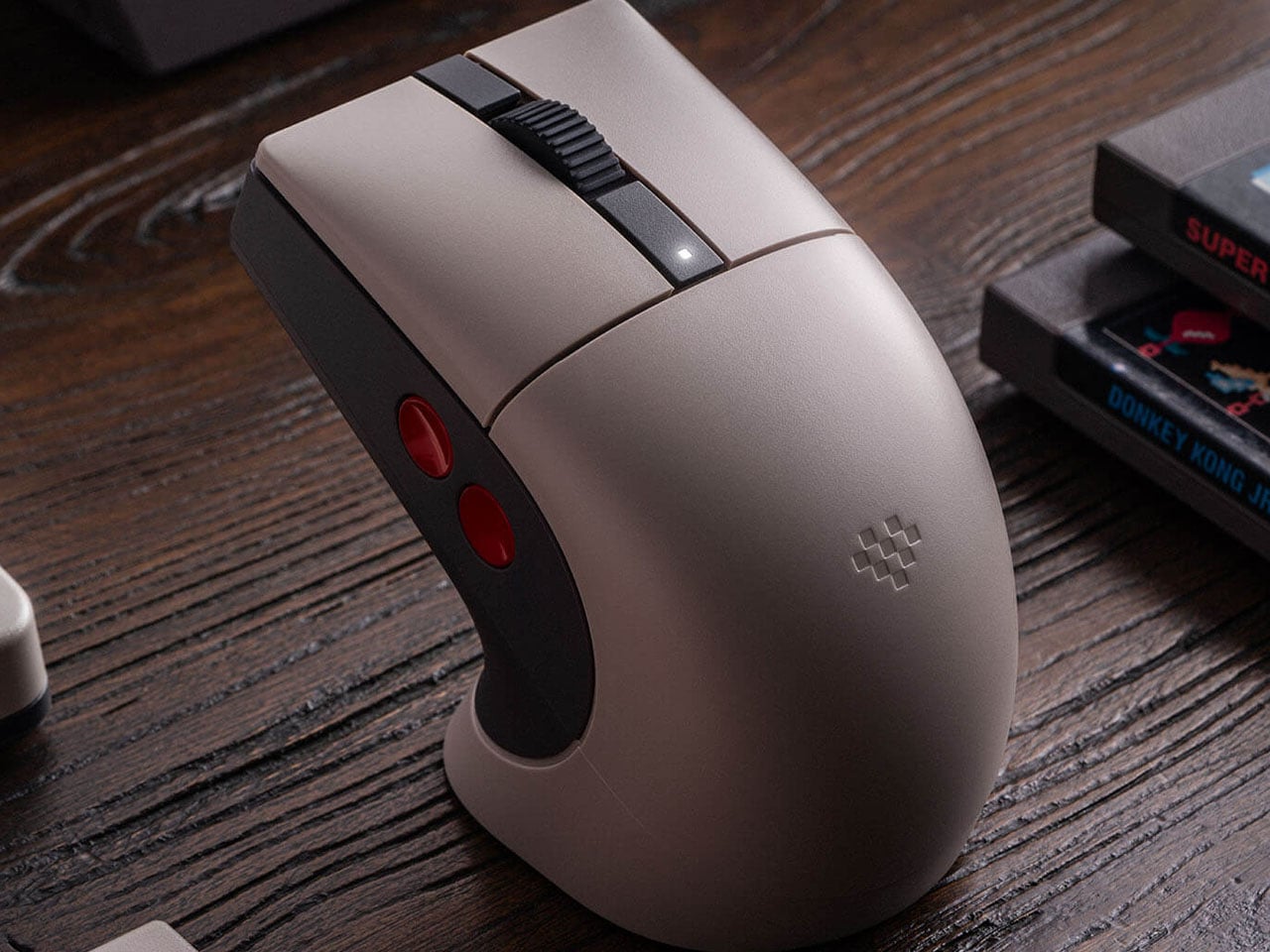
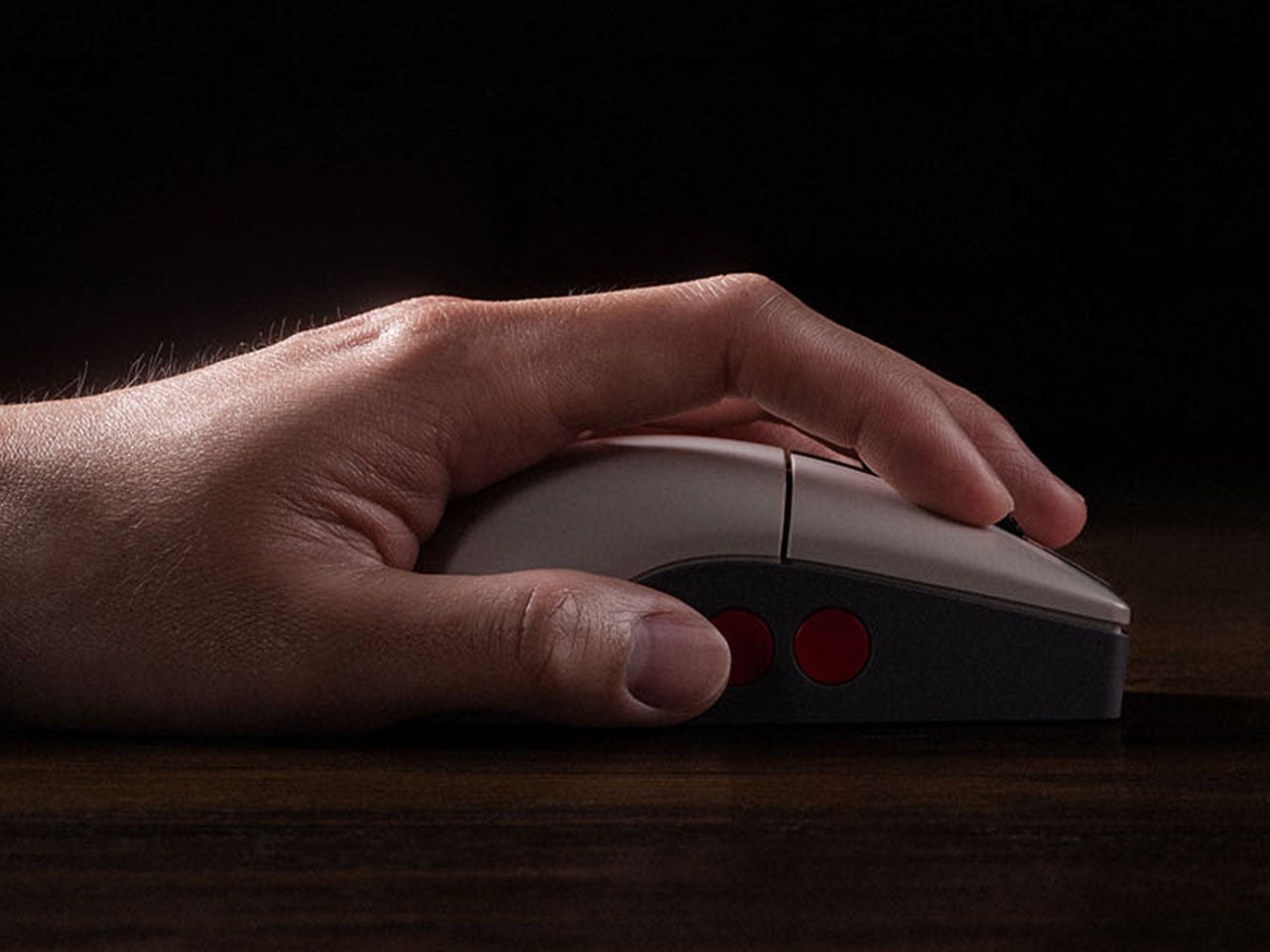
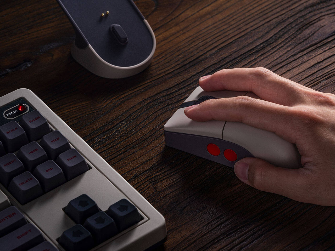
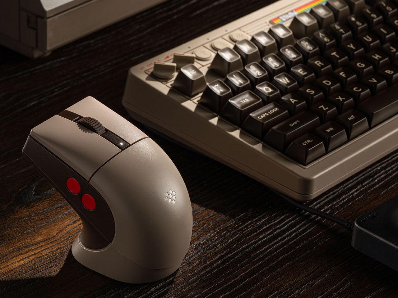
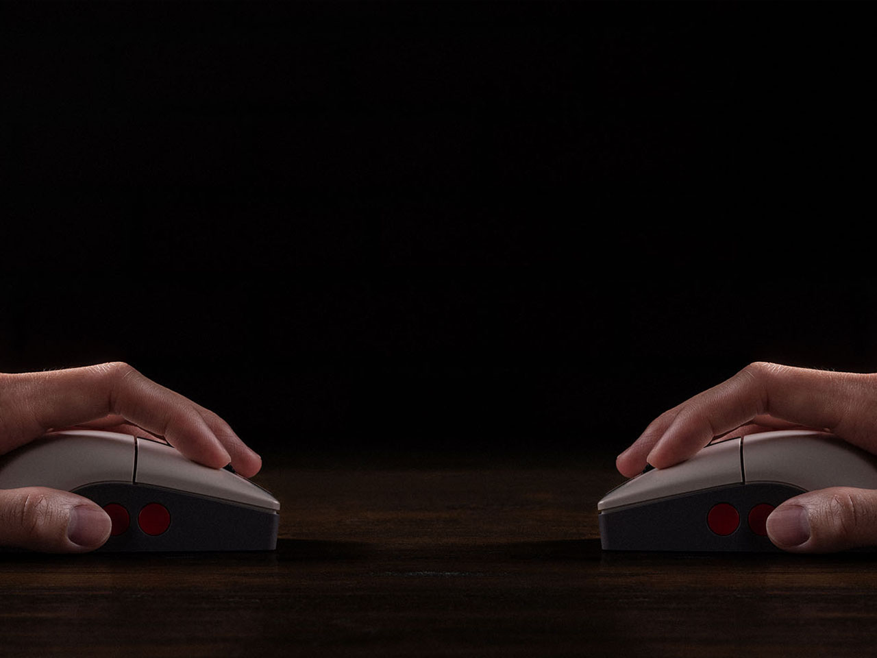
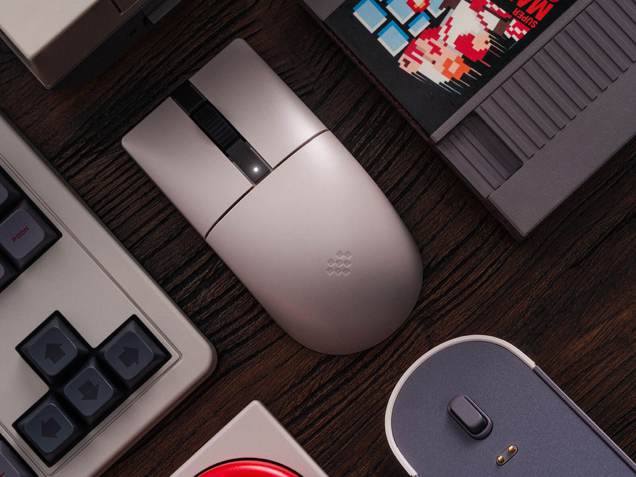
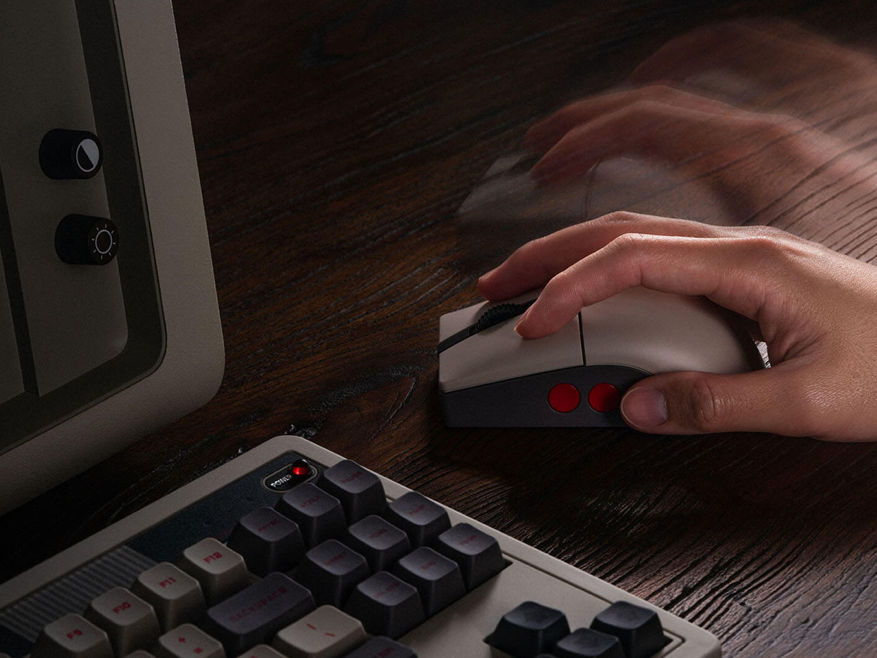
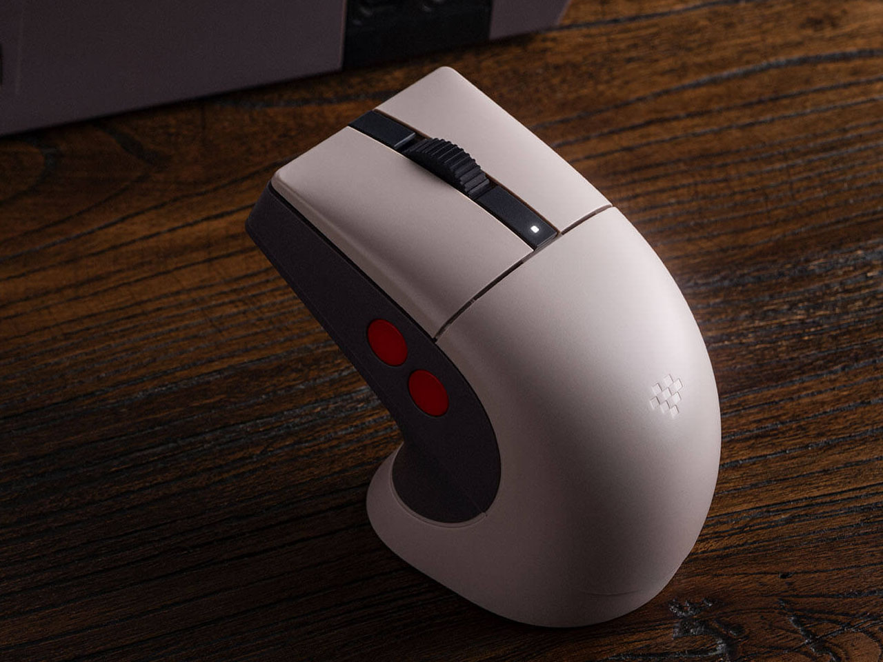
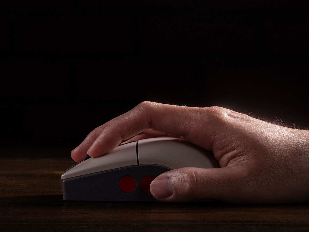
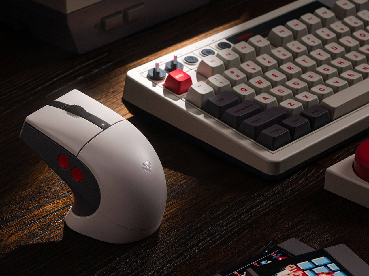
8BitDo, well-known for its quality gaming accessories, has a strong hold on retro-themed PC accessories, such as keyboards and numpads. Their Retro R8 mouse lineup, which already has the Xbox Edition and N Edition, now gets another variant of the peripheral. Like other mice in the R8 range, the C64-Edition is an eye candy mouse that pairs with your keyboard setup perfectly.
Themed on the Analouge 3D N64-themed controller, the C64 Edition evokes the nostalgic memories of the 8-bit era. Those who already own the Commodore 64 version will want to add this one to their collection. While it is unclear at this moment if this one has the Kailh Sword GM X micro switches used in the N Edition, it still gives keen gamers another one to choose from the 8BitDo lineup. The Commodore elements are slapped all over this retro mouse with the stripe logo on the charging dock and the familiar color theme.
The mouse measures 115 mm x 58 mm x 39.4 mm, and the accompanying dock on which it rests is 115.17 mm x 58 mm x 45.88 mm. The dock also functions as a signal extension module for consistent wireless connectivity and negligible latency. The Retro R8’s symmetrical shape allows it to be used comfortably by both left- and right-handed users, with software support enabling quick switching between modes. Despite its vintage aesthetic, the mouse weighs just about 77 grams, making it relatively lightweight and well-balanced for long usage sessions. Customizable side buttons further enhance usability, allowing users to assign shortcuts, macros, or specific commands through the companion Ultimate Software on PC.
Retro R8 C64 N Edition can be paired to your other devices via Bluetooth LE 5.3, 2.4 GHz, and of course, wired. The signal extension mode of the dock is attributed to the 2.4 GHz connection. Like other mice in the Retro R8 family, it is designed to balance nostalgic styling with modern gaming performance. Internally, the mouse is powered by a high-performance PAW 3395 sensor that supports six adjustable sensitivity levels ranging from 50 DPI to as high as 26,000 DPI, allowing users to fine-tune cursor precision for both productivity tasks and gaming. The device also supports adjustable polling rates, reaching up to 8,000 Hz when connected through a wired setup for ultra-responsive input.
Powering the accessory is a 450 mAh rechargeable lithium-ion battery. Depending on the connection mode and polling rate settings, the mouse can deliver up to around 100 hours of battery life over Bluetooth, while the 2.4 GHz wireless mode typically offers between 26 and 105 hours of use. Charging takes approximately 2.5 hours, and the included dock doubles as a convenient stand that keeps the desk setup organized while ensuring the mouse remains ready for action. Priced at $50, the Retro R8 C64 Edition has all that it takes to bring nostalgia to your desk.
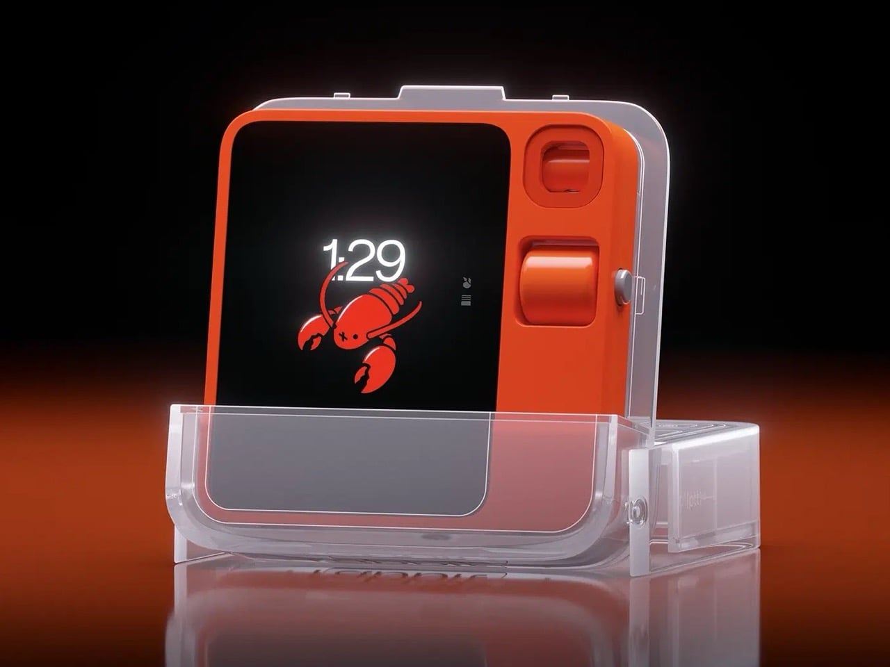
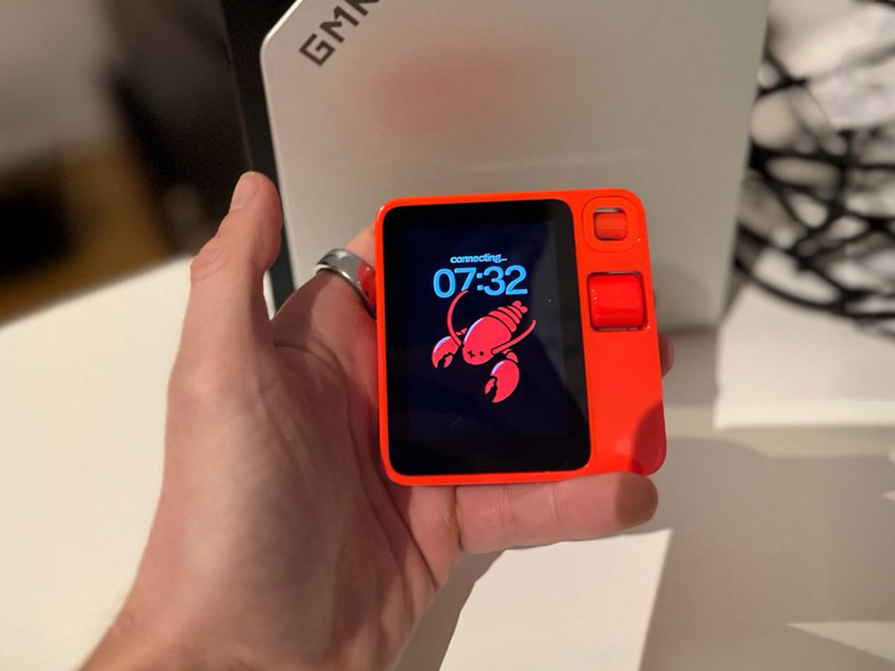
There is a version of the Rabbit R1 story that ends in 2024. The device launches to enormous hype off the back of a viral CES presentation, ships to early adopters who find it half-finished and frustrating, earns a wave of scathing reviews, and quietly disappears the way most failed AI gadgets do. Humane’s AI Pin followed that trajectory almost exactly, discontinued in early 2025 after HP acquired the company. The R1 did not follow it, though the reasons why have less to do with any brilliant pivot than with stubbornness, incremental software updates, and a fair amount of luck.
By January 2026, two years of over-the-air updates had produced a device functional enough to sustain a renewed community of users and developers. Then OpenClaw arrived on the R1, and the conversation changed in a way that felt less like a product announcement and more like something clicking into place. OpenClaw, the open-source autonomous AI agent that had exploded from obscurity to 60,000 GitHub stars in 72 hours, had always carried a hardware problem at its core. The R1, as it turned out, had most of the solution already built in.
Designer: Rabbit
OpenClaw (formerly Clawdbot, then Moltbot, changing names three times in a single week) is an open-source autonomous AI agent that exploded from 9,000 to over 60,000 GitHub stars in 72 hours in late 2025. Austrian developer Peter Steinberger built it as a self-hosted agent runtime that connects AI models to your local machine, messaging apps, calendar, email, and file system. You control it by sending messages through WhatsApp, Telegram, Discord, or Slack, like you’re DMing a particularly capable assistant. OpenClaw can browse the web, manage your inbox, schedule meetings, summarize documents, and execute shell commands autonomously, with persistent memory that lets it remember context across weeks. The problem OpenClaw always carried was the lack of native voice interaction on dedicated hardware, and the R1 had exactly that hardware sitting in a drawer gathering skepticism.
Rabbit integrated OpenClaw in January 2026 as an alpha feature, requiring users to set up their own OpenClaw gateway and connect it to the R1. Push the talk button, speak a command, and OpenClaw executes it through your existing setup. The R1 becomes a voice interface for an agent that can genuinely act on your behalf, making the device something closer to what Lyu promised two years ago. The possibilities depend entirely on how you configure OpenClaw, which can expand through over 100 community-built skills. Security risks are real and well-documented (over 400 malicious add-ons were found on the skill hub in early 2026), but for users willing to manage that complexity, the R1 finally has a use case that feels native to the hardware rather than bolted on.