Most coat hangers exist somewhere between purely functional and aggressively boring. They’re the things we grab without thinking, the wire creatures that multiply mysteriously in closets, or the bulky wooden ones that restaurants seem to breed. But every so often, a design comes along that makes you stop and reconsider something as mundane as a place to hang your jacket.
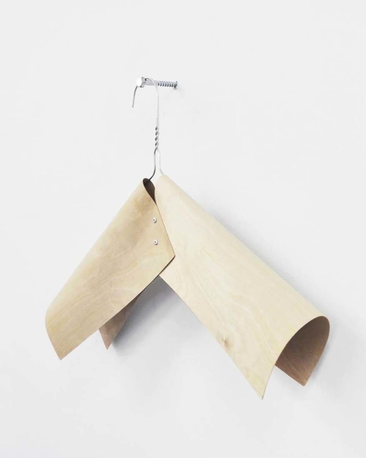
That’s exactly what happened when Swedish design firm Taf Studio created a coat hanger made entirely of veneer back in 2012. This wasn’t your grandmother’s wooden hanger. This was something that looked more like a sculptural whisper than a closet staple.
Designer: Taf Studio
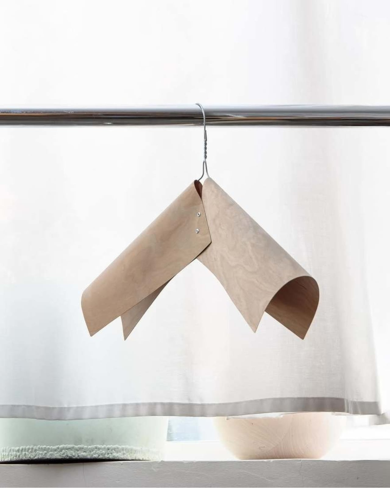
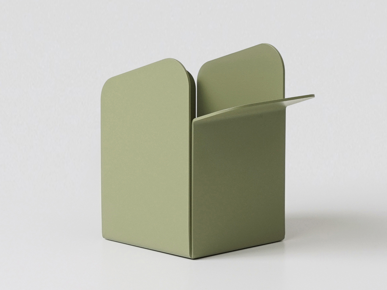
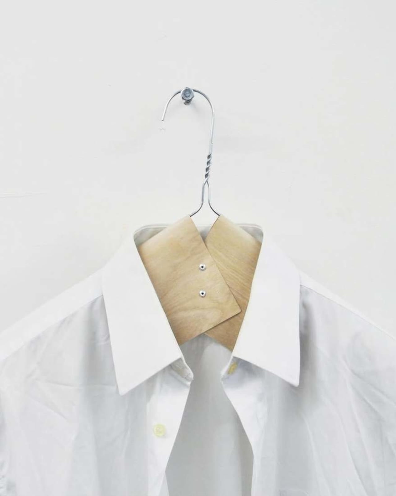
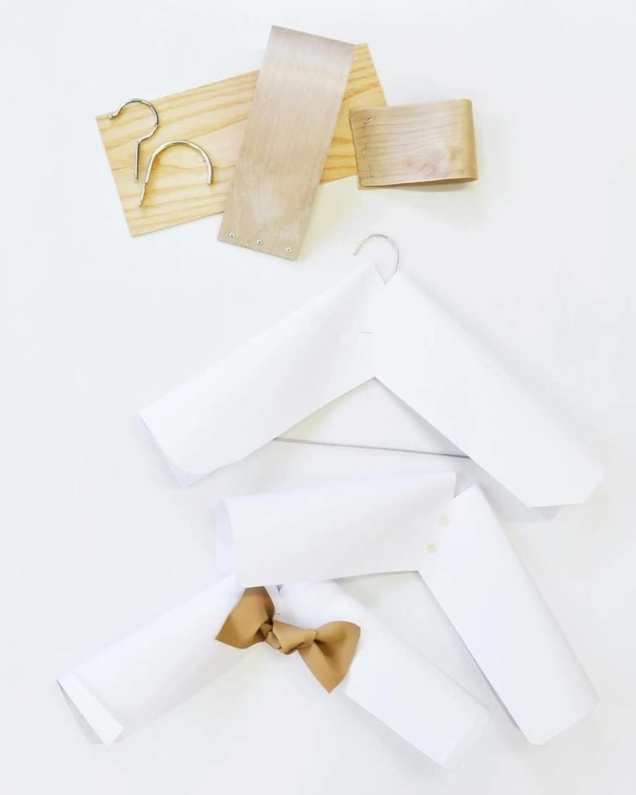
The design itself is surprisingly simple, which is often the hardest thing to pull off. Taf Studio took thin sheets of veneer and created a form that’s both structural and delicate. It bends and curves in ways that seem to defy the material’s fragility, creating a piece that hovers somewhere between furniture and art installation. Looking at it, you might wonder if it could actually hold anything heavier than a silk scarf. But that tension between apparent delicacy and actual function is precisely what makes it interesting.
What’s even more compelling is that this hanger was never meant to be mass-produced. Taf Studio was approached by two influential concept shops, Merci in Paris and Cibone in Tokyo, to create something special. The brief? Design a limited edition of just ten coat hangers to be sold exclusively for charity. Ten hangers. Not a thousand. Not a production run. Just ten. This kind of exclusivity might seem precious or inaccessible, but there’s something refreshing about design that knows what it is. Not everything needs to be scalable or available at every price point. Sometimes a concept exists to push boundaries, to make people reconsider what’s possible with familiar materials, or to raise money for a good cause. This hanger did all three.
The exhibition at Cibone was curated by Daniel Rozensztroch and initiated by Macy Okokawa, bringing together design communities from two cities that take aesthetics seriously. Paris and Tokyo both have reputations for appreciating craftsmanship and conceptual thinking. They’re places where people actually care about the intersection of form and function, where a coat hanger isn’t just a coat hanger if it’s done thoughtfully.
Veneer itself is an interesting material choice. It’s wood at its most vulnerable, sliced so thin you can almost see through it. Furniture makers typically use it to cover cheaper materials, to give the appearance of solid wood without the cost or weight. But Taf Studio flipped that convention. Instead of hiding veneer or using it as a facade, they made it the star. They worked with its natural flexibility and warmth, letting the material dictate the form rather than forcing it into something it wasn’t meant to be.
There’s a larger conversation happening here about disposable design versus meaningful objects. We live in an era where you can order a pack of fifty plastic hangers for less than the cost of lunch. They’ll arrive tomorrow, they’ll work fine, and they’ll probably outlive you in a landfill somewhere. The Taf Studio hanger exists in direct opposition to that mentality. It’s asking whether we might want fewer, better things. Whether the objects in our homes could matter beyond their basic function. Of course, for most people, a limited edition charity coat hanger isn’t a realistic option. That’s not really the point. The value in projects like this isn’t about accessibility. It’s about possibility. When designers take everyday objects and reimagine them without the constraints of mass production or price points, they create new visual vocabularies. They show us what could be.
The beauty of the veneer hanger is that it makes you look twice at something you’d normally ignore completely. It transforms a utilitarian object into something worth considering, worth discussing, maybe even worth writing about. That transformation is what good design does. It doesn’t just make things prettier or more efficient. It changes how we see the world around us, one thin sheet of wood at a time.
The post This Charity Hanger Was Made From Paper-Thin Wood Sheets first appeared on Yanko Design.