Poco Pad X1 & Poco Pad M1 Review: Budget Tablets That Challenge the iPad

PROS:


  • Strong display for the money

  • Complete accessory ecosystem

  • Big batteries

CONS:


  • Neither tablet is light enough for comfortable one-handed use

  • Fully kitted-out X1 with Floating Keyboard and Focus Pen gets expensive fast

RATINGS:

AESTHETICS
ERGONOMICS
PERFORMANCE
SUSTAINABILITY / REPAIRABILITY
VALUE FOR MONEY

EDITOR'S QUOTE:

Poco Pad X1 and M1 are not perfect, but together they deliver more screen, battery, and versatility than almost any other budget tablet pair right now.

Poco built its name on phones that punch above their price, and now it wants to do the same on your coffee table. With Poco Pad X1 and Poco Pad M1, the brand is not just throwing out a couple of cheap tablets. It is trying to turn its budget DNA into a fuller ecosystem that covers gaming, work, and everyday media.

You can feel that ambition in how these two models are drawn. The Poco Pad X1 is a slightly more compact, high refresh performance slate, tuned for games and quick multitasking on an 11.2-inch 3.2K display. The Poco Pad M1 steps up to a 12.1-inch 2.5K panel and the largest battery Poco has ever shipped in a global device, aiming to be the big screen that carries you through movies, sketching sessions, and long days away from a charger.

Designer: Poco

If you have been eyeing an affordable Android tablet for gaming, streaming, or light work, should you reach for the sharper, faster Poco Pad X1, or the larger, more relaxed Poco Pad M1? In this review, we will live with both, compare their strengths, and help you decide which one actually fits your desk, your bag, and your budget.

Aesthetics
Poco Pad X1

Poco is not trying to reinvent tablet hardware with Poco Pad X1 or Poco Pad M1. Both follow a familiar rectangle with rounded corners, flat sides, and a camera module that sits quietly in one corner. On Poco Pad X1, the focus is clearly on framing its 11.2-inch display as efficiently as possible. Poco Pad M1 takes the same basic formula and scales it up with a 12.1-inch panel.

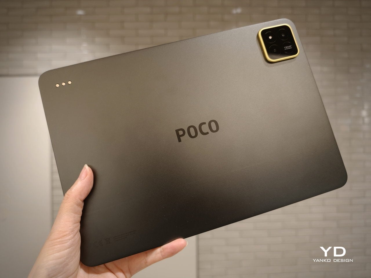
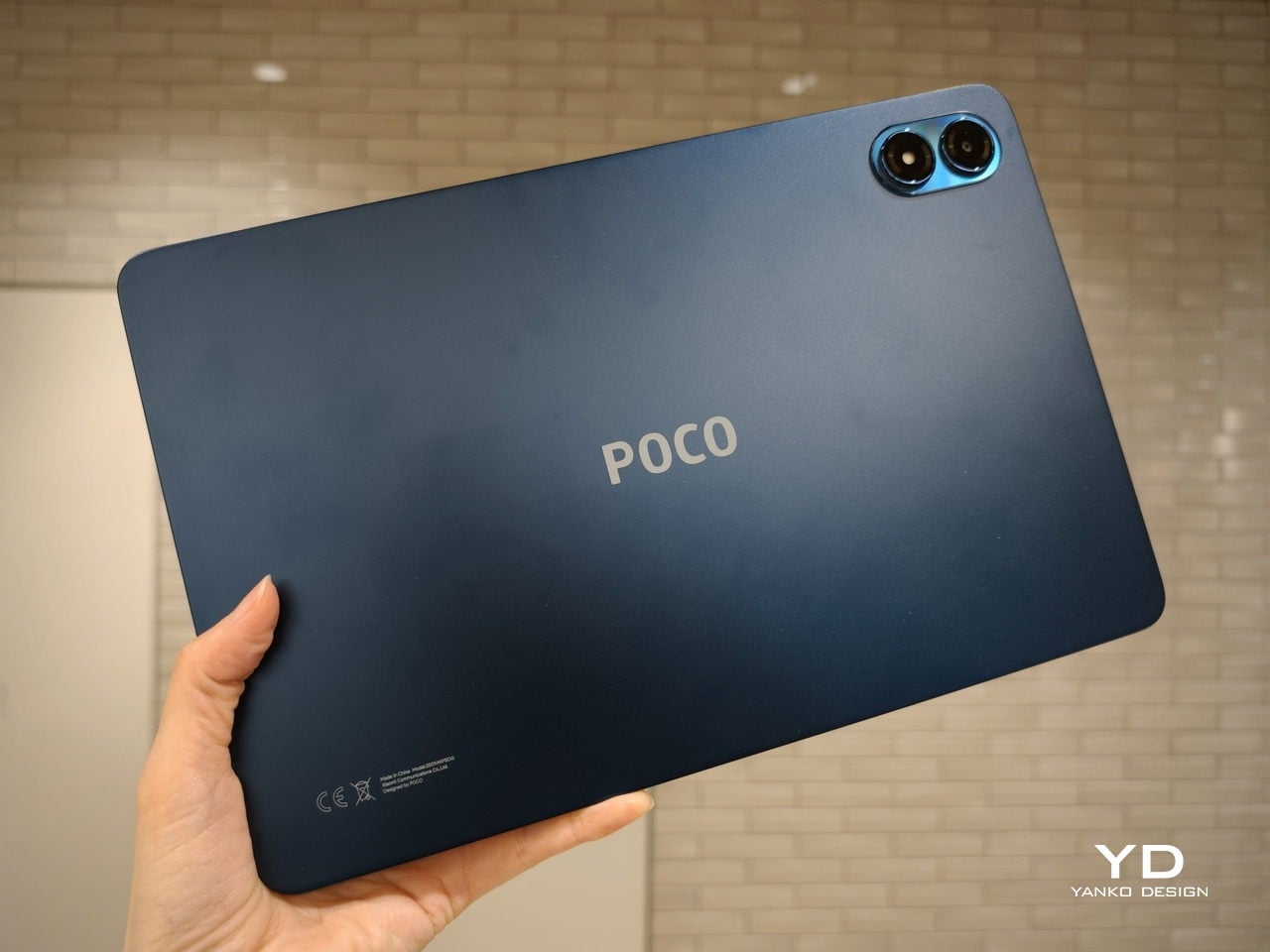
Color choices on the Pad X1 and the Pad M1 are simple. They both come in Grey and Blue. Grey leans more gunmetal and understated with a contrasting yellow accent around the camera module, while Blue reads a little more casual and friendly, but neither option is loud or experimental. Both tablets use a metal unibody design for the main shell, with separate parts for the camera island and buttons, and a big Poco logo stamped in the center for instant brand recognition. The Poco Pad X1 uses a square camera island, while the Poco Pad M1 switches to a softer oval, which gives each model a slightly different signature when you flip them over.
Poco Pad M1

Taken together, the two tablets look exactly like what they are meant to be. They are straightforward, modern Android slabs that fade into the background and let their screens and specs do the talking. For budget-friendly hardware, that quiet, functional design approach feels like the right call.

Ergonomics

In the hand, the main ergonomic difference between Poco Pad X1 and Poco Pad M1 is simply size and weight, but neither is a true one-handed tablet for long stretches. The Poco Pad X1, with its 11.2-inch footprint and 500 g weight, is the more compact of the two. It is easier to manage on a sofa or in bed than the larger Poco Pad M1, but you will still want a second hand or some support if you are holding it for a long time. Even though the Poco Pad X1 is relatively slim and light for an aluminum unibody tablet with an 8,850 mAh battery, with dimensions of 251.22 x 173.42 x 6.18 mm, it does not quietly disappear in one hand the way a smaller 8 or 9-inch device might.
Poco Pad M1

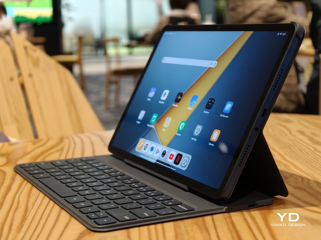
Poco Pad M1 stretches that template out to a 12.1-inch diagonal with dimensions of 279.8 x 181.65 x 7.5 mm and a weight of about 610 g, which puts it clearly into big tablet territory. It is still slim, but the larger footprint makes it even less suited to long one-handed use, especially if you are moving around. Instead, it feels more like a tablet you rest on a table, prop up with a cover, or pair with its official keyboard, where the extra screen real estate really pays off for split-screen apps, video, and drawing.

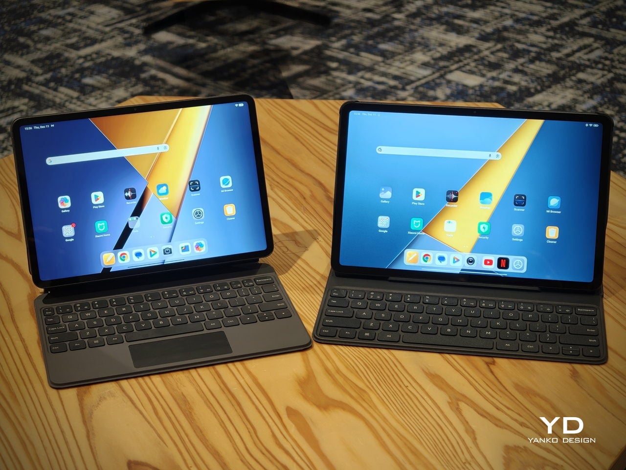
The accessory ecosystem around the Pad X1 and the Pad M1 makes them versatile, but in slightly different ways. Poco Pad M1 is compatible with the optional Poco Pad M1 Keyboard, Poco Smart Pen, and Poco Pad M1 Cover, a trio that turns it into a very capable small-screen workstation. The cover folds into a stand and adds a built-in holder for the pen, which makes it easy to move between bag, desk, and sofa without worrying about where the stylus went. The keyboard is lightweight and easy to carry, but the keys feel a bit plasticky in use, which slightly undercuts the otherwise solid metal body of the tablet.
Poco Pad X1

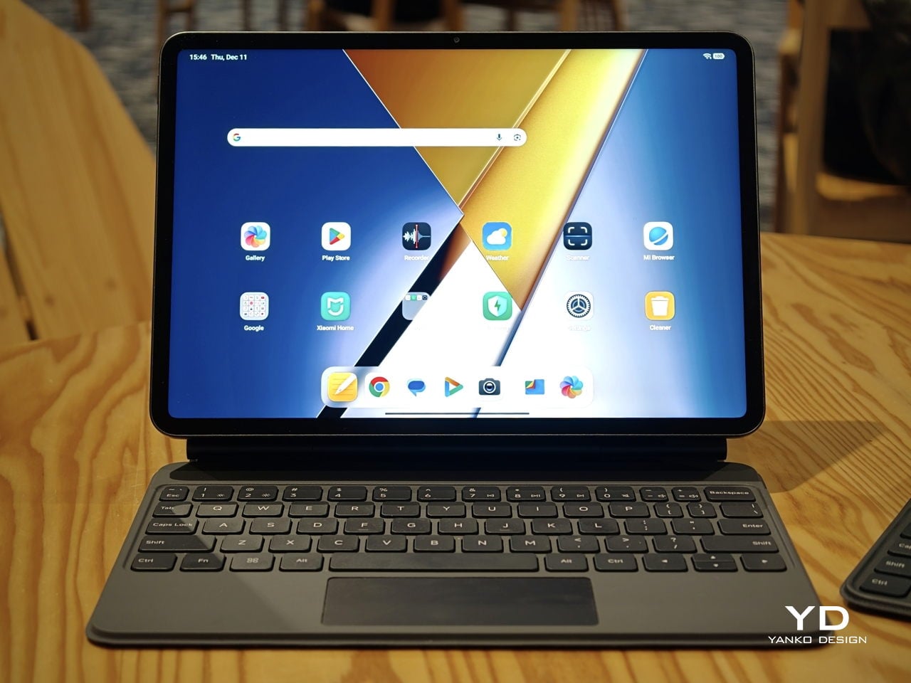
Poco Pad X1 has its own dedicated set of accessories. It supports the Poco Pad X1 Floating Keyboard, the Poco Pad X1 Keyboard, the Poco Focus Pen, and the Poco Pad X1 Cover, which together give it a surprisingly flexible setup for both work and play. The cover folds like origami and doubles as a stand, letting you enjoy the tablet vertically or horizontally, and for horizontal use, you can choose between two different viewing heights.

The Floating Keyboard is the standout here. It adds some weight and only offers a modest tilt range, but the key feel is excellent for this class, and the trackpad is responsive and accurate enough that you quickly forget you are on a tablet accessory. Clipped together, the Poco Pad X1 and the Floating Keyboard behave much more like a compact laptop than a budget slate with an afterthought keyboard, which makes it far easier to treat this smaller tablet as a real writing and work machine when you need it.
 

Performance

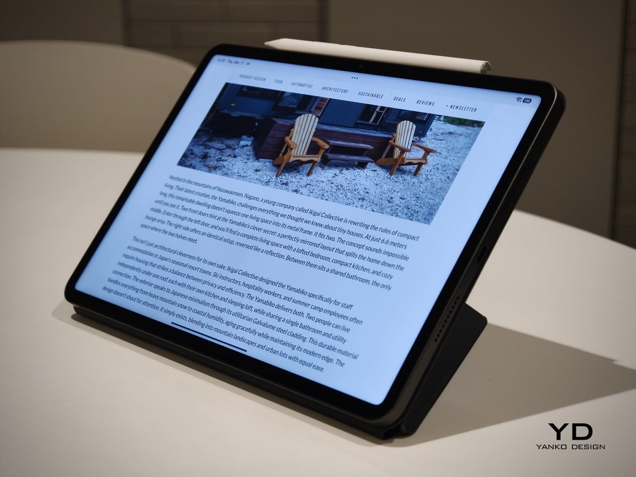
Living with Poco Pad X1 and Poco Pad M1 quickly shows how differently they lean, even though they share a lot of DNA. The Poco Pad X1 is the sharper and faster option, with an 11.2-inch 3.2K display at 3,200 x 2,136 px, around 345 ppi, and refresh up to 144 Hz in supported apps. It can hit about 800 nits peak brightness, supports Dolby Vision and HDR10, and uses a 3:2 aspect ratio that feels very natural for reading, web browsing, and document work, helped by TÜV eye care, DC dimming, and adaptive colors to keep things comfortable.

Poco Pad M1

The Poco Pad M1, on the other hand, trades a bit of sharpness and speed for sheer size and flexibility. Its 12.1-inch 2.5K panel runs at 2,560 x 1,600px with around 249 ppi and up to 120 Hz refresh, plus 500 nits typical and 600 nits in high brightness mode. You still get Dolby Vision, DC dimming, and TÜV certifications for low blue light, flicker-free behavior, and circadian friendliness, along with wet touch support that keeps it usable with damp fingers.
Poco Pad X1

Both tablets use quad speakers with Dolby Atmos and Hi-Res support, so you get surprisingly full sound from either. Crucially, the Poco Pad M1 also adds a 3.5 mm headphone jack and a microSD slot for up to 2 TB of expandable storage, which makes it a much easier media hoarder and a better fit for wired headphones and speakers. The X1 relies on its internal storage and wireless audio instead, which suits its more performance-driven, travel-friendly role.

Poco Pad X1

Poco Pad M1

Performance and gaming clearly favor the Poco Pad X1. It uses the Snapdragon 7+ Gen 3 with 8 GB of RAM and up to 512 GB of storage, and combined with the 144 Hz panel, it feels like a handheld console that also happens to be good at multitasking and productivity. The Poco Pad M1 steps down to the Snapdragon 7s Gen 4 with 8 GB of RAM and 256 GB of storage, which is still more than enough for apps and casual gaming, but clearly tuned more for streaming, browsing, and note-taking than for chasing every last frame. In practice, the Poco Pad X1 is the one you reach for when you care about smooth, high refresh gameplay, while the Pad M1 is the one you leave on the coffee table for everyone to use.

Poco Pad M1

Battery life follows the same logic. The Poco Pad X1 pairs its 8,850 mAh battery with 45 W turbo charging, which Poco says can go from zero to full in about 94 minutes, and my experience matches that claim in day-to-day use. The Poco Pad M1 leans into a 12,000 mAh pack, billed as the largest battery in a global Poco device, with up to 105.36 hours of music playback, around 83 days of standby, 33 W charging, and up to 27 W wired reverse charging so it can top up your other devices.
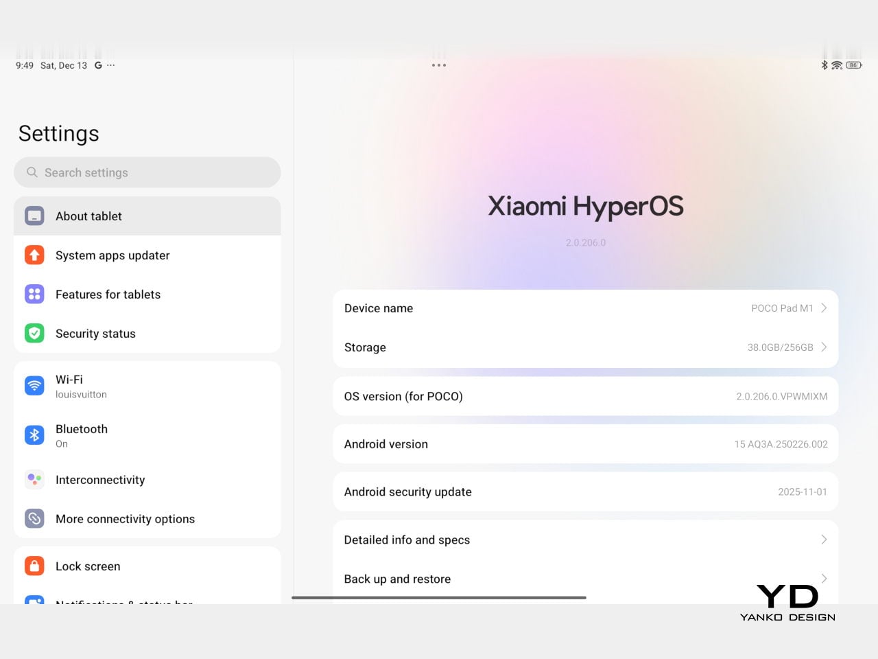
Poco Pad M1
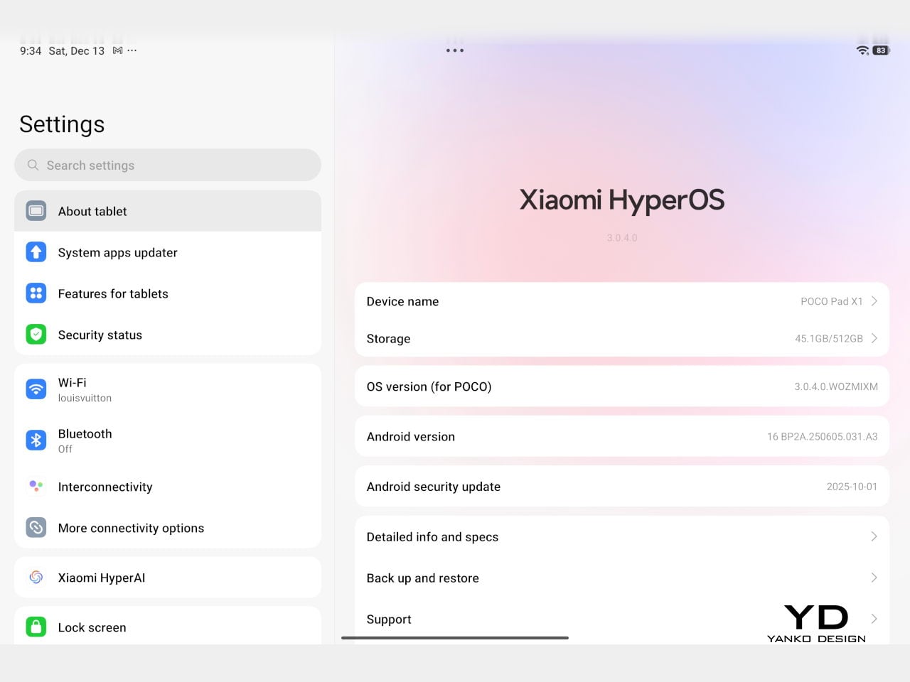
Poco Pad X1

On the software side, both run Xiaomi HyperOS with Xiaomi Interconnectivity and Google’s AI hooks, so you get shared clipboard, call and network sync, Circle to Search, and Gemini support whichever size you choose. As for cameras, Poco Pad X1 pairs a 13 MP rear camera and an 8 MP front camera, while Poco Pad M1 sticks to 8 MP sensors on both sides. The results are perfectly fine for video calls, document scans, and the odd quick snap, but nothing special, which is exactly what you would expect from tablets at this price bracket.

Poco Pad M1

Poco Pad X1

Sustainability

Poco is not making a big environmental branding play with Poco Pad X1 and Poco Pad M1, but there are a few practical touches that matter if you plan to keep a tablet for several years. The most important one is long-term software support. Both Pad X1 and Pad M1 are slated to receive four years of security updates, which gives you a clearer runway for safe everyday use. For budget tablets, that commitment is still not guaranteed across the market, so it is good to see Poco spell it out.
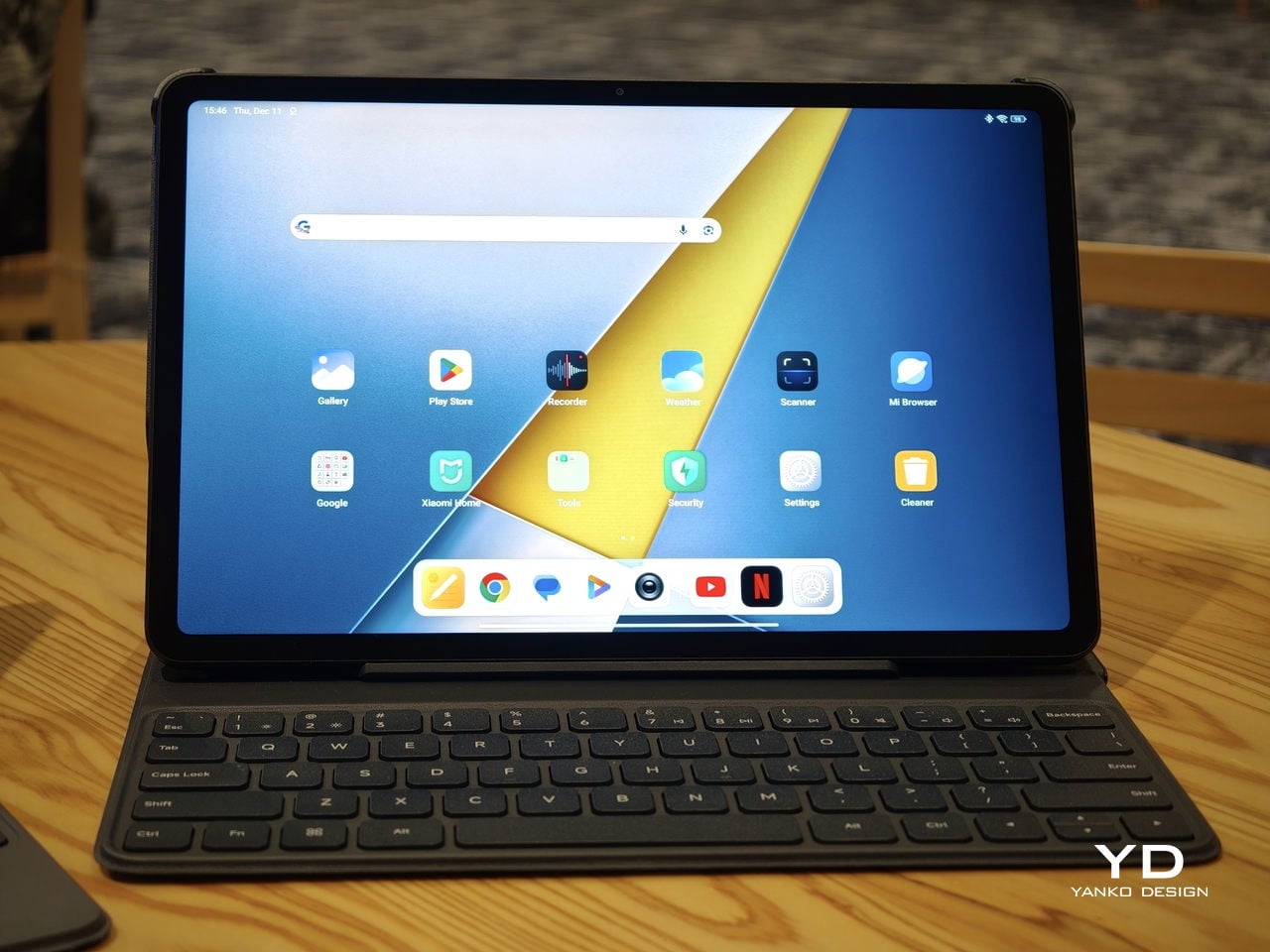
Poco Pad M1


That longer support window pairs well with the hardware choices. The aluminum unibody shells on both models feel sturdy enough to survive several upgrade cycles, and the generous storage options, plus microSD expansion on the Poco Pad M1, reduce the pressure to replace them early just to fit more apps or media. It is not a full sustainability story with recycled materials and carbon tracking, but if your definition of sustainable starts with buying something that will not feel obsolete or unsafe in two years, these tablets are at least pointed in the right direction.

Value

The Poco Pad X1 and Poco Pad M1 both land in the affordable bracket, but they scale very differently once you add accessories. The Poco Pad X1 with 8 GB of RAM and 512 GB of storage is $399 USD, which feels fair for the Snapdragon 7+ Gen 3 and high-end 3.2K 144 hertz display. Its accessories are priced like mini laptop gear, with the Floating Keyboard at $199 USD, the X1 Keyboard at $129 USD, the X1 Cover at $49 USD, and the Poco Focus Pen at $99 USD. A fully loaded X1 setup quickly pushes past $600 USD, but in return, you get a compact tablet that can genuinely stand in for a small laptop and drawing pad.
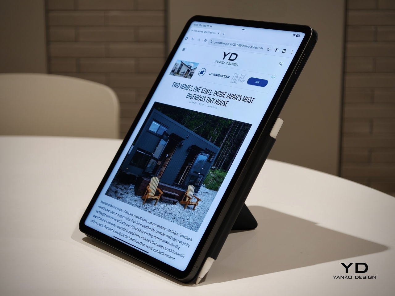
Poco Pad X1

The Poco Pad M1 starts cheaper at $329 USD for 8 GB and 256 GB, and its add-ons stay firmly in value territory. The M1 Keyboard is $99 USD, the M1 Cover is $29 USD, and the Poco Smart Pen is $69 USD, so even a complete kit undercuts an equivalently kitted X1 by a healthy margin. Factor in the microSD slot and 3.5 millimeter headphone jack, and M1 clearly aims to be the better deal for big screen media, note-taking, and family use, while X1 makes more sense if you are willing to pay extra for performance, storage, and that excellent Floating Keyboard experience.

Verdict

The Poco Pad X1 and Poco Pad M1 end up serving two somewhat different roles. If you prioritize performance, the Poco Pad X1 is the clear choice. The Snapdragon 7+ Gen 3, 3.2K 144 Hz display, 512 GB storage, and excellent Floating Keyboard make it feel like a serious little work and gaming machine, even if the full setup gets expensive and you give up the headphone jack and SD slot. If you care more about big-screen comfort and value, the Poco Pad M1 quietly wins. The 12.1-inch 2.5K screen, quad speakers, 3.5 mm jack, microSD expansion, huge battery, and cheaper accessories make it a better fit for big-screen media and everyday productivity.

Poco Pad X1

Whichever way you lean, you are getting more tablet than the price suggests. For context, Apple’s base iPad costs $449 with only 64 GB of storage and a 60 Hz screen. The iPad still has a faster processor and a tighter app ecosystem, but Poco gives you bigger batteries, sharper displays, and a lot more storage for less money. Pick the Poco Pad X1 if you want compact power and a great keyboard experience. Pick the Poco Pad M1 if you want maximum screen, battery, and flexibility for the money. Either way, you end up with a tablet that feels more considered than most of what you will find at this price.

The post Poco Pad X1 & Poco Pad M1 Review: Budget Tablets That Challenge the iPad first appeared on Yanko Design.
Poco Pad X1 & Poco Pad M1 Review: Budget Tablets That Challenge the iPad

PROS:


  • Strong display for the money

  • Complete accessory ecosystem

  • Big batteries

CONS:


  • Neither tablet is light enough for comfortable one-handed use

  • Fully kitted-out X1 with Floating Keyboard and Focus Pen gets expensive fast

RATINGS:

AESTHETICS
ERGONOMICS
PERFORMANCE
SUSTAINABILITY / REPAIRABILITY
VALUE FOR MONEY

EDITOR'S QUOTE:

Poco Pad X1 and M1 are not perfect, but together they deliver more screen, battery, and versatility than almost any other budget tablet pair right now.

Poco built its name on phones that punch above their price, and now it wants to do the same on your coffee table. With Poco Pad X1 and Poco Pad M1, the brand is not just throwing out a couple of cheap tablets. It is trying to turn its budget DNA into a fuller ecosystem that covers gaming, work, and everyday media.

You can feel that ambition in how these two models are drawn. The Poco Pad X1 is a slightly more compact, high refresh performance slate, tuned for games and quick multitasking on an 11.2-inch 3.2K display. The Poco Pad M1 steps up to a 12.1-inch 2.5K panel and the largest battery Poco has ever shipped in a global device, aiming to be the big screen that carries you through movies, sketching sessions, and long days away from a charger.

Designer: Poco

If you have been eyeing an affordable Android tablet for gaming, streaming, or light work, should you reach for the sharper, faster Poco Pad X1, or the larger, more relaxed Poco Pad M1? In this review, we will live with both, compare their strengths, and help you decide which one actually fits your desk, your bag, and your budget.

Aesthetics

Poco Pad X1

Poco is not trying to reinvent tablet hardware with Poco Pad X1 or Poco Pad M1. Both follow a familiar rectangle with rounded corners, flat sides, and a camera module that sits quietly in one corner. On Poco Pad X1, the focus is clearly on framing its 11.2-inch display as efficiently as possible. Poco Pad M1 takes the same basic formula and scales it up with a 12.1-inch panel.

Color choices on the Pad X1 and the Pad M1 are simple. They both come in Grey and Blue. Grey leans more gunmetal and understated with a contrasting yellow accent around the camera module, while Blue reads a little more casual and friendly, but neither option is loud or experimental. Both tablets use a metal unibody design for the main shell, with separate parts for the camera island and buttons, and a big Poco logo stamped in the center for instant brand recognition. The Poco Pad X1 uses a square camera island, while the Poco Pad M1 switches to a softer oval, which gives each model a slightly different signature when you flip them over.

Poco Pad M1

Taken together, the two tablets look exactly like what they are meant to be. They are straightforward, modern Android slabs that fade into the background and let their screens and specs do the talking. For budget-friendly hardware, that quiet, functional design approach feels like the right call.

Ergonomics

In the hand, the main ergonomic difference between Poco Pad X1 and Poco Pad M1 is simply size and weight, but neither is a true one-handed tablet for long stretches. The Poco Pad X1, with its 11.2-inch footprint and 500 g weight, is the more compact of the two. It is easier to manage on a sofa or in bed than the larger Poco Pad M1, but you will still want a second hand or some support if you are holding it for a long time. Even though the Poco Pad X1 is relatively slim and light for an aluminum unibody tablet with an 8,850 mAh battery, with dimensions of 251.22 x 173.42 x 6.18 mm, it does not quietly disappear in one hand the way a smaller 8 or 9-inch device might.

Poco Pad M1

Poco Pad M1 stretches that template out to a 12.1-inch diagonal with dimensions of 279.8 x 181.65 x 7.5 mm and a weight of about 610 g, which puts it clearly into big tablet territory. It is still slim, but the larger footprint makes it even less suited to long one-handed use, especially if you are moving around. Instead, it feels more like a tablet you rest on a table, prop up with a cover, or pair with its official keyboard, where the extra screen real estate really pays off for split-screen apps, video, and drawing.

The accessory ecosystem around the Pad X1 and the Pad M1 makes them versatile, but in slightly different ways. Poco Pad M1 is compatible with the optional Poco Pad M1 Keyboard, Poco Smart Pen, and Poco Pad M1 Cover, a trio that turns it into a very capable small-screen workstation. The cover folds into a stand and adds a built-in holder for the pen, which makes it easy to move between bag, desk, and sofa without worrying about where the stylus went. The keyboard is lightweight and easy to carry, but the keys feel a bit plasticky in use, which slightly undercuts the otherwise solid metal body of the tablet.

Poco Pad X1

Poco Pad X1 has its own dedicated set of accessories. It supports the Poco Pad X1 Floating Keyboard, the Poco Pad X1 Keyboard, the Poco Focus Pen, and the Poco Pad X1 Cover, which together give it a surprisingly flexible setup for both work and play. The cover folds like origami and doubles as a stand, letting you enjoy the tablet vertically or horizontally, and for horizontal use, you can choose between two different viewing heights.

The Floating Keyboard is the standout here. It adds some weight and only offers a modest tilt range, but the key feel is excellent for this class, and the trackpad is responsive and accurate enough that you quickly forget you are on a tablet accessory. Clipped together, the Poco Pad X1 and the Floating Keyboard behave much more like a compact laptop than a budget slate with an afterthought keyboard, which makes it far easier to treat this smaller tablet as a real writing and work machine when you need it.
 

Performance

Living with Poco Pad X1 and Poco Pad M1 quickly shows how differently they lean, even though they share a lot of DNA. The Poco Pad X1 is the sharper and faster option, with an 11.2-inch 3.2K display at 3,200 x 2,136 px, around 345 ppi, and refresh up to 144 Hz in supported apps. It can hit about 800 nits peak brightness, supports Dolby Vision and HDR10, and uses a 3:2 aspect ratio that feels very natural for reading, web browsing, and document work, helped by TÜV eye care, DC dimming, and adaptive colors to keep things comfortable.

Poco Pad M1

The Poco Pad M1, on the other hand, trades a bit of sharpness and speed for sheer size and flexibility. Its 12.1-inch 2.5K panel runs at 2,560 x 1,600px with around 249 ppi and up to 120 Hz refresh, plus 500 nits typical and 600 nits in high brightness mode. You still get Dolby Vision, DC dimming, and TÜV certifications for low blue light, flicker-free behavior, and circadian friendliness, along with wet touch support that keeps it usable with damp fingers.

Poco Pad X1

Both tablets use quad speakers with Dolby Atmos and Hi-Res support, so you get surprisingly full sound from either. Crucially, the Poco Pad M1 also adds a 3.5 mm headphone jack and a microSD slot for up to 2 TB of expandable storage, which makes it a much easier media hoarder and a better fit for wired headphones and speakers. The X1 relies on its internal storage and wireless audio instead, which suits its more performance-driven, travel-friendly role.

Poco Pad X1

Poco Pad M1

Performance and gaming clearly favor the Poco Pad X1. It uses the Snapdragon 7+ Gen 3 with 8 GB of RAM and up to 512 GB of storage, and combined with the 144 Hz panel, it feels like a handheld console that also happens to be good at multitasking and productivity. The Poco Pad M1 steps down to the Snapdragon 7s Gen 4 with 8 GB of RAM and 256 GB of storage, which is still more than enough for apps and casual gaming, but clearly tuned more for streaming, browsing, and note-taking than for chasing every last frame. In practice, the Poco Pad X1 is the one you reach for when you care about smooth, high refresh gameplay, while the Pad M1 is the one you leave on the coffee table for everyone to use.

Poco Pad M1

Battery life follows the same logic. The Poco Pad X1 pairs its 8,850 mAh battery with 45 W turbo charging, which Poco says can go from zero to full in about 94 minutes, and my experience matches that claim in day-to-day use. The Poco Pad M1 leans into a 12,000 mAh pack, billed as the largest battery in a global Poco device, with up to 105.36 hours of music playback, around 83 days of standby, 33 W charging, and up to 27 W wired reverse charging so it can top up your other devices.

Poco Pad M1

Poco Pad X1

On the software side, both run Xiaomi HyperOS with Xiaomi Interconnectivity and Google’s AI hooks, so you get shared clipboard, call and network sync, Circle to Search, and Gemini support whichever size you choose. As for cameras, Poco Pad X1 pairs a 13 MP rear camera and an 8 MP front camera, while Poco Pad M1 sticks to 8 MP sensors on both sides. The results are perfectly fine for video calls, document scans, and the odd quick snap, but nothing special, which is exactly what you would expect from tablets at this price bracket.

Poco Pad M1

Poco Pad X1

Sustainability

Poco is not making a big environmental branding play with Poco Pad X1 and Poco Pad M1, but there are a few practical touches that matter if you plan to keep a tablet for several years. The most important one is long-term software support. Both Pad X1 and Pad M1 are slated to receive four years of security updates, which gives you a clearer runway for safe everyday use. For budget tablets, that commitment is still not guaranteed across the market, so it is good to see Poco spell it out.

Poco Pad M1


That longer support window pairs well with the hardware choices. The aluminum unibody shells on both models feel sturdy enough to survive several upgrade cycles, and the generous storage options, plus microSD expansion on the Poco Pad M1, reduce the pressure to replace them early just to fit more apps or media. It is not a full sustainability story with recycled materials and carbon tracking, but if your definition of sustainable starts with buying something that will not feel obsolete or unsafe in two years, these tablets are at least pointed in the right direction.

Value

The Poco Pad X1 and Poco Pad M1 both land in the affordable bracket, but they scale very differently once you add accessories. The Poco Pad X1 with 8 GB of RAM and 512 GB of storage is $399 USD, which feels fair for the Snapdragon 7+ Gen 3 and high-end 3.2K 144 hertz display. Its accessories are priced like mini laptop gear, with the Floating Keyboard at $199 USD, the X1 Keyboard at $129 USD, the X1 Cover at $49 USD, and the Poco Focus Pen at $99 USD. A fully loaded X1 setup quickly pushes past $600 USD, but in return, you get a compact tablet that can genuinely stand in for a small laptop and drawing pad.

Poco Pad X1

The Poco Pad M1 starts cheaper at $329 USD for 8 GB and 256 GB, and its add-ons stay firmly in value territory. The M1 Keyboard is $99 USD, the M1 Cover is $29 USD, and the Poco Smart Pen is $69 USD, so even a complete kit undercuts an equivalently kitted X1 by a healthy margin. Factor in the microSD slot and 3.5 millimeter headphone jack, and M1 clearly aims to be the better deal for big screen media, note-taking, and family use, while X1 makes more sense if you are willing to pay extra for performance, storage, and that excellent Floating Keyboard experience.

Verdict

The Poco Pad X1 and Poco Pad M1 end up serving two somewhat different roles. If you prioritize performance, the Poco Pad X1 is the clear choice. The Snapdragon 7+ Gen 3, 3.2K 144 Hz display, 512 GB storage, and excellent Floating Keyboard make it feel like a serious little work and gaming machine, even if the full setup gets expensive and you give up the headphone jack and SD slot. If you care more about big-screen comfort and value, the Poco Pad M1 quietly wins. The 12.1-inch 2.5K screen, quad speakers, 3.5 mm jack, microSD expansion, huge battery, and cheaper accessories make it a better fit for big-screen media and everyday productivity.

Poco Pad X1

Whichever way you lean, you are getting more tablet than the price suggests. For context, Apple’s base iPad costs $449 with only 64 GB of storage and a 60 Hz screen. The iPad still has a faster processor and a tighter app ecosystem, but Poco gives you bigger batteries, sharper displays, and a lot more storage for less money. Pick the Poco Pad X1 if you want compact power and a great keyboard experience. Pick the Poco Pad M1 if you want maximum screen, battery, and flexibility for the money. Either way, you end up with a tablet that feels more considered than most of what you will find at this price.

The post Poco Pad X1 & Poco Pad M1 Review: Budget Tablets That Challenge the iPad first appeared on Yanko Design.
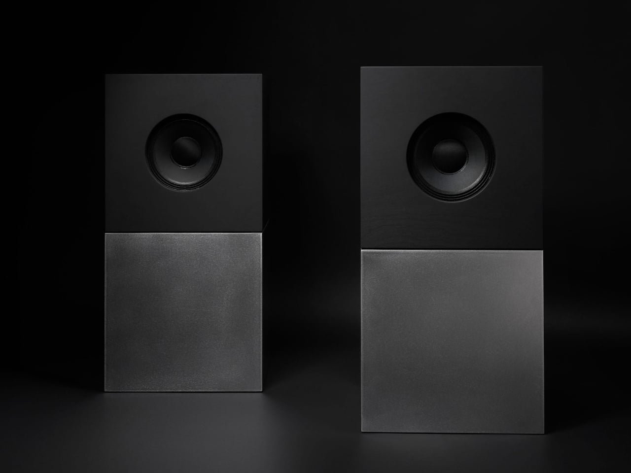
Nocs Braque Stacks Two Cubes into a 25kg Sculptural Stereo System

Most hi-fi speakers still look like anonymous black rectangles, even when they sound great. A few brands treat speakers as furniture or sculpture, but often at the expense of engineering. Braque by Nocs tries to sit in the middle, a pair of cubes that are as considered visually as they are technically, treating stereo as both sound and composition rather than one serving the other as an afterthought.

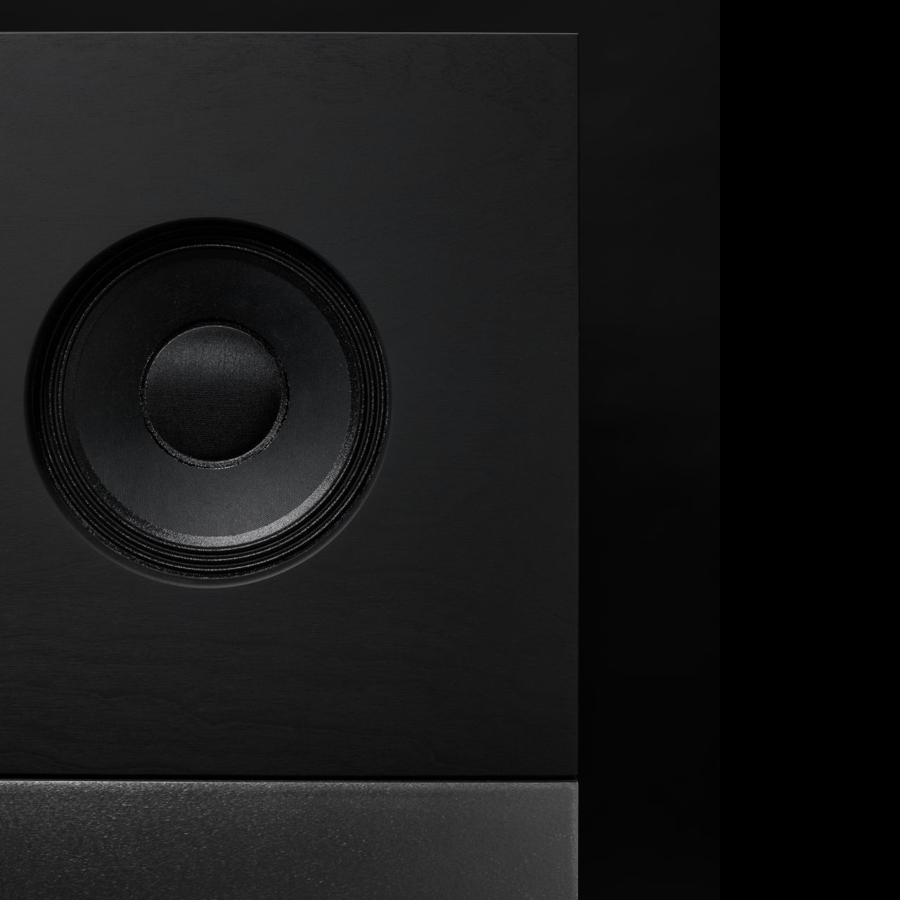
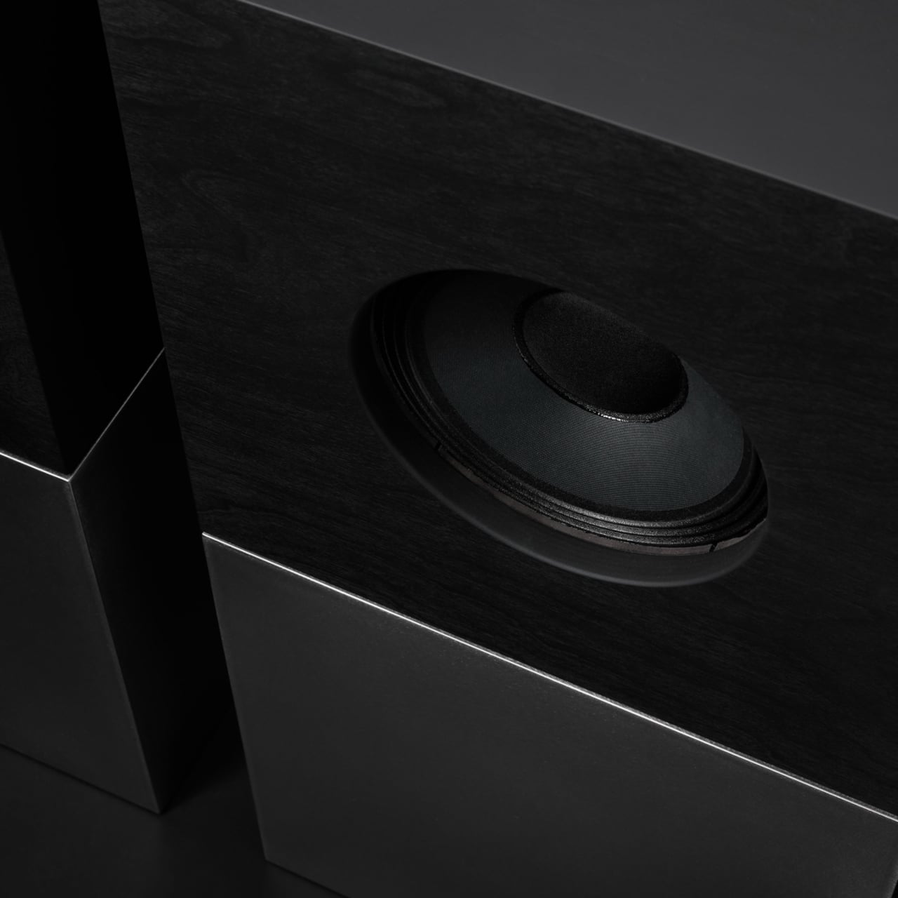
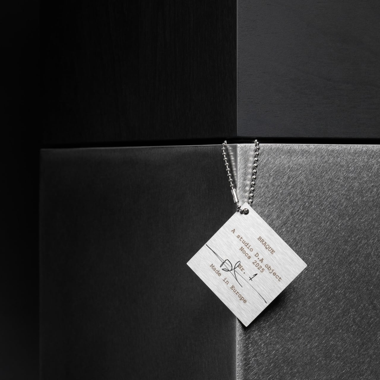
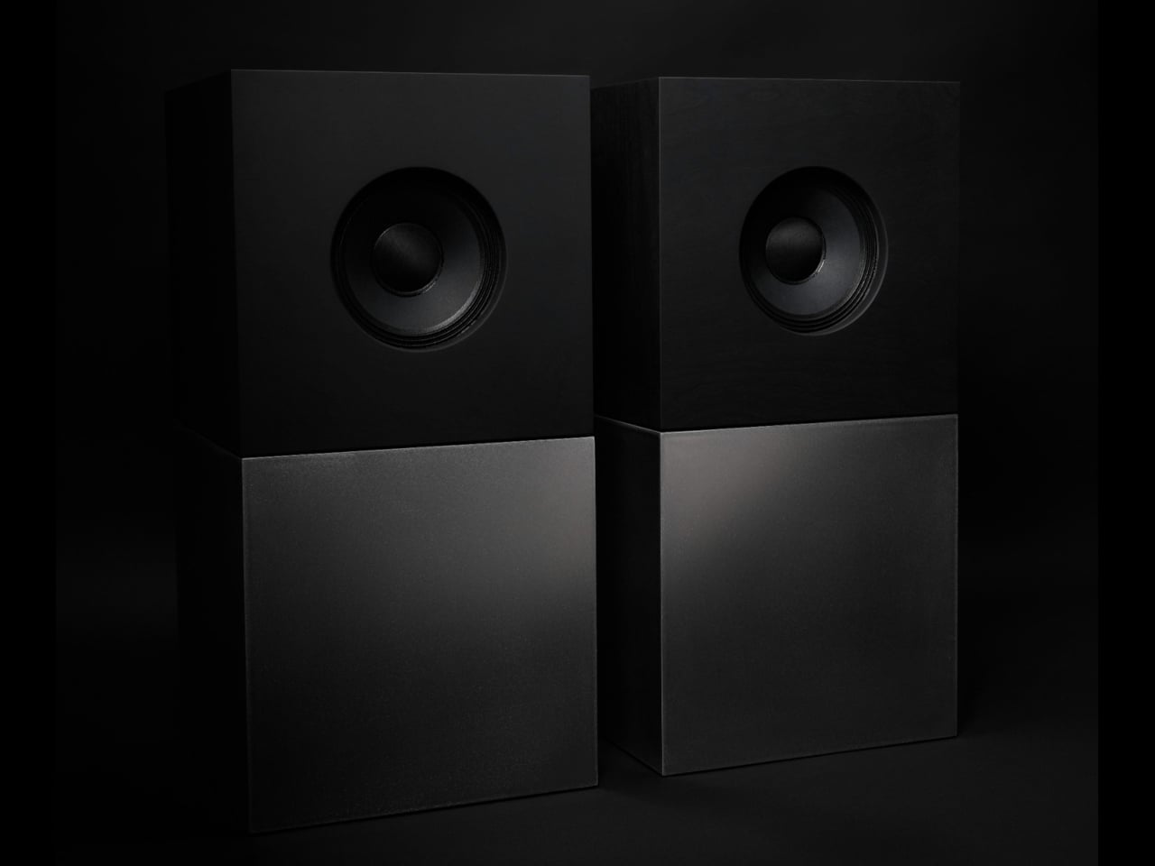
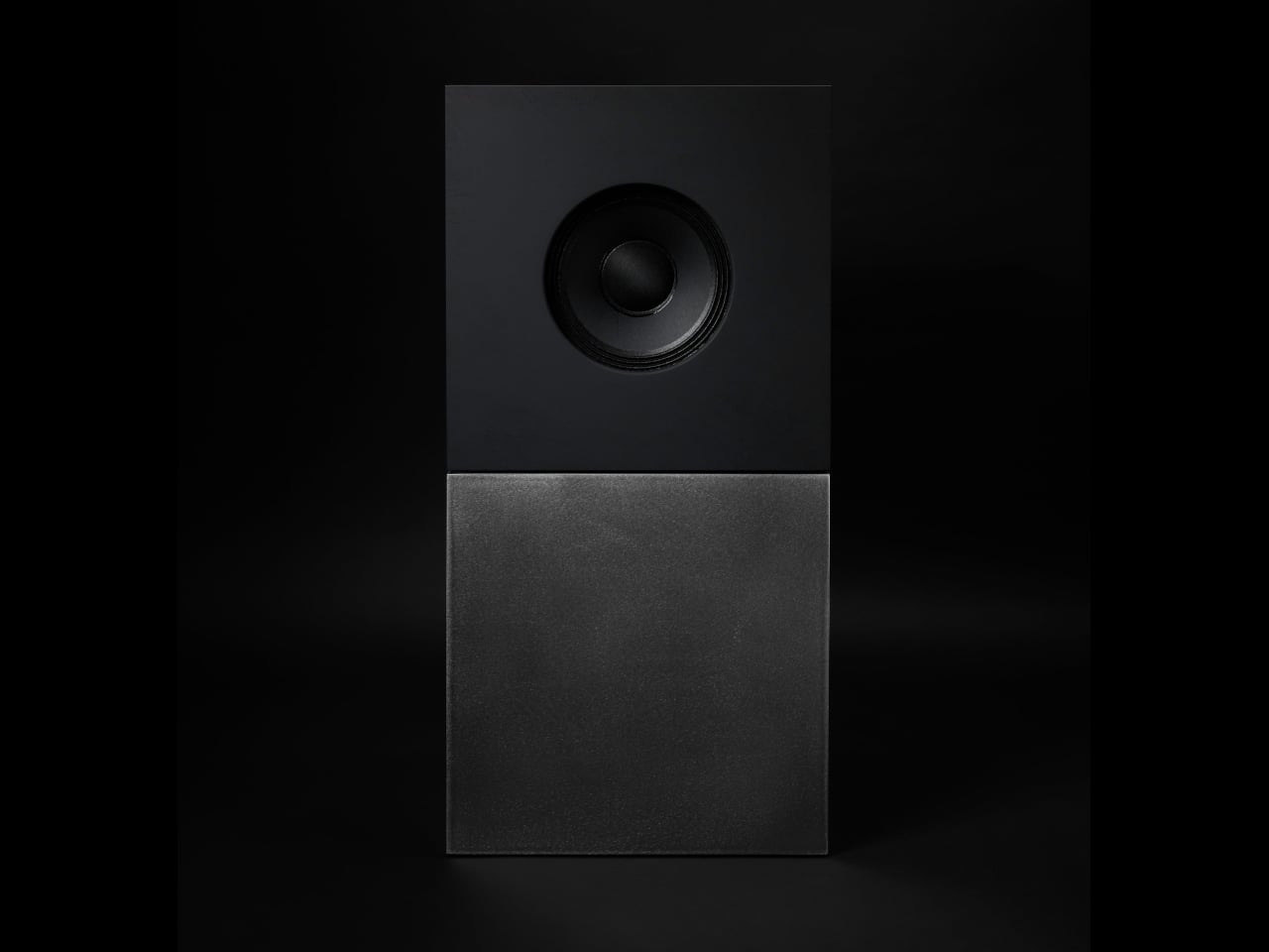
Nocs calls Braque “two cubes, one sculptural stereo system,” and each speaker is a stacked pair, a CNC-machined plywood enclosure on top of a 25 kg solid-steel base. Built in numbered editions, assembled in Estonia with the steel cube handcrafted in Sweden, and tuned back at Nocs Lab, Braque signals that this is not a mass-market soundbar or a safe play for casual listeners who just want something wireless.

Designer: Nocs Design

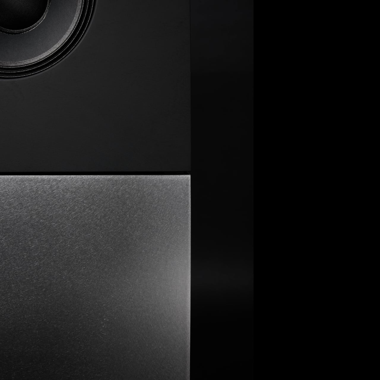
The upper cube is rigid plywood finished in deep matte-black oil, chosen for tonal warmth and acoustic integrity, and the lower cube is a hand-welded, brushed steel block that anchors the system physically and visually. Sorbothane isolation pads sit between them, decoupling the enclosure from the base so the driver can move without shaking the furniture or smearing the soundstage. Together, the two volumes form a study in symmetry, a minimal yet expressive composition.

The acoustic core is an 8-inch Celestion FTX0820 coaxial driver with a 1-inch compression tweeter at its center, powered by dual Hypex FA122 modules delivering 125 W per side with integrated DSP. The coaxial layout gives a point-source image, and the active 2-way design lets Nocs control crossover and EQ precisely, resulting in a 42 Hz–20 kHz response that is tuned rather than guessed at from a passive circuit.

Nocs describes their studio-sound approach as tuning like sculpture, not adding but uncovering, working with artists and engineers to balance emotion, texture, and detail. The dual-cube design is part of that, lifting the driver to ear height when seated and using mass and isolation to keep the presentation clean and stable at real-world volumes. The idea is that a speaker should reveal music rather than shape it into a brand’s house curve.

Braque offers both analog and digital inputs, RCA and XLR for analog, plus S/PDIF, AES/EBU, and coaxial for digital, and it is meant to connect directly to turntables with a phono stage, streamers, or studio interfaces. There is no built-in streaming or app layer, which feels intentional; you bring your own source and let the speakers handle amplification and conversion from there without trying to be a whole ecosystem.

Braque behaves in a living room or studio as two strict cubes that read like small pieces of Cubist architecture until you press play. For people who want their speakers to be part of the composition of a space, not just equipment pushed into corners, the combination of Celestion drivers, Hypex power, and that heavy steel base makes Braque feel like a very deliberate answer to how a stereo should look and sound in 2025, where form and performance finally coexist without one apologizing for the other.

The post Nocs Braque Stacks Two Cubes into a 25kg Sculptural Stereo System first appeared on Yanko Design.
Top 5 Non-Tech Gifts for Designers Who Have Every Gadget

Designers accumulate screens, tablets, and peripherals until their desks resemble mission control. Yet the most meaningful moments in creative work often happen away from pixels and processors. A perfectly weighted pen moving across paper creates a connection that no stylus can replicate. These analog tools offer something technology can’t: the tactile satisfaction of manipulating physical materials, the quiet pleasure of objects that don’t require charging or updates.

This collection celebrates the opposite of smart devices. Each piece proves that thoughtful design doesn’t need Bluetooth connectivity or app integration to elevate daily rituals. From writing implements engineered with surgical precision to candles that transform ambient lighting into meditation, these gifts remind us that the best tools sometimes do exactly one thing extraordinarily well. They’re for designers whose homes already hum with gadgets but whose souls crave something more deliberate and human.

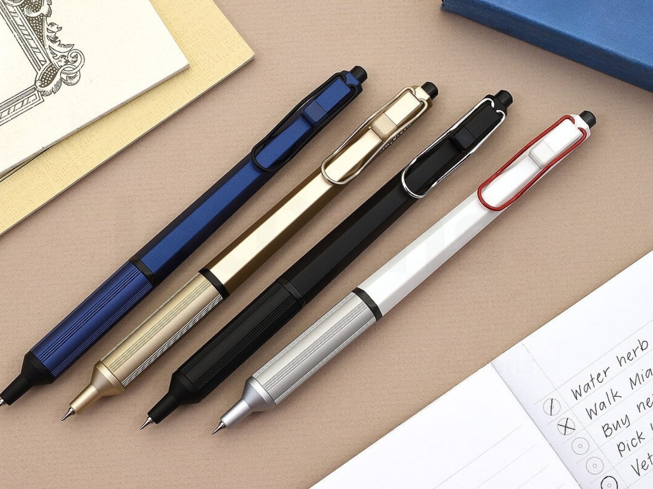
1. Jetstream Edge

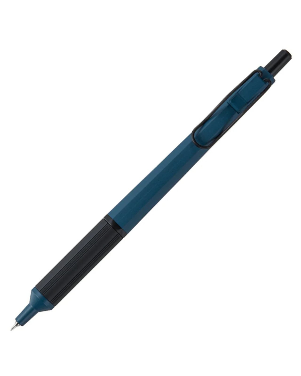
The world’s thinnest ballpoint pen sounds like marketing hyperbole until you drag the 0.28mm tip across paper and watch lines appear that rival technical drafting pens. This Uniball creation doesn’t just write thin; it writes with the kind of precision that makes handwritten notes feel like an intentional design exercise. The hexagonal black barrel catches light along its edges while the knurled metal grip provides just enough texture to keep your fingers anchored during extended writing sessions without causing fatigue or slippage.

What makes this pen exceptional lies in its hybrid ink formulation. The archival-quality black ink combines gel pen smoothness with ballpoint quick-drying properties, eliminating the smeared margins that plague lefties and rushed note-takers. The low center of gravity keeps the ultra-fine tip stable against paper, preventing the wobble that turns delicate linework into jagged scratches. The wire clip adds visual interest while securing the pen to notebook covers or shirt pockets. For designers who sketch concepts before digitizing them, this pen transforms rough ideation into refined mark-making.

What we like

  • The 0.28mm tip delivers drafting-pen precision in a portable ballpoint format.
  • Hybrid ink technology dries instantly to prevent smudging on fresh pages.
  • The hexagonal barrel and knurled grip provide ergonomic control during long sessions.
  • Archival-quality black ink ensures notes and sketches remain legible for years.

What we dislike

  • The ultra-fine tip requires quality paper to prevent catching or tearing.
  • Replacement refills may prove difficult to source compared to standard ballpoints.

2. Heritage Craft Unboxing Knife

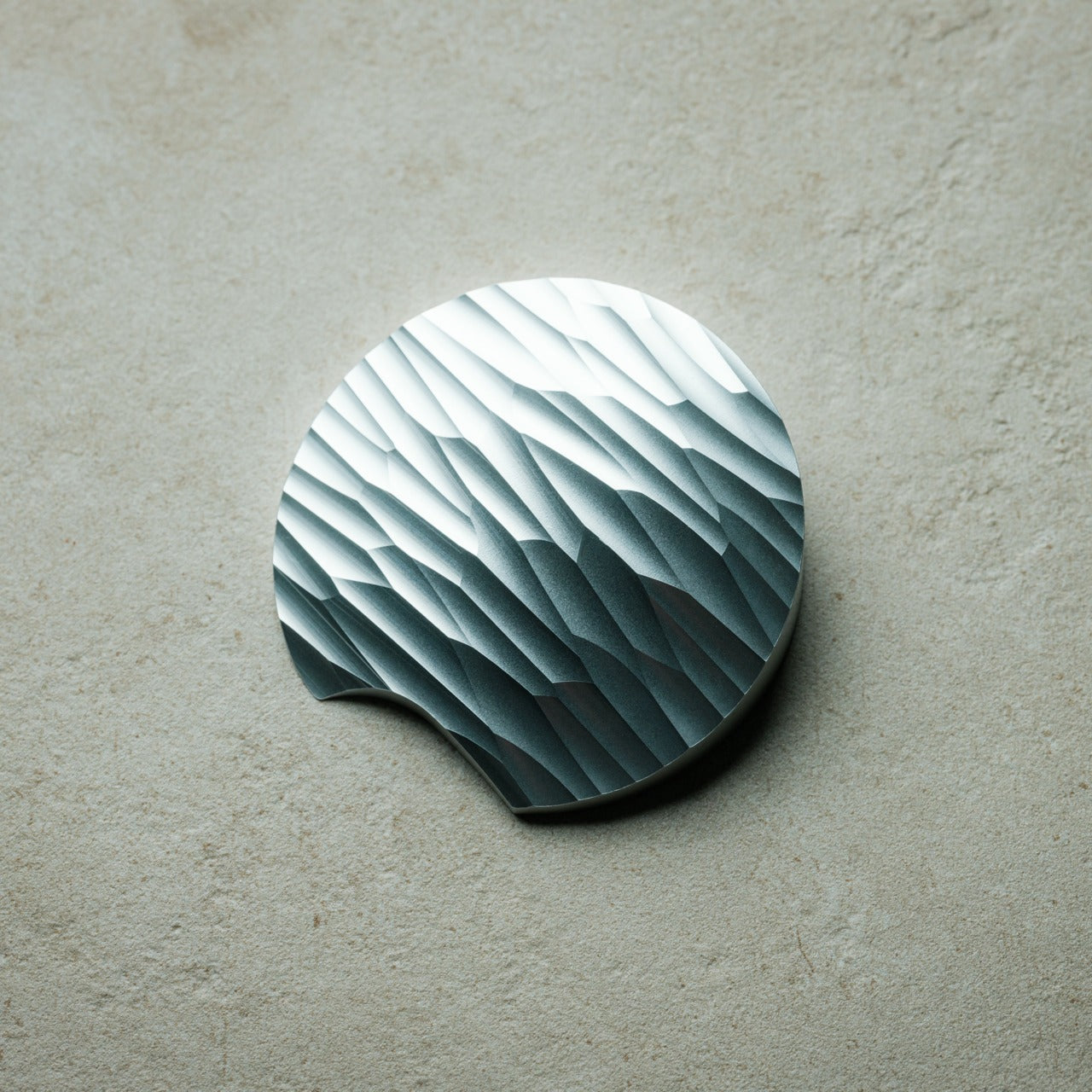
Most box cutters hide in junk drawers because they’re aggressively utilitarian and vaguely dangerous-looking. This aluminum sculpture reimagines the ancient hand axe through precision machining, creating something you’ll want displayed on your desk rather than buried in a drawer. Carved from a solid aluminum block, its circular form echoes Paleolithic tools while the wave-like patterns from the cutting process provide grip and visual intrigue. The tapered shape fits naturally in the hand, making package opening feel less like a chore and more like wielding a carefully considered instrument.

The intentional blade angle prevents over-penetration that damages package contents while maintaining enough sharpness for clean tape slicing. Aluminum’s inherent luster gives the knife a refined presence that elevates the mundane ritual of receiving deliveries. Designers who appreciate when everyday objects receive serious design consideration will find themselves reaching for this piece even when scissors would suffice. It sits at the intersection of functional tool and desktop sculpture, proving that utilitarian objects don’t need to sacrifice beauty for practicality or effectiveness.

Click Here to Buy Now: $99.00

What we like

  • Paleolithic-inspired form transforms mundane unboxing into a satisfying ritual.
  • Precision-milled aluminum construction provides luxury weight and lasting durability.
  • Wave-pattern machining creates a natural grip while adding sculptural visual interest.
  • Angled blade design ensures safe cutting without damaging package contents.

What we dislike

  • The exposed blade requires careful handling despite thoughtful safety considerations.
  • Premium aluminum construction places it at a higher price point than standard cutters.

3. Japanese Lantern Candle

Chouchin lanterns once lit Japanese festival nights with a gentle glow that modern LEDs struggle to replicate. This contemporary interpretation captures that soft illumination through handmade candles crafted in Kurashiki by artisans who understand how light transforms space. The minimalist holder design lets the candle become the focal point while patented technology prevents the outer wax from melting, maintaining the lantern shape throughout its burn life. As the interior wax liquefies, light dances through the undulating surface, creating shifting patterns that turn any room into a contemplative sanctuary.

The ritual of lighting a candle creates a deliberate pause that screens and notifications constantly interrupt. For designers accustomed to blue light and digital stimulation, this analog light source offers a different quality of illumination—one that encourages winding down rather than ramping up. The traditional chouchin form brings Japanese design philosophy into Western interiors without feeling forced or appropriative. Each candle burns with the kind of warm ambiance that makes reading physical books or sketching in analog notebooks feel natural again, reclaiming evening hours from device dependency.

Click Here to Buy Now: $69.00

What we like

  • Handcrafted by Japanese artisans in Kurashiki using traditional candle-making methods.
  • Patented technology maintains the lantern shape as interior wax melts and liquefies.
  • Minimalist design integrates seamlessly into contemporary or traditional interior styles.
  • The undulating surface creates mesmerizing light patterns as the candle burns down.

What we dislike

  • Replacement candles require sourcing from specific suppliers rather than local stores.
  • The contemplative burn time means less instant gratification than switching on a lamp.

4. Penguin x MOEBE Book Stand

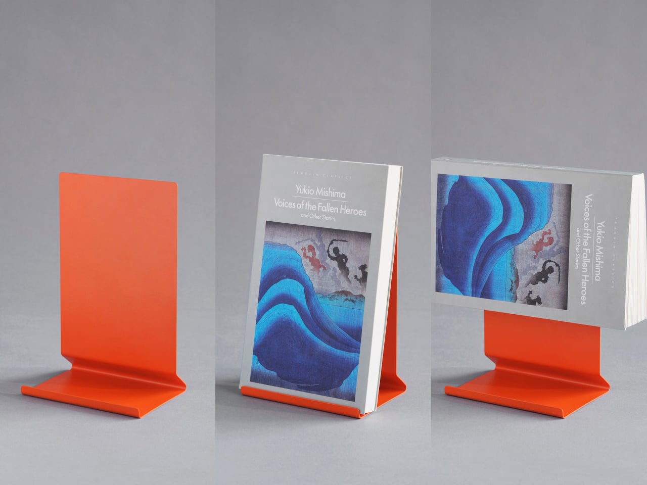
Books deserve better than lying face down with spines cracked or getting buried under device chargers. This collaboration between Penguin and MOEBE treats reading material as objects worth displaying, using bent steel to create a versatile stand that functions as a bookmark, display easel, or bookend depending on configuration. The single-sheet construction eliminates visible fasteners that would interrupt the clean lines, while the matte finish in stainless steel, cream, black, or Penguin orange lets you match existing desk aesthetics or add a pop of color.

The angled base supports everything from slim poetry collections to chunky design monographs without wobbling or tipping forward. Designers who collect physical books for reference and inspiration will appreciate how the stand keeps current reading visible rather than lost in stacks. Pair two stands to create bookends that frame a curated shelf section, or use a single piece to hold cookbooks open during kitchen experiments. Subtle Penguin and MOEBE branding sit on the base, where it remains visible without dominating the overall form. The stand quietly insists that books matter.

What we like

  • Single bent-steel construction creates seamless form without visible fasteners or joints.
  • Angled base supports books of varying thickness without wobbling or tipping.
  • Multiple colorways, including Penguin’s signature orange, integrate with existing decor.
  • Functions as a bookmark, display stand, or bookend depending on current needs.

What we dislike

  • The minimalist aesthetic may not provide enough visual presence for some interiors.
  • Steel construction adds weight that makes it less portable than plastic alternatives.

5. Personal Whiteboard

Digital note-taking apps promise searchability and cloud sync, yet many designers still think best with markers in hand. This portable whiteboard reduces the friction between thought and capture by fitting the essential ritual into a notebook form factor. The multi-functional cover wipes the surface clean, props the board at a comfortable viewing angle, and creates a pocket for loose papers. The Mag Force system turns the cover into both a handle for carrying and a magnetic pen holder that keeps your marker attached and accessible.

The genius lies in accepting that some notes are ephemeral. Sketch a quick concept, photograph it for the cloud, then wipe it clean for the next idea. The single reusable page eliminates the wasteful stack of marker-stained papers while maintaining the kinetic satisfaction of writing on a physical surface. Any standard whiteboard marker works, removing the premium-refill anxiety that plagues some reusable notebooks. For designers who facilitate workshops, lead brainstorming sessions, or simply think better while standing at a wall, this personal version brings that same energy to individual work.

Click Here to Buy Now: $49.00

What we like

  • Multi-functional cover serves as an eraser, an adjustable stand, and a document pocket.
  • The magnetic Mag Force system secures any whiteboard marker for transport and storage.
  • Photograph-then-erase workflow combines analog thinking with digital archiving.
  • Compatible with all standard whiteboard markers rather than proprietary refills.

What we dislike

  • The single-page format limits capturing multiple simultaneous thoughts or comparisons.
  • The whiteboard surface can develop ghosting over time with frequent use and inadequate cleaning.

Beyond the Charging Cable

The best gifts don’t always light up or connect to Wi-Fi. These five pieces prove that analog tools still have vital roles in creative work, offering textures and interactions that screens can’t replicate. From the meditative ritual of lighting a candle to the precise satisfaction of an engineered pen, each object does one thing superbly well without requiring updates or subscriptions. They’re investments in slowing down, in making everyday interactions feel intentional rather than automatic.

For designers drowning in devices, these non-tech gifts offer something increasingly rare: objects that work the same way in five years as they do today. No planned obsolescence, no compatibility issues, no battery anxiety. Just beautifully considered tools that make analog rituals feel luxurious again. They remind us that the most sophisticated technology sometimes means no technology at all, just materials and craftsmanship in service of human needs that haven’t changed in centuries.

The post Top 5 Non-Tech Gifts for Designers Who Have Every Gadget first appeared on Yanko Design.

10 Best Tiny Gifts Under $100 Everyone Steals From Stockings First

The best stocking stuffers aren’t the ones that fill space—they’re the ones that get plucked out first, pocketed before breakfast, and quietly claimed before anyone else notices. These are the gifts that punch above their price tag, blending clever design with genuine utility in a package small enough to tuck into a sock but compelling enough to become someone’s new everyday carry. They’re the kinds of objects that spark conversations, solve real problems, and feel impossibly thoughtful for something that costs less than dinner.

This year’s lineup leans into tactile pleasure, unexpected innovation, and quiet luxury that doesn’t scream its price point. From gravity-defying desk sculptures to grooming tools engineered like precision instruments, these ten designs prove that small gifts can carry a serious impact. Each one clocks in under a hundred dollars, fits in the palm of your hand, and delivers the kind of daily delight that makes people wonder why they didn’t have one sooner.

1. Side A Cassette Speaker

Remember making mixtapes? This pocket-sized throwback reimagines that ritual for the Bluetooth era, disguising modern wireless tech inside an eerily accurate cassette shell. The transparent casing reveals inner mechanics that mirror the real thing, complete with side A labeling and that distinctive tape aesthetic that defined an entire generation’s music culture. Pop it into its crystal-clear protective case, and it transforms into a desk-worthy display piece that actually delivers sound.

The engineering surprises lie beneath the nostalgia. Bluetooth 5.3 ensures stable connections across devices, while microSD support allows for offline playback when streaming isn’t an option. The audio profile skews warm rather than tinny, deliberately echoing the softness of analog tape rather than chasing clinical clarity. At 80 grams with its case, it disappears into jacket pockets and backpacks, making it the kind of speaker people actually carry instead of leaving on a shelf collecting dust.

Click Here to Buy Now: $45.00

What we like

  • The transparent shell design captures cassette aesthetics without feeling like cheap cosplay
  • Bluetooth 5.3 connectivity pairs instantly and stays locked without dropouts
  • Six-hour battery life outlasts most workdays at full volume
  • The included case doubles as a display stand for desk placement
  • The microSD card slot enables phone-free listening anywhere

What we dislike

  • Limited to the MP3 format only for card playback
  • Two-hour recharge cycle feels lengthy for the battery capacity
  • Compact speaker size naturally limits bass response depth

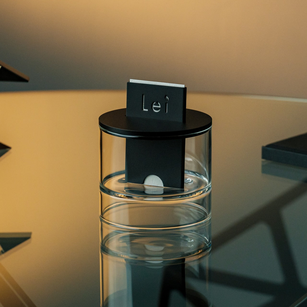
2. Ritual Card Diffuser

Scent diffusion gets stripped to its essence here—no mist clouds, no reed forests, just a simple card insertion that marks the beginning of a fragrance ritual. The mechanism borrows from Japanese train ticketing, where sliding a washi paper card into an anodized aluminum body initiates a slow, controlled release of alcohol-based fragrance oils. It’s diffusion as deliberate practice rather than background ambiance.

The design language stays minimal to the point of zen. Hand-poured oil bases pair with handcrafted Japanese washi paper that absorbs and disperses scent through capillary action alone. Layered glass creates visual lift while the aluminum housing grounds everything with industrial elegance. Fire-free and power-free operation means placement flexibility—nightstands, desks, shelves—anywhere stillness exists. When the oil runs low, refilling takes seconds without disassembly or mess.

Click Here to Buy Now: $89.00

What we like

  • Tactile card insertion transforms scent diffusion into a mindful ritual
  • The patented washi mechanism diffuses fragrance without heat or electricity
  • Compatible with premium alcohol-based fragrance oils
  • Zero maintenance beyond simple oil refills and card replacements
  • Anodized aluminum body offers durability with refined aesthetics

What we dislike

  • Limited to alcohol-based fragrances rather than universal compatibility
  • Scent throw remains subtle compared to powered diffusers
  • Replacement washi cards create ongoing consumable costs

3. Key Holder Wakka

Lost keys cause daily chaos. This magnetic key holder solves that problem by making the act of placing keys genuinely satisfying—so satisfying you’ll actively want to do it. The system combines a wooden base with a metal keyring, held together by a powerful neodymium magnet that releases with a crisp, surprisingly soothing tap when pulled apart. That sonic feedback creates instant habit reinforcement every single time.

Material choices elevate this beyond typical key storage. Choose between maple or walnut bases, each paired with a stainless steel, brass, and iron keyring that carries proper weight. The magnetic hold stays strong enough to prevent accidental drops yet releases smoothly with intentional pulling. Placed near an entryway, it becomes a calming transition point between outside chaos and home sanctuary—a small ritual that anchors your arrival routine with sensory pleasure instead of mindless muscle memory.

Click Here to Buy Now: $45.00

What we like

  • Neodymium magnet provides a secure hold without accidental releases
  • Satisfying tapping sound creates positive habit reinforcement
  • Available in maple or walnut wood base options
  • Multi-metal keyring construction adds premium tactile weight
  • Elegant desk or entryway presence doubles as decor

What we dislike

  • Limited to a single keyring capacity per base unit
  • The wood base requires occasional maintenance to preserve the finish
  • The magnetic field may interfere with certain proximity cards

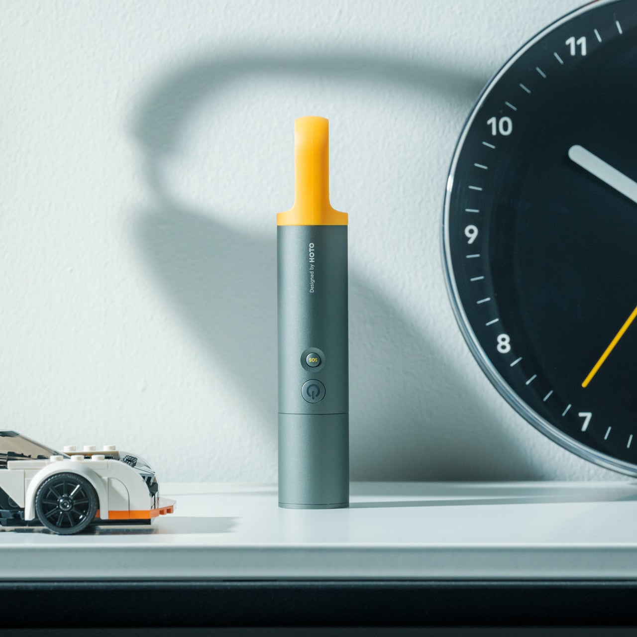
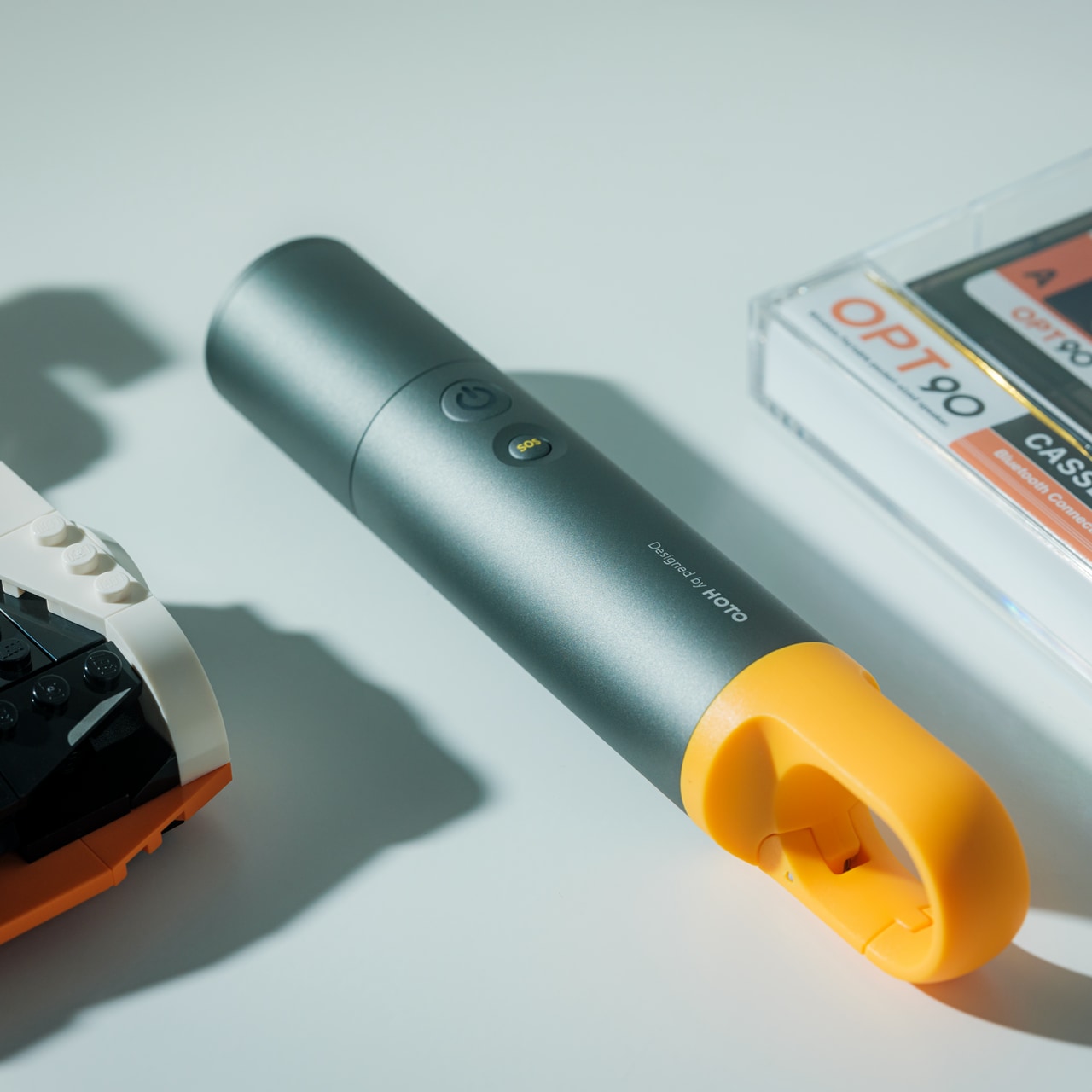
4. CasaBeam Everyday Flashlight

Most flashlights get buried in junk drawers until emergencies strike. This one stays visible because it actually deserves counter space, blending minimalist form with dual-mode versatility that works as both a handheld beam and a freestanding lantern. The 1000-lumen output reaches 200 meters in spotlight mode, while the adjustable zoom head twists to flood light across entire rooms when needed.

Stand it upright and watch it transform into ambient lighting for reading, dining, or a power outage calm. Five modes span three brightness levels plus two SOS settings, all controlled through an intuitive two-button operation that stays simple even when fumbling in darkness. The 2,600mAh battery delivers up to 24 hours on low settings, recharging via USB-C hidden beneath the zoom head to maintain clean visual lines. A bright yellow hanging loop adds practical mounting options while serving as the design’s only color accent.

Click Here to Buy Now: $49.00

What we like

  • Powerful 1000-lumen beam with 200-meter reach
  • Adjustable zoom toggles between spotlight focus and flood illumination
  • Upright stance converts flashlight into hands-free lantern mode
  • The hidden USB-C port maintains a minimalist profile while enabling fast charging
  • Integrated yellow loop enables tent and bag hanging
  • Smart three-color battery indicator prevents unexpected shutdowns

What we dislike

  • Built-in battery means no field-swappable power options
  • The yellow loop may not suit all aesthetic preferences
  • The zoom mechanism requires periodic cleaning to maintain smooth operation

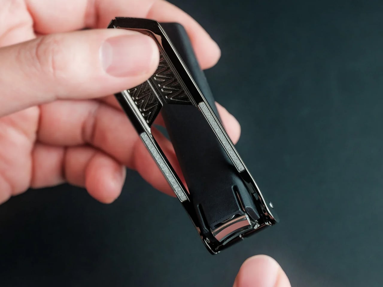
5. Auger PrecisionLever Nail Clipper

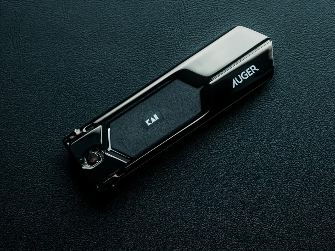
Grooming tools rarely warrant much attention until you encounter one engineered like actual equipment. Kai Corporation—Japan’s blade authority since 1908—designed this clipper around a patented rotating lever mechanism that shifts the pivot point closer to the cutting edge. The result delivers cleaner cuts through thicker nails using less hand pressure while maintaining surgical control throughout each clip.

At 67 grams, the clipper carries satisfying heft that signals quality without bulk. The 86mm compact form slips into dopp kits and desk drawers with equal ease. Stainless cutlery steel blades slice cleanly without tearing or splitting, producing smooth edges that rarely snag fabric afterward. Zinc die-cast lever components wear a sleek plated finish while the thermoplastic stopper and integrated filing surface round out the material story. The press-and-release action stays whisper-quiet and consistently smooth—precision you can feel with every trim.

Click Here to Buy Now: $49.00

What we like

  • Patented rotating lever optimizes cutting pressure distribution
  • Stainless cutlery steel blades deliver clean cuts without nail splitting
  • Weighted 67-gram feel provides stable control during use
  • Compact 86mm length fits grooming kits and drawers easily
  • Quiet operation maintains subtlety during use
  • Refined material selection ensures long-term performance consistency

What we dislike

  • Premium price point exceeds basic clipper budgets
  • The rotating mechanism requires occasional cleaning for optimal performance
  • Compact size may challenge users with larger hands

6. Sakura Petal Grater

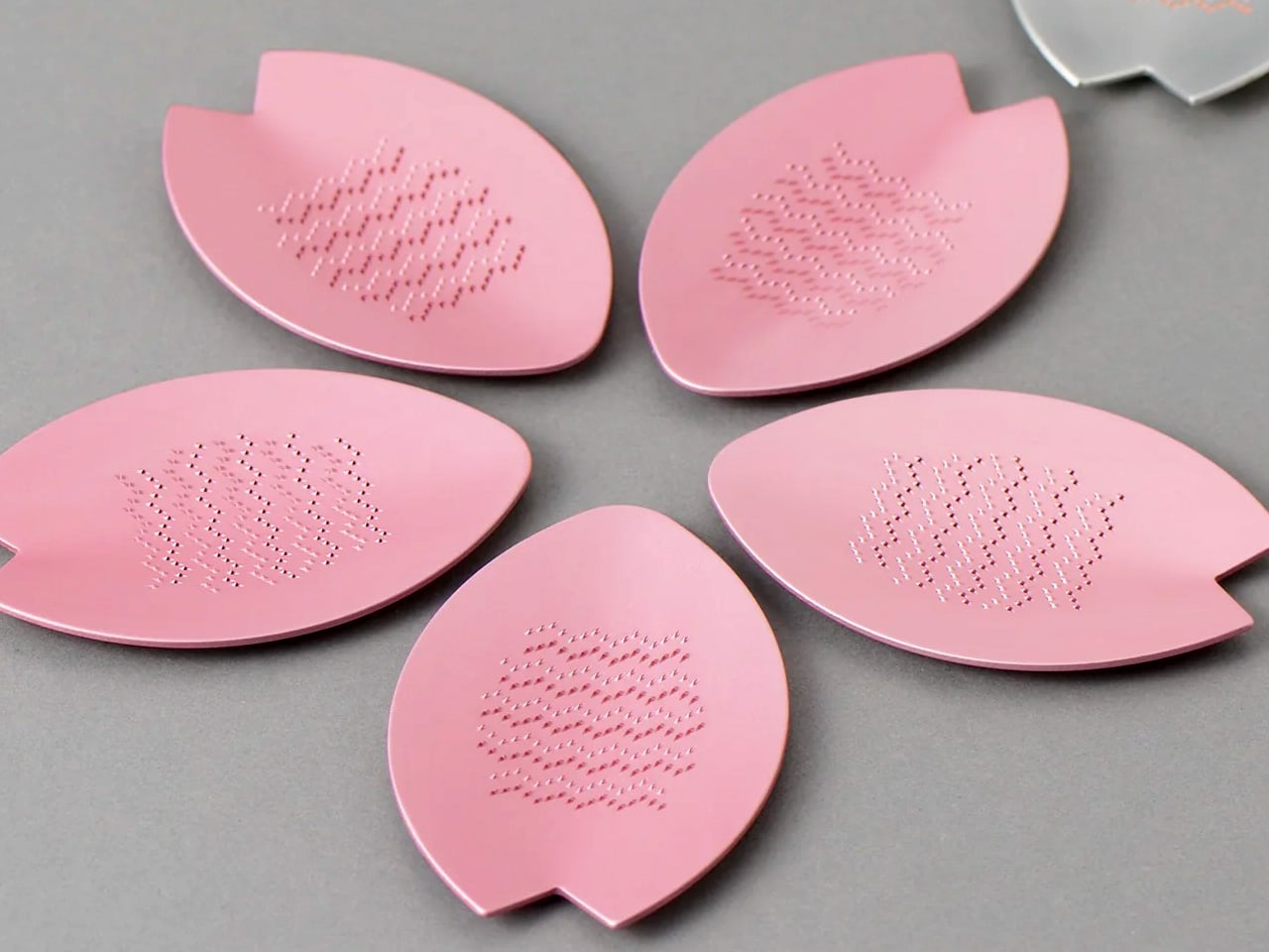
Culinary tools become art objects when Japanese heritage meets functional design. Tsuboe created this sakura blossom-shaped grater to commemorate the Ōkōzu Diversion—a historic flood control project that transformed the Shinano River region—while delivering razor-sharp grating performance for ginger, wasabi, garlic, and citrus zest. The petal silhouette fits comfortably in your palm while adding genuine beauty to any kitchen environment.

Two material options define the aesthetic. The pink edition features lightweight aluminum alloy with a vibrant anodized finish inspired by cherry blossoms lining river levees. The silver edition showcases pure copper with tin plating that creates a luminous interplay between metals while adding substantial heft. Precision-raised blades crafted via custom NC machines maintain sharpness through countless uses. Commemorative packaging includes sakura motifs and story cards celebrating the cultural heritage behind each grater’s creation—transforming kitchen prep into a connection with Japanese craftsmanship traditions.

Click Here to Buy Now: $25.00

What we like

  • Sakura petal shape brings functional elegance to kitchen spaces
  • Custom NC machine blades ensure consistent sharpness
  • Choice between aluminum or copper construction with distinct finishes
  • Palm-sized form suits tableside grating applications
  • Commemorative packaging adds gifting narrative depth
  • Heritage storytelling connects users to Japanese cultural history

What we dislike

  • Premium materials command a higher price versus standard graters
  • Small size limits large-volume grating tasks
  • The copper edition requires occasional polishing to maintain luster

7. DraftPro Top Can Opener

Cracking a cold can usually mean sipping through a narrow opening that traps aroma and limits taste. Award-winning designer Shu Kanno reimagined that moment, creating a precision opener that removes the entire top to deliver glass-like drinking experiences straight from the aluminum. The smooth-edged cut transforms canned beer, sparkling water, and premixed cocktails into proper vessels where you catch every aromatic note.

Beyond elevated sipping, practical advantages multiply quickly. Drop ice cubes directly into opened cans for instant chilling on hot days. Mix cocktails inside the can itself—no shaker, no cleanup, no glassware. Universal sizing works across domestic and international CAN standards, so you’re never caught without compatibility. The lightweight, portable build makes it easy to pack for camping, tailgates, or beach days. Used cans become mini planters or desk organizers thanks to the clean, safe edge. Japanese design discipline shows through every detail—smooth opening motion, comfortable grip, zero visual excess.

Click Here to Buy Now: $59.00

What we like

  • Complete top removal enables full aroma and taste access
  • Smooth edge allows safe, direct ice cube additions
  • Can-based cocktail mixing eliminates shaker cleanup
  • Universal fit works with domestic and international can sizes
  • Lightweight portability suits outdoor and travel use
  • Clean cut facilitates creative can reuse and recycling

What we dislike

  • Single-purpose tool adds to kitchen gadget collection
  • Opening motion requires a brief learning curve for the technique
  • Sharp cutting mechanism demands careful handling and storage

8. Titanium Artisan Spirits Cup

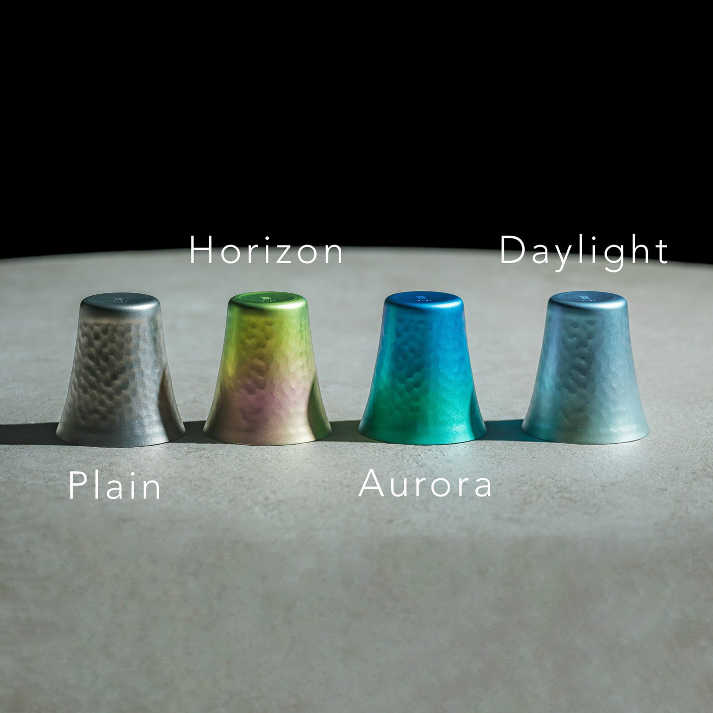
Spirits deserve glassware that enhances rather than distracts from their complexity. This titanium vessel weighs just 22 grams yet delivers sensory amplification through hammered texture that lifts aromatic compounds, while the ultra-thin rim ensures clean flavor contact. At 2.05 inches in diameter by 2.17 inches in height, it fits sake, tequila, and whiskey servings with equal grace.

Titanium construction brings unexpected benefits beyond durability. The metal maintains temperature without rapid heat transfer from your hand, keeping chilled spirits cold longer. Vibrant anodized finishes create unique color variations across each cup—no two look identical, adding bespoke character to any collection. The hammered surface provides subtle grip texture while refracting light beautifully. Compact dimensions suit modern interiors and outdoor settings alike, transitioning seamlessly from home bars to campfire toasts. Minimalist elegance meets practical performance in a cup engineered for connoisseurs who value both flavor clarity and design integrity.

Click Here to Buy Now: $27.00

What we like

  • Ultra-light 22-gram weight enhances portability and comfort
  • Hammered texture amplifies aromatic profiles during sipping
  • Thin rim ensures clean flavor contact without interference
  • Unique anodized finishes create individualized color variations
  • Titanium construction offers exceptional durability
  • Compact size suits diverse spirit types and settings

What we dislike

  • Hand-wash requirement adds care steps versus dishwasher convenience
  • Premium titanium pricing exceeds standard glassware budgets
  • Small capacity limits the use to spirits rather than mixed drinks

9. Levitating Pen

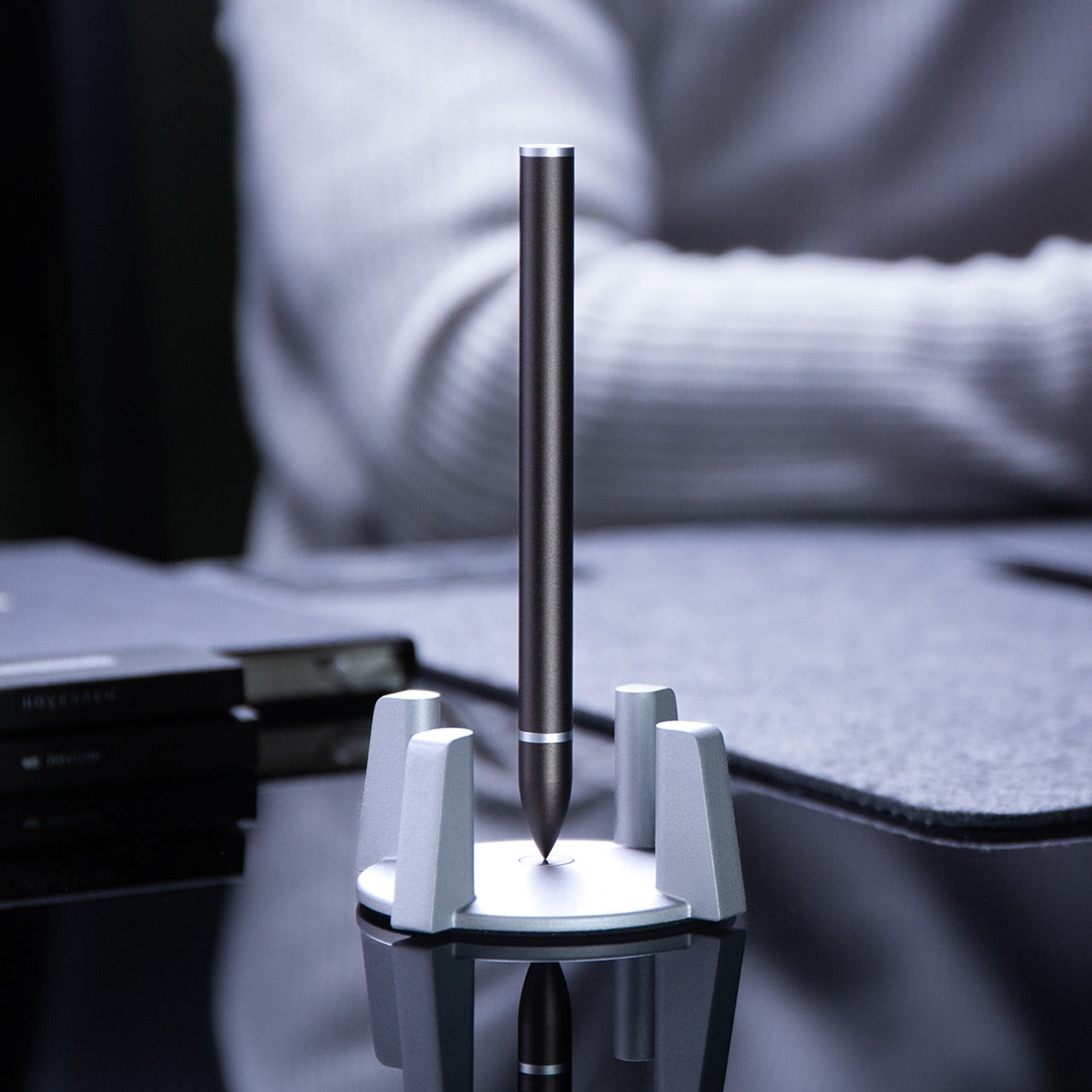
Most desk accessories serve function or form—rarely both with equal commitment. This gravity-defying pen floats vertically above its magnetic pedestal without batteries or electronics, transforming writing tools into kinetic sculpture. The invisible magnetic field holds the pen suspended and spinning with the gentlest touch, creating mesmerizing motion that offers mental breaks during intense work sessions.

Engineering precision makes the magic possible. High-precision CNC machining maintains tolerances under 0.1mm—the same manufacturing standards used for Apple products—enabling perfect hover balance and fluid rotation. Swiss-made ballpoint cartridges deliver smooth, reliable writing performance while Cross-brand refills ensure long-term usability. The magnetic cap provides instant access without fumbling. Whether spinning hypnotically during calls or standing elegantly between uses, the pen becomes a source of inspiration and relaxation. Sleek aesthetics meet practical function in a design that professionals, artists, and engineers appreciate equally for performance and presence.

Click Here to Buy Now: $79.00

What we like

  • Battery-free magnetic levitation creates a captivating desk presence
  • High-precision CNC machining ensures a flawless hovering balance
  • Swiss-made ballpoint cartridge delivers premium writing smoothness
  • Easy refill compatibility with standard Cross-brand cartridges
  • Magnetic cap enables quick single-handed access
  • Mesmerizing spin motion provides stress relief and inspiration

What we dislike

  • The pedestal requires desk space and a stable surface placement
  • The magnetic field may interfere with nearby electronics or cards
  • Premium price reflects complex manufacturing requirements

10. Heritage Craft Unboxing Knife

Box cutters typically hide in drawers because they look utilitarian at best. This one deserves prominent desk placement, carved from solid aluminum into a form inspired by Paleolithic hand axes—ancient tools reimagined through modern precision machining. Wave-like cutting patterns create visual intrigue while providing secure grip texture. The circular shape and tapered profile feel substantial in hand, while the raw metal aesthetic radiates both mystery and intentional design.

Aluminum once commanded prices higher than gold, and this knife showcases the material’s inherent luster and satisfying weight. Milling from a solid block rather than casting ensures structural integrity and refined surface quality. The blade slices through packing tape and cardboard with surgical ease, while the distinctive form starts conversations whenever someone spots it. Placing this on your desk signals appreciation for objects that blend utility with artistry—tools that inspire rather than just serve. Unboxing packages becomes a moment of tactile pleasure rather than a mindless routine.

Click Here to Buy Now: $99.00

What we like

  • Paleolithic hand axe inspiration creates a distinctive sculptural form
  • Solid aluminum construction showcases material luster and a premium feel
  • Precision machining produces wave patterns that enhance grip security
  • Tapered shape balances visual weight with handling comfort
  • Desk-worthy aesthetics encourage display rather than drawer storage
  • Sharp blade handles tape and cardboard efficiently

What we dislike

  • Exposed blade design requires careful handling and storage
  • Aluminum softness may show wear marks over extended use
  • Unconventional shape requires adjustment for traditional box cutter users

The Gift That Keeps Getting Stolen

Stocking stuffers reveal their true value in the days after unwrapping, when practical magic beats flashy excess every time. These ten designs prove that thoughtful gifts don’t require three-digit budgets or oversized boxes—just genuine utility wrapped in forms people actually want to touch, use, and keep within arm’s reach. They’re the presents that migrate from stockings to pockets to daily rotation faster than anyone expects.

Smart gifting means choosing objects that respect both giver and recipient through lasting quality and daily relevance. Each of these pieces delivers experiences beyond their physical size, turning mundane moments into small rituals worth savoring. Whether someone’s grating ginger, opening mail, or taking mental breaks with a spinning pen, these are the gifts that prove you paid attention to how people actually live rather than what they might politely accept.

The post 10 Best Tiny Gifts Under $100 Everyone Steals From Stockings First first appeared on Yanko Design.
Yale Engineers Created a 3D-Printed Carbon-Fiber Cello That That Never Cracks or Warps

Traditional wooden cellos and violins are exquisite but fragile. They crack in dry weather, warp in humidity, and require constant environmental monitoring. A professional instrument can cost tens of thousands of dollars, yet one bad flight or unexpected temperature change can cause irreversible damage. This vulnerability has long kept quality instruments out of reach for traveling musicians, students in varied climates, and performers who need reliability above all else.

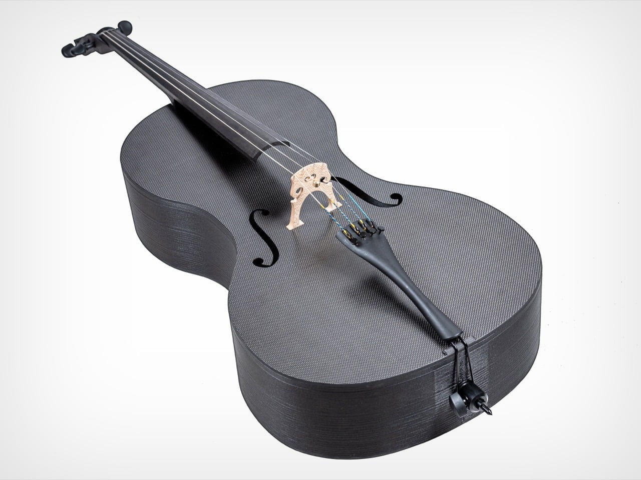
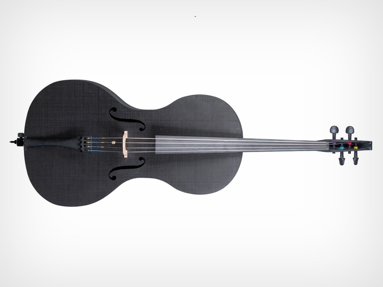
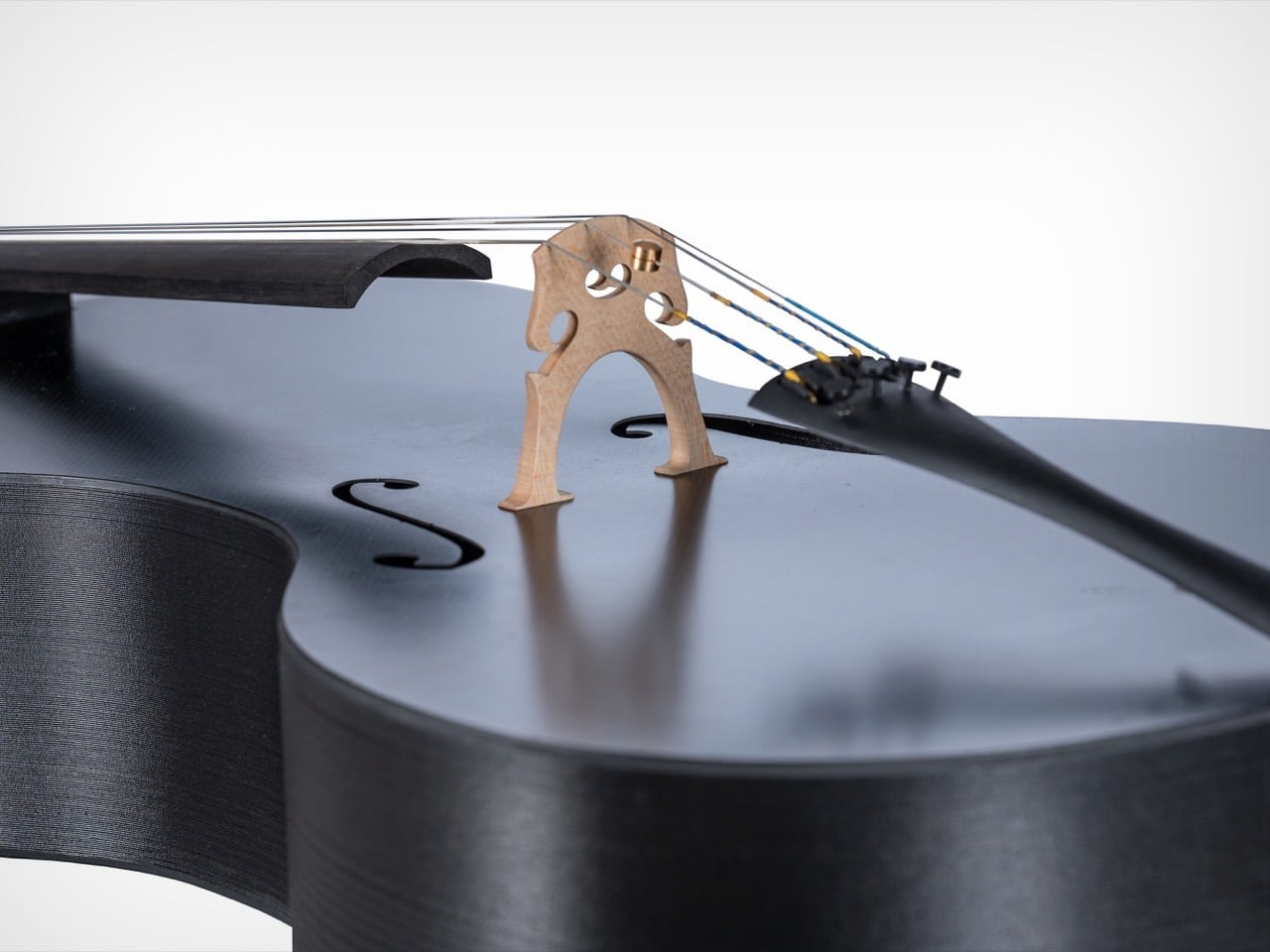
Forte3D’s answer combines 3D printing technology with carbon fiber construction. The team, led by Yale student Elijah Lee and co-founder Alfred Goodrich, created instruments with flat carbon fiber panels and 3D printed polymer components that maintain their shape regardless of environmental conditions. The sound quality matches traditional instruments because the team used computer-aided design to control every structural element and dial in the acoustics precisely. These instruments also include adjustable string heights and smooth tuning mechanisms, making them accessible for players at different skill levels.

Designer: Forte3D

The project originated from a practical challenge. Lee’s orchestra director asked if he could use his early 3D printing skills to design a cello that was strong, low cost, and easy for more people to use. Rather than simply replicating traditional designs in new materials, Lee and Goodrich rethought the entire structure. They tested different thicknesses and configurations using computer-aided design tools, discovering they could shape the sound in more controlled ways than traditional luthiers. This digital precision allowed them to dial in the acoustics by controlling every part of the structure.

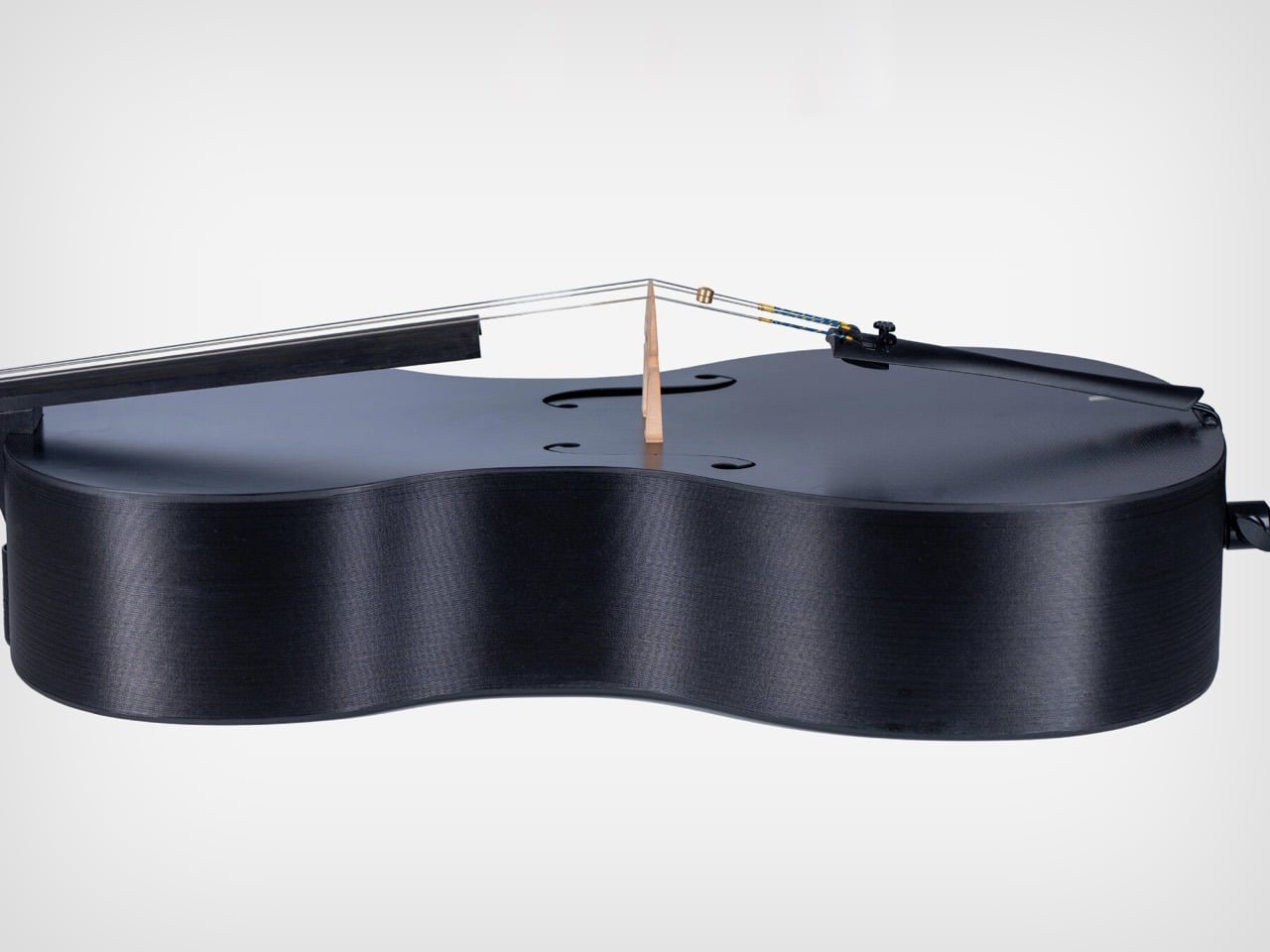
The final design breaks from tradition in significant ways. The top and back panels are made from carbon fiber and shaped as flat and concave surfaces rather than carved forms. The ribs and neck come from 3D printed polymer material. However, certain classical elements remain unchanged because they work perfectly as they are. The sound post, fingerboard, and bridge are still made using traditional methods and materials, creating a hybrid that respects acoustic principles while embracing modern durability.

Carbon fiber’s core advantage is its stability. Unlike wood, which expands and contracts with atmospheric changes, carbon fiber maintains its dimensions regardless of humidity or temperature. This means musicians can bring their instruments to outdoor performances, different climates, or even extreme environments without worrying about structural damage. The material also eliminates the need for specialized maintenance products. A simple cloth and common household cleaners are sufficient to keep these instruments in excellent condition.

Forte3D also addressed playing comfort, which directly affects technique and long-term health. When strings sit too high or too low, musicians experience hand pain and their personal technique becomes harder to execute. The team built in an adjustable string height system that lets each player move the strings up or down using a small tool that comes with the instrument. The cello also includes smoothly moving tuning pegs and tools for stopping wolf tones, which are unwanted resonances that plague certain notes on string instruments. A printed guide ensures the bridge sits in the correct position, and all these design elements work together to support both playing comfort and sound production.

The violin version carries the same philosophy. Players can adjust string height to match their needs, and the body features a hole at the back to support sound flow. Like the cello, it ships with strings and tuning pegs designed for easier tuning. Both instruments handle weather changes and physical bumps that would damage wooden counterparts. For the Forte3D team, these instruments are not about making a style statement. They focus on what musicians actually need, which means less worry about damage, easier carrying, simpler care, and lower cost. The result is an instrument that honors centuries of acoustic development while finally freeing musicians from the constraints that wood has always imposed.

The post Yale Engineers Created a 3D-Printed Carbon-Fiber Cello That That Never Cracks or Warps first appeared on Yanko Design.

Student Team Builds Modular EV You Can Actually Repair Yourself

In most modern EVs, the battery pack lives deep inside a sealed structure that only brand-approved technicians ever see. A student team in the Netherlands decided that design logic works against long-term sustainability and affordability, so they built ARIA, a compact electric city car that treats owner repair as a core feature rather than an afterthought. The bright blue prototype with its upward-opening doors represents the tenth vehicle from TU/ecomotive at Eindhoven University of Technology, and it carries a philosophy that feels almost countercultural in 2025: if you own it, you should be able to fix it.

Designer: Students at TU/ecomotive at Eindhoven University of Technology

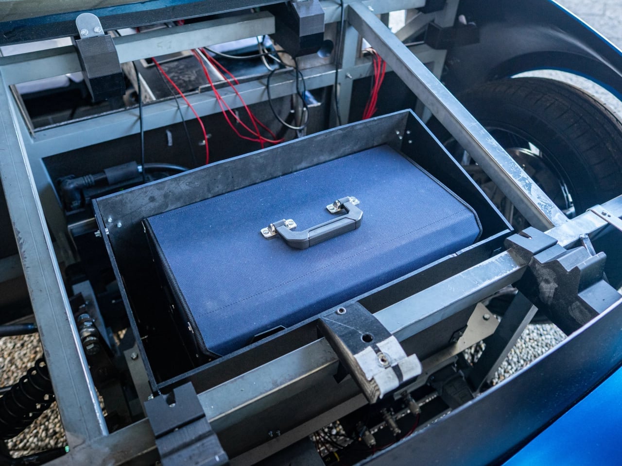
The name stands for “Anyone Repairs It Anywhere,” and the team took that promise seriously. Six independent battery modules sit accessible from the vehicle’s side without needing a lift. Exterior panels are designed for quick removal and refitting using standardized fasteners, so cosmetic damage can be addressed at home. A companion app reads the car’s status and walks owners through maintenance procedures. The team even ships a built-in toolbox with the vehicle, which signals exactly how they expect ARIA to be used.

What makes this project notable is not the ambition alone. Student teams have built conceptual EVs before, including earlier TU/ecomotive prototypes that scrubbed CO2 from the air or used recycled ocean plastic. ARIA differs because it tackles a problem that actually keeps EV owners awake at night: repair costs that can exceed the vehicle’s value when something goes wrong.

Why Modularity Changes the Repair Equation

Traditional EV battery packs are monolithic units, heavy and powerful but designed as single replaceable components. When one cell cluster degrades or fails, the entire pack often needs replacement. With too few mechanics trained on electric drivetrains and proprietary diagnostic systems locking out independent shops, repairs drag on for weeks. Costs climb into thousands of dollars. Some owners simply scrap functional vehicles because fixing them costs more than replacement.

ARIA’s architecture inverts that logic completely. The 12.96 kWh battery capacity splits across six independent modules, each weighing just 12 kilograms. Each of the six battery modules is light enough to handle manually, so an owner can remove a faulty unit and slot in a replacement instead of changing out an entire pack. The app identifies which module is underperforming, and the side-access design means you can reach it without crawling under the car or booking shop time.

The body panel system follows the same philosophy. A Summa student specifically devised the modular exterior approach, prioritizing repair speed over traditional automotive construction. If a fender gets scratched in a parking lot, the idea is to keep the fix in your driveway instead of at a service center: unbolt the damaged section, order a replacement, and install it yourself. According to the team, the whole process moves fast enough to make body shop appointments feel unnecessary.

This granular approach to vehicle architecture extends beyond convenience into genuine sustainability territory. Extending a vehicle’s usable lifespan by making repairs accessible keeps functional cars out of recycling streams longer. The environmental calculus of EVs depends heavily on how long vehicles stay on the road, since manufacturing emissions only pay off over years of use. A car you can maintain yourself has a better chance of reaching that payoff.

The Numbers Behind the Concept

ARIA reaches a maximum speed of 56 mph with a range of approximately 137 miles on a full charge. Those numbers position it firmly as an urban commuter, not a highway cruiser. The specifications make sense for the repair-focused mission: simpler systems mean fewer components that can fail and more accessible maintenance when they do.

The battery modules are accessible without specialized equipment. Team member Marc Hoevenaars, a computer science student at TU/e, emphasized that repositioning components requires no tools or prior experience. The diagnostic app reads vehicle status and provides maintenance guidance, essentially serving as a digital repair manual tailored to the specific car.

Built in approximately one year by students from TU Eindhoven, Fontys, and Summa, ARIA represents what a small team can accomplish when unconstrained by legacy manufacturing processes. The bright blue exterior and dramatic upward-opening doors add visual flair, but the real engineering statement lives in the underlying architecture.

Where ARIA Fits in a Crowded Concept Space

Modular vehicle concepts have appeared before with mixed results. The German startup ElectricBrands developed XBUS, imagining Lego-like body swaps that would let owners transform a camper into a pickup truck. Funding shortfalls stalled that project. Kia’s PV5 uses electromagnetic “Easy Swap” technology for commercial fleet reconfiguration between taxi and cargo van modes, but targets businesses with dedicated infrastructure rather than individual owners.

ARIA pursues something different: enabling owners to maintain their own vehicles rather than transforming them into other configurations. The team points to Europe’s emerging right-to-repair rules, which currently focus on appliances and electronics, as the policy backdrop for their work. Their argument is that passenger EVs should be held to the same standard of openness and longevity, and ARIA serves as their working example of how that might look in practice. Team manager Taco Olmer frames ARIA as a right-to-repair showcase, arguing that EV owners deserve genuine control over their vehicles rather than being locked into dealer-only service networks.

Reality Check: What ARIA Is and Is Not

The team has no plans to commercialize ARIA, which means the prototype’s long-term durability under actual driving conditions remains untested. Whether the modular design proves as repair-friendly as claimed after hundreds of hours on real roads is an open question. Splitting a vehicle into smaller independent modules might introduce maintenance challenges that traditional integrated designs avoid, particularly around weather sealing and connection reliability over time.

The specifications also limit practical applications. A 137-mile range and 56 mph top speed work fine for urban commuting in the Netherlands, where distances are short and speed limits modest. Drivers with longer commutes or highway requirements would find ARIA insufficient regardless of how easy it is to repair.

Still, the project succeeds as a proof of concept and a policy statement. If a student team can build an owner-repairable EV in roughly a year, the major manufacturers choosing sealed, dealer-dependent designs are making a business decision rather than following engineering necessity. Whether that message reaches the automotive industry remains to be seen, but ARIA at least demonstrates the alternative exists.

The post Student Team Builds Modular EV You Can Actually Repair Yourself first appeared on Yanko Design.

Inception’s Anti-Gravity Hallway Fight Scene Just Got Rebuilt in 2,395 LEGO Bricks

In 2010, Christopher Nolan delivered one of cinema’s most unforgettable sequences: a zero-gravity hallway fight that defied physics and redefined practical effects. The scene from Inception featured Joseph Gordon-Levitt battling an opponent while their dreamworld corridor rotated around them, mirroring a van tumbling down a hill in another layer of reality. Nolan’s commitment to practical filmmaking led him to construct a massive rotating set where actors performed the entire sequence for real, creating what many consider a masterclass in tactile, analog special effects.

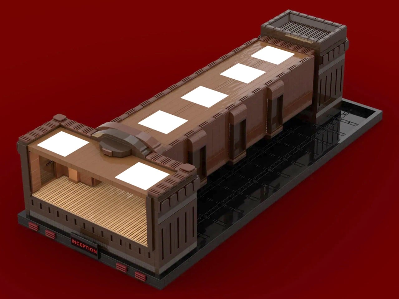
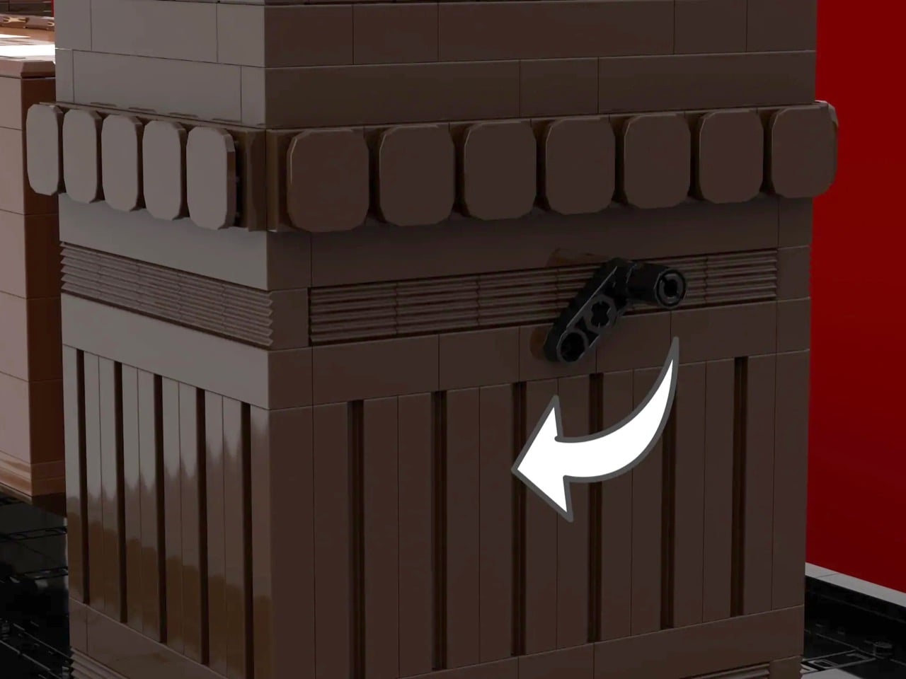
Now, a LEGO builder known as AboveBricks180 has recreated that iconic moment in brick form, complete with a working rotation mechanism. The 2,395-piece MOC (My Own Creation) doesn’t just capture the aesthetic of the hotel hallway. It brings the scene to life with a hand-crank system that lets you physically rotate the corridor, repositioning the minifigures mid-fight just like in the film. Currently seeking support on LEGO Ideas with 770 backers and counting, this build represents both technical ambition and genuine love for one of modern cinema’s most inventive sequences.

Designer: AboveBricks180

Building a stable rotating mechanism in LEGO that can support its own weight while maintaining structural integrity across multiple axes is legitimately difficult (as Nolan will tell you from larger-scale real-life experience). You’re essentially creating a drum that needs to spin smoothly without the whole thing collapsing or jamming, all while keeping minifigures positioned on surfaces that become walls, then ceiling, then floor. AboveBricks180 solved this with a hand-crank lever mounted at the back, connecting to the cylindrical hallway section through what appears to be a geared system housed in that dark grey mechanical compartment visible in the side views. The entire assembly sits on a display base that provides both stability and theatrical presence, with the “INCEPTION” nameplate doing some heavy lifting in terms of presentation. Fifteen years after the film’s release and people are still building elaborate tributes to a single three-minute sequence, which tells you something about how deeply that hallway fight embedded itself in pop culture consciousness.

Look at the color work and interior detailing. The film’s hotel corridor had this specific warm brown and tan aesthetic, almost Art Deco in its geometric simplicity, and this MOC captures it down to the wall sconces with their cream-colored light elements, the vertical brown slat work on the ceiling, the white ceiling panels, the door frames. Strip away the movie-accurate design work and you’re left with a clever mechanical toy. Add in the precise replication of Nolan’s set design and suddenly you have something that feels like it belongs in the film’s universe. The builder used Bricklink Studio for the design work, which tracks given the complexity involved. You can’t eyeball 2,395 pieces and hope for the best.

Turn that crank and watch the hallway rotate while Arthur and his opponent stay locked in their fighting poses. You can stage the scene at any angle you want, recreating different moments from the sequence. Arthur hanging from what’s now the ceiling? Rotate. Both grappling on the floor as it becomes a wall? Keep turning. This interactivity transforms the build from static sculpture into something closer to a kinetic toy, which feels appropriate given LEGO’s roots as a play system rather than just a modeling medium. Too many Ideas submissions lately treat LEGO as purely an artistic medium for adults, forgetting that the best sets balance display appeal with actual functionality. This one remembers.

Getting to 10,000 supporters on the Ideas platform means LEGO reviews it for potential production. Right now this sits at 770 with 403 days remaining, which feels achievable given Inception’s enduring cultural footprint. The rotating hallway scene specifically has staying power because it represents practical filmmaking at its most ambitious, the kind of thing that makes people go “wait, they actually built that?” when they learn no CGI was involved. AboveBricks180 clearly understands this, building something that honors both Nolan’s commitment to physical effects and the scene’s place in modern cinema history. Whether LEGO greenlights this for production or it remains a fan creation, the MOC succeeds at translating one medium’s impossible physics into another’s playful reality. You spin a crank and gravity shifts. Dreams feel real while we’re in them, and apparently so do LEGO sets when someone builds them with this much care. Vote for the build on the LEGO Ideas website here.

The post Inception’s Anti-Gravity Hallway Fight Scene Just Got Rebuilt in 2,395 LEGO Bricks first appeared on Yanko Design.
Iris Sconce: Hand-Shaped Glass Wall Light Where No Two Are Identical

Most LED sconces are thin metal plates and diffusers, designed to disappear into a wall and quietly meet a lumen spec. That approach is efficient but rarely memorable. The Iris Sconce by Siemon & Salazar is the opposite, a fixture that leans into glass and bronze as expressive materials and treats light as something sculpted rather than simply emitted, turning a functional wall mount into a small piece of living craft.

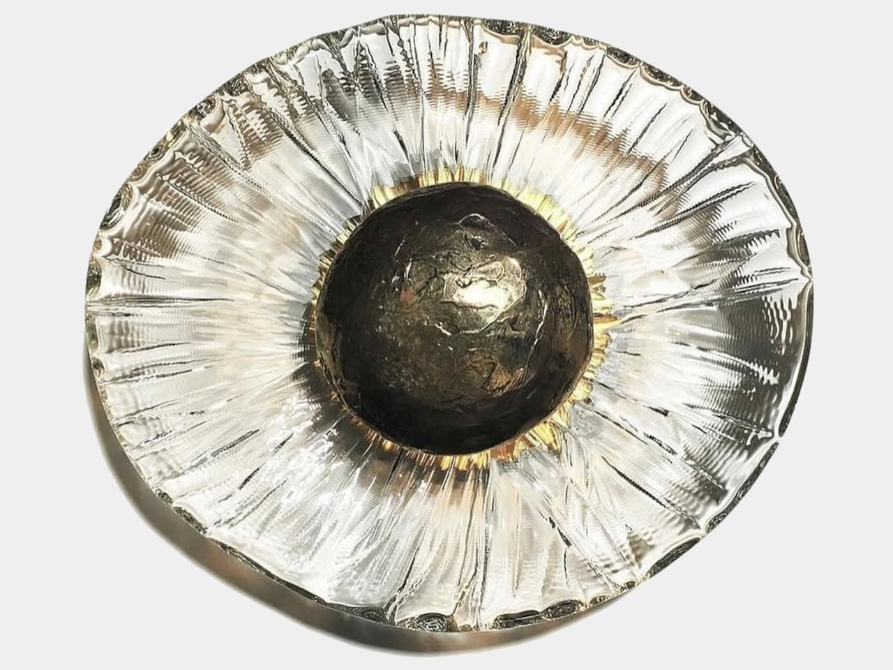
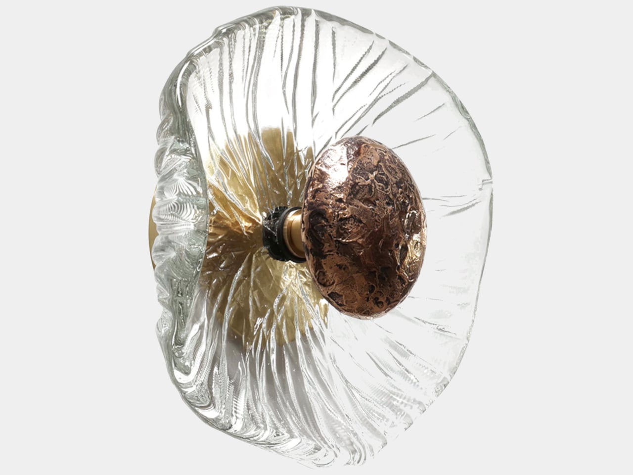
The studio describes Iris as a piece that uses mottled clear thick glass and a cast-bronze heat sink to balance ancient craft with a forward-looking spirit. Each sconce is shaped by hand, with molten crystal poured directly and manipulated immediately, so no molds are used and no two patterns are alike. The result is a fixture that feels more like a living object than a repeated product, where the character comes from the glass itself.

Designers: Caleb Siemon, Carmen Salazar

The glass is lead-free crystal that starts as a glowing pool poured from a crucible, then worked while still hot to create ripples, grooves, and thickness variations. That hot-forming process, without molds, means each disc has its own outline and internal weather. For a designer or homeowner, that translates into a wall of light where every piece has a slightly different voice, and where the surface feels more like water frozen mid-flow than a stamped shade.

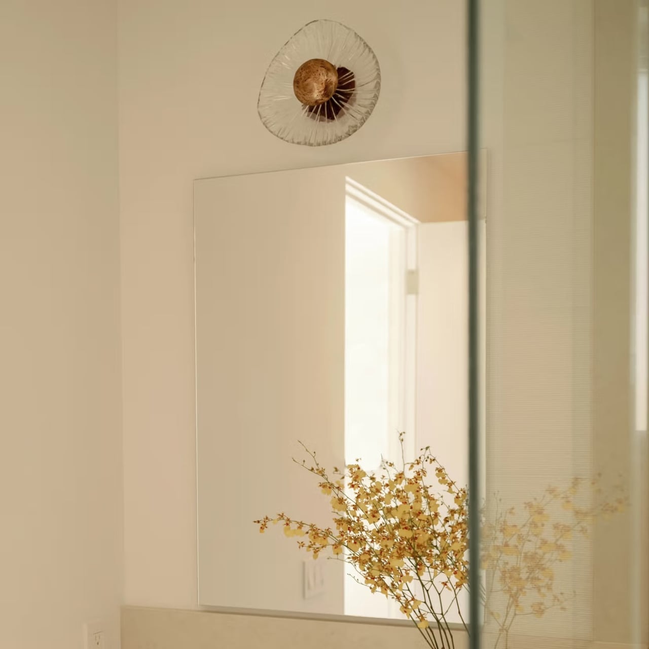
The cast-bronze element at the center acts as both a heat sink for the LED and a visual anchor. Its rough, hammered surface contrasts with the smooth glass, and it reads like a pupil, a seed, or a small meteor embedded in crystal. The bronze conducts heat away from the LED, but it also brings warmth and weight to the composition, grounding the otherwise ethereal glass and giving the sconce a core you can read even from across the room.

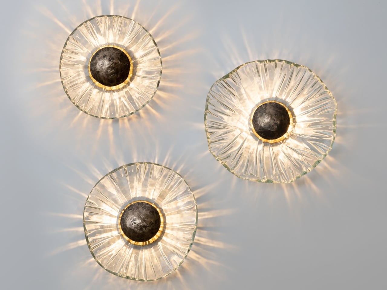
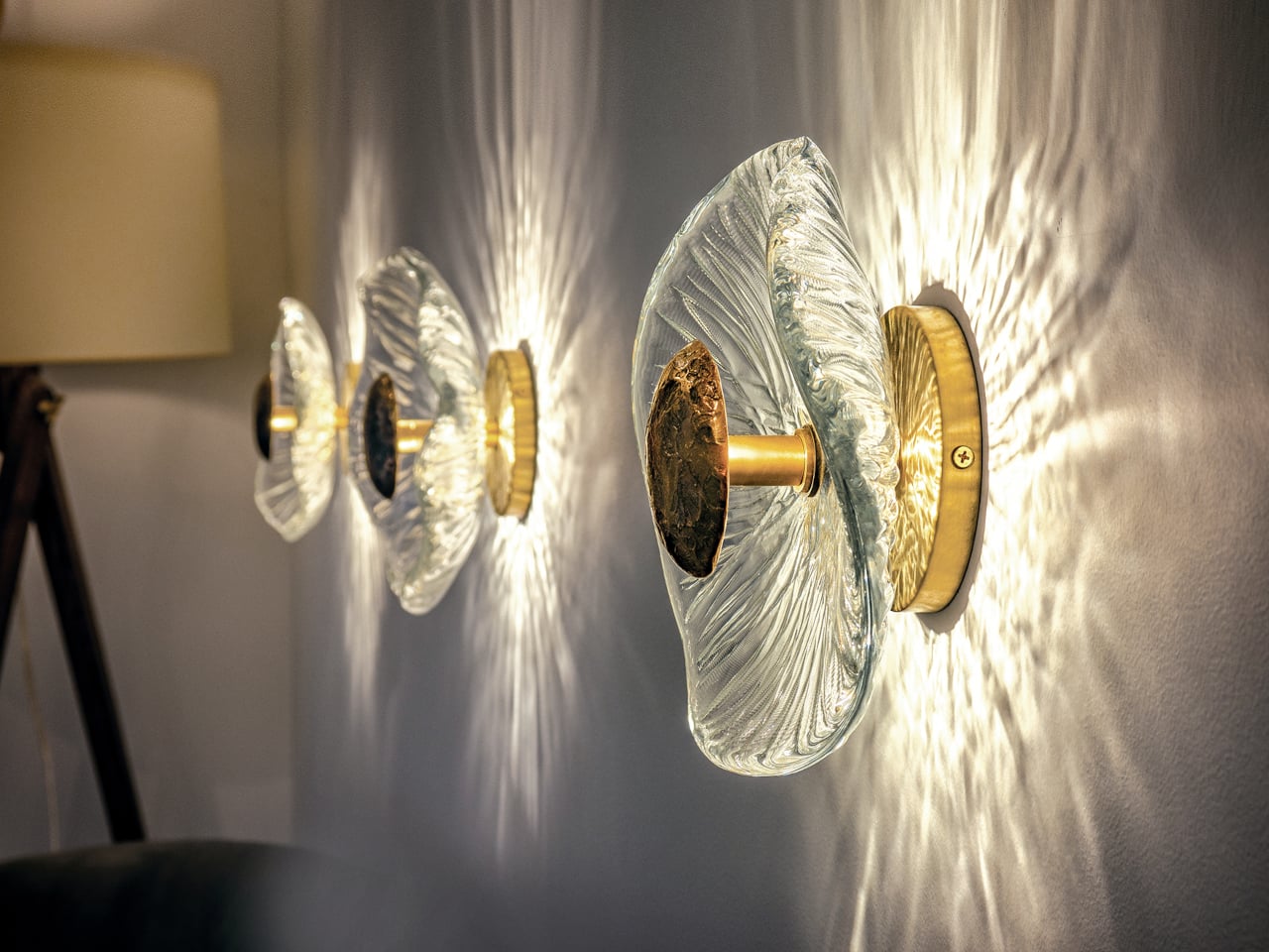
The thick, textured glass behaves more like a lens than a shade, bending and scattering light into a halo on the wall. The LED sits behind the bronze center, so light spills around it into the glass and then out into the room as a corona of streaks and soft gradients. The effect is less about a beam and more about a field, turning a blank wall into part of the fixture itself.

Iris is sized to work as a single focal point above a mirror or as a series along a corridor, and it can be mounted on walls or ceilings. Because no molds are used, grouping several creates a field of related but non-identical eyes or flowers, which suits projects where lighting is meant to be seen. The integrated LED keeps the profile relatively shallow, and the bronze heat sink means the fixture can run for years without fading.

Iris reminds you that even a code-compliant LED fixture can carry the marks of molten glass and cast metal. Each sconce is genuinely unique, not just in finish but in shape and pattern. For people tired of flat panels and generic cylinders, it feels like a small argument for bringing a bit of studio craft back into the everyday act of turning on the lights, where every time you flip a switch, you are also lighting up a piece that was poured, shaped, and cooled into something one of a kind.

The post Iris Sconce: Hand-Shaped Glass Wall Light Where No Two Are Identical first appeared on Yanko Design.

Auk Mini Grows 4 Herbs on Your Counter, No App or Pump Required

The usual indoor herb story goes like this: supermarket pots that die in a week, plastic hydroponic kits that look like lab equipment, and a general mismatch between those gadgets and a carefully considered kitchen. Auk Mini is a Scandinavian take on the problem, a compact indoor garden designed to live on the counter without screaming appliance, especially in its new cork-wrapped edition that adds sustainable texture to clean lines.
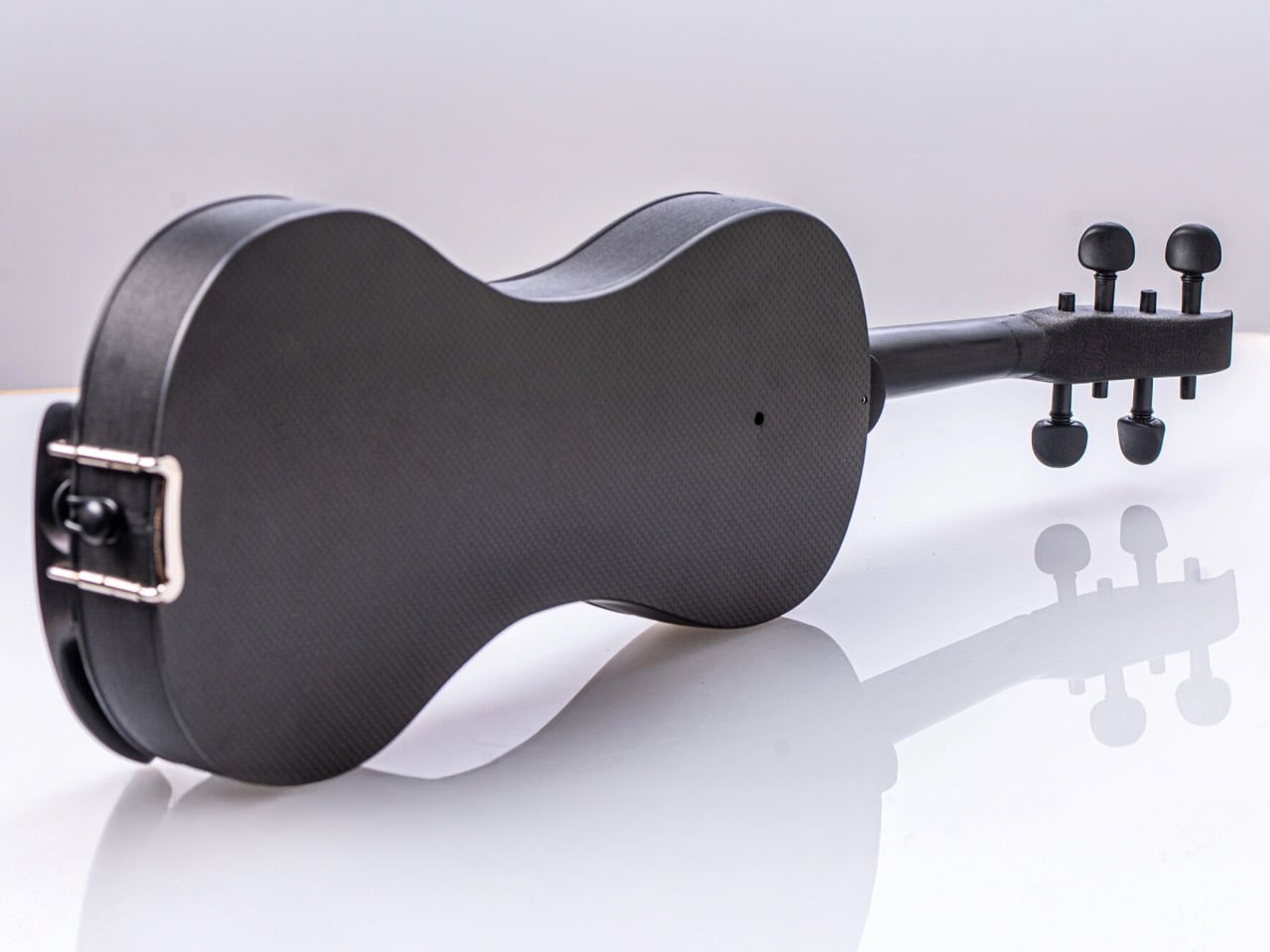

Auk Mini is the smaller sibling to Auk’s original six-pot system, a four-pot hydroponic planter that has already sold more than 100,000 units. The base is now available wrapped in natural cork, alongside oak and walnut finishes, turning the planter into something closer to furniture than a gadget. It ships with a 100-day money-back guarantee and has won awards from T3 and Esquire, but the story is the cork and how it changes presence.

Designer: Auk

The core hardware is a 17.5 × 8.5 inch base with four oval pots over a 0.8 gallon reservoir, flanked by wooden uprights holding a full-spectrum LED bar. There is no pump or app; you fill the tank, add nutrients, set the light cycle, and plants wick water through coco fiber. The light runs a long “summer day” schedule, and you top up water every week or two, checking the side wheel that turns red when empty.

The material mix uses recyclable ABS for the base, recycled aluminum for the light, and American timber for the uprights, then adds the cork wrap. Cork brings warmth, texture, and a sustainable story, softening the white plastic and metal into something that feels at home next to cutting boards and ceramics. The oak and walnut options do a similar job, but cork has a quieter, more neutral presence that works across more interiors.

Auk Mini ships with basil and parsley seeds, but you can use any brand’s seeds, as the system deliberately avoids pod lock-in. Herbs and salads are usually ready in four to six weeks, tomatoes and chilies in eight to twelve. The ideal temperature is around 69–79 °F, and a single crop can last four to ten months if you harvest little by little from the top, encouraging new growth and keeping the plants productive.

Maintenance is a simple loop: refill water and nutrients, harvest regularly, and occasionally swap out the coco fiber. Auk sells refill kits with coco fiber and nutrients for $35, and recommends fresh fiber for each new crop, though you can reuse it. Cleaning between crops is a quick rinse and wipe, not a full teardown, which keeps the system feeling more like a kitchen tool than a science project.

Auk Mini, especially in cork, is designed to disappear into daily life. It is a planter that looks good enough to leave out, a light that doubles as a soft counter glow, and a routine that boils down to topping up water and snipping herbs. For people who want fresh basil without babysitting pots on a windowsill or dealing with finicky smart gardens, it feels like a quiet, well-designed compromise between nature and the realities of indoor living.

The post Auk Mini Grows 4 Herbs on Your Counter, No App or Pump Required first appeared on Yanko Design.