At the end of the 1990s, when most PC mice were beige, ball-based, and capped at a few hundred DPI, the original Razer Boomslang showed up with a weird snake-head shape and a 2,000-DPI mechanical sensor. Razer now calls it the world’s first gaming mouse, and whether or not you want to argue that title, it definitely helped turn the mouse from a beige accessory into a performance peripheral that people obsessed over.
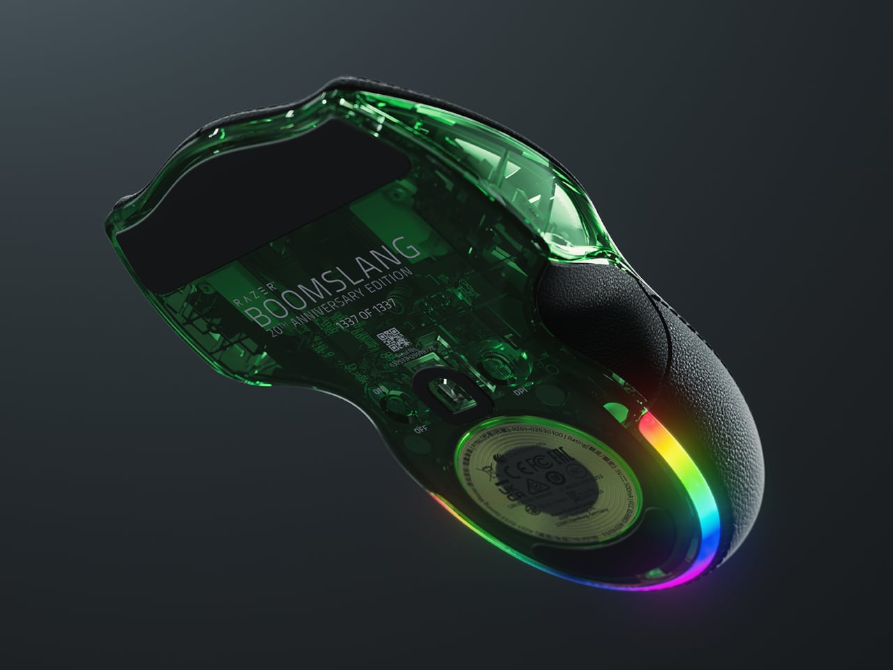
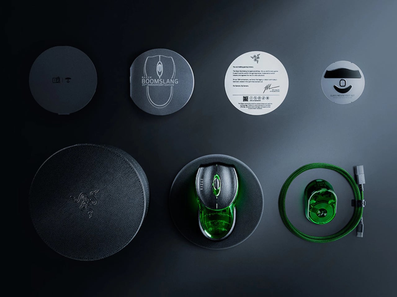
The Boomslang 20th Anniversary Edition is Razer’s way of revisiting that moment with twenty years of hindsight. It is a one-time release limited to 1,337 units worldwide, each uniquely serialized, with the #1337 unit reserved as a “leet” nod for one lucky fan. It is aimed squarely at people who either owned the original or wished they had, but it is also a fully modern mouse that can live on a current desk without feeling like a prop.
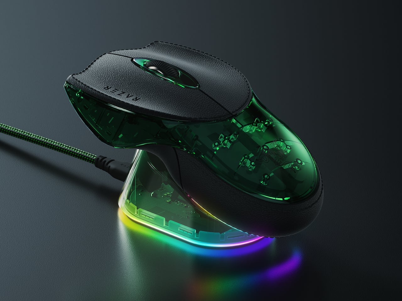
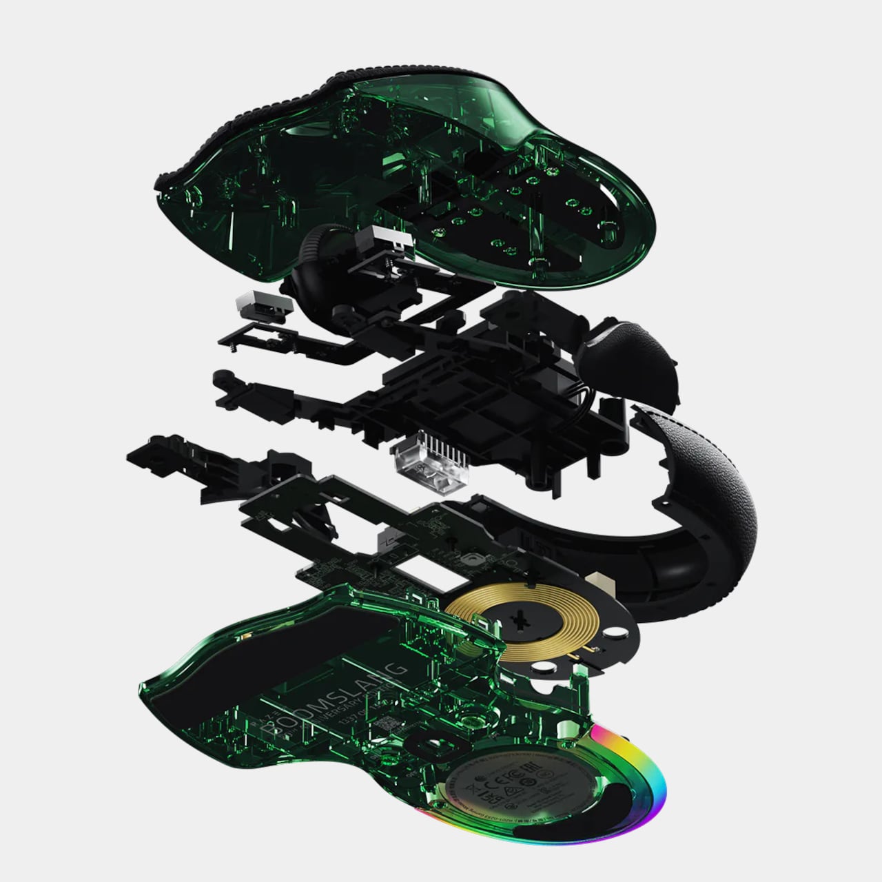
On the outside, the new Boomslang keeps the iconic snake-head outline and true ambidextrous form, preserving the low, wide body that made the original stand out. The translucent shell and underglow are deliberate echoes of that first model, but the lighting is now a nine-zone Razer Chroma RGB system that can be tuned in Synapse. The idea is that, at a glance, it still reads as a Boomslang first, and as a spec sheet second.
Inside, everything is from 2025. The Razer Focus Pro 45K optical sensor offers up to 45,000 DPI with 99.8 percent resolution accuracy, a ridiculous number compared to the original’s 2,000-DPI ball. HyperPolling Wireless pushes the polling rate up to 8,000 Hz, which means the mouse can report its position to the PC eight thousand times per second. Gen-4 optical switches handle primary clicks with a 100-million-click lifespan and no debounce delay.
Charging and connectivity also get a full reboot. The mouse is fully wireless and ships with a Razer Mouse Dock Pro that acts as both a magnetic charging base and a dedicated wireless receiver. Drop the Boomslang on the dock, and it starts charging automatically, while the dock handles HyperPolling Wireless up to 8,000 Hz over a single USB cable. It is a neat contrast to the wired-only original that helped define the gaming-mouse category.
Material and feel have been nudged into more premium territory. The primary buttons are wrapped in PU leather for extra grip and a more tactile press, which is a small but noticeable change if you are used to hard plastic shells. Underneath, nine zones of Chroma underglow can be customized with 16.8 million colors and effects, and eight programmable controls can be mapped to macros and profiles in Synapse.
The Boomslang 20th Anniversary Edition is a reminder that the idea of a gaming mouse had to be invented once, by a translucent, snake-shaped oddball that rolled a ball at 2,000 DPI. This remake uses that nostalgia to show how far sensors, switches, and wireless tech have come. For anyone who grew up on early Razer gear, it is a small, serialized time machine that also happens to be a high-end mouse in 2025.
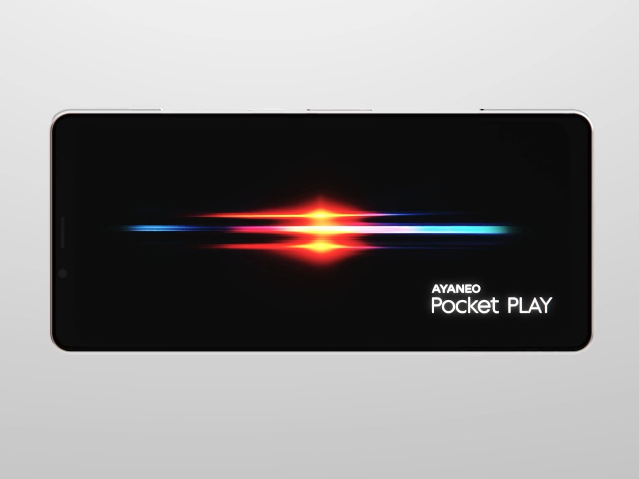
AYANEO is known for gaming handheld devices that run Windows and, sometimes, Android, but not phones. Most gaming phones still feel like regular slabs with RGB lights and higher refresh rates, treating games as an app category instead of the reason the device exists. Pocket PLAY is AYANEO’s first smartphone, and they are not shy about calling it “more than a phone,” framing it as a handheld console that happens to live on a SIM card instead of a desktop operating system.
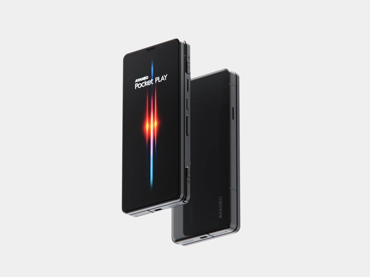
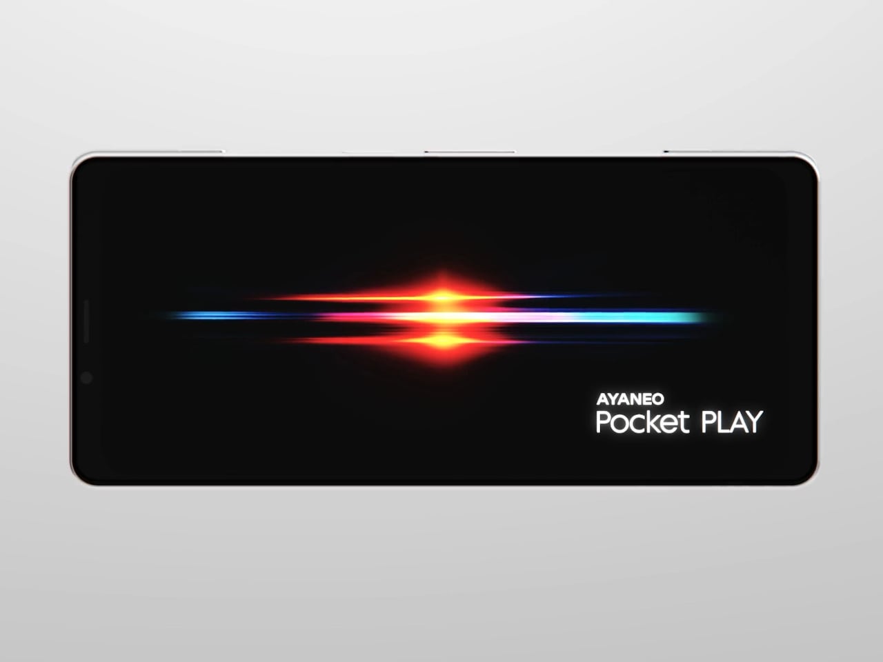
AYANEO calls it “the ultimate fusion of mobile phone and gaming handheld,” built “in the name of games, made for the dreams of gamers.” The minimalist front follows golden-ratio proportions and AYANEO’s “handheld artistry” philosophy, looking like a clean black slab until you slide it open and the real personality appears. The idea is that it should not shout gamer aesthetic when you are checking email, only when you want to play.
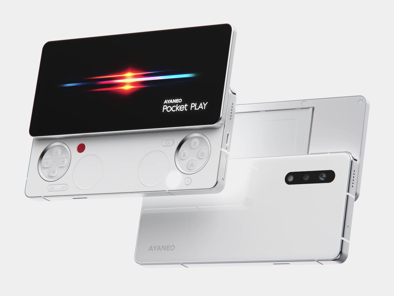
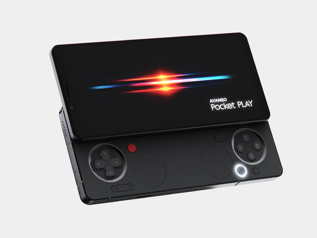
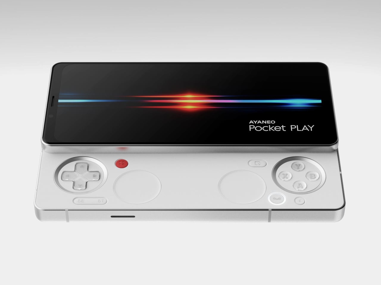
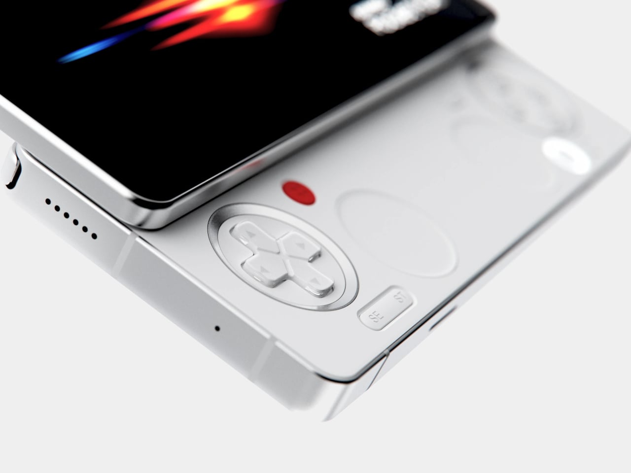
The classic side-slide mechanism is a light push that reveals a full controller under the screen. Anyone who remembers Sony’s Xperia Play will feel a flicker of déjà vu, another Android phone that hid a gamepad under a slider. The difference is that Pocket PLAY arrives in a world where handheld gaming and emulation are mainstream, and AYANEO has spent years building hardware for that exact crowd, not for casual mobile gamers who might try it once.
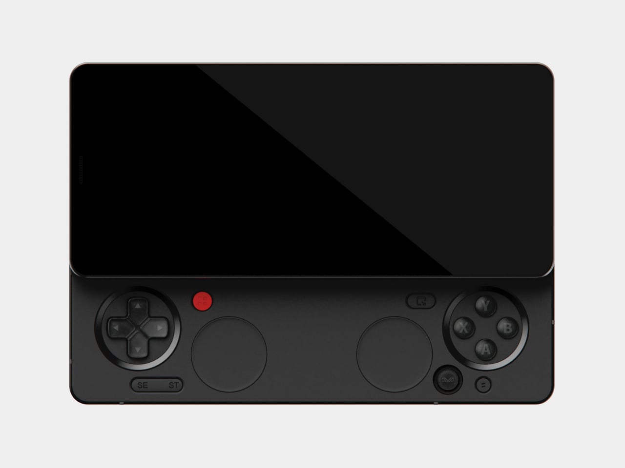
Pocket PLAY reinterprets a standard gamepad layout in a compact way, with a D-pad, ABXY buttons, and shoulder controls tuned for the sliding mechanism. AYANEO promises crisp, light presses and fast response, and a grip shaped so your fingers land where you expect. The idea is that you slide, and you are instantly in handheld mode, no adaptation period or clip-on accessories. The D-pad and buttons are meant to bring back the pure, satisfying feel of classic handheld gaming.
The dual intelligent touchpads sit where analog sticks might go, and they can map virtual joysticks, act as traditional touch surfaces, or trigger custom input combinations. That opens up camera control, mouse-like input for streaming PC games, or macro shortcuts for complex titles. The positioning is ergonomic, and the goal is to make every swipe and tap feel natural, closing the gap between a dedicated handheld and a phone that also runs Genshin Impact or emulators.
AYANEO leans into “cyber-romanticism” language, calling handhelds a culture and a shared emotional language among players. Pocket PLAY is pitched as a tribute to classic designs and an exploration of how handheld spirit can extend to a new medium. It is meant to feel like a daily-carry extension of the devices people already use for emulation and retro gaming, not a generic Android gaming phone with triggers and marketing.
Xperia Play hinted at this form factor years ago, but the ecosystem and audience were not ready. Pocket PLAY picks up that thread with modern hardware, a serious controller, and a brand that already lives in handheld culture. For players who want a phone that slides into a console instead of just another slab with shoulder buttons, it feels like a very specific dream finally getting another shot, this time built by people who actually understand why sliders and D-pads still matter.
AYANEO is known for gaming handheld devices that run Windows and, sometimes, Android, but not phones. Most gaming phones still feel like regular slabs with RGB lights and higher refresh rates, treating games as an app category instead of the reason the device exists. Pocket PLAY is AYANEO’s first smartphone, and they are not shy about calling it “more than a phone,” framing it as a handheld console that happens to live on a SIM card instead of a desktop operating system.
AYANEO calls it “the ultimate fusion of mobile phone and gaming handheld,” built “in the name of games, made for the dreams of gamers.” The minimalist front follows golden-ratio proportions and AYANEO’s “handheld artistry” philosophy, looking like a clean black slab until you slide it open and the real personality appears. The idea is that it should not shout gamer aesthetic when you are checking email, only when you want to play.
The classic side-slide mechanism is a light push that reveals a full controller under the screen. Anyone who remembers Sony’s Xperia Play will feel a flicker of déjà vu, another Android phone that hid a gamepad under a slider. The difference is that Pocket PLAY arrives in a world where handheld gaming and emulation are mainstream, and AYANEO has spent years building hardware for that exact crowd, not for casual mobile gamers who might try it once.
Pocket PLAY reinterprets a standard gamepad layout in a compact way, with a D-pad, ABXY buttons, and shoulder controls tuned for the sliding mechanism. AYANEO promises crisp, light presses and fast response, and a grip shaped so your fingers land where you expect. The idea is that you slide, and you are instantly in handheld mode, no adaptation period or clip-on accessories. The D-pad and buttons are meant to bring back the pure, satisfying feel of classic handheld gaming.
The dual intelligent touchpads sit where analog sticks might go, and they can map virtual joysticks, act as traditional touch surfaces, or trigger custom input combinations. That opens up camera control, mouse-like input for streaming PC games, or macro shortcuts for complex titles. The positioning is ergonomic, and the goal is to make every swipe and tap feel natural, closing the gap between a dedicated handheld and a phone that also runs Genshin Impact or emulators.
AYANEO leans into “cyber-romanticism” language, calling handhelds a culture and a shared emotional language among players. Pocket PLAY is pitched as a tribute to classic designs and an exploration of how handheld spirit can extend to a new medium. It is meant to feel like a daily-carry extension of the devices people already use for emulation and retro gaming, not a generic Android gaming phone with triggers and marketing.
Xperia Play hinted at this form factor years ago, but the ecosystem and audience were not ready. Pocket PLAY picks up that thread with modern hardware, a serious controller, and a brand that already lives in handheld culture. For players who want a phone that slides into a console instead of just another slab with shoulder buttons, it feels like a very specific dream finally getting another shot, this time built by people who actually understand why sliders and D-pads still matter.
AYANEO is known for gaming handheld devices that run Windows and, sometimes, Android, but not phones. Most gaming phones still feel like regular slabs with RGB lights and higher refresh rates, treating games as an app category instead of the reason the device exists. Pocket PLAY is AYANEO’s first smartphone, and they are not shy about calling it “more than a phone,” framing it as a handheld console that happens to live on a SIM card instead of a desktop operating system.
AYANEO calls it “the ultimate fusion of mobile phone and gaming handheld,” built “in the name of games, made for the dreams of gamers.” The minimalist front follows golden-ratio proportions and AYANEO’s “handheld artistry” philosophy, looking like a clean black slab until you slide it open and the real personality appears. The idea is that it should not shout gamer aesthetic when you are checking email, only when you want to play.
The classic side-slide mechanism is a light push that reveals a full controller under the screen. Anyone who remembers Sony’s Xperia Play will feel a flicker of déjà vu, another Android phone that hid a gamepad under a slider. The difference is that Pocket PLAY arrives in a world where handheld gaming and emulation are mainstream, and AYANEO has spent years building hardware for that exact crowd, not for casual mobile gamers who might try it once.
Pocket PLAY reinterprets a standard gamepad layout in a compact way, with a D-pad, ABXY buttons, and shoulder controls tuned for the sliding mechanism. AYANEO promises crisp, light presses and fast response, and a grip shaped so your fingers land where you expect. The idea is that you slide, and you are instantly in handheld mode, no adaptation period or clip-on accessories. The D-pad and buttons are meant to bring back the pure, satisfying feel of classic handheld gaming.
The dual intelligent touchpads sit where analog sticks might go, and they can map virtual joysticks, act as traditional touch surfaces, or trigger custom input combinations. That opens up camera control, mouse-like input for streaming PC games, or macro shortcuts for complex titles. The positioning is ergonomic, and the goal is to make every swipe and tap feel natural, closing the gap between a dedicated handheld and a phone that also runs Genshin Impact or emulators.
AYANEO leans into “cyber-romanticism” language, calling handhelds a culture and a shared emotional language among players. Pocket PLAY is pitched as a tribute to classic designs and an exploration of how handheld spirit can extend to a new medium. It is meant to feel like a daily-carry extension of the devices people already use for emulation and retro gaming, not a generic Android gaming phone with triggers and marketing.
Xperia Play hinted at this form factor years ago, but the ecosystem and audience were not ready. Pocket PLAY picks up that thread with modern hardware, a serious controller, and a brand that already lives in handheld culture. For players who want a phone that slides into a console instead of just another slab with shoulder buttons, it feels like a very specific dream finally getting another shot, this time built by people who actually understand why sliders and D-pads still matter.
Multi-function bedside consolidation, including USB-C charger
Circadian-friendly lighting system
QuietMark certified for sleep
Simple maintenance with long filter life
CONS:
Single color temperature range might not fit some preferences
Premium price for small coverage area
RATINGS:
AESTHETICS
ERGONOMICS
PERFORMANCE
SUSTAINABILITY / REPAIRABILITY
VALUE FOR MONEY
EDITOR'S QUOTE:
The Blueair Mini Restful Sunrise Clock Air Purifier quietly merges clean air with gentle dawn into one compact, sleep-focused design object.
Nightstands have quietly become cluttered charging stations over the past decade, with phones serving as alarms, small purifiers humming in corners, and separate wake-up lights trying to undo the damage of jarring ringtones at six in the morning. Sleep has turned into a wellness habit people track and optimize, but the tools meant to support it often feel scattered and visually chaotic.
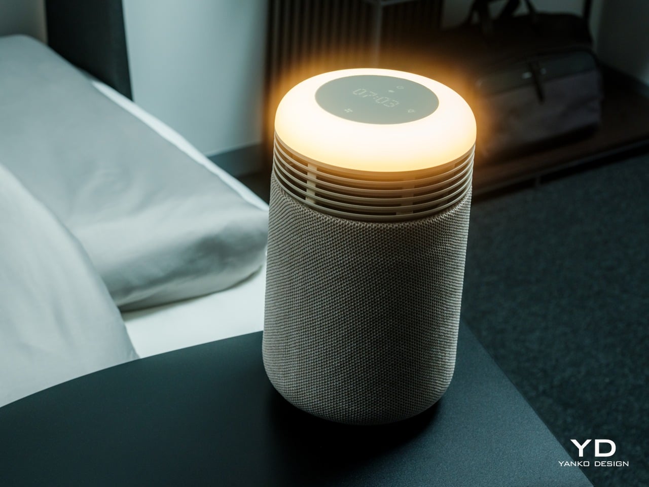
The Blueair Mini Restful() Sunrise Clock Air Purifier is a compact attempt to pull some of those tools into one object. It is a small bedside cylinder that cleans the air, glows like a sunrise to wake you gently, plays soft sounds, shows the time, and charges your phone, all while looking more like a design piece than some cold, drab piece of appliance. But does this striking appliance work as advertised? We put it beside our comfy bed to find out.
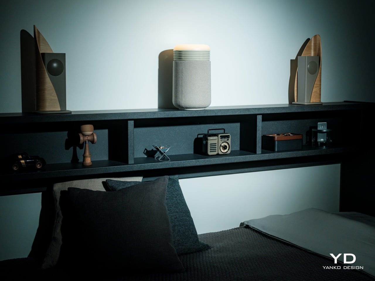
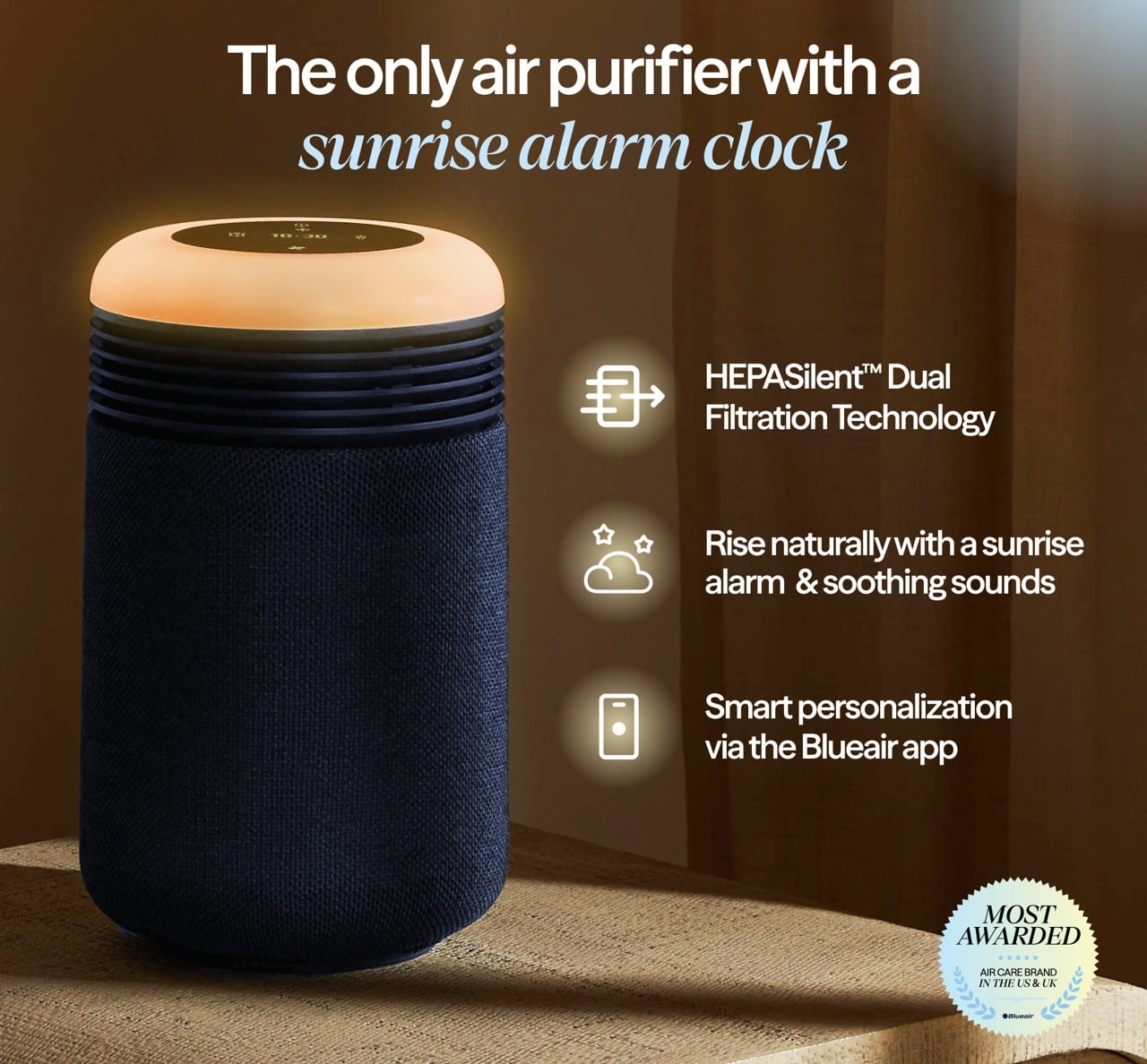
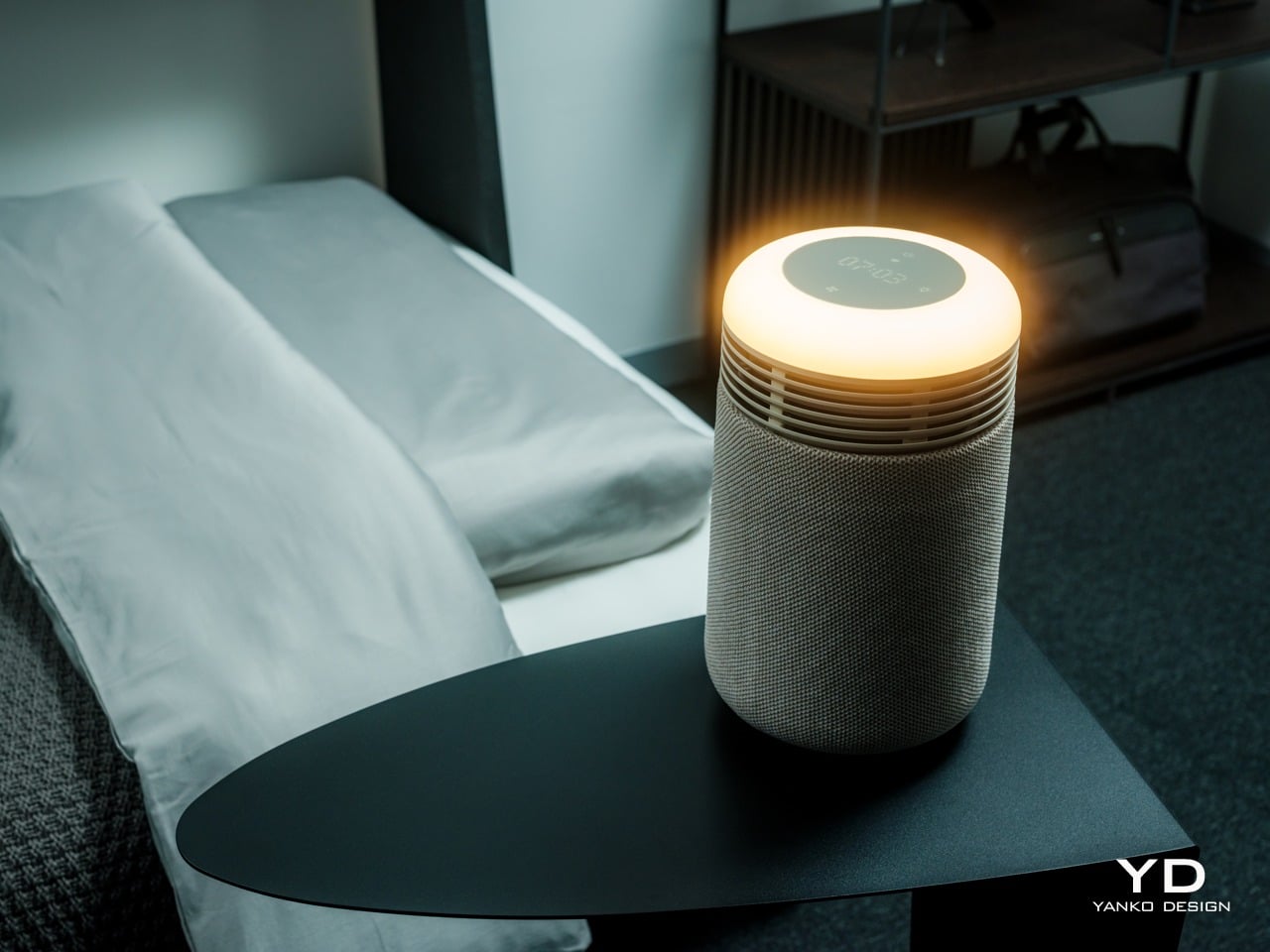
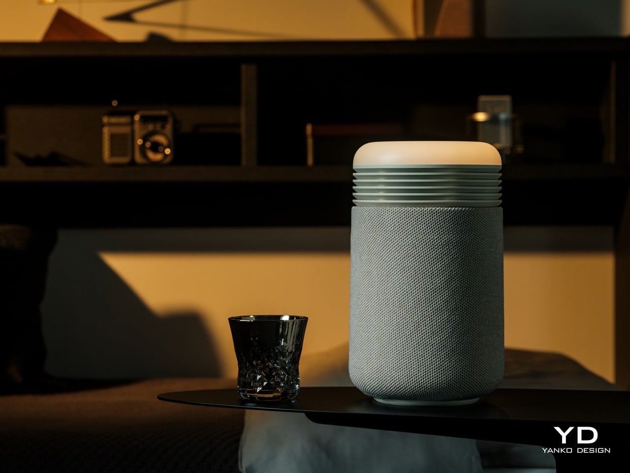
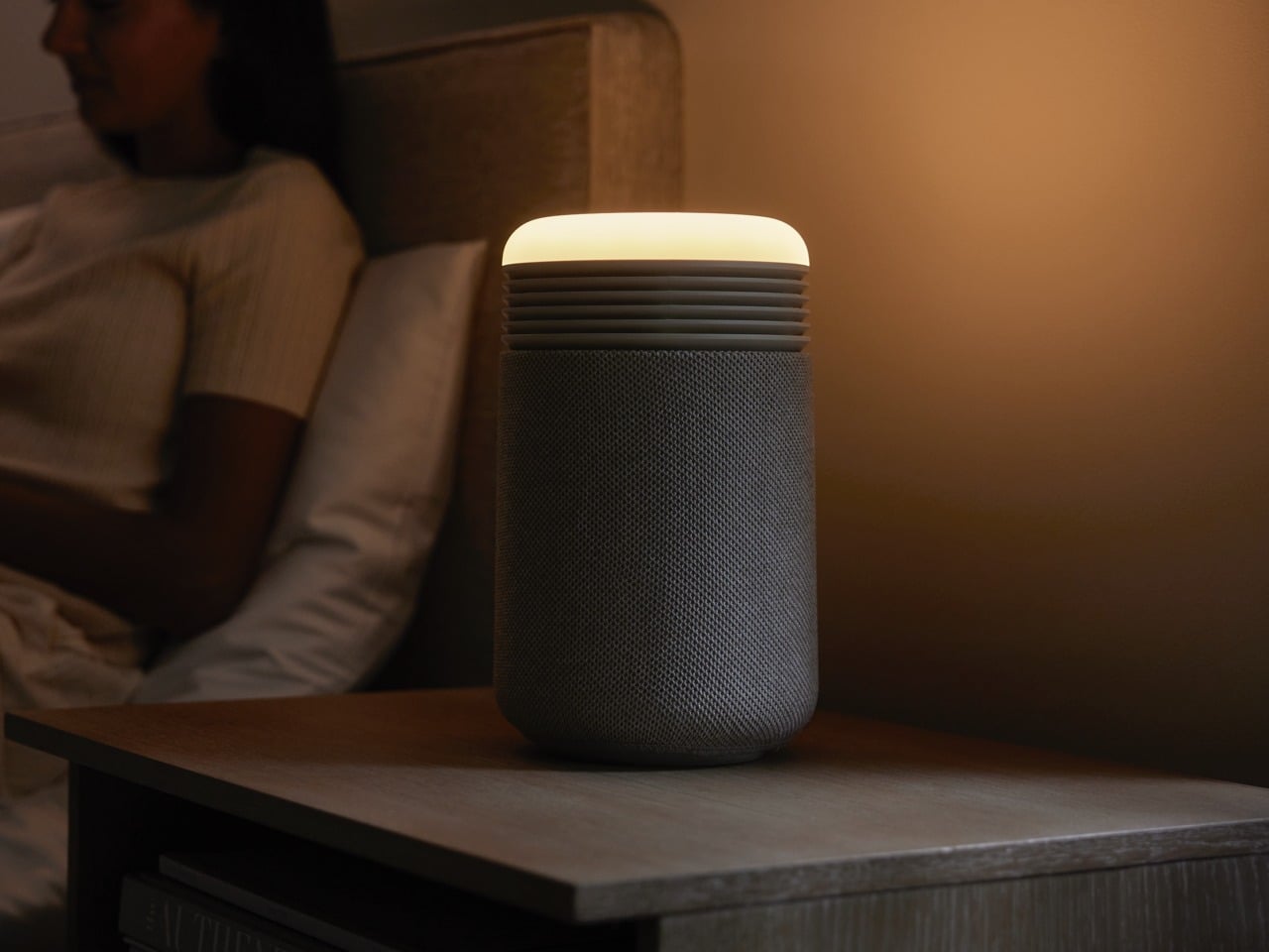
The Mini Restful is a short cylinder about eleven inches tall, wrapped in premium fabric with a smooth top disc. It looks closer to a smart speaker or a small bedside lamp than a traditional purifier, which makes it feel natural sitting on a nightstand. The proportions are deliberately compact and soft, with rounded edges and no visible vents.
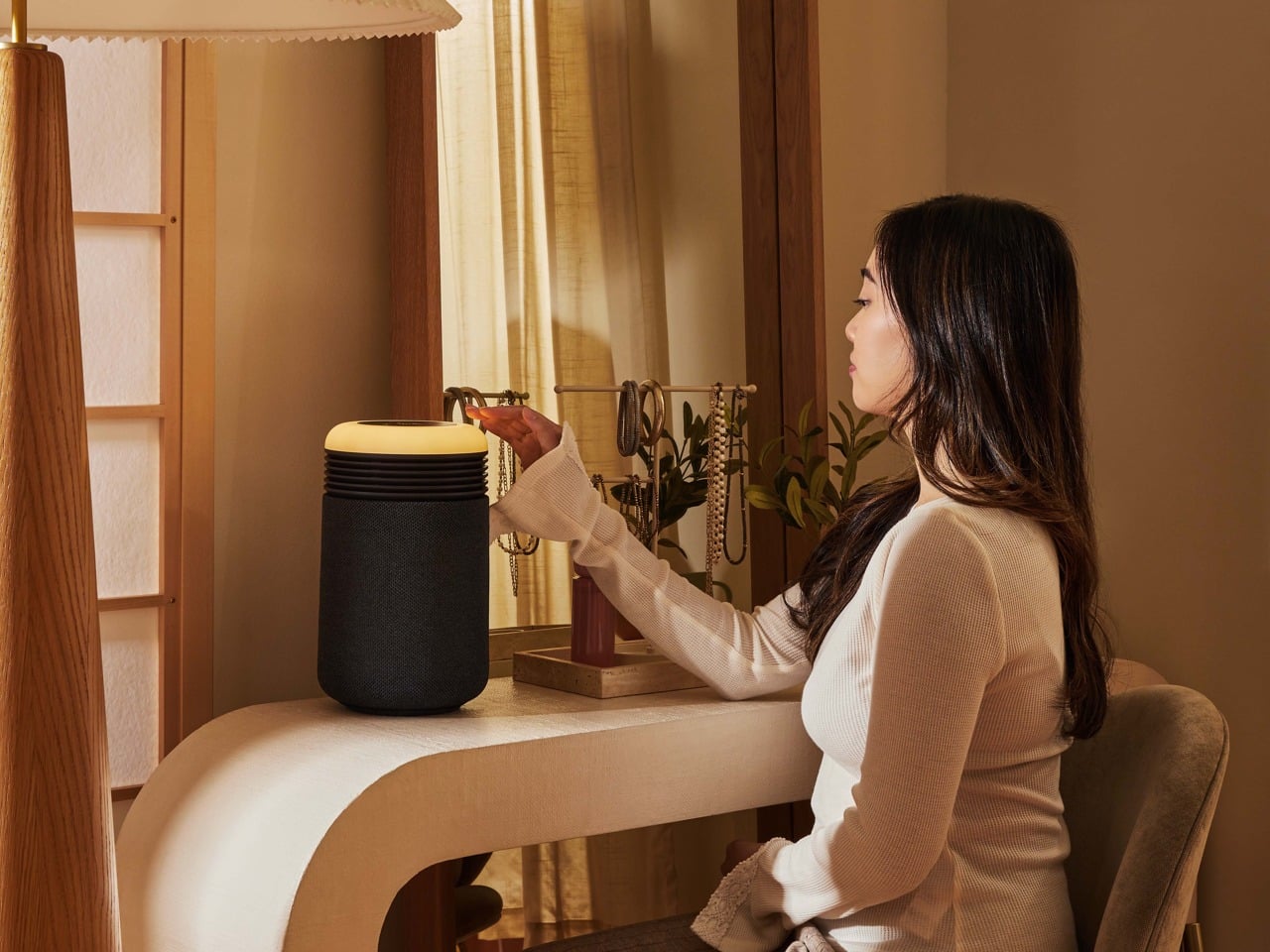
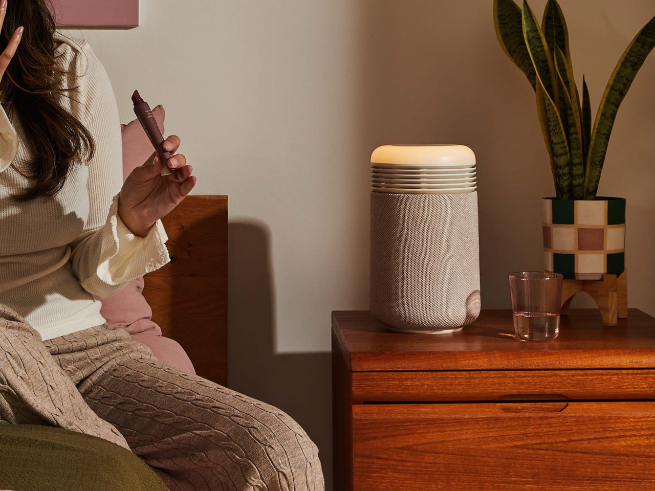
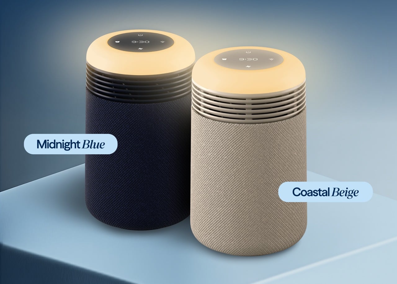
Two color options are available: Coastal Beige and Midnight Blue. Coastal Beige has a light oatmeal fabric with a warm off white top, which reads well in rooms with light wood furniture and neutral bedding. Midnight Blue uses a deep navy fabric, making it comfortable in darker, moodier bedrooms with richer tones.
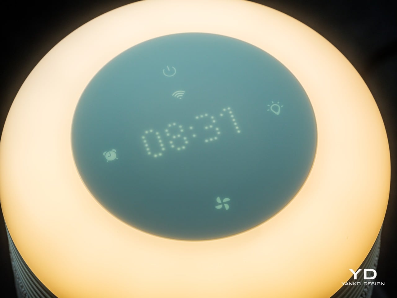
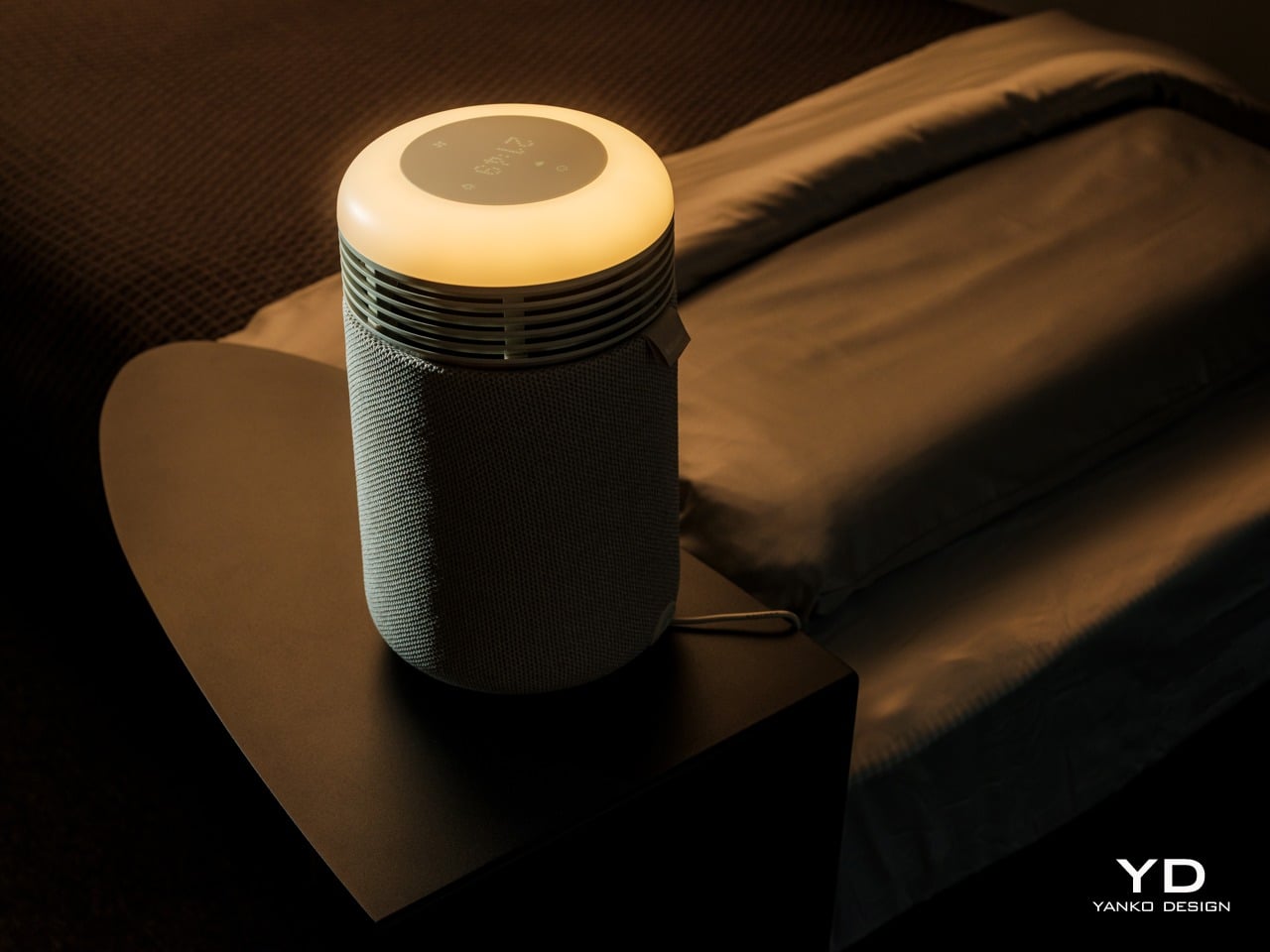
The top surface is where the aesthetic gets interesting. A circular user interface houses a dot matrix clock and touch controls, surrounded by a ring that glows when the wake-up light or mood lighting is active. When the sunrise alarm is running, the top looks like a tiny dawn, casting a warm halo onto the bedside table and wall.
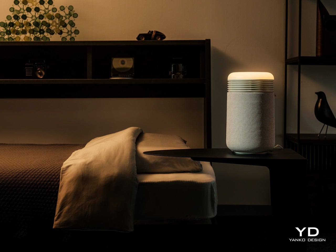
It is much more pleasant than the blinking LEDs most appliances default to, and it doubles the device’s role as both a functional purifier and a kind of ambient light. The glow feels intentional, like a small lamp designed to support sleep rather than disrupt it, which is a significant shift from typical purifier status lights.
The fabric wrap is a key design choice. It softens the entire object and makes it read as part of the room’s soft furnishings rather than a hard plastic box. The textile has a fine woven texture that feels closer to upholstery than speaker mesh, and it helps the Mini Restful blend into spaces where you want calm rather than tech on display. The overall look avoids the glossy plastics and aggressive styling that make a lot of gadgets feel cheap or temporary.
Ergonomics
At around two and a half pounds out of the box, the Mini Restful is genuinely portable. You can pick it up with one hand and move it between rooms or reposition it without any strain. The small footprint, roughly six and a half inches in diameter, means it takes up about as much space as a medium-sized speaker or a chunky candle.
The cylindrical shape means you can place it close to the bed without worrying about sharp corners poking you if you brush against it in the dark. The air intake and outlet are all around the body, so it does not need a lot of clearance to work effectively, which is helpful in tight bedrooms or smaller apartments where every inch of surface area counts.
The top controls and clock are designed for quick, low-effort interaction. The dot matrix display is readable without being glaring, and the surrounding touch icons handle basic tasks like setting alarms, adjusting light brightness, and likely fan speed. You can do the essentials without grabbing your phone, which is helpful if you are trying to reduce screen time before bed.
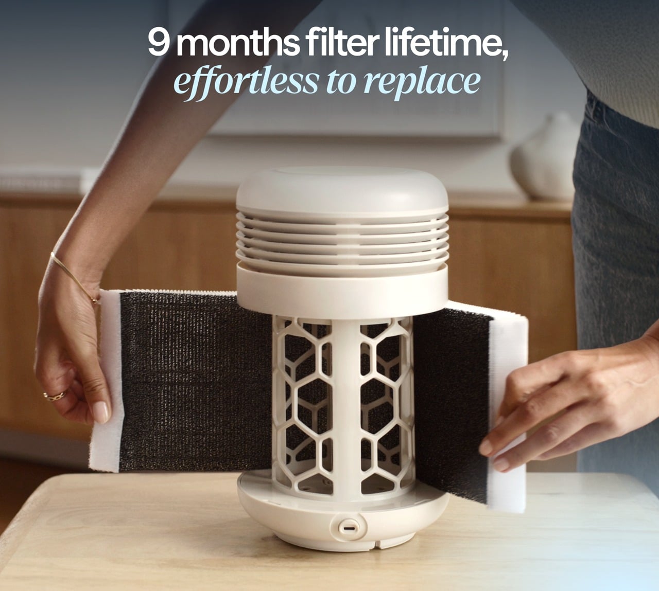
Filter access is straightforward. The fabric sleeve slips off, and the inner filter is a wraparound design with a simple closure, so replacing it does not require tools or wrestling with complicated cartridges. This kind of maintenance design makes it more likely that people will actually change the filter when it is due rather than giving up and buying a new device.
Performance
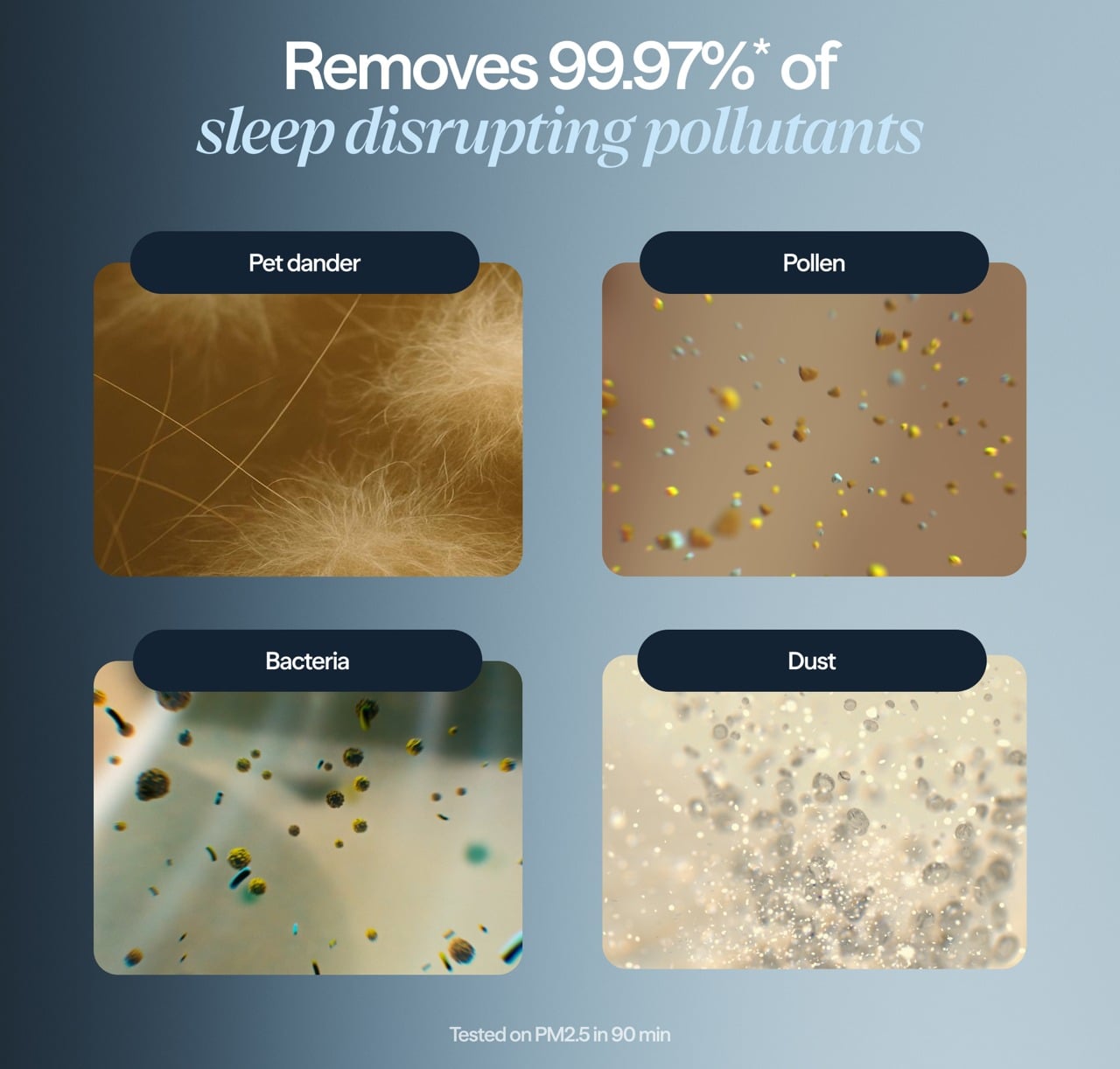
Inside the cylinder is a HEPASilent filter system that pulls in air from around the base, traps fine particles like dust, pollen, and smoke, and pushes cleaner air back out. The filtration is sized for small spaces, specifically bedrooms up to around one hundred forty square feet, which aligns with typical master bedrooms or nurseries. It is meant to clean the zone where you actually sleep.
The idea of a fresh air dome around the bed is central to how Blueair frames this product. Placing the Mini Restful on a nightstand or dresser top helps keep the immediate breathing zone cleaner, which can be especially helpful for people who deal with nighttime congestion, seasonal allergies, or asthma. The device cycles the air in a small bedroom multiple times per hour.
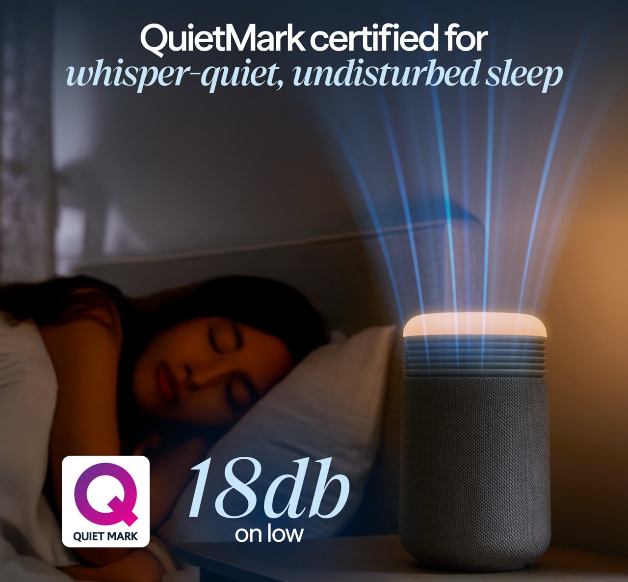
Noise performance is critical for a sleep device, and the Mini Restful is designed to be quiet. On its lowest settings, it is softer than most fans, more like a gentle whoosh than a mechanical hum. Higher speeds are audibly stronger when the device is working harder to clear the air, but the ability to drop back into whisper-quiet operation at night keeps it compatible with light sleepers.
The QuietMark certification adds third-party validation that the noise level is genuinely sleep-friendly, tested and approved by independent acoustic consultants. This matters because many purifiers claim to be quiet but still produce enough mechanical sound to disturb rest, while the Mini Restful can fade into the background entirely on low settings.
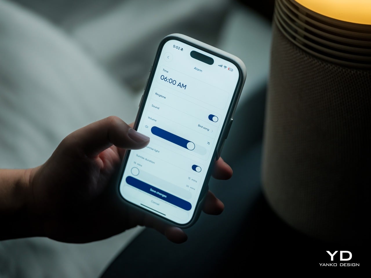
The wake-up light is where the Mini Restful starts to feel different from a standard purifier. You can set a time in the Blueair app, and then, in the fifteen to thirty minutes leading up to that time, the top light slowly brightens from a very dim glow to a warm, room-filling light. The color temperature stays in the warm range, mimicking the quality of a natural sunrise.
This gradual brightening is designed to help your body wake up more naturally than a sudden alarm. The light acts as a cue that morning is approaching, which can make the transition from sleep to wakefulness feel gentler and less abrupt, especially during darker winter months when natural light comes late or not at all.
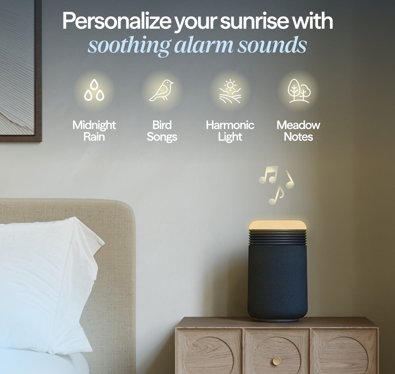
If you want more than light, you can add sound. The app includes a library of gentle wake-up tones and nature sounds, and you can choose one to start playing after the light has reached full brightness. The combination of light and sound is meant to guide you from deep sleep to wakefulness in a calmer way than a phone alarm blaring suddenly at full volume.
The same light that wakes you up can also help you wind down. In the evening, you can set the top to a very low amber glow as a night light or turn it up to a comfortable reading level, all in warm color temperatures that are gentler on melatonin production than bright white overhead lights or blue light-heavy phone screens.
The ability to adjust brightness on the device or in the app means it can match different routines, whether you are reading before bed or just want a soft ambient glow while you settle in. This dual role, supporting both wind down and wake up, makes the light feel integrated into the full sleep cycle rather than just a morning feature.
The Blueair app lets you fine-tune alarm times, choose how long the sunrise light takes to reach full brightness, select wake-up sounds, and create schedules so the device behaves differently on weekdays and weekends. The app also shows air quality and lets you adjust fan speed remotely, though most people will set a preference once. For people who like to see what is happening, the data is there, but the device does not force you into constant app interaction.
The integrated USB-C charging port on the back is a small but practical touch. It lets you plug in a phone or wearable directly into the Mini Restful, reducing the number of separate chargers and cables cluttering the nightstand. For people who currently use their phone as an alarm, this makes it easier to transition to the Mini Restful without losing charging convenience.
Sustainability
The Mini Restful uses a filter designed to last many months before needing replacement, which reduces how often you need to buy and discard new filters compared to some smaller purifiers with shorter lifecycles. The wraparound filter design with simple closure encourages full use of the filter’s lifespan and makes replacement straightforward, supporting longer ownership.
The device is relatively low power and Energy Star certified, which matters for something that might run many hours every day. At its lowest settings, the energy draw is modest, and even at higher speeds, it stays well within the range of efficient bedside appliances. Blueair, as a brand, positions itself with higher environmental standards as a Certified B Corp.
Value
The Mini Restful costs more than a basic purifier or a simple alarm clock. But that price starts to make sense when you consider the roles it plays at once: purifier, sunrise light, sound machine, clock, and phone charger, all in a single compact object designed for the nightstand. If you were to buy those devices separately, you would likely spend a similar amount while ending up with more clutter. The Mini Restful consolidates that into one cylinder that is easy to set up, easy to maintain, and designed to look intentional rather than accidental.
Space and visual calm are real forms of value, especially in small bedrooms or apartments where every object on a nightstand matters. Having one well-designed cylinder instead of multiple mismatched gadgets reduces the sense of clutter and makes the room feel more deliberate. For design-conscious consumers, that reduction in visual noise is worth something tangible, not just aesthetic preference alone.
The sleep focus is also part of the value story. For people who are already treating sleep as a wellness habit, investing in better mattresses, bedding, or blackout curtains, and adding a device that supports circadian rhythms and keeps the breathing zone cleaner is a logical next step. The fact that it is optimized for bedrooms makes it feel like a targeted tool.
The Mini Restful makes the most sense for people who care about both design and sleep quality, who want their nightstand to feel calm rather than cluttered, and who appreciate when technology quietly supports routines instead of dominating them. For users trying to break phone dependence at bedtime, or parents setting up nurseries, or anyone in a small space, it fits naturally.
Verdict
The Blueair Mini Restful Sunrise Clock Air Purifier is a compact, carefully designed object that manages to be a purifier, a sunrise light, a sound machine, and a clock without looking or feeling like four gadgets taped together. It blends into bedrooms with the kind of visual ease that makes you forget it is technology, and the combination of quiet air cleaning, warm light, and gentle sounds makes it feel integrated into sleep rituals.
As sleep continues to be treated as a key part of wellness, devices that treat air, light, and sound as one integrated experience will likely become more common. For homeowners who want their bedroom tech to be as considered as their furniture and as gentle as their nighttime routine, the Mini Restful feels like a thoughtful step in that direction, turning the nightstand into a quieter, calmer place where everything works together.
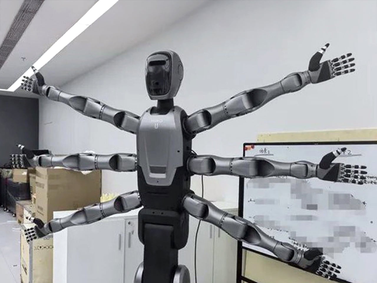
There is a moment in Infinity War where Doctor Strange fans out into a halo of spectral arms and every animator in the room probably high fived. Midea’s new Miro U looks like someone freeze framed that shot, printed it, and walked it down the hall to the robotics lab with the caption “do this, but for factories.” Six coordinated arms, a torso that feels almost cloaked, a wheeled base that spins 360 degrees in place, it reads less like industrial equipment and more like a concept sheet that escaped ArtStation. Except this thing is heading to a washing machine plant in Wuxi, with a target of boosting line changeover efficiency by about 30 percent according to Midea’s own numbers. The visual language screams sorcerer, the job description says production engineer.
You can tell a lot about a robot from what its designers chose to sacrifice. Miro U trades the prestige of bipedal walking for a wheel leg base that is brutally honest about factory floors. No stairs, no urban parkour, just flat concrete and tight aisles that reward stability and turning radius over photogenic gait. It also trades the polite two arm humanoid silhouette for six bionic arms that Midea describes as high precision and flexibly controlled, coordinated around a central spine like a mechanical mandala. That is a very specific bet on parallelism. If you care about line changeovers and modular cells, you want one body that can grab tools, fixtures, and parts at the same time without waiting for someone else to show up.
Designer: Midea
There is a design honesty here that I find refreshing. Most humanoid projects in the West are in a beauty contest with the human form. Smooth faces, leggy proportions, carefully choreographed walking demos, everything framed around the idea that “this could stand where a worker stands.” Miro U walks away from that stage and heads for the backstage rigging. Six arms mean it behaves less like a single worker and more like a compact crew. One pair can hold a housing, another can swap a jig, the remaining arms can manage cables or safety barriers. The silhouette is chaotic on purpose because the workflow is chaotic and the robot is supposed to absorb that complexity.
The numbers around it are still pretty thin, which is typical at this stage, but the broad strokes are telling. Third generation in Midea’s humanoid line, which means they have already burned through at least two iterations before this one hit the news cycle. Fully self developed tech stack, from motion control to the six arm coordination, which matters if you care about long term tuning in real factories rather than trade show floors. Scheduled deployment at the Wuxi washing machine plant this month, following an earlier wheeled humanoid that has been working in Jingzhou since August. This is not a lab mascot. This is a product being dogfooded on a line that actually has throughput targets.
The superhero resemblance is more than a meme hook. Superhero bodies are about exaggerated affordances. Extra limbs, extra reach, extra context switching. Doctor Strange with a ring of arms is a visual metaphor for parallel spellcasting. Miro U with six arms is a visual metaphor for parallel operations on a line that refuses to sit still. Factories that build multiple SKUs on shared equipment live and die by how quickly they can tear down and rebuild a station for the next run. A robot that can reposition fixtures, pull in new tools, and handle parts without waiting for a human crew starts to look less like a novelty and more like a new species of line technician.
You can also read Miro U as a quiet critique of the “humanoid or bust” hype. The question is not whether robots can walk like us, but whether they can inhabit the work in a useful way. Midea is a manufacturer first, and that shows. They do not need a robot that can walk out of the factory and hail a cab. They need something that can survive three shifts a day, roll between modules, and treat the shop floor like a mutable level layout. The wheel base, the vertical lifting, the 360 degree in place rotation, all of that is a love letter to cramped industrial layouts rather than glossy demo stages.
There is also a cultural angle that I cannot ignore. This is a Chinese appliance giant that bought KUKA in 2017 and has been quietly building a robotics stack while the rest of the world argued about whether Tesla’s Optimus would ever fold a shirt. Now they roll out a six arm sorcerer for factories and talk openly about large scale deployment of humanoids across industrial and commercial spaces. Whether Miro U itself becomes a platform or a stepping stone, it signals an attitude. The factory is not a place where you hide robots in cages anymore. It is a stage where body plans are fair game.
Does that mean humanity is cooked. No. It means the shape of “a worker” is starting to fork more visibly. On one branch, you have the leggy, two arm humanoids chasing a one to one replacement fantasy. On another, you now have creatures like Miro U, multi arm, wheeled, unapologetically weird, tuned for specific forms of chaos. The fear response is predictable, but the more interesting reaction is curiosity. If this is what a robot body looks like when you stop caring whether it resembles us, what other silhouettes are still on the cutting room floor.
Imagine cutting a 90-minute airport transfer to 12 minutes. That is the value proposition Vertical Aerospace is selling with Valo, the electric air taxi it unveiled in London’s Canary Wharf on December 10. For business travelers, the pitch is straightforward. Skip ground traffic entirely on short-hop routes between major airports and city centers. Bring real luggage. Arrive in minutes instead of an hour.
Designer: Valo
If Vertical delivers on its technical targets and clears regulatory approval, Valo could reshape how time-sensitive travelers approach urban mobility. For cities, the calculus is different. Quiet electric aircraft designed to operate below 50 decibels in cruise might unlock airspace that conventional helicopters cannot access due to noise restrictions.
Vertiports on rooftops and waterfronts could become practical transit nodes rather than exclusive helipads. The infrastructure does not exist yet, but the partnerships to build it are forming.
The Aircraft
Valo is Vertical’s certification-intent production aircraft, not another prototype. The British company designed it from the ground up to clear regulatory approval rather than retrofit an experimental platform after the fact.
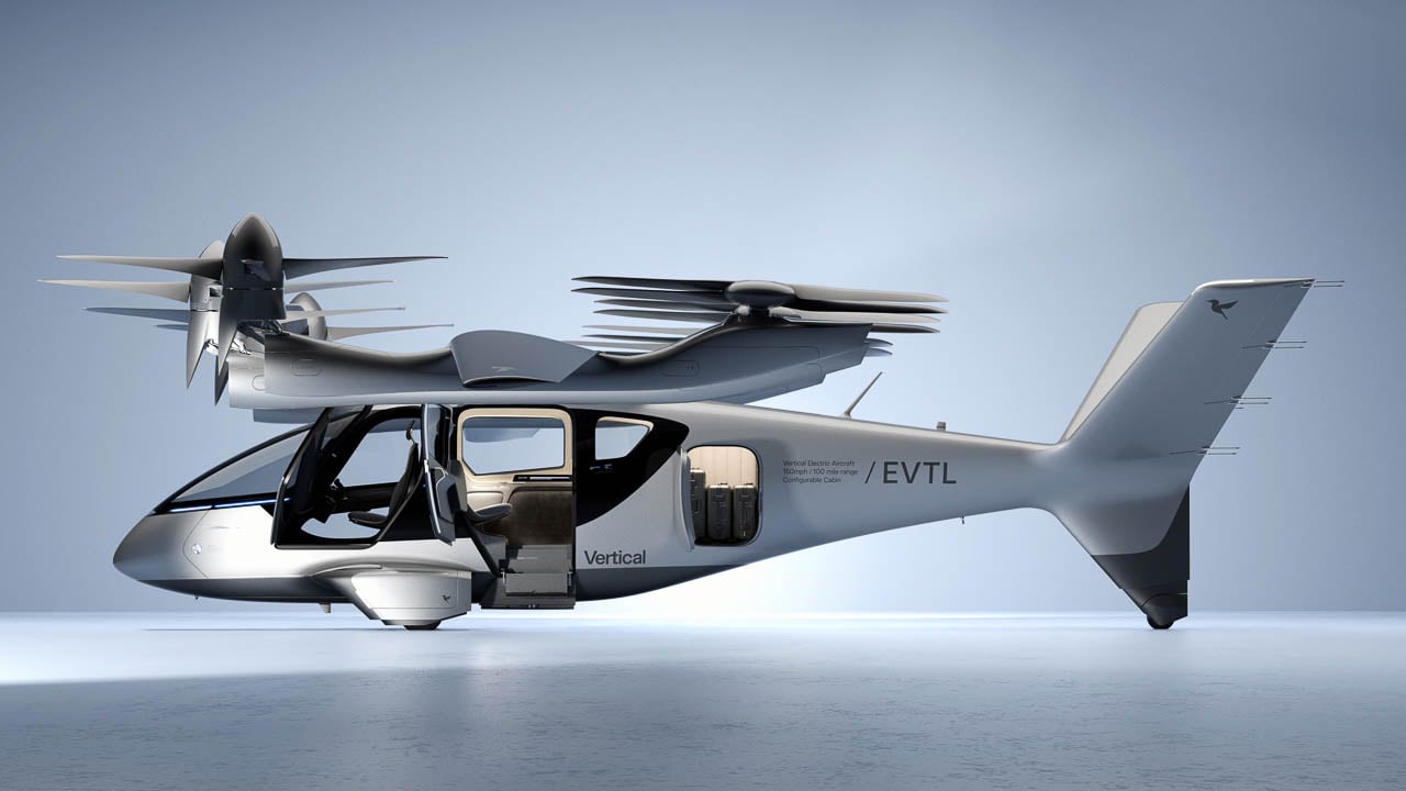
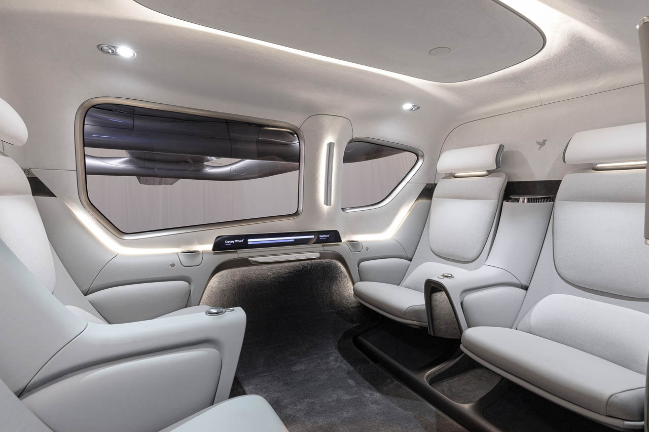
The cabin seats four passengers plus pilot at launch. Vertical plans to expand capacity to six as operator economics improve. Panoramic windows, generous space, and a cockpit divider create transport aesthetics distinct from early experimental aircraft.
Cargo capacity distinguishes Valo from competitors. The hold is designed to fit six cabin bags and six checked bags, with total payload around 550 kg. That addresses one of the persistent criticisms of early eVTOL concepts: nowhere to put your stuff.
Airline partners specifically requested this luggage capacity, and Vertical delivered.
Platform versatility extends beyond passenger service. Vertical has designed Valo to support EMS missions, cargo transport, and future defense applications.
Technical Targets
Vertical is targeting roughly 100 miles of range at cruise speeds approaching 150 mph. The company aims for zero operating emissions and noise levels below about 50 dBA.
If Vertical hits those acoustic targets, Valo cruising overhead would register quieter than typical street conversation. That matters for urban deployment. Helicopters face severe restrictions in noise-sensitive areas. Quiet electric aircraft could operate where rotorcraft cannot.
The propulsion system is designed with eight electric motors on multiple electrically isolated power lanes. Under-floor liquid-cooled battery packs, developed by Vertical’s Energy Centre using Molicel cylindrical cells, are intended to enable approximately 12-minute recharge cycles for short missions.
Honeywell supplies the fly-by-wire controls and avionics, purpose-built for eVTOL flight profiles. The tiltrotor configuration tilts forward propellers to manage vertical-to-horizontal transition. The aft array modulates based on wing lift. As speed increases, rear propellers reduce output and stop, transferring efficiency to cruise flight.
Carbon fiber composite blades and Low Noise Signature technology address specific frequency ranges that human hearing finds intrusive.
How It Got Here
The VX4 prototype generated thousands of test data points. Validated hover performance. Confirmed wingborne flight. Real maneuvers, not just simulation.
Vertical reports it is close to completing full piloted transition flight, the critical phase where the aircraft shifts from vertical lift into forward cruise. That accumulated knowledge shaped Valo’s production design.
The differences extend beyond surface refinements. A reworked airframe optimized for aerodynamics. New wing and propeller architecture. An under-floor battery system that redistributes weight and opens cabin space.
Syensqo and Aciturri contributed aerospace-grade composites for strength-to-weight optimization.
The VX4 received its Phase 4 Permit to Fly from the UK CAA in November 2025. This cleared final test sequences toward piloted transition. Hover, thrustborne, and wingborne phases have already been demonstrated.
Certification Path
Vertical is aiming for Type Certification under both UK CAA and EASA around 2028. The company plans to use the SC-VTOL Category Enhanced pathway.
This is the airliner-equivalent safety standard, requiring 10⁻⁹ failure probability. Approval at this level would enable commercial passenger operations with safety assurances travelers expect from scheduled airlines.
Seven UK-built certification aircraft will complete the full testing program. The redundant propulsion architecture, with eight motors on isolated power lanes, is mandatory to meet these standards.
Post-certification, Vertical holds roughly 1,500 pre-orders and MoUs from airlines including American and Japan Airlines, along with operators such as Bristow and Avolon. Deliveries could begin before decade-end if certification proceeds on schedule.
Planned Routes and Partnerships
Commercial structure is forming alongside the aircraft. Vertical, Skyports Infrastructure, and Bristow Group announced plans for what they describe as the UK’s first electric air taxi network.
The proposal centers on short-hop links between major airports and nearby city hubs.Canary Wharf would serve as the London node. Planned connections include Heathrow, Gatwick, Cambridge, Oxford, and Bicester. The partnership combines Vertical’s aircraft with Skyports’ London Heliport and Bicester Vertiport infrastructure, plus Bristow’s operational expertise.
Héli Air Monaco signed an MoU for Valo pre-orders, opening potential routes along the French Riviera. These are plans and memoranda of understanding that depend on certification and infrastructure buildout, not scheduled services.
Route economics favor corridors where time savings are most pronounced. Heathrow to central London currently consumes 60 to 90 minutes by ground. If Valo meets its performance targets, that could compress to roughly 12 minutes of flight.
Hybrid-Electric Expansion
Vertical announced a hybrid-electric variant in May 2025 targeting extended capabilities.
The hybrid version aims for 1,000 nautical miles of range, roughly ten times the all-electric envelope, with payload reaching 1,100 kg. Flight testing is scheduled for mid-2026.
This architecture would unlock market segments that battery-electric eVTOLs cannot currently serve: defense, logistics, air ambulance services where extended range is mandatory.
Economic Projections
According to company-cited projections from Frontier Economics, Vertical estimates the program could create over 2,000 skilled UK manufacturing and engineering positions. Annual economic contribution could reach £3 billion by 2035.
These are projections contingent on certification success and production scale-up, not guaranteed outcomes.
UK government backing adds context. The Department for Transport’s Plan for Change allocated over £20 million toward drone and air taxi development, signaling regulatory intent to streamline approval without compromising safety.
The Bottom Line
CEO Stuart Simpson positioned the reveal in manufacturing terms. The company is transitioning from prototype developer to production aerospace business.
Many eVTOL programs have demonstrated technology. Converting demonstrations into certified, commercially operating aircraft is the barrier that separates ambition from viable business.
The aircraft exists. The partnerships are signed. The certification path is defined.
What remains is execution against ambitious technical and regulatory targets. December 2025 marked a concrete step. Whether Valo becomes routine urban transport depends on what Vertical delivers over the next three years.
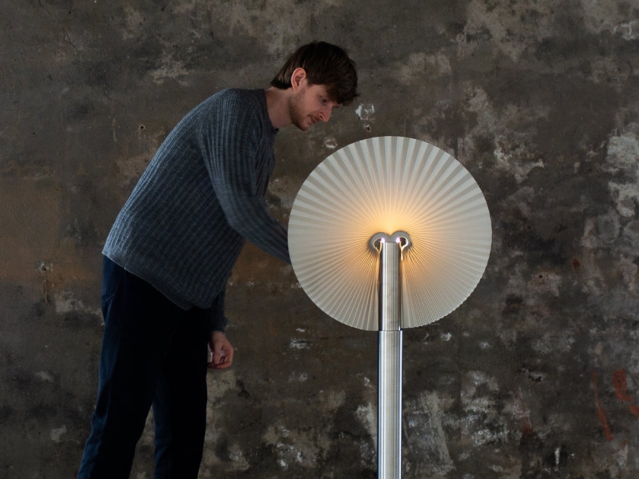
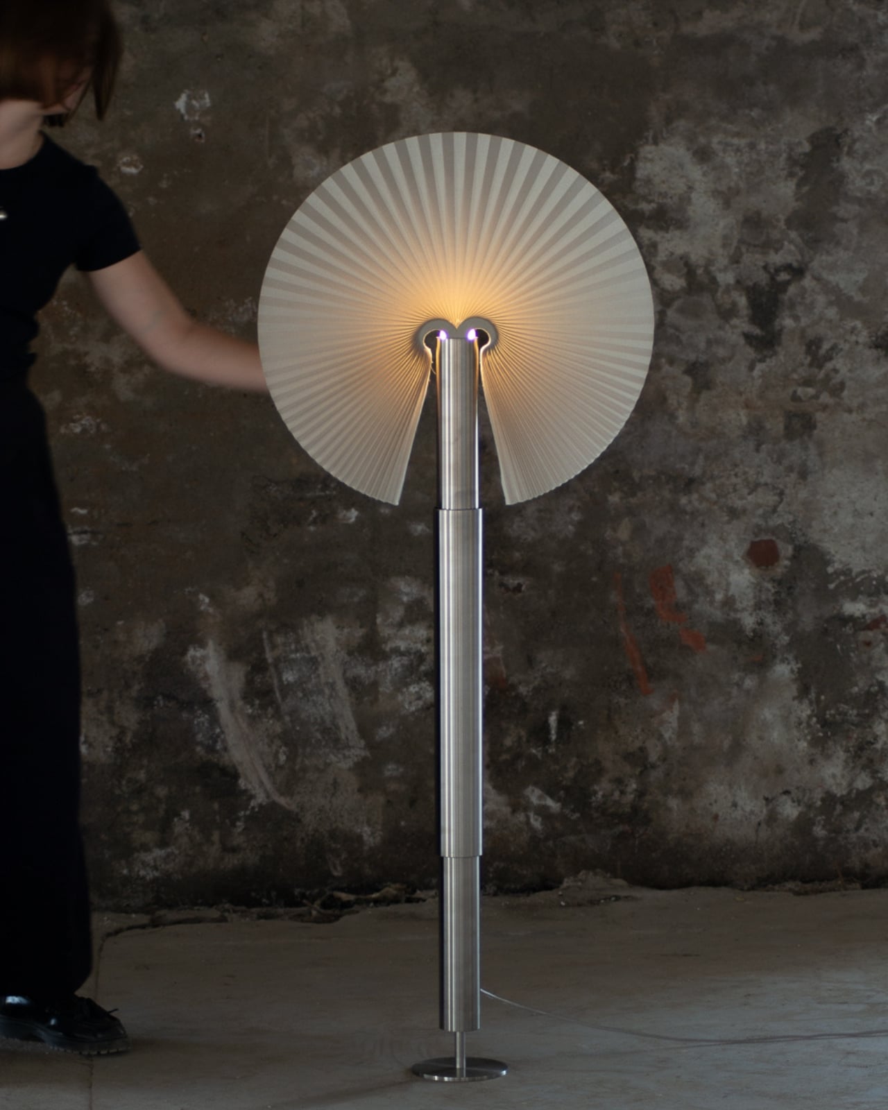
There’s something almost magical about watching a peacock unfurl its tail feathers. That moment of transformation, when something compact suddenly explodes into an elaborate fan of color and pattern, never gets old. Dutch designer Jelmer Nijp must have felt the same way because he decided to bottle that exact feeling into a lamp, and the result is nothing short of captivating.
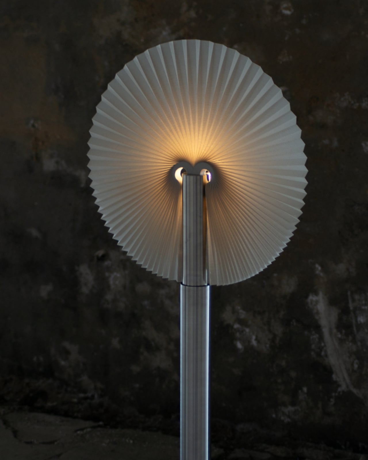
Meet Pavo, a lighting design that’s part industrial fixture, part nature-inspired sculpture. The name itself is a nod to its inspiration. Pavo means peacock in Spanish (and Latin, for that matter), and once you see it in action, you’ll understand why Nijp couldn’t have called it anything else. This isn’t your typical table lamp that just sits there looking pretty. Pavo actually moves, transforms, and reveals itself in a way that makes you stop and stare.
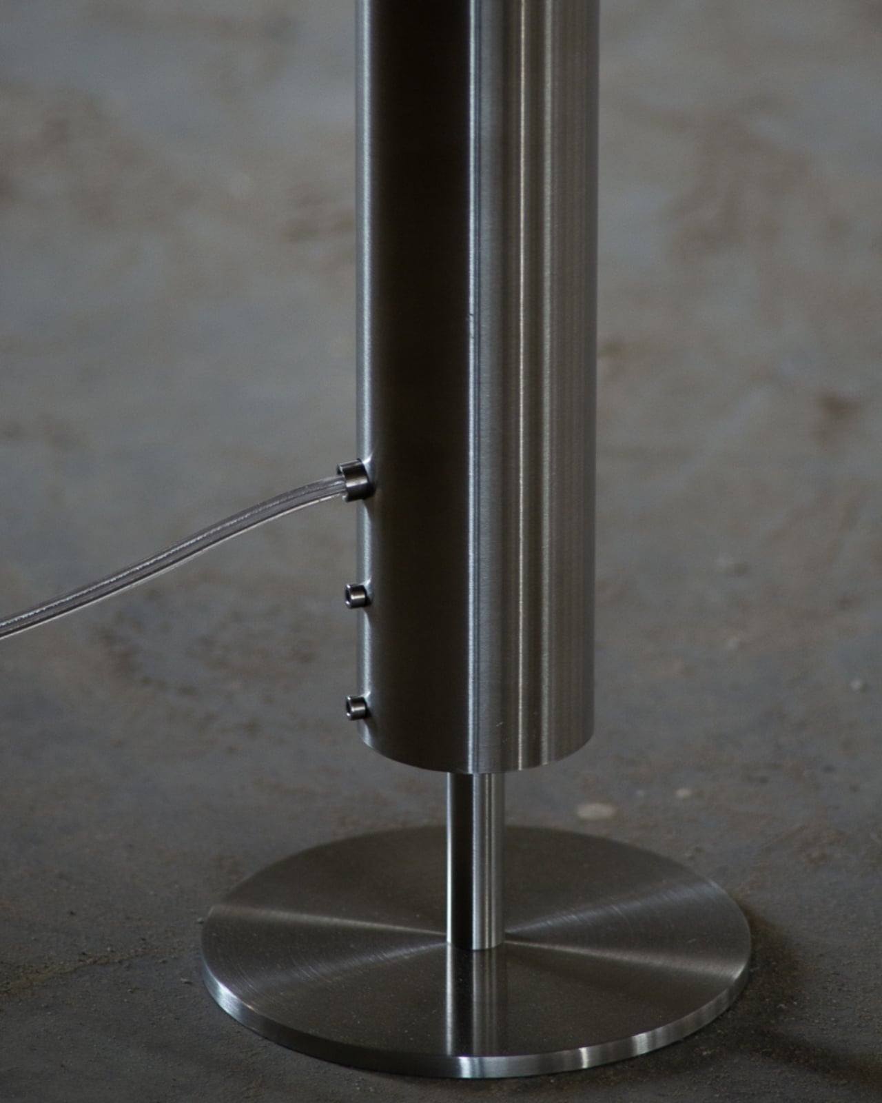
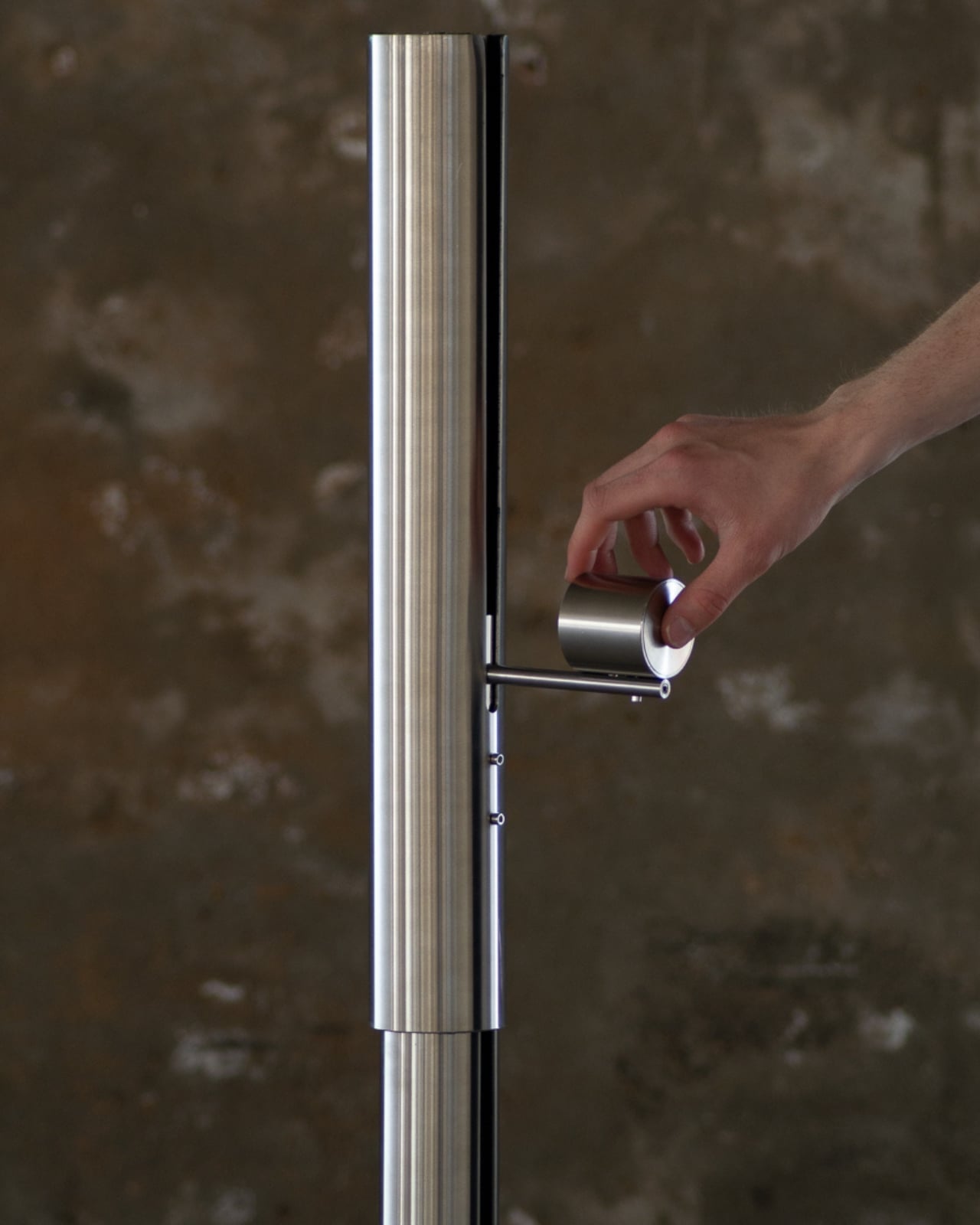
The design is deceptively simple at first glance. When closed, Pavo looks like a sleek metal tube, the kind of minimalist object that wouldn’t look out of place in a modern apartment or design studio. But here’s where it gets interesting. That tube retracts, and as it does, a pleated shade unfurls like a fan, spreading outward in a graceful, almost organic motion. Light radiates from the center of this fan, creating a soft glow that highlights the geometric pleats and folds of the shade. It’s the kind of moment that makes you want to show everyone in the room, “Look at this! Did you see that?”
What makes Pavo special is how it bridges two worlds that don’t always play well together. On one hand, you’ve got this very industrial aesthetic with clean metal lines and mechanical movement. On the other, there’s this undeniable connection to nature, to the beauty and drama of a peacock’s display. Nijp manages to merge these seemingly opposite ideas into something that feels both sleek and alive, modern yet timeless.
The movement itself deserves special attention because it’s not just a gimmick. The way the shade unfolds is smooth and deliberate, mimicking the natural grace of an actual peacock. It’s unexpected in the best possible way. You don’t often encounter furniture or lighting that has this kind of kinetic quality, especially not executed with such elegance. This is design that understands the power of transformation and uses it to create a genuine emotional response.
Nijp is a 2025 graduate of the Design Academy Eindhoven, one of those prestigious schools that consistently churns out designers who aren’t afraid to experiment and push boundaries. His approach is hands-on and experimental, using the process of making itself as a way to explore materials and forms. You can see that philosophy at work in Pavo. This isn’t a lamp that was designed purely on a computer and then manufactured. It has the feel of something that was worked out through trial and error, through actually building and testing until the mechanics and aesthetics came together just right.
The lamp was showcased at Dutch Design Week 2025, where it attracted plenty of attention among a sea of innovative projects. And it’s easy to see why. In a design landscape that often leans heavily into either pure functionality or pure aesthetics, Pavo manages to be both functional and beautiful while also being genuinely delightful. It’s a light source, yes, but it’s also a conversation piece, a kinetic sculpture, and a little moment of wonder in your living space.
What Pavo represents is a growing trend in contemporary design where the line between art and utility becomes increasingly blurred. Designers like Nijp are asking why everyday objects can’t be more engaging, more interactive, more memorable. Why should a lamp just be a lamp when it could also be an experience? There’s something refreshing about a piece that demands your attention, that makes you think differently about what design can be. Pavo is a reminder that good design doesn’t have to choose between form and function, between nature and industry, between stillness and movement. Sometimes, the best design happens when you bring all these elements together and let them play off each other in unexpected ways.
Everyone is racing to build the next great AI gadget. Some companies are betting on smartglasses, others on pins and pocket companions. All of them promise an assistant that can see, hear, and understand the world around you. Very few ask a simpler question. What if the smartest AI hardware is just a better pair of earbuds?
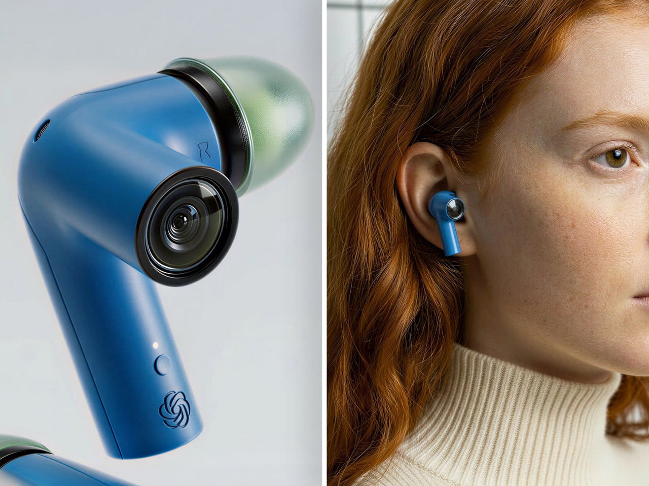
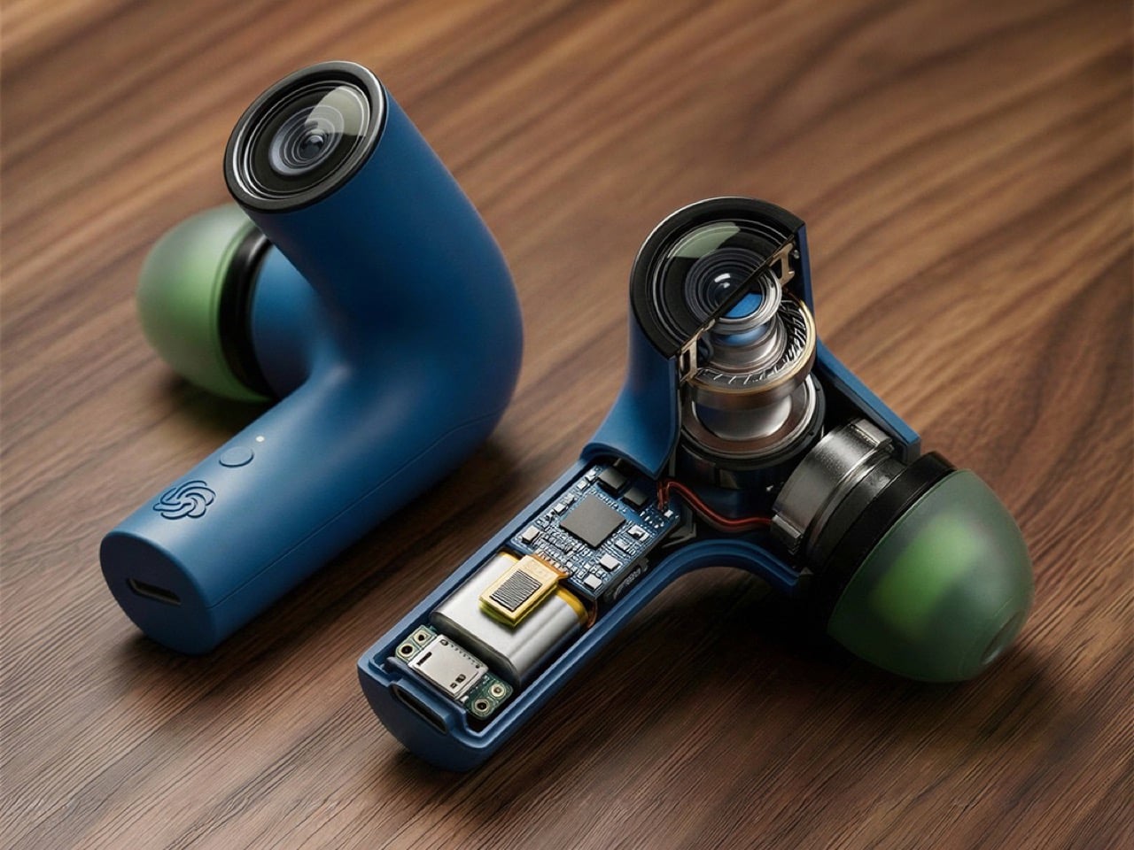
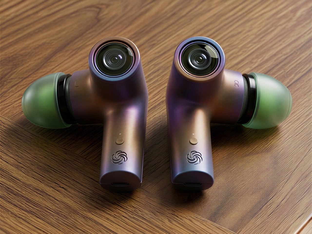
This concept imagines TWS earbuds with a twist. Each bud carries an extra stem with a built in camera, positioned close to your natural line of sight. Paired with ChatGPT, those lenses become a constant visual feed for an assistant that lives in your ears. It can read menus, interpret signs, describe scenes, and guide you through a city without a screen. The form factor stays familiar, the capabilities feel new. If OpenAI wants a hardware foothold, this is the kind of product that could make AI feel less like a demo and more like a daily habit. Here’s why a camera in your ear might beat a camera on your face.
Designer: Emil Lukas
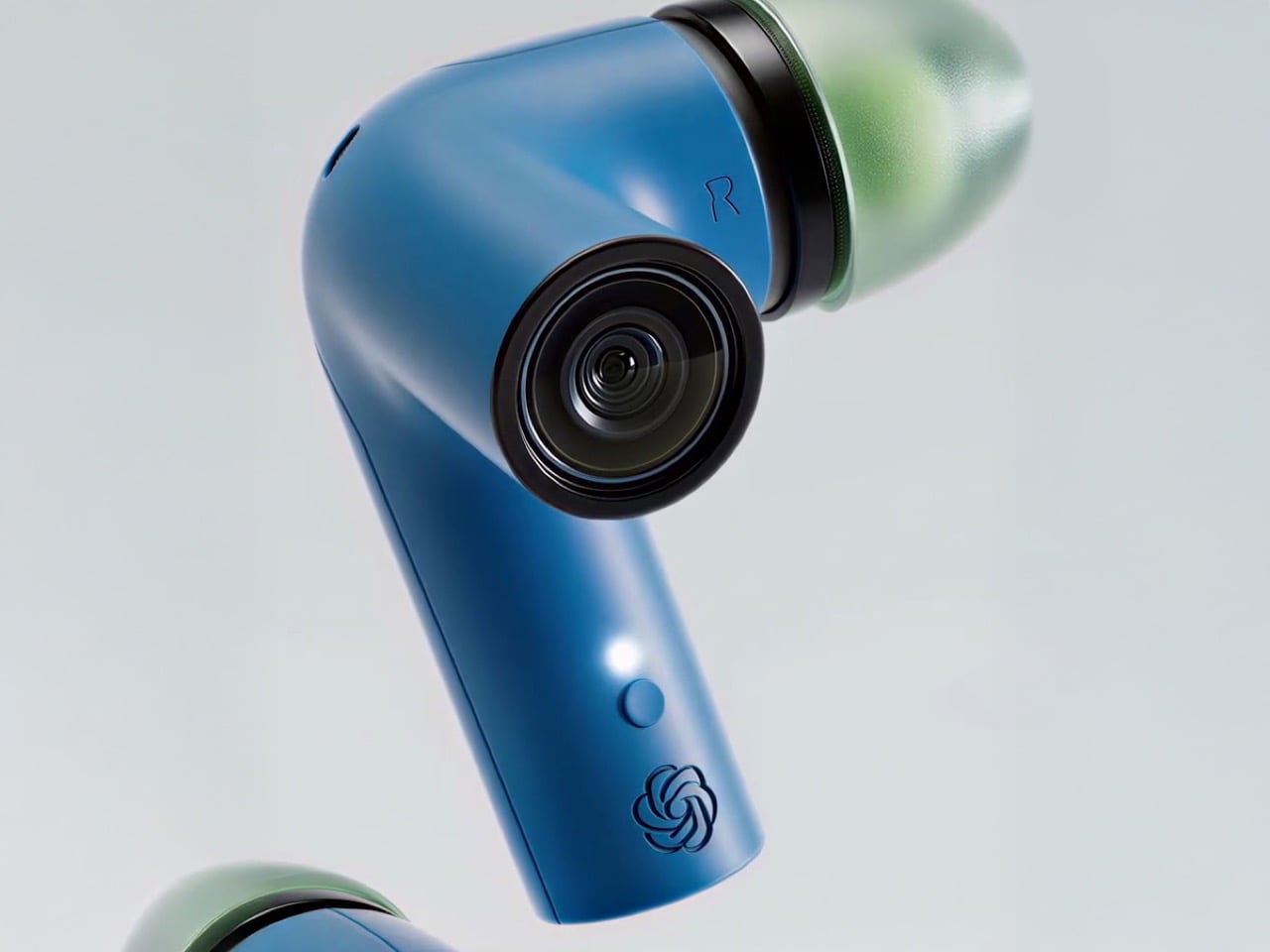
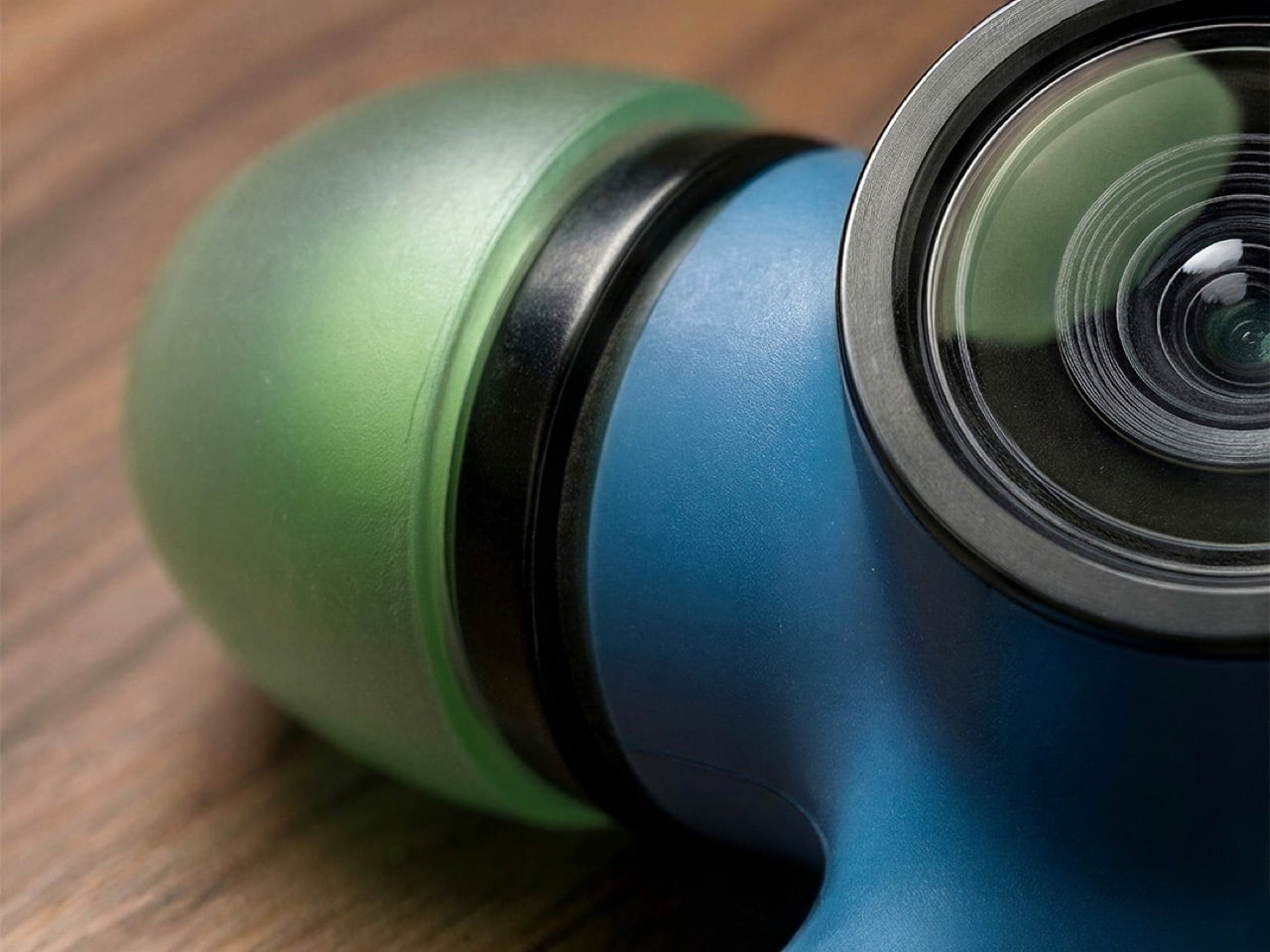
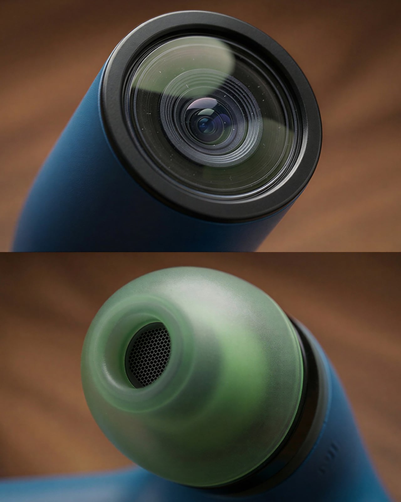
The industrial design has a sort of sci fi inhaler vibe that I weirdly like. The lens sits at the end of the stem like a tiny action cam, surrounded by a ring that doubles as a visual accent. It looks deliberate rather than tacked on, which matters when you are literally hanging optics off your head. The colored shells and translucent tips keep it playful enough that it still reads as audio gear first, camera second.
The cutaway render looks genuinely fascinating. You can see a proper lens stack, a sensor, and a compact board that would likely host an ISP and Bluetooth SoC. That is a lot of silicon inside something that still has to fit a driver, battery, microphones, and antennas. Realistically, any heavy lifting for vision and language goes straight to the phone and then to the cloud. On device compute at that scale would murder both battery and comfort.
All that visual data has to be processed somewhere, and it is not happening inside the earbud. On-device processing for GPT-4 level vision would turn your ear canal into a hotplate. This means the buds are basically streaming video to your phone for the heavy lifting. That introduces latency. A 200 millisecond delay is one thing; a two second lag is another. People tolerate waiting for a chatbot response at their desk. They will absolutely not tolerate that delay when they ask their “AI eyes” a simple question like “which gate am I at?”
Then there is the battery life, which is the elephant in the room. Standard TWS buds manage around five to seven hours of audio playback. Adding a camera, an image signal processor, and a constant radio transmission for video will absolutely demolish that runtime. Camera-equipped wearables like the Ray-Ban Meta glasses get about four hours of mixed use, and those have significantly more volume to pack in batteries. These concept buds look bulky, but they are still tiny compared to a pair of frames.
The practical result is that these would not be all-day companions in their current form. You are likely looking at two or three hours of real-world use before they are completely dead, and that is being generous. This works for specific, short-term tasks, like navigating a museum or getting through an airport. It completely breaks the established user behavior of having earbuds that last through a full workday of calls and music. The utility would have to be incredibly high to justify that kind of battery trade-off.
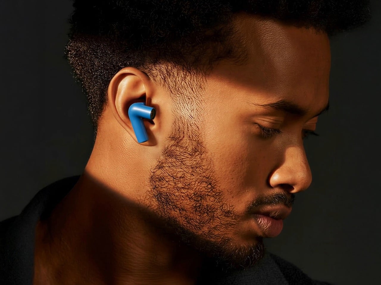
From a social perspective, the design is surprisingly clever. Smartglasses failed partly because the forward-facing camera made everyone around you feel like they were being recorded. An earbud camera might just sneak under the radar. People are already accustomed to stems sticking out of ears, so this form factor could easily be mistaken for a quirky design choice rather than a surveillance device. It is less overtly aggressive than a lens pointed from the bridge of your nose, which could lower social friction considerably.
The cynical part of me wonders about the field of view. Ear level is better than chest level, but your ears do not track your gaze. If you are looking down at your phone while walking, those cameras are still pointed forward at the horizon. You would need either a very wide angle lens, which introduces distortion and eats processing power for correction, or you would need to train yourself to move your whole head like you are wearing a VR headset. Neither is ideal, but both are solvable with enough iteration. What you get in return is an AI that can actually participate in your environment instead of waiting for you to pull out your phone and aim it at something. That shift from reactive to ambient is the entire value proposition, and it only works if the cameras are always positioned and always ready.
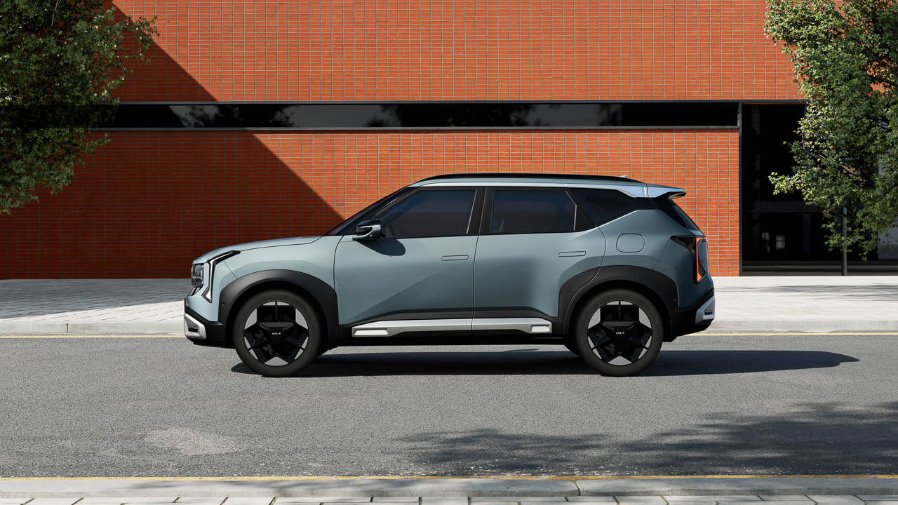
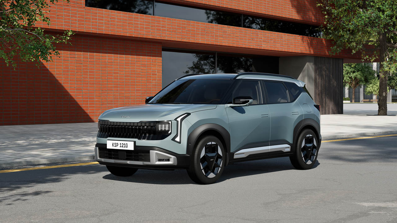
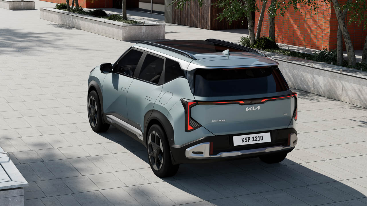
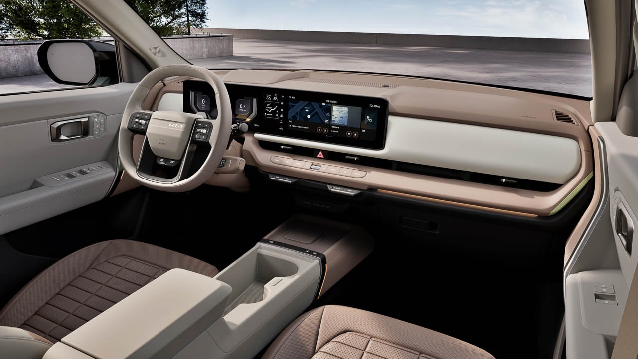
Five years of anonymity ends here. The original Seltos did exactly what Kia asked of it: occupy a parking space in the subcompact crossover segment, return decent fuel economy numbers, and avoid offending anyone with strong aesthetic opinions. Mission accomplished. The problem was that avoiding offense also meant avoiding interest. While Kia’s design teams were busy making the K5 look like it wanted to fight you and turning the Sportage into something your neighbor would actually comment on, the Seltos sat in driveways across America looking like a placeholder for a vehicle that might arrive someday with actual visual presence.
Designer: Kia
The 2027 model is that vehicle. Kia has scrapped the safe approach entirely, replacing sheet metal that blended into rental car fleets with styling divisive enough to generate actual conversations. The interior no longer resembles a budget proposition from 2018. A hybrid powertrain finally joins the lineup, arriving roughly half a decade after competitors proved buyers would pay extra for efficiency in this segment. Whether the transformation justifies waiting for the 2027 model or signals that Kia finally understood what the Seltos needed all along depends on your tolerance for “better late than never” product development.
Platform Math That Actually Matters
Kia moved the Seltos onto the K3 platform. Platform migrations rarely excite anyone outside engineering departments, but this one delivers changes you’ll register without reading a spec sheet. Extensive use of ultra-high-strength and hot-stamped steel enhances body rigidity throughout the structure. Doors shut with a dampened authority the previous Seltos couldn’t manage. Road imperfections that used to send vibrations through the steering column now get absorbed somewhere between the pavement and your palms.
Dimensional changes favor passengers over parking. The new Seltos measures 4,430 mm long, 1,830 mm wide, and 1,600 mm tall, riding on a 2,690 mm wheelbase that redistributes interior volume where it counts. Rear seat legroom increases noticeably. The proportions trade some of the previous model’s upright greenhouse for a profile that looks like it belongs on the road rather than waiting nervously at a stop sign. The stance improvement alone suggests Kia’s designers finally got permission to make the Seltos look intentional.
Proportions that once read as generic now communicate purpose. Lower roofline changes how the vehicle photographs and how it feels from behind the wheel. You sit in something rather than on top of something.
Powertrains arrive with options across the efficiency and performance spectrum. The base 2.0-liter petrol engine makes 149 PS and 179 Nm, optimized for fuel efficiency and smooth everyday driving. The turbocharged 1.6-liter T-GDI comes in two flavors: a standard output version producing 180 PS and 265 Nm with a seven-speed dual-clutch or six-speed manual, and a high-output variant delivering 193 PS and 265 Nm through an eight-speed automatic. All-wheel drive swaps the base torsion beam rear suspension for a multi-link setup and adds Terrain Mode with settings for Snow, Mud, and Sand.
Hybrid Arrives Fashionably Late
Kia will add a hybrid sometime in 2026, trailing the gas models by several months. Specific output figures haven’t been disclosed yet, though the hybrid will bring higher efficiency and expanded everyday usability to the lineup.
The efficiency headline matters less than the features bundled with hybridization. Vehicle-to-Load capability transforms the battery pack into a portable power source. Tailgaters can run a TV. Contractors can charge tools. Campers can keep phones alive without hunting for outlets. That practical utility separates the Seltos Hybrid from efficiency-only competitors.
Kia’s Smart Regenerative Braking System 3.0 automatically adjusts regenerative braking based on traffic flow and navigation data to optimize energy recovery. For buyers who’ve watched the hybrid crossover segment mature while the Seltos offered only gasoline options, the wait has been frustrating. At least the delay allowed Kia to include features that early hybrid adopters had to do without.
Styling That Picks Fights
The front fascia abandons any pretense of subtlety. Kia’s star map lighting signature dominates the grille, paired with a dynamic welcome light sequence that animates on approach. Trim-dependent light signatures differentiate models. Flush door handles enhance aerodynamics and add visual sophistication.
Diagonal character lines run along the profile, while a floating roofline and strong shoulder contours create a dynamic silhouette that conveys forward motion even when stationary. Contrasting cladding and satin silver accents emphasize durability and refinement. The effect demands attention in ways the previous Seltos actively avoided.
Profile proportions stay recognizable but tighten considerably. Wheel arch cladding gains sculptural depth without the aggressive plastic additions that make some crossovers look like they’re wearing protective gear.
Three standout colors debut with the new model: Iceberg Green, Gravity Gray, and a bold matte Magma Red that photographs well enough to suggest Kia invested real effort in the paint development. The overall effect is polarizing by design.
Buyers who found the previous Seltos too bland may love this. Buyers who preferred blending in may find the new face exhausting. Kia appears comfortable with that trade-off, betting that memorable beats forgettable even when memorable divides opinion.
Interior Debt Repaid
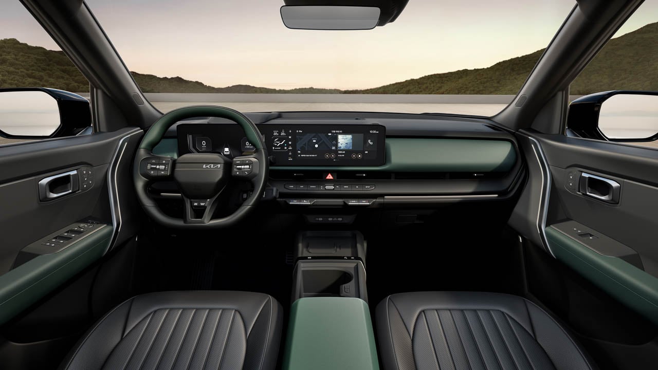
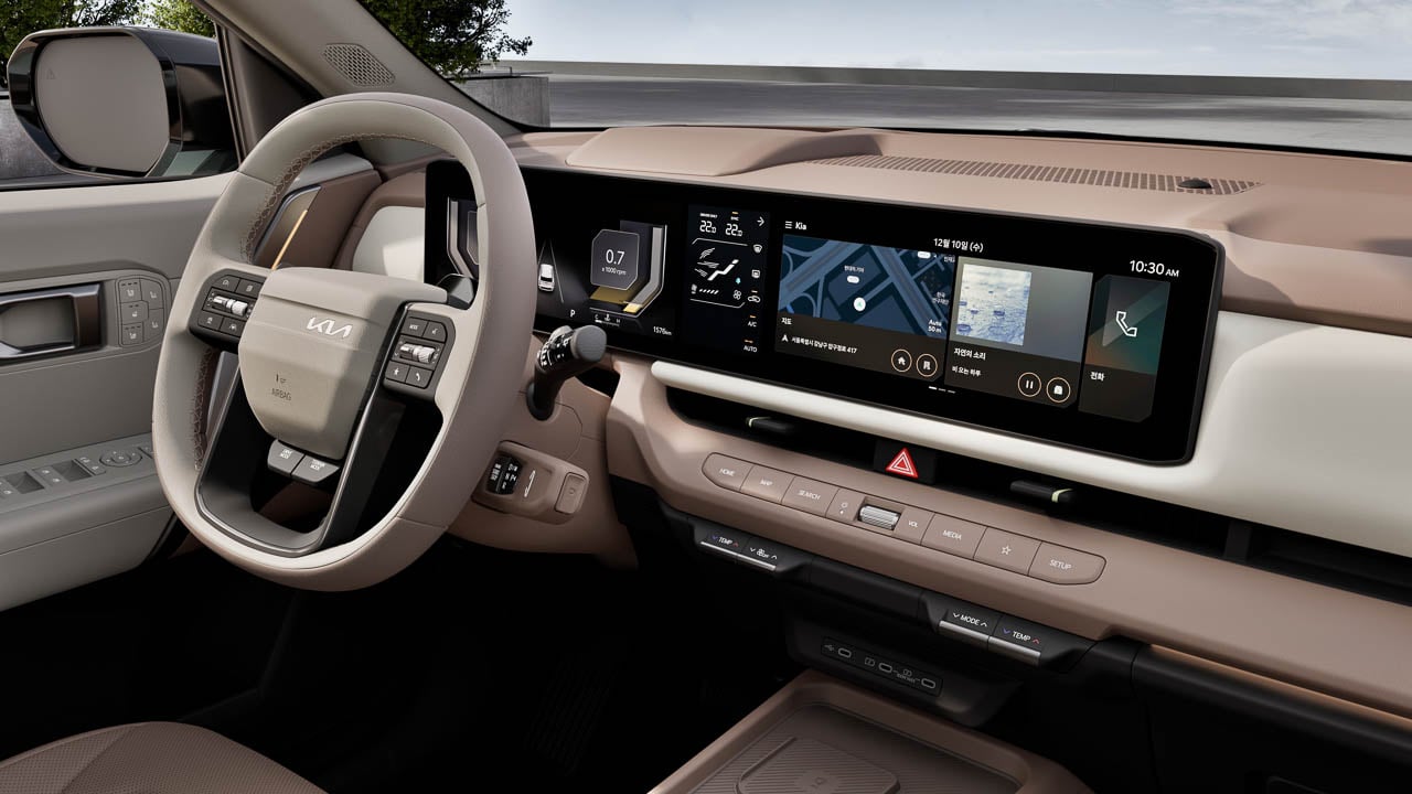
Cabin improvements run deeper than the dual 12.3-inch screens dominating the dashboard, though those screens certainly establish the generational leap immediately. A dedicated climate control panel sits between the displays with physical buttons and knobs for temperature, fan speed, and the functions drivers adjust without looking.
Customizable 64-color mood lighting enhances the cabin ambience, providing visual depth without the purple-and-pink nightclub aesthetic that afflicts competitors trying too hard. The effect is modern without being desperate.
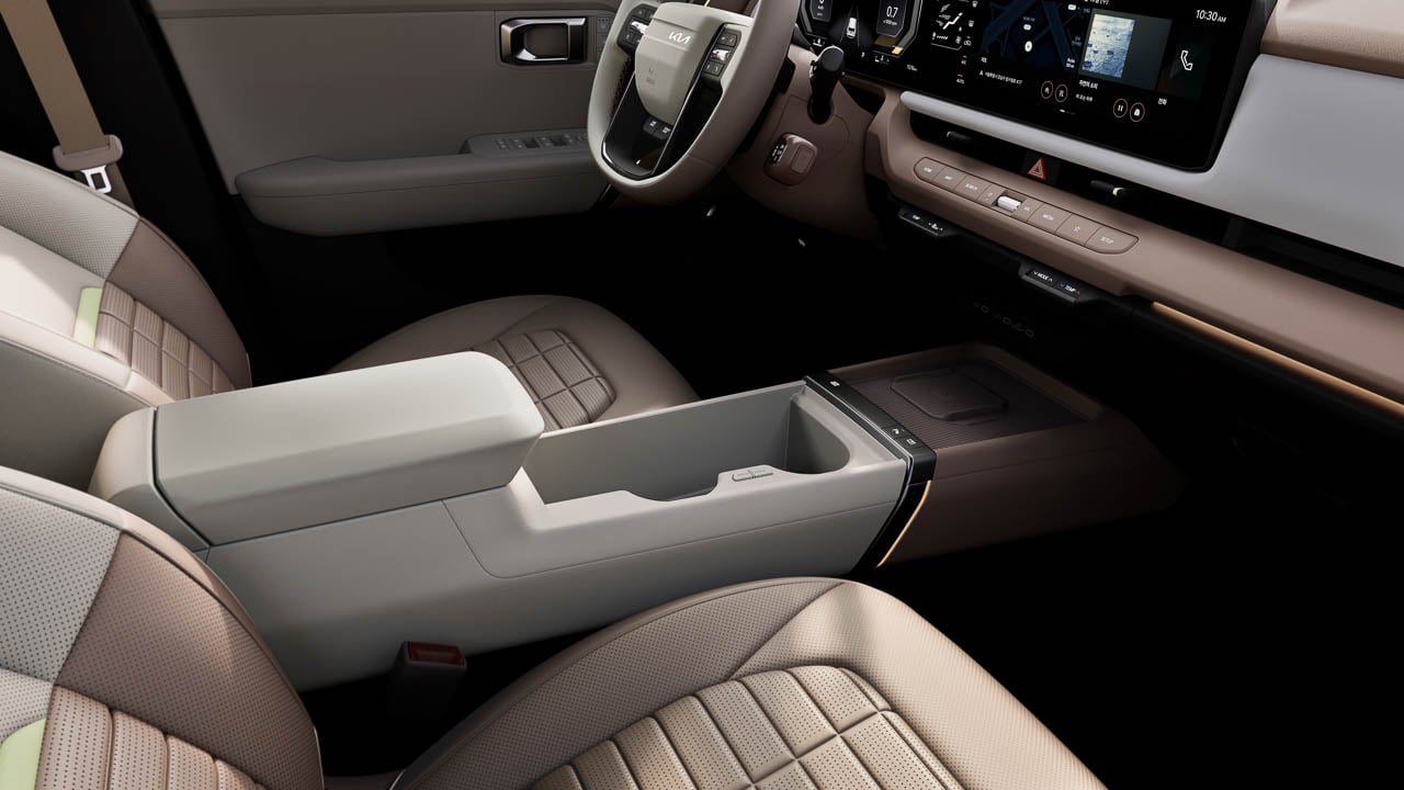
The gear shifter migrates to a column-type Shift-by-Wire system, freeing up the center console for storage bins deep enough to swallow a phone without drama and cupholders sized for actual beverages. This layout contributes to a more open cabin environment.
A low, horizontal dashboard enhances forward visibility and creates a sense of openness, while optimized packaging ensures generous headroom and legroom for all passengers. Second-row seats adjust by a total of 24 degrees, tilting 12 degrees forward and 12 degrees backward. Cargo volume reaches a class-leading 536 liters, with a foldable dual-level cargo board adding organizational flexibility. Passengers who suffered through the previous Seltos’s cramped quarters will notice the improvement immediately.
Premium materials convey both modernity and comfort throughout the interior. The previous Seltos interior felt perpetually compromised. This one suggests Kia finally treated the cabin as a priority rather than a cost-reduction opportunity. That shift in philosophy matters more than any individual feature upgrade.
Feature Density Matches Larger Siblings
Technology concentration reaches levels that would have seemed absurd for a subcompact crossover when the Seltos launched in 2019. Wide panoramic sunroof for an open atmosphere. A 12-inch windshield head-up display projects key driving information directly in the driver’s line of sight. USB ports delivering 100 watts rather than the trickle charging that used to pass for adequate.
Audio options from both Harman Kardon and Bose deliver immersive, high-fidelity sound optimized for the cabin’s acoustic architecture. The Kia Connect Store enables digital personalization and entertainment options, including collaborations with Disney and NBA. Feature-on-Demand brings YouTube, Netflix, and display theme options. The Kia AI assistant, powered by ChatGPT, enables natural conversational interaction. Over-the-air updates keep systems current without dealer visits. Digital Key 2 enables secure smartphone-based vehicle access and sharing.
The driver assistance package bundles Highway Driving Assist 2, Lane Following Assist 2, Forward Collision-Avoidance Assist 2, Safe Exit Warning, Surround View Monitor, Parking Collision-Avoidance Assist-Reverse, and Parking Distance Warning covering front, side, and reverse approaches. The previous Seltos consistently trailed its platform siblings in feature availability, as though Kia assumed subcompact buyers wouldn’t notice or care about the disparity. This generation closes that gap aggressively.
Timeline and Buyer Calculus
Global production begins December 2025 starting with India. South Korea, North America, Europe, and China follow throughout 2026. U.S. specifications and pricing should emerge within months. Hybrid details will arrive later.
The marketing campaign positions Seltos drivers as “protagonists” in their own narratives, which is exactly the aspirational corporate language that invites dismissal. Ignore it. The vehicle transformation underneath that messaging is substantive. The 2027 Seltos finally looks like it belongs in Kia’s current design portfolio rather than lingering as evidence of what the brand used to settle for.
Practical considerations: buyers who need a small crossover immediately can find excellent options from Toyota, Honda, and Mazda. Buyers specifically interested in hybrid efficiency should wait for the Seltos Hybrid or consider alternatives already on the market. Buyers who want something distinctive enough to locate in a parking lot without pressing the key fob, and who can tolerate the wait, might find the 2027 Seltos worth the patience.
After five years of forgettable competence, the Seltos finally demands attention. That’s either exactly what this segment needed or more personality than subcompact crossover buyers actually want. Sales figures will arbitrate.



 ) Sunrise Clock Air Purifier is a compact attempt to pull some of those tools into one object. It is a small bedside cylinder that cleans the air, glows like a sunrise to wake you gently, plays soft sounds, shows the time, and charges your phone, all while looking more like a design piece than some cold, drab piece of appliance. But does this striking appliance work as advertised? We put it beside our comfy bed to find out.