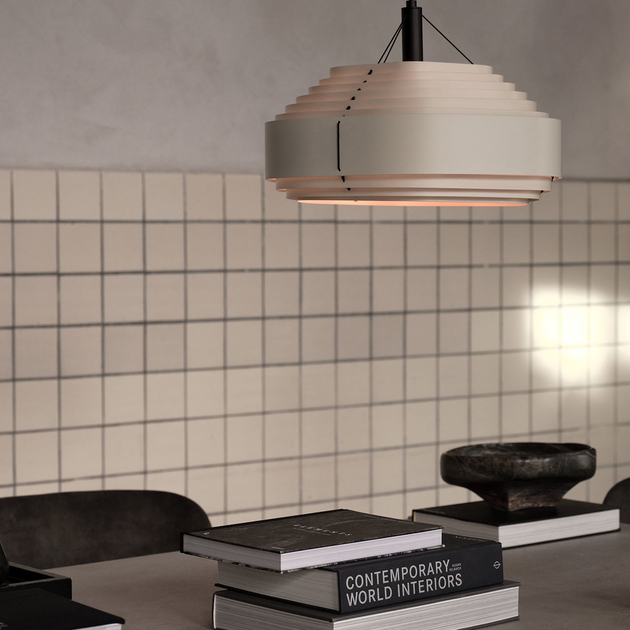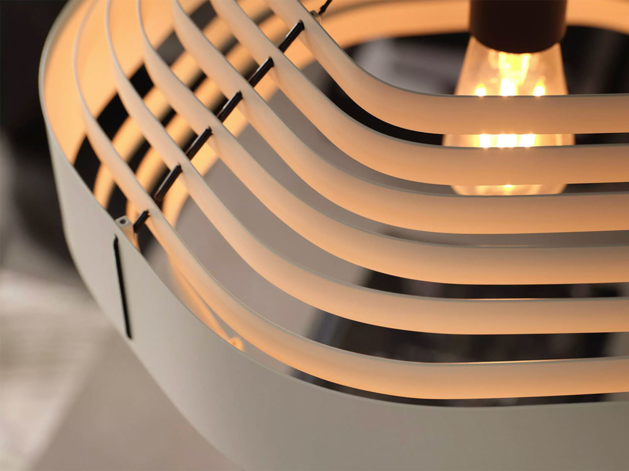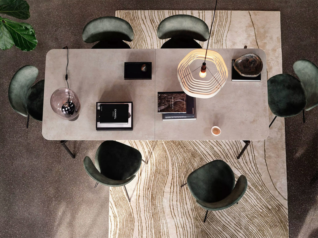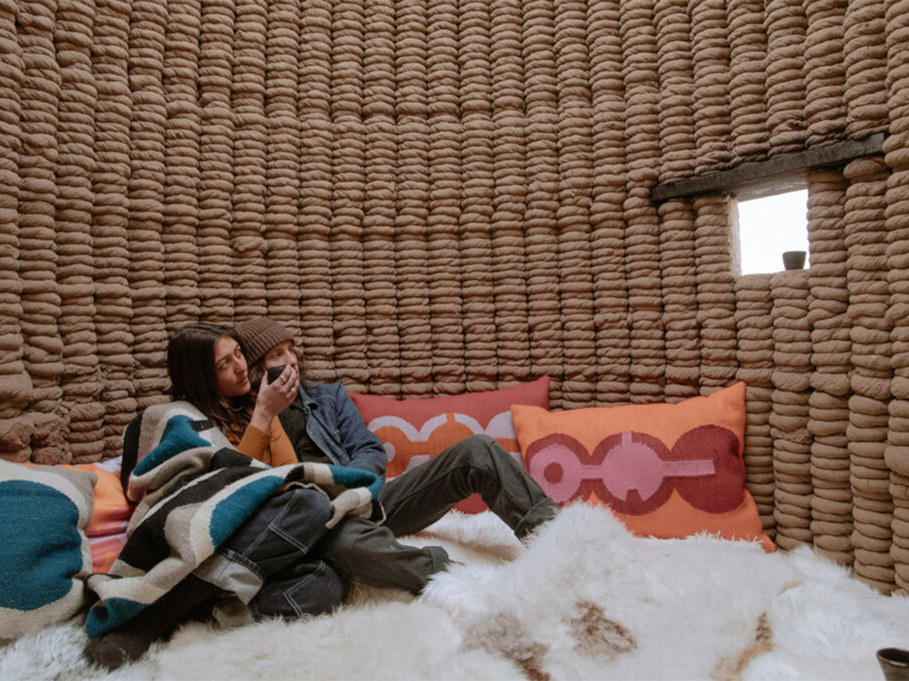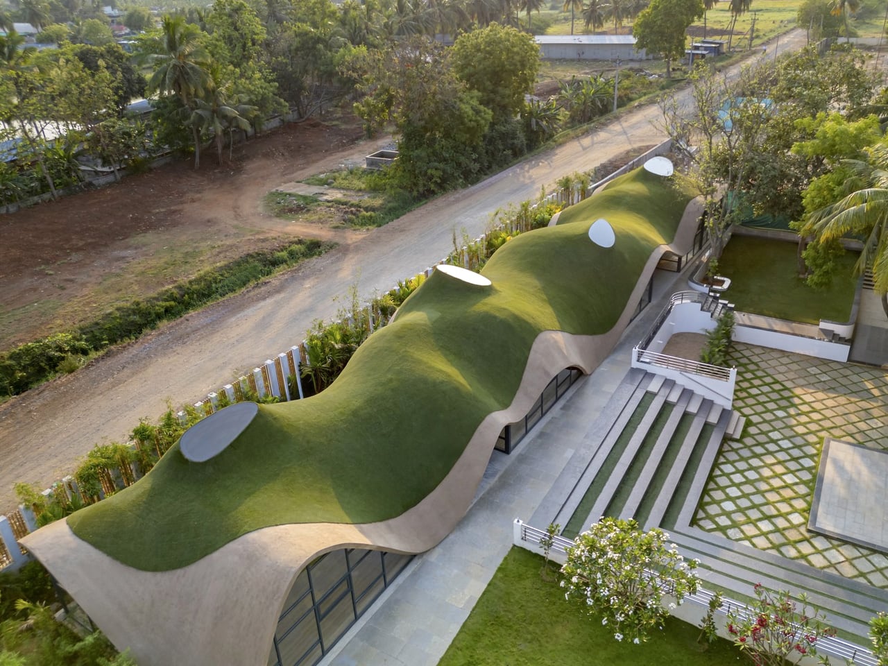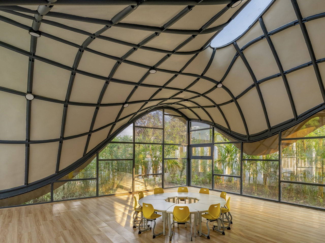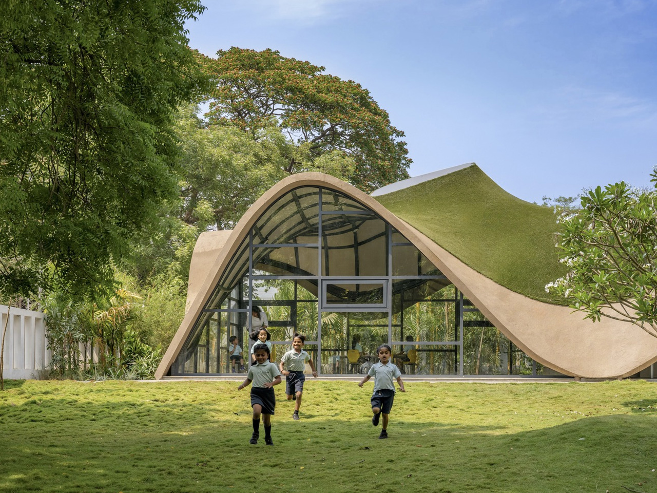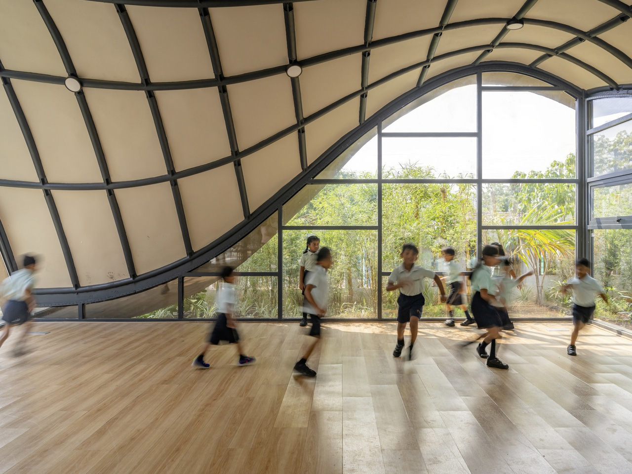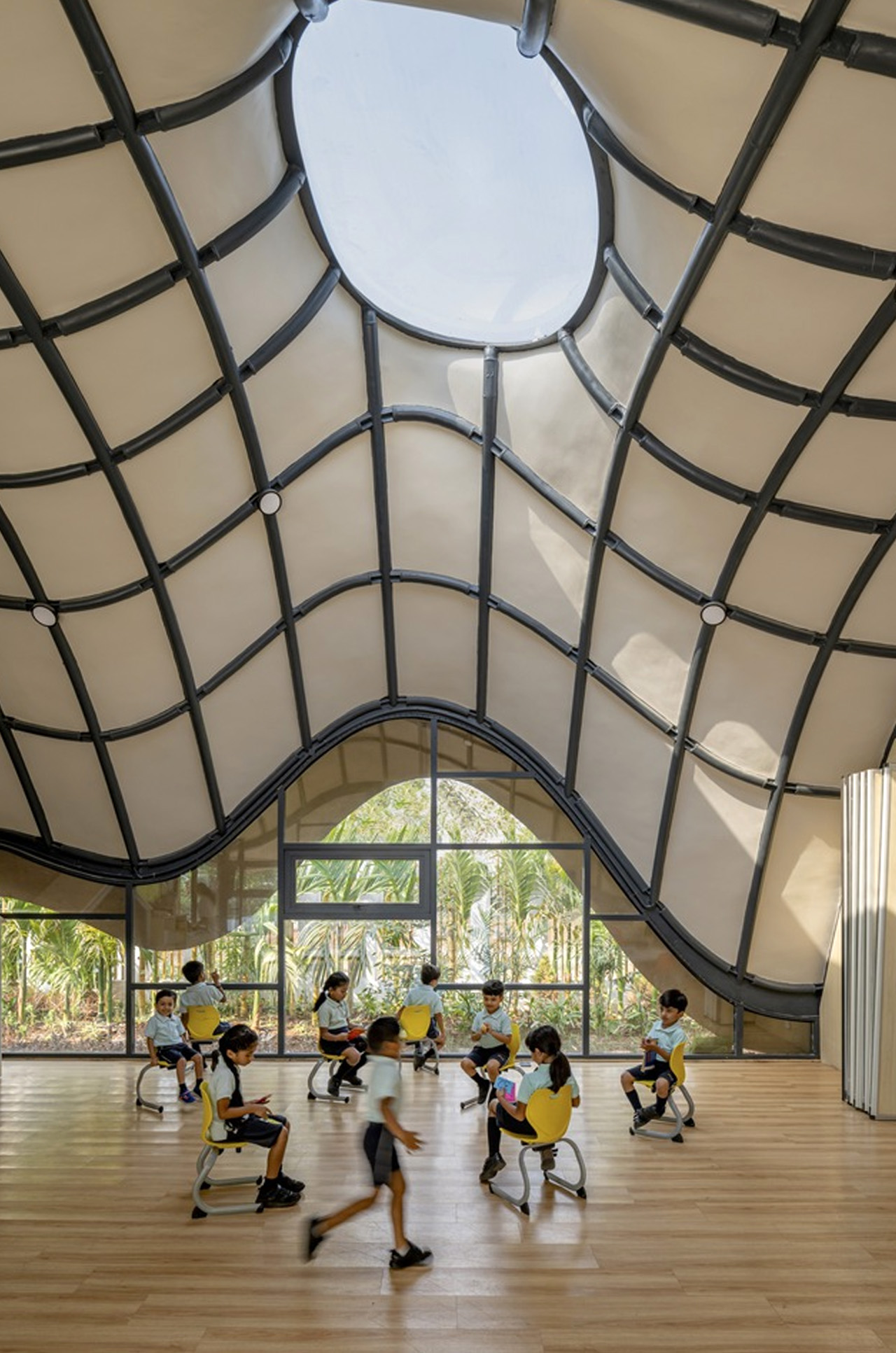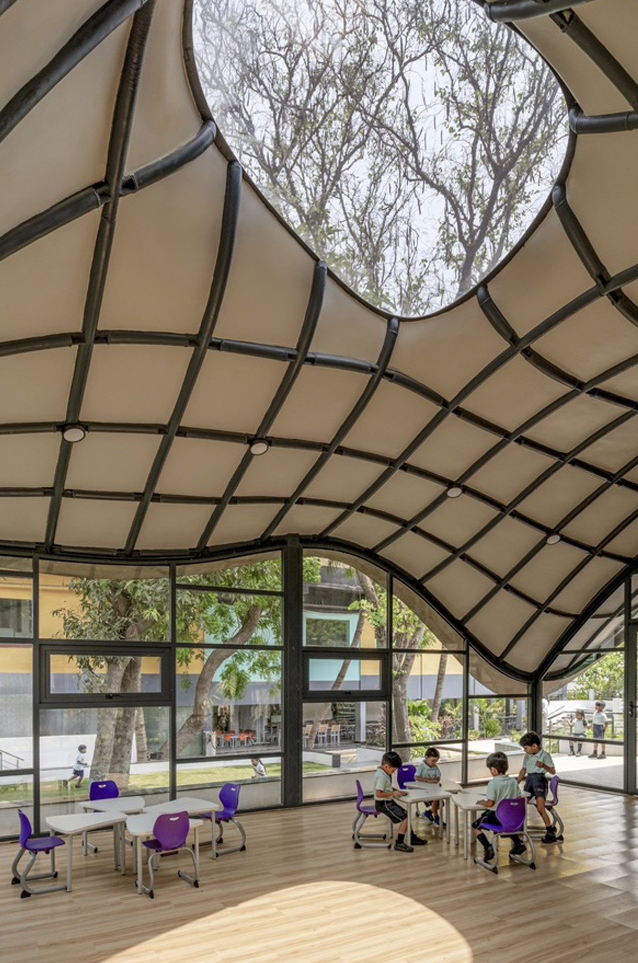
The latest trend in interior design, known as ‘organic shapes,’ embraces soft, oversized curves and luxurious silhouettes, creating a welcoming ambiance in any space. This trend transforms furniture and décor, mirroring the fluidity of nature for a serene atmosphere. From curved sofas to asymmetrical curvaceous tables, it’s a common design feature that adds a touch of modern sophistication to interior spaces.
Organic shapes consist of flowing lines and sweeping curves inspired by nature, free from rigid structures, sleek lines, or sharp angles. These forms reflect the natural contours that are found in landscapes and greenery. Additionally, their soft shapes evoke feelings of comfort and calm. Here are the top 10 why organic shapes are a growing trend in interior design.
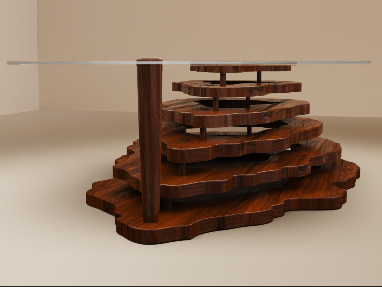
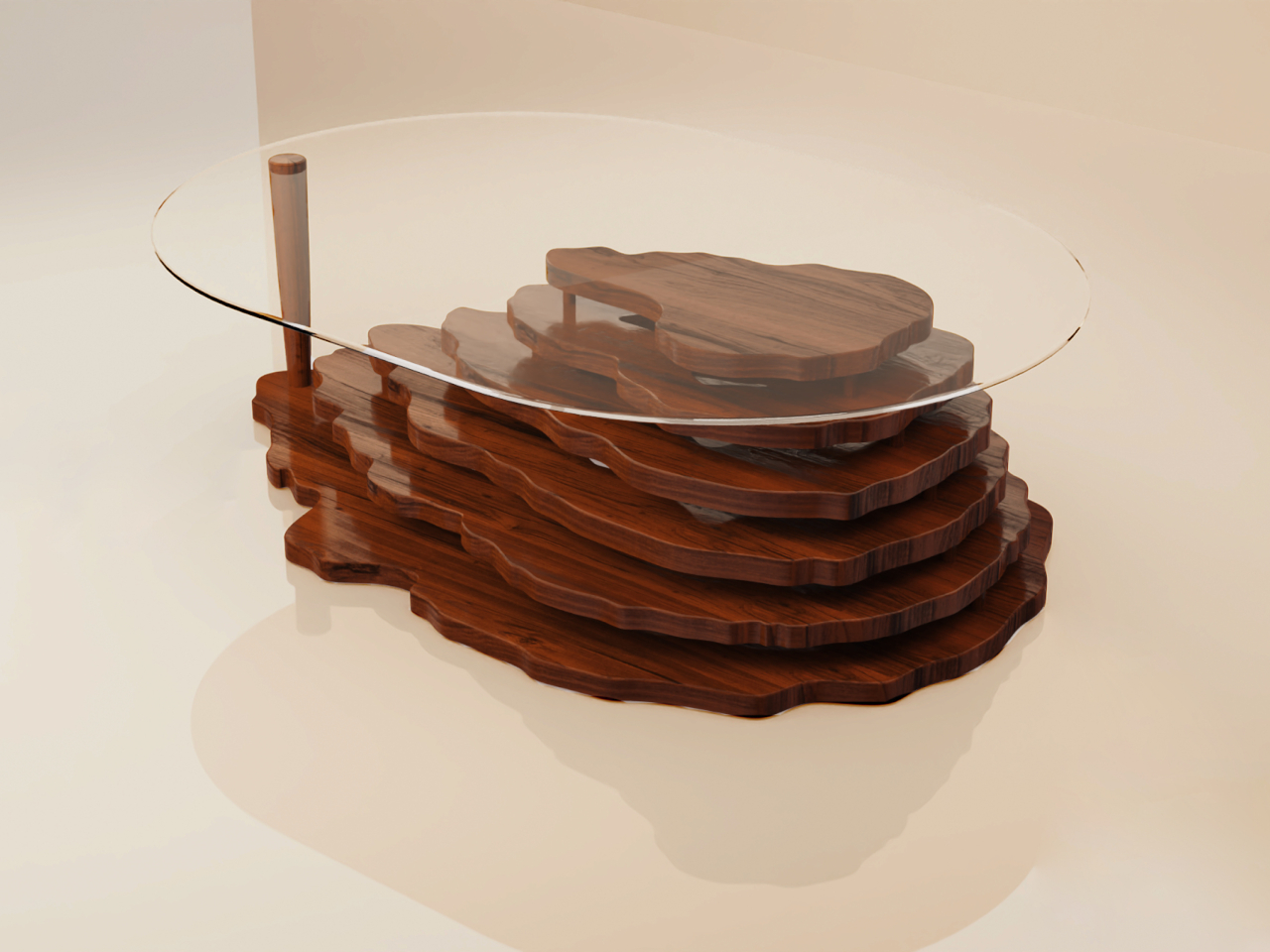
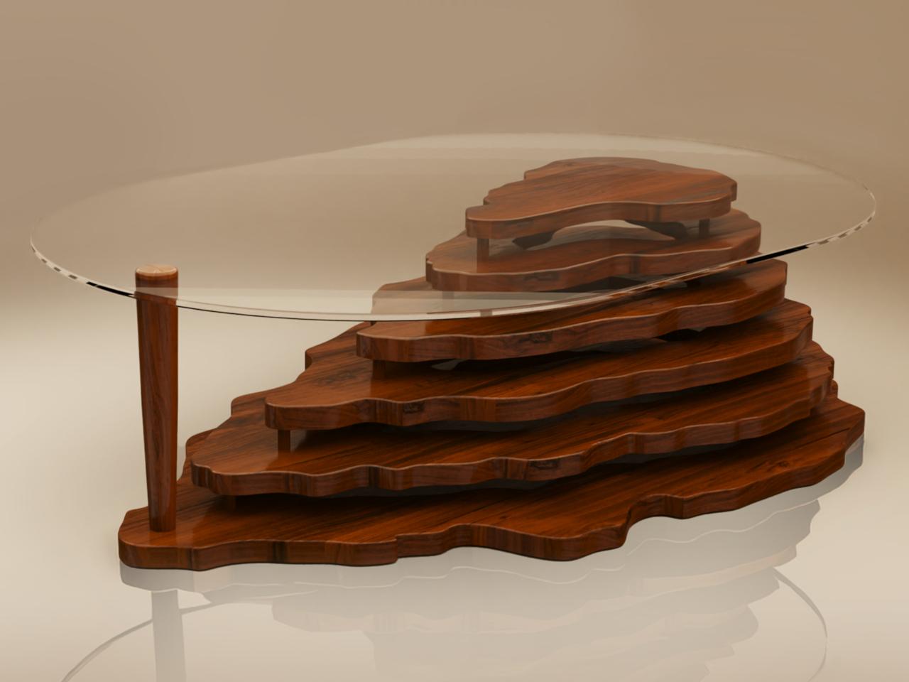
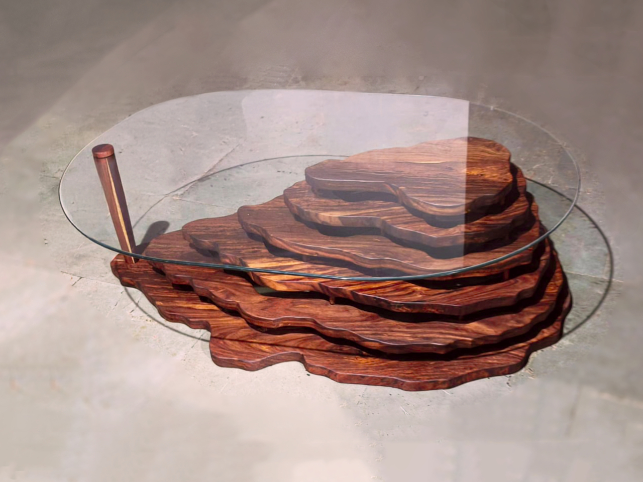
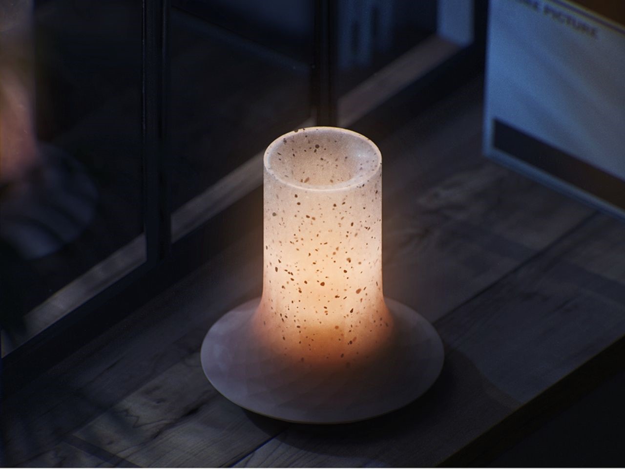
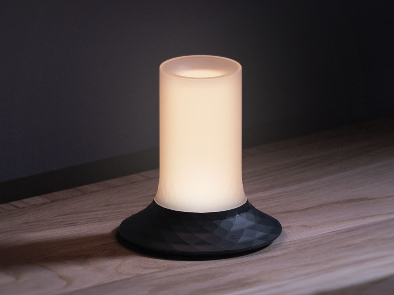
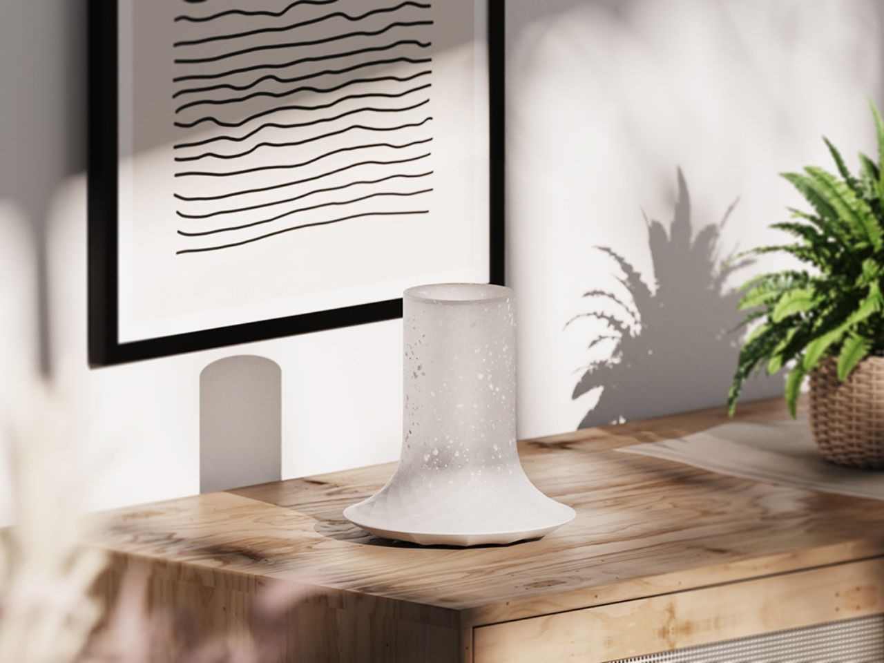
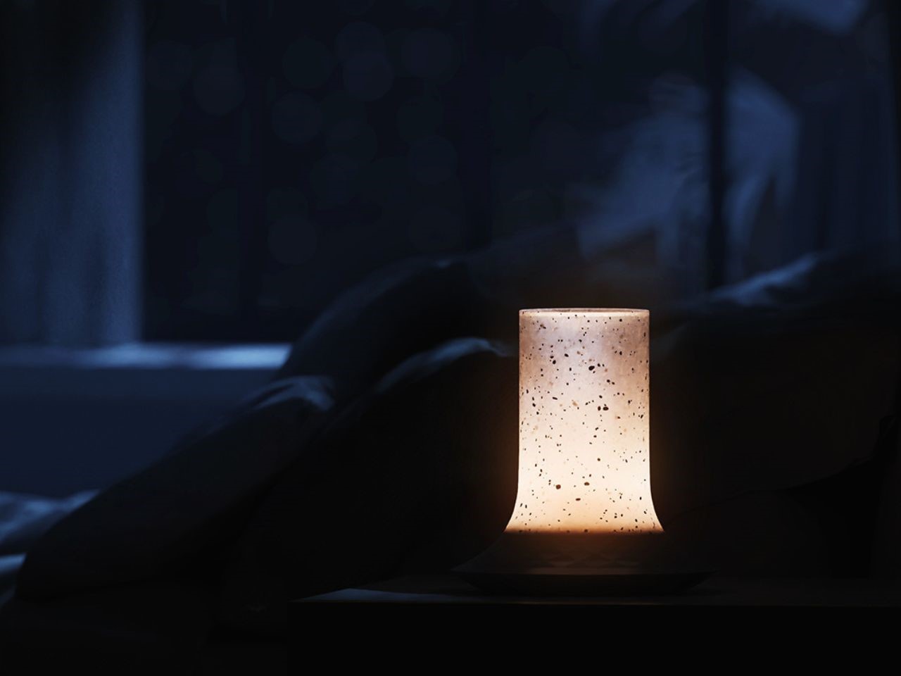
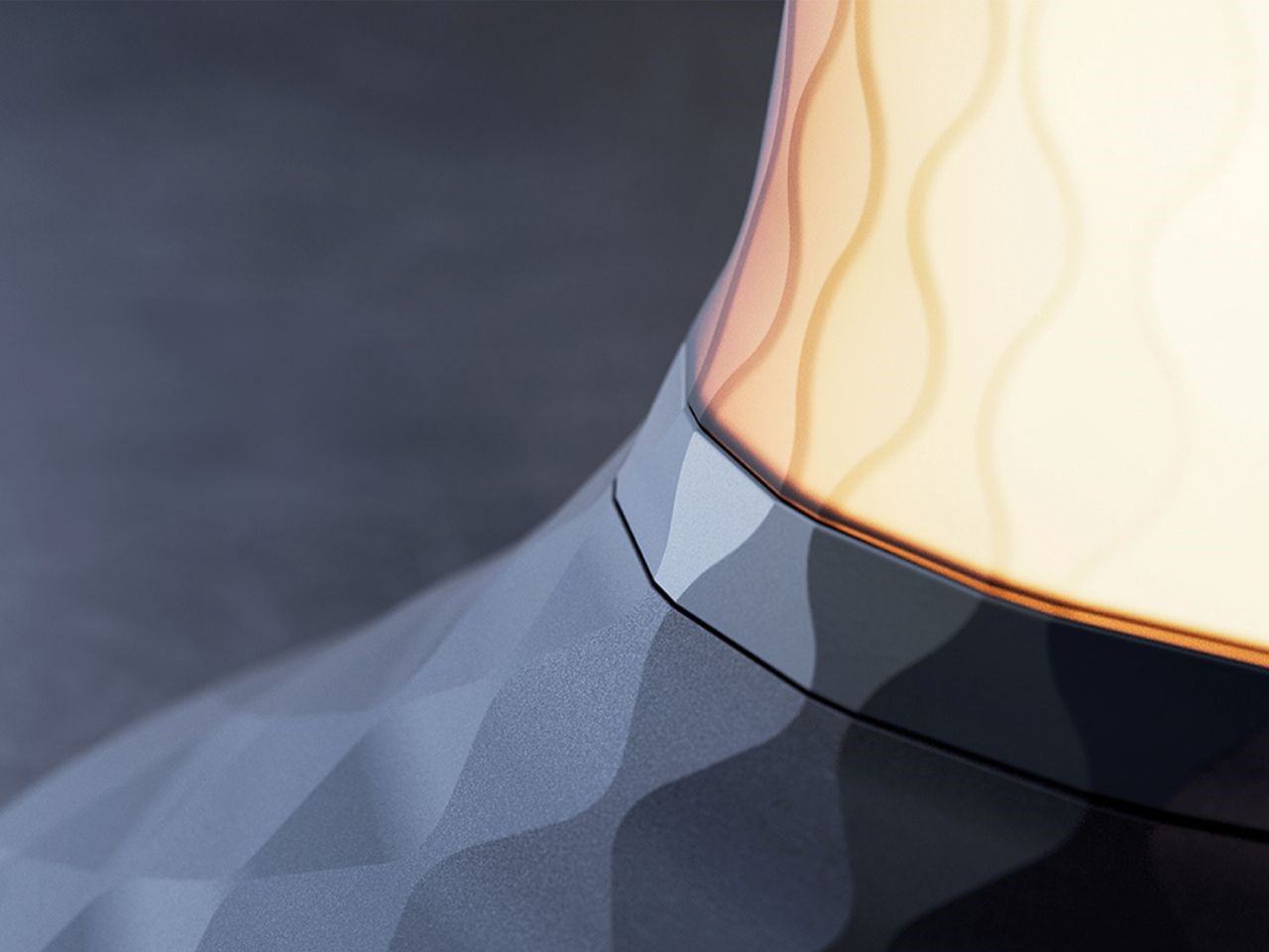
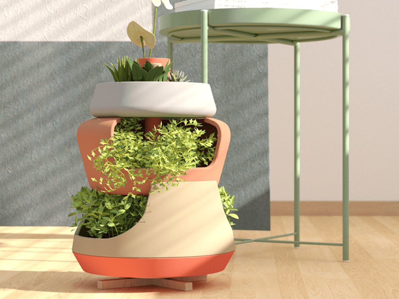
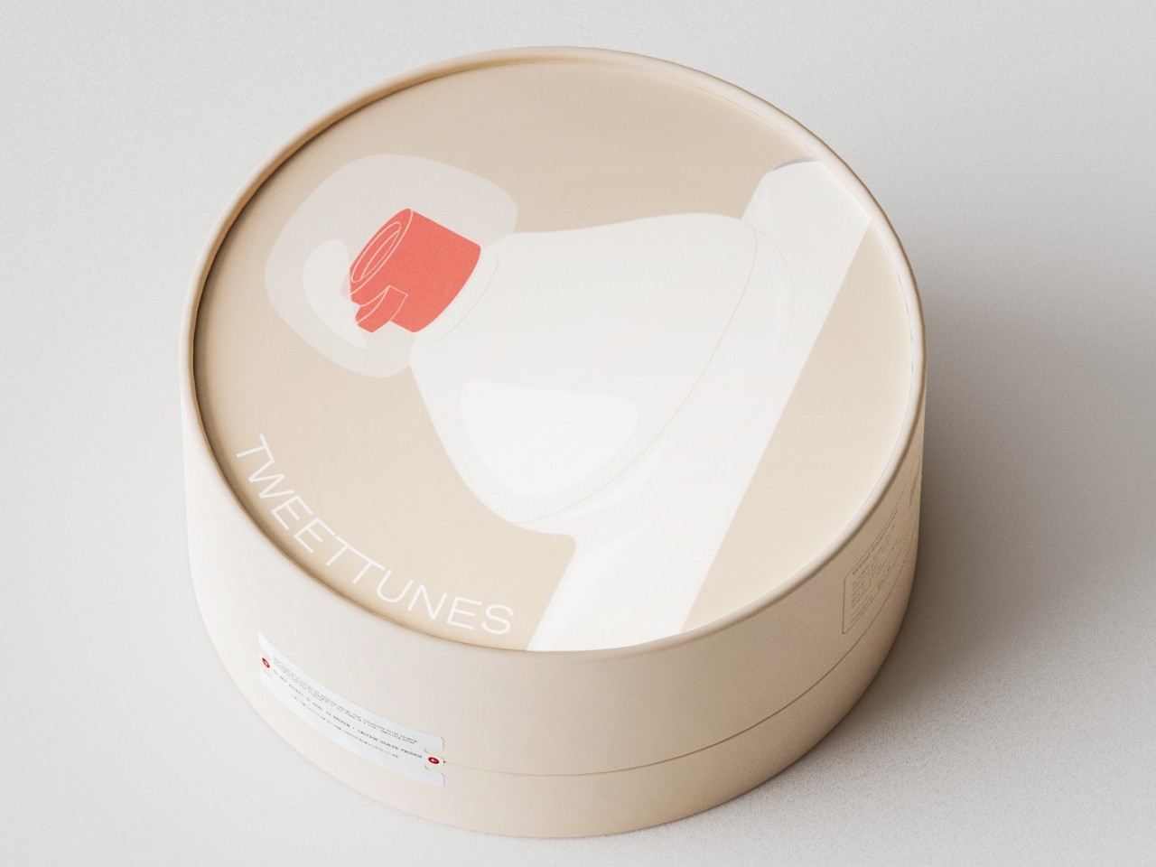
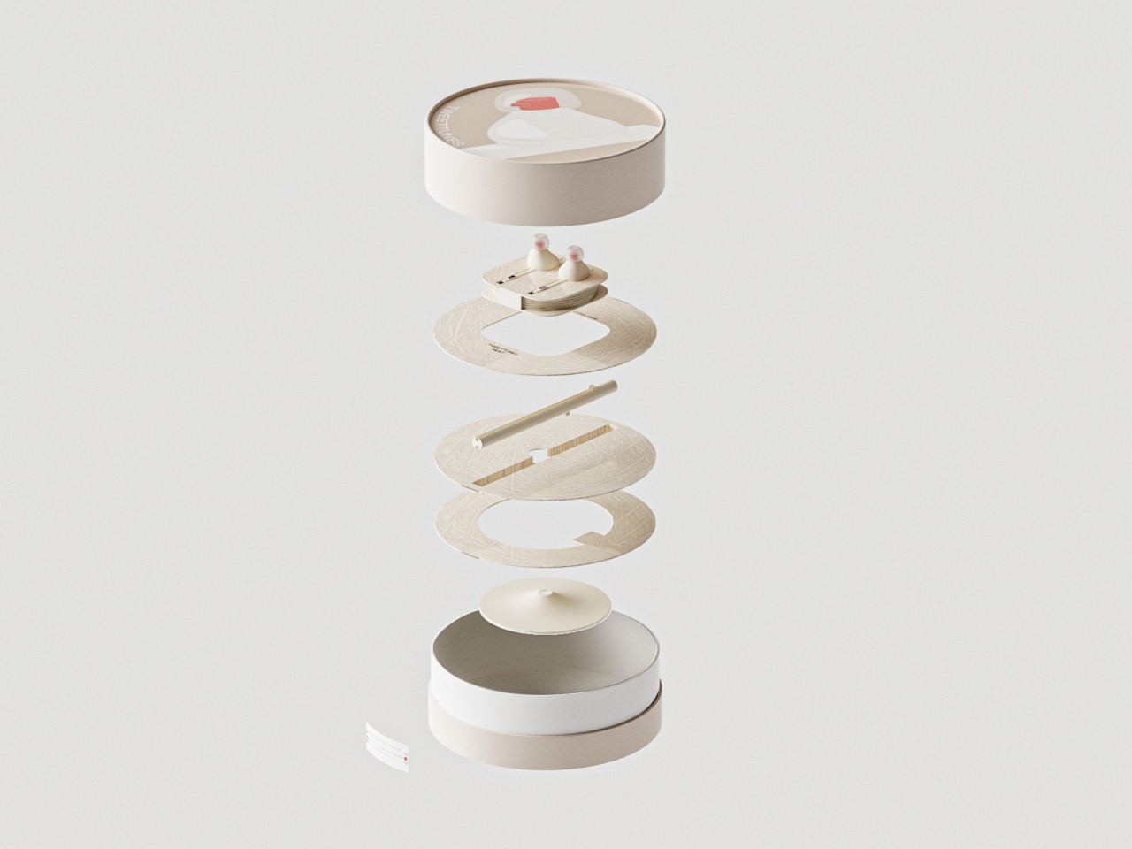
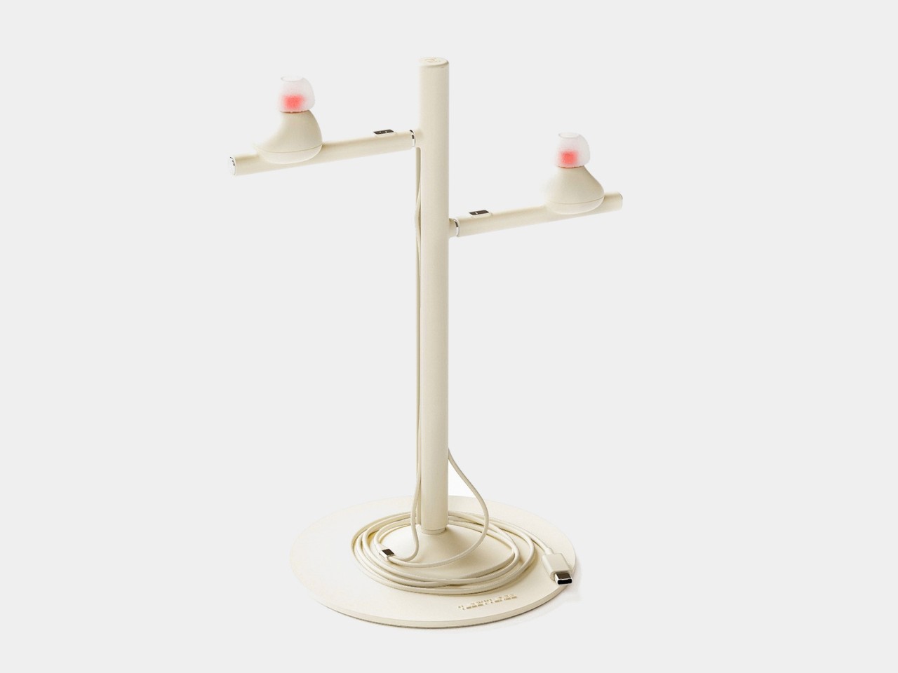
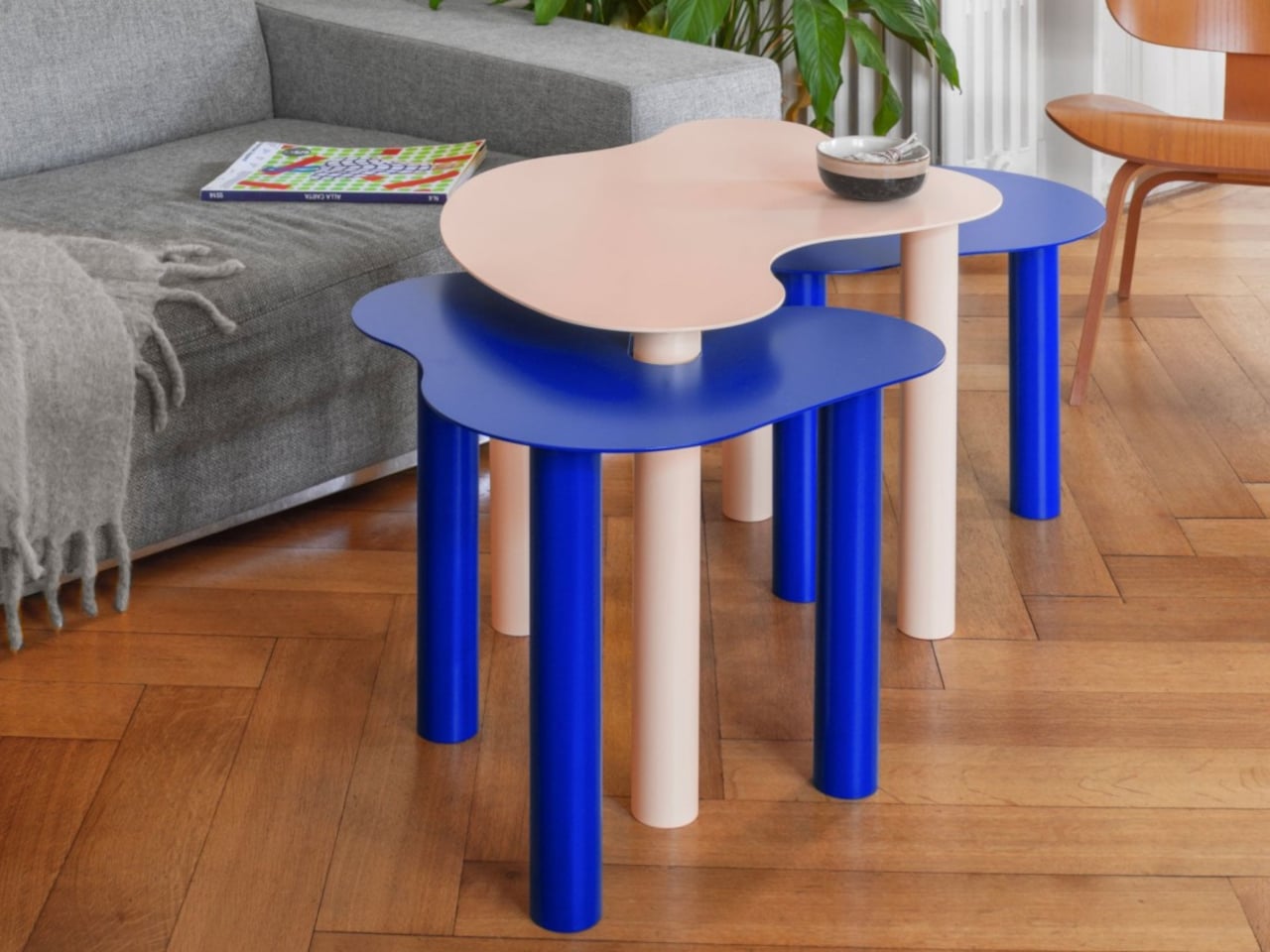
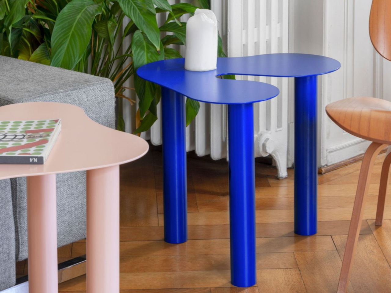
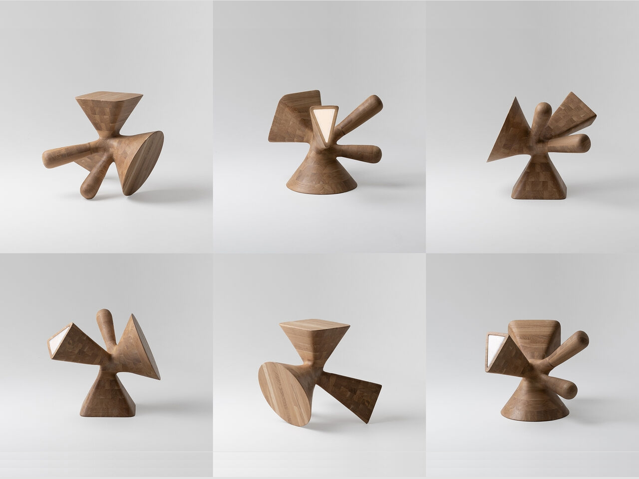
Designer: Superlife
1. Natural Elegance
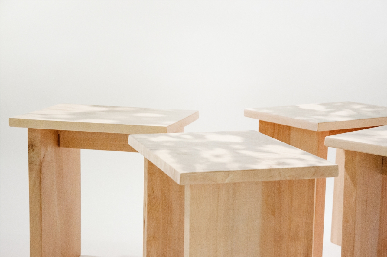
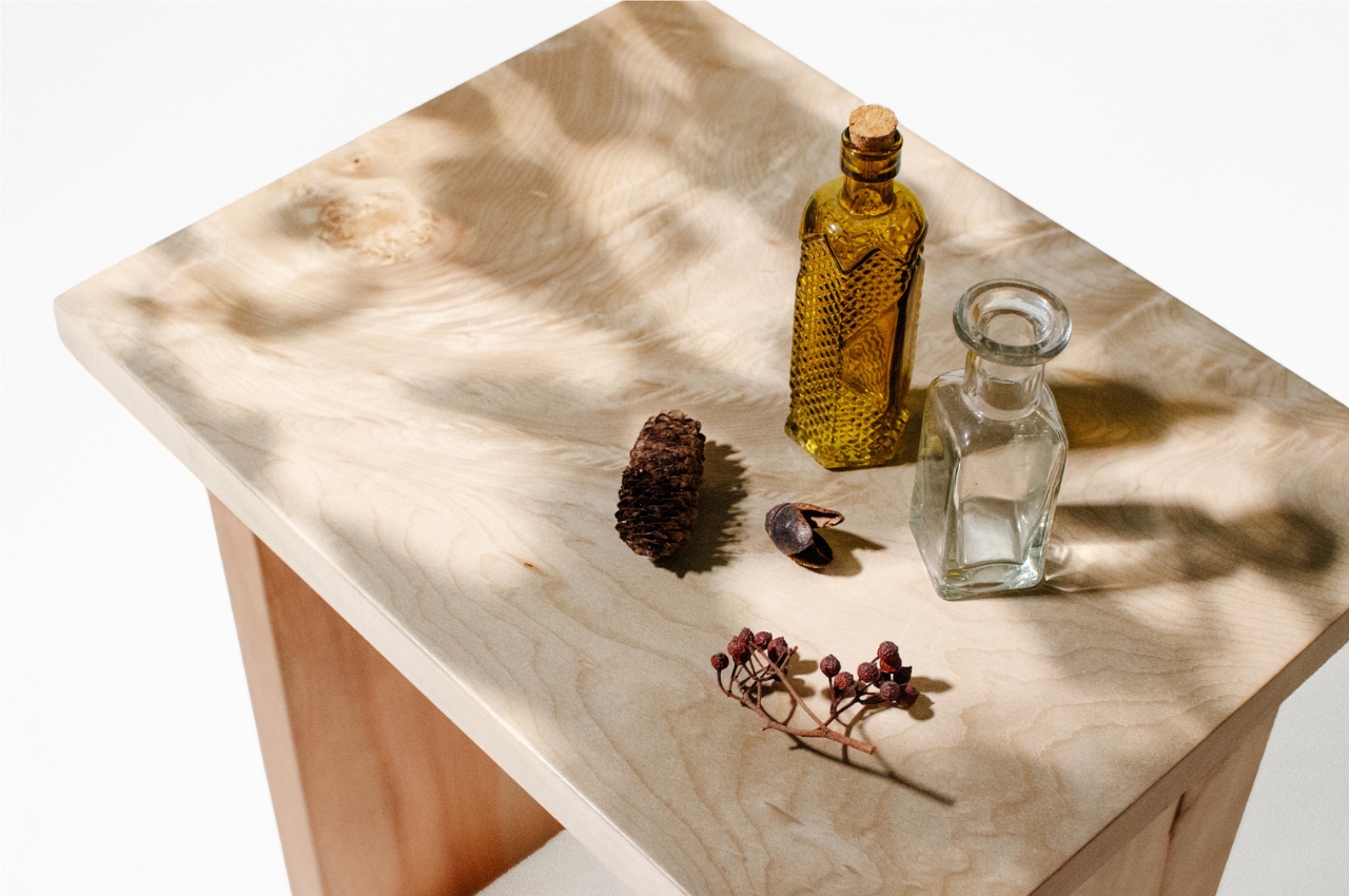
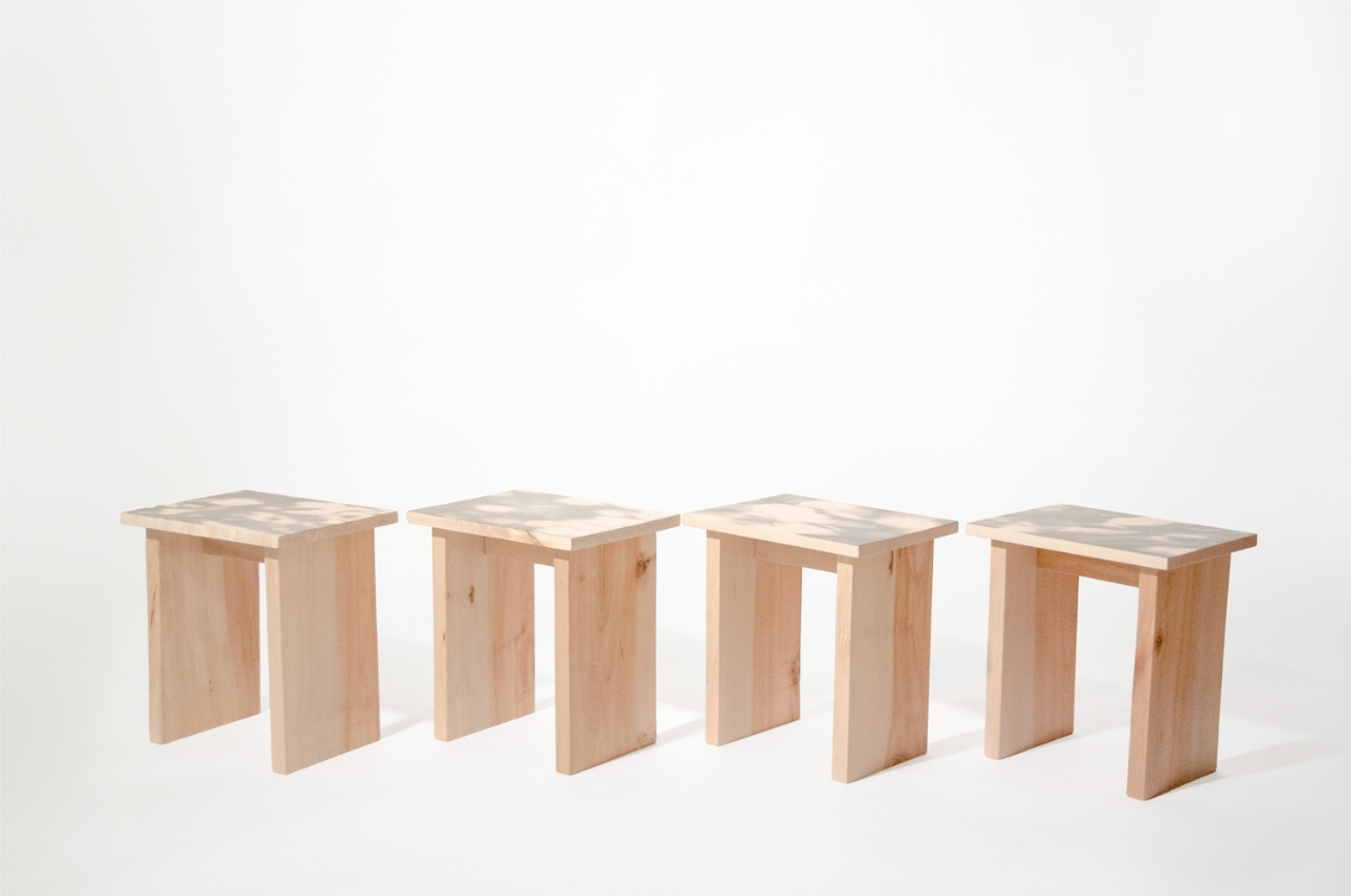
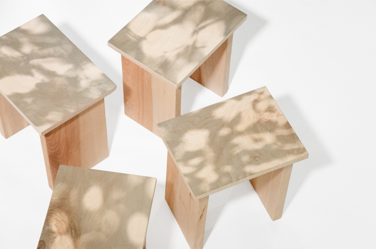
Organic shapes are reminiscent of the natural world and offer a visually appealing and soothing effect. Our eyes are naturally drawn to these shapes and remind us of the innate beauty found in the world around us. And just like nature, this beauty doesn’t always come from complexity but from unexpected simplicity.
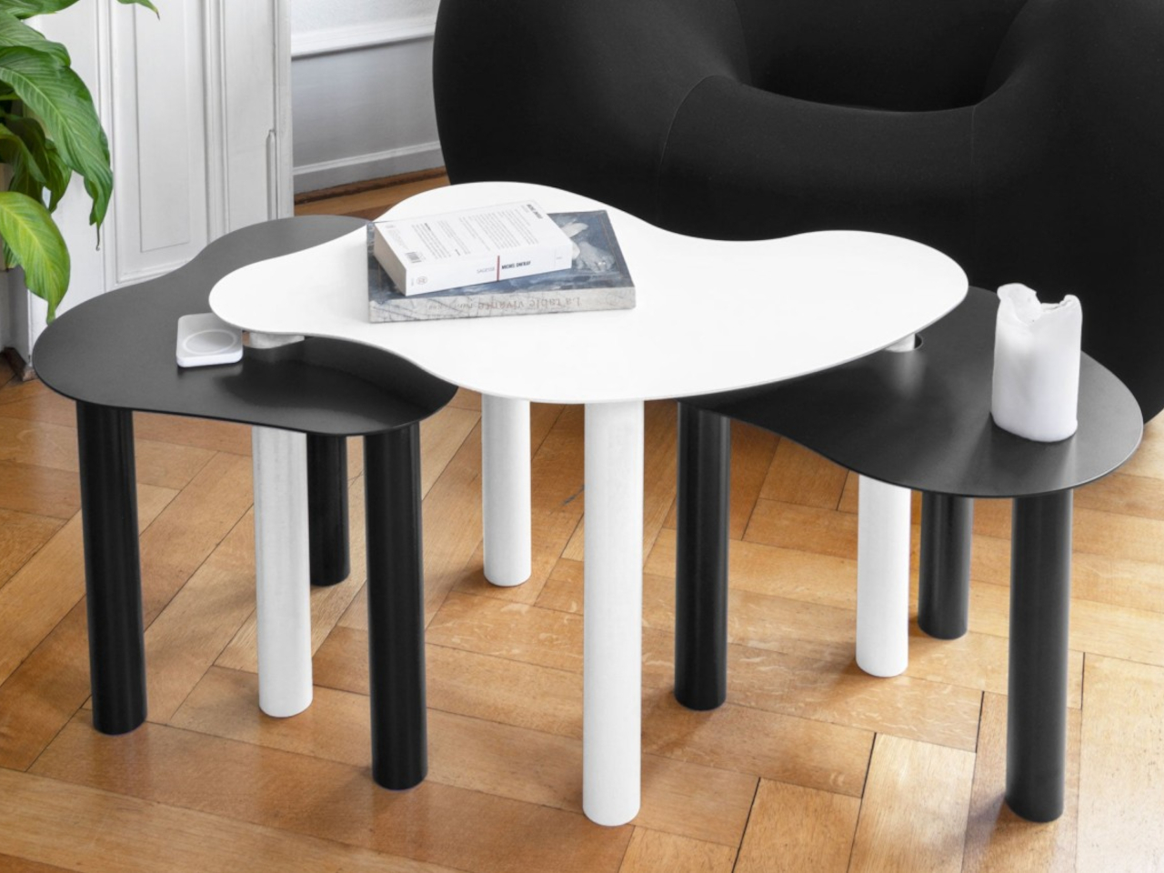
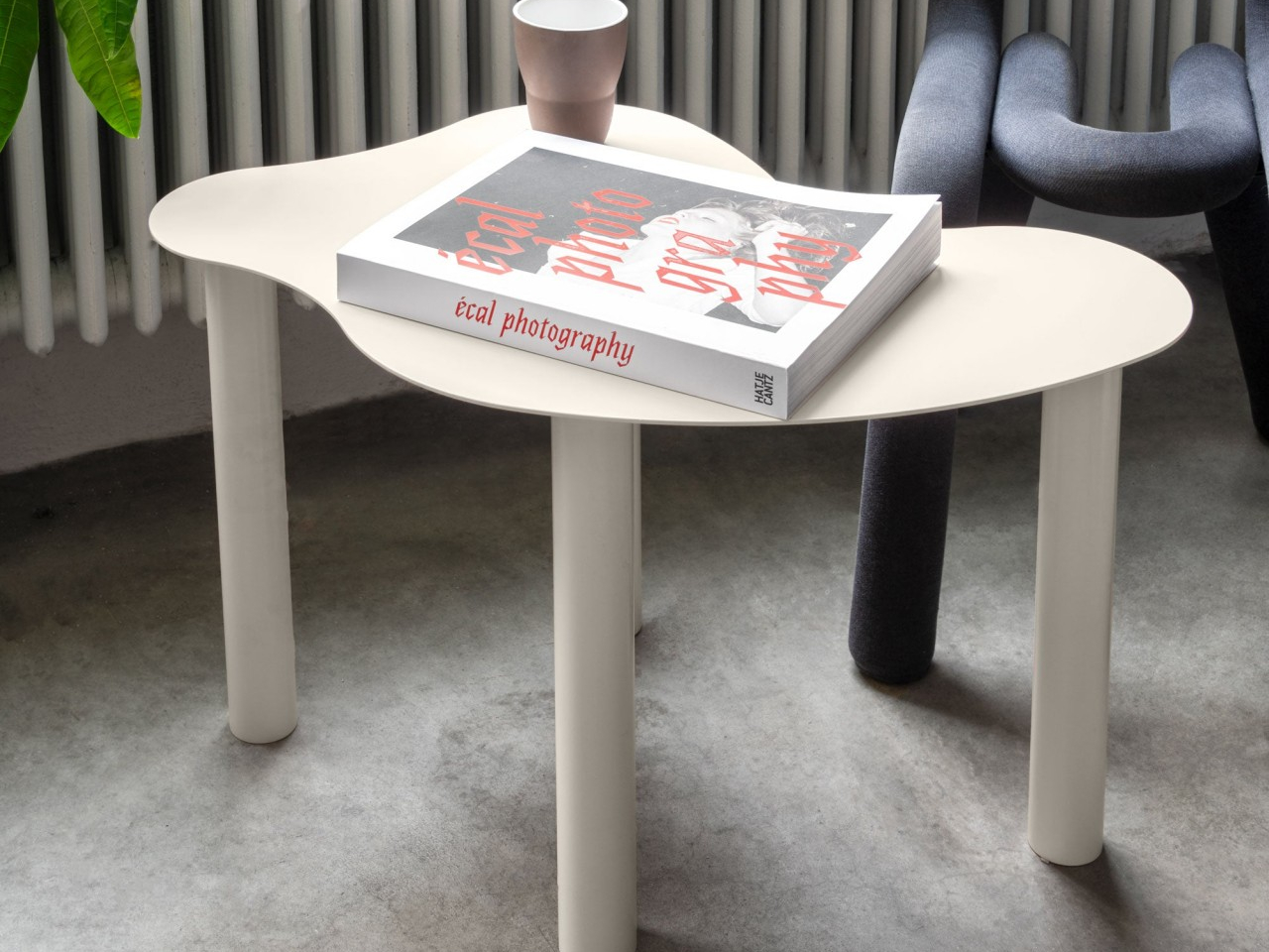
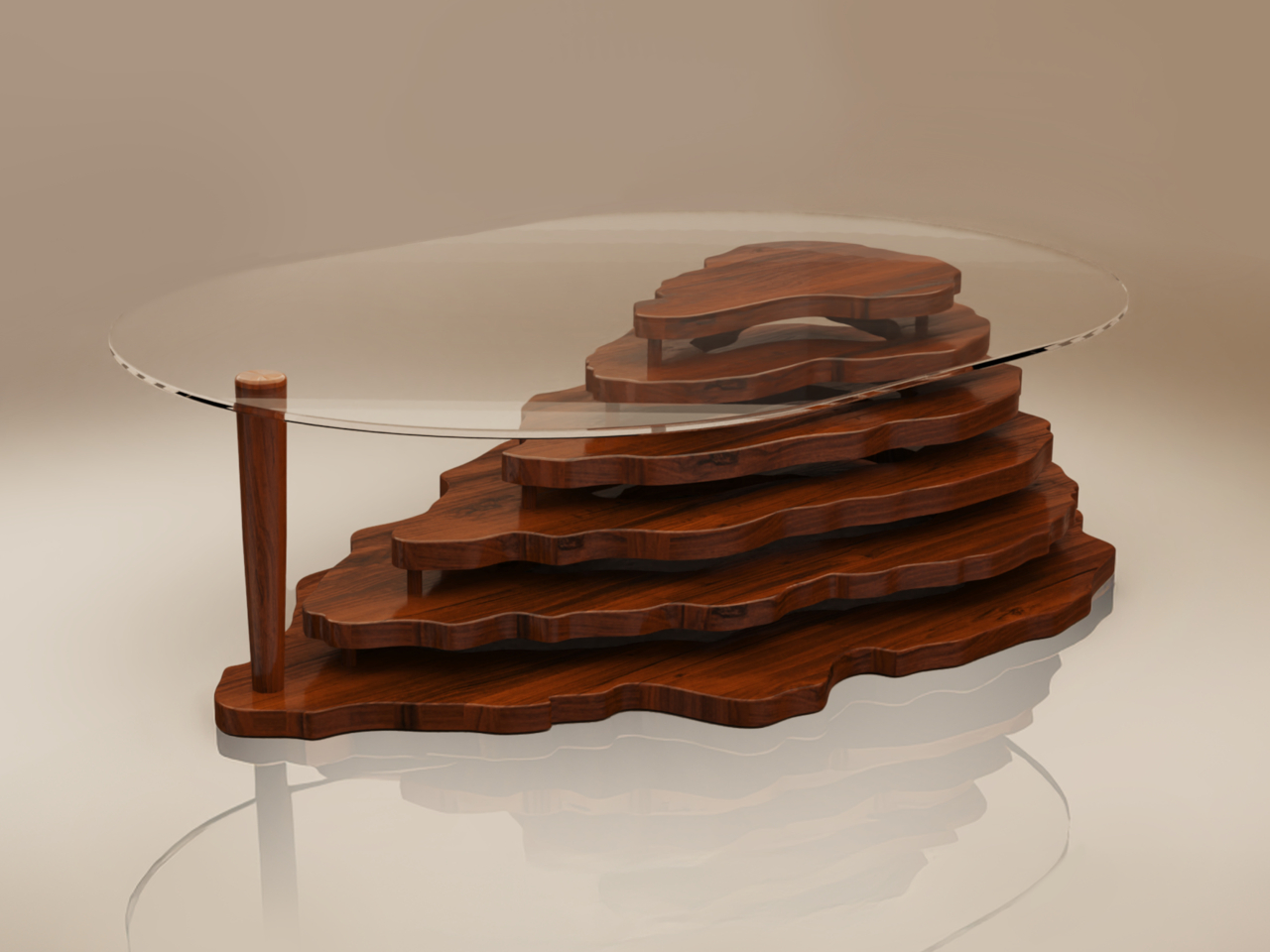
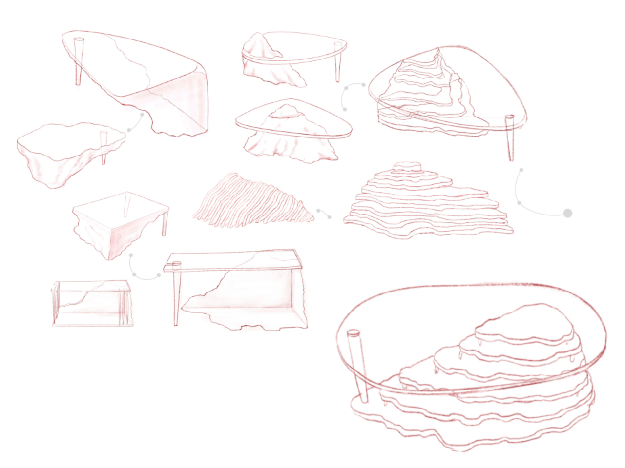
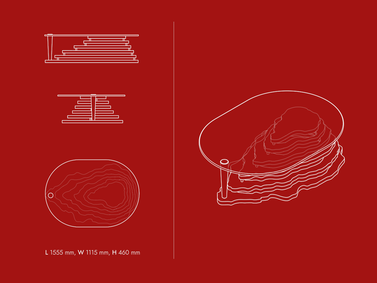
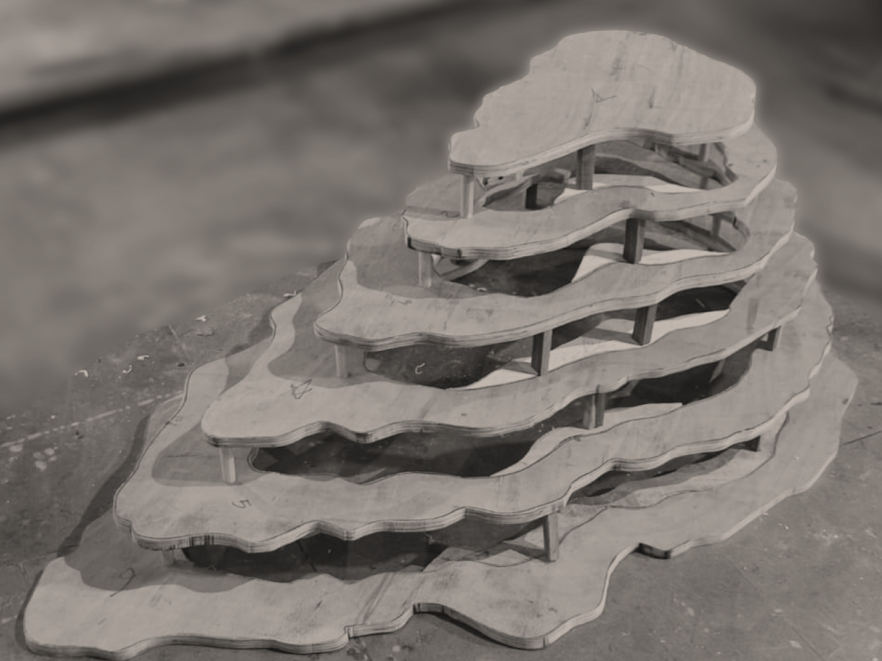
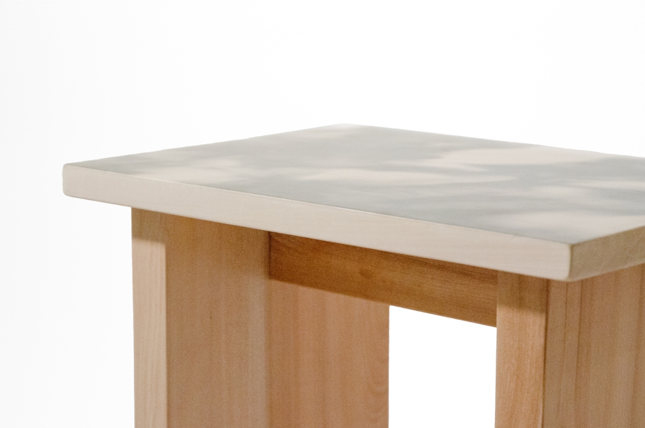
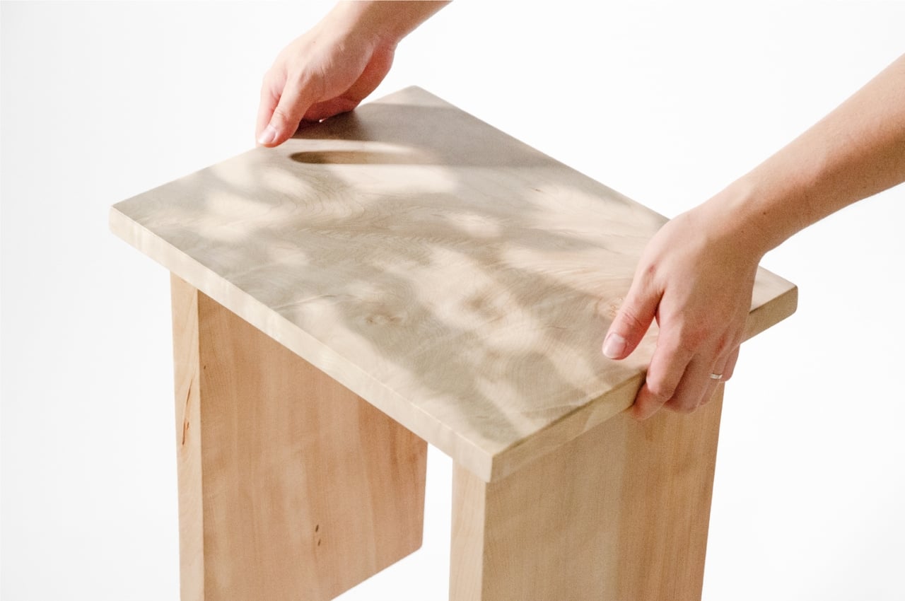
In this example, the Flow table collection harmonizes functionality with nature-inspired design, resembling the fluidity of water and organic cell structures. With varying heights and shapes, these tables offer both structural art and practical utility, evoking a serene yet lively ambiance reminiscent of nature’s harmony.
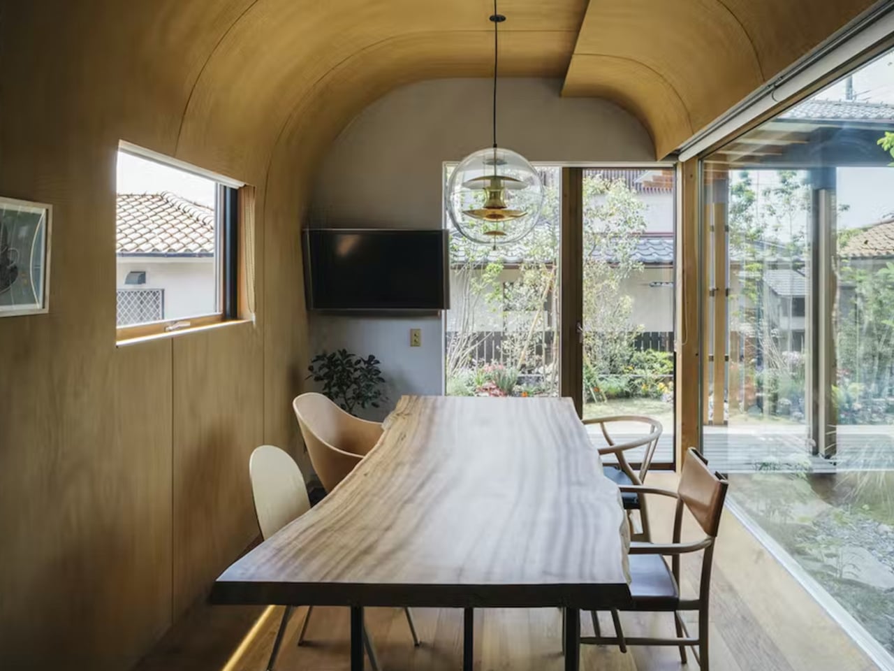
2. Infuses Calm
Organic shapes feature flowing lines that bring in a feeling of comfort and tranquillity, creating an inviting and relaxing ambiance. We see this in the contours of mountain peaks, the curves of the shoreline, or the colors of the seasons. Some cultures easily incorporate these themes in their designs, and Japan is one of the most popular examples of this kind of design philosophy.
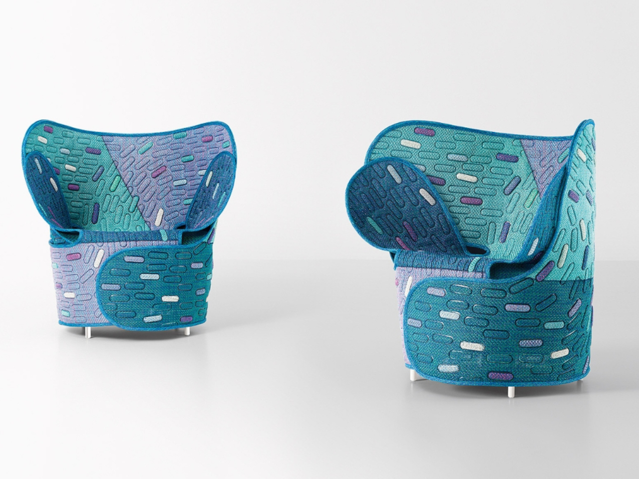
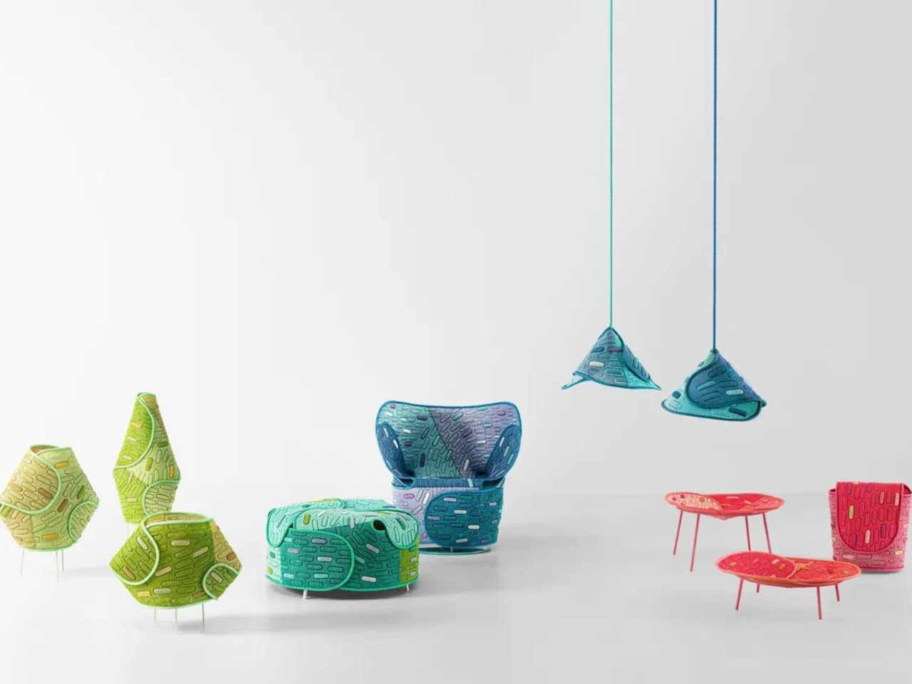
Designer: Nendo for Paola Lenti
Paola Lenti’s collaboration with Japanese design firm Nendo for Milan Design Week unveils the Hanara-shi series. Inspired by Japanese cherry blossoms and samurai armor, this organic-shaped collection features suspended lamps, baskets, floor lamps, armchairs, and poufs. Crafted from recyclable, waterproof Maris mesh, the furniture showcases an innovative design with recovered cutoffs for upholstery, blending beauty and sustainability seamlessly.
3. Versatile Design
Organic shapes find their best fit in furniture, lighting, accessories, and various architectural details. Almost any object can benefit from incorporating organic shapes, but these objects sing a different tune when given such a facelift. From utilitarian tools to accent pieces, they take on a more human character just by having smooth-flowing surfaces and curved forms.
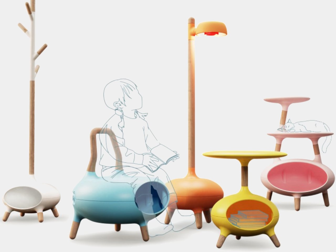
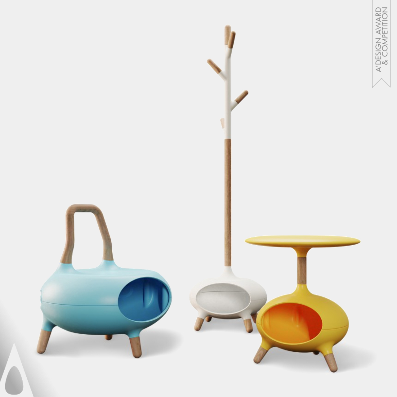
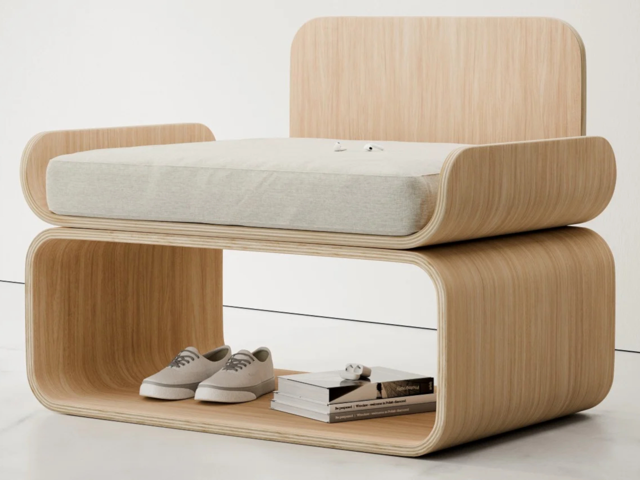
Designers: Wei Jingye, Song Kexin, Zheng Xiaolei and Zhou Haoyuan
The Wowo Multipurpose Furniture is a solution for homes with both kids and pets. This innovative collection offers versatile pieces designed to accommodate both human and furry family members. Crafted with comfort in mind, the hollow structures provide a cozy spot for pets to rest while kids enjoy comfortable seating. Made with high-quality materials including solid wood and utilizing advanced 3D-printing technology, Wowo furniture ensures durability and longevity.
4. Timeless Aesthetics
The organic shapes are a timeless design trend that will not go out of style for years to come. This distinctive rocking chair draws inspiration from the fascination with UFOs, featuring a bowl-shaped exterior crafted from fiberglass or carbon fiber for stability. Its regal design and ergonomic shape offer comfort and support, while luxurious Italian leather or fine fabrics adorn the upholstery. With its unique appearance and versatile design, this curvaceous chair serves as a captivating centerpiece, inviting users to experience an otherworldly seating experience reminiscent of floating on air.
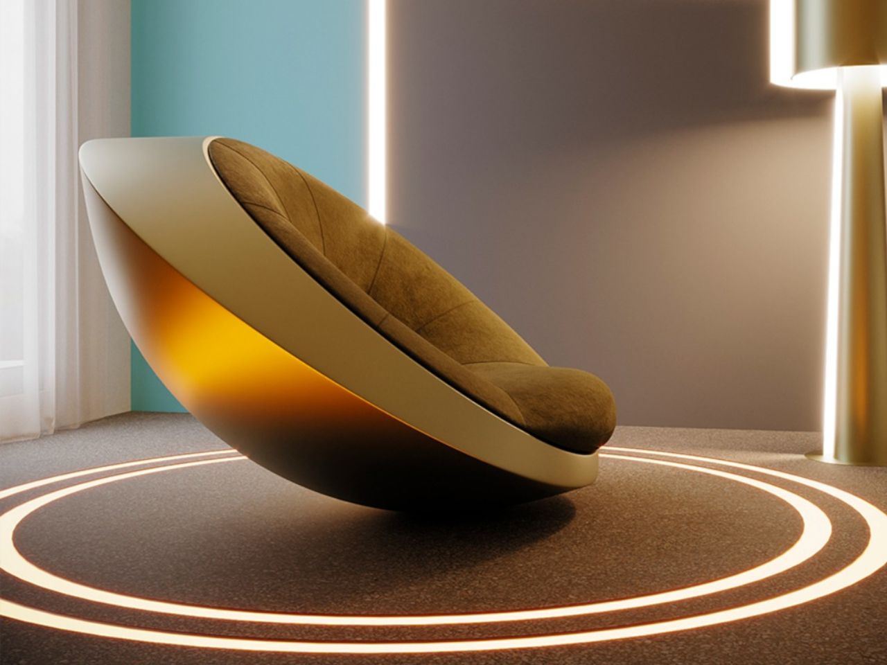

Designer: Mavimatt
The “Balance” side table concept combines elegance and an organic shape with a precarious design, challenging expectations of stability. Crafted from terrazzo and recycled materials, it features interlocking mechanisms for security. Its dynamic appearance sparks conversation, blending aesthetics with sustainability.
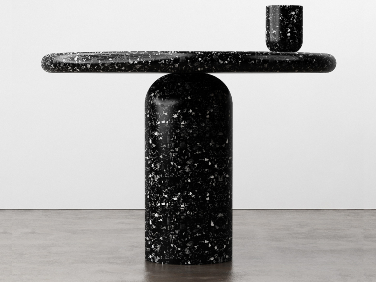
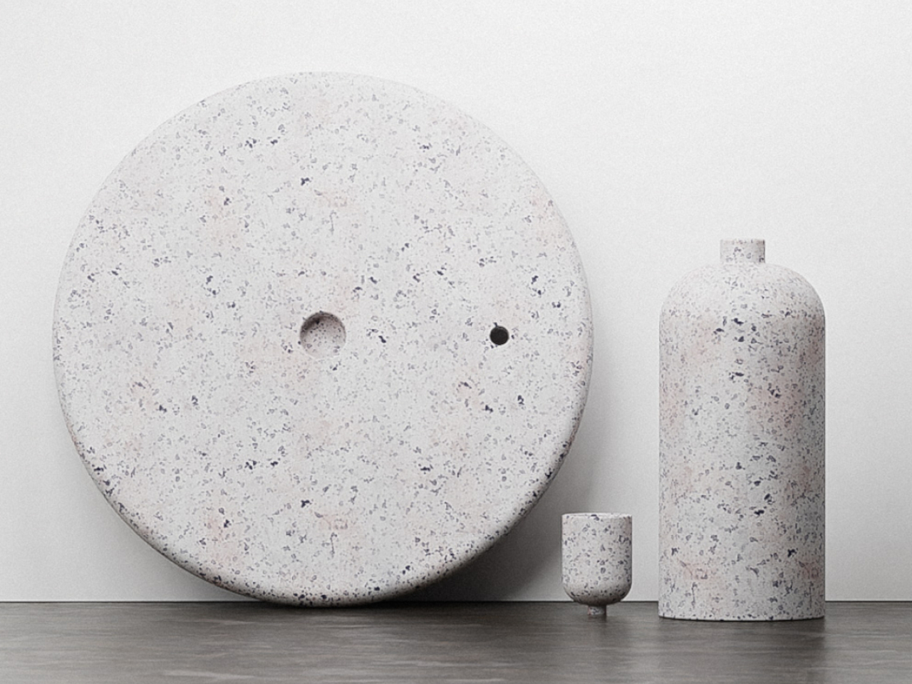
Designer: Stuart Cole
5. Biophilic Design
The organic shape design trend is rooted in biophilic design principles, supporting well-being through a connection with natural elements and fostering a sense of harmony with the environment. In this case, the association with nature becomes a bit more evident, creating a stronger effect that resonates with the rest of the space.
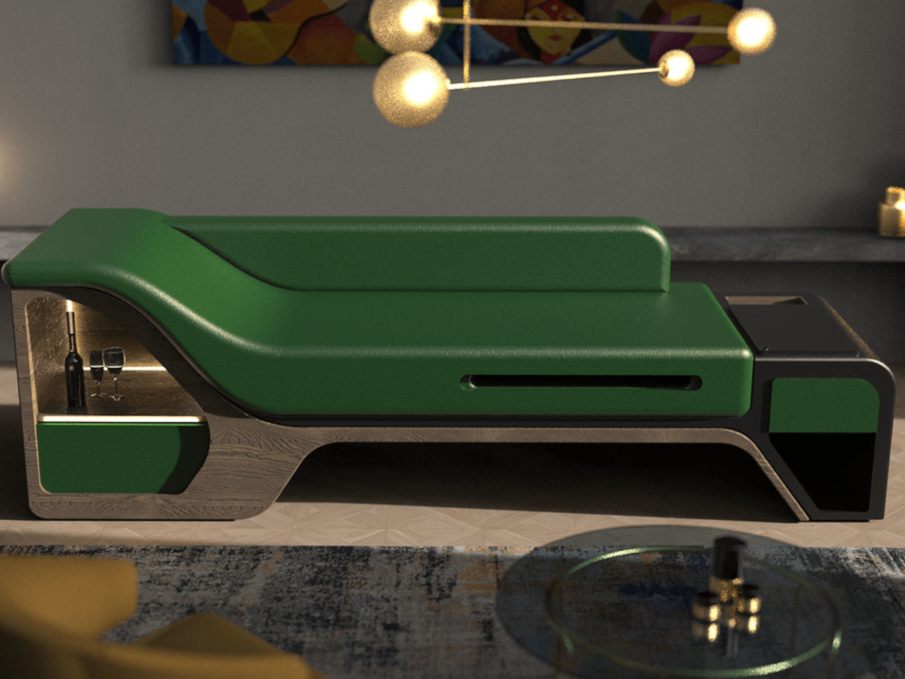
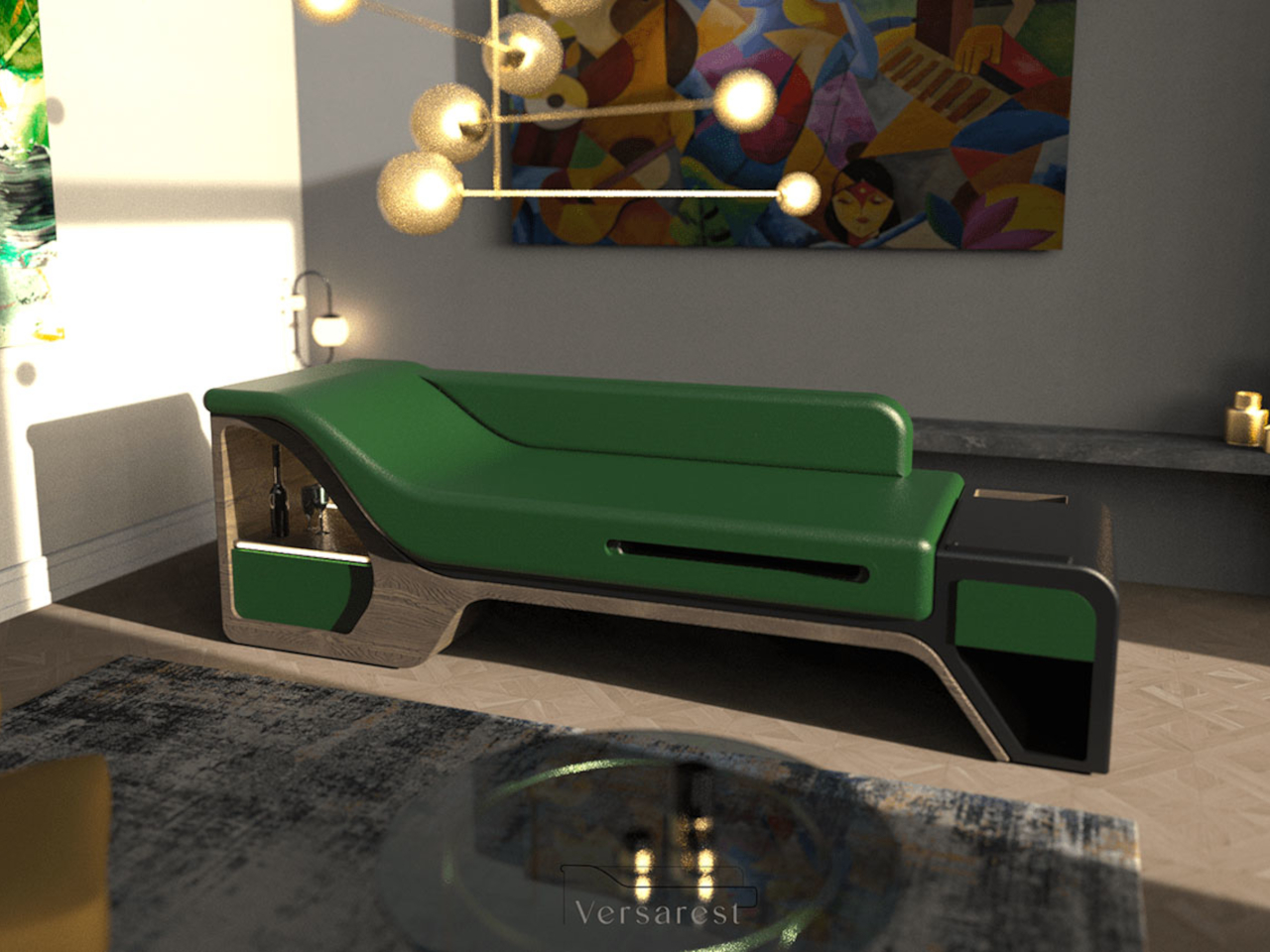
Designer: Gokul Retheesh
The VersaRest Chaise Lounge is crafted with a wooden oak base and luxurious full-grain leather upholstery, it offers unparalleled comfort and style. This innovative sofa with a biophilic vibe integrates hidden storage drawers, adjustable tables, and integrated LED lighting. This thoughtful design combines convenience, luxury, and versatility in one elegant piece.
6. Enhances Creativity
The fluid lines of organic shapes allow for creativity, paving the way for unique aesthetics to emerge. It’s not easy to incorporate curves in a typically flat product, and it requires some outside-the-box thinking to pull off an organic shape that combines form and function in a harmonious way.
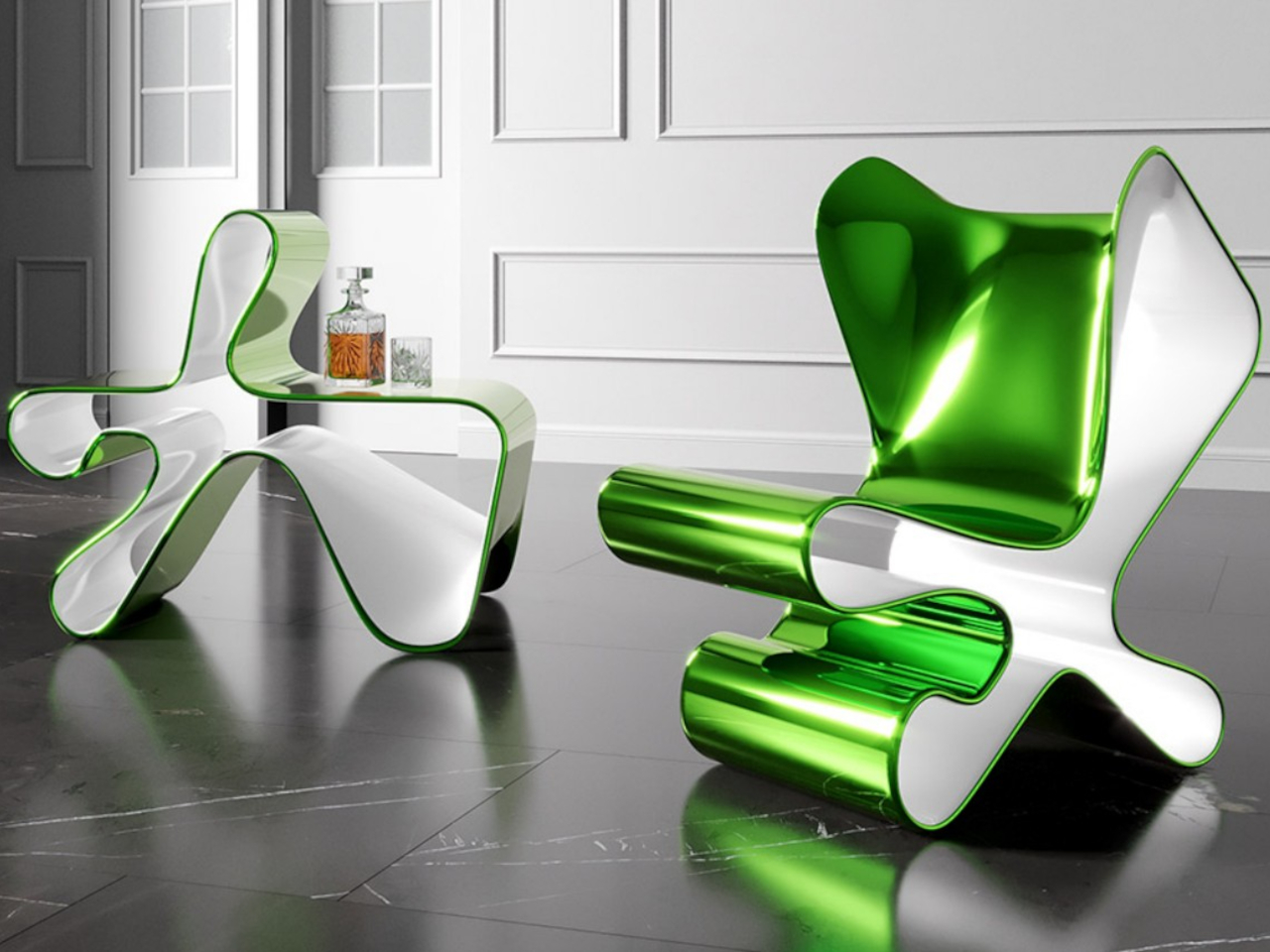
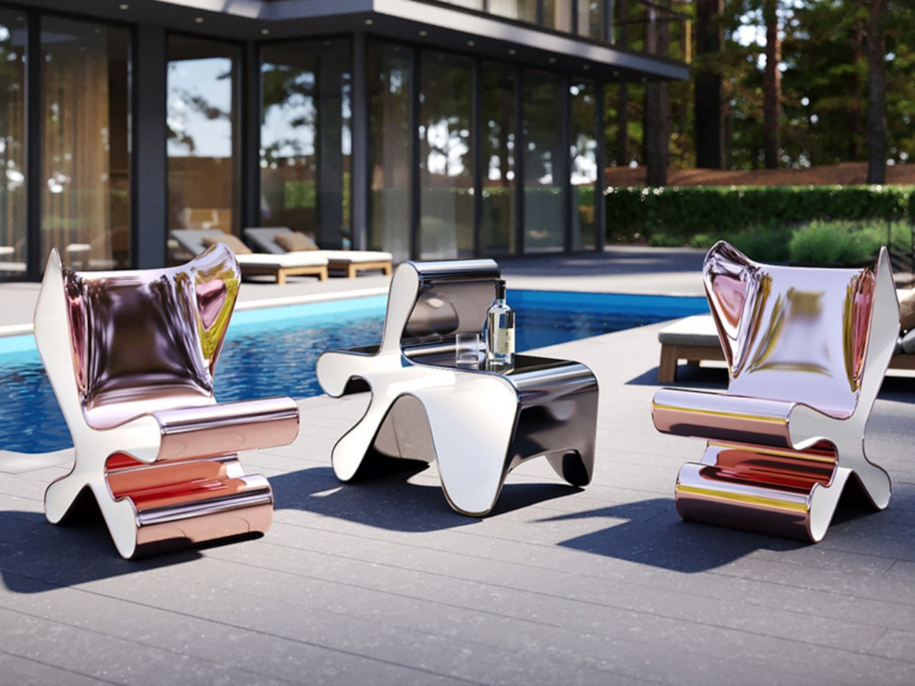
Designer: Mavimatt
Chairs often serve as impromptu shelves due to limited space. Imagine a chair seamlessly transforming into a shelf or table—a solution offered by Metamorfosi. Unlike conventional multifunctional furniture, it remains fixed, its hollow shape concealing three functions: chair, table, and bookcase. Handcrafted with dynamic organic shapes and glossy finishes, it blurs the line between furniture and art, offering elegance and versatility.
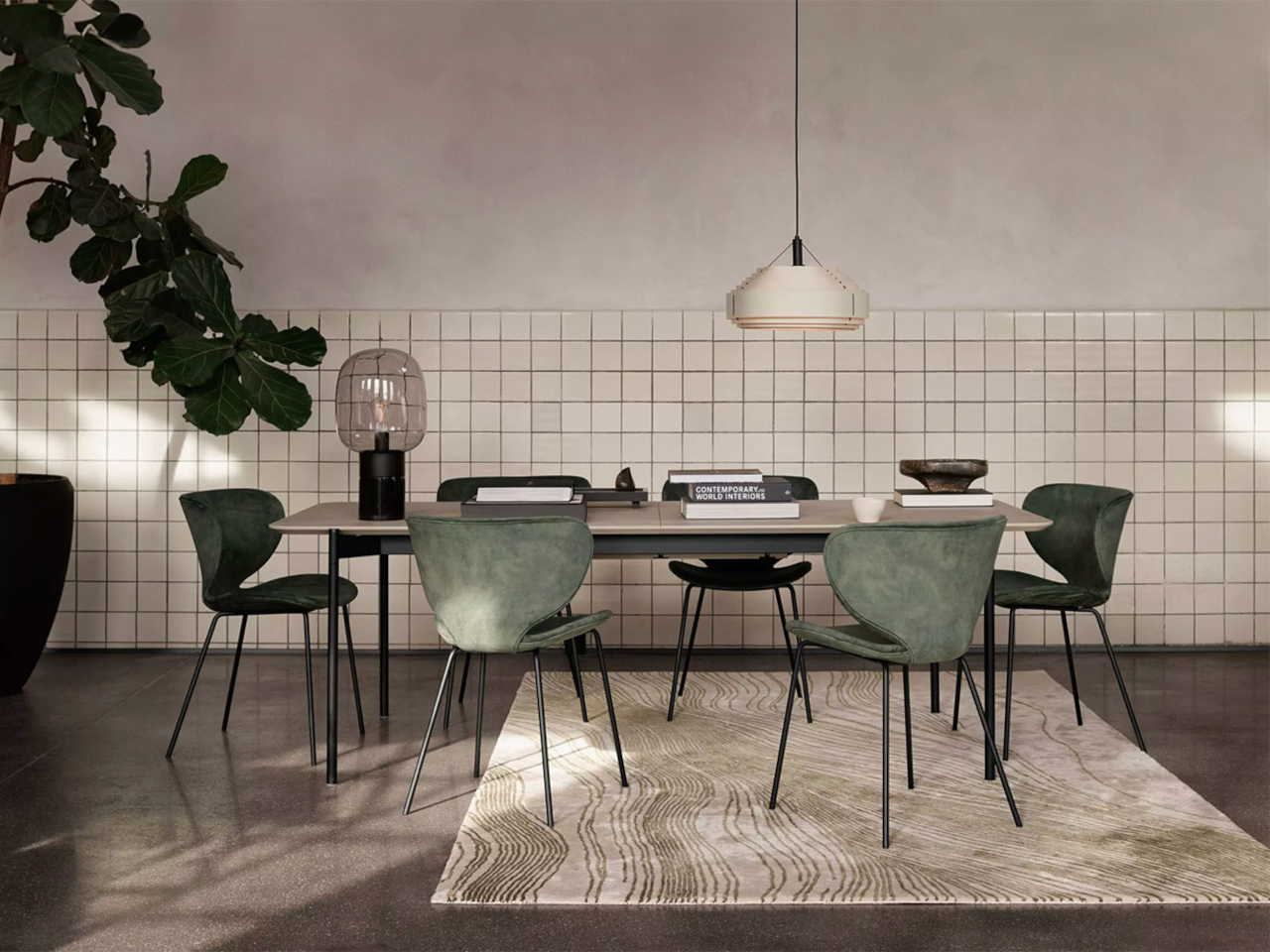
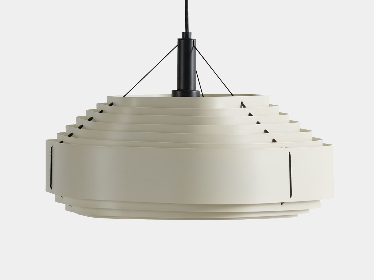
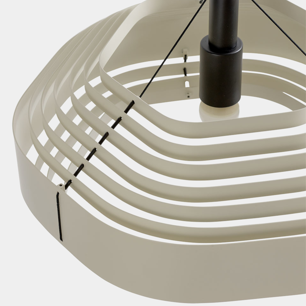
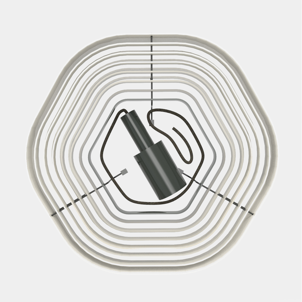
7. Softens the Interiors
The curvaceous shapes of organic furniture contrast with the sleek lines of straight walls, ceilings, and furniture, contributing to a sense of balance and harmonious design. Incorporating organic shapes into lighting fixtures, such as pendant lights with rounded shades or sconces with flowing lines, adds softness to the interiors.
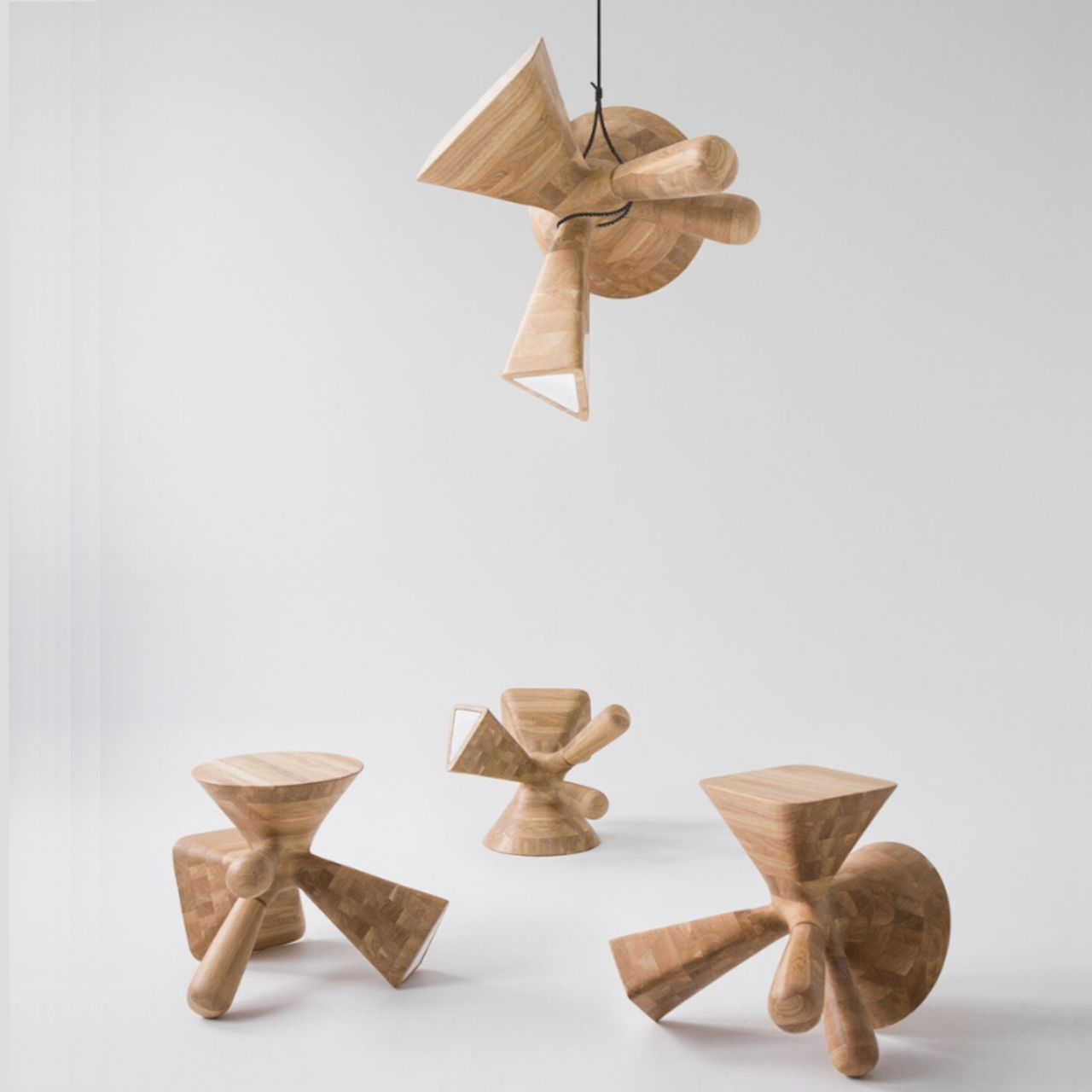
Designer: Kosmos Architects
“The Dice” by Kosmos Architects is a versatile furniture piece inspired by dice markings. Crafted from oak wood using robotics technology, it transforms into a stool, coffee table, leg bench, and lamp with a frosted glass interior. Lightweight and portable, its organic silhouette serves functional and decorative purposes, making it ideal for small spaces or on-the-go lifestyles.
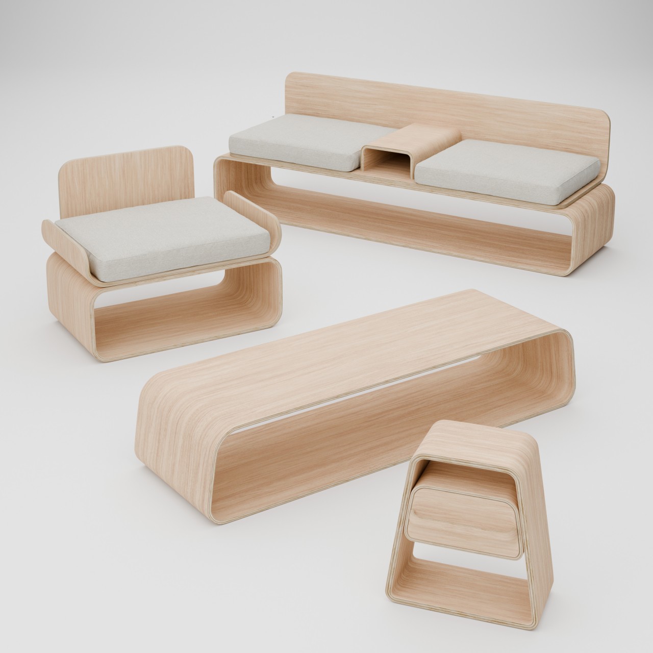
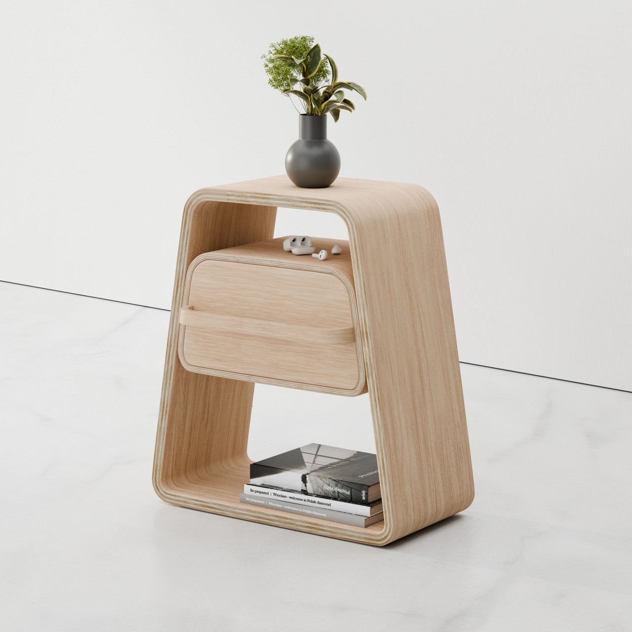
8. Adaptable Design
Another benefit of organic shapes is their ability to seamlessly blend with traditional, modern, and transitional design styles, making them a highly adaptable design element. The best part is that mixing and matching organic shapes with other decor styles can result in a distinctive and eclectic aesthetic.

Designer: Julian Topor
The KURVE furniture collection redefines space-saving design with minimalist plywood pieces. Each item boasts curved layers that offer both organic aesthetics and functionality, featuring a chair, couch, table, and nightstand. Crafted from a single sheet of plywood, the chair’s unique backless box design maximizes storage, while the couch includes a central console and compartments. The trapezoidal table and nightstand provide sleek storage solutions, perfect for small spaces.
9. Beautifies the Space
The natural curves in furniture and art can enhance spaces, bringing a positive vibe and elevating the overall atmosphere. A substantial piece of furniture or artwork featuring organic shapes offers an excellent opportunity to make a statement in your home.
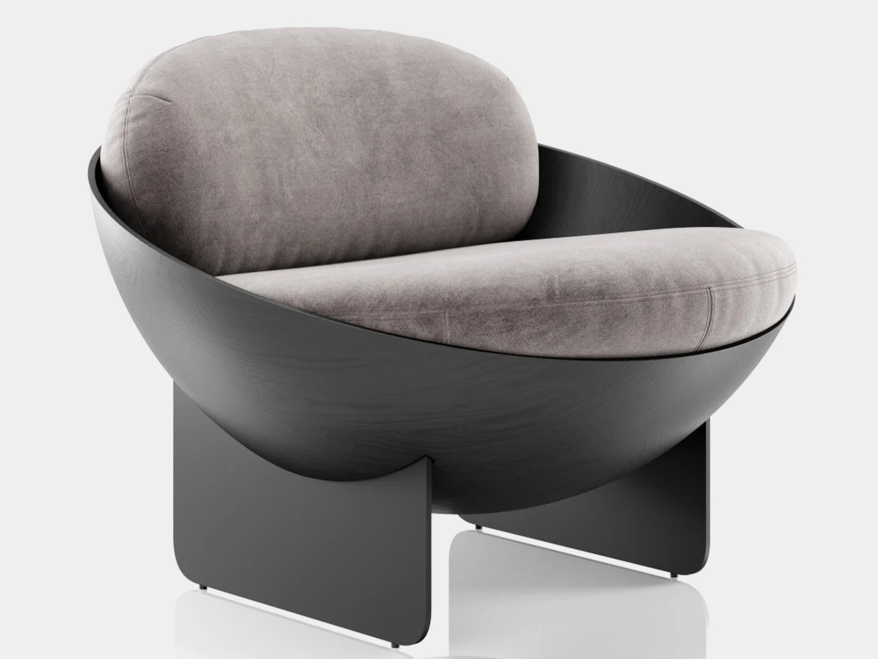
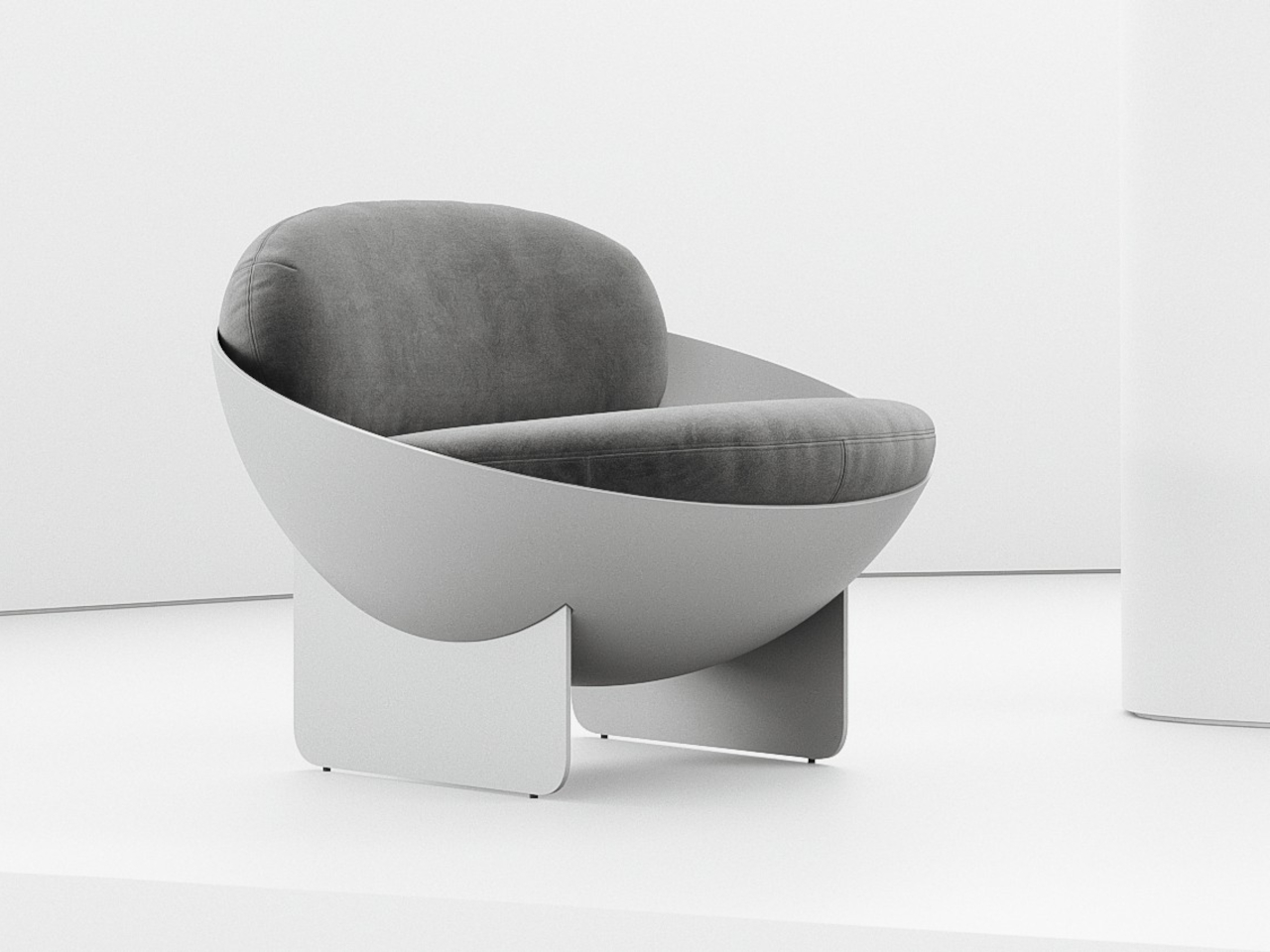
Designer: Mauricio Coelho
The Oco chair concept blends simplicity and visual intrigue with its unconventional bowl-shaped design. Crafted from carbon steel and fiberglass, it offers structural stability with subtle material details. However, concerns about comfort arise due to the thick cushions potentially lacking adequate support for the back and exposed edges posing discomfort. Minor adjustments could enhance ergonomics without compromising its geometric elegance.
10. Organic Accents
Small organic accents, like a vase or bowl, can greatly alter the overall ambiance of your interiors. Opting for pieces made from natural materials such as wood, stone, or ceramic mirrors the curves of nature.
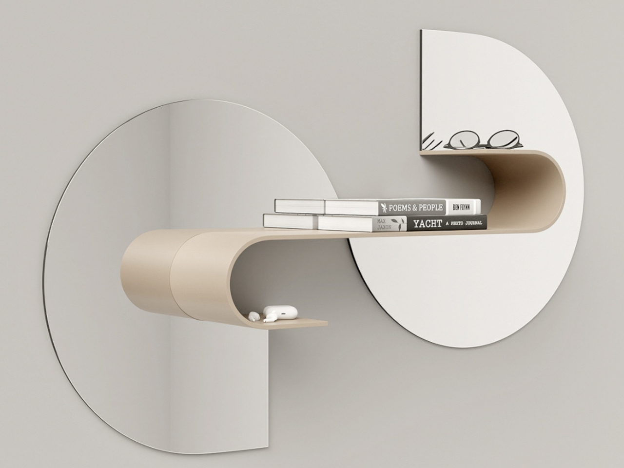
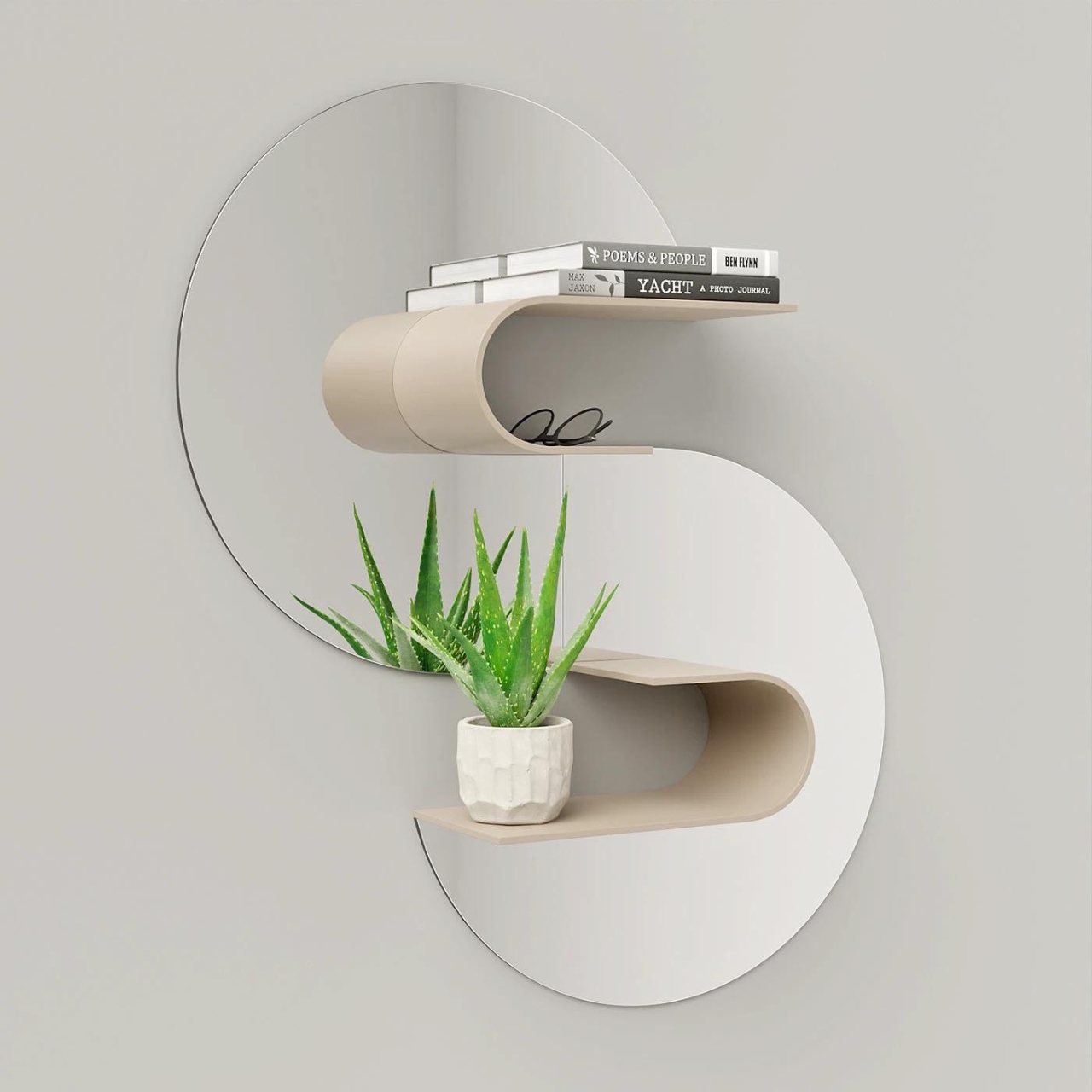
Designer: João Teixeira
Wave is a groundbreaking shelf concept that transforms your space. Not just for books, Wave doubles as a mirror, enhancing both functionality and style. While it may not offer a complete mirror reflection, its wavy shape adds a distinctive touch to any room. With around 4-5 parts, assembly is a breeze, ensuring versatility in placement. While it may not cater to those seeking a full-length mirror, Wave embodies a harmonious blend of form and function, making it an ideal addition to modern living spaces.
This Sculptural Bench Is The Thought-Provoking & Conversation-Starting Furniture You Need In Your Home
Crafted by Madrid-based designer Verónica Mar for Les Ateliers Courbet, the Soul Sculpture Bench embodies a minimalist yet spiritually sensitive design. Inspired by the universe’s intricate spiral patterns, it seamlessly merges nature with design, serving as a versatile piece for private or public spaces. More than seating, it sparks contemplation about the universe’s beauty and connections, inviting viewers to reflect and discuss.
Incorporating organic shapes into your decor doesn’t just add visual interest and dimension. It also creates a dynamic and visually stimulating environment that captures the imagination and inspires creativity. And it doesn’t need to be elaborate or extravagant, either, allowing more freedom in crafting products that stimulate the eyes and calm the mind.
The post Organic Elegance: 10 Ways to Embrace the Organic Furniture and Décor Trend first appeared on Yanko Design.