Custom-built 96,000mAh power bank charges your laptop, phone, and even runs small appliances off-grid

For power users loaded with a laptop, tablet, drone, a robot, and, of course, a smartphone, the ordinary power bank options do not make the cut. The amount of power required to keep these gadgets juiced up is considerable, especially when on the go. The only solution is a custom-made power bank that suffices all the needs of your power-hungry gadgets.

A custom-built portable power station offers a high-capacity solution for people who need to run multiple devices without reliable access to wall power. Standard consumer power banks are often too limited for users carrying a laptop, phone, tablet, router, and other gear at the same time, especially in remote or mobile situations. To solve this problem, creator Luq1308 developed the Omnibus 4×8, a DIY backpack-friendly power bank with enormous capacity and flexible output options.

Designer: Luq1308

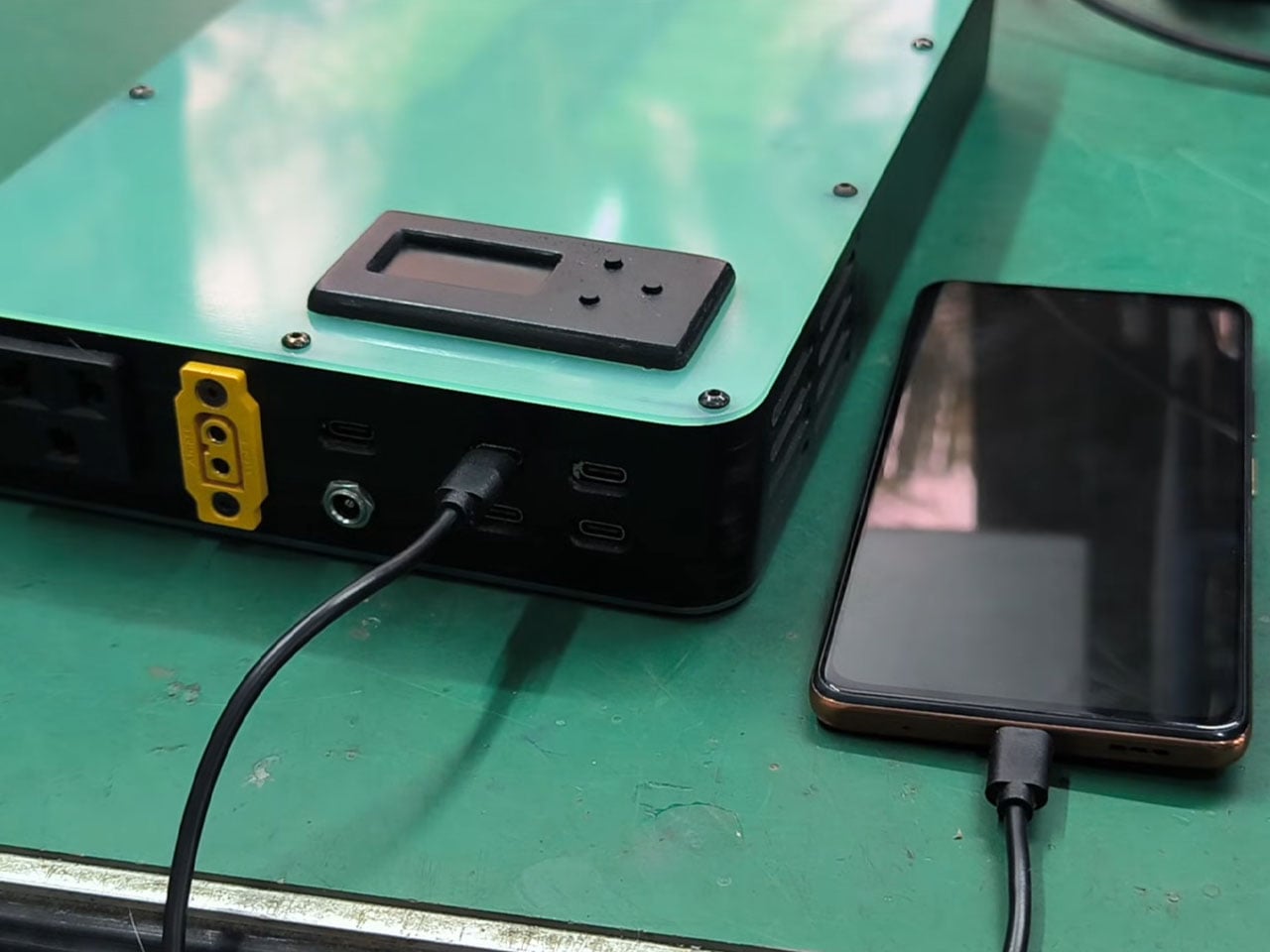
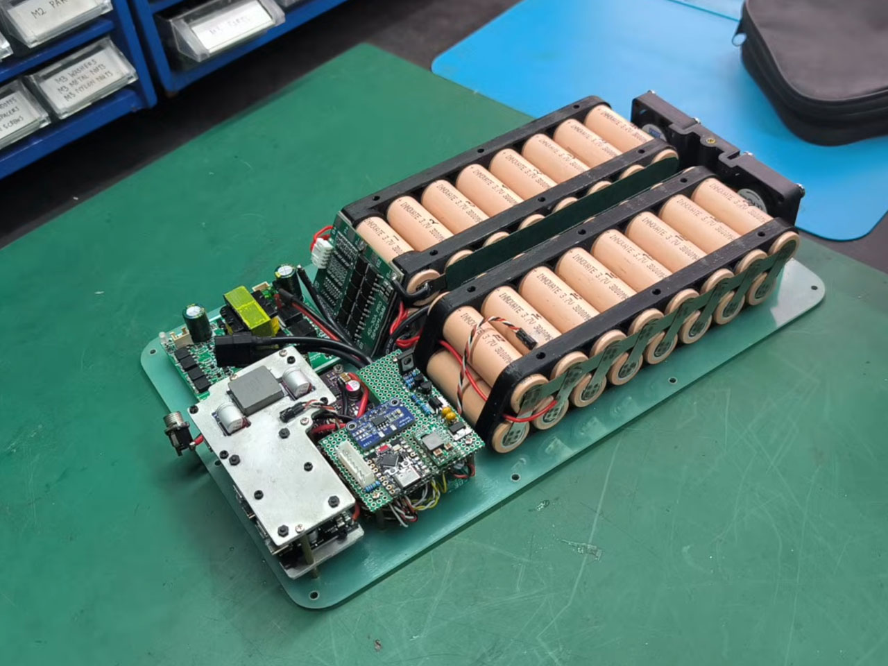
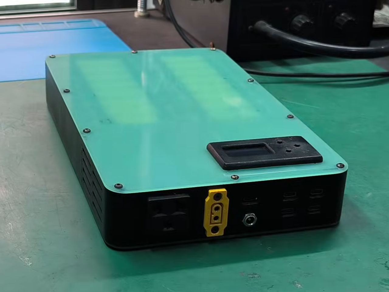
The heart of this project is a dense battery pack made from 32 brand-new 18650 lithium-ion cells arranged in a 4S8P configuration. Each cell is rated at 3000 mAh, and when assembled into the pack and scaled for usable voltage, the complete system delivers roughly 96,000 mAh, equivalent to about 345 watt-hours (Wh) of stored energy. This substantial capacity makes it suitable for powering a range of electronics for prolonged periods without recharging. Critical to the build is a battery management system (BMS) rated for 4S and 30 amps. The BMS monitors and balances the individual cells, prevents overcharging and deep discharge, and includes multiple safety fuses. The system also draws very little power at rest, with a standby current of less than 400 microamps, helping to preserve stored energy when the unit is not in active use.

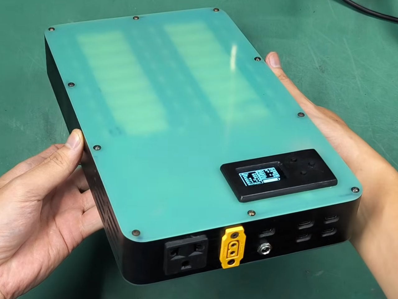
The Omnibus 4×8 offers a wide range of outputs to suit both everyday gadgets and more demanding equipment. There are four USB-C ports, each capable of delivering up to 36 watts, which is enough to charge phones and tablets simultaneously. A 100 W bidirectional USB-C port supports fast laptop charging and can also accept power input from compatible charging sources. For broader custom needs, a DC jack provides adjustable outputs between 2.7 V and 20 V, and a high-wattage XT60 connector can handle loads exceeding 400 W. A dedicated 150 W AC outlet enables the use of small appliances through an inverter, expanding the range of devices that can be supported.

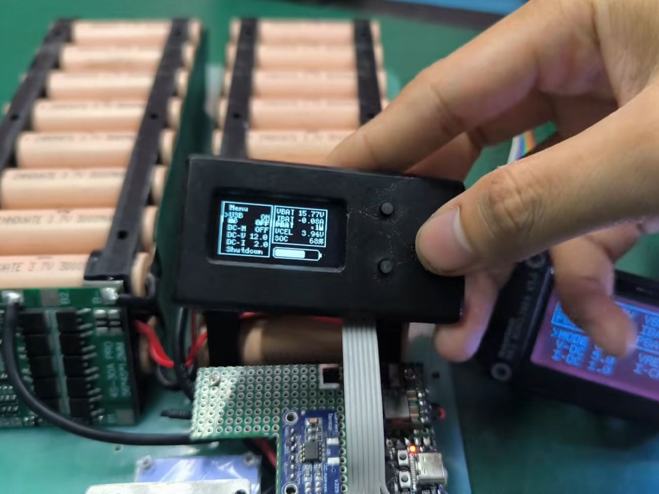
Inside the power station, an ESP32-C3 microcontroller oversees system operations. It reads real-time data such as voltage, current, and temperature from sensors and displays this information on a 1.3-inch OLED screen with simple navigation buttons. Four temperature sensors monitor the battery pack, heatsinks, and inverter, and dual 40 mm cooling fans are triggered as needed to manage heat during high loads. Custom aluminum heatsinks with thermal pads are included to further reduce thermal stress.

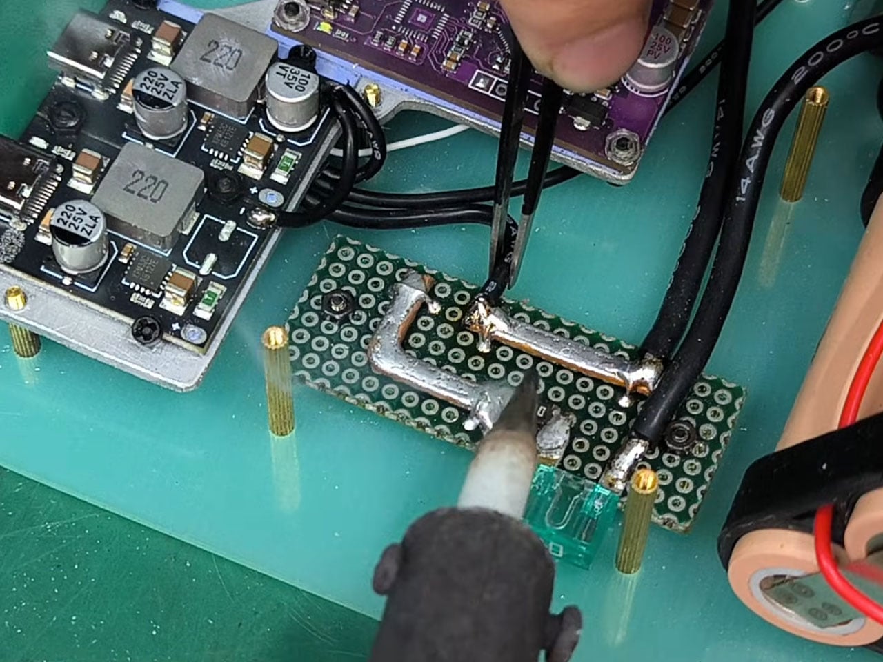
The enclosure combines hand-cut G10 fiberglass plates for strength with 3D-printed ABS plastic sides in a subdued matte black finish. Brass spacers and mesh vents enhance airflow and protect internal components while maintaining a rugged aesthetic suitable for outdoor use. Internally, thick-gauge silicone wiring and a perfboard distribution bus with fuses connect the various modules safely and efficiently.

One notable feature of this DIY build is its adaptability. The inverter was modified to work across the full battery voltage range, and the system can accept solar input with maximum power point tracking (MPPT) for efficient off-grid recharging. All design files have been made open source on GitHub, allowing others to replicate or expand on the concept.

The post Custom-built 96,000mAh power bank charges your laptop, phone, and even runs small appliances off-grid first appeared on Yanko Design.

This Does Not Compute Turns Tiny Mac Clock Into Working Raspberry Pi Macintosh

If you appreciate retro computing and DIY electronics, a new project from This Does Not Compute (YouTube channel) will be the best thing you will see today. The build emulates the 1984 Apple Macintosh, but in a miniaturized version. Not the smallest, but decently small to sit in the corner of your desk and do more than its intended function of a clock.

If that sounds puzzling, here’s a clearer explanation. The modder has actually taken a Maclock, which is a clock that looks identical to the original Mac, but of course considerably smaller, and ripped it open. He replaced the original alarm clock mechanics with a Raspberry Pi, turning it into a homage to the classic Apple computer.

Designer: This Does Not Compute

The project, as the modder himself states, “is just for fun” and doesn’t really reach out to prove anything other than love to toil with anything Mac. With the innards of the clock replaced by Raspberry Pi Zero 2 W, the original display of the clock is also swapped with a 640×480 2.8-in color screen from Wave Share, and the project is interestingly called Wondermac. The name is in reference to Wonder Boy, the Chinese company that makes Maclock.

The modder, as you can see in detail in the video above, starts by cracking open the Maclock case, which has screws, but they are only used to mimic the Macintosh and have no significant usage. Opening the case was “probably the hardest part of the whole project,” he says. The case is clipped together pretty tightly, but he was able to separate the front bezel from the back using a wide metal pry tool. Once the front panel was free, he unplugged the wiring harness and pulled out the main circuit board and the screen to clear up the space inside the Maclock body, which will now have new guts and a new purpose.

“Compact, low power, and relatively inexpensive,” Raspberry Pi Zero 2 W was a clear choice for the Mac’s innards, the modder affirms. It comes with a pin header presoldered and includes a heatsink, which would be a nifty addition to keep this tiny computer cool when it does some computing. The Pi is now connected to the externally purchased screen, and the modder gets down to launching the Raspberry Pi imager app and installing Minivvac on an SD card for the software side of the project.

For powering the Wondermac, the modder doesn’t rely on the Maclock’s built-in battery; instead, they take advantage of the USB-C port on the back housing for power. After some tweaking to power output, some wire soldering, and sticking, he was able to get the power going as required to run the screen. Finally, he designed a 3D printed bracket with black filament to fit the screen in place, and then everything was assembled back into shape. Content with the outcome, he leaves the little Mac on the desk with the Afterdark screen saver.

The post This Does Not Compute Turns Tiny Mac Clock Into Working Raspberry Pi Macintosh first appeared on Yanko Design.

This Wi-Fi Router Looks Like an Incense Burner and Scents Your Room

Most home routers live behind books or plants, blinking away in corners, only noticed when the connection drops. There’s so much quiet faith placed in that invisible box every time we ask it for directions, answers, or late-night comfort while scrolling. If we already treat Wi-Fi like a kind of everyday oracle, maybe the hardware could look and behave more like an object we actually care about instead of just tolerating it.

innrou is a Wi-Fi router concept that resembles an incense burner and incorporates fragrance. It’s designed to go beyond spec sheets and become a small storytelling object, imagining the future form of electronic products. The name and form hint at traditional incense rituals, but the function is pure 21st century, keeping your devices online while quietly scenting the room with swappable essential-oil sticks.

Designer: Yuan Chen

The designer’s starting point is a neat cultural parallel. In traditional Chinese society, people would ask gods for guidance and answers, often by lighting incense at a burner. Today, many of us scroll the internet for the same things, from practical fixes to something closer to spiritual reassurance. innrou deliberately combines those two behaviors, using a router as the carrier for a story about how we now seek help.

The essential oil system reinterprets incense as modern fragrance sticks. You replace a spent stick by sliding in a new one, the same simple vertical gesture used at a temple. That motion deepens the narrative and adds a bit of playfulness, turning maintenance into a small ritual instead of an annoying chore, while the router quietly keeps doing its job underneath without asking for attention.

innrou is a small, rounded block that can sit openly on a desk, bedside table, or shelf without screaming “network gear.” The antennas are hidden, the front shows only a few status dots and a subtle logo, and the body comes in soft colors that match interiors. Instead of being something you hide, it becomes part of the atmosphere, both visually and through scent, which is a surprisingly big shift for a product category that usually defaults to black plastic.

Under the incense metaphor, this is still a proper router. There’s a row of Ethernet ports at the back, a power connection, and internal antennas doing the heavy lifting. The essential oil sticks are designed as replaceable cartridges with their own packaging, so the ecosystem feels thought through. It isn’t about chasing the highest throughput number but about making the necessary hardware less of an eyesore and maybe a bit nicer to live with.

A concept like innrou suggests that if a router can borrow the form and gestures of an incense burner, other invisible boxes could also become objects we actually want in the room, not just tolerate. Blending connectivity with scent and story reframes a forgettable device as a small daily ritual, which feels oddly appropriate when you already treat it like a modern oracle that knows where everything is and when everyone is awake.

The post This Wi-Fi Router Looks Like an Incense Burner and Scents Your Room first appeared on Yanko Design.

Game Boy-Inspired Kids’ Device Concept Fixes What Tablets Get Wrong

Tablets promised to revolutionize early learning. Instead, they delivered passive screen time, accidental in-app purchases, and kids hypnotized by algorithmically-served content they didn’t choose. The interface designed for adult fingers forces children into frustration. The endless app notifications destroy focus. The flat glass slab offers zero tactile feedback for developing motor skills.

Royal Tyagi and Aarna Mishra looked at this mess and asked a better question: What if a learning device was actually designed for how children learn, not how adults think they should learn? Their answer is Puzzle Pals, a smart interactive game concept that ditches the tablet playbook entirely and borrows from something far more effective: the chunky, intentional design of 90s handheld gaming.

Designers: Royal Tyagi, Aarna Mishra

The device sits somewhere between a Game Boy and a Fisher-Price toy, which is precisely the sweet spot it should occupy. It’s unapologetically retro in its aesthetic, with that handheld form factor that screams late 90s gaming. But here’s where it gets interesting: every design choice serves a developmental purpose. Those rounded edges aren’t just there to look friendly. They create an ergonomic grip that actually fits the way young children hold objects. The slightly curved body mirrors the natural curl of small fingers.

Look at the button layout and you’ll see thoughtful restraint. Instead of cramming in a dozen tiny inputs that would overwhelm little users, Puzzle Pals features large, well-spaced buttons arranged in a way that makes accidental presses nearly impossible. Each button has a distinct shape, supporting tactile learning before kids even understand what they’re supposed to do with them. The high-contrast color scheme isn’t a random aesthetic choice either. It’s engineered for instant visual recognition, helping children navigate independently without constant adult intervention.

The games themselves (Animal Memory and Shape Pattern) follow a similarly intelligent design philosophy. Three difficulty levels per game mean the device grows with the child rather than getting abandoned after a week. Too many kids’ tech products assume a static skill level, but Puzzle Pals acknowledges that children are constantly evolving learners. The progressive difficulty keeps them engaged without triggering frustration, that delicate balance every parent desperately seeks.

What really sets this concept apart is its approach to failure. After three incorrect attempts, the game simply provides the correct answer and moves on. No punishing sounds, no game-over screens, no shame spiral. It’s a remarkably compassionate design decision that prioritizes learning over winning. Kids continue building skills without the emotional baggage that can turn educational activities into sources of anxiety.

The reward system is equally clever. Instead of generic “great job!” messages, every correct response triggers a fun fact or informative snippet. It transforms each small victory into an opportunity for additional learning, creating positive associations between achievement and curiosity. That’s the kind of psychological design that usually requires a team of child development experts, yet it’s been seamlessly integrated into gameplay.

The physical prototype shows how the designers balanced playfulness with functionality. Available in eye-catching colors like sunshine yellow, cherry red, sky blue, deep purple, and lime green, each device looks like something a child would actually want to pick up. The matte finish and smooth curves feel premium without being precious. There’s a speaker grille up top for audio feedback, and the screen size is perfectly proportioned for the overall footprint.

What Tyagi and Mishra have articulated through Puzzle Pals is bigger than just another kids’ gadget concept. Their vision centers on making learning genuinely joyful, not just tolerable. They want to build core cognitive skills like recognition, problem-solving, sequencing, and pattern understanding while encouraging creativity and exploration. Most importantly, they aim to instill a love of learning itself, that intangible quality that determines whether a child approaches new challenges with excitement or dread.

The post Game Boy-Inspired Kids’ Device Concept Fixes What Tablets Get Wrong first appeared on Yanko Design.

This Bedside Lamp Remembers Everything You Forget at 6 AM

We’ve all been there. You’re running late, grab your keys, rush out the door, and three blocks later realize your phone is still sitting on the nightstand. Or maybe you left every light in your apartment blazing because your brain was already at work before your body made it out the door.

Designer YeEun Kim gets it. Her concept project, Darling, tackles the scattered morning routine with a smart bedside organizer that’s equal parts lamp, tray, and very gentle personal assistant. The design speaks to anyone who’s ever retraced their steps back home, cursing under their breath about that one essential item left behind.

Designer: YeEun Kim

The concept addresses a surprisingly common problem. According to Kim’s research, modern forgetfulness often stems from irregular sleep patterns, excessive screen time, and the kind of stress that comes with overpacked schedules. The typical advice is to take walks, get better sleep, or generally relax more. But if you’re the type of person who needs this advice, you’re probably also the type who doesn’t have time to follow it.

So Darling takes a different approach. Instead of trying to fix your entire lifestyle, it focuses on building small, sustainable habits. The kind that actually stick because they’re simple enough to do even when you’re running on four hours of sleep and too much coffee.

The design itself is remarkably soothing to look at. Kim built the entire aesthetic around soft curves and circular forms, which makes sense for something meant to bookend your day. The last thing you want on your nightstand is aggressive angles and harsh lines staring at you before bed or first thing in the morning. The lamp component arches over a shallow tray, creating this balanced, almost zen-like silhouette that wouldn’t look out of place in a boutique hotel or a carefully curated Instagram feed.

But the real cleverness is in how it works. Darling connects to your schedule and uses light cues to help you remember things. Place your everyday essentials in the tray before bed, and when it’s time to leave in the morning, the device uses flickering lights to remind you to grab what you need. It’s a subtle nudge rather than an alarm or notification, which feels refreshingly analog in our current era of constant pings and alerts.

The psychology behind it is solid too. Memory experts have long advocated for designated spots for frequently used items. When your keys always go in the same place, your brain doesn’t have to work as hard to remember where they are. Darling just makes that designated spot beautiful and adds a gentle technological reminder system to back up your muscle memory.

Looking at Kim’s development process, you can see the thoughtfulness that went into refining the concept. The sketches show dozens of iterations, each exploring different configurations of the circular theme. The prototyping photos reveal careful attention to how hands interact with the object, how the tray needs to be positioned, and how the lamp should cast light without being obtrusive.

What makes Darling particularly interesting in the broader design landscape is how it pushes back against the “smarter is better” mentality. We’re surrounded by devices that want to do everything, track everything, and connect to everything. Darling does exactly three things: it holds your stuff, it lights your space, and it reminds you not to forget. That restraint feels almost radical.

The concept also reflects a larger conversation happening in design circles about how technology should integrate into our most personal spaces. Bedrooms have become battlegrounds for sleep trackers, smart speakers, and charging stations for multiple devices. Darling suggests that maybe what we need isn’t more capability but more calm. A piece that helps us be slightly more organized without demanding we learn a new app or wade through settings menus.

Whether Darling makes it from concept to production remains to be seen. But as a design statement, it’s already doing important work. It reminds us that solving everyday problems doesn’t always require complex solutions. Sometimes you just need something beautiful that flickers at the right moment.

The post This Bedside Lamp Remembers Everything You Forget at 6 AM first appeared on Yanko Design.

This Camera roll with concealed shooting lens is a fun novelty for geeks

Quite a lot of interesting gadgets tend to originate from Japan, challenging the conventional product designs for good. Some are surprisingly multifunctional, while others tick the boxes of fun novelty for geeks. The OPT100 NeoFilm digital camera that looks like a camera roll is from the latter pool. The tiny accessory emulates the old-school camera rolls by Kodak, evoking nostalgic memories. The Kodak Charmera is another accessory with similar vibes, so, of course, there’s a market for such offbeat gadgets.

Maker Opt has designed the camera roll shooter in different colors to leave no one complaining. There’s the classic Kodak color combination of yellow and black, or the rainbow colors contrasted with the white, along with other colors that bring back charming memories of clicking moments that mattered. A time when clicking a photograph was a more mindful activity of “one shot one opportunity,” rather than shooting in burst mode on modern digital cameras and smartphones.

Designer: Opt

OPT100 NeoFilm measures 47mm x 25mm x 25mm and weighs just 25 grams, making it highly pocketable, or good to carry along tethered to a keychain or backpack. Obviously, this won’t replace your flagship smartphone or digital camera with its 8-megapixel CMOS sensor, but it’s a good accessory to show off. In daylight, it fares well with the ability to shoot photos at 3760 × 2128 pixels resolution, and videos at 0.3 megapixels in HD resolution at 30 frames per second.

The camera roll has a fixed 3.2mm lens that can focus on objects at a distance of 20 cm or 70 cm away from the shooter. Shutter speed of 100-300 milliseconds, and the ISO range of 1500-1600 is not bad for such a makeshift shooting accessory. That could come in useful for quick shoots on the fly when you don’t want to take out your phone. On the rear section of the roll, there’s a 160×80 pixel display to frame the shots and go through the clicked photos on the memory card slot of up to 32 GB. The accessory has an in-built 230mAh battery that is good to go for an hour’s use on a single charge.

Labeling this cool gadget as a toy camera won’t be wrong, since it is a fun novelty meant for casual use and a way to show off your love for old camera rolls. OPT100 NeoFilm comes in period-correct packaging for 5,940 Yen (approximately $40). Currently only available in Japan, the toy camera can be shipped from third-party merchants like eBay, but you might have to spend more money.

The post This Camera roll with concealed shooting lens is a fun novelty for geeks first appeared on Yanko Design.

This Modular Console Changes Layout With Magnetic Snap-In Controls

Modern creative desks are covered in controllers. A Stream Deck for macros, a MIDI controller for faders, a tablet for drawing, maybe a separate panel for color grading. Each tool is great at one thing but locks its layout in place, so switching from streaming to editing to design means mentally remapping controls or physically swapping gear, sometimes both when you’re already behind schedule.

Airttack One is a concept that imagines a single, modular slab that can become any of those controllers in seconds. Described as a “modular revolution,” it’s a minimalist device with a magnetic base that accepts different hardware modules, LCD screens, knobs, joysticks, and button clusters. You rebuild the surface for the task instead of living with a one-size-fits-all grid that only makes sense for one app.

Designer: Alberto Cristino, Mateus Otto (Prosper Visuals)

The base is a grid of circular sockets with power and data contacts. You snap in modules in whatever arrangement makes sense. A streaming session might use a central screen for scenes and chat, surrounded by buttons for triggers and a fader strip for audio. A video edit later that night swaps those for jog wheels, scrub knobs, and dedicated cut keys, each magnetically locked into place without tools or software reassignments.

The software side runs on a 1500-nit touchscreen that stays readable under studio lights. An iOS-inspired interface shows a grid of apps, and a third-party store extends what the hardware can do, from streaming overlays to DAW controllers to brush panels. Each app can push its own layout to the modules, so the same physical knobs and screens behave differently in Resolve, Ableton, or Blender without manual mapping.

Dual cameras with a LiDAR sensor hint at depth-aware capture, AR previews, or motion-tracked controls. The concept also references radio and network tools, which in creative terms could mean wireless camera management, multi-device streaming, or interactive installations. The hardware isn’t locked to one discipline. It’s a blank, magnetic canvas for whatever combination of inputs your project needs.

Airttack lives on a desk as a control surface during the day, then drops into a bag with different modules for an on-site shoot or live event. The industrial design stays low-profile and discreet, with metallic textures and magnetic connectors hidden under a clean grid, so it reads as a serious tool even when the layout is playful, full of knobs and joysticks for a VJ set or game stream.

Airttack One imagines hardware catching up to the way creative software already works: modular, layered, and context-aware. Instead of buying a new controller every time your workflow evolves, you rearrange the same base, load a different app set, and keep going. Whether or not this exact device ships, the idea of a shape-shifting creative console that molds itself to your projects feels overdue when most of us already juggle three controllers that could have been one.

The post This Modular Console Changes Layout With Magnetic Snap-In Controls first appeared on Yanko Design.

Asus ProArt Mouse MD301 Takes Aim at Logitech’s Productivity Throne with Swappable Switches

The productivity mouse market has been living in a single-player game for too long. Logitech’s MX Master has dominated professional desks from Silicon Valley to Singapore, becoming so ubiquitous that it’s practically the default recommendation in every buying guide. But monopolies create the perfect conditions for an underdog, and Asus has clearly been watching, waiting, and building something that aims to shatter the status quo.

Enter the ProArt Mouse MD301, unveiled at CES 2026 with a feature list that reads like a direct response to every MX Master owner who has ever wished for something different. Swappable switches give users hardware-level customization that Logitech has never offered. A lighter 99.7-gram body addresses the wrist fatigue that marathon work sessions can bring. The SmartShift wheel matches its rival stride for stride, while six programmable buttons and an 8,000 DPI sensor deliver the precision that creative professionals demand. Asus is making a serious play for the premium productivity space.

Designer: ASUS

Most productivity mice treat their switches as permanent components, which becomes a problem after millions of clicks degrade the tactile feedback. Asus built the MD301 with user-replaceable switches for both left and right buttons, allowing a choice between optical or mechanical micro switches. Optical switches typically last longer and actuate faster with no physical contact points to wear down. Mechanical switches provide the tactile bump that some workflows demand. The ability to mix both types means asymmetric configurations where left clicks feel different from right clicks, though whether anyone actually wants that remains unclear. A switch puller tool ships in the box, suggesting Asus expects this feature to see actual use rather than existing purely for marketing differentiation.

Logitech’s MagSpeed wheel technology gets directly challenged here under the SmartShift name, offering dual-mode scrolling between ratcheted line-by-line precision and momentum-based free-spin. This feature became non-negotiable for productivity mice after Logitech introduced it because working without it feels like regression. Navigating through 500-page documents or endless spreadsheets with standard scrolling wastes time that free-spin mode eliminates. Precision editing in Photoshop or Premiere needs the tactile feedback of ratcheted scrolling to land exactly on the right frame or layer. Asus recognized that competing without this capability would sink the MD301 before launch, so they matched it and focused innovation elsewhere.

Cutting weight to 99.7 grams puts the MD301 noticeably lighter than the MX Master 3S and most competitors in this category. Thirty grams might sound negligible until translated into thousands of mouse movements across a 32-inch display during marathon editing sessions. Repetitive strain injuries in creative professionals often start with seemingly minor factors that compound over weeks and months. Ergonomic shaping with wave-textured grip surfaces attempts to address comfort, though hand shapes vary enough that what works for one person irritates another. PTFE feet reduce surface friction during movement, which becomes apparent when switching between mice with and without them.

An 8,000 DPI sensor handles precision tracking across multiple surface types including glass, which used to be impossible for optical sensors but now qualifies as expected functionality. Polling rate hits 1,000 Hz through both wired USB and 2.4 GHz wireless modes, keeping cursor responsiveness high enough that latency becomes imperceptible during normal use. Bluetooth connectivity handles device switching across up to five devices, though Asus hasn’t published the polling rate for that protocol. Six programmable buttons accommodate workflow shortcuts across different software platforms, from Adobe Creative Suite to CAD applications to video editing tools.

Tri-mode connectivity covers wired USB, 2.4 GHz RF wireless via an 18.9mm dongle, and Bluetooth for multi-device setups. Switching between a desktop workstation, laptop, and tablet without physically swapping cables or dongles streamlines workflows that increasingly span multiple devices. The wireless dongle’s compact size means it can stay plugged into a laptop port without protruding awkwardly or risking damage during transport. A 190cm USB-C cable handles both wired connectivity and charging, eliminating the separate power adapter that some wireless mice still require.

Asus claims up to 180 days on a full charge, though that number assumes moderate daily usage rather than continuous 12-hour workdays. Fast charging provides three hours of heavy use from one minute of USB-C charging, or eight hours of lighter work. This becomes relevant when deadlines approach and charging got forgotten overnight. Long-term battery degradation over multiple charge cycles will determine whether the MD301 maintains this endurance after a year of daily use, but lithium-ion technology has improved enough that most modern wireless mice retain acceptable battery performance longer than their mechanical components last.

Pricing hasn’t been announced, which introduces uncertainty about how Asus positions this against the MX Master 4’s roughly $100 price point. Undercutting Logitech by $20 or $30 while delivering comparable features makes the MD301 an obvious recommendation. Matching or exceeding that price requires build quality and long-term reliability that Asus hasn’t yet proven in this product category. Swappable switches provide theoretical cost savings over replacing entire mice, but only if the base unit costs less than buying a new competitor model every few years. Launch window sits somewhere before mid-2026, giving Asus months to finalize production and distribution without committing to specific dates or regional availability.

The post Asus ProArt Mouse MD301 Takes Aim at Logitech’s Productivity Throne with Swappable Switches first appeared on Yanko Design.

This Bedside Charger UV-Cleans Your Phone and Pops It Up Like Toast

Phones go to bed dirty. They’ve been in your hands, on tables, in pockets, collecting bacteria all day, and they usually charge on a nightstand next to where you sleep without ever being cleaned. UV sanitizers exist, but most are clinical white boxes that feel more like medical equipment than something you’d want on your bedside table, and they rarely do anything beyond sterilization.

The Phone Toaster is a charging and sterilization device designed by DIVE for Aprill x Stone that borrows the form and ritual of an analog toaster. You slide your phone into a vertical slot at the top before bed, and the device charges it, sterilizes it with what’s likely UV light inside the chamber, and then “delivers” it back with an alarm in the morning, like toast popping up when it’s ready.

Designers: Minki Kim, Kyumin Hwang (DIVE Design)

The bedtime ritual is straightforward. You drop your phone into the slot, pull the front slider down like a toaster lever, and the device takes over. Inside, the phone charges while UV light cycles through to kill surface bacteria. A digital clock on the front keeps time, and the base glows with a soft, indirect LED ring that casts pastel light from underneath, making the space feel cozier instead of clinical before you turn off the lights.

When the alarm goes off in the morning, the device notifies you that your phone is fully charged and sterilized, ready to start another day. The scenario is meant to mirror the experience of making toast, inserting something, waiting, and getting it back transformed. Instead of bread that’s warm and crispy, you get a phone that’s clean and charged, which is a surprisingly fitting metaphor when you think about it.

The controls lean into that toaster language. Two small buttons on the top handle alarm and brightness settings, while the front slider and round, glossy knob feel tactile and familiar. The strong contrast between the matte, textured body and the shiny button gives the small form a bit of personality, making it read more like a playful bedside object than a piece of tech that’s just doing a job quietly in the background.

Color options include pastel blue, beige, yellow-orange, sage green, and gray, all meant to appeal to millennials who want their gadgets to reflect their personality instead of just sitting there in generic black or white. The soft hues and bottom lighting are designed to make the toaster feel like part of a calm nighttime routine rather than another device demanding attention.

Phone Toaster reframes phone sterilization and charging as a small bedtime ritual instead of something you forget about or do with a tangle of cables. Borrowing the toaster’s form, controls, and even the “pop” delivery moment, it makes putting your phone away at night feel intentional and a bit playful. The design is a gentle nudge that says hygiene tech doesn’t have to look clinical to be taken seriously.

The post This Bedside Charger UV-Cleans Your Phone and Pops It Up Like Toast first appeared on Yanko Design.

OLOID ergonomic mouse is designed for hassle-free ambidextrous switching

As simple as it might sound, getting a wireless mouse design right is not a simple task. The number of variables involved due to hand shapes, finger sizes, and the preferred hand for operating the accessory makes it impossible to design a mouse that suits all.

Ambidextrous designs do solve a part of this problem, but the major chunk of making the perfect ergonomic mouse still depends on the shape. That led to a design exercise by a designer duo to create the ambidextrous OLOID vertical mouse that’s almost perfect in every way possible when we consider the ergonomics and functionality.

Designer: Josep Pedro and Jorge Paez

It all began by tearing down popular mouse options available on the market to identify the underlying functionality loopholes and the prospective design that fills the gaps. The major consideration was to create a wireless mouse that works equally well with both hands. Then the next step was to choose from the more popular flat design for simplicity and the more radical vertical design for wrist support. After much contemplation, the vertical configuration turned out to be the one that creates a balance between ergonomics and the primary requirement of the accessory to be ambidextrous.

After countless mockups and clay modelling renders, the final mouse design achieved the perfect blend of ergonomic grip and the underlying functionality provided by the optimally placed click buttons. If you look closely, the ergonomic design of the interaction surface is done with an arched pill shape that gradually transforms into an off-centre ellipse. The flared-up section is the resting position of the thumb for comfort. Another subtle element that adds tactile sensation is the wave texture that extends to the front, indicating the position of the index finger scroll sensors.

In-built sensors on the OLOID mouse automatically detect right-handed or left-handed use, thereby activating the corresponding electronics and triggering the indicator LED on top. Since this is 2026, the wireless mouse can connect to up to three devices simultaneously for multitaskers who love to switch between devices. Truly, the design of this ambidextrous ergonomic mouse and simplistic functionality is worth appreciating. When are we going to see this accessory on our desk? Well, it’s anybody’s guess right now. At least we can take heart from the fact that OLOID mouse has prototype models on the horizon, and it is not merely a random concept design penned for fun.

The post OLOID ergonomic mouse is designed for hassle-free ambidextrous switching first appeared on Yanko Design.