Bluetooth trackers usually behave like small discs or tags you hide on keys and bags and forget about until something goes missing. They tend to come in grayscale, designed to disappear, even though they live on things you carry every day. There’s room for a tracker that feels more like a deliberate accessory choice instead of invisible insurance dangling off your keychain.
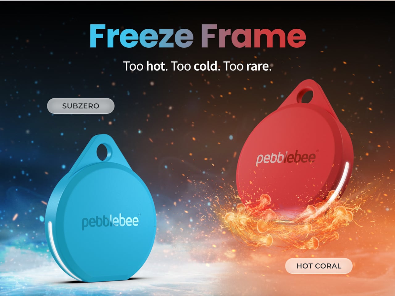
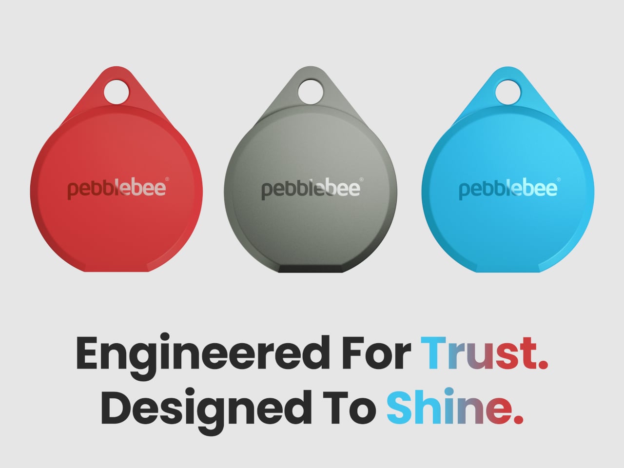
Pebblebee’s Evercolor program is a limited-edition color drop series for Clip 5, and Freeze Frame is the latest release. The brand launched two new colors, Subzero and Hot Coral, framed around temperature as “our first teacher.” The drop is time-limited, never repeated, and meant to make carrying a tracker feel personal and collectible rather than generic, more like picking a phone case than just buying another black tag.
Pebblebee positions Subzero as a restrained, icy blue that reflects calm, control, and stillness, and Hot Coral as a warm, saturated coral red that signals energy, urgency, and action. The pair is meant to capture that early lesson of cold and heat, pause and response, turning the act of clipping a tag to your keys or bag into a small statement about how you relate to that item.
Under the new colors sits the same Clip 5 hardware. It’s Pebblebee’s latest item finder, with brighter LED strobes, a louder buzzer, and a more modern, rounded design. It runs for up to twelve months on a single USB-C charge, has an IP66 water resistance rating, and reaches up to 500 ft over Bluetooth. It’s built to be found by sound, by sight, and now by style.
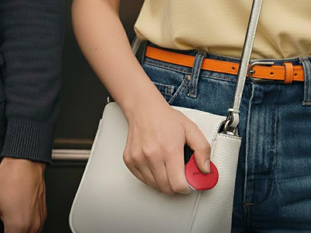
Clip 5 can join Apple’s Find My network on iOS or Google’s Find Hub on Android, so billions of devices quietly help you find lost items. There’s also a built-in Alert personal safety feature, where rapid presses trigger a siren, strobe, and SMS location ping to your chosen Safety Circle. That makes the color choice feel a bit more loaded when you think about where you clip it and when you might need it.
Evercolor drops are designed as moments, not permanent SKUs, and these shades won’t be restocked once they sell out. That scarcity nudges trackers into the same mental space as seasonal phone cases or watch bands, something you pick on purpose for a specific bag, coat, or set of keys instead of a default tag you never think about after you buy it.
Freeze Frame is less about changing what Clip 5 can do and more about changing how it feels to carry it. A Subzero tag on a camera bag or winter coat reads as calm and controlled, a Hot Coral one on keys or a gym bag feels like a bright “do not lose this” marker. When the whole point is not losing what matters, making it easier to care about the tag itself is smart design thinking most trackers skip entirely.
Most aroma diffusers behave like small plastic towers or pods that sit in a corner, quietly bubbling or misting away. They do their job, but they rarely feel like part of the room’s character, more like humidifiers with better marketing. It’s strange that scent and light are both mood tools, but the hardware behind them often looks forgettable enough to hide behind a plant or book.
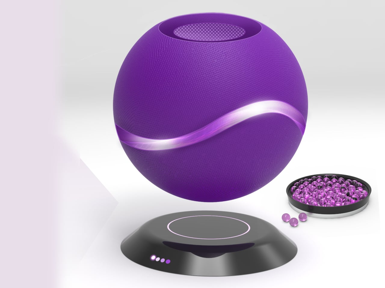
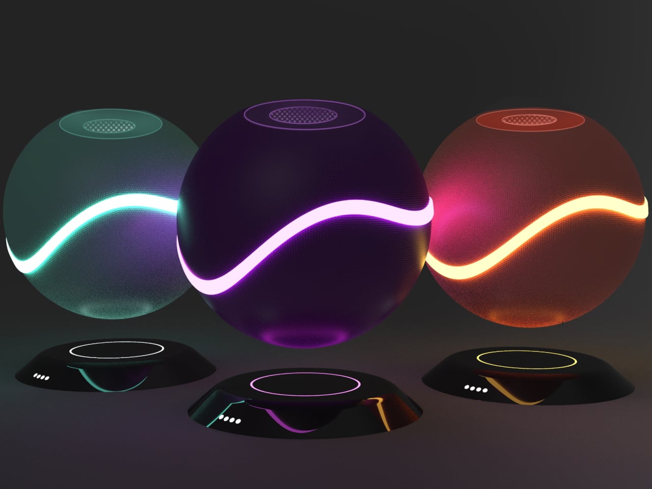
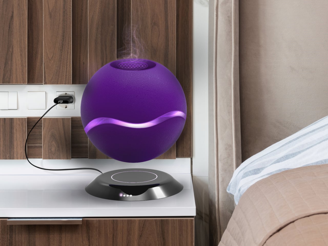
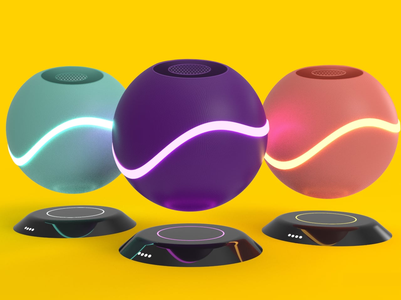
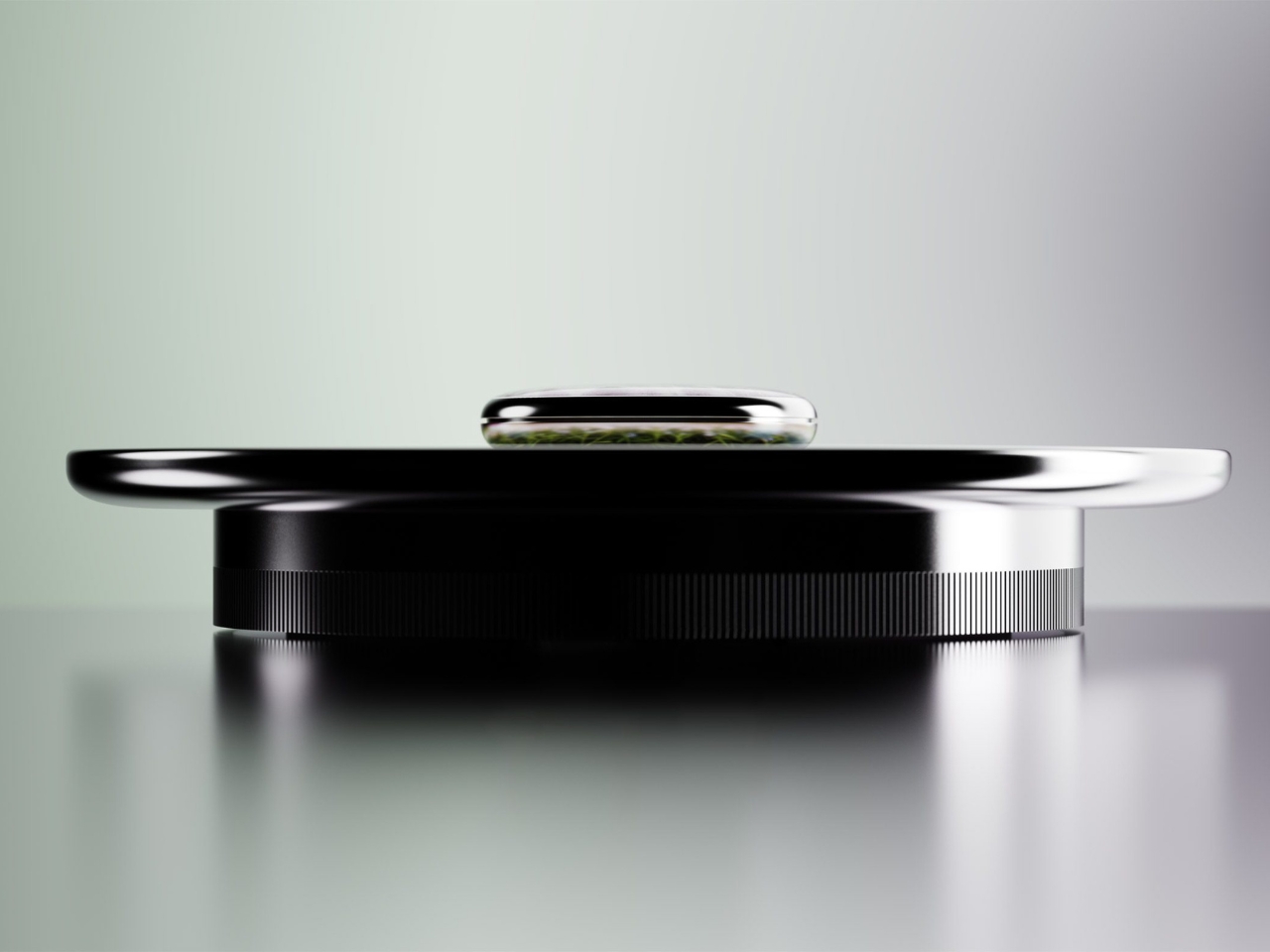
AER OMA is a magnetic levitating aroma diffuser concept that tries to make the act of scenting a room feel more deliberate. It uses a smooth spherical pod that hovers above a base, wrapped in a glowing band of light. The designer calls it a way to enhance room fragrance with a “futuristic feel,” which is rare copy that actually matches what the object looks like it wants to do.
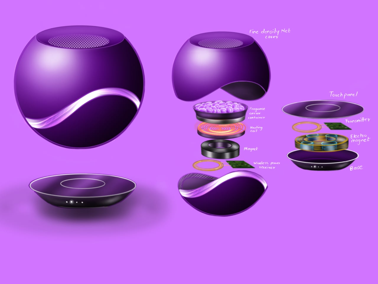
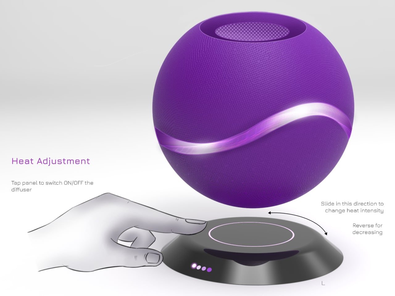
Coming home in the evening, you tap the touch panel on the base to wake the diffuser, and the ring light comes up as the sphere steadies in mid-air. Sliding a finger along the control changes heat and aroma intensity, with the light ring quietly reflecting those changes. It feels less like fiddling with a dial and more like setting a scene before you sit down and let the day catch up.
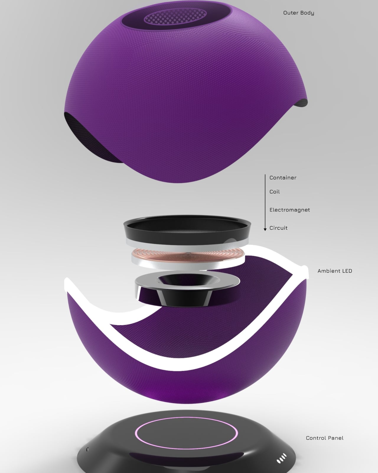
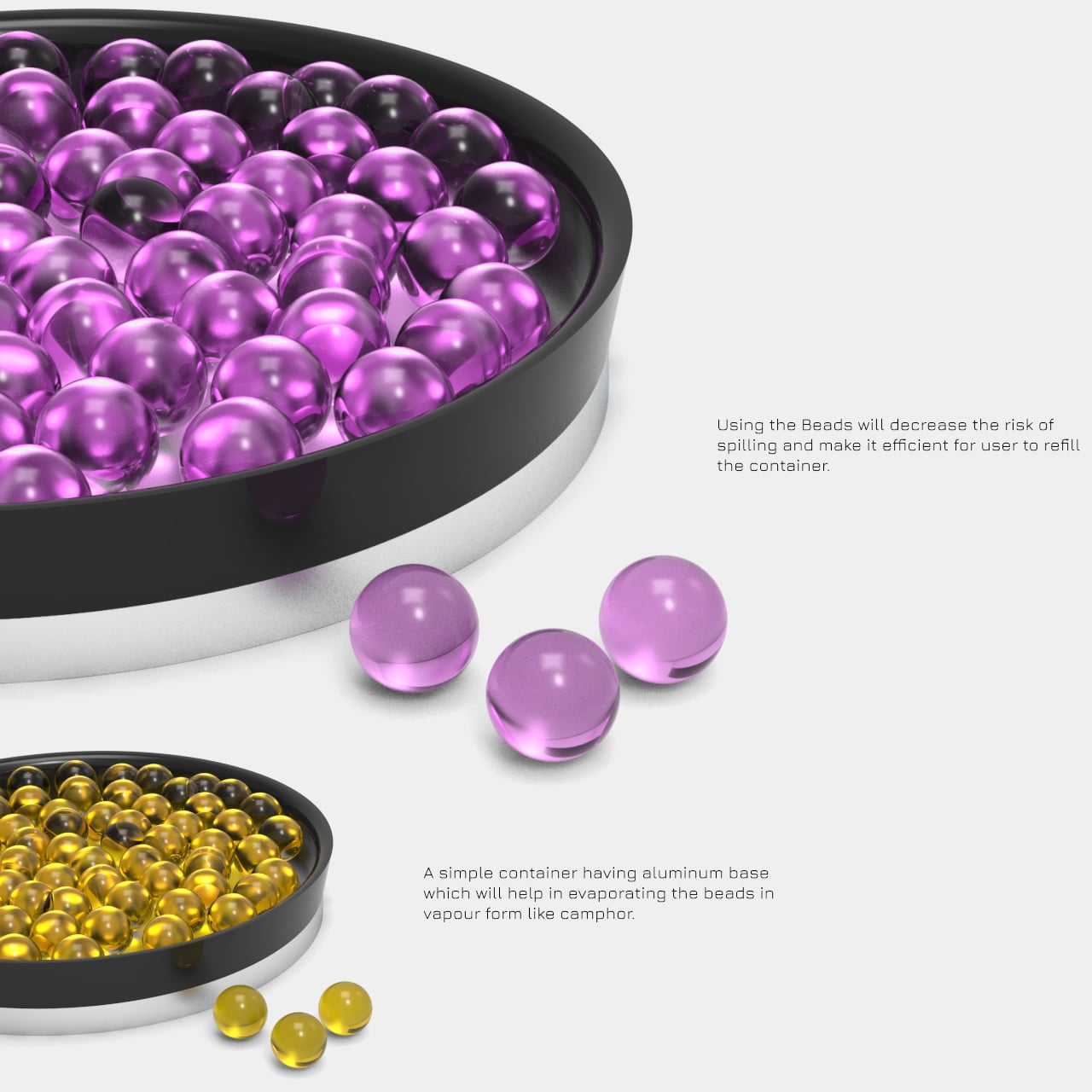
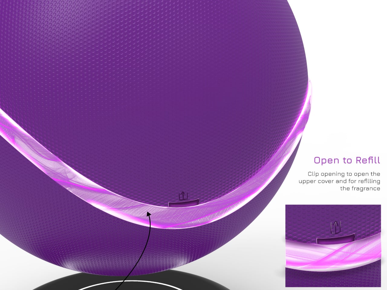
Instead of a water tank and essential oil puddles, AER OMA uses polymer aroma beads held in a small metal and mesh container. Heat from a roughly 12W element releases fragrance without spill risk, and refilling is as simple as swapping beads. You can choose a handful for a light scent or more for a stronger presence, making the ritual more tactile than just dripping liquid into a reservoir.
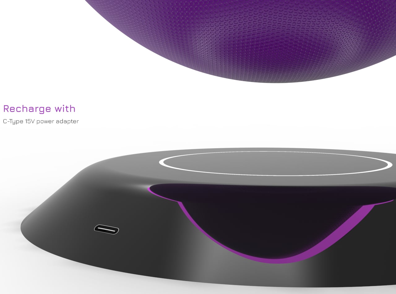
Magnets and coils in the base and sphere handle the hovering act, powered by a 12-15 V USB-C adapter, while ambient LEDs in the base ring and the band around the sphere handle the glow. The floating form and soft light sell the idea that scent is something weightless moving through the room, not just vapor coming out of a nozzle buried in plastic.
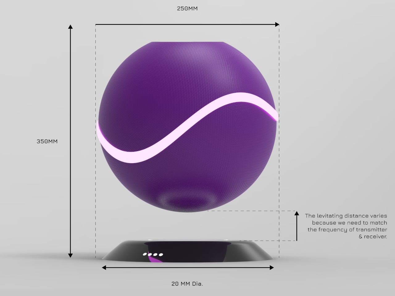
The sphere is about 250mm across, the base around 200mm, with a polypropylene or ABS shell molded into smooth curves. Color options range from deep purple to teal and warm orange, each with matching light accents. It’s big enough to be a focal object on a sideboard or bedside table, but still reads as a single, calm shape rather than tech bristling with vents.
AER OMA treats scent diffusion as a small performance instead of a background process. By floating the diffuser, hiding the mechanics, and giving you a simple touch strip and a bowl of beads to work with, it reframes a functional task as a quiet ritual. It’s a reminder that even making a room smell nice can feel different when the object doing it looks like it belongs in the future instead of the back corner of a shelf.
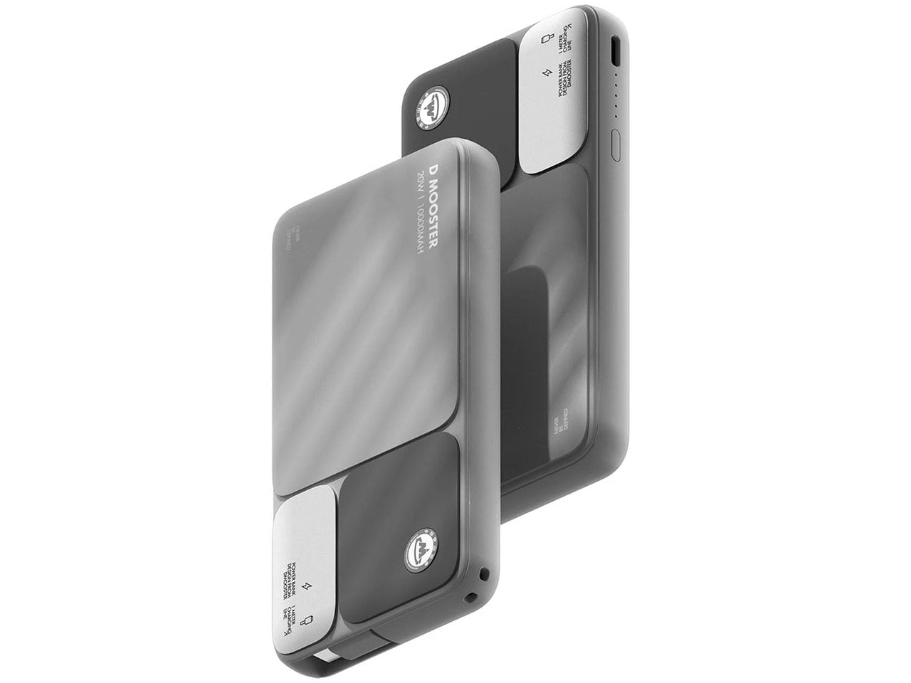
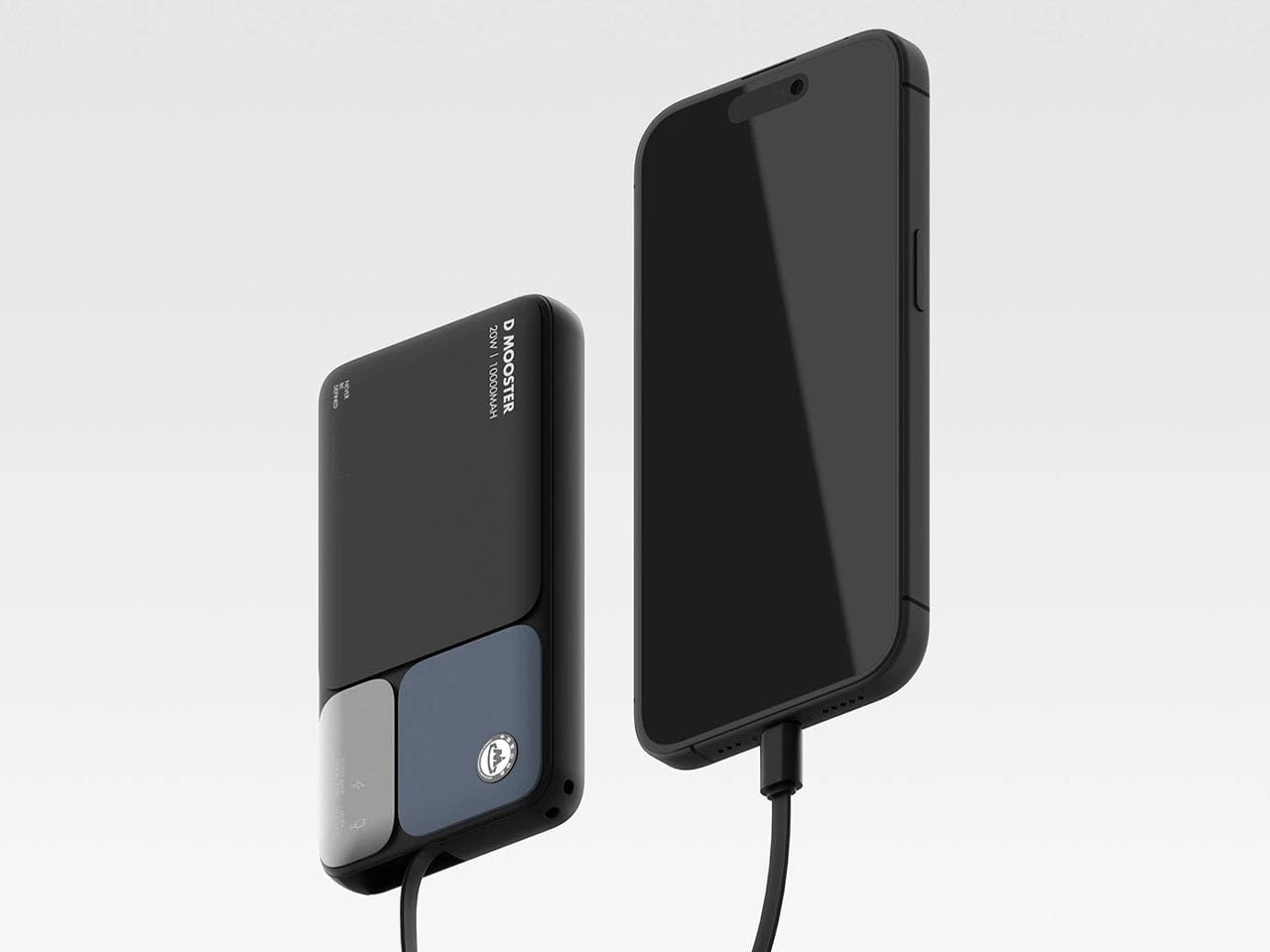
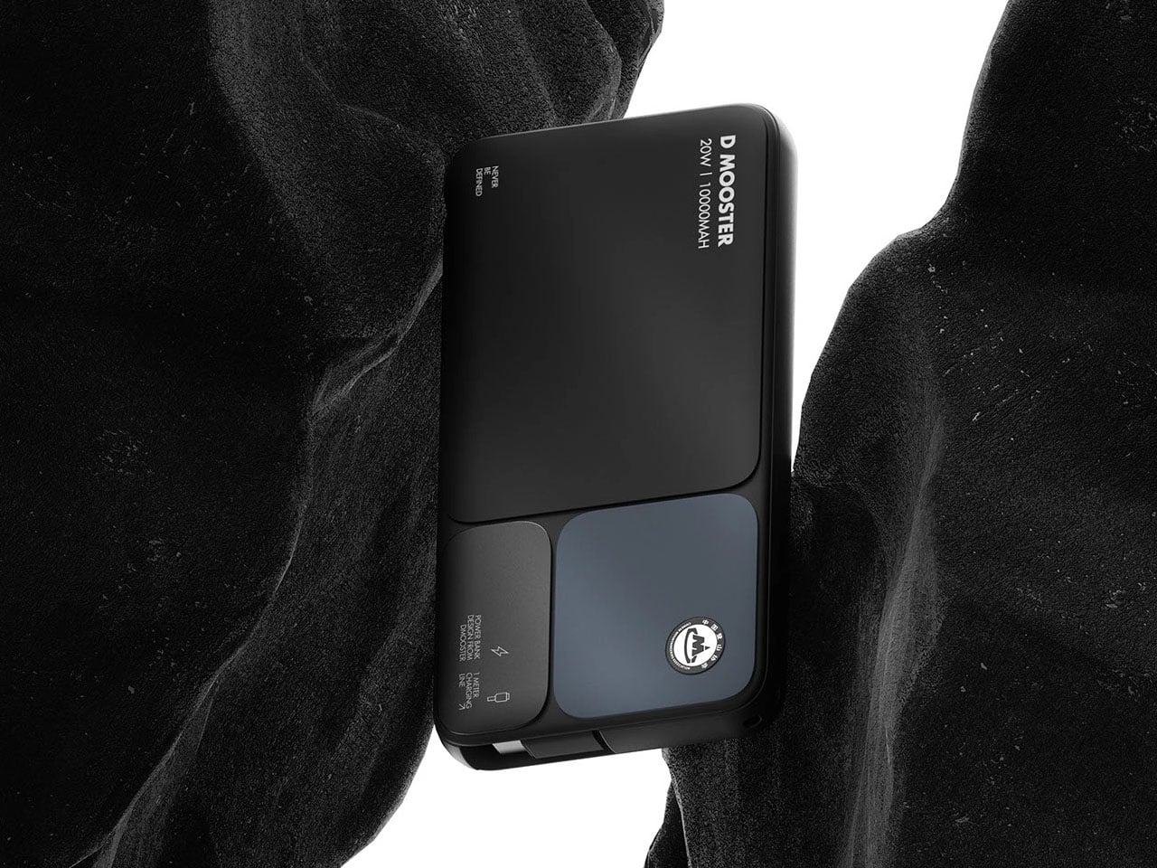
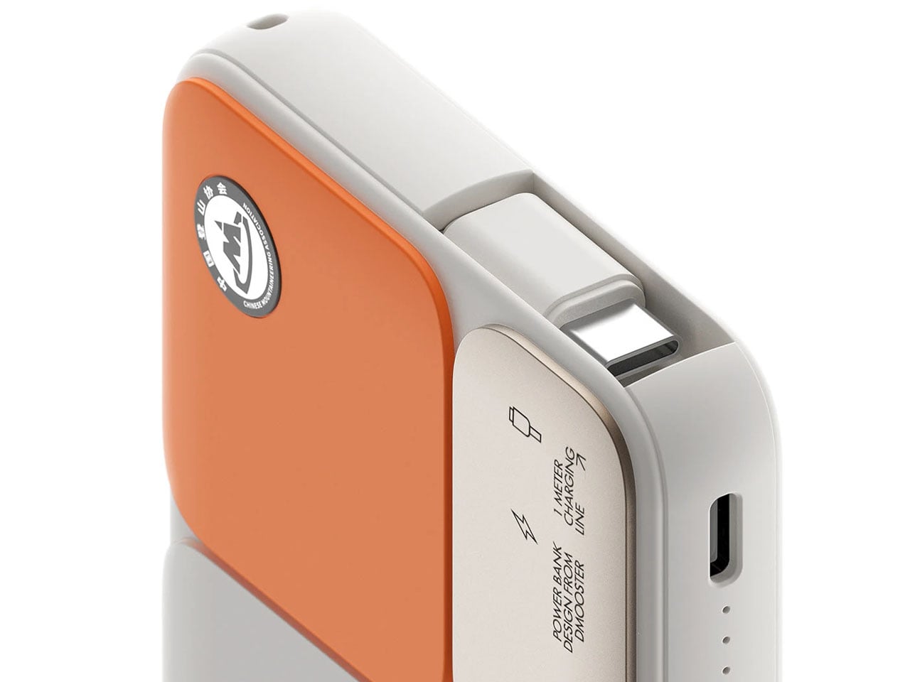
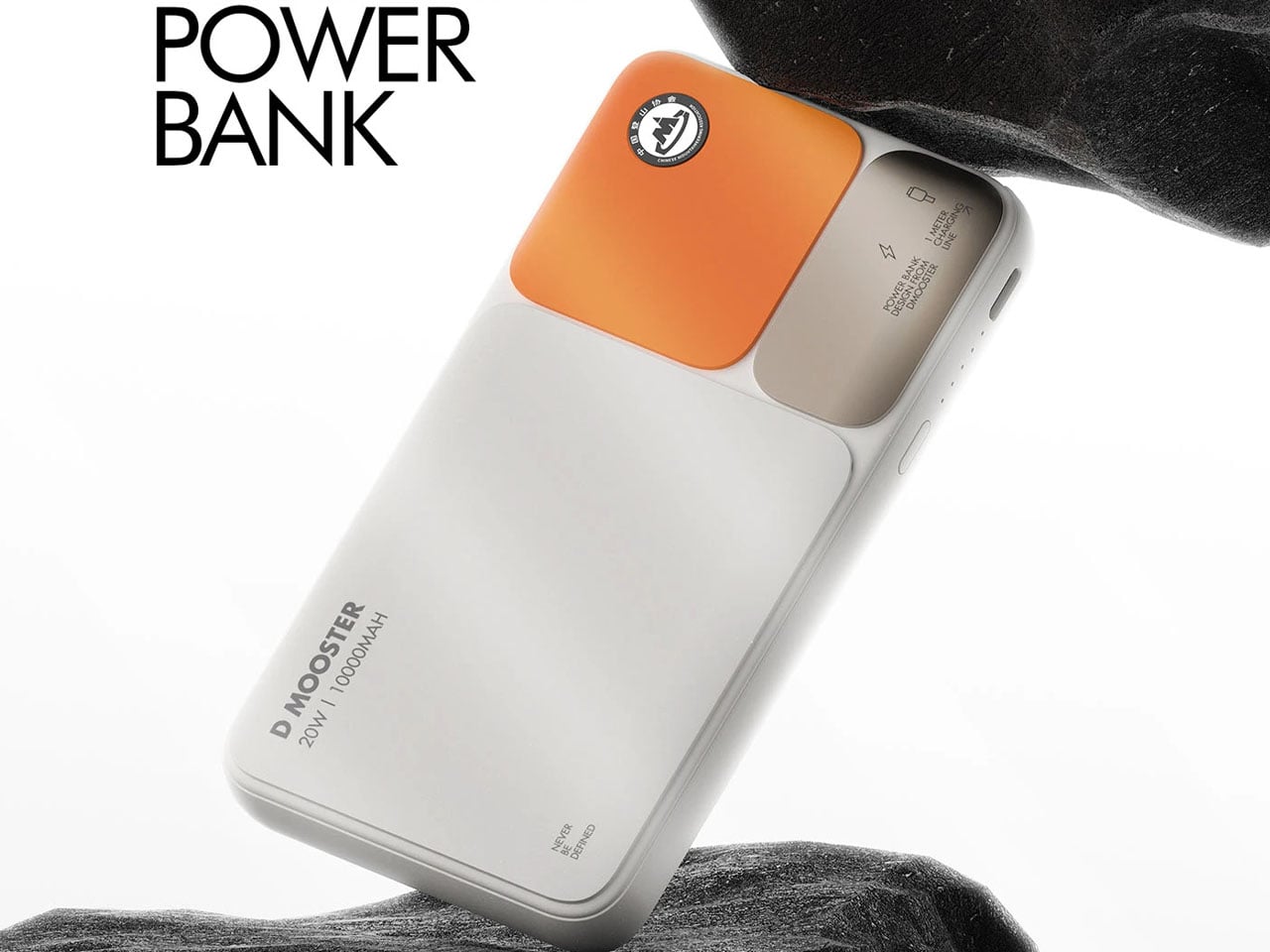
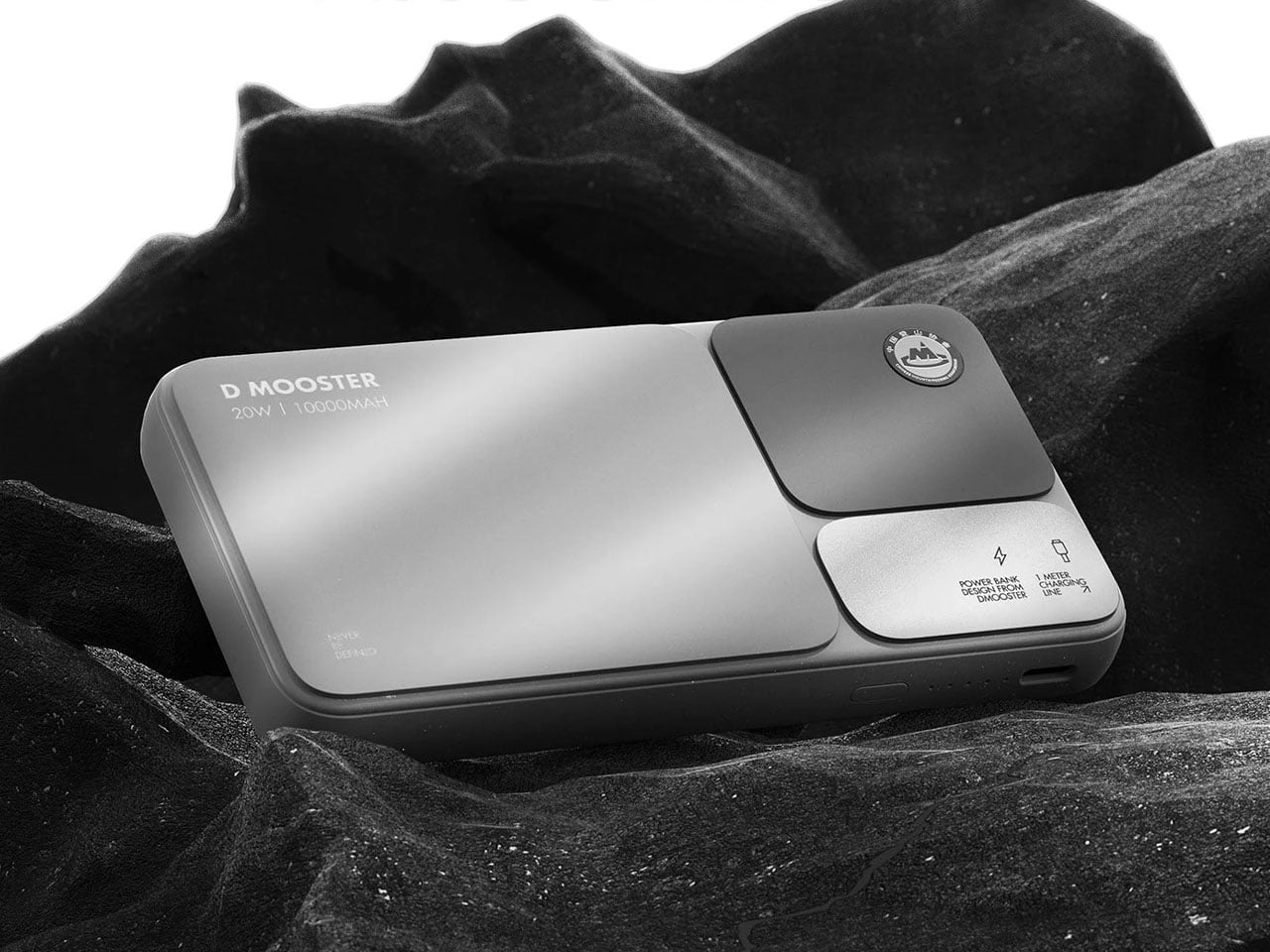
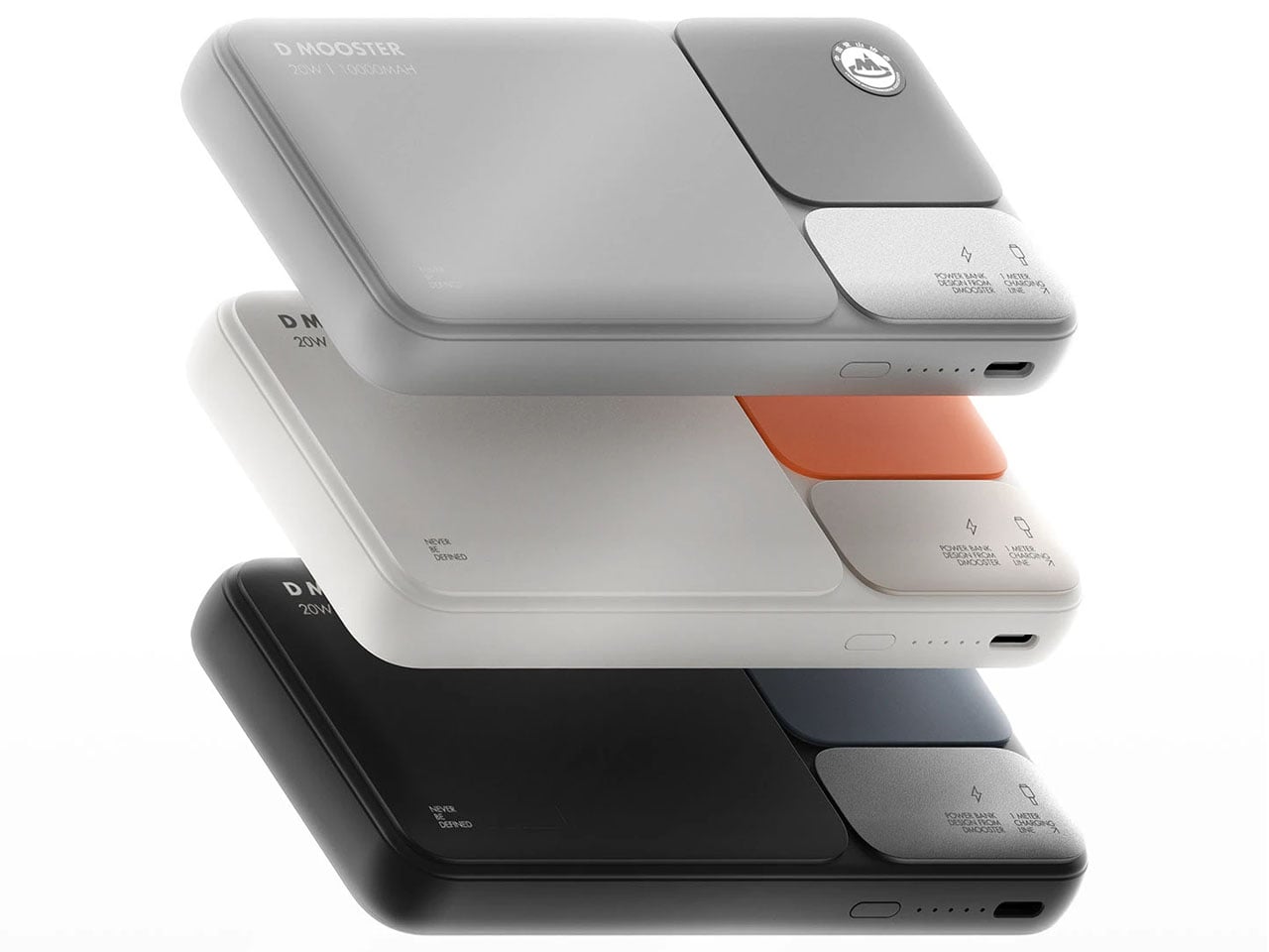
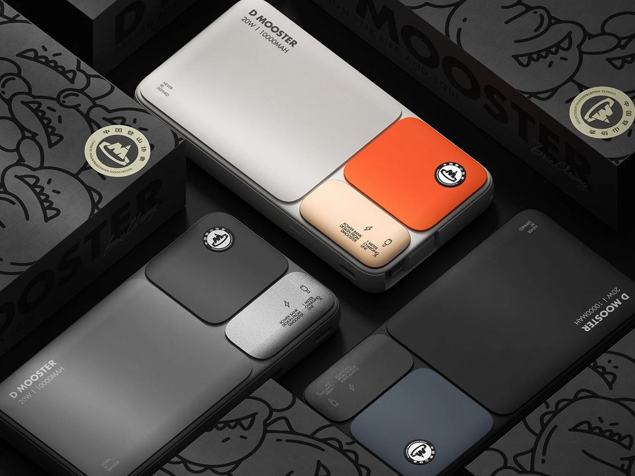
I miss the point-and-shoot cameras of days gone by. They offered a level of convenience that smartphones have hogged over the past two decades. Yet many designers and creators believe those cameras had something in their design that can still influence modern devices and their form. Case in point: the D90 Block Power Bank by D MOOSTER. It resembles a digicam without the lens, but with the same comfortable, convenient handling.
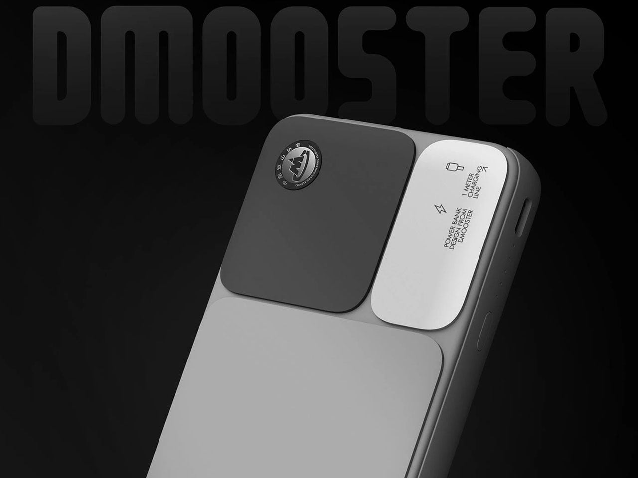
D MOOSTER, established in 2020, is a design agency born during the pandemic. Since then, it has been moving forward with concepts that have the power to mesmerize, and this new power bank with its timeless appearance and state-of-the-art features embodies that spirit, and is a compelling device to behold. If you’re not convinced, we’ll walk you through its aesthetic and functional features below to show why it truly lives up to the hype.
You cannot afford to have your phone run out of power in the middle of doomscrolling or when you’re in no man’s land without a power connection in the vicinity. And it goes without saying that the case is similar when you are working remotely and are involved in back-to-back meetings. A reliable power bank can be the much-needed lifeline when such a situation strikes and you should be ready with a contemporary device, which can offer more power, with maximum convenience and still have a showstopping design to flaunt.
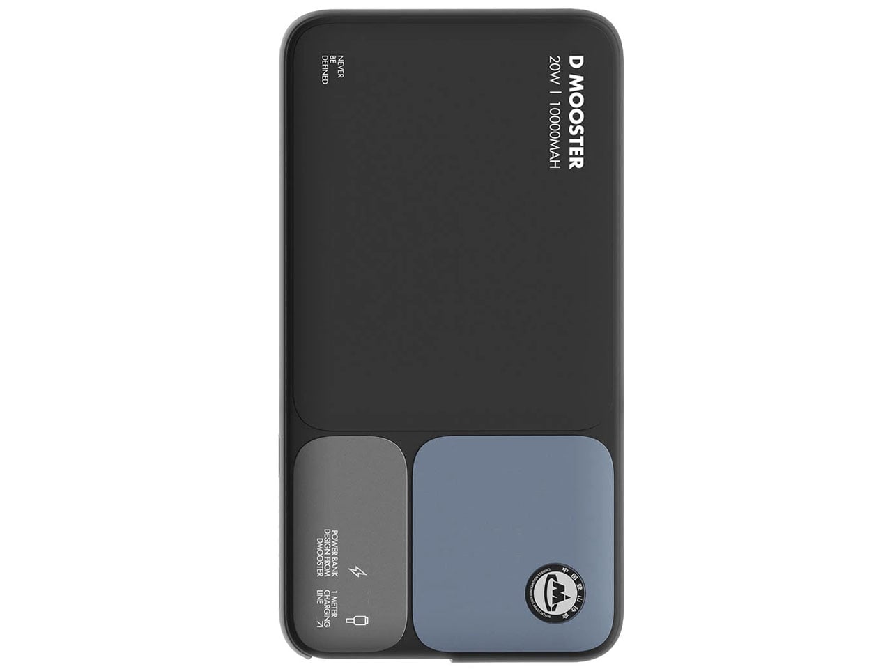
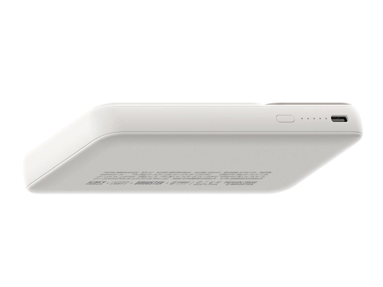
The D90 Block Power is all of the above. A device with the primary idea of keeping your portable devices going through the day. It can work hard and last long with up to 20W fast charging support and a capable 10,000 mAh battery, which can juice up your iPhone fully at least twice before requiring a charge. When it comes to devices like a power bank, we rely on reputable brands for their capacity, power output, and durability.
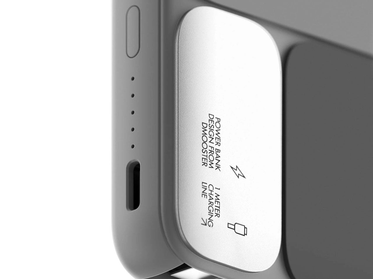
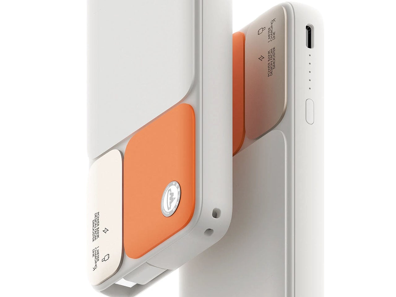
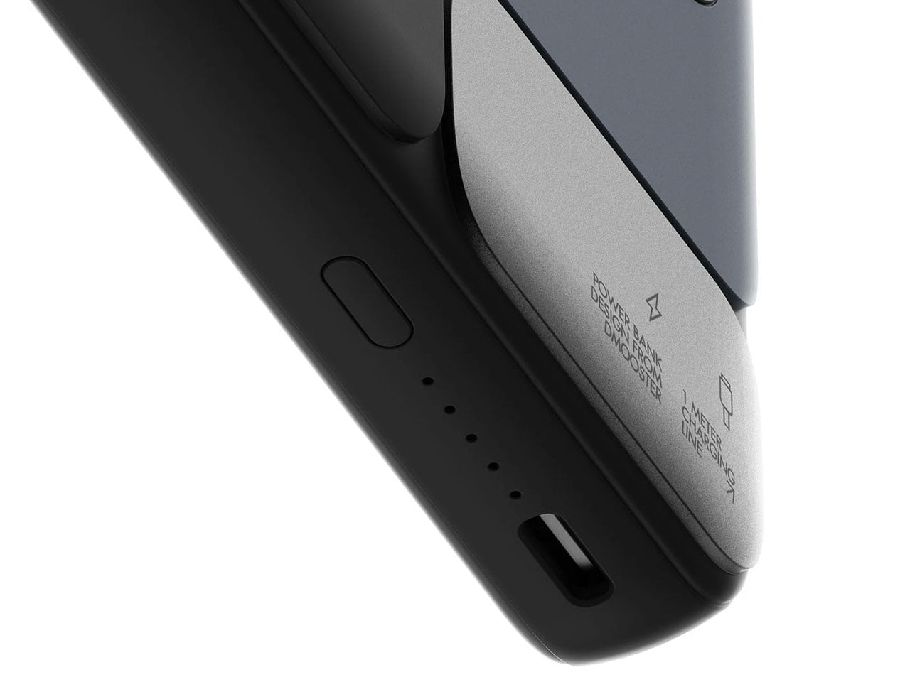
With its new power bank concept, D MOOSTER ensures each of these parameters is checked and consumers have no reason to shy away from its appeal. And when that’s ensured, the convenience of the pull-out cable kicks in. The device flaunts a one-meter-long cable, which pulls out of its housing within the power bank, when you need it. With a USB Type-C on its connecting end, the power bank is made compatible with almost all the new iPhones and an entire collection of smartphones under the Android umbrella.
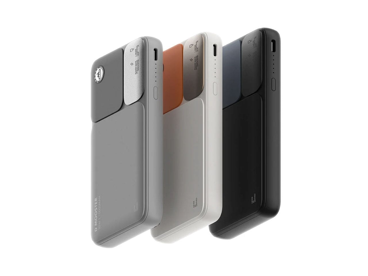
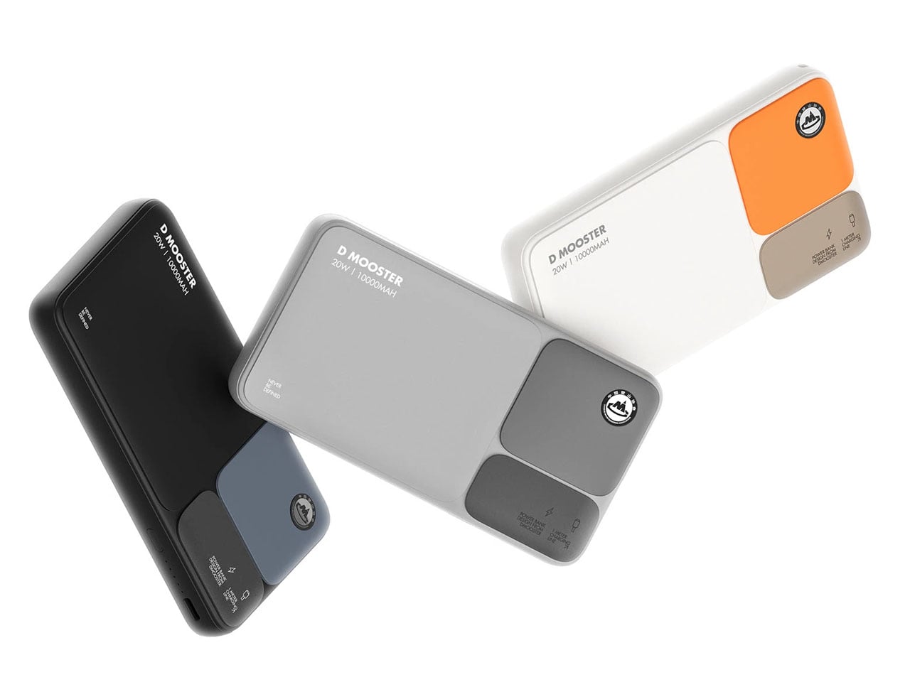
Featuring an enticing three-module design, one each for branding, specifications, and information (inspired by the Fibonacci golden ratio) the D90 Block Power has a power button and an USB A port alongside on one side. Designed in three colors: orange, gray, and blue, the power bank from D MOOSTER is conceptualized with natural materials and a size that is handy to carry and use.
Many people feel overwhelmed by gadgets and cords cluttering their beautifully designed spaces. The growing desire for simplicity and intentional living, once centered on interiors, now extends to technology. Gen Z is not just choosing smaller devices, but they are redefining what it means to own and use technology with purpose and balance.
This generation is driving a new wave of tech minimalism that blends power, portability, and sustainability with a hint of nostalgia. They curate their digital tools like design pieces that are useful, stylish, and clutter-free. For them, technology quietly enhances life rather than overpowering it, reshaping the modern minimalist movement.
1. Tiny Projectors and the Invisible Tech Trend
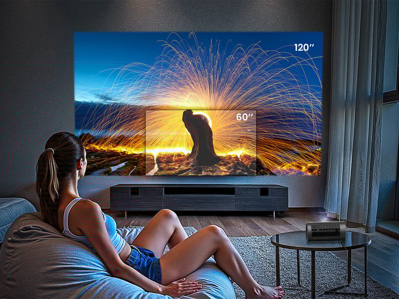
The large television dominating living rooms is fast becoming outdated for Gen Z, who value flexibility and open spaces. A growing number are turning to compact projectors that can be tucked away when not in use, transforming any wall into a viewing screen. It’s a clever solution for anyone wanting to reclaim visual balance and wall space without sacrificing entertainment.
This shift toward “invisible tech” perfectly complements the trend of minimal, intentional interiors. Without a bulky black rectangle commanding attention, rooms feel calmer and more refined. These pocket-sized projectors offer spontaneous experiences like movie nights, art displays, or gaming, anywhere, anytime.
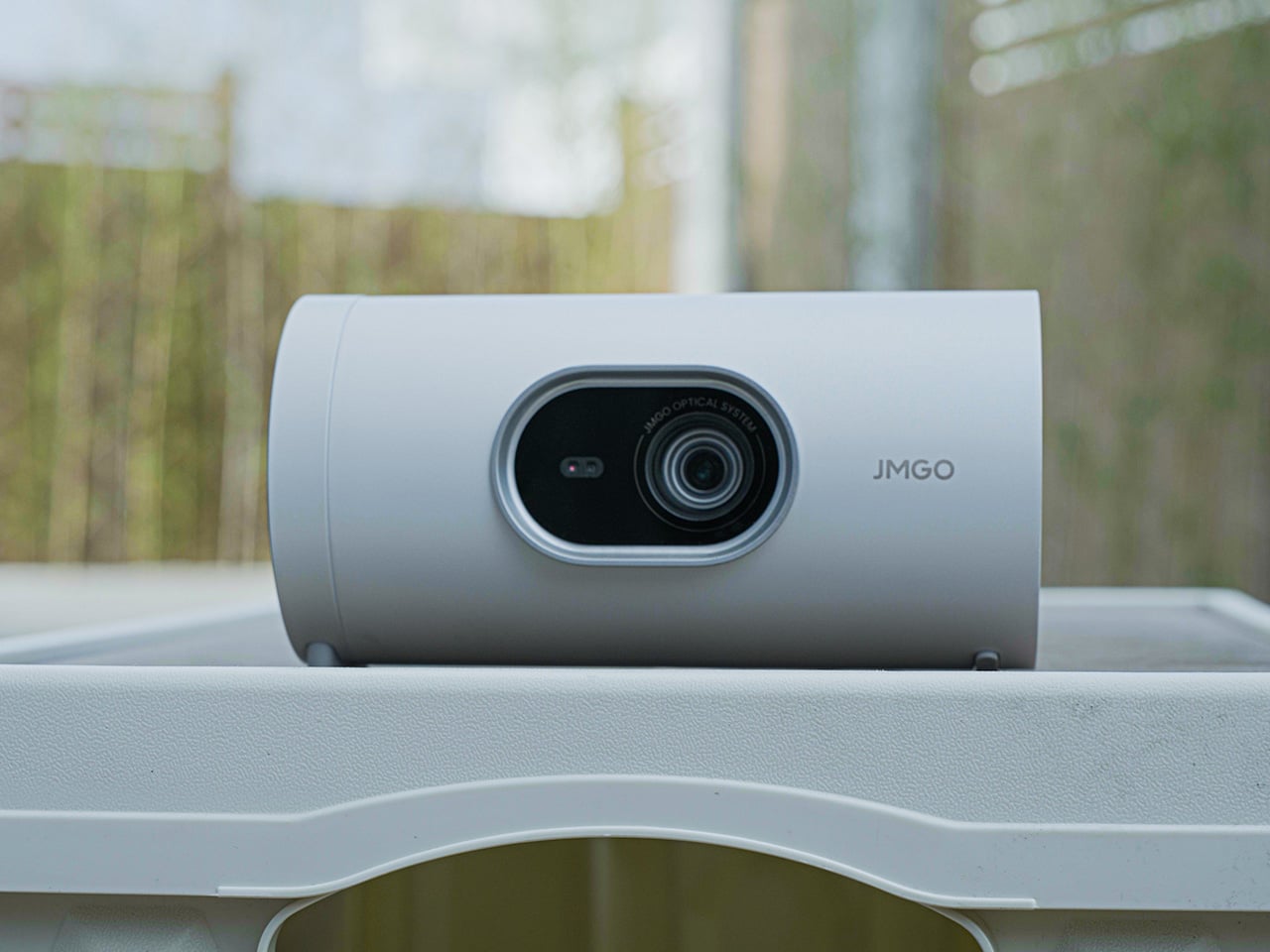
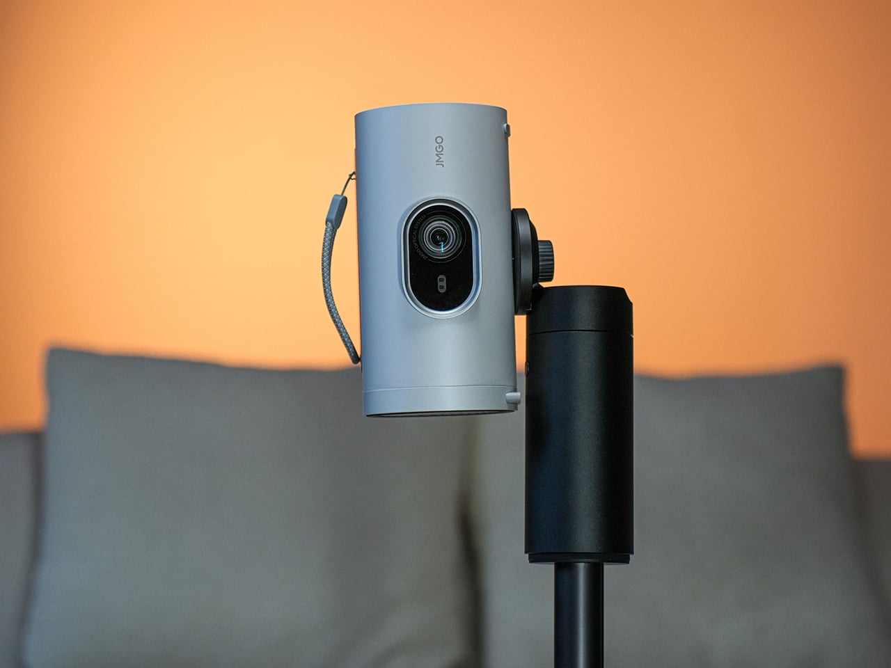
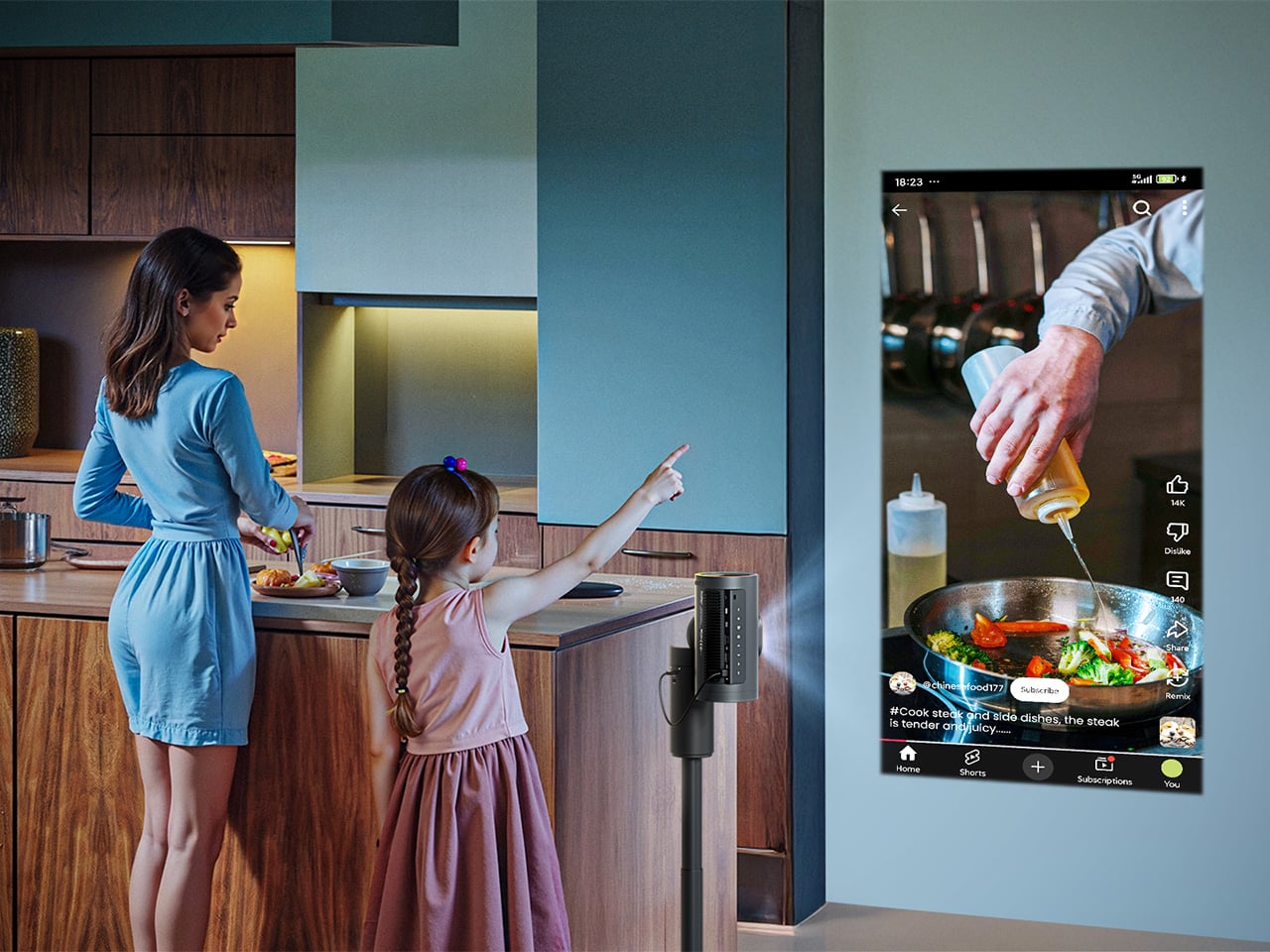
The JMGO PicoPlay+ is a compact, all-in-one portable projector designed to elevate everyday entertainment with minimal effort. Weighing roughly the same as a laptop and fitting easily into a backpack, it delivers Full HD 1080P projection at 460 ISO lumens and includes a vertical projection mode optimised for TikTok, Instagram Reels, and YouTube Shorts. Beyond projection, the device doubles as a 360-degree Bluetooth speaker with rich 8-watt audio, and integrates Google TV with access to over 10,000 apps, including Netflix, without the need for additional streaming hardware.
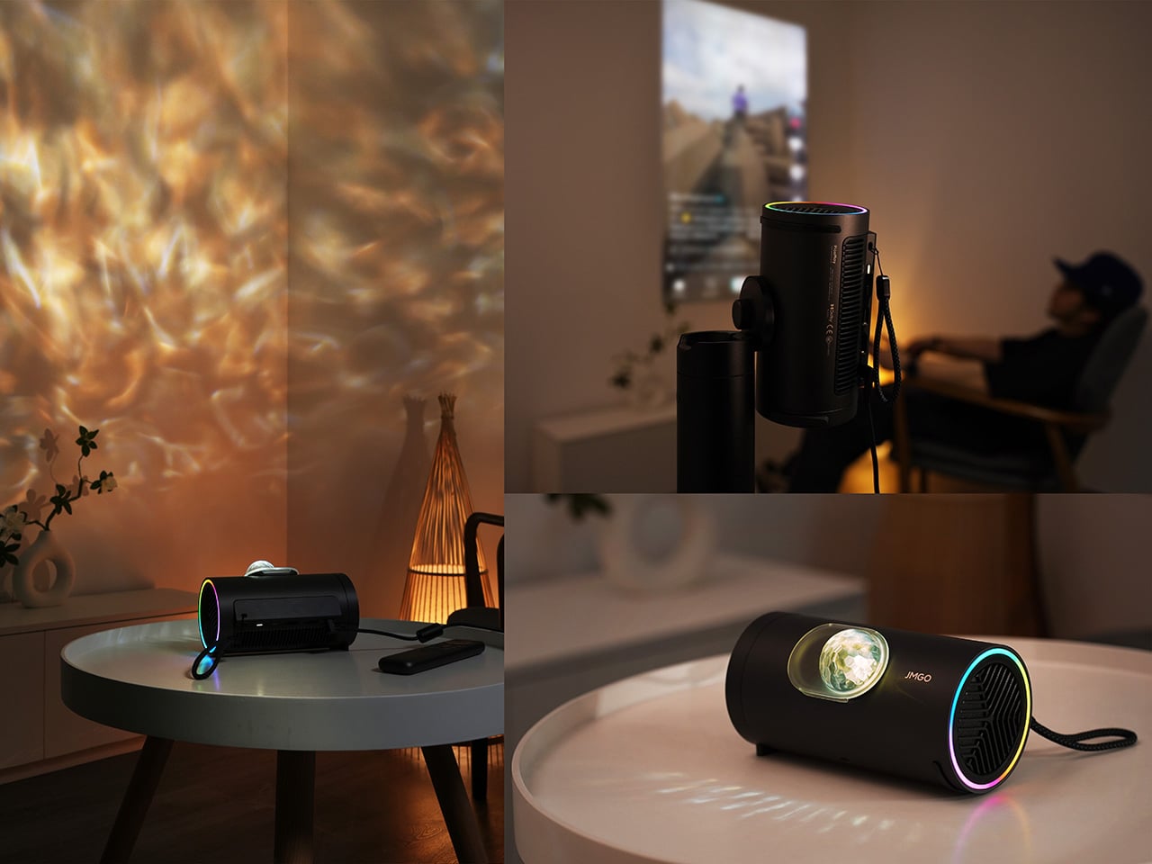
Smart features such as gimbal-based auto-correction, touch controls, HDMI 2.1 ARC compatibility, USB and Type-C support, and a 25,000-hour LED lifespan contribute to a seamless user experience. The cylindrical design incorporates an ambient RGB lighting system that syncs with music to enhance atmospheric settings. Paired with an included power bank stand providing four hours of cordless use, it is ideal for dorms, travel, outdoor events, or multi-purpose living spaces.
2. The Era of Compact and Collapsible Accessories
In Gen Z’s tech world, if it doesn’t fold, it doesn’t fit. A wave of flexible, foldable accessories, including roll-up keyboards, collapsible ring lights, and portable laptop stands, is redefining mobility and workspace design. These tools reflect a work-from-anywhere mindset where setups appear and disappear in seconds.
The philosophy is simple: to function without clutter. Every accessory serves a purpose when in use, then vanishes neatly when not in use. Foldable, compact designs enable spaces to transition effortlessly from a productive office to a calm living area, demonstrating that smart, portable design isn’t just practical but is a quiet act of intentional living.
The KeyGo Ultra-Slim Folding Keyboard is designed to redefine mobile productivity by combining premium construction with intelligent functionality. Crafted from CNC-anodised aluminium, it offers a robust, MacBook-grade tactile experience in a compact form. Its 180-degree foldable mechanism ensures stable deployment while maintaining travel-friendly proportions. Integrated dynamic lighting enhances visual feedback and adds refinement to extended work sessions.
A distinguishing feature of KeyGo is its integrated 12.8-inch laminated touchscreen, providing 1920×720 resolution, ten-point touch support, and 72% NTSC colour performance. It can function as a dedicated secondary display or as a precision touch interface for multitasking, gesture navigation, and creative tasks. Universal compatibility across Windows, macOS, Linux, Android, and iOS, coupled with dual USB-C and USB-A connectivity, enables effortless deployment across devices. Quiet scissor-switch keys ensure a refined typing experience, making KeyGo a sophisticated solution for professionals who do not wish to compromise productivity while working on the move.
3. Retro Gadgets and Simple Tech
Alongside cutting-edge tech, Gen Z is embracing nostalgia-driven gadgets like reissued Polaroid cameras and simple flip phones. This trend isn’t just playful, as it reflects a desire for simplicity and intentional use, favoring devices that perform one task well rather than many poorly.
This focus on purpose-built tools encourages mindfulness. Using an instant camera slows down the process, creating tangible, immediate results instead of endless scrolling. It shows that good design often lies in reducing complexity. Single-purpose devices can enhance well-being, offering freedom from constant digital distractions while making technology feel intentional, satisfying, and thoughtfully integrated into daily life.
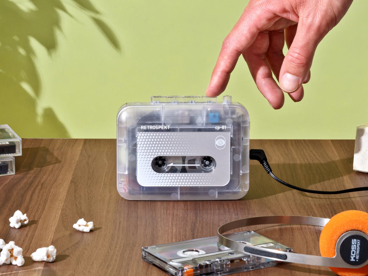
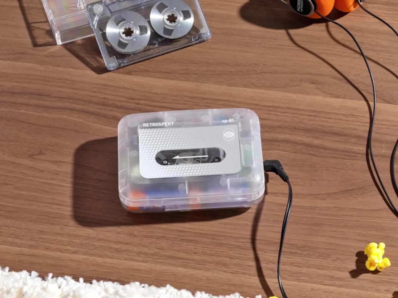
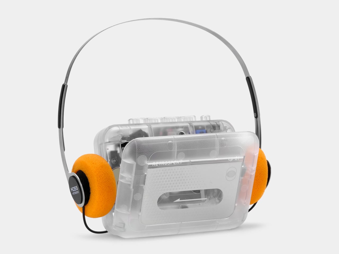
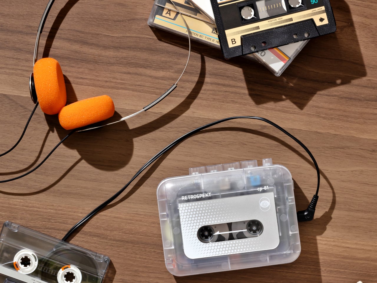
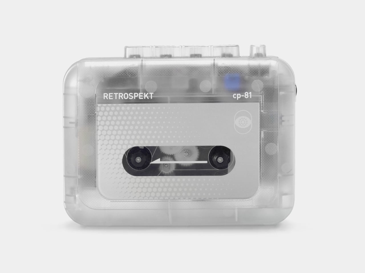
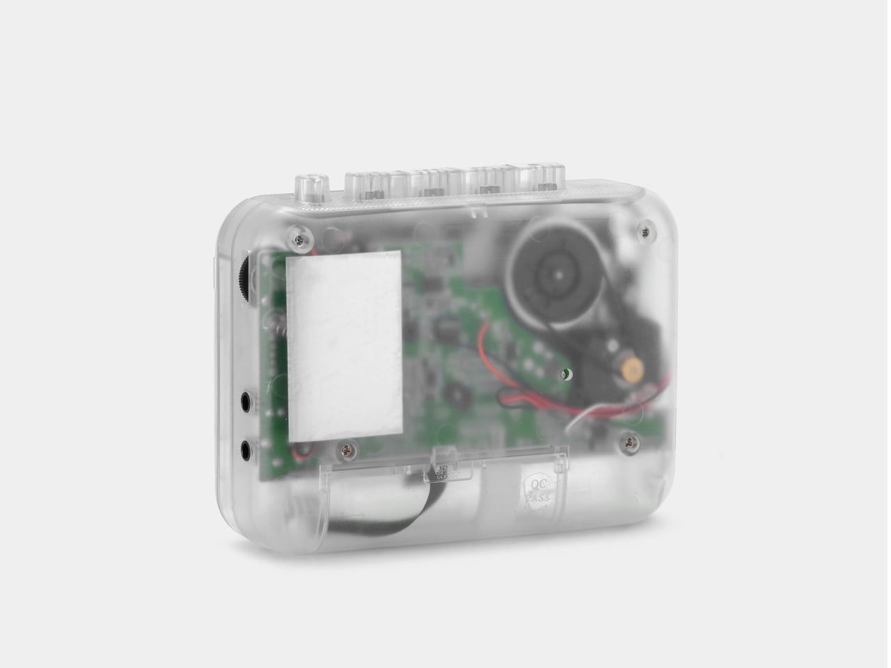
The cassette revival is not merely nostalgic sentiment but a renewed appreciation for analogue sound, tactile interaction, and the ritual of rewinding a mixtape. Where enthusiasts once depended on ageing Walkmans with unreliable mechanics, the Retrospekt CP-81 introduces a contemporary alternative engineered for today. Newly built rather than restored, it pairs retro appeal with modern dependability. The transparent housing exposes the internal mechanics, while its compact profile and minimal branding maintain a clean, modern aesthetic. The unit ships with retro-inspired Koss headphones featuring orange foam pads and a stainless-steel headband.
Functionality is intentionally focused, offering play, fast-forward, rewind, and record, along with a microphone jack for line-in capture. It operates via AA batteries or USB-C for flexible use at home or in transit. The tactile pleasure of inserting a cassette and hearing the gentle transport noise is central to its charm, complemented by stable stereo output and themed editions that add collectability.
4. Eco-Friendly and Mindful Tech
For Gen Z, technology is inseparable from sustainability and well-being. They seek brands that prioritize repairability, modular upgrades, and transparent sourcing, rejecting the disposable gadget culture of previous decades. This shift is driving demand for devices designed to last longer, encouraging a more thoughtful approach to tech ownership.
Adopting this mindset benefits everyone. Choosing eco-friendly, durable devices isn’t just about protecting the planet; it also fosters a sense of calm and permanence in daily life. Supporting companies that actively reduce e-waste is a practical step that anyone can take, making technology both sustainable and more mindful in its use.
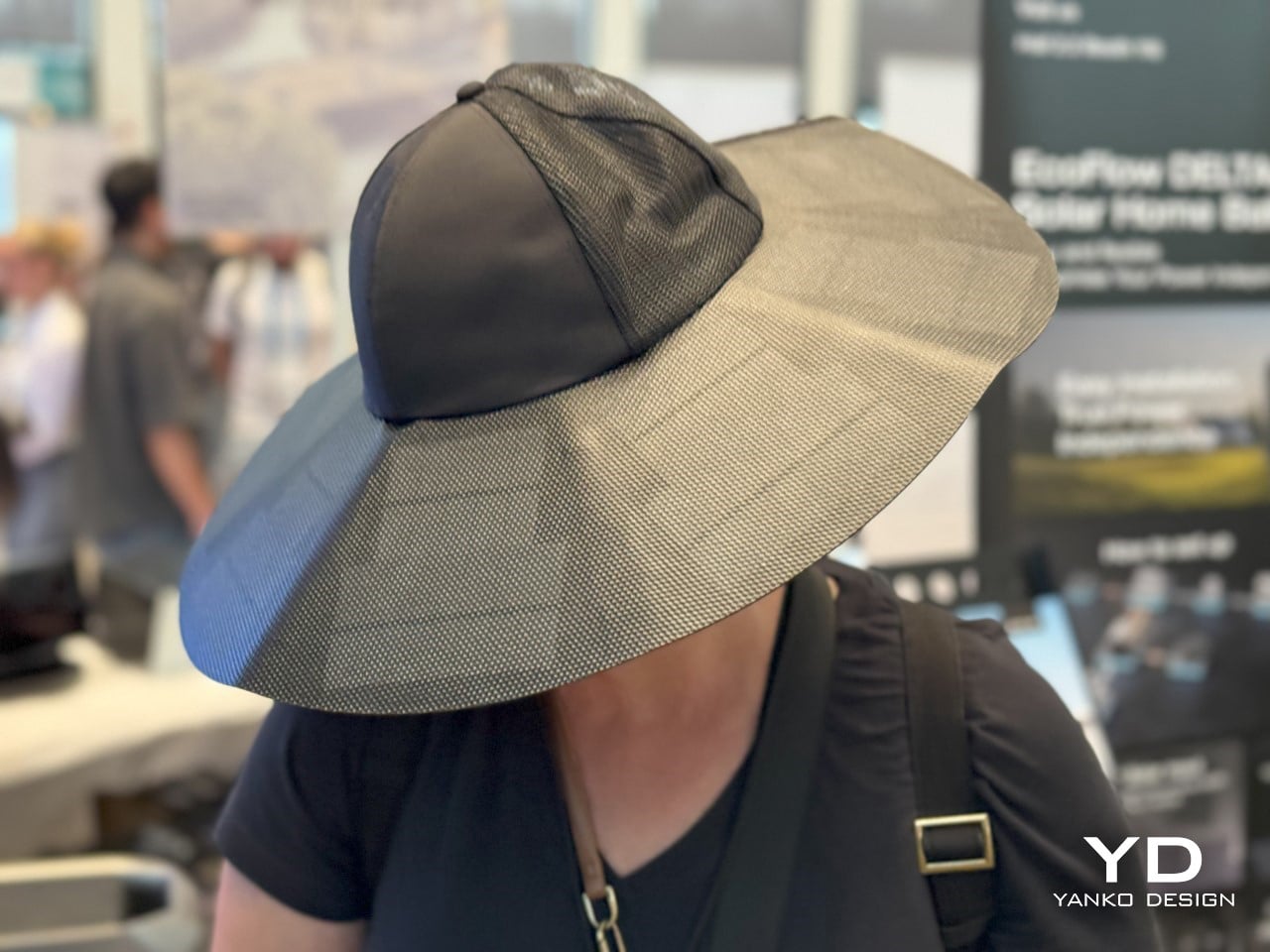
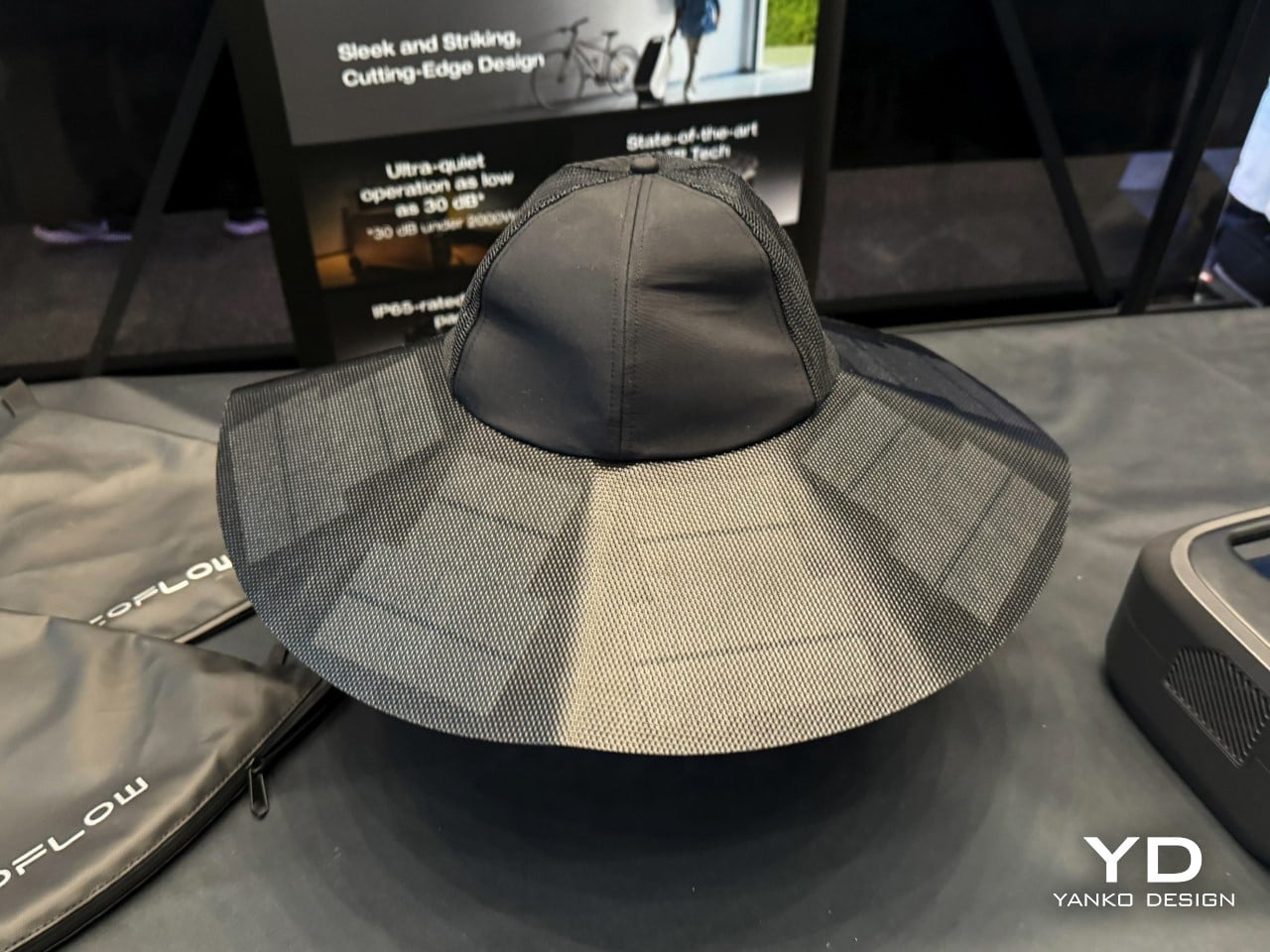
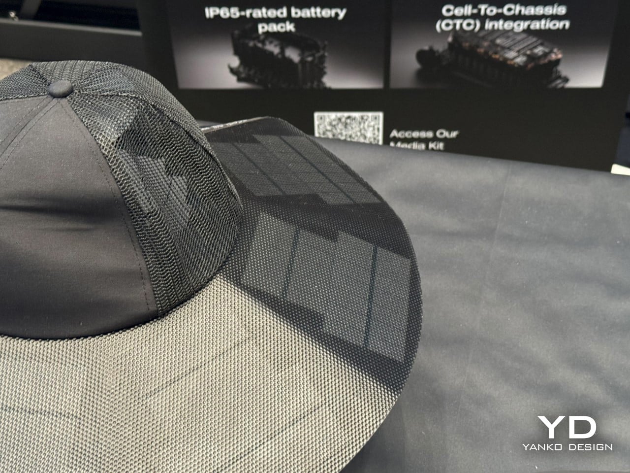
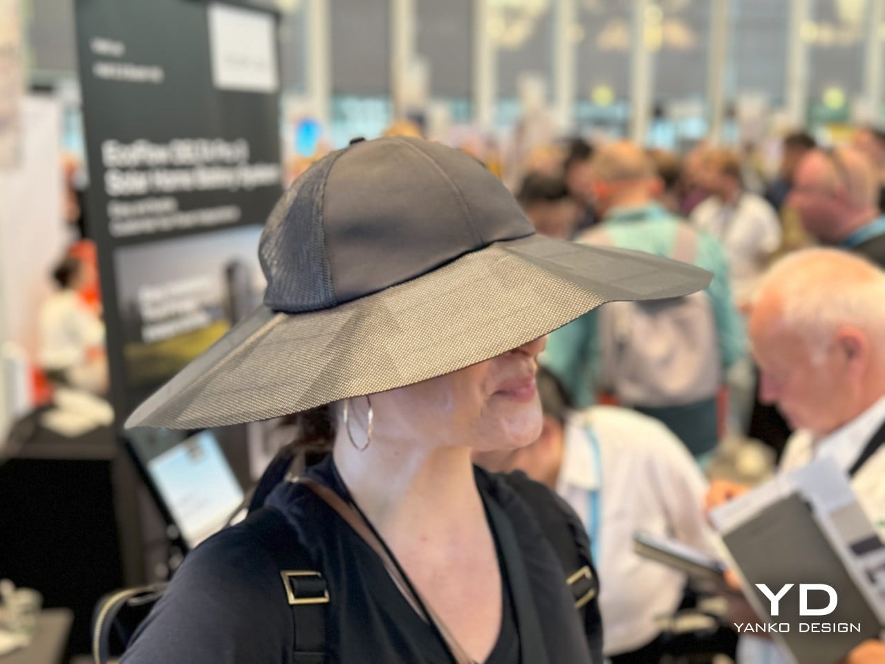
The EcoFlow Power Hat is a wearable solar-charging accessory designed to extend device battery life during outdoor activities. Styled as a wide-brimmed sun hat, it integrates a flexible solar panel seamlessly into the brim, enabling continuous energy capture under direct sunlight. A concealed USB-C port positioned within the inner band allows users to connect and charge small electronic devices such as smartphones, GPS units, or wireless earbuds without additional equipment. The concept aligns with EcoFlow’s commitment to accessible, clean energy, translating the brand’s expertise in portable power into a practical, hands-free format.
Engineered for comfort and longevity, the Power Hat maintains the look and feel of a conventional outdoor hat, ensuring extended wear without visual or physical bulk. Its minimalist aesthetic prevents it from appearing overtly technical, making it suitable for hiking, camping, festivals, and other off-grid environments. It offers a discreet, sustainable charging alternative for users who prioritise functionality without compromising mobility.
5. Minimalist Tech Practices
The final, and perhaps most defining, aspect of Gen Z’s tech minimalism is digital decluttering. They deliberately remove unnecessary apps, control notifications, and maintain highly organised digital spaces. Their belief is straightforward: a cluttered digital life creates a cluttered mind, compromising comfort and well-being. This mindset also influences their hardware choices — favouring sleek, minimal gadgets that deliver function without visual or physical excess.
This is an approach anyone can adopt. Spend an hour deleting old files, unsubscribing from email clutter, and limiting push notifications to essentials. By applying minimalist principles to screens and devices the way we do to physical spaces, we create mental clarity, reduce stress, and cultivate a calmer, more intentional relationship with technology.
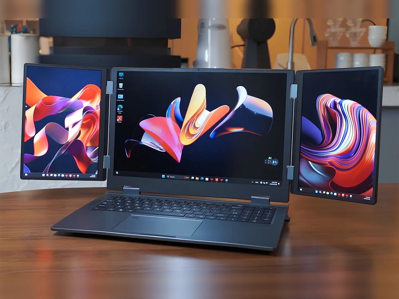
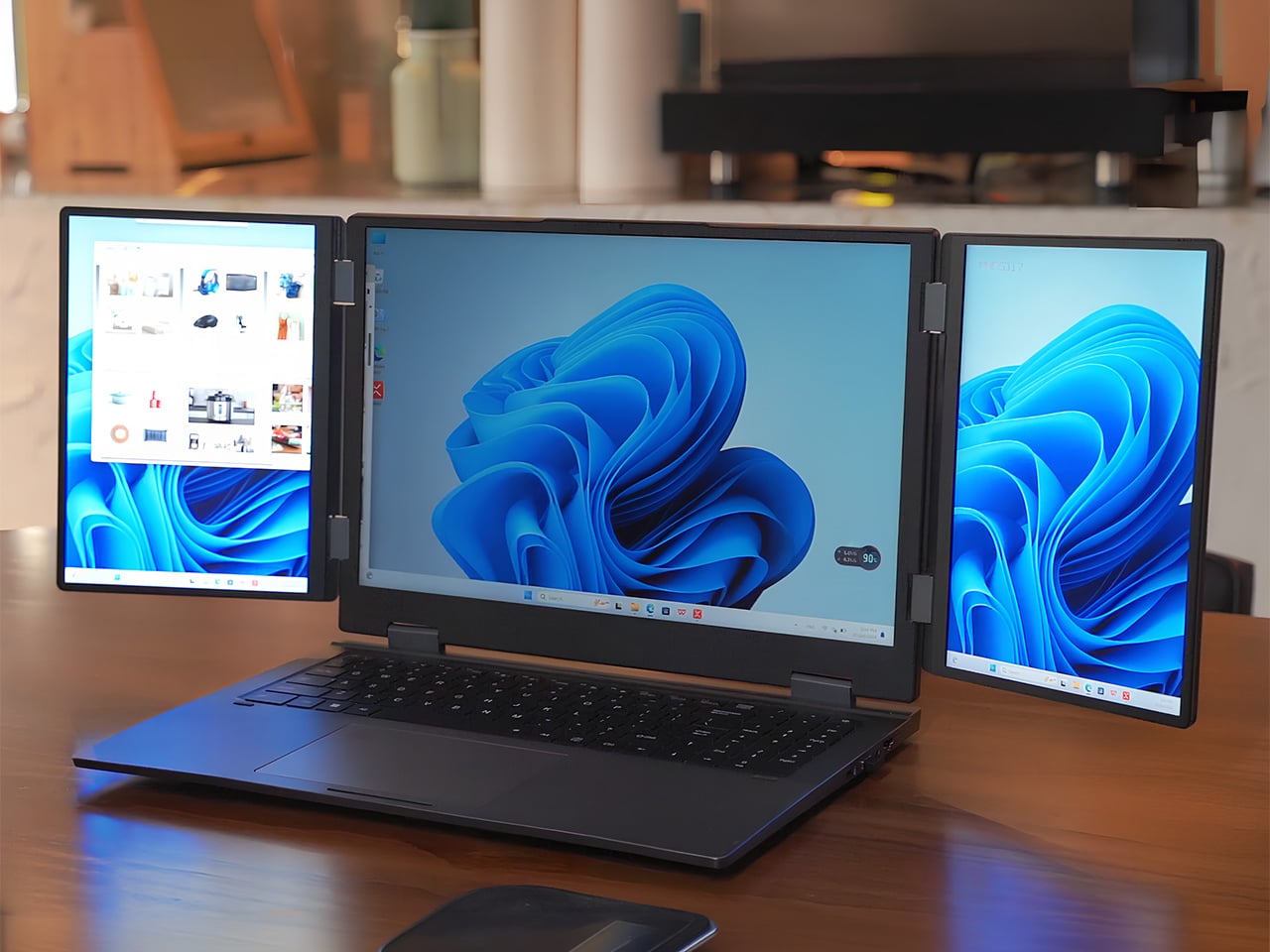
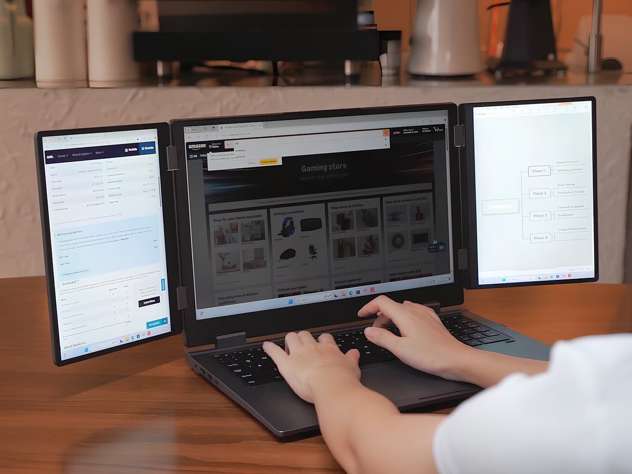
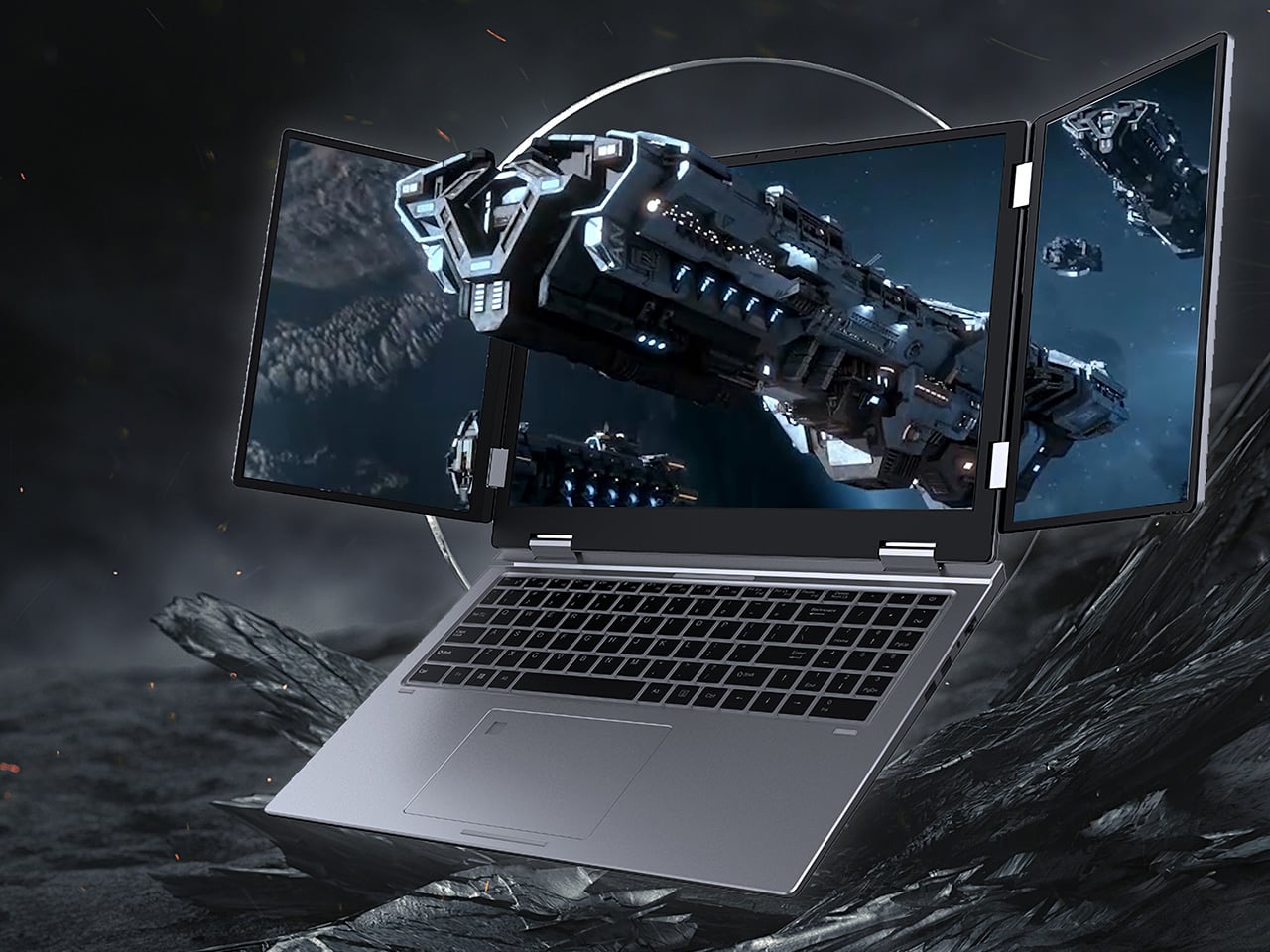
The Greyshork X3 is a pioneering multi-screen laptop designed to redefine portable productivity. Featuring a 16-inch main display flanked by two 10.5-inch fold-out auxiliary screens, it creates an expansive workspace ideal for multitasking. The displays deliver vivid visuals with resolutions of 1920×1200 on the central screen and 1920×1280 on the sides, ensuring clarity and precision for professional workflows. When not in use, the auxiliary screens fold neatly into the chassis, maintaining a sleek, portable form factor. Its thoughtful design balances expansive functionality with mobility, making it suitable for nomadic professionals, designers, and creators who demand flexibility without sacrificing space or efficiency.
Under the hood, the X3 is powered by an Intel i7-12650H processor, supports up to 32GB of DDR4 RAM, and accommodates up to 2TB of M.2 SSD storage, with optional external GPU support via Oculink. A fingerprint reader integrated into the trackpad adds convenient security. The laptop’s multi-screen setup enables effortless window management, immersive gaming, and enhanced workflow efficiency, all within a robust, premium build.
Gen Z shows that tech minimalism isn’t about losing functionality but embracing intention and flexibility. Through compact, foldable gadgets and digital decluttering, they balance technology with well-being and space. This mindful approach offers practical lessons for all, creating calmer, organized, and beautiful environments while enhancing daily life and fostering peace of mind.
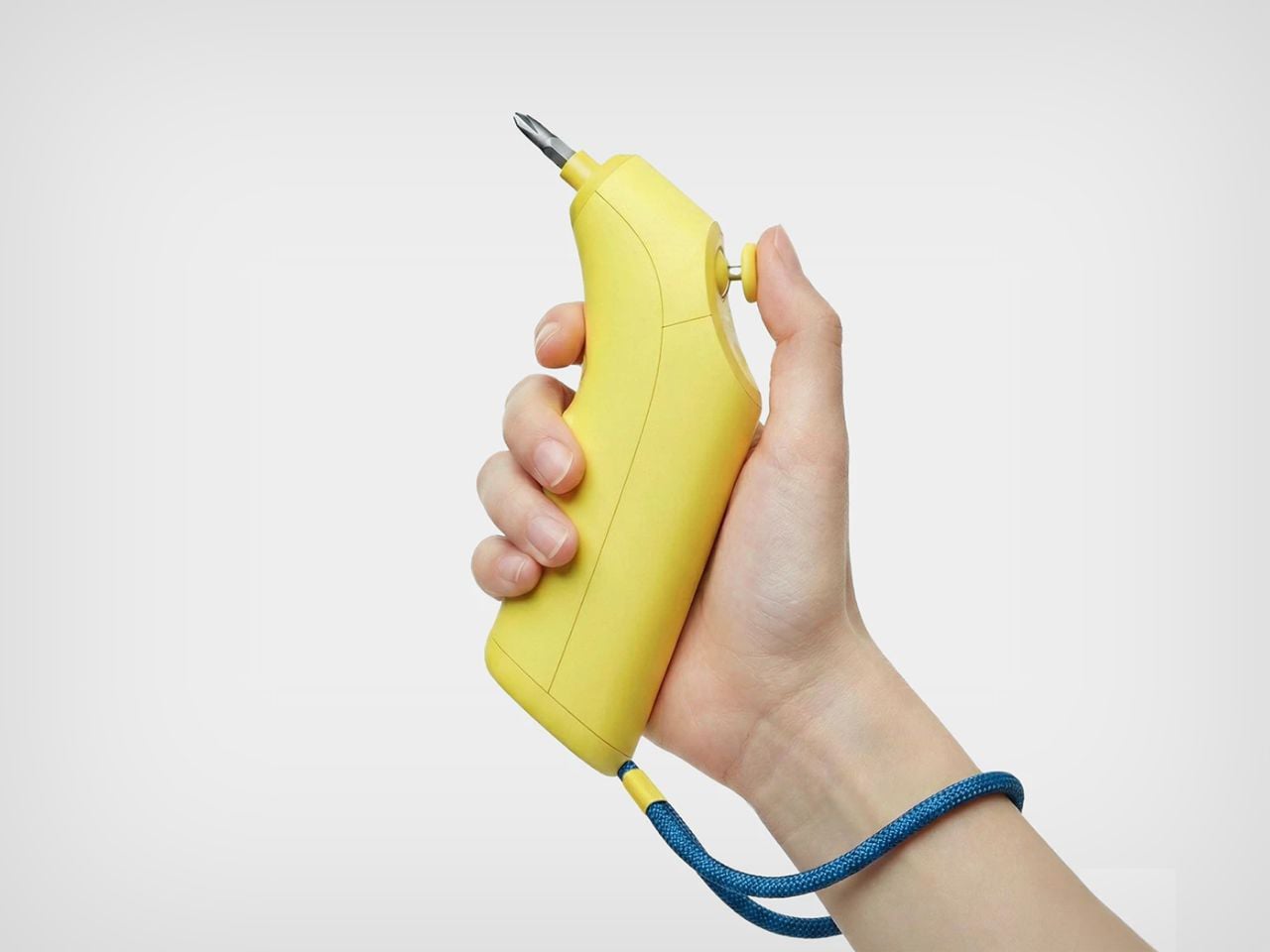
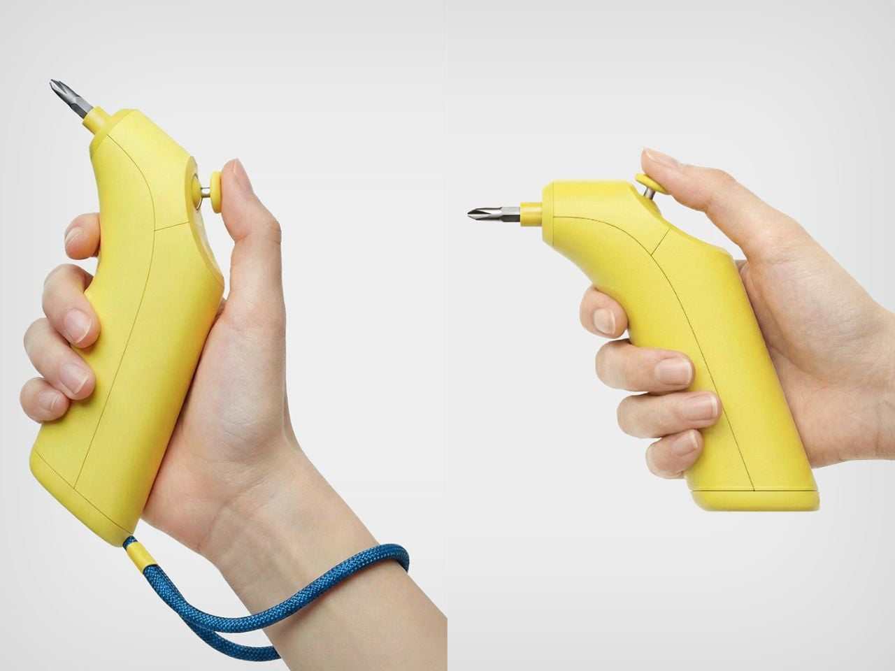
Repair and assembly are usually framed as chores, tasks to be completed as quickly as possible, so we can move on to something more enjoyable. The bi:ts tool challenges this perception by transforming the act of tightening a screw into something closer to play. Instead of feeling like labor, the experience becomes tactile, intuitive, and surprisingly satisfying.
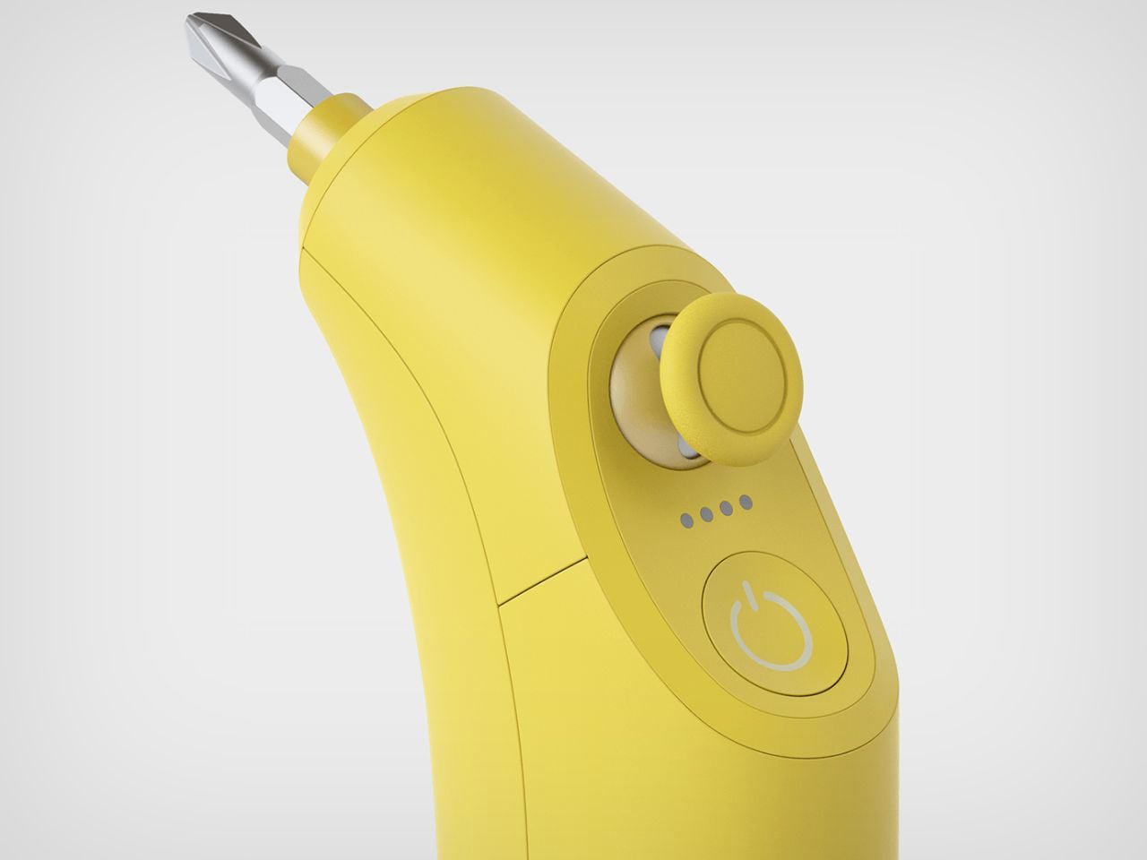
At the heart of the product is a joystick-inspired interface, borrowed from the language of game controllers. Rather than twisting your wrist repeatedly or navigating complicated buttons, you control the rotation using just your thumb. Push the joystick forward to rotate right and tighten, pull it back to rotate left and loosen. The mapping is so natural that it removes the hesitation many novices feel when they pick up a tool. There is no overthinking, no remembering instructions, just instinctive movement.
Somewhere between the words “bit” and “beat,” the product invites you to find your own working rhythm. The motion feels less like a mechanical task and more like interacting with a game, where each rotation becomes a small, satisfying action. For someone new to DIY, even figuring out which direction to turn a screw can feel like a mission. The intuitive joystick mapping eliminates that friction, allowing the user to focus on the activity itself rather than the instructions.
This approach also reduces the learning curve often associated with automatic drilling machines. Power tools can be intimidating, especially for first-time users, but bi:ts lowers that barrier. Its lightweight build and ergonomic grip make it comfortable to hold, while the rounded edges soften the traditional perception of tools as harsh, industrial objects. Instead, the device feels friendly and approachable, more like a gadget than a piece of heavy hardware.
The design language reinforces this sense of playfulness. Bright, cheerful colors add a pop of personality, whether the tool is in use or simply hanging in the corner of a room. It is the kind of object that does not need to be hidden away in a toolbox. In fact, its aesthetic presence encourages visibility, almost like a design accessory rather than a purely functional item.
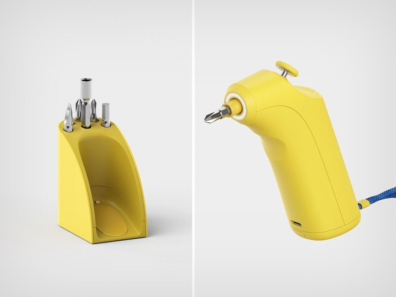
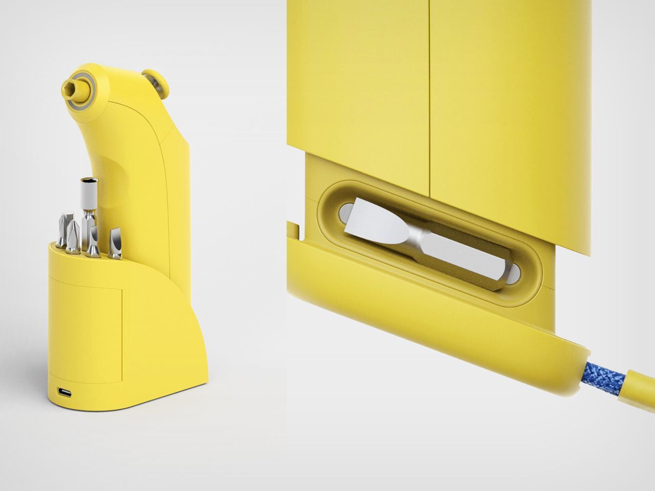
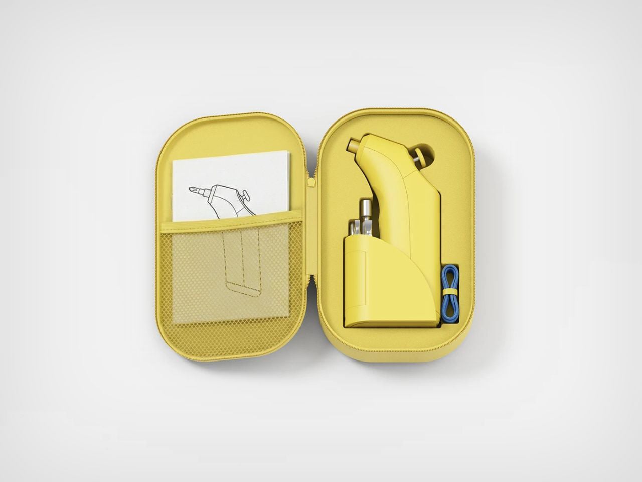
Practical details are thoughtfully integrated into the form. A loop at the top allows you to slip your hand through it, preventing accidental drops and keeping the tool within easy reach when you need both hands for something else. When you are done, the same loop makes it easy to hang the device for storage.
At the bottom, a smartly integrated niche stores different drill heads. This eliminates the need to search for separate parts or risk losing them. Everything fits neatly into the base, keeping the system sleek, compact, and ready for the next task.
bi:ts ultimately reframes what a tool can be. Instead of something intimidating or tedious, it becomes something engaging, almost playful. It suggests a future where DIY assembly, even something as routine as putting together IKEA furniture, can feel less like a chore and more like a small, satisfying game.
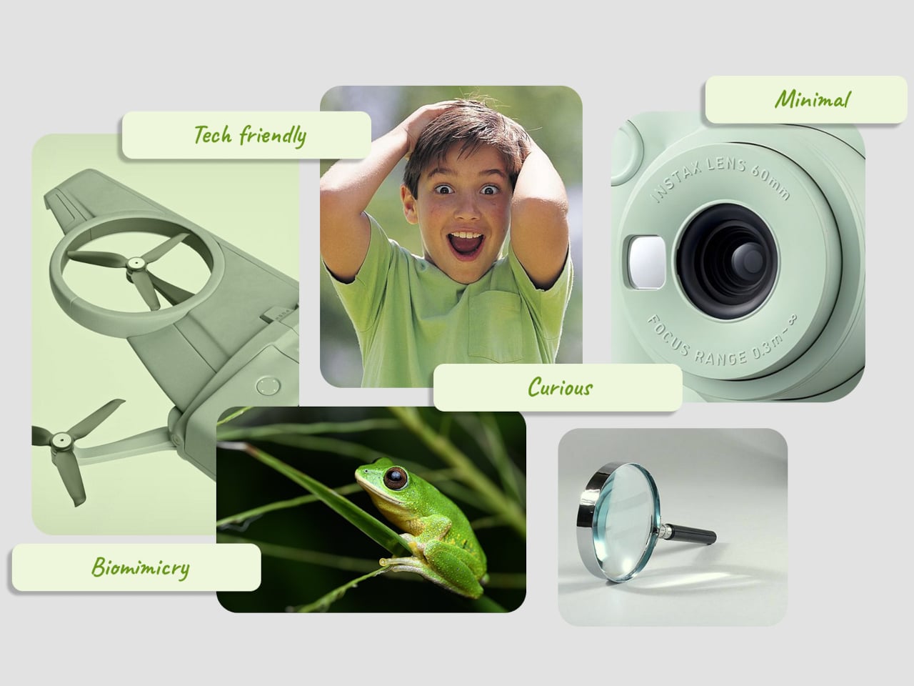
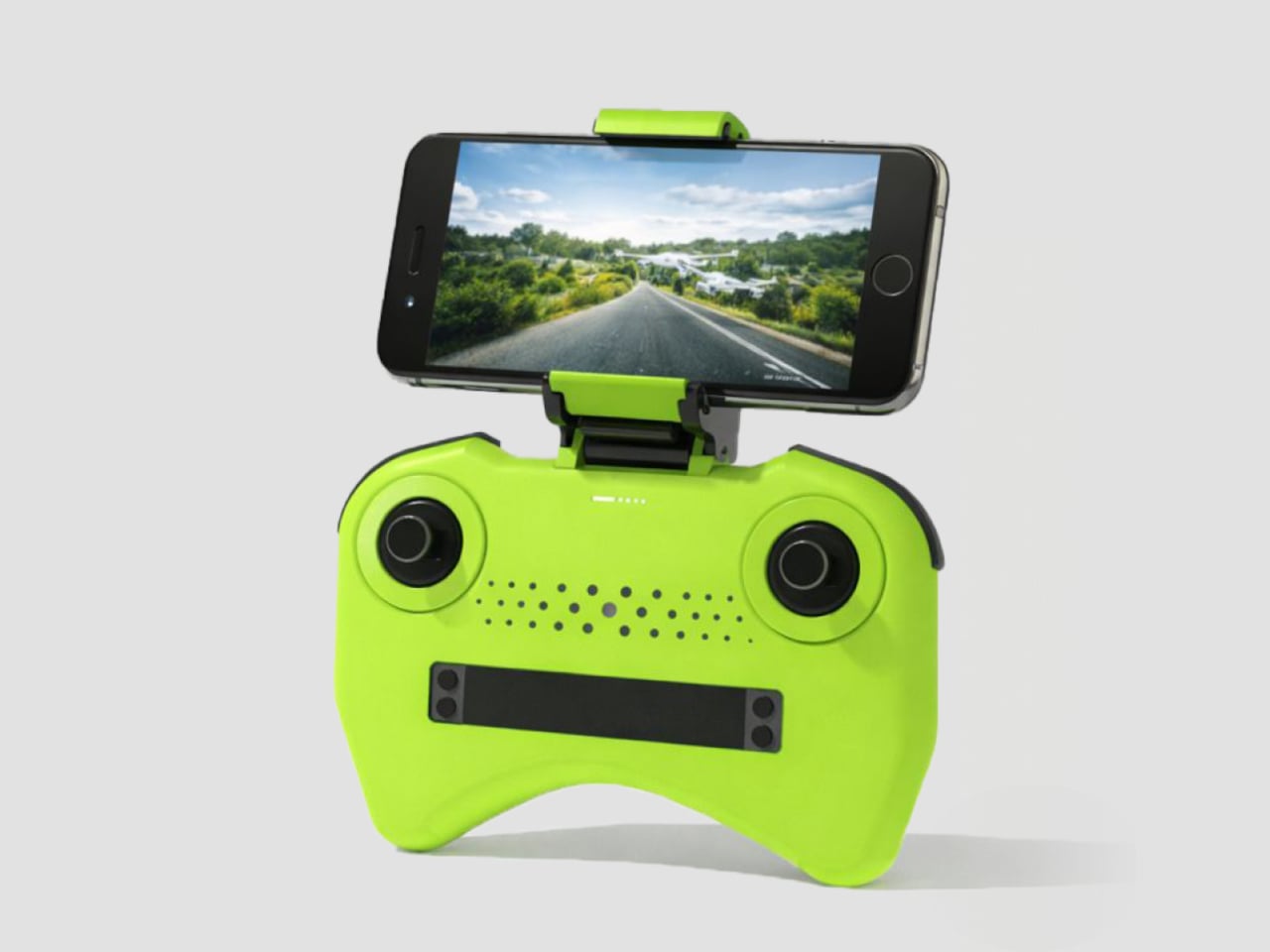
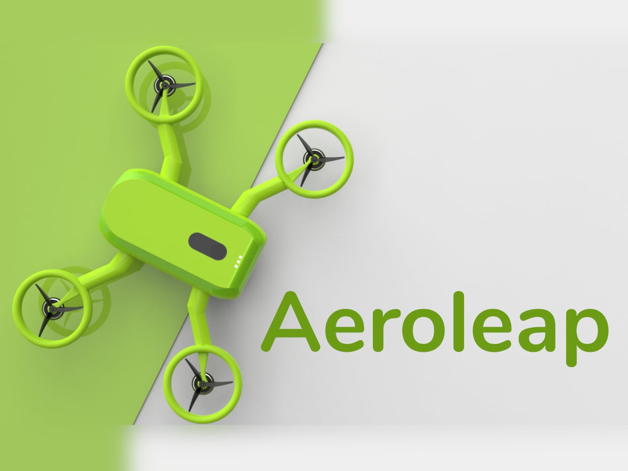
Most consumer drones look and feel intimidating to a child. They’re loud, angular, full of exposed propellers, and packed with complex controls adults barely understand. Kids want to see the world from above, but parents see spinning blades and fragile arms that cost too much to replace. The mix of fascination and fear turns what could be fun into something closer to borrowing a grown-up’s expensive, breakable toy.
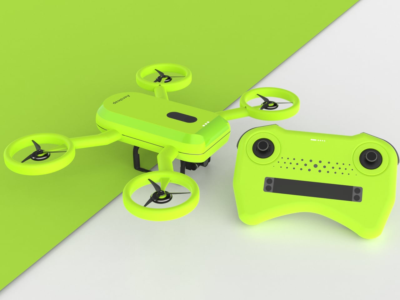
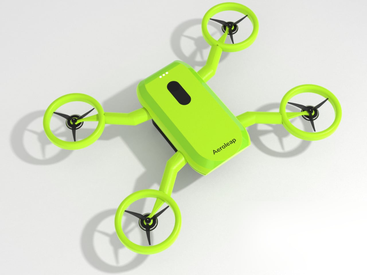
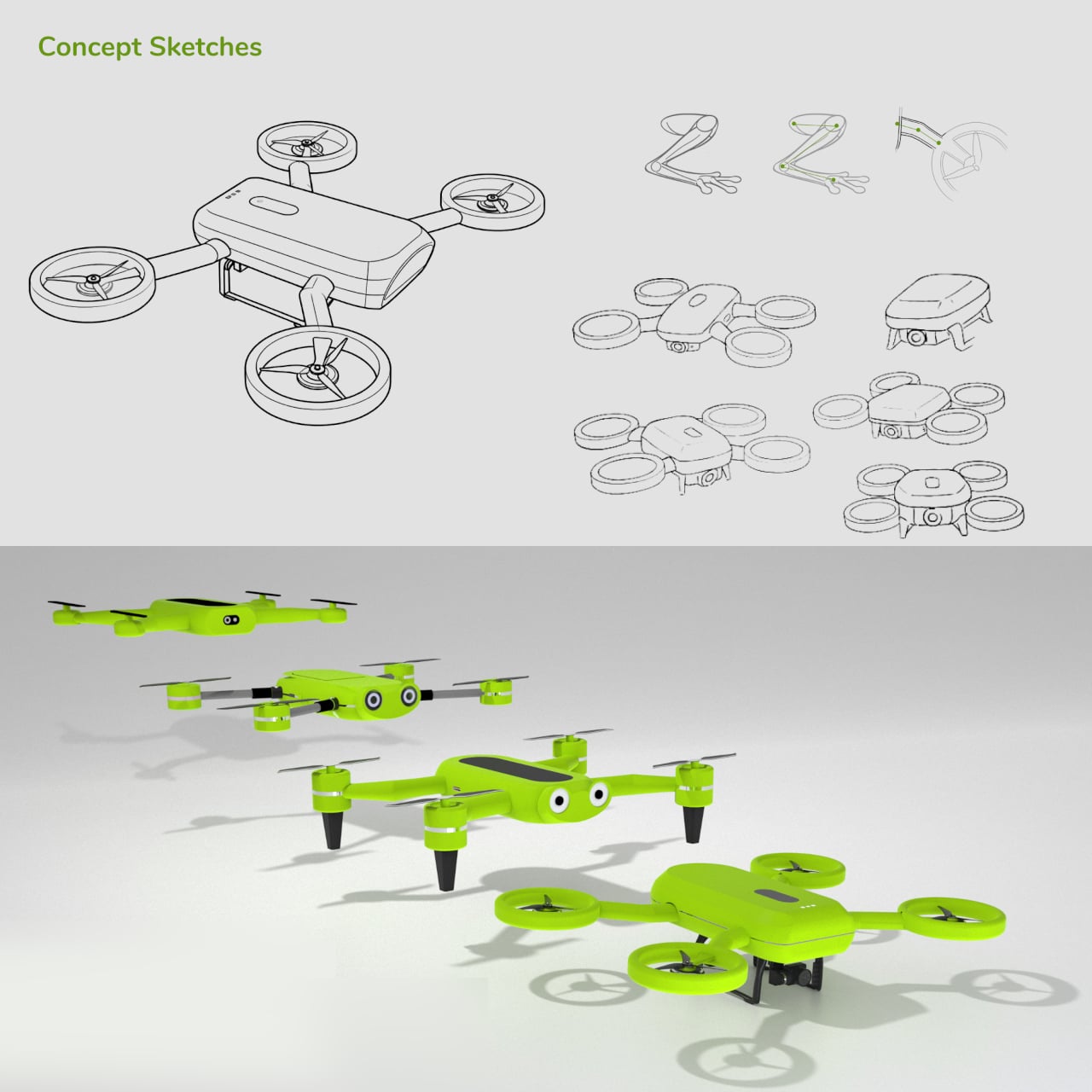
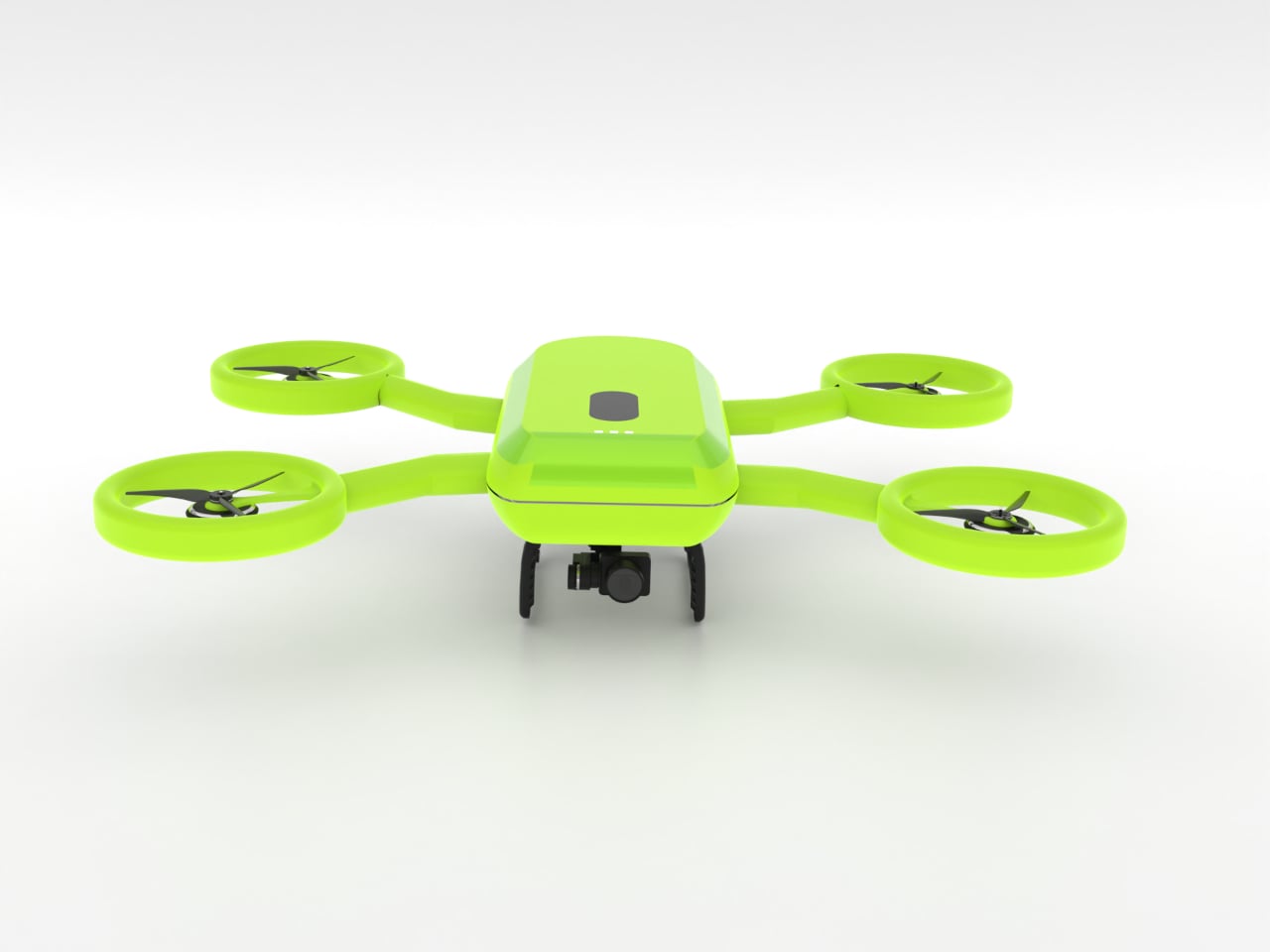
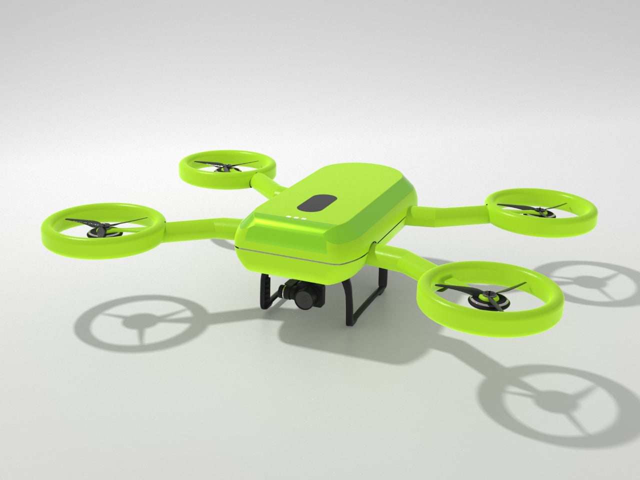
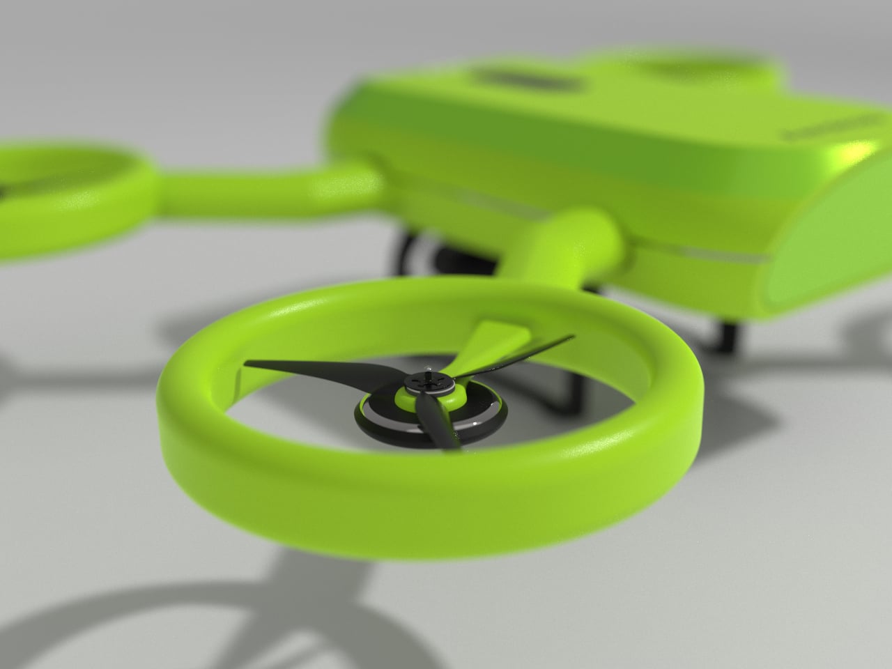
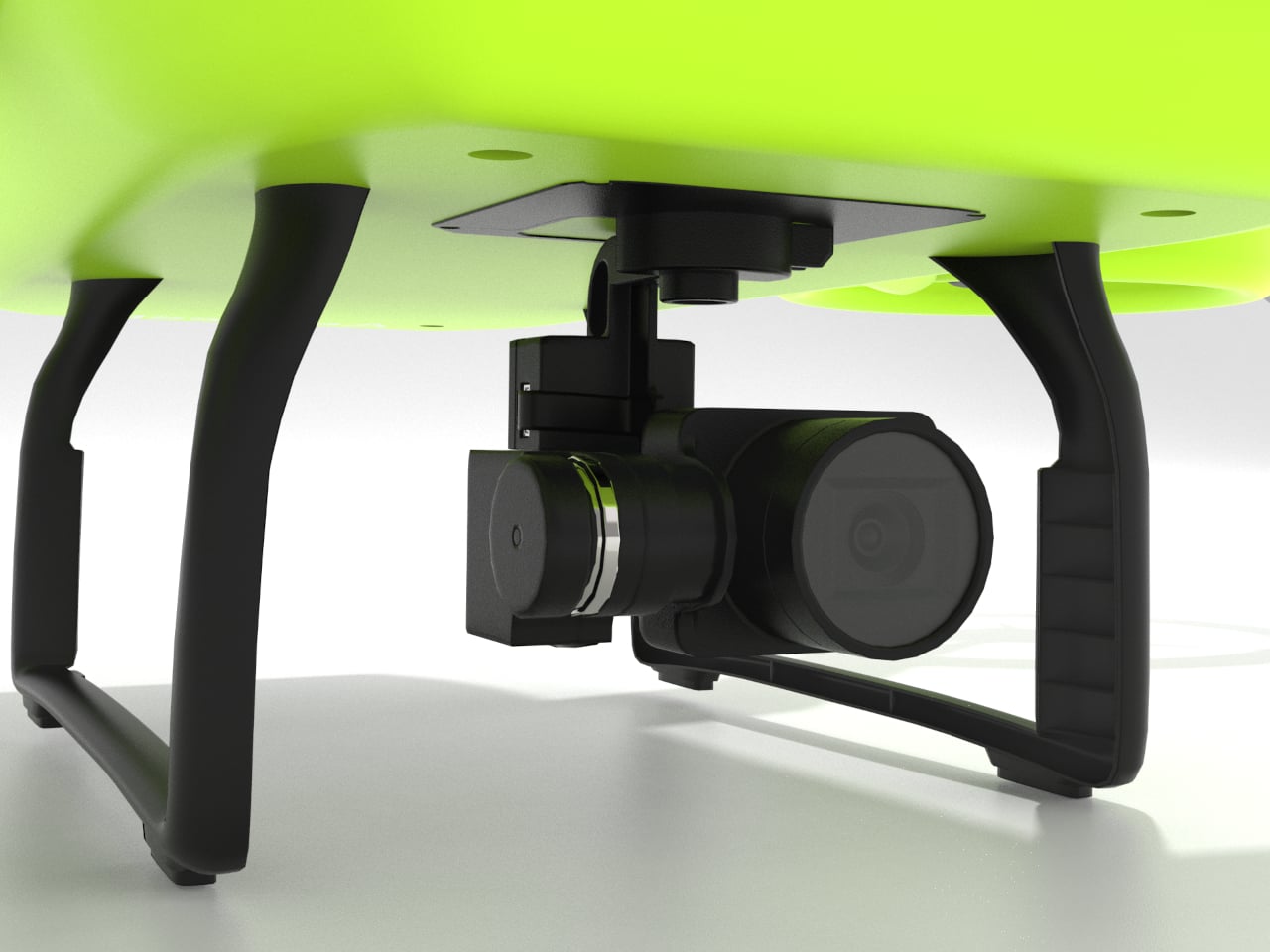
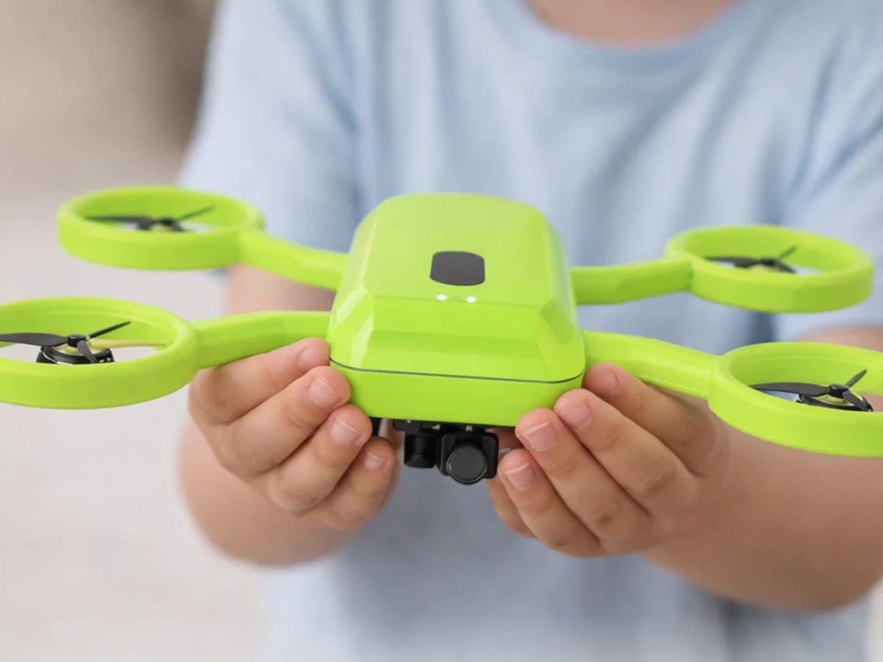
Aeroleap is a kid-friendly drone concept that tries to lower that barrier. Designed for children aged six to twelve, it uses soft, organic form language and clear visual cues to communicate safety and balance. The design draws inspiration from a frog’s stance, so the drone feels stable and approachable rather than mechanical or aggressive, more like a small creature ready to hop than a tiny aircraft ready to crash.
A child in a backyard holds a controller that feels like a gamepad, watching a bright green drone lift off without exposed blades buzzing near fingers. The integrated propeller rings and rounded body make it clear where it’s safe to touch, and the frog-like stance on the ground helps it read as balanced and ready, not twitchy or fragile like hobby drones that need constant correction just to hover.
The frog metaphor shows up in the geometry. A central body sits low with four limbs ending in circular rings that fully enclose the propellers. Those rings add protection during low-height play, reducing injury risk and damage when the drone bumps into walls or trees. The rounded guards and soft transitions do the safety work without needing extra cages or add-on bumpers that make everything heavier.
The interaction layer stays simple. A controller holds a phone that shows a live camera view from the drone, focusing on essentials like battery and connection. The physical controls stay familiar and tactile, so kids get the thrill of seeing their surroundings from above while parents can glance at the same feed. Nobody has to decode a cockpit full of tiny icons just to enjoy a short flight.
The project is grounded in research with kids, parents, and tech educators, who all flagged fragile builds, complex controls, and unsafe-feeling devices as major turn-offs. Aeroleap responds by keeping functionality simple and robust, focusing on how the product is held and understood at first glance instead of layering on autonomous modes that might confuse more than they help when you’re nine years old.
Aeroleap explores how industrial design alone can shape a child’s confidence around new technology. By softening the form, enclosing the dangerous bits, and making the controller feel familiar, it invites kids to be curious about flight without scaring parents off. Sometimes the difference between intimidating and inviting isn’t a feature list but the way an object looks and moves the first time you meet it, and a drone shaped like a friendly frog feels like it’s already smiling before it leaves the ground.
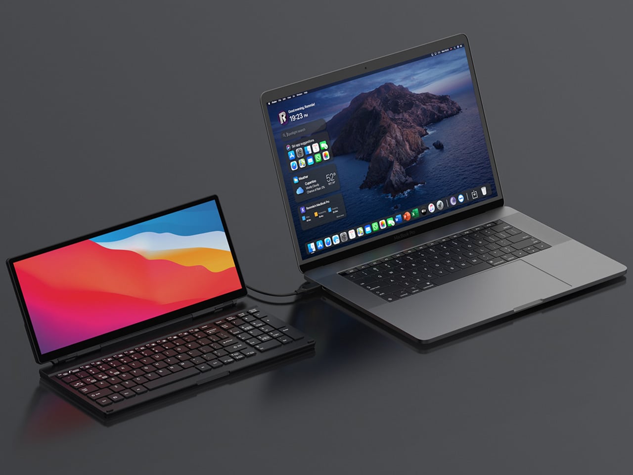
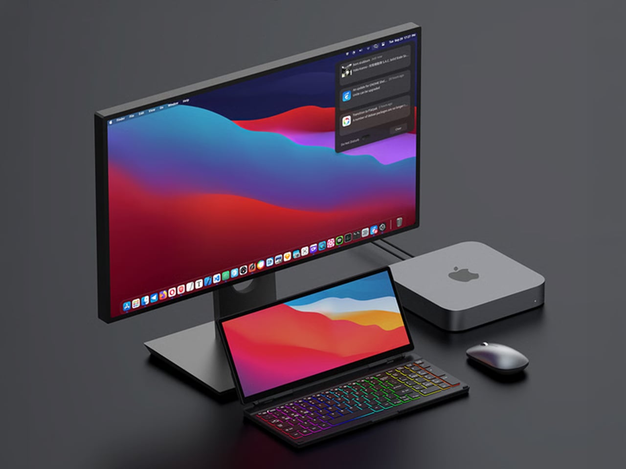
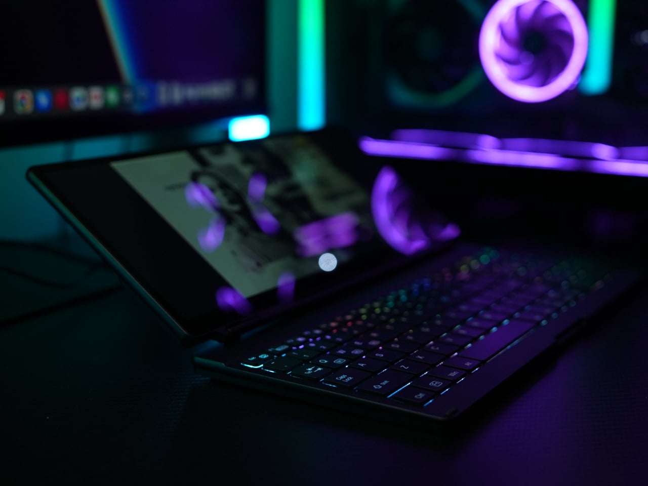
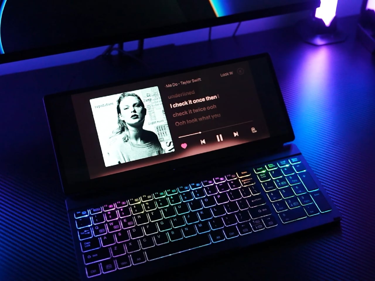
Working away from a main desk often means a laptop balanced on a café table or airplane tray, maybe a separate portable monitor propped up on a stand, a compact keyboard wedged in front, and a tangle of USB-C cables. This works in theory, but often feels like overpacking, especially when all you wanted was a bit more screen space and a better typing angle without turning a small table into a tech puzzle.
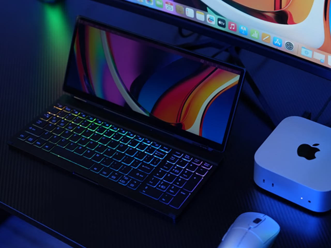
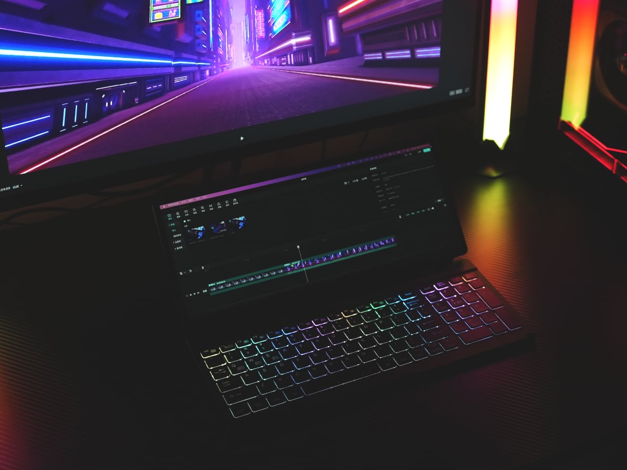
KeyGo Gen2 is a response to that clutter, an ultra-slim folding keyboard with a built-in 13-inch 4K touch screen and speakers that carry like a thin notebook. When it’s closed, it is a flat CNC-machined aluminum slab that slides into a sleeve. When it opens, it becomes a low-profile strip of keys and glass that turns any USB-C laptop into a dual-screen workstation.
The original 720p panel has been replaced with a 4K/60 Hz IPS display, stretched to 13.0 inches and bright enough for offices and cafés, with adjustable brightness for late-night sessions. That upgrade means editing footage at native resolution, keeping dense spreadsheets visible without squinting, parking timelines, chat windows, or reference material on the lower screen so the main laptop display can stay focused on the primary task.
The 10-point capacitive touch layer sits just above the scissor-switch keys, so you can drag windows, scrub through a timeline, or tap controls directly on the display while your hands stay near the keyboard. Key travel has been shortened by 1 mm compared to the first generation, making keys feel snappier and more responsive for long writing or coding sessions.
The CNC aluminum body and under-2-cm profile matter when you are actually on the move. The 32cm x 15 cm footprint fits on a tray table or narrow counter without overhanging. The 1,000g weight feels substantial enough not to slide around, yet light enough to carry daily without feeling like you’re packing a second laptop.
Built-in speakers mean video edits, calls, or background music come from the same strip you are typing on, avoiding the weak audio of many laptops and the need for extra gear. The sound comes from right where you’re working, which makes video playback and calls feel more focused without hunting for a dongle or Bluetooth pairing.
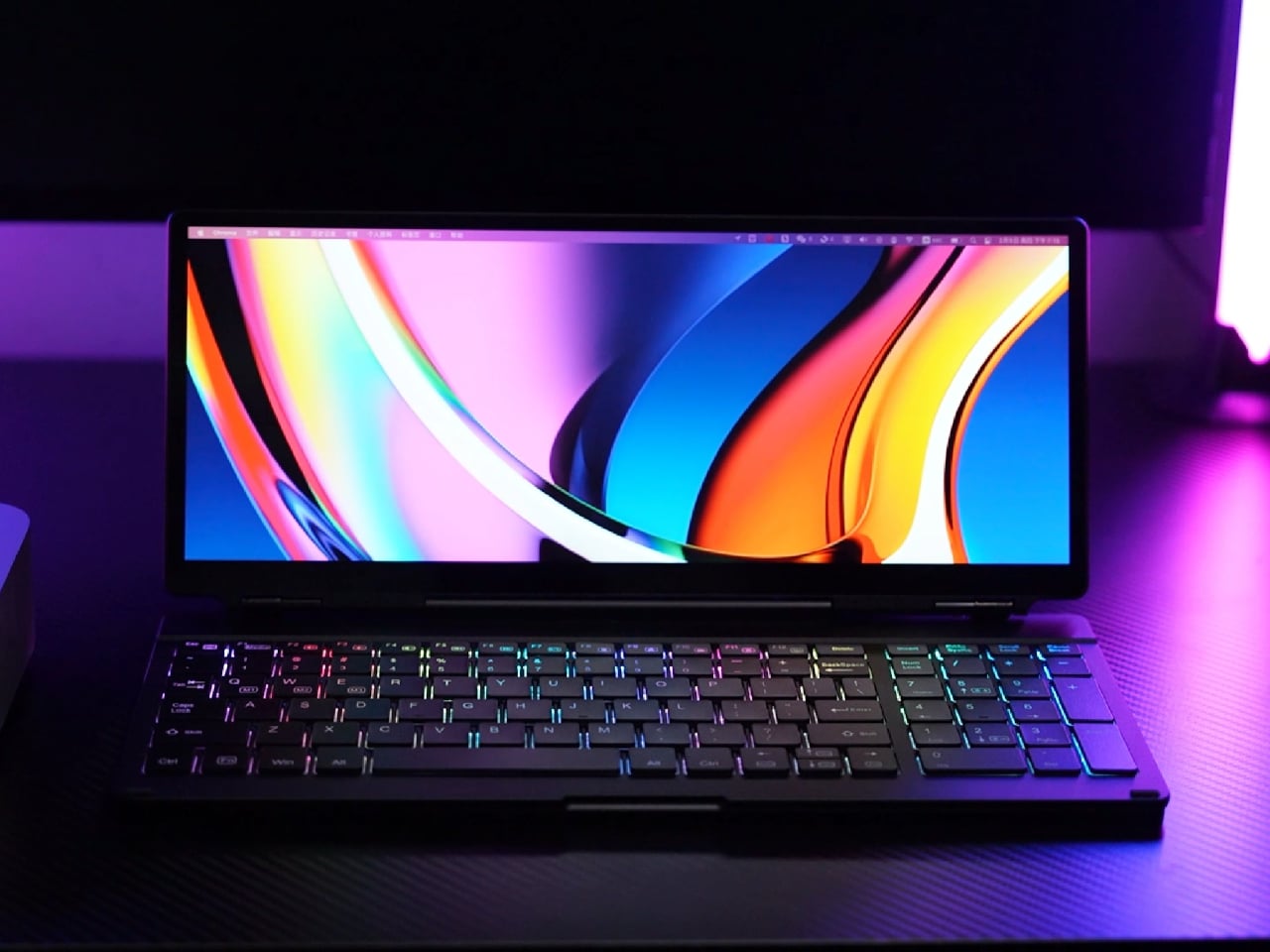
The KeyGo Gen2 moves between roles, plugged into a Windows laptop in a coworking space as a second screen for tools, attached to a compact Linux machine at home as a primary display and keyboard, or paired with an Android tablet for streaming and note-taking. Compatibility with Windows, macOS, Linux, and Android means it can follow your devices rather than being locked to one ecosystem.
The 180-degree fold and single USB-C connection change how quickly you can set up in tight spaces. Instead of assembling a portable monitor stand, routing cables, and finding room for a separate keyboard, you unfold one piece, plug in, and start working. That reduction in friction means you are more likely to actually deploy the dual-screen setup instead of making do with a cramped laptop panel.
The KeyGo Gen2 feels like a thoughtful second pass. It has sharper 4K visuals, a slightly larger 13-inch canvas, a thinner body, refined key feel, brightness control, and audio all tuned to the way hybrid workers, creators, and coders actually move through spaces. With so many separate pieces and improvised stands flooding the market, a single folding strip of aluminum, glass, and keys that opens into a complete little command center feels like an integrated design worth carrying every day.
There’s something deeply broken about the way we interact with technology. We scroll mindlessly, chase notifications, and bounce between tabs like caffeinated pinballs. Our devices constantly demand our attention, rewarding speed over substance, reaction over reflection. But what if a piece of technology asked you to slow down instead?
That’s the radical premise behind Cognitive Bloom, a speculative AI device conceived by Map Project Office in collaboration with Chanwoo Lee from Lovelace Research. Lee, who’s also a visiting lecturer at Imperial College London and the Royal College of Art, is reimagining what personal AI could become if we designed it with the same care we give to cultivating a garden.
The concept couldn’t arrive at a more critical moment. With mounting evidence around cognitive decline and digital burnout, Cognitive Bloom offers an alternative vision for our relationship with artificial intelligence. Instead of optimizing for efficiency or speed, it encourages something we’ve almost forgotten how to do: genuine self-reflection.
At the heart of Cognitive Bloom is a beautiful metaphor that makes complex data feel alive. The device uses an ambient display that transforms your mental wellness data into a virtual ecosystem. Areas where you’re struggling show up as yellowing leaves. New buds emerge where you’re beginning to grow. When you’re truly thriving in an aspect of your wellbeing, those buds finally bloom. It’s an intuitive visualization that breaks down the typically overwhelming data around mental health. Rather than confronting you with charts, percentages, or clinical assessments, Cognitive Bloom speaks in a language we instinctively understand. Plants need water, sunlight, and attention. So do we.
The device functions as a domestic companion that nurtures what the designers call “a new ritual of self-reflection.” It’s designed to help users reconnect with what genuinely matters, fostering the creation of new mental pathways through thoughtful engagement rather than passive consumption. This approach stands in stark contrast to how most AI products work today. Current AI interfaces typically emphasize quick answers, instant gratification, and frictionless productivity. Cognitive Bloom deliberately introduces friction, but the kind that matters. It’s the friction of pausing. Of considering. Of being present with your thoughts rather than racing past them.
The gardening metaphor extends throughout the entire experience. Just as tending a garden requires patience, consistency, and presence, Cognitive Bloom asks users to take a respite from digitally overstimulated lifestyles. It creates space for genuine contemplation, curiosity, and self-discovery, qualities that feel increasingly rare in our current technological landscape. What makes this project particularly compelling is how it uses human-centered design to foster a deeper connection not just to ourselves, but to our digital environment. Too often, technology feels like something that happens to us, an external force constantly pulling us in a hundred directions. Cognitive Bloom suggests technology could instead become a tool for coming home to ourselves.
The collaboration between Map Project Office and Lovelace Research brings together expertise in design strategy and human-centered AI research, creating a vision that feels both technically informed and emotionally resonant. As a speculative project, Cognitive Bloom doesn’t need to solve every practical challenge of implementation. Instead, it asks the more important question: What if we actually designed technology the way we cultivate gardens, with care, patience, and presence?
That question alone is worth sitting with. In a culture obsessed with growth hacking, viral moments, and exponential scaling, the steady rhythm of gardening offers a different model entirely. Gardens can’t be rushed. They respond to seasons, weather, and the particular needs of different plants. They require observation and adaptation, not standardized solutions.
Cognitive Bloom represents a growing movement in design and technology that’s pushing back against the extractive, attention-harvesting model that dominates our digital lives. It joins other projects reimagining what ethical, human-centered AI could actually look like when we design for wellbeing instead of engagement metrics. Whether Cognitive Bloom eventually becomes a physical product or remains a provocative concept, it’s already succeeded in making us reconsider our relationship with AI and personal data. Sometimes the most important innovations aren’t the ones that disrupt markets but the ones that disrupt our assumptions about what technology should be for.
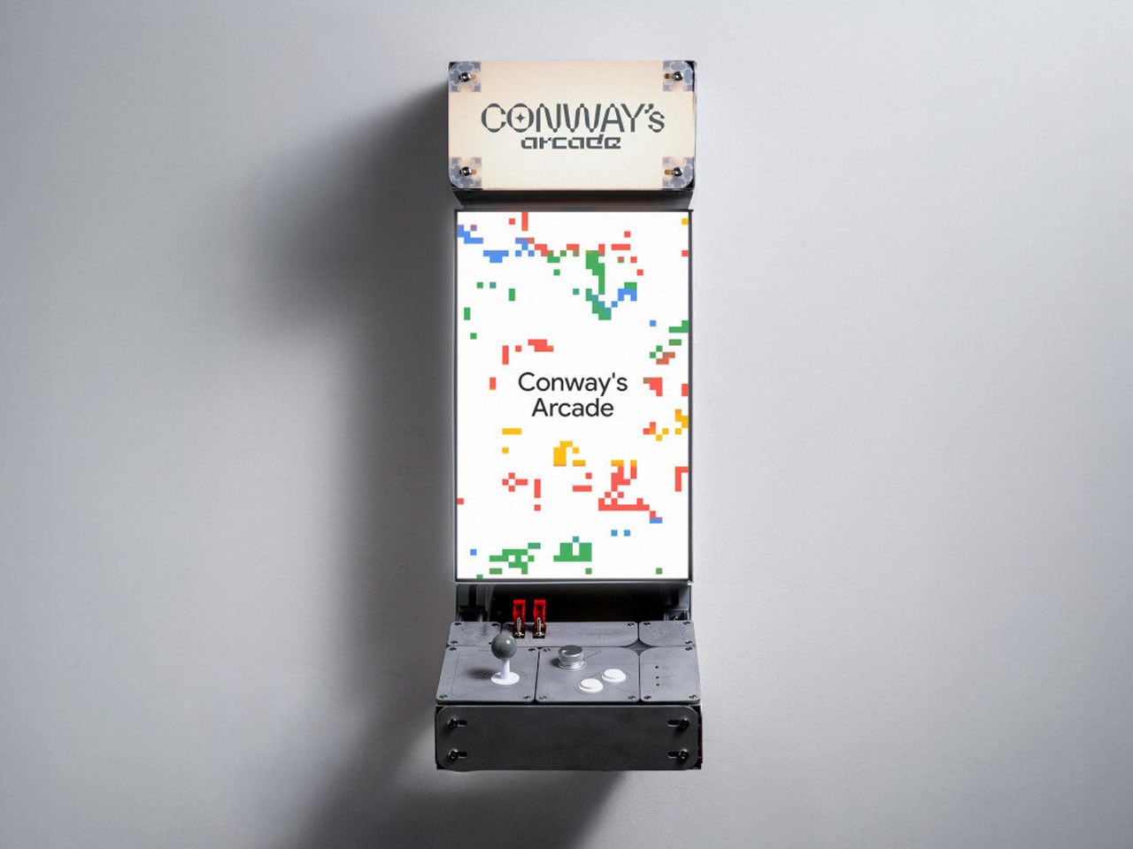
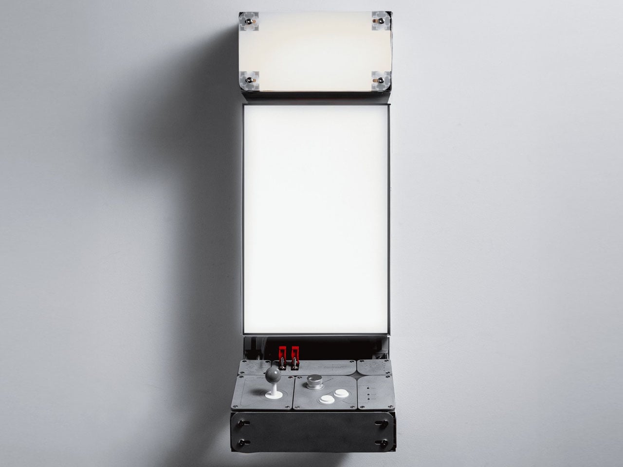
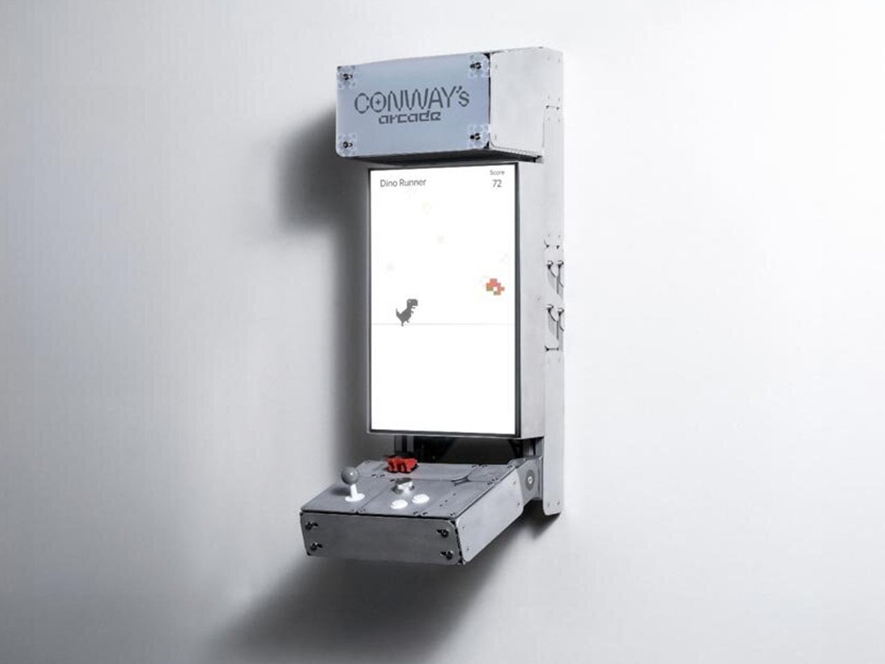
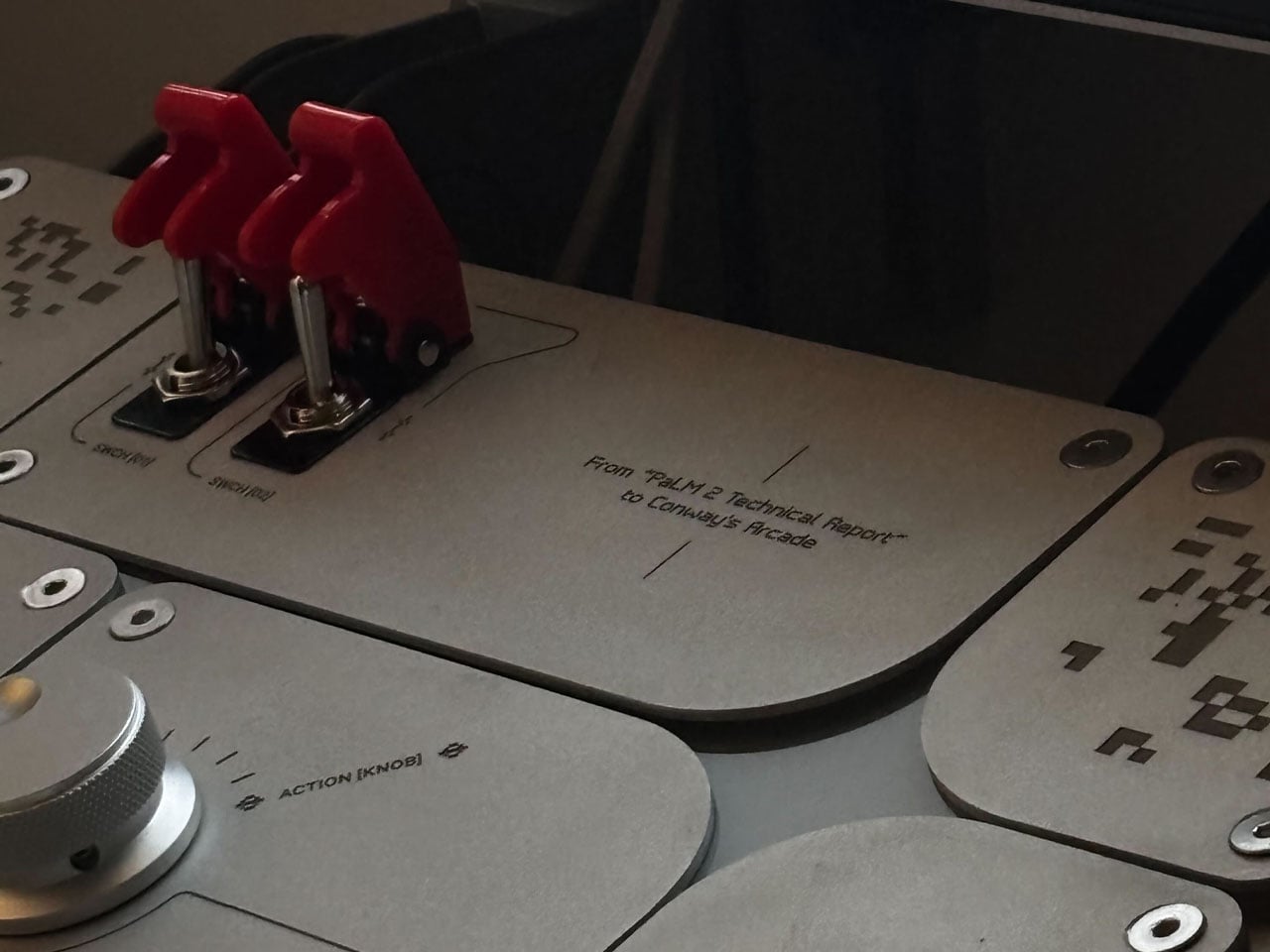
Arcade machines once thrived as cultural objects as much as entertainment devices, combining bold industrial design and tactile controls to pull people into endless play. Over time, those cabinets became symbols of fixed experiences, each game defined by predictable patterns and tactically programmed outcomes. Conway’s Arcade revisits that familiar physical form but challenges the very idea of what an arcade game is supposed to be. This is done using computation, not as hidden infrastructure but as the driving force behind play itself.
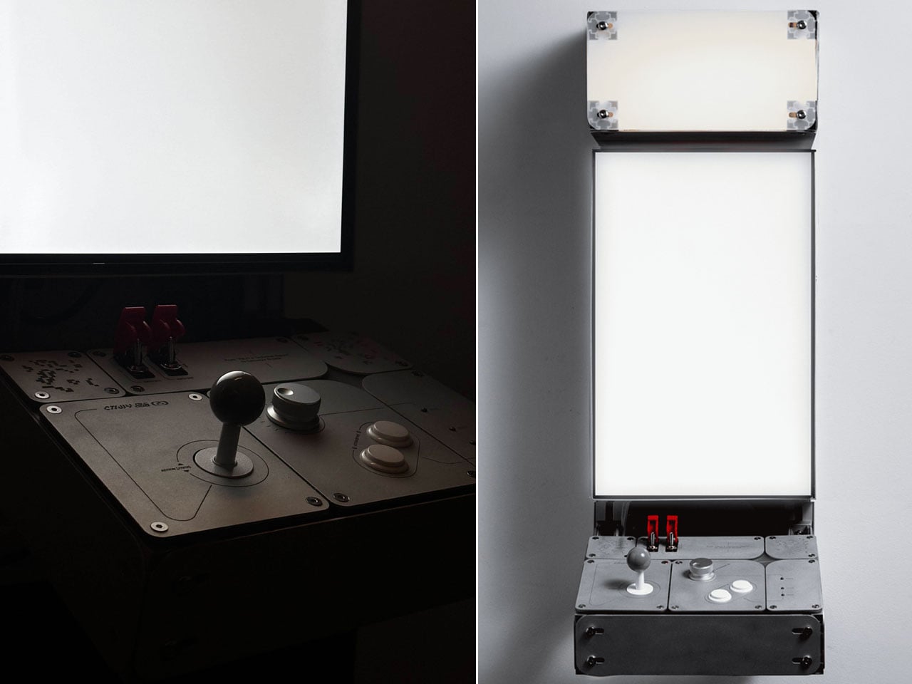
Created by technology agency SpecialGuestX for Google, Conway’s Arcade is a generative gaming installation that transforms classic arcade logic into an evolving, rule-based system. Unveiled at the NeurIPS 2025 conference, the project was designed to communicate complex computational ideas through direct interaction, replacing static gameplay with experiences that emerge in real time.
Instead of loading pre-existing games, the system generates new gameplay variations inspired by well-known titles such as Space Invaders, Breakout, Flappy Bird, and the Chrome Dino game. The smart system recomposes the game’s mechanics through adaptive logic. The conceptual backbone of Conway’s Arcade is John Conway’s Game of Life, a mathematical model where simple rules governing cells lead to unexpectedly complex patterns.
SpecialGuestX translated this principle into a playable framework where movement, collision, and behavior are determined dynamically rather than scripted in advance. Player input influences how these rules evolve, meaning each session becomes a unique computational outcome rather than a repeatable level sequence. Familiar visual language and controls anchor the experience, while the underlying logic continually reshapes how the game behaves.
This generative approach is powered by adaptive systems that respond to interactions in real time, making the arcade gaming feel intuitive while remaining unpredictable. Players begin to sense patterns and relationships as they play, learning the logic through experimentation rather than instruction. The result is an experience that rewards curiosity, turning gameplay into a form of exploration rather than mastery over fixed mechanics.
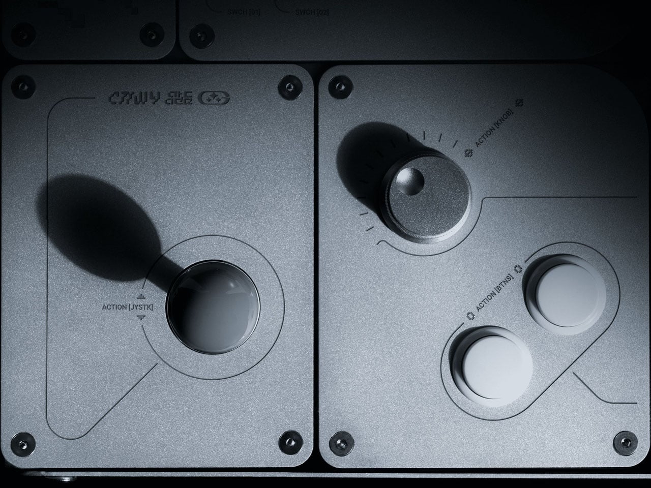
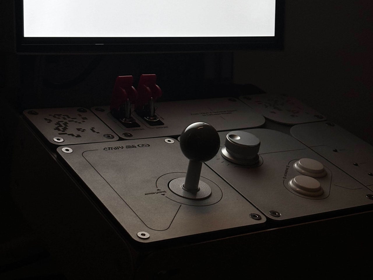
The physical design of Conway’s Arcade reinforces this philosophy. The cabinet is constructed entirely from aluminum and designed as a lightweight, modular structure that can be assembled by a single person in under an hour. Fabricated by Barcelona-based workshop 6punyales, the hardware balances durability with portability, making it suitable for exhibitions and travel. Mechanical joysticks, tactile buttons, and red latched switches reference classic arcade interfaces, while clean lines, exposed structure, and a custom typeface give the machine a distinctly contemporary presence.
Visuals follow a restrained 8-bit aesthetic, not as nostalgia for its own sake but as a clear, readable interface for generative behavior. On screen, game elements act like independent agents within a system, making the effects of rule changes visible and understandable. Rather than hiding computation behind spectacle, Conway’s Arcade puts logic on display, using play as the medium for comprehension.
Commissioned by Google and presented to an audience deeply familiar with artificial intelligence and machine learning, Conway’s Arcade succeeds by making abstract ideas accessible. It reframes the arcade cabinet as a tool for communication, showing how simple rules can generate complexity, creativity, and the element of surprise.
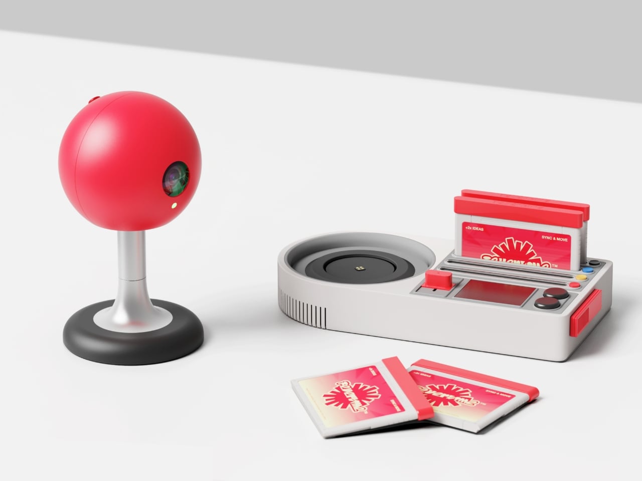
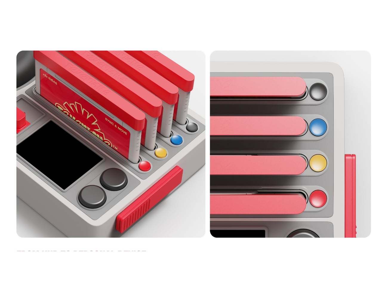
There’s something deeply satisfying about watching designers take a swing at corporate boredom. Fevertime, a recent collaboration by Dugyeong Lee, Gyeong Wook Kim, MyeongHoon Cheon, and Dayong Yoon, does exactly that by transforming the typical video conference setup into something that looks like it belongs in a mid-80s arcade.
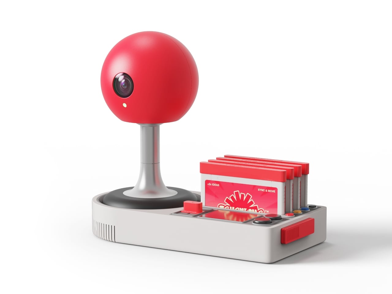
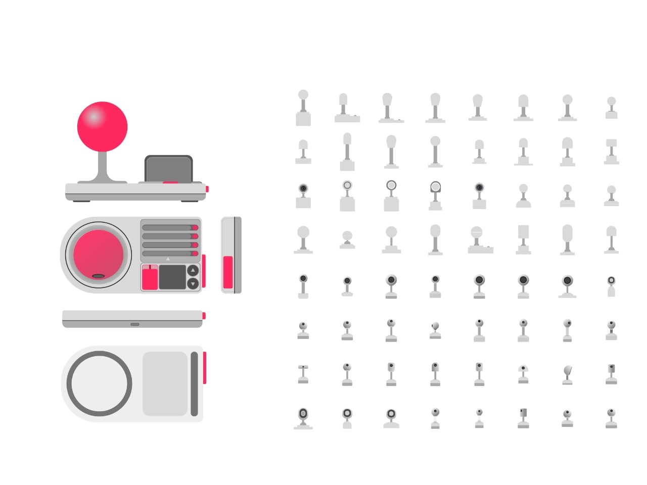
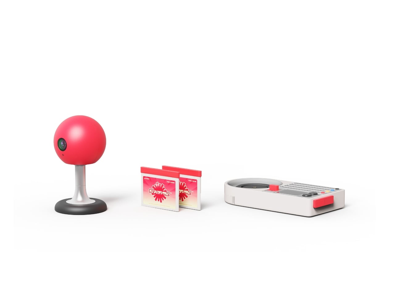
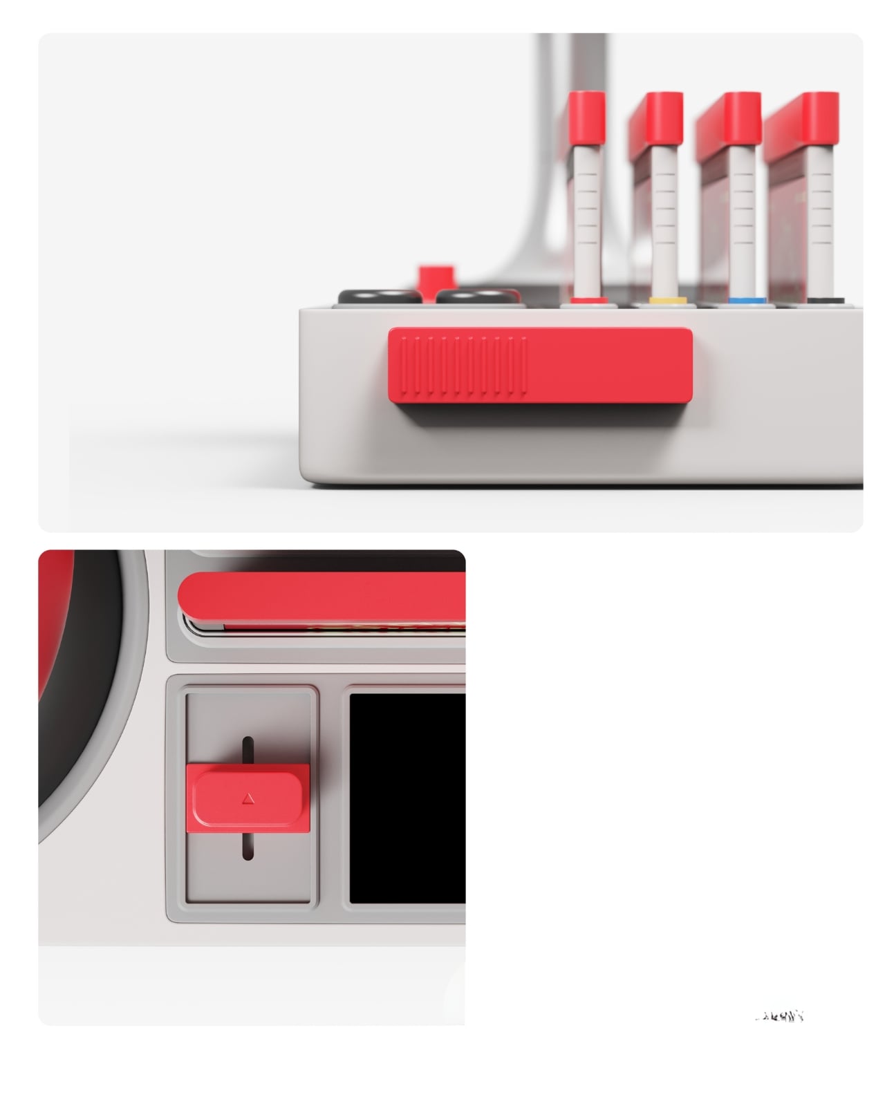
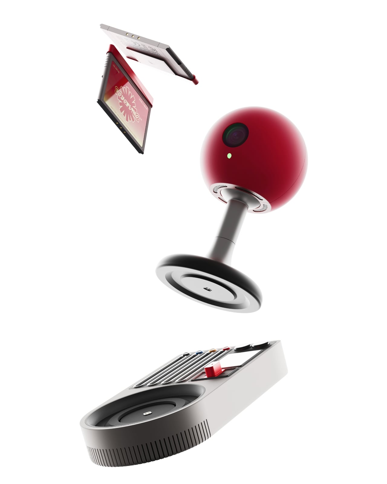
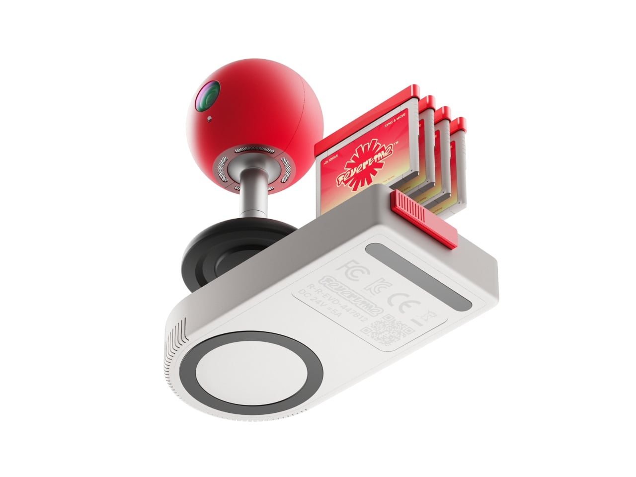
The concept is deceptively simple: what if meetings felt less like mandatory Zoom rectangles and more like gathering around a shared screen? The team created a physical meeting system inspired by retro game consoles, complete with a bright red spherical camera perched on a stand like some cheerful robot companion, and a base unit that wouldn’t look out of place next to your old Nintendo. There are even cartridge-style slots and that unmistakable game controller aesthetic, all rendered in a palette of scorched red, neon accents, and soft grays.
Designers: Dugyeong Lee, Gyeong Wook Kim, MyeongHoon Cheon, dayong Yoon
But this isn’t just nostalgia bait. The designers identified a real problem with modern collaboration tools: everyone staring at their own screens creates this weird isolation, even when you’re supposedly “together” in a virtual room. Fevertime flips that script by projecting content onto a shared surface, encouraging actual eye contact and spatial awareness. The physical device becomes a focal point, something to gather around rather than disappear behind.
The system lets users set up meetings in advance, defining time, participants, and structure before anyone logs on. When the session starts, participants can instantly share content from their personal devices onto the collective display. Everything stays synced and visible to everyone simultaneously. No more “Can you see my screen?” or fumbling through share settings while everyone waits. The interface shows meeting cards, schedules, and project data in a clean, modular layout that feels more like organizing a playlist than managing corporate logistics.
What makes Fevertime visually compelling is how committed it is to the gaming metaphor. The red sphere isn’t trying to look sleek or invisible like most tech hardware. It wants to be noticed. It practically begs to be the conversation starter in the room. The cartridge system for what appears to be different meeting modes or templates plays into that collectible, tactable quality that made physical media so satisfying. You’re not just clicking through digital menus; you’re handling objects, sliding things into slots, physically engaging with the technology.
The UI design carries that same energy. Bright pink highlight screens pop against neutral backgrounds. Typography is bold and condensed, channeling the space constraints of old arcade cabinets where every pixel counted. Cards and modules feel like game level selects or achievement screens. There’s a playful confidence in the branding, with the Fevertime logo rendered in that wavy, almost melting typography that suggests heat and intensity without being aggressive.
The designers describe the project as capturing “a single moment of high-intensity creative output,” that fever state when an idea finally clicks and everything flows. That philosophy shows up in the pulsing, breathing quality of the custom lettering, where font weights fluctuate to create visual rhythm. It’s design that refuses to sit still, much like the creative process it’s trying to facilitate.
From a product design perspective, Fevertime sits in that interesting space between speculative concept and plausible near-future tech. The physical components look production-ready, with thoughtful details like ventilation ridges on the base unit and a weighted stand for the camera sphere. But there’s also a conceptual boldness here, a willingness to say “what if meeting technology looked completely different from what we’re used to?”
The team used Adobe’s creative suite to develop the project, combining Photoshop and Illustrator for the identity work with After Effects for motion elements. That mix of static and animated content gives Fevertime a kinetic presence even in still images. You can imagine the interface cards sliding, the logo pulsing, the whole system humming with that arcade-ready energy.
Whether Fevertime ever makes it to market is almost beside the point. As a design exercise, it asks useful questions about how we physically and emotionally experience collaboration technology. It challenges the assumption that workplace tools need to look serious and minimal. And it demonstrates how pulling from gaming culture can make even something as mundane as meeting software feel fresh and approachable. Sometimes the best design projects are the ones that make you think, “Wait, why doesn’t everything look like this?”


.gif)