A lot of work now happens on beds, sofas, and in hotel rooms, with laptops balanced on knees and chargers snaking across blankets. Most lap desks are flimsy plastic trays that solve heat and stability but do nothing for clutter, leaving pens, earbuds, and phones scattered around you. The Arlo Skye Stowaway Lap Desk is a piece of travel-inspired furniture that tries to make mobile work feel less improvised and more intentional.
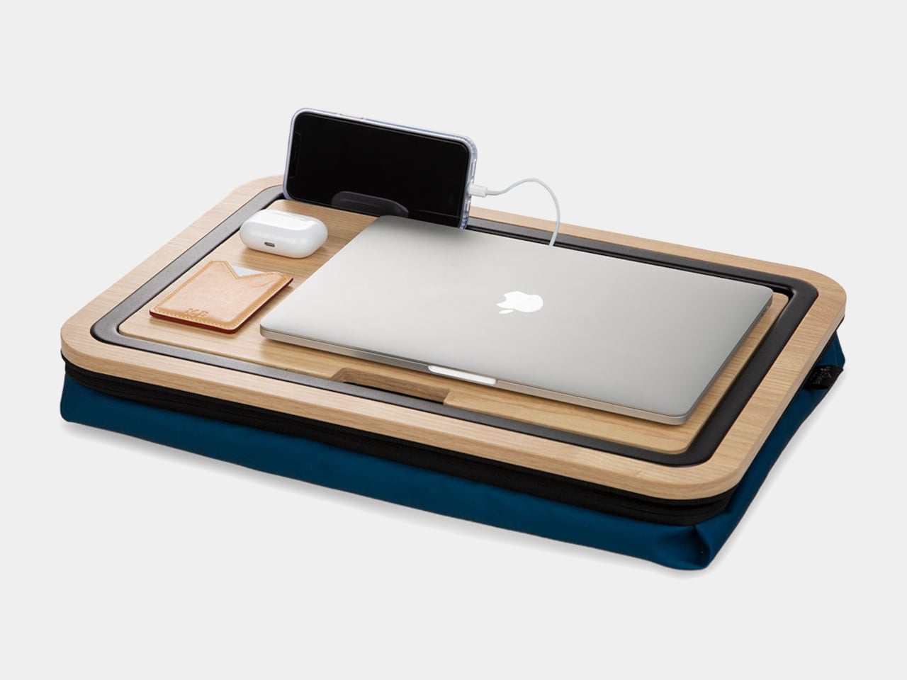
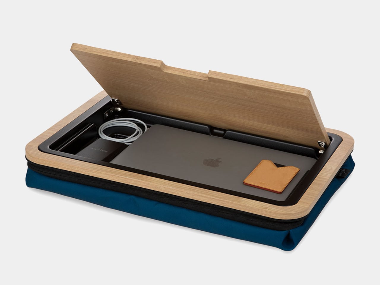
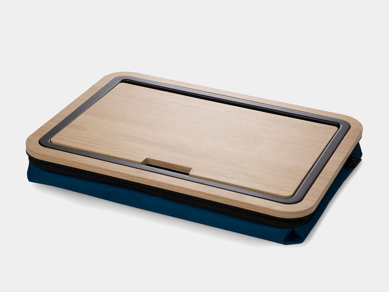
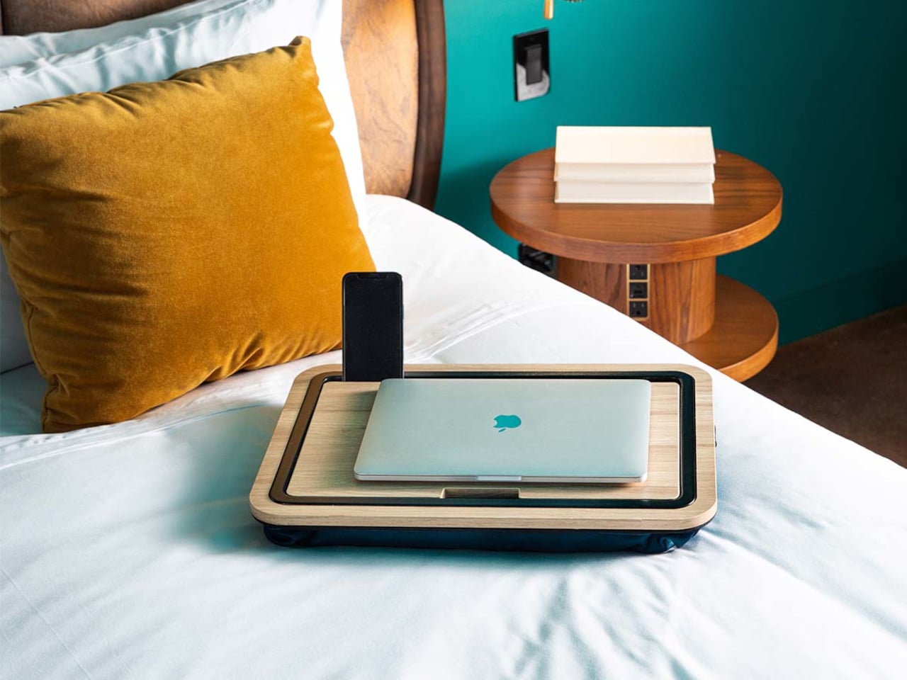
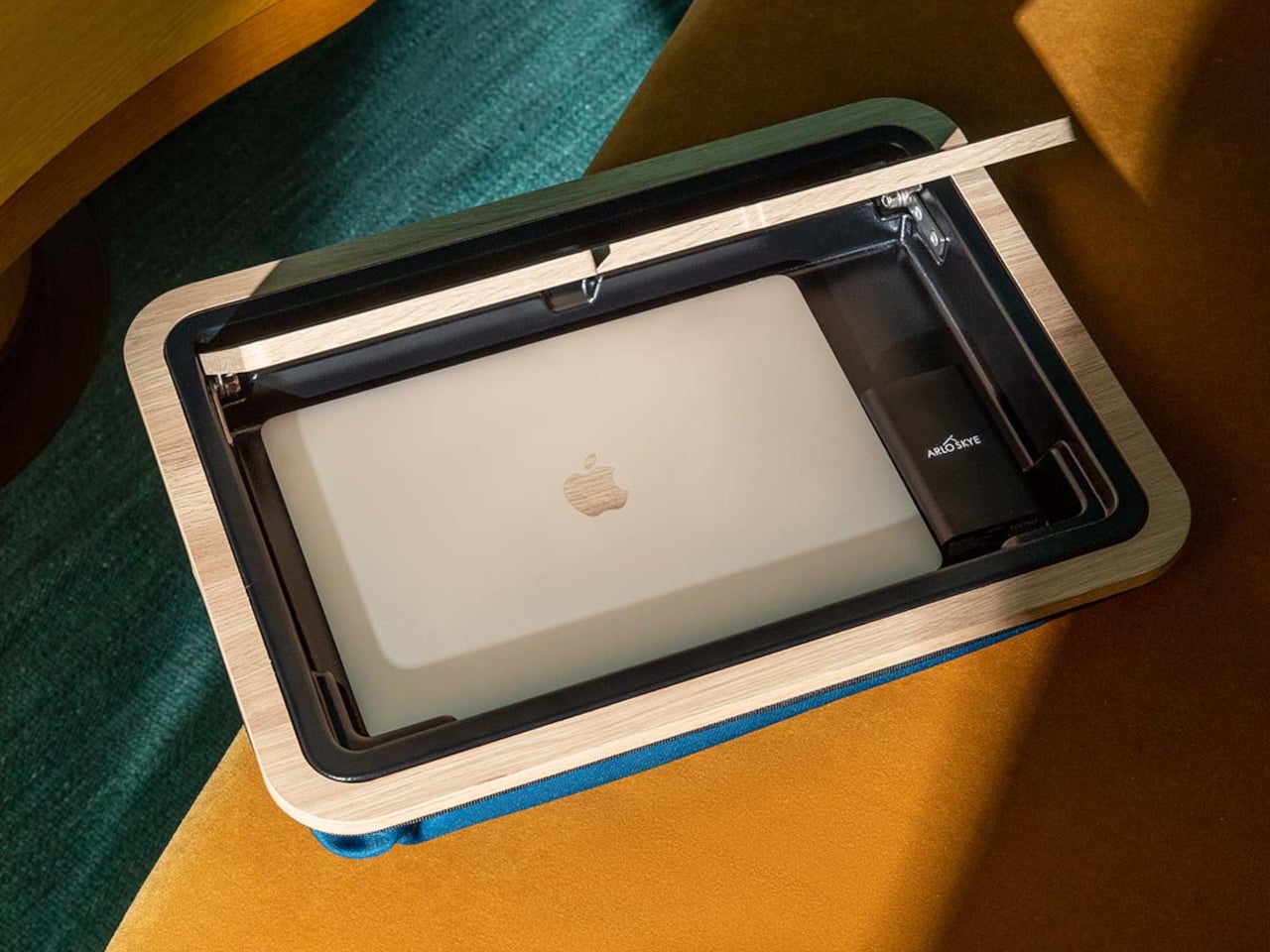
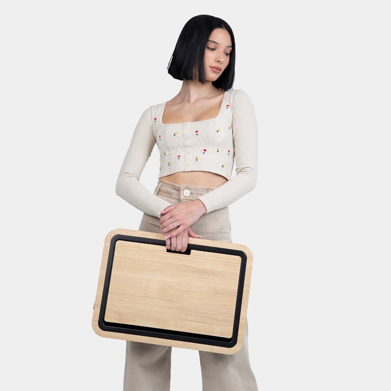
The Stowaway Lap Desk 19 is a compact mobile workstation built around a white-oak work surface and a cushioned base. It is sized for a 16-inch laptop, with room for a mouse or notebook, and designed to move between bed, sofa, and carry-on without looking like office gear. The defining move is the hidden storage built into the desk itself, turning it into a portable drawer for your laptop and everyday tools.
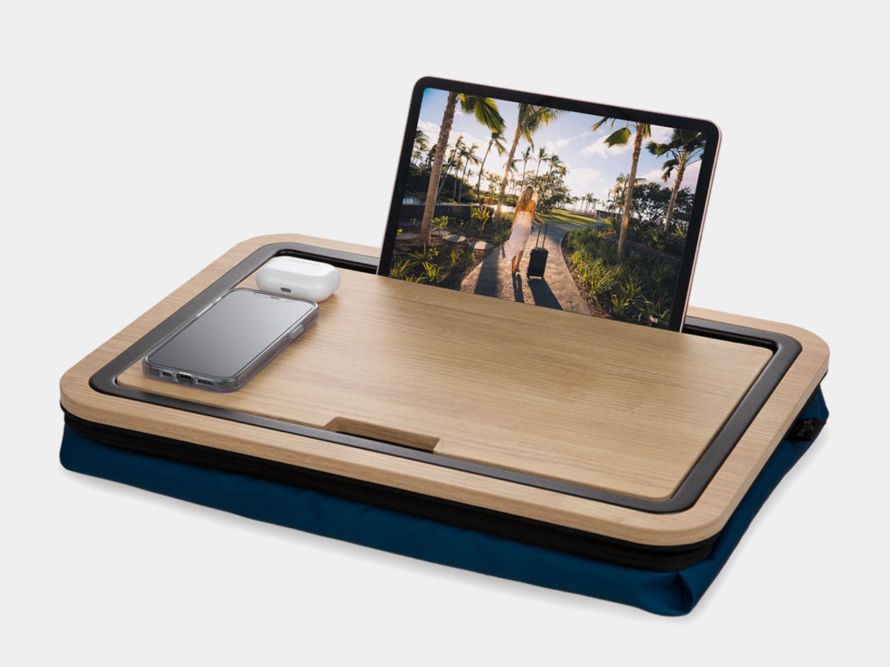
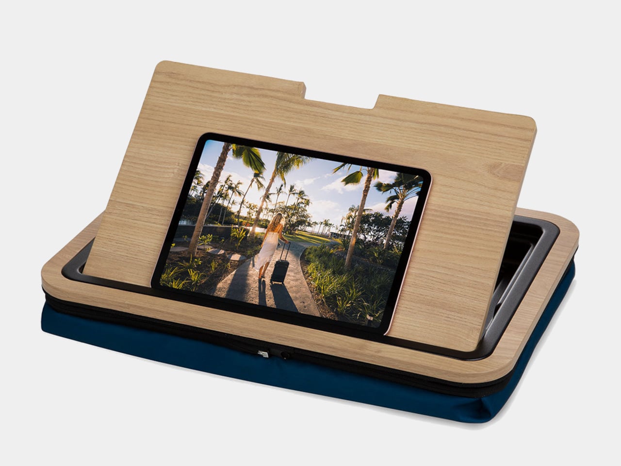
A slot along the back edge holds a tablet or phone upright, turning the lap desk into a small command center with multiple screens. The oak surface is framed by a low lip on three sides, which keeps devices and pens from sliding off when you shift position. The result is a stable, furniture-like platform that feels more like a small table than a tray, with enough space to spread out without everything falling into the blankets.
The top opens to reveal a compartment large enough for a laptop, tablet, and flat accessories. That means when you are done working, everything can live inside the desk instead of being scattered across the bed or sofa. A cut-out doubles as a cable pass-through, so you can charge devices while they are tucked away, keeping cords from tangling around your legs or snagging on bedding when you move.
The microbead cushion attached to the underside conforms to your lap and lifts the wooden surface off your legs. It helps with ventilation and spreads weight more evenly than a hard board. Some reviewers find microbeads firmer than expected, but the combination of cushion and wood still feels more considered than a bare tray or a laptop directly on your knees, especially during longer work sessions that stretch past an hour.
The lap desk doubles as a side table or serving tray when you are not working, holding breakfast, snacks, or a book without needing a separate piece of furniture. The oak top and dark cushion let it blend into a bedroom or living room without screaming office, so it can live out in the open instead of being hidden in a closet between uses, ready to grab whenever you need it.
The Stowaway Lap Desk changes the experience of working away from a desk. It corrals your tools, gives them a defined home, and makes it easier to pack up in one motion when you are done. The idea of a lap desk that behaves like a small, self-contained workstation feels like a welcome upgrade over the usual plastic slab, especially when your office is often a bed, sofa, or hotel room and you need every piece of gear to earn its footprint.
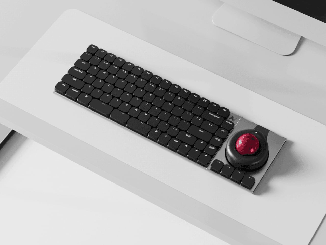
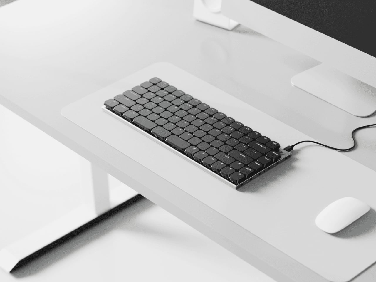
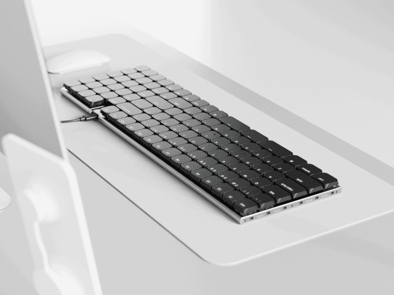
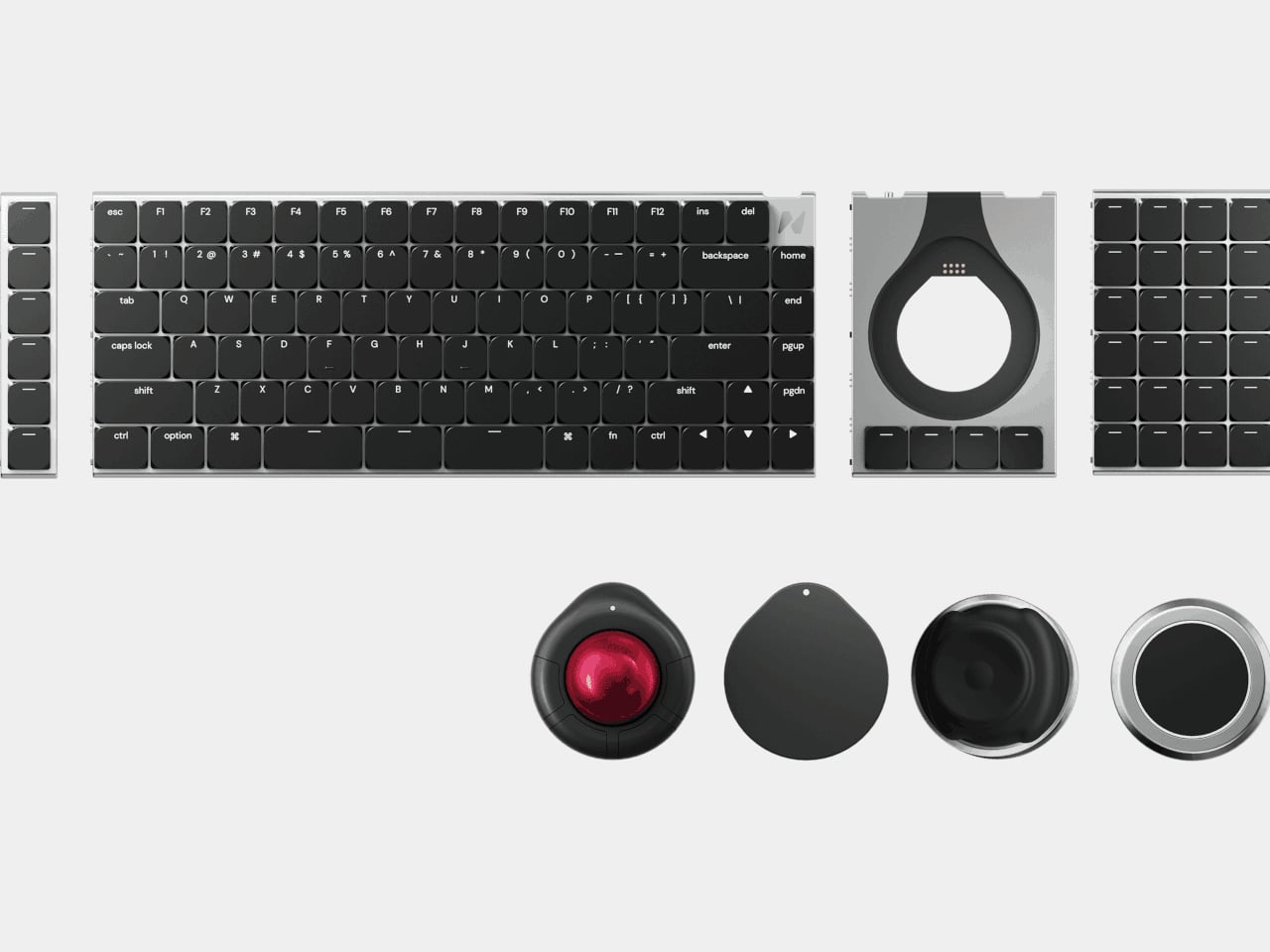
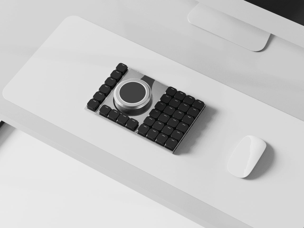
Most desks end up with a nice mechanical keyboard, a separate mouse, maybe a trackpad, a macro pad, and, if you work in 3D, a space controller, all fighting for room. Keyboards stay fixed layouts, even as workflows get more complex and tools multiply. Naya Connect treats the keyboard as the center of a modular workstation instead of just another rectangle, letting the rest of your input tools snap onto it and adapt as your work changes.
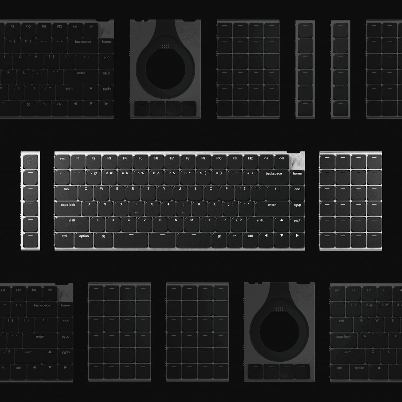
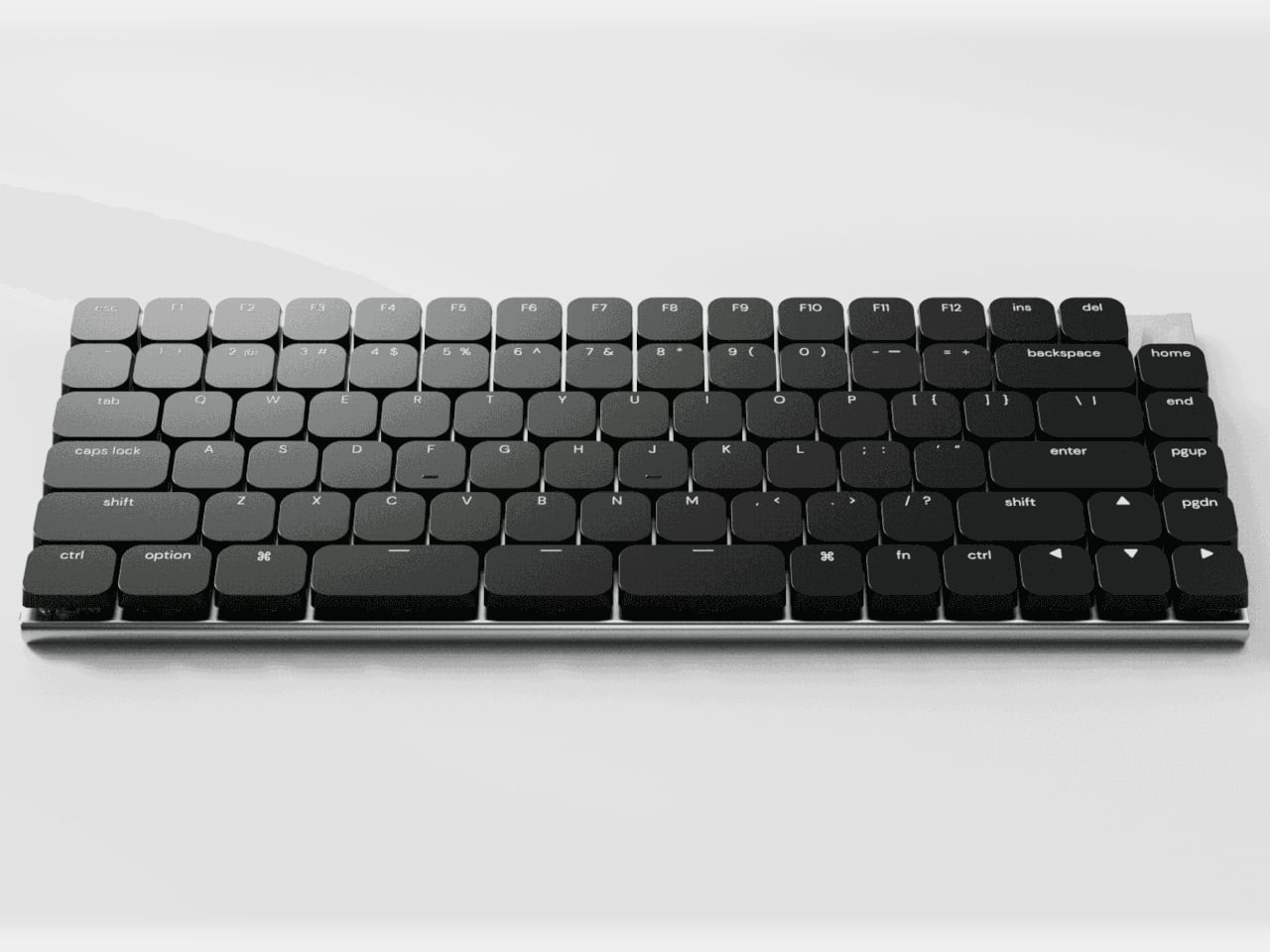
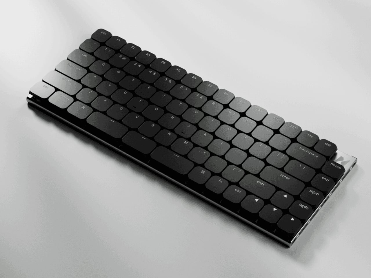
Naya Connect is a low-profile mechanical ecosystem built around the Naya Type keyboard and a dock. Naya Type is a slim 75% board with an aluminum body, Kailh Choc V2 switches, and a 14.9 mm profile, designed to be wireless when paired with the dock. The interesting part is not the layout, but what can snap onto it, a family of input modules that attach magnetically and talk to the same software layer.
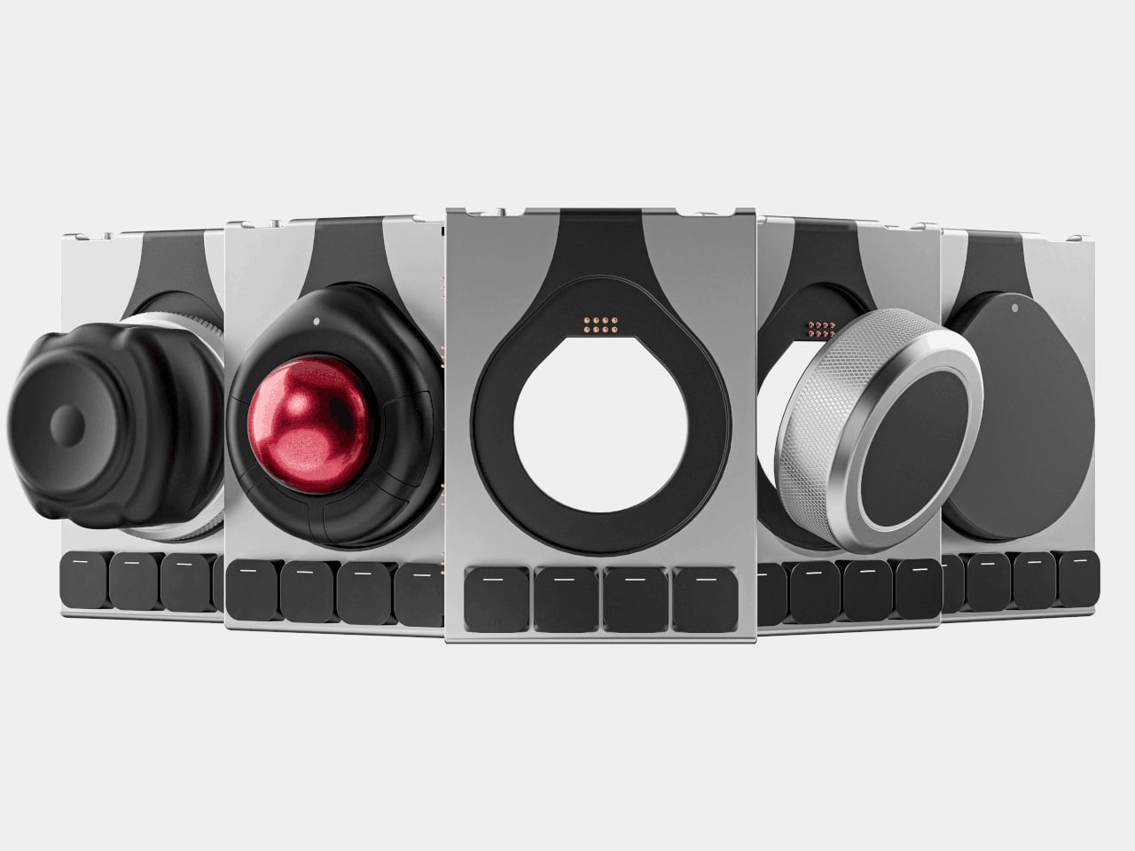
The keyboard and dock have magnetic connection points on both sides, letting you attach modules wherever they make sense. You can add a Multipad as a numpad or macro pad, a six-key strip for extra shortcuts, or build a full console by chaining modules along one edge. The system grows sideways with your workflow instead of forcing you into a single configuration that never quite fits once your needs shift or projects change.
The modules cover different input modes. A Multipad acts as a numpad or macro grid, a six-key strip handles quick actions, a Track module replaces a mouse with a trackball, a Touch module works like a compact touchpad, a Tune dial offers dynamic haptics for scrubbing timelines or adjusting values, and a Float puck gives six degrees of freedom for 3D navigation and camera control.
The hardware only works because the software is flexible. Naya Flow is the configuration app that lets you remap keys, tune module behaviour, and build complex logic with drag-and-drop tools. You can set per-app profiles, change how the Tune dial feels depending on what you are doing, and decide what each touch zone or trackball gesture should trigger, without writing scripts or diving into config files.
The aluminum body, low-profile keycaps, and clean black aesthetic keep the keyboard from looking like a science project, even when it is covered in modules. The modules share the same design language, so a trackball, dial, and macro pad feel like parts of one system rather than a pile of mismatched gadgets. The result is a desk that looks intentional even when it is heavily customized and adapted to very specific tasks.
Naya Connect is aimed at people who live in code editors, timelines, spreadsheets, or 3D scenes all day and want input tools that can evolve with their work. It is not trying to be a mass-market keyboard. Instead, it’s trying to be a platform that grows and reconfigures as often as the projects do, without asking you to keep buying entirely new peripherals or cluttering the desk with orphaned tools.
Finding a gift that arrives quickly without screaming “panic purchase” requires more than fast shipping. The best last-minute presents carry weight beyond their delivery speed—they reflect care through considered design, quality materials, and the kind of details that suggest you’ve been thinking about the recipient all along. These aren’t placeholder gifts. They’re objects that tell a story about taste, intention, and understanding what someone actually values.
The designs featured here share a quiet sophistication that transcends their availability. Each piece balances immediate gratification with lasting presence, turning a compressed timeline into an advantage rather than a compromise. From Japanese craftsmanship to innovative functionality, these gifts feel curated, not rushed. They’re the kind of presents that make people ask where you found them, never when you ordered them.
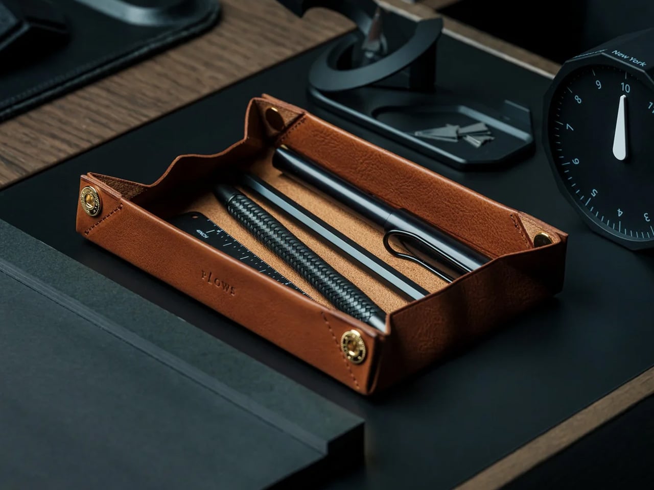
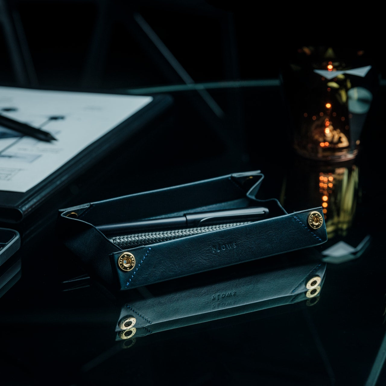
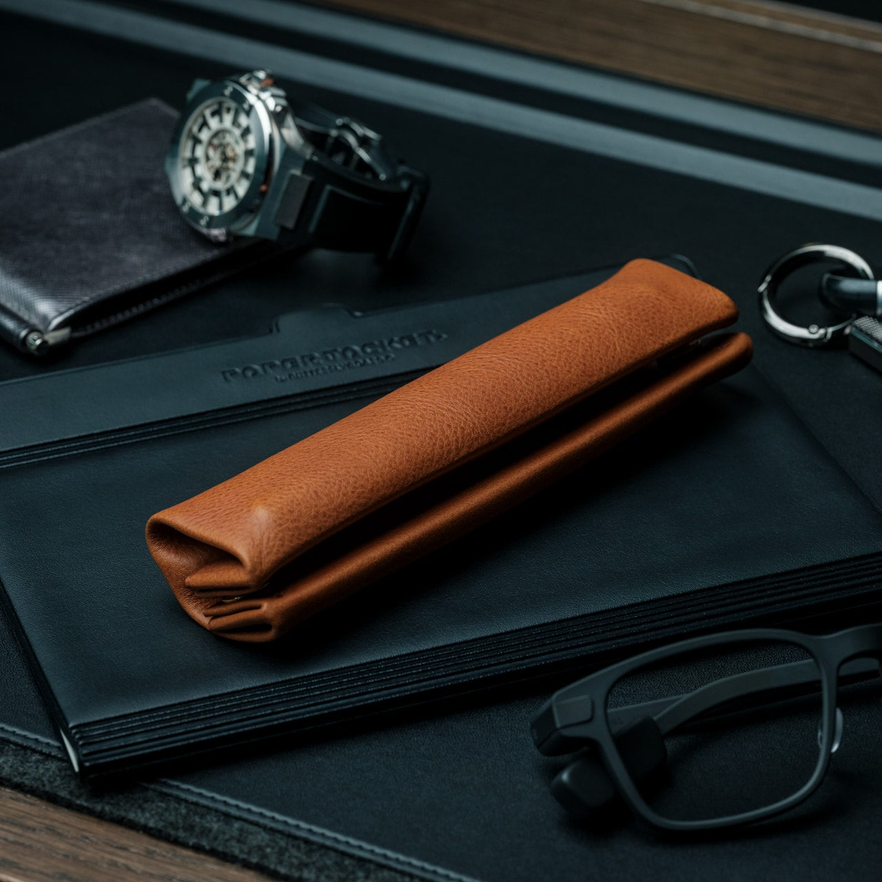
1. FoldLine Pen Roll
The ritual of writing deserves more than a cluttered pencil case. This leather pen roll transforms from compact storage into an instant workspace tray, giving anyone who thinks through their hands a moment of calm before the first mark hits paper. Made from single-piece Italian vegetable-tanned leather, it cradles writing instruments without rattling or scratching, creating separation through intelligent folding rather than bulky dividers. The design feels meditative—unzip from either side, unfold in two seconds, and suddenly any coffee shop counter becomes a defined creative zone.
What makes this gift feel intentional is how it anticipates the recipient’s actual needs. The hollow interior remains slim even when fully loaded, allowing it to slip into bags without adding bulk. The machined Italian snap closure delivers that satisfying tactile click that premium objects should. Over time, the Minerva Box leather from Badalassi Carlo tannery develops a patina unique to its owner’s habits, aging beautifully rather than simply wearing down. For writers, artists, or anyone who carries their tools with purpose, this feels less like an accessory and more like an extension of how they work.
The origami-inspired folding mechanism creates a tray without adding bulk to the closed form.
Single-piece leather construction eliminates internal stitching that could damage the pen’s finish.
Ambidextrous design opens cleanly from either direction for effortless access.
Natural vegetable tanning ensures the leather improves with age rather than deteriorating.
What we dislike
The premium Italian leather and Japanese craftsmanship place it at a higher price point.
Limited capacity means prolific pen collectors might need multiple rolls.
2. StillFrame Headphones
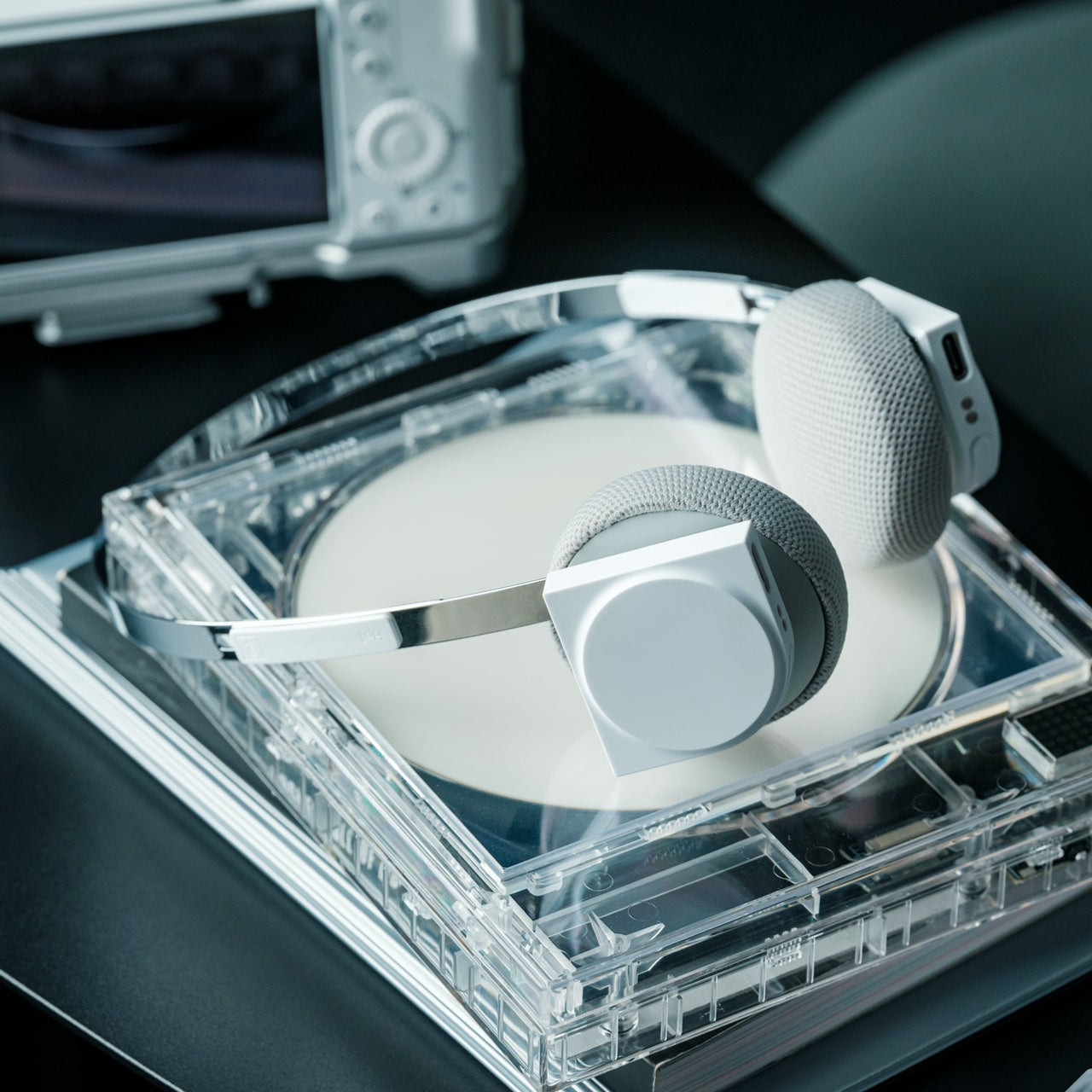
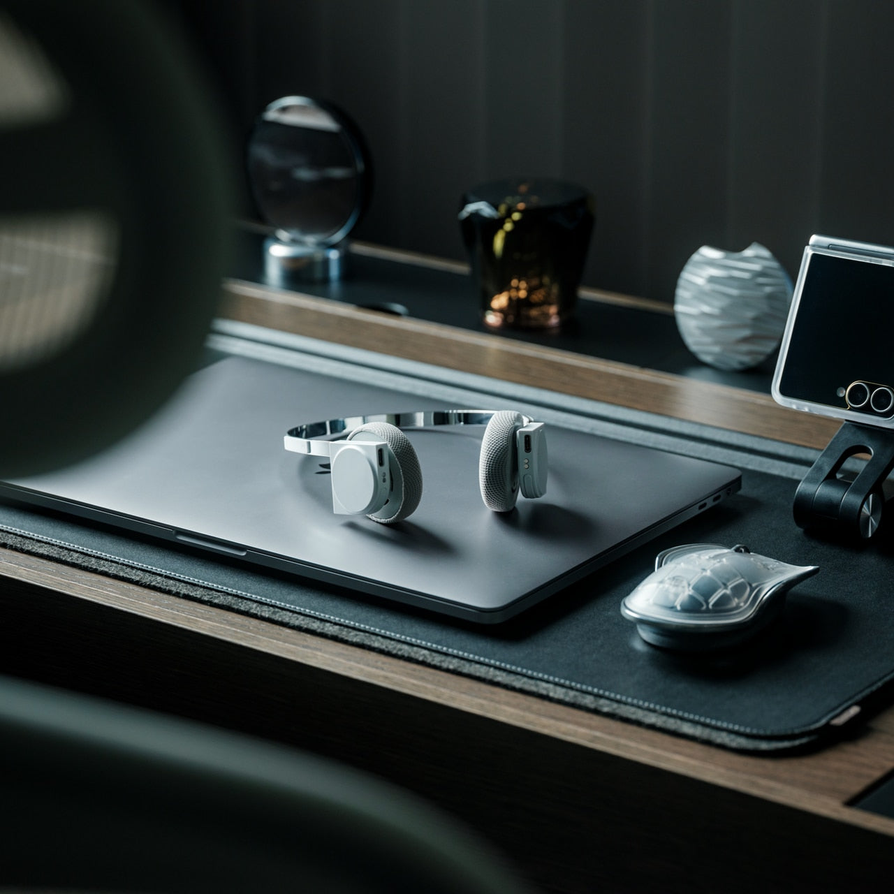
Listening becomes physical again with headphones that bridge the gap between intrusive over-ears and tinny earbuds. The StillFrame design pays homage to the era when albums came in jewel cases, and playlists required intention, translating that 80s-’90s geometry into a featherlight on-ear experience. At just 103 grams, they disappear physically while the 40mm drivers expand the soundstage into something you can almost walk through. This is music as landscape rather than background noise, perfect for anyone who still believes albums deserve to be heard in order.
The thoughtfulness reveals itself in adaptable features that respect how people actually move through their days. Active noise cancelling carves out solitude during commutes, while transparency mode keeps you connected during collaborative moments. The magnetic fabric ear cushions swap instantly—each set includes light gray and turquoise options alongside white, letting the listener match mood rather than trend. With 24 hours of battery life and both wireless and wired connectivity, these headphones refuse to choose between convenience and quality. They feel like a gift for someone whose relationship with music goes deeper than streaming algorithms.
The 40mm drivers deliver an open, spacious soundstage that brings detail to melodic layers.
The magnetic cushion system allows quick color changes to match different aesthetics or moods.
Hybrid wireless and USB-C wired connectivity accommodates both casual streaming and high-resolution playback.
Exceptional 24-hour battery life eliminates the daily charging routine.
What we dislike
On-ear design may feel less isolating than over-ear alternatives for some preferences.
The exposed circuitry aesthetic, while intentional, might not suit every style sensibility.
3. ClearFrame CD Player
Physical media returns not as nostalgia but as a deliberate choice with a CD player that treats album art as essential to the listening experience. The transparent polycarbonate body frames each disc like a miniature gallery installation, with exposed black circuitry turning electronics into visible craftsmanship. This isn’t about abandoning streaming—it’s about reclaiming the ritual of selecting an album, seeing its artwork, and committing to the full experience. The square silhouette creates a display-worthy presence whether sitting on a shelf or mounted on a wall.
The design respects modern flexibility without sacrificing its analog soul. Bluetooth 5.1 connects to contemporary speakers, while the headphone jack accommodates direct listening. The rechargeable battery delivers seven to eight hours of portable playback, making it genuinely untethered from outlets. Multiple playback modes let you experience a full album, repeat everything, or loop a single track until it becomes part of you. For anyone who still owns CDs or wants to rediscover their collection, this feels like permission to care about format again. It’s a gift that validates the recipient’s belief that how you listen matters as much as what you hear.
Crystal-clear housing transforms the player itself into a visual display piece.
Exposed circuitry celebrates the engineering rather than hiding it behind plastic shells.
Bluetooth connectivity modernizes the format without requiring all-new equipment.
Wall-mount capability turns album covers into rotating artwork.
What we dislike
The 300-gram weight, while manageable, makes it less portable than pocket-sized digital players.
Playback limited to CD formats means no direct streaming integration.
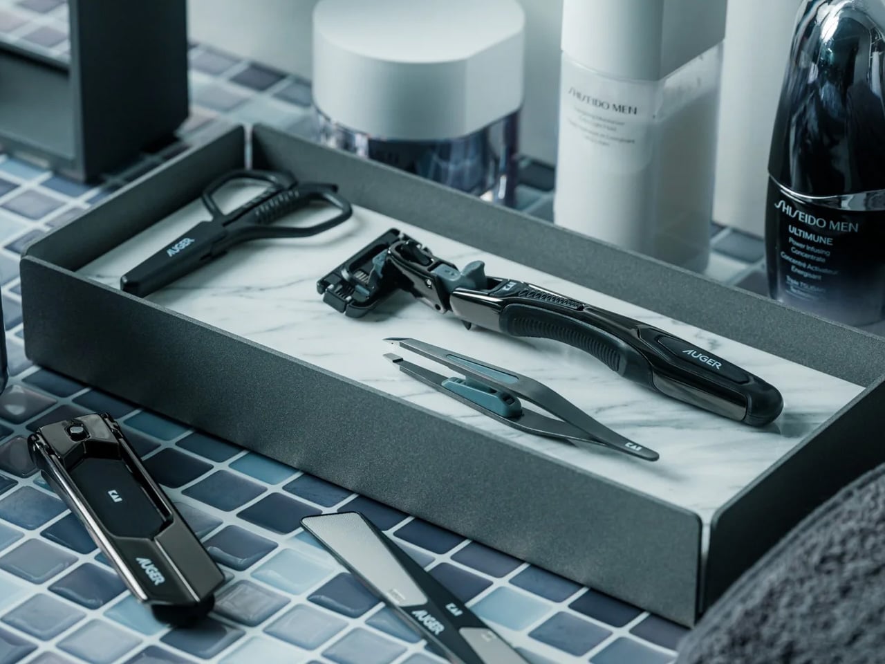
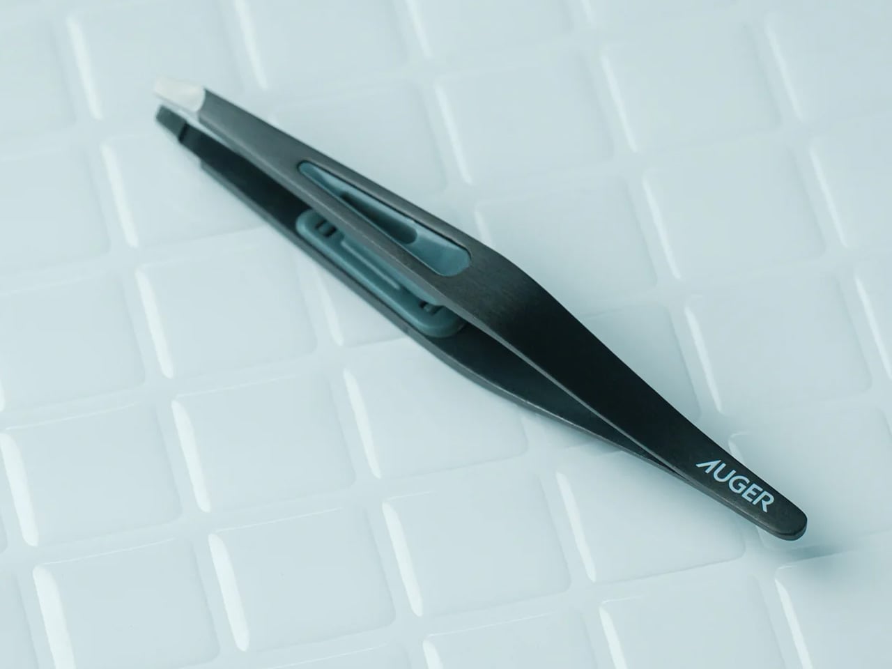
4. Auger PrecisionMaster Grooming Set
Grooming becomes a discipline rather than a chore when every tool performs with surgical precision. This all-black Japanese grooming set from Kai Corporation distills over a century of blade-making expertise into five essential instruments: razor, tweezers, scissors, nail file, and clipper. Each piece reflects the belief that self-care is self-mastery, turning daily maintenance into a quiet form of control. The aesthetics lean minimal and matte, avoiding flashy branding in favor of pure functional elegance. For someone who values preparation and presentation, this set says you understand that details matter.
The engineering separates these from drugstore alternatives. The razor features a world-first 30-degree adjustable angle with a 3D pivoting head that follows facial contours even in reverse strokes. The tweezers include a patented stopper and ergonomic groove for pinpoint control. Ultra-thin curved scissors follow the natural lines of brows and beards with near-surgical finesse. The nail clipper’s rotating lever mechanism delivers cutting power with minimal effort, especially on thicker nails. Compact yet weighted, the entire set feels substantial without bulk. This is the gift for someone whose morning routine is deliberate, refined, and entirely under their command.
Kai Corporation’s 116-year blade-making heritage ensures professional-grade sharpness and durability.
The adjustable-angle razor accommodates different shaving techniques and hard-to-reach areas.
Patented mechanisms in the tweezers and clipper demonstrate genuine engineering innovation.
Cohesive all-black aesthetic creates a unified, sophisticated presence.
What we dislike
The precision-engineered components come at a premium compared to basic grooming tools.
Learning to use the adjustable razor features optimally requires some initial practice.
5. ZenFlow Personal Aroma Diffuser
Scent becomes portable and personal with a diffuser that treats aromatherapy as art rather than an appliance. The ZenFlow combines a handcrafted porcelain filter from a 180-year-old Japanese pottery house with a precision-engineered metal base, creating something that belongs on display as much as in use. The hybrid heat and airflow system disperses essential oils without water or mist, eliminating the mess and maintenance of traditional diffusers. Just two to three drops transform a 1.5-meter radius into a personal sanctuary, making this ideal for desks, nightstands, or any space that deserves its own atmosphere.
The design philosophy balances heritage with adaptability. Available in silver, gold, or black finishes—each with distinctive textures inspired by Japanese metalworking traditions—the diffuser complements minimalist, modern, or traditional interiors equally. Three modes adjust intensity: Normal for invigorating presence, Airflow for subtle background, ECO for energy-conscious extended use. The battery-powered portability means scent follows you rather than tethering you to outlets. Washable, reusable aroma plates eliminate disposable waste. For someone who curates their environment intentionally, this gift acknowledges that ambiance matters and offers them the tools to control it precisely.
Handcrafted Shibukusa Ryuzo porcelain filters bring 180 years of artisanal expertise to functional design.
Water-free operation eliminates refilling hassles and prevents mold or mineral buildup.
Portable battery design allows scent customization in any location without cord constraints.
Washable plates support sustainable, repeated use without replacement costs.
What we dislike
The 1.5-meter effective radius suits personal spaces better than large open rooms.
Premium materials and heritage craftsmanship position it above basic diffuser pricing.
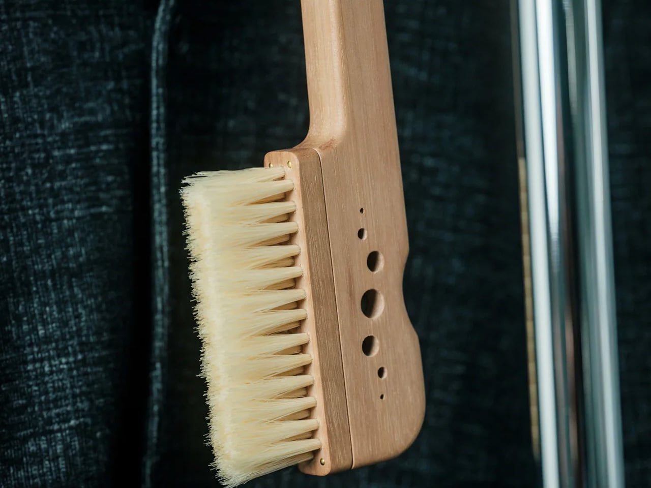
6. AromaCraft Clothes Brush
Garment care becomes a sensory ritual with a brush that cleans while subtly scenting. Made by the Miyakawa Hake Brush Workshop—a family operation running since 1921—this tool combines traditional hand-planted white boar bristles with an innovative aromatic paper insert. Add a few drops of essential oil to customize the fragrance, then let each brush stroke remove dust and pollen while leaving clothes refreshed and subtly perfumed. The walnut wood handle, finished with shea butter, feels substantial and smooth, aging beautifully with regular use. This is the gift for someone who treats their wardrobe as an investment rather than an inventory.
The Tsubokuri method of bristle planting ensures longevity that machine-made brushes can’t match. Each bristle is individually secured, preventing shedding and maintaining consistent performance through years of use. White boar hair is firm enough to lift embedded particles from deep within fabric fibers yet gentle enough to protect delicate textiles. The aromatic element transforms functional maintenance into a moment of personalization—your favorite wool coat can carry hints of cedarwood, bergamot, or whatever scent centers you. For anyone who appreciates clothing that lasts, this brush extends garment life while making care feel less like labor and more like meditation.
Hand-planted bristles using century-old techniques ensure durability and prevent shedding.
Customizable aromatic paper insert allows personal scent preferences for each use.
White boar bristles balance effective cleaning with gentle fabric care.
Walnut and shea butter construction ages gracefully rather than degrading.
What we dislike
The artisanal construction process results in a higher cost than synthetic alternatives.
Aromatic papers require periodic replacement depending on usage intensity.
7. ClearMind Kendama
Focus finds form in a traditional Japanese skill toy that turns coordination into meditation. Crafted by Tokyo Kendama from solid walnut and maple, this isn’t childhood nostalgia—it’s a tool for building presence and breaking mental loops. The kendama’s simple challenge—catch the ball on the cup or spike—creates flow states that quiet mental noise better than scrolling ever could. Larger cups and an enlarged spike hole make tricks more achievable, building confidence through success rather than frustration. The unpainted wood develops character with use, gaining a patina that reflects your practice journey.
What makes this gift feel considered is how it offers an alternative to screen-based downtime. The unique bearing system prevents string twisting, maintaining smooth play without constant adjustment. The rough-textured surface and Japanese cowhide leather label add tactile richness that makes picking it up satisfying before you even attempt a trick. Each successful catch delivers a small dopamine hit earned through skill rather than algorithm. For someone seeking mindful breaks or creative challenges, the kendama becomes a desk companion that grounds rather than distracts. It’s permission to play with purpose, to build something through repetition, to find calm through focused movement.
Solid walnut and maple construction ensures durability while developing a unique patina over time.
Larger cups and tama holes increase success rates, making skill progression more rewarding.
Bearing system minimizes string twisting for smoother, more consistent play.
Natural materials and craftsmanship create an heirloom-quality feel.
What we dislike
The learning curve requires patience to master even basic tricks.
Unpainted wood may show wear marks more visibly than finished alternatives.
Finding Thoughtfulness in Urgency
The best last-minute gifts succeed because they contain stories worth telling. Each design here carries provenance—Japanese workshops with century-long legacies, innovative engineering that solves real frustrations, and materials that improve rather than degrade with time. These aren’t products rescued from generic bestseller lists. They’re objects that communicate care through their existence, regardless of when you discovered them. The compressed timeline becomes invisible when the gift itself holds weight.
What separates thoughtful from desperate is whether the gift reflects the recipient or merely fills space. The designs featured here offer enough specificity to feel personal—tools for writing rituals, listening experiences, grooming discipline, environmental curation, garment care, and mindful play. They suggest you understand how someone moves through their world and what they value in that movement. Speed of delivery never appears in the thank-you note. Quality, consideration, and alignment always do.
Getting a laptop or tablet onto a TV or projector usually involves digging for the right cable, switching inputs, or wrestling with built-in casting that drops connections at the worst moment. This happens in meeting rooms, classrooms, and living rooms, turning simple screen sharing into a minor technical puzzle. A small, dedicated wireless bridge feels like a relief when it just works without software or setup rituals that waste five minutes before anything appears.
YURON is a plug-and-play 4K transmitter and receiver pair that lives in a bag or drawer until needed. One end plugs into a device over USB-C or HDMI, the other into a display’s HDMI port, and the link comes up automatically over its own 5G Wi-Fi connection. No apps, no pairing, no joining a network, just a direct path for video and audio that starts working the moment both sides power on.
YURON handles 4K 60 Hz HDR10 video up to 45 m, using H.265 compression, adaptive 5G Wi-Fi, and error correction to keep the picture smooth. It is fast enough for presentations, movies, and casual gaming, with audio and video traveling together, so there is no awkward lag. The point is to make the wireless link feel as transparent as a cable, without the cable running across the floor or desk.
Walking into a meeting room or classroom, you plug the receiver into the display once, then let different laptops or tablets take turns with the transmitter. YURON supports both mirror and extended modes, so someone can present slides on the big screen while keeping notes or chat on their own display. The 45 m range means it works in larger rooms without needing to huddle near the projector.
In a living room or dorm setup, a laptop, handheld console, or streaming box can send 4K content to a TV without an HDMI run. The low latency and 60 Hz refresh make it comfortable for games and sports, and the lack of app dependencies means guests can plug in and share videos or photos without installing anything. It becomes a quiet upgrade to movie nights and couch sessions.
The one-click control lets you cut the link instantly from the transmitter, useful when switching between apps with sensitive content or when you want to check something privately before sharing it again. A single receiver can pair with up to eight transmitters, with a button press cycling through them. In a studio, office, or classroom, multiple people can share the same screen without swapping cables or logging into accounts.
The hardware is compact and light enough to live on a key shelf or in a laptop sleeve, with a USB-C port that supports up to 100W Power Delivery, so a laptop can stay charged through the same connection. The internal cooling design, with multiple thermal zones and ventilation holes, keeps performance stable during long 4K sessions. It is the kind of detail that makes a small device feel engineered rather than improvised.
YURON turns screen sharing from a minor technical hurdle into something almost invisible. Instead of planning around cables or hoping a TV’s casting feature cooperates, you plug in a small pair of devices and treat any display as if it were directly connected. For people who move between work, study, and play, that kind of quiet reliability is often what makes a tool worth keeping in the bag, especially when the alternative is fumbling with adapters or explaining why the screen is still blank three minutes after the meeting was supposed to start.
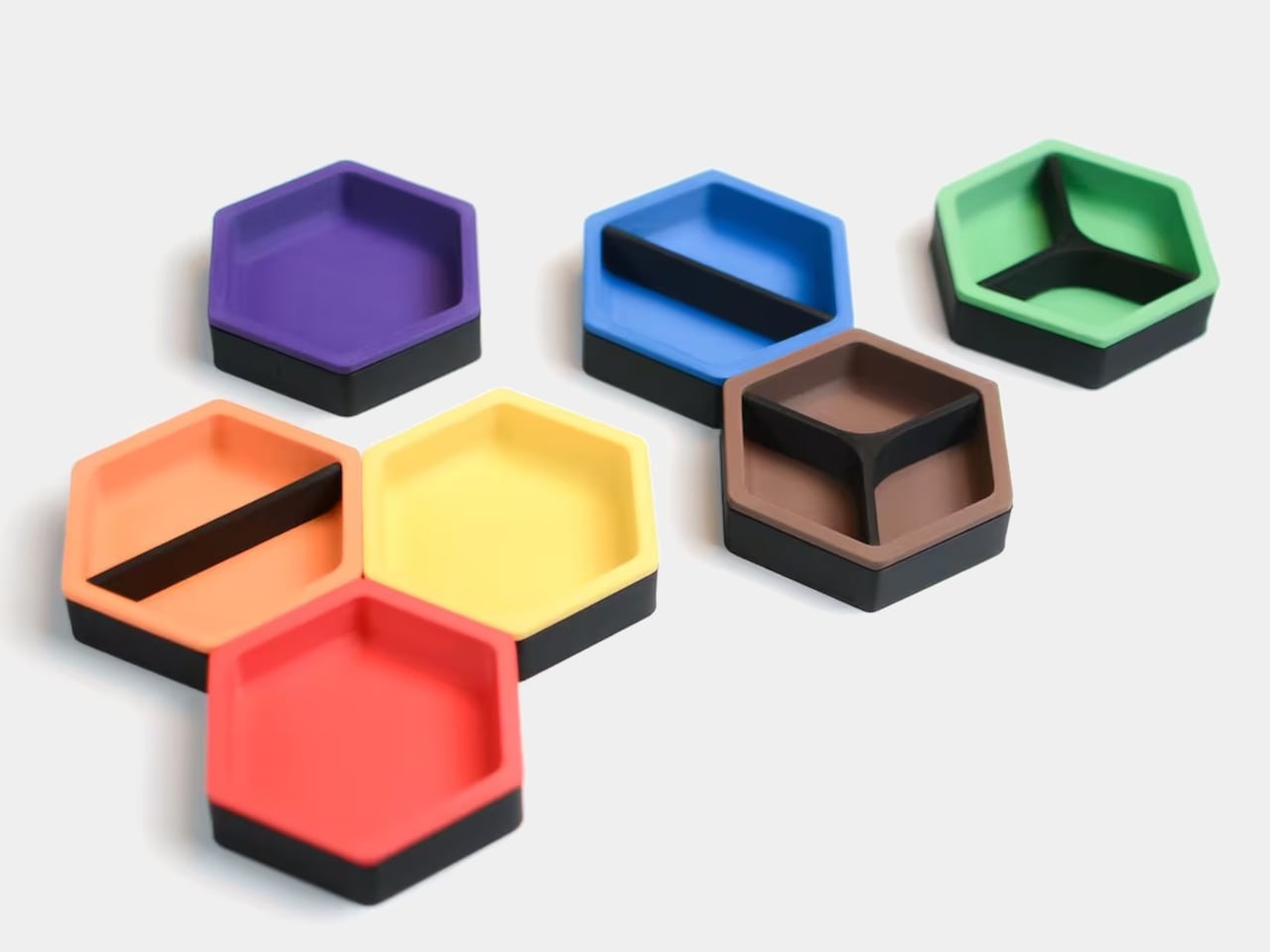
Most of us end up using whatever is at hand as a catch-all: coffee cups, candle lids, random bowls, and that works until you actually need to find a specific SD card or binder clip. A lot of the best small organizers are hiding in other categories, and these magnetic hexagon token trays, sold as board game accessories, are really just well-designed hexagonal dishes with magnets and dividers.
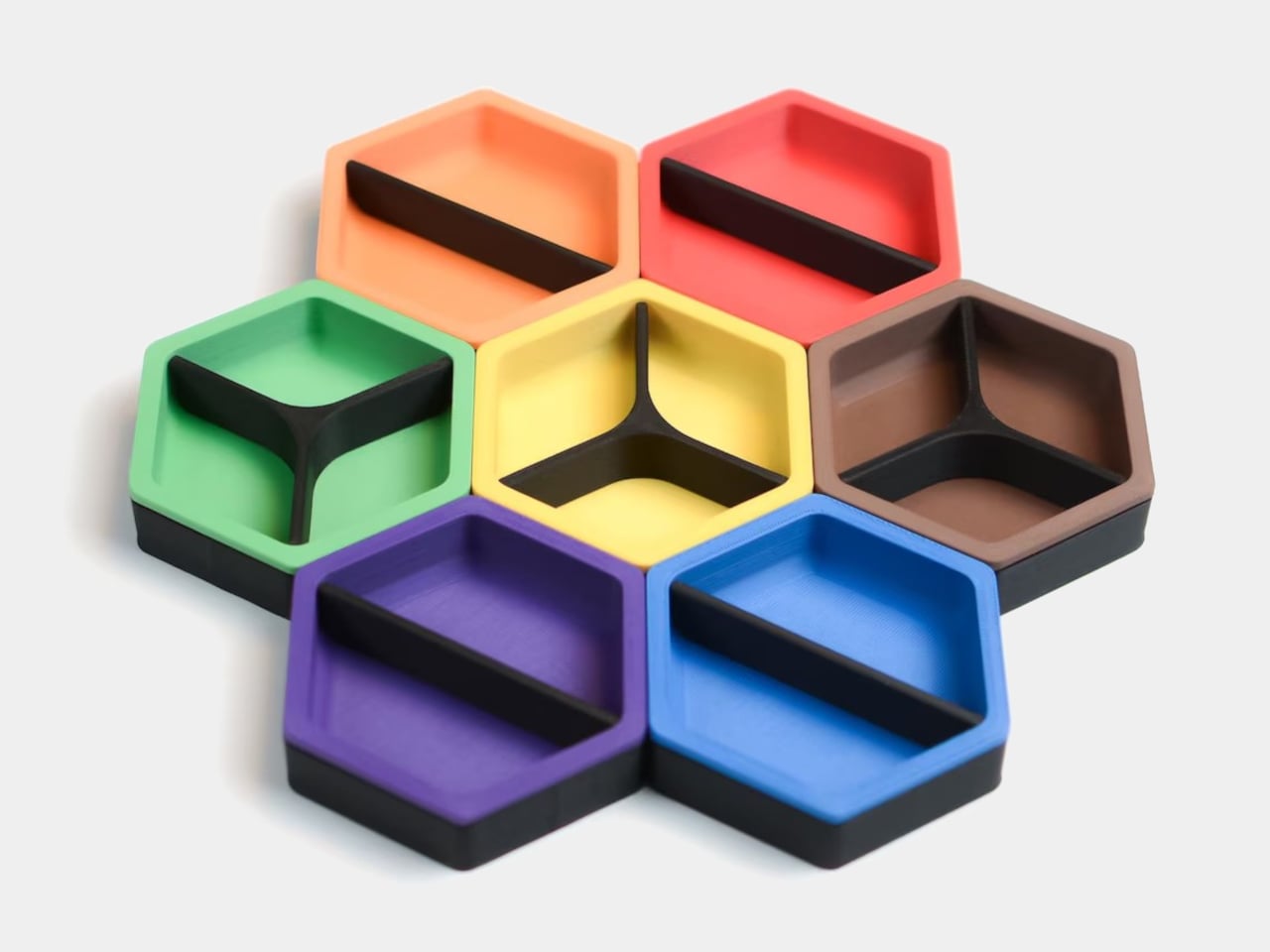
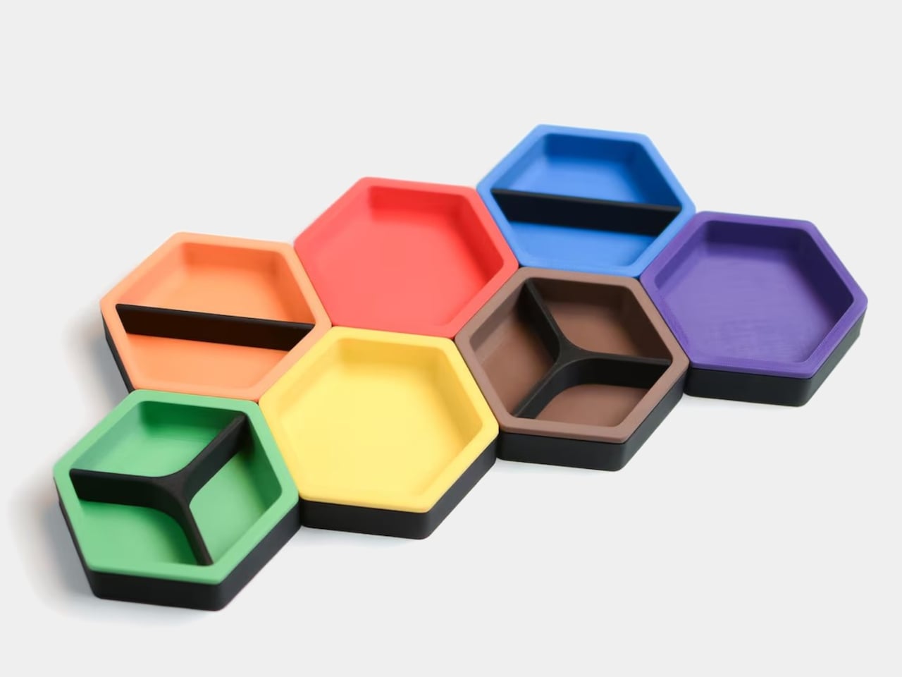
Each tray is a hexagon with magnets hidden in its edges so it snaps to its neighbors in a honeycomb. You can build a cluster that fits the corner of a monitor stand or the space in front of a keyboard, then peel one off and move it closer when you need it. The magnets keep the layout coherent instead of letting dishes drift apart over time, which is a small but meaningful improvement over loose containers.
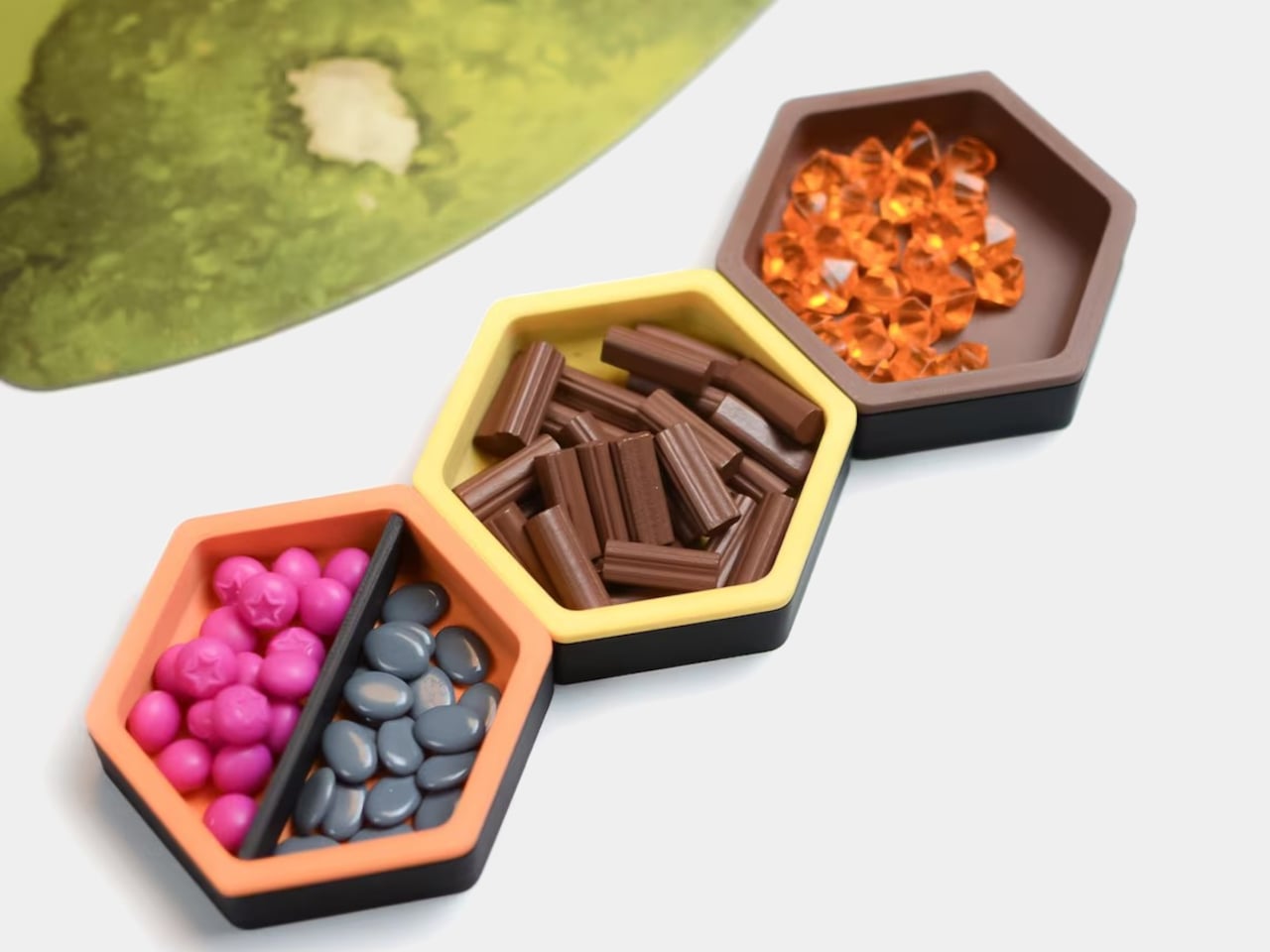
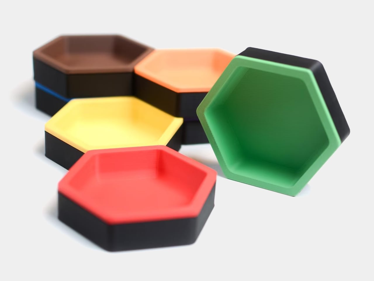
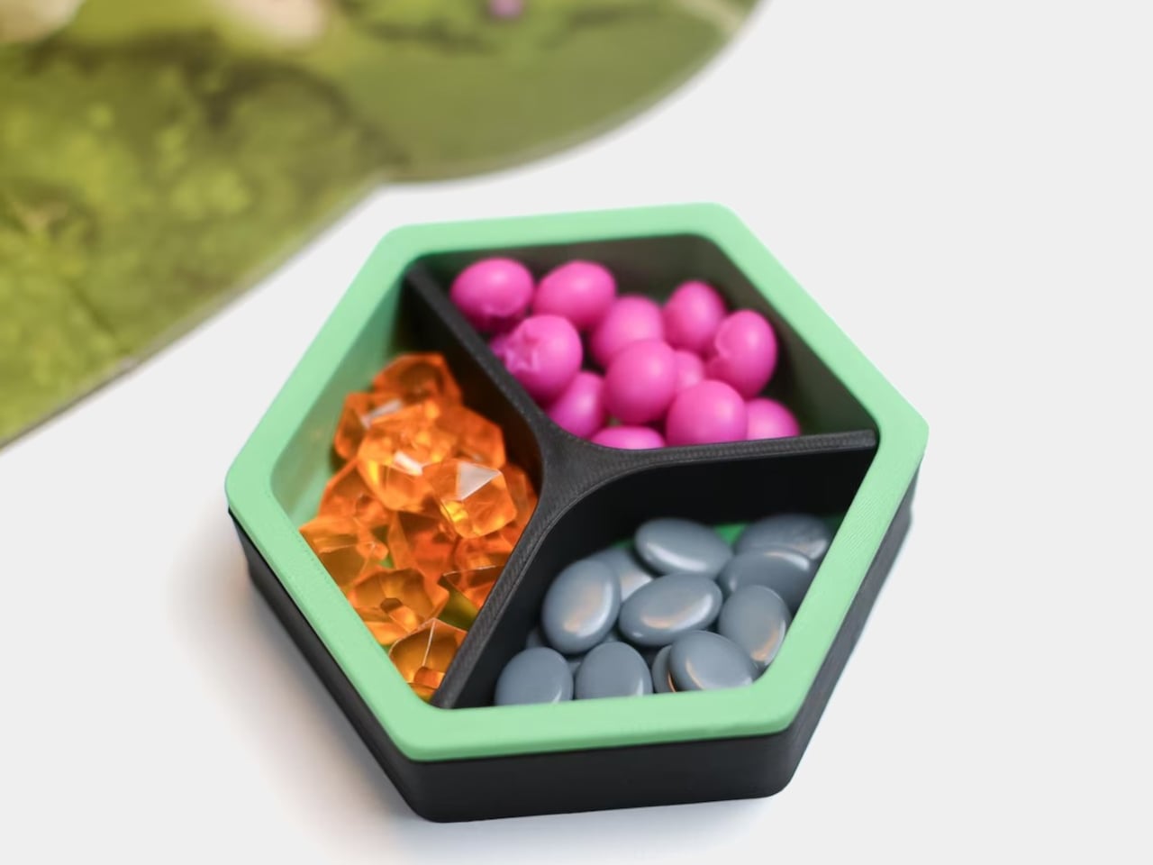
Each unit is a two-part organizer, a black magnetic base, and a colored insert that drops in. The insert ships with two dividers, a straight one that splits the tray into two sections and a Y-shaped one that splits it into three. You can run it as one big bin, two equal compartments, or three wedges, depending on whether you are holding paper clips, sticky-note flags, or three different pen nibs.
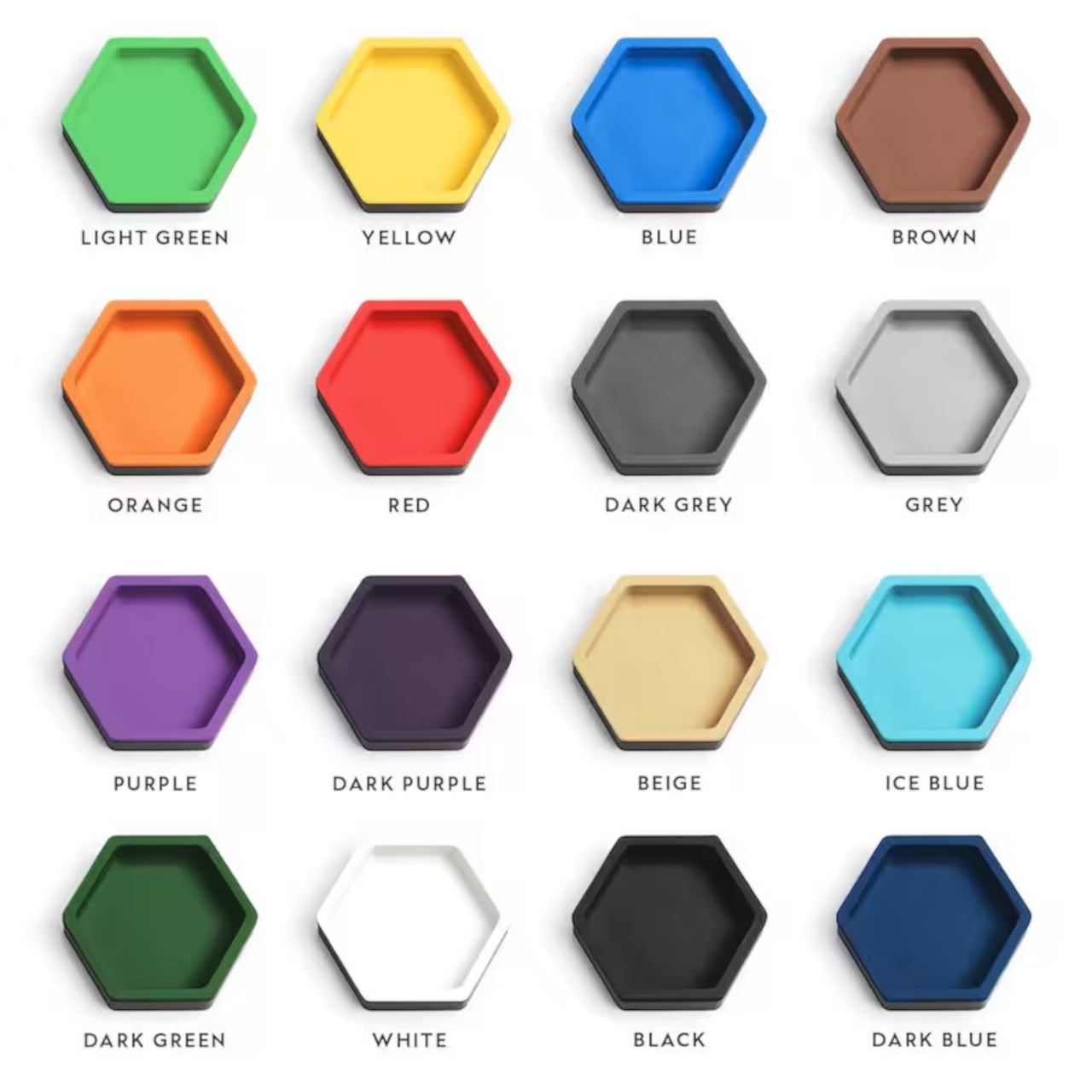
The color options for the inserts let you treat the trays as a visual system. You can assign colors to categories, blue for tech bits, yellow for writing tools, red for things that need attention, or just build a small rainbow that makes the corner of your desk feel more like a layout than a pile. The black bases keep everything grounded, so the color reads as an accent, not chaos.
The trays are 3D-printed in PLA with embedded magnets, which keep them light but give them a satisfying snap when they connect. On a smooth desk, that matters, a cluster of loose bowls tends to slide and separate, while a magnetic cluster holds its shape when you nudge things around. The slight texture of printed PLA also keeps small items from skittering around inside each compartment, especially paper clips and staples.
The modularity plays nicely with shifting work modes. On a heavy project day, you can build a larger honeycomb and park it next to your main work area, each tray handling a different set of parts. On quieter days, you can break the set into smaller clusters and spread them across a shelf, a secondary desk, or a nightstand. The hexagon footprint is compact enough that a single tray works as a bedside catch-all for rings and earbuds.
These trays sit in a sweet spot between rigid drawer inserts and random containers, structured enough to keep things sorted but flexible enough to reconfigure when your habits change. For anyone who likes their desk to feel a little more like a considered layout and a little less like a junk drawer, a handful of magnetic hexagons with dividers is a surprisingly simple way to give every small object a place to land, while keeping the option to rebuild the whole composition whenever the mood or the project shifts.
Most of us end up using whatever is at hand as a catch-all: coffee cups, candle lids, random bowls, and that works until you actually need to find a specific SD card or binder clip. A lot of the best small organizers are hiding in other categories, and these magnetic hexagon token trays, sold as board game accessories, are really just well-designed hexagonal dishes with magnets and dividers.
Each tray is a hexagon with magnets hidden in its edges so it snaps to its neighbors in a honeycomb. You can build a cluster that fits the corner of a monitor stand or the space in front of a keyboard, then peel one off and move it closer when you need it. The magnets keep the layout coherent instead of letting dishes drift apart over time, which is a small but meaningful improvement over loose containers.
Each unit is a two-part organizer, a black magnetic base, and a colored insert that drops in. The insert ships with two dividers, a straight one that splits the tray into two sections and a Y-shaped one that splits it into three. You can run it as one big bin, two equal compartments, or three wedges, depending on whether you are holding paper clips, sticky-note flags, or three different pen nibs.
The color options for the inserts let you treat the trays as a visual system. You can assign colors to categories, blue for tech bits, yellow for writing tools, red for things that need attention, or just build a small rainbow that makes the corner of your desk feel more like a layout than a pile. The black bases keep everything grounded, so the color reads as an accent, not chaos.
The trays are 3D-printed in PLA with embedded magnets, which keep them light but give them a satisfying snap when they connect. On a smooth desk, that matters, a cluster of loose bowls tends to slide and separate, while a magnetic cluster holds its shape when you nudge things around. The slight texture of printed PLA also keeps small items from skittering around inside each compartment, especially paper clips and staples.
The modularity plays nicely with shifting work modes. On a heavy project day, you can build a larger honeycomb and park it next to your main work area, each tray handling a different set of parts. On quieter days, you can break the set into smaller clusters and spread them across a shelf, a secondary desk, or a nightstand. The hexagon footprint is compact enough that a single tray works as a bedside catch-all for rings and earbuds.
These trays sit in a sweet spot between rigid drawer inserts and random containers, structured enough to keep things sorted but flexible enough to reconfigure when your habits change. For anyone who likes their desk to feel a little more like a considered layout and a little less like a junk drawer, a handful of magnetic hexagons with dividers is a surprisingly simple way to give every small object a place to land, while keeping the option to rebuild the whole composition whenever the mood or the project shifts.
You know what’s annoying about camping? You’re out there trying to enjoy nature, breathe in the fresh air, and cook a decent meal, but then you realize your cutting board is wedged under the cooler, your knife is somewhere in the depths of your trunk, and everything you need for meal prep is scattered across three different bags. It’s chaos, and not the fun kind.
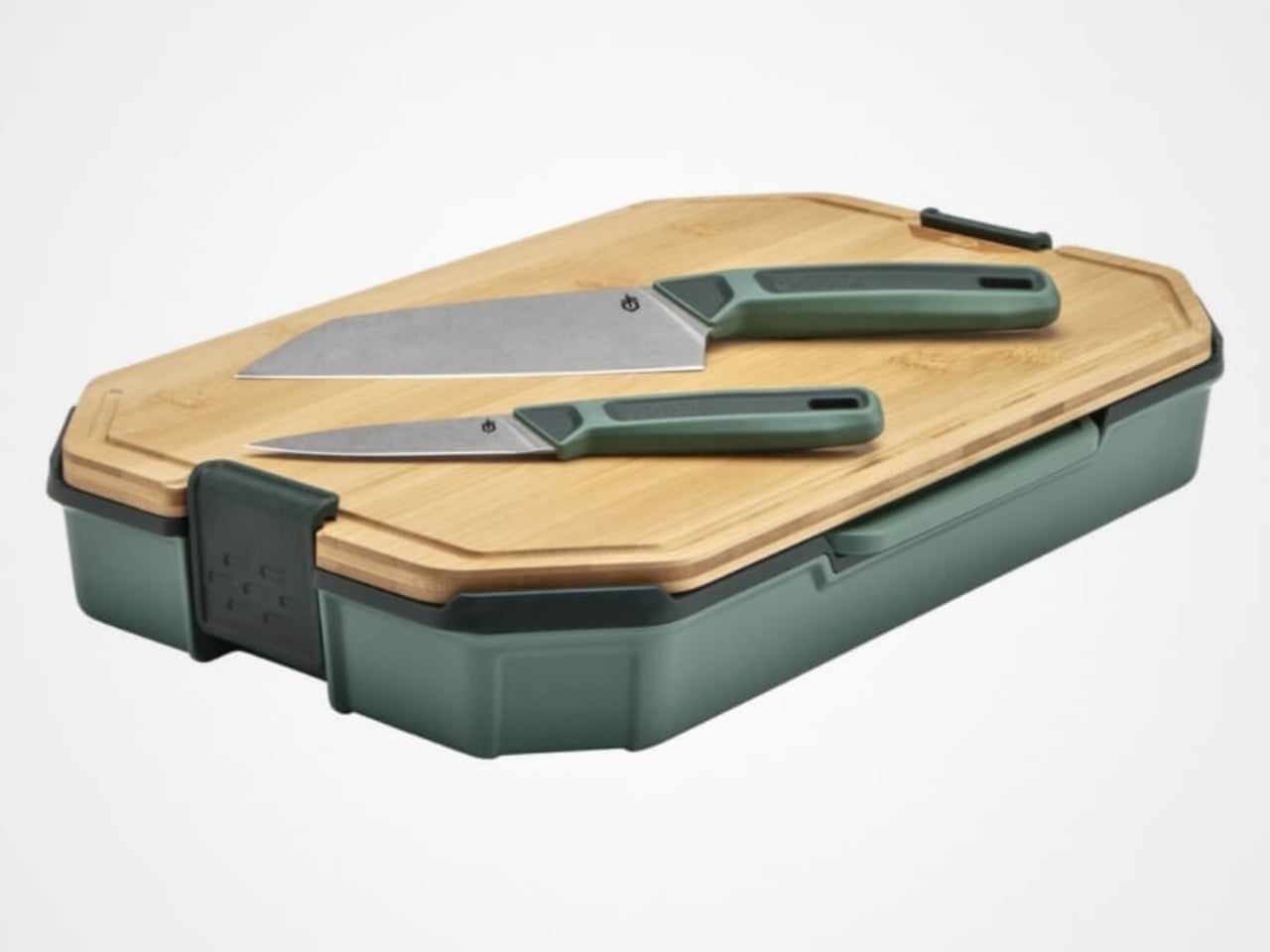
Enter the Gerber ComplEAT Cutting Board Set, which is basically what happens when someone finally asks the right question: what if your entire camp kitchen could pack itself into something the size of a shoebox? This six-piece set is like the Russian nesting doll of outdoor cooking gear, and honestly, it’s kind of brilliant.
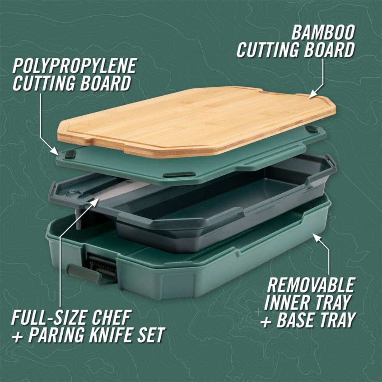
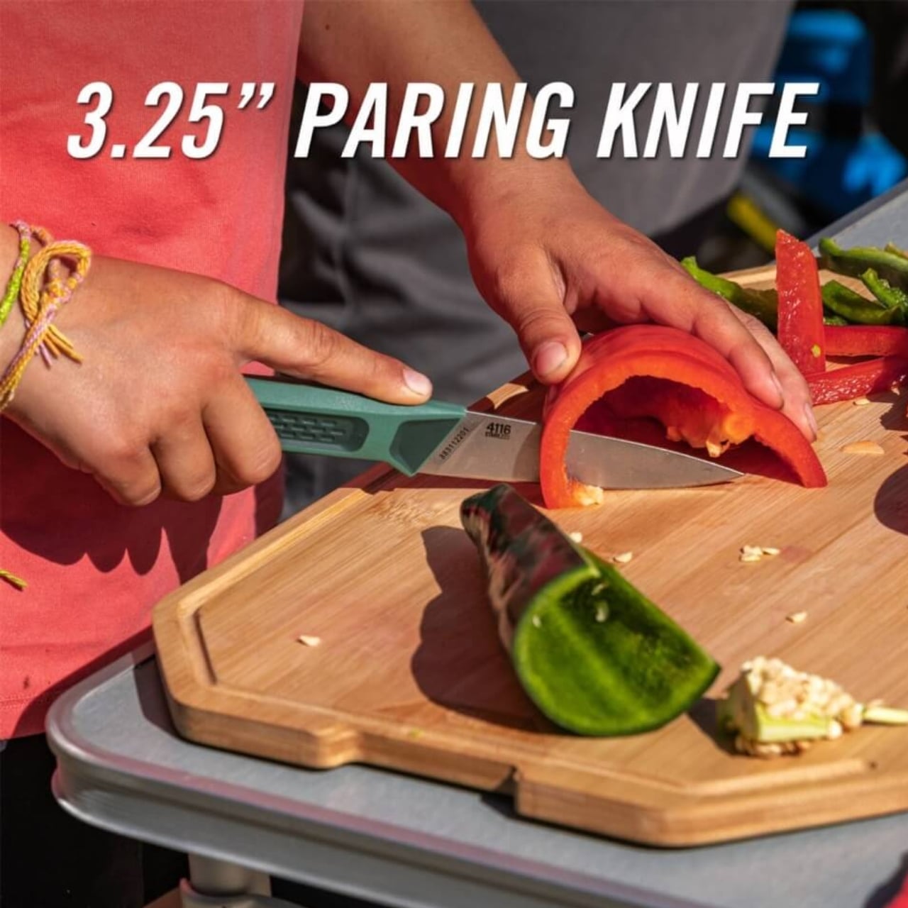
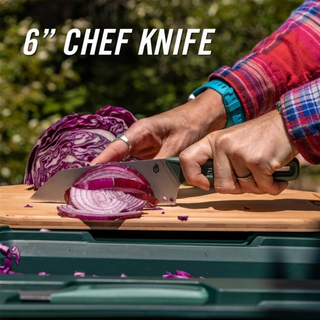
The whole thing starts with two cutting boards. One is bamboo, measuring about 9.6 by 15.6 inches, and the other is polypropylene, slightly smaller at 8.9 by 14.3 inches. Both are dual-sided with juice grooves, which means you can flip them depending on what you’re prepping. The bamboo board gives you that nice, knife-friendly surface for vegetables and bread, while the polypropylene one handles the messier stuff like raw meat without absorbing odors or staining. It’s the kind of thoughtful detail that shows someone actually tested this thing in the real world.
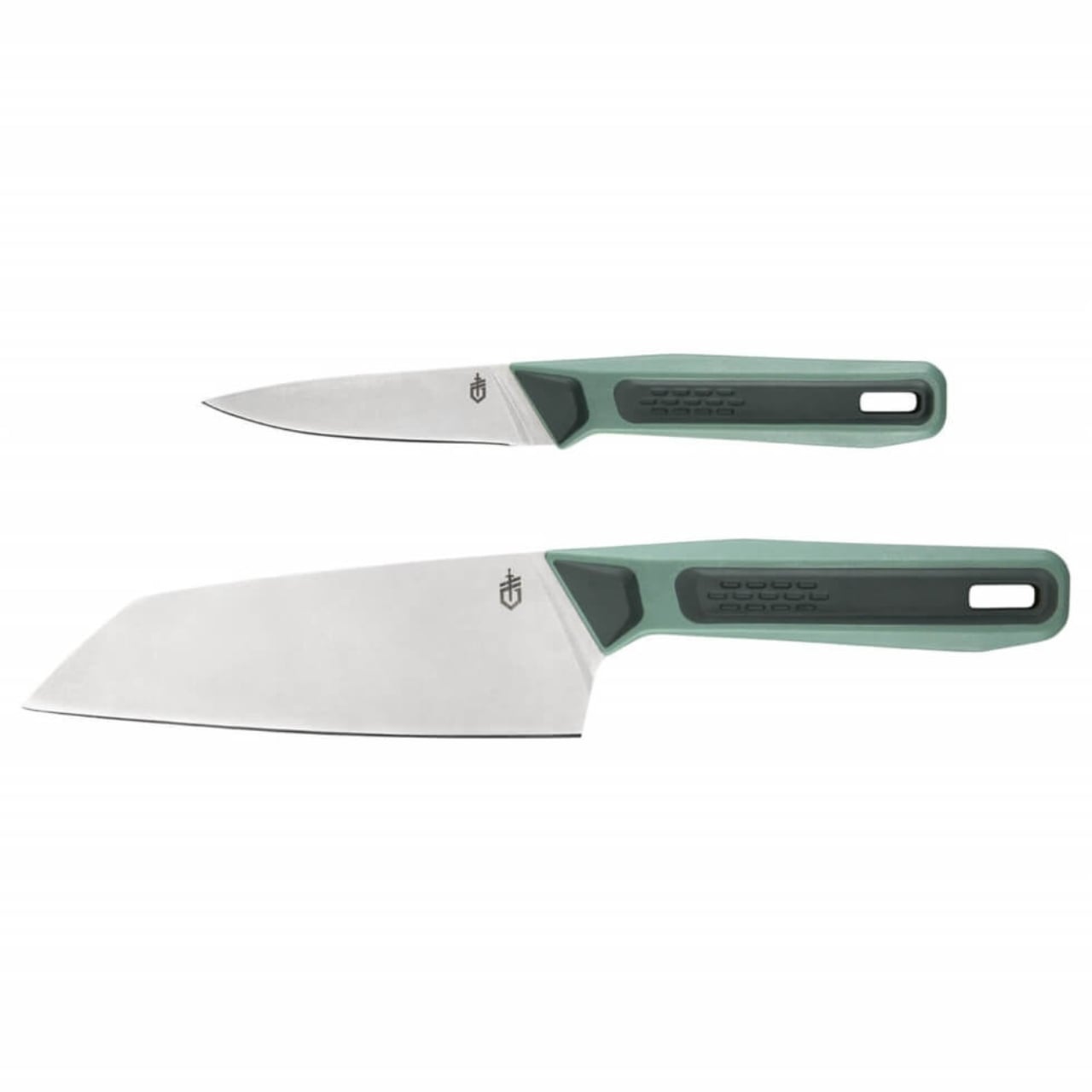
Tucked inside are two fixed-blade knives: a 3.25-inch paring knife and a 6-inch chef knife. These aren’t flimsy camping afterthoughts, either. They’re made with 4116 German stainless steel, which is corrosion-resistant and holds an edge really well. The handles are glass-filled polypropylene with a rubber overmold for grip, and there’s even a lanyard hole if you want to tether them. According to reviews, these knives are legitimately sharp, the kind you’d be happy to use in your home kitchen.
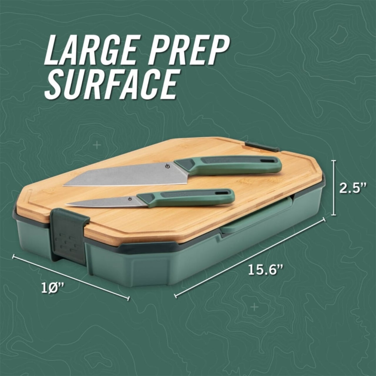
What makes this set stand out is how everything nests together. The knives fit into an inner tray, and that tray sits inside the base tray between the two cutting boards. Heavy-duty locks keep everything secure, so you’re not worried about sharp blades sliding around in your gear. When closed, the whole setup measures approximately 15.6 by 10 by 2.5 inches and weighs just over four pounds. That’s compact enough to slide into a car trunk, RV cabinet, or even a large backpack without monopolizing space.
The design is smart in those small, annoying-problem-solving ways. The cutting boards have rubber feet to keep them stable while you’re chopping on uneven surfaces, which is pretty much every surface when you’re camping. Everything is dishwasher safe, so cleanup isn’t a nightmare after a long day outdoors. And the inner tray doubles as storage for utensils or other small kitchen items, giving you a little extra organizational real estate.
Is it perfect? Well, at around $117, it’s definitely an investment. This isn’t something you casually toss in your cart unless you’re serious about outdoor cooking or you’ve had one too many experiences with bad camp knives. But if you’re the kind of person who actually enjoys making real meals while camping (or tailgating, van life-ing, or boat dwelling), the quality justifies the price. Reviews consistently mention that the knives alone make it worth it, and the fact that everything stores so neatly is a game changer.
Gerber designed the ComplEAT as part of a larger collection aimed at people who don’t want to sacrifice quality when they’re away from home. It’s for the folks who would rather grill fresh vegetables and sear a good steak over the fire than eat sad sandwiches out of a cooler. There’s something satisfying about gear that works hard and looks good doing it, and this set checks both boxes.
At its core, the ComplEAT Cutting Board Set is about solving a very specific problem: how do you bring a functional kitchen into the woods without it becoming a logistical nightmare? Gerber’s answer is elegantly simple. Pack smart, nest everything, and don’t compromise on the tools. It’s design meeting utility in the best possible way, wrapped up in a package that actually makes outdoor cooking feel less like roughing it and more like, well, eating well.
Glamping has evolved beyond simple luxury camping into a sophisticated lifestyle that demands gear as thoughtful as it is functional. The best outdoor equipment now bridges the gap between wilderness adventure and home comfort, transforming rugged landscapes into spaces where design and durability meet. These innovations aren’t just about surviving the elements—they’re about thriving within them.
The gifts featured here represent a new generation of outdoor gear that refuses to compromise. From self-inflating shelters to zero-emission speakers, each design solves real problems with elegance and ingenuity. Whether you’re shopping for the design-obsessed adventurer or the comfort-seeking nature lover, these pieces prove that beautiful living and outdoor living can be the same.
1. The Cube
Picture this: you arrive at your campsite after hours of driving, the sun dipping low on the horizon. Instead of wrestling with poles and stakes while daylight fades, you press a button and watch your shelter inflate itself in four minutes flat. The Cube transforms a tent setup from an exhausting chore into an effortless ritual, using an air tube frame system powered by a wireless electric pump that eliminates every frustrating aspect of traditional camping shelters.
What makes The Cube genuinely special extends beyond its self-setup wizardry. This tent embraces glamping’s core promise with a stretched, oversized design that prioritizes genuine comfort over bare-bones survival. The spacious interior lets you stand upright and move freely, while the modular configuration adapts whether you’re claiming solo sanctuary or hosting friends. No more hunching, no more gear tetris, just airy living space that feels more boutique hotel than backcountry bivouac.
What we like
The four-minute inflation time eliminates setup stress entirely
The spacious, oversized interior offers actual standing room and breathing space
Modular design adapts seamlessly from solo trips to group adventures
No poles, stakes, or complicated threading required
What we dislike
Relies on battery power for the electric pump
Potential vulnerability if the air tube system gets punctured
Higher price point than traditional pole tents
Requires more storage space when deflated due to the pump equipment
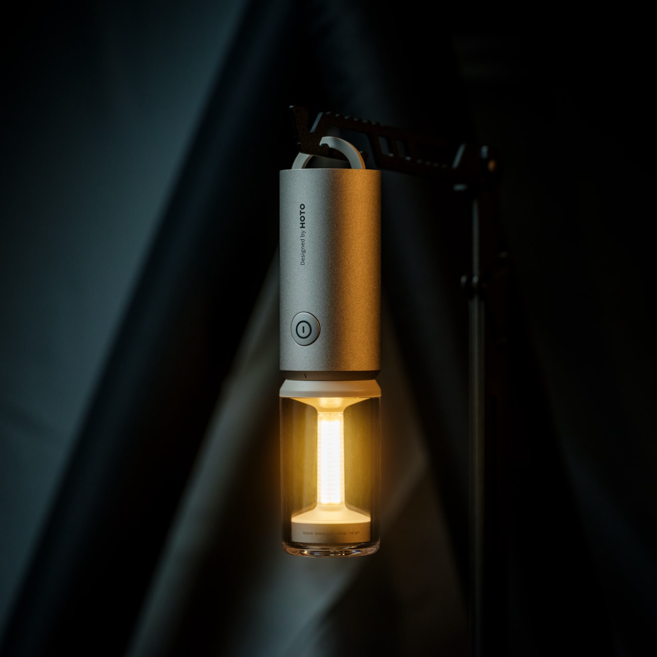
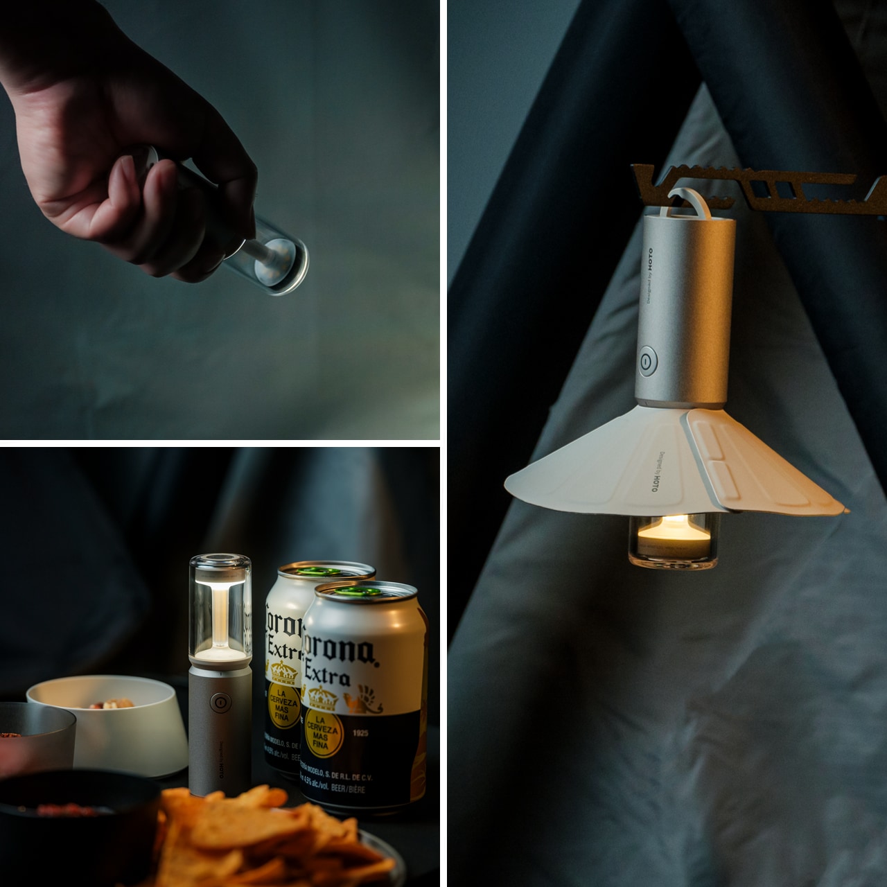
2. TriBeam Camplight
Most camping lights force you to choose between functionality and atmosphere, but the TriBeam Camplight refuses that compromise. This award-winning design delivers three distinct lighting modes—camping, ambient, and flashlight—all controlled by a single intuitive button. The brilliance lies in how it adapts: soft 5-lumen glow for intimate cabin evenings, focused 180-lumen beam for midnight trail navigation, all running up to 50 hours on one charge.
At just 12.8 centimeters tall and 135 grams, this compact powerhouse slips into jacket pockets and disappears into backpacks until the moment you need it. The detachable magnetic lampshade transforms harsh direct light into diffused ambient warmth, while the hidden handle tucks away until you want to hang it from branches, tent loops, or gear bags. It’s portable lighting that thinks like furniture, engineered to become part of your outdoor experience rather than just illuminate it.
Three lighting modes handle every outdoor scenario imaginable
Runs up to 50 hours on a single charge
Weighs only 135 grams and fits in pockets
Magnetic lampshade attachment creates instant ambiance
What we dislike
Single-button control might require cycling through unwanted modes
Magnetic attachment could separate accidentally during transport
Limited brightness compared to heavy-duty expedition lights
Small size makes it easy to misplace in crowded campsites
3. DraftPro Top Can Opener
Award-winning Japanese designer Shu Kanno understood something crucial: the vessel changes the beverage. DraftPro Top Can Opener completely removes the top of any can, transforming it into a smooth-edged, wide-mouth drinking experience that lets you catch every aromatic note and flavor nuance. That first crisp snap becomes an intentional moment, elevating beer, sparkling water, or cocktails from convenient refreshment to sensory experience worth savoring.
The genius extends beyond enhanced tasting. Drop ice cubes directly into your can for instant chilling on sweltering days when the cooler isn’t cutting it. Mix cocktails right in the can without shakers, glassware, or cleanup. The universal fit works with domestic and international cans, while the lightweight, portable design packs easily for any adventure. Used cans become mini planters or organizers thanks to the clean cut, adding sustainable versatility to everyday utility.
Removes the entire top for a draft-style drinking experience
Allows adding ice directly for faster cooling
Enables cocktail mixing without extra glassware
Universal compatibility with various can sizes
What we dislike
Creates sharp edges if not used carefully
Single-purpose tool that only works with cans
Requires proper technique to achieve a smooth cut
Small design means it’s easy to lose in camping gear
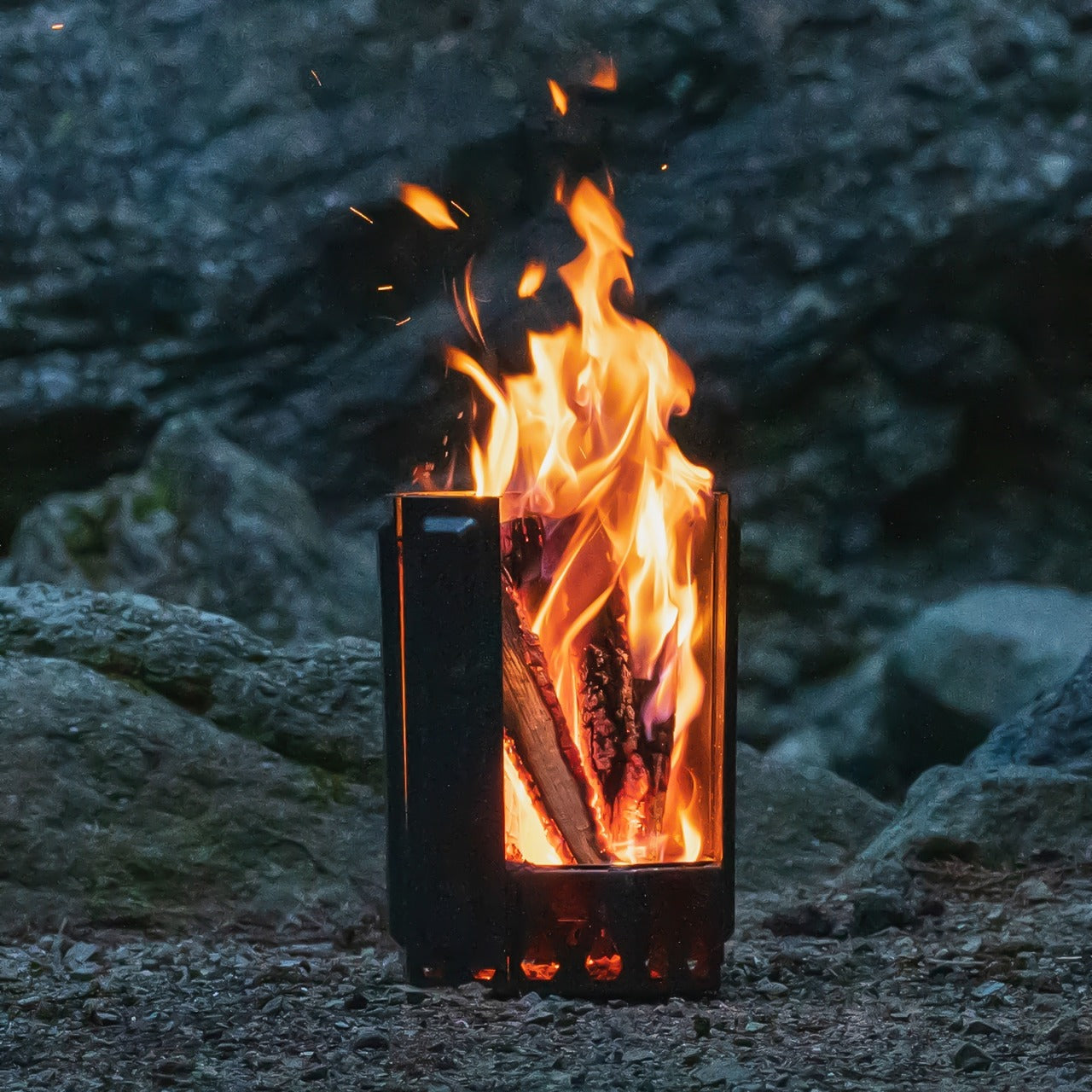
4. Airflow 8-Panel Fire Pit
Sanyo Works drew on decades of metal processing expertise to create a fire pit that solves outdoor fires’ most persistent annoyances. The revolutionary 8-panel removable design gives you unprecedented control over fire intensity through adjustable secondary combustion. Strategic holes at each panel’s bottom channel fresh air directly to the base for primary combustion, while heated air rises through double-walled cavities and exits from top holes, creating efficient secondary combustion that dramatically reduces smoke.
Want high-intensity heat for cooking or cold nights? Enclose the fire with all panels to maximize secondary combustion and efficiency. Prefer a gentler, more open flame for ambiance? Remove panels to reduce intensity while maintaining clean burning. The engineered airflow ensures complete wood combustion, eliminating the typical smoky inconvenience that has campers constantly repositioning. This design delivers warmth and mesmerizing flame dance without respiratory irritation or smoke-dodging, letting you focus entirely on the moment.
Adjustable panel system offers complete fire intensity control
Engineered airflow produces minimal smoke
Secondary combustion creates hotter, more efficient burning
Easy cleanup thanks to complete combustion design
What we dislike
Eight removable panels create multiple pieces to track
Heavy metal construction reduces portability
Higher cost than standard fire pits
Requires a learning curve to optimize panel configuration
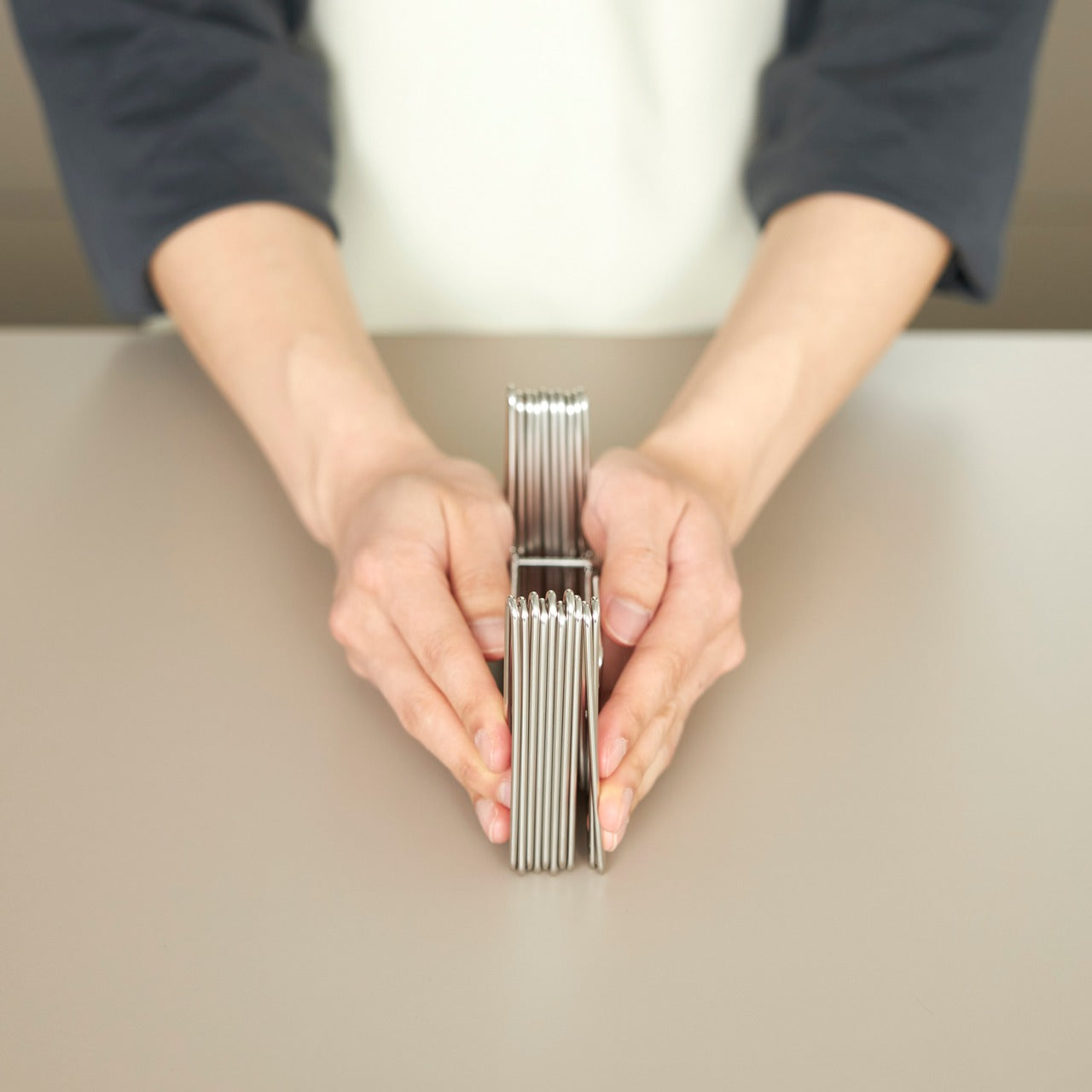
5. Slim Fold Dish Rack
This patent-pending innovation collapses the eternal camping cleanup struggle into something almost elegant. A brilliant spring mechanism shrinks this 14-inch dish rack down to a mere 1.2 inches in one second flat, with deployment equally instantaneous. The minimalist design ensures sufficient ventilation and space for plates, utensils, and cookware of any size, while the collapsed form becomes so compact it literally fits in pockets.
Whether you’re glamping outdoors or maximizing tight kitchen quarters, this collapsible dish rack ensures tableware and cutlery dry thoroughly and quickly. The durable construction handles camping’s rough-and-tumble reality without sacrificing the sleek aesthetic that makes it equally at home in modern kitchens. Easy to clean and dishwasher-friendly, it eliminates the bulky permanence of traditional dish racks while delivering the same functionality in a package you can take anywhere.
Collapses from 14 inches to 1.2 inches in one second
Patent-pending spring system ensures reliable deployment
Pocket-sized when collapsed for ultimate portability
Dishwasher-safe for easy cleaning
What we dislike
The spring mechanism could potentially wear over time
Limited capacity compared to full-size dish racks
Collapsed form requires careful storage to prevent accidental deployment
Premium price for what’s essentially a drying rack
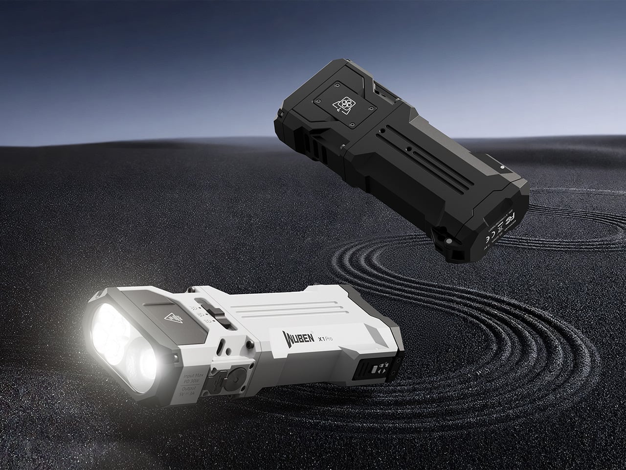
6. WUBEN X1 Pro Flashlight
The WUBEN X1 Pro refuses to be just another flashlight, delivering 13,000 lumens of combined flood and spot light through an angular aluminum alloy body that feels substantial and purposeful in your hand. Smart cooling technology keeps things running smoothly under heavy use, while the sculpted lines and one-handed grip remain easy to hold even with thick gloves during frigid expeditions.
At 383 grams and just under 14 centimeters long, this powerhouse fits in jacket pockets or bike bags without creating annoying bulk. The rugged construction handles whatever the night throws at it, from emergencies to extended exploration. As a bonus, it functions as a power bank to charge your phone when you’re far from outlets, making it an essential gear that serves multiple critical functions without fail.
What we like
13,000 lumens provide exceptional illumination power
Smart cooling prevents overheating during extended use
Doubles as a phone charger for emergencies
Compact size despite serious output capability
What we dislike
High lumen output drains the battery relatively quickly
383-gram weight feels heavy for ultralight backpackers
Premium flashlights require a significant investment
A powerful beam might be overkill for casual camping
7. Battery-Free Amplifying iSpeakers
This ingenious metal smartphone speaker achieves something remarkable: amplified sound without batteries or electricity. Simply place your smartphone inside and let amplified sound waves spread your favorite music throughout the room. Made from vibration-resistant Duralumin—the same material used in aircraft construction—and designed using the golden ratio, this speaker enhances both your phone’s audio and your space’s ambiance.
The portable, no-power design means you can use it literally anywhere without worrying about charging or battery life. The Duralumin construction ensures the speaker itself won’t vibrate sympathetically, maintaining audio clarity while amplifying volume naturally through acoustic design alone. Compatible with optional +Bloom and +Jet mods for directing sound, it offers customization for those who want to fine-tune their listening experience while maintaining the core battery-free philosophy.
Optional mods allow customization for different spaces
What we dislike
Amplification is limited compared to powered speakers
Only works with smartphones, not other devices
Fixed amplification means no volume control
Modern phone sizes might not fit all models
8. Compact Modular Grill Plate
This adaptable metal grill plate transforms outdoor cooking from frustrating guesswork into reliable culinary performance. A brilliant three-layer steel plate design ensures even heat conduction across the entire surface, cooking food uniformly while maintaining juiciness for perfect steaks and dishes. The modular approach lets you swap handles depending on your situation, whether you’re working over unstable bonfires or using induction stoves at basecamp.
What separates this from standard camping cookware is its refusal to compromise. Even heat distribution means food cooks properly without hot spots or raw centers, while the compact form packs down for easy transport. Available in Basic and Special sets, it accommodates different cooking ambitions without unnecessary bulk. Compatible with various heat sources, including campfires, gas burners, and induction stoves, this grill plate adapts to you rather than forcing you to adapt to it.
Three-layer construction delivers superior heat distribution
Interchangeable handles adapt to different cooking situations
Compatible with multiple heat sources, from bonfires to induction
Compact packing size despite cooking surface area
What we dislike
Multi-piece design creates more items to pack
Steel construction adds weight to camping loads
Learning curve to master heat management
Premium sets command higher investment
9. Iron Frying Plate
JIU eliminates the middleman: the frying pan becomes your plate, letting you enjoy meals immediately after cooking them. This rust-resistant, uncoated cookware brings out exceptional flavors and textures through pure iron-to-food contact without chemical coatings interfering. Made from 1.6mm-thick mill scale steel, it arrives ready to use straight from the box, defying cast iron’s typical seasoning requirements.
The wooden handle attaches and detaches with one hand, transforming the cooking vessel into a serving plate in seconds. This beautiful boundary-blurring between cooking and eating creates intimacy with your food while eliminating cleanup steps. Rust-resistant and stick-resistant properties mean the plate maintains its character without constant maintenance, while the handsome design makes serving directly from this cookware feel intentional rather than lazy. It’s culinary efficiency meets aesthetic pleasure, wrapped in durable steel.
Rust-resistant construction eliminates maintenance headaches
What we dislike
The hot plate requires care when transitioning to eating
Single-serving size limits group meal flexibility
Iron construction retains heat, creating a burn risk
An uncoated surface still requires a proper cleaning technique
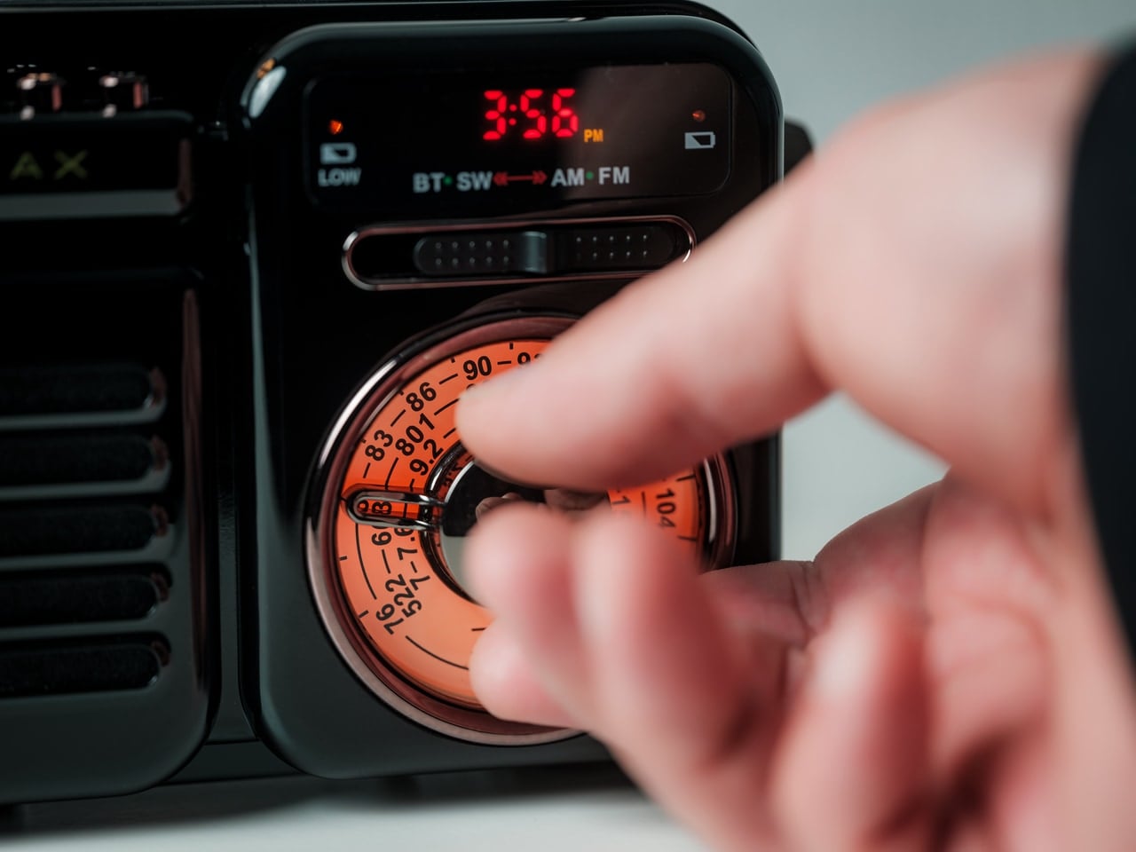
10. RetroWave 7-in-1 Radio
Behind its retro Japanese design and tactile tuning dial, the RetroWave 7-in-1 Radio packs serious contemporary functionality. This device serves as a speaker, MP3 player, radio, flashlight, clock, power bank, and SOS siren—designed to handle everything from daily listening to emergencies. Stream music over Bluetooth like modern life, tune into AM, FM, or shortwave stations like decades past, or rely on its emergency features when circumstances demand.
The 2000mAh battery recharges via hand-crank or solar panel when outlets disappear, while the built-in flashlight and SOS alarm provide critical safety functions. Stream from your phone, play music from USB or microSD cards, or catch local broadcasts without internet. Lightweight construction belies its capability: up to 20 hours of radio time or 6 hours of emergency lighting on full charge. Whether it’s glowing softly on your kitchen shelf during morning coffee or providing the only working station during a blackout, this radio adapts seamlessly to wherever life takes you.
Multiple charging options, including solar and hand-crank
Emergency features provide genuine safety value
Retro design looks beautiful in any setting
What we dislike
The 2000mAh battery offers limited phone charging capability
Hand-crank charging requires significant effort
Multiple functions create complexity for simple tasks
Retro aesthetic might not suit modern minimalist spaces
Final Thoughts: Where Design Meets the Great Outdoors
These ten gifts represent glamping’s evolution into a sophisticated design category where aesthetics and functionality refuse separation. Each piece solves genuine problems with intelligence and style, proving that outdoor gear can be beautiful, thoughtful, and uncompromising. They transform camping from an endurance test into a curated experience, where every detail enhances rather than distracts from nature’s magnificence.
For the glamping enthusiast in your life, these designs offer something beyond typical outdoor equipment—they provide tools that respect both their love of wilderness and their appreciation for considered design. Whether it’s a self-inflating tent, a zero-battery speaker, or a seven-function emergency radio, each gift here redefines what it means to live well outdoors in 2025.
Look, I’ve lost my glasses in some pretty creative places. Between the couch cushions. On top of my head while frantically searching for them. In the fridge once (don’t ask). And I know I’m not alone in this very specific modern anxiety: that moment when you take your glasses off and suddenly have nowhere to put them that won’t end in disaster.
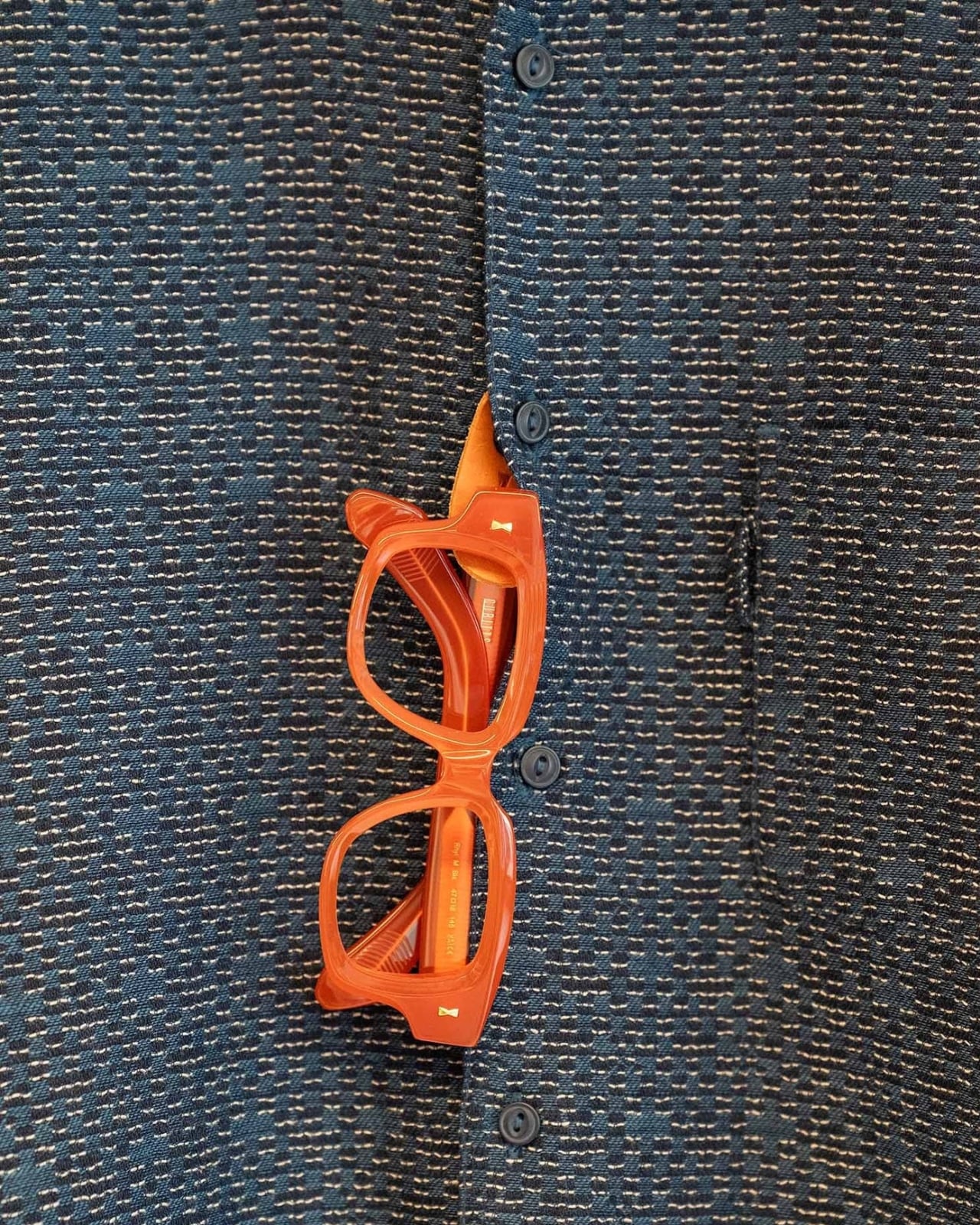
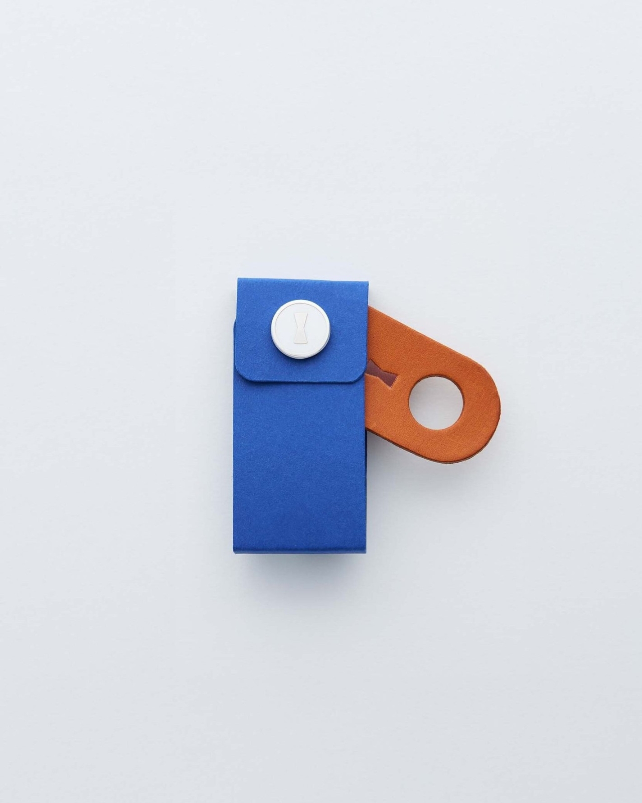
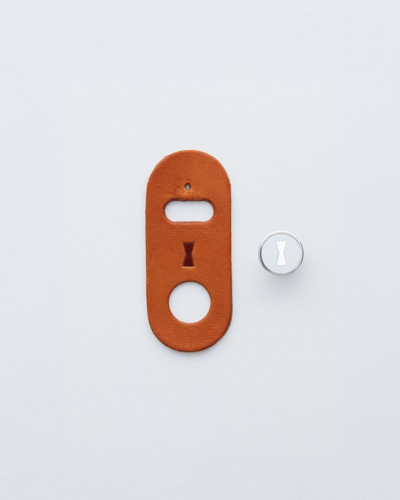
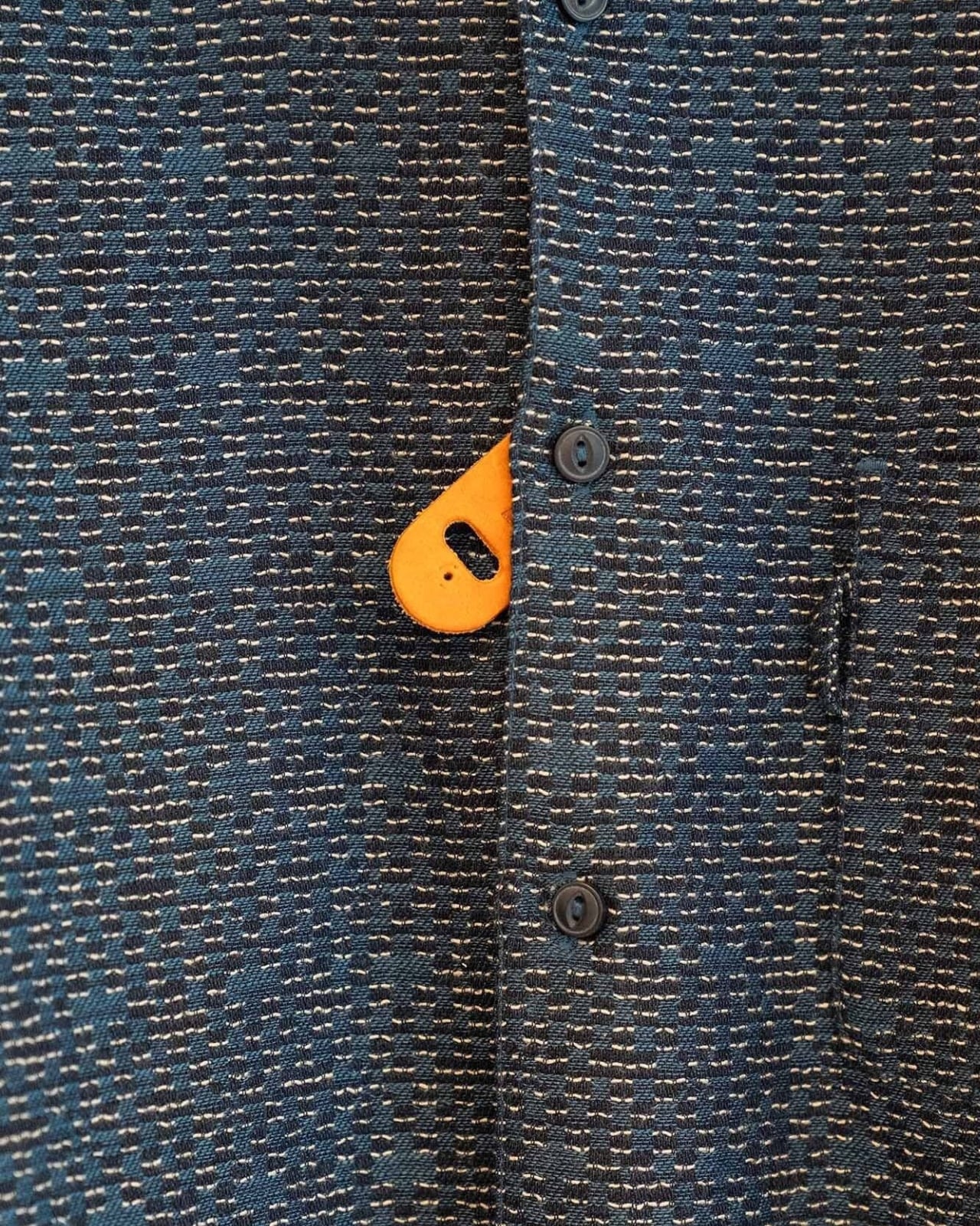
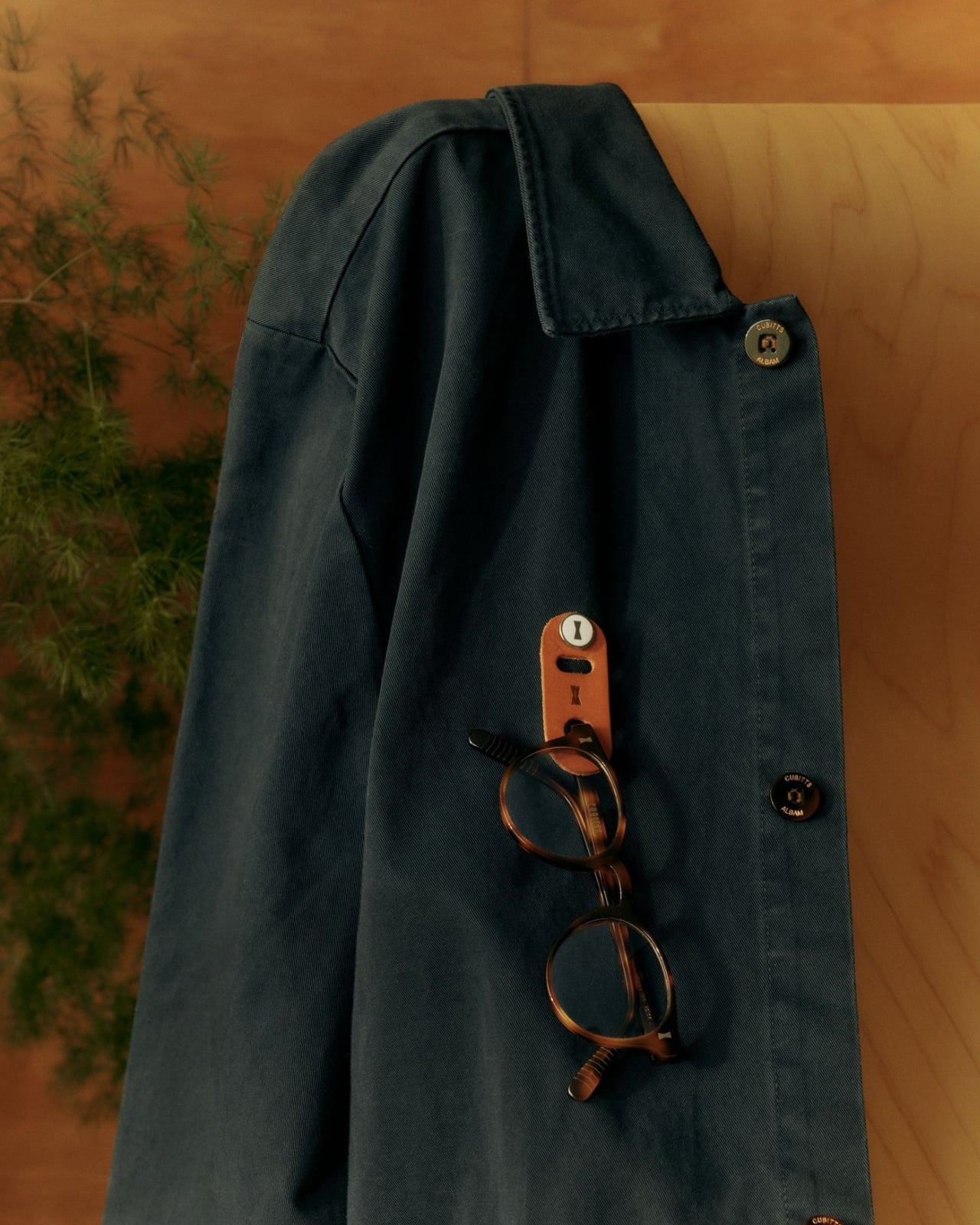
Cubitts, the London-based eyewear brand that’s been quietly revolutionizing how we think about spectacles, has come up with a solution so elegantly simple you’ll wonder why no one thought of it sooner. It’s called On The Wing, and it’s basically a small leather loop that attaches to any button on your shirt. That’s it. That’s the whole thing. And somehow, it’s brilliant.
Made from supple vegetable-tanned leather, On The Wing transforms whatever you’re wearing into a temporary perch for your frames. It’s designed for those in-between moments when you’re not wearing your glasses but don’t want to commit them to a case or risk the inevitable “left them at the restaurant” panic. You slip the loop onto a button, hang your glasses from it, and go about your business. No stretched-out necklines from hanging them on your collar. No bulging pockets. No setting them down on a table and walking away without them.
The design came out of a collaboration between Cubitts and industrial designer Daniel Weil, part of a broader collection of accessories that share the brand’s philosophy: functional, beautiful, and made to last. Weil has spent decades thinking about how objects interact with daily life, and you can feel that consideration in On The Wing’s simplicity. It’s barely visible when you’re wearing it, but always there when you need it.
What I love about this is how it acknowledges a real problem that glasses wearers deal with constantly. If you wear glasses full-time, you know the dance. You take them off to look at your phone up close, or to rub your eyes, or because you’re transitioning from reading to eating. And then what? Do you set them on the table where they’ll get scratched? Balance them precariously on your head? Shove them in a pocket where they’ll get smudged or bent?
The thing is, glasses have become such an integral part of personal style. People spend serious time choosing frames that reflect their aesthetic, whether that’s vintage-inspired, minimalist, or boldly contemporary. Cubitts understands this better than most brands. Their frames are designed to be enduring companions, repaired and serviced over many years rather than treated as disposable fashion. So it makes sense that they’d think about what happens to your glasses when they’re not on your face.
On The Wing costs about $14 and comes in a few colors to match different wardrobe aesthetics. It’s the kind of accessory that feels almost too simple to be worth it until you start using it and realize how much mental energy you were spending on the where-do-I-put-my-glasses question. There’s something charmingly analog about the solution too. In a world where every problem seems to require an app or a gadget with a battery, here’s a piece of leather and a button doing exactly what they need to do. No charging required. No setup. No learning curve.
Will a leather loop on your shirt button change your life? Probably not. But will it solve a small, persistent annoyance in a way that feels considered and well-designed? Absolutely. And sometimes that’s exactly what good design should do: notice the little frustrations we’ve all accepted as normal and offer something better. For anyone who’s ever patted down their pockets in a panic or retraced their steps through a entire building looking for their glasses, On The Wing makes a lot of sense. It’s the kind of simple solution that feels obvious in retrospect, which is usually the mark of genuinely smart design.
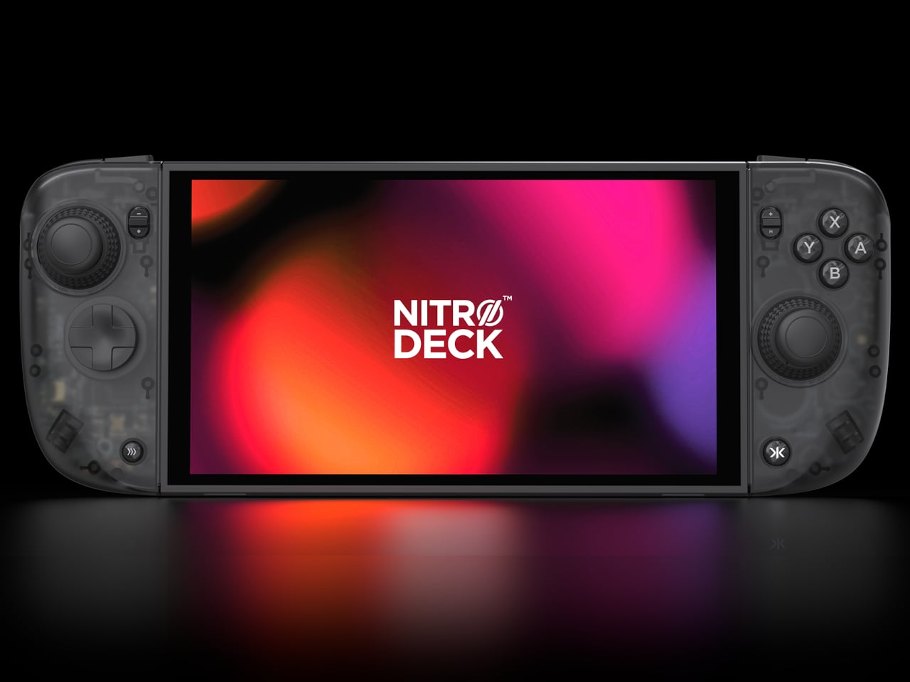
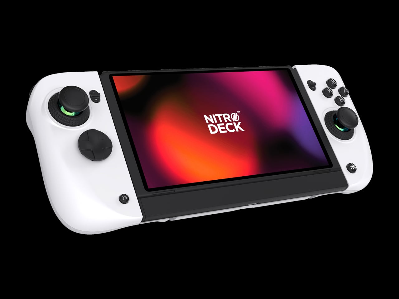
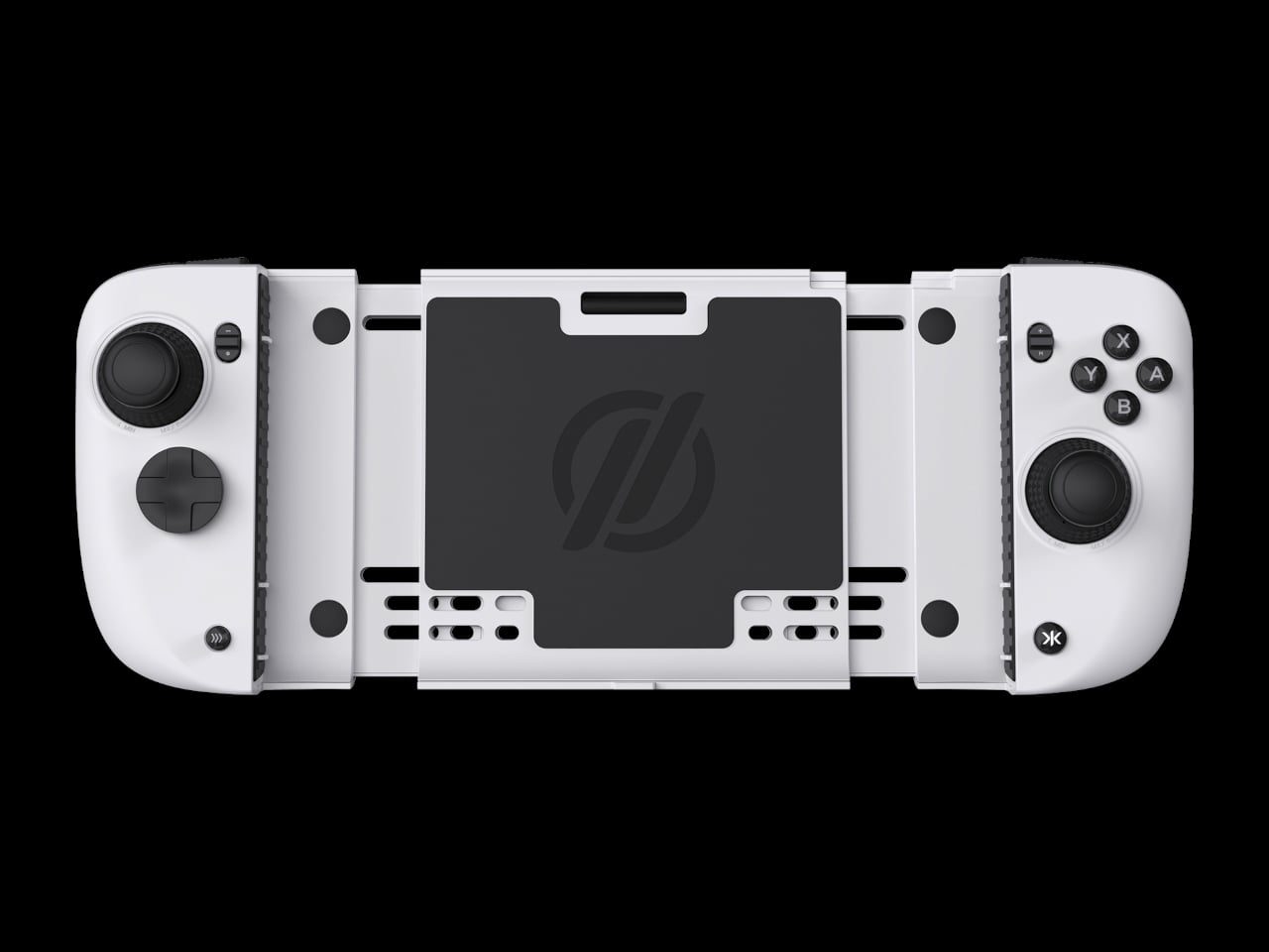
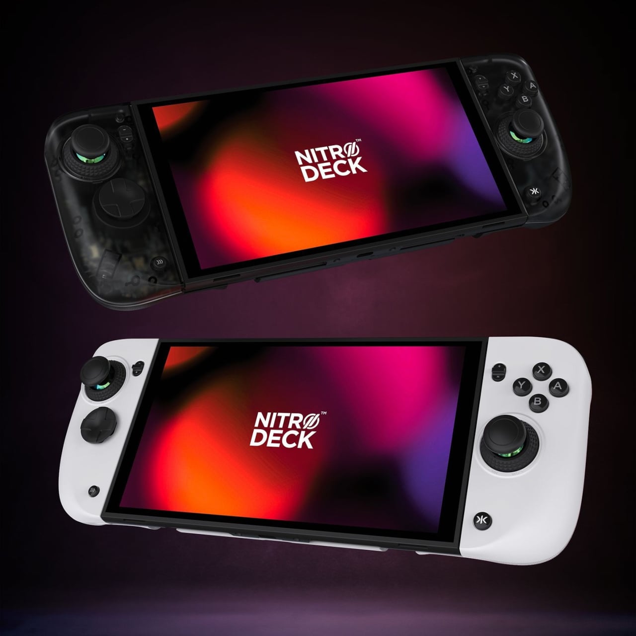
The first Nitro Deck and similar shells made the Nintendo Switch feel more like a proper controller, but they were still mostly one-trick grips that lived in handheld mode. With the Switch 2 looming, there is a chance to rethink what a deck shell should be, not just for Nintendo’s next handheld but for PC, mobile, and TV play. Nitro Deck 2 is CRKD’s answer, expanding the idea from grip to multi-platform controller.
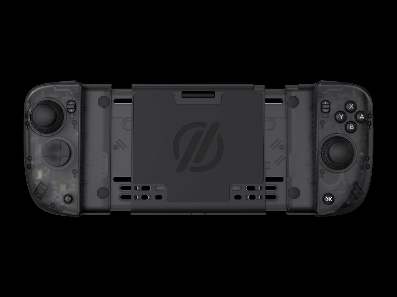
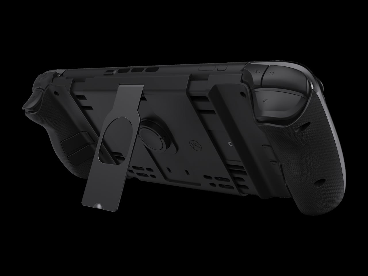
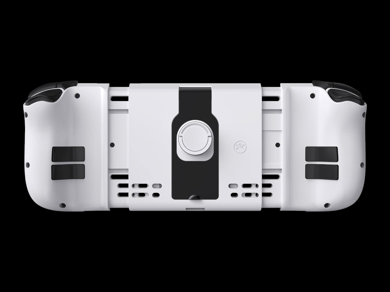
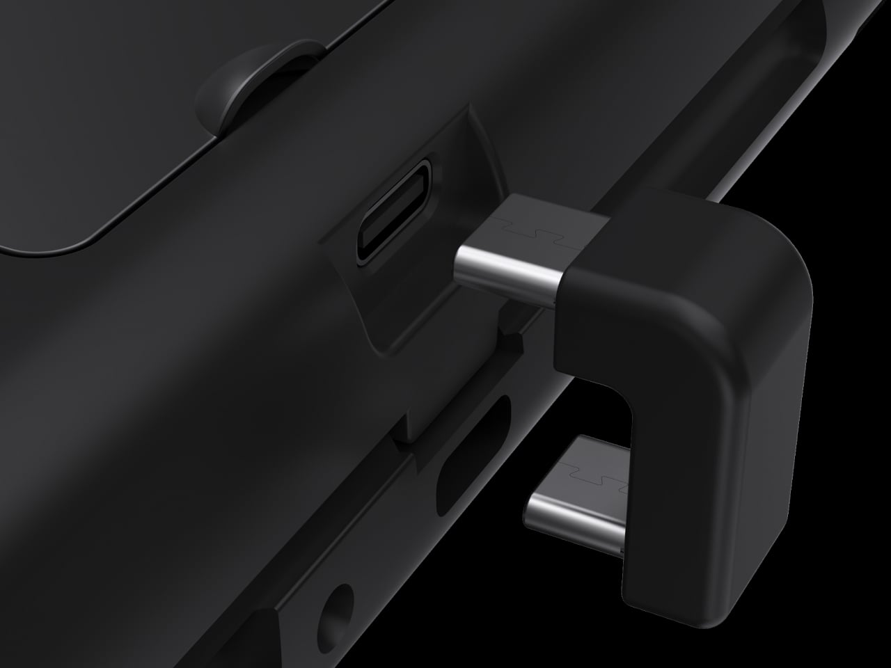
CRKD frames it as a completely new product engineered for the Nintendo Switch 2 and fully backward compatible with the Switch and the Switch OLED, with redesigned ergonomics and expanded versatility across PC, mobile, and smart TVs via Bluetooth and USB. It holds your console for handheld play, but the removable centerpiece lets it convert into a standalone pro-style controller when the console is docked, which is the big conceptual shift from shell to system.
CaptiStick is a capacitor-based, zero-contact sensor design meant to eliminate stick drift and deliver long-lasting precision with no electromagnetic interference. That is CRKD’s alternative to traditional potentiometer sticks that wear out, and Hall Effect sticks that rely on magnets. Nitro Deck 2 also adds adjustable thumbstick resistance and deadzone, tunable through the CRKD Companion App, so you can dial in how loose or tight the sticks feel depending on the game.
The new retractable locking dial mechanism secures the console and keeps the shell compatible with the original Switch and OLED models, with a legacy adapter included. This is a direct response to fit issues from the first Nitro Deck, and it means Nitro Deck 2 survives console generations. The dial gives you a way to adjust clamping force and fit without swapping the whole shell when Nintendo changes dimensions.
The expanded control set includes extra bumper buttons (L2 and R2), remappable back buttons, smooth tactile digital triggers, and toggle buttons for plus, minus, record, and macro. Nitro Deck 2 supports motion controls and adjustable vibration feedback for supported games, plus Turbo Mode for rapid inputs. The idea is to give you more inputs and a better feel than Joy-Cons or a stock Pro Controller, especially for long sessions.
Nitro Deck 2 connects over Bluetooth or wired USB to PC, mobile, and select smart TVs when the console is not installed, acting as an extra pro-style controller. The CRKD app includes its True Collection System for tapping and registering your hardware and CTRL for customizing sticks, vibration, and firmware. It is part collectible, part tuning tool, making the hardware feel like it lives in a broader ecosystem.
Nitro Deck 2 moves the idea of a Switch shell from a simple grip to a long-term controller investment that survives console generations. It is still a pre-order product with questions around weight and battery life, but the combination of CaptiStick, a retractable locking dial, and a removable centerpiece suggests a different kind of accessory, one that grows with your setup instead of getting replaced every time Nintendo ships new hardware.