E-ink Vocabulary Card E2 Fits Language Learning Into a Gum Pack

Most language learning apps live on phones, competing with notifications, social media, and every other distraction fighting for your attention. Opening Duolingo between classes usually turns into five minutes of vocabulary followed by twenty minutes of scrolling through feeds you’ve already checked twice. Designers are starting to build tiny, single-purpose devices that turn fragmented time into focused practice instead of another excuse to stare at your phone screen until your eyes hurt.

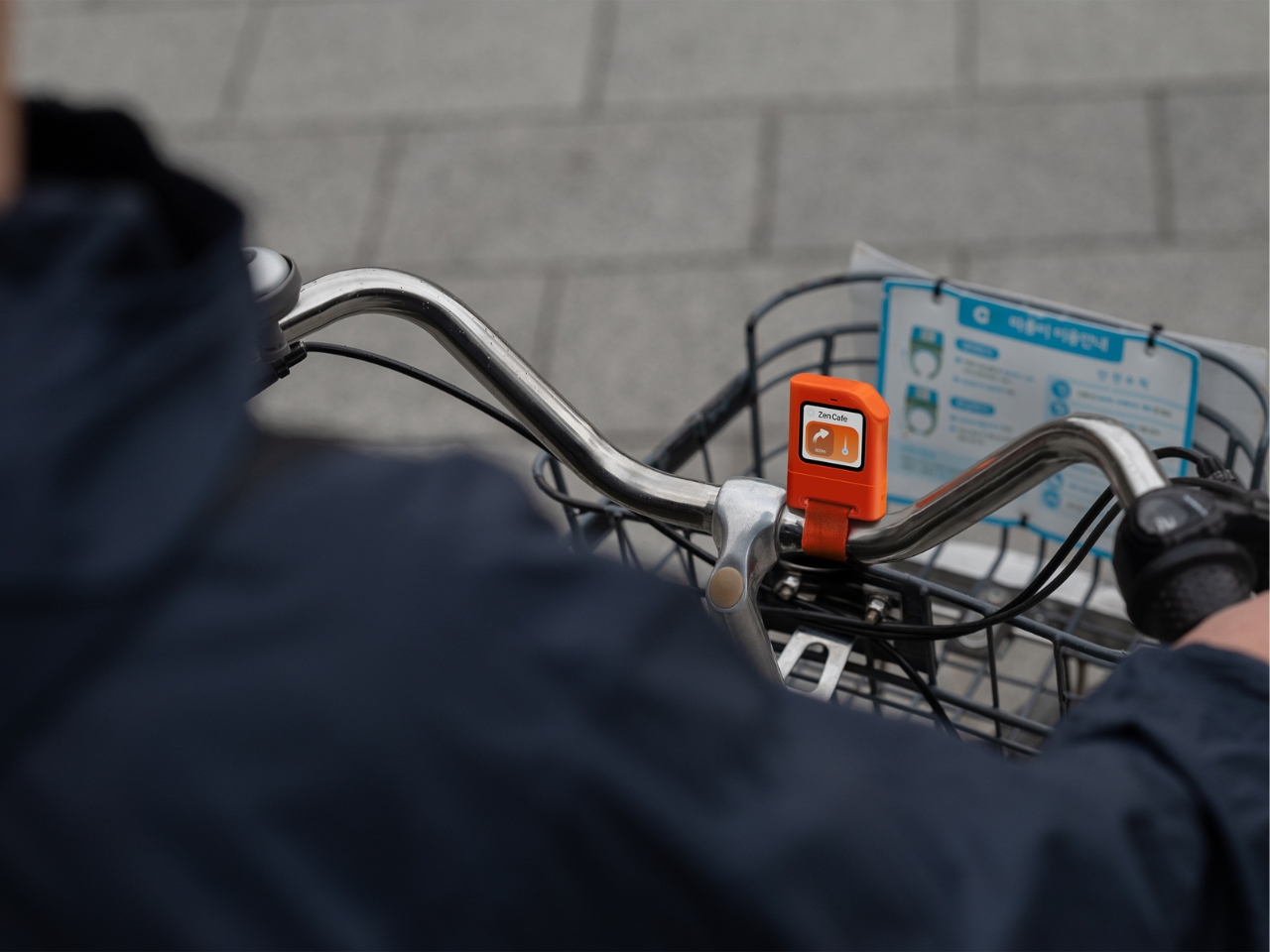
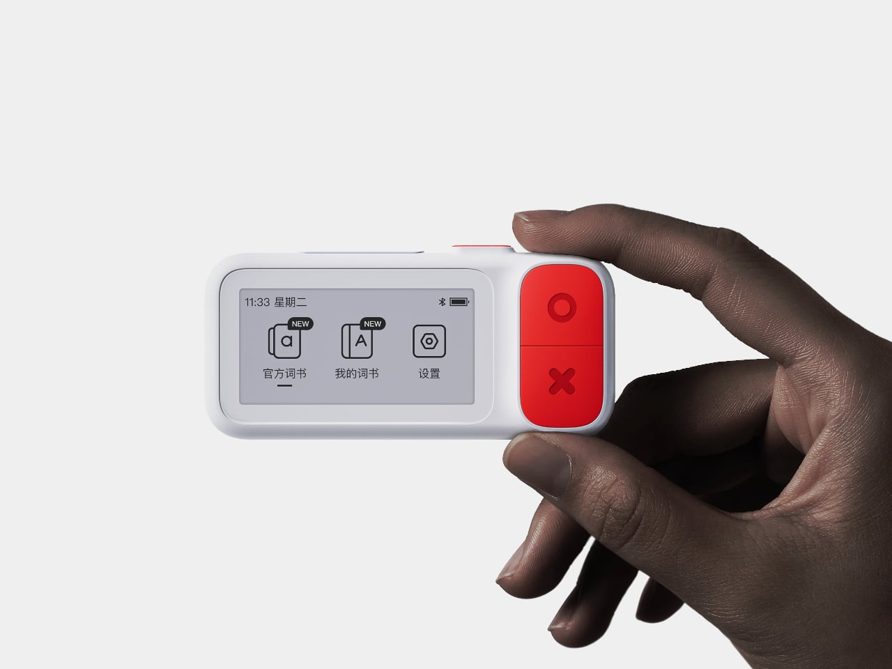
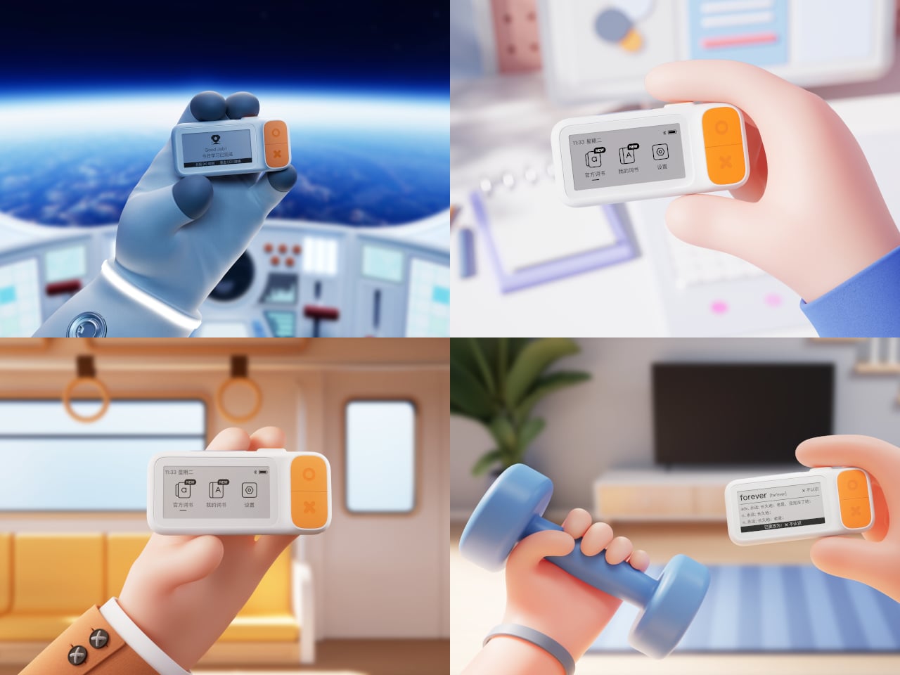
The E-ink Vocabulary Card E2 is one of those tools, a chewing-gum-sized e-ink vocabulary device aimed at students but usable by anyone learning a new language. It pairs with a phone via Bluetooth to pull in study materials and memory modes from an app, then lets you review words on a 2.7-inch e-ink screen without opening your phone. It’s small enough to live in a pocket yet designed to feel like a dedicated learning tool.

Designer: DPP .

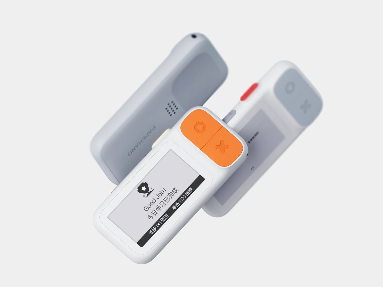
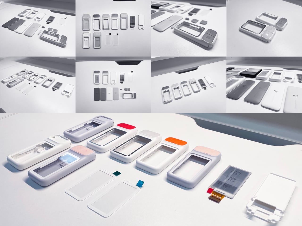
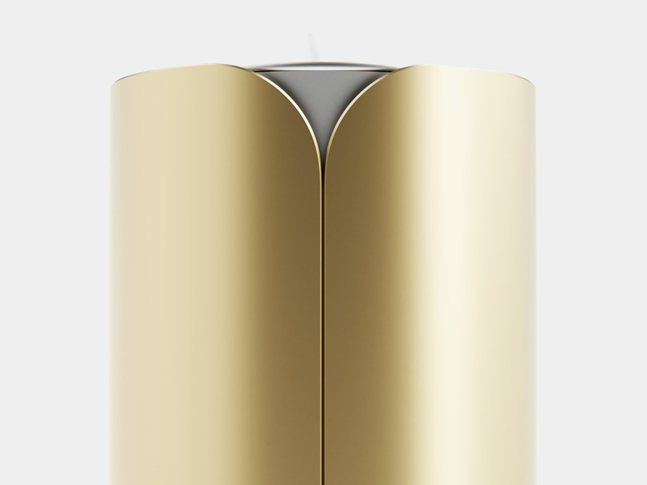
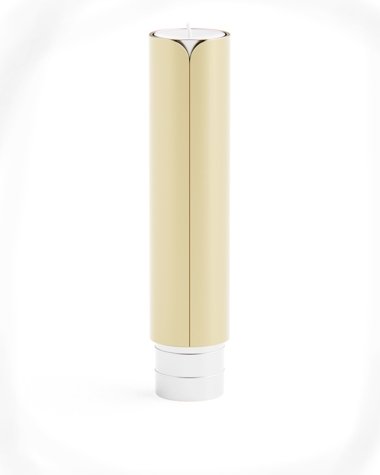
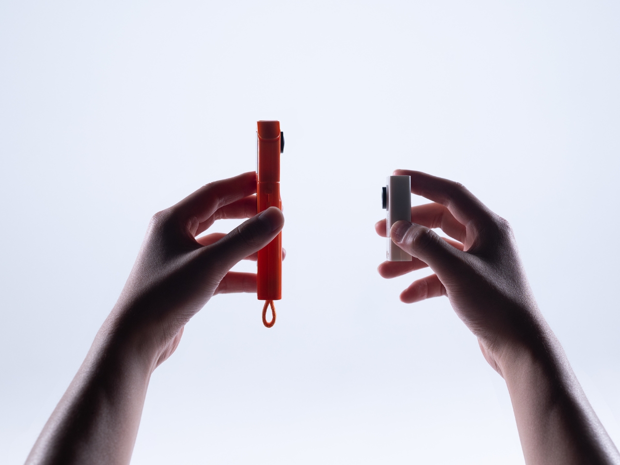
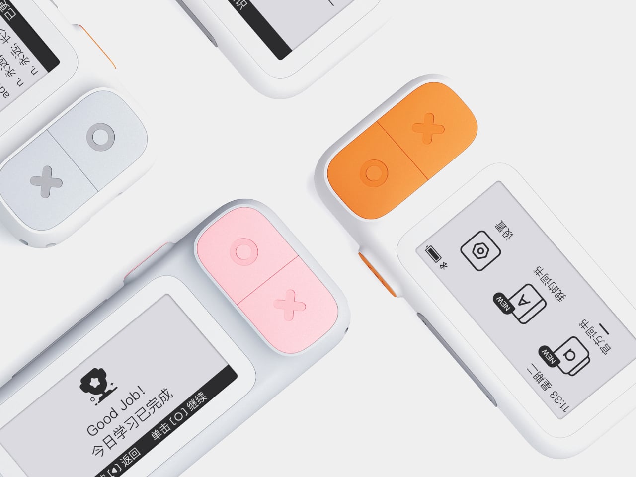
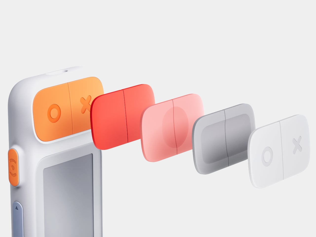
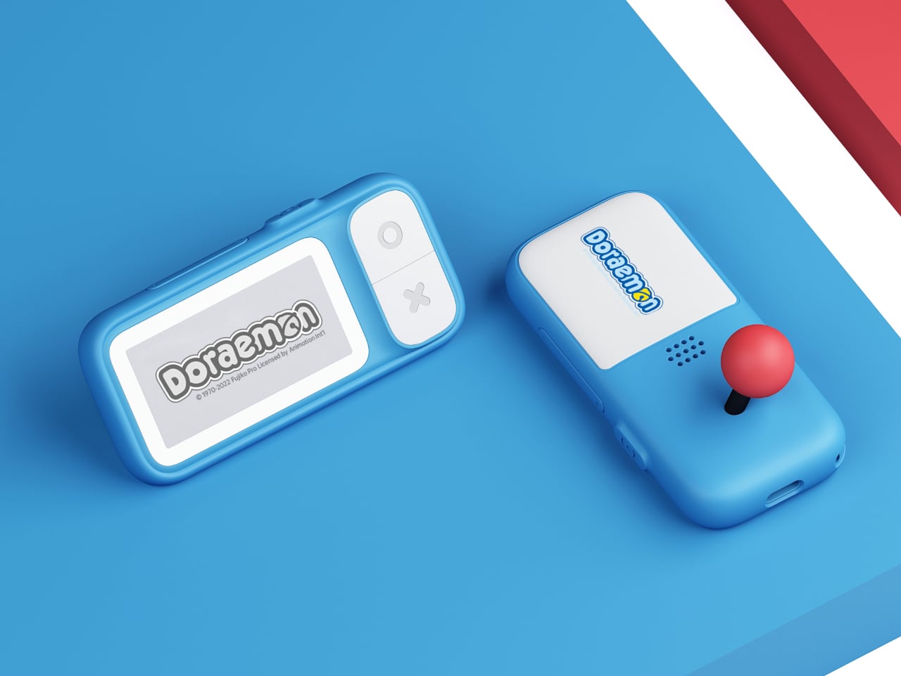
The form factor is remarkably simple. A slim rectangular bar about the size of a pack of gum, weighing only thirty grams. Rounded corners, soft edges, and a two-tone color scheme in orange, pink, green, or grey make it look friendly and approachable. The main action button is tilted at five degrees, tuned for thumb reach when you hold it in one hand, while the simple layout keeps the interaction logic easy to understand.

The 2.7-inch e-ink touch screen is the real selling point. Low blue light and low radiation make it easier on the eyes than a phone, and the high contrast gives a reading experience close to paper. Because e-ink only draws power when the screen changes, the device can reach around one hundred fifty days of standby time, which means it’s always ready when you pull it out between classes or on a commute.

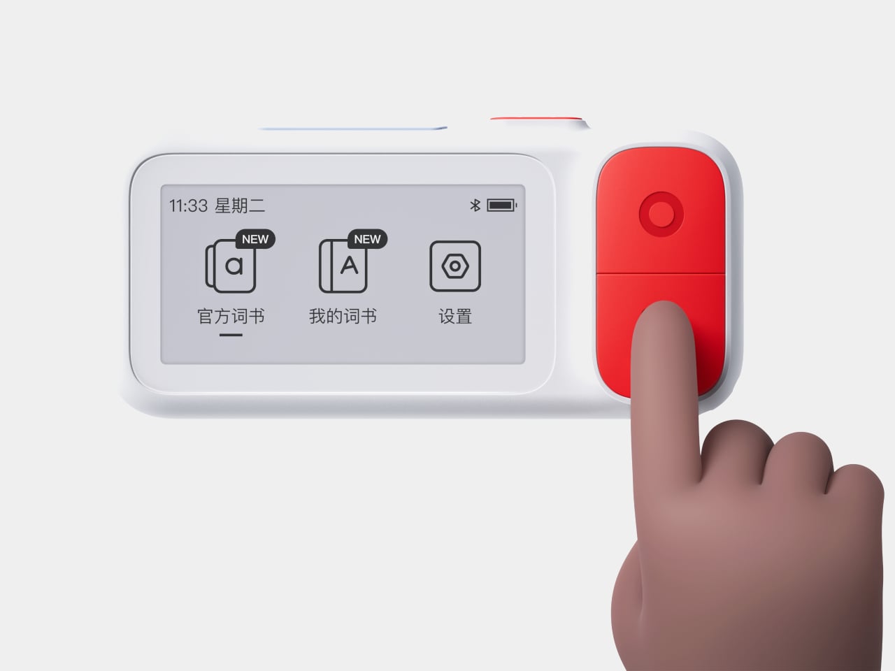
E2 connects to a mobile app over Bluetooth. The device supports nine built-in languages, and the app lets you import more content and choose different study modes or memory patterns that match your learning style. You can load word lists, practice exercises, and review sessions, then leave the phone in your bag while the card handles the actual on-the-go practice.

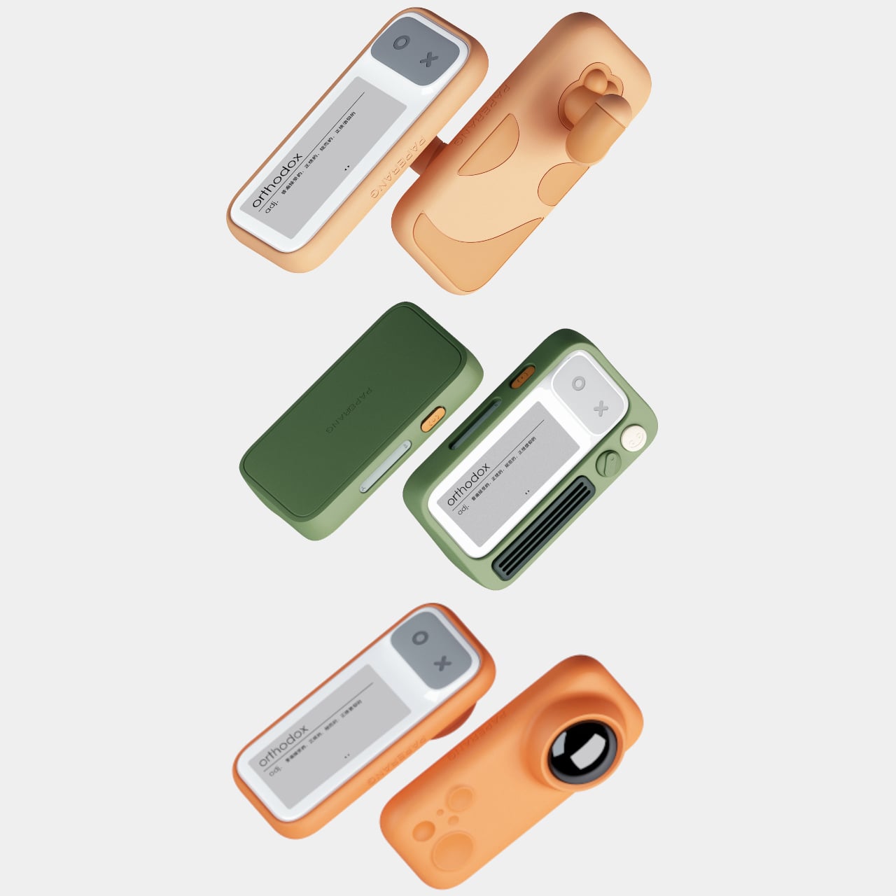
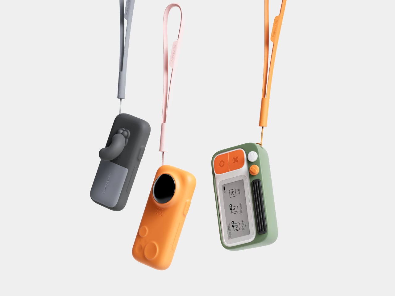
The IP68 protection rating makes the card dust-tight and waterproof enough for more adventurous use. The renders show it in a gym, on a train, and even in a futuristic space scene, reinforcing that it’s meant to live in pockets and hands without babying. A matching wrist strap accessory clips into the body, adding security and a bit of personality to the tiny device.

The visual language is intentionally soft and playful. Big icons, rounded rectangles, and cheerful colorways make it feel more like a friendly gadget than test prep gear. The E-ink Vocabulary Card E2 treats vocabulary learning like checking a notification, but without the noise of a full smartphone, turning spare seconds into small, focused steps toward fluency.

The post E-ink Vocabulary Card E2 Fits Language Learning Into a Gum Pack first appeared on Yanko Design.

This Opera House Design Has No Back and You Can Walk on the Roof

Picture an opera house that doesn’t just sit on its waterfront site but flows across it like sound waves spreading through the air. That’s exactly what Bjarke Ingels Group has cooked up for Hamburg’s new State Opera, and honestly, it’s one of those designs that makes you rethink what a cultural building can be in the 21st century.

The Danish architecture firm just won an international competition to replace Hamburg’s aging 1950s opera house with something that feels less like a fortress of high culture and more like an urban living room. Located on the Baakenhöft peninsula in HafenCity, right where the city meets the water, the new building reads as a landscape of concentric terraces that ripple outward from the central performance hall. Ingels himself describes it as terraces “emanating like soundwaves,” which is pretty poetic for a guy known for turning ideas into buildable reality.

Designer: BIG – Bjarke Ingels Group

What makes this project so interesting is how it completely ditches the traditional opera house playbook. You know the type: imposing facades, grand staircases that separate the cultured elite from everyone else, buildings that basically scream “not for you” to anyone walking by. BIG’s approach flips that script entirely. The 450,000-square-foot building is designed as what they call “a public building within a park,” where the roofscape is fully walkable and the structure has no defined back side.

Think about that for a second. An opera house with no rear elevation. Instead of creating a building that sits apart from its surroundings, the design treats the entire structure as an extension of HafenCity’s public realm. The terraced exterior becomes a landscaped garden that rises to meet the main volume, creating what amounts to a human-made topography where people can hang out, walk their dogs, or just watch the sunset over the harbor regardless of whether they have tickets to La Bohème that evening.

This democratization of space isn’t just good PR. It represents a fundamental shift in how we think about cultural institutions and their relationship to the communities they serve. Opera houses have historically been exclusive spaces, both architecturally and culturally. By making the building itself permeable and accessible, BIG is suggesting that even if you’re not an opera fan, this building still belongs to you. It’s your park, your gathering space, your piece of waterfront.

The design also responds smartly to its context. Hamburg’s existing opera house served the city well for decades, but it reflects a different era’s ideas about urban culture and public space. The new location in HafenCity, a rapidly developing waterfront district that’s become one of Europe’s largest urban regeneration projects, demanded something that could anchor a neighborhood still finding its identity. Rather than plopping down a monument, BIG created something that extends and enhances the existing urban fabric.

From a technical standpoint, the rippling terrace concept isn’t just aesthetically pleasing. It creates multiple entry points and circulation paths, distributes the building’s mass in a way that feels less imposing, and provides outdoor social spaces at various levels. The design incorporates advanced acoustic engineering to ensure world-class sound inside while maintaining that crucial connection to the outside world.

There’s also something refreshingly playful about the whole concept. Comparing the terraces to sound waves or ripples on water isn’t just architectural marketing speak. It creates a visual metaphor that helps people understand what the building is trying to do before they ever step inside. The opera makes sound, sound travels in waves, and those waves become the literal form of the building. It’s the kind of concept-driven design that Ingels has become famous for, where big ideas translate into built form in ways that feel both intellectually satisfying and just plain cool to look at.

Will this design single-handedly make opera accessible to the masses? Probably not. But it removes at least one barrier by creating a building that invites you in rather than keeping you out. And in a world where cultural institutions are constantly wrestling with questions of relevance and accessibility, that architectural gesture matters. Hamburg’s getting more than a new opera house. It’s getting a new kind of public space that just happens to have a world-class performance hall at its center.

The post This Opera House Design Has No Back and You Can Walk on the Roof first appeared on Yanko Design.

This Aluminum Sphere Pencil Makes You Draw Like a Caveman

Early humans scratched lines on stone walls with rocks, and that primal act sits at the root of every sketch we make today. Most modern pencils are optimized for control and detail, shaped like sticks to give you precision over every line and curve. Alberto Essesi’s unnamed pencil concept takes a deliberate step back toward that raw, gestural way of drawing, translating it into a highly refined spherical object that looks more like a polished pebble than any conventional pencil.

Essesi designed this tool for himself after watching a documentary about prehistoric mark-making and then trying to draw with an actual rock. He noticed how the stone forced him into long, bold lines and larger forms rather than tight details, and decided to capture that feeling in a modern drawing instrument. The result is a palm-sized aluminum sphere with a small conical graphite tip emerging from its edge, held like a stone in your hand.

Designer: Alberto Essesi

The form is deceptively simple. A sphere with a polished aluminum band around the middle and sand-blasted, anodized surfaces on the sides. In use, your hand cups the sphere like you’re gripping a smooth rock, which encourages whole-arm movement instead of fingertip control. That naturally pushes your sketches toward sweeping strokes and energetic shading, exactly the kind of drawing Essesi wanted to encourage by changing the shape of the tool.

The material choices are deliberate. The body is hollowed out to reduce weight, avoiding the fatigue a solid metal ball would cause during long sessions. The polished equator catches light and emphasizes the perfect geometry, while the matte sides diffuse reflections and feel softer against your fingers. That contrast between mirror and satin surfaces gives the object a quiet drama even before it touches paper.

The tip uses an infinite graphite insert, a long-lasting graphite alloy that wears down extremely slowly and doesn’t need traditional sharpening. The conical tip is easily replaceable and is designed to replicate the sensation of a smooth stone grinding against a surface. On paper, it lays down a mark closer to charcoal or a soft pencil, ideal for big shapes and confident lines rather than tight technical work.

The exploded render shows the hollow shell, threaded ring, and domed cap polished as carefully as the exterior. Essesi says he loves making every part, even the invisible ones, as refined as what you see. That approach turns disassembly into its own kind of pleasure, revealing a tiny piece of mechanical jewelry rather than a rough interior with leftover machining marks or unfinished edges.

The pencil nudges you away from fussing over details and toward exploring volume, rhythm, and energy. By abandoning the stick form and embracing a stone-like grip, it changes your drawing style simply by changing the shape of the thing in your hand. It’s less a tool for everyday note-taking and more an invitation to sketch differently.

The post This Aluminum Sphere Pencil Makes You Draw Like a Caveman first appeared on Yanko Design.

A Diabetes Device You’d Actually Want to Carry Every Day

I’ll be honest. When I was first diagnosed with diabetes, one of my biggest fears wasn’t just managing my blood sugar or giving myself injections. It was the thought of walking around with devices that screamed “medical patient” everywhere I went. I wanted to feel like myself, not like someone who needed constant hospital-grade equipment just to get through lunch.

That’s why the INSPO smart insulin delivery system caught my attention. Designed by Minseo Lee and Haneul Kang, this isn’t just another glucose monitor or insulin pen. It’s a complete rethinking of what diabetes management could look like if someone actually considered how we want to live our lives.

Designers: Minseo Lee, Haneul Kang

Current diabetes technology has made incredible strides, don’t get me wrong. Insulin pumps and continuous glucose monitors have genuinely saved lives. But they come with baggage that goes beyond their physical weight. The financial burden is real. High upfront costs, endless consumables, insurance companies that may or may not cover what you need. And then there’s the psychological weight of wearing something that looks like it belongs in a medical facility rather than at a coffee shop or the gym.

I’ve watched the design world transform emergency kits and fire extinguishers from eyesores into objects that blend beautifully into modern homes. INSPO applies that same philosophy to diabetes care. The message is simple but revolutionary: medical devices should expand their design language so we can use them naturally in daily life, not just in clinical settings.

What makes INSPO different starts with its approach to glucose monitoring. The continuous glucose monitoring device straps onto your upper arm and measures blood sugar levels non-invasively. No more finger pricks throughout the day, no more finding discrete places to draw blood when you’re out. The CGM quietly does its job while you do yours, and the best part? It comes with customizable straps in various designs. Finally, someone understood that personal expression matters, even when we’re talking about medical devices.

The insulin pen itself is where INSPO really shines. It works in real time with the CGM, automatically adjusting the dosage based on your current needs. When you need to inject, a hidden interface appears at the top of the pen, displaying your exact dosage. It’s discreet, elegant, and gives you the information you need without announcing your condition to everyone around you. The sensual, natural design means I wouldn’t think twice about using it at a restaurant or during a work meeting. It looks like something I chose to carry, not something I’m forced to manage.

The system includes a sleek case that holds both the insulin pen and CGM, with built-in pogo-pin charging terminals. Everything stores and charges simultaneously, which means one less thing to remember, one less task in an already complicated daily routine. The case is designed to go anywhere, which matters when your life doesn’t revolve around being near an outlet or a safe storage spot.

Using INSPO is refreshingly simple. You wear the CGM on your upper arm. It measures your glucose continuously and transmits that data to the insulin pen. When you need insulin, you check the hidden interface for your precise dose, then inject with a single touch. That’s it. No complex calculations, no second-guessing, no mental gymnastics while you’re trying to enjoy your meal or focus on your day.

The designers talk about transforming diabetes devices “from something you once hid, to a lifestyle device you’re proud to reveal.” That resonates deeply with me. I’m tired of feeling like I need to apologize for my condition or hide the tools that keep me healthy. INSPO represents a shift in thinking where managing diabetes doesn’t mean sacrificing style, confidence, or the simple pleasure of blending in when you want to.

This is what the future of diabetes care should look like. Not just smarter technology, but thoughtful design that acknowledges we’re whole people with lives we want to live fully. INSPO doesn’t just help manage diabetes, it helps us reclaim the parts of ourselves we shouldn’t have to give up in the first place.

The post A Diabetes Device You’d Actually Want to Carry Every Day first appeared on Yanko Design.

The Tiny Accessory That Gives Your Umbrella Main Character Energy

You know that feeling when you walk into a coffee shop on a rainy day and have to awkwardly lean your dripping umbrella against the wall, hoping it won’t slide down and crash onto the floor? Or when you get home and realize you’ve been propping your umbrella in the same dusty corner for years because, well, what else are you supposed to do with it? We’ve all been there. And honestly, it’s kind of ridiculous that in 2025, we’re still treating umbrellas like they’re design afterthoughts.

That’s exactly the question that sparked Standpoint, a brilliantly simple solution to a problem we didn’t realize was bothering us. What if your umbrella could just stand on its own? Not leaning, not tucked away, not shoved into some clunky umbrella stand, but actually standing there with a bit of confidence and personality.

Designer: Edwin Tan

Standpoint is a small 3D-printed resin attachment that clips onto the bottom of your umbrella, transforming it from a functional rain shield into something that can hold its own ground, literally and figuratively. It’s one of those designs that makes you wonder why no one thought of it sooner, the kind of idea that feels so obvious once you see it but required someone to actually stop and question the status quo.

The beauty of Standpoint lies in its understated approach. This isn’t some bulky contraption or overwrought design statement. It’s a gentle, minimal base that complements rather than competes with your umbrella. Each base features a soft color gradient that transitions from darker to lighter tones, creating a subtle visual flow that enhances the umbrella’s form without screaming for attention. You get to choose from different base variations, each with its own personality. Some are organic and flowing with petal-like loops, others are more geometric and structured. It’s like picking out jewelry for your umbrella, a small detail that adds unexpected character.

What makes this design particularly smart is how it taps into a bigger conversation happening in the design world right now. There’s this growing movement toward reimagining everyday objects, questioning why things have always been done a certain way, and finding opportunities for improvement in the most mundane corners of our lives. Standpoint fits perfectly into this philosophy. It’s not trying to reinvent the umbrella itself. Instead, it’s asking how we can make an existing object more self-sufficient and expressive in our spaces.

The use of 3D-printed resin is also worth noting. This technology has opened up possibilities for creating small-batch, customizable accessories that would have been prohibitively expensive to manufacture traditionally. You can have multiple bases in different colors and styles, swapping them out based on your mood or aesthetic. It’s the kind of personalization that feels very now, very in tune with how we think about our belongings as extensions of our personal style.

But beyond the practical benefits and the aesthetic appeal, there’s something quietly radical about Standpoint. It celebrates the idea of objects having dignity and presence in our spaces. Your umbrella doesn’t need to hide or apologize for existing. It can stand tall (pun intended) and become part of your interior landscape. In an era where we’re constantly trying to minimize and hide away the functional stuff of daily life, Standpoint takes the opposite approach. It says, let’s make these everyday tools beautiful enough to be visible. The gradient colors, ranging from soft blues and greens to warm corals and neutrals, are clearly influenced by contemporary design trends but feel timeless rather than trendy. They’re sophisticated enough for minimalist interiors but playful enough to bring a smile to your face on a dreary morning when you’re grabbing your umbrella on the way out.

Ultimately, Standpoint is about more than just keeping your umbrella upright. It’s about recognizing that thoughtful design can transform even the smallest moments of our daily routines. It’s a reminder that we don’t have to accept things as they’ve always been, and that sometimes the most delightful innovations come from asking the simplest questions. Your umbrella deserves better than being shoved in a corner. Let it stand proud.

The post The Tiny Accessory That Gives Your Umbrella Main Character Energy first appeared on Yanko Design.

What If Houses Were Spheres and AR Glasses Showed the Facade?

Buildings consume massive amounts of resources just to look a certain way. Houses could function perfectly well as simple, efficient structures that keep us warm, dry, and comfortable, but we demand gables, columns, brick facades, and decorative trim because we want them to look appealing. The materials and energy required to build and maintain those aesthetic choices far outweigh what’s actually needed for shelter. If we were all blind, the argument goes, our houses would be optimized spheres or domes with minimal material use and maximum efficiency.

The Virtual Reality Veneer proposes a radical split between what a house is and what it looks like. The physical structure would always be a simple white sphere, built from the most environmentally friendly materials available and outfitted with efficient energy systems. The appearance, however, would be entirely digital, generated by a computer inside the sphere and broadcast to special AR glasses worn by anyone nearby. Look at the sphere through those glasses and you’d see whatever aesthetic the owner chose, from a traditional suburban home to an abstract sculpture.

Designer: Michael Jantzen

The concept is illustrated through a series of renderings showing the same spherical structure in a green landscape. The base condition is just a plain white sphere on supports, accessed by a simple staircase. The other images show that same sphere with a virtual skin unfurling to cover it, transforming into a classic American house complete with gables, shutters, and landscaping. This isn’t a different building but just a digital veneer unfolding over the same unchanging physical form.

The system would work both inside and outside. When you approach the sphere wearing the glasses, you’d see the chosen exterior facade overlaid on the plain structure. Step inside, and the glasses would switch to a different set of images, replacing the minimal interior with virtual walls, furniture, and even window views showing landscapes that don’t physically exist. The owner could change everything on a whim without touching a single material.

Of course, this raises plenty of questions. What happens when different people want to see different aesthetics for the same building? Do non-wearers just see plain spheres dotting the landscape while everyone else experiences virtual variety? The concept assumes widespread adoption of AR glasses or possibly future retinal implants, which is a big leap from where we are now, even with mixed reality headsets becoming more common.

What makes the Virtual Reality Veneer interesting is how current technology is catching up to the idea. AR glasses, spatial computing, and AI image generation already let us overlay digital content onto the real world. The concept simply pushes that logic further, asking whether we could satisfy our desire for beautiful homes without actually building beautiful homes, using light and computation instead of lumber and stone.

The proposal works best as a provocation rather than a blueprint. It forces you to consider how much waste comes from wanting things to look a certain way, and whether we’d trade physical aesthetics for virtual ones if it meant reducing our environmental footprint. That’s a question without an easy answer, but worth asking as AR technology continues blurring the line between what’s real and what’s projected.

The post What If Houses Were Spheres and AR Glasses Showed the Facade? first appeared on Yanko Design.

Designer Turned the Boring Umbrella Stand Into Wall Art

You know that awkward moment when you walk into someone’s home and realize your dripping umbrella is about to become everyone’s problem? We’ve all been there, clutching a soggy umbrella while desperately looking for somewhere (anywhere) to stash it that won’t create a puddle or knock things over. Enter the Justin Case umbrella stand by Eduardo Baroni, a piece that proves even the most mundane household items deserve a glow-up.

First, let’s talk about that name. Justin Case. Just in case. It’s the kind of clever wordplay that makes you smile before you even see the product. And honestly, it perfectly captures the whole vibe of this design: something you keep around just in case, but that looks so good you’ll actually be glad it’s there rain or shine.

Designer: Eduardo Baroni

What strikes you immediately about this piece is how it refuses to be just another boring storage solution hiding in the corner. Made from powder-coated steel sheet, the Justin Case has this bold, angular presence that reads more like wall art than a utilitarian object. It’s essentially a sculptural triangle that leans away from the wall at just the right angle, creating this dynamic, almost defiant stance. You could hang it in your entryway empty and it would still make a statement.

But here’s where the design gets really smart. That lateral tilt isn’t just for show. The angle naturally cradles your full-size umbrellas, keeping them secure without any fussy clips or complicated mechanisms. Gravity does the work. Meanwhile, three dedicated hooks accommodate your compact umbrellas, so you’ve got room for up to five total. It’s that perfect balance of form meeting function that makes you wonder why all umbrella stands aren’t designed this way.

The wall-mounted aspect is another game-changer, especially if you’re dealing with a small entryway or apartment living. Traditional umbrella stands take up precious floor space and always seem to be in the way, creating an obstacle course right where you’re trying to get in and out the door. By moving everything vertical, Baroni frees up that floor real estate entirely. You can mount it right next to your entrance without blocking the flow of traffic, which is pretty much the dream scenario for anyone who’s ever tripped over an umbrella stand in the dark.

And let’s talk about the practical details, because good design isn’t just about looking cool. At the bottom of the stand sits a removable plastic reservoir that catches all the water dripping from your wet umbrellas. No more mysterious puddles forming on your hardwood floors or entryway rugs. When it fills up, you just pop it out, dump the water, and snap it back in. It’s such a simple solution, but it addresses the actual reason you need an umbrella stand in the first place: to contain the mess. The powder-coated finish means this thing is built to last, too. It’s going to stand up to the constant wet-dry cycle of umbrella storage without rusting or degrading. And while the images show it in a vibrant red that practically demands attention, the beauty of powder coating is that it can come in virtually any color to match your space.

What really makes the Justin Case stand out in the crowded world of home accessories is how it elevates something we usually try to hide. Most organizational products are designed to be invisible, to fade into the background. But Baroni took the opposite approach, creating something with such a strong visual identity that it becomes part of your home’s aesthetic narrative. It’s discreet in terms of space (that slim profile barely projects from the wall), but it’s definitely not shy about making its presence known.

This is the kind of design that makes everyday life just a little bit better. It solves a real problem without sacrificing style, proving that functional doesn’t have to mean boring. Whether you’re a design enthusiast or just someone who’s tired of umbrella chaos, the Justin Case makes a compelling argument that sometimes the smallest details make the biggest difference in how we experience our homes.

The post Designer Turned the Boring Umbrella Stand Into Wall Art first appeared on Yanko Design.

TOLO Stacks Tea Lights in a Vertical Tube Like Polo Mints

Candle holders have always favored traditional taper candles and their elegant, statuesque forms. Tea lights, meanwhile, get relegated to shallow dishes and basic glass cups, functional but hardly inspiring. The problem is practical as much as aesthetic. Most holders treat tea lights as single-use items, offering no solution for storage or replacement beyond keeping a stash somewhere in a kitchen drawer. That leaves you with a scattered collection of metal tins and the constant need to hunt for spares when one burns out.

The TOLO Tea Candle holder takes a different approach, drawing inspiration from an unexpected source to solve both issues at once. Designer Liam de la Beyodere looked at how Polo mints stack neatly inside their cylindrical wrapper and applied the same logic to tea lights. The result is a minimalist metal tube that holds multiple candles vertically, with one sitting at the top ready for use while others wait below. It’s a simple idea that gives tea lights the height and presence of traditional candles without any of the usual mess or inconvenience.

Designer: Liam de la Beyodere

The holder itself is straightforward in construction. A seamless metal tube, likely brass or gold-plated steel, features a precise cutout at the top that exposes just enough of the uppermost candle for lighting. The polished finish adds a touch of elegance, while the clean cylindrical form fits easily into modern interiors. Different heights are available depending on how many tea lights you want to store inside, turning what’s typically a storage problem into part of the design’s appeal.

Of course, the real advantage is how effortless this makes candle replacement. When the top tea light burns out, you simply remove the spent tin and the next one rises into position. No rummaging through drawers, no loose candles rolling around in cabinets, and no need to interrupt your evening to fetch replacements. The tube keeps everything organized and accessible, which is exactly the kind of thoughtful detail that separates good design from merely functional objects.

What sets TOLO apart is how it reframes tea lights entirely. Instead of treating them as cheap alternatives to proper candles, the design gives them structure and verticality that command attention. The holder looks intentional even when unlit, standing as a sculptural object rather than just another utilitarian accessory. That shift in perception, from disposable to deliberate, is what makes the concept feel genuinely fresh rather than just clever packaging.

TOLO remains a concept for now, existing only as renderings rather than a finished product. That said, the design’s simplicity and practicality suggest it could translate well into production, offering a more elegant solution for anyone who prefers the convenience of tea lights but wants something better than the usual uninspired holders cluttering store shelves.

The post TOLO Stacks Tea Lights in a Vertical Tube Like Polo Mints first appeared on Yanko Design.

This Tiny AI Device Turns Awkward Solo Travel Into Adventure

While I love traveling with friends and family, I also enjoy traveling alone. My time is my own and I can do whatever I want. But let’s be honest: solo travel also comes with its own unique challenges. Getting lost in translation at a local market, struggling to take a decent photo of yourself without looking like you’re holding a selfie stick, or standing paralyzed at a subway station trying to decode which train goes where. We’ve all been there.

Designer Siwoo Kim clearly understands these moments because Comes, their latest design concept, feels like it was born from real solo travel experiences. This isn’t just another gadget trying to solve problems that don’t exist. It’s a thoughtful response to the growing culture of solo exploration that’s taken over social media feeds and reshaped how we think about travel.

Designer: Siwoo Kim

The rise of solo travel isn’t just a trend anymore. It’s become a full-blown cultural movement. YouTube channels dedicated to solo journeys rack up millions of views, not just because people want travel tips, but because there’s something deeply relatable about watching someone navigate a foreign city alone. These videos lower the psychological barrier that once made eating alone at a restaurant feel awkward or booking a solo trip seem lonely. Now? It’s empowering.

Comes taps into this shift with an approach that’s refreshingly human-centered. It’s a small AI-powered companion device equipped with a high-performance camera that can observe your surroundings and offer assistance exactly when you need it. But here’s where the design gets interesting: Comes features a modular, detachable structure that adapts to different travel situations. Think of it as a Swiss Army knife for the modern solo traveler, but way more elegant.

Picture this scenario. You arrive in a new city, step off the train, and immediately feel that familiar flutter of “okay, now what?” Just tell Comes where you want to go, and it becomes your personal guide, helping you take those first uncertain steps into unfamiliar territory. The device walks you through navigation in a way that feels supportive rather than intrusive.

The real genius shows up in how Comes splits apart. The head can attach to a necklace module around your neck, capturing your point of view while recording your journey. Meanwhile, the body remains accessible in your hand or pocket, ready to provide information about whatever you’re looking at. It’s like having a curious travel companion who can answer questions on the fly without you having to pull out your phone and break the moment.

For those who love zipping around cities on shared bikes or scooters (because who doesn’t anymore?), Comes includes a strap module that securely mounts the device onto various mobility options. It guides your route while documenting your ride, turning practical navigation into visual storytelling.

But perhaps the most valuable feature addresses every solo traveler’s occasional nightmare: the language barrier. Standing in front of a menu board, making awkward gestures at a shopkeeper, desperately trying to communicate something simple. Comes looks at both faces in a conversation and translates in real time. You speak naturally in your language, they respond in theirs, and Comes bridges the gap. No fumbling with translation apps or pointing desperately at pictures.

And then there’s the social aspect. You find the perfect spot for a photo, but you’re alone. Asking strangers for help can feel awkward, but Comes makes it easier. Because the device detaches, you can hand someone the camera module while keeping the main body with you to check the frame in real time. Composition slightly off? Comes relays your feedback instantly, even from across the plaza. It transforms what could be a frustrating experience into an opportunity for genuine human connection. Who knows, you might even learn about a hidden local gem in the process.

What makes Comes compelling isn’t just its functionality but its underlying philosophy. Solo travel has always involved embracing uncertainty and turning unexpected moments into memorable experiences. This design doesn’t eliminate those variables. Instead, it provides just enough support to help travelers feel confident facing them. It’s the difference between removing adventure and enabling it. Comes offers something different: a tool designed to help solo travelers engage more deeply with the world around them, not retreat from it.

The post This Tiny AI Device Turns Awkward Solo Travel Into Adventure first appeared on Yanko Design.

This modular power bank splits in two to match your charging needs throughout the day

In a world where screens rarely go dark and our devices feel like extensions of ourselves, a reliable power source has become almost as essential as the devices it fuels. Yet even after years of iterations, power banks still fall into the same trap; they’re either bulky blocks with too much capacity to carry comfortably, or slim and portable but unable to keep up with a full day’s use. The Portable Magnetic power bank brings a smarter, more adaptable approach to this everyday struggle, one that feels designed for how people actually move through their day.

Rather than locking users into a single capacity or form, this concept introduces a modular, magnetically connected system that lets you choose what you carry. The main body works as a high-capacity unit capable of charging a phone or multiple devices, while a detachable “Energy Capsule” offers a lightweight option for topping up smaller gadgets like earbuds or smartwatches. Together, they form a cohesive all-in-one charging system; apart, they become personalized tools tailored to different needs.

Designer: Hongkun Cha

The intrigue of this approach lies in its simplicity. The two modules snap together magnetically, merging into a single seamless unit when you need more power, and separating instantly when you prefer to travel light. The magnetic connection feels deliberate and intuitive, eliminating the fuss of cables or clips while ensuring both units align perfectly. It’s a design that adapts as quickly as the pace of your day, from desk to commute to travel, offering flexibility that traditional power banks never quite mastered.

Visually, the Portable Magnetic Power Bank maintains a sense of calm precision. Every surface is smooth and uncluttered, avoiding the heavy industrial look most portable chargers carry. The minimal silhouette, clean geometry, and refined finish make it feel more like a lifestyle accessory than a tech gadget. It’s the kind of product you wouldn’t mind keeping visible on a work desk or coffee table. It’s understated yet purposeful!

Functionally, it aims to simplify multi-device charging. With the growing ecosystem of gadgets (phones, watches, earbuds, and beyond), carrying separate chargers for each is both impractical and messy. This concept eliminates that need through modular integration, ensuring one device can meet multiple scenarios. While detailed specifications, such as capacity, charging wattage, or battery chemistry, remain undisclosed, the concept clearly prioritizes versatility over raw numbers, focusing on the user experience instead.

There’s also an emphasis on comfort and balance. Detaching the capsule reduces the weight you hold while still keeping essential power within reach. Attaching it back extends your battery life without adding visual or physical clutter. This fluid adaptability embodies a quiet kind of innovation, one that improves daily usability without reinventing the wheel.

The post This modular power bank splits in two to match your charging needs throughout the day first appeared on Yanko Design.