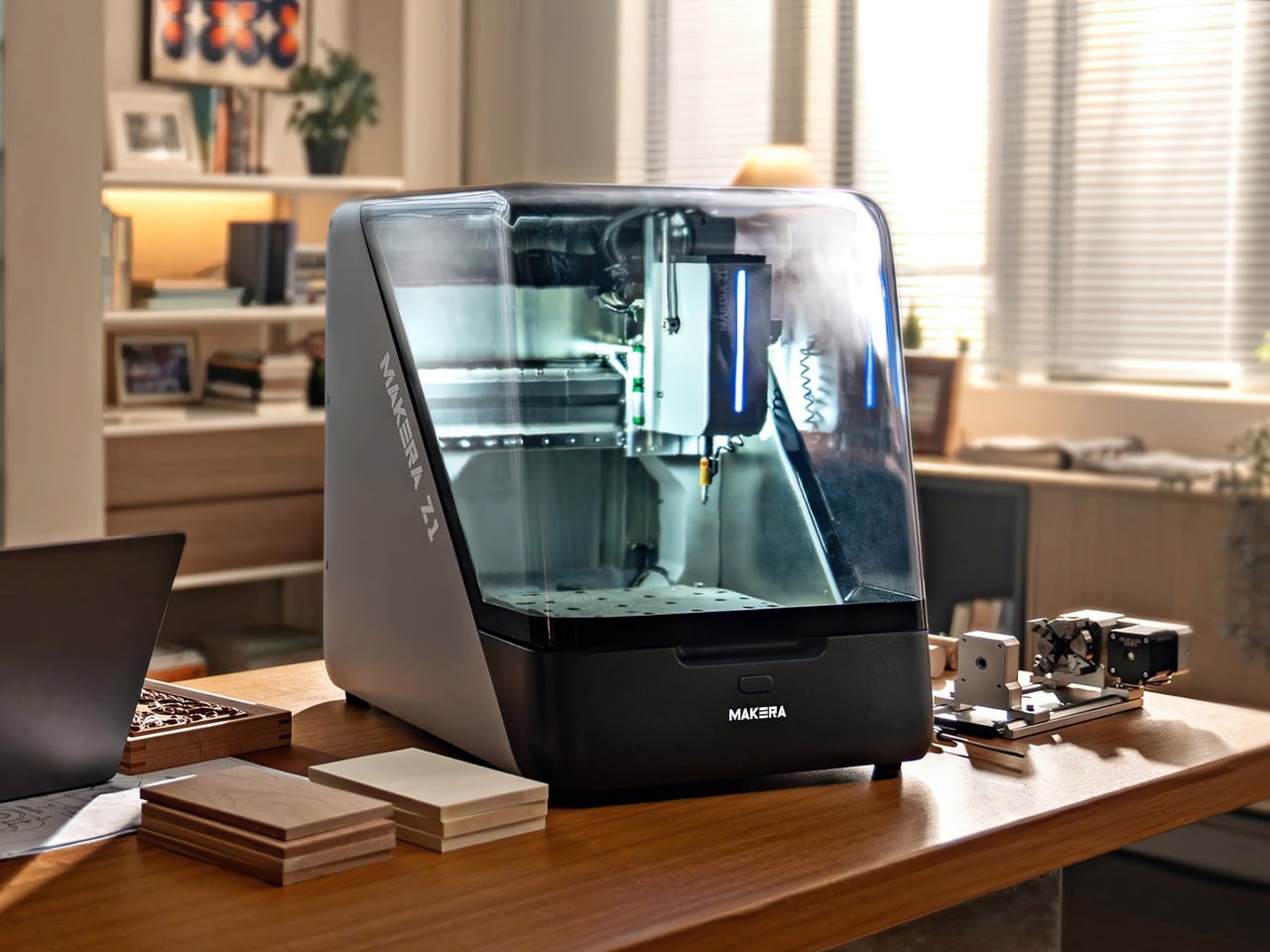
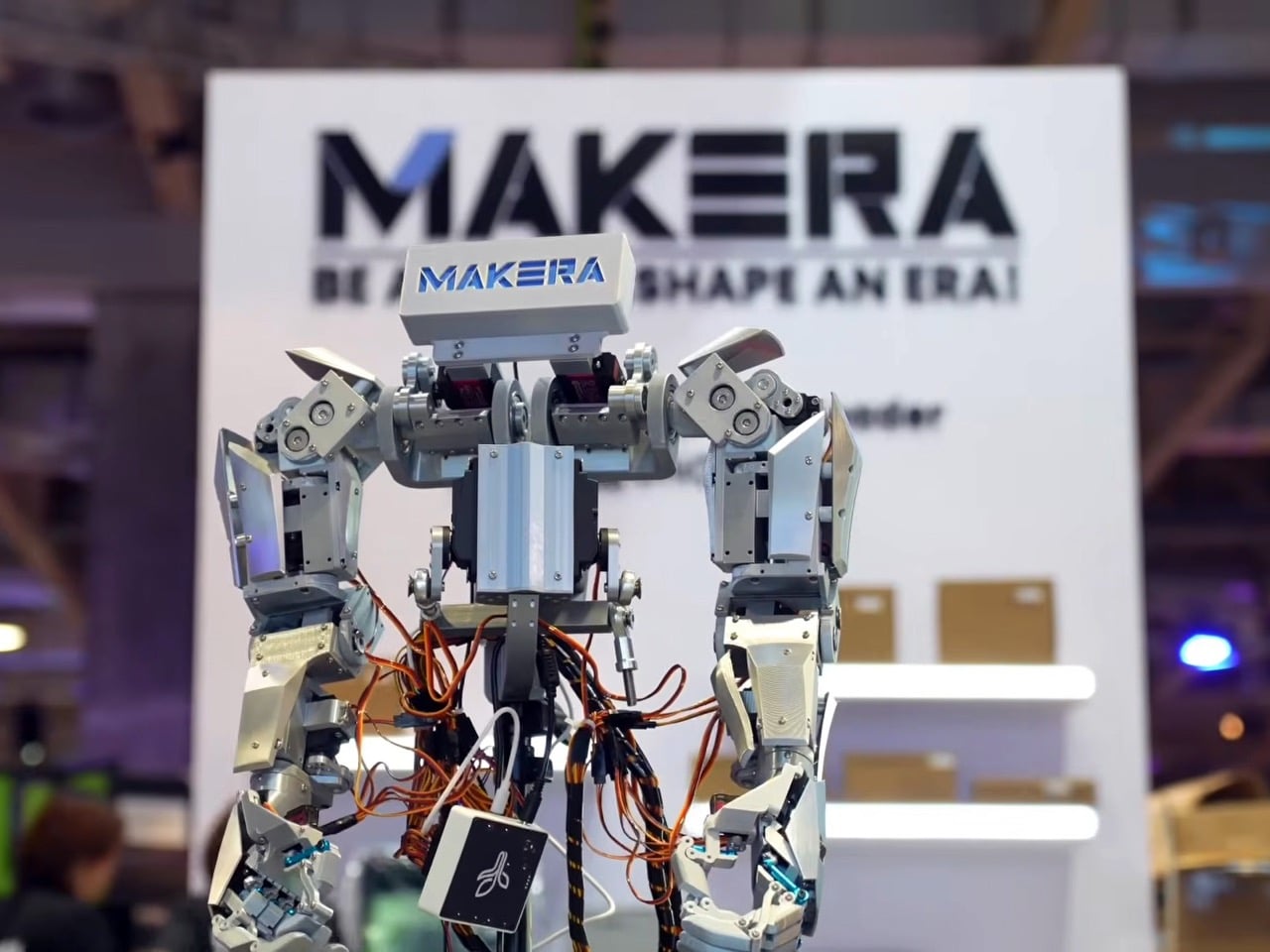
The guiding idea at BEYOND Expo 2026 was that AI software has finished its warm-up, and the main event is technology that acts in the physical world. Humanoid robots, intelligent wearables, and autonomous vehicles all made that case. So when the Makera Z1, a compact desktop CNC machine, won a Best of Innovation award, it felt less like a surprise and more like a statement.
This recognition was a direct nod to the expo’s central theme, “AI: Digital to Physical.” The Z1 is a tool of physicalization, a machine that takes a digital file and gives it mass, texture, and function by milling aluminium or wood. In a showcase built around moving intelligence beyond the screen, Makera’s device provided a clear, powerful example of what that transition looks like at a human scale.
Designer: Makera
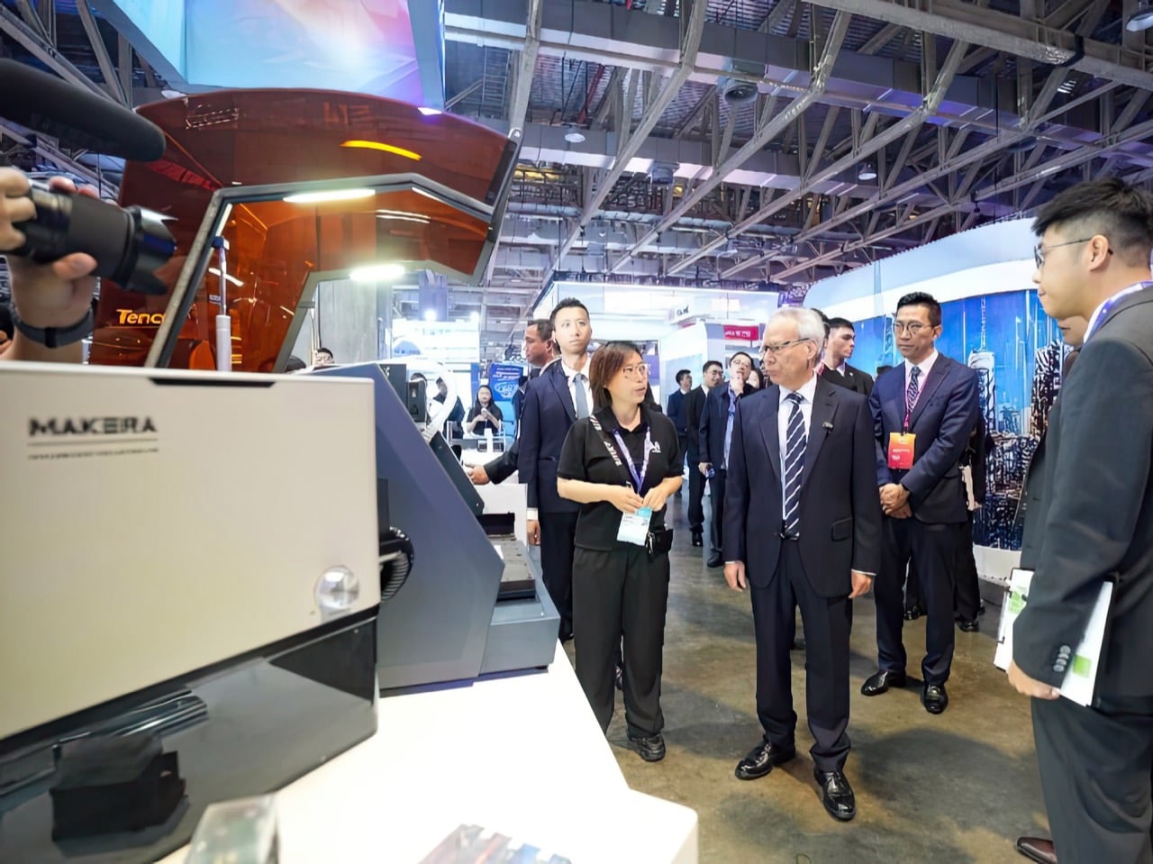
Four days at The Venetian Macao’s Cotai Expo brought together nearly 800 exhibitors, over 400 speakers, and more than 30,000 attendees from 120 countries and regions. Opening keynotes featured senior figures from NVIDIA, XREAL, Pudu Robotics, and the Linux Foundation, setting a tone built around industry direction rather than individual product announcements. Summits ran across seven main stages and covered embodied intelligence, spatial computing, AI agents, global capital flows, and cross-regional developer ecosystems. BEYOND co-founder Dr. Lu Gang described it as a moment where Asia is producing companies with real depth and global relevance, and the expo exists to show that to the world.
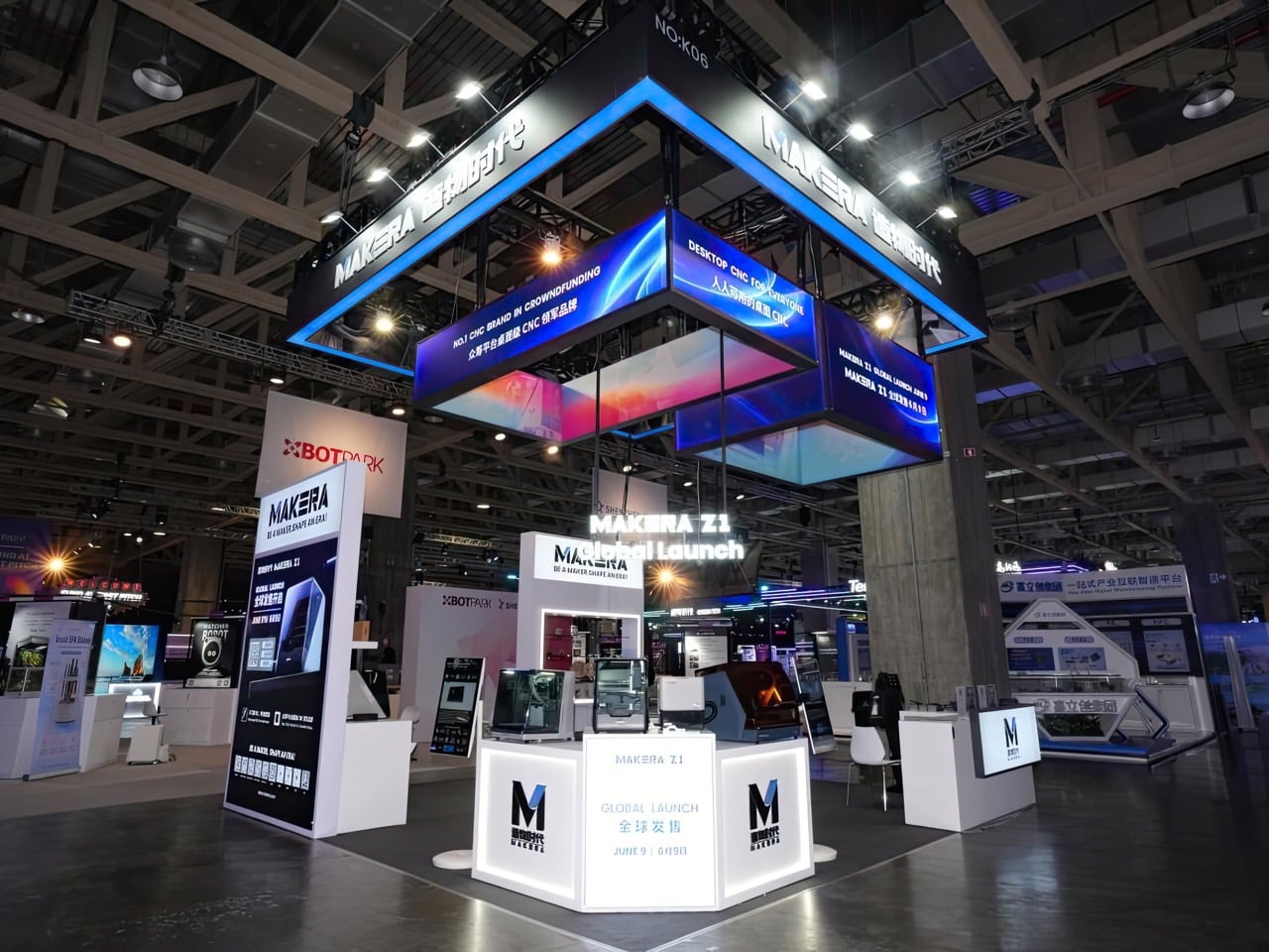
Over $10.2 million from nearly 7,000 backers is what the Z1’s Kickstarter campaign produced before closing in December 2025, a number that sits well above the typical ceiling for desktop hardware crowdfunding. IFA 2025 had already given the machine a “Best in Content Creation” Innovation Award before units shipped. The BEYOND recognition completes a three-stop credibility arc across Kickstarter, IFA, and Asia’s largest tech expo, a run few products in the desktop maker category have managed with this kind of consistency. As Makera’s third CNC machine, following the Carvera in 2021 and the Carvera Air in 2024, it carries a company track record behind it.
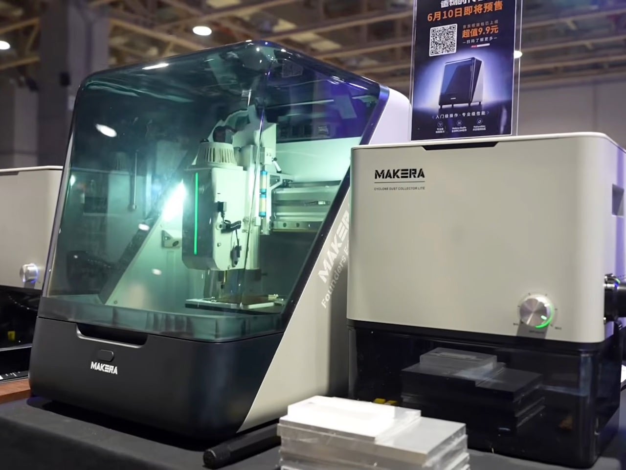
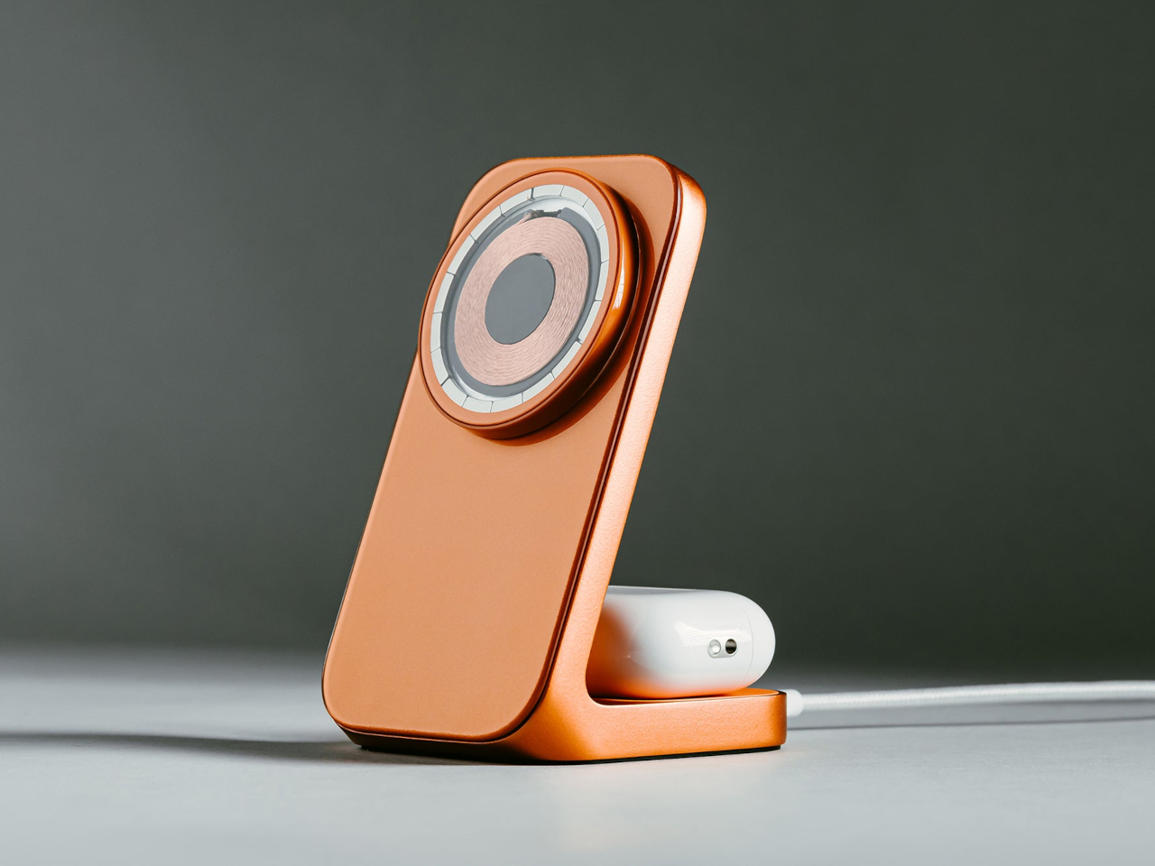
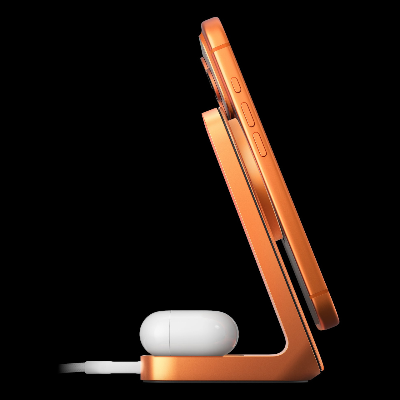
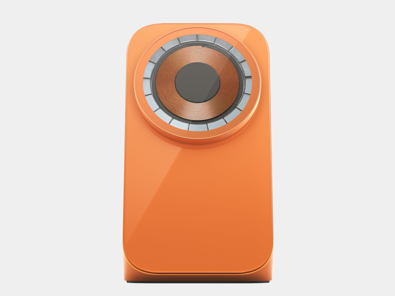
At $899 during its crowdfunding run, the Z1 targets a gap in desktop CNC that has historically been hard to fill. The machine carries a 200 x 200mm cutting area, a 100mm working depth, and a 150W spindle running at 13,000 RPM, handling materials from aluminium, brass, and copper to wood, PCBs, acrylic, and carbon fiber. With a claimed accuracy of 0.02mm, it sits in territory more commonly associated with machines priced two to three times higher. Automatic probing, levelling, a quick tool change system, and a built-in camera for real-time monitoring come standard, with an optional fourth axis, laser attachments, and dust collection available as add-ons.
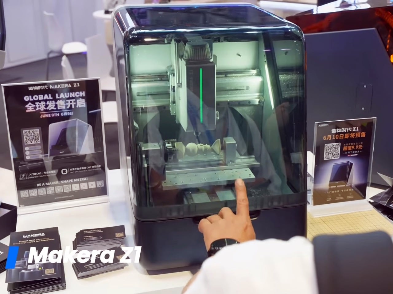
Makera Studio handles toolpath generation automatically, and an AI-powered feature converts hand-drawn sketches or reference images into machinable 3D models, significantly lowering the barrier for anyone without a background in CAD software. A companion platform called Makerables extends this further, giving users access to a shared library of designs they can download, modify, and machine immediately. That full workflow, from a rough idea to a digital design to a finished physical object on a workbench, maps directly onto what “AI: Digital to Physical” was built to celebrate. Where many exhibitors at BEYOND demonstrated digital intelligence or physical hardware in isolation, the Z1 brought both into a single, compact package.
The Best of Innovation list at BEYOND 2026 included DEEPRobotics, Engine AI, iFLYTEK, Pudu Robotics, and AEROFUGIA alongside Makera, placing a sub-$1,000 desktop fabrication tool in the same frame as some of Asia’s most heavily funded hardware and AI companies. That company says something about where innovation appetite is moving at Asia’s largest tech gathering: toward tools that extend precision manufacturing beyond factory floors and into the hands of individual creators and small workshops. Whether the Z1 delivers fully on that promise across its growing user base is still being tested, but the BEYOND stage gave Makera a much bigger conversation to build from.
The post The $899 Desktop CNC That Impressed Asia’s Biggest Tech Expo first appeared on Yanko Design.