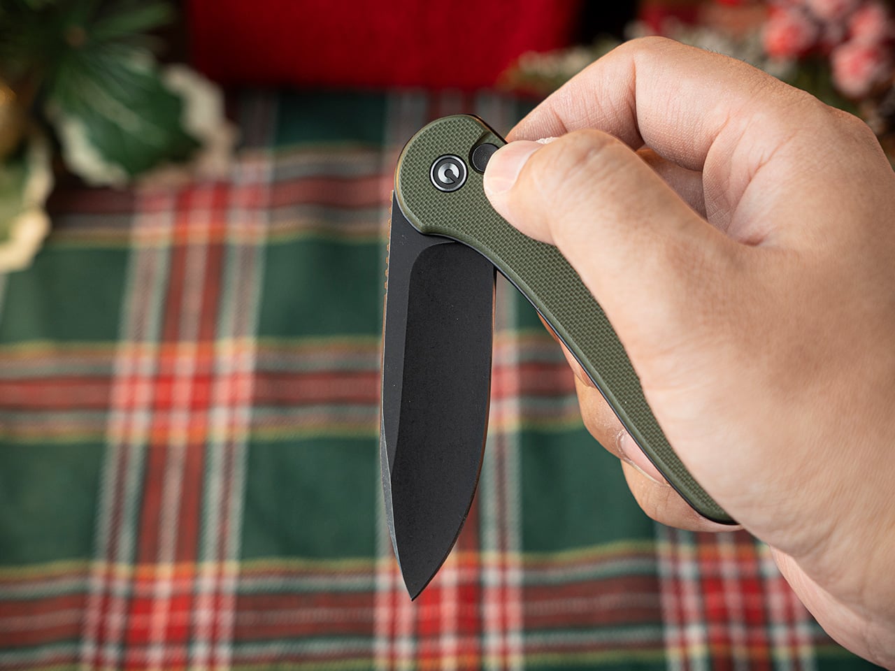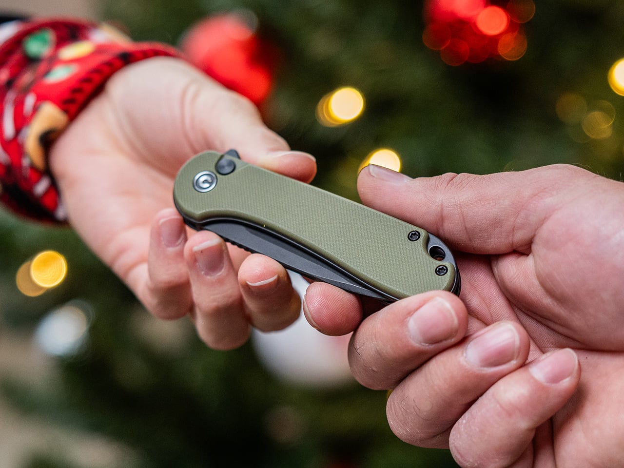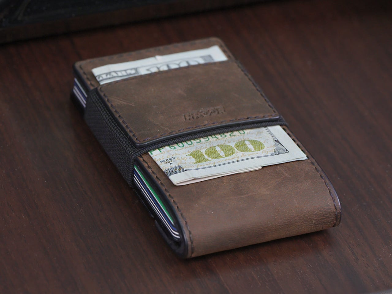
CIVIVI Brazen Flipper
Somewhere around the year 900 CE, a Japanese swordsmith solved a very specific problem. Samurai warriors needed a short backup blade that could function in tight spaces where a katana was useless, something compact enough to wear through a sash and fast enough to deploy at grappling range. The result was the tanto, a single-edged blade between 15 and 30 centimeters, built for thrusting and close-quarters control. For the next several hundred years, it stayed in feudal Japan, evolving through different schools and forging traditions, accumulating ceremonial weight alongside its practical function.
Then, in the 1980s, a knifemaker named Bob Lum pulled the design west. He adapted the Japanese silhouette into an American form with a squared, reinforced tip, and the knife world has been arguing about, borrowing from, and building on that adaptation ever since. Cold Steel industrialized the shape, the tactical market absorbed it, and somewhere along the way it picked up a reputation for being a niche purchase for a specific kind of buyer. In 2026, that reputation is dissolving. The tanto is having one of its more interesting years in a very long time, showing up in premium titanium folders, budget G10 flippers, and American-made OTF automatics all at once.
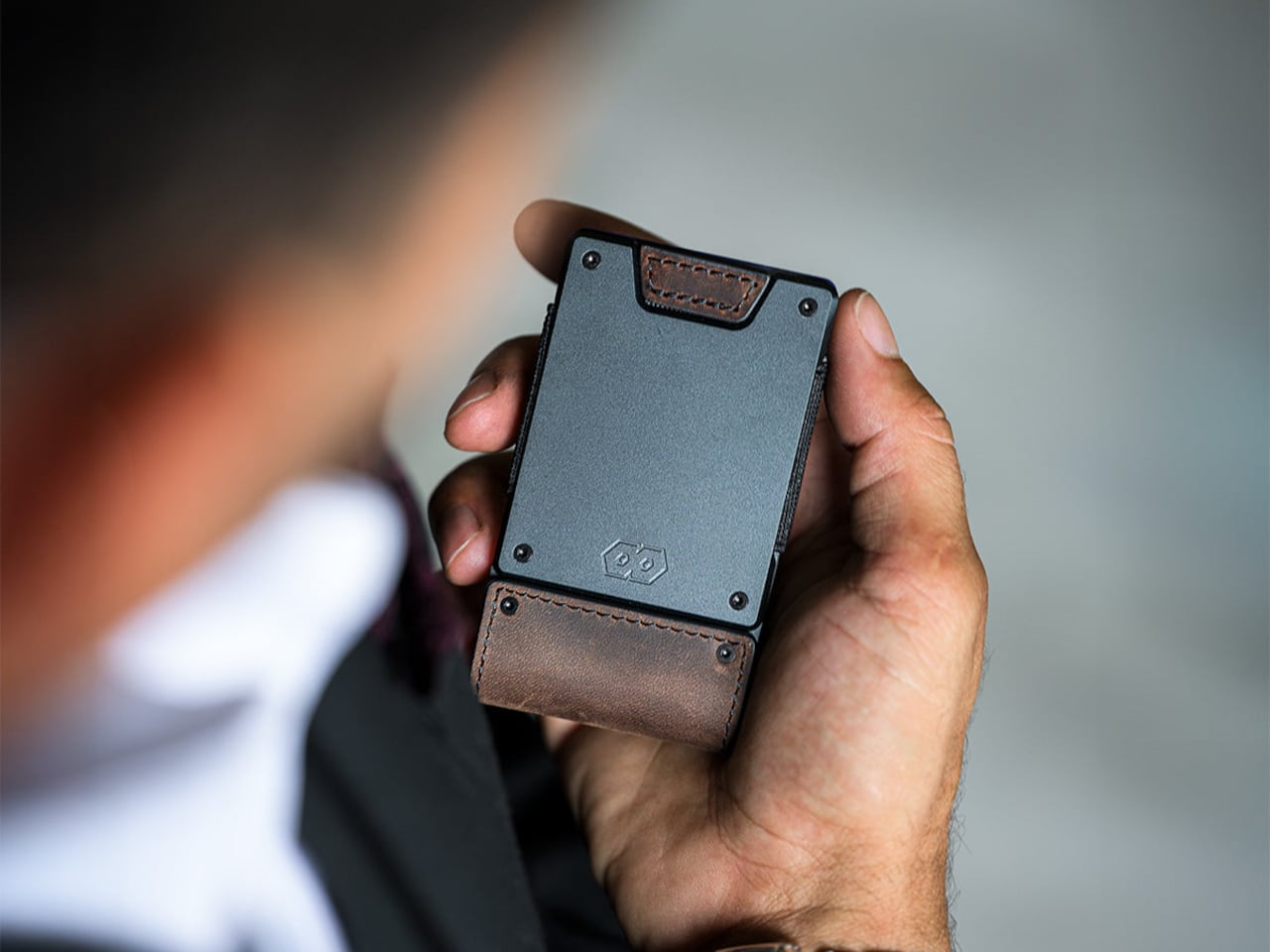
Vosteed Thunderbeast
How a Samurai Dagger Became an EDC Staple
The tantō dates to the Heian period (794-1185 CE), when Japanese swordsmiths began forging short blades for warriors who needed something beyond their primary sword. The blade sat between 5.9 and 11.8 inches, making it the smallest weapon in the samurai arsenal. Women carried them in the obi for self-defense. Samurai wore them as companion blades because the katana, for all its reach and cutting power, couldn’t maneuver inside buildings or in close grappling exchanges. The original Japanese tanto carried a slight curve, a steak-knife profile designed more for utility than the armor-piercing mythology that would later attach to its American descendant.
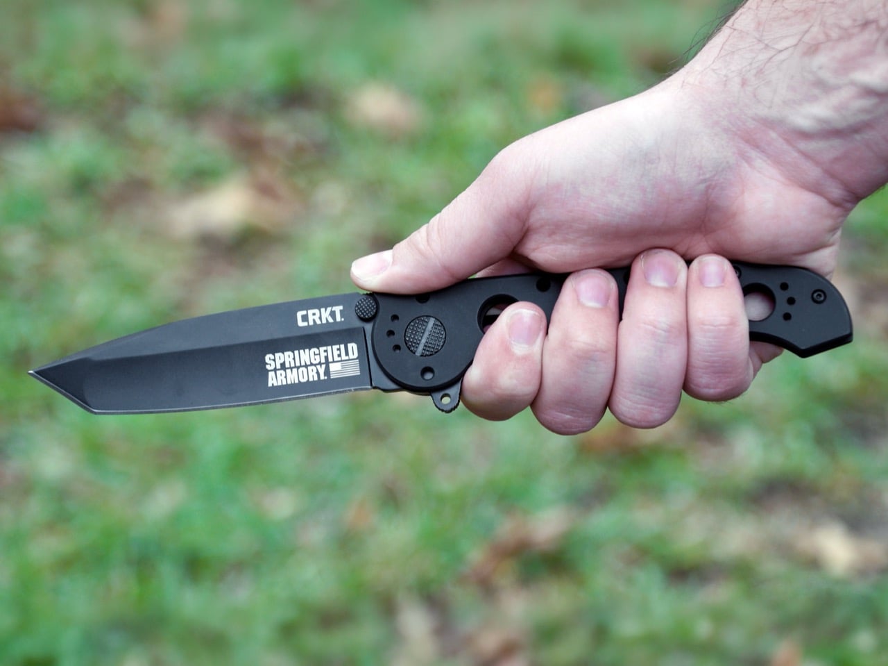
CRKT M16-04KS
Bob Lum, a third-generation Chinese American knifemaker from Astoria, Oregon, brought the tanto west in the late 1970s. Lum had been making knives full-time since 1976, and he combined the tanto name with what Japanese smiths called a hamaguri tip, a reinforced angular point, to create something new. The geometry was his, but Lynn Thompson at Cold Steel saw the commercial potential. Thompson, who founded Cold Steel in Ventura, California in 1980, mass-produced Lum’s design with a flattened grind that made the tip easier to manufacture, then built heavy marketing around tactical applications and armor penetration that the traditional Japanese blade never claimed. The American tanto was born, and the shape began its long association with black G10, aggressive serrations, and catalog copy written for a very specific buyer.
Vosteed Parallel
Three Geometries, One Name
The confusion around tanto blades starts with terminology. Three distinct blade profiles share the same label, and they perform differently enough that the distinction matters. The traditional Japanese tantō keeps a slight curve along the edge, closer in profile to a utility blade than the angular wedge most people picture when they hear the word. The blade was used for everything from cutting rope to seppuku, and the shape reflects that versatility. The tip carries strength, but the curve allows draw cuts. It’s a knife built for function across multiple contexts, not just penetration.
The American tanto, the shape Cold Steel and Bob Lum popularized, moves the angular transition to the cutting edge. Two straight edges meet at a defined angle, creating a wide secondary bevel that reinforces the tip with significantly more steel than a traditional drop point carries. This is the geometry that excels at piercing hard materials: cardboard, drywall, dense packaging, anything where lateral stress would snap a finer point. The trade-off is direct. The flat grind and lack of belly mean slicing performance suffers. You can push-cut with an American tanto, but draw cuts feel awkward, and food prep becomes a chore. It’s a specialist blade that does one thing exceptionally well.
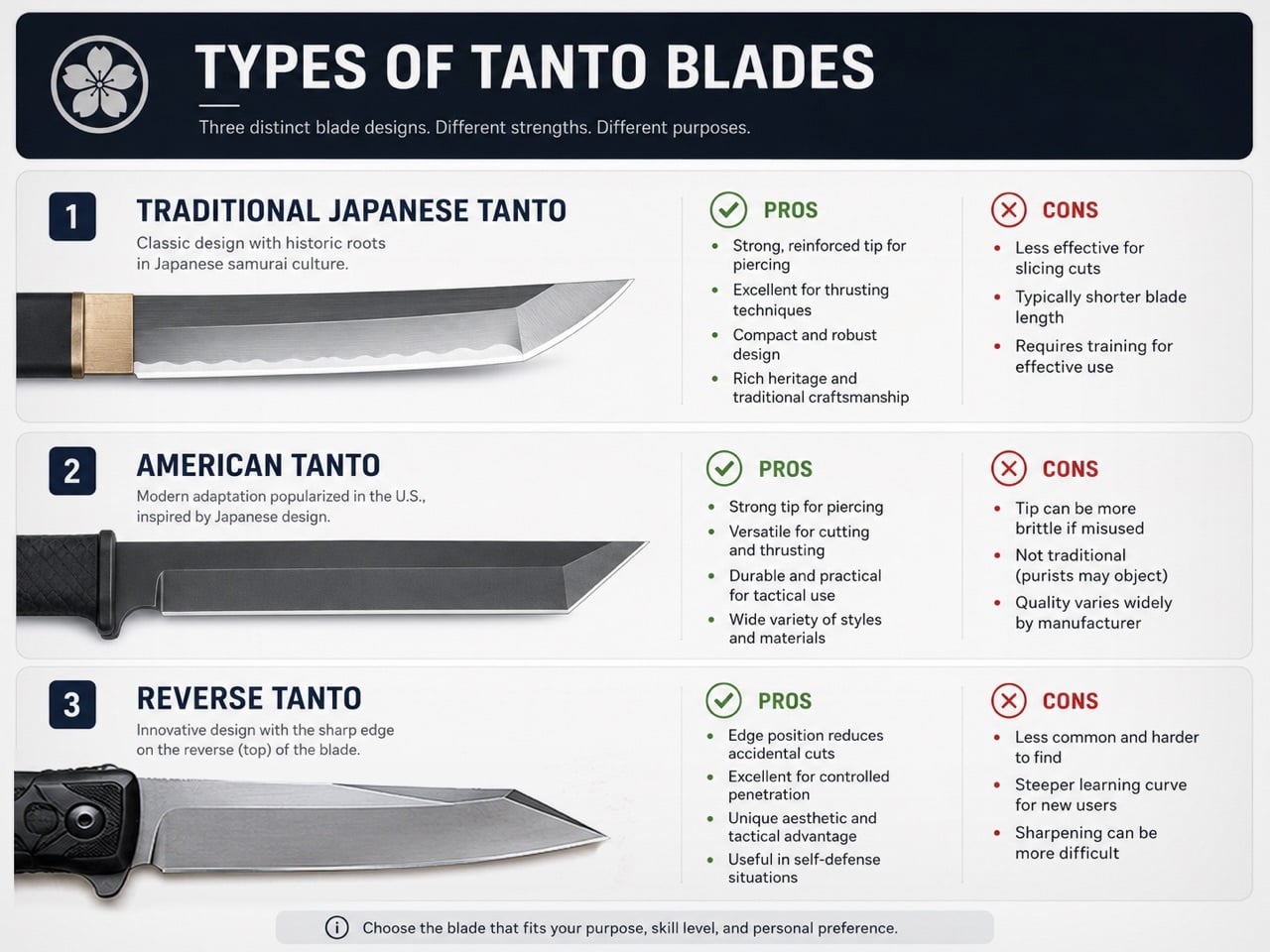
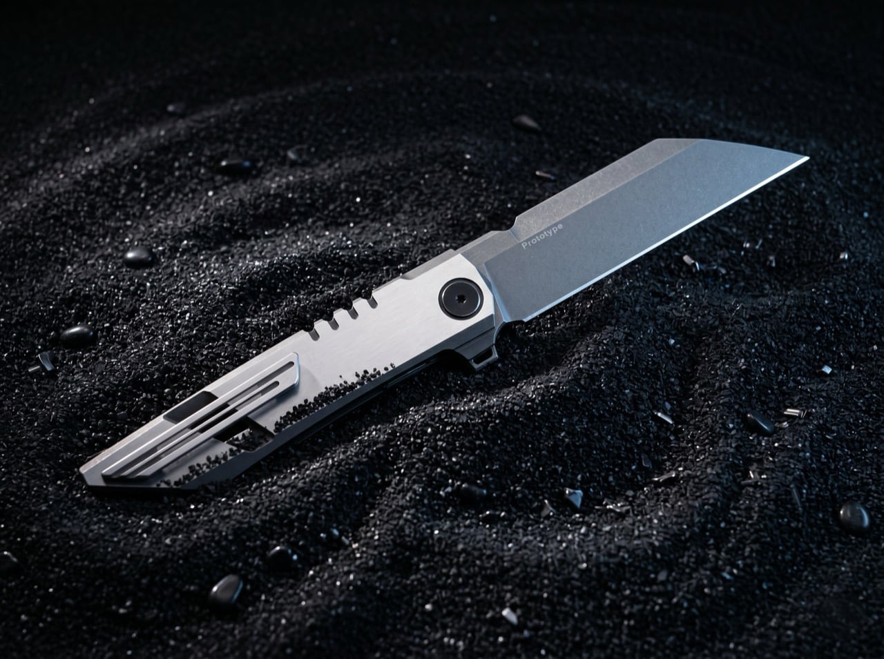
The reverse tanto flips the geometry. The angular transition sits on the spine rather than the cutting edge, which means you get a continuous straight edge running from heel to tip while the spine drops at an angle to meet it. The result looks similar to a wharncliffe but with a slightly different tip geometry and often a steeper point angle. You retain the reinforced tip, the visual drama of the angular break, and the clean industrial aesthetic, but you gain back the full-length cutting edge that makes the blade practical for daily tasks. The reverse tanto is the form that’s currently driving most of the premium EDC releases in 2026, because it solves the American tanto’s biggest limitation without sacrificing the shape’s core appeal.
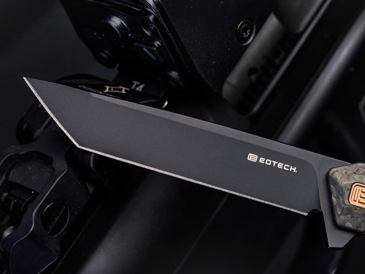
Tekto F2 X EOTECH
Folders That Prove the Point
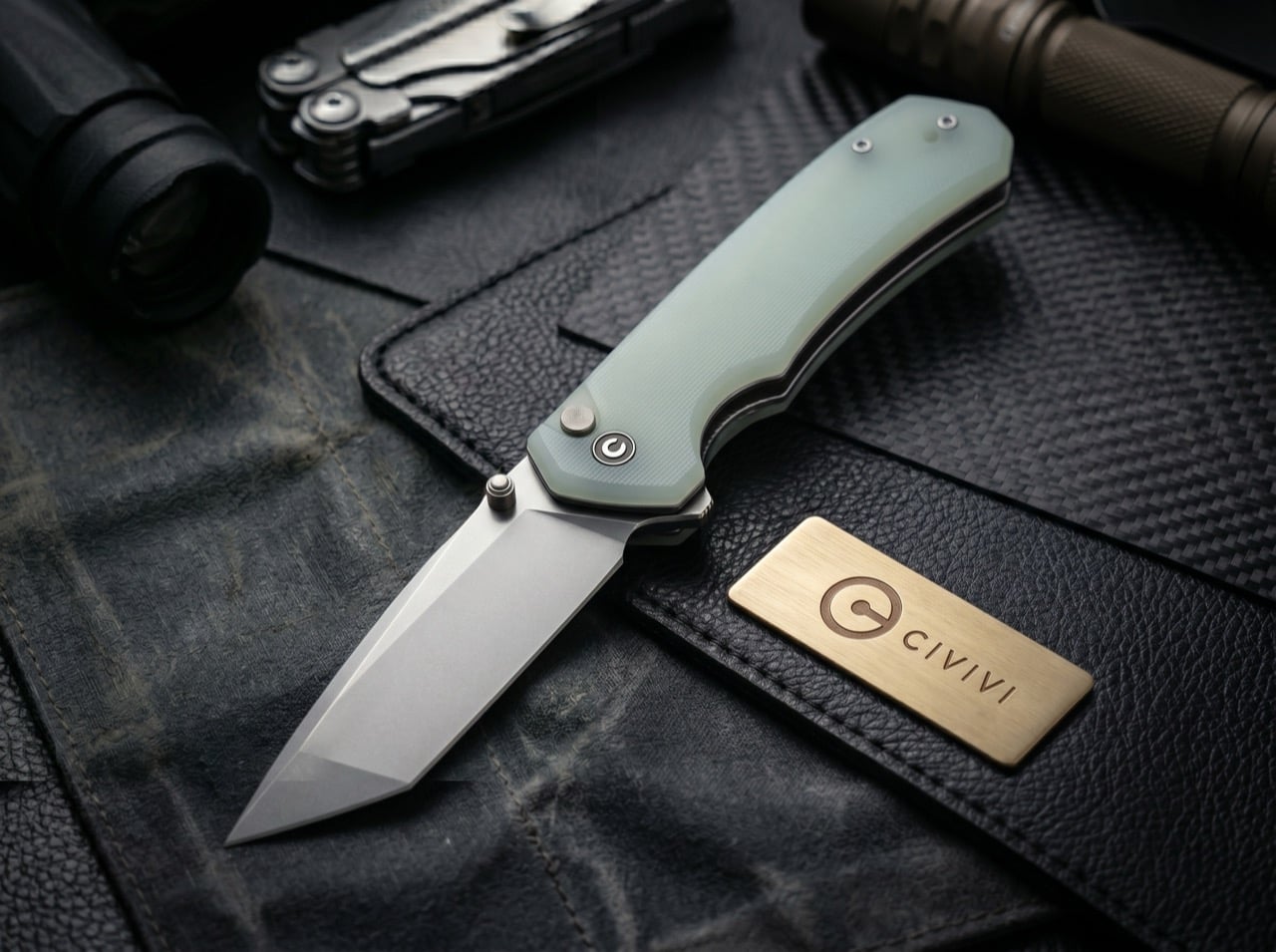
The CIVIVI Brazen pairs a 3.5-inch D2 tanto blade with textured micarta handles and a button lock, delivering the angular geometry at an accessible price point that makes the shape approachable for buyers who haven’t carried a tanto before. CRKT’s M16-04KS, part of the Kit Carson collaboration series that’s been running for decades, keeps the tactical lineage visible with its black-oxide finish and glass-reinforced nylon handles, but the framelock and flipper deployment modernize what could have been a relic. These are the knives that hold the line between the shape’s history and its current iteration.
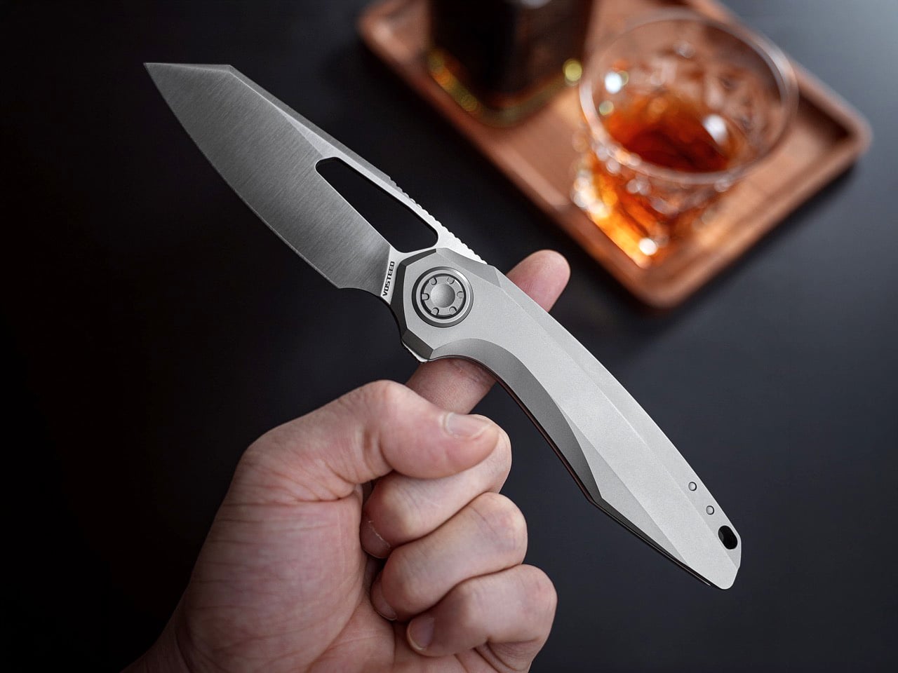
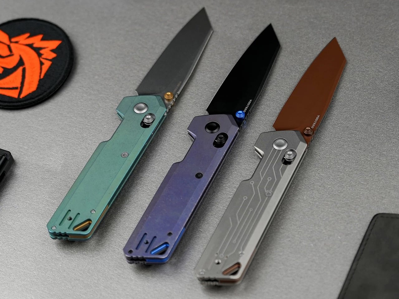
Vosteed’s Thunderbeast and Parallel represent the premium end of the current tanto moment. The Thunderbeast launched in December 2025 with a 3.49-inch M390 reverse tanto blade, full titanium construction, and Vosteed’s Vanchor pivot lock, a button-actuated release that requires no secondary motion to disengage. The knife weighs 4.74 ounces across an 8.26-inch overall length, and it offers three deployment methods: front flipper, rear flipper, and thumb hole. Buyers at KnifeCenter gave it five stars within weeks of release, noting it sits alongside the Psyop as one of the best knives in the $250 range. The Parallel, Vosteed’s ultra-slim EDC folder, brings the reverse tanto geometry into a pocketable profile that disappears on carry but still delivers the piercing capability and straight-edge control the shape is known for.
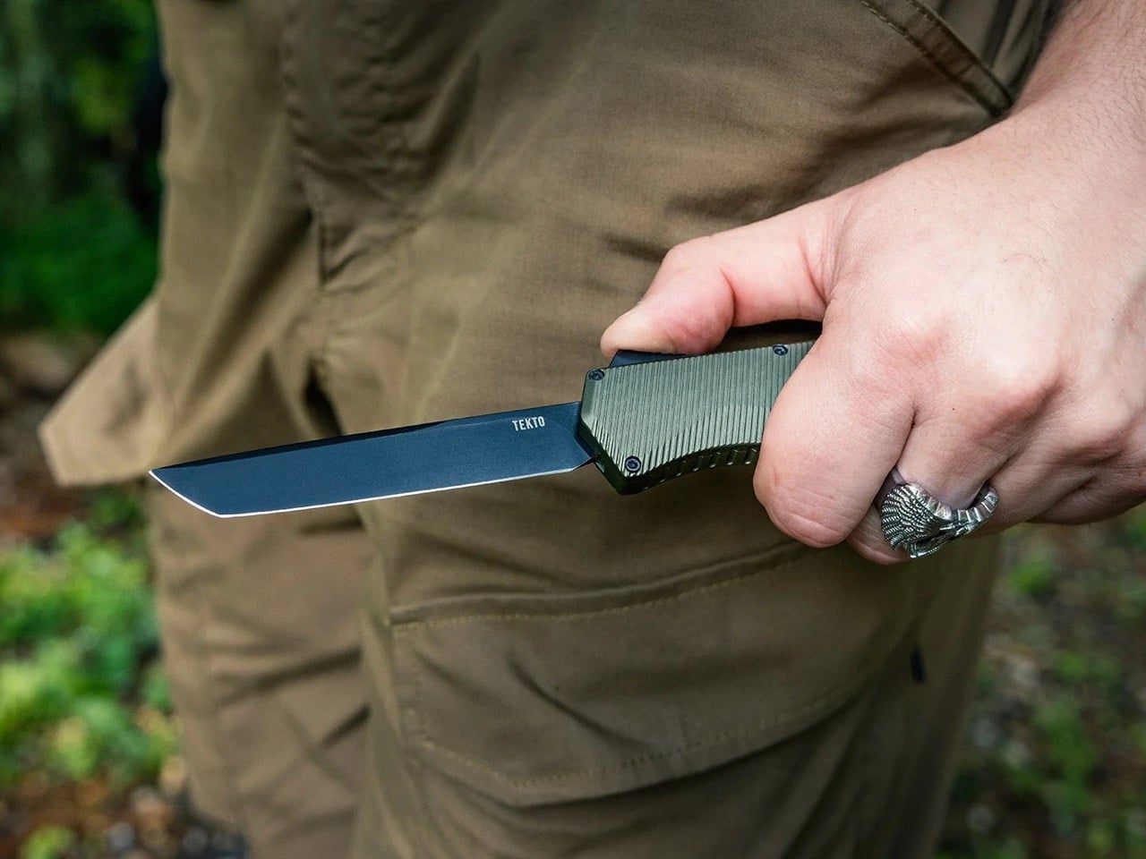
Tekto A5 Spry (Tanto Edition)
Tekto’s A5 Spry, an OTF automatic with a tanto blade, shows how the geometry translates to different deployment mechanisms. OTF knives live or die on blade profile, because the blade has to shoot cleanly out the front of the handle without catching or binding, and the tanto’s flat grind works in that context. The A5 Spry runs a double-action mechanism, so the same slider deploys and retracts the blade, and the tanto tip delivers the aggressive appearance OTF buyers tend to favor without requiring the kind of belly that would complicate the mechanism.
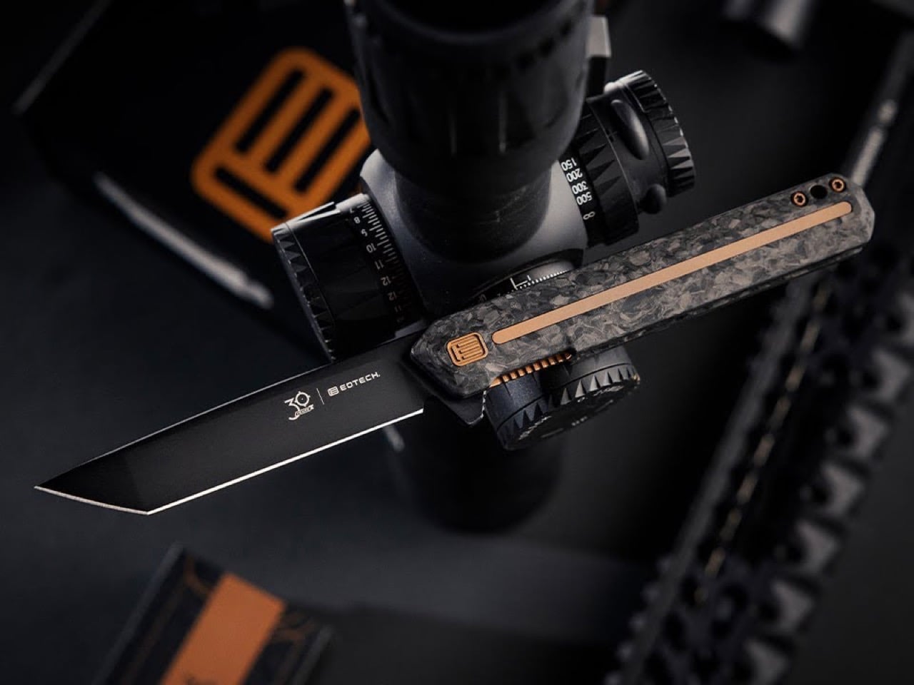
Tekto F2 X EOTECH
Why 2026 Became the Tanto’s Year
CRKT launched three tanto variants in January 2026, more than the company had released in the previous two years combined. The Orochi, a Princeton Wong design with a 3.5-inch Japanese tanto blade, won “Best Machine-Assisted Custom Knife” at Blade Show Texas before CRKT adapted it into production with both a 14C28N/G10 version and a premium damascus/titanium frame lock model. The Counterpart, designed by Ken Onion, includes a D2 tanto option alongside three drop-point configurations. The Twist Tighe Compact, CRKT’s first OTF knife, ships with a 2.73-inch MagnaCut tanto blade in a titanium-nitride finish, made entirely in the United States and priced at $300.
WE Knife’s Anglex, which launched in February 2026, pairs a 3.89-inch stonewashed M390 reverse tanto blade with a full 6AL4V titanium handle and a ceramic ball bearing pivot. The knife weighs 4.65 ounces, costs $357, and landed on The Gadgeteer’s list of the top 10 EDC knives stealing the spotlight in 2026 within weeks of release. Bear Edge, working out of their Jacksonville, Alabama factory, launched the Model 71139 at SHOT Show with a modified tanto blade in black-coated 440 steel and tan G10 handles. Kizer’s Feist 2 ZX brought an M390 reverse tanto into a frame lock flipper. Bestech’s Tonic combined a 2.89-inch M390 reverse tanto with bolstered titanium handles and marbled carbon fiber inlays at $306.
WeKnife Anglex
The pattern holds across manufacturers, price points, and target audiences. KnifeCenter ran two separate new-knife roundup videos with tanto-focused titles in this period, one in June 2025 (“Reverse Tanto rules the day today”) and another in August 2025 (“Tanto Time”), suggesting the geometry was dense enough in new releases to anchor full-episode coverage. RECOIL Magazine published a “Best Tanto Knives for EDC” buyer’s guide in September 2025. The shape has spent decades associated with a specific aesthetic and a narrow buyer base, but titanium frames and M390 steel have done the rebranding work the geometry always deserved. In 2026, the tanto finally looks like what it always was: a practical blade shape with over a thousand years of refinement behind it.
The post Tanto Blade Explained: Why the Angled Tip Dominates 2026 EDC Knives first appeared on Yanko Design.