5 Best Gadgets Every Digital Nomad Should Pack Before Their Next Remote Summer

Summer has a way of convincing you that working from a terrace in Lisbon or a cabin in the Dolomites will feel seamless. It rarely does. The gap between the idealized workation and the experience comes down to a few specific friction points: a dead device mid-call, no sense of what time it is back home, a trackpad making everything slower, and a hotel room that actively fights your sleep.

These five objects aren’t here because they photograph well in a flat lay. Each one solves a recurring problem that surfaces the moment you leave your home office. Some are brand-new hardware. One is a concept that shows exactly where phone design needs to go. All of them are built with the same underlying logic: less bulk, more intention, nothing wasted.

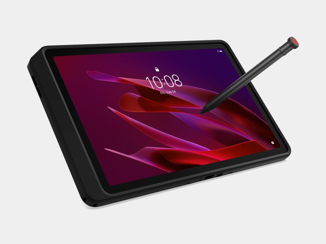
1. Lenovo ThinkTab X11
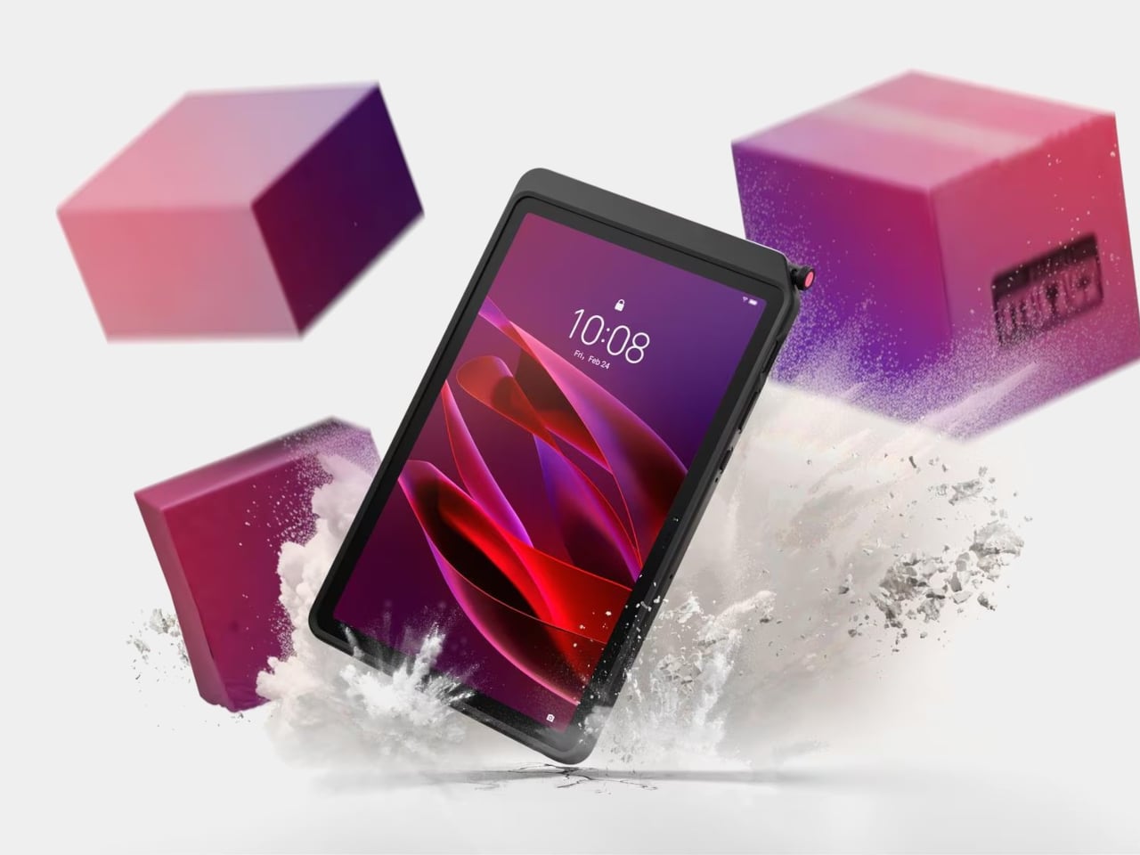
The story most tablets tell goes: thin is better, sleek is the goal, and if you drop it, that’s your problem. The Lenovo ThinkTab X11 tells a different one. It’s the first device in Lenovo’s Think portfolio to run Android, built for people who work outside of offices, starting at $499. That lands well below what enterprise rugged hardware typically costs, and it brings credentials those environments actually need rather than borrowing them from a device designed for a glass desk.

The most unusual feature isn’t the IP68 rating or the MIL-STD-810H drop certification. It’s the battery. The 10,200 mAh cell removes without tools using a screwless mechanism, so a depleted pack swaps for a fresh one without stopping work. For fixed deployments, it runs with no battery installed at all, reducing heat buildup and eliminating long-term cell degradation. The 10.95-inch 90 Hz display works with gloved hands and wet fingers, and the Snapdragon 7s Gen 3 handles processing with up to 12 GB of RAM.

What we like

  • The screwless swappable battery is a design decision most tablet makers abandoned years ago and shouldn’t have
  • MIL-STD-810H certification and IP68 rating that hold up to actual field conditions, not just the marketing copy

What we dislike

  • Running Android 16 rather than a desktop OS limits compatibility for power users who depend on specific Windows software
  • The rugged case, while swappable for a plain back panel, adds bulk that minimal travel setups may not want to carry

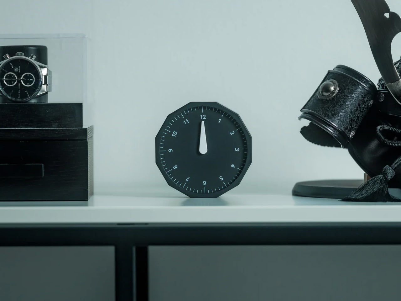
2. Rolling World Clock
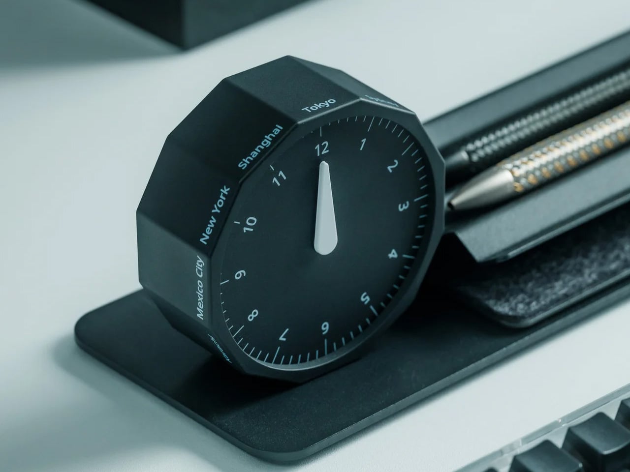
Remote work across time zones produces a specific kind of low-grade anxiety: the constant mental arithmetic of what time it is for your client in Tokyo, your team in Berlin, your editor in New York. Most solutions are digital, meaning another app and another screen. The Rolling World Clock handles it differently. It’s a physical object designed to give time zone awareness a permanent, glanceable presence on whatever surface you happen to be working from, at $49.

At that price, it occupies an increasingly rare space: the deliberate analog object that earns its place in a bag through presence rather than features. A world clock you can hold and orient matters in a way a phone widget doesn’t. It also removes the need to unlock a screen every time you run through time zone arithmetic, which at four in the afternoon after a long session is more useful than it immediately sounds.

Click Here to Buy Now: $49.00

What we like

  • At $49, it brings a physical dimension to time zone tracking that no app or notification panel actually replicates
  • A design-forward desk object that works regardless of whether your laptop is open or your phone is charged

What we dislike

  • As a physical clock, it requires manual adjustment when crossing into a new time zone rather than updating automatically
  • Limited product detail currently available on the YD Shop listing; worth confirming the display mechanism before ordering

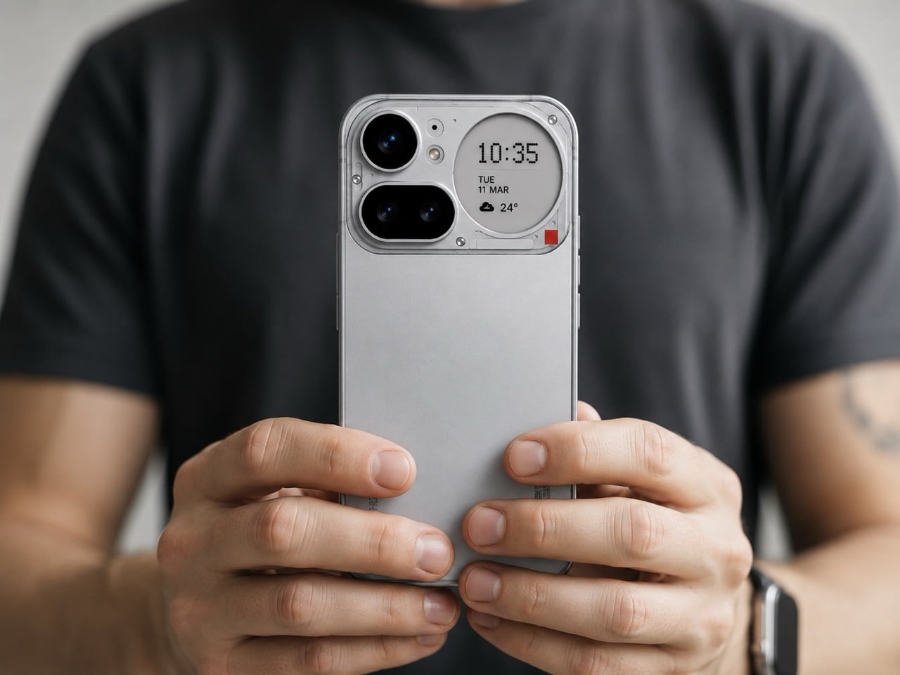
3. Nothing 4a Pro E-ink Display Concept
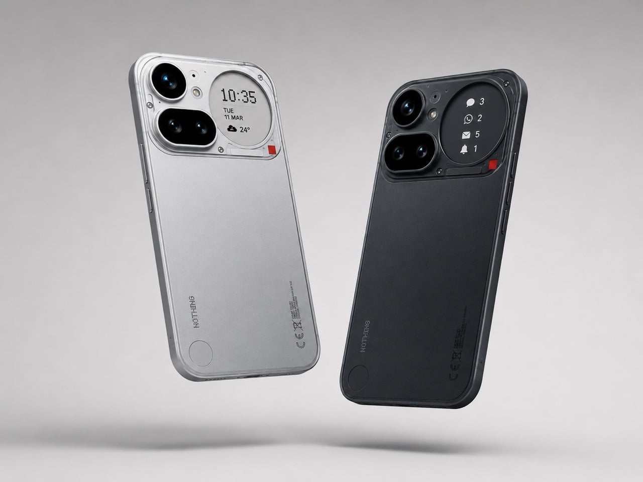
Not everything on this list ships tomorrow, and this one is upfront about that. The Nothing 4a Pro e-ink concept, imagined by Reddit user Taweros, replaces the Glyph Matrix on the back of Nothing’s phone with a small always-on e-ink display. Instead of spinning light patterns, the back shows something useful: a notification, a QR code at a networking event, the face of whoever is calling you. All without meaningfully touching battery life, since e-ink only draws power when the image changes.

The reason it belongs here is specific. When your bag is on the table at a co-working space, and you need to see whether that notification is worth picking up, a phone that surfaces information on its back without requiring you to unlock it removes a real interruption from your workflow. The Nothing 4a Pro hardware this concept builds on already runs a Snapdragon 7 Gen 4. The e-ink back is the single edit that would make it the travel phone worth actually wanting.

What we like

  • E-ink only draws power when the image changes, making a permanently visible ambient display a viable idea without a battery penalty
  • The concept makes a compelling case that the existing Nothing 4a Pro hardware is already there; the display and back panel are the only missing pieces

What we dislike

  • This is a concept render, not a product you can buy, and Nothing has given no public indication it’s moving in this direction
  • The e-ink area is small, which limits how much information it can usefully surface at a glance

4. OrigamiSwift Folding Mouse

At 40 grams and 0.18 inches thick when folded flat, the OrigamiSwift is the mouse that removes the excuse to keep using a trackpad. Designed by Horace Lam and rooted in origami’s structural logic, it unfolds in under half a second into a full-sized ergonomic form. The triangular folded geometry isn’t decorative. It provides the rigidity needed to hold its shape through long work sessions, on surfaces ranging from a co-working desk to the tray table of a long-haul flight.

Bluetooth 5.2 handles connectivity, the HD infrared sensor tracks at up to 4,000 CPI, and the USB-C battery lasts up to three months per charge. Soft-click buttons keep it quiet in shared spaces, which matters at a communal table three feet from a stranger on a call. For a travel mouse with this build quality and a three-month battery life, that’s not a difficult case to make.

Click Here to Buy Now: $85.00

What we like

  • At 40 grams and 0.18 inches flat, it genuinely disappears into any bag without requiring a dedicated compartment or a case
  • Three months of battery life on a single USB-C charge means one less thing to track, top up, or pack a cable for

What we dislike

  • The right-handed ergonomic form means left-handed users will need to look elsewhere entirely
  • At $85, it sits at the higher end of the travel mouse category, and some nomads will find comparable tracking performance at lower price points from established peripheral brands

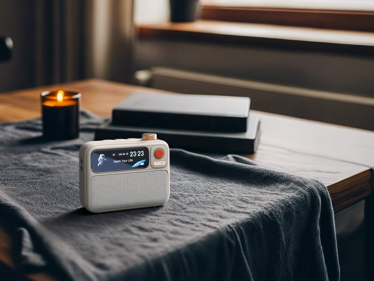
5. Divoom FlowToo
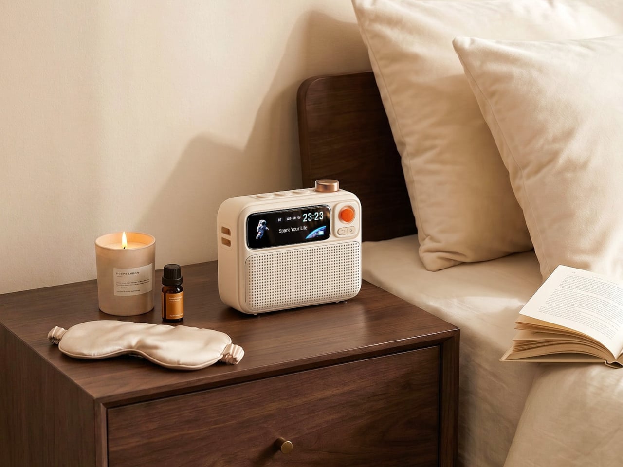
Serial hotel rooms accumulate a specific roster of problems. The alarm clock is always wrong. There’s no white noise option. Music has to come through a laptop speaker. The Divoom FlowToo addresses all three by collapsing a Bluetooth speaker, white noise machine, and alarm clock into one compact device with a 2.26-inch smart display. At $99.99, it doesn’t add to the nightstand pile. It replaces three items already on it, then does each job better than what it replaced.

The 10W amplifier and 45mm full-range driver make it a real speaker rather than an afterthought. The 90-plus built-in sounds cover rain, ocean, forest, and a wide enough library that finding something useful won’t take long. The wake function brings you up gradually with natural sounds and soft display light rather than a jarring tone, which matters when you’re functioning across time zones. The Divoom app handles alarm setting and sound selection from your phone, keeping the device itself simple to operate from any nightstand you find yourself at.

What we like

  • Collapsing three bedside devices into one compact object is the right instinct for anyone who travels with a carry-on and nothing else
  • The gradual natural-sound wake function is a genuine quality-of-life improvement over every hotel alarm clock in existence

What we dislike

  • The 2.26-inch display is small enough that the visualizer and animations read more as ambient mood than functional information
  • It runs on AC power with no built-in battery, which limits use to spaces with a wall outlet nearby

Pack Less. Work Better.

The best travel gear does two things well: it earns its weight, and it removes friction rather than adding it. Every object on this list was chosen because it solves a specific problem that shows up in the first week of working remotely, not a hypothetical one. A tablet that outlasts your work session. A mouse that doesn’t require you to compromise. A hotel room that finally lets you sleep properly.

One of them is a concept you can’t buy yet, and it’s worth watching. The rest are available now, four at price points that fall under $100. None of them are here because they looked good in a render. They’re here because the gap between a workation that works and one that slowly grinds you down usually comes down to a few objects you either packed or didn’t.

The post 5 Best Gadgets Every Digital Nomad Should Pack Before Their Next Remote Summer first appeared on Yanko Design.
This Titanium Calligraphy Pen Trades Tactical Utility for Softer, More Expressive Brush Strokes

Titanium is a material with a very specific reputation. It belongs to the world of rugged efficiency, survival gear, and precision engineering, usually chosen for objects that need to endure pressure, impact, and time with very little fuss. Brush pens come from an almost opposite design language, one shaped by softness, gesture, and line variation, where the slightest change in pressure can transform a word or sketch into something more personal. In most cases, these two worlds stay far apart, one built around resilience, the other around responsiveness.

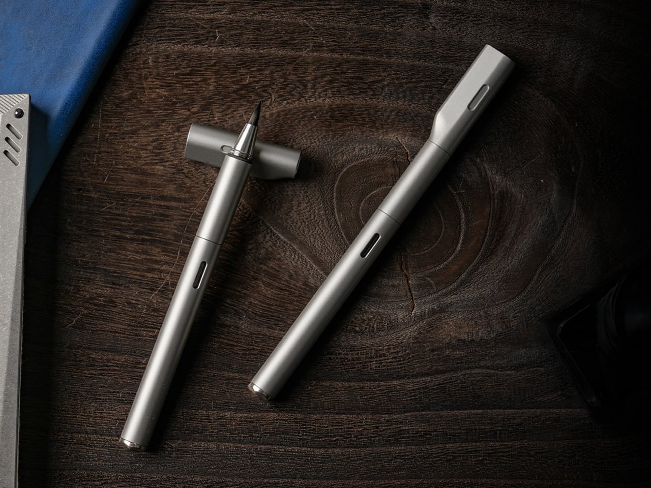
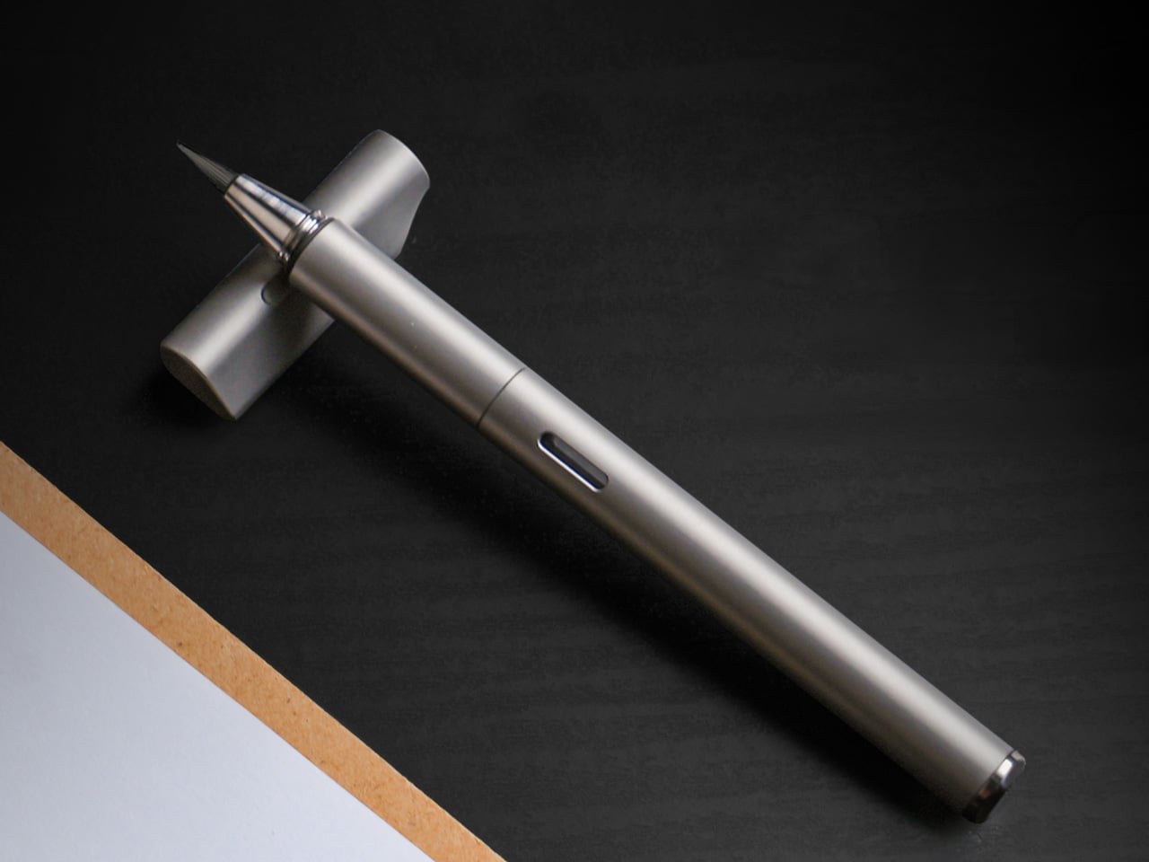
STILL brings them together with surprising clarity. The pen pairs a machined Grade 5 titanium body with a flexible nylon brush tip that shifts from fine hairlines to bold strokes depending on how it meets the page. That contrast gives STILL its identity. It feels grounded and permanent in the hand, yet expressive in motion, creating a writing instrument that carries the discipline of industrial design into the more fluid world of journaling, sketching, and everyday handwriting.

Designer: EYEQ

Click Here to Buy Now: $69 $105 (35% off). Hurry, only a few left! Raised over $82,000.

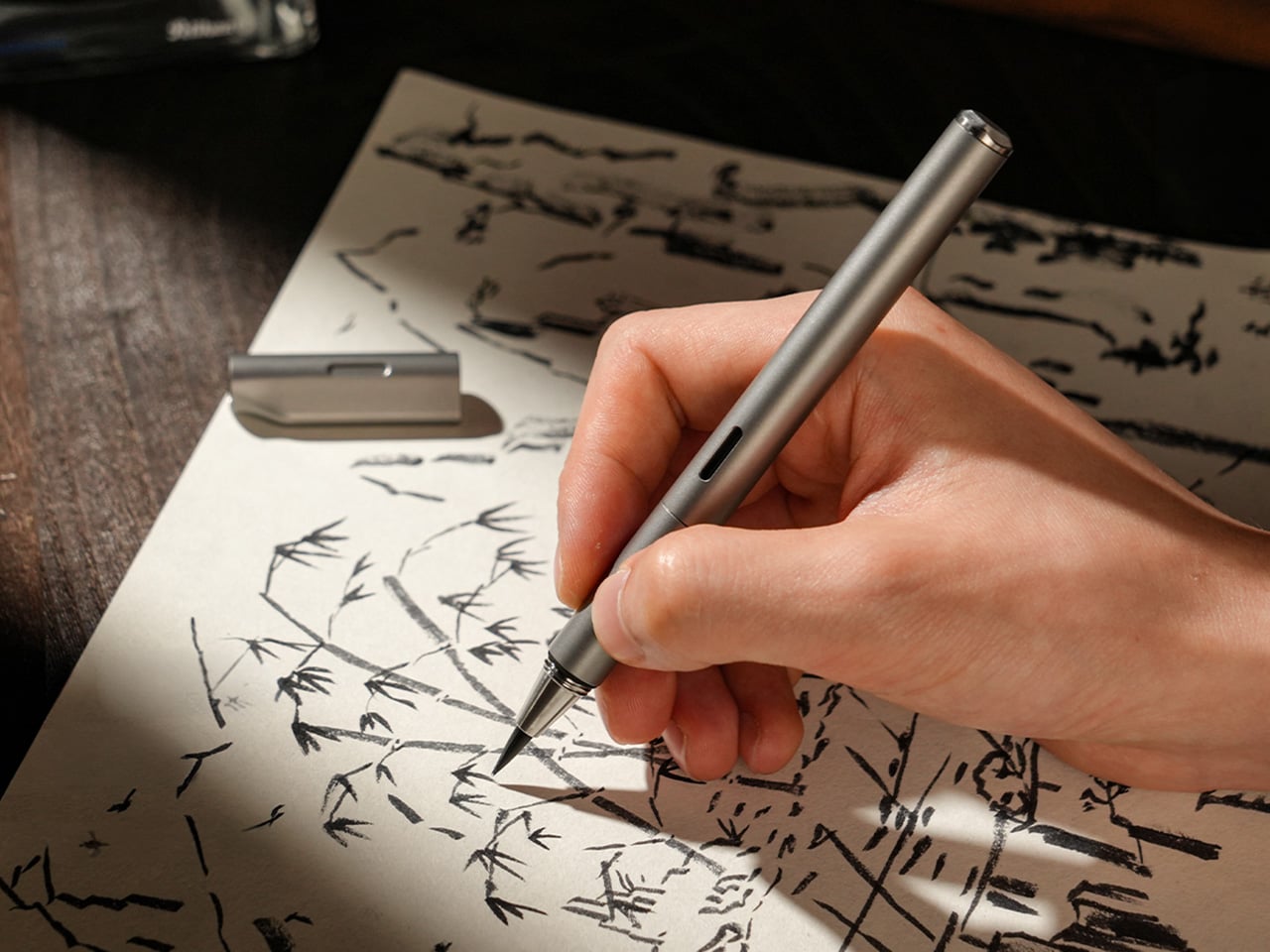
Unlike traditional fountain pen nibs that deliver a consistent line, STILL’s nylon brush tip responds directly to pressure. A light touch produces a 0.3mm hairline suitable for small details or delicate script. Medium pressure yields roughly 1.2mm, the kind of natural width most people instinctively use for everyday writing. Firm pressure opens the tip to 3mm, creating bold strokes for emphasis, headers, or expressive flourishes. Everything in between happens without conscious effort, turning line variation into a natural outcome of the writing process rather than a technical skill. If you’ve used an Apple Pencil on an iPad, you probably know exactly how much more expressive a brush pen is compared to a fineliner or a fountain pen.

That responsiveness makes STILL approachable in a way traditional brush pens often are not. Calligraphy brushes demand control, practice, and an understanding of stroke order to produce convincing results. STILL removes most of that learning curve. The nylon material is elastic enough to flex predictably but structured enough to return to shape immediately. It follows the movement of your hand rather than fighting it, which means you can pick it up and start writing without needing to adjust your grip, angle, or technique. The result is a pen that feels easy to use while delivering visual results typically reserved for more specialized instruments.

The titanium body is not decorative. Grade 5 titanium, also called Ti-6Al-4V, is a high-strength alloy used in aerospace, medical implants, and high-performance hardware. It offers an exceptional strength-to-weight ratio, corrosion resistance, and a surface hardness that resists scratching and wear over years of handling. At 30 grams, STILL sits in a comfortable middle ground between lightweight portability and the kind of heft that gives feedback in the hand. The balance point falls naturally near the grip section, which prevents fatigue during longer writing sessions and keeps the pen stable during more deliberate strokes.

Every component is CNC-machined from solid material, which eliminates the weak points that come from glued assemblies or plastic internals. The barrel threads are cut with micron-level precision, producing a smooth, wobble-free connection between the cap and body. That precision is not just tactile theater. It ensures that the cap seals tightly around the nib, preventing air from drying out the brush tip between uses. The barrel surface is left smooth rather than aggressively textured, allowing the hand to find its own natural grip position without being forced into a predetermined hold.

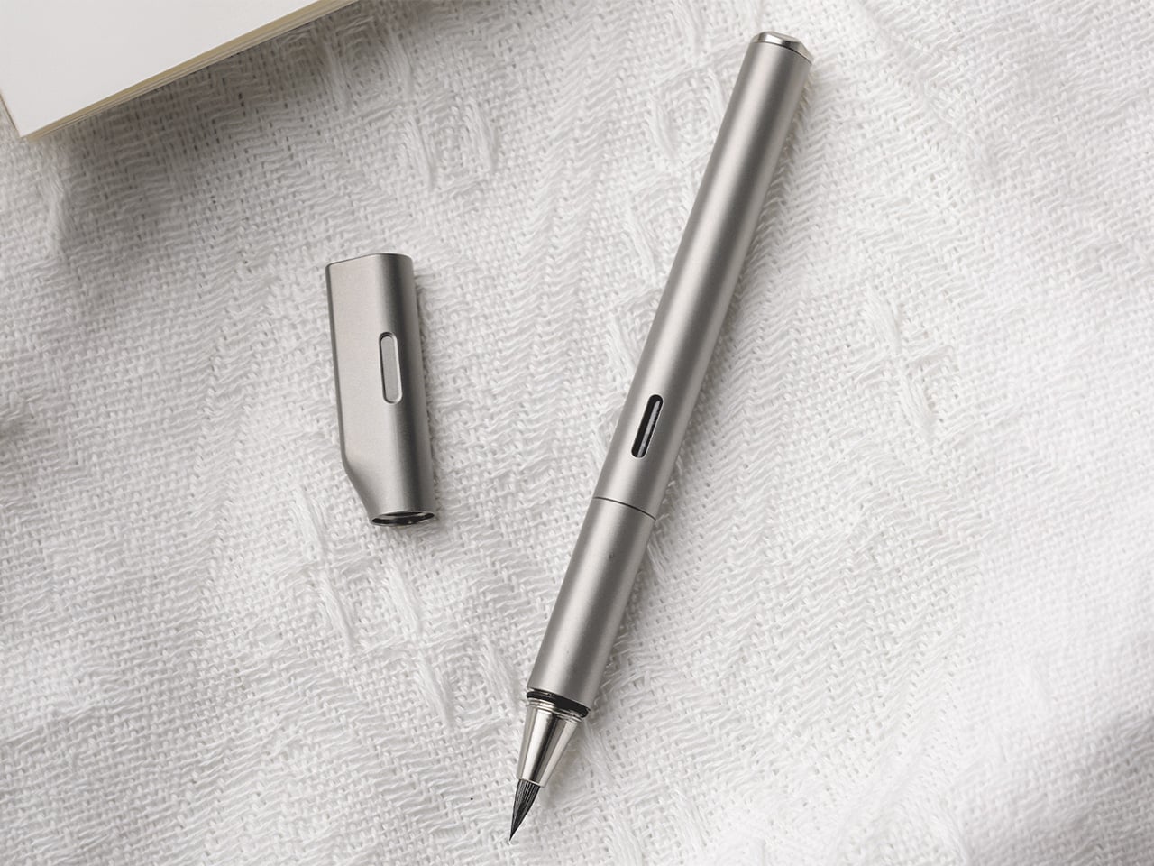
The cap does more than protect the nib. Its flat top allows the pen to stand upright on a desk, turning it into a visible, accessible object rather than something that rolls into corners or gets buried in a drawer. The teardrop cross-section solves another common desk annoyance by preventing the pen from rolling when placed horizontally. A small groove machined into the side of the cap, measuring roughly 1cm by 2mm, acts as an integrated pen rest. You can set the barrel into that groove mid-writing, suspending the nib above the surface so ink does not transfer to the table. The cap also features precision threading and an internal gasket that creates an airtight seal, keeping the brush tip moist and ready even after weeks of non-use.

The pen accepts both ink cartridges and a refillable converter, giving it flexibility across different use cases. Cartridges are faster and cleaner for travel or environments where refilling from a bottle is impractical. The converter opens access to bottled fountain pen inks, which vastly expands color options and allows for more control over ink properties like flow, saturation, and drying time. A small transparent window in the barrel displays the current ink level, removing the guesswork about when a refill is needed. That window aligns perfectly with the groove in the cap when the pen is closed, creating a visual detail that signals the care taken with tolerances and alignment throughout the design.

The anti-roll geometry and smooth barrel work together to create a pen that adapts to multiple grip styles. You can hold it like a conventional fountain pen with a tripod grip near the section, or angle it more steeply like a traditional brush, resting the barrel closer to the web between thumb and forefinger. Both positions feel natural because the cylindrical form and 10.2mm diameter provide enough surface area to stabilize without crowding the hand. The absence of aggressive knurling or molded grip zones means the pen does not dictate how it should be held, which becomes important during longer sessions where hand position tends to shift.

STILL is designed for people who write because they want to, not because they have to. It suits journaling, daily note-taking, sketching, and any situation where the act of putting pen to paper carries some intention beyond pure information capture. The brush tip makes it a strong choice for hand lettering, planner decoration, or adding visual variety to written work without requiring calligraphy skills. It works equally well for designers, students, thinkers, and anyone building a habit around analog productivity. The titanium construction and sealed cap make it practical enough for daily pocket carry, while the expressive nib keeps it interesting enough to reach for regularly.

STILL is available in six anodized finishes: Quiet Titanium, Midnight Black, Ink Blue, Horizon Blue, Moss Green, and Mist Purple. Optional leather sleeves in British Tan or Black, made from full-grain leather with soft lining, provide additional protection and a more refined carry profile. Pricing and availability details can be found on the product page.

Click Here to Buy Now: $69 $105 (35% off). Hurry, only a few left! Raised over $82,000.

The post This Titanium Calligraphy Pen Trades Tactical Utility for Softer, More Expressive Brush Strokes first appeared on Yanko Design.
5 Best Packable Outdoor Tools So Light You’ll Forget They’re in Your Bag – Until You Need Them

There is a specific kind of frustration that only comes from a pack that fights you. Zippers that won’t close. Straps digging in because the load is too heavy for a day hike. Gear that solves one problem while creating two others. The five products on this list were chosen with a single constraint: they need to justify their existence in a bag that has no spare room and no patience for dead weight.

Each one earns its place by solving a specific outdoor problem without giving anything back in bulk or effort. The Nimbus Inflatable Umbrella leads the group as its most radical thinker, but the logic runs through every pick here. Weight matters. Packability matters. The kind of reliability that doesn’t require checking before you leave the house matters most. This is the kit you build once and stop thinking about.

1. Nimbus Inflatable Umbrella

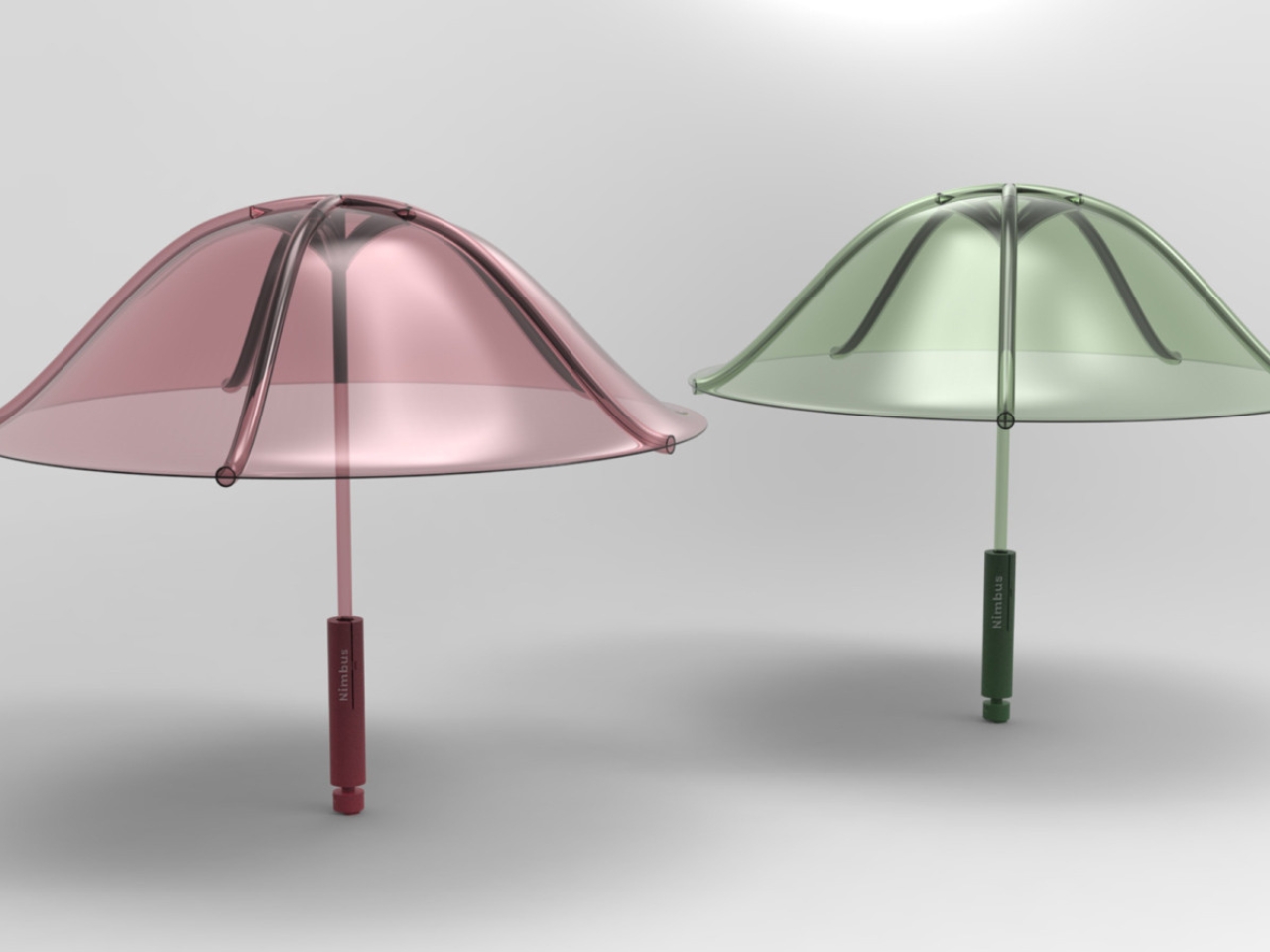
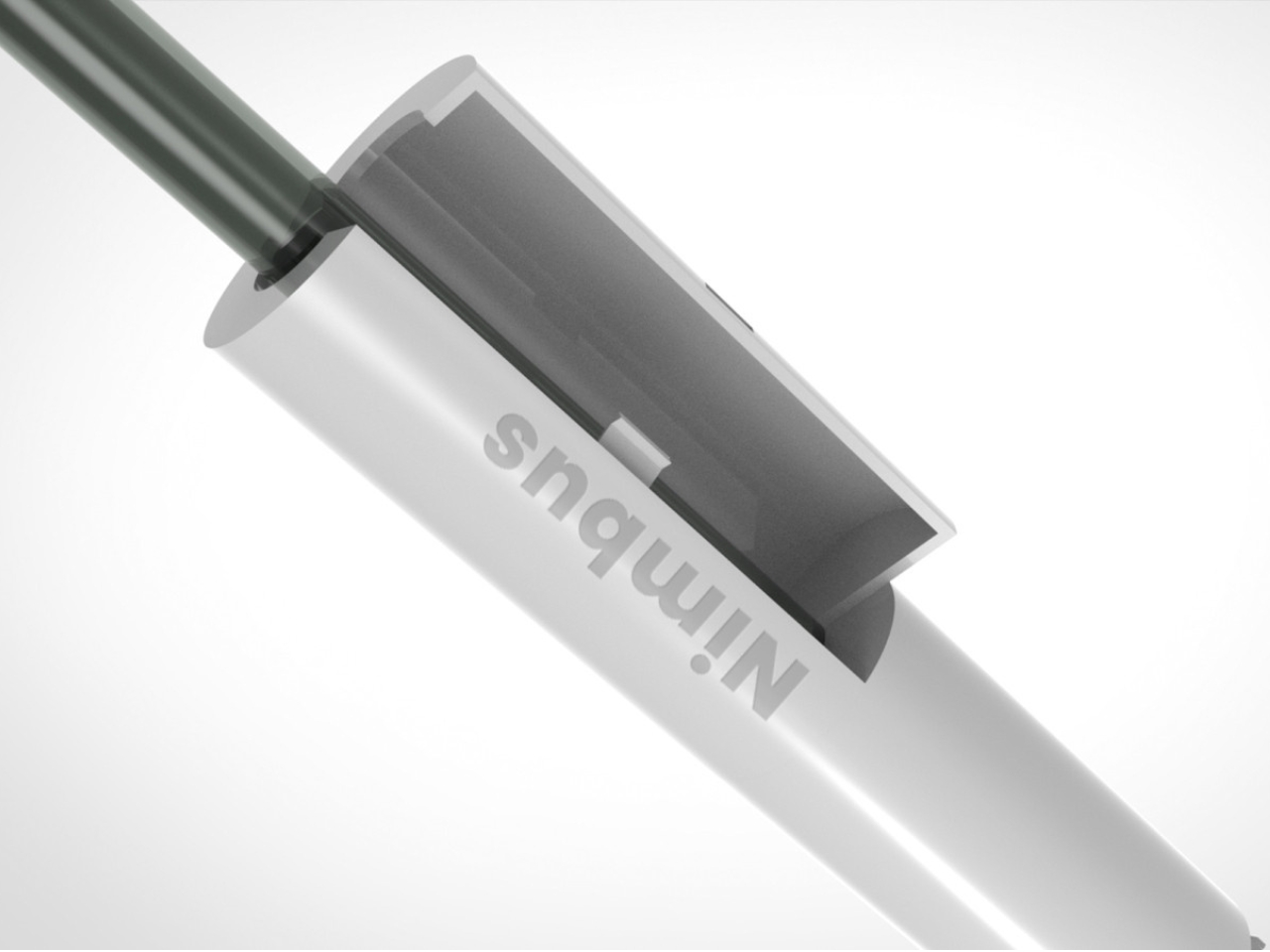
The standard umbrella has one guaranteed flaw: every rib is a failure point waiting for wind. The Nimbus, designed by four SCAD graduate students as part of their Master’s in Design for Sustainability, removes the premise entirely. Made from a single material, recyclable thermoplastic polyurethane, it inflates into structure rather than relying on a metal skeleton to hold its shape. No ribs. No joints. No layered materials that make the whole thing unrecyclable when it finally gives up.

A life cycle assessment puts the Nimbus at 99% lower environmental impact than a conventional umbrella, which is a number worth sitting with. The single-material construction also makes it repairable in ways that standard umbrellas never were, and the design team built in a buy-back program before the product even reached production scale. It has earned recognition from the Green Product Award. While it remains a concept rather than a retail product, the argument it makes is already complete.

What we like

  • Single TPU construction removes every mechanical failure point that standard umbrellas share
  • 99% lower environmental impact verified through a full life cycle assessment

What we dislike

  • Currently a concept product and not yet available for retail purchase
  • Inflation before use adds a step that a conventional umbrella does not require

2. Blackout Beam Tactical Flashlight

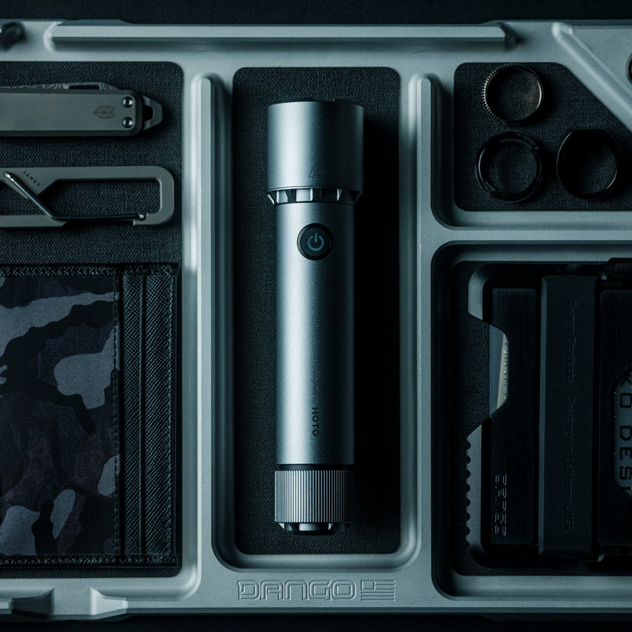
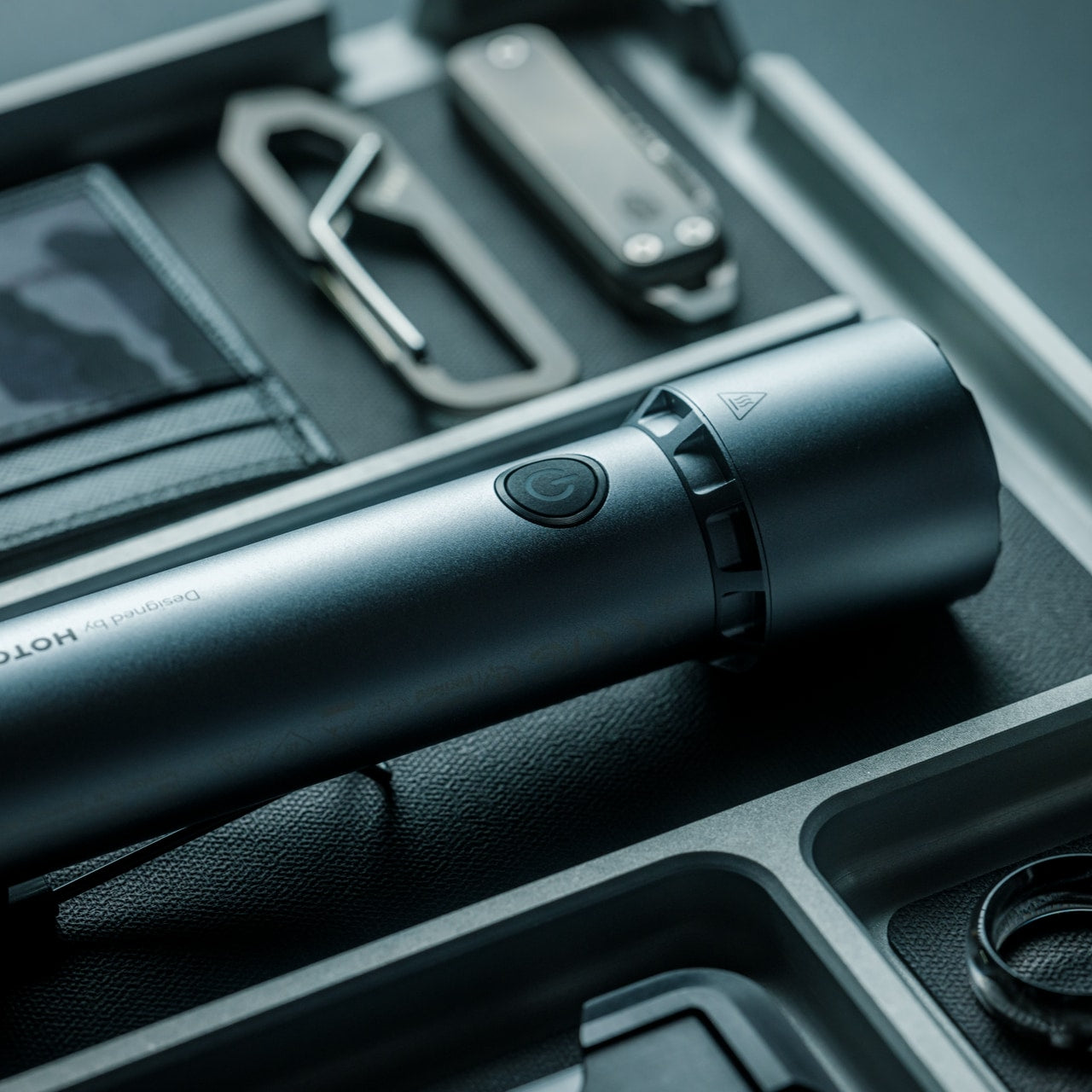
A flashlight earns its place in a packable kit by being the one you actually have on you when the light fails. The Blackout Beam Tactical Flashlight makes that case on size before it gets to output. It delivers enough brightness to handle trail navigation and campsite tasks in a body compact enough to sit alongside the rest of this kit without occupying space the rest of the bag has already negotiated for.

Tactical flashlights tend to be engineered for demands most outdoor users will never encounter, which means the camper or day hiker ends up with hardware overspecified for the task. That margin matters more than it sounds. When navigating an unfamiliar trail after dark or searching a tent interior in total darkness, a light that performs beyond what the moment requires is a light that has never let you down. The Blackout Beam earns its slot by being ready before you are.

Click Here to Buy Now: $90.00

What we like

  • Compact form factor carries without claiming dedicated pack real estate
  • Built to a performance standard that comfortably exceeds typical outdoor demands

What we dislike

  • Tactical construction favors utility over refined aesthetics
  • Requires battery management like any powered carry item in an active kit

3. NoxTi Tritium Keychain

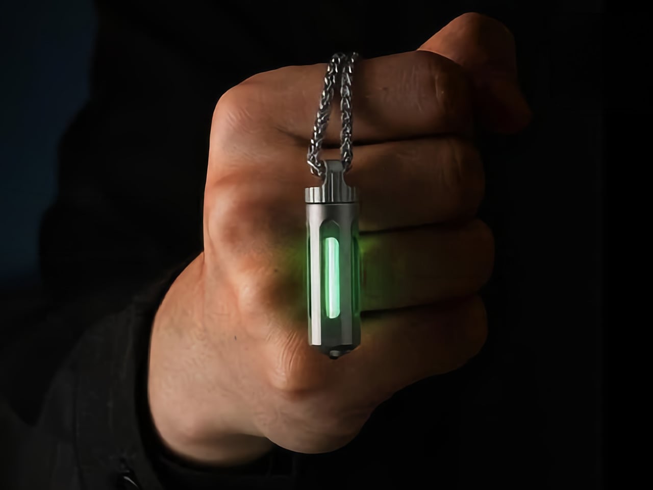
The NoxTi does not run on anything you pack. A 45mm Grade 5 titanium cylinder weighing 10.7 grams, it houses a tritium vial inside a precision quartz tube with 92% light transmission. Tritium is a hydrogen isotope whose beta particle decay strikes a phosphor coating and produces continuous light as a straightforward byproduct of existing. The glow runs for 25 years without a switch, battery, or charge cycle. You add it to the kit and stop tracking it entirely.

In outdoor use, the NoxTi handles a job the Blackout Beam cannot: passive location without activation. It marks your keys at the bottom of a bag, identifies your tent entrance without a search, and stays visible through a full night without being switched on. Six glow colors address different use cases, with red available for night-vision preservation borrowed from military and aviation practice. The ceramic-tipped tail adds a glass breaker for genuine emergency utility without changing the carry footprint.

What we like

  • 25-year continuous glow powered by physics with no battery, switch, or charging required
  • Fully user-serviceable body becomes a permanent platform with swappable tritium cores

What we dislike

  • Intentionally faint glow marks and locates rather than providing meaningful illumination
  • Tritium classification may restrict import or carry in certain countries

4. Camprit TiStove

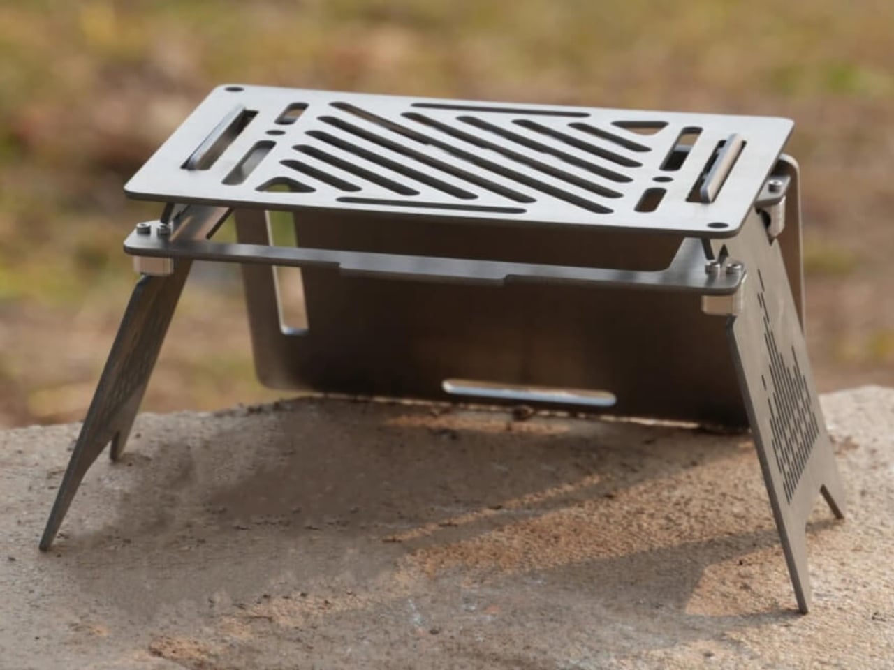
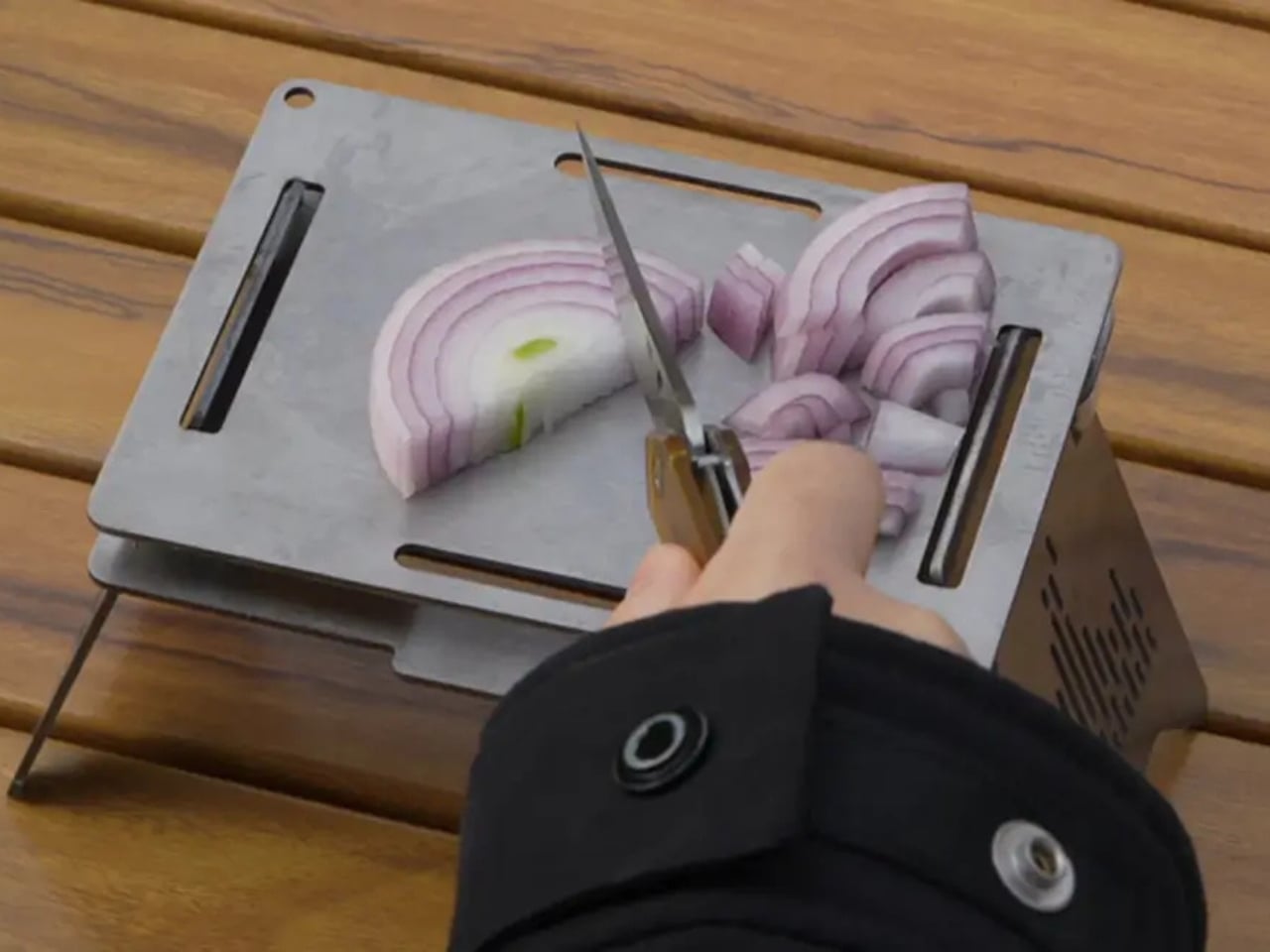
Five flat titanium pieces. That is the entire TiStove. Two foldable legs and three interchangeable cooking panels that pack completely flat, come in under 1.5 pounds, and assemble without fasteners, threading, or a manual. Camprit’s logic was that most camp stoves lock you into a single cooking method and add bulk to compensate. The TiStove removes that assumption. Three panels reconfigure for boiling, grilling, or open-fire cooking, and the spare panels function as a windshield when conditions require one.

There is no ignition system to fail at altitude, no gas canister threading to seize in cold weather, no proprietary fuel that limits what the trip can include. The TiStove accepts wood, gas, and alcohol, adapting to what the trail provides rather than what you remembered to bring. Titanium picks up color from heat over time, marking each stove with its own record of use. For a camp kitchen with no single point of failure, this is where it starts.

What we like

  • Packs completely flat at under 1.5 lbs with three interchangeable cooking configurations
  • Compatible with any fuel source including wood, gas, and alcohol without modification

What we dislike

  • Requires a separate burner or fuel source since nothing in the system is self-contained
  • Titanium panels need careful packing to avoid surface contact and scratching

5. Aero Spork (0.25 oz)

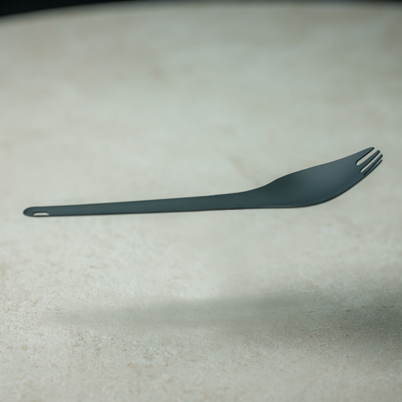
Quarter of an ounce. That figure sounds like marketing until you hold the Aero Spork and realize the engineers took it seriously. Titanium construction at that weight means the tradeoff between durability and gram savings, the negotiation that haunts most ultralight gear, simply does not apply here. The curved ergonomic form handles soup, pasta, and everything in between without requiring the compromises that most sporks impose on at least one function. It does both jobs properly without apologizing for either.

The Aero Spork stacks cleanly, which matters more on group trips than solo ones. When each person brings their own, and the pack reaches capacity, they consolidate without adding bulk. The tapered end handles noodle twirling with enough precision to feel intentional rather than approximate. It is the kind of object whose design becomes invisible because every decision was made correctly. You stop noticing it and start using it, which is the goal of any good tool.

Click Here to Buy Now: $25.00

What we like

  • 0.25 oz titanium construction removes any weight penalty from the carry decision
  • Stackable design scales cleanly for group trips without multiplying bulk

What we dislike

  • Small form factor requires some adjustment from standard cutlery sizing
  • Single utensil format means committing to the spork over carrying separate pieces

The Lightest Kit Is the One That Never Comes Back Out of the Bag

Five products, five outdoor problems, and a combined carry weight that barely registers. What connects them is a refusal to make you choose between function and footprint. The Nimbus reframes what a weather shelter can weigh. The NoxTi removes an entire category of gear from your charge list. The TiStove reduces the camp kitchen to a flat stack of metal. Each one solves its problem at the root rather than working around it.

The best outdoor kits are not the ones with the most options. They are the ones where every item has earned its place, and nothing remains by default. Pull any of these five out of the bag, and you know exactly why it made the cut. Pack all five, and you will start wondering what else you have been carrying that cannot answer the same question. Light is a habit. Once you build it, everything else starts to feel like excess.

The post 5 Best Packable Outdoor Tools So Light You’ll Forget They’re in Your Bag – Until You Need Them first appeared on Yanko Design.

Gage Roads Just Turned a Surfboard Into a Beer Tap

The last debate you expected to find at the heart of a design story was a surfing one, but here we are. For years, the surf community has been at odds over something surprisingly technical: should surfboards be measured in volume, using litres? It sounds like a niche argument, but for shapers and surfers, the stakes are genuinely real. Leave it to an Australian brewery to turn that argument into one of the most interesting design objects of the year.

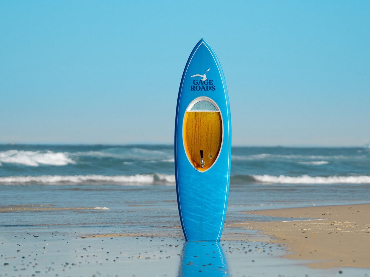
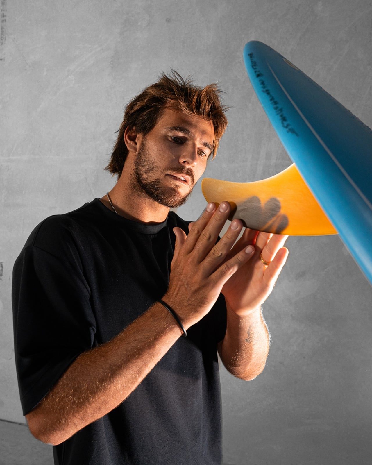
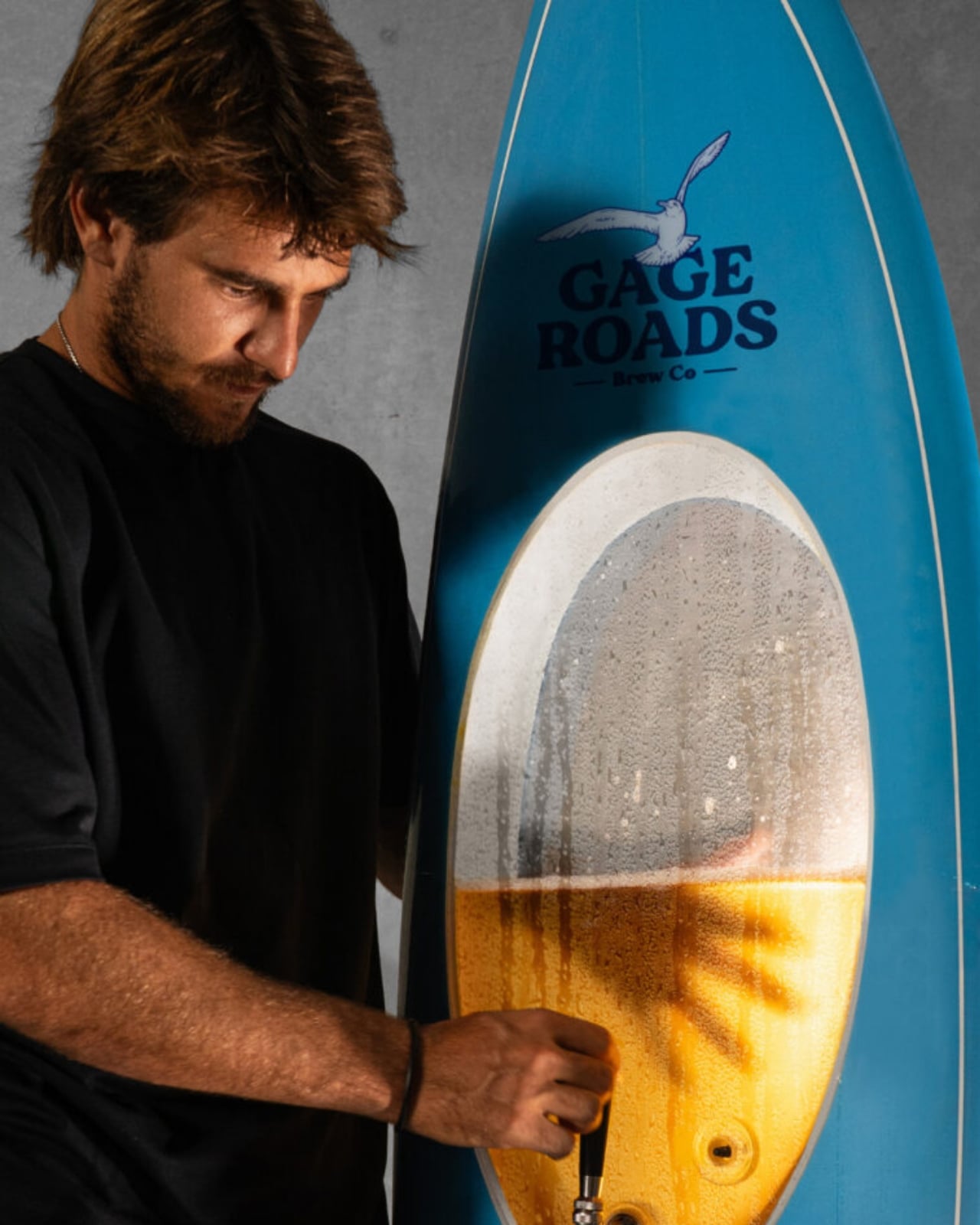
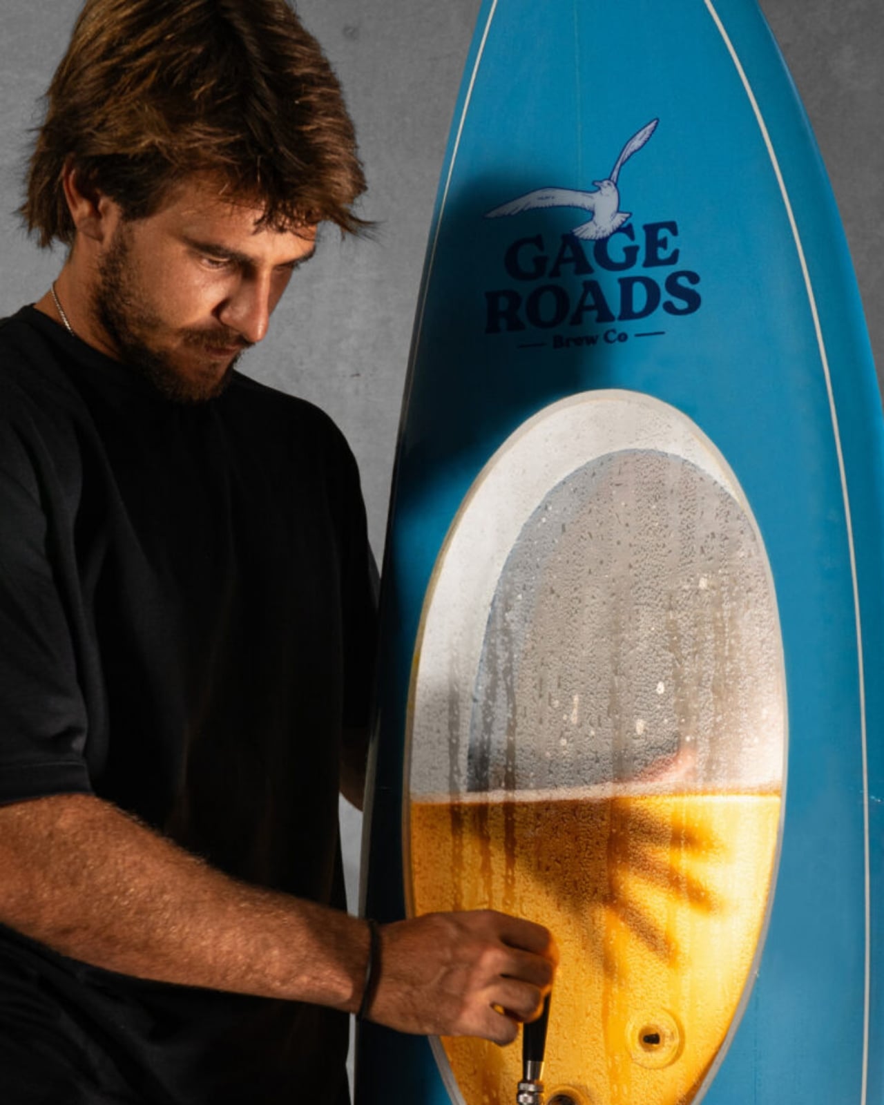
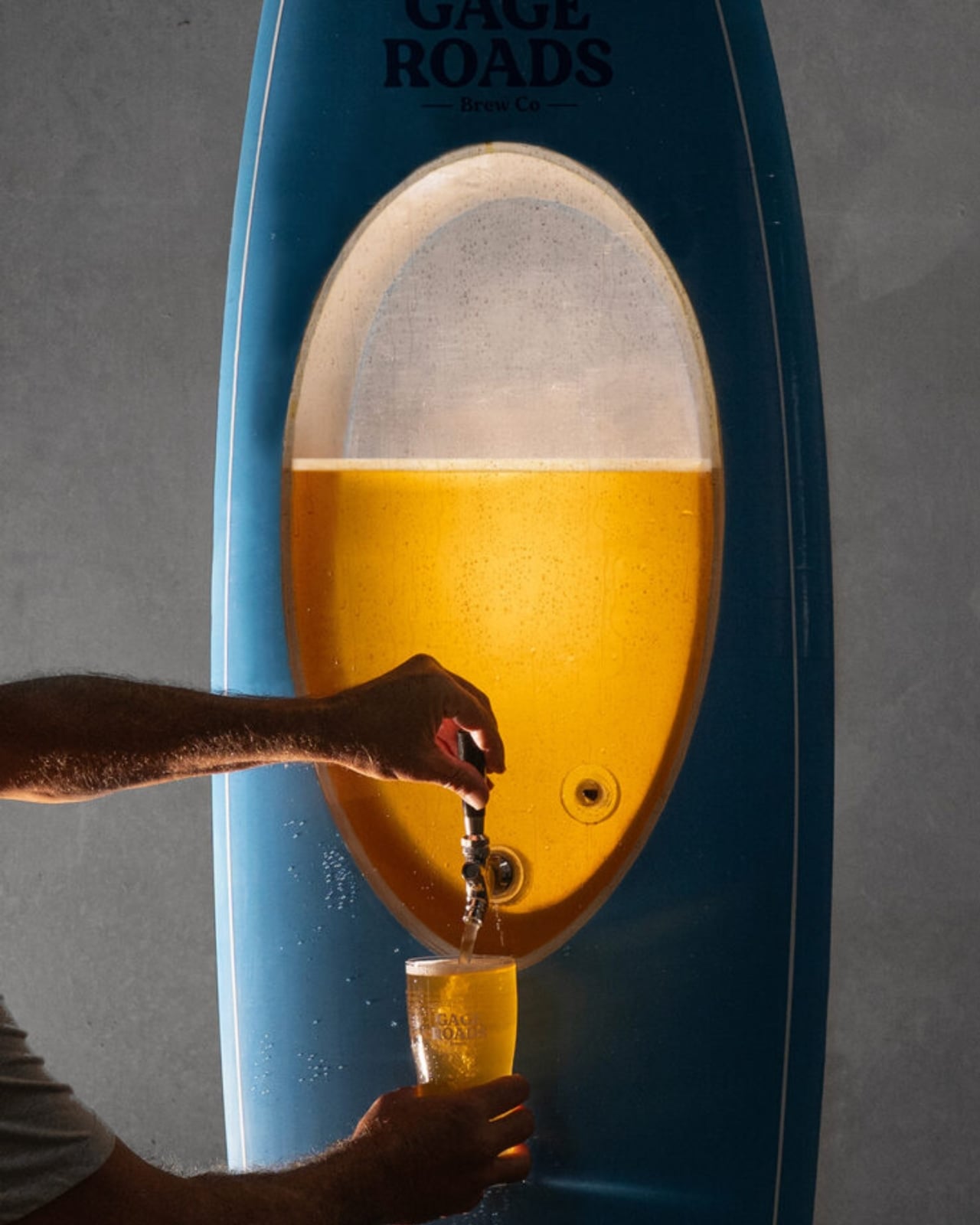
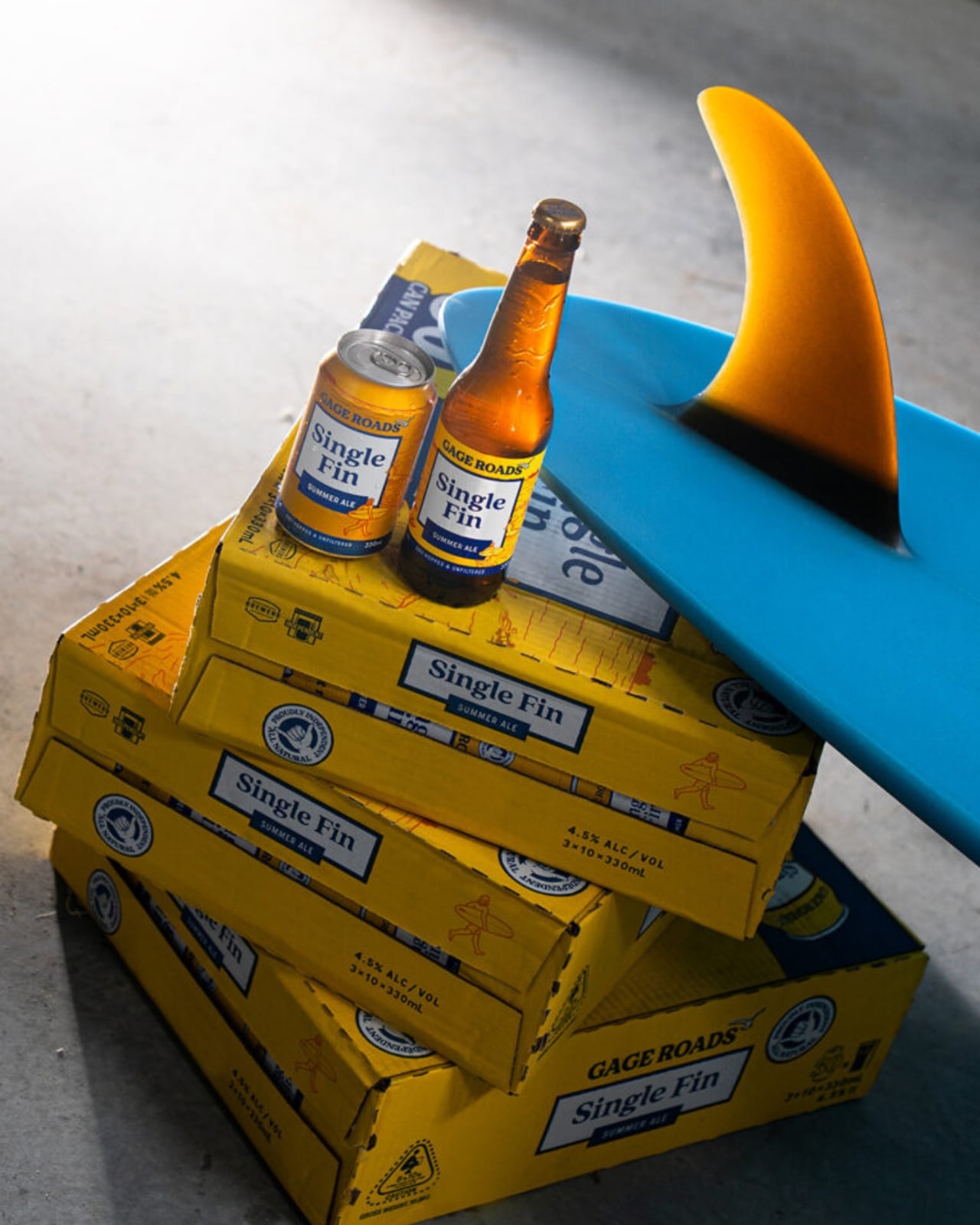
Gage Roads Brew Co. partnered with legendary board shaper Chris Garrett of Phantom Surfboards to create the Beerboard, a custom single-fin surfboard built with a sealed internal chamber capable of holding 10 litres of Gage Roads Summer Ale Single Fin. Yes, it actually surfs. And yes, it actually pours beer. That’s the whole glorious point.

Designer: Chris Garrett with Gage Roads Brew Co

The concept itself is brilliantly simple, but the execution was anything but. The engineering challenge of making a surfboard capable of storing pressurised beer without leaking, or worse, imploding mid-session, required serious work. Garrett’s decades of experience as a shaper came into play here in ways that go well beyond surface aesthetics. He’s been crafting boards since 1979, and Phantom Surfboards has been his life’s work since 1984. Designing the Beerboard meant rethinking the interior construction entirely, embedding a food-safe chamber that could handle pressurisation while preserving the board’s hydrodynamics. The build process reportedly came with a few explosions along the way, which is either alarming or just the most Australian development story imaginable.

The board draws inspiration from the iconic Greenough Spoon, a shape dating back to the 1960s. Choosing that reference wasn’t accidental. The Spoon was itself a radical rethink of what a surfboard could be, and the Beerboard follows directly in that spirit. It doesn’t look like a novelty item. It looks like a real board, clean and purposeful, and that restraint is exactly where the design succeeds. A gimmick slapped together for a social media moment would have felt cheap. This doesn’t feel cheap at all.

Once the board was finished, Gage Roads called in Olympic surfing medalist and part-owner Jack Robinson alongside legendary free surfer Brendan “Margo” Margieson for sea trials. The fact that professional surfers actually took it into the ocean, rode it, and then presumably poured a cold one from it afterward is a key part of why the Beerboard registers as more than a marketing stunt. It works, both as a surfboard and as a beer dispenser. That functional integrity is what elevates the whole project.

Is the Beerboard a practical product? Not remotely. You’re not about to wax this thing down and paddle out for your morning session while worrying about keeping your lager cold. But practicality is the wrong lens here entirely. The most interesting design objects rarely exist to solve a purely utilitarian problem. They exist to reframe one. The Beerboard reframes the entire surfboard volume debate by making it physical and playful, by literally filling a surfboard with the very unit of measurement causing all the fuss. It’s design as commentary, and it genuinely lands.

It also matters who made this. Chris Garrett isn’t an ad agency prop designer. He’s a craftsman with nearly 50 years in the industry, someone whose boards have been trusted by some of the world’s top surfers across decades. Bringing his expertise to a project like this gives the Beerboard a credibility it wouldn’t have had otherwise. It’s the difference between a concept and a creation.

I’ve seen plenty of branded design collaborations that felt hollow or performative, where the “design” was really just a logo slapped on a limited-edition container. The Beerboard isn’t that. It required genuine engineering, real craft expertise, and the confidence to commit fully to a ridiculous idea until it became a remarkable one. That, I think, is what good design actually looks like. Sometimes it just happens to come with a tap.

The post Gage Roads Just Turned a Surfboard Into a Beer Tap first appeared on Yanko Design.
Health Apps Know You’re Stressed, HealingFit TWS Helps You Act on It

Health apps and wearables have become remarkably precise at reading the human body. They can tell you how restorative last night’s sleep was, how stressed your body was during a presentation, and whether your recovery is on track after a hard week. What most of them don’t do, at least not in any concrete way, is hand you a tool to act on what they’ve just told you.

That’s the gap MobiFren founder and CEO Juwon Heo set out to address with the HealingFit TWS, a true wireless earbud built to go beyond standard listening. It earned a CES 2026 Innovation Awards recognition in Headphones and Personal Audio, but the more compelling aspect isn’t the accolade. It’s the design thinking underneath it, and what that thinking could mean for the broader world of digital health.

Designer: Juwon Heo, Founder & CEO, MobiFren

Click Here to Buy Now: $169 $300 (44% off). Hurry, only 11/290 left! Raised over $67,000.

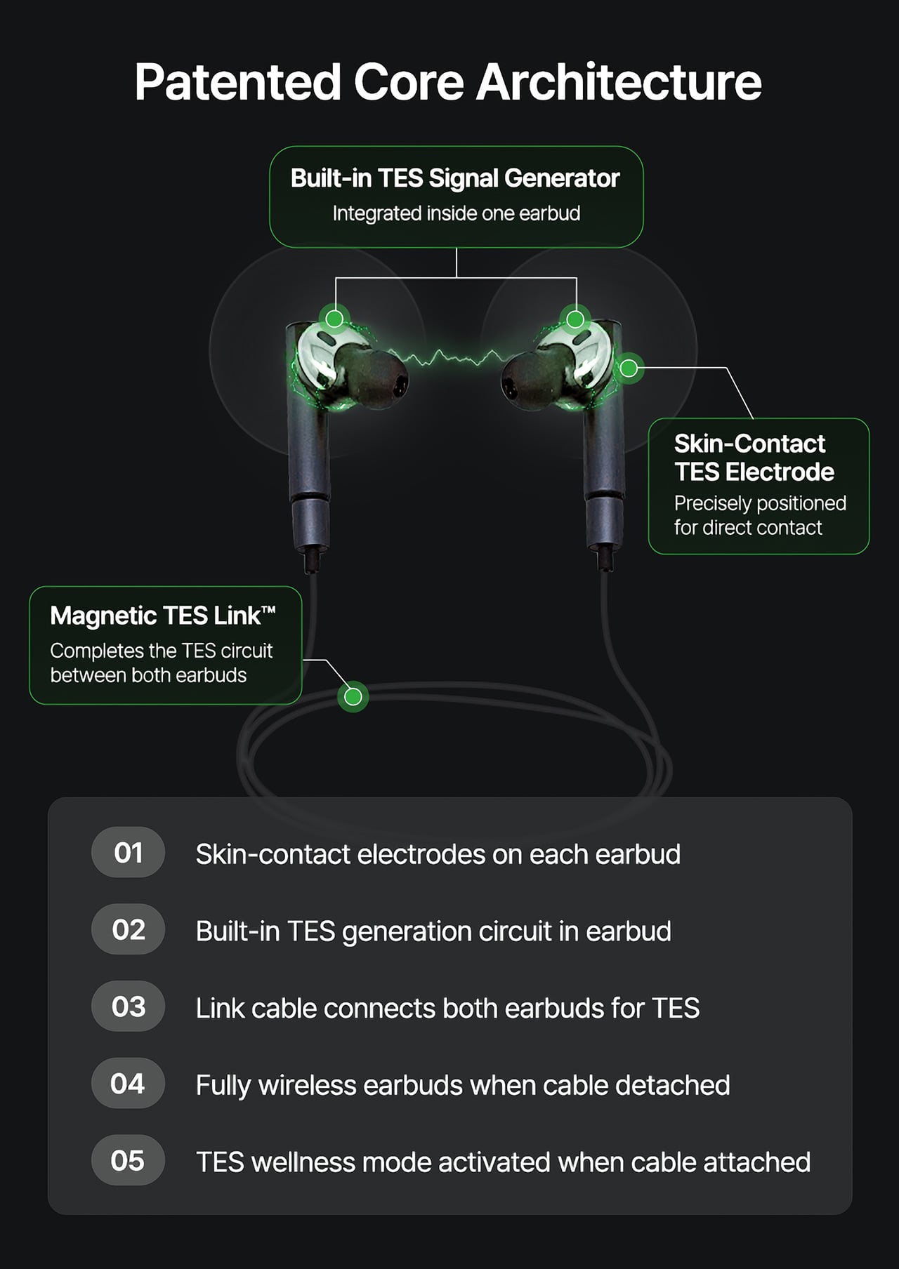
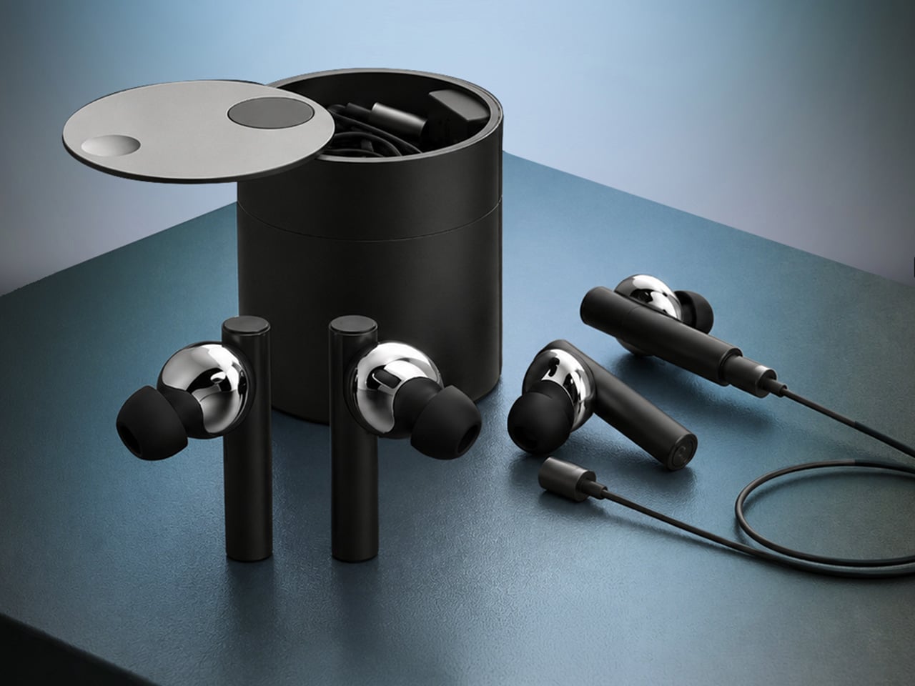
During normal use, HealingFit TWS functions as a premium pair of true wireless earbuds with Bluetooth 6.0, Hybrid ANC, and five tunable sound modes built on MobiFren’s own MSTS sound tuning system. The shift into wellness mode happens when you attach the Magnetic TES Link, a cable that snaps magnetically onto both earbuds. There’s no separate gadget involved, and no new category of hardware to carry.

TES, or Transcranial Electrical Stimulation, is a non-invasive approach widely studied in neuroscience. HealingFit TWS translates it into a controllable daily routine, running calibrated microcurrents through skin-contact electrodes built into each earbud. The intensity is adjustable across 15 levels, and most people describe the sensation as a subtle, rhythmic pulse. It’s designed to support the nervous system’s natural shift toward rest or focus, not force it there.

Three wellness modes organize the experience. Sleep is the bedtime routine, pairing TES with binaural audio tracks to help you gradually settle for the night. Healing is a shorter session for mid-afternoon or post-work moments when the day has felt relentless. Study is a focus-priming routine to run before anything demanding real concentration. Each mode comes with five dedicated tracks, though you can also layer TES over your own music.

That three-mode framework reads differently from the perspective of a digital health platform. Platforms like Samsung Health, Apple Health, Google Health, and Fitbit have become genuinely capable at detecting sleep quality, stress levels, recovery readiness, and daily activity. They generate scores, flag patterns, and surface recommendations. What they don’t typically offer is a connected, device-level way to act on those signals in the moment they appear.

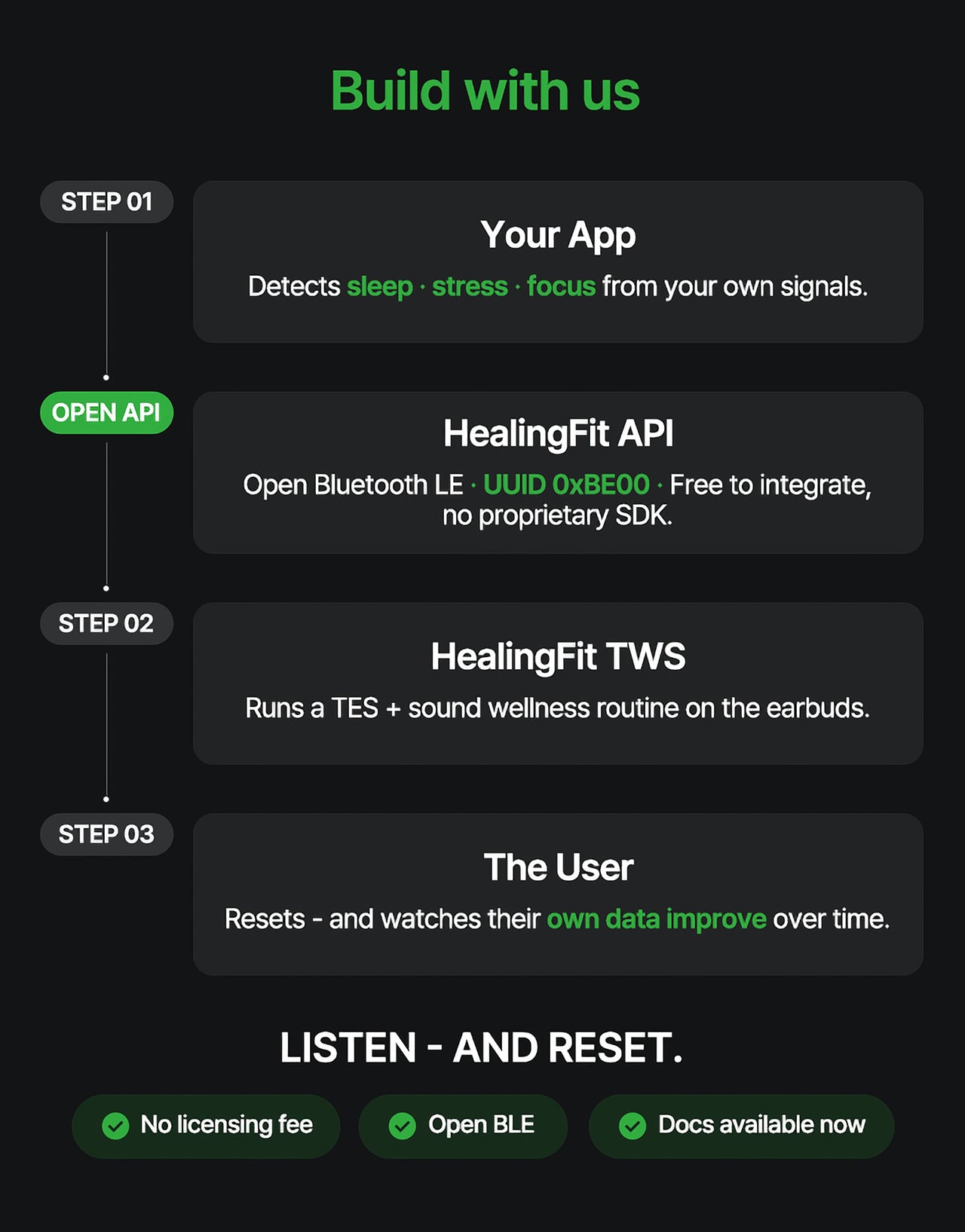
HealingFit TWS addresses that with an open Bluetooth LE interface that developers and platform teams can connect to without a licensing fee or a proprietary SDK. The technical entry point is UUID 0xBE00, and documentation is publicly available through mobifrenglobal.com. The intent is clear: the earbud becomes the intervention hardware, while the app or platform provides the health context that determines when and which session a user might benefit from.

Think about what that could look like in practice. A sleep app detecting elevated pre-bed stress could suggest a Sleep session. A recovery platform flagging low readiness after a demanding training week could prompt a Healing routine. A focus tool that spots declining concentration before a deadline could surface the Study mode. In each case, the platform has done its analysis. HealingFit TWS handles what comes after.

The core architecture places a TES-generating circuit inside one earbud, with electrodes on the front of each earbud that contact the ear canal, and a TES Link cable that connects both earbuds. Detached, it functions as flagship-grade wireless earbuds; connected, it transforms into a wellness device designed to support sleep, stress relief, focus, and memory.

What makes the TES architecture appealing to hardware teams isn’t just the open API. The circuit that generates TES signals relies on entirely standard, commercially available components, totaling just 18 parts: a dual-transistor chip, one FET, and a set of RLC components. The earbud’s existing charging contacts also serve as the TES link contacts, so no extra contact points or major structural changes are needed.

The design has received formal IP recognition across multiple jurisdictions. The U.S. patent application covering the core architecture has been allowed and is proceeding to registration, with the patent expected to be granted soon. There are also registered patents in Korea and Japan, as well as a published application in Europe. FCC certification was granted on July 1, 2026.

Heo founded MobiFren in February 2002, originally as a contract developer for Samsung Electronics feature phones. The company started building its own Bluetooth audio products in 2005 and brought its first Bluetooth earphones to market in 2006. MobiFren has maintained an ongoing relationship with Samsung through smartphone software verification work ever since. That two-decade grounding in Bluetooth audio is what gives HealingFit TWS its engineering footing.

The choice to build this platform on earbuds specifically is, in that context, a deliberate one. Earbuds are already the personal technology closest to the human body for most of the waking day. They’re phone-paired, habitually worn, and typically owned by the same people most likely to be using a health app. Embedding TES therapy into a device people already carry daily removes most of the adoption barrier entirely.

The hardware reflects that audio-first foundation. Alongside the TES system, HealingFit TWS delivers up to 6.5 hours of playback and up to 4.5 hours in TES mode, with Hybrid ANC, three microphones per side, and wear detection for auto-pause when an earbud is removed. Both earbuds and the Magnetic TES Link cable dock in a cylindrical charging case finished in anodized aluminum, designed to carry without fuss.

What Heo is ultimately proposing is a platform category that doesn’t quite have a name yet. His comparison is to how true wireless earbuds, from AirPods to Galaxy Buds, turned personal audio into a mainstream daily habit. The longer ambition is for this patented TES architecture to be adopted into future products from those same companies, giving their health platforms a connected hardware layer for the signals they already detect.

The more compelling case might be for the health platforms themselves. Apple Health, Google Health, Samsung Health, and Fitbit have spent years becoming sophisticated at detecting when something is off: poor sleep, elevated stress, slow recovery. What they don’t yet widely offer is a hardware path from that detection to user-controlled action. HealingFit TWS was built to be exactly that path, and it’s open to anyone willing to test it.

That’s a bold bet, and the category he’s describing doesn’t fully exist yet. But HealingFit TWS makes a credible early case for it, with a patent-allowed architecture, open developer access, and a hardware design that doesn’t ask users to change anything about how they already carry and use earbuds every day.

Click Here to Buy Now: $169 $300 (44% off). Hurry, only 11/290 left! Raised over $67,000.

The post Health Apps Know You’re Stressed, HealingFit TWS Helps You Act on It first appeared on Yanko Design.

Forget Smart Homes, Moooi Is Designing Homes That Feel Alive

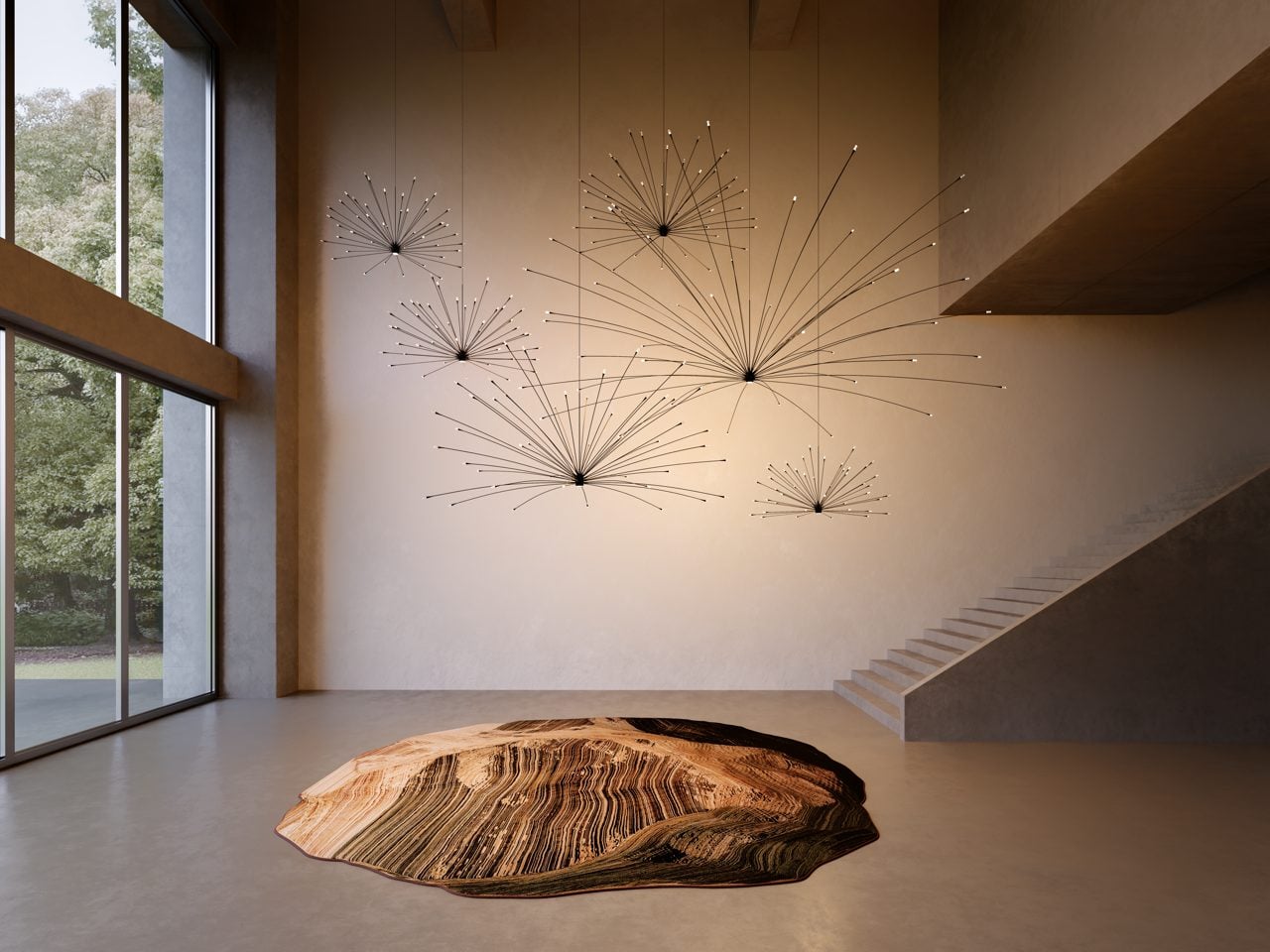
Light moves through trees. Shadows stretch and shrink. No two afternoons ever look quite the same. Moooi wants your living room to borrow that same restlessness. In a conversation with Yanko Design, the Dutch design house laid out a vision for interiors that respond to time, mood and the people living inside them, rather than staying frozen in one fixed arrangement from the day they’re installed.

It is a strange kind of ambition for a furniture brand to have. Strange but brilliant. Moooi has spent 25 years refusing to make boring things, and its next chapter looks less like a product catalog and more like a philosophy for how homes should feel. Not smarter. Not more automated. Just more alive, in the same unpredictable way the outside world already is.

Designer: Moooi

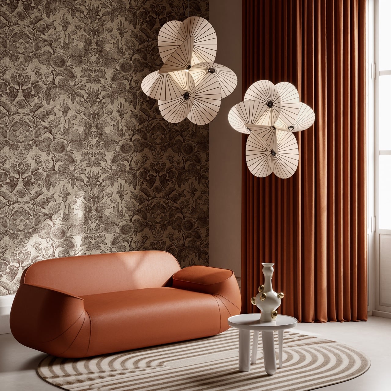
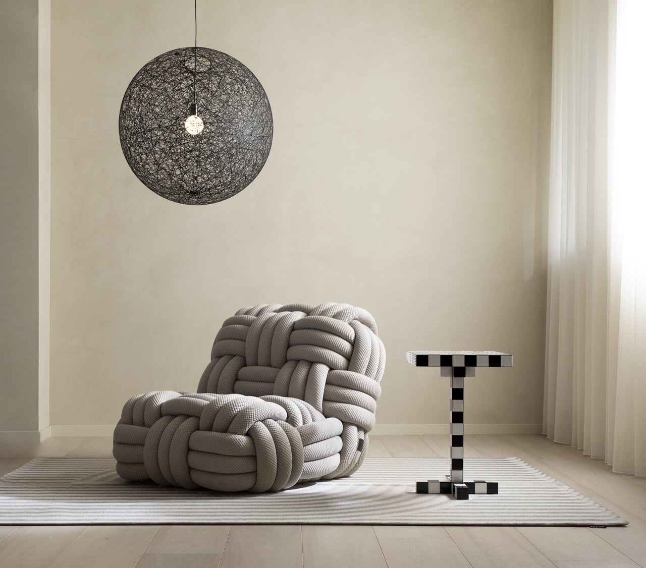
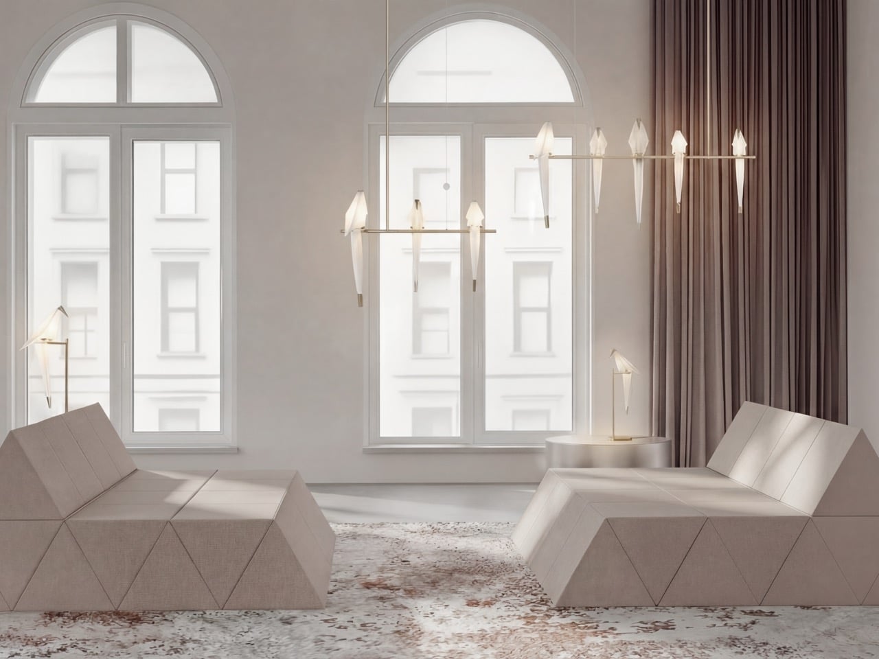
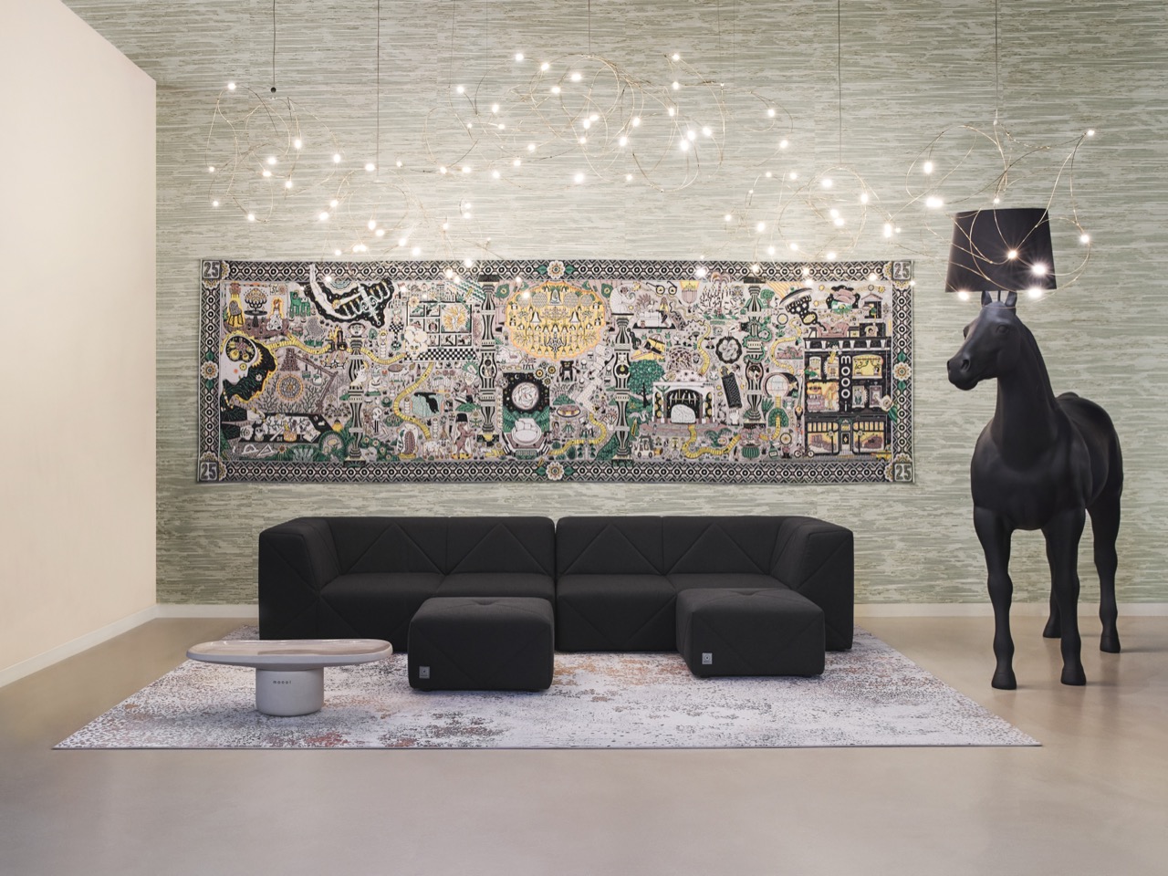
The concept has a name, The Living Room, and it started as a simple question the brand kept circling back to. What if an interior never sat still, but moved through a day the way the world outside a window does, gradually and without announcing itself. Lighting could soften as morning turns to afternoon. Objects could shift subtly in response to who’s in the room and what they’re doing. Nothing about it reads as gimmick or gadgetry, which is deliberate, since Moooi keeps insisting this has nothing to do with sensors or automation. It reads instead like weather indoors, a mood that drifts rather than a setting you toggle. That distinction matters more than it sounds.

Atmosphere has subtly become the real product Moooi sells, and everything else follows from it. The brand says its process now starts with a single question, how do people want to feel the moment they walk in, long before anyone picks a fabric or a finish. That thinking explains why Moooi’s catalog has crept well past furniture and lighting into wallcoverings, carpets, ceramic tiles and even bespoke scent. Each addition exists to thicken the sensory layer of a room rather than decorate its surface. Building a mood board was never the goal. Building an entire world was.

Personalization is where the philosophy stops being poetic and starts getting genuinely strange, in the best sense. Moooi’s collaboration with EveryHuman uses AI to translate a person’s mood into a custom room fragrance, treating scent as another material a designer can shape rather than an afterthought sprayed in before guests arrive. That same instinct extends to digitally printed carpets and layered surfaces built around individual taste instead of a single house style. The brand frames this as giving creative tools to people rather than finished products, which flips the usual furniture relationship on its head. You are not buying a chair here. You are being handed the freedom to keep shaping a space as your own taste evolves.

None of this would land without Moooi’s oldest habit, which the brand still describes as an ambition to stop the boring business. That mantra showed up loudly at the brand’s 25th anniversary installation in Milan this year, a mirrored, multi sensory environment built at Superstudio Più with choreographer Yoann Bourgeois, layering light, movement and scent into something meant to be felt rather than simply viewed. Marcel Wanders has said there’s no one who walks through a Moooi installation feeling nothing, and that stubborn refusal to be neutral is the connective tissue between a 2001 startup and a 2026 AI fragrance experiment.

Where this goes next is of more consequence than where it started. Moooi has been clear that technology should function as another creative material, sitting alongside craft and color rather than steering the whole show. If The Living Room concept ever leaves the realm of installation and lands inside actual homes, it will be a genuinely different pitch than anything coming out of the smart home industry right now. Not a house that watches you. A house that keeps you company.

The post Forget Smart Homes, Moooi Is Designing Homes That Feel Alive first appeared on Yanko Design.
The 8 Best Couch Essentials for the World Cup Final

The World Cup Final happens once every four years. You’ve watched the group stages on your phone, followed the knockouts with one eye on a laptop, and somehow made it to Sunday without a setup that actually matches the occasion. This is the match worth doing properly. Not with a sports bar crowd and warm beer, but from your own couch, with everything exactly where it should be.

The difference between a good viewing setup and a great one isn’t the size of your TV — it’s the details around it. The glass you’re drinking from, the surface your snacks sit on, the sound filling the room. These eight picks are the things that turn three hours on a couch into something worth remembering.

1. Couch Console

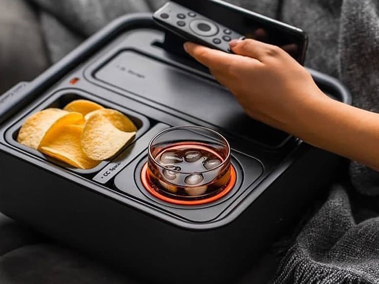
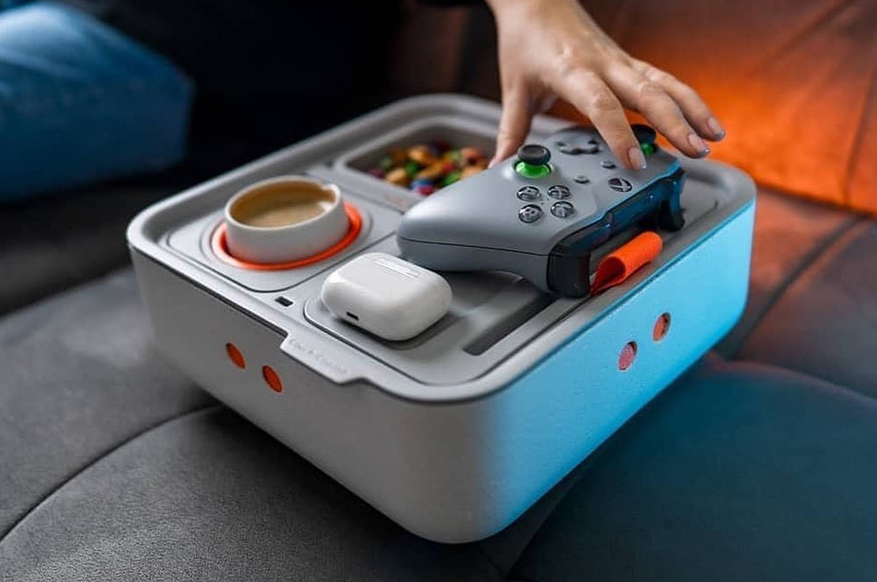
The Couch Console is the anchor of the whole setup. Built with a gyroscopic mechanism that keeps drinks level regardless of how you’re sitting, it solves the single most stressful problem of couch-based viewing — the spill. It clips onto your cushions, stays stable, and holds a drink, snacks, and your phone in one compact footprint. For a 90-minute match that goes to extra time and penalties, that reliability matters more than any individual feature.

Beyond the gyroscope, the Couch Console comes with a USB-C hub built into the top, which connects to whatever external battery you have tucked into its onboard storage space. That means your phone is charging while you watch, your snacks are within reach, and your drink is never in danger. It’s the kind of product that sounds like a novelty until the moment you actually use it, and then it seems obvious that this should have existed all along.

What We Like

  • Gyroscopic drink holder eliminates spills on upholstered furniture
  • USB-C hub keeps devices topped up without a cable reaching across the room

What We Dislike

  • Works less well on deep sectionals where the arm placement is awkward
  • The aesthetic leans functional over considered — it won’t earn compliments on looks alone

2. Prism Titanium Beer Glass

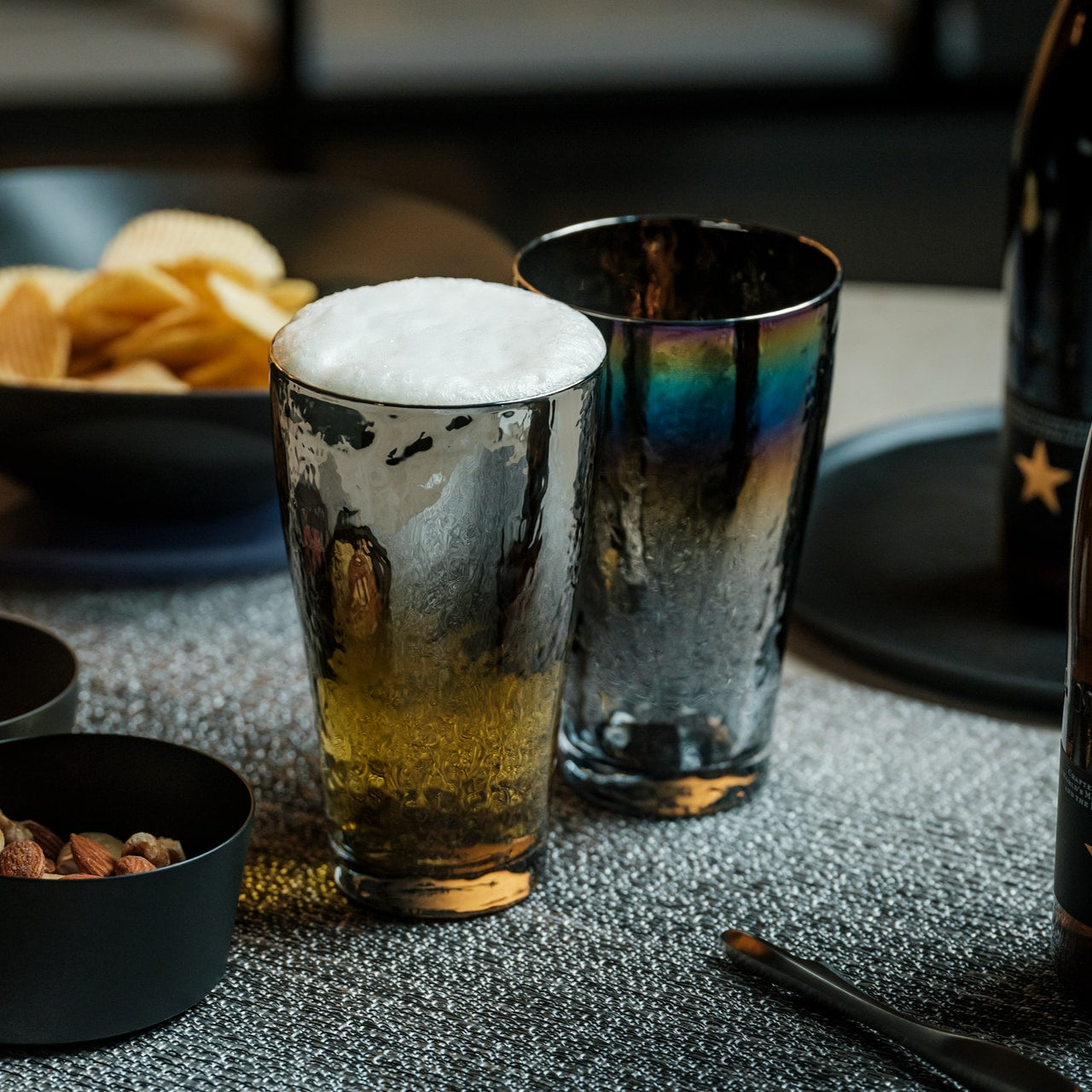
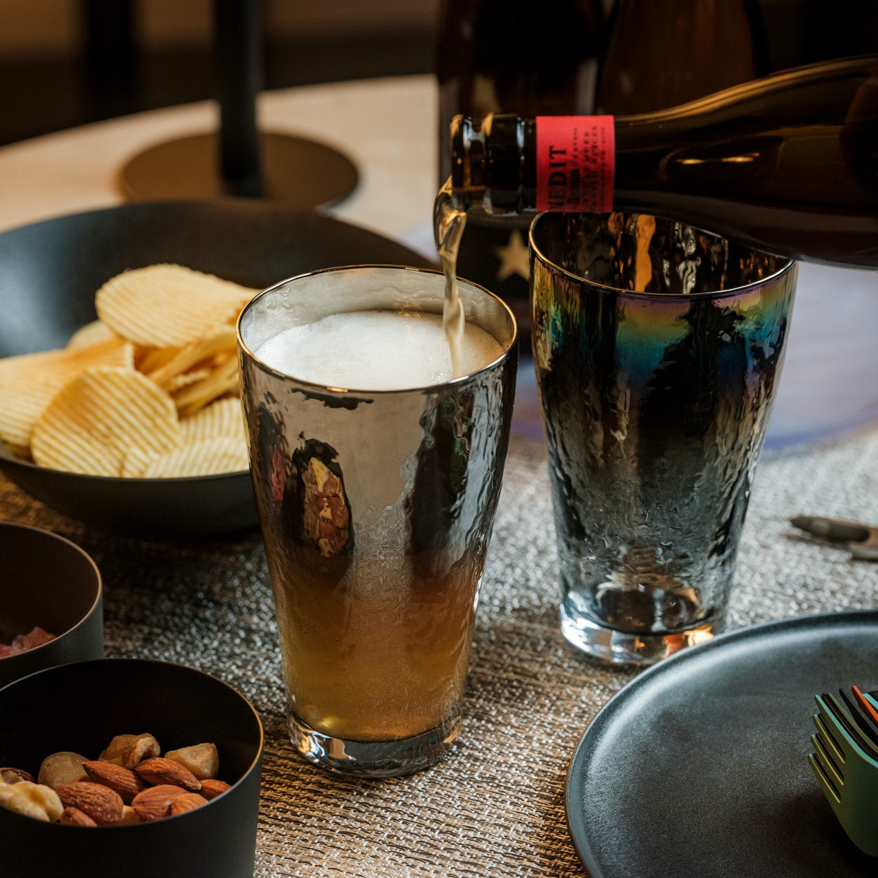
Titanium is not the obvious material for a beer glass, which is exactly what makes this interesting. The Prism glass is machined into a faceted form that catches light differently from every angle. It keeps cold drinks colder for longer than glass or ceramic, and at a fraction of the weight. For a match that runs close to three hours, the temperature retention moves from nice detail to genuinely practical specification.

The faceted prism geometry is the real story here. It gives you something to hold onto — the angles grip naturally in the hand — and visually, it elevates what you’re drinking without any effort on your part. Whether it’s beer, soda, or water during extra time, the experience of drinking from something this considered changes how the whole evening feels. It’s a small object that does a lot of quiet work sitting on the table beside you.

What We Like

  • Titanium construction keeps drinks cold significantly longer than glass
  • The geometric form is genuinely beautiful and sits well on any surface

What We Dislike

  • Titanium can mute carbonation slightly compared to a thin-rim glass
  • The faceted surface shows fingerprints more readily than a matte finish would

3. DraftPro Top Can Opener

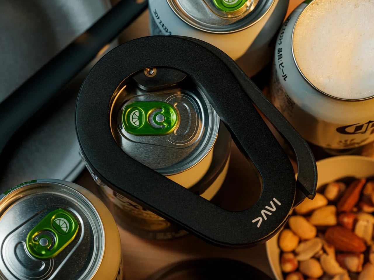
The DraftPro removes the entire top of a can rather than punching a small opening into it. The result is that your beer pours and drinks exactly like it would from a pint glass — full exposure, no restricted airflow, better foam, better aroma. For anyone who thinks canned beer is a compromise, this is the counterargument. It takes seconds to operate, works on standard-sized cans, and changes the experience of drinking from a can completely.

The design of the DraftPro is compact and considered. It doesn’t look like a kitchen tool — it looks like something you’d keep in an EDC kit. There’s no mechanical complexity to worry about, no blades to expose carelessly, and no learning curve. You place it, press, and the top comes away cleanly. For a viewing party with multiple people opening multiple cans across ninety minutes, that consistency and speed matter more than it might initially seem.

Click Here to Buy Now: $60.00

What We Like

  • Removes the full can lid for a genuine draft-style pour every time
  • Compact and simple enough to use one-handed mid-conversation

What We Dislike

  • Works on standard-sized cans only — irregular or oversized cans may not fit
  • The removed lid needs somewhere to go; keep a small dish nearby

4. GravaStar Mars Pro

The GravaStar Mars Pro is described as a desktop sculpture that happens to deliver excellent audio performance. At 5.5 pounds, it doesn’t move around — it sits on your TV unit or side shelf and owns the space. For the World Cup Final, where the commentary, crowd noise, and the crack of a well-struck shot all deserve to be heard properly, having a speaker that takes audio seriously changes how the whole room feels during the match.

The industrial design is unapologetically dramatic. It looks like something from a science fiction prop department, which in a living room full of people watching the world’s biggest football match feels entirely appropriate. You’re not going for subtle on Sunday. The Mars Pro doesn’t disappear into the room — it adds to it, visually and sonically. For anyone whose TV speakers plateau at acceptable, this is the correction worth making before kickoff.

What We Like

  • Audio performance that fully justifies the weight and footprint
  • Industrial design that functions as a conversation piece before the match starts

What We Dislike

  • At 5.5 pounds, it is not portable — this lives in one place for the long term
  • The dramatic aesthetic won’t suit minimalist or neutral interior

5. Stowaway Lap Desk

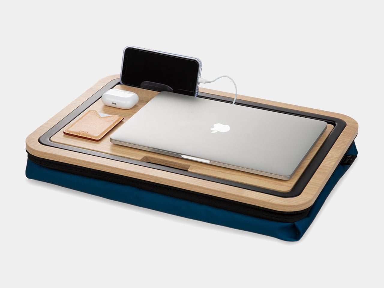
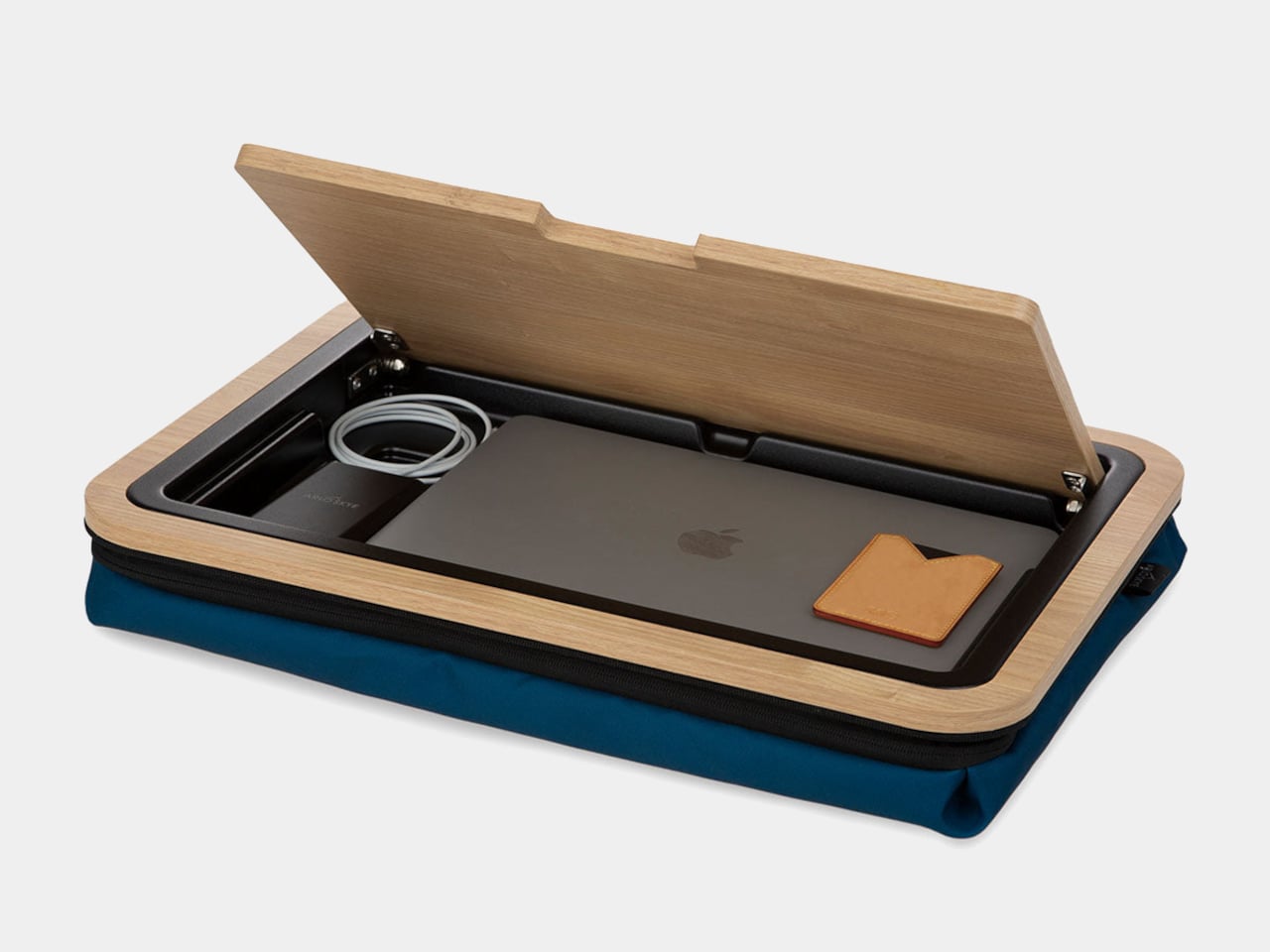
The Stowaway Lap Desk features an ability to hide a laptop inside when the workday ends. For the World Cup Final, the laptop stays out of it entirely — what you want is the desk’s secondary function, which the original article notes directly: it doubles as a side table or serving tray, holding snacks or drinks on the couch without requiring a separate surface. That’s the pitch, and it’s a good one.

The material and form of the Stowaway are designed to look intentional rather than improvised, which matters when you have people over. A lap tray that looks like a lap tray reads as an afterthought. This reads as furniture. It gives everyone on the couch a stable flat surface for the halftime spread without turning the room into a camping setup. It works on your lap, on the cushion beside you, or balanced across the armrest with equal confidence.

What We Like

  • Converts from work surface to serving tray without looking like either
  • Stable enough to hold drinks without the usual couch-wobble problem

What We Dislike

  • Sized around a laptop footprint — generous, but not a full dinner-tray surface
  • The hidden laptop compartment goes unused during viewing, adding structure you don’t need

6. Magsafe Charger Stand

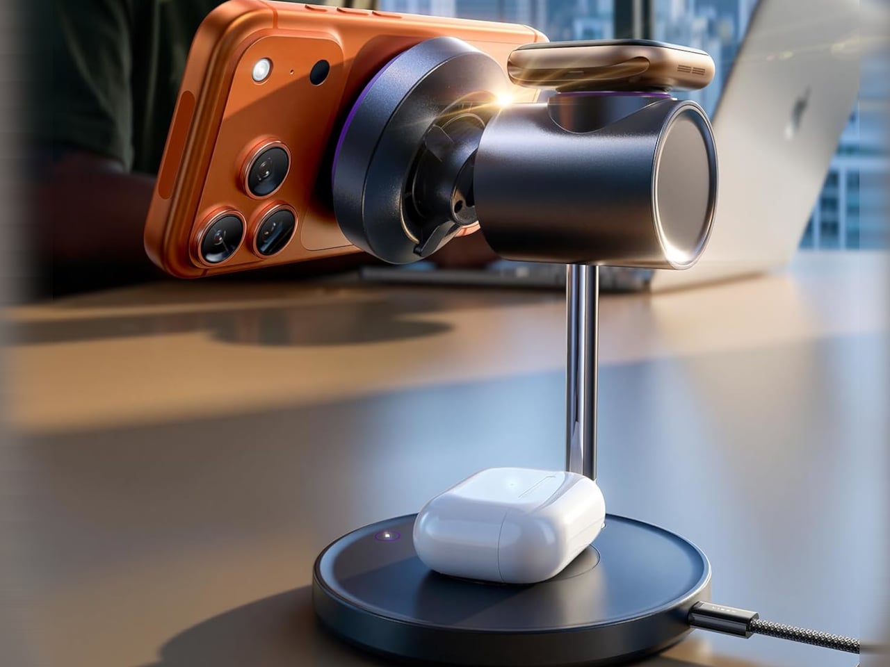
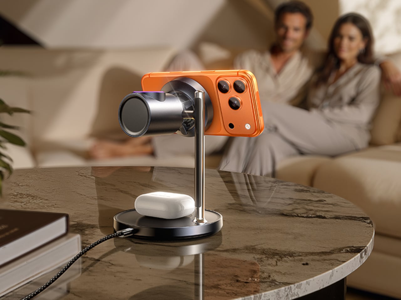
The $100 wireless charging stand fixes a specific problem: wireless charging that generates so much heat it throttles itself and stops working. The stand addresses this with an integrated fan that keeps the charging surface cool and the power delivery consistent. For ninety minutes of football that becomes two and a half hours with analysis and penalties, having a phone that’s actually charged at the end of it requires a charger that doesn’t quietly give up at halftime.

The Sleep Mode is the detail worth noting: a touch on the base switches the fan off at night, making the stand silent for overnight charging. For the match itself, the fan running means consistent, fast power delivery from kickoff to the final whistle. It keeps your phone upright and visible at the same time, so you catch messages from the group chat without picking the phone up every ten minutes during the action.

What We Like

  • Solves the heat-throttling problem that makes most wireless chargers unreliable over long sessions
  • Sleep Mode makes it genuinely useful as an overnight charger beyond match day

What We Dislike

  • The fan adds a low ambient hum — not loud, but present in a quiet room
  • At $100, it sits above most wireless stands; the engineering justifies it, but it’s a considered purchase

7. SwitchBot Air Purifier Table

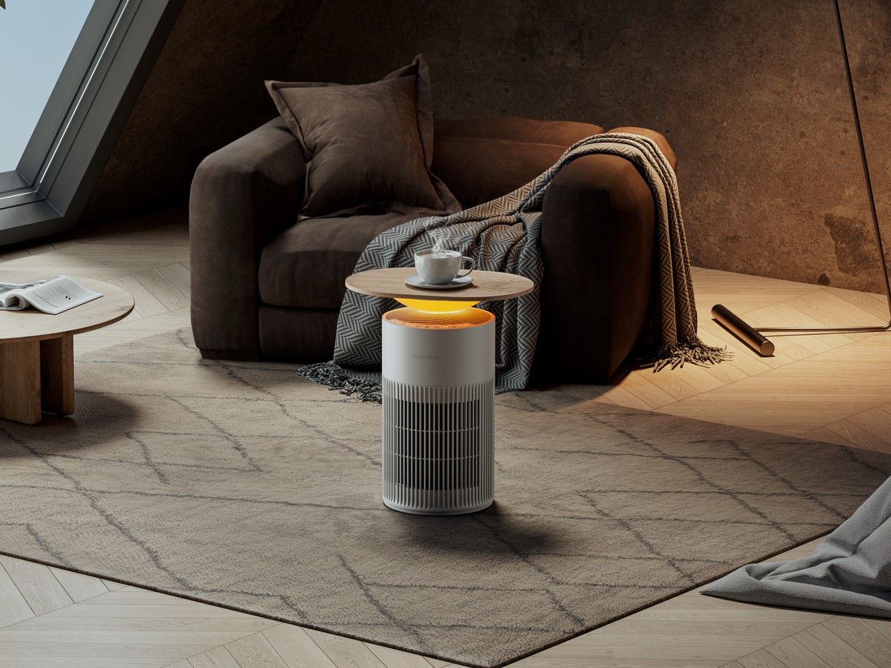
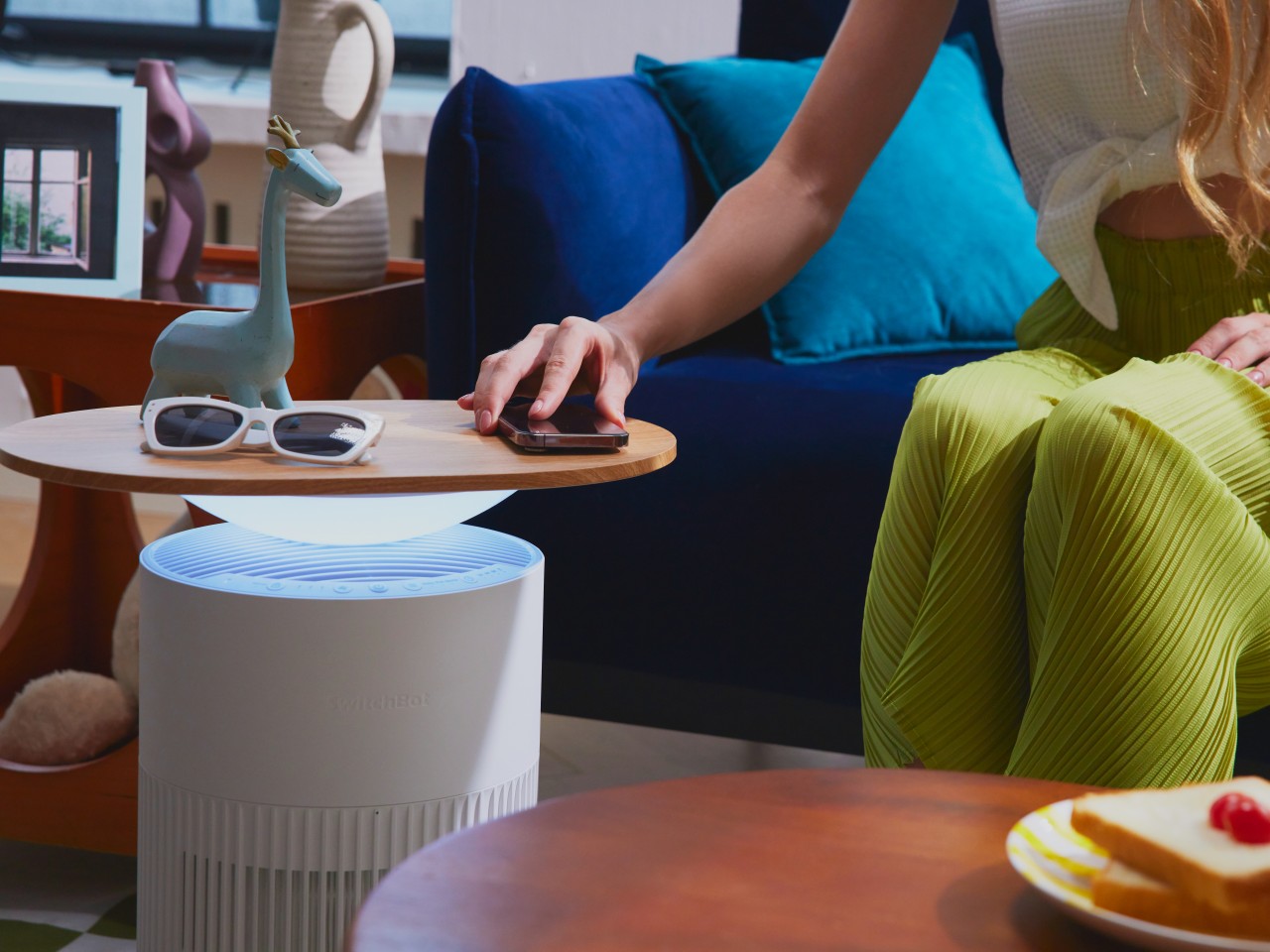
The SwitchBot Air Purifier Table is a side table, wireless charger, and air purifier sharing one footprint. At $269.99 — or $219.99 for the version without wireless charging — it costs more than a conventional side table, but it also replaces three separate objects. For a full room of people watching a three-hour broadcast, air quality becomes a legitimate consideration that most setups don’t acknowledge until it’s too late to do anything about it.

The design keeps all three functions invisible from above. It looks like a table. The purification and charging happen without any visual disruption to the surface or the room. For the Final, it holds a drink, charges a phone, and quietly manages the air in the room while everyone’s attention is on the pitch. That’s the definition of a setup that takes care of itself without requiring anything from you.

What We Like

  • Three functions in one footprint — side table, wireless charger, and air purifier
  • The design reads as furniture, not an appliance

What We Dislike

  • At $269.99 for the full version, it’s the most significant investment on this list
  • Air purifier capacity suits a standard room; very large open spaces may need additional support

8. Miniature Bonfire Wood Diffuser

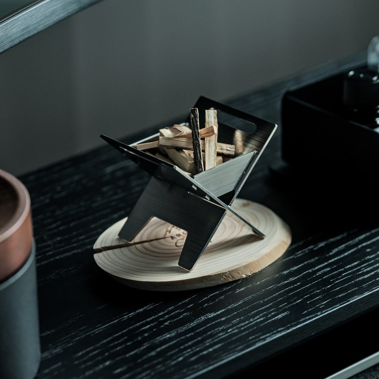
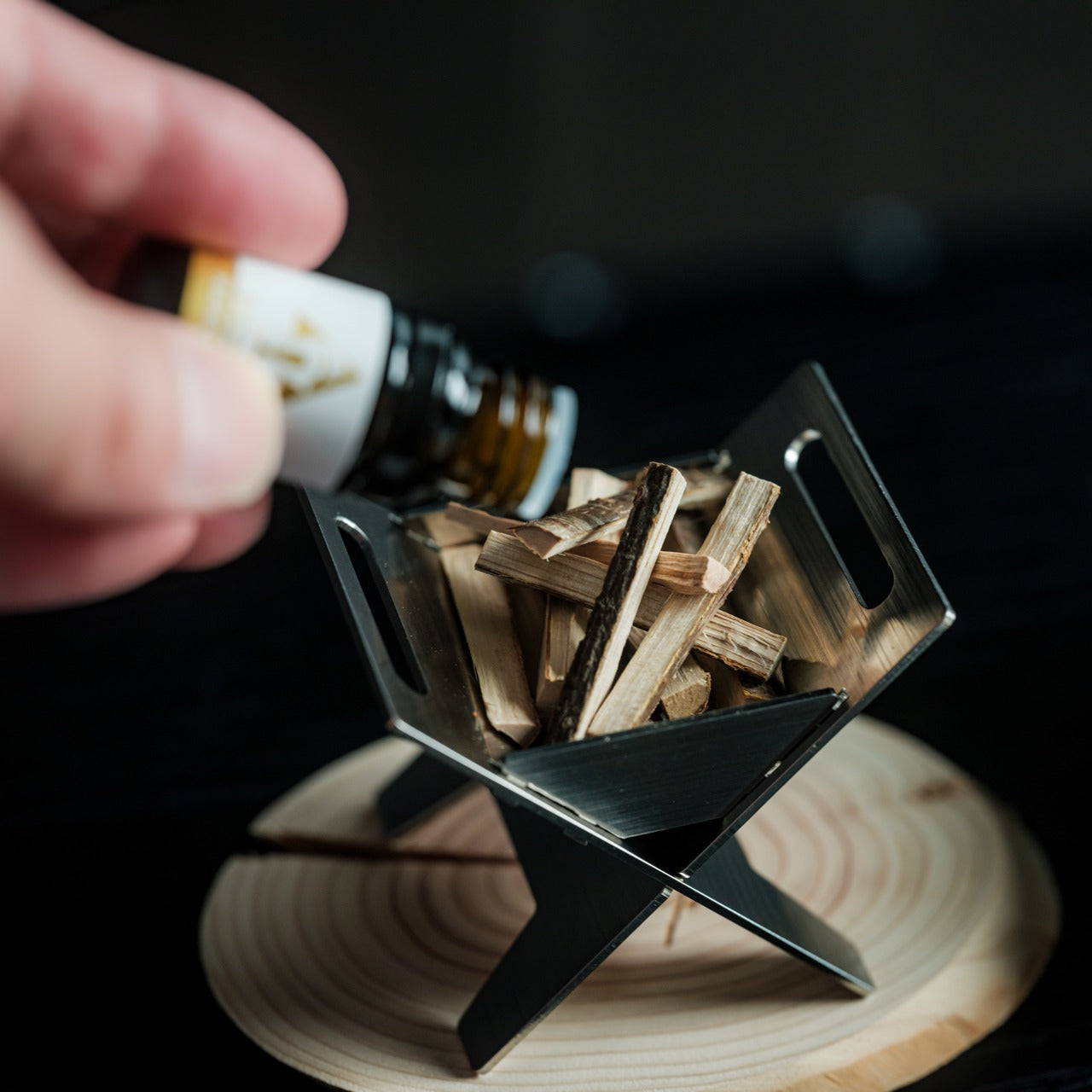
A room full of people watching a football final builds its own atmosphere quickly — and not always a good one. The Miniature Bonfire Wood Diffuser puts a controlled, campfire-adjacent scent into the room without overwhelming it. The design is a scaled-down bonfire rendered in wood, small enough to sit on a side table and interesting enough to generate conversation when someone notices it. Scent is the most underrated element of any room setup.

The wood material means the diffuser develops character over time, absorbing oils gradually and releasing them slowly into the space. It doesn’t require electricity, a reservoir, or any ongoing maintenance during the match — you set it before kickoff and let it work. For a viewing experience where every other element is considered, having the room smell intentional rather than incidental is the kind of detail that guests notice without knowing exactly what they’re responding to.

Click Here to Buy Now: $99.00

What We Like

  • Passive diffusion means no cords, no refills, and no interruption during the match
  • The bonfire form is genuinely sculptural and earns its place on any surface

What We Dislike

  • Scent throw is subtle by design; it won’t carry across a large open-plan space
  • Fragrance oil compatibility may vary — sticking to recommended oils gives the best result

The Setup Is Part of the Match

The World Cup Final is a once-in-four-years occasion. The football will take care of itself for ninety minutes — what you control is everything around it. A setup built from these eight products doesn’t ask you to think about your drink temperature, your phone battery, the air in the room, or where to put your glass during a corner kick. It removes those frictions so the match gets your full attention.

None of them require installation, a subscription, or a manual. They sit on your couch, your side table, or your shelf, and they do what good design always does: make something you were already going to do feel noticeably better than it did before.

The post The 8 Best Couch Essentials for the World Cup Final first appeared on Yanko Design.
Narwal’s Flow 2 White: A Robot Vacuum For Homes With Babies, Pets, and Great Taste

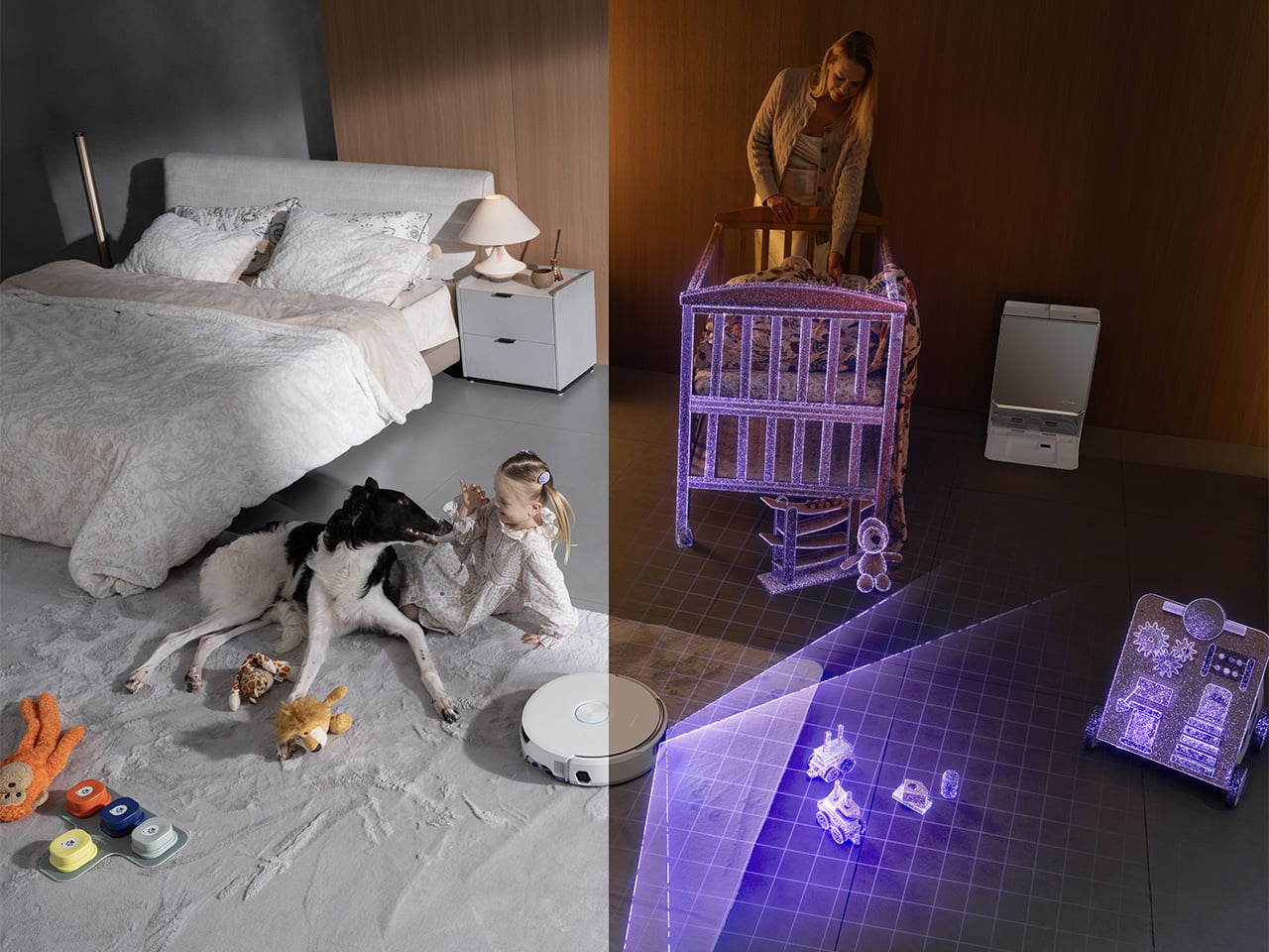
Every new parent knows which household sounds can end a nap. The dishwasher at the wrong moment. A phone notification set too loud. Or the low mechanical hum of a cleaning robot that has no awareness of the three-month-old who just fell asleep six feet away. The usual workaround has always been the same: pause the schedule, rezone the map, or carry the robot somewhere farther from the nursery before the nap timer starts. Robot vacuums have become impressively good at reading floors. Reading the life happening above those floors has been a much rarer skill.

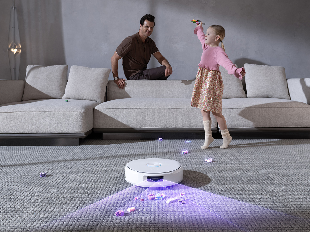
That is part of what makes Narwal’s Flow 2 White interesting. Yes, this is the brand’s 2026 flagship in a new pure white colorway built for modern, light-toned interiors. Yes, the industrial design has been carefully tuned around a quieter, more architectural presence in the home. But one of the clearest expressions of that thinking is Baby Care Mode, which supports quieter cleaning around nursery areas while toy recognition logs misplaced items on the map after each run. In other words, the design story here goes deeper than color. It is about a robot vacuum that has started adapting itself to the rhythms of the room.

Designer: Narwal

Click Here to Buy Now: $1069.99 $1499.99 ($430 off, use coupon code “YDNARWAL”). Hurry, deal ends in 48-hours! Website Link Here.

The robot vacuum category spent most of the 2020s competing on suction numbers. 10,000 Pa became 20,000, then 31,000, and somewhere in that escalation the floors got clean enough that raw power stopped being an interesting conversation. The smarter brands pivoted toward perception: cameras, obstacle recognition, map intelligence, multi-floor awareness. That shift produced genuinely useful improvements. But the household as a social environment, full of schedules, sleeping infants, anxious pets, and the particular chaos of family life, has remained something the machine cleans around rather than one it genuinely accounts for. Most robot vacuums know how to move through a home. Far fewer seem designed around how a home actually feels.

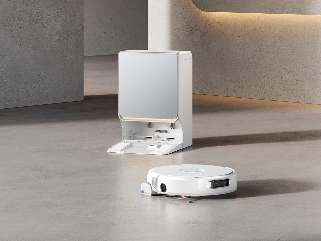
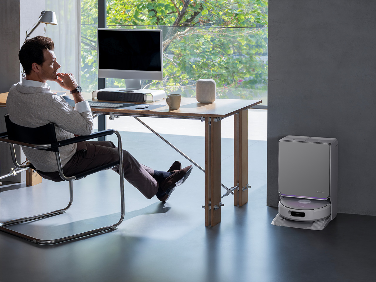
Flow 2 White leans into that missing layer from the moment you look at it. Narwal’s new colorway is framed around what the brand calls a quiet luxury approach, and the visual cues back that up. The base station uses a frosted glass-textured front panel that catches and softens light rather than bouncing it harshly back into the room. A slim ambient status light bar communicates the robot’s state with a low-key visual rhythm. The semi-enclosed silhouette gives the dock and robot a more unified presence, so the whole system feels composed rather than pieced together. In homes shaped by pale wood, cream textiles, soft daylight, and open-plan layouts, that kind of approach shows how much Narwal sees their tech as functional decor built around their ‘quiet luxury’ ethos.

It also helps that the softer aesthetic is tied to behavior, not only appearance. Baby Care Mode returns the conversation from styling to use, because it shows how Narwal is thinking about domestic context in practical terms. A quieter cleaning mode around nursery areas is the sort of feature that immediately makes sense to anyone who has rearranged an entire evening around a sleeping child. Toy recognition adds another layer of household awareness, turning the robot’s mapping system into something slightly more useful than a floor plan with room labels. It starts to feel like a machine designed with family life in mind, rather than one designed in isolation and later dropped into it.

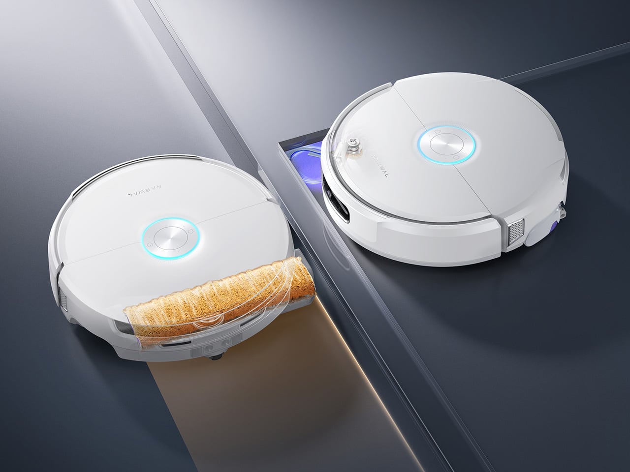
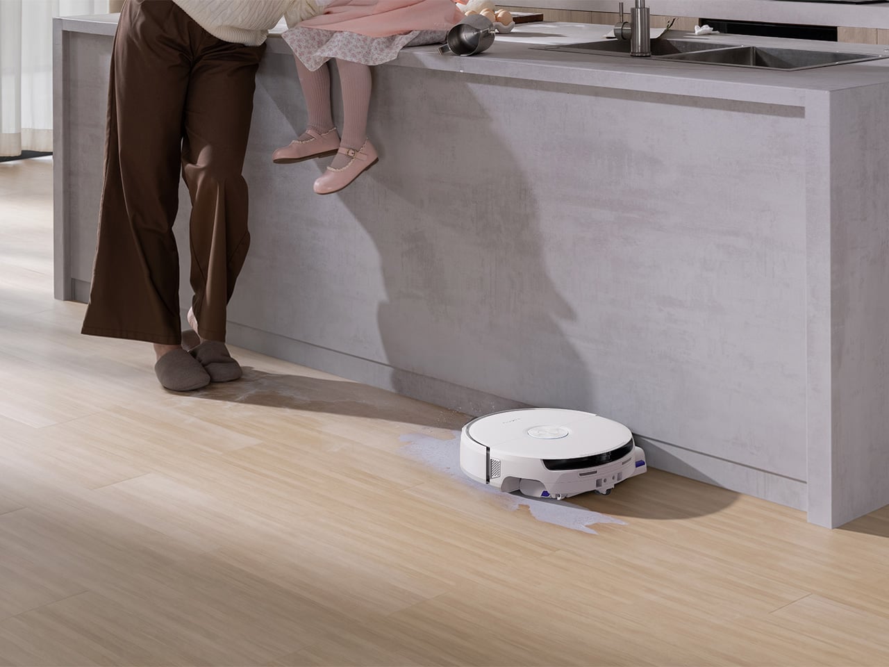
Underneath that calmer exterior, Narwal has kept the flagship hardware story intact. The proprietary FlowWash Mopping System uses a high-speed track mop that rotates at over 100 times per minute and delivers 140 degree Fahrenheit heated water to keep the mop clean throughout each cycle. On paper that reads like another premium cleaning spec. In practice, it addresses one of the category’s most persistent weak points: robot mops that push grime around after the first serious spill. Narwal’s treadmill-style self-cleaning approach feels aimed at that exact frustration, especially in kitchens, entryways, and pet-heavy homes where the mess changes texture by the hour. The Flow 2 White also carries 31,000 Pa suction, CarpetFocus technology, a certified detangling system for 0 percent hair tangling, and a self-emptying base station with up to 120 days of maintenance-free use. The visual language may be quieter now, but the performance story has not been dialed down with it.

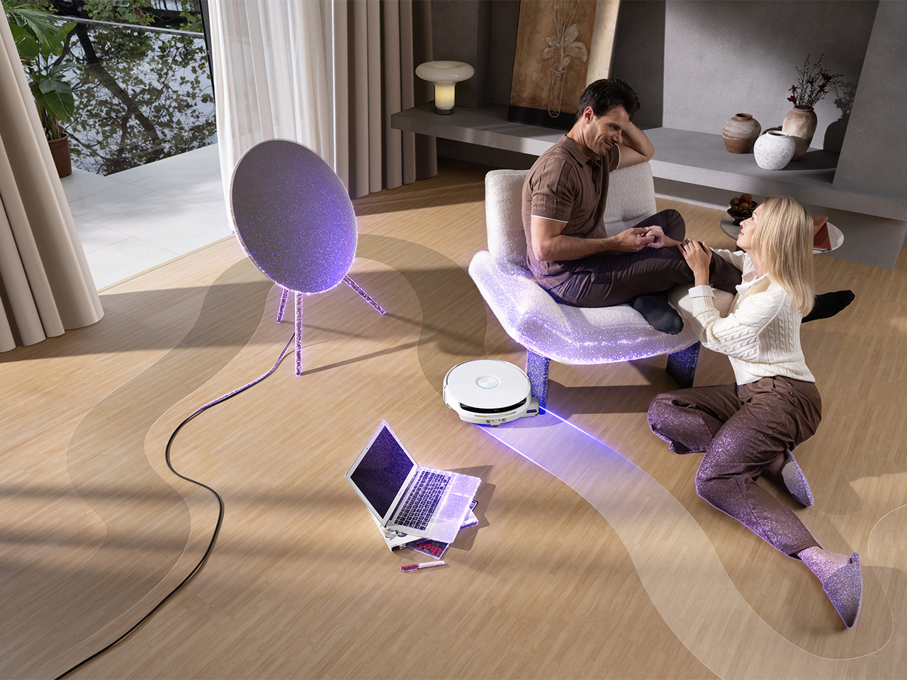
The same goes for intelligence. Flow 2 White runs on the NarMind™ Pro Autonomous System, which combines an onboard AI processor with a cloud-based VLM Omni Model for broader object recognition and more adaptive obstacle handling. Plenty of brands now promise smarter navigation, but the difference increasingly comes down to how that intelligence is applied. Here, the system adjusts cleaning strategies based on what it detects, improves edge coverage, boosts overall efficiency, and reduces the amount of babysitting the robot needs from the user. Pet Mode detects pet-active areas for deeper cleaning and can help locate pets remotely with Find My Pet, while AI Floor Tag identifies valuable objects and sends alerts through the app. The result sounds technical, but the real appeal is simple: fewer interruptions, fewer rescues, and fewer moments where the robot behaves like it understands the map but not the home.

That may be the strongest case for Flow 2 White as a whole. It arrives at a moment when premium robot vacuums are all converging toward similar checklists of suction, mapping, self-cleaning docks, and AI-assisted navigation. Narwal’s opportunity here lies in pushing the conversation somewhere slightly more mature. The white colorway and quiet luxury detailing make the product easier to live with visually. Features like Baby Care Mode and toy recognition make it easier to live with behaviorally. Together, they point toward a category that is finally thinking beyond floor care alone.

The Narwal Flow 2 White will be available starting July 16 with a launch price of $1,099.99, discounted from its $1,499.99 MSRP through July 31. That places it firmly in flagship territory, where buyers expect strong cleaning performance, meaningful automation, and design that justifies the footprint such a device takes up in the home. For people living in bright, modern interiors, the visual refresh alone will have obvious appeal. For parents, pet owners, and anyone who has grown tired of appliances that treat the home like a test lab instead of a lived space, the more interesting story is the one underneath: a robot vacuum that seems increasingly shaped by the habits, moods, and messes of the people around it.

Click Here to Buy Now: $1069.99 $1499.99 ($430 off, use coupon code “YDNARWAL”). Hurry, deal ends in 48-hours! Website Link Here.

The post Narwal’s Flow 2 White: A Robot Vacuum For Homes With Babies, Pets, and Great Taste first appeared on Yanko Design.
This $179 Speaker Has No Battery And Makes Your iPhone Louder Anyway

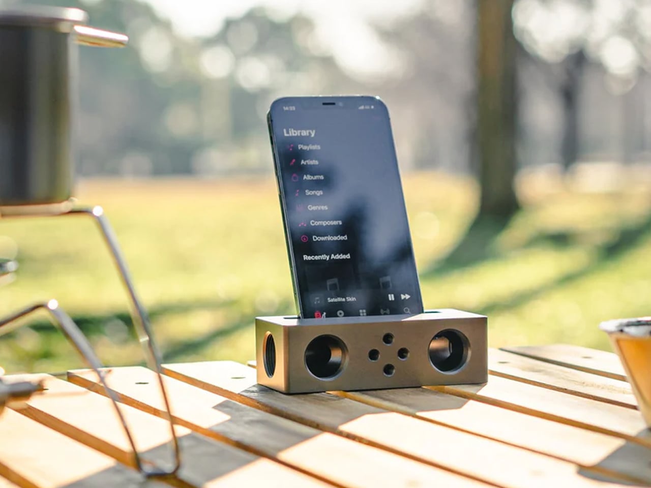
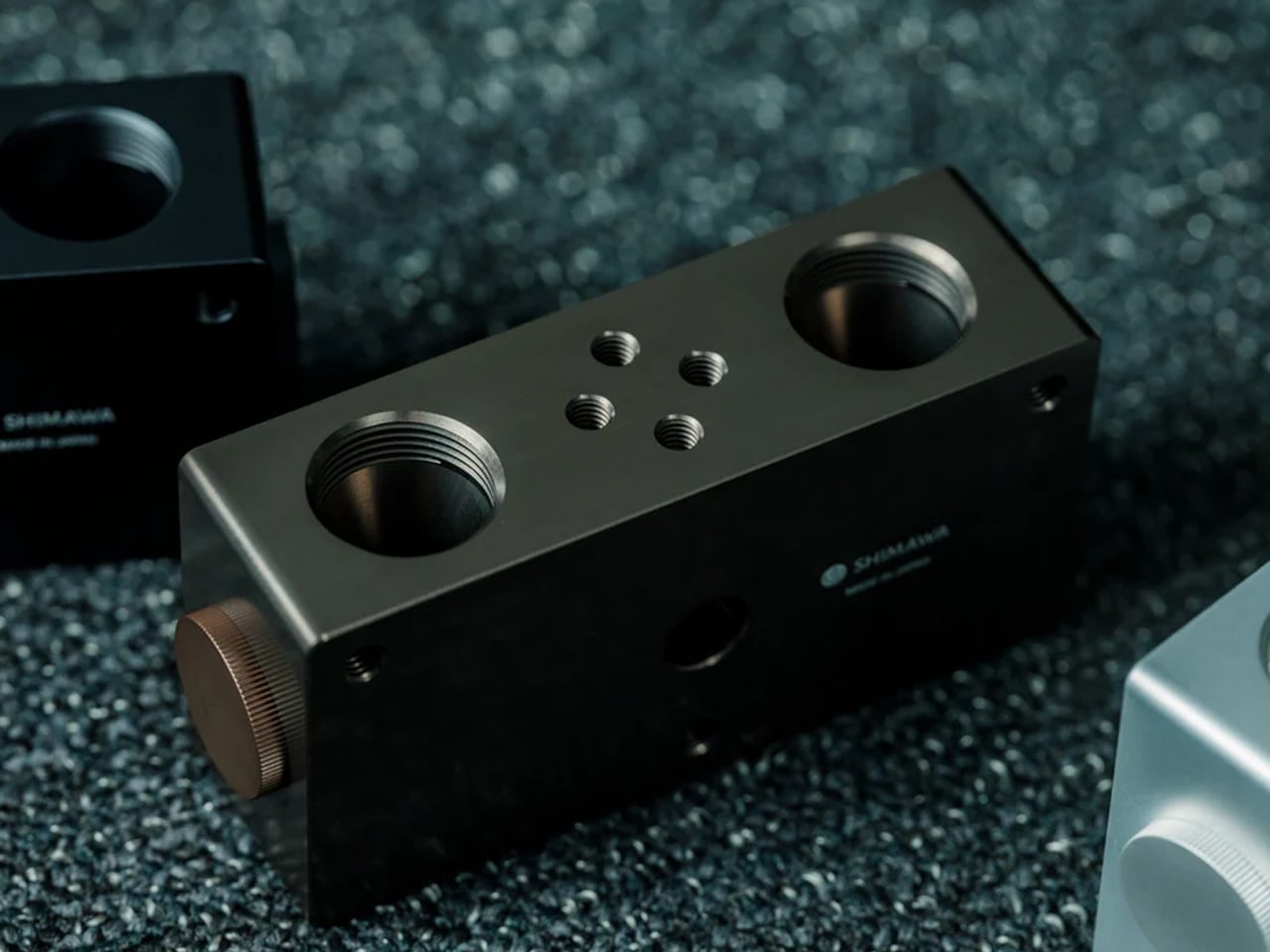
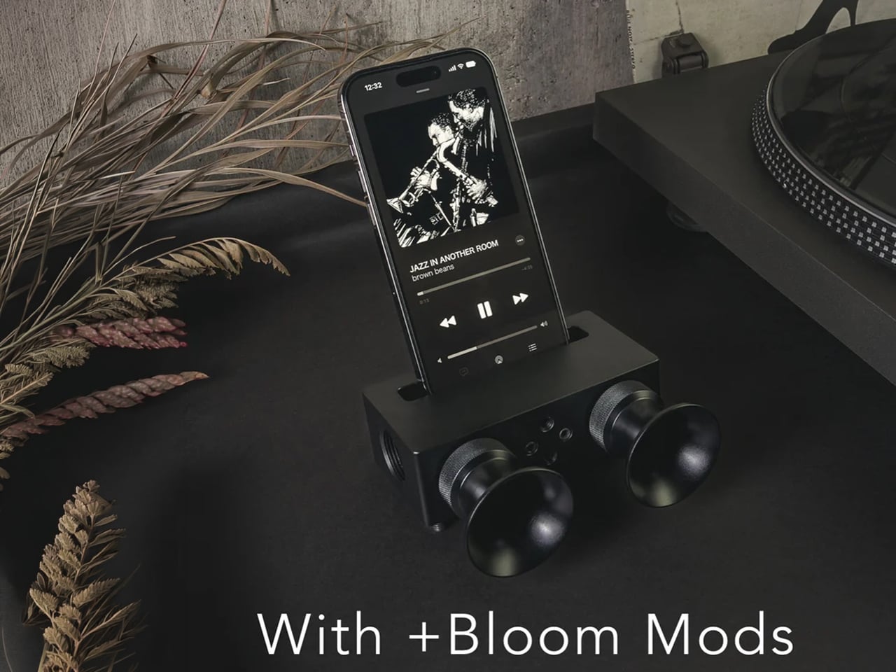
Every speaker you own needs something. The Bluetooth speaker needs charging – and the charging case, and the cable for the case. The wireless earbuds need their own ritual before the music starts. The smart speaker needs a wall outlet, a WiFi password, and a company’s servers staying online on a Tuesday. The Battery-free Amplifying iSpeakers from Yanko Design need none of it. They need your iPhone and the physics of a sound wave moving through precision-machined metal, and that is the complete technical brief.

No battery. No Bluetooth. No electricity. No app. No pairing. No charging. Just your phone, a slot in a piece of metal, and the same acoustic principle that made the phonograph work before Edison’s power grid reached the average American home.

Click Here to Buy Now: $179.00

The Battery-free Amplifying iSpeakers use acoustic resonance – the same principle that powered phonographs before electricity reached the average home – to make your iPhone louder without touching a single cable or draining a single milliamp.

One Slot, A Louder Room

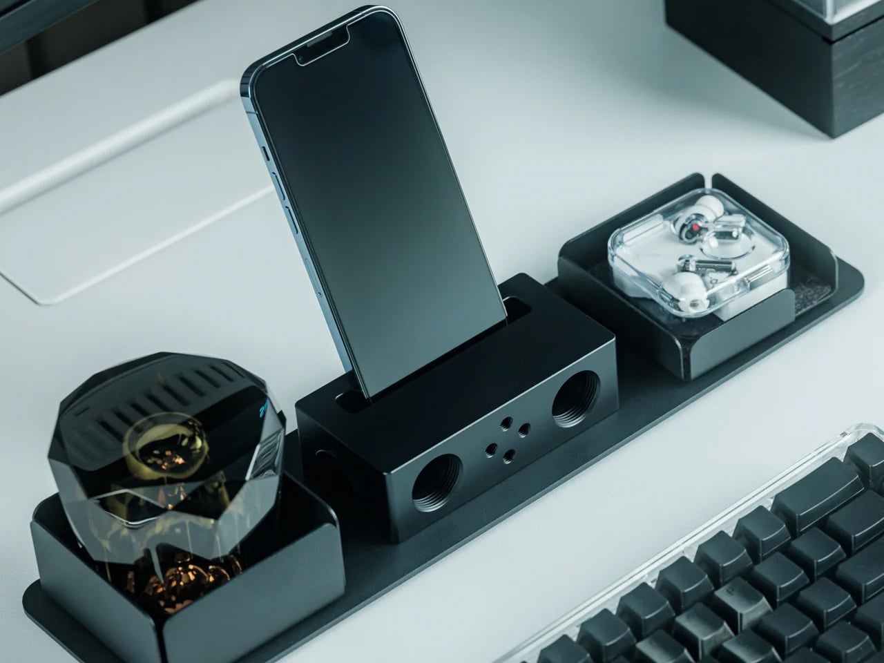
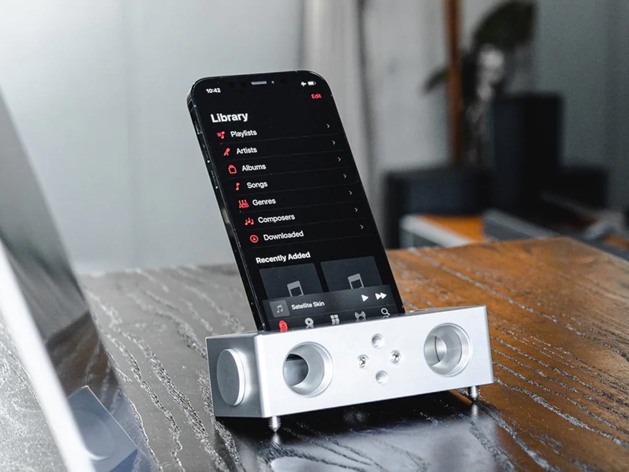
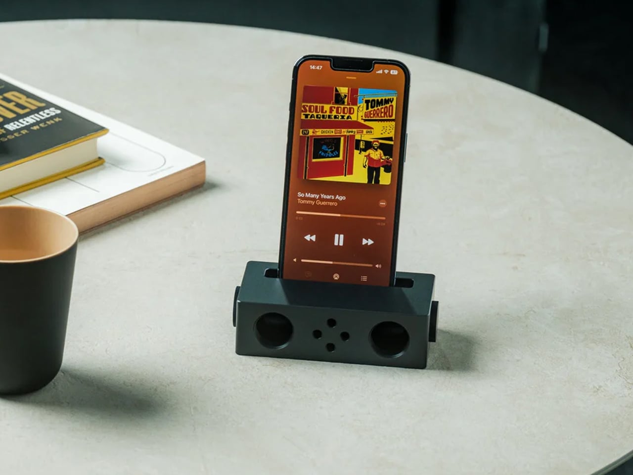
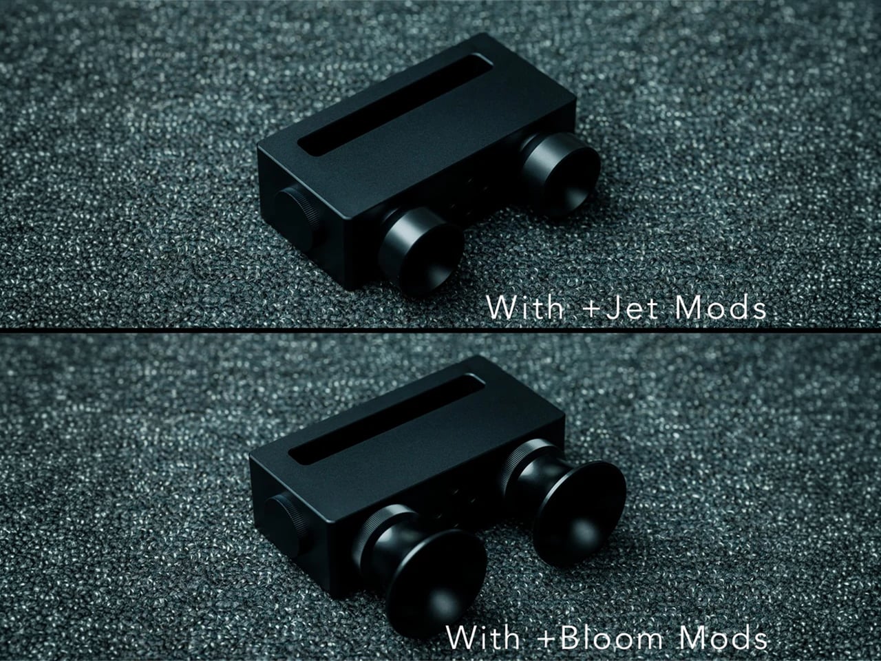
The amplification here is acoustic, not electronic. A phonograph built in 1877 used the same governing principle – a horn-shaped resonance chamber that directed and amplified sound waves using geometry rather than power. The iSpeakers apply that same physics, precision-machined into a metal chassis designed specifically to receive a modern iPhone. The phone’s speaker fires into the chamber. The chamber’s interior geometry redirects, focuses, and amplifies the sound wave. Music comes out measurably louder on the other side – with no battery depleting silently in the background, no Bluetooth connection to drop at the moment the song hits its best part, and no firmware to update before any of it works.

We placed a phone into the iSpeakers and left it there for a week on the desk. The first thing that registers is not the volume, it is the silence around the process. No pairing animation. No connection sound. No status LED cycling through colours. Phone in, music louder. Phone out, music stops. There is no standby mode because there is nothing to stand by. The speaker is a shaped piece of metal that does one thing through pure acoustic engineering, and it does it every single time without being asked twice.

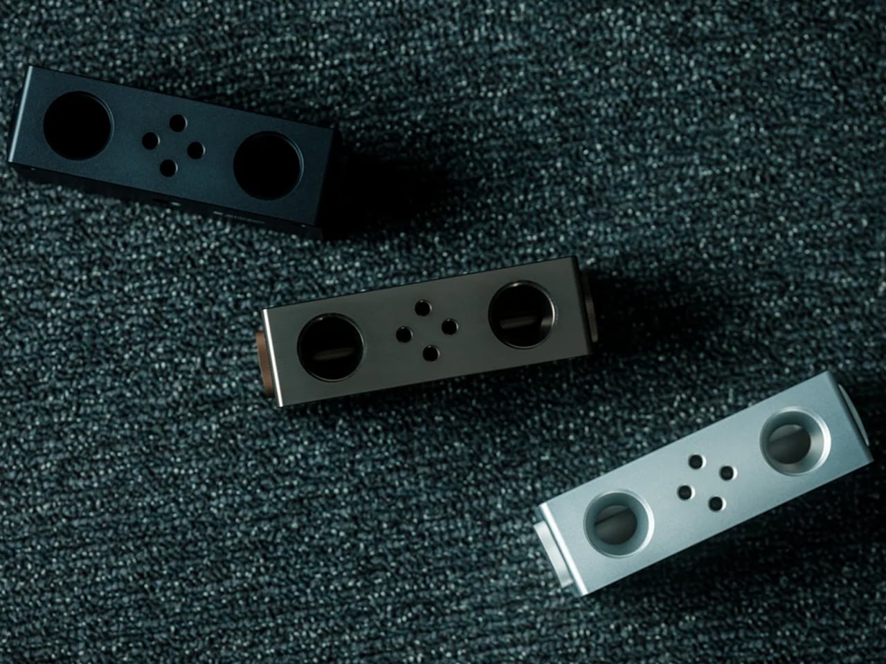
The second thing that registers is the material. Metal sounds different from wood. The passive amplifier market is dominated almost entirely by handcrafted wooden alternatives – walnut, maple, bamboo, each with their own warmth and grain character. Metal amplifies differently: crisper, more present, with a clarity that wood’s natural porosity softens. Whether that is better or worse is a matter of what you are listening to and what you are listening for. As a desk object in a considered setup, it is audibly distinct from every wooden alternative in the category and visually distinct from all of them.

Built for the Desk That Has Everything Except One More Cable

The iSpeakers are available in Silver in two configurations: Speaker Only at $179 and a modified configuration at $299 for extended iPhone compatibility. The price is unambiguously at the premium end of a market, and it deserves the scrutiny that premium pricing invites.

What the $179 buys over the Etsy wooden alternatives – which start at $15 and top out around $60 for handcrafted versions – is precision-machined metal construction, iPhone-specific acoustic tuning, and a design that belongs on the same surface as a considered desk setup rather than looking like a craft project that migrated indoors. The gap between a $25 3D-printed passive speaker and this one is not a matter of degree. It is a matter of what category the object belongs to.

For the remote worker, the minimalist desk builder, or anyone who has spent real money getting every wire off the surface and every device intentional – a speaker that contributes zero cables, zero charging cycles, and zero connectivity requirements to that arrangement is not a convenience. It is the only version of a speaker that is actually consistent with that philosophy.

What We Like

  • Zero power required of any kind – no battery, no USB, no wall outlet, no Bluetooth radio, no WiFi; the amplification is entirely acoustic, which means it works at 3am in a power cut and never needs to be charged before a trip
  • Precision-machined metal construction delivers a distinctly different acoustic character than the wooden alternatives that dominate this category – crisper and more present, with a clarity that reflects the material’s acoustic properties rather than softening them
  • iPhone-specific acoustic geometry means the channel dimensions and chamber angles are tuned to the iPhone’s speaker placement rather than being universal and therefore approximate – specificity in passive amplifier design is not a minor variable
  • Instant-on, always-ready operation – phone in the slot, music plays louder; no pairing sequence, no app, no startup delay, no connection to lose; this is the simplest possible interaction model because there is no interaction model
  • Zero cable contribution to the desk – in a setup where cable management is the work, a speaker that adds nothing to that count is a different category of object than one that adds even one

What We Dislike

  • For this design the buyer has already decided that acoustic amplification, cable-free operation, and metal construction are the priorities – anyone arriving at this product from a Bluetooth speaker mindset will not find the value immediately obvious
  • iPhone-specific design is a strength acoustically but a limitation categorically – Android users, regardless of budget or intent, are not the audience for this product, and that is not stated prominently enough before purchase

The Speaker That Remembered How Sound Works

The Battery-free Amplifying iSpeakers do not fix a problem most people knew they had. They reveal one. Once your music plays louder through a piece of metal that asked nothing of your power bank, your charging cable, or your WiFi router – the Bluetooth speaker on the desk feels exactly like what it is: a device that solved a problem by adding four more problems underneath it.

For the audio-minded, it is a precision-machined object applying one hundred and fifty years of acoustic physics to a twenty-first century pocket computer, with the restraint to leave electricity entirely out of the conversation. For everyone else, the Battery-free Amplifying iSpeakers is a $179 answer to the question of why a speaker needs a battery in the first place.

Either way, once it earns its place on the desk, a charging cable will not be going back.

The post This $179 Speaker Has No Battery And Makes Your iPhone Louder Anyway first appeared on Yanko Design.
Hot Wheels and 7-Eleven Nailed the $7.11 GT-R Drop

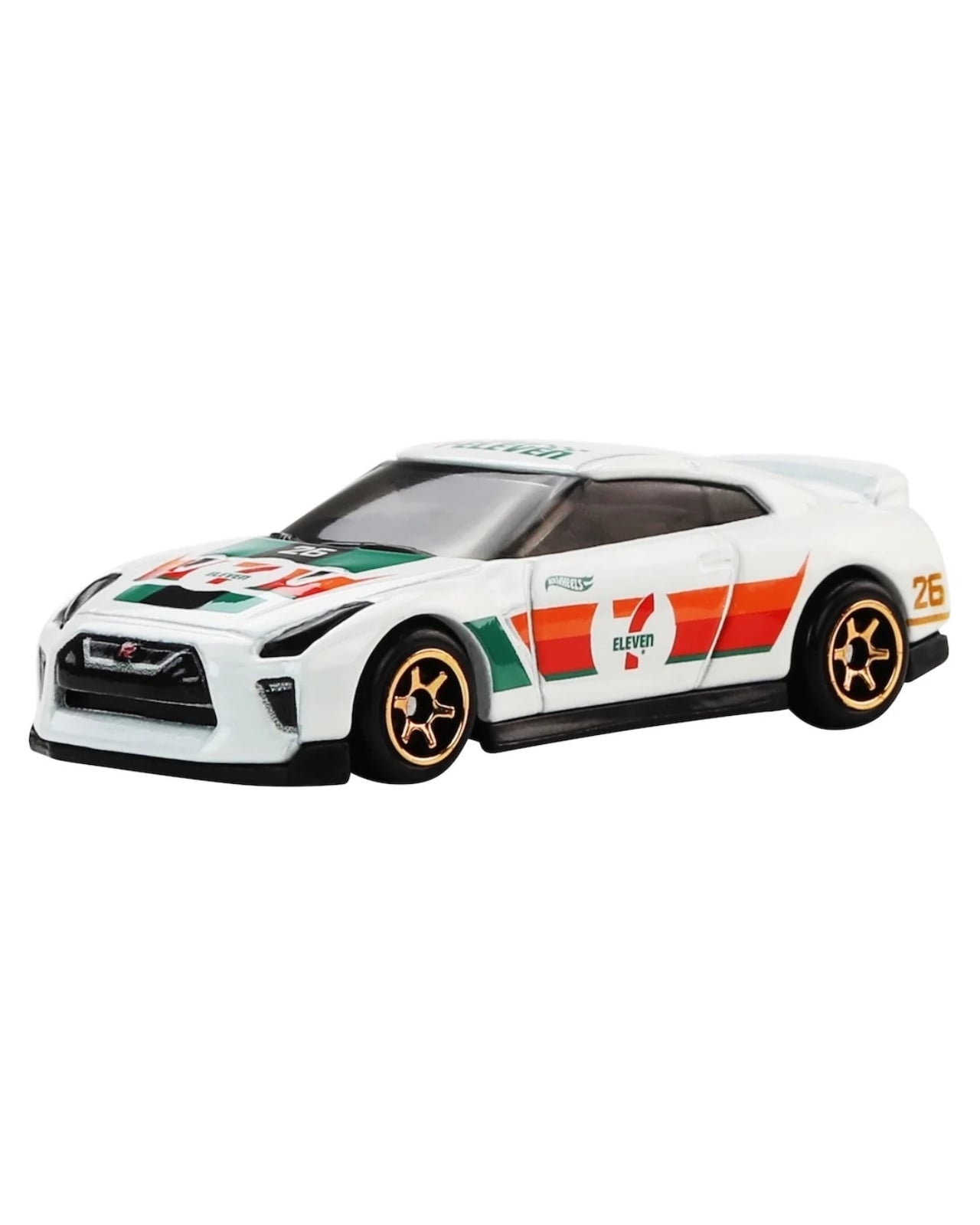
The convenience store has always been a place of small joys. A late-night hot dog, a 44-ounce Slurpee, a scratch card bought on impulse. But 7-Eleven just added something to that list that no one saw coming: a 1:64 scale 2017 Nissan GT-R (R35), draped in white livery, wearing the brand’s iconic green-and-orange logo like it was born into it.

Hot Wheels and 7-Eleven have teamed up before, and every time they do, the internet loses its mind a little. This year’s exclusive is the 2017 Nissan GT-R R35, a choice so specifically right that it almost feels too good to be a corporate decision. The GT-R isn’t just a car. It’s a cultural artifact, the vehicle that made an entire generation of gamers, gearheads, and anime fans fall in love with Japanese engineering. Choosing it for a convenience store exclusive feels less like a marketing move and more like someone in a boardroom finally got the reference.
Designer: Hot Wheels x 7-11

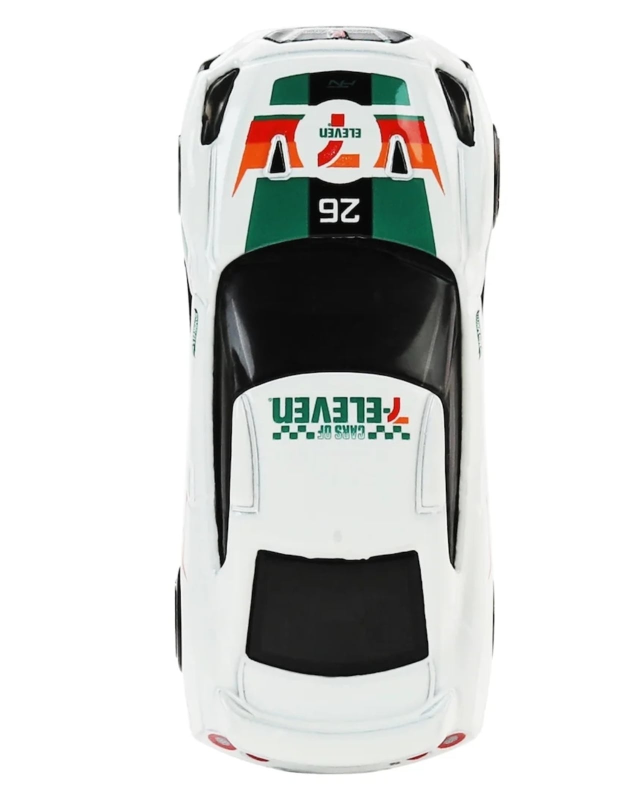
The design itself is clean and confident. Hot white, 7-Eleven branding running along the sides, and a set of 6-spoke rims that manage to look sharp even at this scale. Mattel has always been good at translating a car’s personality into miniature form, and this one lands well. The GT-R’s aggressive stance and wide haunches come through even when the whole thing fits in your palm. It doesn’t feel like a rushed licensing deal. It feels like a collectible that was taken seriously, proportioned carefully, and dressed with some actual intention.

The price is where the real cleverness lives. Retailing at $7.11, it’s a number that doubles as a receipt and a punchline, and I mean that entirely as a compliment. Pricing something at the exact numerical name of the store selling it is the kind of detail that makes you wonder why more brands don’t do it. It’s small, intentional, and memorable, the kind of thing you notice and file away simply because it made you smile.

Of course, the moment word got out, collectors mobilized. People were hunting these in-store at 2AM. Social media filled up with unboxing videos and “found it” posts. eBay listings appeared almost immediately, some going for double or triple retail. That pattern is exhausting and exciting in equal measure. It speaks to how deeply this kind of collaboration hits for a specific audience, and how quickly that enthusiasm can tip into a secondary market that shuts casual fans out before they even know the drop happened.

A chase variant is reportedly circulating as well, appearing roughly once in every hundred shippers. Finding the standard is already a small adventure. Finding the chase turns the whole thing into something approaching a ritual.

What makes this collaboration work, beyond the obvious nostalgia hit, is that it respects the cultures it’s drawing from. The GT-R carries genuine weight in car culture. Hot Wheels has decades of credibility as a collector’s brand, not just a toy. And 7-Eleven, despite being a global convenience chain, has cultivated a surprisingly earnest identity around moments of everyday delight. When those three things collide, you get something that doesn’t feel forced or cynical. It feels like three separate worlds sitting down together and actually enjoying the conversation.

I’ll be direct about this: limited retail exclusives are one of the most interesting design distribution strategies happening right now. Taking a well-made object and anchoring it to a specific physical space, a store, a moment in time, gives it meaning that an online drop simply can’t replicate. You had to be there. You had to walk into a 7-Eleven, scan the displays, and spot it. That friction is the point. It makes the object feel earned in a way that clicking “add to cart” never quite does.

Whether you’re a Hot Wheels collector, a GT-R devotee, or someone who just appreciates when design makes a weird, wonderful detour into your everyday life, this one deserves a second look. Or at the very least, it’s worth a late-night convenience store run.

The post Hot Wheels and 7-Eleven Nailed the $7.11 GT-R Drop first appeared on Yanko Design.