Folding Travel Toothbrush Concept Keeps Your Teeth and the Planet Clean

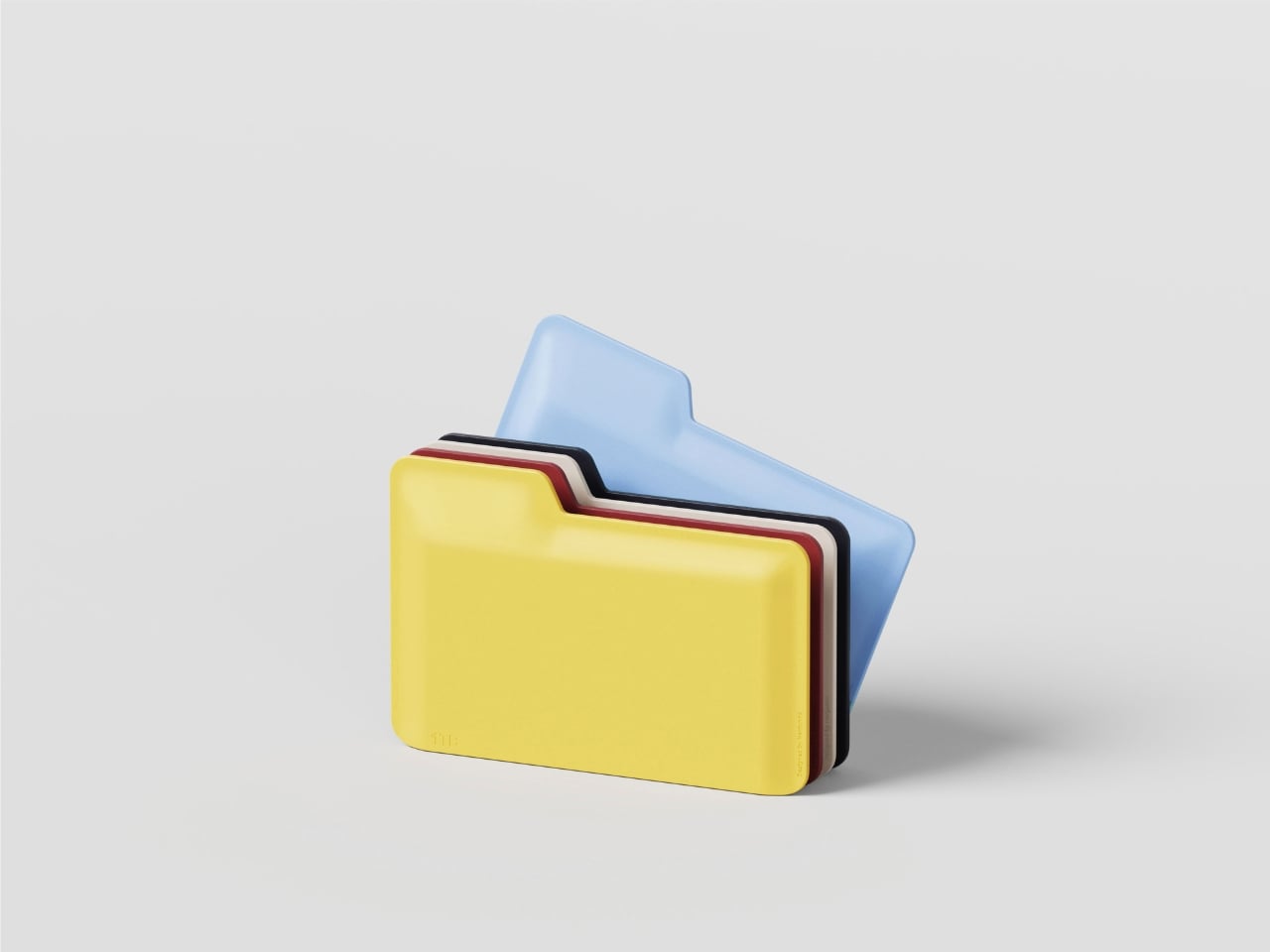
Dental hygiene is already quite the tiresome chore at home, so you can probably imagine how some people use travel as an excuse to conveniently “forget” brushing their teeth. Of course, you can always bring your own toothbrush, or hope your hotel provides one, but not all travel toothbrushes seem to be designed for travel. Conventional toothbrushes take up plenty of space with their long bodies while folding designs feel flimsy, unreliable, and always disposable. For those who really want to keep their teeth healthy even when far from home, they’ll need this kind of toothbrush that can keep them company for years to come, thanks to a modular design that also ensures that the planet’s health isn’t sacrificed for the sake of yours.

Designer: Uladzislau Patapchyk

The vast majority of toothbrushes, whether those for the home or for travel, are made from plastic. Given how people are advised to replace their toothbrushes regularly, the accumulated waste from all these dental hygiene tools is staggering. In reality, what you really need to replace is just the bristles of the brush, something that this concept design takes into heart.

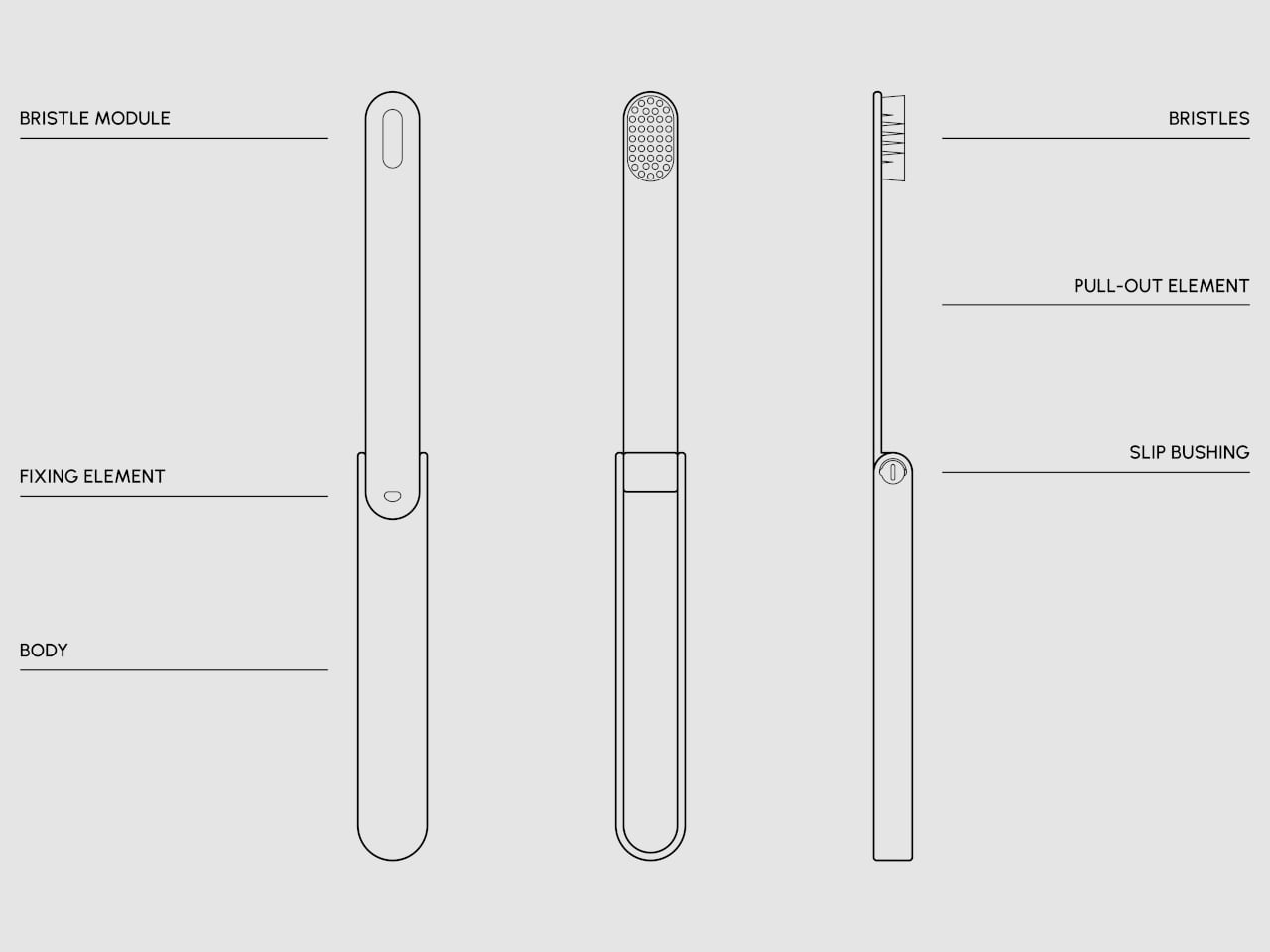
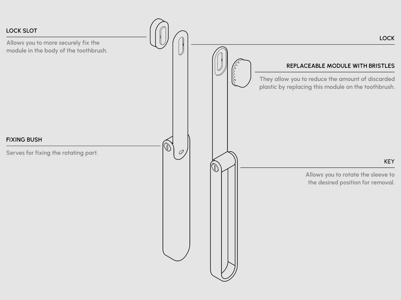
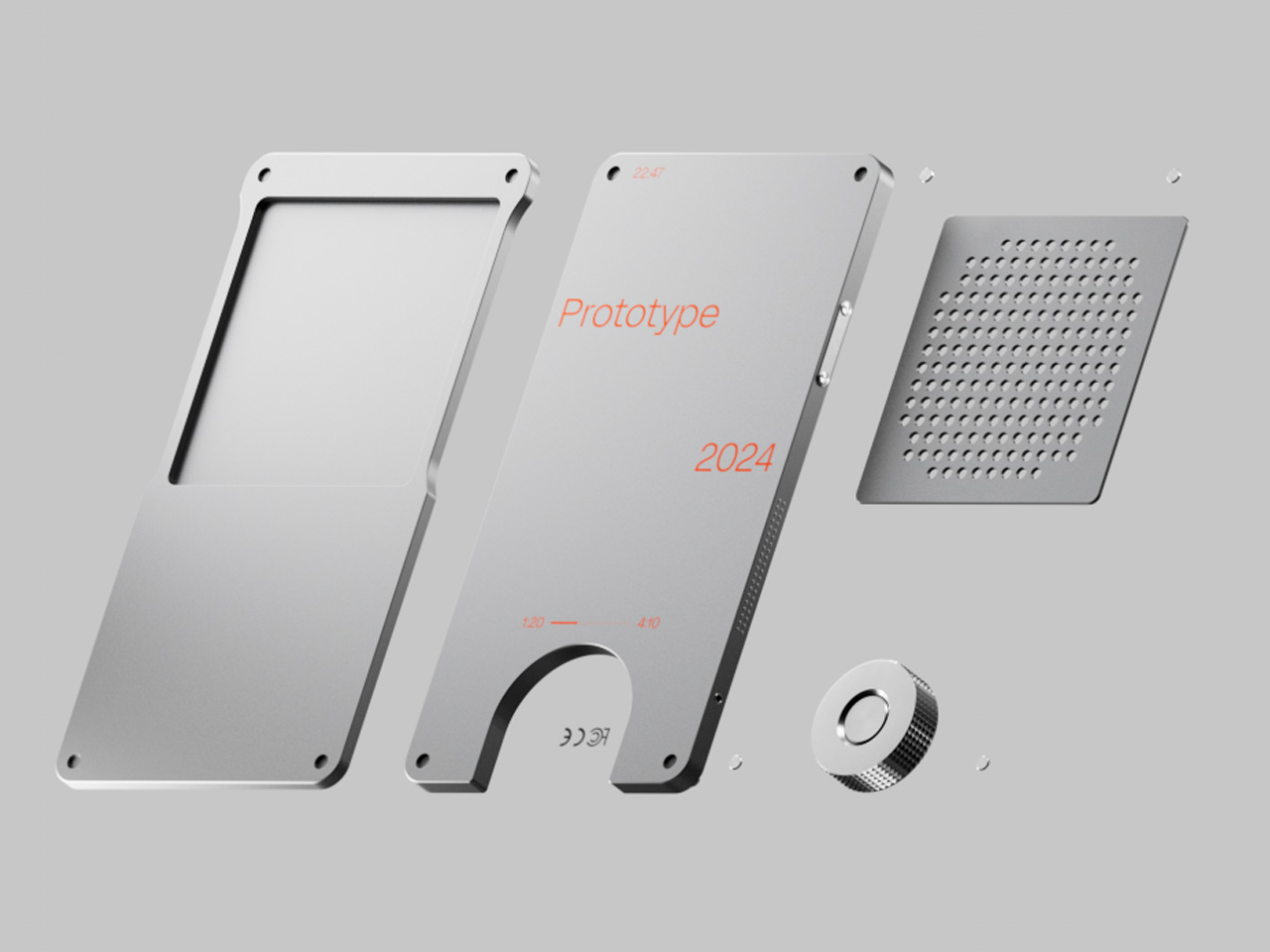
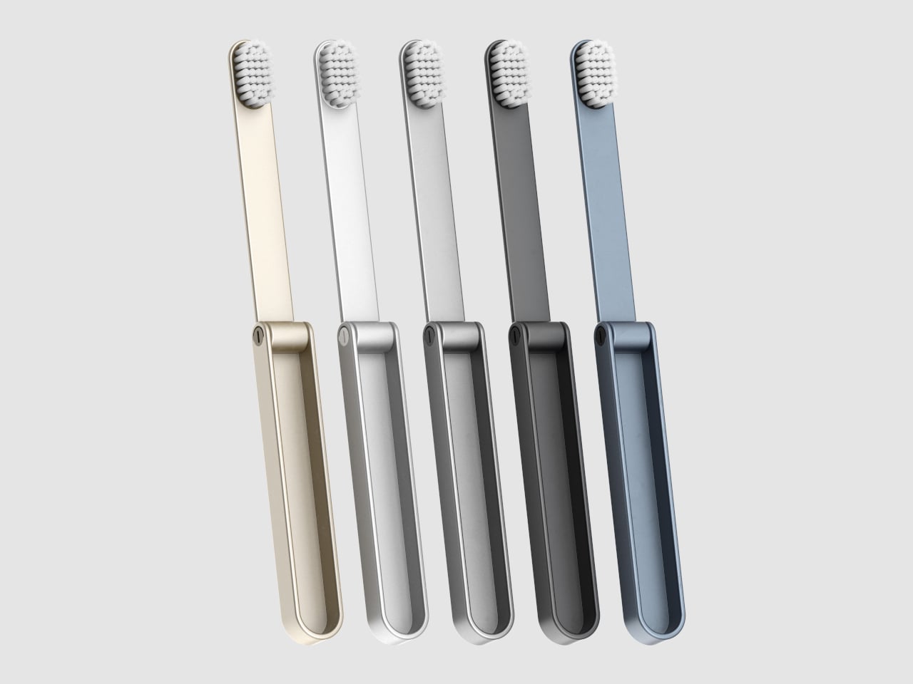
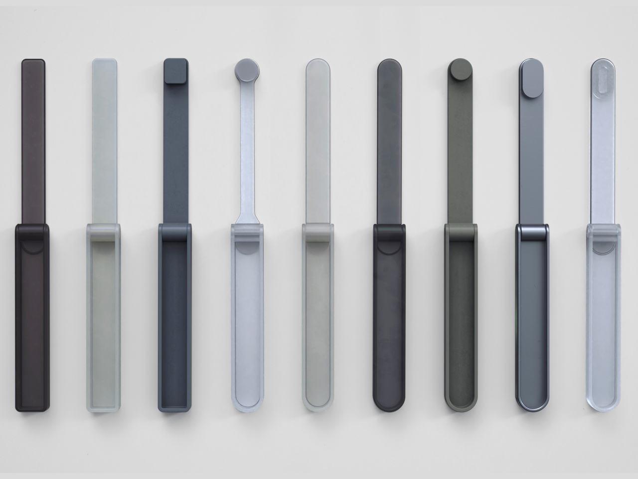
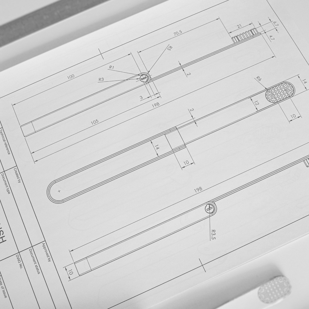
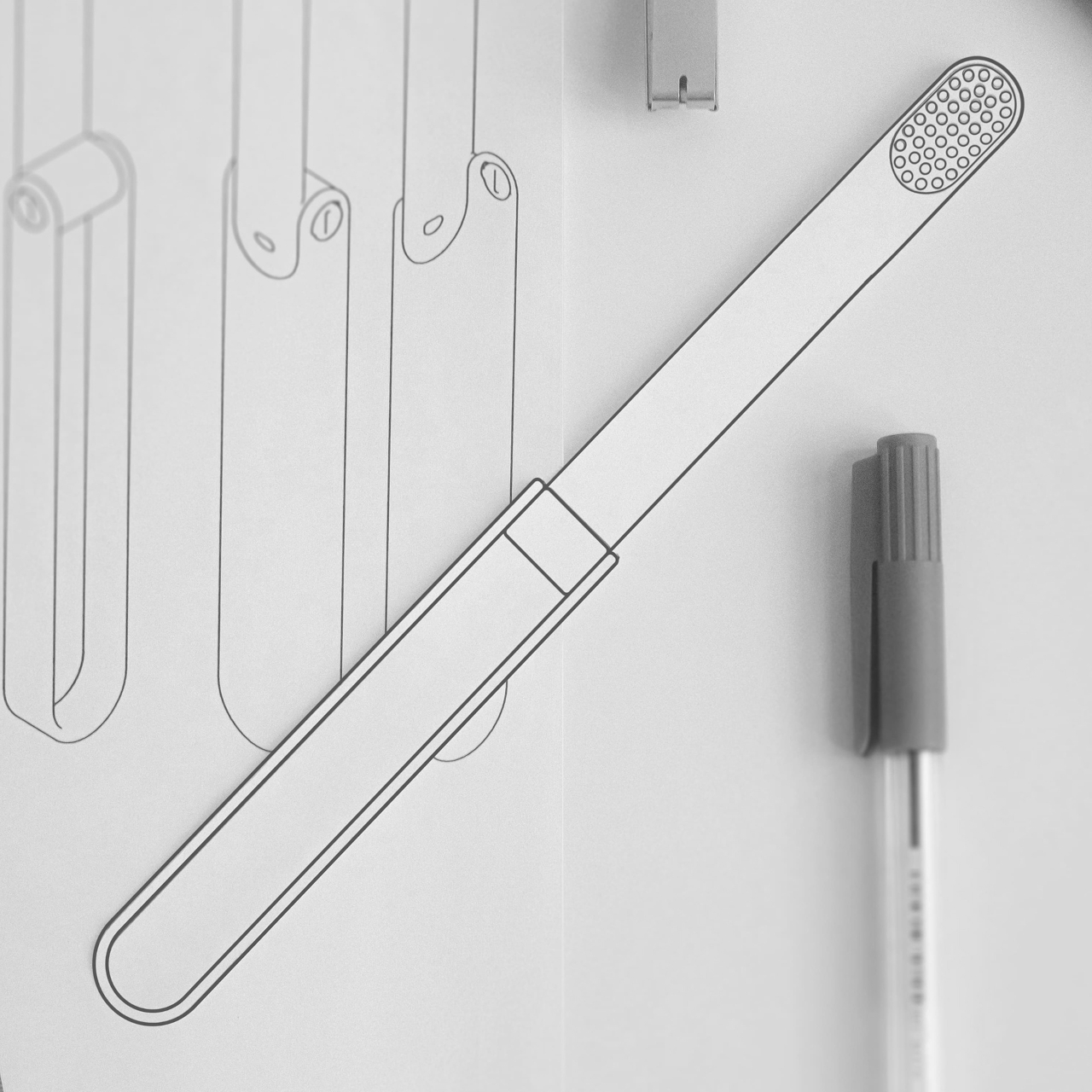
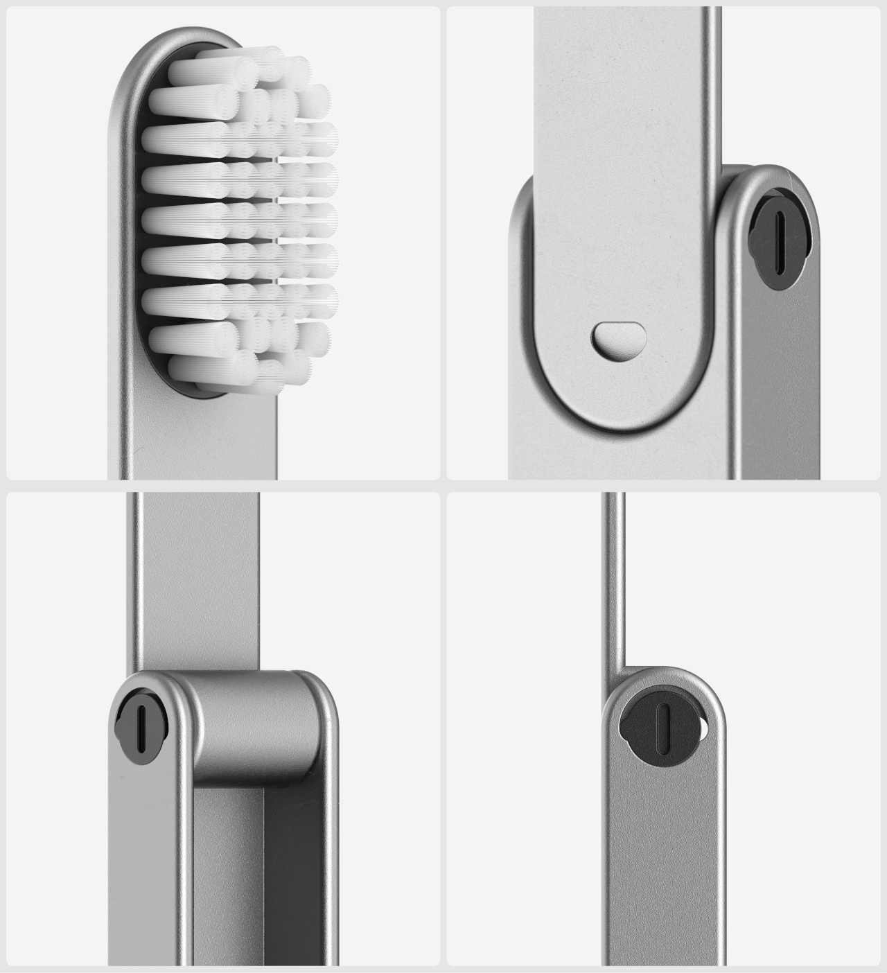
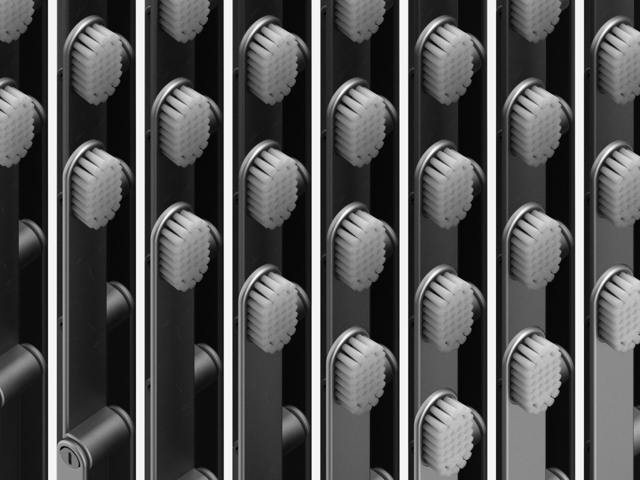
More than just its compact foldable form, the IO travel toothbrush concept embraces a modular design that lets you swap out those bristles as needed. It helps reduce the amount of waste from toothbrushes that are thrown out as a whole object when you really need to only replace the head. It also makes the toothbrush more hygienic and convenient, since you can replace the bristles anytime, especially after an accidental drop or brush (no pun intended) with unsanitary surfaces.

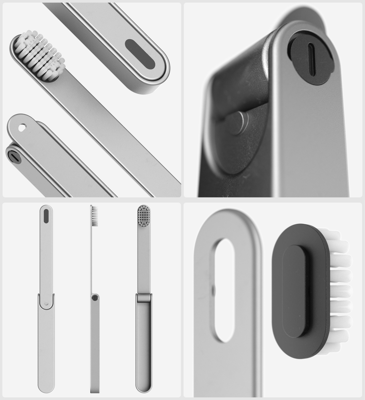
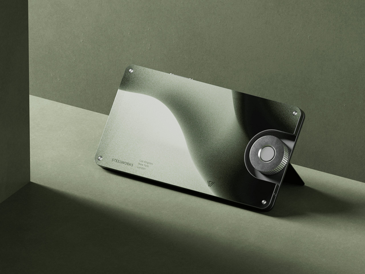
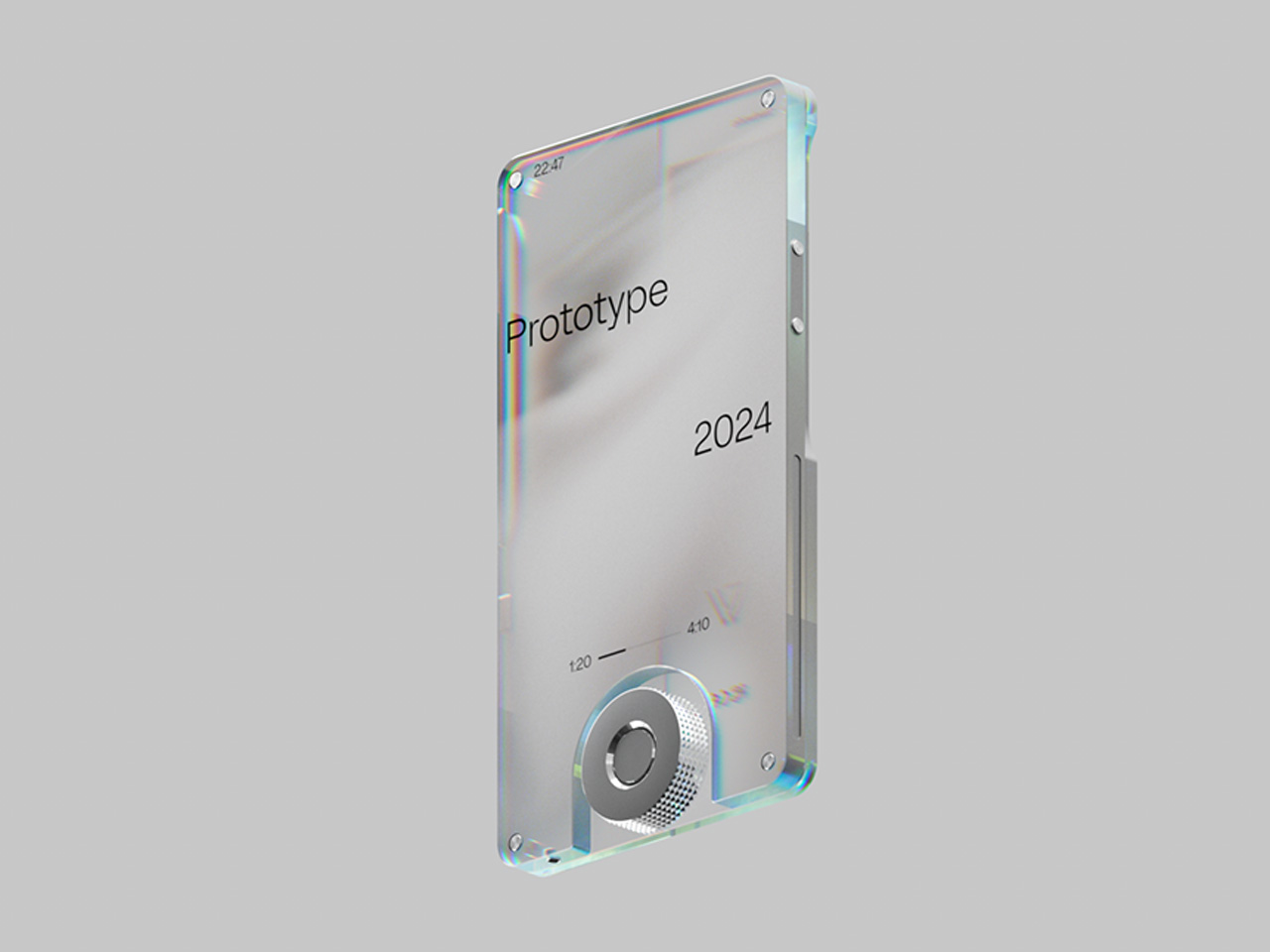
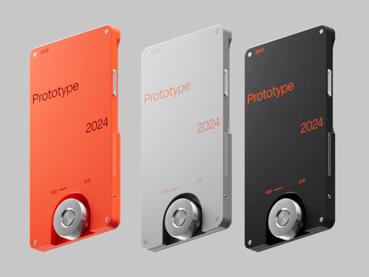
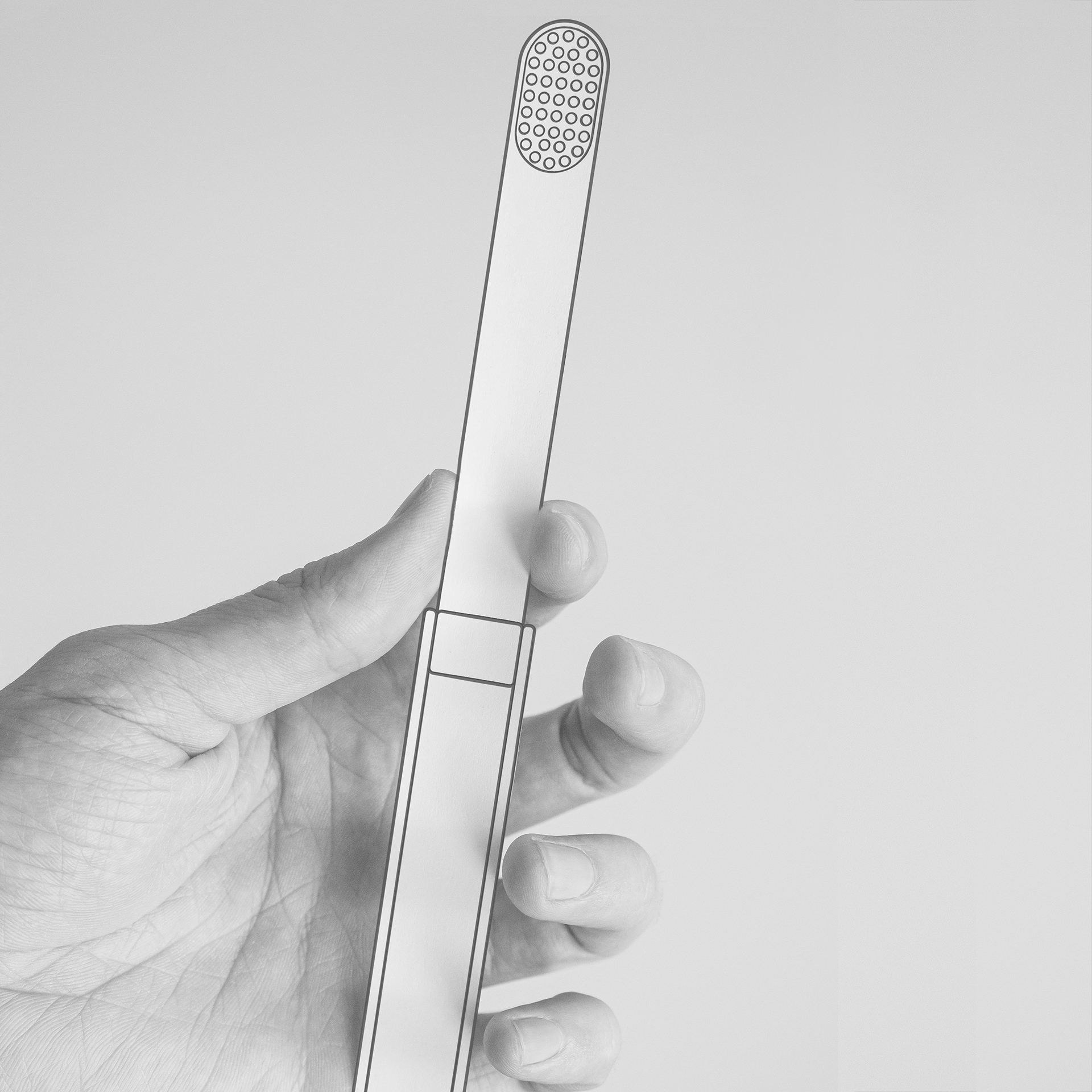
The body of the toothbrush itself is also designed to last and is made using surgical steel or other durable metals. The smooth, edge-free design prevents that metal from cutting into your mouth or skin. It has an elegant minimalist design that not only makes it aesthetically pleasing but also reduces the space it takes up in your bag or kit. Like the bristles, it actually also has a modular design that lets you separate the two parts, in case you need to replace one or the other.

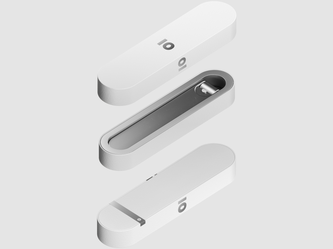
This IO toothbrush concept is designed for sustainability from every angle. Even the packaging is supposed to be biodegradable and can even be dissolved in water. You can easily just dissolve the packaging rather than throw it away, ensuring that you won’t be leaving any trash behind. With some outside-the-box thinking, this toothbrush concept proves that human health and convenience don’t have to come at the expense of the planet.

The post Folding Travel Toothbrush Concept Keeps Your Teeth and the Planet Clean first appeared on Yanko Design.

Modular camera concept keeps you focused on the magic of the moment

Smartphones have become very powerful and convenient tools for recording precious memories and sharing them with loved ones, but they can also be sources of stress, distractions, and dissatisfaction. The Instagram generation has many people snapping up photos or short video clips and then losing themselves in a sea of notifications and social media posts just as they try to quickly share those moments. It is quite ironic that these devices that connect us with others also disconnect us from the world around us and, more importantly, from ourselves because of those incessant distractions. A dedicated digital camera, even one with Wi-Fi, is a solution but an inconvenient one at that because of its bulk and complicated features. A better answer might be the evolution of the point-and-shoot camera, but one with a flexible design that can scale to people’s ever-changing needs and situations.

Designers: Mason Fetter, Alejandra Giron, Grant Huntsman, Cooper Phelps, Summer Glenn

Point-and-shoot digital cameras were the first to be obsoleted by the rise of smartphones, unable to keep up with the growing number of connectivity features and fun filters that these mobile devices offered. At the same time, however, it is exactly those lack of features that now gives the design its appeal, as people using Polaroid-style instant cameras have discovered. Their simplicity allowed people to simply have fun and enjoy the moment, without having to worry about instantly applying filters or even immediately uploading photos and videos.

Keepsake is a concept design that embraces that simplicity but with an added twist. Unlike those very basic cameras, it can actually expand to add features needed by users. Best of all, it can also go back to that basic functionality once those extra tasks are done. In other words, it has a modular system that keeps it agile and flexible in ways that even a smartphone might have problems keeping up with.

1

1

At the heart of the Keepsake design is the screenless digital camera itself and four basic modules which include a mic recording and flash that stick to the front of the camera, as well as a MagSafe clip and a wide charging hub that connects to the back. With this kit, shutterbugs have most of what they need to have an enjoyable disconnected experience that simply focuses on the world around them. At the same time, it keeps the doors open to even more possibilities with future add-ons.

Of course, Keepsake also connects and syncs with a mobile app so you can still share your photos when you want to. It gives users the freedom and control to put their phones away and just immerse themselves in the moment but still gives them the power to enjoy the conveniences of the Internet afterward. And with the modular design, they can take only what they need with them and hold a compact device, unlike a powerful yet bulky and heavy camera.

The post Modular camera concept keeps you focused on the magic of the moment first appeared on Yanko Design.

Sustainable refrigerator concept turns it into a “Food Station”

For people like me who live alone and who has no time to really cook or prep meals, the refrigerator can sometimes be either an empty vessel or a wasteland of unused ingredients and leftover food. Some product designers probably had me in mind (even if I’m not Gen Z) when they came up with the concept for turning the refrigerator into a sustainable food station.

Designers: Hyungwoo Lee, Hyerhyn Park, Seokoo Yeo, Haeri Ryoo, Seryeong Hong

The OneTwo Food Station is a concept for a refrigerator for Generation Z that has a separate compartment for Meal Prep dishes. This means that the brand is also connected to a Meal Prep service and the OneTwo is merely a food storage for the dishes before you cook them or consume them. This prevents the unnecessary waste of ingredients that you don’t really need therefore helping you practice sustainable eating.

So basically the main difference of this ref is that almost half of the space is meant for these meal prep containers. Of course there’s still a regular compartment for other items that you still would want to store and there’s also a freezer compartment although this one is located at the bottom. Instead of the regular ref door handle, you have strap handles on the front for a more “appealing” interaction. It also has double-sided doors so you can easily reach the items whether they’re at the front or back.

The Meal Prep component on the OneTwo app is pretty customizable and also has some sharing and social components since we all love sharing what we eat, especially if it’s visually appealing. There was no mention of what material the Food Station is made from but in keeping with its sustainable branding, it should also be more eco-friendly than the regular refrigerators.

The post Sustainable refrigerator concept turns it into a “Food Station” first appeared on Yanko Design.

Smartphone-powered tabletop stopwatch concept turns deep focus into a game

Our desks are filled with things that inspire us as well as objects that distract us, with our smartphones as the biggest culprits. Sure, we can probably justify having our phones close to us as necessary for work, but we don’t always need to be looking at them while we’re actually working. Notifications, videos and animations, and scrolling text all take our attention away from more important things, but uninstalling these apps completely induces a different kind of stress and worry. The situation doesn’t have to be black or white, though, and there are plenty of strategies to reduce distractions while keeping our phones still within reach, and you don’t even need the training of an ascetic monk to pull this off. In fact, it can even become a fun mini-game, like this tabletop stopwatch that turns getting into the zone into a dive for treasure.

Designers: Dagyeong Kim, Chanhee Park, Dugyeong Lee, Songhee Kim

There are actually some apps that use a similar method to encourage continuous periods of work without unlocking their phone. The idea is that there is some negative consequences when you pause or stop the timer by using the phone, like some virtual tree dying. These apps, however, still put the smartphone not only within reach but also in sight, increasing the temptation anyway. SINK is a concept that works the same way but adds a twist that not only puts the phone away but also makes the experience a bit more engaging.

1

The inspiration behind SINK is the gaming consoles of old, where you insert a cartridge to play a game. The mechanism is simple and straightforward, removing any ambiguity or complications. In this case, however, it’s your smartphone that is the cartridge, and you slide it into the back of the SINK device to turn it on. The device only works if the phone is in the slot, so you’ll have to go out of your way to retrieve your phone even for just a few seconds.

The “game” in SINK’s case is a deep ocean dive, hence the concept’s name, where the longer you remain focused at work, the deeper your diver goes and the higher points you get. There’s some semblance of a ranking system, but the concept doesn’t clarify if you’re just competing with yourself or with others as well. The latter raises the stakes a bit for those with a bit of a competitive bent, but it might also work the opposite way and discourage others.

Using SINK is quite simple and the device itself has very few controls other than a dial and a slider. Of course, any strategy like SINK or the Forest app will only be effective if you’re actually doing the intended work during the allotted period of time. There’s still an element of self-control, but SINK’s playful design makes it look a bit more fun instead of serious work.

The post Smartphone-powered tabletop stopwatch concept turns deep focus into a game first appeared on Yanko Design.

Alien-inspired smartwatch concept eschews conventional design for more organic aesthetics

Smartwatches today have evolved from miniature smartphones on our wrists to miniature health clinics on our wrists. The design of these wearable devices has finally settled down to a handful of designs, most of which try to mimic the appearance of classic timepieces. There is, however, still plenty of room for exploration, for designs that redefine the product category or challenge the status quo. This design concept, for example, tries to look farther ahead into the future, when conventions no longer hold water and where today’s unfamiliar, alien aesthetics would ironically look more natural and more human.

Designer: Olga Orel

Smartwatches had a hard time finding its niche in the market. They were too technological to match the majesty of mechanical watches, but also too underpowered to be the multi-purpose wrist-worn communicators of science fiction. In the end, smartwatches today adopted the core design convention of traditional wristwatches, be they the sporty kind or the luxurious timepieces. But does it really have to be that way? Do smartwatches need to look like, well, watches?

The ALIEN concept gives an empathic “no,” embracing a design language that is more organic and ironically closer to us than its extraterrestrial name would suggest. Its asymmetrical and amorphous design, not to mention the matching domed display, gives it that otherworldly character seemingly pulled out from some 90s sci-fi flick, with its eerie green glow and dark brushed metal surface. Of course, there’s nothing to stop a manufacturer from using other color motifs or materials, but it would still look alien compared to common smartwatches.

The irony is that, freed from the restrictions of circular and square watches, ALIEN can take on shapes that better conform to people’s wrists, offering a more natural, more ergonomic, and more pleasing curvature that is more human-centric. Even the buttons seem to organically grow out of the watch’s body rather than just jutting out like an artificial add-on. And unlike most smartwatches today, it isn’t content to have just one button but can have as many as four in each corner.

This unconventional design also changes the user experience, though not always in good ways. Because the shape of the screen is non-standard, there is more flexibility for different UI elements and arrangements, but it can also make things more confusing as well. Humans are creatures of habit, and smartwatches try to offer a uniform experience across different models or even platforms to make it easier for owners to switch from one watch to the next. That is, unfortunately, one of the disadvantages of this concept design, making the interaction and experience a little foreign and, well, alien.

The post Alien-inspired smartwatch concept eschews conventional design for more organic aesthetics first appeared on Yanko Design.

Folder-shaped hard drive concept is a more organized way to store files

When your desktop or laptop or tablet does not have a large storage or your work involves a lot of large files, external hard drives are life savers. However sometimes they’re just too bulky and heavy to carry around, especially if you work outside or move around a lot. Also, if you’re like me, most likely all the files are just dumped there and you rely on the search button to look for what you need. But you probably don’t need most of the files that are stored there and yet you’re still constantly carrying that big hard drive around.

Designer: Junho Han

The idea for the Folder external hard disk is to have something that is not just all about storage but a more efficient way to carry around your files. It is meant to not have all your files in just one bulky device but to separate them into projects or folders so you can be more efficient in finding and storing your files especially if you’re working on several projects at once. Not much details are indicated in the concept page but you can see in some of the product renders that there’s a 1TB marking although I’m not sure if a tiny item like that can hold that much storage.

The hard drive itself is shaped like a tiny folder that you can hold in the palm of your hand. That’s why it’s hard to imagine how 1TB can fit into that in real life. But the design is pretty cute and if you have several folders hard drives, it’s like you also have several non-digital folders to organize everything into projects. The hard drive circuit board is inserted in a slot under the folder and there’s a USB-C port also so you can connect it to your device.

As a concept, it’s interesting and nice-looking. It’s like carrying around a USB-drive only bigger than the flash disk but definitely smaller than the bulky hard drives. Let’s see if can actually work as an actual product.

The post Folder-shaped hard drive concept is a more organized way to store files first appeared on Yanko Design.

Yamaha’s concept for an outdoor heater gives off a flaming hot look

I live in a tropical country so the need for outdoor (or even indoor) heaters is practically non-existent. But when I first experienced how cold it is outside when I traveled to places that have winter, I understood how important it was to have something to warm you up especially when you’re doing outdoor activities. Most of what I’ve seen are not necessarily aesthetic so there’s always room for well-designed heaters.

Designer: Yamaha Design Laboratory

Yamaha has been experimenting a lot lately with designs for various products that are not necessarily connected to Yamaha Motor or their other businesses. This includes creating design concepts for outdoor tools and one of those projects is for something called Bon-Flame, an outdoor heater attachment tool that combines the brand’s expertise in both mobility and their main product of musical instruments.

Basically this heater uses a bimetallic sheet that is made up of two metals that are glued together. The different metals have varying expansion rates so the sheet is able to change shape when heat is applied. There’s a small ball-shaped bimetal at the base which rotates when heated and then eventually opens up like a flower. The ending look is that of a large flame shape that gives you a pretty looking heater.

The concept also converts the flame of a single burner into far-infrared heat which is better for the environment as it has a lower carbon footprint. It’s still a design concept for now but it would be a great companion for outdoor activities especially if you’re going for an aesthetic look.

The post Yamaha’s concept for an outdoor heater gives off a flaming hot look first appeared on Yanko Design.

FryMist concept combines air frying and steaming into one device

I’ve been trying for years to eat healthier due to various health conditions that have come up. I’m not much of a cook and the only things I can do right now are fry things. But of course it’s not the healthiest way so having an air fryer would be ideal. Another way would be to steam things but there are times when frying, or at least air frying, is better.

Designer: Duygu Yildiz

A designer said, why not have both? FryMist is a concept for a cooking device that puts an air fryer and a steamer into just one device to save space in your kitchen. It’s not really combining the two processes but integrating them into just one device. This way you are able to get low-fat cooking and healthier dishes while also not giving you harmful chemicals from high heat.

1

The steamer part has a water boiling container and a grill since you of course need water to be able to steam your veggies or fish or whatever else you can steam. The air fryer part has the container and the air fry grill. The air fryer and steamer also has separate screens so you won’t get confused as to the controls and the displays.

This would be an ideal cooking device for people who like me who don’t have much time to cook actual dishes. If this is made into an actual product, I would probably be first in line to get one.

The post FryMist concept combines air frying and steaming into one device first appeared on Yanko Design.

This ultra-thin portable music player redefines music listening experience

Portable music players have for long been the staple of audiophiles who cannot compromise on the audio quality of the tracks they listen to. Astell&Kern, FiiO and Sony have dominated this space for a long with their consistency.

Now Steelworks Studio wants these big names to level up their game with the SW-1 music player, which a proposed concept for a DAP that embodies functionality with visually pleasing aesthetics for a unified listening experience.

Designer: Steelworks Studio

A bezeless responsive touchscreen that is encapsulated by the durable aluminum body frame without subduing the retro charm signifies this design leap. The minimalist aesthetic is complemented by the stunning OLED display that fits the vibe of modern audio listeners. This concept chooses the trending silver finish for the frame that has a beautiful volume knob in the bottom center to induce a tactical feel.

The user can listen to their music on the 360-degree surround sound speakers as well as the gadget can be placed in the horizontal orientation. Yes, it’s got an equally robust kickstand for placing the device on a flat surface in landscape mode. So, you’re not just limited to music, but can also enjoy immersive binge-watching on the player.

The SW-1 music player has a very sleek and ergonomic footprint so that it can be carried easily in your daily commute to work. While the form factor is slightly taller than your usual Hi-res music player, the gadget is far thinner than other DAPs out there. Honestly, the height could have been a little less considering the display only occupies around 1/4th of the screen real estate. Anyways, the skim form fits like a charm in hand and that volume knob adds spice to your music listening experience.


The post This ultra-thin portable music player redefines music listening experience first appeared on Yanko Design.

Quirky chair concepts are made for both humans and their feline masters

Anyone who has owned a cat will know the truth about who is really the master and who is the pet. Although they can definitely be cuddly and sentimental, furry felines are also known to be temperamental and territorial. And by that, it usually means that any place in the house can be their territory. All kidding aside, cats tend to love squeezing into tight spaces, even when you’ve already provided a lush, comfy, and unfortunately very open bed. Embracing the behavior of cats and how they can be central to owners’ lives, these concept designs envision furniture for humans that cats will appreciate, or rather, cat furniture that just happens to be usable by humans.

Designer: Jing-Cyuan Tang

For reasons unfathomable to all except their regal kind, cats love to squeeze into cramped spaces. Of course, they’ll still enjoy plush beds, but give them a box or a tube and their natural instincts kick in. So why not just design sleeping furniture that appeals to this behavior directly instead? Bonus points if it can also be used by their human owners, potentially letting them bond even better when resting in the same place.

That may be the thinking behind this rather unusual set of cat-friendly furniture design concepts. Or perhaps they’re human-friendly cat furniture designs. Either way, these chairs will be enjoyable to both parties, though their maintenance will probably be less so for humans. The common theme these chairs have are the armrests that act like dark tunnels, enticing cats to go inside to nap. There’s ample space for a cat or even two, so it’s not exactly a cramped and uncomfortable space at all.

Two variants of these armchair designs exist. Perhaps the more interesting one of the two has an armrest that goes around the back of the chair, creating a single tunnel that cats can walk through from end to end. There is also a more modest version where the armrests swap out tunnels for shelves, allowing owners to put other things on the side that won’t be used by the cat, presuming the cat doesn’t claim that space and pushes the vase off the shelf.

There is even a stool design where the very low backrest curves inward, creating that same tunnel shape where the cat can lie inside behind you. Truth be told, the seats don’t look too comfortable, especially with the backrests so low. They might have been unintentionally designed with feline comfort as the priority, showing who the real master of the house is. That said, they are indeed interesting designs and, to some extent, quite feasible, though the question of how to clean up after the cat inside those armrests still remains.

The post Quirky chair concepts are made for both humans and their feline masters first appeared on Yanko Design.