Microsoft’s $1,950 Surface Pro 13 Gen 12 Got Smarter: Its Design Didn’t

The 2-in-1 laptop has had an interesting run. What started as a novelty device that couldn’t decide what it wanted to be has gradually become a workplace staple. IT departments are increasingly looking for machines that can handle everything from a boardroom presentation to a cross-country flight without missing a beat, and the pressure to pack more intelligence into smaller form factors keeps growing.

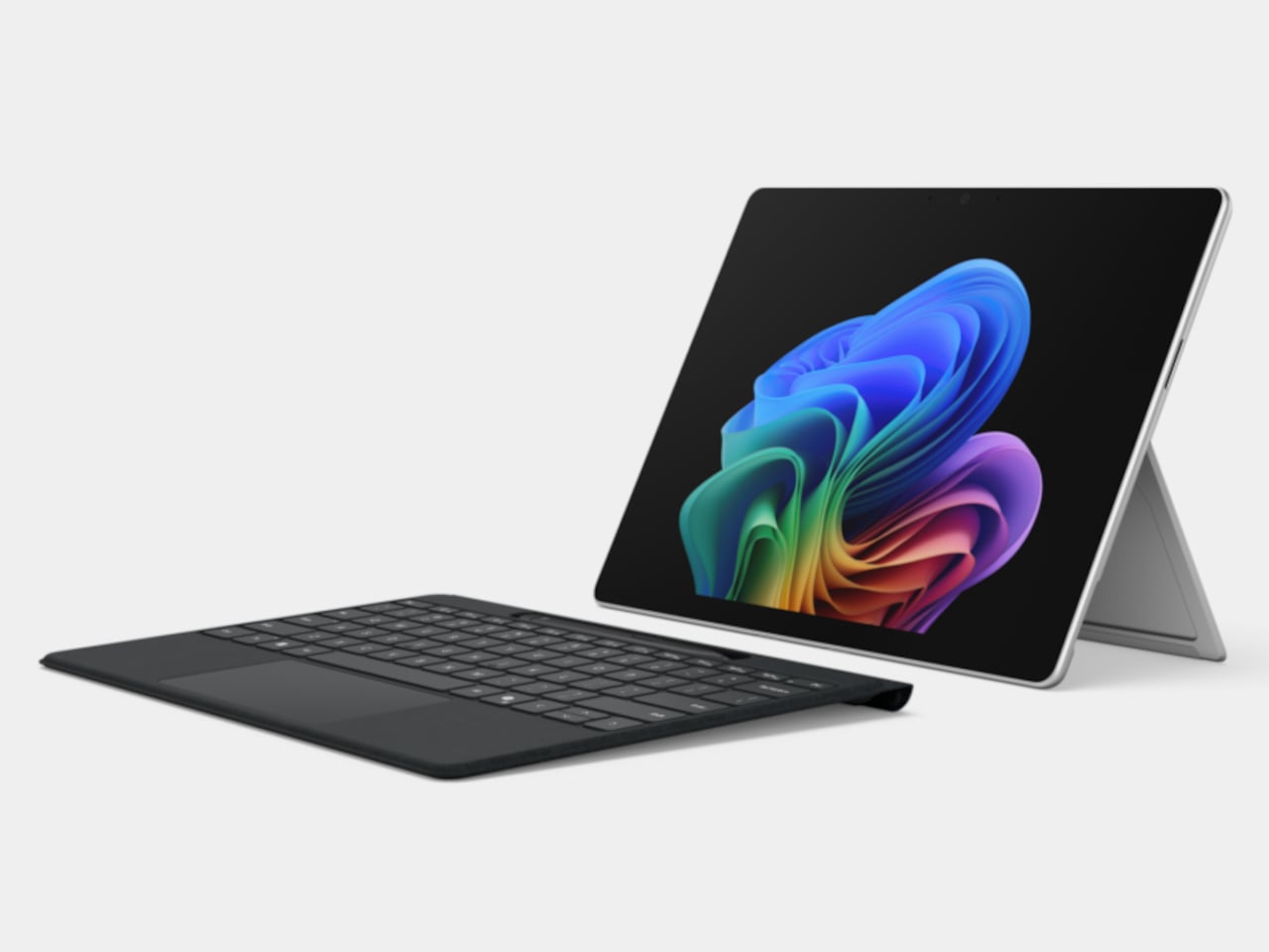
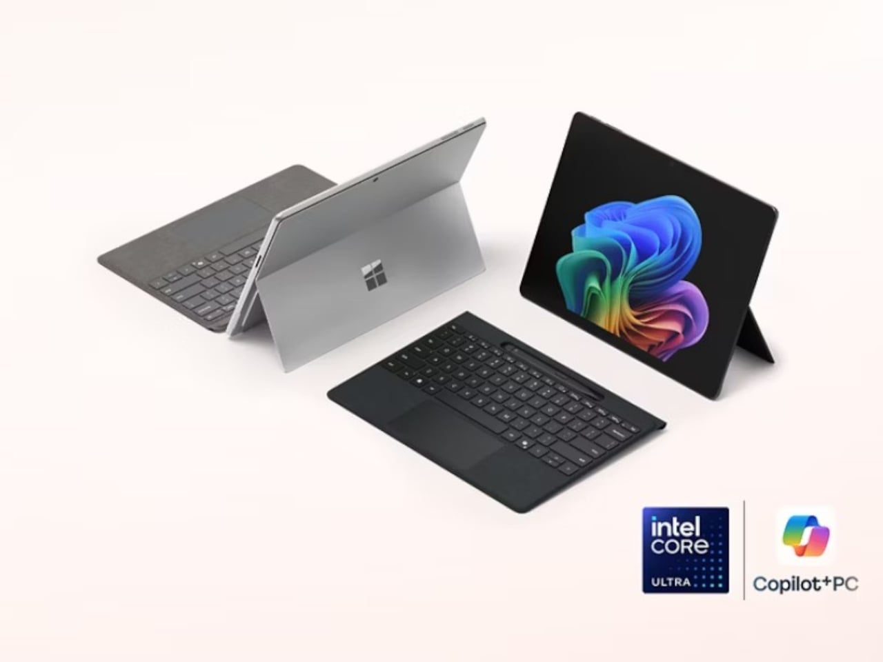
The Surface Pro has been Microsoft’s answer to this for well over a decade, and the new Surface Pro for Business, 13-inch (12th Edition), largely keeps the formula intact. If you’re expecting a dramatic redesign, it isn’t coming. The magnesium chassis, adjustable kickstand, and detachable keyboard are all still here, which is either a testament to the original design or a sign of a very cautious product team.

Designer: Microsoft

That said, what’s happening inside tells a different story. Powered by Intel Core Ultra Series 3, either the Core Ultra 5 335 or the Core Ultra 7 366H, this Surface Pro hits 50 TOPS through Intel AI Boost, qualifying it as a Copilot+ PC. That means on-device AI is fast enough for a consultant to summarize a contract or an analyst to run through data without needing a cloud connection.

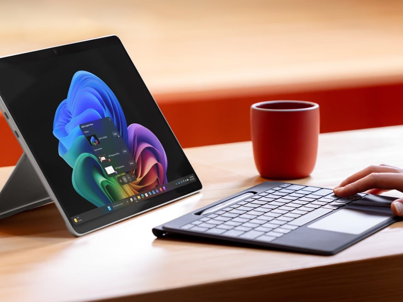
And that AI work happens on a 13-inch PixelSense Flow display running at 2880 x 1920 pixels with a dynamic refresh rate of up to 120Hz, available in an optional OLED for deeper contrast and richer color. The anti-reflective coating is genuinely useful for anyone working in brightly lit offices or outdoor settings, giving this screen a practical advantage over glossier alternatives.

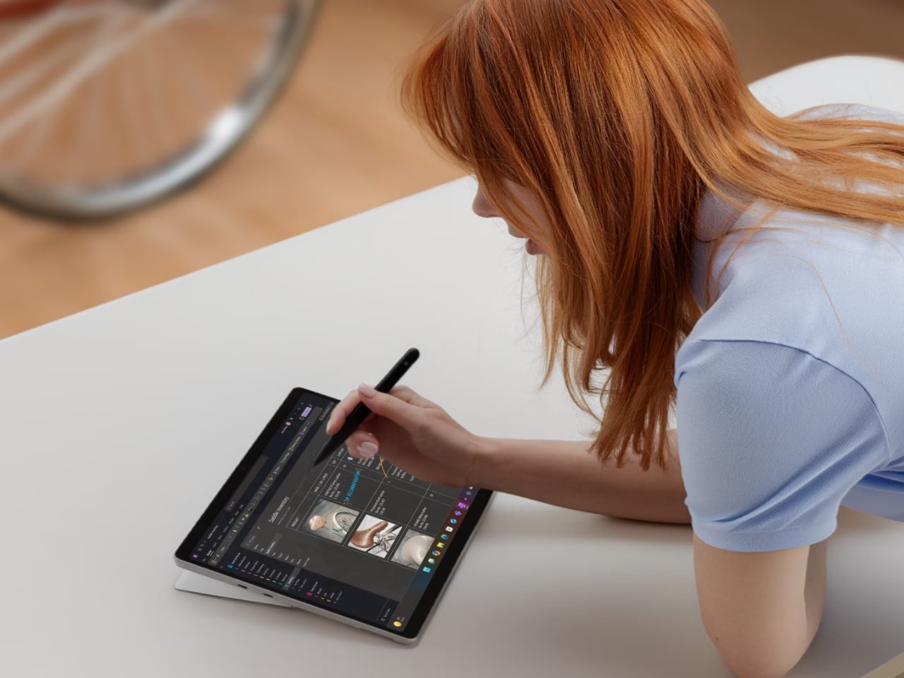
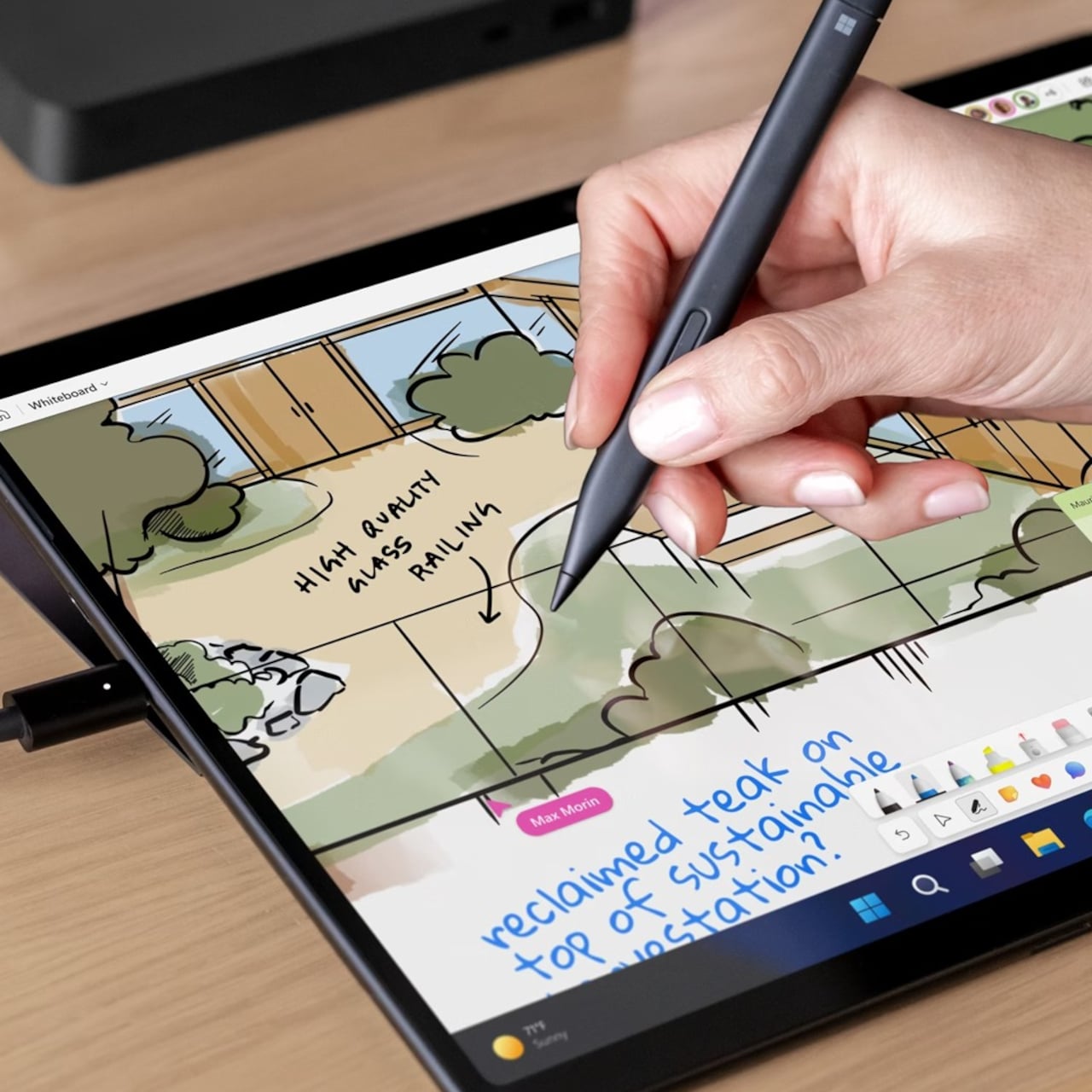
For workers who annotate more than they type, the 2-in-1 flexibility is still the Surface Pro’s most practical feature. Fold the keyboard flat, grab a Surface Slim Pen for Business, and the device shifts from laptop to inking tablet. It’s a workflow that makes sense during a client walkthrough or a field assessment, and one that doesn’t require any extra hardware to pull off.

Under the hood, memory goes up to 64GB of LPDDR5x RAM for anyone running virtual machines or demanding workloads. The removable Gen 4 SSD also matters to enterprise IT teams, who can swap drives without replacing the entire unit. Battery life is promised to reach up to 17 hours on the LCD model, enough for a full day of travel without hunting for a power outlet.

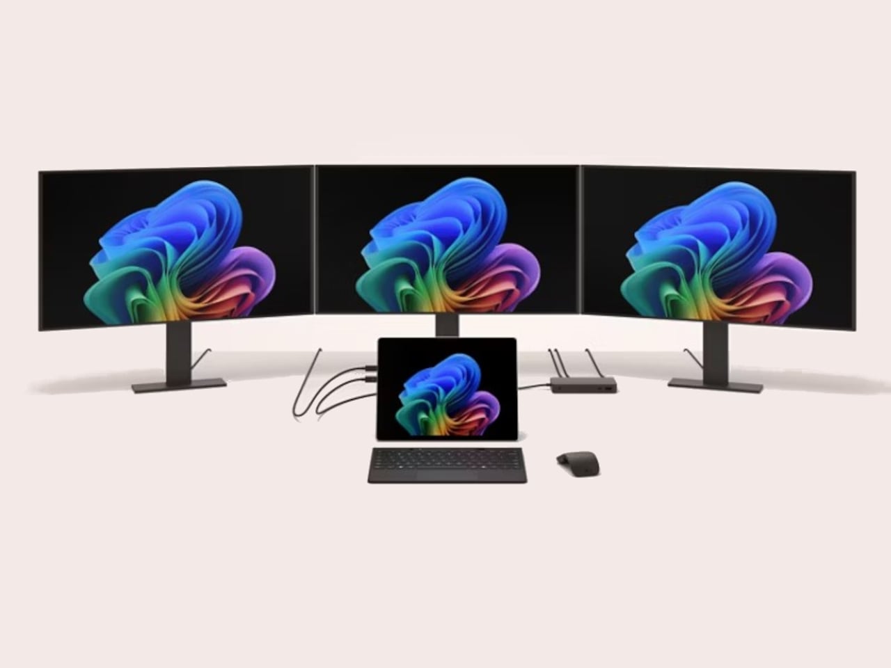
Starting at $1,949.99, this is firmly enterprise territory, especially since that doesn’t include the keyboard or pen, which still don’t come in the box. But for IT teams investing in devices that double as laptops, tablets, and mobile workstations, the math starts to make sense. The 12th Edition has a lot riding on what’s happening under its unchanged exterior, and perhaps hopes that its enterprise customers haven’t yet gotten bored with its looks.

The post Microsoft’s $1,950 Surface Pro 13 Gen 12 Got Smarter: Its Design Didn’t first appeared on Yanko Design.

Microsoft’s $1,950 Surface Pro 13 Gen 12 Got Smarter: Its Design Didn’t

The 2-in-1 laptop has had an interesting run. What started as a novelty device that couldn’t decide what it wanted to be has gradually become a workplace staple. IT departments are increasingly looking for machines that can handle everything from a boardroom presentation to a cross-country flight without missing a beat, and the pressure to pack more intelligence into smaller form factors keeps growing.

The Surface Pro has been Microsoft’s answer to this for well over a decade, and the new Surface Pro for Business, 13-inch (12th Edition), largely keeps the formula intact. If you’re expecting a dramatic redesign, it isn’t coming. The magnesium chassis, adjustable kickstand, and detachable keyboard are all still here, which is either a testament to the original design or a sign of a very cautious product team.

Designer: Microsoft

That said, what’s happening inside tells a different story. Powered by Intel Core Ultra Series 3, either the Core Ultra 5 335 or the Core Ultra 7 366H, this Surface Pro hits 50 TOPS through Intel AI Boost, qualifying it as a Copilot+ PC. That means on-device AI is fast enough for a consultant to summarize a contract or an analyst to run through data without needing a cloud connection.

And that AI work happens on a 13-inch PixelSense Flow display running at 2880 x 1920 pixels with a dynamic refresh rate of up to 120Hz, available in an optional OLED for deeper contrast and richer color. The anti-reflective coating is genuinely useful for anyone working in brightly lit offices or outdoor settings, giving this screen a practical advantage over glossier alternatives.

For workers who annotate more than they type, the 2-in-1 flexibility is still the Surface Pro’s most practical feature. Fold the keyboard flat, grab a Surface Slim Pen for Business, and the device shifts from laptop to inking tablet. It’s a workflow that makes sense during a client walkthrough or a field assessment, and one that doesn’t require any extra hardware to pull off.

Under the hood, memory goes up to 64GB of LPDDR5x RAM for anyone running virtual machines or demanding workloads. The removable Gen 4 SSD also matters to enterprise IT teams, who can swap drives without replacing the entire unit. Battery life is promised to reach up to 17 hours on the LCD model, enough for a full day of travel without hunting for a power outlet.

Starting at $1,949.99, this is firmly enterprise territory, especially since that doesn’t include the keyboard or pen, which still don’t come in the box. But for IT teams investing in devices that double as laptops, tablets, and mobile workstations, the math starts to make sense. The 12th Edition has a lot riding on what’s happening under its unchanged exterior, and perhaps hopes that its enterprise customers haven’t yet gotten bored with its looks.

The post Microsoft’s $1,950 Surface Pro 13 Gen 12 Got Smarter: Its Design Didn’t first appeared on Yanko Design.

Microsoft’s $1,950 Surface Pro 13 Gen 12 Got Smarter: Its Design Didn’t

The 2-in-1 laptop has had an interesting run. What started as a novelty device that couldn’t decide what it wanted to be has gradually become a workplace staple. IT departments are increasingly looking for machines that can handle everything from a boardroom presentation to a cross-country flight without missing a beat, and the pressure to pack more intelligence into smaller form factors keeps growing.

The Surface Pro has been Microsoft’s answer to this for well over a decade, and the new Surface Pro for Business, 13-inch (12th Edition), largely keeps the formula intact. If you’re expecting a dramatic redesign, it isn’t coming. The magnesium chassis, adjustable kickstand, and detachable keyboard are all still here, which is either a testament to the original design or a sign of a very cautious product team.

Designer: Microsoft

That said, what’s happening inside tells a different story. Powered by Intel Core Ultra Series 3, either the Core Ultra 5 335 or the Core Ultra 7 366H, this Surface Pro hits 50 TOPS through Intel AI Boost, qualifying it as a Copilot+ PC. That means on-device AI is fast enough for a consultant to summarize a contract or an analyst to run through data without needing a cloud connection.

And that AI work happens on a 13-inch PixelSense Flow display running at 2880 x 1920 pixels with a dynamic refresh rate of up to 120Hz, available in an optional OLED for deeper contrast and richer color. The anti-reflective coating is genuinely useful for anyone working in brightly lit offices or outdoor settings, giving this screen a practical advantage over glossier alternatives.

For workers who annotate more than they type, the 2-in-1 flexibility is still the Surface Pro’s most practical feature. Fold the keyboard flat, grab a Surface Slim Pen for Business, and the device shifts from laptop to inking tablet. It’s a workflow that makes sense during a client walkthrough or a field assessment, and one that doesn’t require any extra hardware to pull off.

Under the hood, memory goes up to 64GB of LPDDR5x RAM for anyone running virtual machines or demanding workloads. The removable Gen 4 SSD also matters to enterprise IT teams, who can swap drives without replacing the entire unit. Battery life is promised to reach up to 17 hours on the LCD model, enough for a full day of travel without hunting for a power outlet.

Starting at $1,949.99, this is firmly enterprise territory, especially since that doesn’t include the keyboard or pen, which still don’t come in the box. But for IT teams investing in devices that double as laptops, tablets, and mobile workstations, the math starts to make sense. The 12th Edition has a lot riding on what’s happening under its unchanged exterior, and perhaps hopes that its enterprise customers haven’t yet gotten bored with its looks.

The post Microsoft’s $1,950 Surface Pro 13 Gen 12 Got Smarter: Its Design Didn’t first appeared on Yanko Design.

This $30 Gadget Gives Claude a Face That Reacts to What It’s Doing

AI assistants have mostly lived inside screens, and that’s been fine, until you’re deep in a coding session and Claude is quietly running shell commands, editing files, and hitting tool after tool in the background. Knowing what’s happening without constantly alt-tabbing is harder than it should be, and approving or denying an action while keeping your hands on the keyboard is even harder.

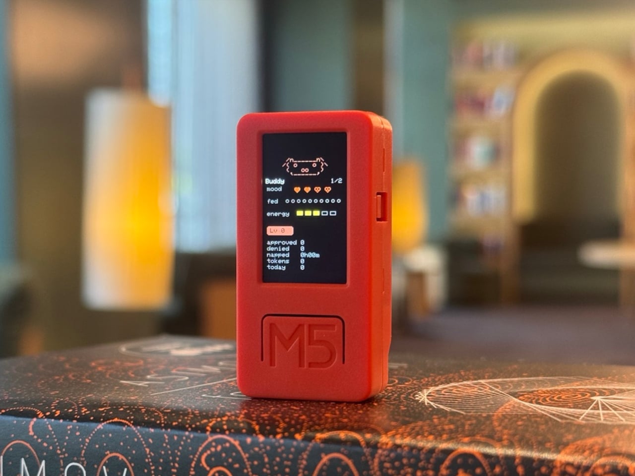
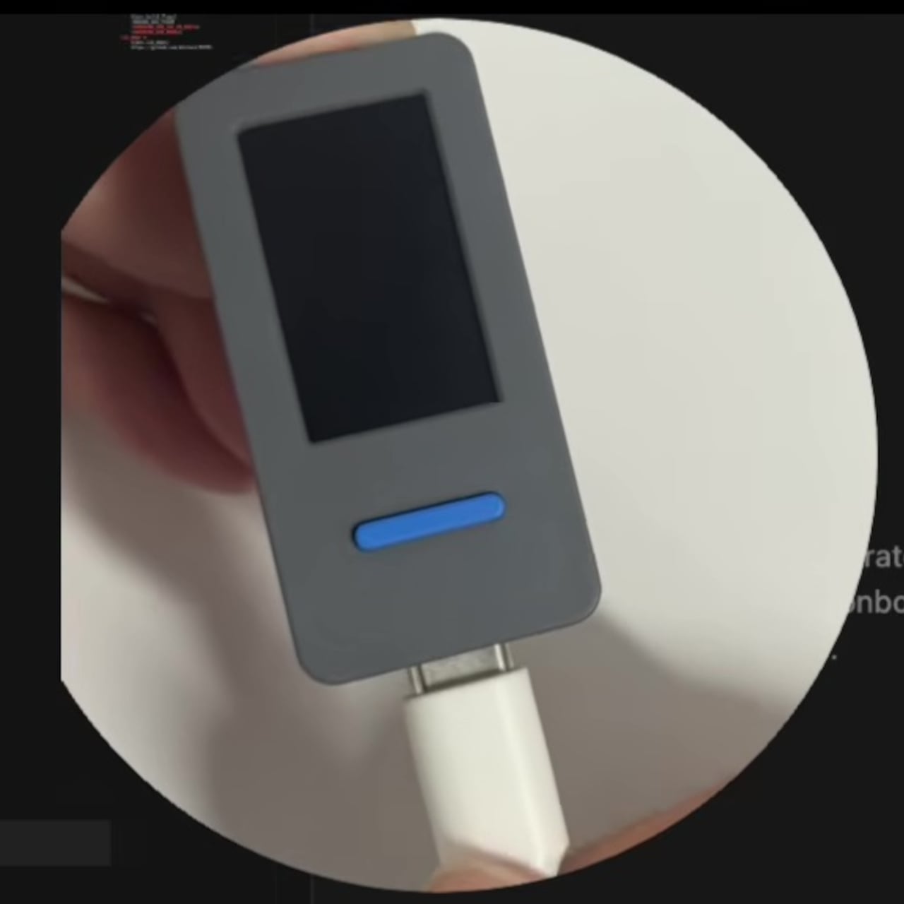
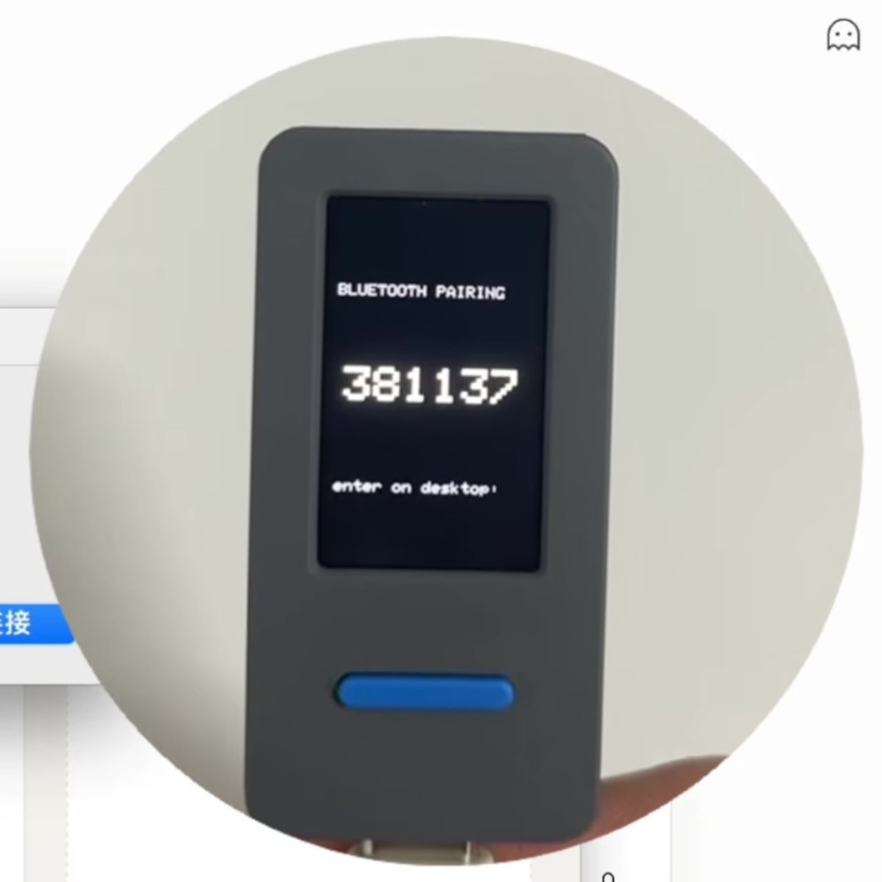
That’s the gap Claude Desktop Buddy was built to fill. Released as an open-source project by Anthropic in April 2026 and built as a prototype by OpenELAB, it turns a small ESP32-based device into a physical companion that sits on your desk and mirrors the activity of the Claude desktop app over Bluetooth Low Energy. It wakes when a Claude Code session starts, idles quietly while Claude works, and gets visibly impatient when a permission prompt is waiting for your attention.

Designer: Anthropic, OpenELAB

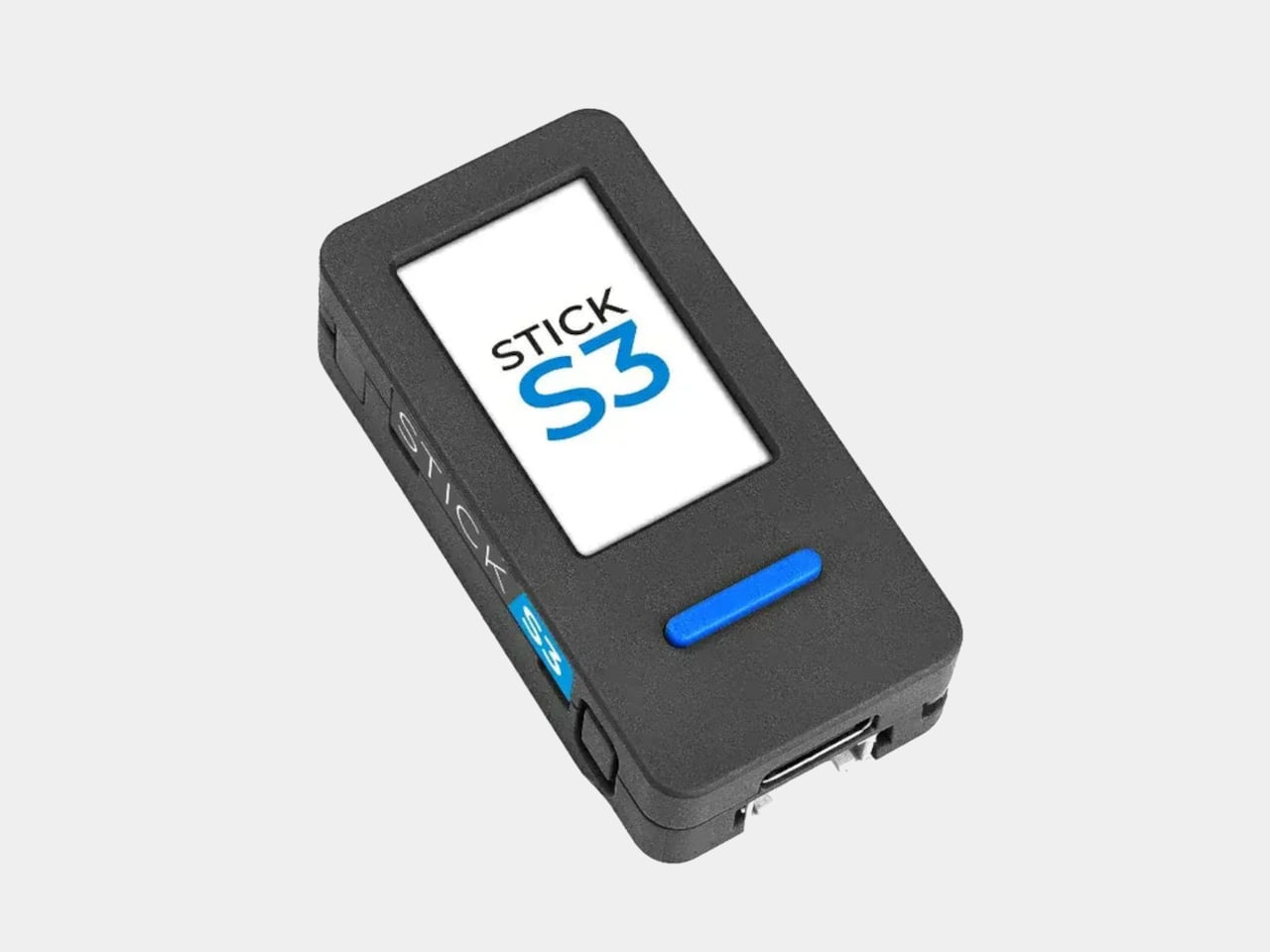
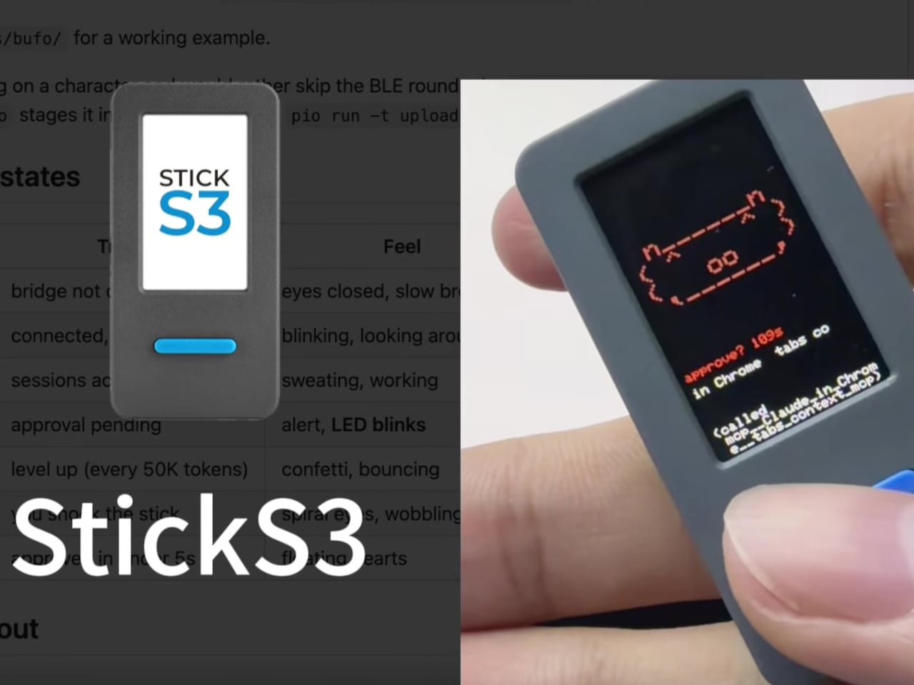
The reference hardware is the M5StickC Plus, a pocket-sized board with a 135×240 color display, buttons, a built-in IMU, and a LiPo battery. It costs around $30 and comes pre-supported by the firmware. When Claude Code asks to run a shell command or access a sensitive file, the device lights its screen, buzzes, and shows the prompt. Button A approves. Button B denies. No switching windows, no hunting for the right modal.

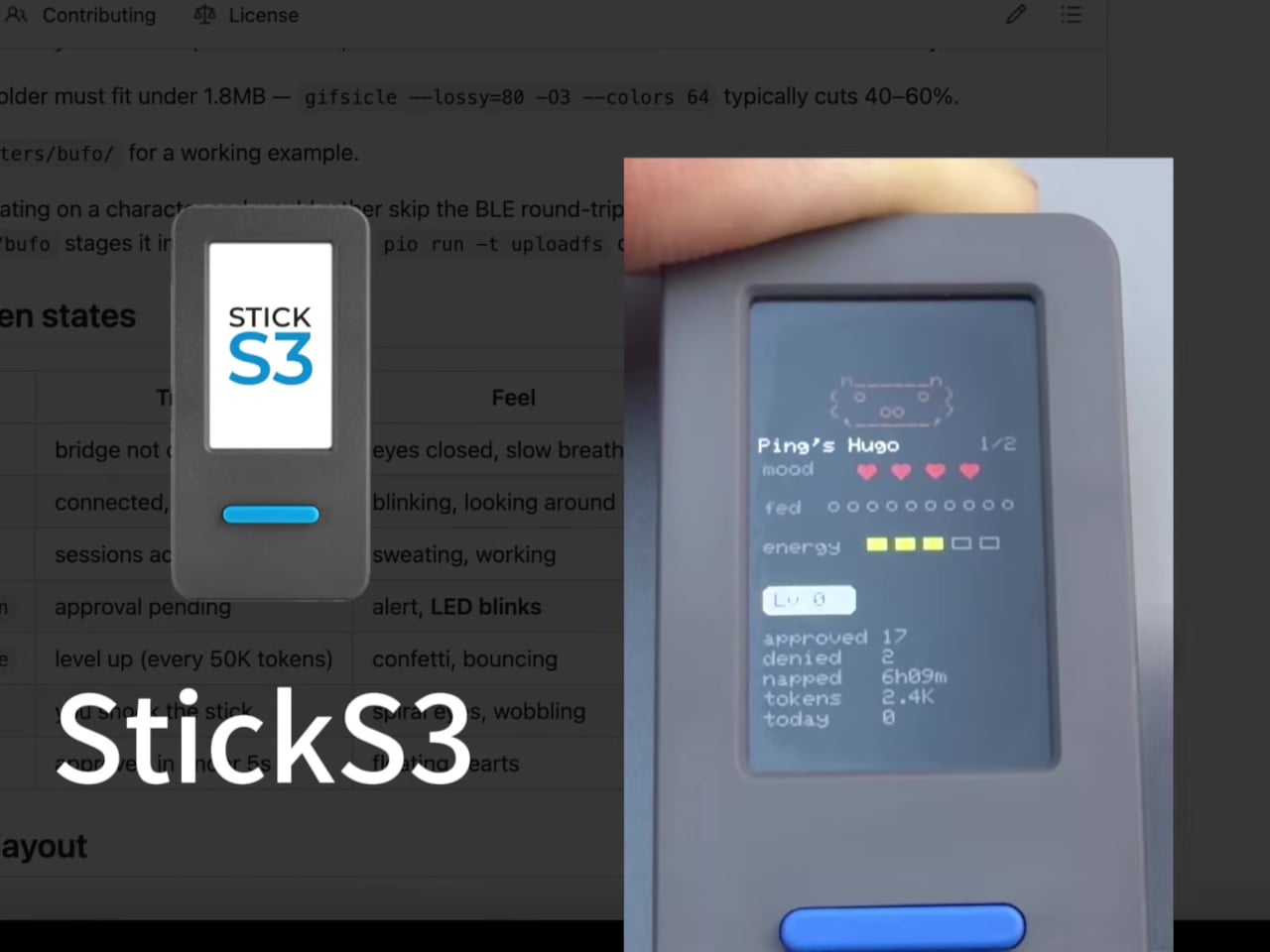
Beyond the permission workflow, the device also doubles as a passive status indicator. A full vocabulary of animated states, including idle, busy, attention, celebrate, dizzy, and heart, plays out on the small screen depending on what Claude is doing. Shake the device to make it dizzy, flip it face-down to put it in nap mode, and it’ll power off the screen after 30 seconds to preserve battery. The built-in IMU handles all of this through physical gestures.

Transcript scrollback is another feature that makes more sense once you’ve used it. Rather than breaking focus to check what Claude just said, you can scroll recent messages directly on the device’s display. It keeps the primary workflow uninterrupted in a way that alt-tabbing simply doesn’t. The device pairs once and reconnects automatically whenever both sides are awake, so there’s no daily setup ritual.

Character customization adds a layer of personality that feels unexpectedly considered for what is, technically, a developer tool. You can drag a custom GIF character pack directly onto the Hardware Buddy window, and the device switches to the new character live. The default character, a small frog called Bufo, ships with the firmware.

There’s something genuinely different about having a physical object on your desk that reacts to an AI working in the background. It turns an invisible process into something with a face, a mood, and a pair of buttons that put control back in your hands without disrupting what you were doing.

The post This $30 Gadget Gives Claude a Face That Reacts to What It’s Doing first appeared on Yanko Design.

8 Father’s Day Tech Gifts for Men Who Don’t Need Anything — But Actually Want These

The man who says he doesn’t need anything usually means he’s stopped expecting to be surprised. Father’s Day is the rare window where you can close that gap with something genuinely considered, not a gift card, not a safe bet, but an object that reflects actual attention. Every product on this list was built by people who thought carefully about the person using it, not just the one buying it.

What makes these gifts land is specificity. A privacy-first phone for the dad who quietly deleted his social accounts two years ago. A satellite watch for the one who goes places where a signal is a luxury. A smart ring for the guy who knows his HRV before he knows what’s for breakfast. The right gift doesn’t need a bow. It just needs to be exactly right for exactly that person.

1. Plinius Phone

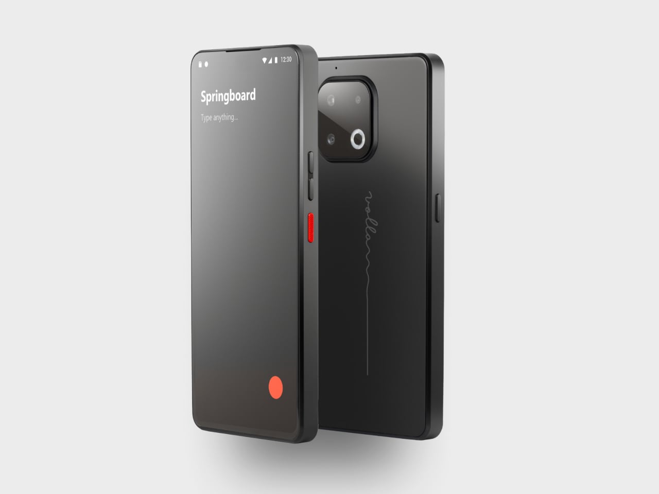
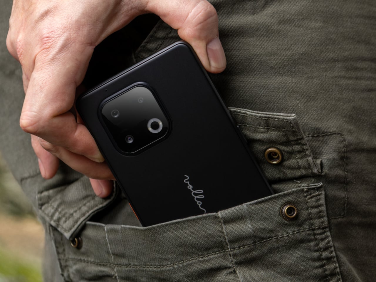
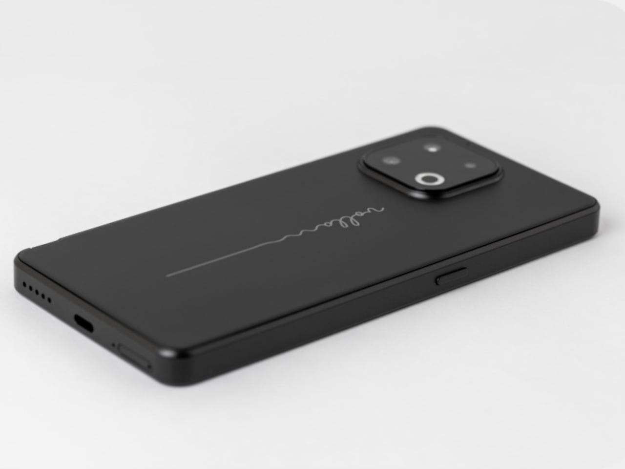
There are phones that gather your data quietly, and there is the Volla Plinius. Built in Germany, this IP68-certified semi-rugged smartphone ships with either Ubuntu Touch or Volla OS, a Google-free version of Android, returning full control to the person holding it. The hardware backs that up convincingly: a 6.67-inch 120Hz OLED display, a MediaTek Dimensity 7300 processor, a 64MP main camera, and a 5,300mAh battery that you can replace yourself, a detail so deliberately countercultural it barely needs explaining.

For the dad who has quietly grown suspicious of how much his phone knows about him, the Plinius isn’t a compromise; it’s a correction. Two user-configurable hardware buttons let you shortcut whatever matters most, and the build holds up against water, drops, and the general conditions of a life lived without excessive caution. The standard model starts at €598 with 8GB RAM and 128GB storage, and it carries the kind of material confidence that makes most flagship phones feel like dressed-up glass rectangles.

What We Like

  • Privacy-first software with a choice of Ubuntu Touch or Google-free Volla OS built in from the start
  • A replaceable 5,300mAh battery on a modern IP68-certified body, a combination almost no other manufacturer offers

What We Dislike

  • Shipping is currently limited to Europe and the UK, which rules it out for buyers elsewhere
  • The Google-free ecosystem requires an adjustment period for anyone deep in the Android app ecosystem

2. OrigamiSwift Mouse

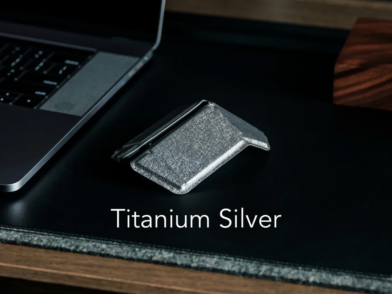
Designer Horace Lam built the OrigamiSwift around a single constraint: a Bluetooth mouse that you actually want to carry every day. Inspired by the geometry of origami, it folds flat in under 0.5 seconds and weighs just 40 grams, making it light enough to slip into a jacket pocket alongside a phone and forget about until you need it. For the dad who works from hotel rooms, client offices, or the corner café between meetings, this is the piece of kit that completes a laptop setup without adding to it.

The triangular structure does more than reference its design language. It reinforces the mechanics, giving the mouse a surprising solidity when open that you wouldn’t expect from something this compact. The transition from travel mode to full-sized ergonomic comfort becomes unconscious after a day of use, which is the real measure of any portable tool.

Click Here to Buy Now: $85.00

What We Like

  • Folds flat in under half a second and weighs just 40 grams for genuine everyday pocket portability
  • The origami-inspired triangular structure gives the mouse both structural rigidity and a strong visual identity

What We Dislike

  • The form factor defaults toward right-handed use, limiting comfort for left-handed users
  • Bluetooth-only connectivity offers no USB dongle option for setups where Bluetooth isn’t available

3. MelGeek Centauri80 Keyboard

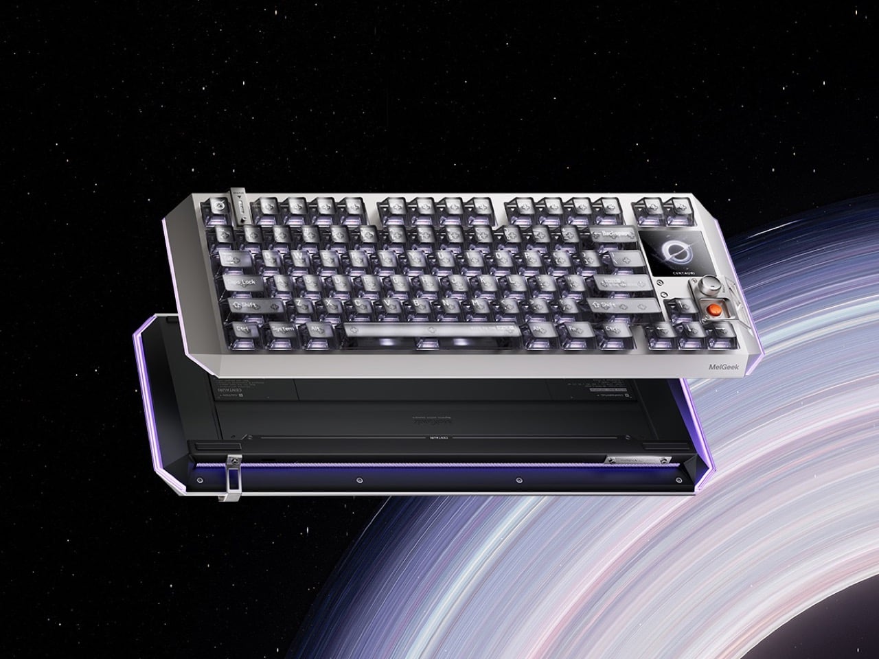
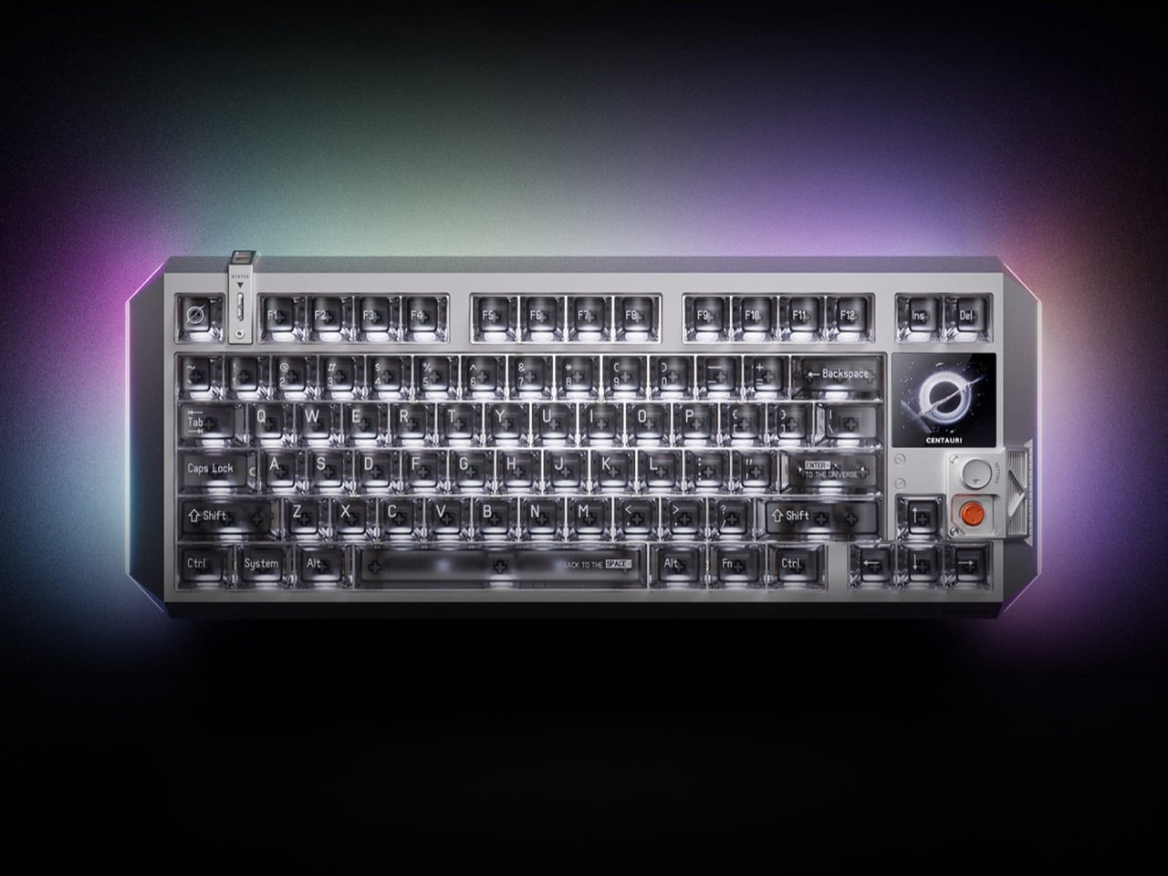
The MelGeek Centauri80 is what happens when a keyboard decides to stop being a background object. Inside a suspended aluminum alloy unibody, TTC Flip King magnetic switches run at an 8000Hz polling rate with 0.125ms latency. Besides the keys, a 1.78-inch OLED touchscreen running at 325 PPI, the same pixel density as an Apple Watch face, displays live wallpapers, macros, and system controls. The physical rotary encoder called the Super Dock lets you dial in lighting and shortcuts without leaving whatever you’re working on.

MelGeek has spent a decade making keyboards for people who treat their desk setup the way audiophiles treat a listening room, and the Centauri80 is the clearest expression of that philosophy yet. The five-layer gasket-mounted acoustic structure keeps the typing sound intentional rather than accidental, and the suspended frame reduces vibration transfer throughout. At $299, it sits in a position against the Hall Effect field that feels genuinely earned. For the dad whose desk is his domain, this is the object that makes everything else on it reconsider its ambition.

What We Like

  • The 1.78-inch OLED touchscreen and Super Dock rotary encoder turn the keyboard into a true desktop control surface
  • Hall Effect switches at 0.125ms latency and 8000Hz polling deliver performance that serious typists and gamers both immediately notice

What We Dislike

  • Wired-only connection removes wireless flexibility for those who prefer a cleaner desk aesthetic
  • The $299 price tag places it firmly in deliberate gift territory rather than a casual upgrade

4. Xiaomi UltraThin Magnetic Power Bank 5000 15W

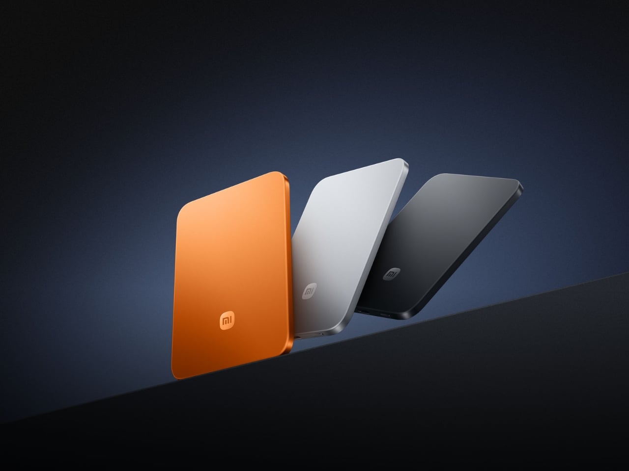
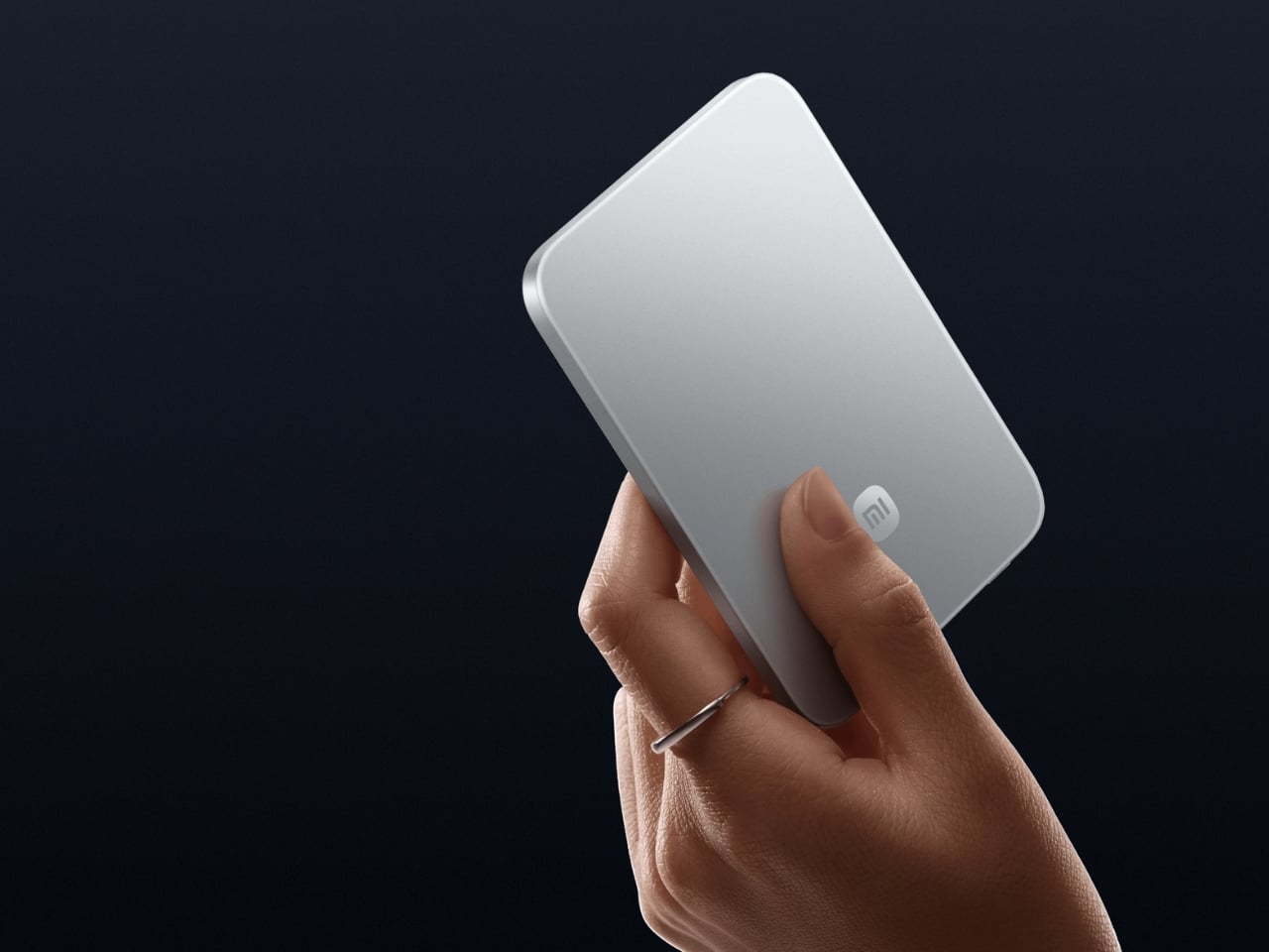
At 6mm thick and 98 grams, the Xiaomi UltraThin Magnetic Power Bank is thinner than most smartphones currently available, including the iPhone 17, which makes it feel less like a battery pack and more like a thoughtful design decision snapped onto the back of a phone. The 5,000mAh cell delivers 15W wireless charging on Xiaomi 17 series devices, 7.5W on iPhones, and up to 22.5W wired over USB-C. The aluminum alloy body is available in Glacier Silver, Graphite Black, and Radiant Orange, starting at around €60.

Most portable batteries live at the bottom of a bag because they’re too heavy to ignore. The Xiaomi UltraThin lives on the back of a phone, invisible and present at the same time, which is the exact behavior a daily-carry object should aspire to. For the dad who runs between meetings and treats plugging in as a luxury he rarely finds time for, this is the kind of upgrade that only becomes visible when everyone else’s phone hits 3% at the end of a long day.

What We Like

  • At 6mm thick and 98 grams, it is the thinnest magnetic power bank available at this capacity
  • Multi-mode charging supports Xiaomi devices, iPhones, and wired USB-C output in a single, minimal form

What We Dislike

  • The 5,000mAh capacity is designed for a top-up rather than a full recharge from zero
  • iPhone users are capped at 7.5W wireless output, well below the 15W maximum this pack delivers

5. StillFrame Headphones

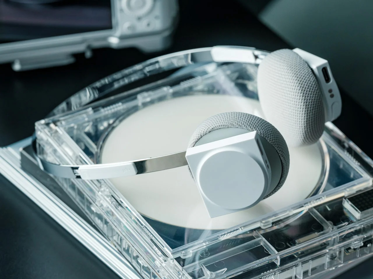
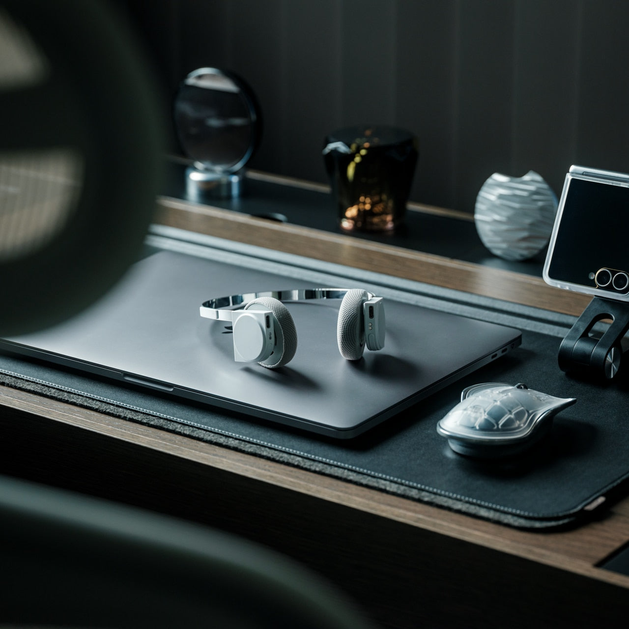
StillFrame weighs 103 grams, and that number matters more than almost anything else on the spec sheet, because it means these over-ear headphones sit on your head the way a well-made hat sits: present but not intrusive. The ultra-minimal design draws from the quiet geometry of ’80s and ’90s CD culture, no exposed hardware, no decorative flourish, no design language that dates itself. Active noise cancellation and transparency mode both switch with a single tap, and the 24-hour battery means one charge carries from morning to evening without prompting you to think about a cable.

At $245, StillFrame earns its place by committing fully to one idea and executing it without compromise. Around the neck between uses, it disappears into an outfit rather than competing with it, which is a quality most headphones claim, and very few deliver. For the dad with a long commute or a home office that bleeds into family hours, these are headphones that serve both contexts, looking as considered on a collarbone as they do on the ears.

Click Here to Buy Now: $245.00

What We Like

  • At 103 grams, it sits among the lightest over-ear headphones available without any sacrifice in build integrity
  • The 24-hour battery runs from morning to evening on a single charge, removing low-battery anxiety from the equation

What We Dislike

  • Limited colorways are a direct consequence of the same design restraint that makes the StillFrame look this precise
  • The ultra-minimal form commits fully to its design language, which rewards patience but won’t suit every aesthetic or setup

6. Futurewave O-Boy Satellite Watch

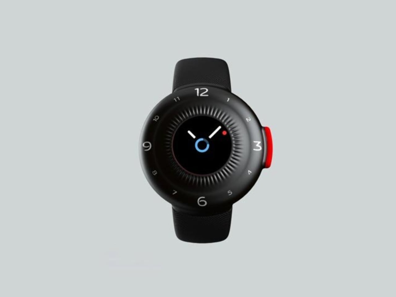
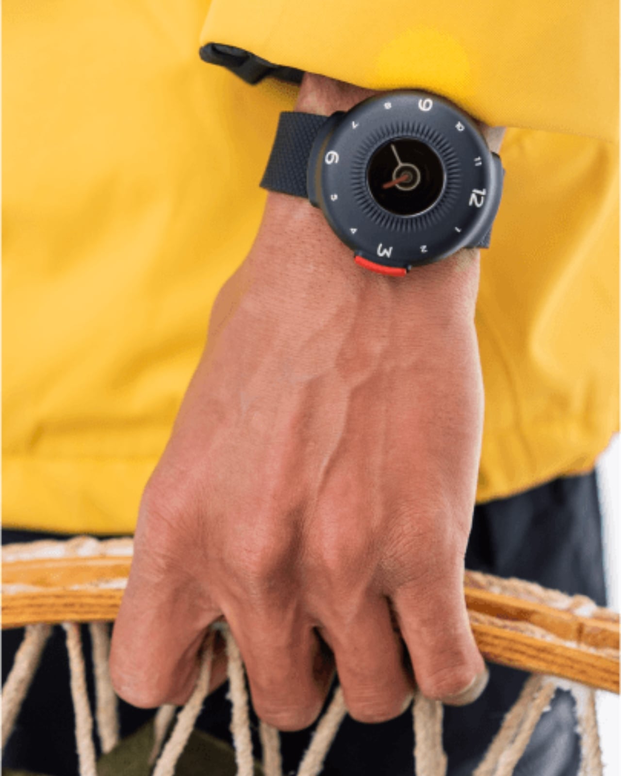
The O-Boy is a satellite-based emergency smartwatch developed by Brussels design studio Futurewave for the specific condition where a phone network simply doesn’t exist. It transmits emergency alerts via satellite connectivity alone, working across mountains, open ocean, and isolated work sites where the nearest signal tower is an abstraction. The black and red color palette is borrowed directly from safety equipment and emergency signaling. The rounded form exists partly for wrist comfort and partly to accommodate the antenna hardware inside, a constraint that became an aesthetic.

O-Boy is for the dad who actually goes off-grid, not the one who talks about it. Starting at $399, it positions itself as the first multiple-use satellite rescue watch, meaning it isn’t single-use distress gear but a daily wearable built around the idea that safety and adventure don’t require negotiation. Developed through collaboration between product designers, electronics engineers, and antenna experts, the watch was tested for waterproofing, pressure resistance, and shock tolerance before the design was finalized. For fathers who push into real wilderness, nothing on this list is more important.

What We Like

  • Satellite connectivity works entirely without a mobile network, covering genuinely remote environments anywhere on Earth
  • Designed to meet waterproofing, pressure resistance, and shock tolerance requirements alongside proportions suited for daily wear

What We Dislike

  • Emergency-focused functionality means lifestyle and fitness features found in conventional smartwatches are not the priority here
  • Satellite communication services may carry ongoing subscription costs depending on the region and chosen plan

7. Soundcore Sleep Earbuds

The Soundcore sleep earbuds were built around a single, unglamorous problem: you want to sleep, and something else has other plans. The slim, low-profile design fits comfortably through the night even for side sleepers, while the noise-masking system blocks up to 35dB, enough to cover a snoring partner, street traffic, or the ambient low-frequency sounds that standard earplugs address poorly. Bluetooth connectivity doubles them as audio earbuds, letting you build a wind-down routine around music, podcasts, or whatever audio works best before sleep.

The Soundcore app extends the experience with white noise options, sleep tracking, a smart alarm calibrated to wake you at the right point in a sleep cycle, and adjustable EQ. For the dad whose sleep quality has quietly degraded over busy years, whether from stress, a shared bedroom, or a schedule that doesn’t respect recovery, these are a practical gift with a measurable impact. They are small enough to forget about entirely until the morning you realize you slept straight through without waking once.

What We Like

  • The ultra-slim, low-profile build stays comfortable through the night, even for dedicated side sleepers
  • The Soundcore app adds sleep tracking, a smart alarm, and curated soundscapes well beyond basic noise blocking

What We Dislike

  • Passive noise masking at 35dB performs well on consistent sounds, but won’t match the output of active noise cancellation technology
  • The full feature set requires the Soundcore app, which adds a dependency on a smartphone connection throughout the night

8. RingConn Gen 2 Smart Ring

The RingConn Gen 2 is made from titanium alloy, measures 6.8mm wide and 2mm thick, and tracks heart rate, HRV, blood oxygen, skin temperature, sleep quality, stress, and sleep apnea, a feature developed in partnership with leading universities and hospitals and one of the first of its kind in a ring-form wearable. Battery life runs 10 to 12 days, depending on ring size. The smart charging case can push total runtime beyond 150 days, and the entire experience runs without a subscription. It is waterproof to 100 meters.

What makes the Gen 2 a genuinely thoughtful gift is the no-subscription model. Most health platforms hold your own data behind a monthly fee; RingConn doesn’t. For the dad who already tracks his health but resents the overhead, or the one who’s been told he should but hasn’t started, this is the wearable that disappears on a finger and simply does its job. At $209, it competes with the Oura Ring on depth of insight while undercutting it on price and profile.

What We Like

  • No subscription required to access your own health data, which is increasingly rare in the smart ring category
  • A 10 to 12-day battery paired with a smart charging case extends total runtime to over 150 days

What We Dislike

  • Enabling sleep apnea monitoring increases power consumption, which can affect battery life on smaller ring sizes
  • No built-in GPS limits its outdoor fitness tracking capability without a paired phone nearby

The Bottom Line

Father’s Day gifts tend to fall into two categories: the kind you buy because the calendar told you to, and the kind you buy because you actually paid attention. Every product on this list belongs to the second category. They represent design decisions that hold up, objects built by people who thought carefully about the person using them, not just the person browsing the checkout page at 11 pm the night before.

The right one here isn’t the most expensive. It’s the one that fits the man you’re buying for. A privacy-first phone for the dad tired of being the product. A satellite watch for the one who needs a lifeline in places where no signal reaches. A ring that tracks his health without demanding he change anything about how he lives. Pick the one that sounds like someone specific, and give it, knowing the thought behind it is already half of what makes it worth receiving.

The post 8 Father’s Day Tech Gifts for Men Who Don’t Need Anything — But Actually Want These first appeared on Yanko Design.

The $519 E-Ink Phone Hiding an LCD on Its Back

Scroll through any tech community online, and the same frustration keeps surfacing: people are exhausted by their screens. The perpetual brightness, the notification pull, the way a quick phone check somehow turns into forty lost minutes. That collective discomfort has pushed a growing number of people toward e-ink devices, displays that don’t glow in your face and don’t make a habit of demanding your attention.

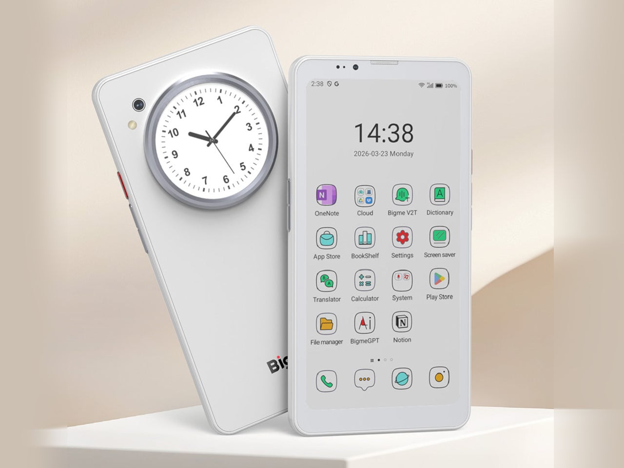
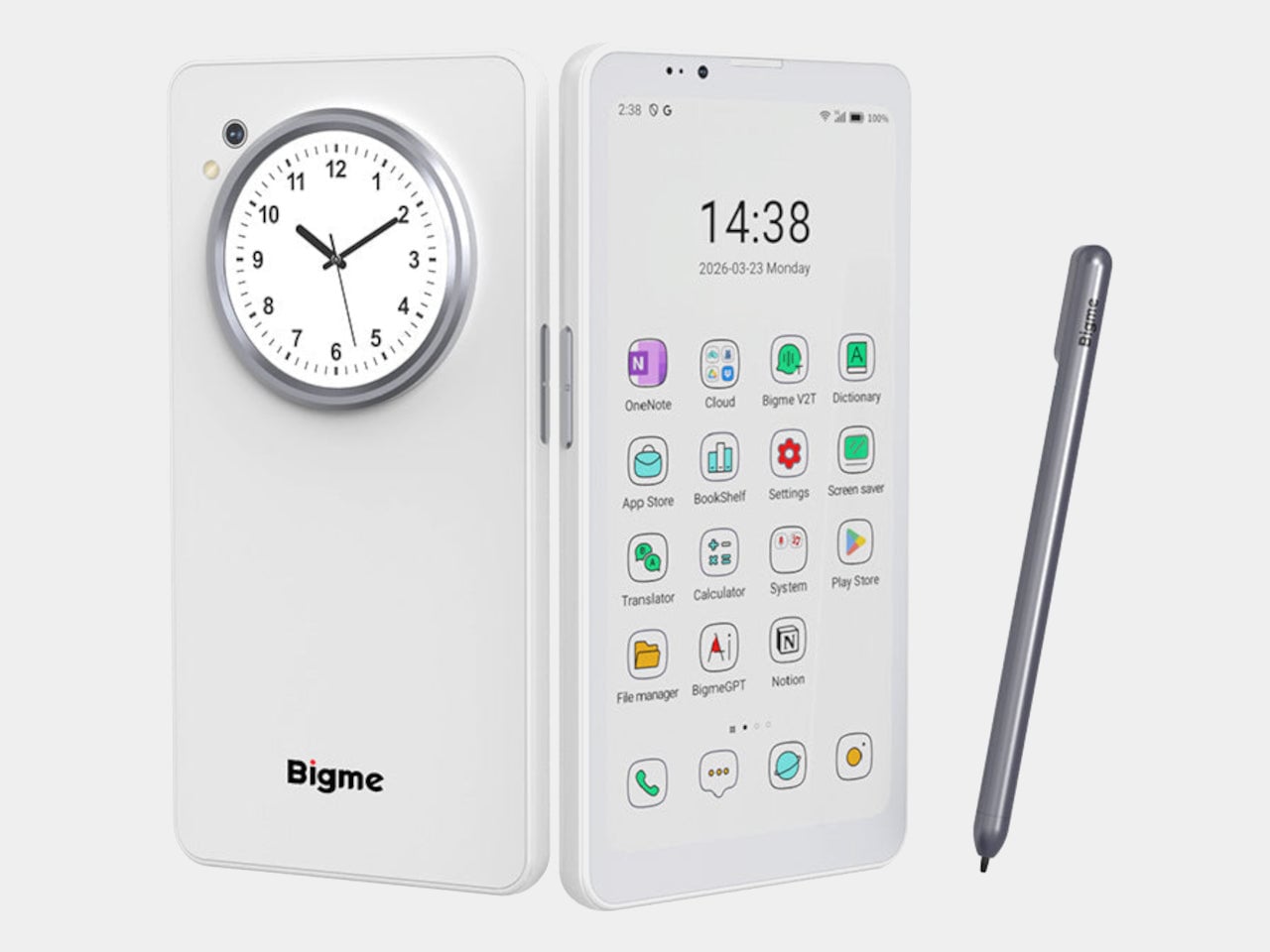
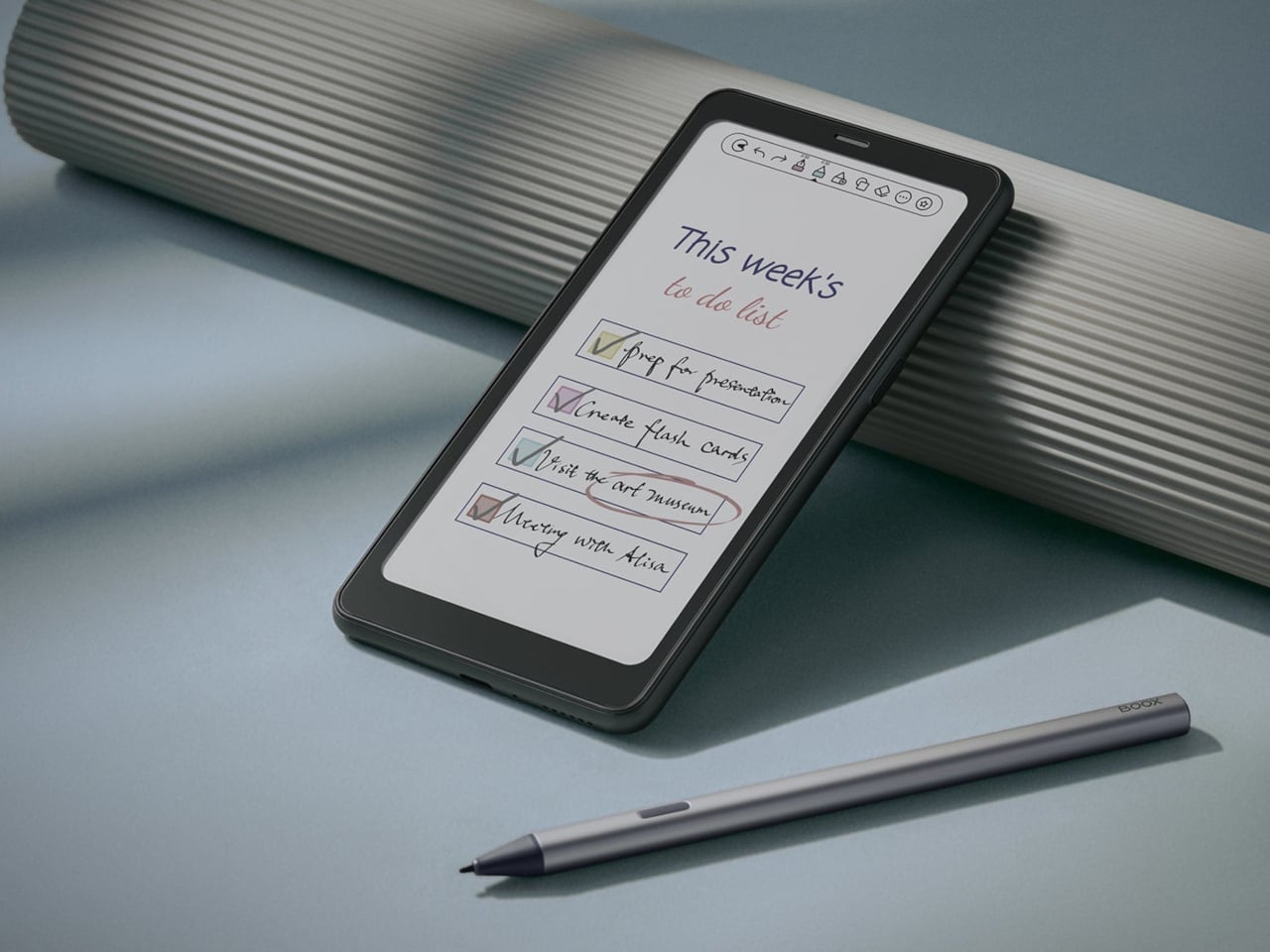
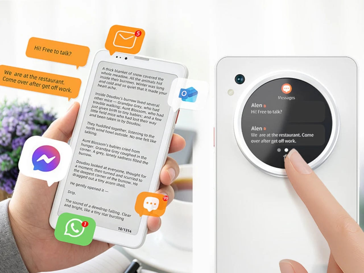
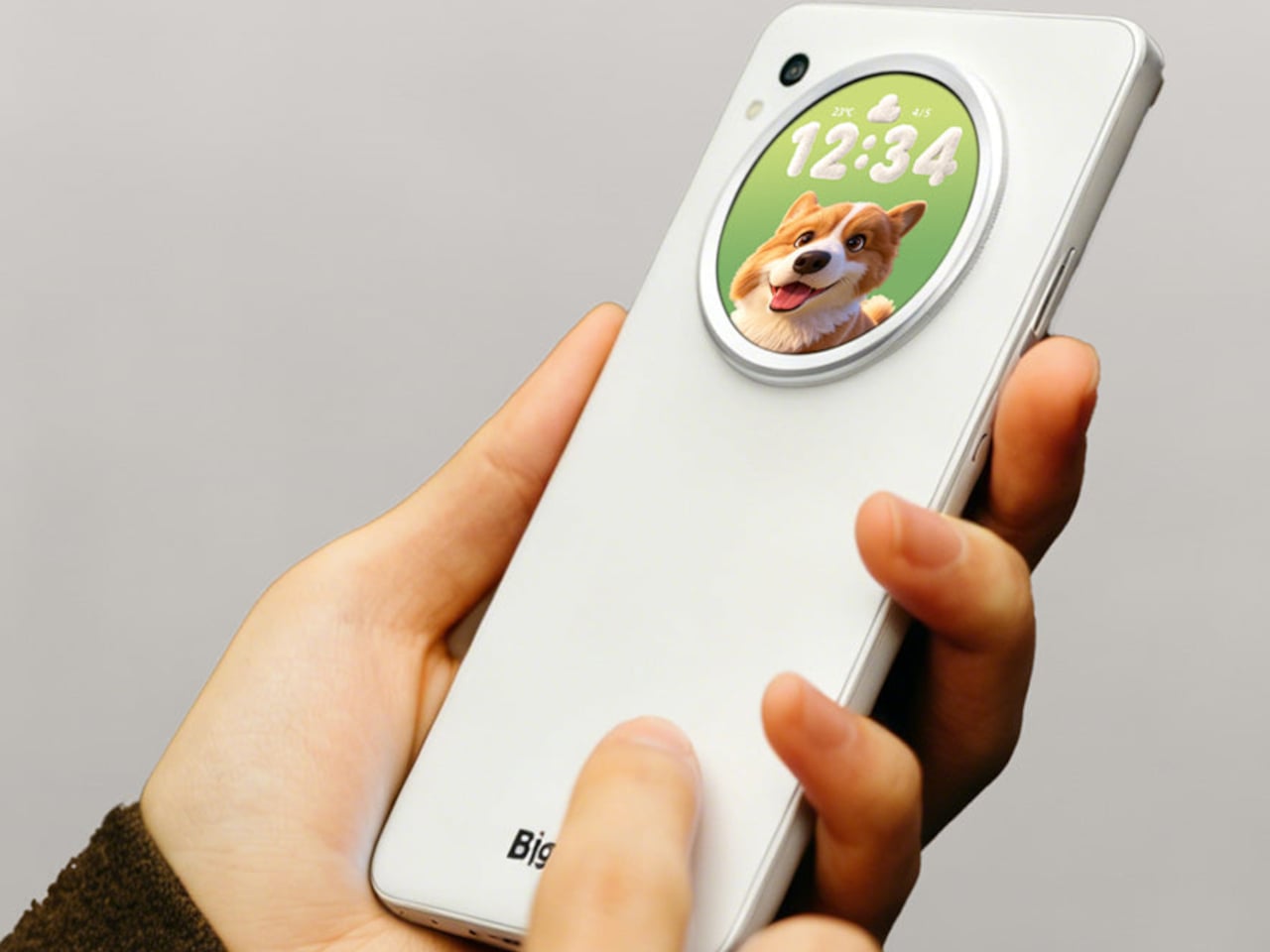
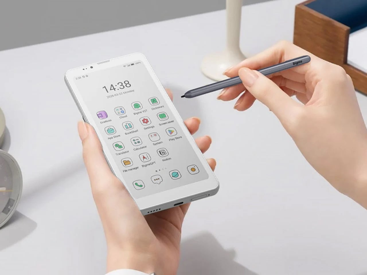
What’s interesting about where the e-ink phone category stands in 2026 is that it’s no longer a one-off experiment. The Bigme HiBreak Dual, announced in mid-April 2026, is one of the more telling entries in this space, not because it perfects anything but because it doesn’t pretend to. A 6.13-inch color e-ink display takes the front, and a small circular LCD sits on the back, each assigned a different job.

Designer: Bigme

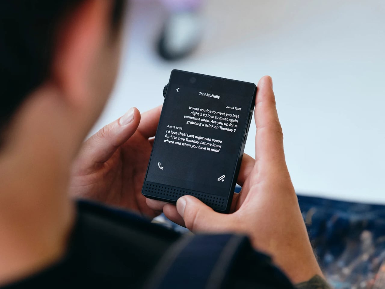
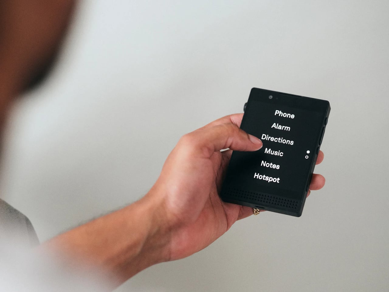
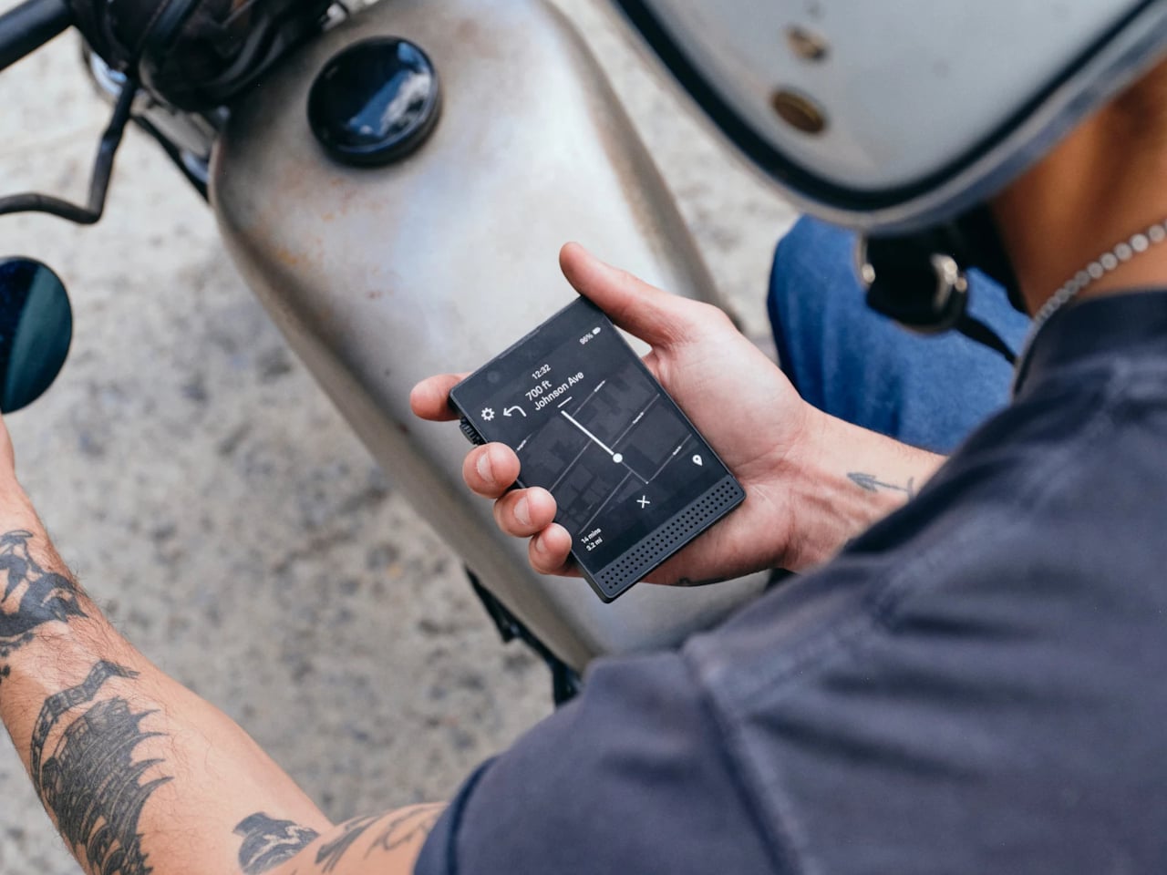
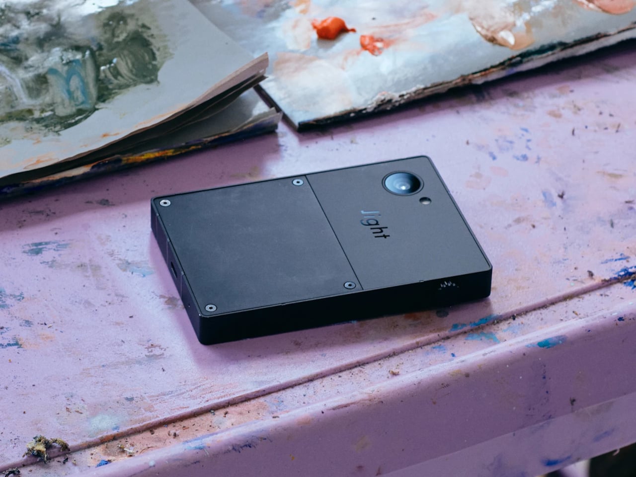
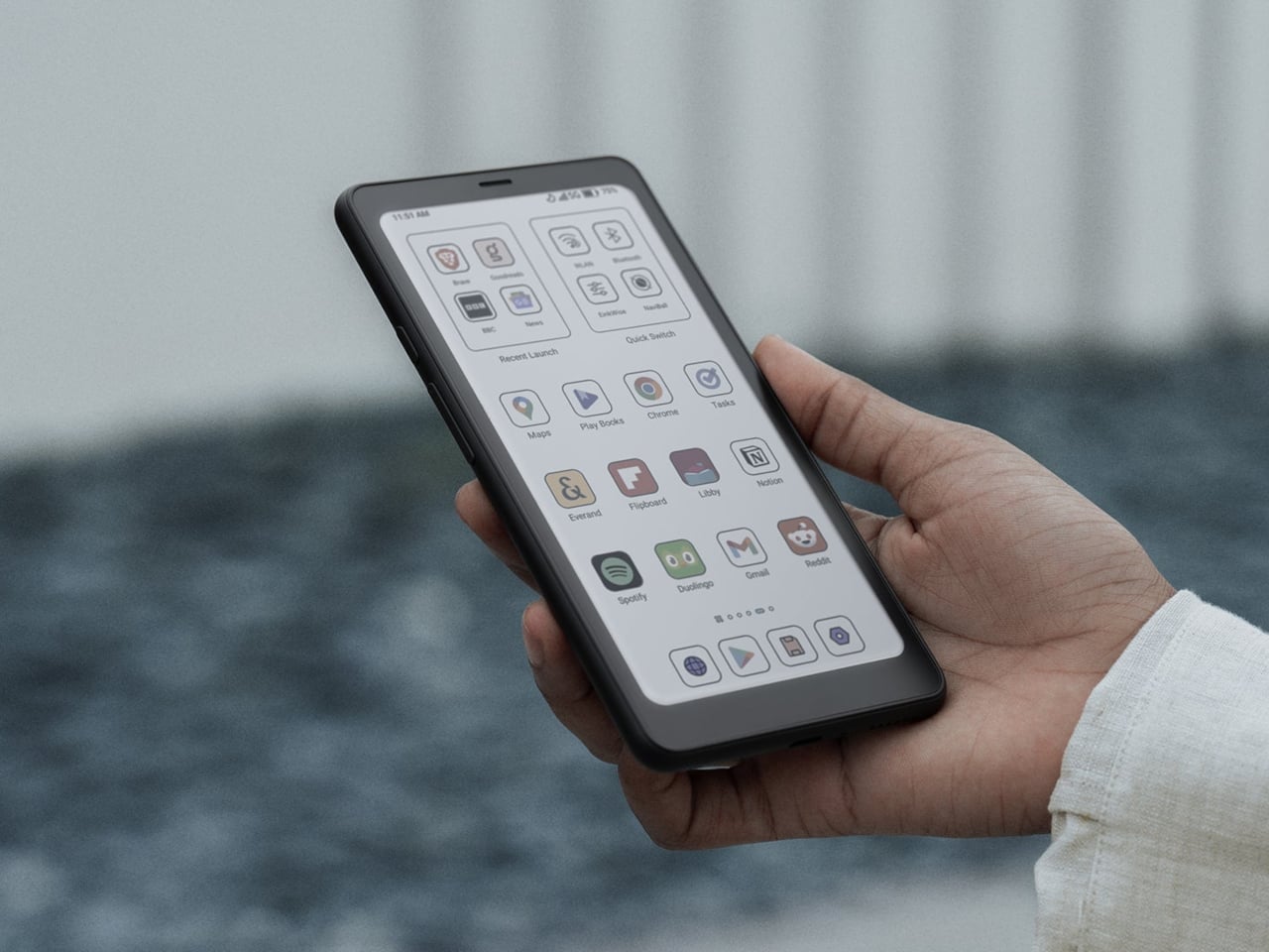
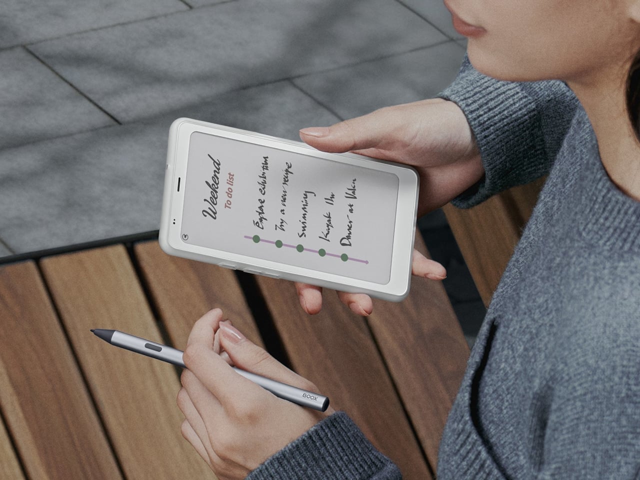
To understand what the HiBreak Dual is responding to, it helps to survey the surrounding territory. The Light Phone III is the deliberate anti-smartphone, built on the belief that fewer features genuinely change how you relate to a device. The Hisense A9 treats e-ink as the primary experience, unapologetically. The Boox Palma 2 Pro sits adjacent to the category, more phone-shaped reader than phone, though it can handle calls when needed.

Light Phone III

Light Phone III

The HiBreak Dual tries to sit between those poles. The e-ink front handles what e-paper does best: reading long-form content, staying on top of messages, and staying connected without the attention loop that comes with a typical smartphone display.

Light Phone III

Light Phone III

That decision to lead with e-ink also means accepting its well-known constraints. Try framing a photo with an e-paper preview, and the experience falls apart; the display’s refresh behavior wasn’t built for fast-moving content. Videos, live navigation, or quick-scrolling feeds follow the same logic. Color e-paper has genuinely improved, but it still carries a muted quality that reads as calm in some moments and limiting in others.

BOOX Palma 2 Pro

BOOX Palma 2 Pro

That’s where the circular LCD on the back becomes the interesting part. Rather than asking the e-ink panel to handle tasks it hasn’t mastered, the HiBreak Dual routes those moments to the secondary screen, situations that call for live camera preview, quick visual checks, or fast-loading feedback. The front absorbs the reading and communication rhythm of a day; the back quietly handles the rest.

BOOX Palma 2 Pro

BOOX Palma 2 Pro

The decision to make that rear display circular rather than rectangular carries a specific design logic. A round screen doesn’t compete with the phone’s primary face; it signals peripheral utility, not a second main event. It reads more like a companion display, keeping the device’s identity anchored in e-ink territory while still allowing it to borrow LCD behavior for moments that need it.

How long the hybrid approach holds up depends on the e-paper panels themselves. Better refresh rates, richer colors, and more responsive camera behavior would gradually reduce the need for a secondary display. Until that gap narrows, the e-ink phone category seems to be diverging in three directions: minimalist phones that accept the trade-offs, phone-shaped readers that sidestep the comparison entirely, and hybrids trying to keep a foot in both camps.

The HiBreak Dual isn’t a perfect phone, and Bigme isn’t trying to pass it off as one. Starting at $359 for the early-bird black-and-white configuration and climbing to around $519 for a color e-ink variant, it lays its compromises out in the open. The rear LCD doesn’t disappear into the design as if it isn’t there. It’s visible, it’s functional, and it’s honest about the gap it’s there to fill.

The post The $519 E-Ink Phone Hiding an LCD on Its Back first appeared on Yanko Design.

RIMOWA’s 2026 Prize Went to a Bracelet That Speaks Sign Language

The RIMOWA Design Prize doesn’t always produce furniture, and that’s precisely why I pay attention to it every year. The luggage brand’s annual student design competition has a way of surfacing ideas that sit at the uncomfortable, exciting edge of what design can actually do for people, and the 2026 winner is probably the best example of that yet.

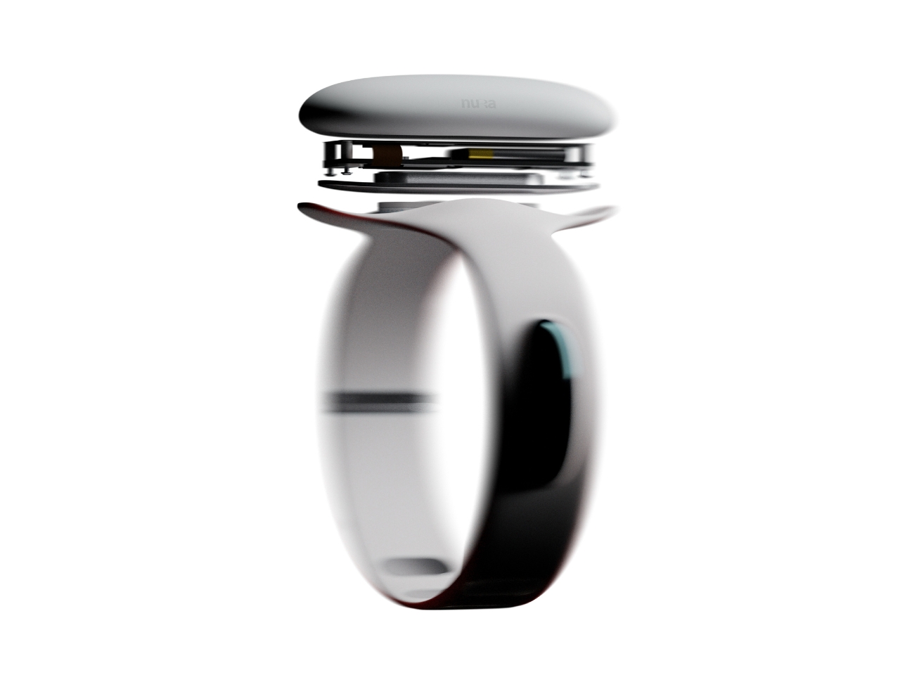
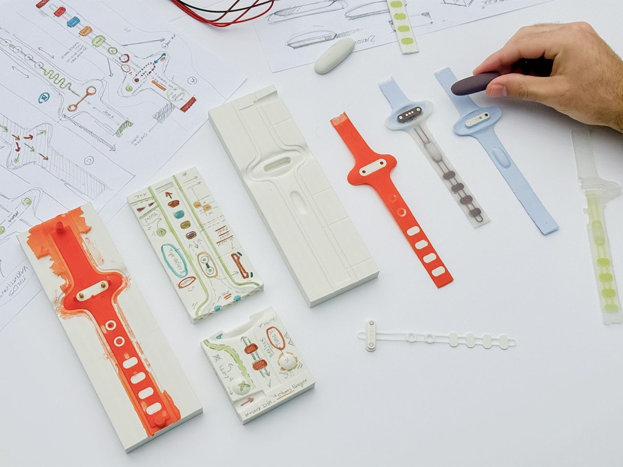
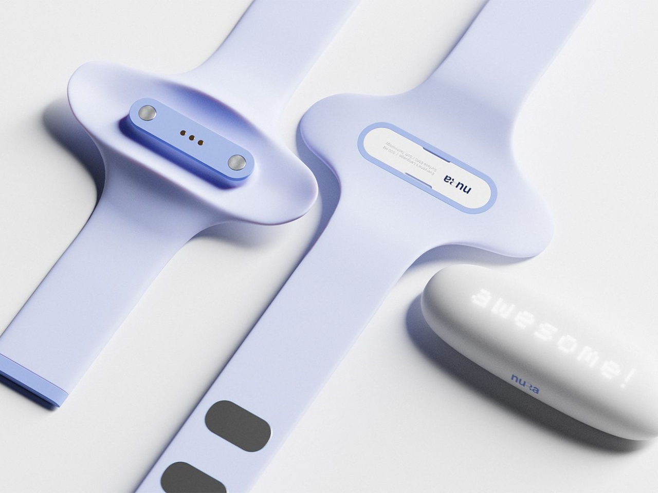
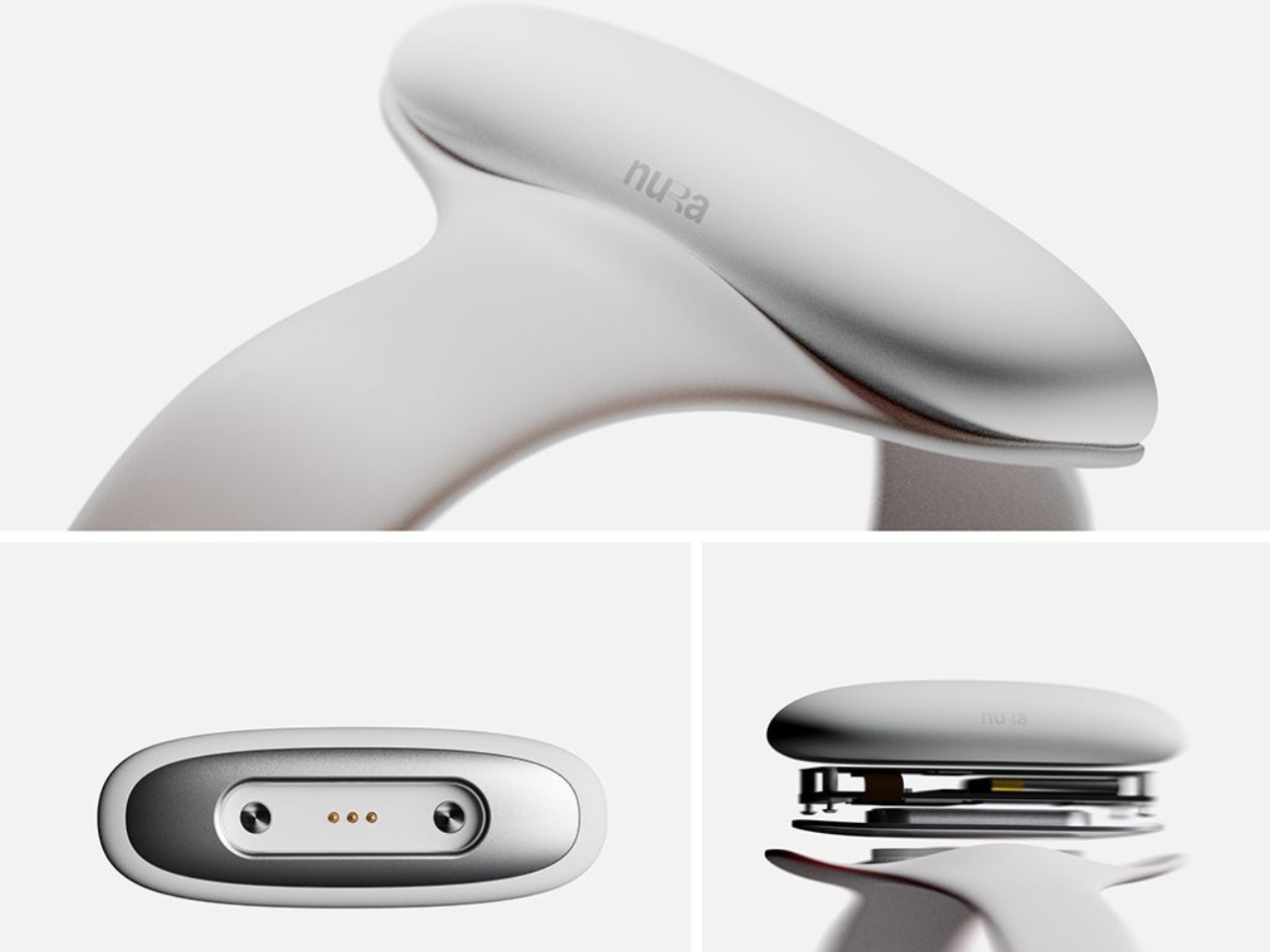
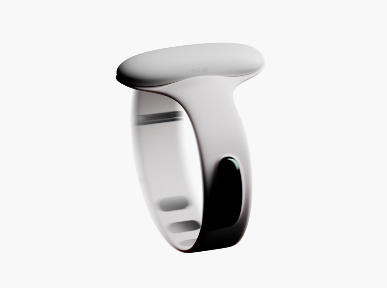
Samuel Nagel and Paul Feiler, two students from Hochschule für Gestaltung Schwäbisch Gmünd, took home the fourth edition of the prize with NURA: a bracelet that uses EMG (electromyography) sensors to capture muscle signals in the forearm and translate sign language into audible speech in real time. It works the other way around too, converting spoken language into visible text for deaf users. The whole thing sits on your wrist, shaped by the silhouette of a manta ray, and it looks less like a medical device and more like the kind of accessory you’d spot on someone at a gallery opening.

Designers: Samuel Nagel and Paul Feiler

That last detail is actually the point, and I think it’s worth dwelling on. Assistive technology has a long and unfortunate history of making the people who need it feel conspicuous. Hearing aids, for decades, were designed to be invisible precisely because visibility carried stigma. The unspoken message was that needing help was something to hide. NURA takes a completely different position. It’s designed to be seen, worn with pride, styled rather than concealed. The gesture feels radical even though, rationally, it shouldn’t have to be.

The technology behind it is genuinely clever. EMG sensors are nothing new as a concept, but applying them to sign language translation in a form this compact and wearable is a meaningful design leap. The bracelet reads the electrical signals produced by muscle contractions in the forearm as the wearer signs, processes them, and produces speech output. The reverse channel picks up spoken language and renders it as text. Two-way, seamless, real-time. For anyone who has ever watched a deaf person navigate a conversation without an interpreter present, or felt the awkward pause that comes from communication breaking down mid-exchange, the implications of that are enormous.

I keep thinking about how many interactions become effortless with something like this on your wrist. Ordering at a counter. Talking to a doctor. A spontaneous conversation with a stranger on the street. These are moments that require logistics for deaf users in a way most hearing people never have to consider, and NURA collapses that distance without asking anyone to compromise.

The manta ray inspiration is a quiet masterstroke, too. It gives the object a reference point that feels alive and organic rather than mechanical or clinical. The form has been rendered in clean, sculptural white, with the kind of restraint you’d expect from a German design school sensibility. It doesn’t scream technology. It just sits there looking elegant, doing something extraordinary underneath.

Will NURA make it into production? That’s the question that always hovers over student prize winners, and it’s an honest one. The gap between a beautifully executed concept and a market-ready product is wide, and the challenges of real-world EMG accuracy across different body types and signing styles are not trivial. But I don’t think that’s entirely the point. The RIMOWA Prize exists, among other things, to expand the imagination of what design is for, to signal to the industry what problems are worth solving and what solving them beautifully might look like.

On that count, Nagel and Feiler have done something genuinely important. They’ve argued, through the language of form, that accessibility and desirability don’t have to be in opposition. That a wearable designed for a deaf person can be something a hearing person might be jealous of. That the most human design isn’t the kind that fixes a flaw and hides it, but the kind that celebrates capability and brings people closer together. The bracelet is beautiful. The idea behind it is even more so.

The post RIMOWA’s 2026 Prize Went to a Bracelet That Speaks Sign Language first appeared on Yanko Design.

Vollebak’s New Sonic Jacket Fires 180 Speakers Into Your Body

If you’ve ever stood too close to a speaker at a concert and felt the bass move through your chest, you already understand the basic premise of Vollebak’s latest creation, even if just barely. The Sonic Jacket doesn’t pump sound into a room. It pumps it directly into you.

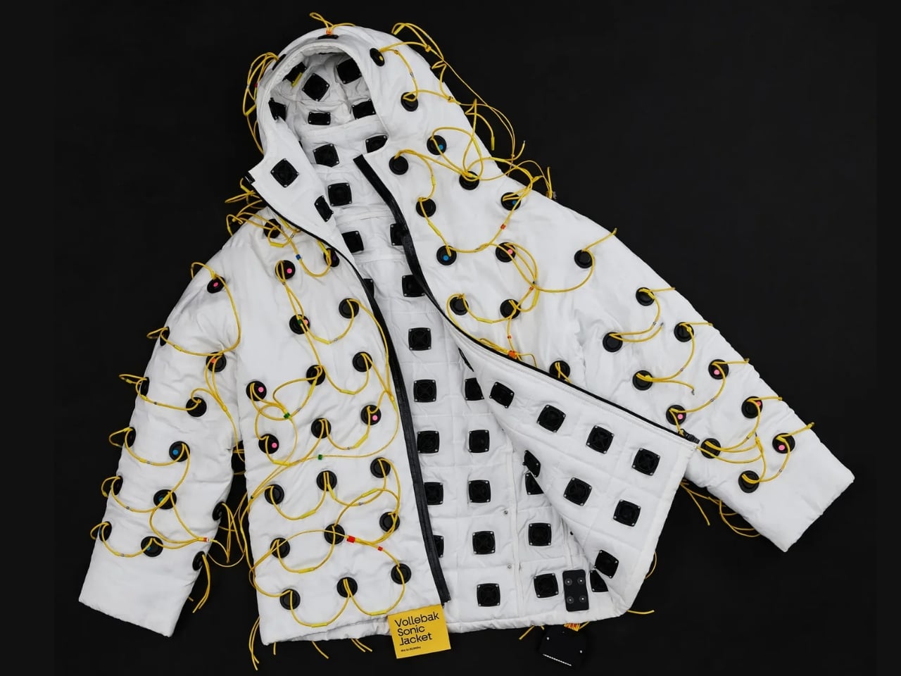
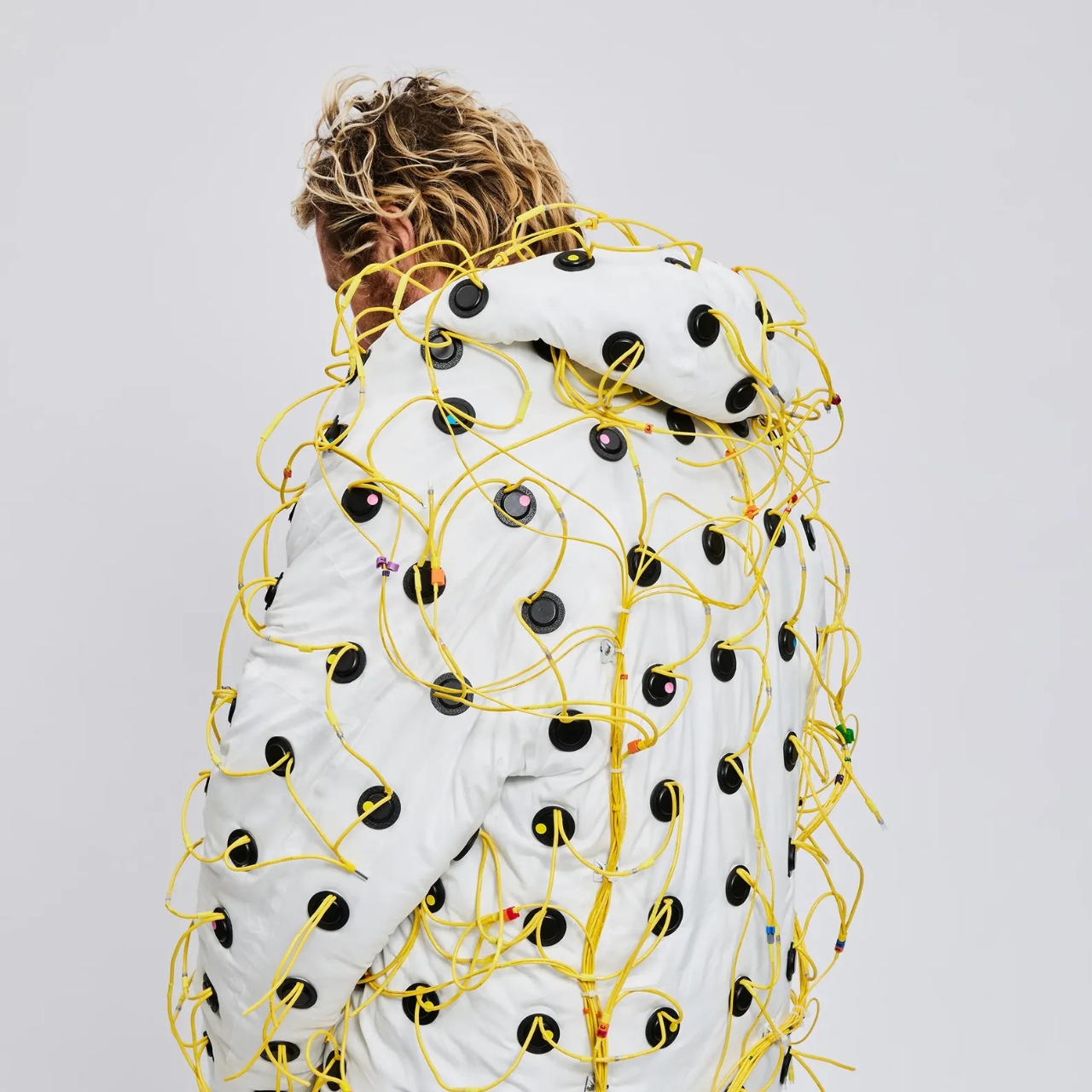
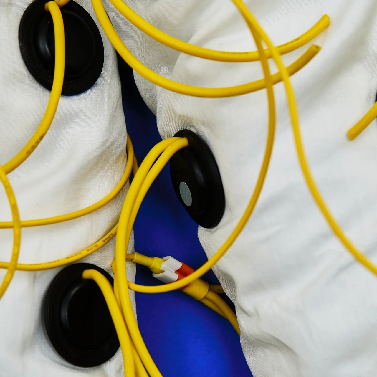
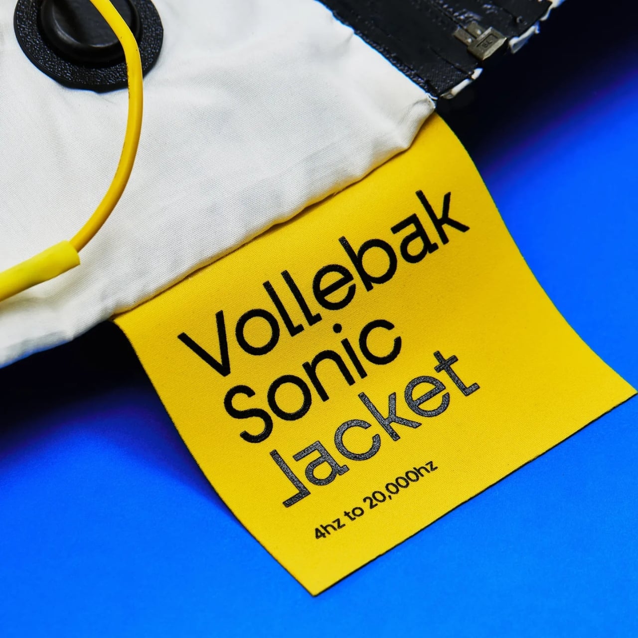
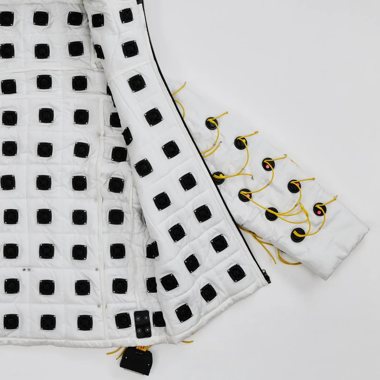
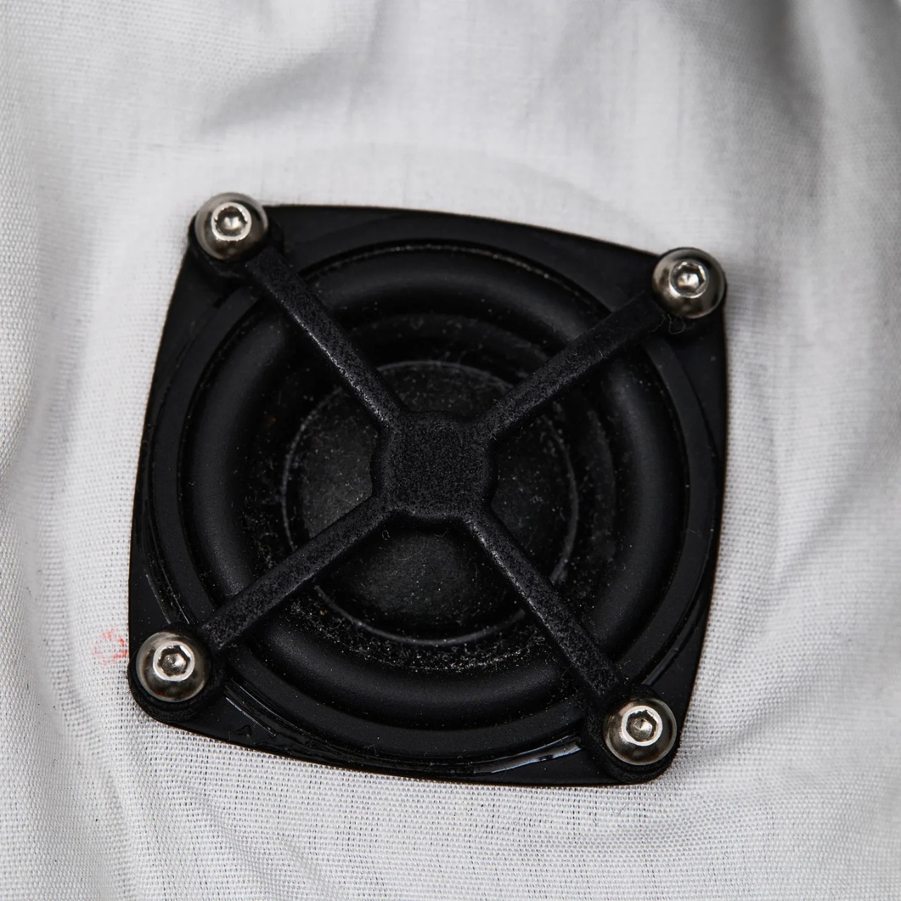
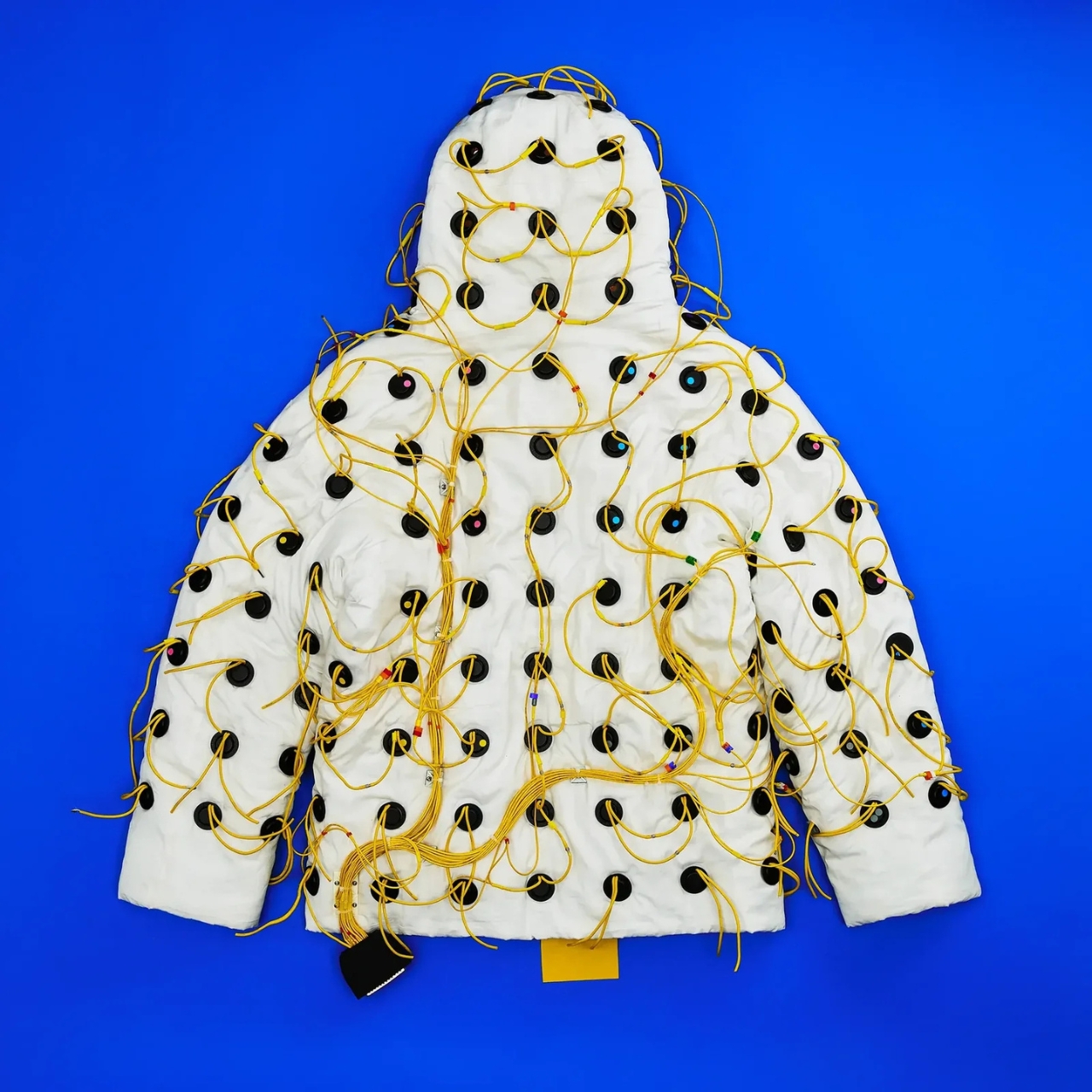
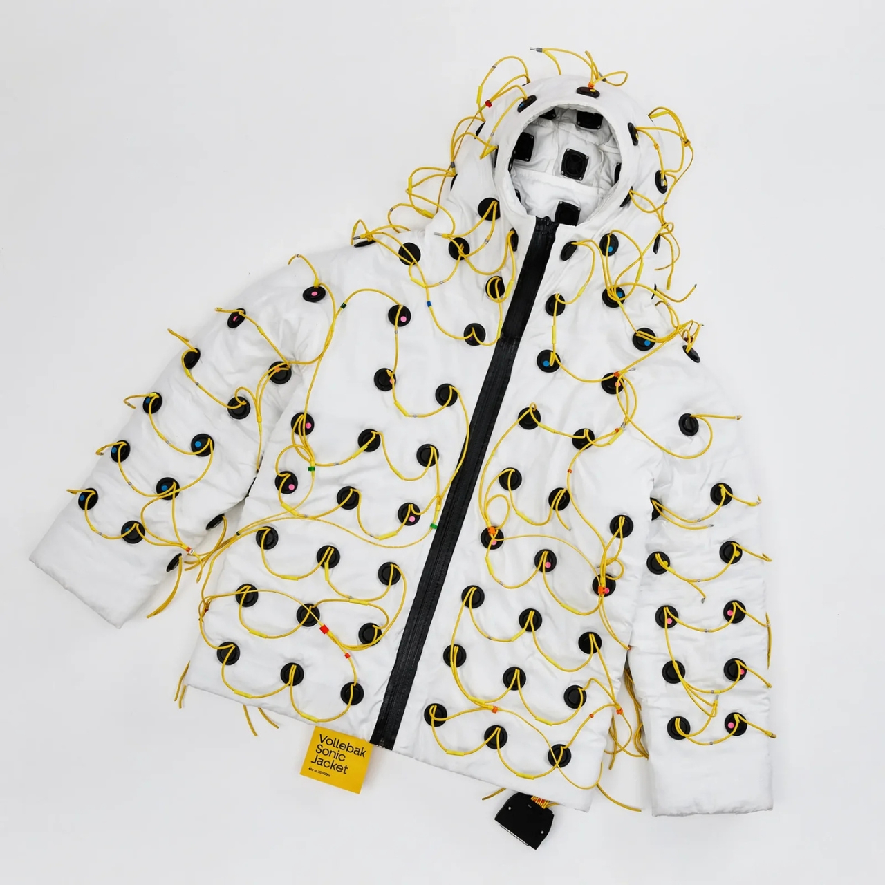
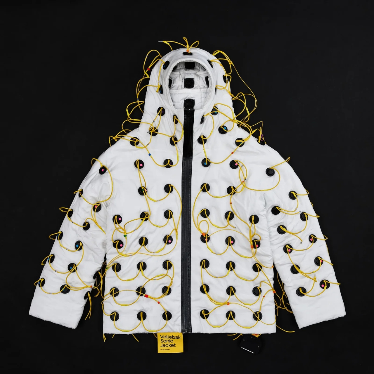
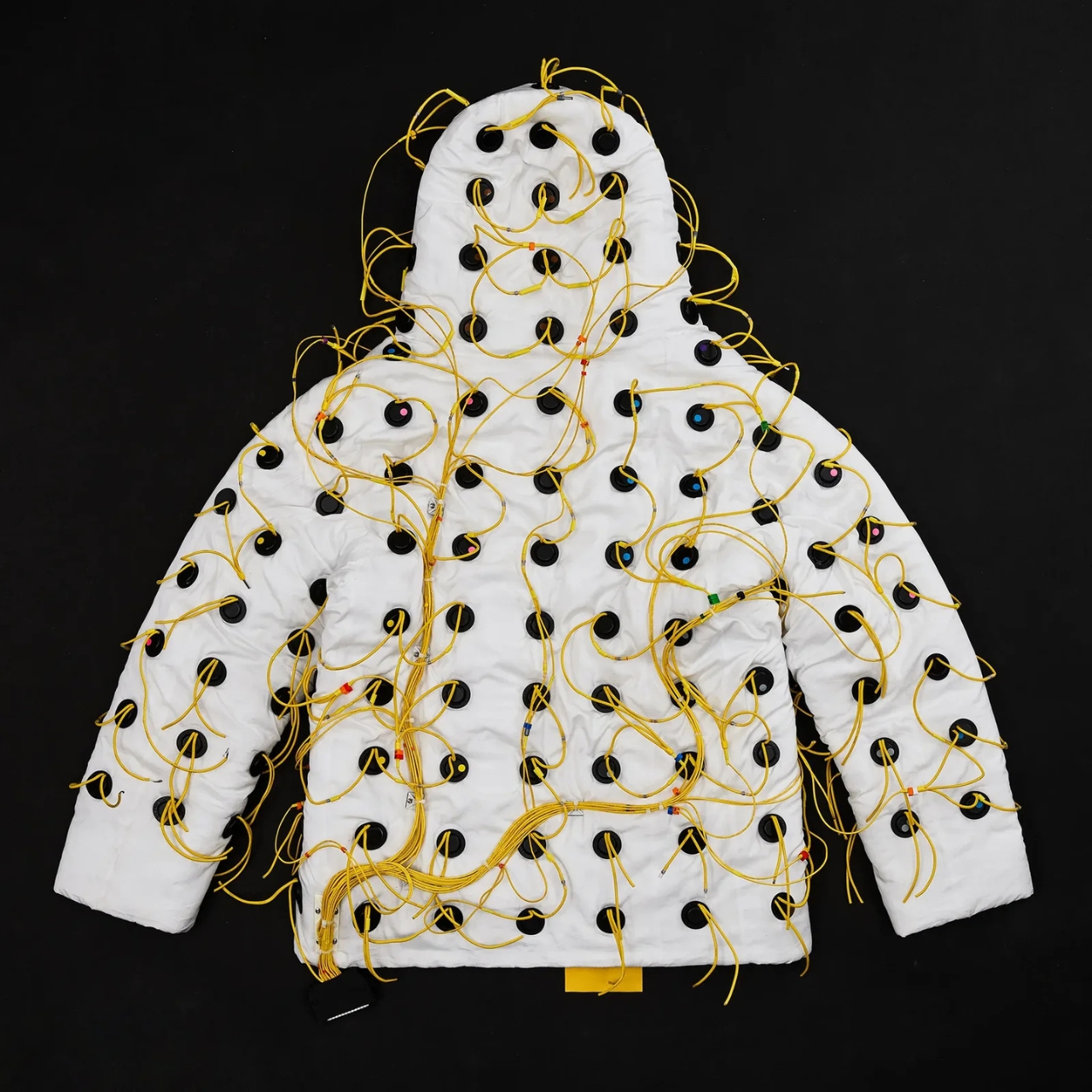
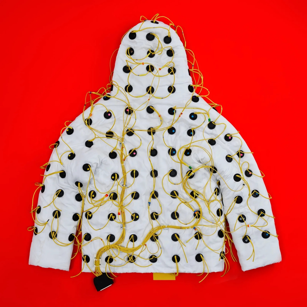
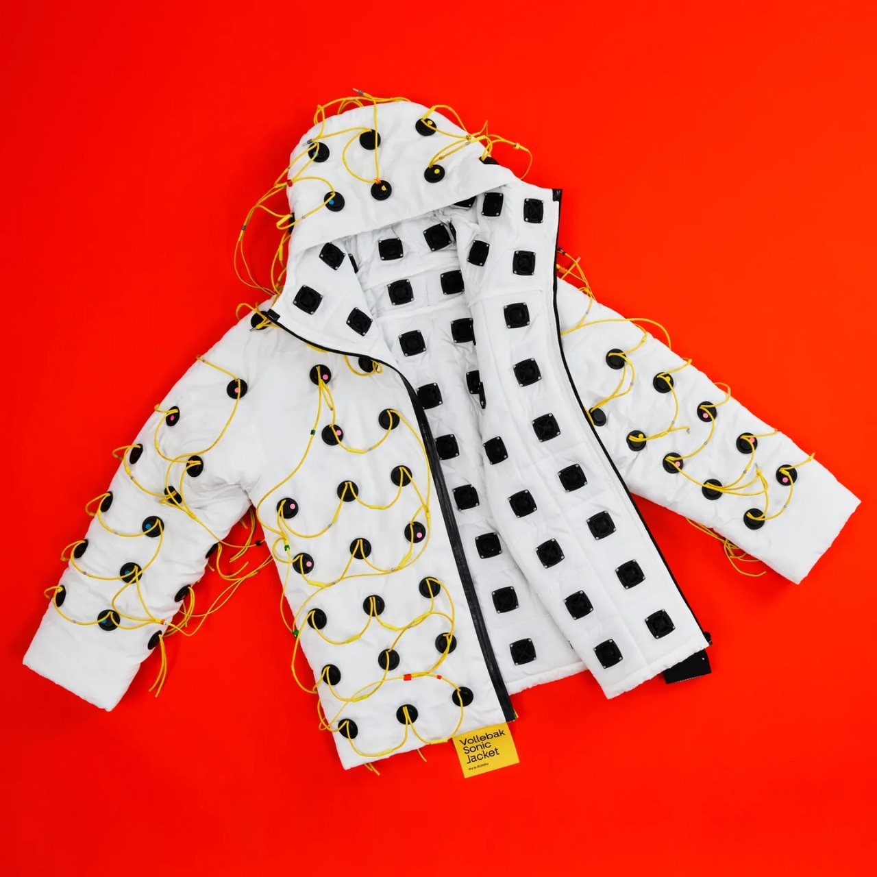
Vollebak, the experimental clothing brand founded in 2015 by twin brothers Nick and Steve Tidball, has built a jacket lined with 180 inward-facing speakers. Each one is 32mm in diameter and 10mm deep, laser-cut into the fabric across the body, arms, and hood. The speakers fire frequencies ranging from 4 Hz to 20,000 Hz straight into the wearer’s body. Not at your ears. Through your skin, your bones, your tissue. The brand’s own description puts it plainly: “You don’t listen to this jacket. You feel it.”

Designer: Vollebak

I’ll be honest. My first instinct was skepticism. Frequency therapy and sound healing have a way of sitting at the awkward intersection of legitimate science and wellness marketing, and it can be hard to tell which side of that line you’re on at any given moment. But the more I dug into what Vollebak actually built here, the harder it became to dismiss.

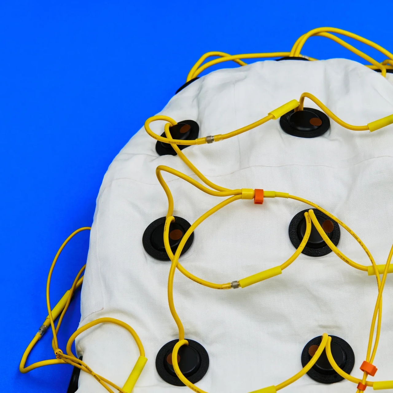
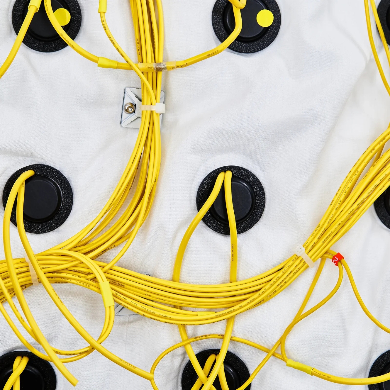
The jacket was engineered by FBFX, a London-based special effects studio with 30 years behind them and credits that include Gladiator, Dune, The Martian, and Project Hail Mary. These are people who build functional spacesuits worn by real actors in demanding production environments. They brought that same precision to the problem of turning a jacket into a distributed speaker system. The wiring is intentionally left visible, all yellow and exposed, because FBFX co-founder Grant Pearmain’s position is straightforward: it looks like a science experiment because that’s exactly what it is.

Control is handled through a unit fitted with an MP3 player preloaded with 10 frequencies, a physical dial for fine-tuning, and a Micro SD card slot that can hold up to 1,000 personalized frequencies. A Bluetooth app is in development. For lower frequencies, where speakers risk overheating, the jacket works around the problem by playing two slightly different tones simultaneously. The body registers the gap between them rather than the tones themselves, and that gap is where the lowest frequencies live.

Nick Tidball’s language around the whole project is part visionary, part slightly unhinged, which is exactly what makes Vollebak so compelling as a brand to follow. He talks about the earth resonating at a frequency, about his cat’s purr, about the fact that we are not solid beings but collections of particles with space between them where sound can travel. “Maybe you’ll orgasm. Maybe you’ll shit yourself. Maybe you’ll find God,” the brand writes on its site. Bold copy, sure. But it’s genuinely hard to argue that sound and frequency don’t do something to us. Every religious tradition figured that out thousands of years ago, from drumming around fires to chanting in stone chambers.

The Sonic Jacket is currently a prototype, tested on only a handful of people. Tidball himself did a 30-minute session and described the initial effects as “kind of astonishing.” That’s a small sample size and a subjective account, so I’d take the results with appropriate caution. But the ambition here isn’t really in question.

What Vollebak is doing, jacket by jacket, is expanding the definition of what clothing is for. They’ve done it with graphene that behaves like a radiator, with near-indestructible Dyneema, and with a jacket made from 250,000 pieces of laser-cut American walnut. The Sonic Jacket feels like the most speculative thing they’ve attempted so far, and that’s saying something. It’s not a wellness gadget in a tech form factor. It’s a wearable environment designed to shift your nervous system.

Whether the science catches up to the ambition remains to be seen. But that’s always been part of Vollebak’s proposition. They make things that probably shouldn’t exist yet, and then figure out if they should. The Sonic Jacket is the most interesting thing I’ve seen come out of the wearable tech space in a long time, and I’m not even sure it counts as wearable tech. It might just be the future of how we think about clothing altogether.

The post Vollebak’s New Sonic Jacket Fires 180 Speakers Into Your Body first appeared on Yanko Design.

XPPen’s $210 Pilot Pro Finally Ends the Left-Hand Keyboard Scramble

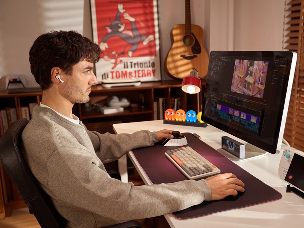
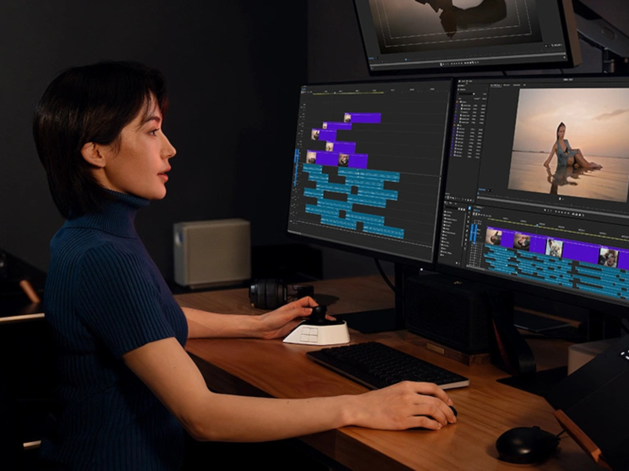
Video and photo editing has always been demanding on keyboard shortcuts. The typical workflow splits attention between tools, timelines, and modifier keys, with the left hand constantly crossing the keyboard while the right stays on the mouse. Professionals spending long hours in DaVinci Resolve or Premiere Pro know the frustration well, and a more deliberate way to manage those commands has long been missing.

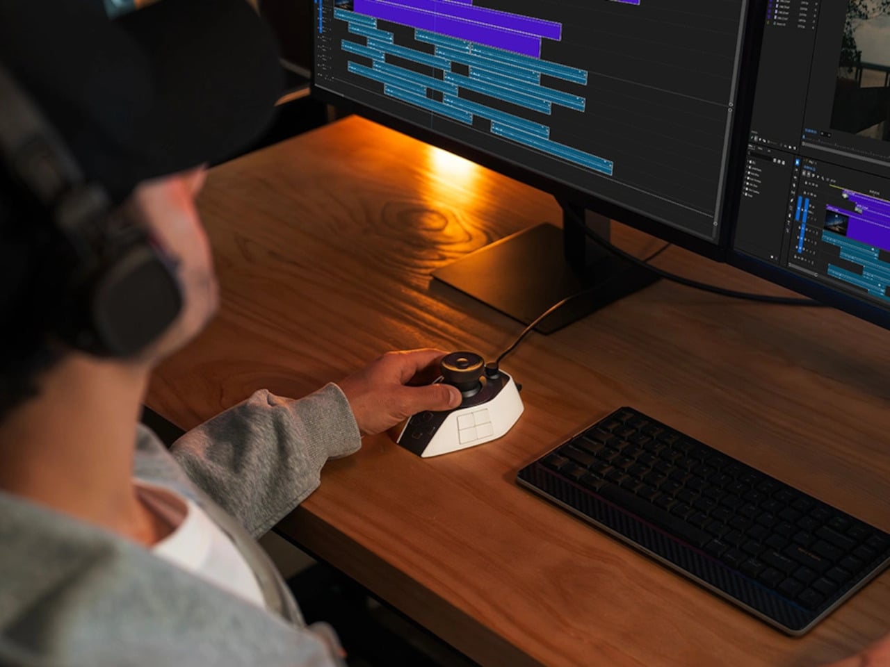
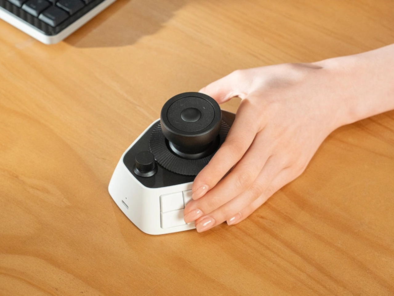
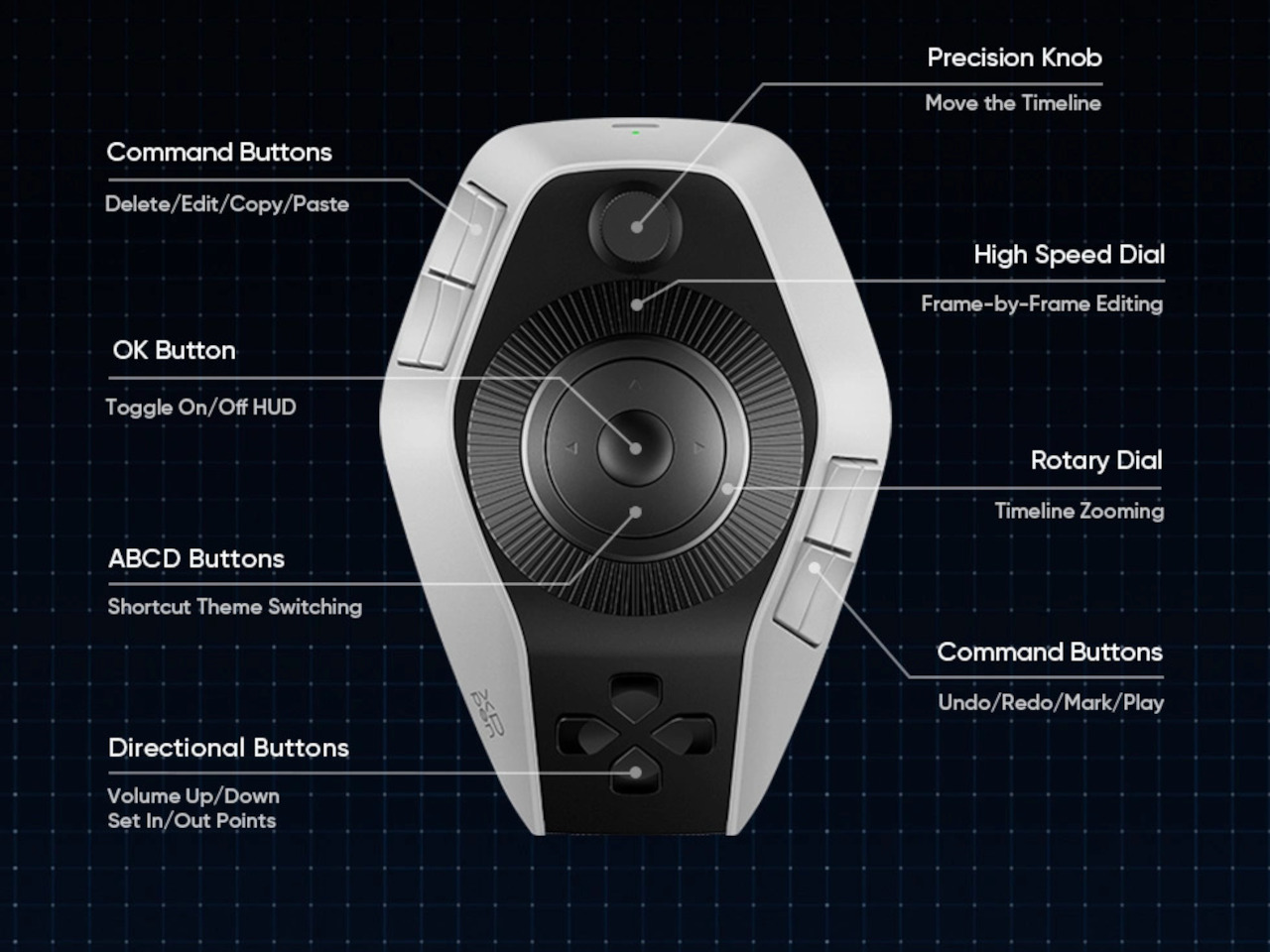
XPPen’s Pilot Pro is the brand’s first dedicated editing console, and it makes a confident debut. It packs 16 customizable buttons, three dials, and an all-way joystick into a compact controller built for one-handed, eyes-free operation. The premise is straightforward: let the left hand manage the shortcuts so the right stays on the mouse and your eyes stay on the screen.

Designer: XPPen

The console’s layout borrows from game controllers but reads more like a precision instrument. An 8-way joystick at the center handles footage scrubbing, color wheel navigation, and clip selection depending on the software. Two rotary dials surround the joystick at different heights, and a third sits just in front. All three deliver haptic feedback through a linear motor that can be tuned or disabled.

What makes the eyes-free claim convincing is the sculpted 3D key layout. Every button and dial has a distinct shape and position, so your fingers learn the device without looking away from the screen. XPPen also added a hypothenar support beneath the controller to keep the outer edge of the palm anchored. That ergonomic attention earned the Pilot Pro a Good Design Award 2025.

The haptic motor makes each interaction feel intentional rather than accidental, which matters more than it sounds when you’re deep in a cut. Up to seven customizable themes let you organize shortcuts your way, and profiles can be shared within the community. XPPen also offers presets from professional editors, so jumping into new software doesn’t require rebuilding your control scheme from scratch.

Tasks like scrubbing through a long timeline, grading a batch of shots, or retouching a portrait session become much less disruptive to the flow. The joystick handles navigation without lifting the hand, the dials adjust values with fine precision, and the 16 buttons absorb the commands that would otherwise mean a trip across the keyboard. It’s a setup that rewards muscle memory fairly quickly.

For connectivity, the Pilot Pro supports wired USB-C, Dual-Channel Bluetooth 5.4 Low Energy, and a USB dongle for machines without Bluetooth. The built-in 1,900 mAh battery lasts over 15 days at four hours of daily use. It works with Windows 10 and macOS 11 or later, and is compatible with Premiere Pro, DaVinci Resolve, Photoshop, Lightroom Classic, and Final Cut Pro.

Weighing 251g with dimensions of roughly 130mm x 93mm, the Pilot Pro fits on the desk without crowding it. XPPen has priced it at $209.99, in line with other professional left-hand controllers. For editors who spend serious hours locked into a timeline, a device that keeps the hands comfortable and a hundred commands within reach can meaningfully change the pace of a workday.

The post XPPen’s $210 Pilot Pro Finally Ends the Left-Hand Keyboard Scramble first appeared on Yanko Design.

Huawei MatePad Pro Max PaperMatte Edition Review: Thinnest 13-inch Tablet Nails Portability and Creativity

PROS:


  • Impressively thin and lightweight

  • Excellent PaperMatte OLED display with ultra-thin bezels

  • M-Pencil feels highly responsive and natural for writing and drawing

  • Glide Keyboard adds useful productivity features, including secure stylus storage

CONS:


  • Wi-Fi only, with no cellular option

  • Glide Keyboard has no backlight

RATINGS:

AESTHETICS
ERGONOMICS
PERFORMANCE
SUSTAINABILITY / REPAIRABILITY
VALUE FOR MONEY

EDITOR'S QUOTE:

The Huawei MatePad Pro Max pairs an ultra-thin and lightweight design with a refined PaperMatte display and excellent stylus experience, making it one of Huawei’s most compelling tablets for creativity and everyday use.
award-icon

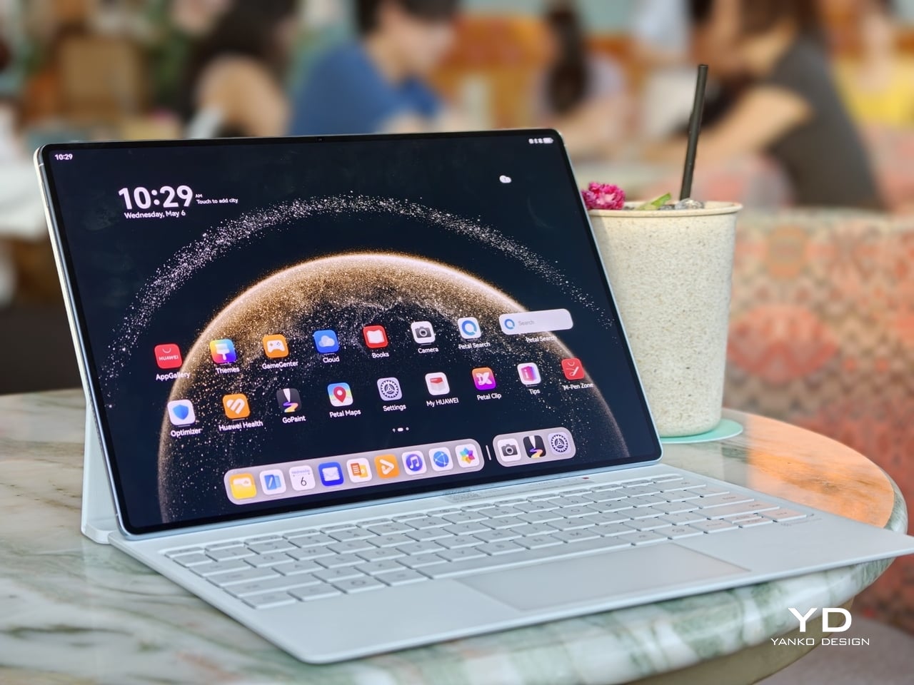
MatePad Pro Max PaperMatte Edition is the company’s largest tablet yet, and it arrives with a design that feels almost implausible in person. It is remarkably thin, unusually light for its size, and still positioned as a serious performance tablet rather than a pure showpiece. On paper, the appeal is immediate. You get a full-metal body, a 13.2-inch flexible OLED display, a 94 percent screen-to-body ratio, and a chassis that measures just 4.7mm thin.

Huawei is also aiming for a premium experience that extends well beyond the tablet itself. The ultra-thin bezel, the optional matte display treatment, the large battery, and the refined metal construction all work together to make the MatePad Pro Max feel elevated before the screen even turns on. Add in optional accessories like the Glide Keyboard and M-Pencil Pro, and it is clearly designed to stretch beyond entertainment into productivity and creative work. The real question is whether all of that sleek hardware leads to a meaningfully better everyday experience, or if it is simply a beautiful piece of industrial design wrapped around the usual tablet compromises.

Designer: Huawei

Aesthetics
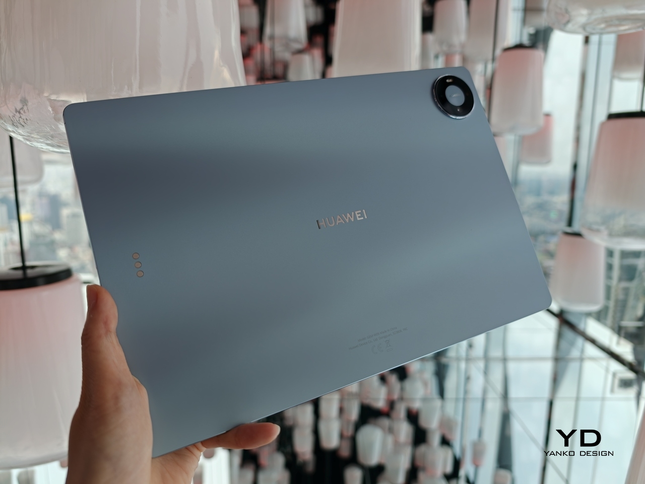
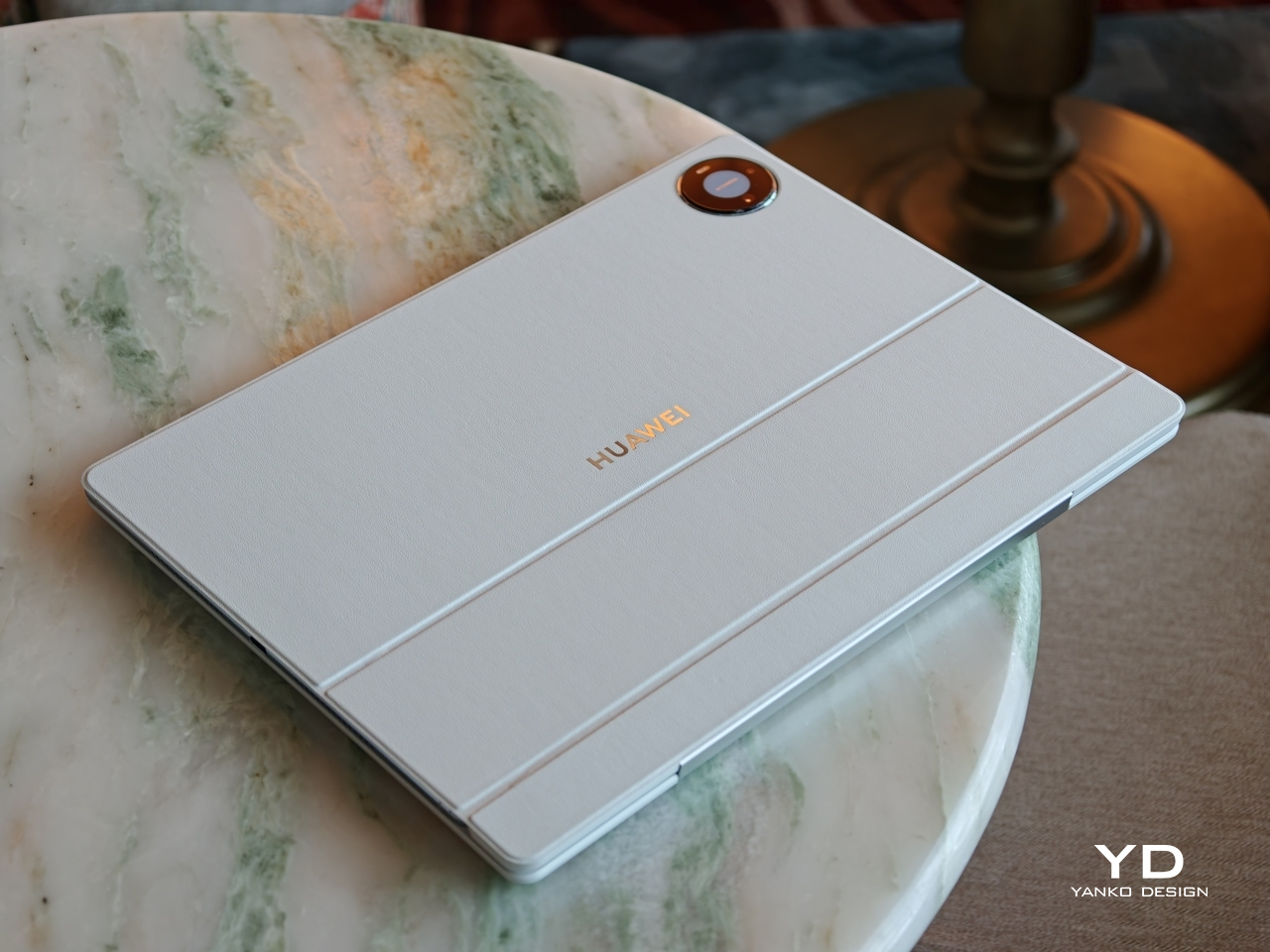
The MatePad Pro Max is a sleek, premium-looking slate that relies on clean proportions and refined finishes rather than flashy details. It comes in Blue and Space Gray, and the blue version I received is especially striking. Its fine glitter finish catches the light beautifully and gives the back panel a more expressive look.
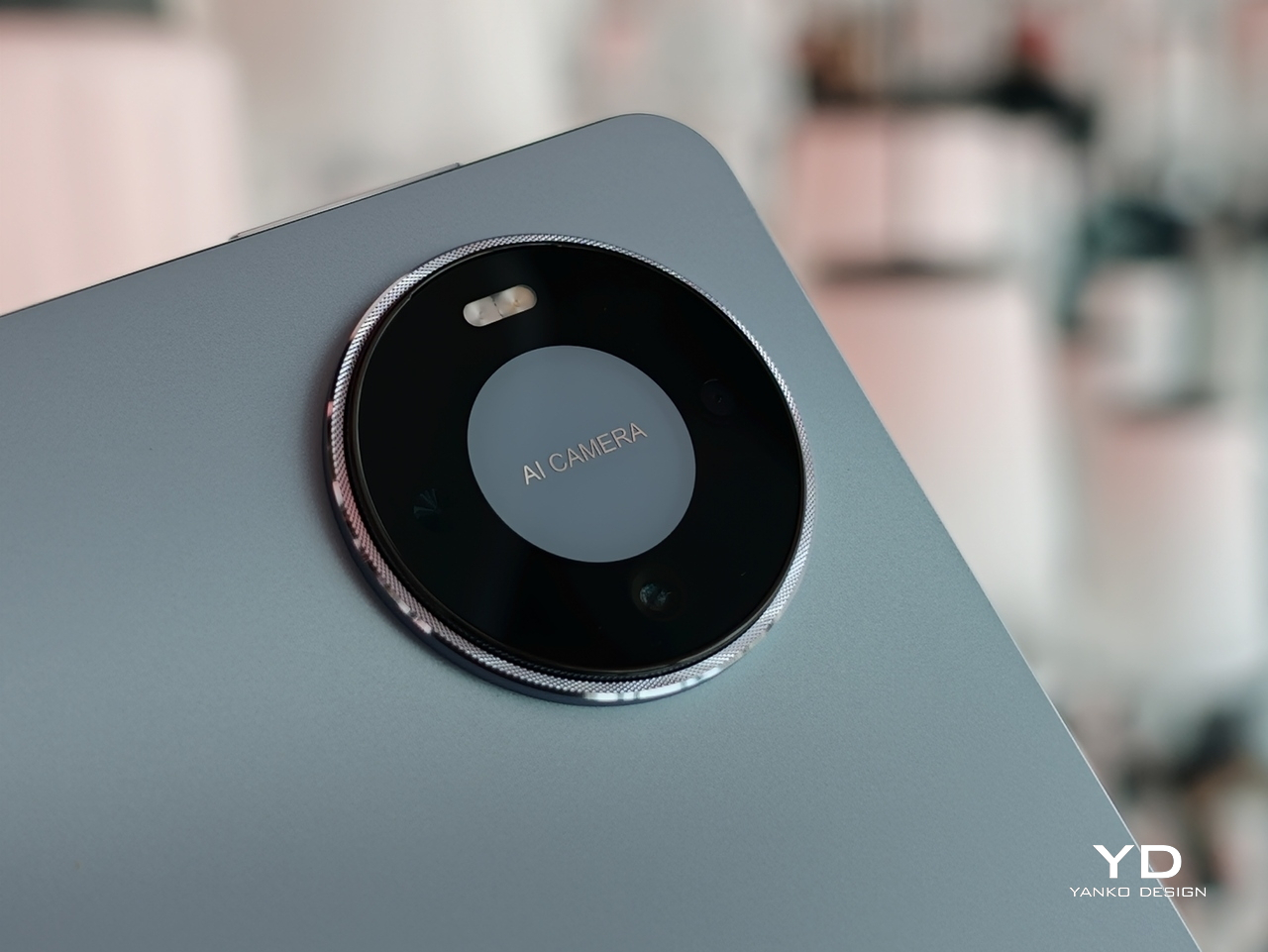
The full-metal body keeps the design simple and clean, while the round camera bump on the upper right adds a bit of visual weight to one corner, and the centered Huawei branding keeps the back from feeling too plain. Around the sides, the glossy frame adds a bit of contrast, with the power button and fingerprint scanner on the left side from the display view, and the volume rocker along the top. Huawei’s optional accessories also fit the design well, with the keyboard offered in white or black and the folio cover available in black.

Ergonomics

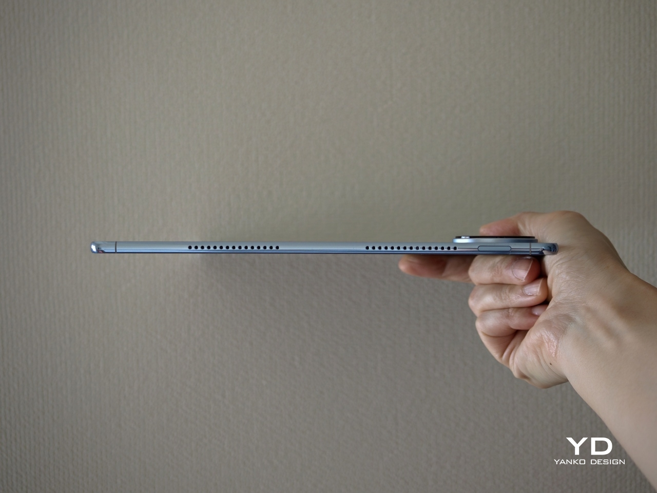
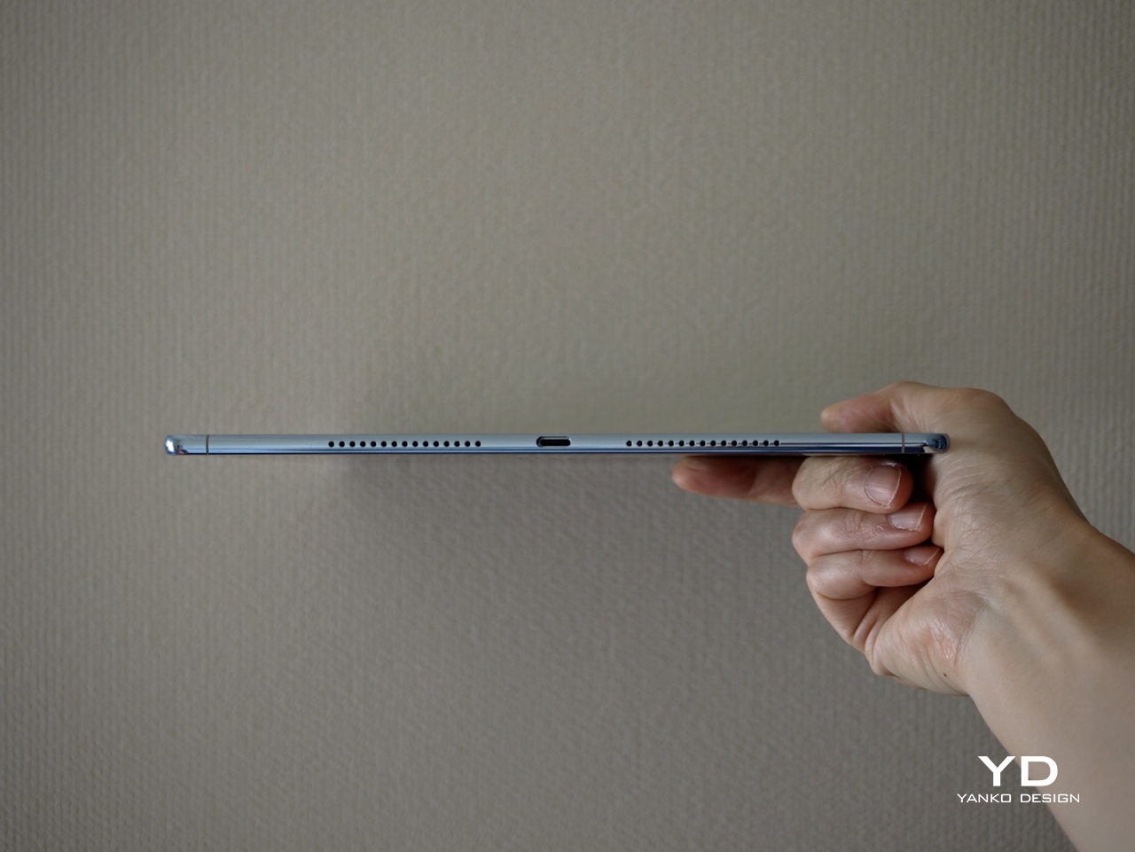
The MatePad Pro Max PaperMatte Edition is surprisingly manageable for a tablet this large. A 13.2-inch display usually suggests a device that is best left on a desk or propped on a stand, but here the physical experience feels far more inviting. At just 4.7mm thin and 509g, it feels notably easy to carry and hold for longer stretches.
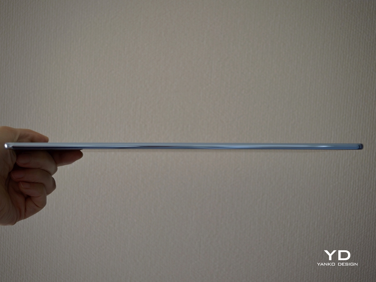
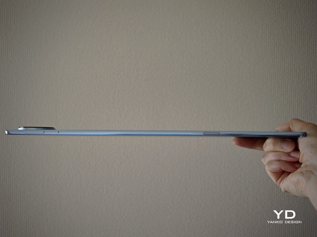
Huawei calls it the world’s thinnest 13-inch-plus tablet, and that slimness is immediately noticeable in use. Even so, it does not feel flimsy or overly delicate in hand. The build still feels solid, though I would still handle it with some care, given just how thin the body is.

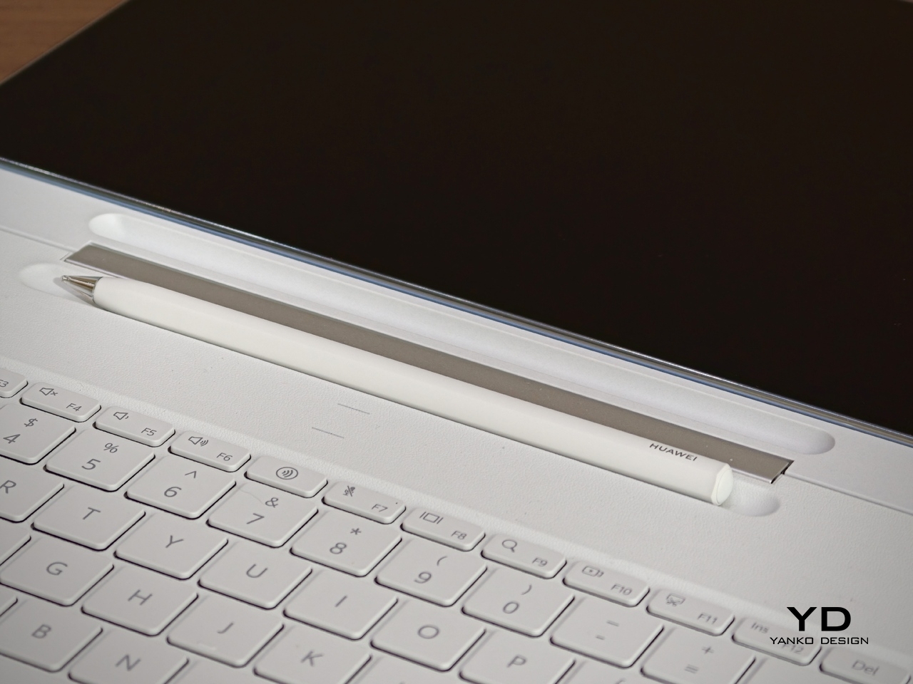
The Glide Keyboard adds 439g, but the full setup still feels very manageable for its size. What I like most is the integrated pen slot, which stores the M-Pencil more securely than a simple magnetic attachment on the side of the tablet. That small detail makes a real difference if you tend to toss your tablet into a bag and go, since the stylus feels less likely to come loose.
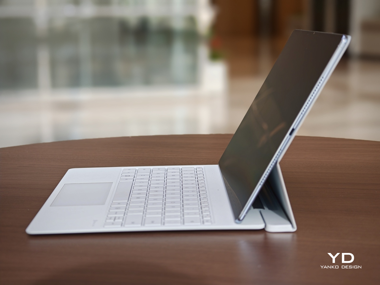
The keyboard itself is pleasant to type on, and the hinge feels sturdy in use. It gives the MatePad Pro Max a more laptop-like feel when you need to get work done. The main limitation is that the viewing angle is fixed to two positions, so it is less flexible than some other tablet keyboard setups. It also lacks a backlight, which makes it less convenient to use in darker environments.
Performance

Performance starts with the display, because it shapes nearly every interaction you have with the MatePad Pro Max. The 13.2-inch flexible OLED panel is large, sharp, and visually immersive, with a 3000 x 2000 resolution, 144Hz refresh rate, and up to 1,600 nits peak brightness. It is the kind of screen that makes reading, streaming, and multitasking feel immediately premium, especially with the PaperMatte finish, which helps cut glare and makes the display more comfortable to use in bright environments.

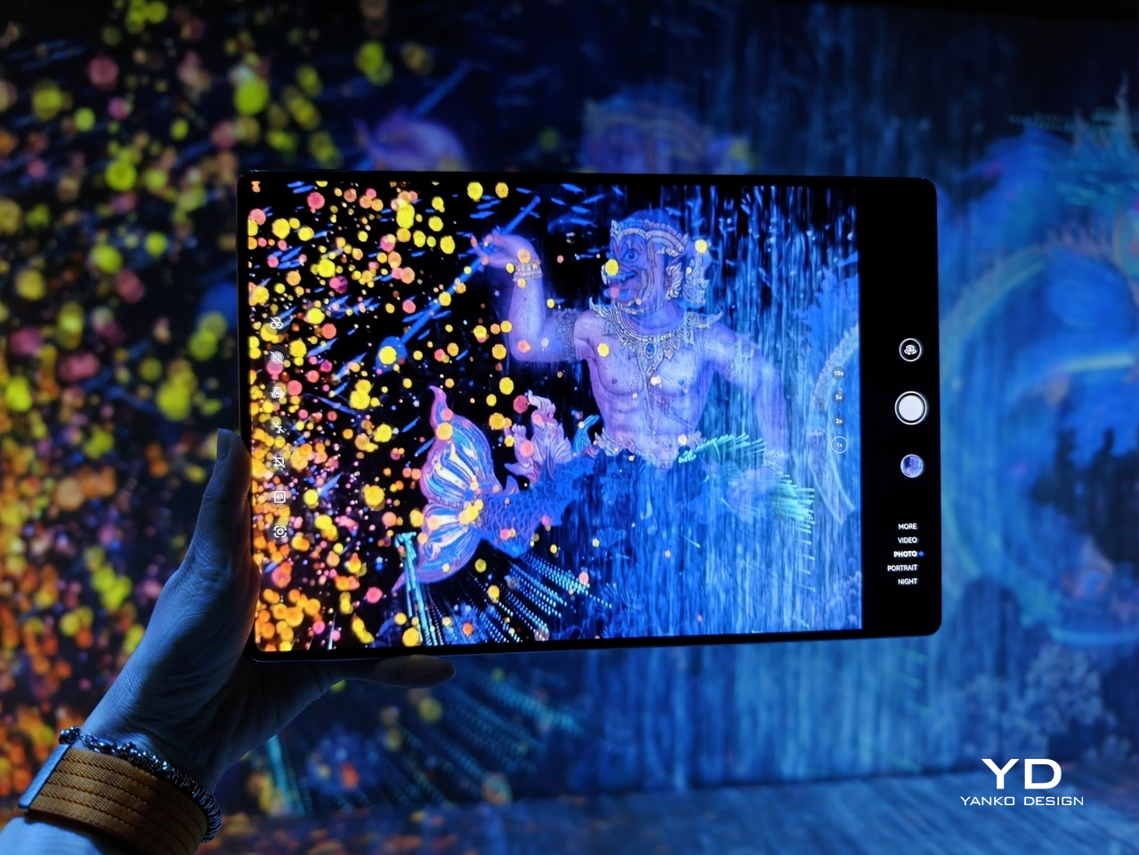
A big part of that immersive feel comes from the tablet’s extremely thin bezel. At just 3.55mm, the border around the display is slim enough to make the front feel almost all screen, helping the MatePad Pro Max reach a 94 percent screen-to-body ratio. Even more impressive is how Huawei has tucked the front camera into that narrow bezel so discreetly that it nearly disappears from view. The result is a front design that feels remarkably clean and uninterrupted, making the display look even more expansive and giving the tablet a more refined, almost futuristic presence in everyday use.
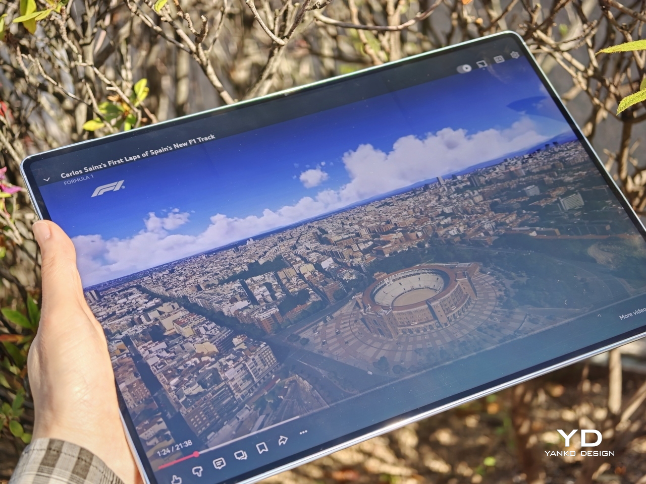
The display quality also lives up to the tablet’s premium design. OLED gives the MatePad Pro Max the deep contrast and rich color you want from a flagship tablet, while the 144Hz refresh rate keeps motion looking fluid and responsive. Whether you are scrolling through documents, flipping between apps, or watching high-quality video, the screen carries a polished sense of smoothness that fits the hardware well. Huawei also gets the basics right when it comes to unlocking the device. Both face recognition and the side-mounted fingerprint scanner worked reliably in my testing. Face unlock was even able to recognize me in the dark, which made the tablet feel quicker and more seamless to use throughout the day.
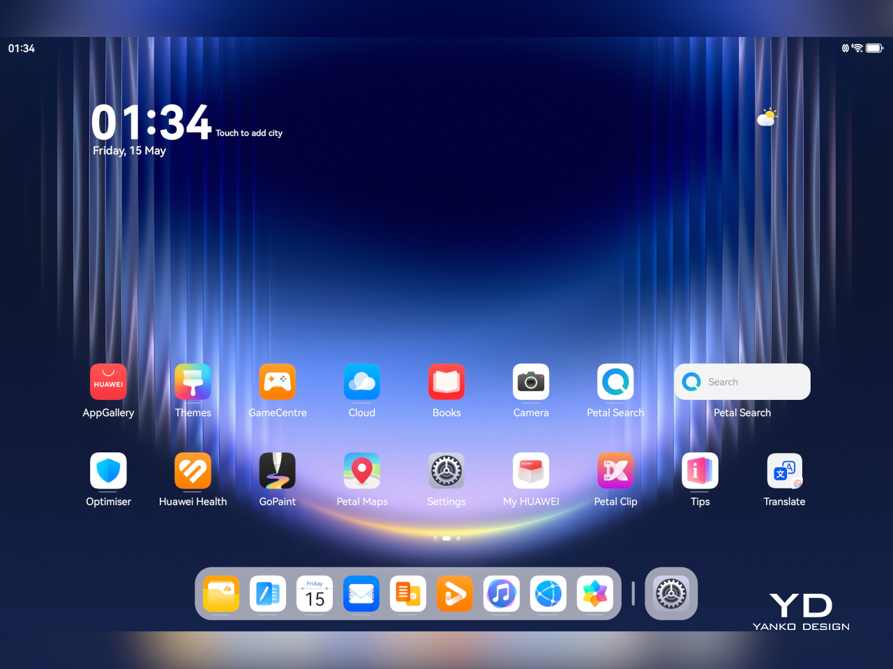
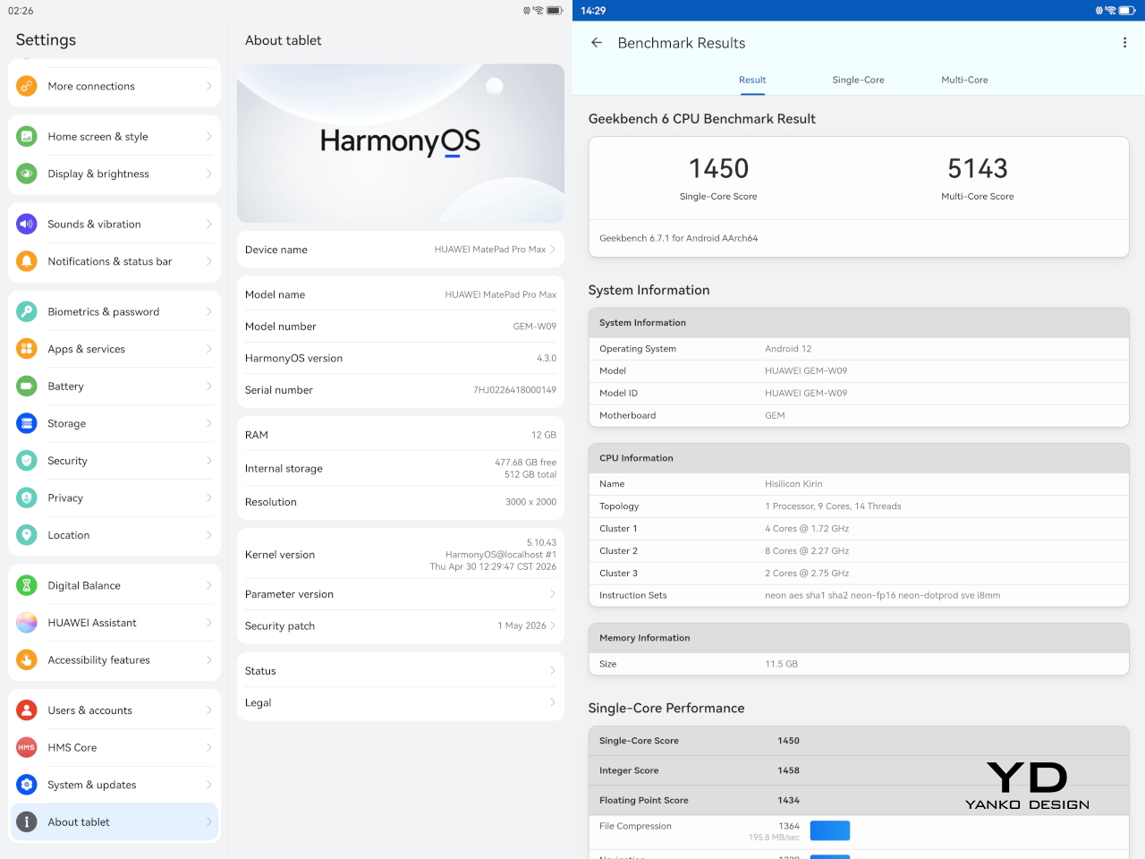
The MatePad Pro Max runs HarmonyOS 4 out of the box. Huawei does not specify the chipset, but in day-to-day use, performance feels strong and responsive. Apps open quickly, multitasking feels smooth, and the tablet has no trouble keeping up with entertainment, browsing, note-taking, and general productivity. It feels like a flagship tablet in everyday use, even without Huawei sharing much detail about the chip inside.
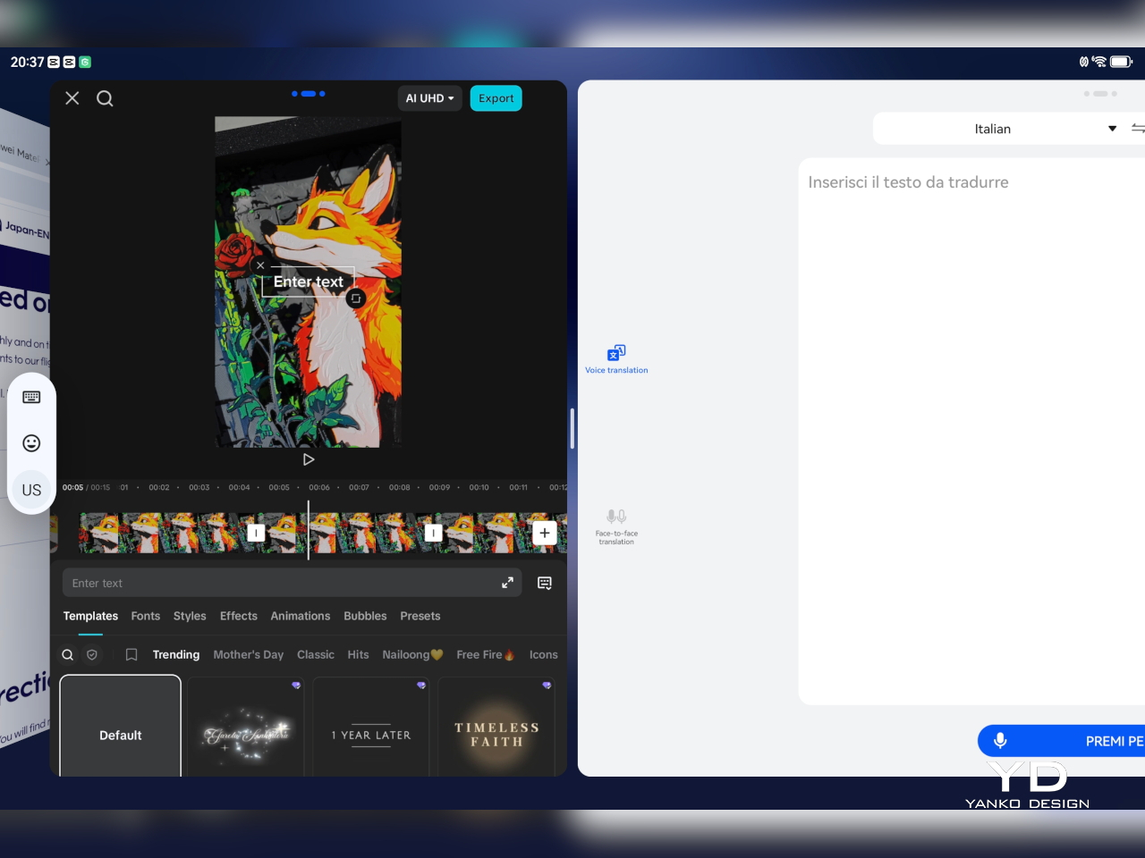
HarmonyOS also makes decent use of the large display. You can keep up to three apps active and move between them easily, though only one is fully visible at a time in that setup. For more direct multitasking, split-screen lets you run two apps simultaneously, either side by side in landscape or stacked vertically in portrait. On top of that, you can open up to two floating windows, which appear as smaller, resizable panels for quick access to other tasks without fully leaving your main app.

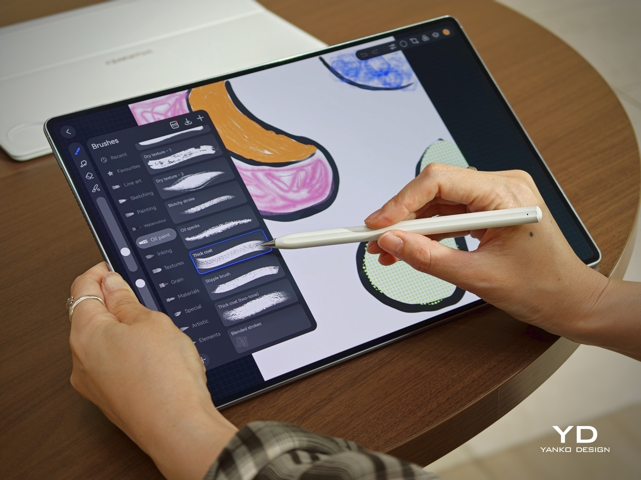
The M-Pencil is also a big part of the experience. It feels very responsive, with no noticeable latency in writing or drawing, and pressure sensitivity works very well. Combined with the PaperMatte display, the writing and sketching experience feels closer to paper than on many other tablets, which makes the MatePad Pro Max especially appealing for note-taking, annotation, and creative work.
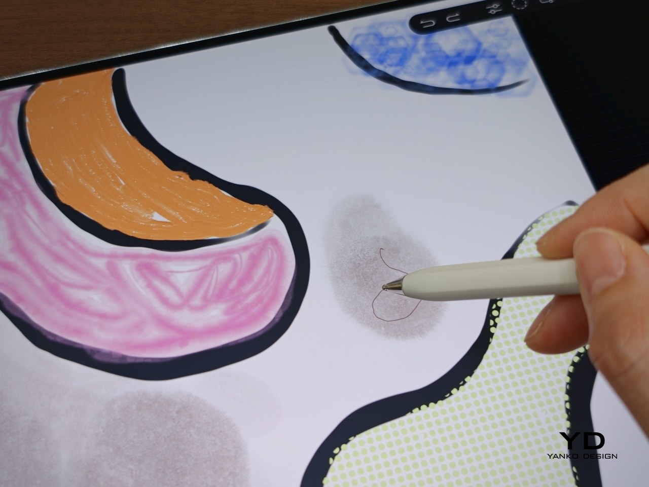

Huawei also has one genuinely compelling creative advantage in GoPaint. It is a surprisingly sophisticated painting app that feels much more advanced than a basic bundled sketch tool. You get a wide range of features, including more than 100 brush options, color picking tools, and effects like a splatter brush, which makes it feel like a serious canvas for illustration rather than a simple note-taking extra. Paired with the M-Pencil, it gives the MatePad Pro Max a stronger identity as a creative tablet, not just a productivity device with stylus support.
The bigger consideration is software rather than speed. Because of ongoing U.S. trade restrictions affecting Huawei, the MatePad Pro Max does not come with Google Services, so users who rely heavily on Google’s apps and services will need to find workarounds.

Audio also helps sell the experience. Huawei includes a 6-speaker crossover system with a quad-driver bass unit, and the sound has enough scale to match the size of the display. It gives movies, music, and games more presence than you would expect from something this thin, which makes the tablet feel like a stronger all-around entertainment device rather than just a beautiful screen.
Battery life is also a strong point, given the 10,400mAh battery. Huawei also includes 40W reverse charging, which adds some practical versatility if you want to top up another device in a pinch. The MatePad Pro Max is clearly designed to deliver a premium media and productivity experience, with the display doing most of the heavy lifting and the rest of the hardware supporting it well.

Sustainability

Huawei’s sustainability story here feels understated, which is often the case with premium tablets that prefer to lead with design and experience. The full-metal body should help the MatePad Pro Max feel durable over time, and there is something inherently longevity-friendly about hardware that feels physically refined. A device that remains pleasant to touch, carry, and look at tends to stay in use longer, and that matters even if it is not framed as a sustainability feature.
At the same time, there is not much information that speaks directly to repairability, recycled materials, or long-term software commitments. That absence is worth mentioning because sustainability is no longer just about whether a product looks durable. It is also about whether it can remain relevant, supported, and serviceable over the years. Without stronger messaging around those areas, the MatePad Pro Max feels more premium than progressive on this front. The tablet feels built to last physically, but the broader ownership story remains less defined.

Value

The MatePad Pro Max is priced like a premium tablet. The 12GB + 512GB model with the Folio Cover costs EUR 1,399, or roughly $1,520 USD. The 12GB + 256GB version with the Smart Keyboard is EUR 1,499, about $1,630 USD, while the 16GB + 512GB model with the Smart Keyboard goes up to EUR 1,649, or around $1,790 USD.

At those prices, the MatePad Pro Max is really selling its hardware. The thin and light design, matte OLED display option, slim bezels, and strong stylus experience help it stand out from other large tablets. That said, it is worth noting that this is a Wi-Fi-only tablet with no LTE or cellular option, and there is no microSD card expansion. Storage tops out at 512GB, which should be more than enough for most users, but heavier users who install a lot of AAA games, edit high-resolution video, or keep large media libraries may want to factor that in.
Verdict

The Huawei MatePad Pro Max gets a lot right where it matters most. It is impressively thin and light for a tablet of this size, and that alone changes how approachable it feels in daily use. The 13.2-inch OLED display is the star of the experience, not just because it is large and vibrant, but because the ultra-thin bezel and discreet front camera integration make the whole front feel unusually clean and immersive. The matte screen is also a real treat, giving the display a more comfortable, paper-like quality that makes watching, reading, writing, and drawing feel more enjoyable over longer stretches.

What makes it stand out is how well the hardware and creative experience come together. The writing and drawing feel is excellent, GoPaint is more capable than expected, and the Glide Keyboard adds real utility without making the setup feel cumbersome. There are still a few tradeoffs, including the keyboard’s limited angle adjustment, lack of backlight, and the Wi-Fi-only setup with no microSD expansion, but for many users, those will be secondary to the overall experience. Huawei’s software situation also still requires some adjustment depending on your workflow.
Even with those caveats, the MatePad Pro Max is a thoughtfully designed tablet that feels distinct in a crowded category. It is not simply trying to be a bigger screen with flagship specs. It is trying to offer a more refined, paper-like, design-conscious experience, and for the right user, it succeeds very well. If your priorities are portability, display quality, and creative work, this is one of the most compelling large tablets Huawei has made.
The post Huawei MatePad Pro Max PaperMatte Edition Review: Thinnest 13-inch Tablet Nails Portability and Creativity first appeared on Yanko Design.