Lamp posts become EV charging stations in innovative startup concept

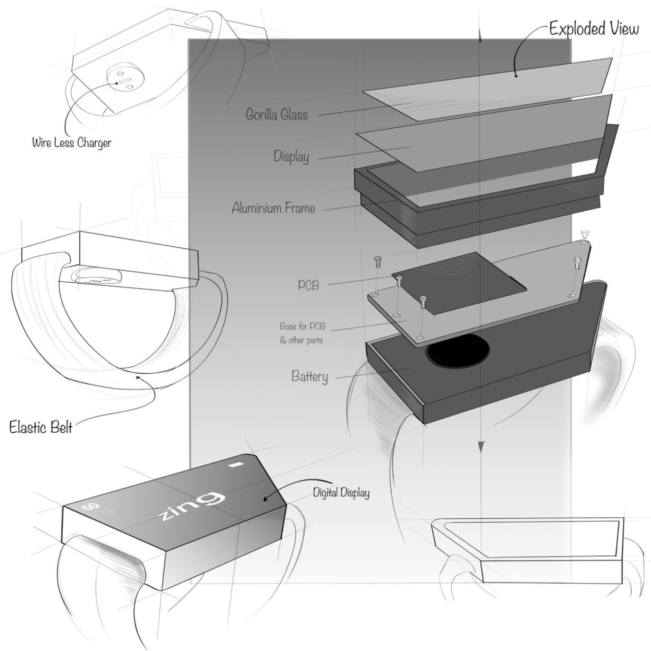
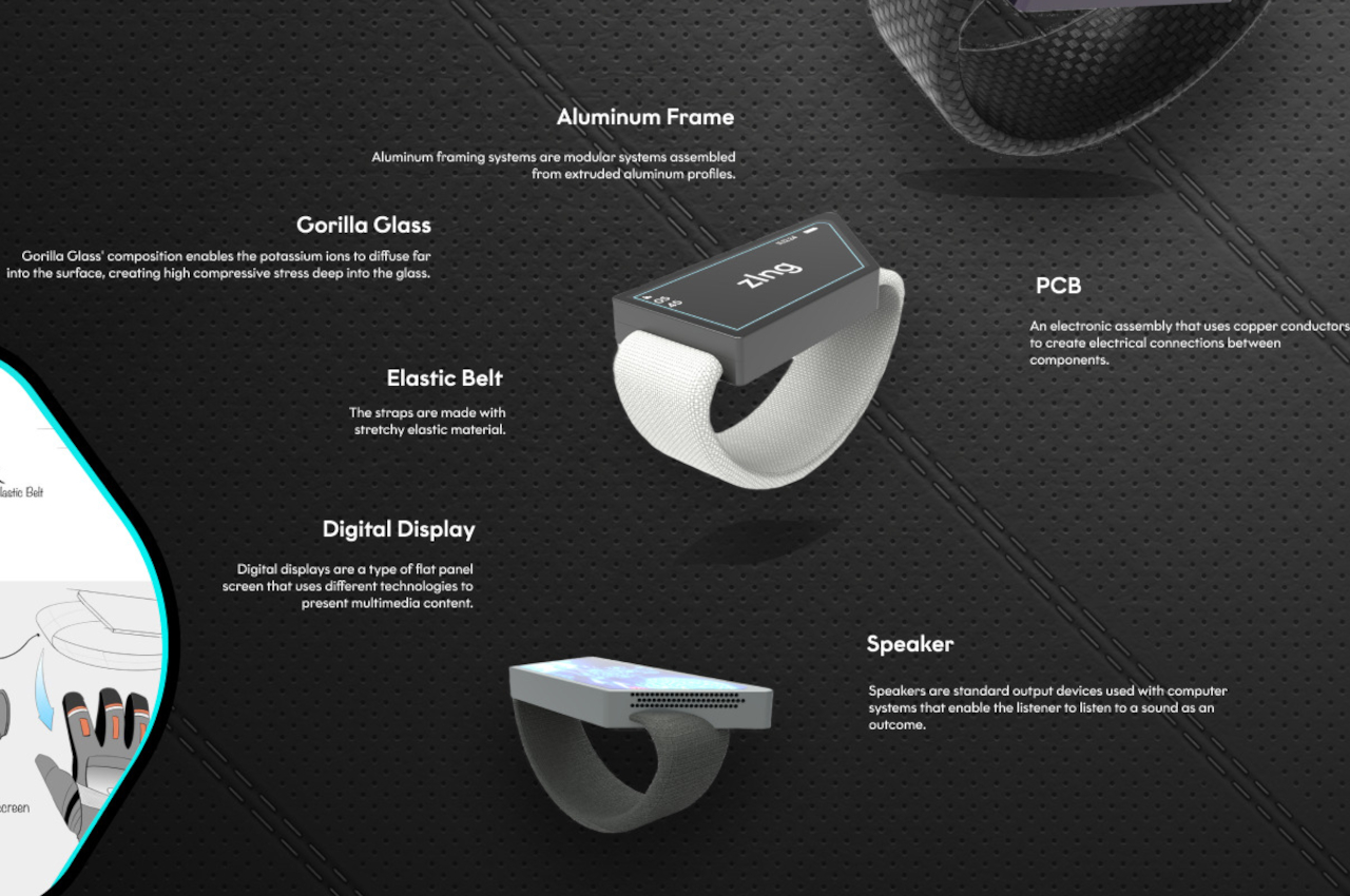
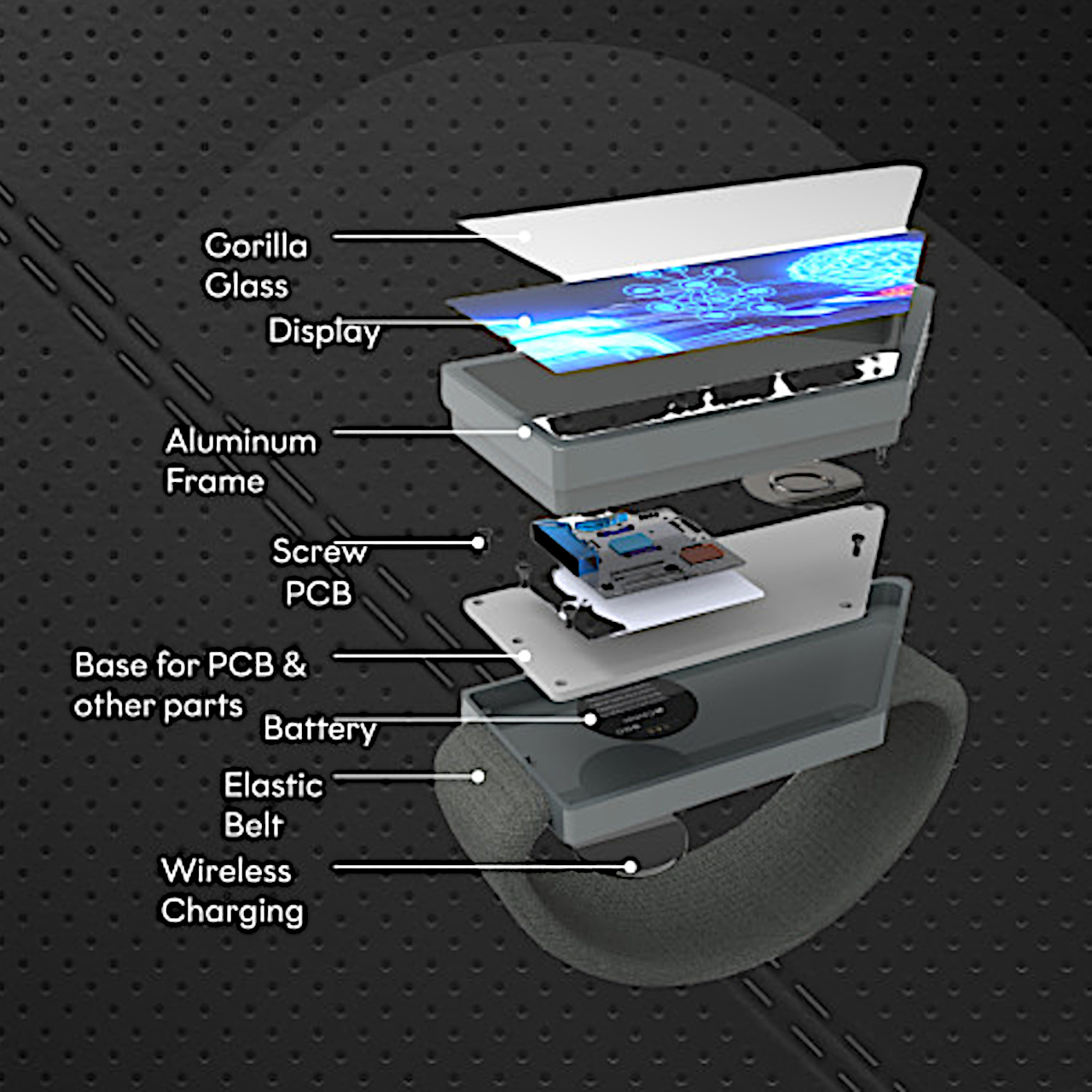
Having an electronic vehicle is becoming a bit more common, although still not as prevalent as we would like it to be. There are a lot of reasons why some are still hesitant about adapting to this more eco-friendly kind of cars. Aside from the price tag, charging your vehicle overnight is still not as easy especially if you don’t have a garage or driveway. You have to look for charging stations near your place but you probably won’t be able to do your charging overnight. A startup aims to solve that problem by utilizing trusty old lamposts.

Designer: Voltpost

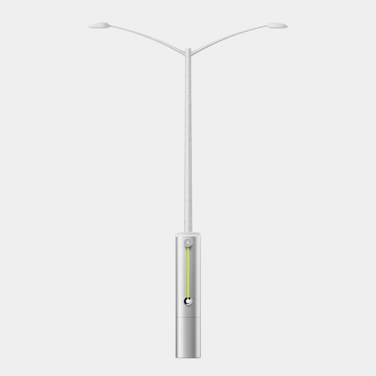
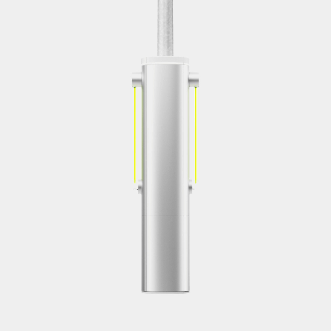
Since street lamposts are pretty common, this New York City startup is proposing to retrofit these existing lamposts and use them to charge electric vehicles. They designed a shroud that will cover the lower part of the lamposts and inside you have various cables and electronic devices to juice up the cars that need them. You have retractable cables that can anchor up to eight feet off the ground and a hand level charger dock. It is also modular and can be installed in an hour and can be repaired easily.

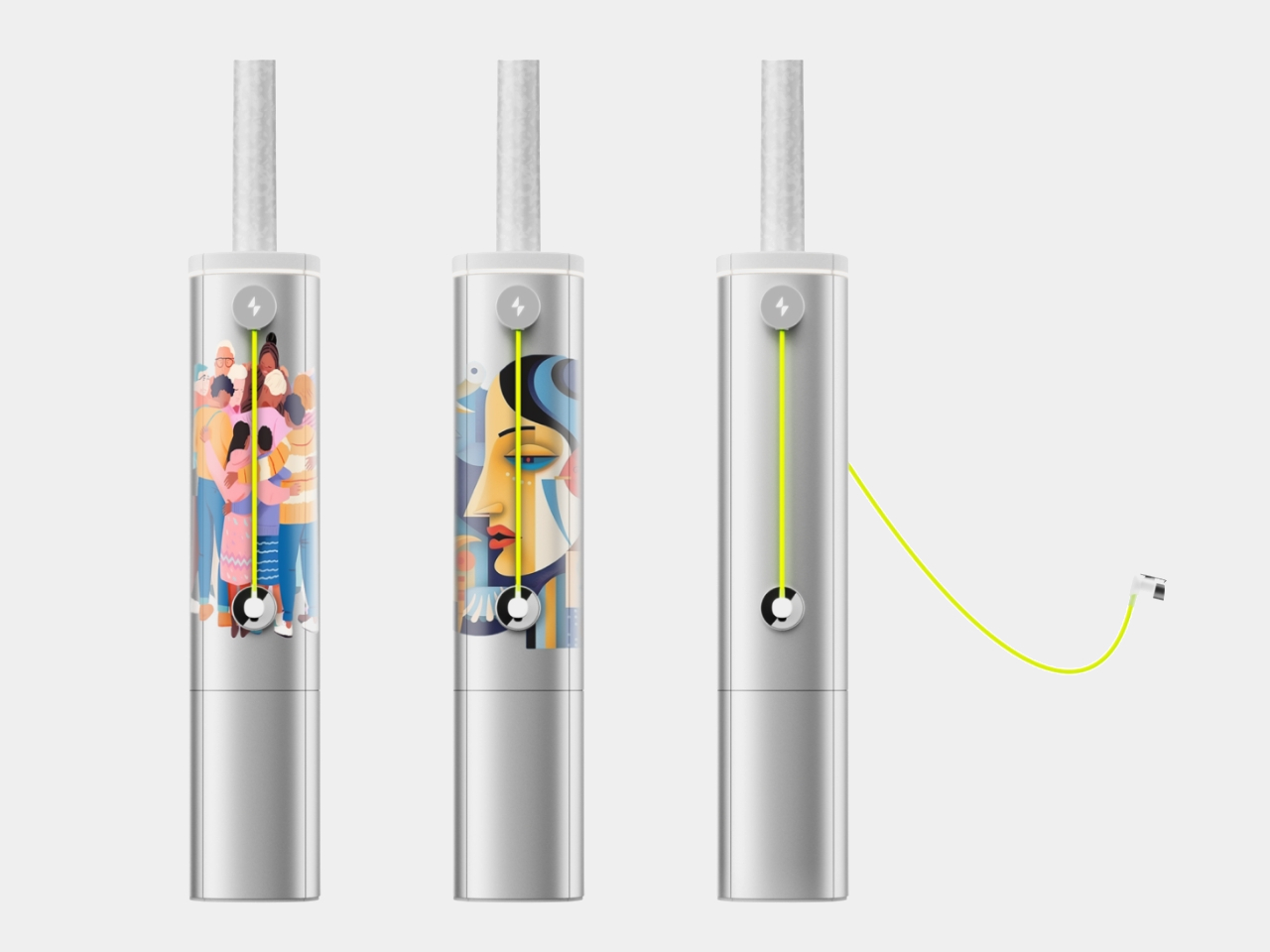
For newbies to the EV game, charging your car here is as easy as plug and play. There’s an app where you can oversee the charging of your vehicle and it is also where you will pay for the service. You can also use it to reserve your spot in case you know the schedule when you need to recharge your vehicle and you don’t want to compete with other EV owners. Even the installation of these chargers on the lamposts is pretty easy and takes just an hour based on their initial tests.

Voltpost has finished a test with the New York City Department of Transportation and they are currently in different stages of development with other cities specifically Chicago, Detroit, and New York. This is something that will be pretty useful to encourage more people to switch to EVs, especially if they don’t have space in their houses to do their own charging. We look forward to the day when EVs are as common as hybrid or regular cars and having a more convenient way to power up is a step towards that.

The post Lamp posts become EV charging stations in innovative startup concept first appeared on Yanko Design.

Origami-inspired table concept folds into a lamp to save space

Tables are important pieces of furniture in any human space, whether it’s the dining table at home or a meeting table at the office. That said, we don’t always use these flat horizontal surfaces all the time, and there will be times when they’re just taking up precious space. Yes, more aesthetic tables do provide some visual value, but it doesn’t outweigh the cost of their presence. Foldable tables are practical, but few actually look good even when unfolded and the hassle of moving the folded table out of the way makes them less compelling. But what if you didn’t need to put the table away because it not only becomes more compact but also serves a different purpose? That’s the kind of multi-functional design that this concept proposes, turning a table into a lamp.

Designer: Sonakshi Gupta

The Japanese art of folding paper has inspired many designs because of its beauty, simplicity, and space efficiency. A large and flat sheet of paper can suddenly become a geometric flower or swan with a few folds, significantly reducing the area that the piece of paper once occupied. This art doesn’t involve removing or adding parts, which makes each piece an independent and standalone unit.

LightUP is a concept that takes inspiration from origami and kirigami (which does involve cutting away and gluing pieces together) to design a table that not only saves space but also provides a completely different functionality or two. The squarish wooden tabletop folds up into a shape that’s like a flower bud, freeing up the space around the table for use. Thanks to ingenious invisible hinges, not only do you have a clean and flat table surface but moving only one or two corners is enough to fold and unfold the table. The easier you can perform this action, the more frequently you’re willing to do it.

Of course, that’s not where it all ends. The design’s name comes from the fact that wide LED light strips from the pyramidal base of the table to each of the four corners. Thus, the table becomes a room-wide lamp at night but can also remain as a space-saving art object when the lights are off.

Admittedly, the design’s implementation is actually more complicated than it looks thanks to the moving parts and hinges involved. Those may become points of failure over time due to wear and tear. The idea, however, could give birth to a simpler design, one that takes into account aesthetics, functionality, and sustainability altogether for a truly space-saving piece of furniture.

The post Origami-inspired table concept folds into a lamp to save space first appeared on Yanko Design.

Hand-worn smart display concept safely shows information for bikers, mountaineers

Smartphones can provide all sorts of useful information and features, but there will always be occasions when you can’t just whip out the phone from your pocket to use it. Smartwatches are supposed to solve that problem by offering more condensed information on your wrists, but that can still be problematic for some class users, especially those who engage in outdoor activities. Although smartwatches are often marketed for athletes and people with active lifestyles because of their health-tracking features, actually using the wearable once the gloves come on can actually be difficult, if not impossible. Fortunately, your wrist isn’t the only body part you can use for a wearable, and this design concept tries to place a bigger display on the back of your hand instead.

Designer: Anuj Pate

Smartwatches are the most popular kind of wearable design simply because they are the most convenient and the most familiar. That doesn’t exactly mean they’re the best or only design possible, definitely not for all kinds of people. The rising interest in smart rings does indicate a sort of “smartwatch fatigue” that’s making people think outside the box on how to deliver some of those features through other means. A smartwatch’s display, for example, is only useful if can see it, which often means having to twist your wrist at the very least to have the screen at a proper angle.

Unfortunately, that’s not easy or even safe for some people whose hands have to be in a fixed position or can’t easily touch the smartwatch screen once they’ve started wearing gloves. That’s the case for cyclists, bikers, and mountain climbers who still need access to some critical information but can’t see their smartwatch for one reason or another. Rather than rely on complicated and distracting solutions like audio notifications or augmented reality goggles, zIng simply moves the display to a position where it can be easily seen even without twisting your wrist or squinting your eyes.

The wearable design concept practically puts a decently sized trapezoid-shaped display on the back of your hand. If you have your hand forward like when you’re holding bike handles or gripping a mountain wall, this immediately puts that screen within your vision. The display is also large enough to tap with a finger even when you’re wearing very thick gloves, which is often the case for biking and mountaineering gear.

zIng is just one of a new generation of wearable designs that are challenging the status quo of smartwatches. An ergonomic Apple Watch band moves the smartwatch away from the wrist and onto the back of the hand as well, this time a little below the thumb, though that doesn’t solve the cramped screen space. Admittedly, the zIng concept targets a very niche market, but it also clearly shows that there’s no one-size-fits-all wearable design that will be perfect for all use cases.

The post Hand-worn smart display concept safely shows information for bikers, mountaineers first appeared on Yanko Design.

Stone-shaped digital compass concept promises an adventure with each walk

Compasses are designed to give you your bearing, but they don’t exactly tell you where you’re headed. With today’s digital maps and navigation apps, that’s pretty much easy peasy, removing any stress from trying to find your way to your destination. At the same time, however, these modern conveniences also remove some of the adventurous feelings and the joy of discovery when wandering about before you reach your actual stop. That kind of whimsical and often serendipitous experiences are almost all but lost, especially with smartphones serving all information on a silver platter or always calling our attention with its incessant notifications. This modern and unconventional compass design wants to remedy that and bring back the joy of an aimless exploration by removing all unnecessary distractions so that you can be more present in your surroundings.

Designer: Modem Works x Panter & Tourron

They say that if you don’t have a destination in mind, any road will take you there, and while that adage is often used as a warning, it neglects to mention the wondrous discoveries you might encounter off the beaten path. After all, not all who wander are lost, as the popular quote goes, but also losing your bearings and your way can be a frightening thought. You could use your phone, but you could also be tempted to just go directly to your destination or, worse, never get there because of all the pings from social media that are begging for your attention.

Terra is a device that modernizes the age-old compass without turning it into a complicated device like a smartphone. There is no screen, at least not an obvious one, just a hidden monochrome display that lights up with symbols and sigils that will mark your adventure. Yes, it will show you your direction, but it won’t mark your destination. Instead, it encourages you to actually get your destination off your mind and take a different path instead.

The idea is that you will input your location and how much time you have available and the device’s AI will guide you along a set of GPS coordinates to accompany you on your adventure. But instead of screens and beeps, it uses gentle haptic feedback and artistic iconography to nudge our attention to little discoveries along the way, be it a kind mushroom or a flower you might have never seen before. And yes, it actually functions as a compass so you won’t get lost by accident.

Terra’s cross-like form seems to be a reference to the four cardinal directions, but its rough, organic shape is more reminiscent of a stone or pebble you’re likely to pick up along your walks. The design, however, is open to various other shapes that will hopefully remind you of the treasury of wildlife waiting to be discovered along your more adventurous excursions.

The post Stone-shaped digital compass concept promises an adventure with each walk first appeared on Yanko Design.

Odd sustainable stool concept prioritizes minimizing materials over recycling

The majority of sustainable designs today focus on using responsibly sourced or biodegradable materials as well as the ability to recycle components at the end of the product’s life. While these are indeed a big leap compared to common production practices, it’s still from the ideal. Even sustainable materials like wood, metal, or bioplastics produce material waste that still gets discarded at the end of the production process. And depending on the materials involved, recycling can actually consume more energy and even result in more pollution, offsetting whatever benefits it should have brought. Another approach to sustainability is to actually reduce the materials used and, therefore, the materials that need to be recycled, as what this rather unconventional “two-piece” stool design tries to propose.

Designer: Kitae Pak

The less materials you use for a product, the more products you can make out of that material. If a single 1,220mm x 2,440mm sheet of plywood would normally yield 24 circular plates with a diameter of 310mm, you could potentially squeeze 219 plates with a diameter of 120mm. That’s the kind of increase in yield that the Dots stool concept is claiming, making more efficient use of a material without compromising on quality, at least in theory.

The concept accomplishes this by completely redesigning what a stool is expected to be. Yes, it’s still a piece of furniture for seating, but there’s no hard rule that the seat has to be one large and whole piece. Instead of a single big circle, the Dots stool utilizes two smaller discs to support the body at rest, hence the name. It delivers the same function but at a significantly lower material consumption right from the start.

With this minimalist design, which consists of two wooden rods for legs and recycled plastics to connect the pieces into a stable whole, you can make 4 times more Dots stools than a regular stool using the same materials. This kind of conservation means that the production process itself would use less materials and energy to produce the same number of stools, while recycling would also use less energy and water as well. And since it’s mostly made of wood, the stool can also be repurposed for other designs or returned to the Earth one way or another.

While the design does check all the right sustainability boxes, it does raise questions on conform and stability. It’s arguable that it does serve its function well, but neither its appearance nor its ergonomics inspire complete confidence. It’s not a complete loss, however, as the experiment proved that there’s still a lot of room for improvement even for already sustainable designs.

The post Odd sustainable stool concept prioritizes minimizing materials over recycling first appeared on Yanko Design.

Stool has tree shadows printed on top to bring you closer to nature

Before I started focusing on writing for design, I never really paid attention to how mostly functional things like chairs are designed. As long as I could sit on it comfortably on it, then i believed it did its job and I didn’t really need to choose based on how well designed it is. But there are pieces of furniture out there, or even just as a concept, that were really thought of well by the designers to bring something not necessarily new, but at least interesting, to the table. Or in this case, the chair.

Designer: Shota Uruasaki

Capture the Light is one such design for a stool. The furniture itself is not a groundbreaking stool but is made up of the usual three blocks (seat, two legs) connected together by one small block. It looks just like your typical wooden stool/bench that you might see at a park or at a museum. But what makes this different is what you’ll see on the seat itself. You might think there’s a tree nearby casting its shadow but if you’re inside, then that may be a mystery.

It’s actually the unique design that this stool brings. The shadows casted by trees that you may see at parks or public spaces are immortalized on the seats as the designs are printed on them. The designer went around photographing the patterns that these tree shadows make, carrying a white board with them. The photographs were then inkjet printed on top of the stools and so you have the illusion of trees hovering on you as you sit on them.

It’s a simple design addition to your regular stool/bench but it’s interesting, if you’re into nature and trees. Even if the stool is inside, you get the illusion of still being surrounded by trees because of the shadows. Of course it’s still best to actually be around trees but in cases where you can’t then this stool may be the next best thing.

The post Stool has tree shadows printed on top to bring you closer to nature first appeared on Yanko Design.

Jar blender concept brings both aesthetic and function

A lot of aspiring product designers get inspiration from existing brands whose aesthetics are very distinct. One famous brand of hair dryers and stylers has made its mark on those interested in product design (and pretty devices) and has served as a basis for concepts. We get a lot of “what if _____ made _____” concepts from aspiring designers and it’s actually pretty interesting to see what they come up with just based on the current product line of these brands.

Designers: Anika Patel, Arya Shewale, Prapti Shah, Pratyasa Samanta, Nandana B. Nair, Pia Walia

A lot of the blenders we see are more functional rather than aesthetic. But who says you can’t have both? This concept for a Jar Blender blends (pun intended) the two as you get a cylindrical form that uses chamfered surfaces to connect to the various parts. Using the industrial and minimalist aesthetic, you have what looks like one of those modern-looking gas lamps. But it is in fact designed to be a functional blender that you can use in your kitchen or even bring with you if you’re traveling.

Aside from the sleek aesthetics, you get key functional elements, at least on paper and in renders. It has things like a liquid level window, lock alignment indicator, and a power switch and in keeping with their visual inspiration, they use rounded rectangles as a key element. And if you’re the type who likes seeing the blender in action, the section around the blade is transparent so you can see how it works in blending the various ingredients you put in it (or if you’re doing a “will it blend?” kind of content). There’s also a perforated mesh at the bottom so the blender gets proper ventilation and air circulation.

The blender also comes with a cap so if you need to carry around the juice or energy shake that you blended, you don’t need a separate bottle for it. The jar is 500ml which should be enough for a drink for one person. It would be interesting to see this aesthetic jar blender come to life.

The post Jar blender concept brings both aesthetic and function first appeared on Yanko Design.

Sustainable 3D printed chair needs no glue or screws to connect its pieces

Flat-packed products like tables and chairs have definitely changed the furniture design landscape and altered consumers’ tastes. But while these designs do make it easy to store, transport, and sometimes assemble pieces of furniture, they often also end up being bland in the name of minimalism, not to mention tedious and cumbersome to repair or dispose of, despite the supposed ease of assembly. Thanks to new manufacturing techniques and technologies, especially 3D printing, there are now alternative methods and designs possible, including a beautiful chair that’s not only made from sustainable materials but is trivial to assemble and disassemble because it doesn’t even use screws or adhesives.

Designer: Eva Dugintseva

3D printing has definitely come a long way from the flimsy plastic materials that they started out with. We can now print objects using a variety of materials, including metal, chocolate, and soon, even wood. It’s even possible to use recycled PS (polystyrene) plastic, which helps reduce the negative impact of mass-produced plastic chairs. That alone already makes the Som Chair concept notable, but that isn’t the only trick it knows, not by a long shot.

Thanks to 3D printing, it was possible to experiment with and use shapes that would normally be costly to pull off on a mass production line. In this case, the chair is made from two separate bent shapes with ridged surfaces that make them look like dozens of plastic tubes stuck to one another. The main structure of the chair has a small gap for the smaller piece to slide into, forming the three legs of the chair. Instead of using glue or screws, this simple mechanism, along with physics, give the chair its stability.

1

This means that the Som Chair isn’t just easy to assemble, it’s also easy to take apart if you need to move it or even dispose of it. It might be possible to break down and recycle the plastic to make other objects, making it a little bit more sustainable, despite being made of plastic. You can also mix and match designs or replace only parts that are broken, giving the design more longevity as well.

Granted, this design won’t be as flat as a flat-packed chair, but you can package two of these together in a single box. Being 3D printed, there’s also more leeway in possible designs, giving this asymmetrical Memphis Milano chair more personality than your common minimalist yet plain flat-packed variety.

The post Sustainable 3D printed chair needs no glue or screws to connect its pieces first appeared on Yanko Design.

Drone quadcopter concept grips power lines to recharge its batteries

Although they may be a bit controversial due to privacy and safety concerns, it’s hard to argue that drones, specifically quadcopter models, have introduced big changes in modern life. Taking photos and recording videos can now have some dramatic flair, and deliveries of food and supplies can be made to harder-to-reach places. What these often astounding use cases don’t always say, however, is that drones have very short operating times due to their small batteries. That means they can only fly over short distances with light payloads unless they stop and land somewhere for a recharge. This research concept tries to think of a different system that takes advantage of one of the most ubiquitous power sources found in most urban areas: heavy-duty power lines.

Designers: Viet Duong Hoang, Frederik Falk Nyboe, Nicolaj Haarhøj Malle, Emad Ebeid

Given our current battery technologies, drones have no choice but to pack light. This means most drones have an operating time of around 1 hour or so, and that’s only if they’re not struggling to keep afloat with a heavy load. This drastically shortens the travel time and distance of drones unless they find a way to charge en route, almost like how a car refuels or charges along its way. That, however, would require creating “charging stations” for these drones, which might not always be possible or even economical.

Scientists from the University of Southern Denmark decided to design around a power source that is always there but isn’t solar-powered, which would be too slow and too little for the drone’s use. Instead, the drones clamp onto power lines, the very same thick cables that deliver power from one pole to another. When the drone senses that its battery is too low for comfort, it flies to the nearest power line, flies under a line, and then slowly raises itself until its mechanism grips the line. From there, it uses induction to draw electricity from the line to power that gripping mechanism as well as charge the drone hanging from it.

To test this theory, a drone that was used to inspect power lines was outfitted with custom-made sensors and a gripper before being set to its task without human intervention. The drone recharged itself five times using this method, resulting in an impressive two-hour operation. Although the task put the drone within the immediate vicinity of the electrical line that it needed to recharge, it’s not hard to imagine how delivery drones would likewise have access to nearby lines for the same purpose.

Then again, this recharging system might not be the best solution either, at least given the technologies we have today. Fully autonomous drones are still generally considered to be unreliable, so you can only imagine the fear of one of these flying robots meeting an accident on that power line and taking down a whole block’s electricity. Of course, the better solution would be to have public charging stations like those for cars, but we’re still far from being a drone-centric civilization to warrant such infrastructure.

The post Drone quadcopter concept grips power lines to recharge its batteries first appeared on Yanko Design.

Cubicle-like urban car concept envisions commuting havens of the future

Everyone travels, whether alone or with others, for work, school, or even leisure. Not everyone, however, enjoys traveling in the same way, especially those who prefer some quiet, solitary time during commutes. Unfortunately, most of the self-driving vehicle concepts seem to focus on turning cars into social spaces, practically removing boundaries between passengers. That’s probably fine for families and friends on their way to a vacation destination, but some people going to and from the office might prefer a bit of quiet downtime on the road. In contrast, this forward-looking design offers an alternative experience, one that envelopes the passenger in their own private space, and it seems to take inspiration from one of the most isolating designs man has ever made: the office cubicle.

Designer: Chloe Gao

The idea of self-driving cars is for people to spare themselves the drudgery and exhaustion of driving so that they can spend more time on more important things. For some people, that might be making connections with other people in the vehicle, but others might prefer some “me time” instead. It’s for these people, especially the “Gen Z” group who value independence and personal immersion, that this urban commuting concept was designed.

As its name suggests, the H-BOX concept turns the car into a box-like machine, and the two-seater model the chairs set to the back of the cabin. Unlike most self-driving automobile concepts, however, this seems to still pay heed to the need for manual control from time to time, so the “driver’s seat” can slide forward to take hold of the futuristic steering well if needed. That further widens the separation between the two seats, which might be a preferred configuration for two people who really want to be immersed in their own little corners.

What makes the H-BOX distinctive, however, are the seats themselves. Where most designs would feature reclining seats that seem to offer the ultimate comfort, these surround the passenger from almost all sides except the front. In other words, it boxes them in, shielding them from the other person in the vehicle while still giving them a clear view of their surroundings. Admittedly, it doesn’t look like the most comfortable design, though it wouldn’t be impossible to have the seat move forward and the backrest lean backward for that same reclining effect.

Then again, the purpose of this self-driving vehicle is to quickly get commuters to their destinations with minimum fuss and perhaps minimum interactions. At the same time, however, the interior of the vehicle still offers a convenient and advanced experience complete with a display that wraps around the interior of the cabin. It does seem to cater to a very niche audience, a generation that might no longer even be around by the time self-driving cars fully take root, but it could offer a more solitary experience for people who prefer to travel in peace and quiet.

The post Cubicle-like urban car concept envisions commuting havens of the future first appeared on Yanko Design.