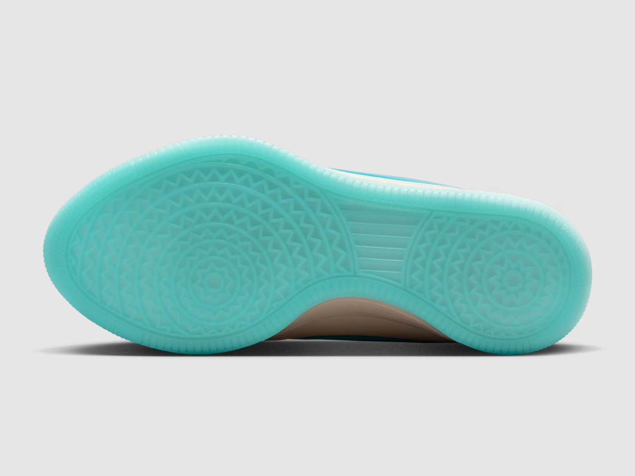
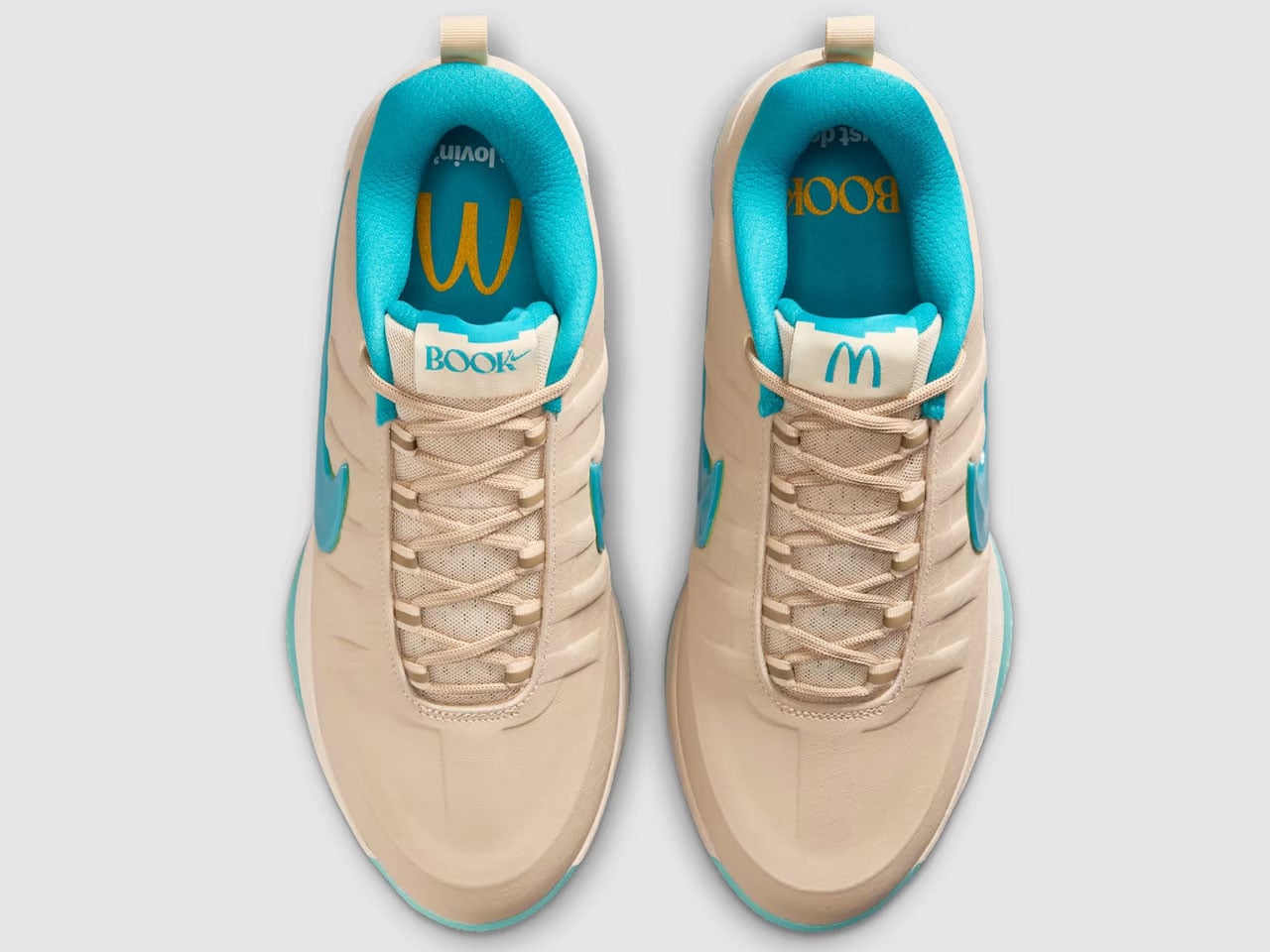
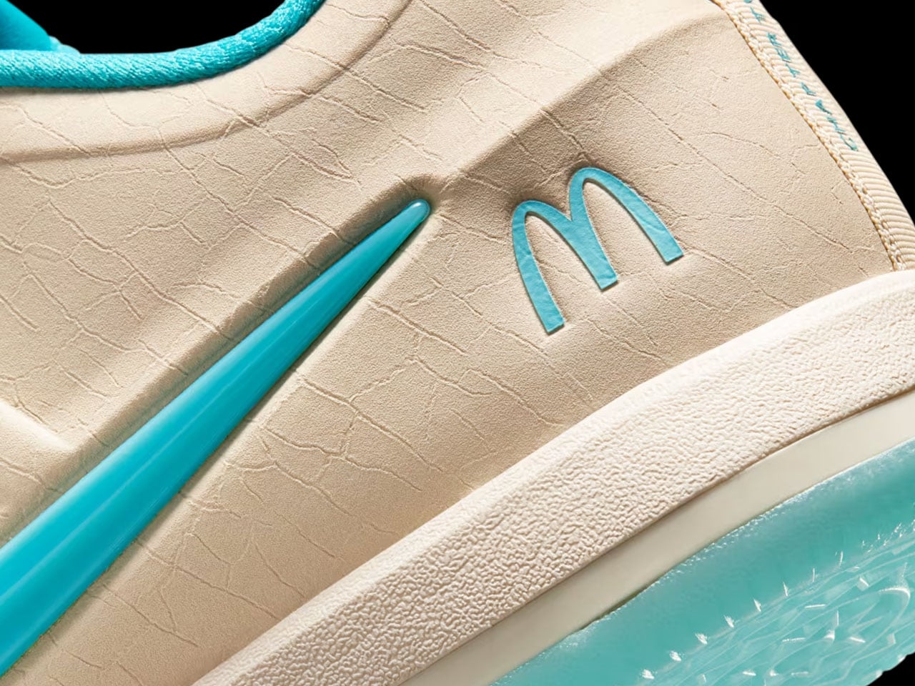
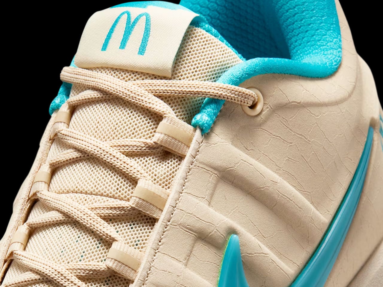
Nike Just Turned 4 Iconic Football Boots into Air Max 90s

If you’ve never cared about football in your life, the Nike Mad 90 Pack might just change that. Not because it’ll make you want to kick a ball around, but because it proves that the most powerful design language in sports has always lived off the pitch as much as on it.

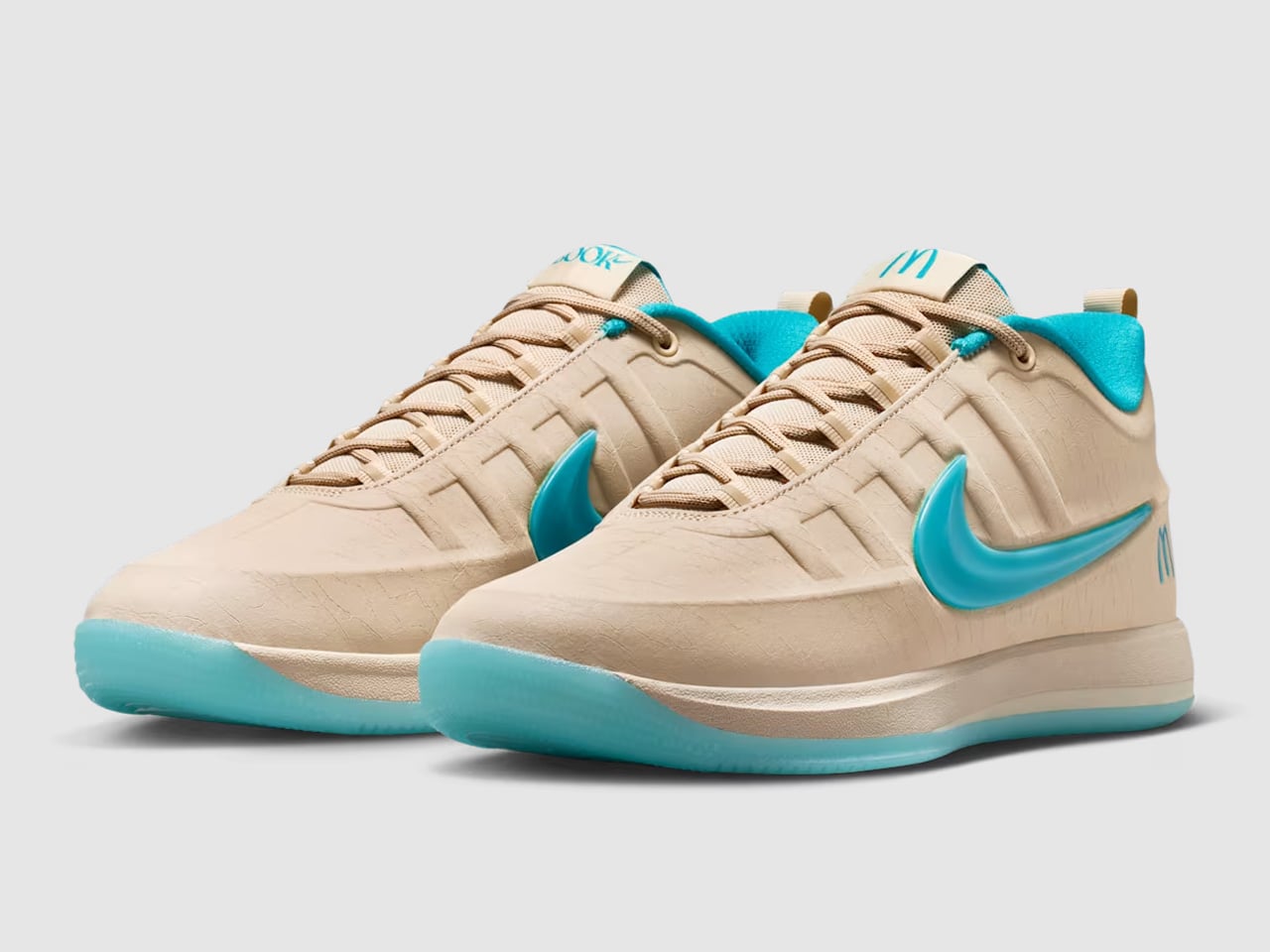
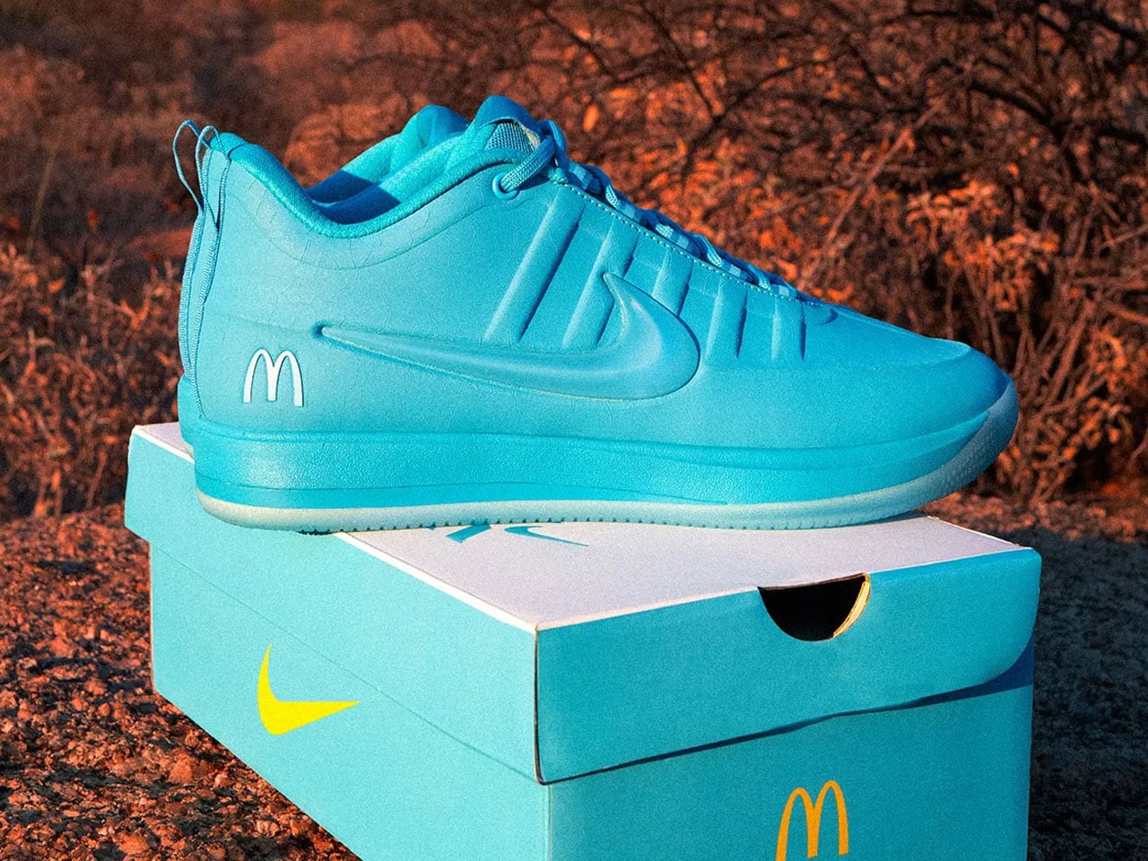
Here’s the setup: Nike took four of its most iconic football boots from the past 25 years and used them as the blueprint for four new Air Max 90 colorways. The Hypervenom, the Mercurial Vapor 2002, the Total 90 Laser, and the Tiempo. Each one gets its own distinct expression on the Air Max 90 silhouette, pulling directly from the materials, colors, and energy of the original boot. The result is a pack that manages to feel both nostalgic and completely new at the same time.

Designer: Nike

The Air Max 90 as a canvas makes a lot of sense here. It’s one of the most versatile sneakers Nike has ever produced, a shoe that’s lived in so many different worlds that borrowing DNA from football feels natural rather than forced. And each pair in this pack earns its reference.

The Hypervenom comes in Bright Citrus and Total Orange, using mesh and Gripskin tech lifted directly from the boot’s original construction. It’s loud, aggressive, and unapologetic, exactly the energy the Hypervenom always carried on the pitch. The Mercurial Vapor 2002 translation goes dark and sleek in an all-black colorway, and it even borrows the boot’s signature flip-over tongue. That’s a small detail, but it’s the kind of thing that separates a thoughtful design from a lazy one.

The Total 90 Laser shows up in its iconic black and yellow with the “90” logo planted at the toe box, and if you grew up in the early 2000s, that color combination alone will do something to you. Finally, the Tiempo takes on a crackled leather finish in black and voltage green that feels more like a heritage piece than a modern release, understated compared to the others but arguably the most wearable of the four.

What Nike is doing here is interesting beyond just the product. They’re translating a very specific kind of sports memory into something wearable for an entirely different context. People who grew up watching Ronaldo score in Mercurial Vapors, or who remember the Total 90 Laser as the boot every kid wanted at Christmas, now get to carry a piece of that era on their feet without needing to step on a football pitch to justify it. That’s a clever move for a brand that knows its audience runs much wider than athletes.

The timing is also doing a lot of heavy lifting. With the FIFA World Cup coming this summer, football is having a cultural moment that goes well beyond its usual fanbase. Fashion people are paying attention. Streetwear people are paying attention. The sport has been creeping into pop culture conversations for a few years now, and Nike is making sure to plant a flag at exactly the right moment. The Mad 90 Pack isn’t a World Cup product in the obvious sense, it doesn’t feature national team colors or tournament branding, but it benefits from that energy all the same.

I do think there’s a genuinely good design story in each pair. The decision not to just slap a boot colorway on a standard Air Max 90 and call it a day, but to actually incorporate material references and structural details from the original footwear, is what keeps this from feeling like a cheap cash-in. It’s well-researched, specific, and considered. You can tell someone actually cared about getting the references right.

Each sneaker retails for $150. The pack drops globally on May 11 and across North America on May 21, along with a complementary apparel collection that draws from football community culture in ways that extend the story past just the shoes. Whether you’re a football obsessive who still thinks the Total 90 Laser is the greatest boot ever made, or someone who just appreciates a well-executed design concept, the Mad 90 Pack gives you something worth paying attention to. Nike has been doing this kind of cross-cultural translation for decades, and every now and then they get it exactly right. This is one of those times.

The post Nike Just Turned 4 Iconic Football Boots into Air Max 90s first appeared on Yanko Design.

Camper x Issey Miyake Sneakers Started With a Book of Birds

Not every sneaker collaboration deserves attention. Most of them follow a predictable script: take a classic silhouette, swap a few colors, slap two logos on the tongue, and call it a limited drop. Which is why when Camper and Issey Miyake unveiled the Karst Finch for SS 2026, I sat up a little straighter.

The story behind it matters. According to Satoshi Kondo, creative director of Issey Miyake’s womenswear line, the design team spent part of their development phase poring over photo books of finches and other small birds. They weren’t studying aerodynamics or engineering anything structural. They were just looking, really looking, at the richness and subtlety of bird plumage and beaks, and letting that translate into a color palette for a shoe. That’s either delightfully eccentric or genuinely brilliant. I think it’s both.

Designers: Camper x Issey Miyake

The name itself tells you a lot. “Karst” references one of Camper’s most distinctive existing silhouettes, a shoe named after a rocky geological formation known for its rugged, organically shaped terrain. The outsole of the original Karst reflects that: it has a lumpy, almost topographic quality that looks like it came up from the earth rather than out of a factory mold. “Finch” layers something entirely different on top of it, lightness, color, a kind of cheerful energy. The combination of those two words is basically a thesis statement for what this shoe is trying to do.

Camper is Spanish, practical, and deeply rooted in a no-nonsense approach to footwear. Issey Miyake is Japanese, sculptural, and preoccupied with the relationship between material, body, and movement. These two brands don’t obviously belong together, and that friction is exactly what makes this collaboration interesting. Kondo noted that both companies share a way of thinking about design that goes beyond fashion, that both engage with other creative disciplines and communities rather than operating purely within the style bubble. I believe that. You can feel it in the shoe.

The Karst Finch is built from recycled PET engineered materials, sits on a Vibram rubber outsole, and uses a ReXarge midsole with an OrthoLite recycled footbed. It’s a sustainability story told quietly, without the usual chest-thumping. The recycled polyester lining and the thoughtful material choices feel like a given here rather than a selling point, which is how it should be. And yes, it’s also genuinely comfortable, which matters more to me than it probably should when discussing something this aesthetically considered. A beautiful shoe you can’t walk in is just an expensive sculpture.

What really lands is the color approach. The pastel yellows, the muted tones, the colorways that feel like they were borrowed from a naturalist’s watercolor study: this is not the saturated, aggressive palette that usually comes with high-profile sneaker drops. It’s quieter than that. More considered. Each pair also comes with two pairs of socks for customization, which is a small detail but a telling one. It signals that whoever designed this understood the shoe doesn’t need to shout.

The Karst Finch made its public debut closing out Issey Miyake’s Spring 2026 runway at Paris Fashion Week, which is an unusual place for a sneaker to land. Runways don’t usually end with footwear as a statement piece, and it’s telling that this one did. It read as a kind of exhale after everything else on the runway, lighter, brighter, and a little more open to joy.

There’s a version of this collaboration that could have been very safe. Instead, the Karst Finch is a shoe built on genuine curiosity: about birds, about material, about what happens when a Majorcan shoe company and a Tokyo fashion house actually sit down and listen to each other. At $320, it’s not an impulse buy. But it’s the kind of thing you pick up because you want it to last, and because the story behind it is worth wearing. The Karst Finch drops globally on April 15, 2026.

The post Camper x Issey Miyake Sneakers Started With a Book of Birds first appeared on Yanko Design.

The World’s First T-Rex Leather Handbag Will Cost You $663,000

Did you ever think to yourself, what if I had a bag made from an extinct million-year-old animal? I mean, people do have bags made from cows, sheep, goats, and even crocodiles, snakes, and lizards. So why not have something from a really exotic animal that doesn’t exist anymore?

Well, apparently there are people, specifically those from techwear label Enfin Levé, who did think of that and have now come up with the world’s first ever T-Rex Leather™ Handbag. And obviously, this time around, no actual animals were harmed in making this one-of-a-kind luxury handbag.

Designer: Enfin Levé

What they used to actually make the bag is lab-grown material that scientists engineered using reconstructed dinosaur collagen. They reconstructed collagen sequences from 66-million-year-old T.Rex fossils that were eventually turned into real leather and now into a luxury handbag that collectors (with money) will probably rush to add to their cabinet (and maybe not actually use). Design-wise, the bag has a sleek and angular silhouette in a striking deep teal color. There are even three decorative incisions in the design that look like dinosaur scratch marks, to add a bit of “realism” to the bag. There is also a DNA helix-styled hardware connecting the strap to the bag.

Now, what makes this more than just a wild concept is actually what went into the leather itself. The T-Rex Leather™ isn’t some glorified synthetic material trying to pass as the real thing. It was developed by three collaborators: creative agency VML, genomic engineering company The Organoid Company, and biotech pioneer Lab-Grown Leather Ltd., and the result is a material that is apparently structurally identical to traditional leather. It’s durable, biodegradable, repairable, and fully traceable. So not only are you carrying something from 66 million years ago, but you’re also carrying something that is arguably better for the planet than your average luxury leather good. No animal slaughter, no deforestation, no heavy-chemical tanning process involved. In a weird twist of fate, the most ancient leather is also the most future-forward.

Enfin Levé’s founder and lead designer, Michal Hadas, put it perfectly when he said the goal was never to force the material into “familiar codes of luxury.” Instead, he let the T-Rex leather speak for itself, figuring out where it resists, how it holds tension, and letting all of that shape the final design. Which honestly? That kind of design philosophy is exactly why this bag feels so different from anything else out there.

The bag is currently on display at the Art Zoo Museum in Amsterdam and is displayed alongside a colossal life-size T. Rex skeleton cast from the Naturalis Biodiversity Center in Leiden, Netherlands. It will be there until May 11, in case you’re in town. But in case you thought there would be a slew of people carrying the T-Rex bag around, there is actually only one that exists in the world. It will be auctioned off to the highest bidder with the bid starting at around $663,000.

As for whether T-Rex leather will ever make it to the mass market, don’t hold your breath just yet, but don’t completely give up hope either. The plan is to eventually make the material available to luxury brands, starting with high-end accessories before expanding into other industries like automotive. So who knows, a T-Rex leather interior in your next car might not be as far-fetched as it sounds. For now though, this bag belongs to the world of the rare and extraordinary, right where it should be. Whether you’re a serious collector, a fashion obsessive, or someone who just really, really loves dinosaurs, there’s no denying that the Enfin Levé T-Rex Leather Handbag is genuinely unlike anything that has ever existed before. And at $663,000, well, some things truly are one of a kind.

The post The World’s First T-Rex Leather Handbag Will Cost You $663,000 first appeared on Yanko Design.

BEAMS Just Turned a $60 Floppy Disk Into Your Next Wallet

If you grew up in the ’90s or early 2000s, the floppy disk was basically part of your personality. You carried those little squares everywhere. You stressed over how many kilobytes were left on them. You wrote your name on the paper label with a Sharpie because it was, obviously, yours. And if you lost one that contains important information and documents, then you might as well say goodbye to it.

Now, BEAMS and Nik Bentel Studio have gone ahead and turned that deeply specific nostalgia into a leather wallet, and I genuinely cannot decide if that’s the most ridiculous thing I’ve heard all week or the most inspired. It’s probably both, and that’s exactly the point.

Designers: BEAMS x Nik Bentel Studio

The Floppy Disk Wallet is, in the most literal sense, a wallet shaped like a 3.5-inch floppy disk. The Brooklyn-based Nik Bentel Studio took the original form apart, component by component, and restructured it in leather, modifying the actual design by only 5%. That means the square shape is intact, the label window is still there, and the hardware detailing reads exactly like the real thing. Except instead of storing a few hundred kilobytes of data, it stores your cash, cards, and whatever else you can fit into its single interior compartment. The metal door lifts off and doubles as a money clip, which is either the cleverest detail of the year or just the most on-brand way possible to carry loose bills. Probably both, again.

It comes in black, beige, and orange. At $60 a piece, it’s priced like a thoughtful design object rather than a novelty tchotchke you’d find at a museum gift shop. That distinction matters to me. This wallet sits in that rare category of things that are both genuinely funny and genuinely well-made, and it pulls that balance off without seeming like it’s trying too hard.

What makes the whole thing more interesting than the obvious nostalgia play is who made it. Nik Bentel Studio isn’t a brand that slaps retro imagery on products and calls it a day. Bentel has described his work as storytelling through objects, and that philosophy shows up consistently across everything his studio releases. He’s the same designer who turned a Barilla pasta box into a handbag, reimagined the Mendl’s patisserie box from Wes Anderson’s Grand Budapest Hotel as a carry-all, and built a purse that’s actually a remote-controlled car. Every piece has a concept baked into it from the start, not layered on afterward for aesthetics. The floppy disk wallet isn’t just fun to look at. It’s a meditation on how beautifully designed everyday objects can be when they’re shaped entirely by their constraints.

The BEAMS partnership amplifies that story in a way that feels earned. The Japanese retailer has long operated at the intersection of fashion, culture, and considered design through its bPr line. Bringing Nik Bentel Studio into that fold doesn’t feel like a brand collab for collab’s sake. It feels like two creative sensibilities that already speak the same language finding a natural reason to collaborate.

I’ll be honest: I have complicated feelings about nostalgia as a design strategy. It gets used so lazily and so often that it’s hard not to be skeptical when something leans into it. Cassette tapes on tote bags. Pixelated graphics on hoodies. That kind of thing loses its meaning fast. But the Floppy Disk Wallet sidesteps that trap because it isn’t just referencing an old object. It is the object, rebuilt in a better material. The nostalgia isn’t decorative; it’s structural. You’re not looking at a picture of a floppy disk. You’re holding one, in your pocket, every single day.

Whether you’ll use it as your primary wallet is a separate conversation. It’s compact by design, and minimal in terms of storage. If you carry a thick stack of loyalty cards and old receipts, this isn’t for you. But for someone who keeps things lean and wants their everyday carry to actually say something about them, this one says quite a lot. The black and orange colorways are already sold out on the studio’s site. That probably tells you everything you need to know.

The post BEAMS Just Turned a $60 Floppy Disk Into Your Next Wallet first appeared on Yanko Design.
IKEA Just Gave the Allen Key a Glow-Up Nobody Saw Coming

You know exactly where this is going the moment IKEA hands you that little L-shaped hex key. You use it once, maybe twice, cross your fingers the furniture doesn’t wobble, and then it disappears into the junk drawer, a kitchen counter corner, or the bottom of a tote bag you haven’t opened since 2021. The allen key has never been a thing anyone kept on purpose. Until now.

IKEA Singapore, working with creative agency The Secret Little Agency, has reimagined the brand’s iconic flat-pack tool as a piece of wearable jewelry. The ALLËNKI, as it’s been named (and yes, the umlaut is doing a lot of heavy lifting there), is the humble allen key redesigned to hang from a chain as a pendant. It leans hard into an industrial aesthetic, the kind that lives somewhere between a Depop vintage find and something a contemporary menswear designer would slip into a lookbook without explanation. Raw, utilitarian, and surprisingly chic. I did not expect to want a hex wrench around my neck. And yet, here we are.

Designers: The Secret Little Agency for IKEA Singapore

What makes the ALLËNKI genuinely interesting as a design concept isn’t just the novelty of it. It’s the fact that it remains fully functional. The piece isn’t a replica or a decorative prop styled to look like the real thing. It’s the actual tool, shaped into something you’d wear. That framing, which the designers describe as “hardware meets heirloom,” is doing a lot of the creative work here, and it does it well. There’s a real conversation happening in contemporary design right now about the objects we use every day and why we’ve decided some deserve beauty and others don’t. The ALLËNKI is a pretty sharp response to that question, even if the response comes with a chain and a studio-lit campaign.

The branding also knows exactly what it is. The campaign leans into humor and self-awareness, which is the right call. A jewelry line built around a furniture tool that most people lose within 48 hours of unboxing a bookcase doesn’t need to take itself too seriously. The Secret Little Agency managed that balance well, keeping the design itself genuinely considered while letting the concept breathe with a bit of absurdity. That’s harder to pull off than it sounds. Most brand stunts either try too hard to be funny or take themselves so seriously that the joke lands flat. This one sits in the right place.

Now, the catch. The ALLËNKI dropped on April 1st, which puts a fairly significant asterisk on the whole thing. Whether it was an April Fools’ stunt, a concept piece, or an actual product in development isn’t entirely clear. Store availability, if any, has not been confirmed. And while part of me wants to be cynical about that, the other part of me thinks the ambiguity might be intentional. It functions as a piece of cultural commentary either way. If it becomes real, great. If it doesn’t, it still made people stop and look at a two-inch hex key like it had something worth saying.

And maybe that’s the bigger point. The ALLËNKI asks you to reconsider what makes something worth keeping. We’ve watched fashion absorb work boots, industrial hardware, and construction aesthetics for years. Luxury brands have put carabiners on bags and charged several hundred dollars for the privilege. In that context, turning the allen key into a pendant feels less like a joke and more like a logical next step in a long line of utilitarian objects getting a second life. IKEA has always understood that good design shouldn’t be reserved for expensive things. Extending that thinking into wearables, even as a concept, feels genuinely on-brand.

Whether or not the ALLËNKI ever lands on store shelves, it’s already doing what good design work does. It’s got people talking, reconsidering a mundane object, and maybe feeling just a little possessive over something they used to throw in a drawer without a second thought. That’s a win, April Fools or not.

The post IKEA Just Gave the Allen Key a Glow-Up Nobody Saw Coming first appeared on Yanko Design.
LEGO and Crocs Finally Made the $89 Collab Nobody Knew They Needed

No matter how you feel about Crocs, you cannot deny the brand has a remarkable talent for finding partners that make you stop and say, “wait, actually… that works.” We’ve seen Krispy Kreme clogs dripping in donut-glazed energy, Windows XP nostalgia packed into a wearable throwback, and Ghostbusters uniforms distilled down to clog form. Every time I think Crocs has peaked its collab game, another partnership resets the bar. This time, they’ve linked up with LEGO for the Creativity Clogs collection, and this one lands a little differently.

The appeal is almost embarrassingly obvious in hindsight. Both LEGO and Crocs are built around the same core philosophy: take something simple, make it endlessly customizable, and let people go wild with it. LEGO gave us the stud system; Crocs gave us Jibbitz holes. Jibbitz charms are basically a wearable LEGO build. The two brands have been spiritually aligned for decades without anyone thinking to actually put them together, and the fact that it took this long feels like a design oversight that’s now been corrected.

Designers: LEGO x Crocs

The collection spans several configurations. The base Creativity Clog starts at $79.99, keeping things relatively clean with colorful LEGO bricks along the sole and a Jibbitz-ready upper waiting to be personalized. There is also a Kids’ Creativity Clog at $59.99, because LEGO is a multigenerational brand whether anyone admits it or not.

The Masterbrand Creativity Clog at $89.99 is the one that goes all in. It arrives with 12 LEGO brick Jibbitz charms already loaded onto the upper and around the sole, plus a LEGO Minifigure tucked into the box. That detail genuinely made me smile. It is the kind of considered touch that separates a real collaboration from a brand simply slapping a logo on an existing product.

The Midnight Garden Creativity Clog takes the same design language in a different direction. Where the other colorways lean into LEGO’s signature primary palette, this version opts for a darker, more subdued aesthetic that feels almost grown-up by comparison. It is the right pick for someone who wants to quietly signal their appreciation for the collab without committing to the full crayon-box energy of the others.

Visually, these clogs strike a balance I did not expect. The brick texture runs along the sole without overtaking the whole shoe, so you are not walking around in something that looks like a toy store exploded on your feet. It is restrained enough to wear in public while still being obviously, joyfully LEGO. The Jibbitz-ready holes mean you can keep building on top of the base, swapping in dedicated LEGO charm packs depending on your mood. That is exactly the kind of open-ended customization that makes both brands tick.

The LEGO Group and Crocs announced their multi-year global partnership in January 2026, and the Creativity Clogs dropped on March 19, with LEGO Insiders getting a three-day head start. Certain sizes sold out quickly, which tells you all you need to know about the appetite for this one.

My honest read is that this collaboration is smarter than its predecessor. The original LEGO Brick Clogs were built for viral moments and display shelves. Giant foam bricks make a statement, but they do not go anywhere useful. The Creativity Clogs are the real follow-through, translating LEGO as a design language into something you would actually wear to a theme park, a farmers market, or around the house on a slow Tuesday. The playfulness is baked in without demanding you commit to a costume to participate.

That said, $89.99 for a pair of Crocs is a price point worth sitting with, even if the included Minifigure does technically sweeten the deal. Crocs collabs have always commanded a premium over the core classics, and by now the brand’s audience is accustomed to paying for the concept as much as the shoe itself. Whether the LEGO x Crocs Creativity Clog earns its place in your rotation will probably depend on how much real estate your inner kid still occupies. For a lot of people, that answer is quite a bit of space.

The post LEGO and Crocs Finally Made the $89 Collab Nobody Knew They Needed first appeared on Yanko Design.
KFC Brazil Wants to Dress You the Way It Dresses Its Chicken

I love fried chicken as much as the next person. Probably more. So when KFC Brazil announced it was offering to customize your actual clothes with a fabric texture inspired by its iconic crispy coating, I had questions. Not the skeptical kind. More the “can they do that with a tote bag, and if so, when?” kind.

The concept is called the KFC Wardrobe, created by Lola\TBWA Brasil. The logic behind it is almost too simple to ignore. KFC’s most recognizable feature, that golden, seasoned crust Colonel Sanders spent a lifetime protecting, shares a lot of DNA with what fashion has always celebrated: something original, textured, and completely impossible to replicate. The KFC Wardrobe takes that parallel seriously and makes it completely, earnestly literal.

Designer: Lola\TBWA Brasil

Here’s how it worked: buy a medium bucket of KFC fried chicken, bring your own clothing to the brand’s flagship store in São Bernardo do Campo, and show your receipt. Eligible items included jackets, coats, jeans, skirts, bucket hats, tote bags, and waist bags. Leave them behind, and within three weeks, they’d come back to your door with a fabric treatment that mimics the texture of fried chicken breading applied to the surface. Crunchier. More textured. Somehow more interesting than before.

The promotion ran for just three days, from March 27 to 29, which makes “limited edition” feel like an understatement. It kicked off during Design Week at BAFU, described as one of São Paulo’s most prominent and respected creative hubs. KFC set the whole thing up as Colonel Sanders’ atelier. An atelier. For a fried chicken brand. I had to read that phrase twice before I could fully commit to it, and then I decided it was actually one of the most correct things anyone has said about fashion in years.

It’s worth noting that KFC has been leaning into fashion for a while now, and with increasing conviction. KFC Australia dropped a streetwear collection during Australia’s Fashion Week in 2023. KFC UK has been particularly active, releasing a ten-piece distressed leather range with Aries and collaborating with designer Sinead Gorey on a London Fashion Week show, both in 2025. At this point, the brand has clearly decided it belongs at the table, and the fashion world has quietly and somewhat bafflingly agreed.

But the KFC Wardrobe does something the earlier drops didn’t. It doesn’t ask you to buy a new KFC product. It asks to work with what you already have. That’s a fundamentally different creative stance. Most brand-adjacent fashion moves are wearable advertisements dressed up in aesthetic language. This one is a genuine collaboration with your existing wardrobe, and that’s more interesting and, honestly, a lot more respectful. KFC isn’t asking you to represent the brand. It’s asking to be part of your look, on your terms.

Fernanda Harb, KFC Brazil’s marketing director, described the initiative as a way to “expand the relationship and closeness between the brand and its customers beyond just food.” Lola\TBWA made that statement mean something real by developing an actual textile treatment, not a printed graphic or an embroidered logo, but a physical crunch-inspired texture applied to fabric. The crispy coating became the design language. That’s a design decision, not just a marketing one, and the difference shows.

The whole thing works because the metaphor at its center is genuinely earned. Fashion has always celebrated what can’t be copied. So has Colonel Sanders, for decades. You can eat KFC your whole life and never come close to the recipe. The KFC Wardrobe takes that same mystery and stitches it into your denim jacket, and that’s a creative idea worth wearing more than once.

KFC Brazil committed to the bit fully and without apology. And now there are people walking around São Paulo in textured, crunch-finished jackets, wearing their taste on their sleeves, quite literally. Fashion has come full circle, and I’ve never been this hungry for what comes next.

The post KFC Brazil Wants to Dress You the Way It Dresses Its Chicken first appeared on Yanko Design.
Tati Ferrucio’s Onda Clog Is the Most Geologically Correct Shoe Ever Made

The Yeezy Foam Runner opened a strange and genuinely productive door in footwear design, proving that a monolithic, organically sculpted clog could capture serious cultural attention. Tati Ferrucio‘s Onda walks through that same door but ends up somewhere quite different. Where the Foam Runner borrows loosely from athletic heritage, the Onda goes fully geological, its dense flowing ridges reading more like layered sandstone strata than anything borrowed from a sportswear archive. The comparison is worth making once and then setting aside, because the Onda has its own logic and it holds together well on its own terms.

That logic starts with landscape. Ferrucio drew directly from waves, sand patterns, stone surfaces, and tree bark, treating nature as the original generative designer and asking what footwear would look like if it followed the same rules. The cutouts are sculpted voids, not punched holes, and the ribbing on the sole wraps continuously into the upper so there is no visual seam between base and body. It reads as a single carved object, the kind of thing you might find in a tide pool if tide pools produced wearable foam.

Designer: Tati Ferrucio

Ferrucio developed the Onda using Vizcom, an AI-assisted design platform that takes a designer’s sketch and generates a field of iterated possibilities rather than a single resolved outcome. The workflow is worth pausing on because it explains something about the result. The Onda does not look like a design that was decided in one session; it looks like a form that accumulated, the way sediment does, layer by layer under consistent pressure from the same directional force. Just FYI, Vizcom did not generate the design; Ferrucio directed it, feeding creative intention into each round of iteration and pulling the form toward her reference material until the surface stopped arguing with itself and settled into something coherent.

Positioned along the sides of the upper, the cutouts allow water and sand to escape when moving through wet or granular terrain, which is a functional requirement in a clog built for outdoor use. But structurally, they also reduce material mass without compromising the integrity of the upper, and visually, they create depth in the silhouette that a solid body would not have. The oval void near the heel is particularly well resolved; it sits inside the ribbed surface like a window cut into a canyon wall, framed by ridges on all sides, and gives the rear of the shoe a formal completeness that most clogs never bother to achieve.

Three colorways exist in the current lineup: a grey-blue that photographs like wet stone, a sand beige that almost disappears against the layered rock surfaces in the campaign imagery, and a sage green that reads somewhere between sea glass and weathered copper depending on the light. Each one is photographed in a context that suits it specifically, which is the kind of creative direction that signals a designer who thought carefully about what the object is actually communicating and to whom. The grey-blue sits on a rocky riverbed in shallow water. The beige is shot against sedimentary cliff faces in warm light. The green lands on dry sand with hard shadows. Every environment reinforces the geological reference without stating it out loud.

The Onda is a mere concept at this stage, developed in collaboration with Vizcom as a demonstration of what AI-assisted industrial design can produce when the designer maintains genuine creative authority over the process. Whether it goes into production depends on factors Ferrucio has not specified, but as a design object it makes a coherent and confident argument: that the clog format, for all its utilitarian plainness, has more formal ambition available to it than most brands have been willing to extract.

The post Tati Ferrucio’s Onda Clog Is the Most Geologically Correct Shoe Ever Made first appeared on Yanko Design.
The 44-Pocket Coat That Makes You Question Home Itself

Picture this: you’re standing on a sidewalk with nothing but the clothes on your back. No wallet, no keys, no lease, no address. The only shelter you have is what you’re wearing. For most of us, that thought is hypothetical enough to be brushed aside. But for Japanese designer Kosuke Tsumura, it became a thirty-year design obsession.

FINAL HOME, the label Tsumura founded in 1994 under the Miyake Design Studio, is built on a single uncomfortable question: if home disappears because of disaster, war, or economic collapse, what can clothing become? The answer, it turns out, is a translucent nylon parka with 44 pockets.

Designer: kosuke tsumura

The 44-pocket parka is FINAL HOME’s most iconic piece, and it earns that status through sheer conceptual density. Those pockets aren’t decorative. They’re meant to carry food, medicine, tools, whatever you need to survive. When the temperature drops, you stuff them with newspaper or any insulating material you can find, and the coat does the work of keeping you warm. Optional down cushions slot into the pockets too, turning the whole thing into a proper down jacket at a moment’s notice. The coat can even be adjusted for fit by stuffing specific pockets, which means it adapts to any body type without tailoring. There’s even a FINAL HOME Bear, a small companion designed to nestle into a pocket and add a layer of insulation.

That last detail is the one I keep returning to. A teddy bear as thermal technology. It sounds absurd until you realize it’s also kind of genius, and deeply human. Tsumura isn’t just designing for survival in a cold, mechanical sense. He’s designing for the full experience of being displaced: frightened, possibly alone, needing warmth in more than one way.

This is what separates FINAL HOME from the streetwear brands that borrow its visual DNA. Plenty of labels have done the oversized translucent nylon thing. Few of them are asking anything of it. Tsumura is asking everything. The coat lives at the intersection of fashion, architecture, and emergency preparedness, and it doesn’t apologize for the weight of that position.

The fact that the 44-pocket parka has been in MoMA’s permanent collection since 2006 says a lot. Museums have a way of freezing things in amber, turning useful objects into relics. But FINAL HOME resists that fate because its premise only becomes more relevant over time. We are, by most reasonable measures, living through an era of compounding instability. Climate events, economic precarity, the slow erosion of what people once assumed was stable. A jacket designed for when the floor disappears doesn’t feel like a curiosity anymore. It feels almost prescient.

Tsumura has described utopia not as a destination but as a method, something embedded in everyday life rather than promised in some distant future. That framing reframes FINAL HOME entirely. It’s not a coat for the apocalypse. It’s a coat for right now, for a world where the safety nets are showing their age and adaptability matters more than ever. The chocolate candles included in the broader FINAL HOME universe push this even further, objects designed to serve two purposes at once, comfort and function, because the line between them is thinner than we like to admit.

The 44-pocket parka doesn’t look like survival gear. It looks like art, which is partly why it works so well. Wearing it doesn’t announce crisis or declare emergency. It just quietly insists that preparedness and design don’t have to be mutually exclusive, that you can move through the world looking completely intentional while also being ready for it to shift beneath you.

Tsumura started this project over thirty years ago, and it still feels ahead of where most design conversations are happening. That’s not a small thing. Most ideas burn bright and fade. FINAL HOME just keeps asking its question, and the world keeps making that question harder to ignore.

The post The 44-Pocket Coat That Makes You Question Home Itself first appeared on Yanko Design.
Rimowa Classic Aluminium Grid Revives a Forgotten 1969 Design

Most luggage brands don’t have a 127-year-old story to draw from. Rimowa does, and it seems to know exactly when it’s worth pulling from that history and when to let the present speak for itself. With the Classic Aluminium Grid, they’ve clearly decided the archive deserves a second act.

The Classic Aluminium Grid is the German brand’s latest limited-edition release, and it’s generating the kind of quiet excitement that reserved design circles usually save for restored mid-century furniture or a first-edition book that resurfaces at auction. The reason is simple: Rimowa didn’t just design something new. They reached back to 1969, pulled out a hand-carry case design that had been sitting in their archives, and asked what it would look like today if it were treated with the same reverence they give to the grooves.

Designer: Rimowa

That grooved shell, by the way, is practically synonymous with the brand itself. You know a Rimowa from across an airport terminal. Those parallel ridges running down the aluminium surface are one of the most recognizable design signatures in travel goods, and they’ve been that way for decades. So when the brand quietly steps away from them and replaces the lines with a grid, a structured, geometric, embossed pattern pressed right into the aluminium shell, it feels like a real statement. It’s not a gimmick. It’s a choice that speaks to a different kind of confidence.

The grid comes from a real place. In 1969, Rimowa was producing hand-carry cases featuring this geometric pattern: practical, modular, and rooted in the kind of technical precision that defined that era’s design thinking. There’s a reason so much design from that decade still holds up. It wasn’t chasing aesthetics for their own sake. Form followed function, and it did so elegantly. Reviving that spirit in 2026 doesn’t read as nostalgia pandering. It reads as a brand that knows exactly where its DNA lives and isn’t afraid to dig for it.

The collection comes in three sizes: the Classic Hand-Carry Case, the Classic Cabin, and the Classic Trunk. All three are made in Cologne, Germany, which matters more than it might seem. Manufacturing location is one of those details that’s easy to gloss over until you’re actually holding the product, and with Rimowa, the German-made quality is part of the whole point. The embossed grid pattern, the blue leather handles, the individually numbered serial number patch on each case: these aren’t details you’d notice in a thumbnail. They’re details you notice after living with the piece and realising it only gets better over time.

And yes, price matters here. The Classic Aluminium Grid sits in the $2,725 to $3,225 range, which puts it firmly in the territory of deliberate, considered purchasing. That’s not casual spending, and it shouldn’t be. This is the kind of purchase that functions as an heirloom more than a travel accessory, something you keep, care for, and eventually pass along. The lifetime guarantee Rimowa extends to all its suitcases reinforces that framing. They’re not selling you a bag built for a few trips. They’re selling you something built to outlast most things currently in your home.

What makes this collection feel genuinely compelling rather than just another limited drop is the restraint behind it. Rimowa didn’t add bright colour for the sake of attention. They didn’t partner with a streetwear brand or commission someone’s artwork across the shell. They went to their own archive, found something worth preserving, and let the design carry the weight. The grid is subtle enough that it won’t read as flashy at baggage claim, but anyone paying close attention will recognise it as something different. Something that doesn’t quite look like everything else on the carousel.

That’s a hard balance to strike in design. Loud enough to be interesting, quiet enough to be enduring. The Classic Aluminium Grid lands squarely in that space, and for a brand with over a century of aluminium behind it, that feels less like luck and more like a brand that knows exactly what it’s doing.
The post Rimowa Classic Aluminium Grid Revives a Forgotten 1969 Design first appeared on Yanko Design.