Miyoo Mini Flip Shrinks Retro Gaming into a 2.8-Inch Folding Square

Retro handhelds have exploded in the last few years, from chunky bricks to tiny keychain consoles, and a lot of them still feel like little Linux boxes with buttons bolted on. The Game Boy Advance SP’s clamshell still lives rent-free in people’s heads, that satisfying snap when you close it, and the way it fits into a pocket without scratching the screen. The Miyoo Mini Flip is a modern answer to that memory, scaled for pockets and commutes.

The Miyoo Mini Flip is a folding version of Miyoo’s tiny emulation handheld, now with an upgraded hinge for better durability. Closed, it is a 2.68‑inch square about 0.79 inch thick, small enough to disappear into a jeans pocket or bag. Open it up, and you get a full control deck and a 2.8‑inch screen, turning idle minutes into quick sessions of 8‑bit and 16‑bit comfort food without needing to commit to a full setup.

Designer: Miyoo

The 2.8‑inch IPS panel runs at 750 × 560 with a 4:3 aspect ratio, which lines up nicely with most classic consoles. The marketing calls it “3× pixel perfect,” hinting at clean integer scaling for certain systems, so sprites and tiles look crisp instead of smeared. Wide viewing angles and decent colour make pixel art and old racing games feel surprisingly alive on such a small canvas, bright enough to play outdoors or on a dimly lit train.

The control scheme mixes classic D-pad, ABXY face buttons, Select and Start, a Menu key, and L/L2 and R/R2 shoulder buttons tucked along the back edge. Volume and power live on the sides, with a front speaker and a TF card slot underneath. The layout feels like a mashup of modern controllers and old handhelds, giving thumbs familiar landmarks without overcomplicating a device that is meant to be grabbed and played.

The hardware is a Cortex‑A7 at 1.2 GHz, 128 MB of RAM, Linux under the hood, 2.4 GHz Wi‑Fi, and a 3.7 V 2500 mAh battery. It is tuned for NES, SNES, GBA, PS1, and similar eras, not chasing Switch-level performance. The bundle usually includes a 64 GB microSD card and USB‑C cable, so you are not hunting for storage or adapters before you can start tinkering with ROMs and emulator settings.

The hinge‑enhanced durability callout addresses early batches where people worried about wobble and wear. Closed, the Flip feels like a small, dense square you can toss into a pocket, backpack, or travel pouch without babying it. Marketing leans into travel, outdoor, waiting, and “back childhood” scenarios, which is exactly where a device like this shines, filling dead time with a few more runs of your favourite platformer or racer.

The Miyoo Mini Flip stands out beyond the emulator list. The clamshell form, upgraded hinge, sharp 4:3 IPS screen, and toy-like colours make it feel like a considered object, not another PCB in a shell. Retro games live as a small ritual in a pocket rather than a full setup on a desk, and this little folding square hits a very specific, very charming note without demanding much more than a microSD card and a willingness to revisit Super Mario World one more time.

The post Miyoo Mini Flip Shrinks Retro Gaming into a 2.8-Inch Folding Square first appeared on Yanko Design.

Best EDC Knives of 2025: 7 Pocket Blade Innovations You Need to See

The everyday carry community has always valued function over flash, but 2025 proved you don’t need to choose between the two. This year brought knives that deploy using gravity, blades inspired by anime mechas, and utility tools that double as desk sculptures. Each design addresses the fundamental tension in EDC culture: creating something small enough to forget about until you need it, yet substantial enough to handle real work when called upon.

What separates these seven innovations from the flood of generic pocket tools is their refusal to play it safe. They experiment with opening mechanisms, embrace unconventional materials, and challenge assumptions about what compact really means. Whether you’re drawn to Damascus steel artistry or minimalist titanium efficiency, these designs prove that the best EDC gear elevates everyday tasks into something worth appreciating. The pocket knife evolved this year, and these are the designs leading that charge.

1. ScytheBlade: The Grim Reaper’s Weapon Goes Micro

The curved blade of a scythe doesn’t seem like an obvious choice for pocket carry, but the ScytheBlade makes it work through radical miniaturization. This titanium EDC knife borrows the Grim Reaper’s iconic profile and shrinks it down to something resembling a tiger claw, creating a blade shape that looks dangerous because it genuinely is. At just 46mm when deployed, this folding knife challenges the idea that effective cutting tools need generous proportions. The curve concentrates force in ways straight blades can’t match.

Titanium construction keeps the ScytheBlade incredibly light at just 8 grams while delivering strength that feels disproportionate to its size. The material brings natural corrosion resistance without demanding constant maintenance, which matters when you’re carrying something this small. You won’t notice it clipped to your pocket until the moment you need it, then that curved blade profile becomes immediately relevant. The ScytheBlade proves that unconventional blade shapes can translate to micro formats when the engineering backs up the ambition.

What we like

  • The 46mm curved blade profile concentrates cutting force effectively.
  • Titanium construction delivers an 8-gram weight with serious durability.

What we dislike

  • The scythe shape may feel awkward for users accustomed to straight blades.
  • The extremely compact size limits cutting capacity for larger tasks.

2. Cubik: The Gravity-Powered Pocket Knife That Defies Convention

Knife designers typically rely on springs, flippers, or complex bearing systems to deploy blades, but the Cubik tosses those conventions aside in favor of gravity. Press the trigger, hold it upside down, and the blade casually emerges. Release the trigger, and it locks securely in place. This elegantly simple mechanism eliminates springs that rust, bearings that fail, and maintenance headaches that plague traditional folders. The knife works with physics rather than fighting it.

The satisfying simplicity doesn’t compromise capability. The Cubik locks solidly enough to pierce hardwood, proving that mechanical simplicity and functional strength aren’t mutually exclusive. The tungsten carbide glass breaker integrated into the rear end transforms this gentleman’s folder into a legitimate emergency tool. That addition elevates the Cubik beyond novelty into genuinely useful territory. When most EDC knives chase complexity through additional features, the Cubik finds innovation by stripping away everything unnecessary and trusting gravity to do the work.

What we like

  • The gravity-powered deployment eliminates complex mechanisms that fail or need maintenance.
  • The tungsten carbide glass breaker adds emergency capability without compromising the profile.

What we dislike

  • Gravity deployment requires a specific orientation that may feel awkward initially.
  • The mechanism works less reliably if debris enters the blade channel.

3. Split Handle Damascus Knife: Where Artistry Meets Engineering

VG10 Damascus Steel paired with Yellow Sandalwood already positions this knife in elite material territory, but the split-handle opening mechanism pushes it into something approaching jewelry. Rather than flipping open conventionally, the handle disassembles before reassembling into an open knife through a clever linkage system. The transformation is mesmerizing, morphing from ergonomic grip to protective sheath and back again. This isn’t the knife you grab for tactical situations or utilitarian tasks.

Damascus Steel brings the visual appeal of marbled metal created by forge-welding multiple steel types together, then acid-etching to reveal the folded layers. The technique originated in Damascus, Syria, though the original method vanished into history. Modern Damascus pays homage to that lost art while remaining highly prized by collectors for the craftsmanship involved. The Split Handle Damascus Knife exists for people who appreciate knives as objects worth contemplating, not just using. It elevates pocket carry into something approaching art, which matters when craftsmanship becomes rarer in mass-produced EDC gear.

What we like

  • The split-handle mechanism creates a uniquely mesmerizing deployment process.
  • Damascus Steel and Sandalwood construction elevate this into collectible territory.

What we dislike

  • The complex mechanism prioritizes aesthetics over practical daily deployment speed.
  • Premium materials make this knife too precious for rough use or potential loss.

4. Nucleus Frame Lock: The Mecha-Inspired Pocket Knife

Princeton Wong designs knives that look like they escaped from anime, and his Nucleus Frame Lock for CRKT commits fully to that vision. Inspired by Mobile Suit Gundam, this Italian-made folder brings mecha aesthetics to everyday carry through sharp, angular lines characteristic of Japanese manga. The symmetrical bolster conceals the frame lock and mechanical notching with precision that reveals Wong’s obsessive attention to detail. This knife functions as a serious cutting tool and a fidget-friendly desk toy simultaneously.

Multiple opening options make the Nucleus genuinely fun to manipulate, delivering that fidget spinner satisfaction while remaining a capable blade. Wong derives inspiration from nature and pop culture, translating those influences into knives that refuse safe silhouettes. The angular design isn’t randomly achieved; it represents deliberate choices about how form can enhance rather than compromise function. While most knife makers stick to conservative profiles, Wong proves that unconventional aesthetics and practical performance can coexist when the designer understands both EDC fundamentals and visual impact.

What we like

  • The mecha-inspired angular design brings genuine visual personality to EDC.
  • Multiple opening options create satisfying fidget-friendly interaction.

What we dislike

  • The aggressive anime aesthetic won’t appeal to users preferring subtle carry pieces.
  • The complex bolster design may complicate maintenance and cleaning.

5. Pocket Tanto: Minimalist Elegance Meets Dual-Edge Capability

Most tanto knives lean into aggressive over-the-top styling, but the Pocket Tanto pursues restraint. The ribbed handle evokes Rimowa luggage more than tactical gear, housing an American Tanto blade forged from M390 steel. Two variants exist: all-titanium or carbon fiber scales, both delivering compact sophistication. The blade measures just 1.5 inches, which sounds inadequate until you understand how the dual-edge American Tanto format multiplies cutting versatility beyond what single-edge blades offer.

Two piercing points and two cutting edges transform this compact blade into something unexpectedly capable for activities from opening letters to scraping flint for fire starting. The tanto-shaped cutout reduces weight while creating a comfortable two-handed opening point. M390 steel brings high-performance edge retention without demanding constant sharpening. The Pocket Tanto fits most pockets easily, disappearing until needed. It succeeds by rejecting the notion that small knives need to look aggressive to be effective, proving that refined aesthetics and practical capability complement rather than contradict each other.

What we like

  • The American Tanto format delivers dual edges and dual points in a compact package.
  • M390 steel construction provides exceptional edge retention and durability.

What we dislike

  • The 1.5-inch blade length limits reach for certain cutting tasks.
  • The minimalist aesthetic may feel too understated for users wanting visual impact.

6. Berm Keychain Knife: Titanium-Coated Micro EDC

Measuring just 2.66 inches tall and weighing 77 grams, the Berm represents the keychain knife category done right. The G10 composite handle brings lightness and durability with exceptional grip, while the 7Cr17MoV stainless steel blade gets a titanium nitride coating for added toughness. The sheepsfoot profile excels at cutting and carving without the accidental piercing risk that pointed blades carry. The top cutout keeps weight minimal while maintaining structural integrity, making this genuinely pocket-friendly rather than just pocket-sized.

Ball-bearing pivot and liner-locking mechanisms make the Berm surprisingly reliable for outdoor use and emergencies despite its diminutive size. The reversible pocket clip and built-in carabiner offer carrying flexibility, whether you prefer pocket carry or backpack attachment. This knife succeeds by understanding that keychain EDC shouldn’t mean compromised capability. It remains dependable and portable simultaneously, which matters when you’re choosing something to carry literally every single day. The Berm proves you don’t need aggressive sizing to create a knife worth trusting.

What we like

  • The 2.66-inch size and 77-gram weight make this genuinely unobtrusive to carry.
  • Ball-bearing pivot and liner lock deliver reliable performance despite compact dimensions.

What we dislike

  • The sheepsfoot profile lacks the piercing capability of pointed blade designs.
  • The keychain size may feel too small for users with larger hands.

7. Craftmaster Utility Knife: The Desk-Worthy Cutting Tool

Most utility knives prioritize pure function, but the Craftmaster pursues something more refined. The clean metallic form and minimalist aesthetic transform this into a statement piece that works equally well on your desk as in your pocket. The hefty metal exterior feels substantial and reliable, while the OLFA blade deploys via a tactile rotating knob rather than cheap sliding mechanisms. At just 0.3 inches thick and 4.72 inches long, this knife disappears into pockets but commands attention when placed on surfaces.

The magnetic back docks a companion metal scale featuring both metric and imperial markings, a raised edge for easy lifting, and a blade-breaker for snapping off dulled edges. The scale’s 15-degree curvature prevents finger cuts during use, while the 45-degree inclination protects contents during box opening. The OLFA blade system allows easy replacement when edges dull, extending the knife’s usefulness indefinitely. This utility knife acknowledges that tools used in professional environments should look the part, bridging the gap between workshop utility and office aesthetic without compromising either.

Click Here to Buy Now: $79.00

What we like

  • The minimalist metal design elevates utility knife aesthetics to desk-worthy status.
  • The magnetic scale with blade-breaker adds genuinely useful functionality.

What we dislike

  • The metal construction adds weight compared to plastic utility knives.
  • The refined aesthetic makes this feel too nice for rough job site use.

The Evolution of Pocket Carry

These seven knives represent something larger than individual product excellence. They signal a shift in EDC design philosophy away from pure tactical utility toward pieces that deliver capability while respecting aesthetics. The days of choosing between function and visual appeal are ending, replaced by designs that demand both simultaneously. From gravity deployment to mecha styling, these innovations prove that knife design still has unexplored territory worth investigating.

What makes this collection particularly relevant is how each piece addresses different aspects of everyday carry. Some prioritize ultimate compactness, others embrace artistic materials, and a few experiment with unconventional mechanisms. The common thread is the refusal to accept established conventions as final answers. Whether you’re drawn to Damascus craftsmanship or minimalist utility, 2025 delivered EDC knives that respect both the practical demands of daily carry and the aesthetic pleasure of owning something genuinely well-designed. That balance feels increasingly rare and worth celebrating.

The post Best EDC Knives of 2025: 7 Pocket Blade Innovations You Need to See first appeared on Yanko Design.

5 Ways to Use Cloud Dancer, Pantone’s Calming 2026 Color

Pantone has taken a surprising turn for 2026, choosing a shade that feels almost weightless, simple at first glance, yet reflective enough to echo every color around it. Cloud Dancer (PANTONE 11-4201), a soft, airy white, emerges as a soothing antidote for a world craving stillness, clarity, and mental reset.

This understated hue speaks to the overstimulation and digital noise of modern life, offering a visual pause amid the chaos. As a trend, Cloud Dancer embodies minimalism with meaning, which is clean, thoughtful, and emotionally grounding. Versatile yet quietly sophisticated, it creates a space for other colors to breathe while making its own serene, modern statement, which is a calm canvas for mindful living. To see how Cloud Dancer’s serene, versatile qualities can transform interiors, here are five key ways to incorporate this calming shade into your home design.

1. Soft-Toned Furniture

Soft-toned furniture in Cloud Dancer, Pantone’s Color of the Year 2026, brings a gentle, modern refinement to any space. Sofas, armchairs, and ottomans in this airy white create a sense of calm while maintaining a contemporary edge. The shade’s soft luminosity helps rooms feel more open, making it ideal for compact spaces or minimalist interiors.

What sets Cloud Dancer apart is its ability to add warmth without heaviness. When applied to upholstered pieces, it softens the architecture of a room and pairs beautifully with natural textures like wood, linen, or stone. The result is a balanced, serene environment that feels both stylish and restorative.

Designers are now treating the bed as a sculptural centerpiece or an element that sets the emotional tone of the entire room. The Roundish Bed captures this shift beautifully. Its creamy palette, rounded silhouette, and sanctuary-like presence reflect the growing preference for softer forms and serene aesthetics. Instead of rigid lines or bulky frames, it introduces a gentle visual language that feels restorative the moment you step into the space.

Wrapped in plush foam and tactile textiles, the design creates a cocooning effect that brings quiet sophistication to the bedroom. Every curve is intentional, enhancing both comfort and safety – especially for families. Its popularity even inspired a kids’ version, scaled down yet equally soft and inviting. With its warm geometry and calming simplicity, the Roundish collection shows how gentle neutrals and fluid shapes are reshaping modern living into something more soothing, minimal, and deeply nurturing.

2. Sculptural Lighting

Sculptural lighting becomes even more refined when expressed in Pantone’s Cloud Dancer, which enhances the trend toward quiet, effortless luxury. Whether used on matte ceramic bases or frosted-glass pendants, this shade transforms lighting into a calming focal point. The glow feels diffused and gentle, bringing a sense of balance and serenity to any room.

In contemporary and minimalist interiors, Cloud Dancer allows the form of the fixture to shine without overwhelming the space. Its clean, billowy tone amplifies the artistic quality of sculptural lighting, turning functional pieces into subtle works of design. The result is illumination that feels soothing, modern, and beautifully intentional.

Most lighting fixtures behave predictably, looking the same whether they’re switched on or off. Taeg Nishimoto’s LOOPS lamp breaks that pattern completely. By day, it appears modest and sculptural, but once illuminated, it transforms the room into a canvas of shifting, intricate shadows. Built from simple materials like sisal rope, plaster, concrete, and steel rods, the lamp proves that innovation doesn’t require luxury and is just an intention. Nishimoto forms loose loops from untwisted sisal rope, stabilizes them with fabric hardener, and wraps them in fast-setting plaster, creating surfaces that feel raw, organic, and entirely handmade.

These plastered loops are joined where they naturally touch, forming clusters that resemble natural formations like dunes or coral. Elevated on slim steel rods above a concrete base, hiding the light source, the lamp casts dramatic patterns across walls and ceilings when lit. The effect feels part lighting, part art installation.

3. Decorative Accessories

The color’s soft, airy white finish highlights form over decoration, allowing curves, contours, and textures to take center stage. Whether crafted in matte ceramic, hand-thrown stoneware, or frosted glass, these pieces act as subtle anchors that calm visual pauses within a space filled with color and pattern. Even a single Cloud Dancer vase can add a touch of serene modernity to a console or side table.

In minimalist, contemporary, or Japandi-inspired settings, this gentle hue enhances the sculptural quality of each piece. The neutral tone makes dried florals, branches, and fresh greenery appear more vivid, creating a balanced yet elevated look. These vases don’t just hold arrangements—they shape the atmosphere, reinforcing the 2026 shift toward softer aesthetics, mindful styling, and timeless quiet luxury.

The Sparrow X Vase from Haoshi Design brings an artful twist to a classic silhouette. Its clean, seamless form is gently interrupted by two finely sculpted sparrows that appear to peek out from the vase itself. These curious little birds add a touch of personality and storytelling, turning an otherwise minimalist vessel into a piece that invites a second look.

Their intricate detailing stands in striking contrast to the vase’s smooth, marble-like white surface, highlighting both craftsmanship and restraint. The sparrows not only introduce visual charm but also echo the organic beauty of the blooms placed inside. Together, the form, texture, and sculptural accents create a vase that feels serene, distinctive, and quietly poetic.

4. Bedding, Textiles & Cozy Layers

Soft, white-but-warm bedding instantly transforms a bedroom into a restorative retreat. Linens, duvets, throws, and blankets in gentle, airy tones create a serene foundation, promoting calm and mindful living. Their neutral palette allows the room to feel open and balanced, while adding subtle warmth that makes the space inviting rather than sterile.

When layered thoughtfully, these textiles bring comfort and style. A plush duvet paired with cozy blankets, textured throws, or tactile cushions enhances the sensory experience, making the bed feel luxurious and welcoming. This approach turns everyday bedding into a tool for relaxation, emphasizing softness, simplicity, and a quiet, elevated aesthetic that supports modern mindful living.

With the HILU blanket, getting a good night’s sleep becomes simpler and cooler. This innovative blanket is four times cooler than linen, yet still soft and cozy against your skin. It’s Adaptex CoolWeev fabric, woven from gel‑spun Eco‑cool Polyfibers, pulls warmth away from your body, helping you sleep undisturbed and sweat‑free. Lightweight but sturdy, the blanket works as a duvet, throw, or even a mattress topper—adaptable through all seasons.

Beyond cooling, HILU blankets care for your health and comfort. The fabric is antimicrobial and hypoallergenic, reducing bacteria, odors, and skin irritation. Designed with sustainability in mind, it’s made from OEKO‑TEX-certified recycled materials and built to last.

5. Modern Kitchen Cabinets

Applying this soft, neutral tone to kitchen cabinetry instantly elevates the space, creating a crisp and refined aesthetic. Its clean, airy quality balances beautifully with warm wooden surfaces, adding depth and sophistication without feeling heavy or overpowering. Whether used on upper cabinets, lower drawers, or full pantry units, the tone brings a timeless, minimalist touch to the kitchen.

Pairing these cabinets with brushed metal handles or sculptural hardware enhances the modern feel while maintaining warmth and tactility. The result is a kitchen that feels light, elegant, and carefully curated, or a space that blends functionality with quiet luxury and makes every culinary experience feel thoughtful and stylish.

Soft, white tones on kitchen cabinets create a crisp, refined backdrop that instantly brightens the space and highlights the quality of surrounding surfaces. Paired with warm wooden accents or brushed metal hardware, the white cabinetry adds depth and a sense of modern elegance. Complementing this, a high-performance sintered stone countertop in light or neutral shades elevates the kitchen’s aesthetic while offering unmatched durability. The smooth, non-porous surface of Lapitec stone is resistant to stains, chemicals, and heat, making it ideal for both functional and stylish kitchen designs. Its range of finishes allows seamless integration with cabinetry, creating a harmonious, sophisticated environment that feels airy and inviting.

The Lapitec Chef induction system, hidden beneath the countertop, enhances this modern setup. Activated by a silicone mat, it transforms the white countertop into a fully functional cooking surface while keeping the workspace clean and versatile.

As Pantone’s Cloud Dancer ushers in 2026, companies across design, interiors, and lifestyle sectors have a unique opportunity to embrace this soft, airy white as a unifying trend. From furniture and lighting to textiles, vases, and kitchen cabinetry, the shade offers versatility that pairs seamlessly with natural textures, warm metals, and sculptural forms. Brands can experiment with Cloud Dancer in product finishes, packaging, or showroom experiences to convey calm, sophistication, and mindful luxury. Its understated elegance allows other colors, materials, and design elements to shine, making it an ideal foundation for contemporary collections.

By using Cloud Dancer thoughtfully, brands and companies can create products and spaces that resonate with consumers seeking calm, clarity, and modern serenity. This gentle hue supports minimalism with meaning, offering a fresh, timeless canvas that blends aesthetic appeal with emotional well-being, making it a defining trend for 2026 and beyond.

The post 5 Ways to Use Cloud Dancer, Pantone’s Calming 2026 Color first appeared on Yanko Design.

2025 Audi Q5 TFSI quattro Prestige Review: Evolution as a Design Strategy

PROS:


  • Interior material quality exceeds what the segment typically delivers

  • Screen integration feels intentional rather than bolted on afterward

  • Adaptive air suspension transforms ride character between driving modes

  • Acoustic glass creates genuinely quiet cabin at highway speeds

  • Real exhaust outlets signal design honesty throughout the vehicle

CONS:


  • Rearward visibility compromised by styling choices and roofline rake

  • No hands-free liftgate gesture system like competitors offer

RATINGS:

AESTHETICS
ERGONOMICS
PERFORMANCE
SUSTAINABILITY / REPAIRABILITY
VALUE FOR MONEY

EDITOR'S QUOTE:

Evolution as philosophy: when restraint becomes the boldest design choice.

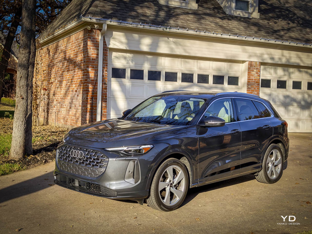
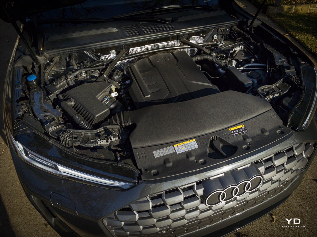
I spent a week with the third-generation Audi Q5 Prestige in Tambora Gray Metallic, and what struck me first was not any single feature but the accumulation of considered choices. Built on Volkswagen Group’s Premium Platform Combustion architecture with a turbocharged 2.0-liter TFSI four-cylinder producing 261 horsepower and 273 lb-ft of torque, this compact luxury SUV occupies familiar territory at $63,290 as tested. The design decisions embedded in its surfaces, proportions, and material selections tell a more nuanced story. The Q5 represents what happens when a manufacturer chooses careful iteration over spectacle.

Designer: Audi

What distinguishes this generation from its predecessor is not a single dramatic gesture but rather an accumulation of details that reveal themselves over days rather than minutes, over highway miles rather than showroom walks, over lived experience rather than specification comparisons. The raked silhouette borrows visual vocabulary from the larger Q7, establishing family resemblance without direct mimicry. Panel gaps have tightened to tolerances that reward close inspection. The decorative exhaust finishers have been replaced with genuine rectangular outlets, a small change that signals larger philosophical shifts about authenticity in automotive design. These aren’t features that demand attention at first glance. They’re details that accumulate into a stance that reads as resolved rather than aggressive, as confident rather than desperate to impress, as the work of engineers and designers who understood that restraint requires more discipline than excess.

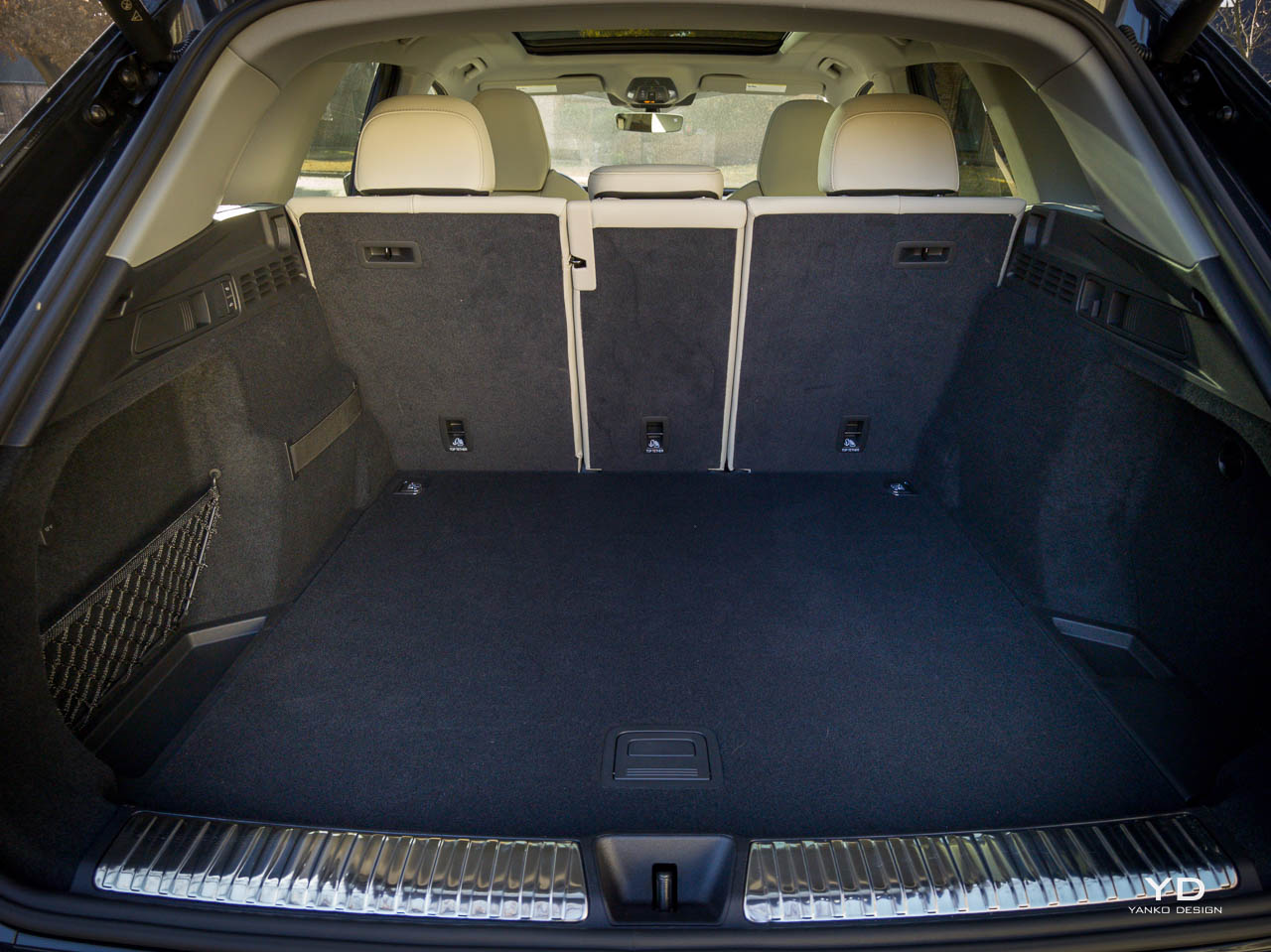
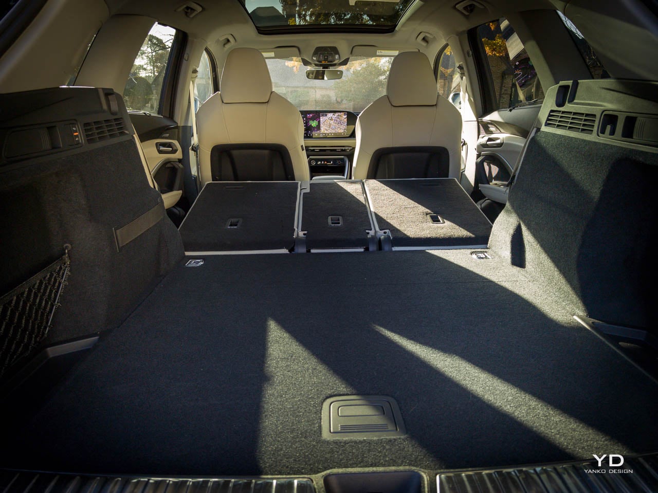
The vehicle’s proportions establish its intent before any specification sheet is consulted. Wheelbase dimensions remain close to the previous generation, but cargo volume has expanded to 56.9 cubic feet with rear seats folded, a gain of 2.8 cubic feet. That’s design as problem-solving.

Exterior Form Language

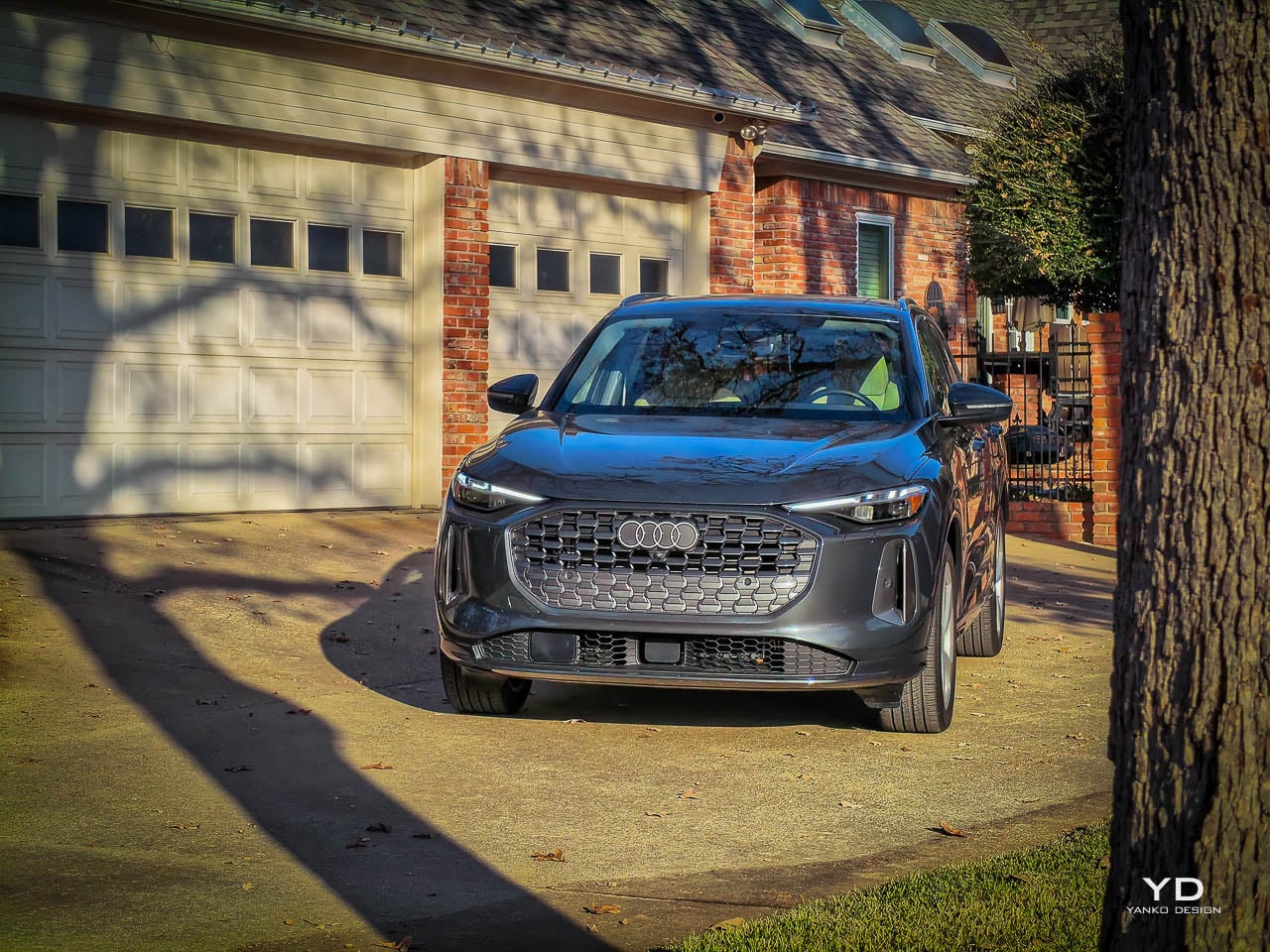
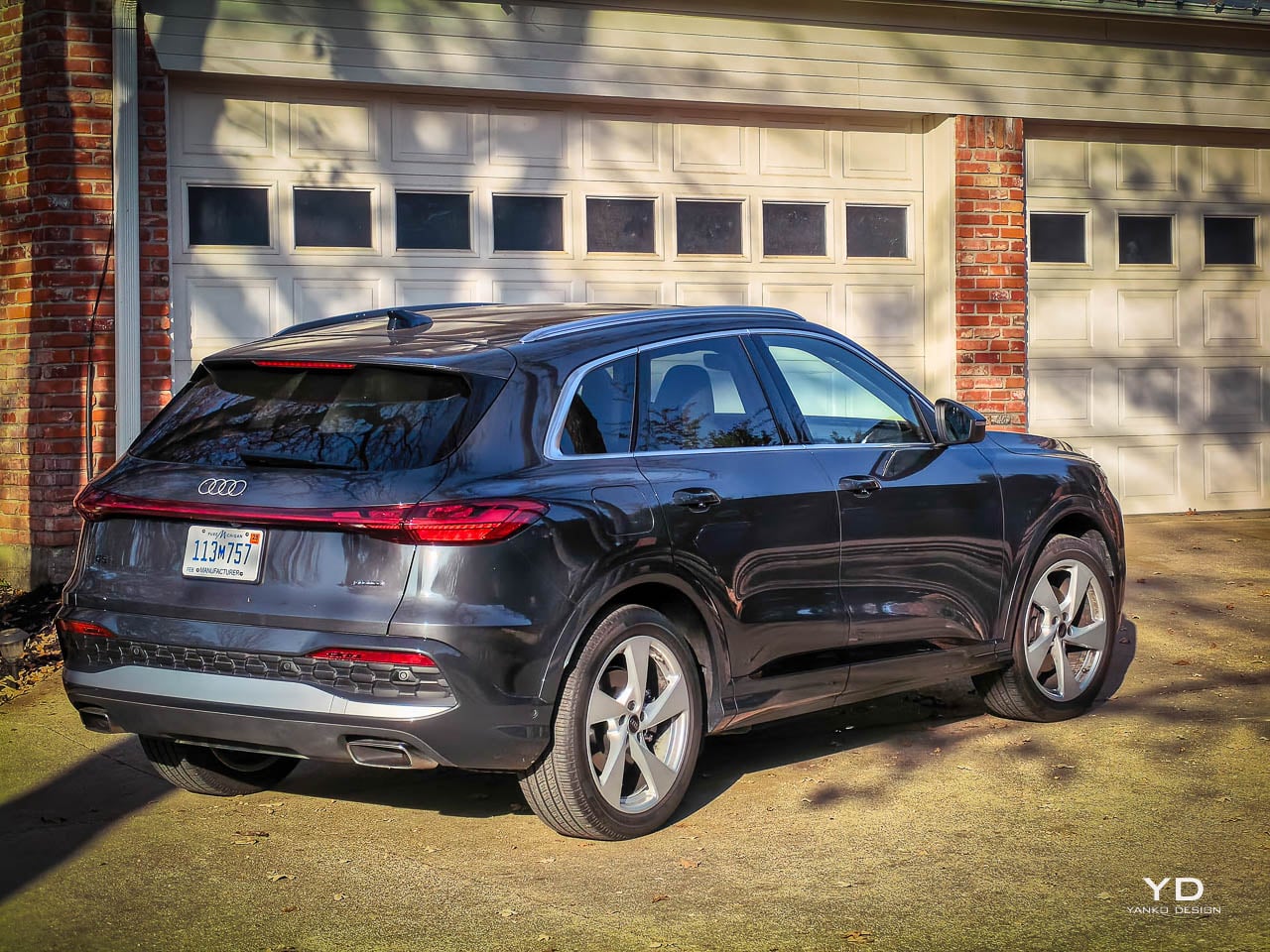
The singleframe grille anchors the front fascia with a presence that has become signature Audi vocabulary, wider and higher than before, flanked by functional air curtains that channel airflow along the body sides, reduce turbulence around the front wheels, and contribute measurably to the 25 mpg combined fuel economy figure while adding horizontal emphasis to the front that grounds the vehicle’s face as the LED lighting signatures lift the eye upward, creating a tension between opposing visual forces that produces dynamism without chaos. In person, the Tambora Gray Metallic finish shifts subtly between cool silver and warm graphite depending on the light, a $595 option that flatters the Q5’s surfacing without demanding attention, revealing the gentle curves of the fender flares and the controlled tension of door panel surfacing in ways that more dramatic colors would overwhelm. I walked around this vehicle at least a dozen times during my week with it, and each angle revealed something slightly different about how Audi’s design team approached the challenge of updating a successful shape without losing what made it work.

That’s restraint as design strategy.

The Prestige trim’s LED headlights plus with eight digital DRL signatures represent a departure from the notion that headlights are merely functional, allowing personalization within boundaries that maintain brand coherence, while the digital OLED taillights transform the vehicle’s nighttime presence entirely with a full-width light bar and dynamic animation sequences that other drivers will notice before they recognize the Audi badges. Front and rear lighting can now express personality. You can choose character, but the character stays on-brand, never straying into the visual vocabulary of competitors or aftermarket modifications.

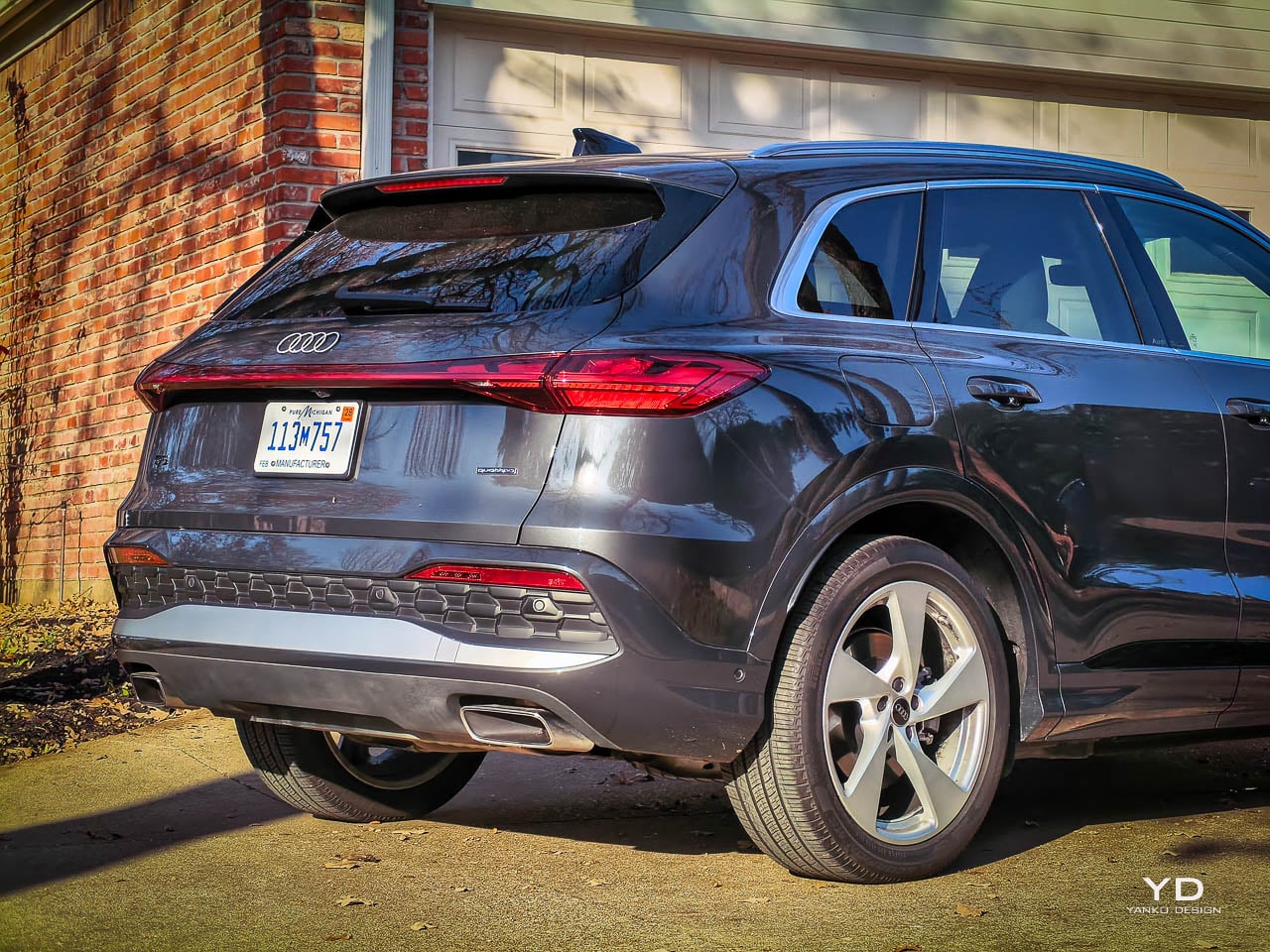
The shoulder line carries through the side profile without interruption, a decision that prioritizes visual length over sculptural drama, that trusts the basic proportions to create interest rather than relying on creases and vents and stamped-in details that would only compete for attention. Where competitors might break this line, the Q5 maintains continuity. The 20-inch 5-arm design wheels from the $800 optional wheel package fill the arches convincingly, and the roofline’s rake creates forward momentum even at rest, suggesting capability without the aggressive stance that defines sportier alternatives.

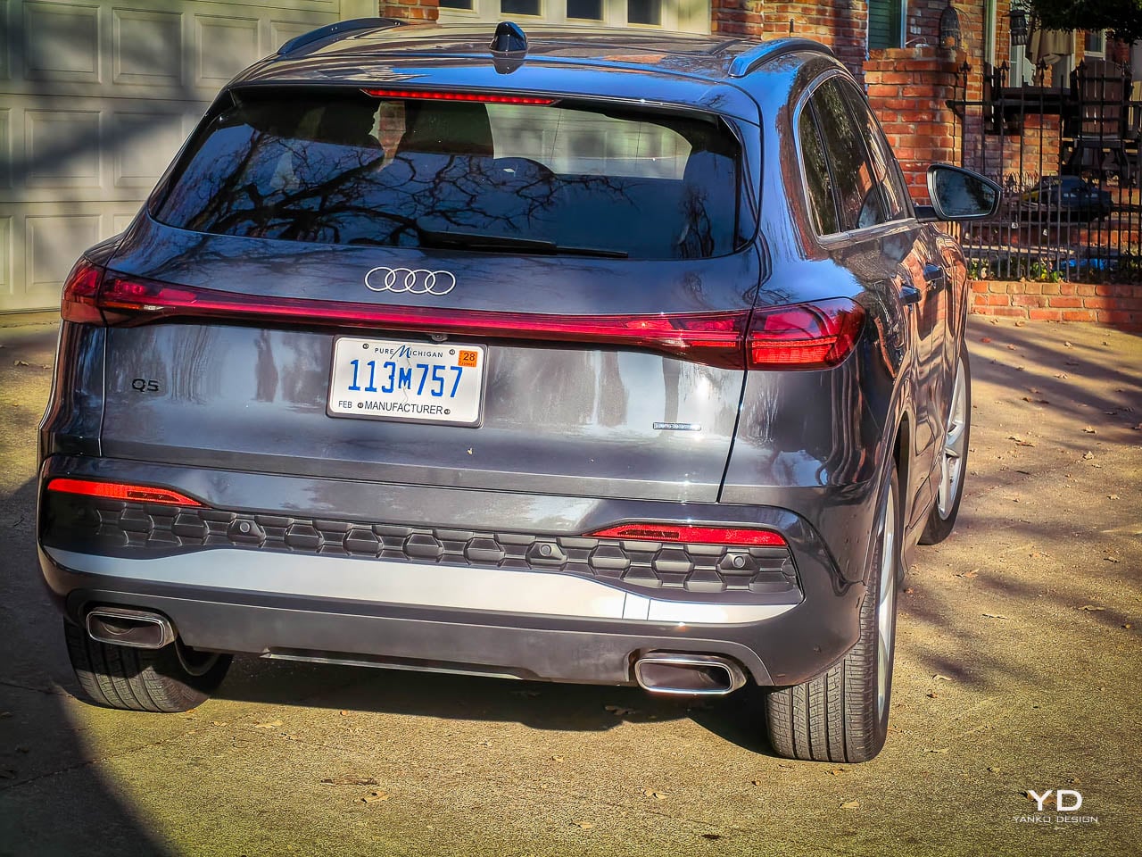
Real exhaust outlets replace the decorative finishers of the outgoing model, communicating mechanical honesty in a market where many competitors still rely on chrome trim pieces that hide the actual exhaust routing somewhere underneath the bumper, a detail that speaks to broader shifts in automotive design thinking about authenticity versus theater, about what we show versus what actually exists, about whether buyers notice or care about such distinctions and what it says about a brand that assumes they do. The previous generation’s false tips suggested performance that the actual exhaust system didn’t support. What you see is what exists. Light catches the fender flares and door panels in ways that reveal gentle curves rather than aggressive angles, while the 12-volt mild hybrid system recovers energy during deceleration invisibly, feeding it back into the electrical architecture that powers the countless systems modern buyers expect, the design absorbing the technology rather than announcing it, integrating engineering advances into surfaces that look simpler than they are.

Interior Architecture

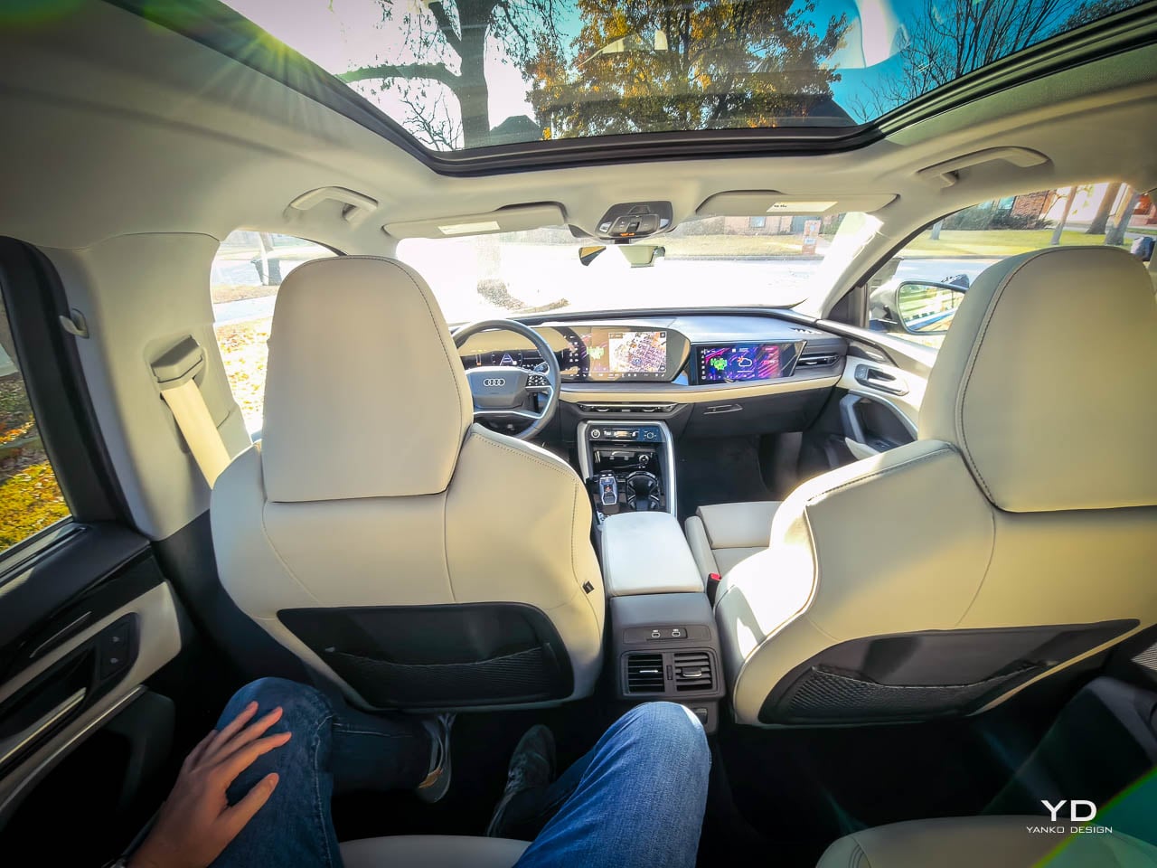
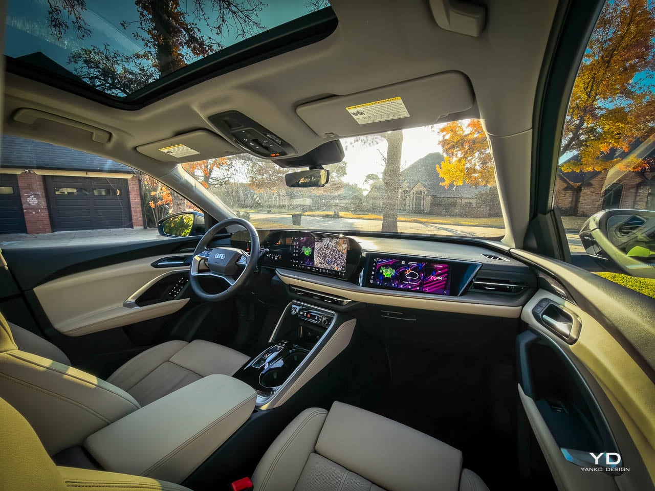
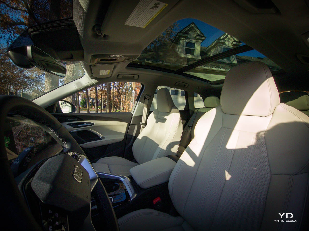
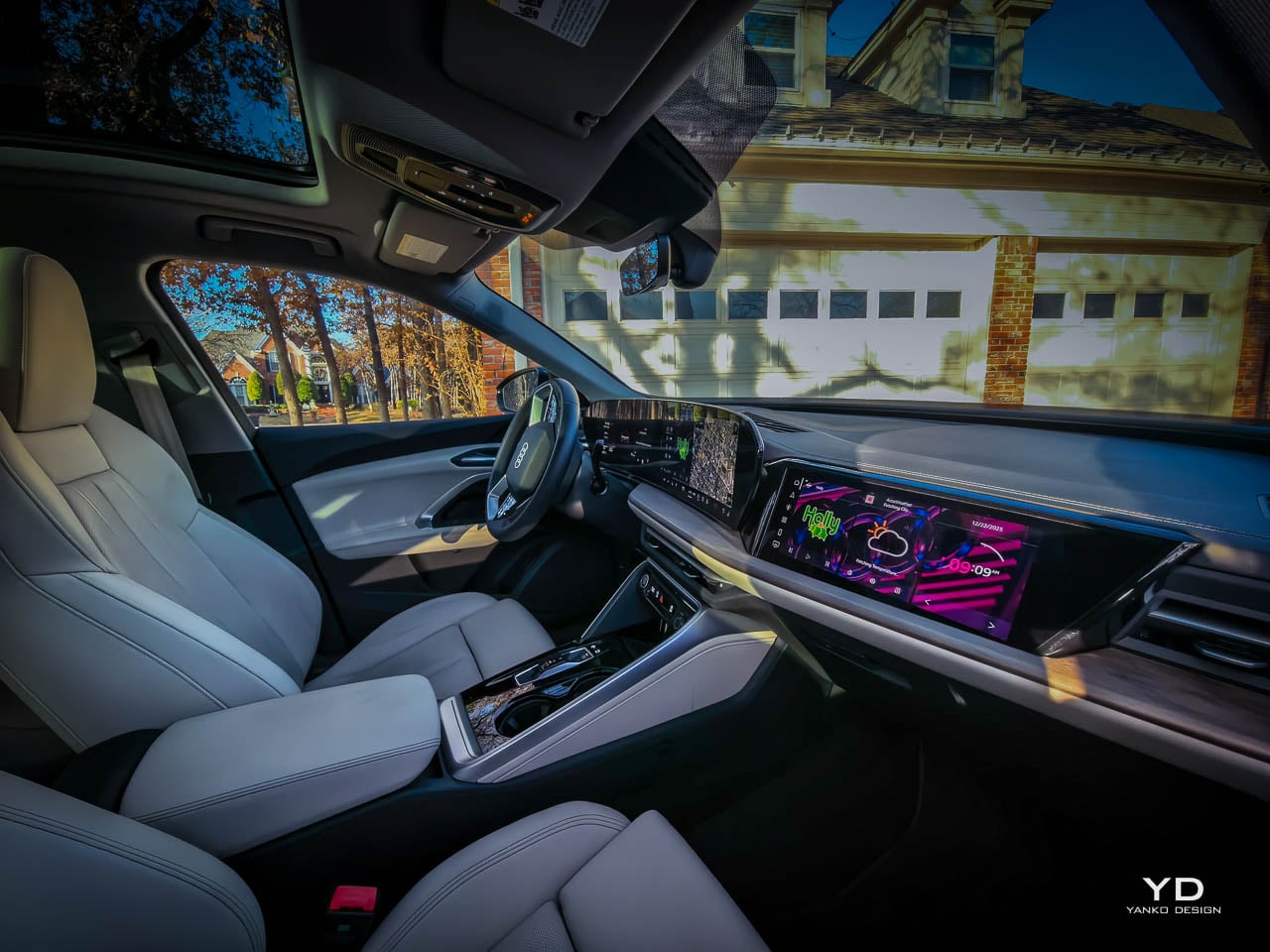
The cabin represents the most significant departure from the previous generation. Sliding into the Pearl Beige interior for the first time, you notice the difference immediately. Where the predecessor was criticized for visual austerity, the new interior addresses this through layered materials and deliberate contrast.

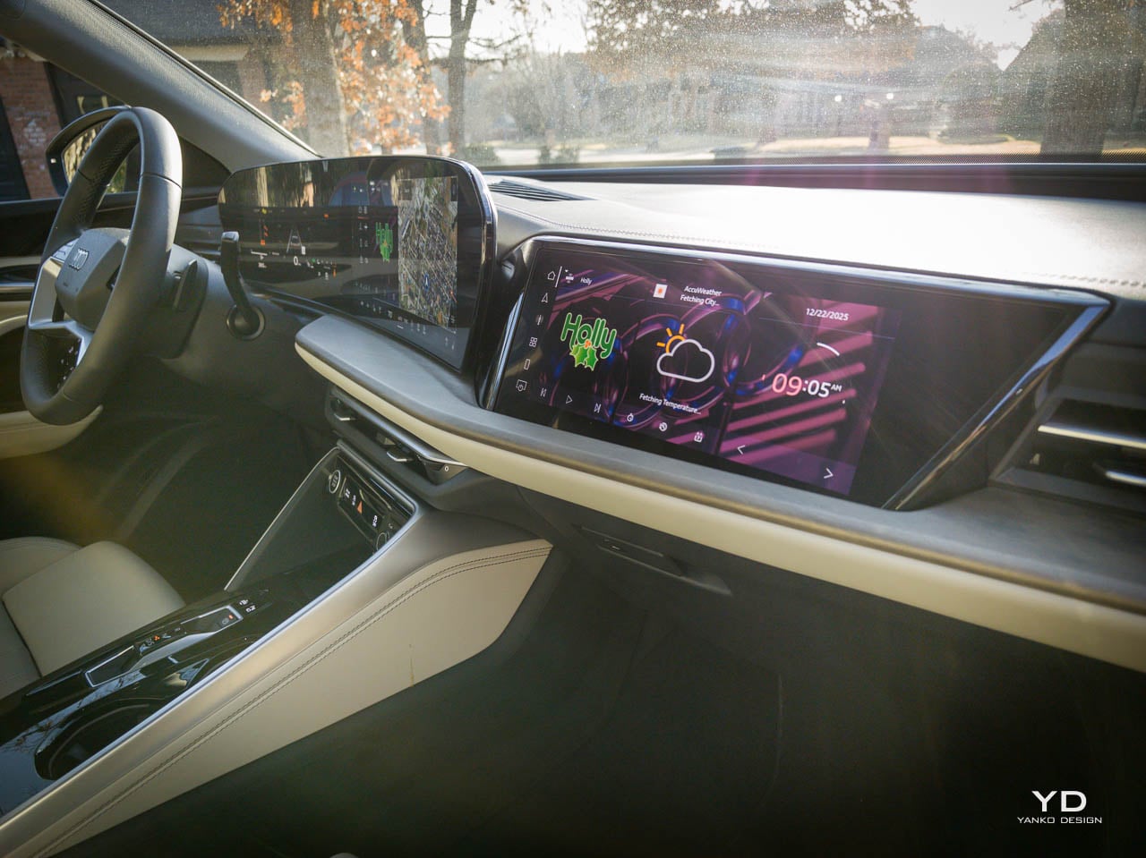
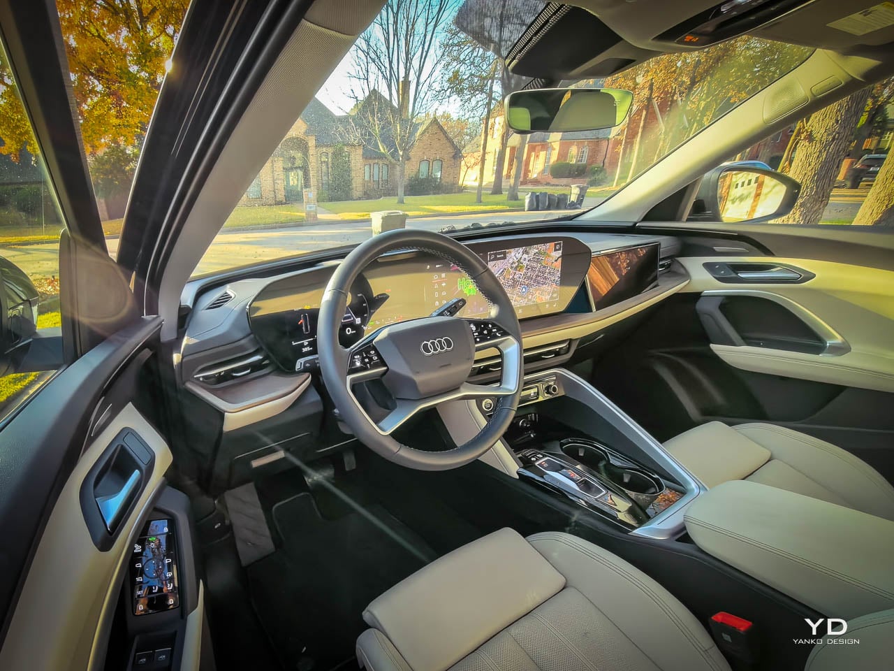
The 14.5-inch MMI touch display dominates the center stack with a presence that might overwhelm in lesser integrations, but here it sits within the dashboard architecture rather than perched atop it like an afterthought, paired with the 11.9-inch Audi virtual cockpit plus that renders navigation and vehicle information with the kind of clarity and customization that once defined luxury flagships, while the Prestige package adds a 10.9-inch MMI passenger display that allows front passengers to manage navigation or entertainment without distracting the driver, though I found myself wondering whether the additional screen complexity serves real needs or simply provides another differentiator on specification sheets that buyers compare without understanding what they actually want. Screen integration matters more than screen dimensions. Too many competitors treat displays as afterthoughts, floating tablets stuck to dashboards designed before touchscreens became standard. Here, the screens belong, and that belonging required more engineering effort than simply making them larger.

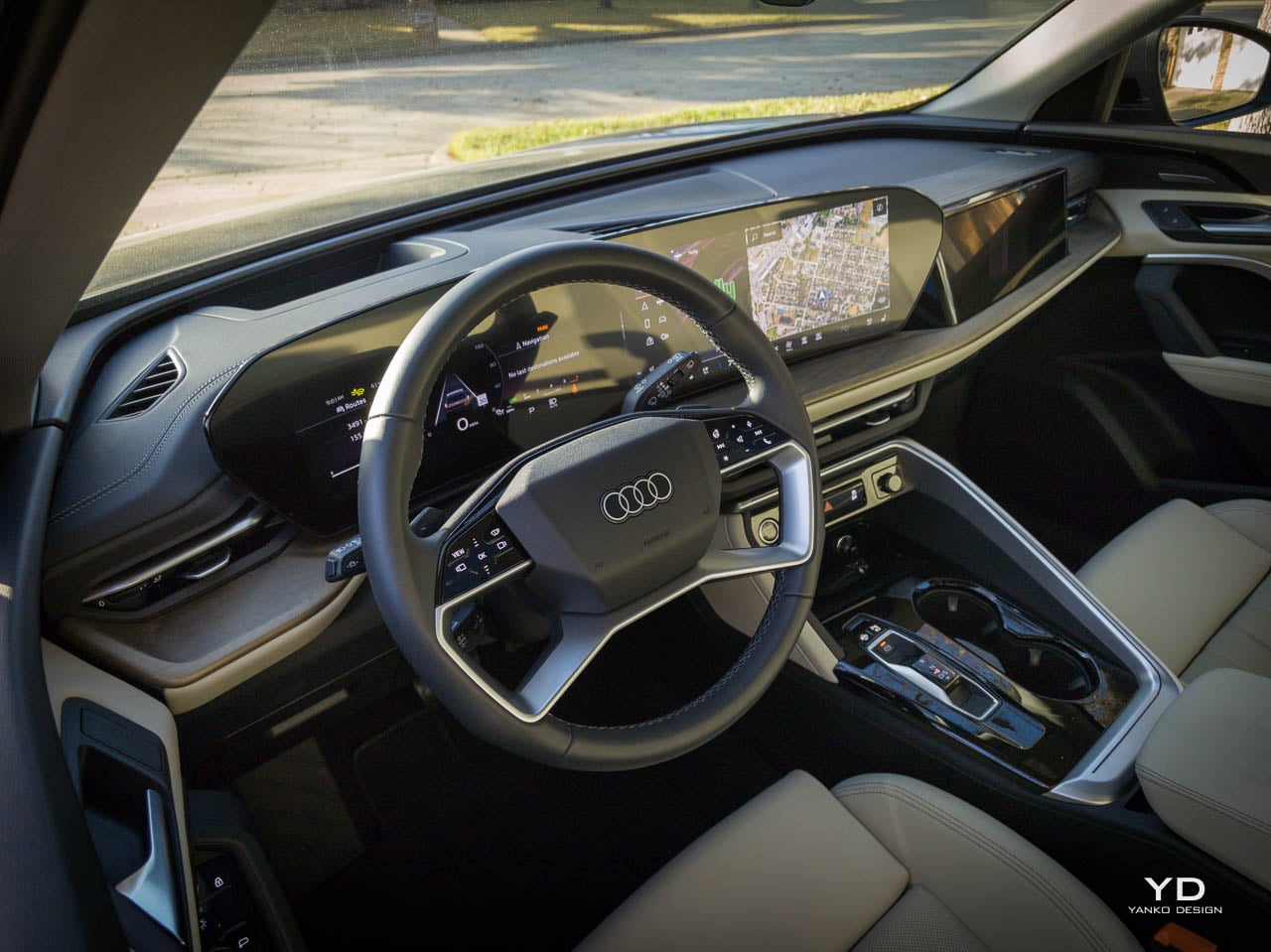
The driver’s position establishes immediate relationship to the controls. Power tilt-and-telescopic steering allows precise positioning. The head-up display projects information directly into the sightline. Tri-zone climate control divides the cabin into manageable thermal territories. These are ergonomic solutions dressed in premium materials.

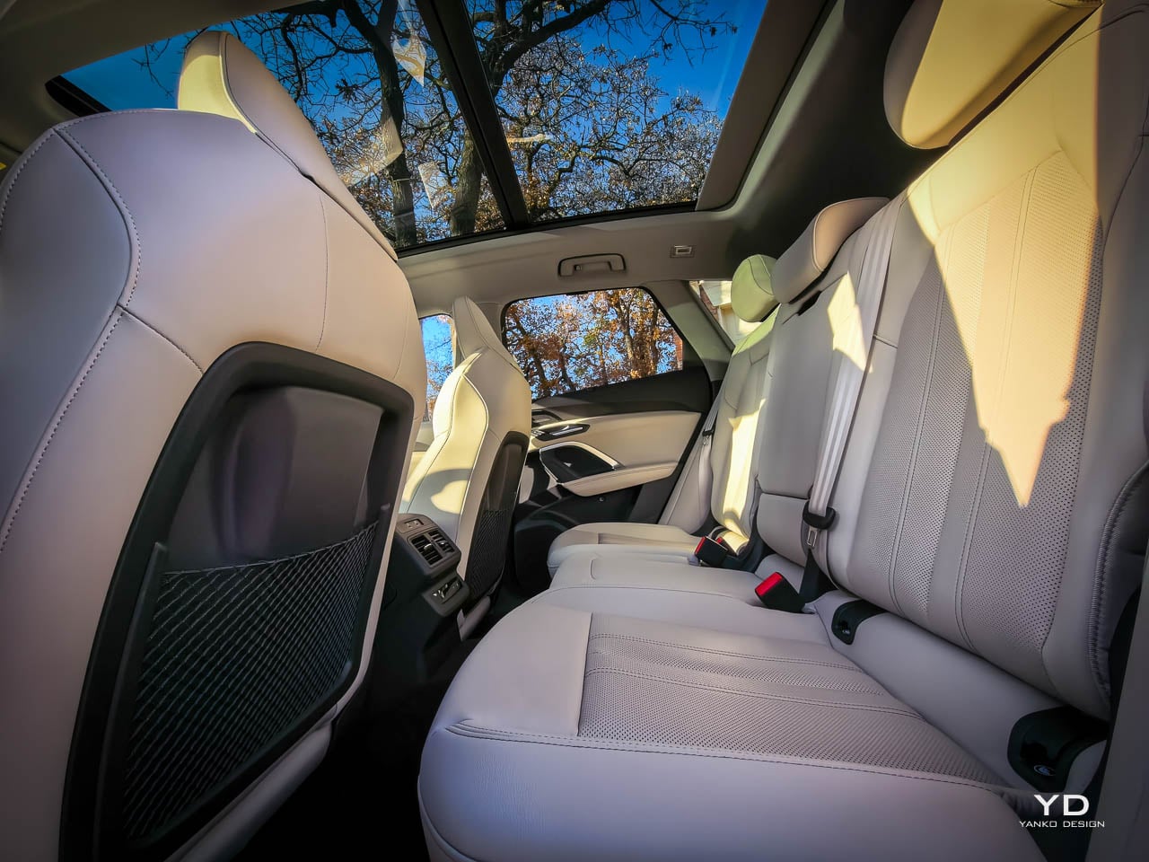
Rear seat architecture employs a 40/20/40 split-folding configuration with sliding capability. The center section folds independently. This configuration solves real-world problems.

Storage solutions throughout the cabin demonstrate attention to daily use patterns, expanding door bins and reorganized center console compartments creating a space that feels designed by people who actually load groceries and manage coffee cups during commutes rather than by stylists optimizing photography angles, while the LED interior lighting pro package adds atmosphere without distraction, touching surfaces that matter at night, transforming the Pearl Beige leather into warmer tones under ambient illumination that makes the cabin feel like a different space after dark, more intimate, more considered, without requiring any adjustment from the driver beyond the simple act of driving into evening.

Material Composition

Material selection in the Q5 follows a hierarchy of touch frequency that allocates budget where it matters most to perceived quality, soft-touch plastics yielding appropriately under pressure on surfaces that hands contact regularly, leather wrapping appearing where fingers rest during normal driving, metal accents providing cool contrast to warmer materials, while lower surfaces that are seen but rarely touched employ more practical materials that clean easily and resist the wear that comes from thousands of entries and exits, from muddy shoes in winter and sandy feet in summer, from the accumulated debris of lives actually lived in vehicles rather than merely photographed in them. This graduated approach represents mature design thinking.

Run a hand across the dashboard, and you feel seams, grain, the subtle undulation of material stretched over structure.

Technology Integration

The MMI interface operates through that 14.5-inch touchscreen with a responsiveness that has improved markedly from previous generations, haptic feedback providing confirmation of inputs, menu structures reorganized to reduce navigation depth for common functions, Apple CarPlay and Android Auto integration appearing as expected equipment alongside smartphone mirroring that handles the connection without the lag that plagues some competitors, while navigation through the MMI Navigation plus system renders on either the center screen or the Virtual Cockpit depending on preference, allowing drivers to keep route guidance in their primary sightline rather than glancing repeatedly toward the center stack. The system works. It doesn’t delight, but it doesn’t frustrate either, which may be the more important achievement.

Driver assistance helps without replacing. Adaptive cruise assist maintains distance. Lane-keeping provides gentle input. Blind-spot monitoring illuminates warnings where they belong.

The Bang & Olufsen sound system with 3D sound represents the kind of feature that separates luxury from mainstream, speaker placement optimized for the cabin’s acoustic properties, resulting sound quality rewarding careful listening with spatial depth that the 3D processing enhances without artificiality, dialogue in podcasts and calls maintaining clarity at any volume level, bass response that never overwhelms or distorts, treble that sparkles without harshness, and an overall presentation that treats sound as part of the ownership experience rather than as a checkbox on a features list, though whether the additional cost over the standard Audi sound system justifies itself depends on how much time you spend with music versus podcasts versus phone calls versus the blessed silence that the acoustic front door glass enables.

That’s considered acoustic engineering. Not afterthought. Not badge upgrade.

Powertrain Character

The 2.0-liter turbocharged TFSI four-cylinder delivers 261 horsepower through a seven-speed S tronic dual-clutch transmission with standard quattro all-wheel drive, acceleration to 60 mph arriving in approximately 5.7 seconds. Quick enough to merge confidently. Not so aggressive that the Q5 pretends it’s something else.

The throttle response sharpens noticeably in Dynamic mode, and you feel the adaptive air suspension firm up within the first few corners, the brake pedal maintaining consistent firmness through repeated stops rather than going soft the way some competitors do when you start pushing harder than normal driving requires, which builds confidence when you find yourself on twisting roads that the Q5 wasn’t explicitly designed for but handles with more composure than its luxury SUV positioning might suggest, the steering weighting up appropriately, the body roll decreasing to levels that keep passengers comfortable rather than alarmed, the overall character shifting from relaxed cruiser to willing partner in ways that feel genuine rather than programmed, the 12-volt mild hybrid system contributing invisibly by recovering energy during deceleration and allowing the engine to shut down earlier during coasting and restart with less perceptible vibration than previous generations managed. Road surface changes come through the floor clearly enough to tell you about grip conditions without intruding on comfort.

Comfort mode isolates. Dynamic mode engages. The vehicle accommodates different moods.

Daily Reality

The quiet cabin emerges from engineering investments that never appear on feature lists, the Prestige’s acoustic front door glass joining sound-deadening materials lining the firewall and floor, upgraded door seals creating tighter barriers against road and wind noise, the panoramic sunroof’s surprisingly effective isolation preventing the drumming that open glass surfaces often produce at highway speeds, all of it combining to create a space where conversation happens at normal volume, where phone calls require no raised voice, where the outside world maintains a respectful distance, where you can think clearly during commutes that would exhaust you in lesser vehicles.

I fit a carry-on, camera bag, and weekend groceries back there without much fuss.

Cargo capacity numbers tell only part of the story, the 56.9 cubic feet available with rear seats folded accommodating large items in theory while the cargo floor’s height and liftgate opening dimensions determine what actually fits in practice, the Q5 managing these secondary measurements well with a floor sitting at reasonable height for loading, an opening wide enough to accept furniture and sporting equipment without excessive maneuvering, a power liftgate that operates with sufficient speed that waiting never feels burdensome, though I wished for a hands-free gesture system that competitors offer, the kind of feature you don’t appreciate until you approach with arms full and discover that someone else’s design team thought further ahead about your actual usage patterns.

The mild hybrid system represents the kind of engineering that never announces itself, recovering energy during deceleration and feeding it back into electrical systems that power climate control, screens, and driver assistance without drawing from the primary powertrain. The 12-volt architecture operates beneath conscious awareness, its presence detectable only in the slightly smoother restart behavior after traffic stops and the fractionally quicker throttle response during initial acceleration. Audi has chosen integration over declaration, embedding efficiency gains into the driving experience rather than celebrating them with dashboard displays or efficiency modes that remind you constantly of their existence.

Visibility from the driver’s seat balances the rakish roofline against practical sightline needs, rearward vision compromised somewhat by styling priorities, the top view camera system compensating effectively during parking maneuvers with its overhead perspective, the ventilated front sport seats proving their worth during warmer days, the side mirrors sized appropriately, the A-pillars intruding less than some competitors, the overall sense being adequate rather than exceptional outward vision, a common trade-off in the segment that the Q5 navigates without distinguishing itself positively or negatively, simply accepting the compromise that modern design priorities impose on driver awareness in exchange for the sleeker proportions that buyers say they want when surveyed about preference and prove they want by opening their wallets.

The ventilated seats earned their keep. The head-up display reduced my glances away from the road. The adaptive cruise made highway miles disappear.

Competitive Context

The compact luxury SUV segment has become perhaps the most contested territory in the automotive market, with the BMW X3 emphasizing driving dynamics, the Mercedes-Benz GLC projecting traditional luxury, the Lexus NX offering advanced hybrid technology, and the Volvo XC60 pursuing Scandinavian restraint, all targeting similar buyers with similar vehicles at similar price points, differentiating through philosophy rather than fundamental capability, through brand values rather than objective superiority, through heritage and design language rather than measurable advantages that would make one choice clearly correct and the others clearly wrong.

Buyers who prioritize sharp handling find the BMW more engaging. Those seeking hybrid efficiency examine the Lexus.

At $63,290 as tested, this Prestige-trimmed Q5 with the 20-inch wheel package enters territory where buyer expectations rise accordingly, the base Q5 starting at $52,200 before destination, the $8,400 Prestige package adding adaptive air suspension, head-up display, digital OLED taillights, panoramic sunroof, ventilated seats, and the Bang & Olufsen 3D sound system among extensive equipment, creating a vehicle that competes not only against segment rivals but against entry-level offerings from Porsche and higher-trim vehicles from mainstream luxury brands, forcing buyers to consider what they actually value and whether the Audi badge, the Virtual Cockpit interface, the specific execution of materials and technology justifies choosing this over alternatives that might offer more in one area while offering less in others.

Who Should Buy This

The Q5 Prestige suits buyers who have arrived, not those announcing their arrival. It rewards those who appreciate quality construction over attention-seeking design, who prefer refinement to drama, and who’ll notice the material choices and ergonomic solutions that accumulate into daily satisfaction. This isn’t a vehicle for people still trying to prove something.

If you want sharp handling, the BMW X3 will engage you more directly. If you want the most advanced hybrid technology, the Lexus NX deserves serious consideration. If you want Scandinavian minimalism, the Volvo XC60 delivers that aesthetic more purely. The Q5 Prestige targets those who want competence across all dimensions rather than excellence in any single one, those who value the cumulative effect of many good decisions over a few dramatic gestures.

Design Verdict

Audi has chosen evolution over revolution with this third-generation Q5, and the choice reflects confidence in the existing formula rather than desperation to change perception, the design improvements real but subtle in ways that require time to appreciate fully, better proportions becoming apparent only when parked beside the previous generation, more honest details revealing themselves only to those who look closely at exhaust outlets and lighting signatures and panel fit, richer interior materials rewarding touch rather than just sight, more advanced technology integrated more thoughtfully into an architecture that anticipates where drivers will look and reach rather than simply adding screens to surfaces that accommodate them.

I think the Q5 makes one of the stronger cases in this segment for quiet competence over dramatic gesture. Whether that philosophy connects depends on what buyers seek.

The post 2025 Audi Q5 TFSI quattro Prestige Review: Evolution as a Design Strategy first appeared on Yanko Design.

Galaxy Z Trifold Durability Test Reveals 3.9mm Trade-Offs

Seven years of Galaxy Z Fold and Flip experiments led to Samsung’s wildest form factor yet, a phone that folds twice into a 10‑inch tablet. Before anyone can trust a device like that, it has to survive more than a marketing reel. JerryRigEverything’s durability test became the unofficial reality check for the Galaxy Z Trifold, showing how far Samsung pushed the engineering and where those limits start to bite back.

Zack Nelson’s standard protocol is scratch, burn, dust, and bend, and the Galaxy Z Trifold greets you with a wall of warnings about not peeling films and folding in a specific order. If you close the wrong flap first, the phone vibrates and flashes red, a sign that the folding choreography is tightly constrained, even if it does not break immediately. The device is smart enough to know when you are stressing it incorrectly.

Designer: Samsung (via Zack Nelson/JerryRigEverything)

The outer cover screen behaves like other flagships, scratching at Mohs level 6 with deeper grooves at 7, while the inner flexible display still marks at level 2 with deeper damage at 3. The burn test shows the outer OLED lasting around 17 seconds under flame and the inner panel about 10, reinforcing that ultra‑thin glass and plastic stacks remain fragile, even in this latest generation, which is less a Samsung problem and more a physics problem.

The phone carries an IP48 rating, which sounds reassuring until fine dust is sprinkled into the hinge area and folding begins. The immediate grinding noises make it clear that particles can still get into the mechanism and between layers. The device survives the moment, but the test underlines that a tri‑fold with exposed hinge gaps is best kept away from beaches, workshops, or pockets full of grit.

The defining moment is the bend test. When force is applied in the opposite direction to the intended fold, the Galaxy Z Trifold’s frame buckles with an audible crack, making it the first Samsung phone to fail this particular test. The central spine is around 3.9 mm at its thinnest, significantly slimmer than many ultra‑thin phones, and the hinges themselves hold while the aluminium frame gives way, showing that Samsung prioritised compactness over reverse‑bend resistance.

The teardown reveals three separate batteries spread across the three segments, totalling about 5,600 mAh, so thin that even using pull tabs to remove them risks bending and puncturing. A 200 MP main camera, a 10 MP telephoto with OIS, and reliance on the aluminium frame for heat dissipation rather than a complex cooling system all point to thinness and packaging as top priorities, which makes sense when the goal is pocketability.

The Galaxy Z Trifold is an engineering statement that proves a pocketable tri‑fold tablet is possible, and JerryRigEverything’s test shows the trade‑offs of that ambition. Inner screens remain soft, dust remains a threat, and a 3.9 mm spine will not forgive a wrong bend. As a first draft of a radically new category, it achieves something impressive while accepting vulnerabilities that future iterations will likely address with slightly thicker frames and better sealing, once the core mechanics are proven and refinement can begin.

The post Galaxy Z Trifold Durability Test Reveals 3.9mm Trade-Offs first appeared on Yanko Design.

OnePlus Pad Go 2 Battery Lasts From Morning Coffee to Bedtime

Tablets have settled into a role somewhere between couch companion and light laptop stand-in, mostly used for streaming, reading, browsing, and occasional work. Android tablets have been uneven for years, with some brands throwing hardware at the problem while others barely try. OnePlus has been quietly building a more coherent story, and the Pad Go 2 is its latest attempt to make a large screen feel natural.

The OnePlus Pad Go 2 is a 12.1-inch Android tablet with a tall 7:5 display, a MediaTek Dimensity 7300-Ultra chip, and OxygenOS 16. It is not trying to be a halo device. Instead, it’s aiming for the sweet spot where a big, sharp screen, smooth performance, and long battery life matter more than headline-grabbing specs or ultra-thin bezels that sacrifice durability and comfort for millimeters.

Designer: OnePlus

The 12.1-inch LCD runs 2,800 × 1,980 resolution at 120 Hz, with 98 percent DCI-P3 coverage and up to 900 nits in high-brightness mode. The 7:5 aspect ratio gives more vertical space for web pages, documents, and split-screen apps than a 16:10 panel while still feeling natural for video. The extra vertical real estate makes reading and scrolling more comfortable, and the 120 Hz refresh means UI animations feel smooth without jitter.

The Dimensity 7300-Ultra, 8 GB of LPDDR5X RAM, and 128 GB of UFS 3.1 storage make the tablet feel snappy for streaming, browsing, and light gaming. The 4 nm SoC and fast memory mean apps open quickly, multitasking feels smooth, and OxygenOS animations take advantage of the 120 Hz panel without stutter. This is not a flagship chip, but it is over-specced enough for a mid-range tablet that the experience feels polished.

The 10,050 mAh battery handles long streaming sessions, reading, and mixed use without needing a charger nearby. The 33 W SUPERVOOC charging means topping up during a break is useful, rather than the slow trickle many budget tablets deliver. The goal is a tablet you can pick up in the morning and still be using on the couch at night, without babysitting the battery percentage or planning your day around outlets.

The quad-speaker setup, Bluetooth codec support from SBC through aptX HD and LDAC, and Wi-Fi 6 with Bluetooth 5.4 handle the supporting roles. The 8 MP front and rear cameras are there for video calls and quick scans rather than photography, and face unlock handles biometric login without a fingerprint reader cluttering the frame or adding cost to the bill of materials.

OxygenOS 16 is more than a phone skin stretched out, with split-screen multitasking, floating windows, and better scaling for the 7:5 display. It plays nicely with OnePlus phones for clipboard sharing, where supported, and the overall feel is closer to a lightweight desktop than a blown-up phone UI when you dock a keyboard or prop it on a stand for a few hours.

The OnePlus Pad Go 2 sits as a large-screen Android option that prioritizes display quality, smoothness, and battery over chasing ultra-high-end features. It makes the most sense for people who want a comfortable reading and streaming device that can also handle some work, and who like the idea of OxygenOS bringing OnePlus phone polish to a bigger canvas without flagship pricing or complexity they do not need for watching shows and scrolling feeds.

The post OnePlus Pad Go 2 Battery Lasts From Morning Coffee to Bedtime first appeared on Yanko Design.

This Pocket PC Concept Has a Flip-Out Pen and No Gaming Apps

Most students now juggle phones, tablets, and laptops, with messaging and games living right next to textbooks and notes. That mix can be powerful but also distracting, especially in crowded Chinese classrooms where space and attention are both limited. Pokepad is a portable PC concept that tries to carve out a focused, pocketable space dedicated to learning, treating study tools as worthy of their own hardware.

Pokepad is a smart learning device designed specifically for students, intended to cover most of their daily study scenarios. It is compact and portable enough to fit into school bags and coat pockets, and the goal is unrestricted learning, a device that can travel from classroom to bus to bedroom without feeling like a shrunken laptop or a repurposed phone fighting for attention against notifications and app alerts.

Designers: DaPengPeng (DPP), Wengkang Cheng, Qi M

The design team experimented with multiple shapes before settling on a slim rectangular box concept, balancing learning apps, hardware needs, and clever portability. The box footprint keeps it familiar enough to slip into existing routines, yet distinct from a phone, with enough internal volume for a decent battery, speakers, and a pen mechanism, without turning into a bulky tablet that refuses to fit anywhere.

The built-in flip pen is central to the concept. To ensure portability, slimness, and differentiation, the team chose to hide the stylus inside the body, so it flips out when needed and disappears when not. That decision reinforces Pokepad as a pen-first device for note-taking, annotation, and handwriting practice, and avoids the classic problem of separate styluses getting lost in backpacks or rolling off desks during lectures.

The soft-edged, minimal aesthetic uses rounded corners, a single camera module, and a small “100” logo that nods to perfect test scores. Colour options range from clean white and light blue to a more playful red with a textured back for grip. The branding and palette position Pokepad as a study companion rather than a gaming gadget, something that feels at home in a pencil case next to erasers and rulers.

The interface is geared toward classes, homework, notes, a dictionary, and voice recording, rather than a full app store. The idea is to centralise tasks that are currently split across paper notebooks and phones, giving students a dedicated place to scan assignments, jot down ideas with the pen, and review materials on the go, without the constant pull of unrelated apps demanding screen time.

Pokepad takes the idea of a learning device seriously enough to design hardware, UI, and branding around school life, instead of treating students as a side market for general tablets. A pocketable box with a flip pen and a “100” on the back suggests a quieter, more focused path for everyday study tech, where the device earns its footprint by doing one category of tasks well instead of trying to be everything at once.

The post This Pocket PC Concept Has a Flip-Out Pen and No Gaming Apps first appeared on Yanko Design.

10 Best Editor-Picked Designs From 2025 Show How Nostalgia Beat Every Tech Trend

I read somewhere that Nostalgia sells harder than Innovation and it really made me do a double-take. Does it make sense? Well, not really, considering how fast things are progressing on the robotics and AI front – but here’s where I’d like to believe that statement rings true. Take a look at culture – old music is in again, Taylor’s new album is an homage to the old. Thomas Bangalter of Daft Punk made his first stage appearance in nearly a decade. What about movies, you ask? They’re shooting the next Shrek film, Robert Downy Jr. is back at Marvel, and heck, Shia LaBoeuf just announced his return to Transformers. Tech is playing the retro game very well too, whether it’s reissuing of old-style hardware, emulators, or even trends like transparency that remind us of the Nintendo GBA and the iMac G3. The grand point I’m making here, is that this last year has been an absolute pendulum, swinging between extremes, aesthetic styles, ideologies, and eras.

So we zeroed down to 20 designs (spread across two articles) that represent what 2025 gave us. These are the first half of our top picks from the year, gathering designs that we as editors loved, but also taking you, the reader into account. After all, we don’t write in a vacuum. We try to find designs and tech that genuinely impress or inspire you, and if you’ve been spending 2025 doing a bunch of other things (like surviving) apart from reading Yanko Design, here are 10 handpicked (yes, I picked them myself!) designs that encapsulate the BEST of 2025. Stay tuned for part 2!

1. Google Pixel Headphones by Sidhant Patnaik

Sometimes concept renders accomplish more than actual products ever could. Designer Sidhant Patnaik’s Google Pixel Headphones exist only as pixels and Photoshop layers, yet they have sparked more genuine excitement than most real hardware launches Google has executed in years. The design borrows visual cues from the Pixel phone lineup, clean geometric forms, two-tone color blocking, subtle branding, while integrating Gemini AI as a core feature rather than an afterthought. Imagined controls include gesture-based interactions, seamless Pixel ecosystem integration, and the kind of ambient intelligence that Google keeps promising but rarely delivers in satisfying ways. It looks credible enough that people keep asking where to buy it, which is both flattering to the designer and damning to Google’s actual product strategy.

Here’s the uncomfortable truth this concept exposes: Google has all the pieces to dominate the premium headphone market but refuses to assemble them. They own best-in-class voice recognition, industry-leading AI through Gemini, deep Android integration, and more audio patents than most people realize. Apple charges $550 for AirPods Max and can barely keep them in stock. Nothing launched Headphone (1) at $299 and sold out immediately despite being a first-generation product from a startup. Meanwhile Google sells Pixel Buds that nobody talks about and leaves the over-ear category completely vacant. The demand is screaming at them through every comment section under this concept. When a render generates this much enthusiasm, it stops being fantasy and starts being a market signal Google is choosing to ignore.

2. Concept Plumage by Jet Weng

One of the ‘best’ designs of 2025 is actually from nearly 13 years ago! Isn’t that insane?! But that’s how you define ‘ahead of its time’, I guess. Designed by Jet Weng, this absolutely genius keyboard design solves the modern-day smartphone’s BIGGEST problem – the fact that touchscreen keyboards still suck. Concept Plumage is a flip-case that integrates a full QWERTY keyboard into the back of your phone’s protective cover. When you need to type something longer than a text message, you flip the case around to reveal physical keys that give you actual tactile feedback. When you’re done, it folds back flush against the phone, adding virtually no bulk to your everyday carry. The whole system lives within the footprint of a standard phone case, which means you get BlackBerry-level typing precision without sacrificing the sleekness of modern smartphone design.

What makes this concept so painfully relevant in 2025 is that we are still dealing with the same frustrations Weng identified over a decade ago. Autocorrect still mangles sentences. Thumbs still obscure half the screen. Typing anything substantial on glass remains an exercise in patience and typo correction. The design world spent years convincing us that we would eventually master touchscreen typing, that our muscle memory would adapt, that software would get smarter. Instead, we just learned to accept mediocrity. Plumage refused that compromise, offering a solution that feels both retro and futuristic, like someone time-traveled from 2013 with the one idea we should have mass-produced immediately.

3. Public Library by Thilina Liyanage

Some libraries try to attract bookworms. This one commits to the metaphor so completely that walking inside feels like stepping between pages. Thilina Liyanage’s Public Library‘s exterior mimics an open book mid-read, with two curved structures meeting at a spine, their forms arching upward like paper caught in a breeze. Floor-to-ceiling glass panels stretch across both halves, flooding the interior with natural light that shifts throughout the day, casting reading nooks into soft afternoon glow or sharp morning clarity depending on where the sun sits.

Inside, the architect abandoned the grid entirely. Shelves curve with the walls, following the book-like contours instead of fighting them. Reading spaces cascade across multiple levels connected by flowing staircases that feel more like narrative transitions than functional infrastructure. The central atrium, positioned where the spine would be, rises through all floors and functions as both circulation hub and dramatic gathering space. Materials skew minimal and futuristic, lots of white surfaces, polished concrete, transparent railings, so nothing competes with the architecture’s bold gesture. It is the kind of space that makes you want to linger even if you didn’t come to read, which might be the highest compliment you can pay a library in 2025.

4. HubKey Gen2 by HubKey

The modern laptop gives you two USB-C ports and expects you to figure out the rest yourself. Most people end up with a drawer full of dongles, one for HDMI, another for ethernet, maybe a card reader that works half the time, all daisy-chained together in configurations that feel temporary but somehow become permanent. HubKey Gen2 consolidates that mess into an 11-in-1 hub with an unusual twist: it includes physical shortcut keys and a rotary knob on top, turning connectivity infrastructure into an actual control surface. Four programmable buttons and a central dial let you trigger macros, adjust volume, skip tracks, or launch applications without reaching for the keyboard. It treats the hub as something you interact with regularly rather than plug in once and forget about.

The headline upgrade is dual 4K at 60Hz, both HDMI outputs running simultaneously without bandwidth compromises or resolution drops. Add 100W pass-through charging, a 2.5Gbps ethernet port, 10Gbps USB-A data transfer, SD and microSD slots, and a 3.5mm audio jack, and you have covered most desk setups without needing secondary adapters. The customizable keys support complex shortcuts through companion software, which means editors can bind them to timeline controls, designers can trigger layer actions, and anyone else can just use them for Spotify and Zoom mute. It is a small addition that changes how the device sits in your workflow, shifting it from passive infrastructure to active tool. Most hubs disappear under your desk. This one earns a spot within arm’s reach.

5. Switzerland Passport Re-design by RETINAA

Most passports are exercises in bureaucratic minimalism, but Geneva-based studio RETINAA treated Switzerland’s passport redesign like a cartographic love letter. The new passport centers around water, Switzerland’s most defining geographic feature, with a hydrological map of the country’s rivers and lakes spreading across the inner cover. Each page features detailed illustrations of Swiss landmarks, architectural icons, mountains, and valleys rendered in precise line work that feels equal parts technical drawing and fine art. The design draws heavily from Switzerland’s rich tradition of cartography and graphic design, honoring the country’s obsessive attention to visual detail while meeting all modern security requirements. It is rare to see a government document that looks like it could hang framed in a design museum, but this one legitimately pulls it off.

The hidden layer makes it even better. Under ultraviolet light, topographic contour lines emerge across the pages, revealing Switzerland’s dramatic elevation changes in glowing detail. The Alps materialize as layered ridges, valleys sink into shadow, and the whole document transforms into something that feels alive. Water remains the conceptual anchor throughout, a nod to the country’s hydroelectric infrastructure and the way rivers and lakes have shaped Swiss identity for centuries. RETINAA managed to make a security feature feel poetic, which is not an easy trick. This is what happens when you let actual designers loose on something usually handled by committee and compliance officers. The passport does not just represent Switzerland, it performs the country’s design ethos with every page turn.

6. Modern Apple iPod by Zac Builds

See?! This is where Nostalgia really sells harder than Innovation! YouTuber Zac Builds took a fifth-generation iPod Video and resurrected it into what Apple should have made if they had any interest in keeping the product line alive. The outside looks nearly identical to the 2005 original, same click wheel, same proportions, same satisfying tactile response. Everything else is 2025. He swapped the 30-pin connector for USB-C, added Bluetooth 5.0 for wireless audio, upgraded the storage to a modern SD card solution, and installed custom firmware that supports FLAC, ALAC, and basically every audio format iTunes ever refused to acknowledge. Most importantly, the whole thing syncs like a standard USB drive, no iTunes required, no proprietary software gatekeeping your music library. Just drag and drop files like it’s 2003 but without the artificial limitations.

The build represents everything people loved about dedicated music players before smartphones absorbed their function. No notifications interrupting an album. No battery drain from a hundred background apps. No accidental skips from a touchscreen registering phantom taps in your pocket. Just a device that plays music exceptionally well and does nothing else. The fact that it took a hobbyist with a soldering iron to deliver this rather than Apple themselves says everything about where consumer electronics have drifted. Zac’s version honors the iPod’s legacy while fixing its most dated frustrations, which might be the perfect definition of thoughtful nostalgia. This is not a museum piece. It is a working argument for why single-purpose devices still matter in a world obsessed with convergence.

7. TobenONE 6-in-1 Hub by TobenONE

HDMI cables are the cockroaches of tech, somehow surviving every wireless revolution that should have killed them off by now. We beam 4K movies through the air, charge devices without plugging them in, and send gigabytes of data across continents in seconds, but connecting a laptop to a projector still means crawling under desks hunting for the right dongle. The TobenONE T1 finally addresses this absurdity with a transmitter-receiver combo that handles video streaming wirelessly while doubling as a fully functional USB-C hub. Plug the transmitter into your laptop, connect the receiver to your TV or monitor via HDMI, and the two talk to each other over 5G Wi-Fi at distances up to 30 meters. No network required, no firmware updates, no app to download and immediately forget your password for.

What separates this from the dozens of other wireless HDMI solutions is the fact that it doesn’t just replace one cable, it replaces six. The hub side includes multiple USB-A ports, an SD card reader, and pass-through charging, which means your laptop stays powered while streaming a presentation or mirroring gameplay. It handles 1080p at 60Hz, which is not cutting-edge but plenty adequate for most use cases outside of competitive gaming or pixel-peeping design work. The real appeal here is convenience compounded, eliminating both the video cable and the separate hub most people already carry. Conference rooms, living room setups, and anyone tired of the “which adapter did I forget this time” ritual will find this particularly satisfying. It is one of those products that feels obvious in hindsight, which usually means someone should have made it years ago.

8. LEGO Snow Globes by ItzEthqn

LEGO has been mining nostalgia so effectively for years that it barely registers as a strategy anymore, it just feels like what LEGO does. But every so often they drop something that reminds you how good they are at packaging childhood wonder into adult-friendly formats. These buildable LEGO snow globes hit that sweet spot perfectly: tactile enough to justify the LEGO branding, decorative enough to sit on a desk without looking like a toy, and seasonal enough to qualify as a gift without feeling like obligatory holiday merch. Each globe contains a miniature scene, winter villages, festive characters, iconic moments, all rendered in brick form and sealed inside a transparent sphere that sits on a buildable base.

The genius is in the scale and execution. These are not massive display pieces that demand shelf real estate and explanations to guests. They are compact, self-contained, and instantly recognizable as both LEGO and snow globe, which means they work as decor, conversation starters, or stocking stuffers without needing context. The build process is simple enough to be relaxing but detailed enough to feel rewarding, which is basically LEGO’s entire value proposition distilled into a seasonal format. They tap into two separate nostalgia streams simultaneously: the childhood joy of LEGO construction and the sentimental pull of snow globes as holiday symbols. It is a perfect example of nostalgia not just selling, but selling smart, giving people something familiar enough to want and novel enough to justify buying in the first place.

9. Plus Pool by Dong-Ping Wong, Oana Stanescu, Archie Lee Coates IV & Jeffrey Franklin

New York City has not had a functional public swimming spot in its rivers for generations, mostly because jumping into the East River carries the same appeal as bathing in a toxic soup. Plus Pool fixes this with an ambitious solution that sounds too simple to work but somehow does: a floating, self-filtering swimming pool that pulls water directly from the river and cleans it in real time. Shaped like an oversized plus sign, the design allows multiple swimming zones, kids’ area, lap lanes, lounging sections, all configurable depending on how many people show up. The filtration system uses multiple straining layers to remove debris and particles, then hits everything with UV treatment for disinfection, no chlorine involved. Construction finally started in 2025 after 14 years of bureaucratic delays, fundraising hurdles, and engineering challenges.

The pool itself is a 320-ton steel structure currently undergoing testing before it gets anchored near Pier 35 on Manhattan’s Lower East Side. A walkway will connect it to the shore, making it accessible without boats or special permits. Once operational, it will filter over half a million gallons of river water daily while people swim in it, turning one of the city’s most neglected natural resources into usable public space. The project represents a rare kind of urban optimism, the belief that infrastructure can do more than just function, it can invite people back to landscapes they abandoned decades ago. If it works as promised, Plus Pool will be the kind of civic landmark that makes people wonder why nobody thought to build it sooner, even though the answer is clearly that it took this long because ambitious public projects always do.

10. Dash Cam 4K T800 by 70mai

Most dash cams cover what is directly in front of you and maybe behind if you spring for the dual setup. That still leaves your sides completely vulnerable and your interior as an afterthought, which is a problem when insurance disputes or break-ins hinge on angles your camera never captured. The 70mai 4K T800 fixes this with three synchronized lenses: 4K front-facing, 1080p rear, and an interior camera that rotates 360 degrees. The front camera handles road footage with Sony STARVIS 2 sensor clarity, the rear covers tailgaters and parking lot incidents, and the interior lens can swivel to monitor the cabin or point sideways through windows to catch side-impact collisions and door dings. Together they eliminate the blind spots that turn minor accidents into he-said-she-said nightmares.

The system records all three feeds simultaneously and displays them in picture-in-picture mode on a 3-inch screen, giving you mission control visibility without needing to dig through separate files later. Built-in GPS tracks your route, the G-sensor triggers emergency recording on impact, and 24-hour parking surveillance keeps an eye on things when you are not around. At $323, it sits at the higher end of dash cam pricing, but it delivers the kind of comprehensive coverage that single and dual-lens setups simply cannot match. The logic is straightforward: if you are going to mount a camera system in your car, it might as well see everything worth seeing. This one does.

The post 10 Best Editor-Picked Designs From 2025 Show How Nostalgia Beat Every Tech Trend first appeared on Yanko Design.

This Japanese Tent Looks Like It Landed From Another Planet

Japanese camping brand Tokyo Crafts has brought something unusual to the American market. The Grayhus tent landed stateside this past August through distributor Kōrogi, and it’s turning heads at campsites across the country. This isn’t your standard dome tent. The polyhedral shelter reads more like an art installation than camping gear, with sharp geometric angles that create an almost alien silhouette against mountain backdrops and forest clearings. It’s the kind of tent that makes neighboring campers do a double-take.

Those angular walls aren’t just for show. Large windows cut into the structure frame whatever landscape surrounds you, turning mornings and evenings into something worth lingering over. There’s something satisfying about the way the tent’s rigid geometry plays against the organic curves of nature. Set one up near a lake or in a meadow, and you’ve got an instant focal point. Tokyo Crafts clearly understands that camping gear can do more than keep you dry. The Grayhus makes a statement while it shelters you.

Designer: Tokyo Crafts

The tent’s real cleverness shows up when the weather changes. On mild days, it works as an airy canopy. When mosquitoes show up at dusk, mesh panels turn it into a screened room. If wind picks up or rain moves in, you can batten everything down into a fully enclosed shelter that’s been tested to 55 mph winds. That’s proper storm protection, not just a rating on paper. The Grayhus shifts between configurations without requiring you to pack different shelters for different conditions.

Here’s where Tokyo Crafts made an interesting call. The tent has no built-in floor. Most campers expect integrated groundsheets, but ditching that feature opens up the interior and makes setup faster. The walls and roof use waterproof, weatherproof materials that handle whatever falls from above. Below, you’re free to arrange things however you want. Throw down a tarp, layer rugs, or go minimal. The floorless design gives you options instead of locking you into one setup. It’s a smarter approach than it might first seem.

Tokyo Crafts says the Grayhus sleeps four comfortably, though the roomy interior could fit more if you’re flexible about personal space. The safari-tent vibe skews toward glamping rather than backpacking. At $1,200 for the base model, it’s not an impulse purchase. That price puts it squarely in premium territory, which makes sense given the materials and design work. You’re paying for something that stands apart from the sea of identical camping shelters cluttering outdoor retailers.

The Grayhus is part of Tokyo Crafts’ bigger push into the US market, bringing Japanese camping aesthetics to American buyers who might not know what they’ve been missing. The brand offers add-ons like living sheets and TPU windows if you want to dial in your setup. What sets Tokyo Crafts apart is the refusal to separate form from function. The Grayhus works well and looks striking while doing it. For campers who care about design as much as they care about staying dry, it’s a tent that finally treats both priorities seriously.

The post This Japanese Tent Looks Like It Landed From Another Planet first appeared on Yanko Design.

Instagram vs Impact: How Design Awards Separate Digital Noise from Real Value

Yanko Design’s new podcast, Design Mindset, continues to bring fresh perspectives from design leaders around the world. Every week, this series (Powered by KeyShot) explores critical questions shaping the future of design, from recognition and validation to the evolving role of awards in our digital age. Episode 15 tackles a particularly timely subject: whether design awards still hold relevance when every designer has Instagram, Behance, and LinkedIn at their fingertips.

Jova Zec, Vice President of Red Dot Awards, joins host Radhika Seth for a candid discussion about the changing landscape of design recognition. As the second generation leading one of the world’s most prestigious design competitions (founded by his father, Professor Dr. Peter Zec), Jova brings a unique vantage point on how awards have transformed over three decades, from insider validation to global influence. He’s actively reshaping what recognition means in 2025 and beyond, viewing it as a responsibility rather than simply a reward.

Download your Free Trial of KeyShot Here

From Visibility to Validation: What Awards Mean Now

Jova recalls a time when getting recognized meant appearing on TV or in newspapers. For designers especially, having their own platform was nearly impossible. But now, with Instagram profiles and countless social media options, the landscape has completely changed. This shift has fundamentally altered what design awards need to offer the creative community.

The focus has pivoted from providing visibility to providing qualification. Awards have evolved from megaphones to validators, from amplifiers to authenticators. Jova explains that nowadays, the emphasis lies on being qualified by Red Dot as somebody who produces something that carries genuine value, helping designers prove that their work matters beyond popularity metrics. In a world drowning in content, expert validation proves that a designer’s work holds timeless value beyond digital noise.

The Four Qualities That Separate Impact from Noise

Red Dot evaluates submissions based on four core qualities: functionality, use, responsibility, and seduction. Interestingly, Jova highlights seduction as perhaps the most important. This quality creates the emotional connection that makes consumers genuinely want a product. While functionality and responsibility might seem self-explanatory, seduction is what really drives desire and adoption in the marketplace.

This evaluation approach allows Red Dot to look past short-term viral gimmicks that might rack up likes online. The judges evaluate products on timeless criteria that have remained consistent across the award’s history. Washing machines, for instance, might all look similar to casual observers, but there’s often extraordinary design work happening in the details. Quality never changes; it’s about the experience. If you experience a quality moment with a product, that experience stays the same whether it happened 50 years ago or will happen 100 years from now.

Meta-Categories: Recognizing Invisible Excellence

One of Red Dot’s most significant evolutions has been the introduction of meta-categories. While core principles remain constant, these categories allow Red Dot to highlight specific aspects of design that deserve elevation. The innovative category, for example, recognizes technologically advanced ideas that may lack polish but carry revolutionary potential. Red Dot has also introduced a sustainability meta-category to encourage environmental responsibility.

When Radhika presents Jova with a hypothetical scenario (a sustainable packaging startup with genuinely innovative biodegradable materials that’s technically brilliant but doesn’t photograph beautifully), his response perfectly illustrates this approach. Such a product would win both the innovative award for finding a solution that could revolutionize the industry and the sustainability award for its environmental impact. Winners of these meta-category awards then gain access to a network that includes experts in visual and seductive design, fostering collaboration that can yield products blending sustainable innovation with high aesthetic quality. Leaving such innovation unrecognized is never an option.

Validation Matters at Every Career Stage

The conversation turns personal when discussing how recognition affects designers differently throughout their careers. Jova’s observation is insightful: the importance to the person themselves always stays the same. Whether you’re a design legend or an emerging talent, validation matters deeply.

For established professionals and design legends, winning a Red Dot confirms they’re still performing at the level they believe they are, that they remain in the mindset of the current generation. For young designers trying to establish themselves, awards serve as career kickstarters. Jova shares stories of students who took part in Red Dot, won something, and immediately got employed by major companies wanting their design talent. Beyond career advancement, recognition provides crucial feedback from professionals who aren’t involved in your project and may have never met you before. This validation boosts self-esteem and helps designers affirm they’re on the right path, especially when they’ve just created something great and need confirmation to continue in that direction.

Recognition as Responsibility: Creating a Better World

The overarching theme throughout the conversation is that recognition has evolved significantly in its purpose and meaning. As Jova reflects, he’s watched recognition transform from something designers hoped for to something they expect, from validation to influence, from celebration to obligation. Today, every designer has a platform, every product gets shared instantly, and everyone’s fighting for the same attention. The question isn’t whether awards still matter; it’s whether they’re measuring the right things.

When asked during the rapid fire round what recognition should ultimately create, Jova offers two words: a better world. The biggest misconception designers have about awards? That it’s all a scam. The most overrated aspect of design recognition today? Just designing something that is very popular but lacks usefulness. This episode of Design Mindset crystallizes something important: in an age when anyone can go viral and content floods every feed, expert validation becomes more critical than ever. Awards that maintain rigorous standards and evaluate based on timeless principles fulfill a vital function, steering the design community toward values that matter: quality, responsibility, innovation, and seduction. The future belongs to awards that actively create conditions for great design to flourish.

Design Mindset, Powered by KeyShot, premieres every week with new conversations exploring the minds shaping the future of design. Listen to the full episode with Jova Zec to hear more insights on recognition, Red Dot’s evolution, and what makes design truly timeless.

Download your Free Trial of KeyShot Here

The post Instagram vs Impact: How Design Awards Separate Digital Noise from Real Value first appeared on Yanko Design.