Flooding has gone from a rare calamity to a recurring reality for millions of households. As climate patterns grow more unpredictable, the spaces people call home have become increasingly vulnerable to forces they were never designed to withstand. Most domestic objects offer no answer to this shift, and furniture has remained stubbornly indifferent to the idea that the room it sits in might one day be underwater.
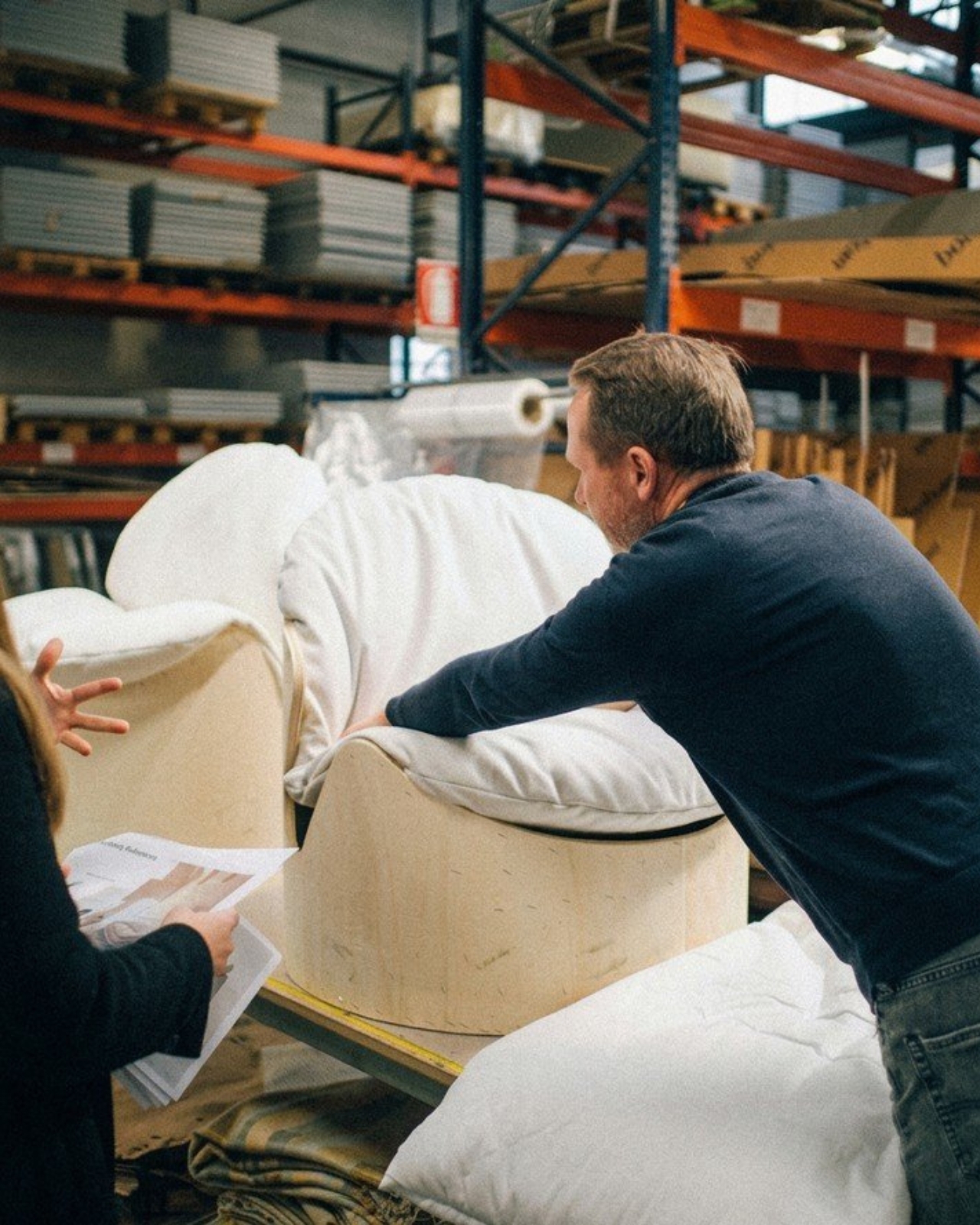
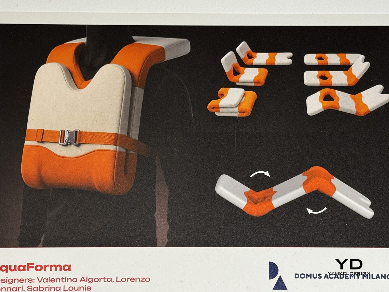
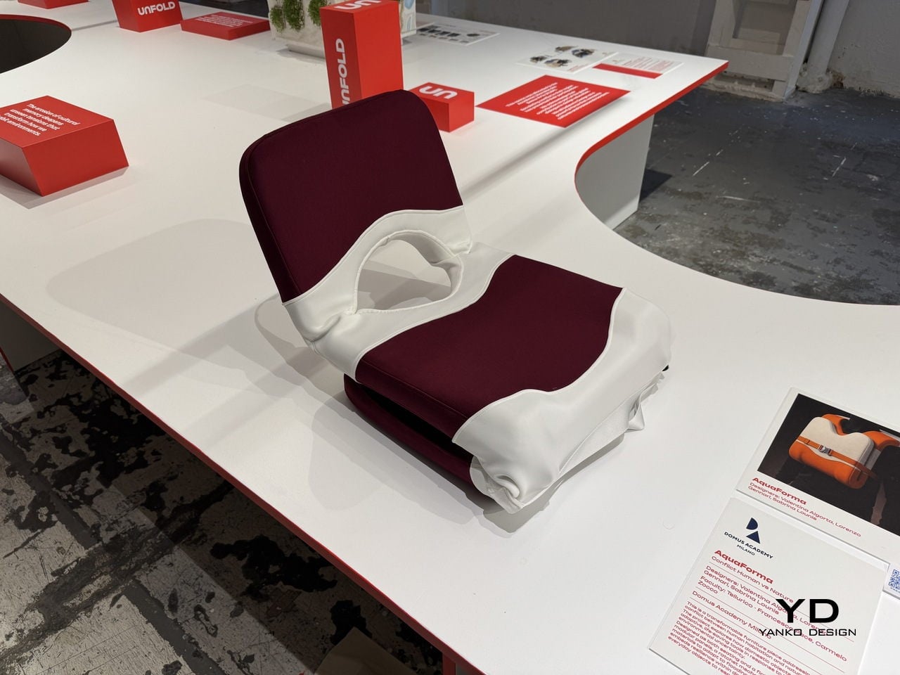
That’s the gap a team of Domus Academy Milano students decided to close. Exhibited at BASE Milano as part of the 2026 Milan Design Week, AquaForma is a transformable furniture piece designed under the theme “Conflict: Human vs Nature.” Created by Valentina Algorta, Lorenzo Gennari, and Sabrina Lounis under faculty guidance, it explores how an everyday domestic object can quietly hold the capacity to save a life.
Designers: Valentina Algorta, Lorenzo Gennari, Sabrina Lounis (Domus Academy Milano)
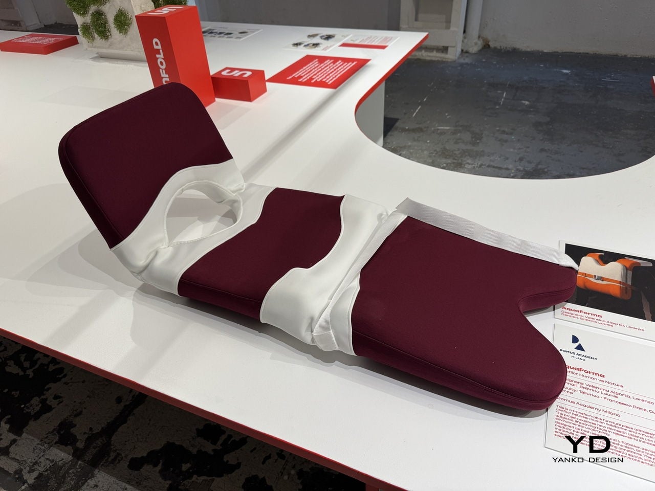
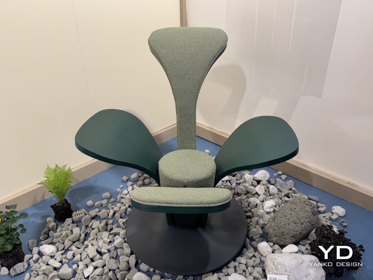
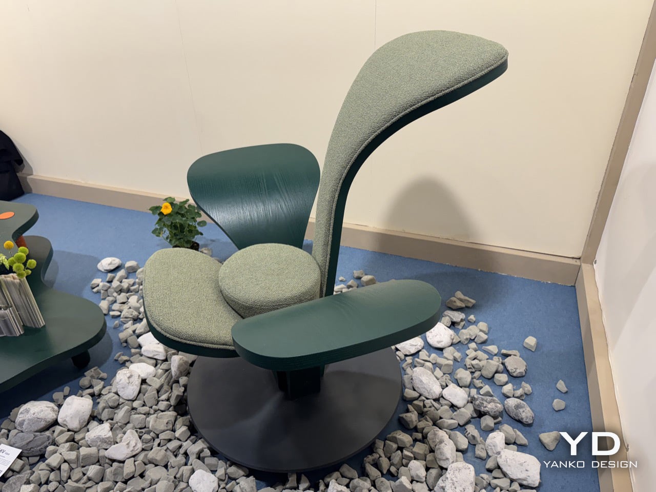
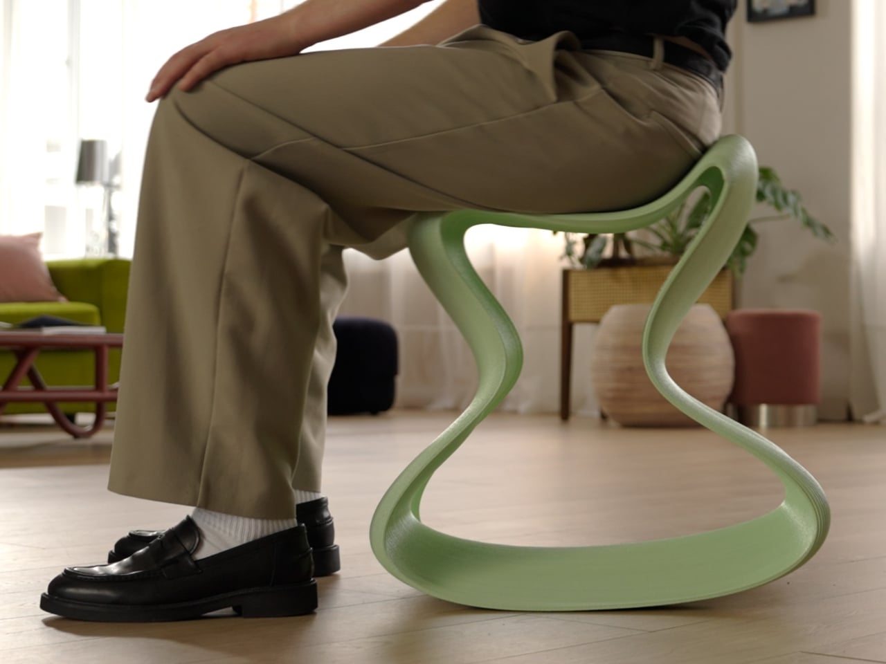
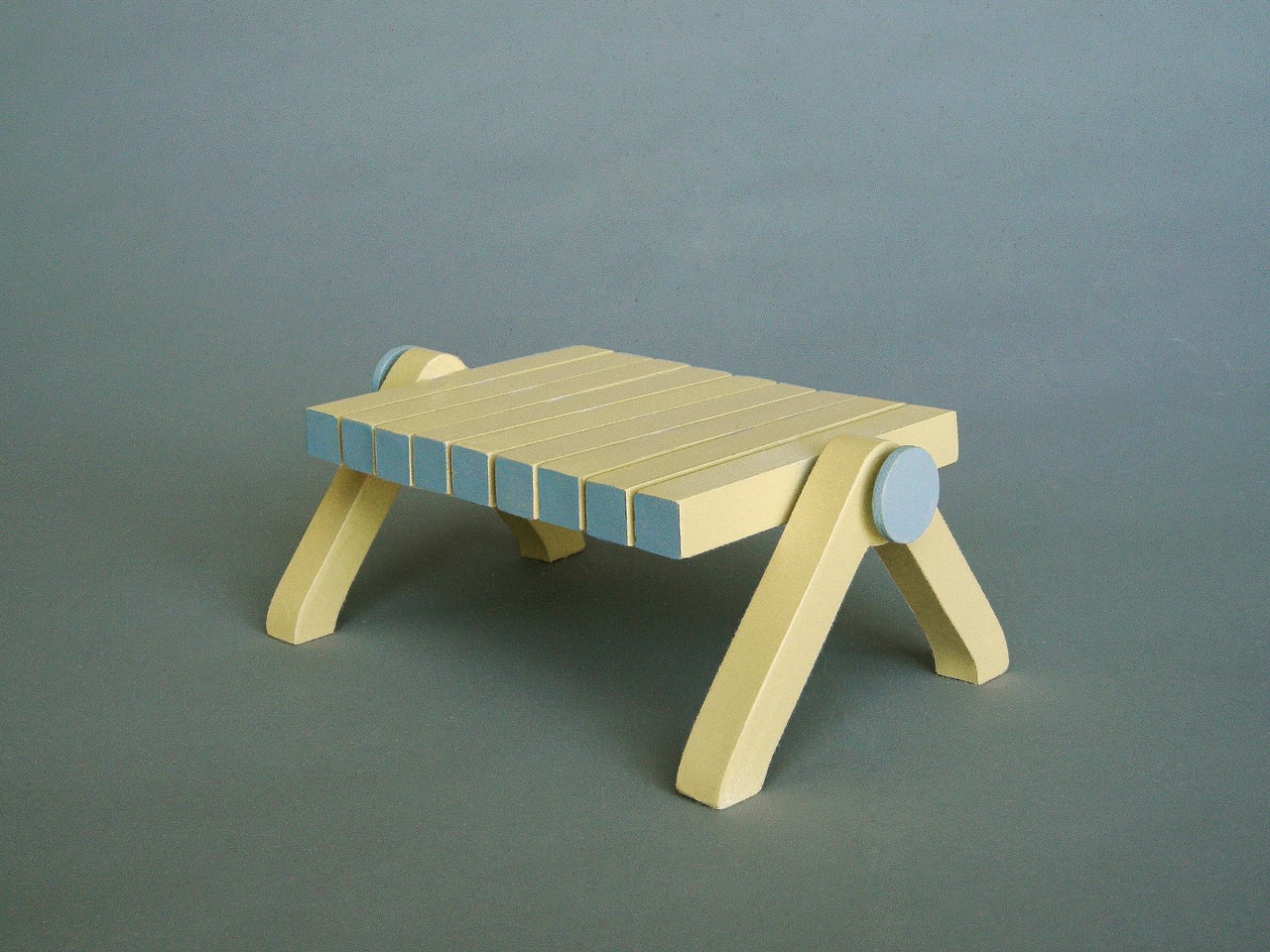
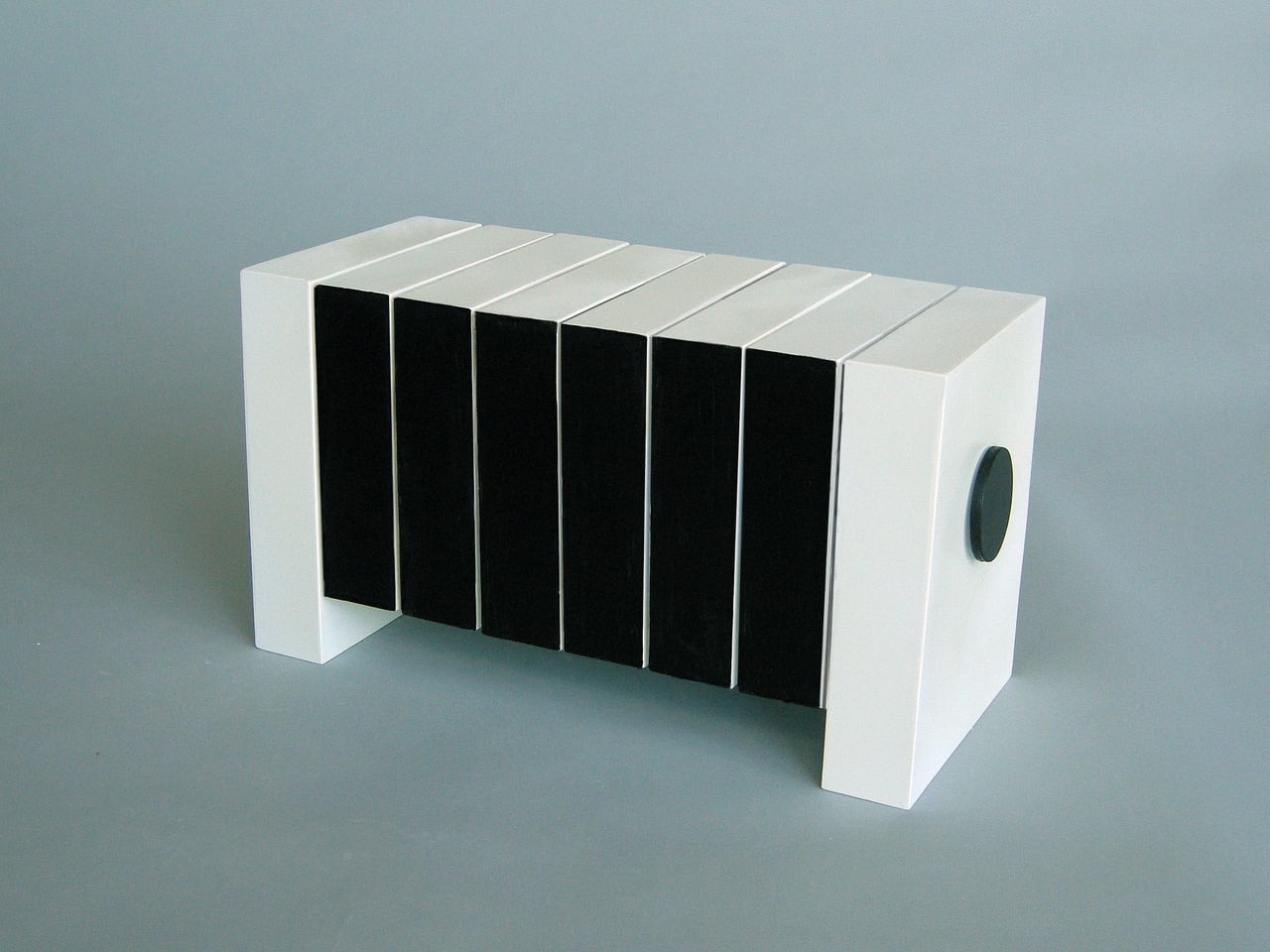
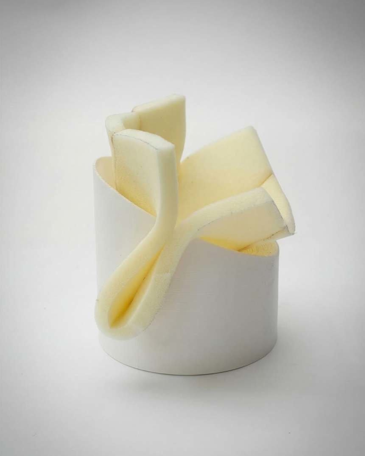
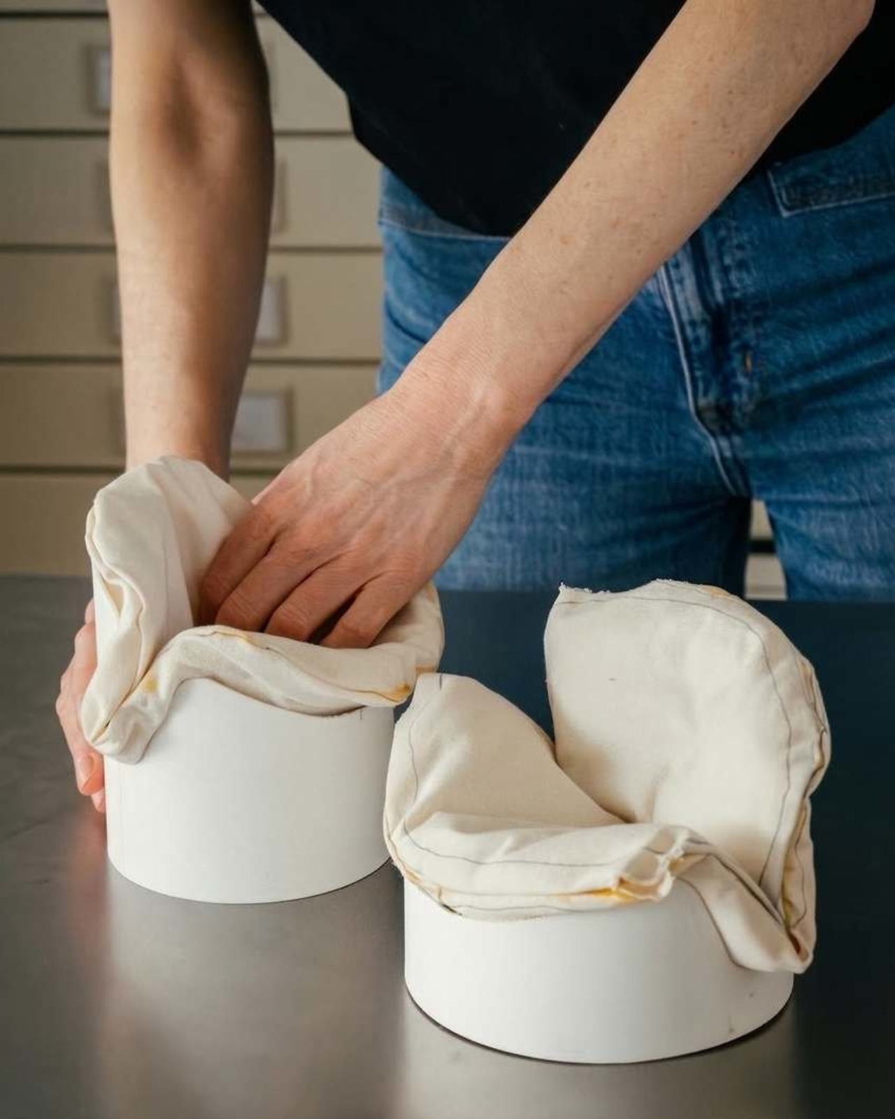
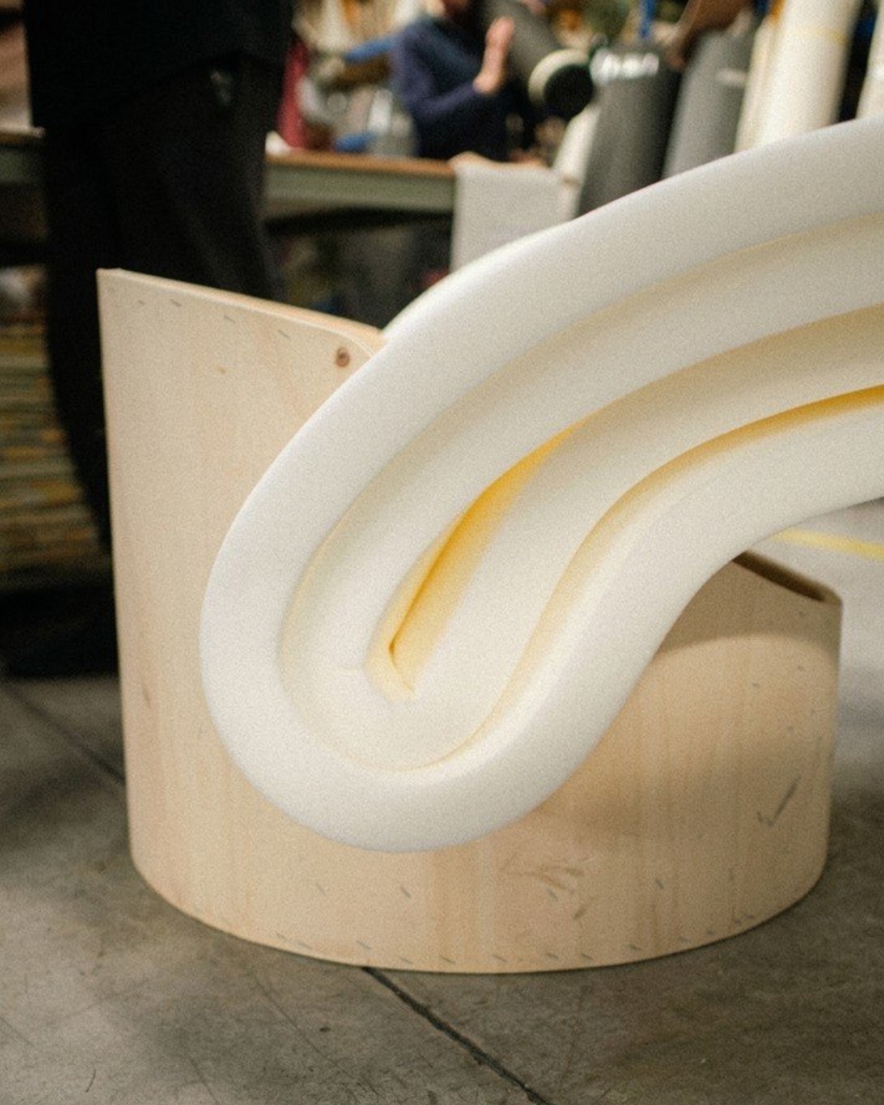
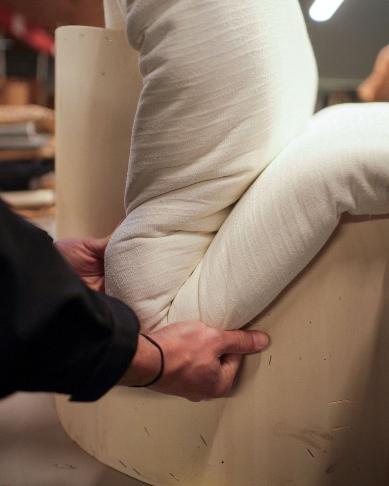
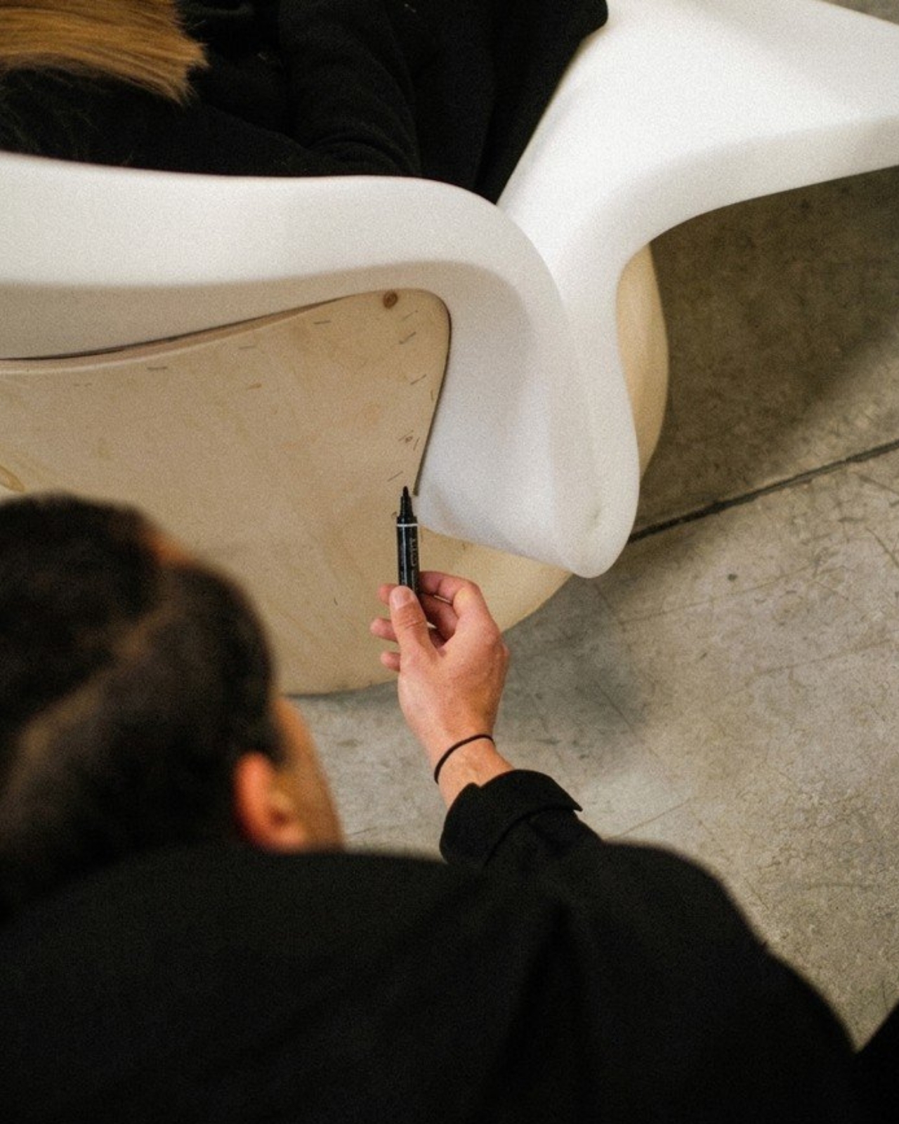
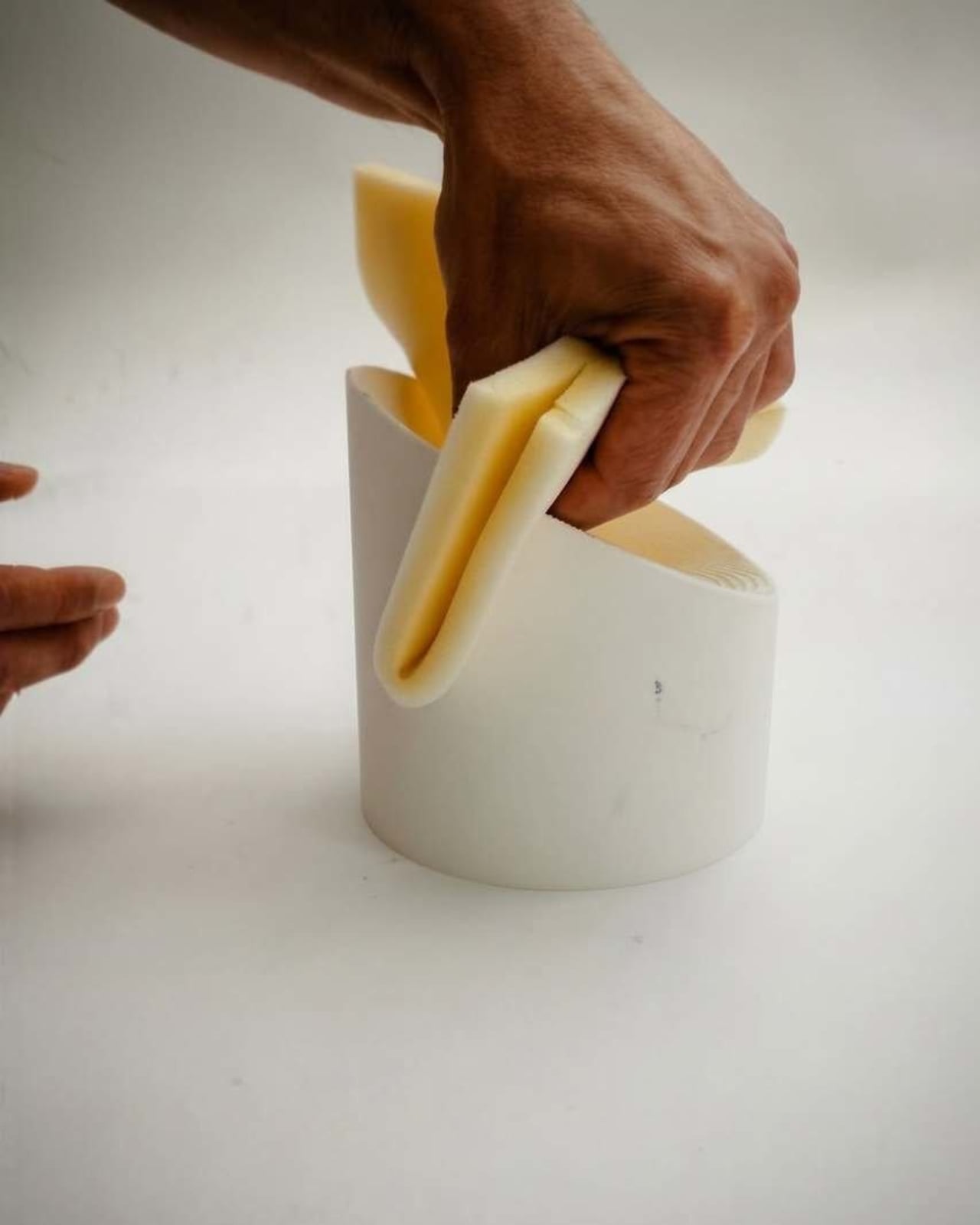
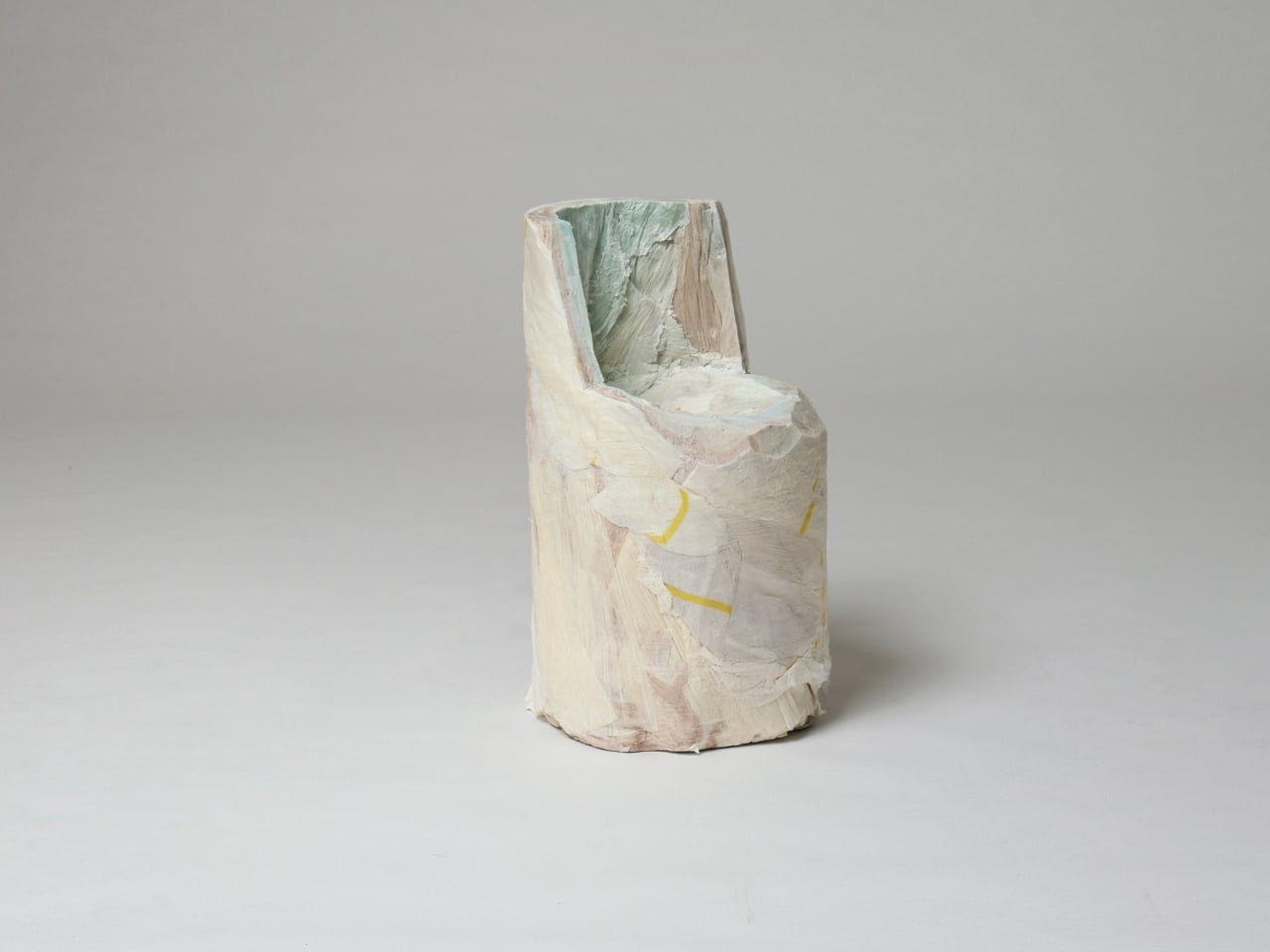
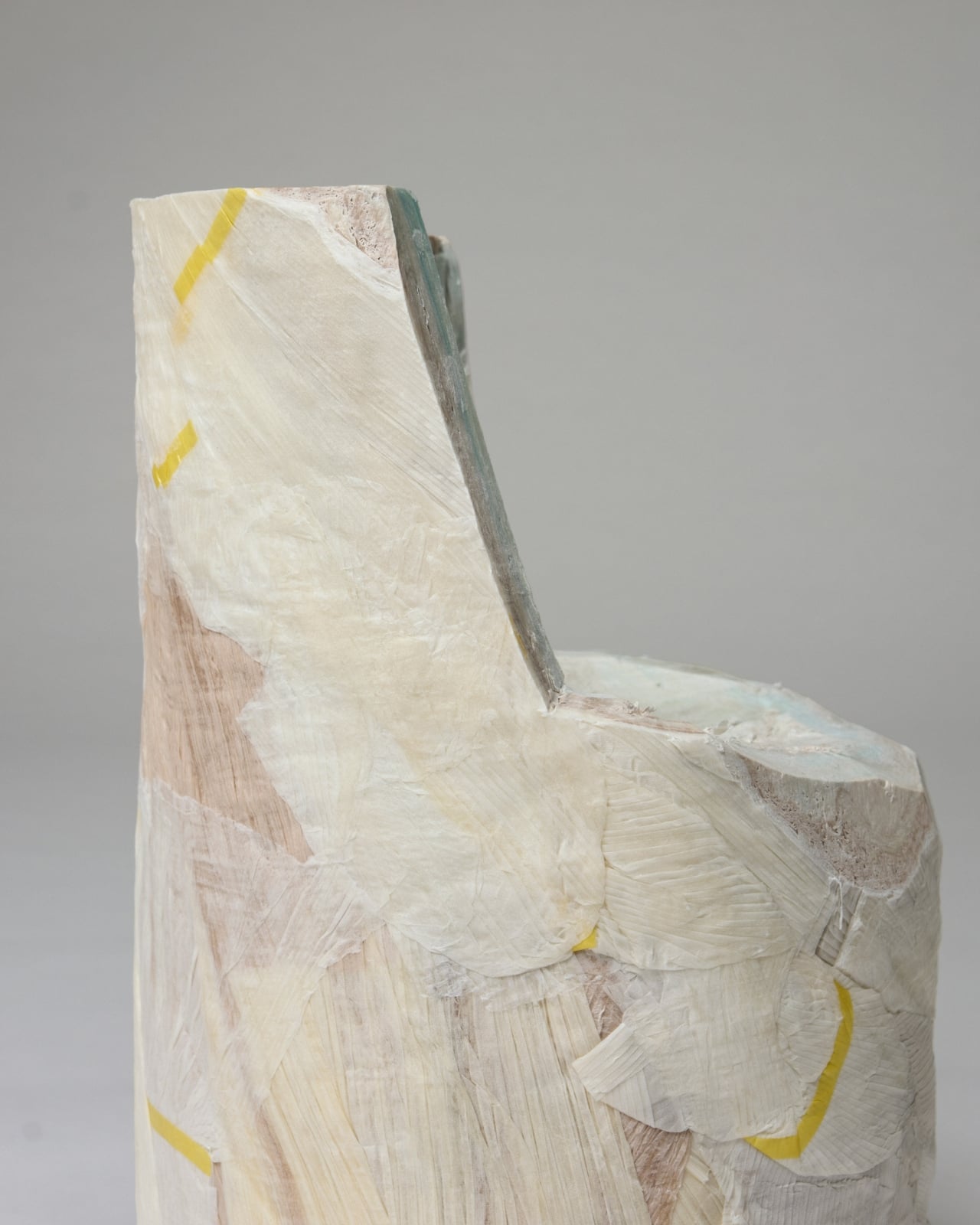
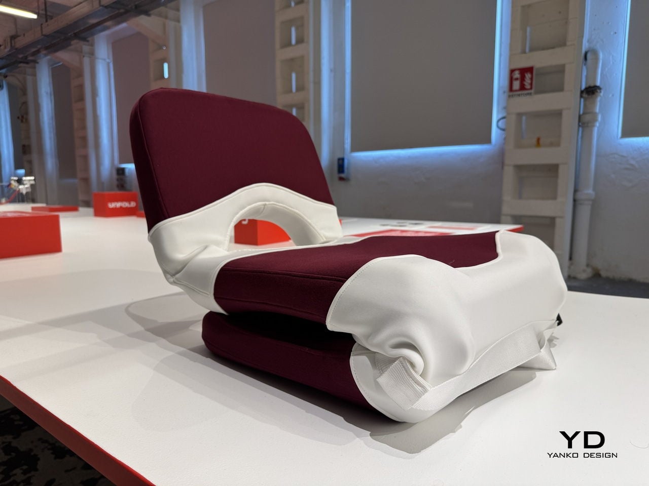
The starting point is a familiar one: a chair. In its default configuration, AquaForma functions as low-profile floor seating with a cushioned backrest and seat upholstered in deep burgundy fabric. A white structural shell wraps around the cushioned elements in flowing, organic curves, giving the piece a sculptural quality that sits comfortably within contemporary furniture design. Nothing about it announces its other purpose.
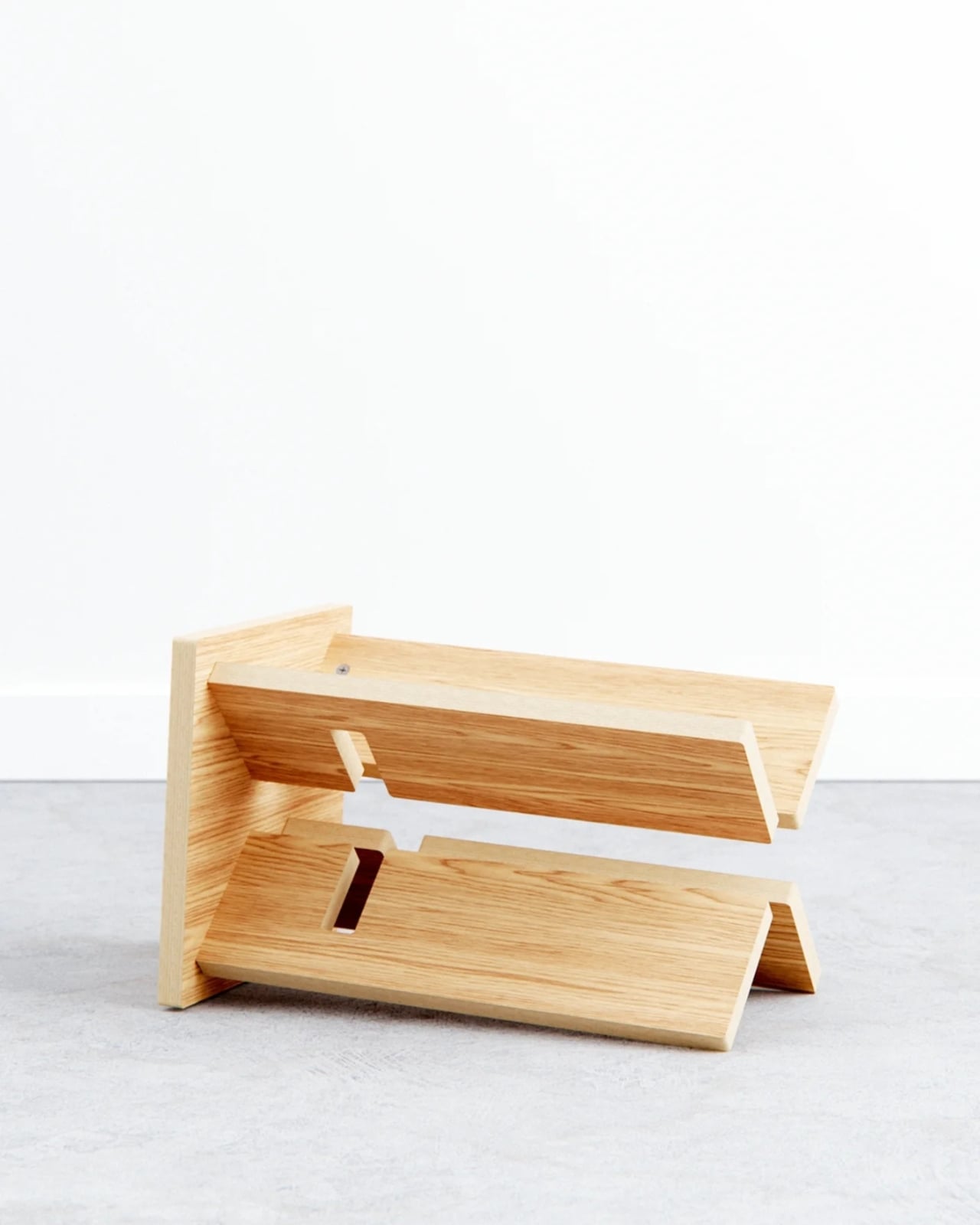
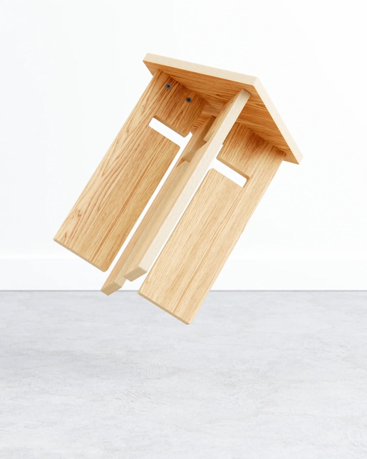
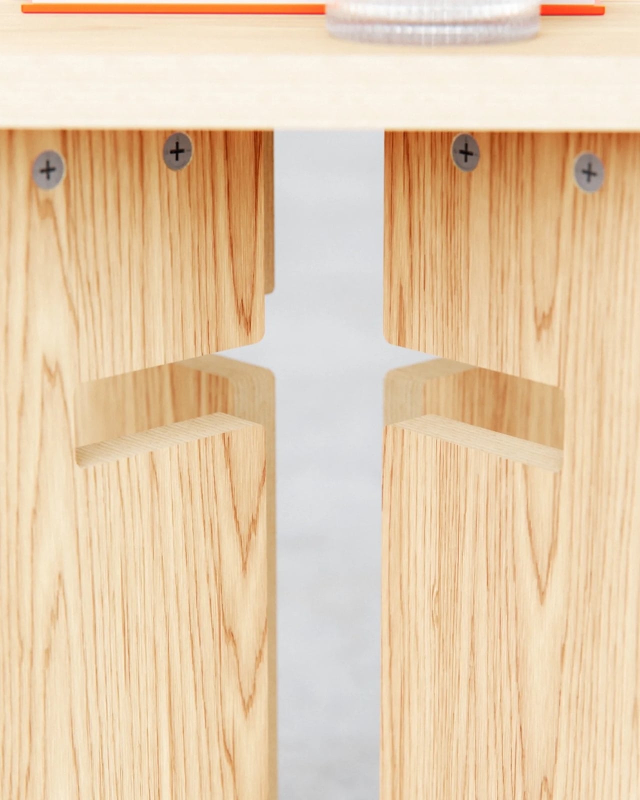
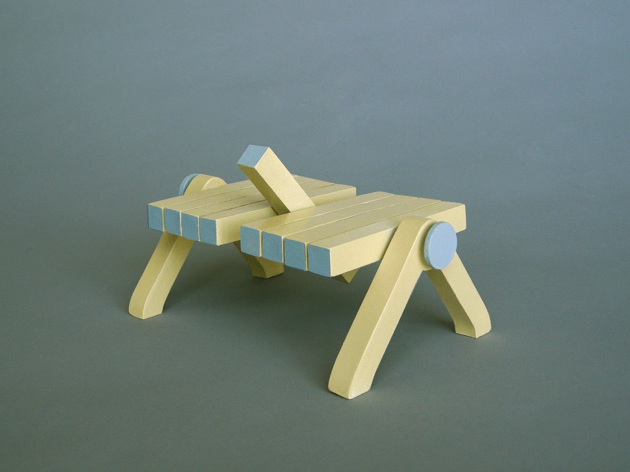
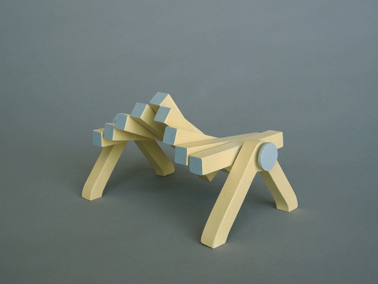
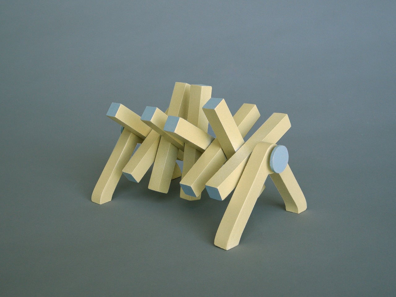
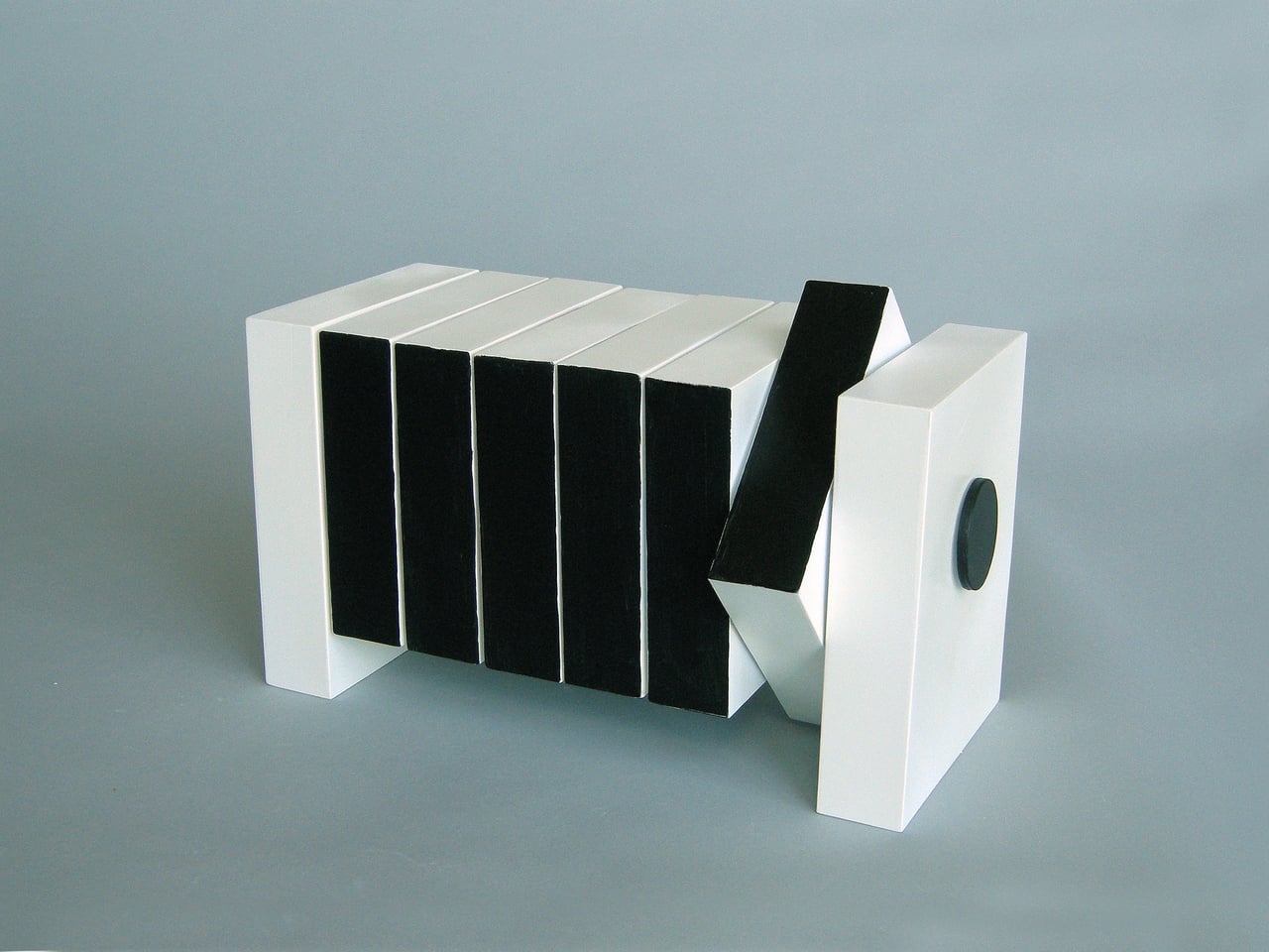
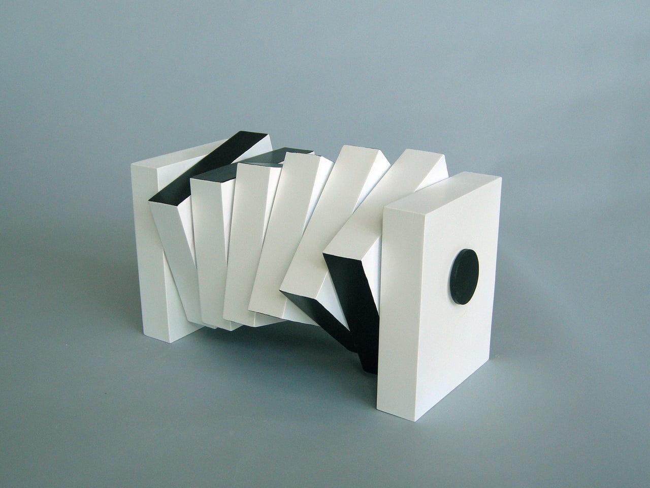
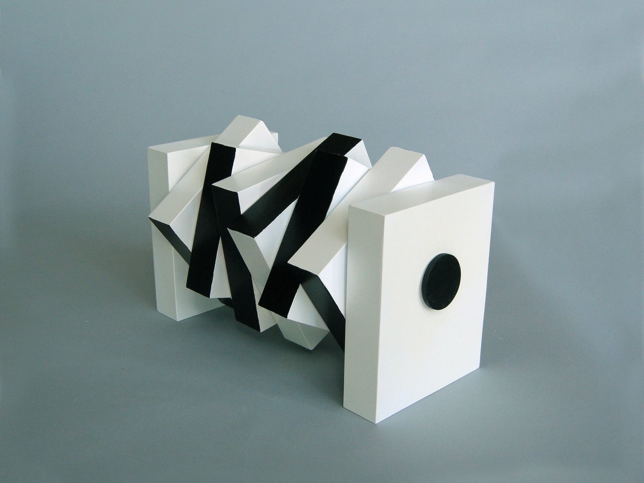
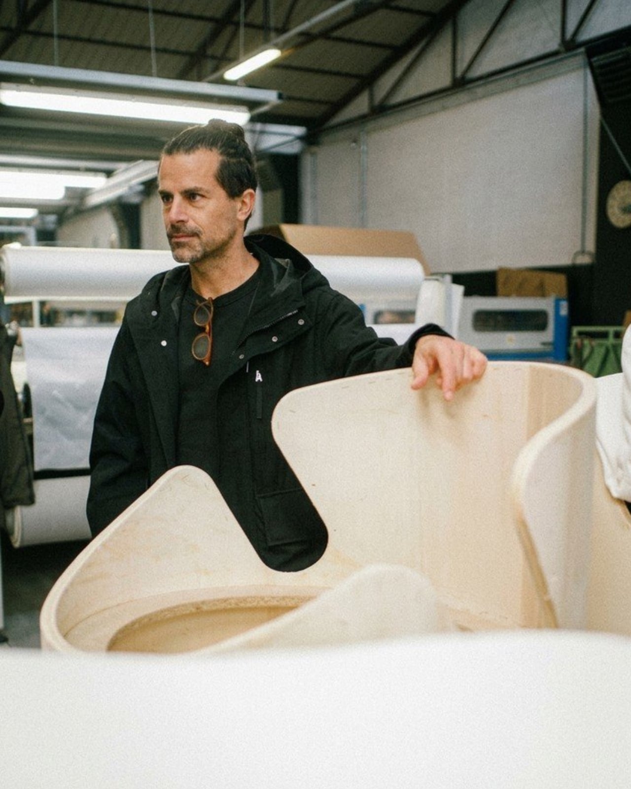
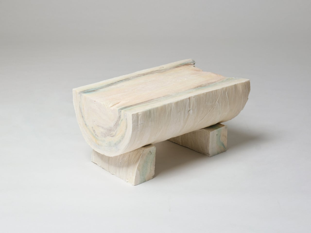
That other purpose becomes clear when flooding hits. The piece uses modular panels, a ratchet buckle mechanism, and buoyant materials that allow it to be reconfigured into a flotation device. The modules interlock and can be reoriented, with individual components separating and reassembling into a completely different arrangement. What sits quietly in a living room can, in theory, keep someone afloat.
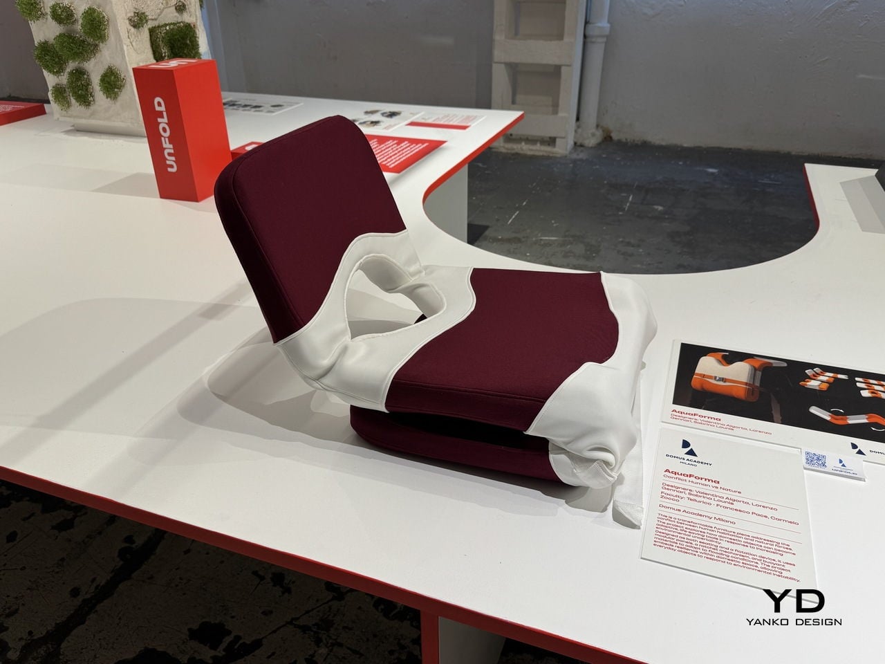
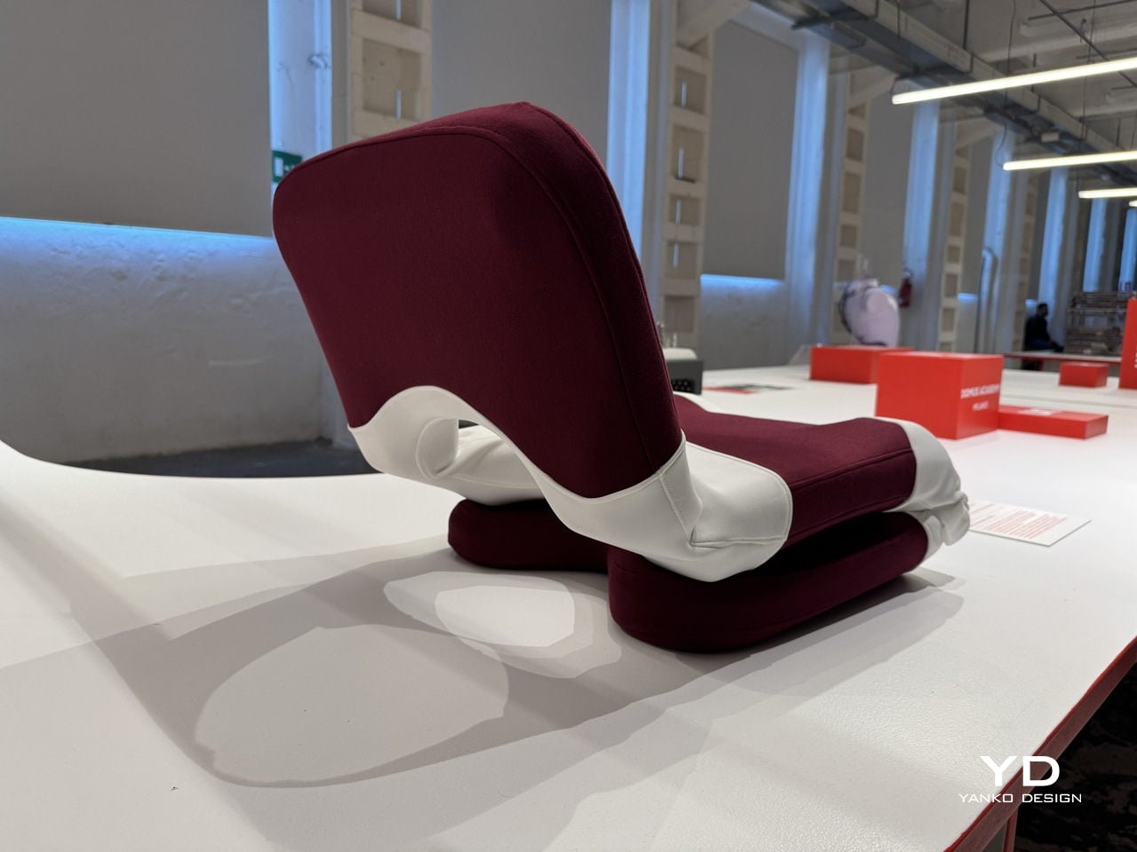
The ratchet strap across the midsection does more than hold the piece together; it’s the key mechanism that allows components to be tightened, secured, and adjusted depending on the configuration the piece needs to take. This kind of dual-purpose hardware thinking keeps the design grounded in practicality. There’s no single feature here that’s gratuitous, with everything pulling double duty between the domestic and the emergency.
What makes AquaForma particularly compelling is how invisible its emergency function is in everyday life. You wouldn’t sit on it and think about rising water, and that’s precisely the point. Resilience embedded in ordinary objects doesn’t announce itself until it needs to, and that restraint is what separates a clever concept from a genuinely useful one. The designers didn’t design for a crisis; they designed around it.
AquaForma was shown as part of the UNFOLD exhibition at BASE Milano during Milan Design Week 2026, a student showcase that puts emerging design ideas at the center of one of the world’s most design-saturated weeks. It’s the kind of project that’s easy to underestimate at first glance. A chair that becomes a flotation device sounds like a design school exercise until you remember how often people need exactly that.
The post This Chair Looks Normal Until It Needs to Keep You Afloat in a Flood first appeared on Yanko Design.