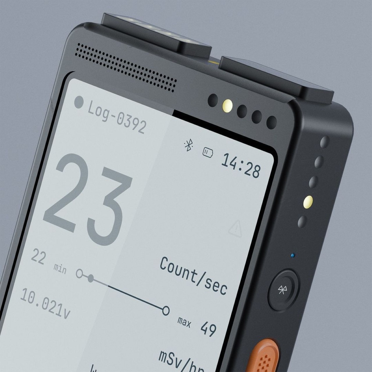
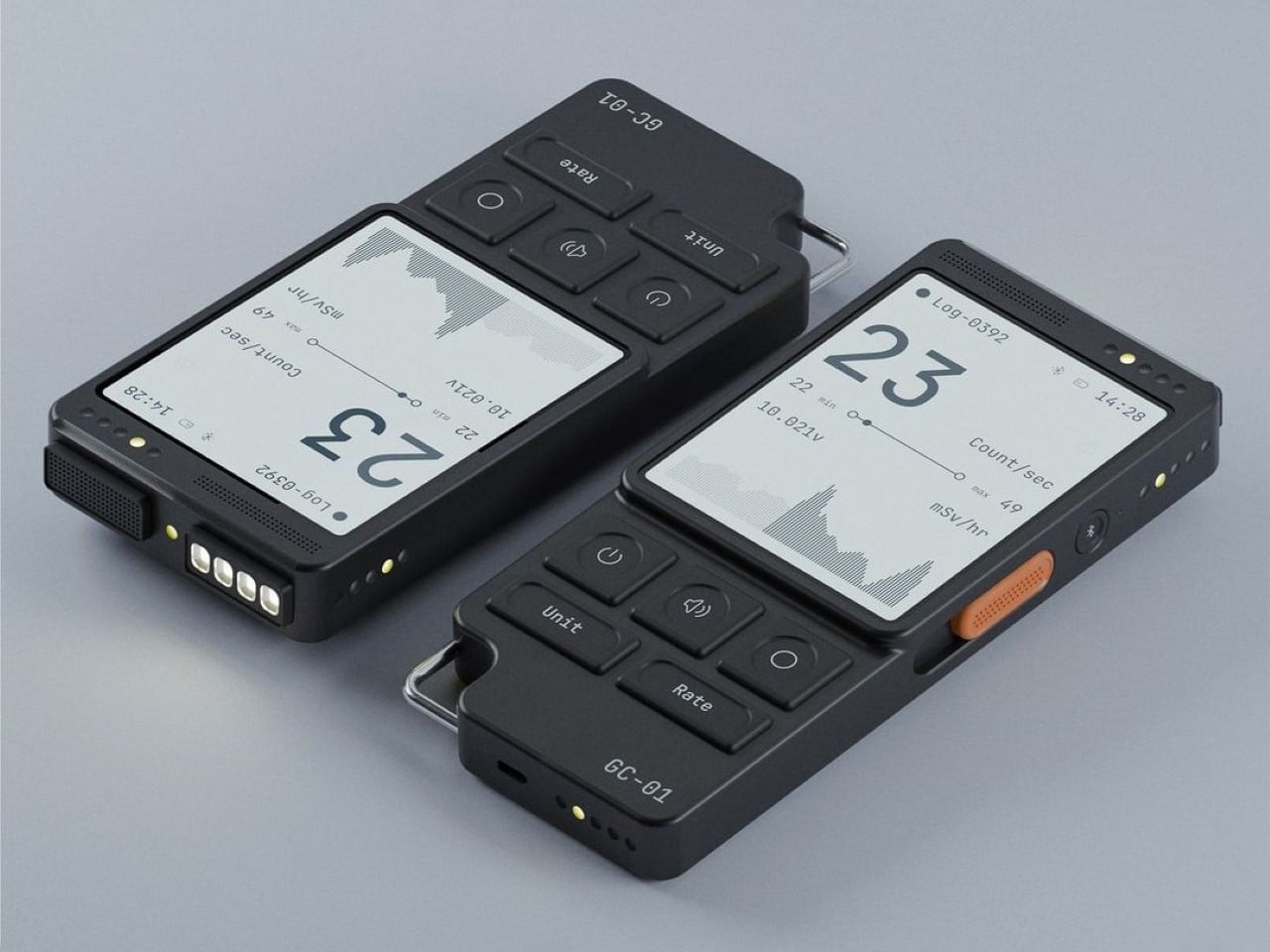
Let’s move beyond the steampunk stylings of the Bioshock games of the past and bring a new neo-punk style to the game fit for the year 2024-25. This Geiger counter designed by Max Kibosh takes a potentially apocalyptic instrument and gives it a new-world cool aesthetic that could just as easily pass off as a tech product from the mind of Nothing or Teenage Engineering.
Dubbed the GC-01, it simplifies an otherwise complicated-looking piece of machinery, with a minimalist aesthetic that trickles all the way down from the exterior to the interface and even the user experience. Is it weird that I now want a Geiger counter??
Designer: Max Kibosh
The GC-01 is simple because why not? Geiger counters have one singular function – detecting and measuring radiation levels. To that end, Kibosh designed a handheld device that looks good on your person, and feels good in your hand. The simplified control panel makes measuring easy, and a monochrome display gives you a clear reading without any fluff.
The counter is conceptual, so any details/controls are purely speculative – however, the idea of bringing minimalist styling to something as unique as a specialist device for measuring radioactivity feels, well, inspired. You’ve got a Bluetooth button on the side (I honestly don’t know why), and a yellow switch that allows the user to switch between different operating ranges to get an effective reading. It’s perhaps the only detail on the GC-01 that has any color, hinting at its significance – sort of like the International Orange color used for the Action button on the Apple Watch Ultra.
Being modern shouldn’t come at a cost of being useful, and I guess Kibosh realised that slapping a touchscreen on a Geiger counter made no sense – especially given that you’re probably in a hazmat suit if you’re using a Geiger counter. The buttons on the GC-01 are large, tactile, and have indents in them that make them easy to intuitively control with minimal error. A loop on the bottom left corner makes tying a lanyard easy so your counter is always at arms length, and here’s the best part, the GC-01 even comes outfitted with a built-in flashlight on the top, allowing you to see where you’re walking as you take readings – pretty useful in a post-apocalyptic abandoned building when the electricity grid’s collapsed. I won’t lie, that makes for a pretty compelling video game – Hey 2K Games, I call dibs.
Most EDC enthusiasts are familiar with the few common formats – knives, screwdrivers, multitools, wallets, sometimes even stationery. A folding fan, on the other hand, isn’t ‘conventional EDC’, but the folks at Titaner have a way of turning it into something cool anyone would love to own. Titaner’s Titanium DIY Folding Fan feels like something straight out of an action hero’s kit—think Kitana from Mortal Kombat, but with a practical, everyday twist. While Kitana may wield her metal fans with deadly precision, the Fan 4.0 is not here to slice and dice. Instead, it blends elegance, craftsmanship, and utility into a piece of EDC gear that’s as refined as it is functional. Redesigned using titanium instead of bamboo wood, the Titanium DIY Folding Fan is a modernized version of the original EDC from ancient Asia. Equal parts a fan and a self-defense tool (if you know how to use it), the Titanium DIY Folding Fan (or Fan 4.0 as its creators call it) makes for a unique addition to your EDC collection, and is the kind that works for both men and women – especially given the heat-wave we’ve been having!
An EDC titanium folding fan might be niche, but the folks at Titaner are no strangers to the EDC industry. They’ve worked on 9 other successful EDC campaigns, so as a 10th campaign it’s perfect that they’re stepping beyond the boring multitools and working on something that has a little more panache. Simply put, the Fan 4.0 is a tool to beat the heat as well as other scenarios that may require potential beating. We don’t condone violence, but hey, the idea of defending yourself using just a folding fan sounds incredibly cool. The fan’s titanium build gives it robustness, making it a baton when closed. Use it to defend yourself as a striking tool, and when you’re feeling safe, fan away the sweat with your folding titanium fan. I won’t lie, that sounds absolutely wicked.
The Fan 4.0 brings a fresh, modern spin to the ancient art of folding fans, offering a distinct combination of tradition and innovation, past and future, and culture and purpose. Crafted with a titanium frame (known for its high strength-to-weight ratio), the fan is built to endure, yet it doesn’t sacrifice elegance in its quest for durability. The ribs, slimmed down to reduce weight, are diamond-shaped and chamfered to offer a more ergonomic grip, ensuring comfort whether you’re fanning yourself in the heat or showing off its impressive craftsmanship. Adding a touch of luxury, the ribs are inlaid with strips of natural mother-of-pearl, bringing a shimmering, oceanic sheen to the otherwise industrial look. These inlays, painstakingly set into the fan’s surface, add a traditional artistry that contrasts beautifully with the rugged titanium structure. The fan’s waterproof silk fabric—another nod to both beauty and practicality—keeps it lightweight, flexible, and impervious to moisture, ensuring it remains in top condition even after prolonged use. The combination of these elements—titanium, mother-of-pearl, and silk—creates a fan that is as much a tool as it is an accessory, marrying functionality with undeniable style.
Optimized center of gravity for a more comfortable grip.
Hidden fan nails for a comfortable grip.
If you’ve ever wrestled with a folding fan that was too tight or flopped around uselessly, you’ll appreciate the engineering at play here. The Fan 4.0 boasts a tool-free tension adjustment system that works without screws or requiring you to dig your nail into grooves to tighten or loosen the fan’s rotating joint. A simple turn of the pop-out T-shaped knob adjusts the tension to your liking, whether you prefer a crisp snap when opening or a more leisurely glide. And thanks to a clever design tweak that limits how much the T-shaped knob juts out, you won’t have to worry about over-rotating and losing the tension nail. Once you’re done adjusting, the knob slides back into its housing, sitting flush against the fan’s grip.
Of course, none of this would matter if the fan didn’t feel good in your hand. Traditional folding fans can be cumbersome, but Titaner took a different approach. The fan ribs have been slimmed down, making them lighter without compromising strength. This seemingly minor change makes a world of difference in usability without compromising on the fan’s overall experience. It still looks and feels like your traditional folding fan made from thinly cut sheets of bamboo. It’s probably marginally heavier than traditional fans, but the flipside is that while bamboo can break or even rot under moisture, titanium won’t. The balance and weight distribution are also finely tuned so you can use it comfortably for extended periods without any hand fatigue. Whether you’re in a humid area or even in dry heat, the titanium fan folds open gracefully, letting you fan yourself for some heat relief. The compact design means it fits right in your pocket so you don’t have to potentially leave the fan lying around anywhere – exposing it to direct sunlight which could make the titanium metal hot to touch. I mean, you wouldn’t leave any EDC out in broad daylight anyway, right?!
The Fan 4.0’s practicality goes beyond being just your traditional folding fan. Sure, it also doubles as a pretty cool fidget toy and conversation starter – but it holds a fair bit of potential as a self-defense tool too. I don’t condone violence here at all, but in emergencies, the closed Fan 4.0 is more than powerful enough to be used as a striking tool. The titanium base (where the pivot lies) can break through most types of glass, and can even be used to fend off attacks. Don’t expect any Mortal Kombat-style warfare though – Kitana’s weaponized fans are a different breed entirely.
Fan 4.0 isn’t just for collectors or those with a flair for the dramatic – it has a little something for everyone. It’s available in three sizes—9.2 inches, 11.8 inches, and 13.4 inches and weighs anywhere between 120.5 grams (4.2 ounces) and 237 grams (8.3 ounces). As far as designs go, you have 3 to choose from, ranging from a Sumi-e horse graphic to an ancient Chinese proverb and even a fluid-art pattern inspired by Van Gogh’s Starry Night. Whether you want something compact enough to fit in a pocket or prefer a larger fan with more presence, there’s an option for you. Starting at $305 on Kickstarter, this fan might raise eyebrows with its price tag, but it’s not about luxury for luxury’s sake. You’re not just buying a fan—you’re buying a piece of expertly crafted gear that combines ancient design with modern innovation. The Titaner Titanium DIY Folding Fan is a perfect example of how even the simplest tools can be reimagined and perfected for today’s world.
Delta Air Lines is embracing a bold new chapter in design, one that puts passenger comfort and aesthetics at the heart of its vision for the next century of flight. Rolling out this fall, the new cabin interiors will first appear on the Boeing 757, setting the stage for what Delta promises to be a cohesive, elevated experience across its fleet. By early 2025, the Airbus A350 will follow suit, giving long-haul travelers the same refined ambiance. This overhaul aims to blend functionality with style, creating a space that feels less like a mode of transportation and more like a curated environment, thoughtfully designed to make the journey as important as the destination.
Delta’s redesign isn’t a one-size-fits-all approach—it carefully caters to the unique needs of each cabin tier, ensuring that every passenger, from the front of the plane to the back, feels the difference. For those flying Delta One, the airline’s most premium offering, the updates bring a sense of sanctuary, with privacy dividers and lie-flat beds that have been reimagined with richer materials and softer finishes. Delta Premium Select sees enhancements with deeper recline and added space, paired with a refreshed design that includes plush memory foam seating and upgraded amenities, bridging the gap between comfort and luxury. First Class also benefits from these changes, offering an elevated experience with updated seating that’s both supportive and refined, making short and medium-haul flights more enjoyable. Meanwhile, Delta Comfort+ and the Main Cabin get their own share of the improvements, from improved seat ergonomics to a fresh look and feel that emphasizes comfort even in the more budget-conscious sections.
Seating has become more than just a place to sit—it’s now a space to sink into. Delta’s updated seats feature memory foam cushions wrapped in breathable engineered leather, striking a balance between durability and comfort. These aren’t your average airplane seats; they are tailored to support relaxation during those cross-country jaunts or quick hops across international borders. The Premium Select and First Class seats get a notable upgrade, but Delta has also spread the love across other cabins, ensuring that the plush feel and attention to detail extend throughout the plane. It’s a design ethos built on extensive passenger feedback, an effort to take the little things that matter—like seat comfort—and elevate them to an art form.
Lighting plays a starring role in Delta’s refreshed interiors, bringing a sense of rhythm to the in-flight experience. Picture this: as you board, the cabin is bathed in a warm, welcoming glow, easing you into the transition from the bustling terminal to your personal space in the sky. The lights shift as the flight progresses—soft and warm for that mid-flight meal, shifting to amber tones that mimic a sunset when it’s time to sleep. Delta’s lighting design is about more than just aesthetics; it’s about creating a sense of time and place, gently coaxing passengers into rest or wakefulness, depending on the phase of the flight. It’s the kind of detail that shows Delta is thinking about how every moment onboard can be made just a bit more comfortable.
But this transformation is more than skin-deep. Delta’s use of colors and materials reflects a commitment to a serene, polished environment. The cabin design introduces a palette that is both warm and refined, incorporating natural materials like wool alongside nods to Delta’s storied history with subtle heritage colors. From the Infinite Grid motif on bulkheads that hints at Delta’s expansive global network, to the Celestial Sky pattern that evokes the feeling of soaring above the clouds, every design choice feels intentional, each detail a quiet nod to the art of travel. Delta’s brand isn’t just stamped onto the plane; it’s woven into every fabric, etched into every surface, creating a continuity that invites passengers to feel at home.
Even the lavatories get their moment in the spotlight. Delta has transformed these often-overlooked spaces with sleek, modern finishes. Think fresh Azure Blue cabinets and walls featuring the Celestial Sky design—a reminder that even at 35,000 feet, style shouldn’t be an afterthought. The flooring is smooth and easy to clean, ensuring a spotless experience from nose to tail. It’s all part of Delta’s vision to leave no corner untouched, no detail unrefined. This attention to the little things speaks volumes about the airline’s commitment to creating a cohesive, high-end experience from the front of the cabin to the back.
Delta’s design refresh isn’t just about making a splash; it’s about setting a new standard in airline interiors, where every detail serves a purpose, and comfort is engineered into the very fabric of the plane. By starting with the Boeing 757 and expanding to the A350, Delta is methodically bringing this new look to life, ensuring that each update delivers on its promise. And while the transformation will take time, the approach is a calculated one—rolling out improvements gradually means Delta can adapt and fine-tune as they gather feedback, making each step a little smoother than the last.
As Delta marks its 100th anniversary, this redesign feels like a statement of intent. It’s about looking forward, anticipating what travelers want before they even know they want it, and delivering an experience that’s as thoughtfully crafted as it is comfortable. Delta’s new interiors are a nod to where the airline has been, but more importantly, they are a preview of where it’s going—toward a future where every flight, regardless of the route, offers a space that feels as inviting as it is functional. And if all goes according to plan, stepping into a Delta cabin will feel like entering a place where design, comfort, and the joy of travel converge, each time you take to the skies.
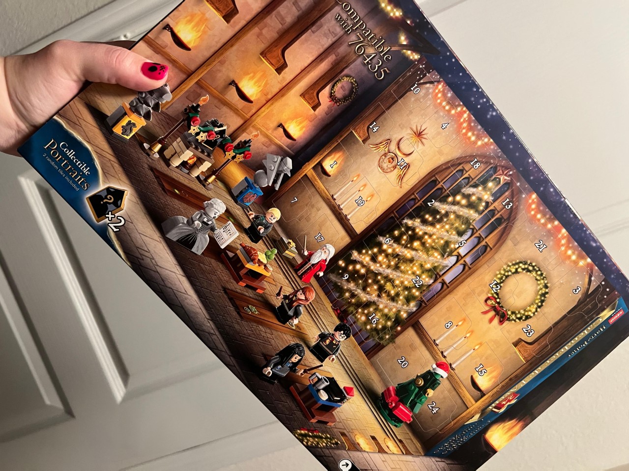
I mean, the holidays are supposed to feel magical, but LEGO’s Harry Potter Advent Calendar makes them feel a little extra magical in the most literal sense! The calendar, designed to count down the days till Christmas from the 1st of December, is a creative twist on a classic tradition. Advent calendars have long been a way to make the countdown to Christmas extra special, with each day offering a new little treat. But rather than the usual chocolates or tiny trinkets, this set brings a daily building adventure that captures the charm of the Wizarding World, offering a delightful surprise behind every door.
Inside the advent calendar, you’ll find a mix of 8 mini-figures, including key characters like Harry Potter, Draco Malfoy, and Professor Dumbledore. Each figure comes with their holiday twist, adding a festive touch to these iconic personalities. Alongside these figures, there are 16 mini-builds featuring familiar Hogwarts items, each designed to evoke scenes from the wizarding world. The builds include everything from festive decorations to miniaturized magical objects, all crafted in Lego’s signature blocky yet detailed style. For fans of the series, it’s a nostalgic nod to Harry’s first Christmas at Hogwarts, capturing the warmth and whimsy of the holiday season within the halls of the magical school. Every day, a new piece is unveiled, building anticipation for what’s behind the next door—a perfect way to keep the holiday spirit alive throughout December.
The beauty of this advent calendar is that it’s as much about the journey as it is about the destination. Each morning, fans can open a door and find a new surprise to add to their growing collection, whether it’s a miniature version of the Hogwarts Express or a whimsical little holiday scene from the wizarding world. It’s a charming way to relive the excitement of those first glimpses of Christmas at Hogwarts—the decorated Great Hall, the warm fires, and snow-covered grounds that are so vividly brought to life in the stories. And for anyone who’s ever dreamed of being part of that world, it’s like opening a window into it, one piece at a time.
This set is also perfect for expanding an existing Lego Harry Potter collection. It’s designed to integrate seamlessly with other sets, such as the 76435 Lego Harry Potter Great Hall, allowing you to create a larger and more detailed magical world. Whether you’re a collector looking to add new elements to your display or a newcomer who’s just starting their Lego journey, this advent calendar offers a versatile and engaging way to build. With clear instructions included behind each door and additional guidance available through the Lego Builder app, even young wizards can easily join in the fun. It makes for a wonderful family activity during the countdown to Christmas, where everyone can contribute to creating a little piece of Hogwarts magic at home.
Currently, it’s available for $36, down from its usual price of $45—a great deal for fans looking to bring home a bit of holiday magic without breaking the bank. It’s a gift that keeps giving long after the holidays, too, as the pieces can be played with and displayed throughout the year. Unlike other advent calendars that might be consumed or discarded, this one offers a more lasting way to celebrate the season, one that can be revisited year after year.
Five years ago Dave Logan designed what we called the ‘only bag you’ll ever need’… now he’s back with an even better redesign.
Logan’s bags (designed under the moniker Onli Travel) had one uniting design detail that made them spectacular – they were like the Power Rangers, independently capable, but also had the ability to unite and become better than the sum of their parts. Onli Travel’s latest design, dubbed the Trilogy, builds on that concept. Made of three distinct parts – a spinner (or a trolley bag), a tote, and a daypack – the Trilogy can be used independently as regular pieces of luggage, paired with one another to create unique combinations based on your need, or all joined together like a club-sandwich that lets you practically carry your life with you in one single cohesive unit.
Ask anyone who travels a lot what their secret to effectively carrying stuff is, and they’ll answer – modularity. It’s simple – one size never fits all, and if your bag is a standard bag that’s rigid in its offerings, it won’t help you. Different people have different needs, and sometimes those needs also change based on mood, scenario, and time of the day. A modular carrying solution is the best way give people what they want, sort of like having a smartphone where people can install the apps they need and not be stuck with the apps you want them to have. Logan’s Trilogy series tries to do that. The three bags are vastly different, made for different scenarios – but they come together when you need them to. Strutting across an airport with your luggage, the bags attach together so you can wheel them as one unit. Scared your laptop bag might get stolen? Zip it off and carry it on your back. Want to unfold everything for the TSA during a security check? The bags are easy to disassemble and lay flat. Boarded your plane late and now don’t have enough space in the stowaway area for your bag? Split them apart so they can jigsaw-piece their way into the overhead storage space. Want to work or watch a movie while flying, one of the bags can literally strap to the back of the seat in front of you, turning into a work-table or entertainment center. All this happens while the Trilogy keeps all your belongings safe, secure, and segregated. Every part of the Onli Travel Trilogy has purpose, and is designed flawlessly to fulfill that purpose… I can’t say that about many other carrying solutions.
Each of the Trilogy’s individual parts is in itself, a complete bag. The spinner, or the trolley case, is perfectly cabin-bag sized, but is spacious enough to carry your luggage comfortably. It’s designed to be expandable, should you need to carry more, and has a mild wedge-shaped profile that allows it to easily tuck under seats of airplanes, just in case the overhead cabins are full. The spinner comes with a fabric construction, but boasts a reinforced top so you can rest a backpack on it while walking through the airport, as well as reinforced sides so the spinner holds its shape remarkably well. On the inside, you have ample space for your stuff, and Onli Travels even has a compatible modular cube packing system for seamless organizing. There are pouches/pockets on the outside too, for storing easy-access belongings like important documents, an umbrella, or a bottle of water. To make carrying the spinner easy, it comes with handles on three sides… and if the spinner’s storage isn’t enough, let’s not forget that it lets you snap two extra bags to it – the daypack, and the tote.
The Expandable Tote and the Weekender Daypack are similar in format – but are designed for different purposes. The Daypack, as its name suggests, is for day-trips, while the tote is the perfect bag to have on yourself for work, commutes, or even stepping out to hit a cafe. The tote is styled to be carried on one shoulder, but can be worn as a backpack too. It’s big enough to comfortably fit a 17” laptop, has pockets on the front and side for storing multiple belongings, and has an expandable design that accommodates more just in case the existing storage isn’t enough. While traveling, the tote can be attached to a seat in front of you using a set of straps, and a zip-down shelf on the top gives you a small yet convenient tabletop surface that fits an iPad or a small tiffin box perfectly. Overall, the tote’s designed with waterproof fabric, has lockable zippers, and even boasts RFID protection against digital theft.
The Weekender Daypack is just as efficient as the Tote, but think of it as your bag for out-of-city trips. It comes with shoulder as well as sternum straps, has ample storage, boasts an expandable design, and even has underpack storage for items like a rolled-up sleeping bag, yoga mat, etc. The bag’s clamshell zippers allow it to open absolutely flat (perfect for TSA inspection), revealing the inner storage compartment that is big enough to house a 17” laptop comfortably, along with an iPad or tablet. The daypack also comes with its fair share of pockets for storing all your belongings, making it just the right bag for a quick getaway or day trip.
The beauty of these bags, regardless of their shape/size/ability, is that they can either work independently, or unite to create ‘super’ bags. Each bag can be attached to the other – so your day-pack can be zipped to your tote for a large shoulder-worn backpack, or to your spinner for a bulky carry-on that can easily be wheeled around everywhere. The tote can fasten to the spinner too, and if you want to join all three together, it’s entirely possible. That particular arrangement is ideal for making sure all your bags are together at all times, but when the going gets tough, each of the bag can separate out, giving you individual compact pieces of luggage that are a little more convenient to manage and access.
The Trilogy set comes in a choice between 3 colors – Black, Blue-Wing Teal, and a Rust-like Zinfandel. The ballistic nylon fabric used on the bags is tough, water-resistant, and can easily endure regular commutes or even rough airport handling. Onli even makes a Trilogy 8-piece packing cube set as an add-on which pairs perfectly with your 3 bags. These packing cubes are perfect for clothes, toiletries, shoes, dirty laundry, precious items, and even your tech gear like chargers, cables, etc. And if you’ve bought Onli Travel’s Revolution bags from its previous campaign, the packing cubes AND the Trilogy bags are backward compatible, allowing you to mix and match to create your perfect piece of luggage. The Trilogy Modular System ships globally starting in late November, so if you grab yours now, you might just have your bags arrive just before you go on holiday!
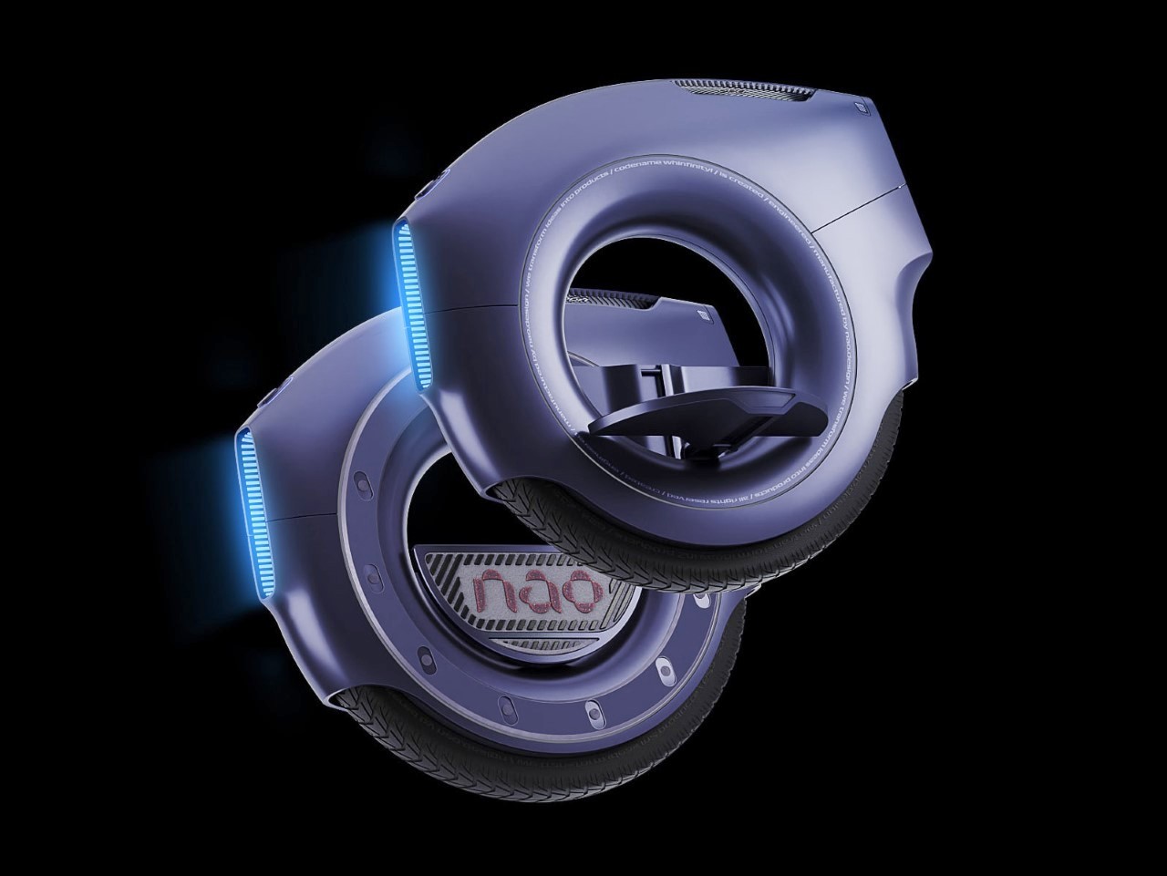
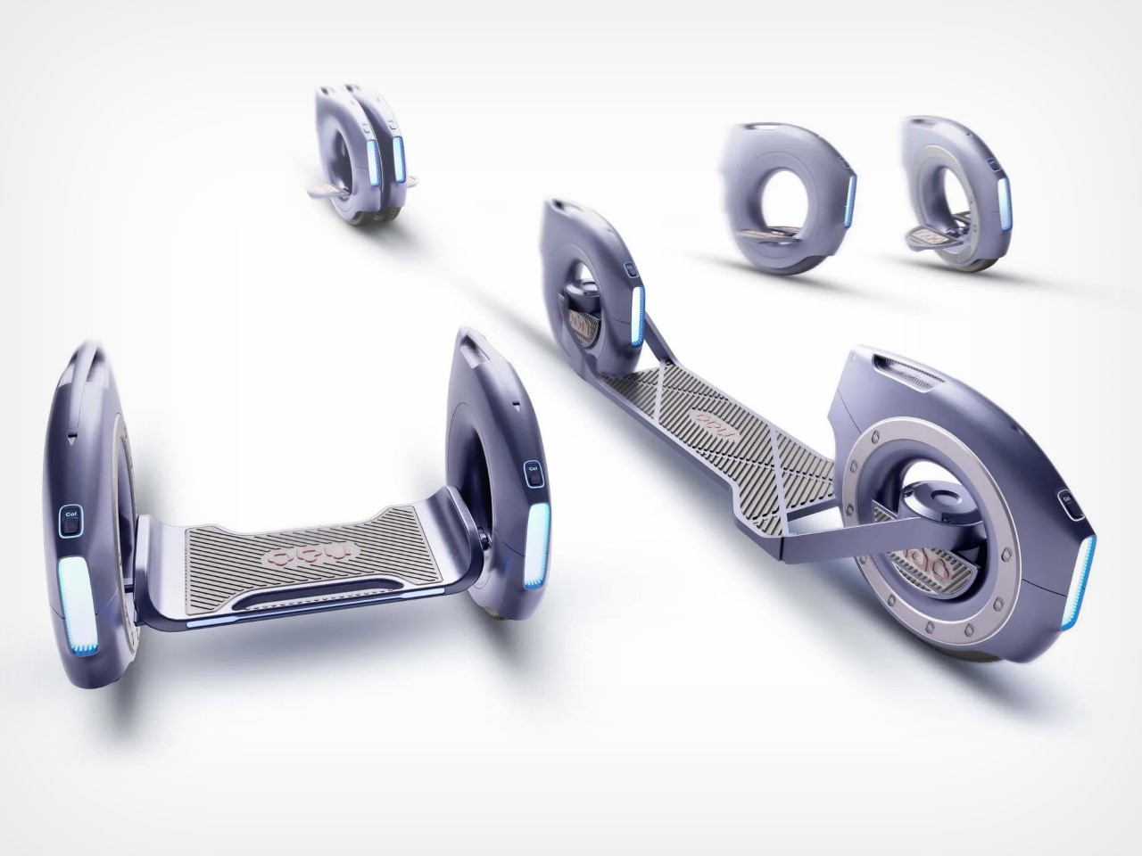
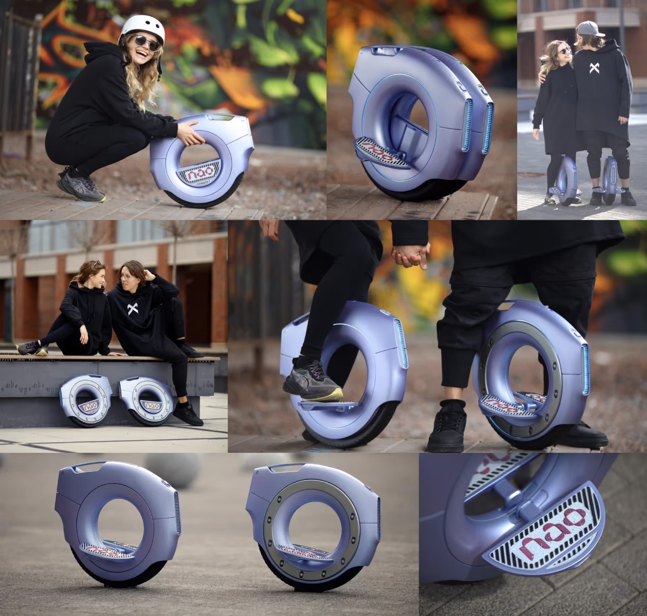
When people say the future of transport is electric, I think there’s a fundamental problem with their vision. Electric cars aren’t the future of mobility, electric transport is. We ditched the internal combustion engine and moved to a simple battery, motor, and wheels setup… so why are we still sticking to cars? They’re expensive, and they’re kind of a waste of space if you’re traveling alone in a 4-seater. The NAO.WHEEL challenges the notion of EVs being the future by presenting something a little more sophisticated. Designed as a monowheel that can be used solo or even joined together as modules, the NAO.WHEEL opens up a possible future where transport isn’t space-consuming. The NAO.WHEEL stands at under 2 feet tall, and just a few inches thick. Step on it, and it uses a gyroscope to balance as it transports you from A to B. Want to travel farther/safer? Two NAO.WHEELs snap together either side by side like a hoverboard, or front and back like an e-scooter, with a platform in the middle for you to stand on, allowing you to intuitively get to places without needing a massive car… and without needing to parallel park ever again.
The folks at Nao.design like to call the NAO.WHEEL “micro-mobility, macro convenience”. When asked about the Model T, Henry Ford famously said that if he asked people what they wanted, they would have asked for ‘faster horses’, because imagining a car in a horse-driven world wasn’t something regular people could do. The NAO.WHEEL is the exact same thing, but for cars. It challenges the notion that you need a car or motorcycle to get from A to B. You just need wheels that move, and a platform that moves you – something that the NAO.WHEEL condenses to its simplest form.
Sort of like earbuds, the NAO.WHEEL comes in a pair (left and right) but can be used individually. Singularly, the individual wheel has two pedals to stand on, but some may find the monowheel setup a little daunting. This is where the second wheel comes in. The second wheel either snaps to the first, creating a double-wheel that’s a little more stable, offers higher power, better turning, and twice the battery… or snapped to a module along with the first, creating a hoverboard or a scooter (as is visible above).
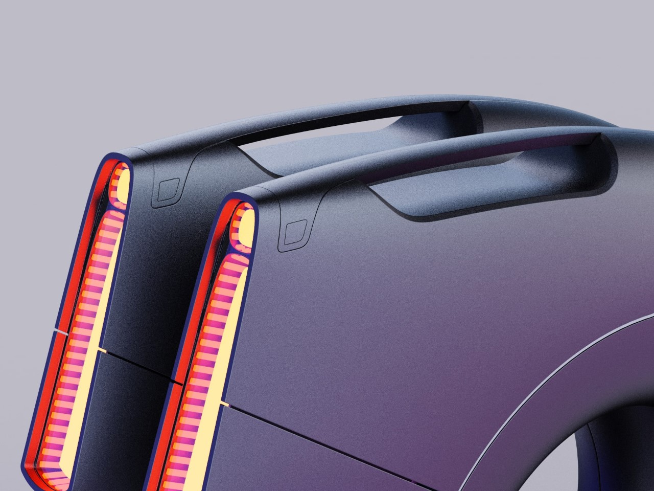
The NAO.WHEEL’s design is markedly different from your average hoverboard, earning it the Red Dot Award for Design Concept. The wheel is entirely hubless, creating a hollow center that really wows you when you look at it. The wheel has batteries built into its inner rim, using multiple cells arrayed in a circle. This helps with weight distribution, while a built-in gyroscope allows the wheel to stand upright while in use without having the dubious balance of a unicycle. Mount the NAO.WHEEL and it’s about as comfortable as a Segway or Hoverboard. There’s a minimal learning curve, and using the vehicle depends entirely on how you lean, allowing you to easily travel on wheels as if you’re cycling or running. And if you plan on traveling at night, don’t worry – the NAO.WHEEL comes equipped with both a headlight as well as a taillight to keep you aware and visible in the dark.
We truly are in a retro-transparent era! With transparent phones and earbuds from Nothing, transparent smart glasses from Meta, and even transparent Cipher controllers for the Xbox, it’s safe to say that the golden age of design has come full circle. Pioneered by Nintendo and then popularized by Apple with their transparent era just before pivoting to aluminum, transparency adds depth and character to design – literally. Instead of a boring opaque form, you get to see what’s underneath the hood and appreciate all the intricacy that goes into a product’s design from the bottom up.
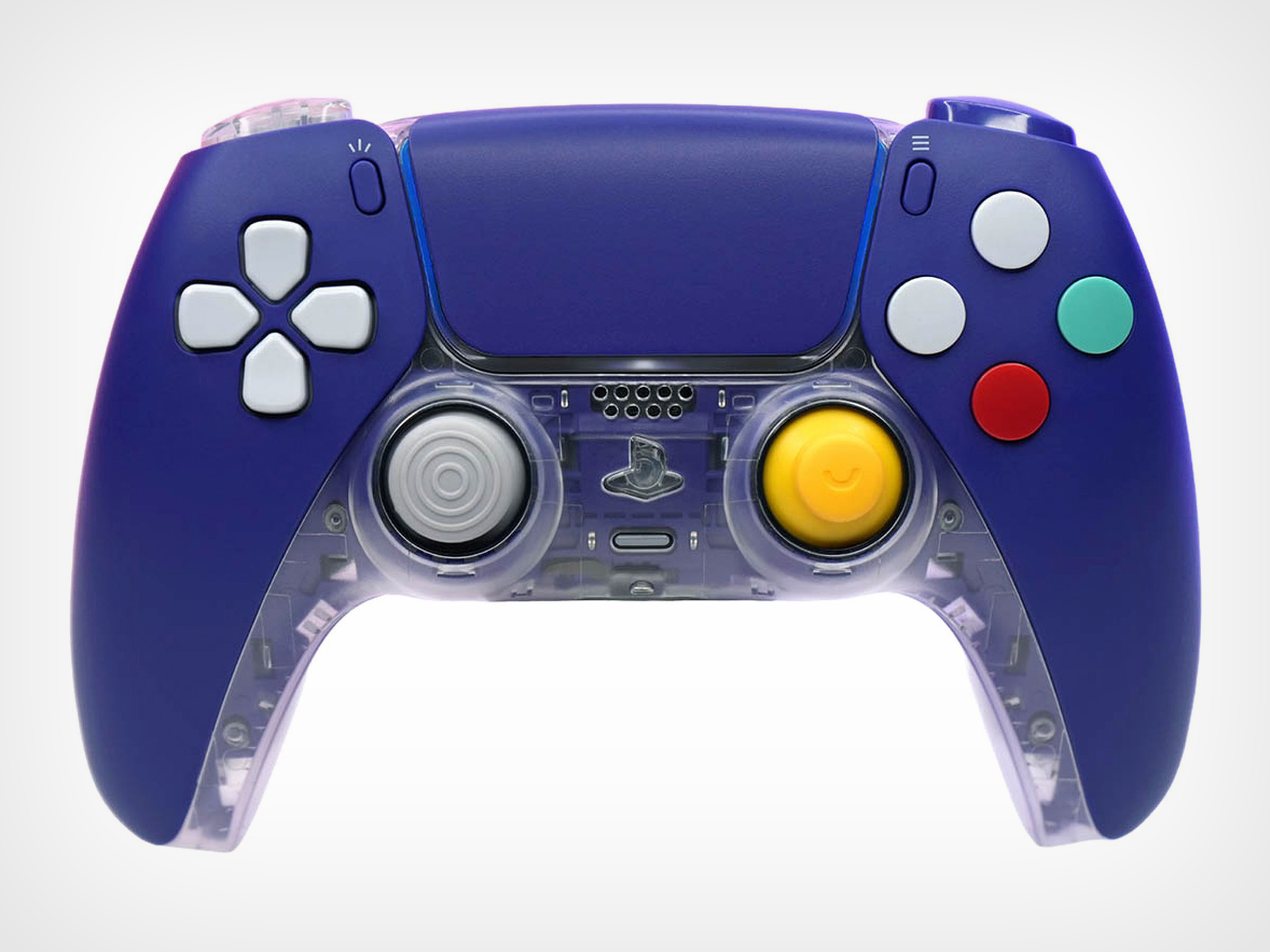
Inspired by the iconic aesthetics of the Nintendo GameCube, this custom gamepad from the folks at Killscreen aims to evoke a sense of nostalgia while maintaining the functionality that PS5 players expect. The CubeSense features a matte purple front shell paired with a transparent back, reminiscent of the original GameCube’s indigo colorway. It sports red, green, and light gray face buttons, evoking the playful palette of the classic console, though the layout remains aligned with Sony’s traditional configuration. The controller also includes custom joysticks, emulating the design of the GameCube’s yellow C-stick with a distinctive nub. However, unlike the asymmetrical stick layout of the GameCube, CubeSense’s dual analog sticks are positioned side by side, maintaining the modern PlayStation feel.
What makes the CubeSense special isn’t just its GameCube-inspired exterior but how it merges the old-school charm with PS5’s next-gen capabilities. Unlike other retro-themed controllers that only change the color scheme, the CubeSense reimagines the tactile feel of gameplay. The joysticks, for example, mirror the distinct yellow C-stick of the GameCube, yet they are adapted to Sony’s signature symmetrical layout. It’s an homage, but with purpose—tailoring the grip to fit the demands of today’s games while offering a nostalgic nod to those who cut their teeth on classics like Super Smash Bros. Melee.
Customization is where CubeSense comes into its own, offering more than just a change of shells. For those who crave a competitive edge, Killscreen has engineered clicky triggers and bumpers with shorter travel distances, designed specifically for the split-second precision needed in FPS games. These upgrades elevate the way you interact with your games, offering a heightened response time that makes the standard DualSense feel sluggish by comparison. And if you’re after a tactile upgrade across all inputs, the option to switch to microswitches provides that crisp click with every press, bringing a level of feedback reminiscent of high-end mechanical keyboards. But here, it’s all about the feel under your thumbs, ensuring that each input is as intentional as the next.
The CubeSense retains everything that makes the PS5’s DualSense great: adaptive triggers, haptic feedback, and seamless integration with the console. This means you get all the sensory depth of Sony’s flagship controller, yet in a package that feels uniquely yours. Imagine playing a game like Astro’s Playroom, where the haptics make you feel the pitter-patter of rain, but with the satisfying weight of the CubeSense’s upgraded buttons beneath your fingers. It’s a tactile treat that combines nostalgia with technical refinement, pushing beyond the simple remakes and remasters we see in the gaming world.
There’s a reason Killscreen’s take on transparency is more than a passing trend—it’s a design philosophy that speaks to the desire for openness in a world of black-box tech. The clear shell offers a glimpse into the intricate circuit boards and mechanisms, a nod to the days when devices came with diagrams of their inner workings. It aligns with what brands like Nothing are doing, where the appeal lies as much in seeing the product as it does in using it. The CubeSense is a device that encourages you to appreciate what’s inside, even though controllers aren’t meant to be seen—they’re meant to empower gaming while your eyes are hooked on the screen.
Priced at $149 for the base model and scaling up to $179 with all the upgrades, the CubeSense may not be the cheapest way to play PS5 games, but it’s certainly one of the most distinctive. It’s a controller for those who care about more than just performance—they want personality, history, and a tactile connection to their gaming past. And yes, this obviously isn’t an official Sony-Nintendo collaboration. Nintendo is infamously protective of its IP and extremely litigious, so a formal collaboration probably isn’t anywhere in the works. Fan-made creations, however, are always a pleasant surprise!
As industries evolve at breakneck speed, so too must the tools that power them. With increasing pressure to innovate quickly, deliver immersive experiences, and streamline processes, companies need solutions that can keep pace. Long known for its powerful 3D rendering capabilities, KeyShot is stepping into an expanded role with a vision that goes beyond just visuals. The brand is now introducing a comprehensive solution for the entire product design journey, or what they call their new ‘Product Design-to-Market’ framework. This shift promises to change how companies of all sizes design, collaborate, and deliver products to market, going well beyond simple 3D visualization (which KeyShot’s already proven to be a market leader in).
KeyShot’s 3D rendering software has been a staple for designers worldwide, offering photorealistic renderings and an intuitive workflow. But as industries change, so too must the tools that power them. Today, the product development process is a complex web of teams, assets, and software—often siloed and inefficient. Design, engineering, and marketing teams are tasked with bringing ideas to life while navigating scattered workflows and disconnected feedback loops.
Recognizing these challenges, KeyShot has expanded its scope to introduce a Product Design-to-Market Suite. This new approach aligns all stages of a product’s journey—from the first sketch to the moment it hits the market. The goal? A more unified, streamlined, and collaborative process that minimizes waste and maximizes creativity.
What is Product Design-to-Market?
The concept of Product Design-to-Market is simple but transformative. It’s a holistic strategy that bridges the gaps between the many departments involved in product creation. Instead of working in isolated silos, KeyShot’s vision encourages a fluid exchange of information and assets across design, development, and marketing teams. The result is faster iteration, better alignment, and a smoother transition from concept to market delivery.
For many companies, the current state of product design is far from optimal. Data is often scattered across platforms, teams work with outdated versions of assets, and crucial feedback gets lost in the shuffle. These inefficiencies cost time, money, and—perhaps most importantly—creativity. KeyShot’s Product Design-to-Market Suite seeks to eliminate these pain points by centralizing the entire process within one ecosystem.
KeyShot’s Expanded Offering
With this new vision, KeyShot has unveiled three key tools designed to revolutionize product design and delivery:
KeyShot Studio: The rendering tool we’ve previously known as KeyShot, KeyShot Studio remains a top choice for rendering photorealistic 3D visuals. Now with enhanced features, like improved texture baking and animation support, it integrates more deeply into the product development process, allowing teams to do much more than just rendering.
KeyShot Hub: A brand-new addition to the KeyShot family, Hub is all about collaboration. It’s a centralized platform where teams can manage scenes, assets, and versions, ensuring everyone stays in sync during the design journey. This tool aims to solve one of the biggest pain points in product development: the lack of a unified space for feedback and iteration.
KeyShot Dock: Formerly Digizuite’s DAM (Digital Asset Management), Dock takes the guesswork out of managing 3D assets across departments. It ensures that teams can access the right assets at the right time, helping to streamline the transition from design to marketing and beyond.
Together, these tools form a complete Product Design-to-Market Suite, designed to break down the barriers that have traditionally slowed product development.
Why This Matters for Designers and Businesses
In a landscape where time to market is critical and customer experience reigns supreme, KeyShot’s new direction offers a much-needed solution. For design teams, it means less time lost in tedious back-and-forths, fewer revisions, and more focus on creativity. For businesses, it translates to faster product launches, reduced costs, and a better alignment between design and marketing teams.
Whether you’re part of a small design studio or a large corporation, the ability to quickly adapt and deliver products to market can be a game-changer. KeyShot’s Product Design-to-Market Suite approach ensures that teams can iterate faster, collaborate more efficiently, and ultimately bring better products to life.
A New Era of Product Design
By expanding its role from rendering software to an all-encompassing design-to-market platform, KeyShot is positioning itself at the forefront of modern product development. This isn’t just a rebrand—it’s a reimagining of what’s possible when design, engineering, and marketing work in harmony. And as industries increasingly shift towards immersive experiences and rapid innovation, KeyShot’s vision offers a clear path forward.
For designers, it’s a chance to focus less on the logistics of development and more on pushing creative boundaries. For businesses, it’s an opportunity to streamline processes and deliver products that truly resonate with their audience.
Learn more about KeyShot’s Product Design-to-Market Suite and download the whitepaper for an in-depth look at how this new framework can transform your business.
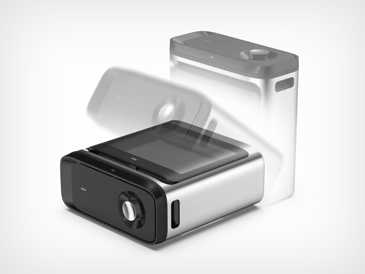
I remember seeing a video where a toaster could be laid on its side and used as a pizza oven instead. Rather than simply toasting bread slices, you could apply a small amount of sauce, pop a pepperoni slice or two, and some cheese and slide it into the horizontally kept toaster. Working essentially as an oven now, this toaster could be used to dish out quick pizza slices, or even toast up garlic bread, bagels, etc. While that sideways toaster use is more of a lifehack, it’s the Dwo Oven and Multicooker’s very USP. Designed to be used vertically as a regular oven, or sideways as a wider pizza oven, the Dwo goes to show that even something as basic as your average kitchen appliance has the potential to be reinvented.
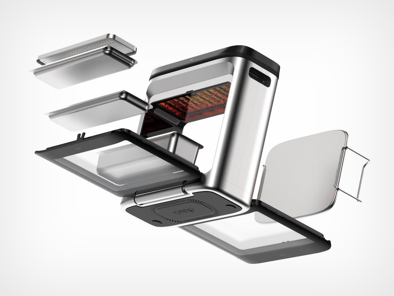
Designed for compact kitchens that can’t accommodate too many appliances, the Dwo lends itself to multiple use cases thanks to an adaptable design that works standing up as well as lying on its belly. The oven comes with a slim profile, sporting clear windows on the front and back, along with a control panel on top that lets you set the temperature and timer. The clear windows also function as doors, with both of them opening depending on how your oven is oriented. When standing up, the front-facing door opens to give you a narrow yet vertically spacious oven, while when sleeping down, the rear door (which is now positioned on top) opens to let you lower wide items into the oven. The concept is sort of like a wood-fired oven versus a tandoor – one has a frontal opening while the other is accessible from the top.
A roller on the bottom of the Dwo helps it easily transition between its two orientations, allowing you to easily and swiftly change between vertical and horizontal use. Vertically, the Dwo is perfect for multi-level cooking, like baking loaves, tea cakes, or a row of cookies. Lay it flat, however, and you can now lower a wider pan into it, making it ideal for pizzas, wider cakes, focaccias, pies, etc. Of course, orienting your oven vertically or horizontally means the heat coils face in different directions based on the orientation. While horizontal, your pizzas don’t necessarily cook fast from the top or the bottom, given that the heat coils are located on the sides. However, with some clever thermodynamic engineering, the Dwo could be turned into a heat-guiding furnace, so your pizza cooks evenly with browning on the bottom and a melted layer of cheese on the top!
Designed by Colombia-based Dogma Design, the Dwo is a Best of the Best winner of the Red Dot Award: Design Concept for the year 2024. It gives you an adaptable oven that doesn’t occupy much space, and can be used for something as basic as reheating an entire pizza to something more complex like making biscuits or cupcakes. The oven’s unique flat-ish internal space might be limiting had it not been for its ability to literally lean over and shift between standing and sleeping formats. No more trying to tilt the toaster on its side to lifehack your way through college!
I remember seeing a video where a toaster could be laid on its side and used as a pizza oven instead. Rather than simply toasting bread slices, you could apply a small amount of sauce, pop a pepperoni slice or two, and some cheese and slide it into the horizontally kept toaster. Working essentially as an oven now, this toaster could be used to dish out quick pizza slices, or even toast up garlic bread, bagels, etc. While that sideways toaster use is more of a lifehack, it’s the Dwo Oven and Multicooker’s very USP. Designed to be used vertically as a regular oven, or sideways as a wider pizza oven, the Dwo goes to show that even something as basic as your average kitchen appliance has the potential to be reinvented.
Designed for compact kitchens that can’t accommodate too many appliances, the Dwo lends itself to multiple use cases thanks to an adaptable design that works standing up as well as lying on its belly. The oven comes with a slim profile, sporting clear windows on the front and back, along with a control panel on top that lets you set the temperature and timer. The clear windows also function as doors, with both of them opening depending on how your oven is oriented. When standing up, the front-facing door opens to give you a narrow yet vertically spacious oven, while when sleeping down, the rear door (which is now positioned on top) opens to let you lower wide items into the oven. The concept is sort of like a wood-fired oven versus a tandoor – one has a frontal opening while the other is accessible from the top.
A roller on the bottom of the Dwo helps it easily transition between its two orientations, allowing you to easily and swiftly change between vertical and horizontal use. Vertically, the Dwo is perfect for multi-level cooking, like baking loaves, tea cakes, or a row of cookies. Lay it flat, however, and you can now lower a wider pan into it, making it ideal for pizzas, wider cakes, focaccias, pies, etc. Of course, orienting your oven vertically or horizontally means the heat coils face in different directions based on the orientation. While horizontal, your pizzas don’t necessarily cook fast from the top or the bottom, given that the heat coils are located on the sides. However, with some clever thermodynamic engineering, the Dwo could be turned into a heat-guiding furnace, so your pizza cooks evenly with browning on the bottom and a melted layer of cheese on the top!
Designed by Colombia-based Dogma Design, the Dwo is a Best of the Best winner of the Red Dot Award: Design Concept for the year 2024. It gives you an adaptable oven that doesn’t occupy much space, and can be used for something as basic as reheating an entire pizza to something more complex like making biscuits or cupcakes. The oven’s unique flat-ish internal space might be limiting had it not been for its ability to literally lean over and shift between standing and sleeping formats. No more trying to tilt the toaster on its side to lifehack your way through college!