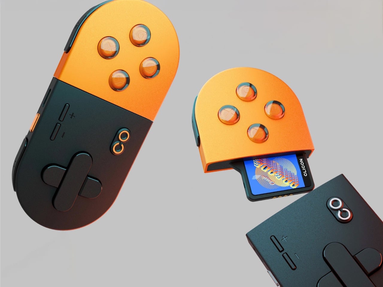
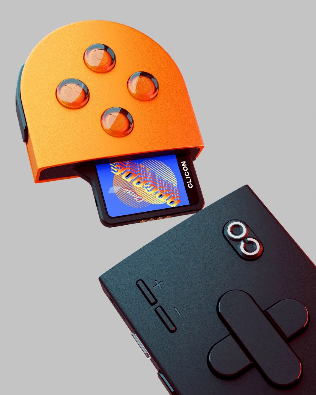
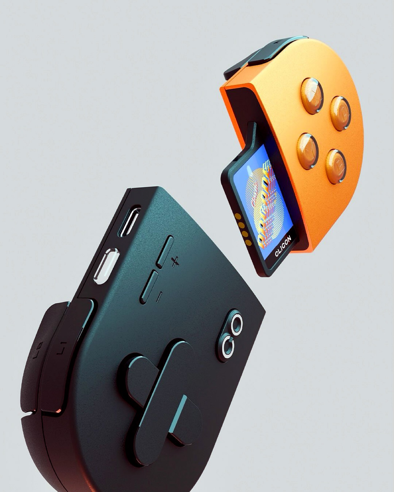
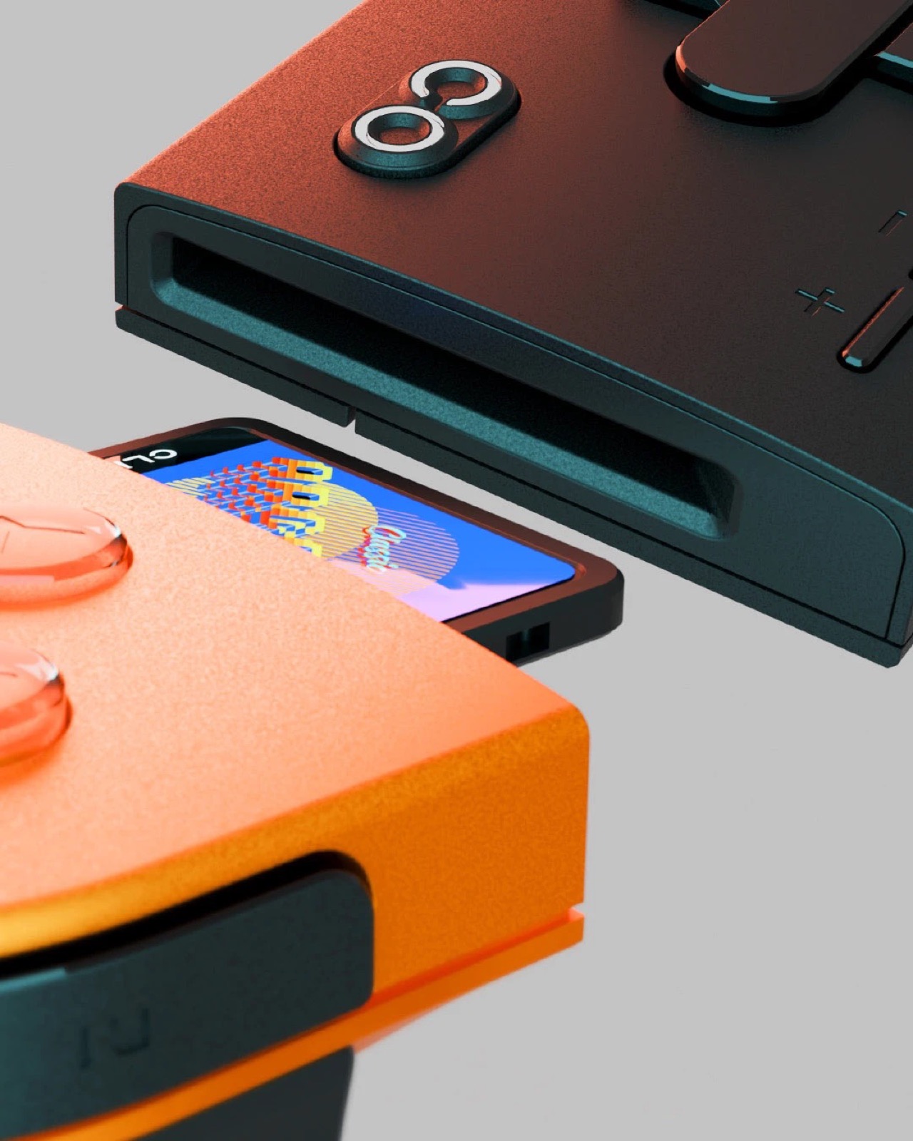
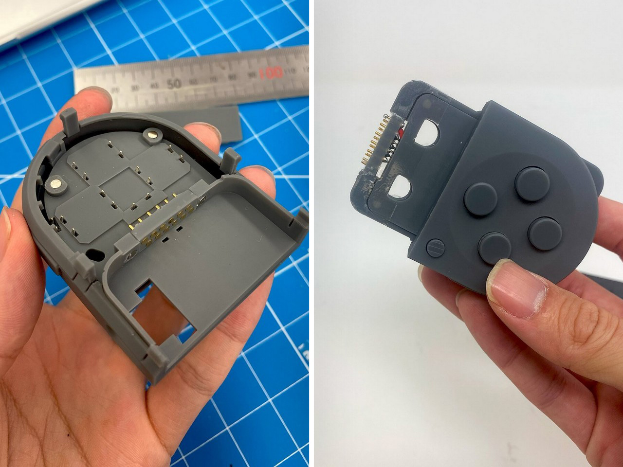
Imagine a Nintendo Switch without a screen. Just two Joy-Cons that click together for wireless gaming. Now imagine that was it. That was the product. That’s what the Clicon gaming controller/console is pitching itself has. Handheld wireless gaming with anything you want as the screen. Split the controller apart and a cartridge fits into it, sandwiched between the two halves. Click the halves shut and you’ve effectively ‘loaded’ a game. Now pick a screen and game on it.
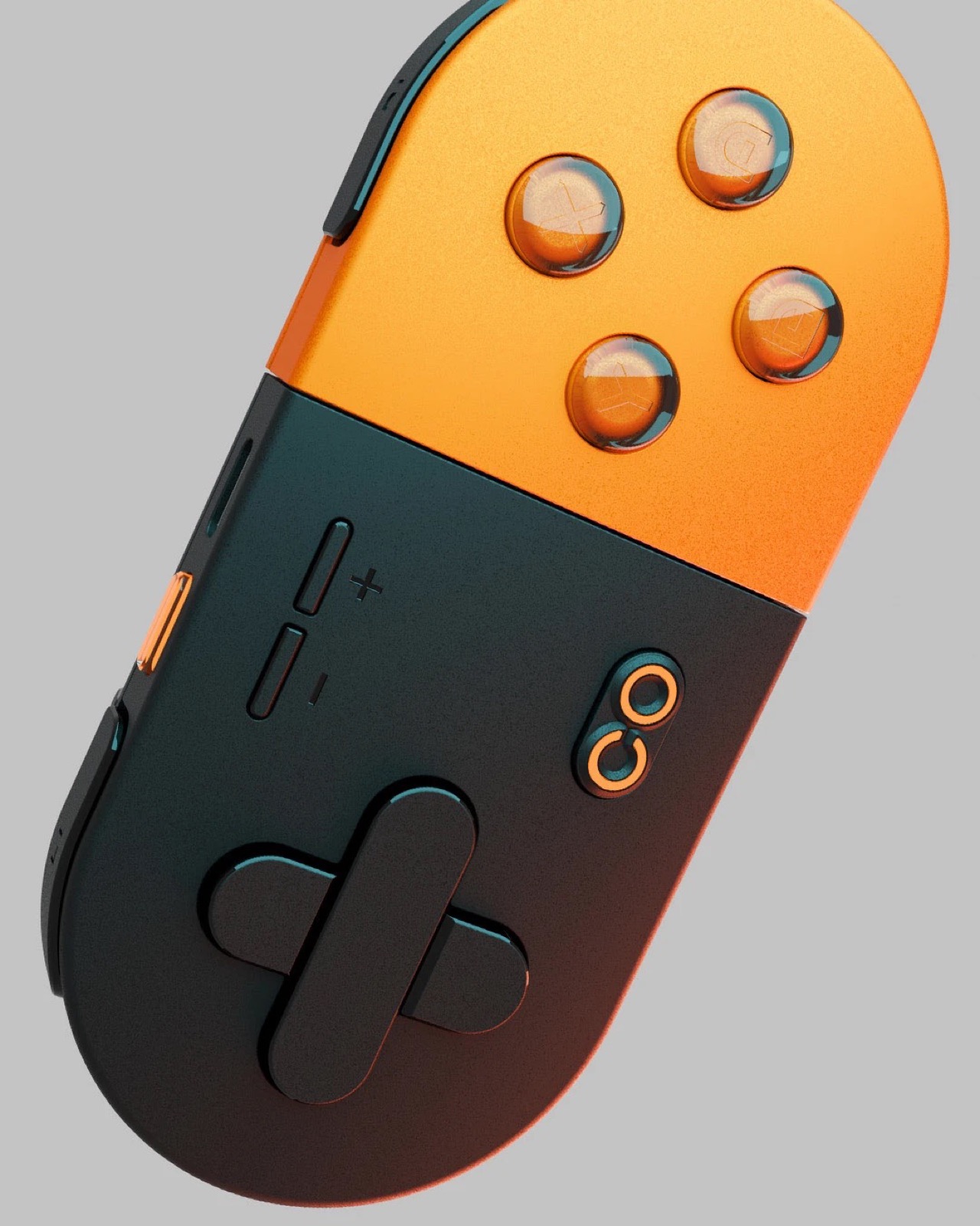
Spiritually, it feels exactly like what I’d expect from an indie company trying to be the next Nintendo. Out-lite the Switch Lite by ditching the screen altogether. The 2-part controller looks gorgeous, is portable, and ends up acting as a cartridge holder just by virtue of its design. Plus, the Duracell colorway definitely gives it a funky touch that’s hard to ignore!
Designers: Yasuaki Iijima & Jason Chen
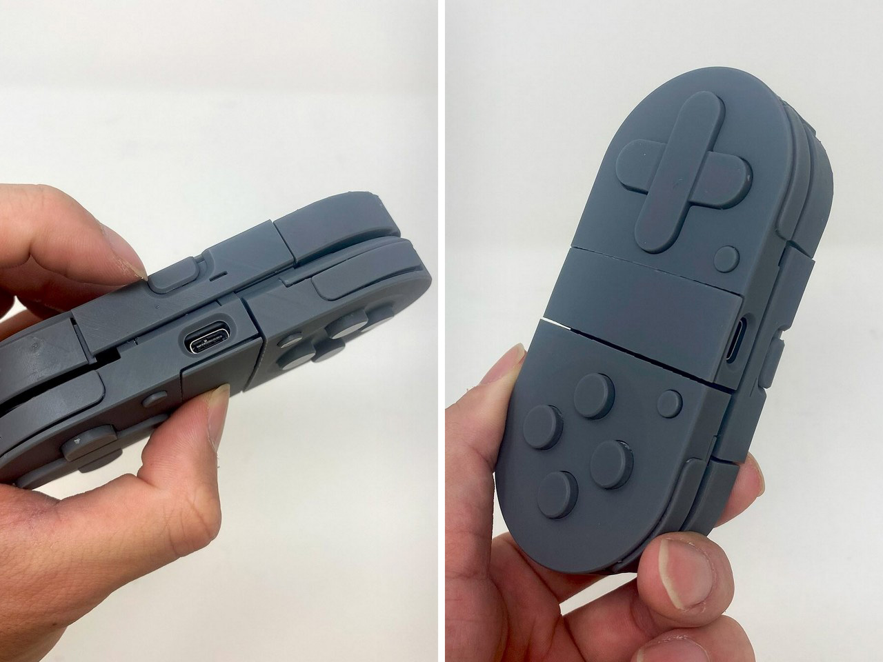
This format is easily the first in the handheld gaming segment and that’s perhaps the one thing that excites me the most. Seeing a design so fairly radical it grabs your attention for a second, making you question how it works, and whether it would work, plausibly. The Clicon is still conceptual, obviously, but the designers are apparently working on a prototype.
The renders show a basic arcade-style cartridge that is housed inside the controllers, sitting just within their parting line and jutting out the middle the way your AirPods jut out when you flip the lid. This means no mano-a-mano gaming the way you would on a Switch. This entire thing is just one console, and doesn’t work when split apart. Lock it together and you’ve got something akin to the SNES controller with a pill-shaped design that feels decent enough to hold for hours at a stretch.
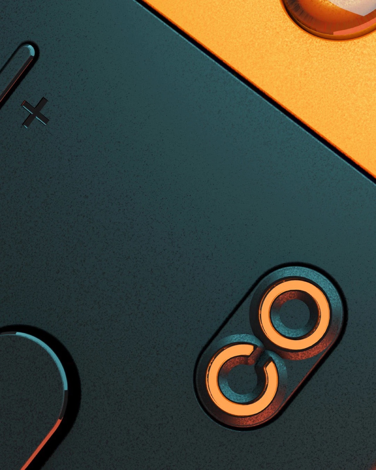
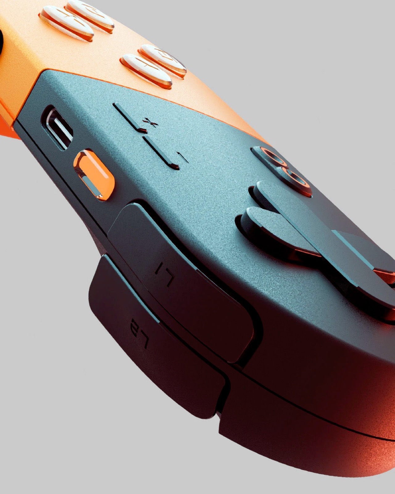
Meanwhile, as controls go, the Clicon packs them all, action buttons, arrow keys, two sets of shoulder buttons, the works. A home button and +/- buttons on the front, another transparent button on the top, and a USB-C port to charge the device as well as potentially stream content via cable. It would also make sense to assume that wireless streaming is a possibility.
Designers Yasuaki Iijima & Jason Chen are apparently working on a prototype. Their instagrams show 3D prints of mock-ups, even with bare-basics circuitry. It’s way too early to even ask for things like a timeline, specs, pricing, etc. but what we can do is judge the design for what it is. And hope that a feasibility run doesn’t result in too much of the design changing in the process! Heck, is it possible we see a ‘Nintendo Switch Lite Lite’ before GTA 6?
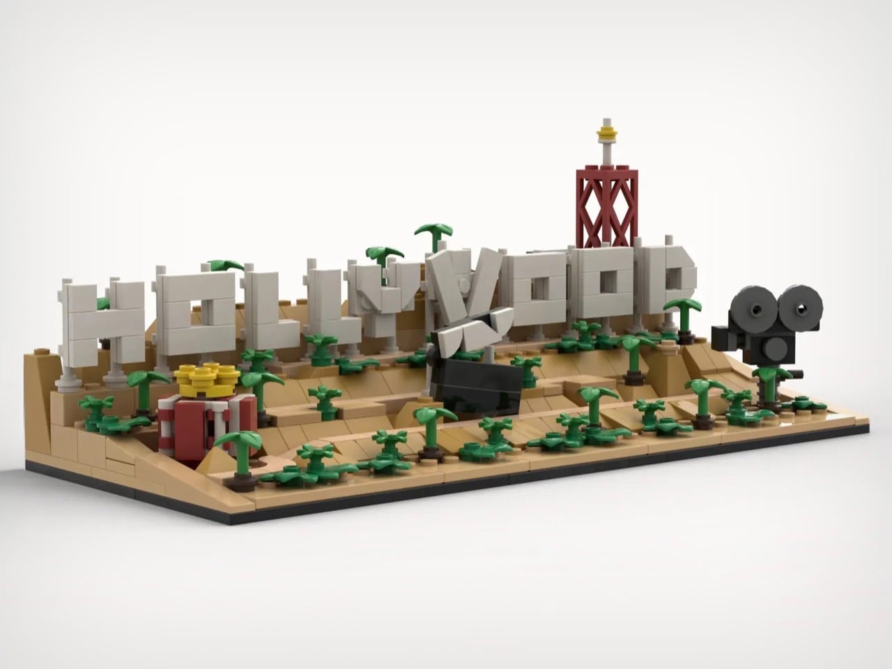
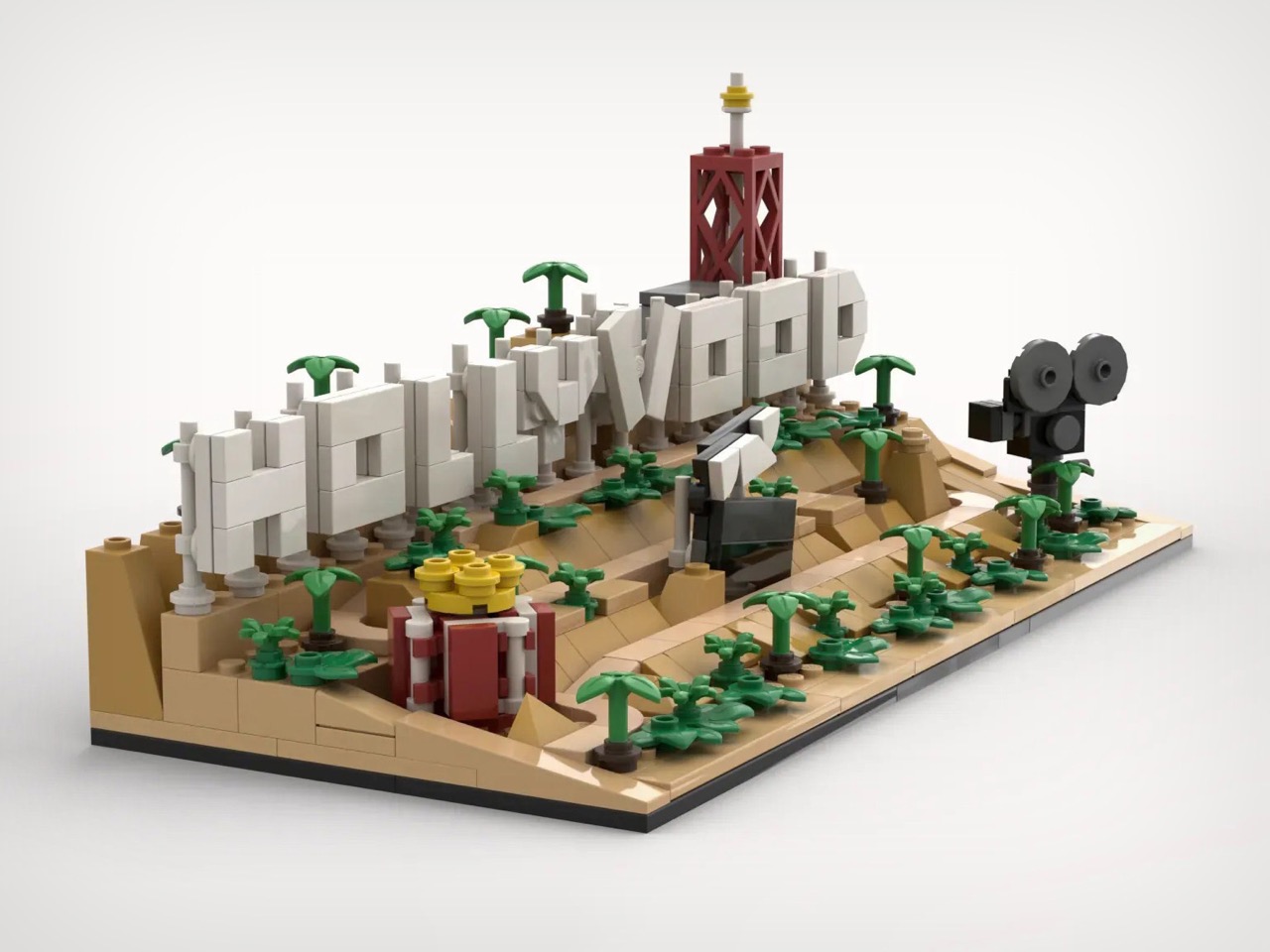
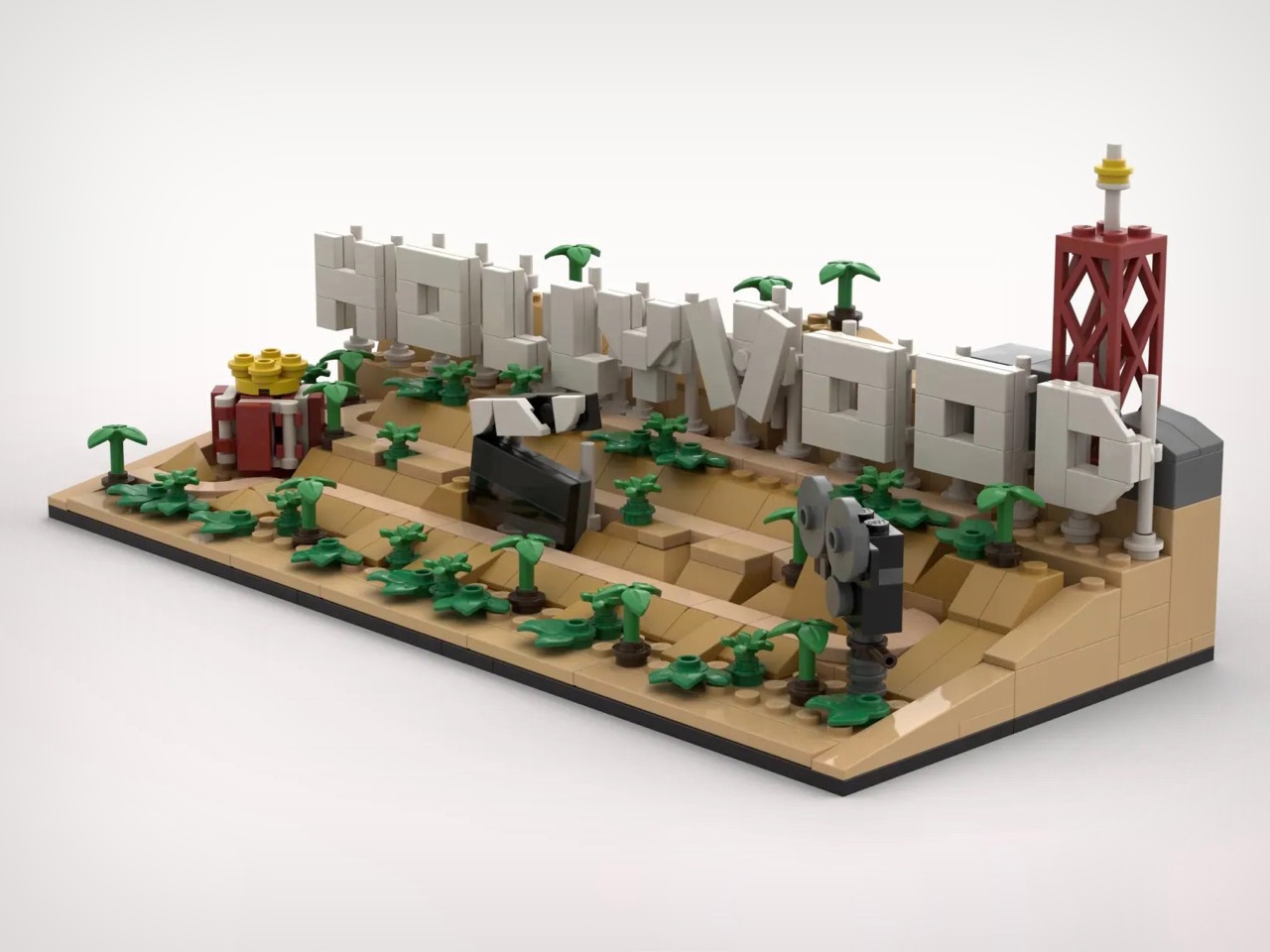
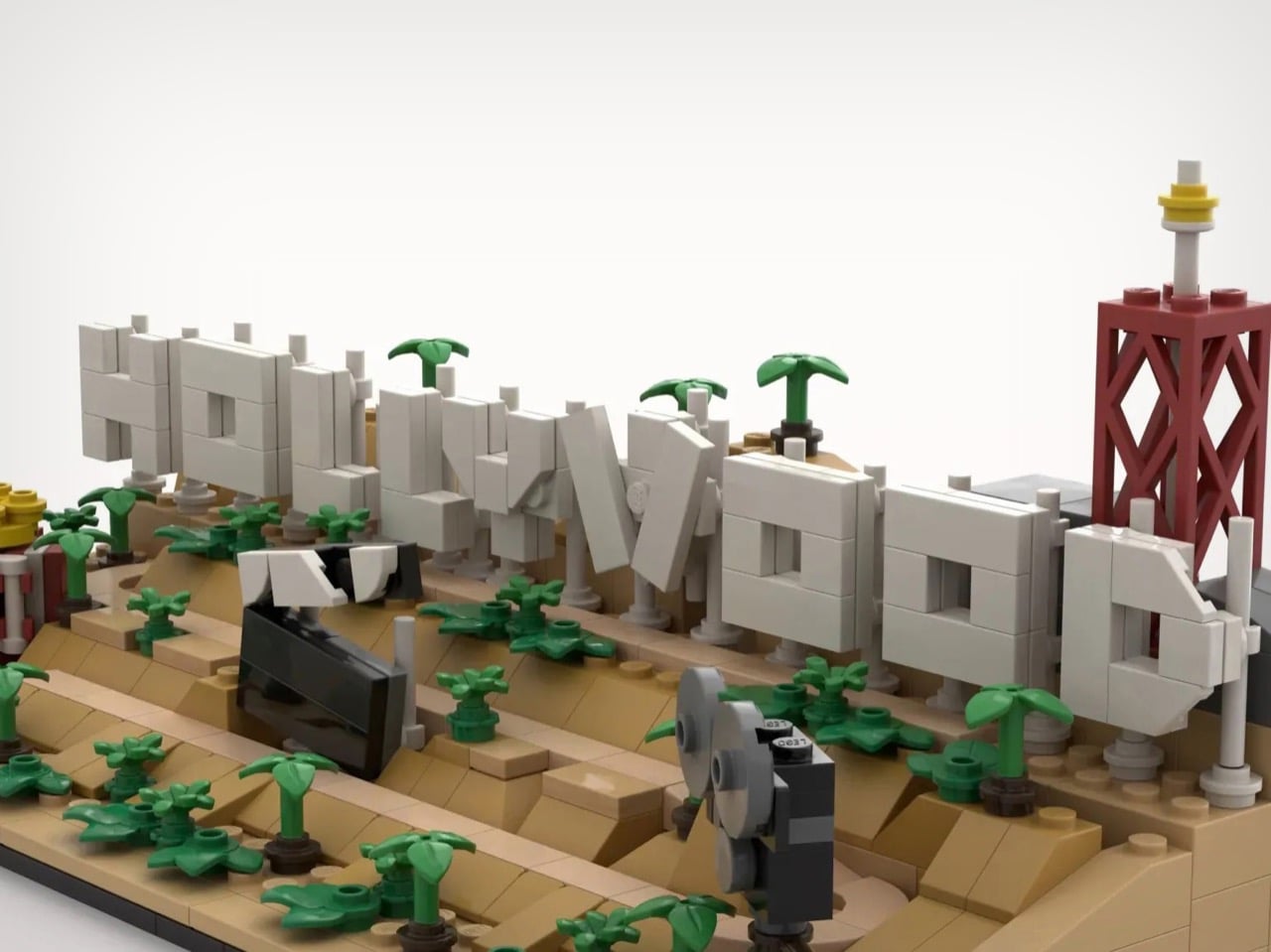
Every year, roughly ten million tourists visit Los Angeles specifically to photograph a sign they will never get closer than a few hundred meters to. There are no public trails to the Hollywood Sign’s base. The entire surrounding area is fenced, monitored, and actively defended against the kinds of people who once scaled those letters for a prank or a protest or a particularly committed selfie (remember the Hollyweed prank from 2017?) It is, by design, a landmark you admire from a distance. Which makes a LEGO version of it feel surprisingly appropriate.
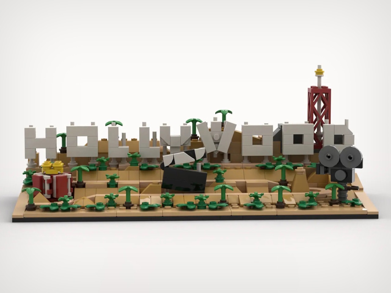
Builder imaxedlp has rendered the sign and its Mount Lee surroundings in 496 pieces, and the result is genuinely charming. The build captures the hillside as a full landscape: tiered sandy slopes, clusters of miniature palms, a clapperboard lying open mid-scene, a vintage camera set up as if waiting for action. The broadcast tower rising behind the letters is an accurate detail that most people probably forget exists. All of it lands on a compact diorama footprint that earns its shelf space.
Designer: imaxedlp
The terraced hillside, built up in warm tan with angled slope bricks stepping from the base to the letter line, gives the model genuine topographic depth from every viewing angle. The nine letters are rendered in light gray with visible stud detailing and subtle column supports underneath, closely echoing the real sign’s steel-frame mounting system. A couple lean at a slight angle, mirroring how the actual letters sit unevenly on the hillside. The clapperboard lying open on the slope, mid-scene, as if a crew just called cut and walked away, is my favorite detail. Small, but it does a lot of narrative work.
The vintage film camera on the right flank, built from dark gray cylindrical pieces with a twin-lens silhouette, grounds the whole scene in old Hollywood specifically. The popcorn bucket on the left pulls in the audience side of the equation. The broadcast antenna tower rising above the D at the far right is the detail that will genuinely surprise people who have only ever seen the sign in photographs cropped to exclude everything but the letters.
imaxedlp’s Hollywood Sign is currently sitting just under 1,000 supporters on LEGO Ideas, where fan-designed builds need 10,000 votes to trigger an official LEGO review for potential production as a retail set. You can head to the LEGO Ideas page here and cast your vote.
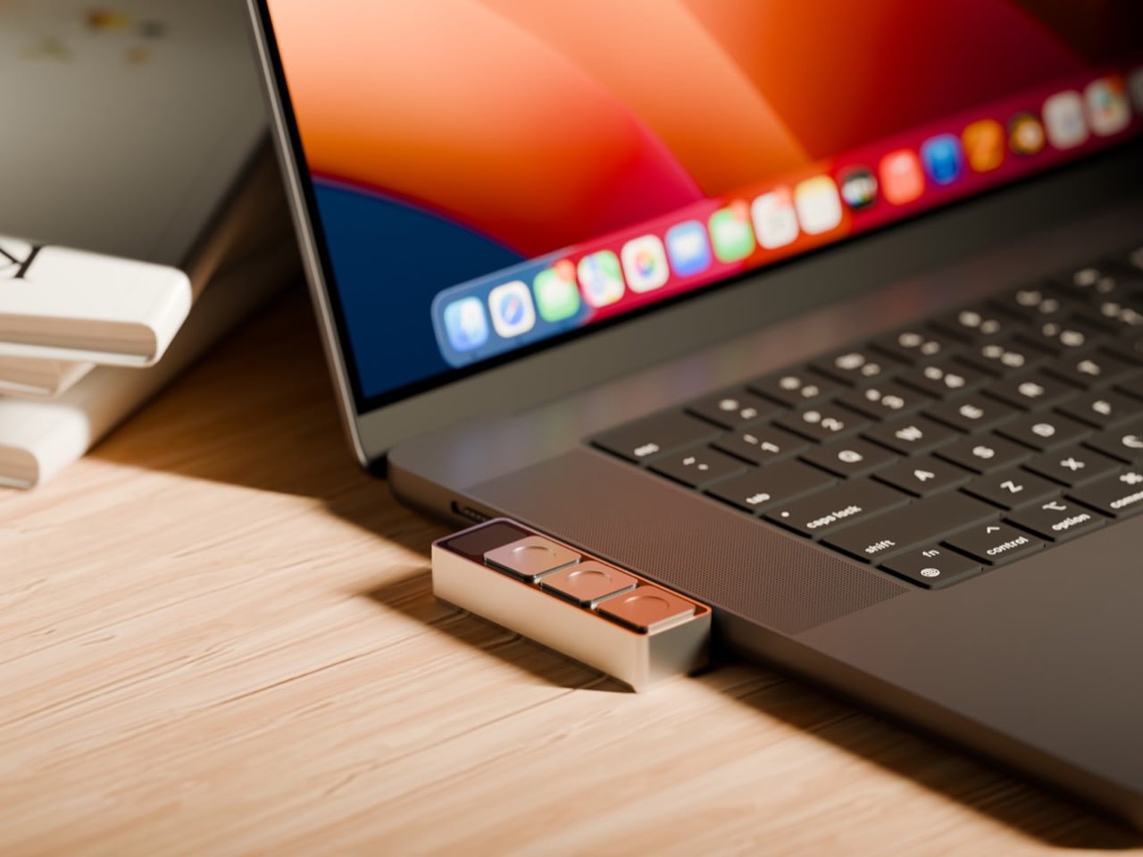
Here’s what happens when you join a Zoom call right now: you click the link, wait for the app to launch, find the mute button, realize your camera is on when you’re still in pajamas, hunt for that toggle, then minimize the window to keep working. Six actions, multiple windows, all muscle memory you’ve built up because this is just how it works. We’ve accepted the friction.
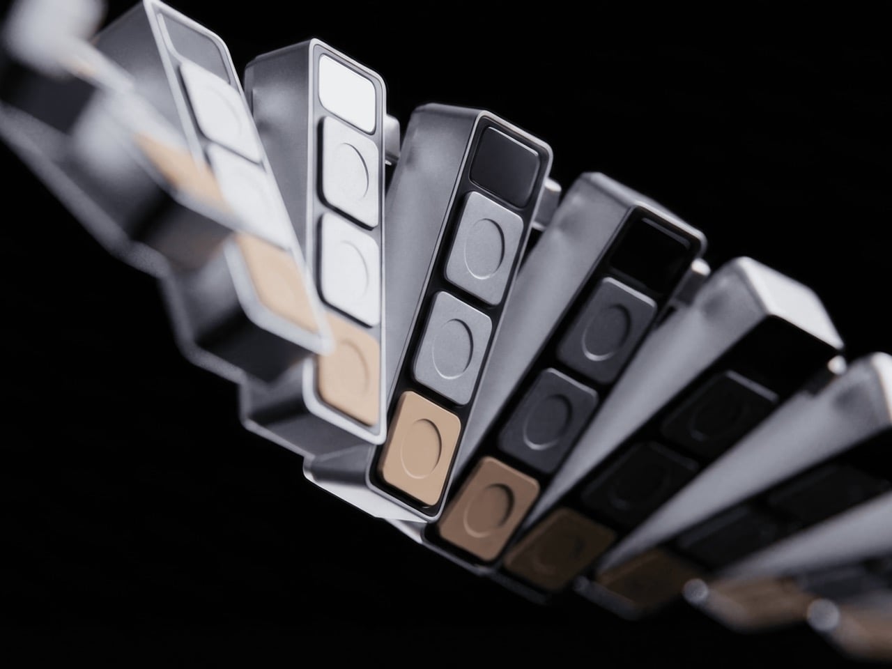
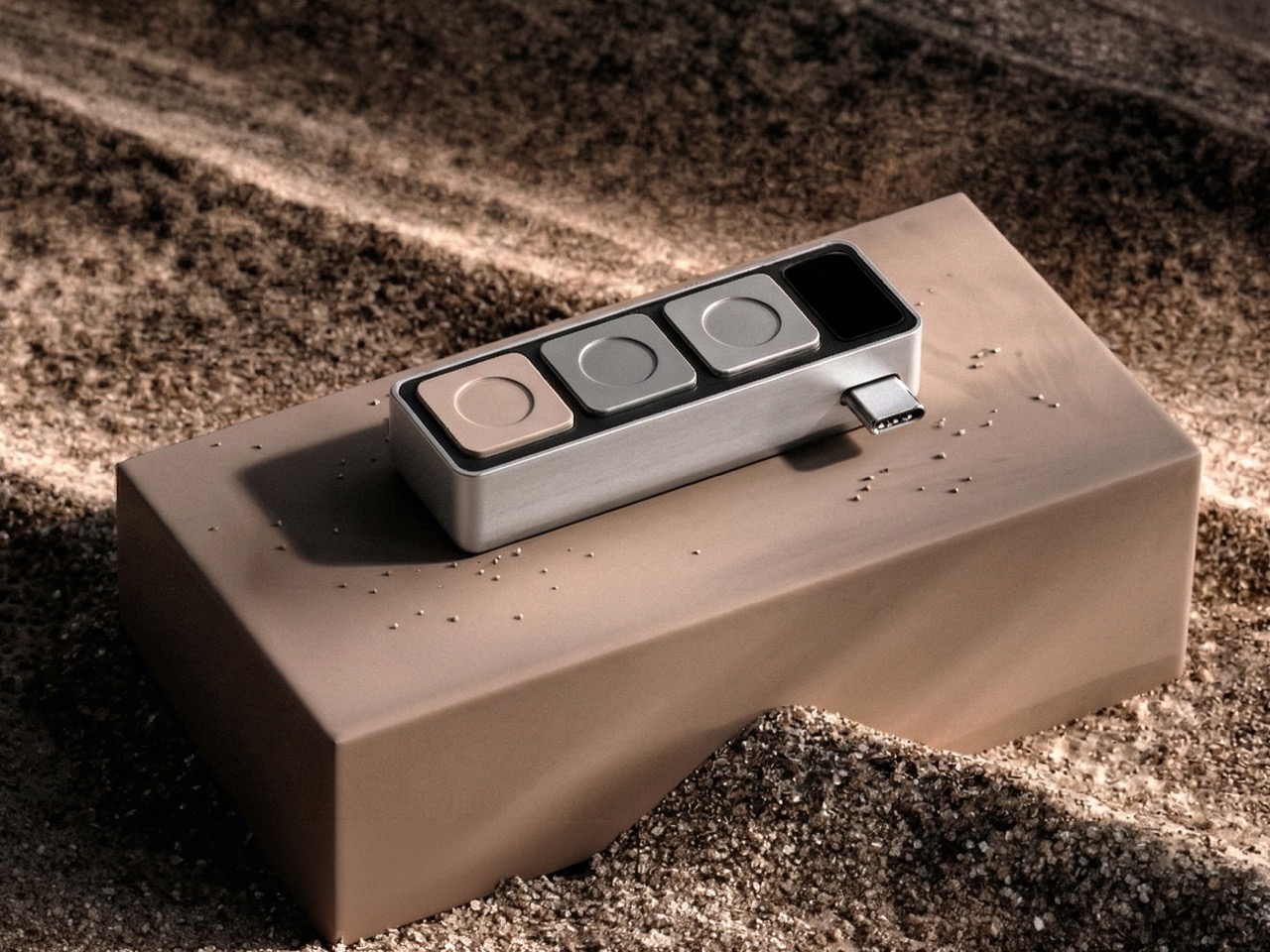
Project Mirage looked at that friction and built Dune. Three physical keys that sync with your calendar, know when your next meeting is, and give you one-button join, instant mic control, camera toggle that brings the window forward when you need it. Then you switch to your code editor and those same three buttons become the shortcuts you actually use in that tool. Open your browser, they adapt to the tab. The hardware reads context, talks to AI, morphs based on what you’re doing. It’s 50 grams of machined aluminum that finally acts like it knows what year it is.
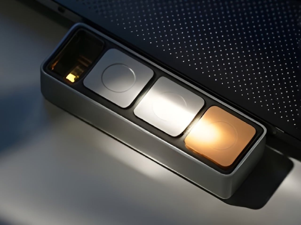
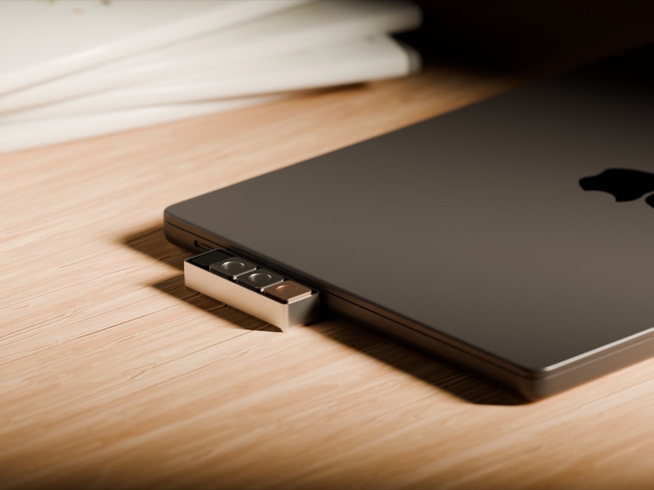
The core idea is simple but meaningful. Dune monitors your Mac, detects which application is in the foreground, and automatically reconfigures what its three keys do. In GitHub, they handle pull requests and code reviews. In VS Code or Claude, they surface the commands you reach for constantly. The device integrates with Openclaw to trigger AI agents you’ve already built, so that email sorting routine you automated can fire with a physical button press instead of hunting through menus. In Photoshop, you can map them to copy/duplicate layers, increase or decrease brush sizes, or flatten/export images. The best part, however, is using the Dune on your browser, where the hardware detects which tab you’re on, changing controls/maps based on whether you’re on a Gmail tab, a Google Meet tab, an Instagram tab, or even scrolling through your inspiration on Pinterest. The on-screen display shows you what each key does at any moment, removing the need to memorize complex shortcuts or maintain mental maps of what Button 2 does in seventeen different apps.
What separates Dune from traditional macro pads is that layer of intelligence. Stream Decks and programmable keypads give you power, but they demand upfront investment. You configure profiles for every app, remember which layer you’re on, maintain the whole system yourself. Dune comes preconfigured with workflows for common tools and adapts automatically. You can still write custom scripts, assign URLs, build your own automations (I built mine using AI and they work like a charm). The difference is the device does the heavy lifting of context switching for you.
The hardware itself is straightforward. CNC-machined anodized aluminum body, USB-C connection that powers the device directly without needing a battery, 40mm × 10mm × 10mm dimensions that sit comfortably next to your keyboard without dominating desk space. It’s macOS only for now, which makes sense given the tight system integration required to read active applications and browser tabs in real time. The packaging ships each unit embedded in actual river sand, a physical callback to the name and the metaphor of something that shifts and adapts constantly.
Dune is available for pre-order now at $119, with the price moving to $149 after launch. Ships in May 2026 from the Project Mirage website, where you can also find setup guides and documentation on building custom automations.
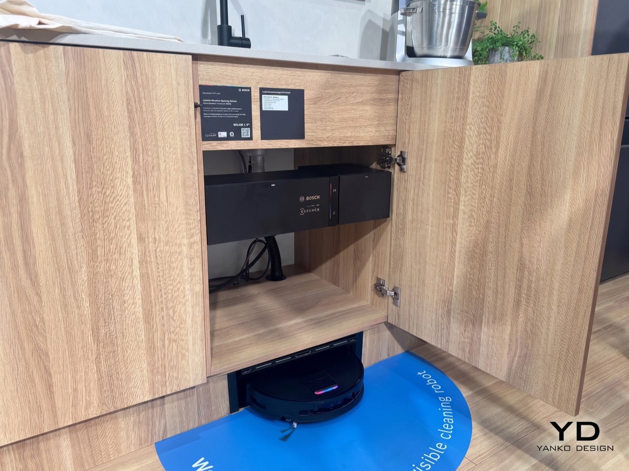
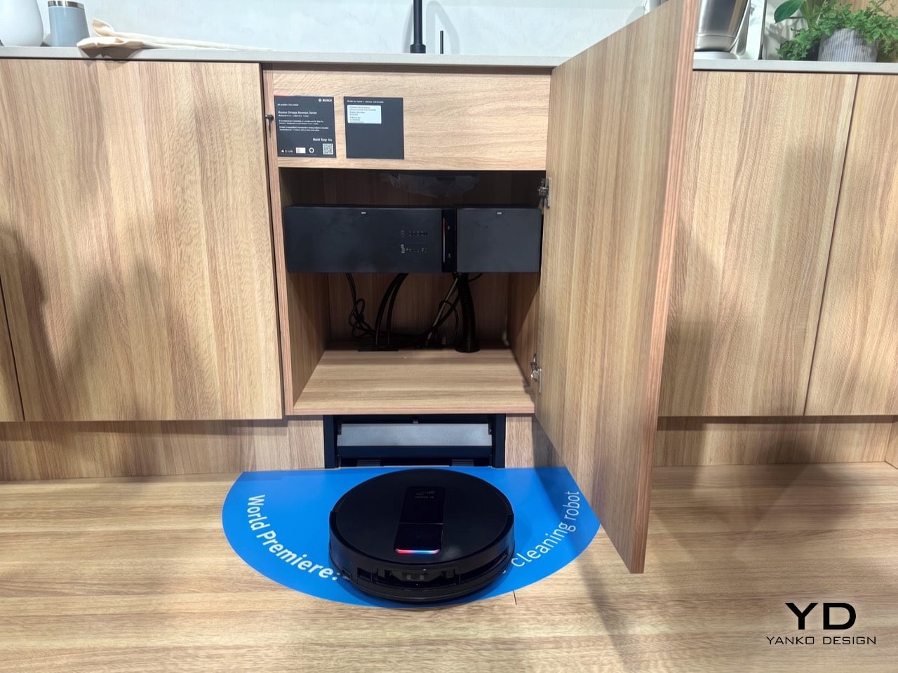
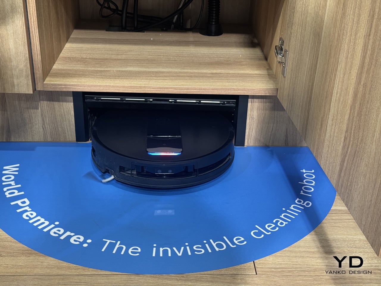
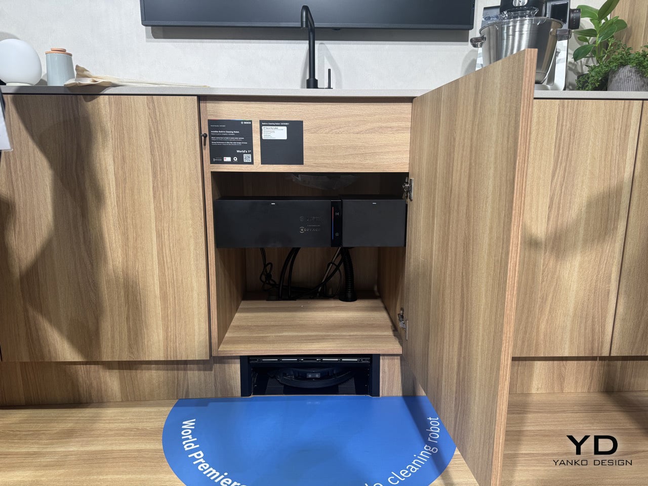
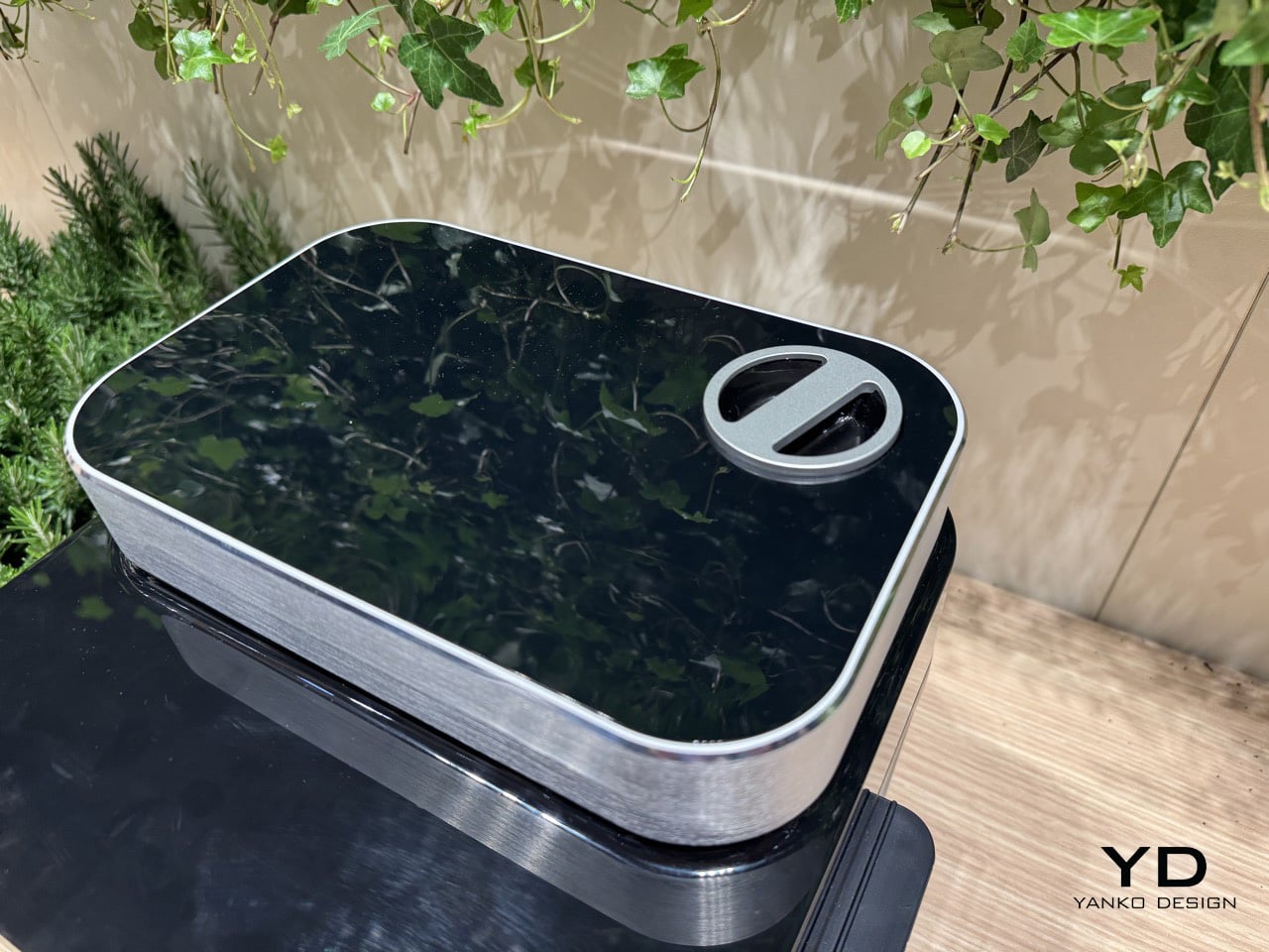
ECOVACS has been pushing robot vacuum technology forward for years, from their bagless X11 OmniCyclone to various innovations in navigation and mopping systems. Bosch has been perfecting built-in appliances since before most of us were born, understanding how to make dishwashers and ovens disappear into cabinetry while maintaining full functionality. Put those two companies in a room together and you get something neither could have built alone: the first robot vacuum system designed from scratch to be installed infrastructure rather than portable hardware.
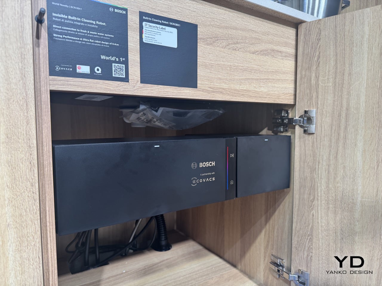
ECOVACS contributed their robotics platform, the patented navigation technologies, the 20,000 Pa suction system, and the mopping mechanics that wash pads with 75°C water and dry them with hot air. Bosch handled the built-in integration, the plumbing connections that let the service station tap into your home’s water and drainage lines, and the cabinet design that fits everything into a sink base while leaving room for your garbage disposal. The system debuts in European stores spring 2026, controlled through the Bosch Home Connect app. Milan Design Week gave us our first look at hardware that reimagines where cleaning robots actually belong.
Designers: Bosch Home Appliances & ECOVACS ROBOTICS
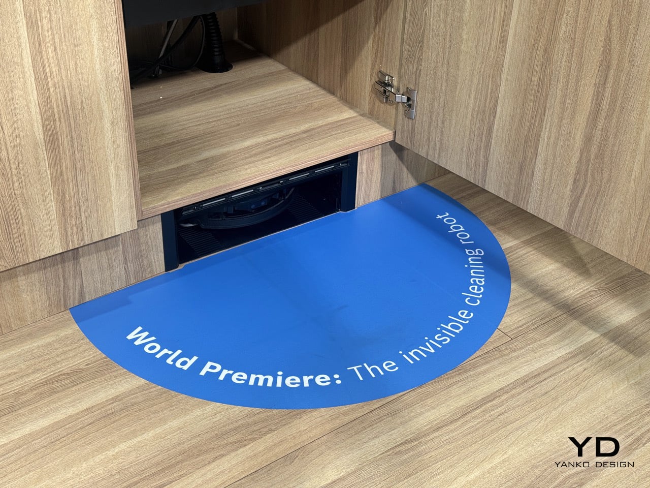
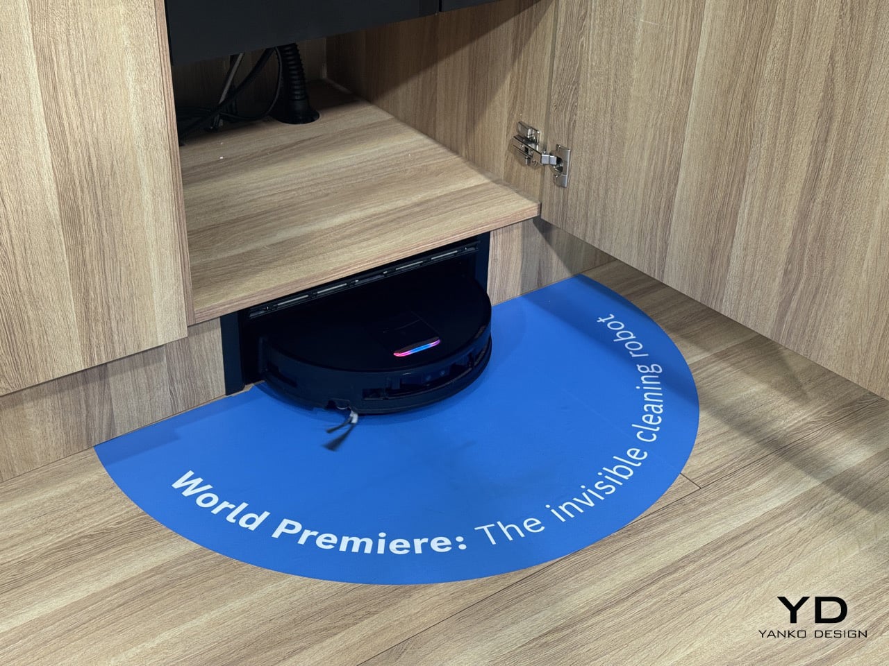
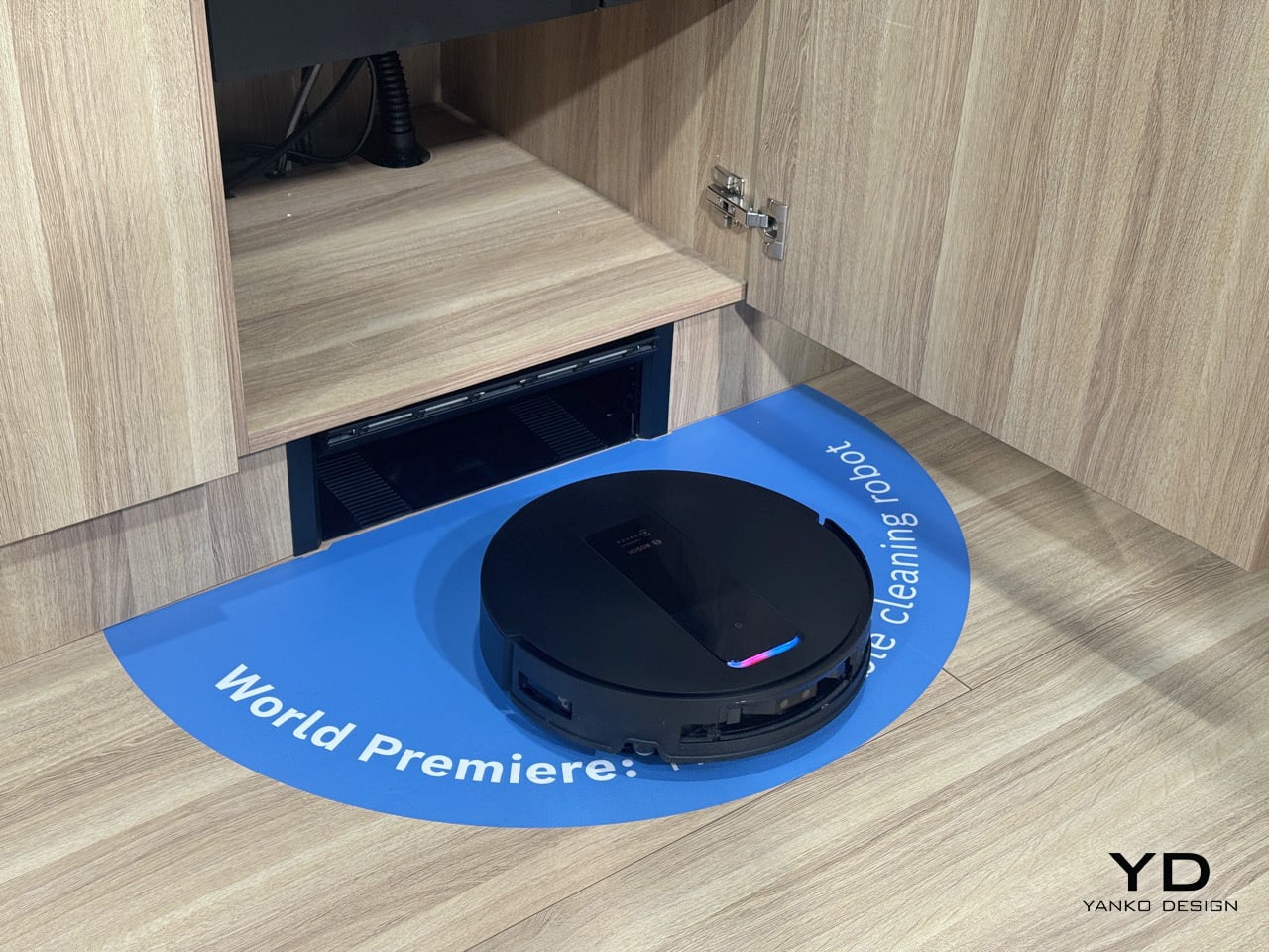
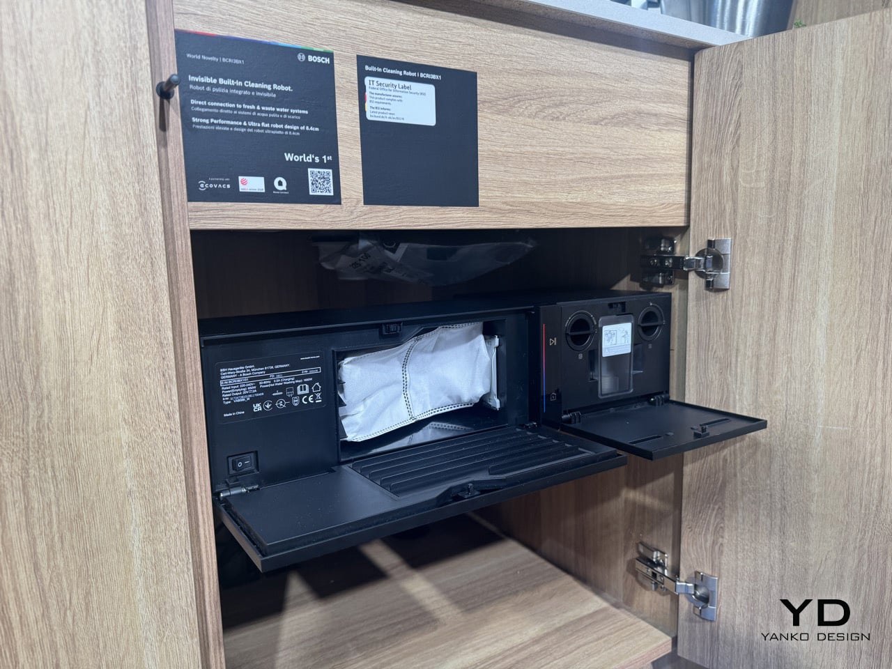
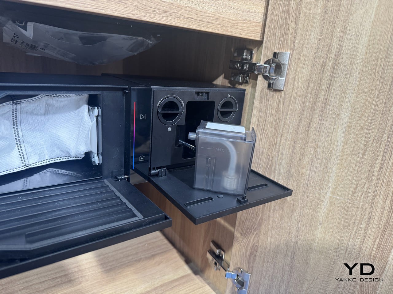
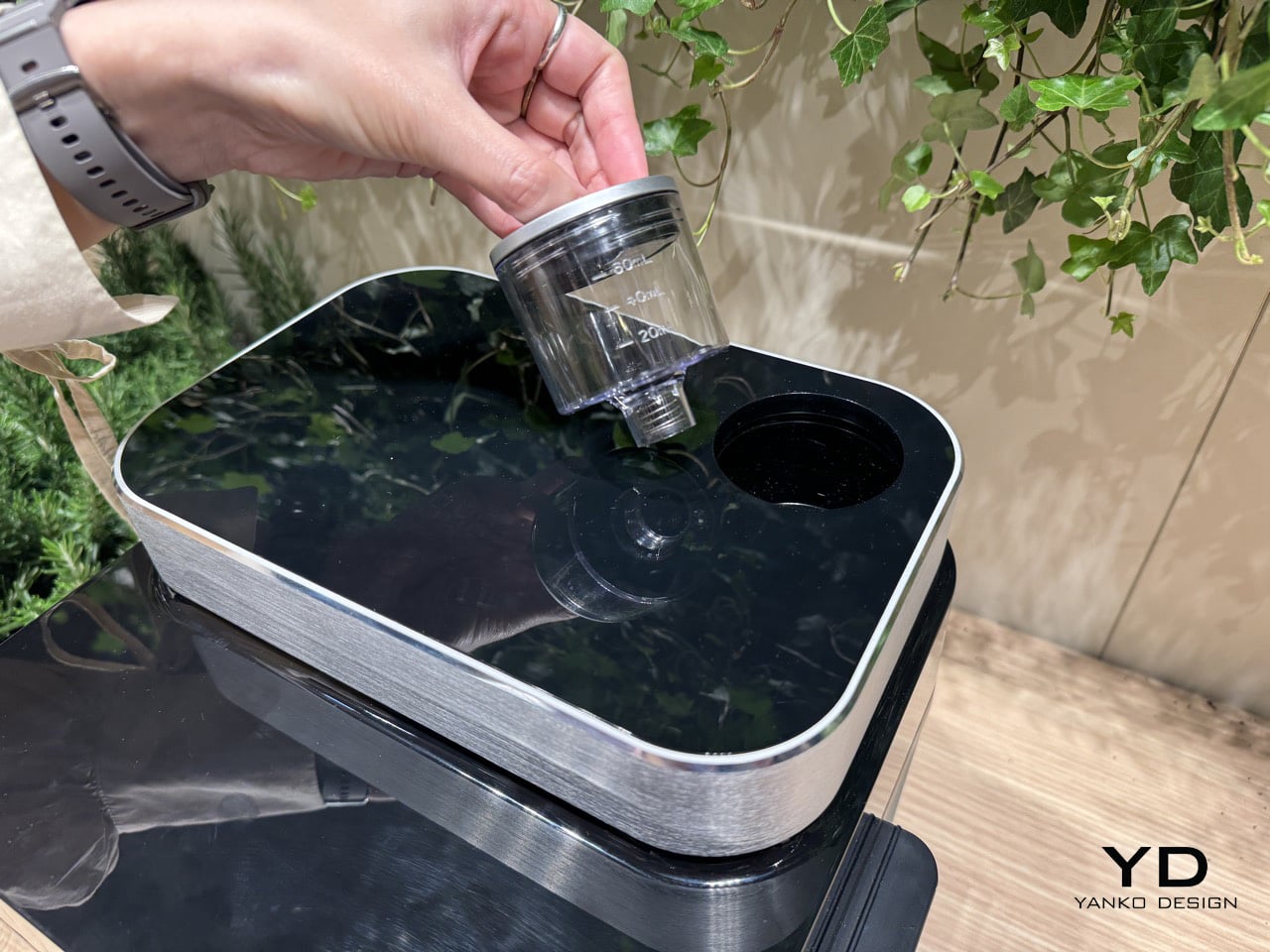
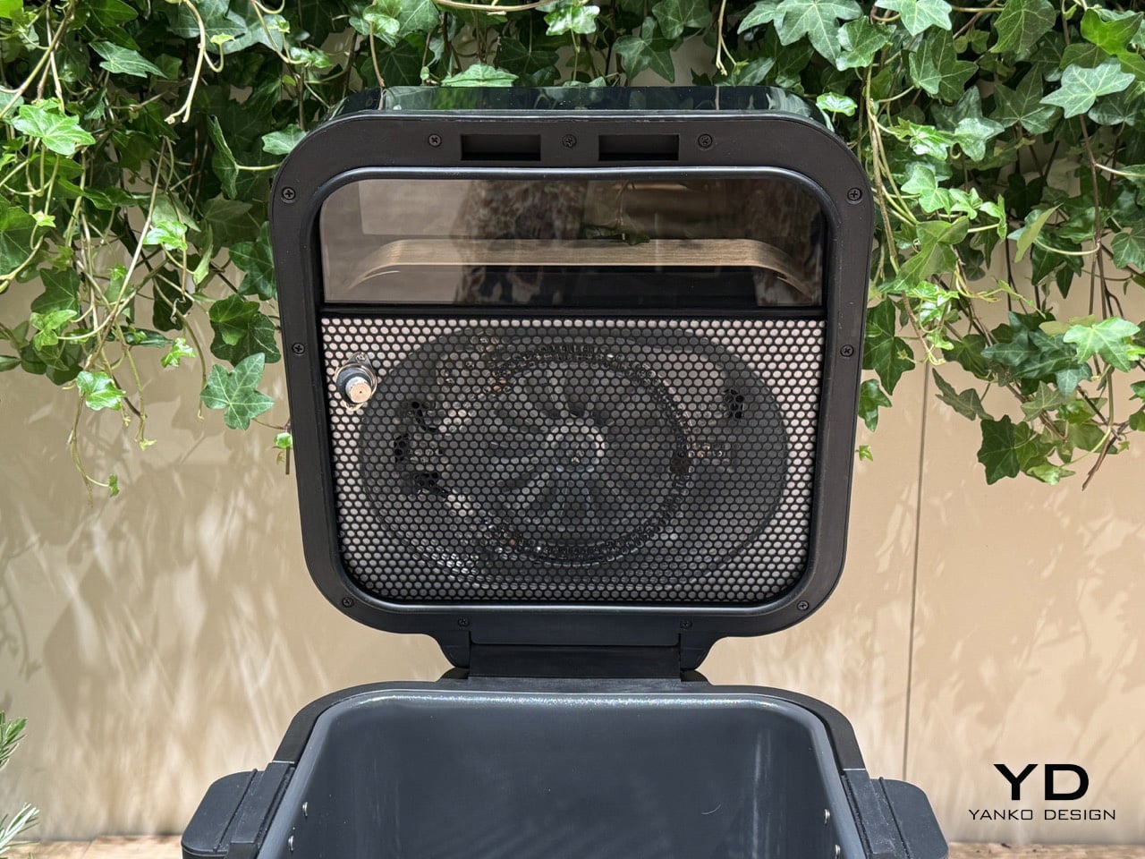
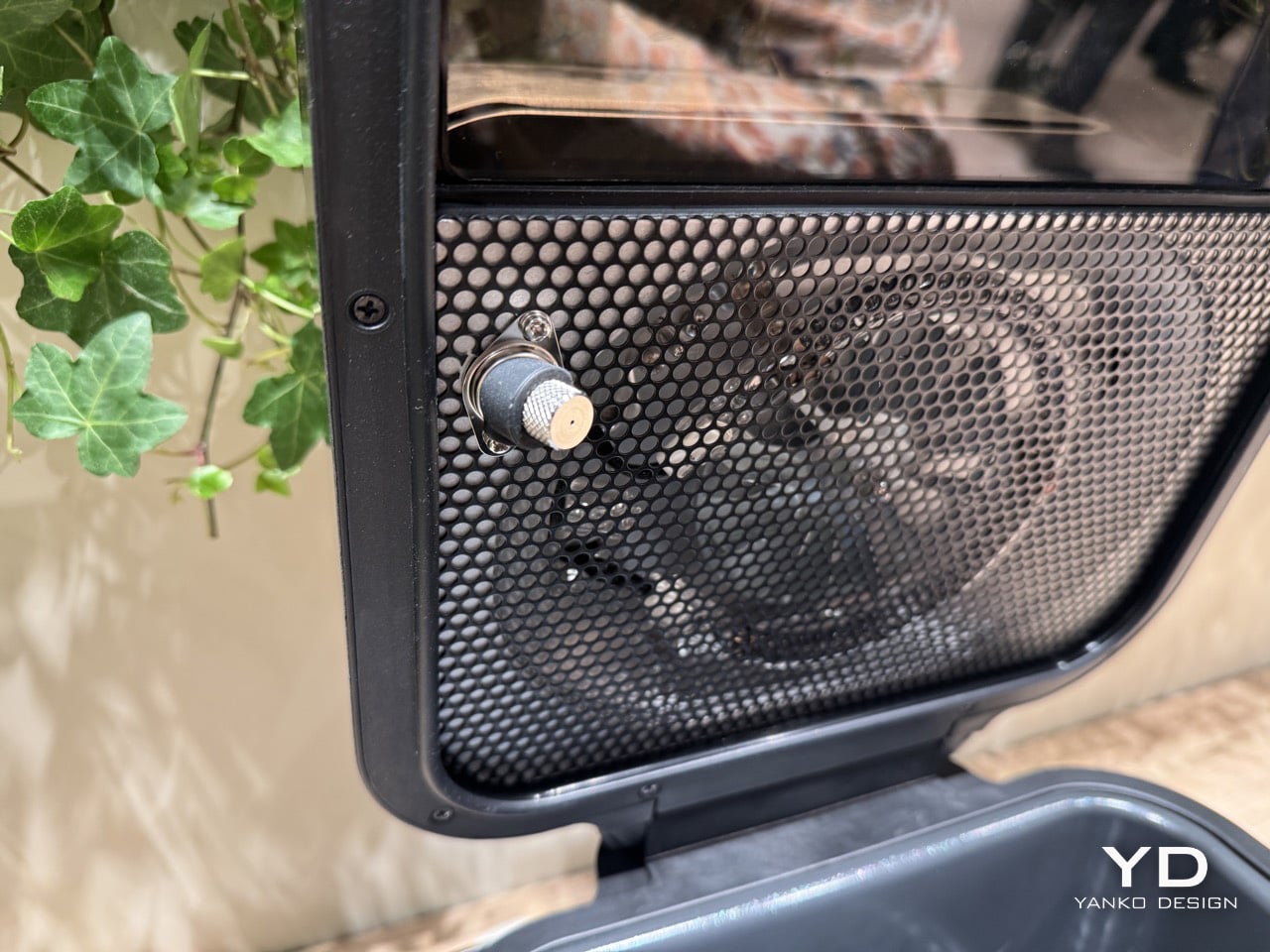
The installation lives entirely within a standard sink base cabinet, which sounds impossible until you see how they’ve packaged it. Two black modules mount to the cabinet’s interior walls, housing the service station components. The left module handles dust collection with a 2-liter antibacterial bag and automatic detergent dispensing. The right module contains the water management system, with fresh water tanks that draw directly from your home’s supply and waste water that drains straight into your plumbing. Between them sits the docking platform where the robot charges and gets serviced. A pull-out tray extends from the service station, revealing the fresh water reservoir with its translucent smoky housing and the cleaning mechanisms that maintain the robot between runs. Everything connects to your kitchen’s existing infrastructure, the same water, drain, and electrical lines that already serve your sink and dishwasher.
The robot itself measures just 84 millimeters tall, which puts it low enough to slip under most furniture and even beneath baseboards that sit 10 centimeters or higher. That 20,000 Pa suction rating makes it the most powerful vacuum Bosch has shipped, and ECOVACS packed in their full navigation suite: Smart Vision camera, structured light sensors, and obstacle detection that lets it map rooms and dodge furniture. Two rotating mop pads handle wet cleaning, with one that extends outward for edge work. An extendable side brush tackles corners. When the robot detects carpet, it lifts those mop pads up to 9 millimeters to avoid soaking fibers. It can climb thresholds up to 20 millimeters high, handling the transitions between rooms without getting stuck.
The demonstration setup at Milan Design Week shows the system in motion. The cabinet doors stay closed, presenting a seamless kitchen facade in light wood. When cleaning time arrives, a section of the baseboard kicks open automatically, revealing a slot just tall enough for the robot to pass through. The vacuum rolls out onto the floor, scans its surroundings, and begins its cleaning pattern. After finishing its route, it navigates back to that same baseboard opening, rolls inside, and the door closes behind it. The whole sequence happens without any visible hardware cluttering your kitchen. Inside the cabinet, the service station gets to work, emptying the dust bin into that 2-liter bag, flushing the mop pads with hot water, and drying them with heated air before the next cleaning cycle.
The control interface runs through Bosch’s Home Connect app, which already manages their other connected appliances. You can view and edit the floor plan the robot creates, set no-go zones for areas you want it to avoid, schedule cleaning routines, or trigger manual cleanings. The app also lets you name your robot if you’re into that sort of thing. All the data stays within EU servers under their data protection requirements, which should address privacy concerns for anyone wary of cloud-connected cleaning devices. The system meets both Bosch and ECOVACS quality and safety standards, combining Bosch’s appliance reliability with ECOVACS’ robotics expertise.
The Bosch built-in vacuum and mop robot is on display at Milan Design Week through April 13th at the Euro Cucina section, where Bosch is showing their latest kitchen innovations. This represents the first time most people will get to see a fully integrated robot cleaning system in person, and it’s the kind of thing you need to watch operate to fully understand. Spring 2026 availability means anyone renovating a kitchen or building new has about a year to plan for installation, which requires coordination with your kitchen installer and access to the necessary plumbing and electrical connections during construction.
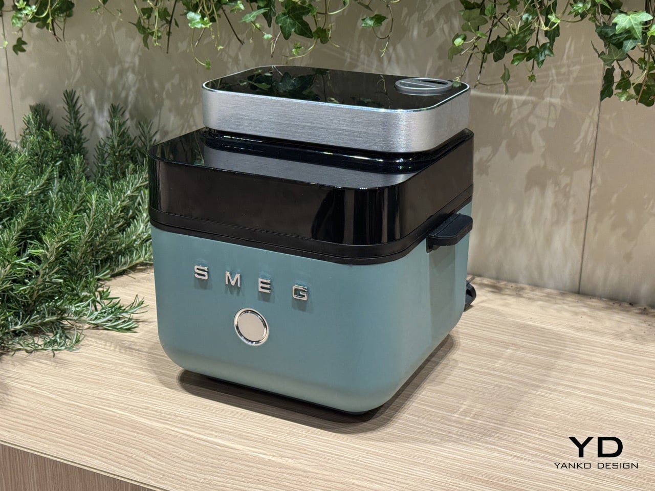
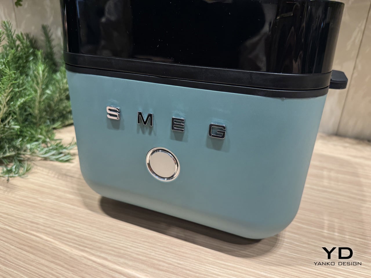
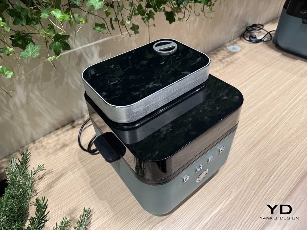
I was today years old when I learnt that Smeg’s origins were in enamel technology, not the gorgeously colorful kitchen appliances we’ve known them for these past few decades. Well, Smeg did end up perfecting the art of enameling wonderful hues onto appliances, so it’s just natural that they’d become famous for it, collaborating with Dolce & Gabbana and even Porsche to reveal appliances in some truly eye-catching colors.
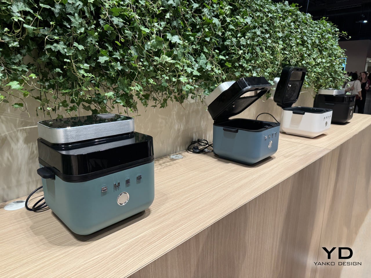
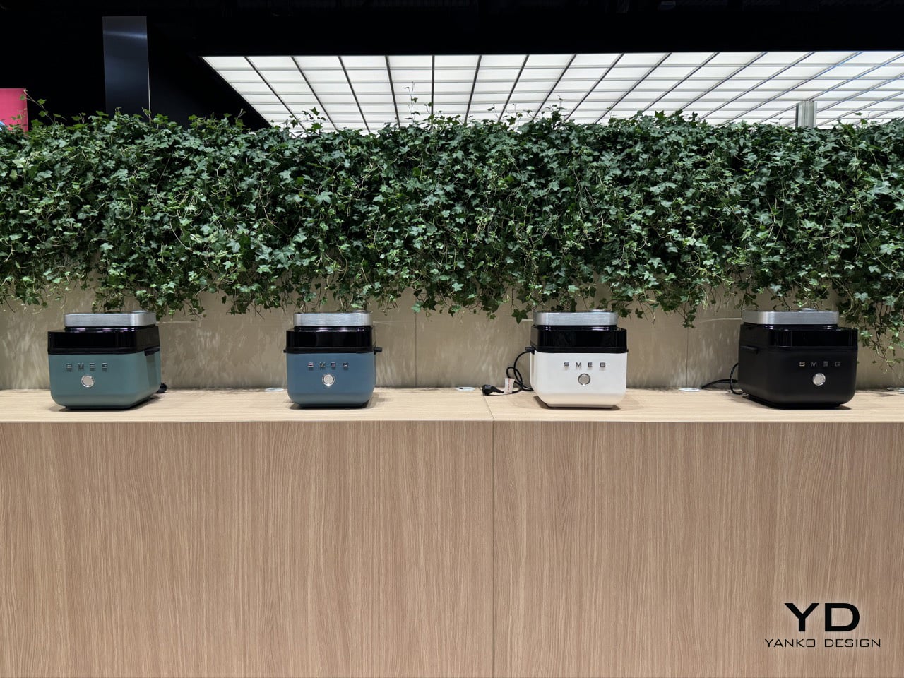
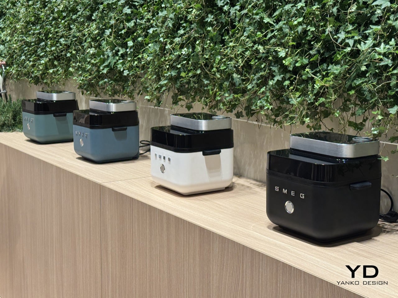
However, apart from the usual fanfare, Smeg even brought some concepts to the table at Milan Design Week, showcasing an innovative air fryer with its own built-in steamer feature. Currently just a concept (with really no product name, price, or market-launch date yet), the fryer channels Smeg’s familiar color language with 4 options, all interplaying wonderfully with gloss black and brushed metal trims.
Designer: Smeg
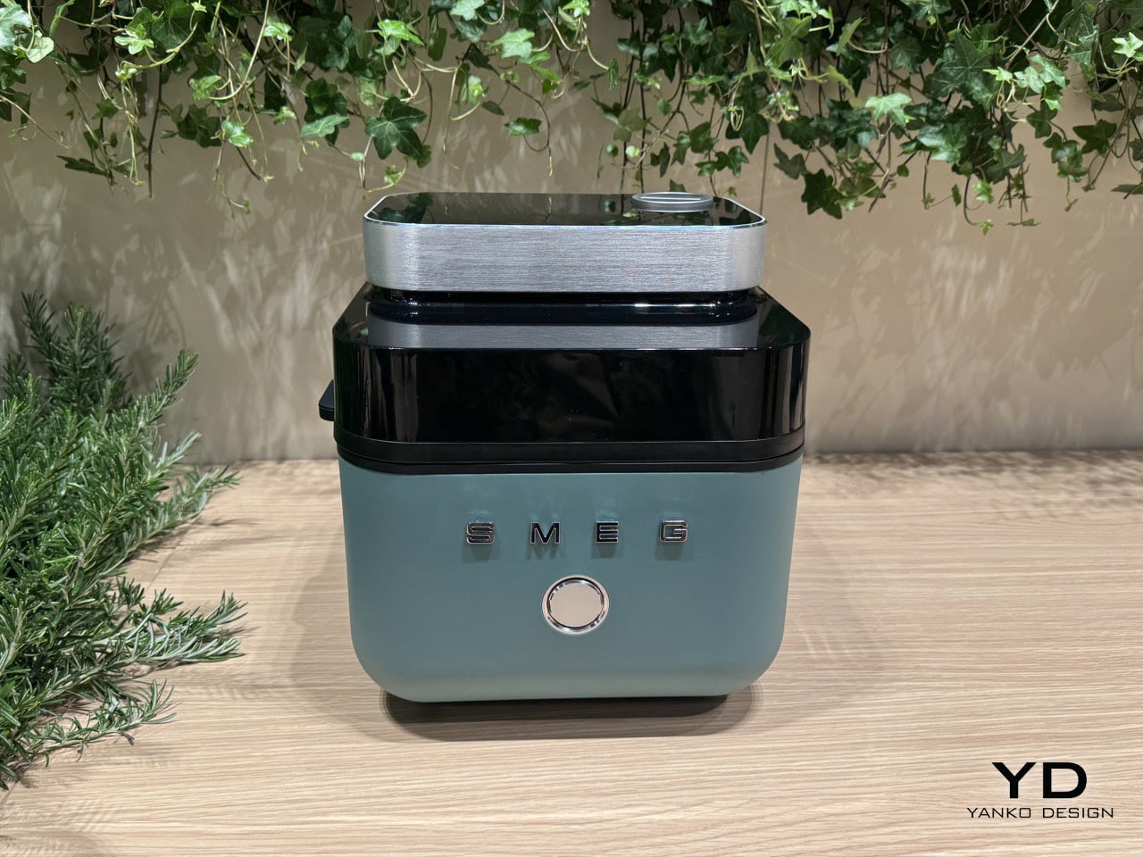
The fryer boasts a 7-liter internal capacity, accessed by a button on the front that ejects the fryer’s lid. Unlike most air fryers that open frontwards, Smeg’s opens from the top, letting you directly place items inside or even take the basket out by its handles. The coil and fan, which otherwise remains hidden from view, is directly visible here, right beside a tinted black visor that allows you to also look into the basket when the air fryer’s at work.
However, we wouldn’t be talking about an air fryer if it was just some basic piece of hardware. Smeg built a steamer into the fryer too, basically turning it into a steam oven, should you choose to use that feature. Most air fryers are just convection ovens redesigned in a different format, but the addition of steam makes a great difference to the fryer’s output. Contrary to popular belief, steam actually helps with crisping up of food, which is why breadmakers usually mist the insides of their oven while baking a loaf. The result is a gorgeous outer crust that’s perfectly brittle, with an inside that’s still fluffy. The same logic works with things like chicken wings, allowing you to cook them without oil, and still ensure that they don’t feel dry to the bite. The steam prevents the inside of the chicken from losing its moisture, so you still have the crack of a fried crust on the outside, with the delectable juiciness you love inside.
The way you use the steam feature is simple. Smeg built a water cartridge that you can pull out and fill up, before reloading back into your air fryer. Once chosen in the settings, the steam is deployed into the basket via a tiny nozzle on the top, permeating the inner chamber with moisture that makes breads fluffy, cakes delicious, and wedges/wings crispy outside and wonderful inside.
We probed Smeg to give us a launch date, but the air fryer + steamer is just a concept for now. Here’s to hoping that they actually launch it sometime in the future, although a representative did say that if it were to launch, it wouldn’t be before 2027. I guess I’ll have to settle for manually spritzing my food in the air fryer with water every few minutes until then!
Along with the concept Air Fryer, you can check out Smeg’s entire showcase at Salone del Mobile in Milan in the Euro Cucina section of the exhibition. The Italian kitchen brand is showcasing fridges, ovens, stoves, coffee machines, induction hobs, and even chimneys, combining color and enamel technology with a design aesthetic suited for both European as well as American markets.
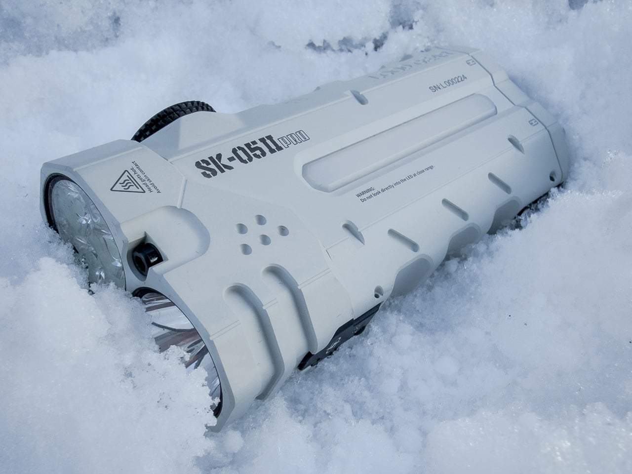
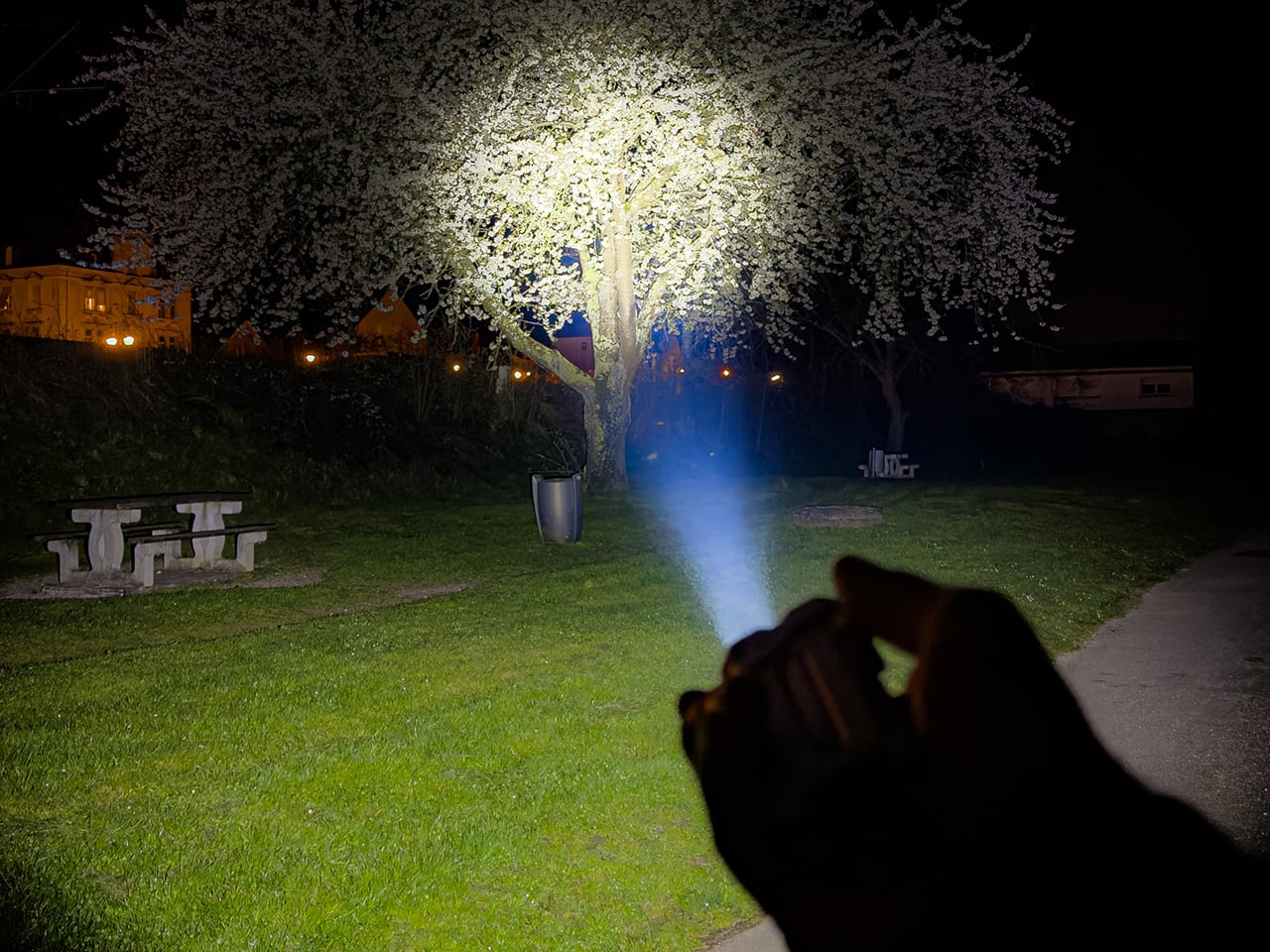
Flashlight manufacturers love to brag about lumen counts, but raw output means very little when the beam profile can’t match the task at hand. A spotlight punches distance but leaves your peripheral vision in the dark. A floodlight washes everything in even brightness but can’t reach past thirty meters. LOOPGEAR’s SK05 Pro 2 solves this by housing both emitter types in a single body, controlled independently through a Rose Gold rotary dial that snaps between modes with mechanical precision. This is the second generation of their dual-light platform, and the performance gap between versions is staggering. Spotlight output jumped 92 percent, from 1300 lumens to 2500, while the floodlight climbed 24 percent to 3800 lumens.
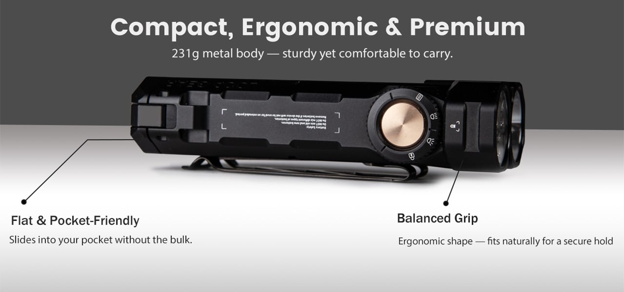
The SK05 Pro 2 measures 106mm long, 47.8mm wide, and 22.5mm thick, a form factor that sits somewhere between a smartphone and a multi-tool. Two 18650 cells run in parallel, giving you 8000mAh of capacity that charges devices at up to 12 volts, a rare feature in the EDC flashlight category. LOOPGEAR offers two emitter choices for the floodlight: Nichia 519A for high color rendering or RE-SF18-W for higher raw output. Both versions use the same SFT42R LED for the spotlight channel. The entire package shares the same machined metal body, IP68 waterproofing, magnetic base, and integrated sidelight with true white and RGB modes. The body ships in black or white MAO (matte anodized) finishes, and the overall design language leans heavily into tactical geometry with angular cutouts and textured gripping surfaces.
The rotary dial controls everything, and its mechanical feedback feels deliberate in a way touchscreens and membrane buttons never will. Twist clockwise and you cycle through the spotlight’s four brightness levels: 40 lumens for map reading, 320 for general navigation, 950 for serious illumination, and a 2500-lumen turbo that steps down after 40 seconds to prevent overheating. Twist counterclockwise and you access the floodlight’s range, from a 50-lumen low that won’t destroy your night vision to the 3800-lumen turbo that lights up a campsite like midday. Hold the dial for two seconds and both emitters fire simultaneously, combining for 5000 lumens of output that reaches 410 meters in the spotlight channel. The dial itself is CNC-machined with knurling that grips even when wet, and the detents are firm enough that accidental mode changes in a pocket or bag are nearly impossible.
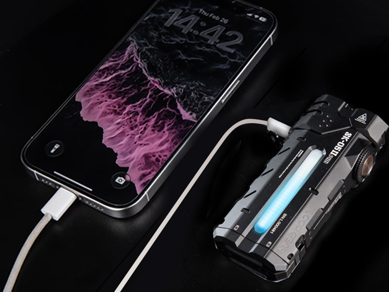
Two 18650 batteries slide into the body from the bottom, both oriented the same direction thanks to the parallel wiring configuration. This setup has practical advantages beyond the 8000mAh total capacity. If one cell dies mid-trip, the light continues running on the remaining battery, albeit at reduced runtime. The cells LOOPGEAR includes are standard 4000mAh units, meaning replacements are easy to source. The USB-C port sits on the side, protected by a magnetic metal flap that seals tight enough to maintain the IP68 rating. Charging happens at up to 22 watts, which fills both batteries in roughly three hours. What separates this from most rechargeable flashlights is the powerbank output capability, specifically the ability to deliver 5V, 9V, or 12V depending on what your device negotiates. Most EDC lights with powerbank features max out at 5V, which limits you to slow-charging phones and basic USB accessories. The SK05 Pro 2 can fast-charge a laptop, power a USB-C monitor, or run higher-voltage gear in the field.
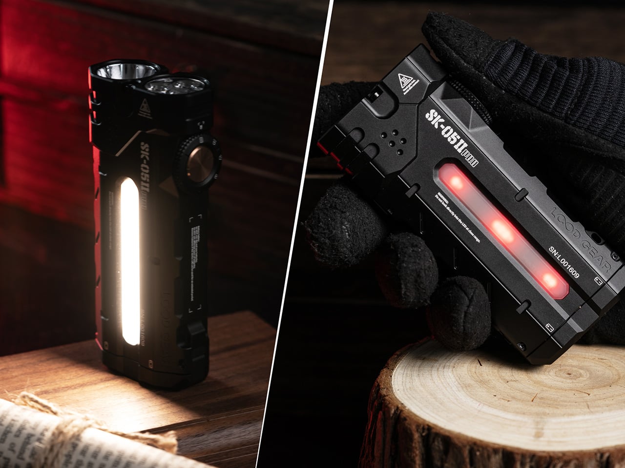
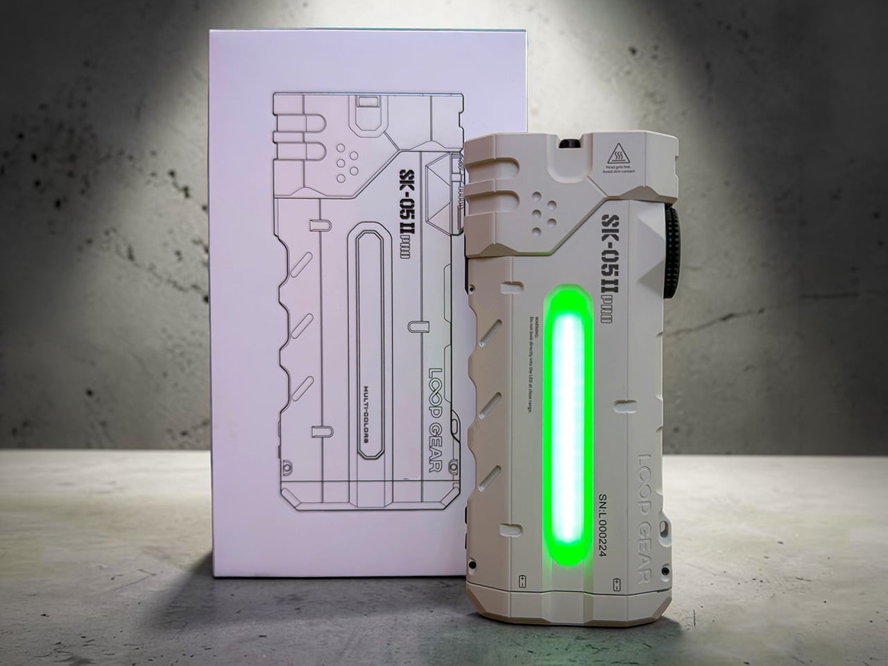
The sidelight runs along the length of the body, a COB (chip-on-board) LED strip that outputs white light in four brightness levels or switches to RGB mode for signaling and ambient lighting. LOOPGEAR upgraded this to a high-CRI emitter in the Pro 2, and the difference is immediately visible when you’re working on anything that requires color accuracy. The white mode ranges from a sub-lumen moonlight setting that lasts over 100 hours to a 120-lumen high that floods your immediate workspace without the harshness of the main emitters. The RGB mode cycles through red, green, and blue, useful for preserving night vision, map reading, or just making the light visible in a packed bag. The sidelight activates through a separate button near the dial, so you can run it independently or combine it with either the spotlight or floodlight for layered illumination.
LOOPGEAR machined the body from metal (likely aluminum based on the weight-to-size ratio) and applied a matte anodized finish that resists scratches and provides grip without being aggressively textured. The corners are chamfered, the sides feature cutouts that reduce weight and add visual interest, and the overall aesthetic skews tactical without crossing into mall-ninja territory. A magnetic base sits at the tailcap, strong enough to hold the light vertically on a car hood or toolbox while you work hands-free. The pocket clip along with a separate nameplate mount via screws (included, along with the installation tool), and you can position it in multiple orientations depending on how you carry. At 231 grams with batteries loaded, this sits heavier than a typical EDC pen light but lighter than most full-size tactical flashlights, and the flat profile distributes that weight in a way that disappears in a cargo pocket or bag.
The competitive landscape for dual-emitter flashlights is sparse, mostly because the engineering complexity tends to drive prices into the $200-plus range where brands like Acebeam and Nitecore operate. LOOPGEAR positioned the original SK-05 Pro around $150, and early indications suggest the Pro 2 will land in similar territory despite the significant performance upgrades. That puts it well below premium dual-channel lights while offering comparable (in some cases superior) output and feature density. The closest analog is probably the Acebeam E70, which offers similar throw and flood capabilities but weighs more, costs more, and lacks the powerbank voltage flexibility. The Sofirn IF22A delivers comparable spotlight performance at a lower price, but it’s a single-emitter design with no floodlight option and no powerbank functionality.
The SK-05 II Pro currently retails at $113.98, down from the original $159.99 list price, a $46 discount that positions it aggressively below the dual-channel competition. Comparable lights from Acebeam and Nitecore typically land in the $180 to $200 range, and most lack the multi-voltage powerbank capability that makes the LOOPGEAR viable as a backup charging solution for higher-draw devices. LOOPGEAR ships the light with both 18650 cells, a USB-C charging cable, pocket clip hardware, and installation tools, so you’re field-ready out of the box. The company’s track record with the original SK-05 Pro and the LOOPDOT platform suggests consistent firmware updates and responsive customer support, which matters when you’re trusting a single device to handle both illumination and emergency power in remote environments. Whether this becomes your primary EDC light depends on whether you value dual-emitter flexibility over the slimmer profile of a traditional cylindrical flashlight, but at this price point with this feature set, few competitors deliver comparable performance per dollar.
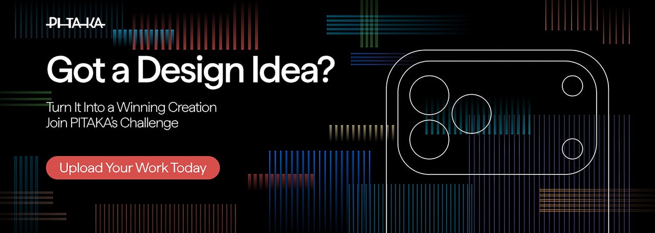
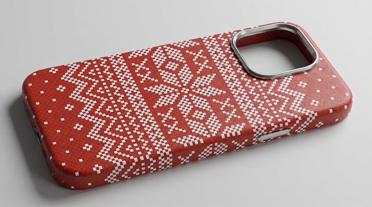
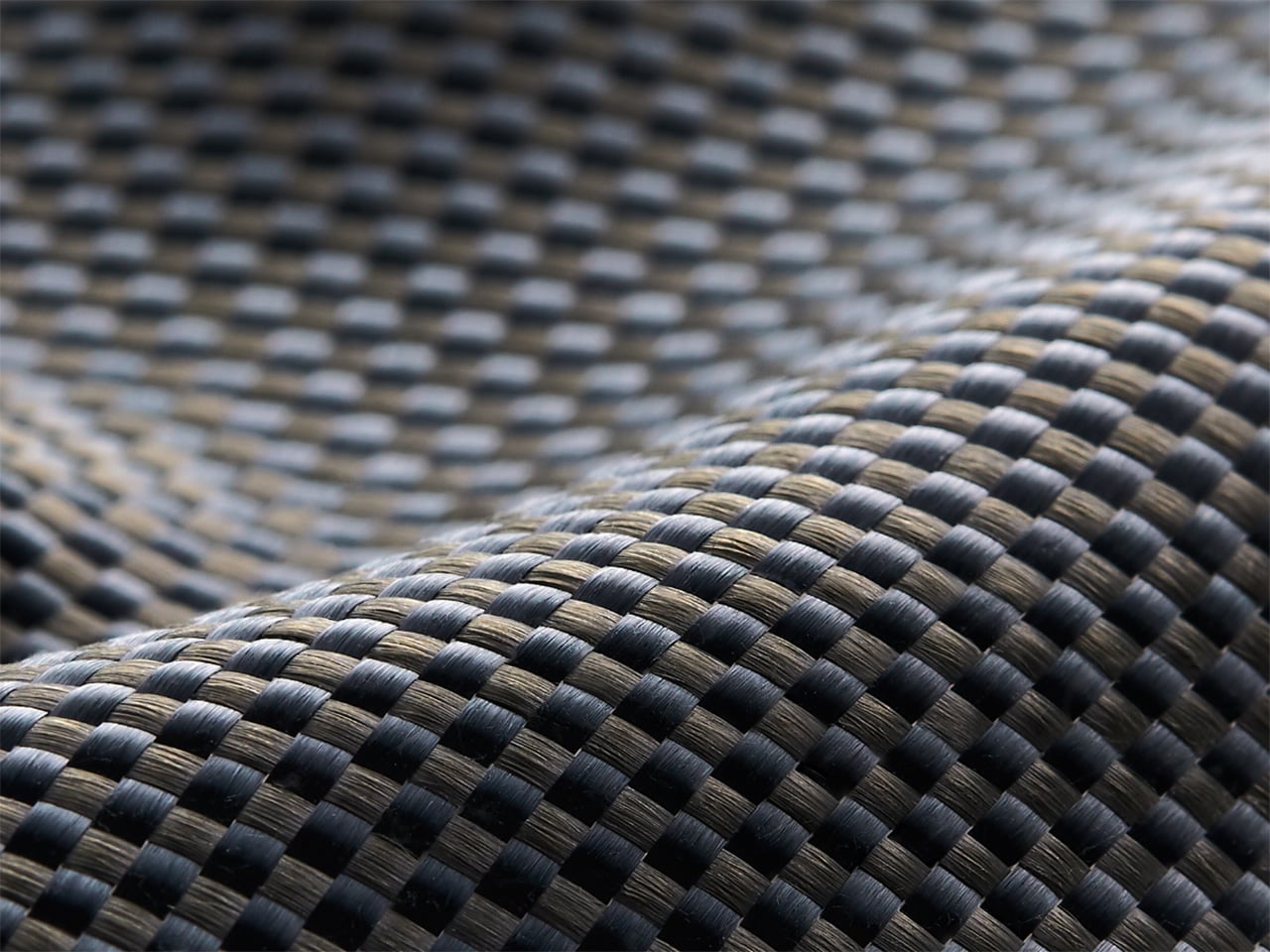
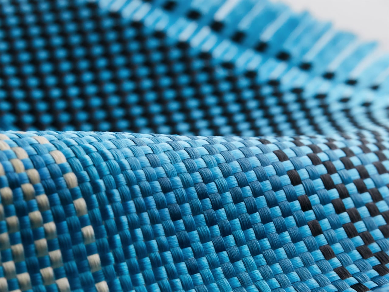
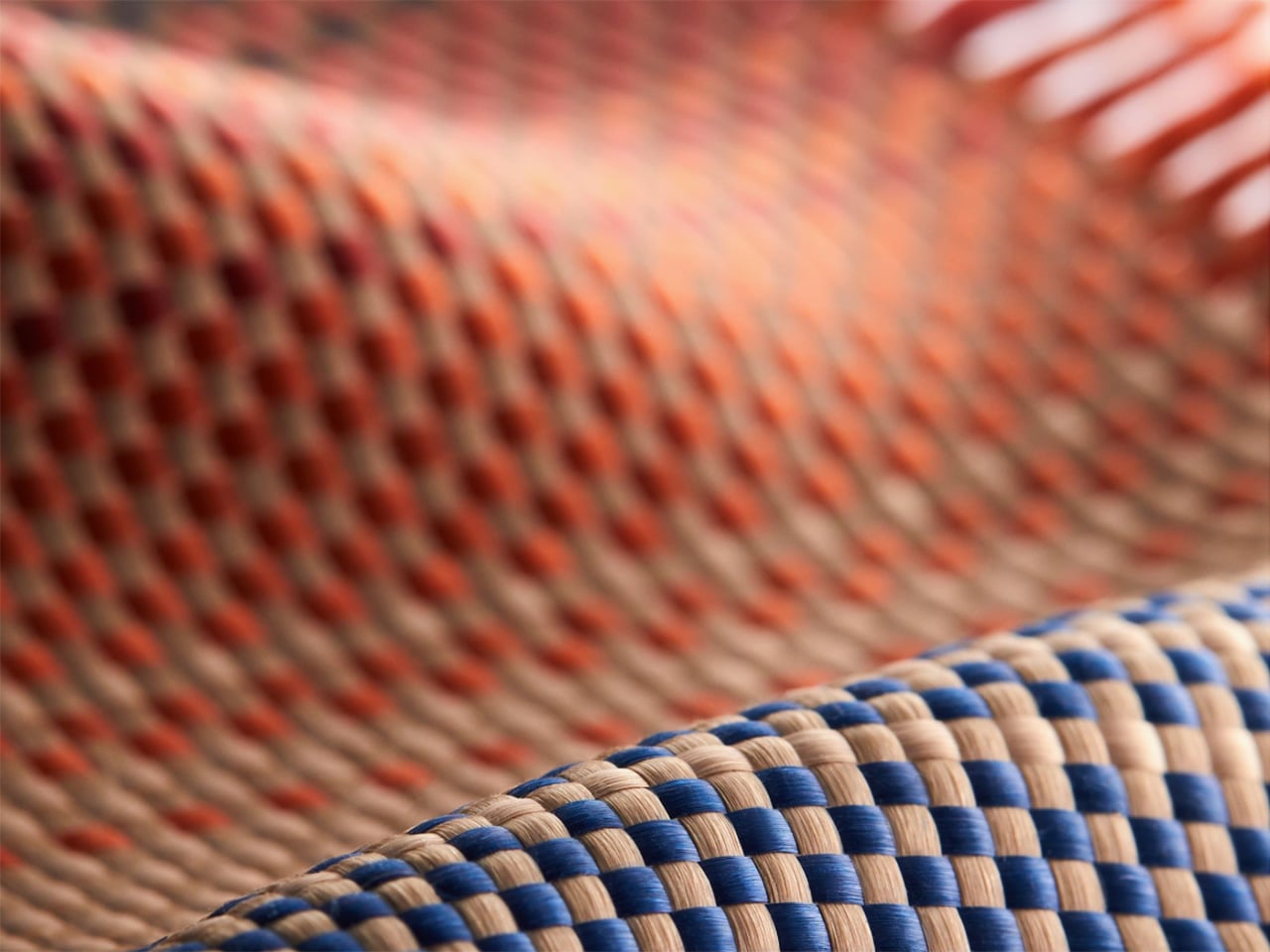
Tech accessories have hit a curious inflection point. The last year trained us to worship thinness and glass, but somewhere between the tenth identical ‘Air’ or ‘Edge’ smartphone and the fifteenth glossy case, a countermovement quietly took root. Texture matters again. Grip, weave, and tactile identity are no longer afterthoughts, they’re the differentiators that keep objects from sliding into the sea of sameness. PITAKA, a brand built on aerospace-grade aramid fiber and what it calls “fusion weaving,” has spent years proving that phones don’t have to feel like jewelry-store display pieces. Now, with the launch of “Weave the Next, Weave Our World,” the company is turning that philosophy outward, inviting designers worldwide to imagine the surfaces and visual languages that will define the next generation of tech we carry, hold, and interact with every day.
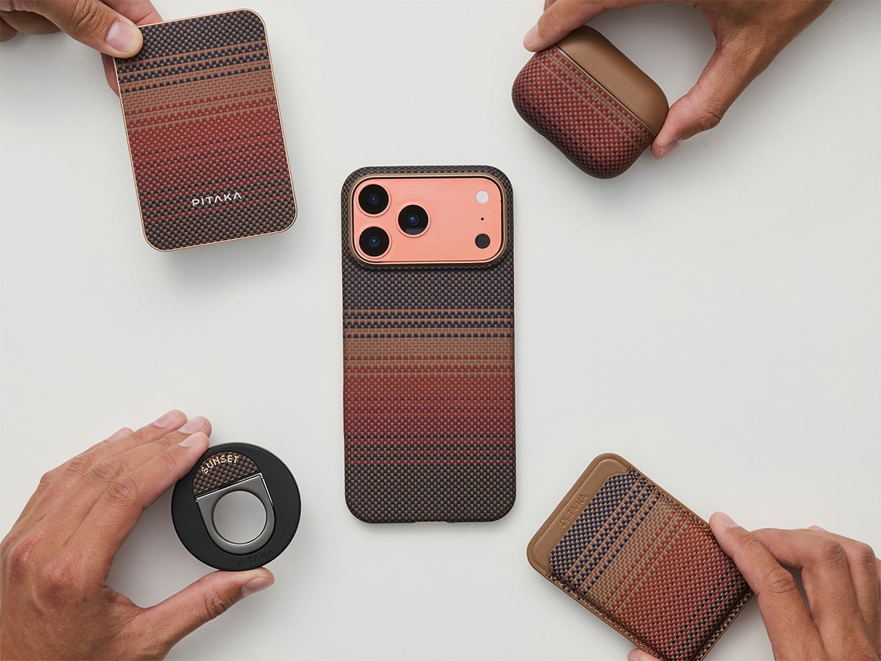
Launching April 24th, 2026, the competition is framed explicitly around the intersection of technology and art, which is less marketing speak and more PITAKA’s operational DNA. The brand’s cases have always leaned hard into material science, using woven aramid fibers (the same stuff in bulletproof vests and aircraft components) that are five times stronger than steel and a fraction of the weight. But strength alone doesn’t sell. What makes PITAKA cases notable is the texture vocabulary they’ve developed over years of refining weave patterns, experimenting with 600D and 1500D aramid densities, and pushing techniques like “fusion weaving,” where multiple patterns coexist on a single loom to create intricate, layered surface designs. “Weave the Next, Weave Our World” extends that exploration beyond the company’s internal design studio and into the hands of students, professionals, and independent creators who might see texture, pattern, and tactility from entirely different cultural or aesthetic starting points.
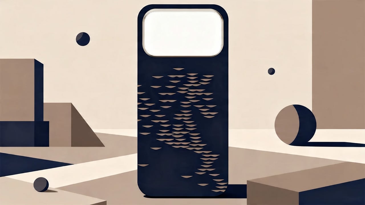
PITAKA’s “Weave the Next, Weave Our World” global design competition invites designers to create texture and visual language systems for the brand’s future product series, positioned explicitly at the intersection of technology and art. Participants choose from four thematic directions: “These Moments,” which captures the raw beauty and shifting rhythms of the natural world; “Timeless Threads,” weaving stories of culture, memory, and human journeys; “Beyond Tomorrow,” exploring visionary futures where innovation reshapes daily life; or “Roots of Rhythms,” celebrating the textures, symbols, and spirit born from each land’s heritage. The competition aims to explore emerging global trends in tactile and visual design, strengthen PITAKA’s art-tech identity, and potentially commercialize winning designs through royalties, co-branding, and official recognition.
How To Participate
Visit the official competition website or Dribbble page to submit your entry
Provide participant information and upload your texture designs
Include a written design explanation with your submission
Entries will be evaluated through a combination of professional jury review and public voting
Winners will be announced and showcased in an online exhibition
Competition Dates
Competition Launch: April 24, 2026
Submission Period: April 24 – May 25, 2026
Judging Period: May 26 – May 31, 2026
Winners Announcement: June 9, 2026
Jury Panel
Qiongzhi Xie (Artist; Founder of Daxing Jizi Studio)
Matteo Menotto (Head of Design, Prints & Textile Accessories at Bulgari)
Sarang Sheth (Editor-in-Chief, Yanko Design)
James (Founder / CEO, PITAKA)
Important Information
The most compelling entries are likely to do three things at once:
Treat texture as a system, not a single image
PITAKA’s products live across multiple form factors, so a strong entry will propose a visual/tactile system that can scale and adapt, not just a one-off pattern.
Anchor the concept in one of the four themes without being literal
“These Moments” does not need a photo-real print of a wave; “Roots of Rhythms” does not need a direct copy of a folk motif. Abstraction, distillation, and translation into a tech-accessory context will matter.
Consider manufacturability and user experience
Even in a speculative competition, the jury includes industrial design and brand leadership. Textures that look stunning in render but collapse in real material or feel uncomfortable in hand will likely be deprioritized.
If you already experiment with materials, parametric patterns, or culturally rooted visual systems, “Weave the Next, Weave Our World” is essentially an invitation to push that work into a space where it might actually ship.
Tech accessories have hit a curious inflection point. The last year trained us to worship thinness and glass, but somewhere between the tenth identical ‘Air’ or ‘Edge’ smartphone and the fifteenth glossy case, a countermovement quietly took root. Texture matters again. Grip, weave, and tactile identity are no longer afterthoughts, they’re the differentiators that keep objects from sliding into the sea of sameness. PITAKA, a brand built on aerospace-grade aramid fiber and what it calls “fusion weaving,” has spent years proving that phones don’t have to feel like jewelry-store display pieces. Now, with the launch of “Weave the Next, Weave Our World,” the company is turning that philosophy outward, inviting designers worldwide to imagine the surfaces and visual languages that will define the next generation of tech we carry, hold, and interact with every day.
Launching April 24th, 2026, the competition is framed explicitly around the intersection of technology and art, which is less marketing speak and more PITAKA’s operational DNA. The brand’s cases have always leaned hard into material science, using woven aramid fibers (the same stuff in bulletproof vests and aircraft components) that are five times stronger than steel and a fraction of the weight. But strength alone doesn’t sell. What makes PITAKA cases notable is the texture vocabulary they’ve developed over years of refining weave patterns, experimenting with 600D and 1500D aramid densities, and pushing techniques like “fusion weaving,” where multiple patterns coexist on a single loom to create intricate, layered surface designs. “Weave the Next, Weave Our World” extends that exploration beyond the company’s internal design studio and into the hands of students, professionals, and independent creators who might see texture, pattern, and tactility from entirely different cultural or aesthetic starting points.
PITAKA’s “Weave the Next, Weave Our World” global design competition invites designers to create texture and visual language systems for the brand’s future product series, positioned explicitly at the intersection of technology and art. Participants choose from four thematic directions: “These Moments,” which captures the raw beauty and shifting rhythms of the natural world; “Timeless Threads,” weaving stories of culture, memory, and human journeys; “Beyond Tomorrow,” exploring visionary futures where innovation reshapes daily life; or “Roots of Rhythms,” celebrating the textures, symbols, and spirit born from each land’s heritage. The competition aims to explore emerging global trends in tactile and visual design, strengthen PITAKA’s art-tech identity, and potentially commercialize winning designs through royalties, co-branding, and official recognition.
How To Participate
Visit the official competition website or Dribbble page to submit your entry
Provide participant information and upload your texture designs
Include a written design explanation with your submission
Entries will be evaluated through a combination of professional jury review and public voting
Winners will be announced and showcased in an online exhibition
Competition Dates
Competition Launch: April 24, 2026
Submission Period: April 24 – May 25, 2026
Judging Period: May 26 – May 31, 2026
Winners Announcement: June 9, 2026
Jury Panel
Qiongzhi Xie (Artist; Founder of Daxing Jizi Studio)
Matteo Menotto (Head of Design, Prints & Textile Accessories at Bulgari)
Sarang Sheth (Editor-in-Chief, Yanko Design)
James (Founder / CEO, PITAKA)
Important Information
The most compelling entries are likely to do three things at once:
Treat texture as a system, not a single image
PITAKA’s products live across multiple form factors, so a strong entry will propose a visual/tactile system that can scale and adapt, not just a one-off pattern.
Anchor the concept in one of the four themes without being literal
“These Moments” does not need a photo-real print of a wave; “Roots of Rhythms” does not need a direct copy of a folk motif. Abstraction, distillation, and translation into a tech-accessory context will matter.
Consider manufacturability and user experience
Even in a speculative competition, the jury includes industrial design and brand leadership. Textures that look stunning in render but collapse in real material or feel uncomfortable in hand will likely be deprioritized.
If you already experiment with materials, parametric patterns, or culturally rooted visual systems, “Weave the Next, Weave Our World” is essentially an invitation to push that work into a space where it might actually ship.