The office is no longer a place. For a growing number of professionals, work happens across a rotating cast of locations, on trains, in hotel lobbies, at standing desks in co-working spaces, at airport gates between meetings. What gets carried through all of that has quietly become one of the more personal decisions in a working day. The bag has to hold a laptop, a water bottle, travel documents, chargers, and sometimes a change of clothes, while still looking appropriate in every environment it passes through. Most bags manage the functional half of that requirement passably well; the visual half tends to be where the compromises show.
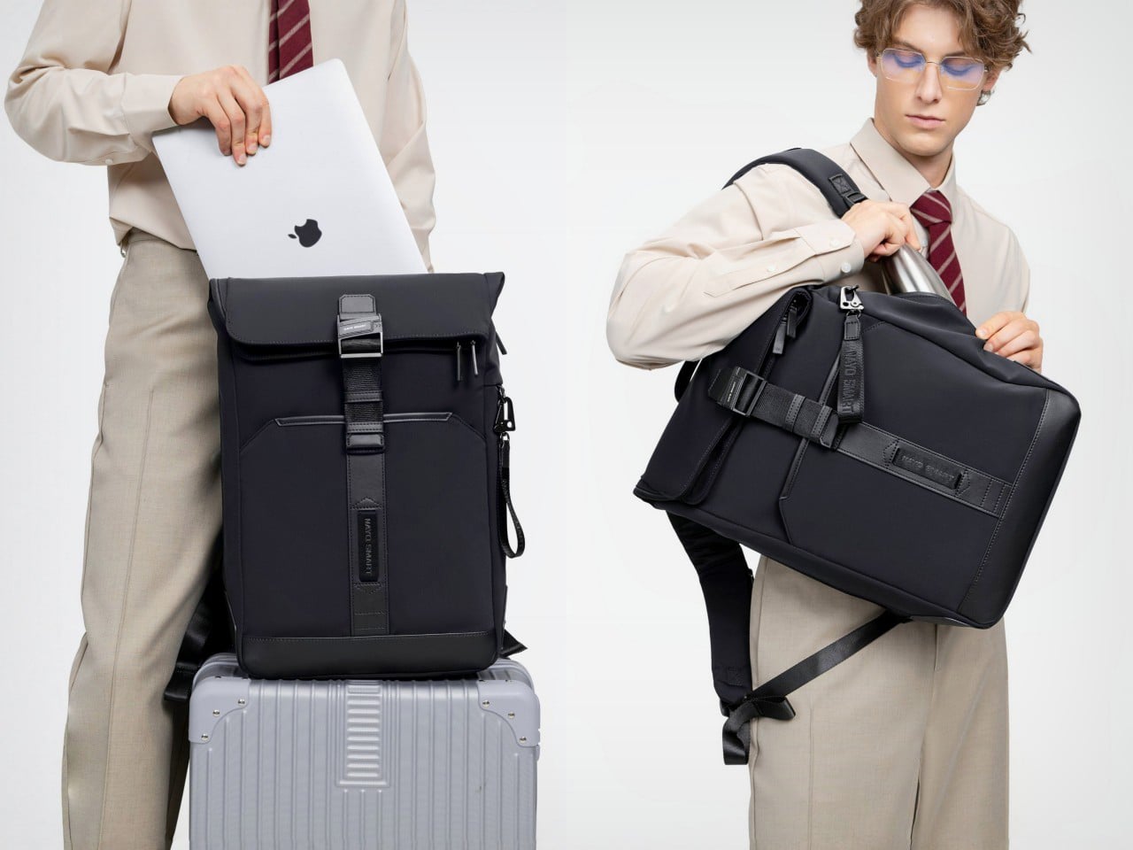
Nayo Smart designed the Herman Pro around exactly this reality. The half-roll-top silhouette keeps things looking composed from the outside, while the internal architecture handles an impressive amount of organized complexity. A dedicated laptop compartment sits separately from the main storage zone, accessible directly from the back panel for quick retrieval at security. The L-shaped main opening lays nearly flat for visibility and easy packing. A FIDLOCK magnetic buckle secures the flap in one motion, and hidden pockets, a side waterproof sleeve, and a luggage strap round out a carry system built around real transit habits rather than feature checklists.
Designer: Nayo Smart
Click Here to Buy Now: $152.10 $169 (10% off) Free Waterproof Packing Cube included with your Herman Pro
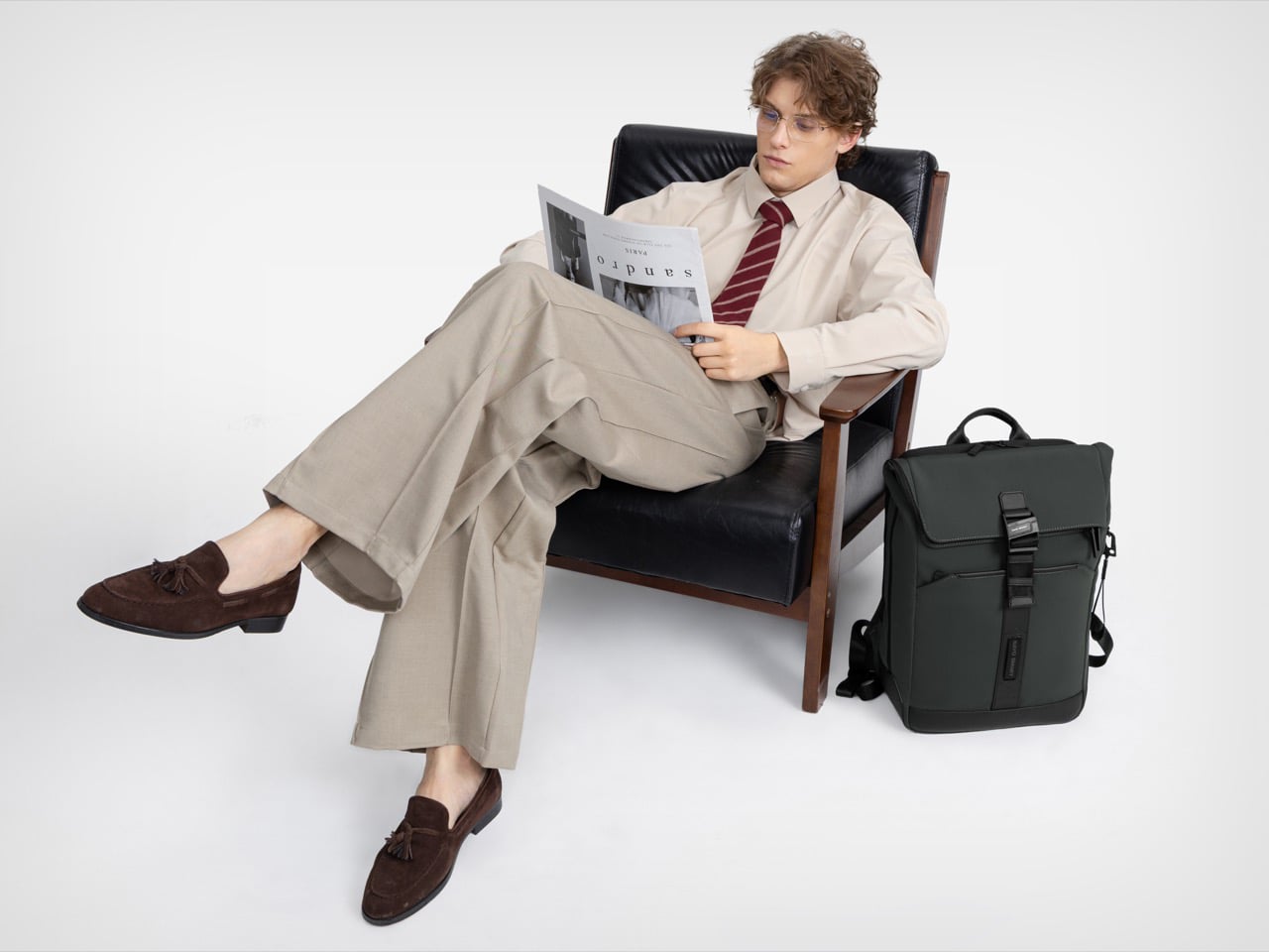
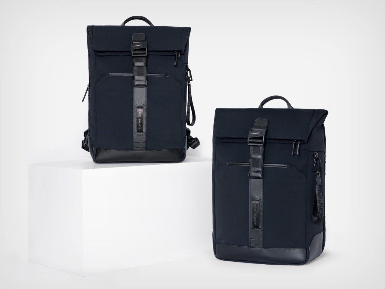
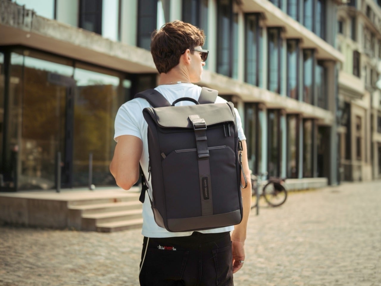
The most immediate visual quality of the Herman Pro, looking at it against the body, is how settled the silhouette stays. Many contemporary backpacks have evolved into highly technical, feature-heavy products that prioritize utility, and the result is often a bag that reads more like field gear than office carry. The Herman Pro’s exterior has been edited rather than accumulated. A clean rectangular body in dark nylon, a structured top flap held down by the FIDLOCK buckle, and a vertical webbing strap running the full length of the front panel make up the entirety of what faces the world. Both colorways, the deep black and the muted forest green, land firmly on the right side of understated, and the structured base gives the bag a stable, planted quality that prevents the slouching common in softer nylon designs.
Beyond durability and weather resistance, equal importance was placed on tactile quality, structure retention, visual texture, and long-term everyday usability, and the parachute-inspired water-repellent NA-TEX fabric was ultimately selected because it balances performance with a more refined and premium visual character. The surface has a matte density to it that holds its character under different lighting conditions, which matters for a bag that moves between a boardroom and a café in the same afternoon. Water beads off without leaving marks or altering the fabric’s structure, the kind of weather performance that earns trust over months of daily use rather than in a single dramatic rain test. A slightly firmer, smoother material at the base grounds the bag both structurally and visually, adding subtle zoning to the exterior without making a statement of it. Tactile quality was clearly weighed alongside durability here, and the difference from a generic nylon backpack is noticeable at first contact.
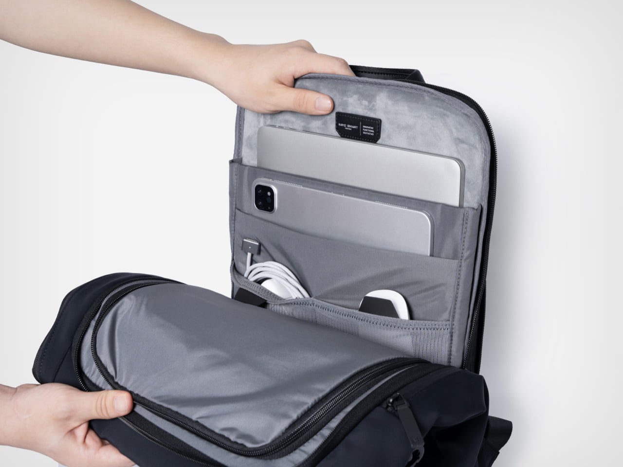
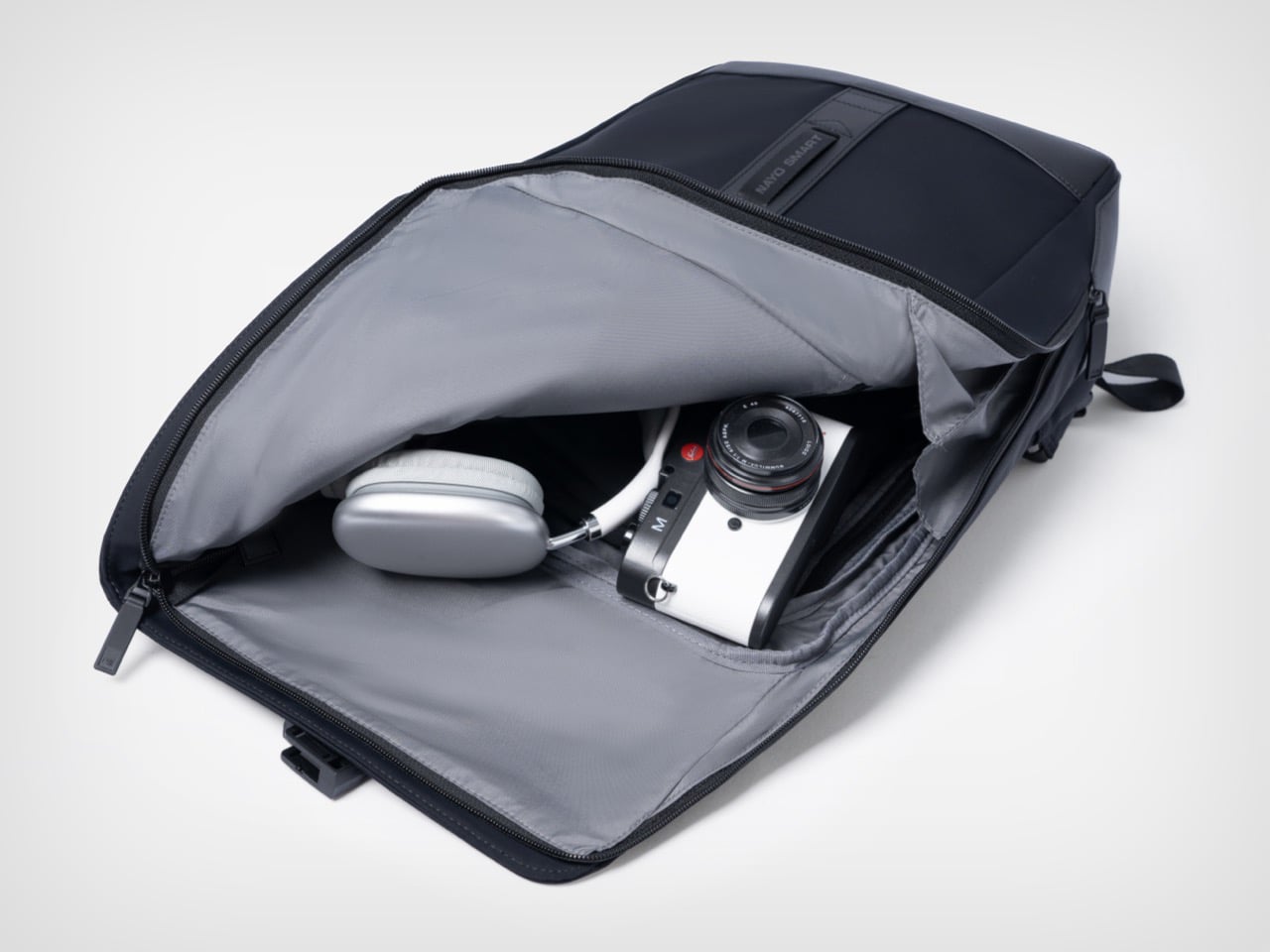
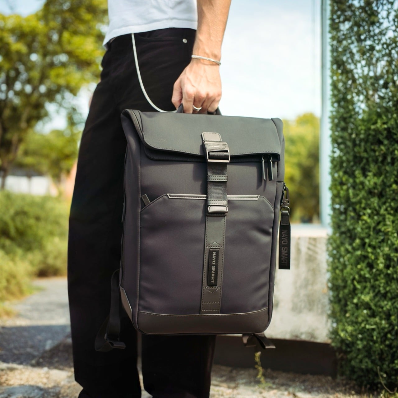
The L-shaped opening improves packing visibility and access in a way that is genuinely hard to go back from once you’ve experienced it. A conventional top-loader reveals its contents in layers, demanding that you excavate through whatever went in last to find what you need now. The L-shaped zipper runs across the top and down one full side, so the flap swings away and the entire main compartment opens in a single motion, nearly flat. The light gray interior lining amplifies this, creating strong contrast against dark items so headphones, cables, and loose accessories are immediately locatable rather than lost at the bottom. Cameras, over-ear headphones, and a tablet all fit comfortably in the main zone without competing for space with the laptop, which lives in an entirely separate section of the bag.
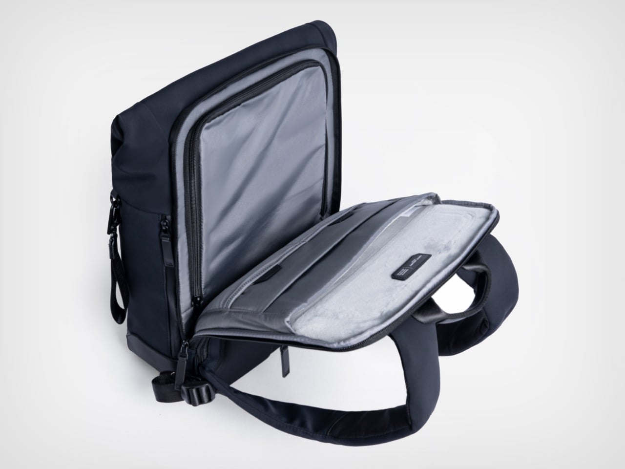
The independent laptop compartment, accessed directly from the rear panel, is one of the more practically useful organizational decisions in the Herman Pro’s design. Airport security typically means pulling the laptop out in a motion that requires setting the whole bag down, opening the main compartment, and digging through accumulated carry chaos. The back-access panel changes that entirely, allowing the laptop to slide out cleanly without touching the main storage zone. The dedicated laptop and digital device organization helps separate work essentials from personal items, and the compartment fits modern 15-inch laptops without forcing anything, with a padded tablet slot sitting alongside it. What looks like a relatively minor structural decision on paper becomes one of those carry conveniences that is hard to give up.
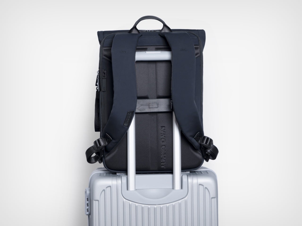
FIDLOCK’s magnetic buckle system has been appearing across premium outdoor and travel gear for several years now, and its inclusion here reads as a purposeful hardware specification rather than a borrowed credential. The mechanism snaps shut with one hand in a single motion and releases just as cleanly, removing the small but cumulative friction of a conventional buckle from what might amount to dozens of open-and-close cycles across a travel week. Hidden anti-theft pockets add a layer of security for passports and cards, while a hidden front zipper pocket handles flat documents or a transit card in a separate zone entirely. The side waterproof pocket accommodates a water bottle or umbrella without disrupting the bag’s profile from the front. A nylon luggage strap on the rear panel completes the transit toolkit, locking the Herman Pro cleanly onto a roller case handle when the load demands it.
Nayo Smart is a Singapore-based brand operating in a market that has gotten genuinely competitive at this price tier. The Herman Pro starts at $169 for the black colorway, placing it in direct conversation with well-regarded carry brands like Aer, Boundary Supply, and Tropicfeel, all of which have raised baseline expectations around what a commuter or travel backpack should deliver. Reviewers have already been reaching for the “affordable Tumi alternative” framing, which is a pointed comparison given how aggressively Tumi’s pricing has drifted upward over the past decade. The more interesting discussion may not simply be how functional a backpack can become, but how modern business backpacks are evolving alongside changes in work culture, mobility, and contemporary everyday lifestyles, and the Herman Pro fits into that conversation as a considered example of how a business travel backpack can become more organized, more comfortable, and more visually restrained without losing the practical performance that modern professionals expect. Both colorways are available directly through nayosmart.com, in standard 20L and large 25-30L sizing.
Click Here to Buy Now: $152.10 $169 (10% off) Free Waterproof Packing Cube included with your Herman Pro
The post This $152 Laptop Backpack Has 7 Features Most Business Bags Skip first appeared on Yanko Design.