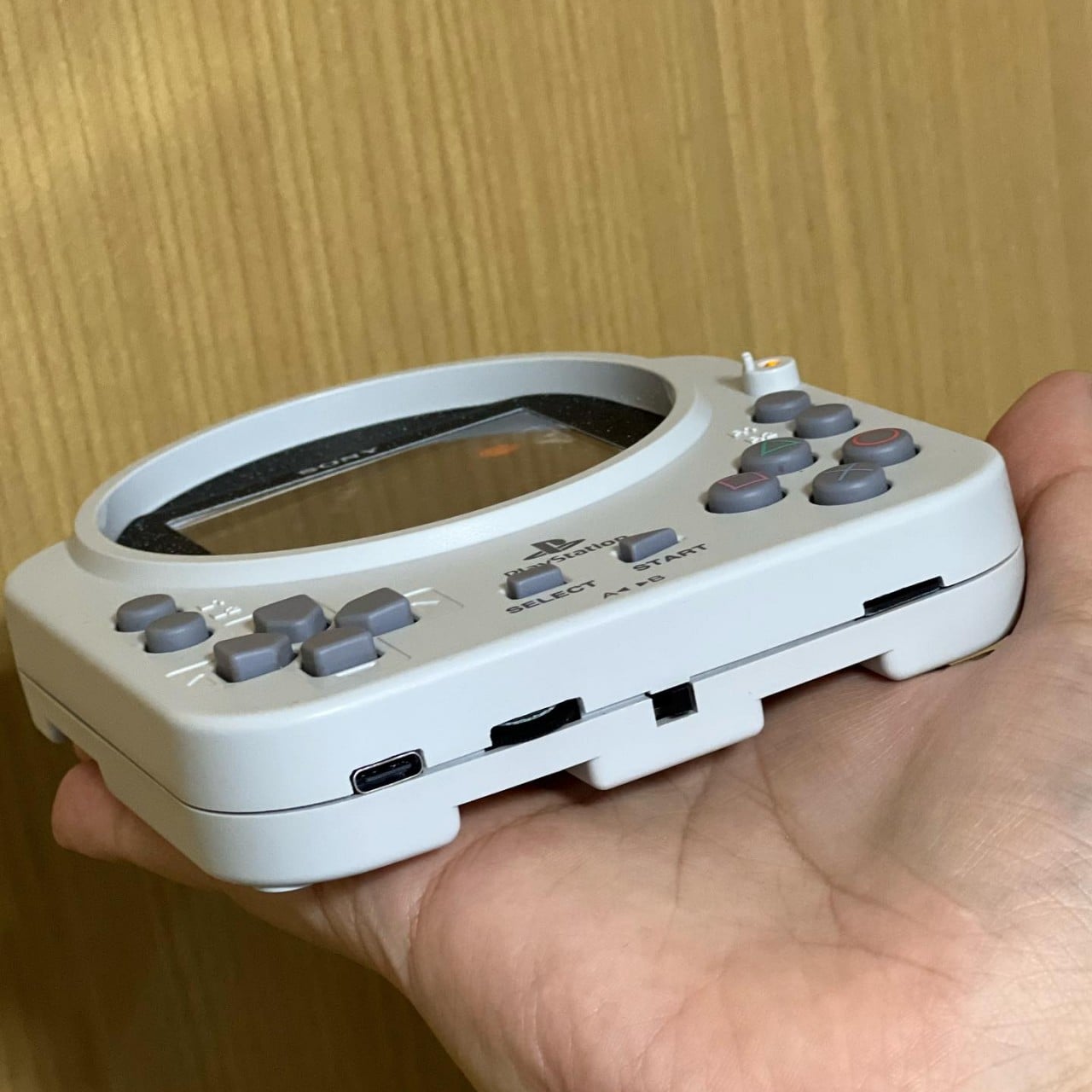
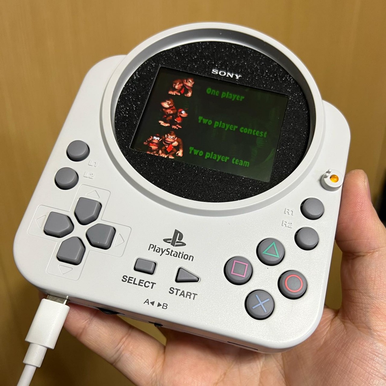
Apple-inspired alarm clock concept helps you snooze a bit longer

People buy and use alarm clocks to wake them up at the right time, but let’s face it, almost everyone ends up extending their sleep by five or ten more minutes or at least want to. With the advent of smartphones, that has become even easier with the built-in snooze functionality in apps. But just as reaching for your phone before bedtime can be bad for your health, doing the same when you just want to snooze your alarm could also end up keeping you from going back to sleep instantly. What you probably need is an alarm clock whose only purpose, ironically, is to get you to sleep longer, which is what this device concept offers in addition to looking like one of Apple’s stylishly minimalist products.

Designer: Antoine Brieux

Useful as they are, our smartphones are notorious for also being sources of distractions. At night, those incessant notifications and the screen’s blue light keep us awake, but our phones also prevent us from snoozing properly again in the morning. Few of us dare to slide the screen blindly for fear of pushing the phone over the edge and breaking it, so we’re forced to open our eyes, get blinded by the screen, and be tempted by the number of unread notifications. There goes your plan to continue that sweet dream!

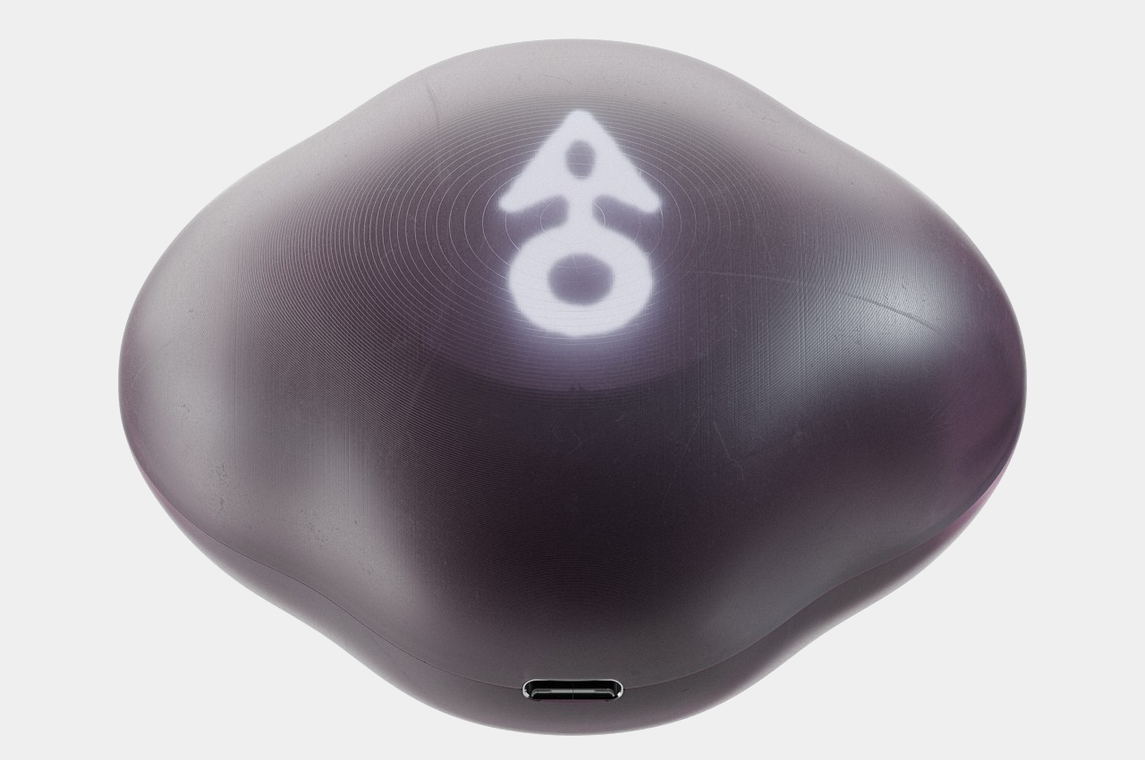
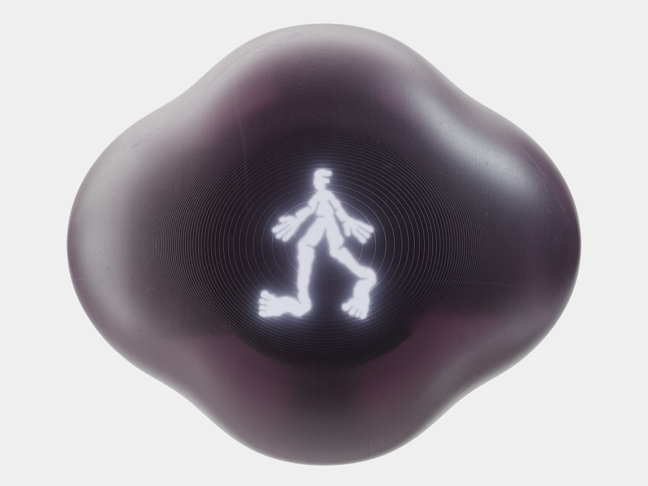
You know those shows or cartoons where people simply push or smash a button on their bedside clock to silence their alarms, all without even looking at the thing? Well, that’s what this alarm clock concept design also lets you do, except it doesn’t stop the alarm from sounding. The big, though flat, button on top of the small box has one and only one purpose: to snooze the alarm and let you extend your sleep, all without pulling you out of your slumbering state completely. No fumbling over which button to push. You can even hit it with your eyes closed, which is the point entirely.

With such an extremely focused purpose, the design of the device can’t be any more complex than it needs to be. It’s a perfect opportunity to apply some of Apple’s famous minimalist design language, leaving a small cube that’s bereft of any unnecessary feature other than a small LCD screen on the front, a USB-C charging port on the back, and Apple’s iconic logo on top. That said, the design is also so simple that it can actually be easily used by other brands, for example, a LEGO-inspired yellow block.

The alarm clock does have another hidden functionality. It can charge your iPhone, but only if you place it on the iPhone’s back. It makes for an awkward position where the iPhone has to lie face down on a flat surface, which risks scratching its screen. Of course, the bigger question is whether there’s a real need for such a device that does only one thing, especially if that one thing encourages and even rewards sleeping in when you really should be getting up.

The post Apple-inspired alarm clock concept helps you snooze a bit longer first appeared on Yanko Design.
Revopoint MINI 2 3D scanner brings precision and innovation to your projects

Have you ever wished to put your knickknacks and small treasured mementos in your personal Metaverse room? Or maybe you need a replacement part for a toy or machine that has long gone out of production. You can try modeling these real-world objects using sophisticated 3D software, but not only is it a painstaking process, the end result might not be as accurate and precise as the real thing. What you need is a simple yet powerful tool to digitize physical objects, and that’s what Revopoint’s upgraded MINI 2 handheld 3D scanner offers, providing designers, makers, and all kinds of creatives the power they need to scan small objects not only with speed but, more importantly, with accuracy and precision as well.

Designer: Revopoint

Click Here to Buy Now: $821 $912 ($91 off). Hurry, deal ends in 48-hours!

3D scanning was once confined to large machines inside professional studios, but thanks to advancements in technology, you can now hold such a scanner in your hand that offers a high level of accuracy and an accessible price tag. You might think that a handheld, portable device would have to sacrifice features just for the sake of size, but the Revopoint MINI 2 3D scanner breaks from the mold and surpasses expectations. With its blue light-powered single-frame precision of up to 0.02 mm and an accuracy reaching up to 0.05 mm, it makes short work of any small object you throw at it, quickly turning real-world three-dimensional objects into their virtual 3D counterparts.

Single Capture Range @ Nearest Distance 52 x 64 @ 120 mm

Single Capture Range @ Furthest Distance 168 x 132 @ 250 mm

An insect scanned by Revopoint MINI 2. Credit: PUTV

The Revopoint MINI 2 presents a significant upgrade from its predecessor across the board. Its single-frame scanning range now reaches 168 mm x 132 mm at a distance of 250 mm, and the scanning speed is now faster at 16 fps. The RGB camera doubles its pixel count and even comes with a larger aperture that lets more light in, allowing it to capture more intricate color details than before. And with a new flash LED system that removes shadows from the object, you can get more uniform colors as well.

Up to 16 fps Scanning Speeds – Create ready-to-use models in seconds.

A 50-cent coin scanned by Revopoint MINI 2. Credit: PUTV.

A ring scanned by Revopoint MINI 2. Credit: PUTV

The MINI 2 isn’t just a leap in power, it is also easier to use as well. A 9-axis IMU (inertial measurement unit) makes sure you still get properly aligned frames, even with shaky hands or fast movement. Revopoint also added tactile buttons directly on the device to make it easier to start or pause the scan and adjust the depth camera’s exposure right then and there, saving you from having to fumble for the right buttons to tap on a phone or a computer. And to make sure the scanned data is also transmitted quickly, the new MINI 2 gets a new USB-C port and support for Wi-Fi 6 for wired and wireless connectivity options.

Up to 2 Megapixels Depth/RGB Cameras Resolution

With more powerful features in a compact and portable package, the Revopoint MINI 2 creates a world of possibilities when scanning small objects quickly and accurately. Scan a part of a toy or a machine to 3D print a replacement when parts are no longer available. Scan pieces of art or historical artifacts to preserve mankind’s legacy for future generations. Or scan designs, prototypes, and other physical items to integrate these objects into your creative workflow. Whether you’re 3D printing gears for replacements, scanning body parts for non-invasive medical analysis, or designing for realistic virtual worlds, the Revopoint MINI 2 3D scanner delivers the precision and power you need to get the job done right at a shockingly cost-effective price point.

Click Here to Buy Now: $821 $912 ($91 off). Hurry, deal ends in 48-hours!

The post Revopoint MINI 2 3D scanner brings precision and innovation to your projects first appeared on Yanko Design.
Vivo V30 Review: Slim, Stylish, Simple

PROS:


  • Thin profile and lightweight body

  • Beautiful and subtle water ripple design (Waving Aqua)

  • 50MP wide front camera with autofocus

  • AI-powered Aura Light for studio-quality portrait photos

CONS:


  • No telephoto camera

  • Decent but unimpressive camera output

RATINGS:

AESTHETICS
ERGONOMICS
PERFORMANCE
SUSTAINABILITY / REPAIRABILITY
VALUE FOR MONEY

EDITOR'S QUOTE:

With an incredibly thin profile and a simple yet elegant design, the Vivo V30 is like a breath of fresh air, presenting a familiar face and offering a well-rounded set of features that speak to the hearts of a selfie-loving generation.

Design in the mobile market never sits still, although we are now seeing certain brands leave their design DNA on their phones for longer periods of time. Most of those designs involve cramming everything but the kitchen sink, turning smartphones into a display of technological marvels more than anything else. That’s great for specs and features, but not always for the overall user experience, especially when it comes to aesthetics and usability. Amidst a sea of thick slabs of glass and metal and bulging camera bumps, the Vivo V30 arrives with a more familiar yet still enchanting face. But is it just a pretty face or does it offer something more inside its incredibly slim physique? We take it for a spin to find out.

Designer: Vivo

Aesthetics

The Vivo V30 will immediately strike you as a very different beast from its peers, and that’s even before you pay close attention to the rather graceful patterns on its back, which we’ll get to later. Even before you hold it in your hand, you can already get an impression of how thin it is, a trait that seems to be quickly disappearing even among premium smartphones. Yes, it’s probably because of that curved glass back and “3D curved screen,” a design that some consider to be no longer fashionable these days, but at just the right angles and with the right play of light, it’s hard to deny how sleek and slim it makes the phone look.

The camera bump is similarly distinctive and unique as far as conventional camera designs go. It’s a single raised rectangle with rounded corners that catches your attention not with an obnoxious size but with a pleasant combination of form, color, and finish. The black rounded square of the camera lenses contrasts and complements the similarly shaped Aura Light ring below it. The “2.5D” curved edges of this raised “One-Piece Cloud Step” design are surrounded by a polished metal bezel refined using a diamond cutting technique, providing not just protection for the cameras but also adding a sleek look to anyone looking at those cameras.

The real design highlight, however, is the subtle patterns that give each Vivo V30 model a unique personality. The greenish-blue Waving Aqua review unit we received employs tens of thousands of tiny magnetic particles integrated into a flowing resin material, creating the illusion of ripples that may conjure up images of beaches, lakes, or rivers, all giving a serene and peaceful vibe. The other designs are no less stunning, with Bloom White’s 3D Petal Pattern, created by engraving 13 million tangent lines into the surface using photolithography, or the color-changing Lush Green that turns into tranquil Blue when exposed to UV light. Even Noble Black, with a typical Fluorite AG Glass back, sparkles like a starry night sky thanks to an etching liquid process that transforms the microscopic crystals on the glass surface into prism-like structures.

All in all, the Vivo V30’s slim profile, minimalist aesthetic, and subtle yet elegant design make it easily stand out from the rest of the crowd, especially at its price point. Yes, some might say that its curves make it a bit dated, but that’s exactly why it also feels rather refreshing to take a break from that current trend, especially when the end result is definitely just as beautiful, if not more so.

Ergonomics

There is still some debate on which predominant smartphone design is actually more ergonomic. Fans of curves claim that their preferred design is more comfortable and gentler on the hand, while advocates of flat edges criticize how it doesn’t provide a confident and solid grip. The Vivo V30 is obviously on the former camp so your mileage may vary, but there’s one aspect that puts all those debates to rest: its weight.

At only 186g, the Vivo V30 is easily one of the lightest smartphones on the market, making it comfortable to hold for long periods of time. That’s even more impressive when you find out that it hides a 5,000mAh battery, also one of the largest among smartphones, which should have weighed the phone down significantly, not to mention adding to its bulk. Thanks to a new “One-Piece Encapsulation Technique,” that large battery can become unbelievably thin, and a “Comprehensive Cushioning Structure” is credited for not just the phone’s aesthetics but also its durability.

Performance

The lines between traditional smartphone market tiers are continually blurring as hardware becomes more diversified yet also more powerful. In the old days, a phone like the Vivo V30 would be classified as a mid-range device because of its Snapdragon 7 Gen 3, but that distinction barely holds today. With 12GB of RAM (plus 12GB Extended memory), the Vivo V30 can handle pretty much anything you can throw at it, with moderation, of course. Mobile gaming is no sweat, especially if you turn down the settings a bit, and the large vapor cooling chamber inside ensures your hands won’t burn when you do so.

The large 6.78-inch AMOLED screen boasts 2800 nits of brightness and a fast 120Hz refresh right. The display is definitely bright and vibrant enough to make your content pop, though it’s not exactly something that will blow your mind either. Audio is a bit so-so, decent enough to let you enjoy music, videos, and games without having to reach for wireless earphones, but more discerning users will prefer higher-quality sound anyway. As mentioned, the 5,000 mAh battery is a major highlight for this unbelievably thin phone, and the 80W charger makes sure you can fully top off in a little just 50 minutes or so.

Like any smartphone these days, a lot of focus is placed on the Vivo V30’s cameras, no pun intended. Truth be told, it’s a rather mixed bag for Vivo’s 2024 V-Series frontrunner, checking a few boxes in some areas while missing out on others. For example, there is no dedicated telephoto camera, which means you’ll have to rely on digital zoom and in-sensor cropping for those closeups. Instead, Vivo puts two co-equal 50MP cameras on the V30’s back, one for the main shooter and the other for ultra-wide panoramic or group shots. In fact, group shots are a big thing for the Vivo V30, but we’ll get to that later.

The main 50MP camera advertises a “True Color” Camera-Bionic-Spectrum VCS technology that is supposed to produce color-accurate images that are close to how our eyes see. While the resulting photos do look vibrant and colorful, they still tend to lean more towards oversaturation rather than the more natural and realistic tones. A highlight of the Vivo V30’s camera system is the latest iteration of its Aura Light, basically a mini Ring Light that’s popular among live streamers and influencers. Used for portrait shots, it offers a softer and more distributed light than what a single LED flash can give. It’s even guided by AI so it can automatically adjust its intensity and temperature depending on the distance from the subject and ambient light.

Vivo positions the V series as a line that targets a more youthful crowd, and nowhere is that more evident than with the selfie camera and its whopping 50MP sensor, complete with autofocus and a 92-degree field of view. Just like the 50MP ultra-wide on its back, this camera was made for taking Group Selfies, ensuring that your friends won’t be left out of those Insta-worthy shots. That said, you don’t have the advantage of the Aura Light with this selfie camera, something Vivo might want to look into for future iterations.

Sustainability

It’s going to be hard to deny that the Vivo V30 isn’t exactly a premium device, at least not with the specs above. Most of the phones on this tier skimp on a few features to meet a certain low price point. In most cases, some corners are cut when it comes to durability, but not this beautiful phone. The V30 boasts an IP54 rating, which is modest but sufficient to protect the phone from dust and water accidents. Given who the phone was made for, those accidents are often the norm rather than the exception.

When it comes to materials, however, the phone doesn’t exactly have anything to boast. It uses quite a variety of special materials and processes to make those intricate patterns on its back, none of which can be said to be sustainable or environment-friendly. The V30 doesn’t stray from the beaten path in this aspect, but hopefully, trends will change and even the young will start demanding for more responsibly made smartphones to put inside their pockets.

Value

Given its target audience, it wouldn’t be a surprise if Vivo prices the V30 very competitively. It’s still playing coy about exact figures, but it should start somewhere around $300 upward, depending on the configuration. It’s something that those with very tight budgets would be able to afford, but it’s almost too easy to say you will also get what you pay for. In reality, however, you’re actually getting a solid deal.

Vivo chose its battles wisely and focused on the things that matter most to its core customer base. The phone is light, easy to hold, and easy to take out of or slip into your pocket. Its design adds a bit of glam to the device, and its cameras, though lacking one member, are made for a generation that loves to take selfies, either alone or with others. With gaming performance the only consideration, the Vivo V30 actually offers a well-rounded set of features wrapped in an elegant aesthetic and matched with an accessible price tag.

Verdict

The market is overflowing with smartphones and, despite all the analysts’ warnings, there doesn’t seem to be any sign of slowing down. Designs are also ever-changing, though the trend seems to be moving towards bigger, thicker, and flatter smartphones. Against this backdrop, the Vivo V30 arrives like a breath of fresh air, offering a face that is both familiar and striking. It’s not going to win benchmarks or photo contests, but its features have been carefully selected to really address the needs and desires of its target market: people who just love taking selfies and holding their phones almost all day.

The post Vivo V30 Review: Slim, Stylish, Simple first appeared on Yanko Design.
GRiD Compass 80s computer is reborn in a retro-futuristic DIY laptop

Computing history is filled not only with monumental machines that celebrate the achievement of human ingenuity but also with designs that look both alien and intriguing to our modern eyes. Of course, the computers of the past were designed to work within the limits of technology at that time, resulting in appearances that are simply out of this world yet oddly very desirable, at least as decorative pieces. The recent retro trend, however, is making these vintage designs actually useful by shoving modern-day components inside old shells, or at least a close facsimile of those old shells. Take for example one of the world’s first-ever laptops, recreated as an actual modern laptop that you can use, presuming you have the pieces and the patience to build it yourself.

Designer: Penk Chen

Launched in 1982, the Grid Compass (stylized by its creators as GRiD) is arguably one of the earliest predecessors of today’s laptops or at least the first to feature a clamshell design. The computer’s claim to fame was its use by NASA, particularly in the Space Shuttle program, as well as the US military. Its distinctive appearance, which is a large black box whose lid is only half the length of the box, became the template for many laptops that followed shortly.

The rasti.computer rides on the ongoing retro wave and brings back that historic laptop with a modern twist: you can actually use it for your everyday work, presuming you’re up to the challenge of building one yourself. The mainboard for this DIY project was gutted from a modular Framework 13 laptop, though you can also buy a fresh new one from the manufacturer. You’re also mostly assembling the laptop from scratch, including the specially-designed keyboard. Fortunately, all of this information is freely available, so you can collect all the needed pieces while waiting for the guide to drop.

Of course, the process will be quite involved, like many DIY projects tend to be. There will be plenty of 3D printed parts required, not to mention soldering electronics while you’re at it. And just like many DIY projects like this, the satisfaction of the final design is the reward itself.

It doesn’t hurt that you get an actually functional modern computer, thanks to the use of modern computer hardware. It’s going to be a weird experience, nonetheless, with a wide and short 10.4-inch 1600×720 LCD screen and a rather bulky rear. It will definitely make you the center of attraction wherever you go, presuming you’d want to take this outside at all. It might even become a homing beacon to other computing history and tech enthusiasts who are interested in seeing what our ancestors would have experienced in using such a laptop design.

The post GRiD Compass 80s computer is reborn in a retro-futuristic DIY laptop first appeared on Yanko Design.
Wider, more ergonomic Samsung foldable phone might be in the works

Samsung might be one of the pioneers of the whole foldable phone craze, but the disadvantage of being the first is that you risk getting things wrong the first time around. In contrast, hindsight is 20/20, as they say, and many of its competitors have used that advantage to catch up and even overtake Samsung at its own game. Of course, the tech giant isn’t content to just sit around while others outrun it, and it has been catching up with “innovations” like a hinge that lets the phone fold flat. Now it seems that Samsung will be catching up in another aspect, with a Galaxy Z Fold that’s a little bit wider when folded and, therefore, easier to use as a regular phone.

Designer: Samsung (via Pigtou and David Kowalski/xleaks7)

To be fair, Samsung was sailing on uncharted waters, so it was bound to miss a few marks. For its inaugural foldable phone, Samsung aimed for a tablet that was like a mini iPad mini or, closer to home, a smaller Galaxy Tab A, which meant it adopted a vertical or portrait format when unfolded. That meant it would have an extremely narrow phone when folded, which was heavily criticized for being awkward to hold and nearly unusable as a regular “candy bar” smartphone.

In contrast, foldable phones like the OPPO Find N and the Google Pixel Fold aimed for a more “traditional” horizontal or landscape tablet design, which had a few direct benefits in terms of consuming content like videos or even books. More importantly, however, it also meant that the folded form of the phone more closely resembles regular smartphones with a wider and sometimes shorter design. In over five generations, Samsung has never changed its design on that front, but that might not be the case with the Galaxy Z Fold 6 or later models.

OPPO Find N3

OPPO Find N2

Vivo X Fold 2

Google Pixel Fold

A recent patent filed by Samsung reveals a foldable design that is significantly different from its status quo in more ways than one. First, it is noticeably wider when folded, giving it a shape that will feel more natural to use compared to the recent crop of Galaxy Z Fold models. Additionally, it’s also significantly thinner, both folded and opened, which would go a long way in increasing the usability of an otherwise heavy and bulky device. In other words, it would be the foldable that Samsung should have launched in the first place if it had the benefit of hindsight five years ago.

Of course, a patent doesn’t immediately mean it will be implemented, whether in the Galaxy Z Fold 6 or future incarnations. It is at least proof that Samsung is aware of the shortcomings of its current design and is taking steps to correct its course. It would definitely be grand if it could launch such a sleek foldable this year, but such a thin design would also go against calls for bigger batteries or a built-in S Pen. For now, other brands still have an advantage over Samsung in some aspects, including and especially the price of such a premium piece of technology.

The post Wider, more ergonomic Samsung foldable phone might be in the works first appeared on Yanko Design.
Service robot concept doubles as a chair and a tiny private office

Service robots are becoming more common these days, from cute mobile trays that deliver food to your table to large rolling boxes that carry your luggage for you. These robots definitely serve their purpose, and they’re often designed to look pleasing or even friendly, but lack a certain element of interaction that will help put humans more at ease with these mechanical assistants. Some designs try to put a figurative human face on these robots, without much effect, while others try to focus on usability and functionality instead. This concept design, however, goes back to the drawing board to determine the best form that a service robot could take. It turns out, we’ve been sitting on the answer all this time, literally.

Designer: Yunsoo Choi

For all the drama about how robots will be replacing humans in the future, there are already certain industries where service robots have indeed taken the place of flesh and blood workers, particularly in the hospitality industry. That said, most are only capable of performing very menial and mechanical tasks, far removed from the human-like androids of our imaginations and science fiction. More importantly, these robots feel as distant and as detached from our lives as the bags they carry. They lack the interactivity and personal connection that would make them indispensable parts of our lives.

This concept design for a service robot tries to provide that kind of interaction by turning the robot into something more than just that. It uses the chair as the inspiration for its design, a functional object that also provides comfort as well as a point of human interaction. But the robot does more than offer a comfortable place to sit on; it also creates a small bubble that becomes a tiny personal office space, at least if you’re the type that can do their job on a tablet.

That’s because this tablet is what triggers the transformation between a chair and a robot. It acts like the brain of the machine, though it’s also the robot’s “face” as well as its sole interface. It’s how you can get information, pay for your hotel stay, or order food, basically anything that involves actually requesting service. The tablet magnetically attaches to the robot’s arm and can be positioned at the most comfortable angle or height for use, including while sitting on the robot chair.

Aside from these, the design also includes the common functions of such a service robot, particularly when it comes to delivering items to customers or keeping their possessions. It can even disinfect these objects using UV light inside its body. But while the idea of a service robot that also functions as a chair sounds interesting on paper, it raises the question of comfort and safety, two factors that are critical for a piece of furniture like a chair. It definitely looks a little too high to sit on comfortably and functions more like a stool than a proper chair. The “office space” is also a bit of a stretch since there’s not much space to get anything done. Still, the idea deserves more exploration and refinement and could spark more designs for service robots that become space-efficient personal offices for the mobile workers of the future.

The post Service robot concept doubles as a chair and a tiny private office first appeared on Yanko Design.
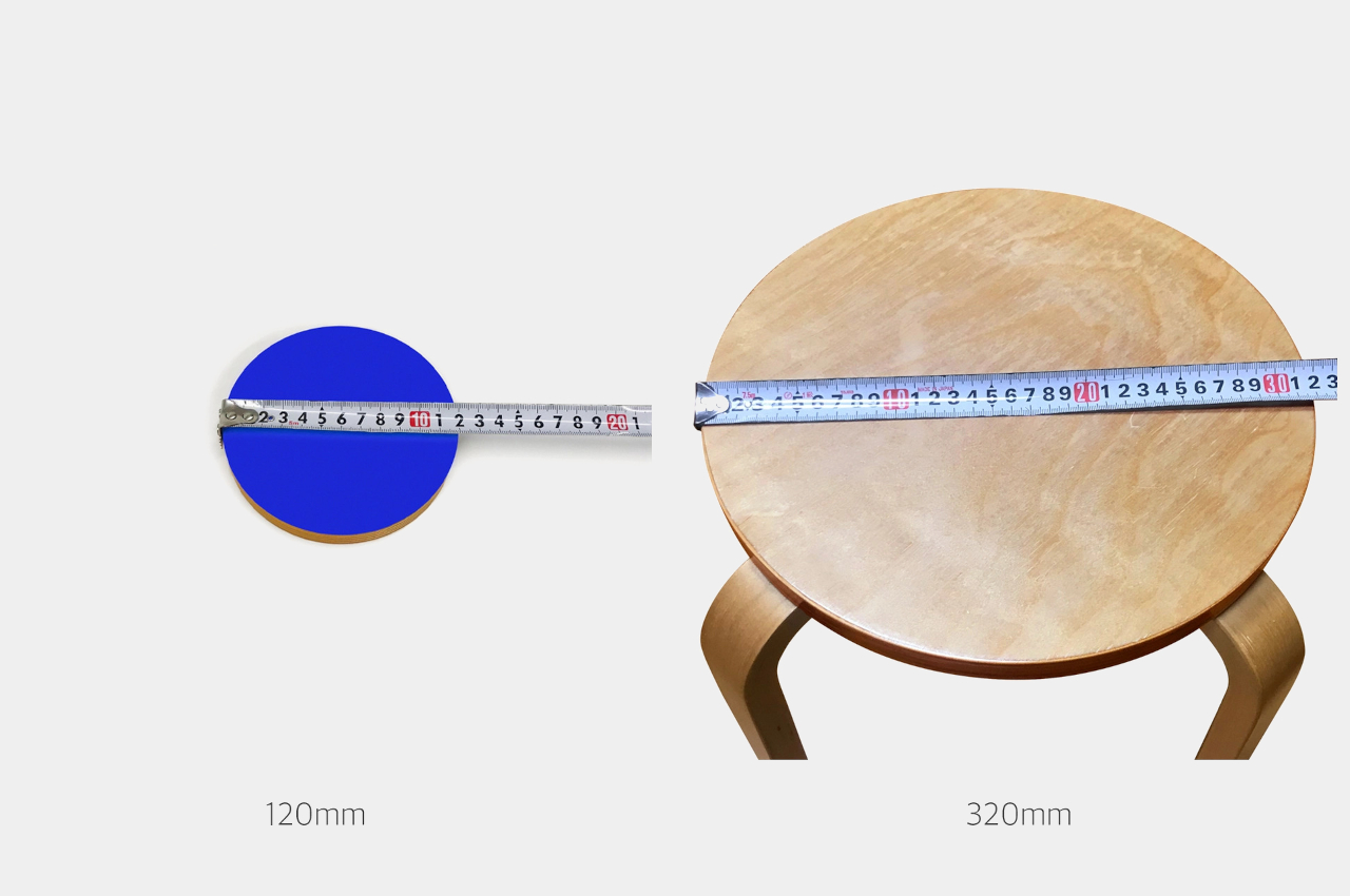
Pool noodle furniture brings a spirit of play to both indoor and outdoor spaces

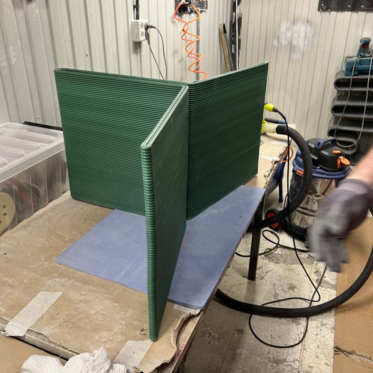
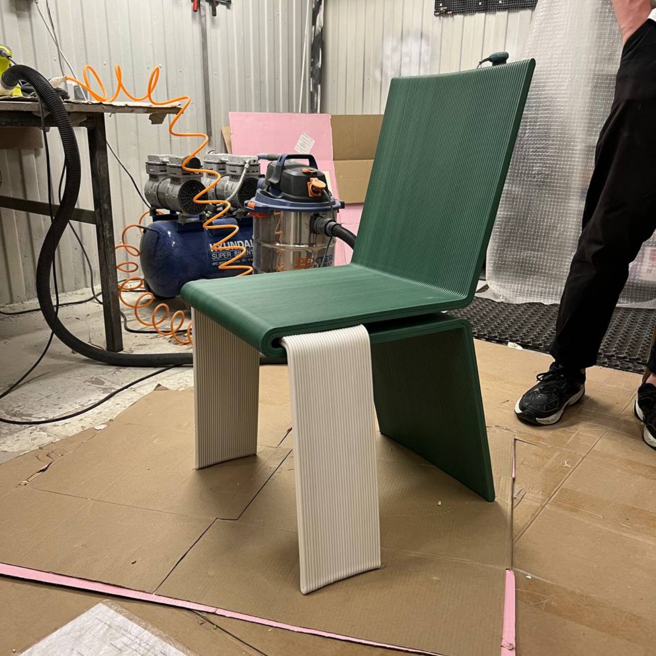
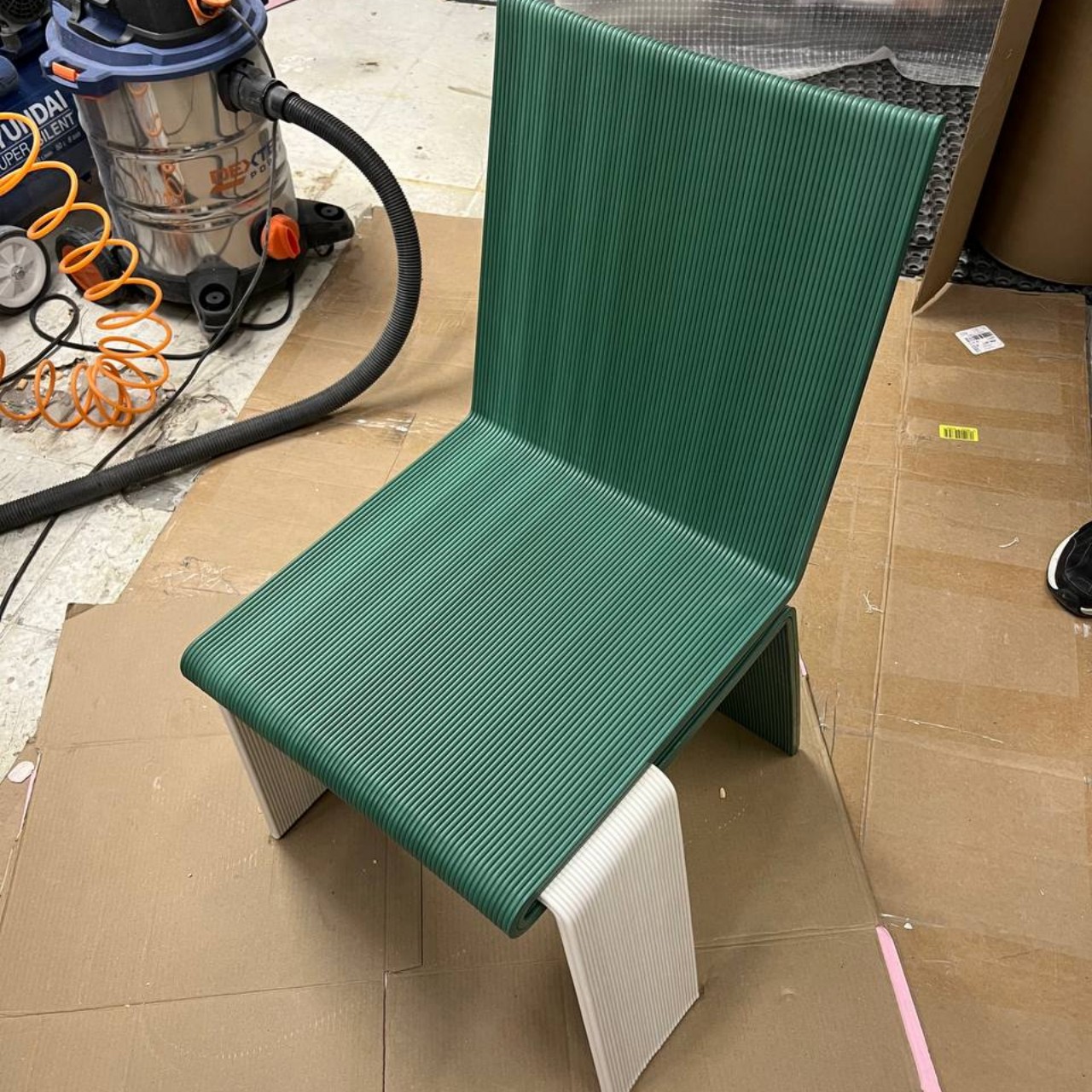
Bright, colorful, flexible, buoyant, and life-saving. These are the words that are often used to describe pool noodles, sometimes called waterlogs or even water woggles. These floating foam tubes allow kids and adults alike to engage in playful banter in the pool while still remaining safe, though they’re also finding use outside of the water. Their flexible bodies and soft material make the perfect objects for safe play, but they’ve amusingly also become the foundations of designs completely unrelated to their original use. Take this experimental set of furniture that employs these vibrant tubes to deliver that same whimsical atmosphere to chairs, tables, and everything in between.

Designer: Lieyah Dagan

They may come by any other name, but pool noodles are a popular component in many fanciful designs, from playground obstacle courses to car covers. Their ubiquity, affordability, and flexibility make it easy to shape them into different objects, combining them to form a more complex composition of rods, circles, and arcs. What pool noodles aren’t known for is stability and rigidity, properties that are almost antithetical to the very essence of these foamy objects. And yet that’s exactly what this furniture is presenting, mixing contrasting elements to give the designs a distinct, lively character.

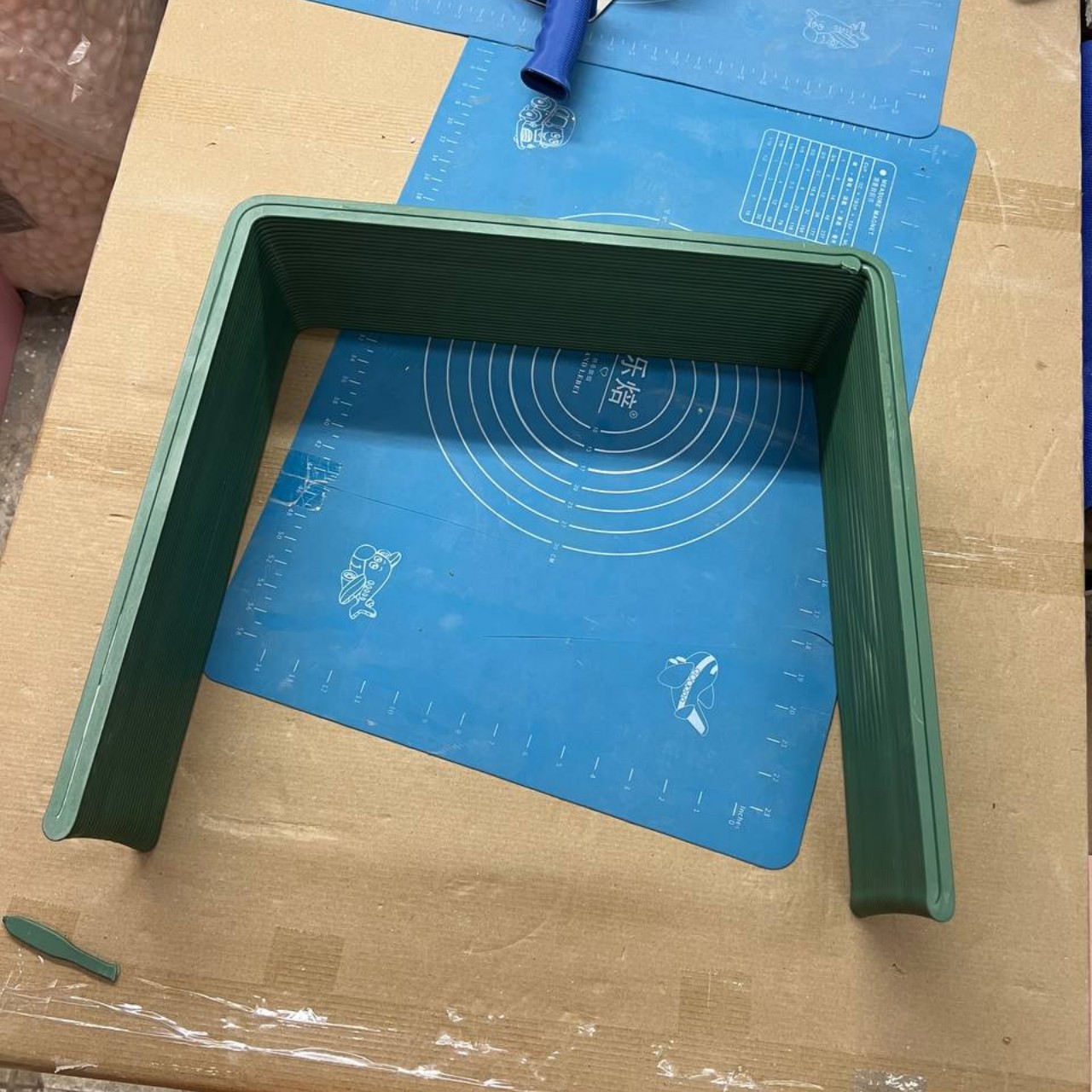
The first step in producing the Looped line of indoor and outdoor furniture was to actually break chairs, tables, and other furniture down to their frames, revealing the structure that ultimately gives them form. The pool noodles are then used to “flesh out” the actual shape of the furniture, giving them mass that would be needed to support their newfound purpose as utilitarian objects. Once the final designs have been selected, dowels and medium-density fiberboard (MDF) are added to provide the needed support to make the furniture become more stable and reliable.

Of course, it wouldn’t be fun if the pool noodles simply followed the same shape as the original furniture. Looped embodies not just the characteristics but also the spirit of these playful waterlogs, employing plenty of curves, loops, and over-the-top proportions that make the furniture almost feel like toys. That, for better or worse, is both the strength and the flaw of the design.

Loop has an undeniable pull that makes people want to play with it, whether it’s because of the bright colors, the soft material, or familiarity with pool noodles. That’s fine with soft toys like actual pool noodles, but playing with a chair or a table brings risks of accidents and injuries. In the end, it creates a perception of playful engagement when they’re also supposed to be designed for serious use, creating a conflict in the mind of the viewer that is both enthralling but also a bit confusing.

The post Pool noodle furniture brings a spirit of play to both indoor and outdoor spaces first appeared on Yanko Design.
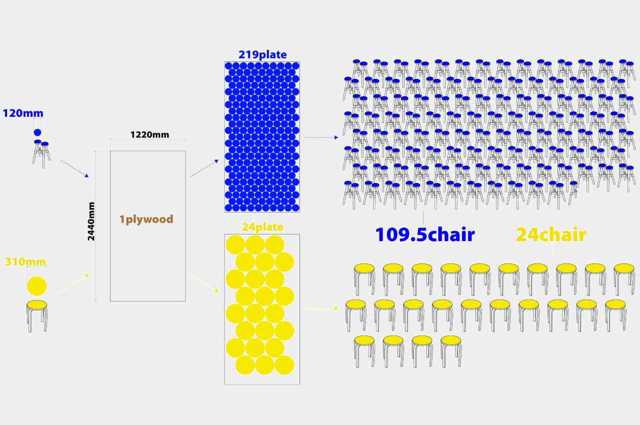
Sticky notes holder concept comes with a very tall panel for your notes

Although a lot of the world today revolves around digital documents and files, there are definitely plenty of people who still espouse analog systems, especially when it comes to taking notes and productivity. In fact, there are many productivity systems today that utilize paper notebooks or even sticky notes, better known as Post-its, though the latter are also notorious for creating a mess rather than helping you stay on top of things. Part of the problem is that sticky notes make it too easy to, well, stick these square pieces of paper anywhere, which means potentially losing them or ending up being more disorganized than ever. This Post-it Note Holder design concept tries to solve that by providing a space for all your sticky notes needs, including a place to stick them.

Designer: Liam de la Bedoyere

Sticky notes today come in different sizes and even shapes, but the colored square format remains the most popular because of its ease of use and space efficiency. It forces you to condense what you need to write down to the most essential pieces of information, and they often don’t take up too much space either. That is until you find your desk, your board, or even your computer monitor littered with these sticky squares, at which point they defeat the entire purpose of trying to keep your life in order.

This concept encapsulates a whole system designed around sticky notes so that you don’t have to work hard to keep everything in a single place. Of course, there’s the actual holder for keeping a stack of notes always ready to receive your scribbles, but there’s also a curve at the back to hold a pen, saving you from having to scramble for one just when you really need it. The most prominent part of this note holder, however, is the very tall and narrow board that rises from the holder. This serves as a more limited space for sticking your notes after you’ve written them.

The design is intentionally limited in space, which forces you to only stick the really important notes the same way sticky notes themselves force you to be concise and quick. At the same time, it still leaves plenty of room for flexibility and personal workflows, like arranging your notes in a literal hierarchy of importance. Or you could order the notes according to their urgency or due dates, watching the colored squares slowly march down as you complete your tasks.

The concept also has room for variations in design, like one that could be hung on a wall and has an inclined note holder for easier access to the pad. And for the truly disciplined Post-it user, the “base” configuration of note and pen holder still gives the convenience of having the essentials always ready when inspiration strikes. You just have to be sure you don’t fall back into the habit of sticking your notes everywhere and then forgetting where you put them after just a few hours.

The post Sticky notes holder concept comes with a very tall panel for your notes first appeared on Yanko Design.
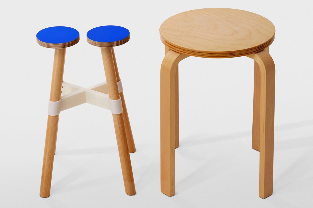
Transform Your Cutting Experience with Scissors That Double as a Box Cutter

How much does it take to change the world? Some people would immediately think of literally big world-changing events, but it’s actually the little steps taken each day that gradually build up to make a longer-lasting difference. The same is true for design, where some of the most significant improvements don’t have to be drastic or even conspicuous. Little improvements here and there all add up to a whole new experience that turns an everyday tool into a delightful encounter each and every time. Case in point are these sleek scissors that look almost alien in their form, bringing just the right amount of design innovation that not only makes it seem like a piece of equipment from the future, it even makes using the simple tool a delightful quest as you snip, slice, and cut through your tasks every day.

Designer: NIKKEN

Click Here to Buy Now: $25 $29 (15% off at checkout). Hurry, deal ends in 48 hours!

The most distinctive thing about these sleek scissors is their form. The drop-shaped handle is something you’ll rarely see in scissors, but it’s a small change that makes plain, boring shears look a little more interesting. Especially when those handles are made from transparent resin that, together with the organic shape, gives the scissors a unique character not unlike alien spacecraft. Of course, that alone isn’t enough to elevate the status of the tool, and indeed its biggest benefits are from things you can’t see but can definitely feel.

Many people use scissors as makeshift box cutters with often disastrous results, forced to precariously hold the tool with the blades wide open. The smart SEKI-TEX scissors avoid this dangerous situation by using a simple yet ingenious sliding mechanism to push one of the blades forward just a little bit while still keeping the rest of the scissors closed. This lets you swiftly and safely cut through the adhesives keeping the box shut like you would with an actual box cutter. And when you’re done, simply slide the blade back to its original position to keep your fingers and hands safe.

Given that use case as well as many other uses of the scissors, there is a real concern that the blades will eventually get covered in sticky sludge from these adhesives. As before, the solution is both simple and clever, coating the blades with fluorine to stop the sticky substances from building up in the first place. Now a simple wipe every now and then is all that it will take to keep the blades always sharp and ready to cut through work tasks.

Such an innovative design doesn’t come from the future and is, in fact, well-rooted in the past. Crafted by expert knife makers from the swordsmith town of Seki in Japan, these scissors are made with meticulous attention to detail, yielding excellent sharpness married to an exquisite and almost organic design. Whether you’re cutting paper or opening boxes, these sleek scissors promise to not only make each task feel effortless, they also add a bit of excitement to your daily work.

Click Here to Buy Now: $25 $29 (15% off at checkout). Hurry, deal ends in 48 hours!

The post Transform Your Cutting Experience with Scissors That Double as a Box Cutter first appeared on Yanko Design.
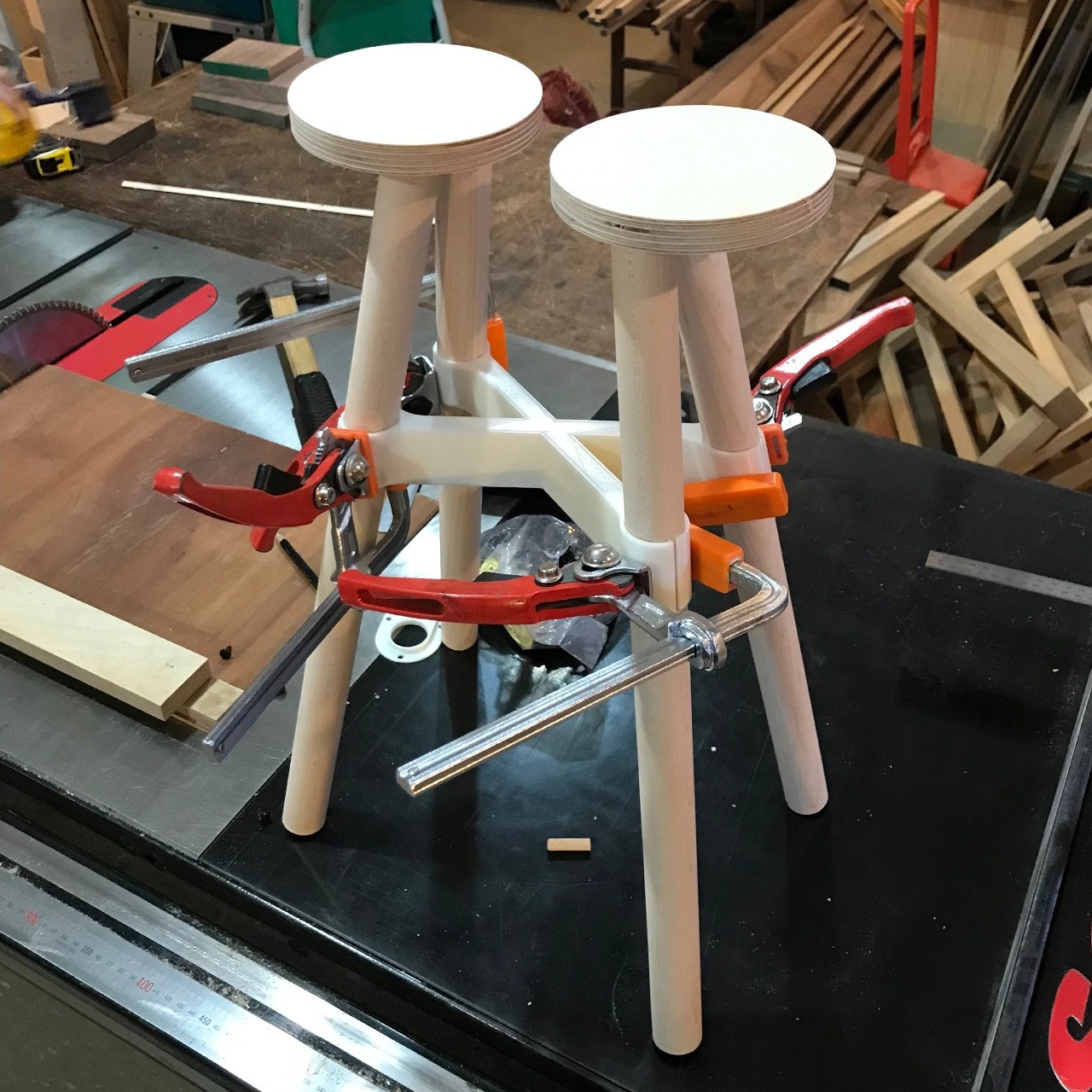
Revolutionary coffee machine lets you make coffee exactly the way you want it

There might be jokes about being the golden brown fuel that runs the world, but coffee really has a special place in many people’s daily routines. Of course, that doesn’t mean everyone enjoys coffee in exactly the same way. There are people who are fine with quick instant coffee, much to the horror of connoisseurs, as long as they get their caffeine fix. Others, however, have developed very particular requirements to satisfy their taste buds as well. Different people also like different types of coffee, from espressos to drips to hot to cold, and sometimes even the same person likes different brews depending on their mood. It’s difficult to find one machine that can deliver all of those, especially for home use, but that’s exactly the kind of ground-breaking innovation that this revolutionary coffee machine offers, giving users full control over the brewing process so that they can have the coffee they want the way they want it.

Designer: Chris Chan

Click Here to Buy Now: $699 $1,399 ($700 off). Hurry, only 23/320 left! Raised over $500,000.

KUKU Maker uses centrifugal force to generate pressure, which makes it possible to maintain a stable extraction pressure throughout the extraction process, regardless of the state of other parameters.

Baristas make it look too easy, but there’s actually a science and an art to brewing the perfect cup of joe. It’s not just the grind size that affects the way coffee tastes but also variables like water temperature, extraction pressure, and more. Your run-of-the-mill coffee machine usually only has one or a few presets for these in order to simplify the process, but that also takes out much of the fun and the power away from true-blooded coffee lovers.

You have the flexibility to use ice water or room temperature water directly for extraction, or you can employ KUKU Maker to swiftly heat room temperature water to your desired temperature before initiating the extraction process.

Enter KUKU, a genius design that lets you have consistent traditional coffee when you need it as well as easy, customized brews when you want it, all thanks to a combination of cyclic extraction and centrifugal force. That flexibility comes from KUKU’s ability to let you be in control of those variables, namely extraction pressure, temperature, time, and, of course, grind size. And best of all, you don’t need to adjust all of those when you don’t want to. For example, you can preset temperature and pressure while only adjusting the grind size to anywhere between superfine to extra course. And if you happened to select the wrong grind size, you aren’t punished but are instead rewarded with a new flavor you might have never discovered on your own.
Room Temperature Espresso

The KUKU Maker is a multifunctional coffee device that can quickly make not only cold-brew coffee but also cold-brew espresso.
Unlike other coffee machines, KUKU uses centrifugal force to generate pressure, and thanks to an inductive brushless motor and intelligent control algorithms, you can precisely define how that happens. Go from normal atmospheric pressure to high pressure or from 3000 to 7000 RPM speeds in a snap, controlling this variable to meet your preferred brew’s requirements. The temperature of the water used during extraction also has a significant impact not only on the taste of the coffee but also on the aroma, and KUKU gives you the freedom to use whatever kind of water you need. Pour crushed ice or ice water for your icy cold beverages or get room temperature water heated to your preferred levels. With electromagnetic induction heating, it takes less than a minute to heat 60ml of water for an espresso and 4 minutes for 300ml of water for an Americano.

With all these powerful features, it comes as a pleasant surprise that you don’t have to be a veteran barista to use KUKU. Your favorite type of coffee is just a single toggle switch away or, if you prefer the hands-free approach, a few taps on the KUKU mobile app. You can even download recipes from the app and try out different profiles made by coffee experts and champions. And at the end of the day, you don’t have to stress over the mess thanks to an easy cleaning process that will help keep your machine in tip-top shape with very little work. Whether your caffeine fix is a cold-brew espresso or you find joy in expertly crafted recipes, the innovative KUKU coffee machine gives you all the control you need for the perfect cup and the flexibility to experiment and discover a whole new world of flavor in every brew.

Click Here to Buy Now: $699 $1,399 ($700 off). Hurry, only 23/320 left! Raised over $500,000.

The post Revolutionary coffee machine lets you make coffee exactly the way you want it first appeared on Yanko Design.