We have seen quite a number of laptops bearing mind-blowing flexible screens that fold or roll, and while they do help push the envelope of laptop design, they might be the future, but it is definitely not yet here. Foldables still scratch easily and are expensive, rollables are at a concept stage, and both rely on technology that is impressive in a demo booth but nerve-wracking when you actually need to get work done and cannot afford downtime or repair bills.
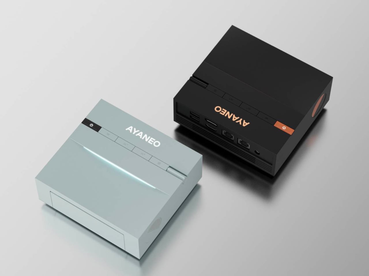
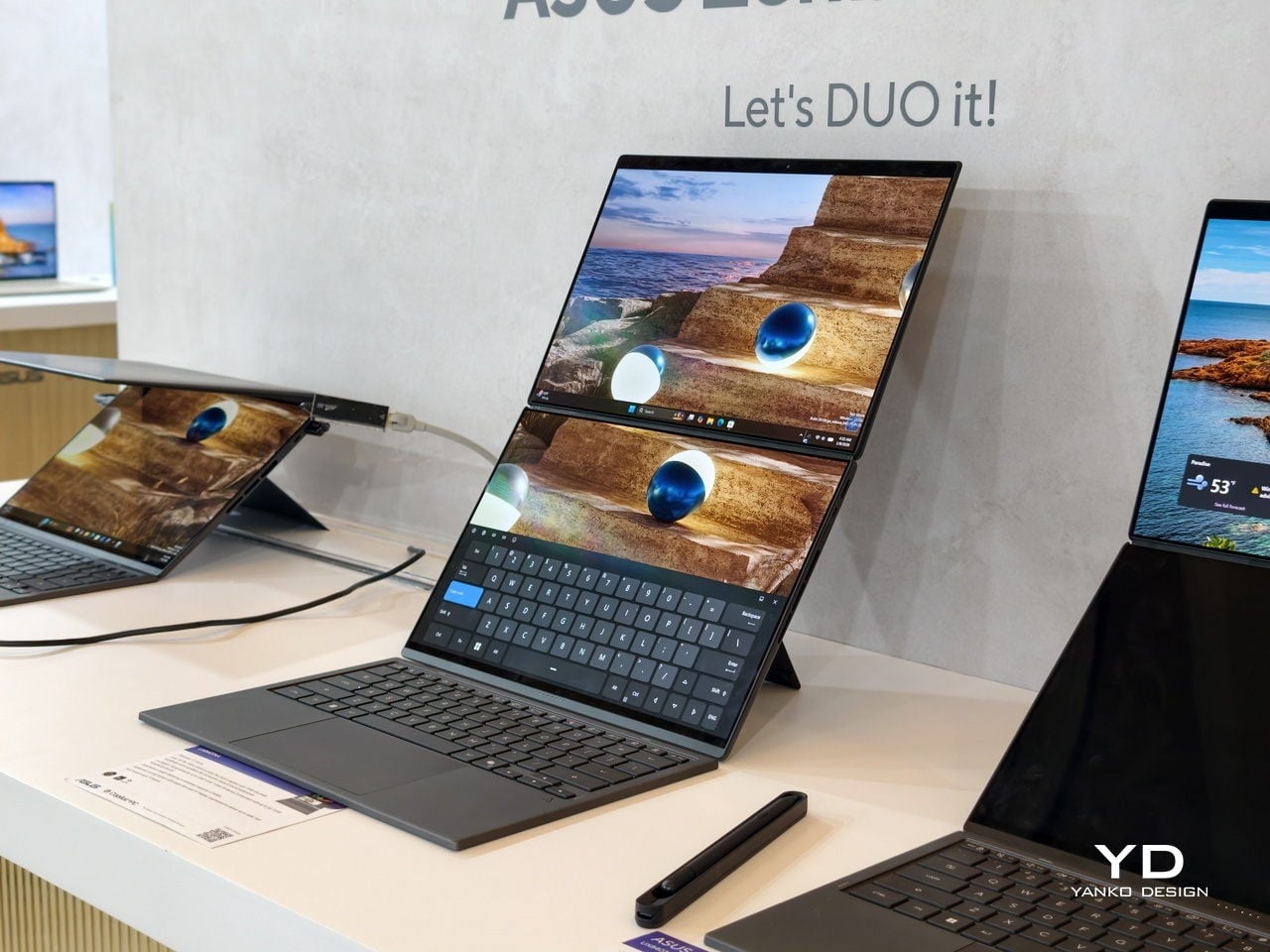
At CES 2026, ASUS and its gaming brand Republic of Gamers are offering two designs for people who need to get stuff done here and now. Although less spectacular than a screen that folds like paper, the ROG Zephyrus Duo 2026 (GX561) and the ASUS Zenbook DUO 2026 (UX8407) promise a more versatile and more reliable experience, using two rigid OLED panels, conventional hinges, and software layouts that treat dual screens as a workflow multiplier instead of a party trick.
Designer: ASUS
Dual Screens, Multiple Possibilities
With a foldable laptop, you get a large screen that folds down to the size of a normal laptop, or a laptop-sized screen that folds down to half its size. A rollable laptop, on the other hand, starts with a normal size and then expands for more real estate. They both try to offer more screen space with a manageable footprint, but it is still a single panel with a limited set of poses. You can fold it like a book or lay it flat, but you cannot flip one half around into a true tent or dual-monitor arrangement, and the panel itself stays soft and fragile under your fingertips.
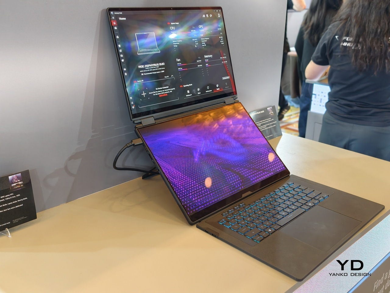
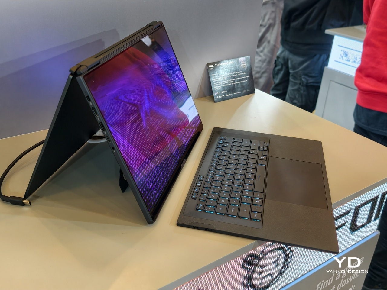
The dual-screen design sported by the new Zephyrus Duo and Zenbook DUO uses two independent but connected screens, practically dual monitors connected by a hinge. They are conventional, rigid OLED panels, so none of the soft, scratch-prone flexible displays of foldables. It feels almost like a normal laptop, just one that has a second monitor permanently attached, hinged, and ready to be stood up, laid flat, or folded back into tent mode for sharing across a table.
More importantly, however, this design offers more versatility in terms of how you actually use the machine throughout the day. You can use only a single screen in laptop mode if space is a constraint or if you want to stay focused. You can flip the whole thing into tent mode to share your screen with someone sitting across from you. You can detach the keyboard entirely and stand both panels up as a tiny dual-screen desk, with the keyboard floating wherever your hands are most comfortable. ASUS brings this design to two different kinds of laptops, really just two sides of the same coin, offering the same core idea with the flexibility you can use today.
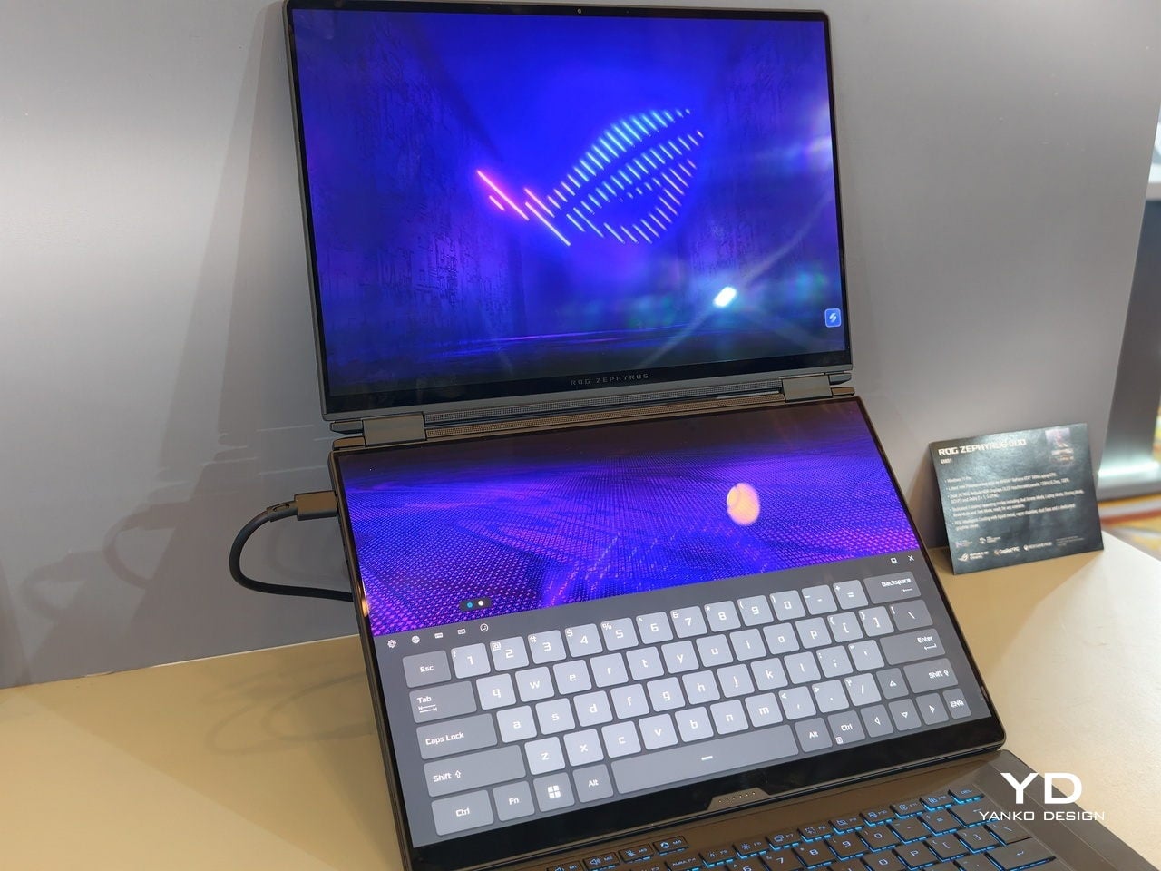
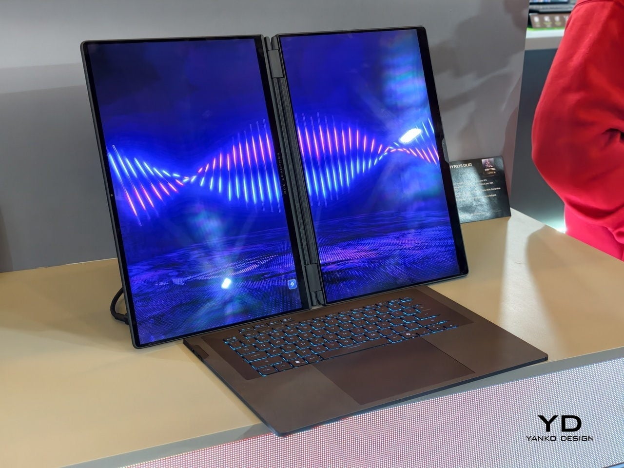
ROG Zephyrus Duo 2026 (GX561): Not Just a Gaming Laptop
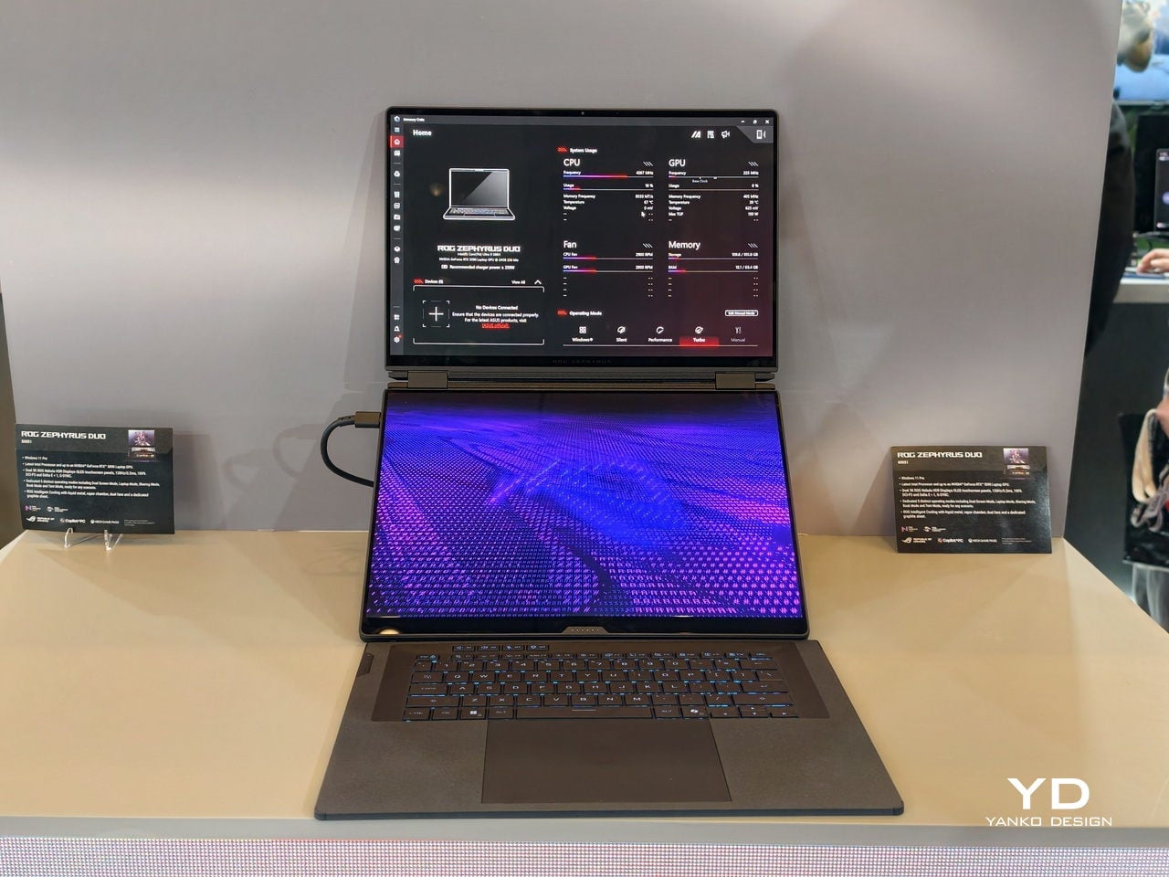
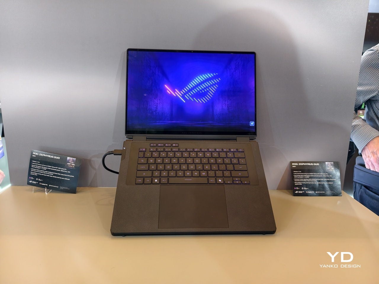
This is not the first Zephyrus Duo, but the first one launched nearly six years ago was more of a one-and-a-half-screen laptop. There was a smaller touchscreen right above the keyboard that offered some space for tool palettes and chat windows, but it was still very much a secondary strip. This 2026 redesign, in contrast, is a bold new direction, going full dual-screen with two large OLED panels and a detachable keyboard like no other gaming laptop has dared to go.
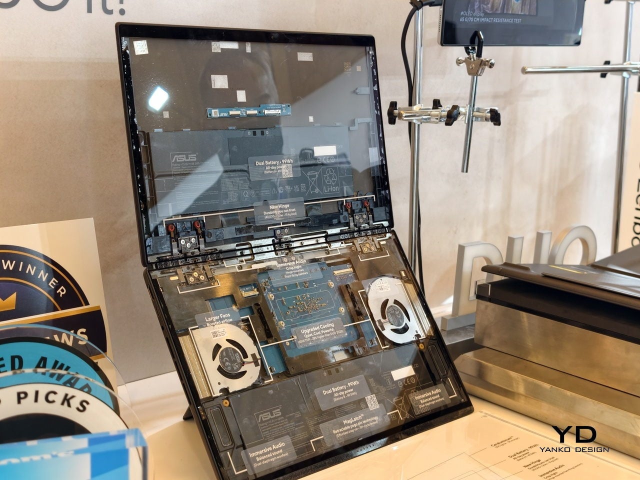
It is a true gaming laptop, of course, and the specs show its pedigree. An Intel Core Ultra 9 processor, paired with up to an NVIDIA GeForce RTX 5090 Laptop GPU pushing up to 135W TGP, backed by up to 64GB of LPDDR5X memory and up to 2TB of PCIe Gen5 SSD storage with easy swap access. The 90Wh battery supports fast charging, hitting 50% in 30 minutes.
The main display is ROG Nebula HDR, a 3K OLED panel running at 120Hz with 0.2 ms response time, HDR 1100 nits peak brightness, 100% DCI-P3 coverage, and ΔE below 1 color accuracy, protected by Corning Glass DXC. All of that is cooled by ROG’s Intelligent Cooling system, with liquid metal on the CPU, a vapor chamber, graphite sheets, and 0 dB Ambient Cooling mode for silent operation when you are not rendering or fragging.
At 6.28 lb and just 0.77 inches thin, it is heavy enough to remind you there is serious silicon inside, but still portable enough to live in a backpack. The machine includes Wi-Fi 7, Thunderbolt 4, HDMI 2.1, USB 3.2 Gen 2 Type-A, and an SD card slot, plus a six-speaker system with two tweeters and four woofers running Dolby Atmos, so you can actually enjoy game audio without always reaching for headphones.
Where the ROG Zephyrus Duo 2026 really shines is in versatility. Because a laptop that can run AAA games can practically do anything as well, including content creation, programming, video editing, and 3D work. Designers and creatives will definitely love the freedom such a design offers, paired with powerful hardware that does not compromise just to fit two screens. You can keep After Effects timelines on one panel while the preview lives on the other, or split code and output, or run a game on the main screen with Discord and guides on the second, all without alt-tabbing or shrinking windows.
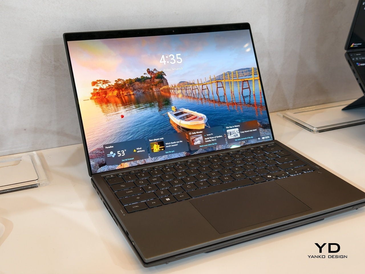
ASUS Zenbook DUO 2026 (UX8407): Dual-Screen Goes Lux
The ASUS Zenbook DUO 2026 shaves off some of the gaming hardware to offer a dual-screen laptop that is slimmer, lighter, and a little more stylish. It is no slouch, though, and carries plenty of muscle to handle any productivity task you might throw at it. That also includes content creation, with a bit of light gaming on the side when you want to unwind between meetings or deadlines and do not need RTX power for every session.
The Zenbook DUO 2026 runs a next-gen Intel Core Ultra processor with up to 50 TOPS NPU for AI workloads, paired with Intel Arc integrated graphics, up to 32GB of memory, and up to 2TB of SSD storage. It supports up to 45W TDP with a dual-fan thermal solution, keeping the machine stable during sustained loads without the heavy cooling overhead of a discrete GPU, which helps keep the chassis thin and light.
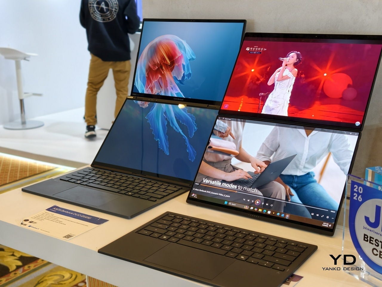
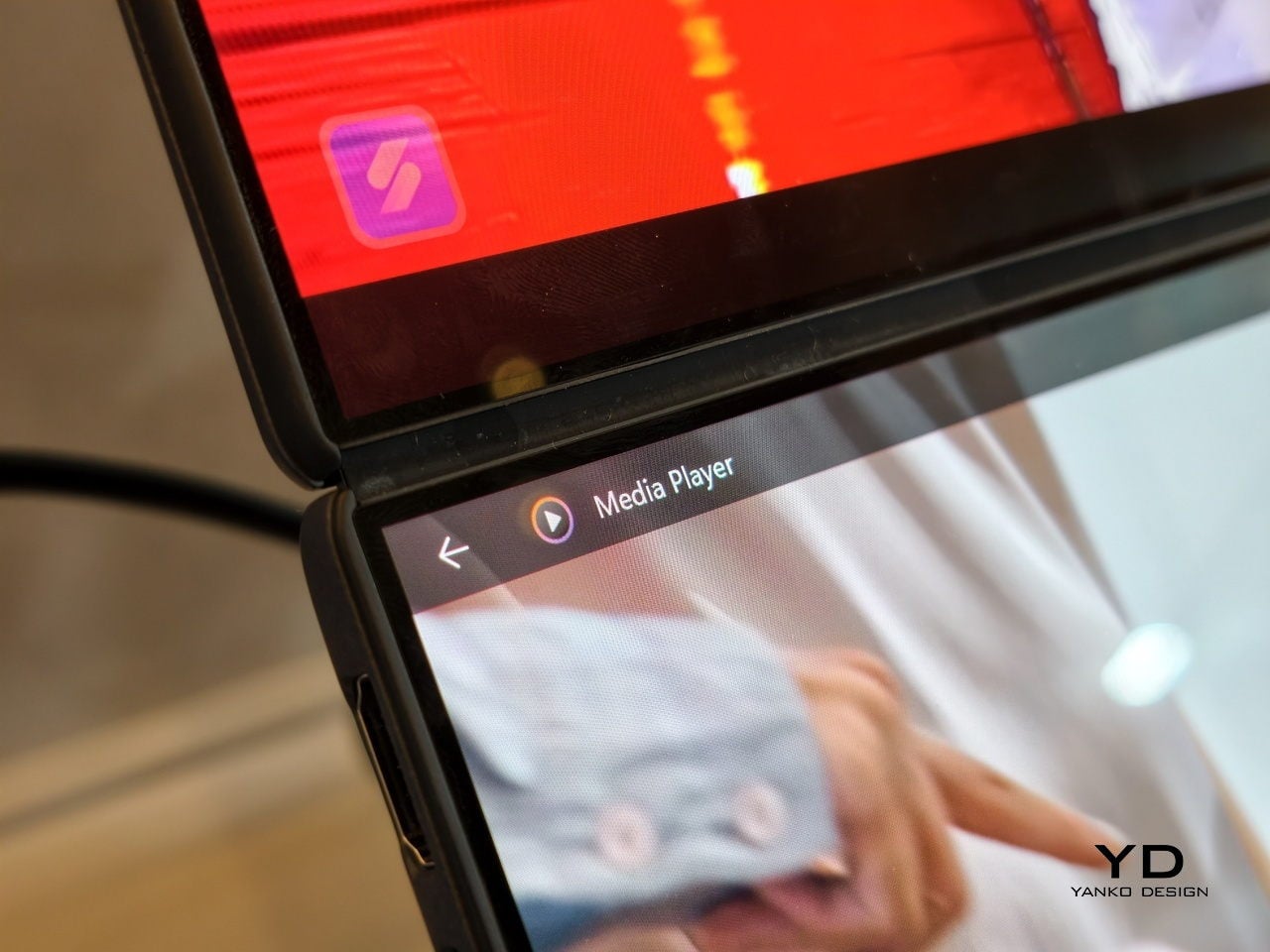
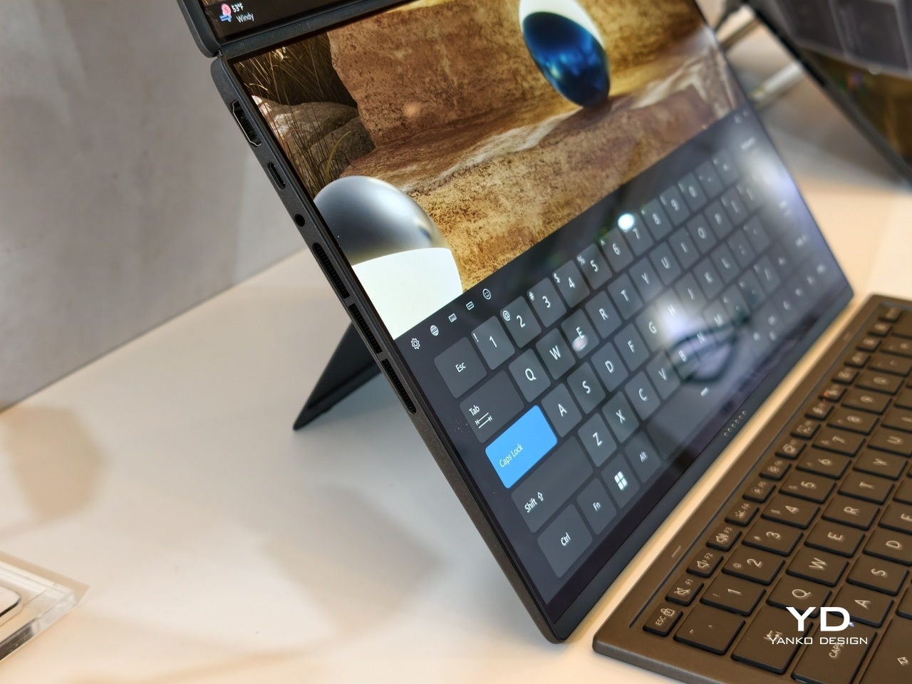
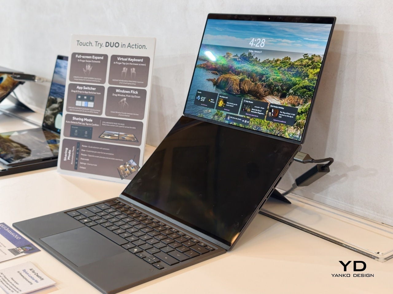
The main display is an ASUS Lumina Pro OLED with 1000 nits peak brightness, and both screens are treated with the same level of care, making them equally usable for productivity, media, and light creative work. What differentiates this next-gen dual-screen from its predecessor is the new hinge design that puts the screens closer together. With thinner bezels, they now sit just 8.28mm apart, a 70% reduction, and they almost look like a single continuous piece.
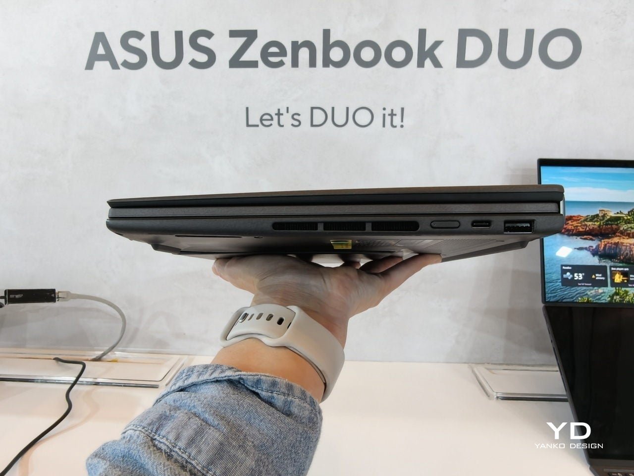
ASUS has adopted its Ceraluminum material for the Zenbook DUO 2026’s laptop lid, bottom case, and kickstand, making it not only look and feel more luxurious but also be a bit more resilient to accidents and daily wear. The Zenbook DUO weighs just 1.65kg and has a 5% smaller footprint than previous generations, which makes it easier to carry and fit on smaller desks or café tables.
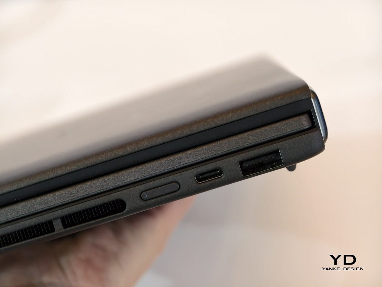
It is packed with ports, including two Thunderbolt 4 connections, HDMI 2.1, USB 3.2 Gen 2 Type-A, and an audio jack, plus six speakers with two front-firing tweeters and four woofers for surprisingly rich audio from a thin chassis. The keyboard connects via magnetic pogo pins or Bluetooth, and the machine supports ASUS Pen 3.0, turning both screens into writable surfaces for notes, sketches, or annotations during video calls or brainstorming sessions.
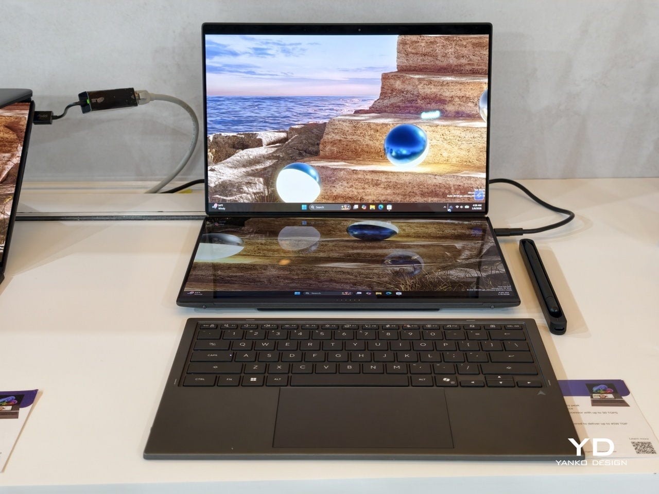
Like the Zephyrus Duo, the Zenbook DUO 2026 can be used in multiple orientations. Laptop mode with the keyboard on top of the lower screen for traditional clamshell use. Desktop mode with both screens stacked or side-by-side, the detachable keyboard placed separately, and the built-in kickstand propping the whole thing up like a tiny dual-monitor workstation. Tent mode for presentations or sharing content across a table without needing an external display or awkward screen mirroring. The flexibility is the point, and it works without asking you to trust a flexible panel not to crease or scratch under normal use.
Trade-offs and Potential
Dual-screen laptops are not perfect, of course. You need to keep track of a separate keyboard you hope you will not lose, though that is also the case for some foldable laptops anyway, and the detachable keyboard is also what lets both the Zephyrus Duo and Zenbook DUO behave like tiny dual-monitor desks in tent or desktop modes. These machines are easily heavier than single-screen laptops with equivalent specs, and they will likely be priced firmly in premium territory, though still far below the stratospheric costs of early foldables.
There is also that unavoidable divider between the two screens, though ASUS has gotten it down to 8.28 mm on the Zenbook DUO, and at that point it starts to feel more like a subtle pause than a major interruption. The hinge is still visible, the gap is still there, but it is less about accepting compromise and more about acknowledging that two rigid, high-quality OLED panels with a small gap are more practical than one fragile foldable panel with no gap at all.
Despite those limitations, these designs offer a kind of versatility that neither conventional laptops nor foldable laptops can match. You get to decide how to use the laptop, unrestricted by a single panel or a prescribed set of folds. You can boost your productivity with two screens for timelines and tools, or save space with just one when you are working in a tight spot. You can stand them up for presentations, lay them flat for collaborative work, or use them as a traditional clamshell when muscle memory takes over.
Maybe someday, we will have foldable laptops that can bend both ways, support multiple modes, and will not easily scratch with a fingernail or develop a permanent crease after a few months of daily folding. But if you want to be productive and create content today, the ROG Zephyrus Duo 2026 and ASUS Zenbook DUO 2026 could very well be among the most productive and most versatile laptops of 2026, delivering the dual-screen promise without the fragility, the expense, or the anxiety that comes with carrying a piece of still-experimental tech into the real world.
The post 2026 ROG Zephyrus Duo, ASUS Zenbook DUO: Versatility You Can Use Today first appeared on Yanko Design.