There’s something exhilarating about pushing into the wild after dark, whether you’re cycling down a forest trail, hiking a canyon, or just exploring the world beyond the city lights where streetlamps don’t reach and the natural darkness takes over. But adventure after sunset demands gear that’s as tough and adaptable as you are, and most flashlights just aren’t up to the challenge of serious outdoor use in unpredictable, demanding conditions.
The WUBEN X1 Pro is built for explorers who want more than a basic beam and simple on-off functionality from their gear. With 13,000 lumens of combined flood and spot light, a rugged aluminum alloy body, and smart cooling to keep things running smoothly under heavy use, it’s a flashlight that’s as ready for action as you are, designed to handle whatever the night throws at you without fail.
Designer: Mr. Tan (Manager of Wuben Brand)
Click Here to Buy Now: $119 $149 (20% off). Hurry, only a few left! Raised over $181,000.
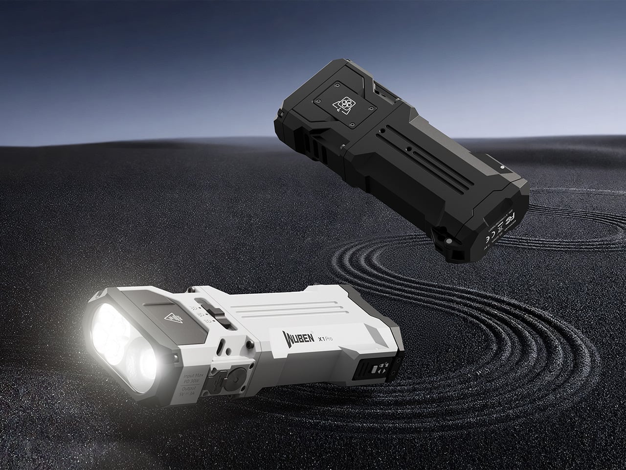
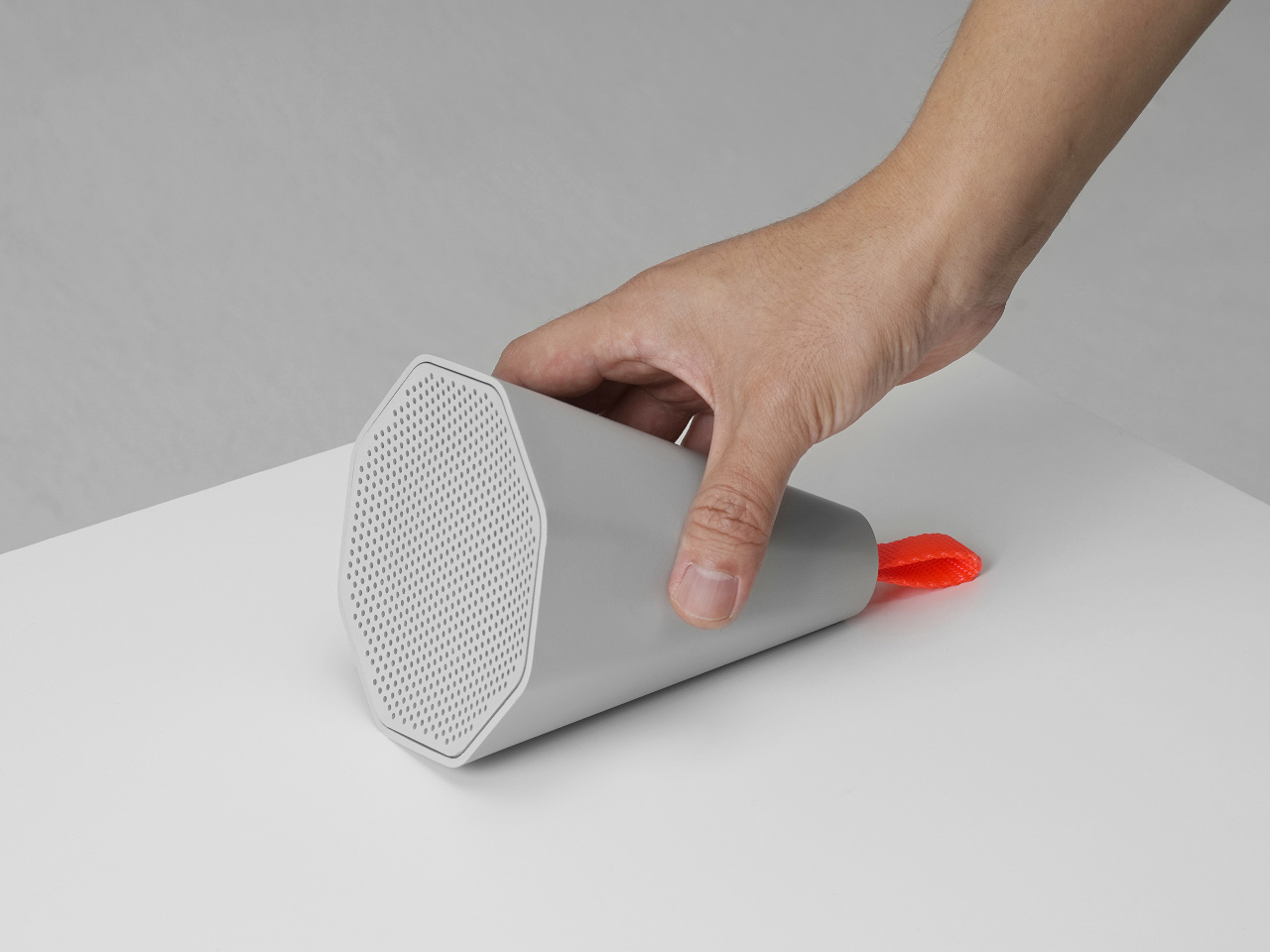
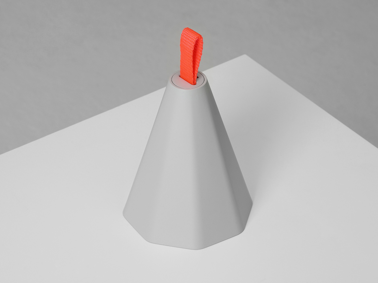
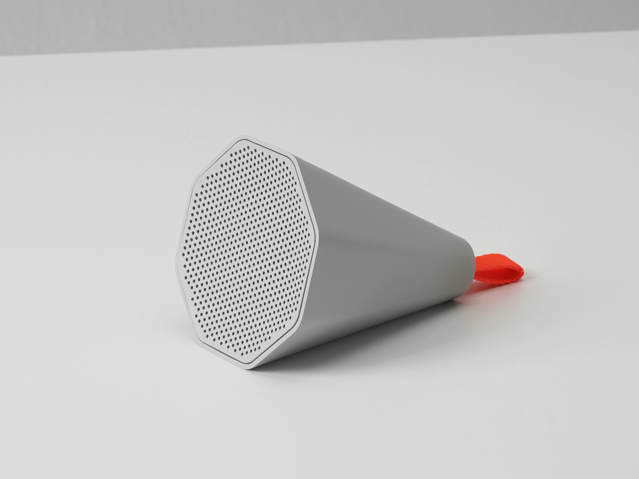
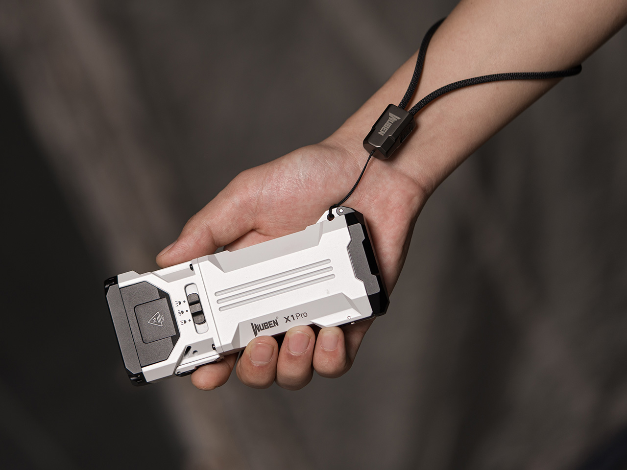
The WUBEN X1 Pro’s angular, aluminum alloy body feels solid and substantial in your hand, with sculpted lines and a one-handed grip that’s easy to hold even with gloves on during cold-weather expeditions. At 383 grams and just under 14 centimeters long, it packs serious power into a form that fits in a jacket pocket or bike bag without creating annoying bulk or weighing you down.
The minimalist button layout and matte finish look refined and purposeful, while the floating chassis and visible cooling vents hint at the engineering inside that keeps everything running at safe temperatures. It’s a flashlight that looks as good clipped to a backpack as it does on a nightstand, blending outdoor toughness with considered industrial design that doesn’t compromise aesthetics.

With three high-output LEDs arranged for both wide coverage and distance, the WUBEN X1 Pro delivers a wide, 125-degree flood for lighting up campsites or work areas and a focused spot beam that throws up to 337 meters into the distance. Switching between modes is seamless, letting you adapt to changing conditions on the fly without fumbling through complicated menu systems or awkward multi-press combinations.

Multiple brightness settings from Turbo to Eco mean you can go all out for a midnight ride through challenging terrain or conserve power for a long hike that stretches into days. The 13,000-lumen Turbo mode is bright enough to turn night into day across entire clearings, while lower settings stretch battery life for extended trips where charging opportunities are limited or nonexistent.
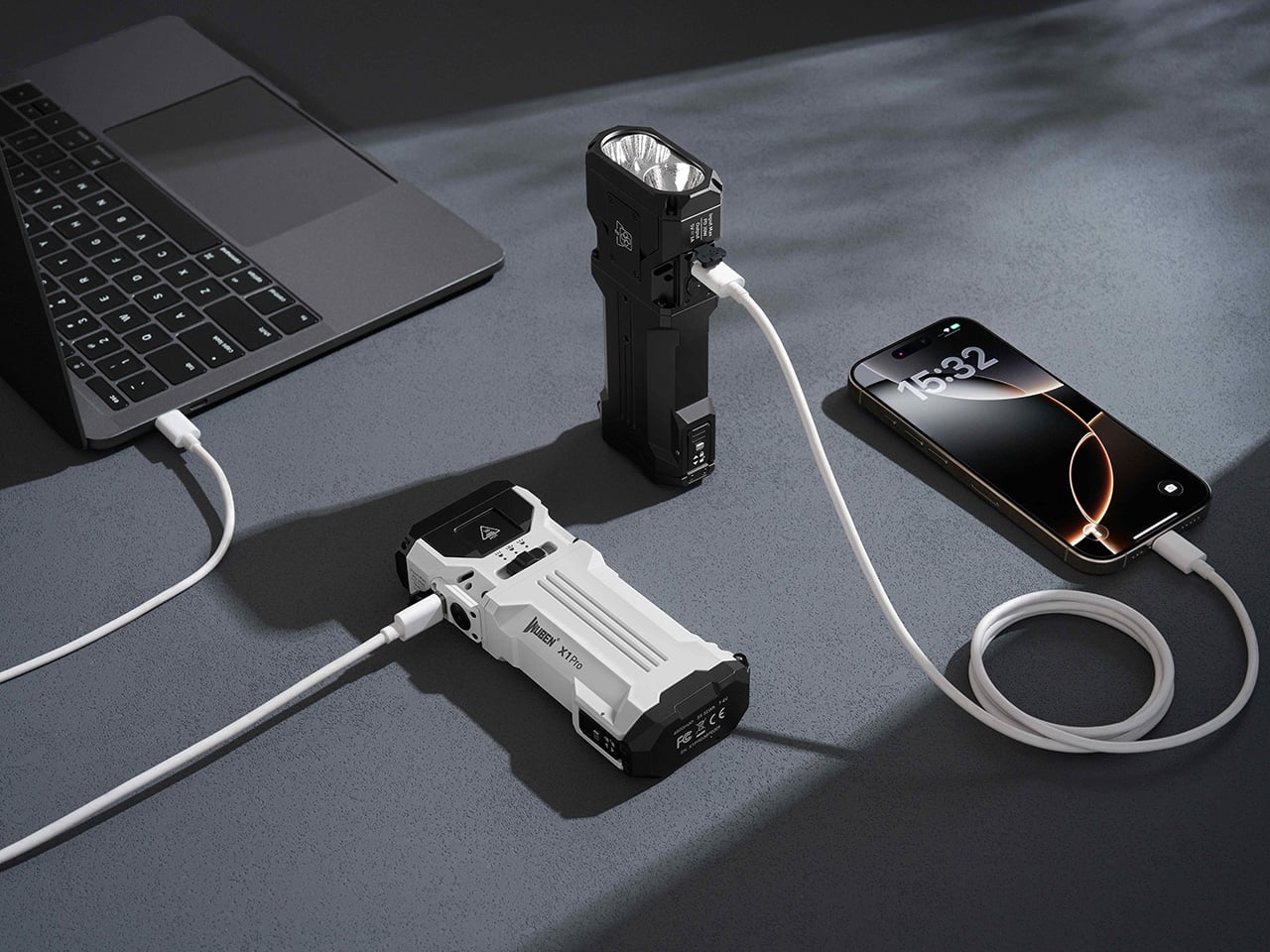
The WUBEN X1 Pro runs on two replaceable 21700 lithium batteries, providing a combined 9600mAh of capacity that powers hours of high-output use without fading. That’s enough juice for serious adventures, and when you need to recharge your phone or GPS device during extended trips, the flashlight doubles as a 15W power bank via USB-C output without compromising your lighting needs or leaving you in the dark.

Smart cooling keeps everything running safely without overheating or sudden performance drops during extended use. A detachable fan module and copper midframe dissipate heat efficiently, so you can use maximum brightness without worrying about thermal throttling or damage to internal components, no matter how long the adventure lasts or how demanding the conditions become during your exploration.
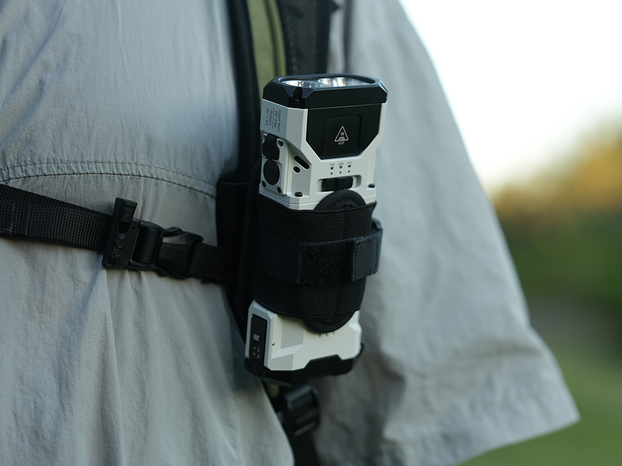
The X1 Pro is designed for versatile carry, with a rope hole for secure lanyards, and a redesigned bike mount for hands-free lighting on the move. The IP54 rating means it shrugs off rain and dust confidently, while the rugged aluminum build stands up to drops and rough handling during outdoor activities without showing significant damage.

Whether you’re setting up camp in complete darkness, fixing a flat tire at midnight on a deserted road, or leading a group through a dark trail where visibility matters for everyone’s safety, the WUBEN X1 Pro brings confidence and clarity to every situation. Its sculpted design, powerful dual-beam output, and clever features like replaceable batteries and power bank functionality make it a reliable companion for every adventure, big or small.
Click Here to Buy Now: $119 $149 (20% off). Hurry, only a few left! Raised over $181,000.
The post 13,000-Lumen Flashlight With Smart Cooling Also Charges Your Phone first appeared on Yanko Design.