Zerowriter Ink Is an Open-Source E-Paper Typewriter Built for Writers

Trying to write on a laptop means fighting a machine that is also a notification box, streaming portal, and social feed. Distraction-free apps help, but they still live inside the same browser-and-tab chaos, surrounded by everything else your computer knows how to do. Some writers just want a device that only knows how to produce plain text and does not care about anything else happening in the world.

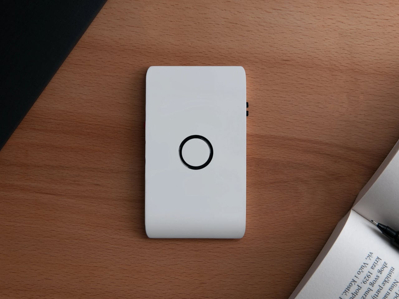
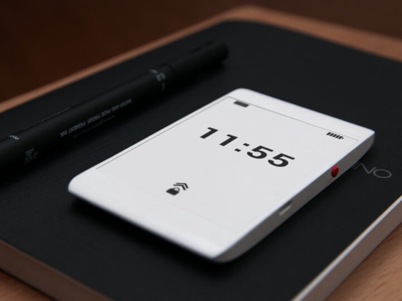
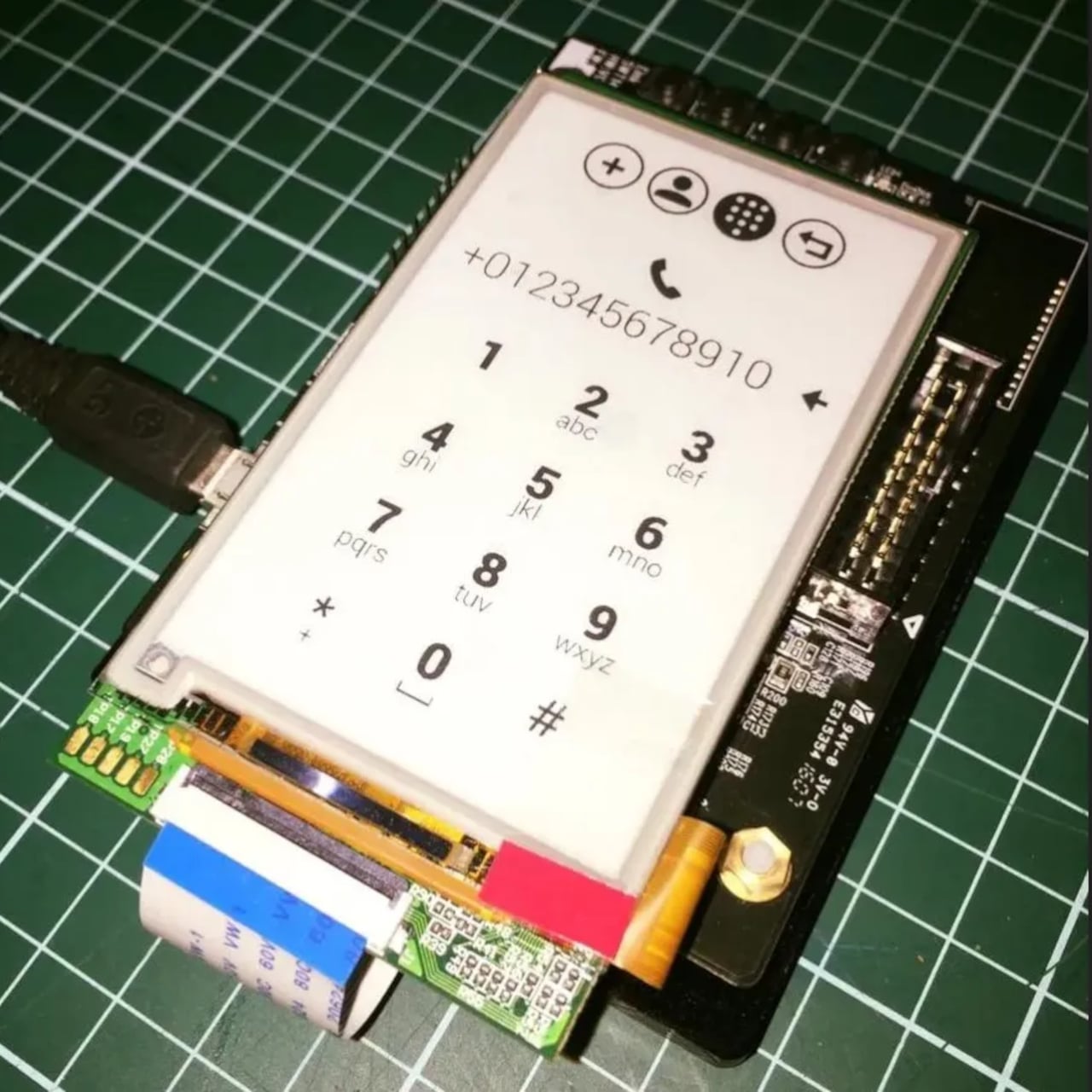
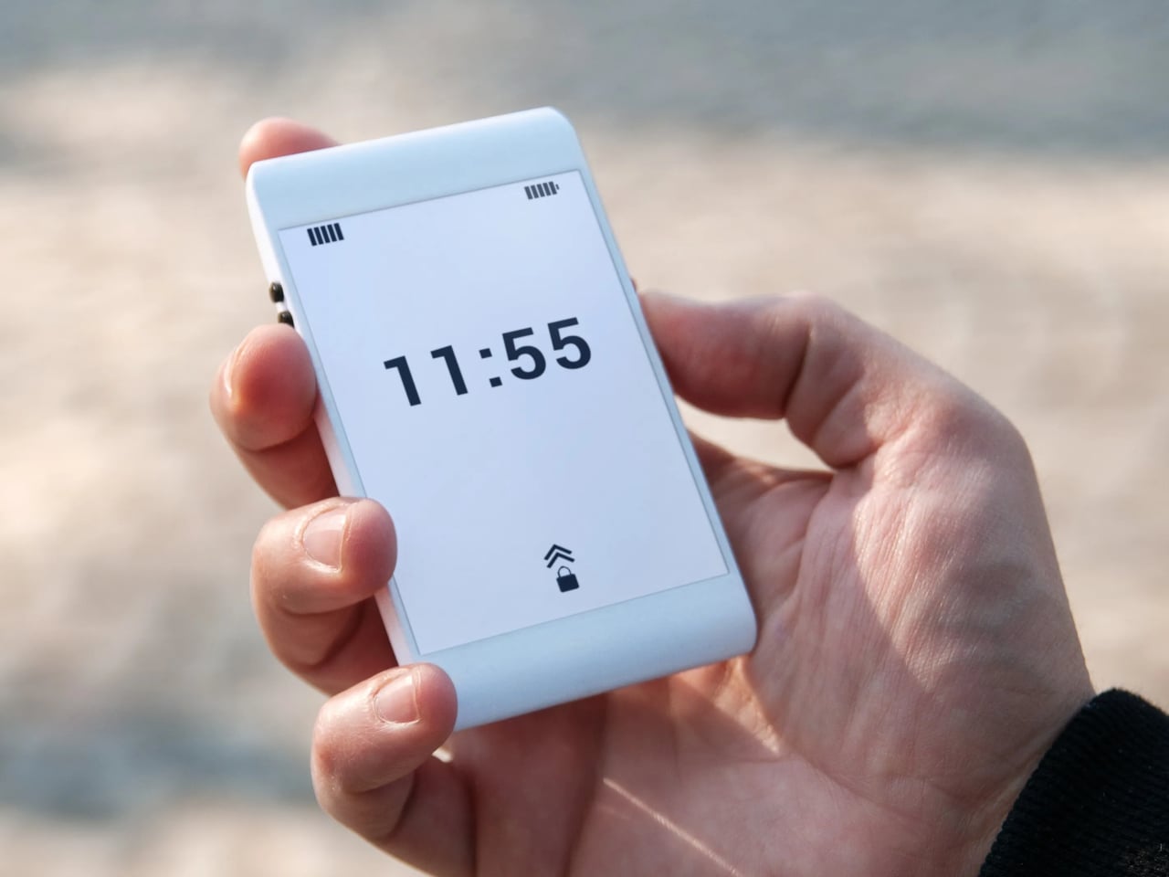
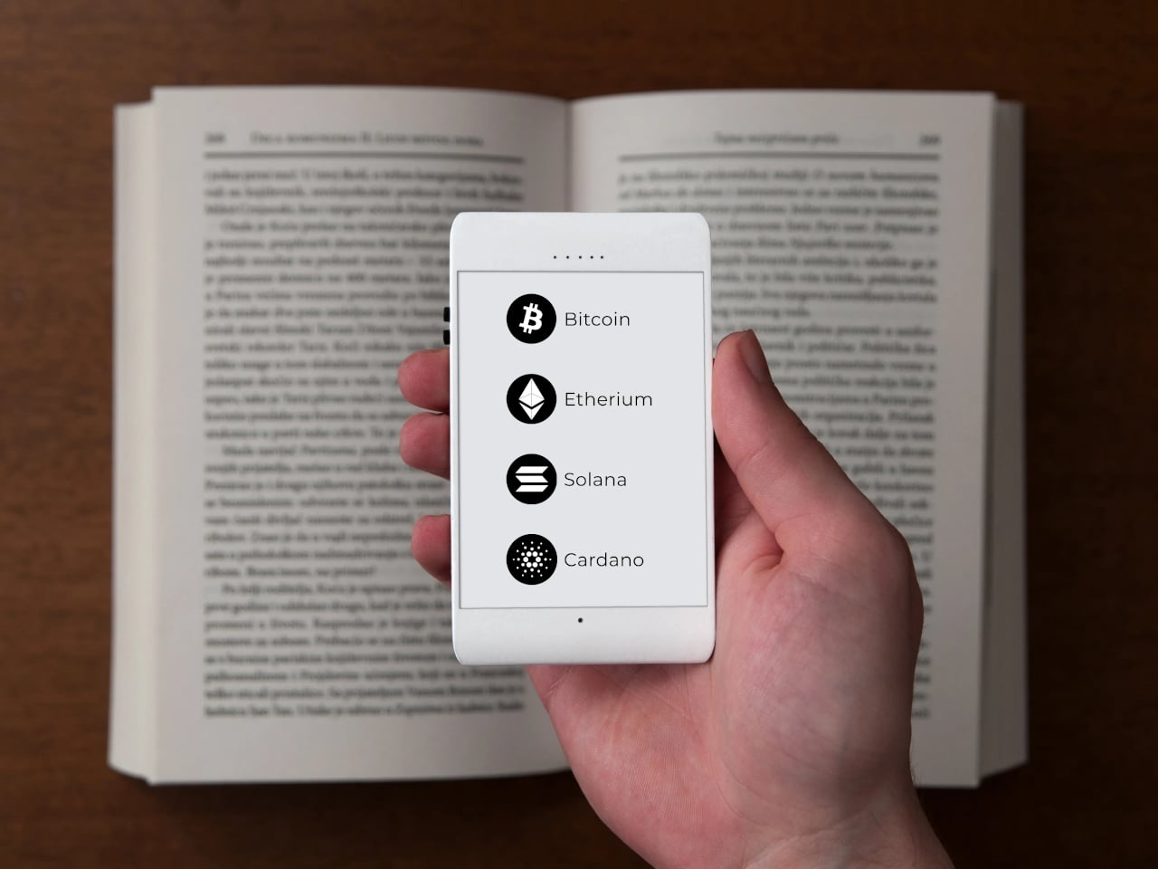
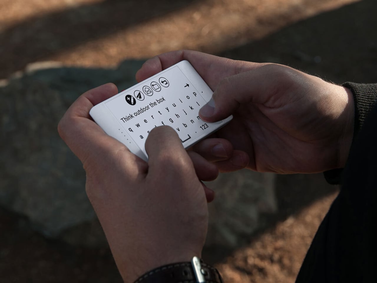
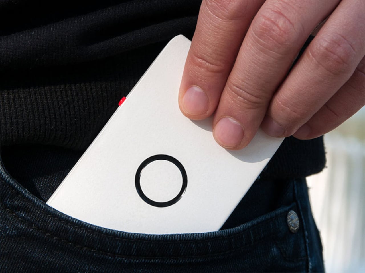
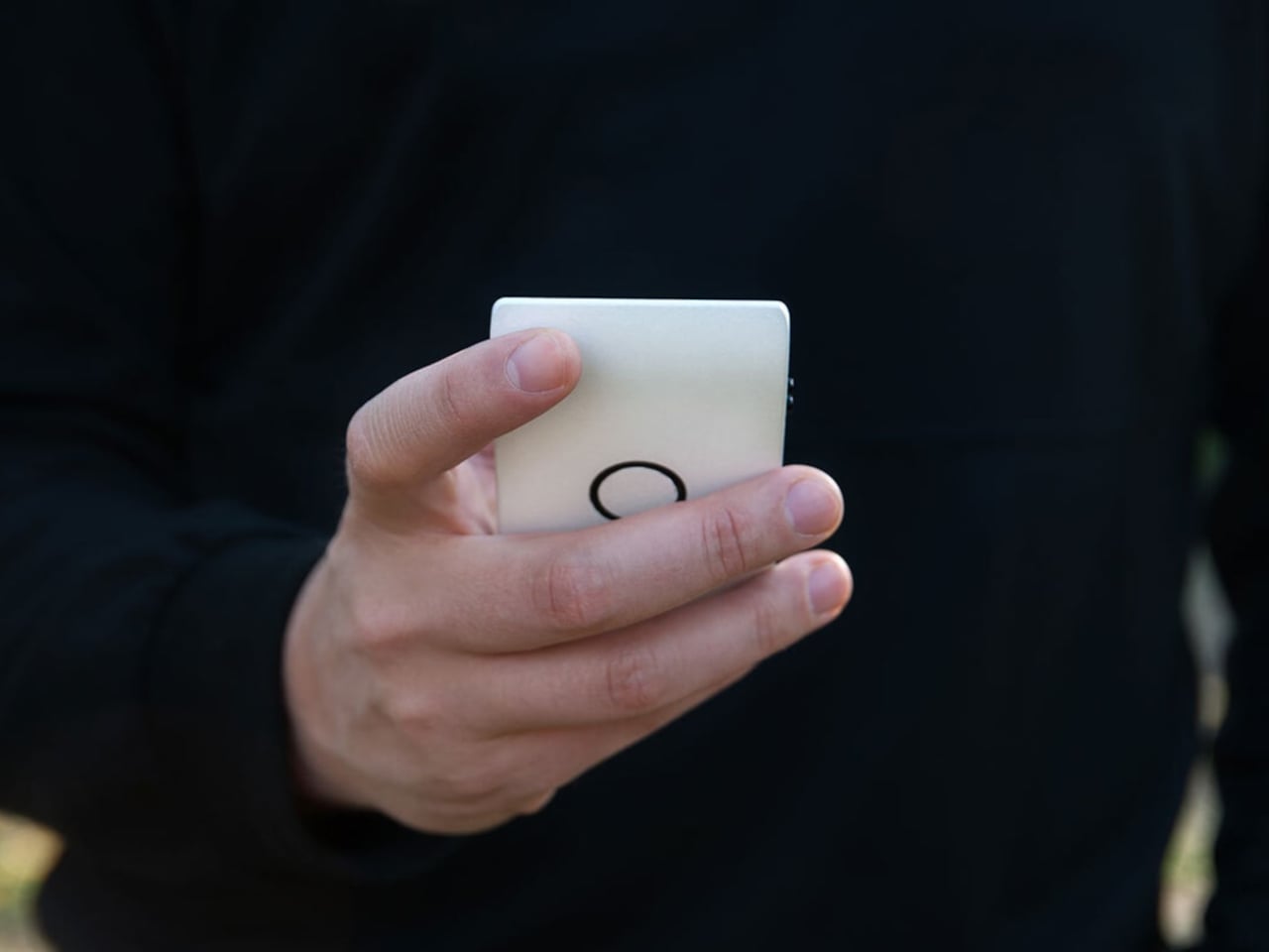
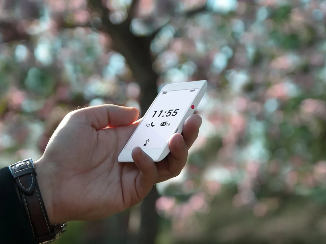
Zerowriter Ink is an open-source e-paper word processor that tries to be exactly that. It combines a 5.2-inch Inkplate e-paper display with a 61-key low-profile mechanical keyboard in a slim slab that fits in a 13-inch laptop sleeve. It wakes instantly, shows a clean page, and runs for weeks on a single charge instead of draining down to zero by lunchtime like most laptops.

Designer: Adam Wilk

Picture drafting on a park bench or train, where the high-contrast e-paper screen stays readable in direct sunlight and does not blast blue light. A custom refresh engine keeps typing lag almost imperceptible, so it feels more like a fast e-reader that learned to keep up with your thoughts than the sluggish e-paper most people expect from displays that usually just show book pages or bus schedules.

1

The 60% mechanical keyboard uses Kailh Choc Pro Red switches, and every switch and keycap is hot-swappable. That means you can tune the feel and sound to your taste, or replace a dead switch without tossing the device. It feels more like a compact enthusiast board that happens to have an e-paper screen attached than a sealed writing appliance you cannot repair or modify.

The built-in software offers a drafting mode and a simple word-processing mode, letting you either pour out text or make quick cursor-based edits with arrow keys. On-device file management lets you save and rename documents, and finished .txt files live on a microSD card. When ready to polish, you plug in over USB or scan a QR code to move drafts to your main machine for formatting and revision.

Zerowriter Ink ships completely offline, with no accounts, no cloud sync, and no AI quietly indexing your drafts. Your words stay on the microSD card unless you decide otherwise. At the same time, the ESP32 hardware and Arduino-based firmware mean Wi-Fi and Bluetooth are there for anyone who wants to add sync or other features, either by writing their own build or grabbing one from the community.

The device is definitely not trying to replace laptops. It is trying to give writers a small, reliable space where nothing else happens. It is for people who miss the simplicity of an Alphasmart but want a sharper screen and a better keyboard, and for tinkerers who like the idea of a writing tool they can open up, both in hardware and in code, once the draft is done and curiosity takes over.

The post Zerowriter Ink Is an Open-Source E-Paper Typewriter Built for Writers first appeared on Yanko Design.
IKEA Just Made a Mouse-Shaped Speaker That Kids Can Actually Carry

IKEA’s GREJSIMOJS collection started with a dog-shaped lamp that dims when you hold its head for bedtime, turning a light switch into something closer to petting a sleepy puppy. The limited collection is more than just about cute animals, but also about playful behavior baked into everyday objects. That same thinking now shows up in a tiny Bluetooth speaker shaped like a mouse, with four stubby legs and a braided tail that doubles as a carry loop.

The GREJSIMOJS portable Bluetooth speaker is a small, mouse-shaped character IKEA calls a “cute little music friend” for playful people of all ages. It is meant to follow kids from room to room, turning background sound into something they can carry and interact with, while still being a straightforward wireless speaker for parents who just want podcasts in the kitchen or bedtime audiobooks without fumbling with phone speakers.

Designer: Marta Krupińska (IKEA)

Picture a child drawing at a desk, the purple mouse sitting nearby quietly playing an audiobook or favorite songs. Pairing is as simple as connecting a phone over Bluetooth, and the sound is tuned for everyday listening rather than shaking walls. The built-in volume limit protects sensitive ears, so kids can turn it up without parents needing to hover over the controls constantly or worry about hearing damage.

The braided tail makes it easy for small hands to grab and move the speaker from bedroom to living room. Charging happens over USB-C, though the cable and adapter are sold separately, and IKEA says adults should handle that part. The speaker cannot play while charging, which creates a split that lets kids control what they listen to while adults manage batteries and power.

The multi-speaker mode lets the mouse pair with other IKEA Bluetooth speakers supporting the same feature. That means the same music can play from multiple spots, turning a hallway and playroom into one sound zone without complicated app setups. It is an easy way to make dance parties or tidy-up time feel coordinated, even if the tech behind it stays invisible to everyone involved.

The collection’s goal is to inspire play and togetherness across the home, and the mouse fits that mission well. IKEA notes that £1 from every GREJSIMOJS product sold during a set period goes to the Baby Bank Alliance, adding a layer of purposeful giving. More than just decor, the speaker is a small facilitator for shared stories, music, and movement in family spaces without needing complicated setup rituals.

The GREJSIMOJS mouse speaker, like the dog lamp, treats technology as something that should feel approachable and a bit silly rather than cold. Rather than competing with serious audio gear, it is trying to make rooms feel more alive without asking kids to sit still or parents to manage another app. In homes where screens already demand enough attention, a small purple mouse that quietly pipes in sound might be exactly the kind of tech everyone can agree on.

The post IKEA Just Made a Mouse-Shaped Speaker That Kids Can Actually Carry first appeared on Yanko Design.
Maingear Retro98 Is the 90s Dream PC Finally Built with 2026 Hardware

Late-’90s desktops hummed under desks in beige towers that always felt heavier than they should. CRTs flickered, CD drives whirred, and somewhere in every PC gamer’s mind lived a fantasy build they only saw in shop windows or magazine ads. The gap between the family PC that struggled with Quake and the dream rig you sketched in notebooks, complete with turbo buttons and drive bays, felt impossibly wide.

Maingear’s Retro98 is that fantasy finally built. The limited-run sleeper PC uses a retro beige SilverStone tower with a working turbo button and keyed power lockout, but hides 2026 hardware inside. The pitch is simple: 1998 on the outside, 2026 inside. It is the machine your younger self would have lost their mind over if they could see past the beige and understood what an RTX 5070 even meant.

Designer: Maingear

Water-cooled Retro98α

Retro98 feels more like a drop than a product line. Maingear limited it to 38 units: 32 standard builds and six water-cooled Retro98α rigs with braided ketchup-and-mustard cables. The brand positions it as something you will not find at a big-box store, and points out that you will not even find a Radio Shack next week. Each system is hand-built by a single technician, making it feel closer to a limited sneaker release than a typical prebuilt.

Even the lowest spec overshoots anything you could have imagined in 1998. The Retro98 5070 pairs an NVIDIA GeForce RTX 5070 with an Intel Core Ultra 7 265K, 32 GB of DDR5 at 6000 MT/s, and a 2 TB NVMe SSD. This is the kind of machine that runs Cyberpunk smoothly while looking like it should be loading StarCraft from a stack of jewel cases on the desk.

Of course, the front-panel rituals matter as much as the internals. The keyed power lock feels like something your parents would have used to keep you off the PC, and the fully functional turbo button now toggles performance profiles instead of pretending to overclock a 486. These physical interactions turn booting up into a tiny ceremony, a reminder of when pressing power felt like entering a different world rather than unlocking another screen.

Behind the retro faceplate, you still get modern conveniences. USB-C on the front, Wi-Fi 7, Bluetooth 5.4, and a clean Windows 11 install without bloatware. The machine is not trying to recreate the pain of driver floppies or IRQ conflicts. It is just borrowing the shell and the attitude. You get the look and the jokes, but you also get quiet fans, instant game launches, and none of the frustration.

Retro98 is not about value per frame but about finally owning the mythical beige tower you stared at in catalogs. It is for people who remember sharing a/s/l in chat rooms and slapping CRTs after another buffer underrun, and who now have the budget to indulge that memory. A beige box with a turbo button probably should not feel fresh in 2026, but somehow it does, which says more about how boring glass-and-RGB towers have gotten than it does about nostalgia.

The post Maingear Retro98 Is the 90s Dream PC Finally Built with 2026 Hardware first appeared on Yanko Design.
ROG Just Built the Gaming Headset Audiophiles Always Wanted

Gaming headsets tend to lean bass-heavy and closed-back, with flashy branding and mics that sound good enough for Discord but not much else. Planar-magnetic hi-fi headphones sound incredible but usually lack microphones and look out of place next to RGB keyboards. Players who care about both soundstage and winning often juggle two pairs or compromise, because the two worlds rarely meet in one product without awkward concessions.

That is where ROG Kithara comes in. It is ROG’s first open-back planar-magnetic gaming headset, developed with HIFIMAN. The collaboration brings 100mm planar drivers into a headset that still has a proper boom mic, in-line controls, and all the plugs you need for PCs, consoles, DACs, and laptops. It treats games like they deserve hi-fi instead of just tolerating them as background noise.

Designer: ROG (ASUS)

The planar drivers deliver an 8Hz to 55kHz frequency response with very low distortion, which translates into deep, controlled bass and crisp treble without smearing. The open-back design creates a wider, more natural soundstage, so footsteps, reloads, and distant movement sit in believable positions instead of clustering in your head. It helps both immersion and tactical awareness without needing surround processing that usually just muddies everything.

Playing a competitive shooter, you can distinguish a teammate reloading behind you from an enemy stepping on metal two floors up. The fast transient response keeps those cues sharp, and the open-back architecture stops explosions from masking subtle sounds entirely. You react faster because you are not guessing where anything came from. You are actually hearing it placed in space the way the sound designer intended it.

The on-cable MEMS boom microphone covers the full 20Hz to 20kHz range with a high signal-to-noise ratio, so your voice sounds more natural than typical narrow-band gaming mics. Separate signal paths for audio and mic on the dual 3.5mm cable keep game sound from bleeding into chat, which your squad will quietly appreciate even if they never ask what headset you switched to or notice until the crosstalk disappears.

The balanced cable with swappable 4.4mm, 3.5mm, and 6.3mm plugs lets you move from a desktop DAC to a laptop or console without changing headsets. The included USB-C to dual 3.5mm adapter covers modern laptops and handhelds. With 16-ohm impedance, Kithara is easy to drive without a rack of gear just to get it loud enough for late-night sessions.

Of course, the metal frame, eight-level headband adjustment, and two sets of ear pads, leatherette with mesh for focused sound and velour for a softer feel, mean you can tune comfort and tonality. The open-back design leaks sound and is best in quiet rooms, but for players who want one headset that handles ranked matches, long story games, and critical music listening, Kithara feels like a rare crossover that actually respects both sides.

The post ROG Just Built the Gaming Headset Audiophiles Always Wanted first appeared on Yanko Design.
Michael Jantzen Just Turned Solar into a 16-Arm Moving Sculpture

Most renewable energy systems hide in plain sight. Rooftop solar panels blend into shingles, batteries sit in containers behind fences, and wind turbines spin in distant fields. They quietly do their jobs without helping anyone understand what happens inside them, which feels like a missed opportunity when you are trying to build support for systems that might keep the planet livable for another generation or two.

Michael Jantzen’s Solar and Gravity Powered Art and Science Pavilion treats that visibility problem as a design challenge. The conceptual structure combines a public exhibition space under an umbrella-shaped roof with a tall central tower supporting 16 long, weighted steel arms. Those arms lift and lower throughout the day, creating shifting silhouettes while demonstrating how solar power and gravity work together as a functional energy system rather than just theoretical concepts.

Designer: Michael Jantzen

The cycle works simply enough. A solar cell array at the top powers 16 winches that pull the weighted arms upward, storing potential energy. When the pavilion needs electricity, or when someone wants to change its shape, the arms fall back down under gravity. Their descent drives 16 generators that feed power to the building or local grid, turning stored height into usable electricity without batteries or other complex systems getting in the way.

Arriving on a sunny afternoon, you would see the arms at different angles around the tower, sometimes clustered vertically, sometimes fanned out like a mechanical flower. The shifting positions are not just decorative but are the visible result of energy being stored and released. You can read the building’s energy state in its skyline without needing a diagram, which turns out to be a surprisingly rare thing for infrastructure to offer at any scale.

Inside, the umbrella roof shelters a large floor for exhibitions, lectures, or performances. At the center, 16 cables drop through holes in the floor, each marked with an orange spot matching the orange-tipped arms outside. Those cables connect to winches and generators below, making the mechanical core part of the exhibition rather than something hidden. Visitors can track which arms are up or down by watching cables move, turning passive observation into something closer to active participation.

Of course, the setup means the building becomes a working model while hosting events about climate or technology. People walk through exhibitions while the structure demonstrates solar capture and gravity storage without needing to explain every detail. The pavilion functions as a tourist attraction, classroom, and public art that teaches through motion instead of asking you to absorb paragraphs about conversion rates nobody remembers afterward.

Jantzen’s proposal might never be built as drawn, but treating energy flows as choreography feels worth exploring. It hints at a future where infrastructure does not just work efficiently behind walls, it performs visibly in ways that invite people to understand systems that usually stay hidden until something breaks. Making those processes watchable might matter more than squeezing out another efficiency percentage point, which is something worth considering the next time we design places meant to teach.

The post Michael Jantzen Just Turned Solar into a 16-Arm Moving Sculpture first appeared on Yanko Design.
This Coat Rack Vanishes Into Your Wall When You Don’t Need It

Coat racks are designed to be covered. Designers refine sculptural hooks and stands that look great in catalogs, but the moment you hang coats and bags, they disappear under fabric. No matter how interesting the form, the object gets visually erased by its own function. Most designs pretend this is not happening, even though vanishing under outerwear is basically written into the job description from the start.

VELTO accepts that contradiction instead of fighting it. The wall-mounted coat rack stays completely flat when not in use and only reveals itself when needed. The philosophy revolves around the idea that design does not always need to shout to be valuable, and sometimes disappearing is actually the point. When closed, it sits flush against the wall like a small tile and can be painted the same color to blend entirely.

Designer: Brent De Meulenaere

The transformation happens with a single push. A spring-assisted mechanism lets the flat panel unfold into a hook that holds coats, bags, or scarves without extra effort. The movement is inspired by origami, turning a flat surface into a functional volume through precise folds. The interaction becomes a small, deliberate gesture every time you come home or leave, pressing the panel and watching it quietly fold out to catch your jacket.

The object starts from a single flat shape laser-cut from polypropylene, which flexes repeatedly without breaking, and can be painted in any color. That flat-pack logic keeps production efficient and reduces waste. You can paint VELTO to disappear into the wall or let it stand out as a subtle accent, depending on whether you want it to blend or quietly announce itself in the entryway.

In narrow hallways or compact entryways, every protruding object becomes something you bump into or work around. Traditional coat racks and hooks always occupy space, even when empty, creating visual clutter on days when you are not using them. VELTO stays flat until pressed, so walls remain clean most of the time. When guests arrive or winter coats come out, hooks appear on demand, then fold back once everything is put away.

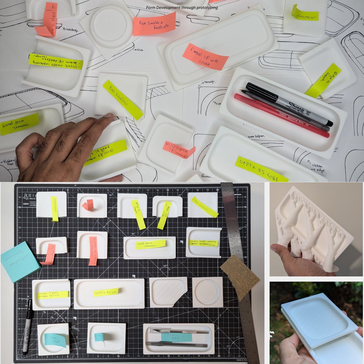
The project grew from sketches about movement and hinges rather than styling, followed by paper models and prototypes testing folding angles, opening force, and stability. Only after the mechanism felt right did the designer refine proportions and edges. That process shows in the final concept, where the memorable part is not a decorative detail but the calm, almost self-explanatory way the object transforms when you actually need it.

VELTO treats absence as a feature instead of a problem. Rather than trying to dominate a room, it tries to coexist quietly with walls and daily routines, only stepping forward when you need a place to hang something. In a world full of products competing for attention, a coat rack designed to be covered and happy to disappear feels like a surprisingly refreshing stance.

The post This Coat Rack Vanishes Into Your Wall When You Don’t Need It first appeared on Yanko Design.
Fold Metal Once, Organize Your Entire Desk Forever

Most desks accumulate the same clutter. A stack of paper that never stays neat, a pen cup filled with tools you never touch, and business cards sliding around until they fall behind the monitor. The typical solution is plastic organizers that do not age well and do not really help. They just give the mess a slightly more defined shape while taking up even more space on the desk.

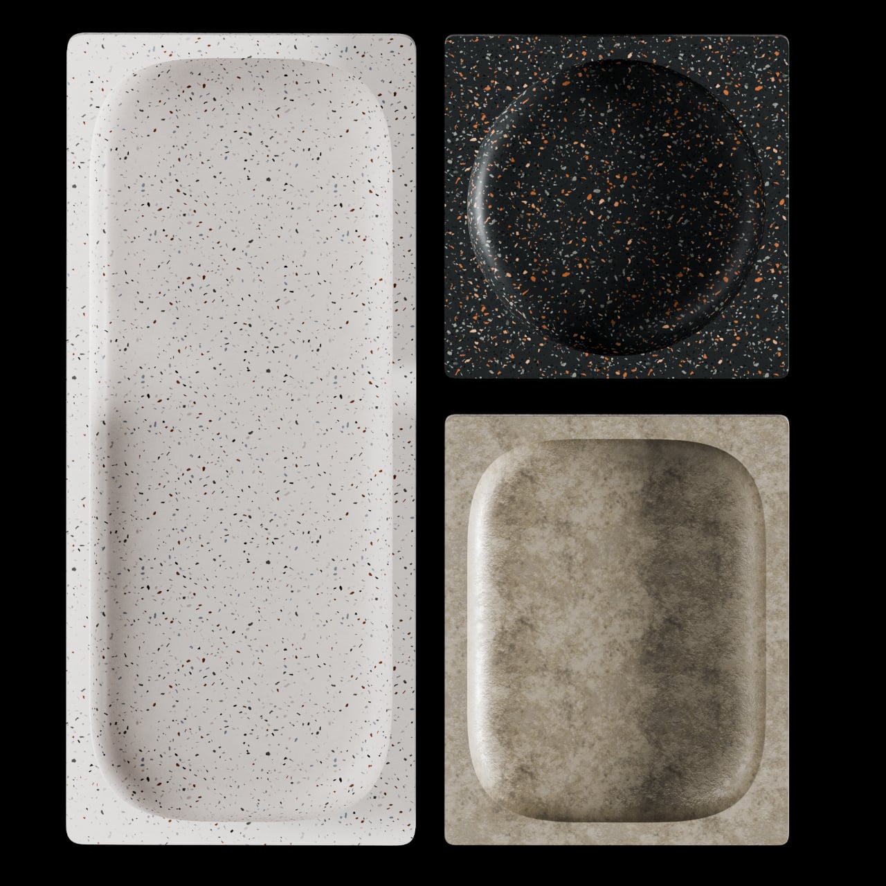
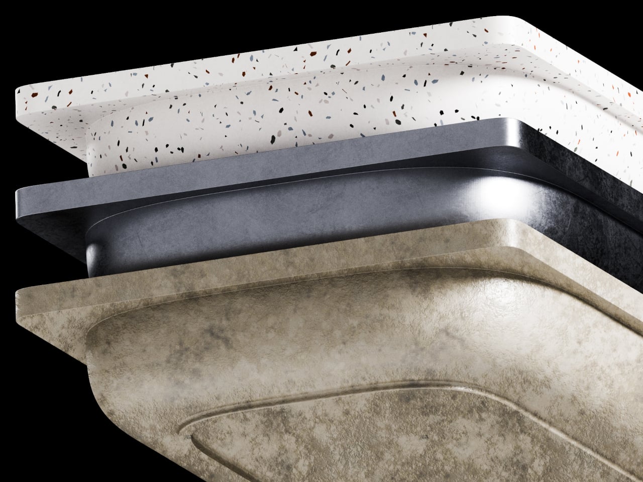
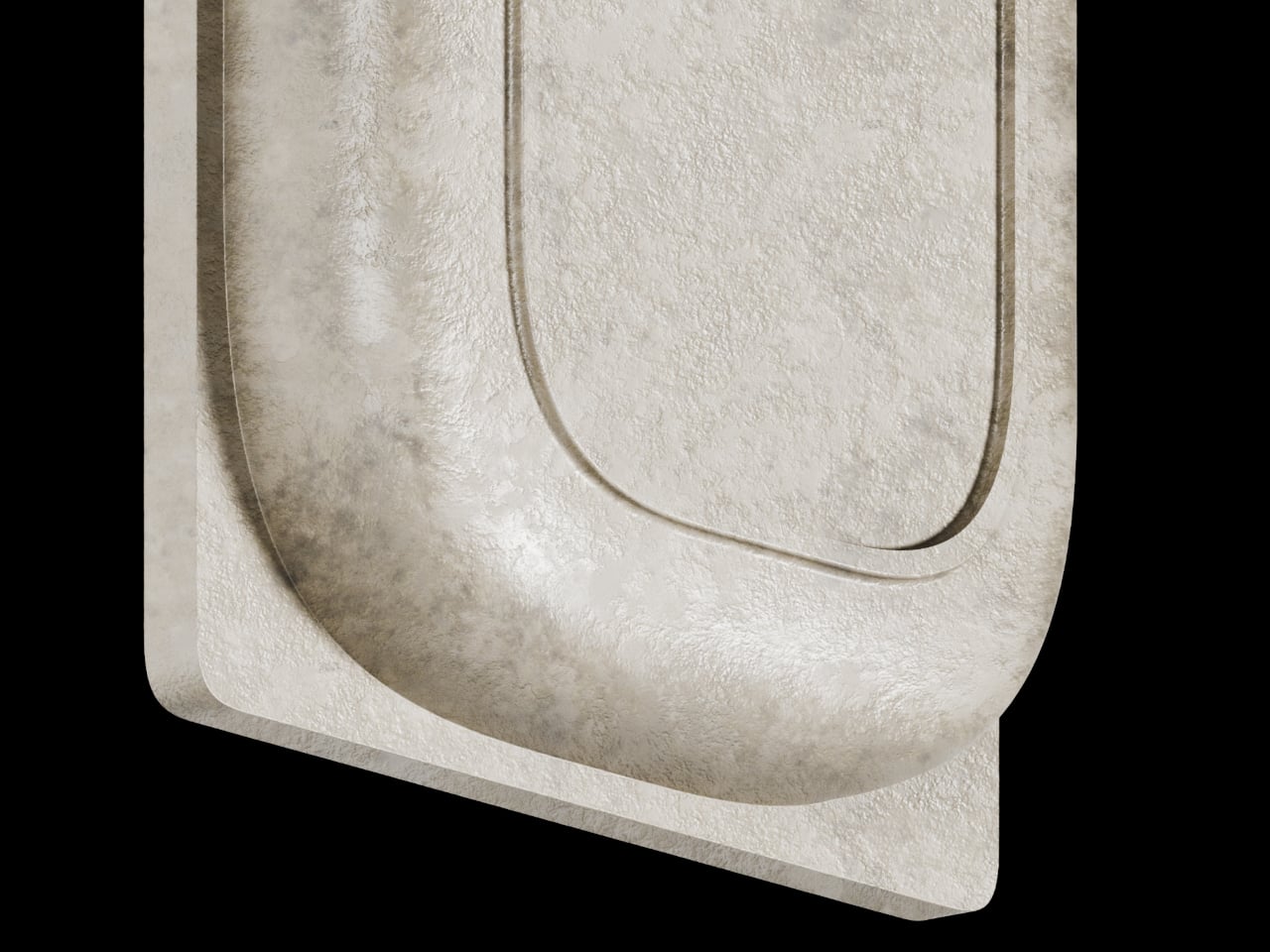
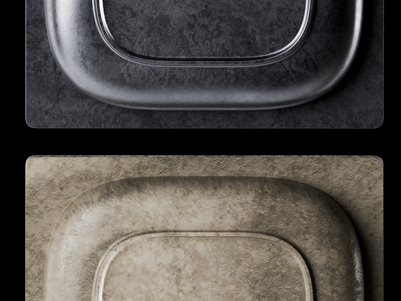
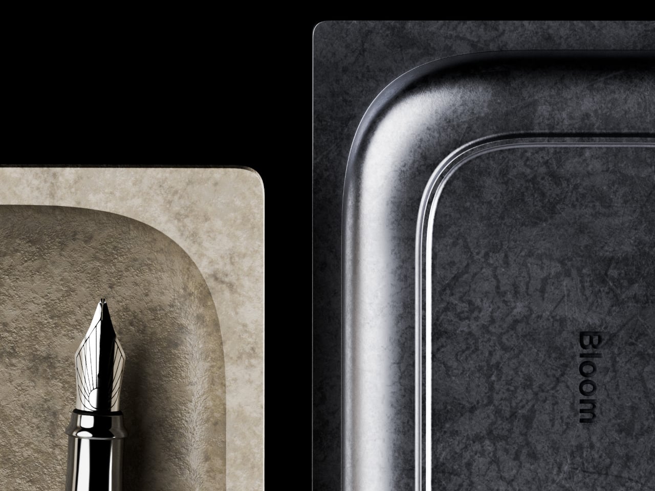
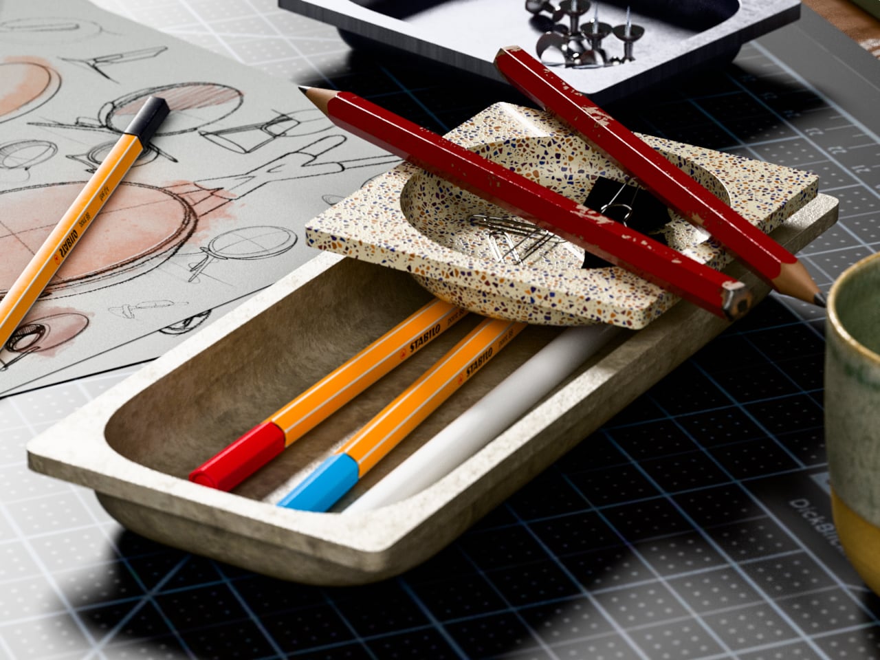
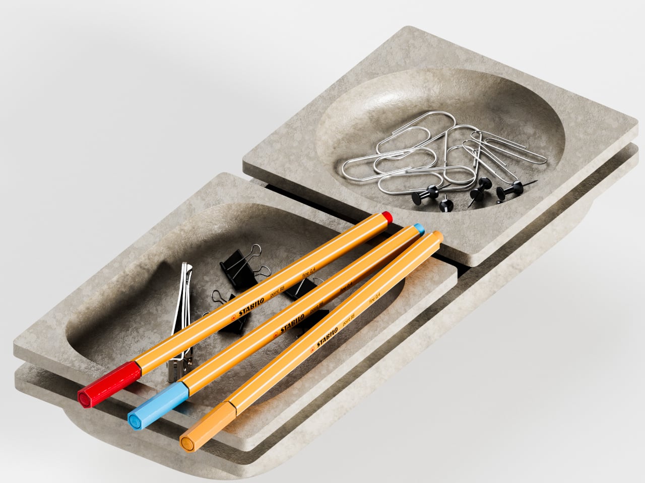
That is where Foldy comes in. This small family of office trays starts from a single 1.6 mm metal sheet bent into shape. Sheet-metal bending is cheap, durable, and works for small runs, but usually looks industrial. Foldy leans into that process while rounding every edge and coating pieces in soft matte colors, so they feel more like friendly desk companions than leftover machine parts from a factory floor.

Designer: Hoyoung Joo (studio SF-SO/SFSO)

The paper tray tackles how people actually stack A4 sheets and half-finished printouts. The slightly slanted face lets paper slide back into alignment instead of creeping forward. The two-level, stackable design separates “now” piles from “later” piles without spreading across the desk, and the metal construction keeps everything solid instead of flimsy enough to tip when fully loaded with documents waiting for signatures.

The pen holder responds to a different frustration. Most pencil cups are graveyards for dried-out markers and forgotten highlighters, which means digging through clutter every time you need your favorite pen. Foldy’s version keeps the upright cavity but adds a folded lip on the front where one or two favorite tools rest horizontally. It acknowledges that you always reach for the same pens, so it gives them a front row seat.

The low pencil tray and business card tray follow the same logic. The pencil tray is just a shallow channel that keeps a pen from rolling away when you set it down between tasks. The card tray is angled so business cards naturally settle into a neat stack and are easier to pick up with a thumb instead of sliding flat fingers underneath them. Both share rounded edges and folded profiles, making them feel like siblings.

Of course, tactile details matter as much as organizational logic. The rounded corners and matte finishes take the edge off metal, literally and visually. The colors, from muted greens to brighter blues and yellows, are soft enough not to shout but distinct enough to zone different functions. The result is a set of objects that look simple but feel surprisingly considered once you start using them daily.

Foldy shows what happens when you let manufacturing drive form for something as humble as a paper tray. Instead of hiding the fold, it celebrates it, and instead of fighting everyday habits like reaching for the same pen or letting paper drift forward, it leans into them. The result is desk tools that quietly tidy things up without asking you to reorganize your entire workflow or pretend to keep your desk perfectly clean all the time.

The post Fold Metal Once, Organize Your Entire Desk Forever first appeared on Yanko Design.
Razer Just Built the Pokémon Desk Setup Every ’90s Kid Wanted

A lot of people who picked their first starter Pokémon on a Game Boy now sit in front of multi-monitor setups, pretending to be adults. Their desks are full of neutral black peripherals that say serious work, even though their playlists are lo-fi Pokémon remixes and their browser tabs tell a different story. The gear stays boring because that is what grown-up keyboards and mice are supposed to look like, apparently.

That is where Razer’s Pokémon collection comes in. Instead of one Pikachu mousepad, Razer built a full ecosystem that includes the BlackWidow V4 X keyboard, Cobra mouse, Kraken V4 X headset, and Gigantus V2 M mat. The line is officially licensed and leans into Kanto nostalgia, wrapping every peripheral in Pikachu, Bulbasaur, Charmander, and Squirtle graphics across bright yellow surfaces with synced Razer Chroma RGB lighting.

Designer: Razer x Pokemon

The BlackWidow V4 X Pokémon Edition keyboard anchors everything. Underneath the graphics, it is a mechanical keyboard with Razer’s clicky switches, six macro keys, and programmable RGB. You can map macros for raids or productivity shortcuts, and the mechanical switches help with both gaming and marathon typing. The Pokémon skin does not change performance; it just turns something you already needed into something that feels like a personal trophy from childhood.

The Cobra mouse and Gigantus V2 M mat work as a paired set. The lightweight wired mouse uses optical switches for durability and precision, with RGB lighting that syncs with the rest of your setup. The soft mat underneath is optimized for fast swipes, whether flicking through game menus or dragging layers in design software. Together, they turn everyday cursor movement into something that feels like your oldest digital companions are right there.

The Kraken V4 X headset pulls audio into the same universe. It supports surround sound for positional cues, has a clear mic for calls or streaming, and features RGB lighting around the earcups. You hear footsteps in matches, but you also use it for music while answering emails or video meetings without switching gear, which makes it more versatile than something covered in Pikachu art probably should be.

Of course, Razer points out the collection works for productivity and content creation, not just gaming. Mechanical keys help with typing speed, the mouse and mat work in design software or spreadsheets, and the headset handles conference calls. The Pokémon layer is simply a visual narrative on top of hardware you could justify buying even in plain black, which means you get function and nostalgia without compromise.

The collection treats your desktop as more than a neutral workspace. It acknowledges that the same person editing spreadsheets might still know every line of the Pokémon theme song, and both can coexist. Instead of hiding that part of yourself in a drawer of old cartridges, Razer lets it sit under your fingers, lighting up every time you log in and reminding you that being functional and still loving Pikachu are not mutually exclusive.

The post Razer Just Built the Pokémon Desk Setup Every ’90s Kid Wanted first appeared on Yanko Design.
This Concept Makes Reading a Physical Ritual, Not an App Reminder

The intention to read a physical book more often usually gets buried under phones, streaming, and vague guilt about never finishing that stack on the nightstand. Reading is not just opening a book; it is a whole arc from deciding to start to actually making it through chapters without drifting away. Lead is a small family of objects designed to sit around a book and quietly support that arc.

Lead is a design concept that treats reading as a story with a beginning, rising action, climax, and resolution. The name is a contraction of “Let’s read” and the first word of the slogan “lead back to the era of reading,” and the system uses three products, Bookeeper, Candle, and Quill, to give each phase of a reading session its own physical cue instead of relying on app notifications you will probably dismiss.

Designers: Yoo Chaeyeon, Kwon Eui Hwan, Yang Jinoo, Lee Sooyeon, Ha Seongmin

Coming home, you drop your book into Bookeeper, where it sits hidden behind a calm green panel. Earlier, you set a time to read, and as that moment approaches, the base lifts and the book slowly emerges from behind the screen. Instead of a phone notification buzzing and vanishing, the book itself appears, a quiet reminder that this is the slot you promised yourself you would actually use.

Candle is a slim vertical light that links to Bookeeper by default, then switches into timer mode with a twist of its ring. Before you dive into the pages, you set how long you want to read, and Candle becomes both atmosphere and clock. As you move through chapters, you can sense how your pace matches the time you set, adjusting speed without feeling chased by a digital countdown ticking in the corner.

When a line or idea sticks, Quill is a smart pen that lets you write by hand in a notebook or margin, then flip into scan mode to store that text on a device later. It has two main modes, transcription and scan, so you can copy favourite phrases, jot down reflections, and then capture them without breaking the flow. A bookmark element on the back lets Quill rest in the book when you pause.

All three objects share dark bases and a calm, translucent green for the parts that move or light up, so they feel like a family without shouting for attention. The interactions are borrowed from analog reading rituals, taking a book off a shelf, lighting a candle, picking up a pen, but layered with just enough technology to guide habit without dragging you back to a screen.

Lead is less about adding gadgets to the reading table and more about designing a gentle structure around a physical book. Bookeeper brings you back at the right time, Candle holds the space and the clock, and Quill helps you remember why the session mattered. When reading often gets squeezed between notifications and feeds, a trio of objects that simply lead you back to the page feels like a quietly radical idea.

The post This Concept Makes Reading a Physical Ritual, Not an App Reminder first appeared on Yanko Design.
HOVSTEP Helps ADHD Focus with Helicopter Missions That Actually End

Modern work and study days are chopped into tiny fragments, with multiple tabs, apps, and timers all competing for attention. Even well-intentioned plans fall apart because time feels abstract and slippery, especially if you lean toward ADHD or time-blindness. Checking the clock becomes another interruption instead of a guide. HOVSTEP is a concept that tries to make time feel like one clear mission instead of a background anxiety.
HOVSTEP treats each block of time like a helicopter mission. It is both a physical clock and an app-linked timer, inspired by how a mission helicopter takes off with one purpose, completes it, and returns. The idea is to help you see a study session, assignment, or break as a single mission you dispatch and then bring home, with a beginning, middle, and end that are all visible at once.

Designer: Ho joong Lee, Ho taek Lee

Opening the app in the morning, you drop studies, tasks, breaks, and games into short mission slots across the day. The app shows your routine by time zone, then switches to an analog view where each mission has a clear start, end, and remaining time. When a mission starts, a little helicopter icon descends, and the activity timer kicks in with an alarm, making the transition feel deliberate.

HOVSTEP shows time passing with a yellow hand that appears on the clock face when a mission begins, rotating once around the dial and showing how much of that block is left. It is framed as the helicopter being dispatched, flying its route, and returning when the hand lands back at 12. You are watching a mission unfold and trying to stay with it until the end.

The object itself is a small helicopter-shaped clock that can sit on a monitor or hang on a wall. A rotor on top acts as the analog hand, a digital display shows timer information, and side buttons let you adjust volume and timer details. A center button on top turns the clock on and starts missions manually, so you can run a quick focus block without opening the app.

The design is grounded in research about how people with ADHD often respond better to movement, change, and short time units than to static digits. By turning each activity into a dispatched mission with a visible arc and clear end, HOVSTEP reduces the need to constantly check the clock. You get a sense of flow, knowing that as long as the yellow hand is moving, you are still inside the mission.

The project’s line, “One mission completed, one step closer to focus,” captures the spirit. Instead of promising to fix attention with another app, HOVSTEP reframes time as a series of small, winnable missions. Sometimes the most helpful tools for focus are the ones that make progress visible and finite, one flight at a time, instead of asking you to manage an infinite stream of minutes.

The post HOVSTEP Helps ADHD Focus with Helicopter Missions That Actually End first appeared on Yanko Design.