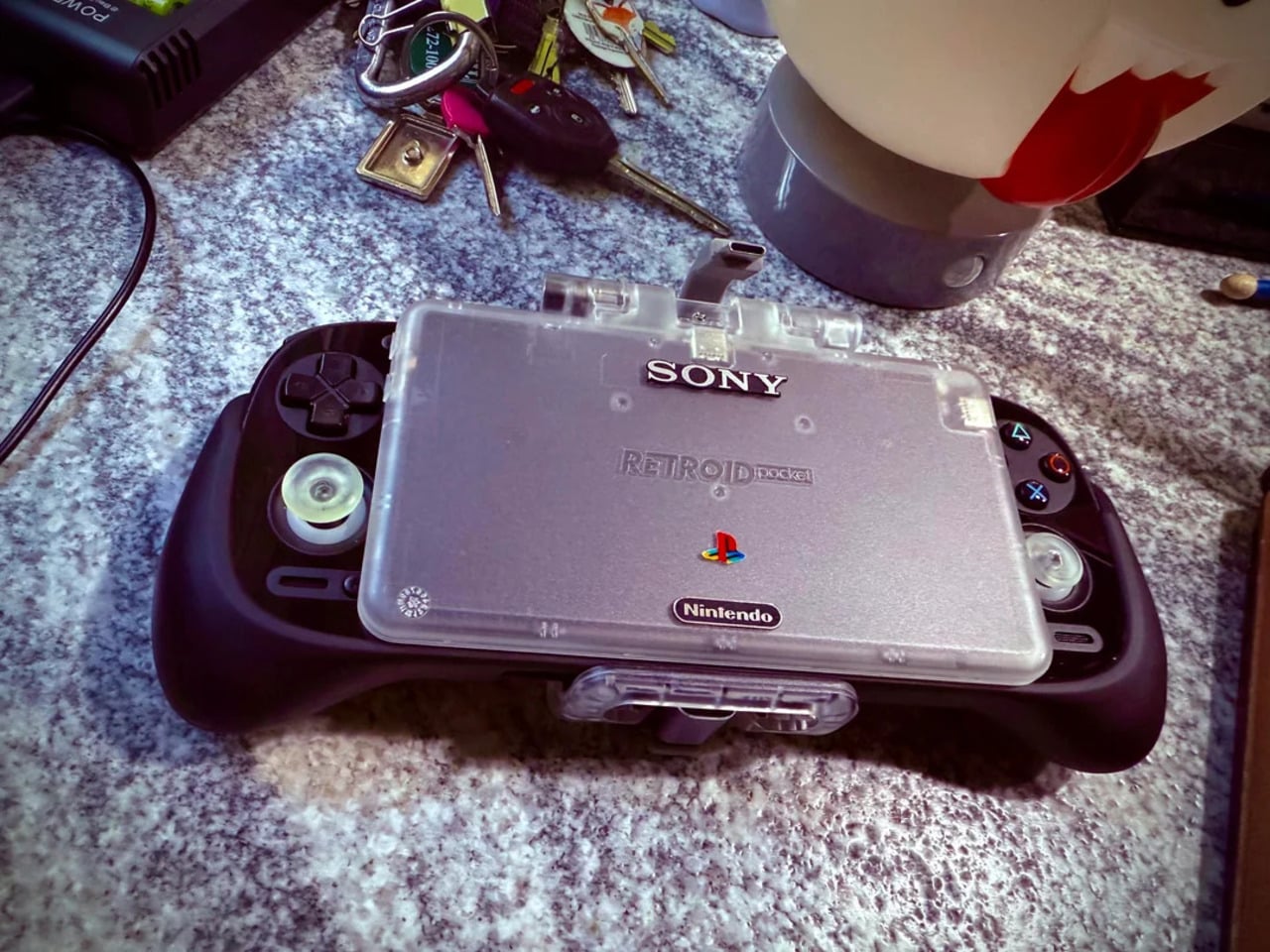
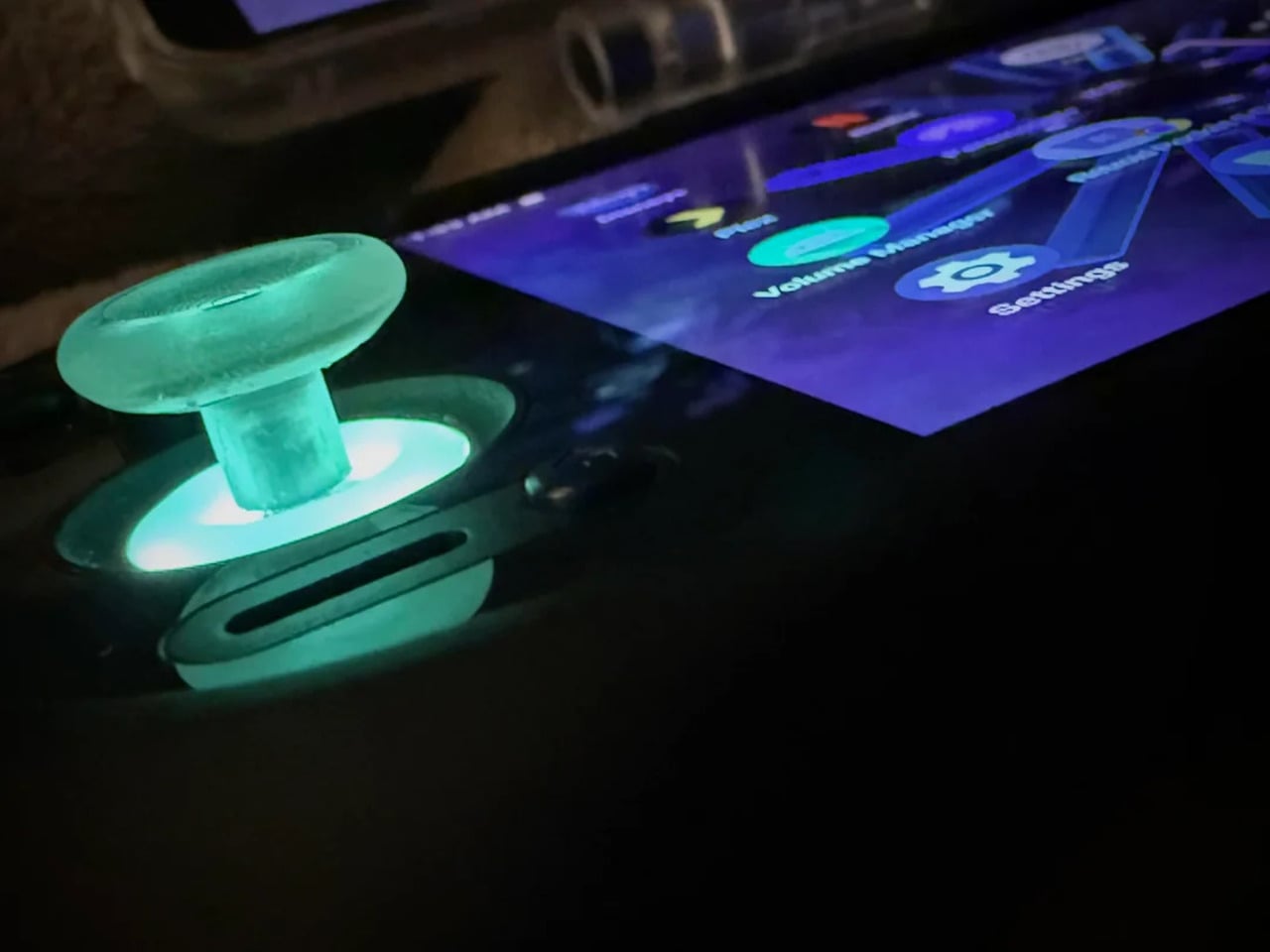
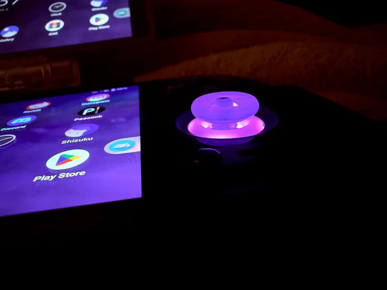
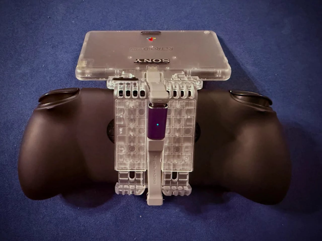
REDMAGIC 11 Air Review: Fan-cooled Gaming Flagship at Just 207g, $499

PROS:


  • Slimmer and lighter design for a gaming smartphone

  • Distinctive gaming aesthetic

  • Large 7,000 mAh battery with 80W fast charging

  • More Accessible price point

CONS:


  • No wireless charging

  • Mediocre 8MP ultra-wide camera

  • Basic IP54 dust and water resistance

RATINGS:

AESTHETICS
ERGONOMICS
PERFORMANCE
SUSTAINABILITY / REPAIRABILITY
VALUE FOR MONEY

EDITOR'S QUOTE:

The REDMAGIC 11 Air doesn't apologize for being a gaming phone, but wraps it in the slimmest, lightest package the brand has made yet.

Gaming phones have split off into their own design species, leaning into transparent backs, RGB lighting, and visible cooling that looks more like sci‑fi props than communication devices. The REDMAGIC 11 Pro, which we reviewed recently, took that to its extreme with a liquid‑cooling window showing coolant flowing like spaceship controls. It made a strong visual statement but was unapologetically a gamer’s machine first and everything else a distant second.

REDMAGIC 11 Air tries to keep the same esports‑grade performance, active cooling, and transparent style in a slimmer frame. It packs a Snapdragon 8 Elite, 7,000mAh battery, 6.85‑inch 144Hz OLED, and 24,000 RPM fan into a 7.85mm, 207g body. Whether this Air approach can balance hardcore gaming with something closer to everyday usability, or just becomes a slightly thinner version of the same uncompromising brick, is worth finding out.

Designer: REDMAGIC

Aesthetics

The moment you see the REDMAGIC 11 Air, it announces itself as a gaming phone. Phantom transparent black and Prism transparent white finishes expose stylized internals, circuit‑like etching, and RGB‑lit fan and logo elements. This is not subtle or generalist; it is a cyberpunk, sci‑fi motif that wants to sit next to mechanical keyboards rather than hide in a leather case.

Despite the gaming‑first aesthetic, materials feel more refined than expected. The aluminum alloy frame, Gorilla Glass front and back, and 7.85mm thickness give it a solid feel. It is positioned as the lightest in the REDMAGIC lineup, which matters compared to the heavier 11 Pro. The curves and 20:9 aspect ratio help it sit more naturally in the hand, even if the styling still clearly prioritizes gamers over minimalists.

RGB lighting and transparent elements add atmosphere without chaos. Fan and logo lights sync with in‑game audio, making the back feel alive during sessions, but both can be toned down or disabled when you want less conspicuous carry. That duality helps if you like the gaming aesthetic but occasionally need to bring the phone into neutral environments where flashing lights feel out of place.

Ergonomics

Living with the 11 Air daily, the slimmer and lighter design makes a real difference. Long landscape gaming sessions feel less fatiguing, and the phone slips into pockets more easily than expected, given the 6.85‑inch display. The curved back and aluminum frame help with grip, and the 20:9 screen ratio balances a wide gaming canvas with something that still fits in most hands without constant readjusting.

The large screen dominates the front with a 95.1% screen‑to‑body ratio and slim bezels. That is great for immersion, but leaves little room to rest thumbs without touching the screen during landscape play. Fortunately, the shoulder triggers take over some of that load, letting the screen act more like a viewfinder while the top edges handle key inputs when you need them most.

Controls are where the gaming focus becomes clear. The 520Hz physical shoulder triggers are tuned for low‑latency and now work in portrait and landscape, giving flexibility for different games. Combined with the 0809 X‑axis linear motor for 4D haptics, the phone feels more like a handheld console, especially when triggers are mapped to aiming or abilities through Game Space’s interface.

Outside of gaming, the transparent back and RGB accents may not suit every situation, but the size and weight make it easier to carry than the 11 Pro or older gaming phones. One‑handed use is still a stretch given the display size, but basic tasks like messaging and browsing feel manageable if you are already used to large phones or phablets.

Performance

At the core sits the Snapdragon 8 Elite paired with RedCore R4, LPDDR5X RAM, and UFS 4.1 storage. Clock speeds reach 4.32GHz on the Oryon CPU and 1,250MHz on the Adreno 830 GPU. The dedicated RedCore R4 and CUBE scheduling engine focuses on stable frame rates rather than just benchmark spikes, which matters more in sustained gaming, where consistency beats bursts.

The ICE Cooling System backs that up with a large vapor chamber, graphene thermal layers, and a 24,000 RPM turbo fan. Unlike the REDMAGIC 11 Pro’s dramatic liquid‑cooling window showing coolant flowing like sci‑fi, the REDMAGIC 11 Air hides cooling under the transparent back. It opts for slimness while still actively managing CPU and GPU temperatures during long sessions, which keeps performance from throttling halfway through a match.

The active cooling fan is audible when it spins up under heavy load. It is not loud enough to overpower game audio, but it is noticeable in quiet rooms. For a device prioritizing sustained performance, this is expected, and fan behavior can be tuned in Game Space if you prefer cooler operation or less noise during specific sessions or when gaming in shared spaces.

Cameras are solid without being the headline. The 50 MP main sensor with OIS delivers clean photos for social media and casual shots, and the 16 MP front camera handles selfies and video calls well enough. The 8MP ultra-wide camera is a bit of a disappointment in this day and age, but it’s not exactly terrible. These are clearly not camera‑phone specs, but they work fine for anyone who needs decent everyday photography alongside gaming.

Battery and charging are part of the performance story. The 7,000 mAh battery is generous in this slim chassis, going over a day with general use, and hours upon hours of binging video streaming at max brightness. The 80W fast charging refills quickly, while Charge Separation routes power to the motherboard during plugged‑in gaming, reducing heat and protecting battery health over time.

Worth noting is the absence of wireless charging. For a phone focused on performance and internal cooling, skipping wireless charging feels like a conscious choice to prioritize battery size, thermals, and layout. It is not a deal‑breaker with rapid wired charging, but it is worth keeping in mind if you are used to charging pads between sessions or overnight.

Sustainability

Durability starts with materials. The aluminum alloy frame, Gorilla Glass GG7i front, and Gorilla Glass 5 back give a solid, premium feel that should handle knocks better than plastic gaming phones. The combination of metal and tempered glass makes it feel built to survive being tossed into bags, dropped onto desks, and carried through crowds without showing age too quickly or feeling fragile.

IP54 dust and water resistance is a pragmatic compromise. For a device packed with vents, fans, and shoulder triggers, pushing water resistance higher would likely require trade‑offs in cooling capacity or thickness. The phone will survive light rain or dusty environments, but it is not meant for submersion or rough outdoor abuse, worth keeping in mind if you game near water or in harsh conditions.

Value

At launch, the REDMAGIC 11 Air starts at $499 ($529 in the US and Canada) for 12 GB + 256 GB and goes up to $599 ($629 in North America) for 16 GB + 512 GB. That puts it in upper mid‑range territory, but with hardware rivaling more expensive phones in gaming performance, especially when you factor in cooling, battery, and gaming‑specific controls that most flagships skip entirely.

Value shows up in what you get for that money. At this price, you are getting Snapdragon 8 Elite, active cooling with a 24,000 RPM fan and vapor chamber, 7,000mAh battery with 80W charging, 6.85‑inch 144Hz OLED, and 520 Hz shoulder triggers. Many similarly priced phones focus on cameras or slimness, leaving gaming performance to throttle once heat builds, so the 11 Air feels like a focused tool rather than a jack‑of‑all‑trades.

Of course, this focus narrows the audience. The transparent, RGB‑lit, cyberpunk design and heavy emphasis on Game Space features, triggers, and haptics make the 11 Air most appealing to mobile gamers. For someone who barely plays and cares more about camera versatility or minimalist aesthetics, much of what makes this device interesting will feel like overkill or actively off‑putting.

Contrasting it with the REDMAGIC 11 Pro helps clarify positioning. The Pro leans harder into showpiece territory with its visible liquid‑cooling window and heavier footprint, while the 11 Air trades some spectacle for slimness and lighter weight. For gamers who want REDMAGIC’s performance and style but prefer something easier to carry daily, the Air’s pricing and positioning make sense as a more practical but still gaming‑centric option.

Verdict

REDMAGIC 11 Air takes the brand’s familiar ingredients, transparent design, RGB accents, active cooling, shoulder triggers, and wraps them in a slimmer chassis that feels more manageable than previous monsters. It does not pretend to be a mainstream flagship, but within its lane of delivering stable high‑fps gaming and distinct visual identity, it hits targets convincingly. The flagship silicon, thermal management, and gaming controls make it hard to ignore if mobile gaming matters to you.

For people who treat mobile gaming seriously and who like the idea of a semi‑transparent, cyber‑mech slab with a fan inside more than a polished glass rectangle, REDMAGIC 11 Air makes a strong case. It will not convert everyone, and it is not trying to, but for the crowd it speaks to, it offers a rare mix of performance, personality, and practicality at a price undercutting many conventional flagships while still feeling like a purpose‑built tool.

The post REDMAGIC 11 Air Review: Fan-cooled Gaming Flagship at Just 207g, $499 first appeared on Yanko Design.

Morphable Shows How a Game Controller Could Adjust to Your Hands

Settling in for “just one more run” usually means your thumbs, wrists, or forearms start complaining long before the game is done. Most controllers are fixed objects that expect your body to adapt, which can lead to repetitive strain or numbness. You either push through the discomfort or take breaks that feel like interruptions, but rarely can you adjust the hardware itself to match how your hands actually feel in that moment.

Morphable is a DIY adjustable gamepad built around a peanut-shaped shell and sliding modules for the joystick and buttons. It is designed to reduce strain by letting you reposition inputs to match your hands and play style, and if something starts to feel off mid-game, you can shift the layout instead of stopping. The whole thing is open-source and 3D-printable, built by someone who wanted their controller to adapt.

Designer: maggs_cas

Playing a demanding game for an hour or two, you might start with a familiar layout and then nudge a button rail closer to your thumb when your reach starts to feel tight. Maybe you slide the joystick slightly inward so your wrist can straighten, or move a frequently used button lower so another finger can take over. The controller encourages micro-adjustments that let different muscles share the work instead of overloading the same joints.

Each button sits on a small sled that rides on a rail, held in place by magnet tape. Underneath, copper tape runs along the base, and wires press against it to carry signals. The joystick uses a similar sled and rail. This setup means you can slide modules around freely while the Arduino inside still sees every press and movement, maintaining electrical contact as things shift without needing screws.

Morphable uses an Arduino Leonardo, which can pretend to be a USB keyboard. The three buttons and joystick axes are wired to specific pins, and the code maps them to keys like E, J, and K for games such as Hollow Knight. Because it shows up as a keyboard, you can remap controls in software and experiment with different layouts without being locked into a console’s default scheme.

The main body is a smooth, 3D-printed peanut shape that fills both palms and keeps wrists in a more neutral position than a flat gamepad. There are no sharp edges, and the weight is spread across the hands instead of concentrated under the thumbs. Combined with the movable modules, the shell lets you tune the controller to your posture instead of the other way around.

Morphable is less about one perfect layout and more about the idea that your ideal layout changes over a night, a week, or a year. Hardware does not have to be static; it can be something you keep adjusting as your body and habits shift. Fixed plastic shells dominate the market, but a controller that invites you to move things around to stay comfortable feels like a quietly radical prototype.

The post Morphable Shows How a Game Controller Could Adjust to Your Hands first appeared on Yanko Design.

Moft MagSafe Wallet Stand Stops You from Losing Your Phone and Cards

Leaving the house with just a phone and a slim MagSafe wallet is convenient until the jolt of realizing you have no idea where you left that combo. Most wallets and stands solve carry and comfort, but do nothing for the “where did I put it” problem. Moft’s trackable stand-wallet is a small tweak to that daily stack, adding a Find My brain without bulking up the back of your phone.

The Trackable Snap-on Phone Stand & Wallet is Moft’s thinnest design yet, just 0.25 inches thick and about the size of a credit card, managing to be a wallet, stand, and grip in one. It snaps onto a MagSafe-compatible iPhone, holds up to two cards, folds into three viewing modes, and quietly adds Apple Find My support so it shows up in the same app as your AirPods and trackers.

Designer: MOFT

On a commute or a day at a café, the wallet is just there on the back of the phone. On the train, you flip it into portrait mode to read, at a desk you switch to landscape for a video, and during a call you use floating mode to prop the screen higher. Walking, the folded panel becomes a comfortable grip, making the phone feel more secure without adding a bulky case.

Realizing the phone-wallet stack is not where you thought it was means opening the Find My app to see its last location, triggering a 70dB alert to find it in a messy room, or relying on the Find My network if it is truly out in the world. The tracker runs for about six months on a wireless charge, and the app shows battery level, so it does not quietly die.

The magnets are tuned to around 15N of snap force, strong enough to trust when using it as a stand or grip. Because it is MagSafe-ready, you can snap a charger onto the back without dismantling your setup. The 0.25-inch profile and 62g weight mean it does not turn the phone into a brick, which matters if you are sliding it into a pocket or small bag.

The outer shell uses Moft’s MOVAS vegan leather with high stain resistance and color retention, handling coffee tables and travel without looking tired. Underneath are fiberglass, magnets, metal sheets, and a compact PCB. It comes in four colors that pair with Moft’s Snap Case line, so you can build a coordinated stack or mix tones for contrast without losing the clean geometry.

This is not a brand-new category. It’s a quiet upgrade to something many people already use. By folding a tracker into a stand-wallet that was already thin and useful, Moft makes the everyday phone-back accessory into a little piece of insurance. It does not ask you to carry more, just to expect a bit more from what you are already carrying every time you walk out the door.

The post Moft MagSafe Wallet Stand Stops You from Losing Your Phone and Cards first appeared on Yanko Design.

This $39 Pill Organizer Is Designed to Stay Out, Not Hide in Drawers

Most pill organizers still look like something from a hospital drawer, translucent plastic strips with tiny lids that feel clinical and easy to hide. That aesthetic does not help when you are trying to build a daily wellness routine around vitamins, supplements, or medication. Maybe the problem is not people forgetting, but tools that feel like they belong in a cabinet instead of in everyday life, making it harder to stay consistent.

The modobloom M7 pill organizer is a weekly system designed for vitamins, supplements, and meds that is meant to live where you actually are, on a counter, desk, or nightstand. It uses seven magnetic Tritan tubes, one for each day, and a compact foldable case that can display them or tuck them away. The goal is to make your routine visible and calm, not something you only interact with when you are already stressed or running late.

Designer: modobloom

Click Here to Buy Now: $39 $59 (34% off). Hurry, 57/1600 left! Raised over $196,000.

The modobloom M7 is designed to stay in sight, because out of sight often means out of mind. You fill the tubes once at the start of the week, then let them sit in the foldable case where you will see them, simplifying your daily rhythm. The internal compartments are sized for real supplement routines, not just a couple of tiny tablets, so you are not fighting the container every time you add a new capsule to your stack.

1

The seven tubes work as a modular set at home and as individual pieces when you leave. The embedded magnets let them snap together in a neat row, then detach smoothly when you want to take a single day with you. A tube can slip into a work bag, gym tote, or carry-on without rattling around, so your bedside routine and your on-the-go life share the same system instead of needing separate containers.

1

1

The material choices are Tritan from Eastman USA for the tube bodies, a BPA-free, FDA-compliant plastic used in premium water bottles and baby products, and food-grade silicone for the soft caps. The matte privacy finish keeps contents discreet, while color-coded lids and day labels keep things clear. The silicone cap opens to about 90 degrees and is tuned for one-hand operation, making it easy to open, pour, and close even when you are half-awake.

The modobloom M7 might sit next to a coffee machine as you take morning vitamins, or a single tube might live in a gym bag holding pre- and post-workout supplements. Another could be on an office desk as a quiet reminder in the middle of a busy day. The organizer becomes part of your daily rhythm, not a separate chore, and its soft-touch finishes and curated colors help it blend into a home rather than stand out like medical gear that you would rather not advertise.

A weekly pill organizer might seem like a small thing until you need it every day. When the object you rely on feels cold or embarrassing, it is easy to shove it in a drawer and forget. When it feels considered, safe, and a little bit warm, it is easier to keep it in view and let it support the habits that keep you well. The modobloom M7 treats wellness as something you live with, not something you hide, turning a mundane task into a small, calm ritual that quietly earns its place on your counter.

Click Here to Buy Now: $39 $59 (34% off). Hurry, 57/1600 left! Raised over $196,000.

The post This $39 Pill Organizer Is Designed to Stay Out, Not Hide in Drawers first appeared on Yanko Design.

Camera (1) Imagines a Tactile Digicam for a Screen-Tired Generation

Most photos now live inside phones, buried between notifications and apps. A new generation has started picking up old digital cameras to make shooting feel more intentional again, separate from scrolling and messaging. Many of those cameras still carry clunky menus and dated interfaces. Camera (1) is a concept design that asks what a modern compact could feel like if it were designed around touch and light instead of software layers.

Camera (1) is a compact, metal-bodied device with softly rounded corners, sized to slip into a pocket but solid enough to fill the hand. All the main controls live on one edge, so your thumb and index finger can reach the shutter, a circular mode dial with a tiny glyph display, and a simple D-pad without shifting your grip or poking at a touchscreen. The concept is inspired by the now familiar transparent, hardware-forward design language of Nothing.

Designer: Rishikesh Puthukudy

Taking the camera to a dinner or a show means twisting the lens ring to frame, feeling the click of the shutter under your finger, and glancing at the little icon on the dial to know whether you are in stills or video. The camera encourages you to look at the scene more than at the screen, letting the physical controls carry most of the interaction so the rear display stays out of the way.

The dot-matrix glyph on the dial shows simple icons for modes, while a curved light strip around the lens can pulse for a self-timer, confirm focus, or signal that video is rolling. Instead of deep menu trees, you get a handful of physical states you can feel and see at a glance, which makes the device feel more like an instrument than a gadget you have to decipher before you can take a picture.

The engraved lens ring, marked with focal length and aperture, invites you to twist rather than pinch. Zooming or adjusting focus becomes a small, satisfying motion instead of a jittery rocker or on-screen gesture. That tiny bit of resistance under your fingers reinforces the idea that changing perspective is a choice, not something you do absentmindedly while flipping through feeds.

The bead-blasted metal shell, the layered front panel with circuit-like relief, and the small red accents and screws give the camera a technical, almost transparent character without actually exposing its internals. It feels like a piece of hardware that is honest about how it works but still restrained enough to live on a café table or hang from a wrist strap without looking like it is trying too hard.

Camera (1) is not trying to beat the phone at convenience. It is offering a different relationship with photography, one where you press real buttons, read simple glyphs, and let light and tactility tell you what the camera is doing. In a world where every screen wants something from you, a compact that just wants you to notice what is in front of it feels like a refreshing thought experiment.

The post Camera (1) Imagines a Tactile Digicam for a Screen-Tired Generation first appeared on Yanko Design.

Samsung’s 13-Inch E-Paper Housing Is Made from Phytoplankton Plastic

Printed signs get reprinted every week, while full LCD signage burns power all day just to show a static promo. E-ink has quietly solved this in e-readers by holding text without sipping battery, but it has not shown up in everyday public spaces where signs still get taped to shelves. Samsung’s new 13-inch Color E-Paper is a panel that tries to live in that middle ground, digital enough to update remotely, quiet enough to blend in.

Samsung’s 13-inch Color E-Paper is roughly the size of an A4 sheet, 1,600 x 1,200 pixels in a 4:3 aspect ratio, built to sit on shelves, counters, tables, and doors where paper signs still dominate. It uses digital ink and an embedded rechargeable battery to hold static images at zero watts, sipping power only when content changes.

Designer: Samsung

A grocery aisle, cosmetics shelf, or bookstore with weekly specials could run these panels instead of printed posters. Staff update prices and layouts from their phones using the Samsung E-Paper app, or centrally through Samsung’s VXT cloud platform, without ladders, tape, or stacks of paper. The signs look like printed cards but can flip to a new campaign in seconds.

The housing is the first commercial display enclosure to use bio-resin derived from phytoplankton, independently verified by UL to contain 45% recycled plastic and 10% phytoplankton-based resin. Samsung says this can cut carbon emissions in manufacturing by more than 40% compared to conventional petroleum-based plastics, and the packaging is made entirely from paper.

The panel maintains static content at zero watts and uses far less energy than conventional digital signage when it refreshes. An advanced color imaging algorithm smooths gradations and refines contours so posters, book covers, and product shots look closer to print than to a backlit screen. A 13-inch, 4:3 color e-ink panel with this power profile sounds suspiciously like the hardware you would want in a large-format e-reader or note-taking tablet.

Samsung is clear that this is a business display, part of a lineup that already includes 32-inch and upcoming 20-inch models aimed at replacing printed signage. Still, it is hard not to imagine what would happen if a future device borrowed this panel, pairing it with touch and pen input for textbooks, comics, sheet music, or ambient dashboards that can sit on a desk for days without a charge.

Some of the most interesting future-facing ideas show up first in places like retail signage. A 13-inch color e-paper display built with phytoplankton-based resin is, on paper, just a smarter sign for cafes and cosmetics counters. It is also a reminder that the ingredients for calmer, more sustainable reading and information devices already exist; they are just waiting for someone to assemble them into something you would want to curl up with on the sofa.

The post Samsung’s 13-Inch E-Paper Housing Is Made from Phytoplankton Plastic first appeared on Yanko Design.

IKEA GREJSIMOJS Dog Lamp Dims When You Hold Its Head for Bedtime

Bedtime means juggling bright ceiling lights, harsh phone screens, and random night lights that feel more like plastic gadgets. Kids often want a light that feels like a friend keeping watch, while adults want something that does not fight the decor or scream “children’s product” when guests walk by. IKEA’s GREJSIMOJS tries to bridge that gap with a lamp that is both functional and playful without picking a side.

GREJSIMOJS is an LED table lamp shaped like a small blue dog, designed by Marta Krupińska as part of IKEA’s play-driven collection. It is meant for children but deliberately “far from childish,” with a rounded capsule body, soft legs, and a white dome that glows like a head, so it reads as a friendly companion even before you turn it on.

Designer: Marta Krupińska (IKEA)

Turning it on at night means pressing and holding the button on the dog’s head to dim the light seamlessly. The lamp remembers the last brightness level, so it always comes back exactly where you left it, whether that is a low night-light glow or a brighter setting for reading. The gesture is simple enough for a child to understand, but satisfying enough that adults do not feel like they are using a toy.

The light itself is a pleasant, glare-free glow that is gentle on the eyes. It is bright enough for bedtime stories or quiet play, but can be dialed down to a soft presence that makes the room feel safe without keeping anyone awake. Over time, that consistency makes the lamp part of the ritual, a signal that the day is winding down and it is time to rest.

Krupińska describes the lamp as a reliable friend that keeps you company and makes you smile every day, and the GREJSIMOJS collection is built around play and togetherness for all ages. The dog shape is abstract enough to sit on a grown-up’s bedside table without feeling out of place, yet expressive enough that a child can project personality onto it, which is a neat trick for polypropylene and LEDs.

The body is made from polypropylene with at least 50% recycled content, and the LED light source is replaceable with a lifetime of about 25,000 hours, roughly 20 years at three hours a day. It is mains-powered with a cord and adapter included, cool to the touch, and cleaning is as simple as dusting it with a cloth.

GREJSIMOJS is less about adding another gadget to a child’s room and more about choosing a bit of playfulness in everyday objects. It is a reminder that a lamp can be both a piece of design and a small character in the room, watching over the bed, joining in on shadow puppets, and quietly proving that functional lighting does not have to grow up completely.

The post IKEA GREJSIMOJS Dog Lamp Dims When You Hold Its Head for Bedtime first appeared on Yanko Design.
Seestar S30 Pro Captures Deep-Sky Photos While You Sleep

The romance of stargazing usually hits the reality of traditional astrophotography pretty hard. Heavy mounts, polar alignment, cables running from telescope to laptop, and software that can turn a clear night into troubleshooting instead of wonder. Phone cameras and basic star apps have helped, but they still leave a gap between pointing at the sky and capturing something worth keeping.

Seestar S30 Pro is a smart telescope that weighs about 1.65kg and folds a telescope, auto-focuser, camera, Alt-Az mount, filter wheel, and controller into one compact body. You power it on, tap your phone to connect, and the system is ready. The idea is to replace a trunk full of gear with a palm-sized observatory that lives in a backpack but still feels like a serious instrument.

Designer: ZWO ASTRO

Setting it up under a clear sky, you open the app and choose from more than 80,000 deep-sky objects and 600,000 stars. With one-tap GOTO, the S30 Pro slews to the target, locks on, and starts tracking. You pick a mode, Stargazing, Milky Way, Solar System, or Scenery, and let the dual-lens 4K system with its IMX585 telephoto and IMX586 wide-angle sensors stack and refine frames.

Milky Way and star trails modes let you watch the sky drift across the frame or trace arcs over time-lapse. Built-in 8K stitching automatically mosaics horizontal or vertical panoramas, expanding the field far beyond a single frame. A freeze-the-ground feature separates foreground from sky, keeping the landscape sharp while the Milky Way stays crisp and trail-free, all from a single tap that would normally require separate exposures.

The 4-element apochromatic lens with extra-low dispersion glass minimizes chromatic aberration so stars stay round, and blacks stay neutral. A built-in triple filter system, dark field, UV/IR cut, and light pollution filter tuned for OIII and Hα, adapts to different conditions. Active anti-dew control gently warms the optics to prevent condensation, so long sessions do not end with a fogged-over lens and hours of wasted time.

Plan mode lets you schedule a target and let Seestar handle locating, tracking, capturing, and processing while you sleep, so you wake up to finished data instead of staying up all night monitoring exposures. For longer exposures, an equatorial mode with additional accessories counters Earth’s rotation. During the day, the same device becomes an ultra-telephoto camera for birds, distant landscapes, or rocket launches, with smart tracking to keep subjects centered.

The S30 Pro sits inside a broader ecosystem, from the telescope network that lets you control Seestar units across regions to the AI assistant that responds to voice commands, and ASCOM Alpaca support that opens it up to software like NINA for advanced workflows. It is framed less as a gadget and more as a platform for exploring the sky, making the first steps effortless while leaving room to grow.

The post Seestar S30 Pro Captures Deep-Sky Photos While You Sleep first appeared on Yanko Design.

This Trolley Stacks and Rotates Like Shipping Containers at a Port

Most storage furniture sits where you put it, fixed shelves and cabinets that do their job but rarely respond to how space changes during a day. Trolleys help with mobility, but they often feel generic, more utility than character. Harbor 051 is a storage trolley that borrows its logic from a place built entirely around movement and stacking, Busan Port, where containers shift and cranes swing in a constant choreography.

Busan’s harbor is where standardized containers are stacked and moved in regular patterns, and where cranes handle goods with a rhythm that becomes its own visual language. Harbor 051 takes that logistical landscape and reinterprets its structure and rhythm into storage furniture, applying the repetition and organized arrangement of containers to the way the trolley is built and used at home, echoing the port’s distinctive sense of flow.

Designers: Ho joong Lee, Ho taek Lee

The trolley consists of four container-like boxes stacked on a wheeled base, each able to pivot around a central axis. In a narrow hallway or next to a desk, you keep them aligned as a compact tower. When you settle on the sofa or work at a table, you swing modules out to the side, opening up access to books or supplies without taking over the floor.

A vertical mast rises from the top, capped with a horizontal beam that doubles as a light. It reads like a tiny crane or gantry, giving the trolley a clear front and sense of direction. In a living room, that light becomes a reading lamp or soft ambient glow, while the mast acts as a subtle signpost, a little landmark instead of anonymous storage hiding in a corner.

The colors are pulled directly from Busan and its port. Yellow comes from cranes and working equipment, navy and blue from the sea in front of and beyond the harbor, and red from the camellia flower that represents the city. In practice, that means a base of deep blue containers, a bright yellow mast, or a red top module bringing energy into an otherwise neutral space.

Harbor 051 is more than a playful reference. The rotating structure makes storage and placement genuinely flexible, the wheels let it move between rooms, and the integrated light adds another layer of function. It is a small example of how a logistics system’s order and rhythm can become a domestic tool instead of staying at the edge of the city.

Harbor 051 brings a city’s backbone into something you can live with every day. Instead of a generic cart, you get a trolley that feels like a stack of containers paused mid-movement, ready to pivot as your day shifts. Storage does not have to be invisible to be useful; sometimes the most satisfying pieces are the ones that quietly carry a story from outside your window into the room where you spend time.

The post This Trolley Stacks and Rotates Like Shipping Containers at a Port first appeared on Yanko Design.
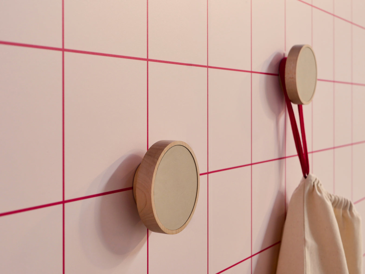
This Headphone Stand Looks Like a Sculpture Even Without Headphones

Headphones usually end up draped over monitors, balanced on stacks of books, or left in a tangle on the desk. They are often the nicest piece of audio gear in the room, but rarely have a home that matches their presence. Most stands are plastic hooks or generic metal frames that disappear under the headband, doing their job but adding nothing to the space. Arco is a response to that gap, a stand that treats headphones like something worth giving a proper place.

Arco is a headphone stand designed to feel like a finished object, whether or not there is a pair of headphones resting on it. Carved from a single block of wood or stone, it has a smooth arc that gives the headband a gentle resting point and a solid base that reads more like a small piece of furniture than an accessory. When empty, it still looks complete, adding subtle presence to a shelf or desk.

Designer: latr.

Reaching for headphones becomes a small, deliberate gesture instead of fishing them out from under papers. When you are done listening, they go back to the same place, the arc catching the headband and lifting the earcups off the surface. Over time, that simple habit keeps the desk clearer and the headphones in better shape, protected from pressure points or deforming pads that come from stacking other things on top.

The wood versions, oak and walnut, bring warmth and visible grain to a shelf or sideboard. The stone versions, Portuguese limestone for subtlety and Guatemala marble for a stronger character, feel more like small monoliths anchoring a corner of the room. In each case, the material is chosen to sit comfortably among books, speakers, and other objects without shouting for attention or feeling like obvious “tech gear.”

Both wood and stone Arcos are CNC-machined from a single solid block, then finished entirely by hand to refine surfaces and edges while letting the natural character of the material remain visible. The arc and outer volume went through many sketches and prototypes until the proportions felt natural and there was nothing left that looked unresolved, which is why the form feels calm rather than generic or rushed.

Latr is a young design brand focused on lifestyle pieces with character for a more relaxed way of living. Arco fits that ethos by turning a purely functional object into something that quietly adds presence to a room, giving headphones a place in the open instead of hiding them away. It is easygoing and optimistic in its own way, inviting you to enjoy the small pleasure of a tidy, intentional audio corner.

Arco is not trying to reinvent storage; it is simply making one everyday object feel more considered. By giving headphones a stand that looks complete on its own, it turns a bit of visual noise into a small architectural moment. In rooms where so many accessories feel disposable or provisional, a single block of wood or stone that earns its place on the desk every day is a quiet kind of luxury.

The post This Headphone Stand Looks Like a Sculpture Even Without Headphones first appeared on Yanko Design.